Agreeable Gray by Sherwin-Williams is one of those paint colors I come back to again and again in real homes. It feels warm, soft, and welcoming without looking too beige or too cold. I love how it changes gently during the day depending on sunlight and lamps.
Some homeowners want it to look brighter, while others want it to feel richer and cozier. That is why choosing the right matching colors matters so much. The right pairing can make cabinets look cleaner, living rooms feel more inviting, and exteriors look fresh from the street.
I have tested Agreeable Gray with many shades over the years, and some combinations always work beautifully. In this article, I’m sharing the best paint colors I trust for kitchens, living rooms, and exteriors.
These are colors that make homes feel balanced, stylish, and easy to enjoy every day.
Why I Always Trust Sherwin-Williams and Benjamin Moore for the Best Colors That Go With Agreeable Gray
I trust Sherwin-Williams and Benjamin Moore because their paint colors feel rich and dependable in real homes. Their shades work well in bright sunlight, darker rooms, modern homes, and cozy family houses.
I also notice their undertones stay more balanced compared to many cheaper paint brands. That matters a lot when using Agreeable Gray because this color can shift between warm gray and soft beige during the day.
I want every room to feel connected instead of mismatched. These brands also make whites look cleaner, greens feel richer, and darker shades look smooth instead of harsh. I often use them when staging homes because buyers react warmly to these colors. People want homes that feel welcoming and easy to live in. Good paint colors help create that feeling faster than almost anything else.
How I Choose the Perfect Colors to Pair With Agreeable Gray
I always start by looking at the natural light in the room because Agreeable Gray changes throughout the day. In sunny rooms, it can feel warmer and softer, while darker rooms can make it look more gray.
I also think about flooring, cabinets, furniture, and how the family uses the room every day. Some homeowners want a bright kitchen, while others want something cozy and rich. Soft whites make Agreeable Gray feel fresh and airy.
Earthy greens help it feel grounded and welcoming. Dark charcoal shades add drama without making the room feel too heavy. I also like mixing warm wood tones with Agreeable Gray because the combination feels natural and comforting. My goal is always the same.
I want the home to feel beautiful, connected, and easy for people to love the moment they walk in.
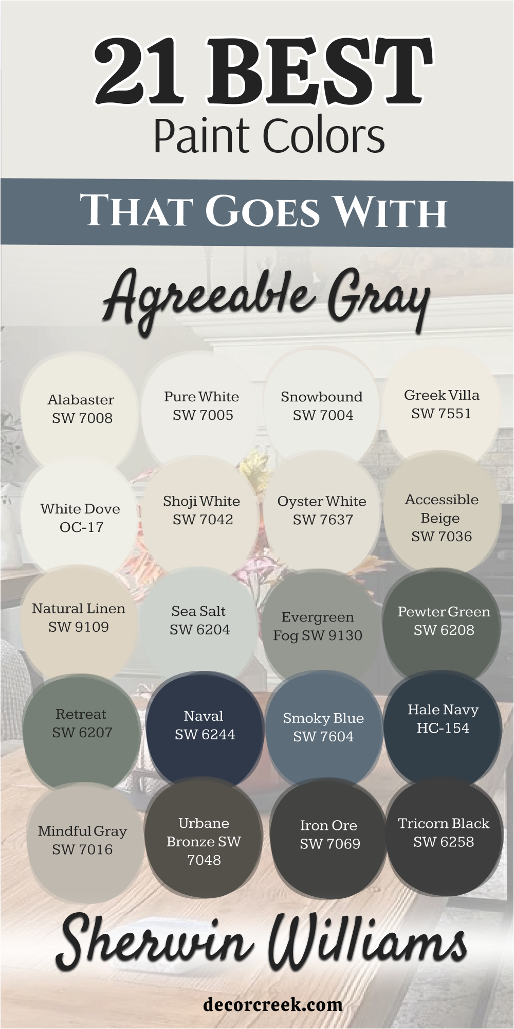
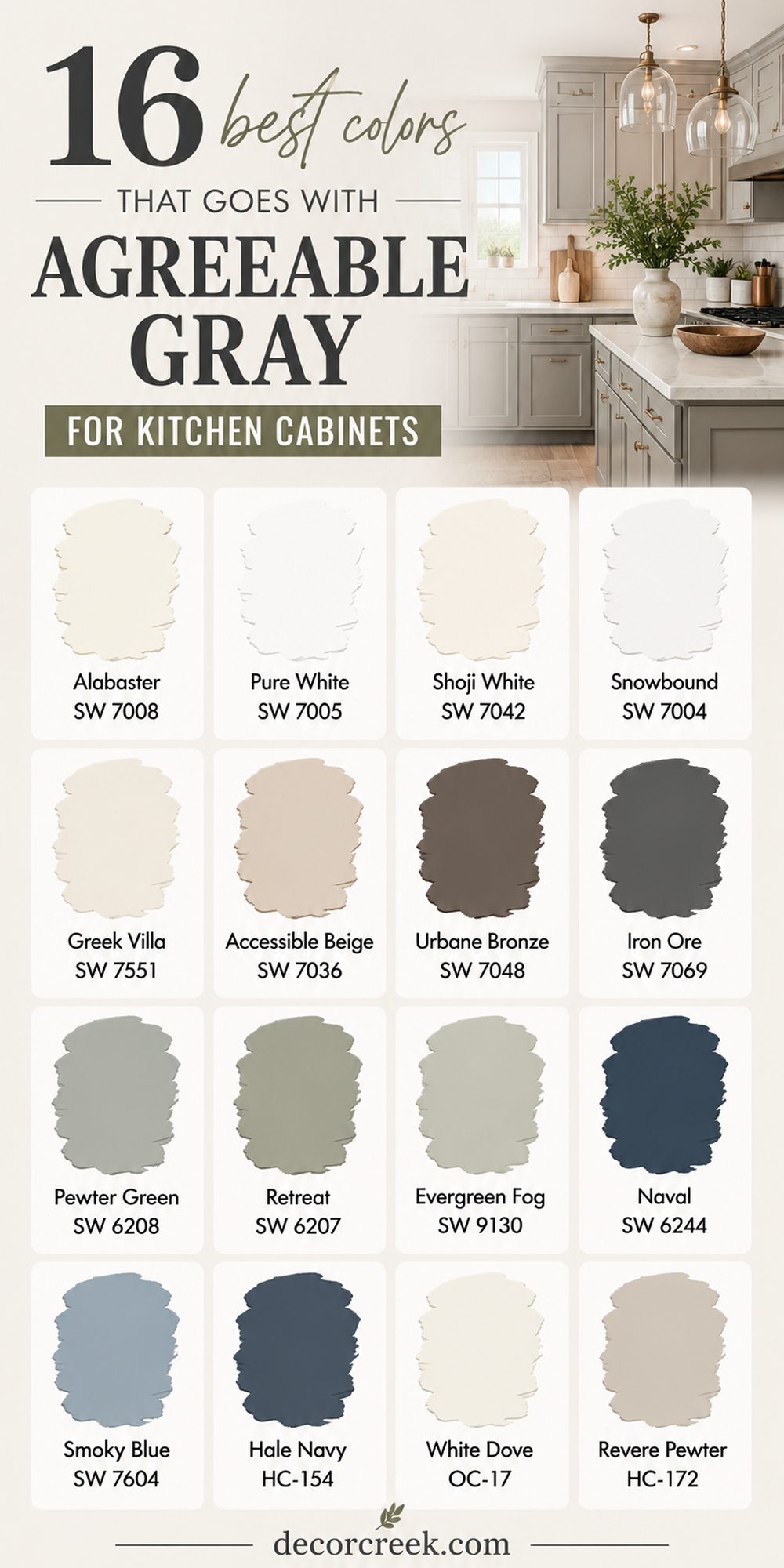
16 Best Colors That Goes With Agreeable Gray for Kitchen Cabinets
Alabaster SW 7008
Alabaster SW 7008 is one of my favorite cabinet colors to pair with Agreeable Gray because it makes kitchens feel warm and bright without looking too stark. I often use it in family kitchens where people gather every morning and night.
The creamy white tone helps gray walls feel softer and more welcoming. It also works beautifully with brass hardware, wood floors, and marble countertops. I love how natural sunlight reflects gently across this color during the day.
In smaller kitchens, it helps everything feel lighter and cleaner. In larger kitchens, it keeps the room from feeling cold or empty. I also notice homeowners feel comfortable with this color because it never feels trendy or hard to decorate around. It works in modern homes, farmhouse kitchens, and traditional layouts. This is one of those shades I trust when homeowners want something safe but still beautiful.
Best used in: living rooms, kitchens, hallways, bedrooms, and farmhouse exteriors
Pairs well with: Iron Ore SW 7069, Agreeable Gray SW 7029, Natural Linen SW 9109, warm wood tones
The key rule of this color for farmhouse style is to use it where you want natural light to feel kind, soft, and inviting throughout the day.
🎨 Check out the complete guide to this color right HERE 👈

Pure White SW 7005
Pure White SW 7005 gives Agreeable Gray a cleaner and fresher look in kitchens without making the room feel icy or flat. I often recommend this color when homeowners want cabinets that feel modern but still welcoming.
The soft white tone keeps kitchens looking bright even on cloudy days. I love using it with black hardware because the contrast feels sharp and stylish. It also looks beautiful with light oak flooring and gray stone countertops.
In open floor plans, this color helps kitchens blend nicely with nearby living rooms painted in Agreeable Gray. I have seen this pairing work especially well in homes that need a fresh update before selling. Buyers usually react very positively because the kitchen feels light and easy to picture themselves living in. This color also helps backsplashes and lighting stand out more clearly. It gives kitchens a polished look without feeling too fancy.
Best used in: kitchens, laundry rooms, trim, ceilings, and modern farmhouse homes
Pairs well with: Agreeable Gray SW 7029, Tricorn Black SW 6258, Sea Salt SW 6204, brushed nickel finishes
The key rule of this color for modern kitchens is to keep surrounding finishes warm enough so the room still feels comfortable and welcoming.
🎨 Check out the complete guide to this color right HERE 👈

Shoji White SW 7042
Shoji White SW 7042 is one of my favorite warm whites to pair with Agreeable Gray kitchen cabinets because it feels soft and welcoming without looking too creamy. I often use this color in homes where families want a relaxed and comfortable kitchen that still feels bright.
The warm undertones help gray cabinets feel richer and more balanced. I love how natural light makes this color glow gently during the day. It also looks beautiful with warm wood floors, black hardware, and stone countertops. In open kitchens, it helps nearby rooms feel connected instead of choppy.
Homeowners usually tell me this color makes the kitchen feel peaceful and easy to spend time in. I also like using it in farmhouse and modern homes because it works with many decorating styles. This shade keeps kitchens looking fresh without feeling too cold or sharp. It creates a welcoming feeling that people notice right away.
Best used in: kitchens, dining rooms, open floor plans, trim, and farmhouse homes
Pairs well with: Agreeable Gray SW 7029, Iron Ore SW 7069, warm wood tones, brushed brass finishes
The key rule of this color for cozy kitchens is to mix it with warm textures and soft lighting so the room feels inviting all day long.
🎨 Check out the complete guide to this color right HERE 👈

Snowbound SW 7004
Snowbound SW 7004 gives Agreeable Gray cabinets a brighter and cleaner look while still keeping the kitchen feeling comfortable. I often recommend this color for homeowners who want a fresh update without making the room feel stark white.
The slightly soft undertone helps balance cooler gray cabinets beautifully. I especially love this pairing with marble countertops and matte black hardware. Sunlight makes this color feel crisp and airy during the daytime.
In the evening, it still keeps kitchens feeling warm enough for family dinners and gatherings. This color also works wonderfully in smaller kitchens because it helps reflect light around the room. I notice that homes painted with this combination often feel more polished and organized. It blends nicely with modern, coastal, and transitional styles. This pairing creates a kitchen that feels bright, clean, and welcoming every day.
Best used in: kitchens, small kitchens, modern homes, trim, and open layouts
Pairs well with: Agreeable Gray SW 7029, Naval SW 6244, marble countertops, black fixtures
The key rule of this color for bright kitchens is to add warmer accents like wood or brass so the room still feels comfortable and lived in.
🎨 Check out the complete guide to this color right HERE 👈

Greek Villa SW 7551
Greek Villa SW 7551 is a warm creamy white that makes Agreeable Gray cabinets feel soft, rich, and welcoming in any kitchen. I love using this color in homes where families want a kitchen that feels cozy but still bright enough for everyday life.
The warm undertones help balance gray cabinets beautifully without making the room feel yellow. I often pair it with warm wood stools, woven textures, and soft gold hardware. Natural sunlight makes this color feel smooth and glowing during the day.
It also works beautifully with stone backsplashes and creamy countertops. Homeowners usually love how comfortable and relaxed the kitchen feels after using this combination. I find this color especially useful in farmhouse and traditional homes because it creates warmth without feeling dark. It keeps kitchens looking fresh while still feeling welcoming for guests and family gatherings. This is one of my favorite whites for creating a homey kitchen feeling.
Best used in: kitchens, farmhouse homes, dining areas, trim, and family homes
Pairs well with: Agreeable Gray SW 7029, Pewter Green SW 6208, warm oak flooring, brass accents
The key rule of this color for farmhouse kitchens is to let natural textures like wood and linen soften the whole room beautifully.
🎨 Check out the complete guide to this color right HERE 👈

Accessible Beige SW 7036
Accessible Beige SW 7036 works beautifully with Agreeable Gray cabinets because it adds warmth without making the kitchen feel heavy. I often use this combination in homes where people want soft neutral colors that feel comforting and easy to live with.
The warm beige undertones help gray cabinets feel smoother and more balanced. I love pairing these colors with creamy countertops and wood accents for a welcoming look. During the day, sunlight helps both shades feel warm and inviting.
At night, soft lighting makes the kitchen feel cozy and relaxed for family dinners. This color pairing also works well in open homes because it connects nearby rooms naturally. Homeowners usually feel comfortable decorating around these colors because they work with many styles and finishes. I especially love this combination in traditional and transitional kitchens. It creates a kitchen that feels warm, stylish, and easy to enjoy every day.
Best used in: kitchens, family rooms, open floor plans, hallways, and traditional homes
Pairs well with: Agreeable Gray SW 7029, Creamy SW 7012, warm wood finishes, bronze hardware
The key rule of this color for welcoming kitchens is to keep lighting warm so the beige undertones stay soft and comfortable.
🎨 Check out the complete guide to this color right HERE 👈

Urbane Bronze SW 7048
Urbane Bronze SW 7048 creates a rich and dramatic contrast with Agreeable Gray cabinets while still feeling warm and stylish. I often use this color for islands, lower cabinets, or accent walls when homeowners want the kitchen to feel more custom and high-end.
The deep brown-gray tone adds depth without making the room feel too dark. I love how beautiful this pairing looks with brass lighting and natural wood textures. Sunlight gives this color a soft richness during the day that feels very elegant.
In the evening, it creates a cozy feeling perfect for gathering with family and friends. This color combination works especially well in modern farmhouse and transitional kitchens. I also notice it photographs beautifully in staged homes because the contrast feels balanced and inviting. Homeowners who want a little drama without using black usually love this shade. It gives kitchens a grounded and welcoming feeling.
Best used in: kitchen islands, lower cabinets, accent walls, modern farmhouse homes, and dining areas
Pairs well with: Agreeable Gray SW 7029, Alabaster SW 7008, warm wood tones, brass fixtures
The key rule of this color for rich kitchen designs is to balance darker finishes with lighter counters and soft lighting.
🎨 Check out the complete guide to this color right HERE 👈

Iron Ore SW 7069
Iron Ore SW 7069 is one of my favorite dark colors to pair with Agreeable Gray because it creates bold contrast while still feeling warm and inviting. I often use it on kitchen islands or lower cabinets when homeowners want a modern look that still feels comfortable.
The soft black tone looks rich without feeling too sharp or harsh. I love pairing it with light countertops and warm wood flooring for balance. During the day, sunlight gives this color depth and softness instead of making it look flat.
At night, it creates a cozy and stylish feeling that makes kitchens feel more custom. This pairing also works beautifully with matte black hardware and brass lighting. I often recommend it for larger kitchens that need stronger contrast to feel balanced. Homeowners usually love how polished and expensive this combination looks after painting. It creates a kitchen that feels modern, warm, and full of character.
Best used in: kitchen islands, lower cabinets, modern kitchens, accent areas, and open homes
Pairs well with: Agreeable Gray SW 7029, Pure White SW 7005, marble counters, brass finishes
The key rule of this color for modern kitchens is to add enough warm textures so the dark shade still feels welcoming and comfortable.
🎨 Check out the complete guide to this color right HERE 👈

Pewter Green SW 6208
Pewter Green SW 6208 is one of the prettiest earthy greens to pair with Agreeable Gray cabinets because it makes kitchens feel rich and welcoming without feeling too dark. I often use this color for kitchen islands or lower cabinets when homeowners want something softer than navy or black.
The muted green tone works beautifully with warm wood floors and brass hardware. I love how sunlight brings out the natural warmth hidden inside this color during the day. In the evening, it creates a cozy feeling perfect for family dinners and quiet mornings with coffee.
This pairing also looks beautiful with white backsplashes and creamy countertops. Homeowners usually love how fresh and grounded the kitchen feels after using this color combination. It works especially well in farmhouse and cottage-style homes. I also find that green tones help kitchens feel more connected to nature and outdoor views. This color gives kitchens personality while still feeling comfortable and easy to live with.
Best used in: kitchen islands, lower cabinets, farmhouse kitchens, cottage homes, and dining areas
Pairs well with: Agreeable Gray SW 7029, Alabaster SW 7008, warm oak flooring, brass accents
The key rule of this color for earthy kitchens is to pair it with warm natural materials so the room feels cozy and balanced.
🎨 Check out the complete guide to this color right HERE 👈
Retreat SW 6207
Retreat SW 6207 creates a deep green-gray look that pairs beautifully with Agreeable Gray cabinets in kitchens that need warmth and richness. I often recommend this color for homeowners who want a moody kitchen that still feels inviting for everyday life.
The dark green undertones give kitchens depth without making them feel too heavy. I love how soft lighting makes this color feel warm and comfortable in the evenings. During the day, sunlight helps reveal the beautiful green tones hidden inside the paint.
This color also works very well with butcher block counters and matte black fixtures. I notice that kitchens painted with this shade often feel more custom and stylish right away. It looks wonderful in farmhouse, rustic, and transitional homes. Homeowners usually feel surprised by how relaxing and welcoming this darker color can feel. It creates a kitchen that feels rich, grounded, and full of personality.
Best used in: kitchen islands, accent cabinets, farmhouse homes, rustic kitchens, and open layouts
Pairs well with: Agreeable Gray SW 7029, Greek Villa SW 7551, black fixtures, warm wood tones
The key rule of this color for cozy kitchens is to balance darker cabinets with lighter walls and counters so the room still feels open.
🎨 Check out the complete guide to this color right HERE 👈
Evergreen Fog SW 9130
Evergreen Fog SW 9130 is a soft green-gray that works beautifully with Agreeable Gray cabinets because it adds warmth and freshness at the same time. I love using this color when homeowners want a kitchen that feels modern but still comfortable and welcoming.
The muted green undertones help gray cabinets feel softer and more natural. I often pair this color with creamy walls, wood shelves, and warm metal finishes. Natural light makes this shade feel airy and relaxed during the day. In the evening, it creates a cozy feeling that works perfectly for family gatherings.
This color also blends beautifully with outdoor views and indoor plants. Homeowners often tell me the kitchen feels more peaceful and connected after painting with this combination. It works especially well in homes with large windows and open layouts. This pairing creates a kitchen that feels stylish without trying too hard.
Best used in: kitchens, open floor plans, modern farmhouse homes, islands, and breakfast areas
Pairs well with: Agreeable Gray SW 7029, White Dove OC-17, warm brass finishes, natural wood textures
The key rule of this color for welcoming kitchens is to use soft warm lighting that keeps the green undertones feeling rich and comfortable.
🎨 Check out the complete guide to this color right HERE 👈

Naval SW 6244
Naval SW 6244 creates one of the most beautiful contrasts with Agreeable Gray cabinets when homeowners want a kitchen that feels bold and stylish. I often use this color on islands or lower cabinets to add richness without making the room feel too dark.
The deep navy tone brings strong character while still feeling elegant and warm. I love pairing it with white countertops and gold hardware for a balanced look. Sunlight gives this color depth and softness during the day that feels very rich and polished.
At night, it creates a cozy and dramatic feeling perfect for entertaining guests. This combination also works beautifully in modern and coastal homes. Homeowners usually love how expensive and custom the kitchen looks after using this color pairing. I find that navy works especially well when the rest of the home has warm neutral tones. It creates a kitchen that feels classic, welcoming, and full of charm.
Best used in: kitchen islands, lower cabinets, modern homes, coastal kitchens, and open layouts
Pairs well with: Agreeable Gray SW 7029, Pure White SW 7005, gold fixtures, marble countertops
The key rule of this color for bold kitchens is to keep surrounding finishes lighter so the navy always feels balanced and inviting.
🎨 Check out the complete guide to this color right HERE 👈

Smoky Blue SW 7604
Smoky Blue SW 7604 gives Agreeable Gray cabinets a soft and welcoming contrast that feels cozy without being too dark. I often recommend this color for homeowners who want a gentle blue tone instead of strong navy shades.
The muted blue-gray undertones work beautifully with warm wood floors and cream accents. I love how sunlight makes this color feel soft and airy during the daytime. In the evening, it creates a relaxed and comfortable feeling perfect for family kitchens.
This shade also pairs beautifully with brushed nickel hardware and stone countertops. I notice that kitchens painted with this color often feel more peaceful and balanced. It works wonderfully in coastal, farmhouse, and traditional homes. Homeowners usually feel happy with how easy this color is to decorate around. It creates a kitchen that feels warm, soft, and welcoming every single day.
Best used in: kitchens, coastal homes, islands, traditional kitchens, and family homes
Pairs well with: Agreeable Gray SW 7029, Snowbound SW 7004, brushed nickel finishes, light wood tones
The key rule of this color for soft kitchen designs is to keep nearby colors warm enough so the blue still feels comfortable and inviting.
🎨 Check out the complete guide to this color right HERE 👈

Hale Navy HC-154
Hale Navy HC-154 is one of my favorite deep navy shades to pair with Agreeable Gray because it creates a rich and elegant kitchen look without feeling harsh. I often use this color for islands and lower cabinets when homeowners want something bold but still welcoming.
The deep navy tone feels classic and polished in almost every kitchen style. I love how beautiful it looks with brass hardware, marble counters, and white walls. During the day, natural light gives this color depth and softness that feels very expensive. In the evening, it creates a cozy and stylish mood perfect for gathering with family and friends.
This pairing also works beautifully in homes with open floor plans because the colors feel balanced together. Homeowners usually love how custom and designer-inspired this combination feels after painting. It works especially well in modern farmhouse and transitional kitchens. This shade creates a kitchen full of warmth, contrast, and personality.
Best used in: kitchen islands, lower cabinets, modern farmhouse homes, coastal homes, and dining areas
Pairs well with: Agreeable Gray SW 7029, White Dove OC-17, brass accents, marble finishes
The key rule of this color for dramatic kitchens is to use enough lighter surfaces nearby so the deep navy feels rich instead of heavy.
🎨 Check out the complete guide to this color right HERE 👈

White Dove OC-17
White Dove OC-17 is a soft creamy white that makes Agreeable Gray cabinets feel warm, bright, and welcoming in every type of kitchen. I often recommend this color for homeowners who want white walls or trim that never feel too cold.
The creamy undertones work beautifully with gray cabinets and warm wood flooring. I love using this color with brass fixtures and soft linen textures for a comfortable look. Natural light makes this shade feel smooth and glowing during the day. At night, warm lighting helps the kitchen feel cozy and relaxing for family time.
This color pairing also works very well in open homes because it blends naturally with nearby rooms. Homeowners usually love how fresh and easy the kitchen feels after using this combination. It works beautifully in traditional, farmhouse, and transitional homes. This is one of the safest white shades when you want a warm and welcoming kitchen.
Best used in: kitchens, trim, ceilings, farmhouse homes, and open layouts
Pairs well with: Agreeable Gray SW 7029, Iron Ore SW 7069, warm wood finishes, brass lighting
The key rule of this color for warm kitchens is to use soft lighting that keeps the creamy undertones feeling gentle and welcoming.
🎨 Check out the complete guide to this color right HERE 👈

Revere Pewter HC-172
Revere Pewter HC-172 creates a beautiful warm neutral combination with Agreeable Gray cabinets that feels balanced and comfortable in family kitchens. I often use this color in homes where people want soft warmth without using strong beige tones.
The gray-beige undertones blend naturally with Agreeable Gray and help the kitchen feel connected. I love pairing this color with warm wood tables, creamy backsplashes, and soft black accents. Sunlight gives both colors a warm and welcoming feeling during the day. In the evening, the kitchen feels cozy and relaxing without becoming dark.
This pairing also works beautifully in open floor plans because the tones flow naturally between rooms. Homeowners usually feel comfortable decorating around these colors because they work with many styles and finishes. It looks especially beautiful in traditional and transitional homes. This combination creates a kitchen that feels warm, stylish, and easy to enjoy every day.
Best used in: kitchens, dining rooms, open layouts, traditional homes, and family spaces
Pairs well with: Agreeable Gray SW 7029, Creamy SW 7012, warm oak tones, black accents
The key rule of this color for welcoming kitchens is to mix warm textures and layered lighting so the room feels comfortable from morning to night.
🎨 Check out the complete guide to this color right HERE 👈

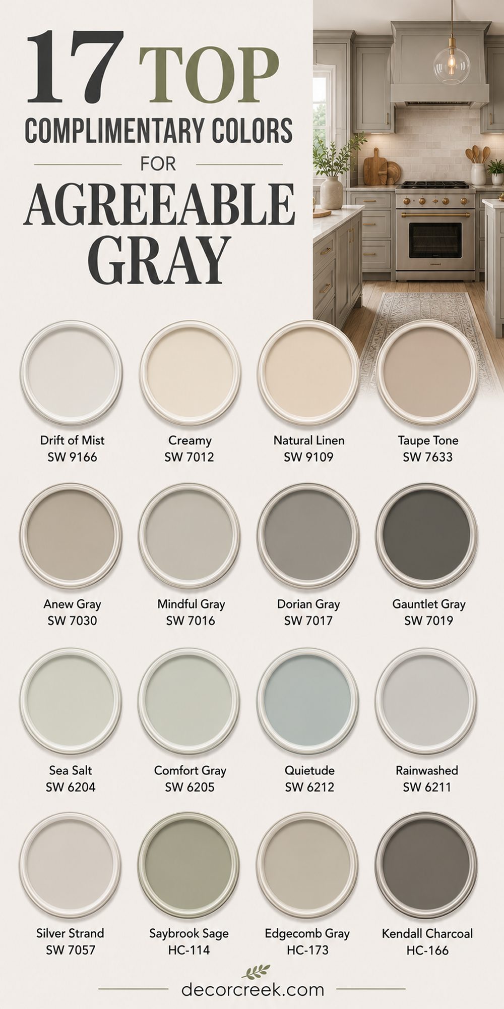
17 Top Complimentary Colors for Agreeable Gray
Drift of Mist SW 9166
Drift of Mist SW 9166 is one of the softest colors I use with Agreeable Gray when homeowners want rooms that feel bright and welcoming without looking plain. The light gray-beige tone blends beautifully and helps nearby walls feel smooth and balanced.
I often use this pairing in open homes where one room flows into another naturally. It also works wonderfully in bedrooms and hallways that need more light. Natural sunlight makes this color feel airy during the day while warm lamps keep it cozy at night. I love using it with cream fabrics, woven rugs, and warm wood furniture.
Homeowners usually tell me the house instantly feels fresher after painting with this combination. It works in modern, farmhouse, and traditional homes without feeling out of place. I also notice that decorating becomes easier because this color matches almost everything. This pairing creates a home that feels comfortable and easy to enjoy every day.
Best used in: bedrooms, hallways, open floor plans, guest rooms, and modern homes
Pairs well with: Agreeable Gray SW 7029, Pure White SW 7005, warm oak flooring, linen fabrics
The key rule of this color for soft interiors is to keep lighting warm so the walls always feel welcoming and comfortable.
🎨 Check out the complete guide to this color right HERE 👈

Creamy SW 7012
Creamy SW 7012 adds warmth to Agreeable Gray in a way that makes homes feel cozy and inviting from the moment you walk inside. I often use this color instead of bright white because it feels softer and more comfortable for everyday living.
The warm creamy tone helps gray walls feel richer without making rooms too dark. I love pairing it with brass lighting, warm wood tables, and soft textured rugs. During the day, sunlight gives this color a glowing and welcoming look. At night, it helps family rooms and kitchens feel relaxed and cozy.
Homeowners who worry about gray feeling cold usually end up loving this pairing. It works beautifully in farmhouse homes and traditional interiors. I also find it very easy to decorate around because most furniture colors work naturally with it. This combination creates rooms that feel warm, friendly, and full of comfort.
Best used in: kitchens, living rooms, dining rooms, trim, and farmhouse homes
Pairs well with: Agreeable Gray SW 7029, Accessible Beige SW 7036, warm wood tones, brass accents
The key rule of this color for welcoming homes is to combine it with soft textures that make the room feel comfortable and lived in.
🎨 Check out the complete guide to this color right HERE 👈

Natural Linen SW 9109
Natural Linen SW 9109 creates one of the warmest and most welcoming combinations with Agreeable Gray that I use often in family homes. The soft beige undertones help gray walls feel richer and more relaxed without looking heavy. I especially love this color in living rooms and bedrooms where homeowners want comfort and warmth.
Sunlight makes this shade feel soft and glowing during the daytime. In the evening, it creates a cozy feeling perfect for relaxing after busy days. I often pair it with warm wood furniture, woven baskets, and cream curtains.
This combination also works beautifully in homes with farmhouse or rustic details. Homeowners usually tell me their rooms instantly feel more inviting after painting with these shades. It blends naturally with many furniture styles and fabrics. This pairing creates a home that feels warm, balanced, and easy to enjoy every single day.
Best used in: living rooms, bedrooms, family homes, hallways, and farmhouse interiors
Pairs well with: Agreeable Gray SW 7029, Alabaster SW 7008, warm woods, woven textures
The key rule of this color for cozy rooms is to let natural materials soften the whole look beautifully.
🎨 Check out the complete guide to this color right HERE 👈

Taupe Tone SW 7633
Taupe Tone SW 7633 gives Agreeable Gray a warmer and richer feeling that works beautifully in homes needing extra comfort. I often use this combination in larger rooms because it helps everything feel more connected and welcoming.
The soft taupe undertones add warmth without making walls feel dark or muddy. I love using this color with warm lighting, cream fabrics, and dark wood furniture. During the day, sunlight brings out the gentle warmth hidden inside the paint.
At night, the room feels relaxing and cozy for family gatherings. This pairing works especially well in traditional and transitional homes. I also notice that it photographs beautifully when staging homes for sale. Homeowners usually feel very comfortable decorating around this color because it blends with many styles. It creates rooms that feel soft, warm, and welcoming throughout the entire day.
Best used in: living rooms, bedrooms, dining rooms, open layouts, and traditional homes
Pairs well with: Agreeable Gray SW 7029, Creamy SW 7012, dark wood furniture, warm lighting
The key rule of this color for warm interiors is to keep surrounding colors soft so the room feels balanced and comfortable.
🎨 Check out the complete guide to this color right HERE 👈
Anew Gray SW 7030
Anew Gray SW 7030 works beautifully with Agreeable Gray because both colors share warm gray undertones that feel smooth together. I often use this combination when homeowners want layered neutral colors without sharp contrast. The warmer taupe-gray tone gives rooms extra depth while still feeling bright enough for everyday life.
I love using these colors in open floor plans because they blend naturally from room to room. Sunlight helps both shades feel warm and welcoming during the day. In the evening, they create a cozy atmosphere perfect for relaxing with family.
This pairing also works beautifully with warm wood floors and black accents. Homeowners usually love how polished and balanced the home feels after painting with these colors. It makes decorating easy because many furniture styles work naturally with these tones. This combination creates a home that feels stylish, warm, and comfortable every day.
Best used in: open floor plans, living rooms, bedrooms, hallways, and modern homes
Pairs well with: Agreeable Gray SW 7029, Pure White SW 7005, black fixtures, warm oak flooring
The key rule of this color for layered neutrals is to keep finishes warm so the gray tones feel welcoming instead of cold.
🎨 Check out the complete guide to this color right HERE 👈
Mindful Gray SW 7016
Mindful Gray SW 7016 creates a slightly deeper contrast with Agreeable Gray while still feeling soft and welcoming in family homes. I often recommend this combination when homeowners want more depth without using very dark colors. The warm gray tone works beautifully in living rooms, dining rooms, and hallways.
I love pairing it with creamy trim and warm wood furniture for a balanced look. During the day, sunlight helps this shade feel smooth and rich instead of flat. At night, it creates a cozy and relaxing feeling throughout the home. This color also blends wonderfully with modern and farmhouse styles.
Homeowners usually feel surprised by how warm gray rooms can feel with the right lighting and textures. I also notice this shade helps artwork and decor stand out beautifully. It creates rooms that feel polished, comfortable, and easy to enjoy.
Best used in: living rooms, dining rooms, hallways, modern homes, and family spaces
Pairs well with: Agreeable Gray SW 7029, Alabaster SW 7008, warm woods, black accents
The key rule of this color for comfortable interiors is to use layered lighting that keeps the gray feeling warm and welcoming.
🎨 Check out the complete guide to this color right HERE 👈

Dorian Gray SW 7017
Dorian Gray SW 7017 adds richness and depth to Agreeable Gray while still keeping homes feeling warm and inviting. I often use this color in larger rooms where homeowners want stronger contrast without using charcoal shades. The warm gray undertones help everything feel balanced and connected.
I love pairing this color with soft white trim, warm flooring, and cozy fabrics. Natural sunlight makes the walls feel rich and welcoming during the day. In the evening, the room feels comfortable and relaxing for family time. This pairing works especially well in transitional and modern farmhouse homes.
Homeowners usually tell me their rooms feel more polished after using these shades together. I also find it very easy to decorate around because the color works with many textures and finishes. This combination creates rooms that feel warm, stylish, and full of comfort.
Best used in: living rooms, bedrooms, open floor plans, modern farmhouse homes, and family rooms
Pairs well with: Agreeable Gray SW 7029, Snowbound SW 7004, warm wood tones, soft fabrics
The key rule of this color for balanced interiors is to keep trim lighter so the gray tones always feel fresh and welcoming.
🎨 Check out the complete guide to this color right HERE 👈

Gauntlet Gray SW 7019
Gauntlet Gray SW 7019 creates a rich and grounded contrast with Agreeable Gray that feels warm and stylish in many homes. I often use this color when homeowners want deeper walls or accent areas without using black or very dark charcoal shades.
The warm gray-brown undertones help rooms feel cozy and welcoming throughout the day. I love pairing it with creamy trim, warm wood flooring, and soft linen fabrics. During the daytime, sunlight gives this shade a smooth richness that feels elegant without trying too hard.
At night, it creates a comfortable feeling perfect for relaxing with family. This pairing works beautifully in modern farmhouse and transitional homes. Homeowners usually love how polished and balanced the rooms feel after painting. I also notice it makes fireplaces, built-ins, and furniture stand out beautifully. This combination creates a home that feels rich, warm, and inviting every single day.
Best used in: living rooms, accent walls, dining rooms, family homes, and modern farmhouse interiors
Pairs well with: Agreeable Gray SW 7029, Alabaster SW 7008, warm oak flooring, black accents
The key rule of this color for cozy interiors is to balance deeper walls with lighter fabrics and warm lighting.
🎨 Check out the complete guide to this color right HERE 👈

Sea Salt SW 6204
Sea Salt SW 6204 adds a soft green-blue feeling to Agreeable Gray that makes homes feel fresh and welcoming without looking too colorful. I often use this pairing in bedrooms, bathrooms, and living rooms where homeowners want something gentle and relaxing.
The muted undertones blend beautifully with warm gray walls and natural textures. I love pairing these colors with woven baskets, cream curtains, and light wood furniture. Sunlight makes this shade feel airy and bright during the day. In the evening, it keeps rooms feeling soft and comfortable for winding down after busy days.
This color combination also works beautifully in coastal and farmhouse homes. Homeowners usually tell me their rooms instantly feel lighter and easier to enjoy after painting. I also find this shade works wonderfully with indoor plants and outdoor views. It creates a home that feels fresh, warm, and welcoming.
Best used in: bedrooms, bathrooms, coastal homes, family rooms, and guest rooms
Pairs well with: Agreeable Gray SW 7029, Pure White SW 7005, woven textures, light wood tones
The key rule of this color for relaxed interiors is to keep surrounding materials natural and soft for a welcoming feeling.
🎨 Check out the complete guide to this color right HERE 👈

Comfort Gray SW 6205
Comfort Gray SW 6205 creates a richer green-gray pairing with Agreeable Gray that feels cozy and balanced in many homes. I often use this shade when homeowners want more depth than Sea Salt while still keeping rooms soft and welcoming. The muted green undertones help gray walls feel grounded and warm.
I love using this combination with warm wood furniture and creamy white trim. During the day, natural light brings out the soft green tones beautifully. At night, the room feels comfortable and relaxing without becoming dark. This pairing works especially well in bedrooms, living rooms, and home offices.
Homeowners usually love how peaceful and balanced the rooms feel after painting with these colors. I also notice it pairs beautifully with brass accents and woven textures. This combination creates a home that feels comfortable, stylish, and easy to enjoy every day.
Best used in: bedrooms, home offices, living rooms, bathrooms, and farmhouse homes
Pairs well with: Agreeable Gray SW 7029, White Dove OC-17, brass fixtures, warm wood finishes
The key rule of this color for cozy homes is to use soft warm lighting that keeps the green undertones feeling rich and welcoming.
🎨 Check out the complete guide to this color right HERE 👈

Quietude SW 6212
Quietude SW 6212 is a soft blue-green shade that works beautifully with Agreeable Gray in homes that need gentle color and warmth. I often recommend this pairing for bedrooms and bathrooms because it feels welcoming without looking too bright or playful.
The muted undertones blend naturally with warm gray walls and soft neutral fabrics. I love how sunlight gives this shade a fresh and airy feeling during the day. In the evening, it creates a cozy atmosphere perfect for resting and relaxing.
This color also pairs wonderfully with warm wood accents and brushed nickel finishes. Homeowners usually tell me the room feels softer and more comfortable after painting with this combination. It works beautifully in coastal, cottage, and traditional homes. I also notice this shade makes white trim and decor stand out in a beautiful way. This pairing creates rooms that feel fresh, soft, and welcoming every day.
Best used in: bedrooms, bathrooms, guest rooms, coastal homes, and cottage interiors
Pairs well with: Agreeable Gray SW 7029, Snowbound SW 7004, brushed nickel finishes, soft linens
The key rule of this color for gentle interiors is to keep nearby colors soft so the room always feels balanced and comfortable.
🎨 Check out the complete guide to this color right HERE 👈
Rainwashed SW 6211
Rainwashed SW 6211 gives Agreeable Gray a fresh and airy companion color that feels soft and welcoming in many homes. I often use this shade when homeowners want a light blue-green color that still feels warm enough for everyday living.
The gentle undertones help rooms feel brighter without becoming too colorful. I love pairing this combination with creamy whites, natural wood furniture, and woven textures. Natural sunlight makes this color feel clean and fresh during the daytime. In the evening, warm lighting keeps the room feeling cozy and inviting.
This pairing works beautifully in bedrooms, bathrooms, and family homes near the water. Homeowners usually love how relaxing and comfortable the rooms feel after using these colors together. I also notice it works beautifully with indoor plants and light fabrics. This combination creates rooms that feel fresh, welcoming, and easy to enjoy throughout the year.
Best used in: bedrooms, bathrooms, coastal homes, family spaces, and guest rooms
Pairs well with: Agreeable Gray SW 7029, Alabaster SW 7008, woven textures, light oak flooring
The key rule of this color for airy interiors is to mix it with warm materials that keep the room feeling comfortable.
🎨 Check out the complete guide to this color right HERE 👈

Silver Strand SW 7057
Silver Strand SW 7057 creates a soft gray-green pairing with Agreeable Gray that feels bright and balanced in open homes. I often recommend this color when homeowners want something light and airy without using plain gray walls everywhere. The soft undertones help nearby rooms feel connected naturally.
I love using this shade with white trim, warm flooring, and natural textures. During the day, sunlight gives the room a fresh and welcoming feeling. At night, it still feels cozy enough for relaxing with family. This color combination works especially well in coastal and modern farmhouse homes.
Homeowners usually tell me the house feels larger and brighter after painting with these colors. I also notice that decorating becomes easier because this shade works with many neutral tones. This pairing creates a home that feels soft, stylish, and comfortable every single day.
Best used in: open floor plans, bedrooms, coastal homes, family rooms, and hallways
Pairs well with: Agreeable Gray SW 7029, Pure White SW 7005, natural textures, light wood furniture
The key rule of this color for bright interiors is to use warm finishes so the gray-green tones never feel cold.
🎨 Check out the complete guide to this color right HERE 👈
Saybrook Sage HC-114
Saybrook Sage HC-114 adds earthy warmth to Agreeable Gray in a way that feels rich and welcoming without looking dark. I often use this color in homes where families want more color while still keeping a soft and natural feeling. The muted sage tone blends beautifully with warm gray walls and wood finishes.
I love pairing it with cream fabrics, warm brass accents, and natural stone details. Sunlight makes this shade feel soft and earthy during the day. In the evening, it creates a cozy and relaxing atmosphere throughout the room.
This combination works wonderfully in farmhouse, cottage, and traditional homes. Homeowners usually love how grounded and comfortable the rooms feel after painting. I also find this color works beautifully with plants and outdoor views. This pairing creates a home that feels warm, natural, and welcoming every day.
Best used in: living rooms, kitchens, farmhouse homes, dining rooms, and cottage interiors
Pairs well with: Agreeable Gray SW 7029, Creamy SW 7012, warm woods, brass fixtures
The key rule of this color for earthy homes is to keep natural textures visible so the room feels warm and connected.

Edgecomb Gray HC-173
Edgecomb Gray HC-173 is one of my favorite soft neutral colors to pair with Agreeable Gray because it creates a warm and balanced home without feeling boring. I often use this combination in open floor plans where homeowners want rooms to flow naturally together.
The warm gray-beige undertones help walls feel soft and welcoming throughout the day. I love pairing these colors with creamy trim, warm wood furniture, and cozy fabrics. During the daytime, sunlight gives this shade a light and airy feeling that makes rooms feel brighter. At night, warm lamps help the home feel comfortable and relaxing for family time.
This pairing works beautifully in modern farmhouse and traditional homes. Homeowners usually tell me the house instantly feels more polished after painting with these colors. I also notice it makes decorating much easier because almost every neutral tone works well with it. This combination creates a home that feels warm, stylish, and easy to enjoy every day.
Best used in: living rooms, hallways, bedrooms, open floor plans, and family homes
Pairs well with: Agreeable Gray SW 7029, White Dove OC-17, warm wood tones, soft linen fabrics
The key rule of this color for welcoming interiors is to keep nearby textures warm and soft so the room feels comfortable throughout the day.
🎨 Check out the complete guide to this color right HERE 👈

Kendall Charcoal HC-166
Kendall Charcoal HC-166 creates strong contrast with Agreeable Gray while still feeling rich and welcoming instead of too dark. I often use this color for accent walls, built-ins, and dining rooms where homeowners want a little drama without using black paint.
The deep charcoal undertones give rooms depth and personality right away. I love pairing this shade with warm wood furniture, brass lighting, and creamy white trim. Sunlight softens the dark color beautifully during the daytime and keeps it from looking flat. In the evening, the room feels cozy and stylish for gatherings with family and friends.
This combination works especially well in modern and transitional homes. Homeowners usually love how expensive and polished the room feels after painting. I also notice artwork and decor stand out beautifully against this darker shade. This pairing creates a home that feels bold, warm, and full of character.
Best used in: accent walls, dining rooms, built-ins, modern homes, and family spaces
Pairs well with: Agreeable Gray SW 7029, Alabaster SW 7008, brass accents, dark wood finishes
The key rule of this color for bold interiors is to balance darker walls with lighter fabrics and warm lighting.
🎨 Check out the complete guide to this color right HERE 👈

Boothbay Gray HC-165
Boothbay Gray HC-165 adds a soft blue-gray touch to Agreeable Gray that feels fresh and welcoming in many homes. I often recommend this color when homeowners want something a little cooler while still keeping rooms comfortable and inviting.
The gentle blue undertones help create a relaxed and balanced feeling throughout the home. I love pairing this shade with white trim, woven textures, and warm oak flooring. During the day, sunlight makes the blue-gray tone feel airy and bright. At night, warm lighting helps the room stay cozy and soft instead of cold.
This pairing works beautifully in coastal homes, bedrooms, and open living spaces. Homeowners usually love how fresh and polished the rooms feel after painting with these colors together. I also notice this shade works wonderfully with indoor plants and natural fabrics. This combination creates a home that feels light, welcoming, and beautiful every day.
Best used in: bedrooms, living rooms, coastal homes, open layouts, and guest rooms
Pairs well with: Agreeable Gray SW 7029, Pure White SW 7005, warm oak tones, woven textures
The key rule of this color for airy interiors is to use warm decor and lighting so the blue-gray tones still feel welcoming and comfortable.
🎨 Check out the complete guide to this color right HERE 👈

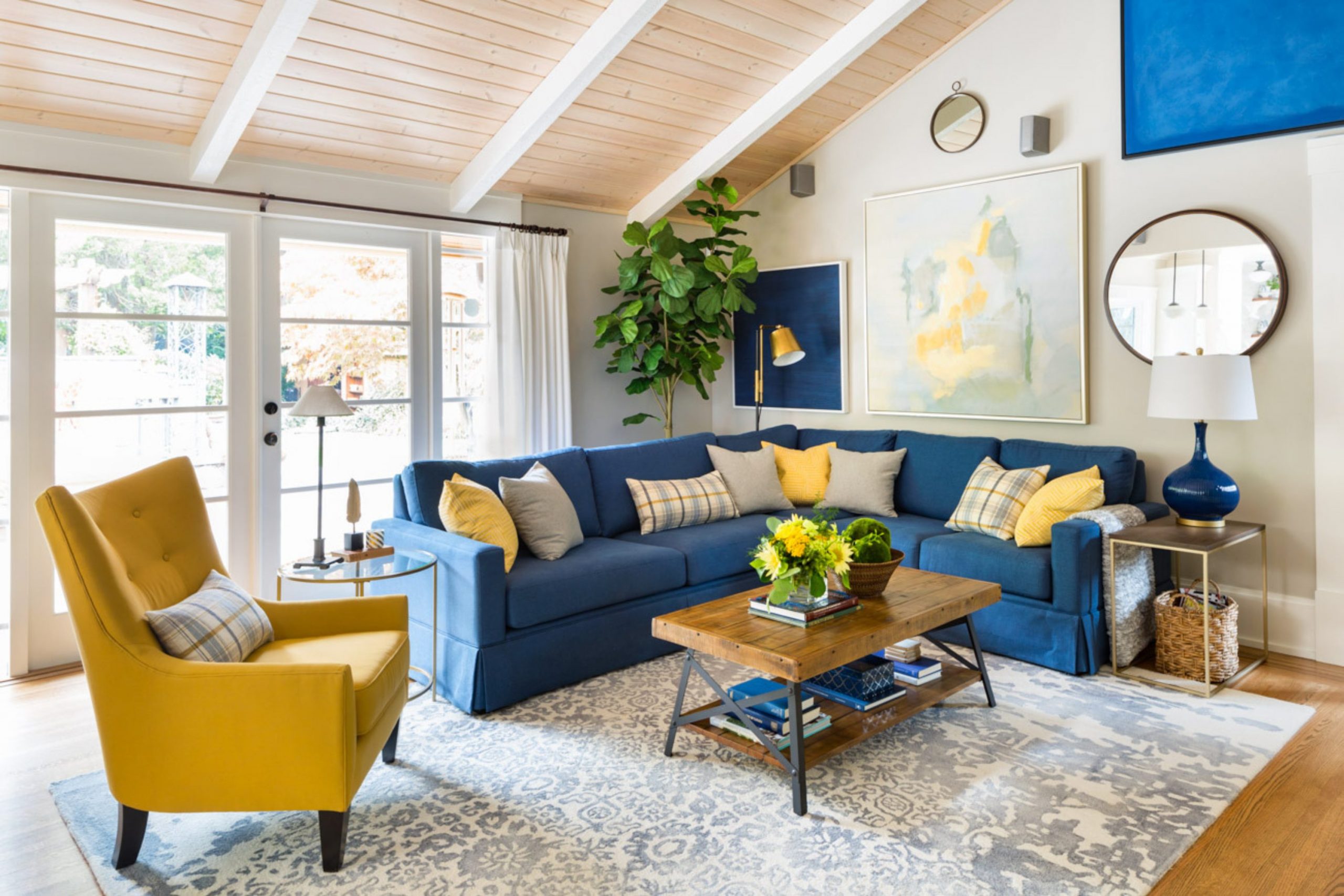
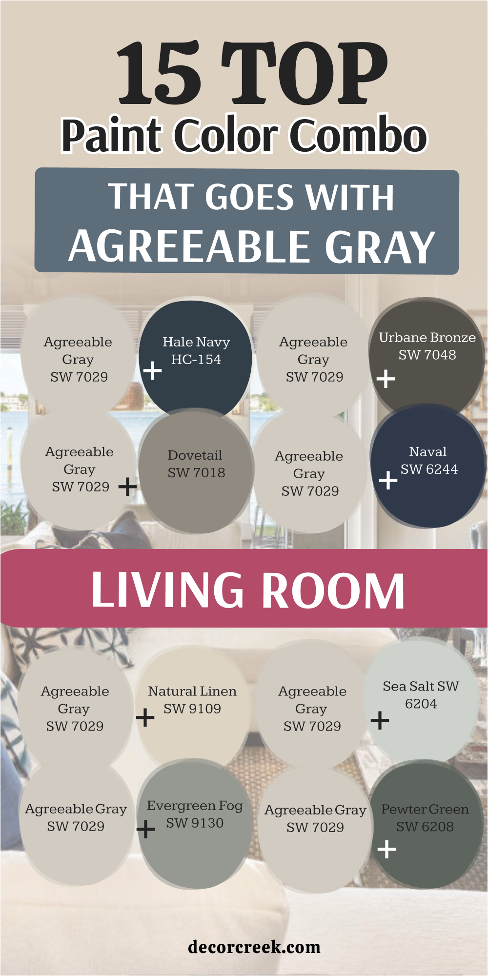
15 Top Color Combo That Goes With Agreeable Gray Living Room
Agreeable Gray SW 7029 + Alabaster SW 7008
Agreeable Gray SW 7029 + Alabaster SW 7008 is one of the warmest and safest living room combinations I use for family homes. The soft gray walls create comfort while the creamy white trim keeps everything looking bright and fresh. I love how sunlight moves across these colors during the day because the room never feels dull or cold.

This pairing works beautifully with wood furniture, woven rugs, and soft cream fabrics. In the evening, warm lighting makes the room feel cozy and welcoming for family movie nights and gatherings. I often recommend this combination for open floor plans because it blends naturally into nearby rooms.
Homeowners usually tell me their living room instantly feels brighter and more comfortable after painting. It also works in farmhouse, traditional, and modern homes without feeling out of place. I find it very easy to decorate around because almost every neutral tone matches beautifully. This combination creates a living room that feels warm, balanced, and welcoming every single day.
Best used in: living rooms, open floor plans, family homes, farmhouse interiors, and hallways
Pairs well with: warm wood tones, black accents, woven textures, brass lighting
The key rule of this color combination for cozy living rooms is to mix soft whites with warm textures so the room always feels inviting.
Agreeable Gray SW 7029 + Pure White SW 7005
Agreeable Gray SW 7029 + Pure White SW 7005 creates a clean and fresh living room that still feels comfortable and welcoming for everyday life. I often recommend this pairing for homeowners who want brighter walls without making the room feel too cold.
The crisp white trim helps the warm gray walls look polished and airy. I love using this combination with black furniture accents, soft gray rugs, and light oak flooring. During the day, natural sunlight keeps the room feeling open and bright. At night, warm lamps help soften the white so the living room still feels cozy for relaxing.
This pairing works beautifully in modern and transitional homes. Homeowners usually love how neat and organized the room feels after painting with these shades. I also notice artwork and decor stand out beautifully against these colors. This combination creates a living room that feels bright, stylish, and welcoming every day.
Best used in: modern living rooms, open layouts, family homes, condos, and transitional interiors
Pairs well with: black fixtures, light oak flooring, gray fabrics, brushed nickel accents
The key rule of this color combination for fresh interiors is to balance crisp whites with warm woods and cozy fabrics.
Agreeable Gray SW 7029 + Greek Villa SW 7551
Agreeable Gray SW 7029 + Greek Villa SW 7551 creates a soft and welcoming living room that feels warm without looking too beige. I often use this combination in homes where families want a brighter look that still feels comfortable for everyday living.
The creamy white undertones help soften the warm gray walls beautifully. I love pairing these colors with linen curtains, woven baskets, and natural wood coffee tables. During the daytime, sunlight makes the room feel airy and glowing. In the evening, warm lighting gives the living room a cozy feeling perfect for gathering with family.
This combination works beautifully in farmhouse and traditional homes. Homeowners usually tell me the room instantly feels more relaxing and inviting after painting. I also notice it works wonderfully with layered neutral decor and soft textures. This pairing creates a living room that feels warm, welcoming, and easy to enjoy all year long.
Best used in: farmhouse living rooms, family homes, open layouts, traditional homes, and cozy interiors
Pairs well with: warm woods, cream fabrics, woven textures, brass accents
The key rule of this color combination for warm interiors is to keep surrounding decor soft and natural for a welcoming feeling.
Agreeable Gray SW 7029 + Accessible Beige SW 7036
Agreeable Gray SW 7029 + Accessible Beige SW 7036 creates one of the coziest living room combinations I use in homes that need warmth and comfort. The beige undertones help soften the gray walls and make the whole room feel connected naturally. I love using this pairing with warm wood furniture and cream-colored fabrics.
During the day, sunlight gives the room a soft and welcoming feeling that never feels too dark. In the evening, warm lamps make the room feel relaxing and comfortable for family time. This pairing works especially well in traditional and transitional homes.
Homeowners usually love how easy these colors are to decorate around because they work with many furniture styles. I also notice that textured rugs and woven baskets look beautiful with these shades. This combination creates a living room that feels balanced, warm, and inviting every day.
Best used in: family rooms, traditional homes, open floor plans, cozy interiors, and transitional homes
Pairs well with: warm oak flooring, cream fabrics, bronze finishes, textured rugs
The key rule of this color combination for comfortable homes is to use warm lighting that keeps the beige undertones soft and welcoming.
Agreeable Gray SW 7029 + Natural Linen SW 9109
Agreeable Gray SW 7029 + Natural Linen SW 9109 gives living rooms a warm and welcoming feeling that feels perfect for family homes. The soft beige warmth of Natural Linen helps the gray walls feel richer and more comfortable. I often use this pairing in homes where people want relaxed and cozy interiors instead of sharp modern looks.
I love combining these colors with warm wood tables, soft cream sofas, and woven textures. During the daytime, sunlight gives the room a gentle glow that feels very inviting. At night, warm lighting makes the living room feel peaceful and comfortable for relaxing.
This combination works beautifully in farmhouse and rustic homes. Homeowners usually tell me the room instantly feels more homey after painting. I also find this pairing easy to style because most neutral decor works naturally with it. This combination creates a living room that feels soft, warm, and welcoming every single day.
Best used in: farmhouse living rooms, rustic homes, family rooms, open layouts, and cozy interiors
Pairs well with: warm wood tones, cream fabrics, woven baskets, soft lighting
The key rule of this color combination for cozy homes is to mix warm neutrals with natural textures throughout the room.
Agreeable Gray SW 7029 + Sea Salt SW 6204
Agreeable Gray SW 7029 + Sea Salt SW 6204 creates a soft and airy living room that still feels warm and welcoming for everyday life. I often recommend this pairing for homeowners who want gentle color without making the room feel too bright or playful. The soft green-blue undertones of Sea Salt blend beautifully with warm gray walls.
I love using these colors with light wood furniture, woven rugs, and cream fabrics. During the day, natural sunlight makes the room feel fresh and open. In the evening, warm lamps help the room stay cozy and comfortable for relaxing. This combination works wonderfully in coastal and farmhouse homes.
Homeowners usually love how peaceful and balanced the room feels after painting. I also notice indoor plants and natural decor look especially beautiful with these shades. This pairing creates a living room that feels light, welcoming, and comfortable every day.
Best used in: coastal homes, family rooms, open layouts, farmhouse interiors, and bedrooms
Pairs well with: light wood furniture, woven textures, cream fabrics, indoor plants
The key rule of this color combination for airy interiors is to keep natural materials visible so the room feels warm and welcoming.
Agreeable Gray SW 7029 + Evergreen Fog SW 9130
Agreeable Gray SW 7029 + Evergreen Fog SW 9130 creates a living room that feels rich, warm, and welcoming without looking too dark. I often use this pairing when homeowners want soft color while still keeping the home neutral and easy to decorate. The muted green undertones of Evergreen Fog help the gray walls feel grounded and comfortable.
I love using these colors with warm wood furniture, brass lighting, and textured cream fabrics. During the day, sunlight gives the room a soft earthy feeling that feels very natural. At night, warm lighting makes the living room feel cozy and relaxing for family time. This pairing works beautifully in farmhouse and transitional homes.
Homeowners usually tell me the room feels more stylish and peaceful after painting with these shades. I also notice plants and natural decor stand out beautifully against these colors. This combination creates a living room that feels warm, balanced, and welcoming every day.
Best used in: living rooms, farmhouse homes, family spaces, open layouts, and transitional interiors
Pairs well with: warm oak flooring, brass accents, woven textures, cream fabrics
The key rule of this color combination for earthy interiors is to balance green tones with warm natural materials throughout the room.
Agreeable Gray SW 7029 + Pewter Green SW 6208
Agreeable Gray SW 7029 + Pewter Green SW 6208 creates a rich and grounded living room that feels stylish while still staying comfortable for everyday life. I often recommend this pairing for homeowners who want stronger contrast without using black or very dark gray walls.
The muted green tone gives the room depth and warmth naturally. I love pairing these colors with soft white curtains, warm wood tables, and cozy textured rugs. During the day, sunlight helps the green undertones feel rich and welcoming. In the evening, the room feels cozy and relaxing for quiet nights with family.
This combination works beautifully in farmhouse and rustic homes. Homeowners usually love how polished and custom the room feels after painting. I also notice leather furniture and brass lighting look beautiful with these shades. This pairing creates a living room that feels warm, rich, and full of personality.
Best used in: farmhouse living rooms, rustic homes, family rooms, accent walls, and cozy interiors
Pairs well with: warm woods, brass fixtures, leather furniture, cream fabrics
The key rule of this color combination for grounded interiors is to soften deeper colors with warm lighting and natural textures.
Agreeable Gray SW 7029 + Retreat SW 6207
Agreeable Gray SW 7029 + Retreat SW 6207 gives living rooms a deep and cozy feeling that still feels welcoming and balanced. I often use this combination when homeowners want a richer look without making the room feel too heavy. The green-gray undertones of Retreat blend beautifully with warm gray walls and natural textures.
I love pairing these colors with cream sofas, warm wood shelves, and soft woven rugs. Sunlight gives the room depth and warmth during the daytime. In the evening, the darker tones help create a relaxing atmosphere perfect for family movie nights and gatherings. This pairing works wonderfully in farmhouse and transitional homes.
Homeowners usually tell me the room feels more custom and comfortable after painting with these colors. I also notice this combination works beautifully with indoor plants and black accents. This pairing creates a living room that feels rich, cozy, and welcoming every day.
Best used in: family rooms, farmhouse interiors, accent walls, cozy homes, and open layouts
Pairs well with: cream fabrics, black fixtures, woven textures, warm wood furniture
The key rule of this color combination for cozy homes is to balance darker tones with lighter fabrics and soft lighting.
Agreeable Gray SW 7029 + Smoky Blue SW 7604
Agreeable Gray SW 7029 + Smoky Blue SW 7604 creates a soft and welcoming living room with gentle color that never feels too bold. I often recommend this pairing for homeowners who want blue tones while still keeping the home warm and comfortable. The muted blue-gray undertones work beautifully with soft gray walls and natural decor.
I love using these colors with light wood furniture, cream rugs, and brushed nickel finishes. During the day, sunlight makes the room feel airy and fresh. At night, warm lamps help the blue stay cozy instead of feeling cold. This pairing works beautifully in coastal and traditional homes.
Homeowners usually love how relaxing and balanced the room feels after painting. I also notice artwork and soft fabrics stand out beautifully with these shades. This combination creates a living room that feels fresh, welcoming, and comfortable every day.
Best used in: coastal homes, family rooms, bedrooms, traditional interiors, and open layouts
Pairs well with: brushed nickel finishes, cream fabrics, woven rugs, light wood tones
The key rule of this color combination for soft interiors is to use warm textures that keep blue tones feeling welcoming.
Agreeable Gray SW 7029 + Naval SW 6244
Agreeable Gray SW 7029 + Naval SW 6244 creates a bold and beautiful living room that feels rich without becoming too dark. I often use this combination when homeowners want stronger contrast and a more custom designer look. The deep navy tone gives the room depth while the warm gray keeps everything balanced and comfortable.
I love pairing these colors with brass lighting, white trim, and warm wood flooring. During the day, sunlight softens the navy beautifully and gives the room a polished feeling. At night, the darker tones create a cozy atmosphere perfect for gatherings with family and friends. This pairing works wonderfully in modern and transitional homes.
Homeowners usually love how elegant and welcoming the room feels after painting. I also notice navy makes artwork and decor stand out beautifully. This combination creates a living room that feels bold, stylish, and inviting every day.
Best used in: modern living rooms, family homes, accent walls, transitional interiors, and open layouts
Pairs well with: brass accents, warm wood flooring, white trim, cream furniture
The key rule of this color combination for bold interiors is to balance navy tones with lighter finishes and warm textures.
Agreeable Gray SW 7029 + Dovetail SW 7018
Agreeable Gray SW 7029 + Dovetail SW 7018 creates a layered gray look that feels warm, rich, and welcoming instead of cold. I often recommend this pairing for homeowners who love neutral homes with a little more depth and contrast. The deeper gray undertones of Dovetail help furniture and decor stand out beautifully.
I love using these colors with black accents, warm woods, and textured fabrics. During the day, sunlight gives the room a smooth and polished feeling. In the evening, the deeper tones make the living room feel cozy and relaxing for family time. This pairing works especially well in modern farmhouse and transitional homes.
Homeowners usually love how balanced and stylish the room feels after painting. I also notice this combination makes fireplaces and built-ins look more custom. This pairing creates a living room that feels warm, polished, and easy to enjoy every day.
Best used in: family rooms, modern farmhouse homes, accent walls, open layouts, and transitional interiors
Pairs well with: black fixtures, warm oak tones, textured rugs, cream fabrics
The key rule of this color combination for layered neutrals is to keep lighting soft so darker grays still feel welcoming.

Agreeable Gray SW 7029 + Urbane Bronze SW 7048
Agreeable Gray SW 7029 + Urbane Bronze SW 7048 creates a warm and dramatic living room that feels rich without becoming too dark. I often use this pairing when homeowners want deeper contrast while still keeping the home comfortable and welcoming. The dark brown-gray undertones of Urbane Bronze help anchor the room beautifully.
I love pairing these colors with warm wood furniture, soft cream rugs, and brass lighting. During the day, sunlight softens the darker tones and gives the room a cozy richness. At night, the living room feels relaxing and stylish for family gatherings and quiet evenings.
This combination works beautifully in farmhouse and modern homes. Homeowners usually love how custom and polished the room feels after painting with these shades. I also notice leather furniture and natural textures look beautiful with this pairing. This combination creates a living room that feels warm, grounded, and full of character.
Best used in: family rooms, accent walls, farmhouse interiors, modern homes, and cozy living rooms
Pairs well with: brass accents, warm woods, cream fabrics, black fixtures
The key rule of this color combination for rich interiors is to soften darker tones with warm lighting and cozy textures.
Agreeable Gray SW 7029 + Hale Navy HC-154
Agreeable Gray SW 7029 + Hale Navy HC-154 creates one of the most elegant living room combinations I use in homes that need stronger contrast and depth. The deep navy shade gives the room personality while the warm gray walls keep everything balanced and welcoming. I often pair these colors with white trim, warm oak flooring, and soft cream furniture.
During the day, sunlight helps the navy feel rich and polished instead of heavy. In the evening, warm lamps make the room feel cozy and comfortable for relaxing with family. This pairing works beautifully in coastal, traditional, and transitional homes.
Homeowners usually love how stylish and expensive the room feels after painting with these shades. I also notice brass lighting and artwork stand out beautifully against the darker blue tones. This combination creates a living room that feels bold, warm, and welcoming every day.
Best used in: living rooms, coastal homes, accent walls, family spaces, and transitional interiors
Pairs well with: white trim, brass fixtures, warm oak flooring, cream sofas
The key rule of this color combination for dramatic interiors is to keep enough lighter decor nearby so the navy always feels balanced.
Agreeable Gray SW 7029 + White Dove OC-17
Agreeable Gray SW 7029 + White Dove OC-17 creates a soft and welcoming living room that feels warm, bright, and comfortable in every season. I often recommend this pairing for homeowners who want a fresh look without using harsh bright whites. The creamy undertones of White Dove help soften the gray walls beautifully.
I love using these colors with linen curtains, woven baskets, and warm wood tables. During the daytime, sunlight makes the room feel airy and glowing. At night, warm lighting gives the living room a cozy and relaxing feeling perfect for family evenings.
This combination works wonderfully in farmhouse, traditional, and cottage homes. Homeowners usually tell me the room instantly feels more peaceful and inviting after painting. I also notice neutral furniture and layered textures blend beautifully with these shades. This pairing creates a living room that feels soft, warm, and easy to love every single day.
Best used in: farmhouse living rooms, traditional homes, open layouts, family spaces, and cottage interiors
Pairs well with: warm woods, woven textures, linen fabrics, brass lighting
The key rule of this color combination for cozy interiors is to layer soft textures and warm materials throughout the room.
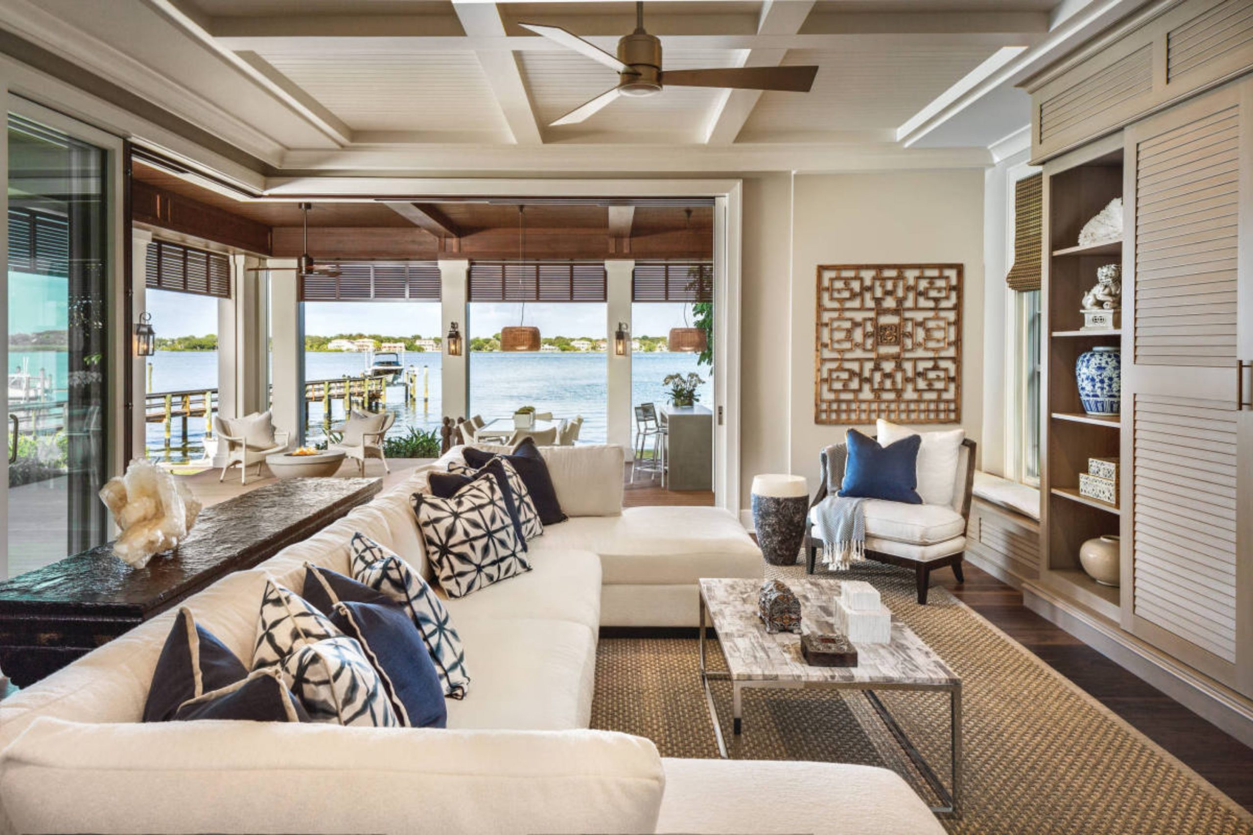
19 Top Color Combo That Goes With Agreeable Gray Exterior
Agreeable Gray SW 7029 + Pure White SW 7005
Agreeable Gray SW 7029 + Pure White SW 7005 creates an exterior that feels fresh, clean, and welcoming from the moment people see the house. I often recommend this combination for homeowners who want something bright without looking too sharp or cold.
The warm gray siding keeps the home soft while the crisp white trim adds beautiful contrast. I love pairing these colors with black shutters and natural wood doors for extra warmth. During sunny days, the exterior feels bright and polished without becoming harsh. On cloudy days, the gray still feels warm and inviting.
This pairing works beautifully on farmhouse, traditional, and modern homes. Homeowners usually tell me the house instantly looks newer and more cared for after painting. I also notice landscaping and stone details stand out beautifully against these colors. This combination creates an exterior that feels timeless, welcoming, and full of charm.
Best used in: farmhouse exteriors, suburban homes, trim, shutters, and modern homes
Pairs well with: black accents, natural wood doors, stone details, warm outdoor lighting
The key rule of this color combination for exteriors is to keep trim bright and clean so the warm gray always feels fresh and welcoming.
Agreeable Gray SW 7029 + Alabaster SW 7008
Agreeable Gray SW 7029 + Alabaster SW 7008 gives homes a soft and welcoming exterior that feels warm without looking too beige. I often use this combination for families who want a cozy look that still feels bright and updated. The creamy white trim softens the gray siding beautifully and adds gentle contrast.
I love pairing these colors with warm brick, wood shutters, and black lantern lighting. Sunlight makes this combination feel rich and glowing during the day. In the evening, outdoor lights give the house a warm and inviting feeling. This pairing works wonderfully on farmhouse and cottage-style homes.
Homeowners usually love how comfortable and welcoming the house feels after painting. I also notice greenery and landscaping stand out beautifully against these shades. This combination creates an exterior that feels warm, balanced, and easy to love for years.
Best used in: farmhouse homes, cottages, traditional houses, trim, and shutters
Pairs well with: warm brick, wood accents, black lanterns, cream stone details
The key rule of this color combination for cozy exteriors is to use warm natural materials that soften the whole look beautifully.
Agreeable Gray SW 7029 + Snowbound SW 7004
Agreeable Gray SW 7029 + Snowbound SW 7004 creates a bright and polished exterior that feels modern while still staying welcoming. I often recommend this pairing for homeowners who want crisp white trim without making the house feel too cold. The soft undertones of Snowbound balance the warm gray siding naturally.
I love using these colors with black windows, modern lighting, and stone walkways. During sunny days, the exterior feels airy and clean without becoming harsh. On cloudy days, the warm gray keeps the home feeling comfortable and inviting. This pairing works beautifully on modern farmhouse and transitional homes.
Homeowners usually love how fresh and updated the house feels after painting. I also notice landscaping colors pop beautifully against these shades. This combination creates an exterior that feels bright, stylish, and welcoming every day.
Best used in: modern farmhouse homes, transitional houses, trim, shutters, and garages
Pairs well with: black windows, stone pathways, modern lighting, wood accents
The key rule of this color combination for fresh exteriors is to balance crisp whites with warm textures and natural finishes.
Agreeable Gray SW 7029 + Oyster White SW 7637
Agreeable Gray SW 7029 + Oyster White SW 7637 gives homes a soft and warm exterior that feels comfortable and welcoming from the street. I often use this combination when homeowners want white trim that feels creamy instead of stark.
The warm undertones help the gray siding feel richer and more connected. I love pairing these colors with warm wood doors and bronze lighting fixtures. Sunlight makes the house feel soft and glowing during the day. In the evening, the exterior lighting keeps the home looking cozy and inviting.
This pairing works beautifully on traditional and farmhouse homes. Homeowners usually tell me the house feels more homey and relaxing after painting. I also notice natural stone and brick details blend beautifully with these shades. This combination creates an exterior that feels warm, soft, and welcoming every season.
Best used in: traditional homes, farmhouse exteriors, trim, garages, and front porches
Pairs well with: bronze fixtures, warm brick, natural stone, wood doors
The key rule of this color combination for welcoming exteriors is to keep surrounding materials warm and natural.
Agreeable Gray SW 7029 + Shoji White SW 7042
Agreeable Gray SW 7029 + Shoji White SW 7042 creates a soft and cozy exterior that feels relaxed and welcoming without looking plain. I often recommend this pairing for homeowners who want warm whites instead of bright crisp trim colors. The creamy undertones of Shoji White help soften the gray beautifully.
I love using these colors with warm cedar accents and black shutters. During the day, sunlight gives the exterior a rich and comfortable feeling. At sunset, the colors feel warm and inviting for guests arriving at the home. This combination works especially well on farmhouse and cottage-style houses.
Homeowners usually love how balanced and comfortable the home feels after painting. I also notice landscaping and greenery look especially beautiful with these tones. This pairing creates an exterior that feels warm, natural, and easy to enjoy every day.
Best used in: cottage homes, farmhouse exteriors, shutters, trim, and front porches
Pairs well with: cedar accents, black shutters, warm stone, bronze lighting
The key rule of this color combination for soft exteriors is to use natural materials that make the house feel warm and welcoming.
Agreeable Gray SW 7029 + Accessible Beige SW 7036
Agreeable Gray SW 7029 + Accessible Beige SW 7036 creates one of the warmest and most comfortable exterior combinations I use for family homes. The beige undertones soften the gray beautifully and help the whole house feel connected naturally.
I often use this pairing with stone pathways, dark roofs, and wood garage doors. During the daytime, sunlight makes the exterior feel soft and welcoming. In the evening, outdoor lighting gives the house a cozy and inviting feeling. This pairing works beautifully on traditional and transitional homes.
Homeowners usually tell me their house instantly feels more welcoming after painting with these colors. I also notice brick details and landscaping blend naturally with these warm tones. This combination creates an exterior that feels balanced, warm, and comfortable throughout the year.
Best used in: traditional homes, suburban houses, garages, shutters, and family homes
Pairs well with: wood garage doors, stone pathways, bronze fixtures, dark roofs
The key rule of this color combination for family homes is to keep warm earthy finishes throughout the exterior design.
Agreeable Gray SW 7029 + Balanced Beige SW 7037
Agreeable Gray SW 7029 + Balanced Beige SW 7037 creates a warm and grounded exterior that feels welcoming in every season. I often recommend this pairing for homeowners who want a soft neutral look that still feels rich and cozy from the street.
The beige undertones help the gray siding feel smoother and more connected with natural surroundings. I love pairing these colors with warm stone, dark shutters, and wood garage doors. During sunny days, the house feels bright and inviting without looking too pale. In the evening, outdoor lights make the exterior feel cozy and comfortable for family gatherings.
This combination works beautifully on traditional and farmhouse homes. Homeowners usually love how natural and balanced the house feels after painting. I also notice landscaping colors stand out beautifully against these warm tones. This pairing creates an exterior that feels soft, welcoming, and full of charm.
Best used in: traditional homes, farmhouse exteriors, garages, shutters, and family houses
Pairs well with: warm stone, wood garage doors, dark shutters, bronze lighting
The key rule of this color combination for cozy exteriors is to mix warm earthy textures throughout the outside of the home.

Agreeable Gray SW 7029 + Tony Taupe SW 7038
Agreeable Gray SW 7029 + Tony Taupe SW 7038 creates a rich and earthy exterior that feels warm and welcoming without becoming too dark. I often use this combination for homeowners who want stronger contrast while still keeping the home soft and comfortable.
The taupe-brown undertones add depth and warmth beautifully. I love pairing these colors with stone details, warm wood accents, and black lantern lighting. During the day, sunlight helps the taupe tones feel rich and natural. In the evening, the exterior lighting creates a cozy and inviting look from the street.
This pairing works especially well on rustic and farmhouse-style homes. Homeowners usually tell me the house feels more custom and polished after painting with these colors. I also notice greenery and landscaping look beautiful against these shades. This combination creates an exterior that feels grounded, warm, and welcoming every day.
Best used in: rustic homes, farmhouse exteriors, garages, shutters, and traditional houses
Pairs well with: black lanterns, warm stone, wood accents, dark roofs
The key rule of this color combination for earthy exteriors is to soften deeper tones with natural wood and warm lighting.

Agreeable Gray SW 7029 + Anonymous SW 7046
Agreeable Gray SW 7029 + Anonymous SW 7046 gives homes a modern and grounded exterior that still feels welcoming and comfortable. I often recommend this pairing for homeowners who want darker accents without using sharp black shades.
The muted green-gray undertones of Anonymous add depth and richness naturally. I love using these colors with black windows, stone pathways, and warm wood front doors. During sunny days, the darker tones feel smooth and polished instead of heavy. At night, exterior lighting keeps the home feeling cozy and inviting.
This pairing works beautifully on modern farmhouse and contemporary homes. Homeowners usually love how clean and updated the exterior feels after painting. I also notice landscaping and greenery stand out beautifully with these colors. This combination creates an exterior that feels modern, balanced, and easy to enjoy for many years.
Best used in: modern homes, farmhouse exteriors, shutters, front doors, and garages
Pairs well with: black windows, stone walkways, cedar accents, warm lighting
The key rule of this color combination for modern exteriors is to balance darker accents with warm natural finishes.
Agreeable Gray SW 7029 + Dried Thyme SW 6186
Agreeable Gray SW 7029 + Dried Thyme SW 6186 creates a warm earthy exterior that feels rich and welcoming without looking too colorful. I often use this combination in homes surrounded by trees and natural landscaping because the colors blend beautifully with nature.
The muted green undertones of Dried Thyme help the gray siding feel soft and grounded. I love pairing these shades with warm stone, wood shutters, and bronze lanterns. During the day, sunlight makes the exterior feel natural and cozy. In the evening, the darker green accents create a comfortable and inviting feeling from the street.
This pairing works wonderfully on farmhouse and cottage-style homes. Homeowners usually love how peaceful and balanced the exterior feels after painting. I also notice gardens and outdoor plants look especially beautiful with these colors. This combination creates an exterior that feels warm, earthy, and welcoming every season.
Best used in: farmhouse homes, cottages, shutters, front doors, and rustic exteriors
Pairs well with: warm stone, bronze lighting, wood accents, natural landscaping
The key rule of this color combination for earthy exteriors is to keep outdoor materials natural and warm for a welcoming feeling.

Agreeable Gray SW 7029 + Rosemary SW 6187
Agreeable Gray SW 7029 + Rosemary SW 6187 creates a bold and rich exterior that still feels comfortable and inviting for family homes. I often recommend this pairing for homeowners who want deeper green accents without making the house feel too dark. The rich green tone gives the exterior depth and beautiful contrast naturally.
I love using these colors with warm brick, black shutters, and wood front doors. During sunny days, the green looks deep and polished without becoming harsh. At night, warm lighting makes the house feel cozy and elegant from the street. This pairing works beautifully on traditional and farmhouse homes.
Homeowners usually love how custom and stylish the exterior feels after painting. I also notice landscaping and outdoor decor stand out beautifully against these shades. This combination creates an exterior that feels rich, welcoming, and full of personality.
Best used in: traditional homes, farmhouse exteriors, shutters, front doors, and garages
Pairs well with: black shutters, warm brick, cedar accents, bronze fixtures
The key rule of this color combination for rich exteriors is to balance deeper greens with lighter trim and natural textures.

Agreeable Gray SW 7029 + Pewter Green SW 6208
Agreeable Gray SW 7029 + Pewter Green SW 6208 gives homes a soft earthy exterior that feels stylish and welcoming at the same time. I often use this pairing for homeowners who want green accents that feel muted and comfortable instead of bright. The soft green undertones blend naturally with warm gray siding and stone details.
I love pairing these colors with warm wood doors and black outdoor lighting. During the day, sunlight gives the exterior a rich and grounded feeling. In the evening, exterior lights make the home feel cozy and inviting for guests. This pairing works beautifully on farmhouse and cottage homes.
Homeowners usually love how natural and balanced the house feels after painting. I also notice gardens and greenery blend beautifully with these tones. This combination creates an exterior that feels warm, earthy, and welcoming every day.
Best used in: farmhouse homes, cottage exteriors, shutters, garages, and front porches
Pairs well with: warm wood doors, black fixtures, stone details, natural landscaping
The key rule of this color combination for welcoming exteriors is to mix earthy tones with warm outdoor lighting and natural materials.
Agreeable Gray SW 7029 + Downing Slate SW 2819
Agreeable Gray SW 7029 + Downing Slate SW 2819 creates a classic exterior with deep blue-gray contrast that feels rich and welcoming. I often use this pairing for homeowners who want a darker accent color without using strong black tones. The slate blue undertones add beautiful depth while still feeling soft and balanced.
I love pairing these colors with white trim, stone pathways, and warm wood doors. During the daytime, sunlight gives the darker accents a smooth and polished look. In the evening, warm outdoor lights make the home feel cozy and inviting from the street.
This pairing works beautifully on traditional and colonial-style homes. Homeowners usually love how elegant and timeless the exterior feels after painting. I also notice landscaping and brick details stand out beautifully against these shades. This combination creates an exterior that feels classic, warm, and full of charm.
Best used in: traditional homes, colonial houses, shutters, front doors, and garages
Pairs well with: white trim, warm stone, wood accents, bronze lanterns
The key rule of this color combination for classic exteriors is to soften darker blue tones with warm natural materials and lighting.

Agreeable Gray SW 7029 + Smoky Blue SW 7604
Agreeable Gray SW 7029 + Smoky Blue SW 7604 creates a soft and welcoming exterior that feels fresh without looking too bright or playful. I often recommend this pairing for coastal and cottage homes because the muted blue tone blends naturally with warm gray siding.
The gentle blue undertones add color while still feeling balanced and comfortable. I love using these shades with white trim, black shutters, and light stone details. During sunny days, the exterior feels airy and polished. In the evening, warm lighting keeps the house feeling cozy and inviting for family and guests.
This pairing works beautifully on homes surrounded by greenery and natural landscaping. Homeowners usually tell me the house feels more peaceful and charming after painting. I also notice outdoor furniture and decor stand out beautifully with these colors. This combination creates an exterior that feels soft, welcoming, and full of warmth.
Best used in: coastal homes, cottage exteriors, shutters, front porches, and family homes
Pairs well with: white trim, black shutters, light stone, warm wood accents
The key rule of this color combination for soft exteriors is to keep outdoor decor warm and natural for a welcoming look.
Agreeable Gray SW 7029 + Gauntlet Gray SW 7019
Agreeable Gray SW 7029 + Gauntlet Gray SW 7019 creates a rich layered gray exterior that feels balanced and welcoming instead of cold. I often use this combination when homeowners want deeper accents while keeping the overall home soft and comfortable.
The darker gray tone adds depth beautifully around shutters, trim, and garage doors. I love pairing these colors with stone details, warm wood accents, and black lighting fixtures. During the daytime, sunlight softens the darker gray and gives the exterior a polished feeling. At night, the house feels cozy and elegant with warm outdoor lighting.
This pairing works especially well on modern farmhouse and transitional homes. Homeowners usually love how clean and custom the exterior feels after painting. I also notice landscaping colors look richer against these neutral shades. This combination creates an exterior that feels stylish, grounded, and welcoming every day.
Best used in: modern farmhouse homes, shutters, garages, trim, and transitional exteriors
Pairs well with: stone pathways, black lanterns, wood doors, warm landscaping
The key rule of this color combination for layered exteriors is to balance deeper grays with lighter trim and warm textures.
Agreeable Gray SW 7029 + Urbane Bronze SW 7048
Agreeable Gray SW 7029 + Urbane Bronze SW 7048 gives homes a dramatic and earthy exterior that still feels warm and welcoming. I often recommend this pairing for homeowners who want bold contrast while keeping the home connected to natural surroundings.
The dark brown-gray undertones add richness and depth beautifully. I love pairing these shades with cedar beams, warm stone, and black windows. During sunny days, the darker accents feel smooth and rich instead of too heavy. In the evening, warm lighting makes the house feel cozy and elegant from the street.
This pairing works beautifully on modern and rustic farmhouse homes. Homeowners usually love how custom and expensive the exterior feels after painting. I also notice natural landscaping blends perfectly with these earthy tones. This combination creates an exterior that feels grounded, stylish, and welcoming throughout the year.
Best used in: rustic homes, modern farmhouse exteriors, shutters, garages, and front doors
Pairs well with: cedar accents, black windows, warm stone, bronze lighting
The key rule of this color combination for earthy exteriors is to soften darker shades with warm woods and natural textures.
Agreeable Gray SW 7029 + Iron Ore SW 7069
Agreeable Gray SW 7029 + Iron Ore SW 7069 creates one of the boldest and most stylish exterior combinations I use for modern homes. The deep charcoal-black tone adds strong contrast while the warm gray siding keeps the house feeling comfortable and inviting.
I love pairing these colors with white trim, wood garage doors, and modern black lighting. During the day, sunlight helps the darker accents feel rich and polished instead of flat. In the evening, warm outdoor lights give the home a cozy and dramatic look.
This pairing works beautifully on modern farmhouse and contemporary houses. Homeowners usually love how clean and expensive the exterior feels after painting with these shades. I also notice landscaping and stone details stand out beautifully against the darker accents. This combination creates an exterior that feels bold, modern, and welcoming every day.
Best used in: modern homes, contemporary exteriors, shutters, front doors, and garages
Pairs well with: white trim, wood garage doors, black fixtures, stone pathways
The key rule of this color combination for bold exteriors is to balance dark accents with lighter trim and warm outdoor textures.
Agreeable Gray SW 7029 + Black Fox SW 7020
Agreeable Gray SW 7029 + Black Fox SW 7020 creates a rich and cozy exterior that feels warm and grounded from the moment you see the house. I often use this pairing when homeowners want darker accents with softer brown undertones instead of sharp black shades. The deep brown-gray tone adds beautiful depth to shutters, trim, and front doors.
I love pairing these colors with warm brick, cedar details, and bronze lantern lighting. During sunny days, the darker tones feel rich and natural instead of harsh. In the evening, outdoor lighting helps the house feel welcoming and comfortable. This pairing works beautifully on farmhouse and traditional homes.
Homeowners usually love how warm and custom the exterior feels after painting. I also notice landscaping and greenery look especially beautiful against these earthy shades. This combination creates an exterior that feels rich, welcoming, and full of comfort.
Best used in: farmhouse homes, traditional exteriors, shutters, front doors, and garages
Pairs well with: warm brick, cedar accents, bronze lighting, natural stone
The key rule of this color combination for cozy exteriors is to use earthy textures and warm lighting throughout the outside design.
Agreeable Gray SW 7029 + Tricorn Black SW 6258
Agreeable Gray SW 7029 + Tricorn Black SW 6258 creates a sharp and beautiful exterior contrast that feels modern while still staying warm and inviting. I often recommend this pairing for homeowners who want strong black accents that look clean and polished.
The warm gray siding keeps the home from feeling too harsh or cold. I love using these colors with wood front doors, white trim, and modern lantern lighting. During the day, sunlight gives the black accents a crisp and elegant feeling. At night, warm exterior lights soften the darker tones beautifully.
This pairing works especially well on modern farmhouse and contemporary homes. Homeowners usually love how bold and updated the house feels after painting. I also notice landscaping and stone details stand out beautifully against these colors. This combination creates an exterior that feels modern, stylish, and welcoming every single day.
Best used in: modern farmhouse homes, contemporary exteriors, shutters, trim, and front doors
Pairs well with: white trim, wood accents, black lanterns, stone pathways
The key rule of this color combination for modern exteriors is to soften bold black accents with warm woods and welcoming outdoor lighting.

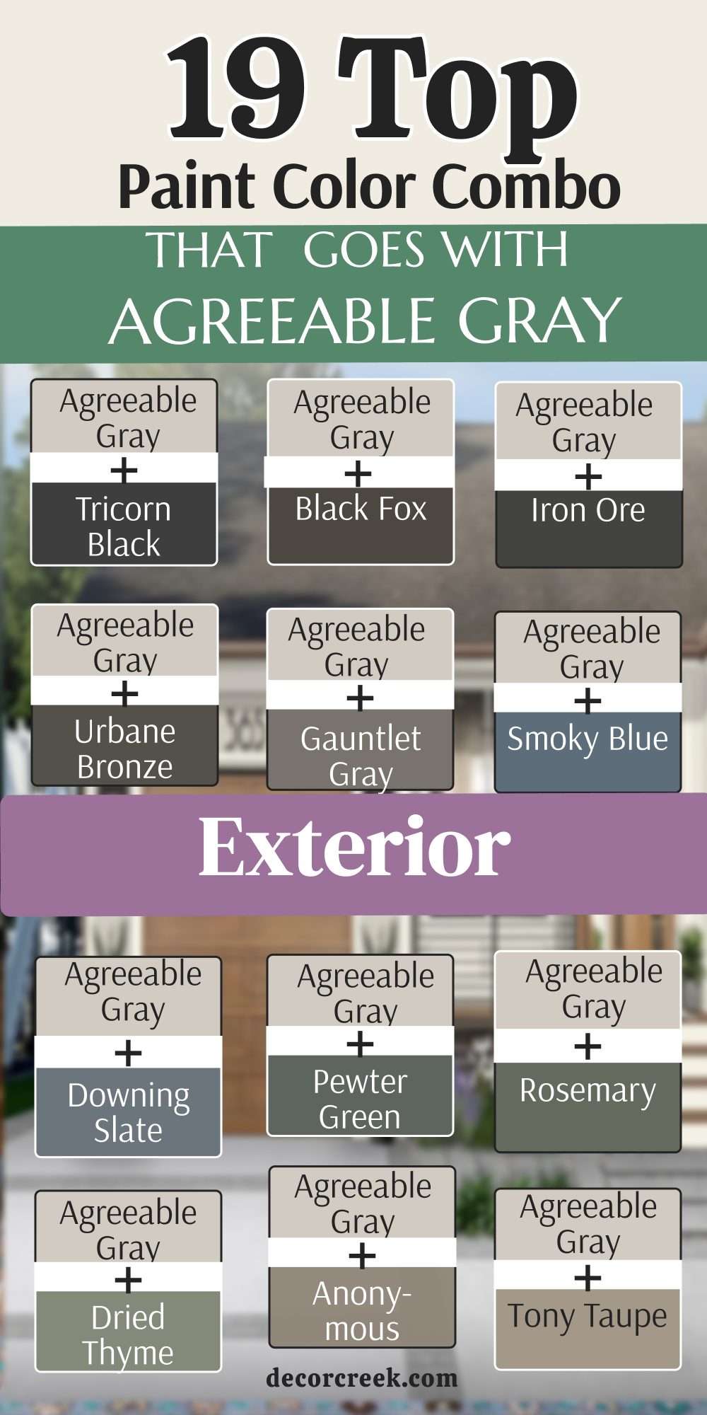
Agreeable Gray continues to be one of the easiest and most beautiful paint colors I use in real homes because it works with so many styles and finishes. It has enough warmth to feel welcoming but still feels soft and fresh throughout the day. I love how the right pairing can completely change the feeling of a kitchen, living room, or exterior. Soft whites make it feel brighter, earthy greens add richness, and darker shades create beautiful contrast without making homes feel too heavy.
Over the years, I have seen these color combinations help homes feel more comfortable and connected for families and guests. Good paint colors also make decorating much easier because furniture, flooring, and lighting blend more naturally together. I always tell homeowners not to rush the process because lighting changes every color during the day. A shade that looks perfect online can feel very different inside your own home.
My favorite thing about Agreeable Gray is how flexible it feels without losing warmth and character. It works beautifully in farmhouse homes, modern interiors, traditional spaces, and cozy family rooms.
Whether you love soft creamy whites, warm beige tones, muted greens, or rich dark contrasts, there is a pairing here that can make your home feel more welcoming every single day.