Christmas colors have a way of filling a home with warmth even before the first decorations are hung. I’ve always believed that paint on the walls sets the stage for how the holidays feel. Deep reds, fresh greens, and glowing whites can turn everyday rooms into places that feel ready for gatherings.
These colors remind me of family meals, cozy evenings, and that special joy we wait for all year. Choosing the right shades gives a home more than style — it gives it spirit.
Why I Believe Christmas Colors Can Change the Mood of a Home
When the season comes, colors carry memories. A strong red can make me think of wrapping paper and crackling fires. A gentle green feels like fresh pine branches, steady and grounding. Whites remind me of snow outside the window and bring a brightness that lifts the whole room.
The mix of these tones changes how people feel when they walk in. For me, the magic of Christmas always begins with color.
How I Pick the Right Christmas Shade for Each Room
I start with what the room is used for most. In a kitchen, I choose colors that feel fresh and welcoming, like greens and warm whites. For a living room, I lean into deeper reds and cozy greens, because they set the right mood for long evenings with family. Bedrooms get softer whites with a touch of warmth, giving a calm place to rest after busy days.
I also look at the light — strong daylight can make greens look brighter, while soft lamps make reds glow richer. The key is finding colors that match both the season and how you want the room to feel.
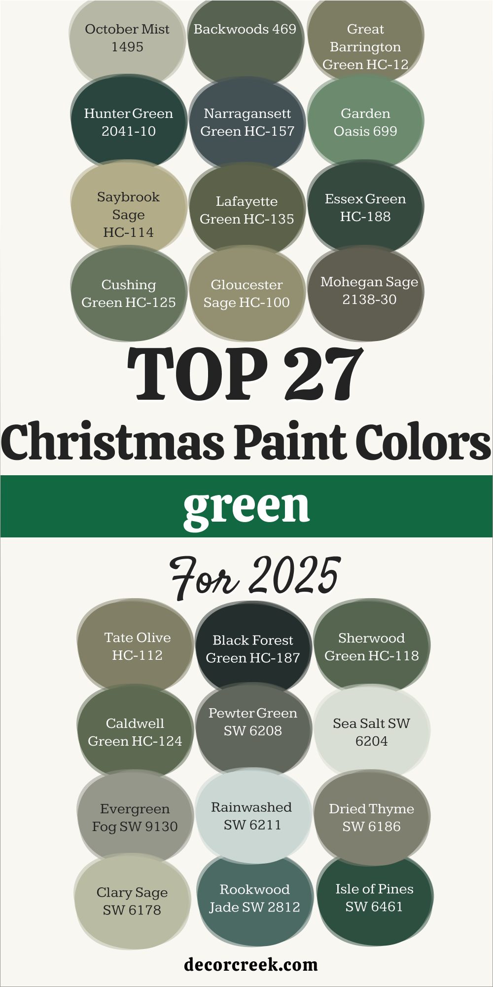
27 Top Green Christmas Paint Colors for 2026
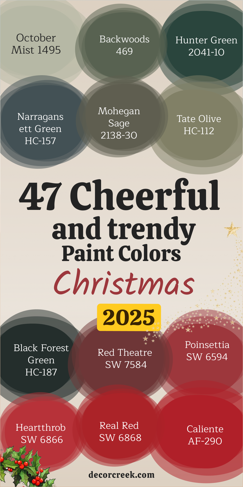
October Mist 1495
October Mist 1495 feels like fresh eucalyptus leaves on a winter morning. I love how this green brings a soft balance that doesn’t fight with bolder reds. In a dining room, it sets the table for holiday meals without stealing the show. This color feels natural and pairs beautifully with gold accents or cream linens.
I’ve used it in cozy hallways too, where it makes wreaths and garlands stand out.
The key rule of this color for Christmas is that it carries nature indoors in a quiet but strong way.
🎨 Check out the complete guide to this color right HERE 👈

Backwoods 469
Backwoods 469 gives the feel of walking through a pine forest in December. It is a dark, steady green that makes a room feel grounded and safe. I find it perfect for living rooms with big windows, where holiday lights shine against its deep tone. With plaid blankets or red cushions, it creates a scene that feels right out of a Christmas card. I like how it makes wood furniture look richer too.
The key rule of this color for Christmas is that it holds the weight of tradition with ease.
🎨 Check out the complete guide to this color right HERE 👈
Great Barrington Green HC-122
Great Barrington Green HC-122 has a classic strength that always makes me think of wreaths and holly. This shade works well in foyers, greeting guests with warmth and depth. Paired with gold or silver decorations, it gives a touch of holiday cheer without being loud. I’ve seen it shine on kitchen cabinets, where it turns cooking into a festive act. It pairs with creamy whites beautifully, balancing dark and light.
The key rule of this color for Christmas is that it makes any corner feel welcoming.
Hunter Green 2041-10
Hunter Green 2041-10 is the kind of green that carries history in its depth. I love it for formal dining rooms where holiday dinners feel grand and special. Its richness pairs well with candlelight and brass accents. Red ribbons and white tablecloths almost glow when set against it. This color is bold but never too much, holding the room in a steady way.
The key rule of this color for Christmas is that it gives dignity and charm to the season.
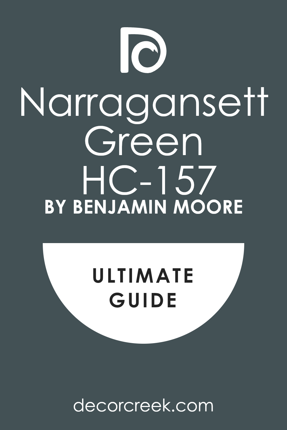
Narragansett Green HC-157
Narragansett Green HC-157 is a deep green with a hint of blue, like winter nights under clear skies. It feels a little modern but still fits right into holiday traditions. I often suggest it for home offices or reading corners, where it makes the room feel grounded yet festive. Against white trim, it creates a crisp holiday setting that looks beautiful with garlands. I like how it works in both small and large rooms, never feeling heavy.
The key rule of this color for Christmas is that it adds depth with a gentle twist.
🎨 Check out the complete guide to this color right HERE 👈
Garden Oasis 699
Garden Oasis 699 brings the brightness of holly leaves into a room. It’s lively but still has a grounded feel that makes it easy to live with. I enjoy using it in kitchens where Christmas baking fills the air, because it pairs well with warm wood and bright whites. Add a touch of gold, and it becomes cheerful and full of energy. It’s also a good choice for children’s play areas during the holidays.
The key rule of this color for Christmas is that it spreads joy without feeling too strong.
Saybrook Sage HC-114
Saybrook Sage HC-114 feels gentle, like a soft blanket of pine needles underfoot. It has a quiet charm that makes a room feel warm without being heavy. I like it in bedrooms, where it pairs beautifully with white bedding and red accents. During Christmas, it becomes the perfect backdrop for greenery and twinkling lights. It also works in kitchens, giving cabinets a festive but relaxed look.
The key rule of this color for Christmas is that it gives a soothing touch while keeping holiday cheer alive.
🎨 Check out the complete guide to this color right HERE 👈

Lafayette Green HC-135
Lafayette Green HC-135 carries the depth of evergreen branches after fresh snow. It’s rich, bold, and full of life. I’ve seen it shine in living rooms with stone fireplaces, where it adds to the holiday glow. Against wood trim, it feels rustic, but with gold decorations, it turns refined. It makes red accents look even brighter, which is perfect for the season.
The key rule of this color for Christmas is that it adds strength and warmth in equal measure.
Essex Green HC-188
Essex Green HC-188 is one of the darkest greens I use, almost like the deep forest at night. I love how it creates drama while still being comfortable for holiday gatherings. Paired with white lights and metallic ornaments, it feels both festive and elegant. It can turn a dining room into a showpiece for family dinners. Even small accents painted in this shade can change a room’s mood.
The key rule of this color for Christmas is that it brings richness that lasts beyond the season.
🎨 Check out the complete guide to this color right HERE 👈

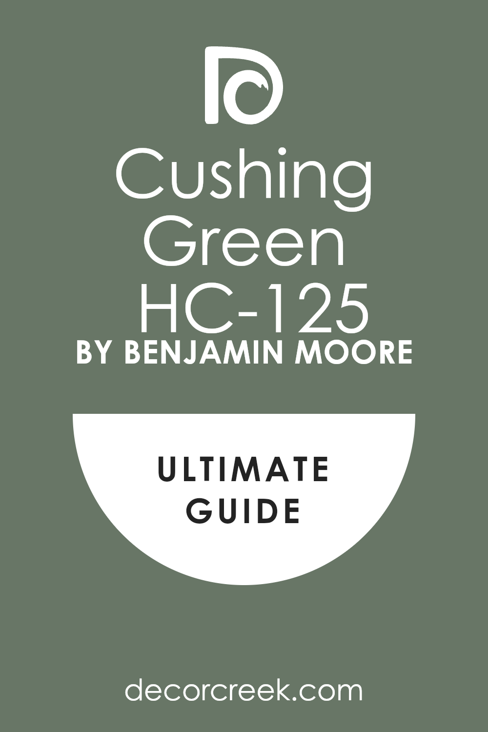
Cushing Green HC-125
Cushing Green HC-125 makes me think of ivy climbing up stone walls in winter. It’s a green with personality but not too much weight. I like it in entryways, where it welcomes guests with festive charm. Paired with creams and soft reds, it feels cheerful without being loud. It’s also a wonderful cabinet color for kitchens filled with holiday cookies and cocoa.
The key rule of this color for Christmas is that it balances energy with comfort.
🎨 Check out the complete guide to this color right HERE 👈
Gloucester Sage HC-100
Gloucester Sage HC-100 is a muted green that feels earthy and classic. It has enough gray to calm it down, making it flexible for many rooms. I find it works well in dining rooms and cozy nooks, where it sets a steady stage for Christmas gatherings. Against twinkling lights, it becomes a soft background that lets decorations shine. It pairs especially well with deep reds and warm woods. The key rule of this color for Christmas is that it holds everything together with quiet strength.
🎨 Check out the complete guide to this color right HERE 👈

Mohegan Sage 2138-30
Mohegan Sage HC-123 is deep and strong, like evergreen garlands draped along a staircase. It has an old-world charm that feels perfect for holiday traditions. I enjoy how it looks with plaid fabrics and rustic textures. In a family room, it makes the tree glow even brighter. Even with simple decorations, it makes the room feel dressed for the season.
The key rule of this color for Christmas is that it ties in tradition with warmth.
Tate Olive HC-112
Tate Olive HC-112 leans into an earthy olive that feels cozy and grounded. It makes me think of warm candlelight flickering against walls during family dinners. I like using it in dining rooms, where it pairs beautifully with brass and gold accents. Red ribbons and ornaments pop brightly against it. It also works well on doors, giving a festive greeting before anyone steps inside.
The key rule of this color for Christmas is that it adds warmth with a rustic touch.
Black Forest Green HC-187
Black Forest Green HC-187 is dramatic, almost black, but with a clear green heart. It feels bold and striking, perfect for accent walls or cabinets. I love pairing it with crisp whites and rich reds for a strong holiday setting. It makes metallic ornaments glow, especially gold and copper. This color has a way of making a room feel both intimate and grand.
The key rule of this color for Christmas is that it brings drama that still feels festive.
Sherwood Green HC-118
Sherwood Green HC-118 is cheerful yet grounded, like a fresh-cut Christmas tree. It’s bright enough to bring energy, but deep enough to feel steady. I often use it in kitchens where family gathers to bake cookies or prepare meals. It pairs well with whites and warm wood tones, making the whole room glow. Garland, wreaths, and red bows look extra vivid against it.
The key rule of this color for Christmas is that it spreads energy that feels joyful.
Caldwell Green HC-124
Caldwell Green HC-124 feels classic and rich, perfect for traditional Christmas décor. I like how it works in entryways, giving guests a strong and festive first impression. Paired with dark woods, it feels timeless, but with gold it shines brighter. It’s a shade that doesn’t fade into the background — it takes part in the celebration. Even in small touches like doors or trim, it makes a difference.
The key rule of this color for Christmas is that it greets with warmth and depth.
🎨 Check out the complete guide to this color right HERE 👈

Saybrook Sage HC-114
Saybrook Sage HC-114 feels gentle, like a soft blanket of pine needles underfoot. It has a quiet charm that makes a room feel warm without being heavy. I like it in bedrooms, where it pairs beautifully with white bedding and red accents. During Christmas, it becomes the perfect backdrop for greenery and twinkling lights. It also works in kitchens, giving cabinets a festive but relaxed look.
The key rule of this color for Christmas is that it gives a soothing touch while keeping holiday cheer alive.
🎨 Check out the complete guide to this color right HERE 👈
Lafayette Green HC-135
Lafayette Green HC-135 carries the depth of evergreen branches after fresh snow. It’s rich, bold, and full of life. I’ve seen it shine in living rooms with stone fireplaces, where it adds to the holiday glow. Against wood trim, it feels rustic, but with gold decorations, it turns refined. It makes red accents look even brighter, which is perfect for the season.
The key rule of this color for Christmas is that it adds strength and warmth in equal measure.
Essex Green HC-188
Essex Green HC-188 is one of the darkest greens I use, almost like the deep forest at night. I love how it creates drama while still being comfortable for holiday gatherings. Paired with white lights and metallic ornaments, it feels both festive and elegant. It can turn a dining room into a showpiece for family dinners. Even small accents painted in this shade can change a room’s mood.
The key rule of this color for Christmas is that it brings richness that lasts beyond the season.
🎨 Check out the complete guide to this color right HERE 👈
Cushing Green HC-125
Cushing Green HC-125 makes me think of ivy climbing up stone walls in winter. It’s a green with personality but not too much weight. I like it in entryways, where it welcomes guests with festive charm. Paired with creams and soft reds, it feels cheerful without being loud. It’s also a wonderful cabinet color for kitchens filled with holiday cookies and cocoa.
The key rule of this color for Christmas is that it balances energy with comfort.
🎨 Check out the complete guide to this color right HERE 👈
Gloucester Sage HC-100
Gloucester Sage HC-100 is a muted green that feels earthy and classic. It has enough gray to calm it down, making it flexible for many rooms. I find it works well in dining rooms and cozy nooks, where it sets a steady stage for Christmas gatherings. Against twinkling lights, it becomes a soft background that lets decorations shine. It pairs especially well with deep reds and warm woods.
The key rule of this color for Christmas is that it holds everything together with quiet strength.
🎨 Check out the complete guide to this color right HERE 👈
Mohegan Sage 2138-30
Mohegan Sage 2168-30 is deep and strong, like evergreen garlands draped along a staircase. It has an old-world charm that feels perfect for holiday traditions. I enjoy how it looks with plaid fabrics and rustic textures. In a family room, it makes the tree glow even brighter. Even with simple decorations, it makes the room feel dressed for the season.
The key rule of this color for Christmas is that it ties in tradition with warmth.
Tate Olive HC-112
Tate Olive HC-112 leans into an earthy olive that feels cozy and grounded. It makes me think of warm candlelight flickering against walls during family dinners. I like using it in dining rooms, where it pairs beautifully with brass and gold accents. Red ribbons and ornaments pop brightly against it. It also works well on doors, giving a festive greeting before anyone steps inside.
The key rule of this color for Christmas is that it adds warmth with a rustic touch.
Sherwood Green HC-118
Sherwood Green HC-118 is cheerful yet grounded, like a fresh-cut Christmas tree. It’s bright enough to bring energy, but deep enough to feel steady. I often use it in kitchens where family gathers to bake cookies or prepare meals. It pairs well with whites and warm wood tones, making the whole room glow. Garland, wreaths, and red bows look extra vivid against it.
The key rule of this color for Christmas is that it spreads energy that feels joyful.
Caldwell Green HC-124
Caldwell Green HC-124 feels classic and rich, perfect for traditional Christmas décor. I like how it works in entryways, giving guests a strong and festive first impression. Paired with dark woods, it feels timeless, but with gold it shines brighter. It’s a shade that doesn’t fade into the background — it takes part in the celebration. Even in small touches like doors or trim, it makes a difference.
The key rule of this color for Christmas is that it greets with warmth and depth.
🎨 Check out the complete guide to this color right HERE 👈
Pewter Green SW 6208
Pewter Green SW 6208 feels calm and steady, like pine branches dusted with frost. It’s not too dark, but it carries a strong presence that makes rooms feel safe and warm. I enjoy how it pairs with soft whites, bringing out the beauty of garlands and candles. In living rooms, it creates a steady backdrop for a glowing Christmas tree. It looks especially beautiful with brass and deep red accents.
The key rule of this color for Christmas is that it gives stability with a festive edge.
🎨 Check out the complete guide to this color right HERE 👈

Sea Salt SW 6204
Sea Salt SW 6204 is a lighter green that feels airy yet festive. It works wonderfully in bedrooms, where it brings freshness without feeling too cold. Against white trim, it shines softly, making lights and decorations glow brighter. I love how it pairs with red touches, balancing boldness with grace. In bathrooms or kitchens, it feels refreshing while still fitting the holiday mood.
The key rule of this color for Christmas is that it carries brightness with a gentle heart.
🎨 Check out the complete guide to this color right HERE 👈

Evergreen Fog SW 9130
Evergreen Fog SW 9130 became a favorite for me because of its softness and strength together. It feels like mist settling over evergreen trees, perfect for quiet Christmas mornings. I’ve used it in entryways where it greets guests with subtle elegance. Against glowing lights and ornaments, it takes on a richer character. It’s also lovely in dining rooms where long family dinners happen.
The key rule of this color for Christmas is that it blends comfort with beauty.
🎨 Check out the complete guide to this color right HERE 👈

Rainwashed SW 6211
Rainwashed SW 6211 has a cheerful freshness, like a crisp winter morning after snow. I love how it makes smaller rooms feel lively without being too strong. It pairs well with red and silver decorations, creating a cheerful balance. In kitchens, it adds a clean, bright look that still feels seasonal. It’s also a good choice for hallways, making the whole home feel connected.
The key rule of this color for Christmas is that it spreads light and joy.
🎨 Check out the complete guide to this color right HERE 👈

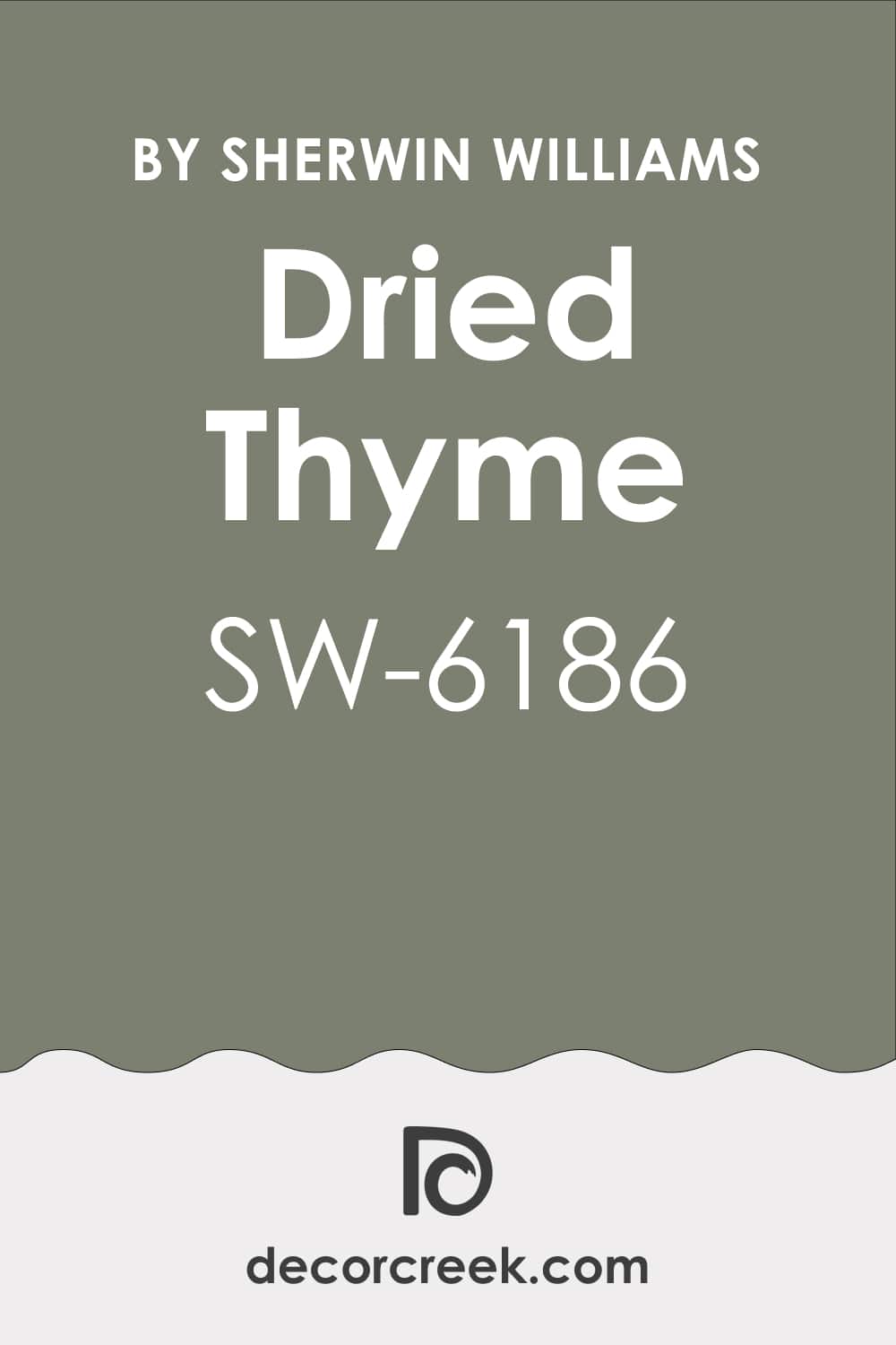
Dried Thyme SW 6186
Dried Thyme SW 6186 reminds me of herbal wreaths hung in kitchens during the holidays. It has an earthy feel that brings comfort and warmth. I like using it in dining rooms with wooden tables and red candles. It also works well in studies or quiet corners, where it gives depth. This green pairs beautifully with natural textures like linen and wool.
The key rule of this color for Christmas is that it grounds the home with natural charm.
🎨 Check out the complete guide to this color right HERE 👈
Clary Sage SW 6178
Clary Sage SW 6178 feels soft and inviting, like fresh sage leaves on a holiday roast. It has a lighter touch that works well in bedrooms and cozy living spaces. With white trim and warm lighting, it feels especially welcoming. I love how it pairs with copper and gold holiday decorations. In kitchens, it creates a soothing place where family gathers to cook and share.
The key rule of this color for Christmas is that it adds warmth in a gentle way.
🎨 Check out the complete guide to this color right HERE 👈

Rookwood Jade SW 2812
Rookwood Jade SW 2812 feels deep and mysterious, perfect for creating rich holiday settings. It shines on accent walls or cabinets, giving a room a strong seasonal mood. I’ve used it with red and gold accents, and the result always feels festive. Against dark wood furniture, it adds character and depth. It’s also stunning for dining rooms that host big Christmas dinners.
The key rule of this color for Christmas is that it brings richness and style together.
🎨 Check out the complete guide to this color right HERE 👈

Isle of Pines SW 6461
Isle of Pines SW 6461 makes me think of evergreen forests dusted with snow. It’s bold and full, perfect for large rooms that need a strong anchor. I love how it looks with plaid fabrics and rustic decorations. In a family room, it sets the mood for cozy evenings by the fire. Against bright whites, it creates a crisp and festive balance.
The key rule of this color for Christmas is that it captures the heart of winter woods.
🎨 Check out the complete guide to this color right HERE 👈

Arugula SW 6446
Arugula SW 6446 is fresh and bold, like holly leaves glowing in the sunlight. It carries a lively energy that feels right for kitchens and busy gathering spots. I enjoy how it pairs with gold and red, making holiday decorations look extra bright. It also works well on front doors, greeting guests with cheer before they even step inside. Even in smaller accents, it brings strong character.
The key rule of this color for Christmas is that it spreads energy and joy.
🎨 Check out the complete guide to this color right HERE 👈

Hunt Club SW 6468
Hunt Club SW 6468 is a strong green that feels both traditional and inviting. I’ve used it in dining rooms where it gives the space a sense of richness. Against candlelight, it glows warmly and makes red accents pop. On cabinets or accent walls, it creates a look that feels special for the season. It’s a perfect match for classic Christmas decorations.
The key rule of this color for Christmas is that it adds bold tradition to any room.
Shade-Grown SW 6188
Shade-Grown SW 6188 is a deep green that feels earthy and grounding. It reminds me of wreaths hanging on wooden doors during December. I love how it makes a room feel steady yet festive, especially when paired with gold and white accents. In studies or living rooms, it brings warmth that lasts beyond the season. Even with simple decorations, it feels like Christmas has arrived.
The key rule of this color for Christmas is that it carries depth with holiday comfort.
🎨 Check out the complete guide to this color right HERE 👈

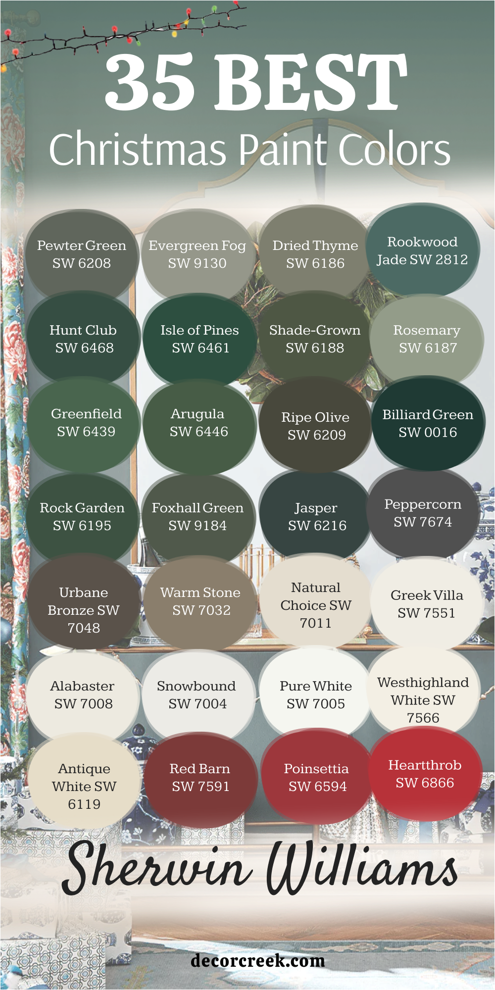
35 Best Christmas Paint Colors from Sherwin-Williams
Pewter Green SW 6208
Pewter Green SW 6208 feels steady and full, like pine garlands draped along a mantel. It’s a grounded shade that works beautifully in living rooms with glowing trees. I’ve used it in kitchens where it pairs with brass hardware and creamy counters for a cozy yet festive feel. Against white trim, it looks clean and classic, making red decorations stand out.
This color has a timeless quality that holds both tradition and comfort. The key rule of this color for Christmas is that it anchors the season with steady charm.
🎨 Check out the complete guide to this color right HERE 👈
Evergreen Fog SW 9130
Evergreen Fog SW 9130 has a softness that makes rooms feel peaceful but still festive. I love how it shifts with the light, sometimes looking warm, other times cool. In bedrooms, it creates a cozy nest for cold nights, and in entryways, it greets with gentle holiday spirit. It works well with silver ornaments and twinkling white lights.
Paired with wood, it feels even richer. The key rule of this color for Christmas is that it balances freshness with warmth.
🎨 Check out the complete guide to this color right HERE 👈
Dried Thyme SW 6186
Dried Thyme SW 6186 is earthy, like dried herbs hanging in a kitchen. It carries comfort and warmth, making it a favorite for dining rooms. I’ve seen it shine with golden candlesticks and red tablecloths during holiday dinners. It makes dark wood look richer and adds depth to simple decorations.
This shade feels both rustic and festive, which makes it very flexible. The key rule of this color for Christmas is that it blends natural beauty with seasonal cheer.
🎨 Check out the complete guide to this color right HERE 👈
Rookwood Jade SW 2812
Rookwood Jade SW 2812 is a bold green that feels strong and festive. I love it for accent walls, where it sets a dramatic stage for holiday gatherings. It pairs beautifully with gold and red, bringing richness to any décor. On cabinets, it creates a warm, inviting kitchen perfect for baking and celebrations.
It’s also stunning in dining spaces, where it holds a traditional charm. The key rule of this color for Christmas is that it adds drama with elegance.
🎨 Check out the complete guide to this color right HERE 👈
Hunt Club SW 6468
Hunt Club SW 6468 has a classic feel that makes me think of evergreen trees. It’s bold and rich, perfect for living rooms filled with laughter and music. Against twinkling lights, it glows with warmth, making the whole room feel ready for the season. I’ve used it in offices too, where it gives a strong, grounded backdrop.
It’s a true Christmas green that never feels out of place.
The key rule of this color for Christmas is that it celebrates tradition with strength.
Isle of Pines SW 6461
Isle of Pines SW 6461 feels full of life, like walking into a snowy forest. It’s a color that brings the outdoors inside with festive energy. I love it for large gathering rooms, where it sets the mood for family celebrations. With plaid pillows and red throws, it feels instantly ready for Christmas. Against white trim, it creates a sharp, cheerful balance.
The key rule of this color for Christmas is that it brings the spirit of the forest home.
🎨 Check out the complete guide to this color right HERE 👈
Shade-Grown SW 6188
Shade-Grown SW 6188 is earthy and deep, perfect for adding weight to a room. I’ve used it in studies and dining rooms where it creates a warm holiday nest. It works with both rustic decorations and elegant ones, making it very flexible. Gold accents shine against it, and red looks especially bold. This shade carries a comfort that feels perfect for long winter evenings.
The key rule of this color for Christmas is that it grounds the season with quiet richness.
🎨 Check out the complete guide to this color right HERE 👈
Rosemary SW 6187
Rosemary SW 6187 feels natural and welcoming, like herbs clipped fresh for cooking. It’s lighter than the deep greens but still very festive. I love it in kitchens where it adds life and freshness to holiday baking scenes. Against creamy whites, it looks clean and cheerful. Paired with gold, it feels warm and inviting.
The key rule of this color for Christmas is that it adds a fresh, lively spirit to the home.
🎨 Check out the complete guide to this color right HERE 👈

Greenfield SW 6439
Greenfield SW 6439 feels strong and classic, the kind of green that pairs perfectly with red bows and wreaths. I love it for front doors, where it greets guests with holiday charm. Inside, it works in dining rooms and kitchens that need a bold, festive anchor. White trim makes it look crisp and cheerful. It also makes metallic decorations shine beautifully.
The key rule of this color for Christmas is that it delivers a traditional, welcoming feel.
Arugula SW 6446
Arugula SW 6446 is fresh and lively, like holly leaves shining in the winter sun. It has a brightness that works well in busy rooms like kitchens and family rooms. Against wood furniture, it feels warm, while with gold and red it feels festive. I like it on accent walls where it adds cheer without overwhelming the space. It’s also perfect for doors and entryways.
The key rule of this color for Christmas is that it spreads joy wherever it’s used.
🎨 Check out the complete guide to this color right HERE 👈
Ripe Olive SW 6209
Ripe Olive SW 6209 feels earthy and bold, almost like freshly pressed olive leaves. It’s a strong green that gives depth to any room during the holidays. I’ve used it in dining rooms where red tablecloths and glowing candles make it shine even more. Against cream walls, it looks refined yet still festive. Gold ornaments pop beautifully against this deep tone.
The key rule of this color for Christmas is that it creates warmth with steady richness.
🎨 Check out the complete guide to this color right HERE 👈

Billiard Green SW 0016
Billiard Green SW 0016 has the sharp energy of a holiday ribbon tied neatly around a gift. It’s a bright and playful green that instantly brings cheer. I love it for accent walls, or even smaller touches like chairs or doors. Against red and white, it feels like pure Christmas fun. In family rooms, it brings a joyful buzz that makes gatherings feel even brighter.
The key rule of this color for Christmas is that it spreads bold energy in every corner.
🎨 Check out the complete guide to this color right HERE 👈

Rock Garden SW 6195
Rock Garden SW 6195 feels earthy, like moss growing near a stone path. It carries depth while still staying warm, making it easy to pair with many decorations. I love how it looks with rustic holiday styles, especially when paired with plaid and wood. Against twinkling lights, it becomes even more inviting. It can make a kitchen or living room feel festive without being too strong.
The key rule of this color for Christmas is that it blends natural charm with comfort.
🎨 Check out the complete guide to this color right HERE 👈

Foxhall Green SW 9184
Foxhall Green SW 9184 feels sophisticated and deep, like evergreen forests under starlight. It has a gray undertone that makes it versatile, fitting both rustic and modern homes. I love it in dining rooms where candlelight makes it glow warmly. Paired with gold and silver, it feels balanced and festive. Even in smaller accents, it adds richness to the season.
The key rule of this color for Christmas is that it brings depth with a polished feel.
🎨 Check out the complete guide to this color right HERE 👈

Jasper SW 6216
Jasper SW 6216 is dark and dramatic, like pine branches at night. It’s a bold green that creates a cozy, intimate mood for the holidays. I like using it on cabinets or in libraries, where it pairs with leather and wood beautifully. With white and red decorations, it feels classic yet rich. It also works well with warm lights that make it glow from within.
The key rule of this color for Christmas is that it adds drama with holiday comfort.
🎨 Check out the complete guide to this color right HERE 👈

Peppercorn SW 7674
Peppercorn SW 7674 isn’t green, but its dark charcoal tone pairs beautifully with Christmas décor. I’ve used it as an accent wall that lets greenery and red ornaments pop. Against white trim and glowing lights, it feels modern yet still festive. It works well in dining rooms where it adds a touch of elegance. Paired with metallics, it creates a chic holiday scene.
The key rule of this color for Christmas is that it supports brighter tones with bold strength.
🎨 Check out the complete guide to this color right HERE 👈

Urbane Bronze SW 7048
Urbane Bronze SW 7048 has the warmth of dark chocolate, cozy and grounding. I like it in living rooms where it pairs with both greenery and red accents. It’s a neutral that feels festive when combined with twinkling lights and soft whites. Against gold, it becomes even richer. I often use it in modern homes where deep tones are needed.
The key rule of this color for Christmas is that it balances holiday cheer with sophistication.
🎨 Check out the complete guide to this color right HERE 👈

Warm Stone SW 7032
Warm Stone SW 7032 feels earthy and welcoming, like freshly baked bread on the table. It’s a warm neutral that pairs beautifully with deep greens and reds. I love it in entryways where it makes guests feel at home instantly. Against Christmas wreaths and glowing candles, it feels even cozier. It works with both rustic and refined decorations.
The key rule of this color for Christmas is that it brings a steady background for festive details.
🎨 Check out the complete guide to this color right HERE 👈

Natural Choice SW 7011
Natural Choice SW 7011 is a creamy white that feels soft and inviting. I’ve used it in bedrooms and living rooms where it sets the stage for holiday decorations. It makes greens look fresher and reds brighter. Against twinkling lights, it glows with warmth. It’s a flexible shade that fits into almost any style.
The key rule of this color for Christmas is that it creates a gentle glow for all the season’s details.
🎨 Check out the complete guide to this color right HERE 👈

Greek Villa SW 7551
Greek Villa SW 7551 is bright yet soft, like fresh snow on a sunny morning. I love it in kitchens, where it makes every decoration shine more clearly. It pairs with greenery beautifully, letting garlands and wreaths stand out. In living rooms, it reflects the glow of Christmas lights. It has a pure quality that feels joyful but still easy to live with.
The key rule of this color for Christmas is that it highlights everything with brightness.
🎨 Check out the complete guide to this color right HERE 👈

Alabaster SW 7008
Alabaster SW 7008 feels warm and gentle, like candlelight against fresh snow. It’s one of my favorite whites for Christmas because it softens everything it touches. I love it in living rooms where garlands and red ribbons glow brighter against its backdrop. In kitchens, it pairs beautifully with brass hardware and holiday greenery. It never feels stark, only welcoming.
The key rule of this color for Christmas is that it adds warmth while letting decorations shine.
🎨 Check out the complete guide to this color right HERE 👈

Snowbound SW 7004
Snowbound SW 7004 feels crisp and bright, like fresh snow outside the window. It’s a clean white that works beautifully with bold greens and deep reds. I enjoy using it on trim and ceilings, where it makes the whole room feel brighter. Against holiday lights, it glows with cheer. It’s also perfect for bedrooms where you want a fresh, peaceful retreat.
The key rule of this color for Christmas is that it brings clarity and light.
🎨 Check out the complete guide to this color right HERE 👈

Pure White SW 7005
Pure White SW 7005 is bright and simple, a shade that feels pure and cheerful. It’s perfect for walls when you want the tree and decorations to be the star. I love how it pairs with gold and silver, giving them a sparkling quality. In dining rooms, it keeps the mood bright and open during holiday meals. It’s flexible enough for every style of Christmas décor.
The key rule of this color for Christmas is that it gives a clean stage for festive details.

🎨 Check out the complete guide to this color right HERE 👈
Westhighland White SW 7566
Westhighland White SW 7566 feels soft and creamy, almost like whipped cream on hot cocoa. It’s warm without being heavy, which makes it ideal for cozy Christmas gatherings. I’ve seen it used in kitchens where it glows next to evergreen wreaths and red berries. It pairs beautifully with wood tones, adding comfort and charm. It makes holiday lights sparkle in a gentle way.
The key rule of this color for Christmas is that it wraps the room in warmth.
🎨 Check out the complete guide to this color right HERE 👈

Antique White SW 6119
Antique White SW 6119 carries a sense of tradition, like aged parchment or old ornaments passed down through family. It’s warm and inviting, perfect for classic holiday homes. I enjoy it in dining rooms where it makes the space feel rich and full. Paired with greenery, it feels timeless, and with reds, it feels festive. It’s a shade that makes every detail feel more personal.
The key rule of this color for Christmas is that it adds heritage and comfort.

🎨 Check out the complete guide to this color right HERE 👈
Red Barn SW 7591
Red Barn SW 7591 feels bold and rustic, like a countryside barn dressed for the holidays. It’s a strong red that brings instant cheer to any space. I love it on doors and accent walls, where it welcomes guests with festive spirit. Paired with greenery, it creates the most classic Christmas combination. In kitchens, it adds a lively energy perfect for holiday baking.
The key rule of this color for Christmas is that it celebrates joy in a bold way.

🎨 Check out the complete guide to this color right HERE 👈
Poinsettia SW 6594
Poinsettia SW 6594 feels as lively as the holiday flower it’s named after. It’s bright, cheerful, and full of energy. I enjoy using it in family rooms where kids play and laughter fills the air. Against white trim, it glows even more, making the room feel alive. It pairs beautifully with both gold and green decorations.
The key rule of this color for Christmas is that it spreads festive cheer with brightness.
Heartthrob SW 6866
Heartthrob SW 6866 is bold and strong, the kind of red that makes a statement. I love it for front doors, where it welcomes everyone with holiday warmth. Indoors, it works in small doses like accent walls or furniture. With greenery and white lights, it feels classic and joyful. Even a touch of it makes a big difference.
The key rule of this color for Christmas is that it adds passion and energy.

🎨 Check out the complete guide to this color right HERE 👈
Real Red SW 6868
Real Red SW 6868 is exactly what its name suggests — a true, vibrant red. It’s the perfect partner for greens and whites during Christmas. I often use it in living rooms where it makes decorations look extra bright. Against soft lighting, it glows with warmth and joy. It’s a color that brings a smile the moment you see it.
The key rule of this color for Christmas is that it gives pure festive spirit.

🎨 Check out the complete guide to this color right HERE 👈
Positive Red SW 6871
Positive Red SW 6871 feels cheerful and lively, like wrapping paper waiting under the tree. It has a playful energy that works well in family spaces. I like it for kitchens, where it makes the room feel full of life. Against white cabinets, it adds brightness and joy. It’s a shade that makes the holidays feel fun.
The key rule of this color for Christmas is that it lifts the mood instantly.

🎨 Check out the complete guide to this color right HERE 👈
Stolen Kiss SW 7586
Stolen Kiss SW 7586 is a deep red that feels romantic and warm. I love it in dining rooms where candlelight makes it glow softly. Paired with greenery, it feels festive without being too bold. Against creamy whites, it creates a cozy balance. It’s a color that feels rich and heartfelt.
The key rule of this color for Christmas is that it adds intimacy to holiday settings.
Red Theatre SW 7584
Red Theatre SW 7584 is dramatic and full, like velvet curtains on a holiday stage. It’s a red that brings elegance to the season. I often suggest it for formal living rooms or dining areas. With gold ornaments and twinkling lights, it feels truly special. It’s a shade that creates lasting memories.
The key rule of this color for Christmas is that it gives the season grandeur.
Fireweed SW 6328
Fireweed SW 6328 feels deep and earthy, with a richness that suits cozy holiday homes. I like it in studies or smaller rooms where it creates intimacy. Against greenery, it feels natural and warm. With wood accents, it becomes even richer. It’s a color that feels grounded but festive.
The key rule of this color for Christmas is that it adds depth with comfort.

🎨 Check out the complete guide to this color right HERE 👈
Rockwood Red SW 2802
Rockwood Red SW 2802 feels traditional, like berries on an evergreen wreath. It has a heritage quality that works well in classic holiday homes. I love it on doors and trim, where it gives strong festive charm. In living rooms, it pairs beautifully with deep greens and creamy whites. It’s bold but never feels too much.
The key rule of this color for Christmas is that it carries tradition with warmth.
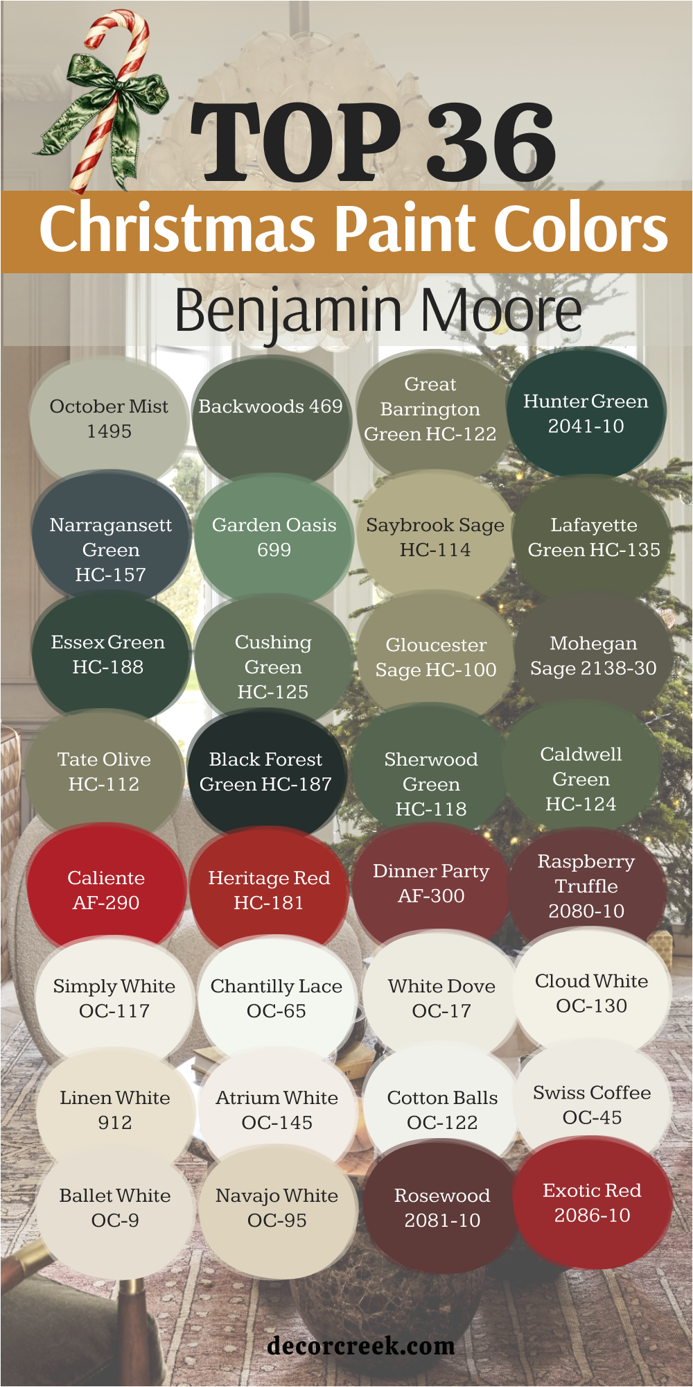
36 Best Christmas Paint Colors from Benjamin Moore
Pewter Green SW 6208
Pewter Green SW 6208 feels steady and balanced, a shade that grounds holiday décor beautifully. I enjoy it in living rooms where twinkling lights make it glow softly. Paired with red ribbons and white trim, it feels instantly festive. On cabinets, it creates a kitchen that feels ready for Christmas gatherings. It never takes over but always supports the decorations around it.
The key rule of this color for Christmas is that it builds a strong base for joy.
🎨 Check out the complete guide to this color right HERE 👈
Evergreen Fog SW 9130
Evergreen Fog SW 9130 is soft and natural, like mist settling on a forest. It works in almost any room, adding a sense of comfort for the holidays. I love it in bedrooms where it feels gentle but still seasonal. In hallways, it makes wreaths and garlands stand out even more. Against white trim, it feels light yet cozy.
The key rule of this color for Christmas is that it blends calmness with festivity.
🎨 Check out the complete guide to this color right HERE 👈
Hunt Club SW 6468
Hunt Club SW 6468 is bold and traditional, the kind of green that feels made for Christmas. I’ve used it in family rooms where it anchors the holiday tree. Against red and gold, it feels joyful and classic. On cabinets or doors, it makes a statement that’s full of cheer. Even in dim lighting, it holds its rich depth.
The key rule of this color for Christmas is that it keeps tradition alive.
Isle of Pines SW 6461
Isle of Pines SW 6461 feels lush, like walking through snowy woods. It has a full, natural quality that works well in both rustic and modern homes. I enjoy using it in living rooms with fireplaces, where it adds warmth and charm. Against white trim, it looks crisp and festive. With plaid fabrics, it feels extra cozy.
The key rule of this color for Christmas is that it captures the heart of winter.
🎨 Check out the complete guide to this color right HERE 👈
Rosemary SW 6187
Rosemary SW 6187 feels fresh and welcoming, like herbs in holiday cooking. It’s lighter than deep greens but still festive. I like it for kitchens where it makes holiday baking scenes cheerful. Against creamy whites, it feels lively and bright. It also works on doors where it greets guests warmly.
The key rule of this color for Christmas is that it adds freshness to the season.
🎨 Check out the complete guide to this color right HERE 👈
Arugula SW 6446
Arugula SW 6446 feels sharp and full of life, a shade that brings cheer instantly. I love it in busy spaces where families gather, like kitchens and playrooms. Against red and gold, it sparkles with energy. On doors, it makes a bold festive greeting. Even in smaller accents, it has a strong presence.
The key rule of this color for Christmas is that it spreads joy with strength.
🎨 Check out the complete guide to this color right HERE 👈
Dried Thyme SW 6186
Dried Thyme SW 6186 feels earthy and grounded, a green that reminds me of natural garlands. It works beautifully in dining rooms filled with candlelight. Paired with rustic wood, it feels warm and festive. Against white, it becomes even more striking. I like it in quiet corners where it adds depth without being too heavy.
The key rule of this color for Christmas is that it connects the home to nature.
🎨 Check out the complete guide to this color right HERE 👈
Rookwood Jade SW 2812
Rookwood Jade SW 2812 feels rich and dramatic, like ornaments glowing under tree lights. I’ve used it in kitchens and dining rooms where it creates festive elegance. Paired with gold, it feels luxurious, and with red, it feels traditional. It’s a bold green that carries weight but still feels joyful. On cabinets, it turns kitchens into holiday showpieces.
The key rule of this color for Christmas is that it adds richness to gatherings.
🎨 Check out the complete guide to this color right HERE 👈
October Mist 1495
October Mist 1495 feels soft and graceful, like eucalyptus leaves tucked into a wreath. It works beautifully in bedrooms where you want lightness with holiday charm. Against white, it glows softly, letting red decorations pop. I love it in hallways too, where it connects different rooms with gentle color. It pairs with both rustic and refined styles.
The key rule of this color for Christmas is that it adds gentle nature indoors.
🎨 Check out the complete guide to this color right HERE 👈
Backwoods 469
Backwoods 469 feels deep and woodsy, like pine trees outside the window. It’s a strong green that brings comfort and stability. In living rooms, it makes holiday lights shine more brightly. Against dark wood, it feels rich and welcoming. With red and gold, it creates a traditional palette that never fails.
The key rule of this color for Christmas is that it grounds the home with tradition.
🎨 Check out the complete guide to this color right HERE 👈
Hunter Green 2041-10
Hunter Green 2041-10 feels bold and classic, like evergreen garlands hung across a mantel. It has a richness that makes rooms feel grounded and festive. I love it in dining spaces where candlelight and red accents glow against it. On cabinets, it gives kitchens a traditional Christmas look. It pairs beautifully with brass and gold decorations.
The key rule of this color for Christmas is that it adds dignity and warmth.
Essex Green HC-188
Essex Green HC-188 feels dark and dramatic, like a pine forest on a winter’s night. It’s one of the deepest greens, full of character and tradition. I enjoy it for accent walls, where it creates a bold backdrop for twinkling lights. Paired with creamy whites, it looks clean and festive. With red ribbons, it feels instantly like the holidays.
The key rule of this color for Christmas is that it brings drama and strength.
🎨 Check out the complete guide to this color right HERE 👈
Narragansett Green HC-157
Narragansett Green HC-157 feels deep and balanced, with a touch of blue that adds freshness. I often use it in living rooms where it feels both modern and classic. Against white trim, it pops and makes wreaths look brighter. Paired with silver and red, it feels polished yet joyful. It’s strong but never heavy.
The key rule of this color for Christmas is that it brings depth with a modern edge.
🎨 Check out the complete guide to this color right HERE 👈
Caliente AF-290
Caliente AF-290 is a lively red, full of holiday spirit. It feels bold and cheerful, perfect for family rooms and kitchens. I love how it makes greenery stand out in the brightest way. Against white walls, it becomes even more striking. It’s a shade that turns any space into a celebration.
The key rule of this color for Christmas is that it spreads joy with passion.
🎨 Check out the complete guide to this color right HERE 👈

Heritage Red HC-181
Heritage Red HC-181 feels traditional, like ribbons and berries on a wreath. It has a deep richness that works in both formal and casual settings. I love it in dining rooms where it sets the stage for long holiday dinners. Paired with dark greens, it makes a classic Christmas palette. Even in small touches, it adds cheer.
The key rule of this color for Christmas is that it honors tradition with beauty.
🎨 Check out the complete guide to this color right HERE 👈
Dinner Party AF-300
Dinner Party AF-300 is elegant and deep, like velvet draped across a table. It’s a red that feels rich and full of charm. I use it in living rooms or dining spaces where it brings drama and warmth. With gold and greenery, it feels luxurious and festive. It creates a cozy mood for gatherings.
The key rule of this color for Christmas is that it makes rooms feel special.
Raspberry Truffle 2080-10
Raspberry Truffle 2080-10 feels bold and sweet, like a box of holiday candies. It’s a deep, fruity red that adds energy to any room. I love how it pairs with soft whites and sparkling lights. In kitchens, it creates a lively scene for baking and family fun. It also works well for accent walls.
The key rule of this color for Christmas is that it adds playful richness.
Heartthrob SW 6866
Heartthrob SW 6866 is bright and full of life, a red that demands attention. I enjoy it for front doors where it welcomes guests with cheer. Indoors, it works in family rooms with greenery and soft lighting. Against white trim, it pops with bold holiday energy. It’s a true festive favorite.
The key rule of this color for Christmas is that it brings passion into the home.
🎨 Check out the complete guide to this color right HERE 👈
Real Red SW 6868
Real Red SW 6868 feels classic and strong, exactly what Christmas red should be. It shines against deep greens and glowing whites. I love it for accent walls, decorations, and doors. With silver and gold, it feels polished and bright. Even a little of this shade changes the whole mood.
The key rule of this color for Christmas is that it carries pure festive spirit.
🎨 Check out the complete guide to this color right HERE 👈
Poinsettia SW 6594
Poinsettia SW 6594 feels cheerful and bright, just like the flower it’s named after. It’s playful and bold, perfect for family spaces. Against white trim, it glows with extra brightness. In kitchens, it makes the whole space feel lively and fun. With greenery, it creates the most classic holiday combination.
The key rule of this color for Christmas is that it spreads cheer with brightness.
Rockwood Red SW 2802
Rockwood Red SW 2802 feels strong and traditional, like ornaments passed down through family. It’s a deep red that carries a sense of heritage. I love it in dining rooms where it pairs beautifully with evergreen garlands and candlelight. Against creamy whites, it feels even richer. It works well for doors too, greeting guests with classic charm.
The key rule of this color for Christmas is that it honors tradition with warmth.
Simply White OC-117
Simply White OC-117 is bright and clean, a shade that makes holiday decorations glow. It feels cheerful in any room, especially where natural light pours in. Against greens and reds, it creates the perfect stage for festive cheer. I like it in kitchens where it keeps everything light and fresh. On trim, it makes every detail look sharper.
The key rule of this color for Christmas is that it brings clarity and joy.
🎨 Check out the complete guide to this color right HERE 👈

Chantilly Lace OC-65
Chantilly Lace OC-65 feels pure and crisp, like fresh snow on Christmas morning. It’s one of my favorite whites for showing off greenery and red accents. In bedrooms, it feels peaceful and bright. On walls, it makes holiday lights sparkle even more. It works with every style of décor, from rustic to elegant.
The key rule of this color for Christmas is that it highlights everything with brightness.
🎨 Check out the complete guide to this color right HERE 👈

White Dove OC-17
White Dove OC-17 feels soft and warm, a shade that wraps a room in comfort. It’s ideal for living rooms where family gathers around the tree. Against bold colors, it softens the edges and makes everything feel balanced. I enjoy how it reflects light, giving a glow during evening gatherings. It’s one of the most inviting whites I use.
The key rule of this color for Christmas is that it adds warmth to the background.
🎨 Check out the complete guide to this color right HERE 👈

Cloud White OC-130
Cloud White OC-130 feels gentle and airy, like a soft blanket of snow. It works beautifully in kitchens and dining rooms, where it pairs with greenery and gold. On trim, it feels bright without being too sharp. I love how it supports decorations without stealing focus. It makes holiday lights look extra magical.
The key rule of this color for Christmas is that it brings lightness with ease.
🎨 Check out the complete guide to this color right HERE 👈

Alabaster SW 7008
Alabaster SW 7008 feels creamy and inviting, a shade that makes any room glow. It’s perfect for cozy gatherings where warmth matters most. In living rooms, it pairs with garlands and red bows in the loveliest way. It reflects soft light beautifully, making evenings feel special. It’s a shade that always feels welcoming.
The key rule of this color for Christmas is that it adds gentle comfort.
🎨 Check out the complete guide to this color right HERE 👈
Snowbound SW 7004
Snowbound SW 7004 feels crisp and lively, like frost on windows. It’s a white that pairs well with deep greens and bold reds. I enjoy it in entryways where it greets with brightness. On walls, it makes decorations pop clearly. It’s also perfect for bedrooms where you want a clean holiday look.
The key rule of this color for Christmas is that it spreads brightness everywhere.
🎨 Check out the complete guide to this color right HERE 👈
Pure White SW 7005
Pure White SW 7005 feels simple and fresh, like the blank page before the season begins. It’s a flexible white that makes every color around it look brighter. In dining rooms, it allows reds and greens to shine with full strength. On trim, it gives a crisp finish to any holiday scene. It’s cheerful and easy to live with.
The key rule of this color for Christmas is that it sets the stage for festive beauty.
🎨 Check out the complete guide to this color right HERE 👈

Antique White SW 6119
Antique White SW 6119 feels warm and rich, like candle wax or vintage ornaments. It’s a creamy shade that carries comfort into any room. I love it for dining rooms where it pairs with wood furniture and glowing lights. Against greenery, it feels rustic and charming. It’s a color that always feels familiar and welcoming.
The key rule of this color for Christmas is that it adds history and coziness.
🎨 Check out the complete guide to this color right HERE 👈
Spiced Cider SW 7702
Spiced Cider SW 7702 feels warm and comforting, like mulled cider shared on a cold evening. It’s a deep, rich shade that works beautifully in living rooms. Paired with greenery, it creates a natural, festive look. Against whites, it stands out with strong character. I like how it carries warmth beyond the holidays too.
The key rule of this color for Christmas is that it wraps the home in seasonal comfort.
🎨 Check out the complete guide to this color right HERE 👈

My Last Word on Christmas Paint Colors
For me, Christmas is always about more than the tree or the lights — it’s about how colors shape the feeling of home. Deep greens bring the strength of the forest indoors, bold reds fill rooms with cheer, and soft whites let everything shine brighter. Each shade carries its own story, but together they create the heart of the holiday.
When I paint a room for the season, I’m not just adding color — I’m setting the stage for laughter, warmth, and memories.
The right Christmas colors make every corner of a home feel ready for joy