Choosing the right paint for your drawing room is one of the most important steps in making a house feel like a home. I have spent years helping people pick colors that make their guests feel welcome and their families feel happy. This room is where you host parties and talk with friends, so the walls should look great in every light. You want a look that shows off your style while still feeling like a place where people can sit and relax for hours.
The drawing room is often the first place people see when they walk through your front door. I want to help you pick a shade that looks expensive but feels cozy at the same time. You do not need to be a professional to get a high-end look if you have the right list of colors.
It is all about finding a balance between what is trendy and what will make you feel good every morning.
Let’s look at some of my favorite picks that work every single time without fail. Having a clear plan for your walls will take away the stress of decorating a big room.
Why I Always Trust Sherwin-Williams and Benjamin Moore for the Best Drawing Room Paint Colors
I only use Sherwin-Williams and Benjamin Moore because their paint stays true to the swatch on the wall. These brands have the best pigments, which means the color does not change into something weird when the sun goes down.
When I tell a client a room will look creamy, I know these brands will deliver exactly that look. Cheaper paints often look different once they dry, but these two names are very reliable for pros like me. You want to know that the color you loved in the store is the same one that ends up on your ceiling and walls.
The paint also goes on the wall very smoothly, which makes the job easier for anyone doing the work. You get a thick, rich finish that covers up old marks or ugly spots perfectly with just a few coats. Spending a little more on quality paint saves you money because you do not have to repaint as often over the years. It resists fading from the sun and stands up to the bumps and bruises of daily life in a busy house.
I trust these companies because they have spent decades making sure their formulas are the best on the market.
How I Choose the Perfect Paint Color for Any Drawing Room
I start by looking at how much natural light comes through the windows during the day. A room with big windows can handle darker colors, while a dark room needs a bright shade to keep it from feeling like a cave.
I also look at the furniture and the floors to make sure the paint does not clash with the wood or the rug. You have to think about the mood you want to set before you ever pick up a brush or a roller. A drawing room should feel like a special place that is different from a kitchen or a laundry room.
You should always test a large sample on the wall before you buy ten gallons of paint for the whole project. Colors look different at noon than they do at eight o’clock at night under a small lamp. My goal is to find a balance where the walls stand out just enough without taking over the whole room.
I watch how the shadows move along the walls to see if the color turns too gray or too yellow in the corners. Taking your time to pick the right shade will ensure you love the results for a very long time.
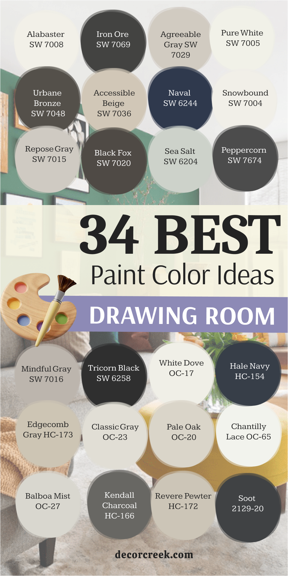
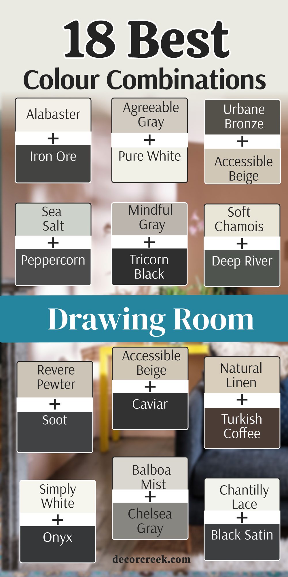
18 Best Drawing Room Colour Combinations
Alabaster SW 7008 + Iron Ore SW 7069
Alabaster SW 7008 creates a very clean look that makes a room feel open and bright. This white is not too stark or cold, so it keeps the walls feeling soft. I love how it looks when paired with a very dark charcoal for a strong contrast.

The dark trim makes the light walls pop in a way that looks very modern and clean. Many people use this Iron Ore to make their drawing room look like it belongs in a fancy magazine. It is a safe choice that never fails to impress visitors.
You can use the dark color on the doors or the fireplace to create a focal point. This combination works well for families who want a neat look that is still very friendly. It brings a sense of order to a busy household.
Best used in: living rooms, kitchens, hallways, bedrooms, and farmhouse exteriors
Pairs well with: Iron Ore SW 7069, Agreeable Gray SW 7029, Natural Linen SW 9109, warm wood tones The key rule of this color for farmhouse style is to use it where you want natural light to feel kind, soft, and inviting throughout the day.

Agreeable Gray SW 7029 + Pure White SW 7005
Agreeable Gray SW 7029 is the most popular color I use because it works with almost any furniture style. It sits right between beige and gray, so it is very flexible for any home. I pair it with a bright white trim to keep the edges looking sharp and fresh.

This mix makes the room feel airy and large without being too boring. Pure White is a great choice if you have a lot of colorful art you want to hang on the walls. The background stays quiet so your decorations can be the stars of the show.
Most homeowners find this color very easy to live with for many years. It does not feel trendy, so you will not get tired of it after a few months. It is a smart pick for a drawing room that gets used every single day.
Best used in: living rooms, open floor plans, entryways, and traditional bedrooms
Pairs well with: Pure White SW 7005, Sea Salt SW 6204, Urbane Bronze SW 7048, dark wood floors The key rule of this color for a balanced look is to use it in rooms with lots of windows to see its true warmth.

Urbane Bronze SW 7048 + Accessible Beige SW 7036
Urbane Bronze SW 7048 is a deep, earthy color that feels very grounded and strong. I suggest using it on an accent wall to give the drawing room some real personality. When you put it next to a warm beige, the room feels very rich and cozy.

This combination reminds me of nature and stone, which helps people feel relaxed. Accessible Beige is a bold move, but it pays off by making the room feel very expensive. The beige keeps the dark bronze from making the room feel too small.
I see this working best in a room with a large rug and comfortable leather chairs. It creates a mood that is perfect for long conversations after dinner. Your friends will definitely notice how stylish your home feels with these tones.
Best used in: accent walls, dens, home offices, and exterior trim
Pairs well with: Accessible Beige SW 7036, Shoji White SW 7042, Revere Pewter HC-172, brass accents The key rule of this color for a moody style is to use it where you want to create a cozy and private feeling.

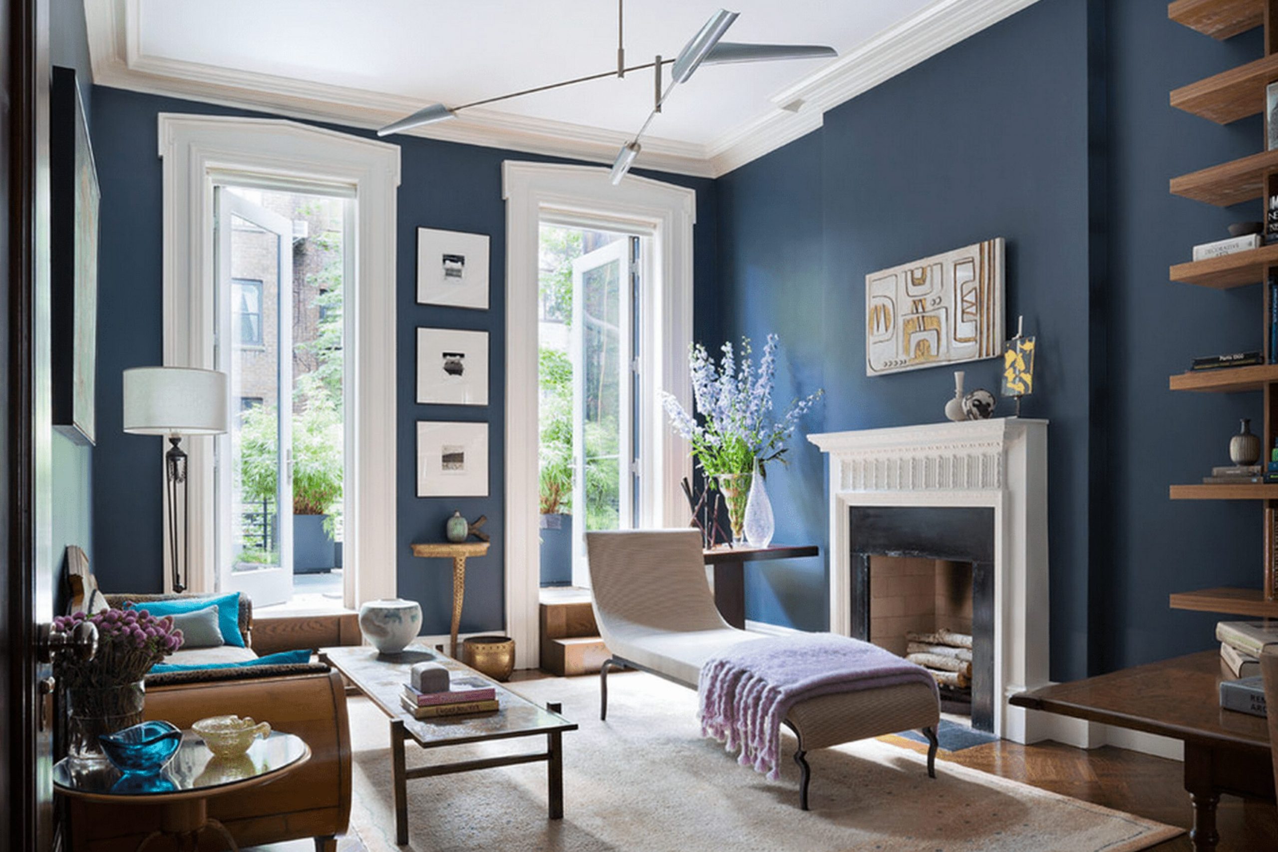
Naval SW 6244 + Snowbound SW 7004
Naval SW 6244 is a classic navy blue that looks very smart and professional in a drawing room. I like to use it when a client wants their home to feel a bit more formal. Pairing it with a crisp white like Snowbound keeps the blue from feeling too heavy.

The white trim acts like a frame for the deep blue walls. This look is very crisp and reminds people of the ocean or a high-end club. It is a great way to add color without using something too bright or loud.
Blue is a color that most people find very pleasing and steady. It makes a big statement but stays very polite at the same time. You can add gold lamps or silver frames to make this look even better.
Best used in: dining rooms, drawing rooms, library walls, and front doors
Pairs well with: Snowbound SW 7004, Repose Gray SW 7015, Carrara marble, gold hardware The key rule of this color for a classic look is to use it in rooms with high ceilings to keep the vibe open.

Repose Gray SW 7015 + Black Fox SW 7020
Repose Gray SW 7015 is a cool gray that looks very sleek on large walls. It has just a tiny bit of blue and green in it, which makes it look very interesting. I combine it with a dark brown-gray like Black Fox for a very sophisticated look.

This pair works well if you have modern furniture with clean lines. The dark color is great for a bookshelf or a media cabinet in the drawing room. It adds depth to the room so it doesn’t look flat or one-dimensional.
Using these colors together makes the room feel very current and trendy. It is a favorite for people who like a minimalist style but still want warmth. It handles shadows very well as the sun moves across the sky.
Best used in: modern living rooms, master suites, kitchens, and cabinets
Pairs well with: Black Fox SW 7020, Eider White SW 7014, Silver Strand SW 7057, cool metals The key rule of this color for a modern style is to use it with plenty of artificial lighting to keep it bright.
White Dove OC-17 + Hale Navy HC-154
White Dove OC-17 is a soft white that designers love because it is not yellow and not blue. It is just right for making a drawing room feel light and happy. When you add a dark navy like Hale Navy, the room gains a lot of character.

This duo is a favorite for traditional homes that want to feel updated. The navy blue looks very regal on a feature wall or on built-in cabinets. The white walls keep the rest of the room feeling fresh and tidy.
I find that this combination makes everyone feel at home immediately. It is a very welcoming set of colors that works in any season. It provides a perfect backdrop for family photos and colorful pillows.
Best used in: trim, molding, kitchen cabinets, and whole-house paint
Pairs well with: Hale Navy HC-154, Revere Pewter HC-172, Woodmont Cream 204, oak furniture The key rule of this color for a clean style is to use it on trim to make your wall colors stand out more.

Edgecomb Gray HC-173 + Wrought Iron 2124-10
Edgecomb Gray HC-173 is a very light “greige” that feels like a warm hug for your walls. It is a great choice for a drawing room that needs to feel cozy but still look modern. Adding a dark, moody gray like Wrought Iron makes the room look very sharp.

The dark color works perfectly on a fireplace or even on the window frames. It creates a high-contrast look that catches the eye right away. Most people love how the light gray makes the room feel bigger than it really is.
This is a very safe choice if you are worried about picking a color that is too bold. It stays in the background but still looks very polished. It is a great way to make a house look ready for guests at any time.
Best used in: hallways, living rooms, bedrooms, and dark basements
Pairs well with: Wrought Iron 2124-10, White Heron OC-57, Nickel 2130-50, dark walnut woods The key rule of this color for a cozy look is to use it in rooms with north-facing windows to add warmth.

Classic Gray OC-23 + Kendall Charcoal HC-166
Classic Gray OC-23 is a very pale gray that almost looks like an off-white in bright light. It is very elegant and makes a drawing room feel very high-end. I like to use Kendall Charcoal to add a bit of drama to the room.

The charcoal gray is very deep and rich, which balances the light walls perfectly. This look is great for people who want a professional design without too much color. It feels very expensive and well-planned.
You can use the dark gray on a single wall to make the room feel deeper. The light gray on the other walls will keep the room from feeling heavy. It is a great choice for a room with big windows and lots of light.
Best used in: open concept areas, drawing rooms, bathrooms, and modern kitchens
Pairs well with: Kendall Charcoal HC-166, Chantilly Lace OC-65, Simply White OC-117, stone textures The key rule of this color for an elegant style is to use it where you want a very light but noticeable wall tone.

Pale Oak OC-20 + Iron Mountain 2134-30
Pale Oak OC-20 is a gentle color that looks like the inside of a seashell. It is very soft and makes a drawing room feel very peaceful. I pair it with Iron Mountain, which is a very dark gray with a hint of brown.

This mix is great for a room where you want to relax and read a book. The dark color adds a bit of weight and makes the room feel solid. It is a very natural combination that looks great with wooden furniture.
I see this working well in homes that have a lot of natural materials like wool and linen. It is a very humble but beautiful set of colors. It makes the drawing room feel like a quiet retreat from the busy world.
Best used in: bedrooms, living rooms, nurseries, and sunny kitchens
Pairs well with: Iron Mountain 2134-30, Boothbay Gray HC-165, Swiss Coffee OC-45, light woods The key rule of this color for a soft look is to use it in rooms that get a lot of afternoon sun.

Chantilly Lace OC-65 + Black Satin 2131-10
Chantilly Lace OC-65 is the brightest white you can find, and it is very clean. It does not have any hidden tones, so it always looks very pure. I love it with a sharp black like Black Satin for a very bold look.

This is a very high-contrast choice that makes a drawing room look very modern. It is great for showing off black and white photography on the walls. The room will feel very crisp and very organized with this pair.
Using black as an accent makes the white walls look even brighter. It is a very brave choice that shows you have great taste. This combination is perfect for a home that wants to look like a modern art gallery.
Best used in: trim, ceilings, modern kitchens, and bright galleries
Pairs well with: Black Satin 2131-10, Gray Owl OC-52, Hale Navy HC-154, chrome fixtures The key rule of this color for a crisp style is to use it when you want the truest white possible.
Balboa Mist OC-27 + Chelsea Gray HC-168
Balboa Mist OC-27 is a warm gray that feels very friendly and light. It changes a little bit throughout the day, which makes the room feel alive. I suggest using Chelsea Gray on the doors or the baseboards for a nice contrast.

The medium gray adds just enough weight to keep the room feeling balanced. This pair is very popular for drawing rooms that need to feel updated but not too cold. It works well with both silver and gold decorations.
Most people find this combination very easy to live with for a long time. It is a great backdrop for colorful flowers or bright throw blankets. It makes the whole house feel connected and well-designed.
Best used in: entryways, living rooms, laundry rooms, and bathrooms
Pairs well with: Chelsea Gray HC-168, Revere Pewter HC-172, Metropolitan AF-690, white marble The key rule of this color for a warm look is to use it in rooms with cool, north-facing light.

Simply White OC-117 + Onyx 2133-10
Simply White OC-117 has a tiny bit of warmth that keeps it from being too cold. It is a very cheerful white that makes a drawing room feel sunny even on a cloudy day. I use Onyx to give the room some sharp, dark edges.

The black paint looks great on a window frame or a small piece of furniture. It makes the room look like it was designed by a pro. The white walls provide a lot of energy and make the room feel very clean.
This is a great choice for a small drawing room that needs to feel bigger. The light walls push the boundaries out while the black adds focus. It is a very classic look that works in any type of house.
Best used in: kitchens, ceilings, trim, and small dark rooms
Pairs well with: Onyx 2133-10, Edgecomb Gray HC-173, Stonington Gray HC-170, bright colors The key rule of this color for a bright style is to use it to reflect as much light as possible.
Natural Linen SW 9109 + Turkish Coffee SW 6076
Natural Linen SW 9109 is a beautiful tan color that looks like high-end fabric. It makes a drawing room feel very cozy and grounded. I love to pair it with a very dark brown like Turkish Coffee for a rich look.

This combination feels very traditional and solid. It is perfect for a room with a big fireplace and lots of books. The dark brown adds a sense of history and strength to the room.
People who like a more rustic or old-fashioned look will love these colors. It makes the room feel very warm and inviting for a night in. It is a great way to make a new house feel like it has been there for a long time.
Best used in: dens, traditional living rooms, dining rooms, and cozy bedrooms
Pairs well with: Turkish Coffee SW 6076, Alabaster SW 7008, Row House SW 7689, copper accents The key rule of this color for a traditional style is to use it with warm lighting to make it feel extra cozy.
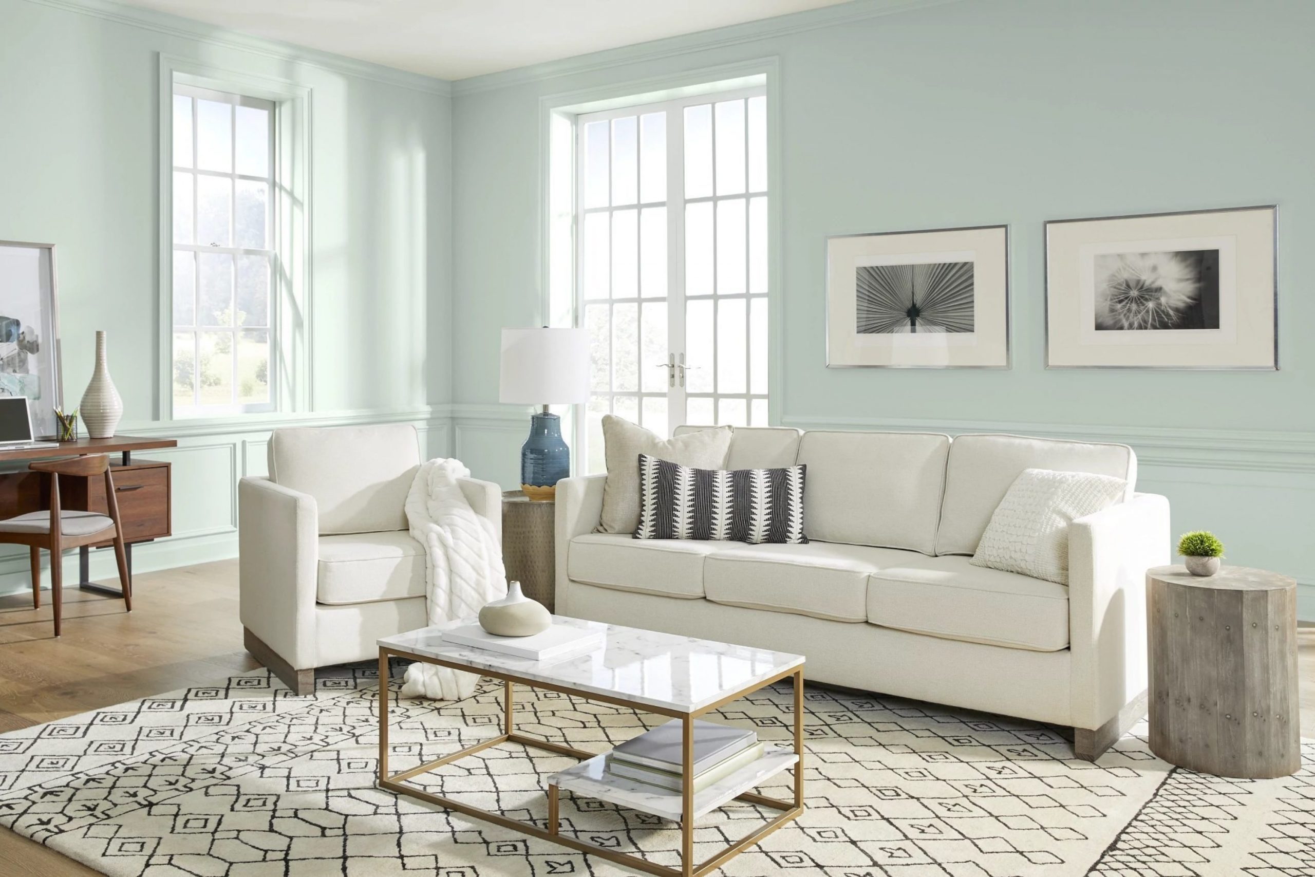
Sea Salt SW 6204 + Peppercorn SW 7674
Sea Salt SW 6204 is a very light green-blue that feels very fresh and light. It brings a little bit of the outdoors inside your drawing room. I pair it with a dark gray like Peppercorn to give it a modern edge.

The dark gray helps the light green-blue look more grown-up and less like a nursery. This is a very popular choice for homes near the water. It makes the room feel very light and breezy.
Most guests will find this color very interesting and unique. It is a great way to add a hint of color without it being too loud. It looks wonderful with light wood floors and white furniture.
Best used in: bathrooms, drawing rooms, bedrooms, and coastal homes
Pairs well with: Peppercorn SW 7674, Rainwashed SW 6211, Pure White SW 7005, driftwood The key rule of this color for a fresh look is to use it in rooms with lots of plants and natural light.
Mindful Gray SW 7016 + Tricorn Black SW 6258
Mindful Gray SW 7016 is a solid gray that does not have many hidden tones. It is very dependable and looks good in almost any drawing room. I like to use Tricorn Black to make the room look very sharp and defined.

The black paint on a door or a mantle makes the gray walls look very professional. This is a very popular look for modern homes that want a clean style. It is easy to decorate around because gray and black go with everything.
This combination makes a room feel very sturdy and well-built. It is a great choice for a room that sees a lot of activity from kids or pets. It hides small marks well while still looking very stylish.
Best used in: exterior siding, living rooms, hallways, and kitchen islands
Pairs well with: Tricorn Black SW 6258, Repose Gray SW 7015, Eider White SW 7014, leather furniture The key rule of this color for a sturdy look is to use it as a neutral base for any decor style.

Soft Chamois OC-13 + Deep River 1582
Soft Chamois OC-13 is a very creamy white that feels like warm silk. It is very gentle on the eyes and makes a drawing room feel very comfortable. I suggest using Deep River, which is a dark green-gray, for a very natural look.
The dark green adds a touch of mystery and depth to the room. This pair looks like something you would find in a high-end country house. It feels very organic and works well with indoor trees or plants.
I love how the cream walls make everyone’s skin look good in the evening light. It is a very flattering color for a room where people gather to talk. It is a great choice for a home that wants to feel very soft and kind.
Best used in: bedrooms, cozy drawing rooms, dining rooms, and kitchens
Pairs well with: Deep River 1582, White Dove OC-17, Saybrook Sage HC-114, linen fabrics The key rule of this color for a soft look is to use it where you want a white that never feels cold.

Revere Pewter HC-172 + Soot 2129-20
Revere Pewter HC-172 is a famous color because it changes from gray to beige depending on the light. It is very versatile and makes any drawing room look instantly better. I pair it with Soot, which is a very dark, smoky gray.

The dark accent color makes the pewter walls look very light and fresh. This is a very classic designer trick to make a room look more expensive. It is a great way to add drama without using a bright color.
Most people find this gray-beige to be very relaxing and easy to look at. It is a great choice for a house that is being sold because everyone likes it. It makes the drawing room feel very clean and high-quality.
Best used in: whole-house color, living rooms, kitchens, and basements
Pairs well with: Soot 2129-20, White Dove OC-17, Fog Mist OC-31, dark wood furniture The key rule of this color for a flexible look is to test it in both morning and evening light to see the shift.
Accessible Beige SW 7036 + Caviar SW 6990
Accessible Beige SW 7036 is a very popular beige because it does not look like yellow or mud. It is very clean and makes a drawing room feel very bright and happy. I like to use Caviar, a very deep black, to add some weight to the room.
The black trim or accents make the beige look very modern and sharp. This is a great choice for a home that wants to feel warm but still very current. It is a very friendly color that makes guests feel at ease.
I suggest this for people who find gray too cold but want something newer than old beige. It is a very smart middle ground that looks great with colorful rugs. It makes the whole room feel very finished and professional.
Best used in: open concept living areas, hallways, bedrooms, and kitchen cabinets
Pairs well with: Caviar SW 6990, Alabaster SW 7008, Urban Bronze SW 7048, brass lighting The key rule of this color for a friendly look is to use it with warm-toned wood to bring out its best.
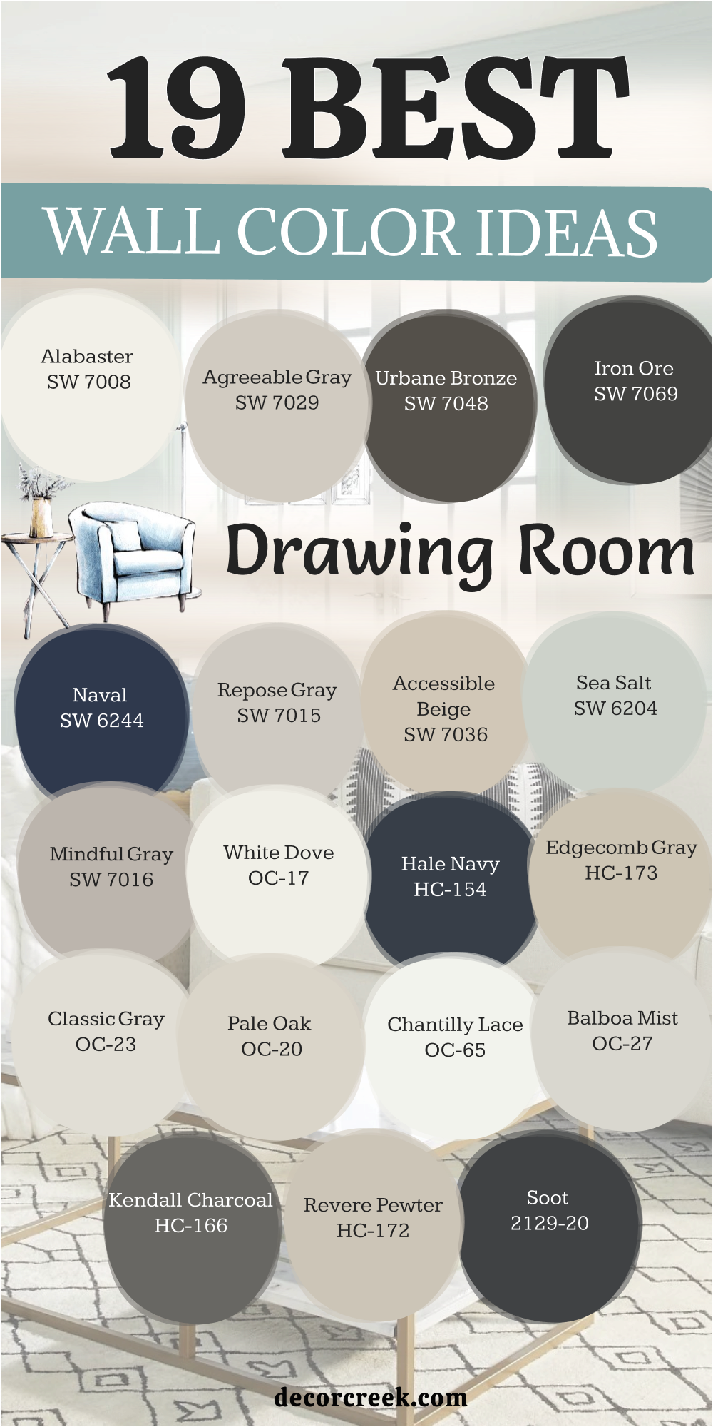
19 Top Drawing Room Wall Color Ideas
Alabaster SW 7008
Alabaster SW 7008 is a beautiful off-white that feels very soft on the walls. It is a great choice for a drawing room that needs a lot of light. I love how it makes a room feel huge and very clean.
This white is very popular for a reason because it never looks like a hospital. It has just enough warmth to make the room feel like a home. You can use it on the walls and the trim for a very seamless look.
Best used in: living rooms, kitchens, hallways, bedrooms, and farmhouse exteriors
Pairs well with: Iron Ore SW 7069, Agreeable Gray SW 7029, Natural Linen SW 9109, warm wood tones The key rule of this color for farmhouse style is to use it where you want natural light to feel kind, soft, and inviting throughout the day.
👉 Read the full guide for this color HERE 👈
Agreeable Gray SW 7029
Agreeable Gray SW 7029 is a perfect mix of gray and beige that fits every home. I use it more than any other color because it is so reliable. It makes a drawing room feel updated without being too cold or dark.
This color is very easy to decorate with because it goes with every furniture color. It handles the sun very well and does not change into weird colors at night. It is a very safe and smart pick for any homeowner.
Best used in: living rooms, open floor plans, entryways, and traditional bedrooms
Pairs well with: Pure White SW 7005, Sea Salt SW 6204, Urbane Bronze SW 7048, dark wood floors The key rule of this color for a balanced look is to use it in rooms with lots of windows to see its true warmth.
👉 Read the full guide for this color HERE 👈
Urbane Bronze SW 7048
Urbane Bronze SW 7048 is a very dark and moody color that adds a lot of style. I like to use it when a client wants a room that feels very cozy and private. It looks like a mix of dark brown and gray stone.
This color makes a huge statement in a drawing room and feels very high-end. It works best with light-colored furniture to keep the room from being too dark. It is a very brave and beautiful choice for an accent wall.
Best used in: accent walls, dens, home offices, and exterior trim
Pairs well with: Accessible Beige SW 7036, Shoji White SW 7042, Revere Pewter HC-172, brass accents The key rule of this color for a moody style is to use it where you want to create a cozy and private feeling.
👉 Read the full guide for this color HERE 👈
Iron Ore SW 7069
Iron Ore SW 7069 is a very dark charcoal that is almost black but a bit softer. I use it to create a lot of drama in a drawing room without it being too harsh. It makes light-colored art and photos look amazing on the wall.
This color is very popular for modern homes that want a very sharp look. It feels very solid and gives the room a lot of character. It is a great choice for a fireplace or a built-in bookshelf.
Best used in: interior doors, accent walls, kitchen islands, and exteriors
Pairs well with: Alabaster SW 7008, Extra White SW 7006, Revere Pewter HC-172, light oak The key rule of this color for a bold style is to use it where you want a strong, dark contrast against light walls.
👉 Read the full guide for this color HERE 👈
Naval SW 6244
Naval SW 6244 is a classic navy blue that makes a drawing room feel very fancy. I think it is one of the most beautiful blues you can buy today. It feels very deep and rich, like a piece of expensive velvet.
This color works well in a formal room where you host dinner parties or meetings. It makes a room feel very established and stable. It is a very popular color for a reason because it looks great in any light.
Best used in: dining rooms, drawing rooms, library walls, and front doors
Pairs well with: Snowbound SW 7004, Repose Gray SW 7015, Carrara marble, gold hardware The key rule of this color for a classic look is to use it in rooms with high ceilings to keep the vibe open.
👉 Read the full guide for this color HERE 👈
Repose Gray SW 7015
Repose Gray SW 7015 is a cool gray that feels very modern and sleek on the walls. I like it because it has a tiny hint of blue that keeps it feeling fresh. It is a great choice for a drawing room with modern furniture.
This gray makes a room feel very organized and tidy at all times. It is very light, so it does not make a room feel small or cramped. It is a very common choice for people who want a clean, simple look.
Best used in: modern living rooms, master suites, kitchens, and cabinets
Pairs well with: Black Fox SW 7020, Eider White SW 7014, Silver Strand SW 7057, cool metals The key rule of this color for a modern style is to use it with plenty of artificial lighting to keep it bright.
👉 Read the full guide for this color HERE 👈
Accessible Beige SW 7036
Accessible Beige SW 7036 is a very friendly tan color that makes any room feel warm. I suggest it for people who think gray is too cold for their home. It feels very natural and looks great with wooden floors.
This beige is very updated and does not look like the old colors from the past. It makes a drawing room feel very inviting and comfortable for guests. It is a very light and happy shade that works in any house.
Best used in: open concept living areas, hallways, bedrooms, and kitchen cabinets
Pairs well with: Caviar SW 6990, Alabaster SW 7008, Urban Bronze SW 7048, brass lighting The key rule of this color for a friendly look is to use it with warm-toned wood to bring out its best.
👉 Read the full guide for this color HERE 👈
Sea Salt SW 6204
Sea Salt SW 6204 is a very light green-blue that feels like a breath of fresh air. I love using it in a drawing room to make it feel more relaxed and light. It is a very unique color that looks different in every room.
This color is very soft and makes the walls feel like they are glowing. It is perfect for a home near the beach or a room with many plants. It is a very cheerful color that makes people feel happy when they enter.
Best used in: bathrooms, drawing rooms, bedrooms, and coastal homes
Pairs well with: Peppercorn SW 7674, Rainwashed SW 6211, Pure White SW 7005, driftwood The key rule of this color for a fresh look is to use it in rooms with lots of plants and natural light.
👉 Read the full guide for this color HERE 👈
Mindful Gray SW 7016
Mindful Gray SW 7016 is a very dependable mid-tone gray that works in any light. I like it because it is strong enough to show up but light enough to stay quiet. It makes a drawing room feel very balanced and professional.
This gray is a bit darker than Repose Gray, so it adds more depth to the walls. It is a great choice if you have a lot of white furniture or trim. It creates a very nice background for a busy family room.
Best used in: exterior siding, living rooms, hallways, and kitchen islands
Pairs well with: Tricorn Black SW 6258, Repose Gray SW 7015, Eider White SW 7014, leather furniture The key rule of this color for a sturdy look is to use it as a neutral base for any decor style.
👉 Read the full guide for this color HERE 👈
White Dove OC-17
White Dove OC-17 is a very soft white that designers use all the time for trim and walls. I like it because it feels very creamy without looking yellow. It makes a drawing room feel very light and airy and clean.
This color is great for a house that wants a very classic and clean look. It works well with any other color you might want to use for accents. It is a very flexible choice that makes everyone feel right at home.
Best used in: trim, molding, kitchen cabinets, and whole-house paint
Pairs well with: Hale Navy HC-154, Revere Pewter HC-172, Woodmont Cream 204, oak furniture The key rule of this color for a clean style is to use it on trim to make your wall colors stand out more.
👉 Read the full guide for this color HERE 👈
Hale Navy HC-154
Hale Navy HC-154 is a very dark and moody blue that looks like the deep ocean. I love using it in a drawing room to make it feel very formal and fancy. It is a very strong color that gives the room a lot of weight.
This blue works perfectly with white trim to create a very sharp look. It is a great choice for an accent wall or a small room that you want to feel cozy. It makes gold and brass lamps look very shiny and beautiful.
Best used in: accent walls, dining rooms, library rooms, and front doors
Pairs well with: White Dove OC-17, Gray Owl OC-52, Woodmont Cream 204, brass accents The key rule of this color for a moody look is to use it in rooms where you want a cozy and deep feeling.
👉 Read the full guide for this color HERE 👈
Edgecomb Gray HC-173
Edgecomb Gray HC-173 is a light and warm gray that feels very soft on the walls. I suggest this color for people who want a neutral look that still feels cozy. It is a very light color that makes any room feel much bigger.
This color is very popular for drawing rooms because it is so easy to live with. It looks great with both light and dark furniture and never feels too loud. It is a very safe and beautiful choice for any homeowner.
Best used in: hallways, living rooms, bedrooms, and dark basements
Pairs well with: Wrought Iron 2124-10, White Heron OC-57, Nickel 2130-50, dark walnut woods The key rule of this color for a cozy look is to use it in rooms with north-facing windows to add warmth.
👉 Read the full guide for this color HERE 👈
Classic Gray OC-23
Classic Gray OC-23 is a very light gray that almost looks like an off-white color. I like it because it is very elegant and makes a drawing room feel very high-end. It is a very clean color that makes a room feel very open.
This gray is perfect for a room that gets a lot of natural light during the day. It stays quiet in the background so your furniture can be the focus. It is a very professional choice that makes a house look very well-kept.
Best used in: open concept areas, drawing rooms, bathrooms, and modern kitchens
Pairs well with: Kendall Charcoal HC-166, Chantilly Lace OC-65, Simply White OC-117, stone textures The key rule of this color for an elegant style is to use it where you want a very light but noticeable wall tone.
👉 Read the full guide for this color HERE 👈
Pale Oak OC-20
Pale Oak OC-20 is a very gentle and soft color that looks like warm light. I use it to make a drawing room feel very peaceful and calm for the family. It is a very light shade that works well in small or dark rooms.
This color is very natural and looks great with linen fabrics and light wood. It makes a room feel very clean and happy without being too bright. It is a great choice for a house that wants a very soft and kind feel.
Best used in: bedrooms, living rooms, nurseries, and sunny kitchens
Pairs well with: Iron Mountain 2134-30, Boothbay Gray HC-165, Swiss Coffee OC-45, light woods The key rule of this color for a soft look is to use it in rooms that get a lot of afternoon sun.
👉 Read the full guide for this color HERE 👈
Chantilly Lace OC-65
Chantilly Lace OC-65 is the truest white you can find for your drawing room walls. I love it because it is very clean and does not have any yellow or blue in it. It makes a room feel very bright and modern and fresh.
This white is perfect for showing off colorful art or very dark furniture. It acts like a clean canvas for your whole room and makes it feel very new. It is a very popular choice for people who love a minimalist style.
Best used in: trim, ceilings, modern kitchens, and bright galleries
Pairs well with: Black Satin 2131-10, Gray Owl OC-52, Hale Navy HC-154, chrome fixtures The key rule of this color for a crisp style is to use it when you want the truest white possible.
👉 Read the full guide for this color HERE 👈
Balboa Mist OC-27
Balboa Mist OC-27 is a very warm and friendly gray that feels like a soft mist. I like to use it in a drawing room to make it feel very updated but still cozy. It is a very light color that makes any room feel much larger.
This gray changes a little bit depending on the light, which makes it very interesting. It is a very popular choice for modern homes that want a touch of warmth. It looks great with white trim and dark wood floors.
Best used in: entryways, living rooms, laundry rooms, and bathrooms
Pairs well with: Chelsea Gray HC-168, Revere Pewter HC-172, Metropolitan AF-690, white marble The key rule of this color for a warm look is to use it in rooms with cool, north-facing light.
👉 Read the full guide for this color HERE 👈
Kendall Charcoal HC-166
Kendall Charcoal HC-166 is a very deep and rich gray that adds a lot of drama. I use it on accent walls or in a cozy library to make it feel very special. It is a very strong color that makes a room feel very solid.
This charcoal looks very high-end and professional in a modern drawing room. It works well with light gray walls to create a very balanced and cool look. It is a great choice for people who are not afraid of dark colors.
Best used in: accent walls, exteriors, office rooms, and lower cabinets
Pairs well with: Classic Gray OC-23, Simply White OC-117, Revere Pewter HC-172, bright accent colors The key rule of this color for a bold look is to use it in well-lit rooms to see the rich gray tones.
👉 Read the full guide for this color HERE 👈
Revere Pewter HC-172
Revere Pewter HC-172 is a very famous color because it is a perfect mix of gray and beige. I suggest this color for almost any room because it always looks good. It makes a drawing room feel very updated and very professional.
This color handles different types of light very well and never looks too dark. It is a very safe pick if you want a color that everyone will like. it is a very classic designer color that has been popular for a long time.
Best used in: whole-house color, living rooms, kitchens, and basements
Pairs well with: Soot 2129-20, White Dove OC-17, Fog Mist OC-31, dark wood furniture The key rule of this color for a flexible look is to test it in both morning and evening light to see the shift.
👉 Read the full guide for this color HERE 👈
Soot 2129-20
Soot 2129-20 is a very dark and smoky gray that is almost black but softer. I like to use it to create a very moody and stylish drawing room. It makes the room feel very private and special for late-night talks.
This color looks amazing on a fireplace or on a wall with a lot of white art. it is a very brave choice that shows you have a lot of style. It makes the whole house feel very modern and high-end.
Best used in: accent walls, front doors, library rooms, and fireplace surrounds
Pairs well with: Revere Pewter HC-172, White Dove OC-17, Classic Gray OC-23, silver hardware The key rule of this color for a moody style is to use it with high-contrast trim to keep it looking sharp.
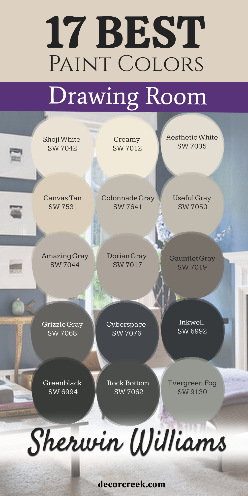
17 Best Drawing Room Paint Colors From Sherwin Williams
Shoji White SW 7042
Shoji White SW 7042 is a very warm and creamy white that feels like handmade paper. I love it because it is very soft and makes a drawing room feel very cozy. It is a great choice for a home that wants to feel very natural.
This color is not too bright, so it does not hurt your eyes in the sun. It makes a room feel very welcoming and kind for your family and guests. It is a very flexible color that works with any furniture you have.
Best used in: living rooms, exteriors, trim, and kitchen cabinets
Pairs well with: Urbane Bronze SW 7048, Accessible Beige SW 7036, Fawn Walnut, black hardware The key rule of this color for a natural look is to use it where you want a white that feels very soft and aged.
👉 Read the full guide for this color HERE 👈

Creamy SW 7012
Creamy SW 7012 is a very rich and soft white that looks like a bowl of heavy cream. I use it in a drawing room to make it feel very traditional and very warm. It is a very happy color that makes a room feel very bright.
This white is perfect for a house with a lot of antique furniture and rugs. It makes the whole room feel very finished and very comfortable for everyone. It is a very popular choice for a classic and clean home look.
Best used in: bedrooms, living rooms, trim, and traditional kitchens
Pairs well with: Alabaster SW 7008, Naval SW 6244, warm wood, gold accents The key rule of this color for a traditional style is to use it on both walls and trim for a soft feeling.
👉 Read the full guide for this color HERE 👈

Aesthetic White SW 7035
Aesthetic White SW 7035 is a very light and cool off-white that feels very modern. I like it because it stays very quiet on the walls and lets your art shine. It makes a drawing room feel very open and very large.
This color is great for a house that wants to feel very updated and very sleek. It does not have any yellow in it, so it always looks very fresh. It is a very professional choice for a high-end drawing room.
Best used in: whole-house paint, living rooms, hallways, and modern offices
Pairs well with: Agreeable Gray SW 7029, Urbane Bronze SW 7048, Chelsea Gray HC-168, cool tones The key rule of this color for a modern style is to use it in rooms with lots of natural light.
👉 Read the full guide for this color HERE 👈

Canvas Tan SW 7531
Canvas Tan SW 7531 is a very warm and sandy color that feels like a beach. I suggest it for people who want a neutral look that is not gray or white. It makes a drawing room feel very grounded and very solid.
This tan is very updated and looks great with big green plants and wood. It makes a room feel very inviting and warm for a long afternoon talk. It is a very sturdy color that handles a lot of light very well.
Best used in: entryways, living rooms, kitchens, and exteriors
Pairs well with: Alabaster SW 7008, Naval SW 6244, Turkish Coffee SW 6076, natural wood The key rule of this color for a warm look is to use it with lots of organic materials like wood and stone.
👉 Read the full guide for this color HERE 👈

Colonnade Gray SW 7641
Colonnade Gray SW 7641 is a very popular gray that feels very balanced and light. I like it because it is a “greige” that leans more toward the gray side. It makes a drawing room feel very sophisticated and very current.
This color works well in any house because it is very easy on the eyes. It makes the walls look very smooth and very clean at all times of day. It is a very smart choice for a family room that sees a lot of use.
Best used in: living rooms, bedrooms, kitchens, and whole-house paint
Pairs well with: Pure White SW 7005, Iron Ore SW 7069, Sea Salt SW 6204, dark furniture The key rule of this color for a balanced look is to use it in open floor plans to connect different rooms.
👉 Read the full guide for this color HERE 👈
Useful Gray SW 7050
Useful Gray SW 7050 is a very light gray that has a hint of green and yellow in it. I love it because it feels very natural and very soft on the walls. It makes a drawing room feel very cozy and very welcoming for guests.
This color is very unique and looks much better on the wall than on a small card. it makes a room feel very peaceful and very quiet for your family. It is a great choice for a house that wants a very soft and natural feel.
Best used in: kitchens, drawing rooms, bathrooms, and laundry rooms
Pairs well with: Alabaster SW 7008, Black Fox SW 7020, Evergreen Fog SW 9130, light oak The key rule of this color for a natural look is to use it in rooms that get a lot of morning light.
👉 Read the full guide for this color HERE 👈
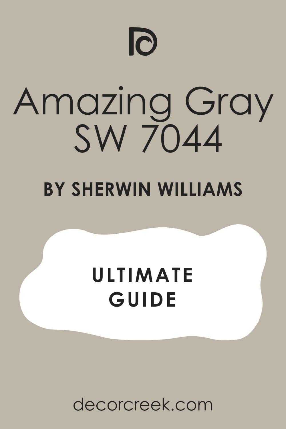
Amazing Gray SW 7044
Amazing Gray SW 7044 is a mid-tone gray that feels very rich and very solid. I like to use it when a client wants a room that feels very cozy and safe. It is a bit darker than other grays, so it has more power.
This color makes a drawing room feel very expensive and very well-planned. It looks great with white trim and dark wood furniture in the room. It is a very dependable choice that looks good in every single house.
Best used in: living rooms, exteriors, bedrooms, and office rooms
Pairs well with: Alabaster SW 7008, Carley’s Rose SW 9002, Urbane Bronze SW 7048, brass hardware The key rule of this color for a cozy style is to use it in rooms where you want a bit more color depth.
👉 Read the full guide for this color HERE 👈
Dorian Gray SW 7017
Dorian Gray SW 7017 is a very beautiful gray that feels very balanced and deep. I suggest this color for people who want a room that feels very steady. It is a very popular choice for a modern drawing room accent.
This gray is dark enough to show up but light enough to keep the room happy. It works well with many different types of rugs and colorful pillows. It is a very professional color that makes a house look very high-quality.
Best used in: exterior siding, living rooms, kitchen islands, and master bedrooms
Pairs well with: Alabaster SW 7008, Repose Gray SW 7015, Tricorn Black SW 6258, silver accents The key rule of this color for a sturdy look is to use it to ground a room that has very high ceilings.
👉 Read the full guide for this color HERE 👈

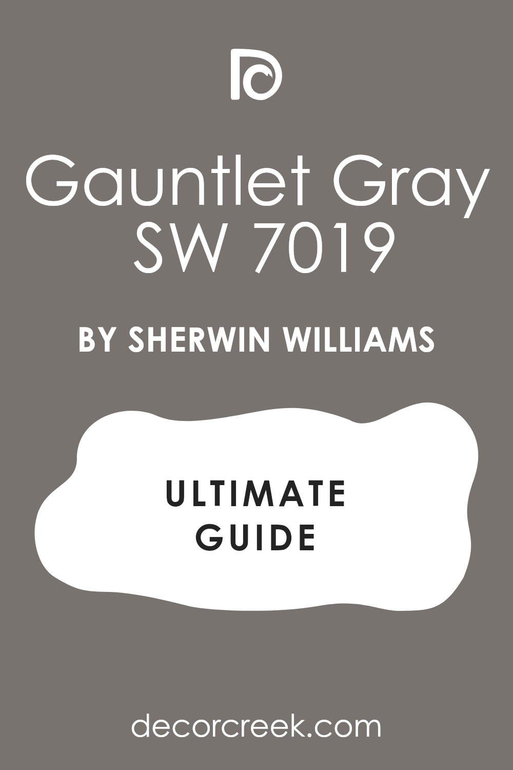
Gauntlet Gray SW 7019
Gauntlet Gray SW 7019 is a very deep and moody gray that adds a lot of style. I like to use it on an accent wall to make the drawing room feel very special. It is a very strong color that feels very solid and very brave.
This color makes light furniture and white trim look very sharp and very clean. It is a great choice for a room where you watch movies or listen to music. It makes the whole room feel very private and very high-end.
Best used in: accent walls, exteriors, dens, and kitchen cabinets
Pairs well with: Repose Gray SW 7015, Alabaster SW 7008, Revere Pewter HC-172, light wood The key rule of this color for a moody style is to use it to create a focal point in a large room.
👉 Read the full guide for this color HERE 👈
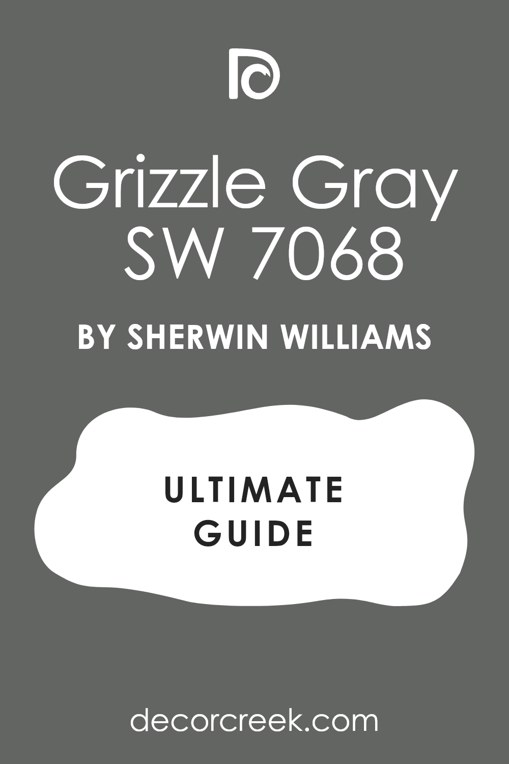
Grizzle Gray SW 7068
Grizzle Gray SW 7068 is a very dark gray that has a hint of blue and green in it. I love using it to make a drawing room feel very unique and very stylish. It is a very moody color that makes a room feel very deep.
This color is very strong and gives a room a lot of personality right away. It looks great with large windows and lots of natural light to show its tones. it is a very professional choice for a modern and brave home look.
Best used in: accent walls, exteriors, office rooms, and lower cabinets
Pairs well with: Extra White SW 7006, Sea Salt SW 6204, Mindful Gray SW 7016, modern art The key rule of this color for a bold look is to use it in rooms with high-contrast decor.
👉 Read the full guide for this color HERE 👈
Cyberspace SW 7076
Cyberspace SW 7076 is a very dark navy blue that is almost black in some light. I use it to make a drawing room feel very fancy and very modern. It is a very deep color that makes the walls look very expensive.
This blue works well for a room where you want to feel very focused and quiet. It makes white furniture and gold lamps look very bright and beautiful. It is a very popular choice for a high-end and stylish drawing room.
Best used in: accent walls, media rooms, library walls, and front doors
Pairs well with: Snowbound SW 7004, Agreeable Gray SW 7029, Carrara marble, gold accents The key rule of this color for a moody style is to use it where you want a very deep and dark feeling.
👉 Read the full guide for this color HERE 👈

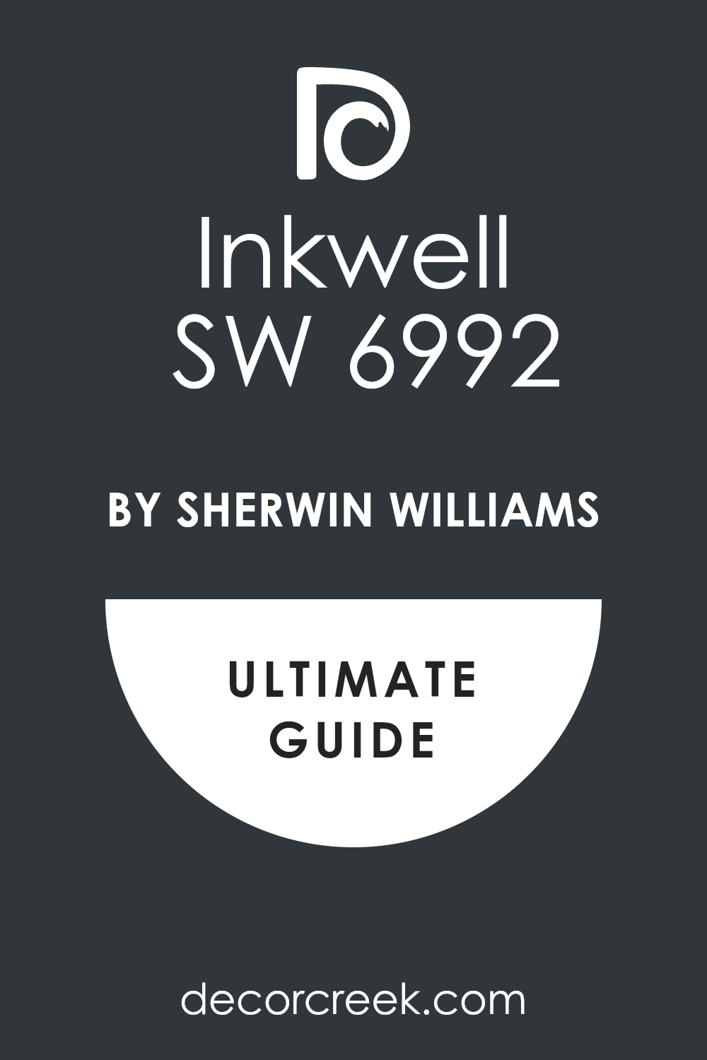
Inkwell SW 6992
Inkwell SW 6992 is a very dark color that looks like a mix of blue and black. I love it because it is very mysterious and very rich on the drawing room walls. It makes a huge statement and shows you have great taste.
This color is very moody and makes a room feel very cozy at night with lamps. It is a great choice for a fireplace or a wall behind a big TV. It makes the whole house feel very current and very well-designed.
Best used in: front doors, accent walls, library rooms, and kitchen islands
Pairs well with: Alabaster SW 7008, Repose Gray SW 7015, Revere Pewter HC-172, light oak The key rule of this color for a bold style is to use it in rooms with very light flooring to balance it.
👉 Read the full guide for this color HERE 👈
Greenblack SW 6994
Greenblack SW 6994 is a very dark green that looks almost black in many rooms. I suggest it for people who want a very natural but very moody look. It makes a drawing room feel like a deep forest and very cozy.
This color is very unique and looks amazing with brass hardware and wood floors. It gives a room a lot of weight and makes it feel very solid and very safe. It is a very professional choice for a high-end and modern home.
Best used in: exterior trim, accent walls, dens, and kitchen cabinets
Pairs well with: Shoji White SW 7042, Accessible Beige SW 7036, copper accents, warm wood The key rule of this color for a natural look is to use it where you want a very dark and earthy feeling.
👉 Read the full guide for this color HERE 👈
Rock Bottom SW 7062
Rock Bottom SW 7062 is a very deep gray-green that feels very solid and very strong. I like it because it is very moody but still feels like nature. It makes a drawing room feel very private and very special for guests.
This color is great for an accent wall or a small room that needs a lot of style. It works well with light gray walls and white trim to keep it balanced. It is a very brave and beautiful choice for any modern house.
Best used in: accent walls, exteriors, office rooms, and lower cabinets
Pairs well with: Alabaster SW 7008, Sea Salt SW 6204, Repose Gray SW 7015, light oak The key rule of this color for a moody look is to use it to add depth to a room with simple furniture.
👉 Read the full guide for this color HERE 👈
Evergreen Fog SW 9130
Evergreen Fog SW 9130 is a very light and soft green-gray that feels very fresh. I love using it to make a drawing room feel very natural and very happy. It is a very unique color that makes people feel relaxed right away.
This color is very popular because it brings the feeling of the outdoors inside. It looks great with wood furniture and lots of light-colored fabrics in the room. It is a very soft and kind color for a family drawing room.
Best used in: bedrooms, living rooms, kitchen cabinets, and mudrooms
Pairs well with: Shoji White SW 7042, Urbane Bronze SW 7048, Accessible Beige SW 7036, gold accents The key rule of this color for a fresh look is to use it in rooms with lots of natural light and plants.
👉 Read the full guide for this color HERE 👈

Clary Sage SW 6178
Clary Sage SW 6178 is a very soft and warm green that feels very traditional and natural. I suggest this color for a drawing room that needs a touch of color. It makes a room feel very inviting and very cozy for everyone.
This green is very light and does not make a room feel small or dark at all. It works well with white trim and warm wood floors for a classic look. It is a very pretty color that makes a house feel very homey and sweet.
Best used in: bedrooms, drawing rooms, laundry rooms, and exteriors
Pairs well with: Alabaster SW 7008, Creamy SW 7012, Dover White SW 6385, wooden furniture The key rule of this color for a natural look is to use it in rooms where you want a soft, earthy feeling.
👉 Read the full guide for this color HERE 👈

Riverway SW 6222
Riverway SW 6222 is a very deep and rich blue-green that looks like a dark river. I like it because it adds a lot of drama and style to a drawing room walls. It is a very moody color that makes a room feel very special.
This color looks amazing with white trim and light gray furniture in the room. It gives the house a very high-end and professional look right away. It is a great choice for people who love deep colors and a lot of style.
Best used in: accent walls, dining rooms, library rooms, and front doors
Pairs well with: Snowbound SW 7004, Repose Gray SW 7015, Silver Strand SW 7057, dark wood The key rule of this color for a bold look is to use it in rooms where you want a strong and stylish mood.
👉 Read the full guide for this color HERE 👈

My Final Thoughts about 34 Drawing Room Paint Color Ideas
Picking a paint color is a big decision, but it should also be a fun one for your home. These 34 choices are the best ones I have used in my career to make rooms look great. I know that if you pick one of these, you will be very happy with your new walls.
You deserve a house that makes you feel proud when you walk through the door each evening. Every color on this list has a proven track record of making houses feel more expensive and well-designed. I have seen these shades work in modern apartments and old traditional houses alike.
Remember to always look at the paint in your own room before you make a final choice. Light changes everything, and you want to make sure the color looks good to you. I am excited for you to see how much better your drawing room will look with new paint. Do not rush the process, because the right shade will bring so much joy to your daily life.
It is amazing how much a fresh coat of paint can change the way you feel about your surroundings.
You are on your way to creating a beautiful place for making memories with your family. I truly believe that one of these 34 options will be the perfect match for your unique style.