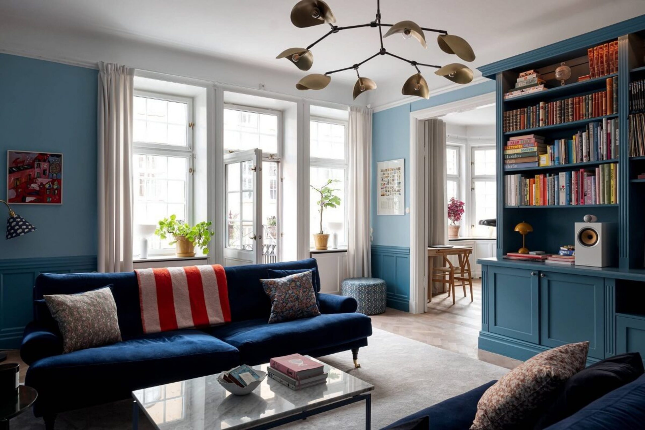
I’ve been designing beautiful homes for years, and when it comes to creating a truly captivating living room, nothing beats the power of blue. This color family is so versatile, offering everything from deep, dramatic jewel tones to light, airy hues that feel like a breath of fresh air. Choosing the right blue can dramatically affect the feeling of your home, setting the perfect mood for relaxing evenings or lively gatherings.
The secret is knowing which shade to pair with which complementary colors to achieve the look you want. I’ve gathered my absolute favorite 18 blue living room color schemes, pulling from the most reliable paint manufacturers, to give you a definitive guide for 2026. Get ready to see how easily you can bring this magnificent color into your own home.
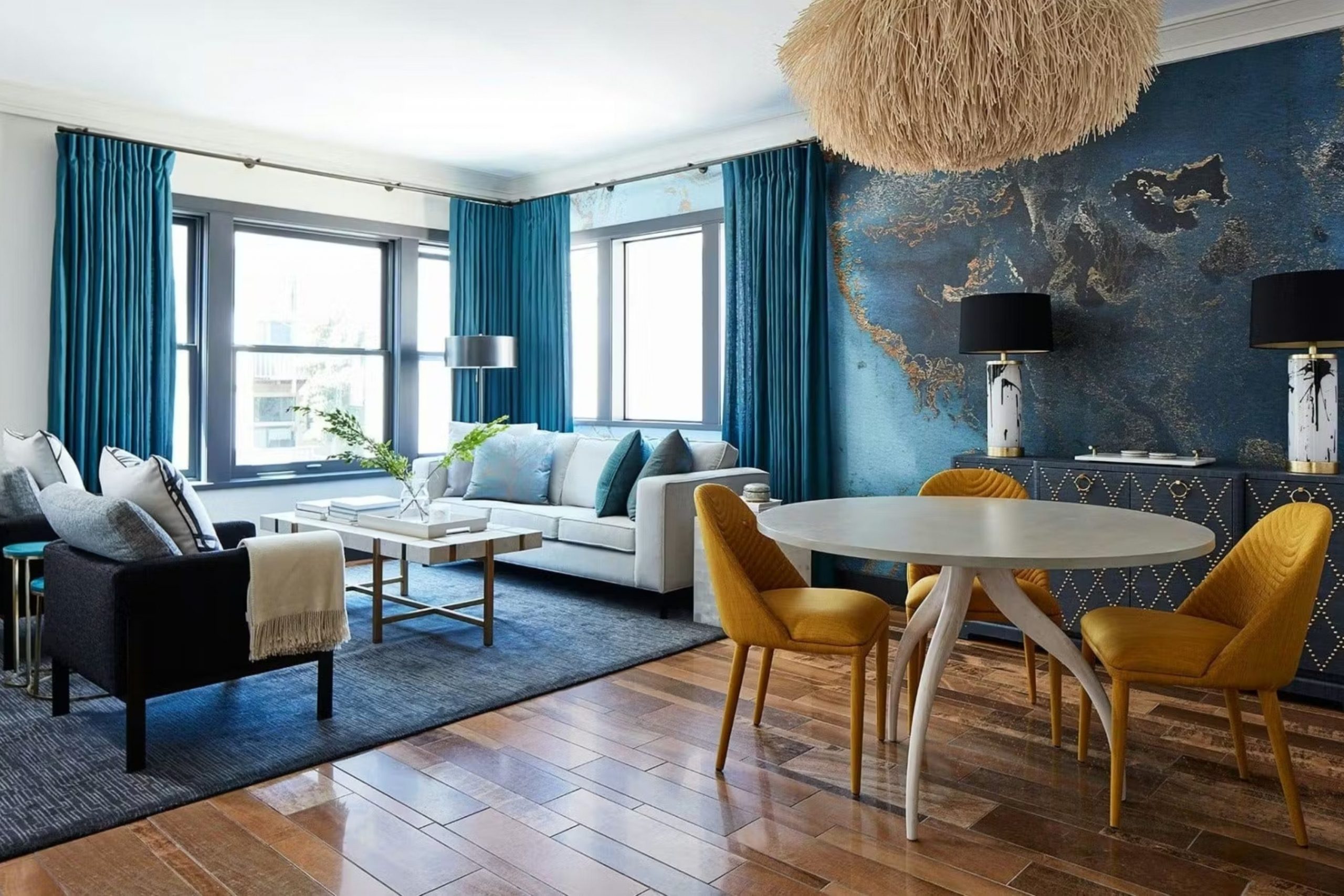
Blue has an astonishing ability to influence our mood and perception of an area. It can instantly lend a living room a feeling of depth, tranquillity, or, conversely, energy. I often use blue to create a visual anchor in a room, especially in large or open layouts. Depending on the chosen shade, blue can be a bold statement or a quiet backdrop.
That’s why I so strongly believe in its power as a primary color for a living room.
My clients are always thrilled with how blue revitalizes their rooms, making them feel more refined and personal. This is not just a wall color; it is a part of the emotional atmosphere you create in your house.
Why I Always Trust Sherwin-Williams and Benjamin Moore for the Best Blue Paints
In my line of work, quality and consistency are everything. That’s why I rely almost exclusively on Sherwin-Williams and Benjamin Moore for paint. These companies have perfected their formulas over decades, which means the color you see on the swatch is the color you get on your wall. Their pigments are rich, they offer incredible durability, and they have an unparalleled range of beautiful blue shades.
When I recommend a specific paint color, I’m not just picking a pretty name; I’m choosing a highly-tested product that I know will look fantastic and last for years. Using their paints makes my job easier and ensures my clients are always happy with the final result. If you’re going to put time and effort into painting a room, use a paint that will deliver a gorgeous, professional finish every time.
An additional important factor is how these leading brands formulate their color palettes. With Sherwin-Williams and Benjamin Moore, blues are not simply blue; they often feature complex, layered undertones—for example, hints of gray, green, or violet. It is these nuances that prevent what I call a “flat” blue, which can look dull and lifeless.
Their blue collections are incredibly vast, allowing me to find the perfect blue for any situation—whether it’s a dark navy that reads almost black, or a light sky blue that feels like pure air. Trusting the quality of their pigments means I can be certain the color won’t fade or shift its hue over time. This is reliability you won’t find with lesser-known brands, and that’s why I always start my blue color search with their catalogs.
How I Choose the Perfect Blue Shade for Any Living Room
Selecting the perfect blue isn’t just about picking a color you like; it’s a careful process that involves light, existing furnishings, and the overall feeling you want to create. First, I always consider the natural light. A sunny, south-facing room can handle a cooler, more saturated blue without feeling dreary, while a north-facing room with cooler light often benefits from blues that have warmer, gray, or green undertones. Second, I look at the function of the room. Is it a cozy den for reading? A deep navy or rich indigo is perfect.
Is it a bright, active family room? A clear, medium blue works wonders. Third, I study the fixed elements—things that aren’t changing, like trim color, flooring, or a stone fireplace. The blue I choose must harmonize with these existing features. Finally, I use large paint samples and view them at different times of the day to see how the color changes. This detailed checking prevents costly mistakes and guarantees the blue shade is just right for that specific living room.
Beyond the technical considerations, I pay close attention to the emotional impact a blue shade will have. A very bright, true blue is stimulating and excellent for high-energy family areas. Conversely, a muted, gray-infused blue promotes rest and quiet conversation, making it ideal for a more formal or dedicated relaxation area. The emotional resonance of the color is key to making the living room feel truly inviting and appropriate for its intended use.
I also consider the other colors I plan to bring in. A rich navy looks incredible against warm woods and brass accents, creating a traditional, library-like feel. A pale, gentle blue works beautifully with crisp whites and light neutrals, achieving a modern, airy aesthetic. By systematically checking the light, function, fixed elements, and emotional tone, I ensure that the blue I select is not just attractive, but perfectly suited to the unique qualities of the room.
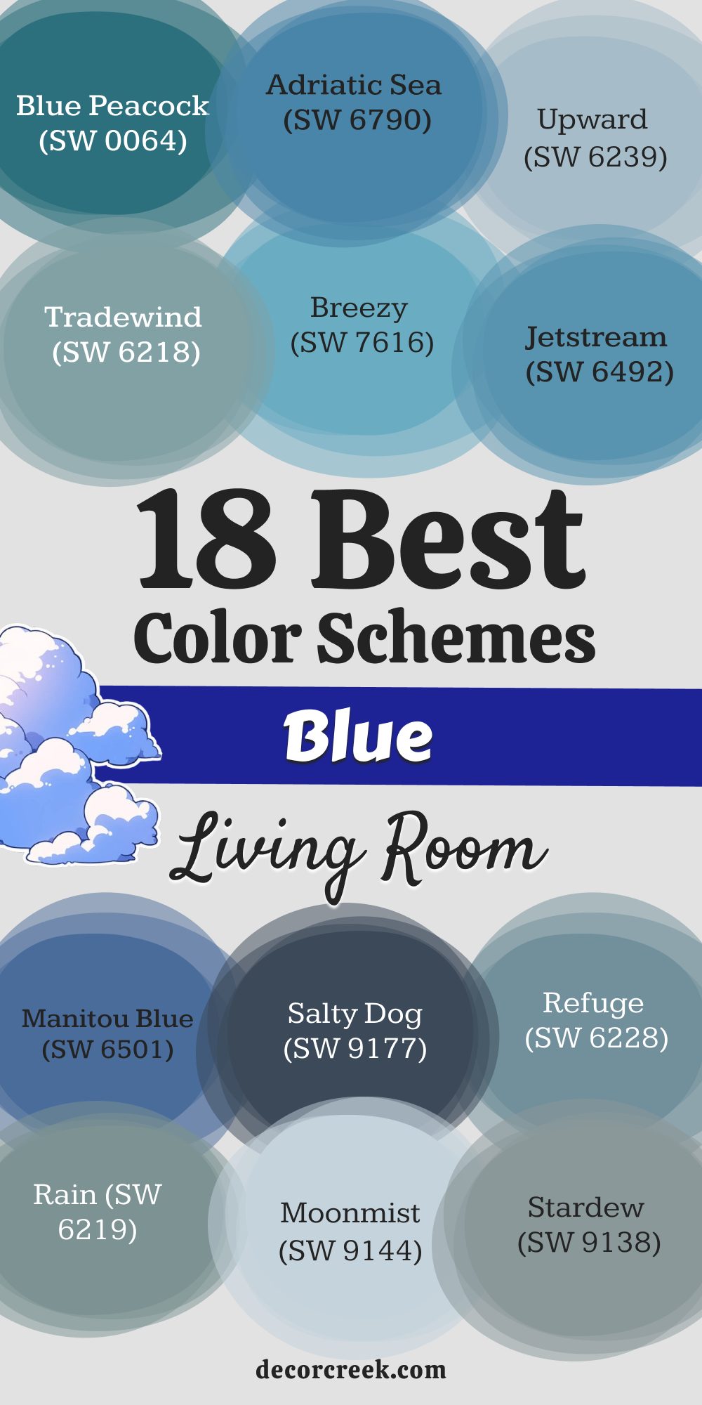
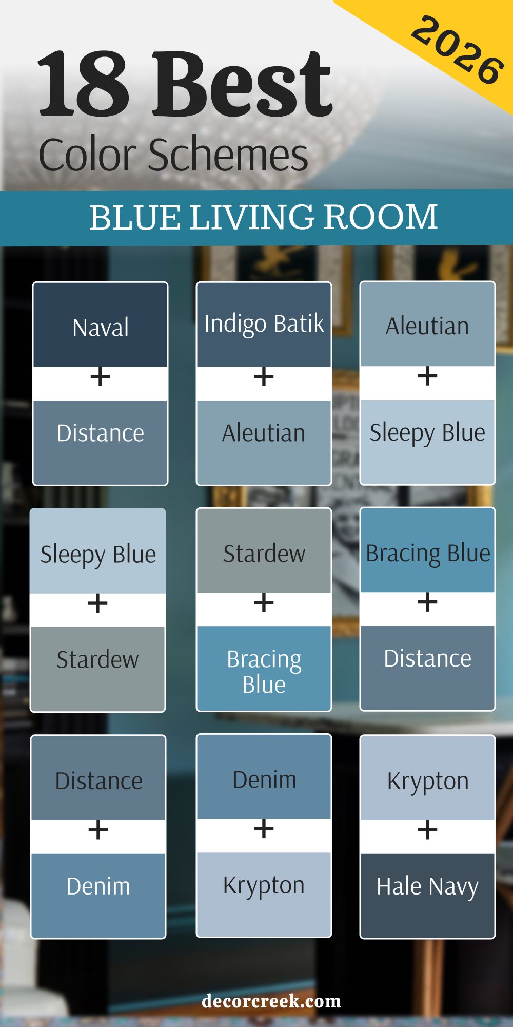
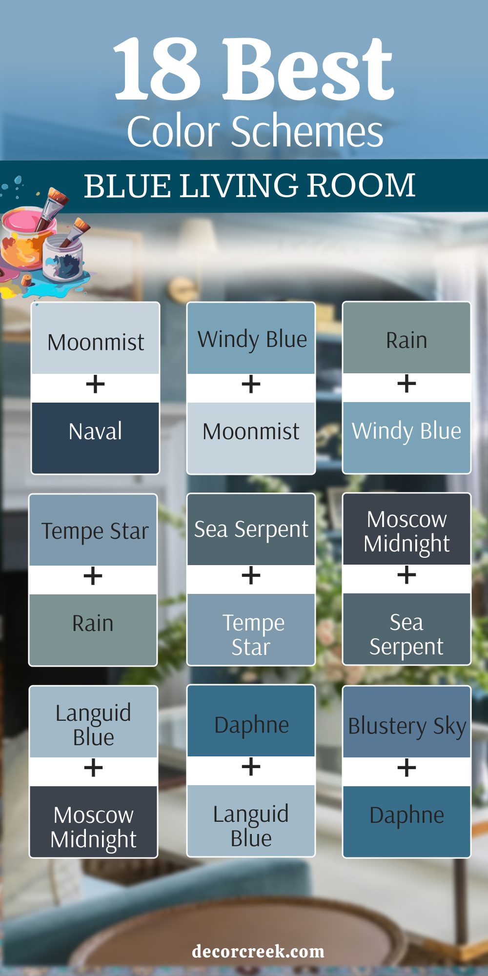
18 Best Blue Living Room Color Schemes in 2026
Naval SW 6244 + Distance SW 6243
Naval is the dramatic, velvety deep navy that provides a strong, sophisticated anchor for any room design. Distance is a slightly less intense, dusty blue with a notable gray undertone, offering a perfect, medium-dark complement. Naval on an accent wall instantly gives the living room a cozy, intimate feeling, especially when paired with creamy white furniture.

Distance works beautifully on the remaining walls, providing depth without the complete darkness of Naval across the whole room. Naval paired with Distance creates a luxurious, layered blue palette that feels deeply traditional yet entirely current and fresh. Distance provides a necessary balance to Naval’s intensity, keeping the overall atmosphere grounded and highly refined.
Naval looks stunning with gold or brass accents, while Distance pairs well with warm wood tones and leather textures. Distance makes a great backdrop for displaying bright artwork, as it doesn’t compete with the focal point.
Naval is excellent for creating a feeling of drama, while Distance ensures the room remains bright enough for daily activity. Naval and Distance together create a gorgeous, moody scheme that is rich in character and visual appeal.
Naval is a confident, mature color, and Distance offers a softer transition into lighter areas of the home.

Indigo Batik SW 7602 + Aleutian SW 6241
Indigo Batik is a gorgeous, softer navy that has a comfortable, slightly muted quality due to its gray undertones. Aleutian is a lovely medium-light blue that is heavily infused with gray, offering a very soothing and airy contrast. Indigo Batik on the lower half of the walls, combined with Aleutian on the upper half, creates a tailored, beautiful wainscoting effect.

Aleutian used on the ceiling would make the room feel taller and brighter, reflecting light down onto the richer Indigo Batik. Indigo Batik creates an established, grounded feel, pairing wonderfully with natural textures like jute and linen fabrics.
Aleutian works well as the primary wall color, with Indigo Batik used on a fireplace mantel or surrounding built-in shelves. Indigo Batik and Aleutian together achieve a beautiful coastal-meets-traditional look that is incredibly sophisticated and easy to live with.
Aleutian prevents the room from feeling too heavy, offering a necessary lightness and softness to the scheme. Indigo Batik looks fantastic with dark wood furniture, while Aleutian brightens the overall palette with white trim. Indigo Batik provides the depth, and Aleutian provides the gentle airiness for a perfectly balanced living room scheme.
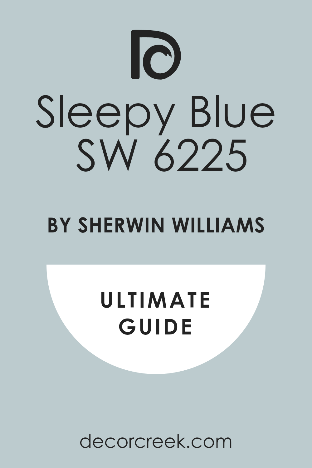
Aleutian SW 6241 + Sleepy Blue SW 6225
Aleutian is a sophisticated, gray-infused mid-tone blue that feels restful and beautifully grounded, avoiding any harsh brightness. Sleepy Blue is an incredibly light, cloud-like blue that offers just a whisper of color, functioning as a near-neutral brightener. Aleutian works wonderfully on all four walls to create a soothing, contained environment, with Sleepy Blue used only on the ceiling.
Sleepy Blue can be used in an adjacent hallway or reading nook to draw the eye and make the living room feel visually larger. Aleutian is a perfect backdrop for warmer wood tones and leather furniture, providing a refined, comfortable backdrop.
Sleepy Blue makes the room feel airy and refreshing, especially when paired with crisp white crown molding and baseboards. Aleutian and Sleepy Blue together create a gentle, cool, and highly harmonious color scheme that promotes quiet conversation.
Sleepy Blue is excellent for maximizing the light in the room, reflecting any available brightness beautifully onto the walls. Aleutian offers the necessary depth and color presence to keep the scheme from looking washed out or overly pale. Aleutian provides the structure, and Sleepy Blue provides the lightness for a completely cohesive and welcoming living room design.
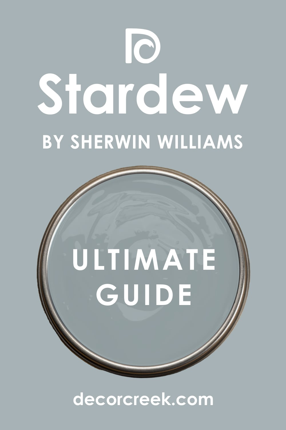
Sleepy Blue SW 6225 + Stardew SW 9138
Sleepy Blue is a wonderfully delicate, light blue that acts as a gentle, bright neutral, reminiscent of a clear, pale sky. Stardew is a complex, muted color that sits between blue, gray, and green, giving it a rich, organic, and grounded quality. Sleepy Blue is perfect for the main wall color, maximizing the light and feeling of openness in the living room.
Stardew can be used as a high-impact accent on a feature wall or on a set of built-in cabinets, providing deep visual contrast. Sleepy Blue pairs beautifully with light, creamy fabrics, while Stardew looks magnificent with brass accents and dark, rich wood tones.
Stardew’s moody depth anchors the lightness of Sleepy Blue, preventing the overall color scheme from feeling too juvenile or frail. Sleepy Blue is excellent for small living rooms, creating an illusion of greater size and airiness. Stardew brings a natural, earthy sophistication that makes the entire design feel custom and well-curated.
Sleepy Blue and Stardew together create a perfectly balanced scheme of light and shadow, resulting in a design that is both happy and serious. Sleepy Blue provides the soft, refreshing canvas, and Stardew provides the compelling focal point with its unique color.
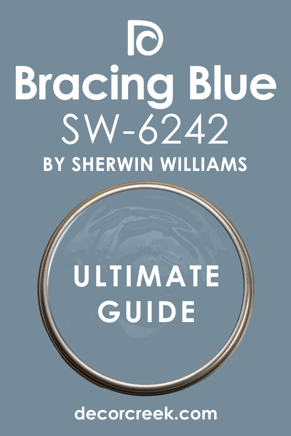
Stardew SW 9138 + Bracing Blue SW 6242
Stardew is a sophisticated, muted blue-gray-green that offers a unique, earthy richness and a highly refined appearance on the wall. Bracing Blue is a clear, vibrant, and energetic medium blue that is bright and invigorating, full of life and confidence. Stardew can be used on the main walls to create a quiet, grounded atmosphere, with Bracing Blue used as a punchy accent on the back of a bookcase.
Bracing Blue is a fantastic color for an accent chair or throw pillows, injecting a surprising, clean burst of energy against the Stardew walls. Stardew’s organic, subtle nature allows the bright, focused clarity of Bracing Blue to truly stand out as a focal point.
Bracing Blue prevents the sophisticated Stardew from feeling overly moody or too dark, adding a necessary layer of crispness. Stardew pairs wonderfully with creamy off-whites, while Bracing Blue looks fantastic with bright, pure white trim and clean lines.
Bracing Blue and Stardew together create a dynamic, interesting contrast between a soft, complex neutral and a vibrant, straightforward accent color. Bracing Blue is great for an active area, and Stardew is perfect for the quiet corners, balancing the room’s energy. Stardew provides the grown-up sophistication, and Bracing Blue provides the surprising spark of cheerful energy.
Bracing Blue SW 6242 + Distance SW 6243
Bracing Blue is a pure, clear, and energetic medium blue that feels bright, clean, and entirely invigorating, like a fresh, clear sky. Distance is a saturated, dusty blue with a strong gray undertone, sitting perfectly between a medium tone and a full navy. Bracing Blue can be used as the primary wall color in a brightly lit room, providing a lively, cheerful atmosphere for daily activities.
Distance works perfectly on a dramatic accent wall, such as the area behind a television or a large piece of furniture, anchoring the space. Bracing Blue looks magnificent with bright white and lemon yellow accents, enhancing its clean, fresh quality. Distance provides a necessary weight and maturity to the scheme, ensuring the brighter Bracing Blue does not feel too youthful or overwhelming.
Bracing Blue and Distance together create a vibrant, yet grounded blue scheme that offers great visual interest and depth to the room. Distance looks wonderful with deep, rich wood furniture and warm, soft leather upholstery for a contrasting texture.
Bracing Blue’s clarity enhances the dusty richness of Distance, preventing the darker shade from looking flat or muddy. Bracing Blue provides the optimism and energy, while Distance provides the sophisticated, confident stability for a beautiful room design.
Distance SW 6243 + Denim SW 6523
Distance is a rich, saturated blue that carries a strong, dusty gray note, offering substantial depth and a perfectly balanced mid-dark tone. Denim is a reliable, familiar medium blue that perfectly captures the comfortable, lived-in feel of classic blue jeans on the wall. Distance can be used to paint the main living room walls, providing a grounded and sophisticated atmosphere that is both cozy and refined.
Denim works wonderfully in a transitional area or on the walls of an adjacent reading nook, offering a lighter, friendlier blue accent. Distance pairs beautifully with creamy whites and brushed gold, lending an elegant, mature feeling to the main living area.
Denim looks fantastic with casual, woven textures and natural wood accents, creating a more relaxed, approachable corner. Distance and Denim together create a subtle, layered blue look, with Distance offering the deeper color and Denim offering the familiar comfort.
Denim is great for a high-traffic family area, as its familiar tone is very welcoming and forgiving. Distance’s dusty complexity elevates the casual comfort of Denim, ensuring the overall scheme maintains a sense of sophisticated design. Distance provides the grounding richness, and Denim provides the perfectly balanced, easy-to-live-with charm.

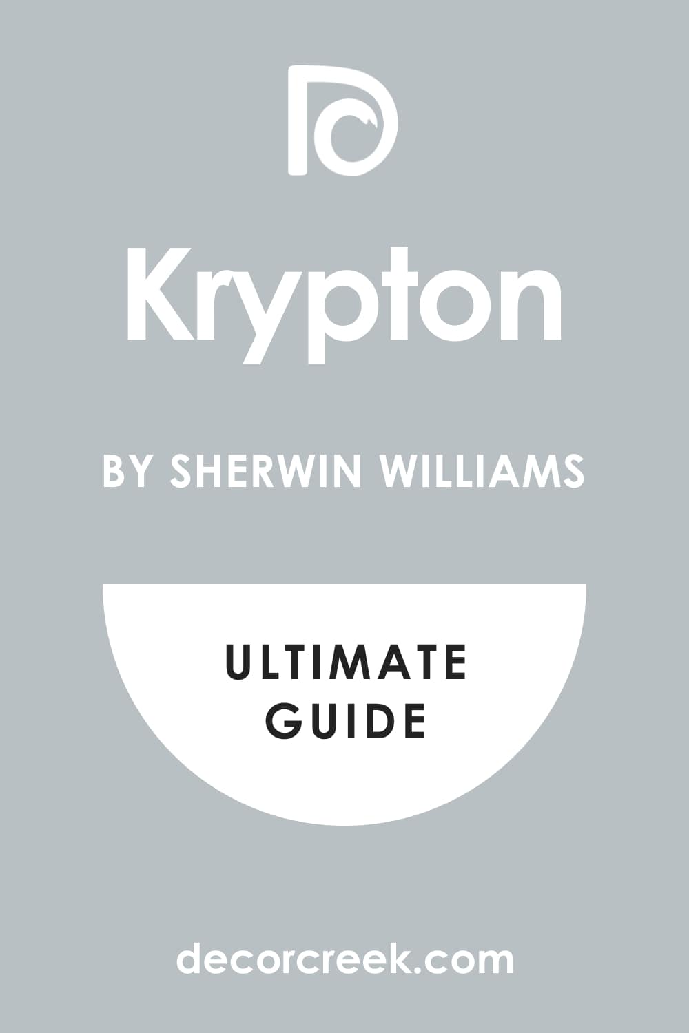
Denim SW 6523 + Krypton SW 6247
Denim is a classic, comfortable medium blue that offers a familiar, approachable feel, acting as a reliable, middle-ground blue tone. Krypton is a very light, almost silver-gray blue that offers just a whisper of cool color, acting as a sophisticated neutral brightener. Denim is an excellent choice for a wall color, creating a warm, welcoming, and relaxed atmosphere for family gatherings and daily living.
Krypton can be used on the ceiling or on the trim and doors, contrasting beautifully with the slightly darker, warmer Denim walls. Denim pairs wonderfully with natural textures, casual fabrics, and light wood furniture, enhancing its lived-in charm.
Krypton works perfectly in a modern or contemporary setting, adding a feeling of lightness, airiness, and a clean polish. Denim and Krypton together create a striking contrast between a comforting mid-tone and a cool, bright near-white, providing strong visual definition.
Krypton is great for reflecting light, making the room feel larger, while Denim anchors the furnishings with its familiar color. Denim is a friendly, dependable color, and Krypton adds a refined, almost ethereal lightness to the overall room design. Denim provides the hearty comfort, and Krypton provides the crisp, silver-like sophistication.
Krypton SW 6247 + Hale Navy HC-154
Krypton is a very light, nearly silver-gray blue that provides a whisper of cool color, serving as a bright, sophisticated, and reflective neutral. Hale Navy is the iconic, go-to deep navy blue from Benjamin Moore, offering immense architectural weight and formal confidence. Krypton is an ideal color for all walls in a living room, maximizing light and making the area feel open, airy, and visually expansive.
Hale Navy is the perfect color for an accent wall, a set of built-in cabinets, or a fireplace mantel, providing a deep, dramatic focal point. Krypton pairs beautifully with charcoal grays and bright whites, creating a clean, highly modern, and fresh overall scheme.
Hale Navy looks magnificent when contrasted with brass or gold metallic accents, enhancing its luxurious and deep pigment. Krypton and Hale Navy together create a stunning, classic high-contrast scheme that feels both bright and intensely dramatic.
Hale Navy grounds the entire design, preventing the lightness of Krypton from feeling too flimsy or unanchored. Krypton is perfect for a small room needing brightness, while Hale Navy adds the necessary depth and gravitas to the design. Krypton provides the airy lightness, and Hale Navy provides the unforgettable, powerful statement of color and depth.

Hale Navy HC-154 + Newburyport Blue HC-155
Hale Navy is the ultimate, deeply saturated navy blue, providing an impressive, stately, and sophisticated presence on any wall surface. Newburyport Blue is a rich, saturated mid-tone blue that manages to feel both classic and completely current, with a great depth of color. Hale Navy on an accent wall instantly creates drama and focus, especially behind a large sofa or a feature console table.
Newburyport Blue works beautifully on the remaining walls, providing a lighter, more vibrant tone that complements the dark navy without competing with it. Hale Navy and Newburyport Blue together create a beautiful, layered blue palette that feels deeply nautical, traditional, and incredibly well-curated.
Newburyport Blue is a great color choice for a room with a lot of natural light, allowing its richness to be fully appreciated and enjoyed. Hale Navy looks magnificent with bright, crisp white trim, making the color truly pop and feel defined.
Newburyport Blue is a versatile shade that works well with greens and yellows, injecting a subtle, lively contrast into the scheme. Hale Navy provides the ultimate anchor, and Newburyport Blue offers the perfect transitional color between the dark navy and the white trim or ceiling.

Newburyport Blue HC-155 + Van Deusen Blue HC-156
Newburyport Blue is a rich, saturated mid-tone blue that is both classic and current, offering significant color presence without being too dark or heavy. Van Deusen Blue is a deeply saturated blue that has a prominent slate or gray undertone, giving it a rich, denim-like, and slightly more muted appearance.
Newburyport Blue on the main walls creates a cheerful, traditional, and welcoming atmosphere, perfect for a main living room. Van Deusen Blue can be used effectively on built-in shelving or a fireplace mantel, providing a darker, more sophisticated focal point. Newburyport Blue pairs nicely with yellows and greens, creating a harmonious and appealing, nature-inspired palette.
Van Deusen Blue works well with rustic wood furniture and woven textures, lending itself to a more casual, lived-in aesthetic. Newburyport Blue and Van Deusen Blue together create a beautifully saturated, medium-to-dark blue scheme that feels incredibly rich, grounded, and very grown-up.
Van Deusen Blue’s gray undertone prevents the scheme from feeling too bright or stark, adding a sophisticated, dusty quality. Newburyport Blue is great for an active area, and Van Deusen Blue provides a more settled, intimate tone for a corner of the room. Van Deusen Blue offers the depth, and Newburyport Blue offers the vibrant, classic color for a refined design.

Van Deusen Blue HC-156 + Breath of Fresh Air 806
Van Deusen Blue is a deeply saturated blue with a distinct slate-gray undertone, offering a rich, sophisticated, and mature denim look on the wall. Breath of Fresh Air is a very pale, nearly pastel blue that is light and bright, like the color of the sky just after a rain shower. Van Deusen Blue is perfect for all walls in a living room where you want a substantial, sophisticated color that still feels soft and not too bright.
Breath of Fresh Air works wonderfully on the ceiling and the trim, creating a gentle, ethereal contrast that makes the room feel taller. Van Deusen Blue pairs well with burnt orange and mustard yellow, creating an inviting and warm color palette full of life.
вцуBreath of Fresh Air is excellent for maximizing light in a room, reflecting brightness and preventing the deeper Van Deusen Blue from feeling too heavy.
Van Deusen Blue and Breath of Fresh Air together create a sharp, gorgeous contrast between a confident, deep color and a delicate, airy lightness. Breath of Fresh Air can be used in an adjacent room to provide a gentle visual transition out of the deep blue living room. Van Deusen Blue provides the depth and weight, while Breath of Fresh Air provides the necessary feeling of openness and refreshing light.
Breath of Fresh Air 806 + Yarmouth Blue HC-150
Breath of Fresh Air is a very pale, nearly pastel blue that is light and bright, offering a delicate, airy wash of color on the wall. Yarmouth Blue is a classic medium blue with a good presence of gray, giving it a slightly muted, rich, and established look.
Breath of Fresh Air is an absolutely perfect color for all walls, making the living room feel light, open, and incredibly spacious and airy. Yarmouth Blue can be used on a feature wall, a furniture piece, or even on the ceiling for a surprising twist that provides depth and color interest.
Breath of Fresh Air pairs beautifully with other pale pastels and light, creamy neutrals for a gentle, cheerful color scheme. Yarmouth Blue works well with traditional furniture and antique pieces, providing a classic, reliable color foundation for the room’s furnishings. Breath of Fresh Air and Yarmouth Blue together create a beautiful, layered blue palette that moves gently from near-white to a comfortable, established mid-tone.
Yarmouth Blue prevents the lightness of Breath of Fresh Air from feeling too stark or washed out in a very sunny room. Breath of Fresh Air is perfect for making a small room feel bigger, and Yarmouth Blue grounds the furnishings with its quiet strength.
Yarmouth Blue HC-150 + Water’s Edge 1635
Yarmouth Blue is a classic, established medium blue with gray undertones, offering a rich, reliable, and sophisticated feel that works across styles. Water’s Edge is a deep, gorgeous blue that sits close to navy but has a distinct and appealing green-gray undertone, making it incredibly complex.
Yarmouth Blue on the main walls creates a comfortable, welcoming, and traditional atmosphere that feels familiar and settled. Water’s Edge works perfectly on an accent wall or on built-in shelving, providing a much deeper, moody, and very luxurious visual layer.
Yarmouth Blue pairs beautifully with warm wood tones and creamy fabrics, enhancing its gentle, historic quality. Water’s Edge looks fantastic when accented with deep gold or rich olive green, creating a moody, nature-inspired, and high-end aesthetic. Yarmouth Blue and Water’s Edge together create a rich, layered blue scheme that moves from an established mid-tone to a sophisticated, dramatic depth.
Water’s Edge provides an element of drama and richness, while Yarmouth Blue ensures the room maintains a feeling of brightness and openness. Yarmouth Blue is great for connecting different areas of the home, and Water’s Edge is perfect for creating a secluded, intimate corner.
Water’s Edge 1635 + Smoke 2122-40
Water’s Edge is a deep, gorgeous blue with a noticeable green-gray undertone, offering a rich, complex, and highly sophisticated color presence. Smoke is a lovely, medium-light blue that is heavily infused with gray, resulting in a perfectly soft, dusty, and delightfully muted near-neutral.
Water’s Edge is a fantastic choice for a dramatic, enveloping wall color, making the living room feel intimate, deep, and luxurious. Smoke works wonderfully on the trim, ceiling, and even the interior of a shallow display shelf, providing a soft, bright contrast.
Water’s Edge pairs beautifully with deep cream and rich velvet textures, creating an opulent and highly curated look. Smoke is excellent for reflecting light, ensuring the room doesn’t feel too dark despite the intense color of Water’s Edge on the walls.
Water’s Edge and Smoke together create a sharp, sophisticated contrast between a moody jewel tone and a light, airy, gray-blue neutral. Smoke is a great alternative to bright white, offering softness while still providing necessary lightness to the scheme. Water’s Edge has a luxurious depth, and Smoke provides the quiet, polished refinement for a mature, well-designed living room.

Smoke 2122-40 + Ocean Floor 1630
Smoke is a lovely, medium-light blue that is heavily infused with gray, resulting in a perfectly soft, dusty, and beautifully muted near-neutral color. Ocean Floor is a deep, rich blue that leans strongly toward teal, having a noticeable green undertone that makes it feel exotic and incredibly beautiful.
Smoke is an ideal color for the main walls, creating a refined, quiet atmosphere that feels adaptable and easy to live with. Ocean Floor works perfectly as a dramatic accent color on a piece of furniture, like a large console cabinet or an upholstered accent chair.
Smoke pairs beautifully with light, bleached wood tones and cream-colored furniture for a breezy, contemporary look. Ocean Floor looks fantastic when accented with bright lime green or sunny yellow, creating a bold, tropical-inspired color pop.
Smoke and Ocean Floor together create a brilliant, layered scheme that moves from a quiet neutral base to a vibrant, jewel-toned focal point. Ocean Floor’s vibrancy is perfectly grounded by the soft, sophisticated Smoke on the walls. Smoke is a wonderful backdrop for a minimalist design, and Ocean Floor injects a surprising amount of personality and confident color.
Ocean Floor 1641 + Big Country Blue 2066-30
Ocean Floor is a deep, rich blue that leans toward teal, having a noticeable green undertone that makes it feel exotic and incredibly beautiful. Big Country Blue is a strong, vibrant, and clear medium blue that has a clean, almost electric energy, feeling lively and fun. Ocean Floor is a beautiful wall color choice for a formal living room, creating a luxurious, jewel-toned, and completely unique atmosphere.
Big Country Blue works perfectly on a door, an interior window frame, or as a small accent on built-in shelving, providing a bright, clean contrast. Ocean Floor pairs beautifully with citrus tones and deep gold accents, creating a bold, worldly, and opulent color scheme.
Big Country Blue looks fantastic when complemented by warm wood tones and creamy white for a cheerful, cottage-like aesthetic. Ocean Floor and Big Country Blue together create a stunning, high-energy blue scheme that contrasts a rich, deep teal with a pure, vibrant medium blue.
Big Country Blue’s clarity prevents the deeper Ocean Floor from feeling too heavy, adding a refreshing burst of brightness. Ocean Floor provides the dramatic depth, and Big Country Blue provides the surprising, energetic, and happy spark of color.
Big Country Blue 2066-30 + Naval SW 6244
Big Country Blue is a strong, vibrant, and clear medium blue that has a clean, almost electric energy, feeling lively and fun. Naval is the ultimate deep navy, a dramatic and velvety color that brings immediate weight and sophistication to any living room design.
Big Country Blue on the walls creates a cheerful, active, and optimistic atmosphere, perfect for a high-traffic family area. Naval works perfectly on a grounding feature like a fireplace wall or a media console, providing a necessary layer of deep, rich contrast.
Big Country Blue pairs magnificently with warm wood tones and creamy white, creating a cheerful, cottage-like color scheme. Naval looks incredible with brass and gold accents, enhancing its luxurious and deep pigment and adding a refined touch to the room.
Big Country Blue and Naval together create a high-contrast, layered blue scheme that moves from vibrant energy to deep, stately sophistication. Naval provides the strong anchor, ensuring the energetic Big Country Blue does not feel too light or unrestrained on the walls. Big Country Blue is a very welcoming color, and Naval adds a necessary layer of formal, confident maturity.
18 Best Blue Living Room Color Schemes by Sherwin-Williams
Naval SW 6244 + Indigo Batik SW 7602
Naval is the quintessential deep navy, a dramatic and velvety color that brings immediate weight and sophistication to any living room. Indigo Batik is a slightly softer, more muted navy that carries a beautiful undertone of gray, making it feel more lived-in and comfortable.
Naval on an accent wall creates a powerful, intimate focus, especially behind a large piece of light-colored artwork. Indigo Batik works beautifully on the adjacent walls, providing a lighter, more approachable layer of deep blue.
Naval paired with Indigo Batik creates a rich, monochromatic blue scheme that offers fantastic visual depth and architectural interest. Indigo Batik’s dusty undertone prevents the intense Naval from feeling too stark, lending a velvety softness to the design.
Naval looks stunning when contrasted with crisp white trim, making the color truly pop and feel refined. Indigo Batik works well with natural textures like linen and jute, enhancing its comfortable, established charm. Naval is perfect for creating a sense of drama, while Indigo Batik ensures the room remains welcoming and cozy for daily use.
Indigo Batik SW 7602 + Aleutian SW 6241
Indigo Batik is a softer, slightly more muted navy that carries a beautiful undertone of gray, making it feel lived-in and comfortable. Aleutian is a gentle, mid-tone blue that is beautifully softened by a strong gray presence, making it very agreeable and adaptable.
Indigo Batik on the lower walls, capped with a white chair rail and Aleutian on the upper walls, creates a beautiful, layered, traditional look. Aleutian works wonderfully in an adjacent room, providing a light, soothing visual transition from the deep Indigo Batik living room.
Indigo Batik creates an established, grounded feel, pairing wonderfully with warm wood and antique brass accents. Aleutian is a perfect backdrop for warmer wood tones and creamy fabrics, providing a restful and refined contrast.
Indigo Batik and Aleutian together achieve a beautiful, tonal blue scheme that moves from a dark anchor to a soothing, gray-infused mid-tone. Aleutian prevents the room from feeling too heavy, offering a necessary lightness and sophisticated airiness to the scheme. Indigo Batik provides the depth, and Aleutian provides the gentle airiness for a perfectly balanced and cohesive living room.
Aleutian SW 6241 + Sleepy Blue SW 6225
Aleutian is a sophisticated, gray-infused mid-tone blue that feels restful and beautifully grounded, avoiding any harsh brightness. Sleepy Blue is an incredibly light, cloud-like blue that offers just a whisper of color, functioning as a near-neutral brightener.
Aleutian works wonderfully on all four walls to create a soothing, contained environment, with Sleepy Blue used only on the ceiling. Sleepy Blue can be used on the trim and doors to brighten the whole room dramatically, offering a soft contrast to the Aleutian walls.
Aleutian is a perfect backdrop for warmer wood tones and leather furniture, providing a refined, comfortable background that feels established. Sleepy Blue makes the room feel airy and refreshing, especially when paired with crisp white molding and simple, clean furniture lines.
Aleutian and Sleepy Blue together create a gentle, cool, and highly harmonious color scheme that feels light, soft, and completely restful. Sleepy Blue is excellent for maximizing the light in the room, reflecting any available brightness beautifully onto the walls. Aleutian offers the necessary color presence to keep the scheme from looking too washed out or overly pale in bright light.
Sleepy Blue SW 6225 + Stardew SW 9138
Sleepy Blue is a wonderfully delicate, light blue that acts as a gentle, bright neutral, reminiscent of a clear, pale sky on a quiet day. Stardew is a complex, muted color that sits between blue, gray, and green, giving it a rich, organic, and grounded quality. Sleepy Blue is perfect for the main wall color, maximizing the light and the feeling of openness in the living room area.
Stardew can be used as a high-impact accent on a fireplace wall or on a set of built-in cabinets, providing deep visual contrast and focus. Sleepy Blue pairs beautifully with light, creamy fabrics, while Stardew looks magnificent with brass accents and dark, rich wood tones for a mature contrast.
Stardew’s moody depth anchors the lightness of Sleepy Blue, preventing the overall color scheme from feeling too frail or ungrounded in the design. Sleepy Blue is excellent for small living rooms, creating an illusion of greater size and airiness with its high light reflectance.
Stardew brings a natural, earthy sophistication that makes the entire design feel bespoke, curated, and thoughtfully executed. Sleepy Blue and Stardew together create a perfectly balanced scheme of light and shadow, resulting in a design that is both bright and seriously sophisticated.
Stardew SW 9138 + Bracing Blue SW 6242
Stardew is a sophisticated, muted blue-gray-green that offers a unique, earthy richness and a highly refined appearance on the wall. Bracing Blue is a clear, vibrant, and energetic medium blue that is bright and invigorating, full of life and confident clarity.
Stardew can be used on the main walls to create a quiet, grounded atmosphere, with Bracing Blue used as a punchy accent on a piece of furniture or an area rug. Bracing Blue is a fantastic color for throw pillows or accent art, injecting a surprising, clean burst of energy against the Stardew walls.
Stardew’s organic, subtle nature allows the bright, focused clarity of Bracing Blue to truly stand out as a captivating focal point in the room. Bracing Blue prevents the sophisticated Stardew from feeling overly moody or too heavy, adding a necessary layer of crispness and vitality. Stardew pairs wonderfully with creamy off-whites, while Bracing Blue looks fantastic with bright, pure white trim and clean, modern lines.
Bracing Blue and Stardew together create a dynamic, interesting contrast between a soft, complex neutral and a vibrant, straightforward accent color. Stardew provides the grown-up sophistication, and Bracing Blue provides the surprising spark of cheerful, clean energy.
Bracing Blue SW 6242 + Distance SW 6243
Bracing Blue is a pure, clear, and energetic medium blue that feels bright, clean, and entirely invigorating, like a fresh, clear sky. Distance is a saturated, dusty blue with a strong gray undertone, sitting perfectly between a medium tone and a full navy.
Bracing Blue can be used as the primary wall color in a brightly lit room, providing a lively, cheerful atmosphere for daily activities and gatherings. Distance works perfectly on a dramatic accent wall, such as the area behind a television or a large piece of furniture, providing necessary visual anchor.
Bracing Blue looks magnificent with bright white and lemon yellow accents, enhancing its clean, fresh, and optimistic quality. Distance provides a necessary weight and maturity to the scheme, ensuring the brighter Bracing Blue does not feel too playful or unrestrained. Bracing Blue and Distance together create a vibrant, yet grounded blue scheme that offers great visual interest and depth to the room.
Distance looks wonderful with deep, rich wood furniture and warm, soft leather upholstery for a contrasting texture and feel. Bracing Blue’s clarity enhances the dusty richness of Distance, preventing the darker shade from looking flat or muddy on the wall.
Distance SW 6243 + Denim SW 6523
Distance is a rich, saturated blue that carries a strong, dusty gray note, offering substantial depth and a perfectly balanced mid-dark tone. Denim is a reliable, familiar medium blue that perfectly captures the comfortable, lived-in feel of classic blue jeans on the wall.
Distance can be used to paint the main living room walls, providing a grounded and sophisticated atmosphere that is both cozy and refined. Denim works wonderfully on a smaller feature wall, such as a gallery wall or a reading nook, offering a lighter, friendlier blue accent. Distance pairs beautifully with creamy whites and brushed gold, lending an elegant, mature feeling to the main living area’s design.
Denim looks fantastic with casual, woven textures and natural wood accents, creating a more relaxed, approachable corner in the design. Distance and Denim together create a subtle, layered blue look, with Distance offering the deeper color and Denim offering the familiar comfort of a classic shade.
Denim is great for a high-traffic family area, as its familiar tone is very welcoming and forgiving of daily wear and tear. Distance’s dusty complexity elevates the casual comfort of Denim, ensuring the overall scheme maintains a sense of sophisticated design.
Denim SW 6523 + Krypton SW 6247
Denim is a classic, comfortable medium blue that offers a familiar, approachable feel, acting as a reliable, middle-ground blue tone. Krypton is a very light, almost silver-gray blue that offers just a whisper of cool color, acting as a sophisticated neutral brightener.
Denim is an excellent choice for a wall color, creating a warm, welcoming, and relaxed atmosphere for family gatherings and daily living. Krypton can be used on the trim and doors, contrasting beautifully with the slightly darker, warmer Denim walls to add visual interest.
Denim pairs wonderfully with natural textures, casual fabrics, and light wood furniture, enhancing its lived-in, cozy charm. Krypton works perfectly in a modern or contemporary setting, adding a feeling of lightness, airiness, and a clean, refined polish. Denim and Krypton together create a striking contrast between a comforting mid-tone and a cool, bright near-white, providing strong visual definition.
Krypton is great for reflecting light, making the room feel larger, while Denim anchors the furnishings with its familiar, dependable color. Denim is a friendly, dependable color, and Krypton adds a refined, almost ethereal lightness to the overall room design.
Krypton SW 6247 + Blustery Sky SW 9140
Krypton is a very light, nearly silver-gray blue that provides a whisper of cool color, serving as a bright, sophisticated, and reflective neutral. Blustery Sky is a vibrant, mid-tone blue that has a clean, energetic quality, evoking the feeling of a clear, bright afternoon sky.
Krypton is an ideal color for all walls in a living room, maximizing light and making the area feel open, airy, and visually expansive. Blustery Sky is the perfect color for an accent wall, a piece of statement furniture, or a door, providing a clean, confident burst of color.
Krypton pairs beautifully with charcoal grays and bright whites, creating a clean, highly modern, and fresh overall scheme. Blustery Sky works well in homes with clean lines and contemporary furnishings, as its clarity complements modern design beautifully.
Krypton and Blustery Sky together create a stunning, vibrant contrast between a quiet neutral and an energetic, confident mid-tone blue. Blustery Sky grounds the lightness of Krypton, preventing the neutral from feeling too pale or unanchored in the design. Krypton provides the airy lightness, and Blustery Sky provides the clear, vibrant statement of confident, cheerful color.
Blustery Sky SW 9140 + Daphne SW 9151
Blustery Sky is a vibrant, mid-tone blue that has a clean, energetic quality, evoking the feeling of a clear, bright afternoon sky. Daphne is a highly saturated, rich jewel-toned blue that has a beautiful, almost exotic intensity, perfect for a high-impact design.
Blustery Sky can be used on the main walls, providing a lively, cheerful atmosphere, particularly in a brightly lit, active room. Daphne works wonderfully as a dramatic accent on a fireplace, a feature wall, or on built-in shelving, providing a luxurious, deep contrast.
Blustery Sky pairs beautifully with pure white and sunny yellow accents, enhancing its clean, fresh, and optimistic quality. Daphne looks magnificent when paired with peacock green and deep gold, creating a vibrant, rich, and worldly color scheme. Blustery Sky and Daphne together create a compelling, layered blue scheme that moves from a bright, clear medium tone to a deep, jewel-toned intensity.
Daphne’s richness prevents the brighter Blustery Sky from feeling too playful, adding a serious, high-end sophistication. Blustery Sky provides the refreshing energy, and Daphne provides the unforgettable, luxurious statement of deep color.
Daphne SW 9151 + Languid Blue SW 6226
Daphne is a highly saturated, rich jewel-toned blue that has a beautiful, almost exotic intensity, perfect for a high-impact, luxurious design. Languid Blue is a very soft, light blue with a noticeable presence of gray, giving it a cool, misty, and gently sophisticated quality.
Daphne can be used on an accent wall, creating a truly luxurious and dramatic focal point that draws all eyes to it. Languid Blue is perfect for the adjacent walls and ceiling, providing a quiet, cool, and soft background that maximizes light.
Daphne pairs magnificently with peacock green and deep gold, creating a vibrant, rich, and worldly color scheme that feels custom-designed. Languid Blue works well in rooms that have lower light, where its gentle quality prevents the room from feeling dark or heavy in any corner.
Daphne and Languid Blue together create a stunning, high-contrast scheme that moves from deep, luxurious color to a light, misty, cool neutral. Languid Blue’s softness ensures the intensity of Daphne remains focused and doesn’t overpower the entire living room area. Daphne provides the drama, and Languid Blue provides the quiet, refined background for a sophisticated space.
Languid Blue SW 6226 + Moscow Midnight SW 9142
Languid Blue is a very soft, light blue with a noticeable presence of gray, giving it a cool, misty, and gently sophisticated quality. Moscow Midnight is a dramatic, inky, deep blue that is so dark it borders on black, providing incredible architectural weight and intense sophistication.
Languid Blue is a wonderful choice for the main walls, creating a very light, restful, and adaptable atmosphere in the living room. Moscow Midnight works perfectly on a door, window trim, or a feature wall, providing a sharp, dramatic contrast to the light walls.
Languid Blue pairs beautifully with various shades of gray, from charcoal to dove gray, creating a harmonious and very modern scheme. Moscow Midnight pairs perfectly with shimmering metallic accents like silver and gold, creating a very luxurious and high-contrast look in the room.
Languid Blue and Moscow Midnight together create a bold, high-contrast scheme that moves from airy lightness to intense, grounding depth. Moscow Midnight anchors the lightness of Languid Blue, ensuring the room feels mature, powerful, and intentionally designed. Languid Blue provides the soft, cool canvas, and Moscow Midnight provides the unforgettable, glamorous visual statement.
Moscow Midnight SW 9142 + Sea Serpent SW 7615
Moscow Midnight is a dramatic, inky, deep blue that is so dark it borders on black, providing incredible architectural weight and intense sophistication. Sea Serpent is a deep, gorgeous blue that has a prominent green undertone, placing it firmly in the alluring teal-blue family, feeling rich and complex.
Moscow Midnight can be used on an accent wall or built-in cabinets, creating a moody, glamorous focal point in the design. Sea Serpent works beautifully on the adjacent walls, providing a lighter, more complex blue with a noticeable green shift, for a layered depth.
Moscow Midnight pairs perfectly with shimmering metallic accents like silver and gold, creating a very luxurious and high-contrast look in the room. Sea Serpent looks fantastic when accented with colors like coral or bright orange, creating a high-end, surprisingly energetic color pop.
Moscow Midnight and Sea Serpent together create a beautifully layered, deep blue scheme that offers incredible complexity and a modern, high-fashion feeling. Sea Serpent’s green undertone provides an organic contrast to the intense black-blue of Moscow Midnight, adding visual interest. Moscow Midnight provides the drama, and Sea Serpent provides the rich, complex, and memorable jewel-toned layer.
Sea Serpent SW 7615 + Tempe Star SW 6229
Sea Serpent is a deep, gorgeous blue that has a prominent green undertone, placing it firmly in the alluring teal-blue family, feeling rich and exotic. Tempe Star is a soft, gentle medium blue that has a good amount of gray mixed in, giving it a dusty, slightly historic, and very welcoming feel. Sea Serpent can be used on an accent wall, providing a rich, jewel-toned focal point that feels luxurious and sophisticated.
Tempe Star works perfectly on the adjacent walls, offering a lighter, more muted blue that connects the deep color to the white trim. Sea Serpent pairs beautifully with shades of cream, warm beige, and natural wood, creating a palette that is both rich and grounded in organic textures.
Tempe Star looks fantastic with warm, honey-toned wood and creamy white fabrics, creating a comfortable and charming cottage aesthetic in the room. Sea Serpent and Tempe Star together create a beautiful, harmonious scheme that moves from a deep, exotic teal to a soft, dependable, dusty medium blue.
Tempe Star’s muted quality ensures the richness of Sea Serpent remains the main visual draw without overwhelming the room. Sea Serpent provides the vibrant depth, and Tempe Star provides the quiet, historical comfort for a balanced design.
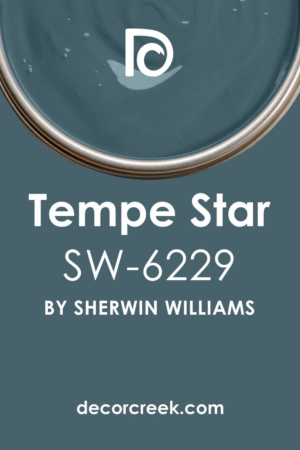
Tempe Star SW 6229 + Rain SW 6219
Tempe Star is a soft, gentle medium blue that has a good amount of gray mixed in, giving it a dusty, slightly historic, and very welcoming feel. Rain is a lovely, mid-tone blue that is heavily infused with gray and a slight hint of green, creating a muted, earthy, and very natural feeling.
Tempe Star can be used on the main living room walls, creating a settled, thoughtful, and comfortably traditional atmosphere for daily life. Rain works beautifully on an accent wall or on built-in shelving, providing a slightly lighter, more green-infused blue layer that contrasts subtly.
Tempe Star pairs beautifully with traditional furniture and antique pieces, providing a classic and reliable color foundation for the design. Rain looks wonderful with light to medium wood tones, creating a harmonious and unforced contrast that feels perfectly balanced with natural elements.
Tempe Star and Rain together create a very harmonious, layered scheme that uses different dusty, gray-infused mid-tones for subtle visual interest. Rain is excellent for a room with a collection of houseplants, as the color naturally complements the deep greens of the foliage. Tempe Star provides the dependable blue comfort, and Rain provides the quiet, soothing, and sophisticated earthy layer.
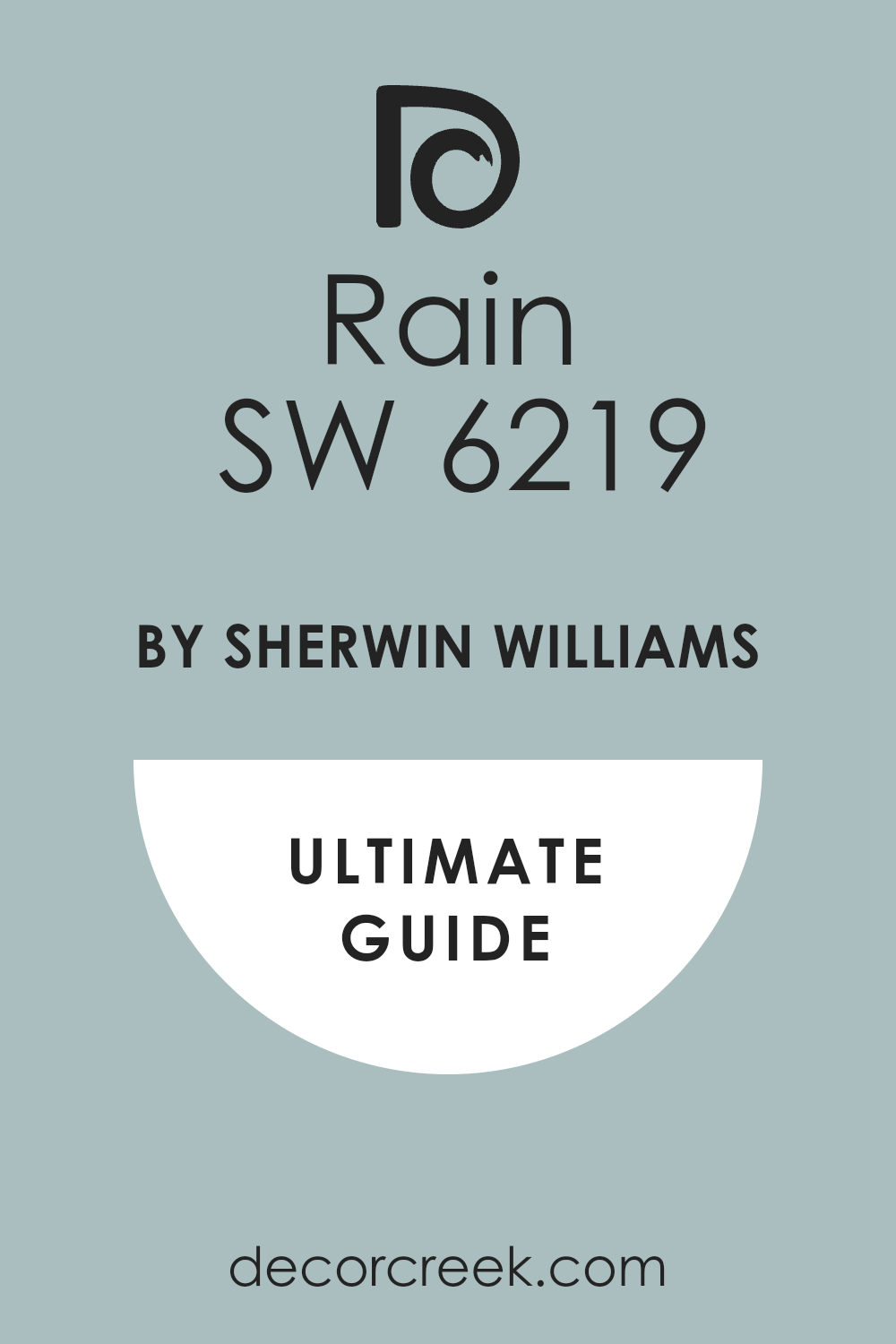
Rain SW 6219 + Windy Blue SW 6240
Rain is a lovely, mid-tone blue that is heavily infused with gray and a slight hint of green, creating a muted, earthy, and very natural feeling. Windy Blue is a clean, medium-light blue that has a refreshing, clear quality, reminiscent of a crisp, sunny sky on a breezy day.
Rain can be used on the main walls to create a relaxing, grounded atmosphere, perfect for quiet reflection and reading. Windy Blue works perfectly on the ceiling, the trim, or an adjacent accent wall, injecting a bright, clear, and energetic contrast.
Rain pairs beautifully with natural textures like linen, jute, and stone, enhancing its organic and soothing quality. Windy Blue looks fantastic when paired with polished chrome and glass, enhancing its fresh and contemporary, light-filled appeal. Rain and Windy Blue together create a stunning contrast between a sophisticated, muted earthy blue and a clear, vibrant, high-energy medium-light blue.
Windy Blue’s clarity prevents the dusty Rain from feeling too heavy or low, adding a necessary burst of brightness to the whole room. Rain provides the quiet, sophisticated structure, and Windy Blue provides the refreshing, optimistic, and welcoming energy.

Windy Blue SW 6240 + Moonmist SW 9144
Windy Blue is a clean, medium-light blue that has a refreshing, clear quality, reminiscent of a crisp, sunny sky on a breezy day. Moonmist is a very pale, ethereal blue that is heavily diluted with white and gray, resulting in an incredibly delicate, light, and airy color.
Windy Blue is an excellent choice for the main walls, providing a vibrant, yet still soft, pop of color that feels invigorating and positive. Moonmist works perfectly on the trim, the ceiling, and the doors, creating an incredibly soft, bright contrast that maximizes light reflectance.
Windy Blue pairs beautifully with bright white trim and ceiling, creating a sharp, clean, and perfectly balanced color contrast in the room. Moonmist looks fantastic when paired with light wood floors and white area rugs, enhancing its overall feeling of bright, airy cleanliness. Windy Blue and Moonmist together create a beautiful, light-filled scheme that contrasts a clear, refreshing blue with an almost-white, ethereal cool neutral.
Moonmist ensures the room feels incredibly spacious and open, while Windy Blue provides the definite, cheerful color presence. Windy Blue provides the friendly energy, and Moonmist provides the quiet, sophisticated, and light-reflecting background.
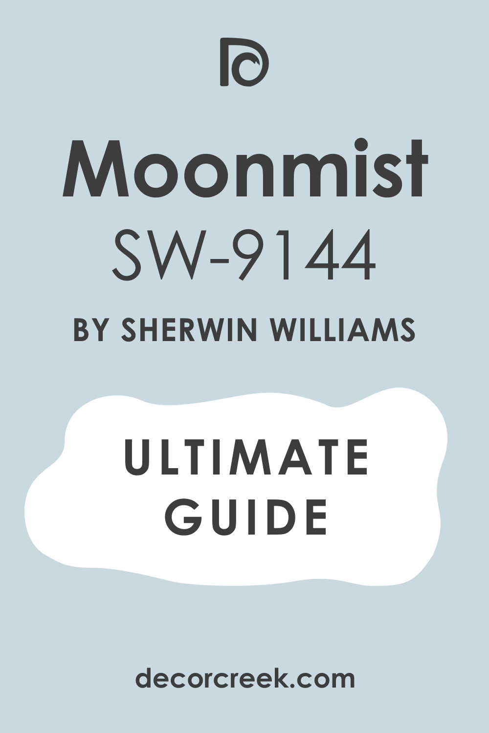
Moonmist SW 9144 + Naval SW 6244
Moonmist is a very pale, ethereal blue that is heavily diluted with white and gray, resulting in an incredibly delicate, light, and airy color. Naval is the ultimate deep navy, a dramatic and velvety color that brings immediate weight and sophistication to any living room.
Moonmist is an ideal color for all walls, creating a subtle, sophisticated, and incredibly bright atmosphere that feels open and airy. Naval works perfectly on a single accent wall, a fireplace surround, or a large piece of furniture, providing an intense, grounding focal point.
Moonmist pairs beautifully with light, creamy neutrals and simple white trim, creating a soft, dreamy, and highly sophisticated aesthetic. Naval looks incredible with brass and gold accents, enhancing its luxurious and deep pigment and adding a refined, mature touch to the room.
Moonmist and Naval together create a striking, classic high-contrast scheme that feels both bright and intensely dramatic and memorable. Naval grounds the entire design, preventing the airy lightness of Moonmist from feeling too flimsy or unanchored in the living area. Moonmist provides the ethereal lightness, and Naval provides the unforgettable, powerful statement of color and depth.
18 Best Blue Living Room Color Schemes — Trendy This Year
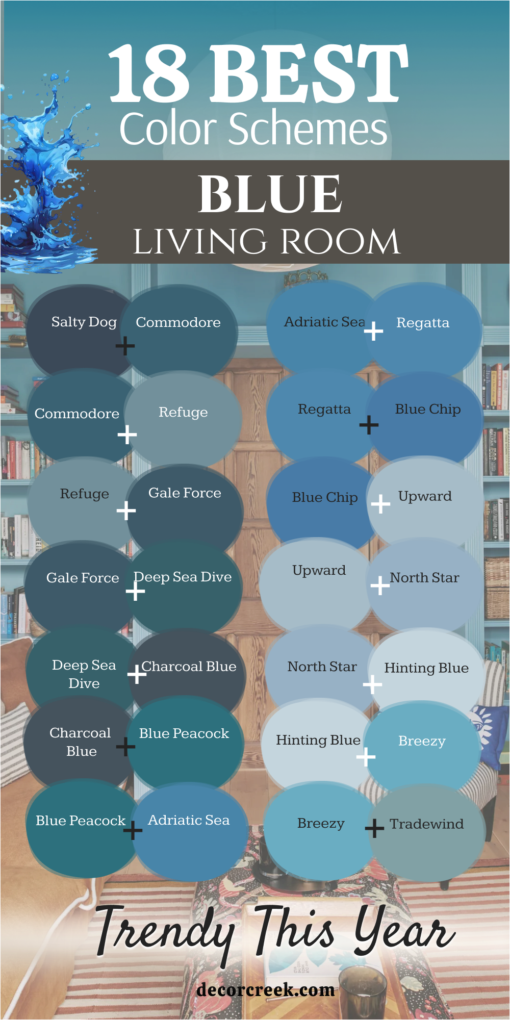
Salty Dog SW 9177 + Commodore SW 6524
Salty Dog is a rich, deep, and slightly vibrant navy that leans into the traditional nautical palette, feeling strong, confident, and full of life. Commodore is a deep, luxurious blue that has a prominent green undertone, placing it firmly in the gorgeous, dramatic teal family.

Salty Dog on an accent wall creates a powerful, intimate focus, especially behind a large piece of light-colored artwork or a light sofa. Commodore works beautifully on the adjacent walls, providing a lighter, more complex blue with a noticeable green shift, for a layered depth. Salty Dog paired with crisp white trim creates a classic, high-contrast, and energetic color scheme that feels reliable.
Commodore pairs beautifully with deep gold and unexpected colors like burnt orange or chartreuse for a vibrant, worldly aesthetic. Salty Dog and Commodore together create a rich, layered, and complex blue scheme that offers fantastic visual depth and is very current this year.
Commodore’s green undertone adds an organic contrast to the dark navy of Salty Dog, adding visual interest and movement. Salty Dog is perfect for grounding the room, and Commodore offers the luxurious, jewel-toned layer that is currently very popular.
Commodore SW 6524 + Refuge SW 6228
Commodore is a deep, luxurious blue that has a prominent green undertone, placing it firmly in the gorgeous, dramatic teal family, feeling rich and exotic. Refuge is a wonderfully muted, soft blue that is heavily infused with gray and a slight touch of green, giving it a peaceful, earthy quality.
Commodore on an accent wall creates a truly luxurious and dramatic focal point that feels custom-designed and high-end. Refuge works perfectly on the adjacent walls, providing a lighter, more muted blue-gray layer that connects the deep color to the white trim.
Commodore pairs beautifully with crisp white, deep gold, and unexpected colors like burnt orange for a vibrant, worldly aesthetic. Refuge pairs beautifully with various shades of warm beige, tan, and light wood, creating a very calm and nature-inspired color palette.
Commodore and Refuge together create a harmonious, layered scheme that moves from a deep, sophisticated jewel tone to a soft, incredibly popular gray-infused neutral base. Refuge ensures the intensity of Commodore remains focused and doesn’t overpower the entire living room area with its calming presence.
Refuge SW 6228 + Gale Force SW 7605
Refuge is a wonderfully muted, soft blue that is heavily infused with gray and a slight touch of green, giving it a peaceful, earthy, and highly versatile quality. Gale Force is an intense, deep, and dramatic blue that leans strongly towards the green-teal spectrum, offering a moody, powerful color statement.
Refuge can be used on the main walls to create a quiet, grounded atmosphere that feels adaptable and incredibly popular this year. Gale Force works perfectly on a dramatic accent wall or on a large, central piece of furniture, providing a deep, sophisticated focal point.
Refuge pairs beautifully with various shades of warm beige and light wood, creating a very calm and nature-inspired color palette. Gale Force pairs beautifully with bright white, warm gold, and vibrant colors like coral for a sophisticated and dramatic contrast that is very in vogue.
Refuge and Gale Force together create a beautiful, balanced scheme that contrasts a soft, light neutral base with a deep, moody, and highly intense jewel-toned accent. Gale Force’s intense depth anchors the lightness of Refuge, ensuring the room feels mature and powerfully designed.
Gale Force SW 7605 + Deep Sea Dive SW 7618
Gale Force is an intense, deep, and dramatic blue that leans strongly towards the green-teal spectrum, offering a moody, powerful color statement. Deep Sea Dive is an intense, saturated blue that is heavily influenced by a green undertone, placing it in a deep, rich teal category, feeling truly vibrant.
Gale Force on an accent wall instantly creates drama and focus, offering a significant, unforgettable color presence. Deep Sea Dive works beautifully on the adjacent walls, providing a similar, complex blue-green layer that is slightly less dark and more vibrant.
Gale Force pairs beautifully with bright white, warm gold, and vibrant colors like coral for a sophisticated and dramatic contrast. Deep Sea Dive pairs beautifully with shades of cream, emerald green, and deep gold, creating a rich, opulent, and worldly color palette.
Gale Force and Deep Sea Dive together create a highly layered, saturated scheme that utilizes deep teal shades for a truly moody and luxurious, monochromatic feel. Deep Sea Dive’s vibrancy complements the slightly darker Gale Force, offering rich movement and complexity across the walls. Both colors are incredibly popular this year for creating rich, custom-designed interiors.
Deep Sea Dive SW 7618 + Charcoal Blue SW 2739
Deep Sea Dive is an intense, saturated blue that is heavily influenced by a green undertone, placing it in a deep, rich teal category, feeling truly vibrant. Charcoal Blue is a deeply saturated, nearly black-blue that provides an extremely sophisticated, moody, and powerful color statement.
Deep Sea Dive on the main walls creates a high-energy, luxurious, and jewel-toned atmosphere, perfect for entertaining. Charcoal Blue works perfectly on a door, window trim, or as a strong accent on built-in shelving, providing the ultimate deep, grounding contrast.
Deep Sea Dive pairs beautifully with shades of cream, emerald green, and deep gold, creating a rich, opulent, and worldly color palette. Charcoal Blue pairs perfectly with bright white, polished chrome, and shimmering silver accents, creating a sharp, modern, and highly luxurious contrast.
Deep Sea Dive and Charcoal Blue together create a striking contrast between a vibrant jewel-toned teal and an intense, dramatic, near-black anchor color. Charcoal Blue anchors the vibrancy of Deep Sea Dive, ensuring the room feels mature, controlled, and exceptionally sophisticated in its design. Both colors are currently highly sought after for modern, dramatic interiors.
Charcoal Blue SW 2739 + Blue Peacock SW 0064
Charcoal Blue is a deeply saturated, nearly black-blue that provides an extremely sophisticated, moody, and powerful color statement. Blue Peacock is a vibrant, dazzling blue-green that is highly saturated and immediately captivating, living up to its bold, exotic name.
Charcoal Blue can be used on all walls to create a truly enveloping, intimate, and glamorous atmosphere that is unforgettable. Blue Peacock works perfectly as a high-impact accent on a single piece of furniture, a large canvas, or decorative accessories like throw pillows.
Charcoal Blue pairs perfectly with bright white, polished chrome, and shimmering silver accents, creating a sharp, modern, and highly luxurious contrast. Blue Peacock pairs magnificently with bright white, deep magenta, and sunny yellow, creating a playful, tropical, and highly spirited color scheme.
Charcoal Blue and Blue Peacock together create a stunning, powerful contrast between a moody, near-black anchor and an intense, vibrant, high-energy jewel tone. Blue Peacock’s vibrancy is dramatically enhanced by the deep darkness of the Charcoal Blue backdrop, making it truly pop.
Blue Peacock SW 0064 + Adriatic Sea SW 6790
Blue Peacock is a vibrant, dazzling blue-green that is highly saturated and immediately captivating, living up to its bold, exotic name. Adriatic Sea is a beautiful, clear, and bright medium blue that evokes the feeling of a sun-drenched European coastline, feeling fresh and clean.
Blue Peacock can be used on an accent wall, creating a truly luxurious and dramatic focal point that feels unique and memorable. Adriatic Sea works perfectly on the adjacent walls, providing a lighter, clearer, and more refreshing medium blue layer that connects well to the trim.
Blue Peacock pairs magnificently with bright white, deep magenta, and sunny yellow, creating a playful, tropical, and highly spirited color scheme. Adriatic Sea pairs excellently with bright white trim and creamy beige, creating a classic, elegant, and perfectly sun-washed coastal look that is very popular.
Blue Peacock and Adriatic Sea together create a stunning, high-energy blue scheme that contrasts a vibrant, jewel-toned teal with a clear, refreshing, medium-tone sky blue. Adriatic Sea’s clarity ensures the room maintains a feeling of brightness, while Blue Peacock provides the sophisticated, vibrant punch of color.
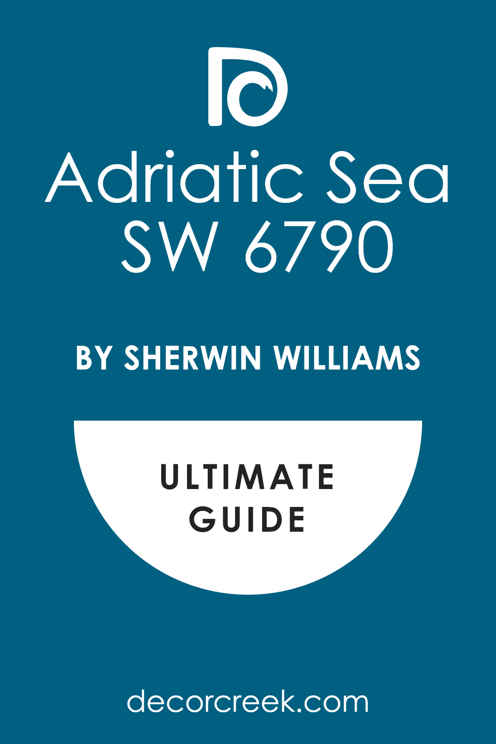
Adriatic Sea SW 6790 + Regatta SW 6517
Adriatic Sea is a beautiful, clear, and bright medium blue that evokes the feeling of a sun-drenched European coastline, feeling fresh and clean. Regatta is a vibrant, clear, and true medium blue that has a strong, confident presence on the wall, feeling both classic and perfectly current. Adriatic Sea can be used on the main walls, creating a clean, sun-washed, and highly welcoming atmosphere for daily living.
Regatta works perfectly on a door, an interior window frame, or as a feature wall, providing a punchier, slightly darker, and more vibrant accent. Adriatic Sea pairs excellently with bright white trim and creamy beige, creating a classic, elegant, and perfectly sun-washed coastal look.
Regatta pairs beautifully with bright white, deep red, and natural wood tones, creating a classic Americana or subtle nautical-inspired color scheme. Adriatic Sea and Regatta together create a cohesive, layered medium blue scheme that moves from a bright, sun-washed tone to a strong, pure, and confident statement blue.
Regatta’s strength grounds the slightly lighter Adriatic Sea, giving the overall design a defined and stable structure. Both shades are fantastic for adding life and true color to a contemporary home design.
Regatta SW 6517 + Blue Chip SW 6959
Regatta is a vibrant, clear, and true medium blue that has a strong, confident presence on the wall, feeling both classic and perfectly current. Blue Chip is a bright, clear, and highly saturated medium blue that carries a subtle, exciting touch of purple, making it unique and slightly electric.
Regatta can be used on the main walls, providing a strong, reliable, and cheerful color foundation for the room’s furnishings. Blue Chip works perfectly on a piece of statement furniture, or as a strong accent on a gallery wall, injecting a surprising, modern burst of color.
Regatta pairs beautifully with bright white, deep red, and natural wood tones, creating a classic Americana or subtle nautical-inspired color scheme. Blue Chip pairs beautifully with pure white and neon accents like lime green or hot pink for a bold, contemporary, and playful color scheme.
Regatta and Blue Chip together create a high-energy, vibrant blue scheme that contrasts a strong, pure blue with a slightly more electric, unique, and modern medium blue. Blue Chip’s unique purple note adds an unexpected, trendy twist to the classic tone of Regatta.
Blue Chip SW 6959 + Upward SW 6239
Blue Chip is a bright, clear, and highly saturated medium blue that carries a subtle, exciting touch of purple, making it unique and slightly electric. Upward is a very light, soft blue that is gently infused with gray, resulting in a perfectly airy, delicate, and beautifully washed-out color.
Blue Chip on an accent wall creates a truly energetic, vibrant, and unique focal point, perfect for a contemporary design. Upward works perfectly on the adjacent walls, providing a light, soft, and soothing neutral background that maximizes the light reflectance.
Blue Chip pairs beautifully with pure white and neon accents like lime green or hot pink for a bold, contemporary, and playful color scheme. Upward pairs beautifully with creamy whites, soft beiges, and pale wood tones, creating a tranquil, sophisticated, and contemporary aesthetic.
Blue Chip and Upward together create a gorgeous, high-contrast scheme that moves from an intense, unique medium blue to a soft, airy, and incredibly popular light neutral. Upward’s quiet softness ensures the vibrancy of Blue Chip remains the main focus without making the entire room feel restless.

Upward SW 6239 + North Star SW 6246
Upward is a very light, soft blue that is gently infused with gray, resulting in a perfectly airy, delicate, and beautifully washed-out color. North Star is a gentle, medium-light blue that is heavily infused with cool gray, resulting in a soft, dusty, and wonderfully adaptable near-neutral.
Upward can be used on all walls to create a very light, bright, and neutral feeling throughout the entire living room area. North Star works perfectly on a single accent wall, a set of built-in cabinets, or a fireplace mantel, providing a slightly deeper, more grounding blue accent.
Upward pairs beautifully with creamy whites, soft beiges, and pale wood tones, creating a tranquil, sophisticated, and contemporary aesthetic. North Star pairs beautifully with charcoal gray, pure white, and black accents, creating a crisp, highly modern, and refined color scheme.
Upward and North Star together create a harmonious, layered scheme of light, cool neutrals that offer subtle color interest and maximize the feeling of openness. North Star’s slightly deeper gray-blue hue adds necessary definition to the walls without compromising the room’s overall feeling of airiness and light.
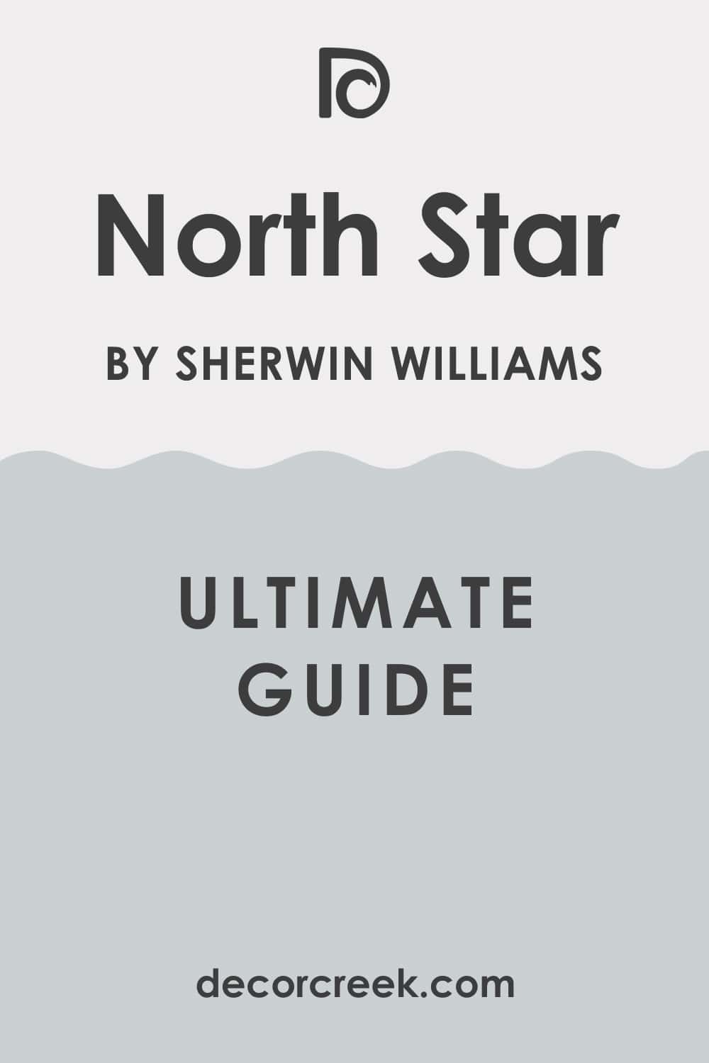
North Star SW 6246 + Hinting Blue SW 6519
North Star is a gentle, medium-light blue that is heavily infused with cool gray, resulting in a soft, dusty, and wonderfully adaptable near-neutral. Hinting Blue is a very pale, almost white blue that offers the slightest suggestion of color, providing a refreshing and light alternative to a pure white wall.
North Star can be used on the main walls, providing a light, soothing, and sophisticated color foundation that feels refined and current. Hinting Blue works perfectly on the trim, ceiling, and doors, creating an incredibly soft, ethereal, and beautifully clean contrast throughout the room.
North Star pairs beautifully with charcoal gray, pure white, and black accents, creating a crisp, highly modern, and refined color scheme. Hinting Blue works wonderfully in smaller living rooms or rooms with lower ceilings, as the lightness visually expands the area.
North Star and Hinting Blue together create a beautifully soft, layered scheme of light, cool-toned blues, maximizing light and airiness. Hinting Blue’s near-white quality enhances the gentle blue presence of North Star, ensuring the walls feel quiet yet colorful.
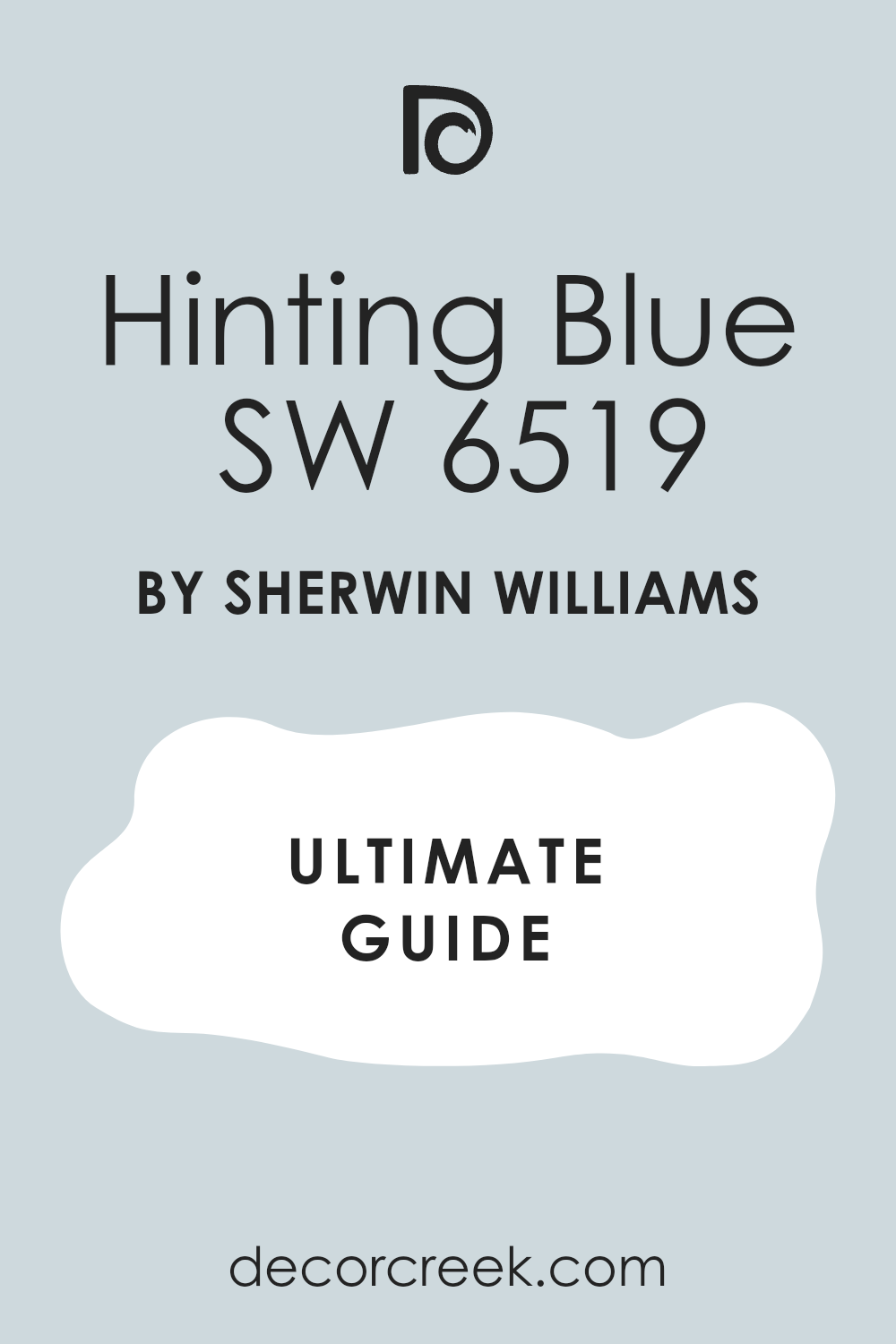
Hinting Blue SW 6519 + Breezy SW 7616
Hinting Blue is a very pale, almost white blue that offers the slightest suggestion of color, providing a refreshing and light alternative to a pure white wall. Breezy is a clear, light, and very clean medium blue that is vibrant and refreshing, living up to its name with a bright, energetic quality.
Hinting Blue can be used on the main walls, providing a subtle, sophisticated, and incredibly bright atmosphere that feels open and expansive. Breezy works perfectly on a single piece of statement furniture, a door, or a small accent wall, injecting a surprising, clean, and cheerful burst of color.
Hinting Blue pairs beautifully with pure white trim and creamy neutrals, creating a soft, dreamy, and highly sophisticated aesthetic. Breezy pairs beautifully with bright white and sunny yellow accents, creating a high-contrast, playful, and wonderfully optimistic color scheme.
Hinting Blue and Breezy together create a crisp, high-contrast scheme that moves from an almost-white, ethereal cool neutral to a vibrant, clean, and energetic medium blue. Breezy provides the necessary life and energy to the scheme, ensuring the softness of Hinting Blue doesn’t feel too pale or unanchored.
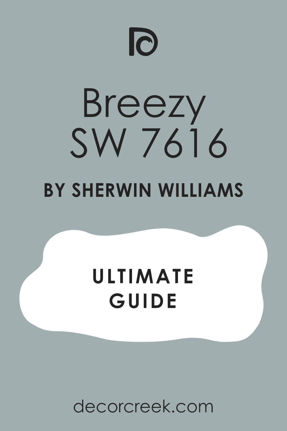
Breezy SW 7616 + Tradewind SW 6218
Breezy is a clear, light, and very clean medium blue that is vibrant and refreshing, living up to its name with a bright, energetic quality. Tradewind is a soft, muted blue-green that is heavily infused with gray, resulting in a beautiful, soothing, and perfectly earthy color.
Breezy can be used on the main walls, providing a cheerful, yet still soft, pop of color that feels invigorating and positive for a family living room. Tradewind works beautifully on an accent wall or built-in cabinets, providing a slightly darker, more muted blue-green layer that adds sophisticated depth.
Breezy pairs beautifully with bright white and sunny yellow accents, creating a high-contrast, playful, and wonderfully optimistic color scheme. Tradewind pairs beautifully with shades of creamy white, light beige, and natural jute, creating a very calm and organic color palette.
Breezy and Tradewind together create a beautiful contrast between a clear, light blue and a muted, earthy blue-green, offering visual interest and depth. Tradewind’s sophisticated gray undertone grounds the vibrancy of Breezy, making the overall scheme feel more complex and mature.

Tradewind SW 6218 + Jetstream SW 6492
Tradewind is a soft, muted blue-green that is heavily infused with gray, resulting in a beautiful, soothing, and perfectly earthy color. Jetstream is a clean, bright, and very pure medium blue that has a noticeable, vibrant energy, feeling completely refreshing and full of life.
Tradewind can be used on the main walls, creating a relaxing, grounded atmosphere, perfect for quiet reflection and a nature-inspired design. Jetstream works perfectly on a door, trim, or as a feature wall, injecting a clear, bright, and invigorating contrast to the muted base.
Tradewind pairs beautifully with shades of creamy white, light beige, and natural jute, creating a very calm and organic color palette. Jetstream pairs beautifully with bright white and sunny yellow accents, creating a playful, energetic, and wonderfully optimistic color scheme.
Tradewind and Jetstream together create a strong contrast between a sophisticated, muted earthy blue-green and a clear, vibrant, high-energy medium blue. Jetstream’s clarity prevents the dusty Tradewind from feeling too heavy or low, adding a necessary burst of brightness to the whole room.
Jetstream SW 6492 + Billowy Breeze SW 9055
Jetstream is a clean, bright, and very pure medium blue that has a noticeable, vibrant energy, feeling completely refreshing and full of life. Billowy Breeze is a light, nearly pastel blue that is soft, delicate, and beautifully diluted with white, giving it a wonderfully ethereal quality.
Jetstream can be used on a feature wall, providing a bright, confident, and energetic focal point that feels modern and lively. Billowy Breeze works perfectly on the adjacent walls and ceiling, providing a light, soft, and soothing background that maximizes the light reflectance.
Jetstream pairs beautifully with bright white and sunny yellow accents, creating a playful, energetic, and wonderfully optimistic color scheme. Billowy Breeze pairs beautifully with pure white trim, creamy beiges, and simple white furniture, creating a soft, dreamy, and highly sophisticated aesthetic.
Jetstream and Billowy Breeze together create a crisp, high-contrast scheme that moves from a vibrant, pure medium blue to a delicate, almost-white, ethereal cool neutral. Billowy Breeze ensures the room feels incredibly spacious and open, while Jetstream provides the definite, cheerful, and confident color presence.
Billowy Breeze SW 9055 + Manitou Blue SW 6501
Billowy Breeze is a light, nearly pastel blue that is soft, delicate, and beautifully diluted with white, giving it a wonderfully ethereal quality. Manitou Blue is a vibrant, deeply saturated blue that has a slight but noticeable touch of purple, giving it a rich, electric, and highly captivating intensity.
Billowy Breeze can be used on all walls to create a subtle, sophisticated, and incredibly bright atmosphere that feels open and expansive. Manitou Blue works perfectly on a single piece of statement furniture, a large canvas, or a feature wall, providing an intense, unique, and grounding focal point.
Billowy Breeze pairs beautifully with pure white trim, creamy beiges, and simple white furniture, creating a soft, dreamy, and highly sophisticated aesthetic. Manitou Blue pairs beautifully with pure white and deep navy for a sharp, modern look or with warm gold and amber for a richer aesthetic.
Billowy Breeze and Manitou Blue together create a stunning, high-contrast scheme that moves from a delicate, light neutral to a rich, vibrant, electric medium blue. Manitou Blue’s depth and unique tone ensures the airy Billowy Breeze feels intentional and stylishly anchored.
Manitou Blue SW 6501 + Salty Dog SW 9177
Manitou Blue is a vibrant, deeply saturated blue that has a slight but noticeable touch of purple, giving it a rich, electric, and highly captivating intensity. Salty Dog is a rich, deep, and slightly vibrant navy that leans into the traditional nautical palette, feeling strong, confident, and full of life.
Manitou Blue can be used on the main walls, providing a bright, confident, and energetic color foundation that is highly modern and unique. Salty Dog works perfectly on an accent wall, a fireplace surround, or a door, providing a powerful, darker, and more traditional counterpoint.
Manitou Blue pairs beautifully with pure white and deep navy for a sharp, modern look or with warm gold and amber for a richer aesthetic. Salty Dog paired with crisp white trim creates a classic, high-contrast, and energetic color scheme that feels reliable and established.
Manitou Blue and Salty Dog together create a bold, layered scheme that contrasts a vibrant, electric medium blue with a deep, strong navy, offering incredible visual depth. Salty Dog provides the sophisticated anchor, ensuring the energetic Manitou Blue remains controlled and mature in the design.
My Final Thoughts About Blue Living Room Color Schemes
Choosing the right blue for your living room is one of the most rewarding decisions you can make in your home design journey. I’ve seen firsthand how a change in wall color, especially with a blue shade, can completely alter the feeling of a room.
Whether you select a dramatic navy like Naval to create a cozy, sophisticated den or a pale, airy tone like Sleepy Blue to make a small area feel bigger and brighter, the emotional power of blue is undeniable.
These 18 color schemes, pulled from the best of Sherwin-Williams and Benjamin Moore, offer a perfect starting point for any design preference you have.
Remember to consider your light and existing furniture, but most importantly, pick the color that makes you feel happiest and most at home. Blue is a beautiful way to introduce richness, comfort, and character into your living room that you will enjoy for years to come.
Ultimately, the goal of any design project is to create a living area that truly reflects your personality and functions as a personal sanctuary, and blue is a magnificent tool for achieving that. I encourage you to use the curated list of 18 blues not just as a palette of options, but as a roadmap for finding the perfect emotional tone for your area.
Think about how the subtle gray in a color like Krypton can make a room feel quietly refined, or how the vivid clarity of Bracing Blue can inject pure optimism into your daily life.
The longevity and versatility of these carefully selected shades mean your investment in this color will continue to pay off aesthetically for many seasons. Take the time to sample your favorites on large boards, observing how they interact with your unique lighting throughout the day.
By doing this final check, you ensure that the blue you choose is not just trendy, but the one that resonates most deeply with you, guaranteeing a result that is both stylish and genuinely comforting.