Dark brown paint is making a significant and powerful comeback in the world of modern home design as it brings a sense of sophisticated luxury to any living space. It truly feels like an incredibly warm and oversized hug for your walls that instantly transforms the atmosphere of your entire house.
Many people feel naturally scared or hesitant when considering such deep and dark colors because they mistakenly believe the room will look like a cramped or gloomy cave. I am here to tell you with absolute certainty that choosing the right shade of rich brown actually makes a room feel remarkably cozy, intimate, and impressively expensive.
It is a deeply grounded and stable color that reminds us of the raw beauty of nature and the comforting richness of fine dark chocolate.
Using these intense and deep tones helps you successfully create a unique look that manages to be both daringly bold and incredibly welcoming at the same time.
You can choose to use it on all four walls for a total transformation or simply as a special and eye-catching accent to highlight your favorite features.
My ultimate goal is to guide you through the selection process and help you find the exact specific shade that perfectly fits the architecture of your house and the unique traits of your personality.
Why I Always Trust Sherwin-Williams and Benjamin Moore for the Best Dark Brown Paint Colors
I have spent years looking at paint swatches and testing samples on walls. Sherwin-Williams and Benjamin Moore are the two brands I use for every single project. Their paint covers the walls smoothly and the colors look exactly like the little paper chips.
When you buy cheap paint, the dark colors can look streaky or weird. These two brands make sure the brown stays rich and deep after it dries. They also offer many different finishes so you can pick how shiny you want your walls to be.
Trusting a professional brand means you will not have to paint the room twice to get it right.
How I Choose the Perfect Dark Brown Paint Color for Any Room
Picking a brown is about looking at the undertones hidden inside the paint. Some browns look a little bit green while others look like they have red or purple in them. I always tell my clients to look at their floors and furniture before they buy a gallon.
Light is also a big deal when you go dark. A room with big windows can handle a very dark chocolate color. If your room is small with no windows, you might want a brown that feels a little warmer and softer.
I always test a big patch on the wall to see how the color changes from morning to night.
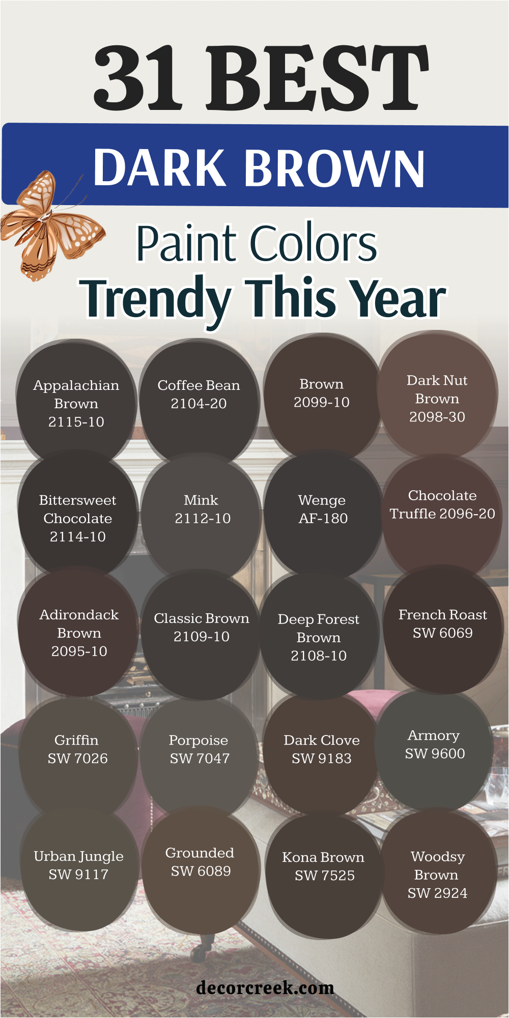
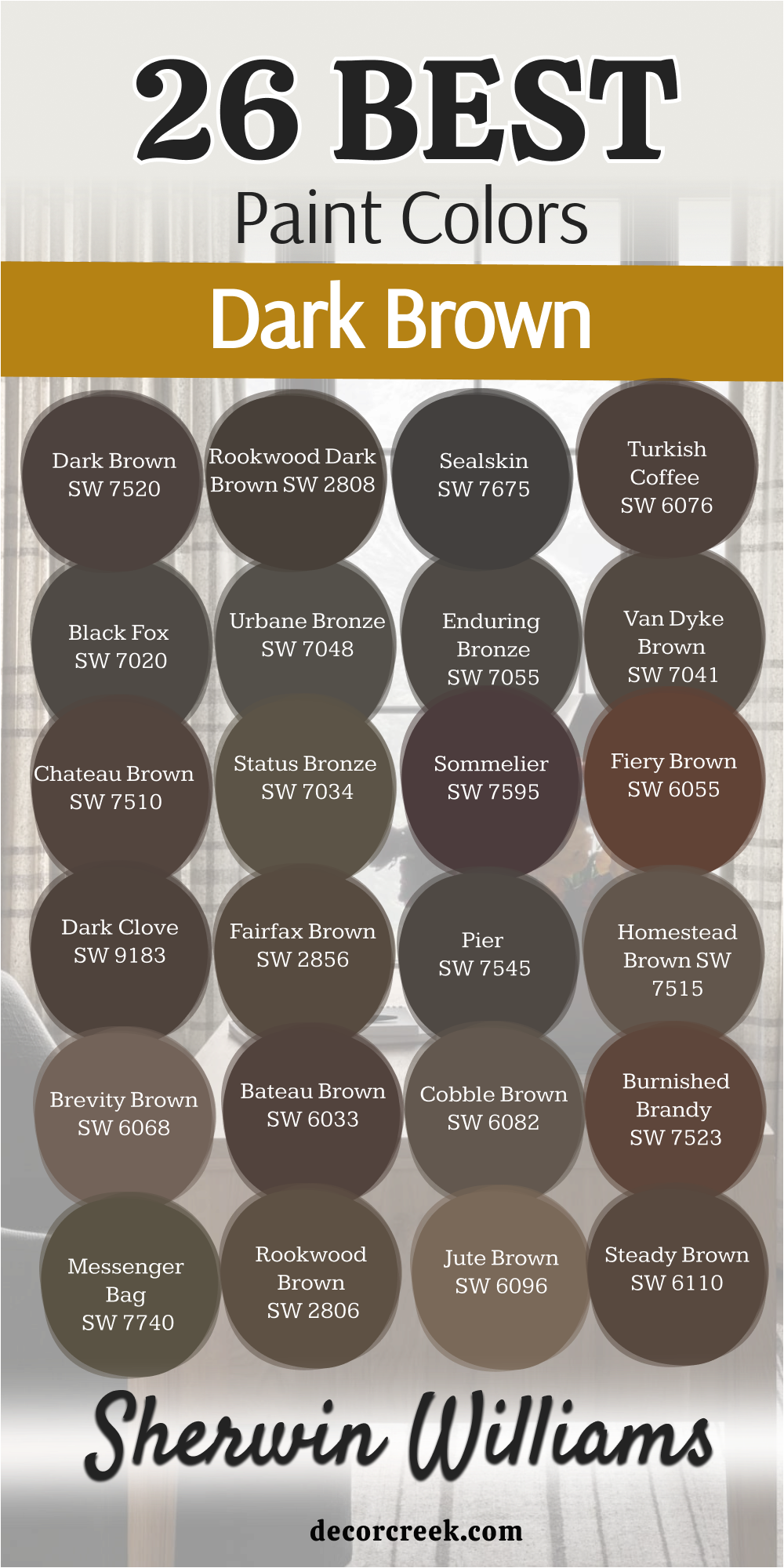
31 Best Dark Brown Paint Colors Trendy This Year
Dark Brown SW 7520
Dark Brown SW 7520 is a classic choice for anyone who wants a true chocolate look on their walls. This color feels solid and reliable because it does not have many strange undertones. It works well in a library or a study where you want to focus on your books. You will notice how it makes gold picture frames stand out against the dark background.
Natural light makes this shade look rich and very creamy. It is a great pick for a front door if you want your house to look high-end. I love how it looks next to white trim because the contrast is very sharp.
People will think you spent a lot of money on a professional decorator when they see this. It stays looking fresh for a long time because the pigment is so strong. You can use it to hide small bumps on old walls.
Best used in: libraries, studies, front doors, and dining rooms
Pairs well with: Alabaster SW 7008, Gold accents, Creamy whites, and light oak floors The key rule of this color for farmhouse style is to use it where you want the architecture to stand out with strength and stability.
🎨 Check out the complete guide to this color right HERE 👈
Rookwood Dark Brown SW 2808
Rookwood Dark Brown SW 2808 has a tiny bit of green hidden inside the deep pigment. This makes it feel like a color you would find deep in a forest. It is part of a historic collection so it feels very traditional and smart. Many people use this on the outside of their homes to match the trees and grass.
Inside, it looks very handsome in a bedroom with heavy wooden furniture. It creates a mood that is very steady and grounded for a good night of sleep. The color is dark enough to feel bold but it never looks like plain black.
It changes slightly as the sun moves across the sky during the day. You should try it if you like colors that feel like they have a history. It is a favorite for older homes with lots of character.
Best used in: home offices, master bedrooms, home exteriors, and trim
Pairs well with: Sage greens, Tan leathers, Antique white, and brick The key rule of this color for farmhouse style is to use it to connect your indoor living areas with the natural colors of the outdoors.
Sealskin SW 7675
Sealskin SW 7675 is one of the darkest browns you can find before the color turns into black. It looks like a very dark piece of charcoal mixed with a cup of espresso. This color is perfect for a modern house that needs some drama. It makes a room feel very expensive and high-fashion without being too cold.
I often use this on kitchen cabinets to make a statement. The finish looks very smooth and velvet-like when it is applied correctly. It works best in rooms that get a lot of natural sunlight from the windows.
Without light, it might look a little bit too dark for a small area. This color is a top pick for designers who want a bold look. It is very popular for accent walls behind a television or a bed.
Best used in: kitchen cabinets, accent walls, media rooms, and modern exteriors
Pairs well with: Cool grays, Marble countertops, and silver hardware The key rule of this color for farmhouse style is to use it as a bold anchor that adds a modern twist to traditional wood elements.
🎨 Check out the complete guide to this color right HERE 👈
Turkish Coffee SW 6076
Turkish Coffee SW 6076 is a warm and inviting shade that looks just like its name suggests. It has a reddish base that makes the room feel much warmer than a gray-brown would. This is the color I choose when I want a living room to feel very cozy. It reminds me of old leather chairs and warm fireplaces.
The color is very deep but it still feels like a true brown in any light. It makes white furniture pop and look very bright and clean. You can use it in a dining room to make dinner parties feel more intimate.
It is a very friendly dark color that does not feel scary to use. Many homeowners love how it brings a sense of comfort to a large open area. It is a great choice for a basement that needs some warmth.
Best used in: living rooms, dining rooms, basements, and cozy dens
Pairs well with: Pure White SW 7005, Copper accents, Warm beige, and dark wood The key rule of this color for farmhouse style is to use it to create a sense of heritage and warmth in family gathering areas.
🎨 Check out the complete guide to this color right HERE 👈
Black Bean SW 6006
Black Bean SW 6006 is a very cool and deep brown that almost looks like a dark plum. It has a purple undertone that gives it a very royal and fancy feeling. This color is great for someone who wants something different than a standard tan or brown. It looks very sophisticated in a bathroom with white tile and gold faucets.
The dark pigment hides dirt and fingerprints very well in high-traffic areas. It is a very moody color that works well for people who love a dramatic style. I like to use it in small doses if the room does not have a lot of light.
On a big wall, it feels very powerful and makes a huge statement. It is a unique shade that people will definitely ask you about. You can use it to create a very posh look in a small powder room.
Best used in: powder rooms, accent walls, shutters, and formal dining areas
Pairs well with: Soft lavender, Crisp white, Brass fixtures, and light gray The key rule of this color for farmhouse style is to use it sparingly to add a touch of mystery and depth to a light-colored room.
🎨 Check out the complete guide to this color right HERE 👈
Bitter Chocolate SW 6013
Bitter Chocolate SW 6013 is a dark and tasty-looking color that feels very organic. It is a very deep brown that looks like it came straight from a cocoa bean. This color is perfect for creating a cozy nook in a large house. It has a lot of depth and does not look flat or boring on the wall.
I suggest using this color in a bedroom where you want to feel tucked in at night. It works beautifully with natural fabrics like linen and wool. The color looks very rich when paired with light-colored rugs and pillows.
It is a great middle-ground between a light brown and a black. Most people find this color very easy to live with for many years. It is a solid choice for anyone who loves earth tones.
Best used in: bedrooms, reading nooks, hallways, and mudrooms
Pairs well with: Creamy beige, Olive green, Terracotta, and natural wood The key rule of this color for farmhouse style is to use it to bring a natural, earthy feel to rooms that have lots of plants.
Otter SW 6041
Otter SW 6041 is a softer dark brown that feels a bit more like a deep taupe. It is not as harsh as the darker chocolate colors on this list. This makes it a great choice for people who are trying dark paint for the first time. It feels very balanced and works in almost any room in the house.
The color has a gray tint that keeps it looking modern and fresh. It is very popular for laundry rooms or bathrooms where you want a clean look. You can pair it with many different colors because it is very flexible.
It looks especially good with blue or green accents. This is a very safe and pretty choice for a full room. It makes the space feel very put together and organized.
Best used in: laundry rooms, bathrooms, guest rooms, and entryways
Pairs well with: Sea Salt SW 6204, Rainwashed SW 6211, White flour, and slate floors The key rule of this color for farmhouse style is to use it as a soft neutral that bridges the gap between dark accents and light walls.
Sable SW 6083
Sable SW 6083 is a rich and glowing brown that feels very high-end. It has a golden warmth that prevents it from looking muddy or dull. This color reminds me of expensive fur or polished wood. It is a great color for a home office where you want to feel powerful and productive.
The warmth in the paint makes the room feel sunnier even on a cloudy day. It looks beautiful when the afternoon sun hits the walls. I love to use this color with creamy white trim to create a very classic look.
It is a very durable color that looks good in both matte and shiny finishes. You will enjoy how it makes your furniture look more expensive than it really is. It is a very sophisticated pick for any homeowner.
Best used in: home offices, formal living rooms, libraries, and master suites
Pairs well with: Dover White SW 6385, Gold leaf, Navy blue, and walnut wood The key rule of this color for farmhouse style is to use it to add a layer of luxury and polish to rustic wooden elements.
Cocoa Whip SW 9084
Cocoa Whip SW 9084 is a lighter version of a dark brown that feels very creamy. It looks like milk chocolate or a warm latte. This color is very easy on the eyes and makes a room feel very friendly. It is a wonderful choice for a nursery or a child’s bedroom.
The color is dark enough to have a personality but light enough to not feel heavy. It creates a very soft background for colorful toys and decorations. I like how it looks with light-colored woods like pine or birch.
It is a very happy shade of brown that feels very modern. Many people pick this color for their kitchens because it feels very clean and warm. It is a very versatile shade for many different styles.
Best used in: nurseries, kitchens, children’s rooms, and breakfast nooks
Pairs well with: Shoji White SW 7042, Soft pink, Light blue, and pine wood The key rule of this color for farmhouse style is to use it where you want a light and airy feel but still want the warmth of brown.
🎨 Check out the complete guide to this color right HERE 👈
Warm Stone SW 7032
Warm Stone SW 7032 is a very popular color because it sits right between brown and gray. It is a dark greige that looks very natural and stony. This color is perfect for the exterior of a house or a large living room. It feels very solid and gives a house a very grounded look.
Inside, it looks very modern and works well with industrial or farmhouse styles. It is a great color for hiding imperfections on the walls. The gray tones keep it from feeling too red or too orange.
It is a very cool-toned brown that looks great with black metal accents. Many designers love this color for its ability to match almost anything. It is a very smart choice for a long-term paint color.
Best used in: house exteriors, living rooms, fireplaces, and large hallways
Pairs well with: Iron Ore SW 7069, Repose Gray SW 7015, Eider White SW 7014, and black metal The key rule of this color for farmhouse style is to use it to provide a strong and neutral base for metal and wood textures.
🎨 Check out the complete guide to this color right HERE 👈

Tavern Taupe SW 7508
Tavern Taupe SW 7508 is a very balanced shade that feels like a mix of old wood and smooth stone. It is a darker neutral that does not feel too heavy when you put it on all four walls. This color works perfectly for a hallway because it makes the transition between rooms feel very natural.
You will see that it has a bit of a gray tint which keeps it looking very modern. It is a great choice for a kitchen where you want a color that hides messes but still looks clean. I love how it makes white plates and bright towels look much sharper.
The color stays very consistent even when the light changes throughout the afternoon. It gives a room a very sturdy and reliable feeling that many people find very relaxing. This is a top pick for a house that has a lot of traditional furniture. You can use it to make a large room feel a little bit more personal and filled with warmth.
Best used in: hallways, kitchens, entryways, and laundry rooms
Pairs well with: Shoji White SW 7042, Urbane Bronze SW 7048, Sandbar SW 7547, and light oak The key rule of this color for farmhouse style is to use it as a bridge between your lighter walls and darker wooden furniture.
🎨 Check out the complete guide to this color right HERE 👈
Woodsy Brown SW 2924
Woodsy Brown SW 2924 feels like a walk through a thick forest on a cloudy afternoon. It is a very deep and earthy color that looks beautiful with natural textures like wool and linen. This shade is quite dark so it makes a great choice for a cozy library or a media room.
It has a very organic feel that reminds me of tree bark and rich soil. You should use this if you want to make a big statement without using a color that feels too artificial. It looks very handsome next to stone fireplaces and heavy rugs.
The color is very saturated and gives a room a sense of mystery and depth. Many of my clients love it for a bedroom because it feels very grounded and safe. It works well to make high ceilings feel a little bit lower and more intimate. This is a very strong color that stays looking great for many years without fading.
Best used in: libraries, media rooms, bedrooms, and rustic cabins
Pairs well with: Creamy SW 7012, Sage greens, Terracotta tiles, and copper hardware The key rule of this color for farmhouse style is to use it to bring a raw and natural element into a room with lots of light.
Kona Brown SW 7525
Kona Brown SW 7525 is a very dark and intense color that looks like a fresh bag of coffee beans. It is a very rich shade that has a tiny bit of warmth to keep it from looking too cold. This color is perfect for a dining room where you want to create a fancy and mood-filled vibe.
It makes gold or silver accents on the table really shine and stand out. I often suggest this for a front door because it makes the whole house look very expensive. The paint has a lot of pigment which means the color looks very deep and solid.
It is a very sophisticated choice for someone who likes a bold and modern look. You will notice that it creates a very beautiful contrast with light-colored floors. It is a very powerful color that demands attention when you walk into the room. This shade is a favorite for designers who want to create a very high-end feeling.
Best used in: dining rooms, front doors, accent walls, and formal studies
Pairs well with: Extra White SW 7006, Gold accents, Light marble, and navy blue The key rule of this color for farmhouse style is to use it as a dark anchor to balance out very bright and white spaces.
Grounded SW 6089
Grounded SW 6089 is a warm and medium-dark brown that feels very stable and honest. It does not try to be anything other than a beautiful earth tone for your home. This color is wonderful for a family room where everyone gathers to relax and watch movies.
It has a bit of a yellow undertone that makes it feel very sun-baked and cozy. I like how it looks with leather sofas and big green plants. The color is dark enough to feel special but it does not make the room feel small.
It is a very safe choice for someone who wants to move away from gray but is not ready for black. You will find that it makes a room feel very thick and full of life. It is a very practical color for a house with pets because it hides a lot of wear and tear. This is a very friendly and approachable shade for any living area.
Best used in: family rooms, mudrooms, dens, and kitchen islands
Pairs well with: Dover White SW 6385, Warm tan, Olive green, and dark walnut The key rule of this color for farmhouse style is to use it to create a sense of history and permanence in a new house.
🎨 Check out the complete guide to this color right HERE 👈

Urban Jungle SW 9117
Urban Jungle SW 9117 is a very interesting brown that has a strong hint of green in the mix. It feels like a very modern version of a classic hunting lodge color. This shade is perfect for a home office where you want to feel smart and focused.
It looks very unique and people will always ask you what color it is. The green tint makes it feel very fresh and alive even though it is a dark shade. It works beautifully with black metal and industrial light fixtures.
I love using this in rooms that have a lot of natural wood accents. It creates a very moody and stylish atmosphere that feels very professional. You can use it to make a small powder room feel like a secret jewel box. It is a very trendy color that still feels like it belongs in nature. This is a great pick for someone who wants a dark color with a lot of personality.
Best used in: home offices, powder rooms, accent walls, and modern dens
Pairs well with: Pure White SW 7005, Black metal, Cognac leather, and light oak The key rule of this color for farmhouse style is to use it to add a touch of modern nature to a room with clean lines.
🎨 Check out the complete guide to this color right HERE 👈
Armory SW 9600
Armory SW 9600 is a very deep and cool brown that leans heavily toward a dark gray. It looks like the color of old iron or weathered stone in a forest. This color is very popular for modern homes that want a very sleek and clean look.
It is a very dark shade that feels very solid and protective on the walls. I often use this on the exterior of a house to make it look very bold and strong. Inside, it works great in a basement or a game room because it creates a very focused mood.
The cool tones make it feel very crisp when paired with bright white trim. It is a very dramatic color that looks great with silver or chrome hardware. You will like how it makes your colorful artwork pop off the wall. It is a very durable looking color that gives a room a lot of weight. This is a smart choice for a very modern and clean style.
Best used in: house exteriors, basements, game rooms, and modern kitchens
Pairs well with: High Reflective White SW 7757, Silver hardware, Cool blue, and slate The key rule of this color for farmhouse style is to use it where you want a strong and cool contrast to warm wood floors.
🎨 Check out the complete guide to this color right HERE 👈
Dark Clove SW 9183
Dark Clove SW 9183 is a rich and spicy brown that feels very warm and inviting. It has a lot of red and orange buried in the pigment which makes it feel very cozy. This color is like a warm blanket for your walls during the winter months.
I love using this in a bedroom to create a very romantic and soft feeling. It makes the room feel very intimate and perfect for a good night of rest. The color is very deep but it never feels cold or unfriendly.
It looks beautiful with cream-colored bedding and soft lighting. You can use it in a dining room to make the space feel very traditional and fancy. It is a very classic brown that feels like it has been around for a long time. People who love warm colors will really enjoy how this shade feels in their house. It is a very comforting and rich choice for any home.
Best used in: bedrooms, dining rooms, formal living rooms, and dens
Pairs well with: Alabaster SW 7008, Warm gold, Beige linen, and mahogany wood The key rule of this color for farmhouse style is to use it to add a layer of spice and warmth to a neutral palette.
🎨 Check out the complete guide to this color right HERE 👈
Porpoise SW 7047
Porpoise SW 7047 is a very famous color because it is a perfect mix of brown and gray. It is a dark and moody neutral that looks very expensive on any surface. This color is a favorite for kitchen cabinets because it looks very chic and clean.
It has a very smooth feeling that makes a room look very put together. I often suggest this color for people who want a dark look but do not want a true brown. It changes its look depending on the light, sometimes looking more gray and sometimes more brown.
It is a very versatile shade that works with almost any style of furniture. You can use it to create a very calm and steady atmosphere in a busy house. It looks amazing with white marble and brushed nickel faucets. This is a very reliable color that designers use all the time for a high-end look.
Best used in: kitchen cabinets, exteriors, bathrooms, and living room accents
Pairs well with: Eider White SW 7014, Repose Gray SW 7015, Brushed nickel, and light marble The key rule of this color for farmhouse style is to use it as a sophisticated neutral that adds depth without too much warmth.
🎨 Check out the complete guide to this color right HERE 👈

Griffin SW 7026
Griffin SW 7026 is a very deep and earthy brown that feels very natural and strong. It is a dark shade that looks like wet soil or dark chocolate. This color is perfect for creating a very grounded feeling in a large room with high ceilings.
It makes a house feel very sturdy and well-built. I like to use it on trim or doors to add a little bit of drama to a lighter room. The color has a very slight gray undertone that keeps it from looking too red.
It is a very masculine and smart color that works well in a study or a library. You will notice that it looks very rich when the sun shines on it through a window. It is a great choice for hiding any small marks or scuffs on the walls. Most people find this color very easy to decorate around because it is so neutral. This is a solid and classic pick for any home project.
Best used in: libraries, studies, interior doors, and trim
Pairs well with: Greek Villa SW 7551, Tan leather, Blue-gray, and pine wood The key rule of this color for farmhouse style is to use it to highlight architectural details like doors and window frames.
🎨 Check out the complete guide to this color right HERE 👈
French Roast SW 6069
French Roast SW 6069 is a very dark and delicious brown that looks like the perfect cup of coffee. It has a very deep and warm pigment that makes a room feel very luxurious. This color is great for an accent wall in a bedroom or behind a large sofa.
It makes a statement that is very bold but still feels very welcoming. I love how it looks with bright white trim because the contrast is so beautiful. The color is very saturated and gives the walls a very soft and velvety look.
You can use it in a small room to make it feel like a cozy and private hideaway. It works very well with gold accents and warm wooden furniture. Many homeowners choose this color because it feels very classic and high-end. It is a very pretty shade that brings a lot of heart to a house. This color will make your home feel very special and carefully designed.
Best used in: accent walls, master bedrooms, dining rooms, and cozy dens
Pairs well with: Snowbound SW 7004, Gold frames, Creamy beige, and cherry wood The key rule of this color for farmhouse style is to use it to create a focal point that feels both bold and traditional.
🎨 Check out the complete guide to this color right HERE 👈
Deep Forest Brown SW 9175
Deep Forest Brown SW 9175 is a very dark and mysterious shade from Benjamin Moore. It looks like the deepest shadows you would see under big pine trees at night. This color is so dark that it almost looks like black in a room with very little light.
It is a very cool-toned brown that feels very modern and sharp. I suggest using this for a media room or a bedroom where you want to sleep very well. It creates a very quiet and focused mood that is perfect for relaxing.
The color is very rich and makes light-colored furniture look very bright and clean. It is a very popular choice for painting the outside of a house to make it look very trendy. You will love how it makes green plants look very vibrant against the dark background. It is a very powerful and smart color for a bold homeowner.
Best used in: media rooms, house exteriors, bedrooms, and accent walls
Pairs well with: Chantilly Lace OC-65, Cool grays, Vibrant greens, and silver hardware The key rule of this color for farmhouse style is to use it as a very dark backdrop to make your greenery and plants pop.
🎨 Check out the complete guide to this color right HERE 👈
Classic Brown 2109-10
Classic Brown 2109-10 is a very true and honest brown that does not have any hidden colors. It looks like a solid piece of dark wood or a bar of baking chocolate. This color is very reliable because it always looks like brown no matter what the light is doing.
It is a great choice for a kitchen or a dining room where you want a very traditional look. I like to use it on the lower half of a wall with a white chair rail on top. The color is very deep and gives the room a sense of strength and history.
It works very well with old-fashioned furniture and antique decorations. You can use it to make a large and cold room feel much warmer and more inviting. It is a very durable color that looks good in a house with a lot of kids and activity. This is a very safe and beautiful choice for any traditional home.
Best used in: dining rooms, kitchens, hallways, and traditional living rooms
Pairs well with: White Dove OC-17, Antique gold, Warm beige, and oak floors The key rule of this color for farmhouse style is to use it to give your home a sense of timeless strength and heritage.
Adirondack Brown 2095-10
Adirondack Brown 2095-10 has a very warm and reddish heart that makes it feel very rustic. It reminds me of the wood on a cozy cabin in the mountains. This color is perfect for a room with a stone fireplace and big windows.
It has a very natural and organic feeling that makes you want to sit down and stay a while. I love using this color in a mudroom because it hides dirt and looks very charming. The red undertones make the room feel much warmer even when it is cold outside.
It is a very rich and deep color that looks very pretty with cream-colored accents. You can use it to make a new house feel like it has been there for a long time. It is a very friendly dark brown that does not feel too serious or cold. Most people find this color very comforting and easy to love.
Best used in: mudrooms, cabins, entryways, and family rooms
Pairs well with: Swiss Coffee OC-45, Stone textures, Forest green, and pine wood The key rule of this color for farmhouse style is to use it to bring a rustic and cozy cabin feeling to your living space.
Chocolate Truffle 2096-20
Chocolate Truffle 2096-20 is a very soft and pretty dark brown that looks very appetizing. It has a tiny bit of purple or red in it which makes it look very fancy and sweet. This color is a wonderful pick for a bedroom where you want to feel like you are staying in a nice hotel.
It looks very smooth on the walls and has a very rich and deep pigment. I like to use it with light gray or white bedding to create a very clean look. The color is dark enough to be bold but it still feels very soft and gentle.
It works very well in a bathroom with white tile and silver faucets. You will notice that it makes the room feel very quiet and private. It is a very stylish color that works well for people who love a bit of luxury. This is a very sweet and beautiful choice for a modern home.
Best used in: bedrooms, bathrooms, accent walls, and walk-in closets
Pairs well with: Simply White OC-117, Soft gray, Silver accents, and light wood The key rule of this color for farmhouse style is to use it to add a touch of soft luxury to a simple room.
Wenge AF-180
Wenge AF-180 is a very trendy and dark brown that looks very much like a dark piece of tropical wood. It has a very cool and deep feeling that works great in modern spaces. This color is very popular for accent walls in living rooms or offices.
It makes a very sharp and clean statement that looks very expensive. I often suggest this color for people who want a dark look that is not quite black. It has a very slight gray and purple tint that keeps it looking very fresh.
The color is very saturated and covers the walls beautifully with a smooth finish. It works great with black furniture and bright white walls. You can use it to create a very focused and professional atmosphere in a workspace. It is a very chic and smart color that designers love to use right now. This is a very cool and modern pick for your home.
Best used in: accent walls, offices, modern living rooms, and trim
Pairs well with: Gray Owl OC-52, Black metal, Bright white, and glass furniture The key rule of this color for farmhouse style is to use it to provide a sleek and modern contrast to rustic elements.
🎨 Check out the complete guide to this color right HERE 👈
Mink 2112-10
Mink 2112-10 is a very soft and grayish-brown that feels very high-end and silky. It looks like the color of a very expensive coat or a smooth piece of stone. This color is very popular for bedrooms because it feels very calm and quiet.
It has a very balanced tone that does not look too warm or too cool. I like to use it in a guest room to make friends feel like they are at a spa. The color is very dark but the gray in it keeps it from feeling heavy or dark.
It looks beautiful with silver hardware and white fluffy rugs. You can use it to create a very elegant and pretty look in any part of your house. It is a very versatile shade that works well with many different accent colors. Most people find this color very sophisticated and easy to decorate with. This is a very soft and lovely choice for a quiet room.
Best used in: bedrooms, guest rooms, bathrooms, and formal sitting areas
Pairs well with: Stonington Gray HC-170, Silver, White linen, and light marble The key rule of this color for farmhouse style is to use it as a soft and sophisticated neutral for a restful space.
Bittersweet Chocolate 2114-10
Bittersweet Chocolate 2114-10 is a very deep and dark brown that looks almost like black coffee. It is a very strong color that makes a room feel very solid and focused. This color is perfect for a home theater or a room where you watch a lot of movies.
It makes the screen pop and prevents any glare from the walls. I often use this color on a kitchen island to create a very bold centerpiece. The color is very rich and has a very smooth and clean feeling on the wall.
It works great with bright white countertops and gold light fixtures. You will love how it makes your kitchen look very modern and expensive. It is a very powerful shade that needs a little bit of light to really show its beauty. This is a very brave and stylish choice for a bold home project. It is a very handsome color that stays in style for a long time.
Best used in: kitchen islands, home theaters, accent walls, and front doors
Pairs well with: Cloud White OC-130, Gold fixtures, White marble, and dark floors The key rule of this color for farmhouse style is to use it as a bold and modern anchor for a large room.
Dark Nut Brown 2098-30
Dark Nut Brown 2098-30 is a warm and friendly brown that looks like a bowl of roasted nuts. It has a very natural and earthy feeling that makes a room feel very cozy. This color is a great choice for a dining room where you want guests to feel at home.
It has a bit of a golden glow that makes the walls look very warm in the evening. I like how it looks with wooden tables and woven baskets. The color is dark enough to be special but light enough to feel very open and airy.
It works very well in a hallway to make the space feel very welcoming. You can use it to create a very traditional and pretty look in a family house. It is a very easy color to live with and does not feel too trendy or weird. Most people find this shade very comforting and beautiful. This is a very solid and warm pick for any project.
Best used in: dining rooms, hallways, family rooms, and kitchens
Pairs well with: Creamy white, Warm wood, Green plants, and tan rugs The key rule of this color for farmhouse style is to use it to create a warm and inviting atmosphere for family gatherings.
Brown 2099-10
Brown 2099-10 is the ultimate true brown paint color from Benjamin Moore. It is a very deep and honest shade that looks exactly like a bar of dark chocolate. This color is perfect for someone who wants a classic and simple brown without any strange tints.
It looks very strong and reliable on the walls of a study or a library. I love to use this color with white trim to make the room look very clean and organized. The color is very rich and covers the walls with a very solid and deep pigment.
It works very well with leather chairs and traditional books. You can use it to make a small room feel very cozy and private like a secret club. It is a very durable and smart color that never goes out of style. Most people love how it makes their house feel very grounded and traditional. This is a very classic and beautiful choice for any room.
Best used in: libraries, studies, small dens, and formal dining areas
Pairs well with: Simply White OC-117, Leather furniture, Gold accents, and oak The key rule of this color for farmhouse style is to use it to bring a sense of traditional strength to a room.
Appalachian Brown 2115-10
Appalachian Brown 2115-10 is a very deep and earthy brown that feels like it belongs in the mountains. It is a very strong and dark color that looks very natural and grounded. This shade is perfect for the outside of a house or a very large family room.
It has a bit of a gray and purple tint that makes it look very unique and smart. I like to use it with stone accents and natural wood to create a very rustic look. The color is very rich and gives a house a very solid and permanent feeling.
It works very well in a bedroom to create a very dark and quiet place to sleep. You can use it to make a large room feel much more personal and cozy. It is a very durable color that looks great for a long time. Most people find this color very handsome and professional. This is a very strong and beautiful pick for any home.
Best used in: house exteriors, family rooms, bedrooms, and rustic dens
Pairs well with: Swiss Coffee OC-45, Stone, Forest green, and dark wood The key rule of this color for farmhouse style is to use it to connect your home to the natural beauty of the mountains.
🎨 Check out the complete guide to this color right HERE 👈
26 Best Dark Brown Paint Colors Sherwin Williams
Dark Brown SW 7520
Dark Brown SW 7520 is a very strong and traditional color that looks exactly like a bar of dark chocolate. This shade is a great choice for a study because it makes the room feel very serious and focused. It stays very true to its name and does not change much when the light in the room shifts.
I love how it looks next to bright white trim because the contrast is very sharp and clean. The color is very deep and hides any small marks or fingerprints on the walls very well. You will find that it makes gold picture frames and brass lamps look very expensive and shiny.
It feels very solid and gives a house a sense of being very well-built and sturdy. Many people use this on their front doors to create a very bold and welcoming look for guests. It is a very reliable choice for anyone who wants a classic look that never goes out of style. You can use it to make a large room feel much more personal and cozy for your family.
Best used in: studies, front doors, dining rooms, and libraries
Pairs well with: Alabaster SW 7008, Brass accents, Creamy whites, and light oak floors The key rule of this color for farmhouse style is to use it where you want the architecture to stand out with strength and stability.
🎨 Check out the complete guide to this color right HERE 👈
Rookwood Dark Brown SW 2808
Rookwood Dark Brown SW 2808 is a very special shade that has a tiny hint of green hidden inside the brown. It is part of a historic collection which means it feels very smart and has a lot of character.
This color is perfect for the outside of a house because it matches the colors of trees and grass perfectly. Inside, it works very well in a bedroom where you want a mood that is very steady and natural. I like how it looks with heavy wooden furniture and old-fashioned decorations.
The color is dark enough to be bold but it never looks like a plain or boring black. It changes slightly as the sun moves across the sky which makes the walls look very interesting. You should try this if you want a house that feels like it has a long and beautiful history. It is a favorite for designers who like traditional styles that feel very high-end and professional. Most people find this color very comforting and grounding to have in their main living areas.
Best used in: home offices, master bedrooms, home exteriors, and trim
Pairs well with: Sage greens, Tan leathers, Antique white, and brick The key rule of this color for farmhouse style is to use it to connect your indoor living areas with the natural colors of the outdoors.
Sealskin SW 7675
Sealskin SW 7675 is a very dark and moody brown that looks like a mix of espresso and charcoal. This color is perfect for a modern house because it makes a very bold and stylish statement. It is so deep that it almost looks black in a room that does not have many windows.
I often suggest this for kitchen cabinets if you want a look that is very fancy and sleek. The finish looks very smooth and professional when it is painted on a large surface. It works best in rooms that get a lot of bright sunlight during the middle of the day.
Without enough light, it can feel a little bit heavy for a very small room. Many people love how it makes colorful artwork and white furniture pop off the walls. It is a very trendy choice for an accent wall behind a television or a large bed. You will like how it gives your house a very expensive and designer feeling.
Best used in: kitchen cabinets, accent walls, media rooms, and modern exteriors
Pairs well with: High Reflective White SW 7757, Cool grays, Marble countertops, and silver hardware The key rule of this color for farmhouse style is to use it as a bold anchor that adds a modern twist to traditional wood elements.
🎨 Check out the complete guide to this color right HERE 👈
Turkish Coffee SW 6076
Turkish Coffee SW 6076 is a very warm and inviting color that feels like a big cup of hot cocoa. It has a reddish base that makes any room feel much friendlier and softer than a cool brown. This is a great choice for a living room where you want your guests to feel relaxed.
It reminds me of old leather books and warm fireplaces in a cozy mountain cabin. The color is very deep but it always looks like a true and rich brown in any light. It makes white doors and windows look very bright and crisp against the dark walls.
You can use it in a dining room to make your dinner parties feel very intimate and special. It is a very popular color for people who want a dark look that is not scary. Many of my clients love how it brings a sense of tradition and comfort to their homes. It works beautifully in a basement that needs a touch of warmth.
Best used in: living rooms, dining rooms, basements, and cozy dens
Pairs well with: Pure White SW 7005, Copper accents, Warm beige, and dark wood The key rule of this color for farmhouse style is to use it to create a sense of heritage and warmth in family gathering areas.
🎨 Check out the complete guide to this color right HERE 👈
Black Fox SW 7020
Black Fox SW 7020 is a very smart color that looks like a mix of chocolate brown and dark gray. It is a very popular choice for the outside of a house because it looks very modern and clean. Inside, it works very well on kitchen cabinets or as a bold accent in a master bedroom.
It has a tiny bit of warmth that keeps it from looking too cold like a standard gray. I like to use it with gold or brass handles because it makes the whole room look very expensive. The color is very saturated and hides any small bumps on the walls very well.
You will see that it creates a very moody and stylish atmosphere in a home office. It looks amazing with natural wood floors and large green plants in the corners of the room. Many designers pick this color when they want a look that is both bold and very steady. It is a very durable shade that stays looking fresh for a long time.
Best used in: kitchen cabinets, house exteriors, bedrooms, and trim
Pairs well with: Agreeable Gray SW 7029, Alabaster SW 7008, Gold hardware, and light oak floors The key rule of this color for farmhouse style is to use it as a dark anchor that brings a modern feeling to traditional wood.
🎨 Check out the complete guide to this color right HERE 👈
Urbane Bronze SW 7048
Urbane Bronze SW 7048 is a very famous and beautiful color that looks like a mix of brown and green. It feels very organic and reminds me of smooth stones you would find in a deep river. This color is perfect for a living room where you want to feel very focused and quiet.
It has a very soft look that makes a room feel like a private and peaceful hideaway. I often use this on front doors to give a house a very strong and stylish look from the street. The color is very balanced and does not feel too heavy even though it is quite dark.
It looks amazing with light-colored wooden furniture and woven baskets. You will enjoy how it makes your home feel very modern but still very connected to nature. It is a very smart choice for an office or a place where you do your best thinking. Most people find this color very easy to live with because it is so grounded and steady.
Best used in: front doors, living rooms, home offices, and accent walls
Pairs well with: Shoji White SW 7042, Modern Gray SW 7632, Wood tones, and black metal The key rule of this color for farmhouse style is to use it to bring a sense of nature and luxury to your interior walls.
🎨 Check out the complete guide to this color right HERE 👈

Enduring Bronze SW 7055
Enduring Bronze SW 7055 is a very rich and deep shade that has a lot of yellow and green in it. It looks like a piece of old metal that has been kept in a beautiful library for many years. This color is perfect for a dining room where you want a look that is very fancy and traditional.
It feels very solid and gives a room a sense of history that is very hard to find. I love how it looks with warm light from lamps because the walls seem to have a soft glow. The color is very deep and makes white trim look very sharp and bright.
You can use it in a basement to make the space feel like a cozy and private club for your friends. It works very well with leather chairs and heavy rugs that have colorful patterns. You will like how it makes your home feel very well-built and strong. It is a very handsome choice for a house with a lot of character.
Best used in: dining rooms, basements, libraries, and exterior trim
Pairs well with: Dover White SW 6385, Brass accents, Warm tan, and dark walnut wood The key rule of this color for farmhouse style is to use it to create a feeling of permanence and traditional beauty.
🎨 Check out the complete guide to this color right HERE 👈

Van Dyke Brown SW 7041
Van Dyke Brown SW 7041 is a very classic and honest brown that feels very much like the earth. It looks like the color of rich garden soil or a beautiful piece of handmade wood furniture. This color is a great choice for a bedroom because it makes you feel very safe and grounded.
It does not have any tricky hidden colors which makes it very easy to match with your blankets. I like to use it in a room with a lot of natural light so you can see how rich it is. The color is very strong and makes a big statement when you use it on all four walls.
It looks very pretty with cream-colored pillows and soft wool rugs. You can use it to make a large and cold room feel much smaller and more inviting for your family. It is a very durable color that works well in a house with active kids and pets. Most people find this color very comforting and friendly to have in their homes.
Best used in: bedrooms, accent walls, mudrooms, and family rooms
Pairs well with: Pure White SW 7005, Creamy beige, Natural linen, and light wood The key rule of this color for farmhouse style is to use it to add a rustic and honest touch to your home.
🎨 Check out the complete guide to this color right HERE 👈
Chateau Brown SW 7510
Chateau Brown SW 7510 is a very fancy and warm brown that feels like it belongs in a grand mansion. It has a reddish heart that makes the room feel very cozy and full of life. This color is perfect for a formal sitting room where you want to relax and talk with friends.
It feels very high-end and makes all your furniture look much more expensive than it is. I love how it looks with gold picture frames and white lamps on the side tables. The color is very deep and helps to hide any small bumps or marks on old walls.
You can use it in a hallway to make the walk between rooms feel very special and warm. It works very well with traditional rugs that have red or orange designs in them. You will notice that it makes a room feel very warm even on a cold and rainy day. It is a very pretty and traditional choice for a beautiful and happy home.
Best used in: sitting rooms, libraries, hallways, and formal dining areas
Pairs well with: Alabaster SW 7008, Gold accents, Warm red, and mahogany furniture The key rule of this color for farmhouse style is to use it to add a layer of warmth and luxury to a traditional space.
🎨 Check out the complete guide to this color right HERE 👈
Status Bronze SW 7034
Status Bronze SW 7034 is a very unique and stylish brown that has a strong golden and green tint. It looks very sophisticated and is a great pick for someone who wants a very modern look. This color feels very expensive and makes a room look like a professional designer chose it.
I like to use it in a home office to create a mood that is very focused and smart. The color is very dark but the warmth in it keeps it from feeling sad or boring at all. It looks beautiful with black metal accents and light-colored wooden desks.
You can use it on a kitchen island to make it the most important part of the room. It changes a lot depending on the light which makes the room feel very interesting all day long. Most people find this color very stylish and fresh for a brand new house. It is a very bold choice that will make your home stand out in a very good way.
Best used in: home offices, kitchen islands, accent walls, and modern dens
Pairs well with: Greek Villa SW 7551, Black metal, Light oak, and copper The key rule of this color for farmhouse style is to use it to add a modern and professional feeling to a cozy room.
🎨 Check out the complete guide to this color right HERE 👈

Sommelier SW 7595
Sommelier SW 7595 is a very deep and dark brown that has a beautiful purple and red undertone. It looks like a glass of very dark juice or a bowl of fresh berries from the garden. This color is perfect for a bedroom where you want a mood that is very romantic and soft.
It feels very royal and gives the room a sense of luxury that is very hard to find. I love using this in a small powder room to make it feel like a tiny and fancy jewel box. The color is very saturated and looks very smooth and clean when it dries on the wall.
It works great with silver faucets and white marble counters in a bathroom. You will find that it makes the room feel very quiet and private for your family. It is a very trendy color for people who love dark and moody styles in their homes. This is a very pretty and unique choice for a very special paint project.
Best used in: bedrooms, powder rooms, formal dining rooms, and accent walls
Pairs well with: Snowbound SW 7004, Silver hardware, Soft gray, and velvet fabrics The key rule of this color for farmhouse style is to use it to add a touch of mystery and soft luxury to a room.
Fiery Brown SW 6055
Fiery Brown SW 6055 is a very warm and energetic brown that has a lot of orange in the mix. It looks like a piece of terra cotta tile or a warm brick in the summer sun. This color is great for a kitchen or a breakfast nook where you want to feel happy.
It feels very organic and reminds me of the warm earth in a very sunny and bright place. I like how it looks with white cabinets because the contrast is very friendly and cheerful. The color is dark enough to have a lot of personality but it stays very warm and light.
You can use it in a laundry room to make a boring chore feel a bit more fun. It works very well with natural baskets and light-colored wooden floors. You will notice that it makes the room feel very sun-baked and cozy all the time. It is a very cheerful and earthy choice for any part of your house.
Best used in: kitchens, breakfast nooks, laundry rooms, and sunrooms
Pairs well with: High Reflective White SW 7757, Tan leather, Turquoise accents, and light pine The key rule of this color for farmhouse style is to use it to bring a sunny and earthy energy to a bright room.
Dark Clove SW 9183
Dark Clove SW 9183 is a rich and spicy brown that feels very warm and welcoming to everyone. It has a lot of red and orange buried in the paint which makes it feel very cozy. This color is like a warm and soft blanket for your walls during the winter months.
I love using this in a bedroom to create a very romantic and quiet feeling for sleep. It makes the room feel very intimate and perfect for a good night of rest. The color is very deep but it never feels cold or unfriendly to be around.
It looks beautiful with cream-colored bedding and soft lighting from small lamps. You can use it in a dining room to make the space feel very traditional and fancy. It is a very classic brown that feels like it has been part of a house for a long time. People who love warm colors will really enjoy how this shade feels in their main house.
Best used in: bedrooms, dining rooms, formal living rooms, and dens
Pairs well with: Alabaster SW 7008, Warm gold, Beige linen, and mahogany wood The key rule of this color for farmhouse style is to use it to add a layer of spice and warmth to a neutral palette.
🎨 Check out the complete guide to this color right HERE 👈
Fairfax Brown SW 2856
Fairfax Brown SW 2856 is a very steady and traditional brown that looks like a piece of old leather. It is part of a historic collection which means it has a very classic and smart feeling. This color is perfect for a family room where you want a look that stays in style.
It feels very grounded and makes the room feel very solid and well-furnished for your kids. I love to use this color with creamy white trim to create a very clean and pretty look. The color is very rich and covers the walls with a very deep and honest pigment.
It works very well with antique furniture and big cozy sofas with lots of pillows. You can use it to make a new house feel like it has been in your family for a long time. It is a very durable color that looks great even after many years of use. Most people find this shade very reliable and handsome for a traditional and happy home.
Best used in: family rooms, libraries, entryways, and master suites
Pairs well with: Creamy SW 7012, Dark wood, Antique brass, and warm beige The key rule of this color for farmhouse style is to use it to give your home a sense of history and permanence.
Pier SW 7545
Pier SW 7545 is a very dark and cool brown that feels like a piece of wet wood on a boat dock. It has a very modern and clean feeling that works great in brand new houses. This color is very popular for accent walls because it makes a very sharp and stylish statement.
I often suggest this color for a media room because it makes the space feel very focused. The color is very deep and looks very smooth and professional when it is dry on the walls. It works beautifully with silver hardware and cool gray rugs in a large living area.
You will notice that it makes the room feel very quiet and calm like a rainy afternoon. It is a very trendy shade that looks great with modern furniture and black metal lamps. Most designers love this color for its ability to look very high-end and smart in a house. This is a very cool and dark pick for a modern and clean project.
Best used in: accent walls, media rooms, modern kitchens, and exteriors
Pairs well with: Extra White SW 7006, Silver hardware, Cool gray, and slate floors The key rule of this color for farmhouse style is to use it to add a sleek and cool contrast to a rustic room.
🎨 Check out the complete guide to this color right HERE 👈

Homestead Brown SW 7515
Homestead Brown SW 7515 is a very natural and earthy brown that feels very much like a cozy farm. It looks like the color of a sturdy barn or a piece of rough wood from a tree. This color is perfect for the outside of a house or a mudroom where you want a rustic look.
It feels very honest and makes the house look like it belongs in the middle of nature. I like to use it with white trim to create a very classic and pretty farmhouse style. The color is very rich and hides a lot of dirt and dust very well in busy areas.
It works very well with stone paths and green gardens in your front yard. You can use it inside to create a very cozy and grounded feeling in a family room. It is a very durable color that looks great in a house that gets a lot of daily use. Most people find this color very friendly and easy to look at every single day.
Best used in: house exteriors, mudrooms, family rooms, and garages
Pairs well with: Alabaster SW 7008, Stone accents, Forest green, and natural wood The key rule of this color for farmhouse style is to use it to connect your home to the traditional colors of the countryside.
🎨 Check out the complete guide to this color right HERE 👈
Brevity Brown SW 6068
Brevity Brown SW 6068 is a medium-dark brown that feels very soft and creamy like a piece of candy. It is a very friendly color that makes any room feel very welcoming and kind to guests. This color is a wonderful choice for a nursery or a guest bedroom in your house.
It feels very balanced and does not have any harsh or very dark feelings on the wall. I like how it looks with light gray furniture because the room stays very bright and open. The color is dark enough to be special but it does not make the room feel small at all.
It works very well in a bathroom to create a very clean and warm feeling for everyone. You can use it to make a small hallway feel a bit more cozy and filled with color. It is a very easy color to decorate with because it matches so many different things. Most people find this shade very comforting and pretty for a quiet and happy home.
Best used in: nurseries, guest rooms, bathrooms, and hallways
Pairs well with: Snowbound SW 7004, Soft gray, Light blue, and pine wood The key rule of this color for farmhouse style is to use it where you want a soft and gentle touch of brown.
Bateau Brown SW 6033
Bateau Brown SW 6033 is a very deep and elegant brown that looks like an old wooden boat. It has a tiny bit of red in it that makes it feel very warm and sophisticated for a house. This color is great for an office or a study where you want to do your best work.
It feels very professional and makes the room look very expensive and smart to visitors. I love using this color on the back of a bookshelf to make your books stand out. The color is very saturated and looks very smooth and rich when it dries on the wall.
It works great with gold lamps and dark leather chairs in a quiet corner. You will notice that it makes the room feel very private and quiet for your family. It is a very stylish choice for someone who loves a classic and high-end look for their home. This color will make your house feel very special and carefully designed by a pro.
Best used in: home offices, studies, bookshelves, and formal dens
Pairs well with: Dover White SW 6385, Gold accents, Navy blue, and dark walnut The key rule of this color for farmhouse style is to use it to add a layer of professional polish to a cozy room.
Cobble Brown SW 6082
Cobble Brown SW 6082 is a very stony and cool brown that feels like a walk on an old city street. It is a dark neutral that works perfectly for both modern and traditional houses in your town. This color is a favorite for kitchen cabinets because it looks very clean and chic to the eye.
It has a very smooth feeling that makes a room look very put together and organized. I often suggest this color for people who want a dark look that is not too red. It changes its look depending on the light, sometimes looking a bit more like a dark gray.
It is a very versatile shade that works with almost any style of furniture you own. You can use it to create a very calm and steady atmosphere in a busy and loud house. It looks amazing with white marble and black metal handles on the doors. This is a very reliable color that designers love to use for a great look.
Best used in: kitchen cabinets, bathrooms, laundry rooms, and exteriors
Pairs well with: Eider White SW 7014, Black metal, White marble, and light gray The key rule of this color for farmhouse style is to use it as a steady and neutral base for a modern look.
Burnished Brandy SW 7523
Burnished Brandy SW 7523 is a very warm and glowing brown that has a lot of orange and red heart. It looks like a warm drink by a fireplace on a cold and snowy night. This color is perfect for a living room where you want everyone to feel cozy and happy.
It feels very organic and reminds me of beautiful autumn leaves falling from the trees. I like how it looks with warm wood floors because the whole room feels very connected and soft. The color is dark enough to be bold but it stays very inviting and friendly for kids.
You can use it in a dining room to make dinner parties feel more intimate and fun for friends. It works very well with copper accents and warm beige rugs on the floor. You will notice that it makes the room feel very sun-baked and soft all day long. It is a very pretty and energetic choice for a happy family home.
Best used in: living rooms, dining rooms, dens, and entryways
Pairs well with: Creamy SW 7012, Copper hardware, Warm beige, and oak The key rule of this color for farmhouse style is to use it to bring a sense of autumn warmth to your home.
Messenger Bag SW 7740
Messenger Bag SW 7740 is a very cool brown that has a very strong green tint hidden inside the paint. It looks like the color of an old bag or a piece of sturdy gear from the forest. This color is very trendy and works great in a modern house that wants a natural look.
It feels very smart and makes a room look very professional and focused for work. I like to use it in a home office or a bedroom to create a moody and quiet vibe. The green in the paint makes it feel very fresh and alive even though it is a dark shade.
It works beautifully with black metal and industrial light fixtures on the high ceiling. I love using this in rooms that have a lot of natural wood furniture and plants. It creates a very stylish atmosphere that feels very modern and cool to live in. You can use it to make a small room feel like a secret and quiet hideaway for yourself.
Best used in: home offices, bedrooms, accent walls, and modern dens
Pairs well with: Pure White SW 7005, Black metal, Cognac leather, and light oak The key rule of this color for farmhouse style is to use it to add a modern and natural touch to your room.
Rookwood Brown SW 2806
Rookwood Brown SW 2806 is a very deep and traditional brown that feels very solid and smart for a house. It is part of a historic collection and looks like the color of high-end furniture from long ago. This color is perfect for a library or a study where you want to read and relax.
It feels very grounded and makes the room feel very sturdy and well-built for your family. I love to use this color on trim or doors to add a little bit of drama to a room. The color is very rich and covers the walls with a very solid and deep pigment that lasts.
It works very well with gold accents and dark wooden tables in a formal area. You can use it to make a new house feel like it has been around for many happy years. It is a very durable and classic color that stays in style for a very long time. Most people find this shade very handsome and professional for their beautiful home.
Best used in: libraries, studies, interior doors, and trim
Pairs well with: Greek Villa SW 7551, Gold frames, Dark wood, and warm beige The key rule of this color for farmhouse style is to use it to highlight the strong lines of your doors and windows.
🎨 Check out the complete guide to this color right HERE 👈
Jute Brown SW 6096
Jute Brown SW 6096 is a medium-dark brown that feels very soft and natural like a woven rug or basket. It is a very friendly and warm color that makes any room feel very welcoming and kind. This color is a wonderful choice for a kitchen or a family room in a busy house.
It feels very balanced and does not have any harsh or very dark feelings on the walls. I like how it looks with white cabinets because the room stays very bright and happy for cooking. The color is dark enough to be special but it feels very light and open in the bright sun.
It works very well in a laundry room to create a very clean and warm feeling for your chores. You can use it to make a small hallway feel a bit more cozy and filled with warmth. It is a very easy color to decorate with because it matches so many different things you own. Most people find this shade very comforting and pretty for a house.
Best used in: kitchens, family rooms, laundry rooms, and hallways
Pairs well with: Alabaster SW 7008, Natural wood, Tan rugs, and green plants The key rule of this color for farmhouse style is to use it as a soft and natural neutral for gathering spaces.
Steady Brown SW 6110
Steady Brown SW 6110 is a very honest and true brown that feels very reliable and strong for a room. It looks like a solid piece of chocolate or a beautiful old tree trunk in the yard. This color is perfect for a room where you want to feel very focused and grounded.
It does not have any strange undertones which makes it very easy to use in any light. I like to use it on an accent wall to make a big statement that feels very cozy. The color is very rich and makes white furniture look very clean and bright in the room.
It works very well with traditional styles and looks great with big comfortable chairs. You can use it to make a large room feel a bit more intimate and special for your family. It is a very durable color that stays looking great even after many years of living there. Most people find this color very handsome and easy to trust for their walls.
Best used in: accent walls, studies, family rooms, and formal areas
Pairs well with: Extra White SW 7006, Warm wood, Blue accents, and beige rugs The key rule of this color for farmhouse style is to use it as a solid anchor that brings a sense of tradition and strength.
Leather Bound SW 6118
Leather Bound SW 6118 is a very rich and warm brown that looks like a favorite old chair. It has a lot of warmth in the paint which makes a room feel very inviting and soft. This color is a great choice for a library or a cozy den where you like to spend time.
It feels very sophisticated and gives a room a sense of history and comfort at once. I love how it looks with gold accents and warm lighting from a lamp in the evening. The color is very deep and hides any small marks on the walls very well for a busy home.
It works very well with traditional furniture and looks great with heavy rugs on the floor. You can use it to make a guest room feel very special and high-end for your friends. It is a very pretty color that makes a house feel very warm and well-loved. Most people enjoy how it makes their furniture look more expensive and classic.
Best used in: libraries, guest rooms, dens, and formal living areas
Pairs well with: Dover White SW 6385, Gold hardware, Warm tan, and dark wood The key rule of this color for farmhouse style is to use it to add a layer of warmth and classic comfort to a room.
Warm Stone SW 7032
Warm Stone SW 7032 is a very popular color because it is a perfect mix of brown and gray tones. It looks like a piece of smooth stone or a very dark and earthy neutral in a house. This color is great for the outside of a house because it looks very strong and modern.
Inside, it works very well in a large living room or a kitchen with a lot of light. It has a very calm and steady feeling that makes everyone feel relaxed when they visit. I like to use it with black metal accents to create a very trendy and industrial look.
The color is very versatile and matches almost any other color you want to use for pillows. You will notice that it makes a room feel very put together and organized for your family. It is a very smart choice for a long-term paint color because it never feels too old. Most people find this color very sophisticated and beautiful for any room they choose.
Best used in: house exteriors, living rooms, kitchens, and large hallways
Pairs well with: Iron Ore SW 7069, Repose Gray SW 7015, Eider White SW 7014, and black metal The key rule of this color for farmhouse style is to use it to provide a strong and neutral base for metal and wood textures.
🎨 Check out the complete guide to this color right HERE 👈
24 Best Dark Brown Paint Colors Benjamin Moore
Silhouette AF-655
Silhouette AF-655 is a very high-end and deep brown that has a hidden hint of charcoal inside. It looks very sophisticated and is a top pick for a primary bedroom where you want a moody look. This color feels very expensive and makes all your furniture look like it belongs in a fancy magazine.
I love using this shade on an accent wall to create a very bold and modern focal point. The color is very saturated and provides a very smooth and clean finish when it dries. It works beautifully with silver or gold accents and bright white bedding for a sharp contrast.
You will notice that it makes the room feel very quiet and private for a good night of rest. It is a very trendy choice for people who want a dark look that still feels very soft. Most designers love how it gives a house a very polished and professional feeling. This is a very smart and beautiful choice for a modern home project.
Best used in: master bedrooms, accent walls, dining rooms, and home offices
Pairs well with: White Dove OC-17, Silver hardware, Soft gray, and velvet fabrics The key rule of this color for farmhouse style is to use it as a dark and elegant anchor for a large room.
🎨 Check out the complete guide to this color right HERE 👈
Chocolate Truffle 2096-20
Chocolate Truffle 2096-20 is a very soft and pretty dark brown that looks very appetizing and sweet. It has a tiny bit of red in it which makes it look very fancy and royal. This color is a wonderful pick for a bedroom where you want to feel very pampered and soft.
It looks very smooth on the walls and has a very rich and deep pigment that lasts. I like to use it with light gray or white bedding to create a very clean look. The color is dark enough to be bold but it still feels very gentle and welcoming to visitors.
It works very well in a bathroom with white tile and silver faucets for a high-end look. You will notice that it makes the room feel very quiet and private for your family. It is a very stylish color for people who love a bit of luxury in their homes. This is a very sweet and beautiful choice for any modern paint project you have.
Best used in: bedrooms, bathrooms, accent walls, and walk-in closets
Pairs well with: Simply White OC-117, Soft gray, Silver accents, and light wood The key rule of this color for farmhouse style is to use it to add a touch of soft luxury to a simple room.
Dark Nut Brown 2098-30
Dark Nut Brown 2098-30 is a warm and friendly brown that looks like a bowl of fresh walnuts. It has a very natural and earthy feeling that makes a room feel very cozy for families. This color is a great choice for a dining room where you want guests to feel at home.
It has a bit of a golden glow that makes the walls look very warm in the evening. I like how it looks with wooden tables and woven baskets found in a kitchen area. The color is dark enough to be special but light enough to feel very open and airy.
It works very well in a hallway to make the space feel very welcoming and safe. You can use it to create a very traditional and pretty look in a busy family house. It is a very easy color to live with and does not feel too trendy or strange. Most people find this shade very comforting and beautiful for their main living areas.
Best used in: dining rooms, hallways, family rooms, and kitchens
Pairs well with: Creamy white, Warm wood, Green plants, and tan rugs The key rule of this color for farmhouse style is to use it to create a warm and inviting atmosphere for family gatherings.
Bittersweet Chocolate 2114-10
Bittersweet Chocolate 2114-10 is a very deep and dark brown that looks almost like black coffee in a cup. It is a very strong color that makes a room feel very solid and focused for work. This color is perfect for a home theater or a room where you watch a lot of movies.
It makes the screen pop and prevents any glare from the walls during a big film. I often use this color on a kitchen island to create a very bold centerpiece for the home. The color is very rich and has a very smooth and clean feeling when it dries on the wall.
It works great with bright white countertops and gold light fixtures in a modern kitchen area. You will love how it makes your kitchen look very modern and expensive for your guests. It is a very powerful shade that needs a little bit of light to show its beauty. This is a very brave and stylish choice for a bold home project that looks great.
Best used in: kitchen islands, home theaters, accent walls, and front doors
Pairs well with: Cloud White OC-130, Gold fixtures, White marble, and dark floors The key rule of this color for farmhouse style is to use it as a bold and modern anchor for a large room.
Mink 2112-10
Mink 2112-10 is a very soft and grayish-brown that feels very high-end and silky like a nice coat. It looks like the color of an expensive item or a smooth piece of stone in a garden. This color is very popular for bedrooms because it feels very calm and quiet for sleeping well.
It has a very balanced tone that does not look too warm or too cool in the light. I like to use it in a guest room to make friends feel like they are at a spa. The color is very dark but the gray in it keeps it from feeling heavy or sad.
It looks beautiful with silver hardware and white fluffy rugs on a clean wooden floor. You can use it to create a very elegant and pretty look in any part of your house. It is a very versatile shade that works well with many different accent colors you might like. Most people find this color very sophisticated and easy to decorate with for a long time.
Best used in: bedrooms, guest rooms, bathrooms, and formal sitting areas
Pairs well with: Stonington Gray HC-170, Silver, White linen, and light marble The key rule of this color for farmhouse style is to use it as a soft and sophisticated neutral for a restful space.
Wenge AF-180
Wenge AF-180 is a very trendy and dark brown that looks like a dark piece of tropical wood furniture. It has a very cool and deep feeling that works great in modern spaces with clean lines. This color is very popular for accent walls in living rooms or home offices in new houses.
It makes a very sharp and clean statement that looks very expensive and high-end to visitors. I often suggest this color for people who want a dark look that is not quite black. It has a very slight gray and purple tint that keeps it looking very fresh and new.
The color is very saturated and covers the walls beautifully with a very smooth finish for the pro. It works great with black furniture and bright white walls in a modern layout for a house. You can use it to create a very focused and professional atmosphere in a main workspace. It is a very chic and smart color that designers love to use for a great look.
Best used in: accent walls, offices, modern living rooms, and trim
Pairs well with: Gray Owl OC-52, Black metal, Bright white, and glass furniture The key rule of this color for farmhouse style is to use it to provide a sleek and modern contrast to rustic elements.
🎨 Check out the complete guide to this color right HERE 👈
Barista AF-175
Barista AF-175 is a very rich and creamy dark brown that looks like the perfect cup of coffee. It is part of a special collection that makes choosing colors very easy for every homeowner. This shade is perfect for a dining room where you want a very high-end and fancy look.
It feels very smooth and gives the walls a soft and velvet-like appearance when the paint dries. I love using this color in a master bedroom to create a mood that is very quiet and romantic. The color is very deep and hides any small marks or dust on the walls very well for families.
It works beautifully with gold accents and warm wood furniture found in a traditional home. You will notice that it makes the room feel very cozy and private like a nice hotel room. It is a very stylish choice for someone who loves a dark look that still feels very warm. This color will make your house feel very special and carefully designed by a professional.
Best used in: dining rooms, master bedrooms, libraries, and accent walls
Pairs well with: White Heron OC-57, Gold accents, Warm tan, and dark walnut wood The key rule of this color for farmhouse style is to use it to add a layer of warmth and professional polish to a room.
Java 2106-10
Java 2106-10 is a very dark and intense brown that looks like a fresh cup of espresso. It is a very strong color that makes a room feel very solid and bold for any visitor. This color is perfect for a front door because it makes the whole house look very expensive and smart.
It feels very grounded and gives a house a sense of being very well-built and strong. I like to use it on kitchen cabinets to create a very high-end look that is very popular today. The color is very deep and looks very rich when the afternoon sun hits the surface.
It works very well with bright white trim because the contrast is very clean and sharp for the eyes. You can use it to make a large room feel much more personal and cozy for your family members. It is a very durable color that stays looking great for a very long time in a house. Most people find this color very handsome and professional for their paint projects.
Best used in: front doors, kitchen cabinets, libraries, and formal dining rooms
Pairs well with: Chantilly Lace OC-65, Gold hardware, Light marble, and dark floors The key rule of this color for farmhouse style is to use it as a dark anchor that brings a modern feeling to wood.
Forest Brown 2105-10
Forest Brown 2105-10 is a very deep and earthy brown that feels like a walk through a thick woods. It has a bit of a green tint hidden inside which makes it look very natural and strong. This color is perfect for a home office where you want to feel smart and focused on your work.
It looks very unique and people will always ask you what color you picked for the walls. The green in the paint makes it feel very fresh and alive even though it is a dark shade. I like to use it in a room that has a lot of natural wood accents and big green plants.
It creates a very moody and stylish atmosphere that feels very professional and quiet for a house. You will like how it makes your colorful artwork and books look very bright against the dark background. It is a very trendy color for someone who wants a dark look with a lot of natural personality. This is a great pick for a beautiful home.
Best used in: home offices, bedrooms, accent walls, and mudrooms
Pairs well with: Simply White OC-117, Forest green, Tan leather, and light oak The key rule of this color for farmhouse style is to use it to add a modern and natural touch to your room.
Earth Brown 2102-10
Earth Brown 2102-10 is a very honest and true brown that feels very much like the ground outside. It looks like the color of rich garden soil or a beautiful piece of handmade wood furniture. This color is a great choice for a family room where you want to feel very safe and grounded.
It does not have any tricky hidden colors which makes it very easy to match with your furniture. I like to use it in a room with a lot of natural light so you can see how rich it is. The color is very strong and makes a big statement when you use it on all four walls.
It looks very pretty with cream-colored pillows and soft wool rugs on a wooden floor. You can use it to make a large and cold room feel much smaller and more inviting for kids. It is a very durable color that works well in a house with active pets and a lot of life. Most people find this color very comforting and friendly.
Best used in: family rooms, bedrooms, mudrooms, and kitchens
Pairs well with: White Dove OC-17, Natural linen, Sage green, and light wood The key rule of this color for farmhouse style is to use it to add a rustic and honest touch to your home.
Suede Brown 2101-10
Suede Brown 2101-10 is a very soft and warm brown that looks like a favorite piece of fabric. It has a lot of warmth in the paint which makes a room feel very inviting and kind. This color is a great choice for a library or a cozy den where you like to relax.
It feels very sophisticated and gives a room a sense of history and comfort at the same time. I love how it looks with gold accents and warm lighting from a lamp in the evening. The color is very deep and hides any small marks on the walls very well for a busy home.
It works very well with traditional furniture and looks great with heavy rugs on the floor for a cozy feel. You can use it to make a guest room feel very special and high-end for your friends. It is a very pretty color that makes a house feel very warm and well-loved for years. Most people enjoy how it makes their furniture look more expensive.
Best used in: libraries, dens, guest rooms, and formal living areas
Pairs well with: Swiss Coffee OC-45, Gold hardware, Warm tan, and dark wood The key rule of this color for farmhouse style is to use it to add a layer of warmth and classic comfort.
Leather Saddle Brown 2100-20
Leather Saddle Brown 2100-20 is a very rich and traditional brown that feels very solid and smart for a house. It looks like the color of an old leather saddle and feels very warm on the walls. This color is perfect for a study or a library where you want to read and relax after work.
It feels very grounded and makes the room feel very sturdy and well-built for your family members. I love to use this color on trim or doors to add a little bit of drama to a room. The color is very rich and covers the walls with a very solid and deep pigment that stays fresh.
It works very well with gold accents and dark wooden tables found in a traditional home. You can use it to make a new house feel like it has been around for many happy years. It is a very durable and classic color that stays in style for a very long time for everyone. Most people find this shade very handsome and professional.
Best used in: studies, libraries, interior doors, and trim
Pairs well with: Simply White OC-117, Gold frames, Dark wood, and warm beige The key rule of this color for farmhouse style is to use it to highlight the strong lines of your doors and windows.
Chocolate Candy Brown 2107-10
Chocolate Candy Brown 2107-10 is a very fun and rich color that looks like a fresh box of sweets. It is a very deep and dark brown that feels very warm and friendly for a happy home. This color is perfect for a kitchen or a breakfast nook where you want to feel happy and awake.
It reminds me of the earth in a very sunny place and feels very organic to the eye. I like how it looks with white cabinets because the contrast is very cheerful and bright for a family. The color is dark enough to have a lot of personality but it stays very warm and light in the sun.
You can use it in a laundry room to make a boring chore feel a bit more fun for you. It works very well with natural baskets and light-colored wooden floors found in a new house. You will notice that it makes the room feel very sun-baked and cozy all the time. It is a very cheerful and earthy choice.
Best used in: kitchens, breakfast nooks, laundry rooms, and family rooms
Pairs well with: Chantilly Lace OC-65, Tan leather, Natural wood, and green plants The key rule of this color for farmhouse style is to use it to bring a sunny and earthy energy to a bright room.
Mocha Brown 2107-20
Mocha Brown 2107-20 is a very smooth and medium-dark brown that feels like a warm drink in the morning. It is a very friendly color that makes any room feel very welcoming and kind to everyone who visits.
This color is a wonderful choice for a nursery or a child’s bedroom in your house. It feels very balanced and does not have any harsh or very heavy feelings on the wall for a kid. I like how it looks with light gray furniture because the room stays very bright and happy all day.
The color is dark enough to be special but it does not make the room feel small at all in the light. It works very well in a bathroom to create a very clean and warm feeling for your family. You can use it to make a small hallway feel a bit more cozy and filled with warmth. It is a very easy color to decorate with because it matches so many different items. Most people find this shade very comforting and pretty for a house.
Best used in: nurseries, children’s rooms, bathrooms, and hallways
Pairs well with: Simply White OC-117, Soft gray, Light blue, and pine wood The key rule of this color for farmhouse style is to use it where you want a soft and gentle touch of brown.
🎨 Check out the complete guide to this color right HERE 👈
Grizzly Bear Brown 2111-20
Grizzly Bear Brown 2111-20 is a very strong and earthy brown that feels very natural and protective. It looks like the color of a large and friendly animal from the forest in a book. This color is perfect for an exterior of a house or a mudroom where you want a rustic look for a family.
It feels very honest and makes the house look like it belongs in the middle of nature. I like to use it with white trim to create a very classic and pretty farmhouse style for a home. The color is very rich and hides a lot of dirt and dust very well in a busy area.
It works very well with stone paths and green gardens in your front yard for a guest. You can use it inside to create a very cozy and grounded feeling in a family room. It is a very durable color that looks great in a house that gets a lot of daily use. Most people find this color very friendly and easy to look at.
Best used in: house exteriors, mudrooms, family rooms, and garages
Pairs well with: White Dove OC-17, Stone accents, Forest green, and natural wood The key rule of this color for farmhouse style is to use it to connect your home to the traditional colors of the countryside.
Van Buren Brown HC-70
Van Buren Brown HC-70 is a very steady and traditional brown that feels very smart and classic. It is part of a historic collection and looks like the color of old leather from a library. This color is perfect for a family room where you want a look that stays in style for years.
It feels very grounded and makes the room feel very solid and well-furnished for your kids to play. I love to use this color with creamy white trim to create a very clean and pretty look for a house. The color is very rich and covers the walls with a very deep and honest pigment that lasts.
It works very well with antique furniture and big cozy sofas with lots of pillows for a guest. You can use it to make a new house feel like it has been in your family for a long time. It is a very durable color that looks great even after many years of use. Most people find this shade very reliable and handsome for a home.
Best used in: family rooms, libraries, entryways, and master suites
Pairs well with: Swiss Coffee OC-45, Dark wood, Antique brass, and warm beige The key rule of this color for farmhouse style is to use it to give your home a sense of history and permanence.
Whitall Brown HC-69
Whitall Brown HC-69 is a very deep and warm brown that feels very much like a cozy home. It is part of a historic collection and has a very smart and classic feeling for a house. This color is a great choice for a dining room where you want guests to feel relaxed and happy.
It has a bit of a golden heart that makes the walls look very warm in the evening light. I like how it looks with wooden tables and woven baskets found in a large kitchen area. The color is dark enough to be special but it stays very friendly and open for everyone who visits.
It works very well in a hallway to make the space feel very welcoming and safe for kids. You can use it to create a very traditional and pretty look in a busy family house. It is a very easy color to live with and does not feel too trendy. Most people find this shade very comforting and beautiful.
Best used in: dining rooms, hallways, family rooms, and kitchens
Pairs well with: Simply White OC-117, Warm wood, Green plants, and tan rugs The key rule of this color for farmhouse style is to use it to create a warm and inviting atmosphere for family gatherings.
North Creek Brown 1001
North Creek Brown 1001 is a very natural and earthy brown that feels like it belongs in the mountains. It looks like the color of a sturdy barn or a piece of wood from a big tree. This color is perfect for a home office or a bedroom where you want a look that is very quiet.
It feels very honest and makes the house look like it belongs in the middle of nature for a family. I like to use it with white trim to create a very classic and pretty farmhouse style for a home. The color is very rich and hides a lot of dirt and dust very well in a busy office area.
It works very well with stone accents and natural wood furniture found in a new house. You can use it to create a very cozy and grounded feeling in any main room. It is a very durable color that looks great in a house that gets a lot of daily use. Most people find this color very friendly.
Best used in: home offices, bedrooms, mudrooms, and living rooms
Pairs well with: Cloud White OC-130, Stone textures, Forest green, and pine wood The key rule of this color for farmhouse style is to use it to bring a rustic and cozy feeling to your living space.
Stardust 2108-40
Stardust 2108-40 is a very light and grayish-brown that feels very high-end and soft for a house. It is a lighter version of a dark brown that works great as a warm neutral on any wall. This color is very popular for bedrooms because it feels very calm and quiet for a good sleep.
It has a very balanced tone that does not look too warm or too cool in the afternoon light. I like to use it in a guest room to make friends feel like they are at a fancy hotel. The color is dark enough to be special but the gray in it keeps it from feeling heavy for kids.
It looks beautiful with silver hardware and white fluffy rugs on a clean wooden floor. You can use it to create a very elegant and pretty look in any part of your house. It is a very versatile shade that works well with many different accent colors you might like. Most people find this color very sophisticated and easy to decorate with for years.
Best used in: bedrooms, guest rooms, bathrooms, and hallways
Pairs well with: Chantilly Lace OC-65, Silver, White linen, and light marble The key rule of this color for farmhouse style is to use it as a soft and sophisticated neutral for a restful space.
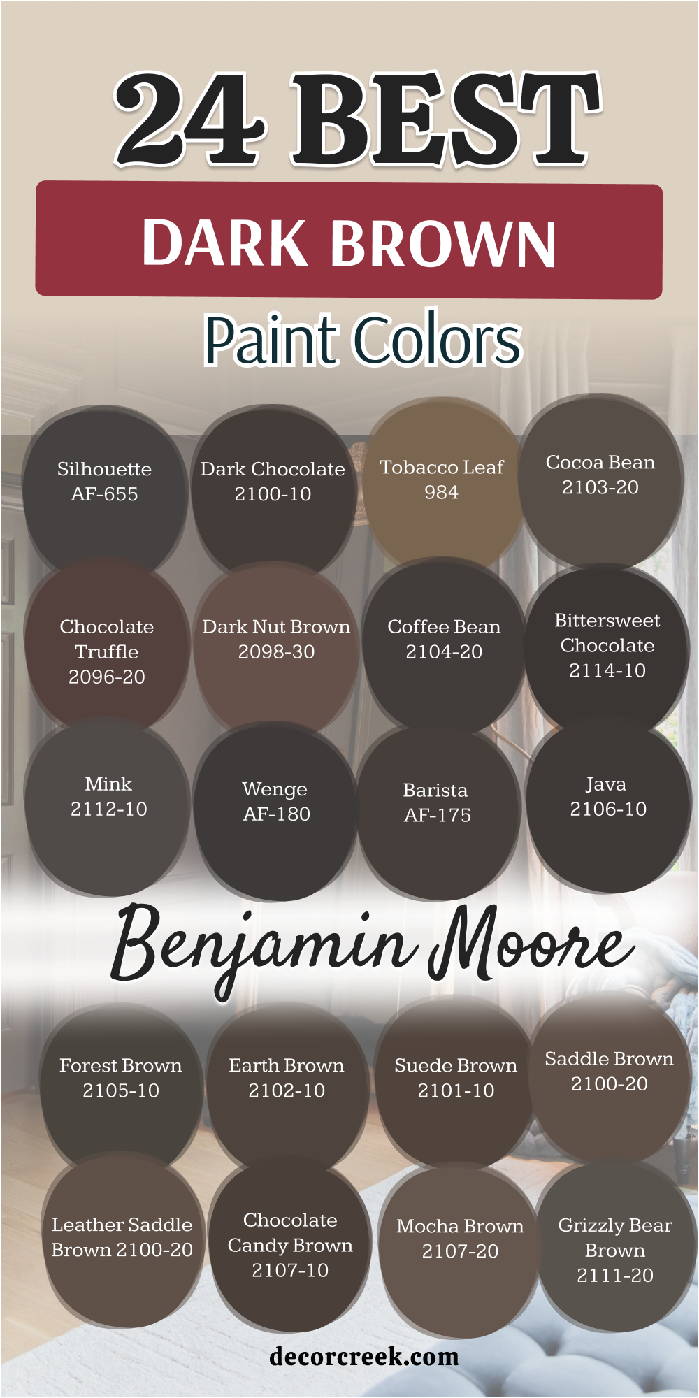
17 Top Dark Brown Paint Colors – Designer’s Opinion
Sealskin SW 7675
Sealskin SW 7675 is a designer favorite because it is one of the deepest, most mysterious browns on the market. It almost behaves like a black paint, but it has a secret warmth that keeps a room from feeling cold or empty.
This color is perfect for a library or a home theater where you want to feel completely tucked away from the rest of the house. I love how it looks when you paint the trim, walls, and ceiling all in this same shade for a very high-end “color drench” look.
It makes your white furniture and bright artwork look like they are in a professional gallery. This color is very strong and works best in rooms that have big windows to let the light dance on the dark surface. It is a very trendy choice for people who want a house that feels very modern and expensive.
Best used in: libraries, media rooms, kitchen cabinets, and accent walls
Pairs well with: High Reflective White SW 7757, Carrara marble, Silver accents, and cool grays The key rule of this color for farmhouse style is to use it as a bold, modern anchor to contrast with light-colored rustic wood.
🎨 Check out the complete guide to this color right HERE 👈
Turkish Coffee SW 6076
Turkish Coffee SW 6076 is a very rich and inviting color that feels like a warm hug for your walls. It has a beautiful reddish base that makes it feel much friendlier than a typical dark brown. This is a top pick for a dining room because it makes everyone feel relaxed and ready to enjoy a long meal together.
I love how it looks with gold picture frames and warm wooden tables because it brings out the natural beauty of the wood. The color is very saturated and gives the room a sense of tradition and history.
It is a very reliable choice for a front door because it makes the entrance of your house look very sturdy and welcoming. You will find that it hides fingerprints and marks very well, which is great for a busy family house.
Best used in: dining rooms, front doors, basements, and cozy dens
Pairs well with: Alabaster SW 7008, Antique brass, Warm tan, and dark walnut The key rule of this color for farmhouse style is to use it to create a sense of heritage and warmth in family gathering areas.
🎨 Check out the complete guide to this color right HERE 👈
Rookwood Dark Brown SW 2808
Rookwood Dark Brown SW 2808 is a very smart and steady color that has a tiny hint of green hidden in the pigment. This makes it look very natural, like the color of old trees in a thick forest. It is part of a historic collection, so it gives a house a very classic and professional look.
I often suggest this for the outside of a house because it matches the colors of a green garden perfectly. Inside, it works beautifully in a bedroom where you want to feel very grounded and peaceful.
It has a very solid feeling that makes a new house feel like it has been part of the family for a long time. This is a great choice for trim or interior doors to add a little bit of drama without being too loud.
Best used in: house exteriors, master bedrooms, interior doors, and trim
Pairs well with: Sage green, Creamy whites, Tan leather, and brick textures The key rule of this color for farmhouse style is to use it to connect your indoor living areas with the natural colors of the outdoors.
Dark Brown SW 7520
Dark Brown SW 7520 is a very honest and true brown that stays exactly the same no matter what the light is doing. It looks like a solid bar of chocolate and feels very reliable on the walls.
This is a great pick for a study or an office because it helps you stay focused and calm while you work. I love how it looks next to bright white trim because the contrast is very sharp and makes the room look very clean.
The color is very deep and gives a room a sense of being very well-built and strong. You can use it to make a very large and cold room feel much more personal and cozy for your kids. It is a very durable choice for a mudroom where you want to hide dirt and keep the space looking handsome.
Best used in: studies, mudrooms, hallways, and traditional living rooms
Pairs well with: Pure White SW 7005, Brass hardware, Light oak, and warm beige The key rule of this color for farmhouse style is to use it where you want the architecture to stand out with strength and stability.
🎨 Check out the complete guide to this color right HERE 👈
Black Fox SW 7020
Black Fox SW 7020 is a very unique and stylish color because it is a perfect mix of dark chocolate and stone gray. It is one of the most popular colors for modern house exteriors because it looks very clean and high-end.
Inside, it is a wonderful choice for kitchen cabinets if you want a look that is very trendy but still feels warm. It has a tiny bit of warmth that keeps it from looking like a cold black or a plain gray. I love using this color with gold or copper handles because it makes the whole room shine.
It creates a very moody and smart atmosphere in a bedroom or a home office. Many designers pick this color when they want a look that is very bold and very steady at the same time.
Best used in: kitchen cabinets, house exteriors, bedrooms, and accent walls
Pairs well with: Agreeable Gray SW 7029, Alabaster SW 7008, Gold hardware, and light oak The key rule of this color for farmhouse style is to use it as a dark anchor that brings a modern feeling to traditional wood.
🎨 Check out the complete guide to this color right HERE 👈
Urbane Bronze SW 7048
Urbane Bronze SW 7048 is a very famous color that looks like a beautiful mix of brown, gray, and green. It feels very organic and reminds me of smooth river stones or old metal statues.
This is a designer favorite because it feels very calm and quiet, making it perfect for a living room where you want to relax. It has a very soft look that makes a room feel like a private hideaway from the busy world. I often use this on front doors to give a house a very strong and stylish look.
The color is very balanced and does not feel too heavy even though it is quite dark. It looks amazing with natural wood furniture and large green plants in the corners of the room. Most people find this color very easy to live with because it feels so natural and steady.
Best used in: front doors, living rooms, home offices, and accent walls
Pairs well with: Shoji White SW 7042, Modern Gray SW 7632, Wood tones, and black metal The key rule of this color for farmhouse style is to use it to bring a sense of nature and luxury to your interior walls.
🎨 Check out the complete guide to this color right HERE 👈
Van Dyke Brown SW 7041
Van Dyke Brown SW 7041 is a very classic and true dark brown that feels very much like the earth. It looks like the color of rich garden soil or a beautiful piece of old wood furniture. This color is a great choice for a bedroom because it makes you feel very safe and grounded for a good night of rest.
It does not have any tricky hidden colors, which makes it very easy to match with your favorite blankets and pillows. I like to use it in a room with a lot of natural light so you can see how rich and deep the brown really is.
The color is very strong and makes a big statement when you use it on an accent wall. It is a very durable color that works well in a house with active kids and pets because it hides a lot of wear.
Best used in: bedrooms, accent walls, mudrooms, and family rooms
Pairs well with: Pure White SW 7005, Creamy beige, Natural linen, and light wood The key rule of this color for farmhouse style is to use it to add a rustic and honest touch to your home.
🎨 Check out the complete guide to this color right HERE 👈
Chateau Brown SW 7510
Chateau Brown SW 7510 is a very fancy and warm brown that feels like it belongs in a grand mansion or a castle. It has a reddish heart that makes a room feel very cozy and full of life for your family. This color is perfect for a formal sitting room where you want to relax and talk with friends.
It feels very high-end and makes all your furniture look much more expensive than it is. I love how it looks with gold picture frames and white lamps on the side tables. The color is very deep and helps to hide any small marks on the walls.
You can use it in a hallway to make the walk between rooms feel very special and warm. It works very well with traditional rugs that have red or orange designs in them.
Best used in: sitting rooms, libraries, hallways, and formal dining areas
Pairs well with: Alabaster SW 7008, Gold accents, Warm red, and mahogany furniture The key rule of this color for farmhouse style is to use it to add a layer of warmth and luxury to a traditional space.
🎨 Check out the complete guide to this color right HERE 👈
French Roast SW 6069
French Roast SW 6069 is a very dark and delicious brown that looks like the perfect cup of coffee. It has a very deep and warm pigment that makes a room feel very luxurious and cozy. This color is great for an accent wall in a bedroom or behind a large sofa in the living room.
It makes a statement that is very bold but still feels very welcoming to everyone who visits. I love how it looks with bright white trim because the contrast is so beautiful and clean. The color is very saturated and gives the walls a very soft and velvety look.
You can use it in a small room to make it feel like a cozy and private hideaway for yourself. It works very well with gold accents and warm wooden furniture found in a happy home.
Best used in: accent walls, master bedrooms, dining rooms, and cozy dens
Pairs well with: Snowbound SW 7004, Gold frames, Creamy beige, and cherry wood The key rule of this color for farmhouse style is to use it to create a focal point that feels both bold and traditional.
🎨 Check out the complete guide to this color right HERE 👈
Bitter Chocolate SW 6013
Bitter Chocolate SW 6013 is a very deep and intense brown that has a slight hint of purple hidden inside. This makes it look very royal and sophisticated on the walls of your house. It is a very strong color that feels very solid and gives a room a lot of personality.
I like to use it in a dining room to create a mood that is very fancy and private. The color is very dark and looks very smooth when the paint dries on the wall. It works beautifully with silver hardware and white furniture for a very modern look.
You will notice that it makes the room feel very quiet and calm, which is great for a bedroom. It is a very stylish choice for someone who wants a dark brown that feels a little bit different from the others.
Best used in: dining rooms, bedrooms, accent walls, and powder rooms
Pairs well with: Extra White SW 7006, Silver hardware, Soft gray, and velvet The key rule of this color for farmhouse style is to use it to add a touch of mystery and modern luxury to a room.
Sable SW 6083
Sable SW 6083 is a warm and medium-dark brown that feels very much like natural wood. It has a lot of golden heart inside, which makes the room feel very sunny and happy even on a cloudy day. This is a great choice for a family room where you want everyone to feel cozy and relaxed.
It feels very organic and reminds me of beautiful autumn leaves in a forest. I love how it looks with tan leather chairs and big green plants in the corners. The color is dark enough to be special, but it stays very friendly and approachable for kids.
You can use it to make a new house feel very warm and well-loved from the first day. It is a very easy color to decorate with because it matches so many natural textures.
Best used in: family rooms, kitchens, entryways, and laundry rooms
Pairs well with: Creamy SW 7012, Tan leather, Sage green, and warm oak The key rule of this color for farmhouse style is to use it as a soft, natural neutral for gathering spaces.
Otter SW 6041
Otter SW 6041 is a very soft and grayish-brown that feels very calm and quiet for a house. It looks like the color of smooth stones or a soft animal coat. This is a wonderful choice for a bedroom because it helps you feel very relaxed before you go to sleep.
It has a very balanced tone that does not look too warm or too cool in the light. I like to use it in a bathroom to create a feeling like you are at a private spa. The color is dark enough to be bold, but the gray in it keeps it from feeling heavy or sad.
It looks beautiful with silver hardware and white fluffy rugs on the floor. You can use it to create a very elegant and pretty look in any part of your house that needs a touch of peace.
Best used in: bedrooms, bathrooms, guest rooms, and hallways
Pairs well with: Eider White SW 7014, Silver, White linen, and light marble The key rule of this color for farmhouse style is to use it as a soft and sophisticated neutral for a restful space
Kona Brown SW 7525
Kona Brown SW 7525 is a very dark and intense color that looks like a fresh bag of coffee beans. It is a very rich shade that has a tiny bit of warmth to keep it from looking too cold on the walls.
This color is perfect for a dining room where you want to create a fancy and mood-filled vibe for your guests. It makes gold or silver accents on the table really shine and stand out beautifully. I often suggest this for a front door because it makes the whole house look very expensive and smart from the street.
The paint has a lot of pigment, which means the color looks very deep and solid. It is a very sophisticated choice for someone who likes a bold and modern look in their home. You will notice that it creates a very beautiful contrast with light-colored floors and white trim.
Best used in: dining rooms, front doors, accent walls, and formal studies
Pairs well with: Extra White SW 7006, Gold accents, Light marble, and navy blue The key rule of this color for farmhouse style is to use it as a dark anchor to balance out very bright and white spaces.
Chocolate Truffle 2096-20
Chocolate Truffle 2096-20 is a very soft and pretty dark brown that looks very appetizing and sweet. It has a tiny bit of red in it, which makes it look very fancy and royal on your walls. This color is a wonderful pick for a bedroom where you want to feel very pampered and soft for a good night of rest.
It looks very smooth and has a very rich and deep pigment that stays beautiful for a long time. I like to use it with light gray or white bedding to create a very clean and modern look. The color is dark enough to be bold, but it still feels very gentle and welcoming to everyone.
It works very well in a bathroom with white tile and silver faucets for a high-end look. You will notice that it makes the room feel very quiet and private for your family.
Best used in: bedrooms, bathrooms, accent walls, and walk-in closets
Pairs well with: Simply White OC-117, Soft gray, Silver accents, and light wood The key rule of this color for farmhouse style is to use it to add a touch of soft luxury to a simple room.
Mink 2112-10
Mink 2112-10 is a very soft and grayish-brown that feels very high-end and silky like a nice coat. It looks like the color of an expensive item or a smooth piece of stone in a beautiful garden. This color is very popular for bedrooms because it feels very calm and quiet for sleeping well.
It has a very balanced tone that does not look too warm or too cool in the light of your house. I like to use it in a guest room to make your friends feel like they are staying at a fancy hotel. The color is very dark, but the gray in it keeps it from feeling heavy or sad for your kids.
It looks beautiful with silver hardware and white fluffy rugs on a clean wooden floor. You can use it to create a very elegant and pretty look in any part of your house that needs a touch of quiet.
Best used in: bedrooms, guest rooms, bathrooms, and formal sitting areas
Pairs well with: Stonington Gray HC-170, Silver, White linen, and light marble The key rule of this color for farmhouse style is to use it as a soft and sophisticated neutral for a restful space.
Bittersweet Chocolate 2114-10
Bittersweet Chocolate 2114-10 is a very deep and dark brown that looks almost like black coffee in a cup. It is a very strong color that makes a room feel very solid and focused for your work. This color is perfect for a home theater or a room where you watch a lot of movies with your family.
It makes the screen pop and prevents any glare from the walls during a big film. I often use this color on a kitchen island to create a very bold centerpiece for the home. The color is very rich and has a very smooth and clean feeling when it dries on the wall.
It works great with bright white countertops and gold light fixtures in a modern kitchen. You will love how it makes your kitchen look very modern and expensive for your guests. It is a very powerful shade that needs a little bit of light to really show its beauty.
Best used in: kitchen islands, home theaters, accent walls, and front doors
Pairs well with: Cloud White OC-130, Gold fixtures, White marble, and dark floors The key rule of this color for farmhouse style is to use it as a bold and modern anchor for a large room.
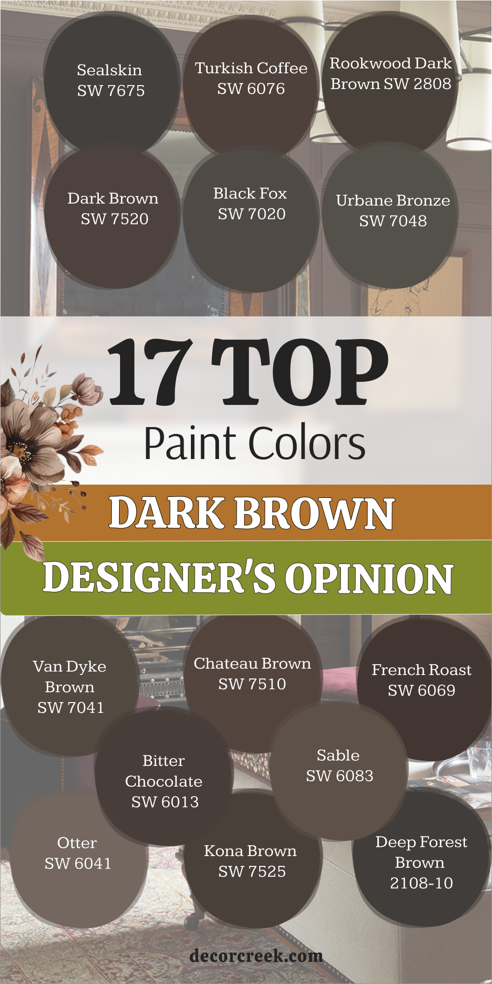
Choosing the perfect dark brown paint color for your home is an exciting journey into a world of comfort and noble style that begins with understanding how deep tones transform the space around them. Dark chocolate and rich bronze possess a unique ability to make an interior feel more grounded and secure, creating the atmosphere of either an ancient manor or a modern design studio depending on the chosen undertone.
When you apply these colors to the walls, the room immediately gains character, becoming a place for deep reflection or warm family evenings by the fireplace. It is important to remember that dark brown is very sensitive to lighting, so in the morning sun it may appear soft and velvety, while under evening lamps it can turn into a mysterious, almost black monolith.
Designers often use these shades as a backdrop for artwork or light-colored furniture because the contrast between a deep wall and a bright accent always looks expensive and professional.
Do not be afraid to experiment with textures, as leather, wood, brass, and natural linen begin to shine in new ways against a dark brown background, emphasizing the natural beauty of the materials.
If you decide on such a bold step, your home will be filled with a sense of stability and luxury that will delight you for many years, remaining timeless and beyond fleeting fashion.
Brown is the color of the earth itself, and it is this natural honesty that makes it so attractive for creating an interior where you don’t just want to be, but truly want to live and enjoy every moment of silence.