Finding the right paint for your living room can feel like a big job, especially when you want everything to feel just right. I know you want your house to feel like a true home where you can kick off your shoes, relax, and enjoy your time with family.
Your living room is the heart of the house, and the color on the walls quietly shapes the mood of every moment that happens there—from slow mornings to busy evenings.
Choosing a cozy shade means picking a color that supports comfort and makes you feel happy and safe. It’s not just about what looks good in a photo, but what feels good in real life.
I have spent years helping people choose paints that make their rooms look beautiful and feel even better to live in.
In this guide, I will share my favorite picks that work well in modern homes and for busy families who want both style and comfort.
Why I Always Trust Sherwin-Williams and Benjamin Moore for the Best Cozy Living Room Paint Colors
I always come back to Sherwin-Williams and Benjamin Moore because they offer paint you can truly rely on. When you invest time and money into your home, you want results that feel clean, smooth, and well done. These brands give you a wide range of warm tones that stay rich and clear on the wall, without turning muddy or flat.
Another reason I trust them is how easy their paint is to work with. It goes on smoothly, covers well, and keeps its look over time, even in homes with kids and pets. I’ve used these brands in many real homes and staging projects, and they have always delivered consistent results.
You can feel confident that the color you pick will look very close to what you saw in the sample.
How I Choose the Perfect Cozy Shade for Any Living Room
The first thing I always check is the light in the room. I look at the windows and notice how the sunlight moves during the day. If the room feels darker, I lean toward lighter warm tones to help it feel more open and welcoming. In brighter rooms, I can go a bit deeper with color to add a more comfortable and grounded feeling.
I also pay close attention to the furniture and finishes you already have. Your sofa, rugs, wood tones, and decor all play a role in how the paint will look. A good wall color should bring everything together so the room feels complete and easy to enjoy.
Most importantly, I think about how the room should feel when you walk in. My goal is always to help you choose a shade that makes you smile, helps you relax, and makes your living room a place you truly enjoy spending time in every single day.
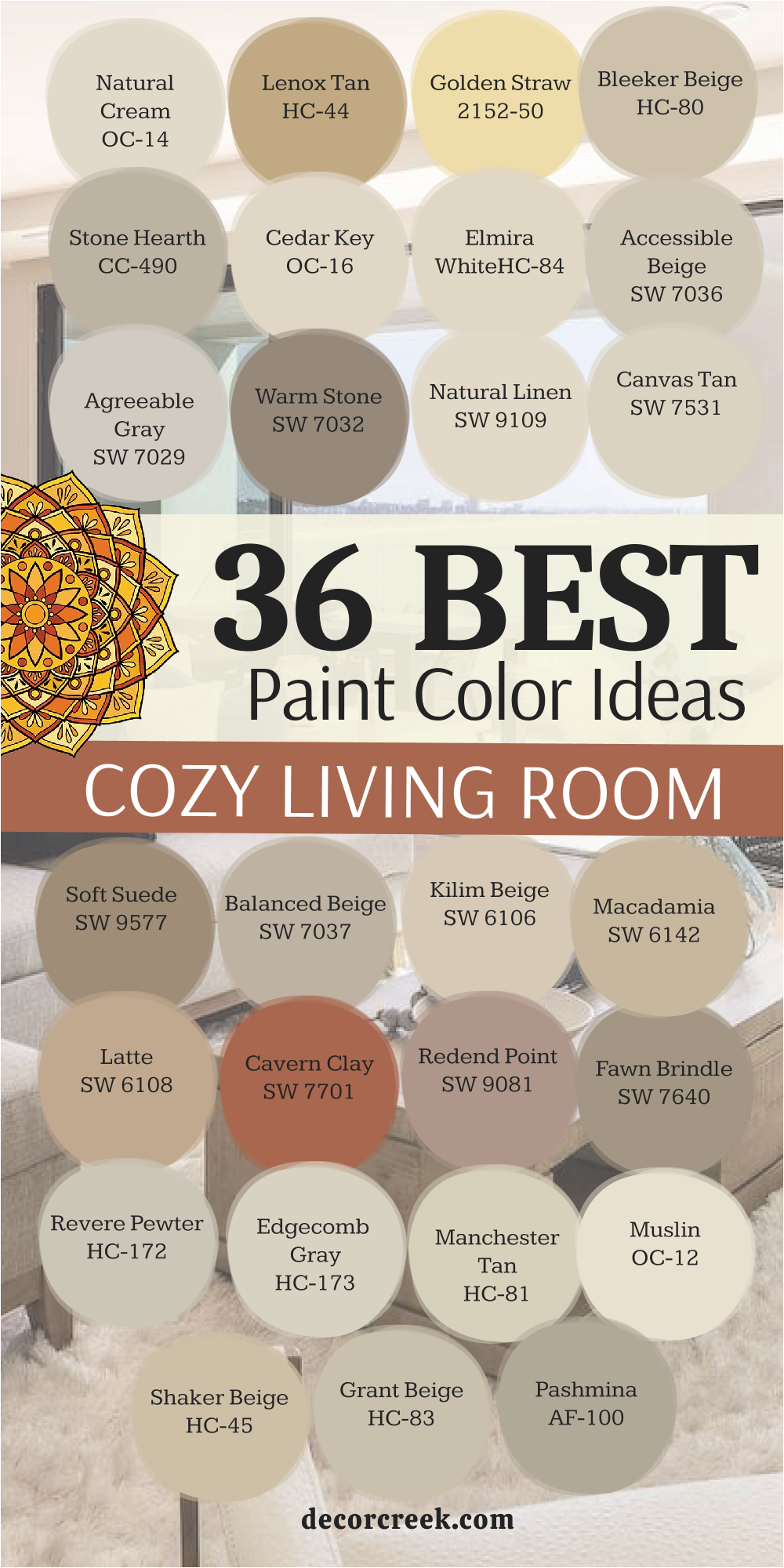
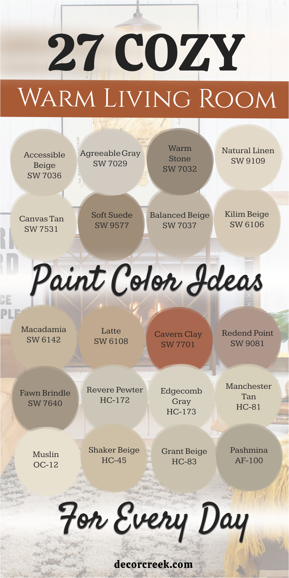
27 Cozy Warm Living Room Paint Color Ideas For Every Day
Accessible Beige SW 7036
Accessible Beige SW 7036 is my top pick for anyone who wants a warm and inviting look. This color is a mix of gray and beige that keeps things looking very clean. It works well because it does not turn yellow when the sun shines on it.
You will find that this shade makes your furniture stand out in a nice way. It feels like a soft blanket for your walls. Many people love it because it matches almost any decor style you choose.
I recommend this for open floor plans where you want one color to flow everywhere. It creates a friendly feeling for guests who come over to visit. You can use it to make a house feel lived-in and comfortable.
Best used in: living rooms, kitchens, hallways, bedrooms, and farmhouse exteriors
Pairs well with: Iron Ore SW 7069, Agreeable Gray SW 7029, Natural Linen SW 9109, warm wood tones The key rule of this color for farmhouse style is to use it where you want natural light to feel kind, soft, and inviting throughout the day.
👉 Read the full guide for this color HERE 👈

Agreeable Gray SW 7029
Agreeable Gray SW 7029 is the most popular gray for a very good reason. This color is light enough to keep a room feeling airy but warm enough to be cozy. It changes slightly depending on the time of day which makes the room interesting.
I think of it as a background color that lets your colorful pillows and art shine. It is perfect for people who are scared of picking a color that is too dark. The warmth in this gray prevents the room from feeling like a cold office.
You can use it in a small living room to help the walls seem further away. It provides a steady and reliable look for your main living area. This shade is a safe bet for any homeowner who wants a modern look.
Best used in: living rooms, kitchens, bedrooms, and bathrooms
Pairs well with: Extra White SW 7006, Sea Salt SW 6204, Mega Greige SW 7031, dark wood floors The key rule of this color for farmhouse style is to use it where you want natural light to feel kind, soft, and inviting throughout the day.
👉 Read the full guide for this color HERE 👈

Warm Stone SW 7032
Warm Stone SW 7032 is a deeper choice for those who want a bit of drama. This color feels very solid and grounding when you put it on all four walls. It reminds me of smooth rocks you find at a park or a beach.
I like to use this in rooms where you watch movies or sit by the fireplace. It makes the room feel smaller in a way that is very comforting. This shade works great with light-colored trim to create a sharp contrast.
It is a sophisticated pick that still feels like home. You will love how it looks next to white cabinets or shelving. It brings a sense of strength to your interior design.
Best used in: living rooms, dens, offices, and accent walls
Pairs well with: Alabaster SW 7008, Shoji White SW 7042, Urban Bronze SW 7048, tan leather The key rule of this color for farmhouse style is to use it where you want natural light to feel kind, soft, and inviting throughout the day.
👉 Read the full guide for this color HERE 👈

Natural Linen SW 9109
Natural Linen SW 9109 looks just like the fabric it is named after. This color is very light and creamy without being a plain white. It gives the room a sense of history and comfort that is hard to find.
I often suggest this for rooms that need a little bit of a sunny boost. It feels cheerful and bright even on rainy or cloudy days. You can pair it with natural wood furniture for a very organic look.
The color is simple but it never feels boring or empty. It helps create a soft backdrop for your family photos and memories. This is a great choice if you want a classic look that stays in style.
Best used in: living rooms, dining rooms, sunrooms, and bedrooms
Pairs well with: Naval SW 6244, Accessible Beige SW 7036, Pure White SW 7005, light oak The key rule of this color for farmhouse style is to use it where you want natural light to feel kind, soft, and inviting throughout the day.
👉 Read the full guide for this color HERE 👈

Canvas Tan SW 7531
Canvas Tan SW 7531 is a beautiful neutral that has a tiny bit of yellow in it. This warmth makes the room feel like it is glowing with light. It is a very polite color that does not demand too much attention.
I like it for rooms where people gather to talk and hang out. It creates a soft atmosphere that helps everyone feel relaxed. The color works perfectly with beige or white furniture sets.
You can use this if you want a traditional look that feels updated and fresh. It is easy to live with for many years without getting tired of it. This shade is a workhorse that looks good in any lighting.
Best used in: living rooms, kitchens, entryways, and laundry rooms
Pairs well with: Rice Grain SW 6155, Favorite Tan SW 6157, Black Magic SW 6991, bronze fixtures The key rule of this color for farmhouse style is to use it where you want natural light to feel kind, soft, and inviting throughout the day.
👉 Read the full guide for this color HERE 👈

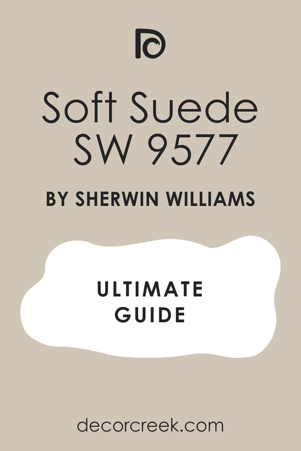
Soft Suede SW 9577
Soft Suede SW 9577 is a rich color that feels like a warm hug. It has a depth that makes the walls look like they have a soft texture. I recommend this for larger living rooms that feel a bit too empty.
The color brings the walls inward to make the room feel much more intimate. It is a great choice for a cozy reading nook or a library area. You will find that it looks very expensive and high-end on your walls.
It pairs beautifully with gold or brass lamps and decorations. This shade helps create a mood that is perfect for relaxing after a long day. It is a bold choice that pays off with a lot of style.
Best used in: living rooms, bedrooms, home theaters, and libraries
Pairs well with: Greek Villa SW 7551, Kilim Beige SW 6106, Foothills SW 7514, gold accents The key rule of this color for farmhouse style is to use it where you want natural light to feel kind, soft, and inviting throughout the day.
👉 Read the full guide for this color HERE 👈
Balanced Beige SW 7037
Balanced Beige SW 7037 is a medium-toned tan that is not too light or too dark. This color lives right in the middle, which makes it very easy to use. It provides enough color to see a difference against white trim.
I love how it makes a room feel finished and complete. It is a great pick if you have kids because it hides small scuffs and marks well. You can use it to create a cozy feel without making the room dark.
It works well with both modern and older styles of furniture. This color is a favorite for many builders because it is so reliable. It gives your home a steady and warm personality.
Best used in: living rooms, hallways, mudrooms, and kitchens
Pairs well with: Dover White SW 6385, Virtual Taupe SW 7039, Black Bean SW 6006, cream rugs The key rule of this color for farmhouse style is to use it where you want natural light to feel kind, soft, and inviting throughout the day.
👉 Read the full guide for this color HERE 👈
Kilim Beige SW 6106
Kilim Beige SW 6106 is a very popular color with a bit of a peach undertone. This warmth makes a room feel very friendly and energetic. It is a great way to bring life into a room that feels a bit cold.
I think this shade looks best in rooms with lots of natural wood. It brings out the beauty in your floors and wooden tables. The color is deep enough to provide a nice contrast with white ceilings.
You will find that this color makes people feel very welcome in your home. It is a classic beige that has been a favorite for a long time. This is a solid choice for a cozy family living room.
Best used in: living rooms, dining rooms, bedrooms, and porches
Pairs well with: Latte SW 6108, Macadamia SW 6142, Vanillin SW 6371, dark walnut wood The key rule of this color for farmhouse style is to use it where you want natural light to feel kind, soft, and inviting throughout the day.
👉 Read the full guide for this color HERE 👈
Macadamia SW 6142
Macadamia SW 6142 is a deep and creamy tan that feels very luxurious. It is darker than many of the other beiges, which adds a lot of character. I like to use this in rooms that have high ceilings to keep them feeling snug.
The color has a richness that reminds me of toasted nuts or warm sand. It creates a very earthy and grounded feeling in the living room. You can pair it with green plants to make the room feel like nature.
It is a great color for a room where you want to feel tucked away from the world. This shade is very comforting and easy on the eyes. It is a sophisticated way to get a cozy look.
Best used in: living rooms, master bedrooms, offices, and basements
Pairs well with: Softer Tan SW 6141, Kilim Beige SW 6106, Roycroft Bronze Green SW 2846, stone fireplaces The key rule of this color for farmhouse style is to use it where you want natural light to feel kind, soft, and inviting throughout the day.
👉 Read the full guide for this color HERE 👈
Latte SW 6108
Latte SW 6108 is a warm and inviting brown that looks just like coffee with milk. This color is perfect for creating a cozy atmosphere in a large house. It has enough pigment to really change the feel of the room.
I suggest this color for rooms where you want to sit and talk for hours. It makes the environment feel very relaxed and slow-paced. The warmth of the color helps to balance out cool light from the north.
It looks wonderful with leather chairs and thick, fuzzy rugs. This shade is a great way to add a bit of color without being too bright. It is a classic choice for a comfortable and modern home.
Best used in: living rooms, dining rooms, kitchens, and entryways
Pairs well with: Kilim Beige SW 6106, Hopsack SW 6109, Alabaster SW 7008, navy blue accents The key rule of this color for farmhouse style is to use it where you want natural light to feel kind, soft, and inviting throughout the day.
👉 Read the full guide for this color HERE 👈
Cavern Clay SW 7701
Cavern Clay SW 7701 brings a wonderful earthy energy that feels like a warm sunset inside. This color is a rich terracotta that makes a room feel very grounded and organic. I suggest using it if you want your living room to have a bold personality that stays cozy.
The shade works like a charm when you pair it with natural materials like wood and stone. It is deep enough to make large walls feel less empty and more like a snug retreat. You will notice how it brings out the best in your indoor green plants.
This color makes a house feel very artistic and full of life for everyone who enters. It is a great way to add heat to a room that feels a bit too chilly. Many people find it reminds them of clay pots and beautiful desert landscapes.
It provides a strong backdrop for neutral furniture like a cream couch or a tan rug. This pick is perfect for a family that loves to gather around for stories and games. You can use it to create a focal point that everyone will talk about.
Best used in: living rooms, dining rooms, accent walls, and entryways
Pairs well with: Moth Wing SW 9175, Origami White SW 7636, Toasted Pine Nut SW 7696, black metal The key rule of this color for farmhouse style is to use it where you want natural light to feel kind, soft, and inviting throughout the day.
👉 Read the full guide for this color HERE 👈

Redend Point SW 9081
Redend Point SW 9081 is a soft and sandy color that has just a hint of pink and brown. This color is very gentle on the eyes and makes a room feel very welcoming and kind. I love how it sits between a neutral and a real color.
It works perfectly for homeowners who want something different but not too loud or bright. You will find that it makes your living room feel very high-end and thoughtfully designed. The warmth in this shade helps people feel at ease right when they sit down.
It looks amazing with light wood floors and soft white trim around the windows. This shade is a great choice for a modern home that needs a touch of softness. It creates a very friendly atmosphere for your daily life and family time.
I recommend it for rooms where you want to feel relaxed and away from the busy world. It is a very soulful color that matches well with many different fabric textures. You will love how it changes into a deeper glow when the evening lamps come on.
Best used in: living rooms, bedrooms, bathrooms, and cozy reading nooks
Pairs well with: Foothills SW 7514, Kestrel White SW 7516, Hushed Revelry SW 9079, clay pottery The key rule of this color for farmhouse style is to use it where you want natural light to feel kind, soft, and inviting throughout the day.
👉 Read the full guide for this color HERE 👈

Fawn Brindle SW 7640
Fawn Brindle SW 7640 is a sophisticated khaki color that feels very solid and dependable on the wall. This color is a mix of gray, green, and brown that creates a very natural look. I like to use it when a room needs a bit more weight to feel cozy.
The shade is deep enough to hide minor messes but light enough to keep things looking clean. It makes a living room feel very sturdy and well-built, like a classic country home. You can pair it with dark furniture to create a very rich and moody environment.
It works well in rooms with lots of big windows because it absorbs the light nicely. This color gives the walls a sense of history even in a brand-new house. It is a smart pick for a family room that gets a lot of use every day.
You will appreciate how it makes white crown molding look very crisp and sharp. It is a very grounding choice that helps tie different colors in the room together. This shade is a favorite for creating a space that feels both modern and traditional.
Best used in: living rooms, exteriors, home offices, and kitchens
Pairs well with: Shoji White SW 7042, Urban Bronze SW 7048, Dover White SW 6385, dark wood The key rule of this color for farmhouse style is to use it where you want natural light to feel kind, soft, and inviting throughout the day.
👉 Read the full guide for this color HERE 👈
Revere Pewter HC-172
Revere Pewter HC-172 is a legendary color that many people call the perfect neutral for a home. This color is a light gray that has a lot of beige hidden inside of it. I find it works in almost any house regardless of the lighting or the furniture.
It creates a very cohesive look that makes your living room feel put together and professional. You will see that it provides a very soft background for your favorite art and family photos. The warmth keeps the gray from feeling like concrete or a cold hospital room.
It is light enough to make a small room feel much more open and breathable for you. This shade is a top choice for staging because it makes everyone feel like they could live there. It is a very safe and reliable pick for a living room that needs a refresh.
I suggest using it if you want a color that will stay in style for many years. It looks great with silver, gold, or black hardware and lighting fixtures. This is a hardworking color that brings a lot of peace to a busy family home.
Best used in: living rooms, open floor plans, kitchens, and hallways
Pairs well with: Simply White OC-117, Hale Navy HC-154, Chelsea Gray HC-168, dark walnut The key rule of this color for farmhouse style is to use it where you want natural light to feel kind, soft, and inviting throughout the day.
👉 Read the full guide for this color HERE 👈

Edgecomb Gray HC-173
Edgecomb Gray HC-173 is a very light and airy color that feels like a soft breath of fresh air. This color is often called a greige because it balances gray and beige so well. I love using it in rooms where the sun shines in during the morning.
It makes the walls look very soft and creamy without turning yellow or looking too dark. You will find that it makes your living room feel much bigger than it actually is. It is a perfect choice for a modern look that still feels very cozy and sweet.
This shade works beautifully with white furniture and light-colored rugs for a clean style. It is a very light color but it still has enough body to stand out against white trim. People love it because it makes their homes feel very bright and happy.
It is a great way to update an old room and make it feel new and exciting again. You can trust this color to be a quiet partner for your more colorful decorations. It is a very flexible choice that fits into any lifestyle or home design.
Best used in: living rooms, bedrooms, kitchens, and small spaces
Pairs well with: White Dove OC-17, Revere Pewter HC-172, Boothbay Gray HC-165, linen fabrics The key rule of this color for farmhouse style is to use it where you want natural light to feel kind, soft, and inviting throughout the day.
👉 Read the full guide for this color HERE 👈

Manchester Tan HC-81
Manchester Tan HC-81 is a classic beige that reminds me of soft sand on a very pretty beach. This color is very steady and does not change much when the lights turn on. I recommend it for people who want a traditional look that feels very warm.
It creates a very solid and comfortable feeling in a living room where you spend a lot of time. You will notice that it makes your wooden furniture look very rich and expensive. The color is simple but it adds a lot of elegance to your home interior.
It is a great background for a room filled with books, plants, and cozy blankets. This shade helps a room feel very settled and quiet for your family to enjoy. It is a very popular pick for living rooms because it is so easy to live with.
I like how it stays looking clean even if the room is a bit messy with toys. It provides a very neutral base that lets you change your pillows and rugs whenever you want. This is a very friendly color that makes your house feel like a real home.
Best used in: living rooms, dining rooms, hallways, and basements
Pairs well with: Cloud White OC-130, Wedgewood Gray HC-146, Wrought Iron 2124-10, brass The key rule of this color for farmhouse style is to use it where you want natural light to feel kind, soft, and inviting throughout the day.
👉 Read the full guide for this color HERE 👈

Muslin OC-12
Muslin OC-12 is a warm and creamy color that feels like a soft cotton shirt for your walls. This color is a bit deeper than a standard off-white, which gives it more personality. I suggest it for rooms that need to feel more inviting and less cold or sterile.
It has a very gentle glow that makes everyone feel relaxed when they walk into the room. You will find that it matches perfectly with warm wood tones and gold decorations. It is a very polite color that stays in the background while making everything look better.
This shade is excellent for creating a cozy vibe in a room with a lot of natural light. It helps the room feel very sunny and cheerful even during the winter months. You can use it to create a classic look that never feels old or out of date.
It is a great choice for a living room where you want to host friends for coffee. The color is very soft and helps to create a kind environment for your family. It is a beautiful and simple way to make your home feel very special.
Best used in: living rooms, kitchens, bedrooms, and entryways
Pairs well with: Simply White OC-117, Wood Grain 2137-30, Van Deusen Blue HC-156, warm oak The key rule of this color for farmhouse style is to use it where you want natural light to feel kind, soft, and inviting throughout the day.
👉 Read the full guide for this color HERE 👈

Shaker Beige HC-45
Shaker Beige HC-45 is a medium-toned tan that feels very traditional and very reliable. This color has a lot of warmth that makes a large living room feel much smaller and snug. I like to use it in homes that have a lot of classic character and wood trim.
It gives the walls a very rich look that reminds me of expensive leather or warm toast. You will love how it makes your living room feel like a safe place to hide away. The color is deep enough to make a real statement without being too dark for the room.
It works very well with traditional furniture and heavy rugs that have lots of patterns. This shade is a favorite for people who want their home to feel very grounded and strong. It provides a very comfortable atmosphere for watching television or reading a book.
I think it looks best when you have plenty of lamps to create a warm evening glow. It is a very classic beige that has been a top choice for designers for a long time. This is a great pick if you want a cozy and very homey feeling.
Best used in: living rooms, dining rooms, offices, and foyers
Pairs well with: Cloud White OC-130, Lenox Tan HC-44, Narragansett Blue HC-157, antique wood The key rule of this color for farmhouse style is to use it where you want natural light to feel kind, soft, and inviting throughout the day.
👉 Read the full guide for this color HERE 👈

Grant Beige HC-83
Grant Beige HC-83 is a unique neutral that has a tiny bit of green hidden inside of it. This hidden color makes the beige feel very fresh and like it belongs in nature. I love using this in living rooms that look out onto a garden or a yard with trees.
It creates a very peaceful feeling that helps you relax as soon as you sit down on the couch. You will notice that it changes a little bit throughout the day as the sun moves. It is a very sophisticated choice for someone who wants a neutral that isn’t boring.
This shade looks wonderful with white trim and dark wood floors to create a nice contrast. It is a very soft and quiet color that makes your home feel very high-quality. You can use it to create a modern look that still feels very warm and friendly.
It is a great background for colorful art or bright flowers in a vase on your table. This color is very versatile and works in many different types of houses. It is a smart way to get a cozy feel with a little bit of a secret green twist.
Best used in: living rooms, bedrooms, hallways, and exteriors
Pairs well with: Swiss Coffee OC-45, Revere Pewter HC-172, Saybrook Sage HC-114, stone The key rule of this color for farmhouse style is to use it where you want natural light to feel kind, soft, and inviting throughout the day.
👉 Read the full guide for this color HERE 👈

Pashmina AF-100
Pashmina AF-100 is a rich and mid-toned greige that feels like a luxury sweater on your walls. This color is deep enough to show a lot of contrast against white doors and baseboards. I recommend it for people who want a living room that looks very elegant and cozy.
It has a very smooth and soft look that makes the walls feel almost like they are made of fabric. You will find that it brings a lot of warmth into the room without being too yellow. It is a very modern choice that works perfectly in a newly built or renovated home.
This shade is great for creating a moody and snug feeling for movie nights at home. It helps the room feel very finished and like a professional designer helped you pick it. You can pair it with black accents to make it look very sharp and clean.
It is a very comfortable color to live with because it is so balanced and even. This pick is perfect for a family that wants a stylish living room that is still very cozy. It is one of my favorite colors for making a house feel very special.
Best used in: living rooms, master suites, dining rooms, and kitchens
Pairs well with: Chantilly Lace OC-65, Chelsea Gray HC-168, Kendall Charcoal HC-166, gold The key rule of this color for farmhouse style is to use it where you want natural light to feel kind, soft, and inviting throughout the day.
👉 Read the full guide for this color HERE 👈

Natural Cream OC-14
Natural Cream OC-14 is a very light and airy color that feels like a soft morning light. This color is a perfect mix of gray and beige that never feels too heavy or dark. I love how it makes a living room feel clean and open while staying very cozy.
It is a great choice for a house that does not get a lot of big windows. You will see that it makes the walls look very smooth and soft like a warm drink. The warmth in this shade keeps the room from feeling cold like a plain white paint.
Many people choose this for a modern look that still feels very friendly and kind. It provides a very quiet background for your colorful pillows and pretty wall art. You can trust it to make your living room feel like a happy place for kids.
It is a very smart pick for a family that wants a bright and fresh home. This shade works well with light wood floors and soft gray rugs for a nice style. It is a beautiful way to make a small room feel much bigger and better.
Best used in: living rooms, kitchens, hallways, bedrooms, and farmhouse exteriors
Pairs well with: Iron Ore SW 7069, Agreeable Gray SW 7029, Natural Linen SW 9109, warm wood tones The key rule of this color for farmhouse style is to use it where you want natural light to feel kind, soft, and inviting throughout the day.
👉 Read the full guide for this color HERE 👈

Lenox Tan HC-44
Lenox Tan HC-44 is a rich and deep gold-toned beige that feels very high-end and fancy. This color has a lot of history and makes a room feel very solid and well-designed. I suggest using it if you want your living room to feel like a warm hug.
The shade is dark enough to provide a very nice contrast against bright white trim. It reminds me of warm sand or a soft tan leather chair that you love. You will find that it makes your wooden furniture look very deep and very beautiful.
This color is great for creating a snug feeling in a room where you watch movies. It brings a lot of heat to the walls which helps a room feel very happy. People love it because it makes their home feel very established and very strong.
It looks wonderful when you turn on the lamps during a quiet evening at home. This shade is a classic pick for a family that loves a traditional and cozy look. It is a very reliable color that stays looking great for a very long time.
Best used in: living rooms, dining rooms, offices, and master bedrooms
Pairs well with: Cloud White OC-130, Shaker Beige HC-45, Hale Navy HC-154, brass lamps The key rule of this color for farmhouse style is to use it where you want natural light to feel kind, soft, and inviting throughout the day.
👉 Read the full guide for this color HERE 👈
Golden Straw 2152-50
Golden Straw 2152-50 is a cheerful and sunny color that brings a lot of life to a home. This color is a soft yellow that feels very warm and very inviting for your guests. I recommend it for rooms that need a little bit of a happy boost.
It makes a living room feel like it is filled with sunshine even on a cloudy day. You will notice that it creates a very friendly atmosphere for your kids and pets. The warmth in this shade helps a room feel very cozy and very lived-in.
It works beautifully with white furniture and light-colored curtains for a breezy style. This shade is a great way to add a bit of color without it being too loud. Many people find that it makes their home feel very positive and very bright.
I like to use it in rooms where the family gathers to talk and play games. It provides a very soft and glowing backdrop for your daily life and family fun. This is a very sweet choice for a home that wants to feel very happy.
Best used in: living rooms, kitchens, sunrooms, and breakfast nooks
Pairs well with: Simply White OC-117, Van Deusen Blue HC-156, Saybrook Sage HC-114, wood The key rule of this color for farmhouse style is to use it where you want natural light to feel kind, soft, and inviting throughout the day.
Bleeker Beige HC-80
Bleeker Beige HC-80 is a medium-toned neutral that feels very balanced and very easy to love. This color is a great mix of tan and gray that looks good in any light. I find it works perfectly for homeowners who want a steady and calm look.
It creates a very cohesive feeling that makes your living room feel very put together. You will see that it hides little marks and scuffs from kids or dogs very well. The warmth keeps the beige from looking like a boring or plain office wall.
It is deep enough to make a large room feel much more intimate and very snug. This shade is a top pick for staging houses because it feels very welcoming to everyone. It is a very safe and reliable choice for a living room refresh project.
I suggest using it if you want a color that stays in style for many years. It looks great with natural wood and black metal decorations or lighting fixtures. This is a hardworking color that brings a lot of heart to your family home.
Best used in: living rooms, hallways, basements, and entryways
Pairs well with: White Dove OC-17, Manchester Tan HC-81, Revere Pewter HC-172, navy accents The key rule of this color for farmhouse style is to use it where you want natural light to feel kind, soft, and inviting throughout the day.
👉 Read the full guide for this color HERE 👈
Stone Hearth CC-490
Stone Hearth CC-490 is a sophisticated greige that feels very solid and very grounding on the wall. This color is a bit deeper than most beiges which adds a lot of personality. I love using this in rooms that have a big stone or brick fireplace.
It creates a very peaceful feeling that helps you relax as soon as you sit down. You will notice that it has a very rich and creamy look in the evening light. It is a very modern choice for someone who wants a cozy and deep neutral.
This shade looks wonderful with cream-colored rugs and dark wood tables for a nice look. It is a very soft and quiet color that makes your home feel very high-quality. You can use it to create a classic style that still feels very fresh.
It is a great background for cozy blankets and a lot of fluffy white pillows. This color is very versatile and works well in many different types of modern houses. It is a smart way to get a snug feel with a very stylish look.
Best used in: living rooms, bedrooms, kitchens, and home offices
Pairs well with: Simply White OC-117, Pashmina AF-100, Edgecomb Gray HC-173, dark wood The key rule of this color for farmhouse style is to use it where you want natural light to feel kind, soft, and inviting throughout the day.
Cedar Key OC-16
Cedar Key OC-16 is a very light tan that feels like a soft sandy beach in the sun. This color is very gentle and makes a room feel very welcoming and very bright. I love how it sits perfectly between a white and a real tan color.
It works perfectly for people who want a bright house that still feels very warm. You will find that it makes your living room feel very high-end and very soft. The warmth in this shade helps family members feel at ease during the day.
It looks amazing with light wood floors and soft white trim around the windows. This shade is a great choice for a modern home that needs a touch of heat. It creates a very friendly atmosphere for your daily life and your morning coffee.
I recommend it for rooms where you want to feel relaxed and away from work. It is a very soulful color that matches well with many different home styles. You will love how it gives the room a soft glow when the sun hits it.
Best used in: living rooms, bathrooms, kitchens, and laundry rooms
Pairs well with: Cloud White OC-130, Revere Pewter HC-172, Gray Owl OC-52, linen textures The key rule of this color for farmhouse style is to use it where you want natural light to feel kind, soft, and inviting throughout the day.
👉 Read the full guide for this color HERE 👈

Elmira White HC-84
Elmira White HC-84 is a warm and creamy off-white that feels very soft and very kind. This color is deeper than a plain white which gives the walls a lot of heart. I suggest it for rooms that need to feel more cozy and less like a store.
It has a very gentle look that makes everyone feel happy when they walk inside. You will find that it matches perfectly with warm wood and soft gold decorations. It is a very polite color that stays in the background of your busy life.
This shade is excellent for creating a snug vibe in a room with small windows. It helps the room feel very bright and very cheerful even in the dark winter. You can use it to create a classic look that stays in style forever. It is a great choice for a living room where you want to sit and talk. The color is very soft and helps to create a friendly environment for your kids. It is a beautiful and simple way to make your house feel very cozy.
Best used in: living rooms, bedrooms, dining rooms, and hallways
Pairs well with: Simply White OC-117, Shaker Beige HC-45, Grant Beige HC-83, warm rugs The key rule of this color for farmhouse style is to use it where you want natural light to feel kind, soft, and inviting throughout the day.
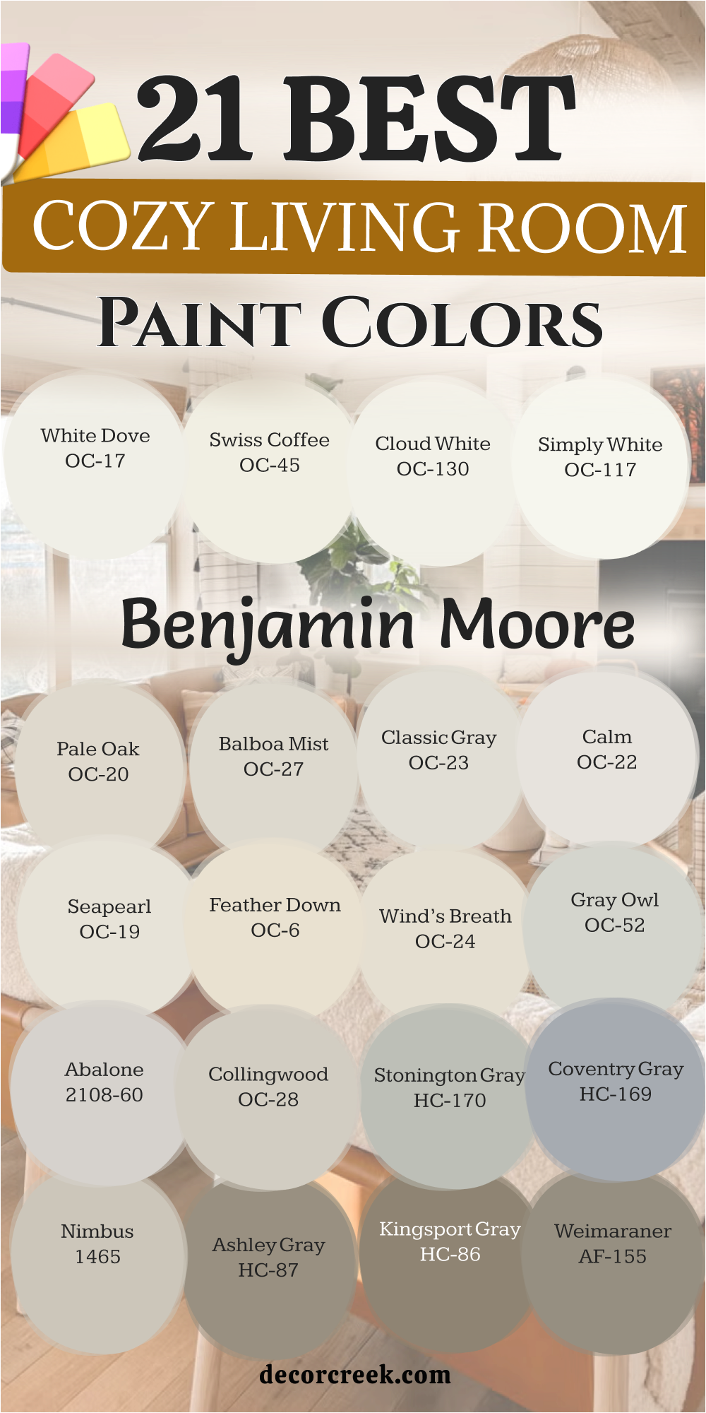
21 Best Cozy Living Room Paint Colors From Benjamin Moore
White Dove OC-17
White Dove OC-17 is a very soft white that feels very creamy and very inviting to everyone. This color is a favorite for trim and walls because it is not too bright. I find it creates a very peaceful and very cozy look in a modern home.
It is a great way to make a room feel clean without it being too cold. You will see that it works perfectly with any furniture you decide to buy. The warmth in this white makes the room feel very soft and very friendly for families.
Many people use this on their kitchen cabinets to make the heart of the house glow. It provides a very quiet background for all of your colorful and pretty things. You can trust it to make your living room feel like a fresh start. It is a very smart pick for a family that wants a light and very bright home. This shade works well with dark wood floors to create a very nice look. It is a beautiful way to make your house feel very light and very cozy.
Best used in: living rooms, kitchens, trim, doors, and bedrooms
Pairs well with: Revere Pewter HC-172, Hale Navy HC-154, Balboa Mist OC-27, dark wood The key rule of this color for farmhouse style is to use it where you want natural light to feel kind, soft, and inviting throughout the day.
👉 Read the full guide for this color HERE 👈

Swiss Coffee OC-45
Swiss Coffee OC-45 is a warm and very rich creamy white that feels like a soft hug. This color is very popular for making a house feel very high-end and very soft. I recommend it for rooms where you want to feel very relaxed and very safe.
It makes the walls look very smooth and very inviting for all of your guests. You will find that it has a tiny bit of yellow that makes it feel like sun. The warmth in this shade helps a large living room feel much more cozy.
It looks amazing with traditional furniture and heavy rugs that have lots of patterns. This shade is a great way to make a modern home feel very soft and sweet. Many people love it because it makes their home feel very warm and very bright. I like to use it in rooms where the family gathers to watch a good movie. It provides a very soft and glowing backdrop for your favorite family memories. This is a very classic and very smart choice for a cozy living room wall.
Best used in: living rooms, kitchens, bedrooms, and open floor plans
Pairs well with: Simply White OC-117, Pashmina AF-100, New Edgecomb Gray, warm accents The key rule of this color for farmhouse style is to use it where you want natural light to feel kind, soft, and inviting throughout the day.
👉 Read the full guide for this color HERE 👈

Cloud White OC-130
Cloud White OC-130 is a soft and very bright white that feels like a fluffy cloud. This color is very clean but it has enough warmth to be very cozy for you. I suggest using it if you want a house that feels very fresh and very light.
The shade is perfect for making a dark living room feel much more happy and bright. It reminds me of clean sheets and a fresh start for your home decor project. You will find that it makes your wall art look very vivid and very pretty.
This color is great for creating a cheerful feeling in a house with a lot of kids. It brings a lot of light to the walls which helps everyone feel very good. People love it because it makes their home feel very modern and very clean. It looks wonderful with any color of furniture or rug that you choose to use. This shade is a classic pick for a family that loves a bright and cozy look. It is a very reliable color that stays looking fresh for a very long time.
Best used in: living rooms, kitchens, trim, ceilings, and bathrooms
Pairs well with: Manchester Tan HC-81, Revere Pewter HC-172, Gray Owl OC-52, any color The key rule of this color for farmhouse style is to use it where you want natural light to feel kind, soft, and inviting throughout the day.
👉 Read the full guide for this color HERE 👈

Simply White OC-117
Simply White OC-117 is a very crisp and happy white that has just a tiny bit of warmth. This color is a favorite for people who want their living room to feel very clean and very bright. I love how it makes the walls look fresh without feeling like a cold bucket of ice.
It works perfectly in a modern house where you want to show off your favorite furniture and art. You will find that it makes your home feel very open and very airy for your family. The hint of warmth in this shade helps a large room feel very friendly and kind.
Many people choose this for their walls and trim to create a very seamless and soft look. It provides a very quiet background that lets your colorful rugs and pillows be the stars. You can trust it to make your living room feel like a cozy and sunny place. It is a very smart pick for a family that wants a light home that still feels very snug. This shade works well with light wood and dark metal to create a very nice style. It is a beautiful way to make your house feel very light and very cozy.
Best used in: living rooms, kitchens, trim, ceilings, and bathrooms
Pairs well with: Silver Gray 2131-60, Casabella AF-485, Dove Wing OC-18, black metal The key rule of this color for farmhouse style is to use it where you want natural light to feel kind, soft, and inviting throughout the day.
👉 Read the full guide for this color HERE 👈

Pale Oak OC-20
Pale Oak OC-20 is a very elegant and light greige that feels like a soft silk ribbon. This color is a perfect mix of gray and beige that looks very high-end on the walls. I suggest using it if you want your living room to feel very soft and very fancy.
The shade is deep enough to see against white trim but light enough to stay very bright. It reminds me of the bark on a pretty tree or a soft wool blanket you love. You will find that it makes your home feel very expensive and very well-designed.
This color is great for creating a snug feeling in a room where you like to read. It brings a lot of soft light to the walls which helps a room feel very happy. People love it because it makes their home feel very modern and very gentle.
It looks wonderful with cream furniture and dark wood floors for a very rich look. This shade is a classic pick for a family that loves a soft and cozy style. It is a very reliable color that stays looking great for a very long time.
Best used in: living rooms, bedrooms, kitchens, and entryways
Pairs well with: Chantilly Lace OC-65, Revere Pewter HC-172, Chelsea Gray HC-168, linen The key rule of this color for farmhouse style is to use it where you want natural light to feel kind, soft, and inviting throughout the day.
👉 Read the full guide for this color HERE 👈

Balboa Mist OC-27
Balboa Mist OC-27 is a very popular light gray that feels very warm and very inviting. This color is a great way to get a gray look without making your home feel cold. I recommend it for rooms where you want to feel very relaxed and very safe.
It makes the walls look very smooth and very soft for all of your family members. You will notice that it has a tiny bit of warmth that makes it feel like a hug. The soft tone in this shade helps a small living room feel much more cozy.
It works beautifully with white trim and light-colored rugs for a very clean style. This shade is a great way to add a bit of color without it being too loud. Many people love it because it makes their home feel very warm and very bright.
I like to use it in rooms where the family gathers to talk and share their day. It provides a very soft and glowing backdrop for your favorite family photos and memories. This is a very classic and very smart choice for a cozy living room wall.
Best used in: living rooms, bedrooms, bathrooms, and hallways
Pairs well with: White Dove OC-17, Gray Owl OC-52, Simply White OC-117, light oak The key rule of this color for farmhouse style is to use it where you want natural light to feel kind, soft, and inviting throughout the day.
👉 Read the full guide for this color HERE 👈

Classic Gray OC-23
Classic Gray OC-23 is a very light and sophisticated off-white gray that feels very soft. This color is a perfect choice for people who want a very clean and very modern look. I find it works in almost any house regardless of the light or the furniture.
It creates a very cohesive look that makes your living room feel put together and very smart. You will see that it provides a very soft background for your favorite art and family photos. The warmth keeps the gray from feeling like a cold stone or a dark office.
It is light enough to make a small room feel much more open and breathable for you. This shade is a top choice for staging because it makes everyone feel very welcome. It is a very safe and reliable pick for a living room that needs a refresh.
I suggest using it if you want a color that stays in style for many years to come. It looks great with silver, gold, or black hardware and lighting fixtures in the room. This is a hardworking color that brings a lot of peace to a busy family home.
Best used in: living rooms, kitchens, bedrooms, and open floor plans
Pairs well with: Simply White OC-117, Hale Navy HC-154, Revere Pewter HC-172, dark wood The key rule of this color for farmhouse style is to use it where you want natural light to feel kind, soft, and inviting throughout the day.
👉 Read the full guide for this color HERE 👈

Calm OC-22
Calm OC-22 is a very soft and very light gray that feels like a quiet morning at home. This color has a tiny bit of purple hidden inside which makes it feel very warm. I love using this in rooms where you want to feel very peaceful and very happy.
It creates a very gentle feeling that helps you relax as soon as you sit down. You will notice that it makes your white furniture look very crisp and very pretty. It is a very modern choice for someone who wants a cozy and very light neutral.
This shade looks wonderful with light wood floors and soft gray rugs for a nice look. It is a very soft and quiet color that makes your home feel very high-quality. You can use it to create a classic style that still feels very fresh.
It is a great background for cozy blankets and a lot of fluffy white pillows in the room. This color is very versatile and works well in many different types of modern houses. It is a smart way to get a snug feel with a very stylish look.
Best used in: living rooms, master bedrooms, nurseries, and bathrooms
Pairs well with: White Dove OC-17, Simply White OC-117, Gray Owl OC-52, soft fabrics The key rule of this color for farmhouse style is to use it where you want natural light to feel kind, soft, and inviting throughout the day.
👉 Read the full guide for this color HERE 👈
Seapearl OC-19
Seapearl OC-19 is a very creamy and very soft off-white that feels like a pretty shell. This color is deeper than a plain white which gives the walls a lot of heart. I suggest it for rooms that need to feel more cozy and less like a store.
It has a very gentle look that makes everyone feel happy when they walk into the room. You will find that it matches perfectly with warm wood and soft gold decorations. It is a very polite color that stays in the background of your busy family life.
This shade is excellent for creating a snug vibe in a room with large windows. It helps the room feel very bright and very cheerful even in the dark winter months. You can use it to create a classic look that stays in style forever.
It is a great choice for a living room where you want to sit and talk. The color is very soft and helps to create a friendly environment for your kids. It is a beautiful and simple way to make your house feel very cozy.
Best used in: living rooms, kitchens, hallways, and exteriors
Pairs well with: Revere Pewter HC-172, Hale Navy HC-154, Simply White OC-117, wood The key rule of this color for farmhouse style is to use it where you want natural light to feel kind, soft, and inviting throughout the day.
👉 Read the full guide for this color HERE 👈

Feather Down OC-6
Feather Down OC-6 is a warm and very rich beige that feels like a soft pillow. This color is very popular for making a house feel very high-end and very soft. I recommend it for rooms where you want to feel very relaxed and very safe.
It makes the walls look very smooth and very inviting for all of your family guests. You will find that it has a tiny bit of gray that makes it feel very soft. The warmth in this shade helps a large living room feel much more cozy.
It looks amazing with traditional furniture and heavy rugs that have lots of pretty patterns. This shade is a great way to make a modern home feel very soft and sweet. Many people love it because it makes their home feel very warm and very bright.
I like to use it in rooms where the family gathers to watch a good movie. It provides a very soft and glowing backdrop for your favorite family memories and photos. This is a very classic and very smart choice for a cozy living room wall.
Best used in: living rooms, dining rooms, bedrooms, and kitchens
Pairs well with: White Dove OC-17, Simply White OC-117, Wood Grain 2137-30, warm wood The key rule of this color for farmhouse style is to use it where you want natural light to feel kind, soft, and inviting throughout the day.
Wind’s Breath OC-24
Wind’s Breath OC-24 is a very light and airy greige that feels like a soft breeze. This color is a perfect choice for people who want their home to feel very fresh. I find it works in almost any house regardless of the light or the furniture.
It creates a very cohesive look that makes your living room feel put together and very smart. You will see that it provides a very soft background for your favorite art and family photos. The warmth keeps the gray from feeling like a cold stone.
It is light enough to make a small room feel much more open and breathable for you. This shade is a top choice for staging because it makes everyone feel very welcome. It is a very safe and reliable pick for a living room that needs a refresh.
I suggest using it if you want a color that stays in style for many years. It looks great with silver, gold, or black hardware and lighting fixtures in the room. This is a hardworking color that brings a lot of heart to a family home.
Best used in: living rooms, entryways, bedrooms, and hallways
Pairs well with: White Dove OC-17, Revere Pewter HC-172, Simply White OC-117, brass The key rule of this color for farmhouse style is to use it where you want natural light to feel kind, soft, and inviting throughout the day.
👉 Read the full guide for this color HERE 👈

Gray Owl OC-52
Gray Owl OC-52 is a very famous and soft gray that has a tiny bit of blue and green. This color feels very fresh and very modern while staying very cozy for your family. I love using this in rooms that get a lot of bright and pretty sun.
It creates a very gentle feeling that helps you relax as soon as you sit down on the couch. You will notice that it makes your white trim look very crisp and very sharp. It is a very modern choice for someone who wants a cozy and light gray.
This shade looks wonderful with light wood floors and soft gray rugs for a nice look. It is a very soft and quiet color that makes your home feel very high-quality. You can use it to create a classic style that still feels very fresh.
It is a great background for cozy blankets and a lot of fluffy white pillows in the room. This color is very versatile and works well in many different types of modern houses. It is a smart way to get a snug feel with a very stylish look.
Best used in: living rooms, kitchens, bathrooms, and bedrooms
Pairs well with: Simply White OC-117, White Dove OC-17, Hale Navy HC-154, silver The key rule of this color for farmhouse style is to use it where you want natural light to feel kind, soft, and inviting throughout the day.
👉 Read the full guide for this color HERE 👈

Abalone 2108-60
Abalone 2108-60 is a very unique gray that has a tiny bit of pink hidden inside of it. This hidden color makes the gray feel very warm and like it belongs in a home. I love using this in living rooms where you want a very soft and kind feel.
It creates a very peaceful feeling that helps you relax as soon as you sit down on the couch. You will notice that it changes a little bit throughout the day as the sun moves. It is a very sophisticated choice for someone who wants a soft look.
This shade looks wonderful with white trim and dark wood floors to create a nice contrast. It is a very soft and quiet color that makes your home feel very high-quality. You can use it to create a modern look that still feels very warm.
It is a great background for colorful art or bright flowers in a vase on your table. This color is very versatile and works in many different types of family houses. It is a smart way to get a cozy feel with a little bit of a secret pink twist.
Best used in: living rooms, bedrooms, bathrooms, and entryways
Pairs well with: Simply White OC-117, Gray Owl OC-52, White Dove OC-17, dark wood The key rule of this color for farmhouse style is to use it where you want natural light to feel kind, soft, and inviting throughout the day.
👉 Read the full guide for this color HERE 👈
Collingwood OC-28
Collingwood OC-28 is a very popular light gray that feels very warm and very inviting. This color is a perfect choice for people who want a gray look without making their home feel cold. I find it works in almost any house regardless of the light or the furniture you have.
It creates a very cohesive look that makes your living room feel put together and very smart. You will see that it provides a very soft background for your favorite art and family photos. The warmth in this shade keeps the gray from feeling like a cold stone or a dark office.
Many people choose this for an open floor plan because it flows very nicely from room to room. It is light enough to make a small living area feel much more open and breathable. This shade is a top choice for a modern home that needs a touch of heat.
I suggest using it if you want a color that stays in style for many years to come. It looks great with silver, gold, or black hardware and lighting fixtures in the room. This is a hardworking color that brings a lot of heart to a busy family home.
Best used in: living rooms, open floor plans, kitchens, and bedrooms
Pairs well with: White Dove OC-17, Hale Navy HC-154, Simply White OC-117, dark wood The key rule of this color for farmhouse style is to use it where you want natural light to feel kind, soft, and inviting throughout the day.
👉 Read the full guide for this color HERE 👈

Stonington Gray HC-170
Stonington Gray HC-170 is a very cool and clean gray that still feels very cozy for your family. This color is a classic pick that makes a living room feel very fresh and very modern. I love using this in rooms that get a lot of bright and pretty sun during the day.
It creates a very gentle feeling that helps you relax as soon as you sit down on the couch. You will notice that it makes your white trim look very crisp and very sharp. It is a very smart choice for someone who wants a gray that looks like real color.
This shade looks wonderful with light wood floors and soft gray rugs for a nice look. It is a very soft and quiet color that makes your home feel very high-quality. You can use it to create a style that feels both very new and very traditional.
It is a great background for cozy blankets and a lot of fluffy white pillows in the room. This color is very versatile and works well in many different types of modern houses. It is a smart way to get a snug feel with a very stylish look.
Best used in: living rooms, bathrooms, kitchens, and bedrooms
Pairs well with: Simply White OC-117, White Dove OC-17, Coventry Gray HC-169, silver The key rule of this color for farmhouse style is to use it where you want natural light to feel kind, soft, and inviting throughout the day.
👉 Read the full guide for this color HERE 👈

Coventry Gray HC-169
Coventry Gray HC-169 is a medium-toned gray that feels very solid and very dependable on the wall. This color is a bit deeper than most grays which adds a lot of personality to your home. I recommend it for rooms where you want a bit more drama and a snug feel.
It makes the walls look very smooth and very inviting for all of your family members. You will find that it has a tiny bit of blue that makes it feel very fresh. The depth in this shade helps a large living room feel much more cozy and small.
It works beautifully with white trim and dark wood floors for a very rich and pretty look. This shade is a great way to add color without it being too bright or loud. Many people love it because it makes their home feel very strong and very grounded.
I like to use it in rooms where the family gathers to watch a good movie. It provides a very soft and deep backdrop for your favorite family photos and memories. This is a very classic and very smart choice for a cozy living room wall.
Best used in: living rooms, dining rooms, offices, and entryways
Pairs well with: Stonington Gray HC-170, White Dove OC-17, Simply White OC-117, black metal The key rule of this color for farmhouse style is to use it where you want natural light to feel kind, soft, and inviting throughout the day.
👉 Read the full guide for this color HERE 👈

Nimbus 1465
Nimbus 1465 is a soft and very beautiful greige that feels like a quiet morning at home. This color is a perfect mix of gray and beige that looks very high-end on the walls. I suggest using it if you want your living room to feel very soft and very fancy.
The shade is deep enough to see against white trim but light enough to stay very bright. It reminds me of the soft stones you find at the beach or a warm wool blanket. You will find that it makes your home feel very expensive and very well-designed.
This color is great for creating a snug feeling in a room where you like to sit. It brings a lot of soft light to the walls which helps a room feel very happy. People love it because it makes their home feel very modern and very gentle.
It looks wonderful with cream furniture and dark wood floors for a very rich look. This shade is a classic pick for a family that loves a soft and cozy style. It is a very reliable color that stays looking great for a very long time.
Best used in: living rooms, kitchens, bedrooms, and bathrooms
Pairs well with: Chantilly Lace OC-65, Revere Pewter HC-172, Chelsea Gray HC-168, linen The key rule of this color for farmhouse style is to use it where you want natural light to feel kind, soft, and inviting throughout the day.
👉 Read the full guide for this color HERE 👈

Ashley Gray HC-87
Ashley Gray HC-87 is a rich and deep greige that feels like a warm and very soft hug. This color has a lot of brown inside which makes it feel very earthy and very cozy. I recommend using it if you want your living room to have a bold personality.
The shade is dark enough to make a large room feel much more small and very snug. It works like a charm when you pair it with natural materials like wood and stone. You will notice how it brings out the beauty in your light-colored furniture and rugs.
This color makes a house feel very artistic and full of life for everyone who visits. It is a great way to add heat to a room that feels a bit too chilly. Many people find it reminds them of a quiet forest or a very pretty winter day.
It provides a strong backdrop for neutral furniture like a cream couch or a tan rug. This pick is perfect for a family that loves to gather around for stories and games. You can use it to create a focal point that everyone will talk about.
Best used in: living rooms, dining rooms, bedrooms, and home offices
Pairs well with: Cloud White OC-130, Revere Pewter HC-172, Shaker Beige HC-45, warm wood The key rule of this color for farmhouse style is to use it where you want natural light to feel kind, soft, and inviting throughout the day.
Kingsport Gray HC-86
Kingsport Gray HC-86 is a deep and very masculine gray that feels very solid and very strong. This color is a favorite for people who want a cozy look that has a lot of depth. I love how it makes the walls look like they have a lot of history.
It works perfectly in a large room where you want to create a very snug and quiet retreat. You will find that it makes your home feel very expensive and very well-built for your family. The brown tones in this shade help a large room feel very friendly.
Many people choose this for an office or a library to create a very quiet and soft look. It provides a very rich background that lets your gold and brass decorations shine. You can trust it to make your living room feel like a cozy and safe place.
It is a very smart pick for a family that wants a deep home that still feels very warm. This shade works well with dark leather and light wood to create a very nice style. It is a beautiful way to make your house feel very strong and very cozy.
Best used in: living rooms, offices, libraries, and accent walls
Pairs well with: White Dove OC-17, Manchester Tan HC-81, Revere Pewter HC-172, gold The key rule of this color for farmhouse style is to use it where you want natural light to feel kind, soft, and inviting throughout the day.
👉 Read the full guide for this color HERE 👈
Weimaraner AF-155
Weimaraner AF-155 is a very unique and warm gray that feels like a soft velvet coat. This color has a lot of brown and purple hidden inside which makes it feel very rich. I suggest using it if you want your living room to feel very special and very fancy.
The shade is deep enough to see a lot of color but stays very soft and very kind. It reminds me of the pretty fur on a dog or a warm clay pot you love. You will find that it makes your home feel very high-end and very well-designed.
This color is great for creating a snug feeling in a room where you watch movies at night. It brings a lot of warmth to the walls which helps a room feel very happy. People love it because it makes their home feel very modern and very gentle.
It looks wonderful with white trim and dark wood floors for a very rich and pretty look. This shade is a classic pick for a family that loves a soft and cozy style. It is a very reliable color that stays looking great for a very long time.
Best used in: living rooms, bedrooms, dining rooms, and home offices
Pairs well with: Simply White OC-117, Pashmina AF-100, Edgecomb Gray HC-173, dark wood The key rule of this color for farmhouse style is to use it where you want natural light to feel kind, soft, and inviting throughout the day.
👉 Read the full guide for this color HERE 👈
Sparrow AF-720
Sparrow AF-720 is a very deep and very earthy gray that feels like a warm and quiet forest. This color is a great choice for people who want their living room to feel very grounded. I find it works perfectly in rooms with a lot of big windows and natural sun.
It creates a very cohesive look that makes your living room feel put together and very smart. You will see that it provides a very deep background for your favorite art and family photos. The warmth in this shade keeps the gray from feeling like a cold stone.
It is deep enough to make a very large room feel much more snug and breathable for you. This shade is a top choice for an accent wall because it makes a very bold statement. It is a very safe and reliable pick for a living room that needs a deep look.
I suggest using it if you want a color that stays in style for many years to come. It looks great with silver, gold, or black hardware and lighting fixtures in the room. This is a hardworking color that brings a lot of heart to a busy family home.
Best used in: living rooms, bedrooms, accent walls, and exteriors
Pairs well with: Cloud White OC-130, Revere Pewter HC-172, Gray Owl OC-52, warm wood The key rule of this color for farmhouse style is to use it where you want natural light to feel kind, soft, and inviting throughout the day.
👉 Read the full guide for this color HERE 👈

33 Cozy Living Room Wall Paint Colors Trendy This Year
Accessible Beige SW 7036
Accessible Beige SW 7036 is my top pick for anyone who wants a warm and inviting look. This color is a mix of gray and beige that keeps things looking very clean. It works well because it does not turn yellow when the sun shines on it.
You will find that this shade makes your furniture stand out in a nice way. It feels like a soft blanket for your walls. Many people love it because it matches almost any decor style you choose.
I recommend this for open floor plans where you want one color to flow everywhere. It creates a friendly feeling for guests who come over to visit. You can use it to make a house feel lived-in and comfortable.
Best used in: living rooms, kitchens, hallways, bedrooms, and farmhouse exteriors
Pairs well with: Iron Ore SW 7069, Agreeable Gray SW 7029, Natural Linen SW 9109, warm wood tones The key rule of this color for farmhouse style is to use it where you want natural light to feel kind, soft, and inviting throughout the day.
👉 Read the full guide for this color HERE 👈
Agreeable Gray SW 7029
Agreeable Gray SW 7029 is the most popular gray for a very good reason. This color is light enough to keep a room feeling airy but warm enough to be cozy. It changes slightly depending on the time of day which makes the room interesting.
I think of it as a background color that lets your colorful pillows and art shine. It is perfect for people who are scared of picking a color that is too dark. The warmth in this gray prevents the room from feeling like a cold office.
You can use it in a small living room to help the walls seem further away. It provides a steady and reliable look for your main living area. This shade is a safe bet for any homeowner who wants a modern look.
Best used in: living rooms, kitchens, bedrooms, and bathrooms
Pairs well with: Extra White SW 7006, Sea Salt SW 6204, Mega Greige SW 7031, dark wood floors The key rule of this color for farmhouse style is to use it where you want natural light to feel kind, soft, and inviting throughout the day.
👉 Read the full guide for this color HERE 👈
Natural Linen SW 9109
Natural Linen SW 9109 looks just like the fabric it is named after. This color is very light and creamy without being a plain white. It gives the room a sense of history and comfort that is hard to find.
I often suggest this for rooms that need a little bit of a sunny boost. It feels cheerful and bright even on rainy or cloudy days. You can pair it with natural wood furniture for a very organic look.
The color is simple but it never feels boring or empty. It helps create a soft backdrop for your family photos and memories. This is a great choice if you want a classic look that stays in style.
Best used in: living rooms, dining rooms, sunrooms, and bedrooms
Pairs well with: Naval SW 6244, Accessible Beige SW 7036, Pure White SW 7005, light oak The key rule of this color for farmhouse style is to use it where you want natural light to feel kind, soft, and inviting throughout the day.
👉 Read the full guide for this color HERE 👈
Canvas Tan SW 7531
Canvas Tan SW 7531 is a beautiful neutral that has a tiny bit of yellow in it. This warmth makes the room feel like it is glowing with light. It is a very polite color that does not demand too much attention.
I like it for rooms where people gather to talk and hang out. It creates a soft atmosphere that helps everyone feel relaxed. The color works perfectly with beige or white furniture sets.
You can use this if you want a traditional look that feels updated and fresh. It is easy to live with for many years without getting tired of it. This shade is a workhorse that looks good in any lighting.
Best used in: living rooms, kitchens, entryways, and laundry rooms
Pairs well with: Rice Grain SW 6155, Favorite Tan SW 6157, Black Magic SW 6991, bronze fixtures The key rule of this color for farmhouse style is to use it where you want natural light to feel kind, soft, and inviting throughout the day.
👉 Read the full guide for this color HERE 👈
Kilim Beige SW 6106
Kilim Beige SW 6106 is a very popular color with a bit of a peach undertone. This warmth makes a room feel very friendly and energetic. It is a great way to bring life into a room that feels a bit cold.
I think this shade looks best in rooms with lots of natural wood. It brings out the beauty in your floors and wooden tables. The color is deep enough to provide a nice contrast with white ceilings.
You will find that this color makes people feel very welcome in your home. It is a classic beige that has been a favorite for a long time. This is a solid choice for a cozy family living room.
Best used in: living rooms, dining rooms, bedrooms, and porches
Pairs well with: Latte SW 6108, Macadamia SW 6142, Vanillin SW 6371, dark walnut wood The key rule of this color for farmhouse style is to use it where you want natural light to feel kind, soft, and inviting throughout the day.
👉 Read the full guide for this color HERE 👈
Balanced Beige SW 7037
Balanced Beige SW 7037 is a medium-toned tan that is not too light or too dark. This color lives right in the middle, which makes it very easy to use. It provides enough color to see a difference against white trim.
I love how it makes a room feel finished and complete. It is a great pick if you have kids because it hides small scuffs and marks well. You can use it to create a cozy feel without making the room dark.
It works well with both modern and older styles of furniture. This color is a favorite for many builders because it is so reliable. It gives your home a steady and warm personality.
Best used in: living rooms, hallways, mudrooms, and kitchens
Pairs well with: Dover White SW 6385, Virtual Taupe SW 7039, Black Bean SW 6006, cream rugs The key rule of this color for farmhouse style is to use it where you want natural light to feel kind, soft, and inviting throughout the day.
👉 Read the full guide for this color HERE 👈
Macadamia SW 6142
Macadamia SW 6142 is a deep and creamy tan that feels very luxurious. It is darker than many of the other beiges, which adds a lot of character. I like to use this in rooms that have high ceilings to keep them feeling snug.
The color has a richness that reminds me of toasted nuts or warm sand. It creates a very earthy and grounded feeling in the living room. You can pair it with green plants to make the room feel like nature.
It is a great color for a room where you want to feel tucked away from the world. This shade is very comforting and easy on the eyes. It is a sophisticated way to get a cozy look.
Best used in: living rooms, master bedrooms, offices, and basements
Pairs well with: Softer Tan SW 6141, Kilim Beige SW 6106, Roycroft Bronze Green SW 2846, stone fireplaces The key rule of this color for farmhouse style is to use it where you want natural light to feel kind, soft, and inviting throughout the day.
👉 Read the full guide for this color HERE 👈
Latte SW 6108
Latte SW 6108 is a warm and inviting brown that looks just like coffee with milk. This color is perfect for creating a cozy atmosphere in a large house. It has enough pigment to really change the feel of the room.
I suggest this color for rooms where you want to sit and talk for hours. It makes the environment feel very relaxed and slow-paced. The warmth of the color helps to balance out cool light from the north.
It looks wonderful with leather chairs and thick, fuzzy rugs. This shade is a great way to add a bit of color without being too bright. It is a classic choice for a comfortable and modern home.
Best used in: living rooms, dining rooms, kitchens, and entryways
Pairs well with: Kilim Beige SW 6106, Hopsack SW 6109, Alabaster SW 7008, navy blue accents The key rule of this color for farmhouse style is to use it where you want natural light to feel kind, soft, and inviting throughout the day.
👉 Read the full guide for this color HERE 👈
Warm Stone SW 7032
Warm Stone SW 7032 is a deeper choice for those who want a bit of drama. This color feels very solid and grounding when you put it on all four walls. It reminds me of smooth rocks you find at a park or a beach.
I like to use this in rooms where you watch movies or sit by the fireplace. It makes the room feel smaller in a way that is very comforting. This shade works great with light-colored trim to create a sharp contrast.
It is a sophisticated pick that still feels like home. You will love how it looks next to white cabinets or shelving. It brings a sense of strength to your interior design.
Best used in: living rooms, dens, offices, and accent walls
Pairs well with: Alabaster SW 7008, Shoji White SW 7042, Urban Bronze SW 7048, tan leather The key rule of this color for farmhouse style is to use it where you want natural light to feel kind, soft, and inviting throughout the day.
👉 Read the full guide for this color HERE 👈
Soft Suede SW 9577
Soft Suede SW 9577 is a rich color that feels like a warm hug. It has a depth that makes the walls look like they have a soft texture. I recommend this for larger living rooms that feel a bit too empty.
The color brings the walls inward to make the room feel much more intimate. It is a great choice for a cozy reading nook or a library area. You will find that it looks very expensive and high-end on your walls.
It pairs beautifully with gold or brass lamps and decorations. This shade helps create a mood that is perfect for relaxing after a long day. It is a bold choice that pays off with a lot of style.
Best used in: living rooms, bedrooms, home theaters, and libraries
Pairs well with: Greek Villa SW 7551, Kilim Beige SW 6106, Foothills SW 7514, gold accents The key rule of this color for farmhouse style is to use it where you want natural light to feel kind, soft, and inviting throughout the day.
👉 Read the full guide for this color HERE 👈
Redend Point SW 9081
Redend Point SW 9081 is a soft and sandy color that has just a hint of pink and brown. This color is very gentle on the eyes and makes a room feel very welcoming and kind. I love how it sits between a neutral and a real color.
It works perfectly for homeowners who want something different but not too loud or bright. You will find that it makes your living room feel very high-end and thoughtfully designed. The warmth in this shade helps people feel at ease right when they sit down.
It looks amazing with light wood floors and soft white trim around the windows. This shade is a great choice for a modern home that needs a touch of softness. It creates a very friendly atmosphere for your daily life and family time.
I recommend it for rooms where you want to feel relaxed and away from the busy world. It is a very soulful color that matches well with many different fabric textures. You will love how it changes into a deeper glow when the evening lamps come on.
Best used in: living rooms, bedrooms, bathrooms, and cozy reading nooks
Pairs well with: Foothills SW 7514, Kestrel White SW 7516, Hushed Revelry SW 9079, clay pottery The key rule of this color for farmhouse style is to use it where you want natural light to feel kind, soft, and inviting throughout the day.
👉 Read the full guide for this color HERE 👈
Revere Pewter HC-172
Revere Pewter HC-172 is a legendary color that many people call the perfect neutral for a home. This color is a light gray that has a lot of beige hidden inside of it. I find it works in almost any house regardless of the lighting or the furniture.
It creates a very cohesive look that makes your living room feel put together and professional. You will see that it provides a very soft background for your favorite art and family photos. The warmth keeps the gray from feeling like concrete or a cold hospital room.
It is light enough to make a small room feel much more open and breathable for you. This shade is a top choice for staging because it makes everyone feel like they could live there. It is a very safe and reliable pick for a living room that needs a refresh.
I suggest using it if you want a color that will stay in style for many years. It looks great with silver, gold, or black hardware and lighting fixtures. This is a hardworking color that brings a lot of peace to a busy family home.
Best used in: living rooms, open floor plans, kitchens, and hallways
Pairs well with: Simply White OC-117, Hale Navy HC-154, Chelsea Gray HC-168, dark walnut The key rule of this color for farmhouse style is to use it where you want natural light to feel kind, soft, and inviting throughout the day.
👉 Read the full guide for this color HERE 👈
Edgecomb Gray HC-173
Edgecomb Gray HC-173 is a very light and airy color that feels like a soft breath of fresh air. This color is often called a greige because it balances gray and beige so well. I love using it in rooms where the sun shines in during the morning.
It makes the walls look very soft and creamy without turning yellow or looking too dark. You will find that it makes your living room feel much bigger than it actually is. It is a perfect choice for a modern look that still feels very cozy and sweet.
This shade works beautifully with white furniture and light-colored rugs for a clean style. It is a very light color but it still has enough body to stand out against white trim. People love it because it makes their homes feel very bright and happy.
It is a great way to update an old room and make it feel new and exciting again. You can trust this color to be a quiet partner for your more colorful decorations. It is a very flexible choice that fits into any lifestyle or home design.
Best used in: living rooms, bedrooms, kitchens, and small spaces
Pairs well with: White Dove OC-17, Revere Pewter HC-172, Boothbay Gray HC-165, linen fabrics The key rule of this color for farmhouse style is to use it where you want natural light to feel kind, soft, and inviting throughout the day.
👉 Read the full guide for this color HERE 👈
Pashmina AF-100
Pashmina AF-100 is a rich and mid-toned greige that feels like a luxury sweater on your walls. This color is deep enough to show a lot of contrast against white doors and baseboards. I recommend it for people who want a living room that looks very elegant and cozy.
It has a very smooth and soft look that makes the walls feel almost like they are made of fabric. You will find that it brings a lot of warmth into the room without being too yellow. It is a very modern choice that works perfectly in a newly built or renovated home.
This shade is great for creating a moody and snug feeling for movie nights at home. It helps the room feel very finished and like a professional designer helped you pick it. You can pair it with black accents to make it look very sharp and clean.
It is a very comfortable color to live with because it is so balanced and even. This pick is perfect for a family that wants a stylish living room that is still very cozy. It is one of my favorite colors for making a house feel very special.
Best used in: living rooms, master suites, dining rooms, and kitchens
Pairs well with: Chantilly Lace OC-65, Chelsea Gray HC-168, Kendall Charcoal HC-166, gold The key rule of this color for farmhouse style is to use it where you want natural light to feel kind, soft, and inviting throughout the day.
👉 Read the full guide for this color HERE 👈
Natural Cream OC-14
Natural Cream OC-14 is a very light and airy color that feels like a soft morning light. This color is a perfect mix of gray and beige that never feels too heavy or dark. I love how it makes a living room feel clean and open while staying very cozy.
It is a great choice for a house that does not get a lot of big windows. You will see that it makes the walls look very smooth and soft like a warm drink. The warmth in this shade keeps the room from feeling cold like a plain white paint.
Many people choose this for a modern look that still feels very friendly and kind. It provides a very quiet background for your colorful pillows and pretty wall art. You can trust it to make your living room feel like a happy place for kids.
It is a very smart pick for a family that wants a bright and fresh home. This shade works well with light wood floors and soft gray rugs for a nice style. It is a beautiful way to make a small room feel much bigger and better.
Best used in: living rooms, kitchens, hallways, bedrooms, and farmhouse exteriors
Pairs well with: Iron Ore SW 7069, Agreeable Gray SW 7029, Natural Linen SW 9109, warm wood tones The key rule of this color for farmhouse style is to use it where you want natural light to feel kind, soft, and inviting throughout the day.
👉 Read the full guide for this color HERE 👈
Muslin OC-12
Muslin OC-12 is a warm and creamy color that feels like a soft cotton shirt for your walls. This color is a bit deeper than a standard off-white, which gives it more personality. I suggest it for rooms that need to feel more inviting and less cold or sterile.
It has a very gentle glow that makes everyone feel relaxed when they walk into the room. You will find that it matches perfectly with warm wood tones and gold decorations. It is a very polite color that stays in the background while making everything look better.
This shade is excellent for creating a snug vibe in a room with a lot of natural light. It helps the room feel very sunny and cheerful even during the winter months. You can use it to create a classic look that stays in style forever.
It is a great choice for a living room where you want to host friends for coffee. The color is very soft and helps to create a kind environment for your family. It is a beautiful and simple way to make your home feel very special.
Best used in: living rooms, kitchens, bedrooms, and entryways
Pairs well with: Simply White OC-117, Wood Grain 2137-30, Van Deusen Blue HC-156, warm oak The key rule of this color for farmhouse style is to use it where you want natural light to feel kind, soft, and inviting throughout the day.
👉 Read the full guide for this color HERE 👈
Shaker Beige HC-45
Shaker Beige HC-45 is a medium-toned tan that feels very traditional and very reliable. This color has a lot of warmth that makes a large living room feel much smaller and snug. I like to use it in homes that have a lot of classic character and wood trim.
It gives the walls a very rich look that reminds me of expensive leather or warm toast. You will love how it makes your living room feel like a safe place to hide away. The color is deep enough to make a real statement without being too dark for the room.
It works very well with traditional furniture and heavy rugs that have lots of patterns. This shade is a favorite for people who want their home to feel very grounded and strong. It provides a very comfortable atmosphere for watching television or reading a book.
I think it looks best when you have plenty of lamps to create a warm evening glow. It is a very classic beige that has been a top choice for designers for a long time. This is a great pick if you want a cozy and very homey feeling.
Best used in: living rooms, dining rooms, offices, and foyers
Pairs well with: Cloud White OC-130, Lenox Tan HC-44, Narragansett Blue HC-157, antique wood The key rule of this color for farmhouse style is to use it where you want natural light to feel kind, soft, and inviting throughout the day.
👉 Read the full guide for this color HERE 👈
Grant Beige HC-83
Grant Beige HC-83 is a unique neutral that has a tiny bit of green hidden inside of it. This hidden color makes the beige feel very fresh and like it belongs in nature. I love using this in living rooms that look out onto a garden or a yard with trees.
It creates a very peaceful feeling that helps you relax as soon as you sit down on the couch. You will notice that it changes a little bit throughout the day as the sun moves. It is a very sophisticated choice for someone who wants a neutral that isn’t boring.
This shade looks wonderful with white trim and dark wood floors to create a nice contrast. It is a very soft and quiet color that makes your home feel very high-quality. You can use it to create a modern look that still feels very warm and friendly.
It is a great background for colorful art or bright flowers in a vase on your table. This color is very versatile and works in many different types of houses. It is a smart way to get a cozy feel with a little bit of a secret green twist.
Best used in: living rooms, bedrooms, hallways, and exteriors
Pairs well with: Swiss Coffee OC-45, Revere Pewter HC-172, Saybrook Sage HC-114, stone The key rule of this color for farmhouse style is to use it where you want natural light to feel kind, soft, and inviting throughout the day.
👉 Read the full guide for this color HERE 👈
Lenox Tan HC-44
Lenox Tan HC-44 is a rich and deep gold-toned beige that feels very high-end and fancy. This color has a lot of history and makes a room feel very solid and well-designed. I suggest using it if you want your living room to feel like a warm hug.
The shade is dark enough to provide a very nice contrast against bright white trim. It reminds me of warm sand or a soft tan leather chair that you love. You will find that it makes your wooden furniture look very deep and very beautiful.
This color is great for creating a snug feeling in a room where you watch movies. It brings a lot of heat to the walls which helps a room feel very happy. People love it because it makes their home feel very established and very strong.
It looks wonderful when you turn on the lamps during a quiet evening at home. This shade is a classic pick for a family that loves a traditional and cozy look. It is a very reliable color that stays looking great for a very long time.
Best used in: living rooms, dining rooms, offices, and master bedrooms
Pairs well with: Cloud White OC-130, Shaker Beige HC-45, Hale Navy HC-154, brass lamps The key rule of this color for farmhouse style is to use it where you want natural light to feel kind, soft, and inviting throughout the day.
👉 Read the full guide for this color HERE 👈
Hale Navy HC-154
Hale Navy HC-154 is a classic and very deep blue that feels very solid and very dependable. This color is a favorite for people who want a cozy look that is not a beige or a gray. I love how it makes the walls look very rich and very deep like the night sky.
It works perfectly in a living room where you want to create a very snug and quiet feeling. You will find that it makes your home feel very expensive and very well-built for your family. The warmth in this blue helps a large room feel very friendly and kind.
Many people choose this for an accent wall or a whole room to create a very soft look. It provides a very rich background that lets your white and gold decorations shine. You can trust it to make your living room feel like a cozy and safe place.
It is a very smart pick for a family that wants a colorful home that still feels very warm. This shade works well with light wood and white trim to create a very nice style. It is a beautiful way to make your house feel very strong and very cozy.
Best used in: living rooms, dining rooms, bedrooms, and exteriors
Pairs well with: Simply White OC-117, Revere Pewter HC-172, Gray Owl OC-52, brass The key rule of this color for farmhouse style is to use it where you want natural light to feel kind, soft, and inviting throughout the day.
👉 Read the full guide for this color HERE 👈

Naval SW 6244
Naval SW 6244 is a very bold and very deep blue that feels like the bottom of the ocean. This color is a perfect choice for people who want a very modern and very clean look. I find it works in almost any house where you want to add a bit of drama.
It creates a very cohesive look that makes your living room feel put together and very smart. You will see that it provides a very deep background for your favorite art and family photos. The depth keeps the blue from feeling like a bright toy or a cold room.
It is deep enough to make a large room feel much more snug and breathable for you. This shade is a top choice for a focal point because it makes everyone feel very welcome. It is a very safe and reliable pick for a living room that needs a refresh.
I suggest using it if you want a color that stays in style for many years to come. It looks great with silver, gold, or black hardware and lighting fixtures in the room. This is a hardworking color that brings a lot of heart to a busy family home.
Best used in: living rooms, bedrooms, offices, and kitchen islands
Pairs well with: Alabaster SW 7008, Agreeable Gray SW 7029, Natural Linen SW 9109, gold The key rule of this color for farmhouse style is to use it where you want natural light to feel kind, soft, and inviting throughout the day.
👉 Read the full guide for this color HERE 👈

Salty Dog SW 9177
Salty Dog SW 9177 is a very deep and moody navy blue that brings a lot of personality to a modern home. This color feels like the deep sea and makes the walls look very solid and very safe. I love using this in a living room where you want to create a very snug and quiet retreat.
It works perfectly for homeowners who want a bold look that still feels very warm and very friendly. You will find that it makes your white trim and light furniture look very sharp and very clean. The depth in this blue helps a large room feel much more intimate and soft for your family.
This shade is a top choice for an accent wall because it makes everyone feel very welcome and very relaxed. It is a very reliable pick for a living room that needs a little bit of a colorful update. You can trust it to make your home feel very high-end and very well-designed.
Best used in: living rooms, bedrooms, offices, and kitchen islands
Pairs well with: Alabaster SW 7008, Agreeable Gray SW 7029, Natural Linen SW 9109, gold accents The key rule of this color for farmhouse style is to use it where you want natural light to feel kind, soft, and inviting throughout the day.
👉 Read the full guide for this color HERE 👈

Gentleman’s Gray 2062-20
Gentleman’s Gray 2062-20 is a very sophisticated blue that has a lot of gray and teal hidden inside. This color feels very rich and makes your living room look like a very fancy hotel or a library. I recommend it for rooms where you want a very deep and very cozy feeling for guests.
It creates a very cohesive look that makes your home feel put together and very smart for you. You will notice that it provides a very deep background for your favorite gold frames and family photos. The warmth in this blue keeps the room from feeling cold or like a plain office.
It is deep enough to make a large living area feel much more snug and breathable. This shade is a favorite for people who want a dark color that stays very soft and very kind. It is a beautiful way to make your house feel very strong and very cozy.
Best used in: living rooms, dining rooms, libraries, and home offices
Pairs well with: White Dove OC-17, Simply White OC-117, Wood Grain 2137-30, brass fixtures The key rule of this color for farmhouse style is to use it where you want natural light to feel kind, soft, and inviting throughout the day.
👉 Read the full guide for this color HERE 👈

Van Deusen Blue HC-156
Van Deusen Blue HC-156 is a classic and very dependable blue that feels like a favorite pair of jeans. This color is a perfect choice for people who want a traditional look that feels very fresh and very modern. I find it works in almost any house regardless of the light or the furniture you have.
It makes the walls look very smooth and very inviting for all of your family members and friends. You will see that it provides a very soft and deep background for your colorful rugs and pillows. The warmth in this shade keeps the blue from feeling too bright or too loud for the room.
This color is great for creating a snug feeling in a room where you like to sit and talk. It brings a lot of heart to the walls which helps a room feel very happy and very safe. People love it because it makes their home feel very established and very high-quality.
Best used in: living rooms, entryways, bedrooms, and dining rooms
Pairs well with: Cloud White OC-130, Revere Pewter HC-172, Shaker Beige HC-45, warm wood The key rule of this color for farmhouse style is to use it where you want natural light to feel kind, soft, and inviting throughout the day.
👉 Read the full guide for this color HERE 👈

October Mist 1495
October Mist 1495 is a very soft and very gentle green that feels like a quiet walk in a park. This color is a perfect mix of green and gray that looks very organic and very natural on the walls. I suggest using it if you want your living room to feel very fresh and very light.
The shade is deep enough to see color but light enough to stay very bright and very airy for you. It reminds me of the leaves on a pretty tree or a soft herb garden in the sun. You will find that it makes your home feel very relaxed and very well-designed.
This color is great for creating a snug feeling in a room where you have a lot of plants. It brings a lot of soft light to the walls which helps a room feel very happy and kind. People love it because it makes their home feel very modern and very gentle.
Best used in: living rooms, kitchens, bedrooms, and bathrooms
Pairs well with: Simply White OC-117, Steam AF-15, Morning Dew 1493, light wood floors The key rule of this color for farmhouse style is to use it where you want natural light to feel kind, soft, and inviting throughout the day.
👉 Read the full guide for this color HERE 👈

Saybrook Sage HC-114
Saybrook Sage HC-114 is a beautiful and very traditional green that feels very steady and very reliable. This color has a lot of gray inside which makes it feel very soft and very easy on the eyes. I recommend it for rooms where you want a classic and very cozy feel.
It creates a very peaceful feeling that helps you relax as soon as you sit down on the couch. You will notice that it matches perfectly with warm wood floors and soft white trim around the windows. It is a very polite color that stays in the background while making the room look better.
This shade is excellent for creating a snug vibe in a room with a lot of natural light from outside. It helps the room feel very sunny and very cheerful even during the dark winter months. You can use it to create a classic look that stays in style for many years.
Best used in: living rooms, dining rooms, kitchens, and exteriors
Pairs well with: Cloud White OC-130, Edgecomb Gray HC-173, Revere Pewter HC-172, natural wood The key rule of this color for farmhouse style is to use it where you want natural light to feel kind, soft, and inviting throughout the day.
👉 Read the full guide for this color HERE 👈

Soft Fern 2144-40
Soft Fern 2144-40 is a very light and happy green that feels like a fresh garden in the morning. This color is very cheerful and brings a lot of life into a living room that feels a bit dark. I like to use it when you want a room to feel very energetic and very bright.
It makes a living room feel very friendly and very inviting for all of your guests and family. You will find that it looks amazing with light wood furniture and soft white curtains. The warmth in this green helps the room feel very cozy and very lived-in.
This shade is a great way to add a bit of color without it being too heavy or too dark. Many people love it because it makes their home feel very positive and very sweet for their kids. It provides a very soft and glowing backdrop for your favorite daily family fun.
Best used in: living rooms, sunrooms, breakfast nooks, and bedrooms
Pairs well with: Simply White OC-117, White Dove OC-17, Pashmina AF-100, light oak The key rule of this color for farmhouse style is to use it where you want natural light to feel kind, soft, and inviting throughout the day.
👉 Read the full guide for this color HERE 👈
Clary Sage SW 6178
Clary Sage SW 6178 is a very soft and very herbal green that feels like a quiet and snug retreat. This color is deep enough to hide minor marks but light enough to keep the room looking clean. I love using this in a modern house that needs a touch of the outdoors.
It creates a very gentle feeling that helps family members feel at ease right when they walk in. You will notice how it brings out the best in your wooden floors and natural decorations. This shade is a top choice for a living room where you want to feel very grounded.
It looks wonderful with cream furniture and dark metal lamps to create a very sharp look. This color helps a room feel very settled and quiet for your family to enjoy together. It is a very friendly green that makes your house feel like a real home.
Best used in: living rooms, bedrooms, entryways, and exteriors
Pairs well with: Dover White SW 6385, Sagey SW 6175, Urban Bronze SW 7048, wood accents The key rule of this color for farmhouse style is to use it where you want natural light to feel kind, soft, and inviting throughout the day.
👉 Read the full guide for this color HERE 👈

Cavern Clay SW 7701
Cavern Clay SW 7701 brings a wonderful earthy energy that feels like a warm sunset inside. This color is a rich terracotta that makes a room feel very grounded and organic. I suggest using it if you want your living room to have a bold personality that stays cozy.
The shade works like a charm when you pair it with natural materials like wood and stone. It is deep enough to make large walls feel less empty and more like a snug retreat. You will notice how it brings out the best in your indoor green plants.
This color makes a house feel very artistic and full of life for everyone who enters. It is a great way to add heat to a room that feels a bit too chilly. Many people find it reminds them of clay pots and beautiful desert landscapes.
Best used in: living rooms, dining rooms, accent walls, and entryways
Pairs well with: Moth Wing SW 9175, Origami White SW 7636, Toasted Pine Nut SW 7696, black metal The key rule of this color for farmhouse style is to use it where you want natural light to feel kind, soft, and inviting throughout the day.
👉 Read the full guide for this color HERE 👈
Rookwood Terra Cotta SW 2803
Rookwood Terra Cotta SW 2803 is a very warm and very earthy color that feels like a sunny day in the desert. This color is a rich orange-brown that makes a room feel very grounded and very organic. I suggest using it if you want your living room to have a bold and cozy personality.
The shade works like a charm when you pair it with natural materials like wood and stone. It is deep enough to make large walls feel less empty and much more like a snug hideaway. You will find that it brings a lot of heart to a room that feels a bit too cold.
This color makes a house feel very artistic and full of life for everyone who enters the room. It is a great way to add heat to your walls which helps the room feel very happy. Many people love it because it reminds them of beautiful clay pots and warm sand.
Best used in: living rooms, kitchens, accent walls, and entryways
Pairs well with: Origami White SW 7636, Moth Wing SW 9175, Toasted Pine Nut SW 7696, black metal The key rule of this color for farmhouse style is to use it where you want natural light to feel kind, soft, and inviting throughout the day.
Fired Brick SW 6335
Fired Brick SW 6335 is a very deep and very rich red that feels like a cozy fireplace on a cold night. This color is a favorite for people who want a bold look that has a lot of depth and warmth. I love how it makes the walls look very solid and very well-built.
It works perfectly in a living room where you want to create a very snug and quiet feeling. You will find that it makes your home feel very expensive and very special for your family. The brown tones in this red help a large room feel very friendly and kind.
Many people choose this for an accent wall to create a very soft and deep look for the room. It provides a very rich background that lets your white and gold decorations shine bright. You can trust it to make your living room feel like a cozy and very safe place.
Best used in: living rooms, dining rooms, libraries, and accent walls
Pairs well with: Alabaster SW 7008, Accessible Beige SW 7036, Urbane Bronze SW 7048, wood The key rule of this color for farmhouse style is to use it where you want natural light to feel kind, soft, and inviting throughout the day.
Copper Mountain SW 6356
Copper Mountain SW 6356 is a warm and very glowy color that feels like a soft sunset inside your home. This color is a rich mix of orange and brown that makes a room feel very cozy and happy. I recommend it for families who want a house that feels full of life and energy.
It makes the walls look very smooth and very inviting for all of your guests and friends. You will notice that it has a very rich and earthy look in the evening light of the room. The warmth in this shade helps a large living room feel much more snug and small.
It works beautifully with white trim and dark wood floors for a very rich and pretty look. This shade is a great way to add a bit of color without it being too bright or loud. Many people love it because it makes their home feel very warm and very bright.
Best used in: living rooms, kitchens, entryways, and accent walls
Pairs well with: Greek Villa SW 7551, Kilim Beige SW 6106, Foothills SW 7514, dark wood The key rule of this color for farmhouse style is to use it where you want natural light to feel kind, soft, and inviting throughout the day.
👉 Read the full guide for this color HERE 👈

Rojo Dust SW 9006
Rojo Dust SW 9006 is a very soft and very unique red that feels like a pretty clay path in the sun. This color is very gentle on the eyes and makes a room feel very welcoming and very kind. I love how it sits perfectly between a neutral and a real deep color.
It works perfectly for homeowners who want something different but not too loud or too bright. You will find that it makes your living room feel very high-end and very well-designed. The warmth in this shade helps people feel at ease right when they sit down to talk.
This shade looks amazing with light wood floors and soft white trim around the windows. It is a great choice for a modern home that needs a touch of soft heat on the walls. It creates a very friendly atmosphere for your daily life and your family memories.
Best used in: living rooms, bedrooms, entryways, and kitchens
Pairs well with: Pure White SW 7005, Accessible Beige SW 7036, Redend Point SW 9081, warm wood The key rule of this color for farmhouse style is to use it where you want natural light to feel kind, soft, and inviting throughout the day.
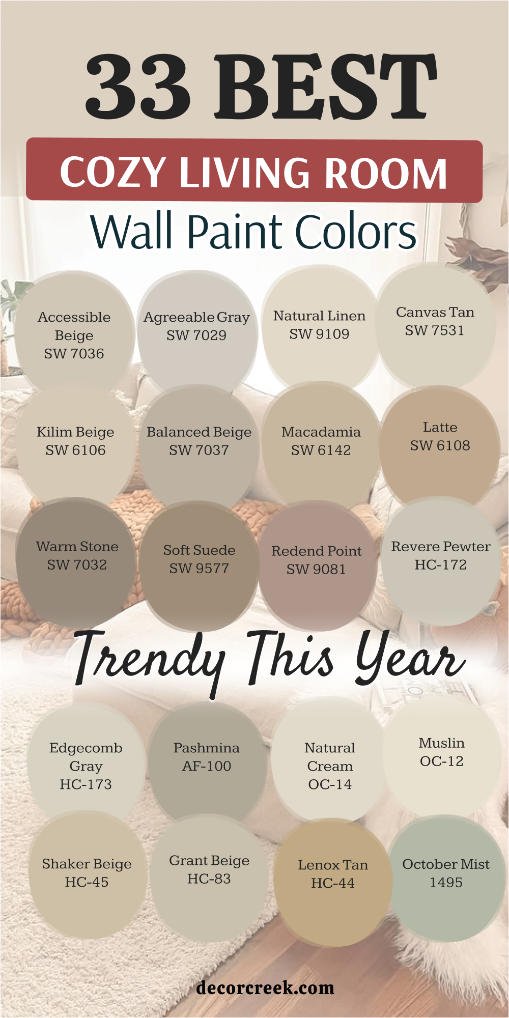
Picking a new paint color is a wonderful way to show how much you care about your home and the people who live in it. I always see it as more than just a design choice—it’s a way to create a feeling that supports your everyday life. I truly hope this list helps you find a shade that brings warmth and joy into your living room. The best color is always the one that feels right to you and makes you smile every single day when you walk into the room.
Before making a final decision, I always recommend testing a small sample on your wall. This step is so important because colors can look very different depending on your lighting, furniture, and even the time of day. What looks perfect in a store might feel completely different at home.
When you test it in your own space, you can see how it works with your floors, fabrics, and decor. This helps you feel confident in your choice and avoid any surprises later.
A cozy home is not about following strict rules. It’s about creating a place where you feel safe, happy, and connected to your loved ones.
The right paint color supports that feeling and makes your living room a place where people want to gather, relax, and spend time together.