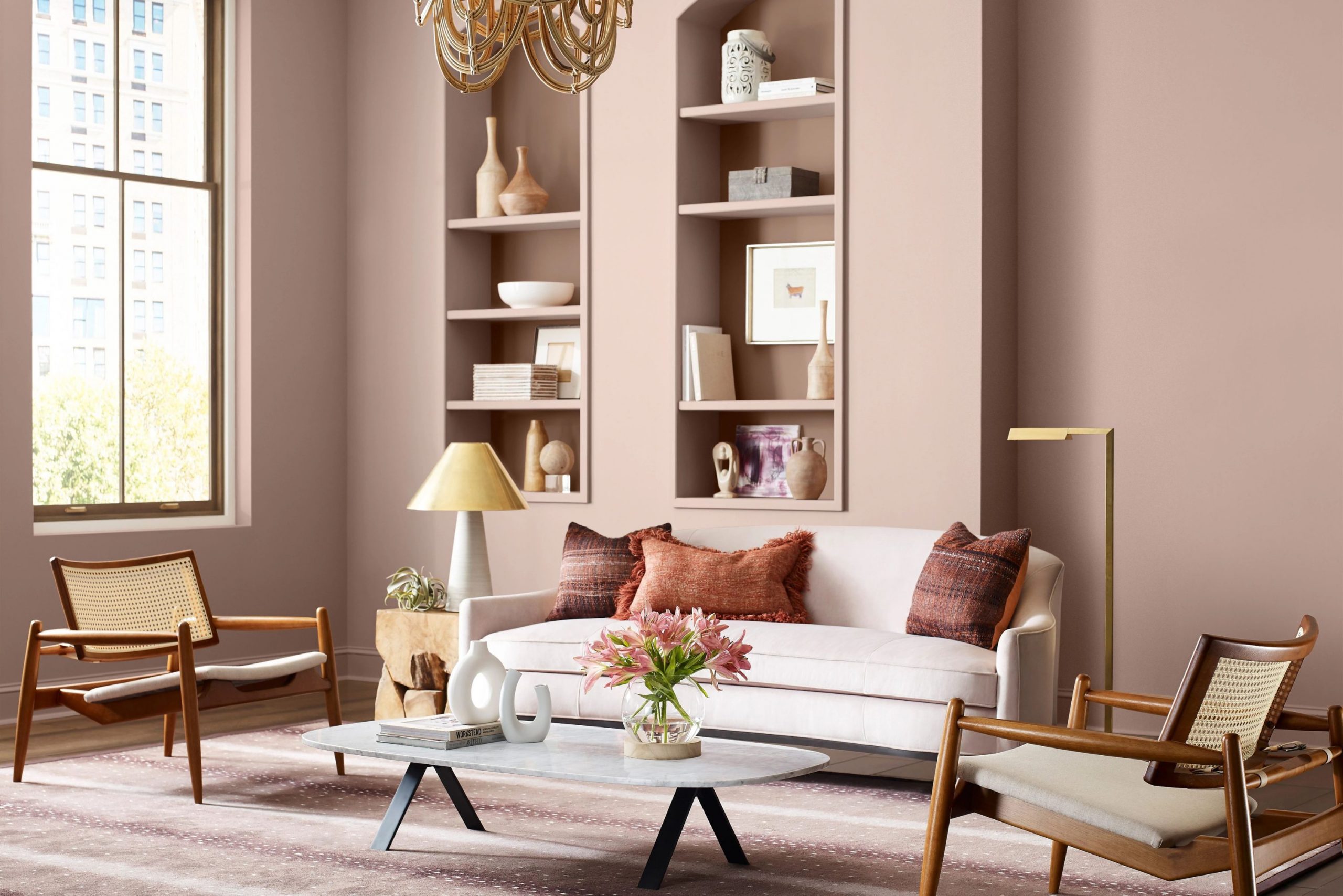
When my clients approach me asking for a color that is warm, gentle, and utterly chic, dusty rose is consistently my first and absolute favorite suggestion. It is a truly marvelous and multifaceted hue that imparts the desirable warmth of pink without ever feeling too bright or childish.
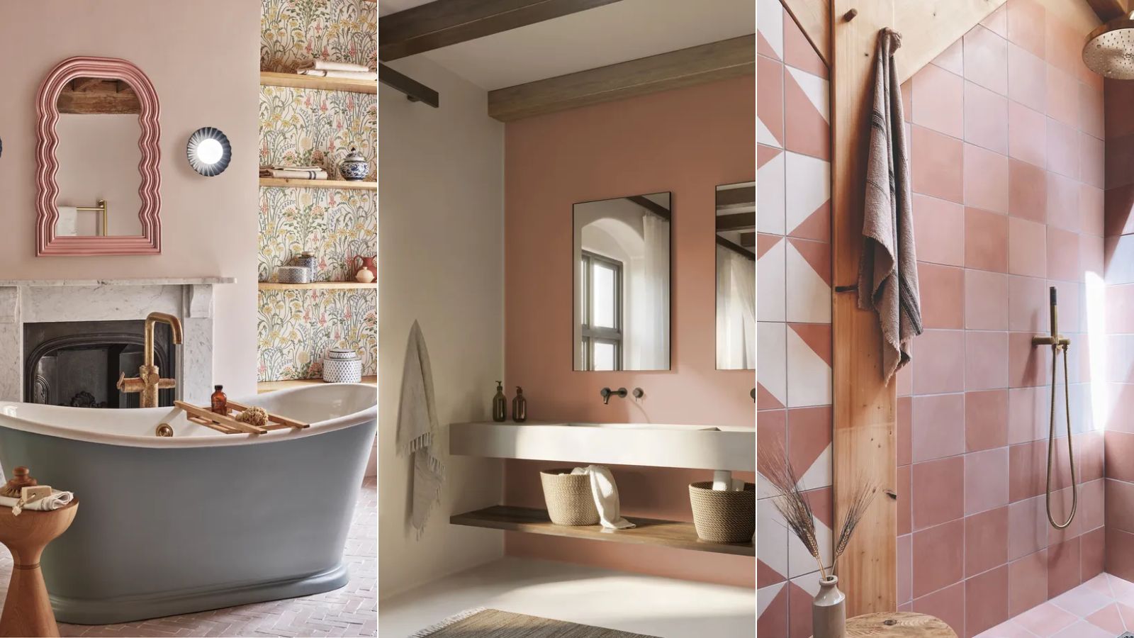
Over the years, I have successfully utilized dusty rose in a wide array of spaces: in bedrooms, where it fosters an atmosphere of profound tranquility; in elegant living rooms, lending them beautiful softness; and even in kitchens, where it adds an astonishing, cozy charm.
Regardless of its application, this color invariably adds a layer of beautiful, comforting sophistication and grace. It possesses the power to instantly make any room significantly softer and incredibly more inviting, evoking a feeling comparable to wrapping yourself up in your most beloved and coziest blanket.
Choosing a shade of dusty rose is an exciting and nuanced way to showcase your personal style and taste; it is a color that eloquently speaks of gentle warmth and confident, quiet dignity.
This comprehensive guide represents my carefully curated, personal collection of the very best and most tested dusty rose shades, compiled from my years of experience in crafting truly special and memorable interiors.
Get ready for the search for that one, perfect shade that will bestow upon your home a gorgeous, sophisticated glow in the year 2026.
Why I Always Trust Sherwin-Williams and Benjamin Moore for Dusty Rose Paint Colors
I rely on Sherwin-Williams and Benjamin Moore for my dusty rose selections for one important reason: they get the shade right. Dusty rose is a difficult color because it needs the perfect balance of pink, gray, and often beige to avoid looking either too vibrant or too muddy.
These two top brands have mastered that balance. Their formulas provide a rich, consistent pigment that applies smoothly and keeps its sophisticated tone on the wall. The colors are never flat; they have a lovely velvety depth that makes the light in the room feel soft and flattering.
When I specify a color like ‘Redend Point’ or ‘First Light,’ I know the client is getting a high-quality finish that will make their room feel truly beautiful and custom for years to come.
For a color as delicate and nuanced as dusty rose, you need the very best quality, and these brands reliably deliver that perfection.How I Choose the Perfect Dusty Rose Shade for Each Room
Choosing the perfect dusty rose involves more than just picking a pretty color; it’s about understanding how the shade will work with the natural light and the existing furnishings in the room.
I always start by considering the direction the room faces. For rooms facing north, which tend to have cooler, blue light, I choose dusty rose shades with warmer, more beige undertones like ‘Malted Milk’ or ‘Proposal’ to counteract the coolness and keep the room feeling cozy.
For bright, south-facing rooms, I can use dusty rose shades with more noticeable gray or mauve undertones like ‘Rosé’ or ‘Dusty Mauve,’ which help keep the color from looking too washed out or too bright in the intense sunlight.
I also pay close attention to the existing fixed elements like the flooring, as a shade needs to complement the wood tone or carpet color perfectly.
The wrong undertone can clash, making the whole room feel off. By focusing on these details, I ensure the dusty rose I choose for my clients makes their room feel harmonious, soft, and utterly inviting.
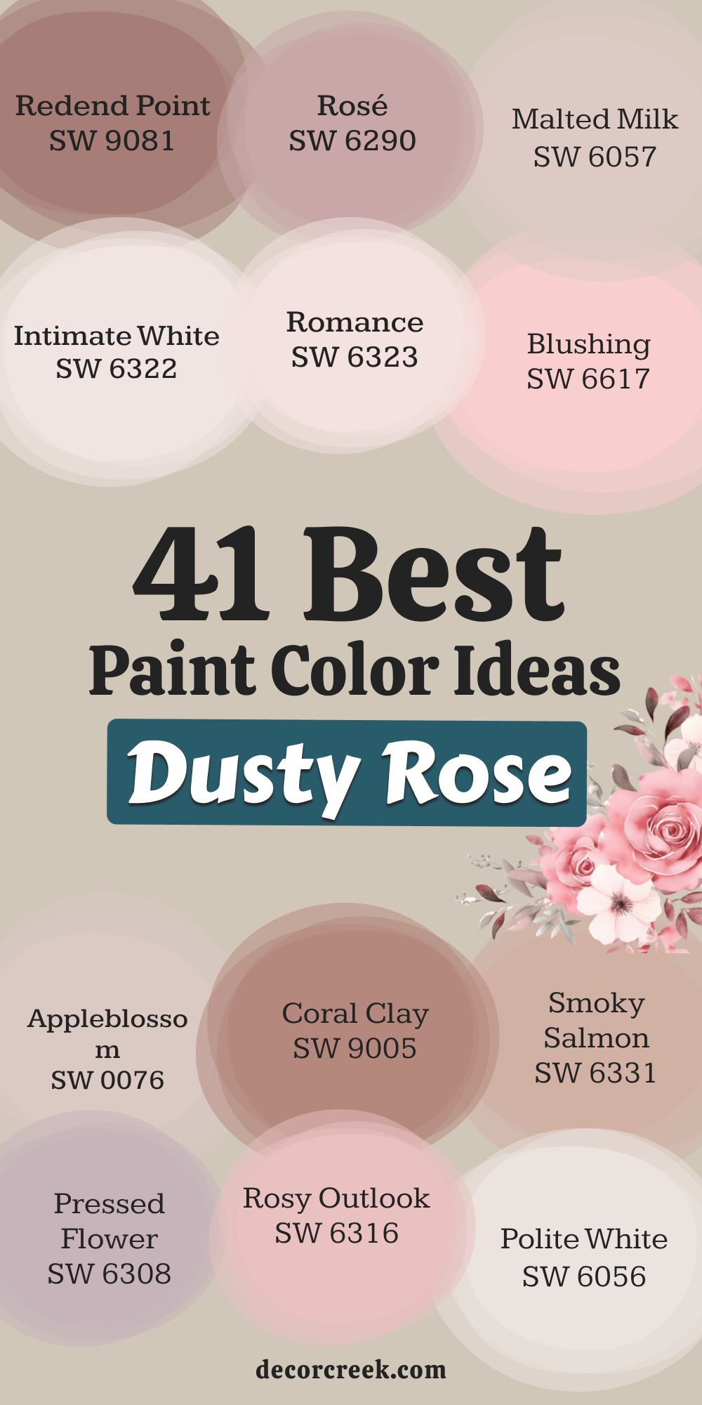
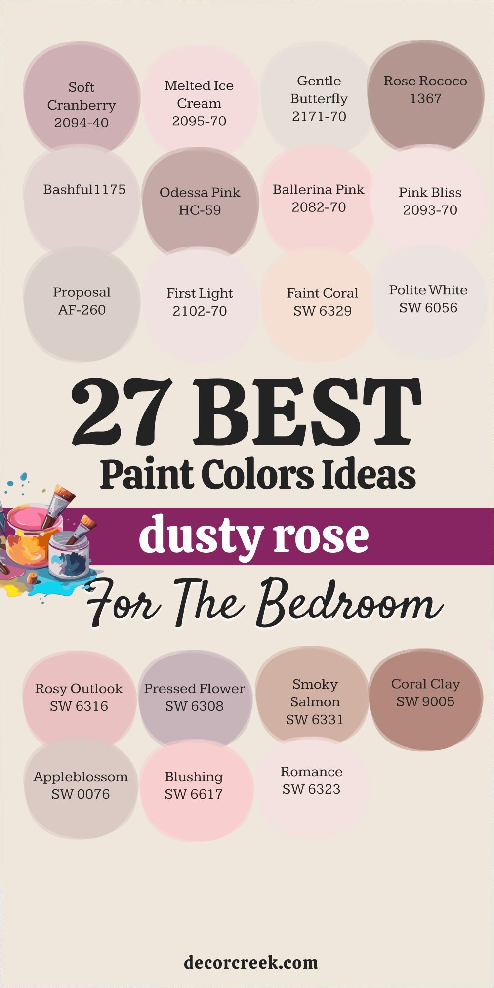
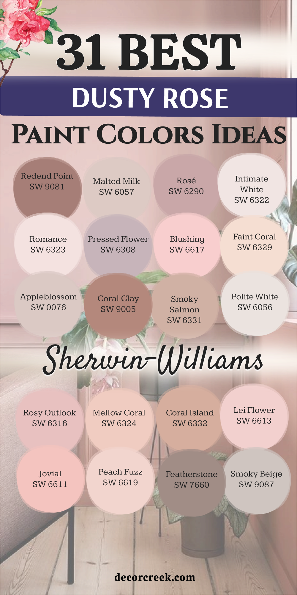
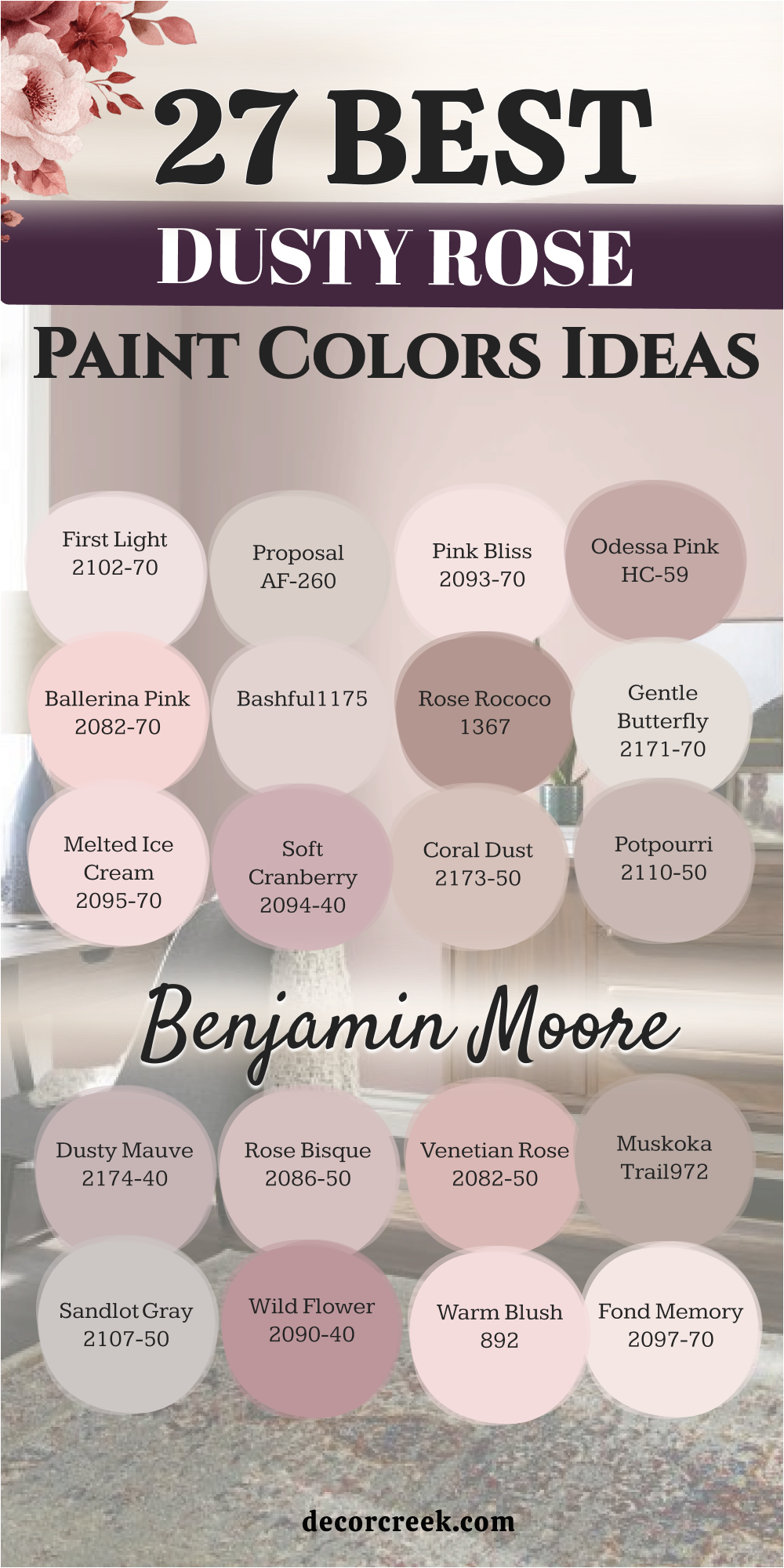
27 Dusty Rose Paint Color Ideas for the Bedroom
Redend Point SW 9081
Redend Point SW 9081 is a gorgeous, deep terracotta pink that has a grounding, warm-beige undertone, making it feel incredibly current and comforting. This shade is perfect for a main bedroom where you want a rich, enveloping color that still feels soft and not too bright.
Redend Point pairs beautifully with crisp white bedding and natural wood furniture, creating an organic, earthy sophistication. The color provides a deep warmth that feels like a soft, protective hug at the end of a long day, encouraging deep rest.
I often use it on all four walls for an intimate, cocoon-like effect that makes the room feel wonderfully private. It’s a sophisticated choice that works well in both contemporary and rustic-style homes, proving its versatile, enduring appeal. Redend Point truly makes a statement of quiet, confident luxury in a personal retreat. This shade is one of my favorites for adding serious warmth and depth to a bedroom. It is a stunning, sophisticated blend of beige, pink, and red clay tones.
🎨 Check out the complete guide to this color right HERE 👈

Rosé SW 6290
Rosé SW 6290 is a beautiful, muted dusty pink that carries a noticeable gray undertone, giving it a sophisticated, grown-up blush quality for a bedroom. This shade is perfect when you want a pink that is clear but doesn’t feel childish or overly sweet, providing a gentle, refined warmth.
Rosé works wonderfully with soft gray and charcoal accents, creating a chic, layered palette that feels very contemporary and tailored. I recommend using it on all four walls to create a subtle, atmospheric depth that makes the room feel soft and inviting.
The color’s muted nature ensures it remains restful and non-distracting, ideal for a sleeping environment. It provides a lovely, flattering glow on the walls that looks beautiful throughout the day. Rosé truly brings a quiet elegance and a sense of gentle romance to any bedroom I use it in.
This pink is a wonderful, versatile choice that pairs well with both warm wood and cool metals.
Malted Milk SW 6057
Malted Milk SW 6057 is a warm, pink-tinged beige that is an excellent choice for a bedroom where you desire the gentle warmth of dusty rose without too much obvious color.
This shade is nearly a neutral, but its subtle pink undertone keeps it from feeling drab, instead giving the room a soft, creamy glow. Malted Milk pairs beautifully with white and natural linen textures, creating a cozy, organic atmosphere that is perfect for a relaxed bedroom.
I often recommend it for smaller rooms as its light value helps keep the room feeling airy while still providing depth. The color is incredibly comforting and versatile, serving as a perfect background for layered patterns and textures. Malted Milk provides a gentle sophistication that is easy to live with and ensures your bedroom feels warmly inviting and peaceful. This shade is an excellent starting point for any client worried about using too much pink on their walls.
🎨 Check out the complete guide to this color right HERE 👈
Intimate White SW 6322
Intimate White SW 6322 is a very pale, creamy white that features a distinct pink undertone, making it the perfect choice for a light, airy take on dusty rose in a bedroom.
This shade is ideal when you want the feeling of a white room but with a subtle, warming blush that prevents the walls from feeling stark or cold. Intimate White works beautifully as a full wall color, especially when paired with deeper accent shades like navy or charcoal in the bedding and accessories.
It provides a soft, ethereal glow that looks beautiful in both natural and artificial light, making the room feel consistently welcoming. The color is wonderfully sophisticated and avoids the risk of looking too strongly pink, offering a quiet whisper of warmth instead. Intimate White truly brings a delicate, understated elegance and soft, peaceful ambiance to a bedroom. I often use this shade in rooms where I want a sophisticated hint of color without the visual weight of a darker shade.
🎨 Check out the complete guide to this color right HERE 👈
Romance SW 6323
Romance SW 6323 is a delicate, soft blush pink that is lighter and purer than a true dusty rose, offering a gentle, more feminine warmth for a bedroom. This shade is perfect when you want a color that feels distinctly pink but is pale enough to feel airy and refined on all four walls.
Romance pairs wonderfully with crisp white trim and light gray furniture, creating a fresh, sweet, and refined aesthetic. I recommend using it in a bright room where the light can enhance its beautiful, subtle rosy glow.
The color creates a very restful and inviting atmosphere, reminiscent of a gentle sunset that encourages relaxation. Romance truly brings a feeling of lighthearted elegance and soft beauty to a personal retreat. It’s an easy way to introduce a soft, cheerful pink without the intensity of a darker shade.
🎨 Check out the complete guide to this color right HERE 👈
Blushing SW 6617
Blushing SW 6617 is a light, gentle pink that is clean and pure, possessing a clear, bright rosy tone that still feels soft enough for a bedroom setting.
This shade is perfect for a room where you want the pink to be noticeable and cheerful but still maintain an element of sophistication and lightness. Blushing works well with gold accents and light wood tones, creating a warm, inviting, and slightly glamorous aesthetic in the room.
I suggest pairing it with a creamy white trim to ensure the color looks fresh and doesn’t feel overly sweet on the walls. The color provides a lovely, uplifting warmth that makes the bedroom feel instantly brighter and more welcoming. Blushing truly brings a sense of gentle joy and fresh elegance to a sleeping area. I often use this shade in guest rooms to give them a bright, welcoming splash of color.
Appleblossom SW 0076
Appleblossom SW 0076 is a soft, muted blush that carries a gentle gray-beige undertone, placing it firmly in the sophisticated dusty rose family for a bedroom.
This shade is ideal when you want a pink that is deeply comforting and wonderfully soft, avoiding any harshness or overly bright coloring. Appleblossom pairs beautifully with darker wood furniture and neutral linen textures, creating a grounded, cozy, and highly organic feel.
I recommend using it in a room that receives moderate light, where its complex depth can truly shine and provide a soft, enveloping atmosphere. The color adds a subtle, beautiful richness that makes the room feel custom and intentionally designed. Appleblossom truly brings a sense of quiet heritage and gentle warmth to a personal space.
This shade has a velvety richness that feels much more expensive than a simple light pink.
Coral Clay SW 9005
Coral Clay SW 9005 is a deep, rich dusty rose that carries a noticeable earthen, coral-orange undertone, giving it a warm, sophisticated depth perfect for a bedroom.
This shade is fantastic for creating a grounding, earthy feel, making the room feel wonderfully protected and intimately designed. Coral Clay works beautifully with dark wood and warm gold accents, creating a rich, almost exotic elegance in the room.
I suggest using it on an accent wall behind the bed to add immediate visual weight and a strong, captivating focal point. The color provides a bold, comforting warmth that is ideal for a stylish and inviting main bedroom. Coral Clay truly makes a statement of sophisticated confidence and earthy beauty. This shade is a power color that anchors a design with its natural intensity.
🎨 Check out the complete guide to this color right HERE 👈
Smoky Salmon SW 6331
Smoky Salmon SW 6331 is a muted, warm pink that has a definite salmon-orange undertone combined with a softening gray, making it a very sophisticated dusty rose alternative.
This shade is perfect for a bedroom where you want a color that feels distinctly warm and grounded while still offering a rich, comforting glow. Smoky Salmon pairs wonderfully with charcoal gray and black accents, creating a striking, modern contrast that feels sharp and polished.
I recommend using it on all four walls to create an enveloping, cozy effect that is perfect for a restful environment. The color has a beautiful, complex depth that makes the room feel unique and intentionally decorated. Smoky Salmon truly brings a sense of unique warmth and quiet drama to a personal retreat. This is a wonderfully adaptable shade that looks good in both sunlit and dimly lit rooms.
🎨 Check out the complete guide to this color right HERE 👈
Pressed Flower SW 6304
Pressed Flower SW 6304 is a beautiful, gentle mauve-pink that has a dusty, slightly purple undertone, offering a refined, mature take on dusty rose for a bedroom.
This shade is ideal when you want a pink that feels incredibly soft and historical, reminiscent of an antique color palette. Pressed Flower works beautifully with antique furniture and soft, layered white textiles, creating a romantic, vintage elegance.
I suggest using it in a room with warm light where its complex mauve character can truly shine and provide a quiet depth. The color creates a very soothing and introspective atmosphere, perfect for winding down at the end of the day. Pressed Flower truly brings a sense of gentle nostalgia and sophisticated softness to a sleeping area. This color has an old-world charm that feels very thoughtful and intentional in a design.
🎨 Check out the complete guide to this color right HERE 👈
Rosy Outlook SW 6316
Rosy Outlook SW 6316 is a mid-tone, classic pink that is clean and bright, possessing a cheerful, uplifting rosy quality that is a lovely, optimistic take on dusty rose.
This shade is perfect for a bedroom where you want the color to feel fresh and noticeably feminine but still soft enough to be restful on the walls. Rosy Outlook works well with bright white trim and light wood tones, creating an airy, inviting, and slightly playful aesthetic.
I recommend using it in a room with northern exposure to add a much-needed boost of sunny warmth and vibrancy. The color provides a gentle, consistent glow that makes the bedroom feel instantly happier and more welcoming. Rosy Outlook truly brings a sense of fresh joy and vibrant elegance to a personal space.
🎨 Check out the complete guide to this color right HERE 👈
Polite White SW 6056
Polite White SW 6056 is a light, creamy beige that carries a very subtle pink-peach undertone, making it an excellent nearly-neutral option for a hint of dusty rose warmth in a bedroom.
This shade is ideal when you want a color that is barely there, providing just enough warmth to prevent the walls from looking stark white. Polite White works beautifully as a full wall color, allowing the room to feel bright and open while adding a soft, gentle warmth.
I suggest pairing it with natural textures and light-colored furnishings for a tranquil, organic, and cozy atmosphere. The color is wonderfully sophisticated and subtle, offering a quiet whisper of rose warmth that flatters every element in the room. Polite White truly brings an understated elegance and soft, peaceful ambiance to a sleeping area.
🎨 Check out the complete guide to this color right HERE 👈
Faint Coral SW 6329
Faint Coral SW 6329 is a delicate, pale pink that has a clear apricot or coral undertone, placing it in the warmest part of the dusty rose family for a bedroom.
This shade is perfect when you want a pink that is distinctly warm and has a subtle, sunny disposition that feels wonderfully inviting and bright. Faint Coral works beautifully with creamy white and light natural textiles, creating a soft, airy, and gently cheerful ambiance.
I recommend using it in a room that needs a boost of warmth, as its coral base prevents it from ever feeling cold or stark on the walls. The color provides a subtle, beautiful blush that is both sophisticated and wonderfully approachable. Faint Coral truly brings a sense of gentle brightness and refined warmth to a personal retreat. This shade is a sophisticated alternative to yellow for adding sunshine to a darker room.
🎨 Check out the complete guide to this color right HERE 👈
First Light 2102-70
First Light 2102-70 is a gorgeous, soft rosy pink that is very current and feels clean, bright, and optimistic, serving as a perfect modern dusty rose for a bedroom.
This shade is perfect when you want a pink that feels airy and illuminating while still delivering a noticeable warmth and gentle color. First Light pairs beautifully with crisp white trim and light oak furniture, creating a fresh, contemporary, and incredibly inviting aesthetic.
I recommend using it on all four walls for an uplifting, cloud-like effect that makes the room feel soft and wonderfully bright. The color provides a subtle, sophisticated glow that is highly flattering and restful, making it a dream to wake up in. First Light truly brings a sense of gentle optimism and current style to any personal retreat. It is a fantastic choice for a room that needs a light, sophisticated wash of warmth.
Proposal AF-260
Proposal AF-260 is a stunning, muted pink-beige that leans heavily towards a warm, sophisticated dusty blush, making it an excellent neutral-rose for a bedroom. This shade is perfect for creating an adult, subdued palette where the pink provides warmth and softness without being obviously colorful or sweet.
Proposal works beautifully with warm linen textures and dark wood accents, creating a rich, velvety, custom-designed feel. I recommend using it in a main bedroom where you want a color that is both grounded and deeply comforting, providing a quiet, refined backdrop.
The gray undertone ensures the color is never jarring or overly bright, making it ideal for promoting rest and quiet time. Proposal truly brings a sense of gentle luxury and highly sophisticated warmth to a sleeping area. This color has the perfect balance of warmth and sophistication for a master suite.
🎨 Check out the complete guide to this color right HERE 👈
Pink Bliss 2093-70
Pink Bliss 2093-70 is a pale, ethereal blush pink that is very soft and quiet, providing a gentle, delicate warmth that is perfect for a light and airy take on dusty rose in a bedroom.
This shade is ideal when you want a whisper of color on the walls, ensuring the room feels airy but still benefits from the softening effect of pink. Pink Bliss pairs wonderfully with bright white and pale gray accents, creating a dreamy, cloud-like atmosphere that is wonderfully tranquil.
I suggest using it in a room with lots of natural light where its extreme softness can shine without being washed out. The color is incredibly peaceful and refined, making it a beautiful, non-distracting backdrop for sleeping. Pink Bliss truly brings a sense of soft beauty and delicate elegance to a personal space.
This shade provides an unrivaled delicacy that is perfect for a feminine and restful room.
Ballerina Pink 2082-70
Ballerina Pink 2082-70 is a light, delicate blush that is clean and pure, possessing a clear, gentle rosy tone that feels charming and refined in a bedroom.
This shade is perfect for a room where you want the pink to be noticeable and cheerful but still maintain an element of lightness and innocence. Ballerina Pink works beautifully with crisp white trim and silver accents, creating a fresh, lighthearted, and beautifully tailored aesthetic.
I suggest using it in a well-lit room where the light can enhance its beautiful, subtle rosy glow on the walls. The color provides a lovely, uplifting warmth that makes the bedroom feel instantly brighter and more welcoming. Ballerina Pink truly brings a sense of gentle joy and airy elegance to a personal space. It’s a sweet but sophisticated choice that feels youthful and inviting.
🎨 Check out the complete guide to this color right HERE 👈
Odessa Pink HC-59
Odessa Pink HC-59 is a classic, rich dusty rose that has a historical, grounded quality due to its deep beige and muted red undertones, perfect for an established bedroom. This shade is ideal when you want a pink that feels substantial and sophisticated, avoiding any modern candy-like brightness.
Odessa Pink pairs beautifully with antique brass hardware and dark, traditional furniture, creating a rich, old-world elegance. I recommend using it in a main bedroom to create an enveloping, cozy effect that feels wonderfully private and tucked away.
The color has a velvety depth that makes the room feel instantly more luxurious and thoughtfully designed. Odessa Pink truly brings a sense of heritage, warmth, and quiet confidence to a personal retreat. This historical color has a timeless, enduring appeal that is highly valuable in design.
🎨 Check out the complete guide to this color right HERE 👈
Bashful 1171
Bashful 1171 is a pale, muted dusty pink that carries a clear gray undertone, giving it a sophisticated, understated blush quality that is perfect for a refined bedroom.
This shade is ideal when you want a color that is soft, quiet, and wonderfully reserved, providing warmth without any visual intensity. Bashful works beautifully with creamy off-whites and natural wood tones, creating a tranquil, organic atmosphere that encourages deep relaxation.
I recommend using it on all four walls to create a subtle, enveloping depth that makes the room feel calm and inviting. The color’s muted nature ensures it remains restful and non-distracting, ideal for a sleeping environment. Bashful truly brings a quiet sophistication and gentle peacefulness to any bedroom I use it in. It is the perfect shade for achieving a restful, Scandinavian-inspired aesthetic.
🎨 Check out the complete guide to this color right HERE 👈
Rose Rococo 1275
Rose Rococo 1275 is a rich, mid-tone dusty rose that has a classic, historical feel due to its deep red-pink and subtle brown undertones, perfect for an elegant bedroom.
This shade is ideal when you want a pink that feels substantial, grounded, and wonderfully warm, creating an intimate atmosphere. Rose Rococo pairs beautifully with dark wood furniture and antique gold accents, creating a sumptuous, old-world glamour.
I recommend using it on an accent wall to add immediate visual weight and a strong, captivating focal point behind a bed. The color provides a bold, comforting warmth that is ideal for a stylish and inviting main bedroom. Rose Rococo truly makes a statement of rich history and quiet confidence in a personal retreat. This color has a velvety richness that feels both grand and deeply personal.
Gentle Butterfly 2173-70
Gentle Butterfly 2173-70 is a very pale pink that is nearly a white, but with a delicate, rosy undertone, offering a wispy, light take on dusty rose for a bedroom.
This shade is ideal when you want the feeling of an airy white room but with a subtle, very soft blush that keeps the walls from feeling stark. Gentle Butterfly works beautifully as a full wall color, allowing light to bounce around and making the room feel consistently bright and open.
It provides a soft, ethereal glow that is highly sophisticated and avoids the risk of looking too strongly pink, offering just a hint of warmth. Gentle Butterfly truly brings a delicate, understated elegance and a soft, airy ambiance to a bedroom. It is a fantastic option for a north-facing room that needs a subtle warming color.
🎨 Check out the complete guide to this color right HERE 👈
Melted Ice Cream 2095-70
Melted Ice Cream 2095-70 is a soft, pale pink that has a very clean, almost confectionery sweetness, making it a delightful and light dusty rose option for a bedroom.
This shade is perfect for a room where you want the pink to be bright, cheerful, and inviting but still pale enough to feel airy and refined on the walls. Melted Ice Cream pairs wonderfully with white and light gray accents, creating a fresh, sweet, and gently tailored aesthetic.
I recommend using it in a children’s room or guest room where you want an uplifting, delicate rosy glow. The color creates a very restful and happy atmosphere that encourages a feeling of lightness and joy. Melted Ice Cream truly brings a sense of playful elegance and soft charm to a personal space.
🎨 Check out the complete guide to this color right HERE 👈
Soft Cranberry 2094-40
Soft Cranberry 2094-40 is a mid-tone, slightly moody pink that carries a noticeable mauve-gray undertone, giving it a refined, quiet depth that works beautifully in a bedroom.
This shade is ideal when you want a dusty rose that feels more grounded and less sweet, providing a sophisticated, mature color on the walls. Soft Cranberry works wonderfully with charcoal gray and deep wood tones, creating a chic, layered, and slightly dramatic palette.
I suggest using it on an accent wall to add immediate visual weight and a captivating focal point in the room. The color provides a velvety richness that makes the bedroom feel custom and intentionally designed. Soft Cranberry truly brings a sense of quiet sophistication and gentle moodiness to a personal retreat.
Coral Dust 2173-50
Coral Dust 2173-50 is a mid-tone pink that has a clear, earthen coral undertone combined with a dusty gray, making it a very warm and grounded dusty rose.
This shade is perfect for a bedroom where you want a color that feels distinctly sun-drenched and comforting, providing a beautiful, organic glow. Coral Dust pairs wonderfully with creamy white trim and natural textures, creating an earthy, inviting, and highly serene atmosphere.
I recommend using it in a room that needs a subtle lift, as its coral base keeps the color from ever looking flat or dull. The color has a sophisticated depth that makes the room feel unique and intentionally decorated. Coral Dust truly brings a sense of unique warmth and quiet personality to a personal retreat.
Potpourri 1312
Potpourri 1312 is a mid-tone, muted pink that has a distinct dusty brown-gray undertone, making it a very grounded and classic dusty rose.
This shade is perfect when you want a pink that feels substantial and sophisticated, providing a beautiful, soft warmth that is easy to live with. Potpourri works wonderfully with dark wood furniture and deep green accents, creating a rich, earthy, and historically inspired palette.
I suggest using it on all four walls to create an enveloping, cozy effect that is perfect for promoting deep rest. The color’s muted nature ensures it remains restful and non-distracting on the walls. Potpourri truly brings a sense of gentle heritage and quiet sophistication to a sleeping area.
Dusty Mauve 2174-40
Dusty Mauve 2174-40 is a mid-tone mauve-pink that carries a noticeable gray-purple undertone, giving it a sophisticated, cool depth that works beautifully in a bedroom.
This shade is ideal when you want a dusty rose that feels more refined and less overtly pink, providing a mature, quiet color on the walls. Dusty Mauve works wonderfully with charcoal gray and white accents, creating a chic, layered, and slightly mysterious palette.
I suggest using it on a feature wall to add visual weight and a sophisticated focal point in the room. The color provides a velvety richness that makes the bedroom feel custom and intentionally designed. Dusty Mauve truly brings a sense of quiet moodiness and gentle sophistication to a personal retreat.
Rose Bisque 2102-50
Rose Bisque 2102-50 is a mid-tone dusty pink that has a noticeable peach-orange undertone, making it a wonderfully warm and inviting shade for a bedroom.
This shade is perfect when you want a pink that feels sun-drenched, comforting, and wonderfully approachable, providing a gentle, beautiful glow. Rose Bisque pairs beautifully with soft gray and natural wood, creating a cozy, organic, and highly serene atmosphere.
I recommend using it on all four walls for an enveloping, sunny effect that makes the room feel consistently welcoming. The color has a subtle sophistication that is easy to live with and ensures your bedroom feels warmly inviting and peaceful. Rose Bisque truly brings a sense of gentle warmth and cheerful elegance to a personal retreat.
31 Dusty Rose Paint Color Ideas by Sherwin-Williams
Redend Point SW 9081
Redend Point SW 9081 is a gorgeous, deep terracotta pink that has a grounding, warm-beige undertone, making it feel incredibly current and comforting. This shade is perfect for a main bedroom where you want a rich, enveloping color that still feels soft and not too bright.
Redend Point pairs beautifully with crisp white bedding and natural wood furniture, creating an organic, earthy sophistication. The color provides a deep warmth that feels like a soft, protective hug at the end of a long day, encouraging deep rest.
I often use it on all four walls for an intimate, cocoon-like effect that makes the room feel wonderfully private. It’s a sophisticated choice that works well in both contemporary and rustic-style homes, proving its versatile, enduring appeal. Redend Point truly makes a statement of quiet, confident luxury in a personal retreat. This shade is one of my favorites for adding serious warmth and depth to a bedroom. It is a stunning, sophisticated blend of beige, pink, and red clay tones.
🎨 Check out the complete guide to this color right HERE 👈
Malted Milk SW 6057
Malted Milk SW 6057 is a warm, pink-tinged beige that is an excellent choice for a bedroom where you desire the gentle warmth of dusty rose without too much obvious color. This shade is nearly a neutral, but its subtle pink undertone keeps it from feeling drab, instead giving the room a soft, creamy glow.
Malted Milk pairs beautifully with white and natural linen textures, creating a cozy, organic atmosphere that is perfect for a relaxed bedroom. I often recommend it for smaller rooms as its light value helps keep the room feeling airy while still providing depth.
The color is incredibly comforting and versatile, serving as a perfect background for layered patterns and textures. Malted Milk provides a gentle sophistication that is easy to live with and ensures your bedroom feels warmly inviting and peaceful. This shade is an excellent starting point for any client worried about using too much pink on their walls.
🎨 Check out the complete guide to this color right HERE 👈
Rosé SW 6290
Rosé SW 6290 is a beautiful, muted dusty pink that carries a noticeable gray undertone, giving it a sophisticated, grown-up blush quality for a bedroom. This shade is perfect when you want a pink that is clear but doesn’t feel childish or overly sweet, providing a gentle, refined warmth.
Rosé works wonderfully with soft gray and charcoal accents, creating a chic, layered palette that feels very contemporary and tailored. I recommend using it on all four walls to create a subtle, atmospheric depth that makes the room feel soft and inviting.
The color’s muted nature ensures it remains restful and non-distracting, ideal for a sleeping environment. It provides a lovely, flattering glow on the walls that looks beautiful throughout the day. Rosé truly brings a quiet elegance and a sense of gentle romance to any bedroom I use it in. This pink is a wonderful, versatile choice that pairs well with both warm wood and cool metals.
Intimate White SW 6322
Intimate White SW 6322 is a very pale, creamy white that features a distinct pink undertone, making it the perfect choice for a light, airy take on dusty rose in a bedroom.
This shade is ideal when you want the feeling of a white room but with a subtle, warming blush that prevents the walls from feeling stark or cold. Intimate White works beautifully as a full wall color, especially when paired with deeper accent shades like navy or charcoal in the bedding and accessories.
It provides a soft, ethereal glow that looks beautiful in both natural and artificial light, making the room feel consistently welcoming. The color is wonderfully sophisticated and avoids the risk of looking too strongly pink, offering a quiet whisper of warmth instead. Intimate White truly brings a delicate, understated elegance and soft, peaceful ambiance to a bedroom. I often use this shade in rooms where I want a sophisticated hint of color without the visual weight of a darker shade.
🎨 Check out the complete guide to this color right HERE 👈
Romance SW 6323
Romance SW 6323 is a delicate, soft blush pink that is lighter and purer than a true dusty rose, offering a gentle, more feminine warmth for a bedroom. This shade is perfect when you want a color that feels distinctly pink but is pale enough to feel airy and refined on all four walls.
Romance pairs wonderfully with crisp white trim and light gray furniture, creating a fresh, sweet, and refined aesthetic. I recommend using it in a bright room where the light can enhance its beautiful, subtle rosy glow.
The color creates a very restful and inviting atmosphere, reminiscent of a gentle sunset that encourages relaxation. Romance truly brings a feeling of lighthearted elegance and soft beauty to a personal retreat. It’s an easy way to introduce a soft, cheerful pink without the intensity of a darker shade.
🎨 Check out the complete guide to this color right HERE 👈
Pressed Flower SW 6304
Pressed Flower SW 6304 is a beautiful, gentle mauve-pink that has a dusty, slightly purple undertone, offering a refined, mature take on dusty rose for a bedroom.
This shade is ideal when you want a pink that feels incredibly soft and historical, reminiscent of an antique color palette. Pressed Flower works beautifully with antique furniture and soft, layered white textiles, creating a romantic, vintage elegance.
I suggest using it in a room with warm light where its complex mauve character can truly shine and provide a quiet depth. The color creates a very soothing and introspective atmosphere, perfect for winding down at the end of the day. Pressed Flower truly brings a sense of gentle nostalgia and sophisticated softness to a sleeping area. This color has an old-world charm that feels very thoughtful and intentional in a design.
Blushing SW 6617
Blushing SW 6617 is a light, gentle pink that is clean and pure, possessing a clear, bright rosy tone that still feels soft enough for a bedroom setting.
This shade is perfect for a room where you want the pink to be noticeable and cheerful but still maintain an element of sophistication and lightness. Blushing works well with gold accents and light wood tones, creating a warm, inviting, and slightly glamorous aesthetic in the room.
I suggest pairing it with a creamy white trim to ensure the color looks fresh and doesn’t feel overly sweet on the walls. The color provides a lovely, uplifting warmth that makes the bedroom feel instantly brighter and more welcoming. Blushing truly brings a sense of gentle joy and fresh elegance to a sleeping area. I often use this shade in guest rooms to give them a bright, welcoming splash of color.
🎨 Check out the complete guide to this color right HERE 👈
Faint Coral SW 6329
Faint Coral SW 6329 is a delicate, pale pink that has a clear apricot or coral undertone, placing it in the warmest part of the dusty rose family for a bedroom.
This shade is perfect when you want a pink that is distinctly warm and has a subtle, sunny disposition that feels wonderfully inviting and bright. Faint Coral works beautifully with creamy white and light natural textiles, creating a soft, airy, and gently cheerful ambiance.
I recommend using it in a room that needs a boost of warmth, as its coral base prevents it from ever feeling cold or stark on the walls. The color provides a subtle, beautiful blush that is both sophisticated and wonderfully approachable. Faint Coral truly brings a sense of gentle brightness and refined warmth to a personal retreat. This shade is a sophisticated alternative to yellow for adding sunshine to a darker room.
🎨 Check out the complete guide to this color right HERE 👈
Appleblossom SW 0076
Appleblossom SW 0076 is a soft, muted blush that carries a gentle gray-beige undertone, placing it firmly in the sophisticated dusty rose family for a bedroom.
This shade is ideal when you want a pink that is deeply comforting and wonderfully soft, avoiding any harshness or overly bright coloring. Appleblossom pairs beautifully with darker wood furniture and neutral linen textures, creating a grounded, cozy, and highly organic feel.
I recommend using it in a room that receives moderate light, where its complex depth can truly shine and provide a soft, enveloping atmosphere. The color adds a subtle, beautiful richness that makes the room feel custom and intentionally designed. Appleblossom truly brings a sense of quiet heritage and gentle warmth to a personal space. This shade has a velvety richness that feels much more expensive than a simple light pink.
🎨 Check out the complete guide to this color right HERE 👈
Coral Clay SW 9005
Coral Clay SW 9005 is a deep, rich dusty rose that carries a noticeable earthen, coral-orange undertone, giving it a warm, sophisticated depth perfect for a bedroom.
This shade is fantastic for creating a grounding, earthy feel, making the room feel wonderfully protected and intimately designed. Coral Clay works beautifully with dark wood and warm gold accents, creating a rich, almost exotic elegance in the room.
I suggest using it on an accent wall behind the bed to add immediate visual weight and a strong, captivating focal point. The color provides a bold, comforting warmth that is ideal for a stylish and inviting main bedroom. Coral Clay truly makes a statement of sophisticated confidence and earthy beauty. This shade is a power color that anchors a design with its natural intensity.
Smoky Salmon SW 6331
Smoky Salmon SW 6331 is a muted, warm pink that has a definite salmon-orange undertone combined with a softening gray, making it a very sophisticated dusty rose alternative.
This shade is perfect for a bedroom where you want a color that feels distinctly warm and grounded while still offering a rich, comforting glow. Smoky Salmon pairs wonderfully with charcoal gray and black accents, creating a striking, modern contrast that feels sharp and polished.
I recommend using it on all four walls to create an enveloping, cozy effect that is perfect for a restful environment. The color has a beautiful, complex depth that makes the room feel unique and intentionally decorated. Smoky Salmon truly brings a sense of unique warmth and quiet drama to a personal retreat. This is a wonderfully adaptable shade that looks good in both sunlit and dimly lit rooms.
Polite White SW 6056
Polite White SW 6056 is a light, creamy beige that carries a very subtle pink-peach undertone, making it an excellent nearly-neutral option for a hint of dusty rose warmth in a bedroom.
This shade is ideal when you want a color that is barely there, providing just enough warmth to prevent the walls from looking stark white. Polite White works beautifully as a full wall color, allowing the room to feel bright and open while adding a soft, gentle warmth.
I suggest pairing it with natural textures and light-colored furnishings for a tranquil, organic, and cozy atmosphere. The color is wonderfully sophisticated and subtle, offering a quiet whisper of rose warmth that flatters every element in the room. Polite White truly brings an understated elegance and soft, peaceful ambiance to a sleeping area.
Rosy Outlook SW 6316
Rosy Outlook SW 6316 is a mid-tone, classic pink that is clean and bright, possessing a cheerful, uplifting rosy quality that is a lovely, optimistic take on dusty rose.
This shade is perfect for a bedroom where you want the color to feel fresh and noticeably feminine but still soft enough to be restful on the walls. Rosy Outlook works well with bright white trim and light wood tones, creating an airy, inviting, and slightly playful aesthetic.
I recommend using it in a room with northern exposure to add a much-needed boost of sunny warmth and vibrancy. The color provides a gentle, consistent glow that makes the bedroom feel instantly happier and more welcoming. Rosy Outlook truly brings a sense of fresh joy and vibrant elegance to a personal space.
Mellow Coral SW 6324
Mellow Coral SW 6324 is a mid-tone, soft peach-pink that has a noticeable warm coral undertone, giving it a bright, cheerful disposition that leans into the warmest side of dusty rose.
This shade is perfect when you want a pink that feels vibrant and sunny while still maintaining a gentle, approachable quality on the walls. Mellow Coral works beautifully with white and bright accent colors, creating a fresh, energetic, and highly inviting aesthetic.
I suggest using it in a room that gets moderate light, where its warm undertone can truly shine and provide a sunny atmosphere. The color provides a lovely, uplifting warmth that makes the room feel consistently happy and welcoming. Mellow Coral truly brings a sense of cheerful elegance and soft vitality to a personal retreat.
🎨 Check out the complete guide to this color right HERE 👈
Coral Island SW 6332
Coral Island SW 6332 is a rich, saturated peach-pink that has a strong, warm coral undertone, making it a bolder, more intense option within the dusty rose range.
This shade is ideal when you want a pink that is deep, grounding, and full of personality, creating an intimate, sunset-inspired atmosphere. Coral Island pairs beautifully with dark wood and gold accents, creating a sumptuous, warm elegance that feels intentional and custom.
I recommend using it on an accent wall to add immediate visual weight and a dramatic, captivating focal point in the room. The color provides a bold, comforting warmth that is ideal for a stylish main bedroom or living room. Coral Island truly makes a statement of confident warmth and rich, earthy beauty.
🎨 Check out the complete guide to this color right HERE 👈
Lei Flower SW 6613
Lei Flower SW 6613 is a light, clear, true pink that has a subtle rosy warmth without a heavy gray or mauve undertone, making it a pure, gentle dusty pink.
This shade is perfect for a room where you want the pink to be delicate and unmistakably rosy, providing a soft, sweet elegance on the walls. Lei Flower works well with bright white and light gray accents, creating an airy, fresh, and beautifully tailored aesthetic.
I suggest pairing it with a creamy white trim to ensure the color looks fresh and doesn’t feel overly sweet on the walls. The color provides a lovely, uplifting warmth that makes the room feel instantly brighter and more inviting. Lei Flower truly brings a sense of gentle purity and fresh elegance to a personal space.
🎨 Check out the complete guide to this color right HERE 👈
Jovial SW 6611
Jovial SW 6611 is a bright, cheerful pink that has a clear, warm coral undertone, making it a very sunny and optimistic choice that still lands in the dusty rose family because of its depth.
This shade is ideal when you want a color that is vibrant, happy, and full of personality, providing a powerful, yet soft glow. Jovial works beautifully with white and turquoise accents, creating a fresh, energetic, and playful aesthetic.
I recommend using it in a child’s room or creative room where you want an uplifting, positive atmosphere. The color provides a lively, consistent warmth that makes the room feel consistently welcoming and bright. Jovial truly brings a sense of joyful energy and confident style to a personal space.
🎨 Check out the complete guide to this color right HERE 👈
Peach Fuzz SW 6344
Peach Fuzz SW 6344 is a soft, pale peach-pink that has a light, gentle orange undertone, making it an excellent, warm alternative to dusty rose for a sunny room.
This shade is perfect when you want a pink that is light, airy, and wonderfully bright, providing a soft, subtle warmth without being too pink or too orange. Peach Fuzz works beautifully with crisp white trim and natural wood, creating an organic, airy, and gently cheerful ambiance.
I recommend using it on all four walls to create an uplifting, soft glow that makes the room feel consistently welcoming and calm. The color has a delicate sophistication that is easy to live with and highly flattering. Peach Fuzz truly brings a sense of gentle brightness and refined softness to a personal retreat.
🎨 Check out the complete guide to this color right HERE 👈
Featherstone SW 9518
Featherstone SW 9518 is a mid-tone, warm gray that carries a noticeable pink or mauve undertone, making it a sophisticated, nearly-neutral choice within the dusty rose palette.
This shade is perfect when you want a color that is grounded and deep, where the rose influence is a quiet, warming whisper rather than a prominent color. Featherstone works beautifully with creamy white and deep charcoal accents, creating a tailored, chic, and layered palette.
I suggest using it on an accent wall to add immediate depth and a sophisticated, moody focal point in the room. The color provides a velvety richness that makes the room feel custom and intentionally designed. Featherstone truly brings a sense of quiet moodiness and serious sophistication to a personal retreat.
🎨 Check out the complete guide to this color right HERE 👈
Smoky Beige SW 9087
Smoky Beige SW 9087 is a warm, earthy beige that has a subtle, dusty rose-pink undertone, making it a fantastic neutral for anyone hesitant about a fully pink wall.
This shade is ideal when you want a color that is grounding and wonderfully soft, providing the warmth of dusty rose without the obvious color. Smoky Beige pairs beautifully with white and natural rattan textures, creating a cozy, organic, and highly tranquil atmosphere.
I recommend using it on all four walls to create an enveloping, calming effect that feels warm and custom. The color is incredibly versatile and serves as a beautiful backdrop for any furniture style or layered textile. Smoky Beige truly brings a sense of gentle sophistication and quiet peacefulness to a space.
🎨 Check out the complete guide to this color right HERE 👈
Rose Colored SW 6303
Rose Colored SW 6303 is a rich, saturated dusty pink that has a clear brown-red undertone, giving it a historical, grounded quality that feels refined and mature.
This shade is ideal when you want a pink that feels substantial and sophisticated, avoiding any sugary sweetness with its earthy depth. Rose Colored pairs beautifully with dark wood and warm gold accents, creating a sumptuous, old-world elegance.
I suggest using it on an accent wall or in a dining room to add immediate visual weight and a strong, captivating focal point. The color has a velvety depth that makes the room feel instantly luxurious and thoughtfully designed. Rose Colored truly brings a sense of heritage, warmth, and quiet confidence to a sophisticated home.
🎨 Check out the complete guide to this color right HERE 👈
Oleander SW 6603
Oleander SW 6603 is a bright, mid-tone pink that has a clear, warm coral undertone, making it a vibrant and cheerful option that is still soft enough for a dusty rose palette.
This shade is ideal when you want a color that is uplifting, happy, and full of personality, providing a bright, yet gentle glow. Oleander works beautifully with white and light wood tones, creating a fresh, energetic, and highly inviting aesthetic.
I recommend using it in a room with less natural light to add a much-needed boost of sunny warmth and vibrancy. The color provides a gentle, consistent glow that makes the room feel instantly happier and more welcoming. Oleander truly brings a sense of joyful energy and vibrant elegance to a personal space.
🎨 Check out the complete guide to this color right HERE 👈
Begonia SW 6599
Begonia SW 6599 is a deep, saturated pink that carries a strong, warm red undertone, making it a bold and rich choice within the dusty rose family.
This shade is perfect when you want a color that is intense, luxurious, and wonderfully warm, creating an intimate, jewel-toned atmosphere. Begonia pairs beautifully with dark wood and antique brass accents, creating a sumptuous, glamorous elegance.
I recommend using it on a feature wall or in a powder room to add immediate visual weight and a dramatic, captivating focal point. The color provides a bold, comforting richness that is ideal for a stylish and inviting main bedroom. Begonia truly makes a statement of confident warmth and opulent beauty in a personal retreat.
🎨 Check out the complete guide to this color right HERE 👈
Pressed Blush SW 9083
Pressed Blush SW 9083 is a light, muted peach-pink that is exceptionally soft, offering a gentle, airy take on dusty rose with a subtle warmth. This shade is perfect when you want a pink that is barely there, providing just enough warmth to prevent the walls from looking stark white.
Pressed Blush works beautifully as a full wall color, allowing the room to feel bright and open while adding a soft, ethereal glow. I suggest pairing it with creamy white trim and natural linen for a tranquil, organic, and cozy atmosphere.
The color is wonderfully sophisticated and subtle, offering a quiet whisper of rose warmth that flatters every element in the room. Pressed Blush truly brings an understated elegance and soft, peaceful ambiance to a sleeping area.
Demure SW 6295
Demure SW 6295 is a mid-tone, soft mauve-pink that has a distinct gray-purple undertone, giving it a sophisticated, mature quality within the dusty rose palette.
This shade is ideal when you want a pink that feels incredibly soft and historical, reminiscent of an antique, refined color. Demure works beautifully with antique white trim and dark wood furniture, creating a romantic, vintage elegance.
I suggest using it in a room with warm light where its complex mauve character can truly shine and provide a quiet depth. The color creates a very soothing and introspective atmosphere, perfect for winding down at the end of the day. Demure truly brings a sense of gentle nostalgia and sophisticated softness to a sleeping area.
🎨 Check out the complete guide to this color right HERE 👈
Innocence SW 6302
Innocence SW 6302 is a very light, pale pink that has a distinct cool-toned, slightly mauve undertone, offering a delicate, airy take on the mauve-rose family.
This shade is ideal when you want a color that is soft, ethereal, and wonderfully reserved, providing a whisper of coolness without being obviously purple. Innocence works beautifully as a full wall color, allowing the room to feel bright while still providing a hint of unique color.
It provides a soft, gentle glow that looks beautiful in both natural and artificial light, making the room feel consistently welcoming. The color is wonderfully sophisticated, offering a quiet whisper of cool warmth instead of an obvious color. Innocence truly brings a delicate, understated elegance and soft, peaceful ambiance to a bedroom.
🎨 Check out the complete guide to this color right HERE 👈
White Truffle SW 6029
White Truffle SW 6029 is a warm, pale beige that carries a very subtle pink-beige undertone, making it a fantastic near-neutral option for a hint of dusty rose warmth.
This shade is ideal when you want a color that is exceptionally light and airy, providing just enough warmth to keep the walls from feeling stark white. White Truffle works beautifully as a full wall color, offering a soft, creamy backdrop for more colorful furnishings.
I suggest pairing it with natural linen and creamy whites for a tranquil, organic, and cozy atmosphere. The color is wonderfully sophisticated and subtle, offering a quiet whisper of warmth that flatters every element in the room. White Truffle truly brings an understated elegance and soft, peaceful ambiance to a living area or bedroom.
🎨 Check out the complete guide to this color right HERE 👈

Breathless SW 6022
Breathless SW 6022 is a pale, white-based mauve that has a clear, cool pink-purple undertone, offering a very light, almost icy take on the dusty rose color.
This shade is perfect when you want a color that is airy and illuminating while still delivering a noticeable coolness and gentle color on the walls. Breathless pairs beautifully with crisp white trim and silver accents, creating a fresh, cool, and incredibly refined aesthetic.
I recommend using it in a brightly lit room for an uplifting, cloud-like effect that makes the room feel soft and wonderfully bright. The color provides a subtle, sophisticated glow that is highly flattering and restful. Breathless truly brings a sense of gentle freshness and current style to any personal retreat.
🎨 Check out the complete guide to this color right HERE 👈
Requisite Gray SW 7023
Requisite Gray SW 7023 is a mid-tone gray that has a distinct, warm red-pink undertone, placing it in the deepest, most sophisticated part of the dusty rose family.
This shade is perfect when you want a gray that is not cold or stark, but instead feels grounded and warmly inviting due to the pink influence. Requisite Gray works beautifully with creamy white trim and deep wood furniture, creating a tailored, rich, and highly sophisticated aesthetic.
I recommend using it on all four walls in a main bedroom to create an enveloping, cozy effect. The color is incredibly versatile and serves as a beautiful, soft neutral with hidden warmth. Requisite Gray truly brings a sense of quiet confidence and gentle depth to a personal space.
🎨 Check out the complete guide to this color right HERE 👈
Sand Dollar SW 6099
Sand Dollar SW 6099 is a light, creamy beige that carries a very subtle peach-pink undertone, making it an excellent, warm near-neutral for a hint of dusty rose warmth.
This shade is ideal when you want a color that is airy, bright, and wonderfully reserved, providing just enough warmth to prevent the walls from looking stark white. Sand Dollar works beautifully as a full wall color, allowing the room to feel bright and open while adding a soft, gentle glow.
I suggest pairing it with linen textures and light-colored furnishings for a tranquil, organic, and cozy atmosphere. The color is wonderfully sophisticated and subtle, offering a quiet whisper of warmth that flatters every element in the room. Sand Dollar truly brings an understated elegance and soft, peaceful ambiance to a sleeping area.
🎨 Check out the complete guide to this color right HERE 👈
Malted Milk SW 6057
Malted Milk SW 6057 is a warm, pink-tinged beige that is an excellent choice for a bedroom where you desire the gentle warmth of dusty rose without too much obvious color.
This shade is nearly a neutral, but its subtle pink undertone keeps it from feeling drab, instead giving the room a soft, creamy glow. Malted Milk pairs beautifully with white and natural linen textures, creating a cozy, organic atmosphere that is perfect for a relaxed bedroom.
I often recommend it for smaller rooms as its light value helps keep the room feeling airy while still providing depth. The color is incredibly comforting and versatile, serving as a perfect background for layered patterns and textures. Malted Milk provides a gentle sophistication that is easy to live with and ensures your bedroom feels warmly inviting and peaceful. This shade is an excellent starting point for any client worried about using too much pink on their walls.
🎨 Check out the complete guide to this color right HERE 👈
27 Dusty Rose Paint Color Ideas by Benjamin Moore
First Light 2102-70
First Light 2102-70 is a gorgeous, soft rosy pink that is very current and feels clean, bright, and optimistic, serving as a perfect modern dusty rose for a bedroom.
This shade is perfect when you want a pink that feels airy and illuminating while still delivering a noticeable warmth and gentle color. First Light pairs beautifully with crisp white trim and light oak furniture, creating a fresh, contemporary, and incredibly inviting aesthetic.
I recommend using it on all four walls for an uplifting, cloud-like effect that makes the room feel soft and wonderfully bright. The color provides a subtle, sophisticated glow that is highly flattering and restful, making it a dream to wake up in. First Light truly brings a sense of gentle optimism and current style to any personal retreat. It is a fantastic choice for a room that needs a light, sophisticated wash of warmth.
Proposal AF-260
Proposal AF-260 is a stunning, muted pink-beige that leans heavily towards a warm, sophisticated dusty blush, making it an excellent neutral-rose for a bedroom.
This shade is perfect for creating an adult, subdued palette where the pink provides warmth and softness without being obviously colorful or sweet. Proposal works beautifully with warm linen textures and dark wood accents, creating a rich, velvety, custom-designed feel.
I recommend using it in a main bedroom where you want a color that is both grounded and deeply comforting, providing a quiet, refined backdrop. The gray undertone ensures the color is never jarring or overly bright, making it ideal for promoting rest and quiet time. Proposal truly brings a sense of gentle luxury and highly sophisticated warmth to a sleeping area. This color has the perfect balance of warmth and sophistication for a master suite.
🎨 Check out the complete guide to this color right HERE 👈
Pink Bliss 2093-70
Pink Bliss 2093-70 is a pale, ethereal blush pink that is very soft and quiet, providing a gentle, delicate warmth that is perfect for a light and airy take on dusty rose in a bedroom.
This shade is ideal when you want a whisper of color on the walls, ensuring the room feels airy but still benefits from the softening effect of pink. Pink Bliss pairs wonderfully with bright white and pale gray accents, creating a dreamy, cloud-like atmosphere that is wonderfully tranquil.
I suggest using it in a room with lots of natural light where its extreme softness can shine without being washed out. The color is incredibly peaceful and refined, making it a beautiful, non-distracting backdrop for sleeping. Pink Bliss truly brings a sense of soft beauty and delicate elegance to a personal space. This shade provides an unrivaled delicacy that is perfect for a feminine and restful room.
🎨 Check out the complete guide to this color right HERE 👈
Odessa Pink HC-59
Odessa Pink HC-59 is a classic, rich dusty rose that has a historical, grounded quality due to its deep beige and muted red undertones, perfect for an established bedroom.
This shade is ideal when you want a pink that feels substantial and sophisticated, avoiding any modern candy-like brightness. Odessa Pink pairs beautifully with antique brass hardware and dark, traditional furniture, creating a rich, old-world elegance.
I recommend using it in a main bedroom to create an enveloping, cozy effect that feels wonderfully private and tucked away. The color has a velvety depth that makes the room feel instantly more luxurious and thoughtfully designed. Odessa Pink truly brings a sense of heritage, warmth, and quiet confidence to a personal retreat. This historical color has a timeless, enduring appeal that is highly valuable in design.
🎨 Check out the complete guide to this color right HERE 👈
Ballerina Pink 2082-70
Ballerina Pink 2082-70 is a light, delicate blush that is clean and pure, possessing a clear, gentle rosy tone that feels charming and refined in a bedroom.
This shade is perfect for a room where you want the pink to be noticeable and cheerful but still maintain an element of lightness and innocence. Ballerina Pink works beautifully with crisp white trim and silver accents, creating a fresh, lighthearted, and beautifully tailored aesthetic.
I suggest using it in a well-lit room where the light can enhance its beautiful, subtle rosy glow on the walls. The color provides a lovely, uplifting warmth that makes the bedroom feel instantly brighter and more welcoming. Ballerina Pink truly brings a sense of gentle joy and airy elegance to a personal space. It’s a sweet but sophisticated choice that feels youthful and inviting.
🎨 Check out the complete guide to this color right HERE 👈
Bashful 1171
Bashful 1171 is a pale, muted dusty pink that carries a clear gray undertone, giving it a sophisticated, understated blush quality that is perfect for a refined bedroom.
This shade is ideal when you want a color that is soft, quiet, and wonderfully reserved, providing warmth without any visual intensity. Bashful works beautifully with creamy off-whites and natural wood tones, creating a tranquil, organic atmosphere that encourages deep relaxation.
I recommend using it on all four walls to create a subtle, enveloping depth that makes the room feel calm and inviting. The color’s muted nature ensures it remains restful and non-distracting, ideal for a sleeping environment. Bashful truly brings a quiet sophistication and gentle peacefulness to any bedroom I use it in. It is the perfect shade for achieving a restful, Scandinavian-inspired aesthetic.
🎨 Check out the complete guide to this color right HERE 👈
Rose Rococo 1275
Rose Rococo 1275 is a rich, mid-tone dusty rose that has a classic, historical feel due to its deep red-pink and subtle brown undertones, perfect for an elegant bedroom.
This shade is ideal when you want a pink that feels substantial, grounded, and wonderfully warm, creating an intimate atmosphere. Rose Rococo pairs beautifully with dark wood furniture and antique gold accents, creating a sumptuous, old-world glamour.
I recommend using it on an accent wall to add immediate visual weight and a strong, captivating focal point behind a bed. The color provides a bold, comforting warmth that is ideal for a stylish and inviting main bedroom. Rose Rococo truly makes a statement of rich history and quiet confidence in a personal retreat. This color has a velvety richness that feels both grand and deeply personal.
🎨 Check out the complete guide to this color right HERE 👈
Gentle Butterfly 2173-70
Gentle Butterfly 2173-70 is a very pale pink that is nearly a white, but with a delicate, rosy undertone, offering a wispy, light take on dusty rose for a bedroom.
This shade is ideal when you want the feeling of an airy white room but with a subtle, very soft blush that keeps the walls from feeling stark. Gentle Butterfly works beautifully as a full wall color, allowing light to bounce around and making the room feel consistently bright and open.
It provides a soft, ethereal glow that is highly sophisticated and avoids the risk of looking too strongly pink, offering just a hint of warmth. Gentle Butterfly truly brings a delicate, understated elegance and a soft, airy ambiance to a bedroom. It is a fantastic option for a north-facing room that needs a subtle warming color.
🎨 Check out the complete guide to this color right HERE 👈
Melted Ice Cream 2095-70
Melted Ice Cream 2095-70 is a soft, pale pink that has a very clean, almost confectionery sweetness, making it a delightful and light dusty rose option for a bedroom.
This shade is perfect for a room where you want the pink to be bright, cheerful, and inviting but still pale enough to feel airy and refined on the walls. Melted Ice Cream pairs wonderfully with white and light gray accents, creating a fresh, sweet, and gently tailored aesthetic.
I recommend using it in a children’s room or guest room where you want an uplifting, delicate rosy glow. The color creates a very restful and happy atmosphere that encourages a feeling of lightness and joy. Melted Ice Cream truly brings a sense of playful elegance and soft charm to a personal space.
🎨 Check out the complete guide to this color right HERE 👈
Soft Cranberry 2094-40
Soft Cranberry 2094-40 is a mid-tone, slightly moody pink that carries a noticeable mauve-gray undertone, giving it a refined, quiet depth that works beautifully in a bedroom.
This shade is ideal when you want a dusty rose that feels more grounded and less sweet, providing a sophisticated, mature color on the walls. Soft Cranberry works wonderfully with charcoal gray and deep wood tones, creating a chic, layered, and slightly dramatic palette.
I suggest using it on an accent wall to add immediate visual weight and a captivating focal point in the room. The color provides a velvety richness that makes the bedroom feel custom and intentionally designed. Soft Cranberry truly brings a sense of quiet sophistication and gentle moodiness to a personal retreat.
🎨 Check out the complete guide to this color right HERE 👈
Coral Dust 2173-50
Coral Dust 2173-50 is a mid-tone pink that has a clear, earthen coral undertone combined with a dusty gray, making it a very warm and grounded dusty rose.
This shade is perfect for a bedroom where you want a color that feels distinctly sun-drenched and comforting, providing a beautiful, organic glow. Coral Dust pairs wonderfully with creamy white trim and natural textures, creating an earthy, inviting, and highly serene atmosphere.
I recommend using it in a room that needs a subtle lift, as its coral base keeps the color from ever looking flat or dull. The color has a sophisticated depth that makes the room feel unique and intentionally decorated. Coral Dust truly brings a sense of unique warmth and quiet personality to a personal retreat.
🎨 Check out the complete guide to this color right HERE 👈
Potpourri 1312
Potpourri 1312 is a mid-tone, muted pink that has a distinct dusty brown-gray undertone, making it a very grounded and classic dusty rose.
This shade is perfect when you want a pink that feels substantial and sophisticated, providing a beautiful, soft warmth that is easy to live with. Potpourri works wonderfully with dark wood furniture and deep green accents, creating a rich, earthy, and historically inspired palette.
I suggest using it on all four walls to create an enveloping, cozy effect that is perfect for promoting deep rest. The color’s muted nature ensures it remains restful and non-distracting on the walls. Potpourri truly brings a sense of gentle heritage and quiet sophistication to a sleeping area.
🎨 Check out the complete guide to this color right HERE 👈
Dusty Mauve 2174-40
Dusty Mauve 2174-40 is a mid-tone mauve-pink that carries a noticeable gray-purple undertone, giving it a sophisticated, cool depth that works beautifully in a bedroom.
This shade is ideal when you want a dusty rose that feels more refined and less overtly pink, providing a mature, quiet color on the walls. Dusty Mauve works wonderfully with charcoal gray and white accents, creating a chic, layered, and slightly mysterious palette.
I suggest using it on a feature wall to add visual weight and a sophisticated focal point in the room. The color provides a velvety richness that makes the bedroom feel custom and intentionally designed. Dusty Mauve truly brings a sense of quiet moodiness and gentle sophistication to a personal retreat.
🎨 Check out the complete guide to this color right HERE 👈
Rose Bisque 2102-50
Rose Bisque 2102-50 is a mid-tone dusty pink that has a noticeable peach-orange undertone, making it a wonderfully warm and inviting shade for a bedroom.
This shade is perfect when you want a pink that feels sun-drenched, comforting, and wonderfully approachable, providing a gentle, beautiful glow. Rose Bisque pairs beautifully with soft gray and natural wood, creating a cozy, organic, and highly serene atmosphere.
I recommend using it on all four walls for an enveloping, sunny effect that makes the room feel consistently welcoming. The color has a subtle sophistication that is easy to live with and ensures your bedroom feels warmly inviting and peaceful. Rose Bisque truly brings a sense of gentle warmth and cheerful elegance to a personal retreat.
🎨 Check out the complete guide to this color right HERE 👈
Venetian Rose 1292
Venetian Rose 1292 is a mid-tone pink that has a clear, warm red undertone and a slight dusting of gray, giving it a classic, elegant dusty rose feel. This shade is ideal when you want a pink that feels rich and romantic, providing a gentle yet distinctive color on the walls.
Venetian Rose works beautifully with white and warm wood tones, creating a soft, inviting, and traditionally elegant aesthetic. I recommend using it in a main bedroom to create an intimate, cozy effect that feels wonderfully private and tucked away.
The color has a beautiful, consistent depth that makes the room feel luxurious and thoughtfully designed. Venetian Rose truly brings a sense of enduring romance and quiet charm to a personal space.
Muskoka Trail 974
Muskoka Trail 974 is a deep, muted taupe that carries a noticeable pink-mauve undertone, making it a fantastic deep neutral with a sophisticated hint of dusty rose.
This shade is perfect when you want a color that is grounded and moody, where the rose influence is a subtle, warming blush rather than a dominant color. Muskoka Trail works beautifully with creamy white and deep charcoal accents, creating a tailored, chic, and layered palette.
I suggest using it on an accent wall to add immediate depth and a sophisticated focal point in the room. The color is incredibly versatile and serves as a beautiful, soft neutral with an unexpected warmth. Muskoka Trail truly brings a sense of quiet confidence and gentle depth to a personal space.
Sandlot Gray 2107-50
Sandlot Gray 2107-50 is a light, warm gray that uniquely carries a soft, dusty rose undertone, making it a perfect neutral for those who desire a touch of pink warmth without obvious color.
This shade is ideal when you want a color that is airy and sophisticated, providing a beautiful backdrop that feels neither too cold nor too pink. Sandlot Gray works wonderfully with white trim and natural materials, creating a tranquil, organic, and highly versatile aesthetic.
I recommend using it on all four walls for an enveloping, calm effect that feels warm and modern. The color’s complex undertone ensures it is never dull or flat on the walls. Sandlot Gray truly brings a sense of gentle sophistication and quiet peacefulness to a space.
🎨 Check out the complete guide to this color right HERE 👈
Wild Flower 2090-40
Wild Flower 2090-40 is a mid-tone pink that has a clear, earthy red-brown undertone, giving it a grounded, nature-inspired feel that is a lovely take on dusty rose.
This shade is perfect when you want a pink that feels organic, rich, and wonderfully warm, creating an intimate, welcoming atmosphere. Wild Flower pairs beautifully with dark wood and warm gold accents, creating a natural, sophisticated elegance.
I suggest using it on an accent wall to add immediate visual weight and a strong, captivating focal point. The color provides a bold, comforting warmth that is ideal for a stylish and inviting main bedroom. Wild Flower truly makes a statement of natural beauty and quiet confidence in a personal retreat.
Warm Blush 892
Warm Blush 892 is a light, creamy peach-pink that carries a gentle, sunny apricot undertone, making it a bright and inviting option in the dusty rose family.
This shade is perfect when you want a pink that is light, cheerful, and wonderfully approachable, providing a soft, subtle warmth. Warm Blush works beautifully with crisp white trim and light wood, creating an airy, inviting, and gently cheerful ambiance.
I recommend using it on all four walls for an uplifting, soft glow that makes the room feel consistently welcoming and calm. The color has a delicate sophistication that is easy to live with and highly flattering. Warm Blush truly brings a sense of gentle brightness and refined softness to a personal retreat.
Fond Memory 2088-70
Fond Memory 2088-70 is a very pale, soft pink that is nearly a white, but with a subtle rosy undertone, offering a delicate, light take on dusty rose.
This shade is ideal when you want the feeling of an airy white room but with a slight, very gentle blush that keeps the walls from feeling stark. Fond Memory works beautifully as a full wall color, allowing light to bounce around and making the room feel consistently bright and open.
It provides a soft, ethereal glow that is highly sophisticated and avoids the risk of looking too strongly pink, offering just a hint of warmth. Fond Memory truly brings a delicate, understated elegance and a soft, airy ambiance to a bedroom. It is a fantastic option for a north-facing room that needs a subtle warming color.
🎨 Check out the complete guide to this color right HERE 👈
Sugarcane 1185
Sugarcane 1185 is a light, creamy beige that has a noticeable, warm pink-peach undertone, making it an excellent, warm neutral for a hint of dusty rose sophistication.
This shade is ideal when you want a color that is light and airy, providing just enough warmth to prevent the walls from feeling too cold or stark. Sugarcane works beautifully as a full wall color, offering a soft, creamy backdrop for more colorful furnishings.
I suggest pairing it with natural linen and creamy whites for a tranquil, organic, and cozy atmosphere. The color is wonderfully sophisticated and subtle, offering a quiet whisper of rose warmth that flatters every element in the room. Sugarcane truly brings an understated elegance and soft, peaceful ambiance to a living area or bedroom.
🎨 Check out the complete guide to this color right HERE 👈
Frosted Petal 2089-70
Frosted Petal 2089-70 is a pale, cool pink that has a distinct mauve-gray undertone, giving it a delicate, slightly icy feel that works as a light, refined dusty rose.
This shade is perfect when you want a pink that feels airy and illuminating while still delivering a noticeable coolness and gentle color. Frosted Petal pairs beautifully with crisp white trim and silver accents, creating a fresh, cool, and incredibly refined aesthetic.
I recommend using it in a brightly lit room for an uplifting, cloud-like effect that makes the room feel soft and wonderfully bright. The color provides a subtle, sophisticated glow that is highly flattering and restful. Frosted Petal truly brings a sense of gentle freshness and quiet style to any personal retreat.
🎨 Check out the complete guide to this color right HERE 👈
Vintage Taupe 2110-70
Vintage Taupe 2110-70 is a mid-tone taupe that has a distinct, warm pink-brown undertone, making it a sophisticated, earthy choice within the dusty rose range.
This shade is perfect when you want a color that is grounded and warm, where the rose influence is a subtle, warming blush rather than a dominant color. Vintage Taupe works beautifully with creamy white and deep wood tones, creating a tailored, chic, and layered palette.
I suggest using it on all four walls to create an enveloping, cozy effect that feels warm and custom. The color is incredibly versatile and serves as a beautiful, soft neutral with hidden warmth. Vintage Taupe truly brings a sense of quiet confidence and gentle depth to a personal space.
Victorian Mauve 2114-50
Victorian Mauve 2114-50 is a mid-tone mauve-pink that carries a noticeable gray-purple undertone, giving it a classic, elegant depth that feels very refined and historical.
This shade is ideal when you want a dusty rose that feels more mature and less overtly pink, providing a sophisticated, quiet color on the walls. Victorian Mauve works wonderfully with antique white and dark wood, creating a romantic, vintage elegance.
I suggest using it in a room with moderate light where its complex mauve character can truly shine and provide a quiet depth. The color creates a very soothing and introspective atmosphere, perfect for winding down at the end of the day. Victorian Mauve truly brings a sense of gentle nostalgia and sophisticated softness to a sleeping area.
🎨 Check out the complete guide to this color right HERE 👈
Autumn Red 2087-40
Autumn Red 2087-40 is a deep, rich berry-red that has a strong, pink-brown undertone, making it a dramatic, darker option that hints at dusty rose’s complexity.
This shade is perfect when you want a color that is intense, luxurious, and wonderfully warm, creating an intimate, jewel-toned atmosphere. Autumn Red pairs beautifully with dark wood and warm gold accents, creating a sumptuous, glamorous elegance.
I recommend using it on a feature wall or in a library to add immediate visual weight and a dramatic, captivating focal point. The color provides a bold, comforting richness that is ideal for a stylish and inviting main room. Autumn Red truly makes a statement of confident warmth and opulent beauty in a personal retreat.
🎨 Check out the complete guide to this color right HERE 👈
Coral Reef 012
Coral Reef 012 is a bright, mid-tone coral-pink that has a clear, vibrant orange undertone, making it a lively and cheerful option that still maintains a sophisticated depth.
This shade is ideal when you want a color that is uplifting, happy, and full of personality, providing a bright, yet gentle glow. Coral Reef works beautifully with white and turquoise accents, creating a fresh, energetic, and highly inviting aesthetic.
I recommend using it in a room that needs a subtle lift, as its coral base keeps the color from ever looking flat or dull. The color provides a gentle, consistent warmth that makes the room feel instantly happier and more welcoming. Coral Reef truly brings a sense of joyful energy and vibrant elegance to a personal space.
🎨 Check out the complete guide to this color right HERE 👈
Raspberry Blush 2008-30
Raspberry Blush 2008-30 is a bold, electric pink-red that carries a strong, saturated warmth, making it the most vibrant option that still respects the underlying sophistication of the rose family.
This shade is perfect when you want a color that is dynamic, energetic, and utterly captivating, making a confident design statement. Raspberry Blush pairs beautifully with dark neutrals and strong, graphic patterns, creating a striking, modern contrast that is polished and sharp.
I recommend using it on an accent wall in a living room or hallway to add immediate visual drama and a powerful focal point. The color provides a bold, luxurious warmth that anchors a design with its natural intensity. Raspberry Blush truly brings a sense of fierce confidence and vibrant sophistication to a home.
19 Best Mauve Paint Color Ideas
Rosé SW 6290
Rosé SW 6290 is a beautiful, muted dusty pink that carries a noticeable gray undertone, giving it a sophisticated, grown-up blush quality that is close to the mauve family but warmer.
This shade is perfect when you want a color that is soft, refined, and wonderfully reserved, providing gentle warmth with a hint of coolness. Rosé works wonderfully with soft gray and charcoal accents, creating a chic, layered palette that feels very contemporary and tailored.
I recommend using it on all four walls to create a subtle, atmospheric depth that makes the room feel soft and inviting. The color’s muted nature ensures it remains restful and non-distracting, ideal for a sleeping environment. Rosé truly brings a quiet elegance and a sense of gentle romance to any bedroom I use it in. This pink is a wonderful, versatile choice that pairs well with both warm wood and cool metals.
Veiled Violet SW 6268
Veiled Violet SW 6268 is a soft, mid-tone mauve that has a distinct purple-gray undertone, giving it a refined, slightly mysterious depth that is perfect for a sophisticated room.
This shade is ideal when you want a color that is truly mauve, with a subtle floral quality that feels soft, comforting, and not too vibrant. Veiled Violet works beautifully with creamy white trim and silver accents, creating a cool, elegant, and gently tailored aesthetic.
I suggest using it in a well-lit room where the light can enhance its beautiful, complex purple-gray character. The color creates a very soothing and introspective atmosphere, perfect for winding down at the end of the day. Veiled Violet truly brings a sense of gentle sophistication and quiet drama to a personal retreat. Its unique coloring adds an immediate custom feel to the walls.
Mauve Finery SW 6282
Mauve Finery SW 6282 is a light, delicate mauve that is quite pale, offering a soft, airy take on the color that still maintains its unique purple-pink character.
This shade is perfect when you want a color that is noticeable but very gentle, providing a whisper of color that keeps the room feeling open and bright. Mauve Finery pairs beautifully with white and pale wood tones, creating a fresh, sweet, and refined aesthetic that is both charming and sophisticated.
I recommend using it in smaller rooms as its light value helps keep the room feeling airy while still providing depth. The color is incredibly peaceful and refined, making it a beautiful, non-distracting backdrop for any room. Mauve Finery truly brings a sense of delicate charm and quiet elegance to a personal space. This shade has an ethereal lightness that is very sought after in modern design.
🎨 Check out the complete guide to this color right HERE 👈
Wallflower SW 6281
Wallflower SW 6281 is a mid-tone mauve that is softened by gray, giving it a dusty, sophisticated look that avoids the starkness of a pure purple-pink.
This shade is ideal when you want a mauve that feels grounded and deeply comforting, providing a beautiful, unique warmth to the walls. Wallflower works wonderfully with deep gray and subtle black accents, creating a chic, moody, and highly refined palette.
I suggest using it on all four walls to create an enveloping, cozy effect that is perfect for a restful environment. The color has a beautiful, complex depth that makes the room feel custom and intentionally designed. Wallflower truly brings a sense of sophisticated moodiness and quiet drama to a personal retreat. It is a fantastic choice for a main bedroom that seeks a distinctive, mature color.
🎨 Check out the complete guide to this color right HERE 👈
Dreamy White SW 6021
Dreamy White SW 6021 is a very pale white with a discernible mauve-pink undertone, making it an excellent subtle option for introducing a hint of mauve sophistication.
This shade is perfect when you want the feeling of a white room but with a slight, cool-toned blush that prevents the walls from looking too stark or cold. Dreamy White works beautifully as a full wall color, especially when paired with deeper, true mauve accents in the textiles.
It provides a soft, ethereal glow that looks beautiful in both natural and artificial light, making the room feel consistently welcoming and airy. The color is wonderfully sophisticated, offering a quiet whisper of cool warmth instead of an obvious color. Dreamy White truly brings a delicate, understated elegance and soft, peaceful ambiance to a space. It’s an easy, low-commitment way to introduce subtle color.
🎨 Check out the complete guide to this color right HERE 👈
Chinchilla SW 6011
Chinchilla SW 6011 is a deep, sophisticated gray that has a strong, warm purple or mauve undertone, making it a unique, darker take on the mauve color family.
This shade is perfect when you want a color that is deep, grounding, and moody but still carries the unique sophistication of a mauve hue. Chinchilla works beautifully with crisp white trim and light gray accents, creating a dramatic, tailored, and highly modern aesthetic.
I recommend using it on an accent wall to add immediate visual weight and a strong, captivating focal point in the room. The color provides a velvety richness that makes the room feel custom and intentionally designed. Chinchilla truly brings a sense of bold sophistication and quiet drama to a personal retreat. Its deep base works wonderfully to anchor a brightly lit room.
Plum Dandy SW 6284
Plum Dandy SW 6284 is a rich, deep mauve that carries a noticeable purple and plum undertone, offering a bold, saturated color that is perfect for a dramatic room.
This shade is ideal when you want a mauve that is intense, luxurious, and wonderfully warm, creating an intimate, jewel-toned atmosphere. Plum Dandy pairs beautifully with warm gold accents and dark wood furniture, creating a sumptuous, old-world glamour.
I recommend using it on an accent wall to add immediate visual weight and a strong, captivating focal point behind a bed. The color provides a bold, comforting richness that is ideal for a stylish and inviting main bedroom. Plum Dandy truly makes a statement of sophisticated confidence and opulent beauty in a personal retreat. This is a powerful shade that feels custom and intentional in its use.
Imagine SW 6009
Imagine SW 6009 is a mid-tone, soft mauve-gray that feels incredibly balanced, offering a refined blend of purple, pink, and gray for a comfortable room.
This shade is perfect when you want a color that is complex, gentle, and wonderfully versatile, providing a sophisticated, unique warmth to the walls. Imagine works beautifully with creamy off-whites and natural linen textures, creating a tranquil, organic atmosphere that encourages deep relaxation.
I suggest using it on all four walls to create a subtle, enveloping depth that makes the room feel calm and inviting. The color’s muted nature ensures it remains restful and non-distracting, ideal for a sleeping environment. Imagine truly brings a quiet sophistication and gentle peacefulness to any room I use it in. This shade is one of the most forgiving and versatile mauves available.
Innocence SW 6302
Innocence SW 6302 is a very light, pale pink that has a distinct cool-toned, slightly mauve undertone, offering a delicate, airy take on the mauve-rose family.
This shade is ideal when you want a color that is soft, ethereal, and wonderfully reserved, providing a whisper of coolness without being obviously purple. Innocence works beautifully as a full wall color, allowing the room to feel bright while still providing a hint of unique color.
It provides a soft, gentle glow that looks beautiful in both natural and artificial light, making the room feel consistently welcoming. The color is wonderfully sophisticated, offering a quiet whisper of cool warmth instead of an obvious color. Innocence truly brings a delicate, understated elegance and soft, peaceful ambiance to a bedroom. It is a fantastic choice for a north-facing room to provide subtle warmth.
🎨 Check out the complete guide to this color right HERE 👈
Breathless SW 6022
Breathless SW 6022 is a pale, white-based mauve that has a clear, cool pink-purple undertone, offering a very light, almost icy take on the mauve color.
This shade is perfect when you want a color that is airy and illuminating while still delivering a noticeable coolness and gentle color on the walls. Breathless pairs beautifully with crisp white trim and silver accents, creating a fresh, cool, and incredibly refined aesthetic.
I recommend using it in a brightly lit room for an uplifting, cloud-like effect that makes the room feel soft and wonderfully bright. The color provides a subtle, sophisticated glow that is highly flattering and restful. Breathless truly brings a sense of gentle freshness and current style to any personal retreat. This delicate shade avoids looking stark, keeping the room feeling soft and inviting.
🎨 Check out the complete guide to this color right HERE 👈
Mauve Mist 1264
Mauve Mist 1264 is a light, true mauve that has a clear, soft purple-pink undertone, providing a distinctly sophisticated color that is clean and gentle.
This shade is perfect when you want a mauve that is noticeable and cheerful but still pale enough to feel airy and refined on the walls. Mauve Mist works wonderfully with crisp white trim and light gray furniture, creating a fresh, sweet, and tailored aesthetic.
I recommend using it in a bright room where the light can enhance its beautiful, subtle rosy glow. The color creates a very restful and inviting atmosphere, reminiscent of a gentle twilight that encourages relaxation. Mauve Mist truly brings a feeling of lighthearted elegance and soft beauty to a personal retreat.
Mauve Blush 2115-40
Mauve Blush 2115-40 is a mid-tone mauve-pink that has a noticeable dusty brown undertone, giving it a warm, grounded feel that is both sophisticated and mature.
This shade is ideal when you want a mauve that feels substantial and deeply comforting, providing a beautiful, unique warmth to the walls. Mauve Blush works wonderfully with dark wood furniture and neutral linen textures, creating a grounded, cozy, and highly organic feel.
I recommend using it in a room that receives moderate light, where its complex depth can truly shine and provide a soft, enveloping atmosphere. The color adds a subtle, beautiful richness that makes the room feel custom and intentionally designed. Mauve Blush truly brings a sense of quiet heritage and gentle warmth to a personal space.
French Lilac 1403
French Lilac 1403 is a light, bright lavender-mauve that carries a clear, clean purple undertone, making it a lovely, cheerful option that feels wonderfully fresh.
This shade is perfect when you want a mauve that is uplifting, sunny, and full of gentle personality, providing a bright, yet gentle glow. French Lilac works beautifully with white and pale yellow accents, creating a fresh, energetic, and highly inviting aesthetic.
I recommend using it in a room that needs a subtle lift, as its clean purple base keeps the color from ever looking flat or dull. The color provides a gentle, consistent warmth that makes the room feel instantly happier and more welcoming. French Lilac truly brings a sense of joyful energy and vibrant elegance to a personal space.
Mauve Desert 2113-50
Mauve Desert 2113-50 is a mid-tone mauve that has a distinct dusty brown-gray undertone, giving it a very grounded and classic, earthy feel.
This shade is perfect when you want a mauve that feels substantial and sophisticated, providing a beautiful, soft warmth that is easy to live with. Mauve Desert works wonderfully with dark wood furniture and deep green accents, creating a rich, earthy, and historically inspired palette.
I suggest using it on all four walls to create an enveloping, cozy effect that is perfect for promoting deep rest. The color’s muted nature ensures it remains restful and non-distracting on the walls. Mauve Desert truly brings a sense of gentle heritage and quiet sophistication to a sleeping area.
Hint of Violet 2114-60
Hint of Violet 2114-60 is a very pale pink that has a subtle, cool mauve undertone, offering a delicate, light take on the color that is nearly a white.
This shade is ideal when you want the feeling of an airy white room but with a slight, cool-toned blush that keeps the walls from feeling stark. Hint of Violet works beautifully as a full wall color, allowing light to bounce around and making the room feel consistently bright and open.
It provides a soft, ethereal glow that is highly sophisticated and avoids the risk of looking too strongly purple. Hint of Violet t truly brings a delicate, understated elegance and a soft, airy ambiance to a bedroom. It is a fantastic option for a north-facing room that needs a subtle warming color.
Vintage Taupe 2110-70
Vintage Taupe 2110-70 is a mid-tone taupe that has a distinct, warm pink-brown undertone, making it a sophisticated, earthy choice within the mauve range.
This shade is perfect when you want a color that is grounded and warm, where the mauve influence is a subtle, warming blush rather than a dominant color. Vintage Taupe works beautifully with creamy white and deep wood tones, creating a tailored, chic, and layered palette.
I suggest using it on all four walls to create an enveloping, cozy effect that feels warm and custom. The color is incredibly versatile and serves as a beautiful, soft neutral with hidden warmth. Vintage Taupe truly brings a sense of quiet confidence and gentle depth to a personal space.
Dusty Mauve 2174-40
Dusty Mauve 2174-40 is a mid-tone mauve-pink that carries a noticeable gray-purple undertone, giving it a sophisticated, cool depth that works beautifully in a bedroom.
This shade is ideal when you want a dusty rose that feels more refined and less overtly pink, providing a mature, quiet color on the walls. Dusty Mauve works wonderfully with charcoal gray and white accents, creating a chic, layered, and slightly mysterious palette.
I suggest using it on a feature wall to add visual weight and a sophisticated focal point in the room. The color provides a velvety richness that makes the bedroom feel custom and intentionally designed. Dusty Mauve truly brings a sense of quiet moodiness and gentle sophistication to a personal retreat.
🎨 Check out the complete guide to this color right HERE 👈
Orchid Pink 036
Orchid Pink 036 is a mid-tone, saturated pink that has a distinct cool, purple-mauve undertone, offering a rich, jewel-toned feel that is bright yet sophisticated.
This shade is perfect when you want a color that is intense, lively, and wonderfully vibrant, making a confident design statement on the walls. Orchid Pink works beautifully with white and deep gray accents, creating a striking, modern contrast that is polished and sharp.
I recommend using it on an accent wall in a living room or hallway to add immediate visual drama and a powerful focal point. The color provides a bold, luxurious warmth that anchors a design with its natural intensity. Orchid Pink truly brings a sense of fierce confidence and vibrant sophistication to a home.
Victorian Mauve 2114-50
Victorian Mauve 2114-50 is a mid-tone mauve-pink that carries a noticeable gray-purple undertone, giving it a classic, elegant depth that feels very refined and historical.
This shade is ideal when you want a dusty rose that feels more mature and less overtly pink, providing a sophisticated, quiet color on the walls. Victorian Mauve works wonderfully with antique white and dark wood, creating a romantic, vintage elegance.
I suggest using it in a room with moderate light where its complex mauve character can truly shine and provide a quiet depth. The color creates a very soothing and introspective atmosphere, perfect for winding down at the end of the day. Victorian Mauve truly brings a sense of gentle nostalgia and sophisticated softness to a sleeping area.
🎨 Check out the complete guide to this color right HERE 👈
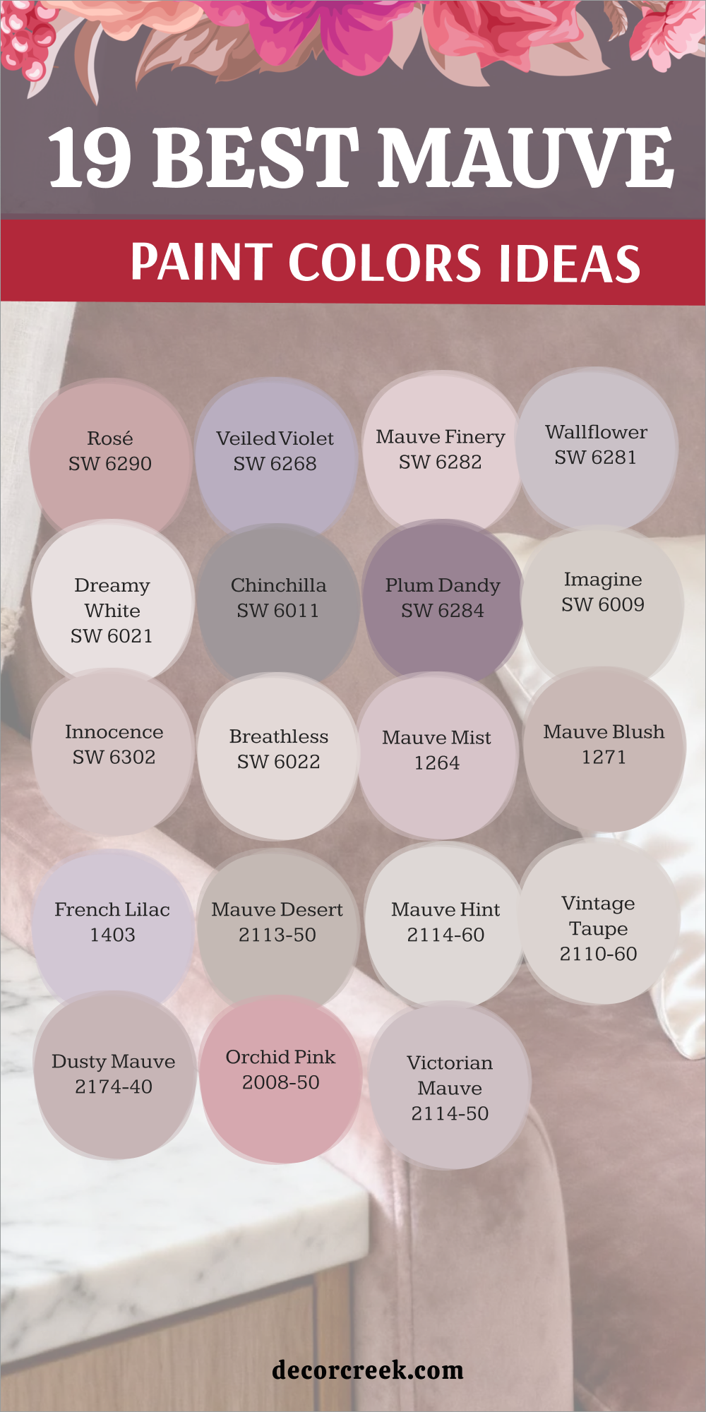
My Final Thoughts on Choosing Dusty Rose Paint Colors
The selection of the right dusty rose shade is an outstanding choice that reflects a deep appreciation for warmth, sophistication, and a gentle touch of color in your living space. This color choice transcends mere trendiness, establishing itself as a genuine style statement that is both profoundly soothing and wonderfully individualizing.
Always remember that the ideal shade is ultimately the one that brings you the greatest sense of happiness and tranquility within your own room.
Because dusty rose is a very delicate equilibrium of pink, gray, beige, and subtle violet pigments, the quality of light is of absolute paramount importance. Therefore, you must consistently test your chosen paint samples on generously sized boards or specialized panels.
Place these samples on various walls throughout the room to accurately observe how the changing natural light affects that subtle and intricate balance between pink and gray pigments over the entire course of the day, from the brightest morning sun to the softest evening shadows.
Dusty rose possesses a unique quality as it functions like an incredibly flattering filter for every element within the room.
It does not just enhance the beauty of your furniture and textiles; its underlying pink-beige base also exquisitely complements your natural skin tone, creating a highly favorable effect.
It is a color that, in essence, envelops your space, instantly making it feel custom-designed, profoundly cozy, and genuinely inviting.
A well-selected dusty rose, irrespective of whether it leans more toward a neutral beige, such as ‘Malted Milk,’ or toward a cooler, muted mauve, like ‘Rosé,’ ensures that your room achieves an immediate sense of warmth, bespoke charm, and true relaxation.
Do not hesitate to employ this color in unexpected and novel ways to maximize its mature aesthetic; it pairs exceptionally well with rich emerald and forest greens and creates a sophisticated, bold contrast with deep, moody blues and dark charcoal grays.
Ultimately, your home should serve as a true reflection of your unique and personal style, and the decision to select a dusty rose is a gentle, yet powerful, testament to your confident ability to create a mark, establishing a personal haven filled with refined warmth and quiet, enduring beauty.