Choosing the right neutral for your living room can be the difference between a room that feels inviting and one that feels unfinished. I’ve worked in dozens of homes where clients wanted something fresh but safe—something that would let their furniture, rugs, or artwork shine. Neutral colors help with that.
They aren’t boring—they’re the background that lets everything else in the room feel more alive. Whether you love creamy whites, warm beiges, or soft grays, I’ve got you covered.
This list includes my favorite shades that have worked again and again in real rooms.
Why Neutral Colors Work So Well in Living Rooms
Neutral paint colors bring a kind of quiet confidence. They don’t shout for attention, but they make a room feel more pulled together. In a living room—where we talk, rest, watch TV, and gather with friends—a neutral color lets us breathe a little easier. It also works with more things: wood, metal, fabric, even bold art.
A study by Zillow found that homes with light, neutral walls sold faster and for more money than those with bold color choices source.
That’s why I always keep a few of these favorites in my back pocket.
How to Pick the Right Neutral for Your Living Room
Picking a neutral color sounds easy—but trust me, it’s not just white or beige. Some have yellow or pink tones, others lean cool or gray. I always start by thinking about the room’s natural light. North-facing rooms need warmer neutrals, while south-facing ones can handle cooler ones.
I also bring samples and test them on the wall for a few days—because colors shift from morning to evening.
And don’t forget the finish: I like matte or eggshell for a cozy look that still cleans up well.
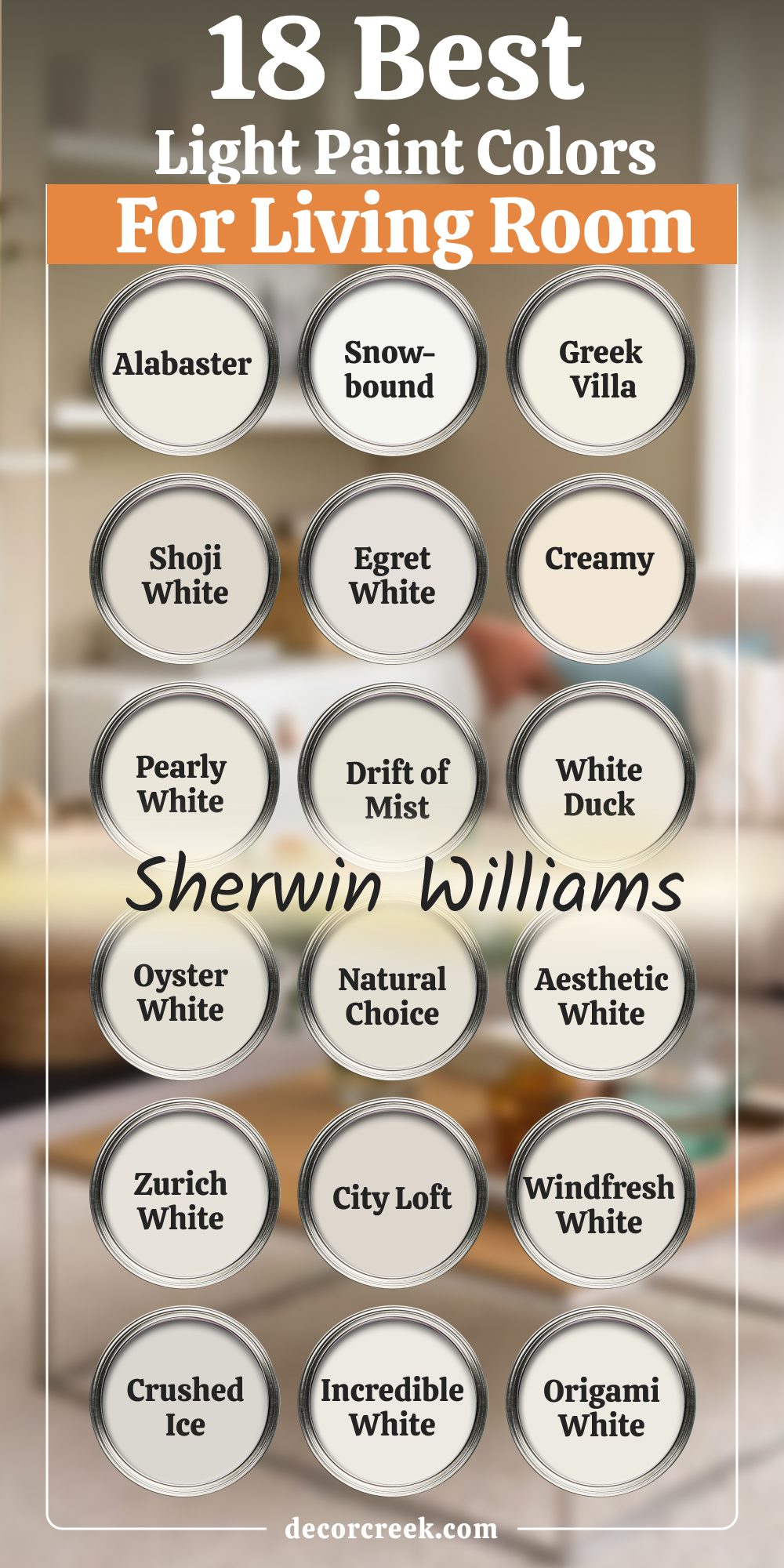
18 Of The Best Light Paint Colors For Living Room by Sherwin Williams
Alabaster SW 7008
Alabaster SW 7008 is one of my go-to whites. It feels soft but not too creamy, and it brings warmth without turning yellow. In darker living rooms, it helps bounce the light around in a gentle way. I’ve used it with oak floors, gray sofas, and even brick fireplaces—it works every time.
Sherwin-Williams calls it one of their most popular colors, and for good reason. It’s easy on the eyes and always looks finished.
My recommendation: Use it when you want warmth without making the room feel too yellow or beige.

Snowbound SW 7004
Snowbound SW 7004 has a cooler feel than Alabaster but still doesn’t feel cold. It has just enough gray in it to work with cooler color schemes like blues, blacks, and even some soft greens. I like it in modern homes or interiors with lots of natural light. It helps everything feel neat and clean.
I once used it in a home with black window frames—it was a perfect match. This shade makes everything else feel more defined.
My recommendation: Try it with black or navy details for a sharp, modern look.

Greek Villa SW 7551
Greek Villa SW 7551 is a beautiful warm white that leans a little creamy. It works especially well in homes that have golden or honey-toned wood floors. I used it recently in a living room with lots of wicker and natural textures—it made the whole room feel soft and pulled together. It’s warm, but not dark. Even in shadow, it keeps a nice brightness.
It’s one of those shades that always looks lived-in and loved.
My recommendation: Pair it with natural wood tones and rattan textures for a soft, cozy style.

Shoji White SW 7042
Shoji White SW 7042 is the kind of off-white that looks like fresh linen. It has a warm undertone that pairs well with earthy tones like rust, clay, and walnut. I’ve used it in boho-style living rooms with patterned rugs and vintage finds. It gives a relaxed and grounded feeling.
This color isn’t too stark, so it doesn’t feel out of place in cozier homes. Clients always love how welcoming it feels.
My recommendation: Use it in rooms with warm textiles and wood furniture for a grounded feel.

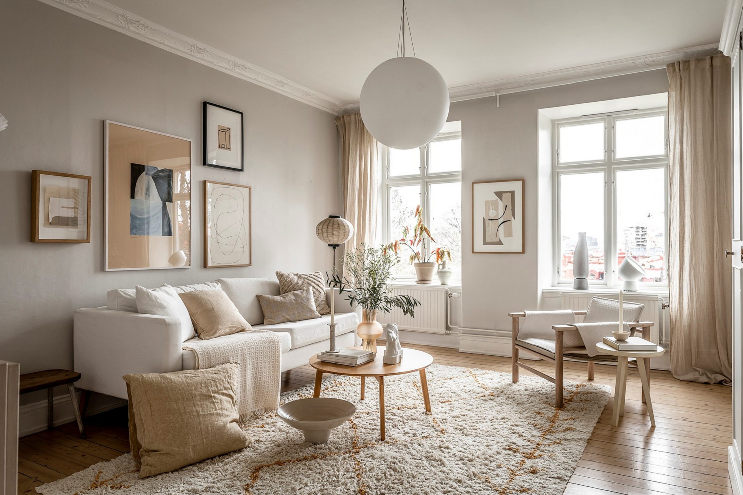
Egret White SW 7570
Egret White SW 7570 falls somewhere between gray and beige, which makes it easy to match with different styles. I like using it in homes where the light changes a lot during the day—it holds steady and doesn’t go too dark. It feels a little richer than plain white.
In rooms with taupe or stone-colored furniture, it looks seamless. It’s not flashy, and that’s what makes it great.
My recommendation: Use it when you want something more interesting than white, but still neutral.
Creamy SW 7012
Creamy SW 7012 lives up to its name. It has a buttery softness that works well in traditional or farmhouse-style living rooms. I once used it in a home filled with vintage furniture and white curtains—it felt like a hug. Even in low light, this shade keeps the room feeling light.
It pairs beautifully with browns and muted greens. It’s one of those comforting colors that never feels too formal.
My recommendation: Try it in homes with vintage or farmhouse details—it blends in beautifully.

Pearly White SW 7009
Pearly White SW 7009 is a soft, quiet white with just a breath of warmth. It works really well in rooms where you want brightness but without any harshness. I’ve used it in interiors with both cool and warm furniture—it plays nice with both. It’s great for ceilings too, if you want a seamless look.
I also like it with brass or black metal accents. It’s one of those colors that quietly holds everything together.
My recommendation: Use it when you need a flexible white that works with mixed tones.
Drift of Mist SW 9166
Drift of Mist SW 9166 is a gentle greige—gray and beige mixed just right. It’s light enough to feel airy but still brings warmth to the walls. I like using it in homes with both modern and rustic styles. In one project, I paired it with leather and linen, and it felt natural and balanced.
It doesn’t take over the room, but it doesn’t fade away either. It gives a soft, finished look without effort.
My recommendation: Use it when you want softness without leaning too warm or too cool.

White Duck SW 7010
White Duck SW 7010 is one of those neutrals that works when nothing else seems right. It leans beige but not too heavy, and it still feels bright. I’ve used it in homes with beige tile or light oak floors—it ties everything together. It’s also beautiful next to creamy white trim.
In cloudy climates, it brings a bit of warmth without going yellow. A very reliable shade for everyday living.
My recommendation: It’s perfect for open layouts with mixed flooring tones.
Oyster White SW 7637
Oyster White SW 7637 is soft, muted, and easy to live with. It has a hint of green-gray that shows up in certain light, giving it depth. I like it in rooms with a lot of natural textures—think baskets, jute rugs, or wood beams. It creates a gentle background that lets other colors pop.
Even in shadowy rooms, it doesn’t feel flat. It’s great for cozy, layered living interiors.
My recommendation: Use it in textured rooms with woven or natural elements.

Natural Choice SW 7011
Natural Choice SW 7011 has just the right amount of creaminess. It feels inviting and lived-in, which makes it great for rooms with kids, pets, and life happening all the time. I’ve seen it look beautiful with warm grays and soft blues. It never goes too peachy or pink.
It holds its own against darker accent colors too. A very balanced choice if you want warmth without weight.
My recommendation: Perfect for high-traffic rooms where you want warmth without strong undertones.

Aesthetic White SW 7035
Aesthetic White SW 7035 is a color I’ve used in so many homes, I’ve lost count. It’s light and warm, with a whisper of gray. It gives walls a soft touch without making the room feel heavy. In smaller living rooms, it helps things feel more open.
I also love how it plays with different lighting—it looks good in sun and shade. It’s one of those colors that works quietly but beautifully.
My recommendation: Go for it if you want a soft neutral that never looks too beige or too gray.

Zurich White SW 7626
Zurich White SW 7626 feels clean but not cold. It’s closer to a soft white with a touch of warmth, which helps a room feel easy to decorate. I like pairing it with black frames or navy sofas—it gives the whole room structure.
It’s also a favorite for open floor plans because it flows so well with other neutrals. A really smart pick for busy homes. And yes—it photographs really nicely too.
My recommendation: Use it for fresh walls that still feel cozy in open layouts.

City Loft SW 7631
City Loft SW 7631 is a whisper-light taupe that fits perfectly in modern or transitional rooms. It’s not too gray and not too beige, which is rare. I’ve used it in rooms with pale wood floors and cream-colored couches—it’s lovely.
This is a color that helps you feel relaxed. Even in evening light, it holds up well. It brings a polished look without being formal.
My recommendation: Try it in minimal rooms where you want just a touch of warmth.

Windfresh White SW 7628
Windfresh White SW 7628 is breezy and soft, but still warm enough to avoid looking stark. I like it in rooms with big windows and white trim—it creates a clean but cozy setting. It also works well with bold art or patterns, letting them shine.
I once used it in a living room with navy and camel tones—it balanced everything beautifully. Great pick if you want white, but not too white.
My recommendation: Best for rooms with good daylight where you want quiet warmth.

Crushed Ice SW 7647
Crushed Ice SW 7647 is a pale gray that doesn’t feel cold. It has a quiet warmth that plays well with deeper grays, blues, and even greens. I like using it in living rooms that need a touch of sophistication without going dark. It’s modern but not too edgy.
It’s also great for accent walls if you want something subtle but different. Definitely one of my hidden favorites.
My recommendation: Use it for an easy upgrade in modern interiors with depth.

Incredible White SW 7028
Incredible White SW 7028 is one of those colors that changes slightly with the light—and I love that about it. Sometimes it feels warm, other times a little gray, but always soft and balanced. I’ve used it with gold frames, velvet furniture, and natural woods.
It holds everything together in a quiet, pretty way. It also looks lovely in both new builds and older homes. A gentle winner for neutral lovers.
My recommendation: Try it if you want a white with just enough interest to feel personal.

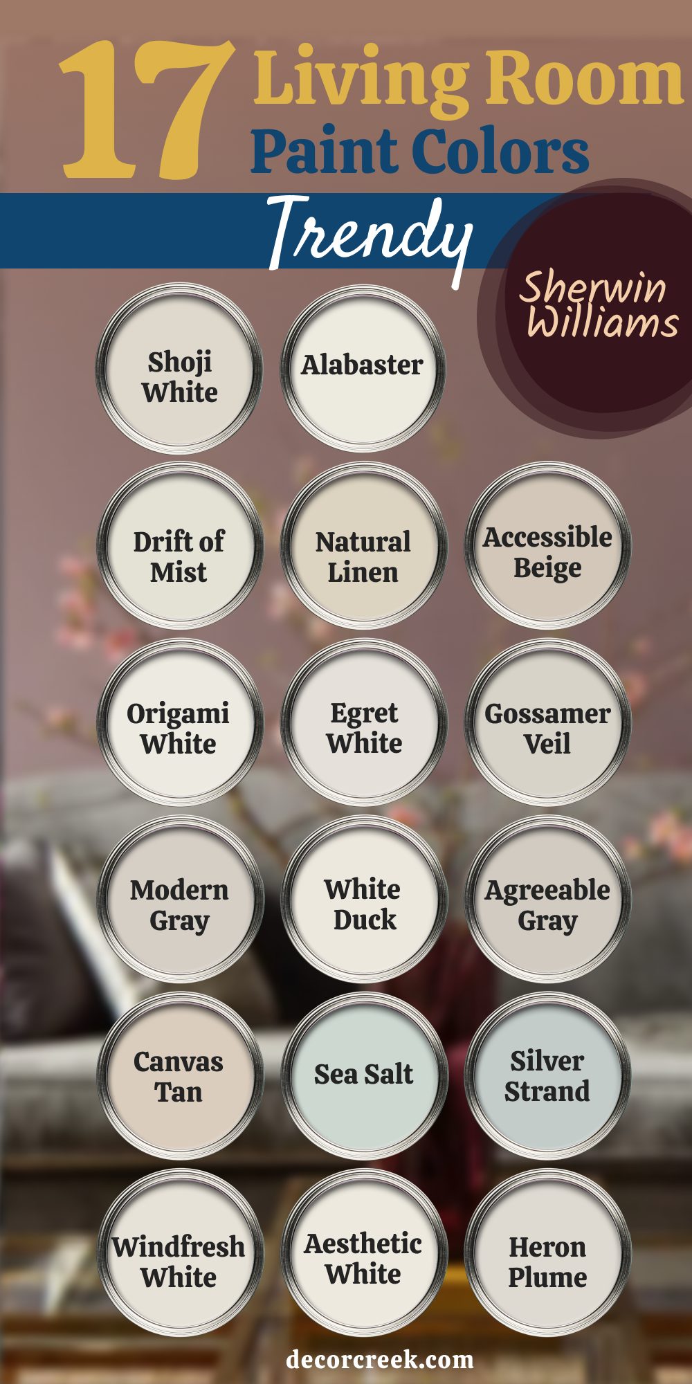
17 Living Room Paint Colors Trendy in 2025 by Sherwin-Williams
Shoji White SW 7042
Shoji White SW 7042 is a soft off-white with a warm base that feels grounded and lived-in. I love using it in homes with wood tones, natural fabrics, and layered textures. It works well in traditional and modern interiors alike. Even when the light shifts, this color stays steady and smooth. I’ve seen it pair beautifully with earthy rugs and cozy sofas. It adds warmth without taking over the room.
My recommendation: Use it when you want something warmer than white but still quiet and clean.
Alabaster SW 7008
Alabaster SW 7008 is still going strong in 2025 for a reason. It has that perfect soft glow that looks good in every kind of light. I’ve used it in coastal homes, rustic cabins, and clean modern apartments—it just fits. It balances bright and cozy without tipping too far either way. It also photographs well, which is a bonus if you’re staging a home. This one never lets me down.
My recommendation: Choose this when you need a foolproof neutral for walls, trim, or ceilings.
Drift of Mist SW 9166
Drift of Mist SW 9166 is such a nice in-between shade. It’s not beige, not gray—somewhere beautifully in the middle. I like it in rooms with a mix of finishes like wood, brass, and soft linen. It helps everything feel balanced without calling attention to itself. It’s one of those colors that you notice only when it’s gone. That’s why I come back to it so often.
My recommendation: Use it in rooms with mixed tones and layered textures.
Natural Linen SW 9109
Natural Linen SW 9109 feels like a favorite sweater—soft, warm, and easy to be around. It’s a true beige, but not yellow or too deep. I used it in a room with chocolate leather, white trim, and light oak floors and it looked amazing. It gave the room a grown-up, grounded feel without going dark. It’s also great in open layouts where you need one color to connect everything.
My recommendation: Use it when you want a natural beige that won’t fight with other tones.

Accessible Beige SW 7036
Accessible Beige SW 7036 might be one of the most practical paint colors out there. It works in low light, bright light, and everything in between. It’s warm without being too tan and gray without being flat. I love it in living rooms with soft white trim and neutral furniture. Even after years of popularity, it still feels fresh. It gives a sense of comfort without drawing too much attention.
My recommendation: Try this when you want something that goes with almost anything.

Origami White SW 7636
Origami White SW 7636 is what I use when pure white feels too stark. It has a slight gray cast that softens it just enough. It works well in minimalist rooms or with modern black accents. I once used it in a room full of black leather and walnut wood—it was a clean, modern match. It holds up well with lots of daylight, too. Very chic but still approachable.
My recommendation: Great for bright rooms with modern or industrial decor.
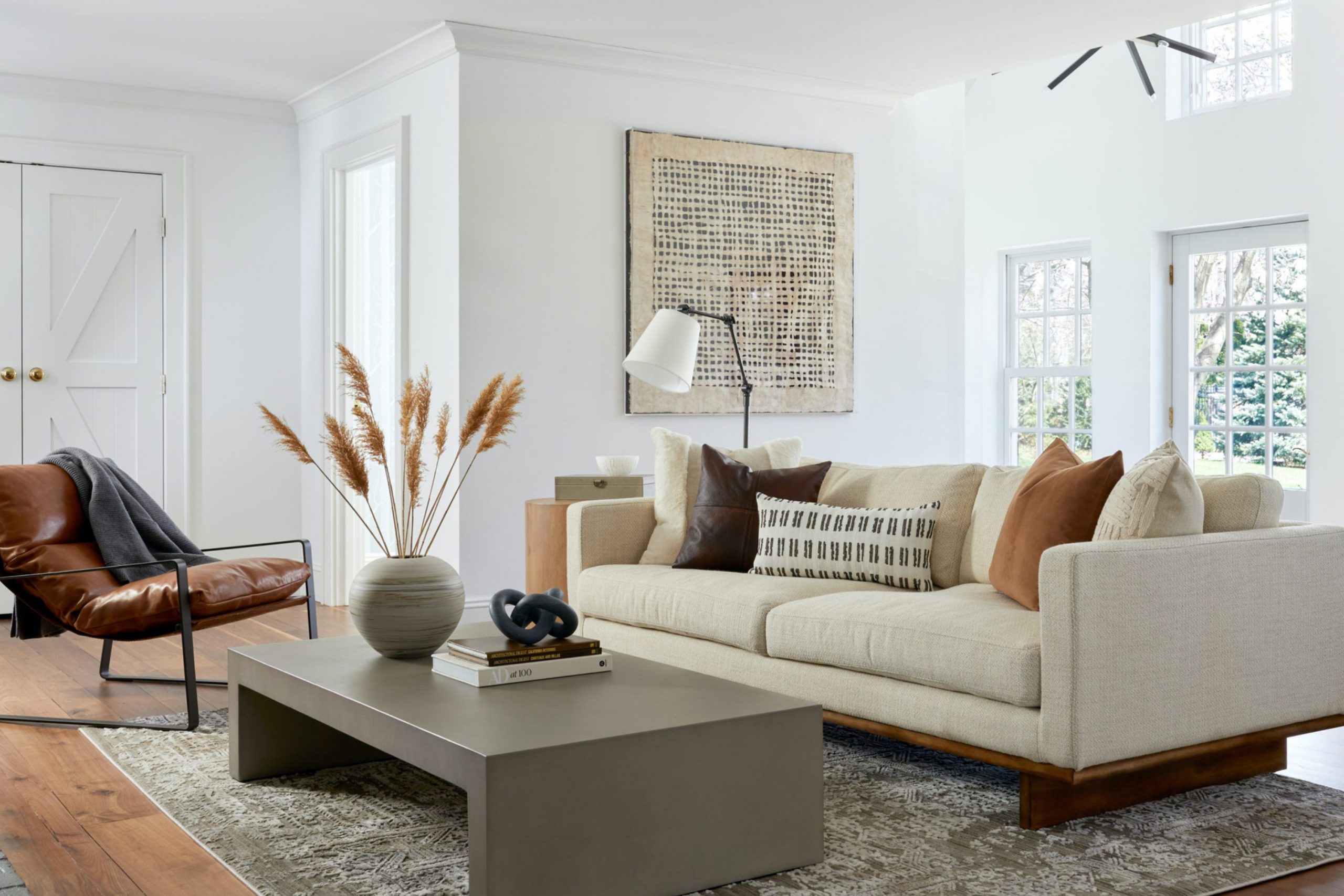
Egret White SW 7570
Egret White SW 7570 gives you a quiet, balanced look that plays well with both warm and cool tones. I’ve used it in rooms with dark wood furniture and also in sleek, white interiors—it adjusts beautifully. It brings just enough contrast to trim without being sharp. You can feel its warmth without it going beige. It’s like a clean canvas, but with heart.
My recommendation: Pick this one when you want something flexible but not boring.
Gossamer Veil SW 9165
Gossamer Veil SW 9165 is a soft greige that’s perfect when you’re tired of gray but not ready for full beige. It reads calm and smooth on the wall and pairs beautifully with creams, olive green, and darker wood. I love using it in family living rooms because it’s forgiving and gentle. It gives structure without being heavy. It works well with soft lighting too.
My recommendation: Use it when you want a modern greige that feels lived-in.
Modern Gray SW 7632
Modern Gray SW 7632 is one of those neutrals that always surprises people. It has a tiny bit of purple or pink undertone, but not in a loud way. I used it in a living room with black furniture and gold lighting, and it felt really warm and elegant. It feels peaceful but not plain. It’s light enough to keep a room bright, even on cloudy days.
My recommendation: Try it in rooms with mixed metals and layered fabrics.

White Duck SW 7010
White Duck SW 7010 is such a soft, creamy color without being yellow. I’ve used it in craftsman-style homes, modern homes, and even rustic cabins—it fits all of them. It feels warm but still open, especially with natural light. I love pairing it with soft browns and greenery. It never feels too clean or too muddy. It’s a true “lived-in” kind of paint.
My recommendation: Great for homes with lots of natural materials like wood, jute, and cotton.

Agreeable Gray SW 7029
Agreeable Gray SW 7029 is probably the most famous greige for a reason. It works in almost any lighting condition and plays well with nearly every color scheme. I like using it when clients want something that feels clean but not cold. It’s warm enough to be friendly, cool enough to be modern. This color has never failed me in a living room. It truly earns its name.
My recommendation: A go-to if you want zero stress and reliable results.

Canvas Tan SW 7531
Canvas Tan SW 7531 is a warm neutral that feels cozy without being dark. It works great in rooms with cream or white trim and brown leather furniture. I’ve used it in older homes to freshen things up while keeping that vintage character. It doesn’t feel too yellow or gray—it’s just right. The finish is soft and familiar.
My recommendation: Try this when you want a light beige that feels classic, not trendy.

Sea Salt SW 6204
Sea Salt SW 6204 is technically a green-gray, but it behaves like a neutral in many interiors. I love using it in homes near water, or where people want that gentle nature-inspired feel. It pairs nicely with soft wood, white trim, and even rattan or wicker. The tone shifts a little with the light, which keeps it interesting. It’s not loud—but it’s full of character.
My recommendation: Great for casual rooms where you want a hint of color without the commitment.

Silver Strand SW 7057
Silver Strand SW 7057 is a soft blue-gray that’s still warm enough for a living room. I used it once in a room with charcoal furniture and white walls—it brought the room to life. It has just enough green to keep it from feeling icy. It’s a good option if you’re leaning toward color but still want something quiet. It’s modern, calm, and not too trendy.
My recommendation: Best for modern rooms with soft edges and layered textures.

Windfresh White SW 7628
Windfresh White SW 7628 is a lovely pale neutral that looks amazing with both warm and cool palettes. I’ve seen it shine in homes with big windows and natural light—it brings a clean feeling without being sharp. It also works well with bold decor like navy or charcoal. I used it once in a room with a lot of bookshelves—it kept the whole room feeling light.
My recommendation: Use this shade when you want a light wall color that works in every season.
Aesthetic White SW 7035
Aesthetic White SW 7035 has that barely-there warmth that makes walls feel finished without pulling too much attention. It’s great in family rooms, especially with soft fabric sofas and brushed gold accents. It has enough body to feel cozy but still light enough to brighten the room. I often pair it with natural wood and soft lighting. This one just works.
My recommendation: Choose it when you need a neutral that supports your decor without fading away.
Heron Plume SW 6070
Heron Plume SW 6070 is a gentle off-white with a soft taupe base. I used it in a living room with white built-ins, warm lighting, and a soft gray rug—it brought everything together. It’s not too pink or purple like some taupes can be. It’s quiet and warm in all the right ways. I also like that it reads differently throughout the day.
My recommendation: A great fit for cozy rooms with layered whites and soft grays.
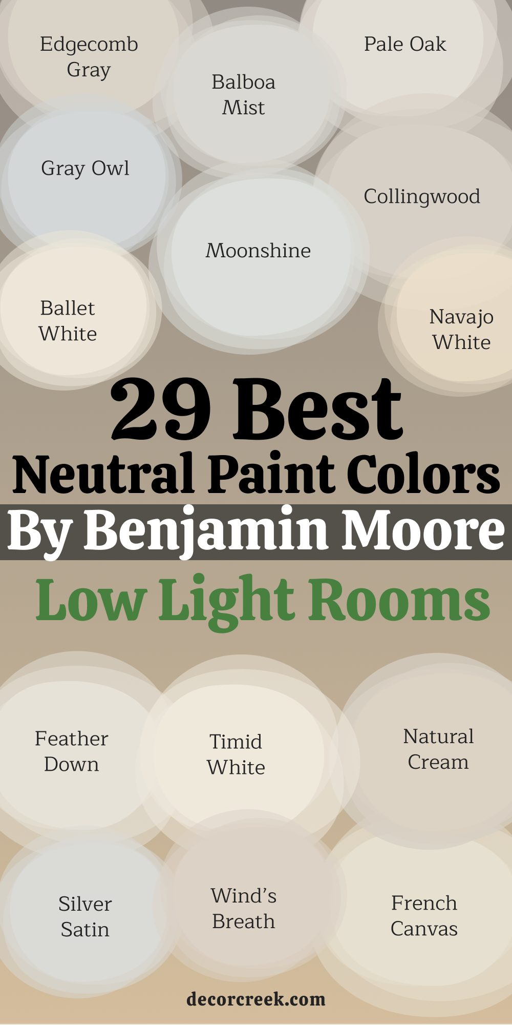
29 Best Neutral Paint Colors for Low Light Rooms by Benjamin Moore
White Dove OC-17
White Dove OC-17 is one of the most requested colors I use in homes with low light. It has a creamy softness that keeps a room from feeling dull. It looks beautiful on both walls and trim. I often pair it with warm woods and soft fabrics to create a peaceful setting. Even when the light is weak, this color feels bright and smooth. It’s warm, but never heavy.
My recommendation: Use it when you want your room to feel light and cozy without any stark contrast

Chantilly Lace OC-65
Chantilly Lace OC-65 is a crisp, clean white that still works in dim rooms. It reflects what little light you have and makes everything feel sharper. I’ve used it in rooms with black accents, and the contrast is stunning. It’s one of Benjamin Moore’s brightest whites. If your furniture has bold colors or patterns, this shade lets them shine. It’s fresh and modern but still homey.
My recommendation: Choose this if you want your room to feel clean and clear, even without sunlight.

Simply White OC-117
Simply White OC-117 is slightly warmer than Chantilly Lace but still feels fresh. It has a soft glow that looks especially nice with natural finishes like rattan or oak. I’ve used it in basements and north-facing living rooms. Even when it’s cloudy, the walls feel alive. It works well for trim and ceilings too. It’s one of those shades that never disappoints.
My recommendation: Try this when you want warmth and brightness wrapped into one white.

Cloud White OC-130
Cloud White OC-130 is gentle and easy on the eyes. It has a soft yellow undertone that makes it perfect for colder, darker rooms. I used it once in a small living room with almost no natural light, and it brought the walls to life. It pairs beautifully with light taupes and faded blues. It’s traditional but still very flexible. It feels like a favorite sweater.
My recommendation: Use it in cozy interiors that need a lift without losing their warmth.

Swiss Coffee OC-45
Swiss Coffee OC-45 is one of those colors that sounds fancy but works in any room. It has just enough creaminess to make your walls feel soft, not yellow. I’ve seen it shine in both old houses and newer builds. It works really well with warm woods, brass accents, and layered textiles. It’s warm without feeling stuffy. And yes—it’s easy to live with.
My recommendation: Choose this for a soft, welcoming neutral that feels calm but not cold.

Seapearl OC-19
Seapearl OC-19 is a lovely greige—right between gray and beige. It’s light enough to work in low-light rooms but still has body. I’ve used it with pale stone fireplaces and light wood floors, and it always feels natural. It’s not too trendy, which makes it last. In darker interiors, it adds softness instead of shadow. A very comfortable neutral.
My recommendation: Go with this if you want a more grounded look that still reflects light well.

Calm OC-22
Calm OC-22 is like its name—easy and quiet. It has a touch of gray and lilac that gives walls a smooth, soft finish. I love it in bedrooms and living rooms that need a little peace. It feels best in the early morning or soft evening light. I once used it in a reading room, and it made the whole room feel safe. It’s subtle, but not boring.
My recommendation: Try it if you want a soft gray that never feels too cold or too flat.

Classic Gray OC-23
Classic Gray OC-23 is one of those grays that works everywhere. It’s very light and almost off-white in some rooms. It brings just enough color to the wall without darkening the room. I often recommend it in open interiors that don’t get much sun. It works well with taupe, white trim, and soft colors. It feels relaxed but polished.
My recommendation: Use it when you want a hint of gray without darkening your living room.

Edgecomb Gray HC-173
Edgecomb Gray HC-173 is a warm gray that’s become a favorite for families. It doesn’t shift too much with the light, which makes it feel reliable. I’ve used it with both cool and warm accents—it blends with everything. In darker rooms, it still brings light to the walls. It’s calm but not blank. There’s just enough warmth to feel welcoming.
My recommendation: Great for busy homes that need a soft but flexible neutral.

Balboa Mist OC-27
Balboa Mist OC-27 has a lavender-gray undertone that makes it feel fancy without being flashy. I like it in rooms with limited light because it reflects just enough brightness. I paired it once with white trim and a charcoal sofa—it was gorgeous. It works especially well in modern or transitional homes. It feels like a breath of clean air. It’s graceful and light.
My recommendation: Choose it when you want a modern touch that still feels gentle.

Pale Oak OC-20
Pale Oak OC-20 is one of those dreamy soft taupes that never feels too dark. It has a creamy base with a drop of gray, which helps it work even in rooms with poor lighting. I used it in a client’s den with almost no windows, and it turned out beautiful. It feels warm, smooth, and never dull. Pale Oak also plays well with both gold and black accents. It’s a great go-to for a soft and natural look.
My recommendation: Use this when you want something soft and cozy that doesn’t feel flat.

Horizon OC-53
Horizon OC-53 is a very light gray with a tiny whisper of blue. In low light, it still feels fresh and open. I’ve used it in modern rooms with silver frames, linen couches, and soft rugs—it was a perfect match. It gives a quiet tone to the walls without pulling all the attention. It’s light enough to feel clean but has more character than plain white. I reach for it when nothing else feels quite right.
My recommendation: Try this in rooms with soft cool tones or minimal color.
Gray Owl OC-52
Gray Owl OC-52 is a super light gray that changes with the lighting. In dim rooms, it shows more warmth, which actually helps the room feel balanced. It’s great if you want a neutral but are afraid of the room looking too cold. I’ve paired it with white curtains and pale oak floors—it worked beautifully. It also looks nice next to navy or soft green. It’s been a favorite for years.
My recommendation: Choose it if you want flexibility and light reflection in tricky rooms.

Moonshine 2140-60
Moonshine 2140-60 is a pale gray with a little green tucked inside. It gives the wall a gentle, cloudy look, which I find peaceful in darker rooms. It’s a great match for soft fabrics and warm wood accents. I like using it in bedrooms or living areas with limited windows. It keeps things from looking too shadowy or brown. This color feels fresh but not too bold.
My recommendation: Use it when you want just a hint of mood but still need light.
Collingwood OC-28
Collingwood OC-28 is a soft greige that feels grounded and clean. It’s just deep enough to feel like real color but still light enough to lift a dark room. I used it in a hallway with no natural light, and it made everything look more open. It plays well with most trims—white or even off-white. It has a slight warmth that helps it feel homey. It’s dependable and classic.
My recommendation: Pick this if you want a cozy neutral that adds depth but not darkness.

Ballet White OC-9
Ballet White OC-9 is a creamy ivory with a little gray mixed in. I love this shade in low light because it stays warm without turning yellow. It’s perfect for traditional homes or interiors with antique furniture. I once used it with brass light fixtures and floral curtains—it looked beautiful. It gives just enough contrast with white trim to feel layered. This shade has charm.
My recommendation: Try this in rooms where you want warmth and softness, but not beige.

Navajo White 947
Navajo White 947 is a classic warm neutral that’s been used for decades—and still works. It has a peachy-cream undertone that can lift a dark room, especially at night. I often suggest it for basements, small living rooms, or even sunrooms with less daylight. It makes the room feel lived-in and familiar. It may not be trendy, but it’s cozy. And that’s what matters.
My recommendation: Use this when you want a traditional, soft glow in dim areas.
Atrium White OC-145
Atrium White OC-145 is a warm white with a soft pink undertone. In darker rooms, this pink tone adds a gentle brightness. I once used it in a nursery that barely had any daylight, and it looked so gentle and clean. It works best in rooms where you want that slight warmth on the walls. Pair it with light wood or soft grays for a gentle feel. It’s a bit unique, but still easy to live with.
My recommendation: Use it when you want a cozy white with a soft blush feel.
Feather Down OC-6
Feather Down OC-6 feels like a soft whisper on the walls. It’s a warm gray that works really well in low-light rooms with beige or wood accents. I used it in a living room with tan leather and oatmeal-colored curtains—it was lovely. It doesn’t go green or pink, which makes it feel steady. It brings warmth without weight. The name fits perfectly.
My recommendation: Choose this when you want a peaceful base that works with soft textures.
Timid White OC-39
Timid White OC-39 is a super light neutral with the slightest warm tint. It’s great for rooms that need a clean look but not something stark. I used it with cane furniture and white bookshelves, and the room felt finished without looking decorated. It’s one of those shades that just blends in easily. You won’t get bored of it. And it never competes with decor.
My recommendation: Try this when you want the walls to support the room, not lead it.
Paper White OC-55
Paper White OC-55 is a cool off-white with a soft gray tone. In darker rooms, it keeps a clean edge without looking too blue. I like using it in modern living interiors with metal or glass accents. It also looks beautiful next to charcoal or black. It has just enough pigment to hold shape. Clean and refined, but still livable.
My recommendation: Best for cool-toned rooms that still need softness and light.
Dove Wing OC-18
Dove Wing OC-18 is a pale, creamy gray that brings elegance in low light. I’ve used it with soft gray sofas and linen curtains, and it created such a balanced feel. It doesn’t get too dark even in the corners. It works beautifully with both cool and warm elements. It’s a true “background” color in the best way. Quiet, but steady.
My recommendation: Use it to tie together mixed neutrals in dim rooms.

Oxford White CC-30
Oxford White CC-30 is a clean white that feels soft instead of stark. In low light, it still feels fresh without going icy. I’ve used it in apartments with small windows and high ceilings—it made the walls feel taller. It’s great with beige, gray, or even pops of green. It works well for ceilings too. Simple, but not plain.
My recommendation: Choose this when you want a gentle bright white that works in shadows.
Natural Cream OC-14
Natural Cream OC-14 is a warm, light beige-gray mix that’s perfect for low-light interiors. It has body but doesn’t weigh down the room. I used it once in a home office with no windows, and it instantly felt livable. It’s not flashy, but it brings comfort. It plays nicely with deeper accent colors like olive or navy. A safe and warm neutral.
My recommendation: Use this when you want something with more presence than white, but still quiet.

Silver Satin OC-26
Silver Satin OC-26 is a light gray that leans cool, but still soft. It reflects just enough light to feel fresh, even in dim rooms. I’ve used it with marble, brass, and linen—it’s always elegant. It feels a bit more refined than flat gray. And it works well with blue or green accents. One of my go-to cool neutrals.
My recommendation: Best for modern rooms that need subtle elegance without coldness.

Wind’s Breath OC-24
Wind’s Breath OC-24 has the look of soft putty or dusty stone. It’s warm, but not yellow or brown. I love it in rooms with rustic or farmhouse touches. Even when there’s no sunlight, this color brings life to the walls. It pairs well with soft grays, ivory, or natural woods. It feels calm and steady.
My recommendation: Choose this if you want a warm, earthy base that’s still light.

Cotton Balls OC-122
Cotton Balls OC-122 is one of the most beautiful off-whites for low-light rooms. It has a softness that doesn’t feel sterile. I used it once in a guest room with no windows, and it felt light and welcoming. It blends easily with whites, woods, and soft patterns. It feels clean, but never sharp. Very family-friendly.
My recommendation: Use this if you want a classic, comfy white that hides shadows.
French Canvas OC-41
French Canvas OC-41 is warm and creamy with a historical touch. I used it in a home with antique furniture. It’s rich without being heavy. It works really well in darker living rooms with vintage fabrics. There’s a softness to it that feels cared for. It’s elegant but very human.
My recommendation: Best for classic interiors that need soft richness and warmth.
Winter Snow OC-63
Winter Snow OC-63 is crisp, bright, and perfect for a low-light room that needs lifting. It’s one of Benjamin Moore’s cooler whites, but it doesn’t go icy. I’ve seen it make even a tiny hallway feel bigger. It pairs nicely with pastels or deep blues. If you need brightness without yellow undertones, this works great. It’s pure but not harsh.
My recommendation: Use it to brighten rooms with no natural light and cool-tone furniture.
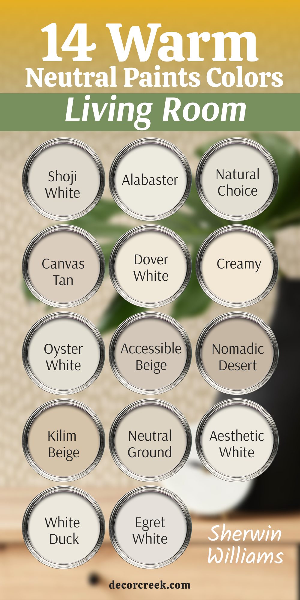
14 Warm Neutral Paint Colors for Living Room by Sherwin-Williams
Shoji White SW 7042
Shoji White SW 7042 is a creamy off-white that always feels relaxed and lived-in. I love using it in homes with wood furniture, soft rugs, and natural details. It adds warmth without turning yellow or beige. In rooms that don’t get strong sunlight, it still feels gentle and easy to be in.
This shade fits perfectly with earthy tones and calm patterns. It always feels comfortable without being dull.
My recommendation: Use it in cozy family rooms with natural textures and soft fabrics.
Alabaster SW 7008
Alabaster SW 7008 has been a favorite of mine for years because it always works. It brings warmth to the walls but stays light and fresh. I’ve used it in living rooms with beige couches, woven chairs, and warm oak floors—it blended like a dream. It’s not too bright and never feels cold. It’s one of those shades that makes people feel instantly at home. I always keep a sample in my kit.
My recommendation: Try this when you want a warm, trusted color that never feels too yellow.
Natural Choice SW 7011
Natural Choice SW 7011 is one of those “safe” colors I always feel good recommending. It’s soft, slightly creamy, and feels warm in any light. I love how it looks with brown leather, white curtains, or anything natural. Even in cloudy rooms, it doesn’t go flat. It gives walls a feeling of comfort and depth without darkening them. It’s especially great in classic living rooms.
My recommendation: Choose it when you want a warm neutral that gently wraps the room.
Canvas Tan SW 7531
Canvas Tan SW 7531 is a very soft tan with a relaxed vibe. It doesn’t have any pink or peach in it, which makes it easy to match with furniture. I once used it in a small living room with lots of bookshelves and it helped everything feel bigger. It looks especially good with off-white trim and beige decor. Even in the corners, it doesn’t look muddy. It’s light, warm, and peaceful.
My recommendation: Best for rooms that need quiet warmth without extra color.
Dover White SW 6385
Dover White SW 6385 is one of the warmer whites in my collection. It’s soft and slightly buttery, which makes it feel inviting. I use it often in homes that have traditional furniture or warmer lighting. It’s perfect when bright white feels too sharp. Dover White also looks beautiful on ceilings and trim if you want a tone-on-tone look. I think of it as soft comfort in a can.
My recommendation: Use it when you want a soft white that feels gentle and warm, not clinical.

Creamy SW 7012
Creamy SW 7012 has the kind of warmth that makes a room feel friendly. It’s light enough to keep things open but has enough color to add depth. I’ve used it in homes with vintage finds and wicker chairs, and it always feels right. It leans toward yellow but never too much. It works well with light browns, rust tones, and cozy lighting. It’s a beautiful choice for a room you live in every day.
My recommendation: Try it if you want a buttery feel that doesn’t overpower the room.

Oyster White SW 7637
Oyster White SW 7637 is a soft, chalky color with hints of greige. I love it in homes that mix warm and cool elements—it blends them together. In living rooms with limited light, it gives the walls a clean but relaxed feeling. It’s not pure white, so it feels more grounded. I’ve used it with light woods and textured fabrics like linen and boucle. It always feels soft but finished.
My recommendation: Pick this when you want something warmer than gray, but calmer than beige.
Accessible Beige SW 7036
Accessible Beige SW 7036 is one of the most trusted Sherwin-Williams colors for a reason. It’s a warm greige that works with nearly everything. I’ve used it in homes with both gold and silver hardware, and it never clashed. It gives a feeling of stability and calm, even in darker corners. It’s soft, clean, and always reliable. It’s like a blank canvas—but cozier.
My recommendation: Choose it if you want one color that works across the whole home, especially in the living room.
Nomadic Desert SW 6107
Nomadic Desert SW 6107 is a warm tan that brings depth to a room without going dark. It reminds me of sunbaked clay, earthy and natural. I’ve used it in southwestern-style homes with warm woods and black iron accents—it looked stunning. It’s richer than beige but still soft enough for a full wall. If you want something that feels rooted and natural, this works beautifully.
My recommendation: Great for rustic rooms or homes that need a little desert warmth.

Kilim Beige SW 6106
Kilim Beige SW 6106 is a true beige that feels comforting and classic. It has a slight peachy warmth that helps in low light but still feels grounded. I love using it in traditional living rooms with layered textiles and warm wood tones. It’s not trendy, but it’s dependable. It pairs well with creams, rusts, and browns. A safe and familiar choice.
My recommendation: Use this if you want a tried-and-true beige that brings a little glow.

Neutral Ground SW 7568
Neutral Ground SW 7568 is a soft and balanced beige with a clean finish. It doesn’t lean too yellow or pink, which makes it easy to coordinate. I’ve used it in homes with transitional styles—part modern, part traditional. It holds up really well in all types of light. The warmth is gentle and easy to live with. A very livable shade.
My recommendation: Choose it when you want a light neutral that fits anywhere and feels easy.

Aesthetic White SW 7035
Aesthetic White SW 7035 shows up again in this list because of how well it handles warmth. It’s technically a warm off-white with just a hint of gray. I love how it softens a room without making it feel yellow. It’s great in open layouts where you want one color to flow through different interiors. It works with cool tones, but it really shines next to warm accents. It’s beautiful and flexible.
My recommendation: Try it in rooms with golden lighting or warm wood—it adapts perfectly.
White Duck SW 7010
White Duck SW 7010 is a light beige that reads almost white in bright rooms, but still feels warm in darker ones. I love how it adjusts depending on the light—it’s never boring. It goes with gray, brown, white, or even muted greens. It’s not cold or yellow—just right in the middle. I’ve used it in farmhouse living rooms and soft modern interiors. Always soft, always safe.
My recommendation: Use it when you need a light neutral that won’t shift too much throughout the day.
Egret White SW 7570
Egret White SW 7570 has a blend of gray and beige that makes it look elegant but relaxed. It’s a little deeper than a white but still bright enough for low-light rooms. I love pairing it with darker neutrals or clean white trim. It gives just enough contrast while keeping the warmth. I’ve used it in quiet reading corners and full living rooms. It always gives that gentle touch.
My recommendation: Try it in small or dark rooms where you want warmth but don’t want a bold color.
My Final Word on Choosing Neutrals That Feel Right
Every time I start a new living room project, I begin with one simple goal: make the room feel like home. And again and again, neutral paint colors help me get there. They don’t scream for attention—but they set the tone. Whether it’s a soft warm white like Alabaster, a classic greige like Accessible Beige, or a calm backdrop like Pale Oak, these shades make the room feel easier to live in.
I’ve seen firsthand how paint can change how people feel in their homes. A lighter color can make a dark room feel hopeful. A warm beige can soften cold furniture. And just the right shade can bring peace to a room that felt disconnected.
That’s why I always test, always compare, and always come back to these trusted colors.
If you’re stuck picking a shade, don’t overthink it. Pick three, paint samples right on your wall, and look at them during the day and at night.
The right one will feel like a “yes” in your chest. And if you ever need a place to start—well, this list is full of the ones that never let me down.
You’ve got this. One paint can and a few brush strokes can truly make the living room feel like it’s finally yours.
