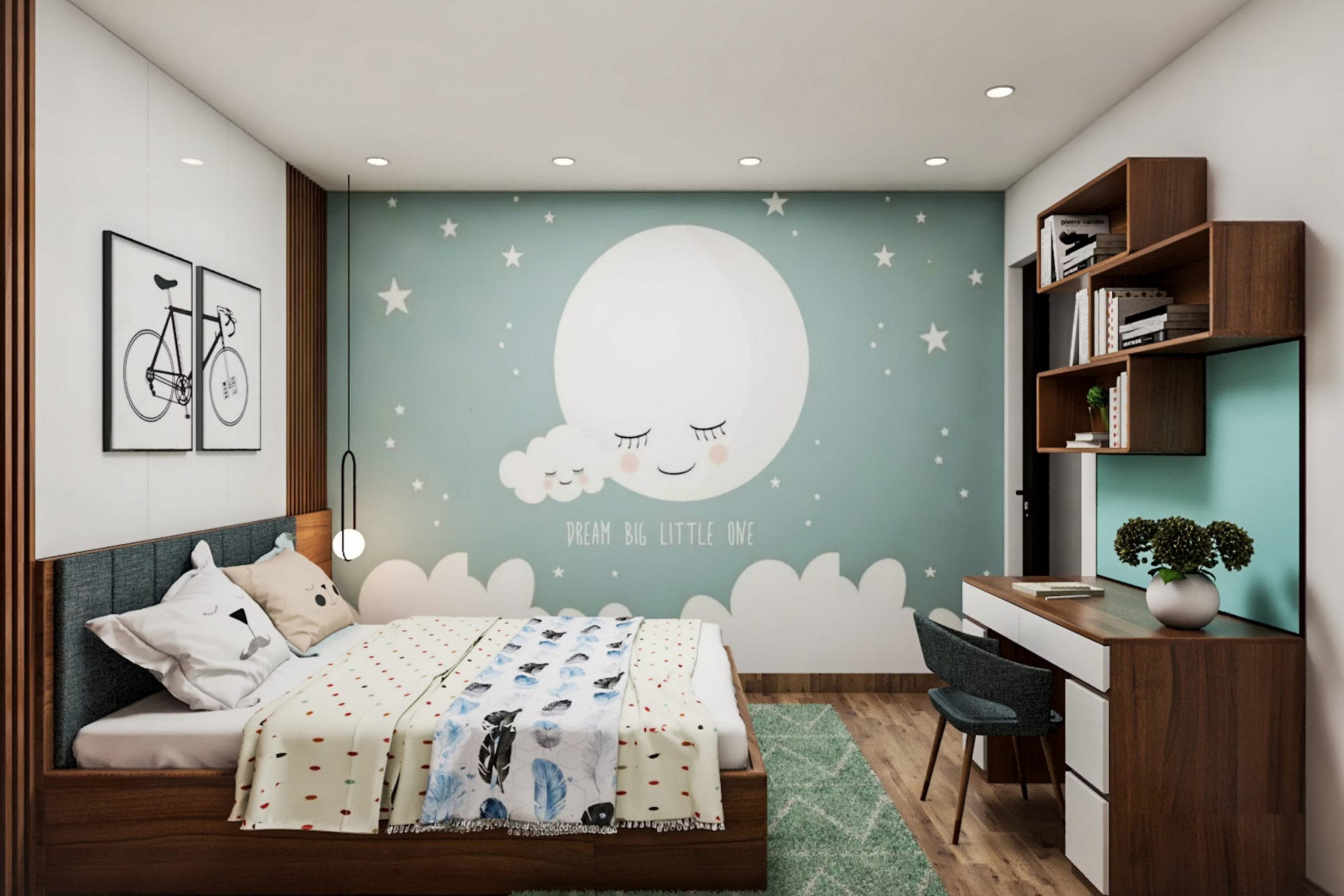
When I think about painting a boy’s room, I know color is not just decoration—it’s a part of his daily life. The right shade can help him feel at ease after school, spark creativity during playtime, and even make bedtime easier. A wall color sets the tone for growing, learning, and dreaming. Some boys want bold energy, others need a softer setting, and many fall somewhere in between.
Over the years, I’ve seen how paint can guide those feelings without adding clutter. It’s why I believe choosing paint is as important as choosing furniture.
The walls become the backdrop for every toy, every book, every poster, and even the memories that stay for years. A good color grows with the child—it feels playful in the early years but still works when they turn into teenagers.
This list brings together shades that carry strength, comfort, and fun. They aren’t just for one age—they work for kids, teens, and even young adults.
Some colors bring a spark of adventure, others create balance for studying, and a few add just the right amount of style to make the room feel personal.
With these ideas, a boy’s room becomes more than four walls. It becomes a place where he feels at home, where he can rest, play, and dream in a setting that feels right for him every single day.
For me, that’s the true power of paint—it shapes how a room feels and how a child feels inside it.
Why I Trust Sherwin-Williams and Benjamin Moore for Boys Room Paints
I’ve tried many paint brands, but Sherwin-Williams and Benjamin Moore always stand out. Their colors feel rich, layered, and full of personality, which matters in a child’s room. These paints also last, holding up through sticky fingers, toy bumps, and busy days.
When I recommend a shade to a family, I know it will look just as good years later. Another reason is their wide range—both brands carry soft tones, bold blues, natural greens, and flexible neutrals.
That means I can find the perfect shade for any boy’s style.
I also trust the way their colors shift with light, never looking flat or dull. Morning light can make a wall glow, while evening light softens it, and both brands handle those changes beautifully. I’ve seen walls painted years ago still look fresh because of the paint’s quality. Parents often thank me for choosing colors that make mornings brighter and nights gentler, and that’s no small thing.
For me, it’s more than paint—it’s trust in quality, reliability, and the way color can shape how a boy feels in his own room.
How I Choose the Right Paint Color for a Boys Room
When I help pick a boy’s room color, I always start with light. Natural light shows colors differently than lamps, so I test swatches in both morning and evening. I also think about the boy’s age—young kids often love bright blues or greens, while teens lean toward gray or navy. Another key is balance: bold walls can be paired with neutral bedding, while soft walls allow for playful accents.
I look at what else is in the room—wood tones, fabrics, or posters—so the paint doesn’t fight with them. Durability matters too, because boys use their rooms for play, homework, and rest all in one.
Sometimes a single accent wall is enough to bring life, while other times the whole room benefits from one steady tone
. I also consider how the color will feel as the child grows, making sure it won’t feel “too young” too quickly. Parents often want something that will last through many stages, and I choose with that in mind.
My goal is always the same: a color that feels like him, fits his daily rhythm, and makes the room a place where he’s happy to spend time.

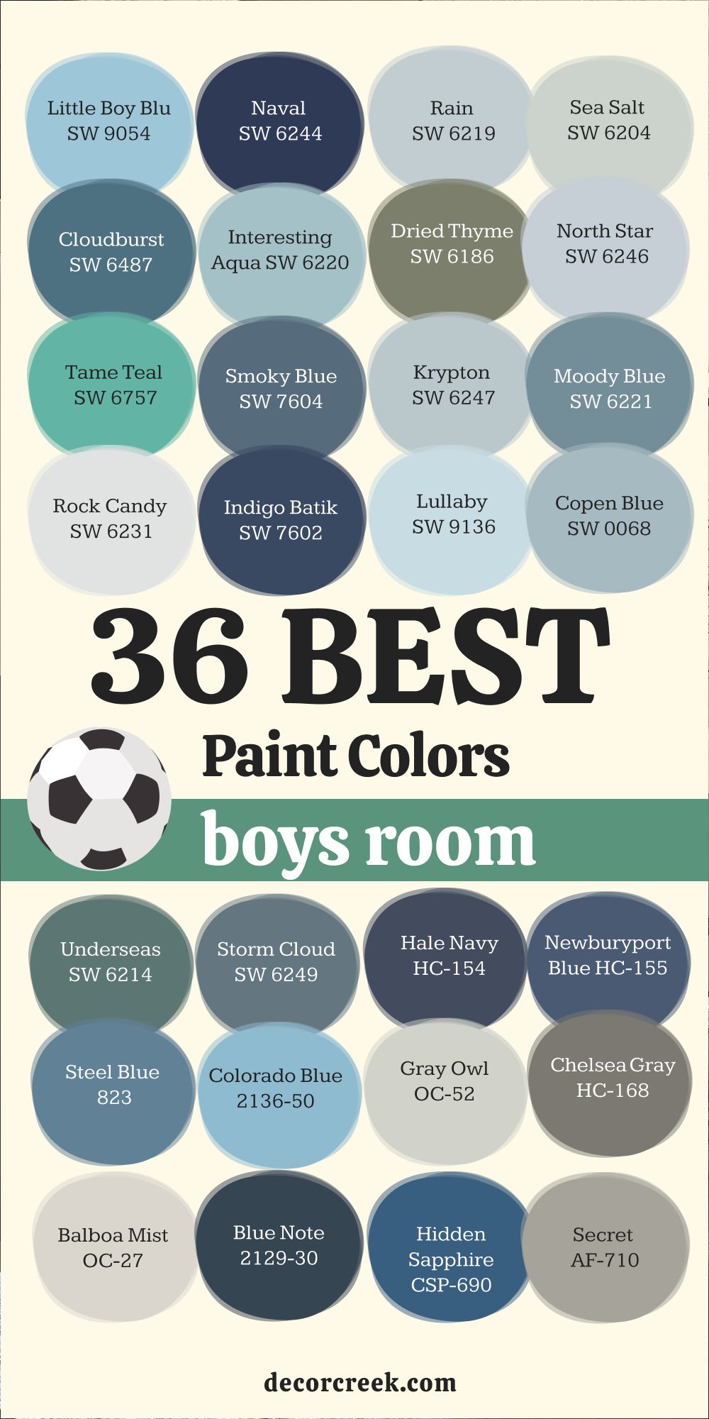
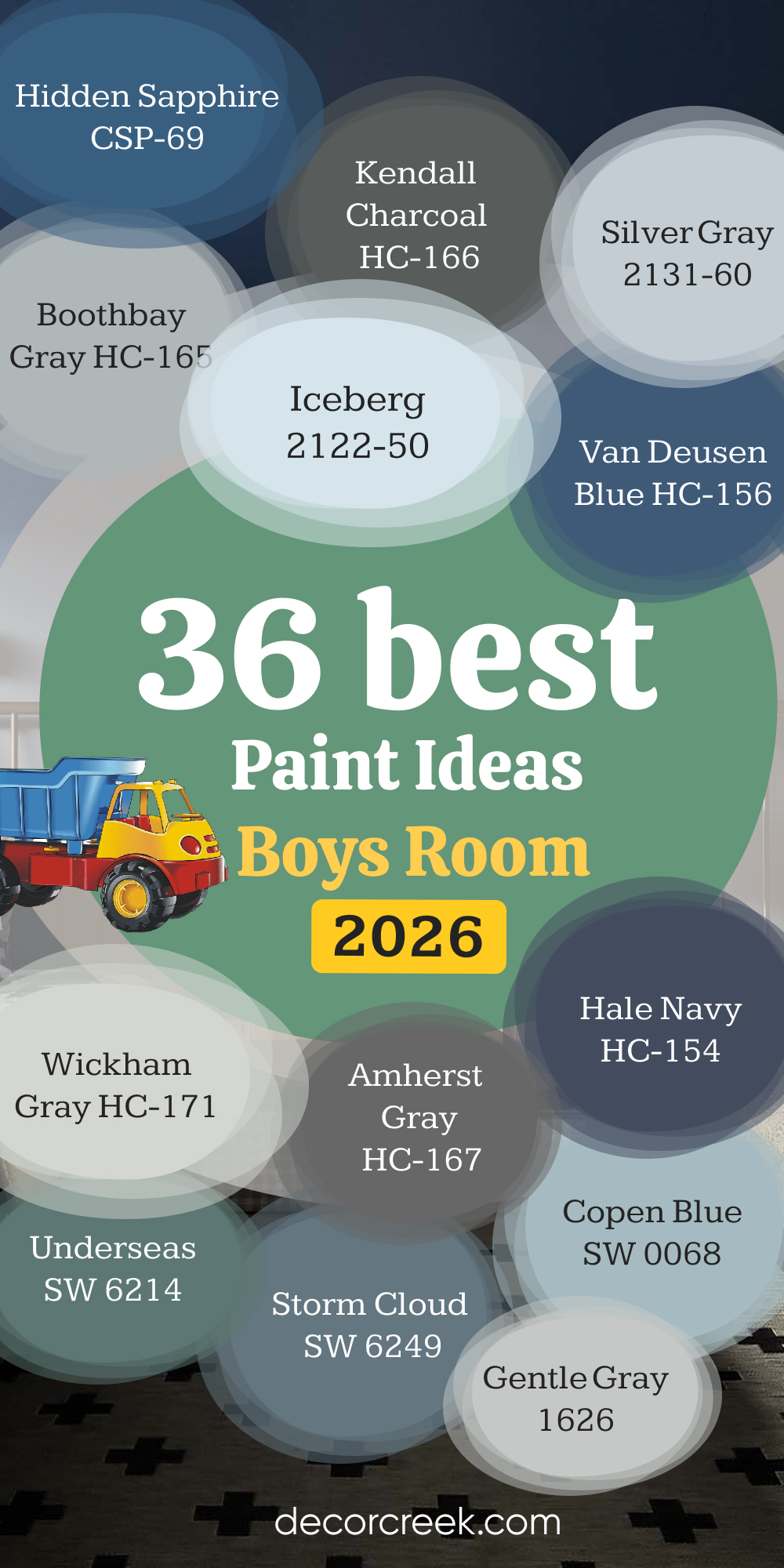
36 Best Boys Room Paint Ideas in 2026
Little Boy Blu SW 9054
Little Boy Blu SW 9054 is a cheerful shade that instantly brightens a room. I love how it feels youthful without being too loud, making it perfect for growing kids. This color pairs well with crisp white trim for a fresh, clean look. I’ve also used it alongside natural wood furniture to add warmth. Little Boy Blu brings a playful mood, but it still feels stylish enough for teens.
In smaller rooms, it reflects light beautifully, opening up the walls. When matched with patterned bedding, it adds character without taking over.
Parents often tell me their kids feel happier waking up to this color. It’s a blue that feels fun yet dependable. For me, it’s always a safe and joyful choice.
Naval SW 6244
Naval SW 6244 is a deep navy that feels bold and strong. I’ve used it for boys who want a more grown-up room, and it always looks sharp. This shade works especially well with white bedding or light-colored desks, creating contrast. Naval can serve as a main wall color or as an accent behind a bed. I like pairing it with metallic accents, like silver lamps, for a modern feel.
The richness of this navy makes it great for teens who want a more mature style. Even though it’s dark, it doesn’t feel heavy when paired with lighter shades. It gives a sense of structure, almost like a grounding force in the room.
Families love it because it grows with their child. Naval is timeless yet modern, which makes it one of my go-to blues.

Rain SW 6219
Rain SW 6219 is a soft, airy blue that feels refreshing. I love how it works for boys of all ages, from toddlers to teens. This color creates a soothing background without being dull. When sunlight hits it, Rain almost sparkles with brightness. I’ve paired it with white bunk beds for a crisp, playful look. It also works beautifully with light grays and soft greens.
In rooms with less natural light, Rain still holds its charm. It feels like a breath of fresh air every time I walk in. Parents tell me their children sleep better with this shade on the walls. For me, it’s one of the most balanced blues you can pick.
Sea Salt SW 6204
Sea Salt SW 6204 is one of my favorite choices for a gentle green-blue. It feels natural and easy, bringing the outdoors inside. I often use it in rooms that need both energy and rest. With white trim, it looks clean and crisp, while with wood tones it feels earthy. Sea Salt has just enough color to keep walls interesting without overwhelming the room.
It pairs well with navy bedding, adding depth to the palette. I’ve also seen it used with playful rugs to give a balanced look.
Even though it’s soft, it never feels boring. Children seem to feel at ease in a room painted with Sea Salt. For me, it’s a classic shade that always works.

Cloudburst SW 6487
Cloudburst SW 6487 reminds me of a stormy sky filled with strength. This shade is bold and dramatic, instantly giving a boy’s room character. I like using it as an accent wall behind the bed, where it creates a powerful focal point. Cloudburst pairs beautifully with crisp white trim or furniture, offering striking contrast. In natural daylight, it feels vibrant, while at night it turns cozy and grounding.
Teenagers especially love this shade because it feels grown-up and stylish. I’ve found that it makes a room look more structured and polished.
Paired with silver lamps or steel accents, it gains a modern edge. Parents tell me it helps their boys feel confident in their own space. For me, Cloudburst is a color that adds both drama and maturity.

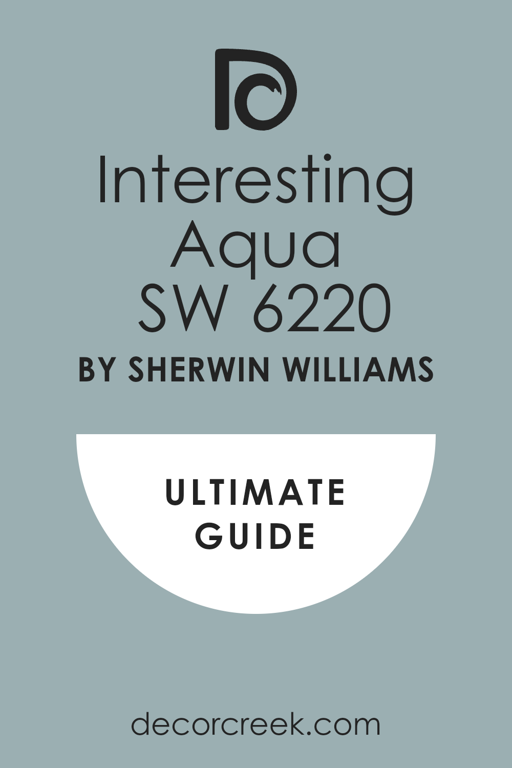
Interesting Aqua SW 6220
Interesting Aqua SW 6220 is a playful mix of blue and green that feels fresh and happy. I love how this color instantly brightens a room without being too intense. It reminds me of water, cool and inviting, which makes it perfect for a child’s room. With white bedding and simple furniture, it creates a cheerful look. Younger kids are drawn to its energy, while older boys find it modern and fun.
I’ve seen it lift the mood of even the smallest bedroom. It works well with sandy beige rugs or gray accents, making it easy to style. In sunlight, it leans more turquoise, while in shadow it feels deeper.
This shifting quality makes it exciting to live with. For me, Interesting Aqua always feels like a breath of joy.
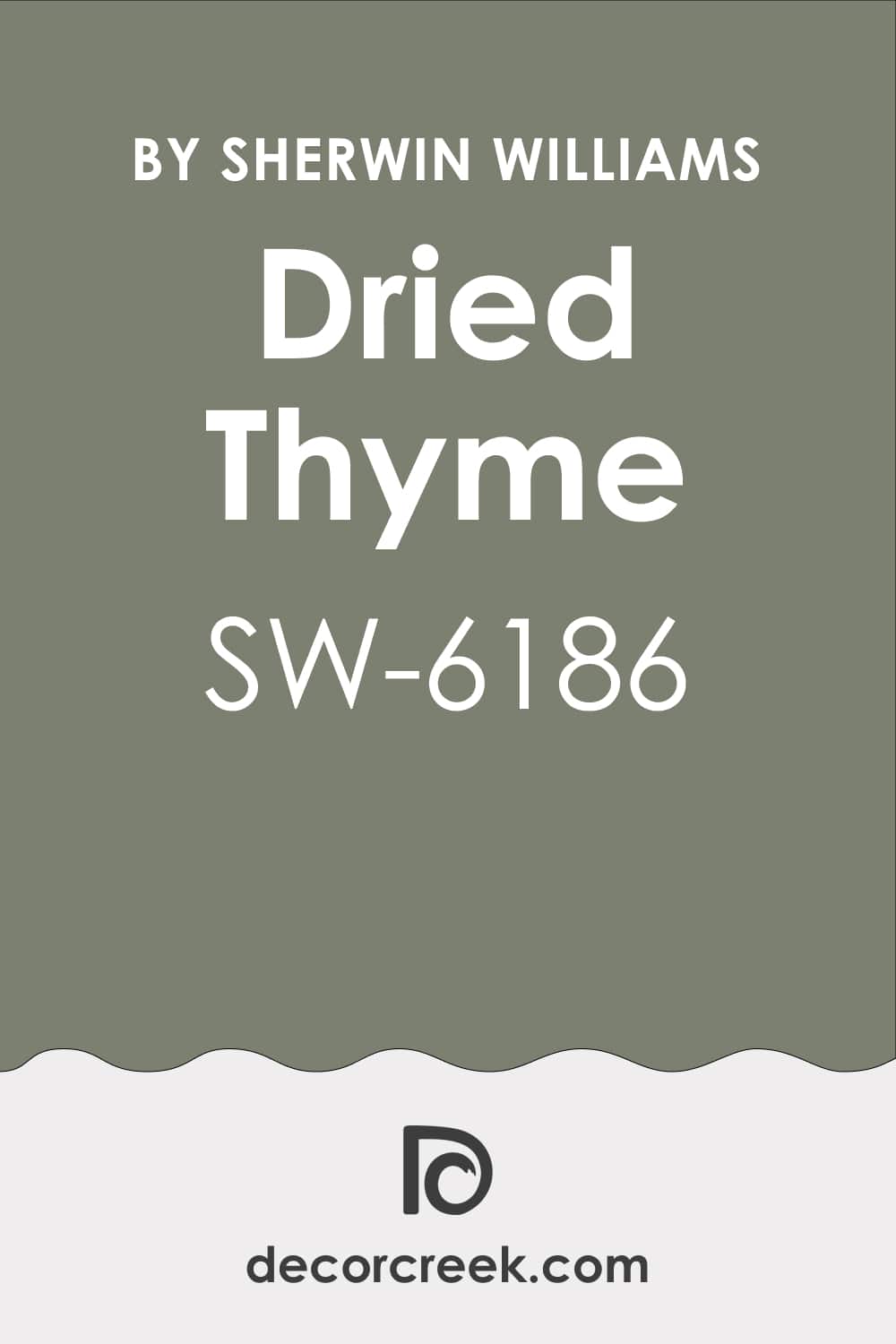
Dried Thyme SW 6186
Dried Thyme SW 6186 brings the richness of nature indoors. It’s a muted green that still holds depth and character. I love how it looks when paired with natural wood furniture and crisp white trim. It feels steady, grounded, and a little more grown-up, which makes it great for older boys. In bright rooms, the green feels softer, while in darker corners it deepens into a cozy backdrop. This shade creates focus, making it a good choice for a study area or reading nook. I often pair it with gray or beige bedding for balance. Parents appreciate how it feels fresh but not too loud.
I see it as a color that matures along with the child. For me, Dried Thyme is always a smart choice for balance and comfort.
North Star SW 6246
North Star SW 6246 is a soft gray-blue that feels light and airy. I love this color because it opens up a room and makes it feel brighter. It’s perfect for small bedrooms that need a little lift. With white doors and trim, it creates a crisp, clean finish. North Star is a gentle backdrop for colorful bedding, toys, or artwork. In daylight, it leans slightly blue, while at night it softens into a light gray. It’s a wonderful choice for children who need a restful room but still want personality. I often recommend it to families who want neutral walls that aren’t plain.
Parents find it easy to decorate around, since it matches many other shades. For me, North Star is reliable, calming, and always beautiful.

Storm Cloud SW 6249
Storm Cloud SW 6249 is a dramatic gray-blue that adds depth and mood. I love how it instantly makes a room feel thoughtful and strong. This shade works especially well for older boys or teenagers who want a more mature look. With crisp white bedding, it feels bold, while with darker accents it creates a cozy cave-like setting. In the morning light, it looks vibrant, while at night it turns rich and grounding. I’ve used it in larger bedrooms where it feels powerful and stylish. Parents like that it adds sophistication without being too heavy. Teens often see it as a cool, grown-up shade that reflects their personality.
I pair it with silver accents or patterned rugs for added interest. For me, Storm Cloud is a striking, confident choice.
Tame Teal SW 6757
Tame Teal SW 6757 feels bold yet friendly, perfect for a boy who wants personality in his room. I love how this teal balances between blue and green, giving both energy and calmness at once. It works well with clean white trim or light wood furniture, creating a balanced look. I often use it as an accent wall to add a splash of fun. In sunlight, it shines with brightness, while in the evening it deepens into a cozy shade. For younger boys, it feels playful and adventurous. For teens, it looks stylish and unique, a color that sets their room apart. I’ve paired it with gray bedding, and the mix always looks modern.
Parents appreciate how it feels fresh but not overwhelming. For me, Tame Teal is the perfect blend of fun and comfort.

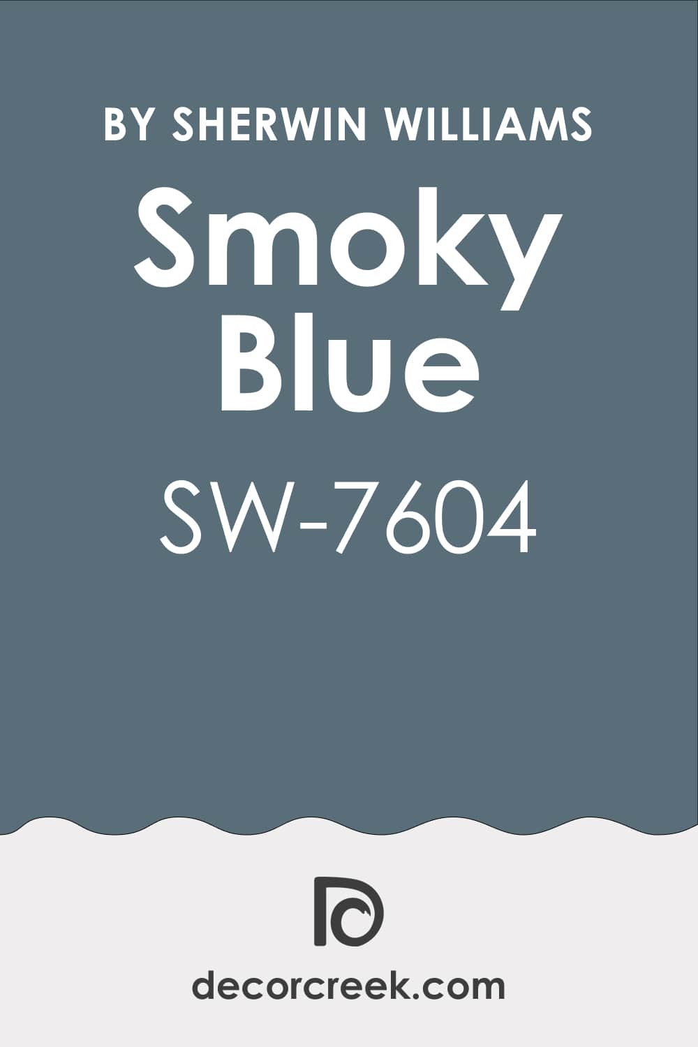
Smoky Blue SW 7604
Smoky Blue SW 7604 is a rich, moody blue that always feels thoughtful. I love how it adds depth without making a room feel too dark. It’s a wonderful choice for boys who want a more mature, grown-up space. Smoky Blue looks beautiful with white or pale gray furniture, making it easy to design around.
I often suggest it for reading corners or study walls because it feels grounding. In daylight, it has a cool energy, while at night it feels warm and cozy.
Teenagers especially love this color because it feels stylish but not flashy. I’ve also seen it paired with tan accents for a classic touch. Parents say it makes the room feel put together with little effort. For me, Smoky Blue is always reliable for depth and charm.
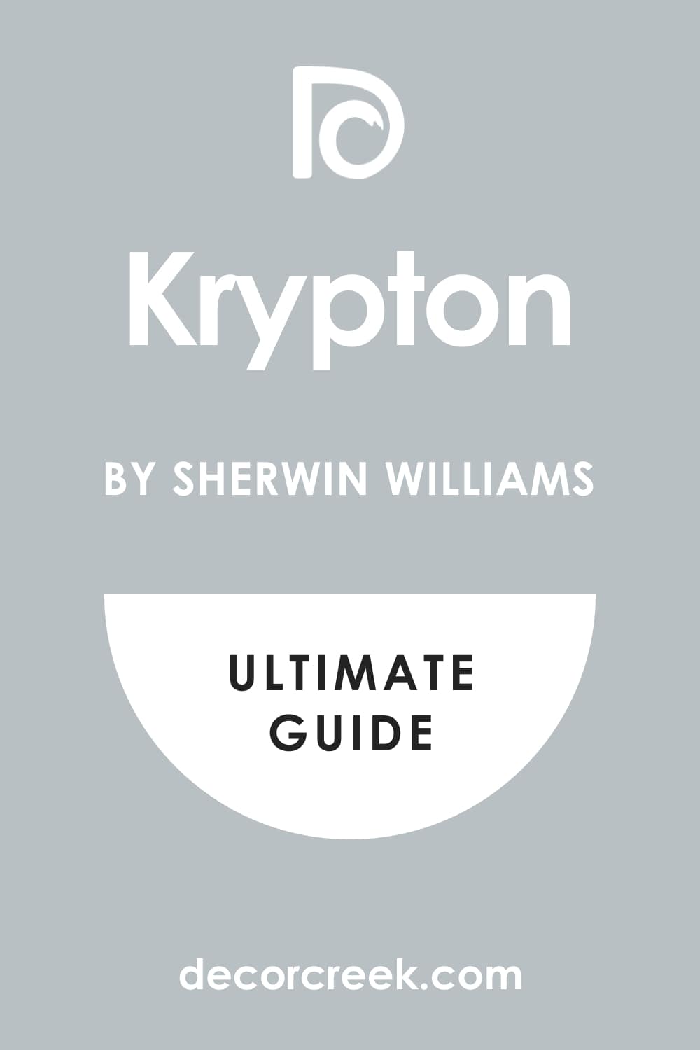
Krypton SW 6247
Krypton SW 6247 is a soft blue-gray that feels airy and light. I love using it in rooms that need brightness without too much color. It’s perfect for boys who like a cleaner, more simple look. With white trim and furniture, Krypton makes everything feel crisp. I’ve seen it work beautifully with bold accent pillows or rugs, letting the details stand out.
In the morning light, it looks brighter, while in the evening it softens into a gentle gray. It’s a flexible shade that fits with many themes, from sports to travel to study.
Parents often tell me it’s easy to decorate around since it works with both warm and cool tones. I find it especially good in smaller bedrooms. For me, Krypton is a fresh, easy choice that never disappoints.
Moody Blue SW 6221
Moody Blue SW 6221 is a striking shade that blends confidence with creativity. I love how it sits between medium blue and teal, giving the room energy without being too bold. This color looks great on all four walls, especially when paired with white furniture. I often recommend it for boys who want their room to feel fun yet stylish. In natural light, it looks vibrant and lively, while in dim light it feels cozy and thoughtful.
I’ve matched it with patterned rugs or striped bedding, and it always feels lively. Teenagers like it because it feels unique compared to classic navy.
Parents appreciate that it has both playfulness and maturity. I enjoy how it changes mood throughout the day. For me, Moody Blue is a playful classic that grows with a child.
Hale Navy HC-154 BM
Hale Navy HC-154 BM is one of the most classic blues I use for boys’ rooms. I love its depth, strength, and elegance, making it perfect for older kids and teens. This shade brings instant character to a room without feeling too dark. Paired with white trim, it looks crisp and bold. With wood furniture, it feels warm and inviting.
I often suggest Hale Navy when families want a color that feels both stylish and lasting. In daylight, it looks rich and sharp, while in the evening it takes on a cozy mood.
It works beautifully with striped bedding or nautical accents. Parents appreciate how easily it matures with their child. For me, Hale Navy is a timeless blue that never fails.

Newburyport Blue HC-155 BM
Newburyport Blue HC-155 BM is a refined navy with a softer touch. I love how it feels strong but not overwhelming, making it great for boys’ bedrooms. This shade pairs well with both traditional and modern furniture styles. With white accents, it has a crisp, clean edge. I’ve seen it used beautifully with red or green accessories for a classic look. In bright rooms, Newburyport Blue feels lively, while in dimmer light it becomes more grounded. It’s especially good for teens who want their rooms to feel stylish yet relaxed. Parents like it because it doesn’t feel too dark or heavy.
I enjoy using it as an accent color for built-in shelves or behind desks. For me, Newburyport Blue is both versatile and dependable.

Steel Blue 823 BM
Steel Blue 823 BM is a bold mid-tone that always brings energy. I love how this shade balances between a strong blue and a touch of gray. It works well for boys who want color that feels lively but not too bright. With white bedding or trim, it feels crisp and modern. I often pair it with darker grays for a cool, layered look.
In the morning, Steel Blue feels fresh and strong; in the evening, it turns deeper and more grounding. It’s a shade that grows well with kids as they move from childhood to teen years.
Parents appreciate that it feels fun but still polished. I’ve seen it work well in both large and small rooms. For me, Steel Blue always brings the right amount of energy and style.
Gray Owl OC-52 BM
Gray Owl OC-52 BM is one of my favorite light grays for a boy’s room. I love how it feels clean and balanced without being cold. This shade has just enough warmth to keep a bedroom inviting. With white trim, it feels crisp, and with navy bedding, it gains depth. I often use it when parents want a modern backdrop that works for both kids and teens. In sunlight, Gray Owl looks brighter, while at night it becomes a gentle, grounding gray.
It’s flexible enough to pair with bold accent colors like green or red. I’ve seen it make small rooms feel larger and more open. Parents love how easy it is to decorate around. For me, Gray Owl is the perfect soft gray that never disappoints.

Colorado Blue 2136-50 BM
Colorado Blue 2136-50 BM is a light, airy shade that reminds me of open skies. I love how it instantly makes a room feel brighter and more open. This shade is great for younger boys who need a playful and happy background. It pairs beautifully with white trim and colorful accents. I often use it in smaller rooms to make them feel larger and fresher.
In daylight, Colorado Blue shines with brightness, while in the evening it softens. It works well with natural wood furniture, adding warmth to the cool tone.
Parents tell me it makes mornings easier because it feels cheerful. I find it blends beautifully with greens or grays for variety. For me, Colorado Blue is a joyful, lighthearted choice for any boy’s room.
Chelsea Gray HC-168 BM
Chelsea Gray HC-168 BM is a bold medium gray that feels strong and stylish. I love how it adds a sense of maturity to a boy’s bedroom. It’s an excellent choice for teens who want a more grown-up look. Paired with crisp white trim, it feels sharp and modern. With wood furniture, it takes on a cozy, earthy side.
In bright daylight, Chelsea Gray shows its strength, while in evening light it becomes softer. I often pair it with blue accents to bring out its richness.
Parents say it gives structure to the room without feeling too heavy. I’ve used it in larger bedrooms where it adds depth and character. For me, Chelsea Gray is a confident choice that always feels smart.

Balboa Mist OC-27 BM
Balboa Mist OC-27 BM is a warm, gentle gray that feels soft and inviting. I love how it works as a neutral base while still adding personality. It’s ideal for boys’ rooms where parents want flexibility with décor. With navy or teal accents, it feels fresh and modern. I often recommend it for smaller rooms because it reflects light well. In the daytime, Balboa Mist leans toward a creamy gray, and in the evening it turns softer.
It looks beautiful with both white and darker trim. Parents enjoy how it grows with their child, fitting any stage. I find it easy to pair with colorful bedding or rugs for extra character.
For me, Balboa Mist is a graceful neutral that always feels right.

Secret AF-710 BM
Secret AF-710 BM is a mysterious mid-tone gray that adds quiet strength to a boy’s room. I love how it feels calm but not boring, giving the room character without overpowering it. This color pairs well with blues, greens, or even brighter accents. With white trim, it feels sharp and clean, while with darker furniture it feels grounded.
In natural light, Secret looks softer, while at night it becomes more dramatic. I often recommend it for study corners or bedrooms where focus matters.
Parents like that it creates a modern feel that grows well with teens. I’ve paired it with navy bedding and the result always feels stylish. For boys who want a space that feels cool and relaxed, this is perfect. For me, Secret is a smart, modern shade that works beautifully.
Blue Note 2129-30 BM
Blue Note 2129-30 BM is a deep, dramatic blue that makes a bold statement. I love how it feels both stylish and grounding in a boy’s room. It works especially well as an accent wall behind a bed or desk. With white trim, it looks sharp and sophisticated, while with wood tones it feels warmer.
Teenagers often choose this shade because it has a mature, modern vibe. In sunlight, it shows its richness, while at night it feels deep and cozy.
I’ve paired it with metallic accents for a sleek finish. Parents appreciate that it makes a room feel special without being too flashy. I often use it when families want a standout wall color. For me, Blue Note is a powerful choice that leaves a lasting impression.

Hidden Sapphire CSP-690 BM
Hidden Sapphire CSP-690 BM is a jewel-like blue that always feels rich and inviting. I love how it carries depth without being too dark for a child’s room. This shade shines beautifully when paired with crisp white bedding or trim. It brings a spark of personality that works well for both kids and teens.
In bright daylight, Hidden Sapphire looks vibrant and bold, while in the evening it softens into a cozy blue.
I’ve used it with patterned rugs and striped bedding for extra playfulness. Parents often say it makes the room feel polished while still fun. It’s a shade that feels adventurous yet dependable at the same time. With metallic accents or navy details, it gains even more strength. For me, Hidden Sapphire is a gem of a color that brings joy and style.
Kendall Charcoal HC-166 BM
Kendall Charcoal HC-166 BM is a strong, dramatic gray that brings instant sophistication. I love how it feels bold but still versatile in a boy’s room. With white trim, it creates a crisp and confident contrast. It pairs beautifully with navy or teal accents for added depth. In daylight, it shows its richness, while in evening light it turns cozy and grounded
. Teenagers often enjoy this color because it feels mature and stylish. I’ve used it with metal accents like lamps or shelves, which adds a sleek finish.
Parents appreciate how it can make even simple furniture look more polished. For boys who want a grown-up look, Kendall Charcoal is always a great choice. For me, it’s a dramatic yet reliable shade.

Silver Gray 2131-60 BM
Silver Gray 2131-60 BM is a soft, silvery blue that feels refreshing and light. I love how it instantly brightens a bedroom without being too bold. This color works especially well for younger boys who enjoy a cheerful room. Paired with white trim, it looks crisp and airy. With navy or darker accents, it gains more depth and interest.
In morning light, it feels sparkling and fresh, while at night it becomes gentle and soothing. I often use it in smaller bedrooms to create a sense of openness.
Parents like that it feels clean and uplifting. I find it easy to decorate around with both playful and classic styles. For me, Silver Gray is a beautiful way to bring brightness to a boy’s room.
Rock Candy SW 6231
Rock Candy SW 6231 is a whisper-light blue that feels soft and airy. I love how it brings brightness into a boy’s room without being too strong. It works especially well in small bedrooms where more light is needed. With white trim, it looks crisp and fresh, almost like a gentle breeze. I often pair it with darker bedding or rugs to give balance and depth.
In daylight, Rock Candy glows with a cool freshness, while at night it softens into a quiet backdrop. Parents tell me it makes the room feel open and peaceful.
Kids like it because it gives them a calm place to sleep while still feeling cheerful. I find it’s easy to decorate with toys, posters, or sports gear because it doesn’t clash. For me, Rock Candy is a light and lovely choice for any boy’s room.

Indigo Batik SW 7602
Indigo Batik SW 7602 is a deep blue that feels bold and confident. I love how it brings instant character to a room while staying stylish. This shade pairs beautifully with white or gray furniture, creating a sharp, modern look. In daylight, it feels rich and elegant, while in the evening it turns cozy and grounding. Teenagers especially enjoy Indigo Batik because it feels grown-up and artistic.
I’ve used it with striped bedding or patterned rugs to add playful contrast. Parents appreciate that it has staying power, working for both younger and older boys.
I often recommend it for accent walls to keep the room balanced. With metallic details like lamps or drawer pulls, it gains extra sophistication. For me, Indigo Batik is a confident color that always makes a statement.

Lullaby SW 9136
Lullaby SW 9136 is a soft pastel blue that feels gentle and sweet. I love using it in nurseries or younger boys’ bedrooms because it creates such a comforting backdrop. With white cribs or furniture, it looks pure and fresh. As the child grows, Lullaby still works, especially when paired with darker blues or grays for contrast. In natural light, it feels bright and playful, while in the evening it turns soft and cozy.
Parents often choose this shade when they want a room that feels safe and inviting. I’ve seen it paired with colorful rugs and toys, and it never feels out of place.
Lullaby is also wonderful for small spaces, making them look larger and lighter. It’s gentle without feeling dull or flat. For me, Lullaby is a perfect choice for a loving, welcoming bedroom.
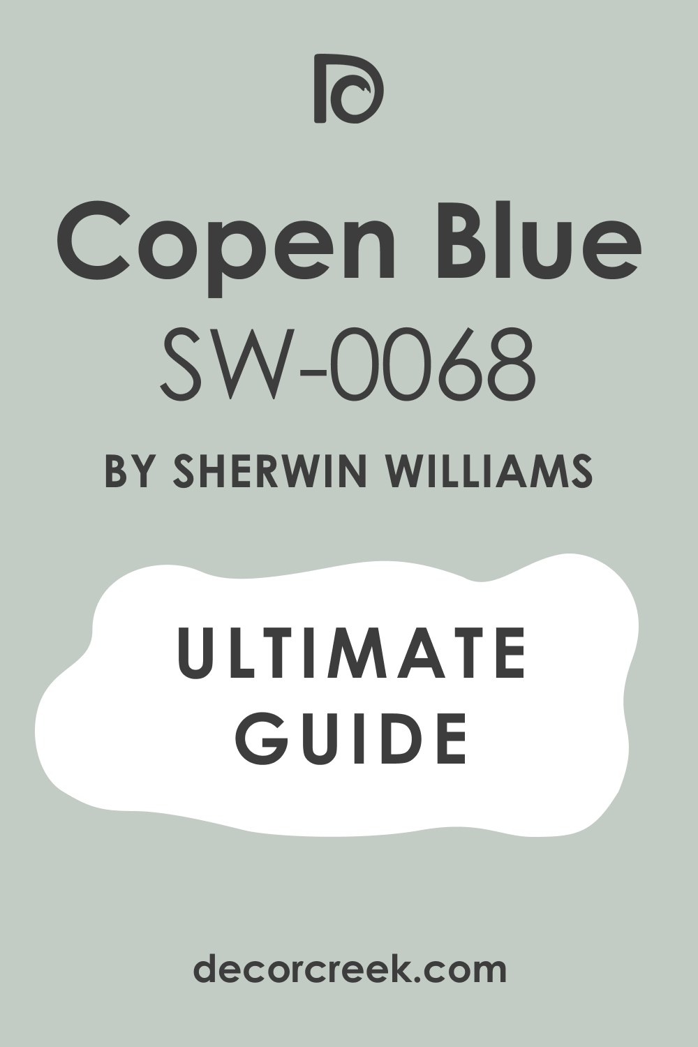
Copen Blue SW 0068
Copen Blue SW 0068 is a classic medium blue with a touch of gray. I love how it feels steady and balanced, perfect for boys of any age. This shade looks wonderful with white trim and dark wood furniture. In bright daylight, it feels lively, while at night it softens into a cozy backdrop. I often use it in shared bedrooms because it’s flexible enough to match different bedding and styles.
Parents like that it doesn’t feel too bright or too dark. Copen Blue also pairs beautifully with patterns, from stripes to checks.
It creates a calm but still stylish mood, making it great for both kids and teens. I’ve seen it work well in both large and small rooms. For me, Copen Blue is a safe, steady choice that always feels right.
Underseas SW 6214
Underseas SW 6214 is a beautiful teal that feels rich and adventurous. I love how it combines blue and green in a way that brings energy into a boy’s room. It’s bold enough to stand out but soft enough to feel welcoming. With white trim, it looks crisp and lively, while with wood furniture it feels more natural.
In bright daylight, Underseas shows its green side, and at night it leans deeper into blue.
I’ve often paired it with nautical themes, striped bedding, or maps on the wall. Parents like it because it feels creative without being too flashy. Teens enjoy it for its unique, stylish vibe. I find it works well as an accent wall or across the entire room. For me, Underseas is a color full of adventure and charm.
Boothbay Gray HC-165 BM
Boothbay Gray HC-165 BM is a soft gray with a whisper of blue. I love how it balances between cool and warm, making it perfect for a boy’s room. It feels light and open, especially when paired with white trim and light furniture. This shade is wonderful as a backdrop for both colorful toys and simple, modern décor.
In daylight, Boothbay Gray shows its blue tones, while in dim light it leans more neutral. Parents appreciate its flexibility because it fits both playful and mature styles.
I’ve used it with navy accents for a nautical touch, and it always works. It’s a shade that grows well as a child moves into teenage years.
With patterned bedding or bold artwork, it feels stylish yet calm. For me, Boothbay Gray is a balanced and reliable favorite.

Iceberg 2122-50 BM
Iceberg 2122-50 BM is a pale blue that feels refreshing and crisp. I love how it instantly lifts the mood of a room, almost like a breath of fresh air. It’s soft enough for a nursery but stylish enough for an older boy’s room too. With white trim, it looks clean and airy, while with darker accents it gains contrast. In sunlight, Iceberg feels bright and lively, and at night it turns soft and soothing.
Parents like it because it’s gentle on the eyes and easy to decorate around. I often pair it with playful bedding or colorful rugs for extra character. Teens enjoy it when mixed with navy or gray details, giving it more edge.
It works beautifully in small rooms by making them feel larger. For me, Iceberg is a light blue that always feels cheerful and fresh.
Van Deusen Blue HC-156 BM
Van Deusen Blue HC-156 BM is a bold navy that feels classic yet modern. I love how it works beautifully for boys who want a strong, confident room. With white trim, it looks crisp and sharp, while with wood furniture it takes on a warmer feel. In bright daylight, Van Deusen Blue feels rich and lively, and in the evening it becomes cozy and grounding.
Parents appreciate how polished and stylish it looks without being too dark. Teens often choose this shade because it feels grown-up but still fun. I’ve paired it with striped bedding or geometric patterns, and it always looks great.
It’s perfect for accent walls or even the whole room if you want drama. With metallic details, it feels even more modern. For me, Van Deusen Blue is a dependable navy that never goes out of style.

Amherst Gray HC-167 BM
Amherst Gray HC-167 BM is a deep gray that feels steady and strong. I love how it adds weight and maturity to a boy’s room. It pairs perfectly with lighter furniture, creating contrast that feels crisp. With bold accents like navy or green, it looks modern and stylish. In sunlight, Amherst Gray feels bold and structured, while at night it softens into a cozy backdrop.
Parents like it because it grows with their child, fitting both childhood and teenage years. I often use it in larger bedrooms to give a sense of depth and grounding.
With white trim, it feels clean and sharp. Teens appreciate that it gives their room a cool, modern edge. For me, Amherst Gray is a confident shade that makes any room look complete.

Wickham Gray HC-171 BM
Wickham Gray HC-171 BM is a light gray with a hint of blue that feels airy and open. I love how it makes a boy’s room feel bright without being too plain. With white trim, it creates a clean, modern finish. I often recommend it for smaller rooms because it helps walls recede and the room feel larger. In daylight, Wickham Gray shows more of its blue side, while at night it leans toward a soft gray.
Parents appreciate its flexibility because it works with many themes and styles. It looks wonderful with playful rugs or colorful bedding.
Teens like it because it feels mature but not too heavy. I’ve seen it pair beautifully with both modern and classic furniture. For me, Wickham Gray is a soft and versatile color that always works.

Gentle Gray 1626 BM
Gentle Gray 1626 BM is a light, soft gray that feels welcoming and easy. I love how it offers just enough color to give life to a room without overwhelming it. With white trim, it looks fresh and neat. I often use it when parents want a backdrop that allows other items in the room to shine. In daylight, it reflects light beautifully, making the room feel more open.
At night, it becomes cozy and warm without being heavy. Parents tell me they enjoy how simple it is to decorate around this shade. With blues, greens, or bold accent pieces, it adapts beautifully.
Teens like it because it feels mature but still soft. For me, Gentle Gray is a perfect neutral that feels both fresh and flexible.
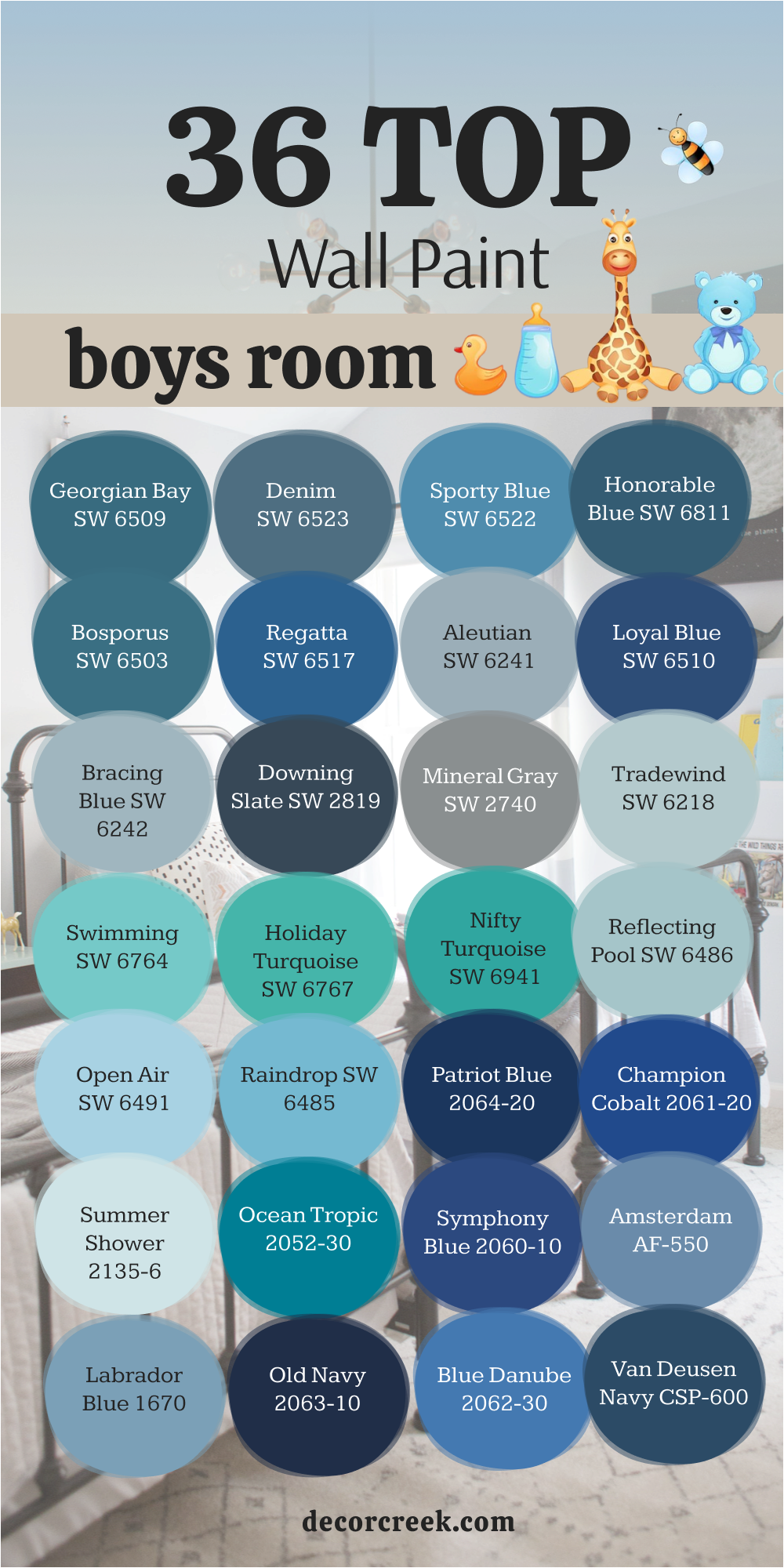
36 Top Boys Room Wall Paint
Old Navy 2063-10 BM
Old Navy 2063-10 BM is a bold, dark navy that feels powerful and confident. I love how it makes a boy’s room feel polished and grown-up. With white trim, it looks sharp and striking, while with wood tones it feels warmer and more classic. In daylight, Old Navy is rich and strong; at night, it becomes cozy and grounding.
Parents often choose it for older boys who want a more mature space. I’ve paired it with gray bedding and modern accents for a sleek look.
Teens love it because it feels stylish and sophisticated. It also works beautifully as an accent wall, adding depth and drama. With metallic or silver details, it becomes even more refined. For me, Old Navy is a confident navy that always stands out.
Georgian Bay SW 6509
Georgian Bay SW 6509 is a bold, rich blue that feels both playful and strong. I love how it fills a boy’s room with energy while still feeling stylish. With white trim, it creates a crisp and clean contrast that stands out. In daylight, this shade feels bright and adventurous, while at night it becomes cozy and grounding. I often recommend it for older kids or teens who want a color that shows personality.
It pairs beautifully with lighter bedding and wood furniture. Parents appreciate that it feels exciting without being too wild. I’ve also seen it used as an accent wall to make a dramatic statement.
With striped rugs or patterned bedding, Georgian Bay always shines. For me, it’s a confident blue that brings character to any room.

Denim SW 6523
Denim SW 6523 is a relaxed medium blue that reminds me of worn-in jeans. I love how it feels casual and inviting, perfect for a boy’s everyday room. It pairs well with both light and dark furniture, making it easy to design around. In bright daylight, Denim feels cheerful and open, while in the evening it becomes cozy and warm. I’ve used it with white trim for a classic look that never feels old.
Parents like that it’s simple but not boring. Teenagers often enjoy Denim because it feels laid-back yet stylish. I find it works beautifully with plaid bedding or sporty décor.
It’s also a good choice for shared bedrooms because it balances many styles. For me, Denim is a relaxed, reliable blue that always feels at home.
Sporty Blue SW 6522
Sporty Blue SW 6522 is exactly what its name suggests—full of energy and life. I love using it in boys’ rooms that need a burst of fun. This medium blue feels bright without being overwhelming. It looks great with white or gray furniture, keeping the look balanced. In sunlight, it pops with vibrancy, while in evening light it softens slightly.
Parents often tell me their kids love the cheerful feeling it brings. It works well with bold bedding or playful rugs for added character.
I’ve also paired it with red or green accents for a sporty, team-inspired theme. Teenagers enjoy its lively feel without it being too childish. For me, Sporty Blue is a perfect match for energy and style.
Honorable Blue SW 6811
Honorable Blue SW 6811 is a classic medium blue that always feels dependable. I love how it works in almost any style of boy’s room, from playful to grown-up. With white trim, it looks sharp and fresh, while with wood tones it feels warmer. In daylight, it shows a cheerful side, and at night it deepens into a cozy tone. Parents appreciate its flexibility because it pairs with so many bedding colors.
I often use it in rooms where families want a shade that will last through the years. Teens enjoy it because it feels stylish without being too bold. It’s great for both full-room coverage and accent walls.
With striped or geometric rugs, it looks especially sharp. For me, Honorable Blue is a steady classic that never fails.
Blue Danube 2062-30 BM
Blue Danube 2062-30 BM is a bright and lively blue that always feels full of energy. I love how it can make a boy’s room feel fun and adventurous. With white trim, it pops with crisp freshness, while with darker furniture it feels bold and playful. In daylight, Blue Danube feels cheerful and bright, while in the evening it turns richer and cozier.
Parents like it because it brings joy without being too overwhelming. I often pair it with striped rugs or graphic bedding for a lively touch.
Teens enjoy it because it feels youthful but still stylish. It works beautifully in small rooms where brightness matters. With silver or metallic details, it gains a modern edge. For me, Blue Danube is a color of fun and excitement.
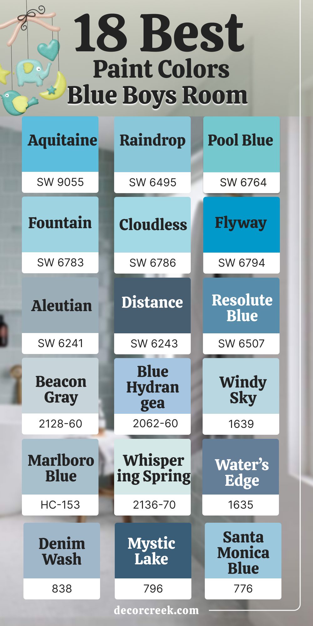
Aleutian SW 6241
Aleutian SW 6241 is a gentle blue with a hint of gray that feels balanced and calming. I love how it adds color without being too strong. It works beautifully as a backdrop for both playful décor and more grown-up themes. With white trim, it looks fresh, while with darker furniture it feels grounded. In bright light, Aleutian leans softer, while in dim rooms it gains depth. Parents often choose it because it grows well from childhood into teen years. I’ve paired it with navy bedding for contrast, and the result always feels stylish. It’s flexible enough for small or large bedrooms alike.
Teens appreciate it because it feels modern without being flashy. For me, Aleutian is a steady, adaptable blue that always works.
Bosporus SW 6503
Bosporus SW 6503 is a bold blue with a touch of teal that feels adventurous. I love how it fills a boy’s room with energy and creativity. With white trim, it creates a sharp, clean look that feels modern. In daylight, Bosporus shows off its brighter side, while at night it feels deeper and richer. I often suggest this shade for boys who want their room to feel unique and exciting.
It pairs beautifully with light gray bedding or natural wood furniture. Parents like that it adds personality without being too dark.
Teens appreciate its stylish edge, giving their room a creative vibe. I’ve used it on accent walls to make a strong statement. For me, Bosporus is a bold choice that inspires fun and imagination.
Van Deusen Navy HC-156
Van Deusen Navy HC-156 is a strong navy that feels bold and timeless. I love how it gives a boy’s room a classic, confident mood. With white trim, it creates sharp contrast, while with natural wood it feels warmer and grounded. In daylight, Van Deusen Navy shows its richness, while in the evening it becomes deep and cozy.
Parents appreciate that it looks polished and mature, fitting for any stage of life. I’ve used it with striped bedding for a nautical theme, and it always looks fresh.
Teens like it because it feels stylish and grown-up. It’s perfect as an accent wall or for the entire room if balance is kept with lighter accents. With silver or gray décor, it feels especially sleek. For me, Van Deusen Navy is bold and reliable.
Loyal Blue SW 6510
Loyal Blue SW 6510 is a rich, confident shade that makes a bold statement. I love how it fills a boy’s room with strength and personality. With white trim, it creates a crisp, modern look, while with wood tones it feels more classic. In daylight, it’s bright and striking, and in the evening it becomes deep and cozy. Parents like that it makes a room look sharp without too much effort. I often use it as an accent wall to give a powerful focal point. Teens enjoy this color because it feels grown-up and stylish. Paired with gray bedding or silver accents, it takes on a sleek look.
It works well in larger rooms where it can show off its richness. For me, Loyal Blue is always a bold and confident choice.
Regatta SW 6517
Regatta SW 6517 is a crisp, bright blue that feels fresh and lively. I love how it reminds me of summer skies and open water. This color works especially well in rooms with lots of natural light. With white trim, it feels sharp and cheerful, perfect for a growing boy. Parents appreciate how happy and energetic it makes a room feel. I’ve paired it with striped bedding for a nautical touch, and it always looks playful.
Teens like it because it feels bold without being too heavy. In the evening, it softens into a cozy blue that still feels strong.
I often use it when families want a color that feels youthful but still stylish. For me, Regatta is pure energy bottled into paint.
Bracing Blue SW 6242
Bracing Blue SW 6242 is a crisp blue-gray that feels cool and refreshing. I love how it works in both modern and classic boys’ rooms. With white trim, it looks clean and sharp, while with darker accents it feels more dramatic. In daylight, Bracing Blue leans toward a light, airy blue, while in the evening it shows more gray.
Parents appreciate that it isn’t too bright but still full of personality. I often recommend it for study spaces or bedrooms where focus matters.
Teens like it because it feels stylish and modern. It pairs well with striped bedding, sports décor, or even nautical themes. I’ve seen it make small rooms feel larger and more open. For me, Bracing Blue is a steady, smart choice that fits many styles.

Mineral Gray SW 2740
Mineral Gray SW 2740 is a soft, earthy gray with a hint of blue. I love how it creates a calm and steady backdrop for any boy’s room. With white trim, it feels light and open, while with darker wood furniture it feels grounded. In daylight, it leans toward blue-gray, and at night it feels warmer. Parents like it because it works with both colorful and neutral décor.
I often suggest it for families who want flexibility as their child grows. Teens enjoy it for its modern feel that isn’t too heavy.
I’ve paired it with patterned rugs or bold wall art, and it always looks balanced. It’s a color that adapts easily to many themes. For me, Mineral Gray is dependable and stylish without trying too hard.
Downing Slate SW 2819
Downing Slate SW 2819 is a deep, classic blue with a timeless strength. I love how it creates a bold statement without being too overwhelming. With white trim, it stands out sharply, while with wood furniture it feels warmer and cozier. In bright sunlight, it reveals its richness, while in dim light it feels grounded and secure.
Parents often choose it for older boys who want a room that feels mature. I’ve used it as an accent wall behind a bed, and it always adds depth.
Teens appreciate that it feels serious but still stylish. Paired with gray bedding or metallic accents, it looks especially sharp. I find it works beautifully in larger rooms that can hold its depth. For me, Downing Slate is bold and classic at the same time.

Ocean Tropic 2052-30 BM
Ocean Tropic 2052-30 BM is a bold teal that feels adventurous and full of life. I love how it blends the energy of blue with the freshness of green. This color is perfect for boys who want their room to feel exciting and unique. With white trim, it feels crisp, while with darker furniture it takes on a modern edge.
In daylight, Ocean Tropic feels lively and bold, while at night it becomes rich and dramatic. Parents like that it creates a playful mood without being too wild.
I often pair it with nautical themes or natural textures for balance. Teens love it because it stands out and feels stylish. With patterned rugs or graphic bedding, it always makes a statement. For me, Ocean Tropic is a color of energy and adventure.
Symphony Blue 2060-10 BM
Symphony Blue 2060-10 BM is a deep, saturated blue that feels bold and stylish. I love how it gives a boy’s room instant character and maturity. With crisp white trim, it looks sharp and modern, while with wood tones it feels warmer. In daylight, Symphony Blue shows off its vibrant richness, while in the evening it becomes cozy and grounding.
Parents appreciate it because it looks timeless and can grow with their child. I’ve paired it with patterned bedding and bold rugs, and the result is always striking. Teens like it because it feels strong and artistic, giving their space personality. It works beautifully as an accent wall or across the whole room. With metallic details, it gains a sleek and polished edge.
For me, Symphony Blue is a confident shade that makes a lasting impression.

Amsterdam AF-550 BM
Amsterdam AF-550 BM is a cool, medium blue with a calm strength. I love how it brings a steady, balanced energy to a boy’s bedroom. With white trim, it feels crisp, while with darker furniture it becomes grounding. In natural light, Amsterdam feels fresh and open, while at night it turns deeper and more relaxed. Parents like it because it is colorful but not overwhelming. I often pair it with gray or navy accents for a layered look. Teens enjoy it because it feels stylish without being flashy. It works nicely in both small and large bedrooms, adapting to the mood of the space
I’ve seen it shine in study areas where focus is needed. For me, Amsterdam is a dependable blue that always feels right.
Gentleman’s Gray 2062-20 BM
Gentleman’s Gray 2062-20 BM is a dramatic blue with a touch of teal that feels sophisticated. I love how it adds depth and personality to a boy’s bedroom. With white trim, it looks sharp and bold, while with darker furniture it feels rich and grounded. In sunlight, it reveals its teal undertones, while at night it feels deep and moody.
Parents like it because it creates a stylish and modern space. Teens enjoy it because it feels unique compared to traditional blues. I often pair it with patterned rugs or bold wall art for extra character.
It’s a shade that works well in larger bedrooms, giving structure and drama. With metallic accents, it gains a sleek edge. For me, Gentleman’s Gray is both daring and stylish.

Brittany Blue 1633 BM
Brittany Blue 1633 BM is a soft, cheerful blue that feels light and welcoming. I love how it instantly brightens a boy’s room without being too bold. With white trim, it looks crisp and fresh, perfect for small or shared bedrooms. In daylight, Brittany Blue feels playful and open, while in the evening it becomes cozy and gentle.
Parents like it because it’s easy to decorate around with toys, posters, or bedding. I’ve often paired it with navy accents for balance, and it always looks beautiful.
Teens appreciate its soft yet stylish look that doesn’t feel too childish. It works well with both modern and classic furniture styles. With patterned rugs, it takes on a lively mood. For me, Brittany Blue is an uplifting shade that brings joy.
Swimming SW 6764
Swimming SW 6764 is a bright aqua that always feels cheerful and fresh. I love how it instantly brings energy into a boy’s room. With white trim, it feels crisp and playful, while with natural wood it feels more grounded. In daylight, Swimming looks lively and almost sparkling, while in the evening it softens into a cozy aqua.
Parents like it because it creates a fun atmosphere without being too intense. I’ve used it with striped bedding or playful rugs, and it always looks exciting.
Teens enjoy it because it feels sporty and full of life. It works especially well in rooms with lots of natural light. With gray or navy accents, it gains a more stylish, balanced look. For me, Swimming is pure joy painted on the wall.
Holiday Turquoise SW 6767
Holiday Turquoise SW 6767 is a vibrant turquoise that feels adventurous and fun. I love how it combines the freshness of blue with the brightness of green. With white trim, it looks crisp and bold, while with darker accents it takes on a modern edge. In daylight, Holiday Turquoise feels lively and bright, while at night it deepens into a striking teal.
Parents like it because it feels playful for younger boys yet stylish for teens. I often suggest it for accent walls, where it adds energy without taking over the entire room.
Paired with patterned bedding or colorful rugs, it creates a lively vibe. Teens enjoy it because it feels unique compared to more traditional blues. With metallic or gray accents, it gains sophistication. For me, Holiday Turquoise is adventurous and full of character.
Reflecting Pool SW 6486
Reflecting Pool SW 6486 is a light aqua that feels fresh and breezy. I love how it makes a boy’s room feel open and cheerful. With white trim, it looks crisp and clean, while with wood tones it feels more relaxed. In daylight, Reflecting Pool shines with brightness, and in the evening it turns softer and soothing. Parents like it because it feels playful but not too bold.
I’ve paired it with patterned bedding and colorful décor, and it always works beautifully. Teens enjoy it for its easy, modern feel.
It’s a great shade for smaller rooms because it helps them look larger. With navy accents, it gains depth and contrast. For me, Reflecting Pool is a refreshing choice that always feels inviting.

Open Air SW 6491
Open Air SW 6491 is a soft, breezy blue that feels gentle and inviting. I love how it makes a boy’s room feel light and cheerful without being too bright. With white trim, it looks clean and crisp, while with natural wood it feels more relaxed. In daylight, Open Air shines as a fresh sky blue, while in the evening it turns softer and more muted.
Parents like it because it creates a happy background for any age. I often pair it with colorful bedding or playful rugs to bring in energy.
Teens enjoy it too, especially when styled with navy or gray accents. It works beautifully in smaller rooms because it helps open up the walls. With patterned pillows, it feels lively and modern. For me, Open Air is a soft blue that always brings a smile.
Raindrop SW 6485
Raindrop SW 6485 is a playful medium blue that feels crisp and bright. I love how it instantly lifts the mood of a boy’s room. With white trim, it looks sharp and fun, while with darker furniture it adds contrast. In bright daylight, Raindrop feels cheerful and bold, while in the evening it softens slightly.
Parents appreciate how easy it is to decorate with—it pairs well with almost any bedding. I’ve used it with striped rugs or sports-themed décor, and it always looks lively.
Teens enjoy it because it feels energetic but not too overwhelming. It’s also a great choice for accent walls to add a splash of color. With gray details, it becomes more modern and balanced. For me, Raindrop is playful, uplifting, and always a win.

Tradewind SW 6218
Tradewind SW 6218 is a breezy, airy blue with a hint of green. I love how it feels fresh, almost like open air flowing into the room. With white trim, it looks crisp and bright, perfect for small or dark spaces. In daylight, it shows more blue, while in the evening it leans toward soft green. Parents often pick this shade because it feels cheerful but not too loud.
I’ve used it with nautical décor, and it always creates a playful vibe. Teens appreciate it for its light and modern feel.
Paired with gray or beige bedding, it feels balanced and easy to live with. I find it especially nice for shared bedrooms where you want harmony. For me, Tradewind is a refreshing color that keeps a room feeling lively.
Patriot Blue 2064-20 BM
Patriot Blue 2064-20 BM is a strong, classic navy that feels bold and powerful. I love how it instantly makes a boy’s room feel more structured and confident. With white trim, it creates a sharp contrast that looks polished. In daylight, Patriot Blue feels vibrant, while in the evening it becomes rich and grounding. Parents often choose it when they want a shade that grows with their child into the teen years.
I’ve paired it with striped bedding for a sporty, all-American look, and it always shines. Teens like it because it feels mature without being boring.
It also works beautifully with silver or metallic accents for a sleek edge. I often use it as an accent wall to add depth without overwhelming the whole room. For me, Patriot Blue is dependable and full of character.
Palladian Blue HC-144 BM
Palladian Blue HC-144 BM is a soft blue-green that feels airy and soothing. I love how it makes a boy’s room feel calm yet cheerful. With white trim, it looks fresh and light, while with wood furniture it feels grounded. In sunlight, Palladian Blue leans more aqua, while in evening light it turns into a soft pastel. Parents often choose it because it feels gentle and works for all ages.
I’ve paired it with bold rugs or colorful bedding, and it never feels out of place. Teens like it for its modern, stylish vibe that’s still soft enough to relax in.
It’s especially good in small rooms where brightness matters. With navy or gray accents, it gains more depth. For me, Palladian Blue is a graceful shade that always feels welcoming.

Champion Cobalt 2061-20 BM
Champion Cobalt 2061-20 BM is a bright, energetic blue that feels alive. I love how it adds a sense of excitement to a boy’s room. With white furniture, it looks crisp and fun, while with gray accents it feels modern. In bright daylight, it almost glows, while at night it softens into a rich, cozy blue. Parents like that it brings playfulness without feeling too childish.
I’ve often paired it with bold bedding or graphic wall art, and the look is unforgettable. Teens enjoy it because it feels sporty and stylish.
It works especially well in rooms with lots of natural light. With black or navy accents, Champion Cobalt takes on a sleek edge. For me, this color is all about energy and fun.
Woodlawn Blue HC-147 BM
Woodlawn Blue HC-147 BM is a charming soft blue with a touch of green. I love how it feels fresh, like a clear spring morning. With white trim, it looks clean and crisp, while with natural wood it feels warmer. In bright daylight, Woodlawn Blue feels lively, while in the evening it becomes softer. Parents like it because it blends well with both playful and classic décor.
I’ve seen it paired with striped bedding or nautical themes, and it always looks perfect. Teens enjoy it because it feels stylish without being too bold.
It works especially well in shared bedrooms, bringing balance and harmony. With gray accents, it becomes more modern and polished. For me, Woodlawn Blue is an easy favorite that always feels light and friendly.

Summer Shower 2135-60 BM
Summer Shower 2135-60 BM is a light, refreshing blue that feels soft and breezy. I love how it makes a boy’s room feel cheerful without being too bright. With white trim, it looks crisp and airy, perfect for smaller bedrooms. In natural daylight, Summer Shower shines, while in the evening it feels calm and welcoming.
Parents appreciate how flexible it is, pairing well with both playful and more mature décor. I often suggest it for nurseries or younger boys’ rooms because it feels gentle and happy.
Teens also enjoy it when styled with darker accents for contrast. It pairs beautifully with light wood or white furniture for a clean look. I’ve seen it bring brightness to even the darkest corners. For me, Summer Shower is a joyful and easygoing blue.
Mount Saint Anne 1565 BM
Mount Saint Anne 1565 BM is a soft gray-blue that feels thoughtful and steady. I love how it gives a boy’s room a sense of calm while still holding character. With white trim, it looks crisp and clean, while with darker furniture it feels grounded. In bright daylight, Mount Saint Anne leans more blue, while in the evening it softens into gray.
Parents appreciate how flexible it is, working for young kids and teens alike. I often suggest it for study areas because it helps create focus.
Teens enjoy it because it feels modern and stylish without being loud. I’ve paired it with navy or teal bedding, and the combination always looks polished. It’s a shade that adapts easily to different themes and styles. For me, Mount Saint Anne is a reliable color with quiet strength.

Nifty Turquoise SW 6941
Nifty Turquoise SW 6941 is a bold teal that feels fun and modern. I love how it brings personality to a boy’s room without feeling too heavy. With white trim, it creates a playful, fresh look. In bright daylight, Nifty Turquoise feels vivid and full of energy, while at night it softens into a cozy teal. Parents like it because it works for both younger kids and teenagers.
I often pair it with navy or gray bedding for contrast. Teens appreciate it for its stylish and unique vibe. It’s a color that makes a room feel more alive and exciting.
With patterned rugs or bold wall art, it creates a strong focal point. For me, Nifty Turquoise is a lively color that sparks creativity.
Wythe Blue HC-143 BM
Wythe Blue HC-143 BM is a soft aqua with a touch of gray that feels fresh and charming. I love how it makes a boy’s room feel open and cheerful. With white trim, it looks crisp and airy, while with wood tones it feels warmer. In daylight, Wythe Blue sparkles with brightness, while at night it turns gentle and cozy.
Parents like it because it feels playful yet adaptable as children grow. I often use it with patterned bedding or rugs for a lively effect.
Teens enjoy it because it has personality without being too bold. It’s especially nice for smaller rooms where you want more light. With navy or gray accents, it takes on a modern twist. For me, Wythe Blue is cheerful, stylish, and always uplifting.

Labrador Blue 1670 BM
Labrador Blue 1670 BM is a soft, medium blue with a friendly feel. I love how it creates a cheerful background without taking over the room. With white trim, it looks fresh and bright, while with natural wood it feels warm and inviting. In sunlight, Labrador Blue feels playful and open; in the evening, it turns gentle and soothing.
Parents like it because it feels easy to decorate with brighter accents. I’ve paired it with striped bedding and nautical details for a classic look.
Teens also enjoy it because it’s colorful yet not too strong. It works well in shared bedrooms where balance is important. With gray rugs or silver accents, it feels modern and clean. For me, Labrador Blue is a cheerful and flexible choice.
Tranquil Blue 2051-50 BM
Tranquil Blue 2051-50 BM is a light, breezy blue that feels fresh and easy to live with. I love how it instantly lifts the mood in a boy’s room. With white trim, it looks crisp and clean, while with natural wood it feels warm. In daylight, Tranquil Blue feels bright and lively, while in the evening it softens into a soothing backdrop.
Parents appreciate how it blends well with toys, posters, and changing décor. I often recommend it for nurseries or younger boys, but it works beautifully for teens too.
Teens like it when it’s paired with darker bedding for contrast. I’ve seen it used with striped rugs or nautical themes, and it always shines. It’s simple but never boring. For me, Tranquil Blue is a color of freshness and comfort.
18 Best Blue Boys Room Paint Colors
Aquitaine SW 9057
Aquitaine SW 9057 is a bright aqua that feels playful and full of energy. I love how it makes a boy’s room feel alive and fresh. With white trim, it looks crisp and fun, while with natural wood it feels a little more grounded. In daylight, Aquitaine shines with brightness, while at night it deepens into a cozy aqua. Parents like it because it brings joy without feeling overwhelming.
I’ve used it with striped rugs or bold bedding, and it always looks exciting. Teens enjoy it because it feels sporty and unique.
It works beautifully in rooms with lots of natural light, making everything feel fresh. With gray or navy accents, it becomes more modern. For me, Aquitaine is a lively shade that always adds fun.
Raindrop SW 6485
Raindrop SW 6485 is a cheerful blue that feels lighthearted and welcoming. I love how it instantly brightens a boy’s room without being too bold. With white trim, it looks crisp and playful, while with gray furniture it feels modern. In bright daylight, Raindrop sparkles with life, while at night it softens into a gentle shade.
Parents appreciate how easy it is to decorate around because it pairs with so many colors. I’ve paired it with sports-themed décor, and it always works beautifully.
Teens like it because it feels energetic but not too loud. It’s also wonderful for smaller bedrooms, making them feel larger and brighter. With patterned bedding, Raindrop comes alive with character. For me, Raindrop is a happy, easygoing choice that never fails.
Cloudless SW 6786
Cloudless SW 6786 is a light, cheerful blue that feels fresh like a clear sky. I love how it makes a boy’s room feel open and bright. With white trim, it looks crisp and airy, while with natural wood it feels warmer and softer. In daylight, Cloudless sparkles with brightness, while in the evening it turns gentle and calming.
Parents appreciate how flexible it is for both playful décor and teen style. I’ve used it with striped rugs and colorful bedding, and it always fits perfectly.
Teens like it because it feels light but not too childish. It works especially well in smaller rooms that need more light. With navy or gray accents, it looks balanced and modern. For me, Cloudless is a joyful, easy shade that always feels right.
Flyway SW 6794
Flyway SW 6794 is a bright aqua-blue that feels adventurous and fun. I love how it fills a boy’s room with excitement and character. With white trim, it looks bold and crisp, while with darker furniture it feels more dramatic. In sunlight, Flyway glows with brightness, while at night it becomes richer and cozier.
Parents like it because it creates a fun space without being overwhelming. I’ve paired it with playful bedding or sports décor, and it always looks lively.
Teens enjoy it because it feels unique and stylish. It works beautifully as an accent wall to add energy without covering the whole room. With silver or navy accents, it gains a modern edge. For me, Flyway is a fearless, fun shade that makes a statement.

Pool Blue SW 6764
Pool Blue SW 6764 is a vibrant, playful aqua that feels full of fun. I love how it brings a sense of summer into a boy’s room. With white trim, it looks fresh and clean, while with bold furniture it feels more adventurous. In sunlight, Pool Blue glows with brightness, and in the evening it turns softer.
Parents like it because it gives the room a cheerful personality. I’ve used it in playrooms and bedrooms, and it always keeps the mood upbeat.
Teens enjoy it when styled with navy or black accents for a sporty vibe. It pairs well with striped rugs, posters, or themed décor. In smaller spaces, it makes the room feel lively and open. For me, Pool Blue is all about energy and joy.
Windy Sky 1639 BM
Windy Sky 1639 BM is a soft sky blue that feels breezy and refreshing. I love how it creates an open, light-filled feeling in a boy’s room. With white trim, it looks crisp and airy, while with gray furniture it feels more modern. In daylight, Windy Sky feels bright and cheerful, and in the evening it softens into a quiet, gentle tone.
Parents appreciate how flexible it is for different ages and décor styles. I’ve paired it with striped rugs and nautical themes, and it always looks perfect.
Teens like it because it feels light but not too childish. It works especially well in smaller rooms that need more brightness. With navy or darker bedding, it gains stylish contrast. For me, Windy Sky is soft, breezy, and always uplifting.
Aleutian SW 6241
Aleutian SW 6241 is a soft, gray-blue that feels gentle and balanced. I love how it creates a calm and steady backdrop for a boy’s room. With white trim, it looks fresh and modern, while with wood furniture it feels warmer. In daylight, Aleutian shows its blue tones, while in the evening it leans more gray.
Parents like it because it’s easy to decorate with, fitting any stage of life. I’ve paired it with navy bedding and patterned rugs, and it always looks stylish.
Teens appreciate it because it feels grown-up without being too dark. It works especially well in study spaces or bedrooms that need focus. With metallic or silver accents, it gains a sleek look. For me, Aleutian is a calm, steady choice that always fits.
Fountain SW 6783
Fountain SW 6783 is a light aqua that feels refreshing and gentle. I love how it creates a cheerful background without overwhelming the room. With white trim, it looks crisp and clean, while with wood furniture it feels softer. In daylight, Fountain shines with brightness, while in the evening it turns more soothing. Parents appreciate its flexibility because it works for young kids and teens alike. I’ve paired it with bold bedding or colorful rugs, and it always looks balanced. Teens like it because it feels modern but still easy to live with. It works beautifully in both large and small bedrooms.
With navy accents, Fountain gains more depth and character. For me, Fountain is a refreshing shade that always feels inviting.
Blue Hydrangea 2062-60 BM
Blue Hydrangea 2062-60 BM is a bright, cheerful blue that feels fun and lively. I love how it adds a playful mood to a boy’s bedroom. With white trim, it looks crisp and joyful, while with natural wood it feels warm and friendly. In daylight, Blue Hydrangea feels vibrant and bold, while at night it becomes softer and more gentle.
Parents like it because it feels lighthearted and easy to decorate with. I’ve used it with colorful rugs or patterned bedding, and it always stands out.
Teens enjoy it for its energetic personality. It works beautifully in shared bedrooms where brightness is important. With silver accents, it feels a little more modern and sleek. For me, Blue Hydrangea is pure joy on the walls.
Distance SW 6243
Distance SW 6243 is a dramatic blue-gray that feels strong and modern. I love how it adds instant depth to a boy’s room. With white trim, it creates a bold, crisp contrast, while with darker accents it feels cozy and grounded. In daylight, Distance feels vibrant and confident; in the evening, it becomes moody and dramatic.
Parents like it because it gives structure to a room without feeling too heavy. I’ve used it for accent walls, and it always creates a striking focal point.
Teens enjoy it because it feels stylish and a little edgy. It works especially well in larger bedrooms where depth is welcome. With silver or metallic décor, it takes on a sleek, polished edge. For me, Distance is a bold, modern shade full of character.

Marlboro Blue HC-153 BM
Marlboro Blue HC-153 BM is a soft, traditional blue that feels friendly and classic. I love how it works well for boys of all ages, from young children to teens. With white trim, it looks crisp and timeless, while with darker furniture it feels more grounded. In daylight, Marlboro Blue feels bright and cheerful, while at night it becomes soft and cozy.
Parents like it because it blends easily with different styles of décor. I’ve paired it with striped bedding for a nautical theme, and it always looks charming.
Teens enjoy it because it feels stylish yet not too bold. It’s flexible enough for small or large rooms alike. With navy accents, it gains depth, and with gray, it feels modern. For me, Marlboro Blue is a classic that always feels right.
Whispering Spring 2136-70 BM
Whispering Spring 2136-70 BM is a pale blue-green that feels light and refreshing. I love how it makes a boy’s room feel open and airy. With white trim, it looks crisp and bright, while with natural wood it feels softer and warmer. In daylight, Whispering Spring shows its blue side, and in the evening it leans toward green.
Parents like it because it feels playful but not too strong. I’ve often paired it with bold rugs or colorful bedding to add contrast.
Teens appreciate it because it feels modern and unique without being loud. It works especially well in shared bedrooms where balance is important. With gray or navy accents, it takes on a more polished look. For me, Whispering Spring is a refreshing, versatile choice.
Resolute Blue SW 6507
Resolute Blue SW 6507 is a strong, true blue that feels bold and classic. I love how it fills a boy’s room with confidence and energy. With white trim, it looks crisp and sharp, while with darker wood it feels more grounded. In daylight, Resolute Blue shines with vibrancy, while at night it becomes cozy and steady. Parents appreciate that it’s cheerful but not too bright.
I’ve paired it with striped bedding or geometric rugs, and it always looks playful yet stylish. Teens like it because it feels cool and modern.
It works beautifully for both accent walls and full-room coverage. With silver or gray accents, it gains a sleek, polished look. For me, Resolute Blue is a dependable choice that always makes an impact.
Beacon Gray 2128-60 BM
Beacon Gray 2128-60 BM is a soft, airy blue-gray that feels open and fresh. I love how it makes a boy’s room feel brighter and more relaxed. With white trim, it looks clean and light, while with darker accents it gains more depth. In sunlight, Beacon Gray leans blue, while in the evening it turns into a gentle gray.
Parents like it because it’s easy to style with playful or mature décor. I often suggest it for smaller bedrooms because it makes the walls feel lighter.
Teens enjoy it because it looks modern without being too bold. I’ve paired it with patterned bedding and bold artwork, and it always looks balanced. It adapts well to changing styles as a child grows. For me, Beacon Gray is an airy shade that feels timeless and fresh.
Water’s Edge 1635 BM
Water’s Edge 1635 BM is a striking medium blue with a hint of gray. I love how it gives a boy’s room both depth and style. With white trim, it feels crisp and clean, while with wood tones it feels warmer. In daylight, Water’s Edge looks lively, while in the evening it becomes richer and cozier. Parents like it because it feels modern but still cheerful.
I’ve paired it with striped bedding and bold rugs, and it always looks sharp. Teens enjoy it for its stylish, grown-up vibe.
It works beautifully as an accent wall to create a focal point. With metallic or silver details, it feels sleek and polished. For me, Water’s Edge is a color that adds both energy and maturity.

Denim Wash 838 BM
Denim Wash 838 BM is a soft, washed blue that feels casual and relaxed. I love how it makes a boy’s room feel cozy and welcoming. With white trim, it looks crisp and light, while with darker furniture it gains contrast. In daylight, Denim Wash feels playful, while at night it turns into a calm, gentle backdrop.
Parents like it because it feels easygoing and comfortable. I’ve paired it with plaid bedding for a classic look, and it always works.
Teens appreciate it because it feels laid-back yet stylish. It’s flexible enough for both small and large bedrooms. With gray accents, it becomes more modern, and with wood tones, it feels warm. For me, Denim Wash is a relaxed shade that feels like home.
Mystic Lake CSP-745
Mystic Lake CSP-745 is a deep, moody blue with a touch of teal. I love how it brings mystery and strength into a boy’s bedroom. With white trim, it looks bold and sharp, while with darker accents it feels rich and dramatic. In daylight, Mystic Lake reveals its teal tones, while in the evening it becomes darker and cozier.
Parents like it because it creates a stylish and unique look. I’ve paired it with metallic accents or bold bedding, and it always feels strong.
Teens enjoy it because it feels different from traditional navy but still polished. It works best in larger rooms where its depth can shine. With gray or silver details, it feels modern and sleek. For me, Mystic Lake is a powerful shade full of personality.
Santa Monica Blue 776 BM
Santa Monica Blue 776 BM is a bright, breezy blue that feels joyful and fresh. I love how it instantly brightens a boy’s room with its cheerful tone. With white trim, it looks crisp and airy, while with wood accents it feels softer. In daylight, Santa Monica Blue glows with brightness, while in the evening it turns lighter and more soothing.
Parents appreciate how easy it is to pair with fun bedding or colorful décor. I’ve often suggested it for younger boys’ rooms because it feels playful and happy.
Teens also enjoy it when combined with darker bedding for contrast. It’s a great color for smaller bedrooms that need more light. With patterned rugs or sports-themed décor, it always feels fun. For me, Santa Monica Blue is a joyful shade that never fails.
My Final Thoughts on 36 Best Boys Room Paint Ideas
When I look back at these 36 best Boys Room Paint Ideas, I see more than just color charts—I see rooms that tell stories. A boy’s bedroom is not only a place to sleep but also where he dreams, learns, and grows. The right paint shade can give him confidence, spark his creativity, or help him feel safe at night. Bright blues add cheer and fun, while deep navies and grays bring strength and focus.
Softer shades open up smaller rooms and make them feel welcoming. I’ve seen how one wall of color can change the way a child feels in his own room.
Parents often thank me when a shade works for both childhood and teenage years, saving them from repainting too soon.
Every tone here offers something special, whether it’s playful, calming, or bold. My goal is always the same: to make a boy’s room feel like his own place, filled with comfort and personality.
For me, these colors are more than paint—they’re the backdrop to growing up.