Accessible Beige by Sherwin-Williams is one of those paint colors I keep coming back to in real homes. I have used it in small apartments, busy family homes, and large open layouts, and it almost always feels warm and welcoming. It has a soft beige base with a light gray touch, which helps it feel fresh instead of yellow or heavy. I love how it changes during the day depending on the sunlight. In the morning it feels warm and cozy, and in the evening it feels rich and grounded.
Many homeowners feel nervous about choosing colors that work with beige walls. I understand that feeling because the wrong pair can make a room feel dull or muddy. That is why I always test colors carefully beside Accessible Beige before making final choices. Some colors help it feel brighter, while others make it feel deeper and more dramatic.
In this guide, I am sharing the best paint colors I trust with Accessible Beige for cabinets, living rooms, and exterior designs.
These are colors I have seen work beautifully again and again in real homes where families live, laugh, cook, and relax every day.
Why I Always Trust Sherwin-Williams and Benjamin Moore for the Best Accessible Beige Color Pairings
I trust Sherwin-Williams and Benjamin Moore because their colors feel rich and dependable in real lighting. Some paint brands look nice on tiny samples but turn flat once they cover an entire wall. These brands keep their depth and warmth even in tricky rooms with little sunlight.
I also like how easy it is to match tones between their collections. Accessible Beige works beautifully with warm whites, earthy greens, soft blues, and deep charcoals from both brands. The undertones usually feel balanced, which helps rooms feel connected from one area to another.
Another reason I use these brands often is because homeowners can easily find them again years later. That matters when someone wants to repaint cabinets, fix trim, or update another room without starting over. Good paint should make life easier, not harder.
How I Choose the Perfect Colors to Pair With Accessible Beige
I always begin by looking at the natural light in the room. Accessible Beige can feel warmer in sunny rooms and slightly deeper in darker areas. The lighting changes everything, so I never pick companion colors without checking samples during the day and evening.
I also think about the mood the homeowner wants. Some people want a soft and cozy kitchen, while others want contrast and drama. Creamy whites and sandy neutrals make Accessible Beige feel gentle, while dark blues and charcoals make it feel bold and modern.
Texture matters too. Wood floors, stone fireplaces, metal hardware, and fabrics all affect how paint colors feel together. I like using paint combinations that help homes feel comfortable and easy to live in instead of too perfect or stiff.
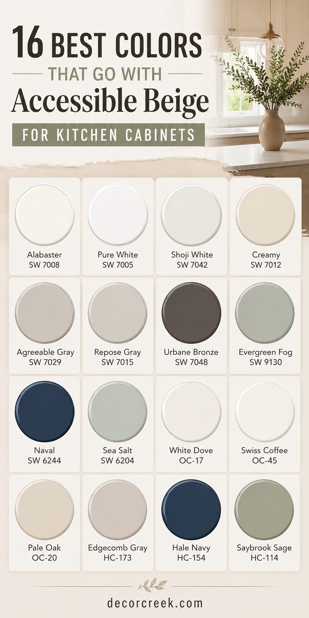
16 Best Colors that goes with Accessible Beige for Kitchen Cabinets
Alabaster SW 7008
Alabaster SW 7008 is one of my favorite cabinet colors beside Accessible Beige because it feels warm without looking too creamy. I love using it in kitchens where homeowners want brightness but still want the room to feel comfortable and welcoming. The soft white tone helps beige walls feel cleaner and lighter during the day.
Natural wood floors look beautiful beside this pairing because both colors share gentle warmth. Black hardware also stands out beautifully against these cabinets without feeling harsh. I often use this color in family kitchens where people gather every day because it creates such an easy feeling.
It also works nicely with marble counters and warm brass lighting. In smaller kitchens, this shade can help the room feel larger without looking cold. I have noticed that it keeps its softness even under strong overhead lighting. Homeowners usually tell me their kitchens feel happier and fresher after using this combination.
Best used in: living rooms, kitchens, hallways, bedrooms, and farmhouse exteriors
Pairs well with: Iron Ore SW 7069, Agreeable Gray SW 7029, Natural Linen SW 9109, warm wood tones
The key rule of this color for farmhouse style is to use it where you want natural light to feel kind, soft, and inviting throughout the day.
🎨 Check out the complete guide to this color right HERE 👈

Pure White SW 7005
Pure White SW 7005 works beautifully with Accessible Beige when I want a kitchen to feel clean and fresh without becoming stark. I often choose it for cabinets in homes that already have warm beige walls and creamy stone counters.
The color has a crisp feeling, but it still carries enough softness to keep the room welcoming. Stainless steel appliances look polished beside this shade, which makes kitchens feel more current and bright. I also love how easy it is to decorate around this white because almost every wood tone works with it.
Large windows make the color glow gently throughout the day. Dark island colors like navy or charcoal become even more eye-catching beside it. Families who cook often usually enjoy how light and open the room feels with this pairing. I find this color especially useful in kitchens that need a little more energy and brightness. It creates balance without stealing attention from the rest of the room.
Best used in: kitchens, trim, laundry rooms, breakfast areas, and open floor plans
Pairs well with: Accessible Beige SW 7036, Naval SW 6244, Iron Ore SW 7069, warm oak flooring
The key rule of this color for farmhouse style is to use it where you want brightness to feel welcoming instead of cold or sharp.
🎨 Check out the complete guide to this color right HERE 👈

Shoji White SW 7042
Shoji White SW 7042 is one of the softest cabinet colors I use with Accessible Beige because it carries a gentle creamy warmth. I often recommend it to homeowners who want their kitchens to feel relaxed and comfortable every single day.
The color looks beautiful beside warm beige walls because the undertones blend naturally together. It works especially well in homes with warm wood beams or rustic flooring. I have noticed this pairing feels rich without trying too hard. Brass hardware and woven textures look beautiful with these tones.
In evening light, the cabinets feel cozy and welcoming instead of bright white. This color also hides fingerprints and daily wear better than cooler whites, which many families appreciate. I love using it in kitchens connected to dining rooms because it creates a smooth flow. The overall feeling becomes warm, gentle, and easy to live with.
Best used in: kitchens, dining rooms, mudrooms, breakfast nooks, and cottage-style homes
Pairs well with: Accessible Beige SW 7036, Natural Linen SW 9109, Pewter Green SW 6208, warm brass finishes
The key rule of this color for farmhouse style is to use it where you want warmth and softness to feel natural from morning until night.
🎨 Check out the complete guide to this color right HERE 👈

Creamy SW 7012
Creamy SW 7012 is perfect when I want Accessible Beige to feel richer and more welcoming in a kitchen. I often use this pairing in homes where people want warmth without strong yellow tones taking over the room.
The creamy cabinets create a soft glow that makes kitchens feel friendly and lived in. I especially love this combination with warm wood floors and open shelving. It feels classic without looking old-fashioned. Sunlight brings out a gentle richness in the cabinets that makes the whole room feel cheerful.
I also find this color forgiving in busy kitchens because it hides little marks better than bright whites. Black pendants and darker islands look striking against this creamy backdrop. Homeowners who enjoy baking and family dinners usually fall in love with this look quickly. It creates a kitchen that feels comforting the moment you walk in.
Best used in: kitchens, pantries, family rooms, breakfast areas, and traditional homes
Pairs well with: Accessible Beige SW 7036, Urbane Bronze SW 7048, Sea Salt SW 6204, natural wood tones
The key rule of this color for farmhouse style is to use it where warmth should feel soft, welcoming, and full of life every day.
🎨 Check out the complete guide to this color right HERE 👈

Agreeable Gray SW 7029
Agreeable Gray SW 7029 is one of the safest and most beautiful cabinet colors I use beside Accessible Beige because the tones blend so naturally together. I often recommend this pairing to homeowners who want their kitchens to feel warm and balanced without strong contrast.
The soft gray-beige mix keeps the room feeling light while still adding depth. I love using this color in open floor plans where kitchens connect to living rooms because it creates an easy flow from one area to another. Matte black hardware looks especially stylish against these cabinets.
Warm white counters and oak floors also work beautifully with this combination. During the day, the color feels fresh and welcoming instead of heavy. In evening lighting, it becomes richer and more comforting. Families who want a kitchen that still feels current years later usually love this shade. It gives the room a peaceful and grounded feeling without making the cabinets disappear.
Best used in: kitchens, open floor plans, family homes, hallways, and dining rooms
Pairs well with: Accessible Beige SW 7036, Alabaster SW 7008, Iron Ore SW 7069, warm oak flooring
The key rule of this color for farmhouse style is to use it where you want softness and warmth to feel balanced all day long.
🎨 Check out the complete guide to this color right HERE 👈

Repose Gray SW 7015
Repose Gray SW 7015 works beautifully with Accessible Beige when I want a kitchen to feel a little cleaner and more modern. I like using this color in homes with lots of natural light because it helps the cabinets feel bright without turning cold.
The soft gray undertones create a gentle contrast beside the warmth of Accessible Beige walls. White subway tile and brushed nickel hardware look especially polished with this pairing. I often choose this shade for homeowners who feel nervous about darker cabinet colors but still want something more interesting than plain white.
The overall feeling stays comfortable and easy to decorate around. It also pairs nicely with marble counters and light wood flooring. I have noticed that it photographs beautifully, which many homeowners appreciate when sharing their homes online. The color keeps kitchens feeling fresh through every season. It creates a clean and welcoming kitchen without looking too sharp.
Best used in: kitchens, laundry rooms, mudrooms, condos, and transitional homes
Pairs well with: Accessible Beige SW 7036, Pure White SW 7005, Naval SW 6244, brushed nickel finishes
The key rule of this color for farmhouse style is to use it where you want brightness and softness to work together naturally.
🎨 Check out the complete guide to this color right HERE 👈

Urbane Bronze SW 7048
Urbane Bronze SW 7048 is one of my favorite dramatic cabinet colors beside Accessible Beige because it adds depth without feeling too dark or harsh. I often use it on kitchen islands or lower cabinets when homeowners want a richer and more custom look.
The warm brown undertones connect beautifully with Accessible Beige walls, creating a grounded and cozy feeling. Brass hardware looks stunning against this deep shade. I especially love this color in kitchens with warm wood accents and creamy counters. In sunlight, the cabinets show beautiful softness instead of looking flat black.
At night, the kitchen feels warm and inviting for dinners and family gatherings. This pairing works well in both modern and farmhouse homes because it feels stylish but still comfortable. I have found that homeowners quickly fall in love with how rich and expensive the room feels afterward. The contrast adds personality while still keeping the kitchen welcoming.
Best used in: kitchen islands, lower cabinets, dining rooms, mudrooms, and farmhouse kitchens
Pairs well with: Accessible Beige SW 7036, Creamy SW 7012, Natural Linen SW 9109, brass finishes
The key rule of this color for farmhouse style is to use it where you want warmth and depth to feel rich but still welcoming.
🎨 Check out the complete guide to this color right HERE 👈

Evergreen Fog SW 9130
Evergreen Fog SW 9130 brings a soft earthy green touch that works beautifully with Accessible Beige in kitchens. I love using this color for cabinets when homeowners want something different from white or gray but still easy to live with every day.
The muted green tone feels natural beside warm beige walls and wood flooring. It reminds me of peaceful mornings and fresh air without becoming too colorful or loud. Gold hardware looks beautiful against these cabinets and adds extra warmth.
I often pair this shade with creamy counters and handmade tile backsplashes for a relaxed kitchen feeling. Natural sunlight helps the green feel soft and welcoming throughout the day. In darker kitchens, it adds depth without making the room feel small. Homeowners who enjoy earthy and organic design styles usually love this pairing instantly. The kitchen feels warm, fresh, and full of personality.
Best used in: kitchens, islands, breakfast areas, cottages, and farmhouse homes
Pairs well with: Accessible Beige SW 7036, Shoji White SW 7042, Dried Thyme SW 6186, warm wood finishes
The key rule of this color for farmhouse style is to use it where earthy warmth should feel welcoming and relaxed every day.
🎨 Check out the complete guide to this color right HERE 👈

Naval SW 6244
Naval SW 6244 creates one of the boldest and most beautiful contrasts with Accessible Beige that I use in kitchens. I often choose this rich navy shade for islands or full cabinet sets in homes that need more depth and character.
The dark blue color makes beige walls feel warmer and brighter at the same time. Brass hardware and marble counters look especially rich with this combination. I love how the navy changes throughout the day depending on the lighting. In sunlight it feels classic and polished, while evening lighting makes it feel cozy and dramatic.
This pairing works especially well in larger kitchens with tall ceilings or open layouts. Homeowners who want a kitchen that feels stylish for years usually feel very happy with this color. It also pairs beautifully with warm oak floors and woven textures. The result feels bold but still welcoming enough for daily life.
Best used in: kitchen islands, large kitchens, dining rooms, open layouts, and modern farmhouse homes
Pairs well with: Accessible Beige SW 7036, Pure White SW 7005, Alabaster SW 7008, brass accents
The key rule of this color for farmhouse style is to use it where strong contrast should still feel warm and inviting.
🎨 Check out the complete guide to this color right HERE 👈

Sea Salt SW 6204
Sea Salt SW 6204 is one of the softest colors I pair with Accessible Beige because it adds a light green-blue touch without feeling cold. I often use it in kitchens where homeowners want a relaxed and airy feeling.
The color works beautifully beside beige walls because both shades carry gentle warmth underneath. White trim and natural wood shelves look especially beautiful with this combination. I love how sunlight brings out different sides of the color during the day. Sometimes it feels slightly green, while other times it leans more blue.
This makes the kitchen feel interesting without becoming busy. Families who enjoy simple and comfortable homes usually feel very connected to this shade. It also works nicely in kitchens near windows or garden views because it feels fresh and natural. The overall feeling becomes welcoming, soft, and easy to enjoy every day.
Best used in: kitchens, bathrooms, breakfast nooks, beach homes, and cottage interiors
Pairs well with: Accessible Beige SW 7036, Creamy SW 7012, Natural Linen SW 9109, white oak finishes
The key rule of this color for farmhouse style is to use it where light and softness should feel fresh but still warm.
🎨 Check out the complete guide to this color right HERE 👈

White Dove OC-17
White Dove OC-17 is one of the most trusted white cabinet colors I use with Accessible Beige because it feels soft and welcoming instead of sharp. I often recommend this shade for kitchens where homeowners want brightness without losing warmth.
The creamy undertones blend naturally beside Accessible Beige walls and help the whole kitchen feel connected. I especially love this pairing with warm wood floors and brushed brass hardware. The cabinets keep their softness even in strong daylight, which many bright whites cannot do.
In evening lighting, the room feels warm and inviting for family dinners and gatherings. This shade also works beautifully with marble counters and handmade tiles. I have used this combination in both modern and traditional homes, and it always feels comfortable. Homeowners usually tell me the kitchen feels lighter and happier after painting with this color. It creates a clean look without making the room feel cold.
Best used in: kitchens, family homes, dining rooms, open layouts, and traditional interiors
Pairs well with: Accessible Beige SW 7036, Hale Navy HC-154, Edgecomb Gray HC-173, warm brass finishes
The key rule of this color for farmhouse style is to use it where brightness should feel warm, soft, and welcoming every day.
🎨 Check out the complete guide to this color right HERE 👈

Swiss Coffee OC-45
Swiss Coffee OC-45 is a creamy white that pairs beautifully with Accessible Beige when I want kitchens to feel extra warm and welcoming. I love using this shade in homes with rustic details, wood beams, or vintage touches because it feels rich and comfortable.
The creamy undertones connect naturally with beige walls, creating a kitchen that feels layered and cozy. I often pair this color with warm stone counters and aged brass hardware for extra character. Natural sunlight gives the cabinets a soft glowing look throughout the day.
In darker kitchens, the warmth helps the room feel brighter without becoming stark white. Homeowners who enjoy gathering with family and friends usually love the inviting feeling this pairing creates. It also works beautifully with woven textures and natural wood finishes. I find this shade especially helpful in kitchens that need warmth and softness together. The result feels welcoming and full of charm.
Best used in: kitchens, farmhouse homes, breakfast rooms, cottages, and family gathering areas
Pairs well with: Accessible Beige SW 7036, Urbane Bronze SW 7048, Pewter Green SW 6208, warm oak flooring
The key rule of this color for farmhouse style is to use it where creamy warmth should feel rich and welcoming throughout the day.
🎨 Check out the complete guide to this color right HERE 👈

Pale Oak OC-20
Pale Oak OC-20 creates a soft and airy kitchen feeling beside Accessible Beige that many homeowners instantly love. I often use this shade for cabinets in homes where people want a light neutral look without plain white cabinets.
The gentle gray-beige undertones blend smoothly with Accessible Beige walls and help the room feel balanced. I especially love this pairing with light wood floors and soft linen textures. Chrome and brushed nickel hardware also work beautifully here. During the day, the cabinets feel fresh and bright without looking too cool.
Evening lighting brings out more warmth, which helps the kitchen stay welcoming and comfortable. This shade works especially well in open kitchens connected to living rooms because it keeps everything flowing naturally. I have noticed that homeowners feel relaxed in kitchens painted this color combination. The overall feeling stays soft, fresh, and easy to decorate around.
Best used in: kitchens, condos, open floor plans, hallways, and modern traditional homes
Pairs well with: Accessible Beige SW 7036, White Dove OC-17, Kendall Charcoal HC-166, light wood tones
The key rule of this color for farmhouse style is to use it where softness and brightness should feel natural and comfortable together.
🎨 Check out the complete guide to this color right HERE 👈

Edgecomb Gray HC-173
Edgecomb Gray HC-173 is one of my favorite warm gray cabinet colors beside Accessible Beige because the pairing feels balanced and relaxed. I often recommend this shade to homeowners who want more depth than white cabinets but still want a light kitchen.
The warm undertones help the cabinets connect naturally with beige walls and wood flooring. I love using black hardware with this color because it adds contrast without feeling harsh. Sunlight makes the cabinets feel soft and warm throughout the day.
In evening lighting, the room feels grounded and cozy for family dinners. This color also works beautifully with white quartz counters and simple backsplashes. I have found that it fits many design styles, from farmhouse homes to more modern interiors. Homeowners usually appreciate how easy it is to decorate around this shade later. The kitchen feels welcoming, balanced, and comfortable for everyday life.
Best used in: kitchens, family homes, mudrooms, open layouts, and transitional interiors
Pairs well with: Accessible Beige SW 7036, Alabaster SW 7008, Iron Ore SW 7069, natural wood accents
The key rule of this color for farmhouse style is to use it where warmth and softness should feel grounded and welcoming.
🎨 Check out the complete guide to this color right HERE 👈

Hale Navy HC-154
Hale Navy HC-154 creates a rich and dramatic kitchen look beside Accessible Beige that always feels stylish and inviting. I love using this color for islands or full cabinet sets in larger kitchens with good natural light. The deep navy tone makes beige walls appear warmer and brighter at the same time.
Brass hardware looks especially beautiful against these dark cabinets. I often pair this shade with creamy counters and warm wood flooring for balance. During the day, the navy feels rich and polished. At night, it creates a cozy and elegant feeling perfect for gatherings and dinners.
Homeowners who want strong contrast without black cabinets usually love this shade immediately. It also works beautifully with woven textures and soft lighting. The result feels bold, welcoming, and full of personality without becoming too heavy.
Best used in: kitchen islands, dining rooms, large kitchens, modern farmhouse homes, and open layouts
Pairs well with: Accessible Beige SW 7036, White Dove OC-17, Swiss Coffee OC-45, brass accents
The key rule of this color for farmhouse style is to use it where deep contrast should still feel warm and comfortable every day.
🎨 Check out the complete guide to this color right HERE 👈

Saybrook Sage HC-114
Saybrook Sage HC-114 brings a soft earthy green feeling that works beautifully with Accessible Beige in kitchens. I often choose this shade for homeowners who want color but still want their kitchen to feel warm and welcoming. The muted sage tone pairs naturally with beige walls and wood textures.
I especially love using this combination in homes with natural stone counters and rustic details. Gold hardware adds extra warmth and charm against these cabinets. Sunlight helps the green feel soft and fresh throughout the day. In evening lighting, the room feels cozy and grounded for family meals and quiet mornings.
This shade also works beautifully with woven baskets and handmade tile backsplashes. Homeowners who enjoy nature-inspired interiors usually feel very connected to this color. The kitchen feels relaxed, welcoming, and full of gentle character.
Best used in: kitchens, cottages, farmhouse interiors, breakfast rooms, and family homes
Pairs well with: Accessible Beige SW 7036, Shoji White SW 7042, Dried Thyme SW 6186, warm wood finishes
The key rule of this color for farmhouse style is to use it where earthy color should feel soft, welcoming, and easy to live with every day.
🎨 Check out the complete guide to this color right HERE 👈

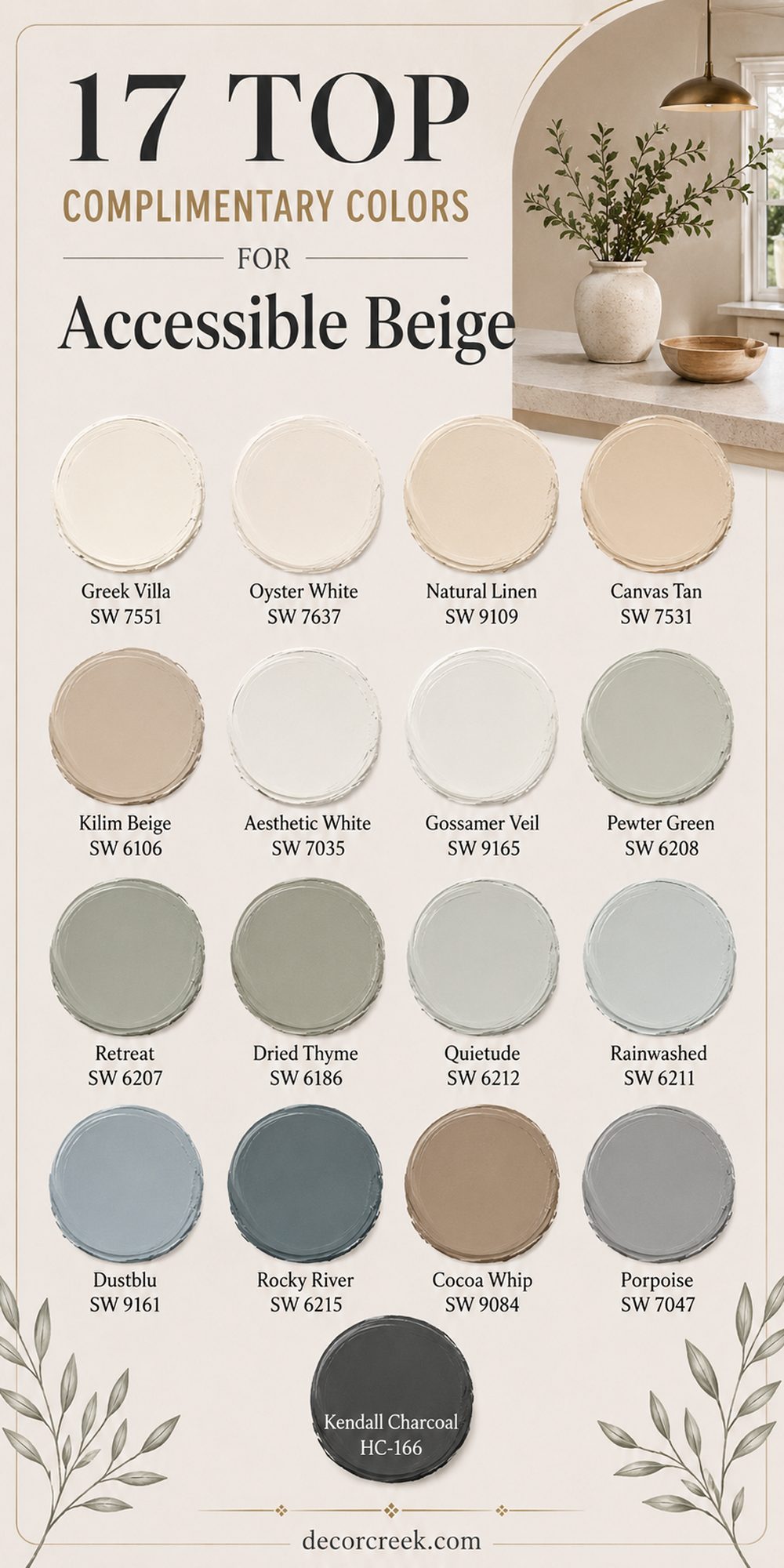
17 Top Complimentary Colors for Accessible Beige
Greek Villa SW 7551
Greek Villa SW 7551 is one of the prettiest whites I pair with Accessible Beige because it feels bright while still keeping warmth in the room. I often use this color on trim, walls, or nearby rooms when homeowners want their homes to feel lighter and more welcoming.
The creamy white tone helps Accessible Beige feel softer and cleaner without making the home look too yellow. I especially love this combination in living rooms with lots of sunlight because the colors glow beautifully together during the day.
Wood floors and woven textures also look beautiful beside these tones. Black window frames create a stunning contrast without making the room feel too sharp. I have noticed that homes painted with this pairing often feel fresh but still comfortable enough for daily life. It works nicely in both modern and farmhouse interiors. Families usually love how peaceful and welcoming the overall feeling becomes. The pairing feels simple, warm, and very easy to decorate around.
Best used in: living rooms, kitchens, trim, bedrooms, and open floor plans
Pairs well with: Accessible Beige SW 7036, Iron Ore SW 7069, Natural Linen SW 9109, warm oak flooring
The key rule of this color for farmhouse style is to use it where brightness should feel warm and welcoming instead of cold.
🎨 Check out the complete guide to this color right HERE 👈

Oyster White SW 7637
Oyster White SW 7637 is a soft off-white that works beautifully with Accessible Beige because both colors carry gentle earthy warmth. I often use this pairing in homes where people want a layered neutral look without strong contrast. The color feels creamy but still light enough to brighten darker rooms.
I especially love it in hallways and living rooms connected to kitchens because it helps the whole home feel connected. Natural linen fabrics and warm wood tones look stunning beside these shades. Sunlight brings out a soft richness that makes rooms feel welcoming all day long.
In evening lighting, the colors feel cozy and comfortable instead of flat. I also find this shade helpful in homes with stone fireplaces or rustic details because it blends naturally with those textures. Homeowners usually say their homes feel softer and more relaxed after using this pairing. The overall feeling becomes warm, inviting, and easy to live with.
Best used in: living rooms, hallways, kitchens, family rooms, and farmhouse interiors
Pairs well with: Accessible Beige SW 7036, Pewter Green SW 6208, Canvas Tan SW 7531, warm brass accents
The key rule of this color for farmhouse style is to use it where soft warmth should feel natural throughout the day.
🎨 Check out the complete guide to this color right HERE 👈

Natural Linen SW 9109
Natural Linen SW 9109 is one of my favorite warm neutrals beside Accessible Beige because it adds richness without feeling heavy. I often recommend this color for walls or nearby rooms when homeowners want their homes to feel warm and welcoming.
The soft beige undertones connect beautifully with Accessible Beige and create a layered look that feels comfortable. I especially love this pairing with warm wood furniture and creamy textiles. In sunlight, the colors feel bright and cheerful without becoming yellow.
During the evening, the rooms feel cozy and relaxing for family time. I have found this shade especially useful in homes with open floor plans because it helps everything flow naturally together. It also pairs beautifully with black accents and natural stone details. Homeowners who want soft neutral homes usually fall in love with this combination quickly. The overall feeling becomes warm, balanced, and welcoming.
Best used in: living rooms, bedrooms, dining rooms, hallways, and open layouts
Pairs well with: Accessible Beige SW 7036, Greek Villa SW 7551, Urbane Bronze SW 7048, natural wood finishes
The key rule of this color for farmhouse style is to use it where warmth should feel soft and welcoming without becoming too dark.
🎨 Check out the complete guide to this color right HERE 👈

Canvas Tan SW 7531
Canvas Tan SW 7531 works beautifully with Accessible Beige because both shades share warm earthy undertones that feel comfortable together. I often use this color in nearby rooms when homeowners want a gentle neutral flow throughout the home.
The slightly deeper beige tone adds warmth while still keeping rooms feeling light and welcoming. I especially love this combination with wood flooring and woven textures because the colors feel natural together. Sunlight gives the walls a soft golden warmth during the day.
In evening lighting, the pairing feels rich and comforting for family gatherings. I have noticed this shade works especially well in homes with traditional or farmhouse details. Dark bronze hardware and rustic wood beams also look stunning beside these colors. Families who want cozy homes without dark walls usually enjoy this pairing very much. The overall feeling becomes grounded, warm, and welcoming every day.
Best used in: living rooms, family rooms, kitchens, dining rooms, and farmhouse homes
Pairs well with: Accessible Beige SW 7036, Oyster White SW 7637, Porpoise SW 7047, warm wood tones
The key rule of this color for farmhouse style is to use it where earthy warmth should feel comfortable and inviting.
🎨 Check out the complete guide to this color right HERE 👈

Kilim Beige SW 6106
Kilim Beige SW 6106 is a richer beige that pairs naturally with Accessible Beige when I want homes to feel extra warm and layered. I often use this shade in dining rooms or nearby living areas because it creates depth without making rooms feel too dark.
The warm undertones blend beautifully together and help homes feel connected from one room to another. I especially love this combination with dark wood furniture and soft cream fabrics. Natural sunlight keeps the color feeling lively and welcoming during the day. At night, the warmth becomes deeper and more comforting.
I have found that homeowners who enjoy cozy traditional interiors usually feel very happy with this pairing. Black accents and bronze lighting also look beautiful with these tones. The overall feeling becomes rich, welcoming, and full of warmth for everyday life. It creates a home that feels comforting the moment people walk inside.
Best used in: dining rooms, living rooms, hallways, traditional homes, and family spaces
Pairs well with: Accessible Beige SW 7036, Creamy SW 7012, Urbane Bronze SW 7048, dark wood finishes
The key rule of this color for farmhouse style is to use it where warmth and comfort should feel rich but still welcoming.
🎨 Check out the complete guide to this color right HERE 👈

Aesthetic White SW 7035
Aesthetic White SW 7035 is a soft warm white that works beautifully with Accessible Beige because it keeps rooms feeling bright without looking stark. I often use this color for trim, walls, or nearby bedrooms where homeowners want softness instead of sharp contrast.
The gentle greige undertones blend naturally beside Accessible Beige and help homes feel calm and balanced. I especially love this pairing in homes with large windows and natural textures. Warm oak floors and linen curtains look beautiful with these colors.
During the day, the rooms feel fresh and airy. In evening lighting, the warmth becomes softer and more relaxing. I have noticed that this shade helps smaller rooms feel larger without losing comfort. Homeowners usually appreciate how easy these colors are to decorate around later. The result feels clean, welcoming, and full of warmth.
Best used in: bedrooms, living rooms, hallways, open layouts, and transitional homes
Pairs well with: Accessible Beige SW 7036, Repose Gray SW 7015, Pewter Green SW 6208, warm oak tones
The key rule of this color for farmhouse style is to use it where softness and brightness should feel natural together.
🎨 Check out the complete guide to this color right HERE 👈

Gossamer Veil SW 9165
Gossamer Veil SW 9165 creates a beautiful soft greige look beside Accessible Beige that feels warm and polished at the same time. I often recommend this shade when homeowners want something slightly cooler without making the home feel cold.
The gray-beige undertones blend smoothly with Accessible Beige and create a balanced layered look. I especially love using this color in open floor plans because it helps rooms connect naturally. White trim and black lighting fixtures look especially beautiful beside these shades.
Sunlight makes the walls feel soft and fresh throughout the day. In evening lighting, the warmth gently appears and keeps the room welcoming. I also find this color helpful in homes with modern furniture because it feels clean but still comfortable. Families who want a neutral home that feels updated usually love this pairing. The overall feeling becomes soft, balanced, and easy to enjoy every day.
Best used in: living rooms, hallways, offices, open floor plans, and modern farmhouse homes
Pairs well with: Accessible Beige SW 7036, Pure White SW 7005, Kendall Charcoal HC-166, brushed nickel finishes
The key rule of this color for farmhouse style is to use it where softness and warmth should feel balanced and welcoming.
🎨 Check out the complete guide to this color right HERE 👈

Pewter Green SW 6208
Pewter Green SW 6208 is one of my favorite earthy greens to pair with Accessible Beige because it adds depth and richness without feeling too dark. I often use this color on cabinets, accent walls, or nearby dining rooms when homeowners want natural warmth in their homes.
The muted green tone looks beautiful beside beige walls and warm wood finishes. Brass hardware and woven textures become even more beautiful with this combination. During the day, the green feels soft and organic. At night, it creates a cozy and welcoming feeling for family gatherings.
I especially love this pairing in farmhouse homes because it feels relaxed and grounded. Stone fireplaces and natural fabrics also work beautifully with these tones. Homeowners who enjoy earthy interiors usually connect with this color very quickly. The result feels warm, layered, and full of character.
Best used in: kitchens, dining rooms, mudrooms, farmhouse interiors, and family rooms
Pairs well with: Accessible Beige SW 7036, Oyster White SW 7637, Natural Linen SW 9109, brass accents
The key rule of this color for farmhouse style is to use it where earthy richness should feel warm and welcoming every day.
🎨 Check out the complete guide to this color right HERE 👈

Retreat SW 6207
Retreat SW 6207 brings a deeper green-gray tone that pairs beautifully with Accessible Beige when I want more depth and contrast. I often recommend this shade for accent walls, built-ins, or dining rooms because it feels rich without becoming too heavy.
The earthy undertones connect naturally with Accessible Beige and create a grounded feeling in the home. Warm wood furniture looks especially beautiful beside these colors. Natural sunlight softens the green during the day, while evening lighting makes it feel cozy and rich.
I also love this pairing with black window frames and brass lighting. It works beautifully in homes that want warmth but still need stronger color contrast. Families usually enjoy how comforting and welcoming the rooms feel afterward. I have found that this shade adds personality while still keeping the home relaxed. The overall feeling becomes rich, earthy, and inviting.
Best used in: dining rooms, offices, kitchens, accent walls, and farmhouse interiors
Pairs well with: Accessible Beige SW 7036, Creamy SW 7012, Iron Ore SW 7069, warm walnut wood
The key rule of this color for farmhouse style is to use it where deeper earthy tones should still feel welcoming and comfortable.
🎨 Check out the complete guide to this color right HERE 👈

Dried Thyme SW 6186
Dried Thyme SW 6186 is one of the richest earthy greens I pair with Accessible Beige because it adds warmth and depth without making rooms feel too dark. I often use this color in dining rooms, offices, and built-ins where homeowners want a cozy and welcoming feeling.
The muted olive undertones blend beautifully with beige walls and natural wood finishes. I especially love this pairing with brass lighting and woven textures because everything feels grounded together. During the day, sunlight softens the green and gives it a gentle warmth.
In the evening, the room feels comforting and full of character for family dinners and quiet nights at home. I have noticed that this color works especially well in farmhouse and rustic interiors. Stone fireplaces and vintage furniture also look beautiful beside these tones. Homeowners usually tell me the room feels richer and more inviting afterward. The overall feeling becomes warm, earthy, and relaxed every day.
Best used in: dining rooms, offices, built-ins, kitchens, and farmhouse interiors
Pairs well with: Accessible Beige SW 7036, Oyster White SW 7637, Natural Linen SW 9109, warm walnut finishes
The key rule of this color for farmhouse style is to use it where earthy warmth should feel rich and welcoming throughout the day.
🎨 Check out the complete guide to this color right HERE 👈

Quietude SW 6212
Quietude SW 6212 creates a soft blue-green look beside Accessible Beige that feels fresh while still keeping warmth in the room. I often recommend this color for bedrooms, bathrooms, and nearby sitting areas where homeowners want a gentle and welcoming atmosphere.
The muted undertones blend naturally with Accessible Beige and help rooms feel balanced instead of too colorful. I especially love this pairing with white trim and light wood furniture. Sunlight makes the color feel airy and fresh during the day.
In evening lighting, the softness becomes warmer and more comforting. I also find this shade beautiful in homes near water or gardens because it connects naturally with outdoor views. Families who enjoy light and relaxed interiors usually love this combination quickly. The room feels brighter without losing warmth or comfort. The overall feeling becomes soft, welcoming, and easy to enjoy every day.
Best used in: bedrooms, bathrooms, sitting rooms, beach homes, and cottage interiors
Pairs well with: Accessible Beige SW 7036, Greek Villa SW 7551, Sea Salt SW 6204, light oak finishes
The key rule of this color for farmhouse style is to use it where softness and freshness should still feel warm and welcoming.
🎨 Check out the complete guide to this color right HERE 👈

Rainwashed SW 6211
Rainwashed SW 6211 is one of the prettiest soft blue-green colors I use with Accessible Beige because it brings a fresh feeling without becoming too bright. I often choose this shade for bathrooms, bedrooms, and laundry rooms where homeowners want light color but still need warmth.
The gentle undertones blend beautifully beside beige walls and creamy whites. I especially love using this pairing with woven baskets, soft linen fabrics, and natural wood textures. During the day, sunlight makes the room feel fresh and cheerful. In the evening, the softness helps the room feel welcoming and comfortable.
I have noticed this color works especially well in smaller rooms because it keeps them feeling open and light. White trim and brushed nickel hardware also look beautiful with this combination. Homeowners usually feel relaxed and happy in rooms painted with these colors. The result feels fresh, gentle, and welcoming for daily life.
Best used in: bathrooms, bedrooms, laundry rooms, beach homes, and guest rooms
Pairs well with: Accessible Beige SW 7036, Pure White SW 7005, Natural Linen SW 9109, brushed nickel finishes
The key rule of this color for farmhouse style is to use it where fresh color should still feel soft and welcoming every day.
🎨 Check out the complete guide to this color right HERE 👈

Dustblu SW 9161
Dustblu SW 9161 brings a muted blue tone that pairs beautifully with Accessible Beige when I want homes to feel soft and slightly moody. I often recommend this shade for bedrooms, accent walls, or built-ins because it adds color without feeling too bold.
The dusty undertones help the blue connect naturally with warm beige walls. I especially love this pairing with warm wood furniture and creamy fabrics. During the day, the blue feels soft and relaxed. In evening lighting, the room becomes cozy and comforting without feeling dark.
I have found that this color works beautifully in homes with modern farmhouse style because it feels stylish but still easy to live with. Brass accents and soft lighting also look stunning beside these tones. Families who want gentle color instead of plain neutrals usually love this combination. The overall feeling becomes warm, soft, and welcoming.
Best used in: bedrooms, offices, accent walls, built-ins, and farmhouse interiors
Pairs well with: Accessible Beige SW 7036, Alabaster SW 7008, Pewter Green SW 6208, warm wood tones
The key rule of this color for farmhouse style is to use it where muted color should feel soft and comfortable throughout the day.
🎨 Check out the complete guide to this color right HERE 👈

Rocky River SW 6215
Rocky River SW 6215 is a deep green-blue color that creates beautiful contrast beside Accessible Beige without feeling too cold. I often use this shade in offices, dining rooms, and built-ins where homeowners want stronger color and personality.
The earthy undertones help the darker color feel grounded beside beige walls. I especially love this pairing with warm walnut wood and aged brass finishes. Natural sunlight softens the color during the day and shows more of its rich green side.
At night, the room feels cozy and welcoming for gatherings and quiet evenings. I have noticed that this shade works beautifully in homes with rustic or vintage details. It also pairs nicely with stone fireplaces and textured fabrics. Homeowners who want deeper color without black walls usually enjoy this combination very much. The overall feeling becomes rich, earthy, and full of character.
Best used in: offices, dining rooms, built-ins, accent walls, and rustic farmhouse homes
Pairs well with: Accessible Beige SW 7036, Oyster White SW 7637, Iron Ore SW 7069, walnut wood finishes
The key rule of this color for farmhouse style is to use it where deeper earthy color should still feel warm and inviting.
Cocoa Whip SW 9084
Cocoa Whip SW 9084 is a soft warm neutral that works beautifully with Accessible Beige because the tones feel creamy and layered together. I often use this shade in bedrooms, living rooms, and nearby hallways where homeowners want extra warmth without dark walls.
The gentle beige undertones create a welcoming feeling that feels very comfortable for everyday life. I especially love this combination with warm linen fabrics and natural wood flooring. Sunlight gives the walls a soft golden warmth during the day. In evening lighting, the room feels cozy and relaxing for family time.
I have found this color especially useful in homes that need softness instead of sharp contrast. Bronze lighting and woven textures also look beautiful with these tones. Families who enjoy warm neutral interiors usually feel connected to this pairing quickly. The overall feeling becomes creamy, soft, and welcoming.
Best used in: bedrooms, living rooms, hallways, family rooms, and cozy interiors
Pairs well with: Accessible Beige SW 7036, Creamy SW 7012, Porpoise SW 7047, warm oak finishes
The key rule of this color for farmhouse style is to use it where warm neutrals should feel soft and comfortable every day.
🎨 Check out the complete guide to this color right HERE 👈

Porpoise SW 7047
Porpoise SW 7047 creates a rich brown-gray contrast beside Accessible Beige that feels grounded and stylish at the same time. I often recommend this shade for accent walls, kitchen islands, or nearby offices where homeowners want stronger depth in the home.
The warm undertones blend naturally with Accessible Beige and keep the darker color from feeling harsh. I especially love this pairing with brass hardware and warm wood furniture. During the day, the color feels deep and polished. At night, it becomes cozy and welcoming for relaxing evenings at home.
I have noticed this shade works beautifully in farmhouse and modern interiors because it feels balanced and easy to decorate around. White trim also stands out beautifully beside these colors. Homeowners usually love how rich and comfortable the room feels afterward. The overall feeling becomes warm, grounded, and full of character.
Best used in: offices, accent walls, kitchen islands, dining rooms, and modern farmhouse homes
Pairs well with: Accessible Beige SW 7036, Natural Linen SW 9109, Alabaster SW 7008, brass finishes
The key rule of this color for farmhouse style is to use it where darker warmth should feel welcoming instead of heavy.
🎨 Check out the complete guide to this color right HERE 👈

Kendall Charcoal HC-166
Kendall Charcoal HC-166 is one of my favorite dark neutral colors beside Accessible Beige because it creates beautiful contrast while still feeling warm. I often use this shade for built-ins, exterior accents, fireplaces, and kitchen islands when homeowners want bold depth in their homes.
The charcoal tone carries soft warmth underneath, which helps it blend naturally beside beige walls. I especially love this combination with creamy whites and warm wood textures. Sunlight keeps the charcoal feeling rich and polished during the day. In evening lighting, the room feels cozy and dramatic without becoming too dark.
I have found this color especially useful in homes that need stronger definition and structure. Black hardware and stone details also look stunning beside these tones. Homeowners who want bold contrast without pure black usually love this pairing quickly. The overall feeling becomes rich, balanced, and welcoming every day.
Best used in: kitchen islands, fireplaces, built-ins, exteriors, and modern farmhouse interiors
Pairs well with: Accessible Beige SW 7036, White Dove OC-17, Pale Oak OC-20, warm walnut finishes
The key rule of this color for farmhouse style is to use it where strong contrast should still feel warm and inviting.
🎨 Check out the complete guide to this color right HERE 👈

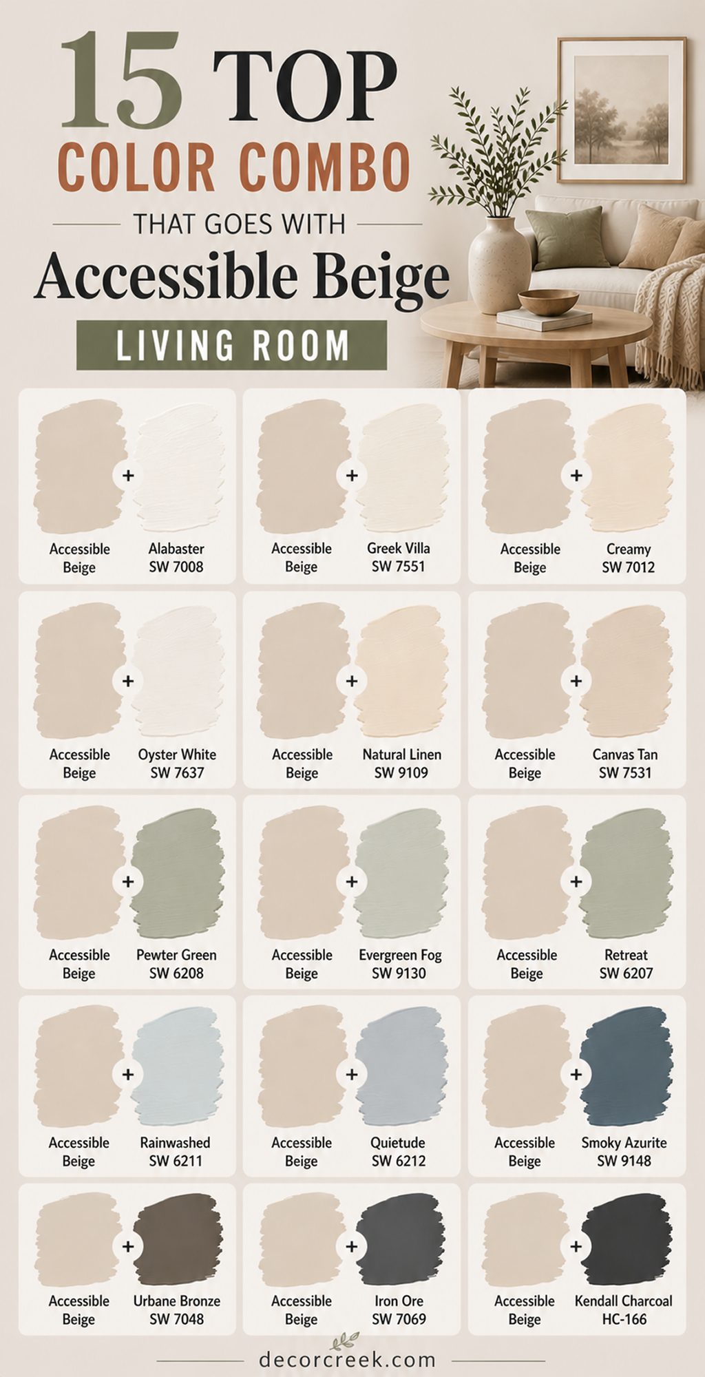
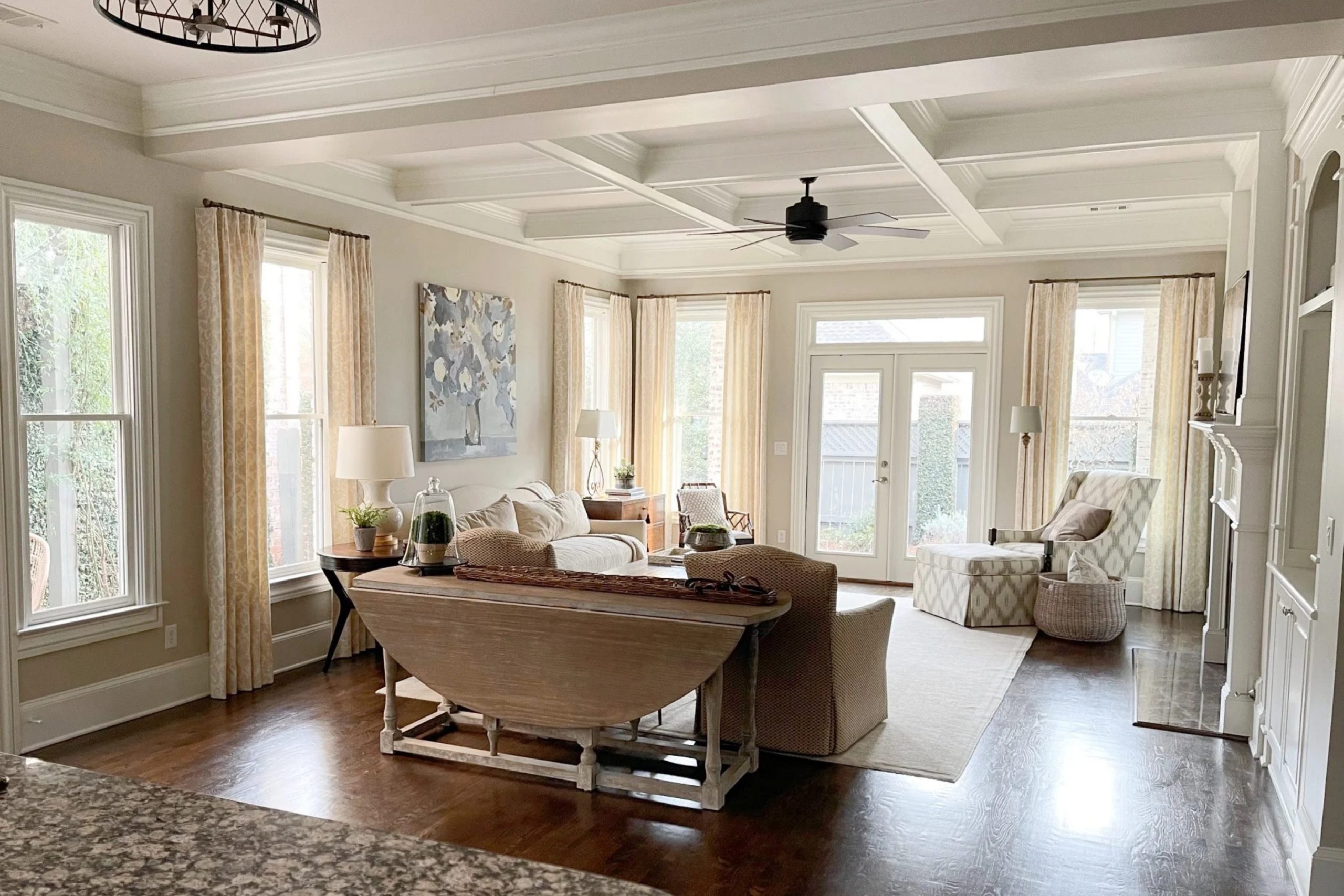
15 Top Color Combo that goes with Accessible Beige Living Room
Accessible Beige + Alabaster SW 7008
Accessible Beige + Alabaster SW 7008 is one of the most welcoming living room combinations I use because it feels warm, bright, and comfortable at the same time. I often recommend this pairing to families who want a home that feels light without becoming too white or cold.

Accessible Beige gives the room soft warmth, while Alabaster keeps everything fresh and open. I especially love this combination with oak flooring, linen curtains, and cozy cream furniture. Sunlight moves beautifully across these colors during the day and makes the room feel cheerful.
In the evening, soft lamps make the walls feel even warmer and more inviting. Black accents and woven textures also stand out beautifully in this palette. I have noticed that this pairing works well in both small and large living rooms because it keeps everything balanced. Homeowners usually feel relaxed the moment they walk into the room. The overall feeling becomes soft, welcoming, and easy to enjoy every day.
Best used in: living rooms, open layouts, family homes, hallways, and farmhouse interiors
Pairs well with: Natural Linen SW 9109, Iron Ore SW 7069, warm oak finishes, woven textures
The key rule of this color for farmhouse style is to use it where warmth and brightness should feel soft and welcoming together.
Accessible Beige + Greek Villa SW 7551
Accessible Beige + Greek Villa SW 7551 creates a brighter living room look while still keeping warmth and comfort in the home. I often use this pairing when homeowners want their living rooms to feel fresh and airy without stark white walls.
Greek Villa brings creamy softness that blends beautifully with the warmth of Accessible Beige. I especially love this palette with light wood furniture and soft textured fabrics. Natural sunlight makes the room glow gently during the day. In evening lighting, the warmth feels cozy and relaxing for family time.
Brass lighting and black frames also look beautiful beside these tones. I have found this combination especially helpful in living rooms that need more light and openness. Families usually love how peaceful and welcoming the room feels afterward. The overall feeling becomes bright, soft, and full of warmth.
Best used in: living rooms, family rooms, open floor plans, cottages, and farmhouse homes
Pairs well with: Pewter Green SW 6208, Accessible Beige SW 7036, warm brass accents, oak flooring
The key rule of this color for farmhouse style is to use it where brightness should still feel warm and inviting.
Accessible Beige + Creamy SW 7012
Accessible Beige + Creamy SW 7012 is a beautiful combination for living rooms that need extra warmth and softness. I often recommend this pairing to homeowners who want their homes to feel cozy and welcoming all year long. Creamy adds gentle richness beside Accessible Beige without making the walls feel too yellow.
I especially love this combination with warm wood furniture, chunky knit blankets, and soft cream sofas. Sunlight gives the room a golden warmth during the day that feels cheerful and inviting. At night, the room feels relaxing and comforting for quiet evenings with family.
Bronze lighting and rustic wood beams also work beautifully with these colors. I have noticed this pairing feels especially lovely in farmhouse and traditional homes. Homeowners usually say the room feels warmer and more comfortable afterward. The overall feeling becomes rich, welcoming, and easy to live with.
Best used in: living rooms, family homes, farmhouse interiors, reading rooms, and cottages
Pairs well with: Natural Linen SW 9109, Urbane Bronze SW 7048, warm walnut wood, woven fabrics
The key rule of this color for farmhouse style is to use it where creamy warmth should feel welcoming throughout the day.
Accessible Beige + Oyster White SW 7637
Accessible Beige + Oyster White SW 7637 creates a soft layered neutral look that feels warm and balanced in living rooms. I often use this pairing in homes where people want light walls without strong contrast. Oyster White carries gentle earthy warmth that blends naturally beside Accessible Beige.
I especially love this palette with soft linen curtains, light oak floors, and textured rugs. During the day, sunlight helps the colors feel fresh and welcoming. In the evening, the room becomes cozy and relaxing for family gatherings. Black window frames and brass accents also look stunning with these tones.
I have found this pairing especially useful in open living rooms connected to kitchens and dining spaces. Families usually appreciate how peaceful and comfortable the room feels afterward. The overall feeling becomes warm, soft, and welcoming every single day.
Best used in: living rooms, open floor plans, family homes, cottages, and transitional interiors
Pairs well with: Pewter Green SW 6208, Accessible Beige SW 7036, brass accents, oak flooring
The key rule of this color for farmhouse style is to use it where layered neutrals should feel soft and welcoming.
Accessible Beige + Natural Linen SW 9109
Accessible Beige + Natural Linen SW 9109 is one of my favorite warm neutral combinations for living rooms because it feels rich without becoming heavy. I often recommend this pairing to homeowners who want soft earthy warmth throughout the home. Natural Linen adds depth beside Accessible Beige while still keeping the room light and welcoming.
I especially love this combination with creamy furniture and natural wood coffee tables. Sunlight makes the walls feel warm and cheerful during the day. In evening lighting, the colors become cozy and comforting for relaxing nights at home. Woven baskets and textured fabrics also look beautiful with this palette.
I have noticed that this combination works wonderfully in both modern farmhouse and traditional homes. Homeowners usually feel immediately comfortable in rooms painted with these shades. The overall feeling becomes warm, balanced, and welcoming.
Best used in: living rooms, family rooms, bedrooms, farmhouse homes, and open layouts
Pairs well with: Greek Villa SW 7551, Accessible Beige SW 7036, warm walnut finishes, linen fabrics
The key rule of this color for farmhouse style is to use it where earthy warmth should feel natural and comfortable every day.
Accessible Beige + Canvas Tan SW 7531
Accessible Beige + Canvas Tan SW 7531 creates a beautiful layered beige look that feels grounded and welcoming in living rooms. I often use this combination in homes where people want warmth without strong color contrast. Canvas Tan adds a deeper earthy tone beside Accessible Beige and helps the room feel cozy and comfortable.
I especially love this pairing with rustic wood furniture and warm cream fabrics. During the day, sunlight gives the room soft golden warmth. In the evening, the colors feel rich and relaxing for family time. Bronze hardware and woven rugs also work beautifully with these shades.
I have found this palette especially useful in farmhouse homes with natural textures and stone details. Families usually enjoy how warm and inviting the room feels afterward. The overall feeling becomes earthy, comfortable, and welcoming every day.
Best used in: living rooms, farmhouse interiors, family rooms, cottages, and rustic homes
Pairs well with: Oyster White SW 7637, Accessible Beige SW 7036, dark wood tones, woven textures
The key rule of this color for farmhouse style is to use it where warmth should feel rich but still soft and welcoming.
Accessible Beige + Pewter Green SW 6208
Accessible Beige + Pewter Green SW 6208 creates one of the prettiest earthy living room palettes I use because it feels rich and natural together. I often recommend this pairing for accent walls, built-ins, or furniture in living rooms that need more depth and personality.
Pewter Green adds a grounded green tone that works beautifully beside warm beige walls. I especially love this combination with leather furniture, brass accents, and wood beams. Natural sunlight softens the green during the day and keeps the room feeling warm.
In evening lighting, the colors feel cozy and welcoming for gatherings and quiet nights at home. I have noticed that this pairing works especially well in farmhouse and cottage interiors. Stone fireplaces and woven fabrics also look stunning beside these shades. Homeowners usually feel very connected to the earthy warmth this palette creates. The overall feeling becomes grounded, warm, and full of character.
Best used in: living rooms, built-ins, farmhouse interiors, cottages, and rustic homes
Pairs well with: Oyster White SW 7637, Accessible Beige SW 7036, brass finishes, natural wood accents
The key rule of this color for farmhouse style is to use it where earthy richness should feel welcoming and comfortable every day.

Accessible Beige + Evergreen Fog SW 9130
Accessible Beige + Evergreen Fog SW 9130 creates a soft earthy green living room palette that feels relaxed and welcoming. I often use this pairing when homeowners want color without making the room feel too bold or dark.
Evergreen Fog adds gentle green-gray depth beside Accessible Beige and helps the room feel balanced. I especially love this combination with cream sofas, warm oak flooring, and textured pillows. Sunlight gives the green a soft natural feeling during the day.
At night, the room becomes cozy and comforting for quiet evenings with family. Brass lighting and woven baskets also look beautiful with these colors. I have found that this pairing works beautifully in both modern and farmhouse homes. Families usually enjoy how soft and comfortable the room feels afterward. The overall feeling becomes earthy, fresh, and welcoming every day.
Best used in: living rooms, family rooms, farmhouse interiors, cottages, and open layouts
Pairs well with: Greek Villa SW 7551, Accessible Beige SW 7036, brass accents, warm wood flooring
The key rule of this color for farmhouse style is to use it where earthy color should feel soft and welcoming throughout the day.