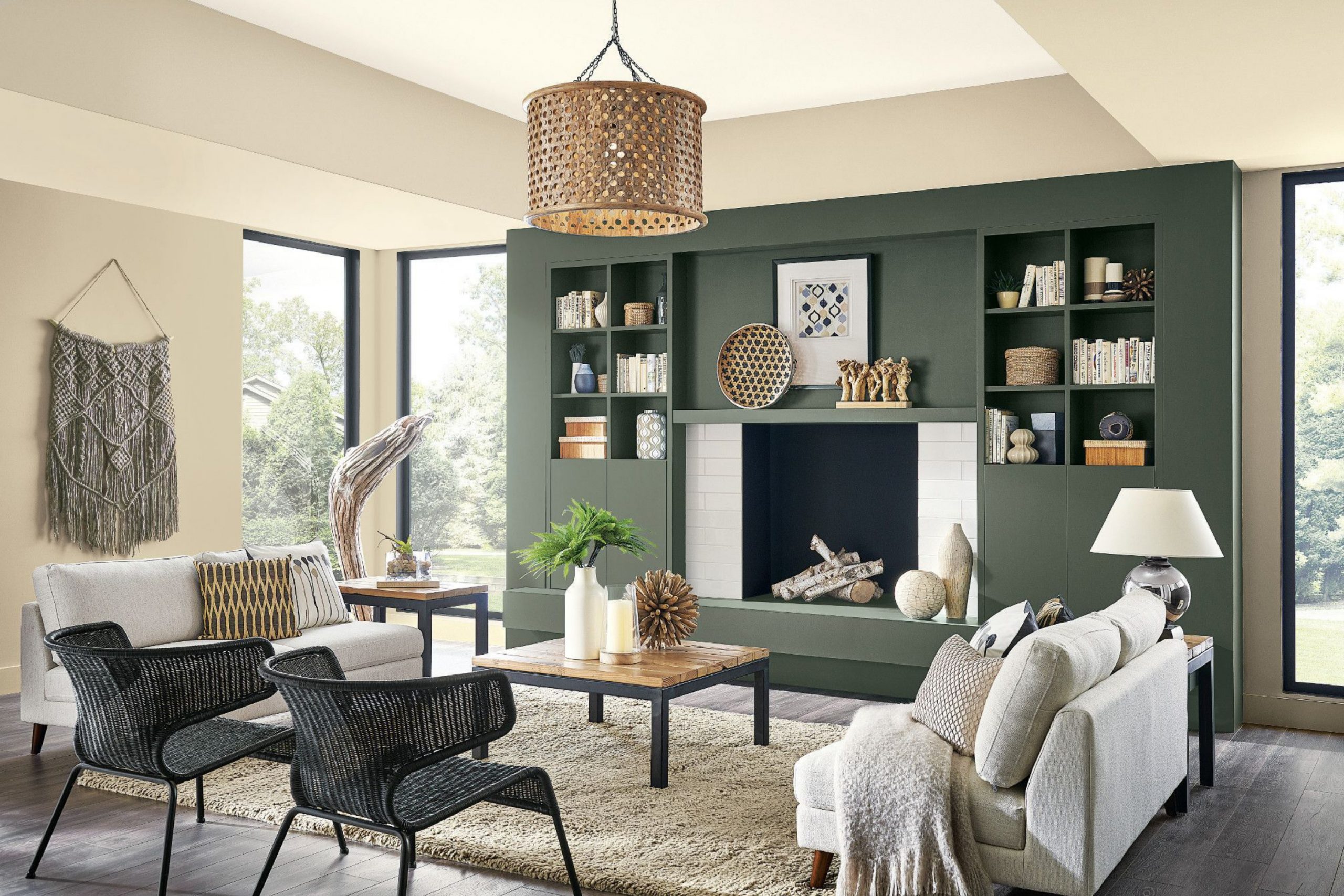
When I think about the best colors for a whole house, light shades are always the ones I trust most. They bring a fresh and open feeling to every room, tying together different areas in a way that feels natural. Light tones also give me the freedom to play with furniture, accents, and textures without worrying about clashing.
They create a base that is simple, welcoming, and easy to live with every single day.
To me, light paint is not just about brightness—it’s about comfort, balance, and making a home that feels warm from the moment you walk in.
Why I Believe Light Colors Work Best for the Whole House
Light shades have a way of making a home feel bigger and more connected. When walls share the same soft tones, it feels like every room belongs together, even if the style changes a little. I love how they reflect natural light, making mornings brighter and evenings more relaxed. Light colors also tend to fit with every kind of design, from modern to classic.
They give me a starting point that always feels safe but never boring. Most of all, they help me create homes that feel calm, open, and ready to welcome anyone who steps inside.
How I Choose the Perfect Light Shade for Every Room
For me, choosing the right light shade starts with looking at how each room feels during the day. Some rooms get a lot of sunlight, so I pick softer whites to balance the brightness. Other rooms feel darker, and that’s when I turn to warmer neutrals to bring in a touch of comfort. I also think about the flooring, cabinets, and even fabrics in the room because the wall color should always support them.
I like to keep the whole house connected, so I use shades that flow into each other without harsh breaks. That way, every corner feels like part of the same story.
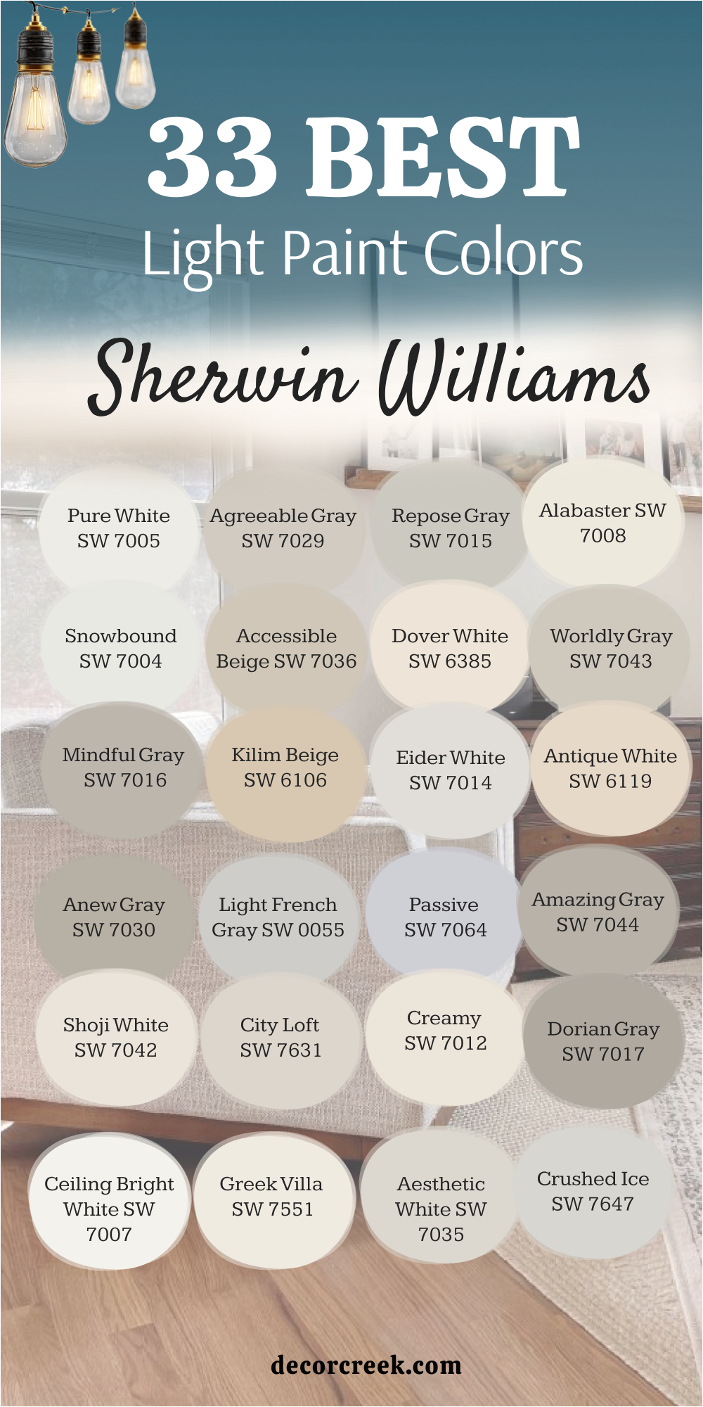
33 Best Light Paint Colors by Sherwin Williams
Pure White (SW 7005)
Pure White feels fresh and bright without being cold. I love how it balances warm and cool tones, making it easy to use in any room. It works beautifully for walls, ceilings, and trim, giving everything a clean finish. Pure White also reflects light softly, which makes a room feel more open.
I often use it when I want a classic base that won’t compete with furniture. This shade always makes a home feel crisp and inviting.

Agreeable Gray (SW 7029)
Agreeable Gray has the right mix of beige and gray, which makes it one of the easiest shades to live with. It feels warm enough to be cozy but light enough to brighten a room. I’ve used it in living rooms, kitchens, and even hallways, and it always feels welcoming. This color adapts well to both natural and artificial light, which keeps it looking soft throughout the day.
I like how it works with wood floors and white trim, creating a balanced look. It’s one of my go-to choices for a whole house palette.

Repose Gray (SW 7015)
Repose Gray is soft, steady, and never too heavy on the walls. It carries just enough warmth to feel inviting but still reads as a true gray. I love how it pairs with bright whites and darker accents, making it flexible for every style. In the daytime, it feels airy and light, while in the evening, it becomes cozy and grounding. It’s one of those shades that feels safe but never dull.
Repose Gray makes a perfect backdrop for both modern and traditional homes.

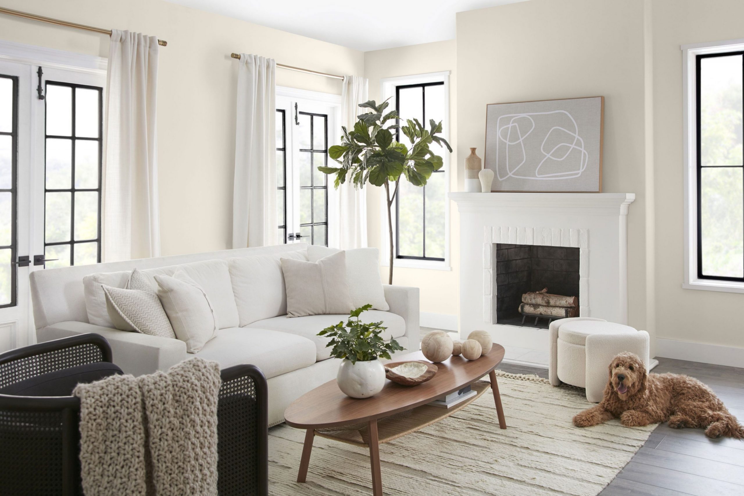
Alabaster (SW 7008)
Alabaster is warm, gentle, and always comforting. I love how it softens a room without making it feel yellow. It works well on both walls and trim, creating a smooth, blended look. Alabaster makes rooms feel restful, like a soft blanket around the home. It’s one of my favorite choices for bedrooms and living rooms where I want the walls to feel soothing.
This color has a timeless quality that makes a home feel bright and peaceful all at once.

Snowbound (SW 7004)
Snowbound feels crisp and modern while still being soft enough for daily living. I like how it works with both cool grays and warm beiges, making it easy to pair with other colors. It reflects light beautifully, which makes rooms feel brighter and more open. Snowbound looks especially fresh on trim and cabinetry, but it also holds up well as a wall color.
I often use it when I want a home to feel bright and stylish but not too stark. It’s one of those shades that always feels polished.

Accessible Beige (SW 7036)
Accessible Beige feels warm, balanced, and natural. It has just enough gray to keep it modern but still holds the softness of beige. I love using it in open living spaces because it connects rooms so well. This color works beautifully with wood tones, stone, and white trim, making it one of my most versatile picks.
Accessible Beige never feels heavy, and it adapts nicely to different types of light. It’s a shade that makes every room feel like part of the same home.

Dover White (SW 6385)
Dover White brings a touch of warmth to a home without feeling too creamy. I like using it in kitchens and living areas because it pairs well with both light and dark finishes. It gives walls a soft, friendly look that feels inviting. Dover White is one of those shades that makes a house feel cheerful but still relaxed.
It also works well as a trim color when paired with deeper neutrals. For me, it’s the kind of white that makes a home feel lived-in and happy.

Worldly Gray (SW 7043)
Worldly Gray is soft, balanced, and incredibly flexible. It sits right between beige and gray, which means it works well with almost any accent. I like how it changes slightly with the light, sometimes warmer, sometimes cooler. This makes it feel alive without being distracting. Worldly Gray is a wonderful choice for hallways and large living areas where you want consistency.
It creates a smooth flow from room to room, keeping the whole house tied together.

Mindful Gray (SW 7016)
Mindful Gray feels grounded but still light enough to be easy on the eyes. It has just the right mix of warmth and softness, making it a color I often use in kitchens and bathrooms. It works perfectly with white trim, giving a clean and fresh contrast. I also love how it pairs with wood tones, bringing balance to modern and rustic styles alike.
Mindful Gray makes a room feel calm without being plain. It’s one of my steady, reliable shades.

Kilim Beige (SW 6106)
Kilim Beige is warm, inviting, and full of life. I like how it adds a gentle richness to walls without feeling dark. It pairs beautifully with creams and soft whites, making it a great choice for cozy spaces. Kilim Beige brings warmth into dining rooms and living rooms, helping them feel more welcoming.
It’s a shade that works especially well with traditional furniture and warm woods. For me, it’s a classic beige that never goes out of style.

Eider White (SW 7014)
Eider White feels soft and gentle, almost like a light blanket wrapped around the room. It has a touch of gray that keeps it from looking too warm, but it never feels cold either. I love how it shifts throughout the day, sometimes reading a little warmer, sometimes a little cooler. This makes it a flexible shade for bedrooms and living rooms.
Eider White pairs beautifully with crisp whites on trim, giving the walls a quiet depth. For me, it’s a simple color that always feels calm and steady.

Antique White (SW 6119)
Antique White feels cozy and familiar, like the warmth of an old home with character. It leans toward cream but has enough depth to make walls feel rich. I love using it in dining rooms or living spaces where I want a touch of tradition. This shade works well with dark wood furniture, adding balance and softness.
Antique White has a comforting quality that makes people feel at home the moment they walk in. It’s a shade that feels timeless in the best way.

Anew Gray (SW 7030)
Anew Gray is one of those perfect middle-ground colors that always feels right. It has a soft beige undertone, but the gray keeps it modern and fresh. I like using it in open layouts where I want consistency from room to room. Anew Gray works well with both cool and warm accents, which makes decorating easier.
On walls, it feels grounded without being heavy. It’s a shade I often choose when I want a home to feel balanced and welcoming.

Light French Gray (SW 0055)
Light French Gray feels elegant and calm, with just enough softness to make it easy to live with. It doesn’t lean too warm or too cool, which makes it one of the most flexible grays I’ve used. I love how it looks in bedrooms and offices, where a clear and steady backdrop matters. It pairs beautifully with both whites and darker grays, creating contrast without harshness.
This shade always feels steady, like it belongs in every corner of the house. Light French Gray makes rooms feel clear, simple, and well-balanced.
Passive (SW 7064)
Passive is a light gray that feels airy and quiet on the walls. It leans slightly cool, which makes it perfect for kitchens, bathrooms, and modern spaces. I love how it reflects natural light, keeping rooms looking crisp throughout the day. Passive pairs beautifully with white trim and black accents, creating a fresh and balanced look. It’s a color that gives a home a clean, modern edge without feeling harsh.
For me, it’s one of those shades that keeps a house feeling current and relaxed at the same time.
Amazing Gray (SW 7044)
Amazing Gray is soft, earthy, and incredibly easy to work with. It has warmth that keeps it from feeling flat, but it still reads as a true gray. I love using it in family rooms and entryways because it feels welcoming without being too bold. This shade pairs nicely with natural textures like wood and stone, making it a great choice for a grounded look.
Amazing Gray adapts well to different lighting, which means it looks good at any time of day. It’s one of those colors that feels steady and trustworthy in a home.

Shoji White (SW 7042)
Shoji White feels warm and gentle, almost like soft sunlight on the walls. It carries a creamy undertone but still reads as light and clean. I love how it makes living rooms and kitchens feel inviting without being too bright. Shoji White pairs beautifully with warm woods and natural fabrics, giving a home a soft, balanced look.
It’s also a great choice for open layouts where you want the color to flow easily from one room to another. For me, this shade always feels comforting and natural.

City Loft (SW 7631)
City Loft is a graceful mix of beige and gray that feels soft but still modern. I like how it works as a gentle backdrop in bedrooms and living areas. The color shifts slightly in different lighting, sometimes warmer, sometimes cooler, which makes it interesting without being distracting. City Loft pairs beautifully with both white trim and deeper neutrals, giving plenty of options for accents.
It’s one of those shades that makes a home feel connected and well put together. City Loft always brings a touch of quiet elegance.

Creamy (SW 7012)
Creamy feels warm and soft, almost like a layer of gentle light on the walls. It has enough depth to feel cozy but still keeps rooms feeling bright. I love how it pairs with natural wood tones, making it a wonderful choice for kitchens and family rooms. Creamy works well when I want a softer alternative to stark whites, especially in homes that need more warmth.
It always feels inviting, as if the walls are giving the room a gentle hug. For me, it’s one of the most comforting light shades.

Dorian Gray (SW 7017)
Dorian Gray feels steady and grounded but still light enough for everyday living. It leans toward the warmer side of gray, which makes it easy to pair with other colors. I like how it looks in larger spaces like living rooms and hallways, where it adds quiet depth. Dorian Gray works especially well with crisp whites on trim, creating a clean, polished look.
This shade adapts nicely to different lighting, always staying soft and approachable. It’s one of those reliable colors that makes a home feel complete.

Ceiling Bright White (SW 7007)
Ceiling Bright White does exactly what its name says—it makes ceilings feel higher and brighter. I love using it when I want a crisp, clear finish above walls of any shade. It reflects light beautifully, helping rooms feel more open and fresh. Ceiling Bright White also works well on trim, doors, and even cabinetry, giving everything a sharp, neat look.
It’s one of my favorite choices when I want the top of a room to feel light and airy. This shade always makes a house look clean and cared for.

Greek Villa (SW 7551)
Greek Villa feels soft, warm, and welcoming in every room. It has just enough creaminess to make walls feel cozy but still reads as fresh and bright. I love using it in living rooms, bedrooms, and kitchens because it adapts so well. Greek Villa pairs beautifully with both light and dark accents, making it easy to decorate around.
It’s a shade that makes a house feel cheerful but never too bold. For me, it’s one of those whites that feels lived-in and friendly.

Aesthetic White (SW 7035)
Aesthetic White feels light and airy with a soft touch of warmth. It’s one of those colors that looks bright without being stark. I love using it in bedrooms and entryways where I want a fresh but gentle feel. It works well with both cool and warm tones, which makes decorating simple and stress-free. Aesthetic White pairs beautifully with natural textures like linen and light wood.
For me, it’s a shade that quietly supports the rest of the design, letting the room feel calm and welcoming.

Crushed Ice (SW 7647)
Crushed Ice feels clean and modern, with a subtle gray undertone that keeps it balanced. I like how it makes kitchens and bathrooms feel crisp without being cold. This shade pairs well with sharp whites and darker grays, giving a room a sleek finish. It reflects light beautifully, making smaller rooms appear bigger.
Crushed Ice also works as a neutral backdrop in open spaces, where it ties everything together. It’s a color I trust when I want walls to feel fresh and refined.

Natural Choice (SW 7011)
Natural Choice feels soft, creamy, and inviting. It has a warm base that makes rooms feel comfortable and lived-in. I often use it in family rooms and dining areas because it blends so easily with wood tones. Natural Choice looks especially beautiful in natural light, where it glows gently without overpowering the room. It also flows well with other neutrals, making it perfect for whole house palettes.
For me, it’s one of those colors that feels like home from the very first glance.

Pearly White (SW 7009)
Pearly White feels bright but never sharp. It carries a faint warmth that keeps it from looking too cool, making it versatile for many styles. I love how it softens modern spaces and adds a welcoming glow. This shade works well in living rooms, kitchens, and even hallways, where consistency matters. Pearly White pairs beautifully with both wood and stone, creating balance in the home.
It’s one of those shades that looks simple but always feels thoughtful.
Drift of Mist (SW 9166)
Drift of Mist feels soft, airy, and perfectly balanced. It has just enough gray to keep it modern but stays light and welcoming. I like using it in bedrooms and open living spaces where I want a steady backdrop. Drift of Mist pairs wonderfully with white trim, giving the walls a gentle definition. It looks fresh in daylight and cozy under warm lamps at night.
For me, it’s a shade that always keeps the home feeling calm and connected.

Navajo White (SW 6126)
Navajo White feels warm and classic, carrying a creamy richness that brightens a room. I love using it in dining rooms and cozy living spaces, where its warmth makes gatherings feel inviting. This shade pairs beautifully with darker woods and traditional furnishings. It has a timeless quality that feels both familiar and welcoming.
Navajo White glows in natural light, giving walls a soft, golden touch. It’s a color that makes every room feel comfortable and lived-in.
Gauntlet Gray (SW 7019)
Gauntlet Gray feels rich and steady, though still light enough for large spaces. It has a deeper undertone that adds weight without making rooms feel heavy. I like using it on accent walls, cabinets, and even exteriors, where it brings structure and strength. Gauntlet Gray pairs well with crisp whites, creating a striking contrast.
It works especially well in modern homes, giving them a grounded, stylish look. For me, it’s a shade that adds character while staying elegant.

On the Rocks (SW 7671)

On the Rocks feels fresh and balanced, with a soft gray tone that never feels heavy. I love how it sits gently on the walls, giving a clean and modern look without being too cold. This shade pairs well with crisp whites and deep charcoal accents, creating contrast that feels stylish but easy to live with. On the Rocks looks especially good in kitchens and bathrooms, where brightness matters.
It also works beautifully in hallways, keeping the flow of the house light and simple. For me, it’s one of the most dependable soft grays.

Dovetail (SW 7018)
Dovetail feels grounded and elegant, bringing a bit more depth while still reading as a light neutral in many spaces. I like using it for accent walls or cabinetry, where it adds quiet strength without taking over the room. Dovetail pairs beautifully with lighter grays and whites, giving balance and contrast. It works well in open layouts where a little definition is needed.
This color always feels steady and polished, making it a reliable choice for homes with character.

Gray Screen (SW 7071)
Gray Screen feels crisp and modern, with a cooler undertone that makes it perfect for contemporary spaces. I love how it reflects natural light, keeping rooms fresh and airy. This shade works beautifully in bedrooms, offices, and bathrooms, where clarity matters. It pairs especially well with navy, black, and bright whites, giving a clean and stylish finish.
Gray Screen has a refreshing quality that makes a home feel updated and open. For me, it’s a favorite when I want a true, light gray.

Softer Tan (SW 6141)
Softer Tan feels warm, friendly, and welcoming. It carries a gentle beige tone that adds comfort without looking dark. I like using it in family rooms and dining areas, where it creates a cozy backdrop for gatherings. Softer Tan pairs well with both white trim and deeper neutrals, making it easy to style around.
It has a natural softness that brings a house together, especially when paired with wood floors. For me, this shade always feels like a warm smile on the walls.
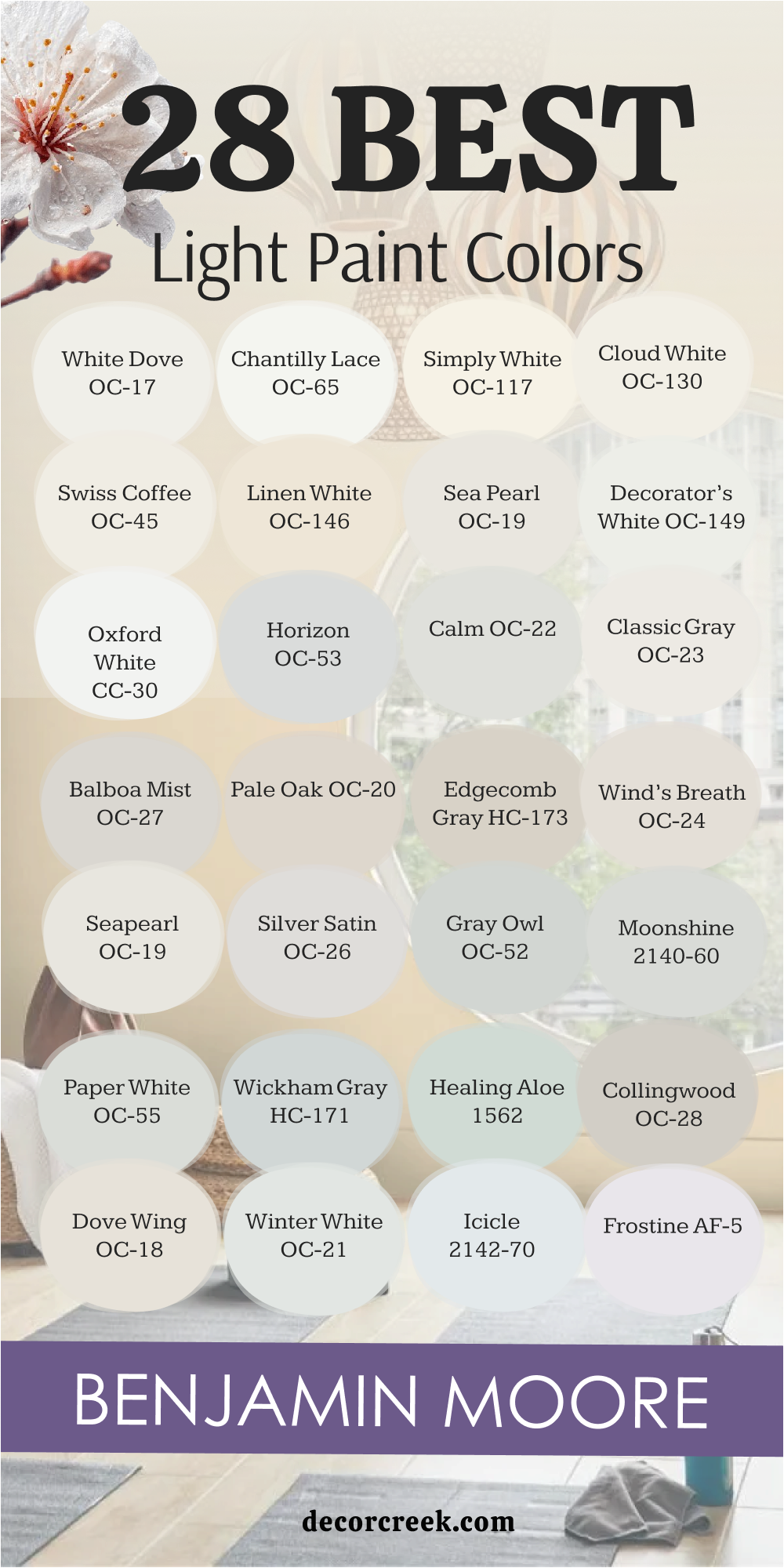
28 Best Light Paint Colors by Benjamin Moore
White Dove (OC-17)
White Dove feels soft, gentle, and endlessly welcoming. It has a creamy warmth that makes walls glow without turning yellow. I love using it in living rooms and bedrooms where I want a calm and inviting look. White Dove pairs beautifully with both dark woods and crisp whites, making it one of the most flexible colors I know.
It works just as well on trim as it does on walls, creating harmony throughout a home. For me, it’s a shade that never fails to make a house feel like home.

Chantilly Lace (OC-65)
Chantilly Lace feels clean, bright, and sharp in the best way. It’s one of the purest whites, which makes it perfect for modern spaces that need a crisp backdrop. I love how it reflects light and keeps rooms looking fresh and open. This shade pairs well with bold accents and strong contrasts, like black or navy.
It also works beautifully for trim and ceilings, giving every corner a polished look. For me, it’s the go-to choice when I want a pure and simple white that always feels fresh.

Simply White (OC-117)
Simply White feels cheerful and full of light. It has just a hint of warmth, which keeps it from feeling too stark. I love using it in kitchens and hallways where brightness matters most. Simply White makes every room feel open and full of energy, like sunlight captured on the walls. It pairs beautifully with both soft neutrals and bolder colors, giving plenty of flexibility for decorating.
For me, it’s a shade that brings joy and freshness to a whole house.

Cloud White (OC-130)
Cloud White feels warm, soft, and perfectly balanced. It has a creamy undertone that makes rooms feel comfortable but never heavy. I like using it in bedrooms and family rooms, where I want a cozy and welcoming backdrop. Cloud White pairs nicely with wood tones and soft grays, making it easy to style a room.
It’s a shade that blends easily throughout a house, tying everything together with a gentle glow. For me, it’s one of those colors that always feels safe and beautiful.

Swiss Coffee (OC-45)
Swiss Coffee feels creamy, warm, and full of charm. It leans slightly toward beige, giving walls a soft and comforting touch. I love how it makes living spaces feel cozy and lived-in. Swiss Coffee pairs well with deep woods and earthy tones, bringing richness to a room.
It works beautifully in both traditional and modern homes, adapting to different styles with ease. For me, this shade always feels welcoming and timeless in the best way.
via decorcreek.com
Linen White (OC-146)
Linen White feels gentle, warm, and classic. It has a soft beige undertone that makes it glow warmly on walls. I love using it in dining rooms or bedrooms where I want a comfortable and familiar atmosphere. Linen White pairs beautifully with traditional furniture and natural materials, giving a home a relaxed elegance.
It’s not too bright, which makes it easy to live with day after day. For me, it’s one of those shades that never loses its charm.

Sea Pearl (OC-19)
Sea Pearl feels soft, airy, and graceful on the walls. It carries a balance of gray and beige that keeps it from looking flat. I love using it in kitchens and bathrooms, where it adds a fresh, polished look. Sea Pearl pairs beautifully with crisp whites and stone textures, making it feel natural and timeless.
It adapts easily to both bright sunlight and evening lamps, always staying gentle. For me, it’s one of those shades that makes a home feel effortlessly elegant.

Decorator’s White (OC-149 / CC-20)
Decorator’s White feels clean and modern, with just a touch of softness to keep it from being too sharp. I like using it on trim and cabinetry, where it gives everything a crisp finish. It also works well on walls in bright, open spaces, making rooms feel bigger and clearer. Decorator’s White pairs beautifully with cool grays and bold accent colors, giving plenty of design options.
For me, it’s a shade that always feels current and polished.

Oxford White (CC-30)
Oxford White feels light, fresh, and balanced. It has a brightness that lifts a room but still feels soft enough for everyday living. I love how it works in modern spaces as well as traditional homes. This shade pairs beautifully with natural wood floors, white trim, and even deeper accent walls.
Oxford White makes hallways and living rooms feel open and smooth, flowing easily from room to room. For me, it’s a flexible white that always feels right.
Horizon (OC-53)
Horizon feels quiet and restful, almost like a soft breeze across the walls. It carries a hint of gray that makes it steady, but it stays light and open. I love using it in bedrooms and living rooms where I want a gentle, calming backdrop. Horizon pairs beautifully with both warm woods and cool metals, making it easy to style.
It changes slightly with the light, which adds interest without being distracting. For me, it’s one of those colors that feels peaceful and steady.
Calm (OC-22)
Calm feels gentle and smooth, with a light gray-beige base that makes walls feel balanced. I like how it works in small rooms, keeping them bright without feeling too sharp. Calm pairs beautifully with soft whites, muted blues, and light woods, creating a soft and inviting palette.
It works well in bedrooms, bathrooms, and hallways, where a steady backdrop matters. For me, it’s a shade that always feels thoughtful and balanced.
Classic Gray (OC-23)
Classic Gray feels light and flexible, adapting easily to any home style. It carries a soft warmth that keeps it from being too cool, which makes it easy to use in many rooms. I love how it works in living rooms, bedrooms, and open layouts, always tying the home together. Classic Gray pairs beautifully with both deep colors and crisp whites, giving it endless possibilities.
It looks fresh in daylight and cozy under warm light at night. For me, it’s one of the most trusted neutrals.

Balboa Mist (OC-27)
Balboa Mist feels soft and graceful, with a light greige tone that works almost anywhere. I love using it in open living spaces because it connects rooms without ever feeling heavy. Balboa Mist pairs beautifully with crisp whites and natural woods, giving a home a balanced look. It shifts gently in different light, sometimes warmer, sometimes cooler, which keeps it interesting.
This shade feels modern but still welcoming. For me, it’s one of those colors that always fits, no matter the style.

Pale Oak (OC-20)
Pale Oak feels warm, creamy, and delicate on the walls. It has a soft beige-gray base that makes rooms feel calm and inviting. I like using it in bedrooms and living rooms where comfort is the goal. Pale Oak pairs well with both warm wood tones and fresh whites, making decorating easy.
It glows beautifully in natural light, giving a gentle brightness without being stark. For me, it’s one of the most charming light neutrals for a home.
via decorcreek.com
Edgecomb Gray (HC-173)
Edgecomb Gray feels natural and balanced, sitting perfectly between gray and beige. I love how it adapts to different settings, sometimes reading warmer, sometimes cooler. It works well in hallways, kitchens, and family rooms, always keeping a steady backdrop. Edgecomb Gray pairs beautifully with both soft whites and deeper accents, giving plenty of design choices.
It has a welcoming quality that makes homes feel comfortable and connected. For me, it’s one of the most reliable light shades.

Wind’s Breath (OC-24)
Wind’s Breath feels airy and light, almost like a gentle touch on the walls. It carries warmth but stays bright enough to keep a room fresh. I like using it in bedrooms, bathrooms, and smaller spaces where a soft glow matters. Wind’s Breath pairs beautifully with muted grays and warm woods, creating a soft, inviting palette.
It flows nicely with other neutrals, making it easy to use across the whole house. For me, it’s a shade that always feels calm and easy.

Seapearl (OC-19)
Seapearl feels balanced and subtle, with just the right mix of warmth and gray. It’s a color I love for kitchens and open living spaces where light changes often. Seapearl looks steady in both natural and artificial light, keeping the home consistent throughout the day. It pairs beautifully with white trim and dark accents, creating harmony in a space.
For me, it’s a dependable neutral that supports both modern and classic styles.
Silver Satin (OC-26)
Silver Satin feels soft, elegant, and understated on the walls. It carries a quiet gray undertone that keeps it fresh but never cold. I like how it makes hallways and living rooms feel smooth and open. Silver Satin pairs beautifully with crisp whites and darker accents, giving balance without effort. It shifts gently in different lights, which adds depth to the room.
For me, it’s a graceful shade that always feels refined and inviting.

Gray Owl (OC-52)
Gray Owl feels fresh, light, and flexible. It leans slightly cool, which makes it perfect for kitchens, bathrooms, and modern living rooms. I love how it reflects light, keeping spaces bright without feeling stark. Gray Owl pairs beautifully with crisp whites and darker grays, giving a home a polished look. It shifts a little with the lighting, sometimes warmer, sometimes cooler, which keeps it interesting.
For me, it’s one of the most reliable light grays for a whole house palette.

Moonshine (2140-60)
Moonshine feels quiet and airy, with a gentle gray base that never overwhelms. It has a softness that makes bedrooms and entryways feel restful. I like how it blends easily with both warm and cool accents, giving me freedom in styling a room. Moonshine pairs beautifully with light woods, soft whites, and muted blues.
It adapts easily to changing light, always keeping a room comfortable. For me, it’s a shade that feels steady and graceful all day long.
Paper White (OC-55)
Paper White feels crisp and clear, with just a whisper of gray that keeps it from being too sharp. I love how it brings brightness to kitchens and hallways while still feeling soft. It pairs beautifully with black, navy, or even natural wood, making it versatile for any style. Paper White works especially well in open homes where consistency matters.
For me, it’s a simple shade that makes every room feel fresh and welcoming.
Wickham Gray (HC-171)
Wickham Gray feels cool, airy, and refreshing. It has a soft blue-gray undertone that reminds me of a clear sky. I love using it in bedrooms and bathrooms where I want a light and restful touch. Wickham Gray pairs beautifully with bright whites, making trim and details stand out.
It looks especially fresh in daylight, where it glows softly across the walls. For me, it’s one of those shades that makes a house feel clean and uplifting.
Healing Aloe (1562)

Healing Aloe feels light and soothing, with a gentle mix of green and gray. It’s soft enough to read as neutral but brings a hint of freshness to any room. I like how it works in bedrooms, bathrooms, and even kitchens, adding a soft touch of color. Healing Aloe pairs beautifully with crisp whites and sandy beiges, creating harmony in the home.
It changes gently with the light, which adds interest to the walls. For me, it’s a shade that feels like a quiet breath of fresh air.

Collingwood (OC-28)
Collingwood feels balanced and graceful, sitting right between beige and gray. I love using it in open layouts where I want a steady flow of color. It pairs beautifully with both light and dark accents, making it a flexible choice for any home. Collingwood adapts well to changing light, always staying soft and inviting.
It has a polished look that makes rooms feel well put together. For me, it’s one of those shades that never feels out of place.

Dove Wing (OC-18)
Dove Wing feels warm and bright, with a creamy undertone that makes it welcoming. I like using it in kitchens and living areas where I want a cheerful glow. It pairs beautifully with dark woods and crisp trim, creating a clean but inviting look. Dove Wing works well across large spaces, keeping everything light and consistent.
For me, it’s a shade that always brings warmth into the home.

Winter White (OC-21)
Winter White feels fresh and cool, like a soft winter morning light. It leans toward gray, which gives it a modern edge without being harsh. I love how it works in bedrooms and bathrooms, where a clean, crisp look matters. Winter White pairs beautifully with navy and black, creating strong contrast.
It also looks graceful with natural wood, balancing warmth and coolness. For me, it’s a color that always feels clear and refreshing.
Icicle (2142-70)
Icicle feels bright and airy, with a slight coolness that keeps it crisp. It has a delicate quality that makes rooms feel open and clear. I love how it works in hallways and kitchens where brightness is key. Icicle pairs beautifully with soft grays, navy, and sharp whites, giving flexibility for design.
It reflects light gently, making smaller rooms feel larger. For me, it’s one of the freshest light tones I can use in a home.
Frostine (AF-5)
Frostine feels smooth, soft, and elegant on the walls. It carries a pale gray-lavender undertone that makes it unique but still light and neutral. I like using it in bedrooms and quiet sitting rooms, where a touch of softness feels right. Frostine pairs beautifully with whites and muted grays, giving the home a graceful look.
It changes gently in different lighting, adding depth without distraction. For me, it’s a shade that feels delicate and refined.
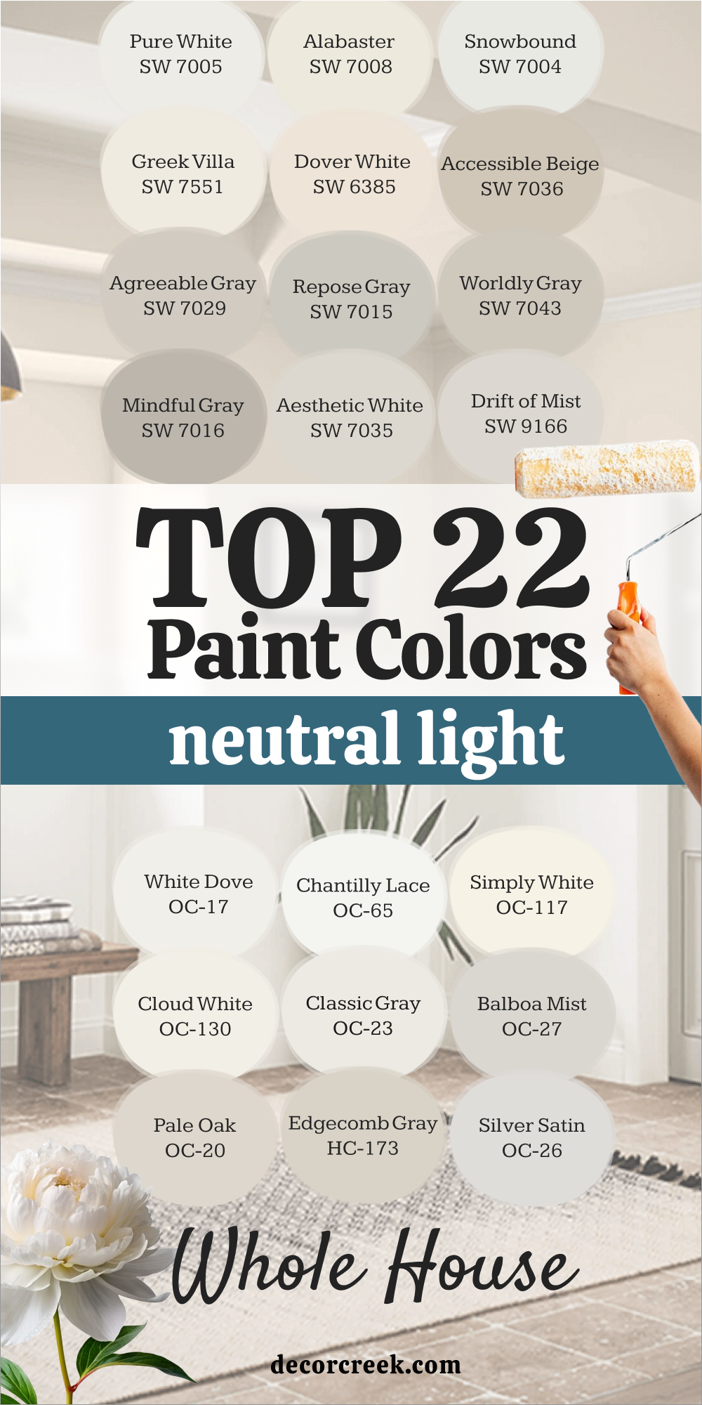
22 Best Neutral Light Paint Colors for the Whole House
Pure White (SW 7005)
Pure White feels clean and flexible, making it one of the easiest shades to use throughout a home. I love how it pairs with both warm and cool tones, tying different rooms together. Pure White reflects light softly, which keeps spaces open and fresh. It works beautifully on walls, trim, and ceilings, giving consistency to the whole house.
For me, it’s the perfect starting point when I want a simple and balanced palette.
Alabaster (SW 7008)
Alabaster feels warm and gentle, bringing softness into every room. It has a creamy undertone that makes walls feel welcoming without being too yellow. I love using it in living rooms and bedrooms where I want a calm, cozy atmosphere. Alabaster pairs beautifully with wood tones, soft fabrics, and crisp trim.
For me, it’s one of the most comforting neutrals for a whole house design.
Snowbound (SW 7004)
Snowbound feels bright and fresh, with just the right softness for everyday living. It doesn’t lean too warm or too cool, making it easy to pair with many styles. I like how it works in kitchens, bathrooms, and hallways where brightness matters most. Snowbound also shines on trim and cabinetry, keeping everything crisp.
For me, it’s a steady, reliable shade that keeps a home looking polished and open.
Greek Villa (SW 7551)
Greek Villa feels cheerful and inviting, with a soft creaminess that warms up the walls. It has a gentle glow that makes rooms feel cozy without losing brightness. I love using it in bedrooms, kitchens, and open layouts where flow is important. Greek Villa pairs beautifully with light woods, stone, and crisp whites.
For me, it’s a versatile shade that always makes a house feel warm and lived-in.
Dover White (SW 6385)
Dover White feels friendly and warm, bringing a touch of comfort into any space. It leans creamy but still stays bright, which makes it easy to use throughout the house. I like how it works in living rooms and dining rooms, adding a soft, welcoming glow. Dover White pairs nicely with both light neutrals and deeper accents, giving flexibility for design.
For me, it’s one of those shades that always feels cheerful and inviting.
Accessible Beige (SW 7036)
Accessible Beige feels balanced and natural, with the right mix of gray and beige. It has warmth that makes rooms feel cozy but still keeps them light. I love using it in large spaces where I want a smooth, consistent backdrop. Accessible Beige pairs beautifully with whites, wood tones, and stone finishes.
For me, it’s a dependable neutral that makes every corner of a home feel connected.
Agreeable Gray (SW 7029)
Agreeable Gray feels soft and steady, making it one of my favorite whole-house shades. It has a beige undertone that keeps it warm while still reading as a light gray. I like how it adapts to different lighting, always staying comfortable and welcoming. Agreeable Gray works well in living rooms, hallways, and kitchens, tying the home together.
For me, it’s a trustworthy neutral that always looks right.
Repose Gray (SW 7015)
Repose Gray feels flexible and modern, with just the right balance of warmth and coolness. It works beautifully across open layouts, making rooms flow naturally. I love how it pairs with crisp whites and deep accents, giving homes a polished look. Repose Gray feels airy during the day and cozy at night, which makes it easy to live with.
For me, it’s a shade that always feels steady and comfortable.
Worldly Gray (SW 7043)
Worldly Gray feels balanced and soft, sitting right between gray and beige. It adapts beautifully to natural and artificial light, always looking smooth. I like using it in entryways and living areas where flow matters. Worldly Gray pairs nicely with whites, soft blues, and natural wood, giving a home an easy, welcoming look.
For me, it’s a gentle color that always ties spaces together.
Mindful Gray (SW 7016)
Mindful Gray feels grounded but still light enough to keep a room fresh. It has warmth that makes it comfortable and easy to live with. I love using it in kitchens and bathrooms where I want contrast against bright whites. Mindful Gray pairs beautifully with both wood tones and painted trim, making it flexible.
For me, it’s one of those shades that adds depth without ever feeling heavy.
Aesthetic White (SW 7035)
Aesthetic White feels soft and airy, with just a touch of warmth that keeps it inviting. I like using it in bedrooms and living spaces where I want a gentle, neutral backdrop. It pairs beautifully with crisp whites and natural materials, creating a home that feels connected. Aesthetic White adapts well to different kinds of light, always staying balanced.
For me, it’s one of those shades that quietly supports everything else in the room.
Drift of Mist (SW 9166)
Drift of Mist feels light and steady, almost like a soft breath across the walls. It has a hint of gray that keeps it modern while still feeling warm. I love how it works in open layouts, tying spaces together without ever looking flat. Drift of Mist pairs beautifully with white trim and warm woods, making it flexible.
For me, it’s a reliable neutral that feels natural in every room of the house.
White Dove (OC-17)
White Dove feels creamy and soft, bringing warmth without heaviness. It’s a favorite of mine for bedrooms and living rooms where I want comfort and brightness together. White Dove pairs beautifully with both deep wood tones and lighter accents, making it easy to design around.
It works equally well on trim, cabinetry, and walls, giving a smooth, blended look.
For me, it’s a shade that always feels timeless and welcoming.
Chantilly Lace (OC-65)
Chantilly Lace feels pure and bright, almost like a fresh sheet of paper. It has a sharp clarity that makes rooms feel modern and clean. I love using it on trim and ceilings, but it also works beautifully on walls when I want maximum brightness. Chantilly Lace pairs well with bold contrasts, like black or navy, as well as softer neutrals.
For me, it’s the perfect choice when I want crisp lightness throughout a home.
Simply White (OC-117)
Simply White feels cheerful and sunny, adding light to every corner. It has just enough warmth to stay soft, which makes it easy to live with. I like using it in kitchens and hallways where brightness matters most. Simply White pairs beautifully with natural woods and colorful accents, making it flexible for many styles.
For me, it’s a shade that lifts the mood of a whole house.
Cloud White (OC-130)
Cloud White feels warm and creamy, wrapping rooms in a gentle glow. It works well in family spaces and bedrooms, where I want comfort to come first. Cloud White pairs beautifully with soft grays, natural fabrics, and wood accents, giving balance to a home. It’s bright but never harsh, which makes it one of my favorite choices for everyday living.
For me, it’s a color that feels like a warm welcome.
Classic Gray (OC-23)
Classic Gray feels flexible and steady, adapting to nearly every setting. It has a soft warmth that makes rooms feel cozy without losing brightness. I love how it pairs with bright whites for trim, giving a clean and polished look. Classic Gray works beautifully in open layouts, keeping the whole home consistent.
For me, it’s a reliable neutral that always feels gentle and balanced.
Balboa Mist (OC-27)
Balboa Mist feels soft and graceful, sitting in the perfect spot between beige and gray. It flows easily from room to room, making it ideal for a whole house palette. I like how it changes slightly with the light, always staying interesting but never distracting.
Balboa Mist pairs beautifully with both light and dark accents, giving plenty of design options. For me, it’s a color that feels elegant and easy at the same time.
Pale Oak (OC-20)
Pale Oak feels delicate and warm, giving walls a gentle glow. It has a soft greige base that makes it flexible and welcoming. I love how it works in bedrooms and living areas, where a soft touch matters. Pale Oak pairs beautifully with natural fabrics and wood tones, keeping the home grounded.
For me, it’s one of those shades that always feels graceful and inviting.

Edgecomb Gray (HC-173)
Edgecomb Gray feels balanced and natural, the perfect middle ground between gray and beige. It’s light enough for whole house use but still brings warmth to the walls. I love how it pairs with both white trim and deeper neutrals, creating harmony. Edgecomb Gray looks steady in every kind of light, which makes it easy to trust.
For me, it’s a shade that feels connected and smooth throughout the home.
Silver Satin (OC-26)
Silver Satin feels refined and quiet, with a gentle gray undertone that keeps it fresh. I like using it in hallways and living rooms where flow matters. It pairs beautifully with crisp whites and darker accents, creating balance without effort. Silver Satin changes slightly with the light, adding depth to the walls.
For me, it’s a shade that feels polished and welcoming.
Paper White (OC-55)
Paper White feels crisp and steady, with a whisper of gray that softens the brightness. It’s a shade I love for kitchens and bathrooms, where a clean look matters. Paper White pairs beautifully with bold colors and natural woods, making it versatile. It looks fresh in daylight and calm in the evening, which makes it easy to live with.
For me, it’s one of the most dependable light neutrals.
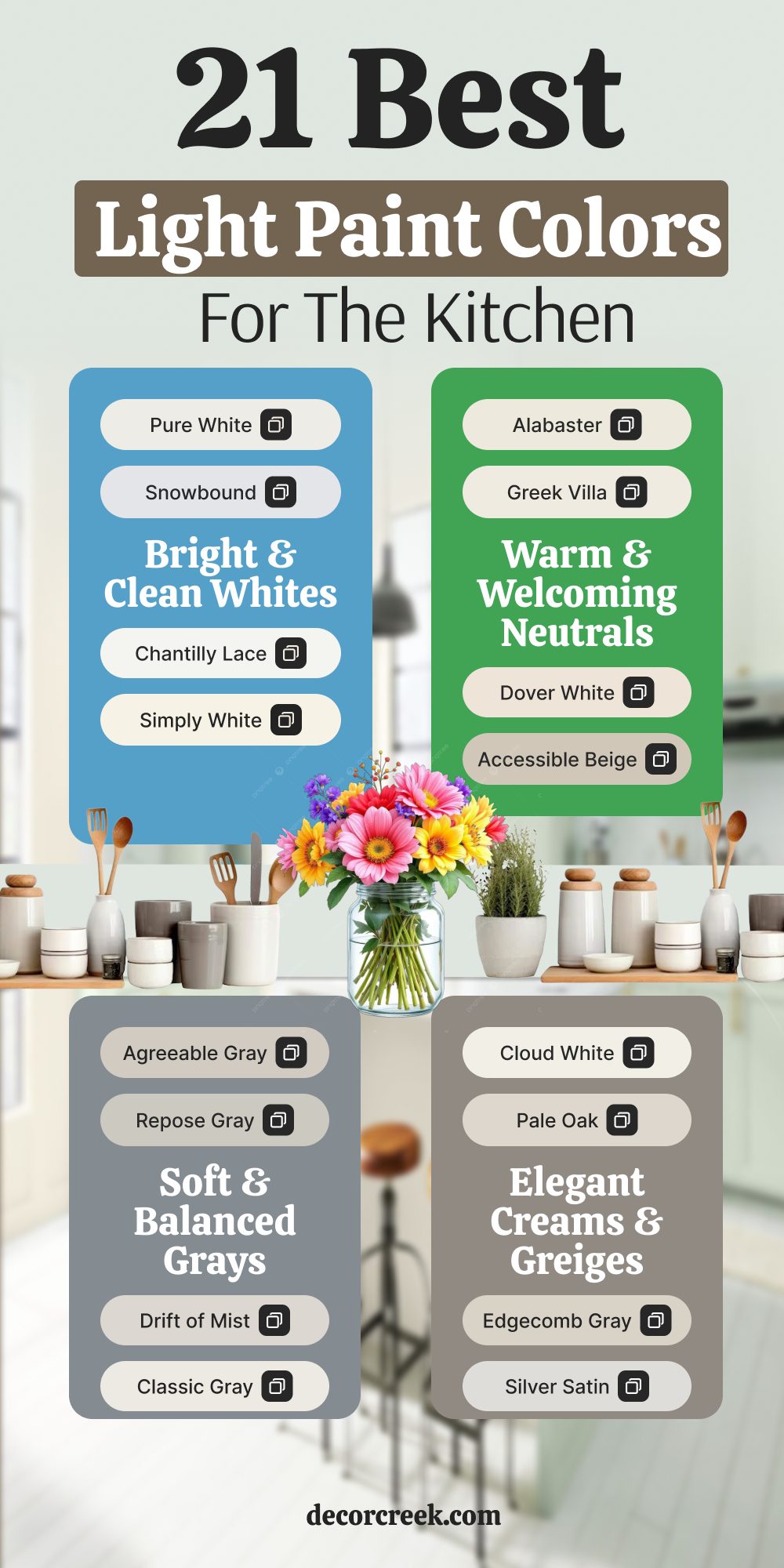
21 Best Light Paint Colors for the Kitchen
Pure White (SW 7005)
Pure White feels clean and versatile, making it one of my favorite choices for kitchens. It reflects light beautifully, which helps brighten up work areas and breakfast nooks. I love how it pairs with stainless steel, marble, and wood, giving the kitchen a balanced look. Pure White also works well on cabinets, creating a crisp finish.
For me, it’s the kind of white that always feels fresh and welcoming in the heart of the home.
Alabaster (SW 7008)
Alabaster feels soft and warm, giving kitchens a cozy but polished look. It’s bright enough to keep the room open but carries warmth that makes it inviting. I like how it pairs with natural wood shelves, gold hardware, and soft stone counters. Alabaster works beautifully on both walls and cabinetry, tying everything together.
For me, it’s a kitchen color that feels friendly and timeless.
Snowbound (SW 7004)
Snowbound feels crisp and modern, perfect for kitchens where I want a clean, airy style. It balances well with both cool grays and warm wood accents, which makes it easy to decorate around. I love how it keeps the room looking fresh all day, no matter the lighting. Snowbound also works well for trim and cabinets, adding a sleek finish.
For me, it’s a shade that makes any kitchen look polished and bright.
Greek Villa (SW 7551)
Greek Villa feels cheerful and welcoming, bringing warmth into the kitchen. It has a creamy glow that makes mornings brighter and evenings cozy. I love how it pairs with stone counters and rustic wood touches, giving the kitchen a balanced charm. Greek Villa works well in both modern and traditional layouts, adapting easily.
For me, it’s a shade that always feels warm and family-friendly.
Dover White (SW 6385)
Dover White feels soft and friendly, adding comfort to busy kitchen spaces. It leans creamy but stays bright enough to feel fresh. I like using it on walls with darker cabinets, where it balances out the contrast. Dover White also looks lovely with natural light, giving the kitchen a welcoming glow.
For me, it’s a shade that makes kitchens feel lived-in and happy.
Accessible Beige (SW 7036)
Accessible Beige feels warm and grounded, perfect for kitchens that need a touch of coziness. It has a hint of gray that keeps it modern but still comfortable. I love how it pairs with stone, tile, and wood, creating harmony in the kitchen. Accessible Beige works well with both light and dark cabinetry, making it versatile.
For me, it’s a shade that keeps kitchens inviting without ever feeling heavy.
Agreeable Gray (SW 7029)
Agreeable Gray feels balanced and soft, a wonderful neutral for kitchens. It’s warm enough to feel welcoming but light enough to keep the room open. I like how it pairs with marble counters, wood floors, and white trim. Agreeable Gray adapts beautifully to changing light, always staying consistent.
For me, it’s one of those dependable shades that make kitchens feel both stylish and comfortable.
Repose Gray (SW 7015)
Repose Gray feels fresh and flexible, giving kitchens a steady backdrop. It has just enough warmth to keep the room inviting but stays modern and clean. I love how it works with bright backsplashes, stainless steel, and natural woods. Repose Gray is easy to pair with different finishes, which makes it perfect for busy kitchens.
For me, it’s a shade that keeps the heart of the home balanced and bright.
Drift of Mist (SW 9166)
Drift of Mist feels airy and gentle, almost like a light fog across the walls. It’s bright enough to lift a kitchen but soft enough to keep it calm. I love how it pairs with warm wood, white trim, and soft stone counters. Drift of Mist works well in both large open kitchens and smaller spaces, keeping them feeling consistent.
For me, it’s a shade that makes cooking and gathering more enjoyable.
White Dove (OC-17)
White Dove feels warm and smooth, a favorite of mine for kitchens. It has just enough creaminess to add comfort but still feels fresh. I love how it pairs with brass or black hardware, marble counters, and natural wood. White Dove is soft enough for walls but also shines on cabinetry.
For me, it’s a kitchen shade that always feels classic and inviting.
Chantilly Lace (OC-65)
Chantilly Lace feels bright and pure, the kind of white that makes a kitchen sparkle. It has a crisp clarity that works beautifully on cabinets, trim, and walls. I love how it pairs with dark counters and sleek hardware, creating a clean contrast. Chantilly Lace reflects light in a way that keeps kitchens looking open all day long.
For me, it’s a shade that always feels polished and modern.
via decorcreek.com
Simply White (OC-117)
Simply White feels cheerful and sunny, perfect for kitchens that need extra brightness. It has a touch of warmth that keeps it from being too sharp. I love how it pairs with wood floors, stone counters, and soft fabrics, giving the kitchen a lived-in feel. Simply White works beautifully for both walls and cabinetry, keeping everything consistent.
For me, it’s a shade that always feels joyful and inviting.
Cloud White (OC-130)
Cloud White feels soft and creamy, bringing comfort into the kitchen. It’s bright enough to keep things open but warm enough to feel welcoming. I love how it pairs with natural textures like wood and stone, making the kitchen feel balanced. Cloud White flows easily from one space to another, keeping the whole home connected.
For me, it’s a shade that feels classic and friendly.
Classic Gray (OC-23)
Classic Gray feels light and neutral, the perfect backdrop for a busy kitchen. It carries a soft warmth that makes the room feel cozy without closing it in. I like how it pairs with white cabinets and dark counters, giving balance. Classic Gray adapts beautifully to changing light, staying steady throughout the day.
For me, it’s a dependable shade that never distracts from the details.
Balboa Mist (OC-27)
Balboa Mist feels graceful and easy, sitting in the perfect balance between beige and gray. I love how it ties together open kitchens and dining spaces, keeping the flow smooth. Balboa Mist pairs beautifully with whites, wood accents, and metal finishes. It has a gentle depth that makes kitchens feel welcoming but never heavy.
For me, it’s a shade that works in nearly any style of home.
Pale Oak (OC-20)
Pale Oak feels creamy and delicate, giving kitchens a soft glow. It works beautifully with warm metals and natural stone, adding charm to the space. I love how it brightens kitchens while still feeling cozy. Pale Oak pairs well with white trim and darker accents, creating harmony.
For me, it’s a shade that feels elegant yet approachable.
Edgecomb Gray (HC-173)
Edgecomb Gray feels natural and smooth, making kitchens feel balanced. It has just enough warmth to feel cozy but still looks modern. I love how it pairs with crisp whites, marble, and wood finishes. Edgecomb Gray flows well into adjoining rooms, which keeps the whole house connected.
For me, it’s a shade that always feels steady and versatile.
Silver Satin (OC-26)
Silver Satin feels soft and refined, perfect for kitchens that need a gentle backdrop. It has a quiet gray tone that keeps the room fresh and open. I love how it pairs with both stainless steel and warm woods, making it easy to decorate. Silver Satin shifts slightly with the light, giving the walls quiet depth.
For me, it’s a shade that always feels graceful.
Paper White (OC-55)
Paper White feels crisp and steady, with just enough softness to keep it easy on the eyes. It’s a wonderful shade for kitchens where brightness matters. I like how it pairs with black hardware, stone counters, and wood floors, creating balance. Paper White keeps kitchens looking clean without feeling stark.
For me, it’s one of the most dependable kitchen shades.
Sea Pearl (OC-19)
Sea Pearl feels smooth and balanced, with a soft mix of beige and gray. It brings quiet warmth into a kitchen while staying bright. I love how it pairs with white cabinetry, stone, and stainless steel. Sea Pearl adapts easily to natural and artificial light, always staying steady.
For me, it’s a shade that makes kitchens feel comfortable and polished.
Swiss Coffee (OC-45)
Swiss Coffee feels creamy and warm, a beautiful choice for kitchens that need comfort and brightness together. It leans slightly toward beige, which makes it inviting. I love how it pairs with rich woods, gold hardware, and marble counters. Swiss Coffee works just as well on walls as it does on cabinetry, giving the kitchen a smooth flow.
For me, it’s a shade that always feels welcoming and full of charm.

Final Thoughts on Light Colors for the Whole House
For me, light colors are the heart of a welcoming home. They make rooms feel open, fresh, and connected, no matter the style. I love how soft whites and gentle neutrals give freedom to add furniture, textures, and accents without worry. Light paint keeps mornings bright and evenings relaxing, turning everyday moments into something special.
When the right shade is on the walls, a house feels balanced and easy to live in.
That’s why light colors will always be my first choice for creating a home that feels both warm and beautiful.