When I begin thinking about wall paint colors, I imagine how each room should welcome the people who step inside. A wall is more than a surface—it sets the mood for the life that happens around it. The right shade can turn breakfast into a bright, cheerful moment or make evenings feel soft and relaxed.
Over the years, I’ve seen how even a small change in color can shift the entire rhythm of a home. A gentle gray can steady a busy living room, while a warm beige can make conversations flow more easily.
A creamy white can make a bedroom glow, while a soft green can help the mind settle at night. I believe paint is not just about design, it’s about comfort, family, and memory.
That’s why I gather colors that I know work in real homes, not just in showrooms.
My goal is always the same: to make walls feel like part of a story that supports your everyday life and makes your home feel truly yours.
Why I Trust Sherwin-Williams and Benjamin Moore for Wall Paint Colors
I’ve worked with many paints, but I always return to Sherwin-Williams and Benjamin Moore because they give me results I can rely on. Light changes constantly—from the bright glow of morning to the soft shadows of evening—and not every brand handles those shifts well.
With these two, the colors stay true, never slipping into something that feels wrong. I’ve seen cheaper paints turn dull or uneven over time, but these keep their richness year after year. The finishes are strong, holding up to kids running down hallways, pets brushing against walls, and furniture being moved around.
I also love the range they offer; I can find soft neutrals that create calm energy, bold shades that add drama, and everything in between.
Their palettes help me match wall colors with floors, cabinets, fabrics, and art, so every detail feels connected.
For me, trusting these brands means I know my clients will love not just how their rooms look on the first day, but how they feel living with the color every single day after.
How I Pick the Right Wall Paint Color for Any Room
Choosing a wall color always starts with light. The way morning sun falls through a window or how a lamp glows at night completely changes how a shade looks. I test large samples on the wall because paint never tells its full story in a tiny swatch. I stand back, walk through the room, and watch how the color shifts from bright noon to dim evening.
Next, I think about what’s already in the space: the tone of the floors, the fabrics on the furniture, the metals on the lamps, even the art on the walls. Every element has an undertone, and the paint should bring them together instead of clashing.
I also think about mood—whether the room should feel lively for gatherings or restful for quiet nights. Some colors carry energy, while others bring softness, and the right one depends on how you want to live in the space.
For me, the final test is simple: when I step into the room, does the color make me feel at ease? If the answer is yes, I know it’s the right choice.
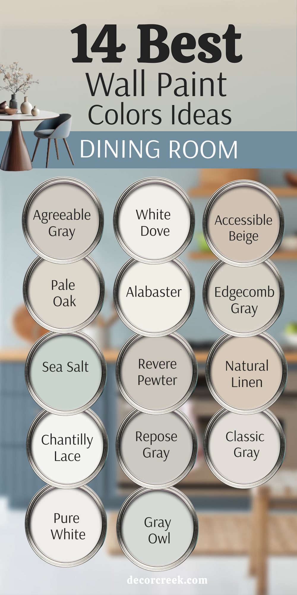
14 Dining Room Wall Paint Color Ideas
Agreeable Gray SW 7029
Agreeable Gray SW 7029 feels steady and warm in a dining room, creating an easy backdrop that makes meals feel more relaxed. Agreeable Gray highlights wood furniture beautifully, making deep tables look richer and lighter chairs look softer. Agreeable Gray shifts gently with the light, giving you a softer tone in the morning and a cozier feel at night, which makes every gathering feel special.
I like how it supports conversation by never shouting for attention but instead letting people and food shine. This shade pairs so well with crisp white trim, woven baskets, or even dark leather chairs, giving plenty of styling freedom.
For me, it is one of those colors I can trust in any dining room because it brings comfort without losing style.

White Dove OC-17
White Dove OC-17 brings brightness without feeling sharp, making a dining room glow in both natural sunlight and lamplight. White Dove creates an open look that feels welcoming for family meals and formal dinners alike. White Dove softens shadows across the table, helping dishes and glassware sparkle with just the right amount of light.
I like to use it when I want a dining room that feels classic and elegant but never cold or stiff. This shade works beautifully with wood floors, brass fixtures, or black-framed artwork, always adding balance.
For me, White Dove is the kind of color that never goes out of style because it keeps meals feeling light and joyful.

Accessible Beige SW 7036
Accessible Beige SW 7036 has warmth that makes a dining room feel like a place to stay and talk a little longer. Accessible Beige carries enough depth to give the room character without becoming heavy. Accessible Beige blends easily with both pale furniture and darker wood, which is why I reach for it in mixed-style homes.
I find it flatters wood tables, especially ones with visible grain, making them stand out beautifully. This shade works well with linen fabrics, woven rugs, or soft lighting, giving the whole room a grounded charm.
For me, Accessible Beige is perfect when I want a dining space that feels lived-in, cozy, and always welcoming.

Pale Oak OC-20
Pale Oak OC-20 gives a soft backdrop that helps dining rooms feel warm yet refined. Pale Oak has a gentle tone that adapts easily to different lights, staying steady in the day and softer at night. Pale Oak pairs well with linen curtains, woven chairs, and oak floors, adding just enough color without stealing the show.
I love how it balances warmth and freshness, offering the best of both in one shade. This color lets art, flowers, or table settings shine, becoming a quiet partner in the room’s design.
For me, Pale Oak is the perfect shade when I want a dining room that feels inviting but also polished.

Alabaster SW 7008
Alabaster SW 7008 is a white that feels warm, glowing under sunlight and becoming golden in candlelight. Alabaster makes dining rooms look bright without ever turning harsh or sterile, which is why I often use it in both small and large spaces. Alabaster works beautifully with dark wood chairs, painted cabinets, or soft upholstered seats, always keeping balance.
I enjoy how it supports both rustic pieces and modern details, making it one of the most flexible whites. This shade holds its beauty morning to night, never losing freshness or warmth.
For me, Alabaster is the white I trust when I want a dining room to feel cared for and inviting.

Edgecomb Gray HC-173
Edgecomb Gray HC-173 offers a natural, earthy tone that helps a dining room feel grounded. Edgecomb Gray shifts slightly with the light, leaning warmer during the day and cooler in the evening, which makes it a flexible choice. Edgecomb Gray pairs nicely with crisp trim, textured fabrics, or metal fixtures, always giving a steady base.
I love how it creates a calm background that lets people, food, and conversation take center stage. This shade has enough character to feel interesting but never becomes distracting.
For me, Edgecomb Gray is one of the most reliable colors for dining rooms that need balance and comfort.

Sea Salt SW 6204
Sea Salt SW 6204 carries a fresh energy that brings life into a dining room without ever feeling too bold. Sea Salt shifts softly between green and blue, offering a lively yet soothing look under different lighting. Sea Salt works with driftwood furniture, wicker chairs, or crisp white trim, reminding me of coastal homes.
I like how it adds character to the room while still staying soft enough to let décor stand out. This color brings cheerfulness to daily meals and gives gatherings a breezy mood.
For me, Sea Salt is a favorite when I want a dining room that feels uplifting and lighthearted.

Revere Pewter HC-172
Revere Pewter HC-172 feels timeless and classic, making dining rooms steady and welcoming. Revere Pewter carries just enough warmth to create comfort while keeping a neutral base that works with almost anything. Revere Pewter pairs well with cream chairs, bold black accents, or rich wood tables, always adapting.
I enjoy how it can take on a soft glow in daylight and a cozy depth under evening lamps. This color has the strength to stand alone but also supports brighter accents if you want a mix.
For me, Revere Pewter is a dependable shade that makes dining spaces look inviting year after year.

Natural Linen SW 9109
Natural Linen SW 9109 creates an easy, lived-in mood that suits family dining perfectly. Natural Linen softens light in the room, making fabric chairs and wood tones blend together seamlessly. Natural Linen pairs with both rustic furniture and more refined details, giving flexibility in design. I like to use it when I want a dining room to feel simple yet thoughtful, like a place that has always been cared for.
This color has depth that keeps it from feeling plain but still keeps things gentle. For me, Natural Linen is a dining color that feels honest, warm, and always welcoming.

Chantilly Lace OC-65
Chantilly Lace OC-65 is crisp and pure, the kind of white that makes a dining room sparkle. Chantilly Lace adds brightness instantly, lifting the mood of the room. Chantilly Lace highlights moldings and trim, making every detail look sharper. I love how it lets art, flowers, and table settings shine, always giving them the spotlight.
This shade fits beautifully into both formal and casual dining rooms, showing its strength in any style. For me, Chantilly Lace is the white I trust when I want the room to feel fresh and open every single day.

Repose Gray SW 7015
Repose Gray SW 7015 gives a steady and thoughtful base for dining rooms, offering balance between warm and cool tones. Repose Gray feels easy to live with, adapting to both modern and traditional décor. Repose Gray pairs beautifully with black accents, light chairs, and wood floors, always looking right. I like how it never feels too bold but still brings a sense of style.
This color works well from bright morning light to soft evening lamps, staying steady. For me, Repose Gray is a safe yet stylish pick that makes meals feel gathered and cared for.

Classic Gray OC-23
Classic Gray OC-23 feels airy and open, making dining rooms look light without being empty. Classic Gray pairs well with muted fabrics, wood finishes, and even bold colors, showing its flexibility. Classic Gray shifts softly with natural light, feeling brighter in the morning and softer at night. I enjoy how it creates a backdrop that adapts to the room’s needs without drawing too much focus.
This shade feels clean but never cold, always supporting comfort. For me, Classic Gray is a dining room color that keeps things easy and graceful.

Pure White SW 7005
Pure White SW 7005 is fresh and steady, a shade that feels right in any dining space. Pure White makes wood furniture pop, especially darker tones, and adds brightness to the room. Pure White feels open in small rooms and clean in larger ones, keeping balance. I like how it supports any style, from modern dining sets to rustic farmhouse tables. This color stays true from morning to night, never losing its charm.
For me, Pure White is one of the most flexible whites, always helping meals feel bright and joyful.

Gray Owl OC-52
Gray Owl OC-52 offers a modern edge while still staying friendly in a dining room. Gray Owl leans slightly toward green, which adds freshness and energy to the space. Gray Owl works beautifully with black fixtures, pale woods, and crisp linens, giving the room personality. I like how it feels open and bright in daylight, then more grounded in the evening.
This color suits both casual meals and more formal dinners, showing its range.
For me, Gray Owl is a shade that keeps dining rooms feeling stylish and full of life.

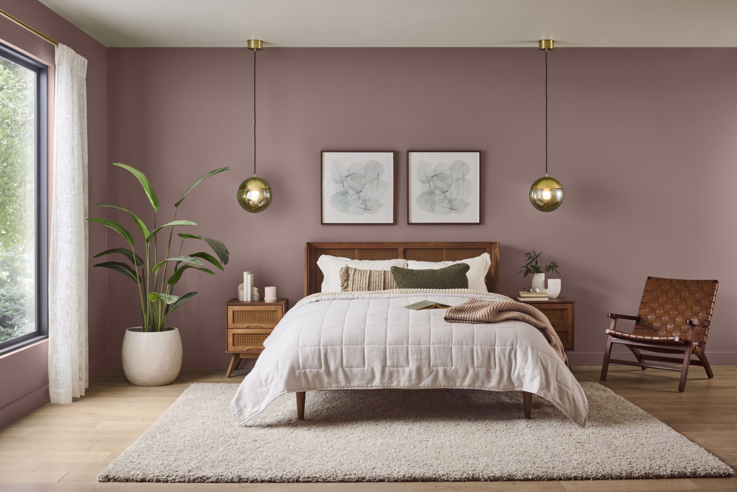
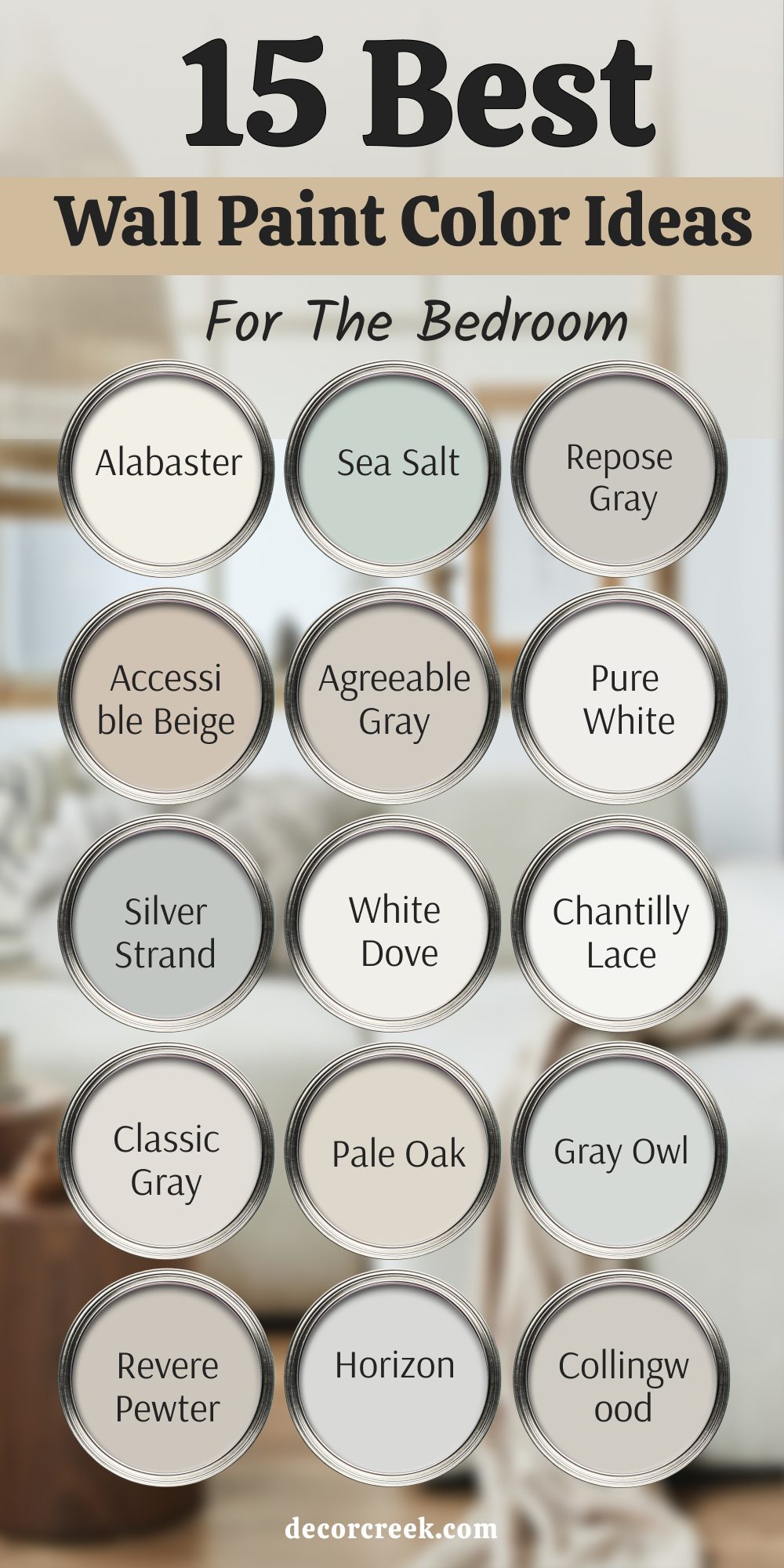
15 Bedroom Wall Paint Color Ideas
Alabaster SW 7008
Alabaster SW 7008 feels warm and gentle, a white that glows instead of glaring. It softens morning light, making early hours kinder, and under evening lamps it turns golden and cozy. It pairs beautifully with natural fabrics like linen sheets, warm wood headboards, and soft wool rugs, giving the whole room a cared-for look.
I love how it never feels harsh, so brighter pillows or darker lamps can be added without clashing. The tone adapts whether the bedroom is minimal or layered with textures, always staying welcoming.
For me, this is the perfect bedroom white when I want a space that feels safe and ready for rest every night.
Sea Salt SW 6204
Sea Salt SW 6204 brings freshness, almost like a breath of air, into a bedroom. It shifts between blue and green, soft enough to calm the eye yet lively enough to keep the room from feeling dull. It pairs perfectly with white trim, sandy woods, woven baskets, and cotton bedding, building a soft coastal story.
I like how it reminds me of open windows and breezes, even when the room is still.
The shade works beautifully in small bedrooms that need brightness and larger ones that need softness. For me, this is my go-to when I want a bedroom to feel lighthearted and restful.
Repose Gray SW 7015
Repose Gray SW 7015 feels balanced, a perfect mix of warm and cool that makes a bedroom steady. It changes with daylight but always holds harmony, which keeps the room feeling secure. It pairs well with white trim, black lamps, or natural oak dressers, giving plenty of design options. I love how it adds structure without stiffness, making the room both stylish and livable.
The tone fits modern lines but also works with traditional furniture, proving its flexibility. For me, this is the color I trust when I want mornings clear and nights steady.
Accessible Beige SW 7036
Accessible Beige SW 7036 feels warm and grounded, like a gentle hug for the walls. It carries depth, so the room feels cared for but not dark. It pairs easily with soft linens, woven rugs, and natural wood tones, creating an organic charm. I like how it adds warmth without stealing light, keeping the bedroom inviting and open.
The shade suits family homes, guest rooms, or master bedrooms, always bringing comfort. For me, this is the kind of paint that makes rest effortless.
Agreeable Gray SW 7029
Agreeable Gray SW 7029 feels like a trusted friend—steady, warm, and always pleasant. It reflects daylight beautifully, fresh in the morning and cozy at night. It pairs wonderfully with white bedding, black accents, or rattan details, creating balance. I enjoy how it never overwhelms, instead giving the room a foundation that supports restful moods.
The tone feels modern yet fits with classic furniture as well. For me, this is one of the most flexible neutrals for bedrooms.
Pure White SW 7005
Pure White SW 7005 feels crisp and fresh, a white that sharpens edges in a bedroom. It makes trim, doors, and ceilings pop while supporting colorful bedding or dark furniture. It pairs with any accent, from navy pillows to golden lamps, showing great adaptability. I love how it brightens small rooms while polishing larger ones.
The shade feels fresh without ever turning cold, which makes it rare. For me, this is one of the most dependable choices for restful mornings.
Silver Strand SW 7057
Silver Strand SW 7057 carries a soft gray kissed with blue, perfect for bedrooms that need quiet elegance. It glows gently in the morning and feels soothing under evening lamps. It pairs beautifully with crisp trim, gray bedding, and woven rugs, always lending a polished touch. I enjoy how it gives refinement while staying easy to live with.
The tone works in both coastal-inspired rooms and modern designs. For me, this is the paint that helps a bedroom feel restful and graceful.

White Dove OC-17
White Dove OC-17 feels soft and welcoming, giving a glow that lifts the bedroom. It has just enough warmth to avoid flatness or harshness. It pairs with beige rugs, wood dressers, or metallic accents like brass or black lamps, keeping balance. I like how it reflects light gently, always creating a restful mood.
The tone fits both airy minimal rooms and layered ones with rich fabrics. For me, this is the white I trust when I want the room fresh yet full of comfort.
Chantilly Lace OC-65
Chantilly Lace OC-65 feels bright and pure, the kind of white that makes details shine. It highlights crown molding, beams, or art, bringing clarity to the bedroom. It pairs beautifully with accents like blush, pale gray, or sage, allowing them to stand out. I love how it feels alive in daylight and still airy under soft lamps.
The color has strength to hold both modern and traditional styles. For me, this is the white I choose when I want freshness and polish.
Classic Gray OC-23
Classic Gray OC-23 feels soft and approachable, adding warmth without heaviness. It looks bright in the day and softens gracefully at night. It pairs well with white linens, wooden details, and golden lamps, creating harmony. I enjoy how it supports the décor without pulling attention, letting the room breathe.
The tone works for muted palettes as well as bold contrasts. For me, this is a safe pick that always makes bedrooms feel cared for.
Pale Oak OC-20
Pale Oak OC-20 feels graceful and inviting, a gentle shade that glows with ease. It captures sunlight beautifully, making mornings cheerful, and at night it turns restful. It pairs with upholstered headboards, cotton throws, and light-toned wood dressers, blending seamlessly. I like how it feels subtle yet grounded, giving the room depth.
The shade fits both modern and traditional designs, making it versatile. For me, this is the color I use when I want softness and refinement.
HeGray Owl OC-52
Gray Owl OC-52 feels modern and fresh, a light gray with a lively undertone. It brightens bedrooms in the morning and settles into a grounded look by evening. It pairs with crisp bedding, black lamps, and pale woods, adding character. I love how it feels bright but never sterile, finding the right balance.
The tone energizes the room while leaving space for rest. For me, this is the shade that makes a bedroom stylish and inviting.
Revere Pewter HC-172
Revere Pewter HC-172 feels classic and steady, giving the bedroom warmth and depth. It has richness that keeps the room interesting while staying soft enough for sleep. It pairs with woven throws, neutral bedding, or dark woods, always looking right. I enjoy how it shifts gently with the light, giving character to different hours of the day.
The shade suits both traditional and modern interiors. For me, this is the dependable neutral I often reach for in bedrooms.
Horizon OC-53
Horizon OC-53 feels airy and clear, almost like fresh daylight on the walls. It leans cool, which makes bedrooms feel neat and refreshing. It pairs with white trim, pale woods, or deep navy accents, giving flexibility. I like how it refreshes mornings and brings clarity at night. The tone suits clean modern rooms as well as traditional ones needing brightness.
For me, this is the paint that lifts heaviness and keeps a room open.

Collingwood OC-28
Collingwood OC-28 feels steady and soft, a gray with gentle warmth for bedrooms. It works consistently under sunlight or lamps, always holding its tone. It pairs beautifully with white bedding, wooden floors, and dark accents, offering a calm balance. I enjoy how it looks refined without being stiff, easy to live with every day.
The color supports both bold and muted accents, making design flexible. For me, this is a quiet favorite that makes bedrooms restful and warm.

14 Best Two Color Wall Paint Color Ideas
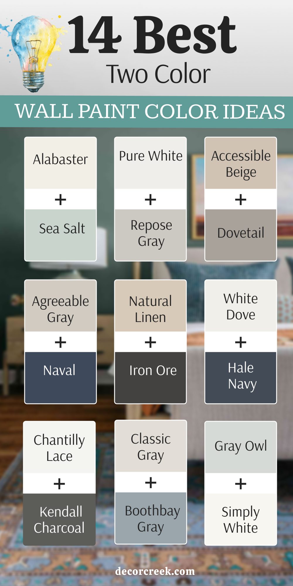
Alabaster SW 7008 + Sea Salt SW 6204
Alabaster SW 7008 + Sea Salt SW 6204 create a pairing that feels fresh yet soft, making a dining or bedroom feel light and easy to live in. One shade provides warmth and brightness, while the other adds a gentle touch of color, almost like a breeze. Together, they balance perfectly for rooms that need energy without losing comfort.
I like how this duo works with natural fibers, wicker chairs, and soft curtains. It brings out the character of wood floors while keeping the walls restful.
For me, this is an ideal pairing when I want a room to feel cozy but never heavy.
Pure White SW 7005 + Repose Gray SW 7015
Pure White SW 7005 + Repose Gray SW 7015 make a combination that feels steady and clear. The brightness of one brings crispness, while the softness of the other adds structure without weighing the room down. Used together, they can divide a wall or highlight trim, creating dimension in simple ways. I enjoy how this pair works in both modern and classic interiors, always adapting.
With dark furniture, the look feels bold, and with pale fabrics, it feels light. For me, this is a trusted choice when I want a balance of freshness and warmth.
Accessible Beige SW 7036 + Dovetail SW 7018
Accessible Beige SW 7036 +Dovetail SW 7018 offer a rich pairing that grounds a space. The lighter tone feels warm and approachable, while the deeper one brings strength and depth. Together, they create contrast without being harsh, making walls feel layered and interesting.
I like how this duo looks with leather chairs, woven rugs, and textured fabrics. It fits perfectly in dining rooms or living rooms where comfort matters most.
For me, this pair always feels both classic and welcoming.

Agreeable Gray SW 7029 + Naval SW 6244
Agreeable Gray SW 7029 +Naval SW 6244 bring contrast that feels stylish and strong. The softness of one creates a steady base, while the deep blue adds drama and character. Used together, they can highlight an accent wall, wainscoting, or built-ins beautifully. I love how the combination works with brass, black, or natural wood tones, giving design flexibility.
The look feels timeless yet modern, suiting both formal and casual spaces.
For me, this duo is a way to add interest without overwhelming the room.

Natural Linen SW 9109 + Iron Ore SW 7069
Natural Linen SW 9109 +Iron Ore SW 7069 create a warm-meets-dark pairing that feels grounded. The lighter tone softens the walls, while the deep shade frames details with striking contrast. This duo works especially well for large rooms where balance is needed between brightness and depth. I like how it supports natural fibers like linen curtains, jute rugs, and wooden tables.
It makes everyday settings feel more designed without being fussy. For me, this pair is one of the easiest ways to add sophistication.

White Dove OC-17 + Hale Navy HC-154
White Dove OC-17 +Hale Navy HC-154 bring together brightness and strength. The soft white reflects light and keeps things airy, while the bold navy grounds the room with richness. Together, they create a coastal or classic mood depending on the décor. I love how they highlight moldings, built-ins, or accent walls.
With brass or black hardware, the look feels tailored and refined. For me, this is a duo that always feels balanced and memorable.

Chantilly Lace OC-65 + Kendall Charcoal HC-166
Chantilly Lace OC-65 + Kendall Charcoal HC-166 give a high-contrast pairing that feels clean and modern. The bright white sharpens edges and lifts the room, while the charcoal shade adds depth. Used together, they make ceilings, trim, or accent walls stand out in striking ways. I enjoy how this pair can lean elegant with gold accents or casual with woven textures.
It makes furniture look more defined and art more vivid. For me, this duo is the perfect match for bold yet livable design.

Classic Gray OC-23 + Boothbay Gray HC-165
Classic Gray OC-23 +Boothbay Gray HC-165 create a pairing that feels soft yet layered. The lighter tone offers warmth and openness, while the deeper one adds subtle strength. Together, they bring interest without strong contrast, which makes them easy for bedrooms and living areas. I like how they work with soft textiles, cozy throws, and muted wood tones.
The pairing feels thoughtful and easy to live with, never overwhelming. For me, this is the choice when I want calm energy with depth.

Gray Owl OC-52 + Simply White OC-117
Gray Owl OC-52 +Simply White OC-117 give a crisp and modern combination. The pale gray brings liveliness with its hint of green, while the white sharpens edges. Together, they highlight trim and walls, making the room feel open and stylish. I like how this pairing works with sleek furniture, metal accents, and simple décor.
It keeps the room feeling fresh while still giving personality. For me, this duo is perfect when I want modern style without losing comfort.

Pale Oak OC-20 + Wrought Iron 2124-10
Pale Oak OC-20 +Wrought Iron 2124-10 balance light softness with strong contrast. The warm neutral brings glow, while the deep near-black adds drama. Together, they create a statement, perfect for accent walls, doors, or lower paneling. I enjoy how this pair suits both cozy dining rooms and modern bedrooms.
The effect feels bold yet inviting, depending on lighting and finishes. For me, this combination is a favorite when I want richness with warmth.

Edgecomb Gray HC-173 + Newburyport Blue HC-155
Edgecomb Gray HC-173 +Newburyport Blue HC-155 bring earthiness and boldness into harmony. The neutral tone makes the room feel grounded, while the navy adds crisp energy. Used together, they look wonderful in coastal or traditional homes. I like how they highlight built-ins, wainscoting, or accent walls, making the architecture stand out.
The pairing feels classic yet still current, never going out of style. For me, this is a duo I rely on when I want both comfort and strength.

Silver Strand SW 7057 + Tricorn Black SW 6258
Silver Strand SW 7057 +Tricorn Black SW 6258 deliver a striking mix of softness and power. The pale gray-blue offers calm energy, while the black adds sharpness and depth. Used side by side, they create dramatic contrast that feels modern but also timeless. I love how this duo works in bedrooms with crisp linens or living rooms with sleek furniture.
It makes light fixtures and metallic accents shine. For me, this pairing is perfect when I want bold edges softened by gentle tones.

Collingwood OC-28 + Coventry Gray HC-169
Collingwood OC-28 +Coventry Gray HC-169 bring together two mid-tones that feel balanced. One side adds warmth, the other coolness, and together they create dimension without sharp contrast. This pairing works beautifully for walls with paneling or adjoining rooms. I enjoy how it feels polished without being showy, making it great for daily living spaces.
It adapts easily to both muted décor and bolder accents. For me, this is a subtle duo that quietly builds depth.

Horizon OC-53 + Chelsea Gray HC-168
Horizon OC-53 +Chelsea Gray HC-168 give a mix of light clarity and grounded depth. The pale tone keeps the room airy, while the darker shade adds structure and richness. Together, they create balance, perfect for open-plan living areas or accent walls. I love how the pairing works with white trim and metallic fixtures.
It feels neat, strong, and welcoming at the same time.
For me, this duo is a reliable choice when I want sophistication that feels easy to live with.
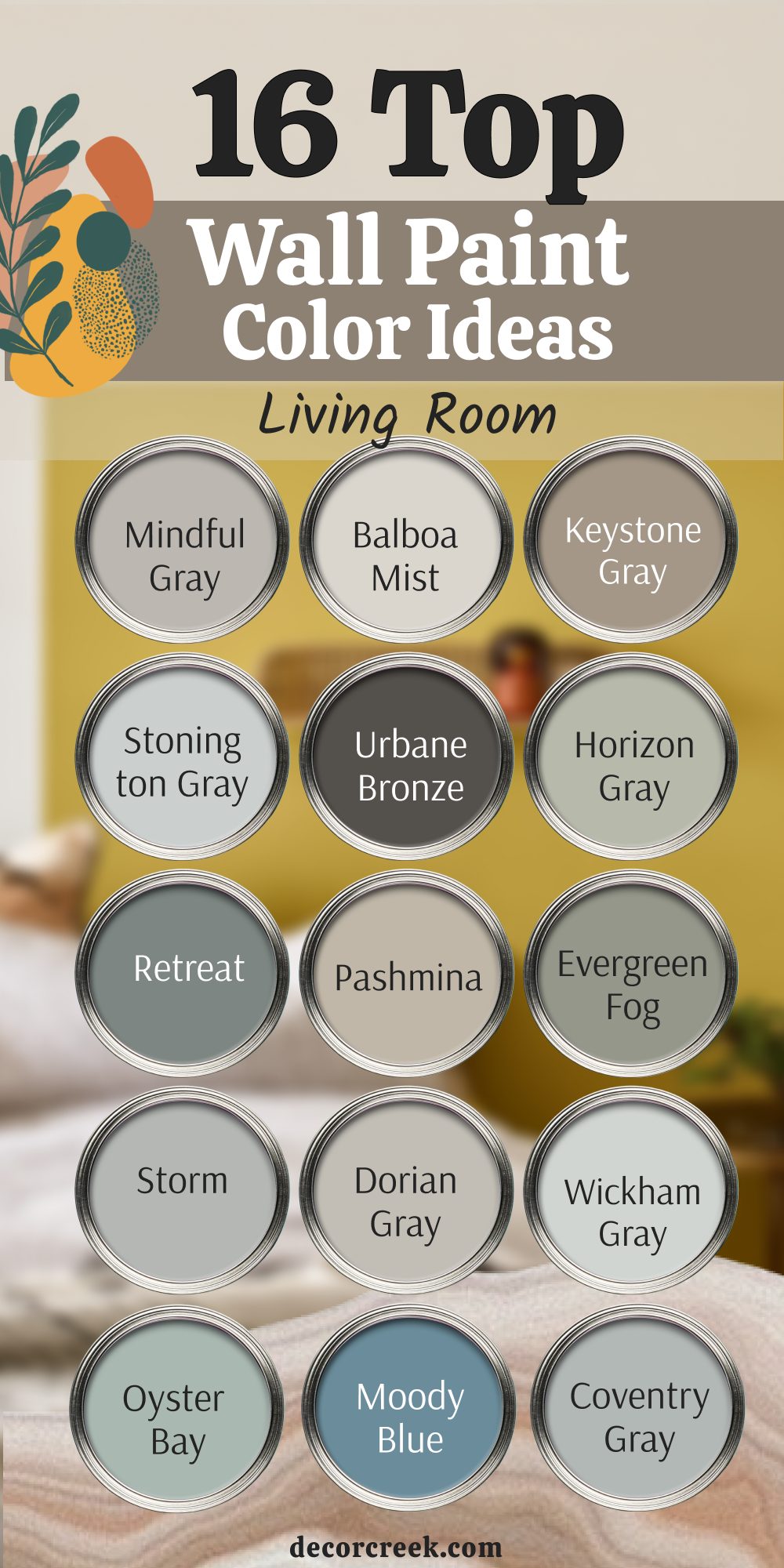
16 Living Room Wall Paint Color Ideas
Mindful Gray SW 7016
Mindful Gray SW 7016 feels balanced and grounded, a shade that works in both bright and dim living rooms. It adapts to changing daylight, always keeping a steady, inviting tone. It pairs beautifully with creamy whites, dark furniture, or brushed metal accents, making styling easy. I like how it makes a living room feel thoughtful, adding character without shouting.
The color works for open layouts as well as cozy corners, blending smoothly with other shades.
For me, this is a reliable gray that gives comfort and quiet strength to gathering spaces.

Balboa Mist OC-27
Balboa Mist OC-27 feels airy and soft, the kind of neutral that lightens a living room without losing warmth. It reflects daylight gently, making the room feel more open and friendly. It pairs well with soft furnishings like linen drapes, light wood tables, and woven baskets. I enjoy how it adapts to both modern furniture and more traditional pieces. The shade doesn’t fight with artwork or décor, instead letting them stand out.
For me, this is an easy choice when I want a living room to feel open and cared for.

Keystone Gray SW 7504
Keystone Gray SW 7504 feels strong and supportive, perfect for a living room that needs depth. It brings richness to the walls, especially when paired with crisp trim or warm wood tones. It works beautifully with leather sofas, textured fabrics, and natural accents. I like how it gives the room presence without turning too dark.
The shade creates a cozy mood that encourages conversation and relaxation. For me, this is a trusted color when I want a living room to feel solid and grounded.
Stonington Gray HC-170
Stonington Gray HC-170 feels clean and modern, a cool-toned gray that lifts a living room. It reflects light in a way that keeps the space bright yet steady. It pairs perfectly with white trim, dark frames, and polished floors. I love how it looks fresh in the morning and calm at night, always adapting. The shade feels right for contemporary homes but also fits into classic settings.
For me, this is a go-to gray when I want a living room to feel current and clear.

Urbane Bronze SW 7048
Urbane Bronze SW 7048 feels bold and elegant, perfect for adding richness to a living room. It carries depth that frames the space beautifully, especially against lighter trim or furnishings. It pairs well with warm metals, textured fabrics, and natural wood.
I enjoy how it creates a cozy, dramatic mood that makes the room feel special.
The shade is strong but never harsh, which keeps it easy to live with. For me, this is the choice when I want a living room to feel stylish and welcoming at the same time.

Horizon Gray 2141-50
Horizon Gray 2141-50 feels soothing, a gray-green that makes a living room look connected to nature. It shifts gently with the light, giving warmth during the day and depth in the evening. It pairs beautifully with soft textiles, wicker accents, and natural wood tones. I like how it brings freshness while still being calm enough for everyday living.
The shade makes the room feel open but not empty, steady but never dull.
For me, this is the color that gives a living room a natural, lived-in charm.
Retreat SW 6207
Retreat SW 6207 feels earthy and steady, a green-gray that brings comfort into the living room. It has a natural depth that makes walls feel grounded, especially in larger spaces. It pairs beautifully with warm leathers, stone accents, or pale linens. I enjoy how it creates a cozy, layered look without overpowering the room.
The shade feels stylish and timeless, fitting rustic or modern décor. For me, this is the paint I choose when I want the living room to feel safe and inviting.
Pashmina AF-100
Pashmina AF-100 feels refined and warm, a taupe that adds richness to a living room. It reflects light in a way that keeps the room soft and welcoming. It pairs beautifully with creamy whites, brass accents, and natural fabrics. I love how it makes both modern furniture and antique pieces feel at home.
The shade brings depth without feeling heavy, perfect for gathering spaces.
For me, this is a dependable neutral that feels both elegant and approachable.

Evergreen Fog SW 9130
Evergreen Fog SW 9130 feels soft and earthy, adding freshness to a living room. It leans toward green but stays neutral enough to work with many palettes. It pairs beautifully with warm woods, brass lighting, and woven fabrics. I enjoy how it gives the room a natural, grounded mood that still feels uplifting.
The shade suits both cozy cottages and sleek modern homes.
For me, this is a perfect choice when I want a living room that feels connected to nature.

Storm AF-700
Storm AF-700 feels bold yet comforting, a medium gray that gives a living room presence. It reflects just enough light to avoid heaviness while still adding depth. It pairs beautifully with crisp white trim, black accents, and natural textures. I like how it makes the room feel more structured and designed.
The shade works with minimal décor as well as layered styles, proving its flexibility.
For me, this is a gray that always makes a living room feel strong and welcoming.
Dorian Gray SW 7017
Dorian Gray SW 7017 feels calm and steady, perfect for a living room that needs balance. It has enough depth to feel interesting but not so much that it overpowers the room. It pairs beautifully with warm wood floors, cream furniture, and black details. I love how it looks refined but not too formal, making it easy to live with.
The shade fits both open layouts and smaller spaces.
For me, this is a versatile gray that brings quiet beauty to the home.

Wickham Gray HC-171
Wickham Gray HC-171 feels airy and light, a cool shade that brightens the living room. It reflects natural light beautifully, keeping the room fresh and open. It pairs well with soft fabrics, pale woods, and modern accents. I enjoy how it makes the room feel crisp in the morning and peaceful at night.
The shade suits both coastal-inspired spaces and clean urban homes.
For me, this is a color that adds clarity without losing warmth.

Moody Blue SW 6221
Moody Blue SW 6221 feels rich and expressive, a blue that adds character to the living room. It holds depth but still reflects light, keeping the room welcoming. It pairs beautifully with white trim, brass hardware, and natural fabrics. I love how it creates a focal point while still leaving space for décor.
The shade works equally well in modern settings and classic rooms.
For me, this is the paint I reach for when I want a living room full of personality.

Coventry Gray HC-169
Coventry Gray HC-169 feels cool and modern, perfect for a living room that needs freshness. It adapts to light, sometimes leaning softer, sometimes more crisp. It pairs beautifully with white walls, black furniture, and brushed metal accents. I like how it keeps the room looking clean and stylish without being stark.
The shade fits open layouts, giving structure without heaviness. For me, this is a dependable gray that makes living rooms feel polished and easy.
Oyster Bay SW 6206
Oyster Bay SW 6206 feels calm and coastal, a green-gray that brings softness into the living room. It reflects light in a gentle way, adding both freshness and depth. It pairs beautifully with pale furniture, wicker accents, and natural woods. I enjoy how it makes the room feel restful without losing character.
The shade adapts well to both sunny and shaded rooms.
For me, this is a favorite for creating a space that feels natural and welcoming.

Ashwood OC-47
Ashwood OC-47 feels soft and versatile, a beige-gray that blends into living rooms with ease. It warms the walls while still keeping the room open and light. It pairs beautifully with neutral furniture, textured throws, and wooden details. I love how it makes everything in the room look harmonious and cared for. The shade works for both traditional and modern spaces, adapting without effort.
For me, this is a steady choice that brings balance and comfort to living areas.
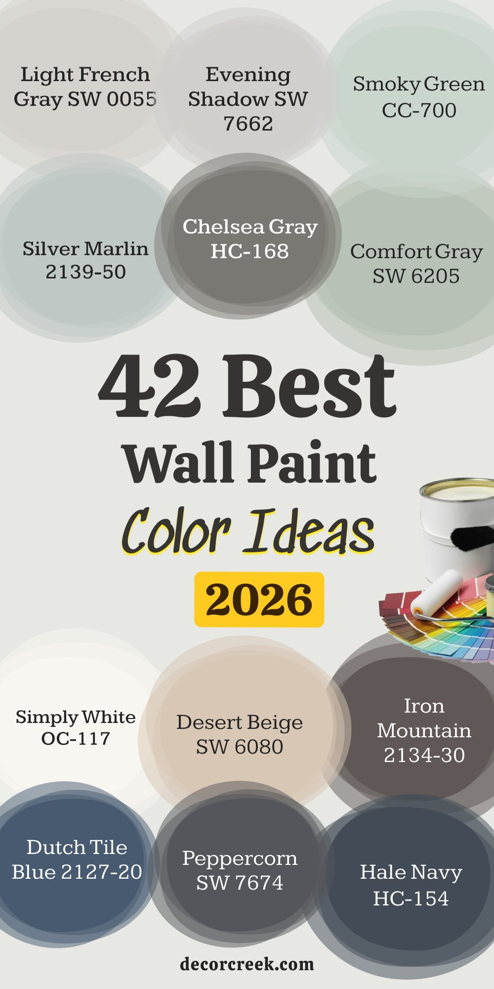
42 best wall paint color ideas in 2026
Mindful Gray SW 7016
Mindful Gray SW 7016 feels steady and dependable, giving walls a balanced look that works in nearly any room. It reflects light softly, staying true in both bright and shaded corners. It pairs beautifully with creamy trim, dark frames, or brushed metal accents, offering easy styling. I like how it adds quiet strength without stealing the show.
The tone works equally well for living rooms, bedrooms, or entryways. For me, this is a go-to shade when I want comfort and balance in one place.
Balboa Mist OC-27
Balboa Mist OC-27 feels airy and welcoming, a soft neutral that brightens walls with grace. It carries just enough warmth to keep rooms from feeling flat. It pairs effortlessly with linen fabrics, light wood finishes, and natural accents. I enjoy how it creates an open backdrop that supports artwork and furniture. The tone adapts to both modern and traditional designs with ease.
For me, this is a color I use when I want rooms to feel fresh and cared for.
Keystone Gray SW 7504
Keystone Gray SW 7504 feels grounded and strong, giving walls a richness that lasts. It provides depth without making the room feel closed in. It pairs beautifully with crisp whites, warm wood tones, and leather accents. I love how it sets the stage for cozy gatherings and quiet evenings alike.
The shade fits both rustic homes and sleek city apartments. For me, this is a trusted pick when I want depth and comfort together.
Stonington Gray HC-170
Stonington Gray HC-170 feels sharp and modern, a cool tone that lifts walls with clarity. It reflects daylight in a way that keeps rooms bright but structured. It pairs well with black frames, polished floors, and clean-lined furniture. I enjoy how it looks crisp in the morning and soothing by night.
The shade works beautifully in open layouts or smaller, tidy rooms. For me, this is a paint that always feels current and reliable.
Urbane Bronze SW 7048
Urbane Bronze SW 7048 feels bold and dramatic, bringing richness and character to walls. It creates depth that frames lighter accents beautifully. It pairs with warm metals, soft fabrics, and natural wood for a striking balance. I like how it makes a room feel designed with intention without becoming overwhelming.
The tone works as an accent wall or an all-over color in larger rooms. For me, this is the shade that adds sophistication and warmth.
Horizon Gray 2141-50
Horizon Gray 2141-50 feels soft and natural, a gray-green that brings a touch of the outdoors in. It shifts gently with the light, offering warmth during the day and depth at night. It pairs beautifully with wicker furniture, woven rugs, and pale curtains. I enjoy how it makes a room feel grounded without losing brightness.
The shade adapts to both casual family spaces and refined living areas. For me, this is a reliable pick when I want walls to carry quiet charm.
Retreat SW 6207
Retreat SW 6207 feels earthy and rich, a green-gray that steadies a room. It creates an inviting depth, perfect for living rooms or dining areas. It pairs with leather chairs, stone details, and soft lighting for a layered effect. I love how it gives presence without being overpowering. The tone works equally well in modern and rustic interiors.
For me, this is a shade that makes walls feel safe and welcoming.
Pashmina AF-100
Pashmina AF-100 feels warm and refined, a taupe that adds richness and comfort. It reflects light in a way that keeps the room soft, never dull. It pairs beautifully with creamy whites, brass hardware, and natural fabrics. I enjoy how it suits both sleek designs and cozy, layered rooms. The shade brings depth while still feeling approachable.
For me, this is a dependable neutral that makes walls feel polished yet inviting.
Evergreen Fog SW 9130
Evergreen Fog SW 9130 feels calm and earthy, a green-gray that connects the home to nature. It shifts softly with lighting, offering brightness during the day and grounding at night. It pairs beautifully with warm woods, woven baskets, and brass lighting. I like how it gives a gentle character without demanding attention.
The tone feels modern but also timeless in its ease. For me, this is the paint I reach for when I want natural comfort indoors.
Storm AF-700
Storm AF-700 feels bold yet steady, a medium gray that adds presence to walls. It holds just enough brightness to avoid heaviness while still offering depth. It pairs with crisp trim, black details, and textured fabrics. I enjoy how it creates a backdrop that feels designed without being fussy. The shade works in both large open spaces and smaller, cozy rooms.
For me, this is a color that always delivers strength and warmth.
Dorian Gray SW 7017
Dorian Gray SW 7017 feels balanced and steady, offering a mid-tone gray that adds structure to walls. It reflects light in a way that keeps the room from feeling heavy, while still providing depth. It pairs beautifully with soft cream trim, black accents, and natural wood floors. I like how it creates a sense of calm structure, supporting both bold décor and simple styling.
The tone feels modern without being cold, making it adaptable for many designs. For me, this is a dependable neutral that holds a room together.
Wickham Gray HC-171
Wickham Gray HC-171 feels airy and open, a cool shade that brightens walls with ease. It has a soft presence that reflects natural light beautifully, keeping spaces fresh. It pairs with crisp white trim, pale wood, and delicate fabrics. I enjoy how it adds a clean look without losing softness.
The tone fits coastal-inspired rooms just as well as city apartments.
For me, this is a color I reach for when I want freshness with a gentle edge.
Moody Blue SW 6221
Moody Blue SW 6221 feels expressive and full of life, bringing personality to the walls. It carries depth while still reflecting light, which keeps a room from feeling closed in. It pairs beautifully with brass lighting, white trim, and natural fabrics. I like how it creates a striking mood without being overbearing.
The shade works for accent walls or as a full-room statement.
For me, this is a choice that gives any room character and charm.
Coventry Gray HC-169
Coventry Gray HC-169 feels sleek and modern, a cool-toned gray that keeps walls looking crisp. It reflects daylight with clarity, offering brightness without harshness. It pairs beautifully with white trim, dark furnishings, and brushed metal fixtures. I enjoy how it creates a polished look that feels intentional and fresh.
The tone adapts to both large and small rooms with ease.
For me, this is a paint that always makes a home feel well put together.
Oyster Bay SW 6206
Oyster Bay SW 6206 feels soft and coastal, a green-gray that brings a relaxed mood to walls. It reflects light in a way that keeps spaces gentle and welcoming. It pairs with wicker chairs, pale fabrics, and sandy woods for a natural look. I love how it feels light in daylight yet still grounded in evening light.
The tone works well in both beach-inspired and modern interiors. For me, this is a shade that gives rooms a fresh and comforting character.
Ashwood OC-47
Ashwood OC-47 feels warm and versatile, a beige-gray that blends easily into different styles. It adds softness to walls without fading into the background. It pairs beautifully with neutral furniture, warm woods, and textured fabrics. I like how it makes everything in the room feel harmonious and cared for.
The tone works equally well in modern homes and traditional designs.
For me, this is a steady neutral that gives balance and warmth to living spaces.
Rainwashed SW 6211
Rainwashed SW 6211 feels airy and refreshing, a soft blue-green that brightens walls. It reflects daylight with a clean glow, making rooms feel more open. It pairs beautifully with white trim, natural fabrics, and sandy wood finishes. I love how it carries a lighthearted mood while still feeling grounded.
The tone brings a hint of coastal energy into the home.
For me, this is the paint I choose when I want a cheerful yet gentle backdrop.

Boothbay Gray HC-165
Boothbay Gray HC-165 feels polished and refined, a cool gray-blue that adds elegance to walls. It reflects light softly, giving rooms a steady and stylish appearance. It pairs beautifully with crisp trim, dark frames, and polished wood. I enjoy how it works as both a calm backdrop and a striking accent. The tone feels classic yet adaptable to modern spaces.
For me, this is a reliable shade that gives any room quiet sophistication.
Soft Chamois OC-13
Soft Chamois OC-13 feels light and creamy, a gentle neutral that brightens walls without sharpness. It reflects sunlight beautifully, making rooms feel soft and open. It pairs with warm woods, white accents, and soft textiles. I like how it creates warmth while still feeling fresh and airy.
The tone adapts well to bedrooms, dining rooms, or hallways. For me, this is a shade that makes a home glow with comfort.

Thunder AF-685
Thunder AF-685 feels bold and solid, a deep neutral that anchors a room. It holds light in a way that gives walls depth and presence. It pairs beautifully with crisp trim, dark furniture, and rich fabrics. I enjoy how it makes a room feel designed and intentional.
The tone works well for accent walls or as a full backdrop in larger spaces. For me, this is a shade that adds confidence and style.

Quiet Moments 1563
Quiet Moments 1563 feels soft and graceful, a gentle mix of blue and green that brings calm energy to walls. It reflects daylight in a way that keeps the room feeling open yet restful. It pairs beautifully with white trim, pale woods, and woven fabrics. I like how it creates a backdrop that encourages relaxation without dullness.
The tone fits bedrooms, bathrooms, or reading corners with equal ease. For me, this is a shade that always feels nurturing and balanced.

Rock Candy SW 6231
Rock Candy SW 6231 feels crisp and modern, a pale gray with a touch of blue that refreshes walls. It reflects light in a way that makes rooms feel brighter and more open. It pairs beautifully with black accents, metal fixtures, and white trim. I enjoy how it adds a sleek look without being harsh.
The tone works beautifully in kitchens, offices, or clean-lined living spaces. For me, this is a dependable choice for a fresh, airy design.

Light French Gray SW 0055
Light French Gray SW 0055 feels balanced and refined, a classic mid-tone gray for walls. It reflects light softly, making rooms feel grounded and steady. It pairs beautifully with crisp whites, warm metals, and natural woods. I like how it adapts easily to both bright daylight and warm evening lamps.
The tone works equally well in large gathering spaces and smaller bedrooms. For me, this is a neutral that never feels outdated or overdone.

Evening Shadow SW 7662
Evening Shadow SW 7662 feels soft and inviting, a gray with a quiet elegance that makes walls glow. It reflects light in a way that keeps the room cozy without heaviness. It pairs beautifully with cool whites, brushed metals, and woven accents. I enjoy how it creates a backdrop that feels stylish yet easy to live with.
The tone suits modern interiors and traditional homes alike. For me, this is a shade that makes spaces feel steady and welcoming.

Smoky Green CC-700
Smoky Green CC-700 feels fresh and natural, a gentle green that gives walls a lived-in charm. It reflects light in a way that keeps the room feeling open and airy. It pairs beautifully with pale fabrics, wicker accents, and wooden details. I love how it brings a sense of nature indoors without being overpowering.
The tone works well in dining rooms, sunrooms, or family spaces. For me, this is a shade that creates comfort while staying lively.
Silver Marlin 2139-50
Silver Marlin 2139-50 feels airy and cool, a soft blue-gray that refreshes walls. It reflects daylight with a brightness that keeps rooms cheerful. It pairs beautifully with crisp whites, silver hardware, and pale wood finishes. I like how it gives structure while still feeling gentle.
The tone fits bathrooms, bedrooms, and kitchens with equal ease. For me, this is a paint that makes spaces feel clean and light.
Chelsea Gray HC-168
Chelsea Gray HC-168 feels bold and confident, a deep gray that adds richness to walls. It reflects just enough light to feel strong without being heavy. It pairs beautifully with white trim, dark furniture, and metallic accents. I enjoy how it makes a room feel tailored and elegant.
The tone works as an accent wall or for an entire room if balanced with lighter elements. For me, this is a shade that adds presence and style.
Comfort Gray SW 6205
Comfort Gray SW 6205 feels soothing and natural, a soft green-gray that creates ease on walls. It reflects light gently, keeping spaces feeling open yet grounded. It pairs beautifully with white trim, pale woods, and woven rugs. I love how it connects a room to nature without overwhelming it.
The tone fits bedrooms, dining rooms, and cozy living areas. For me, this is a color that always makes a space feel comfortable and lived in.

Simply White OC-117
Simply White OC-117 feels fresh and bright, a true white that gives walls clarity. It reflects daylight with sharpness, opening up even the smallest rooms. It pairs beautifully with wood floors, dark accents, or bold colors. I like how it supports any décor, from modern minimal to layered traditional.
The tone never feels flat, always adding energy to the room. For me, this is one of the most dependable whites for any home.
Desert Beige SW 6080
Desert Beige SW 6080 feels warm and steady, a sandy neutral that adds softness to walls. It reflects light in a way that makes rooms glow gently. It pairs beautifully with earthy tones, dark wood, and woven textures. I enjoy how it feels cozy without being heavy, suiting both small and large spaces.
The tone works well in family rooms, dining spaces, or entryways. For me, this is a shade that makes homes feel welcoming and natural.
Iron Mountain 2134-30
Iron Mountain 2134-30 feels bold and grounded, a deep shade that makes walls stand out with confidence. It holds light in a way that gives structure and depth without overwhelming the room. It pairs beautifully with crisp trim, brass accents, and soft textiles. I like how it brings a sense of drama that still feels livable.
The tone works well for accent walls, dining rooms, or modern living spaces. For me, this is a color that creates focus and strength.

Dutch Tile Blue 2127-20
Dutch Tile Blue 2127-20 feels rich and expressive, a deep blue that fills a room with personality. It reflects light just enough to keep the shade from feeling too heavy. It pairs beautifully with white trim, warm woods, and metal finishes. I love how it makes artwork and fabrics stand out more vividly.
The tone fits coastal homes, formal dining rooms, or cozy bedrooms. For me, this is a paint that makes spaces feel unique and full of character.
Peppercorn SW 7674
Peppercorn SW 7674 feels sleek and sophisticated, a near-black gray that gives walls a dramatic edge. It absorbs light enough to create depth but still reflects a hint of softness. It pairs beautifully with crisp whites, pale fabrics, and metallic details. I enjoy how it makes rooms feel modern and stylish without being cold.
The tone works perfectly for accent walls, kitchens, or open-plan living spaces. For me, this is a shade that adds instant refinement.

Hale Navy HC-154
Hale Navy HC-154 feels timeless and bold, a navy that always looks polished on walls. It holds depth that makes a room feel elegant while staying approachable. It pairs beautifully with brass fixtures, white trim, and warm woods. I love how it looks strong in daylight and rich under lamps at night.
The tone works equally well in libraries, dining rooms, or bedrooms. For me, this is a shade that never fails to impress.
Kendall Charcoal HC-166
Kendall Charcoal HC-166 feels powerful and rich, a dark neutral that adds weight and elegance. It reflects just enough light to keep the shade from closing in a room. It pairs beautifully with white trim, beige accents, and wooden furniture. I like how it creates a refined backdrop that suits both modern and traditional interiors.
The tone works as a whole-room color or as an accent with lighter shades. For me, this is a trusted dark neutral that always looks sophisticated.
Rainstorm SW 6230
Rainstorm SW 6230 feels dramatic and bold, a deep blue that adds striking energy to walls. It reflects light enough to keep its richness visible without flattening. It pairs beautifully with gold accents, white trim, and textured fabrics. I enjoy how it makes a statement without needing much décor.
The tone feels right in dining rooms, bedrooms, or bold entryways. For me, this is a shade that turns any wall into a feature.

Homburg Gray SW 7622
Homburg Gray SW 7622 feels earthy and balanced, a deep green-gray that grounds a space. It reflects light in subtle ways, offering both depth and softness. It pairs beautifully with natural woods, creamy whites, and black accents. I like how it creates a sophisticated look while still feeling approachable.
The tone works for living rooms, offices, or bedrooms. For me, this is a color that builds quiet elegance into a home.

Buxton Blue HC-149
Buxton Blue HC-149 feels airy and cheerful, a soft blue that brightens walls with ease. It reflects light beautifully, keeping spaces fresh and welcoming. It pairs with crisp whites, light woods, and woven accents. I love how it brings a playful energy while still feeling grown-up.
The tone suits bedrooms, kitchens, or hallways. For me, this is a shade that always lifts the mood of a room.
Smoky Taupe 983
Smoky Taupe 983 feels warm and grounded, a taupe that creates depth while staying inviting. It reflects light softly, adding character without heaviness. It pairs beautifully with cream accents, natural fabrics, and wooden details. I enjoy how it makes a room feel cozy but still sophisticated.
The tone adapts to both formal and casual spaces with ease. For me, this is a paint that brings warmth and character to walls.
Beach Glass 1564
Beach Glass 1564 feels soft and breezy, a gentle green-blue that refreshes walls. It reflects daylight in a way that keeps rooms feeling light and open. It pairs beautifully with sandy neutrals, white trim, and woven textures. I like how it feels coastal without being too strong.
The tone works in bedrooms, living rooms, or sunrooms. For me, this is a shade that creates a lighthearted and easy mood.

Tricorn Black SW 6258
Tricorn Black SW 6258 feels bold and striking, a pure black that adds dramatic strength to walls. It absorbs light to create depth while still keeping a sharp, modern look. It pairs beautifully with crisp whites, brass fixtures, and pale fabrics. I love how it frames a space and makes details stand out clearly.
The tone works for accent walls, trim, or even entire rooms in daring designs. For me, this is a statement shade that never goes unnoticed.
Sea Pearl OC-19
Sea Pearl OC-19 feels soft and elegant, a pale neutral that adds quiet warmth to walls. It reflects light in a way that makes rooms feel brighter and more open. It pairs beautifully with creamy whites, muted grays, and natural accents. I enjoy how it creates a backdrop that feels graceful without being plain.
The tone works in bedrooms, kitchens, or hallways. For me, this is a color that adds polish and ease to any home.

My Last Word on 42 Best Wall Paint Color Ideas in 2026
When I think about all these shades together, I see more than just paint—I see how each one has the power to change the way a room feels to live in. Some colors make mornings brighter and set the tone for a fresh start, while others make evenings warmer, wrapping the day in comfort.
Many shades carry balance, helping a space feel steady no matter the time or season. I believe the best choice is not about chasing what’s trendy but about choosing what makes you feel at home the moment you step through the door.
The right wall color should ease your daily routine, helping mornings run smoothly and nights feel restful. It should make family meals more inviting, gatherings with friends more joyful, and quiet moments more meaningful.
That’s why I always return to these trusted paints—they not only offer beauty but also reliability, staying true through light, time, and life’s little messes. To me, design has never been about perfection; it’s about connection.
A room should welcome you, support you, and tell your story. For me, the most important part of my work is helping people feel truly connected to their homes, and these colors do exactly that, day after day.