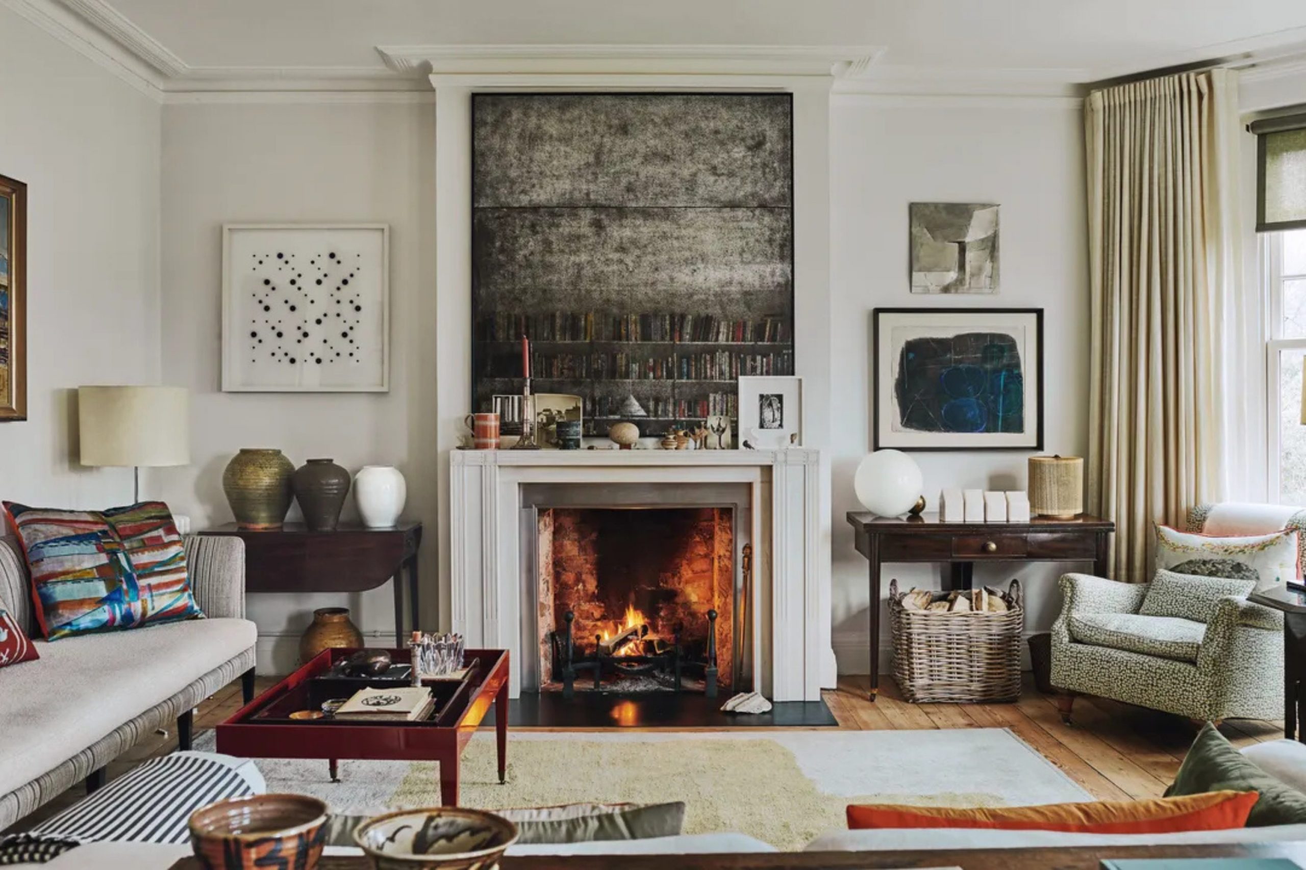
I have spent years walking through houses and figuring out which paints actually make a home feel right. Choosing a color is not just about a chip from the store because it changes how you feel when you sit on your sofa. In 2026, we are looking for looks that feel fresh but also make sense for a real family house.
I want to show you how to mix light and dark tones to get a look that stands out. My goal is to give you a list that takes the guessing out of your next project. You can trust these pairs to work because I have tested them in real light and real rooms. I know how hard it is to look at a small paper square and imagine it on a huge wall in your own house. You want a home that feels like you, not like a page from a cold catalog.
I have seen so many people pick a color that looks great in the store but turns purple or yellow once it is on the wall. This guide is here to help you avoid those mistakes and find a look that makes you proud. We will look at how light moves through a room and how different shades can play together to make your furniture look its best.
You deserve a home that feels warm and ready for real life every single day.
Why I Trust Proven Paint Brands When Creating Living Room Color Pairings
I always pick Sherwin-Williams and Benjamin Moore when I want to create a high-end look for a house. These brands have deep pigments that stay true even when the sun hits the walls directly throughout the day. A good living room needs rich tones that look expensive without being too much for a normal family home. I found that their dark greens and deep blues have a weight to them that cheaper paints just cannot match.
They provide a smooth finish that makes old trim or new furniture look like a million bucks. You want a paint that covers well and stays looking good for years of heavy use by kids and pets. Using these two brands means I never have to worry about the color looking flat or dull after it dries. I have tried many other paints over the years, but I always come back to these two for my staging projects.
The way the paint flows off the brush makes the job much easier for anyone doing the work themselves. You can really feel the quality when you touch the finished wall, as it feels thick and solid. These companies spend a lot of time making sure their colors look the same in every bucket you buy.
It is a relief to know that the color on the lid is exactly what you will see on your ceiling and trim. Your home is a big investment, so using the best paint is a smart way to protect it.
How I Choose Living Room Paint Combinations That Feel Balanced and Inviting
Choosing a combination involves looking at the undertones of your floor and your biggest piece of furniture. I like shades that have a bit of gray or blue in them so they do not look like a bright forest or a bowl of fruit. You should hold your paint sample against your rug to see if the colors fight or get along. A good accent color should feel solid and grounded so it acts as a backdrop for your lamps and art.
I check the paint at noon and again at night to see how the shadows change the mood of the room. If the color stays rich in the dark, then I know it is a winner for a real living room. It is all about finding a balance where the wall feels present but does not take over the whole conversation. I always tell my clients to paint a large board and move it around the room before they commit to a color. You need to see how the paint looks next to your curtains and your favorite armchair.
Some colors look great in a bright kitchen but feel too heavy in a living room with small windows. I look for pairs that help the eye move easily from one side of the house to the other. A perfect mix should make the room feel put together even if you have mismatched pillows or old rugs. My method is to pick one light neutral and one strong partner to give the room a sense of purpose. When the walls look right, everything else in the house starts to fall into place.

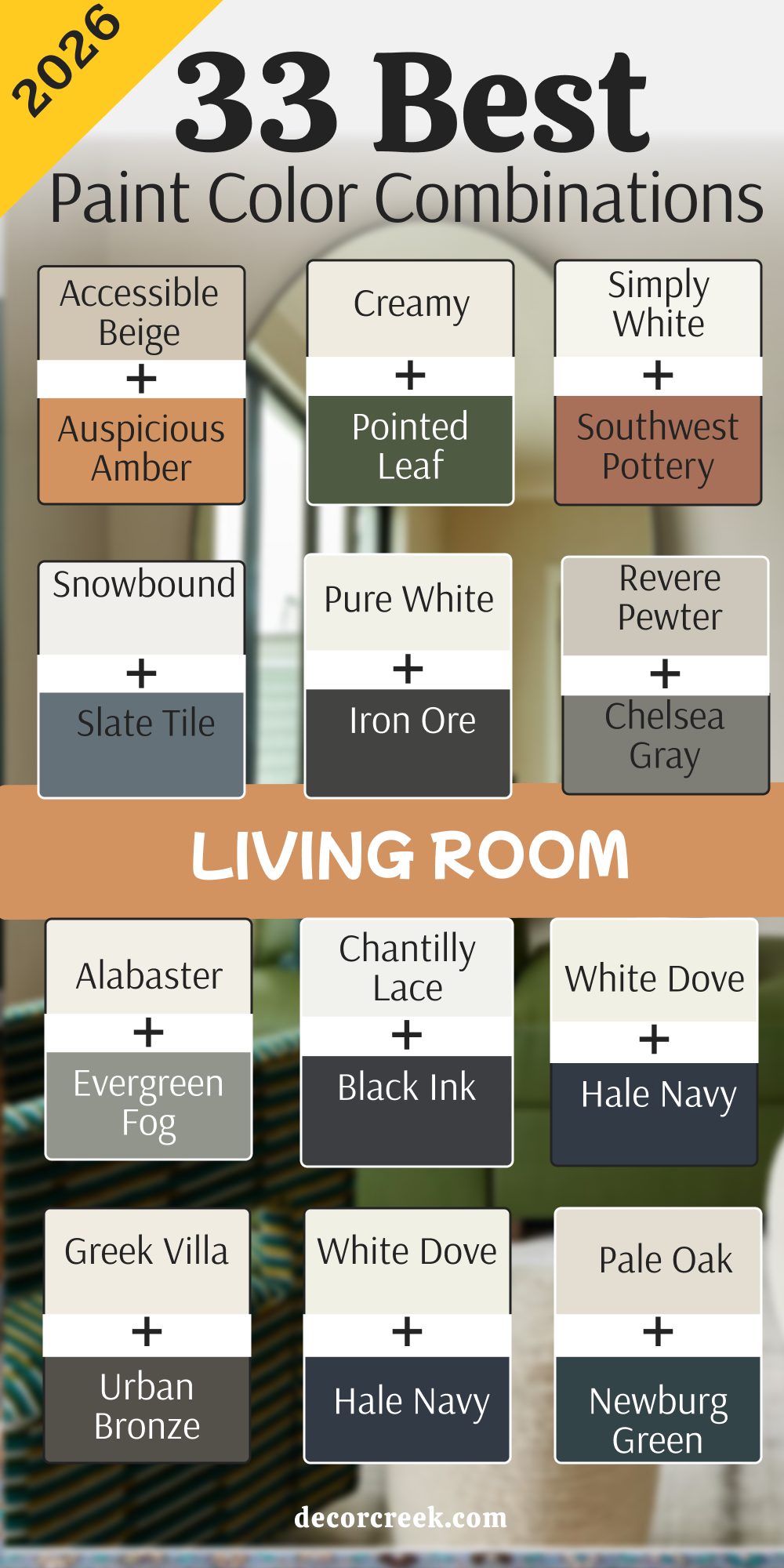
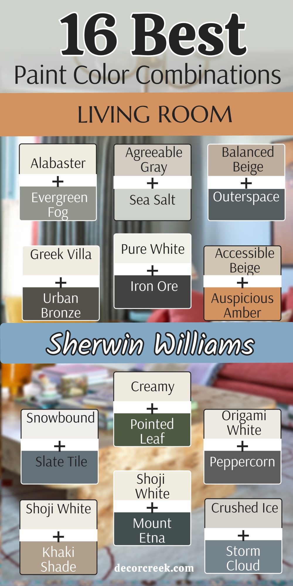
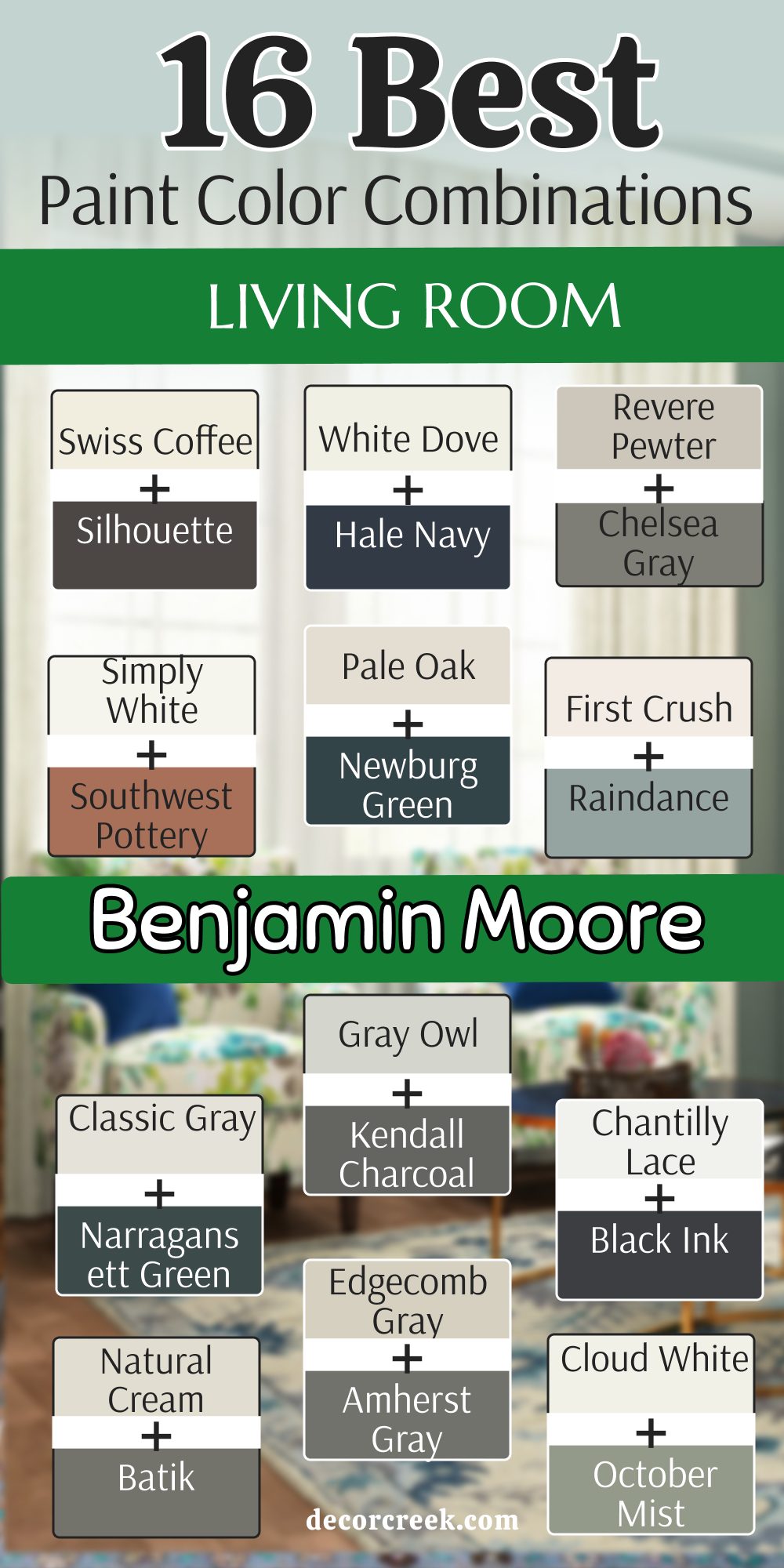
16 Living Room Paint Color Combinations From Sherwin Williams
Alabaster SW 7008 & Evergreen Fog SW 9130
Alabaster (SW 7008) starts the room with a creamy feel that is not too yellow. Evergreen Fog (SW 9130) adds a dusty green touch that brings the outdoors inside your house. This pair works because the light wall keeps the room bright while the green gives it a bit of personality.

You will see that the light bounces off the walls in a way that makes the room feel larger. Dark wood furniture looks very sharp against these two colors. Most people find that this mix helps them feel relaxed after a long day at work.
The green is deep enough to feel fancy but light enough to stay friendly. I suggest using the green on a wall with a fireplace to make a big statement. Everyone who walks in will notice how the colors match your plants and pillows. It is a very safe choice for someone who wants a little color without going too dark.
Best used in: living rooms, kitchens, hallways, bedrooms, and farmhouse exteriors
Pairs well with: Iron Ore SW 7069, Agreeable Gray SW 7029, Natural Linen SW 9109, warm wood tones The key rule of this color for farmhouse style is to use it where you want natural light to feel kind, soft, and inviting throughout the day.

Agreeable Gray SW 7029 & Sea Salt SW 6204
Agreeable Gray (SW 7029) acts as a neutral base that goes with almost any kind of floor. Sea Salt (SW 6204) brings a watery blue and green mix that feels like a trip to the beach. This combination is great for rooms that get a lot of bright afternoon sun.

You will notice that the gray keeps the blue from looking like a baby room. The two tones stay very light so the whole area feels open and airy for your family. I love how these colors look with white trim and light oak wood floors.
Many homeowners choose this when they want a clean look that is not just plain white. The blue-green accent is very light and does not shout at you when you enter. It makes a great backdrop for photos and art on the walls. You can use the gray on three walls and the blue on the last one for a nice balance.
Best used in: bathrooms, laundry rooms, living rooms, and coastal style bedrooms
Pairs well with: Extra White SW 7006, Mega Greige SW 7031, Steamed Milk SW 7554, driftwood The key rule of this color for coastal style is to use it where you want the air to feel light and the walls to reflect a breezy outdoor vibe.

Balanced Beige SW 7037 & Outerspace SW 6241
Balanced Beige (SW 7037) gives the walls a warm and sandy look that feels very sturdy. Outerspace (SW 6251) is a very dark denim blue that adds a lot of drama to the room. This mix is perfect for a cozy den or a place where you watch movies with your kids.

You will find that the dark blue makes the walls feel like they are giving you a hug. The beige keeps the room from feeling like a dark cave by adding a touch of sunlight. I think this pair looks best with leather sofas and metal lamps. Dark colors like this blue are very popular right now for creating a focal point.
You can paint your bookshelves in the blue to make your books really stand out. The beige is a classic choice that will not go out of style next year. It is a smart way to use a very dark color without making the room feel small.
Best used in: home offices, basements, living rooms, and accent walls
Pairs well with: Origami White SW 7636, Urban Bronze SW 7048, Dover White SW 6385, brass accents The key rule of this color for a moody style is to use it in areas where you want to feel tucked in and cozy during the evening.

Greek Villa SW 7551 & Urban Bronze SW 7048
Greek Villa (SW 7551) is a very bright white that has a tiny bit of warmth so it does not feel like a hospital. Urban Bronze (SW 7048) is a deep brownish gray that looks like metal or stone. This duo creates a high contrast look that is very popular in new homes today.

You will see that the dark color makes the white look even cleaner and crisper. I like to use the bronze on doors or window frames to add a bit of weight. The white walls allow you to use colorful rugs and bright pillows without things looking messy.
Many people love how the bronze changes from brown to gray depending on the light. It is a very sophisticated choice for a modern living area. You can even use the dark color on the ceiling if you are feeling very brave. This pair makes everything in the room look like it was picked by a pro.
Best used in: exteriors, modern living rooms, entryways, and kitchen cabinets
Pairs well with: Shoji White SW 7042, Pewter Green SW 6208, Drift of Mist SW 9166, black metal The key rule of this color for a modern look is to use it to create sharp lines that guide the eye toward your favorite views.

Pure White SW 7005 & Iron Ore SW 7069
Pure White (SW 7005) is my favorite choice for a clean and simple background that never fails. Iron Ore (SW 7069) is a soft black that looks much better than a harsh jet black. This combination is the ultimate choice for a sharp and tidy home.

You will notice that the black accent makes the white walls feel very bright and energetic. I often use this mix in houses where the owner has a lot of black and white art. The dark charcoal color is great for a fireplace or a wall behind a television.
It hides cords and shadows very well while looking very sleek. You can add wood accents to keep the room from feeling too cold or stiff. This pair is a winner for anyone who likes a minimal look that still has a lot of punch. It is easy to live with because it never clashes with your clothes or your holiday decor.
Best used in: modern farmhouses, lofts, hallways, and trim work
Pairs well with: Repose Gray SW 7015, Tricorn Black SW 6258, Requisite Gray SW 7023, light maple The key rule of this color for a sharp look is to use it as a frame for the rest of your home to make every detail pop.

Accessible Beige SW 7036 & Auspicious Amber SW 6366
Accessible Beige (SW 7036) is a very famous color because it sits right between gray and tan. Auspicious Amber (SW 6366) is a warm and earthy orange-yellow that feels like a sunset. This pair is great for people who want their living room to feel very welcoming and sunny.

You will find that the amber color adds a lot of heat and joy to the room. The beige keeps the orange from being too loud or making the room look like a pumpkin. I like to use this mix in homes that have a lot of natural stone or brick.
It makes the room feel very organic and connected to the earth. You can use the amber on a small wall or even inside a closet for a fun surprise. This is a very happy combination that makes people want to sit down and stay a while. It works well with green plants and brown rugs.
Best used in: dining rooms, living rooms, kitchens, and sunrooms
Pairs well with: Alabaster SW 7008, Cadet SW 9143, Thunder Gray SW 7645, terracotta tiles The key rule of this color for a warm look is to use it in rooms where you gather with friends to make the mood feel bright.
Snowbound SW 7004 & Slate Tile SW 7624
Snowbound (SW 7004) is a cool white that has a hint of gray to keep it soft. Slate Tile (SW 7624) is a dusty blue-gray that looks like the color of a stormy sky. This pair is very good for a room where you want to feel focused and organized.

You will see that the blue-gray has a lot of depth without being too dark for a small room. The white walls make the blue look very rich and intentional. I suggest using this mix with silver or chrome accents for a very polished finish.
It is a great choice for a home office that is part of your living room. The blue is very professional but also feels like a nice change from basic gray. You can use the blue on the lower half of the wall with white on top. This creates a very classic look that feels fresh for 2026. Many people find this color combo very easy on the eyes.
Best used in: bedrooms, home offices, living rooms, and mudrooms
Pairs well with: Nebulous White SW 7063, Black Magic SW 6991, Silver Strand SW 7057, cool metals The key rule of this color for a crisp look is to use it where you want the light to feel steady and clean all day.

Creamy SW 7012 & Pointed Leaf SW 6436
Creamy (SW 7012) is a very soft and rich off-white that feels like silk.Palm Leaf SW 7735 is a vibrant forest green that brings a lot of life to the walls. This combination is perfect for a traditional home that wants to feel updated.

You will love how the green makes the creamy walls look very expensive and lush. The green is dark enough to feel serious but bright enough to feel active. I like to use this pair with gold frames and antique wood furniture. It creates a look that feels like an old library but in a modern way.
The creamy tone is much better than a cold white for rooms with older windows. You can use the green on the walls and the creamy color on the ceiling for a cozy effect. It is a very solid choice for a room where you read or talk.
Best used in: libraries, dens, living rooms, and dining areas
Pairs well with: Latte SW 6108, Van Dyke Brown SW 7041, Kilim Beige SW 6106, antique gold The key rule of this color for a traditional look is to use it to highlight old furniture and make it feel new again.
Origami White SW 7636 & Peppercorn SW 7674
Origami White (SW 7636) is a clean neutral that looks great in any kind of light. Peppercorn (SW 7674) is a very deep gray that is almost black but has a softer edge. This duo is a top choice for a high-fashion look in your living room.
You will notice that the dark gray makes your colorful pillows and art really stand out. I use this mix when I want a room to look very edited and sharp. The white is not too stark so it feels very comfortable for a family home.
Peppercorn is one of the best colors for an accent wall because it is so neutral. It goes with every other color you might want to bring into the room later. You can paint your fireplace this dark gray to make it the star of the house. This pair is very reliable and always looks good in photos.
Best used in: living rooms, media rooms, entryways, and kitchen islands
Pairs well with: Anew Gray SW 7030, Extra White SW 7006, Tricorn Black SW 6258, colorful accents The key rule of this color for a bold look is to use it to ground the room and make your favorite items pop.
Shoji White SW 7042 & Khaki Shade SW 7533
Shoji White (SW 7042) is a warm white that feels very soft and a little bit like paper. Khaki Shade (SW 7533) is a medium tan that looks very natural and earthy. This pair is great for a room where you want to feel very close to nature.

You will find that these tones work very well with linen fabrics and woven baskets. The tan color adds just enough contrast to make the white walls look purposeful. I like this mix for a relaxed living room where you spend time with your pets.
It hides a little bit of dust better than a very bright white or a very dark blue. The colors stay very quiet and do not demand too much attention. You can use the tan on the trim for a very unique and custom look. This is a very gentle combination that works in any season of the year.
Best used in: sunrooms, living rooms, porches, and hallways
Pairs well with: Urban Bronze SW 7048, Worldly Gray SW 7043, Greek Villa SW 7551, natural fibers The key rule of this color for an organic look is to use it to blend your indoor furniture with the view outside your windows.
Swiss Coffee SW 7002 & Mount Etna SW 7625
Swiss Coffee (SW 7002) is a very popular creamy white that feels very cozy and familiar. Mount Etna (SW 7625) is a dark and mysterious blue-green that has a lot of gray in it. This pair is a fantastic choice for an Art Deco style room with a modern twist.
You will see that the dark color looks very high-end when paired with the soft white. I like to use the dark blue-green on an accent wall or on built-in cabinets. The white walls keep the room from feeling too heavy or dark for everyday living.
Mount Etna is a very complex color that looks different as the sun moves across the sky. It feels very smart and thoughtful as a choice for a main living area. You can add velvet chairs or brass lamps to really make this pair shine. It is a very trendy mix for 2026 that still feels very solid.
Best used in: bedrooms, living rooms, libraries, and furniture flips
Pairs well with: Alabaster SW 7008, Accessible Beige SW 7036, Caviar SW 6990, velvet fabrics The key rule of this color for a rich look is to use it as a backdrop for shiny metals and soft textures.
Crushed Ice SW 7647 & Storm Cloud SW 6249
Crushed Ice (SW 7647) is a very light gray that feels cool and crisp like a winter morning. Storm Cloud (SW 6249) is a medium blue that has a lot of gray mixed in to keep it grounded. This combination is perfect for a room that needs to feel very tidy and fresh.
You will notice that the blue adds a nice pop of color without being too bright. The light gray walls make the room feel open and very clean at all times. I love using this mix in homes with light gray or white floors. It creates a very consistent look that is easy to decorate around.
The blue is dark enough to provide contrast but light enough to stay friendly. You can use the blue on a long wall to make the room feel deeper. This is a very safe and pretty choice for a first home.
Best used in: nurseries, living rooms, bathrooms, and laundry rooms
Pairs well with: Snowbound SW 7004, Naval SW 6244, On the Rocks SW 7671, silver trim The key rule of this color for a fresh look is to use it in rooms with lots of windows to catch the morning light.
City Loft SW 7631 & Grandiose SW 6404
City Loft (SW 7631) is a very soft gray that has a tiny bit of red in it to keep it warm. Grandiose (SW 6404) is a bold and deep gold that feels very royal and fun. This pair is for someone who wants to take a risk and have a room that stands out.

You will find that the gold color adds a lot of energy and warmth to the living area. The light gray walls keep the gold from feeling too loud or distracting. I like to use the gold on a small wall or inside an arched doorway.
It makes the whole house feel more custom and expensive. City Loft is a great neutral that works well with almost any other color you have. The gold is a very 2026 choice that brings back a bit of vintage glam. You will feel very creative and happy in a room with these colors.
Best used in: entryways, living rooms, dining rooms, and creative studios
Pairs well with: Pure White SW 7005, Iron Ore SW 7069, Black Magic SW 6991, gold leaf The key rule of this color for a bold look is to use the gold sparingly to make it feel like a special treat for the eyes.
Pearly White SW 7009 & Reddened Earth SW 6053
Pearly White (SW 7009) is a soft white with a tiny hint of peach that feels very glowing. Reddened Earth (SW 6053) is a deep terracotta color that looks like clay or old bricks. This combination is wonderful for a home that wants to feel very warm and grounded.
You will love how the reddish-brown color makes the room feel very sturdy and safe. The white walls keep the look light enough for a modern family living room. I often use this mix in houses with a lot of tile or wood elements.
It creates a very natural look that reminds me of the desert or a garden. The clay color is very popular for 2026 because people want to feel more connected to nature. You can use the red on one wall and keep the rest white for a simple balance. It is a very comforting pair of colors for a main room.
Best used in: living rooms, kitchens, mudrooms, and southwest style homes
Pairs well with: Shoji White SW 7042, Urbane Bronze SW 7048, Kilim Beige SW 6106, natural clay The key rule of this color for an earthy look is to use it to bring a sense of the outdoors into your most used rooms.
Skyline Steel SW 1015 & Cyberspace SW 7076
Skyline Steel (SW 1015) is a medium gray that feels very industrial and strong. Cyberspace (SW 7076) is a very dark navy blue that has a lot of black in it. This duo is perfect for a room that you want to look very modern and masculine.
You will see that the dark blue is very deep and looks great with metal furniture. The gray walls provide a solid base that makes the blue look very intentional. I like to use this mix in a basement or a media room where you want a moody vibe.
Cyberspace is one of my favorite dark colors because it feels very expensive. Skyline Steel is a great choice for walls because it hides scuffs and marks very well. You can add bright white trim to make the colors really pop. This is a very cool and smart looking pair for a 2026 home.
Best used in: media rooms, offices, living rooms, and kitchen islands
Pairs well with: High Reflective White SW 7757, Agreeable Gray SW 7029, Black Magic SW 6991, steel accents The key rule of this color for a moody look is to use it to create a room that feels like a quiet escape from the world.

Whitetail SW 7103 & Dutch Tile Blue SW 0031
Whitetail (SW 7103) is a very warm and creamy white that looks like natural wool. Dutch Tile Blue (SW 0031) is a classic medium blue that feels very historic and pretty. This pair is a great choice for a cottage or a cozy traditional living room.
You will find that the blue is very friendly and makes everyone feel at home. The creamy white walls make the blue look very bright and cheerful. I love using this mix with floral patterns and light wood furniture.
It creates a very sweet and timeless look that never feels too cold. Dutch Tile Blue is a very steady color that does not change much in different lights. You can use the blue on the walls and the white on the ceiling for a very airy feel. This is a very lovely and simple combination for any house.
Best used in: kitchens, living rooms, laundry rooms, and cottage exteriors
Pairs well with: Alabaster SW 7008, Pointed Leaf SW 6436, Dover White SW 6385, wicker furniture The key rule of this color for a cottage look is to use it to create a bright and happy place for your family to gather.
16 Living Room Paint Color Combinations From Benjamin Moore
Swiss Coffee OC-45 & Silhouette AF-655
Swiss Coffee (OC-45) starts with a very soft and welcoming creamy white that everyone loves. Silhouette (AF-655) adds a very dark and charcoal-brown tone that feels very heavy and rich. This pair is my top pick for a high-end Art Deco look in 2026.

You will see that the dark color makes the room feel very fancy and expensive. The white walls keep the room feeling big and bright during the day. I like to use the dark color on a wall with a lot of art or a big mirror.
This mix is perfect for a room where you entertain guests and want to impress them. The dark tone has a bit of warmth so it never feels like a cold black. You can use the white on all the walls and the dark color just on the trim. This creates a very custom look that people will remember.
Best used in: living rooms, dining rooms, master bedrooms, and accent walls
Pairs well with: Revere Pewter HC-172, Hale Navy HC-154, Simply White OC-117, brass lamps The key rule of this color for a fancy look is to use the dark tone to draw attention to your best pieces of furniture.
White Dove OC-17 & Hale Navy HC-154
White Dove (OC-17) is a very famous off-white that has a tiny bit of gray to keep it soft. Hale Navy (HC-154) is a very deep and classic navy blue that never goes out of style. This combination is a winner for a traditional or nautical looking living room.

You will find that the navy blue adds a lot of strength and class to the walls. The white walls make the blue look very crisp and very clean. I love using this mix with gold or silver accents for a very polished finish.
Hale Navy is often called the perfect navy because it is not too purple or too green. It looks great on a fireplace or as a built-in bookshelf color. White Dove is a very safe choice for walls because it matches almost any rug. This pair is very reliable and always makes a room look put together.
Best used in: offices, living rooms, exteriors, and kitchen cabinets
Pairs well with: Gray Owl 2137-60, Revere Pewter HC-172, Woodmont Cream 204, dark oak The key rule of this color for a classic look is to use the blue to add a sense of history and weight to the room.

Revere Pewter HC-172 & Chelsea Gray HC-168
Revere Pewter (HC-172) is a very popular “greige” that changes from gray to beige depending on the light. Chelsea Gray (HC-168) is a medium-dark gray that feels very solid and sophisticated. This pair is perfect for someone who wants a very neutral and calm looking home.

You will notice that the two grays work together to make the room feel very organized. I like to use the darker gray on a single wall to add a bit of depth. Revere Pewter is great for every wall in the house because it is so easy to live with.
It makes the room feel warm but still looks very modern and clean. You can add any color of furniture you want because these grays go with everything. Many people choose this pair when they are staging a house to sell it. It is a very smart and professional choice for a main living area.
Best used in: open floor plans, living rooms, hallways, and kitchens
Pairs well with: White Dove OC-17, Hale Navy HC-154, Edgecomb Gray HC-173, colorful rugs The key rule of this color for a neutral look is to use different shades of gray to create interest without using bright colors.

Chantilly Lace OC-65 & Black Ink 2127-20
Chantilly Lace (OC-65) is a very bright and clean white that has no yellow or blue undertones. Black Ink (2127-20) is a very deep black that looks like real ink from a pen. This duo is the best choice for a very modern and high-contrast living room.

You will find that the white walls make the room feel massive and very energetic. The black accent adds a sharp line that makes the room look very architectural. I like to use the black on a fireplace or a thin accent wall.
This mix works very well with large windows and lots of natural light. It is a very bold choice but it looks very clean if you keep the room tidy. You can add warm wood floors to make the room feel a bit more comfortable. This is a top choice for a 2026 gallery look.
Best used in: art galleries, modern homes, living rooms, and trim
Pairs well with: Gray Owl 2137-60, Kendall Charcoal HC-166, Simply White OC-117, bright art The key rule of this color for a sharp look is to keep the room simple and let the contrast do all the work.
Pale Oak OC-20 & Newburg Green HC-158
Pale Oak (OC-20) is a very light and soft gray-beige that feels like a quiet morning. Newburg Green (HC-158) is a deep and dusty teal green that feels very historic. This combination is great for a room where you want a bit of color but also a lot of peace.

You will love how the teal green adds a layer of mystery and richness to the room. The light walls keep the area feeling open and very friendly for guests. I like to use the green on a wall behind a sofa or a piano. Pale Oak is a very elegant color that makes the whole house look more expensive.
This mix is perfect for an Art Deco style that feels updated for today. The green has a bit of blue in it which makes it feel very cool and smart. It is a very pretty and unique choice for a living room.
Best used in: master bedrooms, living rooms, dining rooms, and cabinetry
Pairs well with: White Dove OC-17, Revere Pewter HC-172, Hale Navy HC-154, dark wood The key rule of this color for an elegant look is to use the green to add a touch of drama to an otherwise light room.
First Crush CSP-310 & Raindance 1572
First Crush (CSP-310) is a very pale and soft pinkish-white that feels very gentle. Raindance (1572) is a medium blue-green that looks like the color of the sea on a cloudy day. This pair is a very fresh and trendy choice for a 2026 living room.
You will find that the light walls give the room a very soft glow that is very pretty. The blue-green accent adds a bit of color that feels very natural and easy to look at. I like to use this mix in a room with lots of plants and light fabrics.
It makes the whole space feel very lighthearted and happy. First Crush is a great alternative to basic white because it has a bit more personality. Raindance is a very relaxing color that makes you want to sit down and rest. This is a very lovely and modern choice for a family home.
Best used in: nurseries, living rooms, bedrooms, and bathrooms
Pairs well with: Chantilly Lace OC-65, Simply White OC-117, Gray Owl 2137-60, light oak The key rule of this color for a soft look is to use it in rooms where you want the light to feel very gentle and kind.
Classic Gray OC-23 & Narragansett Green HC-157
Classic Gray (OC-23) is a very light gray that almost looks like a soft white in bright light. Narragansett Green (HC-157) is a very dark and moody green that has a lot of black and blue in it.

This combination is a fantastic choice for a very high-end and dramatic living room. You will see that the dark green makes the room feel very sturdy and very private. The light gray walls keep the room from feeling too small or too dark during the day.
I like to use the green on a wall with a big window to see the color change. Narragansett Green is one of my favorite colors for making a big statement in a small house. Classic Gray is a very reliable color that works well in any room of the home. This pair is very sophisticated and looks great with gold or brass accents. It is a very smart way to use a dark color.
Best used in: libraries, living rooms, dining rooms, and front doors
Pairs well with: White Dove OC-17, Revere Pewter HC-172, Hale Navy HC-154, leather furniture The key rule of this color for a moody look is to use the green to create a focal point that feels very grounded.
Gray Owl 2137-60 & Kendall Charcoal HC-166
Gray Owl (2137-60) is a very cool and crisp gray that has a tiny bit of blue and green in it. Kendall Charcoal (HC-166) is a deep and rich dark gray that looks like solid stone. This pair is a very popular choice for a clean and modern living room.
You will find that the two grays create a very tidy and organized look for your home. The light gray walls make the room feel very bright and full of energy. I like to use the charcoal gray on a fireplace or a media wall to hide the TV.
Kendall Charcoal is a very versatile color that goes with many different styles. Gray Owl is a classic choice for people who want a gray that feels very clean and not too muddy. You can add pops of yellow or blue to make the room feel more fun. This is a very reliable and pretty pair for a new house.
Best used in: open floor plans, living rooms, kitchens, and basements
Pairs well with: White Dove OC-17, Chantilly Lace OC-65, Hale Navy HC-154, silver accents The key rule of this color for a tidy look is to use the dark gray to add weight to the room without using a lot of color.

Simply White OC-117 & Southwest Pottery 048
Simply White (OC-117) is a very warm and bright white that feels very crisp and happy. Southwest Pottery (048) is a warm and earthy orange-brown that looks like clay.

This duo is a great choice for a living room that wants to feel very sunny and grounded. You will find that the clay color adds a lot of heat and personality to the room. The white walls keep the look very modern and very fresh for a family home.
I like to use this mix with natural wood and woven rugs. It makes the whole house feel very organic and connected to the sun. Southwest Pottery is a very fun color that makes people feel very welcome. Simply White is a top choice for trim and ceilings because it is so bright. This is a very happy and energetic pair for a 2026 home.
Best used in: kitchens, sunrooms, living rooms, and entryways
Pairs well with: Cloud White 967, White Dove OC-17, Hale Navy HC-154, terracotta The key rule of this color for a warm look is to use the orange tone to bring a sense of joy and heat into the room.
Natural Cream OC-14 & Batik AF-610
Natural Cream (OC-14) is a very soft and sophisticated beige that feels very high-end. Batik (AF-610) is a medium-dark blue that has a lot of gray in it to keep it soft. This combination is perfect for a living room that wants to look very polished and thoughtful.

You will love how the blue color adds a layer of depth and interest to the walls. The cream walls make the room feel very large and very welcoming. I like to use this mix with dark wood and gold accents.
It creates a very custom look that feels like a professional designer picked it. Natural Cream is a very safe choice for every wall in the house because it is so pretty. Batik is a very relaxing blue that does not feel too childish or too bright. This is a very smart and lovely pair for a main living area.
Best used in: master bedrooms, living rooms, dining rooms, and home offices
Pairs well with: White Dove OC-17, Revere Pewter HC-172, Hale Navy HC-154, brass The key rule of this color for an elegant look is to use the cream and blue to create a room that feels very balanced.
Edgecomb Gray HC-173 & Amherst Gray HC-167
Edgecomb Gray (HC-173) is a very light and warm gray that feels like a sandy beach. Amherst Gray (HC-167) is a medium-dark gray that has a very solid and strong feel. This pair is a fantastic choice for a neutral and modern living room.

You will find that the warm gray walls make the room feel very cozy and very clean. The dark gray accent adds a bit of weight that makes the room look more expensive. I like to use the dark gray on a feature wall or on a set of bookshelves.
Edgecomb Gray is a very popular color because it matches almost any kind of furniture. Amherst Gray is a very steady color that does not change much in different lights. You can add bright colors in your pillows and rugs to make the room more active. This is a very reliable and pretty pair for a family home.
Best used in: living rooms, hallways, kitchens, and exteriors
Pairs well with: White Dove OC-17, Revere Pewter HC-172, Simply White OC-117, wood tones The key rule of this color for a neutral look is to use the two grays to create a room that feels very tidy and organized.

Cloud White 967 & October Mist 1495
Cloud White (967) is a very soft and creamy white that feels very light and airy. October Mist (1495) is a gentle sage green that feels very natural and easy on the eyes.
This combination is perfect for a living room where you want to feel very close to nature. You will notice that the sage green adds a lot of peace and softness to the room. The white walls keep the area feeling very open and very bright.
I like to use this mix in a room with lots of plants and natural wood. It makes the whole house feel very lighthearted and very fresh. October Mist is a very relaxing color that works well in any room. Cloud White is a very safe choice for walls because it is not too stark. This is a very lovely and modern choice for a 2026 home.
Best used in: bedrooms, living rooms, kitchens, and sunrooms
Pairs well with: White Dove OC-17, Simply White OC-117, Gray Owl 2137-60, light wood The key rule of this color for an organic look is to use the green to bring a sense of the outdoors into your home.

Balboa Mist OC-27 & Metropolitan AF-690
Balboa Mist (OC-27) is a very light gray with a hint of warmth that feels very soft. Metropolitan (AF-690) is a medium gray that feels very cool and very modern.

This pair is a top choice for a clean and professional looking living room. You will see that the two grays create a very sleek and tidy look for your home. The light walls make the room feel very bright and full of energy.
I like to use the darker gray on an accent wall to add a bit of drama. Metropolitan is a very versatile color that goes with many different styles. Balboa Mist is a classic choice for people who want a gray that feels very light and clean. You can add pops of blue or green to make the room feel more fun. This is a very reliable and pretty pair for a new house.
Best used in: open floor plans, living rooms, offices, and hallways
Pairs well with: Chantilly Lace OC-65, Simply White OC-117, Hale Navy HC-154, silver accents The key rule of this color for a modern look is to use the grays to create a room that feels very sharp and organized.
Sherwood Tan 1054 & Wrought Iron 2124-10
Sherwood Tan (1054) is a warm and deep tan that feels very traditional and solid. Wrought Iron (2124-10) is a very dark gray that is almost black but has a softer look.
This duo is a great choice for a room that you want to feel very sturdy and very rich. You will find that the tan walls make the room feel very cozy and very welcoming. The dark gray accent adds a lot of strength and makes the room look more high-end.
I like to use the dark gray on a fireplace or as a trim color. Sherwood Tan is a very historic color that works well in older homes. Wrought Iron is one of my favorite colors for adding a bit of drama to a room. You can use this mix with leather furniture and brass lamps for a very classic look. This is a very smart and professional choice for a main living area.
Best used in: dens, living rooms, libraries, and entryways
Pairs well with: White Dove OC-17, Revere Pewter HC-172, Simply White OC-117, leather The key rule of this color for a traditional look is to use the tan to create a warm and grounded feeling in the room.

Smoke 2122-40 & Dove Wing OC-18
Smoke (2122-40) is a very light and airy blue-gray that feels very peaceful and pretty. Dove Wing (OC-18) is a soft off-white that feels very warm and very welcoming. This combination is perfect for a living room where you want a bit of color but also a lot of light.

You will notice that the blue-gray adds a layer of softness and interest to the walls. The white walls keep the room feeling very large and very bright. I like to use this mix in a room with lots of natural light and light fabrics.
It makes the whole house feel very lighthearted and very fresh. Smoke is a very relaxing color that works well in any room. Dove Wing is a very safe choice for walls because it is not too stark. This is a very lovely and modern choice for a 2026 home.
Best used in: bedrooms, living rooms, bathrooms, and laundry rooms
Pairs well with: Chantilly Lace OC-65, Simply White OC-117, Gray Owl 2137-60, light oak The key rule of this color for a soft look is to use it in rooms where you want the light to feel very gentle and kind.
Wind’s Breath OC-24 & Van Deusen Blue HC-156
Wind’s Breath (OC-24) is a very light and warm beige that feels very soft and welcoming. Van Deusen Blue (HC-156) is a classic medium-dark blue that feels very solid and pretty.
This pair is a fantastic choice for a traditional and friendly living room. You will see that the blue adds a lot of personality and color to the walls. The beige walls keep the room feeling very bright and very warm.
I like to use the blue on an accent wall or on a set of built-in cabinets. Van Deusen Blue is a very steady color that does not change much in different lights. Wind’s Breath is a very reliable color that works well in any room of the home. You can add bright colors in your pillows and rugs to make the room more active. This is a very smart and lovely pair for a family home.
Best used in: living rooms, dining rooms, kitchens, and exteriors
Pairs well with: White Dove OC-17, Simply White OC-117, Revere Pewter HC-172, wood tones The key rule of this color for a classic look is to use the blue to add a sense of history and personality to the room.

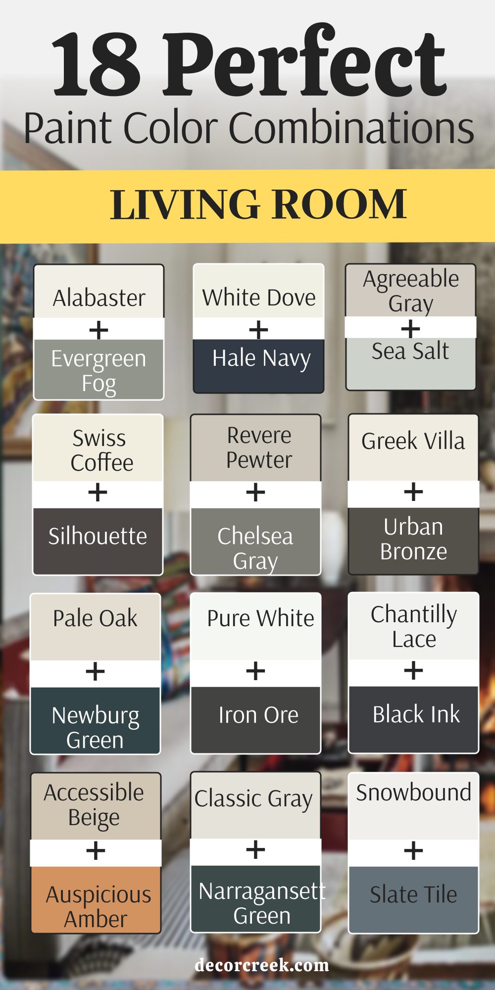
18 Perfect Living Room Paint Color Combinations
Alabaster SW 7008 & Evergreen Fog SW 9130
Alabaster (SW 7008) starts the room with a warm and creamy white that makes every corner feel bright. Evergreen Fog (SW 9130) is a soft green with gray tones that brings a bit of the forest inside your home. This pair is a top choice for families who want a look that is both fresh and grounded.
You will notice that the green looks very expensive when it is next to such a clean white. I love to use the green on a wall with a big window to show off the different shades. The white walls keep the room feeling very large even if you have a lot of furniture.
Most people find that this mix makes their living room feel very friendly and open. You can add light wood tables and woven rugs to finish the look. It is a very smart choice for a main room where you spend most of your time. This combination will stay looking good for many years without feeling old.
Best used in: living rooms, kitchens, hallways, bedrooms, and farmhouse exteriors
Pairs well with: Iron Ore SW 7069, Agreeable Gray SW 7029, Natural Linen SW 9109, warm wood tones The key rule of this color for farmhouse style is to use it where you want natural light to feel kind, soft, and inviting throughout the day.
White Dove OC-17 & Hale Navy HC-154
White Dove (OC-17) is a very soft off-white that has a tiny bit of gray to keep it from looking yellow. Hale Navy (HC-154) is a deep and classic navy blue that makes a very strong statement on any wall. This combination is a winner for a room that needs to feel very solid and very smart.
You will find that the navy blue looks very high-end when you pair it with white trim. I often use this mix in houses where the owner wants a look that feels like a fancy hotel. The white walls allow the room to stay bright during the day while the blue adds drama at night.
Many people love how this blue acts like a neutral because it goes with so many colors. You can add gold lamps or silver frames to make the blue really shine. It is a very reliable pair that makes a living room look very put together. This is a great choice for a house that has a lot of traditional style.
Best used in: offices, living rooms, exteriors, and kitchen cabinets
Pairs well with: Gray Owl 2137-60, Revere Pewter HC-172, Woodmont Cream 204, dark oak The key rule of this color for a classic look is to use the blue to add a sense of history and weight to the room.
Agreeable Gray SW 7029 & Sea Salt SW 6204
Agreeable Gray (SW 7029) acts as a very light base that sits right between gray and beige. Sea Salt (SW 6204) is a light blue-green that changes its look depending on the sunlight. This duo is perfect for a room that you want to feel very light and very airy.
You will notice that the green-blue accent adds a bit of color without being too loud. The gray walls make the whole room look very clean and very tidy for your guests. I like to use this mix with light wood floors and white linen curtains.
It makes the house feel like a beach home even if you live in the city. The colors are very soft and do not demand too much attention when you are trying to relax. You can use the gray on all walls and the sea salt on the ceiling for a fun look. This is a very safe and pretty choice for a first living room.
Best used in: bathrooms, laundry rooms, living rooms, and coastal style bedrooms
Pairs well with: Extra White SW 7006, Mega Greige SW 7031, Steamed Milk SW 7554, driftwood The key rule of this color for coastal style is to use it where you want the air to feel light and the walls to reflect a breezy outdoor vibe.
Swiss Coffee OC-45 & Silhouette AF-655
Swiss Coffee (OC-45) is a very rich and creamy white that feels very soft on the eyes. Silhouette (AF-655) is a dark and moody charcoal color that adds a lot of depth to the room. This pair is one of the most popular looks for a modern Art Deco style in 2026.
You will see that the dark color makes your furniture look very sharp and very expensive. The white walls keep the room from feeling too small or too dark during the day. I like to use the dark charcoal on a fireplace or on a wall with a lot of art.
It creates a very custom look that makes your home stand out from the rest. The creamy white is much warmer than a basic white and feels very cozy. You can add brass or gold accents to make the room feel very high-end. This is a very smart choice for a room where you want to show off your style.
Best used in: living rooms, dining rooms, master bedrooms, and accent walls
Pairs well with: Revere Pewter HC-172, Hale Navy HC-154, Simply White OC-117, brass lamps The key rule of this color for a fancy look is to use the dark tone to draw attention to your best pieces of furniture.
Revere Pewter HC-172 & Chelsea Gray HC-168
Revere Pewter (HC-172) is a very famous color because it looks good in almost any kind of light. Chelsea Gray (HC-168) is a medium gray that has a very sturdy and solid feel. This combination is great for someone who wants a very neutral and clean looking home.
You will find that the two grays work together to make the room feel very organized. I like to use the darker gray on one wall to add a bit of interest. Revere Pewter is a very warm gray that does not feel cold or like a hospital.
It makes the room feel very welcoming and very modern at the same time. You can add any color of furniture you want because these grays match everything. Many people choose this pair because it is very easy to live with for a long time. It is a very professional choice for a large living area.
Best used in: open floor plans, living rooms, hallways, and kitchens
Pairs well with: White Dove OC-17, Hale Navy HC-154, Edgecomb Gray HC-173, colorful rugs The key rule of this color for a neutral look is to use different shades of gray to create interest without using bright colors.
Greek Villa SW 7551 & Urban Bronze SW 7048
Greek Villa (SW 7551) is a bright and sunny white that has a tiny bit of warmth in it. Urban Bronze (SW 7048) is a deep brownish gray that looks like metal or natural stone. This duo creates a very high-contrast look that feels very modern and very bold.
You will notice that the dark bronze makes the white walls look even cleaner. I like to use the dark color on doors or window frames to add some weight to the room. The white walls allow you to use bright rugs and colorful art without things looking messy.
Many people love how the bronze color makes a room feel very grounded and very solid. It is a very sophisticated choice for a new home in 2026. You can add leather chairs and metal lamps to finish the look. This pair makes everything in the room look like a professional designer picked it.
Best used in: exteriors, modern living rooms, entryways, and kitchen cabinets
Pairs well with: Shoji White SW 7042, Pewter Green SW 6208, Drift of Mist SW 9166, black metal The key rule of this color for a modern look is to use it to create sharp lines that guide the eye toward your favorite views.
Pale Oak OC-20 & Newburg Green HC-158
Pale Oak (OC-20) is a very light and soft gray-beige that feels very quiet. Newburg Green (HC-158) is a deep teal green that adds a lot of mystery to the walls. This combination is great for a room where you want to feel very smart and very relaxed.
You will love how the green color makes the room feel very rich and very special. The light walls keep the room feeling open and very friendly for your family. I like to use the green on a wall behind a sofa to make it a focal point.
Pale Oak is a very elegant color that makes the whole house look more expensive. This mix is perfect for an Art Deco style that feels fresh for today. The green has a bit of blue in it which makes it feel very cool and very clever. It is a very pretty and unique choice for any living room.
Best used in: master bedrooms, living rooms, dining rooms, and cabinetry
Pairs well with: White Dove OC-17, Revere Pewter HC-172, Hale Navy HC-154, dark wood The key rule of this color for an elegant look is to use the green to add a touch of drama to an otherwise light room.
Pure White SW 7005 & Iron Ore SW 7069
Pure White (SW 7005) is a very simple and clean white that never has any strange colors in it. Iron Ore (SW 7069) is a soft charcoal black that looks very smooth and very modern. This combination is the ultimate choice for a sharp and tidy living room.
You will notice that the dark accent makes the white walls feel very bright and very full of energy. I often use this mix in houses where the owner likes a very minimal look. The dark gray is great for a fireplace or a wall behind your big TV.
It hides shadows very well and makes the room look very sleek. You can add wood floors to keep the room from feeling too cold or too stiff. This pair is a winner for anyone who likes a look that is both simple and very strong. It is easy to live with because it goes with every other color.
Best used in: modern farmhouses, lofts, hallways, and trim work
Pairs well with: Repose Gray SW 7015, Tricorn Black SW 6258, Requisite Gray SW 7023, light maple The key rule of this color for a sharp look is to use it as a frame for the rest of your home to make every detail pop.
Chantilly Lace OC-65 & Black Ink 2127-20
Chantilly Lace (OC-65) is a very bright and crisp white that makes a room feel very fresh. Black Ink (2127-20) is a very deep black that adds a lot of punch to the room. This duo is the best choice for a very modern and high-contrast living room.
You will find that the white walls make the room feel huge and very energetic. The black accent adds a sharp line that makes the room look very architectural. I like to use the black on a fireplace or on a thin wall to add some style.
This mix works very well if you have large windows and lots of natural light. It is a very bold choice but it looks very clean if you keep things simple. You can add warm wood accents to make the room feel more like a home. This is a top choice for a 2026 modern look.
Best used in: art galleries, modern homes, living rooms, and trim
Pairs well with: Gray Owl 2137-60, Kendall Charcoal HC-166, Simply White OC-117, bright art The key rule of this color for a sharp look is to keep the room simple and let the contrast do all the work.
Accessible Beige SW 7036 & Auspicious Amber SW 6366
Accessible Beige (SW 7036) is a very popular color because it matches almost every floor. Auspicious Amber (SW 6366) is a warm and earthy orange that feels like a bright sunset. This pair is great for people who want their living room to feel very happy and very sunny.
You will find that the amber color adds a lot of heat and personality to the room. The beige keeps the orange from being too loud or making the room feel too small. I like to use this mix in homes that have a lot of natural stone or brown wood.
It makes the room feel very organic and very connected to the earth. You can use the amber on a small wall to give the room a nice pop of color. This is a very happy combination that makes people want to sit down and talk. It works very well with green plants and cozy rugs.
Best used in: dining rooms, living rooms, kitchens, and sunrooms
Pairs well with: Alabaster SW 7008, Cadet SW 9143, Thunder Gray SW 7645, terracotta tiles The key rule of this color for a warm look is to use it in rooms where you gather with friends to make the mood feel bright.
Classic Gray OC-23 & Narragansett Green HC-157
Classic Gray (OC-23) is a very light gray that looks very soft and very clean on the walls. Narragansett Green (HC-157) is a very dark green that has a lot of black in it for a moody feel. This combination is a fantastic choice for a high-end and very dramatic living room.
You will see that the dark green makes the room feel very private and very sturdy. The light gray walls keep the room from feeling too dark during the daytime. I like to use the green on a wall with a big window to see the color change.
Narragansett Green is one of my favorite colors for making a big statement in a family home. Classic Gray is a very reliable color that works well in any room of the house. This pair is very sophisticated and looks great with gold or brass lamps. It is a very smart way to use a dark color.
Best used in: libraries, living rooms, dining rooms, and front doors
Pairs well with: White Dove OC-17, Revere Pewter HC-172, Hale Navy HC-154, leather furniture The key rule of this color for a moody look is to use the green to create a focal point that feels very grounded.
Snowbound SW 7004 & Slate Tile SW 7624
Snowbound (SW 7004) is a cool white that has a hint of gray to keep it very soft. Slate Tile (SW 7624) is a dusty blue-gray that looks like the color of a cloudy sky. This pair is very good for a room where you want to feel very focused and very tidy.
You will see that the blue-gray has a lot of depth without being too dark for a small room. The white walls make the blue look very rich and very intentional on the wall. I suggest using this mix with silver or chrome accents for a very polished finish.
It is a great choice for a home office that is part of your living room. The blue is very professional but also feels like a nice change from basic gray. You can use the blue on the lower half of the wall with white on the top. This is a very classic and pretty choice for any home.
Best used in: bedrooms, home offices, living rooms, and mudrooms
Pairs well with: Nebulous White SW 7063, Black Magic SW 6991, Silver Strand SW 7057, cool metals The key rule of this color for a crisp look is to use it where you want the light to feel steady and clean all day.
Edgecomb Gray HC-173 & Amherst Gray HC-167
Edgecomb Gray (HC-173) is a very light and warm gray that feels like a sandy beach. Amherst Gray (HC-167) is a medium-dark gray that has a very solid and strong feel. This pair is a fantastic choice for a neutral and modern living room.
You will find that the warm gray walls make the room feel very cozy and very clean. The dark gray accent adds a bit of weight that makes the room look more expensive. I like to use the dark gray on a feature wall or on a set of bookshelves.
Edgecomb Gray is a very popular color because it matches almost any kind of furniture. Amherst Gray is a very steady color that does not change much in different lights. You can add bright colors in your pillows and rugs to make the room more active. This is a very reliable and pretty pair for a family home.
Best used in: living rooms, hallways, kitchens, and exteriors
Pairs well with: White Dove OC-17, Revere Pewter HC-172, Simply White OC-117, wood tones The key rule of this color for a neutral look is to use the two grays to create a room that feels very tidy and organized.
Shoji White SW 7042 & Khaki Shade SW 7533
Shoji White (SW 7042) is a warm white that feels very soft and very natural. Khaki Shade (SW 7533) is a medium tan that looks like the color of the earth. This pair is great for a room where you want to feel very relaxed and close to nature.
You will find that these tones work very well with linen fabrics and wooden chairs. The tan color adds just enough contrast to make the white walls look very purposeful. I like this mix for a living room where you spend a lot of time with your pets.
It hides a bit of dust better than a very bright white or a very dark black. The colors stay very quiet and do not demand too much attention from your eyes. You can use the tan on the trim for a very unique and custom look. This is a very gentle combination that works in any season.
Best used in: sunrooms, living rooms, porches, and hallways
Pairs well with: Urban Bronze SW 7048, Worldly Gray SW 7043, Greek Villa SW 7551, natural fibers The key rule of this color for an organic look is to use it to blend your indoor furniture with the view outside your windows.
Natural Cream OC-14 & Batik AF-610
Natural Cream (OC-14) is a very soft and fancy beige that feels very high-end on the walls. Batik (AF-610) is a medium-dark blue that has a lot of gray in it to keep it soft. This combination is perfect for a living room that wants to look very polished and very smart.
You will love how the blue color adds a layer of depth and interest to the room. The cream walls make the room feel very large and very welcoming for your guests. I like to use this mix with dark wood furniture and gold accents.
It creates a very custom look that feels like a professional designer picked it. Natural Cream is a very safe choice for every wall in the house because it is so pretty. Batik is a very relaxing blue that does not feel too bright or too loud. This is a very smart and lovely pair for any house.
Best used in: master bedrooms, living rooms, dining rooms, and home offices
Pairs well with: White Dove OC-17, Revere Pewter HC-172, Hale Navy HC-154, brass The key rule of this color for an elegant look is to use the cream and blue to create a room that feels very balanced.
Skyline Steel SW 1015 & Cyberspace SW 7076
Skyline Steel (SW 1015) is a medium gray that feels very industrial and very strong. Cyberspace (SW 7076) is a very dark navy blue that has a lot of black in it for drama. This duo is perfect for a room that you want to look very modern and very cool.
You will see that the dark blue is very deep and looks great with metal lamps. The gray walls provide a solid base that makes the blue look very intentional. I like to use this mix in a media room where you want a moody and dark vibe.
Cyberspace is one of my favorite colors for making a room look very expensive. Skyline Steel is a great choice for walls because it hides scuffs and marks very well. You can add bright white trim to make the colors really stand out. This is a very cool and smart looking pair for a 2026 home.
Best used in: media rooms, offices, living rooms, and kitchen islands
Pairs well with: High Reflective White SW 7757, Agreeable Gray SW 7029, Black Magic SW 6991, steel accents The key rule of this color for a moody look is to use it to create a room that feels like a quiet escape from the world.
Cloud White 967 & October Mist 1495
Cloud White (967) is a very soft and creamy white that feels very light and very airy. October Mist (1495) is a gentle sage green that feels very natural and easy on the eyes. This combination is perfect for a living room where you want to feel very close to nature.
You will notice that the sage green adds a lot of peace and softness to the room. The white walls keep the area feeling very open and very bright for your family. I like to use this mix in a room with lots of plants and light wood tables.
It makes the whole house feel very lighthearted and very fresh. October Mist is a very relaxing color that works well in any room of the home. Cloud White is a very safe choice for walls because it is not too stark. This is a very lovely and modern choice for a 2026 home.
Best used in: bedrooms, living rooms, kitchens, and sunrooms
Pairs well with: White Dove OC-17, Simply White OC-117, Gray Owl 2137-60, light wood The key rule of this color for an organic look is to use the green to bring a sense of the outdoors into your home.
Balanced Beige SW 7037 & Outerspace SW 6241
Balanced Beige (SW 7037) gives the walls a warm and sandy look that feels very sturdy. Outerspace (SW 6251) is a very dark blue that adds a lot of drama and style to the room. This mix is perfect for a cozy den or a place where you watch movies with your kids.
You will find that the dark blue makes the walls feel very deep and very private. The beige keeps the room from feeling too dark by adding a touch of warm light. I think this pair looks best with leather sofas and metal lamps on the side.
Dark colors like this blue are very popular right now for making a big statement. You can paint your bookshelves in the dark blue to make your books stand out. The beige is a classic choice that will not go out of style next year. It is a smart way to use a dark color without making the room feel too small.
Best used in: home offices, basements, living rooms, and accent walls
Pairs well with: Origami White SW 7636, Urban Bronze SW 7048, Dover White SW 6385, brass accents The key rule of this color for a moody style is to use it in areas where you want to feel tucked in and cozy during the evening.
16 Modern Living Room Paint Color Combos
Greek Villa SW 7551 & Iron Ore SW 7069
Greek Villa (SW 7551) starts the room with a bright white that has a tiny bit of sun inside it. Iron Ore (SW 7069) is a soft and charcoal black that looks like real stone on the walls. This pair is the top choice for people who want a sharp and modern look for their house.
You will see that the dark color makes the white walls feel very clean and very fresh. I like to use the black on a fireplace or a large accent wall to add some weight. The white walls let you use any color of furniture without making the room look messy.
Many people love how this mix makes their home look like a high-end designer house. You can add light wood floors to keep the room from feeling too cold or stiff. It is a very smart and professional choice for a large living area in 2026. This combination makes every detail in your room stand out to your guests.
Best used in: modern living rooms, entryways, kitchen cabinets, and exteriors
Pairs well with: Shoji White SW 7042, Pewter Green SW 6208, Drift of Mist SW 9166, black metal The key rule of this color for a modern look is to use it to create sharp lines that guide the eye toward your favorite views.
Chantilly Lace OC-65 & Black Ink 2127-20
Chantilly Lace (OC-65) is a very bright and crisp white that makes a room feel huge. Black Ink (2127-20) is a deep black that adds a lot of punch and power to the walls. This duo is the best choice for a very modern and high-contrast family living room.
You will find that the white walls make the room feel very energetic and full of light. The black accent adds a sharp line that makes the room look very smart and tidy. I like to use the black on a single wall to make your colorful art really pop.
This mix works very well if you have large windows that let in a lot of sun. It is a very bold choice but it looks very clean if you keep the room simple. You can add warm wood accents to make the room feel more like a home. This is a top choice for a 2026 modern look that feels like a gallery.
Best used in: art galleries, modern homes, living rooms, and trim
Pairs well with: Gray Owl 2137-60, Kendall Charcoal HC-166, Simply White OC-117, bright art The key rule of this color for a sharp look is to keep the room simple and let the contrast do all the work.
Alabaster SW 7008 & Evergreen Fog SW 9130
Alabaster (SW 7008) is a creamy white that feels very soft and very welcoming on your walls. Evergreen Fog (SW 9130) is a dusty green that brings a bit of the outdoors into your home. This combination is great for a modern room that also wants to feel very grounded.
You will notice that the green looks very expensive when it is next to a warm white. I like to use the green on a wall with a big window to show off the color. The white walls keep the room feeling very large and very bright for your family.
Most people find that this mix helps them feel relaxed and happy after a long day. You can add light wood tables and woven rugs to finish the modern look. It is a very smart choice for a main room where you spend a lot of time. This pair is very trendy for 2026 and always looks very high-end.
Best used in: living rooms, kitchens, hallways, bedrooms, and farmhouse exteriors
Pairs well with: Iron Ore SW 7069, Agreeable Gray SW 7029, Natural Linen SW 9109, warm wood tones The key rule of this color for farmhouse style is to use it where you want natural light to feel kind, soft, and inviting throughout the day.
Swiss Coffee OC-45 & Silhouette AF-655
Swiss Coffee (OC-45) is a rich and creamy white that feels very soft on the eyes. Silhouette (AF-655) is a dark and moody charcoal that adds a lot of depth to the room. This pair is a fantastic choice for a modern Art Deco look in your new house.
You will see that the dark color makes your furniture look very sharp and very expensive. The white walls keep the room from feeling too small or too dark during the day. I like to use the dark charcoal on a fireplace or on built-in bookshelves.
It creates a very custom look that makes your living room stand out from the rest. The creamy white is much warmer than a basic white and feels very cozy. You can add brass lamps or gold frames to make the room feel very special. This is a very smart and professional choice for a 2026 living area.
Best used in: living rooms, dining rooms, master bedrooms, and accent walls
Pairs well with: Revere Pewter HC-172, Hale Navy HC-154, Simply White OC-117, brass lamps The key rule of this color for a fancy look is to use the dark tone to draw attention to your best pieces of furniture.
Agreeable Gray SW 7029 & Urban Bronze SW 7048
Agreeable Gray (SW 7029) acts as a soft neutral base that goes with almost any kind of floor. Urban Bronze (SW 7048) is a deep brownish gray that looks like metal or natural stone. This duo creates a very sophisticated look that feels very solid and very modern.
You will notice that the dark bronze makes the light gray walls look even cleaner. I like to use the bronze on doors or window frames to add some weight to the room. The gray walls allow you to use bright rugs and colorful pillows without things looking messy.
Many people love how the bronze color makes their home feel very grounded and very sturdy. It is a very smart choice for a modern living area that needs a bit of drama. You can add leather chairs and metal lamps to finish the look of the room. This pair makes everything in your house look like a professional picked it out.
Best used in: exteriors, modern living rooms, entryways, and kitchen cabinets
Pairs well with: Shoji White SW 7042, Pewter Green SW 6208, Drift of Mist SW 9166, black metal The key rule of this color for a modern look is to use it to create sharp lines that guide the eye toward your favorite views.
White Dove OC-17 & Hale Navy HC-154
White Dove (OC-17) is a soft off-white that has a tiny bit of gray to keep it soft. Hale Navy (HC-154) is a deep and classic navy blue that makes a very strong statement. This combination is a winner for a modern room that needs to feel very solid and smart.
You will find that the navy blue looks very high-end when you pair it with white trim. I often use this mix in houses where the owner wants a look that feels very fancy. The white walls allow the room to stay bright while the blue adds drama at night.
Many people love how this blue acts like a neutral because it goes with so many colors. You can add gold lamps or silver frames to make the blue really shine in the sun. It is a very reliable pair that makes a living room look very put together. This is a great choice for any house that needs a bit of style.
Best used in: offices, living rooms, exteriors, and kitchen cabinets
Pairs well with: Gray Owl 2137-60, Revere Pewter HC-172, Woodmont Cream 204, dark oak The key rule of this color for a classic look is to use the blue to add a sense of history and weight to the room.
Pure White SW 7005 & Peppercorn SW 7674
Pure White (SW 7005) is a very simple and clean white that never has any strange undertones. Peppercorn (SW 7674) is a very deep gray that looks like soft charcoal on the walls. This combination is a top choice for a sharp and modern look in your main room.
You will notice that the dark gray makes the white walls feel very bright and very energetic. I often use this mix in houses where the owner likes a very tidy and minimal look. The dark gray is great for a fireplace or a wall behind your big television.
It hides cords and shadows very well while looking very sleek for your guests to see. You can add wood accents to keep the room from feeling too cold or too stiff. This pair is a winner for anyone who likes a look that is both simple and strong. It is very easy to live with because it never clashes with your clothes.
Best used in: living rooms, media rooms, entryways, and kitchen islands
Pairs well with: Anew Gray SW 7030, Extra White SW 7006, Tricorn Black SW 6258, colorful accents The key rule of this color for a bold look is to use it to ground the room and make your favorite items pop.
Pale Oak OC-20 & Newburg Green HC-158
Pale Oak (OC-20) is a very light and soft gray-beige that feels very quiet and pretty. Newburg Green (HC-158) is a deep teal green that adds a lot of mystery to the room. This combination is great for a modern room where you want to feel very smart and relaxed.
You will love how the green color makes the room feel very rich and very special. The light walls keep the room feeling open and very friendly for your whole family. I like to use the green on a wall behind a sofa to make it a focal point.
Pale Oak is a very elegant color that makes the whole house look more expensive. This mix is perfect for an Art Deco style that feels fresh for the year 2026. The green has a bit of blue in it which makes it feel very cool and clever. It is a very pretty and unique choice for any modern living room.
Best used in: master bedrooms, living rooms, dining rooms, and cabinetry
Pairs well with: White Dove OC-17, Revere Pewter HC-172, Hale Navy HC-154, dark wood The key rule of this color for an elegant look is to use the green to add a touch of drama to an otherwise light room.
Snowbound SW 7004 & Slate Tile SW 7624
Snowbound (SW 7004) is a cool white that has a hint of gray to keep it soft. Slate Tile (SW 7624) is a dusty blue-gray that looks like the color of a stormy sky. This pair is very good for a modern room where you want to feel very focused and tidy.
You will see that the blue-gray has a lot of depth without being too dark for a small room. The white walls make the blue look very rich and very intentional on your accent wall. I suggest using this mix with silver or chrome accents for a very polished and new finish.
It is a great choice for a home office that is part of your modern living room. The blue is very professional but also feels like a nice change from a basic gray color. You can use the blue on the lower half of the wall with white on top. This is a very classic and pretty choice for a new family home.
Best used in: bedrooms, home offices, living rooms, and mudrooms
Pairs well with: Nebulous White SW 7063, Black Magic SW 6991, Silver Strand SW 7057, cool metals The key rule of this color for a crisp look is to use it where you want the light to feel steady and clean all day.
Classic Gray OC-23 & Kendall Charcoal HC-166
Classic Gray (OC-23) is a very light gray that looks very soft and very clean on your walls. Kendall Charcoal (HC-166) is a deep and rich dark gray that looks like solid mountain stone. This pair is a very popular choice for a clean and modern family living room today.
You will find that the two grays create a very tidy and organized look for your house. The light gray walls make the room feel very bright and full of natural energy. I like to use the charcoal gray on a fireplace or a media wall to hide your TV.
Kendall Charcoal is a very versatile color that goes with many different styles of furniture. Classic Gray is a great choice for people who want a gray that feels very clean and light. You can add pops of yellow or blue to make the room feel more fun for kids. This is a very reliable and pretty pair for any modern house.
Best used in: open floor plans, living rooms, kitchens, and basements
Pairs well with: White Dove OC-17, Chantilly Lace OC-65, Hale Navy HC-154, silver accents The key rule of this color for a tidy look is to use the dark gray to add weight to the room without using a lot of color.
Shoji White SW 7042 & Cyberspace SW 7076
Shoji White (SW 7042) is a warm white that feels very soft and a little bit like natural paper. Cyberspace (SW 7076) is a very dark navy blue that has a lot of black in it for drama. This duo is perfect for a room that you want to look very modern and very cool.
You will see that the dark blue is very deep and looks great with metal lamps and art. The white walls provide a soft base that makes the blue look very intentional and smart. I like to use this mix in a media room where you want a moody and dark vibe.
Cyberspace is one of my favorite colors for making a living room look very high-end. Shoji White is a great choice for walls because it is warmer than a basic hospital white. You can add bright wood floors to make the colors really pop for your guests. This is a very cool and smart looking pair for a 2026 home.
Best used in: media rooms, offices, living rooms, and kitchen islands
Pairs well with: High Reflective White SW 7757, Agreeable Gray SW 7029, Black Magic SW 6991, steel accents The key rule of this color for a moody look is to use it to create a room that feels like a quiet escape from the world.
Edgecomb Gray HC-173 & Wrought Iron 2124-10
Edgecomb Gray (HC-173) is a very light and warm gray that feels like a sandy beach. Wrought Iron (2124-10) is a very dark gray that is almost black but has a softer look. This pair is a fantastic choice for a neutral and modern looking living room.
You will find that the warm gray walls make the room feel very cozy and very clean. The dark gray accent adds a bit of weight that makes the room look more expensive. I like to use the dark gray on a feature wall or on a set of built-in bookshelves.
Edgecomb Gray is a very popular color because it matches almost any kind of furniture you buy. Wrought Iron is a very steady color that does not change much in different lights. You can add bright colors in your pillows and rugs to make the room feel more active. This is a very reliable and pretty pair for any modern family home.
Best used in: dens, living rooms, libraries, and entryways
Pairs well with: White Dove OC-17, Revere Pewter HC-172, Simply White OC-117, leather The key rule of this color for a traditional look is to use the tan to create a warm and grounded feeling in the room.
Origami White SW 7636 & Storm Cloud SW 6249
Origami White (SW 7636) is a clean and simple neutral that looks great in any kind of light. Storm Cloud (SW 6249) is a medium blue that has a lot of gray in it to keep it soft. This combination is perfect for a room that needs to feel very tidy and very fresh for 2026.
You will notice that the blue adds a nice pop of color without being too bright or loud. The white walls make the room feel open and very clean at all times for your family. I love using this mix in homes that have light gray or white wood floors.
It creates a very consistent look that is very easy to decorate around with new furniture. The blue is dark enough to provide contrast but light enough to stay friendly for your guests. You can use the blue on a long wall to make the room feel much deeper. This is a very safe and pretty choice for any modern home.
Best used in: nurseries, living rooms, bathrooms, and laundry rooms
Pairs well with: Snowbound SW 7004, Naval SW 6244, On the Rocks SW 7671, silver trim The key rule of this color for a fresh look is to use it in rooms with lots of windows to catch the morning light.
Balboa Mist OC-27 & Metropolitan AF-690
Balboa Mist (OC-27) is a very light gray with a hint of warmth that feels very soft on the walls. Metropolitan (AF-690) is a medium gray that feels very cool and very modern for a new home. This pair is a top choice for a clean and professional looking living room for your family.
You will see that the two grays create a very sleek and tidy look for your whole house. The light walls make the room feel very bright and full of natural energy during the day. I like to use the darker gray on an accent wall to add a bit of drama.
Metropolitan is a very versatile color that goes with many different styles of chairs and sofas. Balboa Mist is a classic choice for people who want a gray that feels very light and clean. You can add pops of blue or green to make the room feel more fun and active. This is a very reliable and pretty pair for a new modern house.
Best used in: open floor plans, living rooms, offices, and hallways
Pairs well with: Chantilly Lace OC-65, Simply White OC-117, Hale Navy HC-154, silver accents The key rule of this color for a modern look is to use the grays to create a room that feels very sharp and organized.
City Loft SW 7631 & Mount Etna SW 7625
City Loft (SW 7631) is a very soft gray that has a tiny bit of warmth to keep it from feeling cold. Mount Etna (SW 7625) is a dark and mysterious blue-green that has a lot of gray in it for style. This pair is a fantastic choice for an Art Deco style room with a modern twist for 2026.
You will see that the dark color looks very high-end when you pair it with the soft gray. I like to use the dark blue-green on an accent wall or on built-in cabinets in your room. The gray walls keep the room from feeling too heavy or dark for your family to live in.
Mount Etna is a very complex color that looks different as the sun moves across your sky. It feels very smart and thoughtful as a choice for a main living area in a new house. You can add velvet chairs or brass lamps to really make this pair of colors shine. It is a very trendy mix that still feels very solid.
Best used in: bedrooms, living rooms, libraries, and furniture flips
Pairs well with: Alabaster SW 7008, Accessible Beige SW 7036, Caviar SW 6990, velvet fabrics The key rule of this color for a rich look is to use it as a backdrop for shiny metals and soft textures.
Gray Owl 2137-60 & Amherst Gray HC-167
Gray Owl (2137-60) is a very cool and crisp gray that has a tiny bit of blue and green inside. Amherst Gray (HC-167) is a medium-dark gray that has a very solid and strong feel for your walls. This pair is a very popular choice for a clean and modern living room in a new home.
You will find that the two grays create a very tidy and organized look for your whole family. The light gray walls make the room feel very bright and full of energy during the day. I like to use the darker gray on an accent wall to add a bit of weight to the room.
Amherst Gray is a very steady color that does not change much in different kinds of light. Gray Owl is a classic choice for people who want a gray that feels very light and clean. You can add bright colors in your pillows and rugs to make the room feel more fun. This is a very reliable and pretty pair for any modern house.
Best used in: living rooms, hallways, kitchens, and exteriors
Pairs well with: White Dove OC-17, Revere Pewter HC-172, Simply White OC-117, wood tones The key rule of this color for a neutral look is to use the two grays to create a room that feels very tidy and organized.
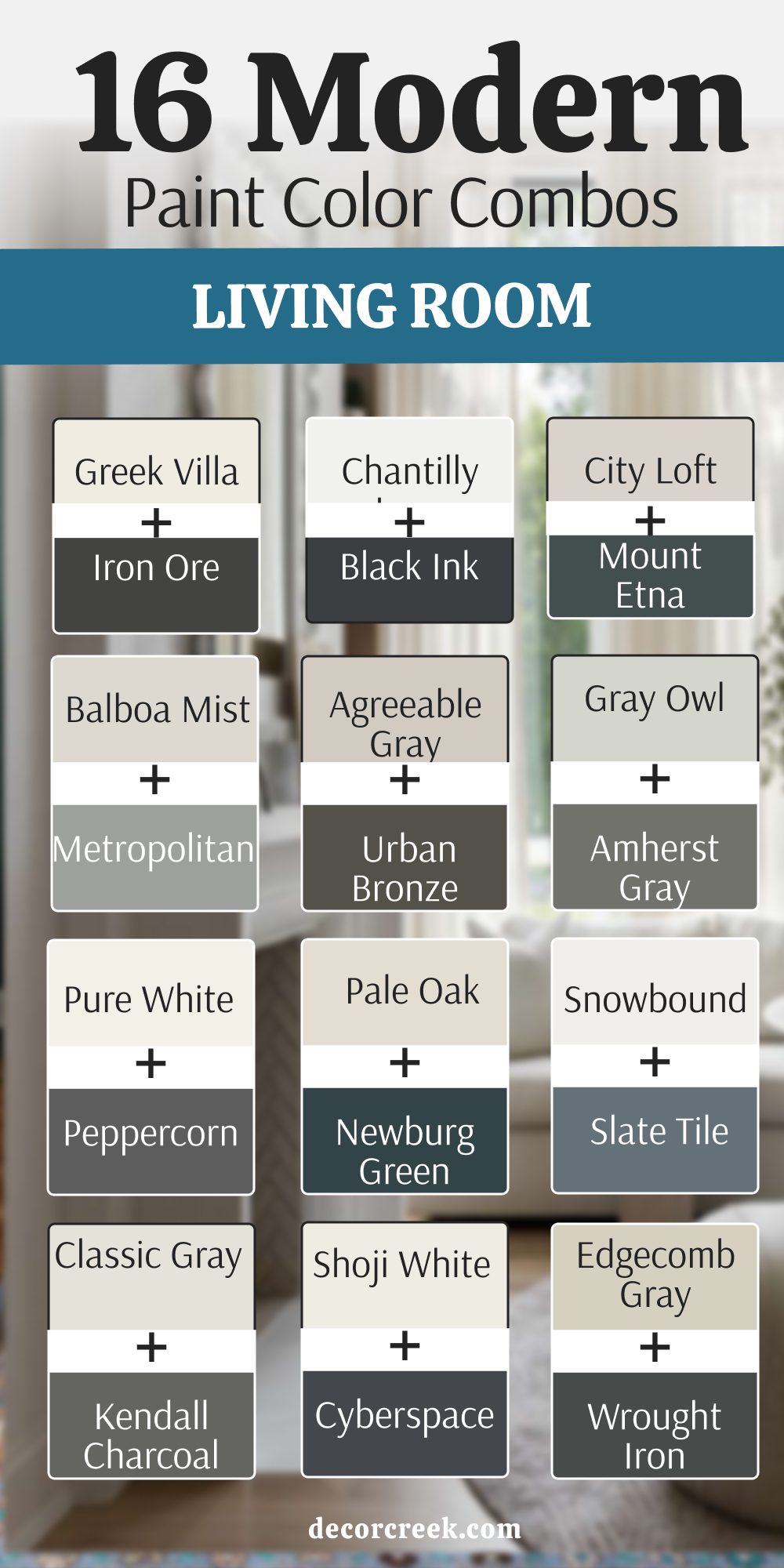
My Final Thoughts About 33 Living Room Paint Color Combinations In 2026
I hope this list helps you feel more confident about your next painting project. Finding the right mix of light and dark can change how you feel about your home every single day. These 33 pairs are picked to work in real houses with real furniture and real families. You should always try a sample on your wall before you buy a whole gallon. Colors can change when the sun goes down or when you turn on your lamps.
Trust your gut when you see a color you love, but use these rules to keep things looking sharp. A great living room is a place where you can relax and feel proud of your house. I look forward to seeing how these colors make your home look more like you. Good luck with your painting and have fun picking your new favorite look!
I want you to remember that your home is the one place where you should feel totally at ease. Picking a new look for your walls is a big step toward making your house feel like it belongs to you and your family. I have seen how a simple change in tone can make an old sofa look brand new or make a small room feel twice as big.
You do not need to be a professional to get these results if you follow the pairings I have tested for you. Every time you walk through your front door, the colors should greet you with warmth and style. It is worth taking the extra time to look at your paint samples against your floors and your curtains.