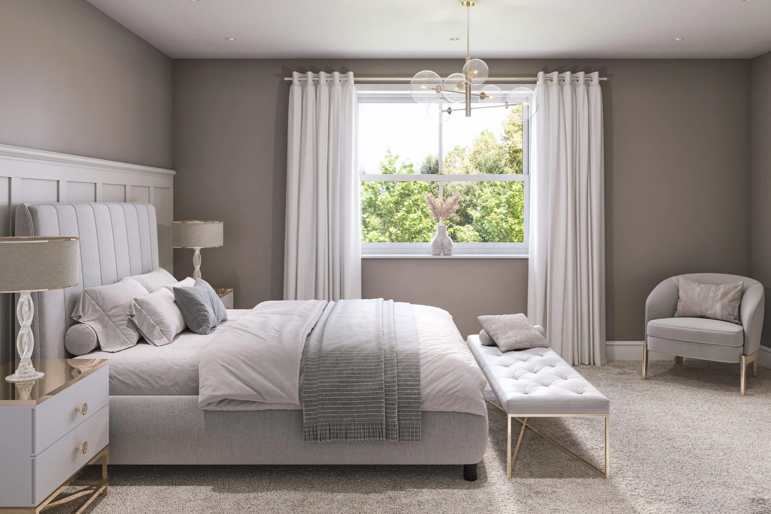
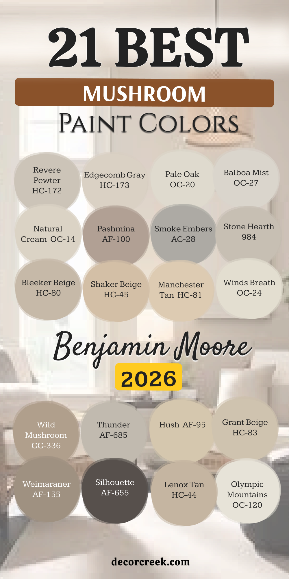
In 2026, I see a big change happening with colors inside homes. People are tired of cold gray walls that feel empty. We are moving toward colors that make you feel cozy and safe, like a warm hug. These special shades are what I call “Mushroom Colors.”
They are not just plain brown or gray; they are a rich mix of both, sometimes even with a hint of green or purple.
This mix creates an atmosphere that is grounded and very fancy. The colors look like the forest floor—everything from light beige cream to dark, wet dirt.
In this guide, I will show you 41 of my best “Mushroom” colors. I’ll tell you exactly how to use this hot color trend to make your house look updated and beautiful right now.
The best thing about the mushroom palette is how flexible it is: it acts like a soft background. It looks great with strong, modern black furniture and also with old-fashioned, warm wood pieces.
It’s the perfect backdrop for making your treasures shine.
Why I Always Trust Sherwin-Williams and Benjamin Moore for Neutral Palettes
When I work with complex neutral colors, especially like these “Mushroom” ones, the paint quality really matters. That is why I rely completely on only two brands: Sherwin-Williams and Benjamin Moore. Their paints are famous because the color goes on deep and even.
This means the color on your walls will look beautiful as the sun moves from morning to night; it won’t suddenly look dull or messy.
I avoid cheaper paints because they can sometimes surprise you and look pink or lilac when you don’t want them to. Sherwin-Williams and Benjamin Moore keep their earthy neutrals perfect. This is super important for colors that sit between gray and brown—a tiny mistake in the formula can ruin the whole feeling of the room.
When you pick these brands, you are paying for richness and reliability. The superior paint quality even helps hide little bumps or marks on your walls, leaving a smooth, velvety finish that will make you happy for many years.
How I Choose the Perfect Mushroom Paint Color for Each Room
Picking the best “Mushroom” color doesn’t have to be hard, but you must pay close attention to details. Here is the easy way I always do it to make sure the color is perfect every time.
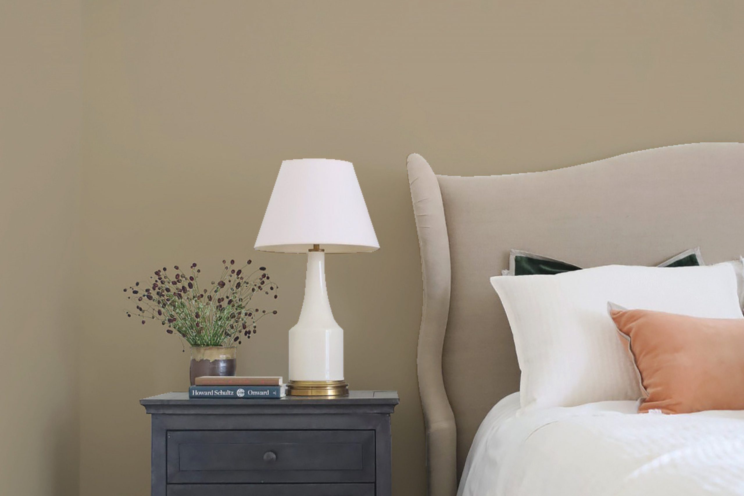
“Mushroom” colors change a lot depending on the light. If your room faces North, the light is cool and blueish. I always choose mushroom colors that are warmer and have a clear beige or brown base in North-facing rooms. This adds the necessary warmth right away.
If your room faces South, the light is bright and warm all day. You can use cooler, more gray-leaning mushroom colors here because the warm light will stop them from feeling too chilly.
Rooms that face East or West get different light at different times of the day, so I often choose a true, middle-ground color that stays pretty steady.
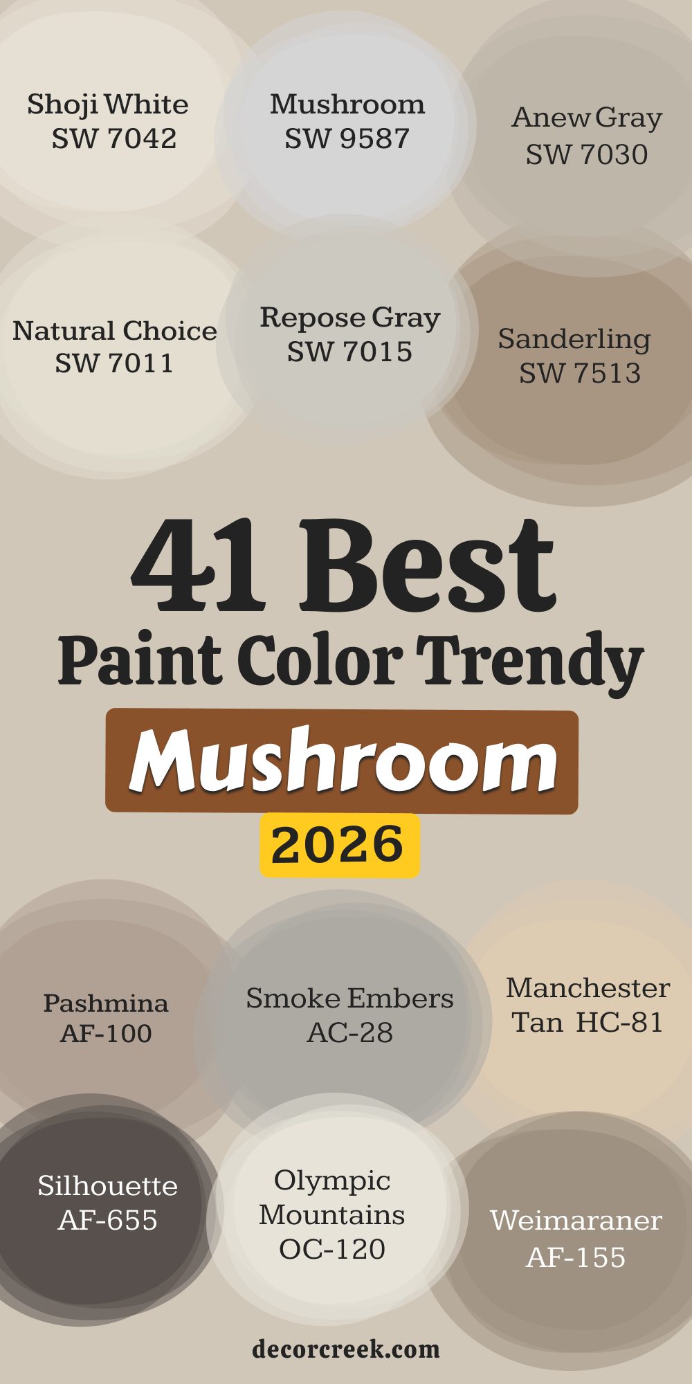
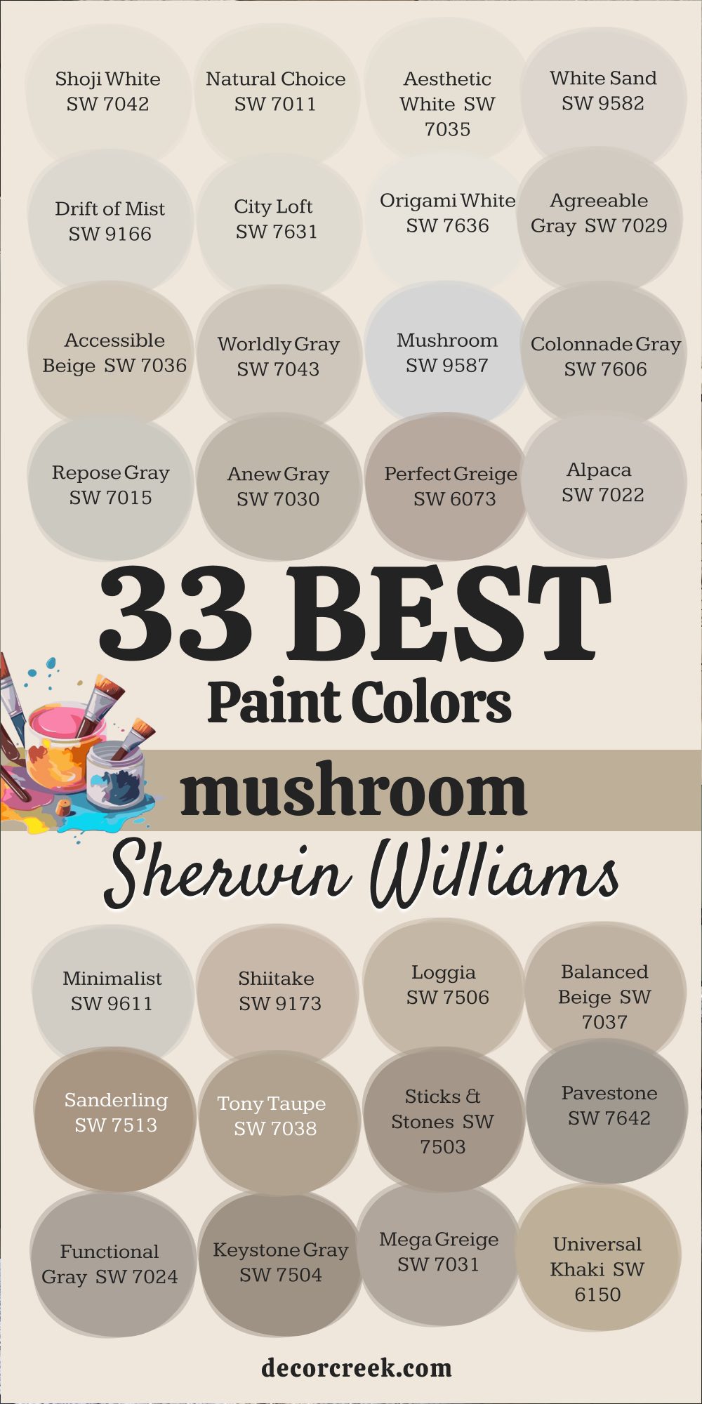
33 Best Mushroom Paint Color From Sherwin Williams For 2026
Shoji White SW 7042
Shoji White is a favorite because it is an off-white that always feels warm. I use Shoji White when I want the brightness of white but fear the starkness of cold white. Shoji White’s undertone is a creamy, subtle beige-gray that brings a delicate softness to the wall.
This color prevents the ceiling and trim from feeling harsh and instead makes everything blend beautifully.
Shoji White works wonderfully in kitchens where you have natural wood cabinets or warm-toned stone countertops. It has a high LRV of 78, so it will make any room feel incredibly open and big. I often recommend Shoji White for the whole house because it sets a sophisticated, gentle foundation for any type of furniture.
🎨 Check out the complete guide to this color right HERE 👈

Natural Choice SW 7011
Natural Choice gives you a clean, very light neutral that still holds onto an earthy touch. I find Natural Choice to be a dependable, light shade that never looks cold or icy.
Natural Choice is one of the easiest colors to use because it brightens rooms without introducing strong, unexpected undercolors.
Its LRV is 74, making it nearly white, but you see the difference because it feels welcoming. I often use Natural Choice in hallways and on ceilings when the walls are a slightly deeper mushroom color. It is a fantastic choice if you want to update from a stark white without committing to a full beige wall. Natural Choice acts as a perfect gentle border.
🎨 Check out the complete guide to this color right HERE 👈

Aesthetic White SW 7035
Aesthetic White is a reliable, soft beige-gray that holds its warmth perfectly. I recommend Aesthetic White when clients tell me they want a color that stays light but is clearly not just white.
Aesthetic White has enough pigment to be noticeable on the wall, even next to bright white trim. It sits beautifully in the mushroom trend because of its deeply grounded feeling.
I love using Aesthetic White in bedrooms because it creates a very peaceful, restful feeling that makes you want to snuggle up. Aesthetic White is popular because it works well in almost any light condition, always holding onto its warm heart. Its LRV is 70, making it a very safe and bright choice.
🎨 Check out the complete guide to this color right HERE 👈
White Sand SW 9582
White Sand is a beautiful, light greige color that is part of the newer Designer Collection. I like White Sand because it is a very clean take on the light mushroom trend, feeling refreshed and up-to-date.
White Sand is perfect when you need a shade that offers subtle contrast against stark white trim. It avoids the heaviness of true beige but has more substance than a pure off-white.
White Sand looks particularly stunning in rooms with large windows where the natural light can play off its soft gray and beige notes. White Sand will make your room feel open and softly textured. Its LRV is 68, making it a fantastic color for bright, airy main living areas.
🎨 Check out the complete guide to this color right HERE 👈
Drift of Mist SW 9166
Drift of Mist is a whisper-light gray-beige, one of the palest mushroom shades you can pick. I often use Drift of Mist when a room is small, or the ceilings are low because its high LRV of 65 makes the room look taller and wider.
Drift of Mist is one of those colors that most people think is an off-white until you put a pure white sample next to it. It has a soft, elusive quality that feels very sophisticated.
I recommend Drift of Mist for modern homes where the emphasis is on simple lines and a clean look. It is a great alternative to the often-used color, which can feel too plain.
🎨 Check out the complete guide to this color right HERE 👈

City Loft SW 7631
City Loft is a sophisticated, pale greige that is slightly cooler than some mushroom colors but still stays grounded. I appreciate City Loft because it prevents a room from feeling too sweet or too light.
City Loft has a noticeable gray presence, but its warm beige undertone pulls it firmly into the mushroom trend.
I find City Loft works really well in homes with a lot of wood tones, as it provides a subtle, cool contrast that highlights the wood’s natural warmth. City Loft is a reliable background color that looks good in both sunny and less sunny rooms. Its LRV is 64, making it a wonderful, bright main wall color.
🎨 Check out the complete guide to this color right HERE 👈

Origami White SW 7636
Origami White is a fantastic off-white with a slight mushroom tint, similar to Shoji White but with a little more color. I use Origami White when I want to be certain the color is slightly warmer than pure white, especially for trim or cabinets.
Origami White gives a room a very clean and crisp appearance while maintaining that much-needed warmth of the mushroom palette.
It is a wonderful color for creating a soft, cohesive look when paired with darker greiges. Origami White is a versatile color that looks incredibly chic when paired with black hardware in a modern farmhouse setting. Its LRV is 76, keeping your room bright and airy.
🎨 Check out the complete guide to this color right HERE 👈
Agreeable Gray SW 7029
Agreeable Gray is an extremely popular greige that leans gray but has enough beige to bring warmth to the wall. I recommend Agreeable Gray to clients who are scared of commitment because it is truly a balanced, safe choice.
Agreeable Gray sits right in the middle of the mushroom spectrum, changing with the light to fit its surroundings. It works with almost any decorating style, from beach house to traditional formal home.
Agreeable Gray is famous because it is so easy to work with and never fights with furniture or artwork. Its LRV is 60, which makes it a fantastic, well-lit wall color.
🎨 Check out the complete guide to this color right HERE 👈

Accessible Beige SW 7036
Accessible Beige is a true mushroom color that leans warmer than most greiges. I use Accessible Beige when the room needs guaranteed warmth, especially in dark, North-facing rooms. Accessible Beige is one of the best examples of a mushroom shade because it shows its beige nature while the gray keeps it from looking yellow or dated.
It has a beautiful depth that makes a room feel instantly comfortable and snug. Accessible Beige is one of my go-to colors for main living areas and cozy bedrooms.
Its LRV is 58, which is the sweet spot for a color that gives you substance without making the room dim.
🎨 Check out the complete guide to this color right HERE 👈

Worldly Gray SW 7043
Worldly Gray is a soft, warm greige that is just slightly darker and warmer than its popular cousin, Agreeable Gray.
I suggest Worldly Gray when clients want that soft, subtle feeling of Agreeable Gray but need a shade that feels a little more grounded or substantial.
Worldly Gray is a very delicate, balanced mushroom shade that plays well with almost every color, from deep blues to rich greens. It is an excellent choice for open-concept homes where you need one color to carry through many different spaces. Worldly Gray’s LRV is 57, giving it a soft presence on the wall.
🎨 Check out the complete guide to this color right HERE 👈
Mushroom SW 9587
Mushroom is the quintessential mushroom color and part of the Designer Collection. I love Mushroom because its name is literal—it’s the perfect mid-tone gray-brown. Mushroom is the shade to use when you want a color that is exactly what the trend describes, sophisticated and naturally earthy.
Mushroom works wonderfully with dark wood trim or furniture, providing a beautiful, gentle contrast.
I find that Mushroom shows off its complexity best when used in a bright room, where you can see the interplay of the gray and brown pigments. Its LRV is 57, providing depth without heaviness.
🎨 Check out the complete guide to this color right HERE 👈
Colonnade Gray SW 7641
Colonnade Gray is a balanced mid-range greige, a solid foundation for any interior design. I rely on Colonnade Gray when I need a color that is more serious and grounded than the lighter neutrals.
Colonnade Gray has a noticeable gray base, but the warmth of the beige makes it feel like an authentic mushroom shade.
It works really well in dining rooms or offices where you want a slightly more formal and defined feeling. Colonnade Gray is a reliable color that looks beautiful in any room with crisp white crown molding and baseboards. Its LRV is 53, giving the color a good, deep presence.
🎨 Check out the complete guide to this color right HERE 👈
Repose Gray SW 7015
Repose Gray is a cooler greige that still fits the mushroom trend because of its significant brown undertone. I often use Repose Gray in sunny, South-facing rooms where the bright light stops it from looking cold.
Repose Gray can sometimes show a very slight purple hint, which adds a layer of sophistication and complexity that I find charming.
It pairs incredibly well with bright white trim and dark wood floors, creating a classic, refined look. Repose Gray is one of the most popular colors for a reason: it’s incredibly versatile and looks stunning in almost any home. Its LRV is 58, keeping the room bright.
🎨 Check out the complete guide to this color right HERE 👈

Anew Gray SW 7030
Anew Gray is a warm, mid-tone gray-brown that feels substantial and rich. I recommend Anew Gray when you are ready to use a deeper color that can really anchor your belongings. Anew Gray is dark enough to provide a strong contrast against white trim without making the room feel small or closed in.
It has a beautiful, earthy depth that makes a living room or a large hallway feel instantly welcoming and stylish.
Anew Gray is a favorite for creating a cozy atmosphere in bedrooms. Its LRV is 47, making it a great color to add visual weight.
🎨 Check out the complete guide to this color right HERE 👈
Perfect Greige SW 6073
Perfect Greige is a well-named color because it truly is a balanced mix of gray and beige. I find Perfect Greige to be a fantastic color if you want a subtle taupe feeling in your room.
Perfect Greige has a slight red undercolor, which gives it a warm, earthy richness that feels very cozy and inviting.
This subtle warmth makes it work beautifully with terracotta accents or vintage wooden furniture. Perfect Greige looks amazing in master bedrooms or living rooms where comfort is key. Its LRV is 42, giving the color a lot of depth and substance.
🎨 Check out the complete guide to this color right HERE 👈
Alpaca SW 7022
Alpaca is a soft taupe-greige with a subtle pinkish-red undertone that adds softness. I often suggest Alpaca when clients are looking for a gentle, muted neutral that won’t feel heavy.
Alpaca creates a beautiful, serene atmosphere that is perfect for nurseries, bathrooms, or primary bedrooms.
Because of its light warmth, Alpaca pairs wonderfully with creamy off-whites and natural linen fabrics. It is a reliable color that always looks soft and never harsh. Its LRV is 57, making it a bright, comfortable shade.
🎨 Check out the complete guide to this color right HERE 👈
Minimalist SW 9611
Minimalist is a clean, modern mushroom shade from the Designer Collection. I love Minimalist because it offers a crisp, updated take on the earthy neutral trend.
Minimalist maintains a beautiful balance between gray and beige, making it feel very current and chic.
I recommend Minimalist for modern or minimalist homes where the focus is on simple, clean architecture. It is a fresh color that looks incredible when paired with modern black accents or stainless steel. Its LRV is 52, giving the color a strong, defined presence.
🎨 Check out the complete guide to this color right HERE 👈

Shiitake SW 9173
Shiitake is an earthy brown-khaki that definitely leans into the warmer side of the mushroom palette. I use Shiitake when a room needs a definite sense of warmth and a touch of the outdoors.
Shiitake is a very organic color that pairs beautifully with natural stone and wood textures. It works wonderfully in cozy spaces like dens, libraries, or mountain homes.
Shiitake avoids the yellow tones of older beiges, making it a sophisticated and deeply cozy choice. Its LRV is 51, providing great saturation.
🎨 Check out the complete guide to this color right HERE 👈

Loggia SW 7506
Loggia is a rich beige-gray, a truly updated neutral that moves past the builder-grade beige of the past. I find Loggia to be a great, substantial color that works well in homes with traditional architecture.
Loggia has a beautiful depth that makes a room feel established and incredibly elegant.
I often recommend Loggia for offices or dining rooms where you want a more formal and serious tone. Loggia is a dependable color that always looks rich and inviting. Its LRV is 48, giving the room a definite, grounded feeling.
🎨 Check out the complete guide to this color right HERE 👈

Balanced Beige SW 7037
Balanced Beige is a true taupe that beautifully sits between the mushroom and the tan color families. I often suggest Balanced Beige because it is a reliable, medium-toned neutral that is very grounding.
Balanced Beige holds its own in bright light without washing out and provides a clear warmth that is perfect for main living areas.
It pairs beautifully with dark furnishings and rich fabrics. Balanced Beige’s LRV is 46, providing a very substantive and cozy feel on the wall.
🎨 Check out the complete guide to this color right HERE 👈

Sanderling SW 7513
Sanderling is a warm, saturated tan with clear gray influences. I recommend Sanderling when clients want a deeper, more noticeable neutral color that gives a room a warm, slightly rustic feel. Sanderling is perfect for transitional styles and looks stunning in rooms with stone fireplaces or exposed wooden beams.
It is a color that feels rich and substantial, providing an instant sense of permanence to a room.
Its LRV is 49, offering a perfect mid-range depth.
🎨 Check out the complete guide to this color right HERE 👈
Tony Taupe SW 7038
Tony Taupe is a dark and moody mushroom color, a rich, grounding taupe. I use Tony Taupe for an accent wall, a mudroom, or a den where you want to make a strong, cozy statement.
Tony Taupe has a serious, deep tone that looks fantastic when contrasted with crisp white trim, making the white look even cleaner.
It’s a very sophisticated color that works well in a library or a home office. Tony Taupe’s LRV is 37, so it adds real visual weight and depth.
🎨 Check out the complete guide to this color right HERE 👈
Sticks & Stones SW 7503
Sticks & Stones is a deep mushroom shade, a robust, organic brown-gray. I love using Sticks & Stones on cabinets or built-in bookshelves to create a high-end, earthy custom look. Sticks & Stones is a color that feels raw and natural, like the earth itself.
It looks incredible with brushed brass hardware and creamy white stone countertops.
This color is dramatic and creates a focal point in any room. Its LRV is 31, providing significant depth and drama.
🎨 Check out the complete guide to this color right HERE 👈
Pavestone SW 7642
Pavestone is an earthy gray with strong brown undertones. I suggest Pavestone when a client wants a color that is dark and sophisticated but definitely warmer than charcoal or black. Pavestone is perfect for moody spaces like a media room or a powder bath, creating an immediate, cozy feeling of enclosure.
It pairs beautifully with rich leather furniture and textured rugs.
Pavestone’s LRV is 32, making it a great color for a dramatic accent wall.
🎨 Check out the complete guide to this color right HERE 👈
Functional Gray SW 7024
Functional Gray is a cooler, deep greige that is reliable and versatile. I recommend Functional Gray when you need a color with visual weight that doesn’t lean too heavily on the brown side.
Functional Gray works exceptionally well in transitional homes, providing a clear, defined background.
It looks fantastic with bright white trim and provides a refined, grounded feeling in any main living area. Its LRV is 42, making it a great solid wall color.
🎨 Check out the complete guide to this color right HERE 👈
Keystone Gray SW 7504
Keystone Gray is a dark taupe-gray, a rich color that creates sophisticated drama. I often use Keystone Gray on the exterior of a home, or on the lower cabinets of a kitchen island.
Keystone Gray has a depth and richness that is luxurious and elegant. It’s a fantastic color for creating that high-contrast look when paired with light walls.
Its LRV is 29, meaning it will appear quite dark on the wall and act as an anchor.
🎨 Check out the complete guide to this color right HERE 👈
Mega Greige SW 7031
Mega Greige is the deepest shade on the greige strip, giving you rich warmth. I suggest Mega Greige when you love the look of Accessible Beige but want a much more saturated and noticeable version.
Mega Greige is great for creating a cozy, enveloped feeling in a den or bedroom.
It has a beautiful depth that looks wonderful with creamy trim and natural wood furniture. Its LRV is 37, making it a rich, substantial color choice.
🎨 Check out the complete guide to this color right HERE 👈
Universal Khaki SW 6150
Universal Khaki is an organic, earthy mushroom that has a definite green influence.
I love Universal Khaki because it brings a strong, grounded feeling of nature indoors. Universal Khaki is a very dependable color that works well in traditional and rustic homes.
I often use Universal Khaki in rooms where I want to highlight natural materials like stone and wood. Its LRV is 45, making it a substantial, mid-tone khaki-greige.
🎨 Check out the complete guide to this color right HERE 👈
Svelte Sage SW 6164
Svelte Sage is a muted sage green that often reads as a deep, sophisticated mushroom color. I use Svelte Sage when I want a natural, organic feel that is more colorful than pure beige but still acts as a neutral.
Svelte Sage is perfect for creating a relaxed, serene atmosphere in a sunroom or a guest bedroom.
It pairs beautifully with natural linens and wicker furniture. Its LRV is 41, giving it a strong earthy presence.
🎨 Check out the complete guide to this color right HERE 👈
Cocoon SW 6173
Cocoon is a rich, comforting color with strong brown-gray notes that literally makes a room feel like a cozy retreat. I recommend Cocoon when you want the room to feel enveloped, like you are snuggled up inside. Cocoon works well in dens or reading nooks, providing an immediate sense of warmth and security.
It’s a perfect color for balancing out very bright, contemporary furniture pieces. Its LRV is 42, giving it a great, grounded depth.
Griffin SW 7026
Griffin is a deep gray-brown, a heavy, masculine neutral that serves as a strong anchor in any room. I use Griffin for dramatic accents like interior doors, fireplace mantels, or built-in bookshelves.
Griffin creates a sophisticated, high-contrast look when paired with light mushroom walls and bright trim.
It’s a perfect color for adding architectural interest and visual weight. Its LRV is 28, making it a very dark, grounding color.
🎨 Check out the complete guide to this color right HERE 👈
Grizzle Gray SW 7068
Grizzle Gray is a charcoal greige, a very dark gray with a clear hint of brown. I suggest Grizzle Gray when you want the impact of black but need a color that feels softer and warmer.
Grizzle Gray is fantastic for cabinets or a laundry room where you want a clean, defined, and substantial look.
It pairs beautifully with brushed nickel and crisp white stone. Its LRV is 24, creating significant depth and drama.
🎨 Check out the complete guide to this color right HERE 👈

Urbane Bronze SW 7048
Urbane Bronze is the deepest earth tone, an almost-black shade with a rich brown-gray base. I recommend Urbane Bronze when you want the most dramatic and grounding mushroom accent possible.
Urbane Bronze looks incredible on front doors, window frames, or as an accent wall in a modern bedroom.
It is sophisticated and bold, adding an instant layer of luxury. Its LRV is 8, making it a strong, dark, impactful color.
🎨 Check out the complete guide to this color right HERE 👈

21 Best Mushroom Paint Colors From Benjamin Moore In 2026
Revere Pewter HC-172
Revere Pewter is an iconic neutral, the gold standard of greige that bridges warm and cool beautifully. I recommend Revere Pewter because it is reliable and always looks sophisticated in any setting.
Revere Pewter is famous for its ability to change with the light, showing off its gray in one light and its beige in another. This incredible flexibility means you will not get bored with your wall color, and it works wonderfully as a whole-house neutral.
It’s an easy color to work with and looks fantastic with almost any accent color, from deep navy to soft blush pink.
Its LRV of 55.05 is the perfect sweet spot for a color that has substance without darkness, keeping rooms feeling airy and complete.
I often suggest clients start their color journey right here because it is a safe bet that delivers expensive-looking results every time. It pairs beautifully with bright white trim like White Dove to really emphasize its earthy complexity. It is truly a dependable choice that many homeowners love for its proven trackability across different furniture styles.
🎨 Check out the complete guide to this color right HERE 👈

Edgecomb Gray HC-173
Edgecomb Gray is the lighter partner to Revere Pewter, making it a very light and versatile mushroom shade. I use Edgecomb Gray when I need to brighten up a room while still adding an essential touch of warmth.
This shade is perfect for rooms that lack natural light, such as North-facing living areas, because it brings in a soft glow. It has a subtle, creamy feel that prevents it from looking stark or cold, which is important for creating a homey feeling.
Its high LRV of 63.88 helps to bounce the light around, making rooms feel noticeably larger. I find it is a beautiful, airy choice for open-concept living spaces where you need a barely-there color to connect different zones. This color is an expert at making older furniture look new and refreshed. It acts as the perfect, non-committal foundation for bold artwork and colorful textiles.
🎨 Check out the complete guide to this color right HERE 👈

Pale Oak OC-20
Pale Oak is a very light, ethereal mushroom that acts almost as a warm off-white, a dreamy backdrop for your belongings. I suggest Pale Oak when clients want a very minimal color that still feels cozy and inviting.
This delicate shade has a creamy quality with a hint of gray, ensuring it never looks yellow or dated, which is a common fear with light beiges.
Its high LRV of 68.64, makes it one of the brightest mushroom shades you can pick, perfect for maximizing light and making a small room feel much bigger.
I find that this shade looks stunning with pure white trim and is a favorite for creating a soft, peaceful atmosphere in primary bedrooms and nurseries.
It is the definition of quiet sophistication, providing a very gentle, welcoming touch to any space it covers. This color will reflect all the natural light that hits it, saving you money on your electricity bill during the day.
🎨 Check out the complete guide to this color right HERE 👈

Balboa Mist OC-27
Balboa Mist is a light greige that has a delicate, soft quality due to a very slight, beautiful violet-red undercolor. I find this shade to be one of the most elegant and refined light neutrals you can choose for a sophisticated home.
It is perfect for spaces where you want a gentle, muted background that won’t compete with strong furniture or detailed architectural trim.
Its LRV of 67.37 ensures it stays light and bright in almost any room, preventing any feelings of heaviness.
I often recommend it for formal living rooms and elegant hallways because of its polished and reserved character.
This neutral shade looks incredible when paired with marble or chrome fixtures in a bathroom, adding a touch of glamour. It is a highly versatile color that provides a very soft, chic backdrop for both traditional and modern designs.
🎨 Check out the complete guide to this color right HERE 👈

Natural Cream OC-14
Natural Cream is a balanced greige that holds its ground, refusing to look too beige or too gray. I recommend this shade because it’s a dependable, medium-light mushroom tone that never looks muddy, even in darker corners.
It has a very clean and honest feel, avoiding the strong, unexpected color shifts of some trickier neutrals. This is a wonderful color for open kitchens and main living areas, providing a solid, warm foundation that makes everyone feel comfortable.
Its LRV is 64.76, giving it great brightness while ensuring it retains its essential warmth. I often recommend this shade to buyers who are staging their homes because it has a broad, immediate appeal.
🎨 Check out the complete guide to this color right HERE 👈

Pashmina AF-100
Pashmina is a rich, sophisticated taupe, a deeply saturated neutral that feels both substantial and luxurious. I use this deep mushroom tone when I want to give a room a more formal, grounded feeling and an immediate sense of elegance.
Pashmina is perfect for dining rooms, home offices, or feature walls where you want to make a cozy statement.
It has a beautiful depth that looks stunning when paired with dark wood furniture and warm brass accents, creating a very tailored aesthetic. Its LRV of 44.25 provides a substantial, anchor-like presence on the wall, making tall ceilings feel more intimate. I often choose this color to create a cozy, library-like atmosphere in a den.
🎨 Check out the complete guide to this color right HERE 👈

Smoke Embers 1466
Smoke Embers is a deep, smoky greige that provides an excellent, sophisticated contrast. I suggest this color when you need a shade dark enough to provide a strong background without the harshness of charcoal or pure black.
Smoke Embers has a beautiful, earthy depth that is warm and cozy, preventing the room from feeling too stark or industrial.
It looks incredible with white shiplap or beadboard in a traditional setting, creating a rich, layered look. This depth makes it perfect for accenting fireplace walls or for use on lower cabinetry.
Its LRV is 41.54, giving it a real sense of weight and gravity. It is a fantastic choice for a dramatic powder room.
Stone Hearth 984
Stone Hearth is a true earth tone, a deeply pure mushroom color with beautiful, complex undertones of brown and gray. I love this shade because it perfectly captures the sophisticated brown-gray trend that is so popular right now.
This color works especially well in homes with natural stone features like a fireplace, as it echoes the colors of nature found outside.
It is a reliable, mid-toned color that provides instant warmth and elegance in any room. Its LRV is 48.01, giving it a good, medium depth that is neither too light nor too dark. I often suggest it to clients who want a solid, dependable color that truly feels organic and wholesome.
🎨 Check out the complete guide to this color right HERE 👈
Bleeker Beige HC-80
Bleeker Beige is a warm mid-tone that leans slightly more beige than gray, making it feel very welcoming and soft. I recommend this shade when the goal is maximum coziness and a very inviting, comforting atmosphere.
This color works wonderfully in North-facing rooms, where its inherent warmth counters the cool blue light, making the room feel sunny even on a cloudy day.
I find it is a fantastic color for living rooms and family dens where people gather and relax after a long day.
Its LRV is 52.37, providing a comfortable, medium brightness that feels richly saturated on the wall. This shade is one of the best for pairing with distressed wood and antique furniture.
Shaker Beige HC-45
Shaker Beige is an earthy and beautiful taupe, a warm neutral that has stood the test of time, showing its lasting style. I use this shade in traditional homes where I want a classic, enduring look that pairs exceptionally well with rich wood tones and textured fabrics.
This color is warm and inviting without any yellow undertones, making it a perfect, updated mushroom shade that avoids looking dated.
It works beautifully in dining rooms and master bedrooms, providing a deep, restful ambiance. Its LRV is 54.49, giving it a gentle, medium brightness that looks highly sophisticated with any white trim. It is a dependable color that guarantees a warm feel.
🎨 Check out the complete guide to this color right HERE 👈

Manchester Tan HC-81
Manchester Tan is a slightly golden, warm neutral that carries a hint of soft, creamy green. I suggest this color when the room needs a shade that is warm and sunny but still sophisticated and grounded.
This shade is perfect for rooms that lack natural light, as its subtle undercolor adds an inner glow that brightens things up.
It is a very dependable color that looks amazing with crisp white trim, providing a clean, welcoming contrast that feels instantly polished. Its LRV is 64.41 makes it a very bright shade, ensuring your room feels airy and cheerful. This is a very happy and dependable color that works well in kitchens and sunrooms.
🎨 Check out the complete guide to this color right HERE 👈

Winds Breath OC-24
Winds Breath is an almost-white greige, one of the lightest mushroom tones you can choose for a truly delicate effect. I love this shade because it brightens a room like white but has a nuanced warmth that prevents it from feeling cold or stark.
This color is perfect for modern interiors where the design is clean, simple, and meant to feel airy and minimal.
Its high LRV of 70.83 helps to make any room look larger and more open, which is a huge benefit in smaller homes. I often suggest this shade as a beautiful, subtle foundation color for the entire house, allowing your artwork to take center stage. This very light color offers just a hint of grounded pigment.
🎨 Check out the complete guide to this color right HERE 👈
Wild Mushroom CC-336
Wild Mushroom is a classic tan infused with rich notes of earthy brown, making it a perfect mid-tone neutral. I use this shade when clients want a deeper, more saturated color that truly feels like the core of the mushroom trend, honest and natural. This color is warm and highly grounding, creating an immediate sense of comfort and stability.
It works wonderfully for cabinets or the lower walls in a beautiful wainscoting design, adding architectural definition. Its LRV is 37.31, giving it real visual depth and a substantial presence.
I find that this shade looks particularly beautiful when paired with creamy furniture and deep red accents.
Thunder AF-685
Thunder is a complex greige that has subtle violet undertones, adding a layer of unexpected elegance to the wall. I suggest this shade when you want a color that is dynamic and interesting, changing subtly throughout the day as the light shifts.
Thunder works beautifully in sophisticated living rooms or dens where you want a rich, moody atmosphere without going completely dark.
This shade’s subtle depth and complexity make it look much more expensive than a simple beige or gray. Its LRV is 48.06, placing it in the perfect mid-tone range for a substantial, cozy color. It is a fantastic choice for balancing out vibrant colors in your artwork.
🎨 Check out the complete guide to this color right HERE 👈

Hush AF-95
Hush is a quiet, soft mushroom that is deeply inviting and doesn’t demand attention, creating a very peaceful atmosphere. I recommend this shade for bedrooms and guest rooms where you want a truly restful and soothing environment, perfect for unwinding. This color has a gentle pigment that works well with soft textiles and beautifully layered neutrals, encouraging relaxation.
It is an easy-to-use color that always feels warm and welcoming, never cold or challenging.
Its LRV is 54.91, providing a nice medium brightness that feels soft and enveloping. I often choose this one for its ability to create a genuine sense of escape.
Grant Beige HC-83
Grant Beige is a reliable mid-tone that is consistently warm and highly welcoming in any setting. I find this shade to be a great, dependable color that successfully avoids the pitfalls of dated, yellowy beige from years past.
Grant Beige has just enough gray influence to keep it feeling modern while retaining an essential earthy, comfortable feeling.
It works well in transitional and traditional homes alike, providing a solid, appealing backdrop. Its LRV is 56.44, providing a perfect, gentle brightness that is deeply pleasing to the eye. It is a fantastic, versatile choice for main living areas.
🎨 Check out the complete guide to this color right HERE 👈

Weimaraner AF-155
Weimaraner is a deep, rich taupe, a dark mushroom color that immediately creates a cozy, intimate enclosure. I use this color in libraries or dining rooms where I want a sense of depth and intimacy that feels luxurious and tailored. Weimaraner looks stunning with creamy white trim and natural wood floors, creating a striking and very sophisticated contrast.
It is a bold, beautiful choice for a feature wall, instantly adding architectural weight. Its LRV is 33.15, giving it a deep, dramatic visual weight that anchors the entire room.
This color is the perfect backdrop for rich, dark furniture.
Silhouette AF-655
Silhouette is Benjamin Moore’s Color of the Year for 2026, a rich espresso brown with soft charcoal notes. I recommend this shade as a dramatic, grounding accent or for stunning cabinetry, bringing a high-end, tailored look to the space. This is a bold neutral that is the definition of a deep, dark mushroom color, feeling both sophisticated and robust.
It creates a striking, memorable contrast with all the lighter mushroom shades on this list.
Its LRV is a very low 8.89, making it an impactful, almost-black anchor that demands attention and provides instant visual weight. It is perfect for creating a very modern, grounded design.
Lenox Tan HC-44
Lenox Tan is a rich, established brown-taupe that carries a classic, dependable feel. I suggest this shade when you want a color that is warm and deeply historical, honoring traditional home design,
This color works well in traditional homes, providing a heavy, substantial backdrop for antique furniture and textured wallpapers.
It’s a fantastic, grounding color for home offices or dens where you want a formal, defined atmosphere. Its LRV is 41.83, giving it a strong, earthy presence that is rich and deeply comforting. This depth ensures the color looks sophisticated and permanent on the wall.
🎨 Check out the complete guide to this color right HERE 👈
Olympic Mountains 971
Olympic Mountains is a very light, creamy neutral that gives you warmth without feeling like a full color commitment. I use this shade as a subtle alternative to stark white, where it reads as the palest, most delicate mushroom color available. This color is perfect for rooms that get a lot of bright light and need a paint that won’t feel washed out or look too cold.
Its high LRV of 72.82 makes it an airy, open shade, contributing to a feeling of expansiveness. It provides the perfect, soft foundation for a layered, organic aesthetic.
Gloucester Sage HC-100
Gloucester Sage is a deep, organic green-gray that fits the earthy trend perfectly by bringing nature inside. I recommend this shade when you want to add a strong, natural element to the mushroom palette, giving the room a wholesome feel.
This color is perfect for creating a cozy, library-like feel or for use on kitchen cabinets, where it looks stunning with brass.
Its LRV is 25.12, giving it a deep, rich saturation that feels very grounded and inherently comforting. It is a fantastic choice for a dramatic, moody room that still feels organic.
🎨 Check out the complete guide to this color right HERE 👈
My Final Thoughts on Choosing Mushroom Paint Colors for 2026
When picking a color for your bathroom in 2026, remember that this small room is where you start and end your day. You want the color to make you feel clean, refreshed, and put-together, not stressed or unwell. Many people worry about choosing a mushroom color for the bathroom because of the cool light coming from vanity bulbs, which can sometimes look unflattering.
My final advice is to choose a mushroom color that is slightly warmer than you think you need. The warm brown undercolor in shades like Accessible Beige (SW 7036) or Edgecomb Gray (HC-173) will immediately counteract the cool blueish light from many LED vanity fixtures.
This step prevents your skin from looking too gray or green in the mirror, which is a major concern for clients. You should avoid any mushroom shade that has a very strong green or purple undercolor, as these can easily look strange and messy in a bathroom’s artificial lighting.
A bathroom is also the perfect place to use a darker mushroom shade like Weimaraner (AF-155) or Sticks & Stones (SW 7503) on a single wall or the vanity itself. This adds a punch of drama and sophistication without making the whole room feel small.
Don’t be afraid to pair a soft, light mushroom wall color with a striking black or dark bronze faucet and light wood shelving. This contrast is what makes the mushroom trend feel so current and chic.
The mushroom color will look wonderful with the white porcelain of the sink and toilet, giving you a clean yet cozy result.
Trust your eyes and always bring large samples into your bathroom to test with the actual lighting. This simple step will ensure your bathroom feels like a warm, quiet retreat every single day you use it.