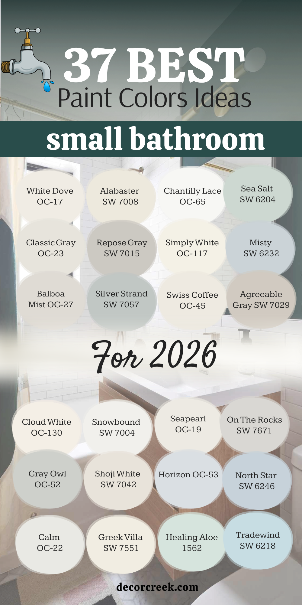


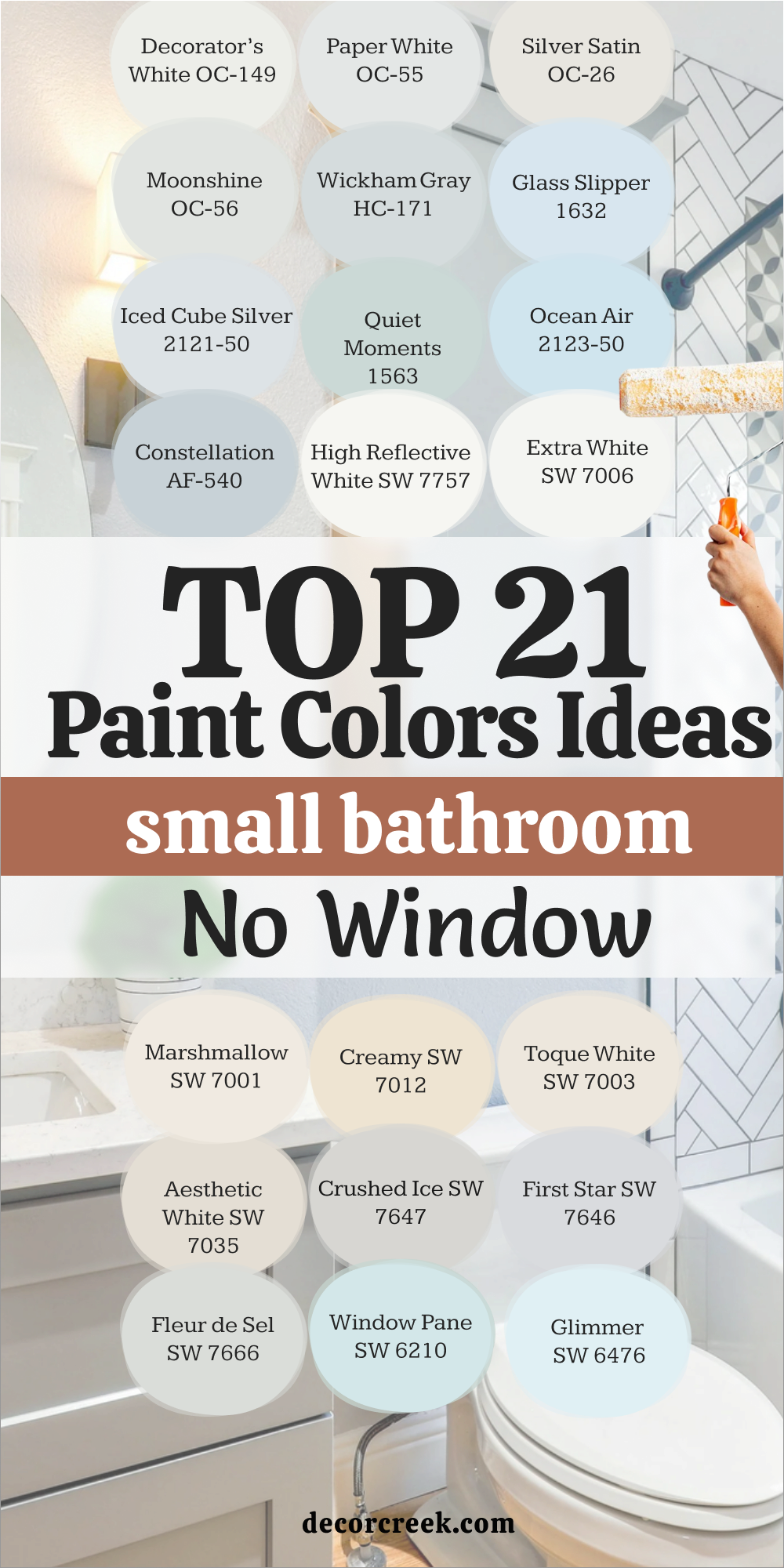
21 Small Bathroom Paint color Ideas no window
Decorator’s White OC-149
Decorator’s White OC-149 jumps in with high brightness that cuts through shadows and lifts tight corners right away. This shade makes mirrors look larger and helps grout lines read clean, which keeps the room feeling neat. I like pairing it with matte black hardware so edges feel sharp without going harsh. It also works beautifully with polished chrome, adding a sleek sparkle that reads fresh under vanity bulbs.
On ceilings and trim, it ties the whole look together so the layout feels planned and tidy.
When I need a white that opens a no-window bath and keeps everything looking crisp, this is the first swatch I grab.
🎨 Check out the complete guide to this color right HERE 👈
Paper White OC-55
Paper White OC-55 carries a whisper of gray that keeps brightness while softening glare from bright fixtures. This color bridges cool tile and warm counters, so finishes play nicely together instead of fighting. I love it with brushed nickel because the metal gains a gentle sheen that feels balanced. Against patterned floors, it helps details look organized and easy to read.
Under both cool LEDs and warmer bulbs, it stays steady so mornings feel clear and evenings feel relaxed.
When a pure white feels too strong but I still want light, this is the answer.
Silver Satin OC-26
Silver Satin OC-26 brings a fine gray wash that brightens walls without shouting. This shade is great behind glass showers because edges stay defined and water spots feel less noticeable. I like it with pale stone tops and simple white sinks so everything reads clean from any angle. Under vanity lighting, it reflects just enough to open the room while keeping a soft mood.
It also supports brass or nickel with equal grace, which makes fixture choices easier.
When I want a gentle backdrop that helps a no-window bath feel fresh and orderly, this pick works every time.
🎨 Check out the complete guide to this color right HERE 👈
Moonshine OC-56
Moonshine OC-56 starts light and airy with a cool undertone that keeps the room from feeling heavy. This color pairs well with white trim and light grout, helping lines look straight and tidy. I like it with ribbed glass or fluted details because the shade lets texture shine without stealing focus.
Under strong LEDs, it keeps a steady face so the mirror view stays flattering.
It also links easily with light woods, rattan baskets, and soft towels for a friendly finish.
When a bath needs brightness with just a hint of sophistication, I reach for this swatch.
Wickham Gray HC-171
Wickham Gray HC-171 lays down a pale gray-blue that feels bright even with zero daylight. This shade loves marble veins and polished chrome, making both sparkle a little more. I like using it to cool off a room that runs warm from bulbs or beige tile. On cabinets, it gives a quiet color note that still feels clean and modern.
It also holds steady across different bulbs, which keeps mornings and nights equally pleasant.
When I want a light gray that reads crisp and helps fixtures stand out, this choice never lets me down.
🎨 Check out the complete guide to this color right HERE 👈

Glass Slipper 1632
Glass Slipper 1632 opens with a light blue touch that freshens walls and lifts corners. This color pairs easily with white beadboard, giving a neat cottage note without turning theme-heavy. I like it next to polished chrome because the metal gains an extra sparkle that feels cheerful. Under vanity lights, it reflects softly so faces look bright without harsh edges.
It also supports pale wood shelves and woven bins, which adds warmth while staying tidy.
When a no-window bath needs a hint of color that still keeps things bright, I pull this sample first.
🎨 Check out the complete guide to this color right HERE 👈
Iced Cube Silver 2121-50
Iced Cube Silver 2121-50 gives a cool, light gray that freshens a no-window bath without feeling icy. This shade pairs beautifully with glossy white tile, making lines look neat and clear. I like how mirrors pick up a soft glow, so faces look bright under simple bulbs. It also balances chrome and nickel, letting fixtures shine while the room stays easy to read.
On cabinets, it adds a quiet note that still feels clean and modern.
When I need brightness with a gentle gray whisper, this color works every time.
Quiet Moments 1563
Quiet Moments 1563 starts as a muted green-blue that feels fresh and friendly in tight layouts. This shade sits nicely behind white trim and pale floors, helping edges stay tidy. I use it when a bathroom needs a hint of color that won’t steal the show from tile or stone. Under LEDs, it holds steady and keeps corners from looking heavy.
It also flatters brushed nickel and soft brass, so hardware choices stay flexible.
When clients want a gentle lift that still reads bright, this swatch is high on my list.
🎨 Check out the complete guide to this color right HERE 👈

Ocean Air 2123-50
Ocean Air 2123-50 brings a breezy blue that makes a no-window bath feel lighter right away. This color loves clean white trim and clear glass, giving showers a crisp outline. I like how it reflects enough light to perk up tight corners without glare. With chrome, it looks sleek; with woven baskets and pale wood, it feels warm and easy.
On walls, it keeps patterns on floors and towels from turning busy.
When I want a soft blue that stays bright under bulbs, this one is a reliable pick.
Constellation AF-540
Constellation AF-540 offers a refined blue-gray that reads calm and tidy under artificial light. This shade pairs beautifully with marble veins, helping them look sharp but not harsh. I often use it to cool down warm vanities or beige tile while keeping the room friendly. Mirrors gain a gentle clarity, which matters in small morning routines.
It also links well with polished chrome and satin nickel, keeping finishes consistent.
When I need a smart, light color that still brings character, this one does the job.
High Reflective White SW 7757
High Reflective White SW 7757 is my brightest white for no-window baths that need maximum lift. This color bounces light off tile and mirrors, so the room looks open and organized. I like it for ceilings and trim because edges snap into clean lines. On walls, it turns matte black or brass hardware into standout details.
It also makes patterned floors feel clearer and less busy.
When clarity and brightness are the goal, I reach for this can first.
🎨 Check out the complete guide to this color right HERE 👈
Extra White SW 7006
Extra White SW 7006 gives a crisp, cool white that keeps small rooms looking neat all day. This shade pairs perfectly with cool grays and bright chrome, making fixtures feel sharp. I like how it handles strong LEDs without turning blue or dull. On cabinets and doors, it creates a smooth, professional finish that’s easy to wipe.
It also frames mirrors nicely, so reflections feel clean and flattering.
When a pure, modern white is the brief, this is my answer.
🎨 Check out the complete guide to this color right HERE 👈
Marshmallow SW 7001
Marshmallow SW 7001 brings a soft, creamy white that brightens without glare. This shade helps warm bulbs feel pleasant, which is useful in a bath with no daylight. I love pairing it with pale stone tops and woven textures for a friendly, cared-for look. On walls, it hides small marks better than harder whites, keeping upkeep simple.
It also works with both brass and nickel, so hardware picks stay flexible.
When I want warmth and light together, this is an easy win.
🎨 Check out the complete guide to this color right HERE 👈
Creamy SW 7012
Creamy SW 7012 starts with a gentle glow that flatters tile, sinks, and skin tones. This color smooths the shift between white fixtures and wood accents, so the room feels planned. I like it for tight layouts because it lifts corners without shouting. Under vanity lights, it stays even and friendly, morning to night.
On trim, it softens lines just enough while keeping things clean.
When a strict white feels too sharp, I brush on this instead.
🎨 Check out the complete guide to this color right HERE 👈

Toque White SW 7003
Toque White SW 7003 gives a refined off-white that reads tidy under any bulb. This shade pairs well with gray grout and porcelain tile, keeping everything crisp. I like it when I need a touch more depth than bright white, but still want the room to feel open. On cabinets, it looks tailored and easy to wipe clean.
With black, brass, or chrome, it stays neutral and supportive.
When a project calls for quiet brightness, this color fits right in.
🎨 Check out the complete guide to this color right HERE 👈
Aesthetic White SW 7035
Aesthetic White SW 7035 offers a soft greige that warms a no-window bath without closing it in. This color supports marble, quartz, and light wood, so finishes feel harmonious. I like how it lets mirrors and glass shine while walls stay gentle. Under LEDs, it remains steady and keeps edges readable.
On doors and trim, it ties the whole palette together without fuss.
When I want a calm, welcoming background that still feels bright, this is my pick.
🎨 Check out the complete guide to this color right HERE 👈

Crushed Ice SW 7647
Crushed Ice SW 7647 brings a cool, light gray that sharpens lines and highlights fixtures. This shade looks especially clean with white trim and polished chrome. I like it for small baths with patterned floors because it quiets the backdrop. Under cooler bulbs, it stays neutral, and under warmer bulbs, it won’t slide yellow.
On cabinets, it adds a modern touch without feeling cold.
When I need a gray that reads clear and tidy, this one works beautifully.
🎨 Check out the complete guide to this color right HERE 👈

First Star SW 7646
First Star SW 7646 gives a pale gray that brightens under basic vanity lighting. This color keeps grout, tile edges, and mirrors looking organized, which helps in tight layouts. I use it when I want more presence than white but the same sense of light. With nickel or stainless, it feels crisp; with brass, it warms just enough
It also plays well with glass doors, keeping sightlines open.
When clarity and ease are the goals, I reach for this shade.
🎨 Check out the complete guide to this color right HERE 👈
Fleur de Sel SW 7666
Fleur de Sel SW 7666 lays down a soft gray wash that stays gentle and bright. This shade pairs with white trim to frame the room neatly without harsh lines. I like it behind marble or quartz because the veins read clean and elegant. Under LEDs, it holds its balance and keeps corners from feeling heavy.
With matte black accents, it gains a modern edge without going loud.
When I want a light gray that behaves well in every part of the bath, this is a favorite.
🎨 Check out the complete guide to this color right HERE 👈
Window Pane SW 6210
Window Pane SW 6210 starts with a pale blue-green that perks up a no-window bath fast. This color keeps walls lively while trims and tiles stay crisp and organized. I like it with shiny chrome and clear glass because reflections look brighter. Under everyday bulbs, it avoids dullness and keeps a friendly tone.
On walls, it supports patterned towels and rugs without competing.
When a room needs a soft lift that still reads light, I reach for this swatch.
🎨 Check out the complete guide to this color right HERE 👈
Glimmer SW 6476
Glimmer SW 6476 offers a whisper of blue that reads fresh and clean under artificial light. This shade pairs well with bright white trim, making edges look sharp and tidy. I like how it gives mirrors a brighter reflection, which helps morning routines. With chrome or nickel, the whole palette feels crisp and simple.
It also sits nicely beside pale stone and light wood, keeping the room balanced.
When I want a hint of color and plenty of light, this is a smart finish.
🎨 Check out the complete guide to this color right HERE 👈
My Final Thoughts on 37 Small Bathroom Paint Color Ideas
Small bathrooms ask for smart choices, not lots of things. I always start with how the light works and let paint do the heavy lifting. One clear wall color, clean trim, and good bulbs can make the room feel brighter and kinder to use every day. Whites and light grays keep edges neat; gentle greens and blues add a friendly mood without taking over.
Match undertones to tile and metal so nothing fights, and keep ceilings a touch lighter to lift the look. I check the sheen, too: satin or eggshell on walls for easy wiping, semi-gloss on trim and doors for a crisp line, and flat on the ceiling so it disappears.
I like mirrors that bounce light and simple hardware that doesn’t steal the show.
If grout is cool, I stay cool; if faucets are warm, I echo that warmth in the paint so the whole room feels connected.
Test big swatches, live with them for a day, and choose the one that makes your morning easier and your evening feel simple and cared for.
Stand in the doorway, turn on every bulb, and take a quick phone photo—what you see in the photo is often what guests will notice. If the room still feels heavy, drop one accent and keep the palette tighter.
If it feels too sharp, warm it up with softer towels, a wood tray, or a woven basket.
Little choices add up: a tidy edge, a steady color, and good light. That’s how a small bathroom looks fresh, neat, and easy to love every single day.