When fall arrives, everything starts to feel a little warmer and cozier. I always think of this season as a time when our homes should feel more inviting—like they’re giving us a gentle hug after a long day. The right paint color can do that. It can make mornings softer, evenings richer, and every rFor me, fall colors aren’t only about deep reds or golden tones. They’re also about how light moves across a wall during short days and long evenings.
A gentle beige can glow like late sunlight, while a smoky gray can feel grounded and steady. I’ve spent years testing shades that feel right for this time of year, and these are the ones I keep coming back to.
Each of them adds warmth, comfort, and that special feeling that only fall brings.
Why I Trust Sherwin-Williams and Benjamin Moore for Fall Paints
After years of designing homes, I’ve learned that paint brands truly matter. Sherwin-Williams and Benjamin Moore always give me results I can rely on. Their colors feel rich, layered, and true to life. When I use them, I know how the paint will react to morning light, how it will look at night, and how it will age over time. Fall paints need to feel cozy but not heavy, and both brands capture that balance beautifully.
Another reason I trust them is their quality. The coverage is smooth, and the finish looks fresh for years.
I’ve painted entire living rooms, hallways, and kitchens without needing constant touch-ups. The colors stay clean and even, even in rooms with changing light or lots of use.
Their selections also make it easy to match shades across walls, trim, and cabinets.
That’s why, when fall comes around and my clients ask for warmth and character, I always start with these two brands.
How I Choose the Right Paint Color for Fall
When I pick a fall color, I start by looking at the light in a room. If the space feels cool and shadowy, I lean toward warm neutrals or deep earthy tones. They make the room feel grounded and calm. In bright rooms, I often use gentle grays or creamy whites to soften the brightness and bring balance. I always test how the color looks at different times of the day because the same paint can feel completely different in the morning and evening.
I also think about how people live in the room. If it’s a family space, I go for tones that feel warm and welcoming. In bedrooms, I prefer colors that help people unwind.
For kitchens, I like hues that bring energy but still feel cozy. Choosing a fall paint color is about more than design—it’s about feeling.
I want every wall to reflect comfort, warmth, and a sense of belonging as the weather cools outside.
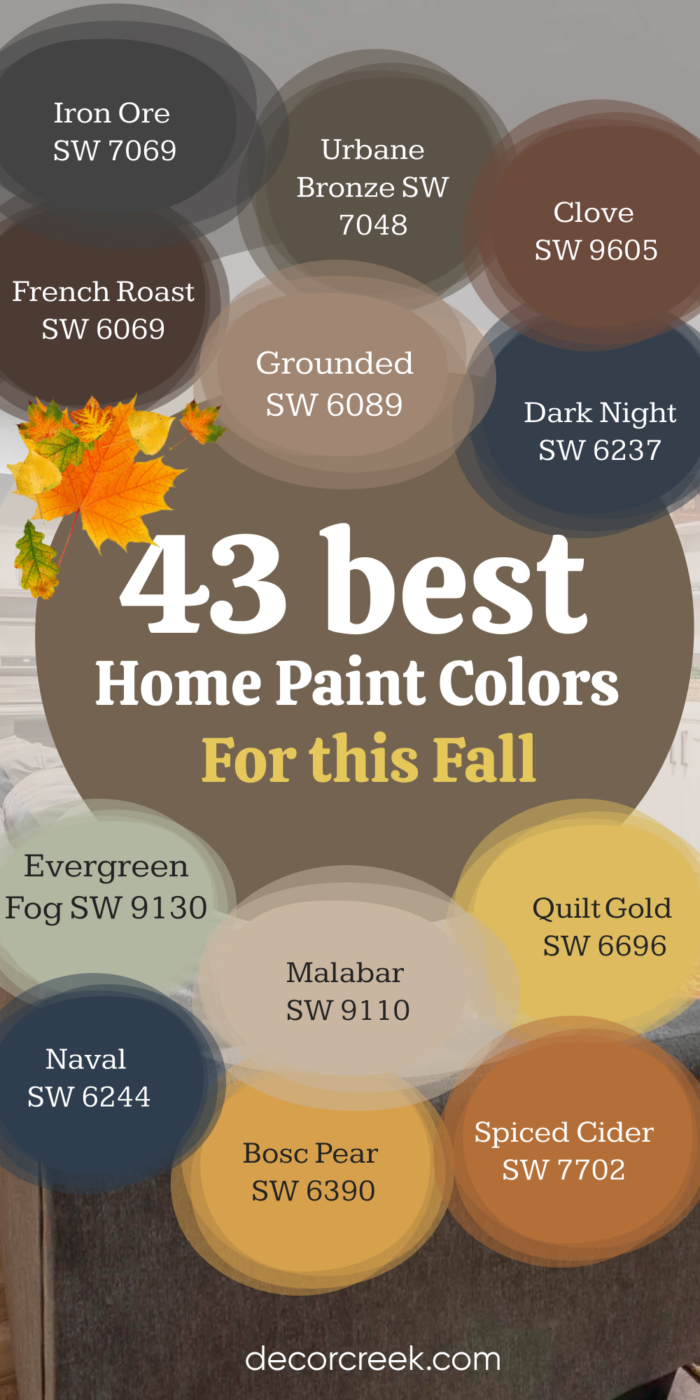
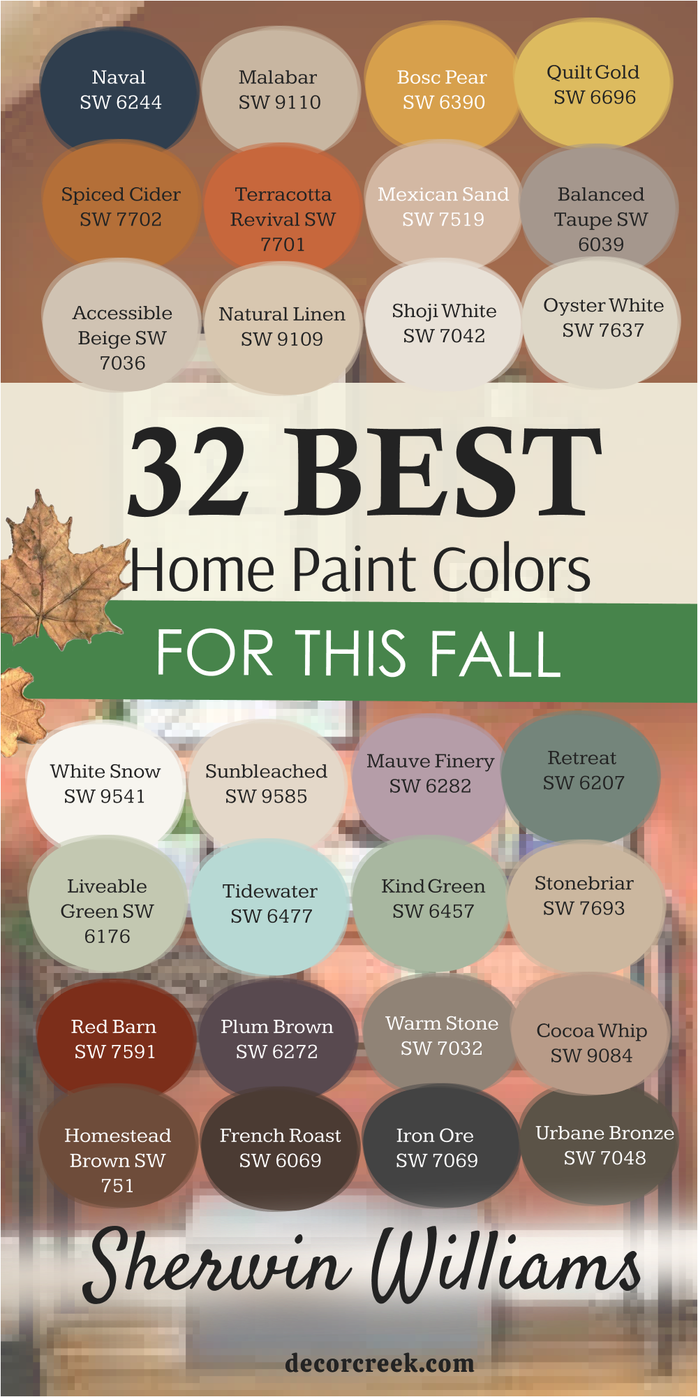
32 Best Home Paint Colors for This Fall from Sherwin-Williams
French Roast SW 6069
French Roast SW 6069 feels like the comfort of a deep, rich coffee on a crisp fall morning. It’s a strong brown with just enough softness to feel welcoming instead of heavy. I often use this color in living rooms and dining areas where people gather, talk, and share meals—it makes the walls feel like they’re part of the warmth. It has that earthy tone that works perfectly with the season, reminding me of freshly turned soil or a cozy leather chair by the fire.
What makes French Roast special is how it reacts to light. In daylight, it feels bold and full, showing off its depth. At night, with soft lamps or candlelight, it becomes more intimate and mellow, creating a quiet and peaceful mood.
I love pairing it with creamy whites or sandy neutrals on trim and fabrics—it gives balance and keeps the room feeling open. Add a few brass touches or warm wood furniture, and the whole space comes alive with fall energy.
I’ve used this shade in traditional homes and modern spaces, and it never feels out of place. It brings character without demanding attention.
It’s that rare color that can make a large room feel cozy and a small room feel rich. When I see French Roast on the wall, it reminds me why I love fall so much—it’s about warmth, depth, and comfort. It’s a color that feels like home, every single time.
🎨 Check out the complete guide to this color right HERE 👈
Iron Ore SW 7069
Iron Ore SW 7069 is my go-to when I want a dark color that feels strong but still welcoming. It’s not a harsh black—it’s a deep charcoal with just enough warmth to make a room feel grounded. I’ve used it in kitchens, entryways, and offices, and every time it gives the space a beautiful sense of depth.
It looks amazing on cabinets or an accent wall where you want a little drama but still need comfort.
Iron Ore works especially well with light countertops, brass hardware, and soft beige or off-white trim.
During the day, this color shows its true texture—it’s layered and rich, never flat. When the evening light hits it, the walls seem to soften, creating a warm, cocoon-like feeling.
It’s the kind of shade that can make even the simplest furniture look intentional and elegant. I also like using it on exteriors paired with white or natural wood—it instantly makes a home look bold and timeless. Iron Ore is one of those shades that proves dark doesn’t have to mean cold; it means cozy, confident, and full of style.
🎨 Check out the complete guide to this color right HERE 👈

Urbane Bronze SW 7048
Urbane Bronze SW 7048 feels like the essence of fall wrapped in color. It’s that beautiful mix of gray and brown that brings warmth and depth without feeling too dark. I love using it in living rooms, bedrooms, or even on front doors—it always adds richness. It pairs perfectly with warm whites, creams, and muted greens, creating a layered, inviting feel. I’ve seen this shade completely change a plain room into something full of character and balance.
What makes Urbane Bronze stand out is how it reacts to textures. Next to wood, it feels natural and earthy; beside metals, it looks sleek and modern.
It’s flexible and forgiving, which makes it one of my most trusted fall tones. Whether you use it on walls or cabinetry, it adds that subtle strength that makes a home feel mature and calm. Urbane Bronze has this quiet confidence—it doesn’t shout, but it always gets noticed.
🎨 Check out the complete guide to this color right HERE 👈

Grounded SW 6089
Grounded SW 6089 is like the soft side of brown—it’s warm, gentle, and full of comfort. Every time I use it, I feel like it wraps the room in calm energy. It’s perfect for living rooms, bedrooms, or even open-concept spaces where you want everything to flow naturally. The undertone reminds me of worn leather or a warm loaf of bread, making it ideal for cozy fall days.
I like to pair Grounded with creamy whites or muted greens—it gives the whole room an easy, lived-in charm.
When sunlight hits it, the color feels alive and glowing; in the evening, it becomes rich and soothing. It works beautifully with wood floors, beige fabrics, and soft lighting. What I love most is how it never feels overdone—it’s elegant and balanced. Grounded is the kind of color that turns a house into a home, season after season.
🎨 Check out the complete guide to this color right HERE 👈
Clove SW 9605
Clove SW 9605 brings the feeling of autumn spices to life. It’s a warm brown with a hint of red that feels both elegant and comforting. I often use it in dining rooms or cozy studies—it adds that sense of warmth you want when the weather turns cooler. The color glows under soft lighting, making every dinner or quiet evening feel special.
I love pairing Clove with creamy whites, gold accents, or natural linen fabrics. Together they create a space that feels rich yet relaxed.
In larger rooms, Clove adds intimacy; in smaller rooms, it adds depth. It’s the perfect middle ground between traditional and modern, making it work in almost any home. Every time I paint a wall in Clove, I’m reminded of cinnamon, warmth, and quiet evenings spent with family—it’s simply the color of comfort.
🎨 Check out the complete guide to this color right HERE 👈
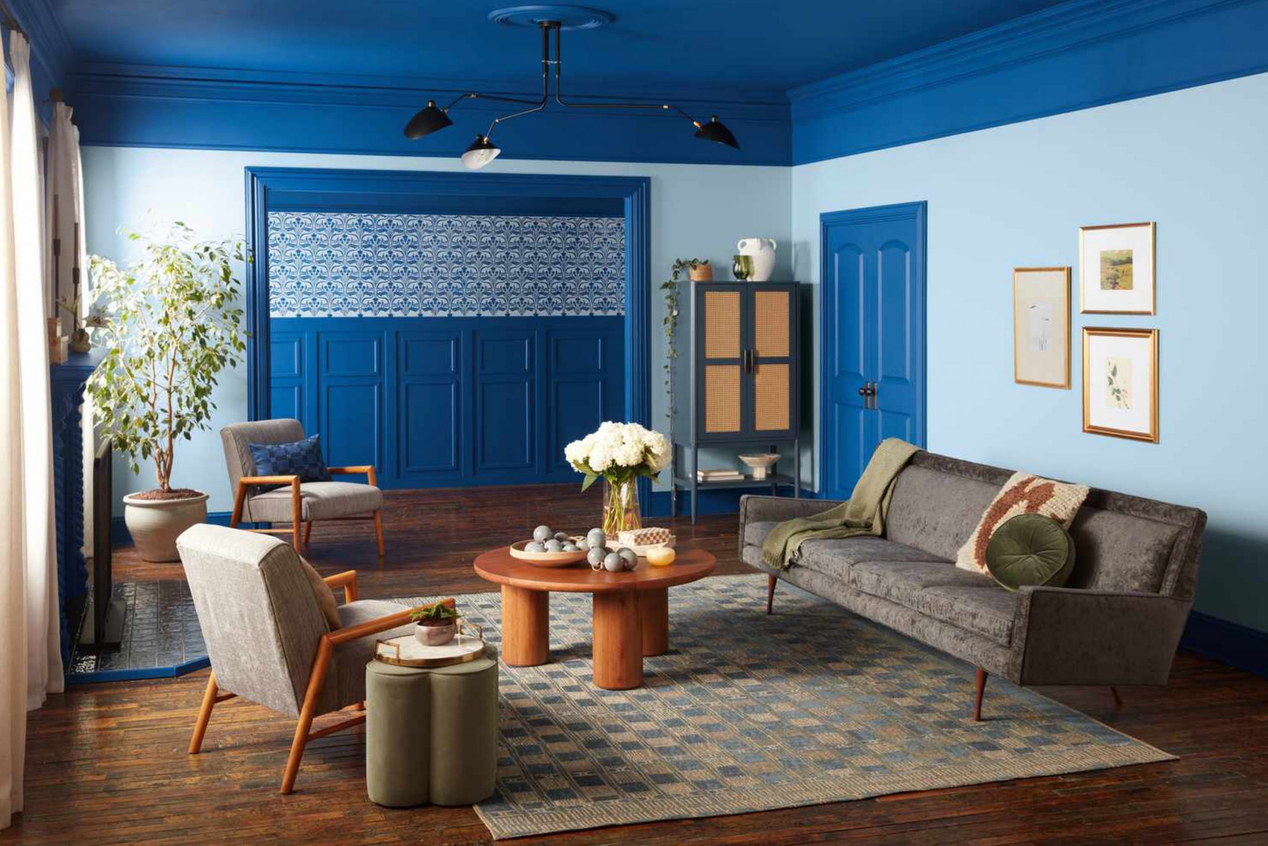
Dark Night SW 6237
Dark Night SW 6237 is bold and beautiful—a deep blue with just enough green to make it feel grounded. I love using it when I want to bring strength to a space without losing warmth. It looks incredible on kitchen islands, accent walls, or even cabinetry. The color changes slightly throughout the day—brighter in the morning, moodier at night—and that’s what makes it so dynamic.
Paired with brass or brushed gold, it feels elegant and timeless. Add warm wood or creamy white, and it becomes soft and sophisticated.
I always tell clients that Dark Night brings confidence to a room—it makes every detail stand out. It’s the kind of blue that feels like the evening sky in late autumn: deep, steady, and full of quiet beauty.
🎨 Check out the complete guide to this color right HERE 👈
Evergreen Fog SW 9130
Evergreen Fog SW 9130 is one of those shades that instantly makes a room feel complete. It’s a soft, misty green with gray undertones that’s both soothing and refined. I use it often in bedrooms, hallways, or entryways—it connects beautifully with nature while still feeling clean and modern. The best thing about this color is how it blends with everything—wood tones, whites, and even darker colors.
During the day, it feels light and airy; at night, it deepens into something cozy and restful.
It reminds me of early morning walks when the air is cool and the trees still hold their color. Evergreen Fog adds just enough color to make a statement without being loud. It’s the perfect balance of nature and elegance, which is why it’s one of my favorite choices for fall.
🎨 Check out the complete guide to this color right HERE 👈

Naval SW 6244
Naval SW 6244 brings a deep, classic navy that feels both modern and timeless. It’s bold but not overpowering, and it always adds depth to any room. I’ve used it in dining rooms, home offices, and bedrooms—it gives each space a rich, confident feel. The color pairs beautifully with crisp whites, warm metallics, and natural textures.
When paired with soft lighting, Naval feels cozy and sophisticated at the same time. It’s also perfect for exteriors—front doors painted in this shade stand out beautifully against fall leaves.
This color reminds me of the evening sky right before dusk—steady, calm, and endlessly beautiful. If you want a color that brings both strength and comfort, Naval is one of the best choices for the season.
🎨 Check out the complete guide to this color right HERE 👈

Malabar SW 9110
Malabar SW 9110 is a warm beige that never feels plain. It has just a touch of gold that gives it life and warmth. I love using it as a base color in living rooms and bedrooms where you want a soft, inviting glow. The tone reminds me of sand at sunset—smooth, warm, and gentle.
Malabar looks amazing next to creamy trim and natural wood.
It works well with both modern and traditional designs, adding quiet charm wherever it goes. When I use it in rooms with good light, it brightens the space without feeling stark. It’s one of those easy, comfortable colors that helps everything else shine.
Malabar is perfect for anyone who wants warmth without weight—it’s simple, elegant, and always right for fall.
🎨 Check out the complete guide to this color right HERE 👈
Bosc Pear SW 6390
Bosc Pear SW 6390 feels like the soft light of late afternoon in autumn. It’s a golden yellow with brown undertones, warm but never loud. I love using it in kitchens and breakfast areas where sunlight can touch it—it brings a gentle glow that feels cheerful and calm. Paired with whites or soft grays, it feels modern and fresh.
This color adds life to any home without taking over. It works beautifully with wood cabinets, neutral walls, and even deep greens.
Bosc Pear reminds me of ripe fruit and the comfort of harvest season—it’s a shade that feels naturally happy. When I want a room to feel welcoming and full of light, this is the color I reach for every time
Quilt Gold SW 6696
Quilt Gold SW 6696 brings the warm glow of autumn sunlight straight into a home. It’s a golden yellow that feels cheerful but calm enough for everyday living. I love using this color in kitchens or dining rooms, where natural light can bring it to life. It reminds me of honey and soft fabric — rich, cozy, and full of warmth. When paired with white trim or soft browns, Quilt Gold creates a balanced and happy feel that instantly lifts the mood.
It’s also one of those colors that works beautifully with fall décor — think pumpkins, dried flowers, and candlelight.
On cloudy days, it adds brightness; on sunny days, it deepens into something rich and comforting. I’ve even used it on a front door, and it looked stunning against the crisp air and turning leaves. Quilt Gold is a perfect reminder that yellow doesn’t have to be loud — it can be soft, glowing, and deeply inviting.
🎨 Check out the complete guide to this color right HERE 👈

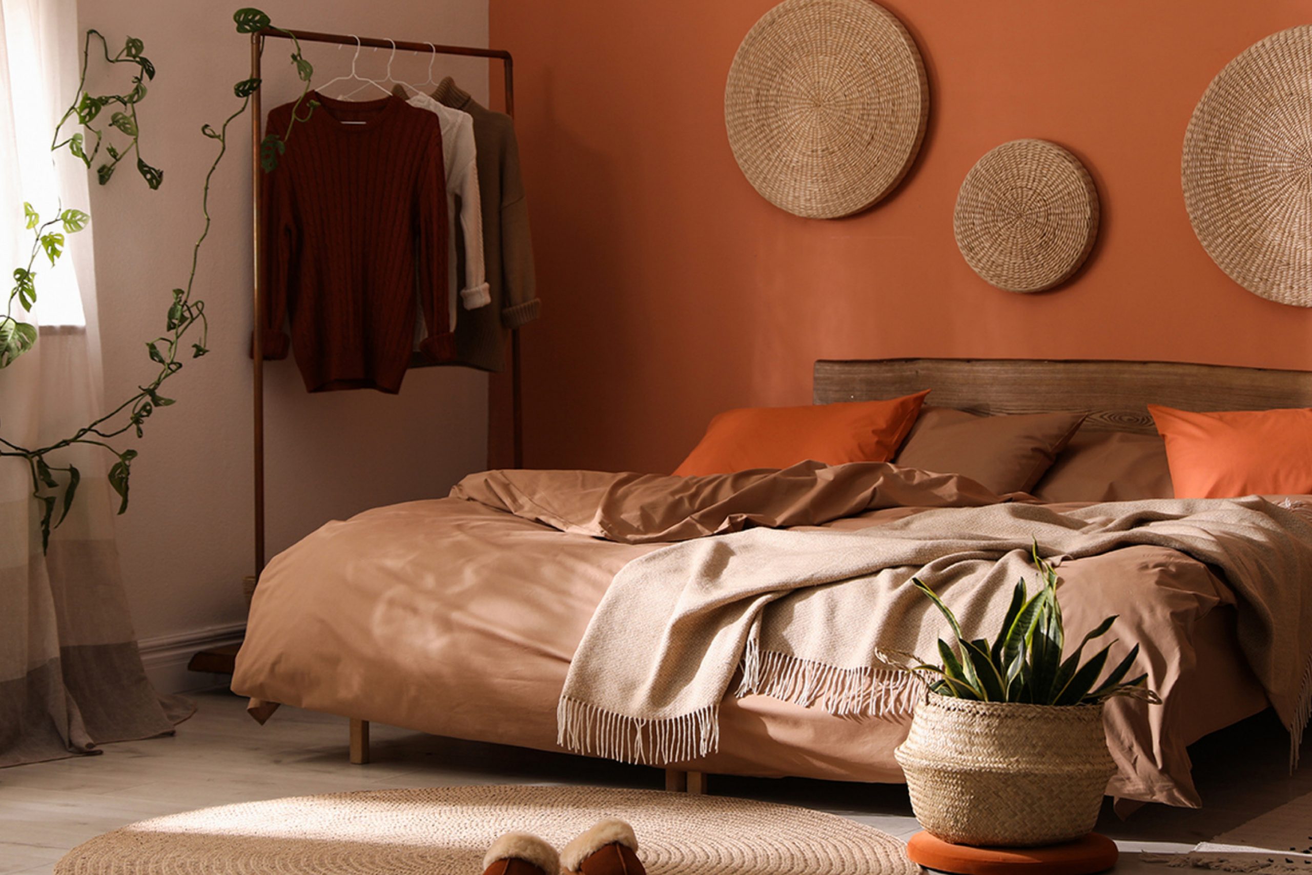
Spiced Cider SW 7702
Spiced Cider SW 7702 feels like the heart of fall. It’s warm, golden brown with an amber glow that instantly makes a room feel cozy. I love using it in living rooms and dining spaces where you want a welcoming mood. The color reminds me of candlelight and roasted chestnuts — warm, comforting, and full of character. It looks especially lovely when paired with creamy whites or muted greens.
This color works beautifully with both rustic and modern styles. On smooth walls, it feels elegant; on textured surfaces, it adds depth and warmth.
When I use Spiced Cider, I notice how people relax in the space — it naturally draws them in. It’s a color that feels safe and special at the same time. If you want to bring true autumn warmth into your home, this is one of the best shades to do it.
Terracotta Revival SW 7701
Terracotta Revival SW 7701 carries that earthy red tone that instantly says fall. It’s warm and grounded, like clay or brick touched by the evening sun. I love using it in entryways, dining rooms, or even on accent furniture — anywhere that needs personality and warmth. It pairs beautifully with creamy whites, dusty greens, or even navy blue.
The beauty of Terracotta Revival is in how it changes throughout the day.
In morning light, it feels fresh and lively; by evening, it becomes deep and rich. It brings natural energy to a home without feeling bold. When combined with woven textures and wood accents, it feels timeless and natural. It’s one of those colors that instantly gives a space life and comfort — the perfect match for the fall season.
Accessible Beige SW 7036
Accessible Beige SW 7036 is one of those soft neutrals that always makes a home feel welcoming. It has a gentle warmth that works with every season but feels especially cozy in fall. I often use it in open living spaces or kitchens where you want light without harshness. It feels natural, like the color of oatmeal or sand under soft light.
It pairs beautifully with wood floors, white trim, or black accents. When the sun hits it, it glows; in the evening, it deepens into something cozy and warm.
Accessible Beige is a safe but never boring choice — it fits any style and always makes a room feel loved. It’s one of those colors that quietly supports everything around it, creating the perfect balance.
🎨 Check out the complete guide to this color right HERE 👈

Mexican Sand SW 7519
Mexican Sand SW 7519 is a warm, comforting neutral that reminds me of clay, beige stone, and desert tones. It’s soft but full of personality. I often use it in living rooms and hallways where I want an easy, natural backdrop that still feels interesting. It’s warmer than gray but lighter than brown — just the right in-between tone for cozy fall days.
This shade pairs beautifully with dark wood and golden metals. It also works well with warm whites and muted greens for a layered, natural palette.
Mexican Sand makes a space feel calm and grounded, perfect for family rooms or reading corners. When you want something subtle yet full of heart, this is one of those shades that never disappoints.
🎨 Check out the complete guide to this color right HERE 👈
Natural Linen SW 9109
Natural Linen SW 9109 is exactly what its name suggests — soft, clean, and comforting. It’s a creamy beige with just a touch of warmth, perfect for bedrooms, hallways, and kitchens. I like it because it makes everything feel brighter without looking stark. It has that fresh, homey quality that reminds me of clean linens drying in the autumn sun.
This shade works perfectly with whites, taupes, and even light greens. It’s wonderful for creating a warm neutral base that can carry any décor style.
Whether paired with rustic wood or sleek modern lines, it holds its charm. Natural Linen makes a space feel soft, simple, and deeply relaxing — exactly what a home should feel like in the fall.
🎨 Check out the complete guide to this color right HERE 👈

Poised Taupe SW 6039
Poised Taupe SW 6039 is the perfect mix of gray and brown — smooth, steady, and full of warmth. It’s a reliable shade I’ve used in so many homes because it adapts to almost any lighting. In bright rooms, it looks elegant and neutral; in dim spaces, it feels deep and comforting. I love using it in bedrooms, living areas, or anywhere that needs a soft sense of calm.
What makes Poised Taupe special is how easy it is to pair with other colors. It looks stunning next to white trim, dark wood, or even muted blue-green tones.
It’s one of those shades that helps furniture, fabrics, and art stand out beautifully. I think of it as a “foundation color” — steady, peaceful, and always graceful.
🎨 Check out the complete guide to this color right HERE 👈
Shoji White SW 7042
Shoji White SW 7042 is one of my favorite warm whites for fall. It’s creamy with a hint of beige, which keeps it from feeling cold or plain. I love how it reflects soft light and makes rooms feel open and inviting. It’s perfect for trim, walls, or ceilings — it gives a gentle glow that feels comforting and elegant.
When paired with darker colors like brown or green, Shoji White adds balance. It also works beautifully with brass or wooden details.
I often recommend it to clients who want a fresh look without losing warmth. It’s that color that makes everything else in a room feel finished and peaceful. Shoji White is proof that even a simple shade can carry depth and emotion.
🎨 Check out the complete guide to this color right HERE 👈

Oyster White SW 7637
Oyster White SW 7637 has a beautiful mix of white and soft gray that feels gentle and sophisticated. It’s the kind of shade that changes beautifully with the light — warm in sunlight, cool and smooth in the evening. I like using it in kitchens, bedrooms, and hallways where a quiet tone brings calm energy.
This color pairs effortlessly with both warm and cool accents — gold, wood, and black all work well beside it.
Oyster White helps make other colors shine without fading into the background. It’s that reliable shade that adds polish to every room while keeping things cozy and simple. I’ve used it in dozens of homes, and it always feels just right.
🎨 Check out the complete guide to this color right HERE 👈

Liveable Green SW 6176
Liveable Green SW 6176 is one of those greens that feels endlessly comfortable. It’s soft, muted, and full of warmth — a perfect blend between natural and neutral. I like using it in kitchens, family rooms, and even bathrooms where you want color that still feels easy to live with. It gives walls a hint of freshness while keeping the atmosphere relaxed.
This color pairs beautifully with creamy whites, warm wood, and brushed gold finishes. It works well in both bright and dim spaces, never feeling out of place. Liveable Green has that quiet charm that makes people feel instantly at home.
It’s a gentle reminder that sometimes the best colors are the ones that simply make a space feel peaceful and lived-in.
🎨 Check out the complete guide to this color right HERE 👈

Tidewater SW 6477
Tidewater SW 6477 carries a soft aqua tone that feels like a breath of fresh air in the fall. It’s light and breezy but still warm enough to feel inviting. I love using it in bathrooms, bedrooms, or small kitchens to create a gentle, airy mood. It reminds me of sea glass and misty mornings, bringing a quiet energy to any space.
It looks stunning with crisp white trim and sandy beige accents. When paired with brass or woven textures, Tidewater feels relaxed yet refined.
It’s not a typical fall color, but it blends beautifully with natural wood and soft neutral décor. For me, it’s a perfect way to add a hint of color while keeping the home feeling calm and cozy as the seasons shift.
🎨 Check out the complete guide to this color right HERE👈

White Snow SW 9541
White Snow SW 9541 is a crisp, fresh white that still carries a touch of warmth. It’s clean without being sterile, which makes it perfect for homes that want brightness but not harshness. I love using it on ceilings, trim, and cabinets where you need contrast but also softness. It pairs beautifully with beige, gray, and muted fall colors.
During fall, this white feels like the first chill in the air — clean, light, and refreshing.
It helps balance deeper tones and makes spaces look open and bright even on cloudy days. When combined with wood furniture or soft textiles, it creates that perfect mix of warmth and clarity. White Snow is one of those shades I can use anywhere and know it will always work.
🎨 Check out the complete guide to this color right HERE 👈
Retreat SW 6207
Retreat SW 6207 feels like stepping into the calm of a quiet forest. It’s a muted green with a touch of gray, making it both natural and refined. I love using it in living rooms or bedrooms where people want a sense of comfort and peace. It’s the kind of color that immediately slows the rhythm of a space, helping everything feel centered.
Retreat pairs wonderfully with warm whites, natural wood, or brass accents. It’s also stunning next to deep navy or soft tan, depending on how dramatic you want the look. This shade brings a bit of the outdoors inside — perfect for fall, when nature’s colors begin to fade into soft golds and greens.
Every time I use Retreat, the room feels thoughtful and complete.
Kind Green SW 6457
Kind Green SW 6457 is one of those shades that feels like it belongs in nature. It’s soft but full of warmth, like a leaf that’s just starting to turn. I love using it in kitchens, dining rooms, and hallways where it can catch natural light. It creates a grounded, comfortable feeling that feels just right for fall.
Kind Green pairs beautifully with creamy whites, dark wood, or brushed bronze fixtures. It’s an easy color to live with — not too bright, not too muted.
I’ve used it in both modern and traditional homes, and it always fits. There’s something honest about this color; it feels familiar, like something you’ve always known. Kind Green brings a touch of the outdoors in, wrapping the home in gentle warmth.
🎨 Check out the complete guide to this color right HERE 👈
Sunbleached SW 9585
Sunbleached SW 9585 reminds me of driftwood and soft sand after a long summer, fading perfectly into fall. It’s a pale beige with a whisper of warmth, ideal for bedrooms, living rooms, or anywhere you want that quiet glow. I love how it makes a space feel light but not cold. During the day, it captures sunlight gently; at night, it reflects the soft glow of lamps in a way that feels calm and easy.
This color pairs beautifully with wood tones, black metal accents, or even earthy greens.
It’s one of my favorite backgrounds for fall décor — think woven baskets, linen throws, and dried flowers. It gives everything a clean but cozy backdrop. I also use it when clients want their homes to feel open but still welcoming. Sunbleached is that easy kind of beautiful — gentle, natural, and endlessly versatile.
🎨 Check out the complete guide to this color right HERE 👈
Stonebriar SW 7693
Stonebriar SW 7693 is a soft greige that always feels balanced and steady. It’s warm enough to feel inviting but still modern and clean. I love using it as a main wall color because it works beautifully with nearly every accent. It reminds me of smooth pebbles or worn stone — natural, simple, and classic.
This shade looks stunning with white trim, muted blues, or warm metallics. It’s also a great choice for open layouts because it connects rooms effortlessly.
Stonebriar works especially well in fall when you want a light color that still feels warm. It’s a quiet backdrop that lets furniture, fabrics, and textures shine. When I use it, homes feel grounded and peaceful, just the way they should.
🎨 Check out the complete guide to this color right HERE 👈
Red Barn SW 7591
Red Barn SW 7591 brings that classic farmhouse red that instantly feels like fall. It’s bold, rich, and full of warmth — the kind of color that makes a home feel alive. I love using it on doors, accent walls, or even furniture pieces. It pairs beautifully with creamy whites, dark grays, and warm woods.
In bright light, it glows with a cheerful energy; in dim light, it feels cozy and rustic. Red Barn gives a sense of history and comfort, like an old country home or a fireside evening.
It’s not a color for every wall, but when used thoughtfully, it becomes the heart of the room. It’s fall in a single shade — warm, classic, and full of life.
🎨 Check out the complete guide to this color right HERE 👈
Mauve Finery SW 6282
Mauve Finery SW 6282 brings the sweetest hint of blush and plum, making it one of my go-to choices for soft, elegant warmth. It’s a color that feels tender without being overly feminine. I love using it in bedrooms, guest rooms, or small offices where you want just a touch of charm. It reminds me of dried roses and early evening skies — comforting and full of grace.
Paired with white trim or soft gold accents, Mauve Finery feels calm and balanced. In the morning light, it looks fresh and pretty; in the evening, it deepens into a muted rose tone that’s incredibly relaxing. I like how it works well with beiges, creams, and even deep greens for contrast.
This shade adds emotion to a home — it’s gentle, graceful, and quietly beautiful.
Plum Brown SW 6272
Plum Brown SW 6272 is one of those deep, rich colors that feels like a hidden gem. It’s a mix of purple and brown that adds quiet drama to a space. I like using it in studies, dining rooms, or cozy bedrooms where warmth matters. It’s unexpected yet incredibly elegant.
Paired with cream, gold, or wood tones, Plum Brown brings depth and character. It changes beautifully throughout the day — more plum in daylight, more chocolate at night.
This shade adds a touch of sophistication without feeling formal. When I want a room to feel both grounded and graceful, Plum Brown never fails.
🎨 Check out the complete guide to this color right HERE 👈
Warm Stone SW 7032
Warm Stone SW 7032 has that ideal balance between gray and taupe — strong, smooth, and endlessly adaptable. I’ve used it in both large and small rooms, and it always feels right. It works beautifully as a backdrop for artwork, dark wood, or soft beige furniture. The warmth in it makes it feel cozy instead of cold.
This shade looks great with creamy whites and brushed metal fixtures.
It’s also perfect for open layouts where you need one color to tie everything together. Warm Stone gives a home a sense of quiet confidence — simple, natural, and perfectly grounded for fall.
🎨 Check out the complete guide to this color right HERE 👈

Cocoa Whip SW 9084
Cocoa Whip SW 9084 is one of my favorite warm browns because it feels light and creamy. It has just enough color to bring comfort without feeling heavy. I love it for bedrooms, dining spaces, and hallways where you want a cozy, inviting feel. It looks lovely with soft whites and muted golds.
When sunlight hits Cocoa Whip, it glows softly, almost like a warm blanket for your walls. In the evening, it deepens into a smooth mocha tone.
It pairs beautifully with linen fabrics, natural textures, and golden lighting. It’s one of those shades that instantly makes a home feel cared for and full of warmth.
🎨 Check out the complete guide to this color right HERE 👈
Homestead Brown SW 7515
Homestead Brown SW 7515 feels like the heart of fall — rich, warm, and welcoming. It’s a deep brown that carries hints of red and orange, reminding me of fresh soil and autumn leaves. I often use it on cabinets, doors, or accent walls to create contrast and depth. It’s bold but still cozy, especially when paired with warm whites or creamy trim.
This color has a way of making a room feel established, almost like it’s been loved for years.
With brass accents or soft textiles, Homestead Brown takes on a luxurious quality. It’s one of those shades that doesn’t just color a wall — it tells a story. For me, it’s a perfect ending to Sherwin-Williams’ best fall palette: classic, grounded, and full of warmth.
🎨 Check out the complete guide to this color right HERE 👈
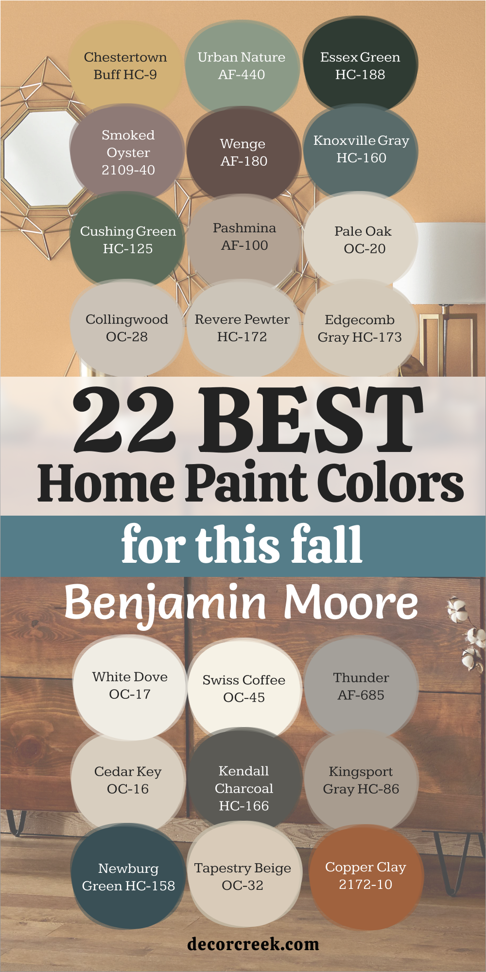
22 Best Home Paint Colors for This Fall from Benjamin Moore
Chestertown Buff HC-9
Chestertown Buff HC-9 feels like the glow of afternoon sunlight streaming through a kitchen window. It’s a warm golden beige that brings instant comfort to any room. I love using it in living rooms, dining areas, or hallways where people gather—it makes every moment feel relaxed and full of warmth. The tone reminds me of soft butter and honey, rich but never too heavy. It’s that perfect middle ground between yellow and tan, bright enough to lift a space yet cozy enough to feel like fall.
When paired with white trim or dark wood accents, Chestertown Buff looks timeless and full of charm. In daylight, it feels cheerful and open; by night, it deepens into something soft and welcoming. It’s the kind of color that makes a house feel truly lived in. I’ve used it in both modern and classic homes, and it always gives that gentle sense of happiness.
Chestertown Buff is more than paint—it’s comfort, nostalgia, and the golden heart of autumn.
🎨 Check out the complete guide to this color right HERE 👈

Urban Nature AF-440
Urban Nature AF-440 captures the quiet beauty of nature in early fall. It’s a muted green with just enough gray to make it soft and sophisticated. I love using it in bedrooms and offices where peace matters. The shade reminds me of the color of moss after rain—calm, grounded, and full of life. It’s one of those colors that makes a room breathe easier, instantly easing tension the moment you walk in.
Urban Nature pairs beautifully with creamy whites, soft browns, and warm metallics. During the day, it feels gentle and fresh; in the evening, it deepens into a rich, natural tone. It’s also a great backdrop for wooden furniture or woven textures. Every time I use it, the home feels settled and serene, as if nature has quietly stepped inside.
🎨 Check out the complete guide to this color right HERE 👈
Essex Green HC-188
Essex Green HC-188 feels like standing under a canopy of trees just before dusk. It’s a deep, moody green that adds richness and depth to a space. I often use it on kitchen cabinets, built-ins, or accent walls when I want to bring strength and character to a room. It has a luxurious feel, especially paired with brass fixtures or crisp white trim.
This color thrives in soft, warm light, where its richness really comes alive. In bright daylight, it looks bold and classic; in dim light, it becomes mysterious and intimate. Essex Green brings sophistication and warmth together perfectly. It’s a fall favorite that reminds me of forest walks, cool air, and cozy evenings spent indoors.
🎨 Check out the complete guide to this color right HERE 👈

Smoked Oyster 2109-40
Smoked Oyster 2109-40 is one of the most elegant shades I’ve ever used. It’s a soft mauve-gray that feels sophisticated yet easy to live with. I love it for bedrooms, dining rooms, or any space that needs a hint of color without being loud. It’s subtle and layered, reminding me of silk fabric or twilight skies.
It pairs beautifully with creamy whites, warm metals, and dark wood. The color shifts gently through the day, taking on warmth in sunlight and becoming soothing at night.
Smoked Oyster brings emotion and depth to a space—it’s quiet but unforgettable. It’s the kind of tone that makes guests pause and ask, “What color is that?”
🎨 Check out the complete guide to this color right HERE 👈

Knoxville Gray HC-160
Knoxville Gray HC-160 carries the perfect mix of blue and green with just enough gray to make it timeless. It’s one of those moody, layered colors that looks different every hour. I use it in dining rooms, offices, and even kitchens—it always adds a quiet elegance. The tone feels calm and thoughtful, like the cool side of fall evenings.
It pairs beautifully with crisp whites, golden hardware, or dark wood floors. In morning light, Knoxville Gray feels soft and balanced; in evening light, it becomes deep and rich. It’s versatile and full of charm, offering both sophistication and comfort. Every time I see this shade, I think of cozy nights, books, and warm drinks by the fire.
🎨 Check out the complete guide to this color right HERE 👈

Wenge AF-180
Wenge AF-180 is deep, rich, and full of confidence. It’s a dark brown with a touch of red that gives it warmth and elegance. I often use it in studies, dining rooms, or as an accent wall when I want a space to feel grounded. It reminds me of polished wood furniture and the warmth of candlelight reflecting off dark tones.
When paired with light fabrics or warm whites, Wenge feels sophisticated and modern. It also looks stunning next to brass, leather, or cream upholstery.
Even in small doses—like a front door or cabinet—it adds a touch of luxury. Wenge gives rooms a sense of permanence, as if they’ve always been part of the home.
Cushing Green HC-125
Cushing Green HC-125 feels like nature wrapped around you. It’s a rich, classic green that’s both peaceful and powerful. I love using it in kitchens, dining areas, or living rooms where I want to bring that steady, natural feel. It pairs beautifully with brass accents, creamy whites, and natural woods.
This color shines in fall light—it has warmth without being heavy. It’s elegant but still approachable, perfect for both traditional and modern homes. Cushing Green adds just the right amount of depth to make a space feel settled and full of life. It’s one of those greens that reminds me why color matters—it creates a feeling you can live in.
🎨 Check out the complete guide to this color right HERE 👈
Pashmina AF-100
Pashmina AF-100 feels like a soft knit blanket turned into color. It’s a warm greige—part beige, part gray—that fits perfectly in any room. I use it when I want walls to feel gentle but full of personality. It complements both light and dark accents, which makes it an easy favorite for fall interiors.
Pashmina looks beautiful with creamy whites, natural woods, and muted greens. During the day, it feels bright and open; in the evening, it becomes soft and comforting. It’s that kind of shade that holds everything together without shouting for attention. Every home feels warmer with a touch of Pashmina—it’s calm, balanced, and deeply welcoming.
🎨 Check out the complete guide to this color right HERE 👈

Pale Oak OC-20
Pale Oak OC-20 is a delicate off-white that glows softly like morning light. It’s one of my favorite colors for open, airy spaces that still need warmth. I use it on walls, trim, and even ceilings when I want a seamless flow. It’s brighter than beige but softer than white, making it ideal for homes that want a light, natural palette.
It pairs beautifully with taupes, warm grays, and muted greens. The beauty of Pale Oak is its quiet strength—it enhances everything around it without demanding focus. It makes wood tones richer and metallics softer. Pale Oak feels like a fresh start every day, making it perfect for fall transitions.
🎨 Check out the complete guide to this color right HERE 👈

Collingwood OC-28
Collingwood OC-28 feels clean, calm, and comforting all at once. It’s a warm gray that carries just enough beige to make it feel inviting. I love using it in living rooms or bedrooms where a soft, neutral backdrop is needed. It reacts beautifully to light—bright and airy in the morning, cozy and warm in the evening.
Collingwood pairs wonderfully with white trim and natural wood furniture. It also looks lovely with soft blues and greens for a layered, peaceful look. It’s a color that never feels flat—it always has depth and character. Collingwood is one of my “can’t-go-wrong” choices for any season, but in fall, it feels especially right.
🎨 Check out the complete guide to this color right HERE 👈

Revere Pewter HC-172
Revere Pewter HC-172 is one of those colors I always come back to. It’s a soft, warm gray that feels perfectly balanced between cool and cozy. I love using it in living rooms, hallways, or open-concept homes where you want consistency and comfort. It adapts beautifully to light — looking brighter in sunlight and richer under lamplight. The tone reminds me of weathered stone and quiet mornings, making it perfect for fall.
Revere Pewter pairs wonderfully with crisp white trim, dark wood floors, and even muted greens. It adds depth without ever feeling heavy. I’ve seen it work in both modern and traditional homes — it’s one of those rare shades that always feels right. It makes a space feel lived-in, calm, and welcoming. If you want one color that feels like home in every season, this is it.
🎨 Check out the complete guide to this color right HERE 👈

Edgecomb Gray HC-173
Edgecomb Gray HC-173 feels like a gentle whisper of warmth. It’s lighter than most grays but carries a beige undertone that keeps it from feeling cold. I love it for bedrooms, hallways, and cozy nooks that need light without starkness. It’s the kind of color that quietly supports everything around it — furniture, fabrics, and even art.
Paired with bright whites and soft wood, it feels airy and elegant. Under warm lighting, it takes on a golden glow that feels perfect for fall evenings. Edgecomb Gray is that subtle shade that makes a home feel effortlessly pulled together. It’s the perfect neutral when you want simplicity with a touch of heart.
🎨 Check out the complete guide to this color right HERE 👈

White Dove OC-17
White Dove OC-17 is one of those colors that makes every room shine softly. It’s a creamy, luminous white that feels cozy instead of cold. I love using it on walls, trim, and even ceilings to create a seamless, warm look. It catches light beautifully, making spaces glow even on gray fall days.
White Dove pairs wonderfully with earthy neutrals, dark woods, and muted greens. It softens strong tones like navy or charcoal while bringing gentle brightness to any space. It’s my go-to white for homes that want warmth and elegance in equal measure. White Dove feels like quiet sunshine — calm, clean, and endlessly welcoming.
🎨 Check out the complete guide to this color right HERE 👈

Swiss Coffee OC-45
Swiss Coffee OC-45 feels like cream in your coffee — soft, smooth, and comforting. It’s a warm off-white that makes walls glow without feeling too yellow. I love using it in bedrooms, living rooms, and kitchens where a little warmth makes all the difference. It works beautifully as a backdrop for fall tones like rust, brown, and olive.
This color pairs wonderfully with brass, beige fabrics, and natural wood accents. It brightens spaces during the day and glows softly in the evening. Swiss Coffee feels like a gentle hug — it’s relaxed, elegant, and full of warmth. It’s one of those shades that makes a home feel fresh but still lived in.
🎨 Check out the complete guide to this color right HERE 👈

Thunder AF-685
Thunder AF-685 is that perfect medium gray with quiet strength. It adds just enough depth to a space without taking over. I use it for accent walls, cabinetry, or cozy dens where I want a little mood. It’s balanced — not too cool, not too warm — which makes it incredibly flexible.
Paired with white trim, brass accents, or light wood, Thunder feels steady and sophisticated. It reacts beautifully to lighting, turning soft in daylight and rich by night. This shade gives a room character and calm at the same time. It’s perfect for creating that fall feeling — grounded, warm, and full of depth.
🎨 Check out the complete guide to this color right HERE 👈

Cedar Key OC-16
Cedar Key OC-16 feels like soft sand beneath your feet. It’s a warm beige with a touch of gray that keeps it balanced. I love it for living rooms, bedrooms, or dining areas where comfort is key. It’s simple yet beautiful, the kind of neutral that lets every other detail shine.
When paired with creamy whites or warm woods, Cedar Key feels elegant and easy. It brings a gentle glow to darker days and works in nearly any lighting. Cedar Key is that shade that quietly supports the whole design — never loud, always graceful. It’s one of my favorite fall neutrals because it feels timeless and calm.
🎨 Check out the complete guide to this color right HERE 👈

Kendall Charcoal HC-166
Kendall Charcoal HC-166 is deep, confident, and full of style. It’s a dark gray with warm undertones that make it perfect for cozy interiors. I love using it on accent walls, cabinets, or even exteriors for a bold yet elegant look. It gives a room structure and sophistication while still feeling comfortable.
It pairs beautifully with crisp white trim and gold or brass accents. Kendall Charcoal looks especially striking in the glow of fall lighting — rich, layered, and classic. It’s the kind of color that makes a space feel strong and balanced. For me, it’s the perfect choice when I want drama with warmth.
🎨 Check out the complete guide to this color right HERE 👈

Appalachian Brown 2115-10
Appalachian Brown 2115-10 feels like a walk through the woods on a cool fall day. It’s a deep, velvety brown that brings elegance and warmth to any space. I love using it for trim, cabinetry, or accent walls when I want depth and richness. It’s strong but never harsh — perfectly balanced and inviting.
Paired with creamy whites, brass fixtures, and warm lighting, Appalachian Brown feels timeless. It creates a cozy, cocoon-like feeling that makes any room more intimate.
It’s the kind of shade that grounds a home — steady, warm, and full of quiet beauty. For fall, it’s my favorite way to finish a palette with confidence.
🎨 Check out the complete guide to this color right HERE 👈

Kingsport Gray HC-86
Kingsport Gray HC-86 is that perfect middle tone between taupe and gray. It’s warm, grounded, and endlessly adaptable. I like using it in living rooms, studies, or hallways where I want an elegant, comfortable atmosphere. It’s subtle yet full of character, making every detail stand out.
Paired with white trim and dark wood, it looks traditional and rich; with lighter fabrics, it feels modern and cozy. Kingsport Gray captures the feeling of fall perfectly — steady, warm, and familiar. It’s one of those colors that always makes a home feel loved.
🎨 Check out the complete guide to this color right HERE 👈
Copper Clay 1241
Copper Clay 1241 is pure autumn warmth. It’s a deep terracotta with a hint of red that adds instant character to a room. I use it in entryways, dining areas, or as an accent wall where I want energy and comfort at once. It pairs beautifully with creamy whites, soft greens, and natural materials.
In bright light, it feels lively and textured; under lamplight, it glows like embers.
Copper Clay is one of those shades that makes people stop and smile. It feels rich but never overpowering — a true fall favorite that warms the heart of any home.
Newburg Green HC-158
Newburg Green HC-158 feels like deep forest air after rain. It’s a moody teal with just the right amount of blue to stay balanced. I love it for cabinets, powder rooms, or accent walls where I want a bold but calming touch. It’s dramatic yet still inviting, perfect for autumn homes.
When paired with brass, creamy whites, or dark wood, Newburg Green feels luxurious. It’s one of those colors that instantly elevates a space without being loud. It brings depth, warmth, and that perfect fall mood — cozy yet elegant. I often call it my “statement calm” color because it captures attention quietly.
🎨 Check out the complete guide to this color right HERE 👈

Tapestry Beige OC-32
Tapestry Beige OC-32 is soft, golden, and comforting — like sunlight filtered through linen curtains. It’s a beautiful beige that feels welcoming in every room. I often use it in bedrooms and living rooms where warmth is key. It carries just enough glow to make spaces feel cheerful, even on cloudy fall days.
Paired with white trim, taupe fabrics, or warm wood accents, Tapestry Beige looks balanced and natural.
It’s one of those neutrals that quietly brings a room together. I love how it works in both classic and modern interiors. Tapestry Beige feels like home — gentle, timeless, and full of heart.
32 best home paint colors for this fall from Sherwin Williams
Sunbleached SW 9585
Sunbleached SW 9585 feels like the last soft light of summer turning into fall. It’s a pale beige with just a whisper of warmth that brings comfort without heaviness. I love using it in living rooms, bedrooms, and hallways where you want an easy, breezy feel that still holds warmth. It reminds me of worn linen or beach sand — calm, grounded, and endlessly familiar.
This shade pairs perfectly with dark woods, creamy whites, and muted greens. In morning light, it feels airy and open; by evening, it settles into a soft, soothing glow.
It’s the kind of neutral that blends beautifully with every season but feels especially inviting in fall. Sunbleached is a quiet, elegant backdrop for everyday living — simple, steady, and naturally warm.
🎨 Check out the complete guide to this color right HERE 👈
Spiced Cider SW 7702
Spiced Cider SW 7702 captures everything I love about autumn. It’s a golden brown with a rich amber undertone that glows beautifully under soft light. I often use it in dining rooms and living areas to make them feel welcoming and full of character. The color reminds me of warm cider and flickering candles — it brings people together naturally.
When paired with creamy whites or olive greens, Spiced Amber feels rustic yet refined. It has depth without being dark, creating a mood that’s calm and comforting.
It’s a color that instantly adds personality to a room, like wrapping your walls in the warmth of fall itself. Every time I use it, homes feel happier, softer, and more alive.
🎨 Check out the complete guide to this color right HERE 👈

Terracotta Revival SW 7701
Terracotta Revival SW 7701 feels like baked clay under the golden autumn sun. It’s an earthy, deep orange with a natural glow that adds both energy and calm. I love using it in entryways, kitchens, or accent walls where you want warmth that feels grounded. The tone fits beautifully with fall’s textures — wood, linen, and woven baskets.
This shade looks amazing next to creamy neutrals or dark bronze accents. During the day, it feels full of life; at night, it becomes soft and intimate.
It’s a color that feels human — warm, connected, and real. Terracotta Revival turns any room into a cozy retreat filled with comfort and charm.
Grounded SW 6089
Grounded SW 6089 is the kind of color that makes a house instantly feel like home. It’s a warm, natural brown with hints of taupe that bring a sense of calm and steadiness. I use it in living rooms, offices, and bedrooms when I want walls to feel rich but soothing. It reminds me of aged leather and baked bread — familiar and endlessly comforting.
It pairs perfectly with creamy trim, brass accents, or soft beige fabrics. The way Grounded catches sunlight gives it depth, while in evening light, it wraps the room in warmth. It’s an easy, lived-in color that always looks right. For fall, it’s one of my most trusted shades — natural, warm, and quietly beautiful.
🎨 Check out the complete guide to this color right HERE 👈
Malted Milk SW 6057
Malted Milk SW 6057 feels soft, cozy, and a little nostalgic. It’s a light, creamy brown with a touch of rose that makes every room feel gentle. I love using it in bedrooms and sitting areas because it reflects warmth in the most delicate way. The tone feels like a favorite sweater — familiar and easy to love.
Paired with off-whites or warm grays, Malted Milk adds a hint of color without overpowering the space. In sunlight, it glows softly; in lamplight, it feels like the golden warmth of fall evenings. It’s the perfect neutral for homes that crave comfort and calm. Malted Milk brings tenderness and balance wherever it goes.
🎨 Check out the complete guide to this color right HERE 👈
Cocoa Whip SW 9084
Cocoa Whip SW 9084 feels like a spoonful of cream stirred into coffee — smooth, soft, and satisfying. It’s a medium brown with warmth that fits beautifully into fall interiors. I use it for living rooms, bedrooms, and cozy corners where I want a comfortable but refined mood. It feels simple yet full of character.
It pairs perfectly with creamy trim, brushed gold accents, and natural wood. The shade changes gently throughout the day, from a light mocha tone to a deeper brown as the evening sets in.
Cocoa Whip adds that “home” feeling that never fades — warm, familiar, and quietly elegant.
Warm Stone SW 7032
Warm Stone SW 7032 is one of my favorite grounding neutrals. It’s a soft greige that brings warmth without feeling too beige. I love using it in open living spaces, especially when the goal is to make the home feel calm but connected. It pairs beautifully with white trim, stone accents, or soft fabrics.
This color holds light in a lovely way — bright enough to stay open, rich enough to feel steady. It’s also versatile, blending seamlessly with nearly any palette. Warm Stone reminds me of smooth pebbles and earthy comfort — perfect for fall’s gentle, balanced tone. It’s the kind of color that never feels out of place, no matter the room.
🎨 Check out the complete guide to this color right HERE 👈
Iron Ore SW 7069
Iron Ore SW 7069 is the definition of quiet strength. It’s a dark charcoal with warmth that keeps it from feeling cold. I use it when I want depth — on cabinetry, accent walls, or even exteriors. It instantly adds sophistication to a room while staying inviting.
It pairs perfectly with crisp whites, golden finishes, and rich wood tones. In bright spaces, it anchors the room; in dim light, it feels soft and enveloping. Iron Ore is that perfect dark shade that brings balance — modern yet timeless, bold yet cozy. For fall, it’s one of the easiest ways to create drama without losing warmth.
🎨 Check out the complete guide to this color right HERE 👈
Urbane Bronze SW 7048
Urbane Bronze SW 7048 feels like the warmth of dusk turned into paint. It’s a deep blend of gray and brown that creates harmony in any space. I love using it on cabinetry, accent walls, or doors where it can show its richness. It’s confident but comforting — a perfect fall color.
This shade pairs wonderfully with off-whites, muted greens, and warm metallics. It feels grounded in natural light and luxuriously deep under warm lamps. Urbane Bronze adds character without trying too hard — steady, rich, and endlessly inviting. It’s one of those shades that feels at home everywhere.
🎨 Check out the complete guide to this color right HERE 👈
Evergreen Fog SW 9130
Evergreen Fog SW 9130 feels like a soft breeze through autumn trees. It’s a muted green-gray that calms a space the moment it’s applied. I use it in bedrooms, living areas, or entryways to create a link between indoors and outdoors. It’s gentle, balanced, and beautifully subtle.
It looks stunning with warm wood tones, cream fabrics, and soft gold accents. In daylight, it feels light and earthy; in evening light, it takes on a cozy, misty tone. Evergreen Fog has an organic ease — it never competes for attention, it simply completes the room. It’s a timeless choice for fall and beyond.
🎨 Check out the complete guide to this color right HERE 👈
Acacia Haze SW 9132
Acacia Haze SW 9132 feels like the cool breath of the forest at the start of fall. It’s a soft, gray-green tone that creates calm and depth without feeling too heavy. I love using it in bedrooms and studies, where quietness and focus matter. It reminds me of sage leaves brushed with morning mist — natural, comforting, and balanced.
This shade works beautifully with creamy whites, dark woods, and soft metallics. It has a way of making spaces feel thoughtful and serene. In bright daylight, it shows its green warmth; under lamplight, it leans toward smoky gray.
Acacia Haze brings an organic calm to a home — it’s the kind of color that feels like exhaling.
🎨 Check out the complete guide to this color right HERE 👈

Pewter Green SW 6208
Pewter Green SW 6208 carries the strength of evergreen trees with a softness that feels cozy. It’s a deep green-gray that brings comfort and structure at once. I often use it in kitchens or entryways where I want a strong but soothing presence. It looks rich and grounded next to warm wood, gold accents, or white trim.
This shade adds instant depth to a room without feeling too dark. It’s a beautiful option for cabinetry, dining rooms, or even exteriors.
Pewter Green feels timeless and honest, like a color that’s always been part of the home. For fall, it’s one of my most trusted choices when I want nature’s warmth indoors.
🎨 Check out the complete guide to this color right HERE 👈

Retreat SW 6207
Retreat SW 6207 feels like the peace that comes when the world slows down. It’s a soft, dusty green with gray undertones that make it incredibly calming. I love using it in bedrooms, living rooms, and cozy corners where rest is the goal. It connects beautifully to outdoor views, creating harmony between seasons.
When paired with white trim, natural fabrics, and warm wood, Retreat feels balanced and timeless.
It’s a shade that never overwhelms the space — it quietly fills it with calm energy. In fall, when the air turns crisp, Retreat brings a gentle warmth that makes staying home feel just right.
🎨 Check out the complete guide to this color right HERE 👈

Svelte Sage SW 6164
Svelte Sage SW 6164 feels like comfort in color form. It’s a muted green-gray with a touch of beige, which keeps it soft and welcoming. I love using it in kitchens, bathrooms, or entryways where you want lightness with warmth. It has a fresh, natural feel that brightens spaces while staying grounded.
It pairs perfectly with warm whites, golden hardware, and wood accents.
Svelte Sage looks lovely in both bright and low light — easy on the eyes and easy to love. It’s one of those shades that makes a home feel instantly more relaxed and lived in. For me, it’s an ideal fall neutral that carries a whisper of nature indoors.
🎨 Check out the complete guide to this color right HERE 👈
Natural Linen SW 9109
Natural Linen SW 9109 feels like freshly washed fabric drying in the autumn sun. It’s a creamy beige that brings light and warmth wherever it’s used. I love it for bedrooms, hallways, and kitchens because it always feels clean, open, and calm. It’s the perfect neutral backdrop for fall textures like rattan, wool, or wood.
This color pairs beautifully with whites, soft grays, and muted greens. It glows in natural light and stays soft under lamps.
Natural Linen adds warmth to every room without stealing attention — a true foundation shade that makes a home feel peaceful and bright.
🎨 Check out the complete guide to this color right HERE 👈
Accessible Beige SW 7036
Accessible Beige SW 7036 is the shade I reach for when I want comfort with a modern touch. It’s warm and neutral, like a soft mix of stone and sand. I use it in open spaces and living areas where I want flow and warmth. It feels timeless but never plain, always giving off a gentle glow.
It pairs effortlessly with creamy trim, dark wood floors, and soft lighting.
The best part is how it adapts — bright and fresh in the morning, cozy and golden at night. Accessible Beige fits into any home, bringing quiet warmth and balance to fall interiors.
🎨 Check out the complete guide to this color right HERE 👈
Shoji White SW 7042
Shoji White SW 7042 is my favorite white for homes that crave warmth. It’s creamy with a slight beige undertone, giving it depth and softness. I love using it for walls, ceilings, or cabinetry — anywhere that needs brightness without harshness. It works beautifully in spaces where light constantly shifts through the day.
When paired with wood, stone, or darker accents, Shoji White adds harmony and elegance.
It’s also a perfect companion to fall palettes of gold, brown, and green. Shoji White gives rooms that fresh yet cozy look that always feels timeless.
🎨 Check out the complete guide to this color right HERE 👈
Oyster White SW 7637
Oyster White SW 7637 has the beauty of soft shells and sandy beaches touched by fall light. It’s a blend of white and gray with a faint warmth that makes it versatile and comforting. I love it for kitchens and bedrooms where a clean but gentle tone is needed. It’s refined, easy, and endlessly livable.
This shade pairs nicely with creamy whites, deep greens, and warm woods.
It helps open smaller rooms and balances larger ones. Oyster White is one of those quiet shades that holds everything together without trying too hard. It’s simple, polished, and full of warmth — a perfect fall neutral.
🎨 Check out the complete guide to this color right HERE 👈
Navajo White OC-95
Navajo White OC-95 feels like sunlight filtered through soft fabric. It’s a creamy off-white with a warm undertone that makes any space glow. I often use it in hallways and living areas to bring light and comfort. It’s cheerful without being bright — the kind of color that adds warmth to even the grayest fall days.
Paired with wood furniture, beige accents, or black fixtures, it feels balanced and natural.
Navajo White makes a home feel lived in, bright, and cozy all at once. It’s one of those classic shades that’s always in season but feels especially welcoming in fall.
🎨 Check out the complete guide to this color right HERE 👈
Pale Oak OC-20
Pale Oak OC-20 is soft, graceful, and endlessly flexible. It’s an off-white with a touch of beige, perfect for creating a smooth, calming base. I love using it in open-plan homes or bedrooms where simplicity makes the space shine. It has a subtle warmth that keeps rooms from feeling too crisp.
This color works beautifully with taupes, golds, and warm woods.
It feels light and clean in the day, then glows softly at night. Pale Oak carries a quiet energy that brings everything together, which is why I always include it in my fall color recommendations.
🎨 Check out the complete guide to this color right HERE 👈
Swiss Coffee OC-45
Swiss Coffee OC-45 feels like a fresh cup of warmth on a cool morning. It’s a creamy, smooth off-white that always feels soft and inviting. I use it in kitchens, bedrooms, and family spaces where comfort and light matter most. It has that cozy glow that turns even the simplest rooms into a retreat.
It pairs well with beiges, taupes, and darker shades like navy or charcoal.
Swiss Coffee adapts beautifully to different lights, staying elegant all day long. It’s a color that never feels out of place — gentle, balanced, and endlessly livable.
🎨 Check out the complete guide to this color right HERE 👈
Edgecomb Gray HC-173
Edgecomb Gray HC-173 is one of my favorite all-season neutrals, but it feels especially right for fall. It’s a soft greige with just the right touch of warmth, never flat or cold. I love using it in open living spaces, hallways, and bedrooms where calm and flow matter. It’s that perfect balance between gray and beige that makes a home feel instantly comfortable.
This shade pairs beautifully with white trim, taupe accents, and warm woods. In sunlight, it glows softly; under evening light, it deepens into a cozy tone.
Edgecomb Gray is flexible enough to work in both modern and traditional interiors. It’s the kind of color that gives rooms a finished, polished look while keeping everything relaxed and natural.
🎨 Check out the complete guide to this color right HERE 👈
Mocha Brown 2107-20
Mocha Brown 2107-20 feels like a cozy evening in a warm blanket. It’s a rich brown that adds depth without feeling too dark. I use it in libraries, dining rooms, or living rooms when I want a little drama that still feels inviting. It carries a deep cocoa undertone that glows softly under warm light.
When paired with creamy whites or muted greens, Mocha Brown feels timeless and grounded. It’s one of those shades that instantly makes a space feel more intimate.
The richness of the color creates a sense of warmth and stability — perfect for fall, when homes become havens.
🎨 Check out the complete guide to this color right HERE 👈
Revere Pewter HC-172
Revere Pewter HC-172 carries quiet confidence. It’s that warm gray that feels timeless and steady, no matter the season. I love using it as a whole-house color because it connects spaces effortlessly. It works in kitchens, bedrooms, and entryways — anywhere you want an easy, lived-in charm. The tone reminds me of soft stone and overcast skies, cozy yet bright.
This color pairs wonderfully with crisp whites, navy blues, and natural wood. In bright rooms, it feels clean and open; in dim spaces, it feels grounded and rich.
Revere Pewter is the color I reach for when clients say they want warmth and balance without too much fuss. It always feels right — calm, reliable, and perfectly fall-ready.
🎨 Check out the complete guide to this color right HERE 👈
Copper Clay 1241
Copper Clay 1241 is the essence of fall itself. It’s a deep terracotta orange that feels natural, cozy, and full of heart. I love using it on accent walls or even front doors — it adds that perfect touch of autumn personality. The tone reminds me of rusted leaves, clay pots, and warm sunsets.
This color works beautifully with cream, olive, and dark brown. In sunlight, it feels bright and cheerful; in dim lighting, it becomes earthy and elegant.
Copper Clay instantly adds warmth to a home. It’s the kind of color that wraps you in comfort and makes every space feel more alive.
Pashmina AF-100
Pashmina AF-100 feels like wrapping yourself in a favorite blanket. It’s a warm gray with a cozy beige undertone that makes every space feel safe and inviting. I use it in living rooms and bedrooms where texture and warmth matter most. It’s subtle but carries beautiful depth that changes gently with the light.
It pairs perfectly with white trim, black accents, or golden hardware. In the morning, it feels light and comforting; at night, it becomes rich and soothing.
Pashmina creates a feeling of softness that works wonderfully for fall — warm without being dark, elegant without being formal. It’s one of those colors that make people instantly feel at home.
🎨 Check out the complete guide to this color right HERE 👈
Smoked Oyster 2109-40
Smoked Oyster 2109-40 brings an unexpected touch of sophistication to a room. It’s a blend of gray and mauve that feels elegant yet approachable. I love using it in dining areas or bedrooms when I want a sense of calm with a little personality. It’s not loud, but it carries emotion in the softest way.
This color pairs beautifully with white trim, brass accents, and dark wood furniture.
It reacts beautifully to light, revealing warmth and softness throughout the day. Smoked Oyster gives rooms a gentle mood — sophisticated without being serious. It’s one of those shades that quietly turns a simple space into something special.
Kingsport Gray HC-86
Kingsport Gray HC-86 is soft, steady, and full of warmth. It’s a perfect taupe-gray blend that adds gentle sophistication to any room. I love it for living rooms and offices because it always looks relaxed yet finished. It’s one of those colors that bridges traditional and modern styles easily.
It pairs beautifully with white trim, gold accents, and wood furniture. In bright spaces, it feels airy; in dim ones, it feels deep and inviting.
Kingsport Gray carries a quiet elegance that fits perfectly into fall interiors. It’s the kind of shade that makes a house feel grounded, calm, and welcoming.
🎨 Check out the complete guide to this color right HERE 👈
Wenge AF-180
Wenge AF-180 feels like pure richness. It’s a deep, chocolate brown with a slight red undertone that makes it glow rather than feel heavy. I love it for cabinetry, feature walls, or even furniture — anywhere you want that warm, refined strength. It’s a color that feels solid and grounded.
It pairs beautifully with creamy whites, beiges, and gold accents.
Under warm light, Wenge becomes soft and luxurious; in natural light, it shows off its depth. This color reminds me of dark coffee and polished wood — classic, elegant, and full of warmth. It’s a strong choice for fall, giving a home that sense of calm confidence.
🎨 Check out the complete guide to this color right HERE 👈

Essex Green HC-188
Essex Green HC-188 is a deep forest tone that feels like the heart of nature. It’s bold but soothing, perfect for cabinets, accent walls, or front doors. I use it when I want to bring the outdoors in — it adds instant sophistication without losing its warmth. The color reminds me of evergreen trees and quiet walks in the woods.
This shade pairs beautifully with white trim, brass accents, or warm wood tones.
In natural light, it feels rich and fresh; in low light, it becomes mysterious and elegant. Essex Green adds a touch of drama that’s always tasteful, perfect for fall’s earthy, grounded mood.
🎨 Check out the complete guide to this color right HERE 👈
Newburg Green HC-158
Newburg Green HC-158 feels like deep teal velvet. It’s a dark, moody green with blue undertones that make it rich and refined. I love using it for cabinetry, bathrooms, and cozy nooks that need a strong yet calm presence. It’s bold without being overbearing — always balanced and beautiful.
Paired with cream, gold, or dark wood, Newburg Green feels luxurious.
It works especially well in rooms with natural light, where its layered tones come alive. This shade captures the mood of fall perfectly — cool, elegant, and endlessly comforting. It’s a color that lingers in the mind long after you’ve left the room.
🎨 Check out the complete guide to this color right HERE 👈
Hale Navy HC-154
Hale Navy HC-154 is a color I reach for every single year. It’s a classic navy blue that feels strong, sophisticated, and timeless. I use it on cabinets, doors, and accent walls to add structure and richness. The deep tone creates balance and calm — it’s powerful but never harsh.
It pairs perfectly with crisp whites, gold accents, and warm neutrals.
In bright light, it feels vibrant; in low light, it becomes deep and moody. Hale Navy adds elegance and depth to every space it touches. It’s one of those shades that makes a home feel grounded, confident, and perfectly ready for fall.
🎨 Check out the complete guide to this color right HERE 👈

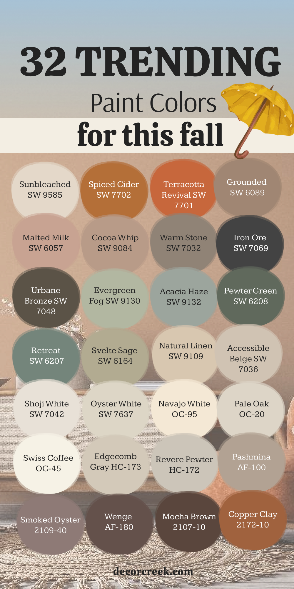
33 Best Room Paint Colors for This Fall
Grounded SW 6089
Grounded SW 6089 feels like the warmth of fresh bread and soft wool blankets. It’s a gentle brown with a cozy undertone that makes any room feel safe and complete. I love using it in family rooms and bedrooms where people gather and relax. It’s a color that creates calm without feeling dull.
When paired with off-white trim, brass hardware, and wood tones, Grounded shines quietly. In daylight, it feels natural and open; at night, it deepens into something peaceful and full of charm.
It’s a shade that wraps a home in comfort, perfect for fall evenings and slow mornings. Grounded is always steady, warm, and endlessly inviting.
🎨 Check out the complete guide to this color right HERE 👈
Warm Stone SW 7032
Warm Stone SW 7032 is the kind of neutral that brings everything together. It’s soft gray with a warm taupe undertone, creating a gentle balance that feels both modern and timeless. I love using it in living rooms and kitchens because it makes spaces feel anchored without being dark.
This shade pairs beautifully with creamy whites, black details, or warm woods.
It’s flexible enough to support any style — rustic, contemporary, or classic. Warm Stone brings quiet confidence to a room, adding a sense of ease that works especially well during fall. It’s subtle but full of depth, making it one of my favorite background shades.
Malted Milk SW 6057
Malted Milk SW 6057 is that delicate mix of beige and blush that makes a space feel calm and tender. It’s subtle but full of warmth, like the inside of a seashell. I love using it in bedrooms and reading corners where soft color makes the air feel peaceful.
Paired with creamy whites, warm wood, and brass accents, it adds quiet elegance. In daylight, it feels fresh and open; under evening lamps, it becomes gentle and soothing.
Malted Milk has a comforting, timeless feel — perfect for homes that want soft warmth all season long.
🎨 Check out the complete guide to this color right HERE 👈
Cocoa Whip SW 9084
Cocoa Whip SW 9084 feels like soft caramel — smooth, sweet, and cozy. It’s a light brown that gives rooms warmth without heaviness. I love using it in bedrooms and dining rooms where soft light can play off its creamy tone. The color has just enough richness to feel special while staying calm.
Paired with white trim, natural fabrics, and golden light, Cocoa Whip creates a space that feels peaceful and cared for.
It’s a beautiful choice for homes that need a touch of warmth but still want a light, balanced palette. This color makes every corner feel cozy and personal.
Natural Linen SW 9109
Natural Linen SW 9109 feels like home in every sense. It’s a warm, creamy beige that creates softness in any room. I often use it as a wall color throughout a house when I want a consistent, cozy flow. It’s simple but never plain, glowing in morning light and deepening with warmth at night.
This shade pairs perfectly with white trim, light wood, and soft textiles. It works in modern, farmhouse, and traditional styles with equal grace.
Natural Linen gives rooms that clean, lived-in comfort — easy, light, and endlessly timeless.
🎨 Check out the complete guide to this color right HERE 👈
Terracotta Revival SW 7701
Terracotta Revival SW 7701 is fall in its purest form. It’s an earthy orange with a touch of red, reminding me of clay pots and autumn sunsets. I love using it in dining rooms, kitchens, or entryways where it brings instant warmth. It gives the feeling of togetherness — perfect for spaces where people gather.
It pairs beautifully with creamy whites, olive greens, or soft browns. In bright light, it feels lively and full of energy; in low light, it becomes warm and comforting.
Terracotta Revival adds personality and life to any room, making it one of my favorite go-to colors for this season.
Accessible Beige SW 7036
Accessible Beige SW 7036 is that perfect shade between beige and gray — warm enough for comfort, cool enough for balance. It’s one of those dependable colors that fits any mood or style. I love using it in kitchens, hallways, and family spaces where calm, steady energy matters most.
It pairs beautifully with white trim, warm metals, and natural woods. In bright sunlight, it feels fresh and airy; at night, it deepens into something cozy and smooth.
Accessible Beige is simple, elegant, and always right — a quiet favorite for every fall home.
🎨 Check out the complete guide to this color right HERE 👈
Spiced Cider SW 7702
Spiced Cider SW 7702 feels like candlelight captured in paint. It’s a golden brown with a gentle glow that fills a room with warmth. I often use it in living rooms or dining areas where you want the space to feel rich but cozy. It’s beautiful next to white trim, warm woods, and gold accents.
The way it shifts through the day is what makes it special — bright and radiant in the morning, soft and deep by evening.
Spiced Amber makes every home feel welcoming. It’s not too bold, not too simple — just perfectly comfortable and full of fall charm.
🎨 Check out the complete guide to this color right HERE 👈

Shoji White SW 7042
Shoji White SW 7042 is soft, creamy, and endlessly adaptable. It’s a warm off-white that brightens rooms while keeping them cozy. I love using it on walls, trim, or even cabinetry when I want a soft, inviting look. It’s bright enough for freshness but carries that fall warmth that makes a house feel alive.
This shade pairs well with taupes, greens, and browns. In daylight, it feels open and gentle; in the evening, it turns smooth and golden.
Shoji White gives rooms that sense of calm harmony that never goes out of style. It’s simple, classic, and incredibly welcoming.
🎨 Check out the complete guide to this color right HERE 👈
Oyster White SW 7637
Oyster White SW 7637 feels like morning fog touched by sunlight. It’s a blend of soft white and gray that works in nearly every room. I use it in kitchens, bathrooms, and bedrooms when I want something peaceful and clean. It’s subtle but full of quiet beauty.
It pairs beautifully with natural wood, gold accents, and creamy trim. In bright spaces, it feels airy; in darker ones, it adds just enough warmth.
Oyster White gives homes that effortless grace — never too bright, never too dull, always just right.
🎨 Check out the complete guide to this color right HERE 👈
White Snow SW 9541
White Snow SW 9541 feels like the brightness of a crisp fall morning. It’s a clean white, but it carries a soft warmth that keeps it from feeling harsh. I love using it on trim, ceilings, or even full walls when I want freshness that still feels welcoming. It’s the kind of color that instantly lifts a room and makes every surface feel open and cared for.
Paired with wood tones, natural fabrics, or muted autumn shades, White Snow glows beautifully. In sunlight, it looks bright and airy; under warm lamps, it turns soft and creamy.
It works perfectly for homes that need light but still want that cozy, fall-inspired feel. White Snow is a simple, timeless color that always makes rooms feel clean, calm, and full of life.
🎨 Check out the complete guide to this color right HERE 👈
Urban Nature AF-440
Urban Nature AF-440 feels like stepping into a quiet forest right after it rains. It’s a muted green with a soft gray base that instantly calms a space. I love using it in bedrooms, home offices, or hallways where you want that peaceful connection to nature. It’s one of those colors that quietly fills the room with balance and warmth.
It pairs perfectly with creamy whites, tan fabrics, and wooden accents. The green tone becomes more pronounced in natural light and more soothing in dim evening light.
Urban Nature brings a sense of grounded beauty that fits fall perfectly. It’s calm, elegant, and endlessly livable — the kind of color that makes a home feel at ease.
🎨 Check out the complete guide to this color right HERE 👈
Pashmina AF-100
Pashmina AF-100 feels like comfort woven into paint. It’s a greige that blends beige warmth with gray’s calmness, creating the perfect balance for fall. I use it in living rooms, bedrooms, and dining areas when I want that soft, restful atmosphere. It reminds me of wool blankets and candlelight — warm, quiet, and reassuring.
This shade pairs beautifully with whites, browns, and deep greens. It works in nearly any style, from modern to farmhouse.
Pashmina changes beautifully with the light, always holding a cozy undertone. It’s one of those colors that makes a home feel grounded and complete.
🎨 Check out the complete guide to this color right HERE 👈
Pale Oak OC-20
Pale Oak OC-20 feels like the gentle glow of morning sunlight. It’s an off-white with a beige touch that makes any room feel light but still warm. I love it for hallways, open-concept spaces, and bedrooms because it never feels too stark. It carries an understated grace that works in both traditional and modern homes.
It pairs wonderfully with taupes, soft greens, and dark browns. In bright daylight, it’s airy and clean; under warm bulbs, it turns creamy and soft.
Pale Oak has that flexible charm that fits with every season but feels especially lovely in fall. It’s pure, elegant, and quietly beautiful.
🎨 Check out the complete guide to this color right HERE 👈
Edgecomb Gray HC-173
Edgecomb Gray HC-173 is the perfect example of a balanced neutral. It’s soft gray with a beige undertone, creating warmth without heaviness. I use it when I want a color that brings together light and comfort. It works beautifully in living rooms, bedrooms, and hallways where connection and flow matter most.
Paired with white trim or dark wood, it feels natural and welcoming. It’s a shade that shifts gently with the day — fresh in sunlight, cozy under warm light.
Edgecomb Gray has that calm, collected character that makes every space feel balanced. It’s simple but full of warmth, perfect for fall homes.
🎨 Check out the complete guide to this color right HERE 👈
Revere Pewter HC-172
Revere Pewter HC-172 feels like the heart of neutral design. It’s a gray that leans warm, easy to love and easy to live with. I’ve used it in dozens of homes because it fits every mood — relaxed, timeless, and full of life. It’s a wonderful backdrop for fall because it makes rich colors like rust, green, and gold stand out beautifully.
This shade pairs effortlessly with crisp white, dark navy, or warm taupe. In natural light, it feels smooth and calm; in dimmer rooms, it adds cozy depth.
Revere Pewter always brings balance. It’s one of those colors that never demands attention but makes everything around it feel right.
🎨 Check out the complete guide to this color right HERE 👈
Collingwood OC-28
Collingwood OC-28 carries a modern softness that fits any home. It’s a light warm gray that feels open and calming without being cool. I love it in bedrooms, living areas, and even kitchens because it stays neutral while still adding character. It’s understated but never plain.
When paired with creamy trim or light wood, Collingwood feels bright and fresh. It’s a color that moves beautifully with the light, staying inviting through every part of the day.
It’s elegant, adaptable, and always puts comfort first — a true go-to for fall interiors.
🎨 Check out the complete guide to this color right HERE 👈
Smoked Oyster 2109-40
Smoked Oyster 2109-40 brings a soft, romantic mood wherever it’s used. It’s a muted mauve-gray that feels cozy, graceful, and rich in personality. I often use it in bedrooms or dining rooms where a little warmth makes a big difference. It’s not flashy — it whispers warmth into the space.
This shade pairs beautifully with ivory, beige, and even dark green. In daylight, it shows off a rosy undertone; by night, it turns smooth and smoky.
Smoked Oyster makes rooms feel calm and thoughtful, like a quiet evening at home. It’s a subtle beauty that always feels right in fall.
Cedar Key OC-16
Cedar Key OC-16 feels like soft sand with a touch of warmth. It’s a beige with a gray undertone that makes it steady and elegant. I use it in living rooms, offices, and open layouts where you need light color that still feels cozy. It gives homes that relaxed, balanced look that fits perfectly with fall décor.
Paired with white trim, warm fabrics, and gold lighting, Cedar Key glows beautifully. It doesn’t shout for attention — it simply enhances everything around it.
Cedar Key has that quiet charm that feels both new and timeless. It’s one of those shades that always feels like home.
🎨 Check out the complete guide to this color right HERE 👈
Copper Clay 2172-10
Copper Clay 2172-10 is the essence of autumn captured in color. It’s a deep terracotta that brings warmth and personality to any room. I love using it as an accent wall or on cabinetry to add a touch of energy. It’s earthy but still polished, making spaces feel instantly cozy.
This color pairs beautifully with creams, greens, and wood tones. It glows in sunlight and deepens in shadow, creating an inviting, lived-in warmth.
Copper Clay feels like fall leaves and soft firelight — rich, glowing, and endlessly welcoming.
🎨 Check out the complete guide to this color right HERE 👈

Kingsport Gray HC-86
Kingsport Gray HC-86 feels like an old favorite sweater — classic, warm, and always comfortable. It’s a medium taupe with just the right blend of brown and gray, making it feel grounded but never dull. I love using it in living rooms, dining rooms, and home offices because it adds quiet strength and warmth. It’s rich enough to bring depth but soft enough to stay relaxed.
When paired with white trim or golden accents, Kingsport Gray looks timeless. In bright light, it feels open and elegant; in dim light, it becomes smooth and soothing.
It’s one of those reliable shades that works with nearly everything — from creamy neutrals to deep greens. Kingsport Gray is steady, familiar, and perfect for fall when every room calls for comfort.
🎨 Check out the complete guide to this color right HERE 👈
Kendall Charcoal HC-166
Kendall Charcoal HC-166 is the color I reach for when I want depth that feels elegant, not dark. It’s a beautiful deep gray with a warm undertone, giving rooms a sophisticated, cozy mood. I love using it on accent walls, cabinetry, and even fireplaces — it creates structure and balance instantly.
This shade pairs beautifully with crisp white, brass, or wood tones. It’s dramatic without being heavy, perfect for creating a calm, confident interior.
Kendall Charcoal feels especially right in fall — rich, warm, and full of texture. It brings character to any space without overwhelming it.
🎨 Check out the complete guide to this color right HERE 👈
Urbane Bronze SW 7048
Urbane Bronze SW 7048 feels like the golden hour just before sunset. It’s a deep brown-gray that carries warmth and balance beautifully. I love using it in living rooms, offices, or front doors when I want a color that feels strong yet welcoming. It’s cozy, grounded, and incredibly versatile.
It looks stunning with cream walls, brass hardware, or wood finishes. In daylight, Urbane Bronze feels earthy; under evening light, it becomes rich and inviting.
It gives rooms a timeless warmth that feels both modern and classic. For fall, it’s one of my top choices when I want to make a space feel bold but still homey.
🎨 Check out the complete guide to this color right HERE 👈
Iron Ore SW 7069
Iron Ore SW 7069 is a deep charcoal that feels smooth and powerful. It’s not pure black — it carries a soft, natural warmth that makes it easy to use. I love it on cabinets, interior doors, or accent walls when I want to make a strong statement without coldness. It’s dramatic in the best way.
Paired with white trim, warm metallics, or wood accents, Iron Ore feels balanced and elegant.
It reflects light gently, adding quiet texture and sophistication. It’s one of those dark shades that feels comfortable and lived in, never stark. Iron Ore gives fall rooms that moody richness we all crave when the days grow shorter.
🎨 Check out the complete guide to this color right HERE 👈
Dark Night SW 6237
Dark Night SW 6237 feels like the deep stillness of evening. It’s a rich blue with a touch of green that gives it depth and calm. I love using it in bedrooms and libraries because it wraps a room in quiet sophistication. It’s bold but incredibly soothing at the same time.
This color looks beautiful next to white trim, brass lighting, or warm woods. It’s a statement color that doesn’t overwhelm — it brings confidence with grace.
Dark Night adds that touch of drama perfect for fall, when cozy corners and candlelight become part of daily life. It’s elegant, moody, and full of personality.
🎨 Check out the complete guide to this color right HERE 👈
Evergreen Fog SW 9130
Evergreen Fog SW 9130 feels like soft morning air on a cool autumn day. It’s a gentle green-gray that makes every room feel calm and connected to nature. I love using it in bedrooms, entryways, and living rooms where balance matters most. It’s subtle, warm, and effortlessly peaceful.
This shade pairs beautifully with whites, creams, and tan accents. It glows softly in natural light and becomes soothing under lamplight.
Evergreen Fog has a timeless charm that fits any home — simple, relaxed, and deeply comforting. It’s one of those fall shades that instantly makes a space feel grounded and complete.
🎨 Check out the complete guide to this color right HERE 👈
Pewter Green SW 6208
Pewter Green SW 6208 is deep, steady, and beautiful — a forest green with a soft gray undertone. It adds calm strength to a room, making it perfect for kitchens, offices, and dining areas. I love using it to bring a sense of nature indoors. It feels peaceful yet confident, like an old evergreen tree standing strong through the season.
When paired with brass or cream accents, Pewter Green looks both rich and elegant. It’s one of those colors that feels warm even though it’s dark.
In fall, it adds that cozy, woodsy comfort that makes staying home feel like the best part of the day.
🎨 Check out the complete guide to this color right HERE 👈
Retreat SW 6207
Retreat SW 6207 feels like balance made visible. It’s a soft green with a gray tone that gives it a calm, lived-in look. I love using it in bedrooms, hallways, and kitchens — anywhere that benefits from a touch of peace. It’s one of those shades that instantly settles the energy of a room.
It pairs beautifully with creamy whites, light browns, and natural fabrics. In sunlight, it feels fresh and open; in the evening, it becomes soothing and intimate.
Retreat captures the essence of fall perfectly — gentle, earthy, and full of quiet charm.
🎨 Check out the complete guide to this color right HERE 👈
Svelte Sage SW 6164
Svelte Sage SW 6164 feels like soft moss underfoot. It’s a muted green-beige that adds natural warmth to a home. I love using it in living rooms, bathrooms, or kitchens where you want freshness that still feels comforting. It has a grounded simplicity that fits perfectly with fall’s relaxed beauty.
This shade works beautifully with off-whites, natural woods, and gold accents. It’s a subtle color, but it brings real depth when paired with texture.
Svelte Sage gives rooms that “breathe easy” feeling — steady, soft, and filled with warmth. It’s one of those shades that never stops feeling right.
🎨 Check out the complete guide to this color right HERE 👈
Bosc Pear SW 6390
Bosc Pear SW 6390 feels like the last light of afternoon on a fall day — rich, golden, and full of life. It’s a warm, glowing yellow that adds happiness to any room without shouting. I love using it in kitchens, entryways, or even as an accent wall in a cozy nook. It brings a joyful brightness that fits the season beautifully.
When paired with white trim, dark wood, or black accents, Bosc Pear shines with elegance.
It catches light beautifully, glowing softly throughout the day. This color instantly lifts the mood of a space — cheerful, cozy, and full of personality.
🎨 Check out the complete guide to this color right HERE 👈
Quilt Gold SW 6696
Quilt Gold SW 6696 feels like sunshine woven into fabric. It’s a warm golden yellow that adds richness to any home. I love using it in kitchens and dining rooms, where warmth and comfort matter most. It’s the kind of color that naturally invites people to gather.
It pairs beautifully with creamy whites, taupes, and olive greens. Quilt Gold catches light in a magical way, shifting gently between bright and mellow.
It feels happy but never too loud, adding just the right glow for fall interiors. It’s a cheerful color that still feels refined and timeless.
🎨 Check out the complete guide to this color right HERE 👈
Sunbleached SW 9585
Sunbleached SW 9585 feels like soft sand under golden light. It’s a pale, warm beige that creates calm, open rooms without feeling empty. I use it in bedrooms and living rooms where I want lightness with just a touch of warmth. It’s fresh but cozy — a perfect fall neutral.
This shade works beautifully with white trim, black metal, or warm wood. It brightens smaller rooms and balances darker ones.
Sunbleached brings that effortless comfort to a home — subtle, natural, and endlessly relaxing. It’s one of those shades that always feels peaceful, no matter the light.
🎨 Check out the complete guide to this color right HERE 👈
Mauve Finery SW 6282
Mauve Finery SW 6282 feels like soft fabric and fading roses — gentle, warm, and full of emotion. It’s a dusty pink with just enough brown to make it feel mature and comforting. I love using it in bedrooms or sitting rooms where a touch of color adds quiet charm. It’s elegant without being fancy.
Paired with ivory, tan, or gold, Mauve Finery glows softly in both daylight and lamplight.
It’s one of those shades that instantly makes a room feel tender and lived in. For fall, it brings a whisper of warmth that feels romantic and peaceful. Mauve Finery is the perfect way to end a color palette — graceful, soft, and deeply welcoming.
🎨 Check out the complete guide to this color right HERE 👈
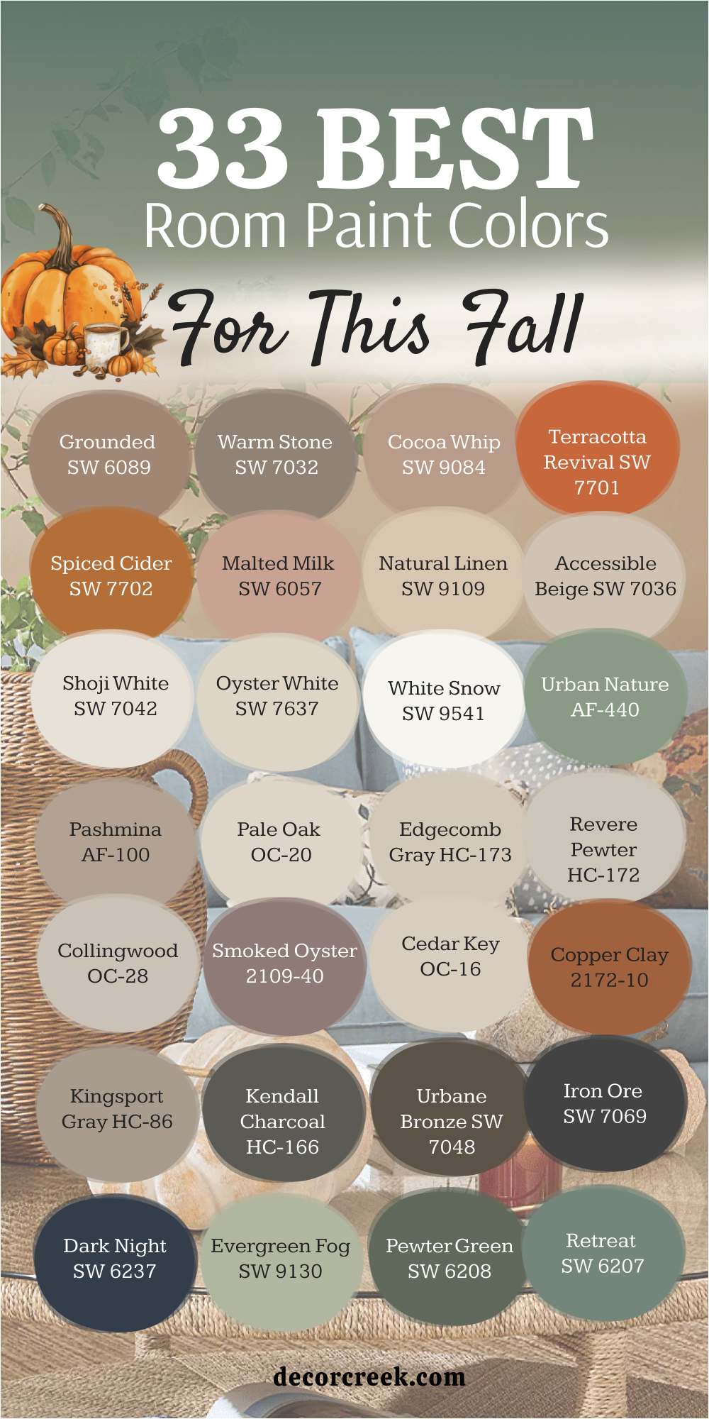
My Final Take on the Best Home Paint Colors for This Fall
When I look back at all these shades, I see more than just paint — I see comfort, light, and emotion woven through every wall. Fall is a season that invites warmth, and the right color can make a home feel like a soft blanket on a cool day. Every shade I’ve shared, from deep browns and forest greens to gentle creams and muted golds, carries a sense of belonging. These colors remind me why fall is my favorite time to design — it’s all about creating warmth that lasts.
What I love most about these tones is how they fit into real life. The creamy whites brighten gray mornings, the golden hues feel like sunlight that never fades, and the deeper colors bring that rich, grounded feeling we all crave as days grow shorter. Each one brings personality without needing perfection.
When I help people choose colors, I always say — listen to how you want your home to feel. If you want calm, go soft and earthy. If you want cozy, go rich and warm.
If you want timeless comfort, lean into those creamy neutrals that work in every light. The best fall palette is one that reflects your rhythm, your memories, and your moments.
To me, a perfect fall home isn’t about chasing trends — it’s about creating balance. Whether you choose deep greens like Evergreen Fog, classic neutrals like Natural Linen, or bold tones like Copper Clay, the magic is in how they make you feel. That’s what good color does — it welcomes you in and reminds you that home is the place where warmth never fades.