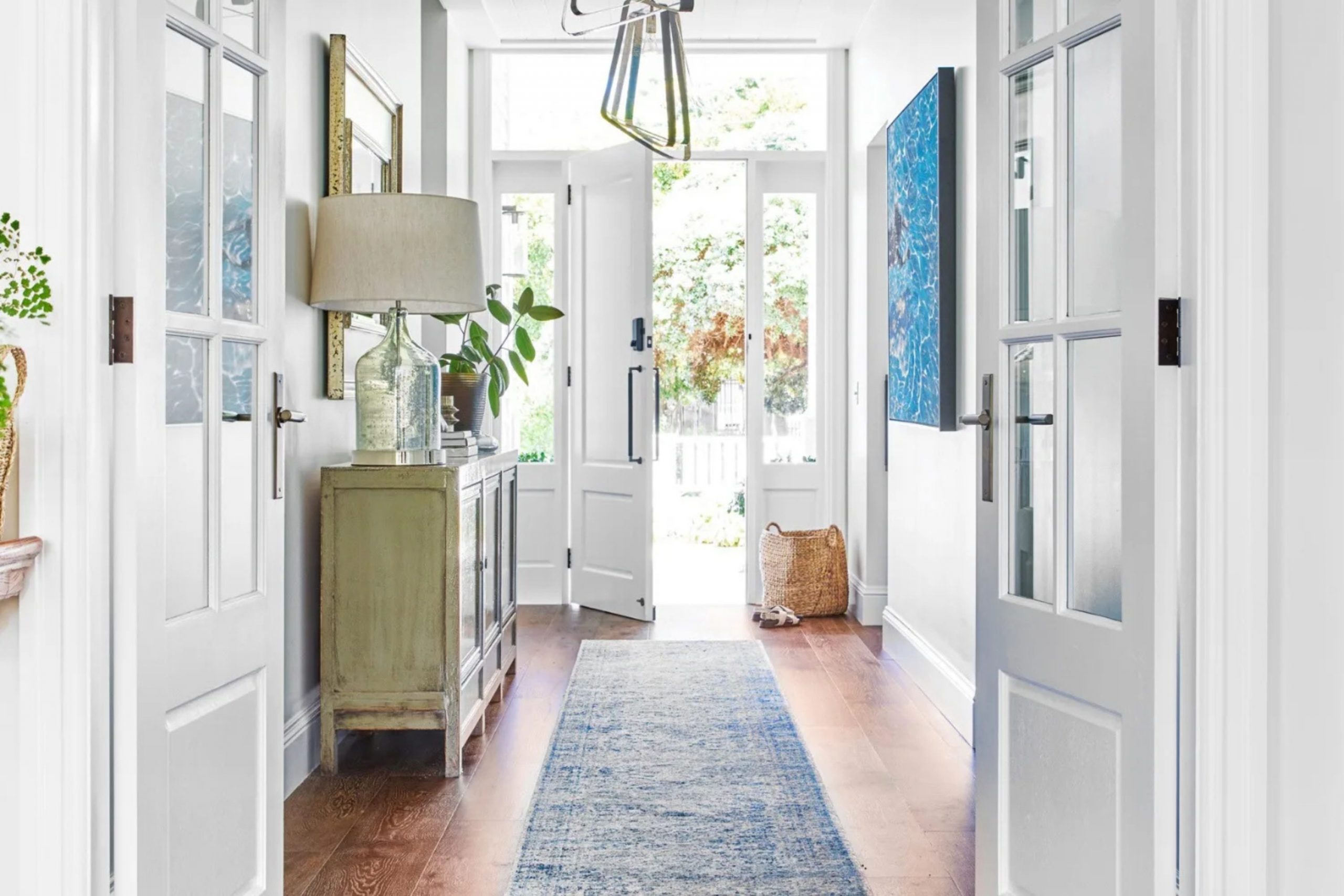
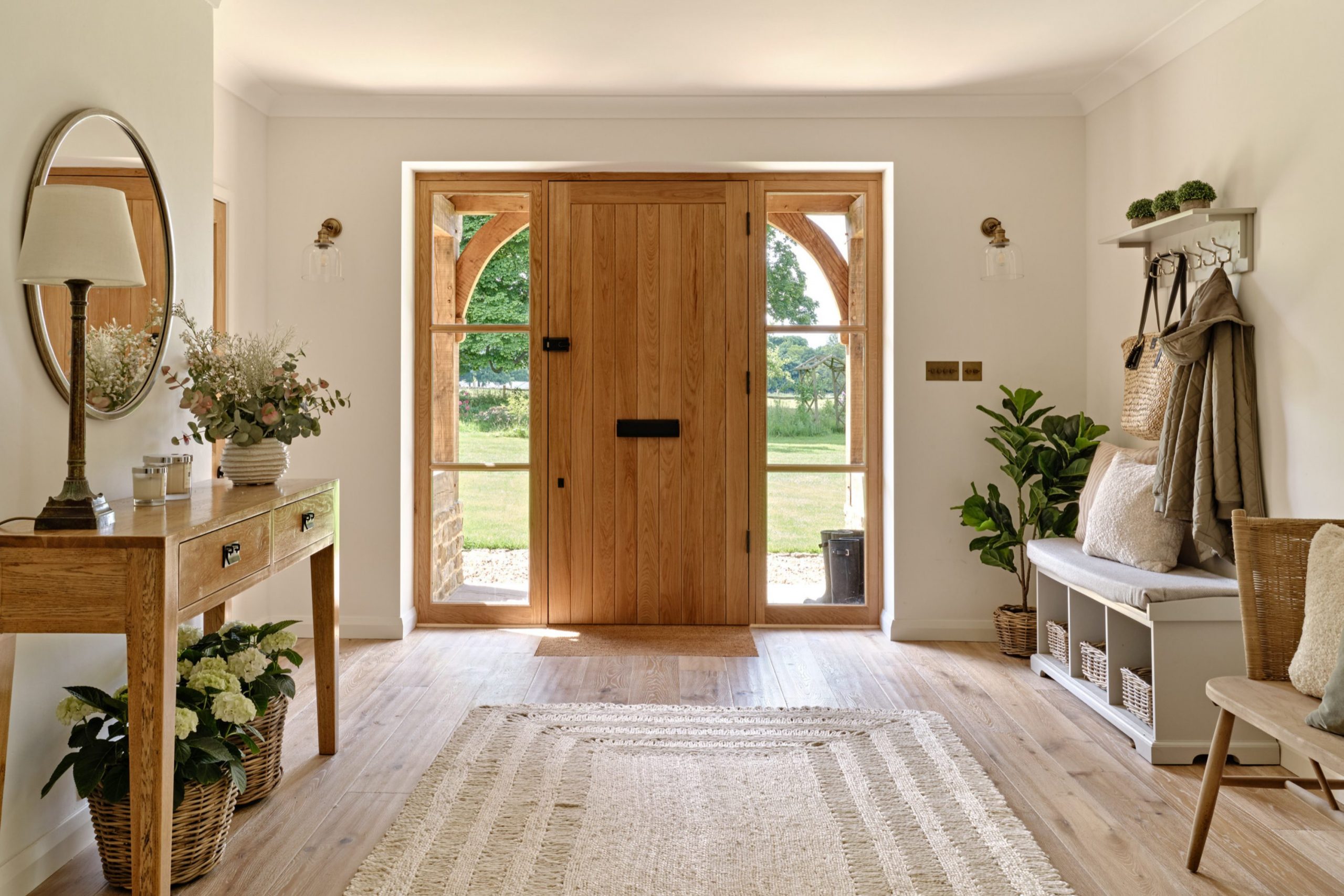
First impressions happen the moment a guest walks through your front door and takes that very first step into your world. I have spent many years helping homeowners stage their houses to sell, and I have learned that the right paint choice makes people feel at home instantly.
Your entryway is truly the handshake of your house, offering a silent but powerful greeting to everyone who visits. It tells a story and sets the expectation for what guests will find in the rest of the rooms throughout the building. If the walls look dingy, scuffed, or if the color feels fundamentally wrong for the space, it negatively changes the mood of the entire visit.
I want to share my professional experience to help you pick a shade that feels genuinely welcoming, bright, and curated. Choosing a color does not have to be a difficult or stressful task if you follow a few simple, time-tested rules for design. By focusing on the foyer, you are investing in the emotional heart of your home’s presentation.
Let’s look closer at how to make your entrance look its absolute best to create a lasting and positive memory for every visitor.
Why I Always Trust Sherwin-Williams and Benjamin Moore for Entryway Paint Colors
I only use the best premium brands because I want your paint investment to last for a very long time without fading. Sherwin-Williams and Benjamin Moore are the two primary names I suggest to every single client, regardless of their home’s specific style. Their high-quality paint covers the walls smoothly and stays looking fresh even when active kids or playful pets bump into the surfaces.
I find that their color swatches are incredibly accurate and actually match what ends up on the wall, which saves us from expensive and bad surprises. These companies have perfected the scientific way they mix pigments so the finished tones stay rich, deep, and true to the original vision. Cheap, generic paint often looks thin, watery, or streaky, but these industry leaders provide a thick and durable finish that stands the test of time.
I trust their consistent quality because I have personally seen it work beautifully in hundreds of homes over the course of my career. You deserve a professional, high-end look without the constant frustration of having to repaint every two years due to poor durability.
Using these brands ensures that the first thing people see is a surface that looks luxurious, saturated, and perfectly applied.
How I Choose the Perfect Paint Shade to Set the Mood at the Home Entrance
When I first look at an entryway, I immediately check how much natural light comes through the windows or the glass in the front door. Lighting is a dynamic element that changes how a color looks at different times of the day, moving from morning brightness to evening shadows.
I always tell my clients to paint a large sample patch on the wall and observe it for twenty-four hours before making a final commitment. A dark, narrow hallway might need a bright, reflective white to help the space feel much bigger, more open, and less restrictive. On the other hand, a large, grand foyer with high ceilings can easily handle a deep, moody forest green or a sophisticated dark gray.
I also carefully think about the existing flooring, the rug, and any furniture that will sit near the walls to ensure total harmony. Everything in the entrance needs to work together like a well-coordinated team to produce a balanced and beautiful aesthetic. I want your guests to feel genuinely happy, relaxed, and invited the very second they step inside your private sanctuary. Picking the right shade is the easiest and most cost-effective way to give your entire home a fresh, clean, and inspired start.
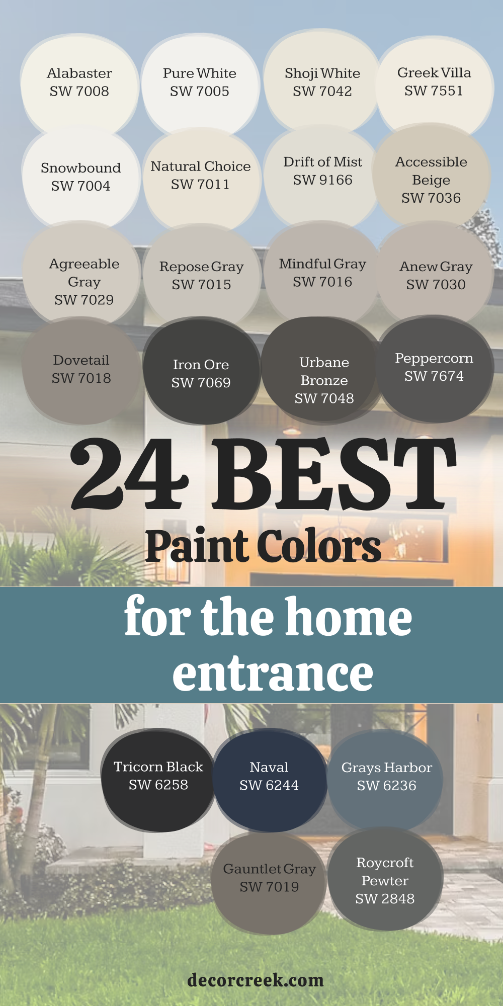
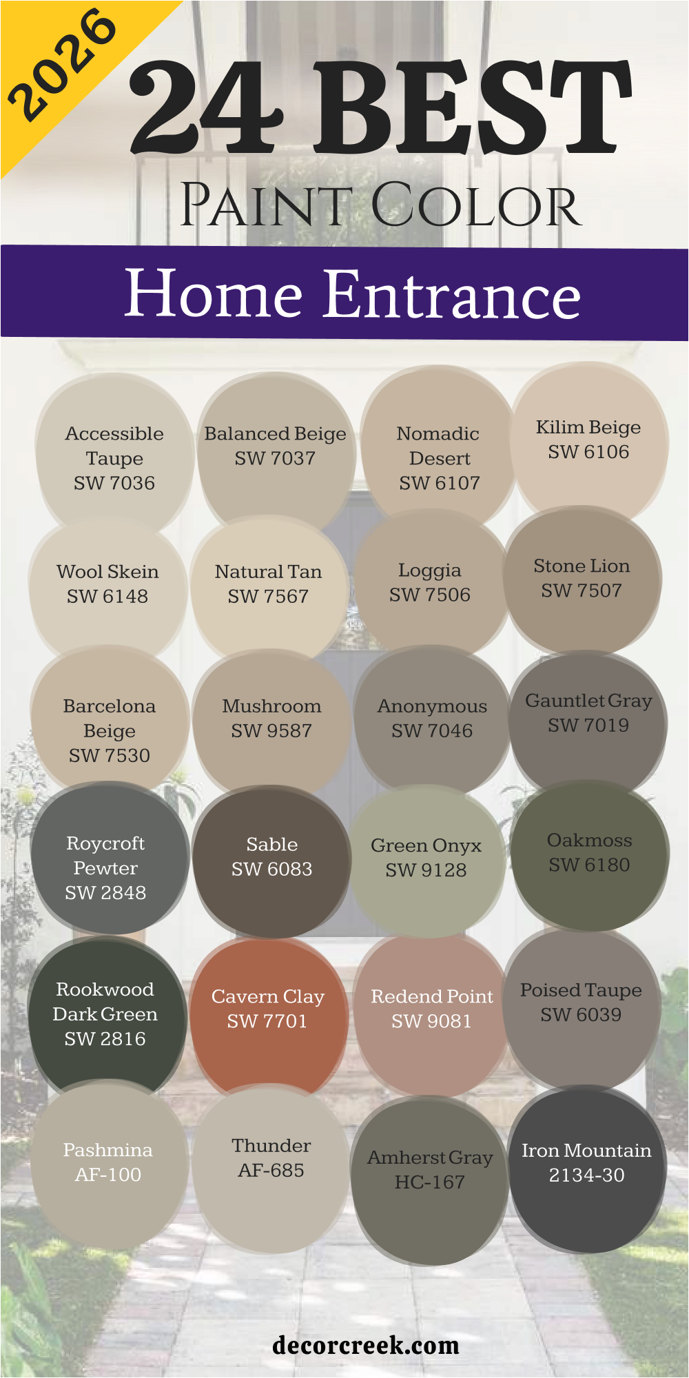
24 Best Paint Colors for the Home Entrance by Sherwin Williams
Alabaster SW 7008
Alabaster SW 7008 is a creamy white that makes every entryway look clean and bright. Alabaster SW 7008 works well with wood floors because it has a tiny bit of warmth. Alabaster SW 7008 is a shade many people choose when they want a clean look that does not feel cold like a hospital.
Alabaster SW 7008 brightens up dark corners where the sun does not reach easily. Alabaster SW 7008 appears often in modern farmhouses because it looks very inviting. Alabaster SW 7008 provides a perfect backdrop for colorful artwork or family photos.
Alabaster SW 7008 hides small marks better than a very bright, stark white would. Alabaster SW 7008 stays a favorite for me because it never clashes with other room colors. Alabaster SW 7008 makes your hallway feel much larger than it actually is. Alabaster SW 7008 helps guests feel a sense of peace the moment they walk through your front door.
🎨 Check out the complete guide to this color right HERE 👈

Pure White SW 7005
Pure White SW 7005 is a very crisp choice for a modern and updated home entrance. Pure White SW 7005 has no heavy yellow or blue tones hidden inside it. Pure White SW 7005 is a color I like to use on trim and doors as well as the main walls. Pure White SW 7005 makes your entryway look sharp and very well maintained.
Pure White SW 7005 reflects light beautifully and helps a small foyer feel much airier. Pure White SW 7005 is what you should use if you want your home to look brand new and very polished. Pure White SW 7005 is a great pick if you have black accents like door handles or light fixtures.
Pure White SW 7005 is a tool many designers use when they want a high-contrast look that pops. Pure White SW 7005 creates a very fresh feeling that makes the whole house seem cleaner. Pure White SW 7005 is a shade you can count on to stay looking bright for many years to come.
🎨 Check out the complete guide to this color right HERE 👈

Shoji White SW 7042
Shoji White SW 7042 is a creamy blend that sits right between white and beige. Shoji White SW 7042 adds a lot of comfort to a home entrance without being too dark. Shoji White SW 7042 is a shade I recommend for homes that have a lot of natural stone or wood elements.
Shoji White SW 7042 feels very soft on the eyes when the afternoon sun hits the walls. Shoji White SW 7042 creates a cozy feeling that welcomes guests into your living area. Shoji White SW 7042 works perfectly in traditional homes that need a little update. Shoji White SW 7042 pairs nicely with both warm and cool furniture pieces in your foyer.
Shoji White SW 7042 is a smart choice for busy families because it is very forgiving with dust and dirt. Shoji White SW 7042 is a color many of my clients love because it makes their home feel stable. Shoji White SW 7042 is a reliable color that looks expensive and high-end on any wall.
🎨 Check out the complete guide to this color right HERE 👈

Greek Villa SW 7551
Greek Villa SW 7551 is a rich and sunny white that brings a lot of life to an entrance. Greek Villa SW 7551 has a golden undertone that makes a room feel like it is glowing. Greek Villa SW 7551 is a color I use often in homes that do not get a lot of natural sunlight.
Greek Villa SW 7551 makes a hallway feel much more cheerful and friendly for visitors. Greek Villa SW 7551 looks stunning when paired with dark wood front doors or bronze hardware. Greek Villa SW 7551 is bright enough to be called white but warm enough to feel like a hug.
Greek Villa SW 7551 will smooth out the look of your walls and hide tiny imperfections. Greek Villa SW 7551 is a popular choice for staging because almost everyone likes how it looks. Greek Villa SW 7551 helps bridge the gap between different styles of decor in your house. Greek Villa SW 7551 makes your home feel like a sunny getaway every time you return.
🎨 Check out the complete guide to this color right HERE 👈

Snowbound SW 7004
Snowbound SW 7004 is a cool white that has a very slight gray undertone. Snowbound SW 7004 is perfect for an entrance that leads into a cool-toned living room. Snowbound SW 7004 looks very crisp against dark gray or navy blue accents.
Snowbound SW 7004 helps bounce light around a cramped entryway to make it feel more open. Snowbound SW 7004 is a great choice if you want a modern and minimalist look. Snowbound SW 7004 is the color you should pick if you want your entrance to feel very fresh and brisk.
Snowbound SW 7004 works well with silver or chrome light fixtures and mirrors. Snowbound SW 7004 keeps your walls looking sharp and clean throughout the entire day. Snowbound SW 7004 is popular because it does not turn yellow under artificial light bulbs. Snowbound SW 7004 provides a very professional finish that makes your home look high-quality.
🎨 Check out the complete guide to this color right HERE 👈

Natural Choice SW 7011
Natural Choice SW 7011 is a light tan that feels very organic and grounded. Natural Choice SW 7011 brings a bit of nature into your home entrance right away. Natural Choice SW 7011 is a shade I suggest for people who think white is too boring or plain.
Natural Choice SW 7011 looks wonderful with indoor plants and green decor items. Natural Choice SW 7011 creates a very soft transition from the outdoors to the inside of your home. Natural Choice SW 7011 makes your foyer feel sturdy and very well put together. Natural Choice SW 7011 adds a layer of warmth that makes guests want to stay.
Natural Choice SW 7011 is a great middle-ground color that fits almost any style of architecture. Natural Choice SW 7011 is a color many homeowners choose when they want a homey and relaxed vibe. Natural Choice SW 7011 is a very safe and smart pick for a welcoming entryway.
🎨 Check out the complete guide to this color right HERE 👈

Drift of Mist SW 9166
Drift of Mist SW 9166 is a very light gray that looks soft and airy on the walls. Drift of Mist SW 9166 is a fantastic alternative to white if you want a tiny bit of contrast. Drift of Mist SW 9166 makes white trim work really stand out in an entrance.
Drift of Mist SW 9166 feels very modern without being too cold or industrial. Drift of Mist SW 9166 works well in small halls because it does not make the walls feel like they are closing in. Drift of Mist SW 9166 pairs with almost any color of rug or runner on the floor. Drift of Mist SW 9166 is very popular for people who like a clean and simple look.
Drift of Mist SW 9166 hides small scuffs better than a pure white paint would. Drift of Mist SW 9166 is a color many of my staging clients choose to give their home a sophisticated feel. Drift of Mist SW 9166 makes your entryway look updated and very stylish.
🎨 Check out the complete guide to this color right HERE 👈

Accessible Beige SW 7036
Accessible Beige SW 7036 is one of the most famous colors for a very good reason. Accessible Beige SW 7036 is the perfect mix of gray and beige that fits every single house. Accessible Beige SW 7036 is the shade I use when I want an entrance to feel high-end and very professional.
Accessible Beige SW 7036 works with both warm wood floors and cool gray tiles. Accessible Beige SW 7036 creates a very balanced look that does not lean too far in one direction. Accessible Beige SW 7036 makes your furniture look much more expensive than it was. Accessible Beige SW 7036 is a great choice if you are planning to sell your home soon.
Accessible Beige SW 7036 is very pleasing and easy to live with every day for most people. Accessible Beige SW 7036 provides a solid foundation for any style of home decoration you choose. Accessible Beige SW 7036 is a winner for anyone who wants a beautiful and inviting foyer.
🎨 Check out the complete guide to this color right HERE 👈

Agreeable Gray SW 7029
Agreeable Gray SW 7029 is the most popular gray color for a home entrance today. Agreeable Gray SW 7029 has a warm base that keeps it from looking like cold concrete. Agreeable Gray SW 7029 works in any lighting situation you might have in your hallway.
Agreeable Gray SW 7029 makes small entryways look much more open and clean. Agreeable Gray SW 7029 is a color that buyers look for when they walk into a house. Agreeable Gray SW 7029 goes well with white trim and dark wood doors alike.
Agreeable Gray SW 7029 is a very safe choice for people who are not sure which gray to pick. Agreeable Gray SW 7029 helps your home look modern while still feeling very cozy. Agreeable Gray SW 7029 is a shade that I recommend for almost every staging project I do. Agreeable Gray SW 7029 will make your entryway look professionally designed without much effort.
🎨 Check out the complete guide to this color right HERE 👈

Repose Gray SW 7015
Repose Gray SW 7015 is a slightly cooler gray that looks very sophisticated in a foyer. Repose Gray SW 7015 has a tiny hint of blue or green depending on your light. Repose Gray SW 7015 makes a home entrance feel very trendy and up to date.
Repose Gray SW 7015 is dark enough to show contrast against white baseboards. Repose Gray SW 7015 works beautifully with marble floors or light gray tiling. Repose Gray SW 7015 is a shade that looks very high-end in a large and open entrance.
Repose Gray SW 7015 stays looking fresh even when the sun goes down and the lamps come on. Repose Gray SW 7015 is a color that helps your entryway feel very organized and tidy. Repose Gray SW 7015 is a great choice if you have a lot of navy or black furniture. Repose Gray SW 7015 gives your home a very polished look that everyone will notice.
🎨 Check out the complete guide to this color right HERE 👈

Mindful Gray SW 7016
Mindful Gray SW 7016 is an ideal mid-tone for those who want to see a clear color on their walls. Mindful Gray SW 7016 looks very solid and dependable in a large foyer with high ceilings. Mindful Gray SW 7016 has enough depth to make white baseboards and door frames pop.
Mindful Gray SW 7016 works well with dark floors to create a high-quality finish. Mindful Gray SW 7016 does not feel too dark if your hallway has at least one window. Mindful Gray SW 7016 helps hide fingerprints and small marks in high-traffic areas.
Mindful Gray SW 7016 gives the entrance area a very modern and expensive look. Mindful Gray SW 7016 stays neutral and does not turn blue or purple in normal light. Mindful Gray SW 7016 is liked by many home buyers because it looks professional. Mindful Gray SW 7016 is a great base for creating a welcoming first impression of your home.
🎨 Check out the complete guide to this color right HERE 👈

Anew Gray SW 7030
Anew Gray SW 7030 is a great mix of gray and beige with a slight lean toward warmth. Anew Gray SW 7030 makes the home entrance very inviting and soft on the eyes. Anew Gray SW 7030 works perfectly with wood furniture and woven baskets for shoes.
Anew Gray SW 7030 is light enough to keep the foyer from feeling like a cramped cave. Anew Gray SW 7030 helps tie together rooms with different styles of decoration. Anew Gray SW 7030 is often chosen by people who want to move away from plain white walls.
Anew Gray SW 7030 looks very natural and reminds me of the color of natural stone. Anew Gray SW 7030 creates a sense of comfort right after you step over the threshold. Anew Gray SW 7030 is a practical choice for active families with small children. Anew Gray SW 7030 highlights the architectural details of your home to make them more noticeable.
🎨 Check out the complete guide to this color right HERE 👈
Dovetail SW 7018
Dovetail SW 7018 is a rich gray that immediately draws attention to the walls. Dovetail SW 7018 gives the entrance group a serious and very stylish character. Dovetail SW 7018 looks best in rooms with good artificial light or large windows.
Dovetail SW 7018 creates a great background for bright paintings or gold mirror frames. Dovetail SW 7018 makes the entrance area very expressive and memorable for your guests. Dovetail SW 7018 is often used by me to create an expensive hotel effect in a private home.
Dovetail SW 7018 hides any bumps on the surface of old walls perfectly. Dovetail SW 7018 feels like a very stable and strong color for the first room in the house. Dovetail SW 7018 emphasizes the whiteness of the ceiling and makes it look visually taller. Dovetail SW 7018 is a bold and right decision for updating your interior.
🎨 Check out the complete guide to this color right HERE 👈

Iron Ore SW 7069
Iron Ore SW 7069 is a very deep and nearly black shade that looks very trendy. Iron Ore SW 7069 creates a stunning contrast if you have light-colored interior doors installed. Iron Ore SW 7069 makes a small entrance area very characteristic and unusual.
Iron Ore SW 7069 absorbs extra light and creates a very intimate mood. Iron Ore SW 7069 is often applied for accent walls right across from the front door. Iron Ore SW 7069 looks very rich in combination with brass light fixtures or handles. Iron Ore SW 7069 helps hide all wall defects due to its dark base.
Iron Ore SW 7069 is chosen by those who want to add a bit of drama to their home design. Iron Ore SW 7069 feels like a very reliable and protective color for the home borders. Iron Ore SW 7069 turns an ordinary hallway into an example of designer art.
🎨 Check out the complete guide to this color right HERE 👈

Urbane Bronze SW 7048
Urbane Bronze SW 7048 is a complex brown-gray color that reminds me of metal or dark wood. Urbane Bronze SW 7048 gives the home entrance a sense of stability and weight. Urbane Bronze SW 7048 harmonizes perfectly with brickwork or stone floors.
Urbane Bronze SW 7048 makes the room very warm despite its dark nature. Urbane Bronze SW 7048 often becomes a favorite color for my clients because of its natural softness. Urbane Bronze SW 7048 works well on both the walls and the front door itself.
Urbane Bronze SW 7048 looks very effective under the light of evening lamps. Urbane Bronze SW 7048 helps guests immediately feel in a cozy and protected environment. Urbane Bronze SW 7048 is a color that never goes out of fashion in the staging industry. Urbane Bronze SW 7048 gives your home the look of a lived-in and very high-quality area.
🎨 Check out the complete guide to this color right HERE 👈

Peppercorn SW 7674
Peppercorn SW 7674 is a balanced dark gray color without any extra undertones. Peppercorn SW 7674 looks very neat and strict in any modern interior. Peppercorn SW 7674 helps make the entrance zone more distinct and structured.
Peppercorn SW 7674 perfectly offsets bright rugs or green indoor plants. Peppercorn SW 7674 creates a sense of luxury even in the simplest and smallest house. Peppercorn SW 7674 is a great choice for those who are afraid of pure black color. Peppercorn SW 7674 keeps its true tone under any type of light bulb in the hallway.
Peppercorn SW 7674 makes the interior deeper and more interesting for long study. Peppercorn SW 7674 causes a feeling of trust and order in the house for visitors. Peppercorn SW 7674 is a proven way to make your entrance stylish for many years.
🎨 Check out the complete guide to this color right HERE 👈
Tricorn Black SW 6258
Tricorn Black SW 6258 is the truest and purest black color in the entire lineup. Tricorn Black SW 6258 makes the entrance area incredibly effective and memorable. Tricorn Black SW 6258 is best used for creating accents on doors or specific wall sections.
Tricorn Black SW 6258 gives the whole house a very expensive and exclusive look. Tricorn Black SW 6258 works perfectly in a pair with very bright white color on the ceiling. Tricorn Black SW 6258 helps create a sense of infinity and depth in a narrow corridor.
Tricorn Black SW 6258 requires good lighting to fully reveal its beauty. Tricorn Black SW 6258 looks very sharp and graphic against any floor covering. Tricorn Black SW 6258 is chosen by bold owners who want to highlight their individuality. Tricorn Black SW 6258 turns the home entrance into a real art object.
🎨 Check out the complete guide to this color right HERE 👈

Naval SW 6244
Naval SW 6244 is a classic navy blue color that always looks very elegant. Naval SW 6244 reminds me of the sea and sky bringing these motifs right into your home. Naval SW 6244 creates a very welcoming atmosphere in the entrance zone.
Naval SW 6244 ideally combines with white furniture and golden decor details. Naval SW 6244 makes the foyer very neat and traditionally good-looking. Naval SW 6244 is often used by me to create a nautical style in the interior.
Naval SW 6244 helps guests feel important and wanted in your house. Naval SW 6244 is a very deep color that does not tire the eyes over time. Naval SW 6244 hides small wall defects and hand marks perfectly. Naval SW 6244 is a great way to add a bit of color to a neutral interior.
🎨 Check out the complete guide to this color right HERE 👈

Grays Harbor SW 6236
Grays Harbor SW 6236 is a smoky dark blue with a noticeable gray tint. Grays Harbor SW 6236 looks very mysterious and attractive on the hallway walls. Grays Harbor SW 6236 is well suited for homes with plenty of natural light from windows.
Grays Harbor SW 6236 creates a very relaxed and pleasant mood for incoming people. Grays Harbor SW 6236 perfectly complements floors made of light oak or pine. Grays Harbor SW 6236 looks less formal than a regular dark blue color.
Grays Harbor SW 6236 helps to visually expand the room boundaries with correct use. Grays Harbor SW 6236 is a very practical and non-staining solution for the entrance zone. Grays Harbor SW 6236 emphasizes the taste of the homeowners and their love for details. Grays Harbor SW 6236 will make your home entrance truly unique and fresh.
🎨 Check out the complete guide to this color right HERE 👈
Evergreen Fog SW 9130
Evergreen Fog SW 9130 is a soft green color with gray and a drop of blue inside. Evergreen Fog SW 9130 brings a sense of living nature right to your doorstep. Evergreen Fog SW 9130 looks very modern and is often chosen for new interiors.
Evergreen Fog SW 9130 helps create a very soft transition from the street to home warmth. Evergreen Fog SW 9130 perfectly combines with natural materials like linen or leather. Evergreen Fog SW 9130 makes the entrance zone very fresh and clean to the eye.
Evergreen Fog SW 9130 is a great choice for those looking for an unusual neutral tone. Evergreen Fog SW 9130 causes a smile and pleasant thoughts in every guest. Evergreen Fog SW 9130 works well in both small and spacious halls. Evergreen Fog SW 9130 will be an ideal start for a cozy and stylish home.
🎨 Check out the complete guide to this color right HERE 👈

Pewter Green SW 6208
Pewter Green SW 6208 is a deep forest green color with a very noble character. Pewter Green SW 6208 makes the entrance zone very solid and trustworthy. Pewter Green SW 6208 looks great next to furniture made of natural dark wood. Pewter Green SW 6208 helps create the atmosphere of an old and very high-quality mansion.
Pewter Green SW 6208 looks very saturated and does not fade in the sun over time. Pewter Green SW 6208 is often used by me to create focus points in the interior. Pewter Green SW 6208 makes the walls very smooth and pleasant for perception.
Pewter Green SW 6208 is an ideal color for homes surrounded by a garden or trees. Pewter Green SW 6208 helps guests immediately tune into a serious and quiet mood. Pewter Green SW 6208 turns an ordinary entrance into a high-level foyer.
🎨 Check out the complete guide to this color right HERE 👈

Dried Thyme SW 6186
Dried Thyme SW 6186 reminds me of the color of dried herbs and looks very natural. Dried Thyme SW 6186 creates a very homey and warm environment in the entrance zone. Dried Thyme SW 6186 is perfectly suited for homes in a rustic or classic style.
Dried Thyme SW 6186 hides dust well which is important for the zone near the front door. Dried Thyme SW 6186 looks very soft under the light of table lamps in the hallway. Dried Thyme SW 6186 helps people feel in safety and comfort.
Dried Thyme SW 6186 perfectly harmonizes with ceramic tiles of brown or gray tones. Dried Thyme SW 6186 is a very harmonious color that does not irritate over time. Dried Thyme SW 6186 makes your home more individual and interesting from the outside. Dried Thyme SW 6186 is a wonderful choice for creating a durable and beautiful interior.
🎨 Check out the complete guide to this color right HERE 👈

Sea Salt SW 6204
Sea Salt SW 6204 is a very light and airy color that changes from gray to green. Sea Salt SW 6204 makes the entrance zone incredibly bright and filled with air. Sea Salt SW 6204 is ideally suited for very narrow and dark corridors. Sea Salt SW 6204 creates a sense of cleanliness and order right after the entry.
Sea Salt SW 6204 looks very gentle and pleasant under any lighting. Sea Salt SW 6204 is often chosen by me to create a light coastal style. Sea Salt SW 6204 helps to visually push the walls apart and make the ceiling higher.
Sea Salt SW 6204 causes a feeling of joy and lightness in guests. Sea Salt SW 6204 combines very well with white frames for photos on the walls. Sea Salt SW 6204 turns your hallway into a bright and very pleasant place.
🎨 Check out the complete guide to this color right HERE 👈

Rock Candy SW 6231
Rock Candy SW 6231 is a very light gray with a barely noticeable blue tint. Rock Candy SW 6231 looks very cool and clean on the entrance zone walls. Rock Candy SW 6231 helps to make the room very modern and minimalist. Rock Candy SW 6231 perfectly reflects light making the entrance very welcoming.
Rock Candy SW 6231 is great for those who want an almost white color but with a twist. Rock Candy SW 6231 looks very professional in combination with black decor details. Rock Candy SW 6231 makes all other items in the room more vivid.
Rock Candy SW 6231 creates a very cheerful mood in the mornings when you leave for work. Rock Candy SW 6231 is a very practical background for any type of floor covering. Rock Candy SW 6231 is a great start for creating a clean and bright interior.
🎨 Check out the complete guide to this color right HERE 👈

24 Best Paint Colors for the Home Entrance in 2026
Accessible Beige SW 7036
Accessible Beige SW 7036 provides a rich and earthy feel to any home entrance. Accessible Beige SW 7036 acts as a warmer version of a classic gray. Accessible Beige SW 7036 hides dirt and scuffs remarkably well in high traffic areas. Accessible Beige SW 7036 coordinates beautifully with natural stone flooring and oak wood.
Accessible Beige SW 7036 makes large entryways feel much more invited and grounded. Accessible Beige SW 7036 works in both bright sun and low artificial light. Accessible Taupe SW 7036 gives your walls a very expensive and thick appearance.
Accessible Beige SW 7036 is a top choice for staging high-end properties this year. Accessible Beige SW 7036 balances well with white trim and dark hardware. Accessible Beige SW 7036 ensures your guests feel a sense of home immediately.
🎨 Check out the complete guide to this color right HERE 👈
Balanced Beige SW 7037
Balanced Beige SW 7037 offers a steady and reliable look for your foyer. Balanced Beige SW 7037 sits right in the middle of the warm color scale. Balanced Beige SW 7037 prevents a large entrance from looking too washed out or pale.
Balanced Beige SW 7037 pairs nicely with traditional rugs and antique furniture pieces. Balanced Beige SW 7037 makes a hallway feel sturdy and very well constructed. Balanced Beige SW 7037 reflects just enough light to keep the area cheerful.
Balanced Beige SW 7037 is a favorite for homeowners who want a predictable result. Balanced Beige SW 7037 works in harmony with almost any other room color. Balanced Beige SW 7037 provides a professional finish that lasts for many years. Balanced Beige SW 7037 creates a very friendly and open mood for visitors.
🎨 Check out the complete guide to this color right HERE 👈

Nomadic Desert SW 6107
Nomadic Desert SW 6107 brings a sun-kissed tan look to your home entry. Nomadic Desert SW 6107 reminds me of warm sand and natural desert landscapes. Nomadic Desert SW 6107 adds a lot of depth to walls that lack architectural detail.
Nomadic Desert SW 6107 looks stunning next to dark walnut or cherry wood floors. Nomadic Desert SW 6107 gives your entrance a very solid and established feeling. Nomadic Desert SW 6107 is deep enough to provide a real contrast with white ceilings.
Nomadic Desert SW 6107 stays looking fresh even in busy houses with many pets. Nomadic Desert SW 6107 makes people want to stop and stay for a while. Nomadic Desert SW 6107 works well for homes with a lot of outdoor greenery. Nomadic Desert SW 6107 is a classic choice that remains very popular today.
🎨 Check out the complete guide to this color right HERE 👈

Kilim Beige SW 6106
Kilim Beige SW 6106 is a legendary neutral that fits every style of entrance. Kilim Beige SW 6106 has a tiny bit of orange undertone for extra warmth. Kilim Beige SW 6106 makes a house feel lived-in and very loved by the owners.
Kilim Beige SW 6106 is bright enough to use in hallways without any windows. Kilim Beige SW 6106 serves as a perfect backdrop for family photos and mirrors. Kilim Beige SW 6106 hides imperfections on older walls better than most light colors.
Kilim Beige SW 6106 looks very clean when paired with a crisp white trim. Kilim Beige SW 6106 is often my first suggestion for a quick home update. Kilim Beige SW 6106 makes guests feel a warm welcome the moment they enter. Kilim Beige SW 6106 is a very smart and safe investment for your home.
🎨 Check out the complete guide to this color right HERE 👈

Wool Skein SW 6148
Wool Skein SW 6148 is a light and airy tan with a hint of green. Wool Skein SW 6148 feels very organic and matches well with indoor plants. Wool Skein SW 6148 makes an entryway look very soft and polished at once.
Wool Skein SW 6148 works wonders in homes that have a lot of natural light. Wool Skein SW 6148 provides a very clean look without being too stark or cold. Wool Skein SW 6148 reminds me of natural linen fabric on a sunny day. Wool Skein SW 6148 is a great choice for a modern farmhouse style foyer.
Wool Skein SW 6148 stays very neutral even when the light changes at sunset. Wool Skein SW 6148 helps a cramped entrance feel much more open and light. Wool Skein SW 6148 is a beautiful way to start your home color palette.
🎨 Check out the complete guide to this color right HERE 👈

Natural Tan SW 7567
Natural Tan SW 7567 is a very simple and honest color for any foyer. Natural Tan SW 7567 does not have any tricky hidden undertones to worry about. Natural Tan SW 7567 makes your walls look very smooth and well cared for.
Natural Tan SW 7567 works perfectly with light wood floors and wicker decor. Natural Tan SW 7567 provides a very quiet and stable feeling for the house. Natural Tan SW 7567 is light enough to make a small hall feel quite big. Natural Tan SW 7567 hides dust and light scuffs very effectively for families.
Natural Tan SW 7567 is a shade that I use when I want a high-end look. Natural Tan SW 7567 helps guests focus on your beautiful furniture and art. Natural Tan SW 7567 ensures your entrance feels bright and very well maintained.
🎨 Check out the complete guide to this color right HERE 👈
Loggia SW 7506
Loggia SW 7506 is a sophisticated greige that leans heavily into the beige side. Loggia SW 7506 gives an entryway a very expensive and tailor-made appearance. Loggia SW 7506 works beautifully with stone tiles or dark slate flooring.
Loggia SW 7506 adds a sense of history and permanence to a newer house. Loggia SW 7506 is deep enough to make white doors look incredibly sharp. Loggia SW 7506 provides a very warm and cozy feeling in the evening hours. Loggia SW 7506 is a color that many designers use for staging luxury homes.
Loggia SW 7506 stays looking great even in very high traffic areas of the home. Loggia SW 7506 makes your foyer look much more interesting than plain white. Loggia SW 7506 is a reliable pick for a stylish and welcoming entrance.
🎨 Check out the complete guide to this color right HERE 👈

Stone Lion SW 7507
Stone Lion SW 7507 is a medium-toned neutral with a very strong presence. Stone Lion SW 7507 brings a lot of personality to a simple home entrance. Stone Lion SW 7507 works well with copper or bronze accents in the foyer.
Stone Lion SW 7507 makes the walls feel very sturdy and well insulated. Stone Lion SW 7507 is dark enough to show off light-colored rugs and runners. Stone Lion SW 7507 provides a very rich and moody atmosphere for guests. Stone Lion SW 7507 stays neutral without leaning too much into yellow or gray.
Stone Lion SW 7507 is a great way to make a statement in a large hall. Stone Lion SW 7507 helps your home feel very secure and well designed. Stone Lion SW 7507 is a choice that looks professional and very high-quality.
🎨 Check out the complete guide to this color right HERE 👈
Barcelona Beige SW 7530
Barcelona Beige SW 7530 is a warm and sunny tan that feels very upbeat. Barcelona Beige SW 7530 makes an entrance feel cheerful even on a rainy day. Barcelona Beige SW 7530 works perfectly with Mediterranean or traditional home styles.
Barcelona Beige SW 7530 adds a nice glow to the walls under warm light bulbs. Barcelona Beige SW 7530 pairs nicely with colorful artwork and vibrant decor. Barcelona Beige SW 7530 is deep enough to hide marks from kids and pets easily.
Barcelona Beige SW 7530 makes a home feel very bright and full of positive energy. Barcelona Beige SW 7530 is a safe choice for people who want a bit of color. Barcelona Beige SW 7530 provides a very smooth and even finish on any wall. Barcelona Beige SW 7530 ensures your foyer feels like a happy part of the house.
🎨 Check out the complete guide to this color right HERE 👈
Mushroom SW 9587
Mushroom SW 9587 is a trendy and earthy shade for a modern entryway. Mushroom SW 9587 looks like a mix of forest soil and soft gray stones. Mushroom SW 9587 makes your home entrance feel very grounded and natural.
Mushroom SW 9587 works wonders when paired with light oak or ash wood. Mushroom SW 9587 provides a very cozy and snug feeling for your guests. Mushroom SW 9587 is deep enough to act as a soft accent color. Mushroom SW 9587 stays looking very clean and modern in different lights.
Mushroom SW 9587 is a favorite for staging homes with an organic theme. Mushroom SW 9587 helps the foyer flow naturally into the rest of the house. Mushroom SW 9587 gives your entrance a very updated and professional look.
🎨 Check out the complete guide to this color right HERE 👈
Anonymous SW 7046
Anonymous SW 7046 is a sophisticated mid-tone that blends gray, brown, and green perfectly. This shade gives your home entrance a very grounded and sturdy feeling. It works wonderfully in foyers with stone floors or rustic wood beams.
The color provides a rich look that makes white trim look incredibly crisp. This pigment is deep enough to hide the wear and tear of a busy household. It creates a moody and executive atmosphere that feels very high-end. You will notice it changes its look slightly depending on the time of day and light.
This is a choice I make when I want to add a lot of character. It pairs nicely with leather furniture or brass light fixtures. This paint ensures your guests see your home as a solid and stylish place.
🎨 Check out the complete guide to this color right HERE 👈

Gauntlet Gray SW 7019
Gauntlet Gray SW 7019 is a true dark gray that brings a lot of drama to an entry. This deep tone makes a big statement the second someone walks through the door. It works best in larger entrances with plenty of bright overhead lighting.
The color provides a cool and modern backdrop for colorful artwork or mirrors. This specific shade hides scuffs from shoes and bags better than almost any lighter paint. It gives the hallway a very sleek and professional appearance for visitors.
You can make it look stunning when used on both the walls and the door trim. The pigment stays very consistent and does not lean toward blue or yellow. It is a favorite of mine for staging modern homes with high ceilings. This choice makes your home feel very updated and incredibly sharp.
🎨 Check out the complete guide to this color right HERE 👈
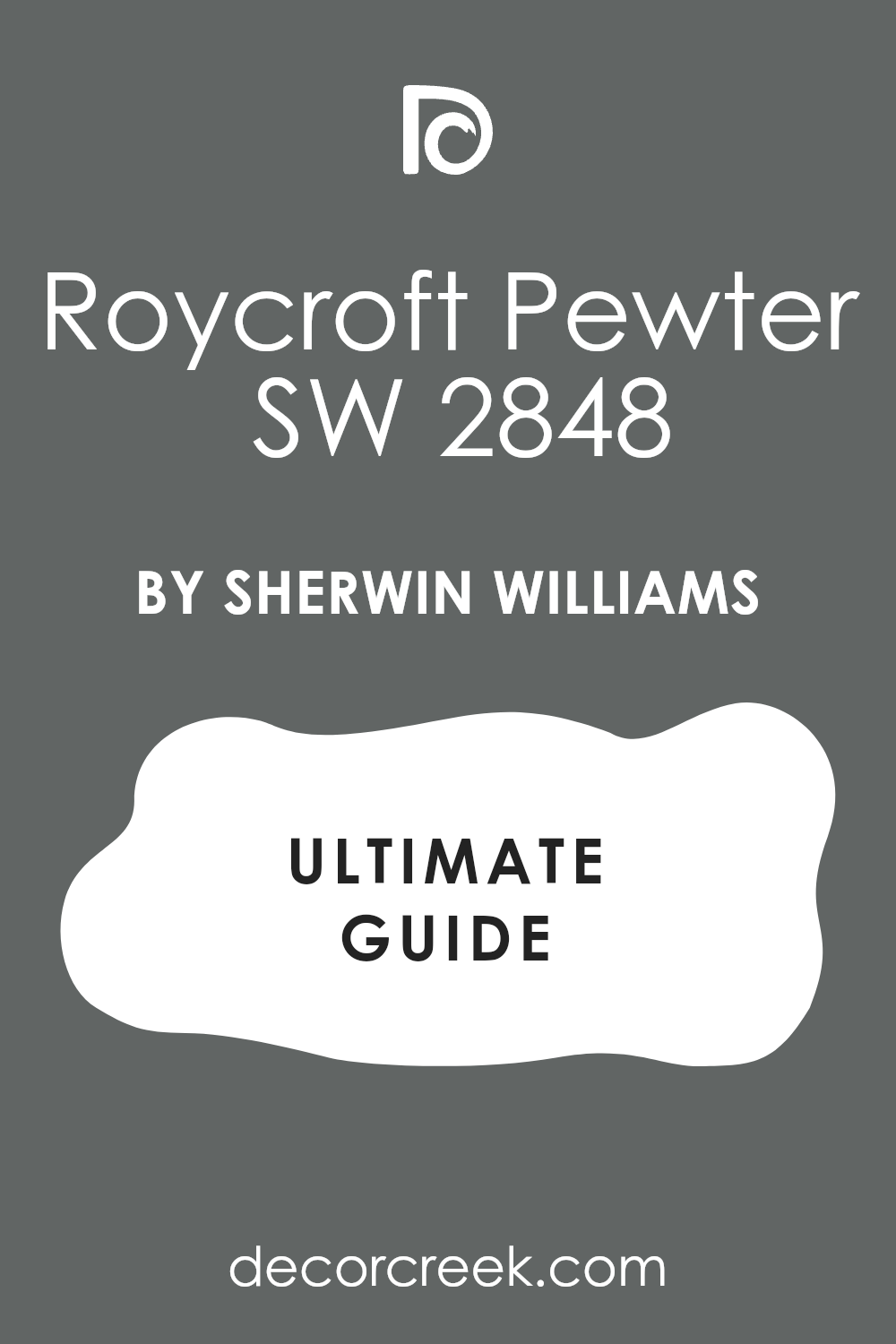
Roycroft Pewter SW 2848
Roycroft Pewter SW 2848 is a deep and historic blue-gray with a lot of soul. This selection gives your entrance a very classic and established feeling. It works beautifully in older homes with a lot of unique character.
The color adds a layer of richness that feels very intentional and designed. It looks amazing when paired with dark wood floors and gold accents. This dark paint provides a moody vibe that makes the foyer feel very private. It is a shade that tells guests your home is of very high quality.
The thick pigment hides small imperfections on the walls very well. I often use this color to create a memorable first impression. It ensures your home entrance looks both traditional and very trendy.
🎨 Check out the complete guide to this color right HERE 👈
Sable SW 6083
Sable SW 6083 is a warm and dark brown that feels like a cozy hug. This paint makes a large and cold entryway feel much more invited and soft. It works perfectly with cream-colored rugs and light-colored furniture.
The tone provides a very earthy look that brings the outdoors inside your home. It hides marks and stains very well in homes with children or pets. This choice gives your walls a very thick and velvety texture to the eye. It is a shade I suggest for creating a very snug and homey foyer.
The color looks best in the evening under the glow of warm lamps. It pairs nicely with bronze hardware and natural wood decor. This rich brown makes every guest feel a sense of warmth the moment they arrive.
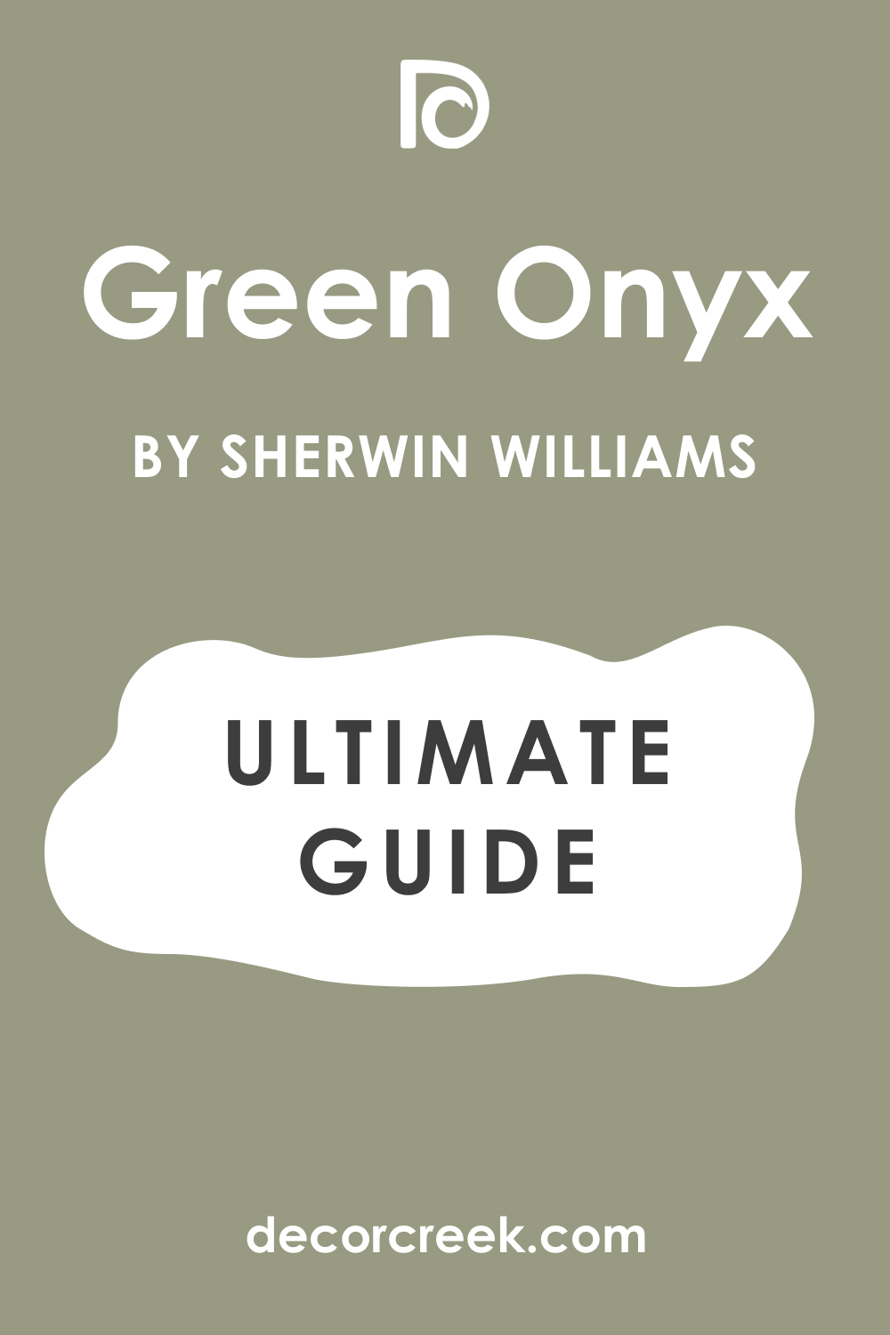
Green Onyx SW 9128
Green Onyx SW 9128 is a soft and muted green that feels very organic. This light shade brings a touch of the garden right into your home entrance. It works wonders for homes that have a lot of natural wood trim.
The color provides a very fresh look that is not too bright or loud. It makes a foyer feel very peaceful and well put together for guests. This paint is a great choice for a relaxed and casual style of living. It looks very clean and bright when the morning sun hits it directly.
The pigment hides dust and light marks very effectively for busy families. It is a color that makes people feel happy and welcomed instantly. This selection ensures your entrance feels like a natural part of the landscape.
🎨 Check out the complete guide to this color right HERE 👈
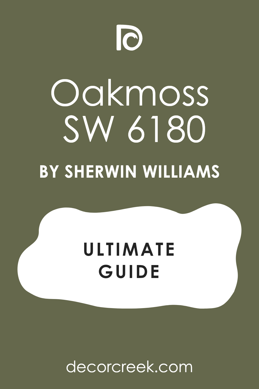
Oakmoss SW 6180
Oakmoss SW 6180 is a deep and forest-inspired green with a lot of depth. This heavy tone makes an entrance feel very sturdy and full of natural life. It works beautifully in homes with a lot of stone or brick details.
The color provides a moody and rich backdrop for white or cream furniture. This dark shade hides scuffs and dirt perfectly near the front door area. It gives the hallway a very sophisticated and high-end look. The walls look stunning under the light of a large chandelier or lamp.
This is a shade I use when I want to add a bold touch to a house. It pairs perfectly with dark floors and antique bronze hardware. The paint ensures your foyer is a memorable and very stylish space.
🎨 Check out the complete guide to this color right HERE 👈
Rookwood Dark Green SW 2816
Rookwood Dark Green SW 2816 is a very dark and traditional green for a foyer. This historic shade gives your entrance a sense of history and permanence. It works well in homes that have high-quality wood craftsmanship.
The color adds a lot of weight and importance to the entrance area. This thick paint hides every mark and fingerprint with its deep pigment. It looks very expensive when used on the walls of a small foyer. The tone creates a very formal and impressive welcome for visitors.
It stays looking very rich and dark throughout the entire day. This is a top pick for a luxury staging look in 2026. The paint ensures your home looks very well cared for and grand.
Cavern Clay SW 7701
Cavern Clay SW 7701 is a warm and terracotta-inspired color that pops. This bright choice makes your home entrance feel very energetic and bright. It works perfectly with southwestern or modern bohemian decor styles.
The shade provides a very unique look that guests will always remember. It adds a lot of warmth to an entrance that gets cold light. The color makes people feel a sense of excitement when they enter. It pairs beautifully with black accents and green indoor plants.
This pigment hides dust and dirt much better than a light white paint. It is a color I use for homeowners who love a bit of adventure. The selection ensures your foyer is a cheerful and very warm space.
🎨 Check out the complete guide to this color right HERE 👈

Redend Point SW 9081
Redend Point SW 9081 is a soft and blush-toned beige that feels very modern. This neutral shade makes an entryway look very updated and fashion-forward. It works in harmony with light wood and natural fabrics.
The color provides a very gentle and soft feeling for anyone walking in. It hides small marks while still keeping the area looking bright. This paint gives the walls a very glowy and healthy appearance. It is a shade I suggest for a cozy and minimal entrance style.
The tone looks amazing under the soft light of a lamp or candle. It pairs nicely with gold mirrors and white ceramic decor. This choice ensures your foyer feels like a very kind and welcoming space.
🎨 Check out the complete guide to this color right HERE 👈

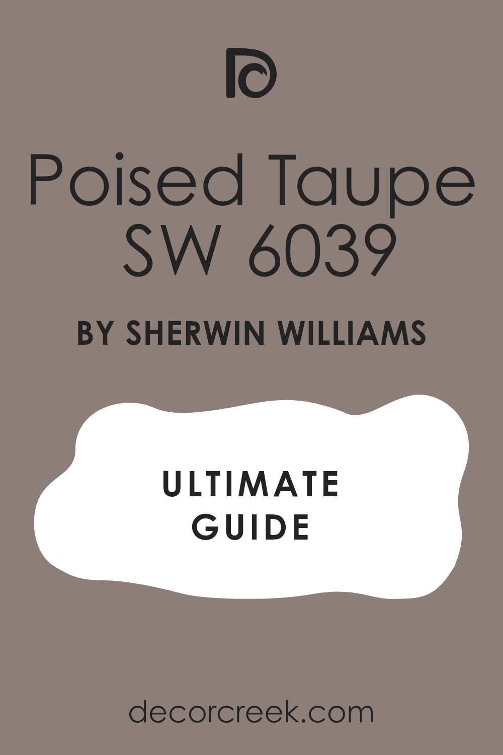
Poised Taupe SW 6039
Poised Taupe SW 6039 is a perfect mix of gray and brown with a hint of purple. This balanced tone makes a home entrance feel very neutral and calm. It works well with both warm wood and cool metal accents.
The color provides a very versatile backdrop for any style of furniture. It hides scuffs and dirt very well in a busy family home. This paint gives the hallway a very professional and clean appearance. It looks very high-end and designer-made on any wall surface.
The shade is a tool that helps people feel a sense of order. It pairs perfectly with white trim and gray-toned rugs. This selection ensures your foyer is a very polished and invited area.
🎨 Check out the complete guide to this color right HERE 👈
Pashmina AF-100
Pashmina AF-100 is a rich and mid-toned greige that looks like soft wool. This luxurious shade gives an entrance a very cozy and high-quality feel. It works wonders in hallways that have limited natural light.
The color provides a very warm and neutral base for your home design. It hides wall imperfections and marks from bags very effectively. This paint makes the entryway feel much more substantial and well decorated. It looks very expensive and custom-made on the foyer walls.
This is a color I use for creating a very stable home environment. It pairs nicely with dark wood and colorful art pieces. The pigment ensures your foyer is a very welcoming and sturdy space.
🎨 Check out the complete guide to this color right HERE 👈

Thunder AF-685
Thunder AF-685 is a light and airy gray with a lot of warmth inside. This bright choice makes a small entryway look much larger and more open. It works perfectly for people who want a very clean and modern look.
The color provides a soft contrast against white doors and trim work. It hides light dust and keeps the foyer looking very fresh. This paint gives the walls a very smooth and well-maintained appearance. It looks great in both the bright morning and the soft evening.
This is a shade I use for a minimalist and updated home style. It pairs beautifully with silver or chrome light fixtures and mirrors. The color ensures your entrance feels very bright and full of positive vibes.
🎨 Check out the complete guide to this color right HERE 👈

Amherst Gray HC-167
Amherst Gray HC-167 is a dark and serious gray that brings a lot of class. This moody tone makes an entrance feel very established and professional. It works best in foyers with high ceilings and big windows.
The color provides a very dramatic and impressive look for your guests. It hides all the messes of a busy doorway area perfectly. This paint gives the hallway a very sleek and tailored appearance. It looks stunning next to bright white baseboards and doors.
This is a color I choose for a high-end luxury staging look. It pairs perfectly with modern art and black iron decor. The pigment ensures your home entrance is a very bold and stylish area.
🎨 Check out the complete guide to this color right HERE 👈

Iron Mountain 2134-30
Iron Mountain 2134-30 is a very deep charcoal that looks like natural stone. This heavy shade makes your home entrance feel very strong and protective. It works beautifully as an accent color for a main foyer wall.
The color provides a very moody and high-contrast look for visitors. It hides every mark and stain from pets and children easily. This paint gives the foyer a very custom and designer appearance. It looks amazing under the bright light of a modern chandelier.
This is a shade I suggest for a truly unique and bold entry. It pairs nicely with light wood and metallic gold details. The pigment ensures your home entrance is a very grand and memorable space.
🎨 Check out the complete guide to this color right HERE 👈

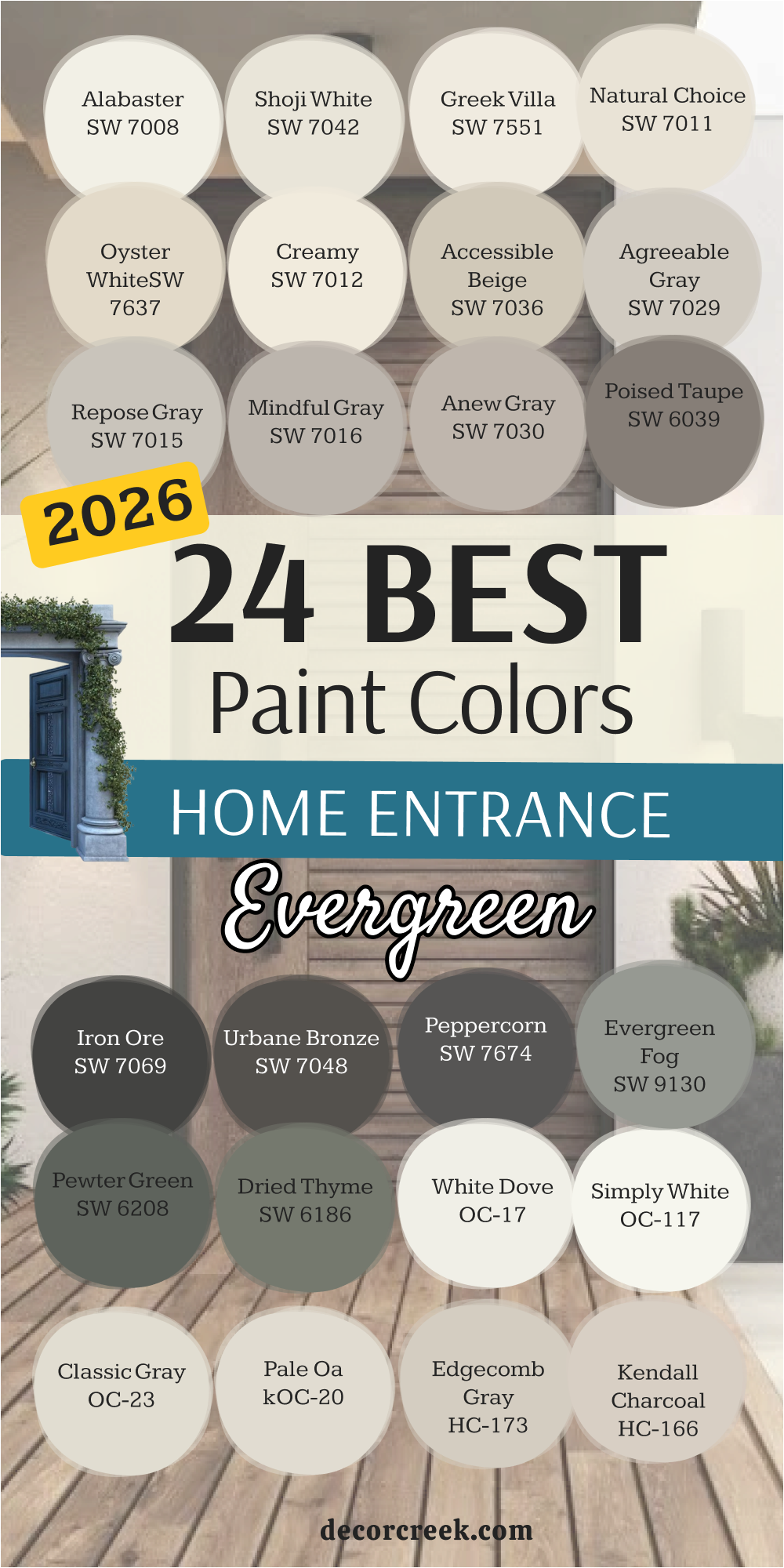
24 Evergreen Paint Colors for the Home Entrance in 2026
Alabaster SW 7008
Alabaster SW 7008 is a soft and creamy white that offers a forever look for any home. This selection makes your entrance look bright without being too harsh on the eyes. It works with every single style of home decoration you can imagine.
The color provides a clean start for every guest who walks through the door. It reflects light perfectly to make small foyers feel much more large. This paint hides small wall marks better than most pure white options. It stays popular year after year for a very good reason in the design world.
The shade looks stunning next to black metal or dark wood accents. It gives your home a very high-end and polished feel from the start. This is a choice you will never regret for your foyer walls.
🎨 Check out the complete guide to this color right HERE 👈
Shoji White SW 7042
Shoji White SW 7042 is a warm blend of white and beige that feels very natural. This paint adds a lot of comfort to a home entrance without being too dark. It is a shade I recommend for houses that have stone or wood floors.
The color feels very soft on the eyes when the sun hits the walls. It creates a cozy feeling that welcomes guests into your living area immediately. This selection works perfectly in traditional homes that need a fresh look. You will find that it pairs nicely with both warm and cool furniture.
It is a smart choice for busy families because it hides dust very well. Many of my clients love how this pigment makes their home feel stable. The paint looks expensive and high-end on any foyer wall.
🎨 Check out the complete guide to this color right HERE 👈
Greek Villa SW 7551
Greek Villa SW 7551 is a rich and sunny white that brings life to an entrance. This tone has a golden hint that makes a room feel like it is glowing. It is a color I use often in homes that lack natural sunlight.
The shade makes a hallway feel much more cheerful and friendly for visitors. It looks stunning when paired with dark wood doors or bronze hardware. This choice is bright enough to be white but warm enough to feel like a hug. It will smooth out the look of your walls and hide tiny imperfections.
The paint is a popular choice for staging because everyone likes how it looks. It helps bridge the gap between different styles of decor in your house. This color makes your home feel like a sunny getaway every day.
🎨 Check out the complete guide to this color right HERE 👈
Natural Choice SW 7011
Natural Choice SW 7011 is a light tan that feels very organic and grounded. This pigment brings a bit of nature into your home entrance right away. It is a shade I suggest for people who think white is too boring. The color looks wonderful with indoor plants and green decor items.
It creates a very soft transition from the outdoors to the inside. This selection makes your foyer feel sturdy and very well put together. It adds a layer of warmth that makes guests want to stay longer. The paint is a great middle-ground color that fits almost any architecture.
Many homeowners choose this when they want a homey and relaxed vibe. It is a very safe and smart pick for a welcoming entryway.
🎨 Check out the complete guide to this color right HERE 👈
Oyster White SW 7637
Oyster White SW 7637 is a soft greige that looks very sophisticated on walls. This shade has a tiny bit of green inside that makes it feel fresh. It works perfectly in large foyers with a lot of natural light. The color provides a very stable and high-quality look for your house.
It hides small marks and scuffs from bags and shoes very effectively. This paint makes the entryway feel much more substantial and well designed. It looks very expensive and custom-made when paired with white trim.
This is a color I use for creating a very stable home environment. It pairs nicely with dark wood and colorful art pieces. The pigment ensures your foyer is a very welcoming and sturdy space.
🎨 Check out the complete guide to this color right HERE 👈

Creamy SW 7012
Creamy SW 7012 is a classic off-white that feels very soft and rich. This paint makes an entrance look bright and very clean for guests. It works beautifully in homes with traditional furniture and rugs.
The color provides a warm and sunny feeling even on cloudy days. It reflects light without being cold or looking like a hospital room. This choice hides small wall imperfections better than a stark white would. It stays a favorite of mine because it never clashes with other colors.
The shade makes your hallway feel much larger than it actually is. It helps guests feel a sense of peace the moment they walk in. This is a reliable color that looks expensive on any foyer wall.
🎨 Check out the complete guide to this color right HERE 👈

Accessible Beige SW 7036
Accessible Beige SW 7036 is one of the most famous colors for a good reason. This shade is the perfect mix of gray and beige for any house. It is the tone I use when I want an entrance to feel professional.
The color works with both warm wood floors and cool gray tiles. It creates a very balanced look that does not lean too far one way. This paint makes your furniture look much more expensive than it was. It is a great choice if you are planning to sell your home.
Most people find this color very pleasing and easy to live with daily. The pigment provides a solid foundation for any style of decoration. It is a winner for anyone who wants a beautiful and invited foyer.
🎨 Check out the complete guide to this color right HERE 👈
Agreeable Gray SW 7029
Agreeable Gray SW 7029 is the most popular gray for an entrance today. This paint has a warm base that keeps it from looking like cold concrete. It works in any lighting situation you might have in your hallway.
The color makes small entryways look much more open and clean. This is a shade that buyers look for when they walk into a house. It goes well with white trim and dark wood doors alike. The choice is very safe for people who are not sure which gray to pick.
It helps your home look modern while still feeling very cozy. This is a selection I recommend for almost every staging project I do. The paint will make your entryway look professionally designed without effort.
🎨 Check out the complete guide to this color right HERE 👈
Repose Gray SW 7015
Repose Gray SW 7015 is a slightly cooler gray that looks very sophisticated. This tone has a tiny hint of blue or green depending on your light. It makes a home entrance feel very trendy and up to date.
The color is dark enough to show contrast against white baseboards. It works beautifully with marble floors or light gray tiling in a foyer. This paint is a shade that looks high-end in a large and open entrance. It stays looking fresh even when the sun goes down and lamps come on.
The choice is a tool that helps your entryway feel very organized. It is a great pick if you have navy or black furniture pieces. This selection gives your home a very polished look everyone will notice.
🎨 Check out the complete guide to this color right HERE 👈
Mindful Gray SW 7016
Mindful Gray SW 7016 is an ideal mid-tone for a clear color on your walls. This paint looks very solid and dependable in a large foyer. It has enough depth to make white door frames pop and stand out.
The color works well with dark floors to create a high-quality finish. This choice does not feel too dark if you have a window nearby. It helps hide fingerprints and small marks in high-traffic areas. The shade gives the entrance area a very modern and expensive look.
It stays neutral and does not turn purple in normal indoor light. This selection is liked by home buyers because it looks very professional. The pigment is a great base for a welcoming first impression.
🎨 Check out the complete guide to this color right HERE 👈
Anew Gray SW 7030
Anew Gray SW 7030 is a great mix of gray and beige with a warm lean. This paint makes the home entrance very inviting and soft to see. It works perfectly with wood furniture and woven baskets for shoes.
The color is light enough to keep the foyer from feeling too small. It helps tie together rooms with different styles of decoration easily. This choice is often picked by people who want to avoid white walls.
The shade looks very natural and reminds me of natural stone. It creates a sense of comfort after you step over the threshold. This pigment is a practical choice for active families with children. The selection highlights the architectural details of your home very well.
🎨 Check out the complete guide to this color right HERE 👈
Poised Taupe SW 6039
Poised Taupe SW 6039 is a complex blend of gray and brown with a purple hint. This selection makes a home entrance feel very balanced and neutral. It works well with both warm wood and cool metal accents.
The color provides a very versatile backdrop for any style of furniture. It hides scuffs and dirt very well in a busy family home. This paint gives the hallway a very professional and clean appearance. It looks very high-end and designer-made on any wall surface.
The shade is a tool that helps people feel a sense of order. It pairs perfectly with white trim and gray-toned rugs. This choice ensures your foyer is a very polished and invited area.
🎨 Check out the complete guide to this color right HERE 👈
Iron Ore SW 7069
Iron Ore SW 7069 is a very deep and nearly black shade that looks trendy. This pigment creates a stunning contrast if you have light interior doors. It makes a small entrance area very characteristic and unusual.
The color absorbs extra light and creates a very intimate mood. This choice is often applied for accent walls across from the door. It looks very rich in combination with brass light fixtures or handles. The shade helps hide all wall defects due to its dark base.
It is picked by those who want to add drama to their home. This dark paint feels like a very reliable and protective color. It turns an ordinary hallway into an example of designer art.
🎨 Check out the complete guide to this color right HERE 👈
Urbane Bronze SW 7048
Urbane Bronze SW 7048 is a complex brown-gray that reminds me of metal. This paint gives the home entrance a sense of stability and weight. It harmonizes perfectly with brickwork or stone floors in a foyer.
The color makes the room very warm despite its dark nature. This selection often becomes a favorite color due to its natural softness. It works well on both the walls and the front door itself. The shade looks very effective under the light of evening lamps.
It helps guests immediately feel in a cozy and protected environment. This is a color that never goes out of fashion for staging. The pigment gives your home the look of a very high-quality area.
🎨 Check out the complete guide to this color right HERE 👈
Peppercorn SW 7674
Peppercorn SW 7674 is a balanced dark gray without any extra undertones. This paint looks very neat and strict in any modern interior style. It helps make the entrance zone more distinct and structured.
The color perfectly offsets bright rugs or green indoor plants. This choice creates a sense of luxury in a small house. It is a great selection for those afraid of pure black color. The shade keeps its true tone under any type of light bulb.
It makes the interior deeper and more interesting to the eye. This pigment causes a feeling of trust and order for visitors. It is a proven way to make your entrance stylish for years.
🎨 Check out the complete guide to this color right HERE 👈
Evergreen Fog SW 9130
Evergreen Fog SW 9130 is a soft green color with gray and a drop of blue inside. This pigment brings a sense of living nature right to your doorstep. It looks very modern and is often chosen for updated interiors this year.
The shade helps create a very soft transition from the street to home warmth. It perfectly combines with natural materials like linen or leather furniture. This selection makes the entrance zone very fresh and clean to the eye. The paint is a great choice for those looking for an unusual neutral tone.
It causes a smile and pleasant thoughts in every guest who visits. This choice works well in both small and spacious foyer halls. The color will be an ideal start for a cozy and stylish home.
🎨 Check out the complete guide to this color right HERE 👈
Pewter Green SW 6208
Pewter Green SW 6208 is a deep forest green color with a very noble character. This heavy tone makes the entrance zone very solid and trustworthy. It looks great next to furniture made of natural dark wood.
The shade helps create the atmosphere of an old and very high-quality mansion. It looks very saturated and does not fade in the sun over time. This paint is often used by me to create focus points in the interior. It makes the walls very smooth and pleasant for perception.
The selection is an ideal color for homes surrounded by a garden or trees. It helps guests immediately tune into a serious and quiet mood. This choice turns an ordinary entrance into a high-level foyer.
🎨 Check out the complete guide to this color right HERE 👈
Dried Thyme SW 6186
Dried Thyme SW 6186 reminds me of the color of dried herbs and looks very natural. This paint creates a very homey and warm environment in the entrance zone. It is perfectly suited for homes in a rustic or classic style.
The shade hides dust well which is important for the zone near the front door. It looks very soft under the light of table lamps in the hallway. This selection helps people feel in safety and comfort immediately. It perfectly harmonizes with ceramic tiles of brown or gray tones.
The pigment is a very harmonious color that does not irritate over time. It makes your home more individual and interesting from the outside. This choice is a wonderful way to create a durable and beautiful interior.
🎨 Check out the complete guide to this color right HERE 👈
White Dove OC-17
White Dove OC-17 is a soft and creamy white that designers love for foyers. This shade makes every home entrance look clean and very bright. It works well with all types of wood floors and traditional rugs.
The color has a tiny bit of warmth that keeps it from looking cold. It brightens up dark corners where the sun does not reach easily. This paint provides a perfect backdrop for colorful artwork or family photos. It hides small marks better than a very bright and stark white would.
The selection stays a favorite for me because it never clashes with other rooms. It makes your hallway feel much larger than it actually is. This classic choice helps guests feel a sense of peace right away.
🎨 Check out the complete guide to this color right HERE 👈

Simply White OC-117
Simply White OC-117 is a very crisp and clean choice for an updated home entrance. This paint has no heavy yellow or blue tones hidden inside it. It is a color I like to use on trim and doors as well as walls.
The shade makes your entryway look sharp and very well maintained. It reflects light beautifully and helps a small foyer feel much airier. This selection is what you should use if you want a brand-new look. It is a great pick if you have black accents like door handles.
The pigment creates a very fresh feeling that makes the whole house seem cleaner. You can count on this white to stay looking bright for many years. It provides a very professional finish that makes your home look high-quality.
🎨 Check out the complete guide to this color right HERE 👈

Classic Gray OC-23
Classic Gray OC-23 is a very light and airy gray that looks soft on the walls. This paint is a fantastic alternative to white if you want a tiny bit of contrast. It makes white trim work really stand out in an entrance.
The shade feels very modern without being too cold or industrial. It works well in small halls because it does not feel like the walls are closing in. This choice pairs with almost any color of rug or runner on the floor. The pigment is very popular for people who like a clean and simple look.
It hides small scuffs better than a pure white paint would. This selection is a color many of my staging clients choose for a sophisticated feel. It makes your entryway look updated and very stylish.
🎨 Check out the complete guide to this color right HERE 👈

Pale Oak OC-20
Pale Oak OC-20 is a warm and gentle greige that feels very organic. This paint brings a bit of nature into your home entrance right away. It is a shade I suggest for people who think white is too plain.
The color looks wonderful with indoor plants and light wood decor. It creates a very soft transition from the outdoors to the inside. This selection makes your foyer feel sturdy and very well put together. It adds a layer of warmth that makes guests want to stay longer.
The pigment is a great middle-ground color that fits almost any style. Many homeowners choose this when they want a homey and relaxed vibe. It is a very safe and smart pick for a welcoming entryway.
🎨 Check out the complete guide to this color right HERE 👈

Edgecomb Gray HC-173
Edgecomb Gray HC-173 is a rich and creamy gray that fits every single house. This shade is the perfect mix of gray and beige for a professional look. It is the tone I use when I want an entrance to feel high-end.
The color works with both warm wood floors and cool gray tiles. It creates a very balanced look that does not lean too far one way. This paint makes your furniture look much more expensive than it was. It is a great choice if you are planning to sell your home soon.
Most people find this color very pleasing and easy to live with every day. The pigment provides a solid foundation for any style of decoration. It is a winner for anyone who wants a beautiful and invited foyer.
🎨 Check out the complete guide to this color right HERE 👈

Kendall Charcoal HC-166
Kendall Charcoal HC-166 is a deep and serious gray that brings a lot of class. This dark paint makes an entrance feel very established and professional. It works best in foyers with high ceilings and big windows.
The shade provides a very dramatic and moody look for your guests. It hides all the messes of a busy doorway area perfectly. This choice gives the hallway a very sleek and tailored appearance. It looks stunning next to bright white baseboards and doors.
The pigment is a color I choose for a high-end luxury staging look. It pairs perfectly with modern art and black iron decor. This selection ensures your home entrance is a very bold and stylish area.
🎨 Check out the complete guide to this color right HERE 👈

22 Passage Wall Decor Paint Colors
Alabaster SW 7008
Alabaster SW 7008 is a soft and creamy white for a forever look. This selection makes your entrance look bright without being too harsh. It works with every single style of home decoration. The color provides a clean start for every guest who walks in.
It reflects light perfectly to make small foyers feel large. This paint hides small wall marks better than most pure whites. It stays popular year after year for a very good reason.
The shade looks stunning next to black metal or dark wood. It gives your home a very high-end and polished feel. This is a choice you will never regret for your foyer.
🎨 Check out the complete guide to this color right HERE 👈
Shoji White SW 7042
Shoji White SW 7042 is a creamy blend of white and beige that feels very natural. This paint adds a lot of comfort to a home entrance without being too dark. It is a shade I recommend for houses that have stone or wood floors.
The color feels very soft on the eyes when the sun hits the walls. It creates a cozy feeling that welcomes guests into your living area immediately. This selection works perfectly in traditional homes that need a fresh look. You will find that it pairs nicely with both warm and cool furniture.
It is a smart choice for busy families because it hides dust very well. Many of my clients love how this pigment makes their home feel stable. The paint looks expensive and high-end on any foyer wall.
🎨 Check out the complete guide to this color right HERE 👈
Greek Villa SW 7551
Greek Villa SW 7551 is a rich and sunny white that brings a lot of life to a passage. This selection has a golden undertone that makes the walls feel like they are glowing. It is a color I use often in corridors that do not get much natural light.
The shade makes a hallway feel much more cheerful and friendly for visitors. It looks stunning when paired with dark wood trim or bronze wall sconces. This choice is bright enough to be called white but warm enough to feel like a hug. It will smooth out the look of your walls and hide tiny imperfections.
The paint is a popular choice for staging because almost everyone likes how it looks. It helps bridge the gap between different styles of decor in your house. This color makes your home feel like a sunny getaway every time you walk through.
🎨 Check out the complete guide to this color right HERE 👈
Natural Choice SW 7011
Natural Choice SW 7011 is a light tan that feels very organic and grounded on passage walls. This pigment brings a bit of nature into your home corridors right away. It is a shade I suggest for people who think pure white is too boring.
The color looks wonderful with indoor plants and natural wood picture frames. It creates a very soft transition from one room to another. This selection makes your passage feel sturdy and very well put together. It adds a layer of warmth that makes guests feel comfortable as they move through.
The paint is a great middle-ground color that fits almost any style of architecture. Many homeowners choose this when they want a homey and relaxed vibe. It is a very safe and smart pick for a welcoming home interior.
🎨 Check out the complete guide to this color right HERE 👈
Oyster White SW 7637
Oyster White SW 7637 is a soft greige that looks very sophisticated in a passage. This shade has a tiny bit of green inside that makes it feel fresh and cool. It works perfectly in long hallways with a lot of natural light coming from doors.
The color provides a very stable and high-quality look for your house walls. It hides small marks and scuffs from daily foot traffic very effectively. This paint makes the passage feel much more substantial and well designed. It looks very expensive and custom-made when paired with bright white trim.
This is a color I use for creating a very stable and professional home environment. It pairs nicely with dark wood furniture and colorful art pieces. The pigment ensures your passage is a very welcoming and sturdy part of the home.
🎨 Check out the complete guide to this color right HERE 👈
Creamy SW 7012
Creamy SW 7012 is a classic off-white that feels very soft and rich on passage walls. This paint makes a hallway look bright and very clean for guests. It works beautifully in homes with traditional wall decor and rugs. The color provides a warm and sunny feeling even on cloudy days.
It reflects light without being cold or looking like a sterile clinic. This choice hides small wall imperfections better than a stark white would. It stays a favorite of mine because it never clashes with other room colors. The shade makes your passage feel much larger than it actually is.
It helps guests feel a sense of peace the moment they walk down the hall. This is a reliable color that looks expensive on any passage wall.
🎨 Check out the complete guide to this color right HERE 👈
Drift of Mist SW 9166
Drift of Mist SW 9166 is a very light gray that looks soft and airy on passage walls. This selection is a fantastic alternative to white if you want a tiny bit of contrast. It makes white trim and door frames really stand out in a hallway.
The shade feels very modern without being too cold or industrial for a home. It works well in small passages because it does not make the walls feel tight. This choice pairs with almost any color of rug or runner on the floor. The pigment is very popular for people who like a clean and simple look.
It hides small scuffs better than a pure white paint would in high-traffic areas. This selection is a color many of my staging clients choose for a sophisticated feel. It makes your passage look updated and very stylish for years.
🎨 Check out the complete guide to this color right HERE 👈
Accessible Beige SW 7036
Accessible Beige SW 7036 is one of the most famous colors for a good reason in passages. This shade is the perfect mix of gray and beige that fits every house. It is the tone I use when I want a hallway to feel professional.
The color works with both warm wood floors and cool gray tiles. It creates a very balanced look that does not lean too far one way. This paint makes your wall decor look much more expensive than it was. It is a great choice if you are planning to sell your home soon.
Most people find this color very pleasing and easy to live with every day. The pigment provides a solid foundation for any style of decoration. It is a winner for anyone who wants a beautiful and invited passage.
🎨 Check out the complete guide to this color right HERE 👈
Agreeable Gray SW 7029
Agreeable Gray SW 7029 is the most popular gray color for a passage today. This paint has a warm base that keeps it from looking like cold concrete. It works in any lighting situation you might have in your hallway.
The color makes small passages look much more open and clean. This is a shade that buyers look for when they walk through a house. It goes well with white trim and dark wood doors alike. The choice is very safe for people who are not sure which gray to pick.
It helps your home look modern while still feeling very cozy. This is a selection I recommend for almost every staging project I do. The paint will make your passage look professionally designed without much effort.
🎨 Check out the complete guide to this color right HERE 👈
Repose Gray SW 7015
Repose Gray SW 7015 is a slightly cooler gray that looks very sophisticated in a hallway. This tone has a tiny hint of blue or green depending on your light. It makes a home passage feel very trendy and up to date.
The color is dark enough to show contrast against white baseboards and trim. It works beautifully with marble floors or light gray tiling in a passage. This paint is a shade that looks high-end in a large and open hallway. It stays looking fresh even when the sun goes down and lamps come on.
The choice is a tool that helps your passage feel very organized and tidy. It is a great pick if you have navy or black wall accents. This selection gives your home a very polished look everyone will notice.
🎨 Check out the complete guide to this color right HERE 👈
Mindful Gray SW 7016
Mindful Gray SW 7016 is an ideal mid-tone for a clear color on your passage walls. This paint looks very solid and dependable in a large hallway. It has enough depth to make white door frames pop and stand out.
The color works well with dark floors to create a high-quality finish. This choice does not feel too dark if you have a window in the hall. It helps hide fingerprints and small marks in high-traffic passages. The shade gives the wall area a very modern and expensive look.
It stays neutral and does not turn purple in normal indoor light. This selection is liked by home buyers because it looks very professional. The pigment is a great base for a welcoming and clean transition.
🎨 Check out the complete guide to this color right HERE 👈
Anew Gray SW 7030
Anew Gray SW 7030 is a great mix of gray and beige with a warm lean for passages. This paint makes the home hallways very inviting and soft to see. It works perfectly with wood furniture and woven wall baskets for decor.
The color is light enough to keep the passage from feeling like a cave. It helps tie together rooms with different styles of decoration easily. This choice is often picked by people who want to avoid plain white walls. The shade looks very natural and reminds me of natural stone or sand.
It creates a sense of comfort as you walk through the home. This pigment is a practical choice for active families with many children. The selection highlights the architectural details of your passage very well.
🎨 Check out the complete guide to this color right HERE 👈
Pale Oak OC-20
Pale Oak OC-20 is a warm and gentle greige that feels very organic in a passage. This paint brings a bit of nature into your home hallways right away. It is a shade I suggest for people who think pure white is too plain.
The color looks wonderful with indoor plants and light wood decor pieces. It creates a very soft transition from one room to another. This selection makes your passage feel sturdy and very well put together. It adds a layer of warmth that makes guests want to move through slowly.
The pigment is a great middle-ground color that fits almost any style. Many homeowners choose this when they want a homey and relaxed vibe. It is a very safe and smart pick for a welcoming home passage.
🎨 Check out the complete guide to this color right HERE 👈
Classic Gray OC-23
Classic Gray OC-23 is a very light gray that looks like a soft shadow on passage walls. This paint is a fantastic alternative to white if you want a tiny bit of contrast. It makes white trim work really stand out in a long hallway.
The shade feels very modern without being too cold or industrial for a home. It works well in small passages because it does not feel like the walls are closing in. This choice pairs with almost any color of rug or runner on the floor. The pigment is very popular for people who like a clean and simple look.
It hides small scuffs better than a pure white paint would in halls. This selection is a color many of my staging clients choose for a sophisticated feel. It makes your passage look updated and very stylish for many years.
🎨 Check out the complete guide to this color right HERE 👈
Balboa Mist OC-27
Balboa Mist OC-27 is a beautiful light gray that has a very soft and warm feel. This paint makes a passage look bright and very updated for guests. It works perfectly in hallways that lead into open living spaces.
The color provides a clean look that is not as sharp as a pure white. It reflects light well and helps a narrow hall feel much more open. This choice hides light dust and small marks better than a flat white would. It stays a favorite for me because it looks good in almost any light.
The shade makes your passage feel very calm and well maintained. It helps guests feel a sense of ease as they walk through. This is a reliable color that gives your walls a designer finish.
🎨 Check out the complete guide to this color right HERE 👈

Edgecomb Gray HC-173
Edgecomb Gray HC-173 is a rich and creamy gray that fits every house passage. This shade is the perfect mix of gray and beige for a professional look. It is the tone I use when I want a hallway to feel high-end.
The color works with both warm wood floors and cool gray tiles. It creates a very balanced look that does not lean too far one way. This paint makes your wall decor look much more expensive than it was. It is a great choice if you are planning to sell your home soon.
Most people find this color very pleasing and easy to live with every day. The pigment provides a solid foundation for any style of decoration. It is a winner for anyone who wants a beautiful and invited passage.
🎨 Check out the complete guide to this color right HERE 👈
White Dove OC-17
White Dove OC-17 is a soft and creamy white that designers love for passages. This shade makes every hallway look clean and very bright for visitors. It works well with all types of wood floors and traditional rugs.
The color has a tiny bit of warmth that keeps it from looking cold. It brightens up dark corners where the sun does not reach easily. This paint provides a perfect backdrop for colorful artwork or family photos. It hides small marks better than a very bright and stark white would.
The selection stays a favorite for me because it never clashes with other rooms. It makes your passage feel much larger than it actually is. This classic choice helps guests feel a sense of peace right away.
🎨 Check out the complete guide to this color right HERE 👈
Simply White OC-117
Simply White OC-117 is a very crisp and clean choice for an updated home passage. This paint has no heavy yellow or blue tones hidden inside it. It is a color I like to use on trim and doors as well as walls.
The shade makes your hallway look sharp and very well maintained. It reflects light beautifully and helps a small passage feel much airier. This selection is what you should use if you want a brand-new look. It is a great pick if you have black accents like door handles or lights.
The pigment creates a very fresh feeling that makes the whole house seem cleaner. You can count on this white to stay looking bright for many years. It provides a very professional finish that makes your passage look high-quality.
🎨 Check out the complete guide to this color right HERE 👈
Horizon OC-53
Horizon OC-53 is a very pale gray with a cool and watery feel for walls. This paint makes a passage look incredibly bright and filled with air. It is ideally suited for very narrow and dark corridors in a home.
The color creates a sense of cleanliness and order right away. It looks very gentle and pleasant under any type of indoor lighting. This selection is often chosen by me to create a light and modern style. It helps to visually push the walls apart and make the ceiling higher.
The shade causes a feeling of joy and lightness in guests as they walk. It combines very well with white frames for photos on the passage walls. This choice turns your hallway into a bright and very pleasant place.
🎨 Check out the complete guide to this color right HERE 👈

Silver Satin OC-26
Silver Satin OC-26 is a very light and airy off-white with a gray hint. This paint makes a passage look very clean and sophisticated for visitors. It works perfectly for people who want a minimalist and modern look.
The color provides a soft contrast against white doors and trim work. It hides light dust and keeps the hallway looking very fresh. This choice gives the walls a very smooth and well-maintained appearance. It looks great in both the bright morning and the soft evening light.
This is a shade I use for an updated and elegant home style. It pairs beautifully with silver or chrome light fixtures in the passage. The color ensures your hallway feels very bright and full of positive energy.
🎨 Check out the complete guide to this color right HERE 👈
Wickham Gray HC-171
Wickham Gray HC-171 is a cool and light gray that has a slight blue or green tint. This paint makes a passage feel very fresh and updated for guests. It works wonders in hallways that have a lot of natural light coming in.
The color provides a very clean and professional look for your house walls. It hides small marks and scuffs from bags very effectively in high-traffic zones. This selection makes the passage feel much more open and airy than before. It looks very expensive and custom-made on the foyer and hall walls.
This is a color I use for creating a very fresh and modern home environment. It pairs nicely with white trim and colorful wall art pieces. The pigment ensures your passage is a very welcoming and stylish space.
🎨 Check out the complete guide to this color right HERE 👈

Kendall Charcoal HC-166
Kendall Charcoal HC-166 is a deep and serious gray that brings a lot of class to a passage. This dark paint makes a hallway feel very established and professional. It works best in passages with high ceilings and big windows or doors.
The shade provides a very dramatic and moody look for your guests. It hides all the messes of a busy doorway area perfectly. This choice gives the passage a very sleek and tailored appearance. It looks stunning next to bright white baseboards and doors.
The pigment is a color I choose for a high-end luxury staging look. It pairs perfectly with modern art and black iron decor. This selection ensures your home passage is a very bold and stylish area.
🎨 Check out the complete guide to this color right HERE 👈
Balboa Mist OC-27
Balboa Mist OC-27 is a beautiful light gray that has a very soft and warm feel. This paint makes a passage look bright and very updated for guests. It works perfectly in hallways that lead into open living spaces.
The color provides a clean look that is not as sharp as a pure white. It reflects light well and helps a narrow hall feel much more open. This choice hides light dust and small marks better than a flat white would. It stays a favorite for me because it looks good in almost any light.
The shade makes your passage feel very calm and well maintained. It helps guests feel a sense of ease as they walk through. This is a reliable color that gives your walls a designer finish.
🎨 Check out the complete guide to this color right HERE 👈
Horizon OC-53
Horizon OC-53 is a very pale gray with a cool and watery feel for walls. This paint makes a passage look incredibly bright and filled with air. It is ideally suited for very narrow and dark corridors in a home.
The color creates a sense of cleanliness and order right away. It looks very gentle and pleasant under any type of indoor lighting. This selection is often chosen by me to create a light and modern style. It helps to visually push the walls apart and make the ceiling higher.
The shade causes a feeling of joy and lightness in guests as they walk. It combines very well with white frames for photos on the passage walls. This choice turns your hallway into a bright and very pleasant place.
🎨 Check out the complete guide to this color right HERE 👈
Silver Satin OC-26
Silver Satin OC-26 is a very light and airy off-white with a gray hint. This paint makes a passage look very clean and sophisticated for visitors. It works perfectly for people who want a minimalist and modern look.
The color provides a soft contrast against white doors and trim work. It hides light dust and keeps the hallway looking very fresh. This choice gives the walls a very smooth and well-maintained appearance. It looks great in both the bright morning and the soft evening light.
This is a shade I use for an updated and elegant home style. It pairs beautifully with silver or chrome light fixtures in the passage. The color ensures your hallway feels very bright and full of positive energy.
🎨 Check out the complete guide to this color right HERE 👈
Wickham Gray HC-171
Wickham Gray HC-171 is a cool and light gray that has a slight blue or green tint. This paint makes a passage feel very fresh and updated for guests. It works wonders in hallways that have a lot of natural light coming in.
The color provides a very clean and professional look for your house walls. It hides small marks and scuffs from bags very effectively in high-traffic zones. This selection makes the passage feel much more open and airy than before. It looks very expensive and custom-made on the foyer and hall walls.
This is a color I use for creating a very fresh and modern home environment. It pairs nicely with white trim and colorful wall art pieces. The pigment ensures your passage is a very welcoming and stylish space.
🎨 Check out the complete guide to this color right HERE 👈
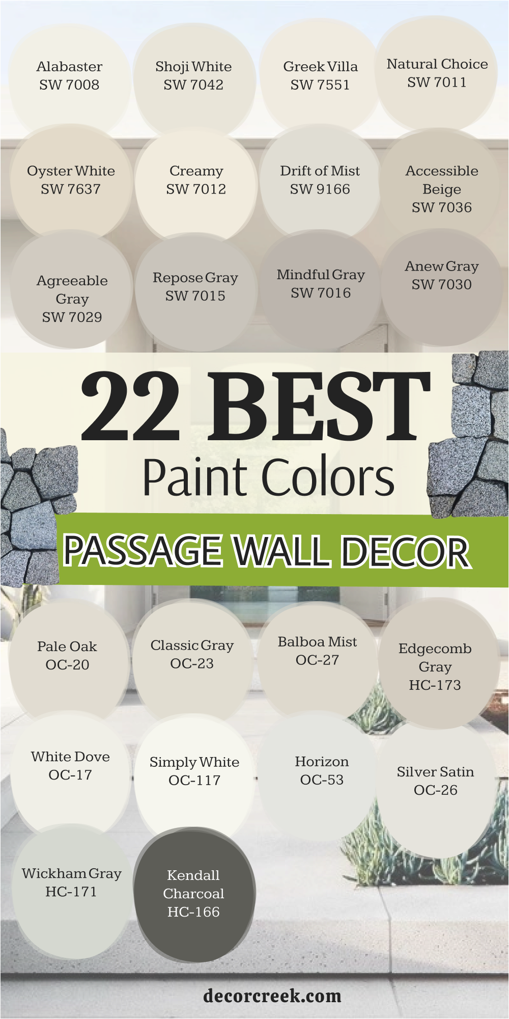
My Final Thoughts on Choosing Paint Colors for a Welcoming Home Entrance
Painting your entryway is the fastest way to make your home feel new and refreshed without undergoing a major renovation. I always tell people that color is a powerful tool you can use to completely change how a house feels and how people perceive your personal space. You do not need a huge budget or expensive contractors to make a big impact on your guests and improve your daily quality of life.
A fresh coat of paint makes everything look cared for, clean, and intentional, instantly raising the perceived value of your property. I hope these professional color choices help you find the specific shade that fits your unique personality and the architecture of your home. Remember to look at your painted samples in the morning light, during the afternoon, and under artificial lamps at night to see their true character.
Once you pick the right shade, you will love walking through your front door every single day, feeling a sense of pride in your surroundings. Your home is your special place and your ultimate sanctuary, so make sure the entrance reflects that feeling of warmth and security.
Investing time in the foyer is a gift to yourself because it sets the tone for your entire evening as soon as you step over the threshold. The entrance is the handshake of the home, offering a silent greeting that speaks volumes about the care and attention you put into your living environment.
Choosing a high-quality pigment from a trusted brand ensures that the walls will stand up to the heavy traffic of a busy household while maintaining their depth. When the color is right, the transition from the chaotic outside world to your private haven feels seamless and incredibly soothing for the mind.
You can use these shades to highlight beautiful moldings, frame a view into the living room, or simply create a clean backdrop for family memories. Taking the step to refresh your walls is the easiest way to breathe new life into an aging interior or to put a personal stamp on a brand-new house.