Sage green is a wonderful color to use in your home. I see it every day in my work when I help people style their houses. It looks like nature and makes rooms feel very comfortable. Finding the right match for it can change how a whole room feels. I want to help you pick the right shades today.
Bringing the feeling of the outdoors inside is a great way to make your family feel relaxed. This leafy tone acts like a neutral backdrop, which means it plays nicely with so many other shades. It can make a small bathroom feel like a hidden garden or a large living room feel extra welcoming. When you pair it with the right accent colors, your entire house will come alive with style.
Choosing paint should be fun and not tricky. When you find the right match, your home feels just right. You want a home that feels warm and happy when you walk inside. Let us look at the finest options together. Picking out new wall coatings is a big step, but it is also the easiest way to give your property a fresh start.
You deserve a beautiful living area that makes you smile the second you open your front door.
Together, we can explore different choices until we find the exact combination that speaks to your heart. Let us begin this exciting design journey right now.
Why I Always Trust Sherwin-Williams and Benjamin Moore for the Best Colors That Go With Sage Green
I have worked as a home designer and staging expert for many years. My job is to make houses look beautiful so people want to buy them or love living in them. I always pick two specific paint brands because their quality is amazing. They make colors that look rich on your walls.
When you are selling a house or just updating your own kitchen, you need products that perform perfectly. Cheap paint can look streaky or require too many coats, which just wastes your time and money. These two industry leaders create thick, smooth formulas that glide onto drywall beautifully. Their color pigment is so strong that the final look always feels high-end and professional.
Sherwin-Williams and Benjamin Moore have the best choices for your home. Their paint covers walls well and lasts a long time. They have spent years making shades that look great under different lights. I know I can trust their formulas every single time. Their extensive color decks give me thousands of options to test for my clients. They understand that a gray is never just a gray, and a white always has hidden undertones.
Because they test their products in real-world settings, I never have to worry about a color turning neon blue or muddy brown on the wall. Using their chips makes my job as a designer successful every day.
How I Choose the Perfect Paint Colors to Pair With Sage Green
I look at the light in a room before I choose a color. Some rooms get lots of bright sun, while others are dark. I also think about the mood you want to create. You might want a bright feeling or a cozy feeling.
Natural lighting is the most important factor because it changes from sunrise to sunset. A cool northern light will make colors look more blue, while a warm southern sun makes everything look more yellow. If you pick a wall shade without checking the windows first, you might get a surprise you do not like. Understanding how light interacts with paint allows us to pick a winning combination on the first try.
Next, I look at the furniture and floors you already have. Wood tones and fabrics matter a lot when picking a wall shade. I hold paint samples against the wall to see how they change during the day. This step helps me make sure the final look is exactly what you want.
Your existing flooring, whether it is dark walnut hardwood or light gray tile, acts as the base for the whole room. I always make sure the undertone of the floor matches the undertone of the new wall coating. We also look at your favorite sofas, curtains, and rugs to ensure the green fits into the family story beautifully.
Testing big color boards against these items guarantees that your finished room feels completely put together and balanced.
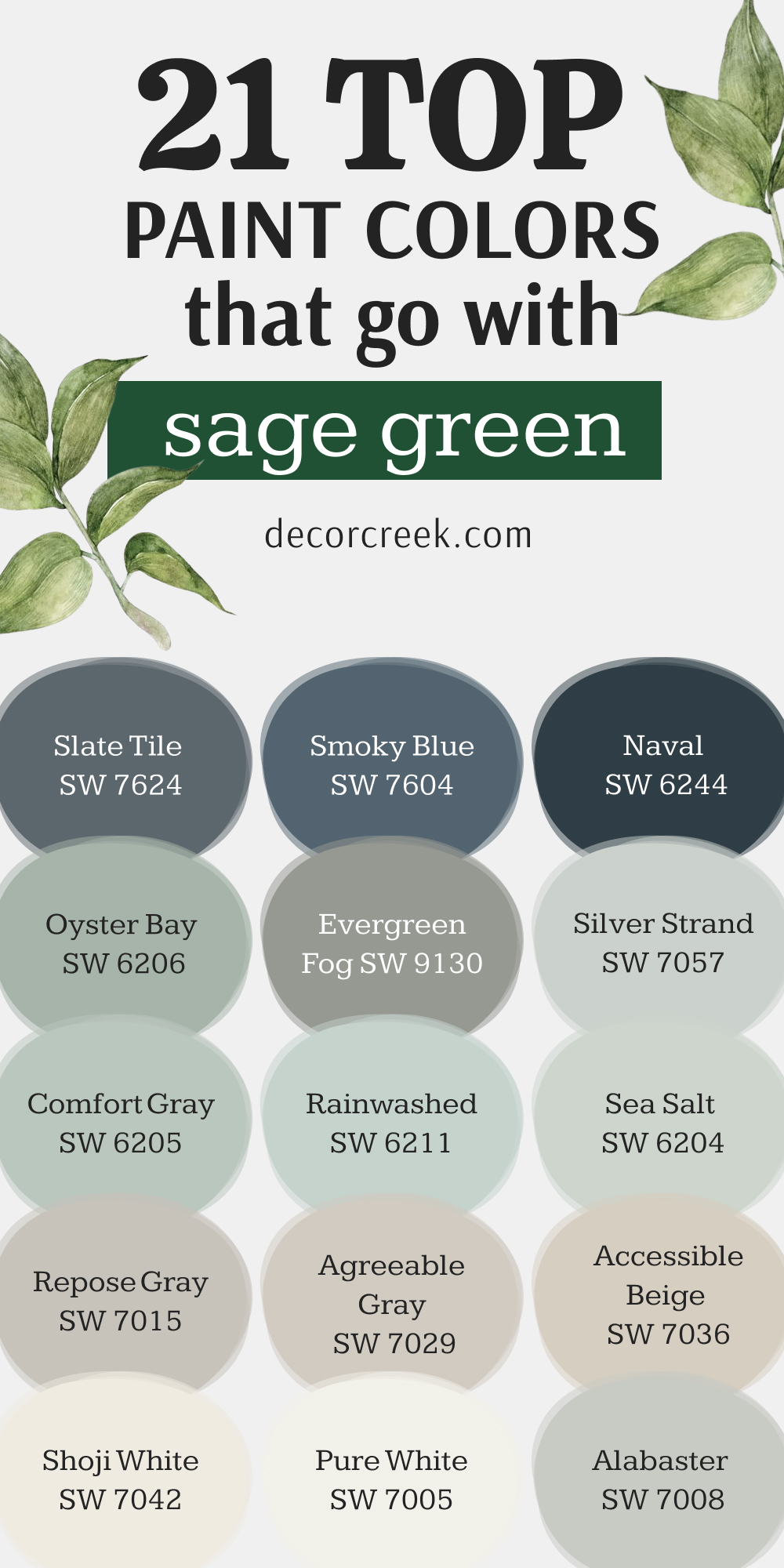
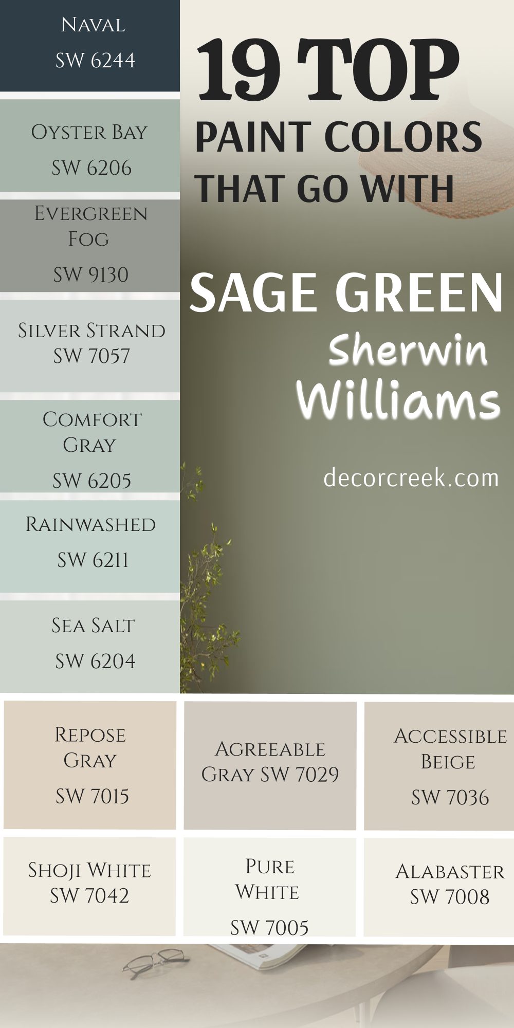
19 Top Paint Colors that go with Sage Green from Sherwin Williams
Alabaster SW 7008
Alabaster SW 7008 starts our list as a beautiful creamy white that feels very cozy. This shade does not feel cold or sterile like some bright whites do. I use it on trim and doors quite often to create a soft look.
It works beautifully on big walls when you want a clean backdrop. Many families love how it makes their entryways look bright and cheerful. It reflects light in a very gentle way throughout the morning.
You can use it in traditional homes or modern settings without any trouble. It helps other elements in the room stand out nicely. Home buyers always smile when they see this clean option on the walls.
Best used in: living rooms, kitchens, hallways, bedrooms, and farmhouse exteriors
Pairs well with: Iron Ore SW 7069, Agreeable Gray SW 7029, Natural Linen SW 9109, warm wood tones The key rule of this color for farmhouse style is to use it where you want natural light to feel kind, soft, and inviting throughout the day.
🎨 Check out the complete guide to this color right HERE 👈

Pure White SW 7005
Pure White SW 7005 is a clean option that has a tiny drop of warmth in it. This choice never looks blue or gray when the sun shines on it. I love using it on kitchen cabinets to create a fresh look.
It makes a wonderful contrast when placed next to muted green tones. Your ceilings will look high and bright with this selection. It brings a sense of order to busy family areas. Many people choose it for their modern bathrooms to get a crisp feel.
It helps small areas feel much larger than they really are. You will find that it matches almost any decor style you choose. It is a safe and beautiful choice for any wall.
Best used in: kitchens, bathrooms, trim, ceilings, and modern living areas
Pairs well with: Naval SW 6244, Charcoal, warm wood tones, black hardware The key rule of this color for modern style is to use it on trim and doors to make your main wall colors stand out clearly.
🎨 Check out the complete guide to this color right HERE 👈

Shoji White SW 7042
Shoji White SW 7042 is a warm, creamy shade that sits between white and beige. This tone makes rooms feel extra cozy on cloudy days. I choose it for large living areas where people gather to relax.
It softy glows when you turn on your lamps at night. It looks amazing next to light oak floors and woven baskets. You can use it to make a large room feel more intimate. It does not look harsh even under bright light bulbs.
Buyers often feel a sense of comfort when they walk into a room painted like this. It acts as a great bridge between cool tones and warm tones.
Best used in: open floor plans, bedrooms, entryways, and cozy living rooms
Pairs well with: Urbane Bronze SW 7048, Comfort Gray SW 6205, dark wood tones, brass accents The key rule of this color for cozy style is to pair it with rich textures like wool and wood to make the walls feel warm.
🎨 Check out the complete guide to this color right HERE 👈

Accessible Beige SW 7036
Accessible Beige SW 7036 is a famous tan color that has a bit of gray hidden inside. This mix keeps the shade from looking too yellow on your walls. I suggest it for hallways that do not get a lot of natural sun.
It gives a sturdy and grounded feeling to your living areas. It coordinates beautifully with earthy tones and green accents. Many homeowners pick it because it hides dirt and fingerprints well.
It creates a friendly backdrop for your family photos and artwork. You will love how it ties different rooms together seamlessly. It is one of my favorite options for staging a house.
Best used in: hallways, family rooms, kitchens, and traditional dining spaces
Pairs well with: Repose Gray SW 7015, Alabaster SW 7008, brown leather, navy blue The key rule of this color for traditional style is to use it as a whole-house backdrop that makes your colorful furniture pop.
🎨 Check out the complete guide to this color right HERE 👈

Agreeable Gray SW 7029
Agreeable Gray SW 7029 is a highly popular blend of gray and beige. This tone adapts to whatever lighting you have in your house. I use it when a homeowner cannot decide between warm or cool tones.
It makes a lovely partner for muted greens in a bedroom. It feels very clean but still keeps a room feeling friendly. Your guests will notice how balanced your home looks with this choice.
It works well with both silver and gold light fixtures. Many people paint their entire house in this shade before selling. It helps people imagine their own things in the house.
Best used in: bedrooms, living rooms, kitchens, and open concept spaces
Pairs well with: Pure White SW 7005, Smoky Blue SW 7604, dark grays, light woods The key rule of this color for balanced style is to use it in rooms with large windows so the natural light brings out its warmth.
🎨 Check out the complete guide to this color right HERE 👈

Repose Gray SW 7015
Repose Gray SW 7015 is a cool gray that has a tiny touch of brown in the background. This small addition keeps the gray from feeling cold like ice. I like it for modern bedrooms that need a clean feeling.
It contrasts beautifully with bright white window trim. It brings a crisp look to kitchens with dark countertops. You will notice that it looks slightly different as the sun moves across the sky.
It gives a very professional look to home offices. Many young buyers look for this exact shade when shopping for houses. It makes a great partner for cool green tones.
Best used in: bedrooms, home offices, bathrooms, and modern kitchens
Pairs well with: Coral, Alabaster SW 7008, Slate Tile SW 7624, silver finishes The key rule of this color for modern style is to contrast it against bright white trim to keep the look sharp and clean.
🎨 Check out the complete guide to this color right HERE 👈

Sea Salt SW 6204
Sea Salt SW 6204 is a magical mix of green, gray, and a little bit of blue. This color changes its look depending on the time of day. I love putting it in bathrooms to create a spa feeling.
It makes small spaces feel bright and open. It reminds people of the ocean on a misty morning. You can pair it with white cottage furniture for a lovely look. It brings a breath of fresh air to dark corners.
Homeowners always tell me how much they love waking up to this color. It is a wonderful choice for creating a peaceful retreat.
Best used in: bathrooms, bedrooms, laundry rooms, and sunrooms
Pairs well with: Pure White SW 7005, Summit Gray, weathered wood, glass accents The key rule of this color for coastal style is to use it in rooms with lots of morning light to see the blue tones shine.
🎨 Check out the complete guide to this color right HERE 👈

Rainwashed SW 6211
Rainwashed SW 6211 is a light blue-green that feels very fresh and cheerful. This shade has a bit more green in it than typical sky blue. I choose it for rooms where you want a happy feeling.
It looks great in kitchens where people cook and talk. It brightens up a laundry room and makes chores more pleasant. You will find that it matches well with light wood floors.
It gives a lovely vintage feel when paired with white cabinets. It makes a bold but friendly statement on a front door. People feel instantly welcome when they see this tone.
Best used in: kitchens, laundry rooms, nurseries, and front doors
Pairs well with: Alabaster SW 7008, Dover White, light oak, oil-rubbed bronze The key rule of this color for cheerful style is to use it in active rooms where your family spends daytime hours together.
🎨 Check out the complete guide to this color right HERE 👈

Comfort Gray SW 6205
Comfort Gray SW 6205 is a medium shade that blends gray, green, and blue together. This option has more depth than the lighter tones on our list.
I use it when a room needs more color on the walls. It looks wonderful in a formal dining room with white wainscoting. It brings a rich feeling to a master bedroom suite. You will love how it looks next to dark walnut furniture.
It does not fade away when the bright sun hits it. It gives a very solid and comfortable feeling to your home. It helps create a beautiful flow from room to room.
Best used in: dining rooms, master bedrooms, study rooms, and accent walls
Pairs well with: Shoji White SW 7042, Extra White, dark walnut, gold accents The key rule of this color for rich style is to use it in rooms with architectural details like crown molding to show off its depth.
🎨 Check out the complete guide to this color right HERE 👈

Silver Strand SW 7057
Silver Strand SW 7057 is a very light gray that has a distinct blue-green undertone. This shade looks metallic and clean when the light hits it right. I select it for modern condos and open apartments.
It gives a very sleek look to bathrooms and powder rooms. It coordinates well with stainless steel appliances in a kitchen. You will enjoy how it makes a dark room feel much lighter.
It provides a cool backdrop for modern furniture pieces. It helps create a tidy look that appeals to buyers. It is a fantastic option for a crisp and clean home.
Best used in: bathrooms, modern kitchens, small apartments, and hallways
Pairs well with: Pure White SW 7005, Iron Ore SW 7069, stainless steel, black accents The key rule of this color for sleek style is to pair it with shiny metal fixtures to bring out its cool silver background.
🎨 Check out the complete guide to this color right HERE 👈
Evergreen Fog SW 9130
Evergreen Fog SW 9130 is a deep green-gray that looks rich and mysterious. This color has a lot of gray in it, which keeps it looking dark and handsome. I love using it for an accent wall behind a bed.
It makes a big statement on kitchen islands or lower cabinets. It brings the feeling of a deep forest right into your home. You can pair it with gold hardware for a very fancy look.
It works well in a cozy den where you watch movies. It gives a sense of history and strength to a room. Buyers find it very memorable and stylish.
Best used in: accent walls, kitchen islands, dens, and mudrooms
Pairs well with: Shoji White SW 7042, Accessible Beige SW 7036, brass, warm leather The key rule of this color for bold style is to use it in rooms where you want a cozy, enclosed feeling during the evening.
🎨 Check out the complete guide to this color right HERE 👈

Oyster Bay SW 6206
Oyster Bay SW 6206 is a medium slate green color with strong gray tones. This shade looks very elegant on walls and cabinets alike. I pick it for traditional living rooms that need a touch of color.
It looks beautiful next to stone fireplaces and rustic mantels. It brings a cool and collected feeling to your living areas. You will like how it changes from green to gray as daylight fades.
It works nicely with linen fabrics and woven rugs. It gives a very mature and sophisticated look to a home. It is a great choice for a relaxed family room.
Best used in: living rooms, dining spaces, cabinets, and exterior shutters
Pairs well with: Snowbound, Sea Salt SW 6204, stone textures, dark woods The key rule of this color for elegant style is to combine it with natural stone or brick elements to create a grounded look.
🎨 Check out the complete guide to this color right HERE 👈

Naval SW 6244
Naval SW 6244 is a deep navy blue that looks like the midnight sky. This bold option creates an amazing contrast when placed next to light greens. I use it to paint accent walls or built-in bookshelves.
It adds high drama and excitement to a small powder bathroom. It makes gold frames and colorful art stand out beautifully. You will love how rich and royal it makes a dining room feel.
It feels very classic and never goes out of fashion. It gives a strong anchor to rooms with high ceilings. Buyers remember houses that use this color correctly.
Best used in: accent walls, bookshelves, dining rooms, and powder bathrooms
Pairs well with: Alabaster SW 7008, Agreeable Gray SW 7029, gold metallic, white quartz The key rule of this color for dramatic style is to use it on a single focal wall where you want to draw everyone’s attention.
🎨 Check out the complete guide to this color right HERE 👈

Smoky Blue SW 7604
Smoky Blue SW 7604 is a medium-dark blue with a heavy gray mist over it. This shade is less intense than a bright royal blue. I choose it for bedrooms where people want a deep color that feels relaxing.
It pairs wonderfully with light green accents and white bedding. It looks great on kitchen cabinets in a cottage-style home. You will enjoy how it brings a cool feeling to a sunny south-facing room.
It provides a handsome backdrop for leather chairs. It makes a room feel very secure and private. It is a wonderful choice for a comfortable study.
Best used in: bedrooms, studies, kitchen lower cabinets, and accent walls
Pairs well with: High Reflective White, Repose Gray SW 7015, light oak, copper accents The key rule of this color for cottage style is to balance it with plenty of bright white trim so the room stays bright.
🎨 Check out the complete guide to this color right HERE 👈

Slate Tile SW 7624
Slate Tile SW 7624 is a dark gray color that has strong blue undertones. This option looks like real slate stone after a fresh rain. I love it for painting kitchen islands or fireplace surrounds.
It brings a modern and industrial feel to an open living area. It creates a stunning contrast with light sage green walls. You will notice it makes gold and brass fixtures look very bright.
It gives a serious and sturdy feeling to home offices. It works well for making large rooms feel more closely knit. It is a favorite among people who love modern design.
Best used in: fireplace surrounds, kitchen islands, home offices, and exterior doors
Pairs well with: Pure White SW 7005, Agreeable Gray SW 7029, blonde wood, brass The key rule of this color for industrial style is to pair it with warm wood accents to keep the room from looking too cold.
🎨 Check out the complete guide to this color right HERE 👈

Urbane Bronze SW 7048
Urbane Bronze SW 7048 is a deep brownish-gray that looks like rich earth. This color has a warm tone that makes it feel very welcoming. I use it for front doors to make a great first impression.
It looks amazing on window frames against light colored walls. It brings a cozy feeling to a modern living room. You can pair it with cream fabrics for a high-end look.
It makes natural wood trim look extra beautiful. It gives a sense of luxury and comfort to any area. Buyers often love the rich feeling it brings to a house.
Best used in: front doors, window trim, accent walls, and exterior siding
Pairs well with: Shoji White SW 7042, Captivating Cream, natural stone, leather The key rule of this color for luxury style is to use it on architectural features like beams or trim to create strong lines.
🎨 Check out the complete guide to this color right HERE 👈

Iron Ore SW 7069
Iron Ore SW 7069 is a soft black that is lighter than a true jet black. This charcoal shade looks very soft and velvety on your walls. I select it for theater rooms or modern accent walls.
It creates a bold framing effect around windows that look out into nature. It matches beautifully with light green shades and white trim. You will find that it adds instant style to any plain room.
It looks very expensive and custom when used correctly. It helps bright colors in the room look more vibrant. It is a top choice for modern home staging.
Best used in: theater rooms, accent walls, window sashes, and interior doors
Pairs well with: Alabaster SW 7008, Repose Gray SW 7015, bright art, light woods The key rule of this color for bold modern style is to use it where you want to frame an outdoor view through a window.
🎨 Check out the complete guide to this color right HERE 👈

Natural Linen SW 9109
Natural Linen SW 9109 is a warm beige that reminds you of oatmeal or fabric. This color feels very organic and close to nature. I use it in sunny living rooms to create a soft glow.
It contrasts gently with cool green tones without creating a harsh line. It makes a wonderful backdrop for traditional furniture pieces. You will love how it makes a dark room feel warm and friendly.
It handles shadows well and does not look dirty in corners. Many homeowners choose it for a welcoming entryway look. It is a fantastic option for a comfortable family home.
Best used in: entryways, living rooms, dining areas, and traditional bedrooms
Pairs well with: Alabaster SW 7008, Homestead Brown, linen fabrics, bronze hardware The key rule of this color for organic style is to use it in rooms with lots of natural fabrics like cotton and linen.
🎨 Check out the complete guide to this color right HERE 👈

Creamy SW 7012
Creamy SW 7012 is a soft white that has a yellow undertone. This shade looks like rich vanilla ice cream on your walls. I recommend it for bedrooms that need a soft and warm feel.
It looks lovely next to soft green curtains and bedding. It keeps a room from feeling cold during dark winter days. You will enjoy how it makes old wood furniture look fresh again.
It creates a soft and smooth look throughout your hallways. It helps create a home that feels gentle and kind. Buyers feel very relaxed when they tour a house with this shade.
Best used in: bedrooms, hallways, traditional kitchens, and trim work
Pairs well with: Urbane Bronze SW 7048, Saybrook Sage HC-114, warm wood, gold fixtures The key rule of this color for traditional style is to use it on all four walls in a bedroom to create a soft envelope of warmth.
🎨 Check out the complete guide to this color right HERE 👈

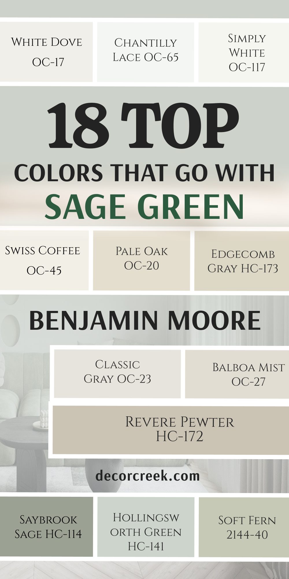
18 Top Paint Colors that go with Sage Green From Benjamin Moore
White Dove OC-17
White Dove OC-17 is a legendary soft white that designers love to use. This choice has a tiny hint of gray that keeps it looking soft. I use it for baseboards, doors, and kitchen cabinets all the time.
It pairs beautifully with light green walls in a sunny kitchen. It does not look yellow even under bright afternoon sun. You will love how it clean it makes your home look.
It feels very fresh without being too bright for your eyes. Many people paint their whole house trim in this beautiful shade. It is a safe and gorgeous option for any home project.
Best used in: trim, doors, kitchen cabinets, living rooms, and exteriors
Pairs well with: Revere Pewter HC-172, Hale Navy HC-154, dark floors, silver hardware The key rule of this color for classic style is to use it on your trim to make your main wall colors look sharp.
🎨 Check out the complete guide to this color right HERE 👈

Chantilly Lace OC-65
Chantilly Lace OC-65 is a bright, clean white with almost no undertones. This color is one of the brightest whites you can find. I select it for modern homes that want a very crisp look.
It makes a stunning contrast against dark green accent walls. Your artwork will look like it is in a museum against this shade. It does not change color when the lighting changes in the room.
You will find that it makes any room look instantly clean and new. It is perfect for ceilings because it reflects all available light. Young buyers love this crisp option.
Best used in: modern living rooms, art galleries, ceilings, trim, and bathrooms
Pairs well with: Wrought Iron 2124-10, Kendall Charcoal HC-166, bright colors, modern art The key rule of this color for modern style is to use it when you want a completely neutral white that does not shift colors.
🎨 Check out the complete guide to this color right HERE 👈

Simply White OC-117
Simply White OC-117 is a cheerful white that has a tiny touch of yellow warmth. This color looks like fresh milk in a glass on a sunny morning. I like it for cottage kitchens and bright dining areas.
It looks wonderful next to soft green walls and wood counters. It makes small rooms feel open and full of joy. You will notice that it keeps your home looking bright even on rainy days.
It brings a lovely glow to ceilings and window frames. Many homeowners say it makes their house feel happier. It is a fantastic all-around white.
Best used in: kitchens, sunrooms, ceilings, trim, and cottage interiors
Pairs well with: Soft Fern 2144-40, Wythe Blue HC-143, warm wood tones, black metal The key rule of this color for cottage style is to use it on walls where you want to maximize the feeling of sunshine.
🎨 Check out the complete guide to this color right HERE 👈

Swiss Coffee OC-45
Swiss Coffee OC-45 is a warm white that feels very rich and creamy. This option is popular for traditional homes that want a soft look. I choose it for cozy living rooms with big stone fireplaces.
It pairs beautifully with sage greens and deep brown leathers. It does not look cold or stark at any time of day. You will love how it makes your family feel comfortable right away.
It creates a smooth and soft look on textured walls. It gives a high-end feel to traditional dining spaces. It is a wonderful color for creating a warm home.
Best used in: traditional living rooms, dining areas, master bedrooms, and exteriors
Pairs well with: Saybrook Sage HC-114, historical colors, dark wood, brass accents The key rule of this color for traditional style is to pair it with warm lighting to bring out its creamy vanilla undertones.
🎨 Check out the complete guide to this color right HERE 👈

Pale Oak OC-20
Pale Oak OC-20 is a light gray color that has a warm beige heart. This shade looks like a soft stone on a sandy beach. I use it for open living spaces where you want a light color that is not white.
It contrasts gently with cool green shades in bedrooms. It makes a lovely backdrop for colorful throw pillows and rugs. You will enjoy how it makes your home feel clean and organized.
It changes nicely from day to night without getting too dark. Many buyers find this color very peaceful and inviting. It is a great staging choice.
Best used in: open concept spaces, bedrooms, entryways, and modern traditional homes
Pairs well with: White Dove OC-17, Hale Navy HC-154, dark walnut, gold finishes The key rule of this color for modern traditional style is to use it in large areas to tie different rooms together.
🎨 Check out the complete guide to this color right HERE 👈

Edgecomb Gray HC-173
Edgecomb Gray HC-173 is a medium-light greige that feels very rich. This shade has a bit more warmth than a typical light gray color. I suggest it for family rooms where people gather to watch movies.
It coordinates beautifully with earthy greens and tan leather chairs. It makes a room feel very solid and well-designed. You will love how it hides minor wall bumps and imperfections.
It looks great under both natural sun and warm light bulbs. It brings a sense of quality and comfort to your home. It is a top pick for cozy family spaces.
Best used in: family rooms, hallways, kitchens, and traditional bedrooms
Pairs well with: Simply White OC-117, Boothbay Gray HC-165, warm oak, bronze accents The key rule of this color for cozy style is to use it in rooms with warm wood floors to create a natural look.
🎨 Check out the complete guide to this color right HERE 👈

Classic Gray OC-23
Classic Gray OC-23 is a very light, clean gray with just a hint of warmth. This shade can look like a soft off-white in bright rooms. I select it for small bedrooms that need a light color choice.
It looks wonderful next to sage green accents and white trim work. It gives a very sophisticated and clean look to your walls. You will find that it never looks blue or purple in dark corners.
It provides a beautiful backdrop for modern and simple furniture. It helps make small homes feel open and bright. It is a lovely option for simple design.
Best used in: small bedrooms, bathrooms, modern living areas, and hallways
Pairs well with: Chantilly Lace OC-65, Wrought Iron 2124-10, silver finishes, glass The key rule of this color for simple style is to use it as an alternative to white when you want a tiny bit of wall contrast.
🎨 Check out the complete guide to this color right HERE 👈

Balboa Mist OC-27
Balboa Mist OC-27 is a beautiful light gray with a soft lavender undertone. This color looks very elegant and pretty on bedroom walls. I choose it when a homeowner wants a gray that feels a bit special.
It pairs nicely with cool green shades and silver accents. It makes a room feel very fresh and clean in the morning. You will like how it brings a soft look to sunny spaces.
It looks wonderful next to white painted furniture pieces. It gives a very stylish and custom feel to your home. Buyers always remember this pretty shade.
Best used in: bedrooms, bathrooms, powder rooms, and formal living areas
Pairs well with: White Dove OC-17, Kendall Charcoal HC-166, silver metal, white linen The key rule of this color for elegant style is to use it in rooms with cool light to highlight its pretty undertones.
🎨 Check out the complete guide to this color right HERE 👈

Revere Pewter HC-172
Revere Pewter HC-172 is a legendary medium gray with strong beige tones. This color is famous because it looks good in almost any home. I use it for transitional spaces that connect different rooms together.
It stands out beautifully against white trim and dark floors. It looks amazing next to sage green kitchen island cabinets. You will love how it gives a rich and sturdy feeling to your walls.
It does not fade away in rooms with high ceilings and big windows. It brings a look of high quality to your home. It is a classic choice for staging.
Best used in: family rooms, kitchens, entryways, and transitional spaces
Pairs well with: White Dove OC-17, Hale Navy HC-154, dark hardwood, oil-rubbed bronze The key rule of this color for transitional style is to use it where you want a reliable color that bridges old and new furniture.
🎨 Check out the complete guide to this color right HERE 👈

October Mist 1495
October Mist 1495 is a soft green-gray that looks like a sage leaf in morning dew. This shade has a lot of gray in it, making it very easy to live with. I love using it in bedrooms to bring a natural look indoors.
It pairs perfectly with creamy whites and natural wood tones. It makes a beautiful statement in a cozy cottage dining room.
You will enjoy how it connects your indoor spaces to your outdoor garden. It feels very fresh and organic on your walls. It gives a unique and stylish look that buyers find very attractive.
Best used in: bedrooms, dining rooms, cozy dens, and accent walls
Pairs well with: Swiss Coffee OC-45, Pale Oak OC-20, light oak, woven baskets The key rule of this color for natural style is to use it in rooms that look out onto trees or gardens to bring nature inside.
🎨 Check out the complete guide to this color right HERE 👈

Saybrook Sage HC-114
Saybrook Sage HC-114 is a classic sage green that has a lot of silver-gray in it. This color is traditional and looks beautiful in historic homes. I choose it for dining rooms where you want a rich look.
It pairs wonderfully with warm white trim and mahogany furniture. It gives a very solid and established feel to your home. You will love how it looks when the evening lamps are turned on.
It does not look too bright or flashy on large walls. It brings a sense of history and quality to your living areas. It is a true designer favorite.
Best used in: dining rooms, living rooms, home exteriors, and historic spaces
Pairs well with: White Dove OC-17, Edgecomb Gray HC-173, dark wood, brass hardware The key rule of this color for historic style is to balance it with traditional furniture and rich fabrics for a complete look.
🎨 Check out the complete guide to this color right HERE 👈

Hollingsworth Green HC-141
Hollingsworth Green HC-141 is a light, misty green with a strong blue-gray background. This shade looks very fresh and bright on your walls. I recommend it for bathrooms where you want a clean look.
It looks beautiful next to white marble counters and silver fixtures. It brings a cheerful feeling to a sunny breakfast room. You will notice it makes small spaces feel open and light.
It gives a lovely vintage feel when paired with old-fashioned furniture. It helps create a home that feels light and airy. It is a wonderful choice for summer homes.
Best used in: bathrooms, breakfast rooms, sunrooms, and cottage bedrooms
Pairs well with: Simply White OC-117, Classic Gray OC-23, white marble, silver accents The key rule of this color for airy style is to use it in small rooms where you want to create a bright feeling.
🎨 Check out the complete guide to this color right HERE 👈
Soft Fern 2144-40
Soft Fern 2144-40 is a gentle green that has a warm yellow undertone. This shade looks like fresh moss growing in a sunny forest. I use it in kitchens to create a warm and inviting look.
It pairs nicely with cream colored cabinets and warm wood floors. It brings a happy and natural feeling to your family areas. You will love how it glows when the morning sun shines in.
It does not look cold or gray even on dark rainy days. It gives a very friendly and welcoming feel to your home. It is a great choice for country style homes.
Best used in: kitchens, laundry rooms, entryways, and country style living rooms
Pairs well with: Swiss Coffee OC-45, Natural Linen, warm wood tones, black iron The key rule of this color for country style is to pair it with warm cream tones to make the yellow undertone look cozy.
🎨 Check out the complete guide to this color right HERE 👈
Wythe Blue HC-143
Wythe Blue HC-143 is a beautiful medium blue-green with a gray mist over it. This shade is famous for looking great on historic front doors. I love using it for an accent color in a coastal living room.
It pairs beautifully with light sage green and bright white trim. It brings a rich and colorful feeling to your home decoration. You will enjoy how it draws attention to your fireplace or built-in shelves.
It looks very sophisticated and high-end on cottage walls. It gives a strong and happy look that buyers remember.
Best used in: front doors, accent walls, kitchen islands, and coastal living rooms
Pairs well with: White Dove OC-17, Simply White OC-117, dark floors, coastal decor The key rule of this color for coastal style is to use it on your front door to welcome guests with a pop of coastal color.
🎨 Check out the complete guide to this color right HERE 👈

Boothbay Gray HC-165
Boothbay Gray HC-165 is a beautiful medium gray with a strong blue heart. This shade reminds me of the ocean on a cool morning. I choose it for bathroom vanities and kitchen lower cabinets.
It contrasts wonderfully with light green walls and white countertops. It brings a very cool and fresh feeling to sunny rooms. You will love how it makes silver and chrome hardware shine.
It gives a very neat and professional look to home offices. It works well for creating a beach house look in any neighborhood. It is a very stylish option.
Best used in: bathroom vanities, kitchen cabinets, home offices, and exterior shutters
Pairs well with: Chantilly Lace OC-65, Pale Oak OC-20, silver hardware, white quartz The key rule of this color for coastal style is to use it on cabinetry to create a cool contrast with white walls.
🎨 Check out the complete guide to this color right HERE 👈

Hale Navy HC-154
Hale Navy HC-154 is a deep, true navy blue that everyone loves. This color acts like a neutral because it matches almost everything. I use it to paint accent walls in modern or traditional bedrooms.
It looks stunning next to light sage green and white trim work. It brings a rich and deeply satisfying feeling to a dining room. You will love how it makes your furniture and art stand out.
It does not look like a bright primary blue at any time. It gives a look of luxury and strength to your home. It is a top choice for home staging.
Best used in: dining rooms, bedrooms, accent walls, and kitchen islands
Pairs well with: White Dove OC-17, Revere Pewter HC-172, gold accents, warm woods The key rule of this color for luxury style is to use it where you want to create a strong, dark background for beautiful artwork.
🎨 Check out the complete guide to this color right HERE 👈

Kendall Charcoal HC-166
Kendall Charcoal HC-166 is a rich dark gray with a warm undertone. This shade looks very high-end and modern on your walls. I select it for fireplace walls and modern accent areas.
It creates a beautiful dark backdrop for your television screen. It contrasts sharply with light greens and bright white trim lines. You will find that it adds instant style to an ordinary room.
It makes gold frames and light wood furniture look very bright. It gives a serious and high-quality feel to your living areas. It is a favorite for modern designs.
Best used in: fireplace walls, media rooms, accent walls, and exterior trim
Pairs well with: Simply White OC-117, Classic Gray OC-23, blonde wood, gold fixtures The key rule of this color for modern style is to use it on a single wall to create a sharp focal point in the room.
🎨 Check out the complete guide to this color right HERE 👈

Wrought Iron 2124-10
Wrought Iron 2124-10 is a dark charcoal black with a hint of blue-gray. This option is softer than regular black paint, making it look very rich. I love using it on interior doors to give a house a custom feel.
It looks amazing on a kitchen island surrounded by light green walls. It brings a very bold and modern look to your home decoration. You will notice that it frames outdoor views beautifully when used on window trim.
It gives a sense of luxury and structure to any area. Buyers love seeing this color on front doors.
Best used in: interior doors, kitchen islands, accent walls, and front doors
Pairs well with: Chantilly Lace OC-65, Balboa Mist OC-27, brass hardware, modern art The key rule of this color for custom style is to use it on interior doors to make your standard home look high-end.
🎨 Check out the complete guide to this color right HERE 👈

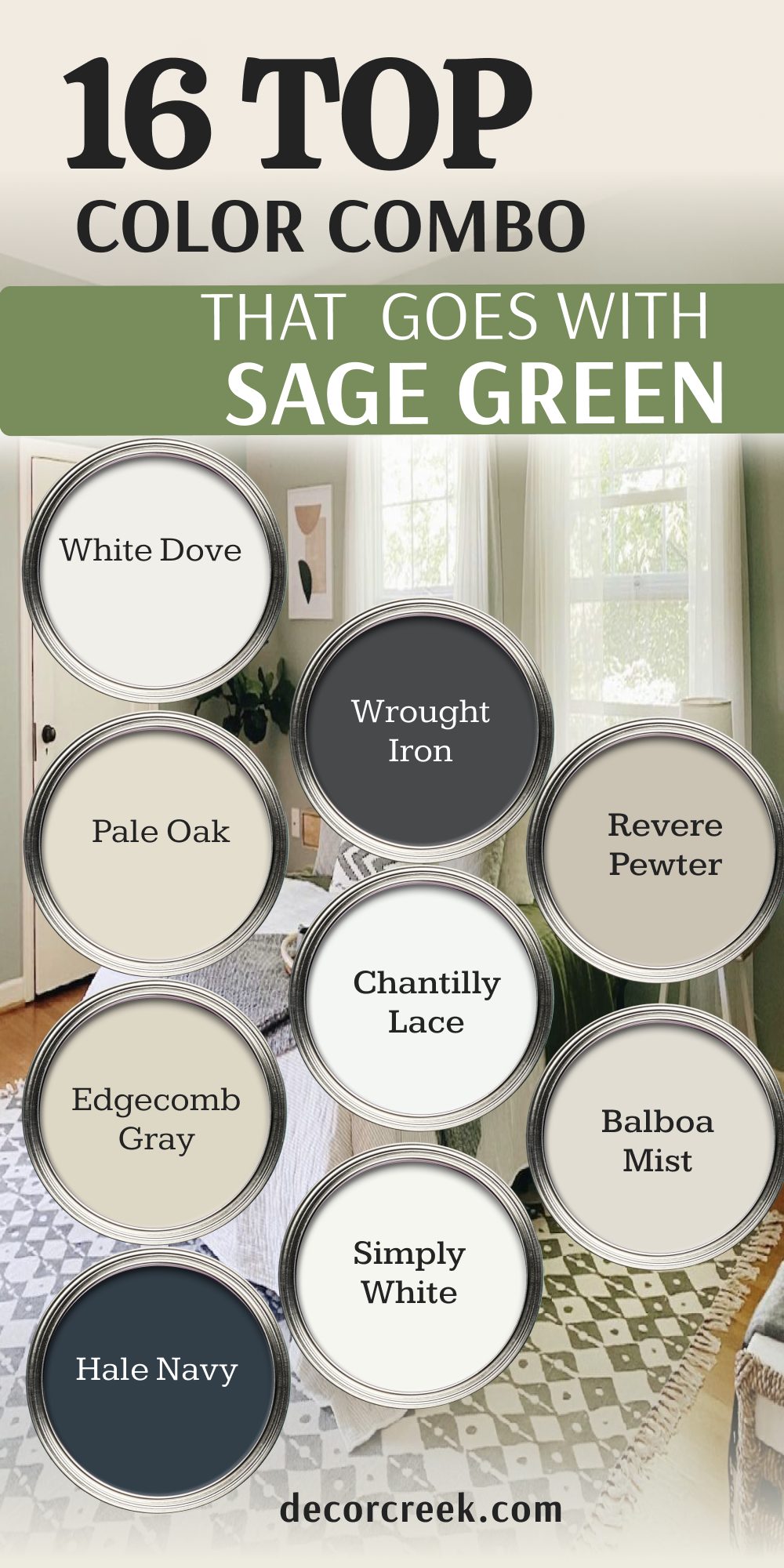
16 Top Paint Color Combo that goes With Sage Green
Sage Green 1504 + White Dove OC-17
Sage Green 1504 and White Dove OC-17 make a classic pair for any home. This combination brings a very clean and fresh look to a kitchen. I use it when a homeowner wants a bright feel that still has color.
The soft white trim makes the green walls look rich and beautiful. You will love how this mix looks in the morning sun. It helps small kitchens feel open and friendly for cooking.
It gives a timeless feeling that appeals to every buyer who walks in. It is a wonderful choice for a welcoming family space.
Best used in: kitchens, bathrooms, laundry rooms, and traditional living areas
Pairs well with: dark wood floors, silver hardware, white quartz countertops The key rule of this combo for classic style is to use the green on the walls and the white on all trim work.
Sage Green 1504 + Pale Oak OC-20
Sage Green 1504 and Pale Oak OC-20 create a soft and warm look together. This pair works beautifully in large living rooms with lots of light. I choose it when you want a gentle change between different walls.
The light gray-beige blends smoothly with the natural green tone. You will enjoy how cozy your family room feels with this combination. It provides a great backdrop for neutral colored furniture and linen rugs. It keeps your home looking bright without using bright white paint. It is a very smart staging choice.
Best used in: living rooms, open floor plans, entryways, and bedrooms
Pairs well with: light oak furniture, brass light fixtures, cream colored fabrics The key rule of this combo for soft style is to use them in open spaces where they can blend naturally from room to room.
Sage Green 1504 + Edgecomb Gray HC-173
Sage Green 1504 and Edgecomb Gray HC-173 offer a rich and traditional look. This mix has more warmth than other gray combinations on our list. I suggest it for dining rooms where you want a comfortable feeling. The rich greige tone complements the earthy green beautifully.
You will love how it looks when you host family dinners at night. It makes old wood dining tables look very handsome and expensive. It gives a sense of quality and comfort to your main living areas. It is a top pick for traditional family homes.
Best used in: dining rooms, family rooms, hallways, and traditional bedrooms
Pairs well with: warm oak trim, oil-rubbed bronze hardware, traditional furniture The key rule of this combo for traditional style is to use them together in rooms with plenty of warm wood elements.
Sage Green 1504 + Hale Navy HC-154
Sage Green 1504 and Hale Navy HC-154 create a bold and dramatic look. This pair combines deep ocean blue with natural forest green. I love using this mix in home offices or cozy libraries. The dark blue wall makes a stunning contrast with green accent pillows.
You will notice that gold frames look extra bright against this deep combination. It gives a very strong and confident feeling to your home decoration. It helps create a memorable room that people will talk about. It is a fantastic option for high-end styling.
Best used in: home offices, libraries, master bedrooms, and accent walls
Pairs well with: gold light fixtures, white trim work, rich leather chairs The key rule of this combo for bold style is to use the navy on an accent wall and the green in fabrics.
Sage Green 1504 + Wrought Iron 2124-10
Sage Green 1504 and Wrought Iron 2124-10 provide a modern and sharp look. This mix uses a soft black to ground the natural green shade. I select it for modern living rooms with big industrial windows. The dark trim frames the green walls like a beautiful picture.
You will find that it adds instant style to any plain looking room. It looks very custom and expensive when used on doors and walls together. It helps modern furniture pieces stand out nicely in the room. It is a top choice for young home buyers.
Best used in: modern living rooms, entryways, interior doors, and modern kitchens
Pairs well with: bright white ceilings, modern artwork, silver or black hardware The key rule of this combo for modern style is to paint doors black and keep the green on the walls.
Sage Green 1504 + Chantilly Lace OC-65
Sage Green 1504 and Chantilly Lace OC-65 make a very clean contrast. This combination uses the brightest white to make the green pop. I use it in modern bathrooms to create a fresh feeling. The crisp white lines keep the green from looking dark or heavy.
You will love how clean your bathroom looks every single morning. It helps small spaces feel much larger than they really are. It provides a beautiful backdrop for simple and modern vanities. It is a lovely choice for a crisp and tidy home.
Best used in: bathrooms, modern kitchens, sunrooms, and simple bedrooms
Pairs well with: chrome fixtures, large mirrors, modern simple furniture The key rule of this combo for crisp style is to use a high-gloss white on trim to create a sharp line against the green.
Sage Green 1504 + Simply White OC-117
Sage Green 1504 and Simply White OC-117 bring a happy cottage feel. This pair uses a warm white to make the green look extra cozy. I choose it for sunrooms and breakfast nooks where you eat. The warm light makes this combination glow with joy all day long.
You will notice that it keeps your home looking friendly even on dark days. It pairs beautifully with yellow wood floors and woven baskets. It gives a lovely vintage look that feels very welcoming to guests. It is a fantastic option for a cheerful family home.
Best used in: sunrooms, breakfast nooks, cottage kitchens, and laundry rooms
Pairs well with: yellow pine floors, copper pots, vintage home decor The key rule of this combo for cottage style is to use them where you get lots of natural afternoon sunlight.
Sage Green 1504 + Revere Pewter HC-172
Sage Green 1504 and Revere Pewter HC-172 are a very reliable designer pair. This mix uses a famous gray-beige to balance the green tones. I use it for transitional spaces that connect your front door to the kitchen. The medium tones look solid and well-planned on your walls.
You will love how it creates a smooth flow through your busy hallways. It hides daily dirt and wear from children and pets very well. It gives a look of high quality that makes houses sell faster. It is a classic staging choice.
Best used in: entryways, hallways, busy family rooms, and open kitchens
Pairs well with: dark hardwood floors, white trim, bronze light fixtures The key rule of this combo for reliable style is to use the gray in hallways and the green in adjoining rooms.
Sage Green 1504 + Balboa Mist OC-27
Sage Green 1504 and Balboa Mist OC-27 offer a soft and pretty look. This mix has a tiny hint of lavender that looks very elegant. I pick it for master bedrooms where you want a custom feel. The light gray walls look lovely next to soft green bedding and curtains.
You will enjoy how fresh and clean your bedroom feels when you wake up. It creates a soft look that does not feel harsh under bright light bulbs. It gives a very stylish and feminine touch to your home decoration. It is a lovely option for private rooms.
Best used in: master bedrooms, guest rooms, powder rooms, and formal sitting areas
Pairs well with: white painted furniture, silver frames, soft linen fabrics The key rule of this combo for pretty style is to use the gray on walls and the green in your fabrics.
Sage Green 1504 + Boothbay Gray HC-165
Sage Green 1504 and Boothbay Gray HC-165 blend cool blue and warm green. This combination looks like a beautiful garden on a misty morning. I recommend it for bathroom vanities and accent pieces in the house. The blue-gray paint stands out beautifully against a green wall backdrop.
You will love how it brings a cool and fresh feeling to sunny areas. It looks wonderful next to white stone counters and silver faucets. It helps create a unique look that stands out from regular gray homes. It is a very stylish option.
Best used in: bathroom vanities, built-in shelves, kitchens, and coastal homes
Pairs well with: white marble counters, chrome faucets, light colored floors The key rule of this combo for coastal style is to use the gray on cabinets and the green on the walls.
Sage Green 1504 + Alabaster SW 7008
Sage Green 1504 and Alabaster SW 7008 create a soft farmhouse look. This pair uses a creamy white to make the green feel warm. I use it in cozy farmhouses and traditional country kitchens. The soft cream trim looks gentle next to the natural green walls.
You will love how inviting this combination makes your entryway look to guests. It does not feel cold or sharp like modern white combinations do. It helps create a home that feels kind, soft, and friendly. It is a top choice for a comfortable family lifestyle.
Best used in: entryways, kitchens, farmhouse living rooms, and bedrooms
Pairs well with: warm wood tones, black hardware, rustic metal accents The key rule of this combo for farmhouse style is to use the cream paint where you want natural light to feel soft.
Sage Green 1504 + Accessible Beige SW 7036
Sage Green 1504 and Accessible Beige SW 7036 offer a sturdy earth tone mix. This combination looks like sand and leaves found together in nature. I choose it for ranch homes and traditional family rooms. The tan background gives a solid foundation to the colorful green walls.
You will enjoy how it coordinates nicely with your brown leather furniture. It creates a very friendly and grounded feeling when you walk inside. It works well for making big rooms feel more closely knit and comfortable. It is a great choice for earthy design.
Best used in: family rooms, ranch homes, dining spaces, and traditional dens
Pairs well with: brown leather chairs, bronze lamps, dark stained wood The key rule of this combo for earthy style is to use the beige on main walls and the green as a feature.
Sage Green 1504 + Natural Linen SW 9109
Sage Green 1504 and Natural Linen SW 9109 look like high-end fabrics together. This pair feels very organic and close to the natural world. I suggest it for cozy bedrooms that use lots of blankets and pillows. The warm linen color makes the green look very soft and beautiful.
You will love how relaxing this mix feels at the end of a long day. It handles shadows well and keeps corners looking warm and friendly. It gives a look of simple luxury to your private spaces. It is a fantastic option for a comfortable home.
Best used in: bedrooms, guest rooms, cozy sitting areas, and reading nooks
Pairs well with: cotton fabrics, woven rugs, light pine furniture, bronze accents The key rule of this combo for organic style is to use them alongside plenty of natural textiles in the room.
Sage Green 1504 + Naval SW 6244
Sage Green 1504 and Naval SW 6244 bring high contrast and design drama. This mix pairs a deep royal navy with a soft natural green tone. I love putting this combination in formal dining rooms for family dinners. The deep blue walls make a gorgeous statement behind a green center piece.
You will love how rich and elegant your dining space feels with this mix. It gives a classic look that stays stylish for many years ahead. It helps create a strong anchor in rooms with very high ceilings. It is a memorable choice for staging.
Best used in: dining rooms, formal living spaces, accent walls, and home theaters
Pairs well with: gold picture frames, white quartz, dark walnut wood floors The key rule of this combo for dramatic style is to use the navy blue on a single focal wall in the room.
Sage Green 1504 + Smoky Blue SW 7604
Sage Green 1504 and Smoky Blue SW 7604 create a soft historic look. This combination tones down the blue with a gentle layer of gray mist. I pick it for traditional studies and old-fashioned home libraries.
The medium blue and green shades look very balanced when placed side by side. You will enjoy how it brings a cool feeling to a very sunny south-facing room.
It provides a handsome backdrop for your favorite books and antique furniture. It makes a room feel secure, private, and well-designed. It is a wonderful choice for traditional homes.
Best used in: studies, libraries, traditional bedrooms, and historical spaces
Pairs well with: antique furniture, brass lamps, light oak floors, white trim The key rule of this combo for historic style is to use them in rooms with traditional architectural details.
Sage Green 1504 + Iron Ore SW 7069
Sage Green 1504 and Iron Ore SW 7069 look incredibly modern and striking. This mix uses a soft velvet black to frame the natural green color. I select it for modern exterior doors or bold interior accent walls.
The dark charcoal color adds an instant look of style to any plain wall. You will find that it makes green plants and artwork look very vibrant.
It looks expensive and custom when used in open modern floor plans. It helps create a strong design statement that buyers love to see. It is a top choice for modern design.
Best used in: front doors, modern accent walls, media rooms, and open condos
Pairs well with: light wood furniture, bright white trim, modern light fixtures The key rule of this combo for modern style is to use the dark charcoal on doors to create strong design lines.
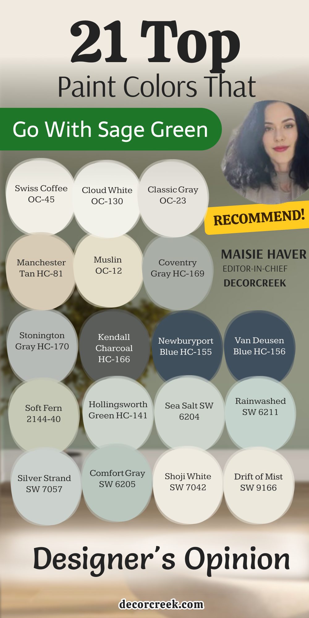
21 Top Paint Colors that go with Sage Green | Designer’s Opinion
Swiss Coffee OC-45
Swiss Coffee OC-45 is a beautiful warm white that looks great in any light. This option feels very creamy and rich when painted on your walls. I love using it in traditional living rooms with green accent chairs. It does not look cold or stark like some modern white paints do.
You will notice it makes your family feel comfortable right away. It creates a smooth and soft look in large open entryways. Many homeowners choose it because it makes their spaces feel friendly. It gives a high-end feel to traditional dining areas. It is a wonderful color for a warm home.
Best used in: traditional living rooms, entryways, dining areas, and master bedrooms
Pairs well with: historical colors, dark wood furniture, brass accents, linen fabrics The key rule of this color for traditional style is to pair it with warm lighting to bring out its creamy tones.
🎨 Check out the complete guide to this color right HERE 👈
Cloud White OC-130
Cloud White OC-130 is a soft, airy white that has a tiny touch of warmth. This shade looks like a fluffy cloud on a bright summer afternoon. I select it for kitchen cabinets to create a soft and clean look. It pairs beautifully with sage green walls in a sunny cooking area.
It does not look yellow or gray when the afternoon sun hits it. You will love how fresh it makes your kitchen feel for cooking. It brings a lovely soft glow to ceilings and window frames. Many people use it to make dark rooms feel much brighter.
Best used in: kitchen cabinets, trim work, ceilings, and small bedrooms
Pairs well with: soft green walls, dark countertops, silver hardware, oak floors The key rule of this color for airy style is to use it on cabinets to create a soft contrast with your walls.
🎨 Check out the complete guide to this color right HERE 👈

Classic Gray OC-23
Classic Gray OC-23 is a very light, clean gray with a tiny hint of warmth. This shade can look like a soft off-white in bright sunny rooms. I use it for small bedrooms that need a light color choice. It looks wonderful next to sage green curtains and white trim work.
It gives a very sophisticated and clean look to your walls. You will find that it never looks blue or purple in dark corners. It provides a beautiful backdrop for modern and simple furniture pieces. It helps make small homes feel open and bright.
Best used in: small bedrooms, bathrooms, modern living areas, and hallways
Pairs well with: Chantilly Lace OC-65, dark grays, silver metal finishes, glass accents The key rule of this color for simple style is to use it as an alternative to white when you want a tiny bit of contrast.
🎨 Check out the complete guide to this color right HERE 👈
Manchester Tan HC-81
Manchester Tan HC-81 is a classic khaki color that feels very warm and elegant. This shade looks like clean sand on a beautiful sunny beach. I choose it for traditional dining rooms that need a solid color. It coordinates beautifully with earthy greens and rich dark wood furniture.
It makes a room feel very formal and well-designed for entertaining guests. You will love how it looks when the dinner candles are lit. It brings a sense of quality and history to your main living areas. It is a top pick for traditional staging.
Best used in: traditional dining rooms, living spaces, hallways, and historic homes
Pairs well with: White Dove OC-17, deep greens, mahogany wood, brass hardware The key rule of this color for traditional style is to use it alongside rich fabrics to create an elegant look.
🎨 Check out the complete guide to this color right HERE 👈

Muslin OC-12
Muslin OC-12 is a soft beige color that reminds you of natural cloth or silk. This shade has a warm tone that makes it feel very welcoming to guests. I suggest it for hallways that do not get a lot of natural sun. It gives a sturdy and grounded feeling to your main living areas.
It pairs nicely with soft greens and tan leather chairs. Many homeowners pick it because it makes their entryways look very friendly. It creates a beautiful backdrop for your family photos and favorite artwork. You will love how warm it feels.
Best used in: entryways, hallways, family rooms, and cozy bedrooms
Pairs well with: Simply White OC-117, earthy tones, brown leather, bronze accents The key rule of this color for welcoming style is to use it in entryways to greet guests with warm color.
🎨 Check out the complete guide to this color right HERE 👈

Coventry Gray HC-169
Coventry Gray HC-169 is a perfect medium gray with cool blue undertones. This color looks very solid and professional on your living room walls. I use it when a room needs a clear gray color that stands out. It contrasts beautifully with light sage green accents and white window trim.
It brings a crisp and organized look to busy modern family areas. You will notice that it looks very sharp under bright daylight bulbs. It gives a very secure and stable feeling to your home office. Buyers love this clean option.
Best used in: living rooms, home offices, hallways, and modern exteriors
Pairs well with: white trim, dark charcoal accents, silver hardware, blue fabrics The key rule of this color for modern style is to contrast it against white trim to keep lines sharp.
🎨 Check out the complete guide to this color right HERE 👈

Stonington Gray HC-170
Stonington Gray HC-170 is a famous clean gray that has a cool blue heart. This shade looks very elegant and sophisticated on kitchen walls. I select it for modern homes that want a clean and tidy look. It coordinates beautifully with stainless steel appliances and green islands.
It makes your kitchen look like a professional chef works inside the room. You will enjoy how it makes your countertops look bright and clean. It provides a cool backdrop for modern furniture pieces in the living room. It is a fantastic option.
Best used in: kitchens, living rooms, bathrooms, and modern open spaces
Pairs well with: Pure White SW 7005, black accents, stainless steel, cool tones The key rule of this color for clean style is to use it alongside shiny metal fixtures to look sleek.
🎨 Check out the complete guide to this color right HERE 👈

Kendall Charcoal HC-166
Kendall Charcoal HC-166 is a rich dark gray with a warm undertone. This shade looks very high-end and custom on your feature walls. I choose it for fireplace surrounds and modern accent areas in the house. It creates a beautiful dark backdrop for your television screen or art.
It contrasts sharply with light greens and bright white trim lines. You will find that it adds instant style to an ordinary family room. It makes gold frames and light wood furniture look very bright. It gives a serious feeling.
Best used in: fireplace walls, media rooms, accent walls, and modern bedrooms
Pairs well with: Simply White OC-117, blonde wood, gold fixtures, green accents The key rule of this color for modern style is to use it on a single wall to create a sharp focal point.
🎨 Check out the complete guide to this color right HERE 👈
Newburyport Blue HC-155
Newburyport Blue HC-155 is a rich navy blue with strong gray undertones. This shade looks like the ocean during a stormy afternoon sky. I love using it for an accent color on built-in bookshelves. It pairs beautifully with light sage green walls and white trim work.
It adds high drama and excitement to a small powder bathroom space. You will love how rich and custom it makes a dining room feel. It feels very classic and never goes out of fashion over time. It gives a strong anchor.
Best used in: bookshelves, powder bathrooms, dining rooms, and exterior doors
Pairs well with: White Dove OC-17, light grays, gold metallic accents, oak floors The key rule of this color for dramatic style is to use it on cabinetry to create a custom look.
🎨 Check out the complete guide to this color right HERE 👈

Van Deusen Blue HC-156
Van Deusen Blue HC-156 is a historical blue that has a lot of gray hidden inside. This option is very elegant and looks beautiful in traditional homes. I recommend it for formal living rooms that need a deep color choice.
It pairs wonderfully with soft green accents and cream colored furniture pieces. It gives a very solid and established feel to your living areas. You will love how it looks when the evening lamps are turned on. It brings a sense of history and quality. It is a true favorite.
Best used in: formal living rooms, dining spaces, home offices, and exteriors
Pairs well with: Swiss Coffee OC-45, tan leather, brass hardware, traditional decor The key rule of this color for historic style is to balance it with traditional furniture for a complete look.
🎨 Check out the complete guide to this color right HERE 👈

Soft Fern 2144-40
Soft Fern 2144-40 is a gentle green that has a warm yellow undertone. This shade looks like fresh moss growing in a beautiful sunny forest. I use it in kitchens to create a warm and inviting look. It pairs nicely with cream colored cabinets and warm wood floor boards.
It brings a happy and natural feeling to your family areas. You will love how it glows when the morning sun shines in. It does not look cold or gray even on dark rainy days. It gives a friendly feel.
Best used in: kitchens, laundry rooms, entryways, and country style homes
Pairs well with: Swiss Coffee OC-45, warm wood tones, black iron hardware, linen The key rule of this color for country style is to pair it with warm cream tones to look extra cozy.
🎨 Check out the complete guide to this color right HERE 👈
Hollingsworth Green HC-141
Hollingsworth Green HC-141 is a light green with a strong blue-gray background. This shade looks very fresh and bright on your bathroom walls. I choose it for guest bathrooms where you want a clean look. It looks beautiful next to white marble counters and silver fixtures.
It brings a cheerful feeling to a sunny morning breakfast room. You will notice it makes small spaces feel open and light. It gives a lovely vintage feel when paired with old furniture. It helps create a home look.
Best used in: bathrooms, breakfast rooms, sunrooms, and cottage bedrooms
Pairs well with: Simply White OC-117, white marble, silver accents, vintage items The key rule of this color for airy style is to use it in small rooms to create a bright feeling.
🎨 Check out the complete guide to this color right HERE 👈
Sea Salt SW 6204
Sea Salt SW 6204 is a mix of green, gray, and a little bit of blue. This color changes its look depending on the time of day. I love putting it in bathrooms to create a clean feeling. It makes small spaces feel bright and open to the light.
It reminds people of the ocean on a misty morning beach. You can pair it with white furniture for a lovely look. It brings a breath of fresh air to dark corners. Homeowners always love waking up to this color.
Best used in: bathrooms, bedrooms, laundry rooms, and sunny areas
Pairs well with: Pure White SW 7005, weathered wood, glass accents, silver metal The key rule of this color for coastal style is to use it in rooms with morning light to see blue tones.
🎨 Check out the complete guide to this color right HERE 👈
Rainwashed SW 6211
Rainwashed SW 6211 is a light blue-green that feels very fresh and cheerful. This shade has a bit more green in it than typical sky blue paint. I pick it for rooms where you want a happy feeling. It looks great in kitchens where people cook and talk together.
It brightens up a laundry room and makes chores more pleasant for you. You will find that it matches well with light wood floors. It gives a lovely vintage feel when paired with white cabinets.
Best used in: kitchens, laundry rooms, nurseries, and bright entryways
Pairs well with: Alabaster SW 7008, light oak furniture, oil-rubbed bronze hardware The key rule of this color for cheerful style is to use it in active rooms where your family gathers.
🎨 Check out the complete guide to this color right HERE 👈
Silver Strand SW 7057
Silver Strand SW 7057 is a light gray that has a blue-green undertone. This shade looks clean when the sunlight hits it just right. I suggest it for modern apartments and open living spaces.
It gives a very sleek look to bathrooms and powder rooms. It coordinates well with stainless steel appliances in a kitchen area. You will enjoy how it makes a dark room feel much lighter. It provides a cool backdrop for modern furniture pieces. It helps create a tidy look.
Best used in: bathrooms, modern kitchens, small apartments, and hallways
Pairs well with: Pure White SW 7005, stainless steel, black accents, modern simple items The key rule of this color for sleek style is to pair it with shiny metal fixtures to look silver.
🎨 Check out the complete guide to this color right HERE 👈
Comfort Gray SW 6205
Comfort Gray SW 6205 is a medium shade that blends gray, green, and blue. This option has more depth than the lighter tones on our list. I use it when a room needs more color on the walls. It looks wonderful in a formal dining room with white woodwork.
It brings a rich feeling to a master bedroom suite. You will love how it looks next to dark walnut furniture. It does not fade away when the bright sun hits it. It gives a solid feeling.
Best used in: dining rooms, master bedrooms, studies, and focal walls
Pairs well with: Shoji White SW 7042, dark walnut wood, gold accents, crisp white trim The key rule of this color for rich style is to use it in rooms with architectural trim details.
🎨 Check out the complete guide to this color right HERE 👈
Shoji White SW 7042
Shoji White SW 7042 is a warm white shade that sits between cream and beige. This tone makes rooms feel extra cozy on cloudy winter days. I choose it for large living areas where people gather to talk. It softy glows when you turn on your lamps at night.
It looks amazing next to light oak floors and woven baskets. You can use it to make a large room feel more intimate. It does not look harsh even under bright light bulbs. Buyers love it.
Best used in: open floor plans, bedrooms, entryways, and cozy family spaces
Pairs well with: Urbane Bronze SW 7048, dark wood tones, brass accents, green details The key rule of this color for cozy style is to pair it with rich textures like wool and wood.
🎨 Check out the complete guide to this color right HERE 👈
Drift of Mist SW 9166
Drift of Mist SW 9166 is a very soft gray that stays completely neutral. This color does not have strong blue or yellow undertones hidden inside. I select it for modern entryways to create a clean first impression. It pairs beautifully with sage green doors and light oak floors.
It gives a very clean and tidy look to your long hallways. You will like how it makes your home look modern and updated. It provides a beautiful backdrop for colorful paintings and frames. It is a fantastic option.
Best used in: entryways, hallways, modern living rooms, and open spaces
Pairs well with: white trim, sage green accents, light oak, black metal hardware The key rule of this color for modern style is to use it in large areas to keep a clean look.
🎨 Check out the complete guide to this color right HERE 👈

Anew Gray SW 7030
Anew Gray SW 7030 is a medium greige color that feels very solid. This shade has a perfect balance of gray paint and warm beige paint. I recommend it for family rooms where children play every day. It coordinates nicely with natural greens and dark wood furniture pieces.
It makes a room feel very comfortable and ready for family movie nights. You will love how it hides minor scuffs on the walls over time. It brings a sense of quality and comfort to your home.
Best used in: family rooms, playrooms, kitchens, and traditional spaces
Pairs well with: Pure White SW 7005, warm wood tones, leather chairs, bronze accents The key rule of this color for family style is to use it where you want a durable look that hides scuffs.
🎨 Check out the complete guide to this color right HERE 👈
Urbane Bronze SW 7048
Urbane Bronze SW 7048 is a deep brownish-gray that looks like rich earth tones. This color has a warm feel that makes it feel welcoming. I love using it for front doors to make a great first impression. It looks amazing on window frames against light colored siding.
It brings a cozy feeling to a modern living room fireplace. You can pair it with cream fabrics for a luxury look. It makes natural wood trim look extra beautiful. It gives a sense of luxury.
Best used in: front doors, window trim, accent walls, and exterior siding
Pairs well with: Shoji White SW 7042, natural stone, leather furniture, cream fabrics The key rule of this color for luxury style is to use it on special features to create lines.
🎨 Check out the complete guide to this color right HERE 👈
Slate Tile SW 7624
Slate Tile SW 7624 concludes our list as a dark gray with blue undertones. This option looks like real slate stone after a fresh outdoor rain. I pick it for painting kitchen islands or fireplace stone surrounds. It brings a modern and industrial feel to an open living area.
It creates a stunning contrast with light sage green walls in the room. You will notice it makes gold and brass fixtures look very bright. It gives a serious feeling to home offices.
Best used in: fireplace surrounds, kitchen islands, home offices, and exterior doors
Pairs well with: Pure White SW 7005, blonde wood, brass hardware, green accents The key rule of this color for industrial style is to pair it with warm wood to stay cozy.
🎨 Check out the complete guide to this color right HERE 👈
Choosing the right paint mix can make your home feel wonderful. I love helping people find colors that bring joy into their houses every single day. Sage green is a beautiful choice that works well with many shades from soft whites to deep blacks. You just need to think about your lighting and furniture pieces before making your final decision. The way the sun hits your walls can change everything in an instant.
Every room tells a story, and the colors you paint on the walls will set the stage for your family memories. You want to walk through your front door and feel a wave of happiness right away. It is amazing how a simple bucket of paint can make an old room feel brand new again. My goal is to make this design journey easy and exciting for you.
Take your time when looking at these paint options for your walls. Put big samples up in different rooms and see how they look during the morning, the afternoon, and the night. You will know when you find the perfect match for your home because it will just feel right. Your house should be a happy place where you can relax with the people you love after a busy day.
When your walls match your floors and your favorite chairs, the whole building starts to feel like a real home. Trust your feelings when you look at the color boards on your walls. You are building a beautiful life, and your home should reflect that goodness every day. I hope this guide helps you create a beautiful house today.