Warm undertones have a quiet magic in a home. They make a room feel softer, calmer, and more welcoming the moment you walk in. As an interior designer, I often see how the right warm paint color can completely change the mood of a space. Walls stop feeling cold or flat and start to feel cozy, layered, and full of life.
Paint colors with warm undertones are especially helpful when a room needs comfort and balance. They bring gentle hints of cream, peach, beige, soft gold, or warm gray into the space.
These small shifts in tone help light bounce around the room in a softer way. The result is a space that feels relaxed and inviting from morning to evening.
In this guide, I’m sharing some of my favorite warm undertone paint colors that work beautifully in many homes. These shades come from brands I trust and use often in real design projects.
Whether you want a soft neutral, a warm white, or a cozy earthy tone, these colors help create walls that feel calm, welcoming, and easy to live with.
Why I Always Trust Sherwin-Williams and Benjamin Moore for the Best Paint Colors with Warm Undertones
When I design a room, choosing the right paint brand matters just as much as choosing the color itself. Over the years, Sherwin-Williams and Benjamin Moore have become the brands I trust the most for warm undertone colors.
Both brands offer a huge range of shades that feel carefully balanced. Warm undertones can be tricky. Some paints lean too yellow, some feel too peachy, and others turn muddy in certain lighting.
Sherwin-Williams and Benjamin Moore do a wonderful job creating colors that stay soft and natural throughout the day.
Another reason I rely on these brands is their consistency. When I test samples on different walls or in different homes, the colors behave in a very predictable way. This makes the design process much smoother for both me and my clients.
Their paint formulas also apply beautifully and hold their color well over time. A warm neutral should feel rich and calm for many years, not fade or shift too much. With these brands, I know the walls will keep their cozy look long after the project is finished.
How I Choose the Perfect Warm Paint Shade for Any Room
Choosing a warm paint color may seem simple, but a few small details can make a big difference. When I help clients select a shade, I always start by looking at the natural light in the room.
Rooms with strong sunlight can handle deeper warm tones because the light keeps the space feeling bright. In darker rooms, I usually recommend softer warm neutrals that help reflect light and keep the room from feeling heavy.
Next, I think about the materials already in the space. Wood floors, furniture finishes, fabrics, and rugs all have their own undertones. A good paint color should work gently with these elements rather than fight against them.
I also like to test a few paint samples on the wall before making a final choice. Colors with warm undertones can shift during the day as the light changes. Seeing the color in the morning, afternoon, and evening helps reveal its true personality.
When everything feels balanced—the light, the materials, and the warmth of the color—the room begins to feel calm, welcoming, and beautifully connected. That is always the goal when I choose paint for a space.
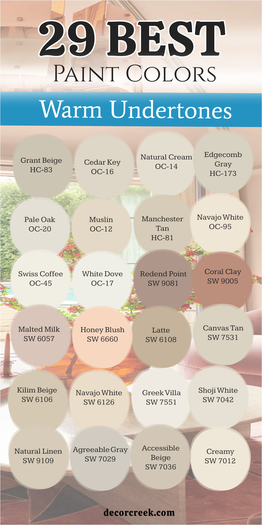
29 Best Paint Colors With Warm Undertones Trendy This Year
Alabaster SW 7008
Alabaster SW 7008 is a soft white that feels like a clean sheet of paper in the sunlight. This color is not too yellow and not too blue, so it sits right in the middle of being perfect. I love how it makes a kitchen look fresh and ready for baking cookies.
Many people pick this because it goes with every single piece of furniture you might own. It looks amazing on trim or on the main walls of a large family room. This shade helps your eyes rest after a long day of work or school.
It has enough cream in it to stop the room from looking like a cold hospital. You will find that it makes your wooden floors look richer and more expensive. It is a very popular choice for people who want a house that looks bright but still feels very homey.
Best used in: living rooms, kitchens, hallways, bedrooms, and farmhouse exteriors
Pairs well with: Iron Ore SW 7069, Agreeable Gray SW 7029, Natural Linen SW 9109, warm wood tones The key rule of this color for farmhouse style is to use it where you want natural light to feel kind, soft, and inviting throughout the day.
👉 Read the full guide for this color HERE 👈

Creamy SW 7012
Creamy SW 7012 is a classic choice that reminds me of vanilla ice cream melting on a hot day. This paint has a bit more yellow in it than a plain white, which makes it feel very sunny. I often use it in hallways that do not have any windows to make them feel less scary.
It makes a room feel like it is glowing from the inside even when the lights are off. Your friends will feel very welcome when they sit in a room painted this color. It is a great pick for a nursery because it is very gentle and soft.
This color makes dark wood furniture stand out and look very handsome. You can use it on the ceiling to make the whole room feel taller and more open. It is a dependable color that never goes out of style for families who love traditional looks.
Best used in: bedrooms, nurseries, windowless hallways, and traditional dining rooms
Pairs well with: Roasted Chestnut SW 6125, Pointed Leaf SW 6436, Vanillin SW 6371, dark walnut stains The key rule of this color for farmhouse style is to use it where you want natural light to feel kind, soft, and inviting throughout the day.
👉 Read the full guide for this color HERE 👈

Accessible Beige SW 7036
Accessible Beige SW 7036 is the color I pick when someone wants a tan that does not look like mud. This shade has a tiny bit of gray in it, which helps it look modern and clean. It is one of the most famous colors because it looks good in every single house I visit.
I think it is the perfect backdrop for colorful pillows and bright artwork on the walls. It makes a living room feel very grounded and organized. You will love how it changes slightly during the day as the sun moves across the sky.
This color is great for hiding little fingerprints from kids or pets. It makes a small bathroom feel much bigger than it actually is. It is a safe choice if you are worried about picking a color that might be too bold.
Best used in: open concept living areas, entryways, laundry rooms, and guest bathrooms
Pairs well with: Urban Bronze SW 7048, Cadet SW 9143, Aesthetic White SW 7035, light oak floors The key rule of this color for farmhouse style is to use it where you want natural light to feel kind, soft, and inviting throughout the day.
👉 Read the full guide for this color HERE 👈

Agreeable Gray SW 7029
Agreeable Gray SW 7029 is a mix of gray and beige that many designers call greige. This color is very smart because it works with both cool blues and warm oranges. I use it in homes where the family wants a look that is very updated and trendy.
It feels like a soft shadow that makes everything else in the room look better. This shade is very light, so it keeps your home feeling airy and big. It is the best choice for a bedroom where you want to have a very good sleep.
You can paint your whole house this color and it will never feel like too much. It looks very fancy when you pair it with white trim around the doors and windows. Most people find this color very relaxing and easy to live with for many years.
Best used in: master suites, home offices, entire main floors, and modern kitchens
Pairs well with: Mega Greige SW 7031, Incredible White SW 7028, Sea Salt SW 6204, charcoal accents The key rule of this color for farmhouse style is to use it where you want natural light to feel kind, soft, and inviting throughout the day.
👉 Read the full guide for this color HERE 👈

Natural Linen SW 9109
Natural Linen SW 9109 looks exactly like a piece of high-quality fabric from a fancy store. It is a very warm tan that makes a room feel like it is filled with sunshine. I like to use this in dining rooms where families gather to eat and talk together.
It creates a very cozy feeling that makes people want to stay and chat for a long time. This color is deep enough to show up against white baseboards but light enough to be bright. It makes a room feel very sturdy and well-built.
You will see that it works beautifully with wicker baskets and green plants. It is a very natural color that reminds me of the beach and the sand. Choosing this shade is like giving your walls a very soft and pretty sweater.
Best used in: dining rooms, sunrooms, mudrooms, and cozy dens
Pairs well with: Alabaster SW 7008, Divine White SW 6105, Peppercorn SW 7674, natural fibers The key rule of this color for farmhouse style is to use it where you want natural light to feel kind, soft, and inviting throughout the day.
👉 Read the full guide for this color HERE 👈

Shoji White SW 7042
Shoji White SW 7042 is a very special white that has a lot of beige and a tiny bit of gray hidden inside. I think it is one of the softest colors in the world for a living room wall. It does not look harsh or cold like a piece of ice.
Instead, it looks like a warm pearl that is glowing in the light. This color is excellent for houses that have a lot of big windows. It helps the light spread out evenly so there are no dark corners in your room.
I use it often for house flippers because it makes every room look very expensive. It is a great color if you have a lot of black or metal decorations. Your house will feel very peaceful and tidy with this shade on the walls.
Best used in: Great rooms, exteriors, minimalist bedrooms, and kitchens
Pairs well with: Pure White SW 7005, Grizzle Gray SW 7068, Worldly Gray SW 7043, black metal hardware The key rule of this color for farmhouse style is to use it where you want natural light to feel kind, soft, and inviting throughout the day.
👉 Read the full guide for this color HERE 👈

Greek Villa SW 7551
Greek Villa SW 7551 is a bright white that feels like a vacation to a sunny place. It is very clean and crisp, which makes it perfect for a modern farmhouse style. I love using this color on kitchen cabinets because it makes the whole kitchen look brand new.
It has a tiny bit of yellow that stops it from feeling like a cold winter day. This shade makes your colorful dishes and flowers really pop out and look bright. It is a wonderful color for a small laundry room to make it feel less like a chore.
You will notice that it makes your home feel very energetic and happy. It is a great background for family photos in black frames. Most people feel very refreshed when they spend time in a room painted with this white.
Best used in: kitchen cabinets, trim, small bathrooms, and dark hallways
Pairs well with: In the Navy SW 9178, Anew Gray SW 7030, Woodish stains, gold accents The key rule of this color for farmhouse style is to use it where you want natural light to feel kind, soft, and inviting throughout the day.
👉 Read the full guide for this color HERE 👈

Navajo White SW 6126
Navajo White SW 6126 is a deep cream color that feels very rich and full of life. It is much darker than a regular white, so it really stands out against your furniture. I think it looks best in rooms with a lot of old wooden furniture and heavy rugs.
This color makes a room feel very safe and warm, like a big hug from a grandma. It is a classic choice that has been used in beautiful homes for a very long time. It works well in a library or a study where you want to sit and read books.
The yellow tones in this paint make it feel like there is a candle burning in the room. It is a very sturdy color that does not change much when the weather is cloudy. You will find that it makes your home feel very established and grand.
Best used in: home libraries, traditional living rooms, basements, and north-facing rooms
Pairs well with: Latte SW 6108, Macadamia SW 6142, Roycroft Copper SW 2840, antique brass The key rule of this color for farmhouse style is to use it where you want natural light to feel kind, soft, and inviting throughout the day.
👉 Read the full guide for this color HERE 👈
Kilim Beige SW 6106
Kilim Beige SW 6106 is a very popular tan color that people have loved for many years. It is a solid, honest color that makes a house feel very sturdy and strong. I like to use it in entryways because it is very good at hiding dust and dirt.
This shade has a lot of warmth, so it makes a cold room feel much better right away. It looks very nice with red or green decorations during the holiday season. It is a great color for a boy’s room or a playroom because it is very durable.
You will find that it goes well with almost any kind of carpet or wood floor. It is a color that feels very familiar and comfortable, like an old pair of jeans. Using this paint is a great way to make a big house feel much more cozy.
Best used in: entryways, playrooms, mudrooms, and high-traffic areas
Pairs well with: Latte SW 6108, Divine White SW 6105, Storm Cloud SW 6249, warm oak The key rule of this color for farmhouse style is to use it where you want natural light to feel kind, soft, and inviting throughout the day.
👉 Read the full guide for this color HERE 👈
Canvas Tan SW 7531
Canvas Tan SW 7531 is a light and airy color that looks like a clean sail on a boat. It is a very polite color because it does not scream for attention or look too bright. I use it in guest rooms to make visitors feel like they are staying at a fancy hotel.
This shade has a tiny bit of khaki in it which makes it look very sophisticated. It is a great choice for a ceiling if you want something other than plain white. This color makes a room feel very organized and neat even if there are toys on the floor.
It looks beautiful when the afternoon sun hits the walls and turns them into gold. You will love how it makes your white curtains look extra bright and clean. It is a wonderful color for people who like a very simple and tidy home.
Best used in: guest bedrooms, ceilings, home offices, and craft rooms
Pairs well with: Shoji White SW 7042, Sealskin SW 7675, Breezy SW 7616, light pine wood The key rule of this color for farmhouse style is to use it where you want natural light to feel kind, soft, and inviting throughout the day.
👉 Read the full guide for this color HERE 👈

Latte SW 6108
Latte SW 6108 is a deep tan that looks just like a warm cup of coffee with a lot of milk. This color is very strong and makes a room feel very safe and steady for your family. I love using it in a living room where you have a big stone fireplace.
It has a lot of brown in it which makes the walls look very rich and fancy. You will notice that it makes white trim around the windows look very bright and clean. This shade is perfect for a basement that needs to feel more like a cozy part of the house.
It is a very friendly color that makes people want to sit down and talk for a while. Many parents pick this color because it does not show any dirt from little hands or pets. It makes your home feel very warm and filled with love every single day. You can use it in a bedroom to help you feel very tucked in and ready for sleep.
Best used in: living rooms, basements, dining rooms, and home offices
Pairs well with: Kilim Beige SW 6106, Vanilla Filler SW 6378, Hopsack SW 6109, dark wood furniture The key rule of this color for farmhouse style is to use it where you want natural light to feel kind, soft, and inviting throughout the day.
👉 Read the full guide for this color HERE 👈
Honey Blush SW 6660
Honey Blush SW 6660 is a very happy color that looks like a sunset on a warm summer night. This paint is a mix of pink and orange that makes every room feel very cheerful and bright. I think it is the best choice for a little girl’s room or a fun guest bathroom.
It makes the light in the room look very soft and pretty on everyone’s faces. You will feel a lot of energy when you walk into a room painted this lovely shade. It is not too bright like a piece of fruit but it is definitely not a boring color.
This shade looks wonderful with white furniture and light green plants. It is a great way to bring a little bit of the garden inside your house. Most people smile the moment they see this color on the walls of a home. It is a very special pick for someone who loves a house full of life and color.
Best used in: nurseries, girls’ bedrooms, small bathrooms, and laundry rooms
Pairs well with: Alabaster SW 7008, Westhaven SW 9508, Greek Villa SW 7551, light gold accents The key rule of this color for farmhouse style is to use it where you want natural light to feel kind, soft, and inviting throughout the day.
👉 Read the full guide for this color HERE 👈

Malted Milk SW 6057
Malted Milk SW 6057 is a very soft pink that has a lot of tan mixed inside of it. This color is very grown-up and does not look like a baby’s room at all. I use it in master bedrooms where the owners want to feel very pampered and special.
It looks like the inside of a seashell or a very light piece of silk fabric. This shade is very gentle on the eyes and helps a busy room feel much more organized. You will love how it makes your skin look healthy when you see yourself in the mirror.
It is a very smart choice for a room that gets a lot of bright morning sun. This color makes a house feel very elegant and well-decorated without being too loud. It works perfectly with silver or gold decorations on the walls. Most of my clients find this color very easy to love for a very long time.
Best used in: master bedrooms, dressing rooms, formal dining rooms, and entryways
Pairs well with: Snowbound SW 7004, Breathless SW 6022, Mink SW 6004, plush gray rugs The key rule of this color for farmhouse style is to use it where you want natural light to feel kind, soft, and inviting throughout the day.
👉 Read the full guide for this color HERE 👈
Coral Clay SW 9005
Coral Clay SW 9005 is a warm and earthy color that looks like a clay pot in a garden. It is a deeper shade of pink that feels very grounded and natural for a home. I love to use this in a dining room to make the dinner parties feel very fancy.
It has a lot of red in it which makes the room feel very warm and exciting. This color looks amazing when you have a lot of green plants sitting nearby. It is a very brave choice that makes your house look like a designer lived there.
You will find that it makes a large room feel much more personal and small. It is a very cozy color that reminds me of beautiful old houses in warm countries. This shade is great for someone who wants a color that is unique and very pretty. It makes every piece of wooden furniture look like a work of art against the wall.
Best used in: accent walls, dining rooms, sunrooms, and entryways
Pairs well with: Shoji White SW 7042, Urbane Bronze SW 7048, Naval SW 6244, terra cotta tiles The key rule of this color for farmhouse style is to use it where you want natural light to feel kind, soft, and inviting throughout the day.
👉 Read the full guide for this color HERE 👈
Redend Point SW 9081
Redend Point SW 9081 is a very special color that feels like a mix of sand and a soft rose. This color was picked as a color of the year because it is so easy to live with. I use it in family rooms where everyone gathers to watch movies and play games.
It is very warm but it still looks very modern and new for a house. This shade helps all the colors in your rugs and pillows look much more bright. It is a very comforting color that makes a house feel like a safe place to be.
You will notice that it looks different and beautiful in every type of light. It is a great choice if you want a neutral color that has a little bit of a pink soul. This paint makes a room feel very soft and friendly for guests and family. Most people find that this color makes their home feel very updated and very stylish.
Best used in: living rooms, bedrooms, hallways, and cozy reading nooks
Pairs well with: Pure White SW 7005, Foothills SW 7514, Kestrel White SW 7516, natural wood The key rule of this color for farmhouse style is to use it where you want natural light to feel kind, soft, and inviting throughout the day.
👉 Read the full guide for this color HERE 👈

White Dove OC-17
White Dove OC-17 is the most famous white paint for a reason because it is almost perfect. This color has a tiny bit of cream and gray that keeps it from looking like a cold ice cube. I use it on the trim and doors of almost every house I help to decorate.
It makes a room feel very clean and open without being too bright for your eyes. This shade is very soft and looks like the feathers of a little bird in the sun. It is a great color for a kitchen because it makes everything look very sanitary and fresh.
You will love how it makes your colorful paintings look like they are in an art gallery. It is a very dependable color that always looks good no matter what room you put it in. Most people think this is the best white for making a house feel very light and happy. It is a classic pick that you will never want to change.
Best used in: kitchen cabinets, trim, ceilings, and open living areas
Pairs well with: Revere Pewter HC-172, Hale Navy HC-154, Balboa Mist OC-27, all wood tones The key rule of this color for farmhouse style is to use it where you want natural light to feel kind, soft, and inviting throughout the day.
👉 Read the full guide for this color HERE 👈

Swiss Coffee OC-45
Swiss Coffee OC-45 is a very rich and creamy white that feels very expensive and fancy. This color has a lot of warmth which makes a large room feel very filled up and cozy. I love using it on walls where the sun shines in during the afternoon hours.
It turns into a beautiful gold color that makes the whole room glow with light. This shade is a favorite for many famous designers because it looks good in photos. It is a very soft color that makes your furniture look very high-quality and pretty.
You will find that it is much more interesting than a plain white from a store. It is a great choice for a whole house if you want everything to look very clean. This paint makes a home feel very peaceful and very organized for a busy family. It is a very sweet and gentle color for any room in your house.
Best used in: living rooms, bedrooms, exteriors, and traditional homes
Pairs well with: Fossil AF-65, Newington Gray HC-157, Black Beauty 2128-10, brass fixtures The key rule of this color for farmhouse style is to use it where you want natural light to feel kind, soft, and inviting throughout the day.
👉 Read the full guide for this color HERE 👈

Navajo White OC-95
Navajo White OC-95 is a deep cream that is very traditional and looks very solid on a wall. This color has been around for a long time because it makes a house feel very sturdy. I use it in rooms that have a lot of big windows and very high ceilings.
It helps the room feel less empty and much more like a real home for people. This shade has a lot of yellow and tan mixed in to make it feel very warm. It looks like a bowl of heavy cream or a soft wool blanket on a cold day.
You will love how it hides any small cracks or bumps on old plaster walls. It is a very forgiving color that stays looking nice even if you do not clean it every day. This paint makes a dining room feel very grand and ready for a big holiday meal. It is a very loyal color that will make your home feel very warm for years.
Best used in: large living rooms, historic homes, north-facing rooms, and hallways
Pairs well with: Simply White OC-117, Van Courtland Blue HC-145, Wrought Iron 2124-10, dark oak The key rule of this color for farmhouse style is to use it where you want natural light to feel kind, soft, and inviting throughout the day.
👉 Read the full guide for this color HERE 👈
Manchester Tan HC-81
Manchester Tan HC-81 is a very clean beige that looks like a beautiful stone on a beach. This color is very smart because it does not look too yellow or too green in the light. I pick this for homes where the family wants a very tidy and simple look for their rooms.
It makes a room feel very professional and well-put-together for guests. This shade is light enough to keep your house feeling very big and very airy. It looks wonderful when you have a lot of black and white photos on the walls.
You will notice that it makes your colorful rugs look very bright and very exciting. It is a very calm color that helps you feel organized when you are working at home. This paint is a great choice for a kitchen where you want to feel very focused. Most people love this color because it is very easy to match with any furniture.
Best used in: kitchens, home offices, entryways, and main living areas
Pairs well with: White Dove OC-17, Boothbay Gray HC-160, Chelsea Gray HC-168, linen fabrics The key rule of this color for farmhouse style is to use it where you want natural light to feel kind, soft, and inviting throughout the day.
👉 Read the full guide for this color HERE 👈

Muslin OC-12
Muslin OC-12 is a very soft and sandy color that looks like a clean piece of light fabric. This paint is very warm and makes a room feel like it is filled with a soft glow. I use it in guest bedrooms to make people feel very welcome and very comfortable.
It is a very simple color that does not try to be the star of the whole room. This shade lets your beautiful bedspreads and curtains be the things that people notice first. It is a great choice for a house that has a lot of natural wood and stone.
You will love how it makes a small room feel very cozy and very sweet for a child. It is a very natural color that reminds me of being outside on a very nice day. This paint makes a home feel very humble and very honest for a happy family. It is one of the easiest colors to live with because it is so gentle.
Best used in: guest rooms, nurseries, small living rooms, and laundry rooms
Pairs well with: Chantilly Lace OC-65, Woodlawn Blue HC-147, Saybrook Sage HC-114, wicker The key rule of this color for farmhouse style is to use it where you want natural light to feel kind, soft, and inviting throughout the day.
👉 Read the full guide for this color HERE 👈

Pale Oak OC-20
Pale Oak OC-20 is a very light gray that has a big heart of warm beige inside of it. This color is very popular right now because it looks very clean and very modern. I use it in houses where the owners want a fresh look that still feels very warm.
It looks like the bark of a very old and beautiful tree in the middle of a forest. This shade is very light, so it makes a dark room feel much more bright and happy. It is a great color for a master bathroom to make it feel like a fancy spa.
You will find that it goes perfectly with both silver and gold faucets and handles. It is a very quiet color that helps you feel very peaceful after a very long day. This paint makes a home feel very airy and very full of light for everyone who lives there. Most people think this color is the perfect mix of old and new styles.
Best used in: bathrooms, bedrooms, open floor plans, and kitchens
Pairs well with: White Dove OC-17, Gray Owl OC-52, Stonington Gray HC-170, marble tops The key rule of this color for farmhouse style is to use it where you want natural light to feel kind, soft, and inviting throughout the day.
👉 Read the full guide for this color HERE 👈

Edgecomb Gray HC-173
Edgecomb Gray HC-173 is a very famous color that is the perfect balance of gray and tan. This shade is very warm but it looks very trendy on the walls of a new house. I use it in entryways so that the first thing people see is a very pretty color.
It makes a room feel very sturdy and very well-made for a growing family to live in. This color is deep enough to show off white trim but light enough to stay very bright. You will see that it changes color a little bit when you turn on your lamps at night.
It is a very friendly color that works well with blue, green, or red decorations. This paint makes a home feel very balanced and very easy to stay in for a long time. It is a very safe choice for someone who is painting their first house and feels nervous. Most families find that this color makes their house feel very solid and very cozy.
Best used in: hallways, living rooms, kitchens, and master bedrooms
Pairs well with: Simply White OC-117, Revere Pewter HC-172, Wedgewood Gray HC-146, dark floors The key rule of this color for farmhouse style is to use it where you want natural light to feel kind, soft, and inviting throughout the day.
👉 Read the full guide for this color HERE 👈

Natural Cream OC-14
Natural Cream OC-14 is a very soft and thick color that looks like a bowl of warm oatmeal. This paint is a bit darker than a white but lighter than most of the tan colors. I like to use it in kitchens where there are a lot of white cabinets and dark counters.
It provides a very nice contrast that makes the whole room look very interesting and deep. This shade is very warm and makes a cold kitchen feel much more like a home. It is a very soft color that looks like a warm hug for your walls every day.
You will find that it makes your wood floors look very rich and very beautiful. It is a great choice for a laundry room to make a boring chore feel more nice. This paint makes a home feel very established and very high-quality for the family. It is a very sweet color that makes everyone feel very welcome when they visit.
Best used in: kitchens, laundry rooms, mudrooms, and breakfast nooks
Pairs well with: Cloud White OC-130, Kendall Charcoal HC-166, Shaker Beige HC-45, copper The key rule of this color for farmhouse style is to use it where you want natural light to feel kind, soft, and inviting throughout the day.
👉 Read the full guide for this color HERE 👈

Cedar Key OC-16
Cedar Key OC-16 is a very soft and sandy color that reminds me of a beautiful day at the beach. This paint has a lot of warm tan in it which makes a room feel very sturdy and safe. I love using it in a sunroom where the light can bounce off the walls and make everything look bright.
It looks very smart when you have white furniture or light wood tables in the room. This shade is deep enough to hide little marks from kids but light enough to keep the room happy. You will notice that it makes your green plants look very healthy and colorful against the tan.
It is a very polite color that does not try to take over the whole house. Many people choose this for their main living area because it feels very natural and easy. It makes a home feel very clean and very organized for a busy family to enjoy. Your house will feel like a warm summer afternoon every single day of the year.
Best used in: sunrooms, living rooms, kitchens, and cottage-style bedrooms
Pairs well with: Simply White OC-117, Boothbay Gray HC-160, Van Courtland Blue HC-145, light oak The key rule of this color for farmhouse style is to use it where you want natural light to feel kind, soft, and inviting throughout the day.
👉 Read the full guide for this color HERE 👈

Grant Beige HC-83
Grant Beige HC-83 is a very classic tan that has a tiny bit of a green heart hidden inside of it. This color is very famous for looking very expensive and very fancy on any wall. I use it in formal dining rooms where families sit together for big holiday meals.
It makes a room feel very established and very strong, like an old library in a big house. This shade is very warm and helps a large room feel much more cozy and small. You will love how it looks with gold picture frames and dark wooden chairs.
It is a very dependable color that stays looking beautiful even when the weather is gray outside. This paint makes a home feel very traditional and very well-kept for many years. Most people find that this color makes their furniture look much more high-quality and pretty. It is a very solid choice for anyone who wants a very handsome and warm house.
Best used in: formal dining rooms, libraries, entryways, and master suites
Pairs well with: White Dove OC-17, Swiss Coffee OC-45, Newburg Green HC-158, brass accents The key rule of this color for farmhouse style is to use it where you want natural light to feel kind, soft, and inviting throughout the day.
👉 Read the full guide for this color HERE 👈

Lenox Tan HC-44
Lenox Tan HC-44 is a deep and rich color that looks like a warm piece of toast with butter. This paint is very full of color and makes a room feel very protected and very warm. I pick this color for dens or media rooms where you want to sit and watch a movie.
It has a lot of gold and brown in it which makes the walls look very thick and nice. This shade is perfect for a room that has a lot of leather chairs or heavy rugs. You will notice that it creates a very cozy feeling that makes people want to take a nap.
It is a very brave color that shows you have a lot of style and a big heart. This paint makes a house feel very sturdy and very safe from the cold wind outside. It is a great way to make a new house feel like it has been there for a long time. Your family will feel very tucked in and very happy with this shade on the walls.
Best used in: dens, media rooms, basements, and north-facing bedrooms
Pairs well with: Cloud White OC-130, Shaker Beige HC-45, Hale Navy HC-154, dark walnut The key rule of this color for farmhouse style is to use it where you want natural light to feel kind, soft, and inviting throughout the day.
👉 Read the full guide for this color HERE 👈

Shaker Beige HC-45
Shaker Beige HC-45 is one of the most popular tan colors because it is very simple and very honest. This color looks like the sand on a big hill and feels very warm under the sun. I use it in hallways that lead to many different rooms because it matches everything so well.
It is a very friendly color that makes your home feel very open and very welcoming. This shade has a lot of warmth but it never looks too yellow or too orange to the eye. You will love how it makes your white doors and white trim look very crisp and very clean.
It is a great choice for a kitchen where you want to feel very happy while you are cooking. This paint makes a home feel very grounded and very easy for a family to live in. Most people think this is the perfect beige because it is not too dark and not too light. It is a very sweet and gentle color for any part of your house.
Best used in: hallways, kitchens, family rooms, and guest bathrooms
Pairs well with: Simply White OC-117, Lenox Tan HC-44, Wythe Blue HC-143, warm wood tones The key rule of this color for farmhouse style is to use it where you want natural light to feel kind, soft, and inviting throughout the day.
👉 Read the full guide for this color HERE 👈

Golden Straw 2152-50
Golden Straw 2152-50 is a very happy yellow that looks like a field of tall grass in the summer sun. This color is very bright and makes every room feel like it is filled with a lot of cheer. I love using it in a breakfast nook where you can drink your juice and feel very energetic.
It is a very warm color that makes a dark house feel much more light and very happy. This shade is soft enough that it does not feel like it is shouting at you when you walk in. You will notice that it makes your white cabinets look very fresh and very new in the kitchen.
It is a great choice for a playroom because it makes kids feel very creative and very active. This paint makes a home feel very sunny even on days when it is raining very hard outside. It is a very special color that brings a lot of joy to every person who sees it.
Best used in: breakfast nooks, kitchens, playrooms, and laundry rooms
Pairs well with: Chantilly Lace OC-65, Palladian Blue HC-144, White Down OC-131, light maple The key rule of this color for farmhouse style is to use it where you want natural light to feel kind, soft, and inviting throughout the day.
Soft Chamois OC-13
Soft Chamois OC-13 is a very gentle off-white that feels like a soft piece of leather or a warm cloud. This color is very light and makes a room feel very big and very full of fresh air. I use it in master bedrooms where the family wants to feel very peaceful and very quiet.
It has a tiny bit of yellow and gray that keeps it from looking like a cold piece of paper. This shade is very soft on the eyes and helps you feel very relaxed when you are tired. You will love how it makes your colorful pillows and blankets look very bright and very pretty.
It is a great choice for a nursery because it is very sweet and very calm for a new baby. This paint makes a home feel very elegant and very tidy for everyone who lives there. Most people find that this color makes their house feel very soft and very full of love. It is a very beautiful choice for a home that wants to feel very light and very warm.
Best used in: master bedrooms, nurseries, living rooms, and small apartments
Pairs well with: Cloud White OC-130, Revere Pewter HC-172, Gray Owl OC-52, natural linen The key rule of this color for farmhouse style is to use it where you want natural light to feel kind, soft, and inviting throughout the day.
👉 Read the full guide for this color HERE 👈

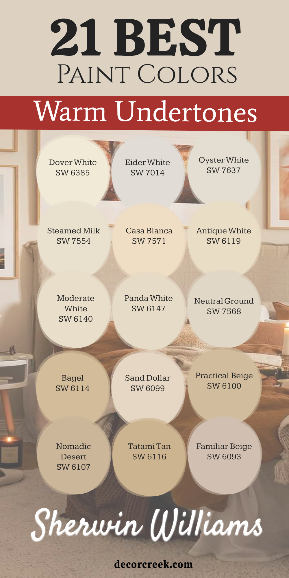
21 Best Paint Colors With Warm Undertones From Sherwin Williams
Dover White SW 6385
Dover White SW 6385 is a very rich and creamy white that people have loved for a very long time. This color looks like a bowl of warm vanilla pudding and feels very sweet on the walls. I use it on the outside of houses to make them look very friendly and very welcoming to neighbors.
It is a very warm color that makes a large room feel very cozy and very filled with light. This shade is much softer than a bright white and it helps your eyes feel very rested. You will love how it makes your wooden furniture look very expensive and very well-made.
It is a great choice for a kitchen because it makes everything look very clean and very happy. This paint makes a home feel very traditional and very solid for a big family to live in. Most people think this is the best color for making a house feel very warm and very bright. It is a very loyal color that will always look good in your home.
Best used in: exteriors, kitchen cabinets, trim, and traditional living rooms
Pairs well with: Accessible Beige SW 7036, Urbane Bronze SW 7048, Waterloo SW 9141, warm oak The key rule of this color for farmhouse style is to use it where you want natural light to feel kind, soft, and inviting throughout the day.
👉 Read the full guide for this color HERE 👈
Eider White SW 7014
Eider White SW 7014 is a very light gray that has a tiny drop of warm red hidden deep inside of it. This color looks like the feathers of a soft bird and feels very gentle on your walls. I use it in modern homes where the family wants a very clean and very updated look for their rooms.
It is a very smart color because it changes from gray to white depending on the sun. This shade is very light so it makes a small room feel much bigger and much more open. You will notice that it makes your black and white photos look very fancy and very professional.
It is a great choice for a bathroom because it makes the room feel very fresh and very tidy. This paint makes a home feel very airy and very full of light for everyone who visits. Most families find that this color makes their house feel very new and very stylish for many years. It is a very pretty and very quiet color for any room in your house.
Best used in: bathrooms, modern kitchens, open floor plans, and bedrooms
Pairs well with: Repose Gray SW 7015, Dorian Gray SW 7017, Tricorn Black SW 6258, marble The key rule of this color for farmhouse style is to use it where you want natural light to feel kind, soft, and inviting throughout the day.
👉 Read the full guide for this color HERE 👈
Oyster White SW 7637
Oyster White SW 7637 is a very soft and warm gray that looks like a beautiful stone from the ocean. This paint is very thick and creamy which makes a room feel very expensive and very well-built. I love using it on the outside of a house with black shutters and a bright red door.
It is a very warm color that makes a large room feel very cozy and very full of life. This shade is deep enough to show up against white trim but it stays very bright and happy. You will love how it makes your green bushes and colorful flowers look very bright outside.
It is a great choice for a living room where you have a lot of big windows and sunlight. This paint makes a home feel very sophisticated and very well-decorated for a modern family. Most people think this color is very peaceful and very easy to live with for a long time. It is a very elegant color that makes your house look very grand and very pretty.
Best used in: exteriors, living rooms, kitchens, and large entryways
Pairs well with: Alabaster SW 7008, Iron Ore SW 7069, Sea Salt SW 6204, dark bronze The key rule of this color for farmhouse style is to use it where you want natural light to feel kind, soft, and inviting throughout the day.
👉 Read the full guide for this color HERE 👈
Steamed Milk SW 7554
Steamed Milk SW 7554 is a very rich and deep cream that looks like the top of a warm latte. This color is very warm and makes a room feel very friendly and very inviting for guests. I use it in hallways that feel a bit dark to make them look like they are full of light.
It is a very soft color that reminds me of a warm wool blanket on a cold winter night. This shade has a lot of tan in it which makes it very good at hiding any little mess. You will find that it makes your dark wood furniture look very handsome and very sturdy.
It is a great choice for a guest room because it makes people feel very comfortable and safe. This paint makes a home feel very established and very full of love for the whole family. Most families find that this color makes their house feel very cozy and very warm all year. It is a very dependable color that makes every room look very sweet and very nice.
Best used in: hallways, guest bedrooms, dining rooms, and kitchens
Pairs well with: Macadamia SW 6142, Softer Tan SW 6141, Foothills SW 7514, antique brass The key rule of this color for farmhouse style is to use it where you want natural light to feel kind, soft, and inviting throughout the day.
👉 Read the full guide for this color HERE 👈
Casa Blanca SW 7571
Casa Blanca SW 7571 is a very creamy and rich white that looks like the inside of a fancy wedding cake. This color is very warm and makes a room feel like it is always bathed in soft candlelight. I love using it in a dining room because it makes the wood of the table look very deep and very shiny.
It is a very soft color that helps people feel very comfortable while they are sitting and eating together. This shade has a lot of yellow and orange hidden inside which keeps it from ever feeling cold. You will love how it makes your white dishes and silver forks look very bright and very special.
It is a great choice for a house that has a lot of old-fashioned charm and pretty details. This paint makes a home feel very grand and very full of history for a happy family. Most people think this color is very elegant and very easy to love for many years. It is a very sweet and gentle color that makes every room look very expensive and very nice.
Best used in: dining rooms, traditional living rooms, entryways, and master bedrooms
Pairs well with: Creamy SW 7012, Latte SW 6108, Urbane Bronze SW 7048, warm gold accents The key rule of this color for farmhouse style is to use it where you want natural light to feel kind, soft, and inviting throughout the day.
👉 Read the full guide for this color HERE 👈
Antique White SW 6119
Antique White SW 6119 is a deep and warm cream that looks like a page from a very old and beautiful book. This color is very famous because it makes a house feel very sturdy and very well-loved for a long time. I use it on kitchen cabinets when a family wants a look that is very cozy and very traditional.
It is a very warm color that makes a large kitchen feel like the heart of the whole home. This shade is much darker than a regular white and it looks very rich against a dark granite counter. You will find that it hides any little splashes from cooking very well so your kitchen stays looking clean.
It is a great choice for a room that has a lot of big windows and green plants. This paint makes a home feel very established and very safe for everyone who lives there. Most families find that this color makes their house feel very solid and very warm all year round. It is a very loyal color that makes every piece of furniture look very handsome and very pretty.
Best used in: kitchen cabinets, hallways, traditional dens, and north-facing rooms
Pairs well with: Kilim Beige SW 6106, Svelte Sage SW 6164, Foothills SW 7514, dark wood The key rule of this color for farmhouse style is to use it where you want natural light to feel kind, soft, and inviting throughout the day.
👉 Read the full guide for this color HERE 👈

Moderate White SW 6140
Moderate White SW 6140 is a very soft and clean off-white that feels like a fresh breeze on a summer day. This paint has a tiny bit of pink and tan inside which makes it look very pretty in the morning light. I pick this color for master bathrooms because it makes the room feel very clean and very light.
It is a very polite color that lets your colorful towels and rugs be the stars of the room. This shade is very bright so it helps you see everything clearly when you are getting ready for school or work. You will notice that it makes your skin look very healthy and very glowing in the bathroom mirror.
It is a great choice for a house that wants to feel very simple and very modern but still very warm. This paint makes a home feel very airy and very full of light for the whole family to enjoy. Most people think this is a very peaceful color that helps them feel organized and very happy. It is a very beautiful choice for making a small room feel much bigger and much more open.
Best used in: bathrooms, laundry rooms, small bedrooms, and ceilings
Pairs well with: Universal Khaki SW 6150, Macadamia SW 6142, Pure White SW 7005, brushed nickel The key rule of this color for farmhouse style is to use it where you want natural light to feel kind, soft, and inviting throughout the day.
👉 Read the full guide for this color HERE 👈
Panda White SW 6147
Panda White SW 6147 is a very interesting color that looks like a mix of soft gray and a warm cookie. This color is very smart because it changes its look depending on what colors you put next to it. I use it in entryways to give the house a look that is very updated and very trendy for today.
It is a very warm color that makes a big entryway feel very welcoming and very friendly to guests. This shade is light enough to be bright but deep enough to show off your white baseboards and doors. You will find that it makes your black metal lamps and coat hooks look very modern and very cool.
It is a great choice for a family room where you want to have a lot of different colored pillows. This paint makes a home feel very stylish and very well-decorated for a busy family to live in. Most families love this color because it is very easy to match with any kind of carpet or wood. It is a very sturdy color that makes your walls look very smooth and very pretty.
Best used in: entryways, living rooms, hallways, and modern farmhouses
Pairs well with: Wool Skein SW 6148, Urban Bronze SW 7048, Naval SW 6244, black metal The key rule of this color for farmhouse style is to use it where you want natural light to feel kind, soft, and inviting throughout the day.
👉 Read the full guide for this color HERE 👈
Neutral Ground SW 7568
Neutral Ground SW 7568 is a very soft and sandy beige that feels like walking on a beach in the morning. This color is very balanced and does not look too yellow or too gray to the eye. I love using it in open floor plans where one room flows right into the next room easily.
It is a very warm color that makes a very large house feel much more cozy and much more like a home. This shade is very light and helps the sunlight reach every corner of your big living area. You will notice that it makes your wooden floors look very rich and very expensive in the light.
It is a great choice for a guest room because it is very gentle and very easy for everyone to like. This paint makes a home feel very organized and very tidy for a happy family to enjoy every day. Most people think this is the perfect neutral because it is so soft and so friendly to other colors. It is a very beautiful color that makes your house look very big and very bright.
Best used in: open concept living areas, guest rooms, kitchens, and exteriors
Pairs well with: Alabaster SW 7008, Steely Gray SW 7664, Mount Etna SW 7625, natural wood The key rule of this color for farmhouse style is to use it where you want natural light to feel kind, soft, and inviting throughout the day.
👉 Read the full guide for this color HERE 👈

Bagel SW 6114
Bagel SW 6114 is a very deep and warm tan that looks exactly like a toasted bagel in the morning. This color is very strong and makes a room feel very sturdy and very safe for the whole family. I pick this color for dens or home offices where you want to feel very focused and very warm.
It has a lot of gold and brown in it which makes the walls look very rich and very thick. This shade is perfect for a room that has a lot of big books and heavy wooden desks to show off. You will love how it makes the room feel like a big hug when you walk inside after a long day.
It is a very brave color that shows you love a house that feels very full of life and very warm. This paint makes a home feel very established and very high-quality for everyone who lives there. Most people find that this color makes their room feel very cozy and very special for reading or working. It is a very handsome color that makes your furniture look very sturdy and very pretty.
Best used in: dens, home offices, basements, and traditional living rooms
Pairs well with: Antique White SW 6119, Kilim Beige SW 6106, Roycroft Copper SW 2840, leather The key rule of this color for farmhouse style is to use it where you want natural light to feel kind, soft, and inviting throughout the day.
Sand Dollar SW 6099
Sand Dollar SW 6099 is a very soft and pale tan that looks like a little treasure you would find on the beach. This color is very warm and makes a room feel like it is always filled with a soft summer glow.
I love using it in small bedrooms because it makes the walls look like they are far away and the room feels bigger. It is a very polite color that helps you feel very happy and very light when you wake up in the morning. This shade has a tiny bit of pink hidden inside which makes it look very pretty with white blankets and pillows.
You will love how it makes your white trim look very sharp and very clean in the sunlight. It is a great choice for a house that wants to feel very simple and very sweet for a young family. This paint makes a home feel very airy and very full of fresh air for everyone who lives there. Most people think this color is very gentle and very easy to match with light wood furniture. It is a very beautiful choice for making a house feel very bright and very warm.
Best used in: small bedrooms, nurseries, guest bathrooms, and sunrooms
Pairs well with: Pure White SW 7005, Diverse Beige SW 6079, Sea Salt SW 6204, light maple floors The key rule of this color for farmhouse style is to use it where you want natural light to feel kind, soft, and inviting throughout the day.
👉 Read the full guide for this color HERE 👈

Practical Beige SW 6100
Practical Beige SW 6100 is a very solid and honest tan that feels very sturdy on the walls of a busy home. This color is very smart because it is dark enough to hide any little messes from toys or pets. I use it in family rooms where everyone gathers to play and have a lot of fun together.
It is a very warm color that makes a large room feel very grounded and very safe for the children. This shade has a lot of gold in it which makes the room feel very sunny even on a cloudy day. You will find that it makes your blue or green pillows look very bright and very exciting against the tan.
It is a great choice for a mudroom or a laundry room where you want a color that is very tough. This paint makes a home feel very established and very well-kept for a big family to enjoy every day. Most families love this color because it is very easy to live with and looks good for many years. It is a very handsome color that makes your house look very strong and very pretty.
Best used in: family rooms, mudrooms, laundry rooms, and basements
Pairs well with: Dover White SW 6385, Kilim Beige SW 6106, Naval SW 6244, warm oak furniture The key rule of this color for farmhouse style is to use it where you want natural light to feel kind, soft, and inviting throughout the day.
👉 Read the full guide for this color HERE 👈
Nomadic Desert SW 6107
Nomadic Desert SW 6107 is a very rich and deep tan that looks like the sand in a big, beautiful desert. This color is very warm and makes a room feel very cozy and very full of life for your family. I pick this color for entryways because it makes a very strong and very friendly statement to anyone who walks in.
It is a very classic color that has been a favorite for many designers for a very long time. This shade is perfect for a house that has a lot of big stone details and heavy wooden doors. You will notice that it makes your white ceilings look very high and very bright in the light.
It is a great choice for a large living room where you want to feel very tucked in and very warm. This paint makes a home feel very sophisticated and very high-quality for everyone who visits. Most people find that this color makes their furniture look very expensive and very sturdy against the wall. It is a very loyal color that makes every room in your house feel very warm and very nice.
Best used in: entryways, large living rooms, master bedrooms, and exteriors
Pairs well with: Kilim Beige SW 6106, Latte SW 6108, Urbane Bronze SW 7048, dark walnut The key rule of this color for farmhouse style is to use it where you want natural light to feel kind, soft, and inviting throughout the day.
👉 Read the full guide for this color HERE 👈

Tatami Tan SW 6116
Tatami Tan SW 6116 is a very warm and earthy tan that looks like a soft straw mat in a pretty garden house. This paint is very full of color and makes a room feel very natural and very grounded for the family. I love using it in home offices because it helps the room feel very steady and very quiet for working.
It has a lot of yellow and brown in it which makes the walls look very rich and very thick. This shade is great for a room that has a lot of green plants and natural wood furniture to show off. You will love how it makes the afternoon sun look like liquid gold when it hits the walls.
It is a very brave color that shows you love a house that feels very organic and very warm. This paint makes a home feel very peaceful and very well-balanced for everyone who lives there. Most people think this is a very unique color that makes a house look very special and very stylish. It is a very handsome color that makes your home feel very sturdy and very pretty.
Best used in: home offices, dens, dining rooms, and kitchens
Pairs well with: Antique White SW 6119, Bagel SW 6114, Svelte Sage SW 6164, wicker accents The key rule of this color for farmhouse style is to use it where you want natural light to feel kind, soft, and inviting throughout the day.
👉 Read the full guide for this color HERE 👈
Familiar Beige SW 6093
Familiar Beige SW 6093 is a very soft and friendly tan that feels like a big hug from someone you love. This color is very warm and makes a room feel very comfortable and very easy to be in for a long time. I use it in guest rooms so that my friends feel very welcome and very at home when they visit.
It is a very gentle color that does not look too dark or too light in the middle of the day. This shade has a tiny bit of gray inside which keeps it looking very modern and very clean for today. You will find that it makes your colorful blankets and rugs look very pretty and very bright against the wall.
It is a great choice for a whole house because it is very polite and goes with every other color you own. This paint makes a home feel very organized and very tidy for a happy family to enjoy every day. Most families find that this color is very easy to love because it is so soft and so warm. It is a very beautiful choice for making your house feel very cozy and very sweet.
Best used in: guest bedrooms, hallways, living rooms, and open floor plans
Pairs well with: Alabaster SW 7008, Diverse Beige SW 6079, Mega Greige SW 7031, linen fabrics The key rule of this color for farmhouse style is to use it where you want natural light to feel kind, soft, and inviting throughout the day.
👉 Read the full guide for this color HERE 👈
Svelte Sage SW 6164
Svelte Sage SW 6164 is a very soft and warm green that looks like a fuzzy leaf on a pretty plant in the woods. This paint is very special because it brings a little bit of the outdoors inside your home in a very nice way. I love using it in bedrooms where you want to feel very peaceful and very close to nature.
It is a very warm green that does not feel cold or like a dark forest at all. This shade looks wonderful with light wood furniture and a lot of white pillows and curtains. You will notice that it makes a room feel very fresh and very full of life every time you walk in.
It is a great choice for a house that has a lot of windows looking out at a big green yard. This paint makes a home feel very unique and very well-decorated for a modern family to enjoy. Most people think this color is very relaxing and helps them feel very happy after a long day of school or work. It is a very beautiful color that makes your house look very soft and very pretty.
Best used in: bedrooms, bathrooms, kitchens, and cozy dens
Pairs well with: Shoji White SW 7042, Grassland SW 6163, Urbane Bronze SW 7048, natural wood The key rule of this color for farmhouse style is to use it where you want natural light to feel kind, soft, and inviting throughout the day.
👉 Read the full guide for this color HERE 👈
Macadamia SW 6142
Macadamia SW 6142 is a very rich and creamy tan that looks like a big bowl of expensive nuts. This color is very warm and makes a room feel very high-quality and very well-made for your family. I pick this color for traditional living rooms where you want everything to look very grand and very nice.
It is a very solid color that makes your walls look very thick and very sturdy in the light. This shade is deep enough to show off your white trim but stays very bright and very happy for everyone. You will find that it makes your dark leather chairs and wooden tables look very handsome and very pretty.
It is a great choice for an entryway because it makes the house feel very established and very safe. This paint makes a home feel very warm and very full of love for the whole family to enjoy every day. Most families love this color because it is very classic and never goes out of style. It is a very sturdy color that makes your house look very grand and very warm.
Best used in: living rooms, entryways, kitchens, and dining rooms
Pairs well with: Moderate White SW 6140, Softer Tan SW 6141, Universal Khaki SW 6150, dark wood The key rule of this color for farmhouse style is to use it where you want natural light to feel kind, soft, and inviting throughout the day.
👉 Read the full guide for this color HERE 👈
Downing Straw SW 2813
Downing Straw SW 2813 is a very deep and warm yellow that looks like a field of gold in the late afternoon sun. This paint is very full of energy and makes a room feel very cheerful and very bright for the family. I love using it in historic homes or kitchens where you want to feel very happy while you are cooking.
It is a very traditional color that makes a house feel very sturdy and very full of history. This shade has a lot of warmth which makes a cold room feel much more cozy and much more like a home. You will notice that it makes your white cabinets look very fresh and very clean in the sunlight.
It is a great choice for a breakfast nook where you can drink your juice and feel very energetic. This paint makes a home feel very sunny and very full of life even on a rainy day. Most people think this color is very special and brings a lot of joy to every person who sees it. It is a very beautiful color that makes your house look very bright and very warm.
Best used in: kitchens, breakfast nooks, historic exteriors, and dining rooms
Pairs well with: Alabaster SW 7008, Rookwood Dark Green SW 2816, Roycroft Copper SW 2840, antique brass The key rule of this color for farmhouse style is to use it where you want natural light to feel kind, soft, and inviting throughout the day.
Townhouse Tan SW 7712
Townhouse Tan SW 7712 is a very elegant and warm tan that looks like a fancy house in a big city. This color is very smart and makes a room feel very professional and very well-put-together for guests. I use it in formal living rooms or home offices to give the house a look that is very high-quality and nice.
It is a very warm color that makes a large room feel much more cozy and much more like a real home. This shade is deep enough to make your furniture pop but light enough to keep the room feeling very airy. You will love how it looks with black and white photos in big gold frames on the walls.
It is a great choice for a house that wants to feel very established and very stylish for a modern family. This paint makes a home feel very organized and very tidy for everyone who lives there. Most people find that this color makes their house feel very grand and very warm all year round. It is a very handsome color that makes your furniture look very sturdy and very pretty.
Best used in: formal living rooms, home offices, entryways, and master suites
Pairs well with: Pure White SW 7005, Foothills SW 7514, Pavestone SW 7642, dark wood floors The key rule of this color for farmhouse style is to use it where you want natural light to feel kind, soft, and inviting throughout the day.
👉 Read the full guide for this color HERE 👈
Flower Pot SW 6334
Flower Pot SW 6334 is a very warm and earthy red that looks like a clay pot sitting in the bright sun. This paint is very brave and makes a room feel very exciting and very full of life for your family. I love using it on an accent wall in a kitchen or a dining room to make it look very special.
It is a very warm color that makes a large room feel much more personal and much more like a home. This shade has a lot of orange and red inside which makes it feel very energetic and very happy. You will notice that it makes your green plants and white dishes look very bright and very pretty.
It is a great choice for a house that wants to have a lot of personality and a lot of style. This paint makes a home feel very cozy and very well-decorated for a busy family to enjoy. Most people think this is a very unique color that makes a house look very special and very warm. It is a very beautiful color that makes your house feel very full of love and very bright.
Best used in: accent walls, dining rooms, kitchens, and powder rooms
Pairs well with: Creamy SW 7012, Macadamia SW 6142, Urbane Bronze SW 7048, terra cotta The key rule of this color for farmhouse style is to use it where you want natural light to feel kind, soft, and inviting throughout the day.
Persimmon SW 6339
Persimmon SW 6339 is a very happy and warm orange that looks like a piece of sweet fruit in the summer. This color is very bright and makes every room feel like it is filled with a lot of cheer and joy. I pick this color for laundry rooms or small bathrooms to make a boring room feel very fun.
It is a very warm color that makes a dark house feel much more light and very energetic for the family. This shade is soft enough that it feels very pretty and very sweet on the walls of your home. You will love how it makes your white towels and white cabinets look very fresh and very clean.
It is a great choice for a playroom because it makes kids feel very creative and very active all day. This paint makes a home feel very sunny and very full of life for everyone who visits. Most families find that this color brings a lot of smiles and a lot of happiness to their house. It is a very special color that makes your house look very bright and very warm.
Best used in: laundry rooms, powder rooms, playrooms, and accent walls
Pairs well with: Alabaster SW 7008, Greek Villa SW 7551, Naval SW 6244, light wood The key rule of this color for farmhouse style is to use it where you want natural light to feel kind, soft, and inviting throughout the day.
18 Best Paint Colors With Warm Undertones From Benjamin Moore
Ballet White OC-9
Ballet White OC-9 is a very pretty and soft white that feels like a pair of satin shoes in the light. This color is very smart because it has a tiny bit of gray and a lot of cream mixed together. I love using it in living rooms where the family wants a look that is very clean but still very warm.
It is a very polite color that makes your colorful pillows and artwork look very bright and happy. This shade is light enough to keep a small room feeling very big and very airy for everyone. You will notice that it changes slightly during the day as the sun moves across your walls.
It is a great choice for a house that has a lot of natural wood and stone details. This paint makes a home feel very organized and very tidy for a busy family to enjoy. Most people find that this color is very easy to love because it is so gentle and so warm. It is a very beautiful choice for making your house feel very cozy and very sweet.
Best used in: living rooms, bedrooms, open floor plans, and entryways
Pairs well with: White Dove OC-17, Revere Pewter HC-172, Chelsea Gray HC-168, natural linen The key rule of this color for farmhouse style is to use it where you want natural light to feel kind, soft, and inviting throughout the day.
👉 Read the full guide for this color HERE 👈
Cloud White OC-130
Cloud White OC-130 is a very soft and fluffy white that looks like a big cloud on a sunny afternoon. This color is very popular for trim and cabinets because it is very creamy and very rich. I use it in kitchens to make the whole room feel very fresh and very happy for cooking.
It is a very warm white that does not look cold or like a piece of ice at all. This shade helps your colorful dishes and flowers really pop out and look very bright on the counters. You will love how it makes your kitchen feel like the heart of the whole home for your family.
It is a great choice for a house that wants to feel very simple and very modern but still very warm. This paint makes a home feel very airy and very full of light for everyone who lives there. Most people think this is the perfect white because it is so soft and so friendly to other colors. It is a very beautiful color that makes your house look very big and very bright.
Best used in: kitchen cabinets, trim, ceilings, and traditional bedrooms
Pairs well with: Simply White OC-117, Pale Oak OC-20, Hale Navy HC-154, dark wood floors The key rule of this color for farmhouse style is to use it where you want natural light to feel kind, soft, and inviting throughout the day.
👉 Read the full guide for this color HERE 👈

Linen White OC-146
Linen White OC-146 is a very warm and deep cream that looks like a piece of high-quality fabric. This color is a classic choice that people have used in beautiful homes for many years. I pick this color for hallways and entryways to make the house feel very sturdy and very safe.
It is a very rich color that makes a large room feel much more cozy and much more like a real home. This shade has a lot of yellow inside which makes the walls look like they are glowing with light. You will find that it makes your dark wooden furniture look very handsome and very sturdy against the wall.
It is a great choice for a house that has a lot of traditional charm and very pretty details. This paint makes a home feel very established and very high-quality for the whole family to enjoy. Most families find that this color makes their house feel very solid and very warm all year round. It is a very loyal color that makes every room look very sweet and very nice.
Best used in: hallways, traditional living rooms, dining rooms, and exteriors
Pairs well with: Cloud White OC-130, Shaker Beige HC-45, Saybrook Sage HC-114, antique brass The key rule of this color for farmhouse style is to use it where you want natural light to feel kind, soft, and inviting throughout the day.
👉 Read the full guide for this color HERE 👈

Navajo White OC-95
Navajo White OC-95 is a very soft and buttery cream that feels like a warm hug for your walls. This color is very different from other whites because it is much more yellow and much more warm. I love using it in bedrooms that do not get a lot of sun to make them feel very bright.
It is a very gentle color that helps you feel very happy and very energetic when you wake up. This shade is perfect for a house that has a lot of colorful rugs and very busy patterns. You will notice that it makes your white curtains and white pillows look very fresh and very clean.
It is a great choice for a nursery because it is very sweet and very calm for a new baby. This paint makes a home feel very sunny and very full of life even on a very rainy day. Most people think this color is very special and brings a lot of joy to every person who sees it. It is a very beautiful choice for making a house feel very bright and very warm.
Best used in: dark bedrooms, nurseries, kitchens, and basements
Pairs well with: Chantilly Lace OC-65, Revere Pewter HC-172, Woodlawn Blue HC-147, light oak The key rule of this color for farmhouse style is to use it where you want natural light to feel kind, soft, and inviting throughout the day.
👉 Read the full guide for this color HERE 👈
Seashell OC-120
Seashell OC-120 is a very light and airy off-white that feels like a quiet walk on the beach. This color is very pretty because it has a tiny bit of pink and tan hidden deep inside. I use it in bathrooms to make the room feel very clean and very full of fresh light.
It is a very polite color that lets your pretty towels and soaps be the stars of the room. This shade is very bright so it helps a small room feel much bigger and much more open for you. You will love how it makes your skin look very healthy and very glowing in the morning mirror.
It is a great choice for a house that wants to feel very simple and very sweet for a happy family. This paint makes a home feel very airy and very full of light for everyone who lives there. Most people find that this color is very peaceful and helps them feel very happy every day. It is a very beautiful choice for making a house feel very soft and very warm.
Best used in: bathrooms, bedrooms, laundry rooms, and small hallways
Pairs well with: White Dove OC-17, Swiss Coffee OC-45, Gray Owl OC-52, marble counters The key rule of this color for farmhouse style is to use it where you want natural light to feel kind, soft, and inviting throughout the day.
Hush AF-95
Hush AF-95 is a very soft and quiet tan that looks like a beautiful stone in a pretty garden. This color is very smart because it is part of a special group of colors that always match each other. I pick this color for home offices because it helps the room feel very steady and very focused.
It is a very warm color that makes a big room feel much more cozy and much more like a home. This shade is deep enough to hide any little marks but light enough to keep the room feeling very happy. You will find that it makes your green plants and wooden desks look very handsome and very pretty.
It is a great choice for a house that wants to feel very modern and very stylish for today. This paint makes a home feel very organized and very tidy for a busy family to enjoy every day. Most families love this color because it is very easy to live with and looks good for a long time. It is a very handsome color that makes your house look very strong and very pretty.
Best used in: home offices, living rooms, kitchens, and guest bedrooms
Pairs well with: Steam AF-15, Crystalline AF-485, Constellation AF-540, dark wood The key rule of this color for farmhouse style is to use it where you want natural light to feel kind, soft, and inviting throughout the day.
👉 Read the full guide for this color HERE 👈
Feather Down OC-6
Feather Down OC-6 is a very light and warm beige that feels like a soft feather in your hand. This color is very gentle and makes a room feel very comfortable and very easy to be in for a long time. I love using it in family rooms where everyone gathers to talk and have a lot of fun together.
It is a very warm color that makes a large room feel very grounded and very safe for the children. This shade has a lot of gray and tan mixed together which keeps it looking very modern and clean. You will notice that it makes your white trim and white doors look very sharp and very crisp.
It is a great choice for a whole house because it is very friendly and goes with every other color. This paint makes a home feel very airy and very full of light for the whole family to enjoy. Most people think this is a very peaceful color that helps them feel relaxed and very happy. It is a very beautiful choice for making your house feel very cozy and very sweet.
Best used in: living rooms, bedrooms, hallways, and open concept areas
Pairs well with: Simply White OC-117, Revere Pewter HC-172, Chelsea Gray HC-168, warm wood The key rule of this color for farmhouse style is to use it where you want natural light to feel kind, soft, and inviting throughout the day.
Maritime White OC-5
Maritime White OC-5 is a very rich and creamy off-white that looks like a beautiful boat on the water. This color is very strong and makes a room feel very sturdy and very well-made for your family. I pick this color for exteriors and entryways to make the house feel very grand and very nice.
It is a very warm color that makes a large room feel much more cozy and much more like a home. This shade is deep enough to show off your white trim but stays very bright and very happy for everyone. You will love how it looks with black shutters and a bright colorful door on the outside of your house.
It is a great choice for a house that wants to feel very established and very high-quality for the family. This paint makes a home feel very warm and very full of love for everyone who visits. Most families find that this color makes their house feel very solid and very warm all year round. It is a very handsome color that makes your house look very grand and very pretty.
Best used in: exteriors, entryways, kitchens, and traditional living rooms
Pairs well with: White Dove OC-17, Hale Navy HC-154, Black Beauty 2128-10, brass hardware The key rule of this color for farmhouse style is to use it where you want natural light to feel kind, soft, and inviting throughout the day.
Cream Fleece 233
Cream Fleece 233 is a very warm and thick tan that looks like a soft wool sweater on a cold day. This color is very full of life and makes a room feel very protected and very warm for your family. I love using it in dens or media rooms where you want to sit and watch a movie together.
It has a lot of yellow and brown inside which makes the walls look very rich and very thick. This shade is perfect for a room that has a lot of leather chairs and big heavy rugs on the floor. You will notice that it creates a very cozy feeling that makes people want to stay for a very long time.
It is a very brave color that shows you love a house that feels very full of life and very warm. This paint makes a home feel very established and very high-quality for everyone who lives there. Most people find that this color makes their room feel very cozy and very special for reading books. It is a very handsome color that makes your furniture look very sturdy and very pretty.
Best used in: dens, libraries, dining rooms, and north-facing bedrooms
Pairs well with: Cloud White OC-130, Shaker Beige HC-45, Kendall Charcoal HC-166, dark oak The key rule of this color for farmhouse style is to use it where you want natural light to feel kind, soft, and inviting throughout the day.
Gentle Cream OC-96
Gentle Cream OC-96 is a very soft and sunny color that looks like a fresh block of sweet butter. This paint has a lot of yellow in it which makes any dark room feel like the sun is finally coming out. I love using it in kitchens where families gather to eat breakfast and start their busy day with a smile.
It is a very warm color that makes a large room feel much more personal and much more like a home. This shade is much deeper than a plain white and it looks very rich against a dark granite counter. You will notice that it makes your white cabinets and white dishes look very clean and very bright.
It is a great choice for a house that has a lot of traditional charm and very pretty details. This paint makes a home feel very sunny and very full of life even on a very rainy day. Most families find that this color brings a lot of joy and a lot of happiness to their house. It is a very special color that makes your house look very bright and very warm.
Best used in: kitchens, breakfast nooks, hallways, and traditional dining rooms
Pairs well with: Simply White OC-117, Van Deusen Blue HC-156, Shaker Beige HC-45, warm wood The key rule of this color for farmhouse style is to use it where you want natural light to feel kind, soft, and inviting throughout the day.
Monroe Bisque HC-26
Monroe Bisque HC-26 is a very solid and rich tan that feels like a warm hug for your whole house. This color is very famous because it stays looking beautiful in both the bright morning and the soft evening. I pick this color for living rooms where you have a lot of big windows and very high ceilings.
It is a very sturdy color that makes your walls look very thick and very well-made for the family. This shade has a lot of gold inside which makes the room feel very sunny and very happy all day. You will love how it makes your dark wooden furniture look very expensive and very handsome against the wall.
It is a great choice for a house that wants to feel very established and very high-quality for everyone. This paint makes a home feel very cozy and very well-decorated for a modern family to enjoy every day. Most people think this is a very handsome color that makes a house look very strong and very pretty. It is a very loyal color that makes every room in your house feel very warm.
Best used in: living rooms, entryways, master bedrooms, and home offices
Pairs well with: Cloud White OC-130, Swiss Coffee OC-45, Hale Navy HC-154, antique brass The key rule of this color for farmhouse style is to use it where you want natural light to feel kind, soft, and inviting throughout the day.
Powell Buff HC-35
Powell Buff HC-35 is a very warm and earthy tan that looks like a beautiful field of tall wheat. This paint is very full of color and makes a room feel very natural and very grounded for your family. I love using it in dining rooms because it makes the room feel very fancy and very ready for guests.
It has a lot of yellow and brown mixed together which makes the walls look very rich and very thick. This shade is perfect for a room that has a lot of big windows looking out at a garden. You will notice that it makes your green plants and colorful flowers look very bright and very pretty.
It is a great choice for a house that has a lot of old-fashioned charm and very sturdy wood furniture. This paint makes a home feel very sunny and very full of life even on a very cloudy afternoon. Most people find that this color makes their room feel very cozy and very special for a long time. It is a very beautiful choice for making a house feel very bright and very warm.
Best used in: dining rooms, kitchens, entryways, and traditional dens
Pairs well with: White Dove OC-17, Manchester Tan HC-81, Van Courtland Blue HC-145, dark oak The key rule of this color for farmhouse style is to use it where you want natural light to feel kind, soft, and inviting throughout the day.
👉 Read the full guide for this color HERE 👈
Philadelphia Cream HC-30
Philadelphia Cream HC-30 is a very rich and buttery yellow that feels like a warm summer vacation. This color is very bright and makes every room feel like it is filled with a lot of cheer. I pick this color for guest bedrooms so that my friends feel very happy when they wake up in my house.
It is a very warm color that makes a dark house feel much more light and very energetic for everyone. This shade is soft enough that it does not feel like it is shouting at you when you walk inside. You will notice that it makes your white trim and white doors look very fresh and very clean.
It is a great choice for a house that wants to have a lot of personality and a lot of style. This paint makes a home feel very sunny and very full of life even on a very rainy day. Most families find that this color brings a lot of smiles and a lot of happiness to their house. It is a very special color that makes your house look very bright and very warm.
Best used in: guest bedrooms, kitchens, hallways, and sunny breakfast rooms
Pairs well with: Chantilly Lace OC-65, Revere Pewter HC-172, Wythe Blue HC-143, light wood The key rule of this color for farmhouse style is to use it where you want natural light to feel kind, soft, and inviting throughout the day.
Brookline Beige HC-47
Brookline Beige HC-47 is a very deep and warm tan that looks like a warm cup of cocoa on a cold day. This paint is very strong and makes a room feel very sturdy and very safe for the whole family. I love using it in dens or basements where you want to feel very tucked in and very cozy.
It has a lot of brown and gold inside which makes the walls look very rich and very high-quality. This shade is perfect for a room that has a lot of big leather chairs and very heavy rugs. You will notice that it creates a very cozy feeling that makes people want to stay for a very long time.
It is a very brave color that shows you love a house that feels very full of life and very warm. This paint makes a home feel very established and very high-quality for everyone who lives there. Most people think this color is very handsome and helps them feel very relaxed after a very long day. It is a very sturdy color that makes your house look very grand and very pretty.
Best used in: dens, basements, home offices, and formal dining rooms
Pairs well with: Simply White OC-117, Shaker Beige HC-45, Chelsea Gray HC-168, dark wood The key rule of this color for farmhouse style is to use it where you want natural light to feel kind, soft, and inviting throughout the day.
Alexandria Beige HC-77
Alexandria Beige HC-77 is a very deep and earthy color that looks like a beautiful stone in an old castle. This color is very smart and makes a room feel very professional and very well-put-together for guests. I pick this color for home libraries or formal dining rooms to make the house look very grand.
It is a very warm color that makes a large room feel much more personal and much more like a home. This shade is deep enough to make your colorful rugs and pillows really pop out and look bright. You will love how it looks with gold picture frames and very dark wooden chairs on the floor.
It is a great choice for a house that wants to feel very established and very stylish for a modern family. This paint makes a home feel very cozy and very well-decorated for everyone who visits your house. Most people find that this color makes their room feel very special and very high-quality for many years. It is a very handsome color that makes your furniture look very sturdy and very pretty.
Best used in: formal dining rooms, libraries, accent walls, and exteriors
Pairs well with: Cloud White OC-130, Manchester Tan HC-81, Hale Navy HC-154, brass The key rule of this color for farmhouse style is to use it where you want natural light to feel kind, soft, and inviting throughout the day.
👉 Read the full guide for this color HERE 👈

Lighthouse Landing 1044
Lighthouse Landing 1044 is a very soft and sandy tan that looks like a quiet path down to the ocean. This paint is very warm and makes a room feel like it is always filled with a soft morning light. I love using it in master bedrooms because it helps you feel very happy and very peaceful when you wake up.
It is a very polite color that does not look too dark or too light in the middle of the day. This shade has a lot of warmth which makes a cold room feel much more cozy and much more like a home. You will notice that it makes your white curtains and white pillows look very fresh and very clean.
It is a great choice for a house that wants to feel very simple and very modern but still very warm. This paint makes a home feel very airy and very full of light for the whole family to enjoy. Most people find that this color is very easy to love because it is so soft and so warm. It is a very beautiful choice for making your house feel very cozy and very sweet.
Best used in: master bedrooms, living rooms, hallways, and open floor plans
Pairs well with: White Dove OC-17, Swiss Coffee OC-45, Gray Owl OC-52, natural linen The key rule of this color for farmhouse style is to use it where you want natural light to feel kind, soft, and inviting throughout the day.
Barely Beige 1066
Barely Beige 1066 is a very light and creamy off-white that feels like a warm breeze in a sunny garden. This color is very pretty because it has a tiny bit of tan and gray mixed together for your walls. I use it in bathrooms to make the room feel very clean and very full of fresh light for you.
It is a very polite color that lets your pretty towels and colorful soaps be the stars of the room. This shade is very bright so it helps a small room feel much bigger and much more open for everyone. You will notice that it makes your skin look very healthy and very glowing in the bathroom mirror.
It is a great choice for a house that wants to feel very simple and very sweet for a happy family. This paint makes a home feel very airy and very full of light for everyone who lives there. Most people think this is a very peaceful color that helps them feel very happy every single day. It is a very beautiful choice for making a house feel very soft and very warm.
Best used in: bathrooms, bedrooms, laundry rooms, and small apartments
Pairs well with: Simply White OC-117, Pale Oak OC-20, Revere Pewter HC-172, light wood The key rule of this color for farmhouse style is to use it where you want natural light to feel kind, soft, and inviting throughout the day.
👉 Read the full guide for this color HERE 👈
Clay Beige OC-11
Clay Beige OC-11 is a very soft and warm gray that looks like a smooth stone from a pretty garden. This paint is very smart because it is the perfect mix of gray and tan for your modern home. I pick this color for entryways so that the first thing people see is a very pretty and warm color.
It is a very warm color that makes a big entryway feel very welcoming and very friendly to guests. This shade is light enough to be bright but deep enough to show off your white trim and doors. You will find that it makes your black metal lamps and coat hooks look very modern and very cool.
It is a great choice for a family room where you want to have a lot of different colored pillows. This paint makes a home feel very stylish and very well-decorated for a busy family to live in. Most families love this color because it is very easy to match with any kind of carpet or wood. It is a very sturdy color that makes your walls look very smooth and very pretty.
Best used in: entryways, living rooms, kitchens, and modern farmhouses
Pairs well with: White Dove OC-17, Edgecomb Gray HC-173, Chelsea Gray HC-168, black metal The key rule of this color for farmhouse style is to use it where you want natural light to feel kind, soft, and inviting throughout the day.
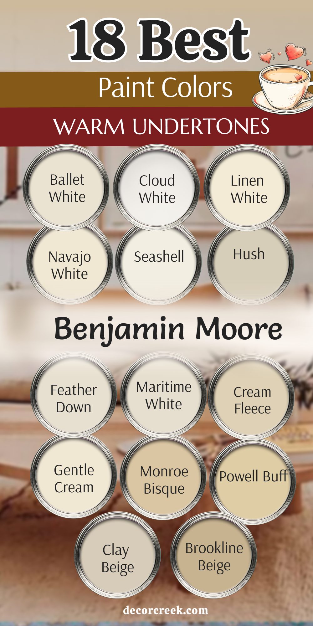
23 Ideas For The Warm Undertone Color Palette
Pure White SW 7005
Pure White SW 7005 is a very bright and clean white that has a tiny drop of warmth hidden inside. This color is the best choice for trim and doors because it looks very sharp against any other color. I love using it in kitchens where you want everything to look very fresh and very new for your family.
It is a very polite white that does not look too yellow or too blue when the sun hits it. This shade helps your colorful walls and artwork really pop out and look very bright in the room. You will notice that it makes your whole house feel very organized and very tidy for everyone who lives there.
It is a great choice for a house that wants to feel very modern and very simple but still very homey. This paint makes a home feel very airy and very full of light for the whole family to enjoy. Most people think this is the perfect white because it goes with every single piece of furniture you own. It is a very beautiful color that makes your house look very big and very bright.
Best used in: trim, doors, kitchen cabinets, and ceilings
Pairs well with: Agreeable Gray SW 7029, Iron Ore SW 7069, Sea Salt SW 6204, all colors The key rule of this color for farmhouse style is to use it where you want natural light to feel kind, soft, and inviting throughout the day.
👉 Read the full guide for this color HERE 👈

White Flour SW 7102
White Flour SW 7102 is a very soft and creamy white that looks like a fresh bowl of white flour. This color is very warm and makes a room feel like it is filled with a very gentle glow. I use it on the walls of master bedrooms where the family wants to feel very quiet and very peaceful.
It is a very warm white that does not look cold or like a piece of paper at all. This shade is perfect for a house that has a lot of natural wood floors and very big rugs. You will love how it makes your colorful blankets and pillows look very bright and very pretty in the light.
It is a great choice for a nursery because it is very sweet and very calm for a new baby. This paint makes a home feel very airy and very full of light for everyone who visits your house. Most people find that this color is very easy to love because it is so soft and so warm. It is a very beautiful choice for making a house feel very cozy and very sweet.
Best used in: bedrooms, nurseries, living rooms, and small kitchens
Pairs well with: Alabaster SW 7008, Steamed Milk SW 7554, Urbane Bronze SW 7048, linen The key rule of this color for farmhouse style is to use it where you want natural light to feel kind, soft, and inviting throughout the day.
👉 Read the full guide for this color HERE 👈
Aesthetic White SW 7035
Aesthetic White SW 7035 is a very soft and warm off-white that feels like a quiet morning in a happy home. This color is very smart because it has a tiny bit of gray and a lot of beige mixed together for your walls. I love using it in open living areas where the light changes a lot from the morning to the evening.
It is a very polite color that makes your colorful rugs and furniture look very bright and very pretty. This shade is light enough to keep a large room feeling very airy and very full of fresh light. You will notice that it makes your white trim look very sharp and very clean in the sunlight.
It is a great choice for a house that wants to feel very modern and very simple but still very warm. This paint makes a home feel very organized and very tidy for a busy family to enjoy every day. Most people find that this color is very easy to love because it is so gentle and so warm. It is a very beautiful choice for making your house feel very cozy and very sweet.
Best used in: living rooms, kitchens, entryways, and master bedrooms
Pairs well with: Pure White SW 7005, Chelsea Gray HC-168, Urbane Bronze SW 7048, light oak The key rule of this color for farmhouse style is to use it where you want natural light to feel kind, soft, and inviting throughout the day.
👉 Read the full guide for this color HERE 👈

Rice Grain SW 6155
Rice Grain SW 6155 is a very warm and earthy tan that looks like a field of gold in the sun. This paint is very full of color and makes a room feel very sturdy and very safe for the family. I pick this color for kitchens because it makes the whole room feel very sunny and very happy for cooking.
It is a very traditional color that looks very rich against a dark wooden table or a stone floor. This shade is deep enough to hide any little marks but light enough to keep the room feeling very bright. You will find that it makes your green plants and colorful dishes look very bright and very pretty.
It is a great choice for a house that has a lot of old-fashioned charm and very sturdy furniture. This paint makes a home feel very established and very high-quality for everyone who lives there. Most families find that this color makes their house feel very solid and very warm all year round. It is a very handsome color that makes your furniture look very sturdy and very pretty.
Best used in: kitchens, breakfast nooks, hallways, and traditional dining rooms
Pairs well with: Dover White SW 6385, Kilim Beige SW 6106, Svelte Sage SW 6164, dark wood The key rule of this color for farmhouse style is to use it where you want natural light to feel kind, soft, and inviting throughout the day.
Mushroom SW 9587
Mushroom SW 9587 is a very rich and deep tan that looks like a warm bowl of soup on a cold day. This color is very cozy and makes a room feel very protected and very warm for your family. I love using it in dens or bedrooms where you want to feel very tucked in and very relaxed.
It has a lot of gray and brown mixed together which makes the walls look very rich and very thick. This shade is perfect for a room that has a lot of big leather chairs and very heavy rugs. You will notice that it creates a very cozy feeling that makes people want to stay for a very long time.
It is a very brave color that shows you love a house that feels very full of life and very warm. This paint makes a home feel very established and very high-quality for everyone who lives there. Most people find that this color makes their room feel very special and very high-quality for reading books. It is a very handsome color that makes your furniture look very sturdy and very pretty.
Best used in: dens, bedrooms, basements, and cozy reading nooks
Pairs well with: Alabaster SW 7008, Accessible Beige SW 7036, Urbane Bronze SW 7048, linen The key rule of this color for farmhouse style is to use it where you want natural light to feel kind, soft, and inviting throughout the day.
Renwick Beige SW 2805
Renwick Beige SW 2805 is a very deep and earthy tan that looks like a beautiful stone in an old garden. This color is very smart and makes a room feel very professional and very well-put-together for guests. I pick this color for formal living rooms or entryways to give the house a look that is very grand.
It is a very warm color that makes a large room feel much more personal and much more like a home. This shade is deep enough to make your colorful rugs and pillows really pop out and look bright. You will love how it looks with gold picture frames and very dark wooden chairs on the floor.
It is a great choice for a house that wants to feel very established and very stylish for a modern family. This paint makes a home feel very cozy and very well-decorated for everyone who visits your house. Most people find that this color makes their room feel very special and very high-quality for many years. It is a very handsome color that makes your furniture look very sturdy and very pretty.
Best used in: formal living rooms, entryways, dining rooms, and exteriors
Pairs well with: Pure White SW 7005, Roycroft Pewter SW 2848, Classical White SW 2829, dark oak The key rule of this color for farmhouse style is to use it where you want natural light to feel kind, soft, and inviting throughout the day.
👉 Read the full guide for this color HERE 👈
Tamarind SW 7538
Tamarind SW 7538 is a very deep and rich brown that looks like a piece of sweet candy or a dark wood. This color is very strong and makes a room feel very sturdy and very safe for the whole family. I love using it on an accent wall or in a small library to make the room feel very special.
It has a lot of red and brown inside which makes the walls look very rich and very thick. This shade is perfect for a room that has a lot of big books and heavy wooden desks to show off. You will love how it makes the room feel like a big hug when you walk inside after a long day.
It is a very brave color that shows you love a house that feels very full of life and very warm. This paint makes a home feel very established and very high-quality for everyone who lives there. Most people find that this color makes their room feel very cozy and very special for working at home. It is a very handsome color that makes your furniture look very sturdy and very pretty.
Best used in: accent walls, libraries, home offices, and formal dining rooms
Pairs well with: Shoji White SW 7042, Kilim Beige SW 6106, Latte SW 6108, gold accents The key rule of this color for farmhouse style is to use it where you want natural light to feel kind, soft, and inviting throughout the day.
Spiced Cider SW 7702
Spiced Cider SW 7702 is a very warm and happy orange that looks like a cup of hot juice in the winter. This color is very bright and makes every room feel like it is filled with a lot of cheer and joy. I pick this color for kitchens or breakfast nooks to make a boring room feel very fun for the family.
It is a very warm color that makes a dark house feel much more light and very energetic for everyone. This shade is soft enough that it feels very pretty and very sweet on the walls of your home. You will love how it makes your white cabinets and white dishes look very fresh and very clean.
It is a great choice for a house that wants to have a lot of personality and a lot of style. This paint makes a home feel very sunny and very full of life for everyone who visits your house. Most families find that this color brings a lot of smiles and a lot of happiness to their house. It is a very special color that makes your house look very bright and very warm.
Best used in: kitchens, breakfast nooks, accent walls, and laundry rooms
Pairs well with: Creamy SW 7012, Macadamia SW 6142, Naval SW 6244, terra cotta The key rule of this color for farmhouse style is to use it where you want natural light to feel kind, soft, and inviting throughout the day.
👉 Read the full guide for this color HERE 👈

Jaipur Pink SW 6577
Jaipur Pink SW 6577 is a very soft and pretty pink that looks like a beautiful flower in a summer garden. This paint is very happy and makes a room feel very cheerful and very bright for your family. I love using it in a girl’s bedroom or a fun guest bathroom to make it look very special.
It is a very warm color that makes a large room feel much more personal and much more like a home. This shade has a lot of orange inside which makes it feel very energetic and very happy for everyone. You will notice that it makes your white furniture and white pillows look very fresh and very clean.
It is a great choice for a house that wants to have a lot of personality and a lot of style. This paint makes a home feel very cozy and very well-decorated for a busy family to enjoy. Most people think this is a very unique color that makes a house look very special and very warm. It is a very beautiful color that makes your house feel very full of love and very bright.
Best used in: nurseries, bedrooms, powder rooms, and craft rooms
Pairs well with: Alabaster SW 7008, Greek Villa SW 7551, Sea Salt SW 6204, gold hardware The key rule of this color for farmhouse style is to use it where you want natural light to feel kind, soft, and inviting throughout the day.
Copper Wire SW 7707
Copper Wire SW 7707 is a very warm and earthy color that looks like a bright penny in the sunlight. This paint is very brave and makes a room feel very exciting and very full of life for the family. I love using it on an accent wall in a kitchen or a dining room to make it look very special.
It is a very warm color that makes a large room feel much more personal and much more like a home. This shade has a lot of orange and red inside which makes it feel very energetic and very happy. You will notice that it makes your green plants and white dishes look very bright and very pretty.
It is a great choice for a house that wants to have a lot of personality and a lot of style. This paint makes a home feel very cozy and very well-decorated for a busy family to enjoy. Most people think this is a very unique color that makes a house look very special and very warm. It is a very beautiful color that makes your house feel very full of love and very bright.
Best used in: accent walls, kitchens, dining rooms, and entryways
Pairs well with: Pure White SW 7005, Urbane Bronze SW 7048, Naval SW 6244, warm wood The key rule of this color for farmhouse style is to use it where you want natural light to feel kind, soft, and inviting throughout the day.
👉 Read the full guide for this color HERE 👈

Vanilla Milkshake OC-59
Vanilla Milkshake OC-59 is a very soft and creamy white that feels like a cold treat on a hot summer day. This color is very pretty because it has a tiny bit of gray and tan mixed together for your walls. I use it in living rooms where the family wants a look that is very clean but still very warm.
It is a very polite color that makes your colorful pillows and artwork look very bright and very happy. This shade is light enough to keep a small room feeling very big and very airy for everyone. You will notice that it changes slightly during the day as the sun moves across your walls.
It is a great choice for a house that has a lot of natural wood and stone details. This paint makes a home feel very organized and very tidy for a busy family to enjoy every day. Most people find that this color is very easy to love because it is so gentle and so warm. It is a very beautiful choice for making your house feel very cozy and very sweet.
Best used in: living rooms, bedrooms, kitchens, and hallways
Pairs well with: White Dove OC-17, Revere Pewter HC-172, Gray Owl OC-52, linen The key rule of this color for farmhouse style is to use it where you want natural light to feel kind, soft, and inviting throughout the day.
👉 Read the full guide for this color HERE 👈
Antique Lace 922
Antique Lace 922 is a very rich and creamy white that looks like a beautiful piece of old fabric. This color is very warm and makes a room feel like it is always bathed in soft and gentle light. I love using it in a master bedroom because it helps you feel very happy and very peaceful when you wake up.
It is a very warm white that does not look cold or like a piece of paper at all. This shade is perfect for a house that has a lot of natural wood floors and very big rugs. You will love how it makes your colorful blankets and pillows look very bright and very pretty in the light.
It is a great choice for a nursery because it is very sweet and very calm for a new baby. This paint makes a home feel very airy and very full of light for everyone who visits your house. Most people find that this color is very easy to love because it is so soft and so warm. It is a very beautiful choice for making a house feel very cozy and very sweet.
Best used in: bedrooms, nurseries, kitchens, and traditional living rooms
Pairs well with: Simply White OC-117, Shaker Beige HC-45, Palladian Blue HC-144, dark wood The key rule of this color for farmhouse style is to use it where you want natural light to feel kind, soft, and inviting throughout the day.
French White 1093
French White 1093 is a very rich and creamy white that looks like a bowl of warm vanilla cream. This color is very special because it makes any room feel like it belongs in a very fancy castle. I love using it in master bedrooms where you want to feel very pampered and very happy.
It is a very warm white that does not look cold or like a piece of ice at all. This shade helps your colorful rugs and pillows really pop out and look very bright on the floor. You will love how it makes your bedroom feel like a very safe and very sweet place to sleep.
It is a great choice for a house that wants to feel very simple and very modern but still very homey. This paint makes a home feel very airy and very full of light for the whole family to enjoy. Most people think this is a very beautiful white because it is so soft and so friendly. It is a very lovely color that makes your house look very big and very bright.
Best used in: master bedrooms, living rooms, kitchens, and formal entryways
Pairs well with: White Dove OC-17, Revere Pewter HC-172, Hale Navy HC-154, antique gold The key rule of this color for farmhouse style is to use it where you want natural light to feel kind, soft, and inviting throughout the day.
👉 Read the full guide for this color HERE 👈

Bleeker Beige HC-80
Bleeker Beige HC-80 is a very soft and sandy tan that looks like a beautiful stone in a pretty garden. This color is very smart because it does not look too yellow or too gray to your eyes. I pick this color for kitchens because it makes the whole room feel very sunny and very happy for cooking.
It is a very warm color that makes a large room feel much more personal and much more like a home. This shade is deep enough to show off your white trim but stays very bright and very happy for everyone. You will notice that it makes your wooden floors look very rich and very expensive in the light.
It is a great choice for an entryway because it makes the house feel very established and very friendly. This paint makes a home feel very warm and very full of love for the whole family to enjoy every day. Most families love this color because it is very classic and never goes out of style for them. It is a very sturdy color that makes your house look very grand and very warm.
Best used in: kitchens, entryways, living rooms, and open floor plans
Pairs well with: Simply White OC-117, Manchester Tan HC-81, Van Courtland Blue HC-145, dark wood The key rule of this color for farmhouse style is to use it where you want natural light to feel kind, soft, and inviting throughout the day.
👉 Read the full guide for this color HERE 👈
Camelback 1103
Camelback 1103 is a very rich and deep tan that looks exactly like the sand on a big warm hill. This color is very strong and makes a room feel very sturdy and very safe for the whole family. I pick this color for dens or home offices where you want to feel very focused and very warm.
It has a lot of gold and brown inside which makes the walls look very rich and very thick. This shade is perfect for a room that has a lot of big books and heavy wooden desks to show off. You will love how the room feels like a big hug when you walk inside after a long day.
It is a very brave color that shows you love a house that feels very full of life and very warm. This paint makes a home feel very established and very high-quality for everyone who lives there. Most people find that this color makes their room feel very cozy and very special for reading or working. It is a very handsome color that makes your furniture look very sturdy and very pretty.
Best used in: dens, home offices, basements, and traditional living rooms
Pairs well with: Antique White SW 6119, Kilim Beige SW 6106, Roycroft Copper SW 2840, leather The key rule of this color for farmhouse style is to use it where you want natural light to feel kind, soft, and inviting throughout the day.
Honeywheat 179
Honeywheat 179 is a very happy yellow that looks like a big field of gold in the summer sun. This color is very bright and makes every room feel like it is filled with a lot of cheer. I love using it in a breakfast nook where you can drink your juice and feel very energetic.
It is a very warm color that makes a dark house feel much more light and very happy for you. This shade is soft enough that it does not feel like it is shouting at you when you walk in. You will notice that it makes your white cabinets and white trim look very fresh and very clean.
It is a great choice for a playroom because it makes kids feel very creative and very active all day. This paint makes a home feel very sunny even on days when it is raining very hard outside. It is a very special color that brings a lot of joy to every person who sees it. It is a very beautiful color that makes your house look very bright and very warm.
Best used in: breakfast nooks, kitchens, playrooms, and laundry rooms
Pairs well with: Chantilly Lace OC-65, Palladian Blue HC-144, White Down OC-131, light maple The key rule of this color for farmhouse style is to use it where you want natural light to feel kind, soft, and inviting throughout the day.
Golden Honey 297
Golden Honey 297 is a very rich and buttery yellow that feels like a warm summer vacation in a bucket. This color is very bright and makes every room feel like it is filled with a lot of cheer. I pick this color for kitchens so that my family feels very happy when they are eating together.
It is a very warm color that makes a dark house feel much more light and very energetic for everyone. This shade is soft enough that it does not feel like it is shouting at you when you walk inside. You will notice that it makes your white trim and white doors look very fresh and very clean.
It is a great choice for a house that wants to have a lot of personality and a lot of style. This paint makes a home feel very sunny and very full of life even on a very rainy day. Most families find that this color brings a lot of smiles and a lot of happiness to their house. It is a very special color that makes your house look very bright and very warm.
Best used in: kitchens, breakfast nooks, sunrooms, and guest bedrooms
Pairs well with: Simply White OC-117, Revere Pewter HC-172, Wythe Blue HC-143, dark wood The key rule of this color for farmhouse style is to use it where you want natural light to feel kind, soft, and inviting throughout the day.
Adobe Dust 2175-40
Adobe Dust 2175-40 is a very warm and earthy pink that looks like a clay pot sitting in the sun. This paint is very brave and makes a room feel very exciting and very full of life for your family. I love using it in a dining room to make the dinner parties feel very fancy and nice.
It is a very warm color that makes a large room feel much more personal and much more like a home. This shade has a lot of orange and red inside which makes it feel very energetic and very happy. You will notice that it makes your green plants and white dishes look very bright and very pretty.
It is a great choice for a house that wants to have a lot of personality and a lot of style. This paint makes a home feel very cozy and very well-decorated for a busy family to enjoy every day. Most people think this is a very unique color that makes a house look very special and very warm. It is a very beautiful color that makes your house feel very full of love and very bright.
Best used in: dining rooms, entryways, accent walls, and powder rooms
Pairs well with: White Dove OC-17, Manchester Tan HC-81, Hale Navy HC-154, terra cotta The key rule of this color for farmhouse style is to use it where you want natural light to feel kind, soft, and inviting throughout the day.
Terra Cotta Tile 2090-30
Terra Cotta Tile 2090-30 is a very deep and earthy red that looks like a beautiful floor in a warm country. This color is very strong and makes a room feel very sturdy and very safe for the whole family. I love using it on an accent wall or in a small den to make the room feel very special.
It has a lot of orange and brown inside which makes the walls look very rich and very thick. This shade is perfect for a room that has a lot of green plants and natural wood furniture. You will love how the room feels like a big hug when you walk inside after a long day of work.
It is a very brave color that shows you love a house that feels very full of life and very warm. This paint makes a home feel very established and very high-quality for everyone who lives there. Most people find that this color makes their room feel very cozy and very special for talking together. It is a very handsome color that makes your furniture look very sturdy and very pretty.
Best used in: accent walls, dens, dining rooms, and kitchens
Pairs well with: Cloud White OC-130, Shaker Beige HC-45, Urbane Bronze SW 7048, wicker The key rule of this color for farmhouse style is to use it where you want natural light to feel kind, soft, and inviting throughout the day.
👉 Read the full guide for this color HERE 👈

Coral Dust 2173-50
Coral Dust 2173-50 is a very soft and pretty pink that looks like a beautiful sunset on a summer night. This paint is very happy and makes a room feel very cheerful and very bright for your family. I love using it in a girl’s bedroom or a laundry room to make a boring chore feel fun.
It is a very warm color that makes a large room feel much more personal and much more like a home. This shade has a lot of orange inside which makes it feel very energetic and very happy for everyone. You will notice that it makes your white furniture and white pillows look very fresh and very clean.
It is a great choice for a house that wants to have a lot of personality and a lot of style. This paint makes a home feel very cozy and very well-decorated for a busy family to enjoy. Most people think this is a very unique color that makes a house look very special and very warm. It is a very beautiful color that makes your house feel very full of love and very bright.
Best used in: nurseries, bedrooms, laundry rooms, and guest bathrooms
Pairs well with: Alabaster SW 7008, Greek Villa SW 7551, Sea Salt SW 6204, light maple The key rule of this color for farmhouse style is to use it where you want natural light to feel kind, soft, and inviting throughout the day.
👉 Read the full guide for this color HERE 👈
Bronzed Beige 2151-50
Bronzed Beige 2151-50 is a very deep and rich tan that looks like a beautiful stone in the bright sun. This color is very strong and makes a room feel very sturdy and very safe for the whole family. I pick this color for entryways so that the first thing people see is a very pretty and warm color.
It is a very warm color that makes a big entryway feel very welcoming and very friendly to guests. This shade is deep enough to show off your white trim but stays very bright and very happy for everyone. You will find that it makes your dark wooden furniture look very handsome and very sturdy against the wall.
It is a great choice for a house that wants to feel very established and very high-quality for the family. This paint makes a home feel very warm and very full of love for everyone who visits. Most families find that this color makes their house feel very solid and very warm all year round. It is a very handsome color that makes your house look very grand and very pretty.
Best used in: entryways, living rooms, kitchens, and formal dining rooms
Pairs well with: Cloud White OC-130, Shaker Beige HC-45, Hale Navy HC-154, brass accents The key rule of this color for farmhouse style is to use it where you want natural light to feel kind, soft, and inviting throughout the day.
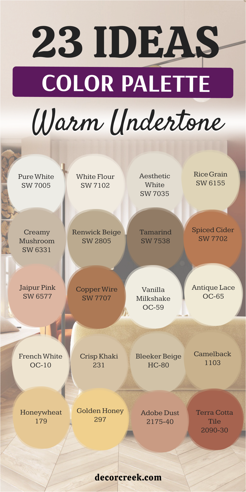
My Final Thoughts about 29 Best Paint Colors With Warm Undertones
I hope this list helps you find the perfect shade to make your home feel wonderful. Choosing a warm color is one of the easiest ways to help a room feel welcoming and full of life. These tones bring a gentle glow to the walls and help every corner of your home feel more inviting. When someone walks through your door, a warm color can help them feel relaxed and happy right away. It adds comfort to everyday moments like morning coffee, quiet evenings, or time spent with family.
Remember that paint is simply a tool that helps you show your personality and style. Your home should reflect what makes you feel good and what brings you joy each day. Some people love creamy whites, others prefer soft beige or warm peach shades. There is no single right answer. The best choice is always the color that makes you smile when you see it in your room.
You should pick the shade that makes you feel the happiest when you wake up and the most relaxed when you return home after a long day. A good paint color can change how a room feels without changing anything else. Even a small update on the walls can make your home feel fresh and full of warmth.
