Choosing the perfect paint color for your walls can feel like a huge decision, but I’m here to make it fun and easy! As someone who designs interiors and stages homes all the time, I know exactly what shades are going to make your home look its best and appeal to the modern aesthetic of 2026.
This article is my personal list of the absolute best paint colors—the ones that are proven winners that look fantastic on every wall, in any light, and that buyers and guests consistently praise. This is not just a random selection; these are the core colors I rely on for my professional projects.
Forget guessing games and the confusion of overwhelming color decks; I’m sharing my secrets, from why I exclusively choose my favorite brands to the exact process of how I select a specific color for a bright kitchen versus a restful bedroom.
My ultimate goal is to give you the clarity and confidence to pick a color that you will genuinely adore and that will make your home feel refined, fresh, and just right in every single detail.
By the end of this, you will be prepared to view your walls in a completely renewed and optimistic light!
Why I Always Trust Sherwin-Williams and Benjamin Moore for Wall Paints
When it comes to painting walls, I strictly adhere to the standards set by the two industry heavy hitters: Sherwin-Williams and Benjamin Moore. And here’s the fundamental reason why I never compromise: I demand uncompromising reliability and quality assurance. I absolutely need to know that the precise color I approve on the sample chip is the exact, chemically consistent shade that will be applied to the wall, and these brands deliver that consistency with every batch they produce.
They invest a substantial amount of science and precision engineering into their pigments and formulas, which means their colors possess a specific depth and rich saturation that mass-market, cheaper paints simply cannot replicate. This crucial depth is what prevents the color from appearing flat, dull, or strangely washed out when the natural or artificial light changes its intensity throughout the day.
Furthermore, their paints are universally known for providing superior coverage, which often means I only need one or two coats for a flawless result, saving considerable time, labor, and overall project costs. For me, specifying a quality paint like Sherwin-Williams or Benjamin Moore is a non-negotiable step toward achieving a truly professional, high-end, and enduring finish.
My entire reputation as a designer rests on the quality of my finished product, and I only use products I trust completely to perform flawlessly for years to come.
How I Choose the Right Wall Paint Shade for Each Room
The very first and most critical factor I always consider is the quality and type of natural light in the room. This element is so powerful that it can completely change a color. A beautiful color that looks bright, clean, and cheerful in a south-facing room with an abundance of sun might look muted, dull, or muddy in a darker, colder north-facing room. Therefore, I always suggest painting a large, at least two-foot by two-foot sample patch directly on the wall and observing it carefully at three distinct times of the day—morning, midday, and evening—before making any final commitment.
Following light, I think intently about the feeling or mood I want the room to immediately convey. For a central living area, I typically gravitate toward something genuinely soft, balanced, and welcoming, such as a light greige or a very warm white, because that area needs to feel comfortable, easygoing, and agreeable for every person using it. In a private area, like a bedroom, I might choose a slightly moodier, deeper, or more personal color that provides a specific, cozy, and private atmosphere.
Finally, I pay extremely close attention to the fixed, permanent elements already present in the room, such as the color of the hard flooring, existing cabinetry, countertops, and any stone or tile work. The new paint must be a perfect companion to these permanent features—it should enhance them, not clash with them or distract the eye.
For example, if the granite countertop or wood floor has inherent yellow or red tones, I must select a wall color that complements and harmonizes with that specific warmth.
It’s entirely about orchestrating a cohesive and harmonious feeling where every element, from the paint to the permanent fixtures, works together beautifully and effortlessly.
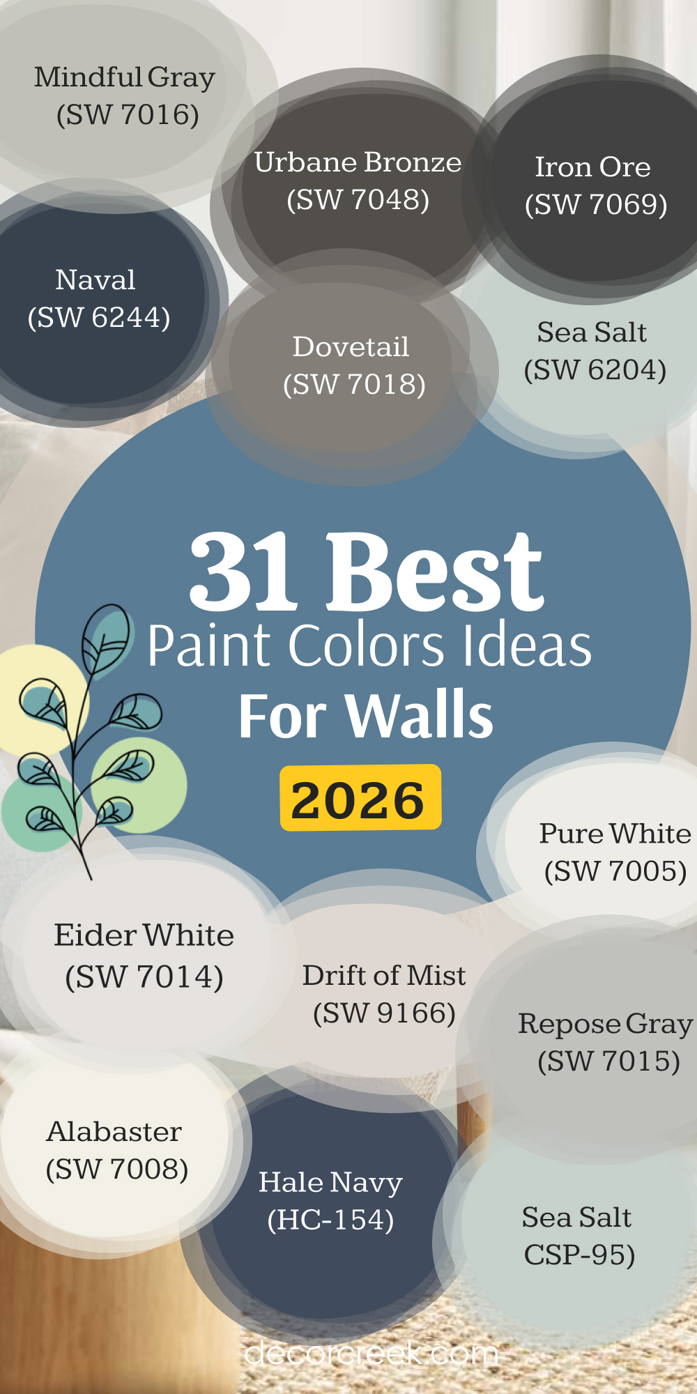
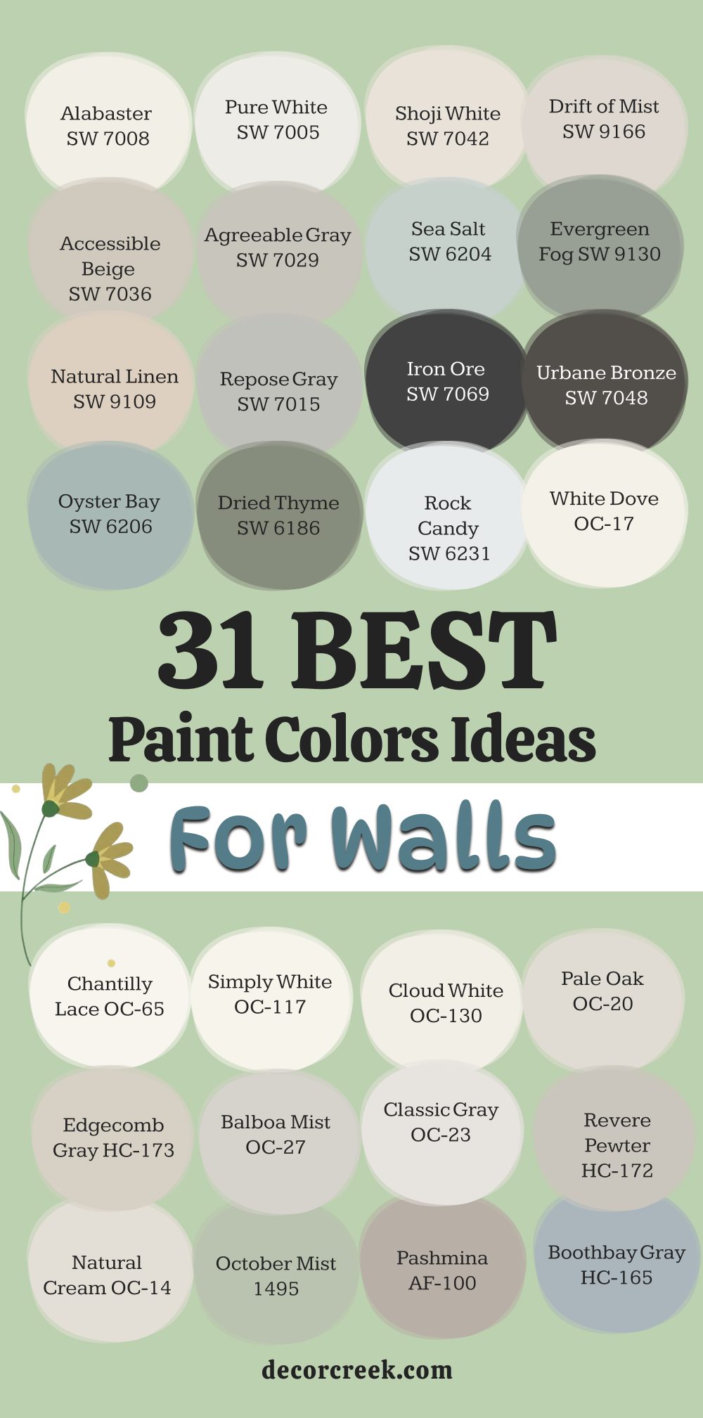
31 Best Paint Ideas For Walls
Alabaster SW 7008
Alabaster SW 7008 is a beautiful creamy white that feels soft and inviting, never stark or cold. This shade is one of Sherwin-Williams’ most popular colors for a very good reason—it has just enough warmth to keep a room feeling cozy. I often use it on walls, trim, and even ceilings when I want a unified, airy look that makes everything feel fresh.
Alabaster pairs wonderfully with both light woods and darker, rich furniture pieces, acting as a perfect backdrop for any decorating style. It truly shines in rooms that receive a lot of natural light, where it glows with a gentle warmth. Because it avoids strong yellow or blue undertones, it’s a remarkably versatile color that works well in almost any room in the house.
This paint color is a safe bet for sellers who want their home to appeal to a wide range of potential buyers. I find that it’s the go-to color when a pure white is too harsh, but you still want a clean, bright feel. Choose Alabaster when you want a white that feels comfortable, lived-in, and absolutely sophisticated. It’s a color that consistently receives compliments for its gentle, flattering glow on walls.
🎨 Check out the complete guide to this color right HERE 👈

Pure White SW 7005
Pure White SW 7005 is a crisp, clean white that I use when I want a true neutral that won’t show any hidden undertones. This color is fantastic for trim, doors, and ceilings, as it brightens up any room and provides a sharp contrast to wall colors. It is also an excellent choice for modern or minimalist interiors where a stark, bright white is the desired aesthetic.
Pure White is not a cold white; it has a hint of warmth that prevents it from feeling too sterile, which is a major benefit. I appreciate that it allows other colors and textures in a room to take center stage, making it a great supporting color. When painting an entire room in this color, the result is dazzling and immediately makes the room feel much larger and more open.
This shade reflects light beautifully, helping to maximize the brightness in rooms that lack natural sun. It creates a flawless canvas for art, colorful rugs, and detailed architectural features that you want to highlight. I always recommend this paint to clients who are looking for a highly reliable, straightforward white.
🎨 Check out the complete guide to this color right HERE 👈

Shoji White SW 7042
Shoji White SW 7042 is a sophisticated off-white that sits firmly in the warm category, leaning towards a very light beige or greige. This beautiful color acts like a warm blanket for any room, instantly making the atmosphere feel welcoming and soft. I often choose Shoji White when a client wants a white wall but needs a little more depth and less reflection than a bright white provides.
It has lovely greige undertones, which means it looks fantastic when paired with rich wood tones, creamy fabrics, and even darker accent colors like deep blues or greens. The warmth of Shoji White changes beautifully throughout the day, looking creamy in the morning light and settling into a deeper greige as the evening arrives.
It works exceptionally well in older homes or homes with more traditional architecture, giving the walls an aged and soft appearance. I find this color to be the perfect bridge between a beige and a white, offering the best qualities of both without being too heavy. This is a must-try color if you are looking for a white that has a discernible color presence and a comforting feel.
🎨 Check out the complete guide to this color right HERE 👈

Drift of Mist SW 9166
Drift of Mist SW 9166 is a gorgeous light greige that is hard to categorize, which is exactly why I love it so much for wall paint. This shade has a perfect balance of gray and beige, making it truly neutral and easy to pair with almost any existing decor. I rely on Drift of Mist when a client wants a color that is not quite white but still feels light, airy, and refreshing.
It has the wonderful ability to shift its appearance based on the light in the room, sometimes looking more gray and other times showing its beige warmth. The color provides a gentle contrast against bright white trim, creating a defined but soft architectural detail.
This greige is an ideal choice for open-concept homes because it flows effortlessly from room to room without being jarring or demanding attention. It’s a very versatile and contemporary wall color that appeals to a wide variety of personal tastes. I find that it is a very successful color in home staging because it looks crisp and clean without feeling cold or uninviting.
🎨 Check out the complete guide to this color right HERE 👈

Accessible Beige SW 7036
Accessible Beige SW 7036 is one of Sherwin-Williams’ most celebrated colors, and it’s a perfect greige that truly lives up to its name. This shade is a wonderful choice for people who want a beige that is updated and not at all like the outdated yellow-toned beiges of the past. I often recommend Accessible Beige for main living areas because it has a comforting warmth that makes people feel instantly at ease.
It has a beautiful gray undertone that prevents it from ever looking too yellow or pink on the wall. This color pairs exceptionally well with stone fireplaces and natural wood finishes, highlighting their texture and richness. Accessible Beige is a powerhouse color for staging because it is genuinely neutral and looks fantastic with almost any accent color you introduce into the room.
It’s a color that feels grounding and stable, offering a sense of permanence and quality to the room’s design. I’ve used it successfully in both highly sunny and lower-light rooms, proving its incredible versatility and adaptability. This is the shade you choose when you want a rich, warm neutral that stands the test of time.
🎨 Check out the complete guide to this color right HERE 👈

Agreeable Gray SW 7029
Agreeable Gray SW 7029 is arguably Sherwin-Williams’ most famous paint color, consistently topping lists for its balanced and harmonious appearance. This is another classic greige, but it leans slightly more towards the gray side than Accessible Beige, while still retaining a crucial amount of warmth. I use Agreeable Gray when a client wants a true gray that doesn’t feel cold or industrial in their living areas or bedrooms.
It has a magical quality of adapting to the lighting and surrounding colors, making it look different in every home, but always looking good. The shade provides a beautiful, soft backdrop that allows your furniture, artwork, and textiles to be the stars of the room. It works particularly well in homes that have a modern farmhouse or traditional-leaning style because of its sophisticated, yet comfortable feel.
I find that it is an excellent color for buyers who want a move-in-ready neutral that they won’t feel the need to immediately paint over. Choose Agreeable Gray for a dependable, perfectly balanced neutral that lives up to its reputation for being, well, agreeable.
🎨 Check out the complete guide to this color right HERE 👈

Sea Salt SW 6204
Sea Salt SW 6204 is a highly popular light greenish-gray that introduces a fantastic coastal or spa-like feeling to any wall. This color is wonderfully airy and cheerful, reminding me of soft ocean air or a misty spring morning. I frequently choose Sea Salt for bathrooms, laundry rooms, or sunrooms where I want to create a refreshing and light-hearted atmosphere.
The color is highly reactive to light; in bright daylight, the green tones are more prominent, while in less light, it can appear as a soft, silvery gray-blue. Because it’s a muted color, it never feels bright or neon, instead offering a soothing and quiet presence on the wall.
It pairs beautifully with bright white trim and natural materials like linen, rattan, and light woods. I caution clients that it can read quite blue in certain lighting, so testing a sample is absolutely vital before painting the whole room. This is a special, tranquil color that works best when you want to bring a little bit of the outdoors’ restful nature inside.
🎨 Check out the complete guide to this color right HERE 👈

Evergreen Fog SW 9130
Evergreen Fog SW 9130 is a beautiful, muted, mid-tone green that was Sherwin-Williams’ Color of the Year for 2022, and it remains a fantastic choice. This color is an outstanding blend of gray and green with a slight blue-gray undertone that gives it a wonderfully sophisticated character.
I love using Evergreen Fog as an accent wall in a living room, or painting an entire dining room for a cozy, enveloping effect. It pairs gorgeously with warm metals like brass and gold, and it is a beautiful contrast to creamy white trim. The color is grounded and natural, providing a comforting connection to the natural world right inside your home.
Because it’s so complex, it manages to feel both current and classic at the same time, making it a wise choice for a main paint color. I find that this shade is perfect for creating a relaxed and contemplative atmosphere in a study or a home office. It’s a very current and earthy choice for a wall color that adds a layer of depth and personality.
🎨 Check out the complete guide to this color right HERE 👈

Natural Linen SW 9109
Natural Linen SW 9109 is a warm, classic beige that offers a more traditional and comforting feeling on your walls. This color is excellent for rooms where you want a definite sense of warmth without falling into the gray trend that is everywhere right now. I often turn to Natural Linen when working on a traditional home where the existing fixed elements like flooring or stone have inherently warm undertones.
It has a beautiful, rich depth that makes the wall feel substantial and of high quality, unlike some flimsy, washed-out beiges. The color looks exceptional when paired with deep wood tones, like cherry or mahogany, which helps to create a rich, custom-feeling interior.
I recommend using this paint in rooms that have a lot of detailed trim work, as the color highlights the craftsmanship perfectly. It’s a dependable choice for a den or a formal dining room where a cozy, established feeling is desired. This is the perfect color for anyone looking to move away from gray but still wants a sophisticated, reliable neutral.
🎨 Check out the complete guide to this color right HERE 👈

Repose Gray SW 7015
Repose Gray SW 7015 is another one of Sherwin-Williams’ top-performing greige colors, sitting very much on the gray side of the spectrum. This is the gray I choose when I want a cooler look than Agreeable Gray, but without going completely cold or steely blue. I find Repose Gray to be a great workhorse color for almost any room in the house, from a brightly lit kitchen to a low-light hallway.
It has very slight, almost imperceptible violet undertones, which give it a unique and sophisticated character when the light hits it just right. It provides an excellent, crisp backdrop for modern furniture and colorful accent pillows, allowing the decor to truly pop.
Because of its cool edge, it looks stunning when paired with darker woods, sharp white trim, and chrome or nickel fixtures. I’ve used this color countless times in staging because it is a highly popular, fashionable color that feels current and clean. Choose Repose Gray if you are looking for a true gray that has just enough warmth to feel comfortable and inviting.
🎨 Check out the complete guide to this color right HERE 👈

Iron Ore SW 7069
Iron Ore SW 7069 is a very deep, dramatic charcoal that is so dark it almost reads as black on the wall, but with a softer, muddier quality. This color is absolutely fantastic for creating high-impact accent walls, painting kitchen islands, or for giving a small powder room an intensely moody feel.
I love that Iron Ore is not a true, stark black, so it feels more sophisticated and less severe than a pure black paint would. It provides a stunning, high-contrast moment when paired with crisp white trim and light-colored furniture and rugs. This color is surprisingly versatile and can look traditional and elegant or completely modern and graphic, depending on the furnishings around it.
I suggest only using this shade in rooms that have a lot of natural light, as it can make a windowless room feel far too heavy. When used on a feature wall, it acts as a gorgeous, deep anchor for a room’s design, making lighter elements feel brighter by comparison. It’s a bold choice, but one that offers incredible payoff in terms of style and drama.
🎨 Check out the complete guide to this color right HERE 👈

Urbane Bronze SW 7048
Urbane Bronze SW 7048 is a deep, rich, and grounding color that Sherwin-Williams selected as their Color of the Year for 2021. This gorgeous shade is a mix of brown, gray, and a hint of bronze, giving it a beautifully complex and earthy presence on the wall.
I adore using Urbane Bronze for creating a cozy, den-like atmosphere, painting a striking mudroom, or using it on interior doors for a customized look. It is an extremely warm and welcoming dark color that doesn’t feel cold or forbidding at all, making it a good choice for family gathering areas.
When paired with natural wood and linen textures, it creates a very organic, sophisticated, and natural look that is highly fashionable. I often suggest painting the walls in this color with a semi-gloss sheen to really bring out the subtle bronze shimmer in the paint. This is a perfect example of how a dark color can actually make a room feel cozier and more intimate, rather than smaller.
🎨 Check out the complete guide to this color right HERE 👈
Oyster Bay SW 6206
Oyster Bay SW 6206 is a beautiful, muted blue-green that has a slightly more saturated presence than its famous relative, Sea Salt. This shade is one of my favorites for creating a true spa-like retreat in a master bathroom or a calming, traditional atmosphere in a dining room. I find that Oyster Bay has a richness and depth that keeps it from looking pastel or childish on the wall.
The color takes on a different life depending on the lighting; it can look more green in warm, yellow light and lean more blue in cool, northern light. It pairs exceptionally well with creamy white trim and darker wood tones, creating a classic, coastal feeling.
I appreciate that it is a colored neutral, meaning it has a distinct color but is still soft enough to work with many different design elements. This paint color is perfect for those who want to introduce a beautiful, natural-feeling color to their home without going too bright or dramatic. It’s a soothing and refreshing color that promotes a feeling of peace and quiet.
🎨 Check out the complete guide to this color right HERE 👈

Dried Thyme SW 6186
Dried Thyme SW 6186 is a gorgeously saturated, deep sage green that feels incredibly rich and wonderfully organic on the wall. This color has been a staple for me in designing traditional, heritage-style homes, as it gives the walls a sophisticated, aged character. I often use Dried Thyme in a study, a mudroom, or on kitchen cabinetry for a custom, high-end look that is both fashionable and grounding.
It has a beautiful complexity with gray undertones that prevent it from ever looking too bright or too forest-green. The shade is a perfect partner for natural wood, brass hardware, and warm leather textures, creating a luxurious and comfortable atmosphere.
I find that the color is particularly effective in spaces that are meant to feel cozy and intimate, as its depth pulls the walls in slightly. It is a fantastic alternative to traditional dark blues or charcoal grays when you want a moody color with a natural feel. This is a very successful color for adding an immediate layer of character and richness to any interior.
🎨 Check out the complete guide to this color right HERE 👈

Rock Candy SW 6231
Rock Candy SW 6231 is a delightfully crisp and bright, cool white that has a hint of a blue-gray undertone. This paint color is excellent for rooms that receive a lot of warm, southern light, as the cool undertone helps to balance the yellowness of the light. I often choose Rock Candy when I want a very clean, almost icy white that feels contemporary and sharp, especially for trim work.
It is a great choice for bathrooms, kitchens, and modern living rooms where a truly pure and unadulterated white is needed to achieve the design vision. The color acts as a perfect contrast for warmer, darker wall colors or for showcasing brightly colored furniture and art.
I appreciate that it is a refreshing and invigorating white that gives any room a clean, renewed feeling. I caution clients to only use this color if they truly want a cool white, as it will look distinctly blue-toned in low light or on cloudy days. This shade provides the bright, reflective quality of pure white but with a subtle complexity that adds a sophisticated touch.
🎨 Check out the complete guide to this color right HERE 👈

White Dove OC-17
White Dove OC-17 is arguably Benjamin Moore’s most popular white, famous for its creamy, soft texture and incredible versatility on the wall. This color has just the right amount of warmth—a slight hint of yellow and gray—that prevents it from ever feeling cold or stark, which is why I use it constantly.
I rely on White Dove for everything from walls and ceilings to all the trim and interior doors in a home, creating a soft, cohesive look. It pairs beautifully with virtually every color on the spectrum, making it an excellent choice for open-concept floor plans where it needs to coordinate with many other elements.
The color is highly successful in traditional and farmhouse-style homes, where its warm, comfortable feeling is particularly appreciated. I find that it is the perfect white to use when a pure, bright white is too harsh, but you still want a clean, classic feel. This color has been a cornerstone in my designs for years because it offers a sophisticated softness that other whites just cannot match.
🎨 Check out the complete guide to this color right HERE 👈

Chantilly Lace OC-65
Chantilly Lace OC-65 is Benjamin Moore’s cleanest, brightest white, with virtually no discernible undertones of yellow or blue. This color is the closest thing to a true, unmixed white that I use, and it’s perfect when you want a crisp, sharp look for your walls or trim.
I choose Chantilly Lace in contemporary or minimalist designs where the goal is a sleek, gallery-like background that lets the architecture and furnishings speak for themselves. It reflects light beautifully, which is a wonderful benefit for making small or dark rooms feel larger and brighter. It provides a stunning contrast to darker wall colors, making trim and millwork details look sharp and pronounced.
I find that this shade is a great choice for ceilings, as it offers a clean, bright lift without competing with the wall color. I always recommend this paint to clients who are looking for a highly reliable, straightforward white that gives a very fresh and modern feeling. It’s a fantastic, dependable white that will never fail to look sharp and clean on your walls.
🎨 Check out the complete guide to this color right HERE 👈

Simply White OC-117
Simply White OC-117 is a brilliant, slightly warm white that was named Benjamin Moore’s Color of the Year in 2016 and remains highly popular today. This color has a lovely, subtle yellow-green undertone that gives it a beautiful vibrancy and keeps it from feeling dull or muted. I use Simply White when I want a bright, cheerful white that feels energetic and happy on the walls.
It is a wonderful color for kitchen cabinets because it looks clean and bright without being harsh or sterile under artificial lighting. It works exceptionally well in rooms that have less natural light, as its inherent brightness helps to counteract gloominess and shadows.
I find that it pairs particularly well with warm, natural materials like oak and rattan, complementing their tones beautifully. This white is a favorite of mine for adding a sense of lightness and airiness to any interior, especially for a fresh, updated look. Choose Simply White when you want a white that feels truly bright and inviting, radiating a welcoming light.
🎨 Check out the complete guide to this color right HERE 👈

Cloud White OC-130
Cloud White OC-130 is a wonderfully soft and warm white that has a gentle, creamy presence on the wall, avoiding any harsh edges. This color has a beautiful yellow and red base that gives it a rich, almost buttery quality, making it feel very cozy and traditional.
I often choose Cloud White for older homes or rooms with lots of historical millwork because it gives a sophisticated, aged appearance that suits the architecture. It is an excellent choice for trim and doors, where its warmth provides a lovely contrast to cooler wall colors. I appreciate that this shade is very forgiving and looks soft and beautiful even when the lighting is poor or shadowy.
I find that it is a fantastic color for bedrooms and living rooms where a very comforting and restful atmosphere is the main goal. It pairs well with earthy tones, dark woods, and rich, jewel-toned fabrics, highlighting their depth. This is the perfect white for anyone looking for a rich, established color that truly feels like a hug for your walls.
🎨 Check out the complete guide to this color right HERE 👈

Pale Oak OC-20
Pale Oak OC-20 is a beautiful, delicate off-white that sits right in the family of light, warm greiges, making it an incredibly popular and sophisticated choice. This shade is one of Benjamin Moore’s most complex neutrals; it’s never just gray or just beige, but a wonderful mix that keeps you guessing.
I often choose Pale Oak for open-concept homes because it is light enough to feel airy but has enough depth to provide a nice contrast to white trim. It has a slight violet or pink undertone, which gives it a softness and warmth that prevents it from ever feeling cold or drab.
The color reacts strongly to light, sometimes looking much whiter and brighter in sunlight, and showing its greige side in the shadows. I find that it is a very successful color for staging, as it is elegant, current, and complements a wide range of furniture and decor styles. It’s an ideal wall color for those who want a neutral that is subtle but still has a noticeable presence and a high-end feel.
🎨 Check out the complete guide to this color right HERE 👈

Edgecomb Gray HC-173
Edgecomb Gray HC-173 is a highly regarded, classic greige from Benjamin Moore that has an unmistakable warm, cozy quality. This beautiful color is perfect for main living areas because it has a comforting earthiness that makes any room feel grounded and relaxing. I rely on Edgecomb Gray when I need a neutral that leans more towards beige than gray, but still retains a modern feel without any yellow or gold tones.
It pairs excellently with all types of wood finishes, from light oak to dark walnut, and provides a lovely, gentle contrast to white trim. I find that this shade is incredibly adaptable, working well in both sun-drenched and low-light rooms, always maintaining its sense of warmth and color.
Because it is part of Benjamin Moore’s Historical Collection, it has a classic, reliable quality that always looks sophisticated and established. This is a dependable choice for homeowners who want a neutral wall color that is proven to work in nearly any setting and with any decor.
🎨 Check out the complete guide to this color right HERE 👈

Balboa Mist OC-27
Balboa Mist OC-27 is a soft, delicate, and pale greige that I consider to be one of the most sophisticated light neutrals available. This beautiful color has a prominent gray base but with a creamy warmth that keeps it from looking too stark, giving it a gentle luminosity on the wall. I often choose Balboa Mist for master bedrooms and formal dining rooms where a quiet elegance and a whisper of color are the goal.
It has subtle violet undertones, which are often very appealing and give the color a unique, complex character when the light hits it. It pairs gorgeously with rich textures, mirrors, and glass, reflecting light and making the room feel more refined.
I find that this color is a favorite for home stagers and designers because it gives a very expensive and tailored feel to the walls. It’s a wonderful alternative to a plain white if you are looking for a neutral that has just enough depth to hold its own without being demanding.
🎨 Check out the complete guide to this color right HERE 👈

Classic Gray OC-23
Classic Gray OC-23 is one of Benjamin Moore’s most misleadingly named colors, as it is actually a beautiful, pale off-white with a very slight greige undertone. This color is perfect for walls when a pure white is too harsh, but you want a color that still reads as exceptionally bright and airy.
I often use Classic Gray when a client wants to use a white color but their room has a lot of shadows or is north-facing, as the shade helps to counteract the gloomy lighting. It has a beautiful, gentle warmth to it, which prevents it from ever feeling icy or cool on the wall.
I find that it is a versatile choice for every single room in the house, flowing beautifully from one area to the next without interruption. It is an excellent backdrop for colorful art and patterned textiles, allowing them to take center stage without competition. This is the neutral that you choose when you want a color that is almost imperceptible but still gives your walls a soft, custom-painted quality.
🎨 Check out the complete guide to this color right HERE 👈

Revere Pewter HC-172
Revere Pewter HC-172 is a classic, established, and highly recognizable mid-tone greige from Benjamin Moore’s Historical Collection. This shade has a rich, earthy depth to it, leaning slightly towards beige, but with a definite presence of gray that keeps it updated and sophisticated.
I often choose Revere Pewter for rooms that need to feel grounded and substantial, such as a traditional study, a den, or a main living room with high ceilings. It is an excellent choice for a whole-house color because its depth hides imperfections and provides a beautiful, muted backdrop for life.
It pairs exceptionally well with dark wood flooring, oil-rubbed bronze hardware, and traditional furniture, giving the room a comfortable, timeless look. I find that it works best in rooms with good natural light, as it can feel a bit heavy in very dark interior rooms. This color is the epitome of a warm, reliable neutral that offers a perfect mix of gray and beige sophistication.
🎨 Check out the complete guide to this color right HERE 👈

Natural Cream OC-14
Natural Cream OC-14 is a soft, warm cream color that is a lovely, more current alternative to the yellow-toned creams of the past. This shade is perfect for walls when you want a color that feels distinctly warm, rich, and comforting without any gray undertones at all.
I often use Natural Cream in bedrooms and dining rooms where a cozy, intimate, and sophisticated atmosphere is the main design goal. It has a beautiful, soft luminosity that makes the walls feel almost hand-painted and of very high quality.
It pairs beautifully with rich wood tones, creamy linens, and brushed gold or brass fixtures, highlighting their warmth and luxury. I find that this color is a great choice for traditional and rustic homes where a highly bright, modern white would feel out of place. This is a wonderfully enveloping color that gives any room a welcoming and established feel.
🎨 Check out the complete guide to this color right HERE 👈

October Mist 1495
October Mist 1495 is a beautiful, very soft, and muted sage green that Benjamin Moore chose as their Color of the Year for 2022. This shade is one of my favorites for introducing a quiet, natural color to the walls that still functions like a neutral.
I often use October Mist in a kitchen, a cozy breakfast nook, or a powder room for a sophisticated and unexpected pop of natural color. It has a gentle, earthy gray undertone that prevents it from ever looking too minty or too bright green on the wall.
It pairs exceptionally well with light wood tones, simple furniture, and white trim, creating a clean, Scandinavian-inspired look. I find that this color is a wonderful choice for creating a restful and quiet atmosphere in a bedroom or home office. It’s a versatile and fashionable green that adds a fresh, organic layer to your home’s design.
🎨 Check out the complete guide to this color right HERE 👈

Pashmina AF-100
Pashmina AF-100 is a gorgeous, warm, and mid-tone brown-greige that offers a much richer and deeper color on the wall than many other popular neutrals. This shade is perfect for creating a cozy, den-like feeling or for a stunning accent wall that anchors a room with its earthy presence.
I often choose Pashmina when a client wants a color that is noticeably darker than Revere Pewter but still has that perfect balance of gray and beige. It has a definite, deep warmth that makes it pair beautifully with leather furniture, darker wood tones, and plush, inviting textures.
I find that this color is incredibly successful in rooms that are meant for relaxation and intimate gathering, as its depth pulls the walls in softly. It works best in rooms with decent natural light so that its complex color can truly shine and not look too heavy. This is a very luxurious and comforting color that gives a home an immediate feeling of high quality and sophistication.
🎨 Check out the complete guide to this color right HERE 👈

Boothbay Gray HC-165
Boothbay Gray HC-165 is a beautiful, clean, mid-tone gray that has a noticeable but soft blue-green undertone. This shade is one of my go-to choices for a sophisticated coastal look or for a bedroom where a quiet, watery color is desired.
I often use Boothbay Gray in bathrooms and laundry rooms because the blue-green quality feels very fresh and clean in those utility areas. It is an excellent choice for a wall color that provides a soft, cool contrast to bright white trim and ceiling paint.
I find that the color is highly reactive to light; it can look quite blue on an overcast day and more gray-green in strong sunlight. This color provides a wonderful splash of color without feeling overwhelming or too bright, acting as a colored neutral. It’s a very successful shade for introducing a light, airy, and refreshing feeling to any interior room.
🎨 Check out the complete guide to this color right HERE 👈

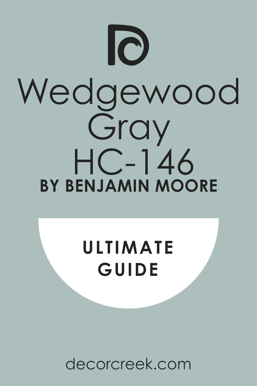
Wedgewood Gray HC-146
Wedgewood Gray HC-146 is a classic, muted, medium-dark blue that has a significant gray base, giving it a sophisticated, dusty quality. This color is perfect for a traditional dining room, a cozy study, or an elegant bedroom where you want a rich, enveloping color.
I often choose Wedgewood Gray when a client wants a clear blue color on their wall, but needs it to feel grown-up and established rather than bright or juvenile. It pairs exceptionally well with rich wood tones, white trim, and brass or silver metallic accents, creating a very classic and refined look.
I find that the color’s muted quality makes it surprisingly versatile and easy to live with, acting as a beautiful backdrop for art and furniture. This shade is a testament to how a deeper color can be used to create a welcoming, intimate atmosphere in a room. It is a highly respected, established color that offers immediate character and depth.
🎨 Check out the complete guide to this color right HERE 👈
Kendall Charcoal HC-166
Kendall Charcoal HC-166 is a gorgeous, deep, and heavily saturated charcoal gray that is incredibly popular for high-impact feature areas. This shade is one of my favorite colors for painting kitchen island bases, interior doors, and dramatic accent walls in living rooms or studies.
I find that Kendall Charcoal has a subtle green or sometimes a very slight brown undertone, which prevents it from ever looking stark blue or cold on the wall. It provides an immediate sense of sophisticated drama and acts as a strong anchor in a room, making all surrounding colors look brighter and cleaner.
It pairs exceptionally well with bright white trim and light wood flooring, creating a sharp, modern contrast. I often suggest using this color in a semi-gloss sheen on trim or cabinetry to really bring out the richness of the charcoal depth. This is a very strong and confident color choice that gives any room an immediate custom and high-end feel.
🎨 Check out the complete guide to this color right HERE 👈

Hale Navy HC-154
Hale Navy HC-154 is one of Benjamin Moore’s most famous and beloved colors, a deep, rich, and classic navy blue. This color is one of my go-to choices for high-impact interior doors, accent walls, and for painting small, moody powder rooms or dens.
I find that Hale Navy has a true, deep blue base that avoids purple or green undertones, making it a reliable and incredibly versatile dark color. It provides a stunning, high-contrast look when paired with crisp white trim like Chantilly Lace or Simply White.
It is a fantastic color for creating a formal or nautical-inspired look that feels both established and very current in its application. I’ve used this color countless times because it has an immediate, powerful presence that gives any room a custom-designed feel. It’s a bold choice, but one that is highly successful for adding depth and personality to a home.
🎨 Check out the complete guide to this color right HERE 👈

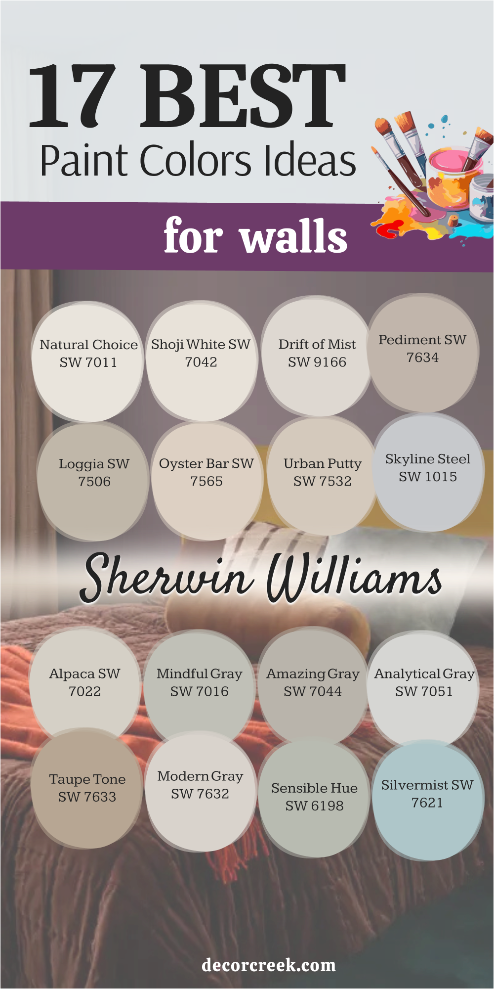
17 Best Paint Ideas For Walls From Sherwin Williams
Natural Choice SW 7011
Natural Choice SW 7011 is a warm, creamy off-white that provides a comforting, soft feeling on the walls without any starkness. This shade is a wonderful choice for homeowners who want a white that leans towards the traditional and cozy rather than the bright and modern.
I often use Natural Choice when a room has existing warm elements like wood trim or terracotta flooring that need a supportive wall color. It has a lovely subtle beige or yellow undertone that keeps the walls from feeling cold or washed out in any light.
It pairs beautifully with earth tones, warm metals, and soft, natural fabric textures, creating a restful atmosphere. I find that this color is particularly effective in master bedrooms and living rooms where a truly relaxing and welcoming feel is essential. Choose Natural Choice when you need a gentle, reliable white that feels established and wonderfully soft.
🎨 Check out the complete guide to this color right HERE 👈

Shoji White SW 7042
Shoji White SW 7042 is a very warm off-white that acts like a soft, light greige on the walls, providing a comforting, gentle presence. This shade is perfect for those who want a white but need more substance and depth to the color than a clean white can provide.
I often use Shoji White in open-concept spaces because it flows beautifully from room to room, creating a seamless and sophisticated look. It has subtle beige and gray undertones, which makes it an incredibly versatile color that works with almost any decor style.
It pairs gorgeously with both light and dark woods, highlighting the natural textures in a beautiful way. I find this color to be the ideal bridge between a traditional cream and a modern greige, offering the best qualities of both worlds. Choose Shoji White for a sophisticated off-white that has a discernible color presence and a comforting warmth.
🎨 Check out the complete guide to this color right HERE 👈
Drift of Mist SW 9166
Drift of Mist SW 9166 is an exceptionally light greige that provides a delicate whisper of color on the walls. This shade is perfect when a client wants a color that is truly neutral, avoiding both strong gray and strong beige tones.
I often rely on Drift of Mist when staging homes because it is light, bright, and appeals to a very wide audience without feeling boring. It has a beautiful, soft complexity that allows it to adapt to different lighting situations, sometimes looking a bit more gray and other times a bit warmer.
It provides a gentle, pleasing contrast to white trim, giving the room a clean and finished architectural look. I find that this greige is a very contemporary and versatile wall color that works effortlessly in any room. Choose Drift of Mist for a wonderfully balanced neutral that is light, airy, and universally flattering on walls.
🎨 Check out the complete guide to this color right HERE 👈
Pediment SW 7634
Pediment SW 7634 is a beautiful, muted, mid-tone greige that is deeper and more saturated than lighter colors like Accessible Beige. This shade is perfect for creating a cozy, grounded feeling in a living room or study where you want the walls to have a substantial presence.
I often use Pediment when a room has a lot of natural light and I need a color with enough depth to hold its own against the bright sun. It has a nice balance of gray and beige with a soft, earthy undertone that gives it a rich and sophisticated character.
It pairs wonderfully with stone fireplaces, traditional wood furniture, and tailored linen fabrics, creating a comfortable and established interior. I find that this color is a great choice for homeowners who are looking for a reliable, deeper neutral that feels classic and warm. Choose Pediment when you want a rich, warm greige that makes a confident statement on the walls.
🎨 Check out the complete guide to this color right HERE 👈
Loggia SW 7506
Loggia SW 7506 is a warm, established mid-tone brown that has a noticeable gray influence, making it a very sophisticated and grounded color. This shade is perfect for creating a cozy, den-like atmosphere or for adding a rich, earthy color to a dining room.
I often choose Loggia when a client wants a color that is noticeably darker than the average greige, but without going fully into the deep charcoal or navy family. It has a beautiful, comforting depth that works exceptionally well with natural wood textures, leather furniture, and brass accents.
I find that this color is particularly successful in rooms where the goal is to create an intimate and relaxed feeling. It’s a great choice for traditional and rustic homes where a highly bright or cool color would feel out of place. Choose Loggia for a rich, warm, and sophisticated brown-greige that adds a feeling of permanence and quality.
🎨 Check out the complete guide to this color right HERE 👈

Oyster Bar SW 7565
Oyster Bar SW 7565 is a light, warm neutral that sits somewhere between a soft beige and a light khaki, offering a beautiful, earthy presence. This shade is perfect for walls when you want a color that is definitely warm but lacks the pink or yellow undertones that can often plague classic beige colors.
I often use Oyster Bar in kitchens or living rooms where a comfortable, sun-kissed feeling is the main goal. It has a clean, gentle quality that provides a lovely, soft contrast to white trim and cabinetry.
I find that this color pairs especially well with natural textures like linen, wool, and rattan, creating a very organic and relaxing interior design. It’s a dependable choice for a wall color that is both warm and reliably neutral for every season. Choose Oyster Bar for a light, earthy neutral that brings a sunny and comforting atmosphere to any room.
🎨 Check out the complete guide to this color right HERE 👈
Urban Putty SW 7532
Urban Putty SW 7532 is a wonderfully balanced, mid-tone greige that offers a great mix of gray and beige, with a very soft, dusty undertone. This shade is perfect for a living room or bedroom where you want a color that is noticeably richer than a lighter neutral but still very versatile.
I often choose Urban Putty for homes with traditional or transitional decor because it feels current and classic at the same time. It has a substantial depth that keeps it from washing out in bright light, and it looks incredibly grounded in lower-light situations.
It pairs beautifully with both light and dark wood furniture, acting as a supportive and sophisticated backdrop. I find that this color is a great workhorse neutral that gives the walls a high-quality, finished appearance. Choose Urban Putty when you want a reliable, mid-tone greige that provides depth and comfort.
Skyline Steel SW 1015
Skyline Steel SW 1015 is a cool, light-to-mid-tone gray that has a very clean and contemporary feel on the walls. This shade is perfect for creating a sleek, modern look in a living room, office, or bedroom where a cooler palette is desired.
I often use Skyline Steel when the fixed elements in the room, like stone or tile, lean towards cooler colors like blue, black, or white. It has a slight blue undertone, which gives it a refreshing and bright quality, preventing it from looking drab or dull.
It provides a sharp, sophisticated contrast to bright white trim and looks fantastic with polished chrome or nickel fixtures. I find that this color is a great choice for staging as it feels current, clean, and highly fashionable. Choose Skyline Steel for a cool, crisp gray that brings a refreshing and modern aesthetic to your walls.
🎨 Check out the complete guide to this color right HERE 👈

Alpaca SW 7022
Alpaca SW 7022 is a beautiful, pale greige that leans distinctly towards the beige side, offering a very soft and warm presence on the wall. This shade is perfect for those who want a light neutral that feels cozy and comforting, avoiding any cool or icy qualities.
I often choose Alpaca for bedrooms and living areas where a truly relaxing and enveloping atmosphere is the main design goal. It has just enough depth to contrast nicely with white trim without making the room feel heavy or dark.
It pairs wonderfully with natural textures, creamy fabrics, and warm wood tones, creating a soothing and organic look. I find that this color is a great alternative to the typical gray, providing warmth without resorting to a traditional yellow-based beige. Choose Alpaca for a soft, warm greige that makes any room feel instantly inviting and comfortable.
🎨 Check out the complete guide to this color right HERE 👈
Mindful Gray SW 7016
Mindful Gray SW 7016 is a popular mid-tone greige that sits comfortably between light neutrals and darker colors, providing a perfect balance of depth and light. This shade is one of my go-to choices when I want a color that is noticeably gray but still has enough warmth to feel welcoming and not stark.
I often use Mindful Gray for living rooms and hallways because it works well in varying light and flows easily between different rooms. It has a beautiful, soft depth that provides a solid, dependable backdrop for all types of furniture and art.
It pairs exceptionally well with sharp white trim and works with both dark and light wood flooring. I find that this color is a true workhorse neutral that gives a home a sophisticated and finished appearance. Choose Mindful Gray for a reliable, balanced greige that offers a refined and enduring look on your walls.
🎨 Check out the complete guide to this color right HERE 👈

Amazing Gray SW 7044
Amazing Gray SW 7044 is a lovely, deep, and established greige that offers a very rich and grounded presence on the walls. This shade is perfect for creating a sense of coziness and sophistication in a living room, dining room, or study.
I often choose Amazing Gray when a client is looking for a color with more saturation than Mindful Gray, but still wants that perfect balance of gray and beige. It has a substantial depth that looks fantastic when paired with dark wood tones, comfortable leather furniture, and brass or oil-rubbed bronze accents.
I find that this color provides an excellent backdrop for art, allowing colorful pieces to truly pop against its rich neutral tone. It’s a great choice for traditional homes where a classic, reliable, and slightly darker neutral is desired. Choose Amazing Gray for a rich, sophisticated greige that brings immediate depth and comfort to your walls.
🎨 Check out the complete guide to this color right HERE 👈
Analytical Gray SW 7051
Analytical Gray SW 7051 is a light, clean gray that has a very subtle green-blue undertone, giving it a cool and crisp feeling on the walls. This shade is perfect for a bathroom, laundry room, or sunroom where a refreshing and light atmosphere is the goal.
I often use Analytical Gray when a client wants a true gray that doesn’t feel warm, but also doesn’t look too cold or sterile. It has a gentle, watery quality that makes it feel airy and bright, especially in rooms with a lot of natural light.
It pairs beautifully with bright white trim and silver or chrome fixtures, creating a clean, updated look. I find that this color is a great alternative to white when you want a light wall color that has a distinct, fresh hue. Choose Analytical Gray for a light, cool gray that feels clean, refreshing, and beautifully subtle.
🎨 Check out the complete guide to this color right HERE 👈

Taupe Tone SW 7633
Taupe Tone SW 7633 is a deep, warm, mid-tone brown that has a very comforting and earthy presence on the wall. This shade is perfect for creating a sophisticated, traditional atmosphere in a den, library, or formal dining room.
I often choose Taupe Tone when a client wants a color that feels grounding and rich, providing a beautiful contrast to light trim and furnishings. It has a substantial depth that works wonderfully with classic wood tones, leather furniture, and rich, plush textiles.
I find that this color is a fantastic choice for homes with traditional architecture, giving the walls an established and luxurious feel. It’s a dependable color for adding a layer of warmth and refined character to any interior. Choose Taupe Tone for a rich, warm brown that provides a deep, comforting, and elegant look on your walls.
🎨 Check out the complete guide to this color right HERE 👈
Modern Gray SW 7632
Modern Gray SW 7632 is a wonderfully light, airy greige that is incredibly popular for its subtle warmth and clean appearance on the walls. This shade is perfect when you want a neutral that is close to white but has a bit more depth to provide a soft contrast to trim.
I often use Modern Gray in open-concept floor plans because it flows seamlessly and keeps the entire living area feeling light and refreshed. It has a beautiful, soft quality that is neither too gray nor too beige, making it highly versatile and easy to decorate around.
It pairs beautifully with both contemporary and traditional furnishings, adapting easily to any design style. I find that this color is a fantastic choice for home staging because it appeals to a wide variety of tastes while feeling clean and current. Choose Modern Gray for a light, soft greige that offers an airy, sophisticated background for your home.
🎨 Check out the complete guide to this color right HERE 👈

Sensible Hue SW 6198
Sensible Hue SW 6198 is a lovely, muted gray-green that has a gentle, natural quality on the walls, making it feel organic and restful. This shade is perfect for a bedroom, home office, or sunroom where a quiet and soothing atmosphere is the goal.
I often choose Sensible Hue when a client wants to introduce a color that feels connected to nature but is still subtle and versatile like a neutral. It has a beautiful, earthy depth with gray undertones that prevent it from looking too bright or too minty.
It pairs exceptionally well with natural wood textures, light linen fabrics, and bright white trim, creating a clean, organic look. I find that this color is a great choice for those who are tired of typical grays but still want a sophisticated, muted color. Choose Sensible Hue for a natural, soft gray-green that promotes a feeling of quiet restfulness.
Silvermist SW 7621
Silvermist SW 7621 is a beautiful, light, and airy blue-gray that has a refreshing, watery quality on the walls. This shade is perfect for a bathroom, laundry room, or kitchen where a clean, coastal-inspired look is desired.
I often use Silvermist when a client wants a color that is distinctly blue but is muted and softened by a significant gray component. It has a lovely brightness to it that makes rooms feel open and clean, especially in areas with good natural light.
It pairs beautifully with crisp white trim and silver or chrome fixtures, enhancing its clean and modern feel. I find that this color is a wonderful choice for creating a light-hearted and cheerful atmosphere without being too bold or overwhelming. Choose Silvermist for a light, refreshing blue-gray that feels airy, clean, and beautifully subtle.
Austere Gray SW 6184
Austere Gray SW 6184 is a beautiful, complex greige that leans strongly towards the gray side while still retaining a crucial amount of warmth. This shade is perfect for a living room or hallway where you want a substantial, grounding color that isn’t too dark.
I often choose Austere Gray when a room has a lot of architectural detail that I want to highlight with a sophisticated, moody neutral. It has a lovely, rich depth that works wonderfully with dark wood furniture, leather, and tailored fabrics.
I find that this color is a great workhorse neutral for traditional and transitional homes, providing a reliable and established backdrop. It’s a sophisticated and dependable gray that offers a refined and enduring look on your walls.
🎨 Check out the complete guide to this color right HERE 👈
16 Best Paint Ideas For Walls By Benjamin Moore
White Dove OC-17
White Dove (OC-17) is Benjamin Moore’s highly celebrated, creamy white, renowned for its soft texture and incredible adaptability in any room. This color is one of my essential shades, used on walls and trim alike, to provide a gentle, warm light that is never harsh or cold.
I rely on White Dove because it possesses a perfect balance of warmth and brightness, making it look elegant and soft in all types of light. It has just enough subtle gray and yellow to keep it from feeling stark, creating an inviting and comfortable atmosphere.
It pairs beautifully with every other color on the spectrum, making it an ideal background for changing decor styles or accent colors. I find that it is the perfect white to use when a homeowner wants a clean, classic feel that is still warm and welcoming. Choose White Dove for a sophisticated and enduring white that truly feels like a hug for your walls.
🎨 Check out the complete guide to this color right HERE 👈
Simply White OC-117
Simply White (OC-117) is a bright, luminous white that was recognized as Benjamin Moore’s Color of the Year, celebrated for its brilliant and cheerful quality. This color is the perfect choice when you want a white that feels truly energetic and makes a room feel light-filled and airy.
I often choose Simply White for kitchen cabinets or trim because its slight yellow-green undertone keeps it from looking dull under artificial light. It is a fantastic color for rooms that lack natural light, as its inherent brightness helps to counteract shadows and gloominess.
It pairs exceptionally well with both light, airy colors and deep, saturated jewel tones, making everything around it look crisper. I find that this white is a favorite for designers because it adds a sense of lightness and a renewed feeling to any interior. Choose Simply White when you want a truly bright, clean white that radiates an inviting and happy glow.
🎨 Check out the complete guide to this color right HERE 👈
Chantilly Lace OC-65
Chantilly Lace (OC-65) is Benjamin Moore’s purest, crispest white, celebrated for having virtually no visible undertones, making it a true blank canvas. This color is the closest I get to using a pure, unmixed white, and it’s fantastic for achieving a sharp, modern, or minimalist look.
I often use Chantilly Lace on trim and doors to provide a dazzling contrast to wall colors, making architectural details pop. It reflects light beautifully, which is a wonderful benefit for making smaller rooms feel larger and much brighter.
It is an excellent choice for a gallery-style wall or for displaying vibrant artwork, as it allows the colors to be the main focus. I find that this paint is highly successful in homes where a sleek, unadulterated white is needed for a clean, sharp aesthetic. Choose Chantilly Lace for a highly reliable, straightforward white that looks clean, sharp, and flawlessly bright on your walls.
🎨 Check out the complete guide to this color right HERE 👈
Classic Gray OC-23
Classic Gray (OC-23) is a beautifully pale off-white that has just a hint of a greige undertone, offering a soft, custom quality to the walls. This color is an ideal choice when a pure white is too stark, but you still want a wall color that reads as exceptionally bright and airy.
I often use Classic Gray in sun-filled living areas, as its subtle undertone prevents the walls from washing out completely in the bright light. It has a lovely, delicate warmth that makes it feel much more inviting than a cool, pure white.
It pairs beautifully with white trim and serves as a sophisticated, quiet backdrop for all types of furniture and decor. I find that this shade is a very versatile choice for every room, creating a seamless and tranquil flow throughout the home. Choose Classic Gray for a neutral that is almost imperceptible but still gives your walls a beautiful, soft, custom-painted quality.
🎨 Check out the complete guide to this color right HERE 👈
Pale Oak OC-20
Pale Oak (OC-20) is a gorgeous, delicate off-white that sits in the light, warm greige family, prized for its complexity and refinement. This shade is one of Benjamin Moore’s most popular neutrals because it is light enough to feel airy but has enough depth to provide a soft contrast.
I often choose Pale Oak for open-concept areas because it helps to define the walls without being too demanding or heavy. It has a slight violet or pink undertone, which gives it a soft, sophisticated warmth that is incredibly appealing.
I find that it is a very successful color for staging because it is highly elegant, current, and complements a wide range of furniture and textile choices. It’s an ideal wall color for those who want a neutral that is truly subtle but still offers a noticeable presence and a high-end, tailored feel.
🎨 Check out the complete guide to this color right HERE 👈
Swiss Coffee OC-45
Swiss Coffee (OC-45) is a wonderfully soft, warm white that has a distinctly creamy, almost aged quality to it. This color is perfect for walls when you want a white that feels cozy, established, and very comfortable, avoiding any stark, modern feelings.
I often use Swiss Coffee in traditional homes or for trim where a bright white would feel too harsh and out of place with the architecture. It has a beautiful, rich depth that makes the walls feel substantial and of high quality, unlike some flimsy, washed-out whites.
It pairs beautifully with warm wood tones, rustic textures, and natural stone, highlighting their earthy quality. I find that this shade is a great choice for creating a restful, comforting atmosphere in a bedroom or a cozy den. Choose Swiss Coffee for a warm, creamy white that feels inviting, classic, and truly soft on the walls.
🎨 Check out the complete guide to this color right HERE 👈

Revere Pewter HC-172
Revere Pewter (HC-172) is a highly dependable, established, and classic mid-tone greige from Benjamin Moore, celebrated for its richness. This shade is a wonderful choice for rooms that need to feel grounded and substantial, like a traditional living room or a long, connecting hallway.
I often choose Revere Pewter because it has a perfect balance of beige and gray, leaning slightly warm, giving it a classic and sophisticated depth. It pairs exceptionally well with dark wood flooring, traditional furniture, and cream-colored trim, creating a comfortable and enduring look.
I find that its depth holds up well in varying light, preventing it from looking washed out in sun or too heavy in shadow. This color is the quintessential warm neutral that provides an established, high-quality, and comfortable feeling on your walls.
🎨 Check out the complete guide to this color right HERE 👈
Balboa Mist OC-27
Balboa Mist (OC-27) is a delicate, pale greige that I consider to be one of the most sophisticated light neutrals for a refined look. This shade is perfect for bedrooms and formal areas where a quiet elegance and a subtle whisper of color are the main design goals.
I often use Balboa Mist when a client wants a color that is almost white but with just enough gray and creamy warmth to give it depth and softness. It has very subtle violet undertones, which give the color a unique complexity and luxurious feel when the light hits the walls.
It pairs beautifully with white trim, glass, and mirrors, reflecting light to make the room feel more refined and open. I find that this color is a favorite for designers because it provides a very custom and high-end feel to the walls. Choose Balboa Mist for a soft, light greige that offers a touch of sophistication and quiet elegance.
🎨 Check out the complete guide to this color right HERE 👈
Gray Owl OC-52
Gray Owl (OC-52) is a beautiful, light, and very clean mid-tone gray that has a definite cool undertone of blue and green. This shade is perfect for an airy, contemporary living room or a kitchen where a clean, crisp, and refreshing feeling is desired.
I often choose Gray Owl when a client wants a true gray that leans slightly cool but avoids looking too cold or sterile on the wall. It has a lovely brightness to it that makes rooms feel open and clean, especially in rooms with plenty of natural light.
It pairs wonderfully with bright white trim and looks fantastic with polished chrome or nickel fixtures, enhancing its clean, modern feel. I find that this color is a highly fashionable and versatile choice for any home. Choose Gray Owl for a clean, light gray that feels refreshing, airy, and beautifully modern on your walls.
🎨 Check out the complete guide to this color right HERE 👈

Edgecomb Gray HC-173
Edgecomb Gray (HC-173) is a highly regarded, warm, mid-tone greige from Benjamin Moore, celebrated for its comfortable and cozy quality. This shade is perfect for main living areas and family rooms because it has a grounded, earthy warmth that makes people feel instantly at ease.
I often rely on Edgecomb Gray when I need a neutral that leans slightly more towards beige than gray, providing a reliable sense of warmth. It pairs excellently with all types of wood finishes and provides a lovely, gentle contrast to crisp white trim.
I find that this color is incredibly adaptable, performing well in both sunny and shadowy rooms while always maintaining its inherent warmth. It’s a classic color choice that always looks sophisticated and established in any setting. Choose Edgecomb Gray for a dependable, perfectly warm greige that works in nearly every room.
🎨 Check out the complete guide to this color right HERE 👈
Horizon 1478
Horizon (1478) is a delicate, very light gray that has a subtle, almost watery blue undertone, giving it a soft, ethereal quality on the walls. This shade is perfect for a bedroom or a quiet study where a truly gentle, calming, and reflective atmosphere is the main design goal.
I often use Horizon when a client wants a color that is lighter than a mid-tone gray but still has a distinct cool hue that reads as sophisticated. It has a beautiful lightness that helps to make rooms feel open and airy, especially when paired with white trim.
I find that this color is a great choice for creating a restful and subtle coastal feeling in a room. It’s a very clean and light color that offers a refreshing, quiet sense of tranquility on your walls.
Van Courtland Blue HC-145
Van Courtland Blue (HC-145) is a beautiful, dusty, classic blue that has a strong gray influence, giving it a sophisticated and historical quality. This shade is perfect for a traditional dining room, a den, or an elegant bedroom where a rich, established color is desired.
I often choose Van Courtland Blue when a client wants a clear blue color on their wall but needs it to feel mature and refined rather than bright or primary.
It pairs exceptionally well with creamy white trim, dark wood furniture, and gold or brass accents, creating a very classic, tailored look. I find that the color’s muted quality makes it surprisingly versatile and easy to live with, acting as a beautiful, grounding backdrop. This shade is a testament to how a deeper color can be used to create a welcoming and intimate atmosphere in a room.
🎨 Check out the complete guide to this color right HERE 👈
Hale Navy HC-154
Hale Navy (HC-154) is Benjamin Moore’s most recognized and successful deep navy blue, celebrated for its rich, unwavering classic hue. This color is my immediate choice for high-impact accent walls, dramatic interior doors, and for creating a moody, chic atmosphere in a powder room.
I find that Hale Navy has a true, deep blue base that remains consistent, avoiding unwanted purple or green shifts, making it reliably sophisticated. It provides a stunning, high-contrast look when paired with the crispness of a white like Chantilly Lace or Simply White.
It is a fantastic color for creating a formal or nautical look that feels both established and highly fashionable. I’ve used this color countless times because it brings an immediate, powerful presence that gives any room a custom-designed, high-end feel. Choose Hale Navy for a bold, reliable navy that adds depth and classic drama to your home.
🎨 Check out the complete guide to this color right HERE 👈
Kendall Charcoal HC-166
Kendall Charcoal (HC-166) is a gorgeous, deep, and heavily saturated charcoal gray that is incredibly popular for high-impact areas. This shade is one of my favorite colors for painting a strong accent wall, kitchen cabinetry, or interior doors for a customized, high-end look.
I find that Kendall Charcoal has subtle green or brown undertones, which prevents it from ever looking cold, sterile, or overtly blue on the wall. It provides an immediate sense of sophisticated drama and acts as a strong anchor, making lighter colors and white trim look sharper by comparison.
It pairs exceptionally well with bright white trim and light wood flooring, creating a sharp, modern contrast that is highly fashionable. I often suggest using this color in a semi-gloss sheen on cabinetry to truly bring out the richness of its deep, smoky tone. This is a very strong and confident color choice that gives any room an immediate custom and luxurious feel.
🎨 Check out the complete guide to this color right HERE 👈
October Mist 1495
October Mist (1495) is a beautiful, very soft, and muted sage green that was named Benjamin Moore’s Color of the Year for 2022. This shade is perfect for introducing a quiet, earthy color to the walls that still functions beautifully as a sophisticated neutral.
I often use October Mist in a kitchen, a cozy breakfast nook, or a powder room for a refined and organic pop of color. It has a gentle, grounding gray undertone that prevents it from ever looking too bright or too minty green on the wall.
It pairs exceptionally well with light wood tones, simple furniture, and white trim, creating a clean, natural, and calming interior. I find that this color is a wonderful choice for creating a restful and quiet atmosphere in a bedroom or home office. Choose October Mist for a fresh, organic green that adds a sophisticated layer of nature and tranquility to your home’s design.
🎨 Check out the complete guide to this color right HERE 👈
Wickham Gray HC-171
Wickham Gray (HC-171) is a very light, soft gray that has a distinct, beautiful blue-green undertone, giving it a clean, silvery quality. This shade is perfect for a bedroom or a sun-filled living area where a refreshing, airy, and sophisticated color is desired.
I often use Wickham Gray when a client wants a light gray but with a noticeable cool color shift to bring a fresh feeling to the walls. It has a lovely luminosity that makes the walls feel almost transparent, especially when paired with crisp white trim.
It pairs beautifully with white, silver, and pale wood tones, creating a tranquil, airy, and subtly coastal atmosphere. I find that this color is a great choice for creating a very restful and subtly colorful backdrop. Choose Wickham Gray for a light, cool gray that feels clean, silvery, and beautifully refreshing on your walls.
🎨 Check out the complete guide to this color right HERE 👈


31 Best Paint Ideas For Walls ToTry This Year
White Dove OC-17
White Dove (OC-17) is a beautifully creamy white that is a perennial favorite for its soft, inviting character, never feeling cold or stark. This shade is a quintessential choice for walls, trim, and ceilings when a uniform, airy, and warm look is the design goal. I rely on White Dove because its delicate balance of warmth and brightness makes it look consistently elegant in all lighting conditions.
It possesses just enough subtle yellow and gray to soften its presence, making it a very comfortable and welcoming color in any room. It pairs beautifully with practically every color, which makes it an excellent, versatile background for any type of decorating style or colorful accents.
I find that this paint is the perfect option when a pure, sharp white feels too harsh, but you still desire a clean, classic, and sophisticated feel. Choose White Dove for an enduring, versatile white that truly feels like a warm embrace for your walls, radiating a gentle glow.
🎨 Check out the complete guide to this color right HERE 👈
Chantilly Lace OC-65
Chantilly Lace (OC-65) is Benjamin Moore’s brightest, cleanest white, famously lacking any significant visible undertones, making it a true, crisp neutral. This color is the closest I get to using a pure, unadulterated white, and it is my go-to for achieving a sharp, contemporary, and sleek aesthetic.
I often use Chantilly Lace extensively on trim, doors, and ceilings because it provides a dazzling, high-contrast look to all surrounding wall colors. It is an exceptional light reflector, a huge benefit for maximizing the brightness and sense of openness in smaller or darker rooms. It serves as an excellent, clean backdrop for showcasing colorful artwork and high-design furnishings without competing for attention.
I find that this paint is essential for homes where a modern, gallery-like, and flawlessly bright white is the core of the design vision. Choose Chantilly Lace for a highly dependable, straightforward white that looks flawlessly sharp, clean, and beautifully contemporary on your walls.
🎨 Check out the complete guide to this color right HERE 👈
Simply White OC-117
Simply White (OC-117) is a vibrant, slightly warm white that is celebrated for its bright, happy, and energetic quality on the wall. This color is one of my favorites when a client wants a white that feels truly light-filled and has a joyful, uplifting presence in the room.
I often choose Simply White for kitchen cabinets and trim because its subtle yellow-green undertone prevents it from looking dull or dingy under artificial lighting. It works exceptionally well in rooms that have less natural sunlight, as its inherent luminosity helps to brighten and lift any shadowed corner.
It pairs beautifully with both light and dark materials, complementing natural wood tones and making deeper colors look richer. I find that this white is a highly successful color for bringing a sense of freshness, airiness, and a renewed feeling to any interior. Choose Simply White when you want a white that feels genuinely bright and inviting, consistently radiating a welcoming light throughout the day.
🎨 Check out the complete guide to this color right HERE 👈
Classic Gray OC-23
Classic Gray (OC-23) is a beautifully pale off-white that features a whisper of a greige undertone, offering a soft, sophisticated custom quality to the walls. This color is the perfect solution when a homeowner finds pure white too stark but still desires a wall color that reads as exceptionally bright and refreshing.
I often use Classic Gray in areas with strong natural light, as its gentle undertone prevents the walls from looking completely washed out by the sun. It possesses a lovely, delicate warmth that makes it feel much more inviting and comfortable than a purely cool, bright white.
It pairs wonderfully with bright white trim and serves as a quiet, unobtrusive, and sophisticated backdrop for all varieties of furniture and textiles. I find that this shade is a versatile and elegant choice for every room, ensuring a tranquil and cohesive flow throughout the entire home. Choose Classic Gray for a neutral that is truly subtle but still gives your walls a beautiful, soft, and custom-painted sense of quality.
🎨 Check out the complete guide to this color right HERE 👈
Pale Oak OC-20
Pale Oak (OC-20) is a gorgeous, refined off-white that sits firmly in the light, warm greige family, cherished for its complexity and versatility. This shade is one of Benjamin Moore’s most complex neutrals because it is light enough to feel airy but has just enough depth to provide a soft, noticeable contrast.
I often choose Pale Oak for open-concept homes because it manages to define the walls subtly without ever feeling demanding or heavy in the vast area. It carries a slight violet or pink undertone, which imparts a soft, sophisticated warmth that is incredibly charming and universally appealing.
I find that it is a highly successful color for staging, as it is elegant, current, and complements a wide range of furniture and textile choices. It’s an ideal wall color for those who want a neutral that is truly subtle but still offers a noticeable, highly refined presence and a high-end, tailored feel.
🎨 Check out the complete guide to this color right HERE 👈
Swiss Coffee OC-45
Swiss Coffee (OC-45) is a wonderfully soft, warm white that has a distinctly creamy, almost historical quality to it, perfect for a cozy atmosphere. This color is ideal for walls when you want a white that feels cozy, established, and very comfortable, avoiding any sharp or contemporary feelings.
I often use Swiss Coffee in traditional homes or for trim where a bright white would clash with the existing architecture’s warm tones. It has a beautiful, rich depth that makes the walls feel substantial and of high quality, unlike some flimsy, washed-out whites.
It pairs beautifully with warm wood tones, rustic textures, and natural stone, emphasizing their earthy and comforting qualities. I find that this shade is an excellent choice for creating a restful, comforting atmosphere in a den or a master bedroom. Choose Swiss Coffee for a warm, creamy white that feels inviting, classic, and truly soft, providing a gentle comfort on your walls.
🎨 Check out the complete guide to this color right HERE 👈
Balboa Mist OC-27
Balboa Mist (OC-27) is a delicate, pale greige that is one of the most sophisticated light neutrals, providing a refined and quiet look. This shade is perfect for bedrooms and formal areas where a quiet elegance and a subtle, almost whisper-like color are the primary design objectives.
I often use Balboa Mist when a client wants a color that is almost white but has just enough gray and creamy warmth to give it softness and depth. It possesses very subtle violet undertones, which lend the color a unique complexity and a luxurious feel, especially as the light shifts.
It pairs beautifully with bright white trim, glass, and mirrors, reflecting light to make the room feel more refined and open. I find that this color is a designer favorite because it gives a room an immediate custom and high-end, tailored finish on the walls. Choose Balboa Mist for a soft, light greige that offers a touch of sophistication and quiet elegance.
🎨 Check out the complete guide to this color right HERE 👈
Gray Owl OC-52
Gray Owl (OC-52) is a beautiful, light, and very clean mid-tone gray that carries a definite cool undertone of blue and green, giving it a crisp feel. This shade is perfect for an airy, contemporary living room or a kitchen where a clean, sharp, and refreshing atmosphere is desired.
I often choose Gray Owl when a client wants a true gray that leans cool but successfully avoids looking too sterile or harsh on the wall. It has a lovely brightness that contributes to making rooms feel open and clean, especially in areas with plenty of natural light.
It pairs wonderfully with crisp white trim and looks fantastic with polished chrome or nickel fixtures, enhancing its clean, modern feel. I find that this color is a highly fashionable and versatile choice for adding a refined touch to any home. Choose Gray Owl for a clean, light gray that feels refreshing, airy, and beautifully modern on your walls.
🎨 Check out the complete guide to this color right HERE 👈
Horizon 1478
Horizon (1478) is a delicate, very light gray that possesses a subtle, almost watery blue undertone, lending it an ethereal quality on the walls. This shade is perfect for a bedroom or a quiet study where a truly gentle, calming, and reflective atmosphere is the main design goal.
I often use Horizon when a client wants a wall color that is lighter than a typical mid-tone gray but still has a distinct cool hue that reads as sophisticated. It has a beautiful, soft lightness that contributes to making rooms feel open and exceptionally airy, especially when paired with white trim.
I find that this color is a wonderful choice for creating a restful and subtle coastal feeling without any bright or overpowering blues. It’s a very clean and light color that offers a refreshing, quiet sense of tranquility on your walls.
Revere Pewter HC-172
Revere Pewter (HC-172) is a highly dependable, classic, and established mid-tone greige from Benjamin Moore, celebrated for its richness and warmth. This shade is a fantastic choice for rooms that need to feel grounded and substantial, such as a traditional study or a main family living room.
I often choose Revere Pewter because it has a perfect, deep balance of beige and gray, leaning slightly warm, giving it a classic and sophisticated depth. It pairs exceptionally well with dark wood flooring, traditional furniture, and cream-colored trim, creating a comfortable and enduring look.
I find that its depth holds up wonderfully in varying light conditions, ensuring it never looks washed out or overly heavy. This color is the quintessential warm neutral that provides an established, high-quality, and comfortable feeling on your walls.
🎨 Check out the complete guide to this color right HERE 👈
October Mist 1495
October Mist (1495) is a beautiful, very soft, and muted sage green that was Benjamin Moore’s Color of the Year in 2022, and it remains a stylish choice. This shade is perfect for introducing a quiet, natural, and earthy color to the walls that still operates successfully as a highly sophisticated neutral.
I often use October Mist in a kitchen, a cozy breakfast nook, or a powder room for a refined and organic splash of color. It has a gentle, grounding gray undertone that skillfully prevents it from ever looking too bright or too minty green on the wall. It pairs exceptionally well with light wood tones, simple furniture, and white trim, creating a clean, natural, and calming interior aesthetic.
I find that this color is a wonderful choice for creating a highly restful and quiet atmosphere in a bedroom or a focused home office. Choose October Mist for a fresh, organic green that adds a sophisticated layer of nature and tranquility to your home’s design.
🎨 Check out the complete guide to this color right HERE 👈
Quiet Moments 1563
Quiet Moments (1563) is a beautifully serene, pale blue-green that is soft, airy, and truly evocative of a peaceful, calm body of water. This shade is one of my favorite colors for bedrooms, bathrooms, and sunrooms where a restful, spa-like, and tranquil atmosphere is the main goal.
I often choose Quiet Moments because it has a lovely, muted quality with strong gray undertones that prevent it from ever looking too bright or too baby blue. It is a highly reflective color that looks beautifully airy in bright sunlight and becomes a deeper, more sophisticated blue-gray in the shadows.
It pairs wonderfully with crisp white trim, natural wood finishes, and linen fabrics, creating an effortless, coastal-inspired look. I find that this color is a great choice for creating a personalized sanctuary within the home. Choose Quiet Moments for a soft, watery blue-green that brings a sophisticated sense of tranquility to your walls.
🎨 Check out the complete guide to this color right HERE 👈

Wickham Gray HC-171
Wickham Gray (HC-171) is a very light, soft gray that has a distinct, beautiful blue-green undertone, giving it a clean, silvery, and very subtle quality. This shade is perfect for a bedroom or a sun-filled living area where a refreshing, airy, and sophisticated cool color is desired.
I often use Wickham Gray when a client wants a light gray but with a noticeable cool color shift to bring a fresh, almost watery feeling to the walls. It has a lovely luminosity that makes the walls feel almost transparent, especially when contrasted with crisp white trim.
It pairs beautifully with white, silver, and pale wood tones, creating a tranquil, airy, and subtly coastal atmosphere. I find that this color is a great choice for creating a very restful and subtly colorful backdrop that remains highly versatile. Choose Wickham Gray for a light, cool gray that feels clean, silvery, and beautifully refreshing on your walls.
🎨 Check out the complete guide to this color right HERE 👈
Sea Salt CSP-95
Sea Salt (CSP-95) is a fantastic, light, and airy gray that has a very soft blue-green undertone, making it feel organic and coastal on the walls. This shade is perfect for a powder room, a sunroom, or a bedroom where a light, refreshing, and sophisticated color is the design goal.
I often choose Sea Salt because it has just enough gray to keep it from looking pastel, while its blue-green hue adds a beautiful, subtle character. It is a highly versatile colored neutral that changes beautifully depending on the light, sometimes looking more blue and sometimes more green.
It pairs wonderfully with bright white trim and natural textures, creating an effortless, tranquil atmosphere. I find that this color is a great way to introduce a touch of subtle color without sacrificing a light, airy feel in the room. Choose Sea Salt for a light, refreshing gray-green that brings a beautiful sense of peace and airiness to your walls.
🎨 Check out the complete guide to this color right HERE 👈
Hale Navy HC-154
Hale Navy (HC-154) is one of Benjamin Moore’s most recognizable and successful deep navy blues, celebrated for its rich, classic, and sophisticated hue. This color is my immediate choice for creating high-impact statements on interior doors, accent walls, and for designing a moody, chic atmosphere in a den or powder room.
I find that Hale Navy has a true, deep blue base that remains consistent, skillfully avoiding unwanted purple or green shifts, making it a reliable dark color. It provides a stunning, high-contrast look when paired with the crispness of a bright white trim like Chantilly Lace or Simply White.
It is a fantastic color for creating a formal or nautical-inspired look that feels both established and highly fashionable. I’ve used this color countless times because it has an immediate, powerful, and classic presence that gives any room a custom-designed feel. Choose Hale Navy for a bold, reliable navy that adds depth and timeless drama to your home.
🎨 Check out the complete guide to this color right HERE 👈
Alabaster SW 7008
Alabaster (SW 7008) is a wonderfully creamy white that feels soft, warm, and inviting on the walls, successfully avoiding any stark or cold qualities. This shade is one of Sherwin-Williams’ most popular colors because it has just the right amount of warmth to keep a room feeling cozy and comfortable.
I often use it on walls, trim, and ceilings when the goal is a unified, airy look that makes the entire room feel fresh and welcoming. Alabaster pairs beautifully with both light and dark wood tones, acting as a perfect, gentle backdrop for any decor style.
It truly shines in rooms that receive a lot of natural light, where it glows with a beautiful, soft warmth throughout the day. I find that it is the go-to color when a pure white feels too harsh, but you still desire a clean, bright, and utterly sophisticated feel. Choose Alabaster when you want a white that feels comfortable, lived-in, and reliably elegant on your walls.
🎨 Check out the complete guide to this color right HERE 👈
Snowbound SW 7004
Snowbound (SW 7004) is a crisp, clean white that has a very subtle greige or even a tiny hint of pink undertone, which gives it a uniquely soft presence. This shade is perfect when you want a very bright white that is still warm and gentle, avoiding the overtly cool tones of many stark whites.
I often choose Snowbound for trim and cabinetry because it looks clean and bright, but its subtle warmth pairs beautifully with warmer wall colors. It is an excellent choice for modern interiors where a bright, but not overly harsh, white is the desired aesthetic.
It reflects light beautifully, which is a wonderful benefit for making rooms feel larger and more open. I find that this color is a very reliable, straightforward white that gives any room a clean, renewed, and professional feeling. Choose Snowbound for a clean, bright white that has a uniquely soft and welcoming quality.
🎨 Check out the complete guide to this color right HERE 👈

Pure White SW 7005
Pure White (SW 7005) is a wonderfully crisp, clean white that I rely on when I need a true neutral that won’t show any hidden or distracting undertones. This color is fantastic for trim, doors, and ceilings, as it immediately brightens any room and provides a sharp, clear contrast to wall colors.
It is also an excellent choice for modern or minimalist interiors where a stark, bright, and unadulterated white is the desired aesthetic. Pure White is not a cold white; it has a hint of gray that prevents it from feeling too sterile or harsh under normal lighting conditions.
I appreciate that it allows other colors, textures, and architectural details in a room to take center stage, acting as a perfect supporting color. I find that painting an entire room in this color is dazzling, immediately making the room feel much larger and more open. Choose Pure White for a highly reliable, straightforward white that always looks clean, sharp, and flawlessly bright.
🎨 Check out the complete guide to this color right HERE 👈
Agreeable Gray SW 7029
Agreeable Gray (SW 7029) is arguably Sherwin-Williams’ most famous paint color, consistently celebrated for its perfect balance and harmonious appearance. This is a classic greige that leans slightly more towards the gray side than some others, while still retaining a crucial amount of comforting warmth.
I use Agreeable Gray when a client wants a true gray that doesn’t feel cold or industrial in their main living areas or bedrooms. It has a magical quality of adapting beautifully to the lighting and surrounding colors, making it look perfect in almost every home. The shade provides an excellent, soft backdrop that allows your furniture, artwork, and vibrant textiles to truly be the focal points of the room.
I find that it is an excellent color for buyers who want a move-in-ready neutral that they won’t feel the immediate need to paint over. Choose Agreeable Gray for a dependable, perfectly balanced neutral that lives up to its reputation for being, well, universally appealing.
🎨 Check out the complete guide to this color right HERE 👈
Repose Gray SW 7015
Repose Gray (SW 7015) is another one of Sherwin-Williams’ top-performing greige colors, sitting very firmly on the cooler, more distinct gray side of the spectrum. This is the gray I choose when I want a cooler, more contemporary look than Agreeable Gray, but without going completely cold or having steely blue undertones.
I find Repose Gray to be a great workhorse color for almost any room, from a brightly lit kitchen to a low-light hallway. It carries very slight, almost imperceptible violet undertones, which give it a unique and sophisticated character when the light changes.
It provides an excellent, crisp backdrop for modern furniture, graphic patterns, and colorful accent pillows, allowing the decor to truly pop. I’ve used this color countless times in staging because it is a highly popular, fashionable color that feels current, clean, and elegant. Choose Repose Gray if you are looking for a true gray that has just enough warmth to feel comfortable and inviting.
🎨 Check out the complete guide to this color right HERE 👈
Drift of Mist SW 9166
Drift of Mist (SW 9166) is a gorgeously light greige that is highly adaptable and hard to categorize, which is why I love it so much for wall paint. This shade has a perfect balance of gray and beige, making it truly neutral and exceptionally easy to pair with almost any existing decor element.
I rely on Drift of Mist when a client wants a color that is clearly not white but still feels incredibly light, airy, and refreshing on the walls. It has the wonderful ability to shift its appearance based on the light, sometimes looking more gray and other times showing its creamy beige warmth.
The color provides a gentle, soft contrast against bright white trim, creating a defined but pleasing architectural detail. I find this greige to be a very versatile and contemporary wall color that appeals to a wide variety of tastes and works effortlessly in open-concept homes. Choose Drift of Mist for a wonderfully balanced neutral that is light, airy, and universally flattering.
🎨 Check out the complete guide to this color right HERE 👈
Accessible Beige SW 7036
Accessible Beige (SW 7036) is one of Sherwin-Williams’ most celebrated colors, a perfectly balanced greige that truly lives up to its versatile name. This shade is a wonderful choice for people who want a beige that is updated, modern, and completely free of the outdated yellow-toned beiges of the past.
I often recommend Accessible Beige for main living areas because it has a comforting warmth that instantly makes people feel at ease and at home. It carries a beautiful gray undertone that prevents it from ever looking too yellow, pink, or gold on the wall.
This color pairs exceptionally well with natural wood finishes and stone fireplaces, highlighting their texture and richness beautifully. I’ve used it successfully in both highly sunny and lower-light rooms, proving its incredible versatility and adaptability in any setting. Choose Accessible Beige when you want a rich, warm neutral that stands the test of time and offers a sophisticated, cozy feel.
🎨 Check out the complete guide to this color right HERE 👈
Eider White SW 7014
Eider White (SW 7014) is a soft, cool off-white that has a very subtle hint of a violet-gray undertone, giving it a unique, delicate quality on the walls. This shade is perfect for bedrooms and living rooms where you want a white that is not stark, but still leans towards the cooler end of the spectrum for a refined look.
I often choose Eider White when a room receives a lot of warm, southern light, as its cool undertone helps to neutralize the yellowness of the sun. It has a beautiful, soft complexity that makes it look more interesting than a flat white, creating a custom, high-end feel.
It pairs wonderfully with light wood tones and silver or nickel fixtures, enhancing its subtle cool quality. I find that this color is a great choice for creating a light, airy, and slightly contemporary atmosphere. Choose Eider White for a unique, cool off-white that is both soft and highly sophisticated.
🎨 Check out the complete guide to this color right HERE 👈

Sea Salt SW 6204
Sea Salt (SW 6204) is a highly popular light greenish-gray that introduces a fantastic, sophisticated coastal or spa-like feeling to any wall. This color is wonderfully airy, soothing, and cheerfully muted, reminding me of soft ocean air or a misty spring morning.
I frequently choose Sea Salt for bathrooms, laundry rooms, or sunrooms where I want to create a refreshing and light-hearted atmosphere. The color is highly reactive to light; in bright daylight, the green tones are more prominent, while in less light, it can appear as a soft, silvery gray-blue.
Because it’s a muted color, it never feels bright or neon, instead offering a soothing and quiet presence on the wall. I find this color to be a special, tranquil shade that works best when you want to bring a little bit of the outdoors’ restful nature inside.
🎨 Check out the complete guide to this color right HERE 👈
Evergreen Fog SW 9130
Evergreen Fog (SW 9130) is a beautiful, muted, mid-tone green that provides a sophisticated and deeply organic presence on the wall. This color is an outstanding blend of gray and green with a slight blue-gray undertone that gives it a wonderfully complex character.
I love using Evergreen Fog as a feature wall in a living area or painting an entire dining room for a cozy, sophisticated, and enveloping effect. It pairs gorgeously with warm metals like brass and gold, and it is a beautiful contrast to creamy white trim.
The color is grounded and natural, providing a comforting connection to the natural world right inside your home. I find that this shade is perfect for creating a relaxed and contemplative atmosphere in a study or a home office. Choose Evergreen Fog for a current, earthy color that adds a layer of depth and immediate personality to your interior.
🎨 Check out the complete guide to this color right HERE 👈
Oyster White SW 7637
Oyster White (SW 7637) is a lovely, warm off-white that has a very gentle beige or greige undertone, giving it a soft, comforting character. This shade is perfect for walls when you want a white that feels truly established, soft, and cozy, avoiding any harsh or stark qualities.
I often choose Oyster White when a room has fixed elements that are inherently warm and need a complementary wall color to avoid clashes. It has a beautiful, creamy depth that prevents it from looking washed out, even in highly bright, sun-drenched rooms.
It pairs wonderfully with natural wood tones, traditional furnishings, and warm metallic accents. I find that this color is a great choice for creating a restful and welcoming atmosphere in a master bedroom or a family living room. Choose Oyster White for a warm, creamy off-white that feels inviting, classic, and beautifully soft on your walls.
🎨 Check out the complete guide to this color right HERE 👈

Dovetail SW 7018
Dovetail (SW 7018) is a deep, rich, and grounding mid-tone charcoal gray that is incredibly popular for creating sophisticated drama. This shade is one of my go-to choices for accent walls, kitchen islands, or interior doors where a strong, substantial color is desired. I find that Dovetail is a very true gray that avoids noticeable blue or green undertones, offering a clean, sophisticated, and earthy charcoal hue.
It provides a stunning, high-contrast moment when paired with crisp white trim and light-colored furniture, making the lighter elements pop. It is an excellent choice for a den or a dining room where a moody, intimate, and elegant atmosphere is the main goal.
I often suggest this color for a feature wall because it acts as a gorgeous, deep anchor for the entire room’s design. Choose Dovetail for a rich, reliable charcoal gray that adds immediate depth and high-impact sophistication.
🎨 Check out the complete guide to this color right HERE 👈

Naval SW 6244
Naval (SW 6244) is a deep, saturated, and highly classic navy blue that Sherwin-Williams recognized as their Color of the Year for 2020. This color is perfect for creating high-impact statements on walls or cabinetry that feel both established and highly fashionable.
I often choose Naval when a client wants a true, rich blue that is moody and dramatic but still feels very sophisticated and traditional. It has a beautiful, powerful depth that looks stunning when paired with warm metals like brass and gold, and crisp white trim.
It is a fantastic color for creating a formal, intimate den or for a bold kitchen island base. I find that this color has an immediate, strong presence that gives any room a custom-designed, high-end feel that is reliably chic. Choose Naval for a bold, rich navy that adds incredible depth and commanding sophistication to your home.
🎨 Check out the complete guide to this color right HERE 👈

Iron Ore SW 7069
Iron Ore (SW 7069) is a very deep, dramatic charcoal that is so dark it almost reads as a soft black on the wall, but with a beautiful, earthy nuance. This color is absolutely fantastic for creating striking accent walls, painting bold trim, or for giving a small powder room an intensely moody and luxurious feel.
I love that Iron Ore is not a true, stark black, so it feels more sophisticated and less severe, maintaining a subtle softness. It provides a stunning, high-contrast effect when paired with crisp white trim and light-colored furnishings and rugs.
This color is surprisingly versatile and can look traditional and elegant or completely modern and graphic, depending on the surrounding decor. I find that when used on a feature wall, it acts as a gorgeous, deep, and sophisticated anchor for a room’s entire design. Choose Iron Ore for a bold, deeply saturated charcoal that offers incredible payoff in terms of style and refined drama.
🎨 Check out the complete guide to this color right HERE 👈
Urbane Bronze SW 7048
Urbane Bronze (SW 7048) is a deep, rich, and grounding color that Sherwin-Williams selected as their Color of the Year for 2021, and it remains a standout shade. This gorgeous color is a complex mix of deep brown, gray, and a hint of bronze, giving it a wonderfully earthy and sophisticated presence on the wall.
I adore using Urbane Bronze for creating a cozy, den-like atmosphere, painting a striking mudroom, or using it on interior doors for a deeply custom and luxurious look. It is an extremely warm and welcoming dark color that doesn’t feel cold or forbidding at all, making it a great choice for family areas.
When paired with natural wood and linen textures, it creates a very organic, sophisticated, and natural look that is highly fashionable. Choose Urbane Bronze for a deep, earthy color that adds a feeling of warmth, sophistication, and incredible depth to your interior.
🎨 Check out the complete guide to this color right HERE 👈

Mindful Gray SW 7016
Mindful Gray (SW 7016) is a popular mid-tone greige that sits comfortably between light neutrals and darker shades, providing a perfect balance of depth and light. This shade is one of my favorite choices when I want a color that is noticeably gray but still has enough warmth to feel truly welcoming and not stark or icy.
I often use Mindful Gray for living rooms and hallways because it performs consistently well in varying light and flows easily between different areas of the home. It has a beautiful, soft depth that provides a solid, dependable backdrop for all types of furniture, art, and decor styles. It pairs exceptionally well with sharp white trim and works with both dark and light wood flooring beautifully.
I find that this color is a true workhorse neutral that gives a home a sophisticated, refined, and completely finished appearance. Choose Mindful Gray for a reliable, perfectly balanced greige that offers a refined and enduring look on your walls.
🎨 Check out the complete guide to this color right HERE 👈
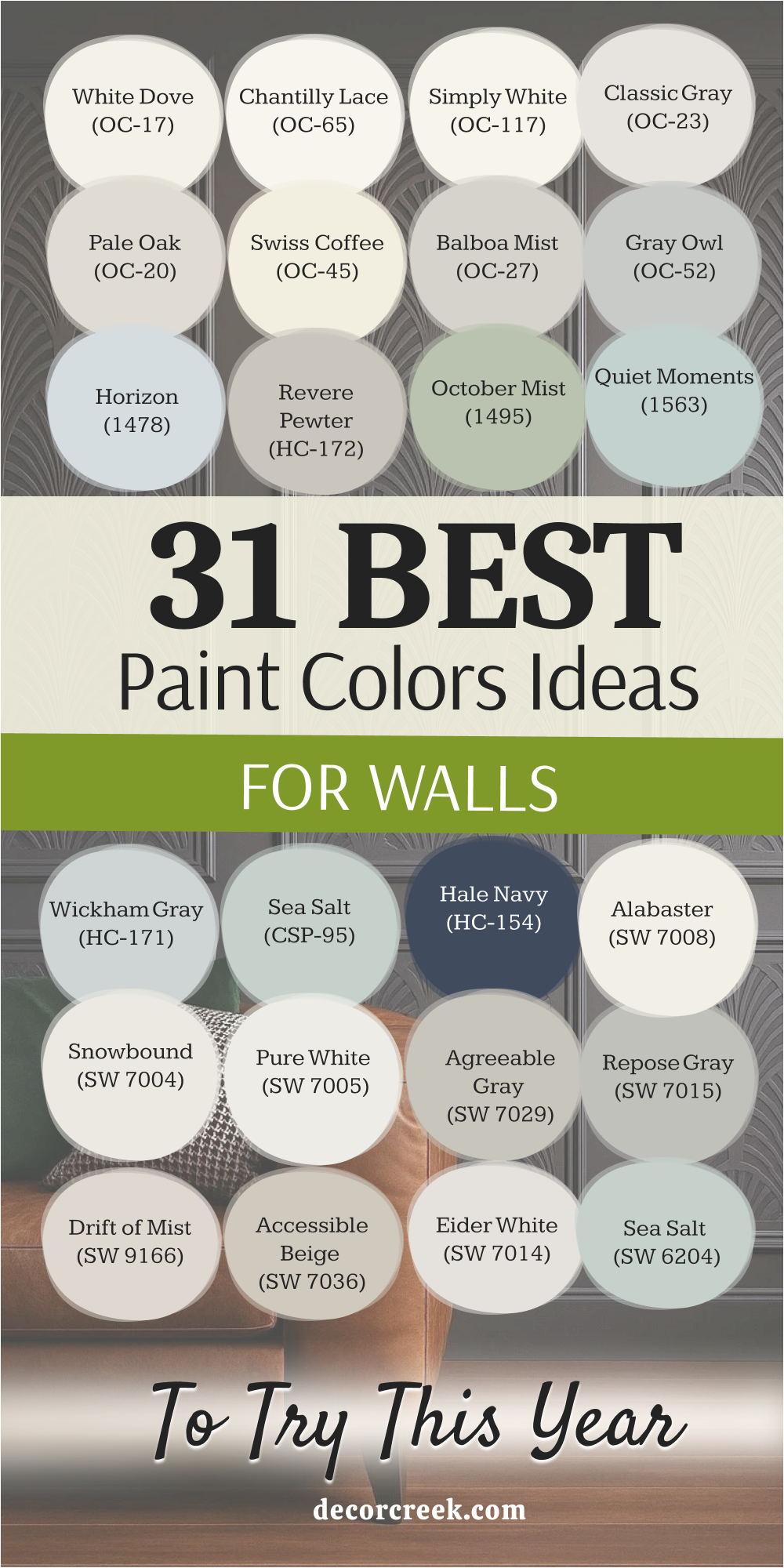
My Final Thoughts About 31 best Paint Ideas For Walls in 2026
If there’s one thing I’ve learned and consistently relied upon over my years as an interior designer and stager, it’s this fundamental truth: paint color is the single most powerful, yet often the most accessible, tool you possess to completely reshape the feeling and character of your home. The curated selection of 31 colors I’ve shared here—spanning everything from the creamy, inviting sophistication of White Dove to the dramatic, grounding depth of Hale Navy—are much more than fleeting trends for the year 2026.
They represent a collection of reliable, high-performing, and truly enduring colors that I return to project after project because they are consistently proven to work beautifully in real-world settings. These specific shades possess a unique and complex ability to interact gracefully with the varying light conditions throughout the day and complement the other core elements in your room, such as your furniture, flooring, and textiles. This essential versatility is the true hallmark of a genuinely great, designer-approved paint color.
Choosing one of these carefully selected colors is a significant, confident step toward creating a home environment that not only looks beautifully warm and current but is also perfectly tailored to reflect your personal sense of style and comfort.
Your walls are the ever-present canvas, the silent backdrop to all your daily moments and memories, so please choose a color you genuinely connect with emotionally and allow it to powerfully set the mood and atmosphere for your entire living experience.
You deserve a home that feels like the absolute best, most harmonious, and most refined version of itself.