I’m frequently asked how to effectively bring the cool, sophisticated, and stylish feel of a major city directly into a home’s interior. The core task is about precisely capturing that perfect, essential mix of the enduring history in old, preserved buildings, the sheer vertical power of towering modern skyscrapers, and the bright, captivating, and electric lights of the intense streetscape.
The atmosphere of a major city is undeniably powerful, complex, and highly influential, and painting is unequivocally the quickest and most potent way to establish that desired, dominant mood indoors.
You must seek out colors that feel inherently smart, strong, decisive, and perhaps a little mysterious or complex, reflecting the multi-layered and often enigmatic nature of the city itself.
Through extensive years of working intensively in interior design and property staging, I’ve compiled and refined a carefully curated list of my absolute favorite paint colors—the ones that truly and successfully nail the specific “City Aesthetic” every time.
Whether your goal is staging a property for sale to immediately appeal to a sophisticated metropolitan buyer, or simply refreshing your own urban dwelling, these specific shades are the secret weapon for creating that desired chic, metropolitan, and enduring look.
We will be primarily focusing on the best color offerings from Sherwin-Williams and Benjamin Moore, because I know from vast experience that they alone possess the quality, richness, and essential color depth necessary for executing these specific moods and strong architectural statements.
Get ready to select the perfect, anchoring shade that will define your own urban sanctuary and give it that unmistakable, sophisticated city edge.
Why I Trust Sherwin-Williams and Benjamin Moore for Modern Urban Shades
When I take on any interior design project, especially one aiming for that distinct city feel, the quality and accuracy of the paint are non-negotiable—it simply has to be perfect. The chosen color needs to maintain its integrity, looking phenomenal under the sharp rays of morning light, rich and deep under lamps at night, and even when a heavy cloud passes by a window.
That consistent, dependable performance is precisely why I rely so heavily on the products from Sherwin-Williams and Benjamin Moore. Both companies create paints with a richness and depth of pigment that generic, cheaper alternatives just can’t replicate. Sherwin-Williams is consistently excellent for producing colors that feel immediately grounded and powerful, offering deep, rich tones that are fantastic for creating architectural drama and weight in a room.
Benjamin Moore, on the other hand, is superb for its incredibly nuanced, complex grays, blues, and near-blacks that seem to change and deepen depending on the lighting conditions, which adds a sophisticated, layered look to any room they grace. Crucially, their formulas provide dependable, consistent coverage, which is absolutely essential when you are working with the strong, dark colors that primarily define the true City Aesthetic.
When you’re seeking to capture that particular metropolitan mood—be it the gritty, purposeful feel of a historic New York street or the sleek, sharp coolness of a high-rise apartment—these two brands consistently deliver the exact tone, saturation, and durability I need to make a project truly successful and enduring. Choosing a quality paint from either of these industry-leading brands is not merely a purchase; it is the fundamental foundation for achieving a high-end, contemporary, and deeply felt city ambiance.
How I Select Paint Colors That Elevate a Modern City Lifestyle
My rigorous process for choosing the perfect urban shade is entirely centered around matching the specific color to the emotional and functional feeling a space needs to embody. It’s important to understand that my choices aren’t just dictated by what’s currently trendy; it’s about a deeply considered assessment of what will genuinely work best for the existing architecture and, most importantly, the available light.
I always start by thinking about the natural light exposure, which is often a critical challenge in dense city settings where windows might be smaller or partially blocked by surrounding buildings. For instance, a gray that looks beautifully moody and exciting on a tiny swatch can easily turn into a depressing, flat shadow if the room doesn’t receive adequate sunlight.
Therefore, I focus on colors that possess a specific, complex undertone—often blue, green, or violet—that adds visual complexity and prevents the color from looking lifeless or flat on a large wall expanse. I actively seek out colors that visually mimic the foundational materials frequently found in enduring city structures, such as aged steel, raw concrete, heavy wrought iron, and dark, substantial wood.
Strong, dark colors are most often the best choice for defining specific architectural features like accent walls, built-in shelving units, or interior trim, adding a graphic punch and immediate visual focus. Conversely, lighter grays and sophisticated off-whites are typically chosen for the main wall areas to provide a necessary sense of structure and keep the overall look clean, sharp, and intentional.
Ultimately, the perfect color must do more than just exist on the wall; it must make the room’s architectural details stand out and actively contribute to a feeling of sharp, purposeful design. Every single shade I select is chosen to reflect the inherent energy, structural complexity, and sophistication of urban living, forging an undeniable connection between the interior room and the dynamic world outside its windows.
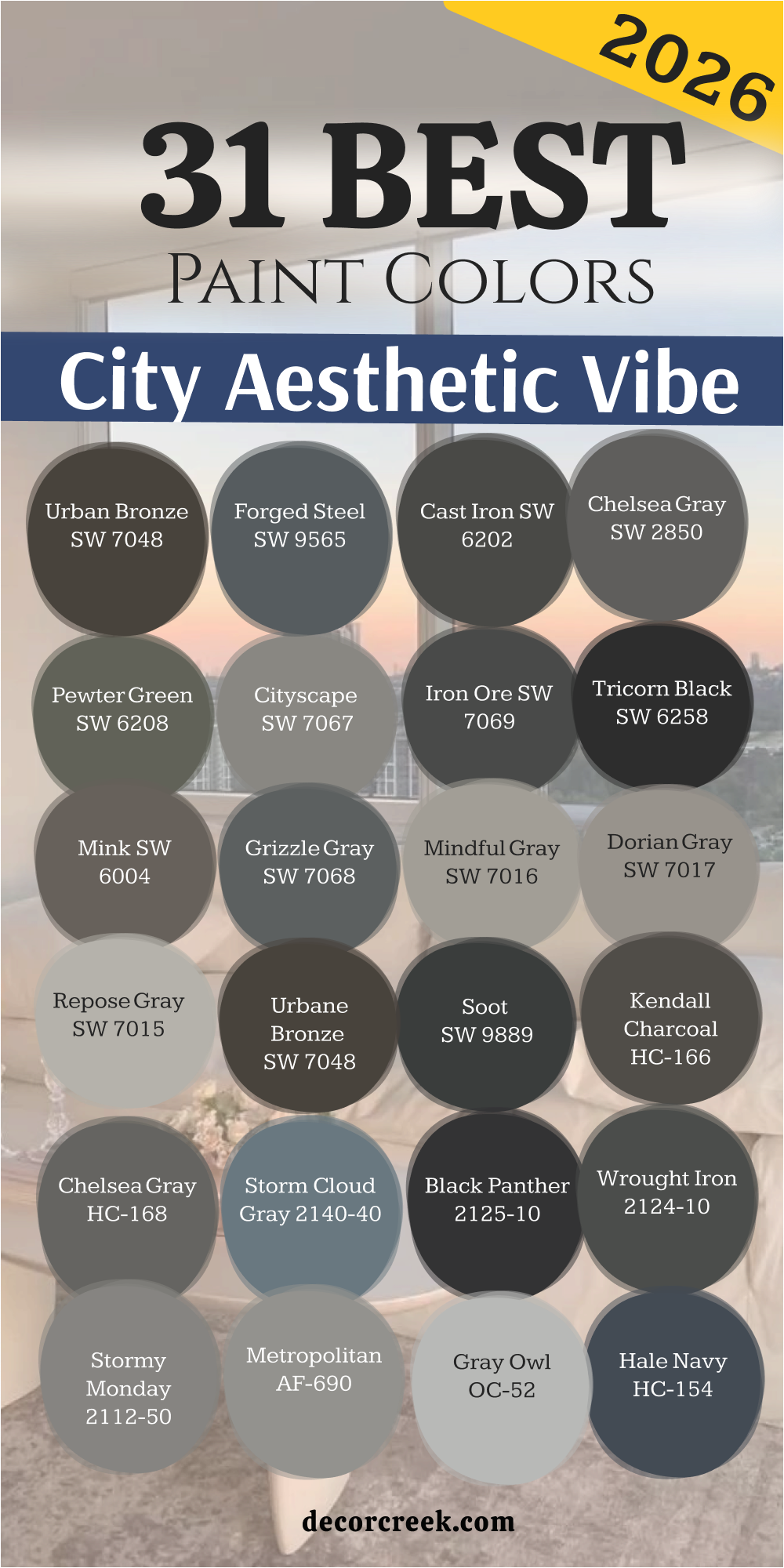
31 Paint Colors For The City Aesthetic In 2026
Urban Bronze SW 7048
Urban Bronze SW 7048 is a deep, rich blend of gray and brown that feels incredibly grounding. This color is like the shadow of a large building or the dark patina of old metal found on city bridges. It’s a wonderful choice for an accent wall in a dining room or study, adding an immediate sense of gravity and importance.
Urban Bronze works beautifully when paired with crisp white trim, creating a strong contrast that feels very modern and tailored. The depth of this shade is warm, preventing it from feeling cold or stark, a great benefit in an often-concrete environment.
It is a fantastic choice for built-in bookcases or cabinets, making them look like substantial pieces of furniture. This dark neutral is sophisticated and serves as a strong backdrop for vibrant art or colorful textiles. I often use it in entryways to establish a serious, high-design first impression. It reminds me of a beautiful, expensive leather sofa, providing comfort along with style.
🎨 Check out the complete guide to this color right HERE 👈

Forged Steel SW 9565
Forged Steel SW 9565 is a dark, true gray with a strong, industrial feel, much like the metalwork found on old factory windows. It is a no-nonsense shade that communicates strength and architectural clarity in any room. I love using this color in kitchens for lower cabinets or on a fireplace wall to make a definite statement.
Forged Steel has very little distracting undertone, which makes it an honest and versatile dark neutral. This color is superb when trying to create a modern loft look, paired with exposed brick or polished concrete floors.
It can make a room feel quiet and focused, perfect for a home office where concentration is key. The color holds up well to different light sources, looking equally good under bright sun or dim evening lamps. It’s a great background for showcasing stainless steel appliances or sleek modern furniture.
🎨 Check out the complete guide to this color right HERE 👈
Cast Iron SW 6202
Cast Iron SW 6202 is an intense, charcoal black-gray that brings immediate drama and structure to a room. This color is exactly what you imagine when thinking of the heavy, dark iron gates or railings you see in historic city neighborhoods. It has a slightly softer feel than pure black, which makes it less harsh and easier to use on larger walls.
Cast Iron is excellent for painting all the walls in a small powder room for a striking, cocoon-like effect. It pairs wonderfully with natural wood tones, like oak or walnut, creating a sophisticated organic contrast.
The depth of this paint makes any lighter objects placed against it stand out with vivid clarity. I’ve used it to paint interior doors, giving them a heavy, custom-made feel that makes a huge difference. This shade is a commitment, but the payoff is a beautiful, moody, and highly curated aesthetic.
🎨 Check out the complete guide to this color right HERE 👈
Chelsea Gray SW 2850
Chelsea Gray SW 2850 is a mid-to-dark gray that has a perfect balance of warmth and coolness, making it very balanced and appealing. This is a very popular shade because it’s a deep gray that avoids looking like a storm cloud or feeling too cold in a north-facing room.
Chelsea Gray is an amazing whole-house color because it provides depth without being overly dark in main living areas. It pairs beautifully with both light and dark trim, acting as a true neutral backbone for any design scheme.
I often recommend this shade for bedrooms because it creates a restful, tailored atmosphere that feels high-quality. The color has enough saturation to hold its own against bright colors but is soft enough to work with creamy whites and linen textures. It feels sturdy and dependable, just like the reliable foundation of a classic city building.
🎨 Check out the complete guide to this color right HERE 👈
Pewter Green SW 6208
Pewter Green SW 6208 is a complex, muted green that is heavily influenced by gray, giving it a sophisticated, historical feel. This color is like the oxidized copper roofs or the old, weathered park benches you might find hidden in the city.
It’s a shade that adds character and a nice twist away from typical grays and blacks. Pewter Green works beautifully in a kitchen or on a piece of furniture, providing an unexpected layer of color. The gray undertone keeps it from feeling too earthy or bright, ensuring it remains part of the urban color story.
It pairs wonderfully with brass or gold fixtures, making them pop with an aged elegance. I love to use this color in sunrooms or areas where a touch of nature is desired, but within a strong, controlled palette. The color has a richness that feels welcoming and expensive at the same time.
🎨 Check out the complete guide to this color right HERE 👈

Cityscape SW 7067
Cityscape SW 7067 is a cool, crisp medium gray with a definite blue undertone, reminiscent of a foggy morning in a downtown canyon. This shade feels clean, modern, and very architectural, making a room look polished and put-together.
It’s a great choice for living rooms and open-concept areas where you want a substantial gray that doesn’t darken the room too much. The blue in it keeps the color fresh and bright, especially when hit by natural light. Cityscape pairs extremely well with crisp white trim and minimalist furnishings, enhancing a sleek, contemporary look.
I’ve used it often in bathrooms and laundries to create a refreshing, tidy feel. This color is wonderful for balancing out warmer materials like red brick or golden wood floors. It’s a reliable, medium-toned workhorse that delivers a sharp urban edge without being too heavy.
🎨 Check out the complete guide to this color right HERE 👈
Iron Ore SW 7069
Iron Ore SW 7069 is a favorite deep charcoal, almost black, that is incredibly popular for its near-black saturation with a hint of softness. This color is the dark concrete of a modern building facade or the heavy, textured asphalt of a quiet city street at night.
It is perfect for accenting architectural features like doors, window sashes, or a dramatic, moody dining room wall. Iron Ore has a slightly green undertone, which makes it feel just a bit warmer than a stark black, giving it more life.
I often use it on exterior trim or garage doors to provide strong, dark contrast against a lighter siding color. This shade is a go-to for making everything else in the room—art, furniture, and lighting—look incredible and intentional. It delivers maximum impact with minimal effort, creating a sophisticated and bold feeling.
🎨 Check out the complete guide to this color right HERE 👈

Tricorn Black SW 6258
Tricorn Black SW 6258 is the purest, most uncompromising black available, with virtually no visible undertones of blue, brown, or green. This is the ultimate shade for high-contrast, graphic design that screams modern city chic.
Tricorn Black is perfect for interior doors and trim to define the lines of a room with striking precision. I sometimes use it on a ceiling to create a dramatic, compressed feeling in a tall room, making the walls feel endless.
It is wonderful for accent walls when the goal is a sleek, gallery-like background for artwork or a television. This color is the best choice when pairing with bright white for a truly classic, tuxedo-like aesthetic. It conveys strength, certainty, and an undeniable sophistication that feels expensive and highly designed.
🎨 Check out the complete guide to this color right HERE 👈

Mink SW 6004
Mink SW 6004 is a warm, mid-toned brown-gray that feels like an expensive suit or the beautiful, weathered wood of a classic club. This color adds a layer of quiet, understated luxury and works beautifully in cozy spaces like dens or libraries.
It has a definite brown base, making it much warmer than most of the other grays on this list, which provides a comforting counterbalance. Mink is an excellent color for connecting traditional and modern furniture styles with its agreeable neutral tone.
I’ve used it on walls and ceilings to create a unified, enveloping feeling that is both elegant and relaxing. It pairs wonderfully with creams, deep reds, and golds, leaning into a more classic city apartment style. This shade is about quiet confidence and rich, sophisticated texture.
🎨 Check out the complete guide to this color right HERE 👈
Grizzle Gray SW 7068
Grizzle Gray SW 7068 is a strong, dark gray with a visible green-blue undertone that gives it a wonderfully moody and slightly stormy feel. This shade looks like a heavy rain cloud hanging over the cityscape, full of drama and presence.
It is a fantastic color for exterior shutters or front doors, adding serious curb appeal and depth. Grizzle Gray works well in transitional spaces like hallways or mudrooms, providing an anchor of strong color.
The subtle hint of color keeps it from being a flat gray, adding complexity and visual interest. It pairs beautifully with lighter grays and crisp whites for a layered, sophisticated look. I often suggest this shade for an accent wall in a modern living room to define a seating area with a strong, tailored color.
🎨 Check out the complete guide to this color right HERE 👈

Mindful Gray SW 7016
Mindful Gray SW 7016 is a very popular, warm light-to-medium gray that is fantastic for an all-over wall color. It is light enough to keep a room feeling airy but has enough color to avoid looking washed out or boring.
Mindful Gray is the perfect backdrop for colorful furniture and artwork because it stays firmly in the neutral zone without distracting the eye. It is an ideal choice for open floor plans, as it flows easily from room to room, creating a cohesive, structured look.
This color has a slight beige undertone, which keeps it feeling cozy and prevents it from appearing sterile or cold. I often recommend it to clients who want a modern gray but are nervous about going too dark or too cool. It’s a very safe, highly adaptable shade that provides structure and modernity in a gentle way.
🎨 Check out the complete guide to this color right HERE 👈

Dorian Gray SW 7017
Dorian Gray SW 7017 is a shade darker than Mindful Gray, offering a bit more richness and presence while still maintaining its warm, greige appeal. This is the gray that looks like it has lived a little, full of depth and complexity, like old stone in a city park.
It is a superb choice for a primary bedroom or a formal living room where you want a deeper neutral that still feels incredibly welcoming. Dorian Gray works beautifully with natural materials like stone, wool, and linen, enhancing a textured, grounded look.
It has a slight purple or brown undertone depending on the light, which makes it a complicated and interesting color. I love this shade for making white trim and architectural details really stand out with its deeper value. It’s a sophisticated neutral that adds quiet weight to a room.
🎨 Check out the complete guide to this color right HERE 👈

Repose Gray SW 7015
Repose Gray SW 7015 is a light, clean gray that is a little cooler than Mindful Gray but still manages to be versatile and widely appealing. This shade is the color of a freshly poured concrete sidewalk or a clean, slate-gray sky, feeling fresh and minimal.
It is a perfect light neutral for those wanting a cool, contemporary look without crossing into stark white. Repose Gray is highly adaptable and works in almost any room, maintaining its grayness without turning blue or purple.
It pairs beautifully with both dark and light colors, acting as a great base for a high-contrast scheme. I often use this color when staging to make rooms look bigger, cleaner, and more current. It’s a reliable, understated gray that embodies the clean, minimalist side of the city aesthetic.
🎨 Check out the complete guide to this color right HERE 👈

Urbane Bronze SW 7048
Urbane Bronze SW 7048 is a powerful and very popular blend of gray, brown, and a touch of green that reads as a deep, earthy neutral. It’s the dark, rich color of a statue’s base or a beautiful bronze plaque on a classic city landmark.
This color feels substantial and serious, making it an excellent choice for a dramatic focal point or a cozy den. It was named the Sherwin-Williams Color of the Year for a reason—it’s grounding, yet incredibly sophisticated and current.
Urbane Bronze pairs beautifully with warm woods and creamy off-whites, creating a rich, layered, and comfortable aesthetic. I love using this color on cabinets in a kitchen or on the entire exterior of a modern home for a strong statement. It is a color that feels both ancient and completely modern at the same time.
🎨 Check out the complete guide to this color right HERE 👈
Kendall Charcoal HC-166
Kendall Charcoal HC-166 is a gorgeous, sophisticated, deep gray from Benjamin Moore with a strong green undertone that makes it incredibly complex. This color is like the deep, rich stone of an old church or the dark, moody river that cuts through a major city.
It is a fantastic color for exterior siding or a dramatic accent wall in a living space. Kendall Charcoal is deep enough to feel substantial but light enough to not feel like an absolute black.
The green undertone gives it a natural, organic feel that works beautifully with real wood and leather. I’ve used this shade in formal dining rooms to create an intimate, elegant, and powerful atmosphere. It’s a color that feels both traditional and totally current, a classic workhorse.
🎨 Check out the complete guide to this color right HERE 👈

Chelsea Gray HC-168
Chelsea Gray HC-168 (BM) is a highly respected and balanced mid-to-dark gray, renowned for its incredible versatility and rich saturation. This is a very similar shade to Sherwin-Williams’ Chelsea Gray, offering that perfect sweet spot between too light and too dark, warm and cool.
It is an amazing all-around color for common areas like living rooms, hallways, and open-concept spaces. Chelsea Gray has a slight green-yellow undertone, making it a “warm gray” that won’t feel chilly in a room with northern light.
I often recommend it when a client wants a strong neutral that can handle heavy traffic and still look fresh. It pairs well with almost any color, acting as a reliable, grounded foundation for bolder design choices. This shade is a true classic that never fails to look elegant and smart.
🎨 Check out the complete guide to this color right HERE 👈

Storm Cloud Gray 2140-40
Storm Cloud Gray 2140-40 is a truly expressive color, a medium-to-dark gray that is heavily infused with blue, giving it a powerful, aquatic mood. This color is the dramatic, swirling gray of a heavy rainstorm over the harbor or a deep, powerful reservoir.
It is a fantastic choice for a bedroom or a cozy reading nook where you want to create a calm, deeply atmospheric feeling. The blue in it makes the color feel cool and refreshing, perfect for balancing warmer furnishings.
Storm Cloud Gray works beautifully with natural fibers and dark woods, creating a sophisticated and watery look. I love using this color in coastal cities for a modern take on seaside living. It’s a deep color that provides a wonderful sense of enclosure and rest.
Black Panther 2125-10
Black Panther 2125-10 is an intense, deep charcoal gray that is very nearly black, carrying a commanding and sleek presence. This shade is like the black glass facade of a modern skyscraper or the shiny, black finish on a classic car driving through the city streets.
It is the ultimate shade for dramatic accents, making doors, built-ins, and trim pieces stand out with absolute authority. Black Panther is a cleaner dark charcoal, lacking the strong green or blue undertones of some of the others, making it very crisp.
I use this color when I need a serious, architectural black that still reads as a very deep gray. It pairs wonderfully with metal finishes like chrome and brushed nickel, contributing to a high-tech, contemporary feel. This color is all about sharp lines and confident design decisions.
Wrought Iron 2124-10
Wrought Iron 2124-10 is a beautiful, deep gray-black that has a wonderfully soft, almost velvety finish when painted, thanks to its underlying warmth. This shade is the classic, heavy metal of gates and fences that have protected city homes for decades, full of history and solidity.
It is a fantastic, versatile dark color that works well on both the interior and exterior of a home. Wrought Iron is a great alternative to true black when you want the depth but need a slightly less severe look.
I love using this color on kitchen islands to create a piece of furniture that feels custom-made and grounded. It pairs exceptionally well with creamy whites and natural wood accents for a timeless, rustic-meets-urban aesthetic.
🎨 Check out the complete guide to this color right HERE 👈

Stormy Monday 2112-50
Stormy Monday 2112-50 is a medium, moody gray with a clear blue-green undertone, giving it a slightly muted, water-worn quality. This color is reminiscent of the wet pavement after a sudden summer shower in the city, reflecting the sky and lights.
It is a fantastic color for a bathroom or a laundry room, where the cool, fresh undertone is particularly pleasing. Stormy Monday provides a good amount of color saturation without making a room feel too dark or heavy.
I often suggest this shade for rooms that need a bit of personality that still falls into the neutral category. It pairs well with white subway tile and dark grout, contributing to a clean, structural look. This color is a wonderful blend of gray and color, creating depth and a calming atmosphere.
Metropolitan AF-690
Metropolitan AF-690 is a gentle, sophisticated silver-gray that was Benjamin Moore’s Color of the Year, speaking to its wide appeal and current feel. This shade is like the soft sheen of a distant skyscraper or the quiet light of a cloudy day filtering into an urban window.
It is a perfect light-to-medium neutral that works beautifully in large, open-concept spaces where a soft, continuous color is needed. Metropolitan has subtle warm undertones, keeping it from feeling icy while still appearing clearly gray.
I use this color when a client wants a modern feel but doesn’t want the harshness of a cooler gray. It works wonderfully with metallic accents and textures, acting as a clean, refined backdrop. This color is all about quiet luxury and understated contemporary design.
Gray Owl OC-52
Gray Owl OC-52 is a hugely popular, very pale gray with a cool, subtle blue-green hint that keeps it feeling fresh and light. This is the color of a foggy morning, where the city is just beginning to wake up, gentle and soft.
It is an ideal alternative to stark white when you want a little color on the wall but need to keep the room feeling bright and open. Gray Owl is a fantastic all-over color for apartments, especially those that lack abundant natural light, as it bounces light beautifully.
I often pair it with bright white trim for a very crisp, coastal-meets-city look. It’s a versatile and cheerful light gray that provides a clean, modern canvas for any style of furniture. This color is highly adaptable and almost always works where a light gray is needed.
🎨 Check out the complete guide to this color right HERE 👈

Hale Navy HC-154
Hale Navy HC-154 is a powerful, deeply saturated navy blue that is almost a neutral due to its dark, intense value. This color is like the heavy wool of a naval uniform or the dark glass of a window reflecting the nighttime street scene.
It is a fantastic, classic accent color for kitchen islands, built-in bars, or stunning accent walls. Hale Navy is one of those colors that feels both classic and completely current, a true design favorite.
It pairs incredibly well with bright white, brass, and dark wood, creating a very traditional, wealthy city look. I sometimes use it in a small study or powder room for a striking, jewel-box effect that feels cozy and sophisticated. This color commands attention and provides an anchoring depth to any room.
🎨 Check out the complete guide to this color right HERE 👈

Iron Mountain 2134-30
Iron Mountain 2134-30 is a deep, warm gray that is heavily infused with brown, giving it a rich, earthy, and powerful feel. This color is like the iron ore pulled from the earth or the heavy, textured stone of a mountain facade, bringing a grounded feel to the city.
It is a fantastic choice for living rooms or dens where a substantial, comforting color is desired. Iron Mountain has a lot of pigment, giving the walls a wonderful, matte texture that feels luxurious.
I love using this color in rooms with high ceilings to bring the visual height down and make the room feel cozier. It pairs beautifully with leather furniture and deep wood tones, creating a classic, masculine, and sophisticated atmosphere.
🎨 Check out the complete guide to this color right HERE 👈

Asphalt CC-548
Asphalt CC-548 is a truly dark, inky gray that is only a shade lighter than absolute black, perfect for a strong, graphic statement. This color is exactly what it sounds like: the wet, freshly paved surface of a major city road, sleek and dark.
It is an amazing color for architectural details, making them pop with serious, deliberate contrast. Asphalt is a wonderful alternative to black when you need a slightly softer edge that still reads as dramatically dark.
I often recommend this shade for framing a beautiful view, painting the wall around a window to emphasize the light outside. It contributes to a sophisticated, sharp, and very contemporary aesthetic that is instantly eye-catching.
Cavern Clay SW 7701
Cavern Clay SW 7701 is an unexpected, warm, earthy terracotta or burnt orange that brings a Southwestern or desert-city feel to the urban palette. This color is like the warm, faded brick of an older city building or the beautiful clay soil seen through construction sites.
It is a bold, grounding choice for an accent wall or a piece of furniture, providing a necessary pop of warmth among the cool grays. Cavern Clay works beautifully with dark wood and black iron, creating a powerful, sophisticated, and slightly rustic design.
I often use this color to add character and a sense of handmade texture to an otherwise sleek, modern space. It’s a wonderful way to introduce a natural, earthy feel into a concrete jungle environment.
🎨 Check out the complete guide to this color right HERE 👈

White Dove OC-17
White Dove OC-17 is a creamy, soft white that is one of the most beloved and versatile whites available. This color is like the beautiful, soft light of a streetlamp diffusing through a window at dusk, warm and inviting.
It is the perfect bright color to use on all trim, doors, and ceilings, providing a classic, clean frame. White Dove has a hint of gray and yellow, which keeps it from feeling stark or cold, making it feel very high-end and gentle.
I often use it as the main wall color in a room with a lot of dark furniture or art, allowing the dark pieces to breathe. It is a phenomenal pairing for all the dark grays and blues on this list, providing the necessary crisp contrast. This shade is a soft, comforting neutral that is always in style.
🎨 Check out the complete guide to this color right HERE 👈

Simply White OC-117
Simply White OC-117 is a clean, bright, and slightly warm white that is incredibly versatile and beloved by designers. This shade is like the pure, direct light of a high-rise apartment on a clear, sunny day, sharp and clean.
It is a fantastic choice for trim and ceilings where you want a very crisp, almost gallery-like white. Simply White has a very slight yellow undertone that keeps it from looking icy, which is why it often works well as a main wall color.
I often recommend it for kitchens and bathrooms where a very clean, bright, and hygienic feel is needed. It’s an essential, foundational white for modern design, providing a luminous backdrop for colorful art and furnishings.
🎨 Check out the complete guide to this color right HERE 👈

Onyx 2133-10
Onyx 2133-10 is a deep, dramatic black that has a softer, more mineral feel than a pure, stark black. This color is like the shiny, dark stone of a high-end countertop or the polished surface of a grand piano in a penthouse apartment.
It is perfect for creating a sophisticated, high-contrast look, especially when used on interior doors or a single statement wall. Onyx reads as a sophisticated neutral, allowing surrounding colors and materials to truly shine and take center stage.
I use this shade when I want the visual weight of black but with a slightly less severe, more textured quality. It pairs wonderfully with bright white, warm metals, and luxurious fabrics like velvet or silk.
Thunder AF-685
Thunder AF-685 is an intriguing mid-toned gray that is part of the Affinity Collection, known for its harmonious colors. This shade is like the rumbling sky before a summer storm, a complex blend of gray and brown with a touch of purple.
It is a beautiful, highly nuanced color for a living room or den, adding a rich, sophisticated warmth. Thunder has a lot of depth and changes subtly with the light, preventing the walls from ever looking flat or boring.
I often use this color to create a unified, comforting feel in a smaller space, making it feel like a cozy retreat. It pairs beautifully with lighter neutrals and complements wood tones perfectly, establishing a grounded and mature aesthetic.
🎨 Check out the complete guide to this color right HERE 👈

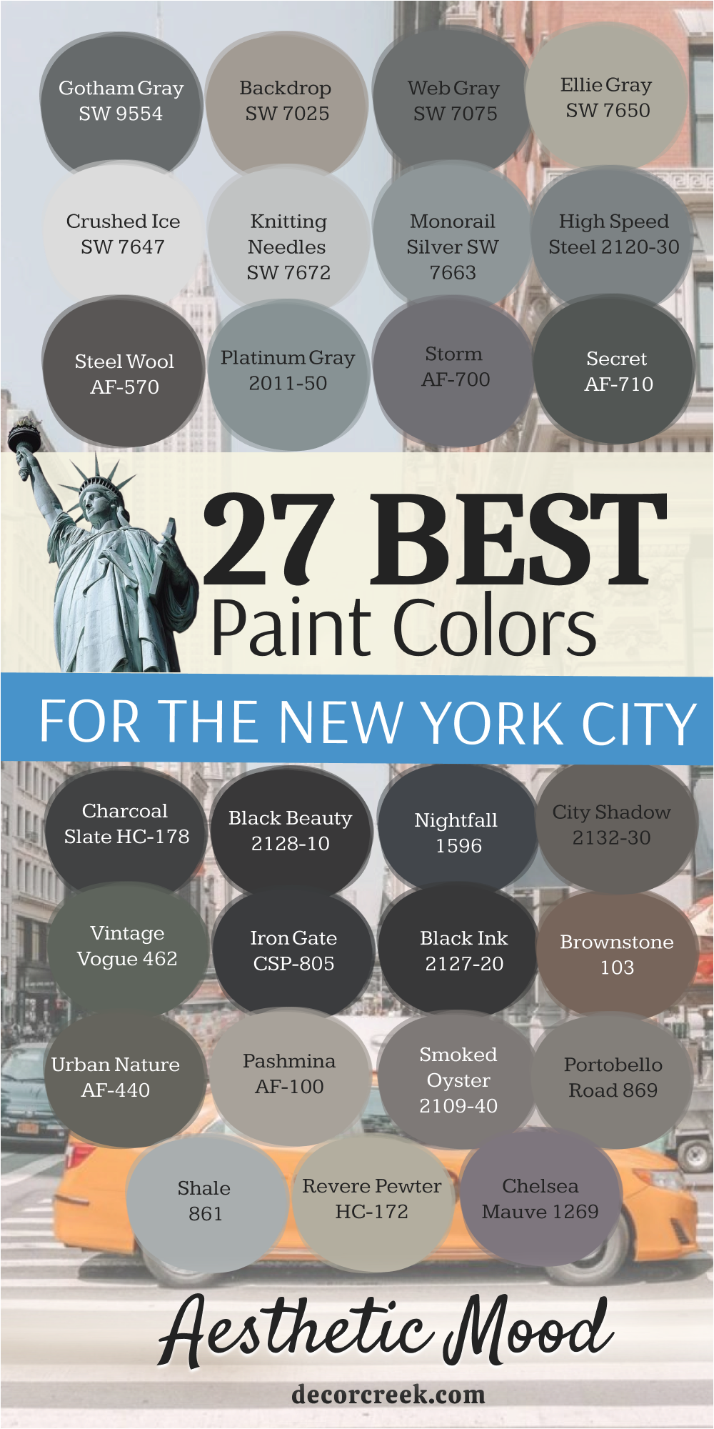
27 Paint Colors For The New York City Aesthetic Mood
Gotham Gray SW 9554
Gotham Gray SW 9554 is a strong, dark, nearly black gray that embodies the cinematic, dramatic feel of a classic movie city. This color is like the heavy stone of an old building covered in shadow, mysterious and incredibly powerful.
It is perfect for creating a sophisticated, moody accent wall in a den or a bold, dramatic entryway. Gotham Gray is deep enough to make white art or furniture pop with striking clarity.
I use this shade when a client wants the full weight of a dark color that still has the complexity of gray. It pairs wonderfully with industrial finishes like dark wood, leather, and black metal. The name itself suggests that high-drama, tailored city aesthetic that is immediately recognizable and captivating.
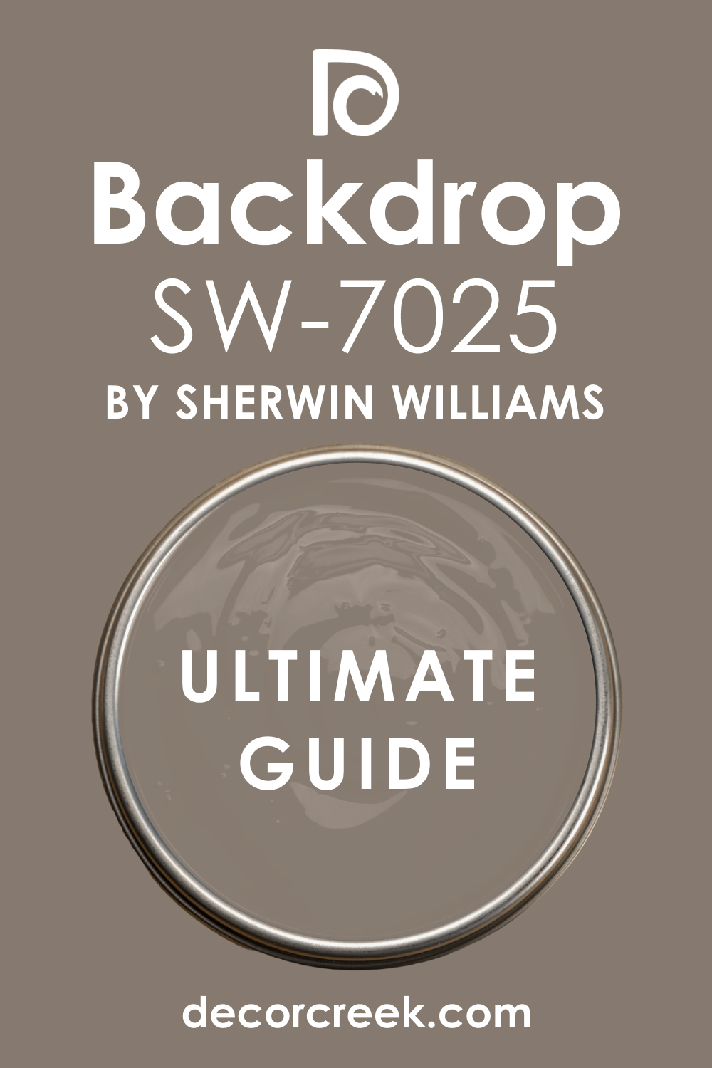
Backdrop SW 7025
Backdrop SW 7025 is a notably warm, mid-toned gray that carries a very visible and substantial brown undertone, establishing it as an incredibly comfortable and profoundly grounding greige. This highly adaptable color evokes the quiet history and enduring texture of the urban landscape, much like the smooth, worn brickwork of a hidden city courtyard or the aged, reliable cement of a familiar public walkway.
It functions as an excellent all-over wall color for large main living spaces and open-concept areas because it successfully provides essential color depth and presence without ever feeling heavy, oppressive, or visually draining. Backdrop is a truly fantastic and reliable neutral because it consciously avoids reading as cold or sterile, which immediately makes the room feel welcoming, approachable, and perfectly suited for a comfortable, contemporary home environment.
I frequently recommend this versatile shade, particularly for interior spaces that feature a significant amount of natural wood trim, built-in shelving, or furniture, as its inherent warmth is perfectly formulated to coordinate and harmonize beautifully with those organic elements. It’s a very safe, incredibly adaptable, and universally pleasing color that provides a sturdy, sophisticated, and cohesive background for almost any style of decor, offering enduring stability to the design.
🎨 Check out the complete guide to this color right HERE 👈
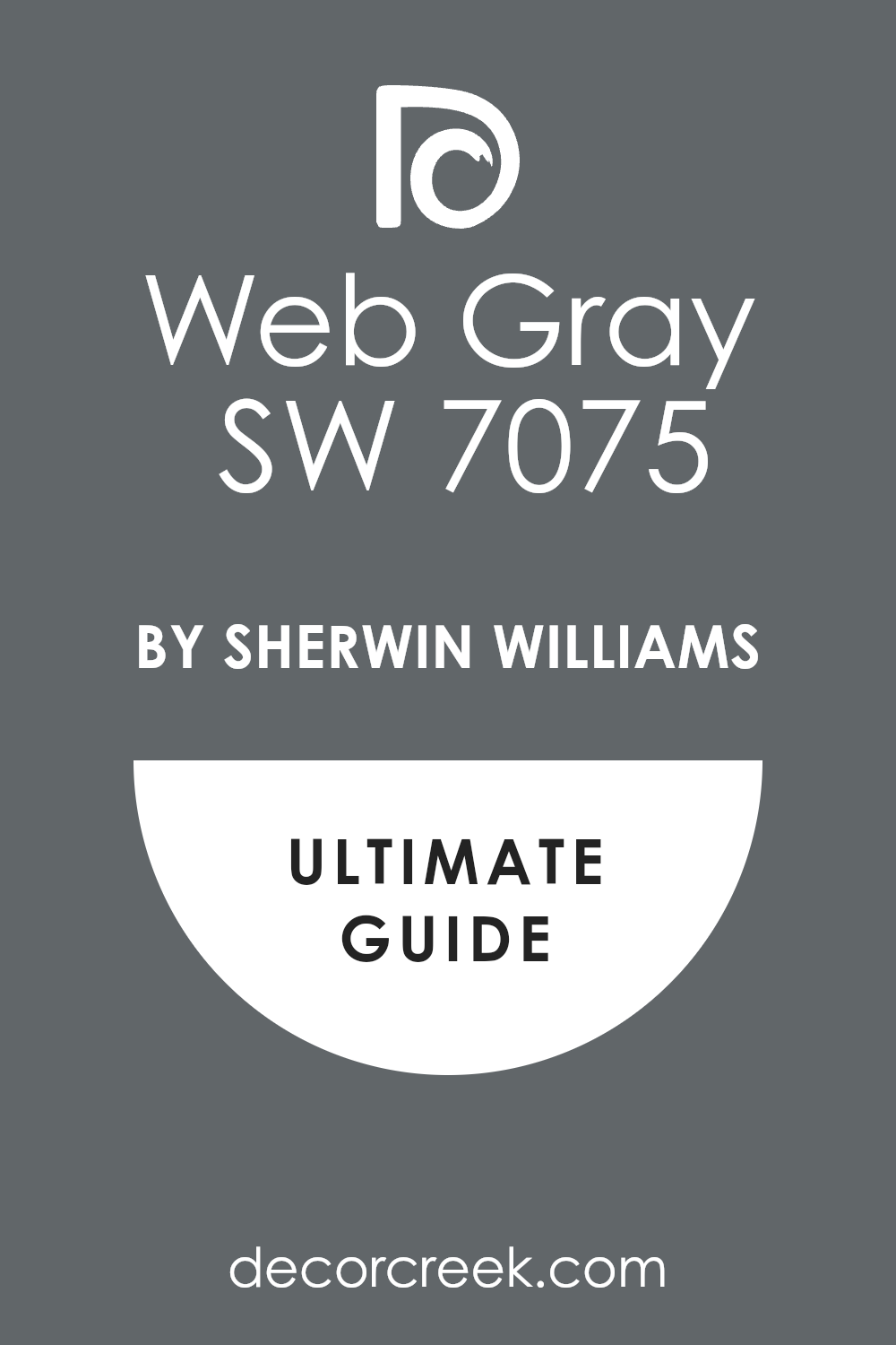
Web Gray SW 7075
Web Gray SW 7075 is a deep, intensely sophisticated, and unequivocally true gray that maintains a strong, clean presence with very little distracting or visible color bias. This commanding and precise color is reminiscent of the structural clarity of the intricate, precise steel beams of a modern, monumental bridge or the dark, sharp structural lines of a contemporary, large-scale piece of city sculpture.
It is a truly wonderful and decisive color choice, especially for high-impact applications like painting kitchen cabinets—where it creates a bespoke, furniture-like effect—or for a dramatic accent wall that demands to be taken seriously as a focal point of the room. Web Gray pairs beautifully and effortlessly with bright, cool whites for a sharp, high-contrast, and graphic look that feels immediately current and impeccably tailored.
I intentionally specify this shade when a client requires a substantial, anchoring gray that can be relied upon not to show distracting hints of blue, green, or purple in varying light conditions. It provides a sharp, meticulously tailored, and consistently structured backdrop that is absolutely excellent for showcasing vibrant, colorful artwork or statement pieces of furniture with maximum effect.
🎨 Check out the complete guide to this color right HERE 👈
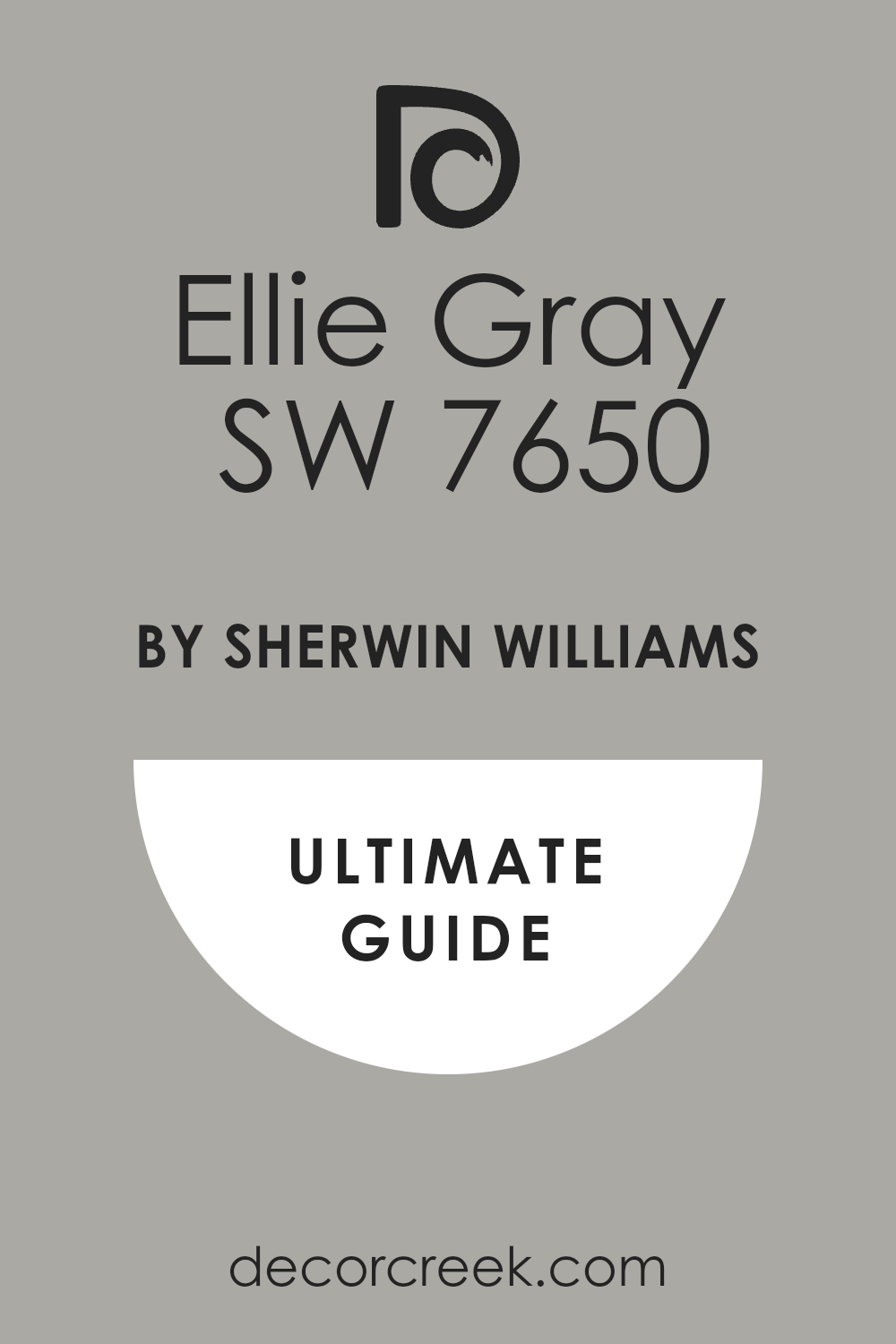
Ellie Gray SW 7650
Ellie Gray SW 7650 is a light-to-medium warm gray that possesses a very clean, highly refined, and elegant feel, establishing it as a truly wonderful, soft neutral choice for main, high-traffic rooms. This gentle and luminous color is evocative of the soft, warm stone of a newly renovated building facade viewed under a bright, clear sunny sky, radiating subtle and inviting warmth.
It is an excellent alternative to the cooler grays in the market, especially when you need to ensure the room maintains an inviting, approachable, and never stark feeling. Ellie Gray works beautifully as a cohesive base color throughout an entire house or apartment, providing a subtle, linking color that flows easily and gracefully from one room to the next, enhancing architectural continuity.
I often utilize this dependable shade when staging properties because it consistently photographs exceptionally well, appearing soft yet purposeful, and is generally appealing to the widest possible range of people. It’s a gentle, modern neutral that brings necessary structure and sophisticated clarity to a space without ever feeling heavy or darkening the overall atmosphere.
🎨 Check out the complete guide to this color right HERE 👈
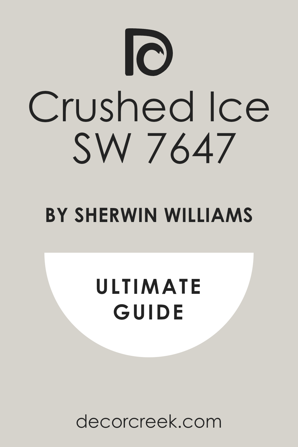
Crushed Ice SW 7647
Crushed Ice SW 7647 is an extremely pale, bright gray that is merely an ethereal step away from pure white, offering a cool, exceptionally refreshing, and airy feel. This luminous color is like the cool, slightly frosted glass of a stylish, modern office building or the clean, bright winter light bouncing off a quiet, snowy city street.
It is a superb, light-maximizing choice for whole-house use, particularly in smaller apartments or compact urban dwellings where lightness and creating a sense of openness are key design priorities. Crushed Ice has a very slight blue-green undertone, which subtly provides it with a crisp, contemporary, and incredibly clean edge.
I frequently use it on walls while pairing it with a true, crisp white on the trim to achieve a subtle, layered, and sophisticated effect without strong contrast. It’s a highly adaptable and truly airy light gray that works hard to create a sense of expansive openness and pristine cleanliness in any space it is applied to, maximizing perceived size and light.
🎨 Check out the complete guide to this color right HERE 👈
Knitting Needles SW 7672
Knitting Needles SW 7672 is a pale, slightly cool silver-gray that provides a wonderfully quiet, soft, and sophisticated backdrop without ever falling into the trap of feeling cold or outright sterile. This nuanced color is reminiscent of the soft, hazy, gentle light filtering into a busy, historic street early in the morning—it is very gentle, subtle, and quietly ethereal.
It is an excellent choice for restful spaces like bedrooms or main living rooms where a soft, understated, and non-demanding color is the core design goal. Knitting Needles is perfectly light enough to keep a room feeling bright and open but has just enough color saturation to keep the walls from looking like a washed-out, lifeless white.
I often pair it with darker grays on the trim or on adjacent accent walls to create a sophisticated, layered, and intentional monochromatic look. It’s a highly versatile and profoundly pleasant gray that coordinates exceptionally well with almost any accent color, art, or furniture style introduced into the space.
🎨 Check out the complete guide to this color right HERE 👈

Monorail Silver SW 7663
Monorail Silver SW 7663 is a powerful, medium-toned, cool gray that features a distinct and visible blue undertone, giving it a polished, sophisticated, and slightly metallic sheen. This color directly mimics the sleek, functional material of modern urban transit, like the brushed aluminum of a sleek train car or the smooth, cool surface of a monorail system.
It is a great, purposeful choice for contemporary kitchens, modern bathrooms, or very current living rooms where you specifically want a truly cool, crisp gray with a high-tech edge. Monorail Silver pairs beautifully and seamlessly with stainless steel and polished chrome fixtures, powerfully enhancing the feeling of modern industry and precision.
I always turn to this shade when the desired aesthetic is sharp, meticulously tailored, and very current, successfully emphasizing clean, architectural lines. The blue quality ensures it feels refreshing, clean, and acts as a great, cool counterpoint to any warmer furnishings or wood tones in the room.
🎨 Check out the complete guide to this color right HERE 👈
Witching Hour 2120-30
Witching Hour 2120-30 is a clean, reliable, medium-toned silver-gray that maintains a clear, no-fuss modern feel, making it perfectly suited for a consistently contemporary home. This specific color is like the highly reflective, light-bouncing surface of a new construction site—it is sharp, clean, and precisely engineered for modern function and form.
It is a fantastic, substantial choice for a main living room or a dedicated home office that needs an anchoring gray without descending into a dark or dramatically moody atmosphere. High Speed Steel is exceptionally flexible, working equally well with both warm and cool-toned accent colors, establishing it as a highly adaptable neutral workhorse.
I often recommend this precise shade for rooms that receive a significant amount of natural light, as it steadfastly maintains its clear, crisp grayness without washing out or losing definition. It’s a reliable, perfectly balanced gray that instantly provides a clean, structural, and highly sophisticated, current feeling to any space.
Steel Wool 2121-20
Steel Wool 2121-20 is a deep, rich charcoal gray that carries a subtle yet critical brown undertone, which grants it a powerful, sophisticated complexity and necessary warmth. This commanding color is reminiscent of the heavy, dark, woven texture of an expensive industrial material or the deep, rich, protective lining of a luxurious, dark coat.
It is absolutely perfect for a cozy den, a serious study, or a dramatic accent wall where a strong, substantial, and anchoring color is needed to provide visual weight and intimacy. Steel Wool has a wonderful depth of pigment that makes it feel instantly luxurious and incredibly substantial when applied to the wall.
I often use this shade specifically to create a cozy, intimate, and enveloping atmosphere, especially when it is paired with dark wood trim or paneled accents. It’s a highly effective color for adding essential architectural definition and a comforting sense of enduring, high-quality, and textural structure.
Platinum Gray HC-179
Platinum Gray HC-179 is a bright, luminous medium silver-gray that features a distinct, underlying blue undertone, which gives it a cool, high-tech, and incredibly refined, almost metallic look. This color is like the polished, shimmering metal of a modern light fixture or the gleaming, reflective side of a high-rise tower that perfectly mirrors the sky above.
It is a fantastic choice for a contemporary, clean kitchen or a minimalist living room that specifically needs a cool, crisp, clean, and slightly industrial feel. Platinum Gray pairs exceptionally well with polished chrome hardware and clean white cabinetry for a sharp, undeniably minimalist, and highly current aesthetic.
I turn to this shade when the overarching goal is to achieve a sleek, almost metallic feeling that is both clean and visually refreshing. The crucial blue quality ensures that the color avoids looking flat or muddy, instead adding a sophisticated, modern shimmer and visual depth.
Storm AF-700
Storm AF-700 is a complex, mid-to-dark gray that carries a noticeable, dusty purple undertone, which makes it a rich, moody, and highly nuanced color unlike a simple utilitarian gray. This captivating color is like the heavy, unpredictable sky looming over the city just as a storm is rolling in, full of atmosphere, depth, and potential energy.
It is a superb choice for a sophisticated bedroom or a formal dining room where a deep, complex, and intriguing color is desired to create a jewel-box, intimate effect. Storm works beautifully and unexpectedly with both cool and warm metal accents, adding an essential layer of unexpected sophistication and visual interest.
I often recommend this unique shade to clients who are actively looking for a gray that is anything but basic, lending the room a memorable, custom-designed, and high-quality feel. The purple quality ensures it reads as a warm, subtly inviting dark color, elegantly avoiding any sense of stark coldness.
🎨 Check out the complete guide to this color right HERE 👈
Secret AF-710
Secret AF-710 is a deep, truly dark gray that is heavily infused with a sophisticated, muted green, giving it a complex, organic, and almost historical, enduring feel. This deep color is evocative of the deep, aged moss on an old, forgotten stone wall or the dark, heavy, enduring foliage of a hidden, quiet city park.
It is a wonderful, grounding color for painting kitchen cabinets or for use in a moody library, providing a rich, unexpected color that manages to feel both strikingly modern and traditionally comforting. Secret works beautifully and naturally with polished brass hardware and warm natural wood tones, successfully creating a luxurious, layered, and visually rich look.
I specifically use this shade when a client requests a deep, moody color that is a purposeful step away from the typical absolute black or pure blue-gray, adding character, textural depth, and warmth to the overall atmosphere.
Charcoal Slate HC-178
Charcoal Slate HC-178 is a very deep, intense, almost-black charcoal gray that carries a slight, subtle blue undertone, which ensures it has a clean, structural, and sophisticated, architectural edge. This commanding color is exactly like the beautiful, dark slate tiles of a classic city roof or the heavy, textured, reliable stone of a major city sidewalk.
It is an absolutely amazing color for high-impact exterior trim or a dramatic interior accent wall that needs to be a powerful, visual anchor for the entire room. Charcoal Slate provides a strong, serious, and unwavering foundation for any design scheme, causing any lighter elements placed near it to pop with crisp clarity.
I often pair this shade with bright, crisp whites for a classic, high-contrast city look that is both timeless and sharply tailored. The subtle blue inclusion keeps it consistently clean and modern, actively preventing it from appearing muddy or aged in an undesirable way.
🎨 Check out the complete guide to this color right HERE 👈
Black Beauty 2128-10
Black Beauty 2128-10 is a very deep, rich black that features a noticeable underlying warmth, which makes it feel significantly less harsh and more immediately enveloping than a pure, stark black. This opulent color is like the dark, plush velvet of an old, grand theater curtain or the shiny, black lacquer finish of an impressive entrance door at a stately city building.
It is perfect for a formal dining room or a high-drama powder room, successfully creating a luxurious, intimate, and jewel-box atmosphere. Black Beauty has just enough inherent softness to be used effectively on larger walls without making the room feel overly severe or gothic.
I use this shade when I desire the powerful visual punch of black but require a slightly more inviting and sophisticated textured quality. It pairs beautifully and richly with polished gold, creamy white, and deep jewel tones for a truly opulent and memorable feel.
🎨 Check out the complete guide to this color right HERE 👈
Nightfall 1596
Nightfall 1596 is a deep, complex, inky blue that is so incredibly dark it intentionally almost reads as a soft black in low light conditions. This evocative color captures the quiet, mysterious moment just after the sun has completely set over the city, when the streetlights begin to cast a warm glow against the deep, transitioning sky.
It is a stunning, sophisticated choice for a major feature wall, a chic media room, or elegant kitchen cabinets, providing a rich, saturated color that feels both classic and bold. Nightfall works beautifully and elegantly with cool grays and crisp whites, creating a high-end, meticulously tailored look that speaks to quality and design depth.
I often recommend this shade as an incredibly sophisticated and nuanced alternative to true black, adding a subtle touch of color depth and visual interest that elevates the space. It instills a sense of calm depth, classic tradition, and enduring style in any interior.
🎨 Check out the complete guide to this color right HERE 👈
City Shadow CSP-60
City Shadow CSP-60 is a deep, significantly muted gray that is heavily influenced by a warm, muddy brown undertone, establishing it as a very grounded, earthy, and highly comforting dark neutral. This color brings to mind the rich, dark soil beneath a hidden city park or the deep, heavy shadow reliably cast by a dense cluster of towering buildings on a bright day.
It is a fantastic choice for a cozy, enveloping den or a serious, masculine home office, providing a serious, anchoring, and comforting atmosphere that promotes focus.
City Shadow works wonderfully when paired with natural, rugged materials like leather, chunky wool, and heavy timber, powerfully enhancing a strong, grounded, and lasting aesthetic. I specifically use this shade when a client desires a dark color that feels more organically derived and less cold or industrial than a typical cool gray or stark black.
Vintage Vogue 462
Vintage Vogue 462 is a complex, deep, and beautifully muted green that is heavily grounded with both gray and a subtle hint of black, lending it a distinctly classic, enduring, and historical feel. This striking color is reminiscent of the aged patina that forms on a beautiful, weathered copper dome or the deep green trim of a preserved, historic city building.
It is a fantastic choice for painting kitchen cabinets, built-in shelving in a library, or a formal dining room, providing a rich, unexpected pop of color that feels incredibly sophisticated.
Vintage Vogue works beautifully and traditionally with polished brass hardware and warm, rich wood, successfully creating an elegant, sophisticated, and memorable space. I often use this distinct shade when a touch of strong, traditional character and color depth is needed within a sleek, modern, and often colorless setting.
🎨 Check out the complete guide to this color right HERE 👈
Iron Gate 1545
Iron Gate 1545 is a deep, incredibly dark gray-black that is a part of the Color Stories Collection, renowned for its rich, complex, and full-bodied pigments.
This color instantly calls to mind the heavy, textured surface of a classic, imposing iron gate that guards a stately, formal city home. It is a superb, commanding choice for dramatic accent walls, main entry doors, or exterior trim where a serious, powerful, and absolutely grounding color is required to define a space.
Iron Gate is a designer favorite for creating a moody, high-impact architectural statement due to its intense, full saturation. I often recommend this shade for a room that needs dramatic depth and structure, acting as a stunning, uncompromising backdrop for lighter, more colorful pieces of furniture or vibrant artwork.
Black Ink 2127-20
Black Ink 2127-20 is an intense, true black that is flawlessly perfect for creating high-impact, graphic contrast and sharp structural definition in a space.
This color is like the deep, shiny surface of calligraphy ink on a bright white page, appearing sharp, pure, and absolute in its intention. It is the ultimate choice for painting interior doors, window trim, or stand-alone furniture pieces to make them stand out with uncompromising and tailored clarity.
Black Ink is a very clean black, crucially lacking the strong undertones of other near-blacks, making it excellent for pairing with a clean, crisp white for maximum contrast. I exclusively use this shade when the design calls for a crisp, striking, precise, and absolutely modern black finish that is undeniable and sharp.
Brownstone CSP-240
Brownstone CSP-240 is a rich, warm, and deeply saturated brown that is heavily grounded in a reddish-gray undertone, making it immediately reminiscent of classic city architecture.
This color is exactly what you envision when contemplating the iconic, historical buildings of older urban neighborhoods—solid, warm, and welcoming. It is a beautiful, anchoring choice for a study, a library, or a cozy dining room where warmth, depth, and historical character are highly desired.
Brownstone works wonderfully and traditionally with creamy whites and traditional wood furniture, successfully creating a feeling of established, enduring elegance and quality. I often use this shade to successfully add a vital sense of history and profound comfort to an otherwise sleek, modern apartment design that needs grounding.
Urban Nature AF-440
Urban Nature AF-440 is a complex, deep gray-green that has a slightly earthy, muted quality, deliberately bringing a subtle hint of the organic to a concrete-dominated setting.
This color is like the deep, damp moss quietly growing between paving stones or the enduring, quiet plant life hidden in a city ravine or alleyway. It is a fantastic color for a den or kitchen cabinetry, providing a sophisticated, nature-inspired twist on a standard neutral.
Urban Nature works beautifully with natural fibers, warm wood, and polished brass accents, expertly creating a high-end, contemporary look that is firmly grounded in nature. I use this specific shade when a client wants a rich, muted color that feels both calming and very current in its design sensibility, bridging the gap between urban and natural.
🎨 Check out the complete guide to this color right HERE 👈
Pashmina AF-100
Pashmina AF-100 is a soft, warm, mid-toned greige that possesses a luxurious, gentle, and muted quality, truly feeling like the fine fabric it is named after.
This color is evocative of the soft, warm light cast from a distant city apartment window at dusk—it is immediately welcoming and highly refined. It is an excellent all-over neutral for creating a unified, elegant, and seamless flow throughout a sophisticated apartment or home.
Pashmina is a perfect, adaptable choice when you want a warm color that is sophisticated but won’t compete with or overpower artwork or furniture choices. I often recommend this shade for main living areas where a cozy, high-quality, and highly adaptable neutral backdrop is the foundation of the design, allowing for maximum flexibility.
🎨 Check out the complete guide to this color right HERE 👈

Smoked Oyster 2109-40
Smoked Oyster 2109-40 is a deep, rich, warm gray that is heavily infused with a dusty, subtle purple-brown undertone, making it incredibly complex, appealing, and visually interesting.
This color is like the heavy, textured, and deeply colored shell of an oyster, rich with muted colors and trapped light. It is a fantastic color for a sophisticated bedroom or a formal sitting room, providing a deep, muted color that feels distinctly velvety and soft to the eye.
Smoked Oyster works beautifully and dramatically with both creamy white and dark black accents, successfully creating a luxurious and truly memorable space. I specifically use this shade when a client desires a complex neutral that changes subtly with the available light, giving the entire room a custom, high-end feel.
🎨 Check out the complete guide to this color right HERE 👈
Shale 861
Shale 861 is a light, clean, and definitively cool-toned gray that carries a definite blue undertone, giving it a crisp, structural, and modernly sophisticated feel.
This color is like the smooth, layered stone that forms a natural, clean wall face, appearing light, precisely cut, and cool to the touch. It is an excellent choice for a light-filled, modern living room or a sunny bedroom, where the cool tone is immediately refreshing and bright.
Shale works beautifully with bright white trim and minimalist, sleek furnishings, powerfully enhancing a sleek, contemporary aesthetic. I often recommend this shade as a reliable, cool, light gray that avoids looking sterile by maintaining its distinct, cool grayness and sophisticated edge.
Chelsea Mauve SW 0002
Chelsea Mauve SW 0002 is an unexpected, dusty, muted purple-gray that introduces a sophisticated, slightly artistic, and unique twist to the typical city aesthetic palette.
This compelling color is like the faded, colorful light of an evening neon sign reflecting mysteriously off a wet street—a beautiful, moody, and memorable surprise. It is a bold, yet surprisingly neutral, choice for a primary bedroom or a striking accent wall, providing a unique and highly refined color depth.
Chelsea Mauve works beautifully with deep grays and creamy whites, successfully creating a memorable, sophisticated, and European-influenced look. I often recommend this unique shade when a client wants to introduce a subtle color that feels complex, highly curated, and distinctly personal, adding a layer of subtle intrigue.
🎨 Check out the complete guide to this color right HERE 👈
Revere Pewter HC-172
Revere Pewter HC-172 is one of the most famous and highly popular colors in history, a classic, warm, light greige that is incredibly versatile and dependable.
This color is like the aged, slightly tarnished surface of a valuable piece of pewter—rich with subtle history and complex, adaptable color. It is a fantastic all-over color for main living spaces, providing a gentle, inviting warmth that effectively prevents a room from feeling cold or uninviting.
Revere Pewter works beautifully and seamlessly in both modern and traditional settings, acting as a flexible, dependable, and non-committal neutral. I frequently use this shade when a client wants a warm gray that is purposefully light enough to keep rooms bright and airy while still adding foundational color and definition.
🎨 Check out the complete guide to this color right HERE 👈

31 Paint Colors For The City Night Aesthetic
Metropolis SW 9575
Metropolis SW 9575 is an incredibly deep, intensely muted black-gray that carries a significant amount of visual weight and inherent sophistication. This potent color vividly recalls the soot and heavy steam that naturally clings to the underside of a massive city bridge or the thick, dark, heavy smoke of an industrial zone.
It is a powerful and assertive choice for successfully creating a moody, intimate, and enveloping atmosphere in a formal dining room or a sophisticated home library. Crucially, Carbonized possesses enough pigment depth to be visually registered as nearly black, yet it retains the subtle, necessary complexity of a true dark gray.
I frequently utilize this compelling shade when staging high-end properties to make a room feel immediately serious, expensive, and architecturally defined. It pairs wonderfully and dramatically with contrasting light wood tones and polished brass accents, which visually pop with dramatic clarity against its deep, dark surface, enhancing the overall graphic effect.
🎨 Check out the complete guide to this color right HERE 👈

Night Out SW 9560
Night Out SW 9564 is a deep, richly saturated indigo blue that is formulated to be so dark it visually borders on black, perfectly capturing the mystery, electric energy, and palpable excitement of a late-night city street scene.
This captivating color is like the deep, inky sky just above the bright, glowing city lights, creating an intense, saturated, and utterly captivating backdrop. It is a stunning, sophisticated choice for a high-impact feature wall, a chic media room, or a dramatic, luxurious primary bedroom suite.
Night Out maintains a clear and discernible blue presence, which is key to preventing it from feeling simply like a plain black, instead adding a beautiful, complex, and deeply saturated color. I often recommend this shade as an elegant and visually richer alternative to a standard dark gray, successfully bringing in a cool, highly complex color that feels luxurious and deeply intentional.
🎨 Check out the complete guide to this color right HERE 👈
Caviar SW 6990
Caviar SW 6990 is a true, classic, and intensely uncompromising black with a very slight, almost imperceptible warmth that allows it to maintain its color integrity, making it one of the purest dark colors available.
This absolute color is like the sleek, wet, black asphalt reflecting neon signs or the smooth, dark, polished finish of a high-end club wall. It stands as the ultimate shade for high-contrast, dramatic trim, interior doors, and prominent accent walls where a pure, absolute black is the precise desired effect.
Caviar provides maximum visual impact, making every element next to it look sharp, crisp, and incredibly defined. I use this shade when the design calls for a sleek, uncompromising, and absolutely modern black that serves as a commanding architectural element.
🎨 Check out the complete guide to this color right HERE 👈
Black Magic SW 6991
Black Magic SW 6991 is an incredibly rich, deep black that is formulated with a subtle, sophisticated softness, making it feel slightly less harsh and severe than a true, stark black.
This enveloping color is like the deep, plush velvet darkness seen through a window looking out onto a dark city night—it is mysterious, comforting, and deeply enveloping. It is a fantastic color choice for creating a cozy, moody, and intimate space like a dedicated den or a home theater room.
Black Magic is a designer favorite for its impressive ability to absorb light and create a feeling of quiet luxury and enclosure. I often recommend this shade specifically for painting built-ins, custom cabinetry, or fireplace mantels to give them a heavy, custom-made quality and necessary visual weight.
🎨 Check out the complete guide to this color right HERE 👈
Inkwell SW 6992
Inkwell SW 6992 is a deep, highly saturated navy blue that has been heavily grounded in black pigment, establishing it as a powerful and classic dark neutral that leans heavily blue.
This deep color is reminiscent of the rich, dark stain of an old wooden bar or the deep, powerful, reflective water of a city river at night. It is a superb, versatile choice for painting kitchen cabinets, built-in shelving in a study, or creating a dramatic primary bedroom feature wall, providing rich color, elegant depth, and structural definition.
Inkwell achieves a perfect visual balance between blue and black, giving you the classic color of navy with the commanding depth of a near-black. I use this shade when a client specifically wants a sophisticated dark color that feels less common and more unique than a simple dark gray.
🎨 Check out the complete guide to this color right HERE 👈
Serious Gray SW 6256
Serious Gray SW 6256 is a deep, complex gray that is heavily infused with a distinct blue undertone, giving it a cool, weighty, and profoundly sophisticated feel.
This structural color is like the cold, hard, unyielding steel of a massive bridge or the heavy, dark metal of enduring city architecture. It is a fantastic choice for a contemporary living room, a modern kitchen, or a professional office, consistently providing a serious, anchoring color that grounds the entire space.
Serious Gray works beautifully with bright white and cool metallic accents, sharply enhancing a sleek, tailored, and very modern aesthetic. I often recommend this precise shade when the primary design goal is a cool, substantial, and reliable gray that makes a definite, impactful modern statement.
🎨 Check out the complete guide to this color right HERE 👈
Samovar Silver SW 6233
Samovar Silver SW 6233 is a deep, complex gray that is heavily saturated with a unique blue-green undertone, giving it a rich, textural, and somewhat old-world feel.
This nuanced color is like the dark, beautifully tarnished silver of an antique metal piece or the heavy, aged stone of a forgotten city landmark, rich with history. It is a wonderful choice for a formal sitting room or an elegant study, successfully providing a moody, refined, and distinctly historic atmosphere.
Samovar Silver works beautifully when paired with warm natural wood and supple leather accents, creating a sophisticated and enduring look. I use this shade when a client desires a complex gray that changes subtly and intriguingly with the available light, offering layers of visual interest and depth.
🎨 Check out the complete guide to this color right HERE 👈
Granite Peak SW 6250
Granite Peak SW 6250 is a deep, cool gray that is heavily infused with a strong blue presence, giving it a powerful, structural, and elemental feel.
This color is like the solid, unyielding stone of a mountain or the heavy foundation of a monumental city building—it feels unbreakable and secure. It is a superb, grounding choice for an exterior facade, a basement den, or a primary bedroom, consistently providing a grounding and cool dark color.
Granite Peak works beautifully with bright, crisp white and dark wood, creating a classic, tailored, and very strong look. I often recommend this shade when a client wants a powerful, substantial gray that successfully avoids the visual intensity of black.
🎨 Check out the complete guide to this color right HERE 👈

Tin Lizzie SW 9163
Tin Lizzie SW 9163 is a deep, complex gray that is heavily influenced by a warm, almost earthy brown undertone, making it a very grounded, comforting, and approachable dark neutral.
This color is like the worn, heavily textured metal of an old automobile or the dark, heavy surface of a craftsman’s workbench. It is a fantastic, versatile choice for a masculine office, a cozy den, or painting kitchen cabinets, providing a strong, rich color that still feels welcoming.
Tin Lizzie works wonderfully with rich wood tones and textured leather, successfully creating a cozy, substantial, and classic atmosphere. I use this shade when a dark, anchoring color is needed that still feels inherently warm and inviting, contrasting with cooler city elements.
🎨 Check out the complete guide to this color right HERE 👈
Peppercorn SW 7674
Peppercorn SW 7674 is a very popular, deep, dark charcoal gray that achieves a perfect balance between black and gray, featuring a subtle, almost dusty blue undertone.
This sophisticated color is like the dark, dusty spice that has been freshly ground—it is rich and textured with a powerful, defined presence. It is a fantastic, highly versatile color for accent walls, kitchen cabinets, or a moody dining room, providing incredible depth and architectural structure.
Peppercorn is a very versatile dark neutral that pairs exceptionally well with both warm and cool accents. I often recommend this shade when a client wants a near-black that is softer, more forgiving, and visually less stark than a pure black paint.
🎨 Check out the complete guide to this color right HERE 👈

Smokehouse SW 7040
Smokehouse SW 7040 is a warm, mid-to-dark gray that carries a very strong, earthy brown undertone, giving it an inherently cozy and organic feel.
This rich color is like the substantial, dark wood that has been beautifully colored by years of smoke—it is deep, comforting, and textural. It is a beautiful, grounding choice for a den, a living room, or a bedroom, consistently providing a substantial, yet warm neutral.
Smokehouse works wonderfully with natural wood finishes and linen textures, successfully enhancing a grounded, sophisticated, and organic aesthetic. I use this shade when a client wants a darker color that still feels incredibly welcoming and actively avoids the coldness often associated with a cool gray.
🎨 Check out the complete guide to this color right HERE 👈
Pier SW 7545
Pier SW 7545 is a cool, medium-toned gray that carries a definite blue-green undertone, giving it a refreshing, water-worn, and distinctly structural feel. This clean color is like the gray, weathered wood of a coastal dock or the cool, structured concrete edge of a harbor.
It is an excellent choice for a bathroom, a laundry room, or a contemporary living room, consistently providing a clean, crisp gray.
Pier works beautifully with white tile and cool metallic fixtures, contributing to a sleek, modern, and light-filled look. I often recommend this shade when a cool, clean gray is needed that is substantial in its color presence but not too dark to maintain brightness.
Stunning Shade SW 7082
Stunning Shade SW 7082 is a powerful, deep charcoal gray that is incredibly saturated and visually commanding, offering a strong, decisive architectural feel.
This commanding color is like the deep, solid concrete of a modern building foundation—it feels unyielding, permanent, and utterly substantial. It is a fantastic choice for creating a high-impact accent wall or for painting built-ins to successfully make them the primary focal point of the room.
Stunning Shade provides a serious, tailored backdrop that allows lighter, contrasting elements to pop with dramatic and sharp clarity. I use this shade when a client wants a very dark gray that feels bold, incredibly weighty, and utterly modern in its clean presence.
🎨 Check out the complete guide to this color right HERE 👈
Deep Forest Brown SW 9175
Deep Forest Brown SW 9175 is a rich, dark brown that is heavily grounded in black and carries a subtle hint of green, giving it a sophisticated, earthy depth.
This color is like the deep, damp soil of a hidden, dense city park or the aged, well-preserved wood of a historic, well-kept library. It is a beautiful choice for a den, a study, or kitchen cabinets, providing a rich, warm, and unexpectedly complex dark color.
Deep Forest Brown works wonderfully with polished brass and creamy white accents, creating a luxurious, layered, and comfortable aesthetic. I often recommend this shade as an elegant and warm alternative to typical black or gray for adding depth and organic warmth.
🎨 Check out the complete guide to this color right HERE 👈
Thunderous SW 6201
Thunderous SW 6201 is a deep, complex gray that is heavily infused with a strong green undertone, giving it a moody, serious, and uniquely powerful presence.
This atmospheric color is like the deep, dark sky just before a heavy summer storm rolls in—it is full of drama, anticipation, and rich saturation.
It is a fantastic choice for a dramatic primary bedroom, a cozy den, or a feature wall that needs a punch of serious, complex color. Thunderous works beautifully with lighter, creamy whites and warm natural wood tones, successfully creating a sophisticated and grounded look with intrigue. I use this shade when a client wants a dark color that feels both unique, memorable, and visually impactful.
Midnight 2131-20
Midnight 2131-20 is a stunning, intensely saturated navy blue that is so deep it is visually almost black, perfectly capturing the dark drama and sophistication of the night sky.
This profound color is like the deepest part of the quiet night, when the city is still and only the brightest lights stand out sharply. It is a powerful choice for a high-impact accent wall, a sumptuous bedroom, or elegant kitchen cabinets, providing a classic, saturated color with great depth.
Midnight works beautifully with polished gold, silver, and bright white for a truly sophisticated, high-end, and classic look. I often recommend this shade as an incredibly elegant, colorful alternative to absolute black for added visual interest.
Black Horizon 2132-30
Black Horizon 2132-30 is a deep, warm, almost-black gray that carries a soft, earthy quality, which effectively makes it feel less harsh and more inviting than a pure, stark black.
This transitional color is like the darkest part of the land where it smoothly meets the night sky—a soft, rich, and comfortable transition. It is a beautiful choice for a cozy den or a dramatic living room, providing a deep, comforting, and enveloping color.
Black Horizon works wonderfully with natural wood tones and plush, textured fabrics, creating a luxurious and intimate atmosphere. I use this shade when a client wants the drama and weight of black but with a slightly softer, more inviting and approachable feel.
Deep Space 2125-20
Deep Space 2125-20 is a mysterious, intensely dark black-gray that carries a strong purple undertone, giving it a complex, almost galactic, and truly unique character.
This evocative color is like the vast, dark emptiness between distant stars, full of hidden color and profound depth. It is a stunning choice for a dramatic powder room or a sophisticated media room, providing a one-of-a-kind color experience that is highly curated.
Deep Space works beautifully with cool metallic accents and sleek, modern furnishings, creating a futuristic, polished, and intriguing look. I often recommend this shade when a client wants a dark color that is truly different and high-design in its execution.
🎨 Check out the complete guide to this color right HERE 👈
Dark Pewter 2122-10
Dark Pewter 2122-10 is a deep, cool charcoal gray that is heavily infused with a strong blue presence, giving it a cold, clean, and industrial sophistication.
This color is like the heavy, solid metal of an old manufacturing machine or the deep, powerful, cool water of a city river. It is a superb choice for a contemporary kitchen, a modern office, or an accent wall, providing a serious, grounding color with a tailored edge.
Dark Pewter works beautifully with stainless steel and bright white, creating a sharp, highly tailored aesthetic. I use this shade when a client wants a cold, strong gray that feels distinctly architectural and structural.
Twilight Zone 2127-10
Twilight Zone 2127-10 is an incredibly dark, almost black color that carries a soft, subtle gray undertone, which prevents it from feeling like a harsh, pure black.
This color is like the quiet moment just after sunset when the world is enveloped in a deep, velvet shadow—it is mysterious and enveloping. It is a fantastic choice for creating a moody, intimate atmosphere in a bedroom or a den.
Twilight Zone works wonderfully with textured fabrics and warm wood, creating a sense of cozy, sophisticated enclosure. I often recommend this shade when a near-black is needed that still feels inherently inviting and soft to the eye.
Wire Frame Glasses 2132-20
Wire Frame Glasses 2132-20 is a powerful, very deep black that is clean and absolutely uncompromising, making it perfect for a high-contrast, graphic statement.
This color is like the polished, dark wood of an expensive floor or the sleek, flawless surface of an ultimate luxury item. It is the best choice for interior doors, window frames, and trim to define the architecture with absolute precision and clarity.
Ebony King provides a strong, serious visual weight that makes every other color and object in the room look important and precisely placed. I use this shade when the design calls for a sharp, striking, and totally modern black that makes no apologies.
Stone 2112-40
Stone 2112-40 is a medium-to-dark gray that has a dusty, muted quality, lending it a gentle, slightly historical, and well-worn feel.
This color is like the soft, hazy air of an older urban neighborhood, full of history, subtle character, and depth. It is a wonderful all-over color for a living room or bedroom, successfully providing depth without feeling overly dark or heavy.
City Smoke works beautifully with antique furniture, rich leather, and traditional fabrics, creating a classic, enduring city aesthetic. I often recommend this shade as a perfectly balanced, versatile gray that feels very sophisticated and established.
French Beret 1610
French Beret 1610 is a deep, very dark gray that has a subtle, sophisticated blue undertone, making it a classic, elegant, and timeless color.
This refined color is like the dark wool of a fine piece of clothing or the rich, deep shadow under a classic city awning. It is a superb choice for kitchen cabinets, a study, or a dramatic accent wall, providing a rich, saturated color that feels custom-made.
French Beret works beautifully with bright white, polished brass, and dark wood, creating a tailored, traditional, and high-end look. I often use this shade when a classic, deeply saturated, and highly tailored dark gray is the key design requirement.
🎨 Check out the complete guide to this color right HERE 👈
Deep Royal 2061-10
Deep Royal 2061-10 is a stunning, intensely saturated, pure navy blue that is both classically elegant and incredibly vibrant in its color profile.
This commanding color is like the beautiful, rich color of a deep, midnight theater curtain or the intense blue of a flag set against a dark sky. It is a bold, yet sophisticated choice for a high-impact accent wall, a bedroom, or a dramatic powder room.
Deep Royal works beautifully with cream, polished gold, and bright white, creating a luxurious, vibrant jewel-box effect. I often recommend this shade when a client wants a deep, rich color that is full of life, character, and undeniable visual presence.
🎨 Check out the complete guide to this color right HERE 👈
Amazon Soil 2115-30
Amazon Soil 2115-30 is a deep, complex brown that is heavily infused with gray, giving it a rich, earthy, and powerful neutral feel.
This color is like the dark, fertile ground of a distant place, successfully bringing a grounded, organic feel to the concrete city. It is a beautiful choice for a cozy den or a study, providing a strong, warm, and highly sophisticated color.
Amazon Soil works wonderfully with natural wood, leather, and cream accents, creating a comfortable, masculine, and enduring aesthetic. I use this shade when a client wants a dark color that feels warm, strong, and deeply connected to nature and organic materials.
Gray 2121-10
Gray 2121-10 is a powerful, deep charcoal black that is one of the darkest colors available, perfectly suited for a serious, highly graphic statement.
This intense color is like the deep, solid concrete of a modern building facade or the heavy, dark surface of a road at night. It is the ultimate shade for architectural trim, doors, and a dramatic accent wall that needs absolute visual weight and definition.
Gray provides a sharp, uncompromising backdrop that is excellent for showcasing brightly colored furniture or artwork. I often recommend this shade when the design calls for a severe, modern, and highly dramatic black-gray.
Galaxy 2117-20
Galaxy 2117-20 is a beautiful, deep, muted purple-gray that has an incredibly complex and atmospheric quality.
This color is like the faint, dusty light of distant celestial objects—it is mysterious, highly complex, and full of hidden color. It is a stunning choice for a sophisticated bedroom or a creative office, providing a unique and refined color that is truly memorable.
Galaxy works beautifully with cream, dark gray, and metallic accents, creating a subtle, high-design feel. I use this shade when a client wants a dark color that is interesting and a sophisticated step away from typical neutrals.
Blacktop 2135-10
Blacktop 2135-10 is an intense, true black that is perfect for creating a sharp, modern, and highly dramatic look.
This color is exactly what it sounds like: the newly paved, sleek, dark surface of a city street—it is clean and absolute. It is the best choice for high-contrast trim, doors, and a feature wall where pure, uncompromising black is the essential requirement.
Blacktop provides a strong, structural definition, making everything around it pop with clarity and precision. I often recommend this shade when a clean, sharp, and totally modern black is the foundation of the design.
Silver Gray 2131-60
Silver Gray 2131-60 is a beautiful, deep blue-black that captures the inky, enveloping darkness of a cloudy night sky.
This color is like the quiet, heavy shadow under the city’s largest structures, mysterious and profound. It is a wonderful choice for a high-impact bedroom, a cozy den, or kitchen cabinets, providing a deep, rich, and sophisticated color.
Moonless Night works beautifully with creamy white and brass accents, creating a luxurious and intimate atmosphere. I often use this shade when a dark color is needed that feels both elegant and enveloping.
Night Shade 2116-10
Night Shade 2116-10 is a deep, complex gray that is heavily infused with a sophisticated blue-green undertone, making it a rich, moody, and powerful color.
This color is like the thick, dark shadow of a building at dusk, full of texture and hidden color. It is a superb choice for a dramatic bedroom, a den, or a formal living room, providing a dark, complex neutral.
Night Shade works beautifully with natural wood and cream accents, creating a sophisticated, grounded, and enduring look. I use this shade when a client wants a dark color that is full of subtle character.
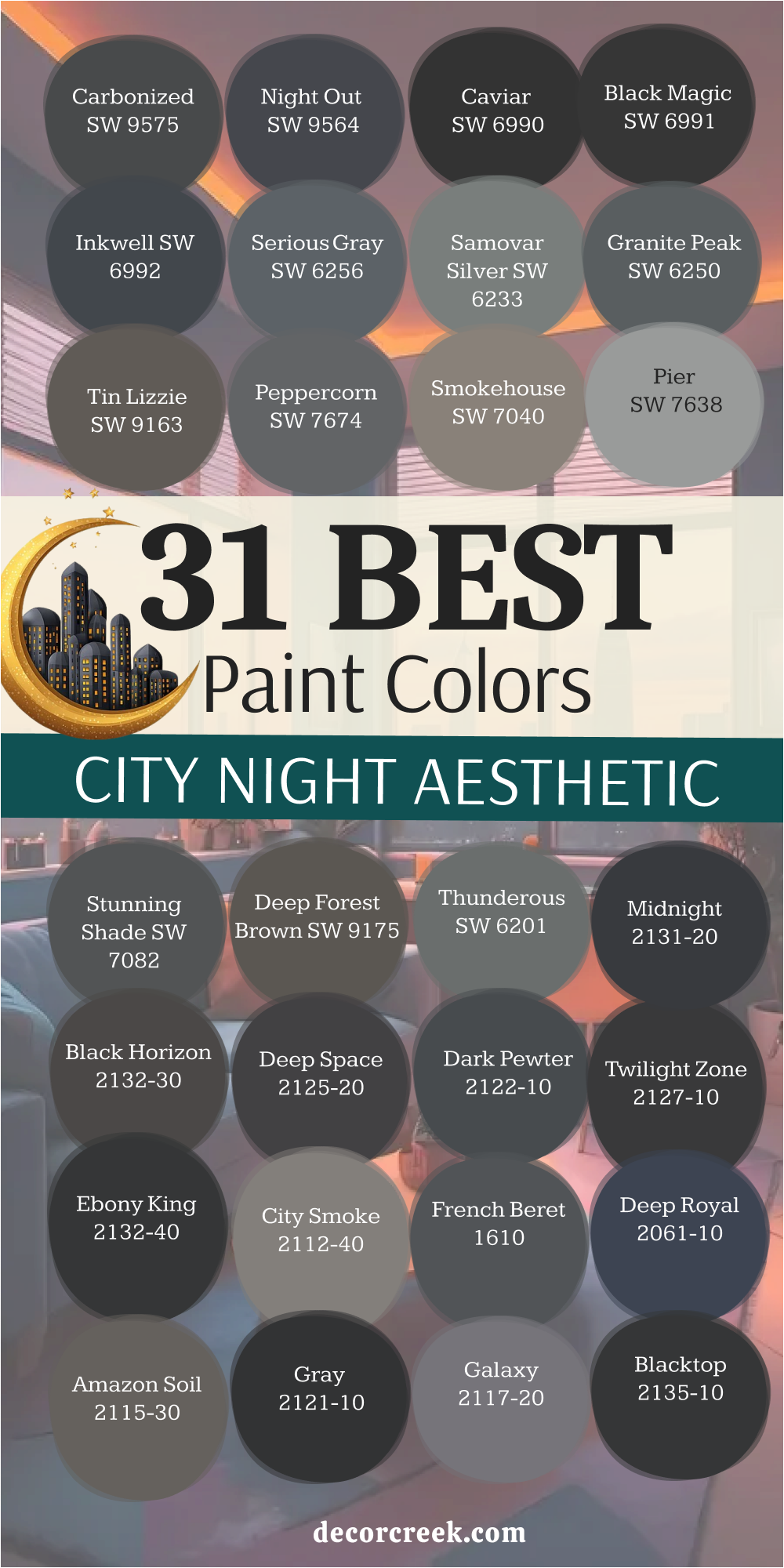
My Final Thoughts About 31 paint colors for the City Aesthetic vibe
Choosing the right paint color is the single biggest and most defining factor in establishing the overall mood, character, and emotional atmosphere of a home. For achieving the desired “City Aesthetic,” you must seek out colors that are sophisticated, structural, often deeply saturated, and highly expressive.
Think of the powerful palette of shades found within the urban environment: the cool, textured gray concrete; the clean, graphic black of wrought iron; the warm, rich brown of historic brownstone buildings; and the deep, inky blue of the night sky over the metropolis.
I have shared my most preferred favorites from Sherwin-Williams and Benjamin Moore because their paint lines consistently offer the depth and quality of pigmentation absolutely necessary to successfully execute these strong, moody, and deep looks without the walls appearing flat or lifeless.
Whether you opt for a deep, dramatic charcoal like Iron Ore to clearly define and accentuate a single wall, or prefer a balanced, warm greige like Revere Pewter for creating a cohesive, overall backdrop throughout the space, the absolute key is to be deliberate and intentional with every single one of your choices.
Always remember that a dark color can actually make a small room feel cozier, more intimate, and more intentional, rather than visually smaller, when you commit to applying it fully across the space.
These 31 shades represent my curated and proven toolkit for bringing that sharp, tailored, metropolitan elegance right into your interior.
Carefully consider which specific aspect of the city you wish to capture and reflect in your home—its sleek, flawless modernity, its historical grit and texture, or its dramatic, luxurious nightlife—and select the perfect shade to match that specific feeling.

