When I think about painting the outside of a home, I see more than just walls—I see how color can give the house its soul. A beautiful combination makes the whole property feel loved, cared for, and full of personality. The right shades can make stone sparkle, wood glow, and windows stand out.
Choosing a paint color combo isn’t just about style; it’s about emotion. I think about how people will feel walking up to the door—calm, proud, or cozy.
Every detail matters: the siding, the trim, the front door, even the sunlight that hits the walls.
My goal is always the same—to help the house look like it belongs, while still catching the eye in the best way.
Why I Trust Sherwin-Williams and Benjamin Moore for Exterior Paints
Over the years, I’ve worked with dozens of paint brands, and only two have never failed me—Sherwin-Williams and Benjamin Moore. Their colors stay rich through rain, sun, and even snow. They don’t fade, crack, or peel easily, which is why I trust them for homes that need to look great for years.
I love the depth of their palettes—soft whites that glow at sunset, deep charcoals that feel strong and modern, earthy greens that connect to nature.
Their finishes protect the house as much as they beautify it. When I choose a shade from either brand, I know it will age gracefully, just like the home itself. That trust means everything when I’m designing for families who want beauty that lasts.
How I Choose the Right Exterior Paint Color Combo
When I help someone pick an exterior palette, I always start with how they want their home to feel. Do they want a warm welcome, or something bold and dramatic? I look closely at the roof, the driveway, and even the plants nearby because everything outdoors affects color.
Sunlight can make one shade look bright and airy or deep and moody depending on the time of day. I also think about balance: a strong base color needs a calm trim, and the front door is where I often add personality.
The perfect exterior color combo brings together light, materials, and heart—it tells a story before anyone even walks inside.
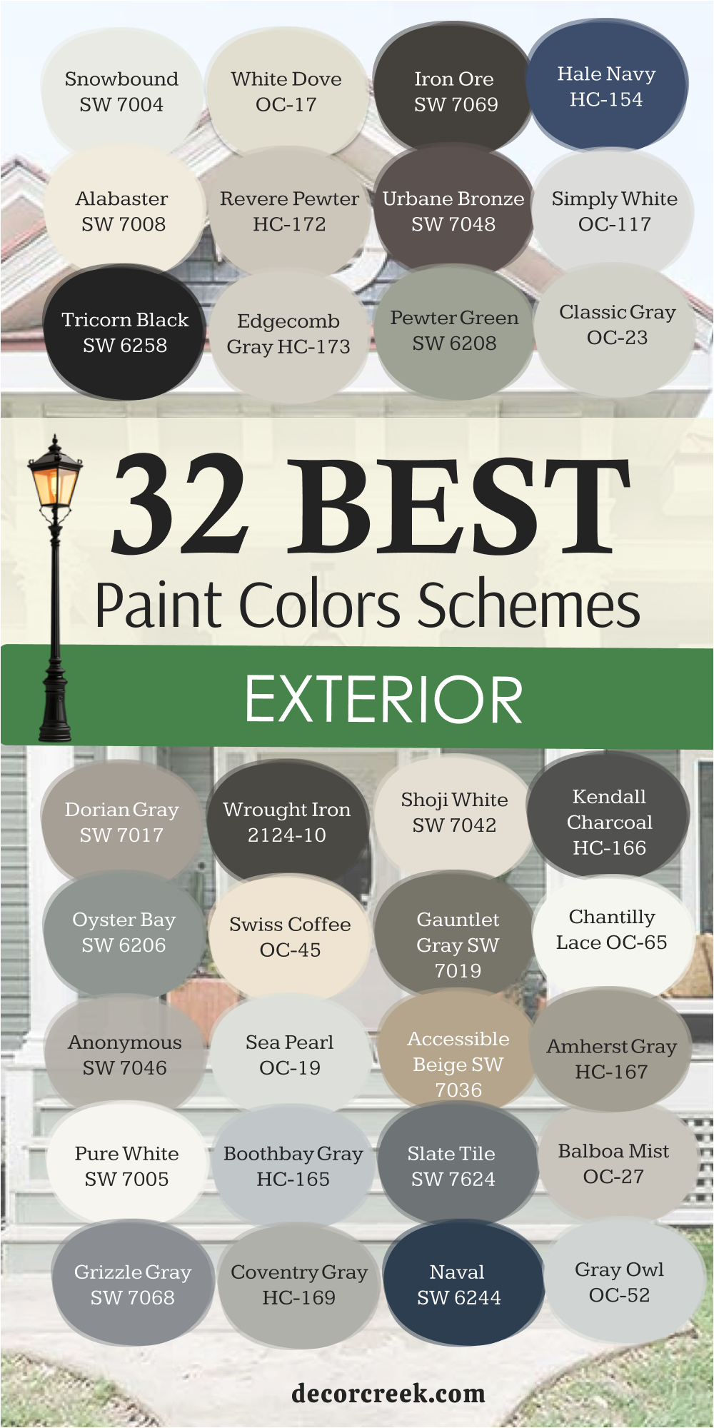
32 Best Exterior Paint Color Schemes
Snowbound SW 7004
Snowbound has a brightness that feels clean but never cold, which is why I reach for it when a home needs to feel open and welcoming. It’s the kind of white that looks fresh under any sky—sunny, cloudy, or at dusk. On a farmhouse, it glows softly beside dark shutters, while on a coastal home, it bounces light beautifully.
I often pair it with deep grays like Iron Ore or with natural wood trim for a balanced look. Snowbound gives the whole house a calm presence without stealing attention from the details.
It also works well on stucco or siding because it holds its tone even as light shifts during the day. When I use this color, the home looks instantly cared for, polished, and full of life. The key rule of Snowbound for exteriors is to let it set the stage—it’s that gentle, steady background that makes everything else look better.

White Dove OC-17
White Dove is one of those rare whites that feels graceful in every setting. It has a soft warmth that keeps it from looking too bright, which makes it ideal for exteriors where harsh sunlight can flatten pure white. I often use it on traditional homes with brick or stone because it smooths the transition between materials. It’s gentle, creamy, and just classic enough to last for years.
Paired with dark accents like Wrought Iron or Kendall Charcoal, it gives a home quiet strength. I’ve seen it transform tired siding into something fresh and elegant without losing charm.
Even when the light changes through the day, it stays balanced and calm. The key rule of White Dove is trust—it adapts easily to any style and always feels welcoming, which is why it remains a favorite for timeless curb appeal.

Iron Ore SW 7069
Iron Ore brings a sense of drama that feels both modern and natural. It’s deep and bold but has a softness that keeps it from feeling harsh or industrial. I love using it as a base for contemporary homes that need character without bright color. When combined with white trims like Alabaster or Snowbound, it makes architectural lines stand out sharply.
It also pairs beautifully with wood doors and stone paths, where its darkness grounds the design. I’ve used it for shutters, front doors, and entire facades—it always feels intentional and confident.
On cloudy days, it shows its charcoal warmth, and under bright light, it deepens into a rich shadowy tone. The key rule of Iron Ore is balance—let it highlight structure and texture while softer accents bring the warmth. It’s powerful, stylish, and full of quiet confidence.

Hale Navy HC-154
Hale Navy is one of those dependable colors that instantly makes a home look polished. It’s a navy with just the right mix of gray to feel elegant instead of bold. I like using it on homes that need personality but still want to look classic. Against crisp whites like Chantilly Lace, it feels bright and nautical; paired with warm grays, it turns sophisticated and calm. In the morning, it shows more blue; by evening, it becomes deeper and more mysterious.
It looks equally beautiful on shingle cottages, modern craftsman houses, and coastal styles. I often suggest Hale Navy for front doors or shutters—it draws attention without being loud.
The key rule of this shade is light—it thrives when surrounded by clean contrasts that show off its depth. Every time I use it, it gives the home a feeling of pride and stability.

Alabaster SW 7008
Alabaster feels like morning light on a peaceful porch—it’s creamy, soft, and endlessly inviting. It’s one of my go-to whites for homes that need warmth without losing freshness. On modern exteriors, it pairs beautifully with bronze or gray trim; on traditional homes, it blends seamlessly with natural stone or brick.
What I love about Alabaster is how it reflects sunlight—it glows gently instead of glaring. Even under cloudy skies, it keeps its clean, soft tone.
It’s bright enough to freshen a façade but has a gentle touch that feels natural and relaxed. When used as the main color, it allows architectural lines and windows to shine. The key rule of Alabaster is comfort—it should wrap the home in warmth while keeping every detail light and easy on the eyes. It never shouts for attention, yet it always stands out.

Revere Pewter HC-172
Revere Pewter is the perfect bridge between gray and beige, and I’ve trusted it for years to bring calm balance to exteriors. It has a gentle earthiness that feels welcoming but still clean and polished. I love using it on homes surrounded by greenery—it harmonizes beautifully with nature. With white trim, it feels crisp and refined; with darker accents like Iron Ore, it turns quietly dramatic.
It’s a shade that adapts easily to light—it can look warm in the morning and cool by sunset, which gives the house an effortless rhythm.
I’ve used it on everything from brick ranches to new modern builds, and it always feels just right. The key rule of Revere Pewter is flexibility—it complements any material, whether wood, stucco, or stone, and helps the home look timeless instead of trendy.

Urbane Bronze SW 7048
Urbane Bronze carries a quiet strength that I adore. It’s a deep, earthy mix of gray and brown that gives a home instant sophistication. When used on siding, it feels grounded and rich; when used on doors or trims, it adds just the right amount of contrast. I often pair it with whites like Shoji White or Alabaster for a balanced, modern feel.
It’s a color that connects perfectly with nature, especially when paired with wood, stone, or greenery. In sunlight, its bronze tones shimmer softly; in shade, it deepens into a cozy, strong hue.
Urbane Bronze doesn’t fade into the background—it adds structure and presence. The key rule of this color is placement—use it to ground lighter tones and to give a home a calm, confident edge that feels both modern and natural.

Simply White OC-117
Simply White feels like a breath of fresh air on a bright morning. It’s pure, clean, and radiant without being cold. I love using it when a home needs to look refreshed and open. It pairs beautifully with deep grays, muted blues, or natural wood, letting details stand out. Simply White works across architectural styles—it’s light enough for coastal cottages and sharp enough for modern builds.
On sunny days, it reflects light softly, while on cloudy days, it still glows. It brings out every trim line and makes even older homes look renewed.
The key rule of this shade is light—it thrives where there’s movement in shadows and sunshine. It’s a color that gives energy to a home, making it feel cared for and alive from morning to night.

Tricorn Black SW 6258
Tricorn Black is bold and timeless in its own way. It’s the color I turn to when I want a home to feel strong and structured. Unlike softer blacks, this one stays pure—it doesn’t lean blue or brown. I use it on doors, trims, or full exteriors when I want instant sophistication. Against white siding, it outlines the architecture perfectly; beside wood tones, it feels rich and grounded.
It’s one of the most dependable blacks I’ve ever worked with because it holds its tone beautifully in all lighting. On sunny days, it gleams slightly; in shade, it deepens to a soft matte look.
The key rule of Tricorn Black is intention—use it to create contrast and focus. It has the power to turn a simple home into something that feels designed with purpose and confidence.

Edgecomb Gray HC-173
Edgecomb Gray is one of those beautiful in-between colors that adapts to its surroundings like magic. It sits right between beige and gray, making it ideal for exteriors that need warmth without heaviness. I love how it changes throughout the day—it’s soft and airy in sunlight, then becomes cozy and grounded at dusk.
Paired with bright whites, it feels modern; with black accents, it turns bold yet calm. I often use it for homes that have mixed materials like stone, wood, and siding because it connects everything together effortlessly.
Edgecomb Gray always feels natural and easy to live with—it doesn’t try too hard, but it never fades away either. The key rule of this shade is harmony—it ties a home together quietly, creating that perfect, balanced first impression.

Pewter Green SW 6208
Pewter Green is one of those colors that brings calm strength to a home’s exterior. It’s deep but still natural, with an earthy tone that connects beautifully to trees, gardens, and stone. I love using it when a homeowner wants something classic yet a little unexpected. It works perfectly on siding with soft white trim or even black shutters for contrast.
In bright sun, it reveals a hint of gray; in shade, it becomes rich and mossy. It feels grounded, elegant, and welcoming all at once.
I’ve seen it make both modern and farmhouse styles look timeless. The key rule of Pewter Green is balance—pair it with natural textures and soft tones to highlight its warmth. Every time I use it, the home feels peaceful, strong, and perfectly in tune with nature.
Classic Gray OC-23
Classic Gray is one of my favorite neutrals for exteriors because it always feels soft and graceful. It’s not too cool or too warm, which makes it easy to match with almost any trim or accent. When the light hits it, it reflects just enough brightness to make the house glow gently. I often pair it with crisp whites for a refined, fresh look or deep blacks for structure and contrast.
Classic Gray has this quiet charm that works on every style—from cottages to sleek modern builds. It never competes with other details; instead, it brings everything together.
The key rule of this color is simplicity—use it when you want your home to feel elegant without shouting for attention. It’s the color that always makes neighbors stop and say, “That just feels right.”

Dorian Gray SW 7017
Dorian Gray is a medium gray that feels dependable, stylish, and comfortable all at once. It has a warm undertone that keeps it from feeling flat or cold. On exteriors, I like pairing it with bright white trims or black accents to add structure. It’s especially beautiful on homes with stone or brick foundations—it ties everything together naturally.
In sunlight, it looks clean and balanced; in shadow, it deepens to a soft charcoal. I often recommend it for homeowners who want gray with personality but not too much drama.
The key rule of Dorian Gray is layering—it works best with mixed materials and contrasting shades that help it shine. It’s a solid, trustworthy color that always looks thoughtful and put together.

Wrought Iron 2124-10
Wrought Iron has a richness that makes any home look more sophisticated. It’s not quite black—it carries subtle hints of blue and gray, which give it depth. I love it on doors, shutters, or as an accent for lighter siding. When paired with creamy whites or natural wood, it feels bold but never harsh. Wrought Iron catches light beautifully, showing different moods through the day—from a soft charcoal in the morning to a deep, dramatic tone at night.
It’s ideal for modern homes that need sharp definition or traditional homes that need contrast. The key rule of Wrought Iron is confidence—it adds presence without overpowering.
It’s one of those colors that quietly says, “this home is cared for,” and that’s why I trust it again and again.

Shoji White SW 7042
Shoji White is a lovely, warm neutral that sits between white and beige. It feels soft and airy, making any home look inviting and calm. I often use it for exteriors that need warmth but not too much color. Shoji White pairs perfectly with deep tones like Urbane Bronze or dark gray roofs. In sunlight, it glows softly; in shade, it gains a creamy depth that feels comforting.
It’s one of those shades that adapts to its surroundings beautifully, bringing harmony to a home’s architecture. Whether on modern siding or classic brick, it never feels out of place.
The key rule of Shoji White is layering—it shines best when paired with richer, grounding tones. I love how it makes homes feel fresh yet lived-in.

Kendall Charcoal HC-166
Kendall Charcoal is a bold, sophisticated gray with a lot of character. It’s dark enough to make a statement but still soft enough to feel inviting. I love using it on exteriors where I want the home to feel grounded and strong. It pairs beautifully with bright whites, creams, or even warm woods. In the morning light, it feels rich and steady; at dusk, it deepens into a luxurious slate.
It’s stunning on doors, shutters, or full siding for modern designs. When used with natural materials, it gives the home an elegant contrast. The key rule of Kendall Charcoal is structure—let it define edges and lines to bring clarity to the design.
It never feels heavy, only sure of itself, which is why I return to it often for lasting curb appeal.

Oyster Bay SW 6206
Oyster Bay has that soothing mix of green and gray that feels naturally elegant. It’s a shade that brings calmness to exteriors without losing depth. I love pairing it with white trims or dark accents like Iron Ore for modern appeal. In the sunlight, it brightens into a silvery sage; under shade, it softens beautifully. It works well for homes surrounded by trees or gardens because it blends effortlessly with nature.
Oyster Bay feels like a fresh breeze—it’s gentle but full of life. The key rule of this color is pairing—combine it with neutrals and wood to make it feel grounded.
It’s a favorite for craftsman and coastal homes that need color without flashiness.

Swiss Coffee OC-45
Swiss Coffee is a cozy off-white that always feels like home. It has soft creamy undertones that make any exterior look warm and welcoming. I use it often on traditional and farmhouse-style houses where comfort matters. Paired with dark grays or greens, it creates a timeless and balanced contrast. Swiss Coffee reflects light beautifully—it feels bright in the sun but mellow in the shade.
On wood siding, it enhances the texture without hiding it. The key rule of this shade is warmth—it should make your home look inviting from the very first glance.
Whenever I paint a house in Swiss Coffee, it feels as if it’s smiling back at the street.
Gauntlet Gray SW 7019
Gauntlet Gray is a rich medium-dark gray that instantly adds character to a home. It’s bold but not overpowering, making it a great base for modern or rustic exteriors. I love pairing it with lighter trims or wood doors—it creates balance and depth. Under sunlight, it feels smooth and strong; in shadow, it turns cozy and grounded. Gauntlet Gray works beautifully with stonework or dark roofing, tying everything together with ease.
It’s one of those colors that gives a house confidence. The key rule of Gauntlet Gray is contrast—use it to define structure and texture so the home feels sturdy but stylish.
It’s modern, timeless, and full of heart.
Chantilly Lace OC-65
Chantilly Lace is my go-to for a pure, clean white exterior that still feels alive. It’s bright without being sharp, and it reflects sunlight like no other white I’ve used. On homes with dark roofs or black accents, it creates that perfect crisp contrast. It’s also beautiful for trim and details around windows—it outlines everything gracefully. I love how it adapts to both modern and classic designs.
In the morning, it looks bright and cheerful; in the evening, it glows softly. The key rule of Chantilly Lace is clarity—use it where you want freshness and structure.
It’s the kind of white that makes a house look neat, confident, and full of pride.

Anonymous SW 7046
Anonymous is one of those deep grays that instantly gives a home strength and presence. It has a quiet sophistication, sitting between charcoal and taupe, making it work beautifully in both modern and traditional styles. I often pair it with soft whites like Shoji White or bright Pure White to balance its depth. On homes with lots of sunlight, Anonymous feels rich and layered; under clouds, it softens into a gentle smoky tone.
It’s perfect for homes surrounded by trees or stone because it blends naturally with earthy textures. The color feels dependable and grounded, never cold or severe.
The key rule of Anonymous is balance—let it take the lead as your main exterior shade, and keep trims clean and simple. When used thoughtfully, it makes a home look sturdy, stylish, and well cared for.

Sea Pearl OC-19
Sea Pearl is a pale, elegant neutral that always reminds me of smooth stone or warm sand. It’s soft enough to feel natural but bright enough to give a home life. I love using it for homeowners who want something lighter than beige but more relaxed than pure white. Sea Pearl pairs beautifully with charcoal trims or muted greens, adding a gentle contrast that feels effortless.
In morning light, it glows softly; at sunset, it deepens into a lovely, creamy tone. On exteriors, it makes a home appear larger and more open, yet still cozy and warm.
The key rule of this color is softness—don’t overcomplicate it with bold accents. Sea Pearl shines when allowed to feel natural and simple, creating a look that feels peaceful and balanced all day long.

Accessible Beige SW 7036
Accessible Beige has a special warmth that makes every home feel inviting. It sits right between beige and gray, giving it a gentle balance that works beautifully with brick, wood, or stone. I use it often when a homeowner wants a neutral that feels modern but still friendly. It pairs best with whites like Alabaster or darker tones like Gauntlet Gray for contrast.
In sunlight, it looks fresh and open; in shade, it deepens slightly, adding richness. What I love about this shade is its flexibility—it never feels dull or dated.
It adapts to every architectural style with ease. The key rule of Accessible Beige is harmony—use it to tie together mixed materials and natural elements for a calm, polished finish that feels timeless.

Amherst Gray HC-167
Amherst Gray has that confident, grounded feeling that gives a home quiet authority. It’s a dark gray with subtle brown undertones that make it warmer and more approachable than many deep shades. I love it on modern homes where clean lines meet bold contrast. When paired with crisp whites or wood doors, it feels balanced and refined.
In full sun, it takes on a sleek, urban look; under cloudy skies, it becomes deep and cozy. Amherst Gray looks beautiful on siding, shutters, and even garage doors—it adds a sense of weight and stability without feeling heavy.
The key rule of this color is focus—use it to define the structure of your home, especially when you want your architecture to speak for itself.

Pure White SW 7005
Pure White is clean, bright, and endlessly versatile. It’s one of those colors that instantly freshens up an exterior without looking too stark. I use it for homes that need a light, simple backdrop where textures and shapes can stand out. It pairs perfectly with any accent—deep navy, charcoal, bronze, or even soft green.
On sunny days, it glows with clarity; in softer light, it feels calm and elegant. I love how it outlines details like window frames and trim, giving homes a crisp, polished appearance.
The key rule of Pure White is simplicity—keep the palette limited and let the paint’s clarity do the work. It’s the kind of white that makes a home look brand new while keeping its warmth.

Boothbay Gray HC-165
Boothbay Gray is one of those rare shades that feels coastal and modern at the same time. It has hints of blue that make it calm and clean, yet it never looks cold. I often use it for homes near water or surrounded by greenery because it complements both beautifully. It pairs best with whites like White Dove or bright trim colors for contrast. In sunlight, it leans fresh and airy; in shade, it becomes a soft, smoky gray.
Boothbay Gray works on siding, doors, or shutters—it always feels thoughtful and balanced. The key rule of this color is ease—use it to create a gentle, polished look that feels breezy without losing sophistication.

Slate Tile SW 7624
Slate Tile is a deep blue-gray that feels confident and refined. It reminds me of stormy skies and quiet evenings—it has that moody calm I love for exteriors. On siding, it brings depth and character, especially when paired with crisp white or stone trim. It works beautifully on craftsman homes and coastal cottages. In sunlight, it shows more blue; under shadows, it becomes a deep charcoal with a soft sheen.
Slate Tile stands out without being flashy—it looks natural yet striking. The key rule of this color is contrast—pair it with lighter tones to highlight its strength.
It’s perfect for homeowners who want a classic color that still feels fresh and modern.

Balboa Mist OC-27
Balboa Mist is a delicate, airy greige that adds quiet elegance to any exterior. It’s light enough to keep a home open and bright but carries enough warmth to feel comfortable. I use it for homeowners who want softness without losing sophistication. Paired with dark trims or natural wood accents, it creates a perfectly balanced look. In the sun, it reflects a silvery warmth; in shade, it turns creamy and calm.
Balboa Mist suits many styles—from minimal modern to cozy cottages. The key rule of this color is subtle balance—it connects architecture and nature gracefully.
It’s a color that doesn’t demand attention but rewards those who notice its gentle beauty.

Grizzle Gray SW 7068
Grizzle Gray is rich, layered, and full of personality. It’s darker than a medium gray but softer than charcoal, which gives it beautiful depth. I love using it on homes that need strong contrast with light trims or stone bases. In daylight, it feels strong and modern; in shade, it becomes warm and quietly dramatic. Grizzle Gray pairs wonderfully with white trims and wood doors for balance.
It’s one of those shades that makes architecture look sharper and more detailed.
The key rule of Grizzle Gray is intention—use it when you want your home to have presence but still feel inviting. It’s elegant, powerful, and built to last.

Coventry Gray HC-169
Coventry Gray is cool, smooth, and classic. It’s the kind of color that makes a home feel fresh and timeless at once. I often use it for modern homes that need definition without going too dark. It pairs perfectly with bright whites or soft blues for trim and doors. In sunlight, it shines clean and crisp; in shadows, it develops a deeper, sophisticated tone.
Coventry Gray works beautifully on both large and small homes—it always feels neat and balanced. The key rule of this shade is precision—keep the lines sharp, and let it define the architecture.
It’s one of those colors that always looks effortless and perfectly put together.

Naval SW 6244
Naval is a deep navy that feels both bold and timeless. It brings strength to any exterior but never feels too heavy. I love using it as a statement color for front doors or entire facades on coastal and classic homes. Against crisp whites like Alabaster or Pure White, Naval creates a clean contrast that feels fresh and modern. It also works beautifully with brass fixtures or wooden accents, adding warmth and richness.
In the sun, it shows a slight blue glow; in the evening, it settles into a deep, confident tone. The key rule of Naval is balance—pair it with light trims and simple textures to let its character shine.
It’s perfect for homeowners who want color that feels both grounded and sophisticated.

Gray Owl OC-52
Gray Owl is one of my favorite flexible grays because it feels bright, soft, and endlessly adaptable. It leans slightly cool but never looks cold, which makes it work beautifully with both warm and crisp accents. On exteriors, it creates a relaxed, welcoming look that feels open and clean. I love pairing it with black shutters or creamy trims—it gives just enough contrast without feeling stark.
Under daylight, it feels light and airy; in shade, it turns into a cozy silver-gray that hugs the home gently. The key rule of Gray Owl is simplicity—it works best when the palette stays calm and natural.
It’s the color I reach for when I want a home to look quietly confident, polished, and peaceful all at once.

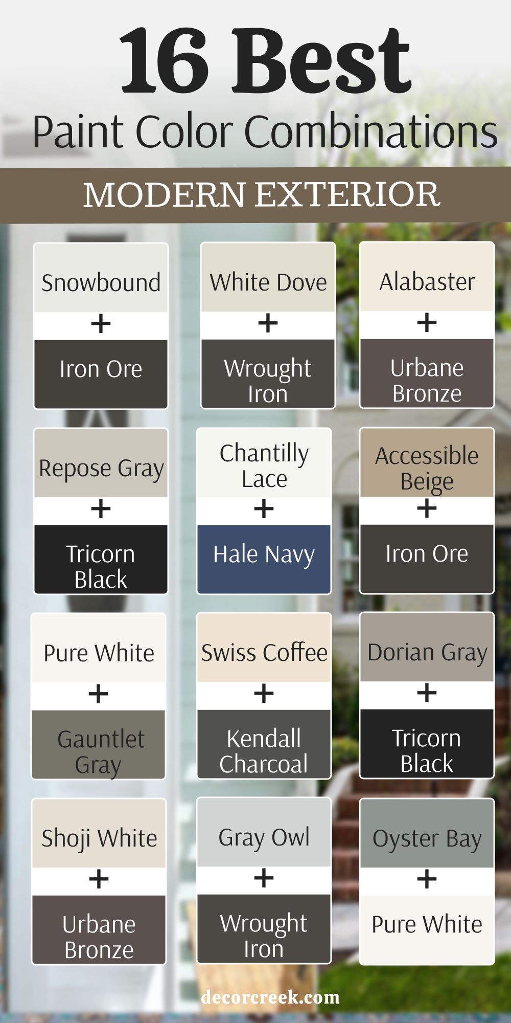
16 Best Modern Exterior Paint Color Combinations
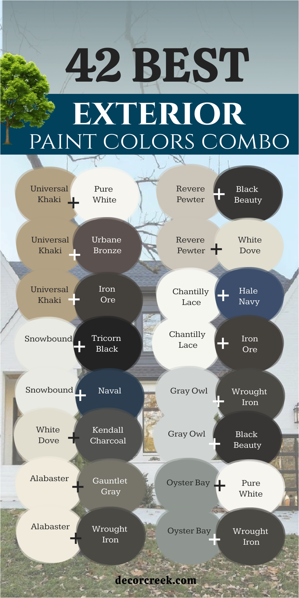
Snowbound SW 7004 + Iron Ore SW 7069
Snowbound and Iron Ore together create one of my favorite modern contrasts. Snowbound’s clean softness brightens a home, while Iron Ore adds the perfect edge of depth and drama. I love using this combo for homes that need a strong, crisp design with warmth underneath. Snowbound keeps the exterior open and light, and Iron Ore defines lines like windows, doors, or trim.
The mix feels timeless yet fresh, especially with wood or metal accents. In sunlight, the white shines beautifully, and the dark feels grounded.
The key rule of this combination is contrast—each color strengthens the other, bringing a perfect balance of brightness and boldness.
White Dove OC-17 + Wrought Iron 2124-10
White Dove and Wrought Iron make a home look clean, refined, and balanced. White Dove’s creamy softness keeps everything warm, while Wrought Iron adds structure and strength. I often use this pair for modern farmhouses or coastal homes that need both charm and boldness. The soft white glows gently in sunlight, while Wrought Iron outlines edges like picture frames. Together they make architecture feel clear and polished.
Add wood or brass hardware, and the look becomes beautifully complete. The key rule of this combo is contrast in texture—mix soft tones and strong lines for a home that feels grounded yet light.
Alabaster SW 7008 + Urbane Bronze SW 7048
Alabaster and Urbane Bronze are made for each other. Alabaster brings gentle light and warmth, while Urbane Bronze grounds it with a rich, natural depth. I’ve used this pair on many homes that needed both comfort and sophistication. It’s especially beautiful on exteriors surrounded by greenery or stone. In daylight, Alabaster feels soft and glowing; by evening, Urbane Bronze turns velvety and elegant.
Together, they make a home look balanced and inviting. The key rule of this pairing is harmony—let the bronze frame the warmth of Alabaster.
It’s ideal for anyone who loves natural tones with quiet strength.
Repose Gray SW 7015 + Tricorn Black SW 6258
Repose Gray and Tricorn Black create a sleek, modern look that feels confident without being too bold. Repose Gray is soft and balanced, adding a calm background, while Tricorn Black defines the structure. I love this duo for clean-lined homes or updated classics—it highlights details beautifully. Under sunlight, Repose Gray feels airy and neutral, while Tricorn Black adds striking depth to trims or doors.

The result is a design that looks both simple and powerful. The key rule of this combination is clarity—keep accents minimal so the black can anchor the home while the gray provides flow.
Chantilly Lace OC-65 + Hale Navy HC-154
Chantilly Lace and Hale Navy feel like crisp linen and dark denim—fresh, stylish, and full of life. The bright white keeps the home light and open, while Hale Navy adds personality and depth. I often use this combination for coastal homes, modern farmhouses, or spaces that need contrast without heaviness. The navy has a rich undertone that plays beautifully with natural light.
Together, these shades feel smart and balanced, creating a home that looks neat, confident, and welcoming.
The key rule of this pair is freshness—let the white breathe and the navy define, giving a clean, sophisticated edge.
Accessible Beige SW 7036 + Iron Ore SW 7069
Accessible Beige and Iron Ore make a home feel grounded yet relaxed. Accessible Beige brings warmth and softness, while Iron Ore adds structure and weight. It’s a pairing that fits beautifully in suburban or countryside homes where natural elements are part of the landscape. The light beige looks bright in the sun but cozy in the shade, and the dark trim defines every corner with elegance. Together they strike a perfect balance—modern but never cold.
The key rule of this combination is proportion—keep Iron Ore for trims, accents, or doors to frame the gentle warmth of Accessible Beige.
Pure White SW 7005 + Gauntlet Gray SW 7019
Pure White and Gauntlet Gray create a modern, clean, and balanced look that feels inviting but sharp. The pure, crisp white adds clarity to the structure, while Gauntlet Gray grounds it with a strong, medium-dark contrast. I love how this combination looks with natural wood accents or black metal details—it feels composed but full of life.
In bright daylight, the colors complement each other perfectly, never competing.
The key rule of this combo is symmetry—use Pure White to highlight and Gauntlet Gray to define. The result is a home that feels smart, fresh, and timelessly modern.
Swiss Coffee OC-45 + Kendall Charcoal HC-166
Swiss Coffee and Kendall Charcoal create a gentle balance between warmth and confidence. Swiss Coffee softens the overall feel with creamy lightness, while Kendall Charcoal adds a deep, grounding presence. I love this pairing for homes with large surfaces or varied materials—it ties everything together naturally. In sunlight, the white glows softly; in the evening, the charcoal adds quiet sophistication.
This combo feels both calm and refined, making it perfect for transitional or traditional homes with a modern twist.

The key rule of this palette is tone—let Swiss Coffee lead and Kendall Charcoal outline, keeping the harmony warm and elegant.
Dorian Gray SW 7017 + Tricorn Black SW 6258
Dorian Gray and Tricorn Black are a bold modern mix that instantly adds presence. Dorian Gray is balanced and smooth, acting as a strong foundation, while Tricorn Black gives depth and distinction. I love this pairing for contemporary homes that need definition and contrast. It’s striking but not cold—just enough drama to feel confident.
When used with white or wood accents, it creates a stylish three-tone balance. In sunlight, Dorian feels warm and polished; under shade, the black adds a quiet shadow effect.
The key rule of this combination is structure—use black purposefully to outline strength while gray gives softness.
Shoji White SW 7042 + Urbane Bronze SW 7048
Shoji White and Urbane Bronze make a home feel grounded yet welcoming. Shoji White brings warmth and light, while Urbane Bronze adds rich contrast that feels steady and strong. I love this combination for exteriors that need both softness and confidence—it works beautifully on farmhouse and contemporary styles alike.
The warm neutral base of Shoji White lets the bronze shine without looking harsh. In the morning sun, the home feels bright and cozy; by evening, it becomes warm and intimate.
When paired with wood accents or natural stone, it feels effortlessly balanced. The key rule of this pair is depth—let the light color breathe and the dark tone anchor. It’s a modern mix that still feels timeless and full of heart.
Gray Owl OC-52 + Wrought Iron 2124-10
Gray Owl and Wrought Iron create a sleek, modern look that feels sharp but never cold. Gray Owl keeps the exterior light and fresh, while Wrought Iron outlines it with confident precision. I love using this combo for homes with simple, clean architecture—flat siding, large windows, and natural materials.
The soft gray balances the bold charcoal perfectly, letting each feature stand out clearly. In bright sunlight, Gray Owl feels open and airy; under shadows, the Wrought Iron gives a beautiful sense of contrast.
This pairing looks incredible with metal, glass, or cedar accents. The key rule of this combination is clarity—use these tones to define, not decorate. Together they make a home look current, polished, and beautifully composed.
Oyster Bay SW 6206 + Pure White SW 7005
Oyster Bay and Pure White feel like a breath of fresh coastal air. The gentle green-gray of Oyster Bay brings softness and calm, while Pure White adds crisp brightness that makes every line feel clean and simple. I love this combination for homes surrounded by greenery or near water—it connects beautifully to nature.
The white trim keeps the look modern and organized, while the soft color base feels natural and welcoming. In sunlight, Oyster Bay glows subtly; under shade, it deepens into a soothing tone.
Together they create a peaceful exterior that feels both fresh and grounded. The key rule of this pair is balance—let the soft color lead and the white refine it. It’s a gentle, relaxed combo that always looks graceful.
Boothbay Gray HC-165 + White Dove OC-17
Boothbay Gray and White Dove create a balanced, calming exterior with just the right touch of elegance. Boothbay Gray brings a hint of blue that feels fresh and coastal, while White Dove wraps the look in warmth. I often use this combination for homes that want softness but still a clean, updated feel.
The white keeps everything polished and bright, while the gray adds subtle color that changes gently with the light. In the morning, the tone feels airy; by dusk, it settles into a soothing, silvery hue.
The key rule of this combo is texture—use natural materials like wood or stone to highlight its softness. It’s classic, peaceful, and always inviting.
Grizzle Gray SW 7068 + Snowbound SW 7004
Grizzle Gray and Snowbound make a perfect statement together. Grizzle Gray gives depth and definition, while Snowbound lightens the whole look with softness. This pairing works beautifully for homes that want a modern edge but still feel comfortable and warm. The contrast makes architecture stand out sharply without feeling stark.
Grizzle Gray looks rich and confident under bright sun, while Snowbound keeps the palette clean and fresh. Together, they create a design that feels both grounded and bright—a perfect reflection of modern elegance.
The key rule of this color combo is proportion—let the gray define and the white open up the space visually. It’s bold but perfectly balanced.
Revere Pewter HC-172 + Black Beauty 2128-10
Revere Pewter and Black Beauty create a look that feels refined, natural, and sophisticated. Revere Pewter brings calm warmth, while Black Beauty adds depth and confidence.
I love this combination for homes that want a strong, grounded exterior without harsh contrast.
The greige tone of Revere Pewter softens the black beautifully, creating a timeless palette that feels elegant in every season. In daylight, it feels harmonious and smooth; at night, the black takes the lead, adding drama and charm.
The key rule of this pairing is tone—let the balance of warm and cool do the talking. It’s a color mix that always feels complete, steady, and perfectly composed.
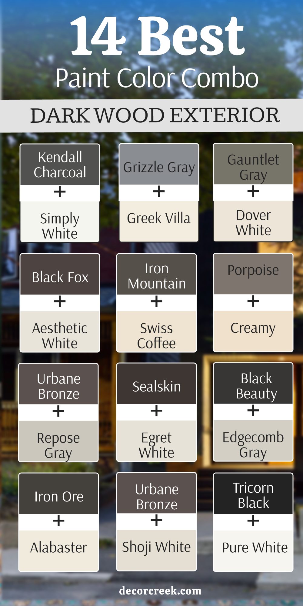
14 Best Dark Wood Exterior Paint Color Combos
Iron Ore SW 7069 + Alabaster SW 7008
Iron Ore and Alabaster are one of my favorite duos for homes with dark wood accents. Iron Ore gives depth and power, while Alabaster softens the edges with its creamy warmth. Together they feel balanced—strong yet calm. I love how this combination works with cedar or walnut tones, highlighting the natural beauty of wood.
In sunlight, the contrast feels rich and modern; in evening light, it becomes cozy and grounded.
It’s perfect for cabins, craftsman homes, or any exterior where natural materials take center stage. The key rule of this pair is warmth—let the dark create structure while the light brings in softness.
It’s a color story that feels strong but never cold.
Urbane Bronze SW 7048 + Shoji White SW 7042
Urbane Bronze and Shoji White bring elegance and calm to exteriors with dark wood elements. Urbane Bronze offers rich depth, while Shoji White wraps everything in gentle light. I love this combination because it makes wood details glow—it’s earthy, natural, and sophisticated all at once.
On homes with wide porches or wood beams, the two shades blend beautifully with their surroundings.
Under sunlight, Shoji White feels creamy and open, while Urbane Bronze looks like polished metal with a hint of softness.
The key rule of this combo is connection—let the colors echo the tones of the wood instead of competing. The result feels organic, smooth, and endlessly inviting.
Tricorn Black SW 6258 + Pure White SW 7005
Tricorn Black and Pure White are bold opposites that make a statement. The deep black outlines every detail with precision, while the clean white keeps the home fresh and balanced. On homes with dark wood, this contrast makes each texture stand out beautifully. I use it when I want a modern, architectural feel that still feels classic.
The dark trim and the bright siding create a dynamic play of light and shadow. In sunlight, it’s sharp and polished; in softer light, it feels rich and grounded.
The key rule of this pairing is clarity—keep the lines clean and let the contrast define the style. It’s timeless, strong, and always looks refined.
Peppercorn SW 7674 + Snowbound SW 7004
Peppercorn and Snowbound are the perfect blend of bold and gentle. Peppercorn adds deep character without feeling too dark, while Snowbound brings brightness that softens everything around it. I love this pairing for modern homes with wood details—it highlights both structure and warmth.
Under bright sunlight, the mix feels striking and crisp; in shade, it turns cozy and elegant.

It works especially well with wide planks, stone, or metal accents. The key rule of this combo is rhythm—let the dark lead in small doses and the light tone fill the space.
It gives a home presence while keeping the overall look calm and inviting.
Wrought Iron 2124-10 + White Dove OC-17
Wrought Iron and White Dove are a perfect marriage of strength and softness. The deep charcoal hue of Wrought Iron adds definition, while White Dove lightens and warms the design. I love this combination for wood-heavy exteriors—it enhances grain and texture beautifully.
In daylight, the dark feels velvety and rich; in the evening, the white glows softly, making the home look calm and complete.
It’s perfect for homes with modern or transitional architecture, especially when paired with warm wood tones. The key rule of this combo is proportion—use the dark shade to frame and the white to highlight.
Together they create elegance with just the right amount of contrast.
Kendall Charcoal HC-166 + Simply White OC-117
Kendall Charcoal and Simply White give a home modern strength with a soft finish. The dark gray feels elegant and timeless, while the white brightens and defines. When paired with wood tones, the combination becomes beautifully layered—the contrast feels natural, not harsh.
I love how Kendall Charcoal brings weight to the base of a home, grounding it, while Simply White lifts the overall look.
It’s sophisticated yet friendly, fitting equally well for city homes and mountain retreats. In changing light, the colors shift gently but never lose their harmony.
The key rule of this pair is balance—let one color lead and the other support for a smooth, cohesive exterior.
Grizzle Gray SW 7068 + Greek Villa SW 7551
Grizzle Gray and Greek Villa make a home look both classic and fresh. Grizzle Gray’s richness pairs perfectly with the creamy warmth of Greek Villa, especially when dark wood tones are added to the mix. This combination brings sophistication and depth without feeling heavy.
I often use it for craftsman or rustic homes—it ties beautifully into natural surroundings.
Under sunlight, Greek Villa reflects soft golden tones, while Grizzle Gray deepens like polished stone. Together they feel grounded yet bright, ideal for homes that want comfort and structure.
The key rule of this combo is layering—mix materials like stone, wood, and metal to show off both shades.

Gauntlet Gray SW 7019 + Dover White SW 6385
Gauntlet Gray and Dover White make a warm, balanced pair that suits homes with natural wood beautifully. The medium-dark gray gives body and contrast, while Dover White keeps the overall look soft and friendly. I love this combination for homes that need an updated classic feel—it’s welcoming and rich without being too bold.
The dark shade works well for siding or trims, while the white adds brightness around windows and doors. In sunlight, they feel crisp and charming; at dusk, they settle into a cozy glow.
The key rule of this combo is warmth—let the undertones of both colors blend with the natural texture of wood.

Black Fox SW 7020 + Aesthetic White SW 7035
Black Fox and Aesthetic White create a refined, comfortable palette that pairs perfectly with deep-toned woods. Black Fox has a soft brown base that feels earthy and grounded, while Aesthetic White balances it with a light, elegant glow. Together, they make a home look rich but approachable.
I love how the contrast feels natural—it’s never too sharp, always soothing.

On homes with heavy wood grain, this pair highlights texture instead of hiding it. The key rule of this combination is connection—choose materials that echo the undertones, like bronze fixtures or natural stone.
The result feels unified and welcoming, full of quiet confidence.
Iron Mountain 2134-30 + Swiss Coffee OC-45
Iron Mountain and Swiss Coffee create a classic pairing full of warmth and contrast. Iron Mountain has a deep, slightly brown undertone that feels sturdy and elegant, while Swiss Coffee adds a gentle, creamy light that softens everything around it.
I love using this combination on homes with dark wood beams or wide porches—it blends seamlessly with natural materials while still looking polished.

In sunlight, Iron Mountain feels rich and earthy; in shade, it turns moody and beautiful. The light cream keeps the look from feeling too heavy, adding balance and air.
The key rule of this combo is warmth—let the creamy tone highlight the depth of the dark for a design that feels both comforting and strong.
Porpoise SW 7047 + Creamy SW 7012
Porpoise and Creamy make a soft, warm duo that complements dark wood perfectly. Porpoise is a brownish-gray with just the right amount of softness, while Creamy keeps the combination light and approachable. I love how these shades bring quiet elegance to homes surrounded by nature—they look especially stunning with stone walkways and rustic wood trims. In bright light, Porpoise shows its warm side; as evening falls, it takes on a gentle charcoal hue.
Creamy adds brightness that feels natural, not stark.

The key rule of this combo is comfort—use it when you want your home to feel calm, cozy, and well-balanced from every angle.

Urbane Bronze SW 7048 + Repose Gray SW 7015
Urbane Bronze and Repose Gray bring sophistication and balance to homes that feature dark wood. Urbane Bronze grounds the look with richness, while Repose Gray adds a soft, neutral backdrop. I love this combination for transitional homes—it feels current but still classic. The gray adds a clean, cool layer that contrasts beautifully with the earthy bronze tones.
Together, they bring depth and dimension without feeling too bold. In the sunlight, Repose Gray looks open and airy, while the bronze shifts gently with light.
The key rule of this pair is flow—let both colors work naturally with the textures around them, from stone to cedar. It’s elegant, understated, and incredibly easy to live with.
Sealskin SW 7675 + Egret White SW 7570
Sealskin and Egret White are perfect for homes that want bold character but gentle edges. Sealskin is a deep espresso-like shade that feels luxurious and dramatic, while Egret White balances it with a soft, creamy glow. I love using this pair on modern rustic homes—the dark color grounds the design, while the lighter tone brightens trims and frames.
In daylight, Sealskin feels strong and velvety; at dusk, it becomes warm and moody. Egret White complements that depth beautifully, adding light in just the right places.
The key rule of this combo is placement—keep the dark where you want focus, and use the light to guide the eye. The result is cozy, rich, and endlessly welcoming.
Black Beauty 2128-10 + Edgecomb Gray HC-173
Black Beauty and Edgecomb Gray create a pairing that feels refined and full of quiet confidence. Black Beauty is deep, smooth, and bold—it adds instant sophistication to any exterior. Edgecomb Gray softens that strength with a warm greige that balances perfectly against wood tones. Together, they make a home look timeless and well-composed
I love this combination for exteriors with wood doors or beams—it makes every detail stand out.
In sunlight, the gray keeps the design fresh; in the evening, the black adds an elegant shadow.
The key rule of this combo is contrast—let the dark create focus and the gray bring comfort. It’s the kind of palette that makes a home feel grounded, graceful, and beautifully complete.
42 Best Exterior Paint Color Combo for 2026
Universal Khaki SW 6150 + Pure White SW 7005
Universal Khaki and Pure White create a natural, balanced look that feels warm yet clean. Universal Khaki has soft earthy undertones that connect beautifully with wood, stone, and greenery, while Pure White keeps the design bright and refined. I love using this pairing for homes that need a grounded look but still want lightness.
It feels timeless without being boring. In sunlight, the khaki tone glows softly, while the white trim sharpens every line.
It’s especially stunning on ranch or farmhouse styles. The key rule of this combo is comfort—let the khaki lead and the white define. It’s an easy harmony that never goes out of style.
Universal Khaki SW 6150 + Urbane Bronze SW 7048
Universal Khaki and Urbane Bronze bring together warmth and sophistication. The khaki’s soft beige base feels relaxed and inviting, while Urbane Bronze adds strength and depth. I love this pairing for modern exteriors that feature wood or metal—it feels natural yet upscale. The two tones complement each other beautifully in sunlight, creating depth without harsh contrast.
Urbane Bronze also grounds the design, giving the house a strong, steady presence. The key rule of this combination is layering—use bronze for trims or doors to frame the calm foundation of khaki.
The result is a home that looks rich, balanced, and quietly confident.
Universal Khaki SW 6150 + Iron Ore SW 7069
Universal Khaki and Iron Ore form a modern, earthy contrast that feels bold but welcoming. I often use this pairing for homes with large porches or wood accents. The khaki’s warmth balances the cool power of Iron Ore, giving structure without stiffness. Under bright daylight, Iron Ore adds crisp definition, while the khaki softens it. Together, they feel grounded, like stone and sand.
This combination works beautifully on both traditional and contemporary styles. The key rule of this combo is texture—let the dark define edges and the khaki fill wide spaces.
It’s strong, organic, and perfect for 2026’s natural design trend.
Snowbound SW 7004 + Tricorn Black SW 6258
Snowbound and Tricorn Black remain a timeless duo that looks especially modern in 2026. Snowbound brings brightness and approachability, while Tricorn Black creates architectural structure. I love using this pairing for exteriors that need clean contrast—it makes every element pop.
The white siding keeps things fresh, and the black trim adds definition that feels crisp and high-end.
In sunlight, the home glows softly; at night, it becomes dramatic and bold.
The key rule of this combo is balance—keep the dark tones limited to trims and accents so the design stays elegant and bright.
Snowbound SW 7004 + Naval SW 6244
Snowbound and Naval feel classic and strong—a fresh take on traditional navy and white. Snowbound provides a pure, warm backdrop, while Naval brings depth and richness. I love this combo for coastal homes, front doors, or shutters—it always feels polished and inviting.
In sunlight, the navy gleams softly; in shade, it becomes dramatic and moody.
It’s a combination that never feels outdated. The key rule of this pair is focus—let the navy highlight key features and the white carry the light.
It’s perfect for 2026’s trend of clean exteriors with bold accents.
White Dove OC-17 + Kendall Charcoal HC-166
White Dove and Kendall Charcoal create a soft but defined palette that feels both modern and comfortable. The creamy undertone of White Dove adds warmth, while Kendall Charcoal gives structure and refinement. I love this combination on traditional homes with wood or brick—it enhances texture without overpowering it.
The pairing shines in daylight, where the white glows and the charcoal deepens beautifully.
It’s the perfect balance between bold and timeless. The key rule of this combo is contrast—use the dark sparingly for definition while keeping the overall look inviting and natural.
Alabaster SW 7008 + Gauntlet Gray SW 7019
Alabaster and Gauntlet Gray are one of those combinations that always look elegant. Alabaster’s creamy softness keeps things bright, while Gauntlet Gray adds mature depth. I love this pairing for craftsman homes or cottages with natural wood—it ties everything together beautifully.
The gray brings focus to shutters and doors, while the white keeps the home open and warm.
In sunlight, the balance feels crisp; under softer skies, it turns rich and layered. The key rule of this pairing is warmth—let both shades complement natural elements like stone or greenery.
It’s quietly beautiful, the kind of palette that feels comfortable year after year.
Alabaster SW 7008 + Wrought Iron 2124-10
Alabaster and Wrought Iron create a contrast that’s soft but confident. Alabaster brightens a home gently, while Wrought Iron defines its shape with subtle depth. I use this pair often for homes that want drama without sharpness. The white glows warmly in sunlight, while the dark tone outlines trim, shutters, and doors with sophistication.
It’s a pairing that looks especially stunning with metal or cedar accents. The key rule of this combo is light—use the dark to frame, not dominate.
It’s a modern favorite that still feels timeless and balanced.
Revere Pewter HC-172 + Black Beauty 2128-10
Revere Pewter and Black Beauty are made for homes that want quiet confidence. Revere Pewter’s warm greige foundation softens the strength of Black Beauty, creating balance and comfort. I love how this combination looks on exteriors surrounded by greenery—it feels natural and effortless. The black adds focus to trims or shutters, while the greige adds warmth to wide surfaces.
In sunlight, the tones blend seamlessly; in shade, they create a refined contrast.
The key rule of this combo is tone—choose matte or satin finishes to highlight texture and keep the look grounded. It’s a designer’s go-to for modern warmth.
Revere Pewter HC-172 + White Dove OC-17
Revere Pewter and White Dove make a subtle, cozy pair that works beautifully in any light. Revere Pewter gives the home a soft greige warmth, while White Dove keeps the edges clear and fresh. I often use this combination when clients want calmness with a touch of sophistication. The pairing feels timeless and works across all styles—from traditional to modern. In bright daylight, the home looks clean and smooth; at dusk, it glows warmly.
The key rule of this pairing is softness—avoid harsh contrast and let both colors blend naturally
It’s one of those combinations that feels like home, no matter where you live.
Chantilly Lace OC-65 + Hale Navy HC-154
Chantilly Lace and Hale Navy together feel crisp, strong, and full of character. Chantilly Lace is one of the purest whites I use — bright but never sterile — while Hale Navy brings richness and tradition with a modern twist. I love this pairing for homes that want to stand out gracefully, not loudly. The white keeps the design fresh, reflecting sunlight beautifully, while the navy adds a dependable depth that feels elegant and confident.
I often use this combination for coastal homes, colonials, or classic cottages with wood or stone features. In daylight, the two colors sparkle with clarity; in the evening, the navy becomes dramatic, and the white glows softly.
The key rule of this combo is contrast with calm — let the white lift and the navy ground. It’s a timeless pairing that feels new again every single year.
Chantilly Lace OC-65 + Iron Ore SW 7069
Chantilly Lace and Iron Ore strike that perfect balance between bold and clean. The bright white brings an open, fresh feeling, while Iron Ore adds structure and intensity. I use this pairing when I want a home to feel modern but still approachable. Against natural light, the contrast is striking, yet the tones feel perfectly matched — the cool undertones of each keep the look balanced.
This duo looks incredible with black-framed windows or natural wood doors. It’s a color scheme that photographs beautifully in every season.
The key rule of this pair is focus — let Iron Ore define the home’s strongest features, and let Chantilly Lace open up the rest. It’s sophisticated, crisp, and perfect for homeowners who want confidence with a touch of softness.
Gray Owl OC-52 + Wrought Iron 2124-10
Gray Owl and Wrought Iron create a smooth, stylish combination that feels simple but refined. Gray Owl carries a silvery softness that keeps homes feeling bright and clean, while Wrought Iron adds rich depth for definition. I often use this pairing for homes with large windows or wood accents — the gray reflects light, and the dark tones frame it beautifully.
The result is crisp, contemporary, and full of personality. Under bright skies, Gray Owl gleams softly; under cloudy light, Wrought Iron takes center stage.
It’s the perfect match for both traditional and modern styles. The key rule of this pairing is balance — keep surfaces open and let the dark tone draw the eye. It feels polished but never cold, ideal for homeowners who love understated beauty.
Gray Owl OC-52 + Black Beauty 2128-10
Gray Owl and Black Beauty together create a look that’s sharp, moody, and endlessly elegant. The gray adds air and lightness, while Black Beauty grounds the entire structure. I love this combination for modern exteriors with clean lines — it gives them a sense of quiet strength. The mix feels like a balance of fog and shadow — soft yet strong.
When sunlight hits, Gray Owl brightens beautifully, while the black deepens like velvet. With wood or stone accents, the effect becomes truly sophisticated.
The key rule of this combo is restraint — let each shade breathe on its own without overmixing. It’s an ideal palette for 2026’s trend of natural contrast and calm confidence.
Oyster Bay SW 6206 + Pure White SW 7005
Oyster Bay and Pure White together feel like a fresh morning breeze. Oyster Bay’s soft green-gray base gives homes a natural, calming tone, while Pure White brings clarity and lightness. This is one of my favorite pairings for homes surrounded by trees or gardens — it harmonizes with nature while keeping everything bright and modern.
The white trim lifts the subtle color beautifully, creating a layered but peaceful look. In bright light, Oyster Bay glows softly; in shade, it turns into a soothing sage tone.
The key rule of this pairing is flow — let the green-gray lead across wide surfaces, and let white frame it gently. It’s a soft, organic look that feels peaceful yet polished.
Oyster Bay SW 6206 + Wrought Iron 2124-10
Oyster Bay and Wrought Iron create a luxurious mix of natural and dramatic. The earthy softness of Oyster Bay contrasts beautifully with the deep, cool edge of Wrought Iron. I use this pairing when a home needs personality and depth without bright color. The muted green-gray adds tranquility, while the dark shade anchors the design.
Together, they feel like nature and architecture in perfect balance. In daylight, the green tone catches light gently; by dusk, the dark trim brings mystery and sophistication.
The key rule of this combo is layering — use texture and tone together, like metal lights or wooden doors, to make the design come alive.
Boothbay Gray HC-165 + White Dove OC-17
Boothbay Gray and White Dove are soft, coastal perfection. The gray has a delicate blue undertone that feels cool and breezy, while White Dove adds creamy warmth that keeps it approachable. I love this pairing for beach houses, lakeside cottages, or homes with lots of sunlight. The two colors work together to create a sense of ease — like sea and sand.
Boothbay Gray adds personality, but White Dove keeps everything grounded. Under sunlight, the gray gleams softly, and at night, it becomes calm and muted.
The key rule of this combo is light — let the natural glow play off the blue-gray, and the whole home feels refreshed and timeless.
Boothbay Gray HC-165 + Black Beauty 2128-10
Boothbay Gray and Black Beauty make a confident, modern statement. The soft blue-gray feels serene, while the rich black adds striking definition. I love this combination for contemporary exteriors that want depth without harsh contrast. The black trim and accents frame the gray perfectly, creating a bold but elegant balance.
When light hits, Boothbay Gray reflects a silvery tone that feels alive, and Black Beauty turns deep and luxurious. This combination works well with metal, wood, or glass finishes.
The key rule of this pair is proportion — let the gray dominate and the black accentuate details. It’s sleek, fresh, and absolutely beautiful in 2026 light trends.
Coventry Gray HC-169 + Pure White SW 7005
Coventry Gray and Pure White are a dream for anyone who loves subtle sophistication. The gray has cool, airy undertones that make it feel modern, while Pure White keeps the entire look open and balanced. I often use this combination for homes that want a minimalist, clean style that still feels warm. It’s especially beautiful with natural textures — like limestone or wood.
In sunlight, the gray feels bright and refined; at dusk, it softens gently. The key rule of this pairing is simplicity — limit additional accents and let the structure shine.
It’s an elegant and dependable duo that feels peaceful, light, and perfectly in tune with 2026’s calm design aesthetic.
Coventry Gray HC-169 + Kendall Charcoal HC-166
Coventry Gray and Kendall Charcoal create a layered neutral palette that feels confident and architectural. The lighter gray forms the body of the home, while the deeper charcoal adds structure and balance. I love how this pairing creates visual depth without relying on contrast alone. It’s especially stunning on homes with multiple materials — shingles, brick, and siding blend naturally between the two tones.
In bright light, the difference between the shades is crisp; in shade, they blend into a smooth, unified look. The key rule of this combo is gradient — keep the tones in the same family so the home feels cohesive.
It’s an effortlessly sophisticated choice for 2026.
Copley Gray HC-104 + Chantilly Lace OC-65
Copley Gray and Chantilly Lace feel classic yet modern, the kind of pairing that makes a home look effortlessly composed. Copley Gray has a rich, warm greige tone that carries depth and stability, while Chantilly Lace adds that crisp brightness every exterior needs. I love using this duo for traditional homes or those with natural stone bases—it creates harmony between soft shadow and light.
The gray reads as warm in sunlight but cools beautifully under shade, while the white keeps the palette grounded. Together, they make every architectural line pop without feeling showy.
It’s a calm, confident color story that feels just as right on a historic home as it does on a new build. The key rule here is balance—let the gray carry the weight and the white lift the light. It’s timeless sophistication with just enough modern polish to fit perfectly into 2026’s design mood.
Copley Gray HC-104 + Iron Ore SW 7069
Copley Gray and Iron Ore bring richness and grounding that instantly make a home look strong and elegant. Copley Gray’s soft warmth pairs beautifully with Iron Ore’s deep graphite tone, creating a contrast that feels bold but natural. I often use this combination on craftsman or transitional homes where texture is key—think wood, stone, and metal blending together.
The dark trim frames windows and doors, adding striking definition, while the gray keeps everything approachable.
Under the sun, Copley Gray looks warm and inviting; in evening light, Iron Ore adds quiet drama. The key rule of this pairing is layering—let materials like brick, cedar, or slate echo the tones to create depth. It’s confident, lasting, and full of quiet charm.
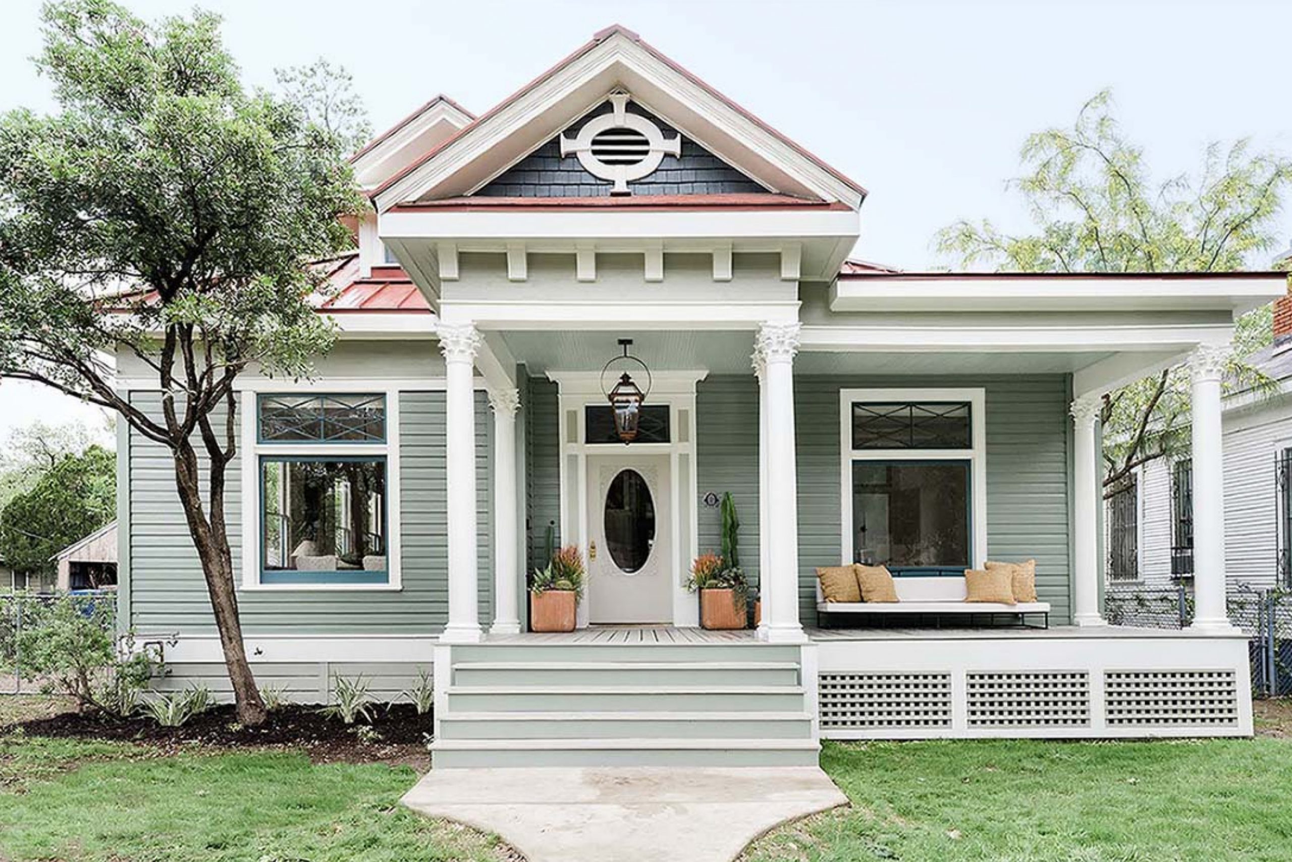
Louisburg Green HC-113 + White Dove OC-17
Louisburg Green and White Dove bring a breath of calm sophistication to any exterior. Louisburg Green is a muted sage with a hint of gray that makes it refined rather than rustic. White Dove balances it perfectly with soft, creamy brightness that feels warm instead of stark. I love this pairing for homes surrounded by trees, gardens, or water—it fits seamlessly into natural landscapes.
In sunlight, the green shows its elegant undertones; in shade, it turns soothing and organic. The white trim adds structure and gives the home a gentle glow.
The key rule of this combo is connection—let it harmonize with the environment. It’s a color story that feels alive, timeless, and welcoming, perfect for homeowners who want something peaceful but still full of personality.
Louisburg Green HC-113 + Black Beauty 2128-10
Louisburg Green and Black Beauty make a striking yet earthy combination that feels both modern and grounded. The soft sage tone adds calmness, while the deep black adds a sense of strength and mystery. I use this pairing for exteriors that want contrast without coldness—it’s bold but still rooted in nature. The black works beautifully on doors, window frames, or metal accents, giving a contemporary edge to the gentle green. Together, they create a balance of elegance and depth that feels especially beautiful under shifting outdoor light.
The key rule of this combination is control—use the dark strategically to shape the home’s character. This duo feels modern, confident, and ideal for 2026’s earthy, natural trends.
Monroe Bisque HC-26 + Kendall Charcoal HC-166
Monroe Bisque and Kendall Charcoal are a pairing of warmth and grounding. The creamy beige feels sunny and welcoming, while the dark charcoal adds definition and depth. I love how this combination balances tradition with modern polish. It’s perfect for exteriors that want contrast without harshness. The charcoal accents on shutters, garage doors, or trim help highlight the home’s lines, while the bisque keeps everything warm and natural. In sunlight, the lighter tone shines with a soft glow; in shade, the dark deepens beautifully.
The key rule here is balance—let the lighter tone lead and the darker color anchor. It’s sophisticated, friendly, and fits perfectly into 2026’s love for timeless neutrals.
Monroe Bisque HC-26 + White Dove OC-17
Monroe Bisque and White Dove create a home that feels warm, timeless, and full of quiet charm. Monroe Bisque is a creamy beige with just a hint of golden undertone that makes exteriors glow softly in daylight. White Dove adds smoothness and clarity, keeping the palette elegant and balanced. I love this combination for traditional or coastal homes—it pairs beautifully with stone walkways, wood doors, and soft landscaping. In sunlight, the bisque color feels gentle and luminous, while the white adds definition.
The key rule of this combo is softness—keep all finishes matte or satin to let the light move naturally. It’s a pairing that feels lived-in from the first day, one that makes guests instantly feel welcome.
Amherst Gray HC-167 + Pure White SW 7005
Amherst Gray and Pure White make a confident, classic duo. Amherst Gray’s deep warmth gives a house strength, while Pure White brings brightness and order. I love this combination for homes that want to feel solid yet crisp. It looks especially beautiful with stone features or black fixtures that tie the tones together. The gray carries subtle brown undertones that add richness and prevent it from feeling too cool. Against the clean white trim, the architecture stands out naturally. In the morning, the home feels fresh and balanced; by evening, it becomes cozy and elegant.
The key rule of this pairing is precision—keep lines clean, and the colors will do the rest. It’s a modern classic for 2026, perfectly composed and endlessly sophisticated.
Amherst Gray HC-167 + Wrought Iron 2124-10
Amherst Gray and Wrought Iron are a deep, layered pairing that feels quietly powerful. Both are dark, but together they create subtle variation that gives the home texture and interest instead of flatness. I love this combination for large or modern homes where tone-on-tone design can shine. Amherst Gray works beautifully as a main siding color, while Wrought Iron adds extra definition on doors, trims, or shutters. The two shades blend like shadows, creating depth that changes with light throughout the day. In morning sun, you see the richness of the gray; by night, the dark charcoal deepens into elegance.
The key rule of this combo is tone—keep finishes matte to emphasize texture. It’s sleek, confident, and perfect for homeowners who love understated strength.
Gentle Cream OC-96 + Gauntlet Gray SW 7019
Gentle Cream and Gauntlet Gray create a comfortable contrast full of warmth and personality. Gentle Cream feels sunny and friendly, while Gauntlet Gray adds a grounding note that keeps it from feeling too light. I love using this pair on homes that want a mix of charm and structure—it fits beautifully on both modern and cottage styles. The creamy base color captures sunlight with a soft glow, while the gray trim outlines architecture in a refined, steady way. Together, they feel balanced, cheerful, and completely livable.
The key rule of this combo is warmth—let natural materials like wood or stone enhance the palette. It’s welcoming and timeless, perfect for homes that feel loved and lived in.
Gentle Cream OC-96 + Wrought Iron 2124-10
Gentle Cream and Wrought Iron combine softness and sophistication in a way that feels both classic and modern. The cream gives the home a warm, radiant base, while Wrought Iron adds depth and structure. I love this pairing for traditional exteriors that want a touch of drama without losing comfort. In full sunlight, the cream feels bright and golden; under shade, the charcoal accents stand out elegantly. The contrast draws attention to trim, doors, and windows, framing the home beautifully.
The key rule of this pairing is proportion—use the dark sparingly but deliberately to shape the house’s personality. The effect feels rich, confident, and welcoming, the kind of palette that never goes out of style.
Swiss Coffee OC-45 + Kendall Charcoal HC-166
Swiss Coffee and Kendall Charcoal make a timeless pairing that feels calm, confident, and balanced. Swiss Coffee has a creamy warmth that softens every line, while Kendall Charcoal grounds the design with sophistication. I love this duo for traditional homes that need elegance without formality. The creamy tone makes siding glow under natural light, while the dark gray adds contrast and depth to shutters, trims, or doors.
Together, they bring warmth and clarity — a perfect mix of cozy and refined. In sunlight, the contrast feels crisp but never harsh; in shade, both colors melt beautifully into one another.
The key rule here is restraint — let the creamy white lead, and use the charcoal as a steady accent. This pairing feels rich, lived-in, and perfectly suited for homes that want to stay beautiful year after year.
Swiss Coffee OC-45 + Tricorn Black SW 6258
Swiss Coffee and Tricorn Black create one of my favorite classic-meets-modern contrasts. The creamy white feels inviting and warm, while Tricorn Black brings a sleek edge that defines every architectural feature. I love this combination on homes with strong lines or detailed trim — it’s the perfect way to make design elements stand out without overpowering them.
Under bright sunlight, the contrast feels bold and sophisticated; under softer light, it turns into a warm, timeless look. The black adds depth to doors, windows, and metal accents, while the white keeps everything approachable.
The key rule of this combo is clarity — use each color purposefully. It’s elegant, clean, and endlessly photogenic — a true staple for 2026 exteriors.
Shoji White SW 7042 + Urbane Bronze SW 7048
Shoji White and Urbane Bronze together feel organic and refined — a combination that seems to belong in nature. Shoji White has that gentle beige undertone that makes a home feel calm and sun-warmed, while Urbane Bronze grounds the palette with strength. I use this pairing when I want a house to look rooted and serene at the same time. It’s especially beautiful on homes surrounded by greenery or stone.
In bright daylight, the warmth of Shoji White shines through, while Urbane Bronze deepens into a soft metallic tone that feels rich and inviting.
The key rule of this combo is balance — let the light color breathe across the walls, and let the darker hue frame and anchor. It’s a palette that brings nature and architecture into perfect harmony.
Shoji White SW 7042 + Iron Ore SW 7069
Shoji White and Iron Ore create one of the most balanced modern contrasts I’ve ever used. Shoji’s gentle warmth keeps the home approachable, while Iron Ore adds strength and clarity. The result feels contemporary but never cold. I often use this combination for modern farmhouses or transitional homes — it pairs beautifully with natural wood doors, black fixtures, or stone accents.
In bright sunlight, the white feels open and clean; in evening light, the contrast softens into quiet sophistication.
The key rule of this pairing is proportion — allow the soft tone to take up space and the dark tone to give shape. It’s a color story that feels stable, elegant, and perfectly in step with 2026’s design trends.
Dorian Gray SW 7017 + Tricorn Black SW 6258
Dorian Gray and Tricorn Black make a powerful, stylish duo that feels polished yet timeless. Dorian Gray has a warm, medium tone that brings comfort, while Tricorn Black adds definition and contrast. I love this pairing for homeowners who want a modern look that still feels approachable. The balance between the two colors gives structure without looking too sharp.
Under daylight, Dorian Gray takes on a soft greige glow; at night, Tricorn Black becomes deep and luxurious. Together, they create a strong foundation that fits any architecture — from modern craftsman to minimalist ranch.
The key rule of this pairing is strength through simplicity — two shades, one purpose: confidence that endures.
Dorian Gray SW 7017 + Snowbound SW 7004
Dorian Gray and Snowbound bring balance and calm to a home’s exterior. The gray feels warm and reliable, while Snowbound’s soft white brightens everything around it. I use this combination often when I want a house to feel calm and open but still grounded. The gray’s subtle warmth pairs beautifully with wood tones and dark hardware, while the white adds clarity.
Under sunlight, the two tones reflect a cozy balance; in shade, they look soft and connected.
The key rule of this combo is softness — let both colors flow naturally without sharp lines. It’s a pairing that makes homes feel fresh, peaceful, and gracefully timeless.
Drift of Mist SW 9166 + Urbane Bronze SW 7048
Drift of Mist and Urbane Bronze create an earthy yet modern combination that feels like it belongs in every landscape. Drift of Mist is a soft greige with a barely-there warmth that opens a home up beautifully. Urbane Bronze adds depth, elegance, and a sense of steadiness. Together, they form a palette that’s subtle yet full of character. I often use this combination on homes that feature natural textures — brick, stone, or raw wood — because it blends seamlessly with them.
In sunlight, the greige feels airy and smooth; at dusk, the bronze tone glows with quiet confidence.

The key rule of this combo is grounding — let the darker tone settle at the base or accents while the lighter tone expands the view.
Drift of Mist SW 9166 + Wrought Iron 2124-10
Drift of Mist and Wrought Iron feel modern, mature, and beautifully refined. The soft gray-beige keeps the home bright and approachable, while the deep charcoal defines every architectural feature with poise. I love this combination for exteriors that rely on shape and material rather than color for personality. The tones complement both stone and metal, making it perfect for mixed-material facades.
In daylight, Drift of Mist reflects a peaceful warmth; under evening light, Wrought Iron frames it elegantly.
The key rule of this pairing is depth — use matte finishes to let the contrast feel natural, not harsh. It’s a designer’s dream for 2026: quiet luxury in color form.
Edgecomb Gray HC-173 + Black Beauty 2128-10
Edgecomb Gray and Black Beauty are what I call “confidence and calm.” Edgecomb Gray feels soft, balanced, and naturally warm, while Black Beauty adds a modern punch. I love this duo for homeowners who want something classic but with a bold twist. The warm gray fits easily into any environment — coastal, suburban, or city — and the black gives it a clean, defined finish. It’s elegant without being strict.
In sunlight, Edgecomb Gray has a lovely glow, while Black Beauty deepens into an elegant, almost velvety tone.
The key rule of this combo is simplicity — let the contrast do the work. It’s graceful, striking, and designed to age beautifully.
Edgecomb Gray HC-173 + Iron Ore SW 7069
Edgecomb Gray and Iron Ore combine the best of warmth and strength. Edgecomb’s greige undertone makes the home feel welcoming and natural, while Iron Ore gives structure and character. I love using this combination for modern traditional homes where color needs to enhance form rather than dominate it. The soft neutral wraps the home in comfort, and the dark accents pull it together.
In daylight, it’s crisp and stylish; at dusk, the palette deepens beautifully. The key rule of this pairing is harmony — let texture and light play between the tones.
This combo never feels trendy; it feels right — year after year, light after light.
Peppercorn SW 7674 + Snowbound SW 7004
Peppercorn and Snowbound are my favorite pairing when I want drama with softness. Peppercorn is a rich, velvety charcoal that feels confident, while Snowbound adds clean brightness that makes everything around it feel crisp and open. Together, they create a balanced, sophisticated look perfect for modern homes. The dark shade highlights details, while the white softens edges.
In sunlight, the contrast is sharp and sleek; in shade, it turns cozy and elegant. I especially love this combination with warm wood tones — it makes the design feel balanced and welcoming.
The key rule of this duo is restraint — let the dark define and the white support. It’s modern, timeless, and fits every style beautifully.
Peppercorn SW 7674 + Alabaster SW 7008
Peppercorn and Alabaster are the kind of opposites that make a home unforgettable. The dark charcoal tone gives the exterior a sense of confidence, while Alabaster brings gentle, creamy light that feels soft and kind. I love using this combination on exteriors that need strong contrast but want to stay inviting.
The warmth in Alabaster keeps the palette from feeling harsh, and the deep gray grounds the entire design.
Together, they make a home feel elegant, structured, and full of personality. In morning light, the contrast feels crisp and fresh; in the evening, it turns moody and glowing. The key rule of this combo is heart — use it when you want your home to feel confident, but still like it’s giving you a hug when you walk up the path.
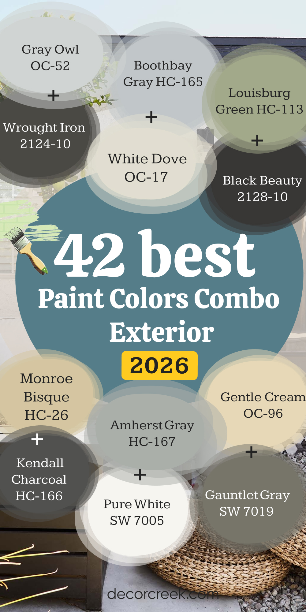
My Final Thoughts
When I stand back and look at all these color combinations together, I see more than paint — I see personality, warmth, and the feeling of home. Every shade tells a story: soft whites that greet the morning sun, deep charcoals that stand tall in the rain, gentle greens that blend into the trees. Choosing an exterior color isn’t just about style; it’s about how your home welcomes you every single day.
I’ve learned that the best palettes are the ones that feel like they belong — to the landscape, to the light, and to the people who live inside. Whether you lean toward modern contrasts or classic neutrals, the secret is finding a balance between comfort and character.
When the right colors come together, they do more than make a home look beautiful — they make it feel complete. That moment when the sunlight hits the siding just right, or when the front door glows warmly at dusk… that’s when you know you chose well.
And that’s what every homeowner deserves — a house that not only looks lovely from the street but feels like the perfect reflection of you.