Green has always been one of those colors that people either love or fear. I get it—green can be tricky. But when you find the right one, it changes everything. It makes a room feel more grounded, more interesting, and more alive. Some greens bring softness, others bring drama, and some just feel easy to live with.
Over the years, I’ve tried almost every kind of green in real homes, and Sherwin-Williams never lets me down. Their greens are full of character but still work with everyday life.
This list brings together all my go-to shades—whether you’re looking for soft sage or something bolder.
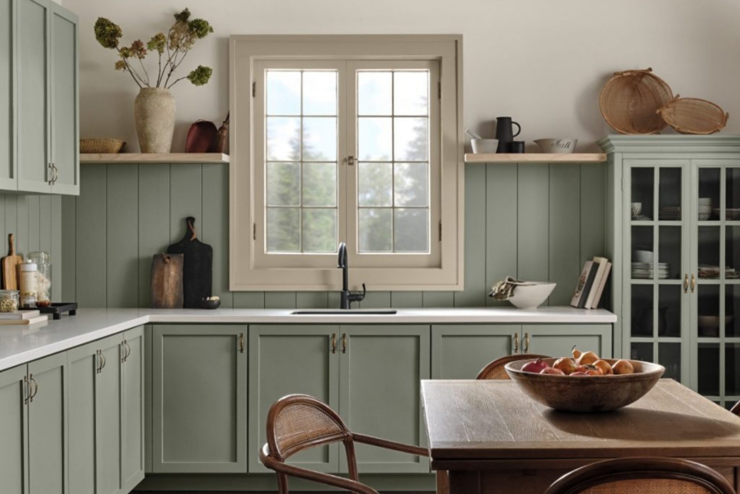
What Green Brings Into a Room (And Why I Keep Reaching for It)
Green gives me something that no other color can. It reminds me of nature, of course, but it also brings a feeling of stability. I like how it can fit in almost anywhere without trying too hard. A soft green in a bedroom helps things feel quiet. A bold green in a living room makes everything around it pop. It works with wood, with white trim, even with brass and black.
It doesn’t fight for attention—it just fits in. That’s why I always seem to come back to it when a room needs something extra.
Before You Pick a Green, Think About This First
Every green looks different depending on the light in your room. That’s why I never choose a paint color without testing it first. Morning light can make a green feel fresh, while evening light can make it feel heavier. Some greens shift a lot throughout the day, and others stay steady. I try samples on a few walls and leave them up for at least a day or two.
I also look at them next to my floors, furniture, and trim. The right green doesn’t just look pretty—it feels right from morning to night.
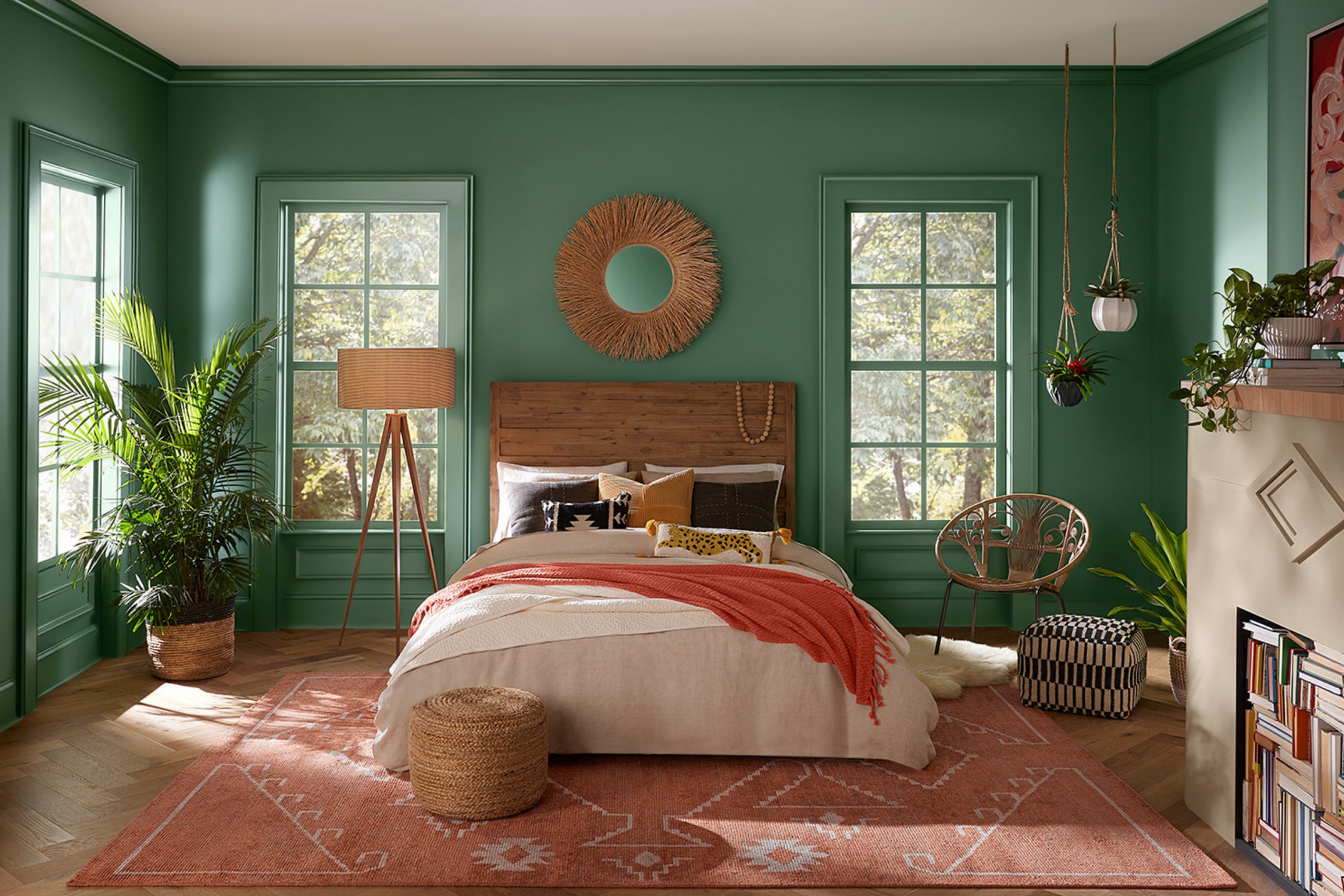
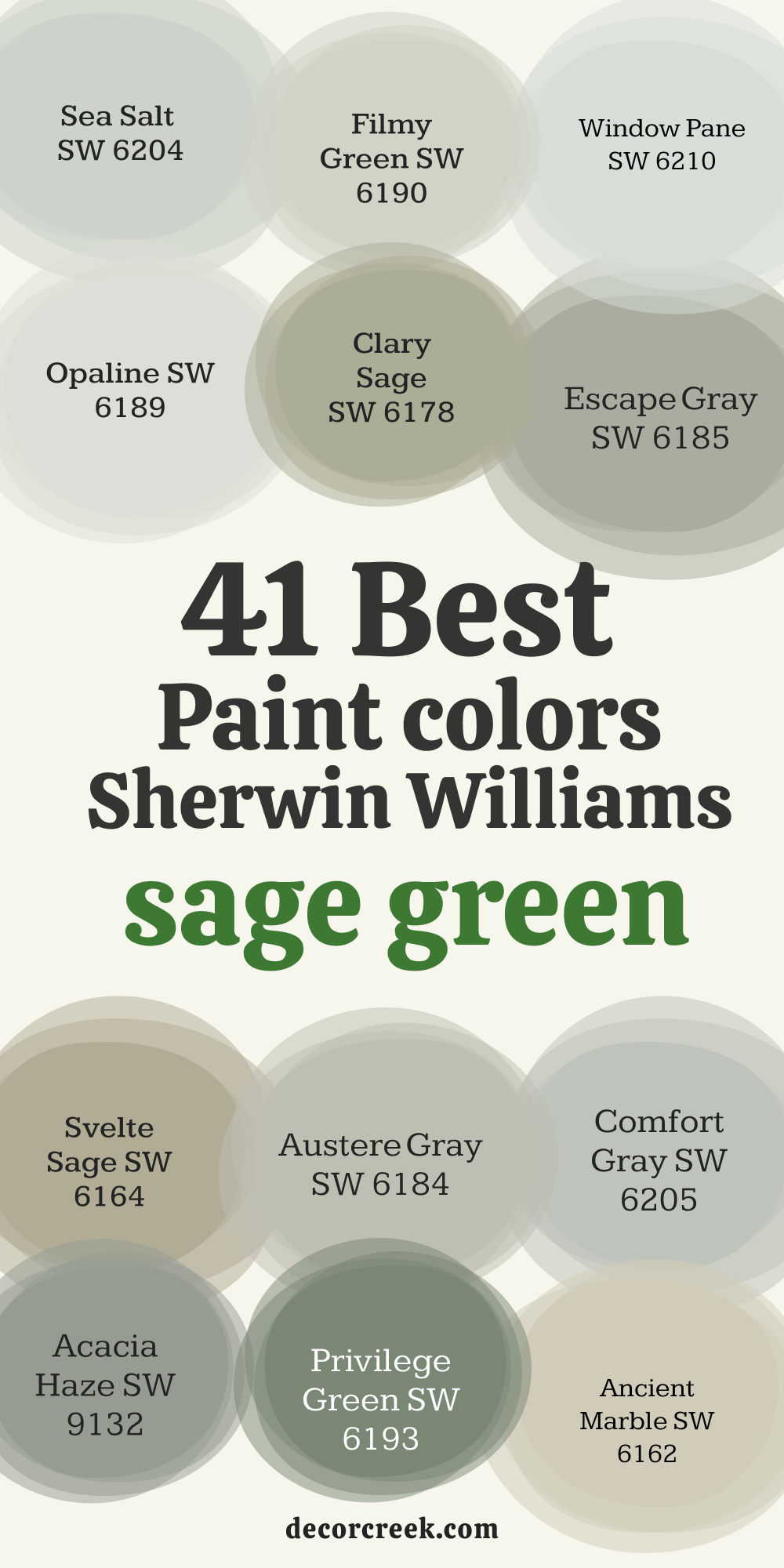
41 Best Sage Green Paint Colors from Sherwin Williams
Light Sage Green Paint Colors
Sea Salt SW 6204
Sea Salt always brings out the best in smaller rooms. It feels soft without being too pale and has just enough green to feel interesting. Sea Salt works really well in bathrooms, guest bedrooms, or anywhere that needs to feel easy. I’ve used it near white trim and light wood, and it always looks fresh.
Sea Salt also plays well with blues and soft grays nearby. It never feels sharp, just easy to be around.

Filmy Green SW 6190
Filmy Green has a gentle look that works beautifully in older homes. It’s not bright, not dark—just soft and steady. Filmy Green has a dusty quality that makes it feel lived-in right away. I love how it balances with oak floors and off-white trim. Filmy Green doesn’t scream for attention, but it never feels flat either.
It’s great in living rooms where you want color, but nothing too loud.

Window Pane SW 6210
Window Pane brings a whisper of green that’s cool and airy. It feels a little minty but never childish. I’ve used it in kids’ rooms and laundry rooms where I want the color to feel fun but still grown-up. Window Pane works well with cool grays and white cabinets.
It’s also great if your room gets lots of light—this color holds up without turning icy.

Opaline SW 6189
Opaline gives just a breath of green, almost like a foggy morning. It looks nearly white in strong sunlight but softens nicely in shadows. Opaline is perfect for hallways or ceilings if you want something different from bright white. I love how it pairs with both silver and gold metals.
Opaline always feels light, but not boring.
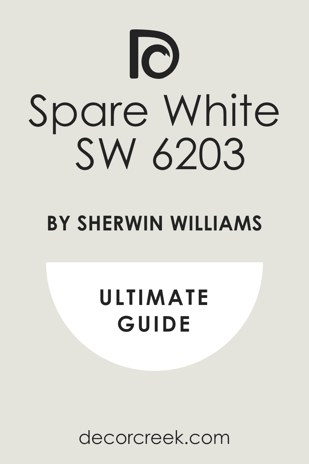
Spare White SW 6203
Spare White is one of those colors that looks white until you see it next to real white. Then you see its pale green side. It’s great for trim or cabinets when you want a gentle shift in tone. Spare White feels clean without being cold. I often use it in beachy homes or places with lots of natural light.
Contented SW 6191
Contented has a softness that’s perfect for bedrooms or sunrooms. It brings a little more depth than a true pastel, which helps the room feel finished. Contented works with soft beiges and pale woods.
I’ve also seen it with leather and rich browns—it warms up beautifully. This color feels kind and welcoming.

Softened Green SW 6177
Softened Green lives up to its name. It sits right in the middle of light and medium, making it a safe choice for almost any room. I’ve used it in living rooms, kitchens, and even on furniture. It pairs beautifully with black accents and natural linen.
Softened Green doesn’t demand attention, but you’ll notice how good it makes everything around it look.

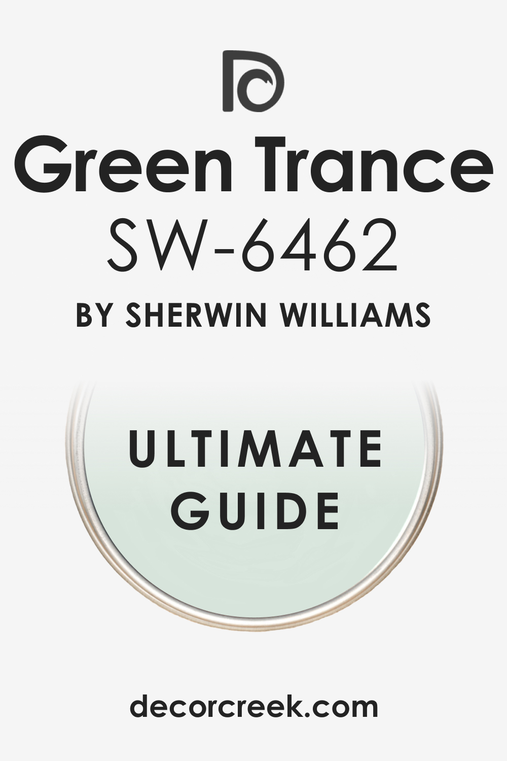
Green Trance SW 6462
Green Trance has a hint of aqua that gives it a cooler twist. It’s perfect if you want a green that leans toward coastal without feeling beachy. I’ve used Green Trance in bathrooms with lots of white tile, and it always feels fresh. It also looks amazing with polished nickel or chrome. Green Trance has movement, but it doesn’t distract.
Fleur de Sel SW 7666
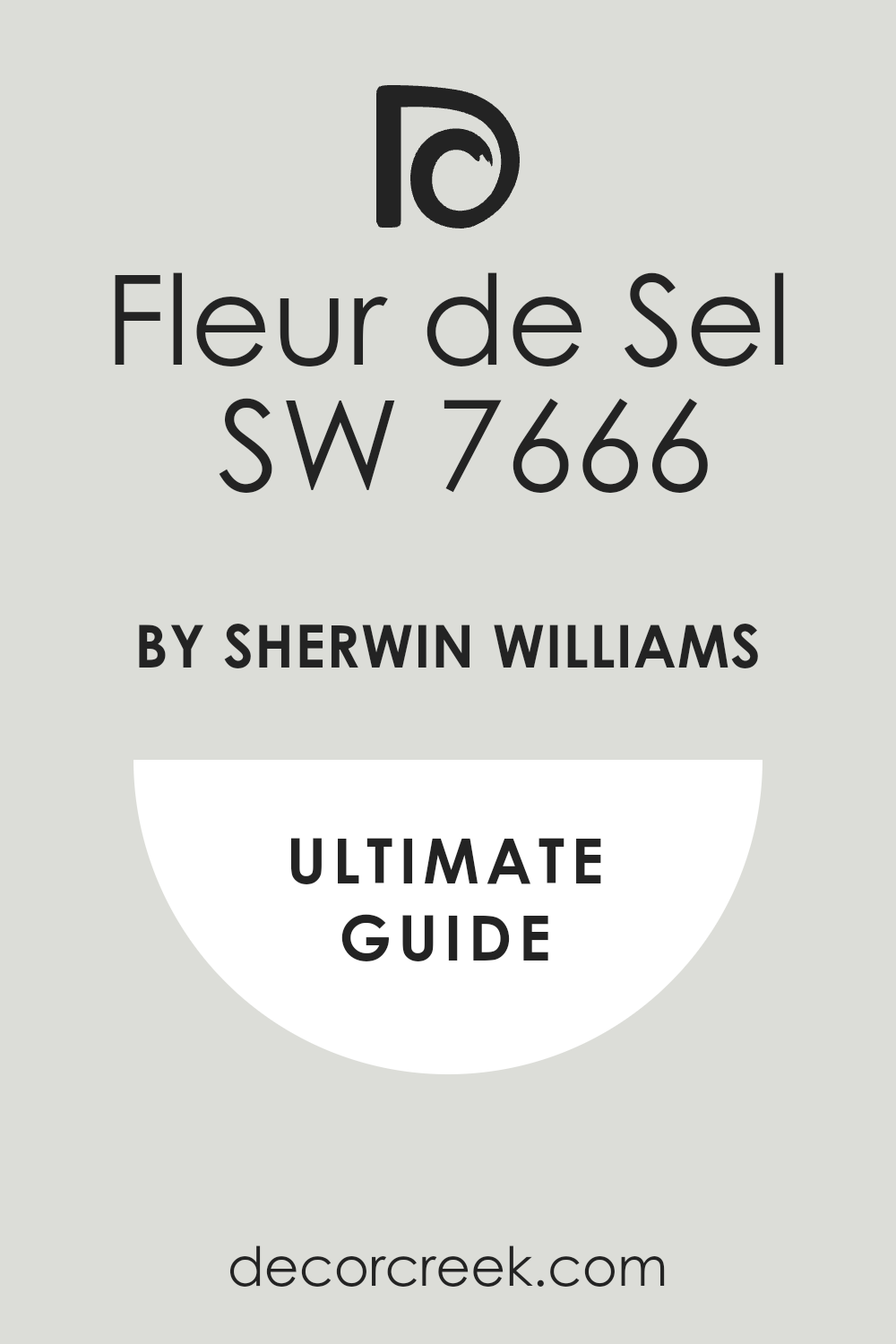
Fleur de Sel feels like a pale, weathered green that’s been around forever. It has a chalky softness to it that makes rooms feel gentle. I’ve used it on cabinets and walls, especially in older homes where I want something that feels like it’s always been there.
Fleur de Sel works well with other vintage tones like dusty blue or warm cream.
Silvermist SW 7621
Silvermist is the one I reach for when I want green, gray, and blue all at once. It changes with the light, and that’s part of the charm. Silvermist feels elegant without being fussy. I’ve used it in dining rooms and bathrooms with brushed brass hardware.
It brings depth to the room without darkening it.
Classic Sage Green Paint Colors
Clary Sage SW 6178
Clary Sage is that perfect middle green—soft, a little warm, and always friendly. I love using it in kitchens with butcher block counters or in cozy dining rooms. Clary Sage feels lived-in right away. It works with cottage style, modern farmhouse, or even traditional homes.
It’s simple, and that’s what makes it special.

Escape Gray SW 6185
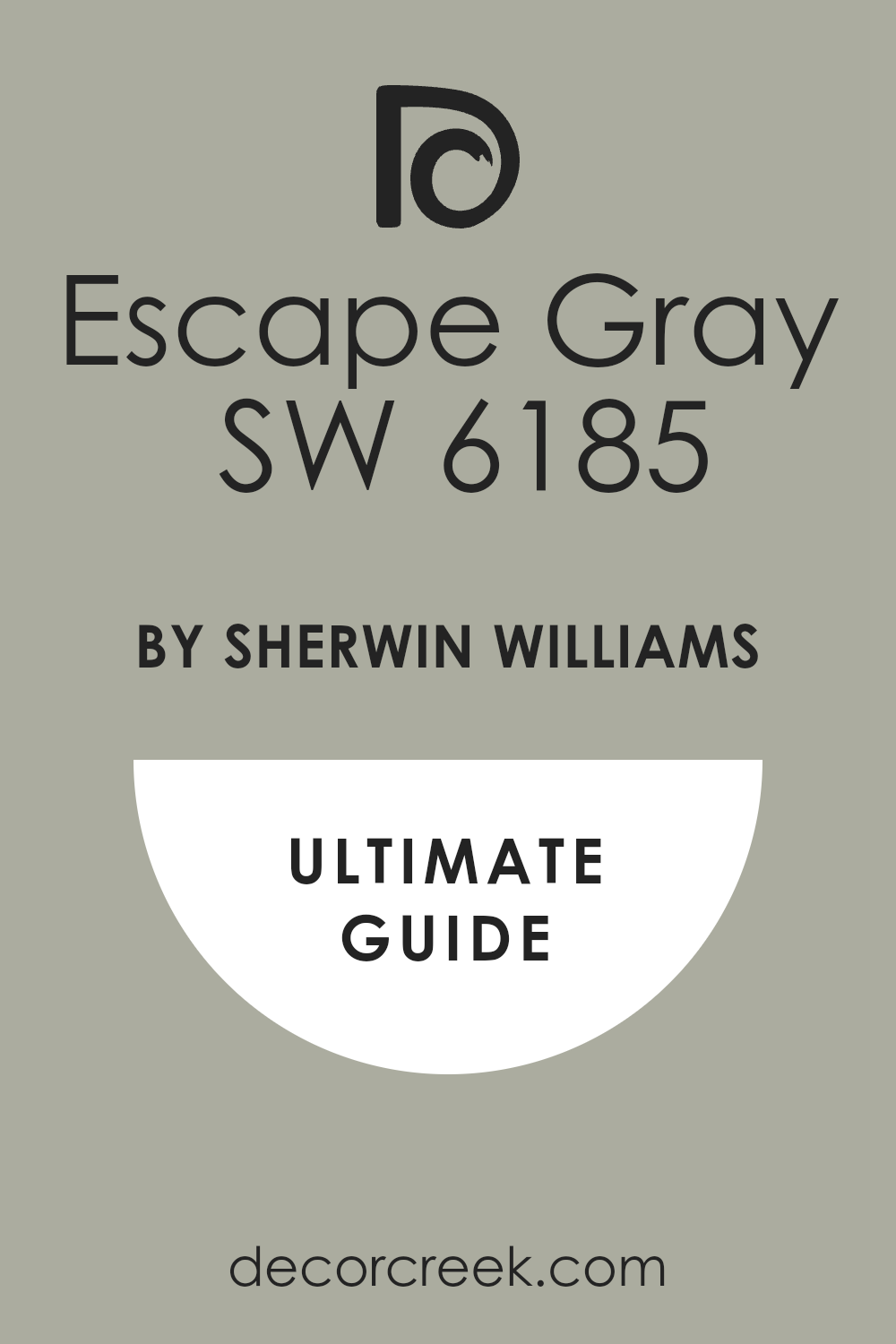
Escape Gray brings a quiet strength to a room. It’s a little deeper than most sage greens, with a touch of gray that grounds it. I like it in libraries or home offices where you want a color that helps you focus. Escape Gray also works well on exteriors with stone or brick. It’s steady and sure.
Svelte Sage SW 6164
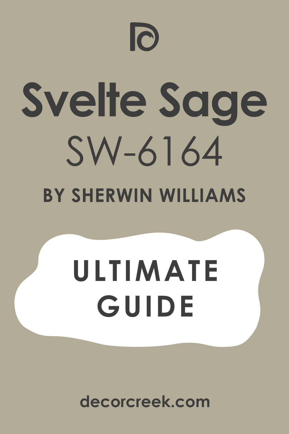
Svelte Sage has a warm, earthy base that makes it feel very grown-up. It pairs beautifully with antique wood and leather. I’ve used it in formal dining rooms, and it always looks rich without being too dark.
Svelte Sage also works well in hallways that connect lots of other colors. It ties everything together.
Austere Gray SW 6184
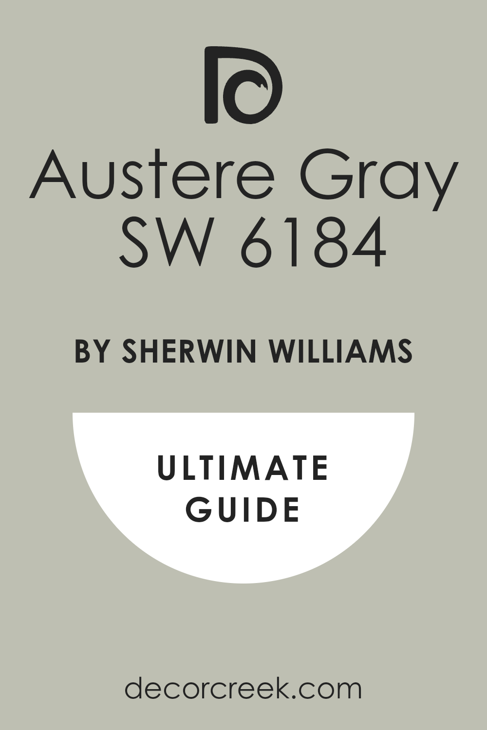
Austere Gray is one of those shades that looks simple until you get it on the wall. Then you notice how balanced it is. It has a gray base with a whisper of green, making it feel elegant. I use it in rooms where I want calm but don’t want plain white. Austere Gray always feels put-together.
Comfort Gray SW 6205
Comfort Gray is soft but never sleepy. It’s part of the Sea Salt family, so it carries that same easy charm. I use it in bedrooms or bathrooms where I want color but still want things to feel light.
Comfort Gray works with both warm and cool tones around it, which makes it super flexible.
Acacia Haze SW 9132
Acacia Haze leans deeper and moodier, with more gray in the base. It’s beautiful in bedrooms or dens, especially with darker wood trim. Acacia Haze gives a sense of strength without going full dark green.
It’s also lovely on kitchen cabinets if you want a classic look.

Privilege Green SW 6193
Privilege Green is rich but still soft. It reminds me of soft suede—something you want to reach out and touch. It works great in living rooms with lots of natural textures. Pair it with rattan, brass, or linen and it just feels right. Privilege Green also holds up well in different lighting.

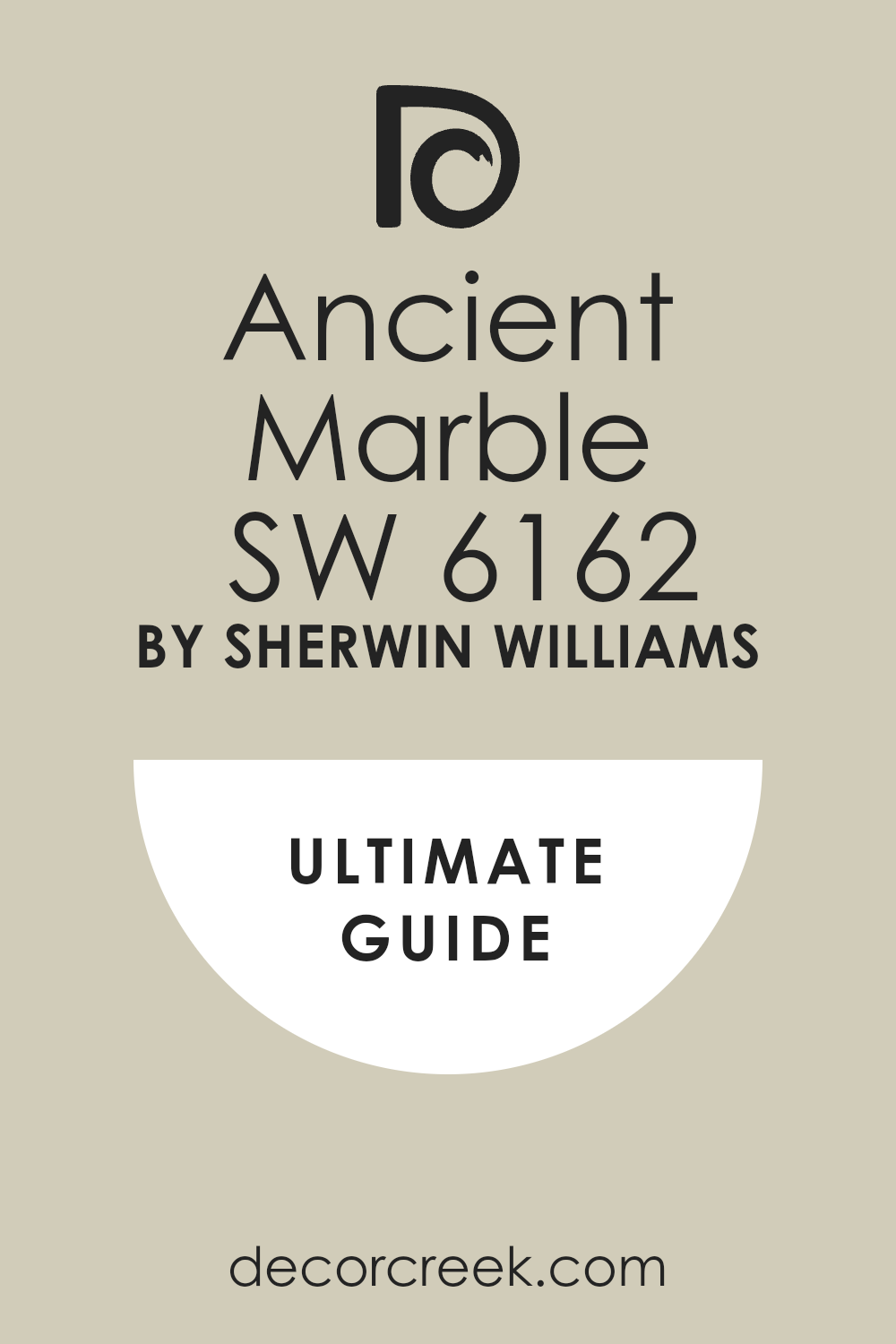
Ancient Marble SW 6162
Ancient Marble leans toward neutral, with a dusty green-gray tone. It’s one of my go-to colors when a room needs something, but I’m not sure what. Ancient Marble fills the walls without feeling heavy. It also looks beautiful with stone, which makes it great for fireplaces or entryways.
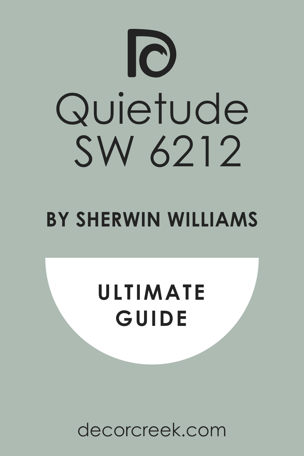
Quietude SW 6212
Quietude is cool and a little blue, but still has that sage quality underneath. It’s refreshing without being cold. I’ve used it in kitchens, mudrooms, and even laundry rooms. It makes everyday rooms feel more cared for.
Quietude looks beautiful with white tile or marble.
Kind Green SW 6457
Kind Green has a warm base and a gentle look. It feels friendly in a family room or playroom. I love it with white built-ins and natural floors. Kind Green isn’t flashy, but it gives just enough color to make the room feel thoughtful. It’s one of those “everyone likes it” shades.

Warm Sage Green Paint Colors
Garden Sage SW 7736
Garden Sage brings in a soft, sun-warmed feeling. It leans a little yellow, which makes it cozy and welcoming. I like using it in kitchens with light wood cabinets or near brick accents.
Garden Sage makes a home feel lived in—like someone cares about the details. It pairs nicely with creamy whites and natural stone.
Lemongrass SW 7732
Lemongrass adds a fresh lift to the sage family. It’s warm, but not loud. I’ve used it in breakfast nooks and kitchens where I want a little energy without using bright colors. Lemongrass feels cheerful without being silly. It also works beautifully with warm metal finishes like brass or gold.
Hearts of Palm SW 6415
Hearts of Palm is a warm, happy green that makes any room feel full of light. It leans toward yellow-green, but not in a sour way. I use it in rooms that don’t get a lot of sun—it helps brighten things up.
Hearts of Palm is perfect with creamy trim and soft, cozy fabrics.
Green Earth SW 7748
Green Earth has a dusty, warm finish that makes it easy to live with. It doesn’t lean blue or gray, which keeps it feeling grounded. I love it in dining rooms or home offices where the mood should feel warm but not dark. Green Earth looks great with soft browns and aged wood.

Honeydew SW 6428
Honeydew is soft and warm, with a yellow glow underneath. It feels almost like a neutral but with more heart. I’ve used it in nurseries and laundry rooms—it brings a sense of ease.
Honeydew also pairs well with whites and pastels. It never feels harsh.
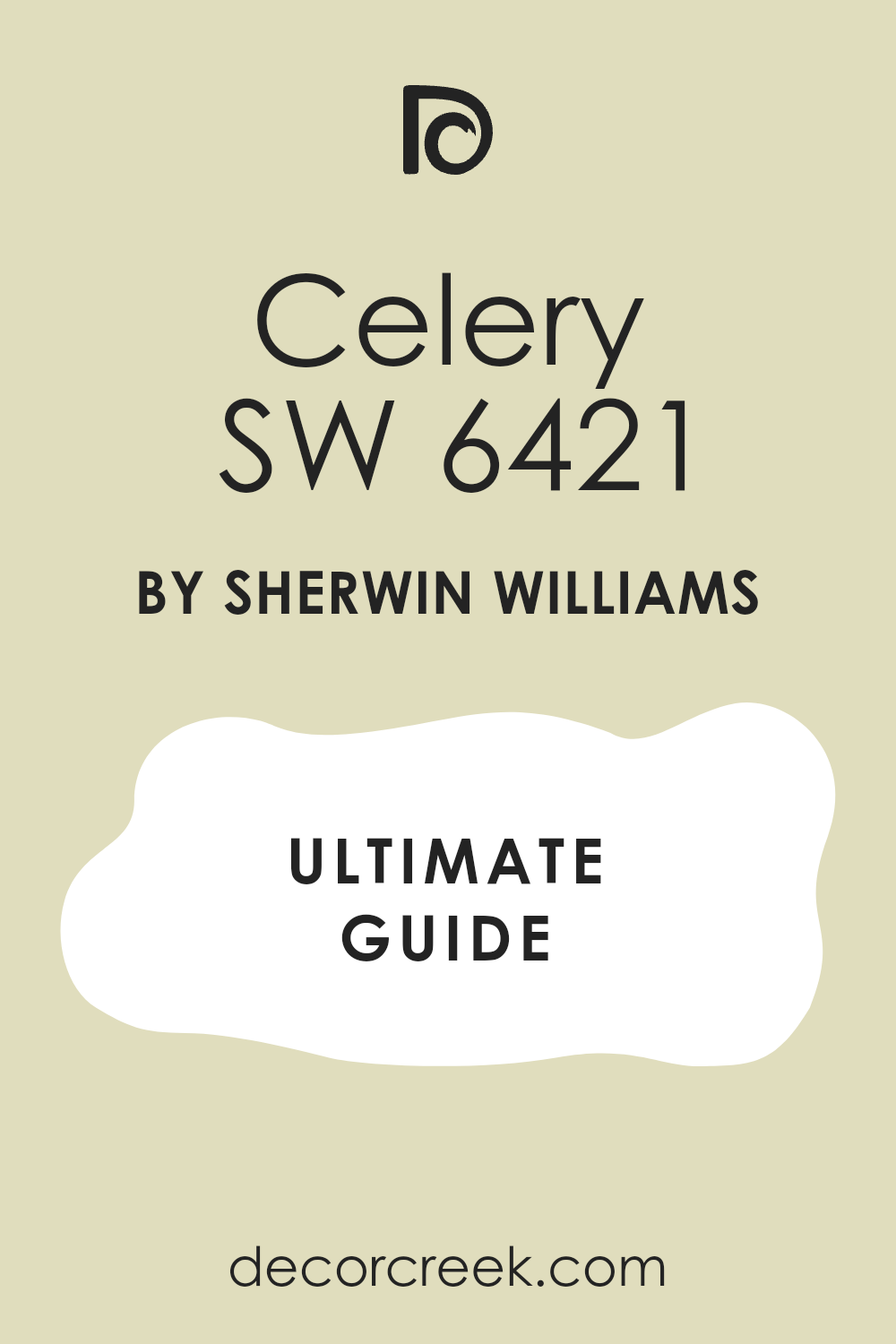
Celery SW 6421
Celery has a crisp, fresh look that’s still gentle. It feels right in kitchens and sunrooms where you want a soft green with life. I like pairing Celery with warm whites or soft terracotta. It gives a little boost to everyday rooms without being too bold.
Liveable Green SW 6176
Liveable Green is one of those greens that always feels balanced. It has warmth without being too yellow, and softness without being too gray.
I use it when someone wants a green that works in lots of light and with lots of styles. It’s just easy.

Ancient Sage SW 6168
Ancient Sage has a peaceful, grounded feeling that works well in quiet rooms. It’s warm but dusty, which makes it a favorite for studies and dens.
Ancient Sage pairs well with warm grays and natural textures like jute or leather. It gives the room depth without making it feel dark.
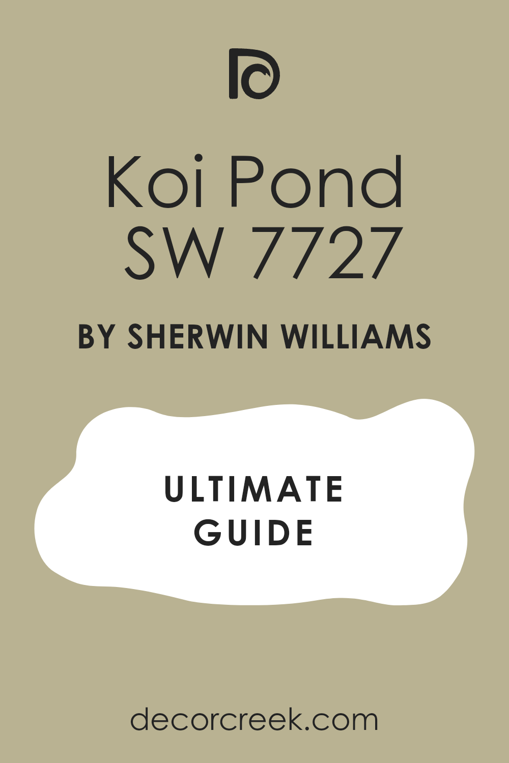
Koi Pond SW 9652
Koi Pond brings in a little more color while staying earthy. It’s great in creative rooms or reading corners. I’ve seen it on built-in shelves, and it looks rich without being heavy. Koi Pond works with woods, brass, and soft neutrals all around it.
Shagreen SW 6422
Shagreen is a warm, full-bodied green that brings in a sense of comfort. I like using it in bedrooms or entryways where you want to feel welcome. Shagreen has a bit of gray to it, which helps it stay soft even in darker rooms.
It also looks great with deep browns or matte black.

Cool Sage Green Paint Colors
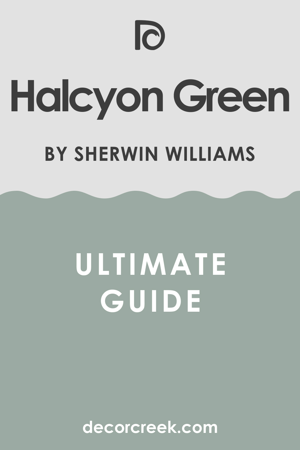
Halcyon Green SW 6213
Halcyon Green has a calm, easy feel with a touch of blue. It looks great in coastal homes or anywhere you want a quiet color with a little mood. I like it with light woods, rattan, and linen. Halcyon Green also works well with white trim and cooler metals.
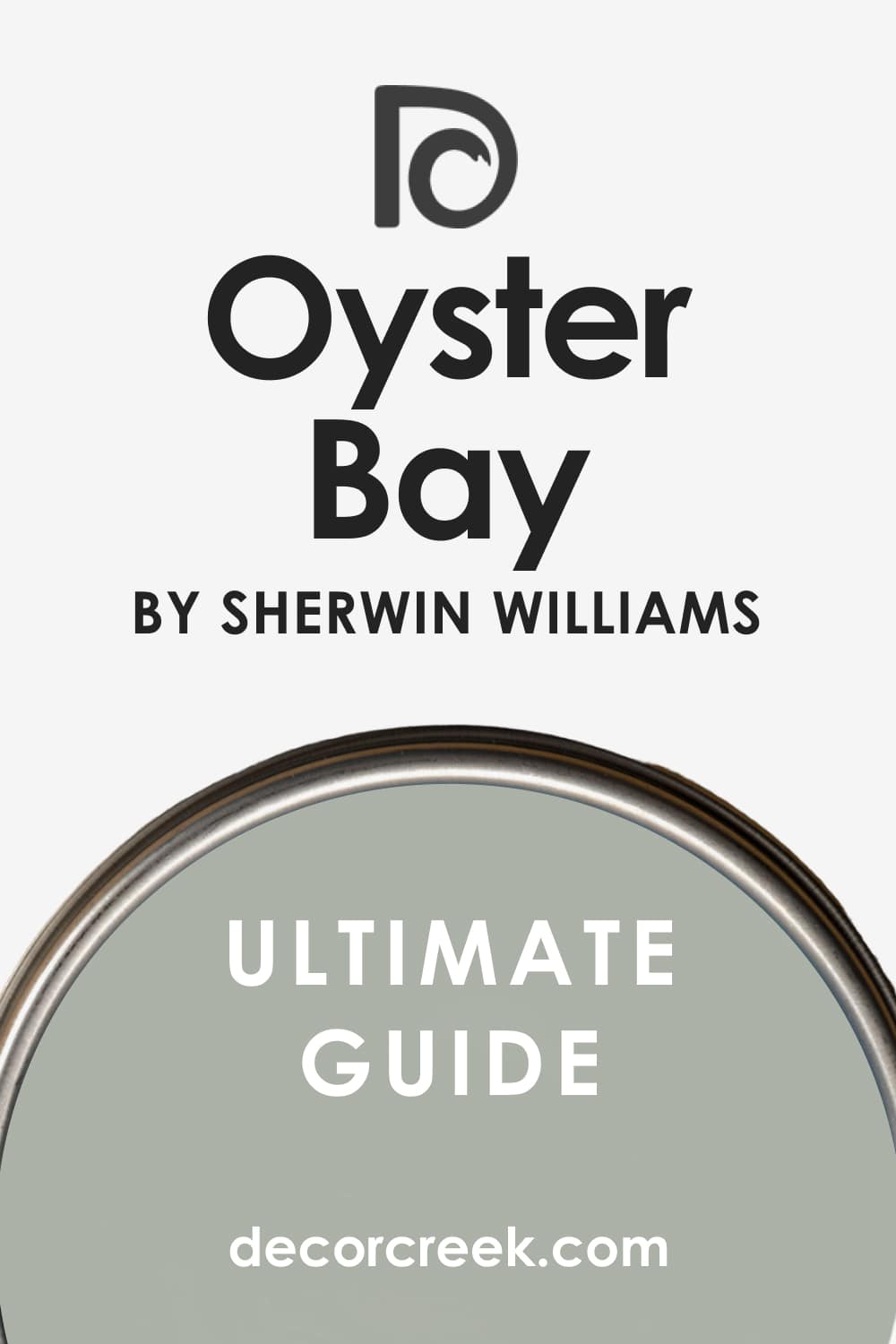
Oyster Bay SW 6206
Oyster Bay gives you depth without going dark. It has both green and blue tones that change slightly throughout the day. I love it in bedrooms and bathrooms where you want the color to do a little more. It pairs well with marble and brushed nickel.
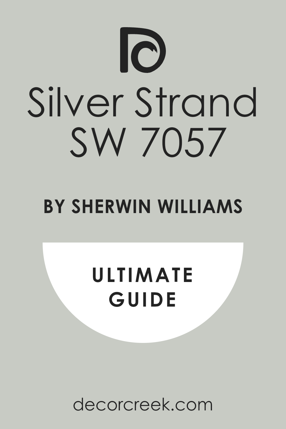
Silver Strand SW 7057
Silver Strand leans gray but has enough green to feel interesting. I use it in living rooms and hallways where you want a soft look that still has personality.
Silver Strand works with both warm and cool tones around it, which makes it super flexible.
Retreat SW 6207
Retreat feels strong and steady, with more gray than most sage greens. It works in dens, studies, or even on kitchen cabinets if you want a bolder look. I love it with matte black or weathered wood. Retreat has a cozy side that’s not too dark.

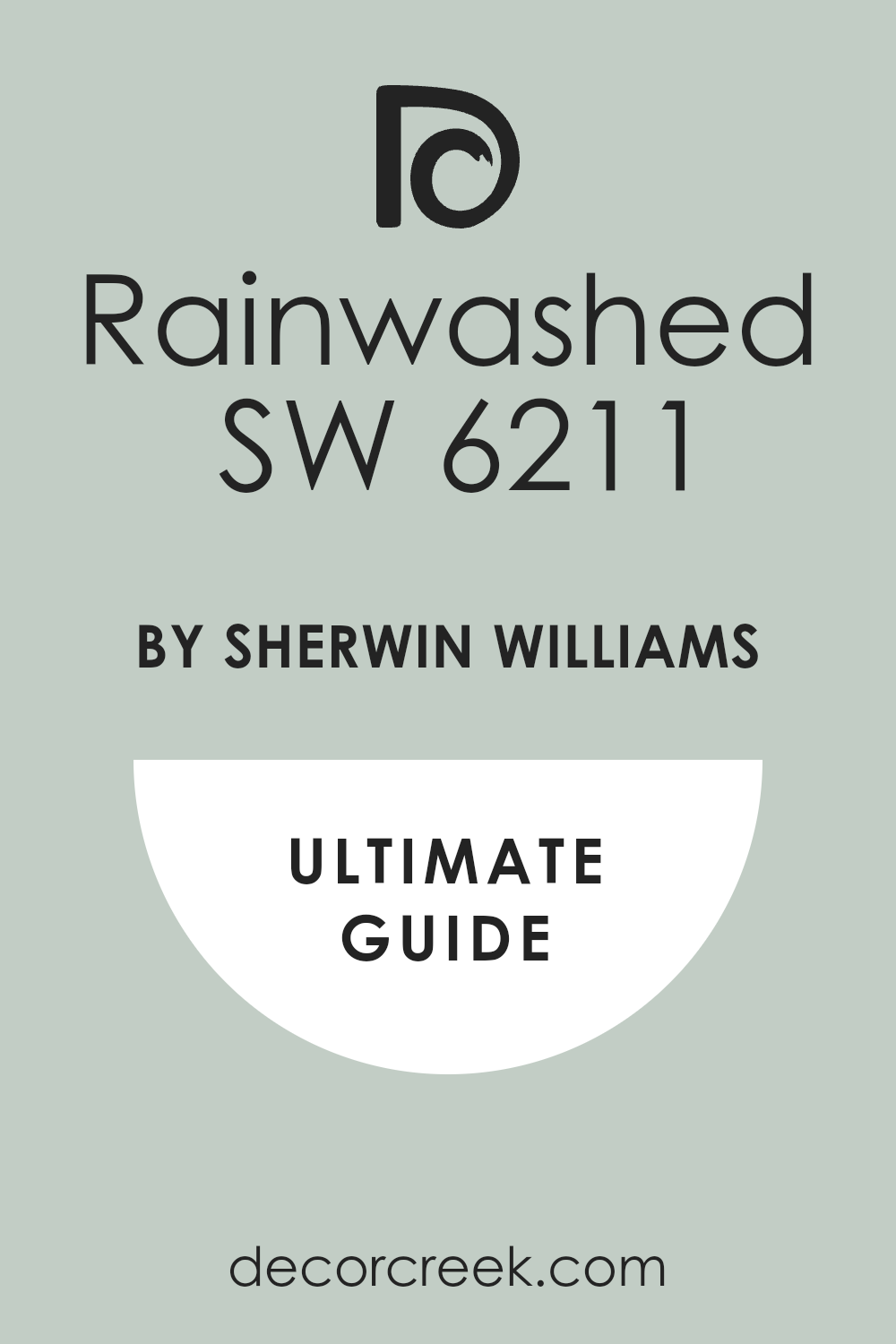
Rainwashed SW 6211
Rainwashed is light and fresh with a blue-green tone. It works beautifully in bedrooms or nurseries, especially with white trim.
Rainwashed helps small rooms feel open, even when the color has depth. It also pairs well with light wood and soft grays.
Moody Blue SW 6221
Moody Blue leans teal but has enough gray to keep it grounded. It’s a great choice for accent walls or bathrooms. Moody Blue feels rich without feeling dark. I like it with natural fabrics and warm white trim. It’s a color that makes a quiet statement.

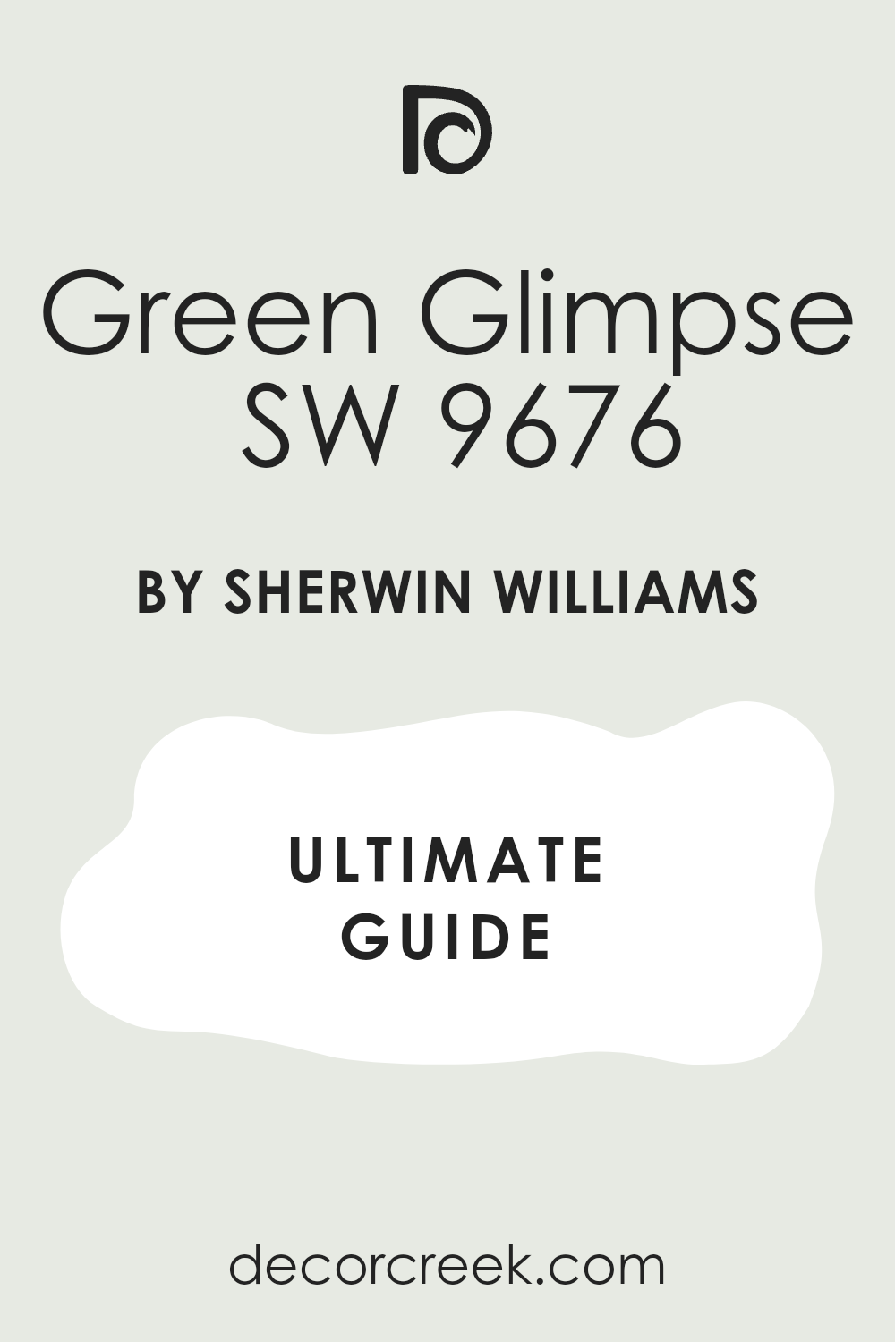
Green Glimpse SW 9677
Green Glimpse has a fresh edge that works great in newer homes. It’s a little brighter than other sage tones, but still soft. I love it in kitchens or dining areas where you want something with energy.
Green Glimpse pairs well with soft whites and brushed gold.
Muted & Dusty Sage Greens
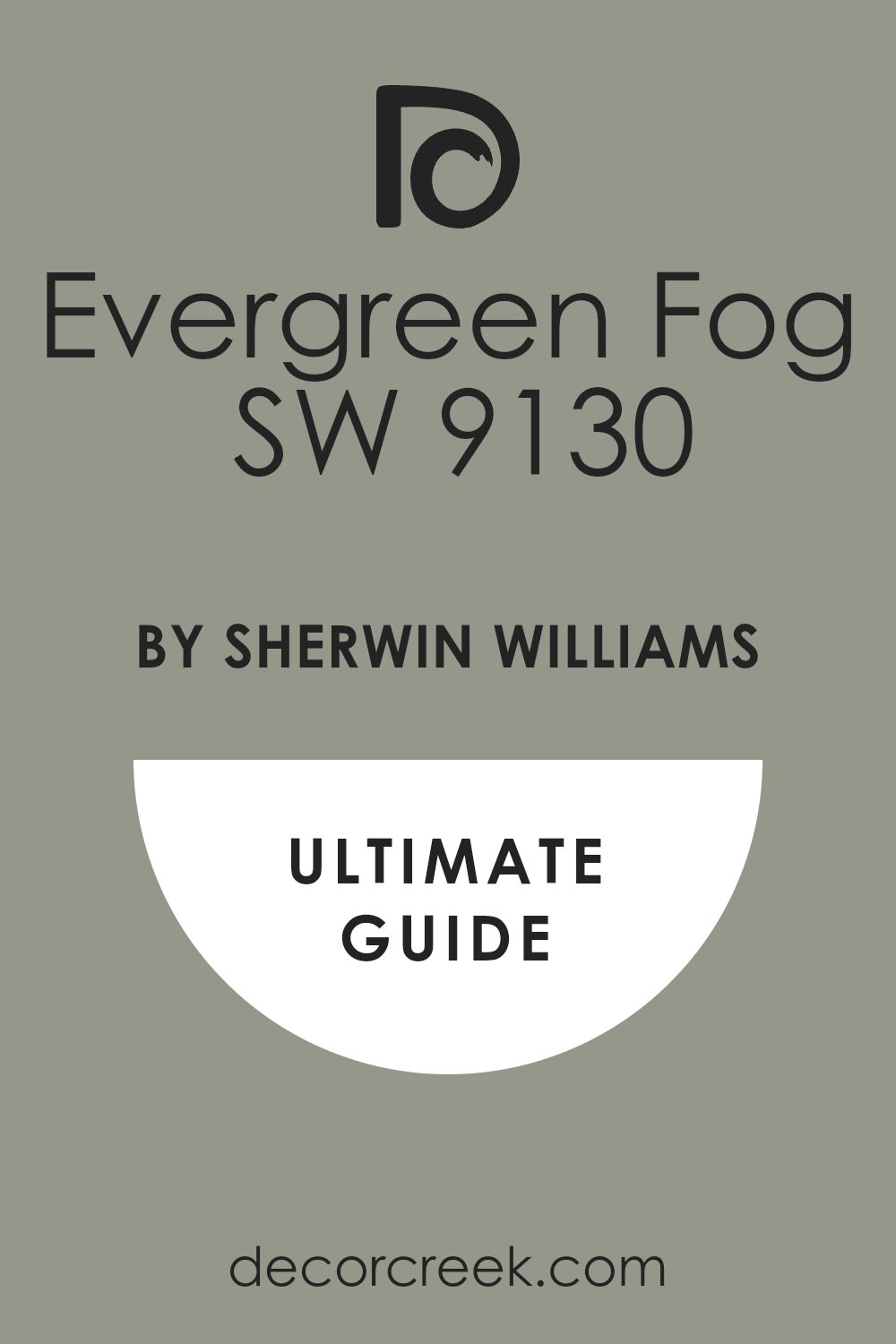
Evergreen Fog SW 9130
Evergreen Fog has just the right amount of dustiness to feel cozy. It was the color of the year for a reason—it works almost anywhere. I’ve used it in entryways, living rooms, even bedrooms. Evergreen Fog feels thoughtful without trying too hard.
Dried Thyme SW 6186
Dried Thyme has a soft depth that works beautifully on cabinets or built-ins. It’s a little richer than a classic sage but still easy to live with. I love it paired with warm metals and creamy whites.
It’s especially nice in homes with a lot of wood accents.

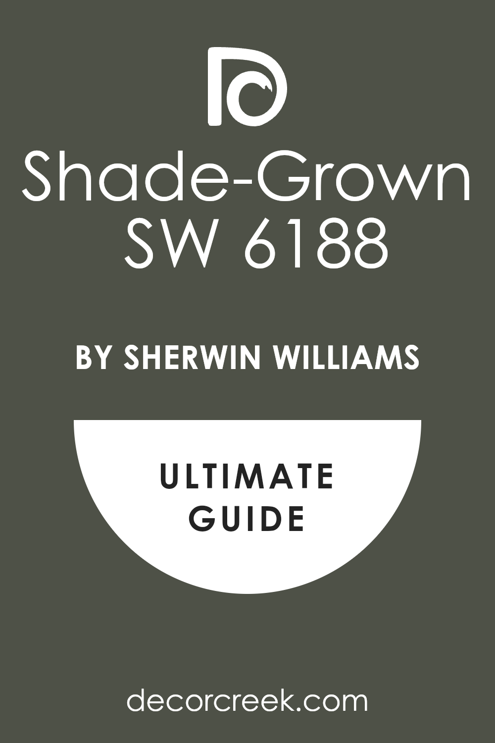
Shade-Grown SW 6188
Shade-Grown is deep and earthy, but still soft enough to live with every day. I’ve used it in studies or reading rooms where I want a quiet mood. It works well with leather, wood, and aged brass. Shade-Grown makes a room feel settled.
Rosemary SW 6187
Rosemary is green with a warm, rustic base. It works beautifully in kitchens and dining rooms, especially when paired with natural wood.
Rosemary brings a sense of comfort, like an old recipe or handmade quilt. It doesn’t shout—it settles in.

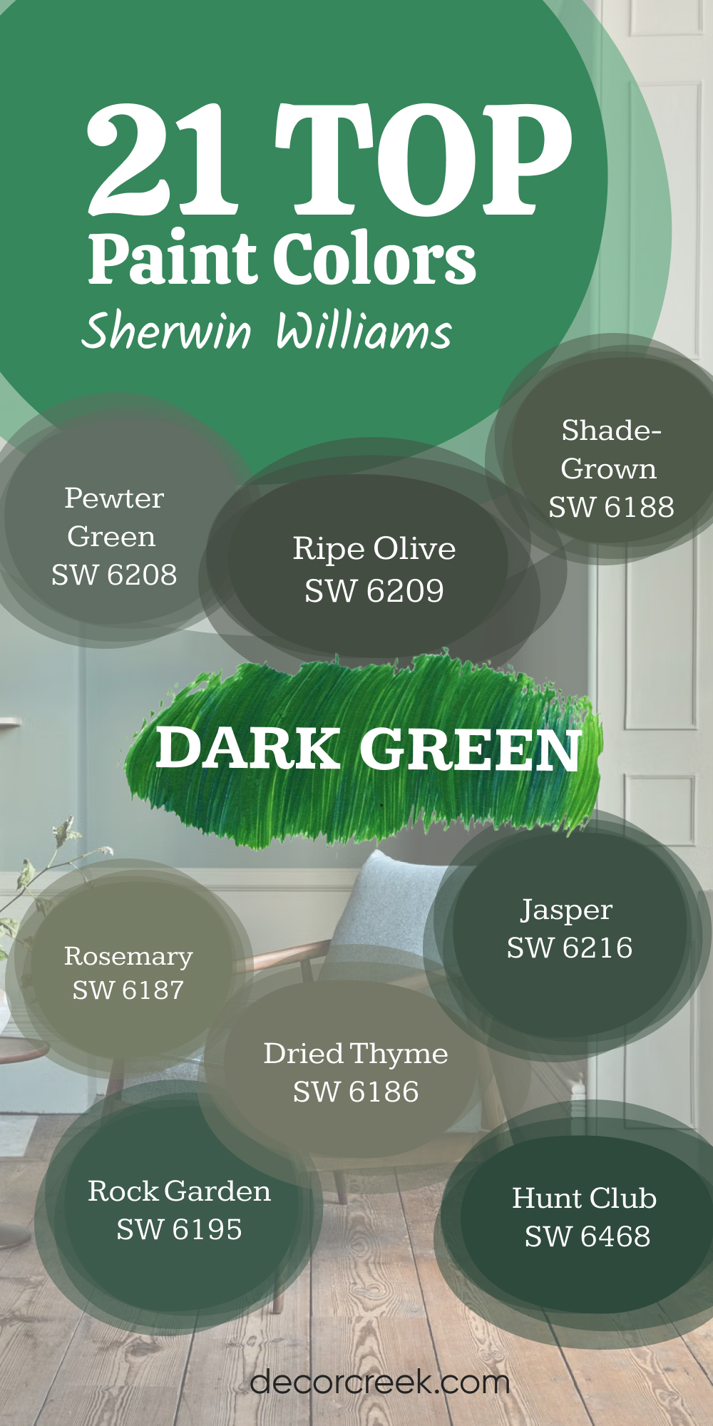
21 Top Dark Green Sherwin Williams Paint Colors
Pewter Green SW 6208
Pewter Green brings depth without feeling too heavy. It has a soft gray base that keeps it grounded. I love using it on kitchen cabinets, especially paired with brass or matte black hardware. Pewter Green also works on accent walls in living rooms or entryways. It brings mood, but never overwhelms the room. This color gives a homegrown, solid feeling I always come back to.

Ripe Olive SW 6209
Ripe Olive is rich and earthy, with a bold, natural tone. It’s perfect when you want a statement, like on built-ins or a powder room wall. I’ve used it with creamy trim and wood tones—it feels warm and steady.
Ripe Olive also pairs well with terracotta, gold, or leather. It’s bold, but still inviting.

Shade-Grown SW 6188
Shade-Grown leans deep forest green, and it’s perfect in places where you want the room to feel cozy. It’s a good choice for home offices or reading corners. Shade-Grown works especially well with dark wood and soft textiles.
It helps the room feel finished and thoughtful.

Rosemary SW 6187
Rosemary has that kitchen garden charm. It’s not as sharp as other dark greens, which makes it easier to use across a full room. I’ve paired it with butcher block counters and white tile—it feels like a modern farmhouse, but more grounded. Rosemary is also beautiful on cabinets or pantry doors.

Dried Thyme SW 6186
Dried Thyme is darker and more olive-toned than it seems on a swatch. It’s one of those colors that shows its best side in evening light. I love it on feature walls or full rooms that need depth. Dried Thyme is especially good with creamy whites and aged brass fixtures.

Jasper SW 6216
Jasper is deep and dramatic. I’ve used it in formal dining rooms and dark bedrooms where the goal was moody and rich. It has almost a blue-green undertone that comes out in certain light.
Jasper makes a strong impression but still works with natural textures like linen and oak.

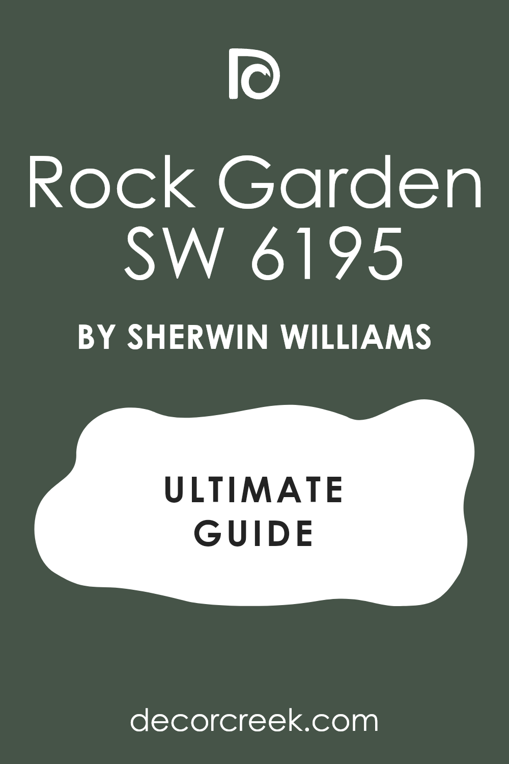
Rock Garden SW 6195
Rock Garden has an evergreen vibe that’s great for exteriors, but it also works indoors in small doses. I’ve used it behind bookcases or on a built-in desk wall. It’s a bold green that doesn’t feel artificial. Rock Garden looks best in well-lit rooms or rooms with high contrast.
Hunt Club SW 6468
Hunt Club feels bold and traditional. It’s that deep green you imagine in old libraries or country homes. I like it in offices, dining rooms, or even mudrooms. Hunt Club pairs well with dark floors, plaid patterns, and oil-rubbed bronze.
It’s strong but stylish.
Isle of Pines SW 6461
Isle of Pines has a cool undertone that gives it a fresh, forest feel. It works well in contemporary rooms when paired with light floors and simple shapes. I’ve used it in kids’ rooms and laundry rooms too—it’s flexible like that.
It feels deep but not too formal.

Billiard Green SW 0016
Billiard Green is bold and rich, with a slightly vintage feel. I love it on statement furniture pieces like dressers or even a fireplace mantel. It gives an old-school charm, especially in rooms with checkerboard floors or traditional molding.

Pewter Sage SW 6207
Pewter Sage has a little more softness than others on this list, but it’s still deep. I love it in bedrooms or dining rooms where you want color without full drama. It’s beautiful with linen curtains and soft lighting. Pewter Sage feels relaxed but refined.
Thunderous SW 6201
Thunderous has a stormy, green-gray tone that’s very grounding. I’ve used it in moody bedrooms and cozy media rooms. It works well with warm leathers and black accents.
Thunderous creates a tucked-in, safe feeling that I really like in quiet corners.
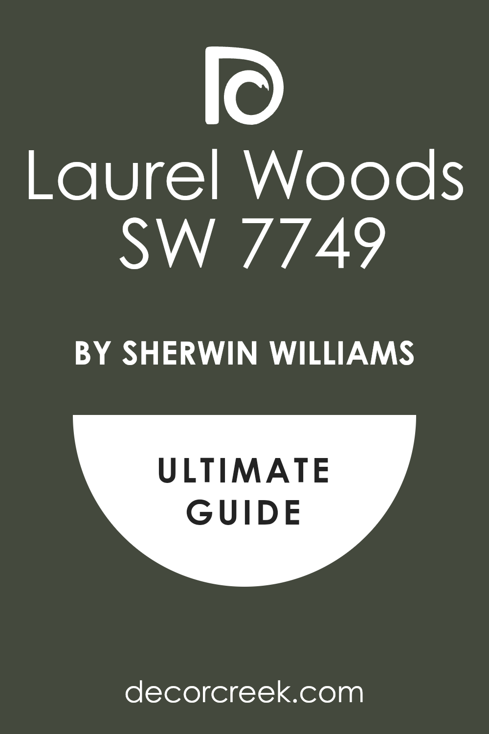
Laurel Woods SW 7749
Laurel Woods has a traditional forest green base that feels rich and strong. It’s lovely in formal rooms or older homes with classic trim. Laurel Woods pairs well with antique brass, rich red rugs, and dark wood. It brings a vintage charm without feeling dated.
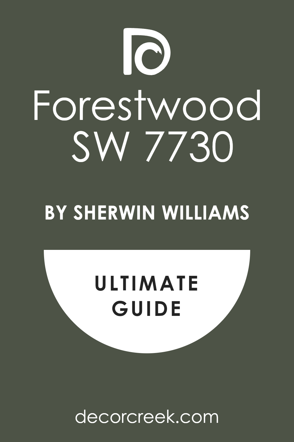
Forestwood SW 7730
Forestwood is deep and earthy, with a brownish-green tone. It’s great in rooms with brick or natural stone. I love using it near fireplaces or entryways.
Forestwood helps tie outdoor tones into your indoor interior, making everything feel connected.
Olympic Range SW 7750
Olympic Range is one of those deep greens that feels thoughtful. It’s perfect in studies or places where you want focus. I also love it on staircases or hallway walls where you want a little mood. It feels like walking through tall trees on a cool day.
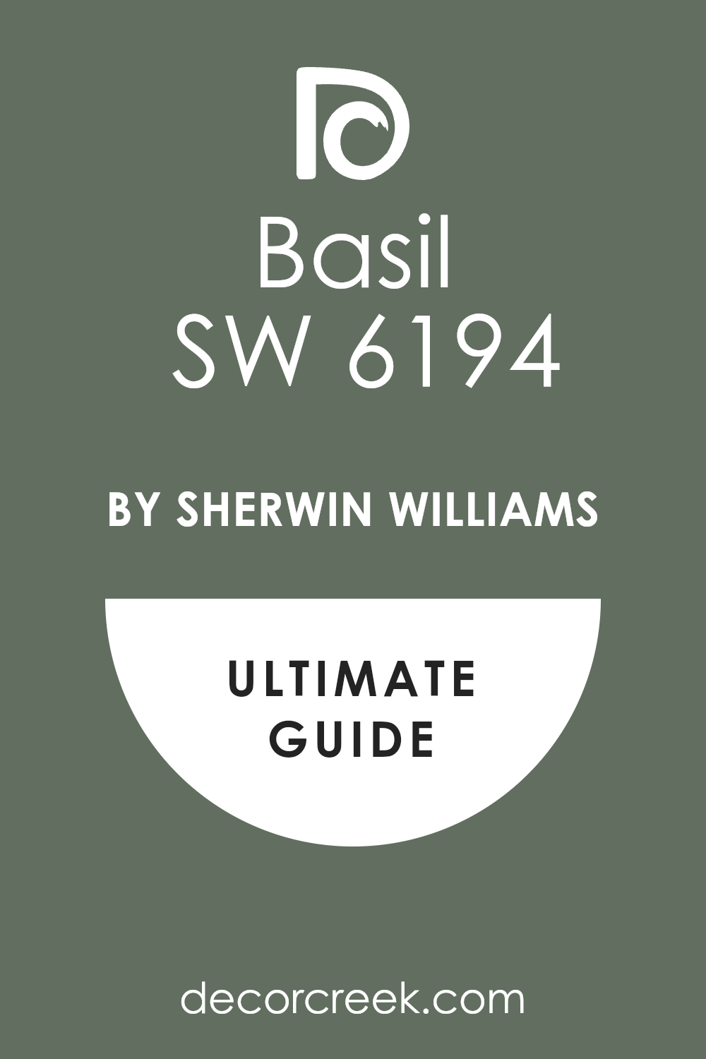
Basil SW 6194
Basil is warm and full-bodied. I use it when a room needs richness but also a little friendliness. It looks great with woven textures and patterned rugs.
Basil works well in kitchens and entryways, especially with aged wood.
Evergreen Forest SW 1236
Evergreen Forest is bold and dramatic—almost theatrical. I love it on exteriors, or on big walls with high ceilings. It feels strong and protective, like a color that gives the room confidence. Use it with white or warm wood for contrast.
Greenblack SW 6994
Greenblack is almost black, but with a green base that shows through in the right light. It’s powerful in modern rooms . I’ve used it on doors, accent walls, even ceilings. Greenblack adds serious character to a room when paired with pale neutrals.

Secret Garden SW 6181
Secret Garden is rich and lush, like the name says. It’s perfect for rooms where you want quiet drama—like bedrooms or powder rooms. It pairs beautifully with gold mirrors and cream fabrics.
Secret Garden feels special without feeling too much.
Saguaro SW 6419
Saguaro brings in a natural, desert green with deeper roots. It’s great in homes that lean rustic or earthy. I love it on kitchen islands or cabinet backs. It feels a little wild, but still grounded. Saguaro brings energy in a thoughtful way.
Courtyard SW 6440
Courtyard has a deep garden feel. It’s a true green that works in mudrooms, kitchens, or garden-facing rooms. Courtyard pairs well with brick, stone, and wood.
It brings the outside in, but in a way that feels planned and pretty.
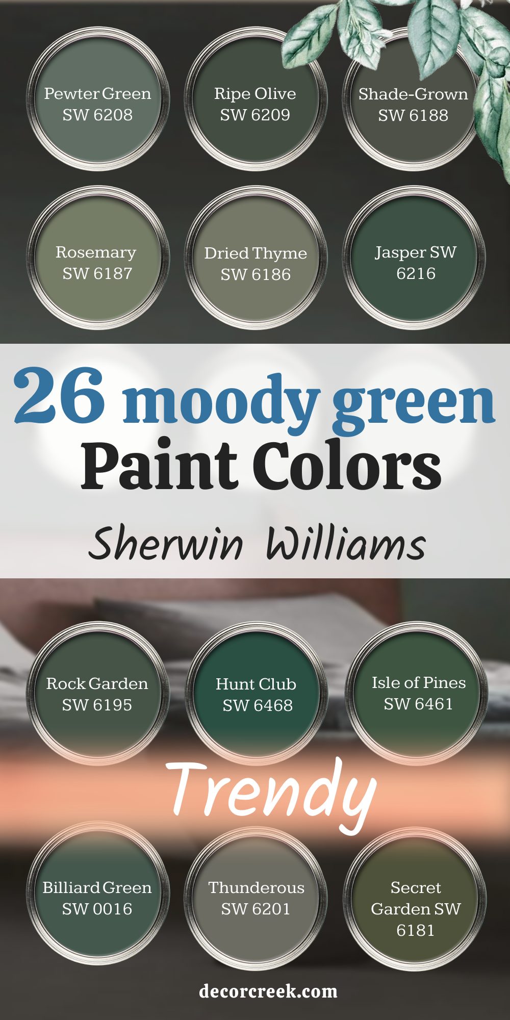
26 Moody Green Paint Colors by Sherwin Williams
Pewter Green SW 6208
Pewter Green feels grounded and quiet. It’s deep enough to bring mood, but still soft enough to live with every day. I love it in dining rooms or on kitchen islands where you want a little depth.
Pewter Green also pairs well with brass and light oak. It gives the whole room a steady, thoughtful look.

Ripe Olive SW 6209
Ripe Olive has a rich, olive tone that brings weight to room. I’ve used it on interior doors, built-ins, and even in bedrooms. It adds personality without being too dramatic. Ripe Olive looks beautiful with creamy whites, soft browns, and black metal fixtures.

Shade-Grown SW 6188
Shade-Grown is a deeper green that makes a big impression in small rooms. It’s one of those colors that feels comforting and strong. I use it when interior needs a little character without using anything too bold.
It also holds up beautifully next to warm wood.

Rosemary SW 6187
Rosemary leans into warm, garden-like green, and it always brings a lived-in feeling. I’ve used it in kitchens, entryways, and laundry rooms. It works great with soft neutrals and wood floors. Rosemary adds color in a way that still feels relaxed.

Dried Thyme SW 6186
Dried Thyme carries a dusty green tone that shifts throughout the day. I love it in reading corners and dens. It feels deep and restful but still light enough for trim or cabinets.
Dried Thyme is especially pretty next to antique brass or textured linen.

Jasper SW 6216
Jasper is bold and rich with a cool undertone. I like it in formal rooms or spots that need a little drama. It looks amazing on full walls, especially paired with warm wood or velvet fabrics. Jasper isn’t shy, but it never feels too loud either.

Rock Garden SW 6195
Rock Garden gives off that forest green energy but with a hint of softness. I’ve used it in modern homes and rustic cabins—it works in both.
Rock Garden is bold enough to anchor room but still soft enough to let other pieces shine.

Hunt Club SW 6468
Hunt Club is a classic deep green that brings a rich, polished look. I’ve used it in home libraries, dining rooms, and even on stair risers. It works well with antique pieces and dark floors. Hunt Club always feels strong and classic.
Isle of Pines SW 6461
Isle of Pines leans cool, with a touch of blue under the green. It’s perfect in moody bedrooms or behind bookcases. I love how it changes with the light.
Isle of Pines works well with lighter woods and soft whites to balance its depth.

Billiard Green SW 0016
Billiard Green feels vintage and bold. I’ve used it on accent furniture and door trim. It looks great paired with black and white check floors or natural stone. This color brings personality and a little bit of charm.

Thunderous SW 6201
Thunderous is a dusty green-gray with weight and warmth. It works great in bedrooms or entryways where you want something strong but not harsh.
I’ve used it in homes with stone fireplaces and big windows—Thunderous helps ground the room.
Secret Garden SW 6181
Secret Garden feels rich and quiet, like the name. It’s perfect in powder rooms, moody dining rooms, or cozy hallways. I love pairing it with gold mirrors, black metal, and deep wood tones. It adds charm and weight all at once.
Pewter Sage SW 6207
Pewter Sage sits in that perfect middle spot—not too deep, not too light. I like it in bathrooms and bedrooms that get soft light.
It pairs well with muted decor and natural textures. Pewter Sage has an old soul feeling I always love.
Saguaro SW 6419
Saguaro is a warm green that brings a little desert energy. It’s bold but earthy. I’ve used it on cabinet backs and even entryway walls. Saguaro plays well with terracotta, tan, and cream. It feels bold but still grounded.
Courtyard SW 6440
Courtyard is a rich garden green that works beautifully indoors. I’ve used it in kitchens, sunrooms, and even home bars. Courtyard feels structured but soft, especially with natural stone or butcher block counters.
It has a stable, cozy mood.
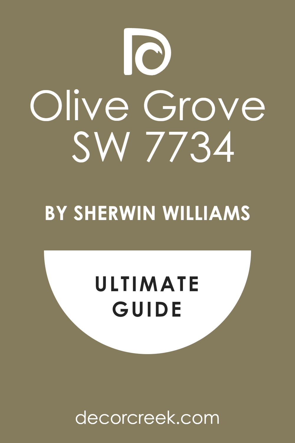
Olive Grove SW 7734
Olive Grove brings in a mellow, golden green tone. It works best in warm-toned homes with natural materials. I love it next to tan leather, warm whites, and vintage rugs.
Olive Grove gives depth without ever feeling too dark.
Laurel Woods SW 7749
Laurel Woods is one of those deep greens that works best in layered, styled rooms. It feels classic and grown-up. I like it on walls with built-in bookshelves, or in a moody bedroom. Laurel Woods helps anchor the whole room.
Forestwood SW 7730
Forestwood gives a deep, earthy tone that works especially well with stone, clay, or raw wood. It’s strong but not overpowering.
Forestwood has a grounded, sturdy feel that I like for statement walls or lower cabinetry.
Basil SW 6194
Basil is warm, rich, and full-bodied. It’s a good choice for someone who wants green but doesn’t want it to feel too sharp. I’ve used Basil in kitchens, mudrooms, and living rooms. It’s easy to pair with both modern and traditional pieces.

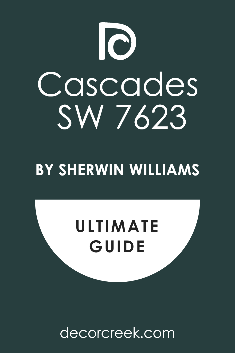
Cascades SW 7623
Cascades has more blue in it, making it feel a little moodier and cooler than some greens. It’s gorgeous in bathrooms or on cabinet fronts. I love it paired with polished nickel and pale woods. Cascades brings a strong look without being too cold.
Greenblack SW 6994
Greenblack is nearly black, but that green undertone keeps it from feeling flat. It’s bold and dramatic. I’ve used it on doors, vanities, and even fireplaces.
Greenblack makes a quiet statement that still catches attention.

Succulent SW 9650
Succulent is deep, lush, and warm. I love it in rooms with layered textures and soft light. It brings a gentle depth that makes everything else feel cozier. Succulent also pairs well with creamy whites and soft tans.

Relentless Olive SW 6425
Relentless Olive brings a bolder olive tone that feels a little vintage. It’s great for dining rooms or cabinets where you want a bit of energy.
I like it with woven shades, light woods, and patterned tile.
Retreat SW 6207
Retreat has a smoky green-gray look that works well in small, quiet rooms. I’ve used it in bedrooms, guest rooms, and hallways. Retreat feels soft but grounded. It’s a great way to add color without going too far.

Palm Leaf SW 7735
Palm Leaf brings more richness and life than other greens. I like it on statement walls or furniture pieces. Palm Leaf looks amazing next to natural fibers and creamy whites.
It feels alive without feeling bright.
Olympic Range SW 7750
Olympic Range is a cool, deep green that reminds me of hiking trails and tall trees. It’s great for libraries, dens, or dramatic living rooms. I love how it looks with leather, stone, and dark wood. It brings focus to a room.
Final Take From My Projects
I’ve painted a lot of walls over the years, but green never gets old. It keeps showing up in my work because it does something special—it makes a room feel connected. Whether you want something fresh and light or deep and dramatic, there’s a Sherwin-Williams green that will feel just right.
My advice? Try a few samples on the wall and see how they look through the day.
Trust what feels good to you, not just what looks good on a screen.
The right green doesn’t just change your wall—it changes how the whole room feels when you walk in.
