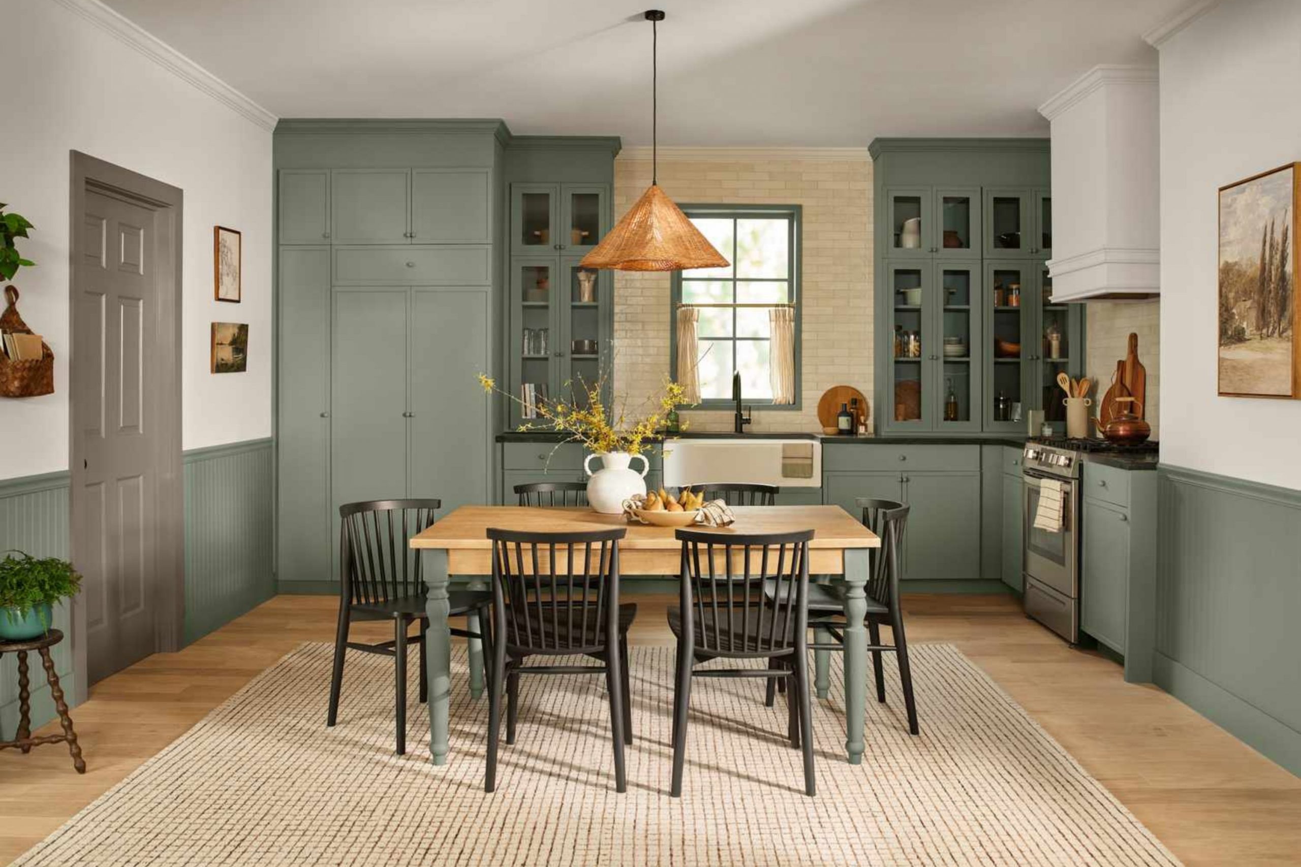
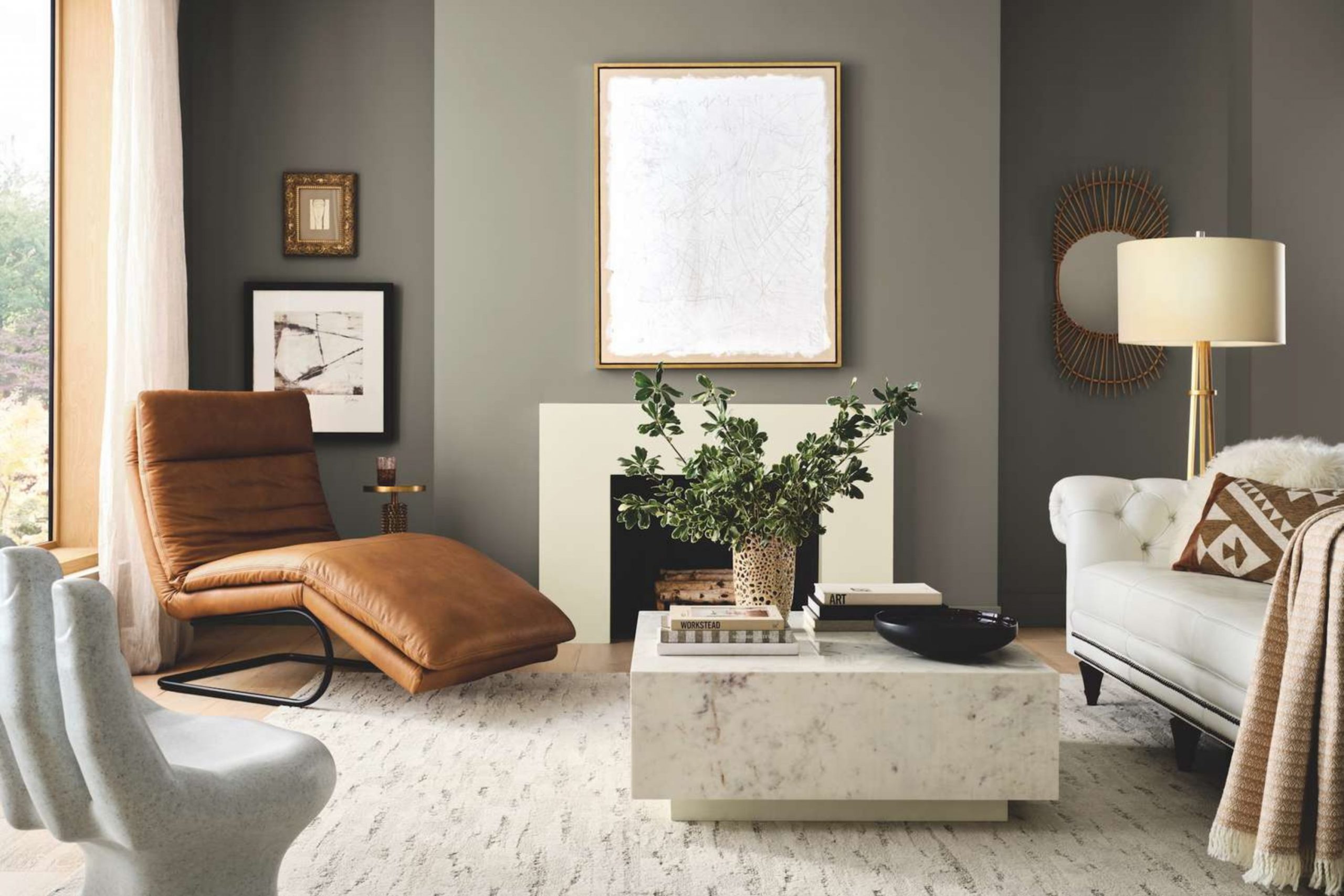
As a home interior designer and staging expert, I’m constantly asked about the perfect neutral, and year after year, the answer often comes back to greige. This beautiful, balanced shade is the current darling of design, proving its staying power well into 2026 and beyond.
Greige is the happy meeting point between warm beige and crisp gray, avoiding the potential flatness of gray and the sometimes yellow undertones of pure beige. It offers a sophisticated neutrality that is both highly adaptable and wonderfully comforting.
It has a beautiful way of lending a grounded, sophisticated feel to any home, making people feel instantly welcome, relaxed, and comfortable. When you choose a great greige, you are setting a robust foundation that allows your treasured furniture, meaningful art, and personal touches to truly shine without ever competing for attention.
Finding the right one is all about understanding the subtle hints of color inside the complex mix—is there a touch of green, violet, or brown?—and how they will react to the unique, ever-changing light in your own rooms.
It’s an exciting process where a little careful color science meets a lot of heart and style, resulting in a home that feels intentionally well-designed and genuinely yours.
Why I Always Trust Sherwin-Williams and Benjamin Moore for Greige Paint Colors
When my clients are looking for a paint that will look rich, feel true, and last for many years, I consistently point them toward Sherwin-Williams and Benjamin Moore. These two powerhouse brands simply lead the industry when it comes to sophisticated color formulation and pigment quality.
Their paint colors are wonderfully complex and layered; a single swatch of greige isn’t just a simple mix of gray and beige. Instead, it’s a careful blend of multiple pigments that react thoughtfully and dynamically to the changing light throughout the day—from the bright morning sun to the soft glow of evening lamps.
This crucial complexity is what prevents a color from looking dull, thin, or muddy on the walls, even after many years.
I trust that when I recommend Agreeable Gray or Revere Pewter, the color will have the depth, richness, and enduring quality my clients desire.
They offer an immensely huge range of neutrals, meaning there is a perfect, nuanced shade for every single scenario, whether it’s a sun-drenched, open-concept living room that needs cooling down or a dimly lit hallway that desperately needs warmth.
These two brands ensure that the color you thoughtfully select is the true, beautiful color you will fall in love with on your walls, every single time you walk through your door.
How I Choose the Perfect Navy Blue Shade for a Bedroom
Choosing navy blue for a bedroom is a wonderful and thoughtful decision; it brings a cozy, enveloping atmosphere that is just perfect for rest and retreat. My secret to picking the perfect navy is to first carefully look at the amount and direction of natural light the room receives.
For a very bright, south-facing bedroom, I often opt for a deep navy that carries a slight hint of gray, which prevents the color from feeling too vibrant or electric in the sun and keeps it grounded and restful.
If the room is north-facing and naturally darker, I might choose a slightly lighter navy that has a very, very small dose of green or purple pigment; this subtle nuance helps it appear rich, balanced, and luxurious instead of appearing like a flat black hole.
Navy blue, above all, should feel like a comforting hug, not a dark cave, so the undertones matter greatly.
It pairs beautifully and classically with crisp white trim, but to truly warm it up, I also love to add pops of warm color in the bedding or accessories—think soft, dusty yellows, muted terra-cottas, or even a dusty rose—to keep the room feeling inviting and deeply personal.
Ultimately, it’s about finding that deep blue that provides a quiet sense of drama and makes you breathe a happy, restful sigh the minute you walk into your personal sanctuary.
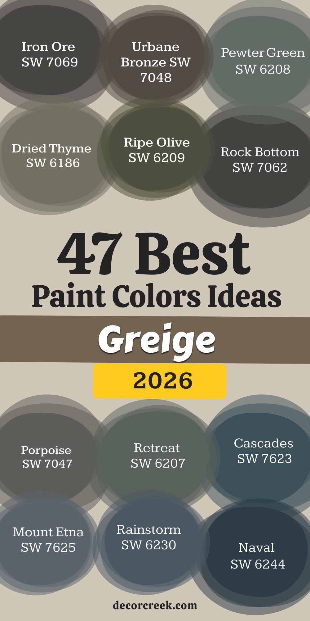
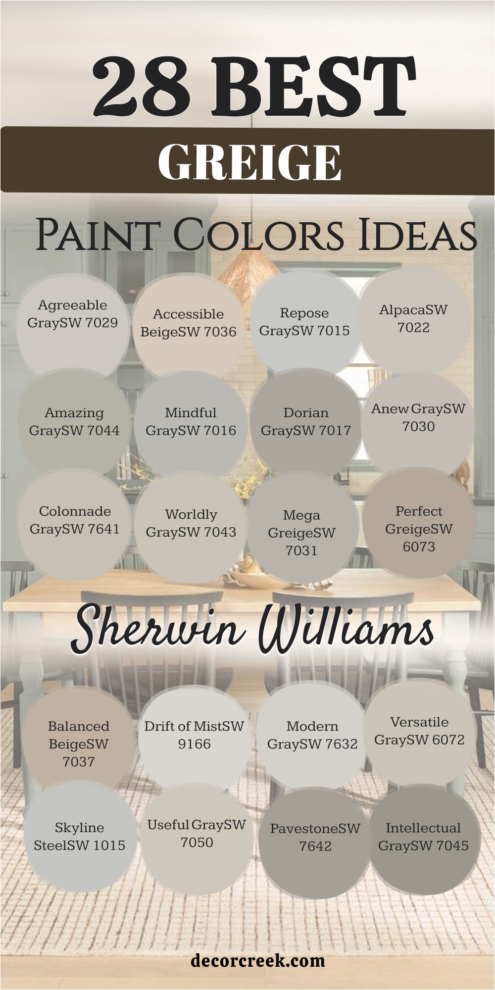
28 Best Greige Paint Colors by Sherwin-Williams
Agreeable Gray SW 7029
Agreeable Gray is the gold standard of greige, sitting perfectly between gray and beige. This color is the one I recommend most often because it truly lives up to its name and seems to look good almost everywhere you put it. It has a magical way of adapting to different lights, appearing slightly warmer when the sun is out and a bit more gray on cloudy days.
The beautiful warmth this shade holds keeps it from feeling cold or stark, making it a favorite for main living areas and open floor plans. If you are nervous about committing to a whole-house color, Agreeable Gray is a safe, sophisticated, and incredibly popular choice that will make your home feel cohesive and refreshed.
It pairs beautifully with crisp white trim, and its balanced neutrality allows any accent color you introduce to stand out with a confident personality. The LRV is excellent, ensuring it reflects light well without washing out. This shade delivers a dependable, inviting feel every time.
🎨 Check out the complete guide to this color right HERE 👈

Accessible Beige SW 7036
Accessible Beige is a gorgeous, warm greige that leans a little more into the beige side of the family than Agreeable Gray. This color is wonderful for rooms where you want to promote an especially cozy and inviting feeling, such as a family room or a den. Its depth is just right, providing enough contrast against bright white trim without making a room feel heavy or dark.
I love how Accessible Beige holds its own in both bright and low light, always delivering a welcoming warmth that feels rich and grounded.
It’s the perfect transition color if you are moving away from traditional beige but aren’t quite ready to commit fully to gray’s coolness. This shade works beautifully with natural wood tones, highlighting their richness and creating a very grounded, earthy feeling in your home. It’s an easy, dependable choice for a light-filled setting.
🎨 Check out the complete guide to this color right HERE 👈

Repose Gray SW 7015
Repose Gray is a touch cooler than Agreeable Gray and is often considered a soft, true gray with just a hint of warmth from a slight beige undertone. If you want a color that feels definitively gray but worry about it turning blue, Repose Gray is the one you need to test because it reliably avoids that icy feeling.
It’s a beautifully balanced mid-tone that holds up well in sunlit rooms, where its saturation prevents the light from washing it out completely.
I particularly like using Repose Gray in kitchens and bathrooms because it offers a clean, crisp backdrop that complements chrome fixtures and white tile perfectly. This color provides a quiet refinement, acting as a sophisticated background that makes even simple decor look well-curated and polished. It’s a reliable, slightly cooler neutral choice.
🎨 Check out the complete guide to this color right HERE 👈

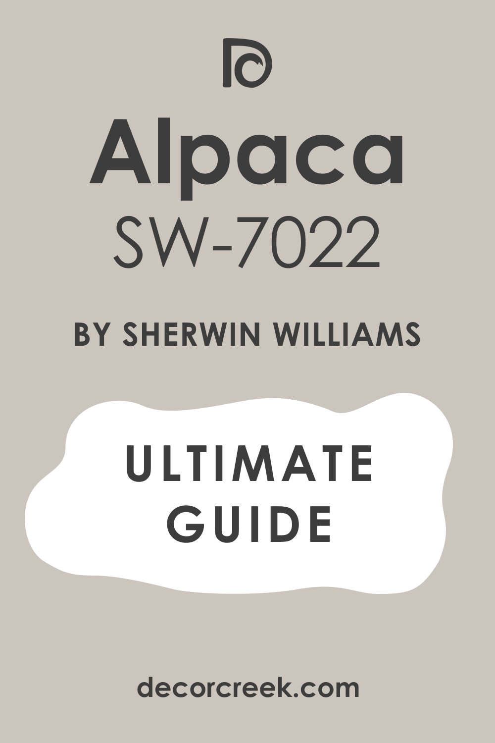
Alpaca SW 7022
Alpaca is a warm, soft greige that has a notable brown or taupe undertone, making it feel incredibly rich, substantial, and earthy. It is a wonderful choice for creating a cozy, almost cocoon-like atmosphere in a bedroom or a formal dining room where depth is desired.
In brightly lit rooms, the beige-brown warmth comes forward, making the walls feel like a soft, comforting blanket wrapping around you.
Be aware that in certain low light, a subtle violet undertone can appear, which is lovely for a bit of moodiness, but something to note if you prefer a perfectly neutral wall. Alpaca looks stunning next to darker wood furniture, as it enhances the depth of the wood and gives the room a polished, intentional feel. It’s a great option for adding a touch more color and depth than a super-light neutral.
🎨 Check out the complete guide to this color right HERE 👈
Amazing Gray SW 7044
Amazing Gray is a deeper, more saturated greige that provides excellent contrast against white trim and ceilings. This color is definitely on the grayer side, but it holds a good amount of green-beige warmth, keeping it from ever looking cold or sterile.
I often recommend Amazing Gray for rooms that get a ton of natural light because its depth allows the color to remain present and true instead of disappearing in the glare. It’s fantastic for creating a grounded, sophisticated feeling in a larger living area or as a striking exterior paint color.
Amazing Gray has a wonderful way of making the whole home feel settled and complete, offering a substantial color that is still undeniably neutral and highly adaptable to changing decor. It’s a confident, medium-toned favorite.
🎨 Check out the complete guide to this color right HERE 👈
Mindful Gray SW 7016
Mindful Gray is the perfect mid-tone gray that gives you a bit more saturation and presence than Repose Gray without going too dark. It’s a true workhorse color because it has a beautifully balanced greige undertone that keeps it grounded and reliably neutral in all lights.
This color is perfect for adding a bit of visual weight to walls, which can be wonderful in rooms with high ceilings or lots of architectural detail that need grounding.
I love using Mindful Gray in home offices or hallways because it provides a quiet, focused backdrop that doesn’t compete with the task at hand and allows for concentration. It has a lovely, refined quality that makes a house feel instantly put-together and well-designed, offering confidence in its neutral presence.
🎨 Check out the complete guide to this color right HERE 👈

Dorian Gray SW 7017
Dorian Gray is a gorgeous, deep warm gray that leans right into the greige category thanks to its soft taupe undertones. This color is wonderful if you are looking for a moody yet inviting feel, perhaps in a media room or a cozy den where you want to create intimacy.
It has a lovely richness and substantial depth that makes white trim pop beautifully, creating a very tailored and expensive look in the home.
Because it’s a bit darker, I suggest testing it in your space to ensure it doesn’t feel too heavy for your liking, but in a well-lit room, it is pure elegance and sophistication. Dorian Gray looks particularly stunning on kitchen islands or built-in bookshelves, offering a grounding accent color that still feels perfectly neutral and polished
🎨 Check out the complete guide to this color right HERE 👈

Anew Gray SW 7030
Anew Gray is a warmer greige that often shows up with a soft, comforting mushroom-like quality, which is very current and chic in design. It has a rich, earthy depth that prevents it from washing out, even in super-bright, sunny rooms that tend to lighten colors.
I find this color is less about being strictly gray and more about being a beautiful, muted taupe that brings a comforting warmth to the walls.
It’s an excellent option for an open-concept main floor where you need a color that can transition gracefully from the living area to the kitchen without feeling jarring. Anew Gray is also one of my favorite exterior colors because it gives a home a grounded, established, and welcoming curb appeal that works with almost any architectural style.
🎨 Check out the complete guide to this color right HERE 👈
Colonnade Gray SW 7641
Colonnade Gray is a classic medium-light greige that I adore for its dependable neutrality and gorgeous versatility in many different settings. It has a gentle, warm beige undertone that makes it incredibly inviting, yet it is undeniably a gray base that keeps it feeling fresh and modern.
With a nice Light Reflectance Value, this shade reflects a good amount of light while still offering clear definition against white trim.
It’s a solid, reliable choice for a main living area where you want a consistent, cheerful feeling throughout the day. Colonnade Gray is fantastic with both cool and warm furnishings, proving that a great greige can truly be the bridge between many design elements in a single room with ease.
🎨 Check out the complete guide to this color right HERE 👈
Worldly Gray SW 7043
Worldly Gray is a soft, light greige that has a unique personality, sometimes revealing a very subtle violet undertone that adds a touch of mystery and depth to the walls. This color is wonderful when you want a light, airy feeling but a pure white is just too stark or bright for your furniture.
It has enough pigment to provide a soft shadow and a clear sense of color on the walls, especially when paired with a bright white ceiling.
I use Worldly Gray often in formal dining rooms or guest bedrooms where a hint of softness and gentle sophistication is desired to make the feel delicate. It coordinates beautifully with both dark and light wood finishes, offering a quiet, composed backdrop that simply works well everywhere.
🎨 Check out the complete guide to this color right HERE 👈
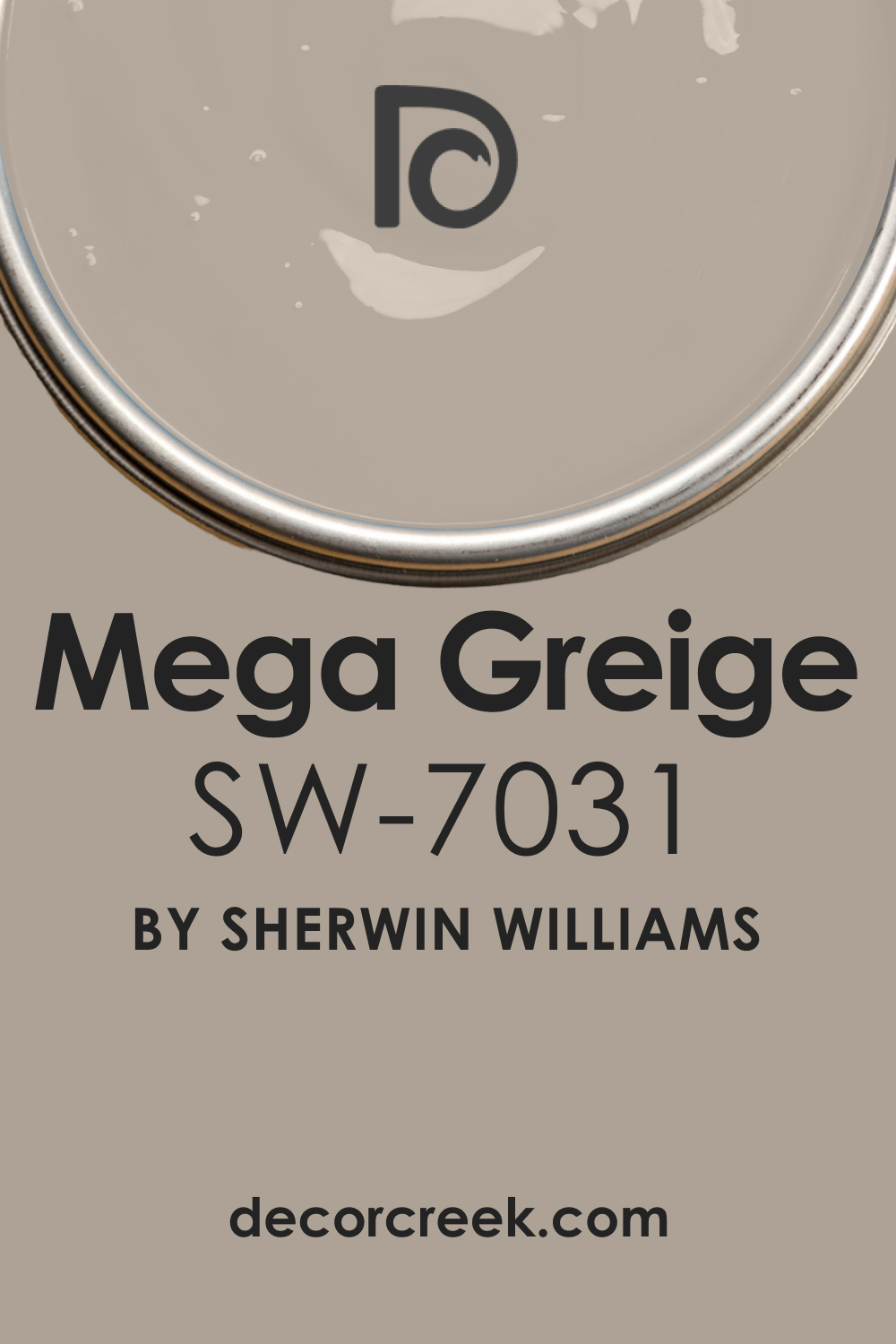
Mega Greige SW 7031
Mega Greige is a deeper, richer greige that leans heavily toward the warm taupe-brown end of the spectrum, offering a substantial and comforting depth to the walls. This color is perfect for those who want a neutral that feels moody and sophisticated without being overly dark or black.
It looks incredible in spaces with rich leather furniture or deep, jewel-toned accents, as it provides a grounded, luxurious backdrop that feels expensive.
Its strong warmth makes it an excellent choice for a dramatic accent wall or a dedicated reading nook where a sense of intimacy is desired. I often use Mega Greige in powder rooms for a touch of warm drama and tailored elegance that makes a statement. This shade holds up beautifully in strong light and is highly effective when paired with bright white trim.
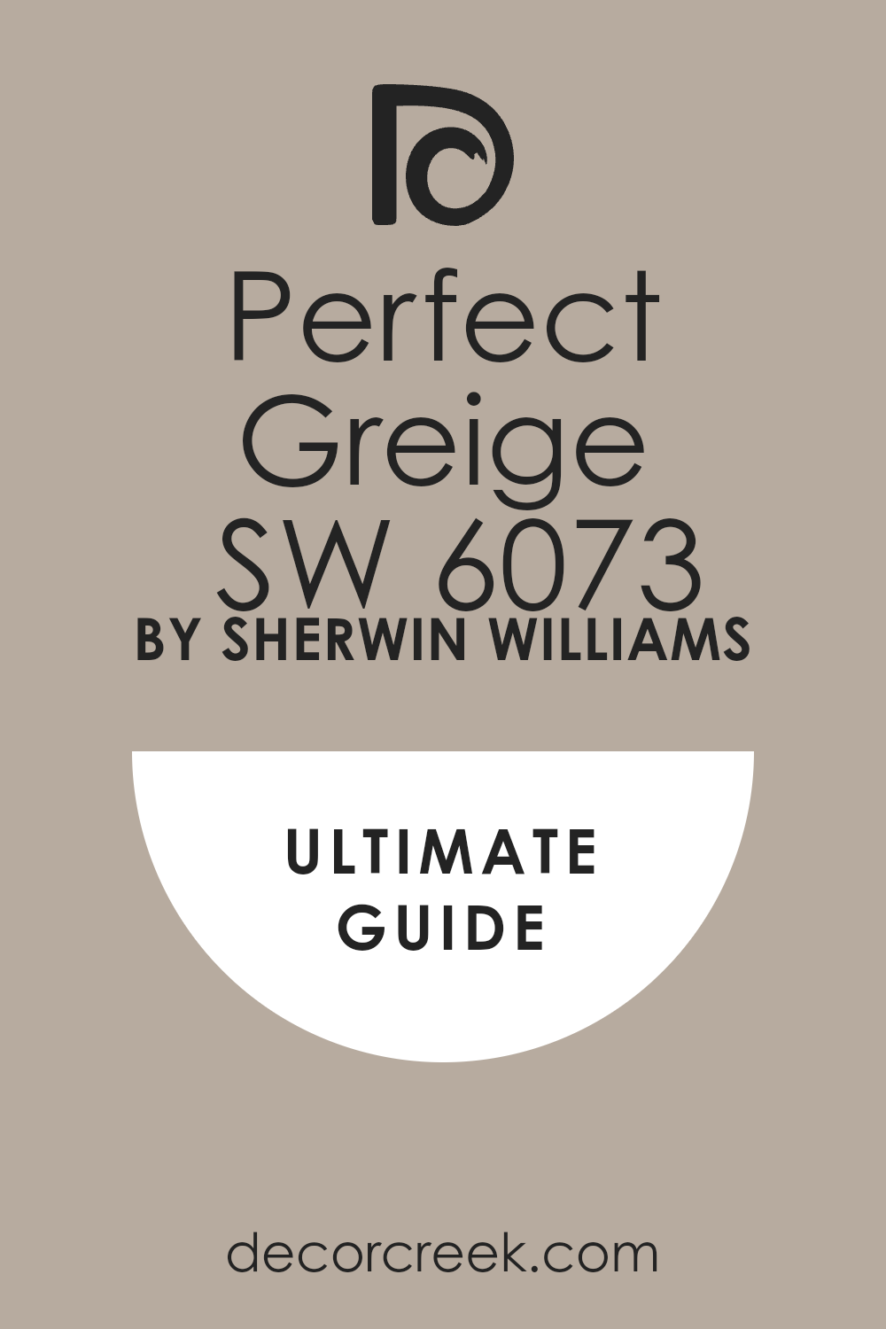
Perfect Greige SW 6073
Perfect Greige is a deeper, more saturated greige that has a strong taupe-brown warmth, making it one of the coziest and most enveloping options in the Sherwin-Williams collection. This color is wonderful for creating a rich, welcoming atmosphere, especially in rooms with high ceilings where a lighter color might feel lost or washed out.
It is an excellent choice for a formal dining room or a dedicated library where a sense of traditional depth is needed.
Perfect Greige looks amazing next to natural stone fireplaces, enhancing their organic textures and colors with its earthy undertones. Be aware that this shade has a significant amount of beige, so it will consistently read very warm in your space, bringing a feeling of quiet contentment.
🎨 Check out the complete guide to this color right HERE 👈
Balanced Beige SW 7037
Balanced Beige is a rich, warm greige that truly lives up to its name by offering a substantial amount of beige, tempered by just enough gray to keep it feeling current and sophisticated. This color is perfect for rooms where you desire a noticeably warm and earthy feel, such as a cozy den or a primary bedroom where warmth is key.
I find that Balanced Beige looks incredible when paired with creamy white trim, as the contrast highlights its depth and inherent richness beautifully.
It is a fantastic choice if you have a lot of stained wood or traditional furniture you want to complement. It’s a confident, inviting neutral with a strong, warm personality that brings a settled, homey feel to any room.
🎨 Check out the complete guide to this color right HERE 👈

Drift of Mist SW 9166
Drift of Mist is a whisper-light greige that is nearly an off-white but holds just enough pigment to feel like a soft, hazy color on the walls. It is perfect for those who desire a very bright, airy room but find pure white too stark or cold for their preference.
This color has a beautiful, gentle warmth that makes it incredibly inviting and soft, even in rooms that don’t receive a lot of natural light.
I love using Drift of Mist for a whole-house neutral, as it provides a clean, continuous backdrop that makes every room feel open and effortlessly polished. It works beautifully with all trim colors, from a stark white to a softer creamy white, offering subtle sophistication.
🎨 Check out the complete guide to this color right HERE 👈

Modern Gray SW 7632
Modern Gray is a lovely light greige that offers a touch more substance than a pure off-white while still keeping the room feeling wonderfully bright and fresh. It is a very balanced neutral with subtle taupe undertones, making it a dependable choice for almost any room in the house.
I find this color to be particularly versatile, working well with both traditional and modern decor styles without competing with either.
Modern Gray is an excellent option for painting cabinetry or built-ins, as it provides a clean, tailored look that is softer than a stark white and complements many different hardware finishes beautifully. It is a simple, straightforward, and reliable light greige.
🎨 Check out the complete guide to this color right HERE 👈

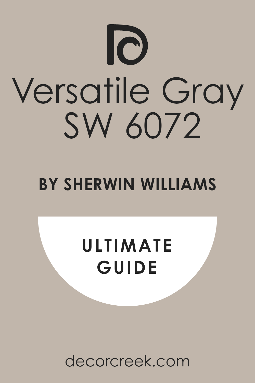
Versatile Gray SW 6072
Versatile Gray is a quintessential warm greige that is incredibly well-balanced, sitting firmly between gray and beige with a lovely, muted warmth. This color is a fantastic choice for a whole-house neutral because it is so easy to live with and adapts effortlessly to different rooms and furnishings.
It has enough pigment to provide a clear sense of color on the walls but is light enough to keep the room feeling open and bright, making it a truly dependable shade.
I often recommend it to clients who want a guaranteed middle-of-the-road greige that will not surprise them with unexpected blue or green flashes in different lighting conditions. It truly lives up to its versatile name, offering a quiet, confident backdrop.
🎨 Check out the complete guide to this color right HERE 👈
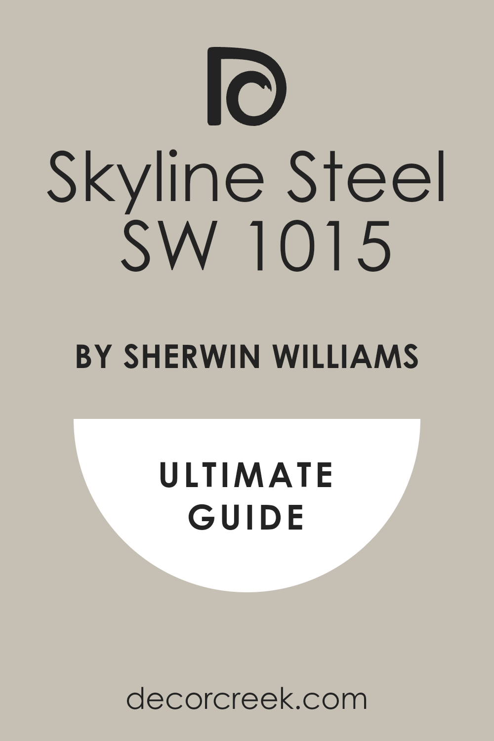
Skyline Steel SW 1015
Skyline Steel is a light, clean greige that leans more toward a crisp gray, making it feel fresh and modern. It has a high LRV, ensuring that it reflects light beautifully, which helps rooms feel larger and more open.
This color is perfect for those who want a light gray look but need to avoid the blue undertones that sometimes plague cooler grays.
The subtle greige warmth keeps it grounded and sophisticated, preventing any cold or icy feelings. I often use Skyline Steel in contemporary homes or urban settings where a clean, straightforward, and airy aesthetic is desired. It provides a simple, tailored backdrop that allows furniture and textiles to provide all the color and personality.
🎨 Check out the complete guide to this color right HERE 👈
Useful Gray SW 7050
Useful Gray is a wonderfully light and warm greige that, despite its name, leans quite heavily toward a soft, pale beige, giving it a comforting, earthy quality. This color is perfect for rooms where you want a very subtle color that makes the walls feel warm and soft, almost like a neutral linen fabric.
It’s a great choice for dining rooms or gathering spaces where an inviting and relaxed atmosphere is desired.
Useful Gray looks beautiful next to deep-toned wood furniture, highlighting the craftsmanship and adding a refined, traditional touch to the whole room’s design. It’s a very safe, warm, and dependable light neutral that acts like a gentle wash of color.
🎨 Check out the complete guide to this color right HERE 👈
Pavestone SW 7642
Pavestone is a deeper, more substantial greige that carries a noticeable, earthy brown undertone, making it a wonderful choice for creating a grounded and cozy atmosphere. This color is perfect for adding visual weight to walls, which can be particularly effective in large rooms or rooms with high ceilings.
It provides a beautiful, dark contrast to white millwork, giving a space a very tailored and formal appearance.
I often use Pavestone as an accent color for trim or exterior siding because its depth is so rich and sophisticated. It’s a warm, confident color that delivers a feeling of permanence and quality to the home.
🎨 Check out the complete guide to this color right HERE 👈
Intellectual Gray SW 7045
Intellectual Gray is a rich, medium-dark greige that has a pronounced warm, taupe-brown undertone, which gives it a moody, handsome quality. This color is great for creating an intentional, intimate feeling in a den, library, or bedroom, bringing the walls closer in for comfort.
It looks particularly stunning in a room with a lot of natural wood, as the warm undertones complement the wood grain beautifully.
Because it is a more saturated color, it holds up exceptionally well against very bright sunlight without disappearing. Intellectual Gray is a sophisticated choice for those who want a deeper neutral that still feels undeniably warm and welcoming, avoiding any starkness.
🎨 Check out the complete guide to this color right HERE 👈
Eider White SW 7014
Eider White is a very popular, bright greige that has a noticeable, yet gentle, gray-violet undertone, giving it a beautifully refined and complex quality. This color is perfect for walls when you want a very light, almost white look but need a shade that softens the glare and adds a touch of sophistication.
It acts like a soft veil over pure white, providing a subtle contrast against white trim without feeling heavy.
Be aware of its subtle purple hint, which is quite lovely and not cold, but something to note depending on your personal preferences and surrounding finishes. I often recommend Eider White for main living areas that are south-facing and receive a ton of intense light, as it helps to cool down the intense brightness without ever feeling stark. It creates a very soft and airy atmosphere.
🎨 Check out the complete guide to this color right HERE 👈

Grecian Ivory SW 7541
Grecian Ivory is a gorgeous, light greige that leans significantly toward the beige/ivory side, giving it a wonderfully warm and creamy quality. This color is perfect for someone moving away from heavy traditional creams but who still desires an undeniably warm backdrop that won’t flash gray.
It has enough pigment to offer a soft, welcoming contrast to white trim without looking like a stark white.
I love using Grecian Ivory in dining rooms or sunny breakfast nooks because its warmth enhances the light and promotes a cheerful, inviting atmosphere. It works beautifully with natural wood cabinets or furniture, as it highlights the wood tones without making them appear orange. This shade is a reliable choice for achieving a gentle, sun-washed look.
🎨 Check out the complete guide to this color right HERE 👈
Shiitake SW 9173
Shiitake is an earthy, very warm greige that has a strong, muted beige-brown undertone, giving it a grounded, deeply organic feel. This color is wonderful for creating a sense of natural comfort and looks incredible in homes with a lot of wood and stone elements, connecting the interior to the outdoors
. It has a notable depth, making it richer than many of the other light neutrals, yet it retains a quiet sophistication.
It is an excellent, sophisticated choice for a bedroom where you want a truly cozy and rich atmosphere that promotes deep rest and relaxation without feeling too dark. Shiitake is a confident warm neutral that brings a touch of the outdoors in, feeling both settled and earthy.
🎨 Check out the complete guide to this color right HERE 👈

Amazing Gray SW 7044
Amazing Gray is a deeper, more saturated greige that provides excellent contrast against white trim and ceilings. This color is definitely on the grayer side, but it holds a good amount of green-beige warmth, keeping it from ever looking cold or harsh.
I often recommend Amazing Gray for rooms that get a ton of natural light because its depth allows the color to remain present and true instead of disappearing in the glare.
It’s fantastic for creating a grounded, sophisticated feeling in a larger living area or as a striking exterior paint color. Amazing Gray has a wonderful way of making the whole home feel settled and complete, offering a substantial color that is still undeniably neutral and highly adaptable to changing decor.
🎨 Check out the complete guide to this color right HERE 👈
City Loft SW 7631
City Loft is a sophisticated, light greige that leans more toward the gray side of the spectrum, providing a crisp, airy feel that is highly modern. It’s a beautifully clean neutral that looks wonderfully bright, making it an excellent choice for updating an older home with a fresh sensibility.
This color is fantastic for maximizing the natural light in a room, making even smaller rooms feel open and expansive.
I often pair City Loft with very dark, dramatic accent colors like navy or charcoal gray to create a chic, high-contrast look that feels very current and intentional. It delivers a quiet sense of style that is perfect for a more streamlined, contemporary aesthetic.
🎨 Check out the complete guide to this color right HERE 👈

Gossamer Veil SW 9165
Gossamer Veil is another lovely, pale greige that has a wonderful, subtle warmth, acting like a soft shadow on the walls rather than a heavy color. This color is fantastic when you need a light neutral that still offers a clear contrast to your white trim, giving the walls definition without any unnecessary heaviness.
It is a very balanced color, reliably avoiding strong blue or purple undertones, which makes it an incredibly reliable choice for a main living area or a bright kitchen.
I find that Gossamer Veil provides a fresh, clean feeling that is perfect for a contemporary or coastal-inspired home, giving the walls a gentle, almost translucent texture.
🎨 Check out the complete guide to this color right HERE 👈
Requisite Gray SW 7023
Requisite Gray is a rich, medium-toned greige that has a noticeable brown-green undertone, giving it a distinctly organic and earthy personality. This color offers great depth and saturation, making it a wonderful choice for adding visual weight and presence to your walls.
I often recommend it for rooms with heavier wood elements or stone fireplaces, as its earthy base complements these natural textures beautifully.
Requisite Gray provides a warm contrast to bright white trim, creating a tailored and grounded look. It is a dependable neutral that will make a room feel intentional and substantial, avoiding any coldness due to its rich undertones.
🎨 Check out the complete guide to this color right HERE 👈
On the Rocks SW 7671
On the Rocks is a beautiful, light-medium greige that has a cool, crisp gray base with just enough warmth to keep it from feeling icy or cold. This color is perfect for those who prefer a gray that feels fresh and modern but still want the sophistication of a perfectly balanced neutral.
It offers a nice depth for a light shade, giving the walls a confident presence and providing excellent contrast with white trim.
I often use On the Rocks in transitional homes where the design blends both warm wood tones and cooler metal finishes, as this color acts as the perfect, dependable bridge between all elements, maintaining a poised style.
🎨 Check out the complete guide to this color right HERE 👈
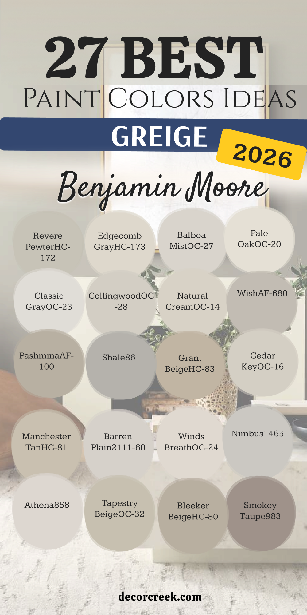
27 Best Greige Paint Colors by Benjamin Moore
Revere Pewter HC-172
Revere Pewter is perhaps the most famous Benjamin Moore greige and for very good reason—it’s an iconic, richly saturated shade. This color is heavier than many other popular greiges, giving it a grounding depth that works beautifully in traditional or transitional homes.
It has strong, warm beige undertones, meaning it leans much warmer than a pure gray, which is what gives it that incredibly cozy and historic feel.
I recommend Revere Pewter often for dining rooms or libraries where a little more presence and substance is needed on the walls. It looks amazing next to white millwork, making the architectural details of a room truly pop with a sense of refined elegance. This dependable shade delivers warmth and sophistication without feeling outdated.
🎨 Check out the complete guide to this color right HERE 👈

Edgecomb Gray HC-173
Edgecomb Gray is a beautiful, lighter greige that has a distinctly creamy, almost mushroom-like quality, making it feel soft and gentle on the eyes. This color is a perfect example of a greige that sits much closer to beige, offering an undeniable warmth that prevents any risk of coldness.
It has a nice high LRV, meaning it reflects light wonderfully, making rooms feel bright and open while still providing a comforting color.
I love using Edgecomb Gray in bedrooms and main living areas where a light, airy, and inviting feel is the goal for a relaxed home. This shade pairs beautifully with natural linen fabrics and light wood floors, creating a very organic and relaxed atmosphere in the home.
🎨 Check out the complete guide to this color right HERE 👈

Balboa Mist OC-27
Balboa Mist is a delicate, pale greige that I often call a “near-white” because it is so light and airy, offering the sophistication of gray and the brightness of white. It provides just the smallest amount of contrast against white trim, creating a subtle definition on the walls.
This color has subtle violet-gray undertones, which can give it a chic, slightly mysterious quality depending on the light, adding complexity.
I frequently use Balboa Mist in large, sunny rooms where a deeper color might feel too heavy, but a pure white would feel glaring. It provides an ethereal backdrop that is wonderfully versatile, working well with modern art and soft, textured fabrics in any setting.
🎨 Check out the complete guide to this color right HERE 👈

Pale Oak OC-20
Pale Oak is a gorgeous, soft greige that has a delightful mix of beige and a hint of pink/violet undertone, making it a very sophisticated and unique neutral. This color is extremely light and acts almost like a refined off-white, offering a gentle warmth without ever leaning too yellow or cream.
It’s one of my favorite colors for clients who are looking for a bright, gallery-like feel but need a shade with just a bit more substance than standard white.
Pale Oak looks stunning on walls, creating a soft, luminous quality in the room, and it pairs beautifully with dark, dramatic accent colors in adjacent rooms, creating a lovely contrast.
🎨 Check out the complete guide to this color right HERE 👈

Classic Gray OC-23
Classic Gray is another incredibly pale and light greige that, despite its name, has a significant amount of warmth, making it a true soft off-white with gray undertones. This color is known for being very clean and pure, as its undertones are subtle, giving it a refreshing and highly adaptable presence.
It’s an excellent choice for a whole-house color where you want the rooms to feel expansive and bright, but you need a gentle color that softens the light.
I find that Classic Gray works beautifully in bathrooms and laundry rooms because it feels exceptionally clean and complements both white porcelain and polished chrome fixtures with great success.
🎨 Check out the complete guide to this color right HERE 👈

Collingwood OC-28
Collingwood is a beautiful, mid-toned gray that carries just enough warm, beige undertone to classify it as a gorgeous, grounded greige. This color has a refined depth, meaning it offers a clear and confident presence on the wall, providing excellent contrast to white trim and moldings.
It’s perfect for creating a sophisticated and welcoming feel in a main living room or a dedicated dining space where a little more color is desired.
The slight violet undertone in Collingwood gives it a wonderful complexity, allowing it to shift beautifully from a true gray in bright light to a softer, warmer tone in the evening.
🎨 Check out the complete guide to this color right HERE 👈

Natural Cream OC-14
Natural Cream is a very light, warm greige that truly sits at the crossroads of a creamy off-white and a soft, pale gray. It’s the perfect color for walls when you want a shade that feels airy and light but also deeply inviting and warm, avoiding any harshness.
The cream undertone keeps it from feeling stark, while the hint of gray prevents it from looking yellow or dated in different lights.
I often use Natural Cream in homes with a lot of natural wood trim or built-ins, as it provides a subtle contrast that honors the richness and warmth of the wood. This color creates a soft, gentle atmosphere that is ideal for a restful bedroom or a bright, sunny breakfast nook.
🎨 Check out the complete guide to this color right HERE 👈

Wish AF-680
Wish is a beautiful, medium-depth greige that has a strong presence and an appealing, comforting warmth due to its rich taupe base. This color is part of the Affinity collection, which means its pigments are formulated to work harmoniously with other colors in the collection, making color pairing easy and intuitive.
It offers a cozy, taupe-like warmth that feels grounded and earthy, reliably avoiding any cool or icy appearances.
I recommend Wish when a client wants a color that adds visual weight to the walls without making the room feel dark, which makes it perfect for a main floor or a larger bedroom needing definition. It looks exceptionally good with dark, rich wood furniture, creating a distinguished and handsome look.
🎨 Check out the complete guide to this color right HERE 👈
Pashmina AF-100
Pashmina is a rich, medium-toned greige that leans quite heavily into the warmer beige-taupe category, giving it an incredibly luxurious and inviting feel. This color has a beautiful depth that provides a wonderful sense of permanence and quality to the walls, feeling substantial.
It’s an excellent choice for rooms where you want a cozy, sophisticated backdrop, such as a formal dining room or a den with a fireplace.
The warmth of Pashmina works perfectly with natural materials like leather, wood, and wool, creating an atmosphere that feels both refined and wonderfully comfortable. This shade is a more saturated option that truly embraces the warmth of the greige spectrum with confidence.
🎨 Check out the complete guide to this color right HERE 👈

Shale 861
Shale is a sophisticated, deeper greige that has a lovely, subtle green undertone that makes it feel very earthy and grounded, offering a unique twist on the neutral trend. This color is a wonderful choice for those who love the idea of a gray neutral but want a hint of a natural, organic color to be present on their walls.
It offers a beautiful, muted backdrop that is substantial enough to contrast perfectly with white trim but still feels very much like a neutral.
I often use Shale in rooms where there are many windows or a beautiful garden view, as the gentle green undertone helps to connect the interior to the outside landscape. It has a rich, refined presence that quietly elevates any room it’s used in.
Grant Beige HC-83
Grant Beige is a beautiful, warm greige that leans firmly into the beige category, offering a deep, earthy richness that feels wonderfully traditional. This color is an excellent choice for creating a cozy, established atmosphere in older homes or rooms with heavy architectural details.
It has a beautiful depth that prevents it from feeling washed out in bright light, always delivering its signature comforting warmth.
I love using Grant Beige in hallways and libraries, as it provides a solid, grounding neutral that pairs perfectly with antique furniture and brass hardware. This shade is a dependable, saturated warm greige that provides a clear color on the wall without being too intense.
🎨 Check out the complete guide to this color right HERE 👈

Cedar Key OC-16
Cedar Key is a light, delicate greige that is highly favored for its clean, soft nature and subtle warmth. This color is slightly warmer than Edgecomb Gray, providing a gentle touch of creamy beige that makes a room feel instantly inviting.
It has a great LRV, making it a perfect choice for bringing light into darker areas while still adding a sense of color to the walls.
I often recommend Cedar Key for main living areas and kitchens where a bright, airy, yet warmly sophisticated look is desired. It’s a beautifully balanced and understated neutral that allows art and textiles to take center stage without competing.
🎨 Check out the complete guide to this color right HERE 👈
Manchester Tan HC-81
Manchester Tan is a classic, warm neutral that sits on the warmer side of the greige spectrum, offering a rich tan/beige base with just enough gray to keep it looking current. This color is perfect for those who want to transition away from pure yellow-based tans but still desire significant warmth on their walls.
It provides a grounded, substantial feel that works wonderfully in traditional and transitional homes.
I find Manchester Tan looks stunning in rooms with stone fireplaces or earth-toned accents, as its richness complements natural materials beautifully. It is a confident, comforting shade that makes any room feel well-appointed and established.
🎨 Check out the complete guide to this color right HERE 👈

Barren Plain 2111-60
Barren Plain is a sophisticated, light-medium greige that has a crisp gray base with a notable, subtle violet undertone, giving it a cool, contemporary edge. This color is perfect for adding a refined, modern feel to a space while still retaining the versatility of a neutral.
Its complexity means it shifts beautifully with the light, appearing cooler in the morning and softer in the evening.
I often use Barren Plain in bedrooms or dedicated reading nooks to create a quiet, slightly moody, and very chic atmosphere. It pairs wonderfully with bright white trim for a sharp contrast that looks clean and intentional.
🎨 Check out the complete guide to this color right HERE 👈
Winds Breath OC-24
Winds Breath is an incredibly light, pale greige that acts almost as a soft, warm off-white, offering an airy and delicate feel. This color is fantastic for maximizing the natural light in a room and ensuring walls feel open and expansive.
It holds just enough subtle color to contrast beautifully against pure white trim, providing that essential definition without feeling stark.
I love using Winds Breath for a whole-house neutral, as it flows seamlessly from room to room, creating a cohesive and gentle backdrop throughout the home. It is a reliable choice for achieving a luminous, subtle warmth.
🎨 Check out the complete guide to this color right HERE 👈
Nimbus 1465
Nimbus is a beautiful, cool-toned greige that leans more heavily into the gray side, featuring a clean, subtle blue-green undertone that gives it a fresh, slightly organic feeling. This color is wonderful for rooms where you want a crisp, light, and very sophisticated neutral that feels modern.
Its coolness makes it an excellent option for sun-drenched rooms, where it helps to temper the intensity of the light beautifully.
I often pair Nimbus with dark wood furniture for a high-contrast, tailored look that feels both classic and contemporary. It offers a clear, confident color without ever feeling heavy or overwhelming.
🎨 Check out the complete guide to this color right HERE 👈
Athena 858
Athena is a very light, bright greige that has a gentle, almost dusty feel, sitting perfectly between gray and a pale, soft beige. This color is ideal for a client who is hesitant about dark colors but needs more substance than a pure white can offer.
It has a lovely softness that makes it perfect for bedrooms and nurseries, creating a restful and gentle environment.
I find Athena to be incredibly versatile because its undertones are so balanced, allowing it to work well with both warm wood and cooler metal finishes effortlessly. It’s a luminous, subtle greige that always feels welcoming.
Tapestry Beige OC-32
Tapestry Beige is a classic, warm greige that leans strongly towards the beige side, carrying a rich, comforting warmth that feels established and traditional. This color is perfect for creating a sense of coziness and depth on the walls, making it an excellent choice for a family room or a den.
Its depth ensures it doesn’t look washed out in bright sun, always providing a clear, substantial color.
I often recommend Tapestry Beige for homes with lots of natural light where a deep, yet versatile, neutral is needed. It coordinates beautifully with earthy tones like terracotta and deep green.
🎨 Check out the complete guide to this color right HERE 👈
Bleeker Beige HC-80
Bleeker Beige is a substantial, medium-toned greige that offers a complex warmth with a clear brown/taupe undertone. This color is a wonderful choice for creating a grounded, quiet sophistication in a formal living or dining room.
It has a noticeable richness that makes white trim pop dramatically, giving the room a tailored, polished appearance.
I love using Bleeker Beige in rooms with traditional design elements, as its depth complements rich fabrics and heavy furnishings beautifully. It’s a very confident, warm neutral that feels comforting and established.
Smokey Taupe 983
Smokey Taupe is a rich, medium-dark greige that embraces the taupe side of the spectrum, offering a deep, inviting warmth that feels sophisticated and luxurious. This color is perfect for creating a cozy, enveloping atmosphere in a bedroom or a den where intimacy is desired.
Its depth adds great visual weight to the walls, making it a fantastic accent color for built-ins or millwork.
I find that Smokey Taupe looks incredible when paired with metallic accents like gold or copper, enhancing its inherent richness and giving the room a decadent feel. It’s a beautiful, warm color that is undeniably chic.
🎨 Check out the complete guide to this color right HERE 👈
Silver Fox 2108-50
Silver Fox is a sophisticated, medium-toned greige that carries a cool, crisp gray base with just a touch of brown undertone for grounding warmth. This color is wonderful if you want a true gray that avoids any blue or violet flashes but still maintains a clean, modern feeling.
It has a beautiful depth that makes it stand out against white trim, giving the walls a confident, tailored presence.
I often recommend Silver Fox for contemporary kitchens or offices because it provides a quiet, focused backdrop that is stylish without being distracting. It’s a very versatile and reliable neutral that provides a perfect balance between cool and warm elements in a room.
Abalone 2108-60
Abalone is a light and airy greige that often presents as a soft, luminous gray with subtle violet undertones, giving it a delicate, refined quality. This color is perfect for creating a soft, ethereal atmosphere in a bedroom or a formal living room where you want a gentle wash of color.
It has enough saturation to provide a soft contrast to white trim, preventing the walls from feeling completely washed out in bright light.
I find that Abalone is a gorgeous choice for pairing with dusty rose or soft blue accents, as its undertone beautifully complements these muted shades. It offers a fresh, clean, and quietly complex neutral background.
🎨 Check out the complete guide to this color right HERE 👈
Feather Gray 2127-60
Feather Gray is a light and delicate greige that is highly favored for its clean, almost off-white appearance with a subtle gray base. This color is perfect for rooms where maximum light reflection and airiness are the primary goals, acting like a bright, sophisticated white alternative.
It provides the smallest hint of color, just enough to soften the glare of bright light and offer a slight contrast to white ceiling paint.
I love using Feather Gray in bathrooms or laundry rooms because it feels exceptionally clean, crisp, and refreshing. It is a subtle, reliable neutral that avoids any strong, distracting undertones.
Horizon OC-53
Horizon is a very light, luminous greige that sits close to the white category, offering a clean, airy feeling that is subtly warmer than a pure white. This color is wonderful for creating an expansive feel, as it makes walls appear taller and rooms feel larger.
It has a gentle gray undertone that keeps it from looking yellow or creamy, maintaining a fresh and modern sensibility.
I often recommend Horizon for clients who want to brighten a north-facing room without using a cold white, as its subtle warmth works beautifully in low light. It’s a fantastic, dependable shade for achieving a soft, airy backdrop throughout the home.
🎨 Check out the complete guide to this color right HERE 👈

Stone Hearth 984
Stone Hearth is a rich, warm greige that leans strongly into the taupe and brown category, offering substantial depth and an earthy, comforting presence. This color is perfect for creating a cozy, handsome atmosphere in a den, library, or a dining room where you want a noticeable, saturated color.
Its warmth is undeniable, making it feel inviting and grounded in any light.
I find that Stone Hearth looks amazing when paired with creamy or off-white trim, as the contrast highlights its sophisticated richness. It is a confident, warm neutral that adds a luxurious, established feel to the architecture of the room.
🎨 Check out the complete guide to this color right HERE 👈
Perfect Greige SW 6073
Perfect Greige is a well-balanced, medium-toned greige that offers a beautiful mix of gray and beige with a soft, comforting brown undertone. This color is highly versatile and avoids leaning too far into either the gray or beige camp, making it a reliable middle ground.
It has enough depth to look substantial on the walls without making a room feel dark, providing excellent contrast to white millwork.
I often use Perfect Greige as a sophisticated neutral that transitions beautifully between warm and cool furnishings, acting as the ultimate, dependable backdrop. It’s a confident, well-named color that delivers consistent warmth and polish.
🎨 Check out the complete guide to this color right HERE 👈
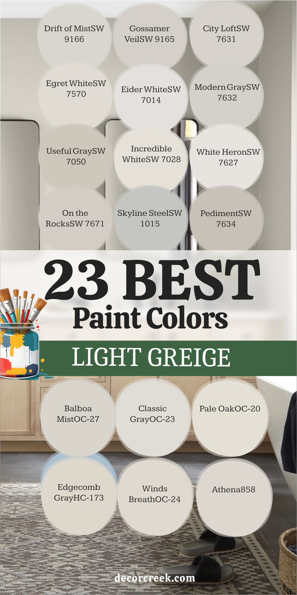
23 Best Light Greige Paint Colors
Drift of Mist SW 9166
Drift of Mist is a whisper-light greige that is nearly an off-white but holds just enough pigment to feel like a soft, hazy color on the walls. It is perfect for those who desire a very bright room but find pure white too stark or cold for their preference.
This color has a beautiful, gentle warmth that makes it incredibly inviting and soft, even in rooms that don’t receive a lot of natural light.
I love using Drift of Mist for a whole-house neutral, as it provides a clean, continuous backdrop that makes every room feel open and effortlessly polished. It works beautifully with all trim colors, from a stark white to a softer creamy white, offering subtle sophistication.
🎨 Check out the complete guide to this color right HERE 👈
Gossamer Veil SW 9165
Gossamer Veil is another lovely, pale greige that has a wonderful, subtle warmth, acting like a soft shadow on the walls rather than a heavy color. This color is fantastic when you need a light neutral that still offers a clear contrast to your white trim, giving the walls definition without any unnecessary heaviness.
It is a very balanced color, reliably avoiding strong blue or purple undertones, which makes it an incredibly reliable choice for a main living area or a bright kitchen.
I find that Gossamer Veil provides a fresh, clean feeling that is perfect for a contemporary or coastal-inspired home, giving the walls a gentle, almost translucent texture.
🎨 Check out the complete guide to this color right HERE 👈
City Loft SW 7631
City Loft is a sophisticated, light greige that leans more toward the gray side of the spectrum, providing a crisp, airy feel that is highly modern. It’s a beautifully clean neutral that looks wonderfully bright, making it an excellent choice for updating an older home with a fresh sensibility.
This color is fantastic for maximizing the natural light in a room, making even smaller rooms feel open and expansive.
I often pair City Loft with very dark, dramatic accent colors like navy or charcoal gray to create a chic, high-contrast look that feels very current and intentional. It delivers a quiet sense of style that is perfect for a more streamlined, contemporary aesthetic.
🎨 Check out the complete guide to this color right HERE 👈
Egret White SW 7570
Egret White is an exceptionally light, warm greige that truly lives right on the edge of the off-white category, holding just a whisper of color. This shade is a wonderful choice for a home where you want a very airy and gentle feel, as its subtle beige undertone keeps it incredibly warm and inviting without looking yellow.
I love using Egret White on ceilings as well as walls to create a seamless, flowing feel that enhances the height of the room.
It’s perfect for layering with natural textures and soft furnishings, creating a deeply cozy, yet bright, atmosphere in a bedroom or nursery that feels restful.
🎨 Check out the complete guide to this color right HERE 👈
Eider White SW 7014
Eider White is a very popular, bright greige that has a noticeable, yet gentle, gray-violet undertone, giving it a beautifully refined and complex quality. This color is perfect for walls when you want a very light, almost white look but need a shade that softens the glare and adds a touch of sophistication.
It acts like a soft veil over pure white, providing a subtle contrast against white trim without feeling heavy.
Be aware of its subtle purple hint, which is quite lovely and not cold, but something to note depending on your personal preferences.
I often recommend Eider White for main living areas that are south-facing and receive a ton of intense light, as it helps to cool down the brightness without ever feeling stark.
🎨 Check out the complete guide to this color right HERE 👈
Modern Gray SW 7632
Modern Gray is a lovely light greige that offers a touch more substance than a pure off-white while still keeping the room feeling wonderfully bright and fresh. It is a very balanced neutral with subtle taupe undertones, making it a dependable choice for almost any room in the house.
I find this color to be particularly versatile, working well with both traditional and modern decor styles without competing with either.
Modern Gray is an excellent option for painting cabinetry or built-ins, as it provides a clean, tailored look that is softer than a stark white and complements many different hardware finishes beautifully. It is a simple, straightforward, and reliable light greige.
🎨 Check out the complete guide to this color right HERE 👈
Useful Gray SW 7050
Useful Gray is a wonderfully light and warm greige that, despite its name, leans quite heavily toward a soft, pale beige, giving it a comforting, earthy quality. This color is perfect for rooms where you want a very subtle color that makes the walls feel warm and soft, almost like a neutral linen fabric.
It’s a great choice for dining rooms or gathering spaces where an inviting and relaxed atmosphere is desired.
Useful Gray looks beautiful next to deep-toned wood furniture, highlighting the craftsmanship and adding a refined, traditional touch to the whole room’s design. It’s a very safe, warm, and dependable light neutral that acts like a gentle wash of color.
🎨 Check out the complete guide to this color right HERE 👈
Incredible White SW 7028
Incredible White is a soft, light greige that has a very gentle beige undertone, making it a very warm and welcoming off-white. This color is fantastic when you need a neutral that feels creamy and rich without leaning into yellow or looking dingy in low light.
It’s an excellent option for use on trim and doors when paired with a darker wall color, creating a beautiful, soft contrast.
I love using Incredible White in bedrooms because it creates a cozy, restful atmosphere that promotes relaxation and feels incredibly gentle on the eyes. It is a subtle, yet deeply satisfying, warm white alternative.
🎨 Check out the complete guide to this color right HERE 👈
White Heron SW 7627
White Heron is another bright, clean greige that functions primarily as a soft, true off-white, offering wonderful brightness without feeling sterile. This color has very minimal, almost non-existent undertones, making it one of the purest and most versatile light neutrals available.
It’s an excellent choice for a gallery wall or a room where bold artwork needs a crisp, clean background to truly stand out and grab attention.
White Heron provides a fresh, tailored backdrop that works with any style, from coastal cottage to sleek, contemporary design, without adding any unwanted color distractions.
🎨 Check out the complete guide to this color right HERE 👈
On the Rocks SW 7671
On the Rocks is a beautiful, light-medium greige that has a cool, crisp gray base with just enough warmth to keep it from feeling icy or cold. This color is perfect for those who prefer a gray that feels fresh and modern but still want the sophistication of a perfectly balanced neutral.
It offers a nice depth for a light shade, giving the walls a confident presence and providing excellent contrast with white trim.
I often use On the Rocks in transitional homes where the design blends both warm wood tones and cooler metal finishes, as this color acts as the perfect, dependable bridge between all elements.
🎨 Check out the complete guide to this color right HERE 👈
Skyline Steel SW 1015
Skyline Steel is a light, clean greige that leans more toward a crisp gray, making it feel fresh and modern. It has a high LRV, ensuring that it reflects light beautifully, which helps rooms feel larger and more open. This color is perfect for those who want a light gray look but need to avoid the blue undertones that sometimes plague cooler grays.
The subtle greige warmth keeps it grounded and sophisticated, preventing any cold or icy feelings.
I often use Skyline Steel in contemporary homes or urban settings where a clean, straightforward, and airy aesthetic is desired.
🎨 Check out the complete guide to this color right HERE 👈
Pediment SW 7634
Pediment is a lovely, light-medium greige that offers a perfect balance of gray and beige with a soft, comforting taupe undertone. This color is an excellent choice for a main living area where you need a neutral that is light and bright but still clearly carries a color that defines the walls.
Its balanced nature makes it incredibly dependable, looking consistently sophisticated in both bright and low light.
I find that Pediment pairs beautifully with darker wood floors and furnishings, offering a perfect medium tone that bridges the light and dark elements in a room.
🎨 Check out the complete guide to this color right HERE 👈
Balboa Mist OC-27
Balboa Mist is a delicate, pale greige that I often call a “near-white” because it is so light and airy, offering the sophistication of gray and the brightness of white. It provides just the smallest amount of contrast against white trim, creating a subtle definition on the walls.
This color has subtle violet-gray undertones, which can give it a chic, slightly mysterious quality depending on the light, adding compleitxy.
I frequently use Balboa Mist in large, sunny rooms where a deeper color might feel too heavy, but a pure white would feel glaring.
🎨 Check out the complete guide to this color right HERE 👈
Classic Gray OC-23
Classic Gray is an incredibly pale and light greige that, despite its name, has a significant amount of warmth, making it a true soft off-white with gray undertones. This color is known for being very clean and pure, as its undertones are subtle, giving it a refreshing and highly adaptable presence.
It’s an excellent choice for a whole-house color where you want the rooms to feel expansive and bright, but you need a gentle color that softens the light.
I find that Classic Gray works beautifully in bathrooms and laundry rooms because it feels exceptionally clean.
🎨 Check out the complete guide to this color right HERE 👈
Pale Oak OC-20
Pale Oak is a gorgeous, soft greige that has a delightful mix of beige and a hint of pink/violet undertone, making it a very sophisticated and unique neutral. This color is extremely light and acts almost like a refined off-white, offering a gentle warmth without ever leaning too yellow or cream.
It’s one of my favorite colors for clients who are looking for a bright, gallery-like feel but need a shade with just a bit more substance than standard white.
Pale Oak looks stunning on walls, creating a soft, luminous quality in the room.
🎨 Check out the complete guide to this color right HERE 👈
Edgecomb Gray HC-173
Edgecomb Gray is a beautiful, lighter greige that has a distinctly creamy, almost mushroom-like quality, making it feel soft and gentle on the eyes. This color is a perfect example of a greige that sits much closer to beige, offering an undeniable warmth that prevents any risk of coldness.
It has a nice high LRV, meaning it reflects light wonderfully, making rooms feel bright and open while still providing a comforting color.
I love using Edgecomb Gray in bedrooms and main living areas where a light, airy, and inviting feel is the goal for a relaxed home.
🎨 Check out the complete guide to this color right HERE 👈
Winds Breath OC-24
Winds Breath is an incredibly light, pale greige that acts almost as a soft, warm off-white, offering an airy and delicate feel. This color is fantastic for maximizing the natural light in a room and ensuring walls feel open and expansive.
It holds just enough subtle color to contrast beautifully against pure white trim, providing that essential definition without feeling stark.
I love using Winds Breath for a whole-house neutral, as it flows seamlessly from room to room, creating a cohesive and gentle backdrop throughout the home.
🎨 Check out the complete guide to this color right HERE 👈
Athena 858
Athena is a very light, bright greige that has a gentle, almost dusty feel, sitting perfectly between gray and a pale, soft beige. This color is ideal for a client who is hesitant about dark colors but needs more substance than a pure white can offer.
It has a lovely softness that makes it perfect for bedrooms and nurseries, creating a restful and gentle environment.
I find Athena to be incredibly versatile because its undertones are so balanced, allowing it to work well with both warm wood and cooler metal finishes effortlessly.
Barren Plain 2111-60
Barren Plain is a sophisticated, light-medium greige that has a crisp gray base with a notable, subtle violet undertone, giving it a cool, contemporary edge. This color is perfect for adding a refined, modern feel to a space while still retaining the versatility of a neutral.
Its complexity means it shifts beautifully with the light, appearing cooler in the morning and softer in the evening.
I often use Barren Plain in bedrooms or dedicated reading nooks to create a quiet, slightly moody, and very chic atmosphere.
🎨 Check out the complete guide to this color right HERE 👈
Revere Pewter HC-172
Revere Pewter is an iconic, richly saturated greige that is heavier than many other popular choices, giving it a grounding depth that works beautifully in traditional or transitional homes. It has strong, warm beige undertones, meaning it leans much warmer than a pure gray, which is what gives it that incredibly cozy and historic feel.
I recommend Revere Pewter often for dining rooms or libraries where a little more presence and substance is needed on the walls.
It looks amazing next to white millwork.
🎨 Check out the complete guide to this color right HERE 👈
Nimbus 1465
Nimbus is a beautiful, cool-toned greige that leans more heavily into the gray side, featuring a clean, subtle blue-green undertone that gives it a fresh, slightly organic feeling. This color is wonderful for rooms where you want a crisp, light, and very sophisticated neutral that feels modern.
Its coolness makes it an excellent option for sun-drenched rooms, where it helps to temper the intensity of the light beautifully.
I often pair Nimbus with dark wood furniture for a high-contrast, tailored look that feels both classic and contemporary.
🎨 Check out the complete guide to this color right HERE 👈
Seapearl OC-19
Seapearl is a beautiful, very light greige that acts as a sophisticated off-white with a gentle, soft gray undertone. This color is perfect for those who want a bright, coastal-inspired neutral that keeps walls feeling airy but avoids any harshness. It has just enough pigment to provide a subtle contrast against the trim, giving the walls a soft definition.
I find Seapearl to be a fantastic choice for kitchens and bathrooms because it feels clean and complements both white tiles and brushed metal fixtures beautifully.
It offers a gentle, luminous, and reliably crisp backdrop.
🎨 Check out the complete guide to this color right HERE 👈

Calm OC-22
Calm is a delicate, pale greige that lives up to its name by offering a soft, gentle wash of color with balanced, subtle undertones. This color is highly recommended for bedrooms and nurseries where a restful and serene environment is the main goal.
It has a high LRV, ensuring the room remains light and bright while still providing a comforting color presence.
I often use Calm as a whole-house neutral when a client desires a light, almost white feeling, but needs a shade that is unmistakably sophisticated and gentle on the eyes.
🎨 Check out the complete guide to this color right HERE 👈
26 Warm Greige Paint Colors
Accessible Beige SW 7036
Accessible Beige is a favorite warm greige because it has a comforting, grounded feel that leans slightly more beige than gray, offering undeniable coziness. This color is wonderful for creating a sense of cozy refinement, especially in main living areas where you want a truly welcoming atmosphere for family and guests.
Its depth is perfect for showcasing both dark and light furnishings, providing a versatile backdrop for any decor style you choose.
I always recommend Accessible Beige to clients who worry about a color feeling too cold, as its inherent warmth keeps every room feeling like a gentle, familiar hug. This shade looks particularly stunning in natural light, enhancing its soft, inviting qualities.
🎨 Check out the complete guide to this color right HERE 👈
Agreeable Gray SW 7029
Agreeable Gray is the quintessential warm greige, sitting perfectly in the middle, offering just the right balance of gray coolness and beige warmth. This is the ultimate, dependable whole-house color because its moderate LRV and balanced undertones make it look good in almost every lighting situation, from bright morning sun to low evening lamplight.
The significant warmth in Agreeable Gray keeps it from looking stark or cold, which is why it remains a top choice for creating a cohesive and beautifully welcoming home that feels settled.
It pairs effortlessly with both dark woods and light, airy fabrics, proving its remarkable versatility as a neutral champion.
🎨 Check out the complete guide to this color right HERE 👈
Balanced Beige SW 7037
Balanced Beige is a rich, warm greige that truly lives up to its name by offering a substantial amount of beige, tempered by just enough gray to keep it feeling current and highly sophisticated. This color is perfect for rooms where you desire a noticeably warm and earthy feel, such as a cozy den or a primary bedroom where deep relaxation is key.
I find that Balanced Beige looks incredible when paired with creamy white trim, as the contrast highlights its depth and inherent richness beautifully, giving the room definition.
It is a fantastic choice if you have a lot of stained wood or traditional furniture you want to complement and highlight.
🎨 Check out the complete guide to this color right HERE 👈
Perfect Greige SW 6073
Perfect Greige is a deeper, more saturated greige that has a strong taupe-brown warmth, making it one of the coziest and most enveloping options in the collection. This color is wonderful for creating an enveloping, rich atmosphere, especially in rooms with high ceilings where a lighter color might feel lost or insignificant.
It is an excellent choice for a dramatic accent wall or a dedicated reading nook where a sense of intimacy and quiet focus is desired.
Perfect Greige looks amazing next to natural stone fireplaces, enhancing their organic textures and colors with its earthy undertones, bringing the outside in.
🎨 Check out the complete guide to this color right HERE 👈
Amazing Gray SW 7044
Amazing Gray is a fantastic medium-depth, warm greige that avoids feeling too light while maintaining a perfect balance of color saturation and undertone. It’s on the grayer side but holds a good amount of yellow-green warmth, ensuring it never feels cold or sterile in your home.
This color provides a wonderful, grounded sophistication and is an excellent choice for main living spaces that get a lot of natural light, as it won’t wash out or disappear.
I love how Amazing Gray provides a clear contrast to white trim, giving a room a very polished and defined structure that feels tailored and complete.
🎨 Check out the complete guide to this color right HERE 👈
Mega Greige SW 7031
Mega Greige is a deeper, richer greige that leans heavily toward the warm taupe-brown end of the spectrum, offering a substantial and comforting depth to the walls. This color is perfect for those who want a neutral that feels moody and sophisticated without being overly dark or dramatic.
It looks incredible in spaces with rich leather furniture or deep, jewel-toned accents, as it provides a grounded, luxurious backdrop that feels expensive.
I often use Mega Greige on feature walls or in powder rooms for a touch of warm drama and tailored elegance that makes a memorable statement.
🎨 Check out the complete guide to this color right HERE 👈
Anew Gray SW 7030
Anew Gray is a beautiful, medium-toned greige with a very appealing, subtle mushroom quality that feels instantly warm and natural in any setting. Its richness and depth make it a wonderful choice for an open-concept living area where you need a color that can carry a large amount of wall surface without feeling flat or dull.
This warm neutral is incredibly versatile and pairs beautifully with both crisp white and softer, creamy trim colors, adapting perfectly to the desired aesthetic.
It’s a reliable choice for achieving a current and chic backdrop that feels substantial.
🎨 Check out the complete guide to this color right HERE 👈
Versatile Gray SW 6072
Versatile Gray is a quintessential warm greige that is incredibly well-balanced, sitting firmly between gray and beige with a lovely, muted warmth. This color is a fantastic choice for a whole-house neutral because it is so easy to live with and adapts effortlessly to different rooms and furnishings without complication.
It has enough pigment to provide a clear sense of color on the walls but is light enough to keep the room feeling open and bright, making it a truly dependable shade.
It really lives up to its name, offering a quiet, confident backdrop that works with everything.
🎨 Check out the complete guide to this color right HERE 👈
Shiitake SW 9173
Shiitake is an earthy, very warm greige that has a strong, muted beige-brown undertone, giving it a grounded, organic feel that is deeply comforting. This color is wonderful for creating a sense of natural comfort and looks incredible in homes with a lot of wood and stone elements, connecting the interior design.
It is an excellent, sophisticated choice for a bedroom where you want a truly cozy and rich atmosphere that promotes deep rest and relaxation without feeling too heavy.
Shiitake is a confident warm neutral that brings a touch of the outdoors in, feeling both settled and highly authentic.
🎨 Check out the complete guide to this color right HERE 👈
Canvas Tan SW 7531
Canvas Tan is a very light, incredibly warm greige that leans heavily on the tan/beige side, making it a beautiful, creamy off-white with just a hint of gray sophistication. This color is perfect for rooms that lack natural light, as its warmth prevents it from ever feeling cold or dingy in darker corners.
I love using Canvas Tan to create a soft, sun-washed atmosphere in a kitchen or dining area, and it pairs perfectly with both white and off-white trim for a subtle, cohesive contrast.
It delivers a gentle, sunny warmth that feels genuinely happy.
🎨 Check out the complete guide to this color right HERE 👈

Natural Linen SW 9109
Natural Linen is a warm and inviting greige that leans distinctly toward the linen-like beige, carrying soft, buttery undertones that feel sophisticated and clean. This color is perfect for creating an upscale, classic look that feels both light and deeply comfortable in a living room or primary suite.
Its warmth prevents any gray coolness from showing through, making it a reliably cozy option for any light exposure.
I often pair Natural Linen with natural wood tones and plush fabrics to emphasize its soft, sophisticated quality. It is a wonderfully dependable shade that brings gentle luxury to the walls.
🎨 Check out the complete guide to this color right HERE 👈

Kilim Beige SW 6106
Kilim Beige is a classic, rich warm neutral that sits on the beige side of greige, offering a comforting depth with a noticeable, subtle red/orange undertone. This color is wonderful for homes that need significant warmth and a substantial color that feels established and traditional.
It works beautifully in dining rooms or dens where an intimate and cozy feeling is desired.
I recommend Kilim Beige for rooms where you have heavy natural stone or earthy accents that you want to complement with richness. It provides a confident, saturated warmth that feels instantly familiar and welcoming.
🎨 Check out the complete guide to this color right HERE 👈

Pavestone SW 7642
Pavestone is a deeper, more substantial greige that carries a noticeable, earthy brown undertone, making it a wonderful choice for creating a grounded and cozy atmosphere. This color is perfect for adding visual weight to walls, which can be particularly effective in large rooms or rooms with high ceilings needing definition.
It provides a beautiful, dark contrast to white millwork, giving a space a very tailored and formal appearance.
I often use Pavestone as an accent color for trim or exterior siding because its depth is so rich and sophisticated, delivering strong, warm elegance.
🎨 Check out the complete guide to this color right HERE 👈
Revere Pewter HC-172
Revere Pewter is an iconic, richly saturated greige that is heavier than many other popular choices, giving it a grounding depth that works beautifully in traditional or transitional homes. It has strong, warm beige undertones, meaning it leans much warmer than a pure gray, which is what gives it that incredibly cozy and historic feel.
I recommend Revere Pewter often for dining rooms or libraries where a little more presence and substance is needed on the walls.
It looks amazing next to white millwork, making the architectural details of a room truly pop with a sense of refined elegance.
🎨 Check out the complete guide to this color right HERE 👈
Edgecomb Gray HC-173
Edgecomb Gray is a beautiful, lighter greige that has a distinctly creamy, almost mushroom-like quality, making it feel soft and gentle on the eyes. This color is a perfect example of a greige that sits much closer to beige, offering an undeniable warmth that prevents any risk of coldness.
It has a nice high LRV, meaning it reflects light wonderfully, making rooms feel bright and open while still providing a comforting color.
I love using Edgecomb Gray in bedrooms and main living areas where a light, airy, and inviting feel is the goal for a relaxed home.
🎨 Check out the complete guide to this color right HERE 👈
Grant Beige HC-83
Grant Beige is a beautiful, warm greige that leans firmly into the beige category, offering a deep, earthy richness that feels wonderfully traditional. This color is an excellent choice for creating a cozy, established atmosphere in older homes or rooms with heavy architectural details.
It has a beautiful depth that prevents it from feeling washed out in bright light, always delivering its signature comforting warmth.
I love using Grant Beige in hallways and libraries, as it provides a solid, grounding neutral that pairs perfectly with antique furniture and brass hardware.
🎨 Check out the complete guide to this color right HERE 👈
Cedar Key OC-16
Cedar Key is a light, delicate greige that is highly favored for its clean, soft nature and subtle warmth. This color is slightly warmer than Edgecomb Gray, providing a gentle touch of creamy beige that makes a room feel instantly inviting.
It has a great LRV, making it a perfect choice for bringing light into darker areas while still adding a sense of color to the walls.
I often recommend Cedar Key for main living areas and kitchens where a bright, airy, yet warmly sophisticated look is desired. It’s a beautifully balanced and understated neutral.
🎨 Check out the complete guide to this color right HERE 👈
Manchester Tan HC-81
Manchester Tan is a classic, warm neutral that sits on the warmer side of the greige spectrum, offering a rich tan/beige base with just enough gray to keep it looking current. This color is perfect for those who want to transition away from pure yellow-based tans but still desire significant warmth on their walls.
It provides a grounded, substantial feel that works wonderfully in traditional and transitional homes.
I find Manchester Tan looks stunning in rooms with stone fireplaces or earth-toned accents, as its richness complements natural materials beautifully.
🎨 Check out the complete guide to this color right HERE 👈
Pashmina AF-100
Pashmina is a rich, medium-toned greige that leans quite heavily into the warmer beige-taupe category, giving it an incredibly luxurious and inviting feel. This color has a beautiful depth that provides a wonderful sense of permanence and quality to the walls, feeling substantial and expensive.
It’s an excellent choice for rooms where you want a cozy, sophisticated backdrop, such as a formal dining room or a den with a fireplace.
The warmth of Pashmina works perfectly with natural materials like leather, wood, and wool.
🎨 Check out the complete guide to this color right HERE 👈
Natural Cream OC-14
Natural Cream is a very light, warm greige that truly sits at the crossroads of a creamy off-white and a soft, pale gray. It’s the perfect color for walls when you want a shade that feels airy and light but also deeply inviting and warm, avoiding any harshness.
The cream undertone keeps it from feeling stark, while the hint of gray prevents it from looking yellow or dated in different lights.
I often use Natural Cream in homes with a lot of natural wood trim or built-ins.
🎨 Check out the complete guide to this color right HERE 👈
Shaker Beige HC-45
Shaker Beige is a deeply warm, classic greige that is highly traditional, embracing a comforting tan/beige base with just a touch of gray for modernity. This color provides a rich, grounded warmth that is perfect for creating an intimate and established feel in a dining room or library.
It has significant depth, ensuring it looks rich and substantial on the walls even in bright daylight.
I often recommend Shaker Beige for clients who love historic colors and desire a tried-and-true, unapologetically warm neutral for their main living areas.
🎨 Check out the complete guide to this color right HERE 👈

Smokey Taupe 983
Smokey Taupe is a rich, medium-dark greige that embraces the taupe side of the spectrum, offering a deep, inviting warmth that feels sophisticated and luxurious. This color is perfect for creating a cozy, enveloping atmosphere in a bedroom or a den where intimacy is desired.
Its depth adds great visual weight to the walls, making it a fantastic accent color for built-ins or millwork.
I find that Smokey Taupe looks incredible when paired with metallic accents like gold or copper, enhancing its inherent richness.
🎨 Check out the complete guide to this color right HERE 👈
Tapestry Beige OC-32
Tapestry Beige is a classic, warm greige that leans strongly towards the beige side, carrying a rich, comforting warmth that feels established and traditional. This color is perfect for creating a sense of coziness and depth on the walls, making it an excellent choice for a family room or a den.
Its depth ensures it doesn’t look washed out in bright sun, always providing a clear, substantial color.
I often recommend Tapestry Beige for homes with lots of natural light where a deep, yet versatile, neutral is needed.
🎨 Check out the complete guide to this color right HERE 👈
Feather Down OC-6
Feather Down is a beautiful, very light greige that acts as a sophisticated off-white with a gentle, warm beige undertone, giving it a soft, delicate luminosity. This color is perfect for creating a bright, airy feel while still avoiding the harsh coolness of many pure whites.
It has just enough color to soften the light beautifully, making it ideal for bedrooms and nurseries where a restful atmosphere is important.
I love using Feather Down on walls and ceilings for a seamless, continuous warmth that feels wonderfully fresh.
Stone Hearth 984
Stone Hearth is a rich, warm greige that leans strongly into the taupe and brown category, offering substantial depth and an earthy, comforting presence. This color is perfect for creating a cozy, handsome atmosphere in a den, library, or a dining room where you want a noticeable, saturated color.
Its warmth is undeniable, making it feel inviting and grounded in any light.
I find that Stone Hearth looks amazing when paired with creamy or off-white trim, as the contrast highlights its sophisticated richness.
🎨 Check out the complete guide to this color right HERE 👈
Muslin OC-12
Muslin is a delicate, pale greige that leans toward a soft, light beige, offering a comforting warmth that feels natural and gentle on the eyes. This color is highly versatile and works beautifully as a whole-house neutral, providing an easy, consistent backdrop that feels bright without being stark.
It has just enough color to provide a soft contrast to white trim, ensuring definition.
I often recommend Muslin for sun-filled rooms where you need a color that feels light, soft, and reliably warm throughout the day, creating a genuinely happy atmosphere.
🎨 Check out the complete guide to this color right HERE 👈

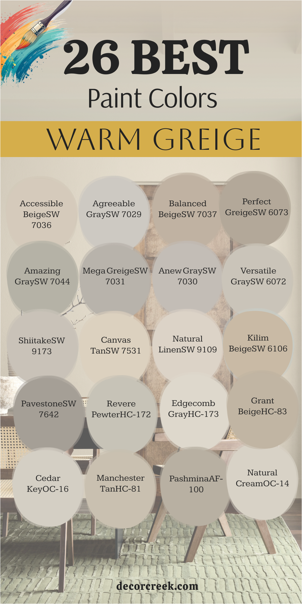
My Final Thoughts on Choosing Greige Paint Colors for 2026
When it comes to selecting your perfect greige for 2026, remember that the most important thing is how the color makes you feel in your home. These 47 shades offer a wonderful spectrum—from the pale, airy near-whites to the deep, moody taupes. Don’t let the sheer number of options scare you!
Greige is so popular because it’s a color of confidence and adaptability; it’s the beautiful, uncomplicated foundation that allows you to express your own personality through your furnishings and art.
My best piece of advice is always to sample, sample, sample. Buy a few generous swatches of your top contenders and paint them on multiple walls in the room you are decorating. Watch them change as the sun moves across the sky and as your artificial lights come on in the evening.
See how the color reacts next to your sofa, your flooring, and your favorite piece of art.
The perfect greige will bring you a feeling of quiet satisfaction and will make your home feel instantly settled and sophisticated.
Trust your gut; the one that makes you smile when you see it at different times of the day is the right one for you.