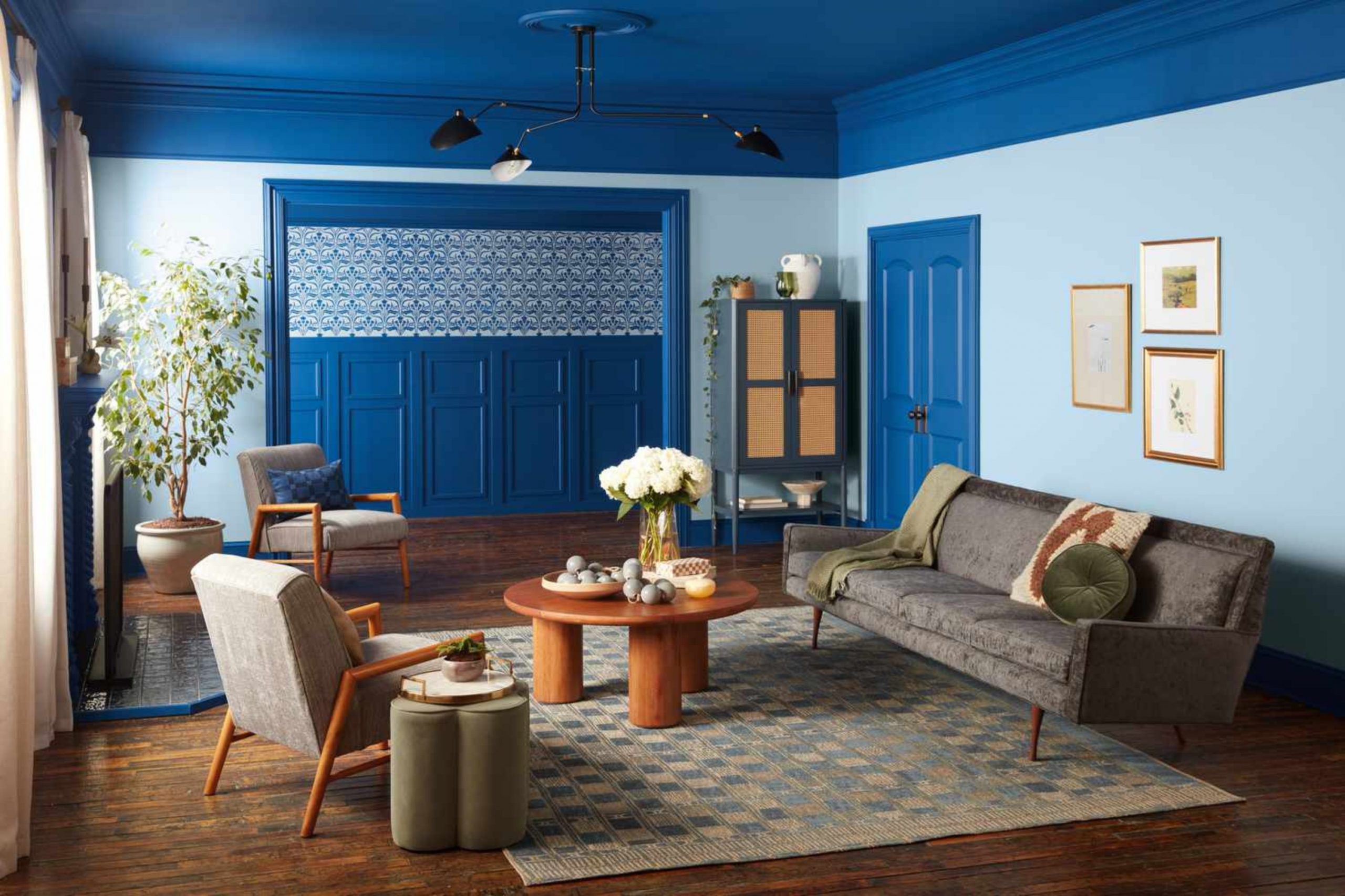
Every year, color takes on new meaning in our homes. For 2026, I’m seeing a beautiful balance between warmth and depth — a move toward shades that feel natural, thoughtful, and rooted in comfort. People are craving homes that look refined but still feel real, and paint color is where that story begins.
I love how the right tone can instantly shift the energy of a space — a soft neutral can make a room feel welcoming, while a moody green or clay can add quiet confidence.
When I work with clients, I always notice how they respond emotionally to color. Some shades feel like a deep breath, while others bring excitement and personality. That’s why paint trends matter — they reflect what we all need most in our homes at a given time.
In 2026, we’re seeing a return to layered neutrals, earthy greens, dusty blues, and sunbaked terracottas — colors that connect us to the world outside while keeping us grounded inside.
This list gathers my favorite shades from Sherwin-Williams and Benjamin Moore that define what’s ahead.
These are the hues I trust most when helping homeowners refresh their spaces — tones that stay beautiful through every season, that photograph beautifully, and that always make a house feel like home.

Why I Always Trust Sherwin-Williams and Benjamin Moore for 2026 Paint Trends
When I’m making predictions about the hottest colors, I look straight to the best in the business: Sherwin-Williams and Benjamin Moore. Why? Because these companies aren’t just selling paint; they are predicting culture itself. They invest heavily in understanding what trends are coming next, not just in homes, but in fashion, technology, and even global events.
They have whole teams of brilliant color experts, sociologists, and designers who study what’s happening around the world to figure out what colors people will emotionally connect with in the coming year.
When they release their “Color of the Year” and their annual trending palettes, it’s not a guess—it’s the result of serious, deep research into the human desire for certain hues.
Their decisions set the tone for the entire decorating industry. Their choices influence what designers like me feel confident using, what furniture manufacturers create, and, most importantly, what homeowners decide to put on their walls. By trusting these giants, I ensure that every color I suggest is well-researched, widely appealing, and truly current.
If you want a color that looks good today and continues to feel fashionable and relevant well into the future, starting with their choices is, without a doubt, the smartest move.
I find that their predictions always guide me well, helping me suggest colors that truly make my clients happy and proud of their refreshed interiors.
Their commitment to quality and forward-thinking color science makes them the gold standard in the industry, which is why I rely on them completely for my 2026 forecast.
How I Choose Paint Colors That Feel Fresh Yet Timeless for the Year Ahead
My biggest secret when picking colors for clients is skillfully balancing what’s new and exciting with what genuinely lasts. I have absolutely no desire to use a color that feels old-fashioned or dated in six short months! My method involves moving beyond fleeting fads to focus on shades that feel inherently grounded and comfortable to live with every day.
I carefully consider colors that are highly flexible—hues that can effortlessly work with different types of existing furniture, various lighting conditions, and a wide array of decorations.
A fantastic trending color, in my opinion, should do more than just look pretty; it should genuinely make you feel good, happy, and settled when you walk into the room.
For 2026, I am strongly sensing a powerful return to colors directly inspired by nature and organic living. I’m focusing on gorgeous, honest greens, warm, dependable neutrals, and rich, beautifully cozy shades that feel like an old friend. Furthermore, I always, always think about how natural and artificial light changes a color throughout the day.
A color that looks great at noon might look harsh under evening lamplight, so testing is crucial. The ultimate goal is to help my clients pick a color that they will passionately love for many years, not just for a brief season. It’s all about making a well-reasoned and heartfelt choice that makes your home feel beautiful, undeniably current, and yet perfectly suited to you and your family’s daily life.
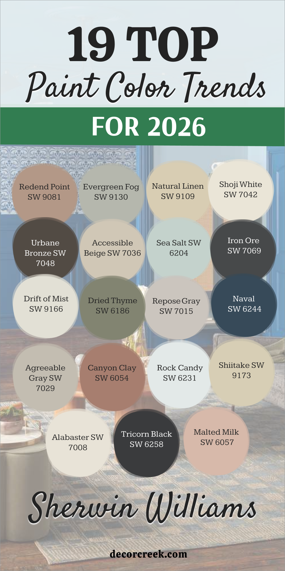
27 Trendy Sherwin Williams Paint Colors For 2026
Universal Khaki SW 6150
Universal Khaki SW 6150 is the heavy hitter for this year because it feels like a warm hug for your walls. This tan shade has a tiny bit of green hidden inside that makes it look very expensive next to your furniture. You will notice that this color stays very steady even when the sun moves across your room during the day.
I love to use it in houses where families want to feel very safe and grounded in their main living areas. It acts like a perfect partner for almost any rug or curtain you already own. You do not have to worry about this shade looking too yellow or too dark when the lamps come on at night.
Most people choose this color because it makes their home feel very put together and sturdy for a long time. It works well for people who want a house that looks very smart but still feels very friendly for kids. This choice is a winner for anyone who wants to stop guessing and start painting with a sure thing.
Best used in: living rooms, hallways, entryways, and home offices
Pairs well with: Iron Ore SW 7069, Alabaster SW 7008, Urban Bronze SW 7048, leather furniture The key rule of this color for a grounded style is to use it as a neutral base that connects all your other rooms together.
Upward SW 6239
Upward SW 6239 brings a bit of the clear sky into your house to help you feel very light and happy. This blue is very airy and makes a small bedroom look twice as big as it really is. You can see that it has a touch of gray which stops it from looking like a room for a small baby.
I like to use this shade in rooms where you want to sit and read or just think about your day. It looks very crisp when you put it next to bright white trim and light wood floors. Many homeowners pick this color because it makes the air feel very fresh and clean in the morning.
You will find that it matches very well with silver lamps and glass tables in a modern home. This blue is a great way to add a pop of color without making the walls look too busy or loud. It is a very pretty choice for a house that needs a bit of light and joy in every corner.
Best used in: bedrooms, bathrooms, laundry rooms, and ceilings
Pairs well with: Snowbound SW 7004, Drift of Mist SW 9166, Naval SW 6244, silver accents The key rule of this color for an airy style is to use it in rooms with large windows to let the blue feel very open and bright.

Iron Ore SW 7069
Iron Ore SW 7069 is a very deep charcoal that looks like real metal or heavy stone on your walls. This color adds a lot of punch to a room and makes your white furniture look very sharp and new. You should use it on a fireplace or a long wall to create a look that feels very solid and smart.
I find that this shade is much better than a plain black because it has a soft finish that is easy to look at. It hides fingerprints very well which is great for houses with lots of kids or pets running around. Many people love how it makes a media room feel like a real movie theater at night.
You can pair it with gold frames to make the whole room look like a fancy hotel in the city. This dark shade is a very brave choice that pays off by making your home look very custom and high-end. It is a reliable color that gives a house a very strong and modern personality.
Best used in: accent walls, fireplaces, kitchen islands, and front doors
Pairs well with: Pure White SW 7005, Agreeable Gray SW 7029, Repose Gray SW 7015, brass hardware The key rule of this color for a bold style is to use it on one wall to create a strong focal point that grounds the whole room.

Alabaster SW 7008
Alabaster SW 7008 is a creamy white that makes every room feel very kind and very soft for your family. This color is not too bright like a hospital but it still keeps your house looking very clean and tidy. You will find that it works in every single room from the front door to the back porch.
I often use it on walls and trim to make a house feel very big and very open to the light. It matches every piece of furniture you own whether it is old wood or shiny metal. Many families pick this because it never goes out of style and stays looking fresh for years.
You can add colorful rugs and pillows and they will all look great against this warm white. It is a very safe choice for anyone who wants a beautiful home without any stress. This shade makes your house feel like a quiet place where you can relax after a busy day.
Best used in: living rooms, kitchens, hallways, bedrooms, and farmhouse exteriors
Pairs well with: Iron Ore SW 7069, Agreeable Gray SW 7029, Natural Linen SW 9109, warm wood tones The key rule of this color for farmhouse style is to use it where you want natural light to feel kind, soft, and inviting throughout the day.

Evergreen Fog SW 9130
Evergreen Fog SW 9130 is a dusty green that brings a bit of the forest into your main living area. This color has a lot of gray in it which makes it feel very grown-up and smart for a new house. You will love how it looks with light wood tables and plants sitting on the window sill.
I use this shade when a homeowner wants a bit of color that still feels very quiet and easy to live with. It makes a great backdrop for family photos and art that has a lot of natural colors.
Many people choose this green because it feels very fresh in the spring and very cozy in the winter. You can paint a whole room in this shade and it will not feel too dark or too heavy for your kids. It is a very trendy choice for 2026 that still makes sense for a real home. This green is a very pretty way to make your house feel more connected to the world outside.
Best used in: living rooms, bedrooms, kitchen cabinets, and mudrooms
Pairs well with: Alabaster SW 7008, Urban Bronze SW 7048, Shoji White SW 7042, natural wood The key rule of this color for an organic style is to use it to bring a sense of nature inside to make the house feel more relaxed.

Inkwell SW 7069
Inkwell SW 6992 is a very dark blue that is almost black but feels much more interesting on the wall. This color is perfect for a small room where you want to feel very tucked in and cozy at night. You will see that it makes your white trim look very bright and very sharp in the sunlight.
I like to use it on the walls of an office to help someone focus and do their best work. It looks very expensive when you add gold lamps or leather chairs to the mix. Many families love this shade for their master bedroom because it feels very private and very solid.
You do not have to worry about this color looking like a kid’s room because it is very deep and rich. It is a great way to make a big statement without using a bright or loud color. This shade gives your house a very smart look that stays looking good for a long time.
Best used in: home offices, bedrooms, powder rooms, and accent walls
Pairs well with: Snowbound SW 7004, Classic Gray OC-23, Cognac leather, gold accents The key rule of this color for a moody style is to use it to create a room that feels like a quiet and private getaway.
Mushroom SW 9587
Mushroom SW 9587 is a soft tan that looks like the color of the earth after a light rain. This shade is a very popular choice for people who want a neutral home that feels very warm and friendly. You will notice that it matches very well with brown wood floors and stone fireplaces.
I find that this color is very good at hiding a bit of dust which is helpful for busy families. It stays looking very nice in the evening when you turn on your warm indoor lights. Many homeowners pick this because it makes a room feel very sturdy and very safe for everyone.
You can use it in a kitchen or a living room and it will always look very put together. It is a very easy color to decorate around because it does not fight with your other choices. This tan is a very smart choice for a house that needs to feel very comfortable and real.
Best used in: kitchens, living rooms, entryways, and cabinetry
Pairs well with: Creamy SW 7012, Urbane Bronze SW 7048, Pure White SW 7005, natural stone The key rule of this color for a natural style is to use it to ground a room that has a lot of different textures and materials.
Sanderling SW 7513
Sanderling SW 7513 is a warm sand color that makes your house feel like a sunny day at the beach. This shade has a bit of gold in it which makes the walls feel very happy and full of light. You can use it in a dark hallway to make it feel much more welcoming and bright for your guests.
I love how it looks with white curtains and light blue pillows on the sofa. Many families choose this color because it makes their living room feel very open and very large. It is a very good choice for a house that has a lot of traditional style and dark wood furniture.
You will find that it makes your home feel very cheerful even on a cloudy day in the winter. This color is very easy on the eyes and helps everyone feel very relaxed when they sit down. It is a very pretty and reliable choice for any room in your home.
Best used in: living rooms, hallways, dining rooms, and traditional homes
Pairs well with: Alabaster SW 7008, Sea Salt SW 6204, Rain SW 6219, dark oak floors The key rule of this color for a warm style is to use it to reflect light and make the whole house feel more inviting.
Pavestone SW 7642
Pavestone SW 7642 is a medium gray that feels very solid and very professional on your walls. This color is not too light and not too dark which makes it a great middle ground for any room. You will see that it has a warm undertone that stops it from feeling cold like a stone floor.
I like to use this shade in houses where the owner wants a very modern and clean look. It makes your white kitchen cabinets look very sharp and very new when they are next to it. Many people love this gray because it hides scuffs from toys and shoes very well.
You can add bright pops of yellow or red and they will look very good against this neutral wall. It is a very steady choice for a house that gets a lot of use every single day. This gray makes your living room feel very organized and very ready for company.
Best used in: kitchens, living rooms, exteriors, and basements
Pairs well with: Extra White SW 7006, Accessible Beige SW 7036, Iron Ore SW 7069, blue accents The key rule of this color for a modern style is to use it as a bridge between your white trim and your darker furniture.

Rare Gray SW 6199
Rare Gray SW 6199 is a soft gray that has a hidden bit of green and blue inside the paint. This color changes its look depending on how the sun hits it which makes the room very interesting. You will notice that it feels very cool and very fresh when you walk into the room in the morning.
I often use this shade in bathrooms or bedrooms to make them feel like a fancy spa. It looks very pretty next to white towels and light wood cabinets in a clean house. Many families pick this because it is a bit more exciting than a basic gray but still feels very quiet.
You can use it in a small room to make the walls feel like they are moving back to give you more room. It is a very smart choice for a house that wants to feel very modern and very clean. This shade helps you feel very focused and very relaxed at the same time.
Best used in: bedrooms, bathrooms, home offices, and kitchen islands
Pairs well with: Snowbound SW 7004, Naval SW 6244, Sea Salt SW 6204, chrome fixtures The key rule of this color for a cool style is to use it in rooms where you want the light to feel very steady and soft.
Armory SW 9600
Armory SW 9600 is a rich steel gray that gives your walls a very strong and heavy look. This color feels very solid and helps a large living room feel more put together and snug. You will notice that it has a cool touch that makes your white ceilings look very bright and high.
I like to use this shade in modern homes where the owner wants a look that is very sharp and tidy. It acts as a great backdrop for large art pieces or colorful photos of your family. Many people choose this color for their media rooms because it helps you focus on the screen without any distractions.
You can add light gray rugs and metal lamps to make the room feel very high-end and smart. It is a very reliable choice for a house that needs a bit of drama but still wants to feel very clean. This gray makes your furniture look very expensive and keeps the room looking fresh for a long time.
Best used in: living rooms, media rooms, home offices, and exteriors
Pairs well with: Extra White SW 7006, Morning Fog SW 6255, Black Magic SW 6991, silver accents The key rule of this color for a modern style is to use it to create a room that feels very sturdy and organized for your family.
Clove SW 9605
Clove SW 9605 is a deep brown that looks like a warm cup of coffee or a dark forest floor. This color is perfect for a room where you want to feel very tucked in and very safe at night. You will find that it makes your wood floors look very rich and very beautiful in the light.
I love to use this shade in a dining room to make every meal feel like a special event. It looks very smart next to creamy white trim and gold frames on the wall. Many families pick this because it adds a lot of heat to a house that feels a bit too cold or empty.
You do not have to worry about this shade looking messy because it is very solid and grounded. It works very well for people who want a house that feels very natural and very cozy for kids and pets. This choice is a winner for anyone who wants a room that feels like a warm hug all year round.
Best used in: dining rooms, dens, master bedrooms, and accent walls
Pairs well with: Creamy SW 7012, Kilim Beige SW 6106, Urban Bronze SW 7048, brass hardware The key rule of this color for a cozy style is to use it in rooms where you want to sit and talk for a long time.
Halcyon Green SW 6213
Halcyon Green SW 6213 is a medium green that has a lot of blue and gray mixed into the paint. This color makes your house feel very quiet and very steady from the moment you walk inside. You will see that it feels like a soft moss on the wall which is very easy on your eyes.
I use this shade when a homeowner wants a room to feel very private and very relaxed for their family. It looks very pretty with light wood furniture and white linen curtains in a sunny room. Many people choose this green because it does not feel too bright or like a toy room for kids.
You can use it in a bedroom to help you sleep better because the color is so quiet and soft. It is a very smart choice for 2026 because it brings a natural feel to a modern house. This green is a very pretty way to make your home feel like a secret garden where you can rest.
Best used in: bedrooms, bathrooms, living rooms, and kitchen cabinets
Pairs well with: Alabaster SW 7008, Sea Salt SW 6204, Gale Force SW 7605, natural fibers The key rule of this color for a natural style is to use it to create a feeling of peace and quiet in your favorite room.
Modern Lavender SW 9688
Modern Lavender SW 9688 is a very light purple that has a lot of gray to keep it from looking like a candy shop. This color adds a tiny bit of fun to your house while still looking very smart and grown-up. You will notice that it makes a small bathroom feel very fresh and very interesting for your guests.
I like to use this shade in rooms that get a lot of morning light so the purple looks very soft. It looks very crisp when you put it next to dark gray floors and bright white trim work. Many homeowners pick this color because they want something different that still feels very clean and tidy.
You will find that it matches very well with silver mirrors and glass shelves in a modern bathroom. This purple is a great way to show some personality without making the walls look too loud for your family. It is a very pretty choice for a house that needs a touch of light and a little bit of joy.
Best used in: bedrooms, bathrooms, nurseries, and laundry rooms
Pairs well with: Snowbound SW 7004, Iron Ore SW 7069, Gray Owl OC-52, silver accents The key rule of this color for a playful style is to use it as a light wash of color that keeps the room feeling bright.
Liveable Green SW 6176
Liveable Green SW 6176 is a very soft green that is so light it almost acts like a neutral gray. This color is perfect for people who want just a hint of nature on their walls without a lot of drama. You will see that it makes your house feel very airy and very open to the sun during the day.
I find that this shade is very good for a kitchen because it feels very clean and very fresh for cooking. It matches very well with white cabinets and marble tops in a new or old house. Many families love this shade because it is very easy to look at for a long time without getting tired of it.
You can use it in every room of the house and it will always feel very put together and smart. It is a very safe choice for someone who wants a home that feels light and very friendly for everyone. This green is a very pretty way to make your walls feel more interesting than just plain white.
Best used in: kitchens, living rooms, entryways, and bedrooms
Pairs well with: Alabaster SW 7008, Pewter Green SW 6208, Repose Gray SW 7015, light oak The key rule of this color for a fresh style is to use it where you want the light to feel very natural and soft.

Solitude SW 6535
Solitude SW 6535 is a dusty blue that feels very solid and very quiet on the walls of your home. This color has a lot of gray in it which stops it from looking too bright or like a sky in a book. You will love how it makes your living room feel very private and very smart for your guests to see.
I use this shade when a house needs a bit of color that still feels very professional and tidy. It looks very sharp next to dark wood floors and bright white curtains in a large room. Many people choose this blue because it helps them feel very focused when they are working at home.
You can use it on all four walls and it will not feel too dark or too heavy for your family. It is a very trendy choice for 2026 that makes your house feel very modern and very cool. This blue is a very pretty way to make your home feel like a quiet place to sit and think.
Best used in: bedrooms, home offices, living rooms, and dining rooms
Pairs well with: Pure White SW 7005, Morning Fog SW 6255, Charcoal Blue SW 2739, silver accents The key rule of this color for a quiet style is to use it to create a feeling of order and focus in a busy house.

Samovar Silver SW 6233
Samovar Silver SW 6233 is a light gray that has a very strong blue look hidden inside the paint. This color makes your walls look very shiny and very clean when the sun hits them in the morning. You will notice that it feels very cool and very fresh which is great for a house in a hot place.
I like to use this shade in bathrooms to make them feel like a high-end spa or a fancy hotel. It looks very crisp when you put it next to white tiles and shiny chrome faucets in a kitchen. Many homeowners pick this color because it makes the room feel very bright and very large for their family.
You will find that it matches very well with gray rugs and glass tables in a modern living room. This silver blue is a great way to add a clean look that stays looking new for a long time. It is a very pretty and smart choice for a house that needs to feel very tidy and very light.
Best used in: bathrooms, kitchens, bedrooms, and laundry rooms
Pairs well with: Extra White SW 7006, North Star SW 6246, Naval SW 6244, chrome fixtures The key rule of this color for a crisp style is to use it in rooms with lots of light to make the walls shine.
Watery SW 6478
Watery SW 6478 is a light blue-green that makes your house feel like you are standing near a clear lake. This color is very happy and very fresh which helps everyone feel in a good mood when they enter. You can see that it has a bit of gray to keep it looking smart and not too bright for a family room.
I like to use this shade in houses where the owner wants a look that is very light and very airy. It looks very pretty next to white trim and light wood furniture in a sunny living room. Many families pick this color because it makes the air feel very clean and very open during the day.
You will find that it matches very well with natural baskets and linen rugs in a coastal style home. This color is a great way to add a pop of joy without making the walls look too busy for your kids. It is a very pretty choice for a house that needs a bit of light and a lot of fresh energy.
Best used in: bathrooms, bedrooms, sunrooms, and kitchens
Pairs well with: Alabaster SW 7008, Sea Salt SW 6204, Rain SW 6219, light wood The key rule of this color for a fresh style is to use it in rooms where you want to feel energized and happy.
Henna Shade SW 6326
Henna Shade SW 6326 is a deep earthy red that looks like the color of warm clay or an old brick. This color adds a lot of heat to a room and makes your house feel very solid and very sturdy. You should use it on an accent wall to create a look that feels very rich and very special for your guests.
I find that this shade is much better than a bright red because it feels very grounded and easy to live with. It makes a great backdrop for wood shelves and gold frames in a cozy living room or den. Many people love how it makes a dining room feel very high-end and very warm for family meals.
You can pair it with tan rugs to make the whole room feel like a comfortable place to stay. This dark earthy red is a very brave choice that makes your home look very custom and very smart. It is a reliable color that gives a house a very strong and very warm personality.
Best used in: accent walls, dining rooms, entryways, and dens
Pairs well with: Shoji White SW 7042, Accessible Beige SW 7036, Urbane Bronze SW 7048, wood tones The key rule of this color for a warm style is to use it to add a sense of history and weight to your home.
Lemon Chiffon SW 6686
Lemon Chiffon SW 6686 is a very soft yellow that feels like a bit of butter or a sunny morning in your kitchen. This color is not too bright or loud, so it makes the walls look very friendly and very kind for your family. You will find that it works great in a small dark room to make it feel much more open and light.
I often use it in houses where the owner wants a look that is very cheerful and very welcoming for guests. It matches very well with white cabinets and dark wood floors in a happy and bright kitchen area. Many families pick this because it makes the house feel very warm even when the weather is cold outside.
You can add green plants and white curtains and they will all look very good against this soft yellow. It is a very safe choice for anyone who wants a beautiful home that feels very sunny and full of life. This shade makes your house feel like a happy place where you can relax with your kids.
Best used in: kitchens, nurseries, laundry rooms, and sunrooms
Pairs well with: Pure White SW 7005, Extra White SW 7006, Naval SW 6244, green plants The key rule of this color for a sunny style is to use it to bring a sense of light into the darker corners of your home.
Coral Island SW 6332
Coral Island SW 6332 is a dusty pinkish-orange that feels like a warm summer evening on your walls. This color is very soft and does not look too bright or loud when you paint it in a large living room. You will notice that it has a bit of gray in it which makes it look very smart and modern for a family home.
I like to use this shade in houses where the owner wants a bit of personality without making the walls look like a toy. It acts as a great backdrop for white furniture and gold lamps in a very tidy room. Many people choose this color because it makes the house feel very unique and very cheerful for their guests.
You can add light wood floors and green plants to make the whole room feel very fresh and full of life. It is a very reliable choice for a house that needs a bit of warmth and a lot of style. This color makes your home look very custom and very ready for a happy family.
Best used in: bedrooms, living rooms, powder rooms, and sunrooms
Pairs well with: Alabaster SW 7008, Iron Ore SW 7069, Sea Salt SW 6204, light oak The key rule of this color for a playful style is to use it as a soft glow that makes everyone in the room look and feel their best.
Sundew SW 7688
Sundew SW 7688 is a warm golden beige that feels like a soft patch of sunlight in your entryway. This shade is very sturdy and makes a house feel very solid and very welcoming from the first step inside. You can see that it has a bit of tan in it which helps it hide scuffs from busy kids and pets.
I love to use this color in houses where the owner wants a look that is very traditional and very friendly. It looks very crisp when you put it next to bright white trim and dark brown wood furniture. Many families pick this color because it makes a room feel very cozy and very safe during the evening.
You will find that it matches very well with brown rugs and leather chairs in a comfortable living room. This gold shade is a great way to add heat to a room that feels a bit too cold or empty. It is a very pretty and reliable choice for a house that needs to feel very comfortable and real.
Best used in: entryways, hallways, living rooms, and kitchens
Pairs well with: Creamy SW 7012, Urban Bronze SW 7048, Van Dyke Brown SW 7041, warm wood The key rule of this color for a warm style is to use it to create a sense of sunshine and joy in the heart of your home.
Peppery SW 6615
Peppery SW 6615 is a bold orange-red that looks like a warm spice or a bright sunset on your walls. This color adds a lot of energy to a house and makes your white trim look very sharp and very new. You should use it on an accent wall in a dining room to make every meal feel very special and fun.
I find that this shade is very good for people who want a house that stands out and feels very brave. It looks very smart next to dark metal lamps and black frames on the wall in a modern room. Many homeowners love how it makes a small area feel very powerful and very full of life.
You can pair it with gray rugs to keep the room looking very tidy and very put together for guests. This bright spicy red is a great choice that gives your home a very strong and very active personality. It is a reliable color that shows you are not afraid to have a bit of fun with your style.
Best used in: accent walls, dining rooms, kitchens, and front doors
Pairs well with: Origami White SW 7636, Pavestone SW 7642, Iron Ore SW 7069, dark wood The key rule of this color for a bold style is to use it in small doses to add a big punch of energy to a neutral room.
Cajun Red SW 0008
Cajun Red SW 0008 is a very deep and rich red that looks like old brick or a fancy library wall. This color is perfect for a room where you want to feel very smart and very tucked in at night. You will see that it adds a lot of weight and drama to a house that has a lot of traditional style.
I like to use it on the walls of a study to help the room feel very private and very solid for work. It looks very expensive when you add gold frames and dark wood chairs to the mix for a high-end look. Many families love this shade for their dining room because it feels very classic and very ready for a big party.
You do not have to worry about this color looking too bright because it is very deep and grounded. It is a great way to make a big statement that feels very historically correct and very professional. This red gives your house a very sturdy look that stays looking good for a long time.
Best used in: dining rooms, libraries, home offices, and accent walls
Pairs well with: Alabaster SW 7008, Accessible Beige SW 7036, Black Magic SW 6991, antique gold The key rule of this color for a traditional style is to use it to add a touch of drama and history to your main rooms.
Garden Gate SW 6167
Garden Gate SW 6167 is a dark msh-green that looks like the deep forest in the late afternoon. This color is very quiet and helps a large living room feel more snug and very connected to nature. You will notice that it has a lot of gray in it which stops it from looking too bright like a blade of grass.
I use this shade when a homeowner wants a room to feel very private and very relaxed for their family. It acts as a great backdrop for light wood shelves and white lamps in a very tidy room. Many people choose this green because it feels very fresh in the morning and very cozy when the lamps are on.
You can use it in a bedroom to help you sleep better because the walls feel very soft and very solid. It is a very trendy choice for 2026 that makes your house feel very modern and very grounded. This green is a very pretty way to make your home feel like a quiet place where you can rest.
Best used in: living rooms, bedrooms, exteriors, and cabinetry
Pairs well with: Alabaster SW 7008, Urban Bronze SW 7048, Natural Linen SW 9109, natural wood The key rule of this color for an organic style is to use it to ground your room and make it feel more like a part of the outdoors.
Plum Brown SW 6272
Plum Brown SW 6272 is a very dark purple-brown that looks like a rich chocolate or a dark fruit. This color is fantastic for a room where you want a look that is very moody and very high-end for your guests. You will see that the dark shade makes your white furniture look very sharp and very new on the wall.
I find that this color is much better than a plain brown because it has a hidden bit of purple that looks very smart. It hides scuffs and marks very well which is helpful for houses with kids or big dogs. Many families pick this color for a cozy den or a small bedroom to make it feel very private.
You can pair it with gold lamps to make the whole room look like a fancy hotel in a big city. This dark shade is a very brave choice that makes your home look very custom and very professional. It is a reliable color that gives a house a very strong and very stylish personality.
Best used in: bedrooms, dens, powder rooms, and accent walls
Pairs well with: Snowbound SW 7004, Modern Lavender SW 9688, Revere Pewter HC-172, brass The key rule of this color for a moody style is to use it to create a room that feels very deep and full of character.
Black Bean SW 6006
Black Bean SW 6006 is a very warm black that has a touch of brown to make it look very soft and natural. This color is the perfect partner for a room that needs a lot of punch and a very modern look. You will notice that it makes your white walls and trim look very bright and very clean in the sunlight.
I often use this shade in houses where the owner wants a look that is very sharp and very tidy. The dark color is great for a fireplace or a wall behind a television to hide all the cords and shadows. It looks very expensive when you add light wood floors and white linen rugs to the room.
Many families love this shade because it feels very solid and very sturdy for their everyday life. You do not have to worry about this color looking cold because the brown inside keeps it very friendly. This black is a great way to make a big statement that stays looking fresh for many years.
Best used in: accent walls, fireplaces, kitchen islands, and front doors
Pairs well with: Origami White SW 7636, Agreeable Gray SW 7029, Shoji White SW 7042, light wood The key rule of this color for a bold style is to use it to frame your favorite parts of the room and make them stand out.
19 Top Paint Color Trends for 2026 by Sherwin-Williams
Redend Point SW 9081
Redend Point SW 9081 is a beautiful, warm blush-beige that feels like a cozy blanket for your walls. Redend Point SW 9081 is a grounded color that mixes the comforting feel of earth tones with a hint of gentle pink. Redend Point SW 9081 is perfect for creating a welcoming living room or a relaxing bedroom retreat.
Redend Point SW 9081 pairs wonderfully with natural wood tones and creamy white trim. Redend Point SW 9081 gives a room a happy feeling without being too bright or loud.
Redend Point SW 9081 looks particularly wonderful in rooms that get a lot of natural afternoon sunlight. Redend Point SW 9081 is a sophisticated neutral that adds personality and depth to any design plan. Redend Point SW 9081 shows that neutral colors don’t have to be boring but can be interesting and inviting. Redend Point SW 9081 would look amazing in a reading nook or as a backdrop for artwork. Redend Point SW 9081 feels like a hug for your home, making everyone who enters feel instantly at ease and happy.
👉 Read the full guide for this color HERE 👈

Evergreen Fog SW 9130
Evergreen Fog SW 9130 is a gorgeous, gentle green-gray that reminds me of a misty forest morning. Evergreen Fog SW 9130 is a soothing shade that brings the refreshing feeling of the outdoors right inside your house. Evergreen Fog SW 9130 works so well in kitchens, bedrooms, and even as a lovely color for built-in cabinets.
Evergreen Fog SW 9130 pairs beautifully with polished brass or light wood finishes for a fresh, modern look. Evergreen Fog SW 9130 is a versatile shade that changes slightly depending on the light it receives. Evergreen Fog SW 9130 offers a nice way to add color without making the room feel too dark or heavy.
Evergreen Fog SW 9130 is a brilliant choice if you are looking to create a restful, balanced atmosphere in your home. Evergreen Fog SW 9130 has enough gray in it to keep it feeling quite neutral and easy to decorate around. Evergreen Fog SW 9130 is a sophisticated choice that speaks of renewal and natural goodness. Evergreen Fog SW 9130 will make any room feel peaceful, like taking a deep breath of fresh air.
👉 Read the full guide for this color HERE 👈
Natural Linen SW 9109
Natural Linen SW 9109 is a fantastic, creamy beige color that truly lives up to its comforting name. Natural Linen SW 9109 is the perfect, warm neutral when you want something richer than pure white but just as flexible. Natural Linen SW 9109 works great in almost any room because it reflects light so well and feels so airy.
Natural Linen SW 9109 provides a soft, warm background that lets your furniture and art shine brightly. Natural Linen SW 9109 is a safe choice that always looks expensive and well-put-together.
Natural Linen SW 9109 has just enough yellow and red undertones to keep it from looking cold or gray. Natural Linen SW 9109 is fantastic for entire homes where you want a flowing, consistent color theme. Natural Linen SW 9109 reminds me of a luxurious resort or a sunny beach house setting. Natural Linen SW 9109 is the kind of dependable color that never causes trouble or goes out of style. Natural Linen SW 9109 is an effortless shade that makes a room feel open, light, and very inviting to everyone.
👉 Read the full guide for this color HERE 👈

Shoji White SW 7042
Shoji White SW 7042 is a creamy, warm white that has a gentle, inviting glow. Shoji White SW 7042 is the perfect choice when pure white feels too stark and cold on the walls. Shoji White SW 7042 has a touch of beige and gray, giving it a comforting depth that plain white often lacks.
Shoji White SW 7042 is often used as a beautiful, soft accent on trim or cabinets, but it shines as a wall color. Shoji White SW 7042 works well in all lighting conditions and rarely looks washed out or dirty. Shoji White SW 7042 is a fantastic backdrop for a variety of decorating styles, from modern to cozy farmhouse.
Shoji White SW 7042 is an excellent option for open-concept homes where you need a neutral color to connect rooms. Shoji White SW 7042 helps to create a bright, airy feeling that is so popular in modern design. Shoji White SW 7042 can make smaller rooms feel much larger and more welcoming to visitors. Shoji White SW 7042 truly proves that white colors can be warm, interesting, and full of appealing character.
👉 Read the full guide for this color HERE 👈

Urbane Bronze SW 7048
Urbane Bronze SW 7048 is a deep, moody color that feels like a powerful, grounding anchor in a room. Urbane Bronze SW 7048 is a beautiful blend of deep brown, charcoal gray, and a touch of olive green. Urbane Bronze SW 7048 is a statement color, perfect for an accent wall, a dramatic study, or a sophisticated dining room.
Urbane Bronze SW 7048 pairs stunningly well with lighter neutrals, especially creamy whites and soft taupes. Urbane Bronze SW 7048 creates a feeling of security and comfort, much like being wrapped up in a warm, dark blanket. Urbane Bronze SW 7048 works wonderfully on exterior doors and trim for a powerful curb appeal statement.
Urbane Bronze SW 7048 looks best when it has plenty of light or contrasting light colors around it to keep it from feeling heavy. Urbane Bronze SW 7048 is a wonderful color choice for making architectural features, like fireplaces, really stand out. Urbane Bronze SW 7048 gives any room a very intentional and designer-approved feeling of luxury and depth. Urbane Bronze SW 7048 is a rich color that speaks of quiet confidence and sophisticated style that everyone admires.
👉 Read the full guide for this color HERE 👈

Accessible Beige SW 7036
Accessible Beige SW 7036 is a dependable, warm neutral that sits perfectly between gray and beige, a true “greige.” Accessible Beige SW 7036 is one of those fantastic colors that truly works everywhere, making it a favorite for many designers. Accessible Beige SW 7036 has a comforting warmth that keeps a room from feeling sterile or uninviting.
Accessible Beige SW 7036 is an excellent choice for staging because it appeals to almost every potential home buyer. Accessible Beige SW 7036 is a light color but still has enough pigment to stand out against white trim beautifully. Accessible Beige SW 7036 pairs easily with both cool and warm accent colors, giving you lots of decorating freedom.
Accessible Beige SW 7036 is wonderful for open floor plans, providing continuity and a soft, flowing feel. Accessible Beige SW 7036 helps create a bright atmosphere while still offering a sense of coziness and familiarity. Accessible Beige SW 7036 is the paint color I recommend when clients want something nice and easy that they will adore. Accessible Beige SW 7036 proves that a simple color can be the very best foundation for a truly lovely home.
👉 Read the full guide for this color HERE 👈

Sea Salt SW 6204
Sea Salt SW 6204 is a lovely, airy color that mixes light blue, green, and gray, just like the coastal water. Sea Salt SW 6204 brings a fresh, breezy feeling to any room where it is used, making it a great pick for bathrooms. Sea Salt SW 6204 is a gentle color that reminds me of a relaxing beach vacation and warm, sunny weather.
Sea Salt SW 6204 can look more green in rooms with less natural light and more blue in very bright sunlight. Sea Salt SW 6204 is an outstanding choice for laundry rooms or mudrooms to give them a clean and happy feel.
Sea Salt SW 6204 works wonderfully with pure white trim and furniture made from natural, light-colored wicker or wood.
Sea Salt SW 6204 is a cheerful color that is popular for nurseries and children’s rooms because it feels so playful and light. Sea Salt SW 6204 provides a beautiful pop of color without becoming the only thing you notice in the whole room.
Sea Salt SW 6204 helps create a light and happy feeling that can brighten anyone’s day when they walk in. Sea Salt SW 6204 is a refreshing shade that truly makes your home feel lively and full of good, clean energy.
👉 Read the full guide for this color HERE 👈

Iron Ore SW 7069
Iron Ore SW 7069 is a strong, dark charcoal gray that is incredibly sophisticated and dramatic on the wall. Iron Ore SW 7069 is a bold color, offering the depth of black but with a softer, more livable gray edge to it. Iron Ore SW 7069 is perfect for accent walls, kitchen islands, or a handsome study or den area.
Iron Ore SW 7069 is a brilliant way to ground a room and make the lighter elements around it pop with energy. Iron Ore SW 7069 looks particularly stunning in a matte or flat finish for a truly luxurious, velvety texture. Iron Ore SW 7069 pairs beautifully with light hardwood floors and crisp, clean white trim and ceilings.
Iron Ore SW 7069 is a favorite for exterior projects, especially on siding or shutters for a great contrast. Iron Ore SW 7069 provides a fantastic backdrop for displaying bright artwork or shiny metallic accessories. Iron Ore SW 7069 is a powerful color that suggests confidence and a refined sense of modern decorating style. Iron Ore SW 7069 helps create a wonderfully cozy feeling, especially when layered with warm light and soft fabrics.
👉 Read the full guide for this color HERE 👈

Drift of Mist SW 9166
Drift of Mist SW 9166 is a wonderfully pale, light greige that has a refreshing, airy quality about it. Drift of Mist SW 9166 is a clean and bright color that looks beautiful in any room where you want to maximize light. Drift of Mist SW 9166 is a great choice for creating a light and bright feel without using a plain, cold white.
Drift of Mist SW 9166 has a very slight coolness to it, making it feel very fresh and crisp on the wall. Drift of Mist SW 9166 is a reliable wall color that is often used in whole-house projects because it flows so well. Drift of Mist SW 9166 works nicely with brighter, bolder colors that you use in your furniture and accent pieces.
Drift of Mist SW 9166 is a fantastic option for ceilings, as it offers a gentle break from stark white. Drift of Mist SW 9166 can easily be used with different finishes, looking good in both eggshell and satin sheens.
Drift of Mist SW 9166 is the perfect color when you want a light neutral that feels happy and wonderfully soft.
Drift of Mist SW 9166 is a simple and genuine color that will make any home feel very neat and well-cared for.
👉 Read the full guide for this color HERE 👈

Dried Thyme SW 6186
Dried Thyme SW 6186 is a wonderful, medium-toned green that has a rich, grounded earthiness. Dried Thyme SW 6186 is a comforting color that reminds me of natural herb gardens and long walks outside in the countryside. Dried Thyme SW 6186 is a beautiful choice for kitchens, pantries, and even an attractive accent wall in a dining room.
Dried Thyme SW 6186 pairs very well with both dark and light wood tones, making it flexible for many homes. Dried Thyme SW 6186 is a great way to introduce a natural color that isn’t one of the usual blue or gray choices.
Dried Thyme SW 6186 has a slight gray undertone that prevents it from looking too bright or too much like a crayon green.
Dried Thyme SW 6186 is a favorite among people who love a cozy and slightly rustic or farmhouse decorating feel.
Dried Thyme SW 6186 creates a comfortable atmosphere that is welcoming and encourages you to relax and stay a while. Dried Thyme SW 6186 is a sophisticated green that adds a welcome touch of color to any well-designed home. Dried Thyme SW 6186 is a rich, satisfying color that brings a feeling of stability and natural beauty to your interior.
👉 Read the full guide for this color HERE 👈
Repose Gray SW 7015
Repose Gray SW 7015 is a very popular, light-to-medium true gray that works well for almost any area of the home. Repose Gray SW 7015 is a slightly cooler gray, but it has just enough beige in it to keep it from feeling frosty or icy. Repose Gray SW 7015 is a highly adaptable color that looks amazing with almost any accent color you choose to pair it with.
Repose Gray SW 7015 is a great color for selling a house because it looks fresh and appealing to a wide range of people. Repose Gray SW 7015 has a nice depth to it that shows up well against pure white trim and moldings.
Repose Gray SW 7015 can sometimes show a very slight purple undertone, so always test it in your unique lighting.
Repose Gray SW 7015 is fantastic for open-concept living areas where you want a very dependable and clean neutral backdrop.
Repose Gray SW 7015 is a stylish and safe choice that truly makes decorating around it simple and enjoyable. Repose Gray SW 7015 is the classic gray that everyone thinks of when they are picturing a modern and updated home. Repose Gray SW 7015 is a dependable and chic choice that will keep your home looking good for years to come with ease.
👉 Read the full guide for this color HERE 👈

Naval SW 6244
Naval SW 6244 is a beautiful, deep, and luxurious navy blue that feels rich and full of personality. Naval SW 6244 is an excellent choice for a dramatic accent wall or a stunningly handsome powder room. Naval SW 6244 has just a very slight hint of green in it, making it feel more complex than a simple primary blue.
Naval SW 6244 pairs wonderfully with bright white, warm gold accents, and deep, rich leather furniture. Naval SW 6244 creates a feeling of sophisticated luxury and depth that draws you right into the room. Naval SW 6244 is a great color for creating a cozy media room or a beautiful, focused study area.
Naval SW 6244 works well in a glossy finish on kitchen cabinets for a nautical, high-end, custom look.
Naval SW 6244 reminds me of a dark evening sky or the deepest, most mysterious parts of the ocean water.
Naval SW 6244 is a powerful color that makes a wonderful statement in any room where it is used. Naval SW 6244 is a favorite color of mine for adding a touch of bold, memorable elegance to a home’s design.
👉 Read the full guide for this color HERE 👈

Agreeable Gray SW 7029
Agreeable Gray SW 7029 is a wonderfully popular greige color that sits perfectly between the coolness of gray and the warmth of beige. Agreeable Gray SW 7029 is a true workhorse color that performs well in almost every lighting situation and every room.
Agreeable Gray SW 7029 is a favorite of designers because it is neither too dark nor too light, sitting right in the middle. Agreeable Gray SW 7029 has a comforting warmth that keeps your rooms from ever feeling cold or empty, even on cloudy days.
Agreeable Gray SW 7029 is the very best color to use when you are staging a house because it truly appeals to everyone. Agreeable Gray SW 7029 is a fantastic background color that lets your furniture, rugs, and artwork take the main stage.
Agreeable Gray SW 7029 is one of Sherwin-Williams’ most popular colors for a very good reason—it is consistently good.
Agreeable Gray SW 7029 is perfect for entire homes because it allows for easy transitions between different rooms and areas. Agreeable Gray SW 7029 makes decorating easy because almost any other color you pick will work beautifully alongside it. Agreeable Gray SW 7029 is a delightful and dependable color that guarantees your home will look fresh and inviting right away.
👉 Read the full guide for this color HERE 👈

Canyon Clay SW 6054
Canyon Clay SW 6054 is a rich, warm terracotta color that brings the beautiful feeling of the desert landscape indoors. Canyon Clay SW 6054 is a powerful, earthy red-orange that feels incredibly comforting and well-grounded in a design. Canyon Clay SW 6054 is a great color for adding a rich, natural warmth to a dining room or a cozy study area.
Canyon Clay SW 6054 pairs very nicely with warm wood furniture and dark green or deep blue accent colors.
Canyon Clay SW 6054 is a striking color that gives a room a sunny, slightly Southwestern or bohemian decorating feel.
Canyon Clay SW 6054 is a wonderful choice for those who want a color that is cheerful but also deeply satisfying and natural. Canyon Clay SW 6054 reminds me of a beautiful sunset or the cozy feeling of a roaring fire in a fireplace.
Canyon Clay SW 6054 can be used on an accent wall to add a beautiful punch of warmth and strong color.
Canyon Clay SW 6054 is a very happy color that will definitely make your walls feel interesting and full of personality. Canyon Clay SW 6054 is a fantastic choice for creating a joyful and very welcoming atmosphere in your home.
Rock Candy SW 6231
Rock Candy SW 6231 is a super light, very pale blue that almost reads as a wonderfully crisp and clean white. Rock Candy SW 6231 is perfect for a bedroom or a bathroom where you want just a hint of cool, refreshing color. Rock Candy SW 6231 has a very light, icy quality that makes a room feel sparkling and very well-kept.
Rock Candy SW 6231 is a great color to use in a sunny room because it helps to cool down the intense light. Rock Candy SW 6231 works perfectly with a nautical or beach-inspired decorating style with light fabrics and furniture. Rock Candy SW 6231 is a gentle, pretty color that is popular for children’s rooms because it feels so light and innocent.
Rock Candy SW 6231 is a wonderful option for ceilings to give them a slight “skylight” feeling, especially on a porch. Rock Candy SW 6231 is a good color for making a small room feel much larger and more open to fresh air. Rock Candy SW 6231 has a truly refreshing quality that is both light-hearted and incredibly pretty on the walls. Rock Candy SW 6231 is a simple, beautiful color that adds a gentle, happy touch to any interior design plan.
👉 Read the full guide for this color HERE 👈
Shiitake SW 9173
Shiitake SW 9173 is a warm, earthy taupe color that has a grounded and very comforting feel to it. Shiitake SW 9173 is a wonderful, complex neutral that feels richer and more intentional than just a simple beige. Shiitake SW 9173 is a great backdrop color that allows you to change your decorations often without needing to repaint.
Shiitake SW 9173 has enough depth that it stands out nicely against bright white trim and ceiling paint. Shiitake SW 9173 reminds me of the beautiful, dried-out grasses and natural fibers found in basket weaving.
Shiitake SW 9173 is an excellent color for living rooms or hallways where you want a durable, sophisticated neutral. Shiitake SW 9173 pairs beautifully with dark, rich wooden furniture and creamy, soft fabric textures. Shiitake SW 9173 is a highly adaptable color that feels perfectly at home in both traditional and modern decorating styles. Shiitake SW 9173 is a nice, comforting choice for a bedroom, as it makes the room feel cozy and restful. Shiitake SW 9173 is a delightful, grown-up neutral that makes your home feel instantly warm, organized, and very welcoming.
👉 Read the full guide for this color HERE 👈

Alabaster SW 7008
Alabaster SW 7008 is a truly beloved, soft, and gentle off-white color that avoids any feeling of harshness. Alabaster SW 7008 is a beautiful warm white that has just a touch of creaminess, making it instantly inviting and cozy. Alabaster SW 7008 is a favorite for kitchen cabinets because it looks clean and bright but not sterile or too plain.
Alabaster SW 7008 is the best color to use when you want a white that feels soft and works with older, less perfect walls. Alabaster SW 7008 has a lovely, subtle warmth that makes it a perfect pairing for natural wood tones and earthy greens.
Alabaster SW 7008 is an excellent choice for a whole-house color because it helps light bounce around happily throughout the entire space. Alabaster SW 7008 is a dependable color that truly lets your home’s architectural details and furniture take center stage easily. Alabaster SW 7008 makes a room feel instantly fresh and clean, like a new beginning for your decorating project. Alabaster SW 7008 is one of the most reliable and beautiful whites in the entire Sherwin-Williams collection of colors. Alabaster SW 7008 is a truly fantastic color that makes any home look bright, airy, and wonderfully put-together.
👉 Read the full guide for this color HERE 👈

Tricorn Black SW 6258
Tricorn Black SW 6258 is the darkest, richest, and truest black that Sherwin-Williams has to offer, and it is stunning. Tricorn Black SW 6258 is a powerful and very dramatic color choice that instantly adds a punch of sophistication to a room. Tricorn Black SW 6258 is a fantastic choice for interior doors, window frames, or a beautiful, focused accent wall.
Tricorn Black SW 6258 is also a favorite for exterior projects, especially on shutters or a main front door for a bold look. Tricorn Black SW 6258 works wonderfully in a high-gloss finish to create a sleek, mirror-like, and very luxurious effect.
Tricorn Black SW 6258 should be paired with plenty of bright white and good lighting to keep the room from feeling too dark. Tricorn Black SW 6258 is a classic, chic color that never goes out of fashion and always looks purposeful and intentional. Tricorn Black SW 6258 is great for grounding a room and making all the lighter colors in your décor really pop and stand out. Tricorn Black SW 6258 is the color to choose when you want to make a big, powerful decorating statement that everyone will remember. Tricorn Black SW 6258 is a beautiful, bold color that adds instant drama and a refined, modern feeling to your home.
👉 Read the full guide for this color HERE 👈

Malted Milk SW 6057
Malted Milk SW 6057 is a gorgeously soft, warm, and inviting pink-beige that feels like a gentle hug on the walls. Malted Milk SW 6057 is a cheerful and comforting color that brings a lovely, rosy glow to any room where it is used. Malted Milk SW 6057 is a very grown-up pink that is not sugary or childish but feels sophisticated and natural.
Malted Milk SW 6057 is a wonderful color choice for a sunny bedroom, a bright nursery, or a welcoming entryway. Malted Milk SW 6057 pairs beautifully with light gray, creamy white, and accents of brass or bronze metals. Malted Milk SW 6057 reminds me of warm desserts and comforting drinks, giving a room a sweet, gentle atmosphere.
Malted Milk SW 6057 is a fantastic way to introduce a blush tone without committing to something too bright or too intense. Malted Milk SW 6057 has a lovely depth that changes nicely throughout the day as the light moves across the room. Malted Milk SW 6057 is a perfect color for creating a happy and very soothing feeling in a space. Malted Milk SW 6057 is a gentle, sweet shade that makes your home feel instantly cozy, cheerful, and very welcoming to guests.
👉 Read the full guide for this color HERE 👈
16 Top Paint Color Trends for 2026 by Benjamin Moore
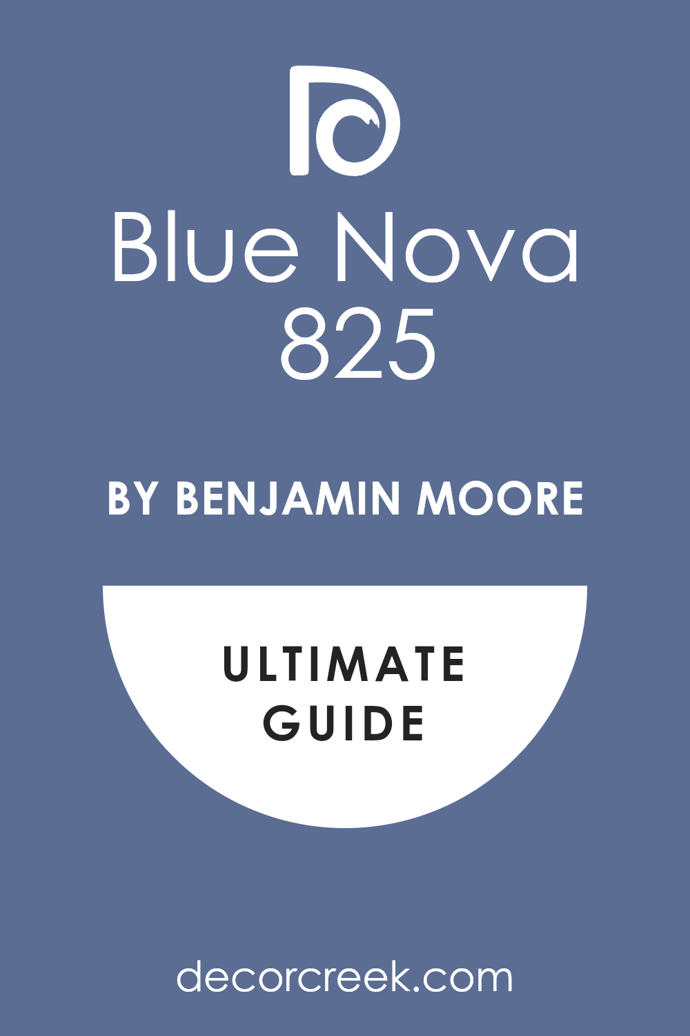
Blue Nova 825
Blue Nova 825 is a beautiful, mid-tone blue that has a nice mix of purple and deep red undertones, making it feel complex. Blue Nova 825 is a captivating and adventurous color that reminds me of the night sky just as the stars begin to appear. Blue Nova 825 is a brilliant choice for an accent wall, a dining room, or a handsome study or library area.
Blue Nova 825 pairs wonderfully with crisp, pure white trim and metallic finishes like silver or light bronze. Blue Nova 825 is a happy color that feels both inspiring and quite elegant in a well-lit room setting.
Blue Nova 825 is a fantastic way to introduce a rich blue that isn’t as heavy or dark as a traditional navy color. Blue Nova 825 reminds me of a luxurious velvet fabric, adding a layer of depth and interest to the design. Blue Nova 825 is a powerful color that truly speaks of creativity and a very forward-thinking, modern style.
Blue Nova 825 can be used on cabinets or built-in shelving for a custom look that feels wonderfully intentional.
Blue Nova 825 is a deep, satisfying color that is sure to make a beautiful, memorable statement in your home for the year ahead.
👉 Read the full guide for this color HERE 👈
White Dove OC-17
White Dove OC-17 is a soft, creamy white color that is incredibly popular for its gentle, flattering warmth. White Dove OC-17 is a beautiful off-white that avoids the sterile, stark feeling that pure, bright white can sometimes have. White Dove OC-17 is a reliable color that is perfect for trim, ceilings, and walls where you want a bright but soft feel.
White Dove OC-17 has a subtle hint of gray or beige in it, giving it a comforting depth and complexity. White Dove OC-17 is a wonderful backdrop for showcasing vibrant artwork or richly colored furniture pieces. White Dove OC-17 is a great color to use on kitchen cabinets to give them a classic, updated, and very clean look.
White Dove OC-17 is a truly dependable, go-to white that never disappoints and always looks perfectly polished. White Dove OC-17 is a lovely choice for a whole-house application because it flows easily from one room to the next. White Dove OC-17 is a sophisticated white that makes your home feel instantly fresh, light, and wonderfully maintained. White Dove OC-17 is the definition of a beautiful neutral that makes any other color you pick look its very best.
👉 Read the full guide for this color HERE 👈

Revere Pewter HC-172
Revere Pewter HC-172 is one of Benjamin Moore’s most famous colors—a perfect medium-toned, warm gray-beige, or “greige.” Revere Pewter HC-172 is a very dependable and grounded neutral that looks beautiful in almost any lighting situation imaginable. Revere Pewter HC-172 has a cozy warmth that keeps a room from feeling cold, which can happen with plain gray colors.
Revere Pewter HC-172 is a highly flexible color that works just as well in traditional homes as it does in modern ones.
Revere Pewter HC-172 is a fantastic color choice for staging a home because it appeals to almost all potential buyers. Revere Pewter HC-172 has enough color saturation to stand out nicely against bright white painted trim. Revere Pewter HC-172 is a wonderful option for open-concept homes because it offers a beautiful, flowing continuity.
Revere Pewter HC-172 is a sophisticated shade that provides a great, rich background for your furniture and decorations.
Revere Pewter HC-172 is a beautiful and classic choice that truly makes decorating around it simple and enjoyable. Revere Pewter HC-172 is a reliable color that guarantees your home will feel warm, well-decorated, and very welcoming right away.
👉 Read the full guide for this color HERE 👈

Edgecomb Gray HC-173
Edgecomb Gray HC-173 is a beautiful, light, and airy greige that feels very gentle and wonderfully soft on the walls. Edgecomb Gray HC-173 is a slightly warmer and lighter version of Revere Pewter, making it great for smaller rooms. Edgecomb Gray HC-173 has a creamy quality that makes it feel instantly inviting and cozy in a living area or bedroom.
Edgecomb Gray HC-173 works very well when you want a light neutral that is much softer than stark white paint.
Edgecomb Gray HC-173 is a great color for an entryway or hallway because it helps to brighten up a potentially dark area. Edgecomb Gray HC-173 is an incredibly flexible shade that pairs nicely with both cooler blues and warmer browns and reds. Edgecomb Gray HC-173 is a reliable choice for achieving a clean, fresh, and slightly sophisticated country-style look.
Edgecomb Gray HC-173 reflects light beautifully, which helps to make any room feel open and full of cheerful energy.
Edgecomb Gray HC-173 is a fantastic neutral that makes the perfect backdrop for all your home furnishings and artwork. Edgecomb Gray HC-173 is a comforting color that will make your home feel light, wonderfully airy, and very welcoming to all.
👉 Read the full guide for this color HERE 👈

Pale Oak OC-20
Pale Oak OC-20 is a beautiful, extremely light greige color that can sometimes look like a gentle, warm off-white. Pale Oak OC-20 is an incredibly versatile and soft color that is a very popular neutral for modern homes. Pale Oak OC-20 is a fantastic choice when you want just a hint of color on your walls but nothing too strong.
Pale Oak OC-20 has a lovely, comforting warmth that prevents it from looking cold or icy, even in northern-facing rooms.
Pale Oak OC-20 is a great option for ceilings to give them a softer look than a plain white paint color. Pale Oak OC-20 pairs well with clean, white trim colors like Simply White for a very crisp and modern feel. Pale Oak OC-20 is a sophisticated color that creates a soft, bright atmosphere perfect for bedrooms and living rooms.
Pale Oak OC-20 is an excellent color for showing off artwork or richly textured fabrics and wood furniture.
Pale Oak OC-20 is the ideal light neutral that makes a room feel open, fresh, and wonderfully inviting for visitors. Pale Oak OC-20 is a gentle, sweet shade that guarantees your home will feel bright, airy, and very welcoming to everyone.
👉 Read the full guide for this color HERE 👈

October Mist 1495
October Mist 1495 is a soft, muted sage green that feels deeply connected to the natural world and the autumn season. October Mist 1495 is a gentle, sophisticated color that reminds me of beautiful, silvery-green sage leaves in a garden. October Mist 1495 is a perfect choice for a cozy reading area, a peaceful bedroom, or a lovely dining room.
October Mist 1495 has enough gray in it to keep it from feeling too bright or overly strong on the walls. October Mist 1495 pairs wonderfully with natural materials like wood, rattan, and light-colored linen fabrics.
October Mist 1495 is a nice color to use on kitchen cabinets for a fresh, slightly country-style, charming look. October Mist 1495 brings a wonderful feeling of the outdoors in, making a room feel refreshed and very grounded. October Mist 1495 is a comforting color that helps create a quiet, settled atmosphere that encourages you to relax.
October Mist 1495 is a truly happy green that adds a wonderful pop of organic color to a sophisticated palette.
October Mist 1495 is a beautiful, peaceful shade that will make your home feel like a wonderful, restful retreat right away.
👉 Read the full guide for this color HERE 👈

Natural Cream OC-14
Natural Cream OC-14 is a beautiful, very light, and warm creamy beige that is a fantastic foundation color. Natural Cream OC-14 is the perfect choice for those who love the idea of a warm white but want just a little more color. Natural Cream OC-14 has a gentle, inviting glow that prevents it from feeling stark or cold on the walls.
Natural Cream OC-14 is a highly reliable color that works wonderfully in any room of the house where you want warmth.
Natural Cream OC-14 is often used as a background color that allows your artwork and furniture to really shine and be noticed. Natural Cream OC-14 is an excellent option for large open-concept areas, as it flows beautifully between different zones. Natural Cream OC-14 is a dependable color that always looks intentional and very expensive when used throughout a home.
Natural Cream OC-14 pairs beautifully with natural textures, rich wood tones, and soft, woven fabrics and rugs.
Natural Cream OC-14 makes a room feel bright, inviting, and very well-cared for and maintained. Natural Cream OC-14 is a comfortable and classic shade that will make your home feel warm, organized, and very welcoming.
👉 Read the full guide for this color HERE 👈

Simply White OC-117
Simply White OC-117 is an incredibly popular, very clean, bright, and slightly warm white that is always a designer favorite. Simply White OC-117 is a very versatile white that works beautifully on walls, trim, and ceilings throughout a home. Simply White OC-117 has a gentle warmth, making it feel less harsh and cold than a pure, primary white color.
Simply White OC-117 is a wonderful backdrop for bright, bold furniture and colorful artwork that you want to stand out. Simply White OC-117 is a fantastic choice for kitchen cabinets, giving them a crisp, updated, and very clean appearance.
Simply White OC-117 reflects light beautifully, which helps to make any room feel open and full of cheerful energy. Simply White OC-117 is a great color to use in a gallery wall setting because it makes all the frames and photos pop. Simply White OC-117 is the go-to color for a modern or Scandinavian-style home where clean lines are important. Simply White OC-117 is a reliable and easy-to-use color that always looks fresh, bright, and very polished. Simply White OC-117 is a sophisticated white that truly makes your home feel instantly light, airy, and wonderfully refreshed.
👉 Read the full guide for this color HERE 👈

Chantilly Lace OC-65
Chantilly Lace OC-65 is a crisp, clean, and very bright white that is one of the purest whites available on the market. Chantilly Lace OC-65 is the perfect color when you want a white that has absolutely no noticeable undertones of other colors. Chantilly Lace OC-65 is fantastic for trim, baseboards, and ceilings where you want a very sharp and clean contrast.
Chantilly Lace OC-65 works best in bright, well-lit rooms where its crispness can really be appreciated fully. Chantilly Lace OC-65 is a favorite for designers who are going for a very modern, graphic, or contemporary look.
Chantilly Lace OC-65 should be used carefully in rooms with less natural light, as it can sometimes look a little too cold. Chantilly Lace OC-65 is a beautiful, clean white that makes any room feel instantly fresh, new, and very organized.
Chantilly Lace OC-65 is an excellent color for pairing with very deep, rich, or saturated wall colors for a great contrast.
Chantilly Lace OC-65 is a dependable white that truly makes any darker color you choose look incredibly sophisticated. Chantilly Lace OC-65 is a wonderful, sparkling shade that makes your home look bright, immaculate, and very well-maintained.
👉 Read the full guide for this color HERE 👈

Collingwood OC-28
Collingwood OC-28 is a beautifully soft, light-to-medium gray color that has just a touch of gentle warmth to it. Collingwood OC-28 is a very popular gray choice because it is incredibly versatile and easy to decorate around in any room. Collingwood OC-28 has a welcoming feel that keeps it from looking too cold, unlike some of the starker gray colors.
Collingwood OC-28 works perfectly in a living room, bedroom, or a lovely dining area for a refined look. Collingwood OC-28 is a great background color that allows your artwork and colorful furniture to be the focus.
Collingwood OC-28 has enough depth to create a nice, subtle contrast against bright white trim and moldings. Collingwood OC-28 is a fantastic choice for staging a house, as it is a safe yet stylish neutral that buyers enjoy. Collingwood OC-28 provides a sophisticated backdrop that makes a home feel instantly updated and wonderfully well-designed. Collingwood OC-28 is a dependable color that will keep your home looking fresh and very current for many years to come. Collingwood OC-28 is a lovely, comforting shade that makes your home feel organized, soft, and very put-together right away.
👉 Read the full guide for this color HERE 👈

Pashmina AF-100
Pashmina AF-100 is a gorgeous, rich greige color that truly leans toward the warm, comforting brown side of the spectrum. Pashmina AF-100 is a sophisticated color that reminds me of beautiful, soft, and luxurious wool or suede fabrics. Pashmina AF-100 is a fantastic choice for a cozy study, a handsome den, or a wonderfully intimate dining room area.
Pashmina AF-100 pairs beautifully with dark, rich wood furniture and metallic accents of bronze or aged brass. Pashmina AF-100 has a wonderful depth that makes the wall feel intentional and adds a layer of refinement to the room.
Pashmina AF-100 is a perfect color for grounding a large room, making it feel more contained and much cozier.
Pashmina AF-100 is a great option for an accent wall or built-in cabinets, especially in a library or reading area.
Pashmina AF-100 is a beautiful color that gives a room a warm, slightly rustic, yet very elegant decorating feel. Pashmina AF-100 is a dependable, earthy shade that makes your home feel instantly rich, warm, and very well-loved. Pashmina AF-100 is a deep, satisfying color that will add a wonderful feeling of security and comfort to your interior.
👉 Read the full guide for this color HERE 👈

Horizon OC-53
Horizon OC-53 is a very light, almost white gray color that has a delicate, airy, and very clean appearance on the wall. Horizon OC-53 is a great choice when you want a light neutral but find pure white to be too stark or boring in a room.
Horizon OC-53 is the perfect color for maximizing natural light, as it helps bounce cheerfulness around the entire room.
Horizon OC-53 has a very slight coolness to it, which makes it feel incredibly fresh and crisp, especially in a bathroom. Horizon OC-53 is a good color for making a smaller room feel much larger and more open to fresh air and light.
Horizon OC-53 is a wonderful option for entire homes because it allows for easy transitions between different areas and rooms.
Horizon OC-53 pairs nicely with almost any accent color you choose, giving you lots of freedom with your decorations. Horizon OC-53 is a sophisticated color that creates a subtle, bright backdrop perfect for bedrooms and living rooms. Horizon OC-53 is a simple, beautiful color that truly makes your home feel light, wonderfully airy, and very welcoming. Horizon OC-53 is a dependable shade that guarantees your home will look fresh, updated, and perfectly neat and clean.
👉 Read the full guide for this color HERE 👈

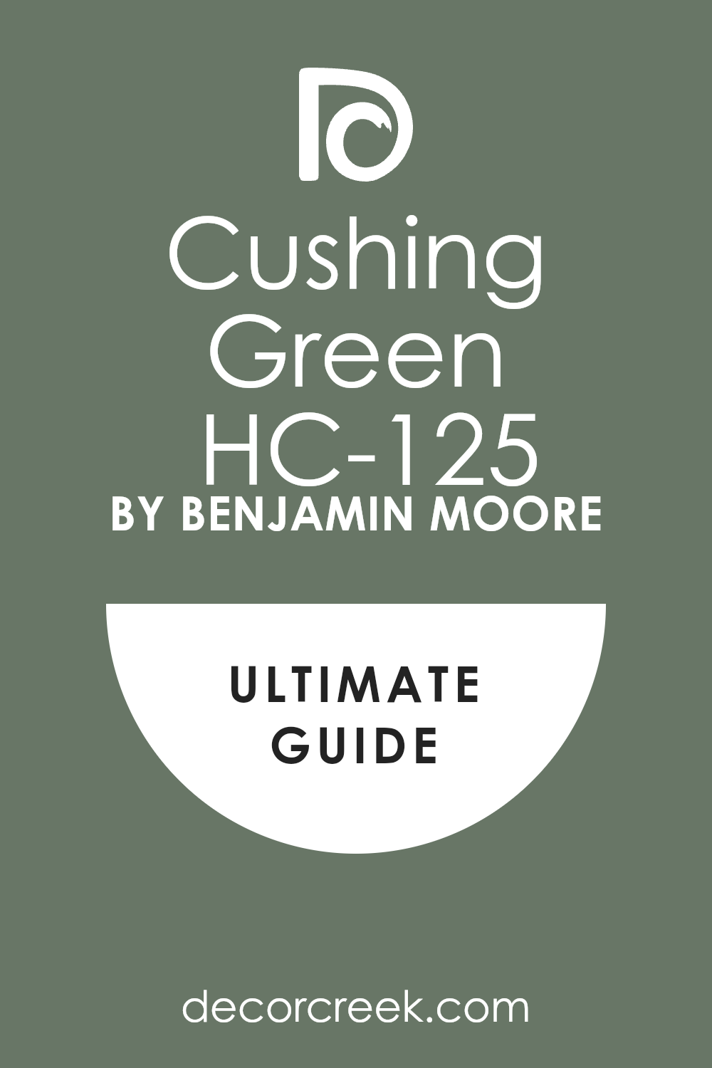
Cushing Green HC-125
Cushing Green HC-125 is a beautiful, deep, and rich hunter green that feels very much like a classic, traditional color. Cushing Green HC-125 is a sophisticated and highly saturated green that feels like it has been a part of the home forever.
Cushing Green HC-125 is a fantastic choice for a dramatic dining room, a handsome study, or a library with dark wood. Cushing Green HC-125 pairs wonderfully with creamy white trim, dark cherry wood, and accents of gold or brass metals.
Cushing Green HC-125 is a great color for creating a cozy, intimate atmosphere that is perfect for gathering with friends.
Cushing Green HC-125 reminds me of a luxurious country estate or a classic, well-loved old home with history. Cushing Green HC-125 is an excellent color to use on cabinetry in a kitchen or on a large, built-in media center.
Cushing Green HC-125 is a powerful color that makes a wonderful statement and adds a touch of grounded elegance to a room. Cushing Green HC-125 is a rich, satisfying shade that brings a feeling of stability and natural beauty to your interior design. Cushing Green HC-125 is a beautiful, bold color that is sure to make your home feel wonderfully intentional and very well-designed.
👉 Read the full guide for this color HERE 👈
Wickham Gray HC-171
Wickham Gray HC-171 is a beautiful, very light gray color that has a fresh, gentle blue-green undertone to it. Wickham Gray HC-171 is a light and airy color that is perfect for creating a refreshing, happy, and clean atmosphere.
Wickham Gray HC-171 is a fantastic choice for a bathroom, laundry room, or a bedroom where you want a very soft color.
Wickham Gray HC-171 reminds me of a quiet winter morning or the soft, light reflection of the sky on the water. Wickham Gray HC-171 works wonderfully with pure white trim and light, natural wood furniture and woven textures.
Wickham Gray HC-171 is a lovely color that makes a room feel instantly tidy and very well-kept and organized.
Wickham Gray HC-171 is a subtle color that adds a gentle touch of coolness without making the room feel cold or unfriendly. Wickham Gray HC-171 is a good color for smaller rooms because it reflects light well and makes them appear larger. Wickham Gray HC-171 is a dependable, pretty shade that truly makes your home feel refreshed and wonderfully bright with ease. Wickham Gray HC-171 is a soft, sweet color that will add a gentle, happy feeling to any interior design plan you have.
👉 Read the full guide for this color HERE 👈

Smoke 2122-40
Smoke 2122-40 is a gorgeous, mid-toned, dusky blue-gray color that feels sophisticated and wonderfully muted. Smoke 2122-40 is a perfect blend of blue, green, and gray, creating a very complex and interesting color on the wall.
Smoke 2122-40 is an excellent choice for a dining room, a bedroom, or an entryway where you want a rich color. Smoke 2122-40 pairs beautifully with warm wood tones, creamy whites, and soft, natural linen fabrics.
Smoke 2122-40 has a wonderful depth to it that adds a layer of quiet, thoughtful refinement to the design.
Smoke 2122-40 reminds me of a hazy, overcast day or the soft color of smoke drifting from a chimney top. Smoke 2122-40 is a sophisticated color that truly makes your furniture and decorations stand out against the walls.
Smoke 2122-40 is a great choice for creating a restful atmosphere that encourages relaxation and quiet time. Smoke 2122-40 is a beautiful color that adds a wonderful pop of muted color without becoming too bright or harsh. Smoke 2122-40 is a delightful, grounded shade that will make your home feel intentional, peaceful, and very well-designed.
👉 Read the full guide for this color HERE 👈

Kendall Charcoal HC-166
Kendall Charcoal HC-166 is a rich, beautiful, deep gray color that has a powerful, handsome, and grounded feel to it. Kendall Charcoal HC-166 is a highly popular, dark neutral that is often used in modern and transitional decorating styles.
Kendall Charcoal HC-166 is a fantastic choice for an accent wall, a dramatic powder room, or for kitchen island cabinetry. Kendall Charcoal HC-166 has a slight warm green/brown undertone that keeps it from ever feeling icy or cold on the walls.
Kendall Charcoal HC-166 pairs stunningly well with pure white trim and accents of bright yellow or rich orange colors. Kendall Charcoal HC-166 is a great color for creating a cozy, intimate atmosphere that feels very safe and secure.
Kendall Charcoal HC-166 works wonderfully in a high-gloss finish to create a sleek, sophisticated, and very modern look.
Kendall Charcoal HC-166 is a favorite for exterior home siding, giving a house an updated and very chic curb appeal. Kendall Charcoal HC-166 is a powerful color that makes a truly memorable statement in any room where it is used well. Kendall Charcoal HC-166 is a deep, satisfying shade that adds instant drama and a refined feeling to your home’s interior.
👉 Read the full guide for this color HERE 👈


My Final Thoughts on 2026 Paint Trends
Looking at this incredible, curated collection of 31 beautiful colors from Sherwin-Williams and Benjamin Moore, I see a clear and very exciting direction for interior design in 2026. The coming year is not about extremes; it is fundamentally all about balance and creating harmony within the home.
We are witnessing a thoughtful fusion where the cozy, rich comfort of gentle earth tones, like the tender blush of Malted Milk and the sun-baked warmth of Canyon Clay, mixes beautifully with the powerful, grounded depth of deeper statement shades, such as the handsome Urbane Bronze and the rich, luxurious Naval.
This blending of light and dark, warm and cool, gives every homeowner the freedom to customize their mood.
Simultaneously, the importance of light, airy neutrals, including the gentle creaminess of Alabaster and the crisp brightness of Simply White, remains incredibly high.
These shades are essential for creating clean, bright backdrops that allow our more saturated color choices to truly shine without the room ever feeling heavy. They provide the perfect canvas for life.
My biggest and most heartfelt takeaway is this: the absolute best color for your home in 2026, or any year, is the one that truly makes you feel happy, comfortable, and deeply at peace in your own house. Color is personal and should evoke joy.

