Blue is the color of the sky and the ocean, and when you bring it into a living room, it just feels right—it’s grounding, serene, and infinitely versatile. Choosing paint is arguably the biggest decision you make for a room, as it covers the most surface area and sets the foundational mood, so getting the color right is absolutely key to creating a beautiful, cohesive home.
As a home interior and staging expert, I often use blue because its psychological effect is profoundly calming and stabilizing, which sets a wonderful, welcoming mood for a primary gathering space.
In this comprehensive guide, I’m sharing 39 of my favorite, most dependable paint colors from my two trusted brands.
Some are true blues that command attention, while others are sophisticated neutrals that work perfectly alongside blue furniture and accents. I’ll walk you through my exact, foolproof method for picking paint, and then give you my curated lists, including a specific focus on the popular light blues that everyone asks for.
We’re not just picking a color; we’re defining the ambiance of your home. Let’s make your living room look fantastic!
Why Designers Depend on Benjamin Moore and Sherwin Williams Colors
When clients ask why I stick to just two main paint companies, the answer is simple: quality, consistency, and pigment richness matter most for a professional, lasting finish. Benjamin Moore and Sherwin Williams stand out because their colors have a wonderful, complex richness and depth that cheaper paints simply can’t replicate.
They use superior pigments, which means the color you see on the chip actually looks the same on your wall and holds its integrity, even when the light changes drastically throughout the day.
This quality makes a huge, discernible difference in the final, sophisticated look of a room. Also, their colors are thoughtfully created and extensively tested; they just seem to mix and harmonize better with the natural materials like furniture, wood flooring, and stone. These brands invest heavily in their color science, giving us confidence that the color won’t appear muddy or unpredictable.
When you’re decorating a house to feel welcoming, expensive, and put-together, you need paint that you can absolutely count on to perform perfectly.
These two brands give me that confidence every time, which is why they are the industry standard.
Mastering Color Selection: My Method for Choosing the Best Paint Shade
Choosing the perfect color shouldn’t be scary, it should be an exciting and fun part of the design process! My selection method is straightforward, designed to eliminate fear, and ensures we get the best possible color for your specific room’s unique conditions.
First, I carefully look at the natural light the room receives, as this is the biggest factor affecting color perception. If your windows face north, the light is naturally cooler, dimmer, and more blue-gray, so I might pick a blue with a bit of green or a warmer neutral to inject a cozy quality.
Conversely, if they face south, the sun is intensely warm and bright, so a cooler blue will keep the room feeling fresh, not washed out or overwhelming.
Second, I meticulously look at the undertones of the color. Every paint is complex; it has a little bit of another color secretly mixed in—is the blue subtly leaning gray, green, or maybe purple?
Identifying these hidden notes is crucial. I make sure that this hidden color works harmoniously with the permanent tones in your room, like your wood floor’s stain, a brick fireplace, or a large, permanent piece of furniture.
Lastly, and this is the most critical step that separates good design from great: always, always sample the paint. I never trust the tiny chip alone.
I paint two large squares (at least 2’x2′) on at least two different walls and observe them for a full 48 hours. Seeing the color in morning light, harsh midday sun, and cozy evening lamp light is the only true way to know if it’s the winner. Following this detailed, three-step process removes all the guesswork and ensures your choice is perfect.
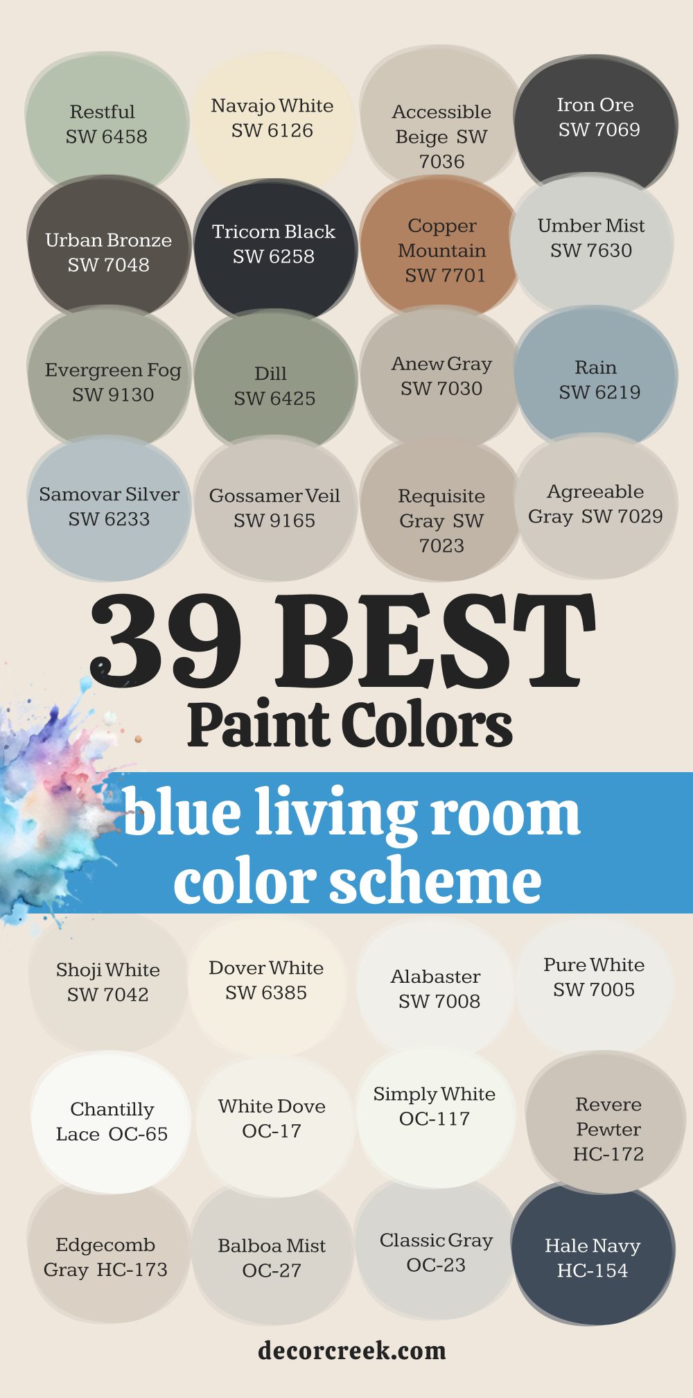
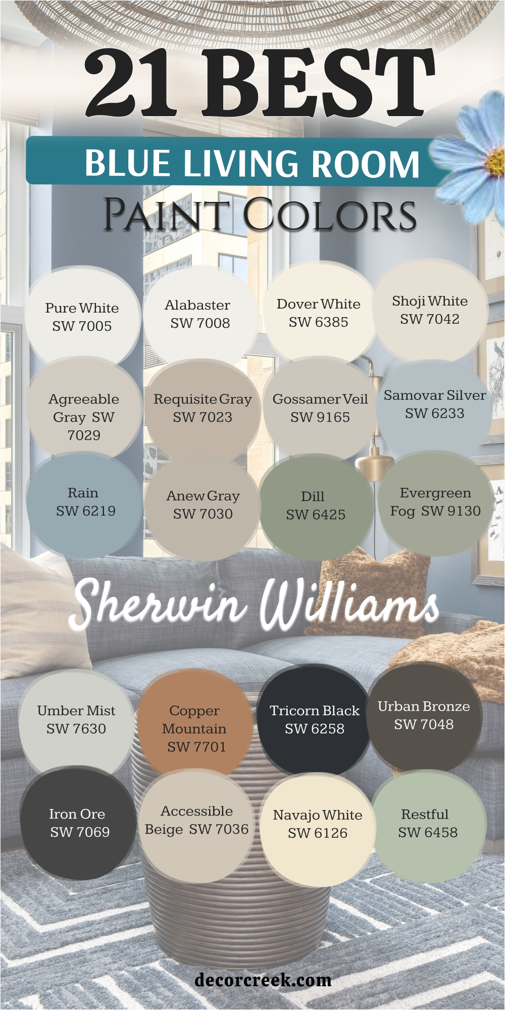
21 paint colors for the blue living room by Sherwin Williams
I’ve selected these 21 colors from Sherwin Williams because they offer an unmatched array of undertones, ensuring a perfect match for any lighting condition or design style, from modern to classic coastal.
Pure White SW 7005
Pure White is a fantastic, clean white that perfectly supports blue accents and furniture. This shade keeps a room feeling bright and airy without being cold or sterile.
It avoids yellow or pink undertones, which can often clash with the cool nature of blue. I frequently use it on trim and ceilings because it makes the true blue on the walls pop with clarity.
Using it on all walls provides a crisp gallery-like backdrop for navy sofas and blue patterned rugs. The lightness of Pure White helps reflect light, making a living room feel larger and more open. It’s my go-to choice for a reliable, neutral canvas in any home.
🎨 Check out the complete guide to this color right HERE 👈

Alabaster SW 7008
Alabaster offers a beautifully soft, creamy white that brings immediate warmth to any setting. Its gentle hue acts as a soothing counterpoint to deeper blues like navy or slate in your pillows and artwork. This color avoids looking stark white, making it a comforting choice for a primary wall color.
I love it because it has a slight beige undertone, preventing the blue elements in the room from feeling too icy or cool.
It’s especially nice in rooms that don’t get much sunlight, as it stops shadows from making the walls look dull. Alabaster helps furniture and fabrics with blue patterns appear soft and inviting, a true testament to its versatility.
🎨 Check out the complete guide to this color right HERE 👈

Dover White SW 6385
Dover White is a very warm white with a definite hint of yellow, giving it an aged, historic feel. This shade works wonders when you have traditional furniture or rich, dark blue woodwork and need a cozy contrast. The creamy warmth prevents the room from feeling new or overly contemporary, lending it a sense of history.
Because it has yellow notes, Dover White pairs beautifully with softer blues that lean slightly green, creating a peaceful garden-like palette.
It’s an excellent choice for cabinets, built-ins, or trim work where you want a richer, less stark white. The color brings a welcome glow, making it a lovely option for living rooms that should feel intimate.
🎨 Check out the complete guide to this color right HERE 👈

Shoji White SW 7042
Shoji White is a sophisticated off-white that acts almost like a soft griege—gray and beige mixed. I often recommend this color when a client has light blue walls but needs a main neutral that has more body than a pure white.
This shade is perfect for connecting different areas in an open floor plan because it’s so friendly to many other colors.
It helps ground a room without being dark, providing a lovely backdrop for both pale and deep blue textiles. Shoji White’s natural, linen-like quality makes it a strong choice for homes with natural wood tones and cozy textures. It truly offers quiet elegance without making a fuss.
🎨 Check out the complete guide to this color right HERE 👈

Agreeable Gray SW 7029
Agreeable Gray is a famously versatile griege that has a perfect balance of gray and beige. This middle-ground neutral is fantastic for a living room where you want to introduce different shades of blue, since it plays well with both cool and warm tones.
I often suggest it for walls when the sofa is a striking blue, as it lets the furniture be the star without fading away.
Its depth is light enough to keep a room bright but dark enough to provide some contrast against white trim. Agreeable Gray is popular for a reason: it’s truly a great foundation that always looks clean and current, a reliable choice for staging a property.
🎨 Check out the complete guide to this color right HERE 👈

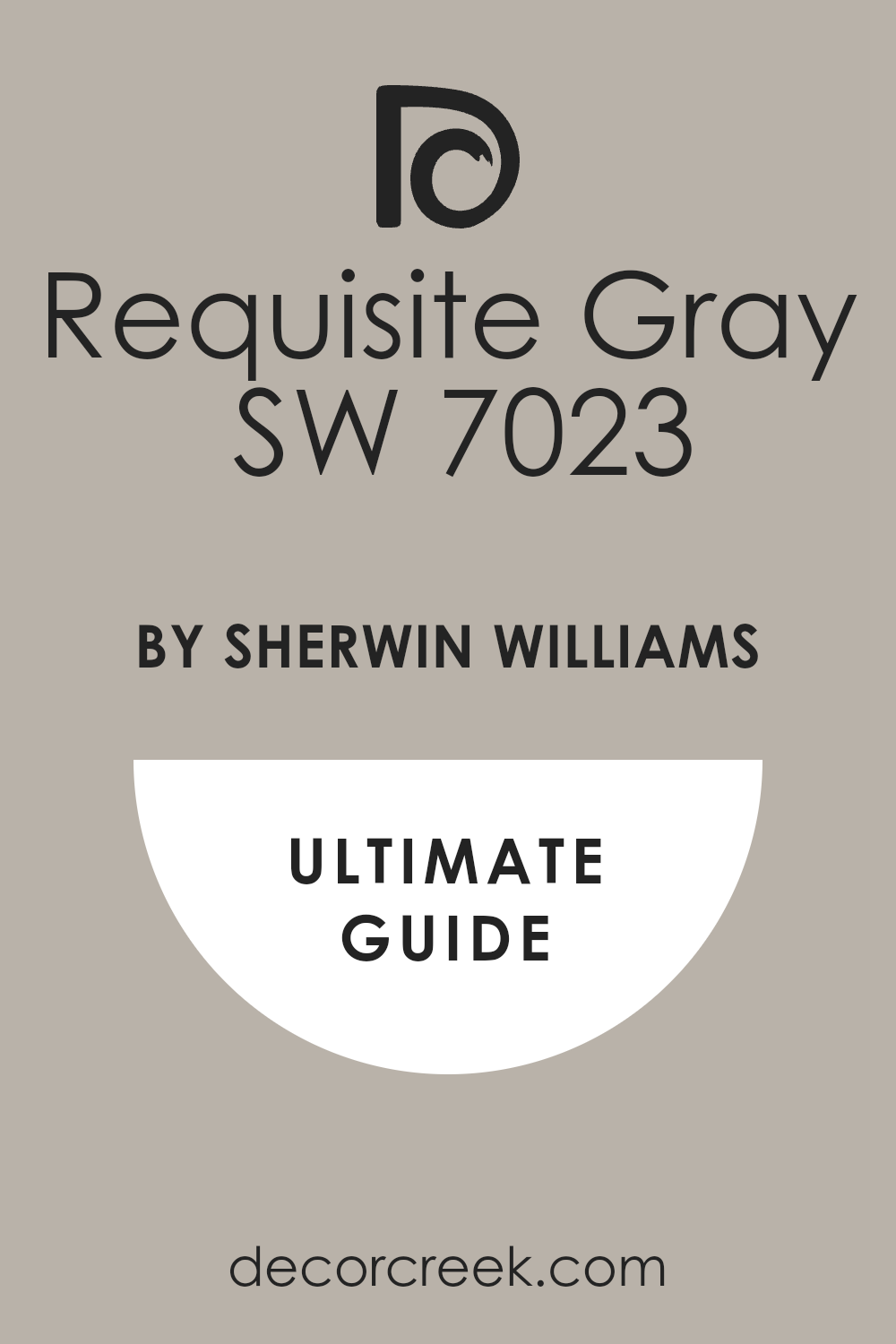
Requisite Gray SW 7023
Requisite Gray is a deeper, dustier griege compared to Agreeable Gray, offering a more grounded feel. This color has a beautiful maturity that works wonderfully in formal or traditional living rooms. It pairs exceptionally well with deep, saturated blues like ink or sapphire, making the room feel tailored and refined.
I use Requisite Gray when the goal is to create a cozy, defined mood without resorting to a dark color.
The strength of this shade is its ability to make white trim and light blue accents look especially crisp and clean. It’s a wonderful foundation for layered textures and rich fabrics.
🎨 Check out the complete guide to this color right HERE 👈
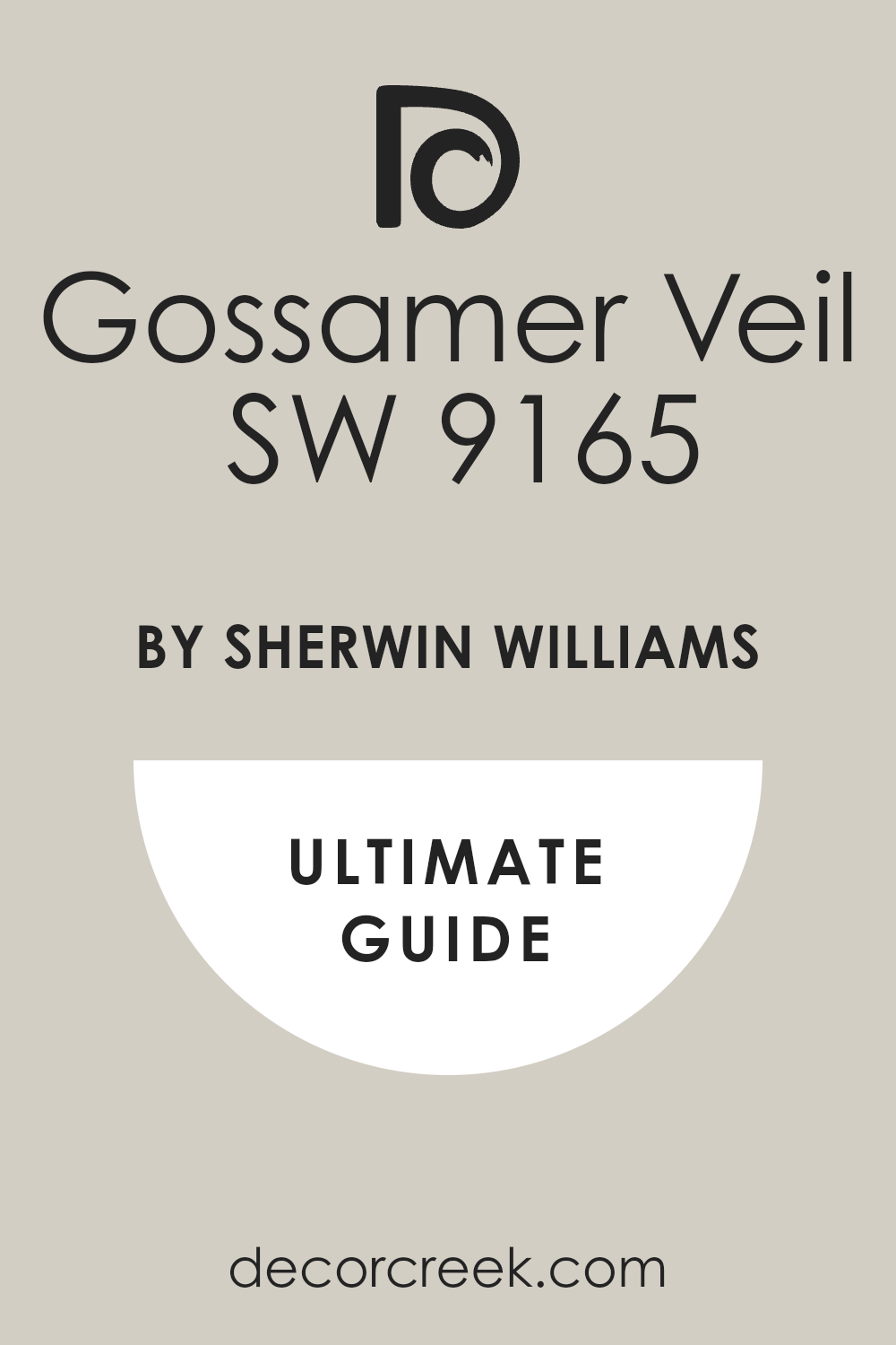
Gossamer Veil SW 9165
Gossamer Veil is a light, ethereal gray that carries subtle blue-green undertones, making it a very light, nearly white-blue. This gentle color is an excellent substitute for a stark white, adding just a hint of cool color to the walls. It works beautifully as a main wall color, giving the living room a fresh, watercolor-like wash of color.
I love to pair it with slightly darker blues and sea glass tones to reinforce a peaceful, light-filled atmosphere.
Gossamer Veil is especially lovely in rooms with plenty of natural light, as the sun makes its faint color appear even softer. It’s truly a breath of fresh air for any living area.
🎨 Check out the complete guide to this color right HERE 👈
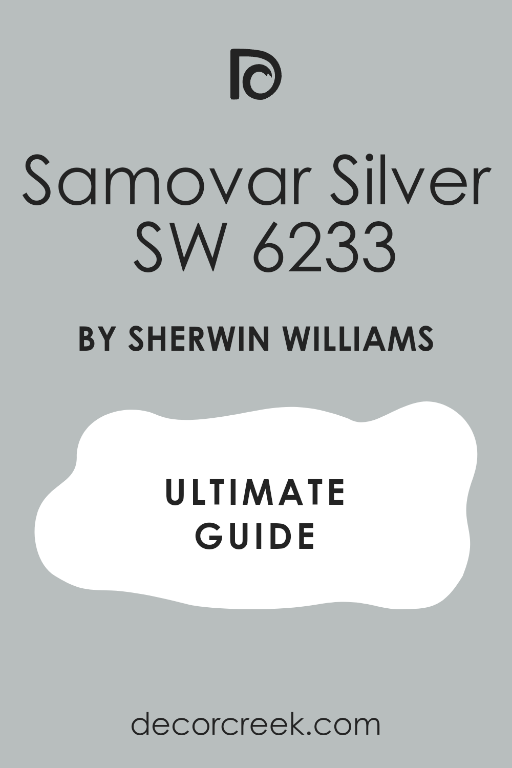
Samovar Silver SW 6233
Samovar Silver is a mid-tone gray that leans strongly blue, making it a very useful color when you want a blue that is mostly neutral. This shade creates a sophisticated, almost denim-like backdrop for white and wood furniture. It provides a wonderful, cozy feeling, especially when used on all four walls of a living room.
I often recommend Samovar Silver when the client has a lot of bright artwork or colorful accessories that need a toned-down background.
The color’s muted quality keeps the room from feeling too loud, allowing decorative items to shine. It is a fantastic bridge between traditional gray and true blue.
🎨 Check out the complete guide to this color right HERE 👈
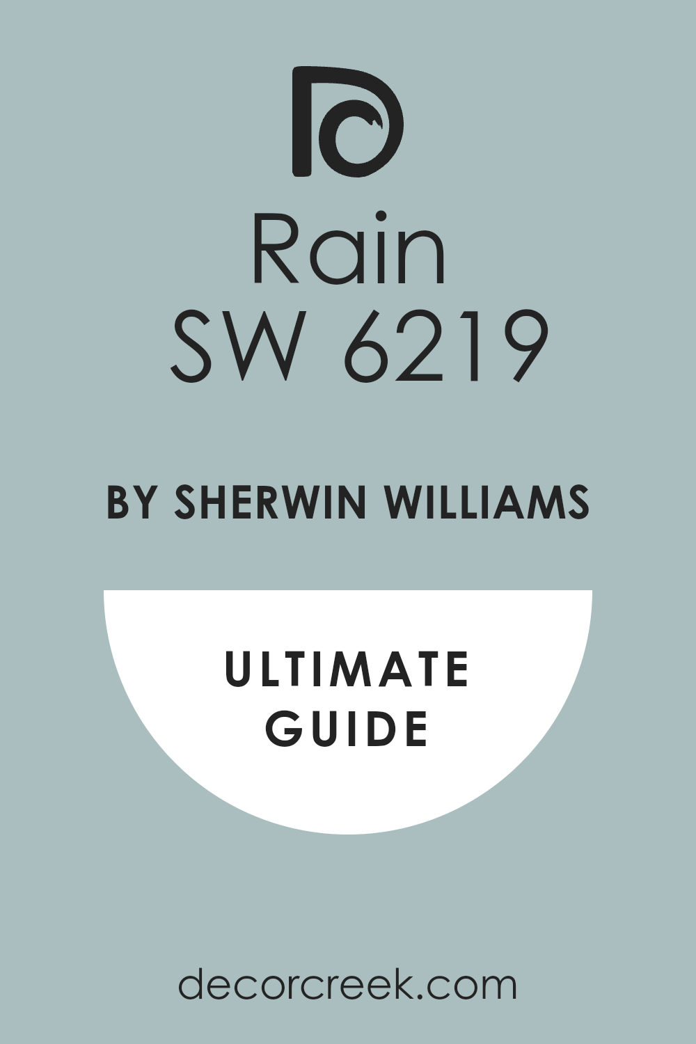
Rain SW 6219
Rain is a lovely, dusty blue that has prominent green undertones, giving it a comforting quality reminiscent of a stormy sky. This color is perfect for a living room where you want to feel relaxed and tucked away from the outside world. I enjoy pairing it with wood furniture and creamy whites to keep the mood natural and organic.
The slightly muted nature of Rain prevents it from ever feeling juvenile or too bright, lending a sophisticated feeling to the room.
It works particularly well in homes with a coastal or cottage-style décor, reinforcing that water-inspired palette beautifully.
🎨 Check out the complete guide to this color right HERE 👈
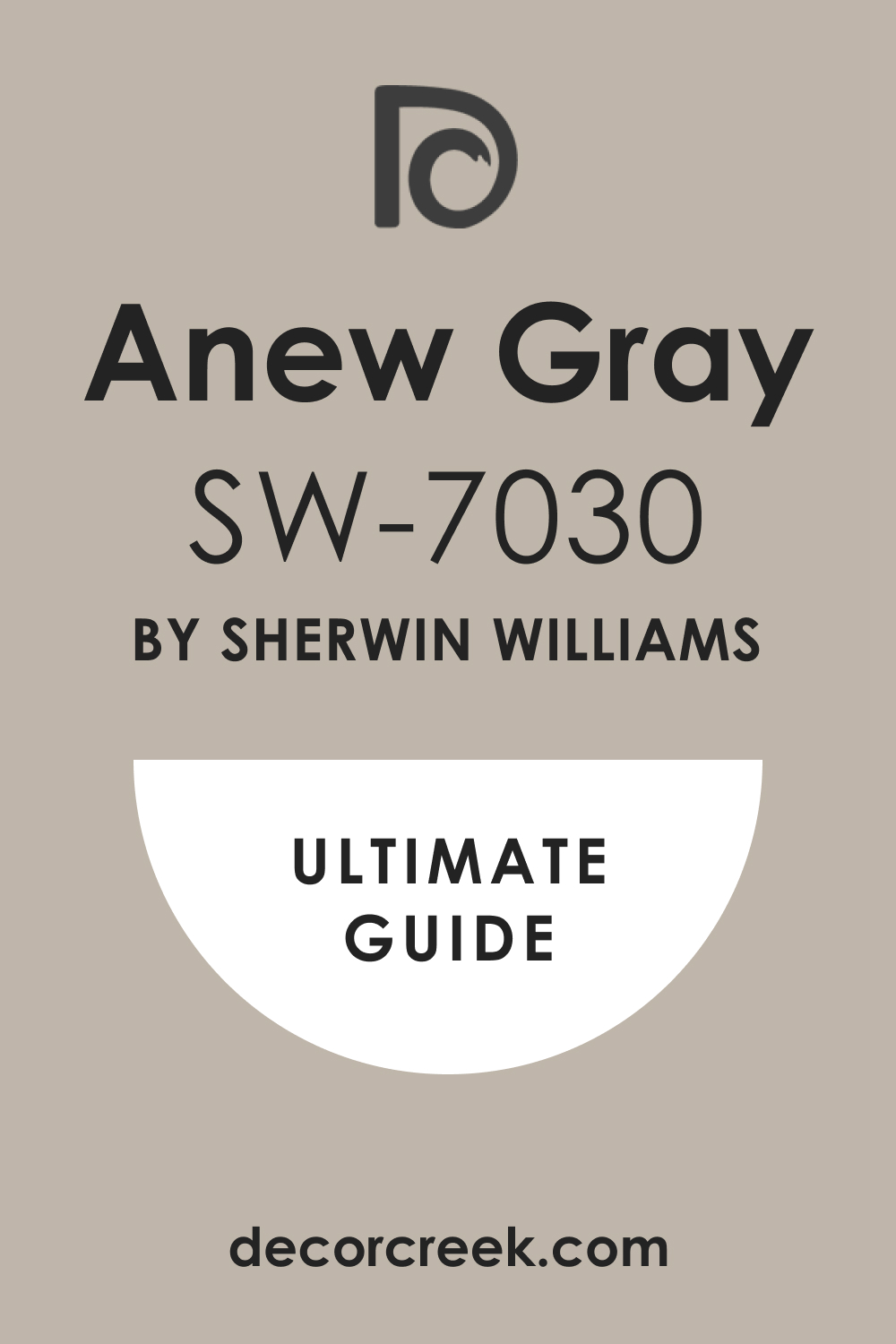
Anew Gray SW 7030
Anew Gray is a warmer, slightly richer griege that is quite popular for its cozy, grounding effect. This color is fantastic when you need a neutral wall but want the room to feel distinctly warm and inviting. It makes a beautiful partner for cool blue sofas or patterned blue curtains by offering a strong, welcoming contrast.
I often suggest Anew Gray for rooms with a lot of heavy shadows because its warmth prevents it from turning cold or dreary.
It’s a very livable shade that serves as a beautiful foundation for virtually any decorating style.
🎨 Check out the complete guide to this color right HERE 👈
Dill SW 6438
Dill is a soft, muted green that works surprisingly well in a blue living room because blue and green are neighbors on the color wheel. This earthy shade acts as a rich, sophisticated neutral against bright white trim and deep blue accents.
I love using it in rooms where the main focus is on comfort and natural materials like linen and aged wood.
Dill provides a beautiful, grounded feeling that feels reminiscent of the outdoors, instantly making the room feel refreshing. When paired with navy or cerulean blue accessories, it creates a balanced, harmonious, and very appealing palette.
🎨 Check out the complete guide to this color right HERE 👈
Evergreen Fog SW 9130
Evergreen Fog is a soft, gray-green that has a wonderfully misty and comforting quality. As a designer, I appreciate this color for its ability to act as a richly saturated neutral in any living room. When paired with deep blue velvet or crisp white cotton, it creates a layered, interesting look that feels current and stylish.
I often use it to give a room a sophisticated depth that a simple gray cannot provide.
The color’s gentle tone means it can be used on all four walls without making the room feel too dark or heavy, offering a beautiful sense of enclosure.
🎨 Check out the complete guide to this color right HERE 👈

Umber Rust SW 9100
Umber Rust is a medium-toned neutral that is a warm, earthy taupe, providing a grounded contrast to cool blues. This shade works brilliantly as a wall color when you have a large blue sectional or blue-patterned wallpaper on one accent wall.
I recommend Umber Rust to add visual weight and coziness to a living room, especially one with high ceilings or an open floor plan.
Its brownish base stops the room from looking too cold, making it a perfect partner for pale blue and green accessories. This color is wonderful for creating an intimate, well-appointed feel.
🎨 Check out the complete guide to this color right HERE 👈
Copper Mountain SW 6356
Copper Mountain is a rich, warm, terra-cotta-inspired brown with red and orange undertones. While not a blue, this shade is a marvelous choice for an accent color in a blue living room because it sits opposite blue on the color wheel.
Using Copper Mountain on a fireplace mantel or in a bookshelf nook creates a dramatic, warm focal point against cool blue walls.
I use this color when the room needs a strong element of coziness and energy. It helps balance the coolness of blue, making the entire living room palette feel vibrant and perfectly balanced.
🎨 Check out the complete guide to this color right HERE 👈

Tricorn Black SW 6258
Tricorn Black is a true, pure black with no noticeable undertones of blue or brown, making it strikingly dramatic. I use this color not on entire walls, but often on interior doors, window sashes, or a fireplace surround in a blue living room.
The sharp contrast it provides makes lighter blue walls look exceptionally crisp and bright.
This shade is a wonderful tool for adding definition and a touch of modern sophistication to a room. Tricorn Black draws the eye and gives the room a polished, intentional feel, helping to highlight architectural features.
🎨 Check out the complete guide to this color right HERE 👈

Urban Bronze SW 7048
Urban Bronze is a deep, anchoring color that is a very dark gray-brown, rich with warmth and a hint of metallic feel. This shade works beautifully in a living room where you want a very moody, cocooning feeling, perhaps behind a blue-gray sofa.
I find it perfect for painting built-in shelving or an accent wall, providing a strong backdrop that feels sophisticated and organic.
It pairs especially well with light blues, which feel fresher and brighter next to its darkness. Urban Bronze grounds the room with an earthen tone that feels both traditional and current.
🎨 Check out the complete guide to this color right HERE 👈

Iron Ore SW 7069
Iron Ore is a softer, lighter shade than Tricorn Black; it’s a very dark charcoal that has subtle brown undertones. This color is an excellent choice for a darker accent when Tricorn Black feels too harsh or stark against a gentle blue wall.
I often use it on kitchen islands or accent cabinetry that is visible from the living room to pull the palette together.
It provides contrast without being severe, offering a refined, slightly aged look. Iron Ore is wonderfully sophisticated and helps highlight the depth of any blue it is placed near.
🎨 Check out the complete guide to this color right HERE 👈

Accessible Beige SW 7036
Accessible Beige is a perfect neutral that sits right between beige and gray, giving it broad appeal and flexibility. This is one of my most dependable colors for walls when the furniture, rug, or curtains are the main source of blue color.
It offers comforting warmth and prevents the room from ever feeling cold or unwelcoming.
I love it because its soft quality allows it to work well in any kind of light, always looking clean and fresh. Accessible Beige is a powerhouse foundation that supports both light and deep blue furnishings beautifully.
🎨 Check out the complete guide to this color right HERE 👈

Navajo White SW 6126
Navajo White is a classic, heavily cream-colored white with strong yellow undertones. I use this color when I want a living room to feel distinctly vintage, cozy, or traditional. It pairs beautifully with historic blues that also have a slightly aged or muted quality, creating a harmonious feel.
This is a great choice for older homes with original woodwork where you want a white that feels soft and less modern.
The warmth of Navajo White adds a beautiful, subtle glow to the living room walls.
🎨 Check out the complete guide to this color right HERE 👈
Restful SW 6458
Restful is a pale, slightly muted green with definite blue undertones, living up to its name perfectly. This color provides a light, fresh atmosphere, working wonderfully on all four walls of a living room. I recommend it when the goal is to create a peaceful, slightly coastal or garden-inspired feeling.
It pairs beautifully with neutral wood tones and off-white fabrics, with the blue elements in the room adding a soft hint of contrast.
Restful is an easy-to-live-with color that always feels clean and inviting.
🎨 Check out the complete guide to this color right HERE 👈
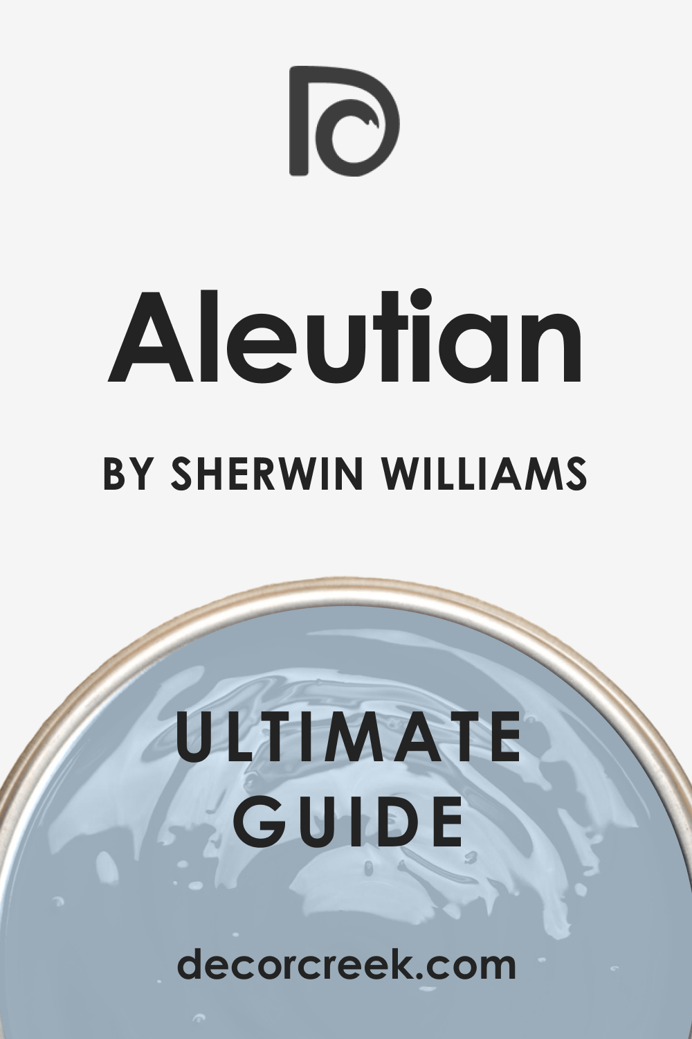
Aleutian SW 6241
Aleutian is a gorgeous mid-tone blue-gray that has a sophisticated, dusky quality. This shade is a perfect main wall color for a living room, especially when you want a color that has depth but isn’t too dark.
I use Aleutian when I want the blue to feel grounded and slightly architectural, like an old stone building near the sea.
It pairs perfectly with crisp white trim and light tan or beige furniture, providing a lovely cool contrast. Aleutian gives the room a quiet strength that is instantly noticeable.
🎨 Check out the complete guide to this color right HERE 👈
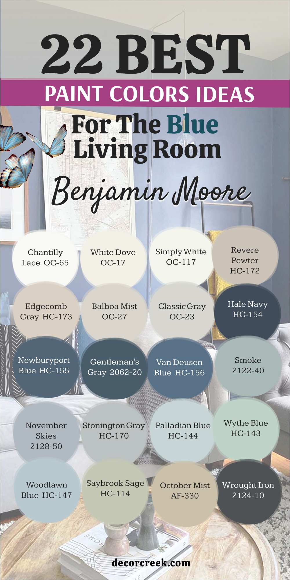
22 Paint Colors For The Blue Living Room By Benjamin Moore
Benjamin Moore’s Historical Collection and their rich, sophisticated pigment formulations make these 22 colors a powerful choice for creating a living room with depth, tradition, and an unmistakable air of quality.
Chantilly Lace OC-65
Chantilly Lace is Benjamin Moore’s purest, brightest white, offering a crisp, clean presence. I use this shade when the blue in the living room is deep and saturated, like navy or sapphire, and needs a razor-sharp contrast. This white is free of yellow or gray tint, which makes it perfect for trim, ceilings, and architectural details.
It creates a stunning, graphic look that feels very modern and precise.
Using Chantilly Lace on the walls keeps the room feeling light and sharp, allowing blue elements to make a strong visual impact.
🎨 Check out the complete guide to this color right HERE 👈

White Dove OC-17
White Dove is a soft, warm white that has a gentle, creamy quality, making it less stark than Chantilly Lace. This color is incredibly popular for a reason: it’s versatile and always looks beautiful.
I recommend White Dove as a softer main wall color or on trim when the blue in the room is also soft and dusty.
Its slight warmth keeps a living room from feeling cold, even when paired with cool blues. It’s a designer favorite because it has just enough pigment to avoid looking washed out.
🎨 Check out the complete guide to this color right HERE 👈

Simply White OC-117
Simply White is a very clean, bright white that has just a touch of warmth to prevent it from feeling sterile. I use this shade when a client wants a white wall that feels energetic and airy, especially in rooms with a lot of natural sunlight.
It works wonderfully alongside virtually any shade of blue, from pale sky blue to deep ocean tones.
Simply White is a perfect white for kitchen cabinetry that is open to a blue living room, helping to create a cohesive look. This color is known for making a room feel instantly fresh and renewed.
🎨 Check out the complete guide to this color right HERE 👈

Revere Pewter HC-172
Revere Pewter is a classic, mid-toned griege that provides a beautiful, historic backdrop for a blue living room. This color has a strong sense of tradition and works beautifully with deep wood tones and formal furniture.
I often use it as a wall color when the goal is to introduce blue through accessories and artwork, making the blue feel grounded and rich.
Its light-reflecting quality changes beautifully with the time of day, sometimes leaning more gray and sometimes more beige. Revere Pewter is an undeniable benchmark for neutral paint shades.
🎨 Check out the complete guide to this color right HERE 👈

Edgecomb Gray HC-173
Edgecomb Gray is a warm, light griege that is soft and inviting, a perfect gentle neutral. This shade is lighter and creamier than Revere Pewter, making it a great choice for smaller living rooms that need to feel open.
I love using it with light blue and powder blue accents, creating a very airy, coastal feeling.
Its welcoming nature makes it an excellent foundation for layering textures and natural materials. Edgecomb Gray offers a beautiful background that is never boring but always feels sophisticated.
🎨 Check out the complete guide to this color right HERE 👈

Balboa Mist OC-27
Balboa Mist is a beautiful light gray that has a definite warmth to it, preventing it from feeling cold or icy. This shade is perfect for a living room that gets plenty of light and needs a gentle, almost ethereal wall color.
I often use it to provide a quiet contrast to the deeper, richer blues in fabrics and upholstery.
It’s a very soft color that works well in modern homes, maintaining a clean and crisp look. Balboa Mist keeps a living room feeling current while providing a beautiful canvas.
🎨 Check out the complete guide to this color right HERE 👈

Classic Gray OC-23
Classic Gray is an incredibly pale gray that is sometimes mistaken for a soft white, offering just a hint of cool color. This shade is wonderful for brightening up a living room while giving the walls more definition than a pure white.
I often recommend it when the blue in the room is very light, as it provides a subtle, harmonious contrast.
It works beautifully with white trim and helps create a very clean, Scandinavian-inspired feeling. Classic Gray is a truly versatile, barely-there color that maintains a feeling of lightness.
🎨 Check out the complete guide to this color right HERE 👈

Hale Navy HC-154
Hale Navy is a deep, rich, classic navy blue that is very dramatic and popular for accent walls. This shade is perfect for a living room when you want to create a moody, sophisticated atmosphere or define a specific zone.
I often use it on one feature wall or built-in bookshelves, pairing it with crisp white walls for contrast.
It works beautifully with brass or gold accents, which sparkle next to its depth. Hale Navy provides an anchor of color that feels tailored, strong, and deeply satisfying.
🎨 Check out the complete guide to this color right HERE 👈

Newburyport Blue HC-155
Newburyport Blue is a slightly brighter, less intense navy than Hale Navy, offering a cleaner, more nautical feel. This shade works well in a living room that gets plenty of light and can handle a bolder color without feeling closed in.
I love it for a full wall color because it brings a vibrant, energetic feel to the room.
It pairs wonderfully with white trim and natural wood floors, reinforcing a traditional American coastal aesthetic. Newburyport Blue is strong and memorable, a fantastic color for an assertive design.
🎨 Check out the complete guide to this color right HERE 👈

Gentleman’s Gray 2062-20
Gentleman’s Gray is a striking, deep teal-blue that has a beautiful balance of blue and green. This color is incredibly rich and works perfectly as a moody, jewel-toned accent wall in a living room. I often suggest it to clients who want a dark blue but appreciate the warmth and complexity that the green undertone provides.
It looks stunning when paired with warm beige and cream fabrics, which highlight its depth.
Gentleman’s Gray provides a bespoke, luxurious feeling to any room it graces.
🎨 Check out the complete guide to this color right HERE 👈

Van Deusen Blue HC-156
Van Deusen Blue is a beautiful, dusty medium blue that has a strong gray quality, giving it a historic, grounded feel. This shade is wonderful for painting an entire living room, providing a noticeable color that is still comfortable and refined.
I love it because it never feels too bright, maintaining a quiet maturity that suits traditional homes.
It looks particularly handsome with dark wood furniture and natural linen, creating an inviting atmosphere. Van Deusen Blue is a staple color that is always in good taste.
🎨 Check out the complete guide to this color right HERE 👈

Smoke 2122-40
Smoke is a light, dusty blue-gray that is beautifully soft and ethereal, living up to its name perfectly. This shade is perfect for a living room where you want a very subtle blue wall that changes with the light, offering a gentle hint of color. I often use it in sunny rooms where a deeper blue might feel too intense.
It pairs beautifully with pure white trim, which helps pull out its subtle blue qualities.
Smoke provides a feeling of airiness and simplicity, a lovely choice for a relaxed home.
🎨 Check out the complete guide to this color right HERE 👈

November Skies 2128-50
November Skies is a mid-tone gray that leans strongly blue, suggesting the look of a cloudy, late-autumn day. This color is sophisticated and works well as a grounding wall color in a living room that needs more depth. I find it perfect for balancing bright furniture or colorful rugs, offering a strong, muted foundation.
It pairs beautifully with dark wood furniture and white trim, creating a tailored, classic appearance.
November Skies is a wonderful option for adding a moody yet inviting feel to the room.
🎨 Check out the complete guide to this color right HERE 👈

Stonington Gray HC-170
Stonington Gray is a popular, true light gray that has a slight, noticeable blue undertone. This shade is an excellent neutral choice for walls when the blue in your living room is coming from other elements like a sofa or curtains. I often use it because it maintains a clean, crisp appearance without ever looking dull or flat.
It’s a very dependable color that works well in almost any light condition, always looking fresh.
Stonington Gray provides a bright backdrop that perfectly complements cool color schemes.
🎨 Check out the complete guide to this color right HERE 👈

Palladian Blue HC-144
Palladian Blue is a stunning, historic color that is a light, cheerful mix of blue and green. This shade is famous for its happy, welcoming quality and works beautifully on all walls of a living room. I love how it changes beautifully depending on the light, sometimes looking more blue and sometimes more green.
It pairs perfectly with crisp white trim, giving the room a fresh, water-inspired feel.
Palladian Blue is a cheerful choice for a relaxed, coastal or traditional home.
🎨 Check out the complete guide to this color right HERE 👈

Wythe Blue HC-143
Wythe Blue is a richer, more saturated blue-green compared to Palladian Blue, offering more depth and presence. This shade is wonderful for a living room that can handle a bolder color, creating a warm, historic feel.
I often suggest it for homes with traditional architecture or dark wood trim, as it provides a beautiful contrast.
It pairs beautifully with soft creams and whites, enhancing its rich, jewel-box quality. Wythe Blue is a classic color that truly brings a room to life with its historical richness.
🎨 Check out the complete guide to this color right HERE 👈

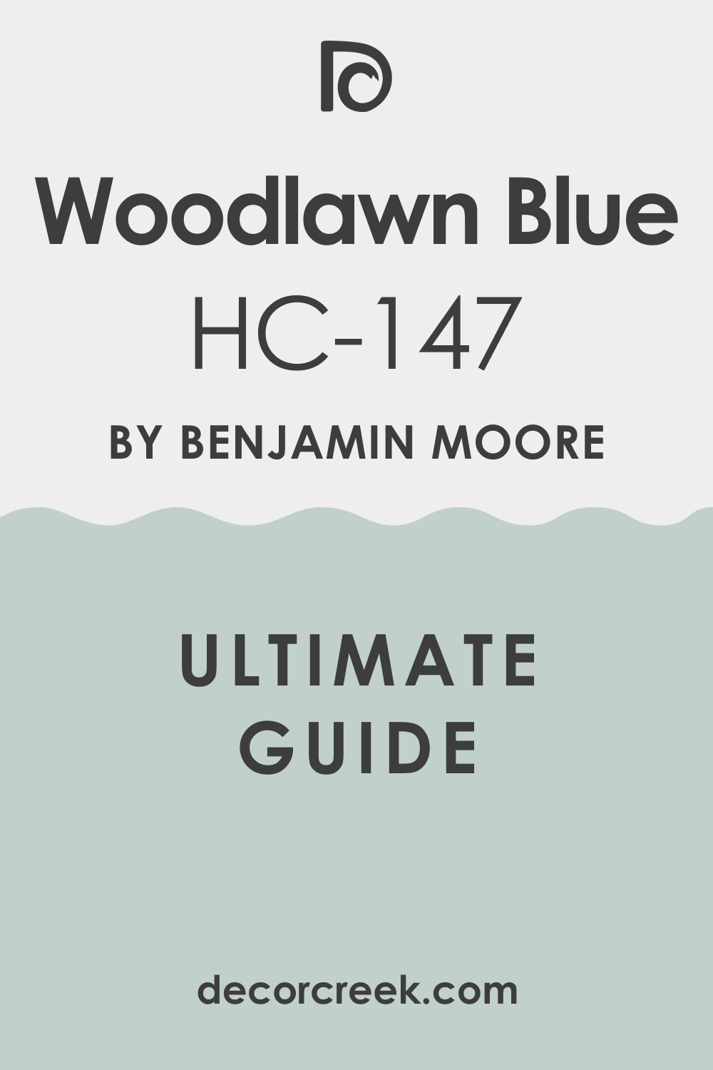
Woodlawn Blue HC-147
Woodlawn Blue is a light, gentle blue that has a hint of green, giving it a peaceful, natural quality. This shade is a perfect main wall color for a light-filled living room, creating a very airy and light-hearted atmosphere.
I love it for homes with cottage or farmhouse-style decor, as it reinforces a fresh, unpretentious feeling.
It pairs wonderfully with natural linen fabrics and light wood floors, maintaining a soft, comfortable appearance. Woodlawn Blue is a light, lovely choice that always feels welcoming.
🎨 Check out the complete guide to this color right HERE 👈
Saybrook Sage HC-114
Saybrook Sage is a beautiful, muted green that has a strong gray undertone, giving it a refined, slightly aged look. This shade is a fantastic complement to dark and deep blues, offering a strong, organic contrast.
I often use it as a wall color when I want the room to feel grounded and earthy, providing a mature backdrop.
It works well with wood tones and cream-colored furniture, creating a balanced and natural palette. Saybrook Sage brings a comforting, historic depth to any living area.
🎨 Check out the complete guide to this color right HERE 👈

October Mist 1495
October Mist is a gentle, silvery-green that has a beautiful, natural quality, feeling organic and soft. This shade is a wonderful way to introduce green into a living room without it feeling too bright or distracting. I love to pair it with soft blue accents, creating a calm, cohesive natural palette.
It works perfectly in living rooms with plenty of plants or natural textures, reinforcing a connection to the outdoors.
October Mist is an incredibly livable and sophisticated color choice.
🎨 Check out the complete guide to this color right HERE 👈

Wrought Iron 2124-10
Wrought Iron is a very dark, nearly black charcoal that has a beautiful, subtle blue-gray undertone. This shade is perfect for adding a serious, grounded punch of darkness to a blue living room, perhaps on a feature wall or on bookshelves. I often use it to give a room depth and definition, making lighter colors pop with intensity.
It pairs beautifully with bright white and acts as a sophisticated anchor in any design scheme.
Wrought Iron offers dramatic contrast with a refined texture.
🎨 Check out the complete guide to this color right HERE 👈

Kendall Charcoal HC-166
Kendall Charcoal is a deep, rich gray that has a lovely warm, earthy brown undertone, preventing it from feeling cold. This shade is a strong choice for an accent color in a blue living room, providing a handsome, tailored appearance. I recommend it for rooms with high ceilings or lots of light where a darker color can really shine.
It works perfectly with crisp white trim and light blue walls, adding a necessary element of weight and grounding.
Kendall Charcoal is a truly sophisticated gray that always looks expensive.
🎨 Check out the complete guide to this color right HERE 👈

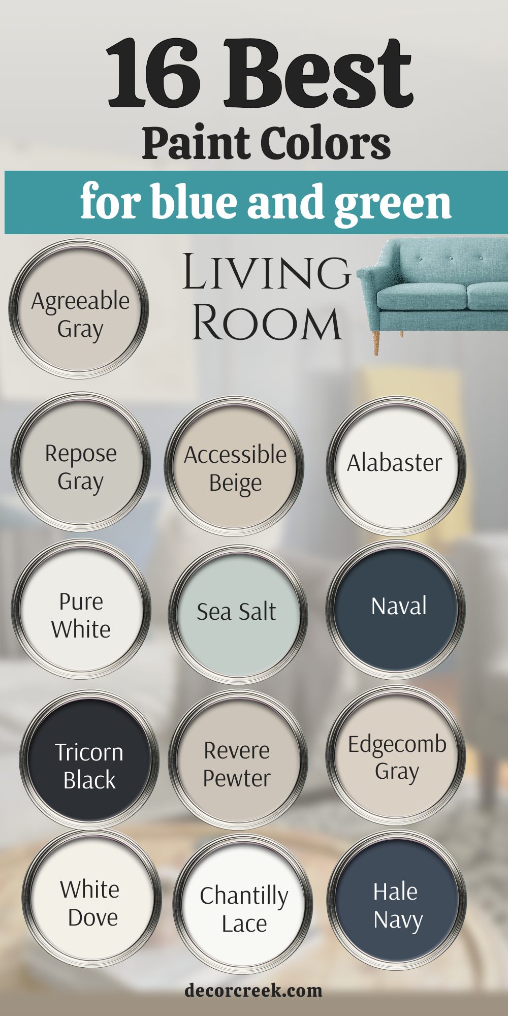
16 Paint Colors For Blue And Green Living Room
This curated selection of 16 shades is designed specifically to harmonize the often-challenging relationship between cool blues and soft, earthy greens, creating palettes that are balanced, natural, and profoundly calming.
Agreeable Gray SW 7029
Agreeable Gray is my essential greige neutral, famously known for balancing gray and beige perfectly, making it a versatile foundational shade. This hue is ideal for walls because it provides a quiet, dependable background that never clashes with blue or green furniture, allowing the entire palette to breathe.
It has a beautiful warmth from its subtle green undertones, which keeps a cool blue and green scheme from feeling icy.
In fact, its versatility means it can adapt to both modern farmhouse and sleek contemporary styles with ease.
I often rely on it to connect rooms painted in different blues and greens seamlessly across an open floor plan.
The color’s perfect balance makes it a friendly, light-filled foundation that truly makes the saturated colors you pair with it look their best. It’s a true workhorse neutral that I trust completely.
🎨 Check out the complete guide to this color right HERE 👈
Repose Gray SW 7015
Repose Gray is a true light gray with subtle warm undertones, offering a slightly cooler and more tailored canvas than Agreeable Gray. This sophisticated shade is an excellent choice for living rooms featuring deep blue or hunter green accents, providing a crisp, modern contrast that feels tailored.
It has a high Light Reflectance Value (LRV), which helps to keep a room feeling light and airy while still adding more definition than a pure white.
In different lights, Repose Gray may flash a very faint violet undertone, which is lovely with the cool blues and greens.
I use it when the overall mood should be distinctly sophisticated, slightly cool, and minimal.
This color adapts beautifully to sleek furniture styles and metallic accents, lending an air of quiet elegance.
🎨 Check out the complete guide to this color right HERE 👈

Accessible Beige SW 7036
Accessible Beige is a perfect warm neutral that offers a comforting, cozy presence against predominantly cool color schemes like blue and green. This shade is fantastic for wall coverage when you want the room to feel distinctly warm and welcoming, counteracting any coolness from the blue and green furnishings or accessories.
It has just enough beige to stop it from reading too gray, making it inviting in any light and preventing the dreaded look of an outdated “builder beige.”
Its moderate LRV provides depth without darkening the space.
I often use it to anchor large or open-concept living rooms, ensuring they feel soft, intimate, and effortlessly welcoming.
It’s an essential bridge color for homes where cool accents meet warm flooring or stonework.
🎨 Check out the complete guide to this color right HERE 👈
Alabaster SW 7008
Alabaster is my preferred soft, creamy white that brings immediate warmth and a gentle glow to any blue and green palette. This shade is renowned for its slight yellow-brown undertone, which prevents it from feeling cold or stark.
I use it extensively on trim and ceilings, or even on all four walls, to provide a gentle, luminous backdrop that doesn’t compete with the main colors.
Its subtle warmth is perfect for softening the contrast with intense colors.
This color is a perfect partner for both soft sage greens and deep indigo blues, offering a soothing balance.
Alabaster is a designer favorite for its ability to brighten a room while maintaining a cozy, lived-in feel, making it the ideal choice for trim in a blue and green sanctuary.
🎨 Check out the complete guide to this color right HERE 👈
Pure White SW 7005
Pure White is the cleanest, most neutral white available from Sherwin Williams, offering the sharpest, most graphic contrast imaginable. This shade is essential when you want your vibrant blues and greens to truly pop and look their most saturated and intense.
It has the slightest whisper of warmth, just enough to stop it from feeling icy cold, but not enough to introduce a yellow or gray cast.
I use it strategically on trim, doors, and architectural details to provide a crisp, modern edge to the room’s design.
It keeps the living room feeling bright, graphic, and well-defined, regardless of the colorful scheme.
Pure White is the ultimate choice for a high-contrast, clean, and contemporary aesthetic when paired with deep, moody hues.
🎨 Check out the complete guide to this color right HERE 👈
Sea Salt SW 6204
Sea Salt is a light, ethereal green-blue that perfectly embodies a coastal, water-inspired palette, acting as a soft chameleon on your walls. This shade is beautiful for main walls, as it softly blends the blue and green elements in the room into a single, cohesive wash of color.
I love how it changes color depending on the light—sometimes looking more blue (in cooler northern light) and sometimes more green (in warmer southern light).
This constant shift adds quiet interest and dimension to a living room. It brings a peaceful, quiet energy to the space, always feeling fresh and uncomplicated. Pair it with creamy whites and natural textures for an authentic, soothing retreat that whispers rather than shouts.
🎨 Check out the complete guide to this color right HERE 👈

Naval SW 6244
Naval is a deep, true navy blue that acts as a strong, anchoring focal point in a blue and green living room with unparalleled sophistication. This shade is perfect for built-in bookcases, an accent wall, or a media console, immediately adding depth, formality, and a feeling of tailored luxury.
With its very low LRV, it creates an intimate, sophisticated atmosphere that grounds the entire color scheme. I often use it to balance out very light greens and whites, providing the necessary visual weight and drama.
It’s a sophisticated, dramatic choice that always looks tailored, especially when paired with warm brass accents and deep-toned wood furniture. Naval is a commanding color that commands attention and respect.
🎨 Check out the complete guide to this color right HERE 👈

Tricorn Black SW 6258
Tricorn Black is a pure, stark black that is perfect for adding graphic definition, high drama, and architectural structure to the living room. This shade is a true, unadulterated black, making it ideal for creating sharp, contemporary lines.
It works brilliantly on interior doors, window sashes, or a fireplace mantel, giving the room a sharp, architectural quality.
I use it to make light blue and soft green walls look significantly brighter and cleaner by contrast.
It is a bold, sophisticated accent that adds an element of modern luxury.
Tricorn Black is the ultimate tool for adding contemporary contrast, a touch of edgy elegance, and strong visual clarity to any space.
🎨 Check out the complete guide to this color right HERE 👈
Revere Pewter HC-172
Revere Pewter is a reliably elegant griege that grounds a room with a feeling of tradition, history, and unmistakable quality. This iconic Benjamin Moore shade is fantastic for main walls when the furnishings are the primary source of blue and green, allowing the accessories to be the stars.
It provides a rich, historic neutral that carries both warm (beige/taupe) and cool (gray/green) undertones, enabling it to bridge almost any color combination.
I appreciate its ability to adapt to its surroundings, looking slightly cooler in north-facing light and warmer in south-facing light.
It pairs beautifully with dark wood and aged metal finishes, making it a timeless choice that remains a favorite for its sheer flexibility and upscale feel.
🎨 Check out the complete guide to this color right HERE 👈
Edgecomb Gray HC-173
Edgecomb Gray is a warm, soft griege that is lighter, airier, and slightly more delicate than its counterpart, Revere Pewter. This shade is ideal for smaller or darker living rooms, as its high LRV provides necessary warmth without sacrificing brightness.
It features beautiful, subtle taupe undertones that keep it soft and welcoming, never cold.
I love using it with gentle blue and sage green accents, creating a calm, naturalistic, and very serene atmosphere, often lending itself to a soft coastal or cottage style.
It is a universally welcoming and beautifully understated choice for any wall, providing a clean canvas that never feels sterile.
🎨 Check out the complete guide to this color right HERE 👈
White Dove OC-17
White Dove is my go-to soft white that provides a creamy, warm counterpoint to cool colors, making a room feel instantly softer and more luxurious.
This shade has just the right amount of warm pigment to ensure it never feels cold or sterile, making it a beautiful choice for trim and ceilings when you want a white that softens the contrast with blue or green walls.
It keeps the room feeling gentle, sophisticated, and incredibly inviting.
I use it widely because it maintains a feeling of quality and quiet sophistication, pairing beautifully with both saturated jewel tones and pale pastels.
White Dove is a versatile classic that brings subtle warmth to every corner.
🎨 Check out the complete guide to this color right HERE 👈
Chantilly Lace OC-65
Chantilly Lace is the sharpest, cleanest white from Benjamin Moore, excellent for maximizing light reflection and making saturated colors look their absolute purest. This shade is the closest you can get to true white, lacking any discernible undertones.
This makes it a powerful partner for trim and doors when you want a highly graphic, high-contrast, and modern look against deep blues and vivid greens.
It creates a crisp, architectural separation that enhances the clarity and depth of the colorful scheme.
I recommend it when the design goal is pristine, gallery-like perfection, providing the ultimate clean canvas for a bold and striking palette.
🎨 Check out the complete guide to this color right HERE 👈
Hale Navy HC-154
Hale Navy is a deep, sophisticated navy that is perfect for adding a layer of depth, formality, and tailored elegance to a blue and green living room. This shade is famous for its complexity, as it is a highly saturated blue with strong gray undertones that mute it and give it a timeless quality.
It’s excellent on built-ins, an accent wall, or a powder room, pairing beautifully with both light blues and mid-tone greens.
I use it to give the living room a tailored, weighty anchor of color. When paired with bright whites, the contrast is stunning.
Hale Navy is a very rich and dependable choice for a bold statement that feels classic and enduring.
🎨 Check out the complete guide to this color right HERE 👈

Kendall Charcoal HC-166
Kendall Charcoal is a deep, rich gray that grounds a room with its handsome, earthy, and complex presence, making it a sophisticated alternative to black. This shade has noticeable, warm green and brown undertones, which prevent it from reading as a cold, stark gray.
It is wonderful on built-ins, a fireplace, or an accent wall, acting as a rich, sophisticated backdrop for blue and green objects.
It provides strong contrast without the severity of black, adding a comforting, enveloping weight to the space.
I recommend it for adding an immediate sense of weight, structure, and importance to a room, especially when balanced by lighter blues on the remaining walls.
🎨 Check out the complete guide to this color right HERE 👈
Stonington Gray HC-170
Stonington Gray is a lovely, light gray with a soft, but distinct, blue undertone, making it a very cool, fresh, and modern neutral. This shade works perfectly as a main wall color when you want a foundation that subtly reinforces the blue elements in your decor without overpowering them.
It maintains a clean, crisp, and consistently refined appearance in most lighting conditions, though it can look quite blue in north-facing light.
I use it to keep a room feeling current and fresh, especially when paired with bright white trim and soft green accents. Its quiet coolness is perfect for creating a serene, contemporary, and breezy feel.
🎨 Check out the complete guide to this color right HERE 👈
Pale Oak OC-20
Pale Oak is a very light, nearly white griege that has a subtle pink-beige undertone, giving it a beautifully warm and ethereal glow. This shade is excellent for living rooms where blue and green might otherwise feel too cool, as it perfectly balances them with a cozy, sophisticated warmth.
It is so light that it often functions as an off-white, providing more depth than a pure white without darkening the space.
I often use it on all walls to create an ethereal, open, and incredibly inviting feeling.
Pale Oak is a soft, charming, and highly versatile color that acts as a delicate veil of warmth over the entire room.
🎨 Check out the complete guide to this color right HERE 👈

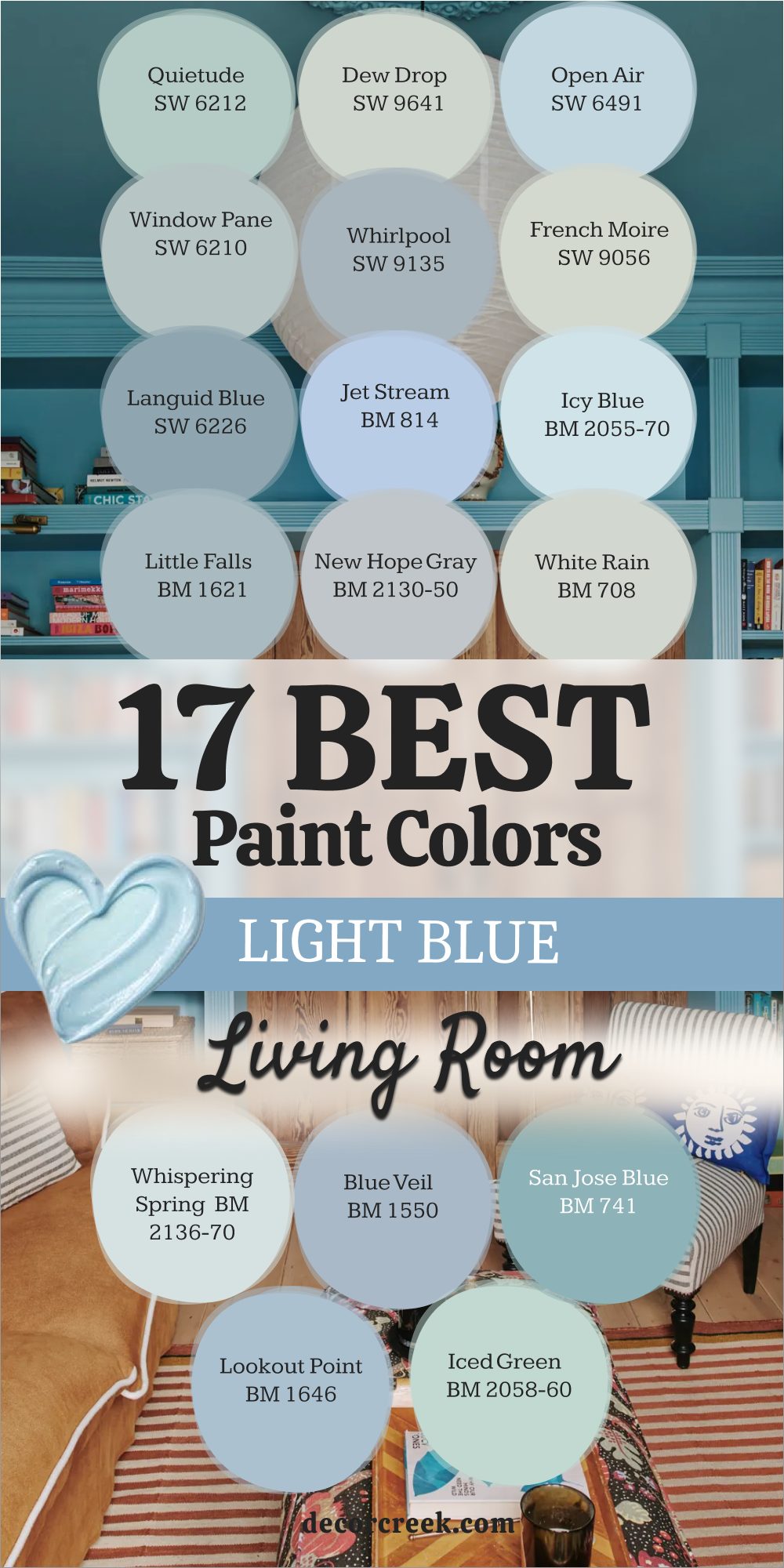
17 Best Light Blue Living Room Paint Color
Light blues are incredibly popular for their ability to brighten and refresh a room, but they can easily fall flat; these 17 options are my tried-and-true choices that maintain their sophisticated color and clarity in any space.
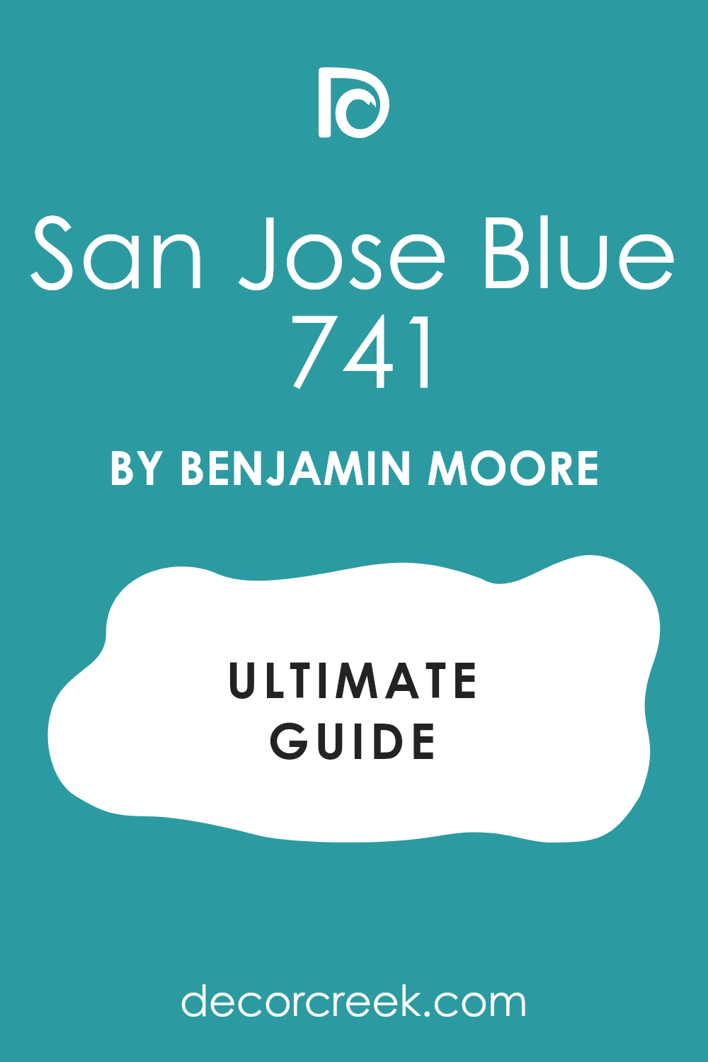
San Jose Blue 741
San Jose Blue is a clean, medium blue that is bright and immediately appealing, yet it avoids being overly saturated or neon.
This shade is great for a living room that can handle a cheerful, true blue on the walls, injecting a feeling of confidence and color clarity.
It works well with classic white trim and patterned rugs, providing an immediate energy lift. I use it when the design calls for a clear, happy, and confident blue that feels classic and vibrant.
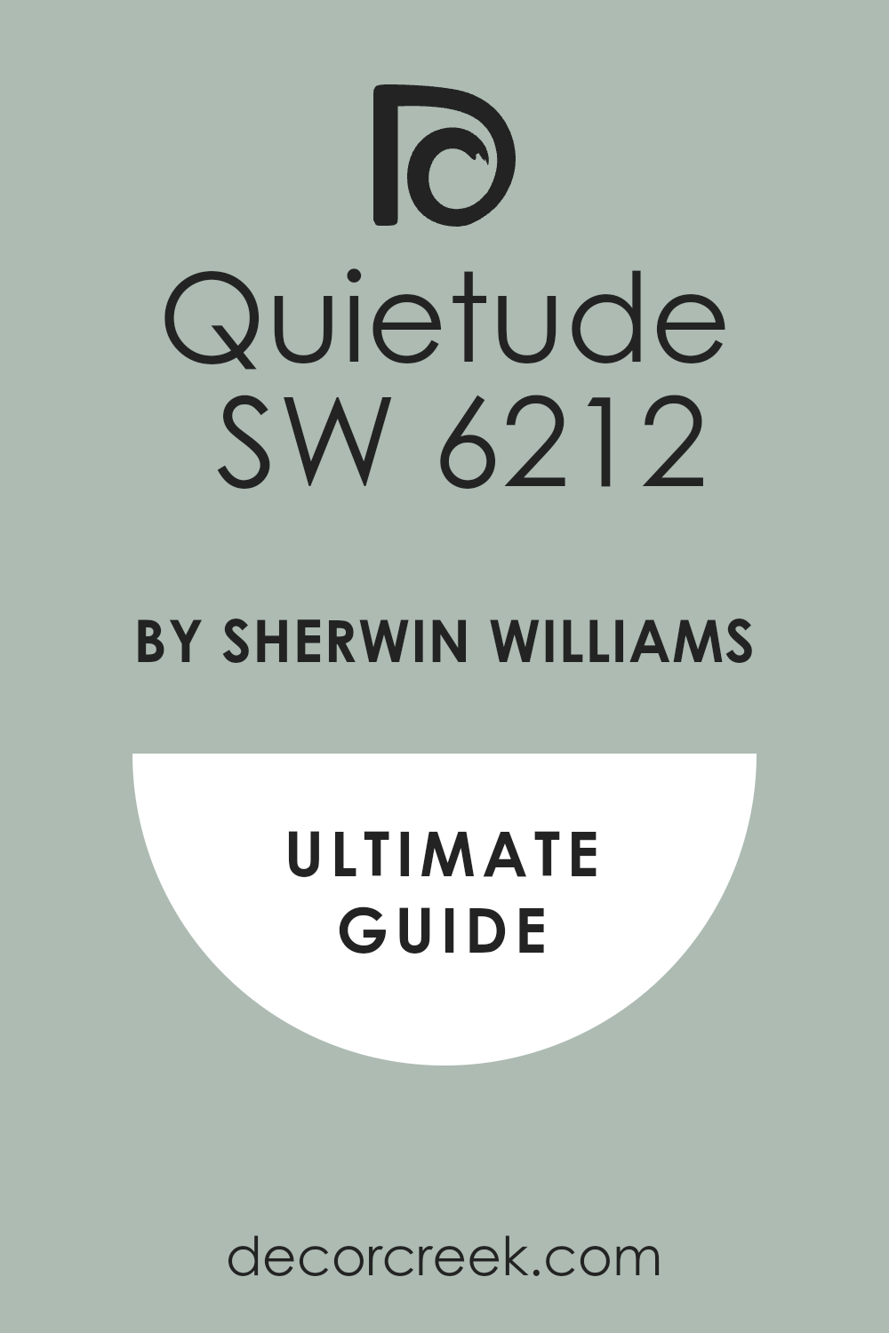
Quietude SW 6212
Quietude is a soft, dusty blue-green that truly lives up to its name, immediately bringing a peaceful, meditative feeling to the walls. This shade is wonderful for an entire living room, creating a light, airy, and incredibly relaxed atmosphere, reminiscent of a gentle sea breeze or morning mist.
It has just the right amount of gray to keep it from looking bright or overwhelming, giving it a sophisticated, muted texture that feels mature and refined.
Its balanced blue/green composition makes it versatile, pairing equally well with blue and green furnishings. I love pairing it with natural wood and linen to enhance its relaxing, spa-like quality, creating a perfect sanctuary.
🎨 Check out the complete guide to this color right HERE 👈
Innocence 2055-70
Innocence is an incredibly pale, near-white blue that is cool, crisp, and highly refreshing, making it perfect for maximizing light.
This shade is excellent for adding just a kiss of cool color to walls that might otherwise be pure white, giving them a subtle, airy depth.
It works beautifully in very sunny, south-facing rooms, where its coolness helps to balance the warmth of the sun, preventing the light from feeling too harsh or yellow.
I love its clean, simple quality for creating a fresh, pristine, and very open feel in a living room.
🎨 Check out the complete guide to this color right HERE 👈

Little Falls 1621
Little Falls is a mid-tone blue-gray that has a lovely soft, natural quality, feeling grounded, sophisticated, and wonderfully balanced. This shade is wonderful for a main living room wall, providing a noticeable color that still functions beautifully as a refined neutral that won’t overwhelm the space.
It works perfectly with wood furniture and cream-colored fabrics, creating a quiet, tailored, and very calming look.
I use it when the room needs a blue that feels strong and permanent but remains comfortable and easy to live with.
Dew Drop SW 9641
Dew Drop is an incredibly pale blue that is nearly white, offering just the faintest whisper of a cool, fresh color on the walls. This shade is perfect for a living room that needs brightening, as its high LRV ensures it reflects light beautifully while still adding more character than a simple white.
It works wonderfully on all four walls, providing a subtle, watercolor-like wash of color that feels delicate and barely-there.
I often use it as a subtle background for brighter blue and green artwork, allowing the art to shine while the walls add a gentle, cool glow. It’s the ideal choice for an airy, minimalist space.
🎨 Check out the complete guide to this color right HERE 👈

Open Air SW 6491
Open Air is a very light, clean blue that feels wonderfully bright, cheerful, and immediately suggests the look of a clear summer sky. This shade is great for a living room that needs an energetic lift, bringing a happy, optimistic, and refreshing quality to the space.
Unlike many light blues that can look gray or dusty, Open Air is crisp and clear. It works beautifully with sharp, crisp white trim and soft, light-colored furniture, reinforcing a breezy and clean aesthetic.
I recommend it when the design calls for an uncomplicated, straightforward, and truly joyful blue wall color.
🎨 Check out the complete guide to this color right HERE 👈

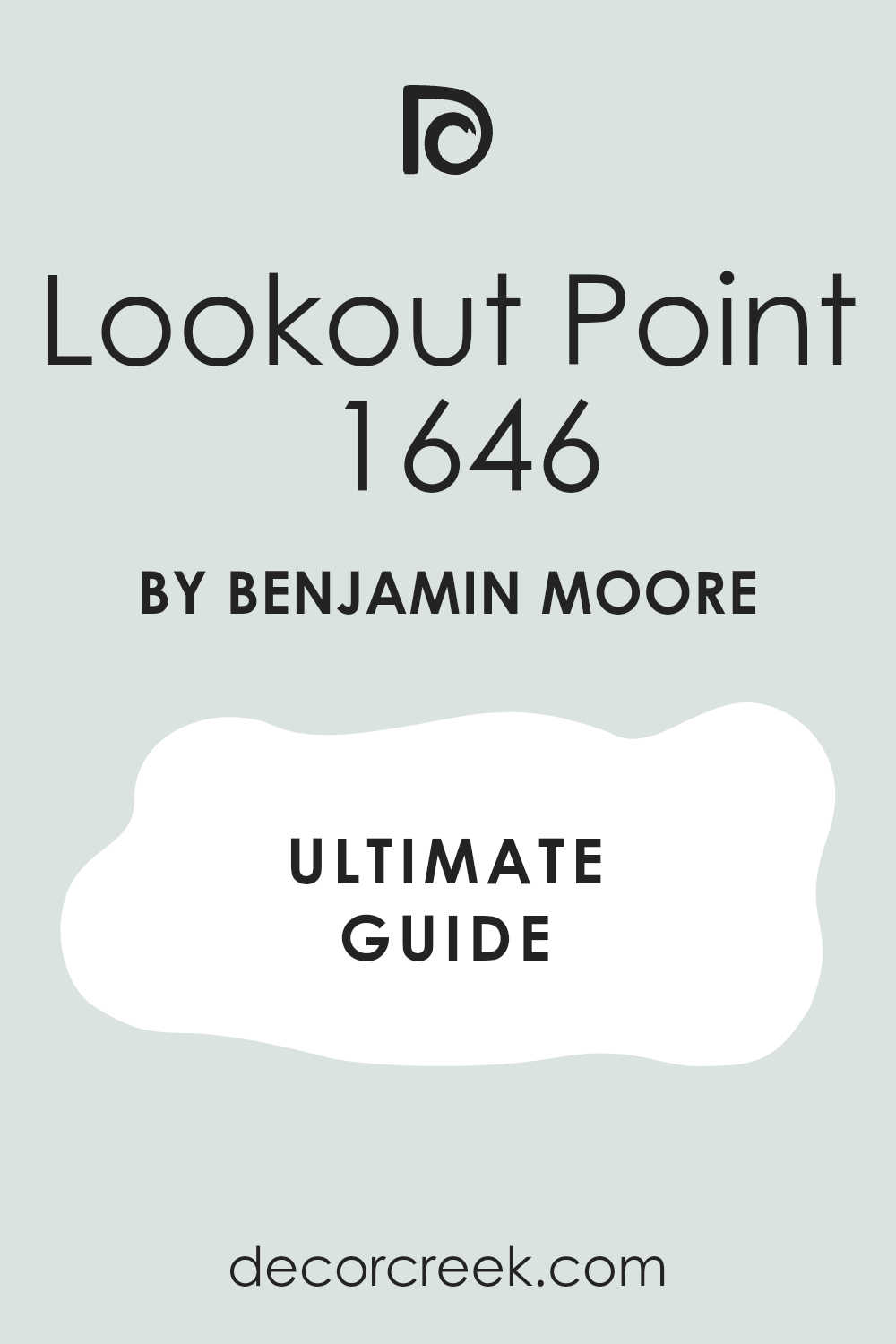
Lookout Point 1646
Lookout Point is a deep, muted powder blue that has a strong gray undertone, giving it a sophisticated depth and visual weight. This shade is lovely for a main wall color, providing a strong blue presence that still feels comfortable and tailored.
It works beautifully with warm wood tones and cream-colored sofas, creating an intimate, well-appointed, and very handsome feel.
I recommend it when the desired blue should feel weighty, refined, and enduring.
🎨 Check out the complete guide to this color right HERE 👈
Window Pane SW 6210
Window Pane is a gentle, light blue-green that is highly versatile and easy to decorate around, making it a dependable choice for a light color. This shade has a perfect balance of blue and green, giving it a soft, water-inspired feel that is calming and easy on the eyes.
It is a lovely color for a main living room wall, providing a soothing yet interesting backdrop that changes beautifully with the light.
I love it because it feels light and fresh without being flimsy, maintaining a solid presence that contributes to a comforting and cohesive home design.
🎨 Check out the complete guide to this color right HERE 👈
French Moire SW 9056
French Moire is a lovely, medium-toned blue that is clean, slightly vibrant, and suggests the classic, sophisticated color of cornflower blue. This shade is great for a living room that needs a beautiful, clear blue wall that feels tailored and elegant without being overly deep or dark.
It has a beautiful clarity that works well with both white and warm wood tones, providing a fresh, traditional, and polished appearance.
I love its ability to bring a striking, happy color into a sophisticated setting, lending a joyful yet refined elegance to the space.
🎨 Check out the complete guide to this color right HERE 👈
Languid Blue SW 6226
Languid Blue is a quiet, muted medium blue with strong gray undertones that grant it a refined, dusky, and mature quality. This shade is excellent for a main wall color in a room that needs noticeable depth but should remain soft and not overwhelming.
It is perfect for creating a cozy, almost introspective mood. It works perfectly with deep wood tones, natural textures, and linen fabrics, creating a handsome, grounded, and very calming look.
I use it when the client wants a blue that feels mature, sophisticated, and entirely free of any childish brightness.
🎨 Check out the complete guide to this color right HERE 👈
Whirlpool SW 9135
Whirlpool is a slightly deeper, misty blue with noticeable gray undertones, giving it a more substantial and sophisticated feel compared to pure light blues. This shade is perfect for a living room where you want the blue to be clearly visible and have a distinct presence but still remain soft and muted.
The heavy gray component prevents it from feeling too intense. It works wonderfully with beige and cream neutrals, creating a refined, cozy, and slightly traditional contrast.
I use it to give a room a gentle, enveloping hug of color that feels serene and grounded.
🎨 Check out the complete guide to this color right HERE 👈
Jet Stream 814
Jet Stream is a clean, mid-tone blue that is beautifully vibrant and energetic without being shocking, reminiscent of a clear, cloudless sky. This shade is wonderful for an energetic living room that can handle a true, unapologetic blue on the walls, injecting a feeling of freshness and movement.
It is a straightforward, happy blue that truly comes to life when paired with crisp white trim, which helps to define its color and keep the look sharp.
I recommend it when the design calls for a cheerful, bright, and invigorating atmosphere that doesn’t compromise on color intensity.
🎨 Check out the complete guide to this color right HERE 👈

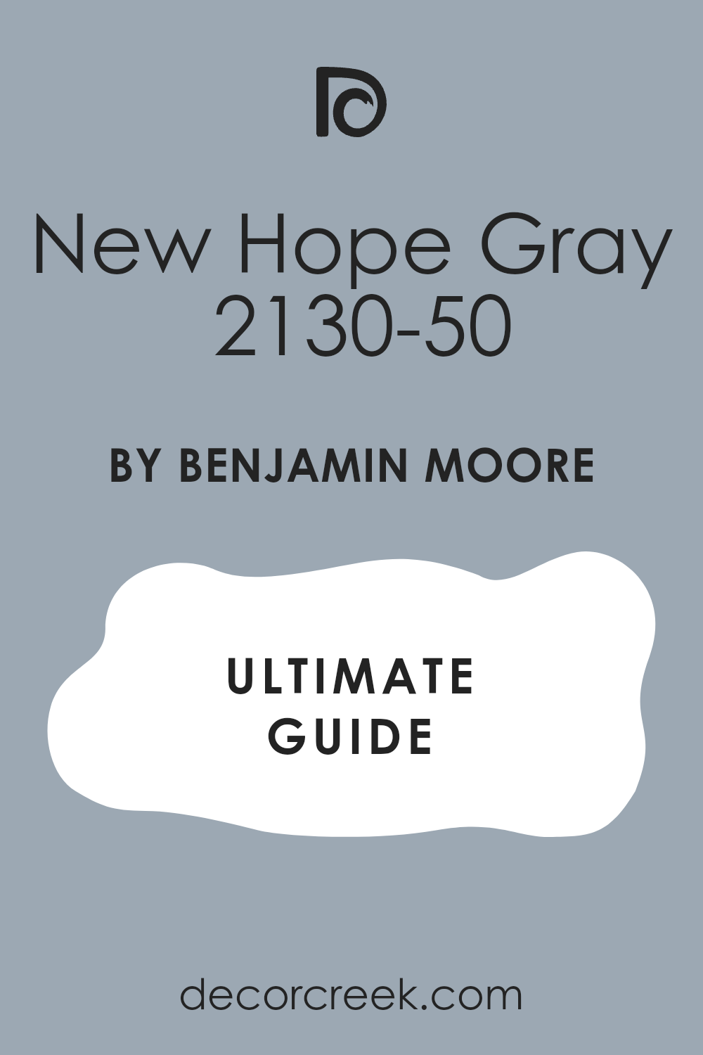
New Hope Gray 2130-50
New Hope Gray is a gray that leans noticeably and beautifully blue, offering a sophisticated, deep-sky feeling to the walls. This shade is perfect for a living room that needs a more architectural, moody background without venturing into the realm of darkness.
The blend of gray and blue is beautifully complex, changing subtly throughout the day.
It works beautifully with crisp white trim and light-colored furnishings, creating a defined contrast that feels both classic and current at the same time, lending an air of quiet gravity.
🎨 Check out the complete guide to this color right HERE 👈
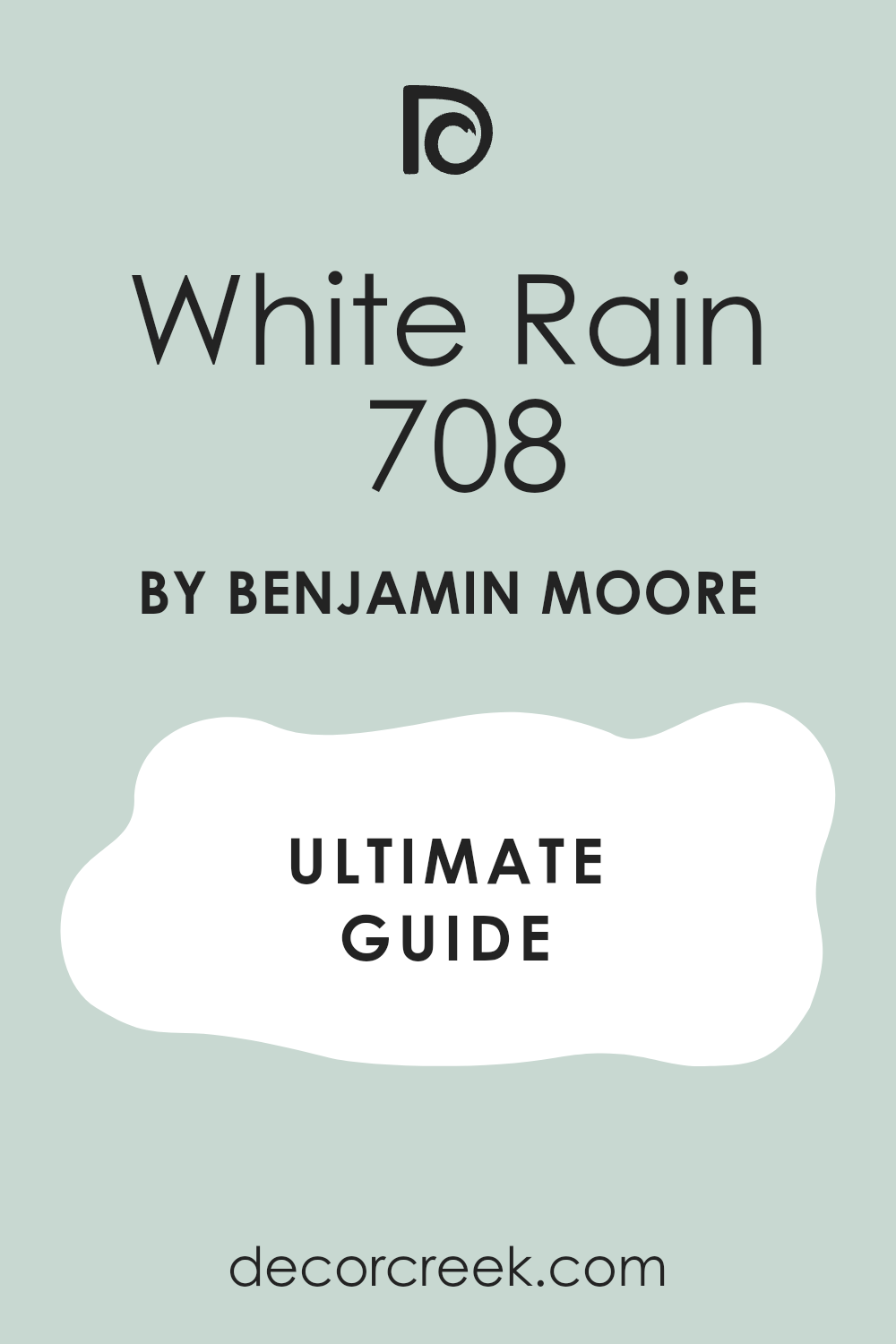
White Rain 708
White Rain is an exceptionally light, silvery blue-gray that is virtually an off-white, providing a wonderful misty, atmospheric quality.
This shade is ideal for all walls in a living room, adding a very subtle coolness and increasing the perceived brightness of the room.
It works wonderfully in natural light, where its faint color softens beautifully, suggesting a cloud-draped sky. I use it when the goal is a soft, gentle wall color that is barely there, adding depth without obvious color.
🎨 Check out the complete guide to this color right HERE 👈
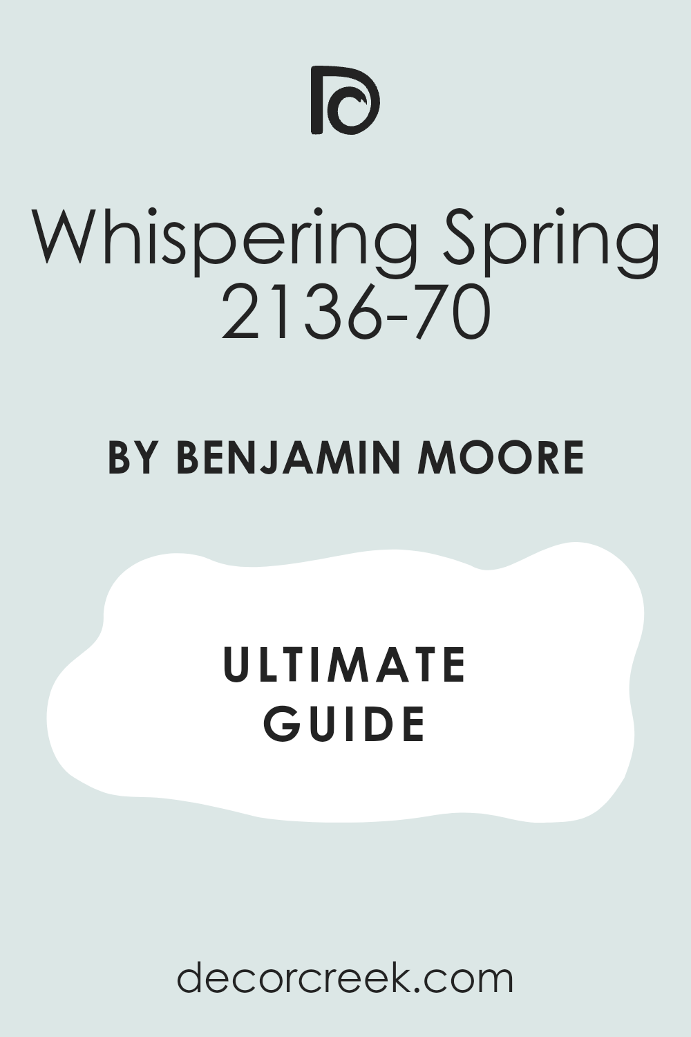
Whispering Spring 2136-70
Whispering Spring is a very pale blue-green that feels light, airy, and suggests the innocence of new foliage and clear spring water. This shade is wonderful for a cheerful, light-filled living room that benefits from a fresh, uplifting color on the walls.
It works beautifully with white and soft neutrals, reinforcing a refreshing, natural, and highly inviting atmosphere.
I recommend it for an optimistic and truly welcoming feel, perfect for a cozy, cottage-style or modern farmhouse aesthetic.
🎨 Check out the complete guide to this color right HERE 👈
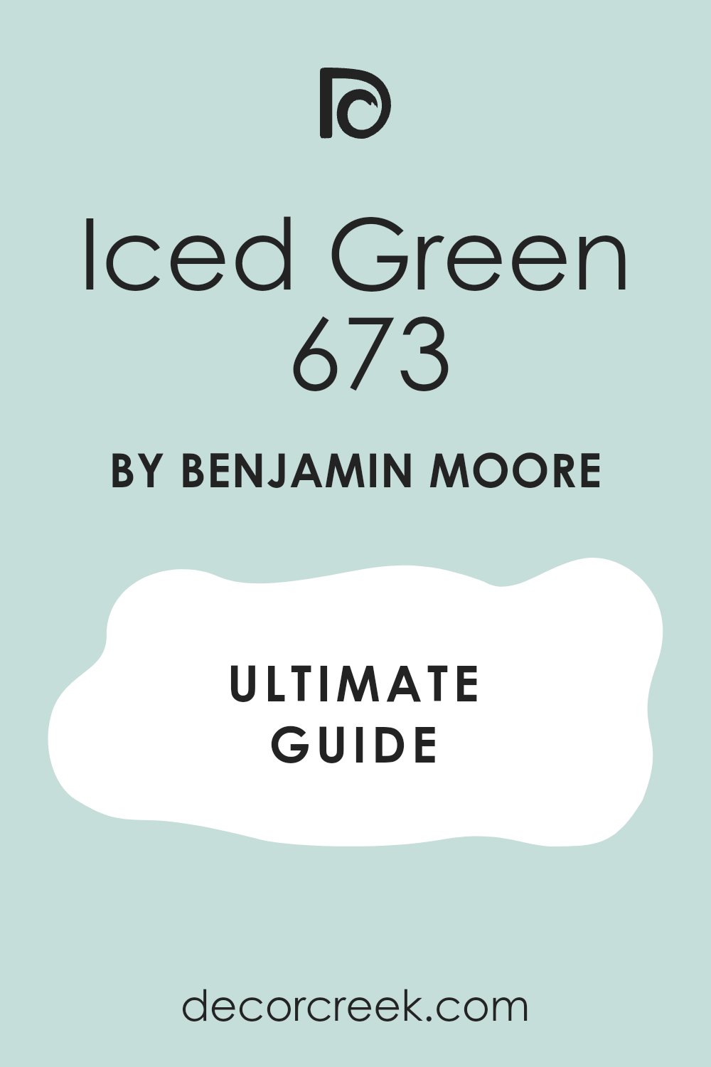
Iced Green 673
Iced Green is a very pale green that has a noticeable blue undertone, making it feel perfectly cool, crisp, and highly refreshing. This shade is perfect for a light-filled living room that wants a touch of color that is natural and easygoing, functioning almost as a neutral.
It works beautifully with light woods and soft white fabrics, creating a peaceful, nearly neutral backdrop.
I love its fresh, clean quality for a light and simple aesthetic, especially in a modern setting.
🎨 Check out the complete guide to this color right HERE 👈
Final Thoughts on Benjamin Moore and Sherwin Williams the 2026 Blue Living Room Palette
As I look at this vast selection of 39 colors, particularly those dependable blues, it’s clear that our homes are moving toward a deeper appreciation for color with history and feeling. The future of the blue living room is less about fleeting fads and more about refined, enduring comfort.
Colors like Hale Navy and Van Deusen Blue are becoming modern classics, proving that a tailored, rich blue will always be a staple of sophisticated design.
The gentle, almost quiet blues—those with soft gray or green mixed in, like Palladian Blue and Quietude—are my final favorites because they perfectly capture the current need for sanctuary and restorative living. We are seeking walls that feel like a gentle hug, not a loud, overwhelming statement.
Even when we pick a deep color, we want it to feel grounded and organic, like the earth or the deep ocean.
The enduring quality of both Benjamin Moore and Sherwin Williams means that when you pick one of these 39 colors, you are not just painting a room; you are setting a beautiful, lasting mood for your home that transcends passing trends.