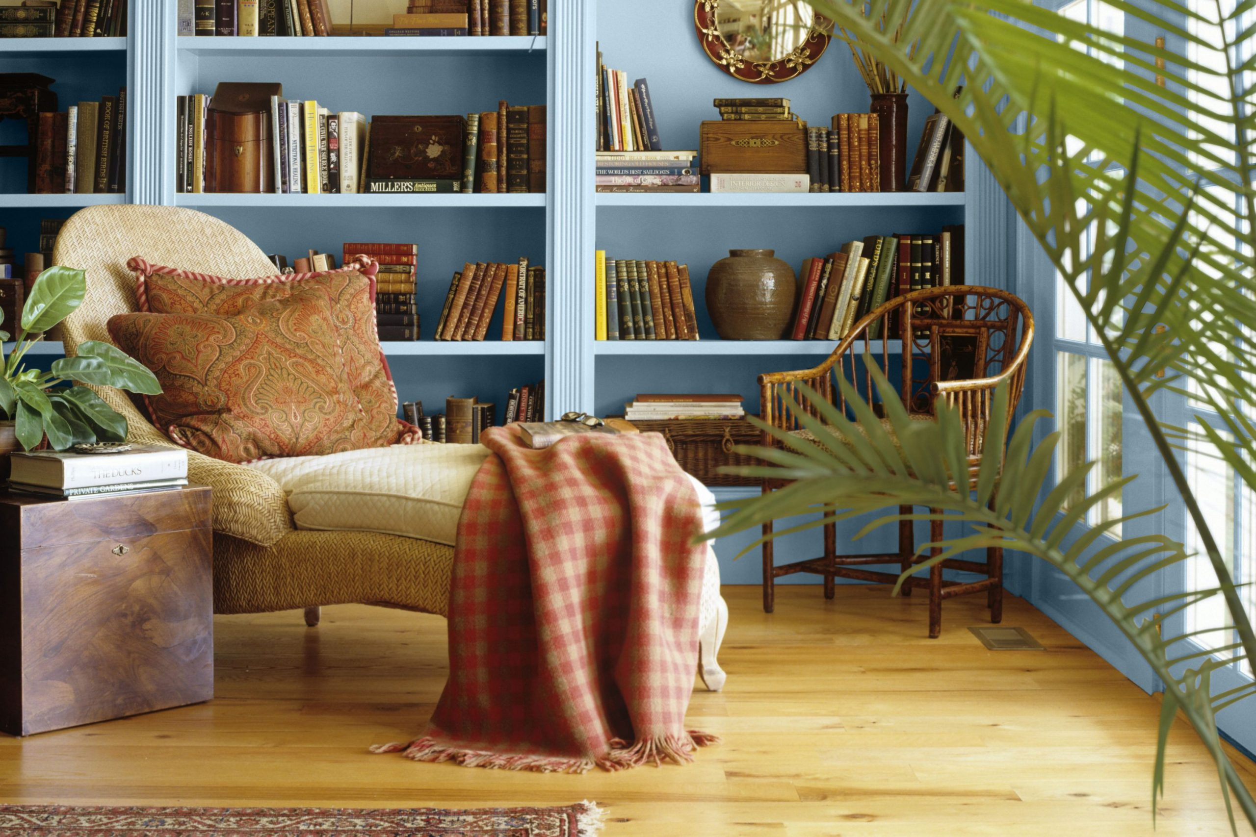
Choosing a paint color for your reading room is about more than just picking a pretty shade from a catalog; it is about intentionality and the psychological impact of your environment. I see rooms as complex feelings and emotional landscapes rather than just static collections of walls, floors, and ceilings. When you finally sit down with a long-awaited book, you want to feel an immediate shift in the atmosphere—a sense that the world outside has stopped moving, that the noise of the day has been muted, and that your focus is now entirely protected.
I specifically look for colors that act as a quiet companion to your focus, helping you dive deep into a story without making your eyes feel tired or strained by harsh glares. A truly good color does two things simultaneously: it makes your book collection look like a curated art gallery and it transforms your reading chair into the most coveted spot in the entire house.
My goal is to help you discover a shade that perfectly fits your personal style, whether that is moody and academic or bright and airy, making you want to linger for just one more chapter.
Every wall tells a story and sets a specific stylistic tone long before you even open your book.

Why I Trust Sherwin-Williams and Benjamin Moore for Reading Room Paint Colors
I have spent years on ladders painting rooms and staging homes for families, and through that experience, I have learned that the quality of the pigment is everything. I always go back to Sherwin-Williams and Benjamin Moore because their paint stays remarkably true to the little paper samples you hold in your hand at the store. Many cheap, generic paints look vastly different—and often disappointing—once they dry on a large wall, but these premium brands stay consistent and reliable.
The way the light hits their high-quality pigment makes a room feel expensive and well-crafted. In a reading room, where you spend hours staring at the walls in your peripheral vision, I need colors that do not fade over time or look patchy and uneven when the sun moves across the room.
These companies offer an incredible range of dark, light, and mid-tone options that are engineered to work for any mood or architectural style. Furthermore, their paint has a superior “hide” and durability, meaning it masks little marks, scuffs, and bumps on the walls very well. I trust these brands to make my designs look professional, polished, and cozy every single time.
How I Choose the Right Paint Color to Create a Cozy and Focused Reading Room
My process starts by carefully observing the natural light that flows through your windows at different times of the day. If a room is naturally very bright with southern exposure, I might pick a darker, more saturated shade to soak up that extra glare and prevent the room from feeling washed out. Conversely, if the room is naturally dark or north-facing, I look for soft, “glowing” whites or light grays with warm undertones to help the space feel open, even on a cloudy afternoon.
I also take a full inventory of the furniture you already own and love—whether it is a vintage brown leather chair, a sleek modern sofa, or white wooden shelves. Colors should work together like a synchronized team to make the room feel balanced and harmonious rather than cluttered.
I am a firm believer in testing; I often apply a large patch of paint to the wall to see how the hue shifts from a crisp morning light to the warm, yellow glow of a lamp at night. Lighting changes everything, so I never rush the choice. My ultimate goal is to build a sanctuary for you—a spot where you feel safe, unhurried, and ready to learn or get lost in a new world.
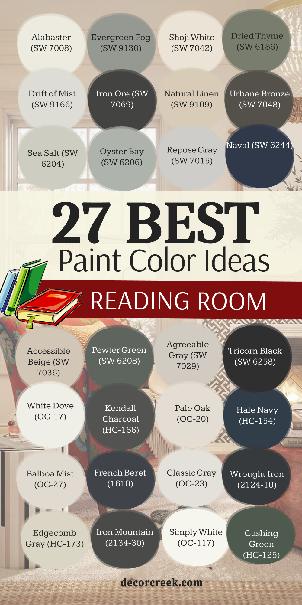
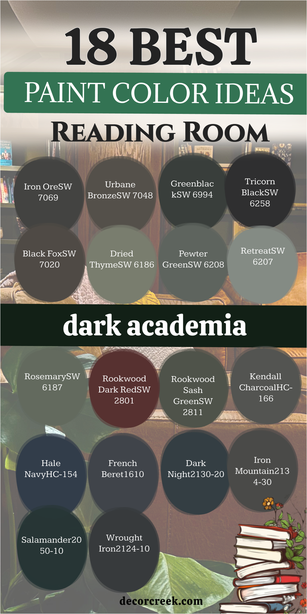
18 Dark Academia Reading Room Paint Color Ideas
Iron Ore SW 7069
Iron Ore starts our list with a deep charcoal look that feels heavy and grounded. This shade works perfectly if you want a room that feels like a secret library in an old castle.
It is not quite black, which keeps the walls from feeling too flat or boring.
You will notice how gold picture frames and old books really pop against this dark background.
Best used in: formal studies, libraries, and moody accent walls.
Pairs well with: Extra White SW 7006, honey oak wood, and antique brass fixtures. The key rule of this color for a sophisticated style is to use it in rooms with high ceilings to create a sense of infinite depth and mystery.
🎨 Check out the complete guide to this color right HERE 👈

Urbane Bronze SW 7048
Urbane Bronze brings a mix of brown and gray that feels very natural and earthy.
This color reminds me of smooth stones or old metal statues found in a garden. It creates a mood that is very steady and helps your mind stay on the pages of your book.
The brown tones inside the paint keep it from feeling cold like some other dark grays might.
Best used in: cozy dens, home offices, and exterior accents.
Pairs well with: Shoji White SW 7042, forest green velvet, and black metal. The key rule of this color for a grounded style is to pair it with organic textures like leather and linen to emphasize its earthy roots.
🎨 Check out the complete guide to this color right HERE 👈

Greenblack SW 6994
Greenblack offers a very hidden hint of forest color buried inside a deep black base.
This shade is perfect for people who find regular black too simple or too harsh for a home. You only really see the green when the sun hits the wall at a certain angle during the day.
It creates a feeling of being in deep woods at twilight while you read.
Best used in: media rooms, libraries, and small powder rooms.
Pairs well with: Alabaster SW 7008, cognac leather, and muted gold. The key rule of this color for an immersive style is to paint the trim the same color as the walls to create a seamless “color drench” effect.
🎨 Check out the complete guide to this color right HERE 👈
Tricorn Black SW 6258
Tricorn Black is the most honest and true black you can find for your walls. This color does not have any secret blue or brown tones hiding inside of it.
It creates a very clean and sharp look that makes everything else in the room look brighter.
It turns your reading room into a high-end gallery where your books are the main stars.
Best used in: modern studies, front doors, and staircase railings.
Pairs well with: Pure White SW 7005, emerald green, and marble surfaces. The key rule of this color for a sharp style is to use it as a backdrop for high-contrast art to make colors vibrate with energy.
🎨 Check out the complete guide to this color right HERE 👈

Black Fox SW 7020
Black Fox is a very rich dark brown that feels like a cup of strong coffee. This shade is much warmer than a gray-black and makes a room feel very lived-in and friendly.
I think it looks best when paired with cream-colored pillows and soft wool blankets.
It gives the room a sense of history even if your house is brand new.
Best used in: mountain cabins, traditional libraries, and bedrooms.
Pairs well with: Accessible Beige SW 7036, cream knits, and walnut furniture. The key rule of this color for a warm style is to use warm-toned lighting to bring out the rich chocolate undertones.
🎨 Check out the complete guide to this color right HERE 👈

Dried Thyme SW 6186
Dried Thyme brings a dusty green color to your walls that looks like a bundle of herbs.
This shade is very soft on the eyes and helps you feel relaxed the moment you walk in. It is dark enough to be moody but light enough to keep the room feeling airy.
I love how this green connects your indoor reading spot to the trees and grass outside.
Best used in: sun-drenched nooks, mudrooms, and bedroom corners.
Pairs well with: Dover White SW 6385, terracotta, and light oak. The key rule of this color for a botanical style is to use it in rooms with natural light to highlight its organic, leafy pigment.
🎨 Check out the complete guide to this color right HERE 👈

Pewter Green SW 6208
Pewter Green is a darker, more serious version of green that feels very cool and steady.
This color has a lot of gray in it, which makes it look like old metal or dark sea water. I suggest this shade for a reading room that needs to feel very quiet and professional.
It creates a wonderful contrast with white trim around the windows.
Best used in: home offices, kitchen islands, and private studies.
Pairs well with: Swiss Coffee OC-45, slate gray, and industrial steel. The key rule of this color for a calm style is to use it on built-in shelving to give your book collection a solid, historic feel.
🎨 Check out the complete guide to this color right HERE 👈

Retreat SW 6207
Retreat is a dusty blue-green that feels like a quiet afternoon at a lake house. This color is very soft and does not demand too much attention from your eyes.
I like to use it in rooms where the main goal is to sit down and forget about a long day.
It has a very watery feel that helps lower the energy of a busy home.
Best used in: guest bedrooms, reading nooks, and nurseries.
Pairs well with: Sea Salt SW 6204, driftwood, and ivory textiles. The key rule of this color for a peaceful style is to use it in spaces where you want to promote deep breathing and relaxation.
🎨 Check out the complete guide to this color right HERE 👈

Rosemary SW 6187
Rosemary is a deep, lush green that feels like walking into a thick forest.
This color is very popular right now because it brings a lot of life to a room without being too bright.
I think it creates a perfect backdrop for a cozy chair and a side table for your tea. The green is dark enough to feel moody but organic.
Best used in: master suites, formal dining rooms, and library walls.
Pairs well with: Greek Villa SW 7551, dark mahogany, and brass. The key rule of this color for a classic style is to use it in rooms with large windows to balance the deep saturation with natural views.
🎨 Check out the complete guide to this color right HERE 👈

Rookwood Dark Red SW 2801
Rookwood Dark Red is a deep wine color that feels very traditional and grand.
This shade reminds me of old leather-bound books and secret rooms in large mansions.
It adds a lot of warmth to a room and makes it feel very snug during the cold months. I love how this red looks under a lamp, turning into a glowing background.
Best used in: dining rooms, traditional libraries, and entryways.
Pairs well with: Creamy SW 7012, navy blue, and dark wood antiques. The key rule of this color for a grand style is to use it in rooms where you want to stimulate deep conversation and intellectual thought.
🎨 Check out the complete guide to this color right HERE 👈
Rookwood Sash Green SW 2811
Rookwood Sash Green is a dark and mossy green that looks like it belongs in a historic home. This color is very earthy and feels like it has been around for a hundred years.
I like to use this shade to give a room a sense of importance and weight.
It is a very steady color that does not change much as light shifts.
Best used in: historic renovations, basement offices, and dens.
Pairs well with: Antique White SW 6119, tan leather, and copper accents. The key rule of this color for a vintage style is to use it on the ceiling as well to create a cozy, “wrapped” feeling in a small room.
🎨 Check out the complete guide to this color right HERE 👈
Kendall Charcoal HC-166
Kendall Charcoal is a very popular dark gray that feels very modern and sleek.
This shade is like a dark suit, looking very sharp and put together in any light.
I love how it creates a neutral background that lets your colorful book covers stand out. It is a very safe dark color without strange purple tints.
Best used in: modern lofts, living rooms, and theater rooms.
Pairs well with: Chantilly Lace OC-65, bright yellow, and chrome. The key rule of this color for a modern style is to use it with high-gloss trim to create a sophisticated, architectural look.
🎨 Check out the complete guide to this color right HERE 👈

Hale Navy HC-154
Hale Navy is a classic dark blue that feels like the ocean at night. This color is very strong and makes a room feel very royal and special.
I love how navy blue acts like a neutral, meaning it goes with almost everything else in the room.
It creates a very deep and rich feeling for a cozy reading corner.
Best used in: kids bedrooms, kitchen cabinets, and cozy libraries.
Pairs well with: Simply White OC-117, coral, and light oak wood. The key rule of this color for a nautical style is to pair it with white accents to keep the deep blue from feeling too heavy.
🎨 Check out the complete guide to this color right HERE 👈

French Beret 1610
French Beret is a very dark blue-gray that looks like the sky just before it turns totally black.
This color is very sophisticated and has a lot of hidden depth. I think it is one of the best colors for creating a very moody and stylish reading room.
It feels very heavy and solid, protecting you while you read.
Best used in: master bedrooms, private dens, and cabinetry.
Pairs well with: Stonington Gray HC-170, silver, and pale lavender. The key rule of this color for a chic style is to use it where you want the walls to recede, making the furniture and books take center stage.
🎨 Check out the complete guide to this color right HERE 👈
Dark Night 2130-20
Dark Night is a deep teal that brings a lot of drama and mystery to a room.
This color is a mix of navy blue and dark green, making it feel very lush and interesting.
I love how it creates a very specific mood that feels like an underwater adventure or a walk in a moonlit forest.
Best used in: focal walls, reading nooks, and formal sitting rooms.
Pairs well with: Pale Oak OC-20, mustard yellow, and natural linen. The key rule of this color for a dramatic style is to use it in rooms with varied textures like velvet and wool to catch the light differently.
Iron Mountain 2134-30
Iron Mountain is a warm dark gray that feels very soft and fuzzy like a wool coat.
This color has a little bit of brown in it which makes it feel much friendlier than a cold gray.
I like to use this shade in rooms where you want to spend a lot of time lounging and losing track of time.
Best used in: open concept living rooms, basements, and bedrooms.
Pairs well with: White Dove OC-17, soft pinks, and light pine. The key rule of this color for a soft style is to use it in rooms with plenty of textiles to emphasize its comforting, “wrapped” nature.
🎨 Check out the complete guide to this color right HERE 👈

Salamander 2050-10
Salamander is an extremely dark green that is almost black but with a secret life.
This color is very moody and looks like a deep pond in a dark forest.
I love using this shade to create a very high-end and luxurious reading room that feels totally private and away from the world.
Best used in: accent walls, built-ins, and dark academic libraries.
Pairs well with: Revere Pewter HC-172, burgundy, and dark gold. The key rule of this color for a luxurious style is to use it in small spaces to embrace a “jewel box” effect that feels rich and intentional.
🎨 Check out the complete guide to this color right HERE 👈

Wrought Iron 2124-10
Wrought Iron is a very deep gray that sits right on the edge of being black.
This color is inspired by old metal fences and has a very strong and sturdy feeling.
I like how it makes a room feel very anchored. It is a great choice for a reading room with lots of big windows to balance light.
Best used in: modern entryways, kitchen islands, and dens.
Pairs well with: Balboa Mist OC-27, bright white, and natural wood. The key rule of this color for an industrial style is to use it on the doors and trim for a sharp, graphic look that defines the room.
🎨 Check out the complete guide to this color right HERE 👈

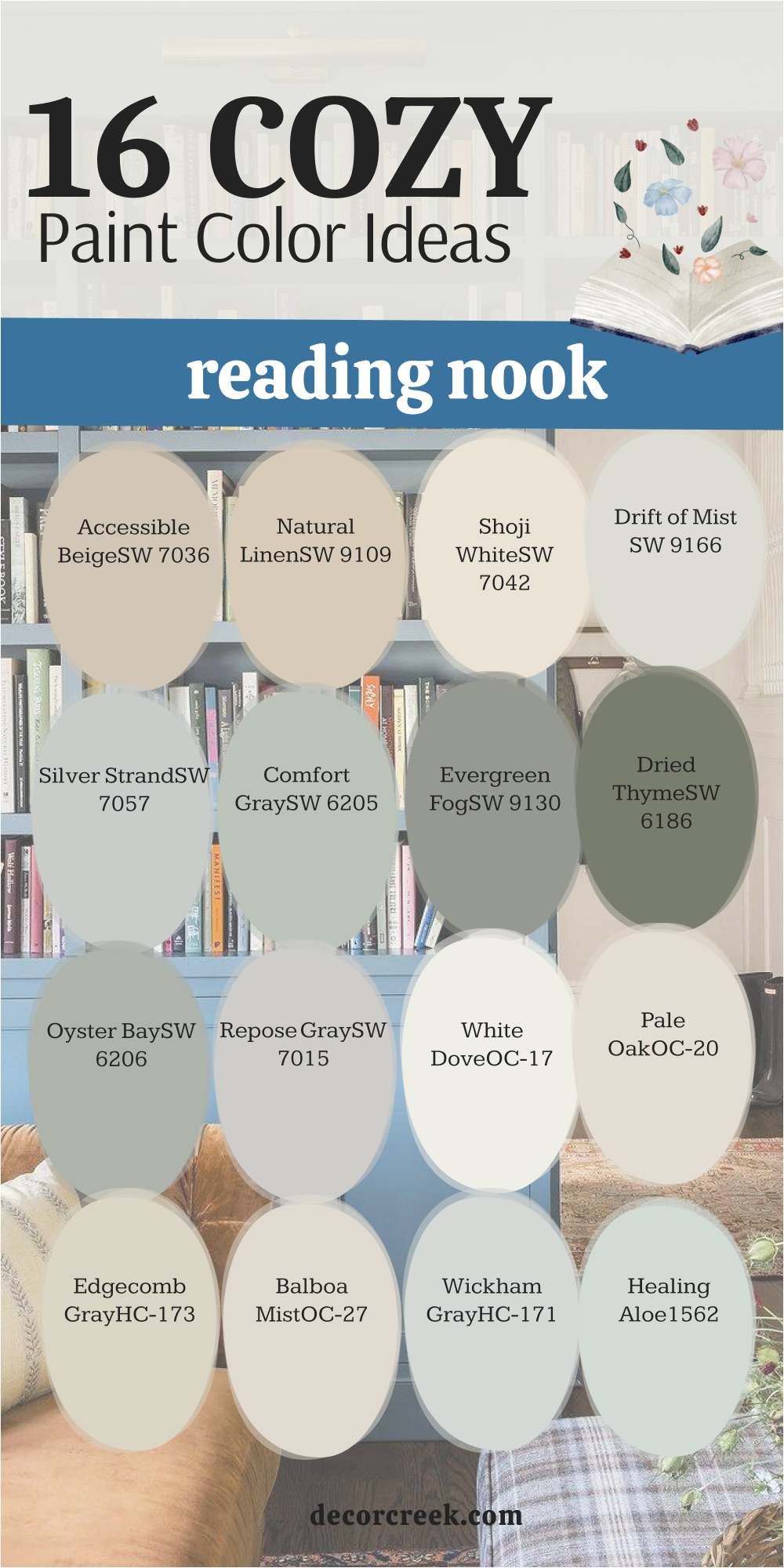
16 Cozy Reading Nook Paint Color Ideas
Accessible Beige SW 7036
Accessible Beige is a very friendly and light color that feels like a warm hug.
This shade is much more interesting than a plain white because it has a little bit of gray and tan inside.
I find that it makes a small reading nook feel very open and clean without feeling cold.
Best used in: living rooms, entryways, sunrooms, and kids bedrooms.
Pairs well with: Dover White SW 6385, bright yellow, cool grays, and silver hardware. The key rule of this color for a vibrant style is to use it where you want the light to bounce around and make people feel happy.
🎨 Check out the complete guide to this color right HERE 👈

Natural Linen SW 9109
Natural Linen looks just like a soft piece of fabric on your walls.
This color is very light and has a touch of yellow that makes it feel like sunshine is hitting the room.
I like to use this in a reading nook to make it feel very breezy and lighthearted.
Best used in: sunrooms, breakfast nooks, and summer homes.
Pairs well with: Pure White SW 7005, sage green, and wicker furniture. The key rule of this color for a sunny style is to use it in rooms with northern light to warm up the space and keep it from looking gray.
🎨 Check out the complete guide to this color right HERE 👈

Shoji White SW 7042
Shoji White is a very soft white that feels like it has a little bit of cream mixed in.
This color is not bright or harsh like some whites can be in a sunny room.
I find that it makes a reading nook feel very peaceful and high-quality, almost like a spa or a retreat.
Best used in: meditation rooms, bedrooms, and open kitchens.
Pairs well with: Urbane Bronze SW 7048, light gray, and natural wood. The key rule of this color for a serene style is to use it on the walls, trim, and ceiling for a seamless, calming environment.
🎨 Check out the complete guide to this color right HERE 👈

Drift of Mist SW 9166
Drift of Mist is a very light gray that feels as soft as a morning cloud.
This color is perfect for a reading nook where you want a very modern and clean feeling.
It has just enough color to make the white trim around your windows look sharp and intentional.
Best used in: modern hallways, bathrooms, and small nooks.
Pairs well with: Iron Ore SW 7069, pale blue, and marble accents. The key rule of this color for a misty style is to use it in rooms with eastern light to emphasize its soft, airy quality in the morning.
🎨 Check out the complete guide to this color right HERE 👈

Silver Strand SW 7057
Silver Strand is a very pretty mix of light gray, green, and a tiny bit of blue.
This color feels like a misty day at the beach and is very relaxing to look at.
I find that it helps a reading nook feel very special and different from the rest of the house.
Best used in: laundry rooms, bathrooms, and bedroom corners.
Pairs well with: Extra White SW 7006, navy blue, and weathered wood. The key rule of this color for a coastal style is to use it in rooms where the light changes throughout the day to see its different blue and green faces.
🎨 Check out the complete guide to this color right HERE 👈

Comfort Gray SW 6205
Comfort Gray is a medium-light color that is actually more green than gray.
This shade is very popular because it feels very stable and easy to live with.
I like to use it in reading nooks that are meant for both kids and adults because of its friendly, balanced energy.
Best used in: family rooms, guest rooms, and sunrooms.
Pairs well with: Sea Salt SW 6204, dark gray, and cream textiles. The key rule of this color for a balanced style is to use it with lots of plants to bring out its natural, leafy undertones.
🎨 Check out the complete guide to this color right HERE 👈

Evergreen Fog SW 9130
Evergreen Fog is a very trendy color that looks like a soft, dusty forest green.
This shade was very popular recently because it feels both fresh and very old at the same time.
I love how it adds a lot of personality to a reading nook without being too bold or overwhelming.
Best used in: modern farmhouses, kitchens, and reading dens.
Pairs well with: Alabaster SW 7008, gold, and warm wood tones. The key rule of this color for a trendy style is to use it as an accent behind a bookshelf to make your book collection feel more curated.
🎨 Check out the complete guide to this color right HERE 👈

Dried Thyme SW 6186
Dried Thyme makes another appearance here because it is just that good for a nook.
This green is a bit darker and more earthy than some of the other light options.
I find that it creates a very solid feeling in a reading corner that might otherwise feel too open or exposed.
Best used in: garden rooms, mudrooms, and home libraries.
Pairs well with: Dover White SW 6385, brown leather, and terracotta. The key rule of this color for a solid style is to pair it with natural wood shelving to create a rustic, outdoor-inspired retreat.
🎨 Check out the complete guide to this color right HERE 👈
Oyster Bay SW 6206
Oyster Bay is a very soft and cool green-gray that feels very sophisticated.
This color reminds me of the inside of a seashell or a smooth stone from a river.
I like to use it in reading nooks that have a lot of natural wood around them to ground the space.
Best used in: spa-like bathrooms, bedrooms, and quiet nooks.
Pairs well with: Silver Strand SW 7057, slate, and white linen. The key rule of this color for a sophisticated style is to use it in rooms with southern light to keep the gray from feeling too cool or flat.
🎨 Check out the complete guide to this color right HERE 👈

Repose Gray SW 7015
Repose Gray is often called the perfect gray because it is so well-balanced.
This color is not too warm and not too cool, making it work in almost any home style.
I find that it makes a reading nook feel very modern and very clean, like a blank slate for your thoughts.
Best used in: whole-house paint, hallways, and modern nooks.
Pairs well with: Eider White SW 7014, navy, and black accents. The key rule of this color for a versatile style is to use it as a neutral foundation that allows you to change your pillows and rugs every season.
🎨 Check out the complete guide to this color right HERE 👈

White Dove OC-17
White Dove is a very famous white color that feels very soft and creamy.
This shade is not a bright, blinding white, but more like the color of a fresh glass of milk.
I like to use it in reading nooks to make them feel very bright and full of cheer and morning light.
Best used in: kitchens, trim and doors, and sunlit nooks.
Pairs well with: Revere Pewter HC-172, blue, and brass hardware. The key rule of this color for a creamy style is to use it in rooms with low light to prevent the space from feeling dingy or yellow.
🎨 Check out the complete guide to this color right HERE 👈

Pale Oak OC-20
Pale Oak is a very light and warm gray that feels like a piece of sun-bleached wood.
This color is very elegant and makes a reading nook feel very sophisticated.
I find that it works very well with light-colored fabrics and white trim to create a high-end designer look.
Best used in: open concept living rooms, bedrooms, and nooks.
Pairs well with: Swiss Coffee OC-45, charcoal, and warm metals. The key rule of this color for an elegant style is to use it in rooms with varied lighting to see how it shifts from gray to beige throughout the day.
🎨 Check out the complete guide to this color right HERE 👈

Edgecomb Gray HC-173
Edgecomb Gray is a very popular mix of beige and gray that feels very organic.
This color is often called a “greige” because it has the best parts of both colors.
I like to use it in reading nooks to create a very warm and steady feeling that feels timeless.
Best used in: hallways, living rooms, and traditional nooks.
Pairs well with: White Dove OC-17, navy blue, and mahogany. The key rule of this color for an organic style is to use it in rooms with a lot of natural sunlight to keep the warm beige tones from becoming too yellow.
🎨 Check out the complete guide to this color right HERE 👈

Balboa Mist OC-27
Balboa Mist is a very light gray that has a tiny hint of purple or pink in some lights.
This color is very soft and feels very feminine and pretty in a reading nook.
I find that it makes the room feel very light and like it is full of air and fresh thoughts.
Best used in: bedrooms, nurseries, and cozy corners.
Pairs well with: Chantilly Lace OC-65, soft gray, and light pink. The key rule of this color for a soft style is to use it with white-painted furniture to create a clean, airy, and very inviting space.
🎨 Check out the complete guide to this color right HERE 👈

Wickham Gray HC-171
Wickham Gray is a very light gray that has a distinct blue or green undertone.
This color feels very cool and refreshing, like a cold glass of water on a hot day.
I like to use it in reading nooks that get a lot of afternoon sun to help cool the space.
Best used in: bathrooms, kitchens, and sunlit corners.
Pairs well with: Stonington Gray HC-170, navy, and white linen. The key rule of this color for a refreshing style is to use it with silver hardware to emphasize its cool, crisp blue undertones.
🎨 Check out the complete guide to this color right HERE 👈

Healing Aloe 1562
Healing Aloe is a very soft and light green that feels very watery and gentle.
This color is named after a plant that heals, and it really does make you feel better just looking at it.
I find that it is one of the most relaxing colors you can pick for a nook.
Best used in: bedrooms, spa rooms, and quiet corners.
Pairs well with: Woodlawn Blue HC-147, cream, and light wood. The key rule of this color for a gentle style is to use it with plenty of natural greenery to create a seamless indoor-outdoor reading garden.
🎨 Check out the complete guide to this color right HERE 👈

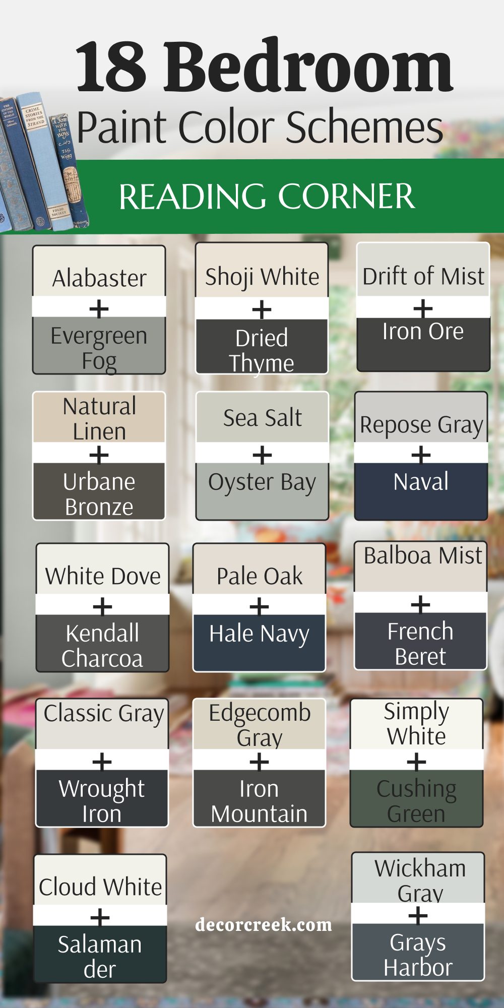
18 Bedroom Reading Corner Paint Color Schemes
Alabaster SW 7008 + Evergreen Fog SW 9130
Alabaster SW 7008 and Evergreen Fog SW 9130 – this combination brings together a warm, iconic white with a sophisticated, dusty green.

It’s the perfect balance between clean and nature-inspired for a master suite.
I suggest painting the main walls white and using the green for a special accent wall behind your chair. This mix makes your reading corner feel like it is part of a high-end nature spa.
Best used in: master bedrooms, guest suites, and nature-themed nooks.
Pairs well with: Urbane Bronze accents, terracotta, and linen bedding. The key rule of this color scheme for a balanced style is to use the darker green on the wall behind the bed to ground the space while keeping the nook airy.
Shoji White SW 7042 + Dried Thyme SW 6186
Shoji White SW 7042 + Dried Thyme SW 6186 – these colors create a very traditional and earthy feel.
The creamy white keeps the room feeling light, while the herbal green adds a sense of history and permanence to your library corner.
I like how these colors look with old wooden furniture and brass lamps. It makes your reading corner feel like it has a long history and lots of stories to tell.
Best used in: traditional bedrooms, farmhouses, and cozy studies.
Pairs well with: Dark walnut wood, antique brass, and cream rugs. The key rule of this color scheme for an earthy style is to use the white on the trim and the green on the doors for a pop of character that defines the reading zone.
Drift of Mist SW 9166 + Iron Ore SW 7069
Drift of Mist SW 9166 and Iron Ore SW 7069 — this combination brings together a soft morning-cloud gray with a heavy, dramatic charcoal. The light gray walls allow the dark reading corner to feel like a separate, private pod within the larger room, creating a visual “hug” around your chair that helps you focus.
Best used in: Modern apartments, theater-style bedrooms, and lofts.
Pairs well with: Bright white, chrome, and bold abstract art.
Key Rule: Use the dark color on the ceiling of the nook to create an enclosed feeling that shuts out the world.
Natural Linen SW 9109 + Urbane Bronze SW 7048
Natural Linen SW 9109 and Urbane Bronze SW 7048 — this combination brings together a warm, glowing tan with a sophisticated, deep bronze edge.
This pairing is perfect for a bedroom that uses natural materials like wool and wood, creating a steady mood that helps you stay focused.
Best used in: Mountain homes, rustic bedrooms, and masculine dens.
Pairs well with: Cognac leather, forest green, and stone textures.
Key Rule: Use the bronze on the window frames to frame the view outside and connect with the natural world.
Sea Salt SW 6204 + Oyster Bay SW 6206
Sea Salt SW 6204 and Oyster Bay SW 6206 — this combination brings together a light, breezy green with a weighted, professional sage. This monochromatic look is incredibly soothing and helps the eyes rest between chapters, lowering the energy of the room so you can get ready for bed.

Best used in: Coastal bedrooms, bathrooms, and cottage nooks.
Pairs well with: Driftwood, white linen, and light oak.
Key Rule: Use the darker shade for the shelving and the lighter shade for the walls to create a layered look.
Repose Gray SW 7015 + Naval SW 6244
Repose Gray SW 7015 and Naval SW 6244 — this combination brings together a versatile neutral gray with a regal, deep navy blue. The blue makes a reading spot feel important and private, helping your brain settle into a learning mode while the gray provides the perfect backdrop.
Best used in: Kids’ bedrooms, nautical themes, and formal studies.
Pairs well with: Bright white trim, red accents, and silver hardware.
Key Rule: Use the navy blue in the area with the most light to see its rich pigment and avoid it looking black.

Accessible Beige SW 7036 + Pewter Green SW 6208
Accessible Beige SW 7036 and Pewter Green SW 6208 — this combination brings together a welcoming, bright beige with a moody, traditional green.
This scheme feels stable and safe, perfect for someone who enjoys history books or classical literature in a focused environment.
Best used in: Traditional homes, guest rooms, and home libraries.
Pairs well with: Burgundy, mahogany wood, and gold frames.
Key Rule: Use the beige on the ceiling to keep the room feeling warm and tall despite the darker green walls.
Agreeable Gray SW 7029 + Tricorn Black SW 6258
Agreeable Gray SW 7029 and Tricorn Black SW 6258 — this combination brings together a modern, open gray with a sharp, defining black. Colorful book covers look like bright jewels against the black paint, making your reading corner feel focused and entirely free from distractions.

Best used in: Modern lofts, entryways, and minimalist bedrooms.
Pairs well with: Pure White, bright colors, and glass furniture.
Key Rule: Use the black for a vertical accent stripe to draw the eye upward and define the nook’s boundaries.
White Dove OC-17 + Kendall Charcoal HC-166
White Dove OC-17 and Kendall Charcoal HC-166 — this combination brings together a creamy, soft white with a steady, professional charcoal.
This sophisticated look prevents the dark tones from feeling too industrial, resulting in a versatile pair that works with almost any furniture or decor.
Best used in: Transitional bedrooms, formal living rooms, and nooks.
Pairs well with: Marble, navy blue, and dark wood.
Key Rule: Use the charcoal for the lower half of the wall (wainscoting) to ground the room.
Pale Oak OC-20 + Hale Navy HC-154
Pale Oak OC-20 and Hale Navy HC-154 — this combination brings together a soft, warm gray with a luxurious, high-contrast navy.
The navy blue makes the reading nook feel like a high-end destination, creating a sense of luxury that makes you want to spend more time with your books.
Best used in: Master suites, formal dens, and office corners.
Pairs well with: Brass, light oak, and white textiles.
Key Rule: Use the navy blue on the shelving units to make your books pop like art pieces in a gallery.
Balboa Mist OC-27 + French Beret 1610
Balboa Mist OC-27 and French Beret 1610 — this combination brings together a gentle, misty gray with a moody, snug blue-gray. It creates a quiet atmosphere that feels like a foggy morning, helping you relax your mind and keep the reading corner separate from the bed area.
Best used in: Serene bedrooms, nurseries, and quiet corners.
Pairs well with: Pale lavender, silver, and soft white.
Key Rule: Use the darker blue-gray on the wall with the reading chair to absorb light and prevent eye strain.
Classic Gray OC-23 + Wrought Iron 2124-10
Classic Gray OC-23 and Wrought Iron 2124-10 — this combination brings together a clean, updated gray with a sharp, architectural charcoal-black. This pair defines the architecture of the nook, making it look custom-built and very intentional within the room.

Best used in: Modern renovations, lofts, and industrial spaces.
Pairs well with: Raw wood, black metal, and white walls.
Key Rule: Use the dark color on the baseboards and window trim for a modern, grounded effect.
Edgecomb Gray HC-173 + Iron Mountain 2134-30
Edgecomb Gray HC-173 and Iron Mountain 2134-30 — this combination brings together a natural, bright gray with a warm, cozy dark gray. This scheme feels like a thick wool blanket, making it perfect for a reading corner meant for long hours of lounging and afternoon tea.
Best used in: Traditional bedrooms, farmhouses, and cozy dens.
Pairs well with: Warm wood, cream knits, and bronze.
Key Rule: Use the darker gray on the accent wall to create a warm “hug” for your chair.
Simply White OC-117 + Cushing Green HC-125
Simply White OC-117 and Cushing Green HC-125 — this combination brings together a clean, crisp white with a vibrant, garden-inspired green. The deep green is full of life, making the reading nook feel like a secret retreat that brings the energy of nature indoors.

Best used in: Sunrooms, kids’ rooms, and colonial homes.
Pairs well with: Light wood, botanical prints, and gold.
Key Rule: Use the green for the window trim to frame the greenery outside.
Cloud White OC-130 + Salamander 2050-10
Cloud White OC-130 and Salamander 2050-10 — this combination brings together a bright designer white with a mysterious, deep teal-green. This dramatic look feels like a boutique hotel, creating a private and high-end atmosphere for deep, immersive reading sessions.

Best used in: Boutique bedrooms, formal libraries, and studies.
Pairs well with: Burgundy velvet, dark gold, and dark wood.
Key Rule: Use the dark green in a nook with low light to emphasize its deep jewel tones.
Wickham Gray HC-171 + Grays Harbor SW 6236
Wickham Gray HC-171 and Grays Harbor SW 6236 — this combination brings together an airy, cool gray with a grounded, refreshing blue. This crisp combination helps you feel more awake and focused on the details of your story while keeping the bedroom feeling light.
Best used in: Bathrooms, guest bedrooms, and laundry nooks.
Pairs well with: Navy, silver, and white linen.
Key Rule: Use the darker blue on the ceiling of the nook for a surprising pop of color that defines the zone.

Natural Cream OC-14 + Pashmina AF-100
Natural Cream OC-14 and Pashmina AF-100 — this combination brings together a happy, bright cream with a rich, cozy tan. These soft neutrals create a layered environment that emphasizes comfort and light, making the reading corner feel tucked-away and sophisticated.

Best used in: Transitional homes, master bedrooms, and nooks.
Pairs well with: Mahogany, bronze, and ivory.
Key Rule: Use different textiles in the same colors to create depth without adding visual noise.

Swiss Coffee OC-45 + Deep Space 2125-20
Swiss Coffee OC-45 and Deep Space 2125-20 — this combination brings together a classic designer white with an intelligent, deep charcoal blue. This sharp pair makes any book collection look like art, creating a focused world that is totally free from distractions.

Best used in: Modern studies, lofts, and kitchen nooks.
Pairs well with: Glass, chrome, and bold colors.
Key Rule: Use the dark blue on the wall behind your shelving for a professional gallery look.

Silhouette AF-655 + Swiss Coffee OC-45
Silhouette AF-655 and Swiss Coffee OC-45 — this combination brings together a mysterious charcoal-plum with a clean, iconic creamy white. This high-fashion library aesthetic makes walls seem to recede into the shadows, making the world outside disappear while you read.
Best used in: Master suites, luxury home libraries, and dramatic accent walls.
Pairs well with: Silver hardware, deep velvet, and pale lavender.
Key Rule: Use Silhouette in rooms with high-gloss trim to create a “jewel box” effect.
Universal Khaki SW 6150 + Creamy SW 7012
Universal Khaki SW 6150 and Creamy SW 7012 — this combination brings together a tailored, sturdy neutral with a sun-drenched, peaceful white. This scheme offers an organic, sandy background that allows the mind to settle and focus on text without any visual distraction.
Best used in: Guest bedrooms, coastal reading nooks, and open-plan suites.
Pairs well with: Terracotta, olive green fabrics, and light-toned wood.
Key Rule: Use natural textures like jute and linen to emphasize its earthy roots.

Narragansett Green HC-157 + Sherwood Tan 1054
Narragansett Green HC-157 and Sherwood Tan 1054 — this combination brings together a deep, black-toned green with a leathery, historic tan.
This “Dark Academia” palette creates an atmosphere of intellectual weight, reminding one of old university halls and mahogany studies.
Best used in: Traditional home libraries, basement reading nooks, and masculine bedrooms.
Pairs well with: Antique brass, dark mahogany, and cognac leather.
Key Rule: Use the tan on built-in shelves to make book spines look like a curated collection.
Still Water SW 6223 + Reddened Earth SW 6053
Still Water SW 6223 and Reddened Earth SW 6053 — this combination brings together a deep, teal-toned blue with a warm, clay-like protective brown. This saturated earth-tone pairing creates a powerful focal point that feels like a hidden lake at sunset.

Best used in: Focal-point reading nooks, modern dens, and master bedrooms.
Pairs well with: Raw stone, matte black metal, and forest green.
Key Rule: Use the deep blue as a backdrop for a large chair to create a “private world.”
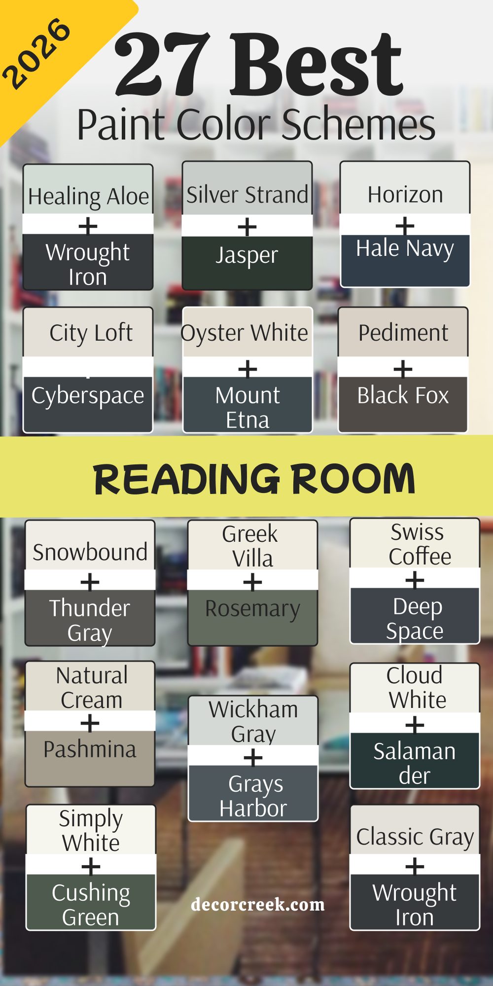
27 Best Reading Room Paint Color Schemes In 2026
Alabaster SW 7008 + Evergreen Fog SW 9130
Alabaster SW 7008 and Evergreen Fog SW 9130 — this combination brings together a warm, iconic white with a sophisticated, dusty green. This pair is perfect for a master suite where you want to feel energized in the morning and calm at night while reading.
Best used in: Master bedrooms, nature-themed nooks, and guest suites.
Pairs well with: Urban Bronze accents, terracotta, and natural linen.
Key Rule: Use the green on the lower half of the walls to ground the reading area.
Shoji White SW 7042 + Dried Thyme SW 6186
Shoji White SW 7042 and Dried Thyme SW 6186— this combination brings together a soft, paper-like white with a dusty, herbal green. These earthy colors provide a sense of permanence and history, making a simple corner feel like it has many stories to tell.
Best used in: Traditional bedrooms, farmhouses, and cozy studies.
Pairs well with: Dark walnut, antique brass, and thick cream rugs.
Key Rule: Use the green on the doors to add a pop of historic character.
Drift of Mist SW 9166 + Iron Ore SW 7069
Drift of Mist SW 9166 and Iron Ore SW 7069 this is a high-contrast, architectural scheme that feels very modern and sleek. Drift of Mist is a soft morning-cloud gray that feels very light, while Iron Ore is a heavy charcoal that brings serious drama.
The light gray walls allow the dark charcoal reading corner to feel like a separate, private pod within the larger room.
This creates a visual “hug” around your reading chair that helps you focus. It’s a great choice for modern lofts or bedrooms where you want to define a specific area as the “knowledge zone.“
Best used in: modern apartments, theater-style bedrooms, and open lofts.
Pairs well with: Bright white accents, chrome hardware, and bold abstract art. The key rule of this color for an architectural style is to use the dark color on the ceiling of the nook to create a cozy, enclosed feeling that shuts out the world.
Sea Salt SW 6204 + Oyster Bay SW 6206
Sea Salt SW 6204 and Oyster Bay SW 6206 two greens that work together like a perfect team to create a monochromatic retreat. This look is incredibly soothing and helps the eyes rest between chapters of a long book.
Sea Salt is light and breezy, while Oyster Bay provides a bit more weight and sophistication. It helps lower the energy of the room so you can get ready for sleep while you read.
This pair makes a corner feel very fresh and like a breath of clean air, perfect for anyone who feels overwhelmed by a busy schedule.
Best used in: coastal bedrooms, spa-like bathrooms, and cottage nooks.
Pairs well with: Driftwood furniture, white linen fabrics, and light oak wood. The key rule of this color for a monochromatic style is to use the darker shade for the shelving and the lighter shade for the walls to create a layered, professional finish.
Repose Gray SW 7015 + Naval SW 6244
Repose Gray SW 7015 + Naval SW 6244 – this color combination is a regal and smart combination that never goes out of style. The neutral Repose Gray acts as the perfect, non-distracting backdrop, while the deep navy of Naval makes a bold, intellectual statement on an accent wall.
I love how the blue makes a reading spot feel very important and very private.
It feels very organized and helps your brain settle into a learning mode, making it an excellent choice for a room where you do serious research or study.
Best used in: kids bedrooms, nautical themes, and formal home studies.
Pairs well with: Bright white trim, red accents, and silver or chrome hardware. The key rule of this color for a smart style is to use the navy blue in the area with the most light to see its rich pigment and avoid it looking too dark at night.
Accessible Beige SW 7036 + Pewter Green SW 6208
Accessible Beige SW 7036 + Pewter Green SW 6208 – this scheme feels very stable and safe, creating a mood that is focused and traditional. Accessible Beige is a friendly, warm neutral, while Pewter Green is a serious, cool-toned green that looks like old metal.
This pair is perfect for someone who enjoys history books or classical literature.
The green is dark enough to feel moody and interesting for long reading sessions, while the beige keeps the rest of the bedroom feeling bright and welcoming to the family.
Best used in: traditional homes, guest rooms, and home libraries.
Pairs well with: Burgundy accents, mahogany wood furniture, and gold picture frames. The key rule of this color for a stable style is to use the beige on the ceiling to keep the room feeling warm and tall despite the darker green walls.
Agreeable Gray SW 7029 + Tricorn Black SW 6258
The ultimate modern neutral pair for the minimalist reader. Tricorn Black adds sharp definition to the reading corner, while Agreeable Gray keeps the bedroom feeling open and approachable for everyday life.
You will notice that colorful book covers look like bright jewels against the black paint, making your library the center of attention.
It makes your reading corner feel very focused and free from any visual “noise” that might distract you from a good story.
Best used in: modern lofts, sleek entryways, and minimalist bedrooms.
Pairs well with: Pure White accents, bright primary colors, and glass furniture. The key rule of this color for a minimalist style is to use the black for a vertical accent stripe to draw the eye upward and define the reading nook’s boundaries clearly.
White Dove OC-17 + Kendall Charcoal HC-166
The creamy white of White Dove prevents the Kendall Charcoal from feeling too industrial or cold. It is a very versatile pair that works with almost any kind of furniture or decor you already own.A very soft and sophisticated look that feels like a professional designer chose it for a luxury hotel.
The charcoal is a very steady, reliable color that helps you stay on task while you read or study, providing a “quiet” visual background.
Best used in: transitional bedrooms, formal living rooms, and small reading nooks.
Pairs well with: Marble surfaces, navy blue accents, and dark wood antiques. The key rule of this color for a transitional style is to use the charcoal on the built-in bookcases to create a professional, permanent feel for your book collection.
Pale Oak OC-20 + Hale Navy HC-154
Pale Oak OC-20 + Hale Navy HC-154 – this color combination is an elegant and high-contrast pair that screams luxury. The navy blue makes the reading nook feel like a high-end destination, while the warm gray of Pale Oak keeps the rest of the bedroom feeling soft and comfortable.
I love how the navy creates a sense of luxury that makes you want to spend more time with your books.
It is a very smart look that feels both traditional and very current, especially when paired with gold accents.
Best used in: master suites, formal dens, and office reading corners.
Pairs well with: Brass hardware, light oak furniture, and white textiles. The key rule of this color for a luxurious style is to use the navy blue on the shelving units to make your books pop like art pieces in a gallery.
Balboa Mist OC-27 + French Beret 1610
Balboa Mist OC-27 + French Beret 1610 – this color combination is a soft and moody blue-gray theme that is perfect for a bedroom where rest is the priority.
It creates a very quiet atmosphere that feels like a misty morning, perfect for waking up slowly with a book.
The dark French Beret makes the reading corner feel very snug and very separate from the sleeping area. It is a very gentle and pretty look that helps you relax your mind and lower your heart rate after a long day.
Best used in: serene bedrooms, nurseries, and quiet corners.
Pairs well with: Pale lavender accents, silver hardware, and soft white furniture. The key rule of this color for a misty style is to use the darker blue-gray on the wall with the reading chair to absorb light and prevent eye strain during long evening sessions.
Classic Gray OC-23 + Wrought Iron 2124-10
Classic Gray OC-23 + Wrought Iron 2124-10 – this color combination is a sharp and architectural look that brings a sense of structure to the room. The dark charcoal-black of Wrought Iron defines the architecture of the reading nook, making it look custom-built and very intentional.
I love how this looks in a bedroom that wants to feel very clean and updated.
It makes a small corner feel very solid and permanent, like an anchor for the whole room’s design.
Best used in: modern renovations, lofts, and industrial-style spaces.
Pairs well with: Raw wood, black metal hardware, and bright white walls. The key rule of this color for a graphic style is to use the dark color on the baseboards and window trim for a modern, grounded effect that frames the nook perfectly.
Edgecomb Gray HC-173 + Iron Mountain 2134-30
Edgecomb Gray HC-173 + Iron Mountain 2134-30 – two warm grays that feel very cozy and lived-in, perfect for a family home. This scheme is intended for a reading corner that is meant for long hours of lounging with kids or a pet.
The dark gray makes the reading corner feel very warm and like a thick wool blanket, while the light gray keeps the bedroom feeling natural and bright.
It’s a very forgiving palette that hides little marks and works well in all light conditions.
Best used in: traditional bedrooms, modern farmhouses, and cozy dens.
Pairs well with: Warm wood furniture, cream-colored knits, and bronze accents. The key rule of this color for a cozy style is to use the darker gray on the accent wall to create a warm “hug” for your chair, making it the most inviting spot in the house.
Simply White OC-117 + Cushing Green HC-125
The deep Cushing Green is vibrant and full of life, making the reading nook feel like a retreat in the middle of a garden. Simply White keeps the room feeling very clean and bright, reflecting sunlight to keep the space cheerful.
It makes the corner feel very special and like a little getaway inside your house.
A fresh and traditional look that brings a tremendous amount of energy to a room.
Best used in: sunrooms, kids bedrooms, and colonial-style homes.
Pairs well with: Light wood furniture, botanical prints, and gold hardware. The key rule of this color for a vibrant style is to use the green for the window trim to frame the greenery outside, merging your books with the natural world.
Cloud White OC-130 + Salamander 2050-10
Cloud White OC-130 + Salamander 2050-10 this color combination is a dramatic and high-end look that feels like a room in a boutique hotel.
The deep teal-green of Salamander is mysterious and rich, creating a very private and elite atmosphere for deep reading.
I love how the dark green can make a reading corner feel like a secret hideaway. It adds a high level of mystery and style without making the entire room feel dark or cramped.
Best used in: boutique bedrooms, formal libraries, and private studies.
Pairs well with: Burgundy velvet fabrics, dark gold accents, and dark wood furniture. The key rule of this color for an upscale style is to use the dark green in a nook with low light to emphasize its deep, jewel tones and create a sense of absolute intimacy.
Wickham Gray HC-171 + Grays Harbor SW 6236
The darker Grays Harbor grounds the reading corner, while the light Wickham Gray walls keep the bedroom feeling airy and alert.
A cool and refreshing blue-gray theme that feels very clean and focused.
It is a very crisp combination that helps you feel more awake, making it perfect for a morning reader who likes to start the day with coffee and a newspaper or non-fiction book.
Best used in: guest bedrooms, coastal homes, and laundry nooks.
Pairs well with: Navy blue accents, silver hardware, and white linen fabrics. The key rule of this color for a clean style is to use the darker blue on the ceiling of the nook for a surprising pop of color that defines the “reading zone” vertically.
Natural Cream OC-14 + Pashmina AF-100
The darker Pashmina makes the reading corner feel very cozy and tucked-away, while the Natural Cream keeps the bedroom feeling bright and happy. It is a very timeless look that never goes out of fashion.Two soft and warm neutrals that create a very rich and layered environment without using “strong” colors.
This scheme is perfect for a sophisticated bedroom where you want to emphasize comfort, texture, and light.
Best used in: transitional homes, master bedrooms, and small nooks
Pairs well with: Mahogany wood, bronze hardware, and ivory textiles. The key rule of this color for a layered style is to use different textures (like a wool rug and a velvet chair) in the same colors to create depth without adding visual noise.
Swiss Coffee OC-45 + Deep Space 2125-20
Swiss Coffee OC-45 + Deep Space 2125-20 – this color combination is a modern and clean look that uses a favorite designer white and a deep, almost-black charcoal blue.
This pair is sharp, intelligent, and makes any book collection look like a high-end work of art.
It creates a mood that is focused and totally free from any distractions. I love how the dark blue makes a reading chair feel like its own world, separated from the rest of the bedroom’s activities.
Best used in: modern studies, lofts, and kitchen reading nooks.
Pairs well with: Glass furniture, chrome hardware, and bold, bright colors. The key rule of this color for an intelligent style is to use the dark blue on the entire wall behind your shelving to create a professional, gallery-style look.
Revere Pewter HC-172 + Old Navy 2063-10
The most iconic “greige” in history meets a deep, classic navy. This pairing is the definition of timeless and provides a very stable, academic environment for reading.

Revere Pewter is famous for its ability to look good in any light, while Old Navy adds a sense of authority and calm.
This is the perfect palette for a traditionalist who wants their home to feel established and smart.
Best used in: traditional living rooms, study nooks, and hallways.
Pairs well with: White trim, red accents, and dark oak wood. The key rule of this color for a classic style is to use Revere Pewter on the main walls to keep the space feeling balanced and let the navy be the star of the nook.

Manchester Tan HC-81 + Boothbay Gray HC-165
Manchester Tan HC-81 + Boothbay Gray HC-165 – this color combination is sophisticated “New England” look that feels like a summer house on the coast.

The warm tan and cool blue-gray create a perfect temperature balance that is very easy on the eyes during long hours of reading.
It feels breezy and relaxed, making it a great choice for a room where you want to escape the heat of the day and get lost in a travel book or a novel.
Best used in: coastal homes, traditional bedrooms, and sunrooms.
Pairs well with: White linen, navy blue fabrics, and light pine wood. The key rule of this color for a breezy style is to use the blue-gray on the furniture or built-ins to make the nook feel like its own quiet island.

Gray Owl OC-52 + Black Beauty 2128-10
A very cool-toned gray paired with a deep, warm black. It feels very contemporary and focuses the mind perfectly for late-night reading.

Gray Owl has a tiny hint of green that keeps it from being too sterile, while Black Beauty is as rich as it sounds.
This combination is great for those who want a very sharp, modern look that still feels high-quality and comfortable.
Best used in: modern lofts, master bedrooms, and sleek offices.
Pairs well with: Silver hardware, white accents, and emerald green. The key rule of this color for a focused style is to use the black on the wall directly behind your reading lamp to reduce glare and make the book pages easier to see.
Chantilly Lace OC-65 + Newburg Green HC-158
The crispest, purest white paired with a deep, teal-toned green. This creates a very high-energy but sophisticated reading corner that feels “expensive” and fresh.

Chantilly Lace provides a clean slate, while Newburg Green adds a rich, oceanic depth.
It is a fantastic choice for a room with lots of art, as the white makes colors pop while the green provides a stable, moody corner for quiet moments.
Best used in: modern farmhouses, bright sunrooms, and galleries.
Pairs well with: Gold accents, marble surfaces, and cognac leather. The key rule of this color for a high-end style is to use Chantilly Lace on the ceiling to reflect as much light as possible, making the room feel tall and expensive.
My Final Thoughts on Choosing Paint Colors for a Reading Room
Picking the right color for your reading room is a deeply personal journey, and it is a process that should be genuinely fun, creative, and completely stress-free. I always tell my clients and friends to ignore the “rules” for a moment and truly trust their initial feelings when they look at a paint sample in their own space.
If a specific shade immediately makes you want to pull up a chair, brew a cup of tea, and open a brand-new book, then you have already found a winner. You should never feel pressured to follow every fleeting design trend just to have a room that looks like a magazine; the most important thing is that the space feels “right” to you and supports your own unique rituals.
I sincerely hope these curated ideas help you find that one perfect shade that makes your house feel more special, intentional, and lived-in. I truly believe a good paint color is exactly like a good book because it stays with you for a very long time, subtly influencing your mood and becoming part of your best memories.
Please, take your time to choose, observe how the colors change from morning to night, and remember that you are making a spot specifically for you and your well-being. Your reading room is a meaningful gift to yourself and a sanctuary for your mind to rest and grow. I am truly excited for you to experience that first evening in your chair, seeing how your new walls transform the atmosphere once everything is finished.