I know exactly how much you want your kitchen to look expensive without spending a fortune on new cabinets. Choosing a beige paint color is the fastest way to get that high-end look you see in luxury magazines. Many people get stuck because they think every kitchen has to be bright white to look clean.
You might feel like your only choice is a cold white, but that can make a home feel like a doctor’s office. A warm beige adds a layer of richness that makes your wooden floors and stone counters look much better. I have spent years staging homes and I can tell you that the right shade of beige makes all the difference for your mood.
You want to walk into your kitchen and feel like you are at a fancy resort. These colors are the ones I use when I want a house to sell fast or when a homeowner wants a truly rich look. I picked these because they work with the lights and the granite you already have. Your kitchen should be a place where you feel successful and happy while you cook for your family.
Let us look at the best options for your home right now so you can start your project.
Why I Always Trust Sherwin-Williams and Benjamin Moore for the Best Beige Kitchen Paint Colors
I only use Sherwin-Williams and Benjamin Moore when I work on expensive houses. These two brands have the best pigments, which means the color looks rich and deep on your walls. Kitchen walls have to handle a lot of steam and grease from cooking. Cheaper paints can peel or change color when they get hot every day.
If you buy a cheap can of paint, you might see it turn yellow or start to flake near the stove. I want your home to stay beautiful for years without you having to pick up a brush every single summer. These brands make special paints that stay looking fresh for a very long time. I like how the light hits these specific paints because it makes the walls look smooth and perfect.
You will not have to repaint as often when you use high-quality cans. My clients always notice that the finish looks more professional when we use these names. It saves you money in the long run to buy the good stuff first. When you see the way the paint flows onto the wood and drywall, you will understand why I never shop anywhere else.
Your kitchen deserves the highest quality because it is the most used room in your entire house.
How I Choose the Perfect Beige Shade for Any Kitchen
I look at the windows first before I ever open a paint fan. If your kitchen is small and has no windows, you need a beige that brings its own light. Big kitchens with lots of sun can handle darker and more tan colors. I always check the color of the floor tiles and the counter tops too.
If your granite has brown spots, you want a beige that pulls those colors out to make the room feel like a single unit. It is all about making sure nothing looks like an accident or a mistake. You want the paint to match the stone so everything looks like it was planned by a pro. I tell my friends to paint a big square on the wall and look at it at night.
Light bulbs can change how a color looks compared to the sun. Some colors might look perfect at noon but turn into a strange green when you turn on your lamps. Picking a color is about how you want to feel when you are making breakfast. I want you to feel happy and proud of your home every single morning. When you walk into the room, you should feel a sense of accomplishment because everything looks so well-balanced.
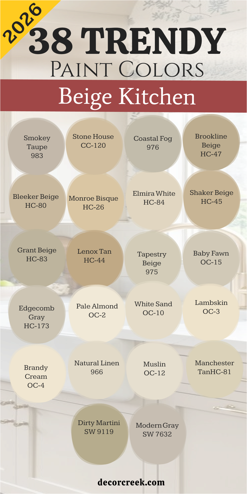
38 Trendy Beige Kitchen Paint Colors For 2026
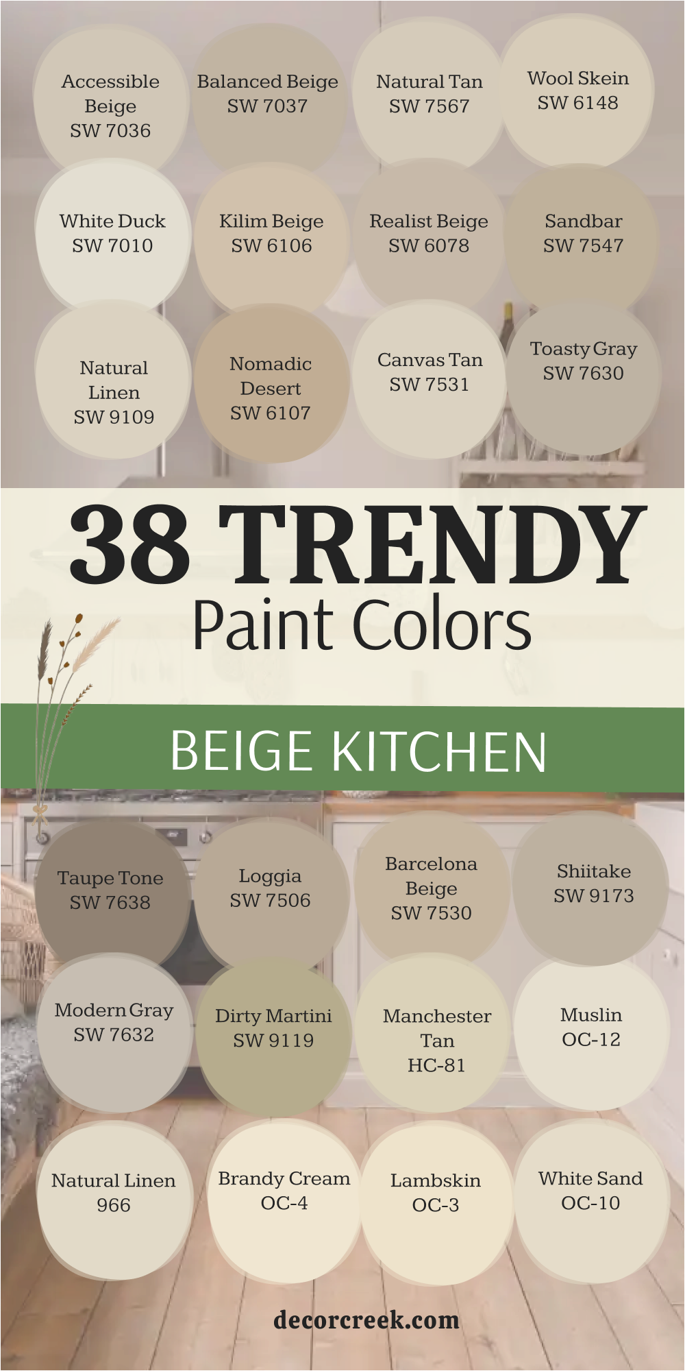
Accessible Beige SW 7036
Accessible Beige SW 7036 is a top pick for kitchens because it has a bit of gray that keeps it from looking too yellow. This color works perfectly with dark wood floors and white cabinets. I love how it makes a room feel cozy but still very bright and open.
Many homeowners choose this because it matches almost any tile or stone you have. It acts like a neutral backdrop that makes your kitchen decorations stand out. You will notice that it looks very professional in both natural and artificial light. Most people find this shade very easy to live with every single day.
It is a smart choice if you want your house to feel welcoming to guests. Your kitchen will look updated and high-end with this paint on the walls. It creates a friendly atmosphere where everyone wants to hang out.
Best used in: kitchens, living rooms, hallways, and open floor plans
Pairs well with: Alabaster SW 7008, Urban Bronze SW 7048, Cadet SW 9143, dark wood The key rule of this color for a balanced look is to use it in rooms with plenty of windows to see the gray undertones.
🎨 Check out the complete guide to this color right HERE 👈

Balanced Beige SW 7037
Balanced Beige SW 7037 is a deeper version of a neutral tan that brings a lot of warmth to a kitchen. This color looks very solid and rich when you put it next to white trim. I use this when a kitchen feels too large and needs to feel a bit more grounded. It hides fingerprints and kitchen messes very well, which is great for busy families.
The shade is dark enough to show a contrast against light countertops. You will feel very safe and comfortable in a room painted with this earthy tone. It makes your kitchen feel like a sturdy part of the house. Many luxury builders use this to make a new home feel lived in and expensive.
It is a very reliable color that never looks washed out. Your friends will ask you for the name of this paint because it looks so well-planned. This shade helps create a balanced space that feels thoughtful and carefully designed.
Best used in: kitchens, laundry rooms, entryways, and master bedrooms
Pairs well with: Pure White SW 7005, Foothills SW 7514, Breezy SW 7616, stone floors The key rule of this color for a grounded look is to pair it with very bright white ceilings and baseboards.
🎨 Check out the complete guide to this color right HERE 👈

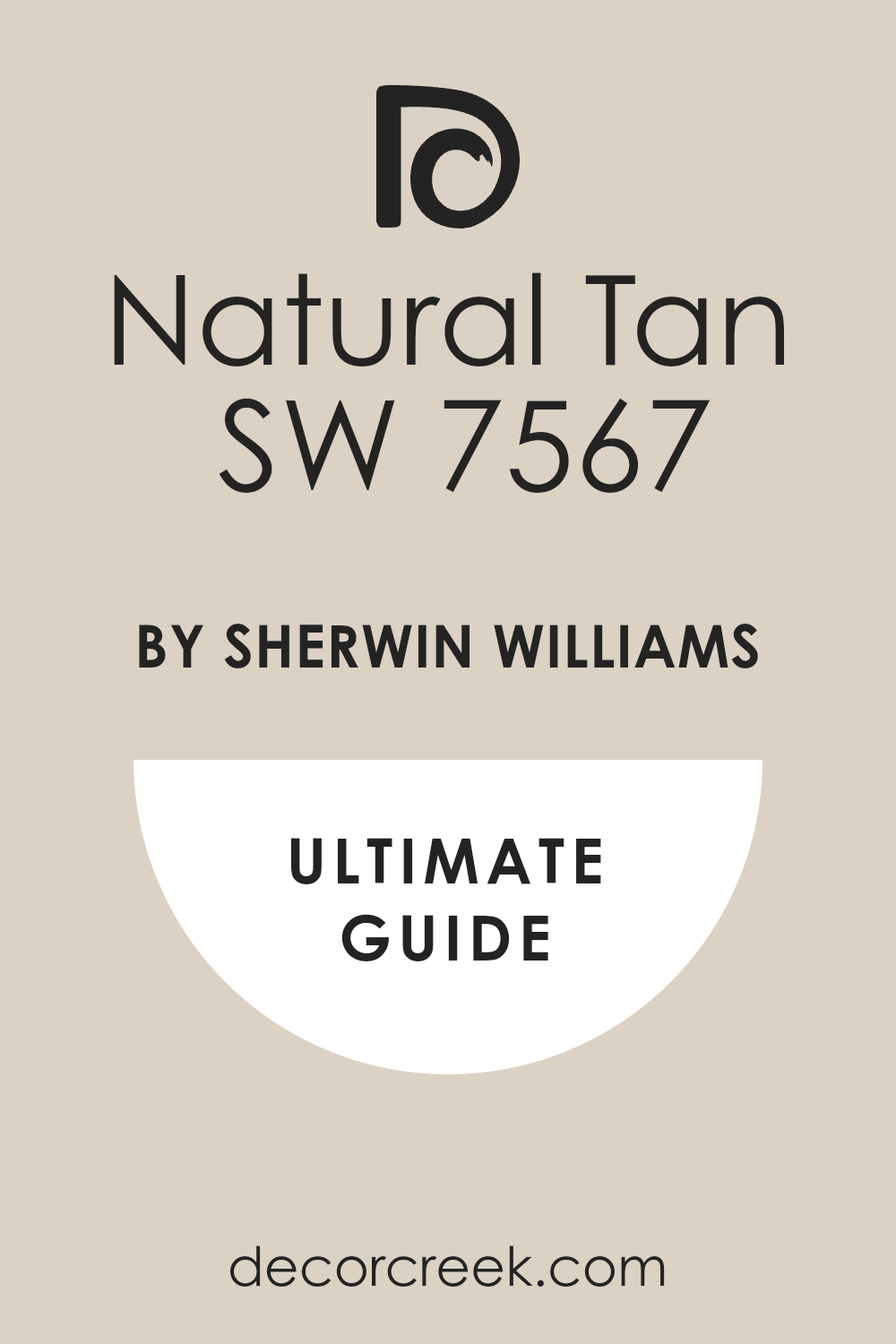
Natural Tan SW 7567
Natural Tan SW 7567 is a very soft and clean beige that looks like a sandy beach. This color does not have any hidden green or pink tones, which makes it very safe. I like how it stays looking light even when the sun goes down. It is a great choice for a kitchen with a lot of light oak cabinets.
You will notice that it makes your kitchen feel very airy and cheerful. It is a very friendly color that makes a small kitchen feel much bigger. I often suggest this for people who are afraid of dark colors. It gives you a tiny bit of warmth without making the room feel heavy.
Most people feel very relaxed when they see this color on the walls. It makes your white dishes and towels look very bright and clean. This shade helps create a calm space where you can enjoy quiet mornings and slow evenings.
Best used in: small kitchens, bathrooms, bedrooms, and sunny living rooms
Pairs well with: Alabaster SW 7008, Black Magic SW 6991, Sea Salt SW 6204, light oak The key rule of this color for an airy feel is to use it in kitchens that get a lot of morning sunlight.
🎨 Check out the complete guide to this color right HERE 👈
Wool Skein SW 6148
Wool Skein SW 6148 is a classic tan that has a tiny hint of green in the base. This color looks very high-end when paired with traditional kitchen furniture. I love using this color in kitchens with black granite countertops. It makes the room feel very established and very well-decorated.
The shade is very cozy and reminds me of an old cottage. You will notice that it feels very warm and inviting during dinner time. It is a popular choice for kitchens that open up into a family room. It makes your kitchen feel like the heart of the home.
Most designers pick this when they want a look that is not too gray. Your kitchen will feel very solid and very stylish with this choice. This color helps create a space where everyone feels comfortable gathering together at the end of the day.
Best used in: kitchens, dining rooms, sunrooms, and exterior siding
Pairs well with: Creamy SW 7012, Rainwashed SW 6211, Cordovan SW 6027, black granite The key rule of this color for a classic look is to use it with warm wood accents and brass hardware.
🎨 Check out the complete guide to this color right HERE 👈

White Duck SW 7010
White Duck SW 7010 is a very light beige that almost looks like a creamy white. This color is perfect for a kitchen that needs to stay very bright and modern. I use this when a homeowner wants a clean look but hates cold gray colors. It has enough warmth to make the kitchen feel like a home.
You will love how it makes your stainless steel appliances look very sharp. It is a very soft color that is very kind to your eyes. Many people use this for the whole house because it is so easy to match. It makes your kitchen feel very fresh and very tidy.
Most guests will think your kitchen looks very expensive and new. It is a great way to get a luxury look without being too bold. This shade helps create a calm and polished space where everything feels thoughtfully chosen.
Best used in: kitchens, bathrooms, trim, and whole house interiors
Pairs well with: Iron Ore SW 7069, Revere Pewter HC-172, Gray Owl OC-52, marble The key rule of this color for a clean look is to use it with very dark accents like black handles.
🎨 Check out the complete guide to this color right HERE 👈
Kilim Beige SW 6106
Kilim Beige SW 6106 is a very famous color because it works in almost every kitchen. This color is a warm tan that makes a room feel very cozy and full of life. I suggest this for kitchens that have a lot of dark cherry or mahogany cabinets. It creates a very traditional look that feels very expensive.
You will notice that it makes the room feel very sunny even on cloudy days. It is a very safe choice if you are worried about picking the wrong paint. Most people find this color very comforting and very easy to love. It has a tiny bit of red in the base which makes it feel very warm.
Your kitchen will look like a classic home from a movie with this shade. It is a top seller for a very good reason. This color helps create a welcoming space where family and friends naturally want to gather.
Best used in: kitchens, family rooms, entryways, and traditional homes
Pairs well with: Latte SW 6108, Van Dyke Brown SW 7041, Storm Cloud SW 6249, cherry wood The key rule of this color for a traditional look is to use it with warm lighting and dark furniture.
🎨 Check out the complete guide to this color right HERE 👈
Realist Beige SW 6078
Realist Beige SW 6078 is a very smooth beige that has a little bit of a gray heart. This color looks very modern and works well in a house with a lot of stone. I like to use this for a kitchen that needs to feel very organized and sleek. It makes your white cabinets look very crisp and very bright.
You will notice that it feels very cool and refreshing on a hot day. It is a very sophisticated color that designers use for high-end apartments. Most people find it very professional and very clean. It does not look yellow at all, which many homeowners really like.
Your kitchen will look very updated and very smart with this paint. It is a great choice for a kitchen that gets a lot of afternoon sun. This shade helps create a balanced space that feels calm, polished, and thoughtfully designed.
Best used in: modern kitchens, offices, hallways, and master bathrooms
Pairs well with: Snowbound SW 7004, Garret Gray SW 6075, Naval SW 6244, silver The key rule of this color for a modern look is to pair it with silver hardware and glass accents.
🎨 Check out the complete guide to this color right HERE 👈
Sandbar SW 7547
Sandbar SW 7547 is a medium tan that looks like wet sand on the beach. This color is very rich and makes a big statement in a large kitchen. I use this when I want to create a very warm and earthy environment. It looks amazing with natural stone floors and wood beams on the ceiling.
You will feel very connected to nature in a room painted with this tone. It hides dirt very well, which is perfect for a kitchen where kids play. Many people choose this for a luxury ranch or a mountain home style. It makes the kitchen feel very strong and very well-built.
Most guests will feel very at home when they walk into your kitchen. Your kitchen will look very high-end and very cozy with this selection. This shade helps create a welcoming space that feels grounded, sturdy, and thoughtfully designed.
Best used in: kitchens, dens, basements, and rustic homes
Pairs well with: Shoji White SW 7042, Urbane Bronze SW 7048, Naval SW 6244, stone The key rule of this color for a rustic look is to use it with natural wood and plenty of warm light.
🎨 Check out the complete guide to this color right HERE 👈
Natural Linen SW 9109
Natural Linen SW 9109 is a beautiful beige that feels like a piece of high-quality fabric. This color is very light and makes your kitchen feel very soft and gentle. I love using this for a kitchen that needs to feel like a quiet retreat. It makes white porcelain sinks and tubs look very bright and clean.
You will notice that it has a very organic feel that is very trendy right now. It is a perfect choice for a kitchen with a lot of plants and light. Most people feel very happy and relaxed in a room with this paint. It makes your kitchen feel very open and very airy for its size.
Your home will look very expensive and very well-styled with this choice. It is a very smart pick for a modern farmhouse look. This shade helps create a peaceful space where you can slow down and enjoy your time at home.
Best used in: kitchens, bedrooms, nurseries, and laundry rooms
Pairs well with: Alabaster SW 7008, Pure White SW 7005, Iron Ore SW 7069, wood The key rule of this color for an organic look is to use it with natural textures like linen and wicker.
🎨 Check out the complete guide to this color right HERE 👈

Nomadic Desert SW 6107
Nomadic Desert SW 6107 is a warm and golden beige that brings a lot of energy. This color looks like the sun is always shining on your kitchen walls. I suggest this for kitchens that are a bit dark and need some extra warmth. It makes dark wood cabinets look very rich and very handsome.
You will notice that the room feels very cozy and very full of life. It is a very popular color for traditional homes in the suburbs. Most people find it very inviting and very easy to decorate around. It has a very solid and friendly feel that lasts for many years.
Your kitchen will look very warm and very welcoming with this gold-tan shade. It is a great choice for a kitchen where the family gathers to eat. This color helps create a lively and comfortable space where everyone enjoys spending time together.
Best used in: kitchens, living rooms, hallways, and dark rooms
Pairs well with: Kilim Beige SW 6106, Latte SW 6108, Hopsack SW 6109, dark wood The key rule of this color for a sunny feel is to use it in rooms that lack natural window light.
🎨 Check out the complete guide to this color right HERE 👈

Canvas Tan SW 7531
Canvas Tan SW 7531 is a very crisp and clean neutral that feels like a fresh piece of artist paper. This color works perfectly in a kitchen that needs to feel light but still has enough pigment to show up against white trim. I love how it looks when paired with light wood floors and soft blue accents. It makes a room feel very professional and well-planned without being too bold.
You will notice that it has a very soft look that hides small marks on the wall very well. Many homeowners pick this because it does not have any tricky yellow or pink undertones. It creates a very friendly environment for cooking and eating with your whole family. Most people find this shade very refreshing and easy to live with for many years.
Your kitchen will look very updated and high-end with this beautiful paint choice. This color helps create a balanced and polished space that feels calm every single day. It is a reliable option if you want a kitchen that feels timeless and thoughtfully designed.
Best used in: kitchens, living rooms, bedrooms, and hallways
Pairs well with: Pure White SW 7005, Alabaster SW 7008, Sea Salt SW 6204, light oak The key rule of this color for a clean look is to use it in rooms with lots of natural light to keep it looking bright.
🎨 Check out the complete guide to this color right HERE 👈

Raisin SW 7630
Raisin SW 7630 is a very unique beige that has a heavy dose of gray buried inside of it. This color looks very sophisticated and is a top pick for modern luxury kitchens. I suggest this for kitchens with marble countertops because the gray tones match the stone veins perfectly. It makes the room feel very cool and very organized during a busy day.
You will notice that it feels very smart and professional on your walls. It is a very versatile color that looks great with both silver and gold hardware. Many designers use this to bridge the gap between old-world style and new modern looks. It makes your kitchen feel very custom and very expensive to any guest who visits.
Most people find this shade very impressive because it changes slightly with the lighting. Your kitchen will feel very updated and very chic with this cool neutral. This paint choice helps create a refined space that feels balanced and carefully designed.
Best used in: kitchens, bathrooms, offices, and modern living rooms
Pairs well with: Snowbound SW 7004, Iron Ore SW 7069, Naval SW 6244, marble The key rule of this color for a modern look is to use it with high-contrast accents like black handles and silver faucets.
🎨 Check out the complete guide to this color right HERE 👈
Taupe Tone SW 7633
Taupe Tone SW 7633 is a rich and deep beige that leans into a much darker tan look. This color makes a kitchen feel very solid and very well-built. I love using this on kitchen islands or accent walls to create a lot of visual interest. It works amazingly well with warm wood furniture and dark leather chairs.
You will feel very cozy and protected in a room painted with this deep earthy shade. It hides kitchen messes and splatters better than almost any other light color. Many luxury homes use this to create a feeling of stability and comfort. It creates a very strong look that shows you are confident in your design choices.
Most people feel very grounded and happy in a room that uses this warm tone. Your kitchen will look very expensive and very sturdy with this paint. This shade helps create a bold yet welcoming space that feels thoughtfully designed and built to last.
Best used in: kitchens, dens, basements, and accent walls
Pairs well with: Alabaster SW 7008, Shoji White SW 7042, Urbane Bronze SW 7048, dark wood The key rule of this color for a grounded look is to pair it with very light ceilings to keep the room from feeling too small.
🎨 Check out the complete guide to this color right HERE 👈
Loggia SW 7506
Loggia SW 7506 is a very popular beige that has a soft and creamy feeling like a luxury hotel lobby. This color looks very expensive and makes any kitchen feel much more grand. I use this when a homeowner wants a very classic and high-end look that never goes out of style. It makes white cabinets pop in a very beautiful and clean way.
You will notice that it feels very velvety and smooth on the walls. It is a very safe color that matches a wide variety of floor tiles and rugs. Many professionals pick this because it looks so good in photos and in real life. It makes your kitchen feel like it was designed by a pro for a fancy magazine.
Most guests will think your home looks very polished and very neat. Your kitchen will look very updated and very rich with this classic choice. This shade helps create a timeless space that feels elegant, balanced, and thoughtfully finished.
Best used in: kitchens, master bedrooms, living rooms, and entryways
Pairs well with: Pure White SW 7005, Accessible Beige SW 7036, Naval SW 6244, gold hardware The key rule of this color for a grand look is to use it with large mirrors and gold or brass accents.
🎨 Check out the complete guide to this color right HERE 👈

Barcelona Beige SW 7530
Barcelona Beige SW 7530 is a warm and sunny tan that feels like a trip to a Mediterranean villa. This color brings a lot of happy energy into the kitchen every single morning. I suggest this for kitchens that need a little more life and warmth on the walls. It works perfectly with terracotta tiles and dark wood cabinets.
You will notice that the room feels very inviting and very cozy for guests. It is a very friendly color that makes everyone want to sit at the kitchen table. Many homeowners choose this because it feels very traditional and solid. It makes your kitchen look very established and very well-kept.
Most people find this shade very comforting and very easy to decorate with. Your kitchen will look very warm and very expensive with this sunny beige choice. This paint helps create a welcoming space where family and friends naturally gather and feel at home.
Best used in: kitchens, dining rooms, hallways, and traditional homes
Pairs well with: Alabaster SW 7008, Kilim Beige SW 6106, dark cherry wood, terracotta The key rule of this color for a sunny feel is to use it with warm-toned lighting and natural wood floors.
🎨 Check out the complete guide to this color right HERE 👈
Shiitake SW 9173
Shiitake SW 9173 is a very cool-toned beige that looks like a beautiful mushroom from the forest. This color is very trendy right now because it looks very organic and natural. I love using this in kitchens with plenty of green plants and natural wood accents. It makes the room feel very quiet and very peaceful for your morning coffee.
You will notice that it has a very soft and earthy look that is very pleasing to the eye. It is a very sophisticated choice for a modern home that wants to feel connected to nature. Many designers use this to create a very calm and upscale environment. It makes your kitchen feel very custom and very well-decorated.
Most guests will love how unique and smooth this color looks on your walls. Your kitchen will look very high-end and very organic with this selection. This shade helps create a serene space that feels balanced, thoughtful, and naturally beautiful.
Best used in: kitchens, bedrooms, bathrooms, and modern living spaces
Pairs well with: Pure White SW 7005, Evergreen Fog SW 9130, black metal, light oak The key rule of this color for an organic look is to pair it with natural materials like stone and wood.
🎨 Check out the complete guide to this color right HERE 👈

Modern Gray SW 7632
Modern Gray SW 7632 is a very light beige that acts exactly like a warm gray. This color is perfect for a kitchen that needs to feel very updated and very fresh. I use this when a homeowner wants a modern look that still feels very warm and inviting. It makes stainless steel appliances and white countertops look very professional.
You will notice that it feels very clean and very tidy every day. It is a very versatile color that works with almost any style of furniture. Many people use this for their whole house because it is so easy to live with. It makes your kitchen feel very open and very airy for its size.
Most guests will think your kitchen looks very expensive and very new. Your home will feel very smart and very well-styled with this paint choice. This shade helps create a bright and polished space that feels balanced and thoughtfully designed.
Best used in: kitchens, bathrooms, hallways, and whole house interiors
Pairs well with: Alabaster SW 7008, Iron Ore SW 7069, Silver Strand SW 7057, stainless steel The key rule of this color for a modern look is to use it in kitchens with plenty of natural light to show the gray tones.
🎨 Check out the complete guide to this color right HERE 👈

Dirty Martini SW 9119
Dirty Martini SW 9119 is a very interesting beige that has a tiny hint of olive green hidden inside. This color looks very sophisticated and adds a lot of personality to a luxury kitchen. I suggest this for homeowners who want a unique look that guests will remember. It works beautifully with dark wood cabinets and gold hardware.
You will notice that the room feels very rich and very well-planned. It is a very smart choice for a kitchen that needs a bit of a moody and cozy feel. Many designers pick this for high-end bars or master suites. It makes your kitchen feel very custom and very high-design.
Most people find this shade very impressive and very stylish. Your kitchen will look very updated and very expensive with this unique green-beige. This color helps create a bold yet welcoming space that feels curated and thoughtfully styled.
Best used in: kitchens, accent walls, bars, and dining rooms
Pairs well with: Shoji White SW 7042, Ripe Olive SW 6209, brass accents, dark wood The key rule of this color for a unique look is to use it with gold or brass light fixtures.
Manchester Tan HC-81
Manchester Tan HC-81 is a legendary beige that has been a favorite of designers for a long time. This color is a very balanced tan that looks good in almost any light. I love using this in kitchens with white cabinets and dark stone countertops. It makes the room feel very established and very high-quality.
You will notice that it feels very warm and very professional on the walls. It is a very safe color for people who want a luxury look that is not too bold. Many luxury homes use this color to create a sense of history and comfort. It makes your kitchen feel very solid and very well-built.
Most guests will feel very at home when they walk into your kitchen. Your kitchen will look very grand and very classic with this choice. This shade helps create a timeless space that feels elegant, welcoming, and thoughtfully designed.
Best used in: kitchens, living rooms, hallways, and traditional master suites
Pairs well with: White Dove OC-17, Hale Navy HC-154, dark walnut, black granite The key rule of this color for a classic look is to use it with white trim to keep the tan looking crisp.
🎨 Check out the complete guide to this color right HERE 👈

Muslin OC-12
Muslin OC-12 is a very soft and pretty beige that looks like a high-quality cloth. This color is very light and makes your kitchen feel very gentle and clean. I recommend this for kitchens that need to feel very airy and cheerful. It makes white porcelain sinks look very bright and new.
You will notice that it has a very natural and organic feel on the walls. It is a perfect choice for a kitchen with a lot of natural wood and stone. Most people feel very happy and relaxed in a room with this paint. It makes your kitchen feel very open and very bright for your morning routine.
Your home will look very expensive and very well-styled with this light beige. It is a very smart pick for a luxury farmhouse or traditional style. This shade helps create a calm and welcoming space that feels thoughtfully designed and easy to enjoy every day.
Best used in: small kitchens, bathrooms, bedrooms, and nurseries
Pairs well with: Simply White OC-117, Revere Pewter HC-172, light oak, marble The key rule of this color for an organic look is to use it with natural textures like linen and stone.
🎨 Check out the complete guide to this color right HERE 👈

Natural Linen 966
Natural Linen 966 is a gorgeous mid-toned beige that brings a sense of handcrafted luxury. This color looks like a piece of expensive fabric hanging on your kitchen walls. I love how it creates a soft contrast against bright white kitchen trim and molding. It makes the whole kitchen feel much more expensive and well-thought out.
You will notice that it has a very cozy and organic vibe that is perfect for a family home. It hides small marks and kitchen dust very well, which makes life easier. Many designers choose this when they want a look that is warm but not too yellow. It makes your kitchen feel very solid and very inviting for long talks over coffee.
Most people find this shade very comforting and very easy to match with furniture. Your kitchen will look very high-end and very stylish with this paint. This color helps create a welcoming space that feels balanced, warm, and carefully designed.
Best used in: kitchens, dining rooms, entryways, and master bedrooms
Pairs well with: Chantilly Lace OC-65, Hale Navy HC-154, dark wood, brass The key rule of this color for a cozy feel is to pair it with warm wood accents and natural materials.
🎨 Check out the complete guide to this color right HERE 👈
Brandy Cream OC-4
Brandy Cream OC-4 is a very rich and glowing beige that has a touch of honey in the base. This color makes a kitchen feel very sunny and very full of life every day. I suggest this for kitchens that get a lot of shadow and need some extra light. It works beautifully with traditional wood cabinets and white tile floors.
You will feel very happy and energetic in a room painted with this warm tone. It creates a very friendly atmosphere where guests feel welcome to sit down. Many people pick this because it makes a home feel established and very prosperous. It makes your kitchen look very polished and very well-kept for years.
Most guests will love how bright and cheerful your kitchen feels. Your kitchen will look very grand and very inviting with this honey-beige shade. This paint choice helps create a warm and welcoming space that feels lively, balanced, and thoughtfully styled.
Best used in: dark kitchens, living rooms, hallways, and sunny breakfast nooks
Pairs well with: White Dove OC-17, Van Deusen Blue HC-156, dark cherry wood, gold The key rule of this color for a sunny feel is to use it in rooms that lack natural window light to add warmth.
Lambskin OC-3
Lambskin OC-3 is a very soft and velvety beige that feels incredibly high-end and smooth. This color looks like the finest wool and adds a layer of comfort to your kitchen walls. I love using this in kitchens where you want to create a very gentle and soft environment. It makes your white countertops look very clean and very professional.
You will notice that it has a very organic and kind look in the morning sun. It is a very sophisticated choice for a modern home that wants to feel very cozy. Many homeowners choose this because it feels very luxurious and well-made. It makes your kitchen feel like a private retreat away from the busy world.
Most people find this shade very easy to love and very relaxing to see. Your home will feel very smart and very well-styled with this soft paint. This color helps create a peaceful space that feels refined, welcoming, and thoughtfully designed.
Best used in: kitchens, bedrooms, bathrooms, and laundry rooms
Pairs well with: Simply White OC-117, Revere Pewter HC-172, light oak, stone The key rule of this color for an organic look is to use it with natural wood and lots of white accents.
White Sand OC-10
White Sand OC-10 is a very light and airy beige that looks like a luxury vacation home. This color is perfect for a kitchen that needs to feel very open and fresh. I use this when a homeowner wants a beachy look that still feels very expensive. It makes your kitchen feel very large and very clean for your daily routine.
You will love how it makes your white dishes and porcelain look very bright. It is a very soft color that is very pleasing to look at even in bright sun. Many professionals use this for their high-end projects because it is so reliable. It makes your kitchen feel very modern and very tidy every single day.
Most guests will think your kitchen looks very expansive and new. Your kitchen will look very high-end and very fresh with this beautiful choice. This shade helps create a bright and welcoming space that feels calm, polished, and thoughtfully styled.
Best used in: small kitchens, bathrooms, hallways, and coastal homes
Pairs well with: Chantilly Lace OC-65, Woodlawn Blue HC-147, light wood, silver The key rule of this color for a fresh look is to use it with lots of natural light and light wood floors.
Pale Almond OC-2
Pale Almond OC-2 is a very classic and creamy beige that looks very established. This color is a top choice for a traditional kitchen that wants a high-end feel. I recommend this for kitchens with a lot of architectural detail like crown molding. It makes the room feel very professional and very well-planned by a designer.
You will notice that it feels very warm and very inviting during the afternoon. It is a very safe color that matches many different types of rugs and curtains. Many luxury builders use this to create a home that feels solid and expensive. It makes your kitchen feel like a sturdy part of a very nice house.
Most people feel very grounded and happy in a room that uses this cream tone. Your kitchen will look very updated and very smart with this paint. This shade helps create a timeless space that feels elegant, welcoming, and carefully designed.
Best used in: kitchens, living rooms, master suites, and traditional homes
Pairs well with: White Dove OC-17, Manchester Tan HC-81, dark walnut, brass The key rule of this color for a classic look is to pair it with warm lighting and dark wood accents.
Edgecomb Gray HC-173
Edgecomb Gray HC-173 is a world-famous neutral that perfectly balances beige and gray. This color is a favorite because it makes any kitchen look instantly more expensive. I love using this for homeowners who want a modern look that still feels very warm. It works amazingly well with marble countertops and white cabinets.
You will notice that the room feels very clean and very organized at all times. It is a very smart choice for a kitchen that opens up into the living room. Many luxury hotels use this color to create a sense of peace and quality. It makes your kitchen feel very custom and very well-decorated.
Most guests will be very impressed by how professional your kitchen looks. Your home will feel very high-end and very updated with this perfect shade. This color helps create a balanced and polished space that feels calm, elegant, and thoughtfully styled.
Best used in: kitchens, open floor plans, bathrooms, and whole house interiors
Pairs well with: Simply White OC-117, Hale Navy HC-154, Revere Pewter HC-172, marble The key rule of this color for a balanced look is to use it in rooms with a mix of warm and cool accents.
🎨 Check out the complete guide to this color right HERE 👈

Baby Fawn OC-15
Baby Fawn OC-15 is a very soft and gentle beige that has a tiny bit of gray inside. This color is incredibly popular for making a kitchen feel light and very upscale. I suggest this for kitchens that need to feel fresh but not cold or like a hospital. It makes your white tile and counters look very bright and very clean.
You will notice that it has a very smooth and velvety look on the walls. It is a very sophisticated choice for a luxury home that wants a soft touch. Many designers pick this for bedrooms and kitchens because it is so easy to live with. It makes your kitchen feel very open and very airy for its size.
Most people find this shade very refreshing and very easy to love. Your kitchen will look very high-end and very stylish with this soft paint. This color helps create a calm and polished space that feels welcoming, balanced, and thoughtfully designed.
Best used in: kitchens, bedrooms, nurseries, and sunny living rooms
Pairs well with: Cloud White OC-130, Stonington Gray HC-170, light oak, silver The key rule of this color for an airy feel is to use it with white trim and silver hardware.
🎨 Check out the complete guide to this color right HERE 👈
Tapestry Beige 975
Tapestry Beige 975 is a very elegant and classic beige that looks like a fine museum wall. This color is very balanced and does not turn yellow or pink in the wrong light. I love using this for a kitchen that needs to feel very professional and high-quality. It makes your kitchen feel like it was designed by a pro for a very expensive house.
You will notice that it feels very solid and very well-made on your walls. It is a very safe color for people who want a luxury look that is not too bold. Many designers use this to create a backdrop for beautiful art and furniture. It makes your kitchen feel very grand and very stylish for any guest who visits.
Most people find this shade very comforting and very smart. Your kitchen will look very updated and very rich with this classic choice. This color helps create a timeless and refined space that feels elegant, balanced, and thoughtfully designed.
Best used in: kitchens, dining rooms, hallways, and formal living spaces
Pairs well with: White Dove OC-17, Chelsea Gray HC-168, dark wood, brass The key rule of this color for a classic look is to use it with white trim to keep it looking fresh.
Lenox Tan HC-44
Lenox Tan HC-44 is a deep and warm beige that brings a lot of richness to the kitchen. This color is a great choice for a kitchen that wants to feel very cozy and established. I recommend this for kitchens with a lot of natural light to show off the warm gold tones. It works beautifully with dark wood floors and traditional furniture.
You will feel very happy and energetic in a room painted with this strong color. It creates a very sturdy atmosphere where the whole family feels very safe. Many luxury homes use this to create a feeling of stability and warmth. It makes your kitchen feel like a central part of a very nice house.
Most guests will feel very at home when they walk into your kitchen. Your kitchen will look very expensive and very cozy with this selection. This shade helps create a welcoming and grounded space that feels warm, balanced, and thoughtfully designed.
Best used in: kitchens, family rooms, dens, and traditional homes
Pairs well with: Simply White OC-117, Shaker Beige HC-45, dark walnut, gold The key rule of this color for a cozy look is to pair it with warm lighting and natural wood floors.
🎨 Check out the complete guide to this color right HERE 👈
Grant Beige HC-83
Grant Beige HC-83 is a very smart and sophisticated beige that has a bit of a green heart. This color looks very high-end and adds a lot of personality to a luxury kitchen. I love using this for homeowners who want a unique look that still feels very classic. It works amazingly well with natural stone and wood beams on the ceiling.
You will notice that the room feels very rich and very well-planned by a designer. It is a very sophisticated choice for a home that wants to feel very custom. Many professionals pick this for their high-priority projects because it looks so good. It makes your kitchen feel very grand and very stylish for any guest who visits.
Most people find this shade very impressive and very easy to decorate around. Your home will feel very smart and very well-styled with this paint. This color helps create a refined and welcoming space that feels balanced, elegant, and thoughtfully designed.
Best used in: kitchens, offices, entryways, and traditional living rooms
Pairs well with: White Dove OC-17, Saybrook Sage HC-114, dark wood, stone The key rule of this color for a sophisticated look is to use it with natural materials like stone and wood.
🎨 Check out the complete guide to this color right HERE 👈

Shaker Beige HC-45
Shaker Beige HC-45 is a classic and reliable tan that makes any kitchen feel very solid. This color is a top choice for a home that wants a traditional and high-end look. I recommend this for kitchens with a lot of wood cabinets and warm floors. It makes the room feel very professional and very well-built for a family.
You will notice that it feels very warm and very inviting during dinner time. It is a very safe color that matches a wide variety of furniture and rugs. Many luxury builders use this to create a home that feels very expensive and sturdy. It makes your kitchen feel like a cozy and important part of the house.
Most people feel very grounded and happy in a room that uses this warm tone. Your kitchen will look very updated and very smart with this selection. This shade helps create a welcoming space that feels stable, elegant, and thoughtfully designed.
Best used in: kitchens, family rooms, hallways, and whole house interiors
Pairs well with: Simply White OC-117, Lenox Tan HC-44, dark cherry wood, brass The key rule of this color for a traditional look is to pair it with warm lighting and dark furniture.
🎨 Check out the complete guide to this color right HERE 👈

Elmira White HC-84
Elmira White HC-84 is a very light beige that acts like a warm and creamy off-white. This color is perfect for a kitchen that needs to stay very bright and airy. I use this when a homeowner wants a clean look but likes a little bit of warmth. It makes your white cabinets look very crisp and very professional on the walls.
You will love how it makes your kitchen feel very open and very fresh. It is a very soft color that is very kind to your eyes in the morning. Many people use this for the whole house because it is so easy to live with. It makes your kitchen feel very modern and very tidy every single day.
Most guests will think your kitchen looks very expensive and very new. Your kitchen will look very high-end and very fresh with this beautiful choice. This shade helps create a bright and welcoming space that feels clean, balanced, and thoughtfully designed.
Best used in: kitchens, bathrooms, hallways, and small rooms
Pairs well with: Chantilly Lace OC-65, Revere Pewter HC-172, light wood, marble The key rule of this color for a clean look is to use it with lots of natural light to keep it looking bright.
Monroe Bisque HC-26
Monroe Bisque HC-26 is a very warm and sunny beige that brings a lot of life to the home. This color makes a kitchen feel very happy and full of energy every day. I suggest this for kitchens that are a bit dark and need some extra warmth on the walls. It works beautifully with traditional wood cabinets and white tile floors.
You will notice that the room feels very inviting and very cozy for any guest. It is a very friendly color that makes everyone want to sit and talk. Many homeowners choose this because it makes a home feel established and very prosperous. It makes your kitchen look very polished and very well-kept for years.
Most people find this shade very comforting and very easy to love. Your kitchen will look very grand and very inviting with this honey-beige shade. This paint helps create a warm and welcoming space that feels lively, balanced, and thoughtfully designed.
Best used in: dark kitchens, dining rooms, hallways, and traditional homes
Pairs well with: White Dove OC-17, Van Deusen Blue HC-156, dark cherry wood, brass The key rule of this color for a sunny feel is to use it in rooms that lack natural window light.
Bleeker Beige HC-80
Bleeker Beige HC-80 is a medium-toned tan that looks very solid and very professional. This color is a great choice for a kitchen that wants to feel very established and high-end. I love using this in kitchens with dark granite countertops and white trim. It makes the whole room feel much more expensive and well-thought out by a pro.
You will notice that it has a very warm and inviting vibe for a family home. It hides kitchen messes and dust very well, which makes it very practical. Many designers choose this when they want a look that is warm but not too gold. It makes your kitchen feel very solid and very welcoming for any guest who visits.
Most people find this shade very comforting and very easy to decorate with. Your kitchen will look very high-end and very stylish with this paint. This color helps create a balanced and welcoming space that feels elegant, sturdy, and thoughtfully designed.
Best used in: kitchens, living rooms, entryways, and master bedrooms
Pairs well with: Simply White OC-117, Hale Navy HC-154, dark wood, stone The key rule of this color for a cozy feel is to use it with warm wood accents and natural materials.
🎨 Check out the complete guide to this color right HERE 👈
Brookline Beige HC-47
Brookline Beige HC-47 is a very rich and deep tan that has a lot of architectural weight. This color makes a kitchen feel very grand and very well-designed from the start. I suggest this for kitchens with high ceilings and a lot of natural light to show it off. It works perfectly with traditional wood cabinets and large stone floors.
You will feel very happy and energetic in a room painted with this strong color. It creates a very sturdy atmosphere where the whole family feels very safe and warm. Many luxury homes use this to create a feeling of history and great quality. It makes your kitchen feel like a central and important part of a very nice house.
Most people find this shade very impressive and very easy to love. Your kitchen will look very expensive and very cozy with this selection. This paint helps create a bold and welcoming space that feels timeless, grounded, and thoughtfully designed.
Best used in: large kitchens, dining rooms, dens, and traditional homes
Pairs well with: White Dove OC-17, Shaker Beige HC-45, dark walnut, gold The key rule of this color for a grand look is to pair it with warm lighting and natural wood floors.
Coastal Fog 976
Coastal Fog 976 is a very unique beige that has a heavy dose of green and gray inside. This color looks very sophisticated and is a top pick for a luxury coastal kitchen. I love how it creates a soft and moody environment that feels very high-end. It makes white cabinets and counters look very bright and very clean in a new way.
You will notice that it feels very smart and very well-planned on your kitchen walls. It is a very versatile color that looks great with both gold and silver hardware. Many designers use this to create a look that is calm and very upscale for guests. It makes your kitchen feel very custom and very expensive to anyone who sees it.
Most guests will love how cool and refreshing this color looks in your home. Your kitchen will feel very high-end and very chic with this unique shade. This paint helps create a refined and peaceful space that feels balanced, elegant, and thoughtfully designed.
Best used in: kitchens, bathrooms, sunrooms, and coastal homes
Pairs well with: Chantilly Lace OC-65, Boothbay Gray HC-165, light wood, silver The key rule of this color for a coastal look is to use it with white trim and silver hardware.
Stone House CC-120
Stone House CC-120 is a very rich and earthy beige that looks like a high-end country home. This color makes a kitchen feel very solid and very well-built for a long life. I suggest this for kitchens that have a lot of natural stone and wood beams. It works beautifully with traditional wood furniture and dark leather chairs.
You will feel very cozy and protected in a room painted with this deep earthy tone. It hides kitchen messes and splatters better than almost any other light paint. Many luxury ranch homes use this to create a feeling of stability and comfort. It creates a very strong look that shows you are confident in your home design.
Most people find this shade very comforting and very smart for a family kitchen. Your kitchen will look very expensive and very sturdy with this paint. This color helps create a grounded and welcoming space that feels warm, durable, and thoughtfully designed.
Best used in: kitchens, dens, entryways, and rustic homes
Pairs well with: White Dove OC-17, Urbane Bronze SW 7048, dark walnut, stone The key rule of this color for a rustic look is to pair it with natural wood and plenty of warm light.
Smokey Taupe 983
Smokey Taupe 983 is a very smart beige that has a lot of gray and brown mixed together. This color is incredibly popular for making a kitchen feel updated and very upscale. I love using this for homeowners who want a modern look that still feels very cozy. It works amazingly well with marble countertops and white cabinets in a kitchen.
You will notice that the room feels very clean and very organized at all times of the day. It is a very sophisticated choice for a kitchen that opens up into the family room. Many luxury hotels use this color to create a sense of quality and quiet style. It makes your kitchen feel very custom and very well-decorated for any guest.
Most people find this shade very impressive and very easy to live with every day. Your home will feel very high-end and very updated with this perfect taupe. This color helps create a polished and welcoming space that feels balanced, calm, and thoughtfully designed.
Best used in: kitchens, bedrooms, bathrooms, and whole house interiors
Pairs well with: Simply White OC-117, Revere Pewter HC-172, dark wood, marble The key rule of this color for a balanced look is to use it in rooms with a mix of warm and cool accents.
🎨 Check out the complete guide to this color right HERE 👈
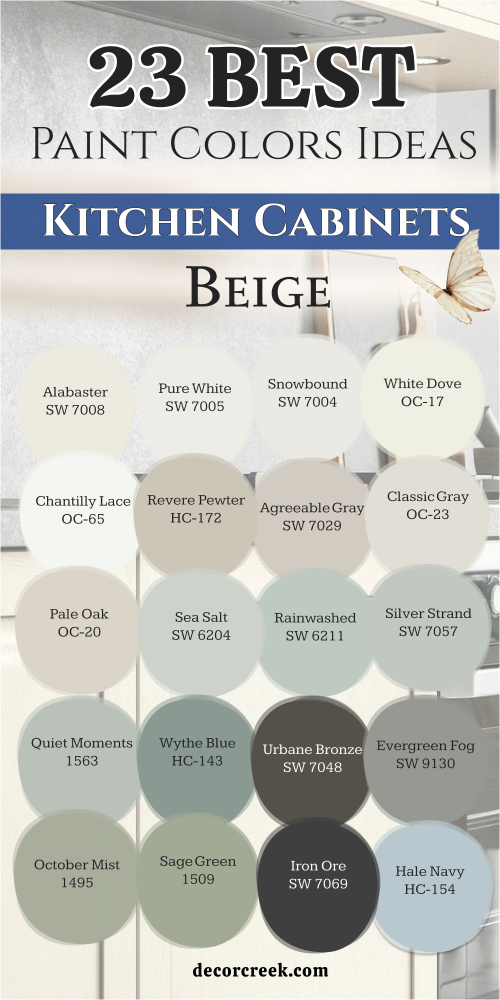
23 Paint Color Ideas For Beige Kitchen Cabinets
Alabaster SW 7008
Alabaster SW 7008 is a beautiful creamy white that looks perfect on kitchen cabinets when you have beige walls. This color makes the entire room feel very high-end and very soft without being too bright or cold. I love how it creates a gentle contrast that feels very expensive and well-planned for a luxury home.
It makes your kitchen fixtures and hardware look brand new and very shiny in the morning light. You will notice that it adds a warm glow to the room that makes everyone feel very welcome. It is a top choice for a professional look because it is so easy to live with every day. Most people find this shade very comforting and much better than a stark hospital white.
Your cabinets will look very updated and very rich with this classic paint choice. It is a very smart way to make your kitchen feel much larger than it really is. This color helps create a bright and welcoming space that feels elegant, balanced, and thoughtfully designed.
Best used in: living rooms, kitchens, hallways, bedrooms, and farmhouse exteriors
Pairs well with: Iron Ore SW 7069, Agreeable Gray SW 7029, Natural Linen SW 9109, warm wood tones The key rule of this color for farmhouse style is to use it where you want natural light to feel kind, soft, and inviting throughout the day.
🎨 Check out the complete guide to this color right HERE 👈

Pure White SW 7005
Pure White SW 7005 is the best pick for kitchen cabinets if you want a very crisp and sharp look. This color is a very balanced white that looks good with any kind of beige wall or tile. I use this when I want a kitchen to look very modern and very fresh for a busy family. It makes every other color in the room stand out and look much more expensive than before.
This is a great choice for cabinets because it looks very professional and shows you care about details. It makes your kitchen feel very clean and very tidy even when you are busy cooking. You will love how it makes your white quartz or marble countertops look so bright and new. It is a very popular choice for luxury homes in the city and the suburbs alike.
Your kitchen will always look very updated and very high-end with this color choice on the wood. Most people find this white very reliable and very easy to match with any floor. This shade helps create a bright and polished space that feels timeless, fresh, and thoughtfully designed.
Best used in: trim, cabinets, modern bathrooms, and ceilings
Pairs well with: everything, especially Naval SW 6244 and Iron Ore SW 7069 The key rule of this color for a crisp look is to use it for all the trim and doors in the house.
🎨 Check out the complete guide to this color right HERE 👈

Snowbound SW 7004
Snowbound SW 7004 is a very cool and refreshing white that has a tiny hint of gray hidden inside. This color looks very sophisticated on kitchen cabinets and is a top pick for modern luxury homes. I suggest this for kitchens that get a lot of natural sun to keep the room feeling cool. It makes your kitchen feel very organized and very sleek during a long day of hosting guests.
You will notice that it feels very smart and very professional on your cabinet doors and drawers. It is a very versatile color that looks great with silver faucets and black metal handles. Many designers use this to create a look that is very sharp and very well-decorated for magazines.
It makes your kitchen feel very custom and very expensive to anyone who walks in the door. Most people find this shade very impressive because it stays looking very clean for a long time. Your kitchen will feel very updated and very chic with this cool white paint.
Best used in: cabinets, trim, bathrooms, and modern exteriors
Pairs well with: Colonnade Gray SW 7641, Iron Ore SW 7069, Peak Pink SW 9004, silver The key rule of this color for a cool look is to pair it with cool-toned stones like gray marble or slate.
🎨 Check out the complete guide to this color right HERE 👈

White Dove OC-17
White Dove OC-17 is a legendary soft white that has been a favorite of designers for many years. This color is a very balanced shade that looks good on kitchen cabinets in almost any light. I love using this in kitchens with beige walls because it creates a very creamy and high-quality look. It makes the whole room feel very established and very well-made for a luxury lifestyle.
You will notice that it feels very warm and very professional on your cabinets and trim. It is a very safe color for people who want a rich look that is not too yellow. Many luxury homes use this color to create a sense of quality and quiet style for guests.
It makes your kitchen feel very solid and very inviting for your morning coffee routine. Most guests will be very impressed by how professional and clean your kitchen cabinets look. Your home will feel very high-end and very grand with this iconic white shade.
Best used in: cabinets, trim, moldings, and whole house interiors
Pairs well with: Revere Pewter HC-172, Balboa Mist OC-27, Hale Navy HC-154, dark wood The key rule of this color for a soft look is to use it on all your trim and cabinets to create a seamless flow.
🎨 Check out the complete guide to this color right HERE 👈

Chantilly Lace OC-65
Chantilly Lace OC-65 is often called the truest white because it has no strong yellow or blue tones. This color is perfect for kitchen cabinets if you want a look that is very bright and very clean. I use this when a homeowner wants a high-contrast look against a warm beige wall or floor. It makes your kitchen feel very large and very fresh for your daily cooking and baking.
You will love how it makes your colorful fruit and decorations look very bright and very happy. It is a very soft color that is very pleasing to look at even in the middle of the day. Many professionals use this for their high-end projects because it is so pure and reliable.
It makes your kitchen feel very modern and very tidy every single day of the week. Most guests will think your kitchen looks very expensive and brand new with this paint. Your kitchen will look very high-end and very fresh with this beautiful and simple choice.
Best used in: cabinets, trim, doors, and art gallery walls
Pairs well with: everything, especially black accents and light oak floors The key rule of this color for a pure look is to use it when you want a high-contrast style with dark hardware.
🎨 Check out the complete guide to this color right HERE 👈

Revere Pewter HC-172
Revere Pewter HC-172 is a very famous color that perfectly bridges the gap between beige and gray. This color looks amazing on kitchen cabinets when you want a look that is deeper and richer than white. I recommend this for homeowners who want their kitchen to feel very high-end and professionally designed. It has a calming quality that makes the kitchen feel very organized and very upscale for guests.
You will notice that it changes slightly with the light, sometimes looking warmer and sometimes cooler. It is a very reliable color that helps with the resale value of a very nice home. Your kitchen will look perfectly balanced and very smart with this iconic shade on the wood.
Most people find this color very impressive because it hides small marks and fingerprints very well. It makes your kitchen feel very custom and very expensive for a long time. Your home will feel very high-end and very updated with this perfect greige paint.
Best used in: kitchen cabinets, open floor plans, master baths, and exteriors
Pairs well with: White Dove OC-17, Chelsea Gray HC-168, Hale Navy HC-154, dark wood The key rule of this color for a balanced look is to use it with bright white trim to keep it looking crisp.
🎨 Check out the complete guide to this color right HERE 👈

Agreeable Gray SW 7029
Agreeable Gray SW 7029 is a very popular color because it matches almost any beige or stone in a kitchen. This color is a light and warm gray that looks very professional on kitchen cabinets and drawers. I love using this for homeowners who want a modern look that still feels very cozy and homey. It works amazingly well with white quartz countertops and light wood floors in a big room.
You will notice that the room feels very clean and very organized at all times of the day. It is a very smart choice for a kitchen that is the heart of a very busy house. Many luxury builders use this color to create a sense of quality and high-end design for buyers.
It makes your kitchen feel very custom and very well-decorated for any guest who visits. Most people find this shade very impressive and very easy to live with every single day. Your kitchen will feel very updated and very rich with this perfect neutral choice.
Best used in: cabinets, walls, whole house interiors, and laundry rooms
Pairs well with: Alabaster SW 7008, Sea Salt SW 6204, Iron Ore SW 7069, white marble The key rule of this color for a professional look is to use it with white trim to show off the soft gray tones.
🎨 Check out the complete guide to this color right HERE 👈

Classic Gray OC-23
Classic Gray OC-23 is a very light and sophisticated gray that looks almost like a soft off-white. This color is perfect for kitchen cabinets when you want a very elegant and high-end feel. I use this when a kitchen needs to feel very bright but also very smart and professionally styled. It makes your white tile and stone look very crisp and very professional on the walls.
You will love how it makes your kitchen feel very open and very fresh for your morning. It is a very soft color that is very kind to your eyes and never feels too loud. Many people use this for their luxury projects because it is so easy to match with rugs.
It makes your kitchen feel very modern and very tidy every single day you use it. Most guests will think your kitchen looks very expensive and very new with this soft gray. Your kitchen will look very high-end and very fresh with this beautiful and smart choice.
Best used in: cabinets, walls, bedrooms, and bathrooms
Pairs well with: White Dove OC-17, Simply White OC-117, Revere Pewter HC-172, dark wood The key rule of this color for an elegant look is to use it in kitchens with lots of natural window light.
🎨 Check out the complete guide to this color right HERE 👈

Pale Oak OC-20
Pale Oak OC-20 is a very soft and gentle neutral that feels incredibly high-end and very smooth. This color looks like a piece of luxury wood and adds a layer of comfort to your kitchen cabinets. I love using this in kitchens where you want to create a very gentle and peaceful environment. It makes your white countertops look very clean and very professional for your family and guests.
You will notice that it has a very organic and kind look in the natural morning sun. It is a very sophisticated choice for a modern home that wants to feel very cozy. Many homeowners choose this because it feels very luxurious and well-made for a nice house.
It makes your kitchen feel like a private retreat away from the busy and loud world outside. Most people find this shade very easy to love and very relaxing to see on the wood. Your home will feel very smart and very well-styled with this soft and warm paint.
Best used in: cabinets, walls, master bedrooms, and nurseries
Pairs well with: Chantilly Lace OC-65, Revere Pewter HC-172, light oak, stone The key rule of this color for an organic look is to pair it with natural wood and lots of white accents.
🎨 Check out the complete guide to this color right HERE 👈

Sea Salt SW 6204
Sea Salt SW 6204 is a very light and fresh mix of green, blue, and gray that looks like a spa. This color is a top choice for kitchen cabinets if you want a very relaxing and high-end feel. I use this when I want a kitchen to feel very light and very airy for a homeowner. It is a very refreshing color that makes everyone feel happy and awake during breakfast time.
This shade makes the room feel very open and much larger than it really is in person. It works beautifully with white trim and natural wood accents or mirrors in the room. You will notice that it looks very soft and very kind on your kitchen cabinet doors.
It is a top choice for a professional luxury look in a guest home or a beach house. Your kitchen will feel like a five-star hotel with this fresh and pretty green shade. Most people find this color very easy to love and very relaxing to see every day.
Best used in: cabinets, bathrooms, bedrooms, and laundry rooms
Pairs well with: Alabaster SW 7008, Pure White SW 7005, Naval SW 6244, light wood The key rule of this color for a spa feel is to use it with white marble and plenty of natural light.
🎨 Check out the complete guide to this color right HERE 👈

Rainwashed SW 6211
Rainwashed SW 6211 is a very soft and pretty blue-green color that looks like a fresh morning. This color looks amazing on kitchen cabinets when you want a look that is bright and very clean. I use this when I want a kitchen to feel very happy and full of light for a family. It is a very soft color that is not too loud or too bright for a kitchen.
This shade works perfectly with white countertops and silver or chrome hardware on the doors. It makes the room feel very light and very open for your morning coffee routine. You will notice that it has a very crisp and clean look on the wood cabinets.
It is a very popular choice for a luxury guest bath or a kids kitchen area. Most people feel very refreshed when they see this pretty blue-green color on the walls. Your kitchen will look very updated and very fresh with this beautiful paint choice.
Best used in: cabinets, bathrooms, bedrooms, and sunrooms
Pairs well with: Alabaster SW 7008, Sea Salt SW 6204, Storm Cloud SW 6249, silver The key rule of this color for a fresh look is to use it with clear glass and silver hardware.
🎨 Check out the complete guide to this color right HERE 👈

Silver Strand SW 7057
Silver Strand SW 7057 is a very sophisticated silver-green-gray that looks very expensive and modern. This color looks very high-end and very smart on your kitchen cabinets and drawers. I like to use this when I want a kitchen to feel very organized and fresh for a client. It is a very cool color that feels very clean and tidy every single day you use it.
This shade works beautifully with white marble and chrome or silver hardware on the wood. It makes the room feel very open and very light even on cloudy or dark days. You will notice that it looks very sharp against bright white paint on the trim.
It is a very popular choice for a luxury master suite or a high-end new home. Your house will look very updated and professional with this smart color pick for the cabinets. Most people find this silver-gray very elegant and very easy to look at every day.
Best used in: cabinets, bedrooms, bathrooms, and laundry rooms
Pairs well with: Pure White SW 7005, Gray Seal SW 7610, Naval SW 6244, chrome The key rule of this color for an expensive look is to use it with white marble and silver.
🎨 Check out the complete guide to this color right HERE 👈

Quiet Moments 1563
Quiet Moments 1563 is a beautiful and soft blue-green-gray that feels very peaceful and upscale. This color is a favorite for kitchen cabinets because it makes the room feel very quiet and high-end. I love using this in kitchens where you want to create a relaxing and gentle environment. It makes your white stone and tile look very bright and very clean on the walls.
You will notice that it has a very organic and kind look in the natural morning sun. It is a very sophisticated choice for a modern home that wants to feel very cozy. Many homeowners choose this because it feels very luxurious and well-made for a nice house.
It makes your kitchen feel like a private retreat away from the busy world outside. Most people find this shade very easy to love and very relaxing to see on the cabinets. Your home will feel very smart and very well-styled with this soft and pretty paint.
Best used in: cabinets, master bathrooms, bedrooms, and nurseries
Pairs well with: Simply White OC-117, Revere Pewter HC-172, light oak, silver The key rule of this color for a peaceful look is to use it with lots of natural light and light wood floors.
🎨 Check out the complete guide to this color right HERE 👈

Wythe Blue HC-143
Wythe Blue HC-143 is a rich and deep blue-green that has a lot of architectural personality. This color makes a kitchen feel very grand and very well-designed from the very first step. I love using this on kitchen cabinets to create a lot of visual interest and style. It works amazingly well with warm wood floors and traditional gold or brass hardware.
You will feel very happy and energetic in a room painted with this strong and pretty color. It creates a very sturdy atmosphere where the whole family feels very safe and warm. Many luxury homes use this to create a feeling of history and great quality for guests.
It makes your kitchen feel like a central and important part of a very nice house. Most people find this shade very impressive and very easy to love for a long time. Your kitchen will look very expensive and very cozy with this selection on the wood.
Best used in: cabinets, accent walls, dining rooms, and exteriors
Pairs well with: White Dove OC-17, Shaker Beige HC-45, dark walnut, gold The key rule of this color for a grand look is to pair it with warm lighting and natural wood accents.
🎨 Check out the complete guide to this color right HERE 👈

Blue Lagoon 2054-40
Blue Lagoon 2054-40 is a deep and sophisticated blue that brings a lot of richness to the home. This color is a great choice for kitchen cabinets if you want to make a big statement. I recommend this for a kitchen island or a lower set of cabinets to create a professional look. It works beautifully with white quartz countertops and gold or brass handles on the doors.
You will notice that the room feels very rich and very well-planned by a designer. It is a very smart choice for a kitchen that needs a bit of a moody and cozy feel. Many luxury homes use this to create a feeling of stability and high-end quality for guests.
It makes your kitchen feel very custom and very high-design for anyone who visits. Most people find this shade very impressive and very easy to decorate around with gold. Your home will feel very grand and very updated with this perfect navy-blue paint.
Best used in: cabinets, accent walls, dens, and front doors
Pairs well with: Simply White OC-117, Revere Pewter HC-172, dark wood, brass The key rule of this color for a powerful look is to use it with bright white and gold accents.
Evergreen Fog SW 9130
Evergreen Fog SW 9130 is a very trendy and soft green-gray that looks like a forest in the mist. This color is a top pick for kitchen cabinets because it feels very organic and very upscale. I love using this for homeowners who want a unique look that still feels very natural. It works amazingly well with light wood floors and white stone countertops in a kitchen.
You will notice that the room feels very quiet and very organized at all times of the day. It is a very smart choice for a kitchen that wants to feel connected to the outdoors. Many designers pick this for their high-priority projects because it looks so professional and rich.
It makes your kitchen feel very custom and very well-decorated for any guest who visits. Most people find this shade very impressive and very easy to live with every day. Your home will feel very high-end and very updated with this perfect green shade.
Best used in: cabinets, master bedrooms, living rooms, and exteriors
Pairs well with: Alabaster SW 7008, Shoji White SW 7042, Iron Ore SW 7069, light oak The key rule of this color for an organic look is to pair it with natural wood and lots of white.
🎨 Check out the complete guide to this color right HERE 👈

October Mist 1495
October Mist 1495 is a very gentle and soft sage green that feels incredibly high-end. This color is a favorite for kitchen cabinets because it makes the room feel very fresh and quiet. I recommend this for kitchens where you want to create a relaxing and very gentle environment. It makes your white stone and tile look very bright and very clean on the kitchen walls.
You will notice that it has a very organic and kind look in the natural sunlight. It is a very sophisticated choice for a modern home that wants a soft touch of color. Many homeowners choose this because it feels very luxurious and well-made for a nice house.
It makes your kitchen feel like a private sanctuary away from the busy world outside. Most people find this shade very easy to love and very relaxing to see on the wood. Your home will feel very smart and very well-styled with this soft green paint.
Best used in: cabinets, bedrooms, bathrooms, and laundry rooms
Pairs well with: Simply White OC-117, Revere Pewter HC-172, light oak, stone The key rule of this color for a peaceful look is to use it with natural textures like linen and stone.
🎨 Check out the complete guide to this color right HERE 👈

Naval SW 6244
Naval SW 6244 is the best navy blue paint if you want a luxury and powerful home look. This color is very deep and rich and looks like the dark ocean on your cabinets. I like to use this on a kitchen island to make it look special and custom for a client. It makes gold or brass handles look very expensive and very shiny in the kitchen light.
This color is very dark and looks very rich against your beige walls and white trim. It creates a very strong and bold look for any kitchen in the entire house. You will notice that it makes white tile look incredibly clean and bright at all times.
It is a very popular choice for high-end master kitchens and professional suites. Most people feel very impressed by this powerful and deep blue color on the wood. Your kitchen will look very grand and very updated with this perfect navy paint choice.
Best used in: cabinets, accent walls, dining rooms, and home offices
Pairs well with: Alabaster SW 7008, Agreeable Gray SW 7029, Sea Salt SW 6204, brass The key rule of this color for a powerful look is to use it with bright white and gold hardware.
🎨 Check out the complete guide to this color right HERE 👈

Hale Navy HC-154
Hale Navy HC-154 is a deep blue that looks like the midnight sky on your kitchen cabinets. This color is a top choice for making a kitchen feel very high-end and very powerful. I love using this on a large vanity or an island to make it the star of the room. It makes white tiles and quartz look very bright and very clean in the kitchen.
Gold and brass hardware look like real jewelry against this dark and rich paint. The color is so deep that it makes a large kitchen feel very cozy and very safe. You will notice that it has a very solid look that never feels cheap or thin.
It is a smart pick for anyone who wants a bold and professional look for their home. Most people find this navy very impressive and very handsome on the cabinets. Your home will look very high-end and very updated with this perfect and classic blue.
Best used in: cabinets, accent walls, dining rooms, and home offices
Pairs well with: White Dove OC-17, Revere Pewter HC-172, marble, brass The key rule of this color for a powerful look is to use it with bright white and gold accents.
🎨 Check out the complete guide to this color right HERE 👈

Iron Ore SW 7069
Iron Ore SW 7069 is a very dark and dramatic charcoal color that looks almost black. This color looks very sophisticated on kitchen cabinets and is a top pick for modern homes. I use this for a very bold look on a kitchen island or a set of lower cabinets. It makes gold or copper hardware look like real jewelry against the dark wood.
This color is very deep but it makes a room look incredibly rich and chic for guests. It creates a very strong and powerful look in any modern kitchen or open room. You will notice that it makes white tile look very bright and very clean every single day.
It is a very popular choice for modern high-end homes and luxury city apartments. Most people feel very impressed by this bold and dark color choice on the cabinets. Your kitchen will look very high-end and very trendy with this charcoal paint.
Best used in: cabinets, accent walls, doors, and exterior trim
Pairs well with: Alabaster SW 7008, Agreeable Gray SW 7029, light oak, copper The key rule of this color for a powerful look is to use it with bright white and gold hardware.
🎨 Check out the complete guide to this color right HERE 👈

Kendall Charcoal HC-166
Kendall Charcoal HC-166 is a very rich and deep gray that brings a lot of drama to the kitchen. This color is a great choice for kitchen cabinets if you want a look that is bold and sophisticated. I recommend this for a kitchen that needs to feel very professional and high-quality. It works beautifully with white stone countertops and silver or chrome handles on the doors.
You will notice that the room feels very rich and very well-planned by a designer. It is a very smart choice for a kitchen that wants a moody and cozy feel for hosting. Many luxury homes use this to create a feeling of stability and high-end quality for guests.
It makes your kitchen feel very custom and very high-design for anyone who visits. Most people find this shade very impressive and very easy to decorate with white. Your home will feel very grand and very updated with this perfect charcoal paint.
Best used in: cabinets, accent walls, dens, and exteriors
Pairs well with: White Dove OC-17, Revere Pewter HC-172, dark wood, silver The key rule of this color for a sophisticated look is to use it with bright white trim and silver accents.
🎨 Check out the complete guide to this color right HERE 👈

Urbane Bronze SW 7048
Urbane Bronze SW 7048 is a very rich and earthy bronze-gray that looks like a forest floor. This color looks very expensive on kitchen cabinets and is a top pick for a luxury home. I use this when I want a kitchen to feel very cozy and very high-end for a client. It looks amazing with natural stone floors and warm wood vanity tops in the kitchen.
This color is very deep and makes the room feel very solid and very safe for the family. It makes white sinks and tubs stand out in a great and clean way against the wood. You will notice that it has a very smooth and velvety look on the cabinet doors.
It is a top choice for a modern kitchen with lots of light and big windows. Most people find this color very sophisticated and very bold for a luxury home. Your kitchen will feel like a high-end hotel with this bronze-gray choice on the cabinets.
Best used in: cabinets, exterior siding, accent walls, and dens
Pairs well with: Shoji White SW 7042, Modern Gray SW 7632, light oak, brass The key rule of this color for a cozy look is to use it with natural materials like stone and wood.
🎨 Check out the complete guide to this color right HERE 👈

26 Paint Color Ideas For Beige Kitchen Wall
Alabaster SW 7008
Alabaster SW 7008 is a beautiful creamy white that looks perfect on kitchen walls when you want a light look. This color makes the entire room feel very high-end and very soft without being too bright or cold. I love how it creates a gentle backdrop that feels very expensive and well-planned for a luxury home.
It makes your kitchen fixtures and hardware look brand new and very shiny in the morning light. You will notice that it adds a warm glow to the room that makes everyone feel very welcome. It is a top choice for a professional look because it is so easy to live with every day.
Most people find this shade very comforting and much better than a stark hospital white. Your walls will look very updated and very rich with this classic paint choice. It is a very smart way to make your kitchen feel much larger than it really is.
Best used in: living rooms, kitchens, hallways, bedrooms, and farmhouse exteriors
Pairs well with: Iron Ore SW 7069, Agreeable Gray SW 7029, Natural Linen SW 9109, warm wood tones The key rule of this color for farmhouse style is to use it where you want natural light to feel kind, soft, and inviting throughout the day.
🎨 Check out the complete guide to this color right HERE 👈
Greek Villa SW 7551
Greek Villa SW 7551 is a very sunny and bright off-white that feels like a summer day in your kitchen. This color has a tiny bit of yellow in the base which makes it feel very warm and happy. I use this when a kitchen has dark floors and needs to feel much lighter and more open.
It makes your white cabinets look very clean and your stone counters look very expensive. You will notice that it feels very fresh and very energetic when you are making your morning coffee. It is a very popular choice for luxury homes because it looks so professional and high-quality.
Most people find this color very easy to love because it never feels cold or gray. Your kitchen will look very grand and very inviting with this sunny shade on the walls. It is a great way to get a luxury look that still feels like a cozy home.
Best used in: kitchens, living rooms, trim, and whole house interiors
Pairs well with: Urbane Bronze SW 7048, In the Navy SW 9178, light oak, brass The key rule of this color for a sunny feel is to use it in kitchens with plenty of natural window light.
🎨 Check out the complete guide to this color right HERE 👈

White Dove OC-17
White Dove OC-17 is a legendary soft white that has been a favorite of designers for many years. This color is a very balanced shade that looks good on kitchen walls in almost any light. I love using this in kitchens because it creates a very creamy and high-quality look for the homeowner. It makes the whole room feel very established and very well-made for a luxury lifestyle.
You will notice that it feels very warm and very professional on your walls and your trim. It is a very safe color for people who want a rich look that is not too yellow. Many luxury homes use this color to create a sense of quality and quiet style for guests.
It makes your kitchen feel very solid and very inviting for your morning routine. Most guests will be very impressed by how professional and clean your kitchen walls look. Your home will feel very high-end and very grand with this iconic white shade.
Best used in: walls, trim, moldings, and cabinets
Pairs well with: Revere Pewter HC-172, Balboa Mist OC-27, Hale Navy HC-154, dark wood The key rule of this color for a soft look is to use it on both walls and trim in different finishes.
🎨 Check out the complete guide to this color right HERE 👈
Chantilly Lace OC-65
Chantilly Lace OC-65 is often called the truest white because it has no strong yellow or blue tones. This color is perfect for kitchen walls if you want a look that is very bright and very clean. I use this when a homeowner wants a high-contrast look against dark wood floors or black cabinets. It makes your kitchen feel very large and very fresh for your daily cooking and baking.
You will love how it makes your colorful fruit and decorations look very bright and very happy. It is a very soft color that is very pleasing to look at even in the middle of the day. Many professionals use this for their high-end projects because it is so pure and reliable.
It makes your kitchen feel very modern and very tidy every single day. Most guests will think your kitchen looks very expensive and brand new with this paint. Your kitchen will look very high-end and very fresh with this beautiful and simple choice.
Best used in: kitchens, trim, doors, and art gallery walls
Pairs well with: everything, especially black accents and light oak floors The key rule of this color for a pure look is to use it when you want a high-contrast style with dark hardware.
🎨 Check out the complete guide to this color right HERE 👈
Simply White OC-117
Simply White OC-117 is a very crisp and happy white that has a tiny bit of warmth to keep it cozy. This color is a top choice for kitchen walls because it makes the room feel very bright and full of life. I suggest this for kitchens that need to feel fresh but still want to feel like a family home. It makes your white cabinets and counters look very sharp and very professional on the walls.
You will notice that it has a very clean and velvety look in the morning sun. It is a very sophisticated choice for a luxury home that wants a very bright and open feel. Many designers pick this for kitchens because it makes every other color in the room stand out.
It makes your kitchen feel very open and very airy for its size. Most people find this shade very refreshing and very easy to love. Your kitchen will look very high-end and very stylish with this bright paint.
Best used in: kitchens, ceilings, trim, and whole house interiors
Pairs well with: Hale Navy HC-154, Revere Pewter HC-172, dark wood, silver The key rule of this color for a bright feel is to use it in kitchens that lack natural light to make them feel sunnier.
🎨 Check out the complete guide to this color right HERE 👈

Agreeable Gray SW 7029
Agreeable Gray SW 7029 is a very popular color because it matches almost any beige or stone in a kitchen. This color is a light and warm gray that looks very professional on kitchen walls. I love using this for homeowners who want a modern look that still feels very cozy and homey. It works amazingly well with white cabinets and light wood floors in a big kitchen.
You will notice that the room feels very clean and very organized at all times of the day. It is a very smart choice for a kitchen that is the heart of a very busy house. Many luxury builders use this color to create a sense of quality and high-end design.
It makes your kitchen feel very custom and very well-decorated for any guest who visits. Most people find this shade very impressive and very easy to live with every single day. Your kitchen will feel very updated and very rich with this perfect neutral choice.
Best used in: kitchen walls, bedrooms, living rooms, and laundry rooms
Pairs well with: Alabaster SW 7008, Sea Salt SW 6204, Iron Ore SW 7069, white marble The key rule of this color for a professional look is to use it with white trim to show off the soft gray tones.
🎨 Check out the complete guide to this color right HERE 👈
Revere Pewter HC-172
Revere Pewter HC-172 is a very famous color that perfectly bridges the gap between beige and gray. This color looks amazing on kitchen walls when you want a look that is deeper and richer than white. I recommend this for homeowners who want their kitchen to feel very high-end and professionally designed. It has a calming quality that makes the kitchen feel very organized and very upscale for guests.
You will notice that it changes slightly with the light, sometimes looking warmer and sometimes cooler. It is a very reliable color that helps with the resale value of a very nice home. Your kitchen will look perfectly balanced and very smart with this iconic shade on the walls.
Most people find this color very impressive because it makes white trim look very bright and clean. It makes your kitchen feel very custom and very expensive for a long time. Your home will feel very high-end and very updated with this perfect greige paint.
Best used in: kitchen walls, open floor plans, master baths, and exteriors
Pairs well with: White Dove OC-17, Chelsea Gray HC-168, Hale Navy HC-154, dark wood The key rule of this color for a balanced look is to use it with bright white trim to keep it looking crisp.
🎨 Check out the complete guide to this color right HERE 👈
Edgecomb Gray HC-173
Edgecomb Gray HC-173 is a very smart and sophisticated beige that has a bit of a gray heart. This color looks very high-end and adds a lot of quality to a luxury kitchen wall. I love using this for homeowners who want a unique look that still feels very classic and warm. It works amazingly well with natural stone and white cabinets in a large kitchen.
You will notice that the room feels very rich and very well-planned by a designer. It is a very sophisticated choice for a home that wants to feel very custom and special. Many professionals pick this for their high-priority projects because it looks so good in any light.
It makes your kitchen feel very grand and very stylish for any guest who visits your home. Most people find this shade very impressive and very easy to decorate around. Your home will feel very smart and very well-styled with this beautiful paint.
Best used in: kitchen walls, bedrooms, hallways, and open spaces
Pairs well with: Simply White OC-117, Revere Pewter HC-172, Hale Navy HC-154, marble The key rule of this color for a sophisticated look is to use it with white trim to keep the color from looking muddy.
🎨 Check out the complete guide to this color right HERE 👈
Pale Oak OC-20
Pale Oak OC-20 is a very soft and gentle neutral that feels incredibly high-end and very smooth. This color looks like a piece of luxury wood and adds a layer of comfort to your kitchen walls. I love using this in kitchens where you want to create a very gentle and peaceful environment. It makes your white countertops and cabinets look very clean and very professional.
You will notice that it has a very organic and kind look in the natural morning sun. It is a very sophisticated choice for a modern home that wants to feel very cozy. Many homeowners choose this because it feels very luxurious and well-made for a nice house.
It makes your kitchen feel like a private retreat away from the busy and loud world outside. Most people find this shade very easy to love and very relaxing to see on the walls. Your home will feel very smart and very well-styled with this soft and warm paint.
Best used in: kitchen walls, master bedrooms, living rooms, and nurseries
Pairs well with: Chantilly Lace OC-65, Revere Pewter HC-172, light oak, stone The key rule of this color for an organic look is to pair it with natural wood and lots of white accents.
🎨 Check out the complete guide to this color right HERE 👈
Accessible Beige SW 7036
Accessible Beige SW 7036 is a top pick for kitchen walls because it has a bit of gray that keeps it from looking too yellow. This color works perfectly with dark wood floors and white cabinets in a luxury home. I love how it makes a room feel cozy but still very bright and open for the family. Many homeowners choose this because it matches almost any tile or stone you already have in the kitchen.
It acts like a neutral backdrop that makes your kitchen decorations stand out and look great. You will notice that it looks very professional in both natural and artificial light. It is a smart choice if you want your house to feel welcoming to guests and neighbors.
Most people find this shade very easy to live with every single day of the week. Your kitchen will look updated and high-end with this paint on the walls. It creates a friendly atmosphere where everyone wants to hang out together.
Best used in: kitchens, living rooms, hallways, and open floor plans
Pairs well with: Alabaster SW 7008, Urban Bronze SW 7048, Cadet SW 9143, dark wood The key rule of this color for a balanced look is to use it in rooms with plenty of windows to see the gray undertones.
🎨 Check out the complete guide to this color right HERE 👈
Natural Linen SW 9109
Natural Linen SW 9109 is a beautiful beige that feels like a piece of high-quality fabric on your walls. This color is very light and makes your kitchen feel very soft and gentle for the family. I love using this for a kitchen that needs to feel like a quiet retreat from the day. It makes white porcelain sinks and cabinets look very bright and clean.
You will notice that it has a very organic feel that is very trendy for kitchens right now. It is a perfect choice for a kitchen with a lot of plants and light wood accents. Most people feel very happy and relaxed in a room with this paint on the walls.
It makes your kitchen feel very open and very airy for its size in the house. Your home will look very expensive and very well-styled with this choice. It is a very smart pick for a modern farmhouse or traditional luxury look.
Best used in: kitchen walls, bedrooms, nurseries, and laundry rooms
Pairs well with: Alabaster SW 7008, Pure White SW 7005, Iron Ore SW 7069, wood The key rule of this color for an organic look is to use it with natural textures like linen and wicker.
🎨 Check out the complete guide to this color right HERE 👈
Manchester Tan HC-81
Manchester Tan HC-81 is a legendary beige that has been a favorite of designers for a very long time. This color is a very balanced tan that looks good on kitchen walls in almost any light. I love using this in kitchens with white cabinets and dark stone countertops. It makes the room feel very established and very high-quality for a luxury lifestyle.
You will notice that it feels very warm and very professional on the walls. It is a very safe color for people who want a luxury look that is not too bold. Many luxury homes use this color to create a sense of history and comfort for guests.
It makes your kitchen feel very solid and very well-built for a long life. Most guests will feel very at home when they walk into your kitchen. Your kitchen will look very grand and very classic with this paint choice.
Best used in: kitchen walls, living rooms, hallways, and traditional homes
Pairs well with: White Dove OC-17, Hale Navy HC-154, dark walnut, black granite The key rule of this color for a classic look is to use it with white trim to keep the tan looking crisp.
🎨 Check out the complete guide to this color right HERE 👈
Classic Gray OC-23
Classic Gray OC-23 is a very light and sophisticated gray that looks almost like a soft off-white. This color is perfect for kitchen walls when you want a very elegant and high-end feel. I use this when a kitchen needs to feel very bright but also very smart and professionally styled.
It makes your white tile and stone look very crisp and very professional on the walls. You will love how it makes your kitchen feel very open and very fresh for your morning routine. It is a very soft color that is very kind to your eyes and never feels too loud.
Many people use this for their luxury projects because it is so easy to match with furniture. It makes your kitchen feel very modern and very tidy every single day you use it. Most guests will think your kitchen looks very expensive and very new with this soft gray. Your kitchen will look very high-end and very fresh with this beautiful and smart choice.
Best used in: kitchen walls, bedrooms, bathrooms, and hallways
Pairs well with: White Dove OC-17, Simply White OC-117, Revere Pewter HC-172, dark wood The key rule of this color for an elegant look is to use it in kitchens with lots of natural window light.
🎨 Check out the complete guide to this color right HERE 👈
Balboa Mist OC-27
Balboa Mist OC-27 is a very soft and pretty gray-beige that looks very high-end on kitchen walls. This color is incredibly popular for making a kitchen feel light and very upscale for a family. I suggest this for kitchens that need to feel fresh but still want to feel very warm.
It makes your white cabinets and counters look very bright and very clean in the morning light. You will notice that it has a very smooth and velvety look on the walls. It is a very sophisticated choice for a luxury home that wants a soft and modern touch.
Many designers pick this for kitchens because it is so easy to live with every day. It makes your kitchen feel very open and very airy for its size in the home. Most people find this shade very refreshing and very easy to love. Your kitchen will look very high-end and very stylish with this soft and pretty paint.
Best used in: kitchen walls, living rooms, bedrooms, and open spaces
Pairs well with: Chantilly Lace OC-65, Revere Pewter HC-172, dark wood, silver The key rule of this color for an airy feel is to use it with white trim and silver hardware.
🎨 Check out the complete guide to this color right HERE 👈

Sea Salt SW 6204
Sea Salt SW 6204 is a very light and fresh mix of green, blue, and gray that looks like a spa. This color is a top choice for kitchen walls if you want a very relaxing and high-end feel. I use this when I want a kitchen to feel very light and very airy for a homeowner.
It is a very refreshing color that makes everyone feel happy and awake during breakfast time. This shade makes the room feel very open and much larger than it really is in person. It works beautifully with white trim and natural wood accents or mirrors on the walls.
You will notice that it looks very soft and very kind on your kitchen walls. It is a top choice for a professional luxury look in a guest home or a beach house. Your kitchen will feel like a five-star hotel with this fresh and pretty green shade. Most people find this color very easy to love and very relaxing to see every day.
Best used in: kitchen walls, bathrooms, bedrooms, and laundry rooms
Pairs well with: Alabaster SW 7008, Pure White SW 7005, Naval SW 6244, light wood The key rule of this color for a spa feel is to use it with white marble and plenty of natural light.
🎨 Check out the complete guide to this color right HERE 👈
Rainwashed SW 6211
Rainwashed SW 6211 is a very soft and pretty blue-green color that looks like a fresh morning on the walls. This color looks amazing on kitchen walls when you want a look that is bright and very clean. I use this when I want a kitchen to feel very happy and full of light for a family.
It is a very soft color that is not too loud or too bright for a kitchen wall. This shade works perfectly with white cabinets and silver or chrome hardware on the doors. It makes the room feel very light and very open for your morning coffee routine.
You will notice that it has a very crisp and clean look on the walls. It is a very popular choice for a luxury guest bath or a kids kitchen area. Most people feel very refreshed when they see this pretty blue-green color on the walls. Your kitchen will look very updated and very fresh with this beautiful paint choice.
Best used in: kitchen walls, bathrooms, bedrooms, and sunrooms
Pairs well with: Alabaster SW 7008, Sea Salt SW 6204, Storm Cloud SW 6249, silver The key rule of this color for a fresh look is to use it with clear glass and silver hardware.
🎨 Check out the complete guide to this color right HERE 👈
Silver Strand SW 7057
Silver Strand SW 7057 is a very sophisticated silver-green-gray that looks very expensive and modern. This color looks very high-end and very smart on your kitchen walls. I like to use this when I want a kitchen to feel very organized and fresh for a client.
It is a very cool color that feels very clean and tidy every single day you use it. This shade works beautifully with white marble and chrome or silver hardware in the room. It makes the room feel very open and very light even on cloudy or dark days.
You will notice that it looks very sharp against bright white paint on the trim. It is a very popular choice for a luxury master kitchen or a high-end new home. Your house will look very updated and professional with this smart color pick for the walls. Most people find this silver-gray very elegant and very easy to look at every day.
Best used in: kitchen walls, bedrooms, bathrooms, and laundry rooms
Pairs well with: Pure White SW 7005, Gray Seal SW 7610, Naval SW 6244, chrome The key rule of this color for an expensive look is to use it with white marble and silver.
🎨 Check out the complete guide to this color right HERE 👈
Quiet Moments 1563
Quiet Moments 1563 is a beautiful and soft blue-green-gray that feels very peaceful and upscale on the walls. This color is a favorite for kitchen walls because it makes the room feel very quiet and high-end. I love using this in kitchens where you want to create a relaxing and gentle environment.
It makes your white stone and tile look very bright and very clean on the kitchen walls. You will notice that it has a very organic and kind look in the natural morning sun. It is a very sophisticated choice for a modern home that wants to feel very cozy.
Many homeowners choose this because it feels very luxurious and well-made for a nice house. It makes your kitchen feel like a private retreat away from the busy world outside. Most people find this shade very easy to love and very relaxing to see on the walls. Your home will feel very smart and very well-styled with this soft and pretty paint.
Best used in: kitchen walls, master bathrooms, bedrooms, and nurseries
Pairs well with: Simply White OC-117, Revere Pewter HC-172, light oak, silver The key rule of this color for a peaceful look is to use it with lots of natural light and light wood floors.
🎨 Check out the complete guide to this color right HERE 👈
Wythe Blue HC-143
Wythe Blue HC-143 is a rich and deep blue-green that has a lot of architectural personality on the walls. This color makes a kitchen feel very grand and very well-designed from the very first step. I love using this on kitchen walls to create a lot of visual interest and style.
It works amazingly well with warm wood floors and traditional gold or brass hardware. You will feel very happy and energetic in a room painted with this strong and pretty color. It creates a very sturdy atmosphere where the whole family feels very safe and warm.
Many luxury homes use this to create a feeling of history and great quality for guests. It makes your kitchen feel like a central and important part of a very nice house. Most people find this shade very impressive and very easy to love for a long time. Your kitchen will look very expensive and very cozy with this selection on the walls.
Best used in: kitchen walls, cabinets, dining rooms, and exteriors
Pairs well with: White Dove OC-17, Shaker Beige HC-45, dark walnut, gold The key rule of this color for a grand look is to pair it with warm lighting and natural wood accents.
🎨 Check out the complete guide to this color right HERE 👈
October Mist 1495
October Mist 1495 is a very gentle and soft sage green that feels incredibly high-end on the walls. This color is a favorite for kitchen walls because it makes the room feel very fresh and quiet. I recommend this for kitchens where you want to create a relaxing and very gentle environment.
It makes your white stone and tile look very bright and very clean on the kitchen walls. You will notice that it has a very organic and kind look in the natural sunlight. It is a very sophisticated choice for a modern home that wants a soft touch of color.
Many homeowners choose this because it feels very luxurious and well-made for a nice house. It makes your kitchen feel like a private sanctuary away from the busy world outside. Most people find this shade very easy to love and very relaxing to see on the walls. Your home will feel very smart and very well-styled with this soft green paint.
Best used in: kitchen walls, bedrooms, bathrooms, and laundry rooms
Pairs well with: Simply White OC-117, Revere Pewter HC-172, light oak, stone The key rule of this color for a peaceful look is to use it with natural textures like linen and stone.
🎨 Check out the complete guide to this color right HERE 👈
Evergreen Fog SW 9130
Evergreen Fog SW 9130 is a very trendy and soft green-gray that looks like a forest in the mist. This color is a top pick for kitchen walls because it feels very organic and very upscale. I love using this for homeowners who want a unique look that still feels very natural.
It works amazingly well with light wood floors and white stone countertops in a kitchen. You will notice that the room feels very quiet and very organized at all times of the day. It is a very smart choice for a kitchen that wants to feel connected to the outdoors.
Many designers pick this for their high-priority projects because it looks so professional and rich. It makes your kitchen feel very custom and very well-decorated for any guest who visits. Most people find this shade very impressive and very easy to live with every day. Your home will feel very high-end and very updated with this perfect green shade.
Best used in: kitchen walls, master bedrooms, living rooms, and exteriors
Pairs well with: Alabaster SW 7008, Shoji White SW 7042, Iron Ore SW 7069, light oak The key rule of this color for an organic look is to pair it with natural wood and lots of white.
🎨 Check out the complete guide to this color right HERE 👈
Saybrook Sage HC-114
Saybrook Sage HC-114 is a classic and reliable green that makes any kitchen wall feel very solid and rich. This color is a top choice for a home that wants a traditional and high-end look. I recommend this for kitchen walls when you have warm wood floors and white trim.
It makes the room feel very professional and very well-built for a family lifestyle. You will notice that it feels very warm and very inviting during your dinner time. It is a very safe color that matches a wide variety of furniture and rugs in the home.
Many luxury builders use this to create a home that feels very expensive and very sturdy. It makes your kitchen feel like a cozy and important part of a very nice house. Most people feel very grounded and happy in a room that uses this warm green tone. Your kitchen will look very updated and very smart with this selection on the walls.
Best used in: kitchen walls, dining rooms, hallways, and exteriors
Pairs well with: White Dove OC-17, Manchester Tan HC-81, dark cherry wood, brass The key rule of this color for a traditional look is to pair it with warm lighting and dark furniture.
🎨 Check out the complete guide to this color right HERE 👈

Hale Navy HC-154
Hale Navy HC-154 is a deep blue that looks like the midnight sky on your kitchen walls. This color is a top choice for making a kitchen feel very high-end and very powerful. I love using this on an accent wall to make it the star of the room.
It makes white tiles and quartz look very bright and very clean in the kitchen. Gold and brass hardware look like real jewelry against this dark and rich paint. The color is so deep that it makes a large kitchen feel very cozy and very safe. You will notice that it has a very solid look that never feels cheap or thin.
It is a smart pick for anyone who wants a bold and professional look for their home. Most people find this navy very impressive and very handsome on the walls. Your home will look very high-end and very updated with this perfect and classic blue.
Best used in: kitchen walls, dining rooms, home offices, and front doors
Pairs well with: White Dove OC-17, Revere Pewter HC-172, marble, brass The key rule of this color for a powerful look is to use it with bright white and gold accents.
🎨 Check out the complete guide to this color right HERE 👈
Naval SW 6244
Naval SW 6244 is the best navy blue paint if you want a luxury and powerful home look on the walls. This color is very deep and rich and looks like the dark ocean on your walls. I like to use this on a single kitchen wall to make it look special and custom for a client.
It makes gold or brass handles look very expensive and very shiny in the kitchen light. This color is very dark and looks very rich against your white cabinets and trim. It creates a very strong and bold look for any kitchen in the entire house.
You will notice that it makes white tile look incredibly clean and bright at all times. It is a very popular choice for high-end master kitchens and professional suites. Most people feel very impressed by this powerful and deep blue color on the walls. Your kitchen will look very grand and very updated with this perfect navy paint choice.
Best used in: kitchen walls, dining rooms, home offices, and accent walls
Pairs well with: Alabaster SW 7008, Agreeable Gray SW 7029, Sea Salt SW 6204, brass The key rule of this color for a powerful look is to use it with bright white and gold hardware.
🎨 Check out the complete guide to this color right HERE 👈
Kendall Charcoal HC-166
Kendall Charcoal HC-166 is a very rich and deep gray that brings a lot of drama to the kitchen walls. This color is a great choice for kitchen walls if you want a look that is bold and sophisticated. I recommend this for a kitchen that needs to feel very professional and high-quality for hosting.
It works beautifully with white stone countertops and silver or chrome handles in the room. You will notice that the room feels very rich and very well-planned by a designer. It is a very smart choice for a kitchen that wants a moody and cozy feel for the evening.
Many luxury homes use this to create a feeling of stability and high-end quality for guests. It makes your kitchen feel very custom and very high-design for anyone who visits. Most people find this shade very impressive and very easy to decorate with white. Your home will feel very grand and very updated with this perfect charcoal paint.
Best used in: kitchen walls, dens, exteriors, and accent walls
Pairs well with: White Dove OC-17, Revere Pewter HC-172, dark wood, silver The key rule of this color for a sophisticated look is to use it with bright white trim and silver accents.
🎨 Check out the complete guide to this color right HERE 👈
Iron Ore SW 7069
Iron Ore SW 7069 is a very dark and dramatic charcoal color that looks almost black on the walls. This color looks very sophisticated on kitchen walls and is a top pick for modern homes. I use this for a very bold look on an accent wall to create style.
It makes gold or copper hardware look like real jewelry against the dark paint. This color is very deep but it makes a room look incredibly rich and chic for guests. It creates a very strong and powerful look in any modern kitchen or open room.
You will notice that it makes white cabinets look very bright and very clean every single day. It is a very popular choice for modern high-end homes and luxury city apartments. Most people feel very impressed by this bold and dark color choice on the walls. Your kitchen will look very high-end and very trendy with this charcoal paint.
Best used in: kitchen walls, doors, exterior trim, and accent walls
Pairs well with: Alabaster SW 7008, Agreeable Gray SW 7029, light oak, copper The key rule of this color for a powerful look is to use it with bright white and gold hardware.
🎨 Check out the complete guide to this color right HERE 👈
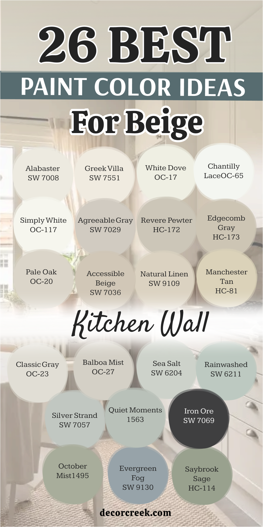
14 Paint Color Ideas For Beige Kitchen Backsplash
Tricorn Black SW 6258
Tricorn Black SW 6258 is the most powerful choice for a kitchen backsplash area because it is a true black with no hidden colors. I love how it creates a sharp and expensive look behind a beige stove or sink. This color makes your gold or silver faucets look like real jewelry against a dark background.
You will notice that it makes the whole kitchen feel much more modern and very well-designed. It is a very bold choice that shows you are confident in your high-end style. Many luxury designers pick this to anchor a large room and make it feel more solid.
Most people are surprised by how clean and professional it looks with white cabinets. Your kitchen will look like a professional chef’s area with this deep paint. It hides every splash and mark from cooking which makes it very smart. Your guests will be very impressed by this daring and rich look.
Best used in: kitchen backsplashes, front doors, cabinets, and accent walls
Pairs well with: Alabaster SW 7008, Pure White SW 7005, gold hardware, marble The key rule of this color for a powerful look is to use a high-gloss finish to make the light bounce off the dark surface.
🎨 Check out the complete guide to this color right HERE 👈

Onyx 2133-10
Onyx 2133-10 is a very deep and rich black that feels like a piece of expensive stone. This color is perfect for a backsplash because it brings a lot of drama to a beige kitchen. I suggest this for homeowners who want a very sophisticated and moody environment for cooking.
It works beautifully with white quartz countertops and warm wood accents. You will love how it makes your kitchen feel very private and very high-end. It is a very solid color that adds a lot of weight and quality to the room.
Many professionals use this to create a look that is very sharp and very well-planned. It makes your kitchen feel very modern and very tidy every single day. Most guests will think your kitchen looks very expensive and very custom. Your home will feel very grand and very updated with this beautiful black paint.
Best used in: backsplashes, trim, doors, and fireplaces
Pairs well with: White Dove OC-17, Gray Owl OC-52, brass, light wood The key rule of this color for a sophisticated look is to pair it with warm wood shelves to balance the darkness.
Peppercorn SW 7674
Peppercorn SW 7674 is a very dark gray that looks very high-end and much softer than a true black. This color is a top pick for a backsplash because it matches almost any stone or tile you have. I use this when a kitchen needs to feel very organized and very professional.
It makes your white cabinets look very bright and very clean in contrast. You will notice that it has a very smooth and velvety look in the evening light. It is a very versatile color that looks great with both silver and gold hardware.
Many designers use this to create a look that is very smart and very well-decorated. It makes your kitchen feel very custom and very expensive for its size. Most people find this shade very impressive because it is so easy to live with. Your kitchen will feel very updated and very chic with this dark gray.
Best used in: backsplashes, islands, accent walls, and exteriors
Pairs well with: Agreeable Gray SW 7029, Alabaster SW 7008, silver, dark wood The key rule of this color for a balanced look is to use it with bright white grout or trim.
🎨 Check out the complete guide to this color right HERE 👈
Kendall Charcoal HC-166
Kendall Charcoal HC-166 is a very rich and deep gray that brings a lot of drama to the kitchen. This color is a great choice for a backsplash area if you want a look that is bold and smart. I recommend this for a kitchen that needs to feel very professional and high-quality.
It works beautifully with white stone countertops and silver handles in the room. You will notice that the room feels very rich and very well-planned by a designer. It is a very smart choice for a kitchen that wants a moody and cozy feel.
Many luxury homes use this to create a feeling of stability and high-end quality for guests. It makes your kitchen feel very custom and very high-design for anyone who visits. Most people find this shade very impressive and very easy to decorate around. Your home will feel very grand and very updated with this perfect charcoal.
Best used in: backsplashes, accent walls, dens, and exteriors
Pairs well with: White Dove OC-17, Revere Pewter HC-172, dark wood, silver The key rule of this color for a sophisticated look is to use it with bright white trim and silver accents.
🎨 Check out the complete guide to this color right HERE 👈
Hale Navy HC-154
Hale Navy HC-154 is a deep blue that looks like the midnight sky on your kitchen backsplash. This color is a top choice for making a kitchen feel very high-end and very powerful. I love using this in the area behind the stove to make it the star of the room.
It makes white tiles and quartz look very bright and very clean in the kitchen. Gold and brass hardware look like real jewelry against this dark and rich paint. The color is so deep that it makes a large kitchen feel very cozy and very safe.
You will notice that it has a very solid look that never feels cheap. It is a smart pick for anyone who wants a bold and professional look for their home. Most people find this navy very impressive and very handsome in the kitchen. Your home will look very high-end and very updated with this perfect and classic blue.
Best used in: backsplashes, accent walls, dining rooms, and home offices
Pairs well with: White Dove OC-17, Revere Pewter HC-172, marble, brass The key rule of this color for a powerful look is to use it with bright white and gold accents.
🎨 Check out the complete guide to this color right HERE 👈
Naval SW 6244
Naval SW 6244 is the best navy blue paint if you want a luxury and powerful home look. This color is very deep and rich and looks like the dark ocean on your walls. I like to use this for the backsplash to make it look special and custom for a client.
It makes gold or brass handles look very expensive and very shiny in the kitchen light. This color is very dark and looks very rich against your white cabinets and trim. It creates a very strong and bold look for any kitchen in the entire house.
You will notice that it makes white tile look incredibly clean and bright at all times. It is a very popular choice for high-end master kitchens and professional suites. Most people feel very impressed by this powerful and deep blue color on the walls. Your kitchen will look very grand and very updated with this perfect navy paint choice.
Best used in: backsplashes, dining rooms, home offices, and accent walls
Pairs well with: Alabaster SW 7008, Agreeable Gray SW 7029, Sea Salt SW 6204, brass The key rule of this color for a powerful look is to use it with bright white and gold hardware.
🎨 Check out the complete guide to this color right HERE 👈
Smoke 2122-40
Smoke 2122-40 is a deep and sophisticated blue that brings a lot of richness to the backsplash. This color is a great choice for homeowners who want to make a big statement. I recommend this for a kitchen that needs to feel very professional and high-quality.
It works beautifully with white quartz countertops and gold or brass handles. You will notice that the room feels very rich and very well-planned by a designer. It is a very smart choice for a kitchen that needs a bit of a moody and cozy feel.
Many luxury homes use this to create a feeling of stability and high-end quality. It makes your kitchen feel very custom and very high-design for anyone who visits. Most people find this shade very impressive and very easy to decorate around. Your home will feel very grand and very updated with this perfect navy-blue paint.
Best used in: backsplashes, accent walls, dens, and front doors
Pairs well with: Simply White OC-117, Revere Pewter HC-172, dark wood, brass The key rule of this color for a powerful look is to use it with bright white and gold accents.
🎨 Check out the complete guide to this color right HERE 👈

Retreat SW 6207
Retreat SW 6207 is a very soft and dusty green that looks like a high-end garden. This color is a top choice for a backsplash if you want a very relaxing and organic feel. I use this when I want a kitchen to feel very light and very earthy for a homeowner.
It is a very refreshing color that makes everyone feel happy and awake during breakfast time. This shade makes the backsplash area feel very custom and much more interesting than plain tile. It works beautifully with white trim and natural wood accents or shelving.
You will notice that it looks very soft and very kind on your kitchen walls. It is a top choice for a professional luxury look in a guest home or a ranch. Your kitchen will feel like a five-star retreat with this fresh and pretty green shade. Most people find this color very easy to love every day.
Best used in: backsplashes, bedrooms, bathrooms, and laundry rooms
Pairs well with: Alabaster SW 7008, Pure White SW 7005, light oak, stone The key rule of this color for an organic look is to use it with natural wood and lots of white.
🎨 Check out the complete guide to this color right HERE 👈

Ripe Olive SW 6209
Ripe Olive SW 6209 is a very deep and dark green that feels incredibly rich and high-end. This color looks like the forest at night and adds a layer of drama to your kitchen backsplash. I love using this in kitchens where you want to create a very strong and custom environment.
It makes your gold hardware and wood shelves look very expensive and very professional. You will notice that it has a very organic and sturdy look in the kitchen light. It is a very sophisticated choice for a modern home that wants to feel very grounded.
Many homeowners choose this because it feels very luxurious and well-made for a nice house. It makes your kitchen feel like a private sanctuary for cooking and talking. Most people find this shade very impressive and very handsome on the walls. Your home will feel very smart and very well-styled with this deep green paint.
Best used in: backsplashes, accent walls, cabinets, and front doors
Pairs well with: Shoji White SW 7042, accessible beige SW 7036, brass, dark wood The key rule of this color for a grounded look is to pair it with warm wood accents and gold.
🎨 Check out the complete guide to this color right HERE 👈

Salamander 2050-10
Salamander 2050-10 is a very deep and mysterious green that almost looks black in the shade. This color makes a kitchen backsplash feel very grand and very well-designed from the start. I love using this to create a lot of visual interest and high-end style behind the counters.
It works amazingly well with warm wood floors and traditional gold or brass hardware. You will feel very happy and energetic in a room with this strong and pretty color. It creates a very sturdy atmosphere where the whole family feels very safe and warm.
Many luxury homes use this to create a feeling of history and great quality. It makes your kitchen feel like a central and important part of a very nice house. Most people find this shade very impressive and very easy to love for its depth. Your kitchen will look very expensive and very cozy with this selection.
Best used in: backsplashes, accent walls, cabinets, and dining rooms
Pairs well with: White Dove OC-17, Manchester Tan HC-81, brass, dark walnut The key rule of this color for a grand look is to use it with gold lighting fixtures.
🎨 Check out the complete guide to this color right HERE 👈

Dark Olive 2140-30
Dark Olive 2140-30 is a classic and reliable green that makes any backsplash feel very solid and rich. This color is a top choice for a home that wants a traditional and high-end look. I recommend this for a backsplash when you have warm wood floors and beige walls.
It makes the room feel very professional and very well-built for a family lifestyle. You will notice that it feels very warm and very inviting during your dinner time. It is a very safe color that matches a wide variety of furniture and rugs in the home.
Many luxury builders use this to create a home that feels very expensive and very sturdy. It makes your kitchen feel like a cozy and important part of a very nice house. Most people feel very grounded and happy in a room that uses this warm green tone. Your kitchen will look very updated and very smart with this selection.
Best used in: backsplashes, family rooms, dining rooms, and exteriors
Pairs well with: White Dove OC-17, Shaker Beige HC-45, dark cherry wood, brass The key rule of this color for a traditional look is to pair it with warm lighting and dark furniture.
🎨 Check out the complete guide to this color right HERE 👈
Cavern Clay SW 7701
Cavern Clay SW 7701 is a very warm and earthy terracotta color that brings a lot of life to the kitchen. This color makes a backsplash feel very sunny and full of energy every day. I suggest this for kitchens that are a bit dark and need some extra warmth on the walls.
It works beautifully with traditional wood cabinets and white tile floors in the room. You will notice that the area feels very inviting and very cozy for any guest who visits. It is a very friendly color that makes everyone want to sit and talk in the kitchen.
Many homeowners choose this because it makes a home feel established and very prosperous. It makes your kitchen look very polished and very well-kept for many years. Most people find this shade very comforting and very easy to love. Your kitchen will look very grand and very inviting with this earthy shade.
Best used in: backsplashes, accent walls, dining rooms, and mudrooms
Pairs well with: Alabaster SW 7008, Naval SW 6244, light wood, terracotta The key rule of this color for a sunny feel is to use it in kitchens with warm-toned lighting.
🎨 Check out the complete guide to this color right HERE 👈

Copper Mountain SW 6356
Copper Mountain SW 6356 is a rich and glowing orange-brown that feels very high-end and warm. This color looks like the sunset and adds a layer of comfort to your kitchen backsplash. I love using this in kitchens where you want to create a very gentle and warm environment for cooking.
It makes your white countertops and cabinets look very bright and very professional. You will notice that it has a very organic and kind look in the natural morning sun. It is a very sophisticated choice for a modern home that wants a very cozy touch. Many homeowners choose this because it feels very luxurious and well-made for a nice house.
It makes your kitchen feel like a private retreat away from the busy and loud world. Most people find this shade very easy to love and very relaxing to see on the walls. Your home will feel very smart and very well-styled with this warm paint.
Best used in: backsplashes, accent walls, entryways, and dining rooms
Pairs well with: White Dove OC-17, Hale Navy HC-154, dark walnut, gold The key rule of this color for an organic look is to use it with natural wood and gold accents.
🎨 Check out the complete guide to this color right HERE 👈

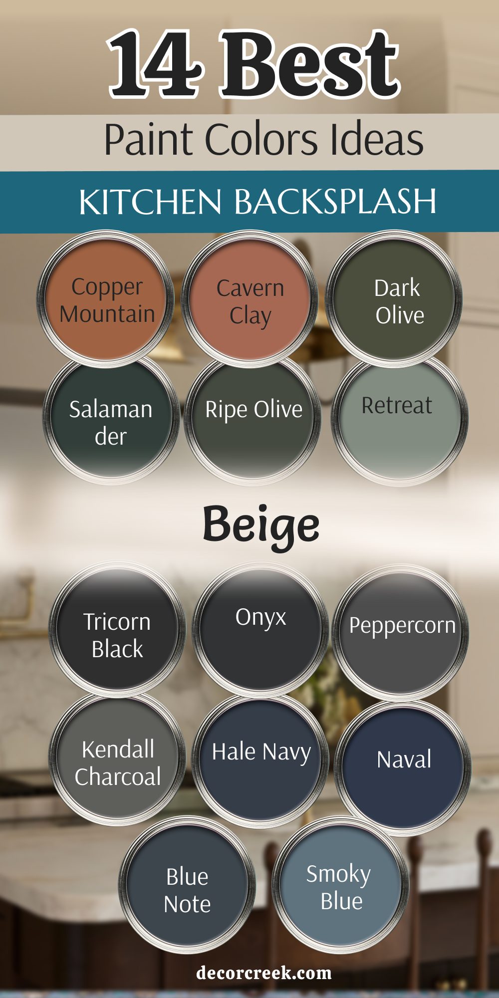
My Final Thoughts about 38 Trendy Beige Kitchen Paint Colors
Choosing the right beige for your kitchen is about finding a balance that makes you feel good every single morning. As we have seen with these 38 shades, the trend for 2026 is moving toward colors that feel organic and solid. Whether you pick a light cream like Alabaster or a deep tone like Taupe Tone, the goal is to make your kitchen feel like a high-end retreat.
You should not feel rushed to make a decision because this color will be the backdrop of your daily life. A great paint choice can make even older cabinets look like they were installed by a luxury builder last week.
Remember that the lighting in your kitchen will change how these colors look from breakfast to dinner. I always tell my clients to trust their gut and pick the color that makes them feel proud of their home. A luxury kitchen is not just about the price of the stove, but the way the colors make the whole family feel.
Your kitchen is the heart of your home, and it deserves a paint color that looks like a million dollars. When you find the perfect shade, you will want to spend more time in the kitchen hosting friends and making memories. This is your chance to turn a simple room into a masterpiece of design that reflects your personal style.