I know how hard it is to pick the right paint for your home because there are so many choices at the store. You want a look that feels fresh but also makes your family feel right at home as soon as they walk in the door. Many people get stuck for a long time because they fear picking a shade that looks too dark or too boring on their walls.
My job is to help you find that perfect middle ground where high style meets daily comfort for your house. Choosing a mix of blue and grey is a smart move for any room you use often with your kids and friends. These colors work well because they feel like a clear sky or a clean morning when the sun first comes out.
A good blue-grey tone makes a room feel very open and very tidy without feeling cold or like a hospital. I love how these shades can make a small room look much bigger while still feeling very cozy for everyone.
Why I Always Trust Sherwin-Williams and Benjamin Moore for the Best Blue Grey Paint Colors
I have used many different paint brands over the years, but these two always stay at the top of my list for every project. Their paint covers the walls much better, which means you spend less time working and more time enjoying your home. The colors look exactly the same on your real wall as they do on the small paper chips you see in the store.
You can trust that the high quality will last for a long time without fading or looking old after just a few years. These brands also offer many special finishes that are very easy to wipe clean if your kids or pets make a mess. Using high-quality paint saves you a lot of money because you do not have to fix big mistakes or repaint later on.
I always feel confident when I suggest these names to my clients because I know the result will look professional and sharp. Getting the job done right the first time is the best way to make your house look like a designer lived there.
How I Choose the Perfect Blue Grey Shade for Any Space
Finding the right shade starts with looking at the windows in your room to see how much natural light comes inside. If you have lots of bright sun, a cooler blue will keep the area feeling very fresh and very light all day long. For rooms with less light, I look for a grey that has a bit more warmth hidden inside to keep the walls from looking sad.
I always tell my clients to paint a very large sample on the wall before they spend money on buying the whole can. This helps you see how the color changes when the sun goes down or when you turn on your lamps in the evening.
Thinking about the color of your furniture and your rugs is also a big part of making the right choice for your home. You want a shade that pulls everything together so the whole room feels like it was meant to be exactly that way. Take your time to watch the paint change from morning to night so you are totally happy with the final look of your house.
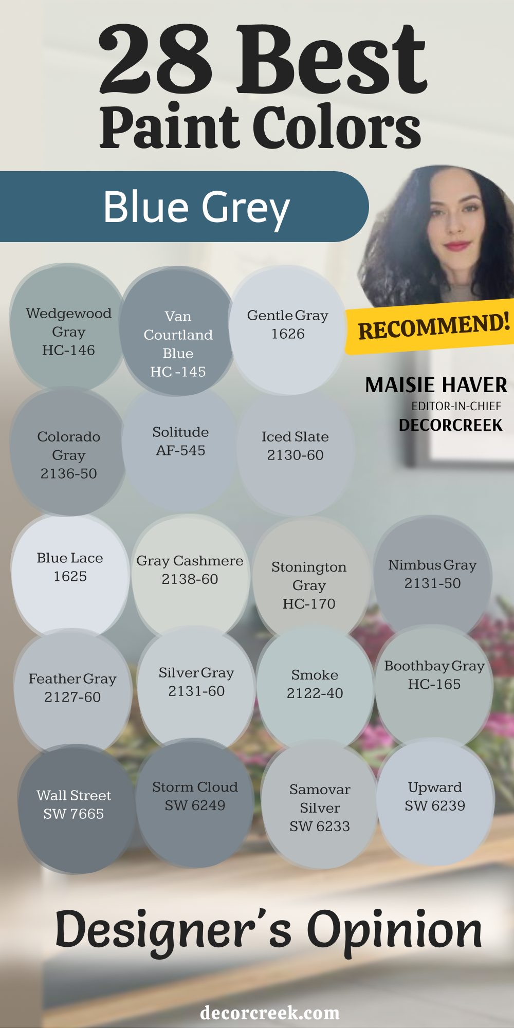
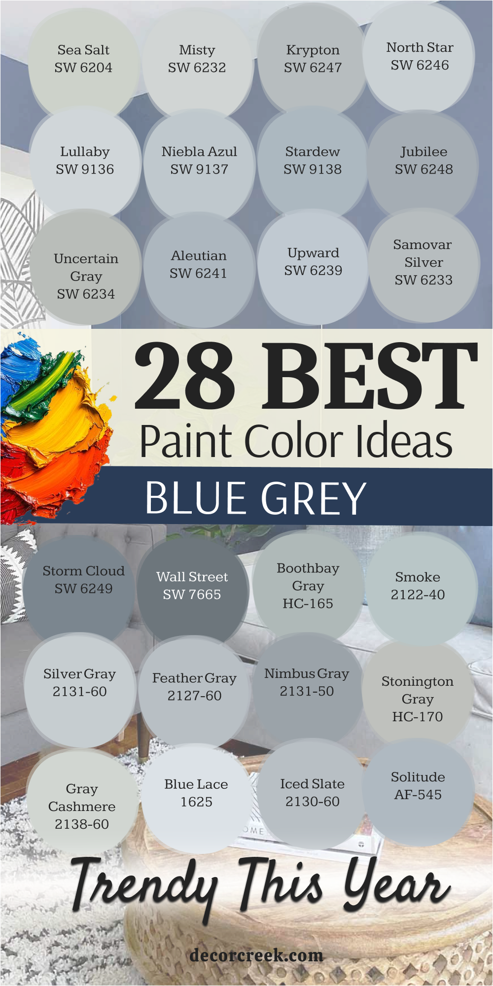
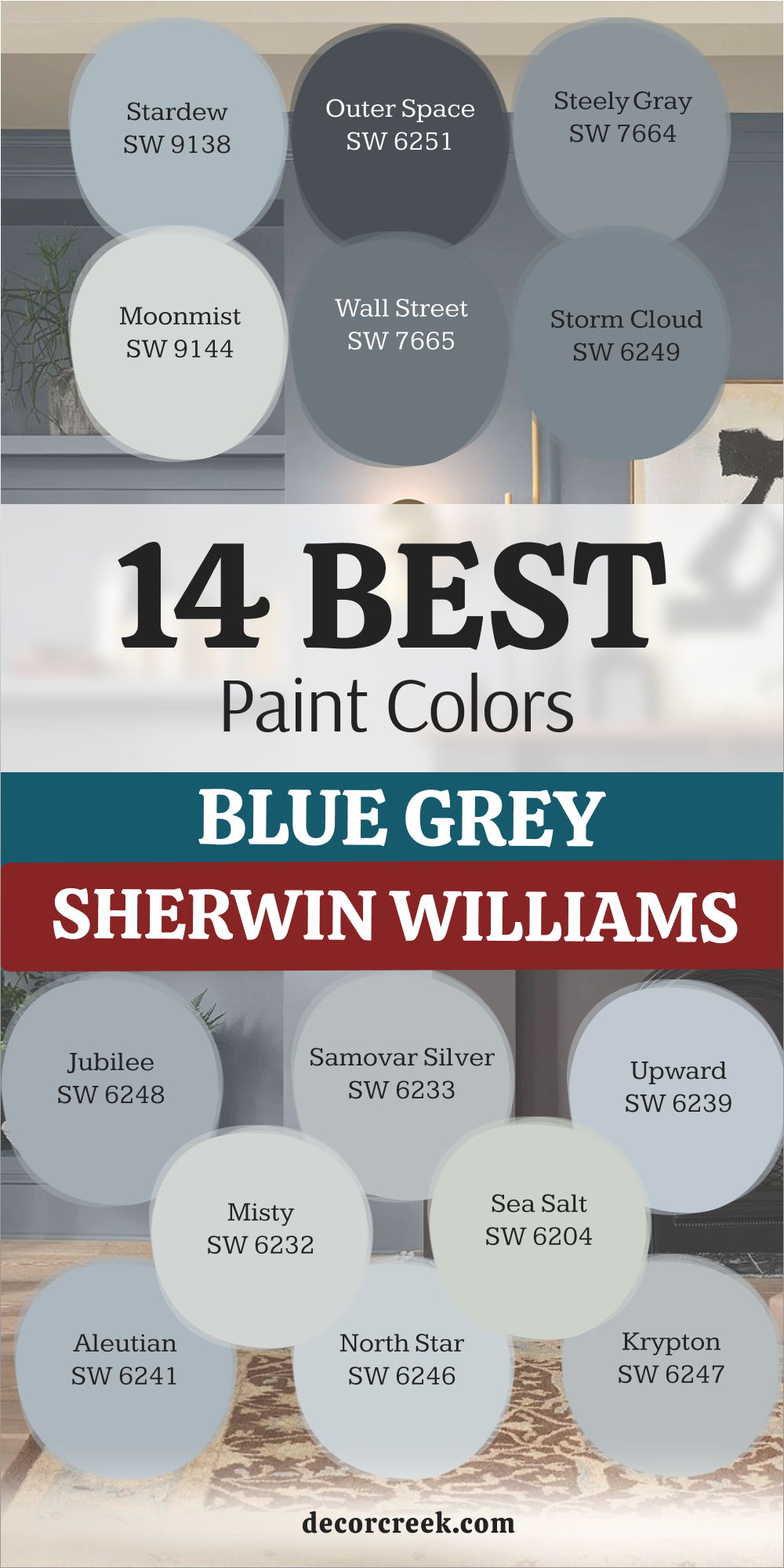
28 Best Blue Grey Paint Colors Trendy This Year
Sea Salt SW 6204
Sea Salt SW 6204 is a favorite for many homeowners who want a light and airy feel. This color changes quite a bit depending on the time of day and the lamps you use. It can look more like a soft green or a cool blue in different light.
Many people love how it makes a small bathroom feel much larger than it really is. It works great in a laundry room to make chores feel a bit less like a heavy task. You will notice that it pairs well with white trim for a very clean look.
I often suggest this shade for anyone who loves the look of the coast. It is light enough that it never feels heavy on your walls. Most of my clients find that it makes their entry way feel very welcoming for guests. The mix of tones inside this paint keeps it from looking flat or dull. You will enjoy how it brings a sense of nature right into your living area.
Best used in: bathrooms, laundry rooms, bedrooms, and kitchens
Pairs well with: High Reflective White SW 7757, Summit Gray SW 7669, Kilim Beige SW 6106, light oak wood The key rule of this color for farmhouse style is to use it where you want natural light to feel kind, soft, and inviting throughout the day.

Misty SW 6232
Misty SW 6232 is a very pale blue that has a nice touch of grey to keep it grounded. This shade is perfect if you want a hint of color without it being too loud or bright. It feels very soft on the eyes when you wake up in the morning. You can use it in a nursery to create a very gentle environment for a new baby. The grey undertones make sure it does not look like a candy color or too childish.
It looks very crisp when you put it next to dark wood floors or black metal frames. Many designers pick this when they want a room to feel open and very tidy.
You will find that it works as a great backdrop for colorful artwork or family photos. It is a reliable choice for a hallway that does not get much natural light. This color helps reflect the light you do have to make the hall feel wider.
Best used in: nurseries, hallways, small bedrooms, and ceiling paint
Pairs well with: Pure White SW 7005, Naval SW 6244, Graphite SW 7048, dark walnut wood The key rule of this color for farmhouse style is to use it where you want natural light to feel kind, soft, and inviting throughout the day.

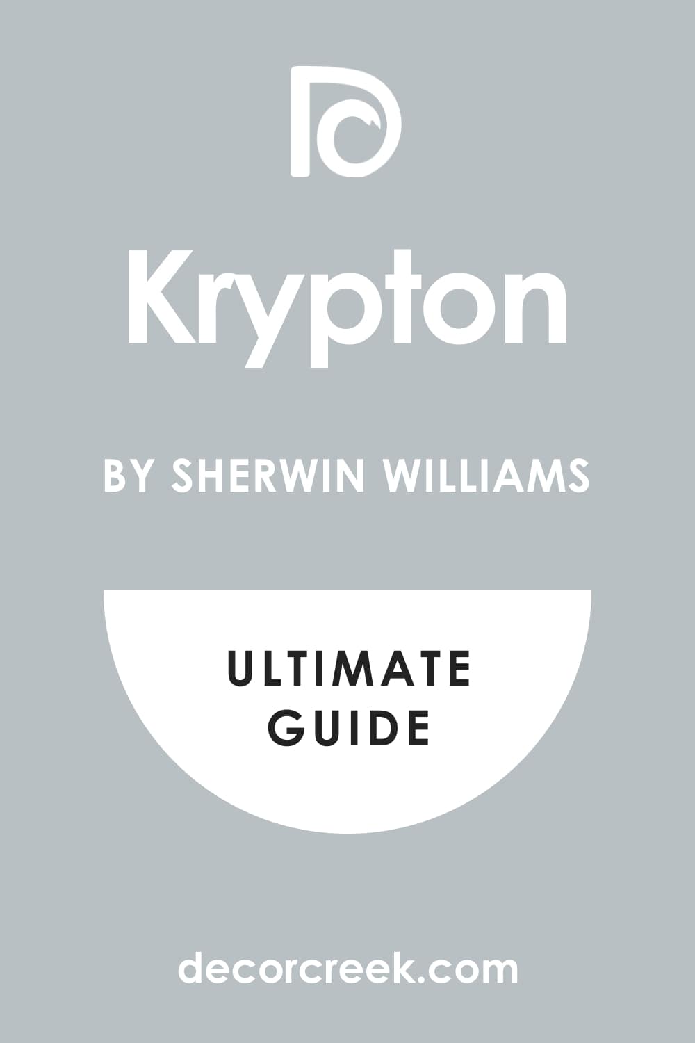
Krypton SW 6247
Krypton SW 6247 has a slate-like feel that brings a lot of personality to a room. This color is a bit deeper than the very light shades, making it stand out more. It looks very professional in a home office where you need to focus on your work.
You will see that it has a cool vibe that helps lower the energy in a busy house. It matches perfectly with silver or chrome faucets in a modern kitchen.
I like to use this shade when a client wants their walls to make a bit of a statement. It is still very easy to live with and does not get tiring to look at every day. The blue in this paint is very clear and does not turn muddy or brown. It provides a great contrast if you have white cabinets or light grey rugs. You can use it on an accent wall if you are afraid to paint the whole room.
Best used in: home offices, kitchens, dining rooms, and accent walls
Pairs well with: Extra White SW 7006, Peppercorn SW 7674, Morning Fog SW 6225, marble countertops The key rule of this color for farmhouse style is to use it where you want natural light to feel kind, soft, and inviting throughout the day.
North Star SW 6246
North Star SW 6246 is a cool grey that leans heavily into its blue side. This shade is excellent for making a room feel like it has a fresh breeze blowing through it. It is very popular for ceilings because it mimics the look of a clear morning sky.
You will find that it makes white furniture pop and look very sharp. It is a very safe choice if you are worried about a color looking too dark.
I find that this color stays very consistent even when the sun moves across the sky. It does not hide in the shadows but stays bright and visible all day long. You can use it in a guest room to make your visitors feel like they are at a spa. It works well with glass decor and shiny surfaces. The tone is very modern but still feels very cozy for a family home.
Best used in: bedrooms, ceilings, guest rooms, and sunrooms
Pairs well with: Alabaster SW 7008, Charcoal Blue SW 2739, On the Rocks SW 7671, light pine wood The key rule of this color for farmhouse style is to use it where you want natural light to feel kind, soft, and inviting throughout the day.
Lullaby SW 9136
Lullaby SW 9136 is as soft as it sounds and creates a very gentle atmosphere. This color is part of a special collection that aims to make homes feel more relaxed. It has just enough blue to feel cheerful but enough grey to stay very mature.
You will love how it looks in a master suite where you want to wind down at night. It is a great choice for cabinets if you want something different than plain white.
I often use this shade to help a room feel more organized and less cluttered. It is very easy on the eyes and provides a great base for many different styles of decor. You can pair it with gold hardware for a very fancy and upscale look. It works well in small spaces because it does not feel like the walls are closing in. Most people feel a sense of relief when they walk into a room painted this way.
Best used in: master bedrooms, bathrooms, nurseries, and kitchen islands
Pairs well with: Snowbound SW 7004, Urbane Bronze SW 7048, Mindful Gray SW 7016, gold accents The key rule of this color for farmhouse style is to use it where you want natural light to feel kind, soft, and inviting throughout the day.
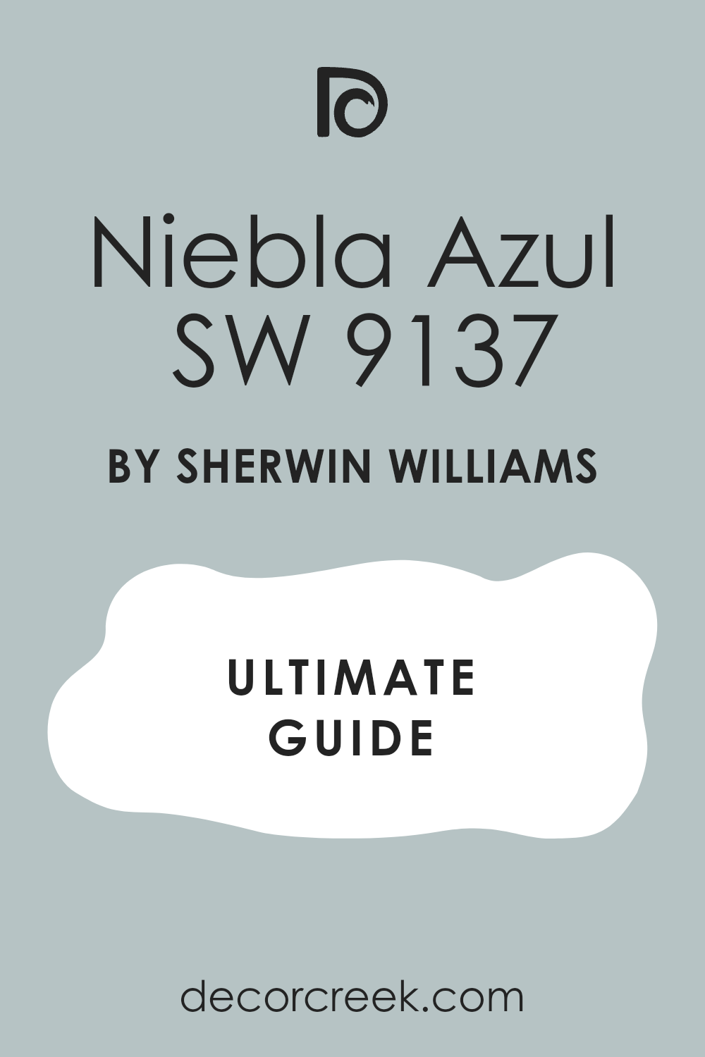
Niebla Azul SW 9137
Niebla Azul SW 9137 offers a mid-tone look that feels very balanced and sturdy. This name means blue mist, and it captures that feeling of a foggy morning perfectly. It is a bit darker than some other choices, which adds a nice weight to the room.
You will notice that it hides small scuffs and marks better than very light paints. It is a great pick for a mudroom where people are always coming and going.
I like to use this color in rooms that have very high ceilings to make them feel more comfortable. It brings the walls in just enough to make a large room feel less empty. You can use it with creamy white trim to keep the look very classic and traditional. It looks wonderful when paired with natural stone or brick elements. This shade feels very grounded and helps you feel more settled in your home.
Best used in: mudrooms, living rooms, large bedrooms, and entryways
Pairs well with: Greek Villa SW 7551, Tricorn Black SW 6258, Accessible Beige SW 7036, natural stone The key rule of this color for farmhouse style is to use it where you want natural light to feel kind, soft, and inviting throughout the day.
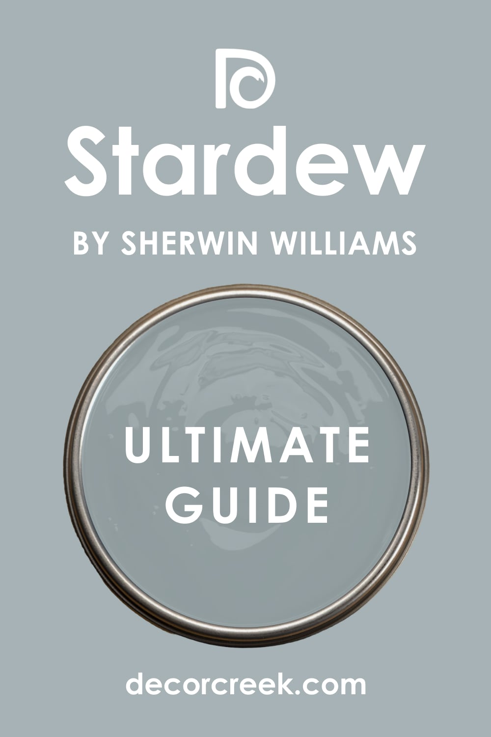
Stardew SW 9138
Stardew SW 9138 is a beautiful denim-like shade that feels very familiar and comfortable. It has a bit of a rustic charm that works very well in older homes or cottages. You will find that this blue has a lot of depth and feels very rich on the wall.
It is great for a dining room where you want to host long dinners with friends. The color stays true and does not look purple or green in most lighting.
I think this is one of the best choices for a home library or a reading nook. It creates a mood that helps you sit still and enjoy a good book for a while. You can use it on the exterior of a house for a very stylish and unique look. It stands out against green plants and trees in a very pretty way. Most people find this color to be very reliable and easy to decorate around.
Best used in: dining rooms, libraries, exteriors, and accent walls
Pairs well with: Dover White SW 6385, Iron Ore SW 7069, Sea Salt SW 6204, dark oak wood The key rule of this color for farmhouse style is to use it where you want natural light to feel kind, soft, and inviting throughout the day.
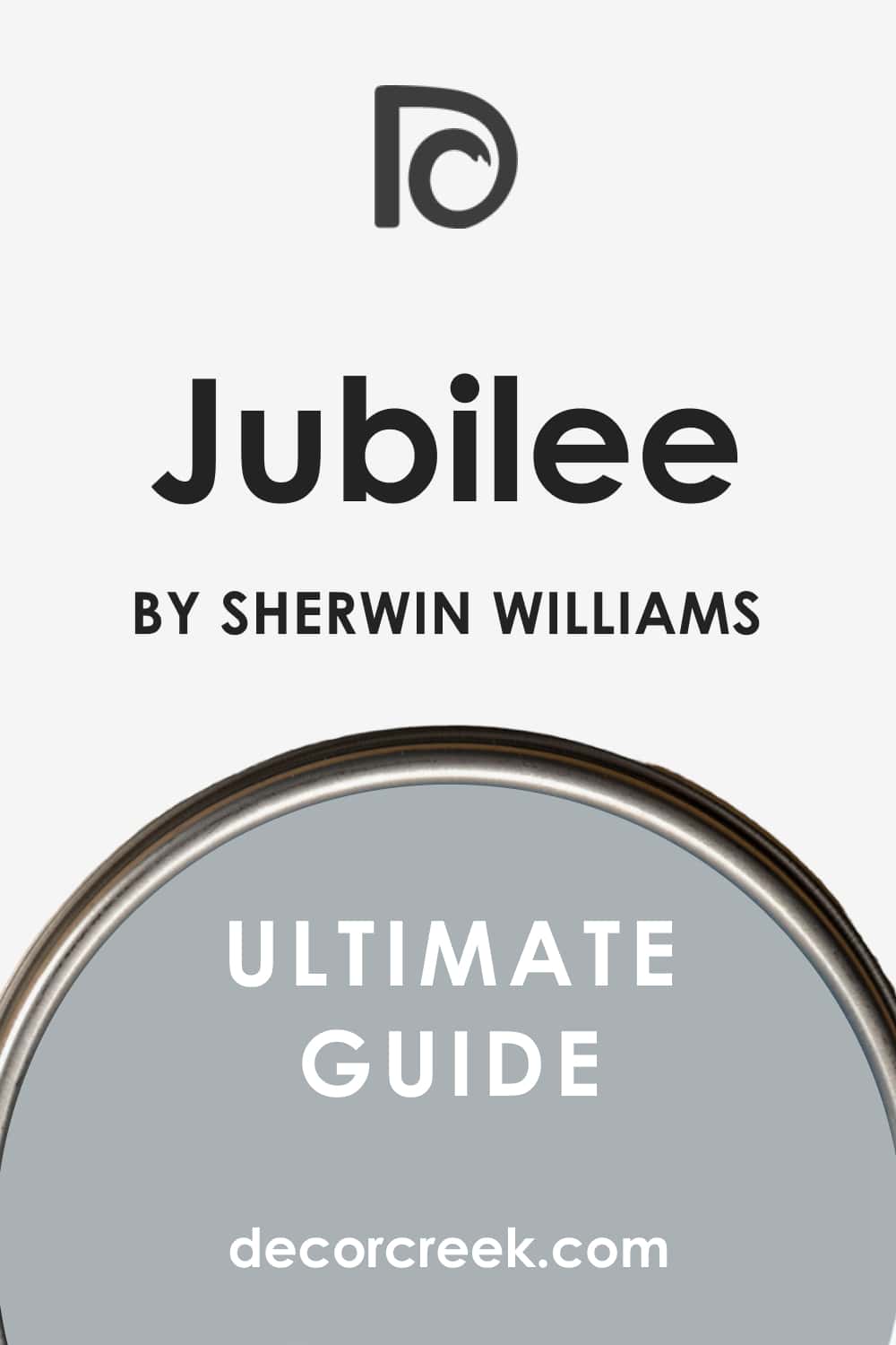
Jubilee SW 6248
Jubilee SW 6248 is a dusty blue-grey that feels very elegant and high-end. It is a bit more grey than blue, which makes it very versatile for different rooms. You will see that it works well with both modern and vintage furniture.
It is a great choice for a formal living room where you want to impress your guests. The color has a certain coolness that makes the room feel very clean and polished.
I like to suggest this color for kitchen lower cabinets to add some interest. It is dark enough to provide a nice contrast but light enough to keep the kitchen bright. You can use it in a home gym to keep the area feeling cool while you exercise. It looks great with white marble or light grey quartz countertops. This shade is a very smart pick for anyone who wants a designer look on a budget.
Best used in: formal living rooms, kitchen cabinets, home gyms, and bathrooms
Pairs well with: Pure White SW 7005, Black Magic SW 6991, Repose Gray SW 7015, marble The key rule of this color for farmhouse style is to use it where you want natural light to feel kind, soft, and inviting throughout the day.
Uncertain Gray SW 6234
Uncertain Gray SW 6234 is a very interesting color because it sits right on the fence between blue and grey. This makes it a very flexible choice that can work with many different color schemes. You will notice that it looks different as the weather changes outside your window.
It is a very sophisticated shade that makes a home feel more expensive. Many people use it in their main living areas because it is so easy to live with.
I find that this paint is excellent for hiding imperfections on older walls. The matte finish in this color looks very smooth and professional. You can pair it with bright pops of color like yellow or orange for a fun look. It also works well with neutral tones if you want to keep things very simple. This is a great “go-to” color when you are not sure which direction to take.
Best used in: living rooms, hallways, bedrooms, and home offices
Pairs well with: High Reflective White SW 7757, Tricorn Black SW 6258, Revere Pewter HC-172, bright accents The key rule of this color for farmhouse style is to use it where you want natural light to feel kind, soft, and inviting throughout the day.
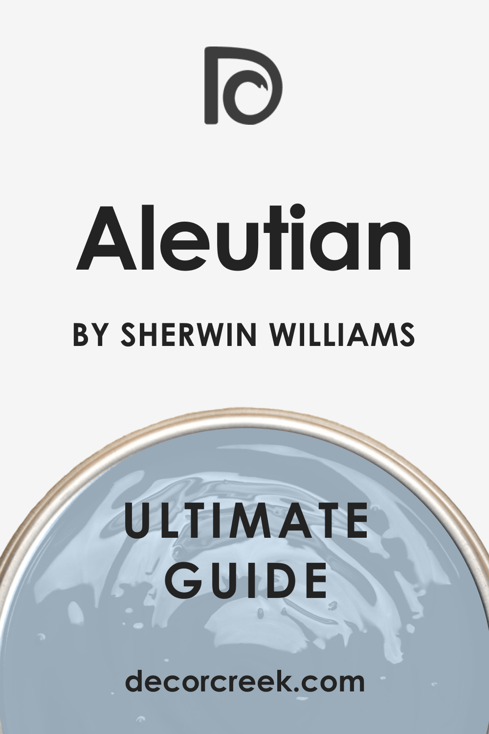
Aleutian SW 6241
Aleutian SW 6241 is a soft denim blue that feels very relaxed and casual. It is a bit warmer than some other blues, which makes it feel very welcoming. You will love how it looks in a bedroom with lots of white pillows and blankets. It is a great choice for a kid’s room because it can grow with them as they get older. The color is very pleasing and does not feel too bold or loud.
I often use this shade for porch ceilings to create a classic look for a home. It makes the outdoor area feel more like a part of the house.
You can use it in a craft room to help you feel creative and focused. It pairs wonderfully with light wood tones and natural fibers like jute or wool. This color is very easy to love and brings a happy feel to any space.
Best used in: bedrooms, kids’ rooms, porch ceilings, and craft rooms
Pairs well with: Alabaster SW 7008, Naval SW 6244, Agreeable Gray SW 7029, light wood tones The key rule of this color for farmhouse style is to use it where you want natural light to feel kind, soft, and inviting throughout the day.
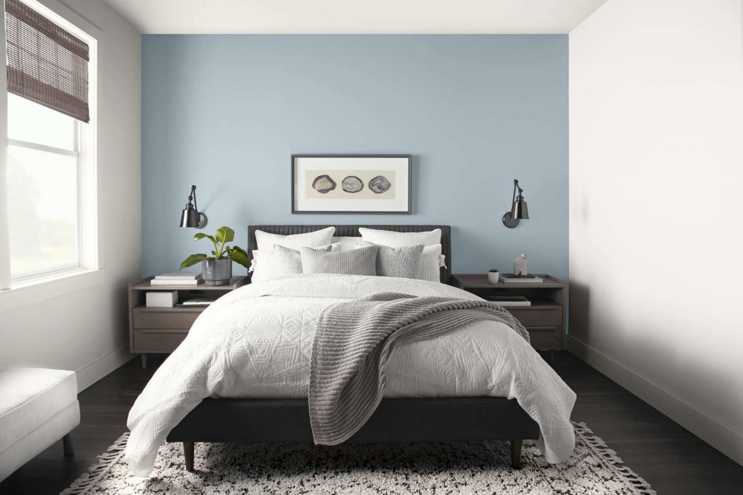
Upward SW 6239
Upward SW 6239 is a very light and airy blue that has just a tiny hint of grey to keep it from being too bright. This shade is perfect for a ceiling if you want to make a room feel like it has no roof at all. You will find that it works wonders in a small bedroom where you want to feel like you are floating on a cloud.
It has a very crisp and clean look that makes every corner of your home feel fresh. Many people love this color because it feels like a sunny day even when it is raining outside.
I often suggest this color for a small bathroom to help it feel less cramped and more open. It looks very smart when you use it with white tile and silver towel racks. You can also use it in a laundry room to make the chore of washing clothes feel a bit more cheerful. The blue is very pure and does not turn into a muddy grey when the sun goes down. Most of my clients say this color makes them feel very happy every time they walk into the room.
Best used in: bedrooms, bathrooms, ceilings, and laundry rooms
Pairs well with: Snowbound SW 7004, Drift of Mist SW 9166, Icicle SW 6238, silver hardware The key rule of this color for farmhouse style is to use it where you want natural light to feel kind, soft, and inviting throughout the day.

Samovar Silver SW 6233
Samovar Silver SW 6233 is a sophisticated blend of grey and blue that looks very rich on the wall. This color has a bit of a metallic feel to it, which makes it look very fancy in a dining room. You will notice that it has a lot of depth and changes its look quite a bit as the light moves.
It is a great choice for a home office where you want to look professional during video calls. The grey in this paint is very strong, so it stays looking very mature and never like a baby room.
I like to use this shade in a formal entryway to give guests a great first impression of your home. It works very well with dark wood furniture and heavy rugs. You can pair it with black accents to create a very modern and sharp look for your living area. It is a heavy enough color that it hides fingerprints and small marks on the walls very well. This makes it a smart pick for busy families who still want a house that looks very high-end.
Best used in: dining rooms, home offices, entryways, and formal living rooms
Pairs well with: Extra White SW 7006, Black Magic SW 6991, Grayish SW 6001, dark wood The key rule of this color for farmhouse style is to use it where you want natural light to feel kind, soft, and inviting throughout the day.
Storm Cloud SW 6249
Storm Cloud SW 6249 is a deep and moody blue-grey that adds a lot of drama to a room. This color is perfect for an accent wall if you are too afraid to paint the whole room a dark shade. You will see that it feels very cozy and warm, like a big blanket on a cold night.
It looks amazing behind a bed with a light-colored headboard to create a big contrast. Many people use this in a media room or a place where they watch movies to keep the light low.
I find that this shade looks very expensive when you use it on kitchen island cabinets. It provides a sturdy look that grounds the room and makes the white counters pop. You can use it in a study or a library to create a very quiet and serious feeling for reading. The blue tones are very deep and lean into a navy look without being too dark to see. Most people find that this color makes their home feel very solid and well-designed.
Best used in: accent walls, kitchen islands, media rooms, and libraries
Pairs well with: Alabaster SW 7008, On the Rocks SW 7671, Repose Gray SW 7015, brass accents The key rule of this color for farmhouse style is to use it where you want natural light to feel kind, soft, and inviting throughout the day.
Wall Street SW 7665
Wall Street SW 7665 is a serious and dark grey that has a strong blue undertone hidden inside. This color is very popular for modern homes that want a look that is both bold and clean. You will notice that it makes white trim look very bright and very sharp.
It is a great choice for the outside of a house if you want to stand out from your neighbors. The color is very strong and does not fade away when you put it on a large surface.
I like to use this shade in a bathroom with gold mirrors and lights to make it feel like a fancy hotel. It creates a very private feel in a bedroom that helps you sleep better at night. You can pair it with light grey floors to keep the room from feeling too heavy or closed in. It is a very reliable color that stays looking the same under different types of light bulbs. Most of my clients love how this color gives their home a very strong and confident look.
Best used in: exteriors, master bedrooms, bathrooms, and modern living rooms
Pairs well with: Pure White SW 7005, Dorian Gray SW 7017, Goldfinch SW 6905, light grey floors The key rule of this color for farmhouse style is to use it where you want natural light to feel kind, soft, and inviting throughout the day.
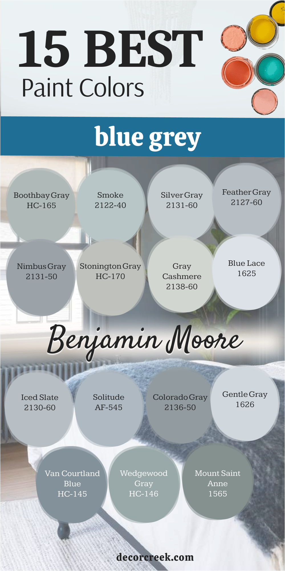
Boothbay Gray HC-165
Boothbay Gray HC-165 is a classic choice from Benjamin Moore that many designers love to use. This color is a very soft blue-grey that feels like a foggy day at the beach. You will find that it works perfectly in a kitchen with white cabinets and marble tops.
It is a very light shade, but it still has enough color to make the walls look finished. Many people use it in their main living areas because it goes with almost any kind of furniture.
I suggest this color for people who want a blue look but are worried about it looking too bright. The grey in this paint keeps the blue in check so it stays very soft and easy to look at. You can use it in a nursery for a look that is very gentle but still very stylish. It pairs wonderfully with natural wood and woven baskets for a very earthy feel. This shade is one of those colors that looks good in every house, no matter the style.
Best used in: kitchens, living rooms, nurseries, and mudrooms
Pairs well with: Chantilly Lace OC-65, Simply White OC-117, Woodmont Cream 204, natural wood The key rule of this color for farmhouse style is to use it where you want natural light to feel kind, soft, and inviting throughout the day.

Smoke 2122-40
Smoke 2122-40 is a very pretty and light blue that has a nice amount of grey mixed in. This color is very popular for bathrooms because it feels very clean and watery. You will love how it makes a room feel very fresh and like it has a lot of air.
It is a great choice for a bedroom where you want to feel relaxed as soon as you sit down. The color is very light but it definitely shows up as a blue when you put it on the wall.
I often use this shade to paint old furniture to give it a new and modern life. It looks great on a dresser or a side table in a room with neutral walls. You can use it in a sunroom to bring the color of the sky inside your home. It works very well with light fabrics and linen curtains for a very soft look. Most people find this color to be very easy to decorate with using white and light grey.
Best used in: bathrooms, bedrooms, sunrooms, and painted furniture
Pairs well with: White Dove OC-17, Gray Owl OC-52, Hale Navy HC-154, linen fabrics The key rule of this color for farmhouse style is to use it where you want natural light to feel kind, soft, and inviting throughout the day.

Silver Gray 2131-60
Silver Gray 2131-60 is a very pale and cool grey that has a soft blue heart. This color is perfect for a very modern home that wants to feel very open and bright. You will see that it reflects a lot of light, which helps a dark room feel much better.
It is a great choice for a ceiling if you want something other than plain white but still very light. The blue in this paint is very light and only shows up when the sun hits it just right.
I like to use this shade in a hallway to make the walk between rooms feel more interesting. It looks very good with dark metal accents like black door handles or light fixtures. You can use it in a home gym to keep the area feeling very cool and ready for work. It pairs well with other shades of grey for a very layered and designer look. Most people choose this color when they want a very subtle hint of blue in their home.
Best used in: hallways, ceilings, home gyms, and modern kitchens
Pairs well with: Decorator’s White CC-20, Stonington Gray HC-170, Wrought Iron 2124-10, black metal The key rule of this color for farmhouse style is to use it where you want natural light to feel kind, soft, and inviting throughout the day.
Feather Gray 2127-60
Feather Gray 2127-60 is a soft mid-tone blue-grey that feels very balanced and light. This color gets its name because it is as light and soft as a bird’s feather on the wall. You will notice that it brings a lot of life to a room that has very little decor.
It is a great choice for a kid’s bedroom because it is a fun color but still very mature. Many people use it in their dining room to create a very nice backdrop for family meals.
I find that this shade looks very good when you use it with light-colored wood floors. It makes the wood look warmer and the walls look cooler for a very nice mix. You can use it in a guest bathroom to make your visitors feel like they are in a nice spa. It is a very easy color to paint because it covers the walls very smoothly and evenly. Most of my clients are very happy with how this color stays looking fresh for a long time.
Best used in: kids’ rooms, dining rooms, guest bathrooms, and bedrooms
Pairs well with: Cloud White OC-13, Revere Pewter HC-172, Chelsea Gray HC-168, light wood floors The key rule of this color for farmhouse style is to use it where you want natural light to feel kind, soft, and inviting throughout the day.
Beneath the Clouds 2131-50
Beneath the Clouds 2131-50 is a deeper blue-grey that has a lot of personality and strength. This color is named after a rain cloud, and it has that same rich and full feeling. You will find that it makes a large living room feel much more cozy and finished.
It is a great choice for a master bedroom if you want a color that feels very solid. The blue in this paint is very clear and looks beautiful next to white window frames.
I often use this shade for the lower part of a wall with a white chair rail on top. It creates a very classic look that works well in traditional homes or farmhouses. You can pair it with warm colors like gold or wood to keep the room from feeling too cold. It is a very good color for hiding dust and marks in a high-traffic hallway. Most people love how this color adds a sense of quality and weight to their home walls.
Best used in: living rooms, master bedrooms, hallways, and traditional dining rooms
Pairs well with: Simply White OC-117, Edgecomb Gray HC-173, Van Deusen Blue HC-156, gold decor The key rule of this color for farmhouse style is to use it where you want natural light to feel kind, soft, and inviting throughout the day.
Stonington Gray HC-170
Stonington Gray HC-170 is a very famous grey that has a cool blue undertone that people love. This color is a top pick for many designers because it looks good in almost every light. You will see that it stays looking like a true grey most of the time, but the blue keeps it fresh.
It is a great choice for a kitchen with white or grey cabinets for a very tidy look. Many people use it on their whole main floor to keep the house looking very unified.
I like to use this shade in a home office to create a place that feels very organized and ready for work. It looks very sharp with black and white photos in silver or black frames. You can use it in a laundry room to make the area feel very clean and bright. It pairs well with almost any other color, making it very easy to choose rugs and curtains. Most of my clients find this to be the most reliable grey paint they have ever used.
Best used in: kitchens, whole-house painting, home offices, and laundry rooms
Pairs well with: Chantilly Lace OC-65, Coventry Gray HC-169, Amherst Gray HC-167, silver accents The key rule of this color for farmhouse style is to use it where you want natural light to feel kind, soft, and inviting throughout the day.

Gray Cashmere 2138-60
Gray Cashmere 2138-60 is a very light and airy shade that feels like a mix of blue, green, and grey. This color is perfect for a master bathroom where you want to feel like you are at a high-end spa.
You will find that it changes its look quite a bit depending on how much sun comes through your windows. It is a great choice for a bedroom because it feels very light and does not weigh down your mood. Many people love how it looks next to white trim because the contrast is very soft and pretty.
I often suggest this shade for a nursery because it works well for both boys and girls. It has a very sophisticated feel that grows with your child as they get older and change their room. You can use it in a small hallway to make the walk between rooms feel much brighter and more open. The hint of green inside this paint keeps it from feeling too cold or like a block of ice. It pairs wonderfully with light wood floors and white linen curtains for a very natural look. Most of my clients say this color makes their home feel very fresh and very clean.
Best used in: bathrooms, bedrooms, nurseries, and hallways
Pairs well with: Chantilly Lace OC-65, Revere Pewter HC-172, Swiss Coffee OC-45, light wood The key rule of this color for farmhouse style is to use it where you want natural light to feel kind, soft, and inviting throughout the day.
Blue Lace 1625
Blue Lace 1625 is a very pale and delicate blue that has just enough grey to keep it looking mature. This color is a wonderful choice for a guest room where you want your friends to feel very welcome.
You will notice that it has a very soft glow when the morning sun hits the walls of your home. It is a great pick for a ceiling if you want to add a tiny bit of interest without being too bold. The grey undertone makes sure it stays looking like a real wall color rather than a bright sky.
I find that this shade looks very good when you use it in a laundry room with white machines. It makes a small and busy room feel much more organized and easy to work in for a long time. You can pair it with dark blue rugs to create a very nice layer of different blue tones. It works well with silver or chrome light fixtures for a very modern and tidy look. Many people choose this color because it is very easy to live with and never feels like it is too much. Most of my clients enjoy how this shade brings a little bit of the outdoors into their living area.
Best used in: guest rooms, laundry rooms, ceilings, and small bathrooms
Pairs well with: Simply White OC-117, Hale Navy HC-154, Stonington Gray HC-170, silver hardware The key rule of this color for farmhouse style is to use it where you want natural light to feel kind, soft, and inviting throughout the day.
Iced Slate 2130-60
Iced Slate 2130-60 is a cool and refreshing blue-grey that feels very solid on the wall. This color is a bit deeper than the very pale shades, which gives it a lot of character and style. You will see that it works very well in a home office where you need to feel focused and ready.
It is a great choice for kitchen lower cabinets if you want a look that is very trendy and new. The color has a crisp feel that makes white dishes and white counters look very bright.
I like to use this shade in a mudroom to help the area feel very clean and ready for the day. It hides a bit more dust than the very light paints, which is great for a busy family house. You can use it on a front door for a very unique look that makes your home stand out. It pairs very well with dark grey floors and black metal hooks for a very sharp look. Most people find that this color adds a sense of cool confidence to any room they put it in. This is a very smart pick for a modern house that wants a little bit of color.
Best used in: home offices, kitchen cabinets, mudrooms, and front doors
Pairs well with: Decorator’s White CC-20, Wrought Iron 2124-10, Gray Owl OC-52, black metal The key rule of this color for farmhouse style is to use it where you want natural light to feel kind, soft, and inviting throughout the day.
Solitude AF-545
Solitude AF-545 is a beautiful mid-tone blue that has a lot of grey mixed in to keep it grounded. This color is part of a special collection that makes it very easy to match with other colors. You will find that it works very well in a large dining room where you want a bit of drama.
It is a great choice for an accent wall behind a couch or a big piece of art. The blue in this paint is very clear and does not look muddy even in low light.
I often suggest this shade for a master bedroom to create a very private and special feel for the room. It looks very fancy when you use it with gold mirrors and warm wood furniture pieces. You can use it in a bathroom with white tile for a very classic and high-end look. It has a very steady and reliable feel that makes a home feel more substantial and well-made. Many of my clients love how this color makes their furniture look more expensive than it really was. Most people find it very easy to pick out pillows and rugs that look great with this shade.
Best used in: dining rooms, master bedrooms, bathrooms, and accent walls
Pairs well with: Steam AF-15, Cinder AF-150, Flint AF-560, gold accents The key rule of this color for farmhouse style is to use it where you want natural light to feel kind, soft, and inviting throughout the day.
Colorado Gray 2136-50
Colorado Gray 2136-50 is a medium blue-grey that has a lot of strength and looks very handsome. This color is named after the mountains and it has that same rugged and natural feeling for your home. You will notice that it makes a room feel very cozy and safe when you are inside it.
It is a great choice for a home library or a place where you keep your favorite books. The grey in this paint is very strong, which keeps the blue from looking too bright or too young.
I find that this shade looks very good when you use it on the outside of a house with white trim. It gives the home a very classic look that will stay in style for a very long time. You can use it in a kitchen with wood cabinets to create a very warm and inviting feel. It pairs well with natural stone like granite or slate for a very earthy look in your home. Most of my clients like how this color makes their house feel very solid and well-protected from the world. It is a very good choice for a room that gets a lot of bright natural sun.
Best used in: libraries, kitchens, exteriors, and home offices
Pairs well with: White Dove OC-17, Chelsea Gray HC-168, Van Courtland Blue HC-145, stone The key rule of this color for farmhouse style is to use it where you want natural light to feel kind, soft, and inviting throughout the day.
Gentle Gray 1626
Gentle Gray 1626 is a very light blue-grey that is as soft and quiet as a whisper on your walls. This color is perfect for a small room that you want to make feel much larger than it is. You will love how it looks in a hallway where you want the walls to almost disappear.
It is a great choice for a baby’s room because it is very light and does not look too busy. The blue in this paint is very faint, so it looks like a cool grey most of the time.
I like to use this shade on a ceiling to make a room feel very tall and very airy for the family. It works very well with silver hardware and glass light fixtures for a very clean look. You can use it in a guest bathroom to make it feel very tidy and fresh for your visitors. It pairs very well with other light colors like cream or beige for a very soft feel. Most people choose this color when they want a very simple look that is still very stylish. It is a very safe choice for someone who is painting a large area for the first time.
Best used in: hallways, nurseries, guest bathrooms, and ceilings
Pairs well with: Cloud White OC-13, Silver Half Dollar 2121-40, Moonshine 2140-60, glass decor The key rule of this color for farmhouse style is to use it where you want natural light to feel kind, soft, and inviting throughout the day.
Van Courtland Blue HC-145
Van Courtland Blue HC-145 is a rich and classic blue that has a good amount of grey to keep it soft. This color is part of a historic collection and it feels very traditional and very high-quality.
You will find that it looks amazing in a dining room with white wood paneling on the bottom. It is a great choice for an entryway if you want to make a bold and stylish statement. The color is deep enough to have a lot of personality but light enough to not feel dark.
I often suggest this shade for a front door because it looks very welcoming and very smart from the street. It works very well with brass hardware and dark wood floors inside the house for a warm look. You can use it in a home office to create a place that feels very serious and very focused. It pairs wonderfully with creamy white trim and natural wood furniture pieces in any room. Many of my clients find that this is their favorite color in the whole house because it is so pretty. Most people feel that this shade adds a lot of value and style to their home.
Best used in: dining rooms, entryways, front doors, and home offices
Pairs well with: Simply White OC-117, Revere Pewter HC-172, Shaker Beige HC-45, brass hardware The key rule of this color for farmhouse style is to use it where you want natural light to feel kind, soft, and inviting throughout the day.
Wedgewood Gray HC-146
Wedgewood Gray HC-146 is a very popular blue-grey that has a soft and earthy feel to it. This color is named after the famous pottery and it has that same classic and timeless look. You will notice that it looks very good in a kitchen with white cabinets and wood countertops.
It is a great choice for a master bedroom because it feels very grounded and very easy to live with. The mix of blue and grey in this paint is very balanced, so it never looks too much like one or the other.
I find that this shade looks very nice when you use it with natural textures like wool and cotton. It makes a room feel very handmade and very special for the family that lives there. You can use it in a bathroom with white tile for a look that feels very clean and very fresh. It pairs well with light grey and beige rugs to create a very soft and easy floor plan. Most of my clients say this color makes them feel very relaxed as soon as they sit down in the room. It is a very reliable choice for a home that wants to feel very comfortable and very cozy.
Best used in: kitchens, bedrooms, bathrooms, and living rooms
Pairs well with: Atrium White OC-145, Edgecomb Gray HC-173, Woodmont Cream 204, natural textures The key rule of this color for farmhouse style is to use it where you want natural light to feel kind, soft, and inviting throughout the day.
14 Best Blue Grey Paint Colors by Sherwin Williams
Sea Salt SW 6204
Sea Salt SW 6204 is a favorite for many homeowners who want a light and airy feel. This color changes quite a bit depending on the time of day and the lamps you use. It can look more like a soft green or a cool blue in different light.
Many people love how it makes a small bathroom feel much larger than it really is. It works great in a laundry room to make chores feel a bit less like a heavy task. You will notice that it pairs well with white trim for a very clean look for the family.
I often suggest this shade for anyone who loves the look of the coast. It is light enough that it never feels heavy on your walls. Most of my clients find that it makes their entry way feel very welcoming for guests. The mix of tones inside this paint keeps it from looking flat or dull in your house.
Best used in: bathrooms, laundry rooms, bedrooms, and kitchens
Pairs well with: High Reflective White SW 7757, Summit Gray SW 7669, Kilim Beige SW 6106, light oak wood The key rule of this color for farmhouse style is to use it where you want natural light to feel kind, soft, and inviting throughout the day.
Misty SW 6232
Misty SW 6232 is a very pale blue that has a nice touch of grey to keep it grounded. This shade is perfect if you want a hint of color without it being too loud or bright. It feels very soft on the eyes when you wake up in the morning.
You can use it in a nursery to create a very gentle environment for a new baby. The grey undertones make sure it does not look like a candy color or too childish. It looks very crisp when you put it next to dark wood floors or black metal frames.
Many designers pick this when they want a room to feel open and very tidy. You will find that it works as a great backdrop for colorful artwork or family photos. It is a reliable choice for a hallway that does not get much natural light. This color helps reflect the light you do have to make the hall feel wider.
Best used in: nurseries, hallways, small bedrooms, and ceiling paint
Pairs well with: Pure White SW 7005, Naval SW 6244, Graphite SW 7048, dark walnut wood The key rule of this color for farmhouse style is to use it where you want natural light to feel kind, soft, and inviting throughout the day.
Krypton SW 6247
Krypton SW 6247 has a slate-like feel that brings a lot of personality to a room. This color is a bit deeper than the very light shades, making it stand out more. It looks very professional in a home office where you need to focus on your work.
You will see that it has a cool vibe that helps lower the energy in a busy house. It matches perfectly with silver or chrome faucets in a modern kitchen. I like to use this shade when a client wants their walls to make a bit of a statement.
It is still very easy to live with and does not get tiring to look at every day. The blue in this paint is very clear and does not turn muddy or brown. It provides a great contrast if you have white cabinets or light grey rugs. You can use it on an accent wall if you are afraid to paint the whole room.
Best used in: home offices, kitchens, dining rooms, and accent walls
Pairs well with: Extra White SW 7006, Peppercorn SW 7674, Morning Fog SW 6225, marble countertops The key rule of this color for farmhouse style is to use it where you want natural light to feel kind, soft, and inviting throughout the day.
North Star SW 6246
North Star SW 6246 is a cool grey that leans heavily into its blue side. This shade is excellent for making a room feel like it has a fresh breeze blowing through it. It is very popular for ceilings because it mimics the look of a clear morning sky.
You will find that it makes white furniture pop and look very sharp for the house. It is a very safe choice if you are worried about a color looking too dark. I find that this color stays very consistent even when the sun moves across the sky.
It does not hide in the shadows but stays bright and visible all day long. You can use it in a guest room to make your visitors feel like they are at a spa. It works well with glass decor and shiny surfaces. The tone is very modern but still feels very cozy for a family home.
Best used in: bedrooms, ceilings, guest rooms, and sunrooms
Pairs well with: Alabaster SW 7008, Charcoal Blue SW 2739, On the Rocks SW 7671, light pine wood The key rule of this color for farmhouse style is to use it where you want natural light to feel kind, soft, and inviting throughout the day.
Aleutian SW 6241
Aleutian SW 6241 is a soft denim blue that feels very relaxed and casual. It is a bit warmer than some other blues, which makes it feel very welcoming for guests. You will love how it looks in a bedroom with lots of white pillows and blankets.
It is a great choice for a kid’s room because it can grow with them as they get older. The color is very pleasing and does not feel too bold or loud. I often use this shade for porch ceilings to create a classic look for a home.
It makes the outdoor area feel more like a part of the house. You can use it in a craft room to help you feel creative and focused. It pairs wonderfully with light wood tones and natural fibers like jute or wool. This color is very easy to love and brings a happy feel to any space you paint.
Best used in: bedrooms, kids’ rooms, porch ceilings, and craft rooms
Pairs well with: Alabaster SW 7008, Naval SW 6244, Agreeable Gray SW 7029, light wood tones The key rule of this color for farmhouse style is to use it where you want natural light to feel kind, soft, and inviting throughout the day.
Upward SW 6239
Upward SW 6239 is a very light and airy blue that has just a tiny hint of grey to keep it from being too bright. This shade is perfect for a ceiling if you want to make a room feel like it has no roof at all. You will find that it works wonders in a small bedroom where you want to feel like you are floating on a cloud.
It has a very crisp and clean look that makes every corner of your home feel fresh. Many people love this color because it feels like a sunny day even when it is raining outside. I often suggest this color for a small bathroom to help it feel less cramped and more open for the family.
It looks very smart when you use it with white tile and silver towel racks. You can also use it in a laundry room to make chores feel a bit more cheerful. The blue is very pure and does not turn into a muddy grey.
Best used in: bedrooms, bathrooms, ceilings, and laundry rooms
Pairs well with: Snowbound SW 7004, Drift of Mist SW 9166, Icicle SW 6238, silver hardware The key rule of this color for farmhouse style is to use it where you want natural light to feel kind, soft, and inviting throughout the day.
Samovar Silver SW 6233
Samovar Silver SW 6233 is a sophisticated blend of grey and blue that looks very rich on the wall. This color has a bit of a metallic feel to it, which makes it look very fancy in a dining room. You will notice that it has a lot of depth and changes its look quite a bit as the light moves.
It is a great choice for a home office where you want to look professional during video calls. The grey in this paint is very strong, so it stays looking very mature. I like to use this shade in a formal entryway to give guests a great first impression of your home.
It works very well with dark wood furniture and heavy rugs. You can pair it with black accents to create a very modern and sharp look for your living area. It is a heavy enough color that it hides small scuffs and marks on the walls very well.
Best used in: dining rooms, home offices, entryways, and formal living rooms
Pairs well with: Extra White SW 7006, Black Magic SW 6991, Grayish SW 6001, dark wood The key rule of this color for farmhouse style is to use it where you want natural light to feel kind, soft, and inviting throughout the day.
Jubilee SW 6248
Jubilee SW 6248 is a dusty blue-grey that feels very elegant and high-end. It is a bit more grey than blue, which makes it very versatile for different rooms. You will see that it works well with both modern and vintage furniture.
It is a great choice for a formal living room where you want to impress your guests. The color has a certain coolness that makes the room feel very clean and polished. I like to suggest this color for kitchen lower cabinets to add some interest to the home.
It is dark enough to provide a nice contrast but light enough to keep the kitchen bright. You can use it in a home gym to keep the area feeling cool while you exercise. It looks great with white marble or light grey quartz countertops. This shade is a very smart pick for a designer look.
Best used in: formal living rooms, kitchen cabinets, home gyms, and bathrooms
Pairs well with: Pure White SW 7005, Black Magic SW 6991, Repose Gray SW 7015, marble The key rule of this color for farmhouse style is to use it where you want natural light to feel kind, soft, and inviting throughout the day.
Storm Cloud SW 6249
Storm Cloud SW 6249 is a deep and moody blue-grey that adds a lot of drama to a room. This color is perfect for an accent wall if you are too afraid to paint the whole room a dark shade. You will see that it feels very cozy and warm, like a big blanket on a cold night.
It looks amazing behind a bed with a light-colored headboard to create a big contrast. Many people use this in a media room to keep the light low while watching movies. I find that this shade looks very expensive when you use it on kitchen island cabinets.
It provides a sturdy look that grounds the room and makes the white counters pop. You can use it in a study or a library to create a very quiet and serious feeling for reading. The blue tones are very deep and lean into a navy look without being too dark.
Best used in: accent walls, kitchen islands, media rooms, and libraries
Pairs well with: Alabaster SW 7008, On the Rocks SW 7671, Repose Gray SW 7015, brass accents The key rule of this color for farmhouse style is to use it where you want natural light to feel kind, soft, and inviting throughout the day.
Wall Street SW 7665
Wall Street SW 7665 is a serious and dark grey that has a strong blue undertone hidden inside. This color is very popular for modern homes that want a look that is both bold and clean. You will notice that it makes white trim look very bright and very sharp.
It is a great choice for the outside of a house if you want to stand out from your neighbors. The color is very strong and does not fade away when you put it on a large surface. I like to use this shade in a bathroom with gold mirrors and lights to make it feel like a fancy hotel.
It creates a very private feel in a bedroom that helps you sleep better at night. You can pair it with light grey floors to keep the room from feeling too heavy or closed in. It is a very reliable color that stays looking the same under lamps.
Best used in: exteriors, master bedrooms, bathrooms, and modern living rooms
Pairs well with: Pure White SW 7005, Dorian Gray SW 7017, Goldfinch SW 6905, light grey floors The key rule of this color for farmhouse style is to use it where you want natural light to feel kind, soft, and inviting throughout the day.
Moonmist SW 9144
Moonmist SW 9144 is a very light and airy blue that feels like a cool morning mist. This shade is wonderful for small rooms where you want to maximize the feel of the square footage. You will find that it works very well in a guest bedroom to make it feel very fresh.
It is a great pick for a ceiling if you want a hint of color that is not white. The grey inside this paint makes sure it looks very modern and never like a baby room. I find that this color stays looking very bright even in rooms that do not have many windows.
It looks very good with light grey furniture and silver accents in your living area. You can use it in a hallway to make the walk between rooms feel much more open. It pairs perfectly with white trim for a look that is very tidy and very sharp. This color brings a happy feel to your home walls.
Best used in: guest rooms, hallways, ceilings, and small bathrooms
Pairs well with: Snowbound SW 7004, Repose Gray SW 7015, Agreeable Gray SW 7029, silver accents The key rule of this color for farmhouse style is to use it where you want natural light to feel kind, soft, and inviting throughout the day.
Steely Gray SW 7664
Steely Gray SW 7664 is a medium-dark grey that has a very strong blue tone mixed in. This color is perfect for a home office where you want to feel very focused and ready for work. You will see that it has a very solid and sturdy look on the wall.
It is a great choice for an accent wall in a living room to add a bit of weight. The blue in this paint is very clear and looks beautiful next to white window frames. I like to use this shade for the lower part of a wall with a white chair rail on top.
It creates a very classic look that works well in modern homes or old houses. You can pair it with warm wood floors to keep the room from feeling too cold or harsh. It is a very good color for hiding dust in a high-traffic mudroom or entryway. Most people love how this color adds a sense of quality and style.
Best used in: home offices, accent walls, mudrooms, and entryways
Pairs well with: Extra White SW 7006, Peppercorn SW 7674, Morning Fog SW 6225, warm wood The key rule of this color for farmhouse style is to use it where you want natural light to feel kind, soft, and inviting throughout the day.
Outer Space SW 6251
Outer Space SW 6251 is a very dark and moody blue-grey that feels as deep as the night sky. This color is a bold move for a media room or a place where you watch movies. You will find that it makes a large room feel much more cozy and very private for the family.
It is a great choice for kitchen lower cabinets if you want a look that is very high-end. The color is deep enough to hide small scuffs and marks on the walls very well. I often suggest this shade for an accent wall behind a TV or a fireplace.
It looks very fancy when you use it with gold hardware and warm light bulbs. You can use it in a bedroom to create a place that feels very safe and very quiet for sleeping. It pairs wonderfully with light grey rugs to keep the room from feeling too black. Most of my clients love how this color adds a lot of drama.
Best used in: media rooms, kitchen cabinets, accent walls, and bedrooms
Pairs well with: Alabaster SW 7008, On the Rocks SW 7671, Repose Gray SW 7015, gold accents The key rule of this color for farmhouse style is to use it where you want natural light to feel kind, soft, and inviting throughout the day.

Stardew SW 9138
Stardew SW 9138 is a beautiful denim-like shade that feels very familiar and comfortable for a house. It has a bit of a rustic charm that works very well in farmhouses or small cottages. You will find that this blue has a lot of depth and feels very rich on the wall.
It is great for a dining room where you want to host long dinners with your friends. The color stays true and does not look purple or green in most kinds of lighting. I think this is one of the best choices for a home library or a reading nook for you.
It creates a mood that helps you sit still and enjoy a good book for a while. You can use it on the exterior of a house for a very stylish and unique look. It stands out against green plants and trees in a very pretty way for your yard. Most people find this color to be very reliable and easy to decorate around.
Best used in: dining rooms, libraries, exteriors, and accent walls
Pairs well with: Dover White SW 6385, Iron Ore SW 7069, Sea Salt SW 6204, dark oak wood The key rule of this color for farmhouse style is to use it where you want natural light to feel kind, soft, and inviting throughout the day.
15 Best Blue Grey Paint Colors by Benjamin Moore
Boothbay Gray HC-165
Boothbay Gray HC-165 is a classic choice from Benjamin Moore that many designers love to use for a high-end look. This color is a very soft blue-grey that feels like a foggy day at the beach in your home. You will find that it works perfectly in a kitchen with white cabinets and white marble tops for a tidy feel.
It is a very light shade but it still has enough color to make the walls look finished and professional. Many people use it in their main living areas because it goes with almost any kind of furniture you own. I suggest this color for people who want a blue look but are worried about it looking too bright.
The grey in this paint keeps the blue in check so it stays very soft and easy to look at. You can use it in a nursery for a look that is very gentle but still very stylish for the family. It pairs wonderfully with natural wood and woven baskets for a very earthy and grounded feel. This shade is one of those colors that looks good in every house no matter the style.
Best used in: kitchens, living rooms, nurseries, and mudrooms
Pairs well with: Chantilly Lace OC-65, Simply White OC-117, Woodmont Cream 204, natural wood The key rule of this color for farmhouse style is to use it where you want natural light to feel kind, soft, and inviting throughout the day.
Smoke 2122-40
Smoke 2122-40 is a very pretty and light blue that has a nice amount of grey mixed in to stay mature. This color is very popular for bathrooms because it feels very clean and watery when you are getting ready. You will love how it makes a room feel very fresh and like it has a lot of air moving through.
It is a great choice for a bedroom where you want to feel relaxed as soon as you sit down at night. The color is very light but it definitely shows up as a blue when you put it on the wall. I often use this shade to paint old furniture to give it a new and modern life in your house.
It looks great on a dresser or a side table in a room with neutral walls and light rugs. You can use it in a sunroom to bring the color of the sky inside your home walls. It works very well with light fabrics and linen curtains for a very soft and easy look. Most people find this color to be very easy to decorate with using white and light grey tones.
Best used in: bathrooms, bedrooms, sunrooms, and painted furniture
Pairs well with: White Dove OC-17, Gray Owl OC-52, Hale Navy HC-154, linen fabrics The key rule of this color for farmhouse style is to use it where you want natural light to feel kind, soft, and inviting throughout the day.
Silver Gray 2131-60
Silver Gray 2131-60 is a very pale and cool grey that has a soft blue heart hidden deep inside the paint. This color is perfect for a very modern home that wants to feel very open and very bright for everyone. You will see that it reflects a lot of light which helps a dark room feel much better for the family.
It is a great choice for a ceiling if you want something other than plain white but still very light. The blue in this paint is very light and only shows up when the sun hits it just right. I like to use this shade in a hallway to make the walk between rooms feel much more interesting.
It looks very good with dark metal accents like black door handles or light fixtures for a sharp look. You can use it in a home gym to keep the area feeling very cool and ready for hard work. It pairs well with other shades of grey for a very layered and designer look for your home. Most people choose this color when they want a very simple look that is still very stylish.
Best used in: hallways, ceilings, home gyms, and modern kitchens
Pairs well with: Decorator’s White CC-20, Stonington Gray HC-170, Wrought Iron 2124-10, black metal The key rule of this color for farmhouse style is to use it where you want natural light to feel kind, soft, and inviting throughout the day.
Feather Gray 2127-60
Feather Gray 2127-60 is a soft mid-tone blue-grey that feels very balanced and very light on the eyes. This color gets its name because it is as light and soft as a bird feather on your home walls. You will notice that it brings a lot of life to a room that has very little decor or furniture.
It is a great choice for a kid’s bedroom because it is a fun color but still very mature. Many people use it in their dining room to create a very nice backdrop for big family meals. I find that this shade looks very good when you use it with light-colored wood floors and white rugs.
It makes the wood look warmer and the walls look cooler for a very nice mix of tones. You can use it in a guest bathroom to make your visitors feel like they are in a nice spa. It is a very easy color to paint because it covers the walls very smoothly and very evenly. Most of my clients are very happy with how this color stays looking fresh for a long time.
Best used in: kids’ rooms, dining rooms, guest bathrooms, and bedrooms
Pairs well with: Cloud White OC-13, Revere Pewter HC-172, Chelsea Gray HC-168, light wood floors The key rule of this color for farmhouse style is to use it where you want natural light to feel kind, soft, and inviting throughout the day.
Beneath the Clouds 2131-50
Beneath the Clouds 2131-50 is a deeper blue-grey that has a lot of personality and strength for your house. This color is named after a rain cloud and it has that same rich and full feeling on the walls. You will find that it makes a large living room feel much more cozy and finished for your family.
It is a great choice for a master bedroom if you want a color that feels very solid. The blue in this paint is very clear and looks beautiful next to white window frames and trim. I often use this shade for the lower part of a wall with a white chair rail on top for style.
It creates a very classic look that works well in traditional homes or farmhouses for a fresh feel. You can pair it with warm colors like gold or wood to keep the room from feeling too cold. It is a very good color for hiding dust and marks in a high-traffic hallway or a mudroom. Most people love how this color adds a sense of quality and weight to their home walls every day.
Best used in: living rooms, master bedrooms, hallways, and traditional dining rooms
Pairs well with: Simply White OC-117, Edgecomb Gray HC-173, Van Deusen Blue HC-156, gold decor The key rule of this color for farmhouse style is to use it where you want natural light to feel kind, soft, and inviting throughout the day.
Stonington Gray HC-170
Stonington Gray HC-170 is a very famous grey that has a cool blue undertone that many people love. This color is a top pick for many designers because it looks good in almost every kind of light. You will see that it stays looking like a true grey most of the time but the blue keeps it fresh.
It is a great choice for a kitchen with white or grey cabinets for a very tidy look. Many people use it on their whole main floor to keep the house looking very unified and professional. I like to use this shade in a home office to create a place that feels very organized and ready.
It looks very sharp with black and white photos in silver or black frames on the wall. You can use it in a laundry room to make the area feel very clean and very bright for work. It pairs well with almost any other color making it very easy to choose new rugs and curtains. Most of my clients find this to be the most reliable grey paint they have ever used for a house.
Best used in: kitchens, whole-house painting, home offices, and laundry rooms
Pairs well with: Chantilly Lace OC-65, Coventry Gray HC-169, Amherst Gray HC-167, silver accents The key rule of this color for farmhouse style is to use it where you want natural light to feel kind, soft, and inviting throughout the day.
Gray Cashmere 2138-60
Gray Cashmere 2138-60 is a very light and airy shade that feels like a mix of blue and green and grey. This color is perfect for a master bathroom where you want to feel like you are at a high-end spa. You will find that it changes its look quite a bit depending on how much sun comes through.
It is a great choice for a bedroom because it feels very light and does not weigh down your mood. Many people love how it looks next to white trim because the contrast is very soft and very pretty. I often suggest this shade for a nursery because it works well for both boys and girls in a home.
It has a very sophisticated feel that grows with your child as they get older and change their room. You can use it in a small hallway to make the walk between rooms feel much more open. The hint of green inside this paint keeps it from feeling too cold or like a block of ice. It pairs wonderfully with light wood floors and white linen curtains for a very natural look.
Best used in: bathrooms, bedrooms, nurseries, and hallways
Pairs well with: Chantilly Lace OC-65, Revere Pewter HC-172, Swiss Coffee OC-45, light wood The key rule of this color for farmhouse style is to use it where you want natural light to feel kind, soft, and inviting throughout the day.
Blue Lace 1625
Blue Lace 1625 is a very pale and delicate blue that has just enough grey to keep it looking mature. This color is a wonderful choice for a guest room where you want your friends to feel very welcome. You will notice that it has a very soft glow when the morning sun hits the walls of your home.
It is a great pick for a ceiling if you want to add a tiny bit of interest. The grey undertone makes sure it stays looking like a real wall color rather than a bright sky shade. I find that this shade looks very good when you use it in a laundry room with white machines.
It makes a small and busy room feel much more organized and easy to work in for a long time. You can pair it with dark blue rugs to create a very nice layer of different blue tones. It works well with silver or chrome light fixtures for a very modern and tidy look for the family. Many people choose this color because it is very easy to live with and never feels like it is too much.
Best used in: guest rooms, laundry rooms, ceilings, and small bathrooms
Pairs well with: Simply White OC-117, Hale Navy HC-154, Stonington Gray HC-170, silver hardware The key rule of this color for farmhouse style is to use it where you want natural light to feel kind, soft, and inviting throughout the day.
Iced Slate 2130-60
Iced Slate 2130-60 is a cool and refreshing blue-grey that feels very solid on the wall of your home. This color is a bit deeper than the very pale shades which gives it a lot of character and style. You will see that it works very well in a home office where you need to feel focused.
It is a great choice for kitchen lower cabinets if you want a look that is very trendy and new. The color has a crisp feel that makes white dishes and white counters look very bright and clean. I like to use this shade in a mudroom to help the area feel very tidy and ready for the day.
It hides a bit more dust than the very light paints which is great for a busy family house. You can use it on a front door for a very unique look that makes your home stand out. It pairs very well with dark grey floors and black metal hooks for a very sharp and modern look. Most people find that this color adds a sense of cool confidence to any room they paint.
Best used in: home offices, kitchen cabinets, mudrooms, and front doors
Pairs well with: Decorator’s White CC-20, Wrought Iron 2124-10, Gray Owl OC-52, black metal The key rule of this color for farmhouse style is to use it where you want natural light to feel kind, soft, and inviting throughout the day.
Solitude AF-545
Solitude AF-545 is a beautiful mid-tone blue that has a lot of grey mixed in to keep it grounded. This color is part of a special collection that makes it very easy to match with other house colors. You will find that it works very well in a large dining room where you want a bit of drama.
It is a great choice for an accent wall behind a couch or a big piece of family art. The blue in this paint is very clear and does not look muddy even in very low light. I often suggest this shade for a master bedroom to create a very private and special feel for the room.
It looks very fancy when you use it with gold mirrors and warm wood furniture pieces in your home. You can use it in a bathroom with white tile for a very classic and high-end look for everyone. It has a very steady and reliable feel that makes a home feel more substantial and well-made. Many of my clients love how this color makes their furniture look more expensive.
Best used in: dining rooms, master bedrooms, bathrooms, and accent walls
Pairs well with: Steam AF-15, Cinder AF-150, Flint AF-560, gold accents The key rule of this color for farmhouse style is to use it where you want natural light to feel kind, soft, and inviting throughout the day.
Colorado Gray 2136-50
Colorado Gray 2136-50 is a medium blue-grey that has a lot of strength and looks very handsome for a house. This color is named after the mountains and it has that same rugged and natural feeling for your home walls. You will notice that it makes a room feel very cozy and safe when you are inside it.
It is a great choice for a home library or a place where you keep your favorite books to read. The grey in this paint is very strong which keeps the blue from looking too bright or too young. I find that this shade looks very good when you use it on the outside of a house with white trim.
It gives the home a very classic look that will stay in style for a very long time for the family. You can use it in a kitchen with wood cabinets to create a very warm and inviting feel for guests. It pairs well with natural stone like granite or slate for a very earthy look in your home. Most of my clients like how this color makes their house feel very solid.
Best used in: libraries, kitchens, exteriors, and home offices
Pairs well with: White Dove OC-17, Chelsea Gray HC-168, Van Courtland Blue HC-145, stone The key rule of this color for farmhouse style is to use it where you want natural light to feel kind, soft, and inviting throughout the day.
Gentle Gray 1626
Gentle Gray 1626 is a very light blue-grey that is as soft and quiet as a whisper on your walls. This color is perfect for a small room that you want to make feel much larger than it really is. You will love how it looks in a hallway where you want the walls to feel very open.
It is a great choice for a baby’s room because it is very light and does not look too busy. The blue in this paint is very faint so it looks like a cool grey most of the time. I like to use this shade on a ceiling to make a room feel very tall and very airy.
It works very well with silver hardware and glass light fixtures for a very clean and tidy look. You can use it in a guest bathroom to make it feel very fresh and new for your visitors. It pairs very well with other light colors like cream or beige for a very soft feel in the house. Most people choose this color when they want a very simple look that is still very stylish.
Best used in: hallways, nurseries, guest bathrooms, and ceilings
Pairs well with: Cloud White OC-13, Silver Half Dollar 2121-40, Moonshine 2140-60, glass decor The key rule of this color for farmhouse style is to use it where you want natural light to feel kind, soft, and inviting throughout the day.
Van Courtland Blue HC-145
Van Courtland Blue HC-145 is a rich and classic blue that has a good amount of grey to keep it soft. This color is part of a historic collection and it feels very traditional and very high-quality for any home. You will find that it looks amazing in a dining room with white wood paneling on the bottom part.
It is a great choice for an entryway if you want to make a bold and stylish statement. The color is deep enough to have a lot of personality but light enough to not feel dark. I often suggest this shade for a front door because it looks very welcoming and very smart from the street.
It works very well with brass hardware and dark wood floors inside the house for a warm look. You can use it in a home office to create a place that feels very serious and very focused for work. It pairs wonderfully with creamy white trim and natural wood furniture pieces in any large room. Many of my clients find that this is their favorite color in the whole house.
Best used in: dining rooms, entryways, front doors, and home offices
Pairs well with: Simply White OC-117, Revere Pewter HC-172, Shaker Beige HC-45, brass hardware The key rule of this color for farmhouse style is to use it where you want natural light to feel kind, soft, and inviting throughout the day.
Wedgewood Gray HC-146
Wedgewood Gray HC-146 is a very popular blue-grey that has a soft and earthy feel to it for your walls. This color is named after the famous pottery and it has that same classic and high-end look. You will notice that it looks very good in a kitchen with white cabinets and wood countertops for the family.
It is a great choice for a master bedroom because it feels very grounded and very easy to live with. The mix of blue and grey in this paint is very balanced so it never looks too much like one or the other. I find that this shade looks very nice when you use it with natural textures like wool and cotton rugs.
It makes a room feel very handmade and very special for the people that live in the house. You can use it in a bathroom with white tile for a look that feels very clean and very fresh. It pairs well with light grey and beige rugs to create a very soft and easy feel for everyone. Most of my clients say this color makes them feel very relaxed.
Best used in: kitchens, bedrooms, bathrooms, and living rooms
Pairs well with: Atrium White OC-145, Edgecomb Gray HC-173, Woodmont Cream 204, natural textures The key rule of this color for farmhouse style is to use it where you want natural light to feel kind, soft, and inviting throughout the day.
Mount Saint Anne 1565
Mount Saint Anne 1565 is a medium-dark blue-grey that has a lot of depth and a bit of a green heart. This color is perfect for a room that has a lot of windows and a lot of natural light coming in. You will see that it changes its look as the sun goes down becoming a very deep and rich shade.
It is a great choice for a living room where you want the walls to feel like a big part of the style. The color is very sophisticated and makes a home feel like a professional designer chose the paint for you. I like to use this shade for lower cabinets in a kitchen to add a lot of interest and weight.
It looks very good with white marble and gold light fixtures for a very fancy and modern look. You can use it on an accent wall in a bedroom to make the bed the main focus of the room. It pairs very well with dark wood floors and grey rugs to create a very nice layered feel for the house. Most people find that this color is very easy to love and looks great.
Best used in: living rooms, kitchen cabinets, accent walls, and bedrooms
Pairs well with: White Dove OC-17, Gray Cashmere 2138-60, Sea Haze 2137-50, gold hardware The key rule of this color for farmhouse style is to use it where you want natural light to feel kind, soft, and inviting throughout the day.
26 Evergreen Blue Grey Paint Colors
Rainwashed SW 6211
Rainwashed SW 6211 is a light and airy shade that feels like a fresh morning after a spring storm. This color has a strong hint of green mixed with blue and grey to keep it looking very soft. You will find that it works wonders in a laundry room where you want to feel a sense of cleanliness. It is a great choice for a small bathroom because it helps the walls feel like they are further away. The color is very bright and stays looking cheerful even on days when the sun is hidden.
I often suggest this color for a porch ceiling to bring a bit of the sky closer to your home. It looks very smart when you use it with white trim and light wood furniture pieces. You can also use it in a nursery to create a very gentle environment for a new baby.
The mix of tones inside this paint keeps it from looking like a plain or boring blue. Most of my clients find that it makes their entry way feel very welcoming for guests. This shade is a very popular pick for anyone who loves a look that feels very natural.
Best used in: laundry rooms, bathrooms, nurseries, and porch ceilings
Pairs well with: Alabaster SW 7008, Sea Salt SW 6204, Kilim Beige SW 6106, white furniture The key rule of this color for farmhouse style is to use it where you want natural light to feel kind, soft, and inviting throughout the day.

Sleepy Blue SW 6225
Sleepy Blue SW 6225 is a very soft and pale blue that has a nice touch of grey to keep it grounded. This shade is perfect if you want a hint of color without it being too loud or bright. It feels very gentle on the eyes when you wake up and start your day in the bedroom. You can use it in a guest room to make your visitors feel like they are staying in a fancy hotel. The grey undertones make sure it does not look like a candy color or a shade for a toy store.
It looks very crisp when you put it next to dark wood floors or black metal picture frames. Many designers pick this when they want a room to feel open and very tidy for the family. You will find that it works as a great backdrop for colorful artwork or large family photos.
It is a reliable choice for a hallway that does not get much natural light from windows. This color helps reflect the light you do have to make the hall feel wider. Most people feel a sense of relief when they walk into a room painted with this blue.
Best used in: bedrooms, guest rooms, hallways, and small bathrooms
Pairs well with: Pure White SW 7005, Naval SW 6244, Graphite SW 7048, dark walnut wood The key rule of this color for farmhouse style is to use it where you want natural light to feel kind, soft, and inviting throughout the day.
Bracing Blue SW 6242
Bracing Blue SW 6242 is a medium-dark blue that has a lot of strength and looks very handsome. This color has a slate-like feel that brings a lot of personality to any room in your house. It looks very professional in a home office where you need to focus on your daily work. You will see that it has a cool vibe that helps lower the energy in a very busy home. It matches perfectly with silver or chrome faucets in a modern and clean kitchen.
I like to use this shade when a client wants their walls to make a bit of a statement. It is still very easy to live with and does not get tiring to look at every single day. The blue in this paint is very clear and does not turn muddy or brown in the evening.
It provides a great contrast if you have white cabinets or very light grey rugs. You can use it on an accent wall if you are afraid to paint the whole room. This color gives your home a very solid and well-designed look that lasts.
Best used in: home offices, kitchens, accent walls, and dining rooms
Pairs well with: Extra White SW 7006, Peppercorn SW 7674, Morning Fog SW 6225, marble The key rule of this color for farmhouse style is to use it where you want natural light to feel kind, soft, and inviting throughout the day.

Distance SW 6243
Distance SW 6243 is a deep and moody blue-grey that adds a lot of style to a large room. This color is perfect for a master suite where you want to wind down at the end of a long day. You will see that it feels very cozy and warm, like a big blanket on a cold winter night. It looks amazing behind a bed with a light-colored headboard to create a very big contrast. Many people use this in a media room to keep the light low while watching movies.
I find that this shade looks very expensive when you use it on kitchen lower cabinets. It provides a sturdy look that grounds the room and makes the white quartz counters pop. You can use it in a study or a library to create a very quiet and serious feeling.
The blue tones are very deep and lean into a navy look without being too dark to see. Most people find that this color makes their home feel very solid and very well-made. It is a very smart pick for a modern house that wants a little bit of drama.
Best used in: master bedrooms, kitchen cabinets, media rooms, and libraries
Pairs well with: Snowbound SW 7004, Urbane Bronze SW 7048, Mindful Gray SW 7016, gold accents The key rule of this color for farmhouse style is to use it where you want natural light to feel kind, soft, and inviting throughout the day.

Endless Sea SW 9150
Endless Sea SW 9150 is a rich and dark navy blue that has a nice amount of grey to keep it soft. This color is part of a special collection that feels very traditional and very high-quality. You will find that it looks amazing in a dining room with white wood paneling on the bottom. It is a great choice for an entryway if you want to make a bold and stylish statement. The color is deep enough to have a lot of personality and a lot of heart.
I often suggest this shade for a front door because it looks very welcoming from the street. It works very well with brass hardware and dark wood floors inside the house for a warm look. You can use it in a home office to create a place that feels very serious and focused.
It pairs wonderfully with creamy white trim and natural wood furniture pieces in any large room. Many of my clients find that this is their favorite color because it looks so pretty. Most people feel that this shade adds a lot of value and style to their home.
Best used in: front doors, dining rooms, entryways, and home offices
Pairs well with: Simply White OC-117, Revere Pewter HC-172, Shaker Beige HC-45, brass hardware The key rule of this color for farmhouse style is to use it where you want natural light to feel kind, soft, and inviting throughout the day.

Slate Tile SW 7624
Slate Tile SW 7624 is a very strong grey that has a deep blue undertone hidden inside. This color is very popular for modern homes that want a look that is both bold and clean. You will notice that it makes white trim look very bright and very sharp for the family. It is a great choice for the outside of a house if you want to stand out from others. The color is very steady and does not fade away when you put it on a large surface.
I like to use this shade in a bathroom with gold mirrors and lights to make it feel fancy. It creates a very private feel in a bedroom that helps you sleep better at night. You can pair it with light grey floors to keep the room from feeling too heavy or closed in.
It is a very reliable color that stays looking the same under different types of light bulbs. Most of my clients love how this color gives their home a very strong and confident look. This is a great choice for someone who wants a very mature and polished wall.
Best used in: exteriors, master bedrooms, bathrooms, and modern living rooms
Pairs well with: Pure White SW 7005, Dorian Gray SW 7017, Goldfinch SW 6905, light grey floors The key rule of this color for farmhouse style is to use it where you want natural light to feel kind, soft, and inviting throughout the day.

Foggy Day SW 6235
Foggy Day SW 6235 is a medium blue-grey that has a lot of strength and looks very handsome. This name captures the feeling of a misty morning by the water perfectly for your home. You will notice that it makes a room feel very cozy and safe when you are hanging out.
It is a great choice for a home library or a place where you keep your favorite books. The grey in this paint is very strong, which keeps the blue from looking too bright.
I find that this shade looks very good when you use it on the outside of a house. It gives the home a very classic look that will stay in style for a long time. You can use it in a kitchen with wood cabinets to create a very warm and inviting feel. It pairs well with natural stone like granite or slate for a very earthy look in your home. Most of my clients like how this color makes their house feel very solid and well-protected. It is a very good choice for a room that gets a lot of bright sun.
Best used in: exteriors, libraries, kitchens, and home offices
Pairs well with: White Dove OC-17, Chelsea Gray HC-168, Van Courtland Blue HC-145, stone The key rule of this color for farmhouse style is to use it where you want natural light to feel kind, soft, and inviting throughout the day.
Indigo Batik SW 7602
Indigo Batik SW 7602 is a deep and rich blue that has just enough grey to stay very soft. This color is perfect for a room where you want to show off your style and your art. You will find that it makes white furniture pop and look very sharp against the dark walls. It is a great choice for a formal dining room where you host holiday meals for the family. The blue is very pure and does not turn into a muddy color when the sun goes down.
I often suggest this color for a kitchen island to add a lot of interest to the room. It looks very smart when you use it with gold hardware and white marble countertops. You can also use it in a bedroom to make the room feel very private and very special.
The mix of tones inside this paint keeps it from looking too dark to see in the evening. Most of my clients say this color makes them feel very proud of how their house looks. This shade is a very bold pick for anyone who loves a look that is classic.
Best used in: dining rooms, kitchen islands, bedrooms, and front doors
Pairs well with: Alabaster SW 7008, Sea Salt SW 6204, Kilim Beige SW 6106, gold hardware The key rule of this color for farmhouse style is to use it where you want natural light to feel kind, soft, and inviting throughout the day.

Network Gray SW 7073
Network Gray SW 7073 is a cool and steady grey that has a soft blue heart hidden inside. This color is perfect for a very modern home that wants to feel very open and bright. You will see that it reflects a lot of light, which helps a dark room feel much better. It is a great choice for a hallway if you want something other than plain white. The blue in this paint is very light and only shows up when the sun hits it.
I like to use this shade in a home office to create a place that feels very organized. It looks very good with dark metal accents like black door handles or light fixtures. You can use it in a home gym to keep the area feeling very cool and ready.
It pairs well with other shades of grey for a very layered and designer look for you. Most people choose this color when they want a very simple look that is still very stylish. It is a very safe choice for someone who is painting a large area.
Best used in: home offices, hallways, home gyms, and kitchens
Pairs well with: Decorator’s White CC-20, Stonington Gray HC-170, Wrought Iron 2124-10, black metal The key rule of this color for farmhouse style is to use it where you want natural light to feel kind, soft, and inviting throughout the day.
Blustery Sky SW 9140
Blustery Sky SW 9140 is a beautiful denim-like shade that feels very familiar and comfortable for a home. It has a bit of a rustic charm that works very well in older houses or small cottages. You will find that this blue has a lot of depth and feels very rich on the wall. It is great for a dining room where you want to host long dinners with your friends. The color stays true and does not look purple or green in most kinds of light.
I think this is one of the best choices for a home library or a small reading nook. It creates a mood that helps you sit still and enjoy a good book for a long time. You can use it on the exterior of a house for a very stylish and unique look.
It stands out against green plants and trees in a very pretty way for your yard. Most people find this color to be very reliable and easy to decorate around with neutrals. This shade is a very smart pick for a house that wants to feel very cozy.
Best used in: dining rooms, libraries, exteriors, and accent walls
Pairs well with: Dover White SW 6385, Iron Ore SW 7069, Sea Salt SW 6204, dark oak wood The key rule of this color for farmhouse style is to use it where you want natural light to feel kind, soft, and inviting throughout the day.
Debonair SW 9139
Debonair SW 9139 is a mid-tone blue that feels very refined and elegant on the wall. This color has a dusty grey quality that keeps it from feeling too bright or like a primary blue. You will find that it works perfectly in a formal living room where you want a bit of color. It is a great choice for a master suite because it creates a very peaceful feeling for sleeping. The blue is very clear and looks beautiful next to dark wood furniture or white trim.
I often suggest this shade for a home office to help the room feel more professional and organized. It looks very smart when you use it with silver hardware and black metal desk lamps. You can also use it in a guest bathroom to make the area feel very clean and high-end.
The mix of tones inside this paint keeps it from looking flat even when the sun goes down. Most of my clients say this color makes their home feel very well-designed and stylish. It is a very reliable pick for anyone who loves a classic look that is easy to live with.
Best used in: living rooms, master bedrooms, home offices, and guest bathrooms
Pairs well with: Alabaster SW 7008, Sea Salt SW 6204, Kilim Beige SW 6106, dark wood The key rule of this color for farmhouse style is to use it where you want natural light to feel kind, soft, and inviting throughout the day.
Granite Peak SW 6250
Granite Peak SW 6250 is a deep and moody blue-grey that adds a lot of drama to any room. This color is perfect for an accent wall if you want to make a big statement. You will see that it feels very cozy and warm like a big blanket on a cold night. It looks amazing behind a bed with a light-colored headboard to create a very big contrast. Many people use this in a media room to keep the light low while watching movies.
I find that this shade looks very expensive when you use it on kitchen lower cabinets for a modern look. It provides a sturdy look that grounds the room and makes white marble counters pop. You can use it in a study or a library to create a very quiet and serious feeling.
The blue tones are very deep and lean into a slate look without being too dark to see. Most people find that this color makes their home feel very solid and very well-made. It is a very smart pick for a house that wants to feel very high-end and unique.
Best used in: accent walls, kitchen cabinets, media rooms, and libraries
Pairs well with: Snowbound SW 7004, Urbane Bronze SW 7048, Mindful Gray SW 7016, gold accents The key rule of this color for farmhouse style is to use it where you want natural light to feel kind, soft, and inviting throughout the day.

Web Gray SW 7075
Web Gray SW 7075 is a serious and dark grey that has a strong blue heart hidden inside. This color is very popular for modern homes that want a look that is both bold and clean. You will notice that it makes white trim look very bright and very sharp for your family. It is a great choice for the outside of a house if you want to stand out. The color is very steady and does not fade away when you put it on a large surface.
I like to use this shade in a bathroom with gold mirrors and lights to make it feel fancy. It creates a very private feel in a bedroom that helps you sleep better at night. You can pair it with light grey floors to keep the room from feeling too heavy.
It is a very reliable color that stays looking the same under different types of light bulbs. Most of my clients love how this color gives their home a very strong and confident look. This is a great choice for someone who wants a very mature and polished wall for their home.
Best used in: exteriors, master bedrooms, bathrooms, and modern living rooms
Pairs well with: Pure White SW 7005, Dorian Gray SW 7017, Goldfinch SW 6905, light grey floors The key rule of this color for farmhouse style is to use it where you want natural light to feel kind, soft, and inviting throughout the day.
African Gray SW 9162
African Gray SW 9162 is a medium-dark grey that has a lot of strength and a soft blue side. This color is very handsome and works well in rooms that have a lot of natural light. You will find that it makes a large living room feel much more cozy and finished. It is a great choice for a home office where you want to feel very focused and ready. The grey in this paint is very strong, so it stays looking very mature and never like a toy room.
I often suggest this shade for an entryway to give guests a great first impression of your house. It works very well with dark wood furniture and heavy rugs for a very rich look. You can pair it with black accents to create a very modern and sharp look for your living area.
It is a heavy enough color that it hides small marks on the walls very well. This makes it a smart pick for busy families who still want a house that looks very nice. Most people feel that this shade adds a lot of value and style to their home walls.
Best used in: entryways, living rooms, home offices, and hallways
Pairs well with: Extra White SW 7006, Black Magic SW 6991, Grayish SW 6001, dark wood The key rule of this color for farmhouse style is to use it where you want natural light to feel kind, soft, and inviting throughout the day.
Tin Lizzie SW 9163
Tin Lizzie SW 9163 is a soft and steady grey that has a very nice blue undertone mixed in. This color is perfect for a whole-house paint job because it is very easy to look at. You will see that it stays looking like a true grey most of the time, but the blue keeps it fresh. It is a great choice for a kitchen with white cabinets for a very tidy and clean look. Many people use it on their main floor to keep the house looking very unified and professional.
I like to use this shade in a hallway to make the walk between rooms feel much brighter. It looks very good with dark metal accents like black door handles or light fixtures for the family. You can use it in a guest bathroom to make it feel very fresh for your visitors.
It pairs very well with other light colors like cream or beige for a very soft and easy feel. Most people find this to be a very reliable grey paint that works in every kind of light. It is a very safe choice for someone who is painting a large area for the first time.
Best used in: whole-house paint, kitchens, hallways, and guest bathrooms
Pairs well with: Snowbound SW 7004, Repose Gray SW 7015, Agreeable Gray SW 7029, black hardware The key rule of this color for farmhouse style is to use it where you want natural light to feel kind, soft, and inviting throughout the day.
Philipsburg Blue HC-159
Philipsburg Blue HC-159 is a rich and classic blue that has a good amount of grey to keep it soft. This color is part of a historic collection and it feels very traditional and very high-quality. You will find that it looks amazing in a dining room with white wood paneling on the bottom. It is a great choice for an entryway if you want to make a bold and stylish statement. The color is deep enough to have a lot of personality but light enough to not feel dark.
I often suggest this shade for a front door because it looks very welcoming and very smart from the street. It works very well with brass hardware and dark wood floors inside the house for a warm look. You can use it in a home office to create a place that feels very serious and very focused.
It pairs wonderfully with creamy white trim and natural wood furniture pieces in any large room. Many of my clients find that this is their favorite color in the whole house because it is so pretty. Most people feel that this shade adds a lot of value and style to their home for years.
Best used in: dining rooms, entryways, front doors, and home offices
Pairs well with: Simply White OC-117, Revere Pewter HC-172, Shaker Beige HC-45, brass hardware The key rule of this color for farmhouse style is to use it where you want natural light to feel kind, soft, and inviting throughout the day.
Beacon Gray 2128-60
Beacon Gray 2128-60 is a very light and airy blue that has just a tiny hint of grey to keep it cool. This shade is perfect for a small room that you want to make feel much larger than it is. You will love how it looks in a hallway where you want the walls to feel very bright. It is a great choice for a baby’s room because it is very light and does not look too busy. The blue in this paint is very clear and feels like a sunny day inside your home.
I like to use this shade on a ceiling to make a room feel very tall and very full of light. It works very well with silver hardware and glass light fixtures for a very clean and modern look. You can use it in a guest bathroom to make it feel very tidy and fresh for your friends.
It pairs very well with other light colors like white or very light grey for a soft feel. Most people choose this color when they want a very simple look that is still very cheerful. It is a very popular pick for anyone who loves a look that feels very fresh and natural.
Best used in: ceilings, hallways, nurseries, and guest bathrooms
Pairs well with: Chantilly Lace OC-65, Stonington Gray HC-170, Silver Gray 2131-60, silver hardware The key rule of this color for farmhouse style is to use it where you want natural light to feel kind, soft, and inviting throughout the day.
November Skies 2128-50
November Skies 2128-50 is a medium blue-grey that has a lot of character and feels very balanced. This color is named after the late autumn sky and it has that same rich and full feeling. You will find that it makes a large living room feel much more cozy and finished for the family. It is a great choice for a master bedroom if you want a color that feels very solid. The blue in this paint is very pretty and looks beautiful next to white window frames and curtains.
I often use this shade for the lower part of a wall with a white chair rail on top for style. It creates a very classic look that works well in traditional homes or farmhouses for a fresh feel. You can pair it with warm colors like gold or wood to keep the room from feeling too cold.
It is a very good color for hiding dust and marks in a high-traffic hallway or mudroom. Most people love how this color adds a sense of quality and weight to their home walls every day. It is a very reliable choice for a home that wants to feel very comfortable and very cozy.
Best used in: living rooms, master bedrooms, hallways, and dining rooms
Pairs well with: White Dove OC-17, Gray Owl OC-52, Hale Navy HC-154, gold decor The key rule of this color for farmhouse style is to use it where you want natural light to feel kind, soft, and inviting throughout the day.

Wolf Gray 2127-40
Wolf Gray 2127-40 is a deep and moody blue-grey that adds a lot of personality to a room. This color is perfect for an accent wall if you want to make a room feel more designer. You will see that it feels very cozy and safe, like a big hideaway from the busy world outside. It looks amazing behind a bed with a light-colored headboard to create a very big contrast for the eyes. Many people use this in a media room to keep the light low and the focus on the screen.
I find that this shade looks very expensive when you use it on kitchen lower cabinets for a change. It provides a sturdy look that grounds the room and makes the white quartz counters pop and shine. You can use it in a study or a library to create a very quiet and serious feeling for work.
The blue tones are very deep and lean into a dark slate look without being too black. Most people find that this color makes their home feel very solid and very well-made for the family. It is a very bold and beautiful pick for any room in your house that needs a change.
Best used in: accent walls, kitchen cabinets, media rooms, and libraries
Pairs well with: Cloud White OC-13, Revere Pewter HC-172, Chelsea Gray HC-168, dark wood floors The key rule of this color for farmhouse style is to use it where you want natural light to feel kind, soft, and inviting throughout the day.
Sterling 1591
Sterling 1591 is a very light and cool grey that has a soft blue heart hidden inside it. This color is perfect for a very modern home that wants to feel very open and very bright. You will see that it reflects a lot of light, which helps a dark room feel much better for everyone. It is a great choice for a ceiling if you want something other than plain white but still very light. The blue in this paint is very faint and only shows up when the sun hits it just right.
I like to use this shade in a hallway to make the walk between rooms feel much more interesting. It looks very good with dark metal accents like black door handles or light fixtures for a sharp look. You can use it in a home gym to keep the area feeling very cool and ready for a workout.
It pairs well with other shades of grey for a very layered and designer look for your home. Most people choose this color when they want a very simple look that is still very high-end and clean. It is a very safe choice for someone who is painting a large area for the first time.
Best used in: hallways, ceilings, home gyms, and kitchens
Pairs well with: Decorator’s White CC-20, Stonington Gray HC-170, Wrought Iron 2124-10, black hardware The key rule of this color for farmhouse style is to use it where you want natural light to feel kind, soft, and inviting throughout the day.
Metallic Silver 2132-60
Metallic Silver 2132-60 is a very crisp blue-grey that has a lot of brightness to it. This color is wonderful for a small kitchen to make it feel very tidy and very sharp. You will notice that it looks very good with stainless steel machines and white countertops. It is a great pick for a laundry room where you want to feel like everything is getting very clean. The blue in this paint is very cool and helps a hot room feel much better.
I often suggest this shade for a basement area to help the walls look much lighter. It works very well with bright white trim and light grey rugs for a very modern look. You can use it in a home office to create a place that feels very ready for work.
It pairs wonderfully with silver hardware and glass decor pieces in any room of your house. Most of my clients find that this color stays looking very fresh even after many years. It is a very smart choice for a home that wants a very polished and clean look.
Best used in: kitchens, laundry rooms, basements, and home offices
Pairs well with: Simply White OC-117, Silver Half Dollar 2121-40, Steel Wool 2121-20, silver hardware The key rule of this color for farmhouse style is to use it where you want natural light to feel kind, soft, and inviting throughout the day.
Palladian Blue HC-144
Palladian Blue HC-144 is a very soft and airy mix of blue, green, and grey. This color is a top favorite for many homeowners who want a very light and happy feel. You will find that it works wonders in a master bathroom to make it feel like a private spa. It is a great choice for a bedroom because it feels very light and does not weigh down your mood. Many people love how it looks next to white trim because the contrast is very soft and pretty.
I often suggest this shade for a nursery because it feels very gentle and very kind. It has a very high-end feel that works well in traditional houses or small cottages. You can use it in a guest room to make your visitors feel very special and very welcome.
The hint of green inside this paint keeps it from feeling too cold in the morning. It pairs wonderfully with light wood floors and white curtains for a very natural look for the family. Most of my clients say this color makes their home feel very fresh and very full of air.
Best used in: bathrooms, bedrooms, nurseries, and guest rooms
Pairs well with: White Dove OC-17, Woodmont Cream 204, Revere Pewter HC-172, light wood The key rule of this color for farmhouse style is to use it where you want natural light to feel kind, soft, and inviting throughout the day.

Brittany Blue 1633
Brittany Blue 1633 is a very classic and pretty blue that has a soft grey shadow. This color is perfect for a room that you want to feel very bright and very cheerful. You will see that it looks amazing in a sunroom where the light can hit the walls all day. It is a great choice for a kitchen island if you want to add a bit of color. The blue in this paint is very clear and feels like a beautiful day at the beach.
I like to use this shade on a front door to give your home a very friendly look. It works very well with white siding and dark grey roof colors for a sharp contrast. You can use it in a kid’s room to create a place that feels very fun and full of life.
It pairs very well with other light colors like cream or very light grey for a soft feel. Most people find this color to be very easy to decorate with using white and blue fabrics. It is a very popular pick for anyone who loves a look that feels very fresh and very happy.
Best used in: sunrooms, kitchen islands, front doors, and kids’ rooms
Pairs well with: Chantilly Lace OC-65, Blue Lace 1625, Stonington Gray HC-170, white trim The key rule of this color for farmhouse style is to use it where you want natural light to feel kind, soft, and inviting throughout the day.
Providence Blue 1636
Providence Blue 1636 is a deep and rich blue-grey that adds a lot of weight and style to a room. This color is perfect for a formal dining room where you host long dinners with your friends. You will find that it makes a room feel very cozy and very finished for the whole family. It is a great choice for a master suite if you want a color that feels very solid. The blue in this paint is very deep and looks beautiful next to white window frames and gold art.
I often use this shade for the lower part of a wall with a white chair rail on top for a classic look. It creates a very sturdy feel that works well in large rooms with high ceilings. You can pair it with warm colors like gold or wood to keep the room from feeling too dark.
It is a very good color for hiding marks in a high-traffic hallway or a busy mudroom. Most people love how this color adds a sense of quality and weight to their home walls. It is a very reliable choice for a house that wants to feel very expensive and very well-made.
Best used in: dining rooms, master bedrooms, entryways, and mudrooms
Pairs well with: Cloud White OC-13, Gray Owl OC-52, Hale Navy HC-154, gold accents The key rule of this color for farmhouse style is to use it where you want natural light to feel kind, soft, and inviting throughout the day.
Blue Spruce 1637
Blue Spruce 1637 is a very interesting color because it has a strong hint of forest green inside the blue-grey. This color is perfect for an accent wall if you want to bring the feeling of nature inside. You will see that it feels very warm and very safe, like a big hideaway from the world. It looks amazing behind a couch with light-colored pillows to create a big contrast. Many people use this in a media room or a library to keep the light low and the focus high.
I find that this shade looks very good when you use it on the outside of a house for a change. It gives the home a very classic look that works well with green trees and wood decks. You can use it in a kitchen with wood cabinets to create a very warm and inviting feel.
It pairs well with natural stone like granite or slate for a very earthy look in your home. Most of my clients like how this color makes their house feel very solid and well-protected. It is a very strong and beautiful pick for any room in your house that needs more personality.
Best used in: accent walls, exteriors, kitchens, and libraries
Pairs well with: Simply White OC-117, Revere Pewter HC-172, Chelsea Gray HC-168, natural stone The key rule of this color for farmhouse style is to use it where you want natural light to feel kind, soft, and inviting throughout the day.
Slate Blue 1648
Slate Blue 1648 is a very sturdy and handsome blue-grey that feels very reliable. This color has a lot of grey in it, which makes it very versatile for different rooms in the house. You will notice that it works well with both modern and vintage furniture pieces for the family. It is a great choice for a formal living room where you want to show off your style. The color has a certain coolness that makes the room feel very clean and very polished for everyone.
I like to use this shade for kitchen lower cabinets to add a lot of interest to the area. It is dark enough to provide a nice contrast but light enough to keep the kitchen bright. You can use it in a home office to create a place that feels very serious and organized.
It looks great with white marble or light grey quartz countertops and silver handles. This shade is a very smart pick for anyone who wants a designer look that stays in style. Most people find that this color makes their home feel very solid and very well-designed.
Best used in: living rooms, kitchen cabinets, home offices, and bathrooms
Pairs well with: Chantilly Lace OC-65, Stonington Gray HC-170, Wrought Iron 2124-10, silver hardware The key rule of this color for farmhouse style is to use it where you want natural light to feel kind, soft, and inviting throughout the day.
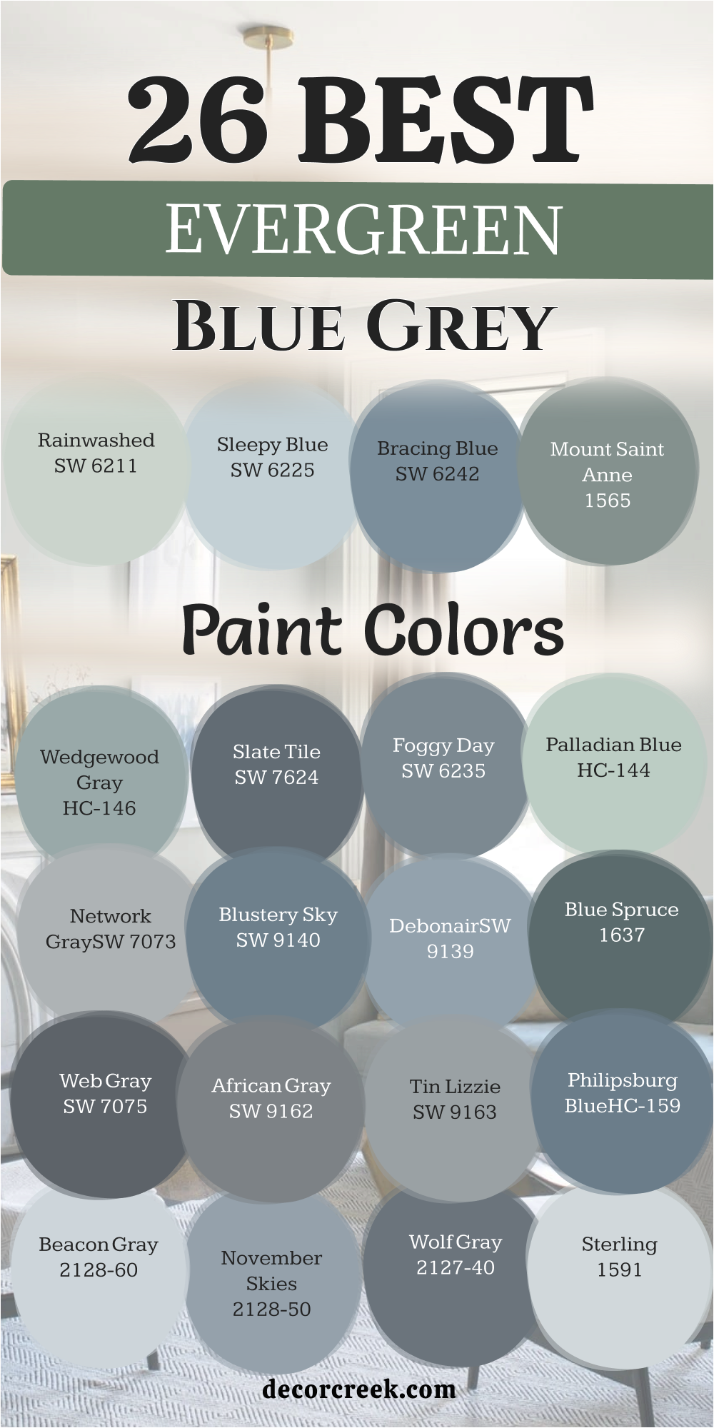
Choosing a new color for your home is an exciting way to show your personal style to everyone who visits. I hope these many options help you feel more confident about your next big painting project for your house. Picking the right shade is a big step in making each room feel exactly how you want it to feel for your family.
Remember that the best color is always the one that makes you feel happy when you walk through your front door after a long day. You should take your time to look at every choice and test your paint samples on the wall in different light. Watching how the light changes the look of the paint helps you make a choice that you will not regret later.
Enjoy the whole process of making your home look its best because it is a very creative and fun task for any homeowner. You have the power to create a beautiful house that your whole family and all your friends will love for many years to come. A fresh coat of paint is the fastest way to bring new life to your walls and make your home feel brand new again.
Trust your gut and pick the blue-grey tone that feels most like you.