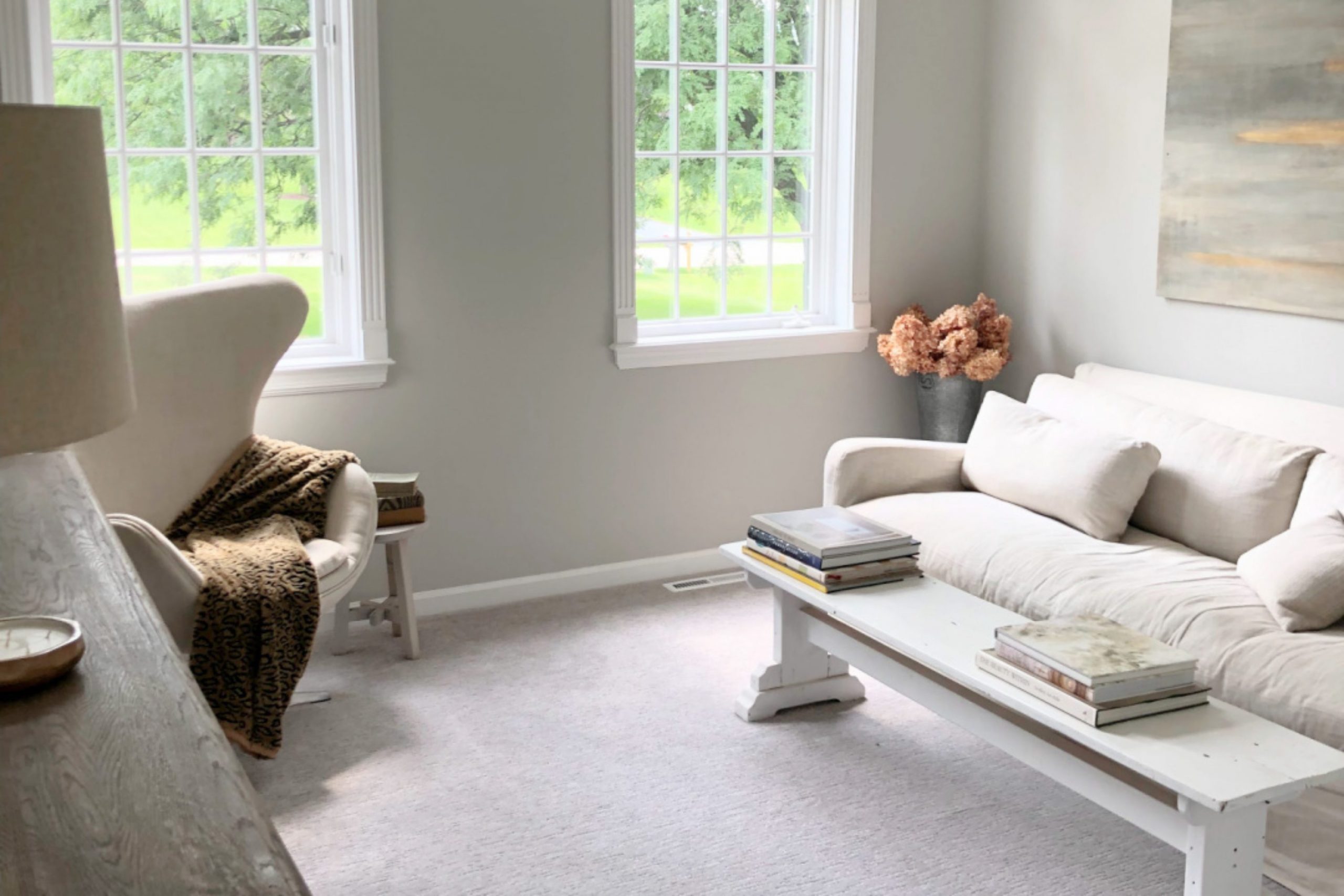
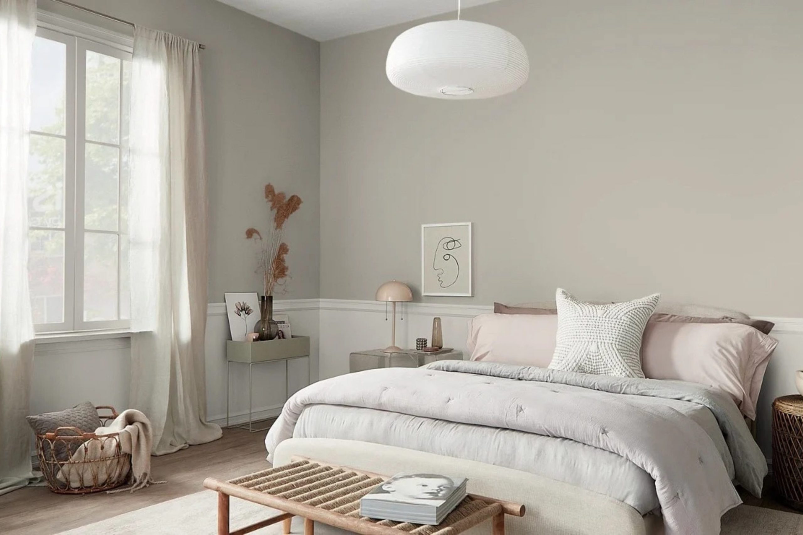
Choosing the right paint for your home can feel like a tough puzzle to solve. I see homeowners struggle every day trying to find that one perfect shade that looks good under any light. Repose Gray by Sherwin-Williams is a favorite choice because it balances warm and cool tones beautifully. This neutral shade can make your rooms feel cozy while keeping a clean look. I want to share my favorite combinations to help you make smart choices for your property.
The secret to a successful home transformation lies in how you layer your favorite shades across different surfaces. When you find a reliable neutral base, it opens up a world of design opportunities for every other room in your house.
A well-chosen wall color acts like a quiet backdrop that lets your personal style shine. Instead of rushing the process, take your time to study how a color behaves in your unique layout.
By understanding the small details of color theory, you can turn a basic living space into a custom luxury zone that feels uniquely yours.
Why Repose Gray Is One of My Favorite Neutral Paint Colors
As an interior designer, I work with many gray paint colors, but Repose Gray remains one of my most trusted choices. What makes it special is its balance. It isn’t too warm and it isn’t too cool, which makes it incredibly flexible throughout the home.
I often recommend Repose Gray because it adapts well to different lighting conditions. In bright rooms, it feels light and fresh. In rooms with less natural light, it creates a soft and welcoming atmosphere without feeling dark or heavy.
This versatility makes it easy to pair with many other colors, from crisp whites and warm creams to dramatic navy blues and earthy greens.
Another reason I love Repose Gray is its timeless appeal.
Trends come and go, but this color continues to work beautifully in traditional, transitional, farmhouse, and modern homes. It creates a calm foundation that allows furniture, décor, and accent colors to shine.
How I Choose the Perfect Color Pairings for Repose Gray
When I choose colors to pair with Repose Gray, I always start by thinking about the mood I want the room to have. Every color combination tells a different story, and the best pairing depends on how you want the space to feel.
For a bright and airy look, I often combine Repose Gray with warm whites and soft creams. If I want more contrast and drama, I turn to deep blues, charcoal tones, or rich black accents. For a natural and relaxed feeling, I love pairing it with muted greens, warm taupes, and earthy browns.
Lighting also plays a big role in my decisions. Natural sunlight, artificial lighting, and even the direction a room faces can change how colors appear next to Repose Gray. That’s why I always recommend testing paint samples together before making a final choice.
The colors in this guide are some of my favorite companions for Repose Gray because they create balance, add personality, and help every room feel thoughtfully designed.
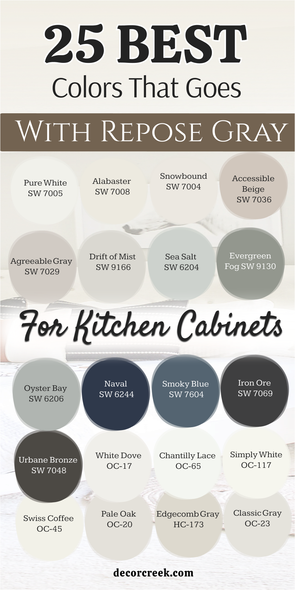
25 Best Colors that Goes with Repose Gray for Kitchen Cabinets
Pure White SW 7005
Pure White SW 7005 gives your cooking area a bright finish without feeling cold. This shade removes dark shadows from your cooking area to make the room feel much larger. Homebuyers always fall in love with this clean look when they walk through the front door.
You will notice how beautifully it contrasts with darker hardware and stone countertops. It works perfectly for families who want a clean look that stays bright all day.
Best used in: living rooms, kitchens, hallways, bedrooms, and farmhouse exteriors
Pairs well with: Iron Ore SW 7069, Agreeable Gray SW 7029, Natural Linen SW 9109, warm wood tones
The key rule of this color for farmhouse style is to use it where you want natural light to feel kind, soft, and inviting throughout the day.
🎨 Check out the complete guide to this color right HERE 👈

Alabaster SW 7008
Alabaster SW 7008 offers a creamy warmth that takes away the sharp edge of standard white paint. This choice makes your cabinets feel historic and deeply inviting for family gatherings.
You can use it to create a soft bridge between your walls and your kitchen appliances. It reflects a gentle light that makes morning coffee feel special.
Best used in: living rooms, kitchens, hallways, bedrooms, and farmhouse exteriors
Pairs well with: Iron Ore SW 7069, Agreeable Gray SW 7029, Natural Linen SW 9109, warm wood tones
The key rule of this color for farmhouse style is to use it where you want natural light to feel kind, soft, and inviting throughout the day.
🎨 Check out the complete guide to this color right HERE 👈

Snowbound SW 7004
Snowbound SW 7004 has a tiny hint of gray in its base that matches your main wall color perfectly. This paint option stops your cabinets from looking too yellow under bright LED ceiling lights.
You will appreciate how it keeps the kitchen looking crisp and ready for hosting guests. It delivers a seamless look that makes the ceiling feel higher than it actually is.
Best used in: living rooms, kitchens, hallways, bedrooms, and farmhouse exteriors
Pairs well with: Iron Ore SW 7069, Agreeable Gray SW 7029, Natural Linen SW 9109, warm wood tones
The key rule of this color for farmhouse style is to use it where you want natural light to feel kind, soft, and inviting throughout the day.
🎨 Check out the complete guide to this color right HERE 👈

Accessible Beige SW 7036
Accessible Beige SW 7036 introduces a rich, sandy tone that brings grounded comfort to your kitchen cabinets. This choice balances the cooler notes of your gray walls by adding a touch of traditional style.
You can pair it with black metal handles to create a beautiful modern look. It hides everyday cooking smudges and fingerprints much better than brighter shades.
Best used in: living rooms, kitchens, hallways, bedrooms, and farmhouse exteriors
Pairs well with: Iron Ore SW 7069, Agreeable Gray SW 7029, Natural Linen SW 9109, warm wood tones
The key rule of this color for farmhouse style is to use it where you want natural light to feel kind, soft, and inviting throughout the day.
🎨 Check out the complete guide to this color right HERE 👈

Agreeable Gray SW 7029
Agreeable Gray SW 7029 shares a similar DNA with your walls but adds a slightly warmer undertone to the room. This formulation creates a gentle layer of depth without causing a jarring contrast in your kitchen.
You will enjoy how it coordinates with stainless steel appliances and nickel hardware. It feels dependable and steady for homeowners who dislike dramatic design shifts.
Best used in: living rooms, kitchens, hallways, bedrooms, and farmhouse exteriors
Pairs well with: Iron Ore SW 7069, Agreeable Gray SW 7029, Natural Linen SW 9109, warm wood tones
The key rule of this color for farmhouse style is to use it where you want natural light to feel kind, soft, and inviting throughout the day.
🎨 Check out the complete guide to this color right HERE 👈

Drift of Mist SW 9166
Drift of Mist SW 9166 is a airy hue that hovers softly between white and light gray. This choice brings an understated elegance to cabinet doors without pulling attention away from your beautiful backsplash.
You can use this option to keep a dark kitchen feeling open and full of life. It acts like a soft morning fog that makes the whole room feel relaxing.
Best used in: living rooms, kitchens, hallways, bedrooms, and farmhouse exteriors
Pairs well with: Iron Ore SW 7069, Agreeable Gray SW 7029, Natural Linen SW 9109, warm wood tones
The key rule of this color for farmhouse style is to use it where you want natural light to feel kind, soft, and inviting throughout the day.
🎨 Check out the complete guide to this color right HERE 👈

Sea Salt SW 6204
Sea Salt SW 6204 introduces a beautiful blend of green and blue that reminds you of the ocean. This choice gives your kitchen cabinets a splash of personality while remaining gentle on the eyes.
You will love how it brings a coastal energy into the heart of your home. It works wonderfully with light oak floors and white quartz countertops.
Best used in: living rooms, kitchens, hallways, bedrooms, and farmhouse exteriors
Pairs well with: Iron Ore SW 7069, Agreeable Gray SW 7029, Natural Linen SW 9109, warm wood tones
The key rule of this color for farmhouse style is to use it where you want natural light to feel kind, soft, and inviting throughout the day.
🎨 Check out the complete guide to this color right HERE 👈

Evergreen Fog SW 9130
Evergreen Fog SW 9130 offers a deep, muddy green that brings the beauty of nature indoors. This rich shade makes your lower cabinets look sturdy and expensive.
You can use it to create a stunning focal point that grounds your entire cooking area. It matches beautifully with brass faucets and warm wooden cutting boards.
Best used in: living rooms, kitchens, hallways, bedrooms, and farmhouse exteriors
Pairs well with: Iron Ore SW 7069, Agreeable Gray SW 7029, Natural Linen SW 9109, warm wood tones
The key rule of this color for farmhouse style is to use it where you want natural light to feel kind, soft, and inviting throughout the day.
🎨 Check out the complete guide to this color right HERE 👈

Oyster Bay SW 6206
Oyster Bay SW 6206 is a slate green paint with slate gray undertones that feel deeply sophisticated. This choice brings a cool, historic character to your cabinetry that looks great in traditional homes.
You will notice how it changes character depending on how much sunlight hits the doors. It provides a rich background for showing off your favorite white dishware.
Best used in: living rooms, kitchens, hallways, bedrooms, and farmhouse exteriors
Pairs well with: Iron Ore SW 7069, Agreeable Gray SW 7029, Natural Linen SW 9109, warm wood tones
The key rule of this color for farmhouse style is to use it where you want natural light to feel kind, soft, and inviting throughout the day.
🎨 Check out the complete guide to this color right HERE 👈
Naval SW 6244
Naval SW 6244 provides a classic dark blue that brings a sense of luxury to your kitchen island. This bold shade makes a dramatic statement while remaining safe and family-friendly.
You can use it to anchors your cooking area with a look that never goes out of style. It pairs magnificently with bright white accents to create a high-contrast look.
Best used in: living rooms, kitchens, hallways, bedrooms, and farmhouse exteriors
Pairs well with: Iron Ore SW 7069, Agreeable Gray SW 7029, Natural Linen SW 9109, warm wood tones
The key rule of this color for farmhouse style is to use it where you want natural light to feel kind, soft, and inviting throughout the day.
🎨 Check out the complete guide to this color right HERE 👈

Smoky Blue SW 7604
Smoky Blue SW 7604 brings a rich navy tone with a touch of gray that perfectly matches your main walls. This color choice makes your lower cabinets look expensive and keeps the room from looking boring.
You will love how it changes during the day when the sun hits the surfaces. It gives your cooking area a deeply stable feeling that makes people want to hang out. Home buyers always notice this shade because it looks like a high-end designer picked it out.
It hides kitchen messes very well while adding a lot of visual interest to your home. You can pair it with shiny brass handles to make a very pretty statement. It creates a beautiful anchor for an island or a full set of lower doors. This option helps your white dishes pop when displayed on open shelving above the counters.
Best used in: living rooms, kitchens, hallways, bedrooms, and farmhouse exteriors
Pairs well with: Iron Ore SW 7069, Agreeable Gray SW 7029, Natural Linen SW 9109, warm wood tones
The key rule of this color for farmhouse style is to use it where you want natural light to feel kind, soft, and inviting throughout the day.
🎨 Check out the complete guide to this color right HERE 👈
Iron Ore SW 7069
Iron Ore SW 7069 is a charcoal shade that looks softer than a true pitch black paint. This deep tone gives your modern cabinets a sharp outline that feels strong and very grounding. You will see how it makes your metallic fixtures and light countertops look twice as bright.
It acts like a frame around your cooking area to highlight your beautiful tile choices. Many families love this option because it stands up to heavy daily use without showing scratches. It creates an incredible contrast that makes a small kitchen look like a custom luxury zone.
You do not have to worry about this dark shade looking cold next to your gray walls. It carries enough warmth to keep your morning routine feeling cozy and very inviting. This selection works wonderfully for anyone who wants a bold look without using a harsh color.
Best used in: living rooms, kitchens, hallways, bedrooms, and farmhouse exteriors
Pairs well with: Iron Ore SW 7069, Agreeable Gray SW 7029, Natural Linen SW 9109, warm wood tones
The key rule of this color for farmhouse style is to use it where you want natural light to feel kind, soft, and inviting throughout the day.
🎨 Check out the complete guide to this color right HERE 👈

Urbane Bronze SW 7048
Urbane Bronze SW 7048 mixes a deep brown with a gray base to create a rich earth tone. This choice connects your kitchen to the natural world outside your windows in a beautiful way. You will notice how it warms up the room and creates a wonderful sense of security.
It works incredibly well with stone floors and exposed wooden beams across your ceiling. This shade makes your cabinetry look like a piece of fine furniture rather than plain painted wood. It absorbs bright glare from overhead lights to keep the room feeling comfortable during dinner time.
You can use it to create a cozy nook that makes everyone feel right at home. It provides a rich look that elevates basic materials into something that looks very premium. This paint choice is fantastic for creating a high-end look that feels very welcoming to guests.
Best used in: living rooms, kitchens, hallways, bedrooms, and farmhouse exteriors
Pairs well with: Iron Ore SW 7069, Agreeable Gray SW 7029, Natural Linen SW 9109, warm wood tones
The key rule of this color for farmhouse style is to use it where you want natural light to feel kind, soft, and inviting throughout the day.
🎨 Check out the complete guide to this color right HERE 👈

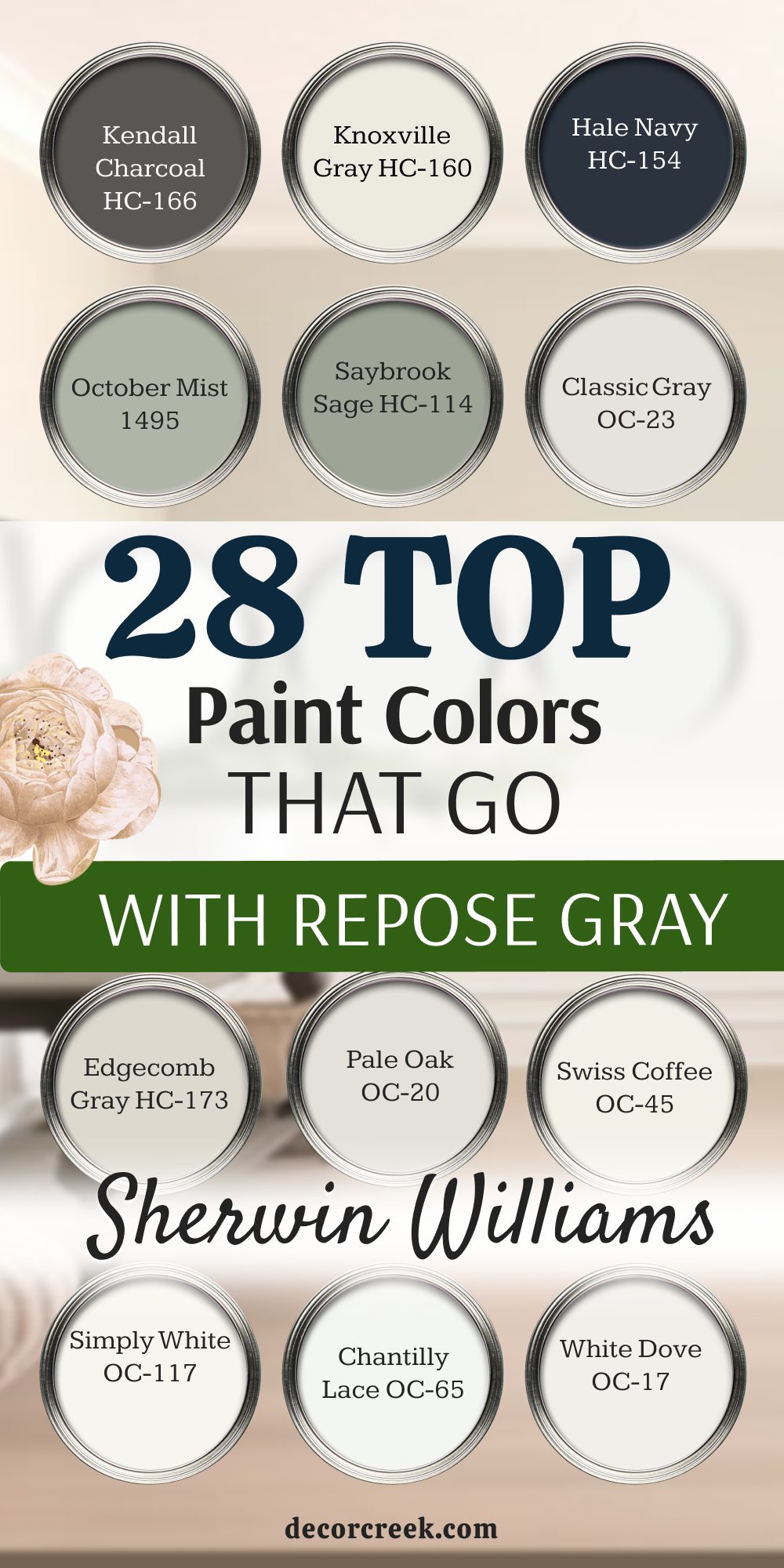
White Dove OC-17
White Dove OC-17 provides a soft creamy base that has a very small touch of yellow and gray. This paint option makes your cabinets look clean and bright without ever feeling like a cold hospital. You can trust this choice to bring a soft glow into corners that do not get much sun.
It blends beautifully with your gray walls to create a smooth look from floor to ceiling. Many designers pick this specific shade because it always looks great under any kind of lightbulb. It gives your cooking area a traditional look that feels clean, fresh, and ready for baking.
You will enjoy how it softens the hard edges of metal appliances and dark stone counters. It keeps the heart of your home looking cheerful and full of bright energy all year long. This classic shade works beautifully for families who want a clean look that stays in style.
Best used in: living rooms, kitchens, hallways, bedrooms, and farmhouse exteriors
Pairs well with: Iron Ore SW 7069, Agreeable Gray SW 7029, Natural Linen SW 9109, warm wood tones
The key rule of this color for farmhouse style is to use it where you want natural light to feel kind, soft, and inviting throughout the day.
🎨 Check out the complete guide to this color right HERE 👈

Chantilly Lace OC-65
Chantilly Lace OC-65 is a bright white that has almost no yellow or blue undertones hidden inside. This crisp selection gives your kitchen cabinets a highly clean appearance that feels completely fresh. You will love how it makes your kitchen look like a bright art studio full of sunshine.
It provides the highest amount of contrast against your gray walls to create a crisp outline. This option makes every other color in the room look sharper and much more colorful by comparison. It works best if you want a modern look with zero muddy tones in the background.
You can use it to make a small kitchen feel open and full of breathing room. It reflects every bit of available light to keep the dark winter days from feeling gloomy. This clean paint choice gives your woodwork a beautiful finish that looks modern and clean.
Best used in: living rooms, kitchens, hallways, bedrooms, and farmhouse exteriors
Pairs well with: Iron Ore SW 7069, Agreeable Gray SW 7029, Natural Linen SW 9109, warm wood tones
The key rule of this color for farmhouse style is to use it where you want natural light to feel kind, soft, and inviting throughout the day.
🎨 Check out the complete guide to this color right HERE 👈

Simply White OC-117
Simply White OC-117 carries a tiny hint of warmth that makes it feel bright yet deeply comfortable. This color choice makes your cabinets look cheerful and full of life when the morning sun enters. You will see how it keeps the kitchen looking clean without feeling sharp or overly bright.
It works beautifully for open shelves where you want your colorful bowls to take center stage. This shade helps bridge the gap between traditional wooden floors and very modern gray walls. It offers a bright finish that makes the whole room feel clean and organized.
You will love how it brightens up the entire room during rainy afternoons when light is low. It creates an inviting atmosphere where friends will want to gather around your kitchen island. This balanced option provides a beautiful brightness that feels very natural for a busy family home.
Best used in: living rooms, kitchens, hallways, bedrooms, and farmhouse exteriors
Pairs well with: Iron Ore SW 7069, Agreeable Gray SW 7029, Natural Linen SW 9109, warm wood tones
The key rule of this color for farmhouse style is to use it where you want natural light to feel kind, soft, and inviting throughout the day.
🎨 Check out the complete guide to this color right HERE 👈
Swiss Coffee OC-45
Swiss Coffee OC-45 offers a creamy white tone that brings a lot of traditional charm to cabinets. This paint selection makes your kitchen feel like a cozy cottage filled with warm treats and coffee. You can use it to soften a room that has too many hard metal or tile surfaces.
It matches beautifully with warm brass hardware and natural cutting boards on your counter. This shade avoids looking too yellow by relying on a tiny hint of gray in the mix. It creates a soft look that makes morning light feel gentle and very kind to your eyes.
You will notice how it gives your cabinetry a rich look that feels friendly and time-tested. It works perfectly for anyone who thinks standard white paint feels too bright for a home. This warm option ensures your kitchen stays looking cozy and ready for family meals every evening.
Best used in: living rooms, kitchens, hallways, bedrooms, and farmhouse exteriors
Pairs well with: Iron Ore SW 7069, Agreeable Gray SW 7029, Natural Linen SW 9109, warm wood tones
The key rule of this color for farmhouse style is to use it where you want natural light to feel kind, soft, and inviting throughout the day.
🎨 Check out the complete guide to this color right HERE 👈

Pale Oak OC-20
Pale Oak OC-20 is a light taupe color that sits nicely between a soft gray and a warm beige. This shade adds a layer of gentle luxury to your cabinet doors without creating a dark room. You will appreciate how it changes from a warm gray to a soft tan as the daylight moves.
It works wonderfully for creating a quiet look that does not fight with your backsplashes. This choice makes your kitchen look very expensive because it mimics the tones found in natural stone. It offers a soft alternative to white cabinets that still keeps the room feeling bright and open.
You can pair it with dark bronze handles to give your kitchen a beautiful traditional touch. It helps create a smooth flow when your kitchen opens directly into a main living area. This balanced paint tone is excellent for creating a gentle look that feels very inviting.
Best used in: living rooms, kitchens, hallways, bedrooms, and farmhouse exteriors
Pairs well with: Iron Ore SW 7069, Agreeable Gray SW 7029, Natural Linen SW 9109, warm wood tones
The key rule of this color for farmhouse style is to use it where you want natural light to feel kind, soft, and inviting throughout the day.
🎨 Check out the complete guide to this color right HERE 👈

Edgecomb Gray HC-173
Edgecomb Gray HC-173 is a rich greige paint that brings an earthy warmth to your cabinetry. This color option makes your kitchen feel deeply grounded and ready for busy family life every day. You will love how it prevents your main gray walls from looking too cold or clinical.
It hides dust and small cooking marks much better than a standard white paint would do. This classic tone looks beautiful alongside natural oak flooring and dark black iron details. It gives your home a steady look that feels very secure and traditional to the eye.
You can trust it to make large kitchen islands look solid, handsome, and very well-made. It helps create a comfortable environment where people want to sit down and talk for hours. This reliable color choice is a favorite for creating a warm look that lasts for years.
Best used in: living rooms, kitchens, hallways, bedrooms, and farmhouse exteriors
Pairs well with: Iron Ore SW 7069, Agreeable Gray SW 7029, Natural Linen SW 9109, warm wood tones
The key rule of this color for farmhouse style is to use it where you want natural light to feel kind, soft, and inviting throughout the day.
🎨 Check out the complete guide to this color right HERE 👈

Classic Gray OC-23
Classic Gray OC-23 is a very light gray that has a tiny bit of warmth hidden in its base. This paint choice gives your cabinets a soft tint that distinguishes them from bright white trim work. You will enjoy how it coordinates with your main walls to create a very smooth appearance.
It keeps your kitchen looking open and airy while adding just enough color to notice a difference. This option works perfectly under bright modern lighting without turning blue or purple on you. It provides a clean backdrop that lets your beautiful countertops be the star of the room.
You can use it to create a bright look that feels much softer than standard white choices. It brings a gentle feeling to the room that makes afternoon chores feel less like hard work. This quiet shade is perfect for achieving a simple look that stays beautiful all day.
Best used in: living rooms, kitchens, hallways, bedrooms, and farmhouse exteriors
Pairs well with: Iron Ore SW 7069, Agreeable Gray SW 7029, Natural Linen SW 9109, warm wood tones
The key rule of this color for farmhouse style is to use it where you want natural light to feel kind, soft, and inviting throughout the day.
🎨 Check out the complete guide to this color right HERE 👈

Saybrook Sage HC-114
Saybrook Sage HC-114 introduces a soft green with a strong gray undertone that looks like garden herbs. This color choice brings a touch of nature into your kitchen to create a very peaceful feeling. You will notice how it gives your cabinetry a historic look that feels unique and customized.
It coordinates beautifully with your main walls because the gray tones in both paints match well. This selection looks wonderful next to white farmhouse sinks and light marble countertop surfaces. It offers a great way to add real color to your home without picking something too bright.
You can use it to turn your kitchen island into a beautiful feature that guests will praise. It makes the room feel friendly and connected to the trees outside your kitchen window. This natural tone works well for creating a relaxed look that feels fresh and very steady.
Best used in: living rooms, kitchens, hallways, bedrooms, and farmhouse exteriors
Pairs well with: Iron Ore SW 7069, Agreeable Gray SW 7029, Natural Linen SW 9109, warm wood tones
The key rule of this color for farmhouse style is to use it where you want natural light to feel kind, soft, and inviting throughout the day.
🎨 Check out the complete guide to this color right HERE 👈

October Mist 1495
October Mist 1495 is a silver green tone that feels soft and very gentle on the eyes. This paint choice gives your kitchen cabinets a unique personality that stays calm and friendly. You will love how it softens the bright reflection from large stainless steel refrigerators and ovens.
It acts like a beautiful neutral color while still giving you the joy of having green cabinets. This shade coordinates beautifully with light wood accents and woven baskets on your shelves. It helps create a gentle flow that makes cooking feel like a relaxing hobby after a long day.
You can trust this color to keep your room looking bright while adding a touch of style. It brings a cheerful energy to your morning routine without feeling loud or distracting to your family. This earthy option is wonderful for homeowners who want a soft color that feels very organic.
Best used in: living rooms, kitchens, hallways, bedrooms, and farmhouse exteriors
Pairs well with: Iron Ore SW 7069, Agreeable Gray SW 7029, Natural Linen SW 9109, warm wood tones
The key rule of this color for farmhouse style is to use it where you want natural light to feel kind, soft, and inviting throughout the day.
🎨 Check out the complete guide to this color right HERE 👈

Hale Navy HC-154
Hale Navy HC-154 provides a deep maritime blue that brings a massive amount of style to cabinets. This bold choice makes your kitchen look expensive and very solid from the moment it is painted. You will love the heavy contrast it creates when paired with bright white tiles and shiny metal knobs.
It works beautifully on lower cabinets to ground the room while keeping upper areas light and white. This shade carries a lot of gray in its base, so it never looks like a bright primary color. It provides a timeless look that makes your home feel historic and very well-designed for hosting.
You can use it to create a stunning feature wall that draws people into the cooking area. It stays looking clean even if you have pets and children running through the kitchen all afternoon. This rich blue tone is a smart pick for creating a high-end look that feels very secure.
Best used in: living rooms, kitchens, hallways, bedrooms, and farmhouse exteriors
Pairs well with: Iron Ore SW 7069, Agreeable Gray SW 7029, Natural Linen SW 9109, warm wood tones
The key rule of this color for farmhouse style is to use it where you want natural light to feel kind, soft, and inviting throughout the day.
🎨 Check out the complete guide to this color right HERE 👈

Knoxville Gray HC-160
Knoxville Gray HC-160 blends dark blue, green, and gray into a deep slate paint color. This complex shade gives your kitchen doors a moody look that feels very modern and artistic. You will appreciate how it changes its look depending on the weather outside your kitchen window.
It creates a beautiful backdrop that makes gold hardware shine like real jewelry against the wood. This choice is fantastic for anyone who wants a dark kitchen without using basic black paint. It works well to hide standard kitchen wear and tear while maintaining a very upscale appearance.
You can use it to add drama to a large island or to create a dark set of lower cabinets. It matches the cool undertones of your main walls while offering a lot of extra depth. This rich selection gives your cooking area a strong look that feels very custom and premium.
Best used in: living rooms, kitchens, hallways, bedrooms, and farmhouse exteriors
Pairs well with: Iron Ore SW 7069, Agreeable Gray SW 7029, Natural Linen SW 9109, warm wood tones
The key rule of this color for farmhouse style is to use it where you want natural light to feel kind, soft, and inviting throughout the day.
🎨 Check out the complete guide to this color right HERE 👈
Kendall Charcoal HC-166
Kendall Charcoal HC-166 is a dark gray that carries a rich warmth to keep it from looking cold. This paint color gives your kitchen cabinetry a bold look that feels strong, stable, and very sleek. You will see how it creates a crisp frame around your white dishes and light quartz countertops.
It matches your main walls perfectly because it lives in the same gray color family but with more weight. This shade is excellent for creating a modern look that still feels cozy enough for family dinners. It stops your kitchen from looking washed out when you have large windows letting in bright light.
You can pair it with natural wood floating shelves to create a beautiful look that feels balanced. It provides a dependable look that makes your whole home feel well-constructed and very neat. This dark option is perfect for homeowners who love a sleek style that feels warm.
Best used in: living rooms, kitchens, hallways, bedrooms, and farmhouse exteriors
Pairs well with: Iron Ore SW 7069, Agreeable Gray SW 7029, Natural Linen SW 9109, warm wood tones
The key rule of this color for farmhouse style is to use it where you want natural light to feel kind, soft, and inviting throughout the day.
🎨 Check out the complete guide to this color right HERE 👈

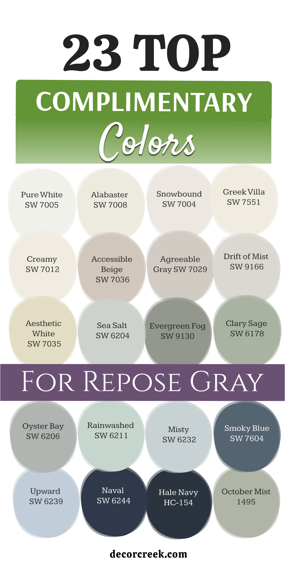
23 Top Complimentary Colors for Repose Gray
Pure White SW 7005
Pure White SW 7005 works as a beautiful trim choice that makes your main walls stand out nicely. This crisp shade cleans up the look of your trim boards and doors without looking too bright. You will notice how it helps your window frames look crisp and completely fresh.
It keeps your hallways from looking dark on cloudy afternoons when natural light drops. Homeowners love this pairing because it feels clean, organized, and very ready for visitors. It balances the warm and cool tones of your paint choice with total ease.
You can use it anywhere you want a clean border that separates your walls from your flooring. It provides a simple look that lets your furniture choices take center stage in the room. This reliable option keeps the whole layout looking bright, coordinated, and very cheerful.
Best used in: living rooms, kitchens, hallways, bedrooms, and farmhouse exteriors
Pairs well with: Iron Ore SW 7069, Agreeable Gray SW 7029, Natural Linen SW 9109, warm wood tones
The key rule of this color for farmhouse style is to use it where you want natural light to feel kind, soft, and inviting throughout the day.
🎨 Check out the complete guide to this color right HERE 👈
Alabaster SW 7008
Alabaster SW 7008 brings a soft milkiness that matches the warm side of your main gray walls. This selection avoids looking sharp by adding a gentle warmth to your baseboards and crown molding. You can use it to create a smooth flow between different rooms in your house.
It reflects light in a friendly way that makes your entryways feel extra welcoming. Many families choose this look because it keeps the house feeling cozy during winter evenings. It softens the hard edges of your rooms and makes your drywall look smooth.
You will enjoy how it looks next to warm honey oak or dark walnut wood floors. It delivers a gentle finish that makes every corner of your property look highly comfortable. This friendly white option is excellent for creating a soft look that people instantly love.
Best used in: living rooms, kitchens, hallways, bedrooms, and farmhouse exteriors
Pairs well with: Iron Ore SW 7069, Agreeable Gray SW 7029, Natural Linen SW 9109, warm wood tones
The key rule of this color for farmhouse style is to use it where you want natural light to feel kind, soft, and inviting throughout the day.
🎨 Check out the complete guide to this color right HERE 👈
Snowbound SW 7004
Snowbound SW 7004 features a very slight gray undertone that links up perfectly with your main wall choice. This clever formulation ensures your trim never clashes with the gray tones in your rooms. You will see how it gives your home a uniform appearance that feels very well-planned.
It keeps your ceilings looking high and bright without casting a strange pink or yellow hue. This option is great for open floor plans where you want a smooth design theme. It handles changing sunlight well, staying clean and bright from morning until nightfall.
You can count on it to provide a balanced look that supports your other decor choices. It makes your living spaces feel tidy, open, and completely unified throughout the day. This stable shade works perfectly for creating a clean look that stays very reliable.
Best used in: living rooms, kitchens, hallways, bedrooms, and farmhouse exteriors
Pairs well with: Iron Ore SW 7069, Agreeable Gray SW 7029, Natural Linen SW 9109, warm wood tones
The key rule of this color for farmhouse style is to use it where you want natural light to feel kind, soft, and inviting throughout the day.
🎨 Check out the complete guide to this color right HERE 👈
Greek Villa SW 7551
Greek Villa SW 7551 offers a rich, sunny white tone that brings a cheerful energy to your woodwork. This selection helps remove any coldness from your walls by adding a touch of golden warmth. You will love how it makes small bedrooms feel cozy and completely secure for sleeping.
It provides a beautiful contrast that highlights your architecture without looking forced or overly bright. This paint choice feels heavy and expensive on your doors, giving them a high-quality finish. It coordinates beautifully with woven rugs, linen curtains, and tan leather couches in your main rooms.
You can use it to make dark hallways feel friendlier for your family to walk through. It keeps the mood of your home feeling bright, sunny, and very lighthearted all year long. This rich white shade is wonderful for adding a friendly touch to a neutral home.
Best used in: living rooms, kitchens, hallways, bedrooms, and farmhouse exteriors
Pairs well with: Iron Ore SW 7069, Agreeable Gray SW 7029, Natural Linen SW 9109, warm wood tones
The key rule of this color for farmhouse style is to use it where you want natural light to feel kind, soft, and inviting throughout the day.
🎨 Check out the complete guide to this color right HERE 👈

Creamy SW 7012
Creamy SW 7012 is a warm white option that feels soft, smooth, and very traditional. This paint tone softens your main gray walls by adding a layer of buttery comfort to the room. You can apply it to your built-in bookshelves to make your book collection stand out beautifully.
It prevents your home from looking like a cold office building by introducing a classic look. This shade works wonderfully in older homes where you want to honor the historic character of the building. It reflects lamplight beautifully at night to create a glowing environment for your family to enjoy.
You will notice how it helps create a relaxed feel that makes people want to kick off their shoes. It pairs nicely with brass light fixtures and warm woven baskets on your tables. This traditional option is perfect for anyone who loves a soft look that feels deeply homey.
Best used in: living rooms, kitchens, hallways, bedrooms, and farmhouse exteriors
Pairs well with: Iron Ore SW 7069, Agreeable Gray SW 7029, Natural Linen SW 9109, warm wood tones
The key rule of this color for farmhouse style is to use it where you want natural light to feel kind, soft, and inviting throughout the day.
🎨 Check out the complete guide to this color right HERE 👈

Accessible Beige SW 7036
Accessible Beige SW 7036 provides a solid neutral foundation that brings an earthy tan tone into the house. This choice works as an excellent accent wall color to give your main living areas a clear focus. You will love how the tan notes blend with your gray surfaces to create a balanced design look.
It makes large rooms feel much closer and friendlier for daily family conversations. This shade hides dirt very well, making it smart for mudrooms and busy back entryways. It matches beautifully with stone fireplace surrounds and heavy wooden furniture pieces.
You can use it to create a classic look that feels very steady and grounded. It helps your property look valuable and well-maintained to people visiting for the first time. This sturdy neutral tone is a great partner for creating a comfortable environment.
Best used in: living rooms, kitchens, hallways, bedrooms, and farmhouse exteriors
Pairs well with: Iron Ore SW 7069, Agreeable Gray SW 7029, Natural Linen SW 9109, warm wood tones
The key rule of this color for farmhouse style is to use it where you want natural light to feel kind, soft, and inviting throughout the day.
🎨 Check out the complete guide to this color right HERE 👈
Agreeable Gray SW 7029
Agreeable Gray SW 7029 is a slightly warmer cousin to your main wall color choice. This paint option creates a very gentle transition when used on accent walls or adjacent hallway spaces. You will see how it builds a smooth flow that guides your eyes easily from room to room.
It keeps the design looking consistent without making every single wall look exactly identical. This balanced shade handles both natural sunshine and artificial lightbulbs with great success. It feels safe, reliable, and very smart for homeowners who want to stage their property for sale.
You can combine it with white wood trim to get a classic look that stays tidy. It builds a beautiful backdrop that supports your favorite artwork and family photos. This popular choice ensures your whole layout looks smooth, intentional, and very well-balanced.
Best used in: living rooms, kitchens, hallways, bedrooms, and farmhouse exteriors
Pairs well with: Iron Ore SW 7069, Agreeable Gray SW 7029, Natural Linen SW 9109, warm wood tones
The key rule of this color for farmhouse style is to use it where you want natural light to feel kind, soft, and inviting throughout the day.
🎨 Check out the complete guide to this color right HERE 👈
Drift of Mist SW 9166
Drift of Mist SW 9166 is a very pale gray that brings a light touch to your ceilings or trim. This shade keeps your rooms looking bright while providing a soft contrast against your darker walls. You will appreciate how it softens the transition between white ceilings and gray vertical surfaces.
It gives your home an airy feel that makes small rooms look open and full of life. This option is wonderful for laundry rooms or bathrooms where you want a fresh look. It behaves nicely under bright light bulbs without showing unexpected blue or green undertones.
You can use it to create a simple look that keeps the home looking neat and tidy. It works silently in the background to ensure your main rooms feel open and easy to live in. This quiet shade is excellent for creating a light look that feels very balanced.
Best used in: living rooms, kitchens, hallways, bedrooms, and farmhouse exteriors
Pairs well with: Iron Ore SW 7069, Agreeable Gray SW 7029, Natural Linen SW 9109, warm wood tones
The key rule of this color for farmhouse style is to use it where you want natural light to feel kind, soft, and inviting throughout the day.
🎨 Check out the complete guide to this color right HERE 👈
Aesthetic White SW 7035
Aesthetic White SW 7035 mixes a light beige base with a gray undertone to create an off-white shade. This paint choice looks wonderful on trim when you want to avoid a bright white look. You will notice how it brings a soft structure to your rooms while matching your walls perfectly.
It keeps your living areas looking warm and cozy even on dark, rainy winter days. This selection pairs beautifully with greige carpeting and light hardwood floor materials. It gives your home a high-end look that feels thoughtful, tailored, and very clean.
You can use it to create a gentle frame around your windows to highlight your outdoor view. It stops your home from looking cold by adding a touch of natural clay tone to the trim. This balanced off-white choice is great for making your neutral rooms feel complete.
Best used in: living rooms, kitchens, hallways, bedrooms, and farmhouse exteriors
Pairs well with: Iron Ore SW 7069, Agreeable Gray SW 7029, Natural Linen SW 9109, warm wood tones
The key rule of this color for farmhouse style is to use it where you want natural light to feel kind, soft, and inviting throughout the day.
🎨 Check out the complete guide to this color right HERE 👈

Sea Salt SW 6204
Sea Salt SW 6204 introduces a beautiful wash of green and blue that brightens your neutral walls. This color choice brings a coastal look into your home that feels fresh and full of energy. You will love using it in bathrooms or sunrooms to create a cheerful focal point.
It matches the gray tones of your main walls while adding a splash of real personality to the house. This selection looks wonderful next to white painted furniture and light wicker accent baskets. It helps your family feel connected to nature even when you are relaxing indoors.
You can paint an accent wall with this shade to give your living room a beautiful surprise. It changes its look delightfully depending on whether the sky outside is sunny or cloudy. This natural option is perfect for adding a touch of color that stays very gentle.
Best used in: living rooms, kitchens, hallways, bedrooms, and farmhouse exteriors
Pairs well with: Iron Ore SW 7069, Agreeable Gray SW 7029, Natural Linen SW 9109, warm wood tones
The key rule of this color for farmhouse style is to use it where you want natural light to feel kind, soft, and inviting throughout the day.
🎨 Check out the complete guide to this color right HERE 👈
Evergreen Fog SW 9130
Evergreen Fog SW 9130 offers a rich slate green tone that brings a strong natural look to your home. This choice works beautifully on doors or fireplace mantels to create a handsome look. You will love how it introduces the feeling of a quiet forest directly into your living room.
It pairs naturally with your gray walls because both colors share a steady gray undertone. This paint shade makes your bronze door handles and gold frames look extremely beautiful. It gives your rooms a grounded appearance that feels very secure and traditional to your family.
You can use it to create a cozy reading corner that feels private and special. It stands up to busy family life while keeping your home looking like a designer house. This rich green option is fantastic for creating a grounded look with lots of style.
Best used in: living rooms, kitchens, hallways, bedrooms, and farmhouse exteriors
Pairs well with: Iron Ore SW 7069, Agreeable Gray SW 7029, Natural Linen SW 9109, warm wood tones
The key rule of this color for farmhouse style is to use it where you want natural light to feel kind, soft, and inviting throughout the day.
🎨 Check out the complete guide to this color right HERE 👈
Clary Sage SW 6178
Clary Sage SW 6178 is a soft herbal green paint that brings a yellow undertone for extra warmth. This choice looks wonderful on accent walls when you want to create a happy, bright look. You will see how it warms up your gray rooms and makes them feel like a spring garden.
It coordinates beautifully with cream-colored pillows and light wooden dining tables. This shade brings a cheerful energy that helps your family feel relaxed during breakfast time. It offers a great way to use color without making your home look too loud or distracting.
You can trust it to look beautiful in rooms that get a lot of bright southern sunshine. It turns plain walls into an interesting feature that highlights your favorite decorative items. This friendly green selection is perfect for building a cozy look that feels very organic.
Best used in: living rooms, kitchens, hallways, bedrooms, and farmhouse exteriors
Pairs well with: Iron Ore SW 7069, Agreeable Gray SW 7029, Natural Linen SW 9109, warm wood tones
The key rule of this color for farmhouse style is to use it where you want natural light to feel kind, soft, and inviting throughout the day.
🎨 Check out the complete guide to this color right HERE 👈

Oyster Bay SW 6206
Oyster Bay SW 6206 provides a cool blue-green shade with a heavy dose of gray mixed inside. This paint choice looks highly sophisticated on interior doors or built-in storage cabinets. You will notice how it adds a cool, historic character that feels very stable and handsomely styled.
It balances the warm daylight in your home by introducing a crisp, refreshing note to the walls. This color choice looks excellent when paired with chrome hardware and crisp white trim boards. It helps your main rooms look unique without breaking the flow of your neutral paint scheme.
You can use it to create a handsome accent that draws the eye toward your favorite architectural features. It gives your property a high-end look that feels very intentional and well-designed. This cool tone is a smart pick for bringing a refined look to your living spaces.
Best used in: living rooms, kitchens, hallways, bedrooms, and farmhouse exteriors
Pairs well with: Iron Ore SW 7069, Agreeable Gray SW 7029, Natural Linen SW 9109, warm wood tones
The key rule of this color for farmhouse style is to use it where you want natural light to feel kind, soft, and inviting throughout the day.
🎨 Check out the complete guide to this color right HERE 👈
Rainwashed SW 6211
Rainwashed SW 6211 is a light, watery blue-green that feels like a clear sky after a rainstorm. This paint selection brings a cheerful lightness to your home that makes small spaces feel open. You will enjoy using it in bedrooms or laundry zones to keep the atmosphere looking bright.
It offers a beautiful contrast against your gray walls by adding a touch of clean color. This shade looks wonderful when paired with white cotton curtains and light pine wood details. It helps keep the mood of your home feeling positive, clean, and full of fresh energy.
You can use it to make a dark room feel like it has an extra window letting in light. It behaves beautifully under soft white lightbulbs to keep your evenings looking cozy and sweet. This airy selection is perfect for anyone who wants a bright look that feels very fresh.
Best used in: living rooms, kitchens, hallways, bedrooms, and farmhouse exteriors
Pairs well with: Iron Ore SW 7069, Agreeable Gray SW 7029, Natural Linen SW 9109, warm wood tones
The key rule of this color for farmhouse style is to use it where you want natural light to feel kind, soft, and inviting throughout the day.
🎨 Check out the complete guide to this color right HERE 👈

Misty SW 6232
Misty SW 6232 is a very light blue with a strong gray foundation built right into the paint. This selection gives your walls a soft touch of color that stays very quiet and easy to look at. You will appreciate how it coordinates with your main gray paint to create a smooth appearance.
It prevents your rooms from looking boring by adding a cool hint of morning sky to the mix. This shade works perfectly for bedrooms where you want to create a relaxing layout for sleep. It looks beautiful next to dark gray carpets and crisp white bedding sheets on your bed.
You can use it to keep a sunny room from looking too hot during the summer months. It provides a balanced backdrop that lets your personal style look organized and very clean. This soft blue shade is excellent for creating a quiet look that stays very friendly.
Best used in: living rooms, kitchens, hallways, bedrooms, and farmhouse exteriors
Pairs well with: Iron Ore SW 7069, Agreeable Gray SW 7029, Natural Linen SW 9109, warm wood tones
The key rule of this color for farmhouse style is to use it where you want natural light to feel kind, soft, and inviting throughout the day.
🎨 Check out the complete guide to this color right HERE 👈

Smoky Blue SW 7604
Smoky Blue SW 7604 offers a deep, rich navy tone that carries a beautiful gray undertone inside. This bold selection looks incredible on fireplace walls or as a rich background for your TV. You will see how it gives your main living room a heavy dose of luxury and style.
It provides a massive contrast against your gray walls to make the whole room look sharper. This shade helps your colorful paintings and gold decorations pop out with extra brightness. It makes your seating areas feel cozy and private for family movie nights every weekend.
You can trust it to look very premium because it avoids looking like a bright kids’ color. It holds up well against busy hands and pets while keeping your home looking highly designed. This handsome blue choice is wonderful for building a strong look that feels very secure.
Best used in: living rooms, kitchens, hallways, bedrooms, and farmhouse exteriors
Pairs well with: Iron Ore SW 7069, Agreeable Gray SW 7029, Natural Linen SW 9109, warm wood tones
The key rule of this color for farmhouse style is to use it where you want natural light to feel kind, soft, and inviting throughout the day.
🎨 Check out the complete guide to this color right HERE 👈
Upward SW 6239
Upward SW 6239 is a pure denim blue that carries a soft silver tint in its background. This color choice brings a happy, open feeling that reminds you of a bright spring morning sky. You will love how it coordinates with your gray walls to create a fresh and youthful look.
It works wonderfully for bathrooms or nursery rooms where you want a clean appearance. This paint choice looks beautiful next to light ash hardwood flooring and white trim boards. It gives your home a friendly character that makes guests feel instantly happy when they enter.
You can use it to brighten up dark corners that feel a little too heavy or dull. It stays looking clean and bright throughout the day as the sun moves across your house. This silver-blue option is perfect for achieving a cheerful look that stays very light.
Best used in: living rooms, kitchens, hallways, bedrooms, and farmhouse exteriors
Pairs well with: Iron Ore SW 7069, Agreeable Gray SW 7029, Natural Linen SW 9109, warm wood tones
The key rule of this color for farmhouse style is to use it where you want natural light to feel kind, soft, and inviting throughout the day.
🎨 Check out the complete guide to this color right HERE 👈

Naval SW 6244
Naval SW 6244 provides a classic dark navy that brings a massive amount of traditional style. This deep choice makes a dramatic statement on accent walls or your front entry door. You will love the high-contrast look it creates when paired with bright white trim and your gray walls.
It works like a solid anchor in your home to make open floor plans feel well-organized. This shade is a safe choice for adding deep color because navy blue never goes out of style. It gives your living spaces a stately look that feels historic, expensive, and very well-made.
You can use it to create a beautiful feature wall that makes your guests say wow. It stays looking wonderful for years and handles daily family life with zero trouble. This rich blue tone is a smart pick for creating a luxury look that feels very stable.
Best used in: living rooms, kitchens, hallways, bedrooms, and farmhouse exteriors
Pairs well with: Iron Ore SW 7069, Agreeable Gray SW 7029, Natural Linen SW 9109, warm wood tones
The key rule of this color for farmhouse style is to use it where you want natural light to feel kind, soft, and inviting throughout the day.
🎨 Check out the complete guide to this color right HERE 👈
Hale Navy HC-154
Hale Navy HC-154 is a deeply rich blue paint that carries a lot of traditional slate gray inside. This choice looks incredibly handsome on library shelves, office walls, or your main kitchen island. You will notice how it gives your wood details a solid appearance that looks very premium.
It pairs wonderfully with your main gray walls because the gray notes in both formulas match. This selection creates a beautiful background that makes your white artwork frames look extra bright. It gives your home a secure feeling that makes evening reading time feel extra comfortable.
You can use it to add a touch of high-end design to an ordinary room in your house. It hides smudges easily and keeps its deep color looking fresh for a very long time. This deep blue tone works beautifully for building a strong look that feels very secure.
Best used in: living rooms, kitchens, hallways, bedrooms, and farmhouse exteriors
Pairs well with: Iron Ore SW 7069, Agreeable Gray SW 7029, Natural Linen SW 9109, warm wood tones
The key rule of this color for farmhouse style is to use it where you want natural light to feel kind, soft, and inviting throughout the day.
🎨 Check out the complete guide to this color right HERE 👈
October Mist 1495
October Mist 1495 brings a soft sage green tone that feels earthy, gentle, and very natural. This color choice adds a layer of quiet style to your home without causing a giant color clash. You will see how it softens the look of your gray walls by adding a touch of organic warmth.
It works beautifully in dining rooms or bedrooms where you want a friendly and grounded look. This shade coordinates nicely with light oak floors, linen fabrics, and handmade clay pottery items. It helps your family feel close to nature while enjoying the comfort of your living room couch.
You can use it to give your home a custom look that feels unique to your personal taste. It handles morning light beautifully to make your early routine feel bright and very positive. This natural selection is perfect for creating a cozy look that stays very friendly.
Best used in: living rooms, kitchens, hallways, bedrooms, and farmhouse exteriors
Pairs well with: Iron Ore SW 7069, Agreeable Gray SW 7029, Natural Linen SW 9109, warm wood tones
The key rule of this color for farmhouse style is to use it where you want natural light to feel kind, soft, and inviting throughout the day.
🎨 Check out the complete guide to this color right HERE 👈
Pale Oak OC-20
Pale Oak OC-20 is a light greige tone that blends a soft gray with a creamy tan foundation. This paint selection offers a tiny bit of contrast against your main walls for a smooth look. You will enjoy how it keeps your home looking extremely bright while adding a touch of luxury.
It works perfectly for trim or ceilings when you want to avoid using basic bright white paint. This option looks very expensive because it copies the soft colors found in limestone and marble. It provides a warm alternative that keeps your living areas looking large, open, and full of light.
You can combine it with dark iron accents to give your rooms a beautiful modern edge. It helps create a comfortable feeling that makes your daily routine feel very smooth and easy. This balanced paint choice is excellent for creating a gentle look that feels very inviting.
Best used in: living rooms, kitchens, hallways, bedrooms, and farmhouse exteriors
Pairs well with: Iron Ore SW 7069, Agreeable Gray SW 7029, Natural Linen SW 9109, warm wood tones
The key rule of this color for farmhouse style is to use it where you want natural light to feel kind, soft, and inviting throughout the day.
🎨 Check out the complete guide to this color right HERE 👈
Iron Ore SW 7069
Iron Ore SW 7069 is a rich charcoal shade that looks much softer than a harsh black paint. This deep option gives your doors, window frames, or fireplaces a sharp outline that feels strong. You will love how it makes your white baseboards and gray walls look crisp and bright.
It behaves like a beautiful frame around your rooms to highlight your favorite furniture pieces. Many families use this shade on their interior doors to hide messy fingerprints and daily scuffs. It creates an incredible contrast that makes an ordinary room look like a custom luxury zone.
You do not have to worry about this dark shade looking cold next to your gray paint. It carries enough warmth to keep your rooms feeling cozy, grounded, and very high-end. This bold selection is fantastic for anyone who wants a strong look without using a plain black.
Best used in: living rooms, kitchens, hallways, bedrooms, and farmhouse exteriors
Pairs well with: Iron Ore SW 7069, Agreeable Gray SW 7029, Natural Linen SW 9109, warm wood tones
The key rule of this color for farmhouse style is to use it where you want natural light to feel kind, soft, and inviting throughout the day.
🎨 Check out the complete guide to this color right HERE 👈
Urbane Bronze SW 7048
Urbane Bronze SW 7048 combines dark bronze, brown, and gray into a rich earth tone paint. This choice connects your home to the outdoor woods and stones in a beautiful, natural way. You will notice how it warms up your gray walls and creates a strong sense of safety.
It works wonderfully for accent walls, structural columns, or heavy main entry doors. This shade makes your wooden furniture and green plants look vibrant and full of life. It absorbs bright window glare to keep your living room feeling comfortable during hot afternoons.
You can use it to build a cozy fireplace corner where your family can gather together. It provides a rich look that turns simple rooms into spaces that look very expensive. This paint choice is excellent for creating a premium look that feels warm and very welcoming.
Best used in: living rooms, kitchens, hallways, bedrooms, and farmhouse exteriors
Pairs well with: Iron Ore SW 7069, Agreeable Gray SW 7029, Natural Linen SW 9109, warm wood tones
The key rule of this color for farmhouse style is to use it where you want natural light to feel kind, soft, and inviting throughout the day.
🎨 Check out the complete guide to this color right HERE 👈
19 Top Color Combo that goes With Repose Gray Living room
Repose Gray SW 7015 + Pure White SW 7005
Repose Gray SW 7015 + Pure White SW 7005 forms a classic duo that brightens your main family gathering room. This combination keeps your baseboards looking sharp while letting your furniture choices stand out. You will love how it clears away dark corners on cloudy days when natural sunlight is weak.
It provides a clean canvas that lets you swap out colorful pillows and blankets whenever you want. This choice works perfectly for active households that want a clean look without feeling cold or sterile. It creates a simple backdrop that makes your wall art look like it belongs in a premium gallery.
You can trust this pairing to stay fresh and organized through years of heavy family use. It lifts the overall mood of the house by reflecting artificial ceiling lights beautifully during the evening hours. This balanced team is excellent for building a light appearance that everyone in the family can enjoy.
Best used in: living rooms, kitchens, hallways, bedrooms, and farmhouse exteriors
Pairs well with: Iron Ore SW 7069, Agreeable Gray SW 7029, Natural Linen SW 9109, warm wood tones
The key rule of this color for farmhouse style is to use it where you want natural light to feel kind, soft, and inviting throughout the day.
Repose Gray SW 7015 + Alabaster SW 7008
Repose Gray SW 7015 + Alabaster SW 7008 offers a warm partnership that fills your sitting area with real comfort. This pair removes the chilly feeling from north-facing windows by introducing a soft milkiness to your wood trim.
You can use it to build a friendly environment where guests feel instantly welcome to sit down and talk. It looks beautiful alongside light linen curtains and soft beige carpeting under your coffee table. This combination softens the straight edges of your walls to create a very smooth look throughout the room.
It gives your property a historic touch that feels deeply grounded and well-made. You will enjoy how the creamy trim tones glow gently when you turn on your table lamps at night. It prevents your home from looking like a plain white box by adding a layer of rich luxury. This cozy mixture is perfect for homeowners who love a gentle look that stays friendly.
Best used in: living rooms, kitchens, hallways, bedrooms, and farmhouse exteriors
Pairs well with: Iron Ore SW 7069, Agreeable Gray SW 7029, Natural Linen SW 9109, warm wood tones
The key rule of this color for farmhouse style is to use it where you want natural light to feel kind, soft, and inviting throughout the day.
Repose Gray SW 7015 + Snowbound SW 7004
Repose Gray SW 7015 + Snowbound SW 7004 utilizes matching gray undertones to build a completely unified living room design. This selection stops your trim from turning unexpectedly yellow or pink when the afternoon sun hits the paint. You will see a smooth shift between your main walls and your white crown molding overhead.
It keeps the entire layout looking crisp, tidy, and very well-planned from every angle. This duo works wonderfully in homes with open floor plans where you need colors to flow naturally. It allows your large media consoles and dark metal light fixtures to take a prominent role.
You can depend on it to keep your family room looking large, open, and full of breathing room. It provides a reliable look that helps your whole home feel organized and structured. This clean option is fantastic for achieving a smart design that looks great all the time.
Best used in: living rooms, kitchens, hallways, bedrooms, and farmhouse exteriors
Pairs well with: Iron Ore SW 7069, Agreeable Gray SW 7029, Natural Linen SW 9109, warm wood tones
The key rule of this color for farmhouse style is to use it where you want natural light to feel kind, soft, and inviting throughout the day.
Repose Gray SW 7015 + Greek Villa SW 7551
Repose Gray SW 7015 + Greek Villa SW 7551 creates a sunny contrast that fills your family space with a cheerful glow. This mix adds a touch of rich ivory warmth to your doors and windows to balance the cooler wall paint. You will notice how it makes your daily living areas feel cozy and safe for your evening relaxation.
It delivers a rich look that makes basic drywall look like custom woodwork from an upscale builder. This combination matches beautifully with gold picture frames and warm tan leather chairs near the television. It keeps the energy of your home looking positive and full of sunshine even during winter storms.
You can use it to build an inviting setting that makes your family want to linger around the fireplace. It stands out enough to look intentional without ever screaming for attention in an aggressive way. This rich duo is wonderful for adding a sunny touch to a neutral home.
Best used in: living rooms, kitchens, hallways, bedrooms, and farmhouse exteriors
Pairs well with: Iron Ore SW 7069, Agreeable Gray SW 7029, Natural Linen SW 9109, warm wood tones
The key rule of this color for farmhouse style is to use it where you want natural light to feel kind, soft, and inviting throughout the day.
Repose Gray SW 7015 + Accessible Beige SW 7036
Repose Gray SW 7015 + Accessible Beige SW 7036 pairs a popular gray with a steady tan to create a balanced greige look. This mixture is excellent for an accent wall or built-in bookshelves behind your main sofa setup. You will love how the earthy tan notes bring a strong feeling of security into your daily life.
It makes large, drafty living rooms feel much closer, cozier, and better suited for family conversations. This combination coordinates nicely with heavy stone accents, brick fireplaces, and rustic wooden mantle pieces. It hides everyday scuffs from kids and pets much better than a standard white wall would ever do.
You can use it to design a traditional layout that feels steady, reliable, and very rich to the eye. It helps your property look valuable and highly attractive to people who come over to visit. This sturdy neutral pair is a great choice for creating a comfortable environment.
Best used in: living rooms, kitchens, hallways, bedrooms, and farmhouse exteriors
Pairs well with: Iron Ore SW 7069, Agreeable Gray SW 7029, Natural Linen SW 9109, warm wood tones
The key rule of this color for farmhouse style is to use it where you want natural light to feel kind, soft, and inviting throughout the day.
Repose Gray SW 7015 + Agreeable Gray SW 7029
Repose Gray SW 7015 + Agreeable Gray SW 7029 combines two favorite shades to build a very smooth color transition. This option works perfectly when you want to highlight a specific feature wall without using a loud color. You will see how it creates a gentle shift that guides your eyes easily across your main living spaces.
It keeps the interior looking consistent while adding just enough depth to prevent a boring look. This pair handles changing sunlight with total success, staying warm and attractive from sunrise to bedtime. It feels safe, smart, and highly professional for homeowners who want to stage their property for a quick sale.
You can add crisp white decorations to this mix to achieve a very neat and tailored appearance. It builds a beautiful foundation that supports your personal furniture style with total ease. This popular combination ensures your layout looks smooth, intentional, and very well-balanced.
Best used in: living rooms, kitchens, hallways, bedrooms, and farmhouse exteriors
Pairs well with: Iron Ore SW 7069, Agreeable Gray SW 7029, Natural Linen SW 9109, warm wood tones
The key rule of this color for farmhouse style is to use it where you want natural light to feel kind, soft, and inviting throughout the day.
Repose Gray SW 7015 + Aesthetic White SW 7035
Repose Gray SW 7015 + Aesthetic White SW 7035 blends your gray walls with a soft, clay-toned off-white trim. This paint choice brings an organic structure to your living room without creating a sharp or jarring line. You will appreciate how it keeps your family room looking bright while adding a touch of tailored luxury.
It works wonderfully for window casings, making the outdoor view look like a beautiful framed painting. This duo looks highly expensive because it copies the soft tones found in natural limestone hearths. It provides a warm alternative that keeps your seating areas looking large, open, and full of natural light.
You can combine it with dark wood floors to give your room a very balanced and complete appearance. It helps create an environment where your daily family routine feels smooth, relaxed, and easy. This balanced neutral team is great for making your main rooms feel finished.
Best used in: living rooms, kitchens, hallways, bedrooms, and farmhouse exteriors
Pairs well with: Iron Ore SW 7069, Agreeable Gray SW 7029, Natural Linen SW 9109, warm wood tones
The key rule of this color for farmhouse style is to use it where you want natural light to feel kind, soft, and inviting throughout the day.
Repose Gray SW 7015 + Pale Oak OC-20
Repose Gray SW 7015 + Pale Oak OC-20 mixes a soft gray base with a light taupe color for a very high-end look. This selection adds a layer of gentle comfort to your living spaces without making the room feel dark or heavy. You will enjoy watching how the walls shift characters gracefully as the daylight moves across the room.
It works beautifully for creating a quiet design theme that allows your colorful rugs to look their best. This choice gives your home a custom appearance because it avoids basic white paint on large surfaces. It offers a soft alternative that keeps your family room feeling open, bright, and full of fresh air.
You can pair it with dark bronze floor lamps to give your seating area a beautiful traditional touch. It builds a smooth connection when your main living space flows straight into your dining area. This quiet paint mix is excellent for creating a gentle look that feels very inviting.
Best used in: living rooms, kitchens, hallways, bedrooms, and farmhouse exteriors
Pairs well with: Iron Ore SW 7069, Agreeable Gray SW 7029, Natural Linen SW 9109, warm wood tones
The key rule of this color for farmhouse style is to use it where you want natural light to feel kind, soft, and inviting throughout the day.
Repose Gray SW 7015 + Edgecomb Gray HC-173
Repose Gray SW 7015 + Edgecomb Gray HC-173 brings an earthy greige warmth into your main family relaxation room. This combination makes your living area feel deeply grounded and ready for busy family life every single day. You will love how it stops your walls from looking cold when the sky outside is grey or rainy.
It hides small marks and daily dust much better than a stark white paint combination ever could. This traditional mix looks beautiful next to natural white oak floors and heavy black iron decorative accents. It gives your property a steady look that feels very secure and friendly to anyone who walks inside.
You can trust it to make large open spaces feel well-defined, handsome, and completely connected. It helps build a comfortable setting where friends will want to sit down and talk for hours. This reliable team is a favorite for creating a warm look that lasts for years.
Best used in: living rooms, kitchens, hallways, bedrooms, and farmhouse exteriors
Pairs well with: Iron Ore SW 7069, Agreeable Gray SW 7029, Natural Linen SW 9109, warm wood tones
The key rule of this color for farmhouse style is to use it where you want natural light to feel kind, soft, and inviting throughout the day.

Repose Gray SW 7015 + Classic Gray OC-23
Repose Gray SW 7015 + Classic Gray OC-23 utilizes a very pale gray accent to create a whisper of contrast. This combination gives your trim or built-in cabinets a soft tint that looks incredibly clean and neat. You will enjoy how it coordinates with your main walls to build a highly smooth and continuous appearance.
It keeps your living room looking airy while adding just enough color difference to show off your wood details. This option works perfectly under bright modern light fixtures without turning unexpected colors on you. It provides a clean backdrop that lets your stone fireplace be the true champion of the layout.
You can use it to build a bright look that feels much softer than standard bright white options. It brings a gentle feeling to the room that makes evening relaxation feel extra peaceful after work. This quiet mixture is perfect for achieving a simple look that stays beautiful all day.
Best used in: living rooms, kitchens, hallways, bedrooms, and farmhouse exteriors
Pairs well with: Iron Ore SW 7069, Agreeable Gray SW 7029, Natural Linen SW 9109, warm wood tones
The key rule of this color for farmhouse style is to use it where you want natural light to feel kind, soft, and inviting throughout the day.
Repose Gray SW 7015 + Sea Salt SW 6204
Repose Gray SW 7015 + Sea Salt SW 6204 introduces a beautiful blend of blue and green onto your accent walls. This combination brings a fresh coastal look right into your main living area to liven up the space. You will love how it changes your family room into a cheerful zone that feels full of natural energy.
It coordinates smoothly with your gray surfaces because both paints carry a matching silver undertone inside. This selection looks wonderful alongside white cotton drapes and light wicker baskets filled with extra blankets. It helps your family feel connected to the outdoor world even when you are hanging out indoors.
You can use it to give a dark living room a beautiful surprise that makes everyone smile. It handles changing weather beautifully, looking bright on sunny days and cozy when it rains. This natural mix is perfect for adding a touch of color that stays very gentle.
Best used in: living rooms, kitchens, hallways, bedrooms, and farmhouse exteriors
Pairs well with: Iron Ore SW 7069, Agreeable Gray SW 7029, Natural Linen SW 9109, warm wood tones
The key rule of this color for farmhouse style is to use it where you want natural light to feel kind, soft, and inviting throughout the day.
Repose Gray SW 7015 + Rainwashed SW 6211
Repose Gray SW 7015 + Rainwashed SW 6211 pairs your neutral walls with a light, watery blue-green accent paint. This selection brings a cheerful lightness to your home that makes small seating areas feel much larger. You will enjoy using this combination to keep your main family room looking clean, open, and bright.
It offers a beautiful contrast that cuts through the neutrality of gray by adding a splash of fresh sky color. This duo looks fantastic when paired with light pine furniture and cream-colored linen throw pillows. It helps keep the daily mood of your household feeling positive, tidy, and full of fresh morning energy.
You can use it to make a windowless corner feel like it has sunlight pouring directly inside. It behaves beautifully under soft light bulbs to keep your family evenings looking cozy and sweet. This airy pair is perfect for anyone who wants a bright look that feels very fresh.
Best used in: living rooms, kitchens, hallways, bedrooms, and farmhouse exteriors
Pairs well with: Iron Ore SW 7069, Agreeable Gray SW 7029, Natural Linen SW 9109, warm wood tones
The key rule of this color for farmhouse style is to use it where you want natural light to feel kind, soft, and inviting throughout the day.
Repose Gray SW 7015 + Evergreen Fog SW 9130
Repose Gray SW 7015 + Evergreen Fog SW 9130 brings a rich slate green tone into your main conversation area. This choice looks incredible on fireplace mantels or accent walls to build a highly handsome appearance. You will love how it introduces the feeling of a quiet forest directly next to your comfortable sofa.
It pairs naturally with your gray paint because both formulations share a steady gray undertone in their bases. This combination makes your gold picture frames and brass floor lamps look extremely beautiful and expensive. It gives your family room a grounded look that feels very secure, traditional, and protective.
You can use it to create a cozy reading corner that feels private and special for your weekends. It handles heavy daily activity effortlessly while keeping your home looking like a top designer house. This rich green mix is fantastic for creating a grounded look with lots of style.
Best used in: living rooms, kitchens, hallways, bedrooms, and farmhouse exteriors
Pairs well with: Iron Ore SW 7069, Agreeable Gray SW 7029, Natural Linen SW 9109, warm wood tones
The key rule of this color for farmhouse style is to use it where you want natural light to feel kind, soft, and inviting throughout the day.
Repose Gray SW 7015 + October Mist 1495
Repose Gray SW 7015 + October Mist 1495 brings a silver green tone that feels earthy, gentle, and very organic. This color combination adds a layer of quiet style to your living room without causing an aggressive color clash. You will see how it softens the straight lines of your walls by introducing a touch of natural warmth.
It works beautifully in seating areas where you want a friendly, relaxed, and deeply grounded atmosphere. This pair coordinates nicely with light oak flooring, knitted blankets, and handmade ceramic decorative pieces. It helps your family feel relaxed while watching television or playing board games together on the rug.
You can use it to give your home a custom look that feels unique to your personal design taste. It handles morning light beautifully to make your early coffee time feel bright and very positive. This natural team is perfect for creating a cozy look that stays very friendly.
Best used in: living rooms, kitchens, hallways, bedrooms, and farmhouse exteriors
Pairs well with: Iron Ore SW 7069, Agreeable Gray SW 7029, Natural Linen SW 9109, warm wood tones
The key rule of this color for farmhouse style is to use it where you want natural light to feel kind, soft, and inviting throughout the day.
Repose Gray SW 7015 + Clary Sage SW 6178
Repose Gray SW 7015 + Clary Sage SW 6178 utilizes an herbal green accent wall to bring a bright cheerfulness indoors. This combination warms up your gray living room and makes it feel like a sunny garden in springtime.
You will notice how beautifully it coordinates with cream-colored sofas and light wooden coffee tables. This mixture delivers a positive energy that helps your family feel relaxed after a long day at work. It offers an excellent way to use real color without making your main rooms look too loud or distracting.
You can trust it to look beautiful in front of large windows that get a lot of southern sunshine. It turns a basic drywall surface into a beautiful feature that highlights your favorite family photos. This friendly green partnership is perfect for building a cozy layout that feels very organic.
Best used in: living rooms, kitchens, hallways, bedrooms, and farmhouse exteriors
Pairs well with: Iron Ore SW 7069, Agreeable Gray SW 7029, Natural Linen SW 9109, warm wood tones
The key rule of this color for farmhouse style is to use it where you want natural light to feel kind, soft, and inviting throughout the day.
Repose Gray SW 7015 + Smoky Blue SW 7604
Repose Gray SW 7015 + Smoky Blue SW 7604 offers a deep navy accent that brings a massive amount of style. This bold selection looks incredible on your main TV wall or behind your favorite artwork pieces. You will see how it gives your family room an immediate dose of high-end luxury and security.
It provides a heavy contrast against your gray paint to make the whole room layout look much sharper. This combination helps your colorful paintings and shiny metal decorations stand out with extra brightness. It makes your sofa area feel cozy, private, and perfect for family movie nights every single weekend.
You can trust this blue because it carries a heavy gray undertone that prevents it from looking childish. It handles busy family life easily while keeping your main rooms looking highly professional. This handsome navy partnership is wonderful for building a strong look that feels very secure.
Best used in: living rooms, kitchens, hallways, bedrooms, and farmhouse exteriors
Pairs well with: Iron Ore SW 7069, Agreeable Gray SW 7029, Natural Linen SW 9109, warm wood tones
The key rule of this color for farmhouse style is to use it where you want natural light to feel kind, soft, and inviting throughout the day.
Repose Gray SW 7015 + Naval SW 6244
Repose Gray SW 7015 + Naval SW 6244 provides a classic dark blue pairing that delivers a traditional appearance. This deep accent choice makes a dramatic statement on focal walls or around your main entry doorways.
You will love the high-contrast look it creates when mixed with white trim and your standard gray surfaces. It works like a heavy anchor in your house to make large open-concept rooms feel well-structured. This combination is a very safe investment because navy blue never goes out of design fashion.
It gives your daily living spaces a stately feel that looks historic, expensive, and extremely well-made. You can use it to build a beautiful feature wall that surprises your guests in a great way. It stays looking clean and magnificent for years, handling active children with zero surface trouble. This rich blue team is a smart pick for creating a luxury look that feels very stable.
Best used in: living rooms, kitchens, hallways, bedrooms, and farmhouse exteriors
Pairs well with: Iron Ore SW 7069, Agreeable Gray SW 7029, Natural Linen SW 9109, warm wood tones
The key rule of this color for farmhouse style is to use it where you want natural light to feel kind, soft, and inviting throughout the day.
Repose Gray SW 7015 + Iron Ore SW 7069
Repose Gray SW 7015 + Iron Ore SW 7069 introduces a rich charcoal accent that looks much softer than plain black. This deep option gives your fireplace surround or window trim a sharp outline that feels strong and modern. You will love how it makes your white baseboards and gray walls look incredibly crisp and clean.
It behaves like an elegant frame around your seating area to draw attention to your best furniture items. Many active families use this deep shade on doors and trim to hide messy handprints and daily scuff marks. It creates an incredible contrast that turns an ordinary living room into a custom luxury zone very quickly.
You do not have to worry about this dark charcoal looking cold next to your main paint. It carries enough warmth to keep your rooms feeling cozy, grounded, and highly premium for your family. This bold mixture is fantastic for anyone who wants a strong look without using a plain black.
Best used in: living rooms, kitchens, hallways, bedrooms, and farmhouse exteriors
Pairs well with: Iron Ore SW 7069, Agreeable Gray SW 7029, Natural Linen SW 9109, warm wood tones
The key rule of this color for farmhouse style is to use it where you want natural light to feel kind, soft, and inviting throughout the day.
Repose Gray SW 7015 + Urbane Bronze SW 7048
Repose Gray SW 7015 + Urbane Bronze SW 7048 joins dark bronze and neutral gray into a rich earth-toned environment. This choice connects your living room to the outdoor trees and stones in a beautiful, natural way. You will notice how it warms up your gray walls and creates a powerful sense of physical safety.
It works wonderfully for accent walls, structural pillars, or deep window frames that look out into your yard. This shade makes your green indoor houseplants and wooden coffee tables look vibrant and full of life. It absorbs bright window glare to keep your seating area feeling comfortable during hot summer afternoons.
You can use it to build a cozy fireplace nook where your family can sit together every night. It provides a rich appearance that turns simple rooms into spaces that look very expensive and custom. This paint combination is excellent for creating a premium look that feels warm and very welcoming.
Best used in: living rooms, kitchens, hallways, bedrooms, and farmhouse exteriors
Pairs well with: Iron Ore SW 7069, Agreeable Gray SW 7029, Natural Linen SW 9109, warm wood tones
The key rule of this color for farmhouse style is to use it where you want natural light to feel kind, soft, and inviting throughout the day.
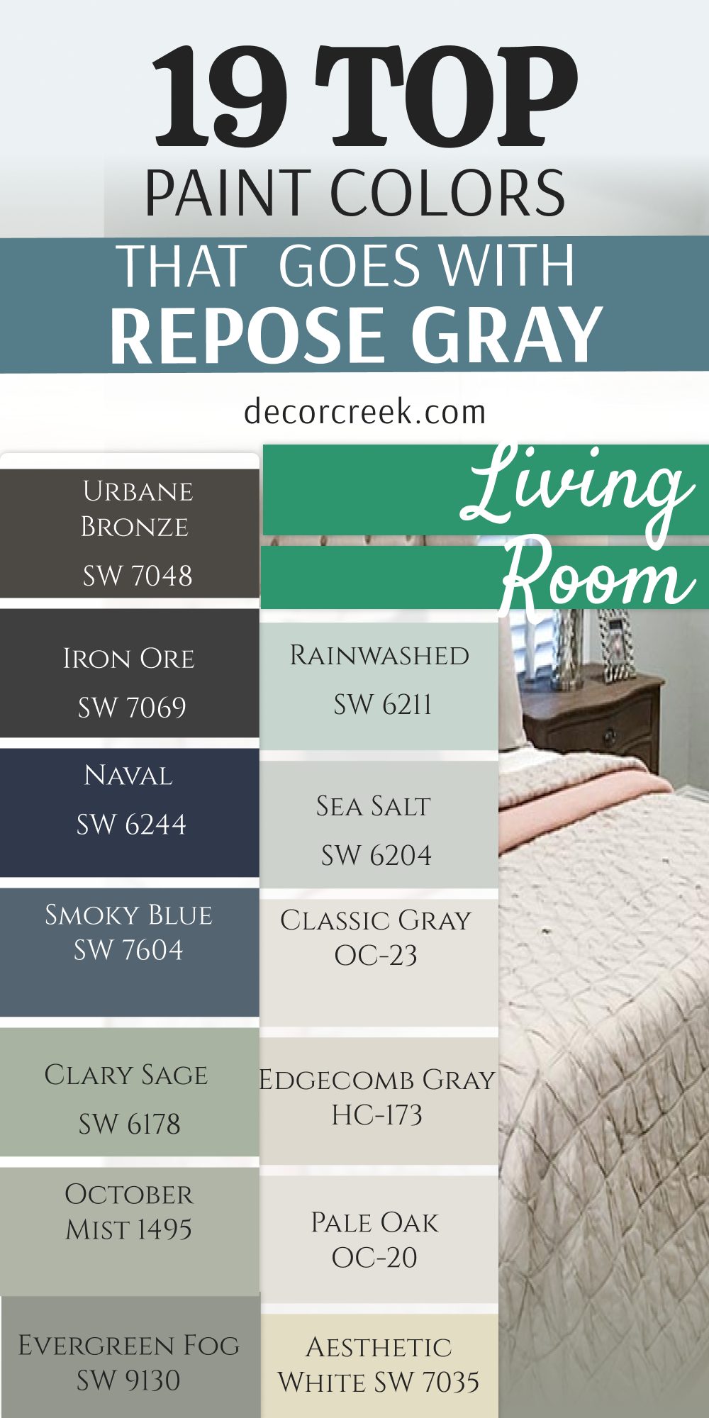
25 Top Color Combo that goes with Repose Gray Exterior
Repose Gray SW 7015 + Cavern Clay SW 7701
Repose Gray SW 7015 + Cavern Clay SW 7701 brings a sunny, southwest desert feel to your home exterior. This rich terracotta tone looks incredible when applied directly to your front entryway door or wooden shutters. You will love how it pops against the neutral siding to create a cheerful greeting for guests.
It offers an earthy warmth that keeps your home from looking dull during gray winter mornings. Neighbors will notice this unique styling choice because it looks like a high-end custom build. It pairs beautifully with black iron porch lanterns and natural clay planters on your front steps.
You can use it to highlight your main entryway and draw the eye exactly where people should walk. It stays looking bold and bright even under the direct glare of the hot afternoon sun. This warm mixture is fantastic for building a friendly appearance that feels very welcoming.
Best used in: living rooms, kitchens, hallways, bedrooms, and farmhouse exteriors
Pairs well with: Iron Ore SW 7069, Agreeable Gray SW 7029, Natural Linen SW 9109, warm wood tones
The key rule of this color for farmhouse style is to use it where you want natural light to feel kind, soft, and inviting throughout the day.

Repose Gray SW 7015 + Redend Point SW 9081
Repose Gray SW 7015 + Redend Point SW 9081 joins your neutral siding with a soft, sandy blush accent paint. This selection provides a very gentle earthiness that makes your property look historic and deeply grounded. You will see how it softens the hard lines of your roof and garage doors seamlessly.
It avoids looking too bright by relying on a healthy dose of brown underneath the pink tint. This duo works wonderfully for coastal homes or countryside cottages where you want a natural style theme. It handles changing outdoor daylight beautifully, staying soft from early sunrise until dusk sets over the roof.
You can count on it to provide a balanced look that supports your green garden landscaping. It makes your home look unique without breaking the peaceful feeling of your suburban neighborhood layout. This quiet option is perfect for achieving a gentle look that stays very reliable.
Best used in: living rooms, kitchens, hallways, bedrooms, and farmhouse exteriors
Pairs well with: Iron Ore SW 7069, Agreeable Gray SW 7029, Natural Linen SW 9109, warm wood tones
The key rule of this color for farmhouse style is to use it where you want natural light to feel kind, soft, and inviting throughout the day.

Repose Gray SW 7015 + Copper Mountain SW 6356
Repose Gray SW 7015 + Copper Mountain SW 6356 offers a deep copper orange that adds instant value to your curb appeal. This bold selection looks magnificent on front doors and accent gables facing the main street. You will appreciate how the rich tone contrasts with the cool gray siding to make the architecture pop.
It delivers a rich energy that makes your property feel proud, structured, and full of life. This pair works beautifully with dark bronze rain gutters and brown brick foundations around the house. It absorbs bright outdoor sunlight easily without washing out or losing its fun personality over time.
You can trust it to make your entryway feel warm, inviting, and very high-end to visitors. It creates a stunning look that makes your house stand out as a beautifully designed property. This rich team is a smart pick for creating a luxury look that feels very stable.
Best used in: living rooms, kitchens, hallways, bedrooms, and farmhouse exteriors
Pairs well with: Iron Ore SW 7069, Agreeable Gray SW 7029, Natural Linen SW 9109, warm wood tones
The key rule of this color for farmhouse style is to use it where you want natural light to feel kind, soft, and inviting throughout the day.

Repose Gray SW 7015 + Terra Brun SW 6048
Repose Gray SW 7015 + Terra Brun SW 6048 combines your light gray walls with a deep, dark chocolate brown trim. This paint choice brings a traditional structure to your home exterior without looking harsh or plain black. You will notice how it frames your windows beautifully against the lighter gray siding on the walls.
It gives your property a sturdy appearance that looks very secure and traditional to your family. This selection pairs perfectly with dark wooden porch ceilings and natural stone walkway paving materials. It stops your home from looking washed out during bright summer days when light hits the front.
You can use it on your garage doors to hide standard road dust and outdoor splashes easily. It helps create a comfortable look that feels classic, well-constructed, and ready for family life. This balanced dark choice is great for making your outside walls feel completely finished.
Best used in: living rooms, kitchens, hallways, bedrooms, and farmhouse exteriors
Pairs well with: Iron Ore SW 7069, Agreeable Gray SW 7029, Natural Linen SW 9109, warm wood tones
The key rule of this color for farmhouse style is to use it where you want natural light to feel kind, soft, and inviting throughout the day.
Repose Gray SW 7015 + Rookwood Sash Green SW 2810
Repose Gray SW 7015 + Rookwood Sash Green SW 2810 brings a historic forest tone directly onto your window frames. This combination gives your home an old-world charm that feels unique, tailored, and very well-planned. You will love how it links your property to the mature trees and bushes growing in your yard.
It coordinates beautifully with your gray siding because both formulas share a steady gray undertone underneath. This paint shade makes your brass door handles and gold house numbers look extremely shiny. It gives your exterior a grounded look that feels safe, reliable, and very smart for home staging.
You can use it on traditional shutters to create a crisp outline that catches the eye. It stands up to changing weather while keeping your house looking like an expensive designer estate. This rich green option is fantastic for creating a grounded look with lots of style.
Best used in: living rooms, kitchens, hallways, bedrooms, and farmhouse exteriors
Pairs well with: Iron Ore SW 7069, Agreeable Gray SW 7029, Natural Linen SW 9109, warm wood tones
The key rule of this color for farmhouse style is to use it where you want natural light to feel kind, soft, and inviting throughout the day.
Repose Gray SW 7015 + Laurel Woods SW 7749
Repose Gray SW 7015 + Laurel Woods SW 7749 relies on a dark, moody olive green to create deep visual interest. This color choice makes your front door look like an expensive piece of custom architectural millwork. You will enjoy watching how the deep green changes under cloudy skies versus direct afternoon sunshine.
It works wonderfully for creating a quiet look that matches dark gray shingle roofs perfectly. This choice gives your home a luxury finish because it stays away from standard black trim options. It offers a soft alternative that grounds the entire house layout with a touch of organic style.
You can pair it with black metal porch furniture to give your outdoor seating a beautiful look. It builds a smooth connection that makes your house look completely native to the surrounding landscape. This natural green selection is perfect for building a cozy exterior look that feels very organic.
Best used in: living rooms, kitchens, hallways, bedrooms, and farmhouse exteriors
Pairs well with: Iron Ore SW 7069, Agreeable Gray SW 7029, Natural Linen SW 9109, warm wood tones
The key rule of this color for farmhouse style is to use it where you want natural light to feel kind, soft, and inviting throughout the day.
Repose Gray SW 7015 + Rock Garden SW 6195
Repose Gray SW 7015 + Rock Garden SW 6195 introduces a rich emerald green accent that looks highly custom. This paint selection brings a majestic look into your home exterior that feels fresh and full of pride. You will love using it on front doors or window boxes to create a cheerful focal point.
It matches the cool gray tones of your main siding while adding a splash of bold character. This selection looks wonderful next to white porch railings and bright blooming flower pots on your deck. It helps your property look valuable and extremely well-maintained to people driving by your street.
You can trust it to make a plain front entrance look like a high-end designer entryway. It handles heavy rain and winter snow beautifully without losing its deep, rich saturation of green. This crisp option is perfect for adding a touch of color that stays very steady.
Best used in: living rooms, kitchens, hallways, bedrooms, and farmhouse exteriors
Pairs well with: Iron Ore SW 7069, Agreeable Gray SW 7029, Natural Linen SW 9109, warm wood tones
The key rule of this color for farmhouse style is to use it where you want natural light to feel kind, soft, and inviting throughout the day.
Repose Gray SW 7015 + Rosemary SW 6187
Repose Gray SW 7015 + Rosemary SW 6187 is a favorite green mixture that features a heavy gray base inside. This choice works beautifully on garage doors or siding panels to create a very handsome exterior look. You will see how it warms up your gray house and makes it feel like an English countryside estate.
It coordinates naturally with your main siding because both paint colors share a deep gray heritage. This shade brings a cheerful energy that helps your home feel inviting to family arriving for dinner. It offers a great way to use real color without making your property look too loud.
You can trust it to look beautiful in front of large green lawns and white cement driveways. It turns basic siding areas into an interesting layout that highlights your property value with total ease. This friendly green partnership is perfect for building a cozy layout that feels very organic.
Best used in: living rooms, kitchens, hallways, bedrooms, and farmhouse exteriors
Pairs well with: Iron Ore SW 7069, Agreeable Gray SW 7029, Natural Linen SW 9109, warm wood tones
The key rule of this color for farmhouse style is to use it where you want natural light to feel kind, soft, and inviting throughout the day.

Repose Gray SW 7015 + Jasper SW 6216
Repose Gray SW 7015 + Jasper SW 6216 provides a near-black forest green that brings massive luxury to trim. This deep choice makes a dramatic statement on shutters or your main porch posts with total confidence. You will love the heavy contrast it creates when mixed with white window frames and gray siding.
It works like a solid anchor on your home exterior to make the roofline look sharp and clean. This shade is an excellent choice for adding deep color because dark forest greens never go out of style. It gives your home a stately look that feels historic, expensive, and extremely well-made by builders.
You can use it to build a beautiful front facade that makes your neighbors stop and praise it. It stays looking clean even if you live near dusty roads or have lots of autumn leaves blowing. This deep green team is a smart pick for creating a luxury look that feels very stable.
Best used in: living rooms, kitchens, hallways, bedrooms, and farmhouse exteriors
Pairs well with: Iron Ore SW 7069, Agreeable Gray SW 7029, Natural Linen SW 9109, warm wood tones
The key rule of this color for farmhouse style is to use it where you want natural light to feel kind, soft, and inviting throughout the day.
Repose Gray SW 7015 + Mountain Road SW 7743
Repose Gray SW 7015 + Mountain Road SW 7743 is a rich slate greige green that feels deeply sophisticated. This paint choice looks highly uniform on secondary trim boards or back deck railings around your property. You will notice how it adds a cool, historic character that feels very stable and handsomely styled.
It balances the bright outdoor daylight by introducing a steady, muted tone onto the exterior details. This color combination looks excellent when paired with black metal lighting fixtures and white window trims. It helps your home look unique without breaking the flow of your neighborhood paint schemes.
You can use it to create a handsome look that draws the eye toward your best landscape features. It gives your home a premium look that feels very intentional and well-designed for a modern family. This cool tone is a smart pick for bringing a refined look to your living spaces.
Best used in: living rooms, kitchens, hallways, bedrooms, and farmhouse exteriors
Pairs well with: Iron Ore SW 7069, Agreeable Gray SW 7029, Natural Linen SW 9109, warm wood tones
The key rule of this color for farmhouse style is to use it where you want natural light to feel kind, soft, and inviting throughout the day.
Repose Gray SW 7015 + Riverway SW 6222
Repose Gray SW 7015 + Riverway SW 6222 introduces a heavy slate blue with a dark green undertone inside. This bold selection looks incredible on front doors or as a rich accent color for your backyard shed. You will see how it gives your main exterior layout an immediate dose of high-end style and safety.
It provides a heavy contrast against your gray siding to make the whole property layout look much sharper. This combination helps your landscaping plants and copper light fixtures stand out with extra brightness. It makes your front porch feel cozy, private, and perfect for greeting friends on sunny weekend mornings.
You can trust this blue because it carries enough gray to prevent it from looking like a primary color. It handles harsh winter weather easily while keeping your home looking highly professional and clean. This handsome blue choice is wonderful for building a strong look that feels very secure.
Best used in: living rooms, kitchens, hallways, bedrooms, and farmhouse exteriors
Pairs well with: Iron Ore SW 7069, Agreeable Gray SW 7029, Natural Linen SW 9109, warm wood tones
The key rule of this color for farmhouse style is to use it where you want natural light to feel kind, soft, and inviting throughout the day.

Repose Gray SW 7015 + Slate Tile SW 7624
Repose Gray SW 7015 + Slate Tile SW 7624 utilizes a classic slate gray-blue to create an elegant home exterior. This combination gives your house trim a strong tint that looks incredibly clean, neat, and highly modern. You will enjoy how it coordinates with your main siding to build a very smooth and continuous appearance.
It keeps your house looking crisp while adding just enough color difference to show off your window frames. This option works perfectly under bright afternoon sun without turning unexpected colors or fading quickly. It provides a clean backdrop that lets your stone porch steps be the true champion of the yard.
You can use it to build an upscale look that feels much softer than standard black trim choices. It brings a gentle feeling to the property that makes coming home after work feel extra rewarding. This quiet mixture is perfect for achieving a simple look that stays beautiful all day.
Best used in: living rooms, kitchens, hallways, bedrooms, and farmhouse exteriors
Pairs well with: Iron Ore SW 7069, Agreeable Gray SW 7029, Natural Linen SW 9109, warm wood tones
The key rule of this color for farmhouse style is to use it where you want natural light to feel kind, soft, and inviting throughout the day.

Repose Gray SW 7015 + Charcoal Blue SW 2739
Repose Gray SW 7015 + Charcoal Blue SW 2739 delivers a deep, dark navy accent that looks highly traditional. This deep choice makes a dramatic statement on main garage doors or your front entry stairs with ease. You will love the high-contrast look it creates when mixed with white trim and your gray siding.
It works like a heavy anchor on your home exterior to make the whole roof structure look stable. This combination is a very safe investment because dark navy blues never go out of exterior fashion. It gives your property a stately feel that looks historic, expensive, and extremely well-made by craftsmen.
You can use it to build a beautiful feature wall around your backyard patio to surprise your guests. It stays looking clean and magnificent for years, handling mud splashes with zero surface trouble. This rich blue team is a smart pick for creating a luxury look that feels very stable.
Best used in: living rooms, kitchens, hallways, bedrooms, and farmhouse exteriors
Pairs well with: Iron Ore SW 7069, Agreeable Gray SW 7029, Natural Linen SW 9109, warm wood tones
The key rule of this color for farmhouse style is to use it where you want natural light to feel kind, soft, and inviting throughout the day.
Repose Gray SW 7015 + Gale Force SW 7605
Repose Gray SW 7015 + Gale Force SW 7605 combines your gray siding with a stormy, dark sea blue color. This selection brings a happy, open feeling that reminds you of deep ocean water under a clear sky. You will love how it coordinates with your gray trim to create a fresh and youthful look outside.
It works wonderfully for coastal properties or lakeside cabins where you want a clean appearance. This paint choice looks beautiful next to white porch railings and light concrete driveway paths. It gives your home a friendly character that makes guests feel instantly happy when they drive up.
You can use it to brighten up dark corners under your roofline that feel a little too heavy. It stays looking clean and bright throughout the day as the sun moves across your property. This stormy option is perfect for achieving a cheerful look that stays very light.
Best used in: living rooms, kitchens, hallways, bedrooms, and farmhouse exteriors
Pairs well with: Iron Ore SW 7069, Agreeable Gray SW 7029, Natural Linen SW 9109, warm wood tones
The key rule of this color for farmhouse style is to use it where you want natural light to feel kind, soft, and inviting throughout the day.
Repose Gray SW 7015 + Cyberspace SW 7076
Repose Gray SW 7015 + Cyberspace SW 7076 offers a deep, modern slate blue that sits close to charcoal black. This pair creates a striking contrast that updates your home exterior into a trendy contemporary masterpiece. You will love how it highlights your rooflines, gutters, and structural pillars against the gray walls.
It provides a clean layout that lets your colorful landscaping flower beds take center stage in the yard. This choice works perfectly for active families who want a clean look without using a plain black paint. It creates a bold backdrop that makes your white porch furniture look like it belongs in a magazine.
You can trust this pairing to stay fresh and organized through years of heavy outdoor weathering. It lifts the overall mood of the property by giving it a sharp, crisp silhouette against the blue sky. This balanced team is excellent for building a light appearance that everyone in the family can enjoy.
Best used in: living rooms, kitchens, hallways, bedrooms, and farmhouse exteriors
Pairs well with: Iron Ore SW 7069, Agreeable Gray SW 7029, Natural Linen SW 9109, warm wood tones
The key rule of this color for farmhouse style is to use it where you want natural light to feel kind, soft, and inviting throughout the day.

Repose Gray SW 7015 + Black Fox SW 7020
Repose Gray SW 7015 + Black Fox SW 7020 joins your gray siding with a rich, dark brown-black accent paint. This selection provides an intense earthiness that makes your property look sturdy and deeply grounded.
You will see how it frames your front windows and doors beautifully against the lighter gray siding. It avoids looking too cold by relying on a healthy dose of chocolate brown deep inside the black mix. This duo works wonderfully for mountain cabins or modern farmhouses where you want a natural style theme.
It handles changing outdoor daylight beautifully, staying rich from early sunrise until dusk sets over the roof. You can count on it to provide a balanced look that supports your green garden landscaping. It makes your home look unique without breaking the peaceful feeling of your neighborhood layout. This quiet option is perfect for achieving a gentle look that stays very reliable.
Best used in: living rooms, kitchens, hallways, bedrooms, and farmhouse exteriors
Pairs well with: Iron Ore SW 7069, Agreeable Gray SW 7029, Natural Linen SW 9109, warm wood tones
The key rule of this color for farmhouse style is to use it where you want natural light to feel kind, soft, and inviting throughout the day.

Repose Gray SW 7015 + Anonymous SW 7046
Repose Gray SW 7015 + Anonymous SW 7046 mixes two friendly neutrals to create a very smooth exterior transition. This option works perfectly when you want to highlight secondary walls or garage doors without using a loud color.
You will see how it creates a gentle shift that guides your eyes easily across your home exterior panels. It keeps the building looking consistent while adding just enough depth to prevent a boring look. This pair handles changing sunlight with total success, staying warm and attractive from sunrise to bedtime.
It feels safe, smart, and highly professional for homeowners who want to stage their property for a quick sale. You can add white vinyl windows to this mix to achieve a very neat and tailored appearance. It builds a beautiful foundation that supports your personal landscaping style with total ease. This popular combination ensures your layout looks smooth, intentional, and very well-balanced.
Best used in: living rooms, kitchens, hallways, bedrooms, and farmhouse exteriors
Pairs well with: Iron Ore SW 7069, Agreeable Gray SW 7029, Natural Linen SW 9109, warm wood tones
The key rule of this color for farmhouse style is to use it where you want natural light to feel kind, soft, and inviting throughout the day.
Repose Gray SW 7015 + Griffin SW 7026
Repose Gray SW 7015 + Griffin SW 7026 blends your gray siding with a soft, muddy brown accent paint choice. This paint pair brings a deep mud tone to your shutters and front door without creating a sharp line. You will appreciate how it keeps your home exterior looking bright while adding a touch of tailored luxury.
It works wonderfully for front porches, making your welcome mat and rocking chairs look like a beautiful scene. This duo looks highly expensive because it copies the soft tones found in dark natural soil and stones. It provides a warm alternative that keeps your front yard looking large, open, and full of natural light.
You can combine it with black metal house numbers to give your home a very balanced appearance. It helps create an environment where your daily homecoming routine feels smooth, relaxed, and easy. This balanced neutral team is great for making your main rooms feel finished.
Best used in: living rooms, kitchens, hallways, bedrooms, and farmhouse exteriors
Pairs well with: Iron Ore SW 7069, Agreeable Gray SW 7029, Natural Linen SW 9109, warm wood tones
The key rule of this color for farmhouse style is to use it where you want natural light to feel kind, soft, and inviting throughout the day.
Repose Gray SW 7015 + Porpoise SW 7047
Repose Gray SW 7015 + Porpoise SW 7047 mixes your soft gray siding with a medium charcoal bronze tone. This selection adds a layer of gentle comfort to your exterior walls without making the property feel dark or heavy. You will enjoy watching how the siding shifts characters gracefully as the daylight moves across the yard.
It works beautifully for creating a quiet design theme that allows your green lawns to look their best. This choice gives your home a custom appearance because it avoids basic white trim on large outdoor surfaces. It offers a soft alternative that keeps your backyard patio feeling open, bright, and full of fresh air.
You can pair it with dark bronze exterior lights to give your doorways a beautiful traditional touch. It builds a smooth connection when your garage area flows straight into your main house walls. This quiet paint mix is excellent for creating a gentle look that feels very inviting.
Best used in: living rooms, kitchens, hallways, bedrooms, and farmhouse exteriors
Pairs well with: Iron Ore SW 7069, Agreeable Gray SW 7029, Natural Linen SW 9109, warm wood tones
The key rule of this color for farmhouse style is to use it where you want natural light to feel kind, soft, and inviting throughout the day.

Repose Gray SW 7015 + Garret Gray SW 6075
Repose Gray SW 7015 + Garret Gray SW 6075 brings a deep, chocolate-tinted gray warmth into your home exterior design. This combination makes your living areas feel deeply grounded and ready for busy family life every single day. You will love how it stops your house from looking cold when the winter sky is dull or rainy.
It hides small mud splashes and daily dust much better than a stark white paint combination ever could. This traditional mix looks beautiful next to natural red brick chimneys and heavy black iron decorative features. It gives your property a steady look that feels very secure and friendly to anyone who drives past.
You can trust it to make large multi-story houses feel well-defined, handsome, and completely connected. It helps build a comfortable setting where friends will notice your home value from the curb. This reliable team is a favorite for creating a warm look that lasts for years.
Best used in: living rooms, kitchens, hallways, bedrooms, and farmhouse exteriors
Pairs well with: Iron Ore SW 7069, Agreeable Gray SW 7029, Natural Linen SW 9109, warm wood tones
The key rule of this color for farmhouse style is to use it where you want natural light to feel kind, soft, and inviting throughout the day.
Repose Gray SW 7015 + Manchester Tan HC-81
Repose Gray SW 7015 + Manchester Tan HC-81 utilizes a soft, sandy beige trim to create a traditional look. This combination gives your porch columns and window borders a warm touch that looks extremely clean and neat.
You will enjoy how it coordinates with your main gray siding to build a highly smooth and continuous appearance. It keeps your house looking bright while adding just enough color difference to show off your wood details. This option works perfectly under direct daily sunshine without turning unexpected yellow colors on you.
It provides a clean backdrop that lets your green shrubs be the true champion of the yard layout. You can use it to build a bright look that feels much softer than standard bright white options. It brings a gentle feeling to the building that makes coming home feel extra peaceful after work. This quiet mixture is perfect for achieving a simple look that stays beautiful all day.
Best used in: living rooms, kitchens, hallways, bedrooms, and farmhouse exteriors
Pairs well with: Iron Ore SW 7069, Agreeable Gray SW 7029, Natural Linen SW 9109, warm wood tones
The key rule of this color for farmhouse style is to use it where you want natural light to feel kind, soft, and inviting throughout the day.

Repose Gray SW 7015 + Alexandria Beige HC-77
Repose Gray SW 7015 + Alexandria Beige HC-77 introduces a heavy, sophisticated taupe tan onto your exterior details. This combination brings a classic historic look right into your main property facade to liven up the space. You will love how it changes your house into a cheerful zone that feels full of natural grounding energy.
It coordinates smoothly with your gray surfaces because both paints carry a matching muddy undertone inside. This selection looks wonderful alongside dark brown roof shingles and black iron mailboxes on your wall. It helps your property look expensive and highly attractive to people who come over to visit.
You can use it to give a plain garage door a beautiful surprise that makes the whole driveway look better. It handles changing weather beautifully, looking rich on sunny days and cozy when it rains. This natural mix is perfect for adding a touch of color that stays very gentle.
Best used in: living rooms, kitchens, hallways, bedrooms, and farmhouse exteriors
Pairs well with: Iron Ore SW 7069, Agreeable Gray SW 7029, Natural Linen SW 9109, warm wood tones
The key rule of this color for farmhouse style is to use it where you want natural light to feel kind, soft, and inviting throughout the day.
Repose Gray SW 7015 + Wrought Iron 2124-10
Repose Gray SW 7015 + Wrought Iron 2124-10 pairs your neutral siding with a dark charcoal slate trim paint. This selection brings a modern lightness to your home roofline that makes the whole building feel grand. You will enjoy using this combination to keep your main property looking clean, open, and extremely crisp.
It offers a beautiful contrast that cuts through the neutrality of gray by adding a splash of deep charcoal metal color. This duo looks fantastic when paired with light gray stone foundations and black metal porch light fixtures. It helps keep the daily mood of your household feeling positive, tidy, and full of proud homeownership energy.
You can use it to make a small cottage exterior feel like it has sharp architectural lines built right inside. It behaves beautifully under bright streetlights to keep your house looking safe and handsome at night. This airy pair is perfect for anyone who wants a bright look that feels very fresh.
Best used in: living rooms, kitchens, hallways, bedrooms, and farmhouse exteriors
Pairs well with: Iron Ore SW 7069, Agreeable Gray SW 7029, Natural Linen SW 9109, warm wood tones
The key rule of this color for farmhouse style is to use it where you want natural light to feel kind, soft, and inviting throughout the day.

Repose Gray SW 7015 + Knoxville Gray HC-160
Repose Gray SW 7015 + Knoxville Gray HC-160 brings a rich blue-green slate tone onto your exterior features. This choice looks incredible on front doors or window shutters to build a highly handsome appearance. You will love how it introduces the feeling of coastal stones directly next to your light gray siding.
It pairs naturally with your wall paint because both formulations share a steady gray undertone in their bases. This combination makes your brass locksets and gold porch lights look extremely beautiful and expensive.
It gives your home exterior a grounded look that feels very secure, traditional, and protective for your family. You can use it to create a custom look that stands up to heavy daily tracking and driveway dust. It handles heavy daily sunshine effortlessly while keeping your house looking like a top designer model home. This rich slate mix is fantastic for creating a grounded look with lots of style.
Best used in: living rooms, kitchens, hallways, bedrooms, and farmhouse exteriors
Pairs well with: Iron Ore SW 7069, Agreeable Gray SW 7029, Natural Linen SW 9109, warm wood tones
The key rule of this color for farmhouse style is to use it where you want natural light to feel kind, soft, and inviting throughout the day.
Repose Gray SW 7015 + Cushing Green HC-125
Repose Gray SW 7015 + Cushing Green HC-125 brings a deep, historic green accent that feels earthy and organic. This color combination adds a layer of proud style to your home facade without causing an aggressive color clash.
You will see how it softens the straight lines of your siding by introducing a touch of natural warmth. It works beautifully on front porch floors or doors where you want a friendly and grounded atmosphere. This pair coordinates nicely with dark mulch flower beds, stone pathways, and black metal porch railings.
It helps your property look valuable and extremely charming to guests pulling up your driveway path. You can use it to give your home a custom look that feels unique to your personal design taste. It handles bright daylight beautifully to make your front yard feel bright, cheerful, and very positive. This natural team is perfect for creating a cozy look that stays very friendly.
Best used in: living rooms, kitchens, hallways, bedrooms, and farmhouse exteriors
Pairs well with: Iron Ore SW 7069, Agreeable Gray SW 7029, Natural Linen SW 9109, warm wood tones
The key rule of this color for farmhouse style is to use it where you want natural light to feel kind, soft, and inviting throughout the day.
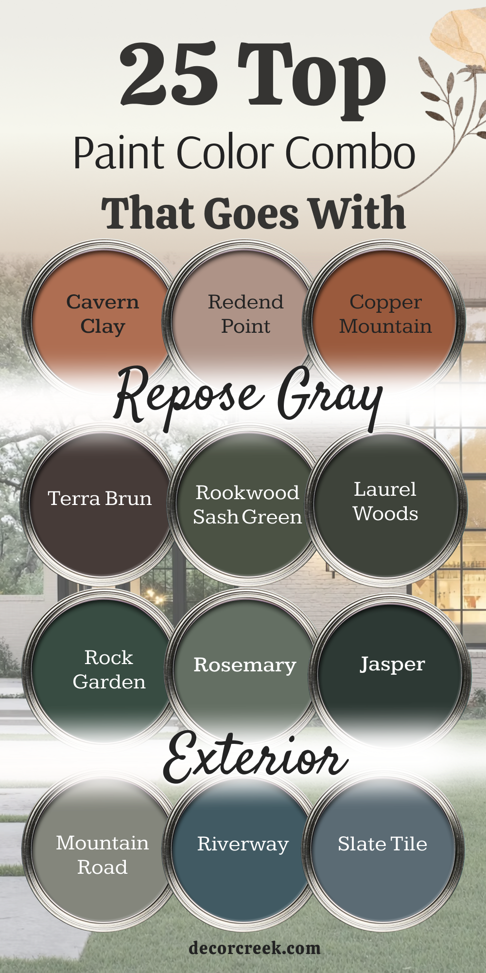
My Final Thoughts About the Best Colors That Go With Repose Gray
Repose Gray by Sherwin-Williams has earned its place as one of my favorite neutral paint colors because of its incredible flexibility. Whether you love bright and airy spaces, cozy traditional rooms, or modern designs with bold contrast, Repose Gray provides the perfect foundation. It has a soft, balanced character that allows many different colors to work beautifully alongside it.
When choosing colors to pair with Repose Gray, I always encourage homeowners to think about the feeling they want to create.
Warm whites and creamy beiges bring comfort and softness, while blues and greens add depth and personality. Darker accent colors can create striking contrast, while lighter shades keep a room feeling open and peaceful.
The best part about Repose Gray is that there is no single “right” pairing. The perfect companion color depends on your home’s lighting, furnishings, and personal style.
That’s why I always recommend testing a few color samples together before making a final decision.
I hope these 28 color combinations have inspired you to see just how versatile Repose Gray can be.
With the right pairing, this timeless gray can help create a home that feels welcoming, stylish, and uniquely yours for years to come.