Bathrooms often feel like the one place in the home where I can slow down and breathe. Choosing the right paint color is what makes that moment feel even better. Sage green has become one of my favorite choices because it feels connected to nature and creates balance without being too bold. In small rooms like bathrooms, this color makes the walls feel alive while still being gentle.
I’ve helped many clients use sage green in their homes, and it always brings warmth and style. In this article, I’ll share my favorite shades from Sherwin-Williams, along with earthy and olive greens that work beautifully.
I’ll also suggest options that are perfect for small bathrooms, so you can find the right color that makes your room feel inviting.
Why I Trust Sage Green for Bathroom Walls
Sage green feels like fresh air indoors. Bathrooms are often tight and busy, so having a color that relaxes the eye makes them more enjoyable. Over time, I’ve noticed sage green works in almost any style, from modern to farmhouse. It brings the feeling of nature inside without being dark or heavy.
I trust this color because it looks beautiful in the morning light as well as under evening lamps. It pairs well with warm wood tones, stone tiles, and crisp whites.
When I choose sage green for a bathroom, I know the room will feel balanced and welcoming every single day.
How I Pick the Right Sage Green Shade for a Bathroom
When I help clients pick sage green, I always look at three things: the light, the size of the bathroom, and the finishes already in the room. A bathroom with no windows often needs a softer sage to keep it bright. A bathroom with natural light can handle deeper shades that add character. I also check what kind of tile or countertop is in the room.
Creamy marble asks for a lighter sage, while dark stone looks great with rich green tones.
In the end, the right sage green is the one that feels good every time you walk in.
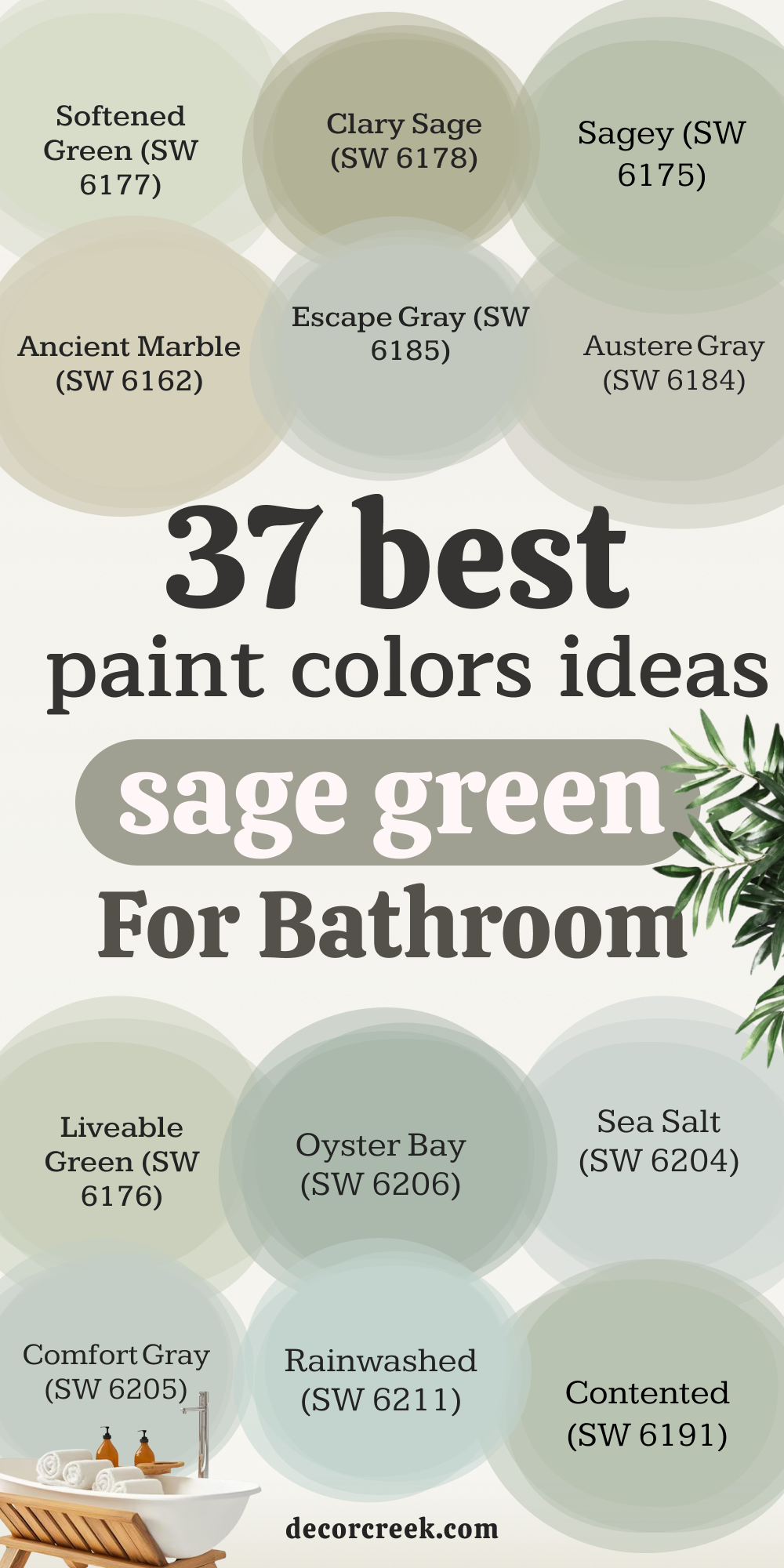
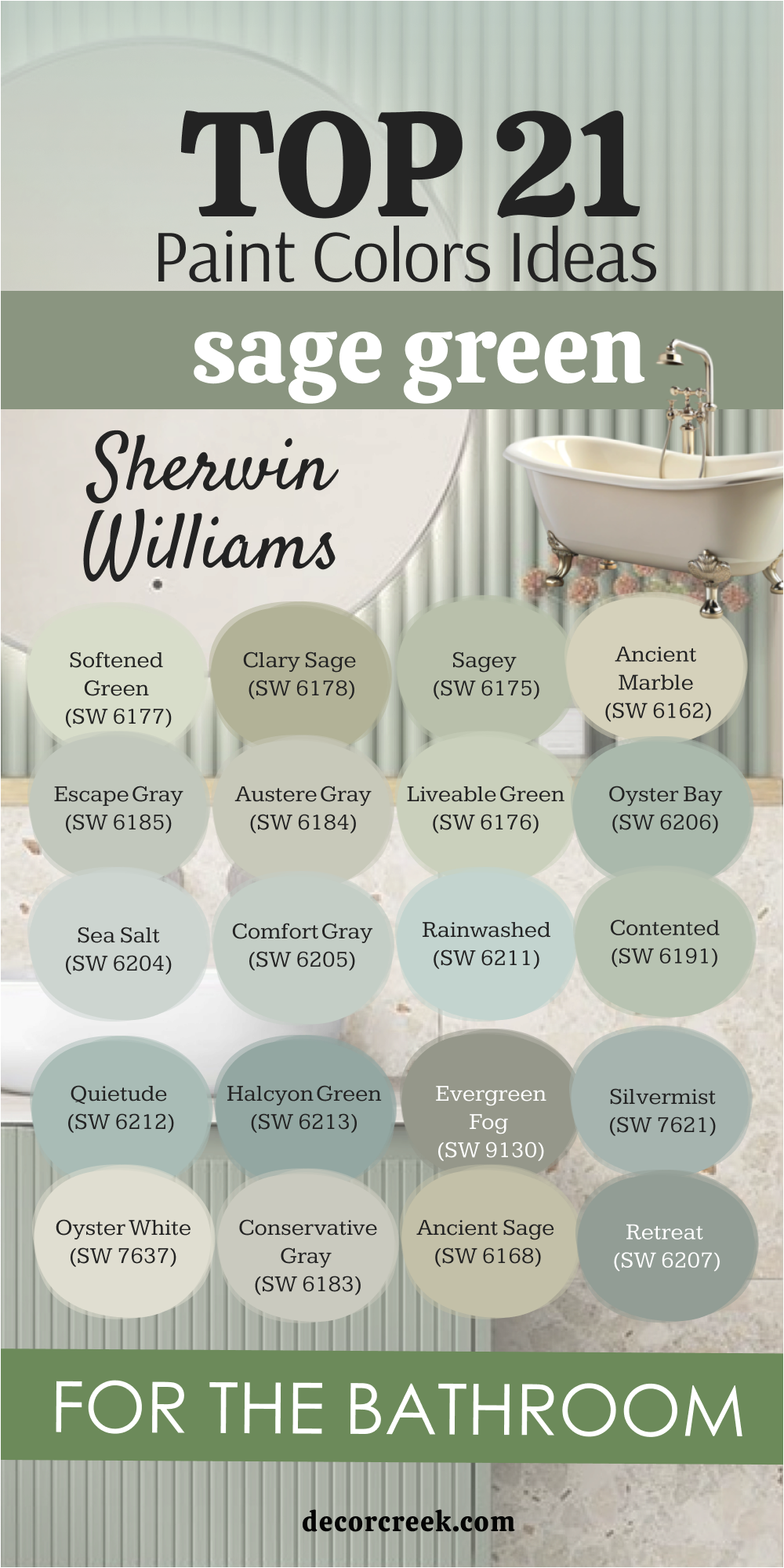
21 Sage Green Bathroom Paint Color Ideas from Sherwin-Williams
Softened Green (SW 6177)
Softened Green feels gentle yet full of life. I love how it brings a touch of nature into a bathroom without being too strong. This shade works beautifully with white tile and natural wood shelves, creating balance. In a small bathroom, it keeps the room light but not plain. I’ve used it in guest bathrooms, and people always comment on how fresh it feels. The key rule of this color for bathroom design is pairing it with clean finishes to keep the look easy and welcoming.

Clary Sage (SW 6178)
Clary Sage carries a soft warmth that makes bathrooms feel inviting. I find it especially nice when paired with brass or brushed gold fixtures. It gives a natural glow without needing bold accents. This shade has just enough depth to bring character without weighing the room down. In bathrooms with warm wood vanities, Clary Sage creates harmony. I’ve used it in powder rooms where the color makes the small space memorable. The key rule of this color for bathroom design is mixing it with warm metals to highlight its charm.

Sagey (SW 6175)
Sagey is slightly brighter, which helps bathrooms feel open and fresh. I like how it keeps energy in the room while still feeling natural. This color works well with stone tiles or light oak cabinets. In rooms with limited natural light, it adds brightness without looking too pale. I often suggest it for family bathrooms because it feels cheerful yet soft. The key rule of this color for bathroom design is using it where you want both freshness and comfort.
Ancient Marble (SW 6162)
Ancient Marble is a soft green with earthy undertones. It feels grounded but not heavy, which makes it perfect for bathrooms with stone or travertine. I’ve paired it with cream trim, and the result is a look that feels natural and balanced. The shade reflects light in a gentle way, so even small bathrooms feel larger. This color works beautifully with black accents like mirrors or hardware. The key rule of this color for bathroom design is letting it connect with natural textures.
Escape Gray (SW 6185)
Escape Gray has a cooler tone that gives bathrooms a fresh, clean feeling. I like it for modern bathrooms with sleek fixtures. It pairs well with white tile and chrome finishes. In small bathrooms, this shade brings a crisp touch without making the room feel cold. I’ve seen it work in homes where the owners wanted a green that felt mature and stylish. The key rule of this color for bathroom design is balancing it with warm details so it feels inviting.

Austere Gray (SW 6184)
Austere Gray leans green-gray, making it versatile for many bathroom styles. I love how it shifts slightly with the light, giving depth to the walls. This color pairs especially well with marble and brushed nickel. In a master bathroom, it feels steady and welcoming without being plain. I’ve used it in bathrooms with big mirrors, and it reflects beautifully. The key rule of this color for bathroom design is using it when you want a refined yet approachable feel.
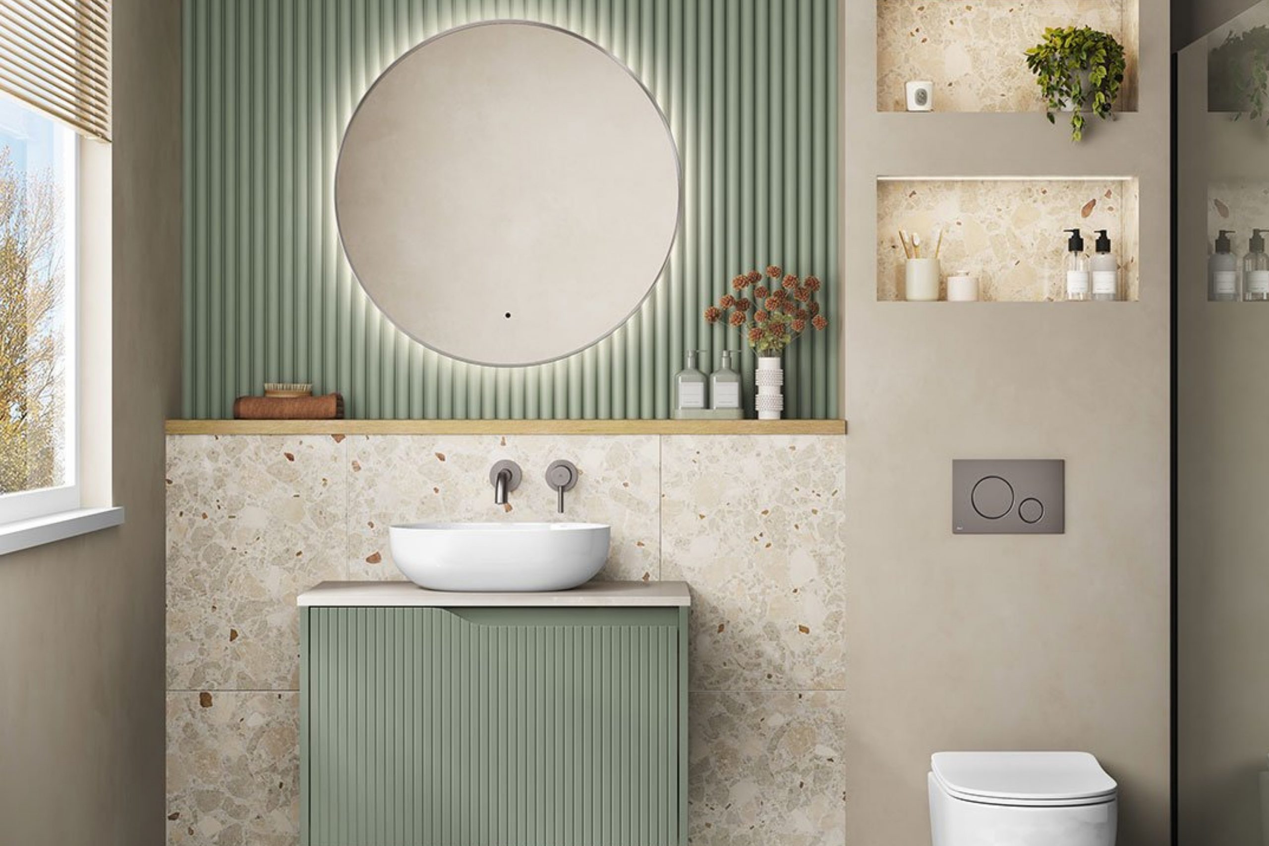
Liveable Green (SW 6176)
Liveable Green is exactly what the name says—it feels easy and natural in any bathroom. I like it in family spaces because it’s not too strong, but it still adds personality. With white beadboard or subway tile, it feels fresh and light. In small bathrooms, it keeps the walls from looking flat. I’ve often recommended it when someone wants green without going too bold. The key rule of this color for bathroom design is leaning on its easy comfort for everyday style.

Oyster Bay (SW 6206)
Oyster Bay brings a blue-green touch that makes bathrooms feel cool and refreshing. I love how it pairs with white tile floors or brushed steel fixtures. This shade has more depth, so it works well in larger bathrooms or those with natural light. In coastal-style homes, it adds a soft seaside look without being too bright. The key rule of this color for bathroom design is using it in spaces where you want a refreshing, airy feel.

Sea Salt (SW 6204)
Sea Salt is one of my all-time favorites for bathrooms. It changes with the light, sometimes looking green, other times blue. I find it works beautifully in bathrooms that get natural sunlight. It feels bright and welcoming, perfect for morning routines. With white trim and pale wood cabinets, it looks stylish and clean. The key rule of this color for bathroom design is enjoying its shifting beauty with the light of the day.

Comfort Gray (SW 6205)
Comfort Gray leans cool, which makes bathrooms feel steady and pleasant. I love how it pairs with stone or slate tile floors. It has enough depth to look rich but not too dark for small rooms. In bathrooms with soft lighting, it feels especially cozy. I’ve used it in master bathrooms where the owners wanted a soft, relaxed green. The key rule of this color for bathroom design is letting it anchor the room with steady color.

Rainwashed (SW 6211)
Rainwashed feels like fresh water on the walls. It has blue-green notes that brighten up bathrooms instantly. I find it works beautifully with white marble and silver accents. In guest bathrooms, it feels welcoming and uplifting. This shade also makes small bathrooms look bigger because of its airy quality. The key rule of this color for bathroom design is using it to add a light, fresh atmosphere.

Contented (SW 6191)
Contented carries a balanced green tone that feels natural and comfortable. I like using it in bathrooms with darker wood vanities to create contrast. It reflects light gently, so bathrooms feel warm and open. Paired with beige or cream tiles, it looks very inviting. I’ve seen it work in both modern and farmhouse-style bathrooms. The key rule of this color for bathroom design is leaning on its easy balance for harmony.

Quietude (SW 6212)
Quietude feels restful and light. It has just the right amount of blue to make a bathroom feel crisp. I love using it with polished chrome fixtures because it brings out a sparkle. In small bathrooms, it keeps the room feeling open without being too plain. With warm wood shelves or accents, it gains depth. The key rule of this color for bathroom design is using it where freshness and relaxation are needed.
Halcyon Green (SW 6213)
Halcyon Green has a deeper tone that makes bathrooms feel cozy. I like it in larger bathrooms where the color can show its richness. It pairs beautifully with black or oil-rubbed bronze fixtures. In natural light, it looks vibrant, while under lamps it feels warm. I often use it when clients want a bathroom with more personality. The key rule of this color for bathroom design is letting it add character to a larger space.

Evergreen Fog (SW 9130)
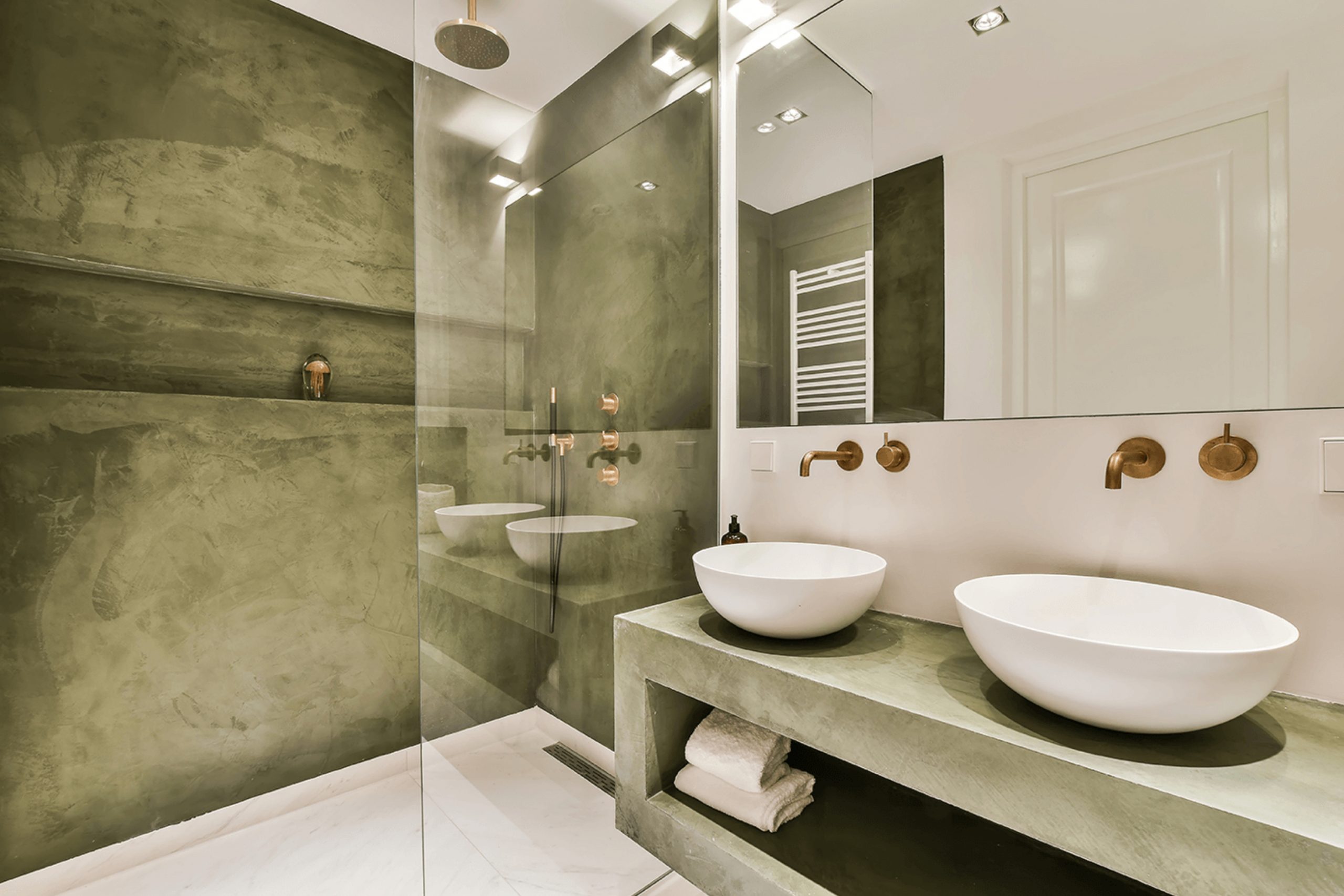
Evergreen Fog was named Color of the Year, and I understand why. It has a rich, grounded feel that makes bathrooms look stylish. I’ve paired it with natural stone floors, and it feels very connected to nature. This shade works especially well in modern bathrooms with sleek finishes. In smaller bathrooms, it feels dramatic without being too dark. The key rule of this color for bathroom design is letting it shine as the star of the room.

Silvermist (SW 7621)
Silvermist is soft and airy, with just enough blue to feel refreshing. I love it in coastal-style bathrooms or spaces with plenty of natural light. It works beautifully with white shiplap or beadboard. In a small bathroom, it helps the room feel open and light. I often suggest it for bathrooms where homeowners want something different from plain white. The key rule of this color for bathroom design is using it to highlight a fresh, breezy style.
Oyster White (SW 7637)
Oyster White may sound like white, but it has a soft green undertone. This makes it wonderful for bathrooms where you want a hint of green without going bold. I’ve used it on walls paired with white trim, and it feels clean yet interesting. In small bathrooms, it makes the room look bigger while still giving color. It also pairs nicely with warm wood cabinets. The key rule of this color for bathroom design is keeping it simple with quiet elegance.

Conservative Gray (SW 6183)
Conservative Gray carries a steady balance of green and gray. I like it in bathrooms where the owner wants something refined but not plain. It pairs well with brushed nickel fixtures and stone tiles. The color looks different throughout the day, adding interest. In guest bathrooms, it gives a stylish but approachable impression. The key rule of this color for bathroom design is letting it show off its soft shifting tones.

Ancient Sage (SW 6168)
Ancient Sage feels earthy and natural, almost like moss in the woods. I enjoy using it in bathrooms with warm stone floors. It brings a sense of nature indoors without feeling too dark. In larger bathrooms, it adds character, while in smaller ones, it looks steady and welcoming. It matches beautifully with bronze accents. The key rule of this color for bathroom design is letting it echo natural elements for comfort.
Retreat (SW 6207)
Retreat feels rich and full-bodied, perfect for bathrooms where you want depth. I’ve used it on accent walls behind vanities, and it looks stunning. It pairs well with brass hardware and white sinks, giving a stylish contrast. In small bathrooms, it may feel bold, but with good lighting it creates drama. In larger bathrooms, it feels cozy and welcoming. The key rule of this color for bathroom design is using it with intention for impact.

Acacia Haze (SW 9132)
Acacia Haze has a muted green look that makes bathrooms feel soft but grounded. I love using it with matte black fixtures, which give it a modern edge. It works beautifully with patterned tiles, adding interest without competing. In smaller bathrooms, it looks stylish yet approachable. This shade feels natural, like eucalyptus leaves. The key rule of this color for bathroom design is using it where you want quiet strength and style.

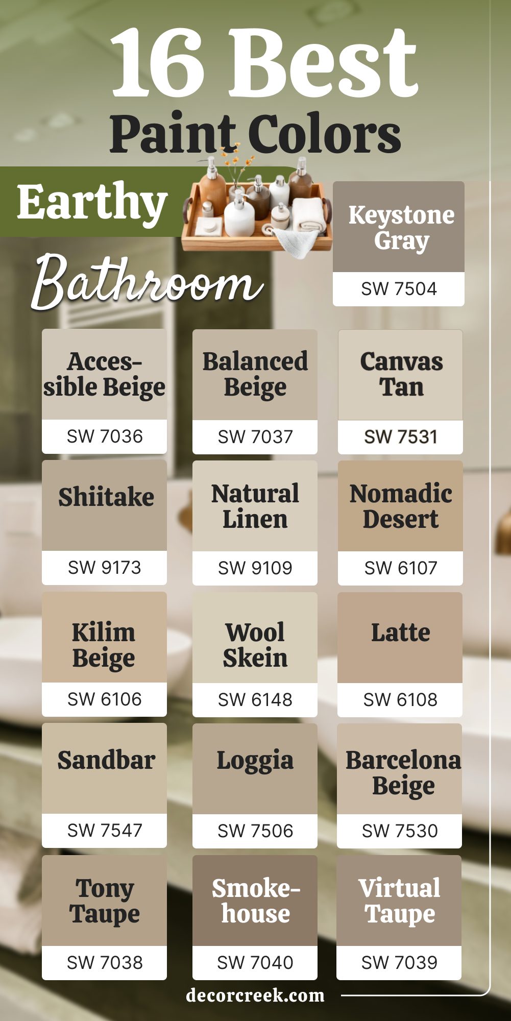
16 Earthy Bathroom Paint Colors from Sherwin-Williams
Accessible Beige (SW 7036)
Accessible Beige is one of my favorite warm neutrals because it never feels flat. In a bathroom, it brings a natural warmth that pairs beautifully with soft green towels or plants. I’ve used it with creamy marble countertops, and the combination looks elegant yet relaxed. It’s not too dark, so small bathrooms stay open and inviting. This shade works especially well with wood finishes and woven baskets. The key rule of this color for bathroom design is leaning on its balance to create a grounded, easy style.

Balanced Beige (SW 7037)
Balanced Beige gives bathrooms a welcoming, steady look. I love how it feels earthy without being heavy. In rooms with warm light, it picks up a soft glow that makes mornings feel pleasant. I’ve paired it with brushed gold hardware, and the effect was both cozy and chic. For smaller bathrooms, it adds depth while staying gentle. The key rule of this color for bathroom design is trusting its natural warmth to make the room feel inviting.

Canvas Tan (SW 7531)
Canvas Tan feels like soft linen on the walls. In bathrooms, it works beautifully with white trim and natural wood cabinets. I like how it reflects light, making the room brighter without being plain. It pairs nicely with beige stone tile or soft green accents. Guests often comment on how comfortable and warm it feels. The key rule of this color for bathroom design is letting it create a quiet background for natural details.

Shiitake (SW 9173)
Shiitake has a mushroom-like tone that makes bathrooms feel earthy and natural. I enjoy how it pairs with stone floors or textured tile. It has just enough depth to add character but doesn’t overwhelm smaller bathrooms. I’ve used it with matte black fixtures, which gave the room a modern edge. It’s also beautiful with greenery or woven baskets. The key rule of this color for bathroom design is letting it highlight natural textures.

Natural Linen (SW 9109)
Natural Linen feels soft and grounded, perfect for a bathroom where you want a relaxed mood. I love how it blends with warm lighting to create a gentle glow. It pairs beautifully with creamy whites and warm oak vanities. In a guest bathroom, it feels comforting and easy to live with. It doesn’t fight with other colors, so styling is effortless. The key rule of this color for bathroom design is using it as a calm base for accents.

Nomadic Desert (SW 6107)
Nomadic Desert carries a sandy warmth that instantly makes bathrooms feel cozy. I’ve paired it with terracotta accents, and the result was earthy and rich. It works well in both large and small bathrooms because it holds steady under different light. This color pairs beautifully with brass or bronze fixtures. In homes with rustic details, it feels especially fitting. The key rule of this color for bathroom design is leaning into its warmth for an earthy comfort.

Kilim Beige (SW 6106)
Kilim Beige is soft and natural, making bathrooms feel welcoming. I like how it works well with both modern and traditional styles. It pairs nicely with creamy whites, making the room look polished. In bathrooms with beige stone tiles, it blends seamlessly. I’ve often recommended it for people who want warmth without being too bold. The key rule of this color for bathroom design is using it as a versatile neutral that feels steady.

Wool Skein (SW 6148)
Wool Skein feels light and natural, like fresh cotton. In bathrooms, it adds just enough color to make walls interesting. I enjoy how it pairs with brushed nickel fixtures and white sinks. This shade reflects light beautifully, which is helpful in smaller spaces. It brings an easy warmth that works with both cool and warm accents. The key rule of this color for bathroom design is leaning on its softness for balance.

Latte (SW 6108)
Latte brings a creamy warmth to bathroom walls. I love pairing it with natural wood cabinets and woven storage baskets. It makes the room feel cozy without being too dark. In a small bathroom, it creates a snug, inviting atmosphere. It also looks stylish with dark bronze or black fixtures. The key rule of this color for bathroom design is letting its warmth add a cozy backdrop.

Sandbar (SW 7547)
Sandbar feels like the warmth of sunlit sand. Bathrooms painted in this color feel natural and bright. I love how it pairs with sea-inspired accents or white tile. It reflects light well, keeping smaller bathrooms airy. With brushed steel or silver details, it feels modern and clean. The key rule of this color for bathroom design is using it to bring a soft, natural glow.
Loggia (SW 7506)
Loggia has a grounded beige tone that feels strong yet inviting. I’ve used it in bathrooms with dark stone floors, and it creates a striking balance. It pairs nicely with black mirrors or fixtures. In natural light, it shows off a warm depth that feels comforting. This shade works well for larger bathrooms where you want an earthy presence. The key rule of this color for bathroom design is leaning into its depth for character.

Barcelona Beige (SW 7530)
Barcelona Beige feels like warm clay on the walls. It has a welcoming tone that pairs well with cream and gold details. I love how it works with patterned tile floors, adding balance. In small bathrooms, it looks soft and friendly without being too bold. Guests often say it feels very cozy. The key rule of this color for bathroom design is using it where you want a warm, grounded look.
Tony Taupe (SW 7038)
Tony Taupe feels earthy and strong, perfect for adding depth in bathrooms. I like how it pairs with both modern and rustic finishes. It has just enough gray to keep it from being too warm. In bathrooms with wood vanities, it creates a cozy harmony. With black or gold accents, it feels stylish and bold. The key rule of this color for bathroom design is letting it be the anchor in your palette.

Smokehouse (SW 7040)
Smokehouse has a deep richness that adds drama to bathrooms. I’ve used it on accent walls, and it instantly made the space feel more stylish. It pairs beautifully with marble counters and black fixtures. In larger bathrooms, it feels cozy and warm. For small bathrooms, I suggest pairing it with plenty of light to keep balance. The key rule of this color for bathroom design is using it for depth and richness.

Virtual Taupe (SW 7039)
Virtual Taupe carries a steady, grounded tone that works well in bathrooms. I like how it feels earthy but still refined. It pairs beautifully with creamy whites and natural stone tiles. In modern bathrooms, it adds warmth without losing style. It reflects light gently, which keeps it from feeling heavy. The key rule of this color for bathroom design is using it as a steady, natural base.

Keystone Gray (SW 7504)
Keystone Gray feels like solid stone, strong and dependable. Bathrooms painted in this shade feel grounded and calm. I love how it pairs with black accents and warm wood. It’s especially nice in bathrooms with high ceilings, where the depth can shine. For smaller spaces, it works well when balanced with white trim. The key rule of this color for bathroom design is letting it act as a stable foundation.

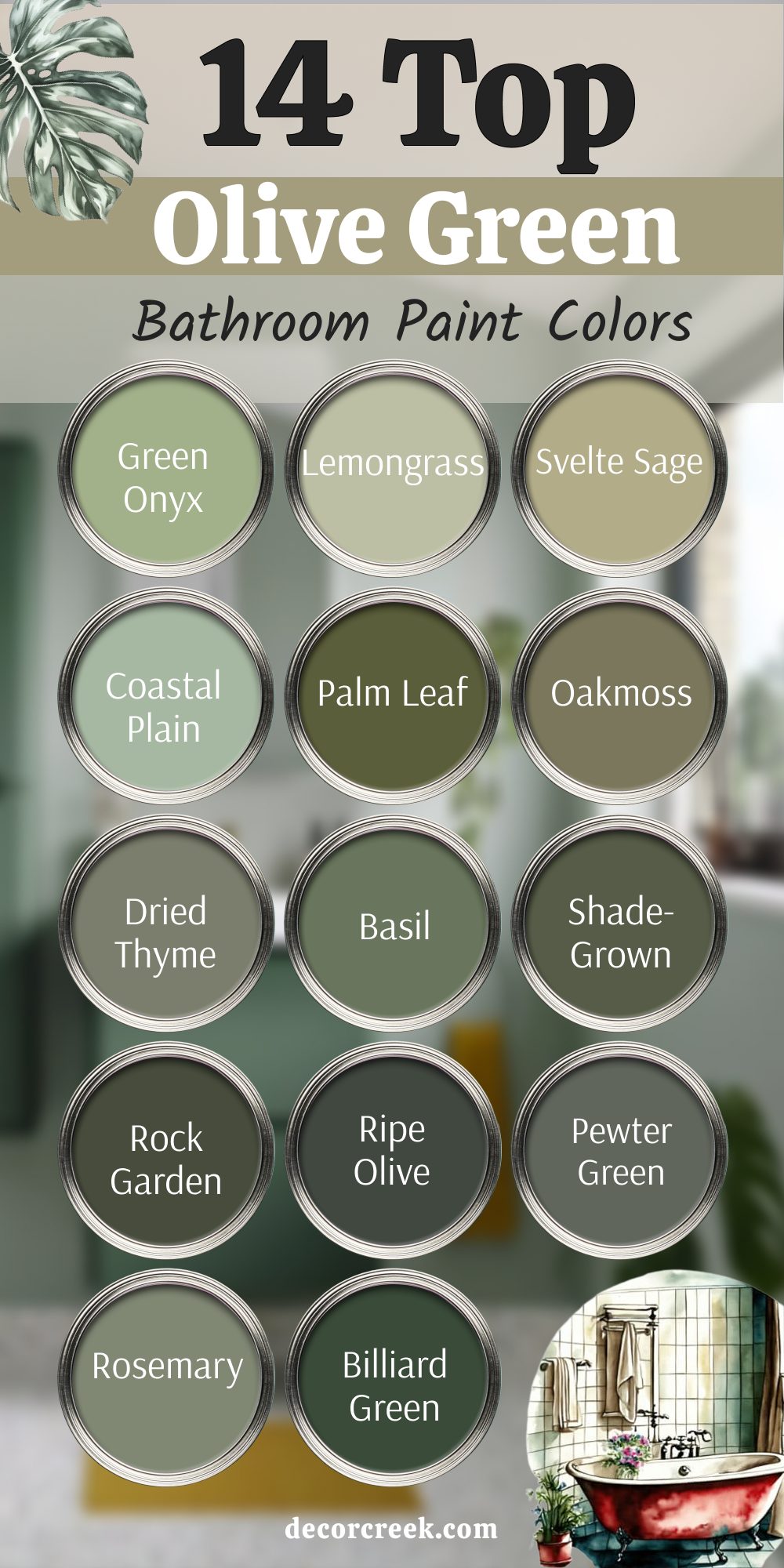
14 Olive Green Bathroom Paint Colors
Green Onyx (SW 9128)
Green Onyx has a deep olive tone that makes bathrooms feel rich and natural. I love pairing it with brass fixtures, which give it warmth. In larger bathrooms, it adds a strong personality. With natural stone tiles, it feels earthy and timeless. In smaller rooms, it works well on an accent wall. The key rule of this color for bathroom design is letting it shine alongside warm metals.

Lemongrass (SW 7732)
Lemongrass feels light and cheerful, perfect for bathrooms that need brightness. I like how it has just enough olive warmth to stay grounded. It pairs beautifully with cream cabinets and gold details. In small bathrooms, it feels lively but still soft. I’ve often used it in guest baths where energy and welcome matter most. The key rule of this color for bathroom design is letting it bring natural cheer.
Svelte Sage (SW 6164)
Svelte Sage has a soft olive depth that makes bathrooms feel inviting. I love how it pairs with warm wood vanities and stone counters. It’s a color that works equally well in modern or rustic styles. In smaller bathrooms, it feels grounded without being too dark. Guests often describe it as both stylish and comfortable. The key rule of this color for bathroom design is using it when you want warmth with elegance.
Coastal Plain (SW 6192)
Coastal Plain has a fresh olive tone that feels full of life. In bathrooms, it pairs beautifully with white tile and brushed silver hardware. I enjoy how it feels lively without being too strong. In small spaces, it brings brightness and energy. This shade works especially well in homes with a natural theme. The key rule of this color for bathroom design is leaning on its energy for a lighthearted feel.

Palm Leaf (SW 7735)
Palm Leaf has a bold olive tone that feels earthy and confident. I’ve used it in larger bathrooms where the color could really stand out. It looks striking with black fixtures and patterned tile floors. In smaller bathrooms, I recommend it as an accent wall. It’s a shade that makes the room feel full of character. The key rule of this color for bathroom design is letting it create drama with strong contrasts.
Oakmoss (SW 6180)
Oakmoss feels like a walk in the forest. Bathrooms painted in this shade look earthy and full of depth. I love how it pairs with natural stone and wood. It’s perfect for rustic or nature-inspired homes. In smaller bathrooms, it may feel bold, but it adds rich style. The key rule of this color for bathroom design is using it to bring a strong natural vibe.
Dried Thyme (SW 6186)
Dried Thyme has a muted olive tone that feels sophisticated. I enjoy using it with warm lighting and cream finishes. In bathrooms, it creates a soft but stylish backdrop. It pairs nicely with matte black hardware for contrast. In small bathrooms, it feels elegant without being too dark. The key rule of this color for bathroom design is letting it add quiet strength.

Basil (SW 6194)
Basil carries a deep olive richness that adds drama to bathrooms. I love it paired with gold accents for a glamorous feel. It works especially well in large bathrooms with good light. In smaller bathrooms, it’s striking on cabinets or vanities. This color feels like nature’s richness brought indoors. The key rule of this color for bathroom design is letting it highlight focal points.
Shade-Grown (SW 6188)
Shade-Grown feels bold and earthy, like the deep green of trees. Bathrooms with this shade feel dramatic and stylish. I love pairing it with light counters and strong black details. In larger rooms, it adds comfort and depth. In smaller rooms, I prefer it for cabinets or trim. The key rule of this color for bathroom design is using it for bold character.
Rock Garden (SW 6195)
Rock Garden has a dark olive look that feels very grounded. I enjoy pairing it with natural stone and metal finishes. In bathrooms, it feels bold and stylish, almost like a designer statement. It’s not a color for every wall in a small room, but perfect for accents. With gold or bronze, it feels luxurious. The key rule of this color for bathroom design is letting it bring richness to the details.

Ripe Olive (SW 6209)
Ripe Olive is deep, bold, and dramatic. Bathrooms painted in this shade feel elegant and strong. I love how it pairs with black and brass for a chic effect. It’s ideal for modern bathrooms with clean lines. In smaller spaces, it works best in smaller doses. The key rule of this color for bathroom design is leaning on its boldness for luxury.

Pewter Green (SW 6208)
Pewter Green has an olive depth that feels steady and natural. I’ve used it in bathrooms with dark stone floors, and the balance is beautiful. It pairs well with brushed nickel and white counters. In small bathrooms, it looks stylish without feeling too heavy. It’s a shade that blends strength with approachability. The key rule of this color for bathroom design is using it for balance and depth.

Rosemary (SW 6187)
Rosemary carries a soft olive depth that feels warm and inviting. In bathrooms, it pairs well with wood vanities and stone finishes. It feels natural and soothing without being plain. I love it with cream accents and warm lighting. In smaller spaces, it gives just the right amount of richness. The key rule of this color for bathroom design is letting it add comfort and natural charm.

Billiard Green (SW 0016)
Billiard Green feels deep and dramatic, with an olive edge. Bathrooms with this shade look rich and bold. I’ve paired it with gold mirrors, and the result was striking. In larger rooms, it brings depth and character. For smaller bathrooms, I like it on cabinetry. The key rule of this color for bathroom design is using it for dramatic style.

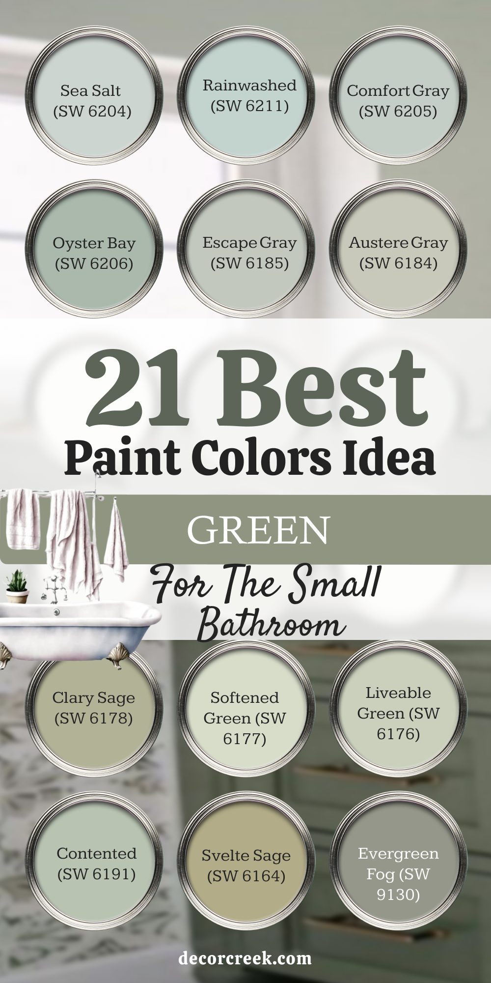
21 Paint Color Ideas from Sherwin-Williams for a Small Green Bathroom
Sea Salt (SW 6204)
Sea Salt is one of my most recommended colors for small bathrooms. It shifts between green and blue, depending on the light, which keeps the room interesting. I love how it reflects sunlight in a cheerful way, yet stays soft under artificial light. With white trim, it makes the room look open and welcoming. In tight bathrooms, it feels like a breath of fresh air. The key rule of this color for bathroom design is letting the light play with its shifting tones.
Rainwashed (SW 6211)
Rainwashed feels like a splash of cool water, perfect for a small bathroom that needs brightness. I love how it makes a room feel lively but never too strong. It works beautifully with silver or chrome fixtures. When paired with white tile, it helps the bathroom feel fresh and airy. Guests often describe it as refreshing. The key rule of this color for bathroom design is using it to bring a clean, uplifting touch.
Comfort Gray (SW 6205)
Comfort Gray is steady and balanced, making a small bathroom feel restful. I like how it pairs with stone tile floors and brushed nickel accents. It has a cool undertone that keeps the room crisp. In bathrooms without natural light, it still manages to look inviting. I often suggest it for master baths with smaller footprints. The key rule of this color for bathroom design is letting it anchor the space with subtle depth.
Oyster Bay (SW 6206)
Oyster Bay carries a soft green-blue tone that makes a small bathroom feel open. I enjoy using it with warm wood vanities and white sinks. It has enough richness to stand out but doesn’t crowd the room. Paired with simple décor, it creates a clean, natural look. In sunlight, it shows a lovely soft sheen. The key rule of this color for bathroom design is leaning on its freshness for openness.
Escape Gray (SW 6185)
Escape Gray brings a cool touch that works well in compact bathrooms. I like how it feels crisp without being stark. It pairs beautifully with white trim and glass shower doors. In small rooms, it gives a sense of structure while staying light. With chrome fixtures, it looks stylish and modern. The key rule of this color for bathroom design is using it where clarity is needed.
Austere Gray (SW 6184)
Austere Gray balances gray and green in a way that keeps bathrooms looking natural. I love how it reflects different tones as the light changes. In small bathrooms, it doesn’t feel too strong but still adds depth. It pairs nicely with stone counters or ceramic tiles. This shade feels versatile and steady. The key rule of this color for bathroom design is using it when you want flexibility in a compact space.
Clary Sage (SW 6178)
Clary Sage brings warmth and character to even the smallest bathrooms. I like pairing it with warm metals, which make it glow. In tight spaces, it feels cozy without being dark. It pairs well with creamy tiles or light wood accents. Guests often remember it as soothing and stylish. The key rule of this color for bathroom design is leaning on its soft depth for comfort.
Softened Green (SW 6177)
Softened Green is gentle and refreshing, making it perfect for small bathrooms. It has a light, natural look that keeps the room feeling open. I love how it blends with crisp whites and natural wood shelves. This shade works especially well when you want color without heaviness. It’s simple yet welcoming. The key rule of this color for bathroom design is letting it highlight brightness in tight spaces.
Liveable Green (SW 6176)
Liveable Green works in any size bathroom, but I love it most in small ones. It brings enough color to feel lively but doesn’t close in the walls. Paired with white beadboard, it creates a fresh look. I like how it feels balanced and easy to live with. It’s the kind of color that doesn’t overwhelm daily routines. The key rule of this color for bathroom design is using it as a steady base.
Contented (SW 6191)
Contented adds a natural comfort that small bathrooms need. It has a grounded green tone that pairs beautifully with cream and beige finishes. In smaller spaces, it feels warm but not heavy. I like how it reflects light softly, keeping the bathroom open. With brushed silver fixtures, it looks clean and stylish. The key rule of this color for bathroom design is letting it bring quiet harmony.
Svelte Sage (SW 6164)
Svelte Sage has an olive softness that works surprisingly well in compact bathrooms. It adds depth but doesn’t overpower the space. I love how it pairs with warm wood or brass fixtures. In natural light, it feels warm and steady. For small powder rooms, it creates a memorable look. The key rule of this color for bathroom design is letting its muted depth create character.
Evergreen Fog (SW 9130)
Evergreen Fog adds richness to small bathrooms without being too dark. I enjoy pairing it with white trim and dark hardware. It feels modern yet natural at the same time. In sunlight, it shows soft shifts in tone. Even in compact rooms, it manages to feel stylish and grounded. The key rule of this color for bathroom design is using it as a focal point with clean accents.
Silvermist (SW 7621)
Silvermist feels airy and open, making it perfect for small bathrooms. It carries a soft blue-green tone that keeps walls light. I like how it pairs with white shiplap or beadboard. With natural light, it feels especially refreshing. It’s a shade that adds interest without crowding the room. The key rule of this color for bathroom design is leaning on its airy tone for openness.
Halcyon Green (SW 6213)
Halcyon Green has a deeper tone that still works well in smaller bathrooms when paired with white trim. I love how it adds richness without feeling heavy. It pairs beautifully with dark bronze or black fixtures. In natural light, it feels vibrant and inviting. In compact bathrooms, I like to use it on a single wall. The key rule of this color for bathroom design is using it for contrast in small rooms.
Filmy Green (SW 6190)
Filmy Green is soft and light, perfect for a bathroom with little natural light. It reflects brightness, keeping the room from feeling closed in. I love how it pairs with pale wood and simple white accents. This shade feels clean and natural, almost like a whisper of color. In small bathrooms, it makes the room feel easy and fresh. The key rule of this color for bathroom design is leaning on its softness for light.
Misty Jade (SW 9657)
Misty Jade feels gentle and cool, a beautiful choice for compact bathrooms. It pairs nicely with silver fixtures and white counters. I enjoy how it feels modern without being too bold. In small spaces, it adds just enough color to make the room special. It’s perfect for powder rooms that need a touch of character. The key rule of this color for bathroom design is letting it bring a cool freshness.
Aloe (SW 6464)
Aloe is a soft green that feels clean and refreshing in small bathrooms. I like how it pairs with white tile and chrome finishes. It adds a natural look that doesn’t close in the walls. In sunlight, it looks especially bright and cheerful. I’ve used it in guest bathrooms where it feels welcoming. The key rule of this color for bathroom design is using it to highlight natural light.
Quietude (SW 6212)
Quietude carries a crisp freshness that makes small bathrooms feel light. It has just enough blue to feel clear and open. I love pairing it with polished chrome fixtures. With warm accents, it gains depth and character. It’s an easy shade to live with, never too demanding. The key rule of this color for bathroom design is leaning on its fresh clarity.
Mint Condition (SW 6743)
Mint Condition feels playful and bright, perfect for a small bathroom that needs energy. I like how it pairs with white trim and light wood. It brings cheer without being overwhelming. In natural light, it feels especially lively. It’s a great pick for powder rooms where you want personality. The key rule of this color for bathroom design is letting it add fun energy.
Healing Aloe (SW 6468)
Healing Aloe has a soft green tone that feels restorative in small bathrooms. I love how it pairs with cream finishes and brushed nickel hardware. It reflects light well, keeping the room feeling airy. With simple décor, it creates a gentle, welcoming style. Guests often comment on its freshness. The key rule of this color for bathroom design is letting it create a soothing balance.
Rock Garden (SW 6195)
Rock Garden feels bold and rich, and in small bathrooms, I prefer it as an accent. I love how it pairs with crisp whites and warm metals. It gives a strong personality to the room without overpowering. In sunlight, it shows a natural depth. Even in compact spaces, it can make a statement. The key rule of this color for bathroom design is using it with contrast for bold style.
My Final Thoughts on Sage Green Bathroom Paint Colors
When I look back at all the sage greens I’ve used in bathrooms, I see why this family of colors has become so loved. These shades work for small powder rooms as well as large master baths, always adding life without being too much. Whether paired with warm wood, cool stone, or shiny metal, they find a way to blend in while standing out.
For me, sage green is more than just a trend—it feels personal and connected to nature. I trust it because it brings balance and style to homes of all kinds.
If you’re choosing a bathroom color, you’ll never regret letting sage green be part of your everyday moments.