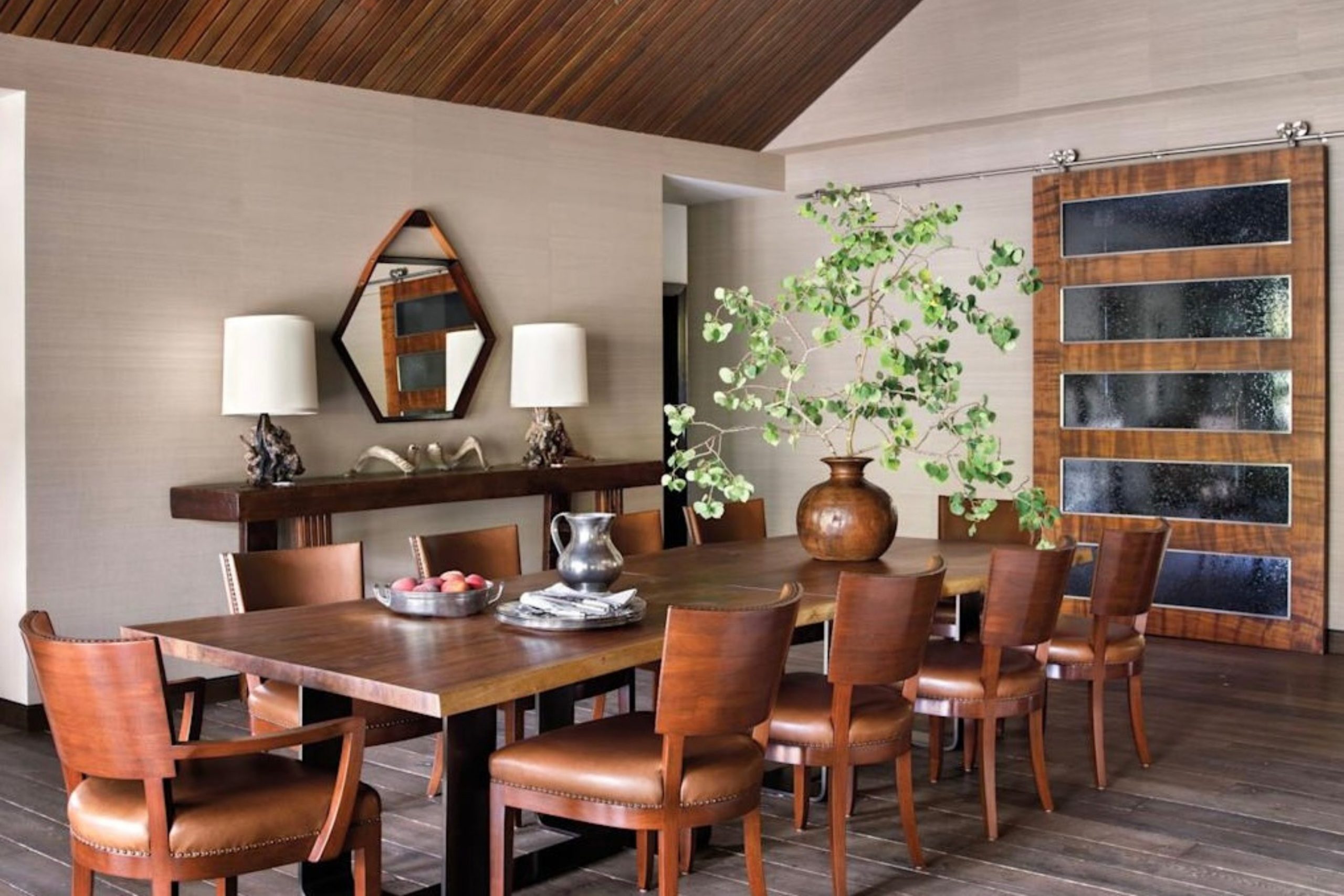
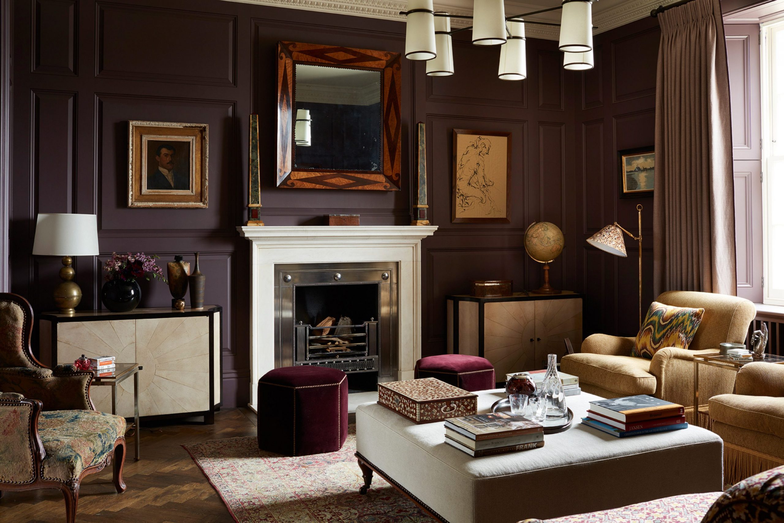
Brown furniture and wooden floors are back in a big way right now. For years, people hid their beautiful wood pieces or painted over them because gray was the big trend. Now, everyone wants that cozy, grounded feeling that only rich wood tones can bring into a house.
Painting over gorgeous grain is finally a thing of the past. Homeowners are falling in love with heirloom chest drawers and natural oak finishes all over again. Pairing the wrong wall shade with your wood can make your rooms look dark, dusty, or dated.
It can ruin the look of an expensive renovation instantly. Finding the right paint makes your wood furniture look intentional, costly, and incredibly stylish.
It turns old or heavy items into gorgeous focal points that look like they belong in a luxury magazine.
Why I Always Trust Sherwin-Williams and Benjamin Moore for the Best Colors That Go With Brown
Sherwin-Williams and Benjamin Moore are my absolute favorite brands when I work on houses. Their paints have rich pigments that react beautifully to different types of lighting during the day. This high quality is super important when you are trying to match natural elements like wood grain or leather.
Cheap paint often looks flat or shifts into weird, unexpected shades like lime green or muddy yellow when placed next to wood. It can make a beautiful room look cheap and unfinished. These two brands create dependable shades that lock onto the undertones of your wood floors and cabinets perfectly.
They spend years testing their formulas so that the color stays true from morning until night. You get exactly what you see on the swatch, which saves you time and money. It takes all the stressful guesswork out of your big home decorating projects.
How I Choose the Perfect Paint Colors to Pair With Brown
Choosing paint requires looking closely at the undertone of your specific brown items. Some wood has a red tone like cherry, some has an orange tone like oak, and some is dark brown like walnut. You cannot treat all browns the same way or your room will look completely disjointed.
I match cool wall shades with warm woods to create a crisp, clean look in a room. This balances out the heavy heat coming from old honey pine or orange oak floors. I pair warm creams and soft beiges with dark woods to keep the room feeling cozy and bright.
This simple trick injects light back into a space that has lots of deep espresso cabinets or heavy mahogany furniture. You always want contrast so your walls and your furniture do not blend together into one big muddy mess. Creating clear boundaries between your walls and your woodwork makes the whole house feel neat, structured, and expertly styled.
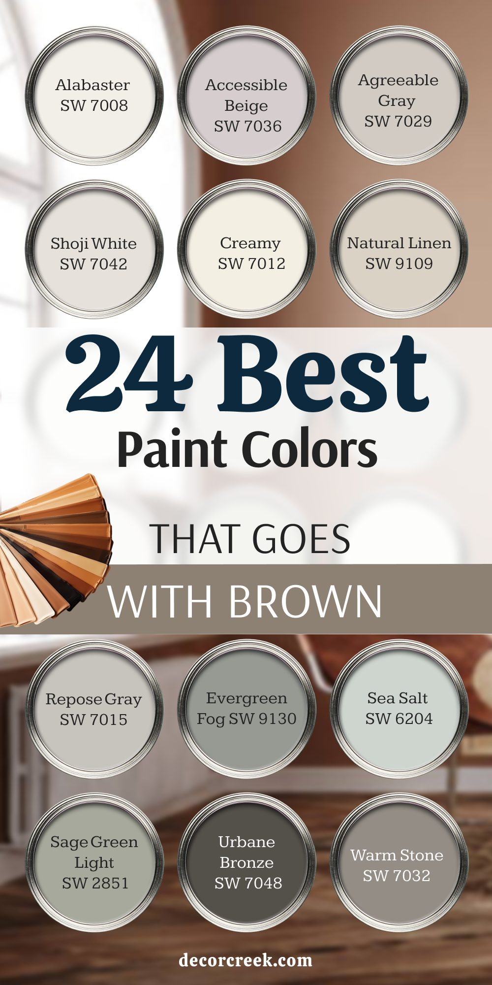
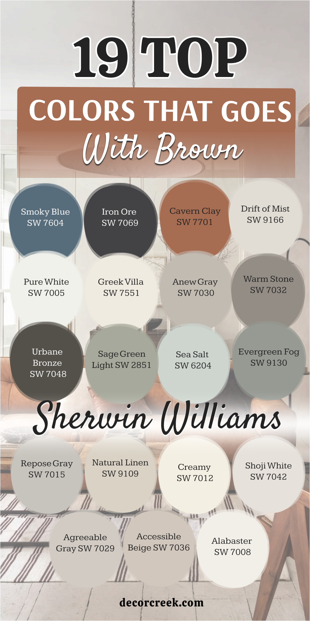
19 Top Paint Colors that go With Brown from Sherwin Williams
Alabaster SW 7008
Alabaster SW 7008 offers a soft and creamy look that keeps your walls from feeling chilly. This particular shade works wonders when you have dark walnut tables or heavy oak chest drawers. It reflects a lot of natural sunlight so your dark furniture stands out like artwork.
You will notice how it softens the harsh lines of older wooden window frames. It creates a welcoming backdrop that does not fight with the natural grain of your woodwork. Many homeowners choose this shade to make small rooms feel much larger while keeping a cozy vibe.
It bridges the gap between modern style and rustic charm without looking too stark or clinical. The creamy base hides everyday smudges better than bright white options.
Best used in: living rooms, kitchens, hallways, bedrooms, and farmhouse exteriors
Pairs well with: Iron Ore SW 7069, Agreeable Gray SW 7029, Natural Linen SW 9109, warm wood tones The key rule of this color for farmhouse style is to use it where you want natural light to feel kind, soft, and inviting throughout the day.
🎨 Check out the complete guide to this color right HERE 👈

Accessible Beige SW 7036
Accessible Beige SW 7036 contains a grayish undertone that prevents it from turning yellow against brown items. This hue blends beautifully with medium oak floors and pine ceiling beams.
It acts like a neutral canvas that lets your wood pieces take center stage. You can paint an entire house in this shade and it will look great in every single room. It brings out the rich, earthy qualities of leather sofas and woven baskets.
The paint looks rich and expensive even when the sun goes down and lamps turn on. It keeps your walls from looking washed out when surrounded by deep brown decor. It feels cozy on cold winter days and crisp during hot summer afternoons.
Best used in: family rooms, dining areas, open floor plans, entries, and master bedrooms
Pairs well with: Iron Ore SW 7069, Alabaster SW 7008, Urbane Bronze SW 7048, dark walnut trim The key rule of this color for traditional style is to use it where you want a smooth, cohesive transition between wood floors and walls.
🎨 Check out the complete guide to this color right HERE 👈

Agreeable Gray SW 7029
Agreeable Gray SW 7029 stands as a perfect mix of gray and beige that updates older homes instantly. This color modernizes rooms that feature lots of traditional brown trim and built-in bookshelves.
It cools down the hot orange tones often found in older oak flooring. You get a clean look that still feels warm enough to match your wooden furniture. It changes slightly depending on the time of day, keeping your walls interesting.
This shade makes your dark brown leather chairs look incredibly chic and purposeful. It works well in bright sunlit rooms and darker hallways alike.
Best used in: basements, bedrooms, large living areas, bathrooms, and modern kitchens
Pairs well with: Pure White SW 7005, Charcoal Blue SW 7611, Cavern Clay SW 7701, light ash wood The key rule of this color for modern transitional style is to use it as a neutral bridge that softens bright sunlight and tames orange wood tones.
🎨 Check out the complete guide to this color right HERE 👈

Shoji White SW 7042
Shoji White SW 7042 walks the line between a soft cream and a very light greige paint. This tone looks wonderful next to mid-century modern brown furniture and light wood accents.
It gives your walls a soft look without any harsh, bright reflections. You will love how it makes dark wood picture frames pop on the wall. It brings a cozy feeling into rooms that lack large windows.
It coordinates beautifully with organic materials like jute rugs and linen curtains. The shade keeps your home looking clean and tidy even on cloudy days.
Best used in: sunrooms, bedrooms, nurseries, exterior siding, and cozy reading nooks
Pairs well with: Urban Bronze SW 7048, Anew Gray SW 7030, Greek Villa SW 7551, warm cedar accents The key rule of this color for minimalist style is to use it to create a soft, clean backdrop that lets raw wood grains shine.
🎨 Check out the complete guide to this color right HERE 👈

Creamy SW 7012
Creamy SW 7012 is a rich, warm white that feels like vanilla ice cream on your walls. This paint prevents large rooms with dark brown floors from feeling empty or cold.
It emphasizes the deep, luxurious tones in mahogany and espresso wood finishes. You will see your antique furniture look refreshed and modern against this background. It catches lamplight beautifully to create a very cozy evening atmosphere.
It does not have any annoying green or blue undertones to worry about. This shade makes your home feel loved, lived-in, and very comfortable.
Best used in: traditional kitchens, cozy bedrooms, dark hallways, dining rooms, and cottage interiors
Pairs well with: Studio Clay SW 7046, Sage Green Light SW 2851, Pewter Tankard SW 0023, dark cherry wood The key rule of this color for cottage style is to use it to make dark, shadowy corners feel warm, bright, and inviting.
🎨 Check out the complete guide to this color right HERE 👈

Natural Linen SW 9109
Natural Linen SW 9109 mimics the color of unbleached flax cloth and brings texture to your walls. This paint pairs nicely with rustic barn wood and dark bronze hardware.
It creates a relaxed feeling that makes people want to sit down and stay awhile. You can use it to ground rooms that have high ceilings and lots of windows. It hides dust and fingerprints well, making it perfect for busy family homes.
The color highlights the golden flecks in oak wood pieces. It offers a sophisticated look that never feels stiff or formal.
Best used in: mudrooms, entryways, cozy dens, laundry rooms, and casual dining spaces
Pairs well with: Divine White SW 6105, Homberg Gray SW 7622, Urbane Bronze SW 7048, rustic pine The key rule of this color for rustic style is to use it to enhance the raw, textured beauty of natural, unpainted wood elements.
🎨 Check out the complete guide to this color right HERE 👈

Repose Gray SW 7015
Repose Gray SW 7015 has a tiny hint of green and brown hidden inside its gray base. This composition makes it match exceptionally well with cool-toned brown floors and stone fireplaces.
It provides a sharp contrast that makes dark furniture look crisp and modern. You can use it to tone down rooms that feel too hot from red wood trim. It maintains its true color even in rooms with tricky north-facing light.
This paint gives your home a tailored, designer look without effort. It looks beautiful next to white baseboards and dark wood doors.
Best used in: open concept spaces, modern bathrooms, offices, kitchens, and bright bedrooms
Pairs well with: Eider White SW 7014, Coral Clay SW 6606, Pavestone SW 7642, weathered gray-brown woods The key rule of this color for contemporary style is to use it to balance out warm wood temperatures with a crisp, cool background.
🎨 Check out the complete guide to this color right HERE 👈

Evergreen Fog SW 9130
Evergreen Fog SW 9130 is a gorgeous chameleon color that blends green, gray, and a bit of blue. This hue looks stunning when placed next to light tan leathers and warm walnut wood.
It makes your wood furniture look like it belongs in a high-end designer magazine. You will feel connected to nature when you see this color on your walls. It brings a rich, cozy drama to a room without making it feel dark.
It changes personality throughout the day as the sunlight moves across the room. This shade elevates simple wooden cabinets into a major design feature.
Best used in: accent walls, home offices, master bedrooms, dining rooms, and kitchen cabinets
Pairs well with: Shoji White SW 7042, Accessible Beige SW 7036, Über Bronze SW 7048, golden oak The key rule of this color for organic modern style is to use it where you want to highlight the rich, warm tones of natural wood grains.
🎨 Check out the complete guide to this color right HERE 👈

Sea Salt SW 6204
Sea Salt SW 6204 is a light green-gray paint that feels like a breath of fresh air. This shade pairs beautifully with light beachy woods, driftwood, and tan wicker furniture.
It prevents rooms with lots of brown furniture from feeling heavy or dark. You will notice how it brightens up a room on dark, rainy days. It offers a lovely contrast to dark chocolate brown leather pieces.
The color looks clean and crisp next to bright white window trim. It brings an airy, happy feeling into any room you choose to paint.
Best used in: bathrooms, laundry rooms, coastal bedrooms, sunrooms, and bright kitchens
Pairs well with: Pure White SW 7005, Warm Stone SW 7032, Summit Gray SW 7669, light bamboo The key rule of this color for coastal style is to use it to keep heavy brown elements feeling light, breezy, and completely balanced.
🎨 Check out the complete guide to this color right HERE 👈

Sage Green Light SW 2851
Sage Green Light SW 2851 offers a historic, earthy green tone that feels deeply traditional. This paint looks incredible next to rich mahogany, cherry wood, and antique dark brown finishes.
It reminds people of old-world libraries and cozy historic estates. You can use it to create an elegant look in a formal dining room. It complements the deep orange and red undertones found in older wood floors.
This shade makes brass light fixtures and copper pots look bright and beautiful. It brings a grounded, natural energy into your living areas.
Best used in: historic homes, libraries, dining rooms, kitchens, and exterior accents
Pairs well with: Creamy SW 7012, Classical Yellow SW 2865, Rookwood Dark Brown SW 2816, rich mahogany The key rule of this color for traditional historic style is to use it to celebrate and enrich the deep, red undertones of antique wood.
🎨 Check out the complete guide to this color right HERE 👈
Urbane Bronze SW 7048
Urbane Bronze SW 7048 is a deep, dark gray with strong brown undertones that looks like rich metal. This paint works perfectly for making a big statement on an accent wall or trim work.
It loves being paired with light tan leather, raw wood edges, and warm caramel tones. You can use it to make a large room feel much more intimate and comfortable. It creates a stunning look when painted on interior doors next to lighter walls.
This shade feels grounded, heavy, and very luxurious when used correctly. It hides flaws on old walls because of its deep, rich saturation.
Best used in: accent walls, media rooms, exterior trim, front doors, and masculine dens
Pairs well with: Alabaster SW 7008, Shoji White SW 7042, Extra White SW 7006, honey oak The key rule of this color for industrial modern style is to use it to create bold contrast against light-colored wood and metal fixtures.
🎨 Check out the complete guide to this color right HERE 👈

Warm Stone SW 7032
Warm Stone SW 7032 is a rich, medium-dark greige that feels like a warm hug. This color matches wonderfully with medium brown wood floors and stone tile work.
It prevents large, open rooms from feeling cold and empty. You will love how it highlights light white oak or ash furniture pieces. It creates a sophisticated look that feels cozy rather than dark.
The shade holds its own against very bold brown leather furniture. It works beautifully in rooms where you want to gather with family in the evening.
Best used in: living room accent walls, cozy dens, exterior stucco, dining areas, and master suites
Pairs well with: Sea Salt SW 6204, Alabaster SW 7008, Repose Gray SW 7015, light white oak The key rule of this color for warm modern style is to use it to anchor large rooms that feature lots of different wood tones.
🎨 Check out the complete guide to this color right HERE 👈

Anew Gray SW 7030
Anew Gray SW 7030 sits right in the middle of light and dark greige paint colors. This hue matches perfectly with mid-tone brown furniture and walnut coffee tables.
It keeps your rooms looking updated without feeling cold like a modern art museum. You will see how it balances out the yellow tones in older pine floors. It provides a sturdy background for colorful artwork and patterned pillows.
The color looks fantastic under both bright LED lights and soft yellow lightbulbs. It makes your living spaces feel balanced, neat, and highly organized.
Best used in: entryways, hallways, open kitchens, family rooms, and guest bedrooms
Pairs well with: Incredible White SW 7028, Shoji White SW 7042, Iron Ore SW 7069, mid-tone walnut The key rule of this color for transitional design is to use it to pull together a mix of old brown furniture and new modern decor.
🎨 Check out the complete guide to this color right HERE 👈
Greek Villa SW 7551
Greek Villa SW 7551 is a bright white paint with a tiny drop of yellow and green warmth. This shade looks amazing next to light brown oak floors and woven rattan lighting.
It gives you a clean look that does not feel like a cold hospital room. You will notice how it bounces light into the dark corners of your kitchen or hallways. It makes dark brown furniture look sharp, clean, and highly intentional.
Homeowners love this shade because it works well in almost any lighting condition. It gives your home a fresh starting point for any design style you want.
Best used in: bright kitchens, small bathrooms, whole-house walls, trims, and modern exteriors
Pairs well with: Evergreen Fog SW 9130, In the Navy SW 9178, Urban Bronze SW 7048, light natural oak The key rule of this color for clean modern style is to use it to make dark wood accents stand out as beautiful focal points.
🎨 Check out the complete guide to this color right HERE 👈

Pure White SW 7005
Pure White SW 7005 is a very versatile white paint that is not too cold or too warm. This color provides a crisp contrast against very dark espresso furniture and dark brown stained floors.
It lets the true color of your wood pieces show without changing how they look. You will find that it makes colorful rugs and brown leather sofas look cleaner. It works perfectly for baseboards, trim, and doors throughout your home.
This shade creates a bright look that opens up tiny, cramped rooms. It is a reliable choice that designers use when they want zero surprises on the walls.
Best used in: trim work, ceilings, modern kitchens, art galleries, and small dark rooms
Pairs well with: any brown tone, Agreeable Gray SW 7029, Sea Salt SW 6204, dark espresso wood The key rule of this color for crisp contemporary style is to use it to create sharp, clean lines against dark brown woodwork.
🎨 Check out the complete guide to this color right HERE 👈

Drift of Mist SW 9166
Drift of Mist SW 9166 is a very airy, light gray paint with a warm, sandy undertone. This shade pairs beautifully with light ash wood and pale brown flooring choices.
It gives your walls a soft look that changes gently as daylight shifts. You will notice it keeps rooms with lots of wooden furniture looking light and open. It prevents dark brown leather from looking too heavy in a small room.
The color looks sophisticated when paired with white trim and dark metal accents. It is a fantastic choice for people who want a bright house without using white paint.
Best used in: bedrooms, open living areas, modern nurseries, bathrooms, and corridors
Pairs well with: Quicksilver SW 9165, Urban Bronze SW 7048, Iron Ore SW 7069, pale ash wood The key rule of this color for light airy style is to use it to soften the look of large, bulky brown furniture pieces.
🎨 Check out the complete guide to this color right HERE 👈

Cavern Clay SW 7701
Cavern Clay SW 7701 is a rich, warm terracotta color that brings the desert inside. This bold shade looks incredible when paired with dark brown wood and rustic leather.
It creates an earthy look that feels friendly, warm, and highly energetic. You can use it to create a stunning accent wall behind a wooden bed frame.
It makes white pottery and green plants look bright and beautiful. The color feels very cozy in dining rooms where people gather to eat and talk. It celebrates warm wood tones instead of trying to hide them away.
Best used in: accent walls, dining rooms, southwest style spaces, creative offices, and front doors
Pairs well with: Origami White SW 7636, Agreeable Gray SW 7029, Distance SW 6243, rustic dark wood The key rule of this color for bohemian style is to use it to create a warm, energetic backdrop for rich wood and plants.
🎨 Check out the complete guide to this color right HERE 👈
Iron Ore SW 7069
Iron Ore SW 7069 is a deep, soft black paint that looks softer than a true pitch black. This dramatic color looks stunning next to light oak, honey-colored woods, and tan leather.
It creates a high-fashion look that makes your home feel like a luxury hotel. You can use it to paint a fireplace wall or a cozy media room. It makes the natural grain of light wood furniture look incredibly artistic.
This shade adds weight and structure to rooms with high ceilings and big windows. It looks very rich when used on kitchen cabinets paired with warm wood shelves.
Best used in: theater rooms, kitchen islands, accent walls, exterior trim, and window sashes
Pairs well with: Alabaster SW 7008, Accessible Beige SW 7036, Repose Gray SW 7015, light honey oak The key rule of this color for high-contrast style is to use it to make light and medium wood pieces pop out dramatically.
🎨 Check out the complete guide to this color right HERE 👈

Smoky Blue SW 7604
Smoky Blue SW 7604 is a deep, rich blue with a heavy dose of gray mixed inside. This paint provides a stunning contrast to warm orange oaks and rich medium brown woods.
It creates a classic look that feels like a cozy captain’s cabin or an upscale den. You will see how it makes the warm tones in your wood furniture look brighter and richer. It brings a grounded feeling to bedrooms and formal living areas.
This shade looks beautiful under soft lamplight during the evening hours. It gives your home a confident splash of color while remaining very easy to live with.
Best used in: accent walls, boys’ bedrooms, home libraries, dining rooms, and kitchen islands
Pairs well with: Extra White SW 7006, Revere Pewter HC-172, Network Gray SW 7073, warm orange oak The key rule of this color for classic traditional style is to use it to balance out the intense warmth of orange and red wood tones.
🎨 Check out the complete guide to this color right HERE 👈

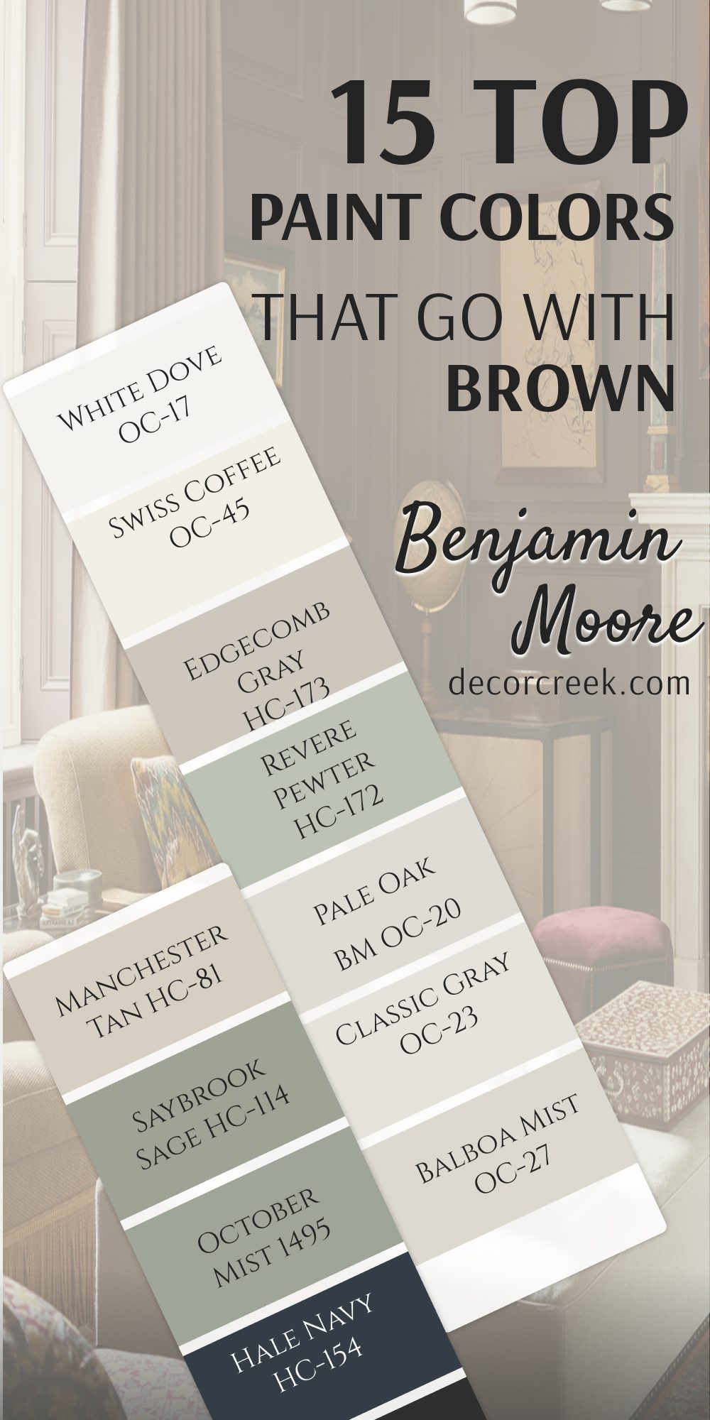
15 Top Paint Colors that go With Brown From Benjamin Moore
White Dove OC-17
White Dove OC-17 is a famous soft white paint that has a tiny touch of gray in its base. This color pairs perfectly with traditional brown furniture and dark stained oak floors.
It keeps your rooms looking bright without ever feeling cold or blinding to your eyes. You will notice how it softens the look of heavy antique wooden chests. It reflects light in a gentle way that makes spaces feel friendly and open.
Many staging experts use this color because it makes every wood tone look its absolute best. It works beautifully on both walls and trim for a clean, unified appearance.
Best used in: whole-house walls, kitchen cabinets, trim work, crown moldings, and open living rooms
Pairs well with: Revere Pewter HC-172, Hale Navy HC-154, Balboa Mist OC-27, dark oak floors The key rule of this color for traditional transitional style is to use it to give a clean, soft border to rich wood features.
🎨 Check out the complete guide to this color right HERE 👈

Swiss Coffee OC-45
Swiss Coffee OC-45 is a rich, creamy white paint that feels warm and very inviting. This shade looks wonderful next to golden brown woods and rich leather couches.
It keeps large rooms from feeling empty by adding a layer of creamy warmth to the walls. You can use it to create a cozy cottage look in your favorite living spaces. It hides minor wall imperfections much better than brighter white paints do.
The color looks beautiful when the afternoon sun streams through your windows. It makes your home feel comfortable, cozy, and ready for guests.
Best used in: living rooms, country kitchens, master bedrooms, exterior siding, and family dens
Pairs well with: October Mist 1495, Kendall Charcoal HC-166, Clay Beige OC-11, golden brown oak The key rule of this color for warm country style is to use it to bring out the golden, sunny tones inside medium wood grains.
🎨 Check out the complete guide to this color right HERE 👈

Edgecomb Gray HC-173
Edgecomb Gray HC-173 is a beautiful light greige paint that acts like a true chameleon on walls. This color matches exceptionally well with medium brown furniture and red oak floors.
It tones down the bright red and orange flash in older wood finishes. You get a clean, updated look that still feels warm and connected to nature. It changes its look softly as the weather changes outside your windows.
This shade makes your wooden dining room set look modern and fresh again. It is a reliable choice for long hallways and open entryways.
Best used in: entryways, open floor plans, family kitchens, bedrooms, and staircases
Pairs well with: White Dove OC-17, Smokey Taupe 983, Chelsea Gray HC-168, red oak furniture The key rule of this color for casual elegant style is to use it to ground rooms that have a mix of different wood species.
🎨 Check out the complete guide to this color right HERE 👈

Revere Pewter HC-172
Revere Pewter HC-172 is a historic medium greige paint that has been a favorite for decades. This shade pairs beautifully with dark walnut, espresso wood, and rustic brown beams.
It brings a rich, grounded feeling to your living areas without making them feel dark. You will love how it makes white trim look crisp and clean in contrast. It holds its true color well even in rooms with poor natural light.
This paint gives your home a solid, upscale feeling that looks highly professional. It matches a wide variety of brown fabrics and woven wood shades.
Best used in: kitchens, dining rooms, finished basements, exterior trim, and large family rooms
Pairs well with: Simply White OC-117, Smoky Blue SW 7604, Hale Navy HC-154, dark walnut beams The key rule of this color for historic transitional style is to use it to add depth and richness next to dark wood features.
🎨 Check out the complete guide to this color right HERE 👈

Pale Oak OC-20
Pale Oak OC-20 is a very light, elegant greige paint that looks like clean beach sand. This hue pairs magnificently with light white oak floors and pale brown furniture pieces.
It gives your home a bright, gallery-like look that feels soft and gentle. You will see how it lets your dark brown antique pieces stand out as beautiful accents.
It keeps small, dark rooms looking open and bright throughout the day. The color looks sophisticated when paired with matching white baseboards. It is an excellent choice for creating a clean look in your home.
Best used in: master bedrooms, bright bathrooms, nurseries, living areas, and small apartments
Pairs well with: Kendall Charcoal HC-166, White Dove OC-17, Wrought Iron 2124-10, light white oak The key rule of this color for soft modern style is to use it to create a bright backdrop that makes brown accents pop.
🎨 Check out the complete guide to this color right HERE 👈

Classic Gray OC-23
Classic Gray OC-23 is a very light, crisp gray paint with just a tiny drop of warmth. This shade looks incredible next to dark espresso furniture and dark brown stained floors.
It creates a beautiful contrast that makes your wood pieces look sharp and clean. You will find that it keeps your rooms looking modern without feeling cold or stony.
It reflects a massive amount of light to make small rooms feel larger. This paint works perfectly in open concept homes with lots of wood trim. It gives your walls a clean look that allows your furniture to shine.
Best used in: modern living rooms, open kitchens, small hallways, bedrooms, and home galleries
Pairs well with: Simply White OC-117, charcoal tones, deep brown stains, espresso wood The key rule of this color for crisp modern style is to use it to provide a clean contrast against very dark wood tones.
🎨 Check out the complete guide to this color right HERE 👈

Balboa Mist OC-27
Balboa Mist OC-27 is a light, warm gray paint that has a tiny hint of purple in its base. This unique tone pairs beautifully with medium brown furniture and dark walnut floors.
It adds a lovely layer of soft color to your walls without looking too heavy. You will notice how it makes your wood pieces look rich and highly detailed. It changes beautifully from morning to night under different lighting conditions.
This shade works well for creating a cozy feeling in open, high-ceiling rooms. It gives your home an updated look that still feels warm and welcoming.
Best used in: bedrooms, open living spaces, formal dining areas, bathrooms, and guest rooms
Pairs well with: Cedar Key OC-16, White Dove OC-17, Shaker Beige HC-45, dark walnut floors The key rule of this color for cozy modern style is to use it to bring out the rich, cool undertones of dark brown wood.
🎨 Check out the complete guide to this color right HERE 👈

Manchester Tan HC-81
Manchester Tan HC-81 is a classic, warm tan paint that feels like a khaki jacket. This traditional shade matches perfectly with honey oak, pine, and warm brown furniture pieces.
It creates a unified look that makes your home feel grounded and secure. You will love how it makes your old wooden furniture feel like a natural part of the room. It does not turn yellow or orange under standard incandescent lightbulbs.
This color brings an upscale, traditional elegance to dining rooms and entry halls. It provides a rich background that looks beautiful with gold and brass accents.
Best used in: traditional dens, dining rooms, historic entryways, exterior siding, and family spaces
Pairs well with: Simply White OC-117, Bleeker Sand HC-80, historic green tones, honey oak trim The key rule of this color for traditional historic style is to use it to create a seamless blend with warm, golden wood tones.
🎨 Check out the complete guide to this color right HERE 👈

Saybrook Sage HC-114
Saybrook Sage HC-114 is a beautiful, dusty green paint with strong gray undertones. This earthy color looks stunning next to dark mahogany, cherry, and warm brown wood pieces.
It reminds people of a beautiful garden and brings a bit of nature indoors. You can use it to create a handsome look in a home office or library. It balances out the hot red tones found in older wood finishes beautifully.
This shade makes white pottery and light linen fabrics look bright and clean. It gives your rooms a historic, designer look that feels very stable.
Best used in: home offices, dining rooms, kitchen cabinets, exterior shutters, and cozy dens
Pairs well with: White Dove OC-17, Edgecomb Gray HC-173, historic cream tones, rich cherry wood The key rule of this color for traditional green style is to use it to soften the intense red tones of dark antique furniture.
🎨 Check out the complete guide to this color right HERE 👈

October Mist 1495
October Mist 1495 is a soft, silvery sage green paint that feels very gentle. This color looks incredible when paired with light oak, walnut, and warm brown tones.
It makes your wood furniture look modern, fresh, and highly artistic. You will feel a sense of nature whenever you walk into a room painted in this shade. It adds a soft layer of color without being loud or distracting to the eyes.
This shade changes personality beautifully depending on how much sunlight hits the walls. It creates an organic look that pairs perfectly with natural woven textures.
Best used in: accent walls, bedrooms, cozy sunrooms, kitchen cabinets, and relaxed living areas
Pairs well with: Swiss Coffee OC-45, Steam AF-15, dark charcoal accents, natural walnut wood The key rule of this color for organic modern style is to use it to link your indoor wood furniture with the natural world outside.
🎨 Check out the complete guide to this color right HERE 👈

Hale Navy HC-154
Hale Navy HC-154 creates a stunning contrast that makes warm orange oak and medium brown woods look costly. This deep navy blue paint has gray undertones that keep it looking tailored and neat.
You can use it to create a bold statement on a kitchen island or a bedroom wall. It brings a classic, upscale feeling that adds massive depth to your living areas. This shade works wonders in bright rooms with lots of white trim work.
You will find that it acts like a neutral because it pairs so easily with leather. It makes brass drawer pulls and copper light fixtures shine like bright jewelry. The deep color helps hide smudges on lower walls in busy walkways. It gives your family a cozy, secure feeling during evening dinner hours.
Best used in: accent walls, dining rooms, kitchen islands, front doors, and boys’ bedrooms
Pairs well with: White Dove OC-17, Revere Pewter HC-172, Classic Gray OC-23, orange oak trim The key rule of this color for bold traditional style is to use it to create maximum contrast against warm wood tones.
🎨 Check out the complete guide to this color right HERE 👈

Kendall Charcoal HC-166
Kendall Charcoal HC-166 is a dark, rich gray paint that looks amazing next to light white oak furniture. This sophisticated color creates a high-fashion look that makes your home feel like a luxury urban loft.
You can use it to make a small powder room feel like a cozy, rich jewel box. It makes the natural grain of light wood tables look sharp and modern. This shade adds a layer of weight and structure to large living areas.
You will love how it frames your windows when painted on the trim. It does not look muddy or brown because it has a clean slate base. The rich pigment absorbs harsh afternoon glare in bright south-facing rooms. It gives your artwork a dramatic background that looks highly professional.
Best used in: media rooms, powder baths, accent walls, kitchen islands, and exterior siding
Pairs well with: Pale Oak OC-20, Simply White OC-117, Edgecomb Gray HC-173, light white oak The key rule of this color for modern industrial style is to use it to frame and highlight pale, natural wood textures.
🎨 Check out the complete guide to this color right HERE 👈

Simply White OC-117
Simply White OC-117 is a bright, happy white paint with a warm yellow undertone. This clean shade pairs perfectly with dark espresso furniture and deep brown floors. It gives your home a fresh look that feels sunny and cheerful even on rainy days.
You will find that it makes your wood pieces look sharp, clean, and highly intentional. It works perfectly for trim, doors, and ceilings throughout your entire house. This shade creates an open look that makes small rooms feel much larger.
It is a favorite choice for modern kitchens with warm wood open shelves. You will never have to worry about this white looking cold like ice. It creates a crisp border that makes your antique wood frames pop.
Best used in: kitchen cabinets, ceilings, trim work, small bedrooms, and modern exteriors
Pairs well with: Manchester Tan HC-81, Hale Navy HC-154, Revere Pewter HC-172, dark espresso wood The key rule of this color for clean warm style is to use it to create a bright, sunny border around dark wood pieces.
🎨 Check out the complete guide to this color right HERE 👈

Smokey Taupe 983
Smokey Taupe 983 matches wonderfully with medium brown wood floors and traditional family furniture. This cozy shade prevents large rooms from feeling empty by adding a layer of earthy warmth to the walls. You will love how it coordinates with tan leather sofas and woven wool rugs.
It creates a sophisticated look that feels friendly rather than stuffy or cold. The shade holds its own against very bold dark wood architectural beams. You will notice it bridges the gap between old brown furniture and gray decor items.
It changes from a soft tan to a rich gray-brown depending on the lamp light. The warmth in this paint keeps your basement family rooms feeling snug. It brings a grounded comfort that makes guests want to linger longer.
Best used in: family rooms, cozy dens, dining areas, guest bedrooms, and warm entryways
Pairs well with: Edgecomb Gray HC-173, White Dove OC-17, dark walnut accents, medium oak floors The key rule of this color for warm traditional style is to use it to build a cozy, unified look with mid-tone brown furniture.
🎨 Check out the complete guide to this color right HERE 👈
Cedar Key OC-16
Cedar Key OC-16 is a soft, sandy beige paint with a gentle grayish undertone. This color pairs beautifully with light brown oak floors and natural linen fabrics. It gives your walls a clean look that does not feel yellow or muddy.
You will notice how it highlights the beauty of dark brown antique picture frames. It brings a relaxed, beachy feeling to rooms that have lots of wood trim. The color coordinates perfectly with stone fireplace surrounds and woven basket textures.
It offers an elegant look that keeps your home feeling light and bright. You will enjoy how it coordinates with woven grass window shades. It hides everyday scuffs on walls while keeping a high-end designer look.
Best used in: sunrooms, bedrooms, open kitchens, main living areas, and beach house interiors
Pairs well with: Balboa Mist OC-27, White Dove OC-17, dark wood accents, natural tan oak The key rule of this color for relaxed coastal style is to use it to keep heavy wooden elements feeling light and completely balanced.
🎨 Check out the complete guide to this color right HERE 👈

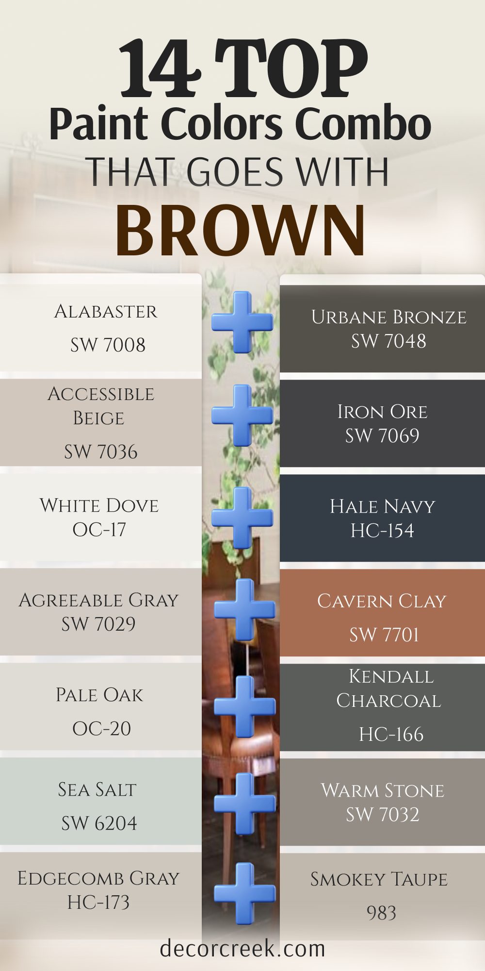
14 Top Paint Color Combo that Goes With Brown
Alabaster SW 7008 + Urbane Bronze SW 7048
Alabaster SW 7008 and Urbane Bronze SW 7048 create a high-contrast pair that looks amazing with light oak. This combination brings a modern farmhouse look into your kitchen or main living areas.
The light white keeps things bright while the dark bronze grounds your wooden furniture pieces. You will love how this pair makes a standard room look like a custom designer showcase. It provides a clean and crisp background that makes natural wood grain look incredibly artistic. The dark accent color adds a lot of depth behind light wood television stands or open shelving.
This mix keeps your home looking perfectly balanced between bright airiness and cozy weight. It works wonders in large family areas where people gather to watch movies and talk. Your brown leather chairs will look completely intentional and stylish against these walls.
Best used in: kitchens, open living areas, entryways, and modern farmhouse family rooms
Pairs well with: light oak floors, honey pine accents, matte black hardware, and raw wood edges The key rule of this color combo for modern farmhouse style is to use the bright shade on main walls and the dark shade on accents to let raw wood textures pop.
Accessible Beige SW 7036 + Iron Ore SW 7069
Accessible Beige SW 7036 mixed with Iron Ore SW 7069 offers a rich look for medium walnut finishes. This duo balances warm beige walls with a deep dark accent wall behind your wood pieces.
It makes your living room feel intentional, sturdy, and highly styled by a professional designer. You will find that the soft beige keeps the dark charcoal paint from feeling heavy or gloomy. This pair acts like a beautiful frame around rich walnut dressers and brown leather sofas.
It handles bright afternoon sunshine and soft evening lamplight without ever losing its character. The combination brings a luxurious hotel feeling into standard bedrooms and open living zones. It hides everyday smudges perfectly while giving your home a timeless, grounded foundation.
Best used in: master bedrooms, formal dining rooms, media spaces, and cozy home offices
Pairs well with: medium walnut furniture, dark chocolate leather, brushed brass fixtures, and plush neutral rugs The key rule of this color combo for upscale transitional style is to wrap the room in warm beige while using the dark tone to ground your main focal wall.
White Dove OC-17 + Hale Navy HC-154
White Dove OC-17 combined with Hale Navy HC-154 brings a classic look next to orange oak trim. The deep blue wall tones down the bright orange flash found in older wood floors.
The soft white trim keeps the entire room looking crisp, clean, and completely updated. You get a handsome appearance that feels like a high-end coastal estate or a traditional library. This combination helps traditional brown furniture pieces look fresh and highly relevant for today.
It reflects natural daylight beautifully while providing a cozy, deep background for evening relaxation. Your family will love how bright and tidy the room looks during busy morning hours. It brings a confident splash of color without overwhelming your favorite wooden accents.
Best used in: living rooms, boys’ bedrooms, traditional dining spaces, and bright sunrooms
Pairs well with: orange oak flooring, cherry wood cabinets, crisp white moldings, and tan leather chairs The key rule of this color combo for classic traditional style is to use the deep navy to absorb hot orange wood tones while the white trim adds structure.
Agreeable Gray SW 7029 + Cavern Clay SW 7701
Agreeable Gray SW 7029 paired with Cavern Clay SW 7701 creates an earthy look for rustic pine. The warm terracotta color adds a splash of energy behind your wooden shelves or bed frames.
The neutral gray tones down the heat so the room stays comfortable to look at. This blend makes your home feel connected to nature and full of friendly life. It looks amazing when surrounded by organic textures like jute rugs and green leafy plants.
You will see how it highlights the golden undertones in natural pine and cedar wood. It provides a unique look that feels highly customized and full of creative personality. Your guests will feel welcomed by the cozy warmth of the feature wall.
Best used in: creative studios, accent walls, casual dining areas, and southwest style bedrooms
Pairs well with: rustic pine furniture, raw cedar beams, woven jute rugs, and green indoor plants The key rule of this color combo for bohemian style is to use the clay color to inject natural warmth while the greige keeps the overall look neat.

Pale Oak OC-20 + Kendall Charcoal HC-166
Pale Oak OC-20 and Kendall Charcoal HC-166 make a modern pair that loves light white oak floors. The dark charcoal accent highlights the beautiful lines of your light-colored wood tables and chairs.
The soft sand color keeps the rest of the walls looking open and bright. You get a high-fashion look that feels like a luxury urban apartment or a modern gallery. It creates a stunning setting for dark brown picture frames and minimalist wooden decor items.
This duo maintains a clean look while adding a powerful layer of architectural interest. It keeps your spaces looking neat, organized, and very expensive without a lot of effort.
Best used in: modern living rooms, open kitchens, small powder baths, and urban loft spaces
Pairs well with: light white oak, pale ash furniture, matte black metal accents, and simple line art The key rule of this color combo for modern industrial style is to use the dark charcoal to frame clean wood lines while the light greige keeps things airy.
Sea Salt SW 6204 + Warm Stone SW 7032
Sea Salt SW 6204 mixed with Warm Stone SW 7032 brings a natural look to driftwood and tan wicker. This pair feels like a walk on a rocky beach next to deep brown elements.
It keeps your sunrooms and bathrooms looking fresh, clean, and highly connected to nature. You will notice how the light green-gray shade opens up tight, cramped family spaces instantly.
The medium-dark stone color adds a sturdy anchor so the light paint does not wash away. It balances heavy chocolate brown leather pieces with a soft, breezy background that feels wonderful. This combination helps you create a peaceful retreat where your family can wind down easily.
Best used in: bathrooms, sunrooms, laundry spaces, and coastal style guest rooms
Pairs well with: driftwood tones, tan wicker furniture, light bamboo, and crisp white towels The key rule of this color combo for coastal style is to use the breezy green-gray to lighten heavy brown items while the stone color adds structure.
Edgecomb Gray HC-173 + Smokey Taupe 983
Edgecomb Gray HC-173 and Smokey Taupe 983 create a smooth look for red oak furniture pieces. The taupe shade adds deep warmth on a main feature wall next to your wood items.

The light greige flows through the rest of the room to keep it looking neat. You will love how this pair tones down the aggressive pink or red flash in older flooring. It creates a seamless look where your walls and your furniture live together in total harmony.
This mixture feels soft on the eyes and provides a very sophisticated backdrop for artwork. It works beautifully in long corridors and open entryways that receive tricky natural lighting.
Best used in: entryways, long hallways, family kitchens, and open concept seating areas
Pairs well with: red oak flooring, mahogany tables, soft beige fabrics, and warm bronze accents The key rule of this color combo for casual elegant style is to blend the two related tones to create a smooth transition around tricky red wood grains.
Greek Villa SW 7551 + Evergreen Fog SW 9130
Greek Villa SW 7551 paired with Evergreen Fog SW 9130 offers an organic look for warm walnut wood. The soft green accent wall makes your wooden cabinets look like expensive designer showroom pieces.
The warm white walls bounce light around to keep the room feeling big and friendly. You will love how it links your indoor wooden furniture with the green trees outside your windows. It brings a fresh, healthy energy into kitchens and dining areas where families spend their day.
This combination makes brass hardware and golden light fixtures look incredibly sharp and bright. It provides a clean canvas that celebrates natural wood grains instead of hiding them.
Best used in: bright kitchens, home offices, dining rooms, and modern organic bedrooms
Pairs well with: warm walnut wood, natural white oak, brushed gold hardware, and linen curtains The key rule of this color combo for organic modern style is to use the green to pull out rich wood tones while the white keeps the room feeling big.
Swiss Coffee OC-45 + October Mist 1495
Swiss Coffee OC-45 and October Mist 1495 bring a cozy cottage feel next to golden oak floors. The silvery sage green looks beautiful behind antique dark brown chest drawers and woven baskets.
The rich cream walls keep the bedroom feeling warm, sunny, and completely relaxed. You get a welcoming look that makes people feel at home the moment they step inside. This duo highlights the rich, golden undertones inside honey-colored pines and older oaks.
It feels comfortable on dark winter days and beautifully bright during sunny summer afternoons. Your antique wooden heirlooms will look completely refreshed and lovely against this soft backdrop.
Best used in: country cottages, master bedrooms, cozy reading nooks, and casual family dens
Pairs well with: golden oak floors, honey pine trims, antique dark brown chests, and woven baskets The key rule of this color combo for warm country style is to pair a rich cream with a soft sage to celebrate golden wood grains.
Revere Pewter HC-172 + Smoky Blue SW 7604
Revere Pewter HC-172 combined with Smoky Blue SW 7604 creates a handsome look for dark walnut beams. The deep gray-blue accent wall celebrates the rich dark weight of your overhead wood structures.
The sturdy greige walls ground the room and tie your brown furniture together neatly. You will find that this mix adds a massive amount of traditional luxury to your home. It provides a strong contrast that makes your leather chairs look sharp and costly.
The combination stays true to its color even in spaces that lack huge windows. It is a fantastic choice for creating a confident, stately look in a gentleman’s den or formal room.
Best used in: home libraries, formal dens, dining rooms, and basement entertainment spaces
Pairs well with: dark walnut beams, espresso wood finishes, heavy leather sofas, and copper accents The key rule of this color combo for historic transitional style is to let the deep blue accent create a rich contrast while the historic greige binds the look.
Creamy SW 7012 + Sage Green Light SW 2851
Creamy SW 7012 and Sage Green Light SW 2851 offer a traditional look for rich mahogany furniture. The historic green shade enriches the red undertones found inside antique wooden dining sets.
The vanilla white walls keep the dining room looking elegant, bright, and highly welcoming. You get an old-world library feeling that looks deeply stable, rich, and highly sophisticated. This pair looks stunning when surrounded by oil paintings in dark frames and polished brass lamps.
It prevents rooms filled with large, bulky antique furniture from feeling dusty or outdated. Your family will enjoy the dignified warmth this look brings to holiday dinner parties.
Best used in: historic dining rooms, traditional libraries, guest spaces, and cottage entryways
Pairs well with: rich mahogany wood, dark cherry finishes, polished brass lamps, and dark framed art The key rule of this color combo for traditional historic style is to use an earthy green to enrich red wood tones while a vanilla white adds brightness.
Balboa Mist OC-27 + Cedar Key OC-16
Balboa Mist OC-27 mixed with Cedar Key OC-16 creates a soft layer of neutrals for medium brown woods. This combination uses subtle shifts in gray and beige to make your woodwork look detailed.
It prevents large living areas from looking flat or boring without using loud colors. You will see how it highlights the fine craftsmanship of dark brown walnut floors and doors. It creates a sophisticated look that feels friendly, neat, and highly relaxing to live with.
This duo is perfect for homeowners who want a quiet, designer house that feels cohesive from room to room. It lets your colorful rugs and wood grain take center stage.
Best used in: open concept spaces, master suites, formal living rooms, and modern guest baths
Pairs well with: medium brown woods, dark walnut flooring, natural tan oak, and neutral textiles The key rule of this color combo for cozy modern style is to combine a warm gray and a soft sand to build depth without using loud paint colors.
Shoji White SW 7042 + Anew Gray SW 7030
Shoji White SW 7042 and Anew Gray SW 7030 bring a clean look to mid-century modern wood pieces. The medium greige adds structure to accent areas while the soft white opens up the hallways.
This duo makes your clean-lined brown furniture look incredibly chic and purposeful. You get a balanced appearance that bridges the gap between old family furniture and brand-new decor. It handles tricky yellow undertones in older pine floors with absolute ease.
The combination makes small, dark family rooms feel much larger and highly organized. It provides a sturdy background that looks fantastic under any kind of home lightbulb.
Best used in: entryways, hallways, open kitchens, and mid-century modern living rooms
Pairs well with: mid-century modern teak, warm cedar accents, natural jute rugs, and simple line drawings The key rule of this color combo for minimalist transitional style is to use the medium greige for structure on feature walls and the soft cream for openness.
Simply White OC-117 + Manchester Tan HC-81
Simply White OC-117 paired with Manchester Tan HC-81 offers a traditional look for golden pine trim. The warm tan walls blend seamlessly with the golden tones of your doors and baseboards.
The bright white trim adds a clean border that makes the woodwork look sharp. You get a secure, grounded feeling that feels highly traditional and comfortable. This combination ensures that your old wood furniture feels like a natural part of the architecture.
It does not turn orange or muddy when you turn on your lamps at night. It is an excellent choice for a busy household that wants a classic, upscale appearance.
Best used in: traditional family rooms, country dens, historic entryways, and sunny kitchen corners
Pairs well with: golden pine trim, honey oak doors, brass hardware, and warm caramel leather The key rule of this color combo for traditional clean style is to match the wall tan to the golden wood tone while using warm white to outline the trim.
24 Top Paint Colors that go with Brown | Designer’s Opinion
Alabaster SW 7008
Alabaster SW 7008 remains my absolute top choice for making dark wood furniture look fresh and modern. This shade provides enough warmth to keep your rooms from feeling cold or uninviting to guests. It looks amazing in living rooms filled with rich walnut tables and leather chairs.
You will see how it brightens up dark corners without looking like cheap apartment paint. It is a foolproof choice that makes your home feel cozy and incredibly clean. It softens the harsh lines of older wooden window frames without fighting the natural grain.
Many homeowners choose this shade to make small rooms feel much larger while keeping a welcoming vibe. It bridges the gap between modern style and rustic charm with absolute ease. The creamy base hides everyday smudges much better than bright white options do. It creates a welcoming backdrop that makes your heavy furniture stand out like fine artwork.
Best used in: living rooms, kitchens, hallways, bedrooms, and farmhouse exteriors
Pairs well with: Iron Ore SW 7069, Agreeable Gray SW 7029, Natural Linen SW 9109, warm wood tones The key rule of this color for farmhouse style is to use it where you want natural light to feel kind, soft, and inviting throughout the day.
Agreeable Gray SW 7029
Agreeable Gray SW 7029 works magic when you need to tone down bright orange oak flooring. This balanced shade brings a modern feel into older homes that have lots of brown woodwork.
It creates a clean look that allows your traditional furniture to look updated and expensive. You will love how it changes gently during the day to keep your walls interesting. It is a reliable option for open floor plans with mixed wood tones. It cools down the hot tones often found in traditional built-in bookshelves.
You get a clean look that still feels warm enough to match your wooden furniture. It works exceptionally well in both bright sunlit rooms and darker hallways alike. This shade makes your dark brown leather chairs look incredibly chic and purposeful. It keeps your living spaces looking highly organized and neatly balanced.
Best used in: basements, bedrooms, large living areas, bathrooms, and modern kitchens
Pairs well with: Pure White SW 7005, Charcoal Blue SW 7611, Cavern Clay SW 7701, light ash wood The key rule of this color for modern transitional style is to use it as a neutral bridge that softens bright sunlight and tames orange wood tones.
Accessible Beige SW 7036
Accessible Beige SW 7036 is my go-to paint when a client wants a cozy, traditional home style. This color has a grayish base that prevents it from looking yellow next to medium brown woods. It acts like a rich canvas that showcases your favorite leather sofas and woven rugs.
You can use it in dark rooms to add a layer of dependable warmth. It makes your entire house feel unified, comfortable, and very well put together. This hue blends beautifully with medium oak floors and pine ceiling beams. You can paint an entire house in this shade and it will look great in every single room.
It brings out the rich, earthy qualities of leather sofas and woven baskets. The paint looks rich and expensive even when the sun goes down and lamps turn on. It keeps your walls from looking washed out when surrounded by deep brown decor.
Best used in: family rooms, dining areas, open floor plans, entries, and master bedrooms
Pairs well with: Iron Ore SW 7069, Alabaster SW 7008, Urbane Bronze SW 7048, dark walnut trim The key rule of this color for traditional style is to use it where you want a smooth, cohesive transition between wood floors and walls.
Sea Salt SW 6204
Sea Salt SW 6204 provides an incredible contrast that lightens up heavy chocolate brown leather pieces. This breezy green-gray shade makes your rooms feel open, bright, and completely refreshed.
It works wonders in bathrooms and sunrooms that feature natural wood accents or wicker furniture. You will notice how it brings a happy energy into dark, gloomy spaces on rainy days. It is the perfect choice for keeping a brown-filled room from feeling heavy. It prevents rooms with lots of brown furniture from feeling muddy or dark.
The color looks clean and crisp next to bright white window trim. It brings an airy, happy feeling into any room you choose to paint. It coordinates beautifully with light beachy woods, driftwood, and tan wicker furniture. You get a lovely contrast that makes dark chocolate brown leather pieces pop nicely.
Best used in: bathrooms, laundry rooms, coastal bedrooms, sunrooms, and bright kitchens
Pairs well with: Pure White SW 7005, Warm Stone SW 7032, Summit Gray SW 7669, light bamboo The key rule of this color for coastal style is to use it to keep heavy brown elements feeling light, breezy, and completely balanced.
Greek Villa SW 7551
Greek Villa SW 7551 offers a clean look that brings out the beauty of light brown oak floors. This warm white shade has a tiny drop of yellow that prevents it from looking blinding.
It makes your dark wood picture frames and cabinets stand out like beautiful artwork pieces. You can trust it to make small, cramped kitchens feel bright and completely open. It provides a crisp starting point that matches every wood tone in your house. It gives you a clean appearance that does not feel like a cold hospital room.
You will notice how it bounces light into the dark corners of your kitchen or hallways. Homeowners love this shade because it works well in almost any lighting condition. It gives your home a fresh starting point for any design style you want to build. It coordinates beautifully with light brown oak floors and woven rattan lighting fixtures.
Best used in: bright kitchens, small bathrooms, whole-house walls, trims, and modern exteriors
Pairs well with: Evergreen Fog SW 9130, In the Navy SW 9178, Urban Bronze SW 7048, light natural oak The key rule of this color for clean modern style is to use it to make dark wood accents stand out as beautiful focal points.
Evergreen Fog SW 9130
Evergreen Fog SW 9130 creates an expensive designer look next to light tan leather and walnut wood. This rich green-gray color makes your wooden furniture look intentional and highly customized.
It brings a grounded feeling into master bedrooms and home offices without feeling dark. You will love how it changes character beautifully as the sunlight moves across the walls. It elevates simple wooden features into the main event of your room design. This is a gorgeous chameleon color that blends green, gray, and a bit of blue.
You will feel connected to nature when you see this color on your walls. It brings a rich, cozy drama to a room without making it feel tiny. It changes personality throughout the day as the sunlight moves across the floorboards. It makes your dark walnut tables look like they belong in a high-end designer magazine.
Best used in: accent walls, home offices, master bedrooms, dining rooms, and kitchen cabinets
Pairs well with: Shoji White SW 7042, Accessible Beige SW 7036, Über Bronze SW 7048, golden oak The key rule of this color for organic modern style is to use it where you want to highlight the rich, warm tones of natural wood grains.
Shoji White SW 7042
Shoji White SW 7042 walks the line between soft cream and light greige to create a cozy backdrop. This paint looks wonderful next to mid-century modern brown furniture and light wood accents.
It gives your walls a soft look without any harsh reflections when the sun shines in. You can use it to bring warmth into rooms that lack large windows or natural light. It coordinates beautifully with organic materials like jute rugs and linen curtains.
This tone gives your walls a rich look without any harsh, bright reflections. You will love how it makes dark wood picture frames pop on the wall. It keeps your home looking clean and tidy even on cloudy days. Many designers choose it for open spaces that feature lots of raw woodwork. It provides a quiet background that allows raw wood grains to take center stage.
Best used in: sunrooms, bedrooms, nurseries, exterior siding, and cozy reading nooks
Pairs well with: Urban Bronze SW 7048, Anew Gray SW 7030, Greek Villa SW 7551, warm cedar accents The key rule of this color for minimalist style is to use it to create a soft, clean backdrop that lets raw wood grains shine.
Creamy SW 7012
Creamy SW 7012 is a rich vanilla white that prevents large rooms with dark floors from feeling empty. This paint emphasizes the deep, luxurious tones found in mahogany and espresso wood finishes.
You will see your antique furniture look refreshed and modern against this warm background. It catches lamplight beautifully to create a very cozy atmosphere in the evening. It makes your living spaces feel loved, lived-in, and highly comfortable. This paint prevents large rooms with dark brown floors from feeling chilly.
It does not have any annoying green or blue undertones to worry about. This shade makes your home feel rich, traditional, and very friendly. It is an excellent choice for opening up dark, narrow hallways. Your dark wood chests will look warm and inviting against this color.
Best used in: traditional kitchens, cozy bedrooms, dark hallways, dining rooms, and cottage interiors
Pairs well with: Studio Clay SW 7046, Sage Green Light SW 2851, Pewter Tankard SW 0023, dark cherry wood The key rule of this color for cottage style is to use it to make dark, shadowy corners feel warm, bright, and inviting.
Natural Linen SW 9109
Natural Linen SW 9109 mimics unbleached flax cloth and brings a grounded look to your walls. This paint pairs nicely with rustic barn wood furniture and dark bronze hardware pieces.
It creates a relaxed feeling that makes people want to sit down and talk for hours. You can use it to ground large rooms that have very high ceilings. It hides dust and fingerprints well, making it a great choice for busy families. This paint pairs nicely with rustic barn wood and dark bronze hardware.
It brings out the golden flecks in older oak wood pieces. It offers a sophisticated look that never feels stiff or formal. You will love how it makes open entryways look sturdy and welcoming. It provides a neutral canvas that celebrates raw, unpainted wood elements perfectly.
Best used in: mudrooms, entryways, cozy dens, laundry rooms, and casual dining spaces
Pairs well with: Divine White SW 6105, Homberg Gray SW 7622, Urbane Bronze SW 7048, rustic pine The key rule of this color for rustic style is to use it to enhance the raw, textured beauty of natural, unpainted wood elements.
Iron Ore SW 7069
Iron Ore SW 7069 is a soft charcoal black that creates high drama next to light oak wood. This bold color makes the natural grain of light furniture look incredibly artistic and modern. You can use it on a fireplace wall to create an upscale, luxury hotel feeling.
It adds weight and structure to rooms with high ceilings and big windows. It looks very rich when used on a kitchen island paired with wood shelves. This deep, soft black paint looks softer than a true pitch black. It loves being paired with light oak, honey-colored woods, and tan leather.
It creates a high-fashion look that makes your home feel completely customized. It adds structure to rooms with high ceilings and big windows. It looks very rich when used on kitchen cabinets paired with warm wood shelves.
Best used in: theater rooms, kitchen islands, accent walls, exterior trim, and window sashes
Pairs well with: Alabaster SW 7008, Accessible Beige SW 7036, Repose Gray SW 7015, light honey oak The key rule of this color for high-contrast style is to use it to make light and medium wood pieces pop out dramatically.
Smoky Blue SW 7604
Smoky Blue SW 7604 provides a stunning contrast that balances out warm orange oak flooring. This deep blue-gray paint creates a classic look that feels like a cozy historic library. You will see how it makes the warm tones in your brown furniture look richer and brighter.
It brings a confident splash of color into bedrooms while remaining very easy to live with. It looks beautiful under soft lamplight during the evening hours. This paint provides a stunning contrast to warm orange oaks and rich medium brown woods.
It creates a classic look that feels like an upscale den. It brings a grounded feeling to bedrooms and formal living areas. This shade looks beautiful under soft lamplight during the evening hours. It gives your home a confident splash of color while remaining very easy to live with.
Best used in: accent walls, boys’ bedrooms, home libraries, dining rooms, and kitchen islands
Pairs well with: Extra White SW 7006, Revere Pewter HC-172, Network Gray SW 7073, warm orange oak The key rule of this color for classic traditional style is to use it to balance out the intense warmth of orange and red wood tones.
Anew Gray SW 7030
Anew Gray SW 7030 sits right in the middle of light and dark greige paint options. This neutral shade matches perfectly with mid-tone brown walnut coffee tables and cabinets. It keeps your home looking updated without feeling cold like a modern art museum.
You will see how it balances out the yellow tones in older pine floors. It provides a sturdy background that looks beautiful under both bright and soft lighting. This hue matches perfectly with mid-tone brown furniture and walnut coffee tables.
It keeps your rooms looking updated without feeling cold or stony. You will see how it balances out the yellow tones in older pine floors. It provides a sturdy background for colorful artwork and patterned pillows. It makes your living spaces feel balanced, neat, and highly organized.
Best used in: entryways, hallways, open kitchens, family rooms, and guest bedrooms
Pairs well with: Incredible White SW 7028, Shoji White SW 7042, Iron Ore SW 7069, mid-tone walnut The key rule of this color for transitional design is to use it to pull together a mix of old brown furniture and new modern decor.
Warm Stone SW 7032
Warm Stone SW 7032 is a rich medium greige that feels like a warm hug on your walls. This color matches wonderfully with medium brown wood floors and natural stone tile work.
It prevents large, open rooms from feeling cold and empty when the sun goes down. You will love how it highlights light white oak or pale ash furniture pieces. It creates a sophisticated look that feels cozy rather than dark or gloomy. This rich, medium-dark greige feels deep and secure.
It prevents large, open rooms from feeling cold and empty. You will love how it highlights light white oak or ash furniture pieces. It holds its own against very bold brown leather furniture. It works beautifully in rooms where you want to gather with family in the evening.
Best used in: living room accent walls, cozy dens, exterior stucco, dining areas, and master suites
Pairs well with: Sea Salt SW 6204, Alabaster SW 7008, Repose Gray SW 7015, light white oak The key rule of this color for warm modern style is to use it to anchor large rooms that feature lots of different wood tones.
White Dove OC-17
White Dove OC-17 is a famous soft white that pairs perfectly with traditional dark stained floors. It keeps your rooms looking bright without ever feeling blinding or clinical to your eyes. You will notice how it softens the look of heavy antique wooden chests and cabinets.
It reflects light in a gentle way that makes small spaces feel friendly and open. This is a favorite choice because it makes every wood tone look beautiful. It has a tiny touch of gray in its base that prevents it from looking harsh.
It keeps your rooms looking bright without ever feeling cold. You will notice how it softens the look of heavy antique wooden chests. It works beautifully on both walls and trim for a clean, unified appearance. Staging experts use this color because it makes every wood tone look its absolute best.
Best used in: whole-house walls, kitchen cabinets, trim work, crown moldings, and open living rooms
Pairs well with: Revere Pewter HC-172, Hale Navy HC-154, Balboa Mist OC-27, dark oak floors The key rule of this color for traditional transitional style is to use it to give a clean, soft border to rich wood features.
Swiss Coffee OC-45
Swiss Coffee OC-45 is a creamy white paint that brings warmth next to golden brown woods. It keeps large rooms from feeling empty by adding a layer of rich creaminess to the walls. You can use it to create a cozy cottage look in your favorite family living spaces.
It hides minor wall flaws much better than bright, stark white paints can do. The color looks beautiful when afternoon sunlight streams into the room. This shade looks wonderful next to golden brown woods and rich leather couches.
It keeps large rooms from feeling empty by adding a layer of creamy warmth. You can use it to create a cozy cottage look in your favorite living spaces. It hides minor wall imperfections much better than brighter white paints do. It makes your home feel comfortable, cozy, and ready for guests.
Best used in: living rooms, country kitchens, master bedrooms, exterior siding, and family dens
Pairs well with: October Mist 1495, Kendall Charcoal HC-166, Clay Beige OC-11, golden brown oak The key rule of this color for warm country style is to use it to bring out the golden, sunny tones inside medium wood grains.
Pale Oak OC-20
Pale Oak OC-20 is a very light greige paint that looks like clean, warm beach sand. This hue pairs magnificently with light white oak floors and pale brown modern furniture. It gives your home a bright look that feels incredibly soft and gentle on the eyes.
You will see how it lets your dark brown antique pieces stand out as beautiful accents. It keeps small, dark rooms looking open and bright throughout the entire day. This hue pairs magnificently with light white oak floors and pale brown furniture pieces.
It gives your home a bright, gallery-like look that feels soft. You will see how it lets your dark brown antique pieces stand out as beautiful accents. It keeps small, dark rooms looking open and bright throughout the day. The color looks sophisticated when paired with matching white baseboards.
Best used in: master bedrooms, bright bathrooms, nurseries, living areas, and small apartments
Pairs well with: Kendall Charcoal HC-166, White Dove OC-17, Wrought Iron 2124-10, light white oak The key rule of this color for soft modern style is to use it to create a bright backdrop that makes brown accents pop.
Edgecomb Gray HC-173
Edgecomb Gray HC-173 acts like a true chameleon next to medium brown furniture and red oak floors. It tones down the bright red and orange flash found in older home wood finishes.
You get a clean look that still feels warm and connected to the natural world. It changes its look softly as the weather changes outside your windows. This shade makes your wooden dining room furniture look modern and fresh again. This color matches exceptionally well with medium brown furniture and red oak floors.
It tones down the bright red and orange flash in older wood finishes. You get a clean look that still feels warm and connected to nature. It changes its look softly as the weather changes outside your windows. It is a reliable choice for long hallways and open entryways.
Best used in: entryways, open floor plans, family kitchens, bedrooms, and staircases
Pairs well with: White Dove OC-17, Smokey Taupe 983, Chelsea Gray HC-168, red oak furniture The key rule of this color for casual elegant style is to use it to ground rooms that have a mix of different wood species.
Revere Pewter HC-172
Revere Pewter HC-172 is a historic greige paint that has been a design favorite for decades. This shade pairs beautifully with dark walnut, espresso wood, and rustic brown ceiling beams. It brings a rich, grounded feeling to your living areas without making them feel dark.
You will love how it makes white window trim look crisp and clean in contrast. It holds its true color well even in rooms with poor natural lighting. This historic medium greige paint has been a favorite for decades. This shade pairs beautifully with dark walnut, espresso wood, and rustic brown beams.
It brings a rich, grounded feeling to your living areas without making them feel tiny. You will love how it makes white trim look crisp and clean in contrast. It matches a wide variety of brown fabrics and woven wood shades.
Best used in: kitchens, dining rooms, finished basements, exterior trim, and large family rooms
Pairs well with: Simply White OC-117, Smoky Blue SW 7604, Hale Navy HC-154, dark walnut beams The key rule of this color for historic transitional style is to use it to add depth and richness next to dark wood features.
October Mist 1495
October Mist 1495 is a soft silvery sage green that looks incredible with light oak and walnut wood. It makes your wood furniture look modern, fresh, and highly artistic to anyone who visits. You will feel a sense of nature whenever you walk into a room painted in this shade.
It adds a soft layer of color without being loud or distracting to your eyes. This shade creates an organic look that pairs perfectly with woven textures. This soft, silvery sage green paint feels very gentle on the eyes. This color looks incredible when paired with light oak, walnut, and warm brown tones.
It makes your wood furniture look modern, fresh, and highly artistic. You will feel a connection to nature whenever you walk into the room. It creates an organic look that pairs perfectly with natural woven textures.
Best used in: accent walls, bedrooms, cozy sunrooms, kitchen cabinets, and relaxed living areas
Pairs well with: Swiss Coffee OC-45, Steam AF-15, dark charcoal accents, natural walnut wood The key rule of this color for organic modern style is to use it to link your indoor wood furniture with the natural world outside.
Hale Navy HC-154
Hale Navy HC-154 creates a stunning contrast that makes warm orange oak and medium brown woods look costly. This deep navy blue paint has gray undertones that keep it looking tailored and neat.
You can use it to create a bold statement on a kitchen island or a bedroom wall. It brings a classic, upscale feeling that adds massive depth to your living areas. This shade works wonders in bright rooms with lots of white trim work.
You will find that it acts like a neutral because it pairs so easily with leather. It makes brass drawer pulls and copper light fixtures shine like bright jewelry. The deep color helps hide smudges on lower walls in busy walkways. It gives your family a cozy, secure feeling during evening dinner hours.
Best used in: accent walls, dining rooms, kitchen islands, front doors, and boys’ bedrooms
Pairs well with: White Dove OC-17, Revere Pewter HC-172, Classic Gray OC-23, orange oak trim The key rule of this color for bold traditional style is to use it to create maximum contrast against warm wood tones.
Balboa Mist OC-27
Balboa Mist OC-27 is a light, warm gray paint that pairs beautifully with dark walnut flooring. It adds a lovely layer of soft color to your walls without looking too heavy or dark. You will notice how it makes your wood pieces look rich and highly detailed in the daylight.
It changes beautifully from morning to night under different lighting conditions. This shade works well for creating a cozy feeling in open, high-ceiling rooms. This light, warm gray paint has a tiny hint of purple hidden inside.
This unique tone pairs beautifully with medium brown furniture and dark walnut floors. It adds a lovely layer of soft color to your walls without looking heavy. You will notice how it makes your wood pieces look rich and highly detailed. It gives your home an updated look that still feels warm and welcoming.
Best used in: bedrooms, open living spaces, formal dining areas, bathrooms, and guest rooms
Pairs well with: Cedar Key OC-16, White Dove OC-17, Shaker Beige HC-45, dark walnut floors The key rule of this color for cozy modern style is to use it to bring out the rich, cool undertones of dark brown wood.
Kendall Charcoal HC-166
Kendall Charcoal HC-166 is a dark, rich gray paint that looks amazing next to light white oak furniture. This sophisticated color creates a high-fashion look that makes your home feel like a luxury urban loft.
You can use it to make a small powder room feel like a cozy, rich jewel box. It makes the natural grain of light wood tables look sharp and modern. This shade adds a layer of weight and structure to large living areas.
You will love how it frames your windows when painted on the trim. It does not look muddy or brown because it has a clean slate base. The rich pigment absorbs harsh afternoon glare in bright south-facing rooms. It gives your artwork a dramatic background that looks highly professional.
Best used in: media rooms, powder baths, accent walls, kitchen islands, and exterior siding
Pairs well with: Pale Oak OC-20, Simply White OC-117, Edgecomb Gray HC-173, light white oak The key rule of this color for modern industrial style is to use it to frame and highlight pale, natural wood textures.
Smokey Taupe 983
Smokey Taupe 983 matches wonderfully with medium brown wood floors and traditional family furniture. This cozy shade prevents large rooms from feeling empty by adding a layer of earthy warmth to the walls.
You will love how it coordinates with tan leather sofas and woven wool rugs. It creates a sophisticated look that feels friendly rather than stuffy or cold. The shade holds its own against very bold dark wood architectural beams.
You will notice it bridges the gap between old brown furniture and gray decor items. It changes from a soft tan to a rich gray-brown depending on the lamp light. The warmth in this paint keeps your basement family rooms feeling snug. It brings a grounded comfort that makes guests want to linger longer.
Best used in: family rooms, cozy dens, dining areas, guest bedrooms, and warm entryways
Pairs well with: Edgecomb Gray HC-173, White Dove OC-17, dark walnut accents, medium oak floors The key rule of this color for warm traditional style is to use it to build a cozy, unified look with mid-tone brown furniture.
Manchester Tan HC-81
Manchester Tan HC-81 is a classic tan paint that matches perfectly with honey oak and pine pieces. This traditional shade creates a unified look that makes your home feel grounded and secure. You will love how it makes your old wooden furniture feel like a natural part of the room.
It does not turn yellow or orange under standard home lightbulbs. This color brings an upscale, traditional elegance to dining rooms and entry halls. This classic, warm tan paint feels like a comfortable khaki jacket.
This traditional shade matches perfectly with honey oak, pine, and warm brown furniture pieces. It creates a unified look that makes your home feel grounded. It does not turn yellow or orange under standard incandescent lightbulbs. It provides a rich background that looks beautiful with gold and brass accents.
Best used in: traditional dens, dining rooms, historic entryways, exterior siding, and family spaces
Pairs well with: Simply White OC-117, Bleeker Sand HC-80, historic green tones, honey oak trim The key rule of this color for traditional historic style is to create a seamless blend with warm, golden wood tones.
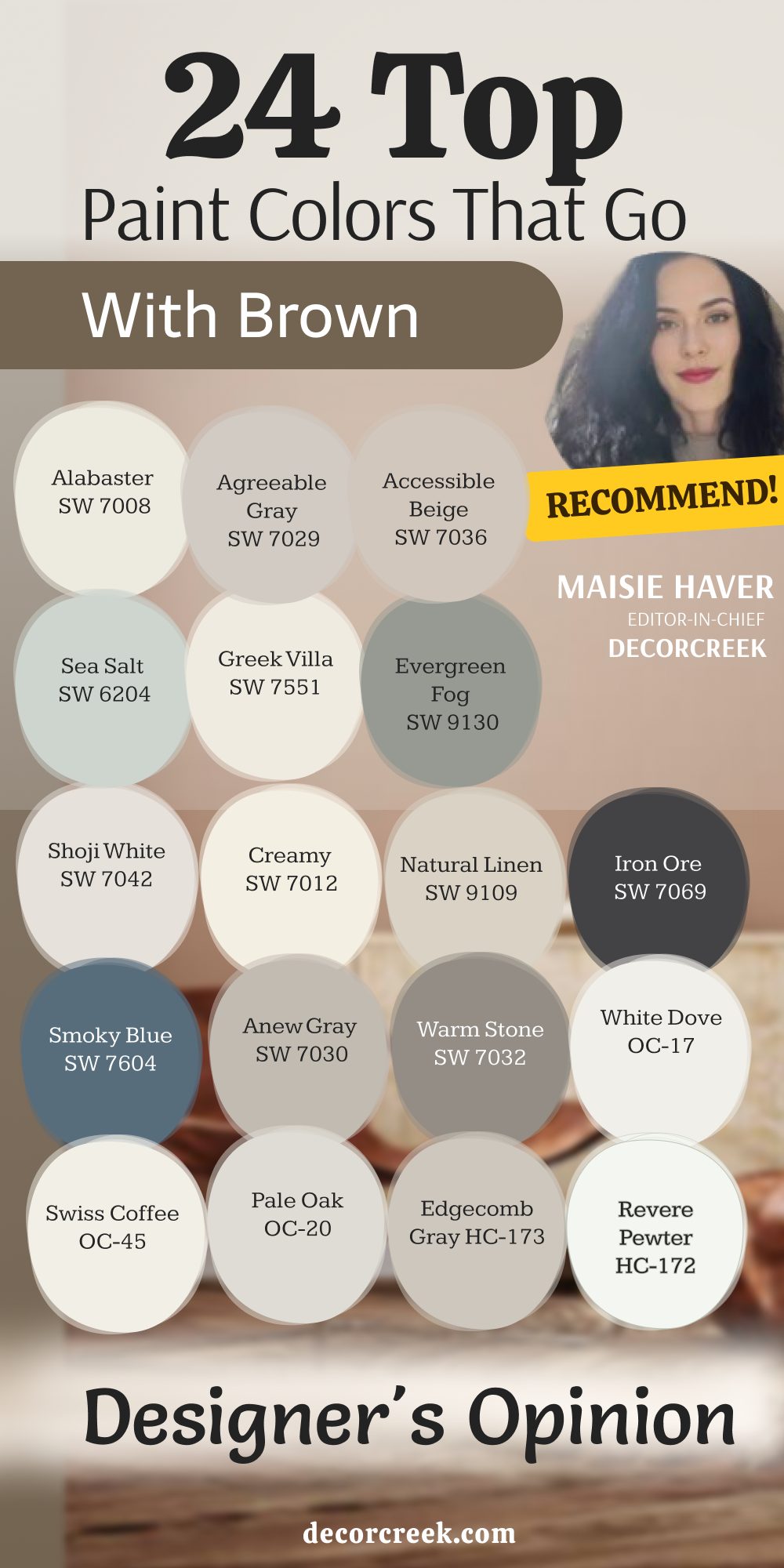
Choosing the right paint color to pair with brown isn’t just about picking a neutral—it’s about managing undertones. You cannot simply throw any random beige or white on the walls and hope for the best. Whether you are dealing with a rich chocolate brown leather sofa, historical dark walnut trim, or those tricky, warm orange-oak floors from a previous decade, the wall color you choose dictates the entire vibe of the room.
A bad match can make your expensive wood look cheap, outdated, or completely lost in the background. When finalizing your palette, keep in mind that balanced greiges and cool neutrals work wonders to tone down intense, fiery wood tones like traditional red oak or honey pine. They cool down the heavy heat coming from those golden finishes and instantly make your home feel fresh and updated.
Deep, moody shades like navy or charcoal provide a stunning, high-contrast backdrop that makes light oak and cognac leather pop with incredible structure. These dark colors absorb the light in a way that frames your lighter wooden furniture like beautiful artwork in a museum. Finally, when opting for a crisp white to contrast with heavy brown furniture, always lean toward soft, warm whites over clinical ones to avoid making the room feel disjointed.
A bright, icy white will fight the natural warmth of the wood grain and look far too harsh on your eyes. Taking the time to test your favorite swatches next to your furniture ensures your chosen shade beautifully balances the warmth of your woodwork. Putting large paint samples on the wall next to your cabinets or floors saves you from expensive mistakes and guarantees a cozy, designer finish.