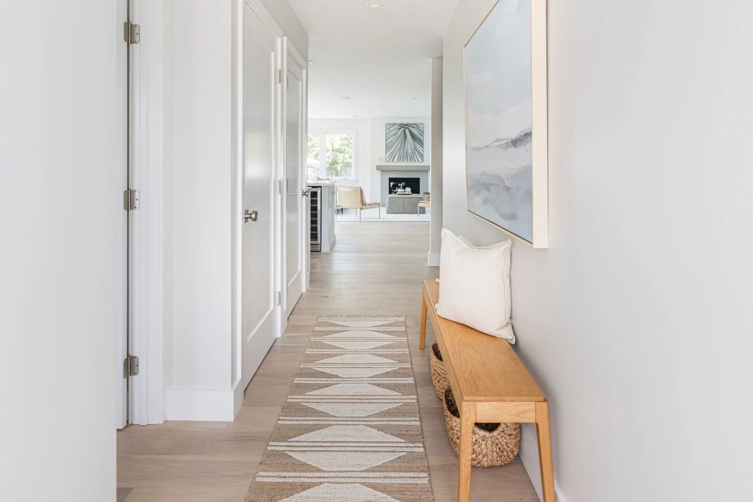
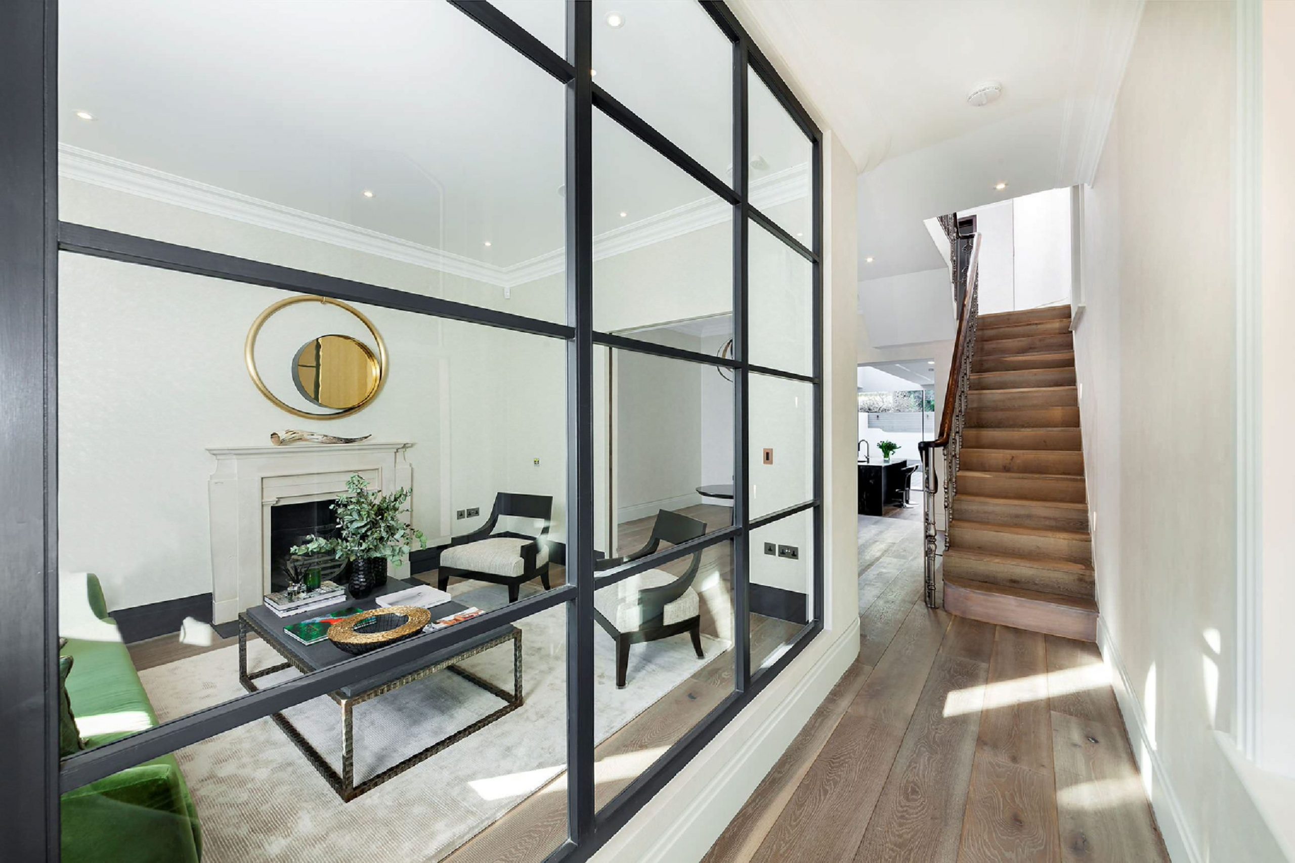
Hallways are the most used parts of any home, serving as the primary arteries that direct the flow of your daily life. I see them as the essential paths that connect your personal journey from one room to another, acting as the connective tissue of your living space. Many people forget about them or treat them as an afterthought, but I truly think they are the most important part of the house to get exactly right.
If your hallway looks dark, cramped, or boring, it inadvertently makes the whole house feel a bit sad and uninspired. A fresh coat of high-quality paint can change everything about your mood and how you feel the moment you walk through your front door. I want to help you pick specific colors that make you feel genuinely happy and proud of the home you have built.
Picking the right shade can magically make a narrow hall feel wide and a deep, dark hall feel surprisingly bright and airy. It is the very first thing people see when they enter, and it sets a powerful tone for the rest of your house.
I love the transformative process of seeing a hallway go from messy or neglected to absolutely beautiful with just a few gallons of paint and a little vision.
Why I Always Trust Sherwin-Williams and Benjamin Moore for Hallway Paint Colors
I have spent many years working as a professional designer and staging various homes to sell in competitive markets. I always go back to these two specific brands because their paint lasts a long time and handles the wear and tear of daily life. Hallways are high-traffic zones that get a lot of accidental bumps and scratches from kids, active pets, and moving heavy furniture.
These companies make specialized paint finishes that you can easily wipe clean without ruining the color or the texture of the look. The colors they offer are incredibly rich and look exactly like the little paper samples you see in the store, which removes all the guesswork.
I never have to worry about the walls looking different or disappointing once the liquid finally dries and the light hits it.
Using high-quality paint saves you a lot of money in the long run because you do not have to fix or repaint it every single year.
Their advanced formulas cover the walls evenly and effectively hide the old, ugly colors that might be underneath. I know that my hard work and your investment will stay looking great for a very long time, maintaining its value.
It makes me feel good and confident knowing the finish will not peel, crack, or fade even in the busiest of households.
How I Choose the Perfect Paint Shades for a Hallway
Picking the perfect color always starts with carefully looking at the specific type of light in your particular hall. Most hallways do not have windows or natural light, so they can feel like a dark cave if you are not careful with your selection. I look closely at the floor color and the specific wood trim before I ever make a final choice to ensure everything is in harmony.
I want the chosen color to lead your eyes naturally into the next room without causing a big shock or a visual disconnect. It is also important to think about how the shade makes you feel emotionally when you are tired from work or in a big hurry to leave. I usually suggest testing a big patch on the wall to see how it looks under artificial light at night and natural light during the day.
My goal is always to find a perfect balance that makes the walls feel sturdy and grounded but not heavy or closing in on you. I also take the time to think about how many doors are in the hall and what color they are painted to ensure a cohesive look. A good choice makes the whole path feel like a warm, intentional part of the family home rather than just a way to get around.
I always want the hallway to feel like a warm welcome that greets you every time you return home.
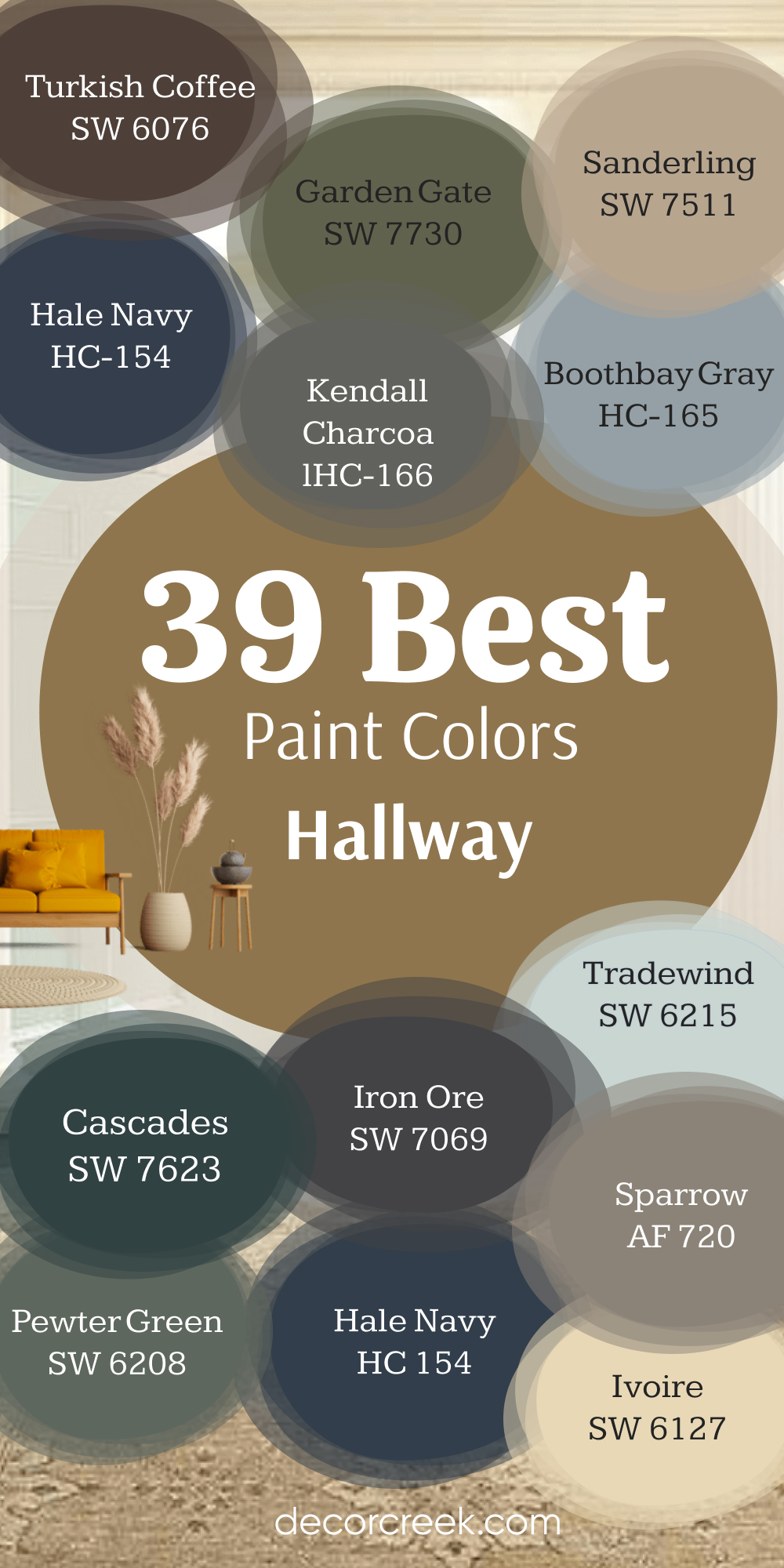
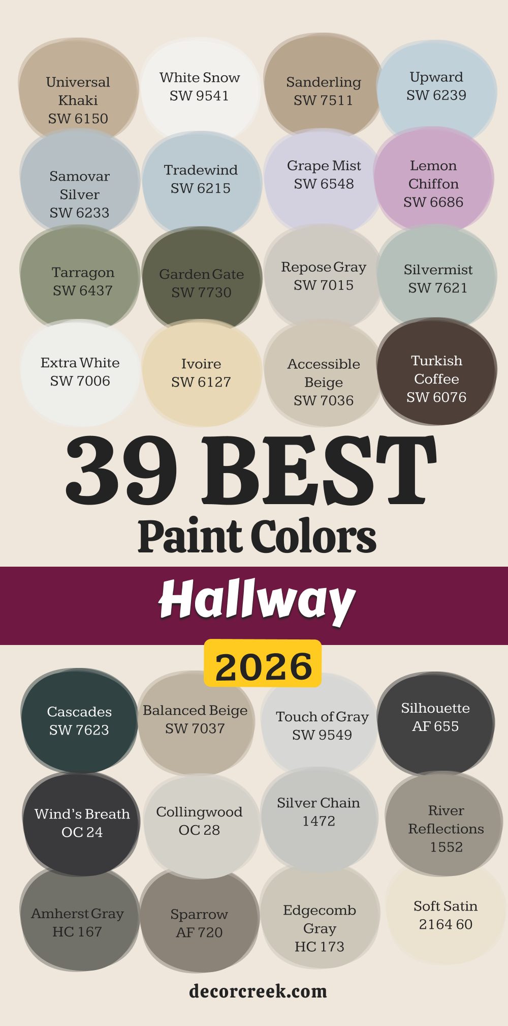
39 Best Hallway Paint Colors In 2026
Universal Khaki SW 6150
Universal Khaki SW 6150 brings a very grounded feeling to any long entrance in your home. This tan shade works well because it hides small scuffs from shoes and bags very easily. It looks great next to dark wood floors or white trim boards.
The tone feels like a warm hug when you step inside after a long day of work. It is a smart choice for families who have dogs that run down the halls. The pigment does not change its look much even when the sun goes down at night.
This choice provides a nice background for hanging family photos in black or gold frames. It is deep enough to have real character without making the hall feel tiny. The finish stays looking fresh for many years because it is a very sturdy option. I think this is one of my favorite picks for a traditional home style.
🎨 Check out the complete guide to this color right HERE 👈
White Snow SW 9541
White Snow SW 9541 is the brightest way to make a dark hallway feel much larger than it is. This crisp option reflects every bit of light coming from the rooms nearby to help you see. It gives a very clean look to the walls that guests will notice right away.
The shade works perfectly if you want a modern and simple feeling in your house. It makes your colorful rugs or artwork stand out as the main stars of the hall. This is a very pure choice that does not have any weird yellow or blue tones in it.
The brightness helps a narrow path feel open and airy instead of tight and crowded. It is a top choice for ceiling paint too if you want everything to match perfectly. This creates a high contrast look when you have dark doors along the hallway. I use this when a homeowner wants a totally fresh start for their entry.
🎨 Check out the complete guide to this color right HERE 👈
Sanderling SW 7513
Sanderling SW 7511 is a medium tan color that reminds me of the sand at a quiet beach. This earthy tone has enough brown in it to feel very natural on your walls. It is wonderful for high traffic areas because it does not show fingerprints very fast.
The warmth makes white doors pop and look very sharp against the slightly darker wall. This choice feels very cozy in the evening when you turn on your hallway lamps. It is a great middle ground for people who do not want white or gray.
The shade works with almost any style of furniture you already have in your home. It gives the hallway a sense of strength and makes it feel like a real room. This is a reliable pick that I have used in many staging projects lately. The color helps create a smooth flow from the living room into the bedrooms.
🎨 Check out the complete guide to this color right HERE 👈
Upward SW 6239
Upward SW 6239 is a light blue that feels like looking at the sky on a clear day. This airy pick brings a sense of peace to a part of the house that is usually busy. It looks very beautiful when paired with light oak floors or gray carpets.
The shade is bright enough to keep the hallway from feeling dark even without windows. This is a fun choice if you want a little bit of color instead of just neutrals. It makes a small hallway feel like it has more breathing room for everyone.
The tone is very popular right now for people who love a coastal or farmhouse look. It feels very light and cheerful every time you walk past it during the day. This is a color that kids and adults both seem to really like in a home. I see it as a great way to add a soft touch to your interior design plan.
🎨 Check out the complete guide to this color right HERE 👈

Samovar Silver SW 6233
Samovar Silver SW 6233 is a blue-gray color that looks very fancy and high-end on walls. This cool option changes its look depending on the light bulbs you use in your hallway. It feels very refreshing when the weather outside is hot and sticky.
This is a great choice if you want your hallway to feel like a luxury hotel. The medium depth hides dust very well which is great for busy moms and dads. It looks amazing with silver or chrome light fixtures on the ceiling.
This selection gives a very steady and professional look to your home entrance. It is deep enough to feel serious but light enough to stay bright during the day. The tone helps the hallway feel connected to other cool rooms in the house. I find this particular shade very relaxing to look at every single day.
🎨 Check out the complete guide to this color right HERE 👈
Tradewind SW 6218
Tradewind SW 6218 is a watery blue that makes you feel like you are on a permanent vacation. This gentle shade is soft so it never feels like it is too much for a small area. It looks wonderful when you have a lot of white trim and crown molding.
The color brings a bit of nature inside your home through the power of paint. This is a very friendly choice that makes guests feel welcome right away. It works well in homes that get a lot of natural light from nearby windows.
This is an option that stays in style for a long time without looking old. It makes the walls feel like they are pushing back to give you more room. I think it is a top pick for creating a soft and pretty hallway for your family. The light blue helps you feel happy as you move from room to room.
Grape Mist SW 6548
Grape Mist SW 6548 is a very light purple that adds a touch of magic to your hallway. This unique pick is different from the usual grays and whites most people pick. It feels very whimsical and lighthearted which is great for a family home.
The shade looks beautiful when the light hits it from an open doorway nearby. It is soft enough that it does not feel like a bright fruit color at all. This selection works surprisingly well with gray floors or dark wood accents.
It gives your hallway a personality that reflects a creative and fun spirit. This is a great choice for a hallway that leads to a childs bedroom or a playroom. The pigment makes the walls look like they have a soft glow in the early morning. I suggest this when someone wants something truly special for their home.
🎨 Check out the complete guide to this color right HERE 👈
Lemon Chiffon SW 6686
Lemon Chiffon SW 6686 is a pale yellow that brings sunshine into the darkest parts of your home. This sunny option makes a hallway feel very warm and bright even on a rainy day. It is a classic choice that feels very traditional and very welcoming to guests.
The shade works great with white trim to create a very clean and bright look. It helps people feel more energetic and happy when they walk through the house. This light shade helps a cramped hallway feel much wider than it really is.
It is a wonderful choice for older homes that need a bit of brightening up. The color looks very pretty with green plants sitting on a hallway table. It reminds me of a happy spring morning all year long. I think this is a great way to add a cheerful vibe to your daily path.
🎨 Check out the complete guide to this color right HERE 👈
Tarragon SW 9660
Tarragon SW 9660 is a soft green that brings the feeling of a garden inside your house. This natural color feels very stable and very quiet on the walls. It looks great with wood doors and other natural materials like wicker or stone.
The shade is dark enough to feel cozy but light enough to not feel like a cave. It helps you feel more connected to the world outside while you are indoors. This is a very trendy choice for 2026 because people love green right now.
It works well as a background for colorful paintings or bright wall decorations. The tone makes the hallway feel like a bridge between the busy living areas. This is an option that stays looking good even if you do not clean the walls often. I make this choice when I want a home to feel very grounded.
🎨 Check out the complete guide to this color right HERE 👈
Garden Gate SW 6167
Garden Gate SW 6167 is a deep and dark green that feels very bold and very stylish. This selection makes a huge statement as soon as someone walks into your hallway. It works best if you have good lighting to show off the rich green tones.
The color feels very expensive and high-class when used with gold light fixtures. It is a great way to make a long hallway feel shorter and more interesting. This dark shade hides every single mark or smudge that might happen on the walls.
It creates a very dramatic look that many modern homeowners love today. The deep green looks stunning next to bright white baseboards and door frames. This is a color that shows you are not afraid to use bold design ideas. I love this pick for making a home feel very custom and special.
🎨 Check out the complete guide to this color right HERE 👈
Repose Gray SW 7015
Repose Gray SW 7015 is a very famous color that looks good in almost every house I visit. This shade is a mix of gray and beige which makes it very easy to match with furniture. It feels very fresh and light when you use it in a long hallway.
The tone is not too cold so it makes the home feel welcoming for your guests. It hides small dust marks very well which helps busy families stay happy. I like how it looks when the sun hits it from a doorway. This choice makes the walls look smooth and very modern.
It is a great pick if you want a neutral look that is not boring. Many people choose this because it makes the hallway feel very open. I think it is a safe and smart choice for a beautiful home.
🎨 Check out the complete guide to this color right HERE 👈

Silvermist SW 7621
Silvermist SW 7621 is a cool blue-green gray that makes a hallway feel like a spa. This color is very light and helps small areas feel much bigger than they are. It looks very pretty next to white trim and light wood floors.
The shade feels very clean and helps you relax as you walk through your home. I often pick this for hallways that lead to bedrooms or bathrooms. It is a very stylish choice for 2026 because people like soft natural colors.
The pigment stays looking nice even if the hallway does not have any windows. It gives a very gentle look to the walls that everyone will enjoy. I think it adds a touch of class to any entry area. This is a great way to make your home feel special and well-designed.
🎨 Check out the complete guide to this color right HERE 👈

Extra White SW 7006
Extra White SW 7006 is a very bright and pure white that makes walls look like brand new. This choice is perfect if you want a very clean and simple look for your home. It reflects all the light in the hallway and makes it feel very airy.
The shade is great for showing off colorful art or dark wood doors. I use this when a hallway feels very tight and needs to feel wider. It makes the whole house look very modern and organized. The finish looks very sharp and helps you see everything clearly.
It is a very popular choice for people who love a minimalist style. I think it makes a hallway feel very honest and bright. This is the best pick for a totally fresh and crisp feeling.
🎨 Check out the complete guide to this color right HERE 👈

Ivoire SW 6127
Ivoire SW 6127 is a warm creamy yellow that makes a hallway feel very sunny. This color is a classic choice for traditional homes that want to feel cozy. It looks very good with dark wood trim and old-fashioned furniture.
The shade helps a dark hall feel like it has its own light source. I think it makes guests feel very welcome as soon as they walk inside. It is a very soft color that does not feel too loud or bright. The tone stays looking warm and nice even during the winter months.
It is a great way to add a bit of color without being too bold. I like how it makes the walls feel very thick and sturdy. This is a wonderful pick for a happy and friendly home.
Accessible Beige SW 7036
Accessible Beige SW 7036 is a very helpful color that goes with everything in your house. This shade is a perfect mix of warm and cool tones for your walls. It makes a hallway feel very steady and very well-planned.
The color hides dirt and scuffs very well which is great for kids and pets. I often suggest this to people who are moving into a new home. It makes the hallway feel like a natural part of the living area. The tone looks very rich and expensive even though it is a simple neutral.
It gives a very smooth look to the walls that lasts for a long time. I think it is one of the best colors for making a house feel ready to live in. This is a top choice for a professional and clean look.
🎨 Check out the complete guide to this color right HERE 👈

Turkish Coffee SW 6076
Turkish Coffee SW 6076 is a very dark and rich brown that makes a hallway feel very grand. This bold choice is perfect for people who want a very dramatic and cozy home. It looks amazing when you have bright white trim and gold decorations.
The shade makes the hallway feel like a library or a fancy hotel. I use this to make a very large hallway feel more like a real room. It is a very warm color that feels very safe and strong.
The pigment covers the walls very well and hides any old marks underneath. It is a great way to show off your unique style and taste. I think it makes the home feel very high-end and very special. This is a brave pick that looks stunning when done right.
🎨 Check out the complete guide to this color right HERE 👈
Cascades SW 7623
Cascades SW 7623 is a deep dark blue-green that brings a lot of mood to a hallway. This color feels very mysterious and very stylish for a modern house. It works very well if you have a lot of light or white furniture.
The shade makes the walls look like they have a lot of depth and history. I think it is a great choice for a hallway that leads to an office or a den. It feels very serious and very cool at the same time. The color is very trendy right now for people who love dark interiors.
It hides everything on the walls so they always look very clean. I like how it makes a long hallway look like a piece of art. This is a perfect pick for a bold and beautiful home.
🎨 Check out the complete guide to this color right HERE 👈
Balanced Beige SW 7037
Balanced Beige SW 7037 is a medium tan color that makes a hallway feel very solid. This shade is a little bit darker than other beiges which gives it more strength. It looks very good with wood floors and green plants.
The color feels very natural and helps you feel more at home. I often pick this for hallways that get a lot of sunlight from windows. It stays looking the same all day long and does not turn yellow.
The tone is very easy to live with and does not feel boring at all. It makes the walls feel very warm and very cozy for your family. I think it is a great choice for a home that wants to feel very grounded. This is a reliable and pretty option for any hallway.
🎨 Check out the complete guide to this color right HERE 👈

Touch of Gray SW 9549
Touch of Gray SW 9549 is a very light and soft gray that looks almost white. This color is perfect for people who want a very light hall but not a pure white. It has a tiny bit of gray in it to keep the walls from looking too cold.
The shade reflects light very well and makes the hall feel very big. I think it looks very elegant next to silver frames and glass lights. It is a very modern choice that feels very fresh for 2026. The pigment is very light so it keeps the hallway feeling very airy.
It is a great choice for small homes or apartments with tight paths. I like how it makes everything in the hall look very clean. This is a wonderful pick for a simple and pretty home.
Silhouette AF 655
Silhouette AF 655 is a very dark charcoal color that looks almost black in some light. This selection is very modern and makes a hallway look very sophisticated. It works great as a background for colorful rugs or bright lights.
The shade makes the hallway feel very private and very quiet. I think it is a great way to make a big statement in your home. It hides every bump on the wall and makes them look very smooth.
The color feels very strong and helps the house feel very well-made. It is a popular pick for people who love a very dramatic look. I like how it makes white doors stand out like pieces of art. This is a top choice for a very stylish and bold hallway.
🎨 Check out the complete guide to this color right HERE 👈
Wind’s Breath OC 24
Wind’s Breath OC 24 is a very soft off-white color that feels very gentle. This shade has a little bit of warmth in it to keep the hallway feeling cozy. It looks very good with almost any floor color you have.
The color makes the walls feel like they are glowing in the daylight. I often pick this for hallways that lead into bright living rooms. It is a very quiet color that does not demand a lot of attention.
The tone feels very light and helps you breathe as you walk through. It is a great choice for a home that wants to feel very soft and friendly. I think it makes the hallway feel very clean and very honest. This is a lovely pick for a simple and warm home.
🎨 Check out the complete guide to this color right HERE 👈
Collingwood OC 28
Collingwood OC 28 is a very popular light gray that looks very high-end. This color is a perfect neutral that does not have any blue or purple in it. It makes a hallway feel very steady and very well-balanced.
The shade looks great with dark wood or light carpet. I like how it makes the hallway feel like a professional gallery. It is a very easy color to match with your existing furniture. The tone stays looking fresh for a very long time and does not go out of style.
It helps a small hallway feel a bit more open and much cleaner. I think it is a great choice for someone who wants a modern but warm look. This is a very smart and pretty pick for your home.
🎨 Check out the complete guide to this color right HERE 👈
Silver Chain 1472
Silver Chain 1472 is a medium gray that looks very clean and very cool. This shade makes a hallway feel very modern and very organized. It looks very good with white trim and silver door handles.
The color is deep enough to hide marks but light enough to stay bright. I think it is a great choice for a family home with lots of activity. It feels very steady and helps the house feel very solid.
The tone does not change much in different types of light bulbs. It makes the walls look very smooth and very professional. I often use this to make a hallway feel more like a real room. This is a reliable and stylish choice for any entrance.
🎨 Check out the complete guide to this color right HERE 👈

River Reflections 1552
River Reflections 1552 is a warm brownish-gray that feels very natural. This color makes a hallway feel very cozy and very safe. It looks very good with stone floors or wood accents. The shade is deep enough to give the hall a lot of personality.
I think it makes guests feel like they are in a very high-quality home. It feels very grounded and helps you relax when you get home. The color hides dirt very well which is great for the front door area.
It gives the walls a very rich look that stays beautiful for years. I like how it makes the hallway feel connected to the outdoors. This is a wonderful pick for a cozy and sturdy home.
🎨 Check out the complete guide to this color right HERE 👈
Amherst Gray HC 167
Amherst Gray HC 167 is a dark gray that looks very strong and very elegant. This color is perfect for people who want a hallway with a lot of character. It looks amazing with bright white trim and dark wood floors.
The shade makes the hallway feel very quiet and very private. I use this to create a very dramatic look in a small area. It feels very expensive and helps the house feel very well-made. The pigment is very thick and covers the walls perfectly.
It is a great choice for a home office hall or a library entrance. I think it makes the walls look very smooth and very deep. This is a bold pick that looks very stylish and modern.
🎨 Check out the complete guide to this color right HERE 👈

Sparrow AF 720
Sparrow AF 720 is a warm gray-brown that feels very soft and very natural. This color makes a hallway feel very cozy and very welcoming. It looks very good with beige carpets and warm wood trim.
The shade is a great middle ground for people who want a dark look without it being too heavy. I think it makes the hallway feel like a warm hug for your family. It hides scuffs very well and stays looking clean for a long time.
The tone is very easy on the eyes and helps you feel more at home. It makes the walls look very rich and very high-quality. I often pick this for homes that have a lot of natural materials. This is a lovely and steady choice for any hallway.
🎨 Check out the complete guide to this color right HERE 👈
Edgecomb Gray HC 173
Edgecomb Gray HC 173 is a very famous light gray-beige that goes with everything. This color is very light and helps a hallway feel very open and bright. It looks very good in houses that have a lot of light coming in.
The shade is a perfect mix of warm and cool for your walls. I think it makes the whole house feel very clean and very modern. It is a very safe choice that everyone seems to love.
The tone stays looking fresh and pretty all through the day. It helps a small hall feel much wider and more friendly. I often use this for staging homes because it looks so good to everyone. This is a top pick for a bright and happy hallway.
🎨 Check out the complete guide to this color right HERE 👈

Soft Satin 2164 60
Soft Satin 2164 60 is a very light and creamy color that feels very elegant. This shade makes a hallway feel very warm and very soft. It looks very good with gold frames and white flowers.
The color makes the walls feel like they are made of expensive silk. I think it is a great choice for a formal hallway or a front entry. It feels very clean and helps guests feel very welcome in your home. The pigment is very light but has a lot of warmth in it.
It helps a dark hallway feel much brighter without being too cold. I like how it makes the walls look very smooth and very pretty. This is a wonderful pick for a soft and classy home.
Driftwood 2107 40
Driftwood 2107 40 is a medium gray-brown that looks very natural and earthy. This color makes a hallway feel very steady and very well-grounded. It looks very good with wood floors and green plants on a table.
The shade reminds me of the beach and feels very relaxing. I think it is a great choice for a family that loves nature. It hides dirt and marks very well which is good for busy halls.
The tone feels very solid and helps the house feel very strong. It gives the walls a lot of character and a very rich look. I like how it stays looking the same even in low light. This is a reliable and pretty choice for a cozy home.
Hale Navy HC 154
Hale Navy HC 154 is a very dark and famous blue that looks very grand. This color makes a hallway look like a very expensive and stylish place. It looks amazing next to white trim and light wood floors.
The shade is very deep and makes the walls feel very strong. I use this to make a hallway feel more like a real part of the home design. It feels very classic and will never go out of style.
The pigment is very rich and makes the walls look very smooth. It is a great choice for a house that wants to feel very high-end. I think it makes guests feel very impressed when they walk in. This is a bold and beautiful pick for any home.
🎨 Check out the complete guide to this color right HERE 👈

Copley Gray HC 104
Copley Gray HC 104 is a medium gray with a bit of green and brown in it. This color makes a hallway feel very natural and very well-balanced. It looks very good with dark wood and stone accents.
The shade is deep enough to hide scuffs but light enough to stay friendly. I think it makes the home feel very sturdy and very well-made. It feels very quiet and helps you relax as you move through the house.
The tone looks very professional and keeps the walls looking clean. It is a great choice for a traditional home that wants a modern touch. I like how it makes the hallway feel like a bridge to the outside world. This is a wonderful and steady pick for your walls.
🎨 Check out the complete guide to this color right HERE 👈

Gray Owl OC 52
Gray Owl OC 52 is a very light gray that has a tiny bit of green in it. This color makes a hallway feel very fresh and very cool. It looks very good in houses that have a lot of natural light.
The shade helps a small hallway feel very open and much bigger. I think it makes the whole house feel very clean and very organized. It is a very popular choice for modern homes and apartments.
The tone stays looking very bright and helps you see everything clearly. It is a very safe and pretty choice for anyone who loves gray. I like how it makes white doors look very sharp and new. This is a top pick for a light and airy hallway.
🎨 Check out the complete guide to this color right HERE 👈

Pashmina AF 100
Pashmina AF 100 is a medium gray-beige that looks very rich and very cozy. This color makes a hallway feel very warm and very well-planned. It looks very good with both light and dark furniture in your home.
The shade is deep enough to have its own personality without being too loud. I think it makes guests feel very comfortable as soon as they visit. It feels very steady and helps the house feel very solid.
The pigment hides dirt very well which is great for high traffic halls. It gives the walls a very smooth and high-quality look. I often pick this for homes that want a neutral but fancy feeling. This is a reliable and beautiful choice for any entry.
🎨 Check out the complete guide to this color right HERE 👈

Classic Burgundy HC 182
Classic Burgundy HC 182 is a very deep and dark red that looks very traditional. This color makes a hallway feel very grand and very important. It looks amazing with gold decorations and dark wood trim.
The shade makes the hallway feel like a part of a very old and fancy house. I use this to add a lot of drama and warmth to a small area. It feels very cozy in the winter and very stylish all year long.
The pigment is very rich and covers the walls perfectly. It is a great way to show that you have a very bold and classic style. I think it makes the hallway feel very warm and very special for guests. This is a brave pick that adds a lot of value to your home look.
🎨 Check out the complete guide to this color right HERE 👈
Georgian Green HC 115
Georgian Green HC 115 is a soft and natural green that feels very quiet. This color makes a hallway feel like a garden path inside your home. It looks very good with wood doors and light colored carpets.
The shade is very friendly and helps people feel more at home. I think it is a great choice for a family that loves a traditional look. It feels very steady and helps you relax after a busy day. The tone stays looking fresh and does not feel too bright or too dark.
It gives the walls a very gentle and pretty look for a long time. I like how it makes the hallway feel connected to nature. This is a wonderful and soft pick for your home.
🎨 Check out the complete guide to this color right HERE 👈
White Dove OC 17
White Dove OC 17 is a very soft and famous white that everyone loves. This color has a tiny bit of warmth in it so it never feels too cold. It makes a hallway feel very bright and very clean without being harsh.
The shade looks very good with almost any other color you pick for your rooms. I often use this for all the trim and the walls to make it simple. It reflects light very well and helps a small hall feel much wider.
The tone stays looking beautiful for years and is very easy to clean. It is a very popular choice for people who want a classic and light home. I think it makes the hallway feel very honest and very friendly. This is a top pick for a beautiful and bright entrance.
🎨 Check out the complete guide to this color right HERE 👈

Stonington Gray HC 170
Stonington Gray HC 170 is a very clean and professional gray for your walls. This color makes a hallway feel very modern and very well-organized. It looks very good with white trim and silver or black hardware.
The shade is a perfect middle gray that does not look blue or brown. I think it makes the home feel very solid and very high-quality. It feels very cool and helps you stay focused as you walk through.
The tone stays looking fresh and does not show dust very easily. It helps a hallway feel like a real room and not just a path. I often pick this for homes that want a very sharp and clean look. This is a very smart and pretty choice for any hallway.
🎨 Check out the complete guide to this color right HERE 👈

Revere Pewter HC 172
Revere Pewter HC 172 is perhaps the most famous paint color for any home. This shade is a perfect mix of gray and beige that looks good in any light. It makes a hallway feel very warm and very modern at the same time.
The color goes with every type of floor and every style of furniture. I think it is the best choice for people who are not sure what to pick. It hides scuffs and dirt very well which is great for busy families.
The tone looks very rich and makes the walls look very smooth. It helps a hallway feel very steady and very well-balanced. I use this more than any other color because it always works. This is a reliable and beautiful pick for your entry path.
🎨 Check out the complete guide to this color right HERE 👈

Horizon OC 53
Horizon OC 53 is a very light gray that looks almost like a soft mist. This color makes a hallway feel very airy and very open to the rest of the house. It looks very good with white trim and glass light fixtures.
The shade is very light so it helps a dark hall feel much brighter. I think it makes the hallway feel very clean and very quiet. It is a very modern choice that feels very fresh for 2026. The pigment is very light and helps you see everything clearly.
It is a great choice for small apartments or narrow hallways. I like how it makes the walls look very smooth and very pretty. This is a wonderful pick for a simple and bright home.
🎨 Check out the complete guide to this color right HERE 👈

36 Trendy Hallway Paint Ideas
Alabaster SW 7008
Alabaster SW 7008 is a very soft and warm white that feels very cozy on the walls. This shade is not too bright so it makes the hallway feel very friendly. It looks very good with wood floors and natural light.
The color makes the walls feel like they are glowing in the morning. I often pick this for homes that want a clean but warm look. It is a very popular choice for a farmhouse or a traditional home.
The tone stays looking fresh and is very easy to match with your rugs. It helps a small hallway feel much wider and more open. I think it makes guests feel very welcome in your house. This is a top pick for a soft and beautiful entrance.
🎨 Check out the complete guide to this color right HERE 👈

Snowbound SW 7004
Snowbound SW 7004 is a crisp white that has a tiny bit of gray in it to keep it soft. This color makes a hallway feel very clean and very modern. It works great if you have a lot of cool colors in the rest of your home.
The shade reflects light perfectly and makes a narrow path feel very wide. I think it is a great choice for a hallway that leads to a laundry room or a bath. It feels very fresh and stays looking new for a long time.
The tone is very easy on the eyes and helps you see your path clearly. It makes the whole house feel very organized and very bright. I like how it looks next to black door handles and dark floors. This is a wonderful and sharp pick for your walls.
🎨 Check out the complete guide to this color right HERE 👈

Pure White SW 7005
Pure White SW 7005 is a very steady and reliable white that I use all the time. This shade is not too blue and not too yellow which makes it perfect for any home. It makes a hallway feel very bright and very professional.
The color looks amazing with any type of artwork you want to hang. I think it is a great choice for a home that wants a very clean look. It helps the hallway feel connected to all the other rooms in the house.
The tone stays looking exactly like the sample and does not change in the dark. It is a very popular choice for people who love a minimalist style. I think it makes the hallway feel very honest and very bright. This is a top pick for a fresh and simple entrance.
🎨 Check out the complete guide to this color right HERE 👈

Shoji White SW 7042
Shoji White SW 7042 is a very warm and creamy off-white that feels very soft. This color makes a hallway feel like a warm hug for your family. It looks very good with natural wood and beige carpets.
The shade is not too bright so it feels very quiet and very relaxed. I often pick this for hallways that lead to cozy bedrooms. It feels very gentle and helps you slow down as you move through your home.
The tone stays looking warm even on a cloudy day. It helps a hallway feel very sturdy and very well-made. I think it makes the walls look very smooth and very pretty. This is a lovely and warm pick for your home.
🎨 Check out the complete guide to this color right HERE 👈

Greek Villa SW 7551
Greek Villa SW 7551 is a sunny and warm white that makes a hallway feel very welcoming. This color has a lot of personality and feels very high-end. It looks very good with gold frames and bright white trim.
The shade makes the walls look like they have their own light source. I think it is a great choice for a traditional or Mediterranean home. It feels very clean but still has a lot of heart and warmth.
The tone stays looking very bright and helps guests feel at home right away. It makes the hallway feel very open and very friendly. I like how it makes the walls look very rich and very thick. This is a wonderful pick for a happy and bright home.
🎨 Check out the complete guide to this color right HERE 👈

Creamy SW 7012
Creamy SW 7012 is a classic and rich off-white that feels very traditional. This color makes a hallway feel very soft and very cozy. It looks very good with dark wood floors and old-fashioned lights.
The shade is very warm and helps a dark hall feel much more inviting. I think it is a great choice for an older home with lots of history. It feels very steady and helps the house feel very solid.
The tone stays looking nice and warm all through the year. It gives the walls a very gentle and pretty look that lasts. I like how it makes the hallway feel like a real part of the living area. This is a reliable and soft pick for your walls.
🎨 Check out the complete guide to this color right HERE 👈

Natural Linen SW 9109
Natural Linen SW 9109 is a warm beige that looks like a high-quality fabric on your walls. This color makes a hallway feel very cozy and very well-balanced. It looks very good with green plants and wood furniture.
The shade is deep enough to hide dirt but light enough to stay friendly. I think it makes the home feel very grounded and very safe. It feels very natural and helps you relax when you get home from work.
The tone stays looking the same in different kinds of light. It makes the walls look very rich and very smooth. I often pick this for homes that want a neutral but warm feeling. This is a wonderful and steady pick for any entry.
🎨 Check out the complete guide to this color right HERE 👈

Accessible Beige SW 7036
Accessible Beige SW 7036 is a color that works in almost every hallway I have ever seen. This shade is a perfect mix of warm and cool tones that goes with everything. It makes a hallway feel very steady and very well-planned.
The color hides dirt and scuffs very well which is great for a busy house. I often suggest this to people who want a neutral look that is not white. It makes the hallway feel like a natural part of the main living area.
The tone looks very expensive and gives the walls a very smooth look. It stays looking fresh for a long time and is very easy to live with. I think it is one of the best colors for making a house feel ready to live in. This is a top choice for a professional and clean look.
🎨 Check out the complete guide to this color right HERE 👈
Balanced Beige SW 7037
Balanced Beige SW 7037 is a medium tan color that makes a hallway feel very solid. This shade is a little bit darker than other beiges which gives it more strength. It looks very good with dark wood floors and white door frames.
The color feels very natural and helps the house feel very well-grounded. I often pick this for hallways that get a lot of light from other rooms. It stays looking the same all day long and does not turn yellow or gray.
The tone is very easy to live with and feels very cozy for your family. It makes the walls feel very warm and very sturdy. I think it is a great choice for a home that wants to feel very safe. This is a reliable and pretty option for any hallway.
🎨 Check out the complete guide to this color right HERE 👈
Anew Gray SW 7030
Anew Gray SW 7030 is a warm gray that looks very modern and very clean. This color is a bit deeper than other grays which gives it a lot of style. It looks very good with silver hardware and light wood trim.
The shade makes a hallway feel very professional and very well-organized. I think it is a great choice for a family home with lots of activity. It feels very steady and helps the house feel very solid.
The tone does not show marks very easily which is good for high traffic paths. It makes the walls look very smooth and very high-quality. I often use this to make a hallway feel more like a real room. This is a smart and stylish choice for any entrance.
🎨 Check out the complete guide to this color right HERE 👈
Repose Gray SW 7015
Repose Gray SW 7015 is one of my favorite colors to use in a long and narrow hallway. This shade is a perfect mix of gray and beige that looks good in any house. It feels very fresh and light and helps the hall feel much wider.
The tone is not too cold so it makes the home feel very welcoming. It hides small dust marks very well which helps busy parents stay happy. I like how it looks when the sun hits it from an open doorway.
This choice makes the walls look smooth and very modern for 2026. It is a great pick if you want a look that is stylish but not loud. Many people choose this because it makes the hallway feel very open. I think it is a safe and smart choice for a beautiful home.
🎨 Check out the complete guide to this color right HERE 👈
Agreeable Gray SW 7029
Agreeable Gray SW 7029 is a color that many people say is the best gray ever made. This shade has just enough warmth to make a hallway feel cozy instead of cold. It looks very good with almost any floor color or rug you pick.
The color makes a hallway feel very steady and very well-balanced. I think it is the best choice for people who want a neutral look that works everywhere. It hides dirt and scuffs very well which is great for kids and pets.
The tone looks very rich and makes the walls look very smooth. It helps a hallway feel very modern and very professional. I use this more than any other color because it always makes a house look better. This is a reliable and beautiful pick for your entry path.
🎨 Check out the complete guide to this color right HERE 👈

Mindful Gray SW 7016
Mindful Gray SW 7016 is a medium gray that feels very serious and very stylish. This color is dark enough to make a big statement in a hallway. It looks amazing next to bright white trim and light colored floors.
The shade makes the hallway feel very quiet and very private for your family. I use this to make a hallway feel like a real part of the home design. It feels very strong and helps the house feel very well-made.
The pigment is very rich and covers any old marks on the walls perfectly. It is a great choice for a home office hall or a library entrance. I think it makes the walls look very smooth and very deep. This is a bold pick that looks very stylish and modern.
🎨 Check out the complete guide to this color right HERE 👈

Silvermist SW 7621
Silvermist SW 7621 is a cool blue-green gray that makes a hallway feel like a quiet garden. This color is very light and helps small areas feel much bigger than they are. It looks very pretty next to white trim and light wood floors.
The shade feels very clean and helps you relax as you walk through your home. I often pick this for hallways that lead to bedrooms or bathrooms. It is a very stylish choice for 2026 because people love soft natural tones.
The pigment stays looking nice even if the hallway does not have any windows. It gives a very gentle look to the walls that everyone will enjoy. I think it adds a touch of class to any entry area. This is a great way to make your home feel special and well-designed.
Sea Salt SW 6204
Sea Salt SW 6204 is a very light and watery green that feels very refreshing. This color makes a hallway feel very bright and very airy all day long. It looks very good with white trim and natural wood accents.
The shade brings a touch of the outdoors inside your home in a soft way. I think it is a great choice for a beach house or a farmhouse style. It feels very gentle and helps guests feel very relaxed when they visit.
The tone stays looking very clean and helps a small hallway feel much wider. It makes the walls look like they have a soft glow in the light. I like how it makes the whole house feel very lighthearted and happy. This is a wonderful and pretty pick for your daily path.
🎨 Check out the complete guide to this color right HERE 👈

Tradewind SW 6215
Tradewind SW 6215 is a soft blue that makes you feel like you are looking at the ocean. This color is very gentle and helps a hallway feel very bright and very open. It looks wonderful when you have a lot of white doors and crown molding.
The shade brings a sense of peace to a busy part of the house. I think it is a very friendly choice that makes everyone feel welcome. It works well in homes that get a lot of natural light from nearby rooms.
This is an option that stays in style for a long time without looking old. It makes the walls feel like they are pushing back to give you more room. I think it is a top pick for creating a soft and pretty hallway for your family. The light blue helps you feel happy every morning.

Comfort Gray SW 6205
Comfort Gray SW 6205 is a medium green-gray that feels very steady and natural. This color makes a hallway feel very cozy and very well-balanced. It looks very good with dark wood floors and stone tile.
The shade is deep enough to have its own personality without being too loud. I think it makes the home feel very sturdy and very well-grounded. It feels very quiet and helps you relax after a long day of work.
The tone stays looking the same in different kinds of light bulbs. It gives the walls a very rich and high-quality look for years. I often pick this for homes that want a neutral but deep feeling. This is a reliable and beautiful choice for any entry.
🎨 Check out the complete guide to this color right HERE 👈

Evergreen Fog SW 9130
Evergreen Fog SW 9130 is a very trendy gray-green that looks very modern. This color makes a hallway feel very stylish and very well-designed for 2026. It looks amazing next to light wood trim and gold light fixtures.
The shade brings a lot of mood and character to a small part of the house. I think it is a great way to make a hallway feel more like a real room. It feels very natural and helps you feel more connected to the earth.
The pigment is very rich and hides any marks on the walls very well. It is a popular pick for people who love a new and fresh look. I like how it makes a long hallway look like a piece of art. This is a perfect pick for a bold and beautiful home.
🎨 Check out the complete guide to this color right HERE 👈

Pewter Green SW 6208
Pewter Green SW 6208 is a dark and moody green that feels very professional. This color makes a statement as soon as you walk into the hallway. It looks very good with bright white trim and dark metal hardware.
The shade makes the hallway feel very quiet and very private for your family. I use this to create a very dramatic and high-end look in your home. It feels very expensive and helps the house feel very well-made.
The tone stays looking very deep and hides every scuff and mark. It is a great choice for a home that wants to show off a bold style. I think it makes guests feel very impressed when they see your walls. This is a brave pick that looks stunning and very modern.
🎨 Check out the complete guide to this color right HERE 👈

Urbane Bronze SW 7048
Urbane Bronze SW 7048 is a very dark brownish-gray that looks very grand. This color makes a hallway look like a very expensive and stylish place. It looks amazing next to light wood floors and white door frames.
The shade is very deep and makes the walls feel very strong and solid. I use this to make a hallway feel more like a real part of the home design. It feels very classic and very modern at the exact same time.
The pigment is very rich and makes the walls look very smooth. It is a great choice for a house that wants to feel very high-end. I think it makes guests feel like they are in a very special home. This is a bold and beautiful pick for any entry path.
🎨 Check out the complete guide to this color right HERE 👈

Iron Ore SW 7069
Iron Ore SW 7069 is a very dark charcoal color that looks very sharp on walls. This selection is very modern and makes a hallway look very sophisticated. It works great as a background for colorful rugs or bright ceiling lights.
The shade makes the hallway feel very private and very quiet for you. I think it is a great way to make a big statement in a small area. It hides every bump on the wall and makes them look very smooth.
The color feels very strong and helps the house feel very well-built. It is a popular pick for people who love a very dramatic and dark look. I like how it makes white doors stand out like pieces of art. This is a top choice for a very stylish and bold hallway.
🎨 Check out the complete guide to this color right HERE 👈

Tricorn Black SW 6258
Tricorn Black SW 6258 is the deepest black paint you can pick for your hallway. This color makes a huge statement and looks very high-end and modern. It looks amazing next to bright white trim and gold light fixtures.
The shade makes the hallway feel very dramatic and very stylish for 2026. I use this to create a very unique look that guests will always remember. It feels very solid and helps the house feel very expensive.
The pigment covers the walls perfectly and hides any old marks underneath. It is a great choice for a home that wants to show off a brave style. I think it makes the walls look like a gallery for your favorite art. This is a top pick for a bold and very beautiful entrance.
🎨 Check out the complete guide to this color right HERE 👈

White Dove OC 17
White Dove OC 17 is a very soft and famous white that everyone loves to use. This color has a tiny bit of warmth so it never feels too cold. It makes a hallway feel very bright and very clean without being harsh.
The shade looks very good with almost any other color you have in your house. I often use this for all the trim and the walls to make it simple. It reflects light very well and helps a small hall feel much wider.
The tone stays looking beautiful for years and is very easy to wipe clean. It is a very popular choice for people who want a classic and light home. I think it makes the hallway feel very honest and very friendly. This is a top pick for a beautiful and bright entrance.
🎨 Check out the complete guide to this color right HERE 👈
Swiss Coffee OC 45
Swiss Coffee OC 45 is a creamy off-white that feels very soft and welcoming. This color makes a hallway feel very warm and very cozy for your family. It looks very good with wood floors and natural light from nearby rooms.
The shade is not too bright so it feels very quiet and very relaxed. I often pick this for homes that want a clean but traditional look. It feels very gentle and helps you slow down as you move through the house.
The tone stays looking warm even on a dark or rainy day. It helps a hallway feel very sturdy and very well-maintained. I think it makes the walls look very smooth and very pretty. This is a lovely and warm pick for your home path.
🎨 Check out the complete guide to this color right HERE 👈

Wind’s Breath OC 24
Wind’s Breath OC 24 is a very soft and gentle off-white for your walls. This shade has just enough warmth to keep the hallway feeling very cozy. It looks very good with almost any floor color or carpet you have.
The color makes the walls feel like they are glowing in the daylight. I often pick this for hallways that lead into bright and sunny living rooms. It is a very quiet color that does not demand a lot of attention.
The tone feels very light and helps you breathe as you walk through. It is a great choice for a home that wants to feel very soft and friendly. I think it makes the hallway feel very clean and very honest. This is a lovely pick for a simple and warm home.
🎨 Check out the complete guide to this color right HERE 👈
Collingwood OC 28
Collingwood OC 28 is a very popular light gray that looks very high-quality. This color is a perfect neutral that does not have any blue or purple in it. It makes a hallway feel very steady and very well-balanced for your guests.
The shade looks great with dark wood or light colored carpets. I like how it makes the hallway feel like a professional and clean gallery. It is a very easy color to match with all of your existing furniture.
The tone stays looking fresh for a very long time and never looks old. It helps a small hallway feel a bit more open and much cleaner. I think it is a great choice for someone who wants a modern but warm look. This is a very smart and pretty pick for your home.
🎨 Check out the complete guide to this color right HERE 👈

Edgecomb Gray HC 173
Edgecomb Gray HC 173 is a very famous light gray-beige that works everywhere. This color is very light and helps a hallway feel very open and bright. It looks very good in houses that have a lot of natural light coming in.
The shade is a perfect mix of warm and cool for your hallway walls. I think it makes the whole house feel very clean and very modern. It is a very safe choice that almost every homeowner seems to love.
The tone stays looking fresh and pretty all through the busy day. It helps a small hall feel much wider and more friendly for guests. I often use this for staging homes because it looks so good to everyone. This is a top pick for a bright and happy hallway.
🎨 Check out the complete guide to this color right HERE 👈
Gray Owl OC 52
Gray Owl OC 52 is a very light gray that has a tiny bit of green in it. This color makes a hallway feel very fresh and very cool on the eyes. It looks very good in houses that have a lot of natural light and white trim.
The shade helps a small hallway feel very open and much bigger than it is. I think it makes the whole house feel very clean and very organized. It is a very popular choice for modern homes and new apartments.
The tone stays looking very bright and helps you see everything clearly. It is a very safe and pretty choice for anyone who loves light gray. I like how it makes white doors look very sharp and brand new. This is a top pick for a light and airy hallway.
🎨 Check out the complete guide to this color right HERE 👈
Stonington Gray HC 170
Stonington Gray HC 170 is a very clean and professional gray for your walls. This color makes a hallway feel very modern and very well-organized. It looks very good with white trim and silver or black door hardware.
The shade is a perfect middle gray that does not look too blue or too brown. I think it makes the home feel very solid and very high-quality. It feels very cool and helps you stay focused as you walk through.
The tone stays looking fresh and does not show dust very easily. It helps a hallway feel like a real room and not just a dark path. I often pick this for homes that want a very sharp and clean look. This is a very smart and pretty choice for any hallway.
🎨 Check out the complete guide to this color right HERE 👈
Revere Pewter HC 172
Revere Pewter HC 172 is the most popular paint color for a hallway for a reason. This shade is a perfect mix of gray and beige that looks good in any light. It makes a hallway feel very warm and very modern at the same time.
The color goes with every type of floor and every style of furniture you have. I think it is the best choice for people who are not sure which color to pick. It hides scuffs and dirt very well which is great for families with kids.
The tone looks very rich and makes the walls look very smooth and clean. It helps a hallway feel very steady and very well-balanced for everyone. I use this more than any other color because it always works. This is a reliable and beautiful pick for your entry path.
🎨 Check out the complete guide to this color right HERE 👈
Pashmina AF 100
Pashmina AF 100 is a medium gray-beige that looks very rich and very cozy. This color makes a hallway feel very warm and very well-planned for your family. It looks very good with both light and dark furniture in your home.
The shade is deep enough to have its own personality without being too loud. I think it makes guests feel very comfortable as soon as they visit you. It feels very steady and helps the house feel very solid and well-built.
The pigment hides dirt very well which is great for high traffic hallway areas. It gives the walls a very smooth and high-quality look for many years. I often pick this for homes that want a neutral but very fancy feeling. This is a reliable and beautiful choice for any entry.
🎨 Check out the complete guide to this color right HERE 👈
Hale Navy HC 154
Hale Navy HC 154 is a very dark and famous blue that looks very grand. This color makes a hallway look like a very expensive and stylish place to be. It looks amazing next to white trim and light wood floors or carpets.
The shade is very deep and makes the walls feel very strong and sturdy. I use this to make a hallway feel more like a real part of the home design. It feels very classic and will never go out of style for your house.
The pigment is very rich and makes the walls look very smooth and professional. It is a great choice for a house that wants to feel very high-end. I think it makes guests feel very impressed when they walk into your home. This is a bold and beautiful pick for any hallway.
🎨 Check out the complete guide to this color right HERE 👈
Kendall Charcoal HC 166
Kendall Charcoal HC 166 is a very deep and rich gray that looks very stylish. This color makes a hallway feel very modern and very private for your family. It looks amazing next to bright white door frames and light wood floors.
The shade brings a lot of mood and character to a small part of the house. I use this to create a very dramatic and high-quality look for your home. It feels very solid and helps the house feel very well-built and sturdy.
The tone stays looking very deep and hides every single mark and smudge. It is a great choice for a home that wants to show off a very bold style. I think it makes guests feel very impressed when they see your dark walls. This is a brave pick that looks stunning and very modern.
🎨 Check out the complete guide to this color right HERE 👈

Amherst Gray HC 167
Amherst Gray HC 167 is a dark gray that looks very strong and very elegant. This color is perfect for people who want a hallway with a lot of character. It looks amazing with bright white trim and dark wood floors or rugs.
The shade makes the hallway feel very quiet and very private for everyone. I use this to create a very dramatic and high-end look in a small area. It feels very expensive and helps the house feel very well-made and solid.
The pigment is very thick and covers the walls perfectly with rich color. It is a great choice for a home office hall or a library entrance. I think it makes the walls look very smooth and very deep and rich. This is a bold pick that looks very stylish and modern for 2026.
🎨 Check out the complete guide to this color right HERE 👈
Van Deusen Blue HC 156
Van Deusen Blue HC 156 is a deep and classic blue that feels very high-end. This color makes a hallway look very sophisticated and very well-designed for you. It looks amazing next to white trim and natural wood furniture or floors.
The shade is very deep and helps the hallway feel like a real room. I use this to add a lot of style and personality to your entry path. It feels very classic and will always look good in any type of house.
The pigment is very rich and makes the walls look very smooth and strong. It is a great choice for a family that wants a bold and beautiful color. I think it makes guests feel very welcome and very impressed when they visit. This is a top pick for a very stylish and pretty hallway.
🎨 Check out the complete guide to this color right HERE 👈

Horizon OC 53
Horizon OC 53 is a very light gray that looks almost like a soft mist. This color makes a hallway feel very airy and very open to the rest of the house. It looks very good with white trim and glass light fixtures on the ceiling.
The shade is very light so it helps a dark hall feel much brighter. I think it makes the hallway feel very clean and very quiet for your family. It is a very modern choice that feels very fresh and new for 2026.
The pigment is very light and helps you see everything in the hall clearly. It is a great choice for small apartments or narrow hallways in any home. I like how it makes the walls look very smooth and very pretty. This is a wonderful pick for a simple and bright home entrance.
🎨 Check out the complete guide to this color right HERE 👈
21 Best Paint Color For The Hallway By Sherwin Williams
Alabaster SW 7008
Alabaster SW 7008 is a wonderful warm white from the Sherwin Williams collection. This shade makes a hallway feel very clean and very cozy at the same time. It looks great with almost any other color you have in your house.
The color reflects light in a very soft way that is easy on the eyes. I think it is one of the best choices for a happy and bright home. It stays looking fresh for a long time and is easy to wipe clean.
The tone makes the hallway feel very open and very friendly for guests. It is a very popular pick for designers because it always looks good. I like how it makes the walls look very smooth and very high-quality. This is a top choice for a warm and inviting hallway.
🎨 Check out the complete guide to this color right HERE 👈
Snowbound SW 7004
Snowbound SW 7004 is a clean white that Sherwin Williams makes for a crisp look. This color makes a hallway feel very fresh and very modern for your family. It works great if you have cool gray or blue colors in other rooms.
The shade reflects light perfectly and makes a narrow path feel very wide and open. I think it is a great choice for a hallway that needs to feel very clean. It feels very new and stays looking great even with lots of use every day.
The tone is very easy on the eyes and helps you see your way clearly. It makes the whole house feel very organized and very bright for everyone. I like how it looks next to dark wood floors and black hardware. This is a wonderful and sharp pick for any hallway walls.
🎨 Check out the complete guide to this color right HERE 👈
Pure White SW 7005
Pure White SW 7005 is a very steady and reliable white that I use quite often. This shade is a perfect middle white that does not look yellow or blue. It makes a hallway feel very bright and very professional for your guests.
The color looks amazing with any type of colorful art you want to hang. I think it is a great choice for a home that wants a very clean look. It helps the hallway feel connected to all the other parts of the house.
The tone stays looking exactly like you expect and does not change much. It is a very popular choice for people who love a minimalist and simple style. I think it makes the hallway feel very honest and very bright. This is a top pick for a fresh and simple home entry.
🎨 Check out the complete guide to this color right HERE 👈
Shoji White SW 7042
Shoji White SW 7042 is a very warm and creamy white that feels very soft. This color makes a hallway feel like a warm and cozy part of your home. It looks very good with natural wood doors and beige carpets or rugs.
The shade is not too bright so it feels very quiet and very relaxed. I often pick this for hallways that lead into family rooms or bedrooms. It feels very gentle and helps you slow down as you walk through.
The tone stays looking warm even when the weather outside is very cloudy. It helps a hallway feel very sturdy and very well-maintained for your family. I think it makes the walls look very smooth and very pretty for years. This is a lovely and warm pick for any house path.
🎨 Check out the complete guide to this color right HERE 👈
Greek Villa SW 7551
Greek Villa SW 7551 is a sunny and warm white that makes a hallway feel welcome. This color has a lot of personality and feels very high-end and fancy. It looks very good with gold frames and bright white trim and doors.
The shade makes the walls look like they have their own light inside them. I think it is a great choice for a traditional home that wants to feel bright. It feels very clean but still has a lot of heart and warmth for guests.
The tone stays looking very bright and helps everyone feel at home right away. It makes the hallway feel very open and very friendly for your family. I like how it makes the walls look very rich and very thick. This is a wonderful pick for a happy and bright home.
🎨 Check out the complete guide to this color right HERE 👈
Creamy SW 7012
Creamy SW 7012 is a classic off-white that feels very traditional and very soft. This color makes a hallway feel very cozy and very inviting for your guests. It looks very good with dark wood floors and older light fixtures or art.
The shade is very warm and helps a dark hallway feel much more friendly. I think it is a great choice for a home with a lot of wood trim. It feels very steady and helps the house feel very solid and well-built.
The tone stays looking nice and warm all through the different seasons. It gives the walls a very gentle and pretty look that lasts for years. I like how it makes the hallway feel like a real part of the home. This is a reliable and soft pick for your walls.
🎨 Check out the complete guide to this color right HERE 👈
Accessible Beige SW 7036
Accessible Beige SW 7036 is a famous Sherwin Williams color that goes with everything. This shade is a perfect mix of warm and cool tones for any hallway. It makes a hallway feel very steady and very well-planned for your family.
The color hides dirt and scuffs very well which is great for busy homes. I often suggest this to people who want a neutral look that is not white. It makes the hallway feel like a natural part of the whole house design.
The tone looks very expensive and gives the walls a very smooth finish. It stays looking fresh for a long time and is very easy to live with. I think it is one of the best colors for making a house look good. This is a top choice for a professional and clean look.
🎨 Check out the complete guide to this color right HERE 👈
Balanced Beige SW 7037
Balanced Beige SW 7037 is a medium tan color that makes a hallway feel very solid. This shade is a little bit darker than other beiges which gives it strength. It looks very good with dark wood floors and bright white door frames.
The color feels very natural and helps the house feel very well-grounded. I often pick this for hallways that get a lot of light from other areas. It stays looking the same all day long and does not turn yellow.
The tone is very easy to live with and feels very cozy for your family. It makes the walls feel very warm and very sturdy for many years. I think it is a great choice for a home that wants to feel safe. This is a reliable and pretty option for any hallway.
🎨 Check out the complete guide to this color right HERE 👈
Anew Gray SW 7030
Anew Gray SW 7030 is a warm gray from Sherwin Williams that looks very modern. This color is a bit deeper than other grays which gives it a lot of style. It looks very good with silver hardware and light wood trim or floors.
The shade makes a hallway feel very professional and very well-organized. I think it is a great choice for a family home with lots of activity. It feels very steady and helps the house feel very solid and well-made.
The tone does not show marks very easily which is good for high traffic. It makes the walls look very smooth and very high-quality for your guests. I often use this to make a hallway feel more like a real room. This is a smart and stylish choice for any entrance.
🎨 Check out the complete guide to this color right HERE 👈
Agreeable Gray SW 7029
Agreeable Gray SW 7029 is the most popular gray color that Sherwin Williams makes. This shade has just enough warmth to make a hallway feel cozy and not cold. It looks very good with almost any floor color or carpet you have chosen.
The color makes a hallway feel very steady and very well-balanced for everyone. I think it is the best choice for people who want a neutral look everywhere. It hides dirt and scuffs very well which is great for kids and pets.
The tone looks very rich and makes the walls look very smooth and clean. It helps a hallway feel very modern and very professional for your family. I use this color more than any other because it always looks good. This is a reliable and beautiful pick for your entry path.
🎨 Check out the complete guide to this color right HERE 👈
Repose Gray SW 7015
Repose Gray SW 7015 is a very beautiful gray that looks good in every hallway. This shade is a perfect mix of gray and beige that looks good in any light. It feels very fresh and light and helps the hall feel much wider and open.
The tone is not too cold so it makes the home feel very welcoming. It hides small dust marks very well which helps busy families stay very happy. I like how it looks when the sun hits it from a doorway or window.
This choice makes the walls look smooth and very modern for the year 2026. It is a great pick if you want a look that is stylish but quiet. Many people choose this because it makes the hallway feel very open. I think it is a safe and smart choice for a home.
🎨 Check out the complete guide to this color right HERE 👈
Mindful Gray SW 7016
Mindful Gray SW 7016 is a medium gray that feels very serious and very stylish. This color is dark enough to make a big statement in your home hallway. It looks amazing next to bright white trim and light wood floors or rugs.
The shade makes the hallway feel very quiet and very private for your family. I use this to make a hallway feel like a real part of the home design. It feels very strong and helps the house feel very well-made and solid.
The pigment is very rich and covers any old marks on the walls perfectly. It is a great choice for a home office hall or a library entrance path. I think it makes the walls look very smooth and very deep. This is a bold pick that looks very stylish and modern.
🎨 Check out the complete guide to this color right HERE 👈
Silvermist SW 7621
Silvermist SW 7621 is a cool blue-green gray that makes a hallway feel like a spa. This color is very light and helps small areas feel much bigger than they are. It looks very pretty next to white trim and light wood floors in your home.
The shade feels very clean and helps you relax as you walk through the house. I often pick this for hallways that lead to bedrooms or guest bathrooms. It is a very stylish choice for 2026 because people love soft and natural colors.
The pigment stays looking nice even if the hallway does not have any windows. It gives a very gentle look to the walls that everyone in the family will enjoy. I think it adds a touch of class to any entry area. This is a great way to make your home feel special.
Sea Salt SW 6204
Sea Salt SW 6204 is a very light and watery green that feels very refreshing to see. This color makes a hallway feel very bright and very airy all day long. It looks very good with white trim and natural wood furniture or floors.
The shade brings a touch of the outdoors inside your home in a soft way. I think it is a great choice for a beach house or a farmhouse style home. It feels very gentle and helps guests feel very relaxed when they visit you.
The tone stays looking very clean and helps a small hallway feel much wider. It makes the walls look like they have a soft glow in the natural light. I like how it makes the whole house feel very happy. This is a wonderful and pretty pick for your daily path.
🎨 Check out the complete guide to this color right HERE 👈
Tradewind SW 6218
Tradewind SW 6218 is a soft blue that makes you feel like you are looking at the sky. This color is very gentle and helps a hallway feel very bright and very open. It looks wonderful when you have a lot of white doors and crown molding.
The shade brings a sense of peace to a busy part of your family home. I think it is a very friendly choice that makes everyone feel welcome. It works well in homes that get a lot of light from other nearby rooms.
This is an option that stays in style for a long time without looking old. It makes the walls feel like they are pushing back to give you room. I think it is a top pick for creating a soft and pretty hallway. The light blue helps you feel happy every single morning.
Comfort Gray SW 6205
Comfort Gray SW 6205 is a medium green-gray that feels very steady and very natural. This color makes a hallway feel very cozy and very well-balanced for everyone. It looks very good with dark wood floors and stone or tile floors.
The shade is deep enough to have its own personality without being too loud. I think it makes the home feel very sturdy and very well-grounded for your family. It feels very quiet and helps you relax after a long day of hard work.
The tone stays looking the same in different kinds of light bulbs or lamps. It gives the walls a very rich and high-quality look for many years. I often pick this for homes that want a neutral but deep feeling. This is a reliable and beautiful choice for any entry.
🎨 Check out the complete guide to this color right HERE 👈
Evergreen Fog SW 9130
Evergreen Fog SW 9130 is a very trendy gray-green that looks very modern and new. This color makes a hallway feel very stylish and very well-designed for your home. It looks amazing next to light wood trim and gold light fixtures on the wall.
The shade brings a lot of mood and character to a small part of the house. I think it is a great way to make a hallway feel more like a real room. It feels very natural and helps you feel more connected to the earth.
The pigment is very rich and hides any marks on the walls very well. It is a popular pick for people who love a new and fresh green look. I like how it makes a long hallway look like a piece of art. This is a perfect pick for a bold and beautiful home.
🎨 Check out the complete guide to this color right HERE 👈
Pewter Green SW 6208
Pewter Green SW 6208 is a dark and moody green that feels very professional on walls. This color makes a statement as soon as you walk into the home hallway. It looks very good with bright white trim and dark metal door hardware.
The shade makes the hallway feel very quiet and very private for your family. I use this to create a very dramatic and high-end look in your home. It feels very expensive and helps the house feel very well-made and solid.
The tone stays looking very deep and hides every scuff and mark very easily. It is a great choice for a home that wants to show off a bold style. I think it makes guests feel very impressed when they see your walls. This is a brave pick that looks stunning and modern.
🎨 Check out the complete guide to this color right HERE 👈
Urbane Bronze SW 7048
Urbane Bronze SW 7048 is a very dark brownish-gray that looks very grand and fancy. This color makes a hallway look like a very expensive and stylish place to be. It looks amazing next to light wood floors and white door frames and trim.
The shade is very deep and makes the walls feel very strong and solid. I use this to make a hallway feel more like a real part of the home design. It feels very classic and very modern at the exact same time for you.
The pigment is very rich and makes the walls look very smooth and clean. It is a great choice for a house that wants to feel very high-end. I think it makes guests feel like they are in a very special home. This is a bold and beautiful pick for any entry path.
🎨 Check out the complete guide to this color right HERE 👈
Iron Ore SW 7069
Iron Ore SW 7069 is a very dark charcoal color that looks very sharp on your walls. This selection is very modern and makes a hallway look very sophisticated and clean. It works great as a background for colorful rugs or bright ceiling light fixtures.
The shade makes the hallway feel very private and very quiet for you. I think it is a great way to make a big statement in a small area. It hides every bump on the wall and makes them look very smooth for years.
The color feels very strong and helps the house feel very well-built and sturdy. It is a popular pick for people who love a very dramatic and dark look. I like how it makes white doors stand out like pieces of art. This is a top choice for a very stylish and bold hallway.
🎨 Check out the complete guide to this color right HERE 👈
Tricorn Black SW 6258
Tricorn Black SW 6258 is the deepest black paint you can pick for your family hallway. This color makes a huge statement and looks very high-end and very modern. It looks amazing next to bright white trim and gold light fixtures on the wall.
The shade makes the hallway feel very dramatic and very stylish for 2026. I use this to create a very unique look that guests will always remember. It feels very solid and helps the house feel very expensive and well-made.
The pigment covers the walls perfectly and hides any old marks underneath very well. It is a great choice for a home that wants to show off a brave style. I think it makes the walls look like a gallery for your favorite art. This is a top pick for a bold and very beautiful entrance.
🎨 Check out the complete guide to this color right HERE 👈
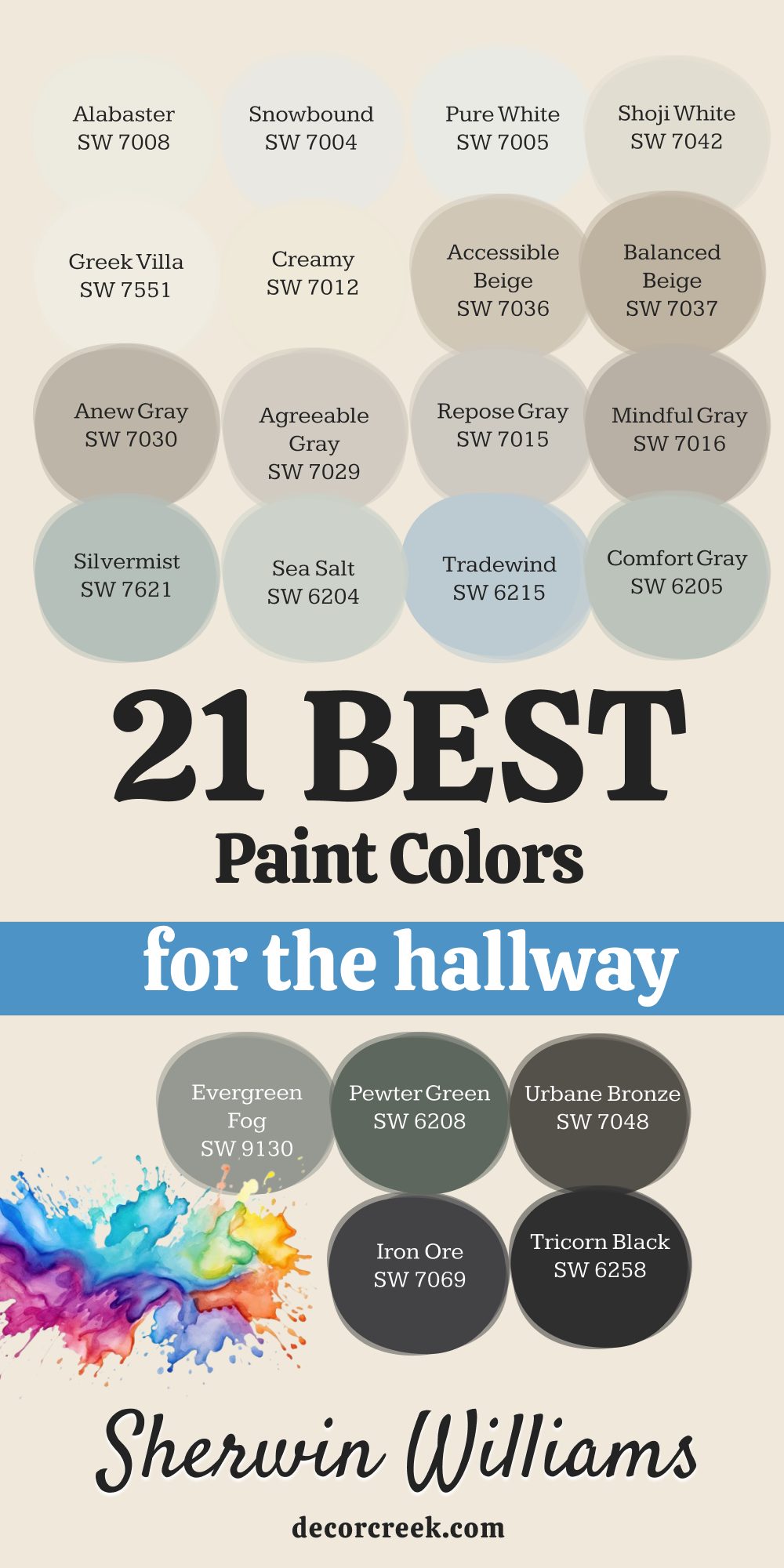
17 Best Paint Colors For The Hallway By Benjamin Moore
White Dove OC 17
White Dove OC 17 is a very soft and famous white that everyone loves to use. This color has a tiny bit of warmth so it never feels too cold. It makes a hallway feel very bright and very clean without being harsh.
The shade looks very good with almost any other color you pick for your rooms. I often use this for all the trim and the walls to make it simple. It reflects light very well and helps a small hall feel much wider.
The tone stays looking beautiful for years and is very easy to clean. It is a very popular choice for people who want a classic and light home. I think it makes the hallway feel very honest and very friendly. This is a top pick for a beautiful and bright entrance.
🎨 Check out the complete guide to this color right HERE 👈
Swiss Coffee OC 45
Swiss Coffee OC 45 is a creamy off-white from Benjamin Moore that feels very soft. This color makes a hallway feel very warm and very cozy for your family. It looks very good with wood floors and natural light from nearby open rooms.
The shade is not too bright so it feels very quiet and very relaxed. I often pick this for homes that want a clean but traditional look. It feels very gentle and helps you slow down as you move through the house.
The tone stays looking warm even on a dark or rainy winter day. It helps a hallway feel very sturdy and very well-maintained for your family. I think it makes the walls look very smooth and very pretty for years. This is a lovely and warm pick for your home path.
🎨 Check out the complete guide to this color right HERE 👈
Wind’s Breath OC 24
Wind’s Breath OC 24 is a very soft and gentle off-white for your hallway walls. This shade has just enough warmth to keep the hallway feeling very cozy. It looks very good with almost any floor color or carpet you have chosen.
The color makes the walls feel like they are glowing in the natural daylight. I often pick this for hallways that lead into bright and sunny living rooms. It is a very quiet color that does not demand a lot of attention.
The tone feels very light and helps you breathe as you walk through. It is a great choice for a home that wants to feel very soft and friendly. I think it makes the hallway feel very clean and very honest for guests. This is a lovely pick for a simple and warm home.
🎨 Check out the complete guide to this color right HERE 👈
Collingwood OC 28
Collingwood OC 28 is a very popular light gray that looks very high-quality. This color is a perfect neutral that does not have any blue or purple in it. It makes a hallway feel very steady and very well-balanced for your guests.
The shade looks great with dark wood or light colored carpets in your home. I like how it makes the hallway feel like a professional and clean gallery. It is a very easy color to match with all of your existing furniture.
The tone stays looking fresh for a very long time and never looks old. It helps a small hallway feel a bit more open and much cleaner for you. I think it is a great choice for someone who wants a modern but warm look. This is a very smart and pretty pick for your home.
🎨 Check out the complete guide to this color right HERE 👈
Edgecomb Gray HC 173
Edgecomb Gray HC 173 is a very famous light gray-beige that works in any hallway. This color is very light and helps a hallway feel very open and bright. It looks very good in houses that have a lot of natural light coming in.
The shade is a perfect mix of warm and cool for your hallway walls. I think it makes the whole house feel very clean and very modern. It is a very safe choice that almost every homeowner seems to love.
The tone stays looking fresh and pretty all through the busy day. It helps a small hall feel much wider and more friendly for your guests. I often use this for staging homes because it looks so good to everyone. This is a top pick for a bright and happy hallway.
🎨 Check out the complete guide to this color right HERE 👈
Gray Owl OC 52
Gray Owl OC 52 is a very light gray that has a tiny bit of green in it. This color makes a hallway feel very fresh and very cool on your eyes. It looks very good in houses that have a lot of natural light and white trim.
The shade helps a small hallway feel very open and much bigger than it is. I think it makes the whole house feel very clean and very organized. It is a very popular choice for modern homes and new apartments lately.
The tone stays looking very bright and helps you see everything in the hall clearly. It is a very safe and pretty choice for anyone who loves light gray. I like how it makes white doors look very sharp and brand new. This is a top pick for a light and airy hallway.
🎨 Check out the complete guide to this color right HERE 👈
Stonington Gray HC 170
Stonington Gray HC 170 is a very clean and professional gray for your hallway walls. This color makes a hallway feel very modern and very well-organized. It looks very good with white trim and silver or black door hardware.
The shade is a perfect middle gray that does not look too blue or brown. I think it makes the home feel very solid and very high-quality for everyone. It feels very cool and helps you stay focused as you walk through.
The tone stays looking fresh and does not show dust very easily for you. It helps a hallway feel like a real room and not just a dark path. I often pick this for homes that want a very sharp and clean look. This is a very smart and pretty choice for any hallway.
🎨 Check out the complete guide to this color right HERE 👈
Revere Pewter HC 172
Revere Pewter HC 172 is the most popular paint color for a hallway for a good reason. This shade is a perfect mix of gray and beige that looks good in any light. It makes a hallway feel very warm and very modern at the same time.
The color goes with every type of floor and every style of furniture you have. I think it is the best choice for people who are not sure which color to pick. It hides scuffs and dirt very well which is great for families with kids.
The tone looks very rich and makes the walls look very smooth and clean. It helps a hallway feel very steady and very well-balanced for everyone. I use this more than any other color because it always works. This is a reliable and beautiful pick for your entry path.
🎨 Check out the complete guide to this color right HERE 👈
Pashmina AF 100
Pashmina AF 100 is a medium gray-beige that looks very rich and very cozy on walls. This color makes a hallway feel very warm and very well-planned for your family. It looks very good with both light and dark furniture in your home.
The shade is deep enough to have its own personality without being too loud. I think it makes guests feel very comfortable as soon as they visit you. It feels very steady and helps the house feel very solid and well-built.
The pigment hides dirt very well which is great for high traffic hallway areas. It gives the walls a very smooth and high-quality look for many years to come. I often pick this for homes that want a neutral but very fancy feeling. This is a reliable and beautiful choice for any entry.
🎨 Check out the complete guide to this color right HERE 👈
Horizon OC 53
Horizon OC 53 is a very light gray that looks almost like a soft mist in the hall. This color makes a hallway feel very airy and very open to the rest of the house. It looks very good with white trim and glass light fixtures on the ceiling.
The shade is very light so it helps a dark hall feel much brighter. I think it makes the hallway feel very clean and very quiet for your family. It is a very modern choice that feels very fresh and new for the year 2026.
The pigment is very light and helps you see everything in the hall clearly. It is a great choice for small apartments or narrow hallways in any home. I like how it makes the walls look very smooth and very pretty. This is a wonderful pick for a simple and bright home entrance.
🎨 Check out the complete guide to this color right HERE 👈
Silver Chain 1472
Silver Chain 1472 is a medium gray that looks very clean and very cool on walls. This shade from Benjamin Moore makes a hallway feel very modern and organized. It looks very good with white trim and silver door handles or hooks.
The color is deep enough to hide marks but light enough to stay bright. I think it is a great choice for a family home with lots of activity. It feels very steady and helps the house feel very solid and well-made.
The tone does not change much in different types of light bulbs or lamps. It makes the walls look very smooth and very professional for your guests. I often use this to make a hallway feel more like a real room. This is a reliable and stylish choice for any entrance.
🎨 Check out the complete guide to this color right HERE 👈
Amherst Gray HC 167
Amherst Gray HC 167 is a dark gray that looks very strong and very elegant. This color is perfect for people who want a hallway with a lot of character. It looks amazing with bright white trim and dark wood floors or rugs.
The shade makes the hallway feel very quiet and very private for everyone. I use this to create a very dramatic and high-end look in a small area. It feels very expensive and helps the house feel very well-made and solid.
The pigment is very thick and covers the walls perfectly with rich color. It is a great choice for a home office hall or a library entrance path. I think it makes the walls look very smooth and very deep and rich. This is a bold pick that looks very stylish and modern.
🎨 Check out the complete guide to this color right HERE 👈
Kendall Charcoal HC 166
Kendall Charcoal HC 166 is a very deep and rich gray that looks very stylish. This color makes a hallway feel very modern and very private for your family. It looks amazing next to bright white door frames and light wood floors.
The shade brings a lot of mood and character to a small part of your house. I use this to create a very dramatic and high-quality look for your home. It feels very solid and helps the house feel very well-built and sturdy for you.
The tone stays looking very deep and hides every single mark and smudge. It is a great choice for a home that wants to show off a very bold style. I think it makes guests feel very impressed when they see your dark walls. This is a brave pick that looks stunning and very modern.
🎨 Check out the complete guide to this color right HERE 👈
Hale Navy HC 154
Hale Navy HC 154 is a very dark and famous blue that looks very grand and fancy. This color makes a hallway look like a very expensive and stylish place to be. It looks amazing next to white trim and light wood floors or carpets.
The shade is very deep and makes the walls feel very strong and sturdy. I use this to make a hallway feel more like a real part of the home design. It feels very classic and will never go out of style for your house.
The pigment is very rich and makes the walls look very smooth and professional. It is a great choice for a house that wants to feel very high-end. I think it makes guests feel very impressed when they walk into your home. This is a bold and beautiful pick for any hallway.
🎨 Check out the complete guide to this color right HERE 👈
Van Deusen Blue HC 156
Van Deusen Blue HC 156 is a deep and classic blue that feels very high-end. This color makes a hallway look very sophisticated and very well-designed for you. It looks amazing next to white trim and natural wood furniture or floors.
The shade is very deep and helps the hallway feel like a real room. I use this to add a lot of style and personality to your entry path. It feels very classic and will always look good in any type of house.
The pigment is very rich and makes the walls look very smooth and strong. It is a great choice for a family that wants a bold and beautiful color. I think it makes guests feel very welcome and very impressed when they visit. This is a top pick for a very stylish and pretty hallway.
🎨 Check out the complete guide to this color right HERE 👈
Georgian Green HC 115
Georgian Green HC 115 is a soft and natural green that feels very quiet and calm. This color makes a hallway feel like a garden path inside your family home. It looks very good with wood doors and light colored carpets or rugs.
The shade is very friendly and helps people feel more at home when they visit. I think it is a great choice for a family that loves a traditional look. It feels very steady and helps you relax after a busy day of work.
The tone stays looking fresh and does not feel too bright or too dark. It gives the walls a very gentle and pretty look for a long time. I like how it makes the hallway feel connected to nature. This is a wonderful and soft pick for your home.
🎨 Check out the complete guide to this color right HERE 👈
Classic Gray OC 23
Classic Gray OC 23 is a very light and airy gray that feels very sophisticated. This color makes a hallway feel very bright and very clean every single day. It looks very good with white trim and dark wood doors or furniture.
The shade is so light that it almost looks like a soft white in some light. I think it is a great choice for a home that wants a modern and fresh feeling. It helps a small hallway feel much wider and more open for everyone.
The tone stays looking very clean and stays in style for many years. It makes the walls look very smooth and very high-quality for your guests. I like how it makes the hallway feel like a bright bridge between rooms. This is a top pick for a beautiful and simple home.
🎨 Check out the complete guide to this color right HERE 👈

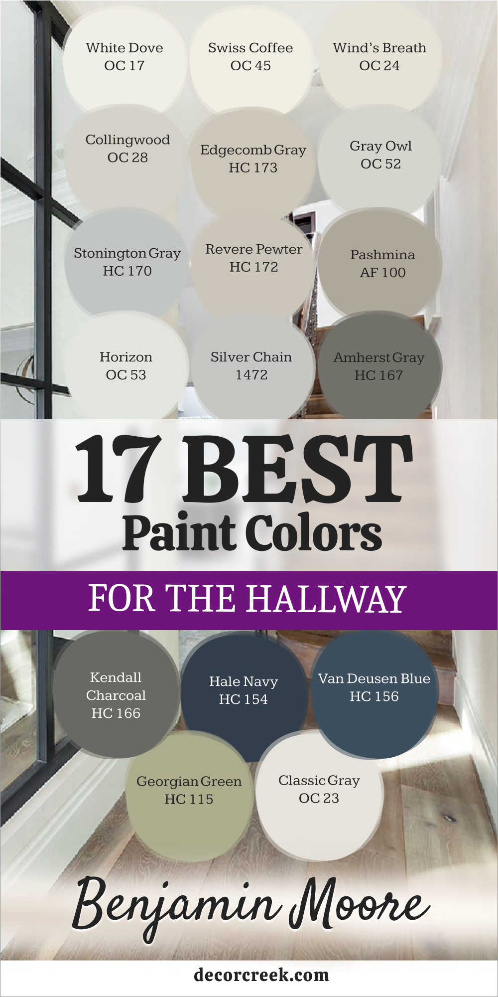
My Final Thoughts For The 39 Trendy Paint Colors For The Hallway
I hope this extensive list helps you feel much more confident and inspired about picking a brand-new look for your home. Changing the hallway is truly the fastest and most effective way to make your whole house feel fresh, updated, and new again.
I always tell my clients to trust their gut instinct when they see a color they love, as that initial spark usually leads to the best design choice.
Your home should be a personal sanctuary that makes you feel genuinely good every single time you walk through it.
Remember to carefully look at your unique light sources and your specific floors before you commit to buying the paint.
Using professional brands like Sherwin-Williams and Benjamin Moore will make the entire job much easier for you because their overall quality is so remarkably high. I know you can create a beautiful and welcoming path that your family and friends will enjoy for a very long time.
Please take your time to sample these options and pick the exact shade that speaks to your heart and matches your personal style.
A fresh hallway acts as a wonderful transition between rooms and provides a fresh start for your whole day. Investing time in this small space will pay off every time you step through your front door and feel a sense of pride. You deserve to live in a space that reflects your taste and brings a smile to your face with every step.