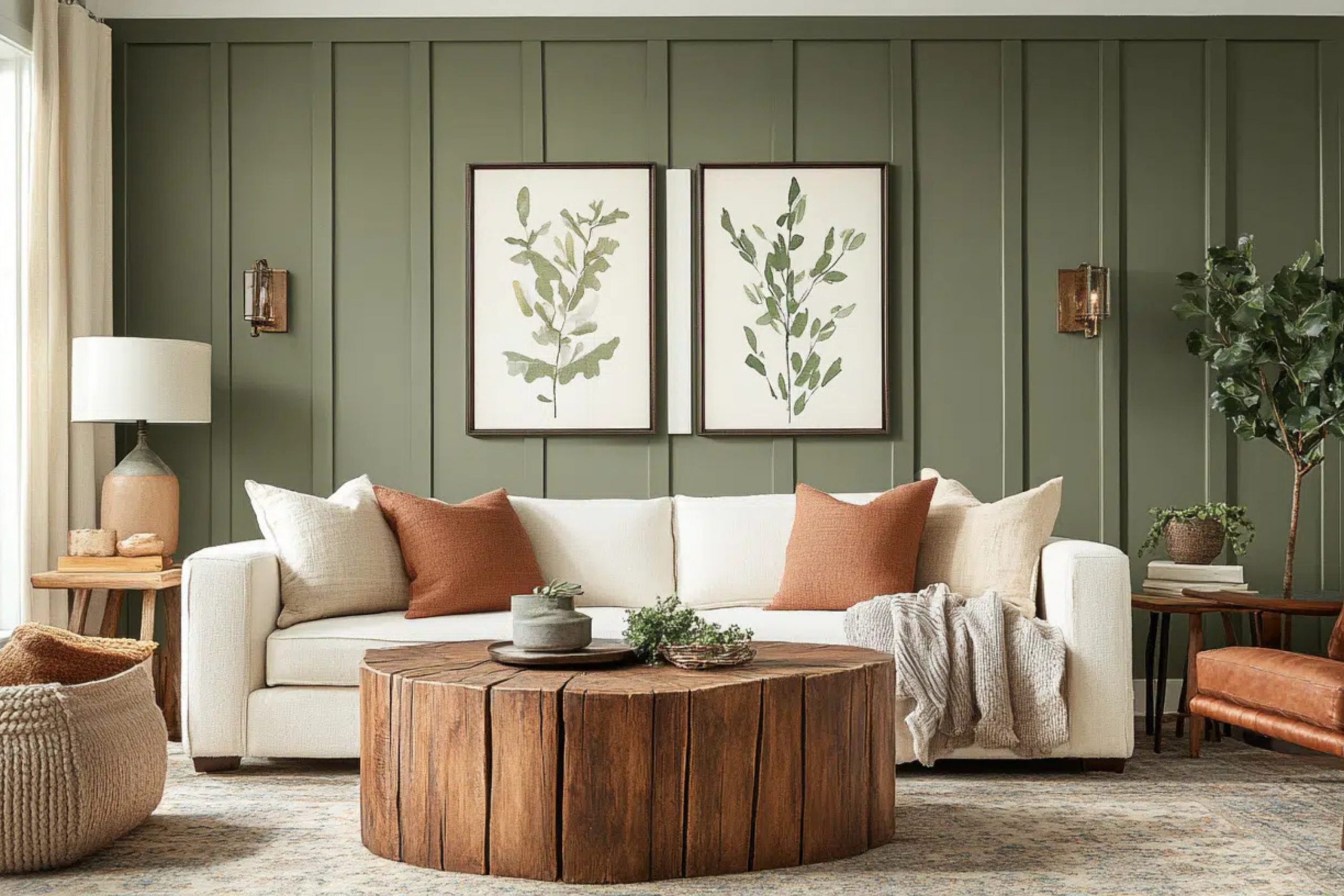
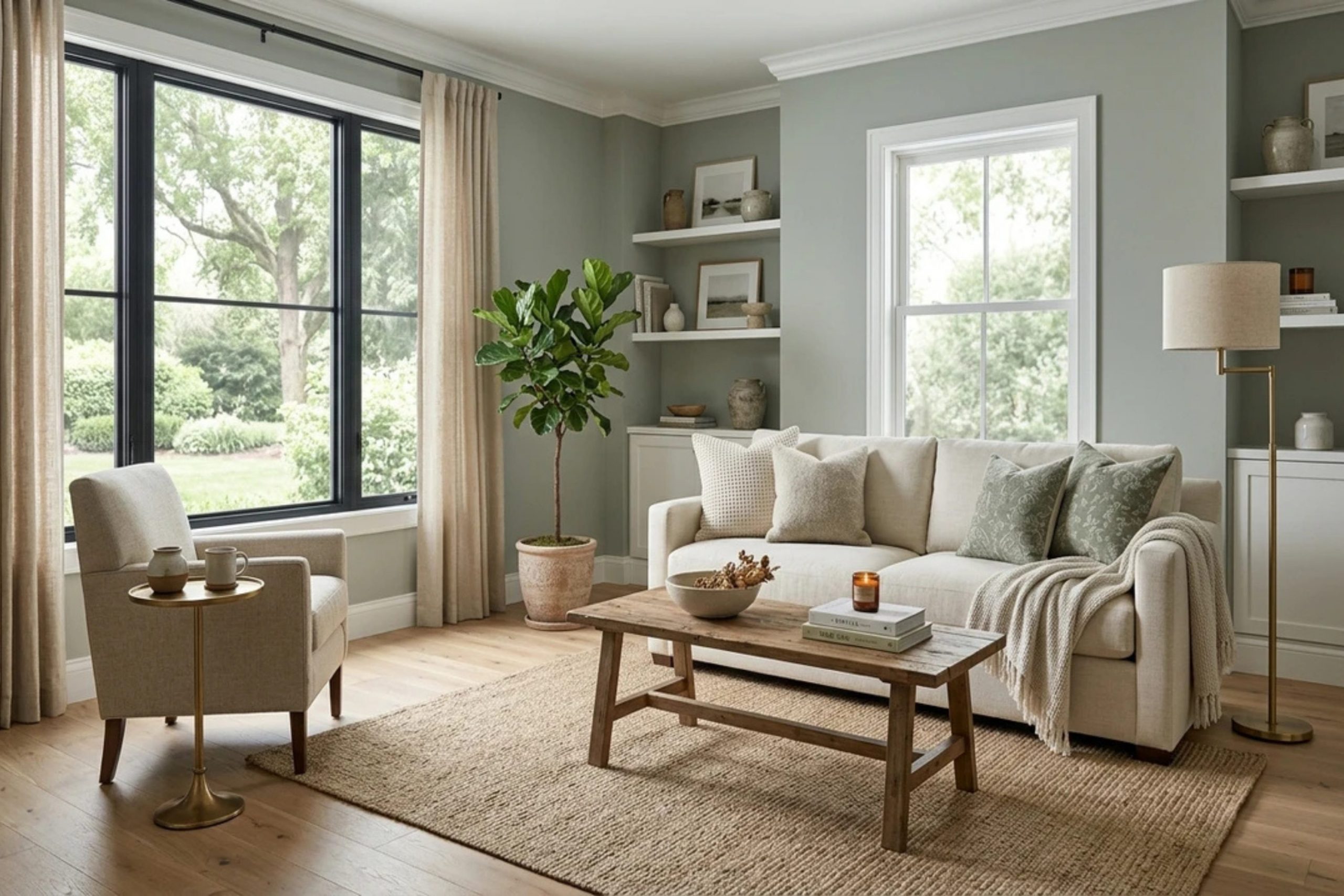
Dried Thyme SW 6186 is a deep, rich green paint that brings the beauty of nature right into your house. It looks like the leaves you use for cooking, making any room feel grounded and cozy. Choosing the right paint combinations makes your home look like a professional put it together. I love showing people how to mix this gorgeous green with other tones to fix boring rooms.
Finding the right match can feel hard when you stare at hundreds of paint chips. This guide will give you the exact paint names that look amazing next to this rich shade. We will look at options for your kitchen, your main rooms, and even the outside of your house.
You will see how simple choices make a massive difference in how your home feels every single day.
Why I Always Recommend Sherwin-Williams and Benjamin Moore When Choosing Colors That Go With Dried Thyme
Sherwin-Williams and Benjamin Moore make the finest paint products you can buy for your walls. Their formulas have rich pigments that keep their true look under different kinds of house lighting. I always trust these two brands because their color decks offer the most reliable matches for complex greens. Cheap paint often ends up looking muddy or completely different from the little paper sample card.
Using high-quality brands means your walls will look beautiful for many years without fading away. They cover the walls smoothly, which saves you extra work and extra money during application. Your home deserves materials that stand up to daily life while looking totally professional and clean.
These specific brands give me the confidence that my color choices will look stunning in reality.
How I Choose the Best Color Combinations for Dried Thyme by Sherwin-Williams
I always look at the hidden undertones in a paint formula before making a final choice.Dried Thyme has yellow and gray tones inside it, so it needs partners that share those same roots. I test samples on big boards and move them around the room at different times of day. This helps me see how the morning sun and evening lamps change the appearance of the walls.
Matching a deep green requires a balance of light shades and dark shades to create contrast. You do not want your rooms to feel flat or uninteresting because the shades match too closely. I combine crisp whites, warm beiges, and deep dramatic charcoal shades to create visual interest and style.
The goal is to make your home feel welcoming, intentional, and beautifully put together for your family.
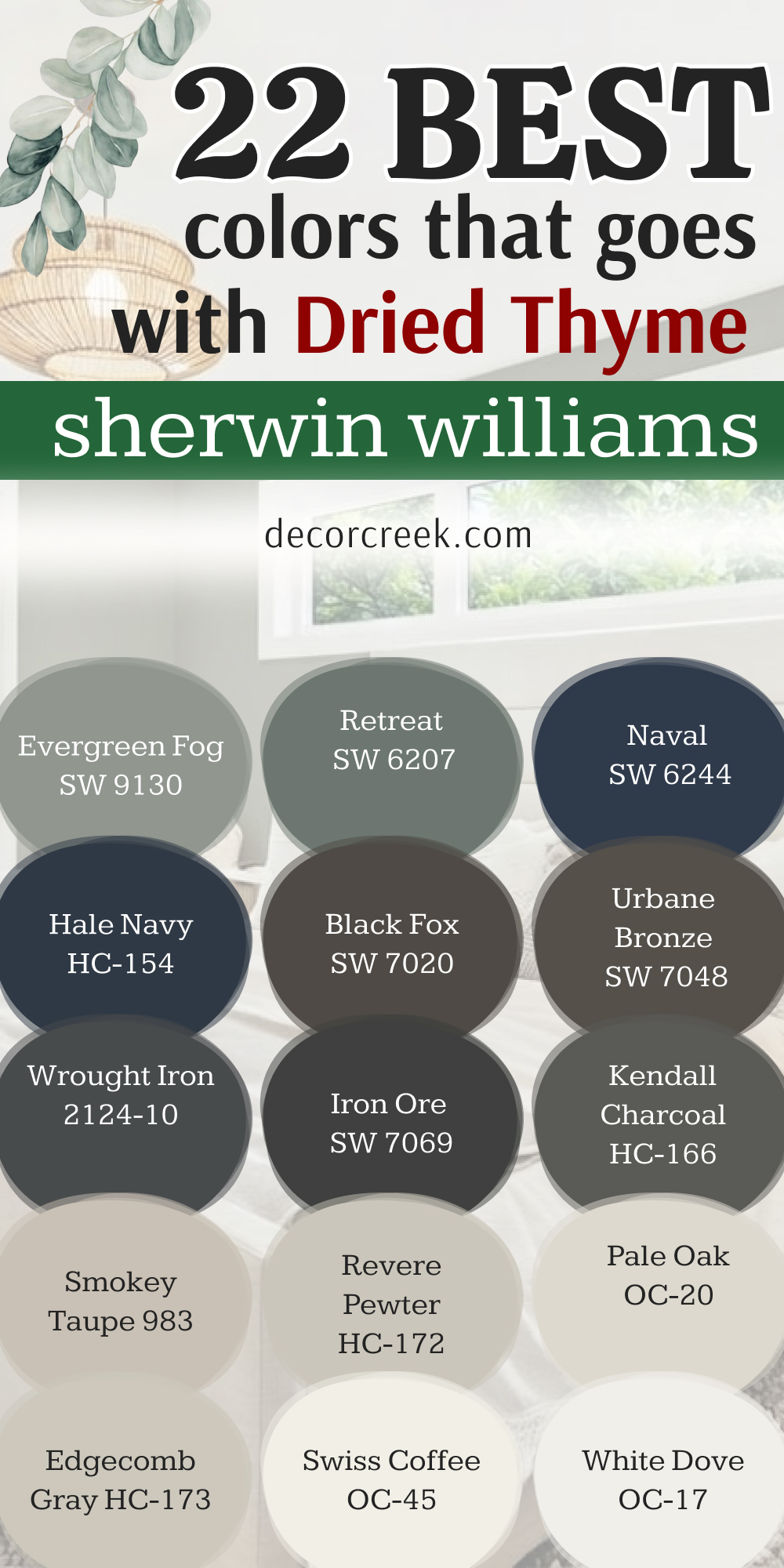
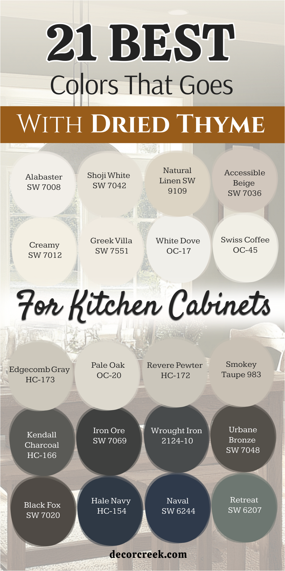
21 Best Colors that goes with Dried Thyme for Kitchen Cabinets
Alabaster SW 7008
Alabaster SW 7008 brings a creamy softness to upper cabinets while your lower cabinets wear the deep green. This tone keeps your cooking area bright without feeling cold like a sterile hospital room.
It softens the hard lines of wooden countertops and coordinates beautifully with shiny brass hardware. Homeowners love how this specific white makes smaller cooking areas feel much larger than they are.
It catches the morning light beautifully and creates a cheerful mood for breakfast. Your cooking area will feel fresh and clean every single morning. This shade hides minor smudges better than bright stark whites usually do. It bridges the gap between modern style and traditional country living perfectly.
Best used in: living rooms, kitchens, hallways, bedrooms, and farmhouse exteriors
Pairs well with: Iron Ore SW 7069, Agreeable Gray SW 7029, Natural Linen SW 9109, warm wood tones The key rule of this color for farmhouse style is to use it where you want natural light to feel kind, soft, and inviting throughout the day.
🎨 Check out the complete guide to this color right HERE 👈

Shoji White SW 7042
Shoji White SW 7042 has a strong beige undertone that softens the intensity of a dark green kitchen. This option works wonderfully for folks who dislike bright white but still want a light room.
It matches beautifully with warm oak floors and traditional ceramic tile backsplashes. You will notice how it changes throughout the day to match the natural outdoor light. It makes your cabinet doors look rich and custom-made rather than basic or cheap.
This shade prevents the deep green from making your kitchen feel too dark or cramped. It creates a cozy background for family dinners and long evening conversations around the island.
Best used in: kitchens, open floor plans, entryways, and home offices
Pairs well with: Urbane Bronze SW 7048, Pewter Green SW 6208, Revere Pewter HC-172, light oak The key rule of this color for a cozy look is to apply it in rooms with large windows to let the warm undertones glow.
🎨 Check out the complete guide to this color right HERE 👈

Natural Linen SW 9109
Natural Linen SW 9109 mimics the look of unbleached fabric to bring an earthy texture to your cabinets. This shade grounds your kitchen and makes it feel like a rustic countryside cottage.
It works beautifully alongside oil-rubbed bronze handles and dark stone countertops. You will love how it hides dust and fingerprints from pets and small children.
It offers a perfect middle ground between a gray and a traditional tan shade. The combination creates an inviting atmosphere where guests want to hang out and chat. It looks especially handsome under warm LED ceiling lights in the evening hours.
Best used in: kitchens, laundry rooms, mudrooms, and traditional dining spaces
Pairs well with: Black Fox SW 7020, Foothills SW 7514, Accessible Beige SW 7036, copper accents The key rule of this color for a rustic style is to pair it with matte finishes to keep the organic feel alive.
🎨 Check out the complete guide to this color right HERE 👈

Accessible Beige SW 7036
Accessible Beige SW 7036 is a famous neutral that never looks too yellow or too gray next to green. This paint choice makes your kitchen cabinets look expensive and professionally styled.
It balances the cool notes in the green with its own steady warmth. You will find that it matches almost any style of flooring you already have installed.
It creates a seamless transition between your cooking area and the nearby living spaces. The tone keeps the room feeling sunny even on cloudy winter afternoons. It is a safe choice that always yields highly attractive results for homeowners.
Best used in: open concept kitchens, hallways, family rooms, and home staging
Pairs well with: Pure White SW 7005, Repose Gray SW 7015, Sea Salt SW 6204, dark walnut The key rule of this color for staging is to use it as a bridge between rooms to create a continuous flow.
🎨 Check out the complete guide to this color right HERE 👈

Creamy SW 7012
Creamy SW 7012 offers a rich, velvety background that makes the sage green tones pop with life. This shade avoids looking yellow while maintaining a distinct buttery softness on your woodwork.
It pairs beautifully with traditional crown molding and historic architectural details in older homes. You can use it on the walls to make dark green cabinets stand out as the main feature. It softens the glare from stainless steel appliances and glossy granite surfaces.
This combination makes the heart of your home feel extra sweet and welcoming. It provides a classic look that will not feel outdated in five years.
Best used in: traditional kitchens, bedrooms, bathrooms, and historic home interiors
Pairs well with: Studio Mauve SW 0062, Balanced Beige SW 7037, Dried Thyme SW 6186, brass fixtures The key rule of this color for traditional spaces is to apply it on trim and doors for a soft contrast against deep walls.
🎨 Check out the complete guide to this color right HERE 👈

Greek Villa SW 7551
Greek Villa SW 7551 is a bright white with just a tiny drop of amber warmth inside it. This shade gives your kitchen a clean, crisp look without feeling chilly or sharp.
It bounces light around the room, making it excellent for dark kitchens with small windows. It creates a beautiful frame around green cabinet bases when used on the surrounding walls.
You will love how clean and organized your cooking area looks with this combination. It brings a cheerful energy to the room where you start your busy days. It is a timeless option that makes every piece of decor look fantastic.
Best used in: kitchens, small bathrooms, bright sunrooms, and modern exteriors
Pairs well with: Iron Ore SW 7069, Driftofid SW 9108, Naval SW 6244, natural wicker The key rule of this color for maximizing brightness is to use a semi-gloss finish on trim to bounce light efficiently.
🎨 Check out the complete guide to this color right HERE 👈

White Dove OC-17
White Dove OC-17 is a legendary designer choice because it behaves perfectly in every lighting situation. This white has a touch of gray that keeps it soft and completely neutral next to green cabinets.
It gives your kitchen an instant upgrade that looks clean, high-end, and custom-designed. It coordinates beautifully with marble countertops and white subway tile backsplashes.
You will notice how it keeps its true character whether it is raining or sunny outside. It creates a soft contrast that lets the herbal green shade take center stage. It is an ideal pick for a clean, sophisticated kitchen layout.
Best used in: modern kitchens, living rooms, trim work, and bedroom walls
Pairs well with: Revere Pewter HC-172, Hale Navy HC-154, Wrought Iron 2124-10, classic marble The key rule of this color for a clean look is to use it on both walls and trim but in different paint sheens.
🎨 Check out the complete guide to this color right HERE 👈

Swiss Coffee OC-45
Swiss Coffee OC-45 provides a rich, warm white background that feels incredibly cozy and relaxed. This paint choice prevents a dark green kitchen from feeling too heavy or intimidating.
It works perfectly for traditional, transitional, or country-style home designs. You will love how it warms up cool northern light coming through your windows. It looks fantastic when applied to open shelving holding white dishes and glassware.
This tone creates an inviting environment where people love to gather for morning coffee. It helps your kitchen feel connected to the natural world outside your windows.
Best used in: family kitchens, cottage interiors, bedrooms, and cozy breakfast nooks
Pairs well with: Edgecomb Gray HC-173, Chelsea Gray HC-168, Simply White OC-117, terracotta tile The key rule of this color for a cottage feel is to pair it with open wood shelving and indoor plants.
🎨 Check out the complete guide to this color right HERE 👈

Edgecomb Gray HC-173
Edgecomb Gray HC-173 is a beautiful greige that sits perfectly between gray and beige. This shade brings a modern, sleek look to a kitchen with green cabinets.
It looks rich and grounding without making the room feel small or dark. It coordinates wonderfully with modern stainless steel hardware and gray stone floors. You will find that it hides daily kitchen grime exceptionally well over time.
It creates a calm backdrop that allows your colorful kitchen accessories to shine brightly. It is a fantastic choice if you want a neutral that has some real substance to it.
Best used in: kitchens, dining rooms, hallways, and contemporary living areas
Pairs well with: White Dove OC-17, Hale Navy HC-154, Revere Pewter HC-172, black metal hardware The key rule of this color for modern spaces is to pair it with black accents to anchor the room.
🎨 Check out the complete guide to this color right HERE 👈

Pale Oak OC-20
Pale Oak OC-20 resembles the soft, elegant tone of white oak wood after it has been sanded down. This shade brings a quiet sophistication to your kitchen walls or upper cabinetry.
It shifts beautifully with the light, sometimes looking like a warm gray and other times like a soft off-white. It pairs naturally with the organic look of the herbal green paint on your island.
This combination makes your kitchen feel like a high-end spa or a luxury resort cooking area. It provides just enough contrast to make the green details stand out sharply. It keeps the entire room feeling airy, light, and completely balanced.
Best used in: open concept kitchens, bedrooms, bathrooms, and modern living spaces
Pairs well with: Wrought Iron 2124-10, Chantilly Lace OC-65, Revere Pewter HC-172, light woods The key rule of this color for a high-end look is to use it in rooms with plenty of natural daylight.
🎨 Check out the complete guide to this color right HERE 👈

Revere Pewter HC-172
Revere Pewter HC-172 is a deep greige that brings a classic, sturdy feel to kitchen walls. This tone works perfectly for large kitchens that need a paint color with real weight.
It bridges the gap between traditional styling and modern rustic design choices. You will love how it holds its own against the deep green without getting lost or washed out.
It looks spectacular next to dark soapstone or black granite countertops. This combination gives your kitchen a historic, established look that feels rooted in tradition. It is a highly dependable color that designers choose year after year.
Best used in: large kitchens, open family rooms, historic homes, and basements
Pairs well with: White Dove OC-17, Chelsea Gray HC-168, Iron Ore SW 7069, antique brass The key rule of this color for a classic style is to use warm yellow lightbulbs to bring out the cozy undertones.
🎨 Check out the complete guide to this color right HERE 👈

Smokey Taupe 983
Smokey Taupe 983 introduces a rich hint of purple and brown into your neutral kitchen palette. This unique shade creates a fascinating and complex look next to a deep herbal green.
It is perfect for homeowners who want something different from standard grays or beiges. It pairs wonderfully with dark chocolate wood stains and copper kitchen pots.
The tone makes your cabinets look incredibly warm and inviting in the evening light. It creates a rich, layered look that feels like a professional designer chose it. Your kitchen will stand out as a unique and beautiful conversation piece.
Best used in: kitchens, formal dining rooms, cozy dens, and master bedrooms
Pairs well with: Simply White OC-117, Revere Pewter HC-172, Kendall Charcoal HC-166, copper The key rule of this color for unique design is to pair it with warm metallic elements like copper or bronze.
🎨 Check out the complete guide to this color right HERE 👈
Kendall Charcoal HC-166
Kendall Charcoal HC-166 is a dark, dramatic gray that brings a bold modern edge to your kitchen. This combination is ideal for a kitchen island or lower cabinets beneath green walls.
It creates a moody, high-contrast look that feels deeply luxurious and striking. It matches beautifully with bright white quartz countertops and shiny chrome fixtures.
You will love how it makes the green tones look vibrant and lush by comparison. It grounds the room and gives it a clear, strong focal point. It is a daring choice that pays off with a highly sophisticated look.
Best used in: kitchen islands, accent walls, modern powder rooms, and home theaters
Pairs well with: White Dove OC-17, Pale Oak OC-20, Revere Pewter HC-172, polished chrome The key rule of this color for dramatic impact is to use crisp white countertops to create a clean boundary.
🎨 Check out the complete guide to this color right HERE 👈

Iron Ore SW 7069
Iron Ore SW 7069 is a soft, charcoal black that adds instant luxury to a green kitchen scheme. Using this on your kitchen island creates a powerful center of attention in the room.
It is less harsh than standard black, making it friendlier for daily family life. It looks magnificent next to white farmhouse sinks and bright brass cabinet pulls.
You will notice how it emphasizes the rich outdoor feel of the green paint. It creates a strong, confident look that makes your home feel instantly updated. It is an excellent choice for creating a striking, high-fashion kitchen space.
Best used in: kitchen islands, interior doors, window frames, and modern fireplaces
Pairs well with: Alabaster SW 7008, Extra White SW 7006, Accessible Beige SW 7036, brass The key rule of this color for a luxury look is to use matte or satin finishes to keep it looking soft.
🎨 Check out the complete guide to this color right HERE 👈

Wrought Iron 2124-10
Wrought Iron 2124-10 is a deep black with heavy gray and blue undertones inside it. This shade gives your kitchen cabinets a sturdy, historic look like old metalwork.
It forms a handsome partnership with green walls, creating a dark and cozy cooking area. It works beautifully in homes with industrial accents or rustic wooden beams.
You will appreciate how it makes colorful dishware on open shelves stand out dramatically. It hides daily scuffs and cooking marks better than almost any other color available. It brings a sense of strength and permanence to your home design.
Best used in: lower cabinets, kitchen islands, entry doors, and accent trim
Pairs well with: White Dove OC-17, Swiss Coffee OC-45, Revere Pewter HC-172, industrial wood The key rule of this color for an industrial look is to pair it with raw wood elements and metal pipes.
🎨 Check out the complete guide to this color right HERE 👈

Urbane Bronze SW 7048
Urbane Bronze SW 7048 is a rich blend of brown and gray that feels deeply connected to nature. This shade brings a warm, grounding weight to your kitchen cabinet layout.
It pairs naturally with the organic qualities of a deep, herbal green paint color. You will love how it complements stone backsplashes and rich hardwood flooring.
It creates a warm, cocoon-like feeling in the kitchen during evening hours. This tone is perfect for creating a high-end look that still feels casual and friendly. It makes your cooking space feel like a warm lodge in the woods.
Best used in: kitchens, accent walls, home exteriors, and cozy living rooms
Pairs well with: Shoji White SW 7042, Accessible Beige SW 7036, Extra White SW 7006, natural stone The key rule of this color for an organic feel is to incorporate plenty of stone and brick textures nearby.
🎨 Check out the complete guide to this color right HERE 👈

Black Fox SW 7020
Black Fox SW 7020 mixes dark charcoal gray with a rich, warm chocolate brown undertone. This paint creates a warm, dramatic contrast when placed next to herbal green cabinets.
It prevents the dark colors from feeling cold or uninviting to your family members. It pairs wonderfully with gold hardware and warm under-cabinet lighting systems.
You will enjoy how it makes your kitchen feel like a high-end restaurant kitchen. It provides a sturdy look that handles the mess of a busy cooking space easily. It is an excellent option for creating a cozy, high-contrast look.
Best used in: kitchen islands, accent walls, exterior trim, and library shelving
Pairs well with: Alabaster SW 7008, Creamy SW 7012, Repose Gray SW 7015, gold fixtures The key rule of this color for a rich appearance is to contrast it against warm, creamy whites on the walls.
🎨 Check out the complete guide to this color right HERE 👈
Hale Navy HC-154
Hale Navy HC-154 is a deeply classic dark blue that brings a nautical flair to your home. Mixing blue and green in a kitchen creates a rich, jewel-box effect that looks stunning.
This color adds a traditional elegance to lower cabinets or a large central island. It looks beautiful next to bright white countertops and classic subway tile designs.
You will love the depth it adds to your kitchen layout during the evening hours. It feels sophisticated and timeless without being boring or predictable to your guests. It is a fantastic choice for people who truly love rich, deep colors.
Best used in: kitchen islands, dining rooms, front doors, and boy’s bedrooms
Pairs well with: White Dove OC-17, Pale Oak OC-20, Edgecomb Gray HC-173, brass hardware The key rule of this color for a traditional look is to use shiny brass handles to make the blue pop.
🎨 Check out the complete guide to this color right HERE 👈

Naval SW 6244
Naval SW 6244 is a bold, royal navy blue that brings a cheerful confidence to the kitchen. This shade creates a dramatic look when paired with a soft herbal green on surrounding surfaces.
It brings an energetic yet classic mood to the room where your family spends the most time. It pairs perfectly with clean white quartz and bright gold light fixtures.
You will love how it makes your kitchen feel clean, crisp, and beautifully styled. It is an excellent choice for a beach house or a modern suburban cooking area. It gives your home an instant feeling of high-end style.
Best used in: kitchen islands, powder rooms, front doors, and accent walls
Pairs well with: Greek Villa SW 7551, Snowbound SW 7004, Accessible Beige SW 7036, gold accents The key rule of this color for a crisp style is to pair it with pure whites and lots of shiny metal.
🎨 Check out the complete guide to this color right HERE 👈

Retreat SW 6207
Retreat SW 6207 is a dusty green-gray that sits slightly lighter than your main green color. Using these two shades together creates a beautiful monochromatic look on your cabinets.
It makes your kitchen feel like a peaceful garden room hidden away from the world. It pairs wonderfully with light wood accents and simple ceramic pottery pieces.
You will find that this combination is very easy on the eyes throughout the day. It creates a gentle, harmonious environment that makes cooking feel relaxing and fun. It is a wonderful option for nature lovers who want a soft look.
Best used in: upper cabinets, master bathrooms, bedrooms, and laundry rooms
Pairs well with: Extra White SW 7006, Alabaster SW 7008, Sea Salt SW 6204, light oak wood The key rule of this color for a garden look is to use simple wooden accents and fresh cut flowers.
🎨 Check out the complete guide to this color right HERE 👈
Evergreen Fog SW 9130
Evergreen Fog SW 9130 is a gorgeous chameleon color that blends green, gray, and a hint of blue. This shade acts as a soft companion to the deeper green, creating a sophisticated look.
It makes your kitchen cabinets look modern, artistic, and completely custom-designed for you. It coordinates beautifully with matte black hardware and light concrete countertops.
You will love how it changes character depending on the weather outside your window. It brings a soft, artistic energy into the heart of your family home. It is a perfect choice for an updated, trendy cooking space.
Best used in: kitchen trim, accent walls, bedrooms, and built-in bookshelves
Pairs well with: Shoji White SW 7042, Accessible Beige SW 7036, Iron Ore SW 7069, black matte metal The key rule of this color for a modern look is to use it alongside sleek, minimal cabinet doors.
🎨 Check out the complete guide to this color right HERE 👈

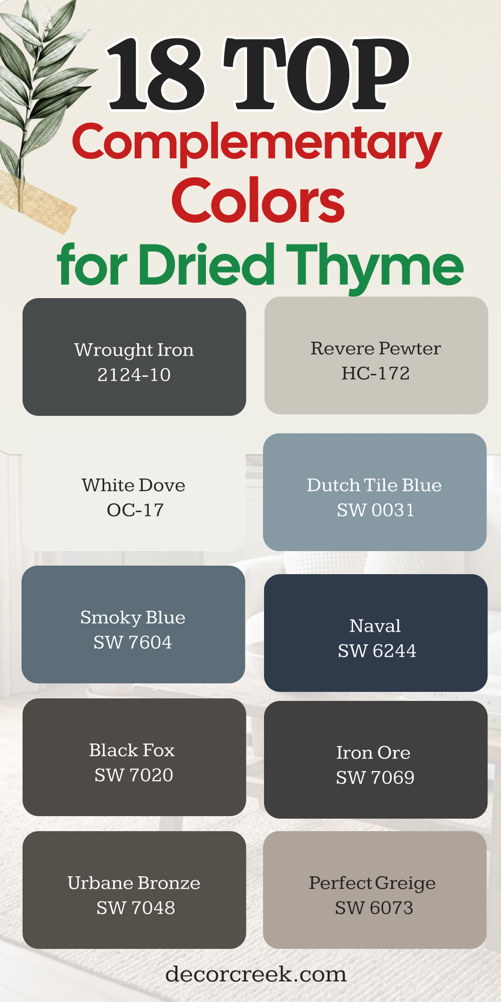
18 Top Complimentary Colors for Dried Thyme
Alabaster SW 7008
Alabaster SW 7008 serves as a perfect light partner to balance out the deep herbal green tones. This paint color keeps your whole room from feeling heavy by adding bright areas of relief.
It works beautifully on window trim, ceilings, and baseboards against dark green walls. You will notice how it makes the green color look crisp, clean, and intentional.
It welcomes the sunlight and bounces it into the dark corners of your room. It creates a classic look that works in any neighborhood or style of house. It is the most reliable white paint you can find for this specific job.
Best used in: living rooms, kitchens, hallways, bedrooms, and farmhouse exteriors
Pairs well with: Iron Ore SW 7069, Agreeable Gray SW 7029, Natural Linen SW 9109, warm wood tones The key rule of this color for farmhouse style is to use it where you want natural light to feel kind, soft, and inviting throughout the day.
🎨 Check out the complete guide to this color right HERE 👈
Pure White SW 7005
Pure White SW 7005 lacks any strong yellow undertones, making it look incredibly clean and sharp. This shade provides a brilliant contrast that makes the deep green look very modern.
It is an excellent choice for modern homes with clean lines and simple furniture styles. You will love how bright your doors and trim look when coated in this color.
It cuts through the moodiness of the green to keep the room feeling fresh. It gives your home an immediate look of being newly updated and highly cared for. It is a simple, no-nonsense white that always delivers excellent results.
Best used in: modern trim, ceilings, contemporary kitchens, and bright bathrooms
Pairs well with: Black Fox SW 7020, Charcoal Blue SW 2739, Anew Gray SW 7030, silver hardware The key rule of this color for a modern look is to use it on trim with a high-gloss finish for a sharp edge.
🎨 Check out the complete guide to this color right HERE 👈

Greek Villa SW 7551
Greek Villa SW 7551 adds a soft glow to any room when placed next to deep green walls. This white paint option makes your living areas feel warm and comfortable rather than cold.
It bridges the gap between your dark green paint and your light furniture pieces perfectly. You will appreciate how it softens the edges of the room in the evening hours.
It keeps your house looking sunny and cheerful even on rainy winter days. It is a highly versatile option that pleases everyone who walks through your door. It makes your home feel like a welcoming haven from the busy world outside.
Best used in: kitchens, small bathrooms, bright sunrooms, and modern exteriors
Pairs well with: Iron Ore SW 7069, Driftofid SW 9108, Naval SW 6244, natural wicker The key rule of this color for maximizing brightness is to use a semi-gloss finish on trim to bounce light efficiently.
🎨 Check out the complete guide to this color right HERE 👈
Creamy SW 7012
Creamy SW 7012 provides a classic, warm backdrop that complements the yellow notes inside the green. This color gives your rooms a soft, traditional feel that feels very rich and established.
It looks amazing on built-in bookshelves next to a green accent wall or fireplace. You will love how it warms up under standard warm white indoor lightbulbs.
It creates a gentle contrast that is incredibly comforting to look at every day. It makes your home look like a vintage estate with lots of history and charm. It is a beautiful choice for traditional furniture lovers.
Best used in: traditional kitchens, bedrooms, bathrooms, and historic home interiors
Pairs well with: Studio Mauve SW 0062, Balanced Beige SW 7037, Dried Thyme SW 6186, brass fixtures The key rule of this color for traditional spaces is to apply it on trim and doors for a soft contrast against deep walls.
🎨 Check out the complete guide to this color right HERE 👈
Natural Linen SW 9109
Natural Linen SW 9109 brings an organic, textured feel into your home color scheme. This shade looks like expensive linen fabric, adding class without adding a loud color.
It pairs naturally with green because both colors share strong roots in the outdoor world. You can use it on adjacent walls to make a green accent wall stand out.
It hides everyday dirt and dust from busy family life remarkably well over time. It makes your rooms feel grounded, comfortable, and completely relaxed for your guests. It is an excellent choice for a casual, friendly home atmosphere.
Best used in: kitchens, laundry rooms, mudrooms, and traditional dining spaces
Pairs well with: Black Fox SW 7020, Foothills SW 7514, Accessible Beige SW 7036, copper accents The key rule of this color for a rustic style is to pair it with concrete or stone finishes to keep the organic feel alive.
🎨 Check out the complete guide to this color right HERE 👈
Accessible Beige SW 7036
Accessible Beige SW 7036 is a legendary neutral that complements deep greens without any effort. This color brings a clean, modern tan look to your walls that everyone enjoys.
It balances the dark green perfectly, making the room feel whole and well-planned. You will find that your existing wood furniture looks incredible against this paint choice.
It creates a flowing look when used in hallways connected to a green room. It is a safe, smart choice that adds real value to your home. It makes your house look professionally staged and ready for a magazine shoot.
Best used in: open concept kitchens, hallways, family rooms, and home staging
Pairs well with: Pure White SW 7005, Repose Gray SW 7015, Sea Salt SW 6204, dark walnut The key rule of this color for staging is to use it as a bridge between rooms to create a continuous flow.
🎨 Check out the complete guide to this color right HERE 👈
Shiitake SW 9173
Shiitake SW 9173 is a rich, warm stone color that has a beautiful gray-beige tone. This paint color adds a deep sophistication to rooms with herbal green accents.
It mimics the colors you see on a walk through a deep, quiet forest. You will love how it brings out the gray undertones inside the green paint.
It works wonderfully in large living rooms with stone fireplaces and big windows. This shade makes your home feel solid, well-built, and expensive to your visitors. It is an exceptional choice for creating a cozy, high-end mountain lodge feel.
Best used in: large living rooms, home offices, master bedrooms, and stone fireplaces
Pairs well with: Pure White SW 7005, Balanced Beige SW 7037, Urbane Bronze SW 7048, leather furniture The key rule of this color for a lodge feel is to use it alongside heavy leather furniture and stone features.
🎨 Check out the complete guide to this color right HERE 👈

Loggia SW 7506
Loggia SW 7506 is a rich tan with a strong gray backbone that keeps it looking modern. This paint color offers a deep neutral option for folks who want real wall color.
It pairs beautifully with the rich green, creating a warm and comforting environment. You will love how it looks next to warm wood trim and wood floors.
It creates a handsome look in a home office or a formal dining room. This shade makes your furniture look curated and carefully chosen over many years. It brings a sense of quiet luxury into your daily living spaces.
Best used in: home offices, dining rooms, main entryways, and exterior siding
Pairs well with: Alabaster SW 7008, Downy SW 7002, Balanced Beige SW 7037, dark oak wood The key rule of this color for quiet luxury is to mix it with rich fabrics like velvet or heavy linens.
🎨 Check out the complete guide to this color right HERE 👈

Perfect Greige SW 6073
Perfect Greige SW 6073 is a mixture of gray and beige with a slight red undertone. This unique undertone adds an unexpected warmth that makes green walls look extra lush.
It creates a rich, complex color scheme that feels very high-end and designer-made. You will notice how it changes character as the sun moves across your house.
It looks spectacular in bedrooms where you want a cozy, wrapped-in-a-blanket feeling. This shade helps bridge the gap between cool gray decor and warm green paint. It is a fantastic option for updating older homes with traditional layouts.
Best used in: bedrooms, cozy dens, family rooms, and exterior trim work
Pairs well with: Snowbound SW 7004, Poised Taupe SW 6039, Aesthetic White SW 7035, warm light The key rule of this color for a cozy feeling is to use warm light bulbs to emphasize the soft red undertone.
🎨 Check out the complete guide to this color right HERE 👈
Urbane Bronze SW 7048
Urbane Bronze SW 7048 brings a deep, rich brown-gray drama to your home color palette. This dark shade forms a powerful partnership with green for a moody room design.
It looks incredible on interior doors or a fireplace mantle next to green walls. You will love the rich, earthy feeling this combination brings into your house.
It makes your living spaces feel private, secure, and deeply comforting after dark. It is a bold choice that immediately shows you have a strong sense of style. It turns an ordinary room into a memorable design statement.
Best used in: kitchens, accent walls, home exteriors, and cozy living rooms
Pairs well with: Shoji White SW 7042, Accessible Beige SW 7036, Extra White SW 7006, natural stone The key rule of this color for an organic feel is to incorporate plenty of stone and brick textures nearby.
🎨 Check out the complete guide to this color right HERE 👈
Iron Ore SW 7069
Iron Ore SW 7069 is a charcoal black that adds instant high-fashion contrast to green. This shade works perfectly for window frames, trim work, or accent furniture pieces.
It grounds the light in the room and gives your eyes a clear place to rest. You will love how it modernizes the look of the traditional herbal green paint. It creates a crisp, graphic look that looks beautiful in photographs and real life.
It is much softer than pure black, keeping your home feeling warm and friendly. It is an excellent tool for defining architectural details in a room.
Best used in: kitchen islands, interior doors, window frames, and modern fireplaces
Pairs well with: Alabaster SW 7008, Extra White SW 7006, Accessible Beige SW 7036, brass The key rule of this color for a luxury look is to use matte or satin finishes to keep it looking soft.
🎨 Check out the complete guide to this color right HERE 👈
Black Fox SW 7020
Black Fox SW 7020 combines dark black with a heavy dose of rich chocolate brown. This color choice creates a warm, dark background that makes green accents pop beautifully.
It looks fantastic in a library, a cozy den, or a main bedroom space. You will love the cozy, high-end feeling it brings to your evening relaxation time.
It pairs naturally with gold light fixtures and rich oriental rug designs. This shade gives your home a sense of history, wealth, and deep comfort. It is a beautiful alternative to standard gray or black accent paints.
Best used in: kitchen islands, accent walls, exterior trim, and library shelving
Pairs well with: Alabaster SW 7008, Creamy SW 7012, Repose Gray SW 7015, gold fixtures The key rule of this color for a rich appearance is to contrast it against warm, creamy whites on the walls.
🎨 Check out the complete guide to this color right HERE 👈
Naval SW 6244
Naval SW 6244 brings a crisp, deep blue energy that complements green beautifully. This combination creates an elegant jewel-toned look that feels very rich and custom.
It works wonders in formal dining rooms or guest bathrooms for a surprise effect. You will love how the blue and green play off each other under bright light.
It gives your home a classic, sophisticated feeling that never goes out of style. It pairs perfectly with crisp white trim and bright metallic hardware pieces. It is a confident color choice that shows your creative design spirit.
Best used in: kitchen islands, powder rooms, front doors, and accent walls
Pairs well with: Greek Villa SW 7551, Snowbound SW 7004, Accessible Beige SW 7036, gold accents The key rule of this color for a crisp style is to pair it with pure whites and lots of shiny metal.
🎨 Check out the complete guide to this color right HERE 👈
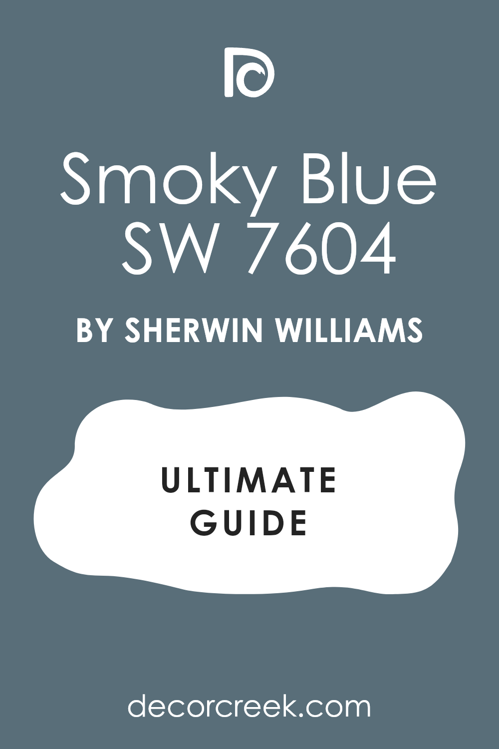
Smoky Blue SW 7604
Smoky Blue SW 7604 is a medium-dark blue with a strong gray shadow inside it. This shade creates a historical, muted color combination when paired with herbal green.
It looks like the colors found in traditional historic oil paintings and old estates. You will love how it creates an interesting mood in a home office or study.
It offers a beautiful color option for folks who want real color without brightness. This shade keeps your rooms looking grounded, smart, and completely intentional. It is a wonderful pick for a classic, library-style room design.
Best used in: home offices, library rooms, dining rooms, and exterior shutters
Pairs well with: Alabaster SW 7008, Extra White SW 7006, Gray Shingle SW 7605, dark wood furniture The key rule of this color for a historic look is to use dark wood furniture and antique gold decorations.
🎨 Check out the complete guide to this color right HERE 👈
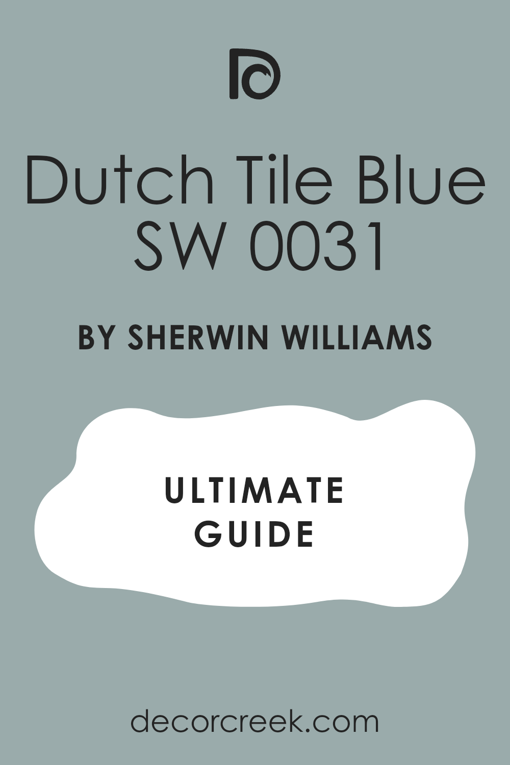
Dutch Tile Blue SW 0031
Dutch Tile Blue SW 0031 is a soft, historic blue-gray that looks incredibly charming. This color creates a beautiful sky-and-forest feel when placed next to your green paint.
It is perfect for a cottage style house or a cozy guest bedroom space. You will notice how it lightens the mood of the dark green without using white. It creates a friendly, nostalgic environment that makes guests feel instantly at home.
This combination brings a lovely touch of old-world beauty into modern houses. It is a wonderful choice for creating a unique, color-rich living area.
Best used in: guest bedrooms, country kitchens, laundry rooms, and porch ceilings
Pairs well with: Pure White SW 7005, Accessible Beige SW 7036, Dried Thyme SW 6186, wicker accents The key rule of this color for a cottage look is to pair it with vintage decorations and light fabrics.
🎨 Check out the complete guide to this color right HERE 👈
White Dove OC-17
White Dove OC-17 is a soft white that brings a clean frame to your green walls. This paint choice is trusted by designers everywhere because it never looks yellow or blue.
It gives your room an instant feeling of high-end quality and professional design work. You will love how it accentuates the beautiful green tones without fighting for attention.
It looks clean and beautiful under any type of indoor lightbulb you choose. It creates a classic look that makes your home feel organized and tidy. It is an essential neutral for any successful green color scheme.
Best used in: modern kitchens, living rooms, trim work, and bedroom walls
Pairs well with: Revere Pewter HC-172, Hale Navy HC-154, Wrought Iron 2124-10, classic marble The key rule of this color for a clean look is to use it on both walls and trim but in different paint sheens.
🎨 Check out the complete guide to this color right HERE 👈
Revere Pewter HC-172
Revere Pewter HC-172 offers a deep greige tone that provides a sturdy neutral background. This shade balances the natural green by adding a classic stone-like color to the room.
It works beautifully in large open floor plans where rooms connect to each other. You will find that it makes your green accent pieces look incredibly rich and vibrant.
It is a highly reliable color that handles different lighting situations with ease. This combination makes your living areas feel warm, established, and very comfortable. It is a timeless option that always looks professional and complete.
Best used in: large kitchens, open family rooms, historic homes, and basements
Pairs well with: White Dove OC-17, Chelsea Gray HC-168, Iron Ore SW 7069, antique brass The key rule of this color for a classic style is to use warm yellow lightbulbs to bring out the cozy undertones.
🎨 Check out the complete guide to this color right HERE 👈
Wrought Iron 2124-10
Wrought Iron 2124-10 brings a heavy, charcoal black drama that outlines your green spaces. This paint color looks fantastic on window sashes, baseboards, or built-in media cabinets.
It adds a touch of modern industrial style to an otherwise traditional green room. You will love the sharp, clean lines it creates against your colorful walls.
It keeps the room feeling grounded and gives it a highly custom, architectural look. This shade is perfect for homeowners who love bold, high-contrast interior designs. It turns your living areas into beautiful, memorable works of art.
Best used in: lower cabinets, kitchen islands, entry doors, and accent trim
Pairs well with: White Dove OC-17, Swiss Coffee OC-45, Revere Pewter HC-172, industrial wood The key rule of this color for an industrial look is to pair it with raw wood elements and metal pipes.
🎨 Check out the complete guide to this color right HERE 👈
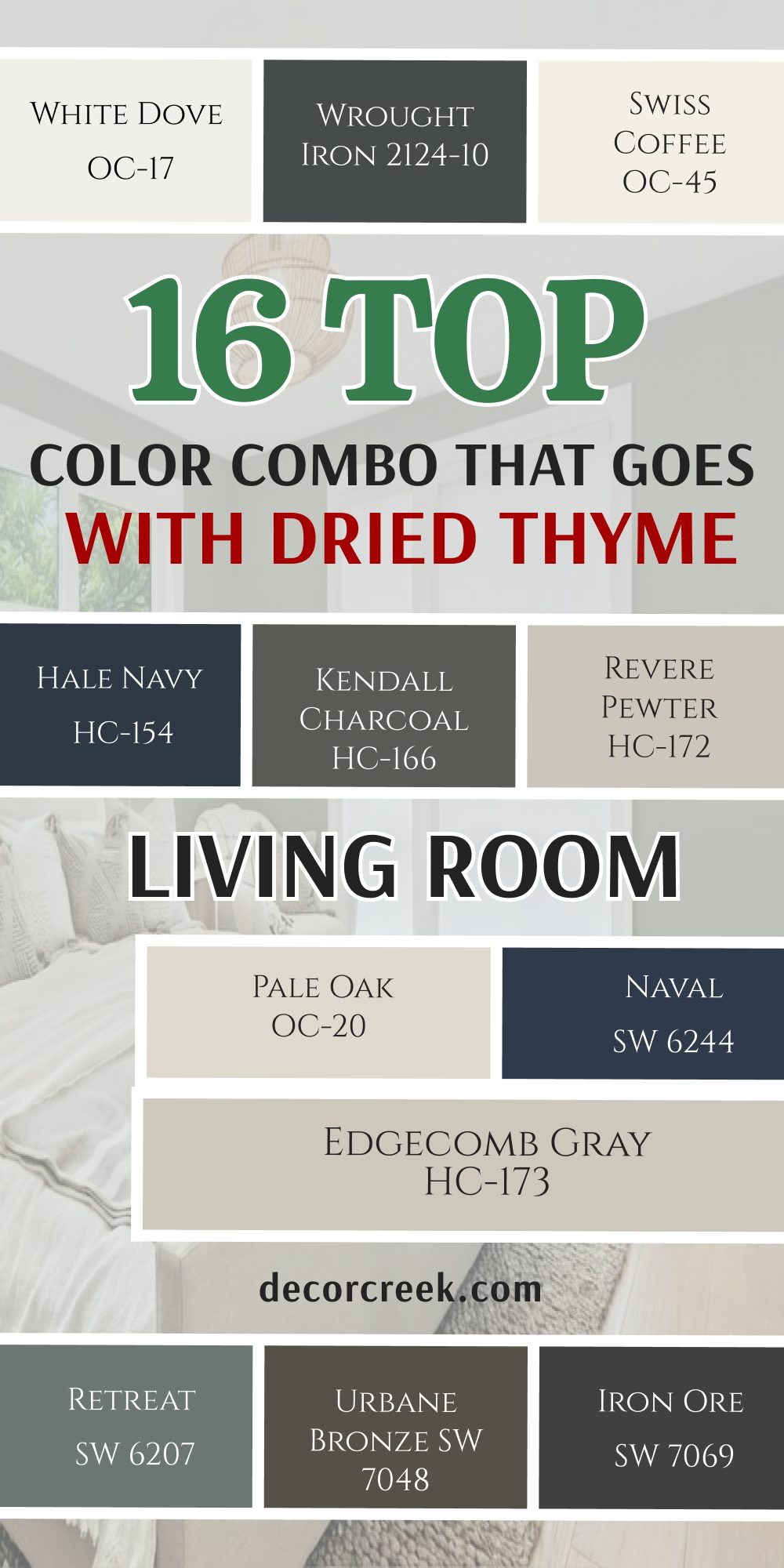
16 Top Color Combo that goes with Dried Thyme Living Room
Dried Thyme SW 6186 + Alabaster SW 7008
Dried Thyme SW 6186 mixed with Alabaster SW 7008 creates a classic high-contrast living room. This combination lets you paint three walls light and one wall deep green.
It prevents your main living area from feeling dark while adding a splash of color. You will love how your family photos look hanging against the deep green background.
It creates a cheerful environment for hosting friends or relaxing on the weekend. This mix works with almost any furniture color you already own in your house. It is the most popular way to use this beautiful green paint.
Best used in: living rooms, kitchens, hallways, bedrooms, and farmhouse exteriors
Pairs well with: Iron Ore SW 7069, Agreeable Gray SW 7029, Natural Linen SW 9109, warm wood tones The key rule of this color for farmhouse style is to use it where you want natural light to feel kind, soft, and inviting throughout the day.
Dried Thyme SW 6186 + Natural Linen SW 9109
Dried Thyme SW 6186 paired with Natural Linen SW 9109 brings an organic warmth to living rooms. This combination makes your main room feel like a cozy cabin nestled in the woods.
The linen color softens the green and adds a comfortable, relaxed feel to the walls. It looks amazing next to large jute rugs and comfortable linen slipcovered sofas. You will find that this mix makes your home feel incredibly welcoming to guests.
It creates a friendly atmosphere where people want to kick off their shoes and stay. It is an excellent choice for a casual, active family room.
Best used in: kitchens, laundry rooms, mudrooms, and traditional dining spaces
Pairs well with: Black Fox SW 7020, Foothills SW 7514, Accessible Beige SW 7036, copper accents The key rule of this color for a rustic style is to pair it with concrete or stone finishes to keep the organic feel alive.
Dried Thyme SW 6186 + Creamy SW 7012
Dried Thyme SW 6186 combined with Creamy SW 7012 offers a traditional, buttery living room feel. This pair is perfect for older homes with beautiful historic trim and high ceilings.
The creamy white softens the deep green, making the whole room feel cozy and warm. It looks beautiful when the afternoon sun shines through your living room windows.
You will love the classic, elegant look it gives to your main fireplace wall. This mix makes your home feel established, rich, and filled with historical charm. It is a wonderful pick for traditional furniture and antique decorations.
Best used in: traditional kitchens, bedrooms, bathrooms, and historic home interiors
Pairs well with: Studio Mauve SW 0062, Balanced Beige SW 7037, Dried Thyme SW 6186, brass fixtures The key rule of this color for traditional spaces is to apply it on trim and doors for a soft contrast against deep walls.
Dried Thyme SW 6186 + Iron Ore SW 7069
Dried Thyme SW 6186 joined by Iron Ore SW 7069 creates a modern, dramatic living room setup. This combo is perfect for a media room where you watch movies with your family.
The charcoal black trim makes the green walls look deep, rich, and highly fashionable. You will love how it hides modern television screens when they are turned off. It creates a cozy, movie theater feeling right inside your own home.
This daring look shows you have a strong, confident eye for modern interior design. It turns your living room into a stunning showpiece for your guests.
Best used in: kitchen islands, interior doors, window frames, and modern fireplaces
Pairs well with: Alabaster SW 7008, Extra White SW 7006, Accessible Beige SW 7036, brass The key rule of this color for a luxury look is to use matte or satin finishes to keep it looking soft.
Dried Thyme SW 6186 + Urbane Bronze SW 7048
Dried Thyme SW 6186 alongside Urbane Bronze SW 7048 delivers a rich, earthy living room atmosphere. These two dark colors create a cozy environment that feels deeply connected to nature.
It is ideal for large living rooms with high ceilings that feel too empty. The bronze tones add a heavy, luxurious warmth that makes the room feel smaller and friendlier. You will love curling up with a book in this beautifully dark and cozy space.
It looks stunning when paired with large indoor trees and raw wood furniture. It creates a beautiful mountain lodge feel in any suburban neighborhood.
Best used in: kitchens, accent walls, home exteriors, and cozy living rooms
Pairs well with: Shoji White SW 7042, Accessible Beige SW 7036, Extra White SW 7006, natural stone The key rule of this color for an organic feel is to incorporate plenty of stone and brick textures nearby.
Dried Thyme SW 6186 + Retreat SW 6207
Dried Thyme SW 6186 mixed with Retreat SW 6207 creates a soft, double-green living room design. Using two greens together creates a layered look that feels like a professional garden house.
The lighter green softens the main deep green, keeping the room feeling balanced and interesting. It works beautifully in homes with lots of natural wood trim and houseplants.
You will love how peaceful your living room feels when using this color combination. It creates a gentle background that makes everyday stress fade away when you come home. It is a wonderful option for people who truly love natural colors.
Best used in: upper cabinets, master bathrooms, bedrooms, and laundry rooms
Pairs well with: Extra White SW 7006, Alabaster SW 7008, Sea Salt SW 6204, light oak wood The key rule of this color for a garden look is to use simple wooden accents and fresh cut flowers.
Dried Thyme SW 6186 + Naval SW 6244
Dried Thyme SW 6186 plus Naval SW 6244 creates a bold, jewel-toned living room statement. This combination mixes deep green and royal blue for a rich, custom designer appearance.
It is an amazing choice for an eclectic living room filled with art and books. You will love the high energy and sophisticated feeling this pair brings to your home. It looks spectacular when paired with bright gold floor lamps and velvet accent chairs.
This mix shows your guests that you are not afraid of using rich colors. It makes your living room feel incredibly special and completely unique to you.
Best used in: kitchen islands, powder rooms, front doors, and accent walls
Pairs well with: Greek Villa SW 7551, Snowbound SW 7004, Accessible Beige SW 7036, gold accents The key rule of this color for a crisp style is to pair it with pure whites and lots of shiny metal.
Dried Thyme SW 6186 + Accessible Beige SW 7036
Dried Thyme SW 6186 paired with Accessible Beige SW 7036 offers a highly comfortable living room balance. This pair is the ultimate choice for creating a home that feels warm, neutral, and clean.
The beige wall paint provides a steady background that lets your green accents shine out. It matches perfectly with light gray carpets or dark hardwood flooring choices. You will notice how this combination makes your living room feel instantly larger and brighter.
It is a highly dependable choice that makes home staging look easy and successful. Your family will enjoy this clean, classic look for many years.
Best used in: open concept kitchens, hallways, family rooms, and home staging
Pairs well with: Pure White SW 7005, Repose Gray SW 7015, Sea Salt SW 6204, dark walnut The key rule of this color for staging is to use it as a bridge between rooms to create a continuous flow.
Dried Thyme SW 6186 + White Dove OC-17
Dried Thyme SW 6186 and White Dove OC-17 create a crisp, professional living room layout. This white paint gives your living room walls a clean look without feeling cold or sharp.
It frames a green accent wall beautifully, making the color look rich and important. You will love how clean and organized your main living area looks with this combo.
It bounces daylight into the room, making it feel bright and cheerful all day. This option gives your home an instant feeling of high-end architectural design quality. It is a classic choice that you will never regret picking.
Best used in: modern kitchens, living rooms, trim work, and bedroom walls
Pairs well with: Revere Pewter HC-172, Hale Navy HC-154, Wrought Iron 2124-10, classic marble The key rule of this color for a clean look is to use it on both walls and trim but in different paint sheens.
Dried Thyme SW 6186 + Pale Oak OC-20
Dried Thyme SW 6186 combined with Pale Oak OC-20 creates a soft, elegant living room. This light greige paint resembles the natural look of beautiful white oak wood surfaces.
It brings a quiet luxury to your living room walls, balancing the deep green accent parts. You will notice how the room shifts beautifully as the daylight changes outside.
This combination makes your family room feel like a high-end luxury resort lounge. It keeps the whole space feeling airy, light, and completely balanced for your eyes. It is an exceptional pick for a modern, clean family lifestyle.
Best used in: open concept kitchens, bedrooms, bathrooms, and modern living spaces
Pairs well with: Wrought Iron 2124-10, Chantilly Lace OC-65, Revere Pewter HC-172, light woods The key rule of this color for a high-end look is to use it in rooms with plenty of natural daylight.
Dried Thyme SW 6186 + Edgecomb Gray HC-173
Dried Thyme SW 6186 and Edgecomb Gray HC-173 deliver a sleek, contemporary living room feel. This light gray-beige paint brings a clean, modern look to your family gathering spaces.
It looks rich and grounding without making your main living room feel small. It coordinates wonderfully with modern gray furniture and stainless steel lamps. You will appreciate how it hides everyday dust from pets and busy kids.
It creates a handsome background that allows your colorful throw pillows to stand out. It is a fantastic option if you want a neutral wall color with real style.
Best used in: kitchens, dining rooms, hallways, and contemporary living areas
Pairs well with: White Dove OC-17, Hale Navy HC-154, Revere Pewter HC-172, black metal hardware The key rule of this color for modern spaces is to pair it with black accents to anchor the room.
Dried Thyme SW 6186 + Revere Pewter HC-172
Dried Thyme SW 6186 joined by Revere Pewter HC-172 creates a classic, sturdy living room design. This deep greige color is perfect for large family rooms that need real paint presence.
It bridges the gap between traditional styling and modern farmhouse design choices perfectly. You will love how it holds its own against the deep green without washed-out areas.
It looks spectacular next to dark stone fireplace surrounds and leather chairs. This mix gives your living room an established look that feels rooted in family tradition. It is a highly dependable combination that looks amazing in any light.
Best used in: large kitchens, open family rooms, historic homes, and basements
Pairs well with: White Dove OC-17, Chelsea Gray HC-168, Iron Ore SW 7069, antique brass The key rule of this color for a classic style is to use warm yellow lightbulbs to bring out the cozy undertones.
Dried Thyme SW 6186 + Kendall Charcoal HC-166
Dried Thyme SW 6186 mixed with Kendall Charcoal HC-166 brings a bold, moody living room vibe. This dark gray paint color creates a striking contrast next to the herbal green.
It is ideal for accent walls, built-in media centers, or a modern fireplace wall. You will love the rich, deep look it gives to your room during cozy winter evenings. It pairs beautifully with bright white details to keep things looking clean and sharp.
This choice gives your living room a high-fashion edge that feels deeply luxurious. It turns an ordinary room into a dramatic design statement your friends will praise.
Best used in: kitchen islands, accent walls, modern powder rooms, and home theaters
Pairs well with: White Dove OC-17, Pale Oak OC-20, Revere Pewter HC-172, polished chrome The key rule of this color for dramatic impact is to use crisp white details to create a clean boundary.
Dried Thyme SW 6186 + Hale Navy HC-154
Dried Thyme SW 6186 paired with Hale Navy HC-154 creates a deeply traditional, rich living room. This combination brings a classic maritime feel that looks incredibly elegant and expensive.
It works wonders on accent walls or custom built-in bookshelves next to the green. You will love the depth it adds to your family room during the evening hours. It feels sophisticated and interesting without feeling boring to your neighborhood visitors.
It pairs naturally with warm brass lamps and rich oriental rug patterns. It is an excellent choice for creating a handsome, library-like family room space.
Best used in: kitchen islands, dining rooms, front doors, and boy’s bedrooms
Pairs well with: White Dove OC-17, Pale Oak OC-20, Edgecomb Gray HC-173, brass hardware The key rule of this color for a traditional look is to use shiny brass handles to make the blue pop.
Dried Thyme SW 6186 + Swiss Coffee OC-45
Dried Thyme SW 6186 alongside Swiss Coffee OC-45 provides a warm, cottage-style living room. This warm white paint prevents the deep green from feeling too heavy for daily life.
It works perfectly for traditional, transitional, or country-style home furniture pieces. You will love how it warms up cool northern daylight coming through your windows.
It looks fantastic when applied to your main walls with the green on your fireplace. This mix creates an inviting environment where your family loves to gather every evening. It helps your living room feel connected to the beautiful natural world outside.
Best used in: family kitchens, cottage interiors, bedrooms, and cozy breakfast nooks
Pairs well with: Edgecomb Gray HC-173, Chelsea Gray HC-168, Simply White OC-117, terracotta tile The key rule of this color for a cottage feel is to pair it with open wood shelving and indoor plants.
Dried Thyme SW 6186 + Wrought Iron 2124-10
Dried Thyme SW 6186 plus Wrought Iron 2124-10 creates a strong, industrial living room contrast. This deep charcoal black gives your window trim and doors a sturdy, historic look.
It forms a handsome partnership with green walls, creating a dark and cozy family space. It works beautifully in homes with industrial metal accents or rustic overhead wooden beams.
You will appreciate how it makes your colorful artwork stand out dramatically on the walls. It grounds the light in the room and gives your eyes a clear place to rest. It brings a wonderful sense of architectural strength to your home.
Best used in: lower cabinets, kitchen islands, entry doors, and accent trim
Pairs well with: White Dove OC-17, Swiss Coffee OC-45, Revere Pewter HC-172, industrial wood The key rule of this color for an industrial look is to pair it with raw wood elements and metal pipes.
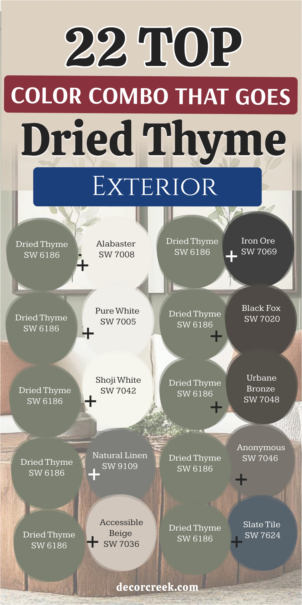
22 Top Color Combo that Goes With Dried Thyme Exterior
Dried Thyme SW 6186 + Alabaster SW 7008
Dried Thyme SW 6186 mixed with Alabaster SW 7008 creates a gorgeous farmhouse exterior look. This combination uses the creamy white for your main siding and the green for shutters.
It gives your house a classic, welcoming look that stands out beautifully in any neighborhood. Passersby will love how clean and friendly your front porch looks from the street.
It coordinates naturally with green lawns, landscaping plants, and colorful front door flowers. This choice keeps your house looking bright while adding a touch of traditional country charm. It is a highly reliable exterior mix that boosts your home value instantly.
Best used in: living rooms, kitchens, hallways, bedrooms, and farmhouse exteriors
Pairs well with: Iron Ore SW 7069, Agreeable Gray SW 7029, Natural Linen SW 9109, warm wood tones The key rule of this color for farmhouse style is to use it where you want natural light to feel kind, soft, and inviting throughout the day.
Dried Thyme SW 6186 + Pure White SW 7005
Dried Thyme SW 6186 and Pure White SW 7005 offer a crisp, modern exterior house design. This clean white trim makes the deep green siding look incredibly sharp and newly updated.
It is an excellent choice for modern homes with clean lines and simple architectural details. You will love how bright your windows and rooflines look against the rich green body.
It cuts through cloudy weather to keep your home looking fresh and highly cared for. It gives your property an immediate look of being modern, high-end, and completely clean. It is a simple, beautiful look that always works perfectly.
Best used in: modern trim, ceilings, contemporary kitchens, and bright bathrooms
Pairs well with: Black Fox SW 7020, Charcoal Blue SW 2739, Anew Gray SW 7030, silver hardware The key rule of this color for a modern look is to use it on trim with a high-gloss finish for a sharp edge.
Dried Thyme SW 6186 + Shoji White SW 7042
Dried Thyme SW 6186 paired with Shoji White SW 7042 brings a soft warmth to exterior walls. This option works wonderfully for folks who dislike bright whites under the hot summer sun.
The warm beige undertone prevents your house from blinding the neighbors on sunny afternoons. It matches beautifully with natural stone foundations and warm wooden front doors.
You will notice how it changes throughout the seasons to match the outdoor landscape. It makes your home look rich, custom-built, and completely integrated into its environment. It creates a cozy, inviting exterior that everyone loves to visit.
Best used in: kitchens, open floor plans, entryways, and home offices
Pairs well with: Urbane Bronze SW 7048, Pewter Green SW 6208, Revere Pewter HC-172, light oak The key rule of this color for a cozy look is to apply it in rooms with large windows to let the warm undertones glow.
Dried Thyme SW 6186 + Natural Linen SW 9109
Dried Thyme SW 6186 combined with Natural Linen SW 9109 mimics the look of a rustic cottage. This exterior match brings an organic, earthy texture to your home siding or trim work.
It works beautifully alongside dark bronze gutters and rustic wooden porch pillars. You will love how it hides outdoor dust and splashing rain marks over the years.
It offers a perfect middle ground between a gray and a traditional tan exterior shade. This combination creates a friendly look that makes your house feel like a peaceful woodland retreat. It looks especially handsome surrounded by large shade trees and natural gardens.
Best used in: kitchens, laundry rooms, mudrooms, and traditional dining spaces
Pairs well with: Black Fox SW 7020, Foothills SW 7514, Accessible Beige SW 7036, copper accents The key rule of this color for a rustic style is to pair it with concrete or stone finishes to keep the organic feel alive.
Dried Thyme SW 6186 + Accessible Beige SW 7036
Dried Thyme SW 6186 joined by Accessible Beige SW 7036 is a famous, reliable exterior choice. This modern tan siding color looks incredible when framed by deep green shutters and doors.
It balances the cool outdoor light with its own steady, reliable built-in warmth. You will find that it matches any style of roofing shingles you already have installed.
It creates a beautiful look that makes your house look expensive and professionally styled from the curb. It is a safe, smart choice that always yields highly attractive results for homeowners. It makes your house look completely ready for the real estate market.
Best used in: open concept kitchens, hallways, family rooms, and home staging
Pairs well with: Pure White SW 7005, Repose Gray SW 7015, Sea Salt SW 6204, dark walnut The key rule of this color for staging is to use it as a bridge between rooms to create a continuous flow.
Dried Thyme SW 6186 + Iron Ore SW 7069
Dried Thyme SW 6186 along with Iron Ore SW 7069 creates a dramatic, modern exterior appearance. Using this charcoal black on your front door and shutters adds instant luxury to your property.
It is less harsh than standard black, making it friendlier for a neighborhood setting. It looks magnificent next to modern outdoor light fixtures and concrete porch floors.
You will notice how it emphasizes the rich, organic look of the herbal green siding paint. It creates a strong, confident look that makes your home look newly architect-designed. It is an excellent choice for a striking, high-fashion exterior statement.
Best used in: kitchen islands, interior doors, window frames, and modern fireplaces
Pairs well with: Alabaster SW 7008, Extra White SW 7006, Accessible Beige SW 7036, brass The key rule of this color for a luxury look is to use matte or satin finishes to keep it looking soft.
Dried Thyme SW 6186 + Black Fox SW 7020
Dried Thyme SW 6186 and Black Fox SW 7020 mix dark charcoal with a rich chocolate brown. This exterior choice creates a warm, dark contrast that looks beautiful on mountain cabins or modern homes.
It prevents the dark siding from feeling cold or uninviting to your family arriving home. It pairs wonderfully with copper gutters and warm outdoor lighting systems. You will enjoy how it makes your home look like a luxury mountain resort building.
It provides a sturdy finish that handles harsh winter weather marks exceptionally well over time. It is an excellent option for a cozy, high-contrast exterior look.
Best used in: kitchen islands, accent walls, exterior trim, and library shelving
Pairs well with: Alabaster SW 7008, Creamy SW 7012, Repose Gray SW 7015, gold fixtures The key rule of this color for a rich appearance is to contrast it against warm, creamy whites on the walls.
Dried Thyme SW 6186 + Urbane Bronze SW 7048
Dried Thyme SW 6186 plus Urbane Bronze SW 7048 is a rich blend that feels connected to nature. This deep brown-gray brings a warm, grounding weight to your exterior trim or main siding boards.
It pairs naturally with the organic qualities of the deep herbal green paint color. You will love how it complements stone foundations and rich hardwood porch ceilings. It creates a warm, welcoming feeling when you pull into the driveway at night.
This tone is perfect for creating a high-end look that still feels casual and friendly. It makes your house look like a warm lodge hidden in the woods.
Best used in: kitchens, accent walls, home exteriors, and cozy living rooms
Pairs well with: Shoji White SW 7042, Accessible Beige SW 7036, Extra White SW 7006, natural stone The key rule of this color for an organic feel is to incorporate plenty of stone and brick textures nearby.
Dried Thyme SW 6186 + Anonymous SW 7046
Dried Thyme SW 6186 combined with Anonymous SW 7046 offers a sophisticated mid-tone gray exterior. This paint color has a heavy green-brown undertone that matches the siding perfectly.
It creates a subtle contrast that looks highly integrated, quiet, and professionally designed. You will love how it softens the hard lines of your garage doors and roof trim. It handles bright sunlight without washing out or losing its interesting character.
This combination gives your home an established, peaceful look that blends into mature trees beautifully. It is a fantastic option for a classic suburban house upgrade.
Best used in: home exteriors, garage doors, trim work, and backyard fences
Pairs well with: Alabaster SW 7008, Urbane Bronze SW 7048, Repose Gray SW 7015, dark gutters The key rule of this color for a cohesive exterior is to use it on garage doors to blend them into the house body.
Dried Thyme SW 6186 + Slate Tile SW 7624
Dried Thyme SW 6186 mixed with Slate Tile SW 7624 introduces a rich slate blue-gray trim. This unique color combo creates a fascinating and complex look for your home exterior.
It is perfect for homeowners who want a historic look that stands out from standard choices. It pairs wonderfully with gray roof shingles and stone porch steps. The blue and green tones complement each other like a cloudy mountain landscape.
This mixture makes your home look incredibly custom-built and artistic to everyone passing by. Your house will stand out as a beautiful conversation piece in the neighborhood.
Best used in: home exteriors, front doors, decorative shutters, and porch trim
Pairs well with: Extra White SW 7006, Revere Pewter HC-172, Charcoal Blue SW 2739, stone accents The key rule of this color for a unique exterior is to use it on shutters against a lighter green siding body.

Dried Thyme SW 6186 + Seaworthy SW 7620
Dried Thyme SW 6186 paired with Seaworthy SW 7620 brings a deep, ocean-blue accent to your house. This dark blue paint looks magnificent on a front door next to green siding panels.
It creates a rich, jewel-box effect that makes your entry look important and welcoming. You will love the depth it adds to your front porch appearance during the evening hours. It feels sophisticated and proud without being too bright or loud for the neighborhood.
It pairs perfectly with shiny brass kickplates and modern outdoor handles. It is a fantastic choice for people who truly love rich exterior colors.
Best used in: front doors, exterior accent walls, shutters, and garden gates
Pairs well with: Alabaster SW 7008, Pure White SW 7005, Accessible Beige SW 7036, brass hardware The key rule of this color for a grand entrance is to use a high-gloss sheen on the front door.
Dried Thyme SW 6186 + White Dove OC-17
Dried Thyme SW 6186 and White Dove OC-17 create a classic, high-end exterior framework. This legendary white paint keeps your window trim and fascias looking sharp for years.
It has a tiny touch of gray that prevents blinding glare under direct hot sunlight. It gives your home an instant upgrade that looks clean, expensive, and custom-designed. It coordinates beautifully with red brick details and dark gray roofing materials.
You will notice how it keeps its clean character whether it is raining or sunny outside. It creates a soft contrast that lets the green siding feel rich and earthy.
Best used in: modern kitchens, living rooms, trim work, and bedroom walls
Pairs well with: Revere Pewter HC-172, Hale Navy HC-154, Wrought Iron 2124-10, classic marble The key rule of this color for a clean look is to use it on both walls and trim but in different paint sheens.
Dried Thyme SW 6186 + Swiss Coffee OC-45
Dried Thyme SW 6186 alongside Swiss Coffee OC-45 delivers a beautiful, warm cottage exterior feel. This rich white paint prevents a dark green house body from feeling too heavy or gloomy.
It works perfectly for traditional craftsman or country-style home designs. You will love how it warms up cool northern light hitting the front of your house. It looks fantastic when applied to porch railings, trim, and decorative gables.
This tone creates a welcoming environment that makes guests feel comfortable before they enter. It helps your home blend beautifully with cottage gardens and natural landscaping.
Best used in: family kitchens, cottage interiors, bedrooms, and cozy breakfast nooks
Pairs well with: Edgecomb Gray HC-173, Chelsea Gray HC-168, Simply White OC-117, terracotta tile The key rule of this color for a cottage feel is to pair it with open wood shelving and indoor plants.
Dried Thyme SW 6186 + Edgecomb Gray HC-173
Dried Thyme SW 6186 and Edgecomb Gray HC-173 offer a sleek, modern greige exterior solution. This paint shade brings a modern look to your home siding or trim details.
It looks rich and grounding without making your property look dark or gloomy. It coordinates wonderfully with modern black light fixtures and concrete driveways.
You will find that it hides outdoor dirt and dust storms exceptionally well over time. It creates a handsome backdrop that allows your green front door to pop out beautifully. It is a fantastic choice if you want a neutral house color with real style.
Best used in: kitchens, dining rooms, hallways, and contemporary living areas
Pairs well with: White Dove OC-17, Hale Navy HC-154, Revere Pewter HC-172, black metal hardware The key rule of this color for modern spaces is to pair it with black accents to anchor the room.
Dried Thyme SW 6186 + Revere Pewter HC-172
Dried Thyme SW 6186 joined by Revere Pewter HC-172 creates a classic, sturdy exterior presence. This deep greige works perfectly for large two-story homes that need a strong color base.
It bridges the gap between traditional styling and modern rustic design choices beautifully. You will love how it holds its own against the green accents without fading away. It looks spectacular next to natural stone chimneys and black asphalt shingles.
This combination gives your home an established look that feels rooted in architectural history. It is a highly dependable color choice that neighborhood associations always love.
Best used in: large kitchens, open family rooms, historic homes, and basements
Pairs well with: White Dove OC-17, Chelsea Gray HC-168, Iron Ore SW 7069, antique brass The key rule of this color for a classic style is to use warm yellow lightbulbs to bring out the cozy undertones.
Dried Thyme SW 6186 + Kendall Charcoal HC-166
Dried Thyme SW 6186 mixed with Kendall Charcoal HC-166 brings a bold, modern exterior look. This dark charcoal gray is ideal for modern accent siding or garage doors.
It creates a moody, high-contrast look that feels deeply luxurious and striking from the curb. It matches beautifully with bright white stone features and silver metal house numbers.
You will love how it makes the green trim look vibrant and lush by comparison. It grounds the property and gives it a clear, strong modern focus. It is a daring exterior choice that pays off with a highly sophisticated look.
Best used in: kitchen islands, accent walls, modern powder rooms, and home theaters
Pairs well with: White Dove OC-17, Pale Oak OC-20, Revere Pewter HC-172, polished chrome The key rule of this color for dramatic impact is to use crisp white details to create a clean boundary.
Dried Thyme SW 6186 + Wrought Iron 2124-10
Dried Thyme SW 6186 plus Wrought Iron 2124-10 gives your home exterior a sturdy, historic feel. This deep charcoal black looks incredible on front doors, shutters, and metal porch railings.
It works beautifully in homes with industrial accents or rustic wooden porch beams. You will appreciate how it makes your green siding panels look deep and lush from the street. It hides outdoor smudges and spiderwebs better than almost any other color available.
It brings a sense of strength, security, and permanence to your exterior design. It is a stunning choice for a handsome, historic neighborhood look.
Best used in: lower cabinets, kitchen islands, entry doors, and accent trim
Pairs well with: White Dove OC-17, Swiss Coffee OC-45, Revere Pewter HC-172, industrial wood The key rule of this color for an industrial look is to pair it with raw wood elements and metal pipes.
Dried Thyme SW 6186 + Hale Navy HC-154
Dried Thyme SW 6186 paired with Hale Navy HC-154 creates a traditional maritime exterior style. This deep blue looks spectacular on a front door or accent shutters against green siding.
It adds a traditional elegance that makes your home look custom-designed and expensive. It looks beautiful next to white porch columns and classic red brick walkways. You will love the rich depth it adds to your home curb appeal during evening hours.
It feels sophisticated and proud without being too trendy for your neighbors. It is a fantastic choice for people who love rich, established house colors.
Best used in: kitchen islands, dining rooms, front doors, and boy’s bedrooms
Pairs well with: White Dove OC-17, Pale Oak OC-20, Edgecomb Gray HC-173, brass hardware The key rule of this color for a traditional look is to use shiny brass handles to make the blue pop.
Dried Thyme SW 6186 + Boothbay Gray HC-165
Dried Thyme SW 6186 alongside Boothbay Gray HC-165 offers a beautiful coastal exterior blend. This soft blue-gray paint color feels like a misty morning by the ocean side.
It lightens the deep green siding, creating a refreshing look that feels very custom. It looks amazing on traditional siding with the green on shutters and trim boards. You will notice how it keeps its cool, friendly character even on hot summer days.
This mix brings a lovely touch of seaside beauty to any inland neighborhood house. It is a wonderful choice for a light, breezy home exterior upgrade.
Best used in: home exteriors, coastal siding, front doors, and sunroom walls
Pairs well with: Pure White SW 7005, Simply White OC-117, Wrought Iron 2124-10, coastal decor The key rule of this color for a coastal look is to use bright white trim to frame the soft blue-gray panels.

Dried Thyme SW 6186 + October Mist 1495
Dried Thyme SW 6186 combined with October Mist 1495 creates a soft, layered green exterior. This light sage green acts as a gentle companion, creating a sophisticated look from the street.
It makes your house look modern, artistic, and completely custom-designed for your landscape. It coordinates beautifully with dark gray roofing and natural wood front doors. You will love how the colors change character depending on the weather conditions outside.
It brings a soft, artistic energy to your home exterior that neighbors will envy. It is a perfect choice for an updated, trendy garden-style house.
Best used in: exterior siding, garden sheds, window shutters, and porch ceilings
Pairs well with: Alabaster SW 7008, Iron Ore SW 7069, Swiss Coffee OC-45, natural wood tones The key rule of this color for a garden look is to use natural cedar wood accents nearby.

Dried Thyme SW 6186 + Saybrook Sage HC-114
Dried Thyme SW 6186 plus Saybrook Sage HC-114 delivers a classic, historic green exterior scheme. This mid-tone green has strong silvery undertones that shine beautifully in natural daylight.
It pairs naturally with the deep green, creating a handsome monochromatic look on your siding. You will find that this combination is very easy on the eyes when driving up to your house.
It creates a harmonious environment that makes your home feel like a historic park property. It is a wonderful option for historic home lovers who want a traditional green house.
Best used in: historic home exteriors, window trim, porch columns, and garage doors
Pairs well with: White Dove OC-17, Wrought Iron 2124-10, Revere Pewter HC-172, stone paths The key rule of this color for a historic look is to use crisp white on the windows to create a clear border.

Dried Thyme SW 6186 + Black Forest Green HC-187
Dried Thyme SW 6186 mixed with Black Forest Green HC-187 creates the ultimate deep forest exterior look. This black-green color is incredibly dark, rich, and full of traditional drama.
It looks magnificent on a front door or main shutters against the lighter green siding body. You will love how it makes your home blend into pine trees and mountain landscapes.
It creates a powerful center of attention that makes your entryway look deeply secure and private. This combo gives your property a historic look that feels rooted in the forest. It is an excellent choice for a bold, high-fashion lodge exterior statement.
Best used in: front doors, exterior trim, window shutters, and mountain cabins
Pairs well with: Alabaster SW 7008, Natural Linen SW 9109, Manchester Tan HC-81, iron lighting The key rule of this color for a forest appearance is to use heavy iron light fixtures to complete the lodge feel.
Dried Thyme SW 6186 is a wonderful paint choice that brings the beauty of nature into your home. Its rich green tone feels warm and grounded, making it easy to pair with many different colors and decorating styles. Whether you’re updating a cozy living room, refreshing kitchen cabinets, or giving your home’s exterior a new look, Dried Thyme creates a welcoming backdrop that feels balanced throughout the year.
Choosing the right coordinating colors makes a big difference. Soft whites help brighten the green, warm beiges create a comfortable and inviting look, while deep grays and navy blues add contrast and character. Depending on the combination, Dried Thyme can feel traditional, modern, rustic, or even slightly contemporary without losing its natural charm.
I always recommend using trusted paint collections from Sherwin-Williams and Benjamin Moore because their colors are consistent, reliable, and easy to coordinate. Before making your final decision, paint a few sample boards or test patches and look at them during the morning, afternoon, and evening. Natural and artificial lighting can noticeably change how the color appears throughout the day.
With these twenty-two carefully selected color combinations, you’ll have plenty of ideas for creating a home that feels warm, polished, and inviting. Whether you prefer light and airy pairings or bold contrast, Dried Thyme offers the flexibility to create a look that will remain beautiful for years while reflecting your own personal style.