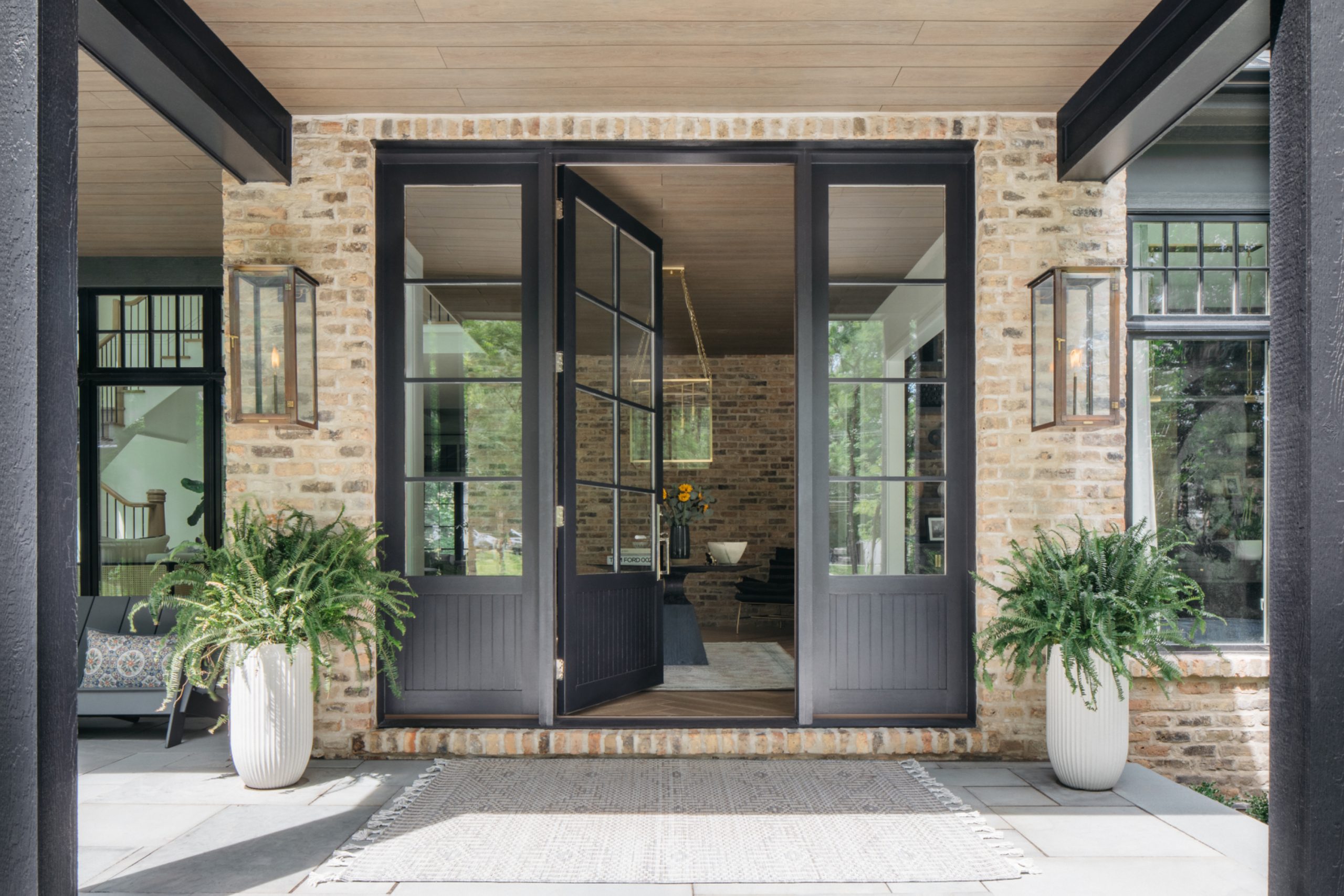
The front door is truly like the handshake of your home—it’s the first impression you make on every visitor, setting the tone for what awaits inside. It represents a fantastic, yet inexpensive, chance to show off your personal style and dramatically boost your curb appeal with just a few careful coats of paint.
Choosing the right color can feel like a surprisingly big decision with so many options available, but it’s actually one of the easiest and fastest ways to give your entire house a striking new look without resorting to a major, costly renovation.
Over my many years of experience helping homeowners and meticulously prepping houses for sale, I’ve seen firsthand the significant impact of a perfect front door color; it can instantly change the entire feeling of a property.
I always tell clients to think of your front door as a vibrant accessory for your home’s exterior; it should stand out, possess a unique character, and make you smile every single time you pull into the driveway.
This carefully curated guide brings together my absolute favorite colors and my best professional tips so you can feel completely confident picking a shade that will make your entryway truly pop and wonderfully reflect your home’s unique and charming character.
Why I Always Trust Sherwin-Williams and Benjamin Moore for Front Door Paints
When it comes to painting a front door, a high-quality product is non-negotiable because the door takes a beating from the elements. This is precisely why I stick exclusively to the brands I know will last and look beautiful for many years: Sherwin-Williams and Benjamin Moore.
They aren’t simply selling cans of color; they are offering premium quality that reliably holds up against all kinds of harsh weather, which is crucially important for a busy, exterior entryway exposed to sun and moisture.
Their colors are consistently rich, deep, and beautifully saturated, and they apply smoothly, giving you a remarkably professional-looking finish even if you’re tackling the painting project yourself.
Both companies rigorously engineer their premium products to specifically resist fading, chipping, and cracking, which are the most common and frustrating problems for exterior doors exposed to direct sun and constant rain.
Crucially, I’ve found that their color consistency is excellent, meaning the tiny swatch you choose in the store is truly and accurately what you get once the paint dries on your door.
Plus, their immense color selections allow for that perfect, nuanced shade that makes a front door feel genuinely special and intentional.
Trusting these industry leaders means I never have to worry about a client’s front door looking prematurely faded or needing an emergency repaint too soon after the project is complete.
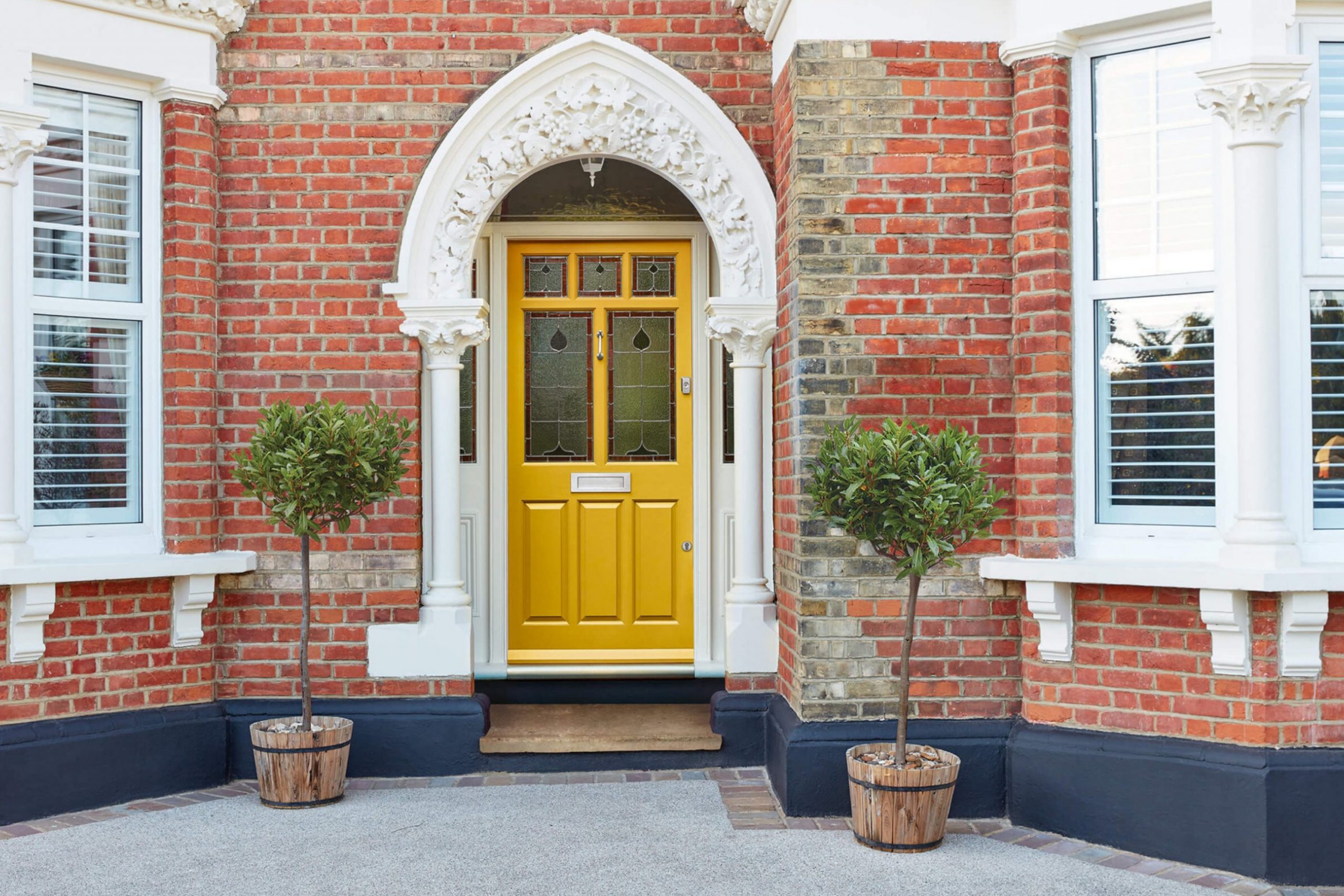
How I Choose the Perfect Paint Color for a Front Door
Choosing the perfect paint color for a front door is much more strategic than just picking a color you happen to like; it’s primarily about creating harmony and visual balance with your home’s entire exterior. My reliable method starts with closely observing and analyzing the fixed elements of the house: the primary brick or siding color, the exact color of the roof, and any existing stone or trim colors.
These permanent, unchangeable colors set the essential backdrop and must be the guiding force behind your door color selection.
For example, a home with a warm-toned red brick exterior looks best with door colors that have a similar underlying warmth or a cool color to provide sophisticated contrast, while a façade with cool gray stone can beautifully handle a cooler deep blue or rich green.
Secondly, you must consider the architectural style of your home—a stately, formal Colonial might demand a classic, deep navy or a sophisticated black, while a cozier cottage could easily carry off a brighter, happier hue like a clear blue or a vibrant teal.
Thirdly, think about the amount of sunlight your door receives throughout the day; colors appear much lighter and brighter in intense, direct sun and much deeper, richer, and moodier in full shadow.
To guarantee satisfaction, always purchase a small paint sample and test it directly on your door, viewing it at different times of the day and under various weather conditions before you commit to the full can.
This simple, non-negotiable test is the biggest secret to getting it right and confidently avoiding that moment of panic when the entire door is already painted.
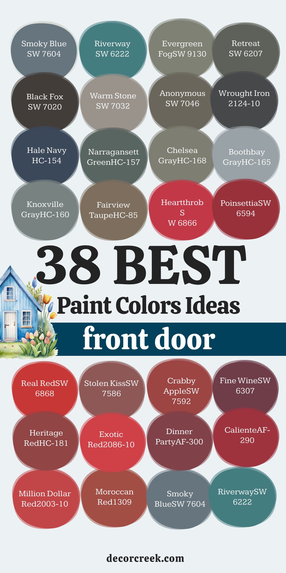
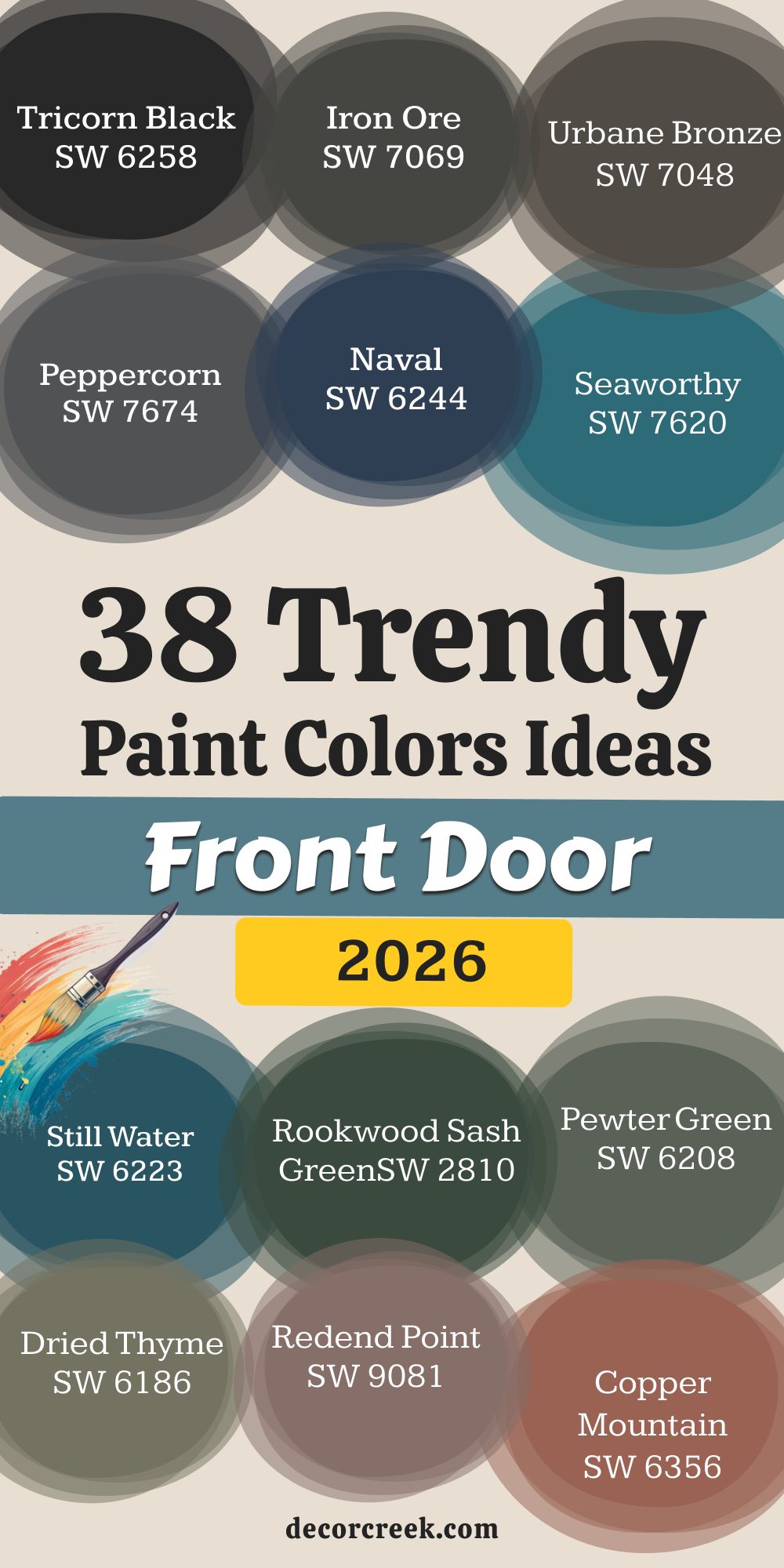
38 Trendy Front Door Paint Color Ideas In 2026
Tricorn Black SW 6258
Tricorn Black is a true, deep black that offers incredible drama and sophistication to almost any home. Tricorn Black is a fantastic choice for giving your front entry a crisp, polished, and grounded appearance.
This shade has virtually no noticeable undertones, making it a pure, foundational color that pairs beautifully with bright white trim. It creates a striking contrast that draws the eye directly to the front of the house, offering instant curb appeal.
Using Tricorn Black suggests a classic style, especially on traditional homes like Colonials or Tudors, but it can also look sleek on modern architecture.
It provides a welcoming sense of formality and works well in both bright sunlight and deep shade, looking rich and deep under all conditions.
Tricorn Black is a paint that homeowners often select when they want a reliable and bold statement without introducing any distracting color.
This bold color is perfect if your goal is to make your front door a powerful focal point on a lighter-colored house. Tricorn Black is a professional favorite because it’s both stylish and incredibly versatile.
🎨 Check out the complete guide to this color right HERE 👈

Iron Ore SW 7069
Iron Ore is a gorgeous, rich charcoal that sits perfectly between black and deep gray, offering moody depth without the starkness of pure black. Iron Ore is a popular color for those who want a dark door but find true black too harsh or demanding in their setting.
This beautiful shade has a soft, warm undertone that makes it feel slightly more welcoming and less severe than a straight black paint. It works exceptionally well with lighter exteriors like white, cream, or light gray siding, providing a lovely contrast that feels very current.
Iron Ore is also fantastic for homes with natural wood elements, as its soft quality complements the wood grain beautifully. It is an extremely versatile color that has been trending for a few years and shows no sign of losing its appeal for a reason. This color is highly adaptable to both traditional and modern door styles, emphasizing the details and hardware well. Iron Ore is an excellent choice for creating a striking, sophisticated, and memorable entrance to your cherished home.
🎨 Check out the complete guide to this color right HERE 👈

Urbane Bronze SW 7048
Urbane Bronze is a deep, warm color that is best described as a sophisticated mix of gray, brown, and a hint of bronze, offering an earthy feel. Urbane Bronze was chosen as Sherwin-Williams’ 2021 Color of the Year, and it remains an incredibly popular and grounding color for front doors.
This deeply rich neutral is perfect for creating a warm, solid, and inviting entrance that feels securely rooted to the landscape. It beautifully complements homes with stone or brick exteriors, enhancing their natural textures without competing for attention.
The bronze quality is subtle but adds a luxurious, velvety finish that changes slightly depending on the light throughout the day. Urbane Bronze pairs wonderfully with off-whites and creams, or you can use it to create a striking monochromatic look with darker trim.Choosing this color gives your home a feeling of quiet confidence and contemporary elegance, appealing to many different aesthetic tastes. Urbane Bronze is a fantastic, modern neutral that offers a welcome sense of depth and stability to your home’s facade.
🎨 Check out the complete guide to this color right HERE 👈

Peppercorn SW 7674
Peppercorn is a deeply saturated, cool charcoal gray that provides a rich, strong foundation without reading as pure black on the door. Peppercorn is one of my go-to dark grays for a powerful and sophisticated statement that feels very grounded and current.
This particular shade has soft blue-violet undertones, which become more apparent in bright light, giving it a subtle depth and complexity. It’s an ideal choice if you want the drama of a dark color but prefer a cool-toned finish that balances warm siding or brick. Peppercorn pairs beautifully with a clean, crisp white trim, creating a tailored, classic look that is both smart and inviting.
Because it’s so dark, it also works well as a grounding element on lighter stucco or light gray siding, offering fantastic contrast. Choosing Peppercorn signals a sophisticated and slightly modern sensibility in a homeowner, providing a durable and stylish look that always feels well-chosen.
🎨 Check out the complete guide to this color right HERE 👈

Naval SW 6244
Naval is a classic, deep navy blue that is both strong and incredibly sophisticated, bringing a timeless nautical elegance to your front entry. Naval is an incredibly versatile color that works beautifully on homes from cozy beach cottages to formal, traditional residences, thanks to its deep saturation.
This particular shade is one of the most reliable dark blues because it reads clearly as blue, even when in shadow, avoiding the common issue of looking black. It pairs exquisitely with crisp white trim for a traditional, eye-catching contrast that feels fresh and clean against almost any backdrop.
Using Naval on your front door gives your house an instant feeling of heritage, trust, and quiet authority, inviting visitors inside warmly. This shade of blue is also known to be highly appealing to potential buyers because it is universally loved and projects a feeling of stability. Naval is a brilliant choice for making a powerful, enduring statement that perfectly blends classic style with modern appeal.
🎨 Check out the complete guide to this color right HERE 👈

Seaworthy SW 7620
Seaworthy is a vibrant, mid-tone blue that manages to feel bright and happy without being overly loud or childish. Seaworthy has a gorgeous, nautical feel, perfect for homes that seek a slightly more spirited and energetic entrance than a traditional dark navy.
This cheerful shade has subtle green undertones, which give it a unique teal quality that adds character and feels refreshing on a sunny day. It’s an especially wonderful color for coastal homes, lake houses, or any property where you want to evoke a feeling of water and clear skies. Seaworthy contrasts beautifully with neutral siding like warm beiges, soft grays, or classic white, making the front door truly stand out.
This paint choice instantly gives your home a more casual, welcoming, and optimistic vibe, suggesting a relaxed and happy atmosphere within.
Seaworthy is a refreshing alternative to standard blues, offering a lovely pop of saturated color that draws people toward your door.
Still Water SW 6223
Still Water is a deep, rich blue-green that truly captures the feeling of a calm, secluded body of water, offering great depth and natural appeal. Still Water is an excellent choice for a front door color if you are looking for a shade that feels grounded in nature and is highly restful to look at.
This shade is a beautiful blend of a moody deep blue and a classic dark green, making it a sophisticated option for many home styles. It pairs exceptionally well with brick, particularly warmer red or brown tones, where the cool color provides a stunning and rich contrast.
Using Still Water gives the entrance a feeling of quiet strength and traditional elegance, hinting at a cozy, thoughtful home behind the door. This color is also a favorite because it is dark enough to feel serious but has that inviting, natural hue that makes it feel less severe than a black or charcoal. Still Water offers a unique, complex color statement that feels both classic and perfectly in tune with today’s color trends.
🎨 Check out the complete guide to this color right HERE 👈
Rookwood Sash Green SW 2810
Rookwood Sash Green is a classic, deeply saturated, historic green that feels traditional, weighty, and perfectly grounded. Rookwood Sash Green is one of those fantastic historical colors that gives a home instant maturity and a sense of enduring charm, especially on older architecture.
This shade has a lovely richness that leans slightly toward black, allowing it to provide a powerful, sophisticated punch without being a pure, primary green. It pairs beautifully with natural wood accents, stone facades, and traditional white or cream trim, highlighting its beautiful depth.
Using Rookwood Sash Green on your front door creates a stately, formal welcome, suggesting a home filled with history and thoughtful design choices. This shade is an excellent option for homes with warm exterior colors, as the dark, cool green offers a brilliant and grounding contrast. Rookwood Sash Green is a trustworthy color for achieving a timeless, deeply attractive entryway that truly enhances your home’s architectural details.
🎨 Check out the complete guide to this color right HERE 👈
Pewter Green SW 6208
Pewter Green is a mid-to-dark muted green with a gray base that gives it a wonderfully sophisticated and adaptable quality. Pewter Green is a highly versatile and popular color because it strikes a perfect balance: it’s a distinct color without being overly bright or demanding attention.
This lovely shade has an earthy quality that makes it pair beautifully with natural exterior elements like stone, wood shutters, and landscapes full of greenery. It works particularly well on homes with white, cream, or light gray siding, where it offers a refreshing but very balanced pop of color.
Using Pewter Green creates a welcoming entrance that feels calm, connected to nature, and immediately suggests a comfortable, well-cared-for home. This color is a fantastic choice for giving your home’s exterior a contemporary update while maintaining a classic, approachable feeling. Pewter Green is a reliable color that I recommend often for a polished, gentle statement that is universally appealing and easy to live with.
🎨 Check out the complete guide to this color right HERE 👈
Dried Thyme SW 6186
Dried Thyme is a comforting, medium-toned sage green that leans toward an earthy, slightly dusty olive, giving it a soft, natural quality. Dried Thyme is an incredibly appealing and relaxed color choice that evokes feelings of the countryside, making it great for cottage-style or rustic homes.
This shade has a wonderful, organic feel that makes it look fantastic when surrounded by landscaping and natural materials like cedar or stone. It pairs beautifully with a range of exterior colors, from warm beige and taupe to a bright, clean white, adding a gentle contrast.
Choosing Dried Thyme gives your front door a welcoming and slightly weathered appearance, suggesting a home that is effortlessly comfortable and unpretentious. This color offers a much-needed warmth compared to cooler grays and blacks, providing a more approachable and grounded entryway. Dried Thyme is a perfect option if you desire a green door that feels muted, natural, and incredibly harmonious with its outdoor surroundings.
🎨 Check out the complete guide to this color right HERE 👈
Redend Point SW 9081
Redend Point is a deep, soulful blush that perfectly captures a terracotta warmth, sitting between a rich earth red and a grounded brown-pink. Redend Point was Sherwin-Williams’ 2023 Color of the Year and remains a fantastic choice for those seeking a warm, unique, and deeply personal door color.
This stunning, sophisticated color offers a welcoming and rich texture to the front of your home that is unlike many traditional door colors. It pairs beautifully with neutral exteriors like soft whites, light grays, or even natural wood siding, where its warmth truly shines.
Using Redend Point gives your home a feeling of heritage and quiet confidence, suggesting a comfortable, lived-in, and artfully designed interior. This color is an unexpected choice that feels both historic and thoroughly modern, setting your home apart from the common dark door trend. Redend Point is a brilliant choice for adding a cozy, deeply satisfying hue to your entryway that is sure to draw positive attention.
🎨 Check out the complete guide to this color right HERE 👈

Copper Mountain SW 6356
Copper Mountain is a vibrant, earthy color that lives up to its name, resembling the rich, sun-baked tones of natural copper and burnt orange. Copper Mountain is an incredibly warm and energetic color choice that immediately makes a home feel welcoming, lively, and incredibly distinctive.
This particular shade has a strong red-orange base that is softened by a grounded, earthy undertone, preventing it from appearing too bright or aggressive. It pairs beautifully with neutral siding like deep grays, charcoal, or even a classic white, offering a brilliant, fiery contrast.
Choosing Copper Mountain gives your home a distinctive Southwestern or rustic appeal, hinting at an adventurous and cozy interior. This color is perfect for those who want a front door that acts as a beacon of warmth and optimism, standing out beautifully against a lush green landscape. Copper Mountain is a fantastic option for adding a unique, fiery personality and a deep sense of tradition to your front entrance.
🎨 Check out the complete guide to this color right HERE 👈

Rookwood Red SW 2802
Rookwood Red is a classic, deep red that manages to be rich and powerful without being overly bright or fire-engine aggressive. Rookwood Red is a gorgeous, heritage color that provides a deep, traditional warmth that feels incredibly welcoming and stately on an entryway.
This shade is complex, offering a lovely balance of red and brown that ties it beautifully to natural elements like wood, brick, and stone. It’s an ideal choice for homes with traditional architectural details where you want a striking color that still feels historically appropriate.
Rookwood Red pairs wonderfully with cream or off-white trim, providing a classic, highly elegant contrast that suggests quality and permanence. Choosing this red gives your home an immediate sense of boldness, warmth, and classic style, often associated with good luck and hospitality. Rookwood Red is a deeply satisfying color that is perfect for making a strong, welcoming statement that remains sophisticated and well-grounded.
🎨 Check out the complete guide to this color right HERE 👈
Foxhall Green SW 9184
Foxhall Green is a deep, complex, dark green that sits between forest green and a moody teal, offering a rich and sophisticated color statement. Foxhall Green is a fantastic choice for anyone who wants a dark, grounding door color that is decidedly not black, offering a welcome hint of natural color.
This shade has a beautiful depth that pairs exceptionally well with brick exteriors, both red and brown, creating a stunning, high-contrast look. It also looks absolutely stunning against clean, crisp white siding, where the color’s richness really stands out and emphasizes the door’s design.
Using Foxhall Green gives your front entrance a sense of quiet authority, tradition, and an easy connection to the natural landscape surrounding your home. This color is dark enough to feel extremely polished and modern but has the softness of green to keep it from feeling too stark or severe. Foxhall Green is a rich, highly appealing color that offers a beautiful, enduring welcome to your treasured home.
🎨 Check out the complete guide to this color right HERE 👈
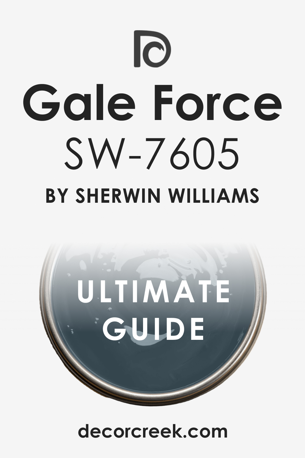
Gale Force SW 7605
Gale Force is a stunning, deeply saturated blue-green that is moody, rich, and truly captivating, evoking the power of a deep sea storm. Gale Force is an excellent choice for a front door if you are looking for a highly distinct and complex color that shifts beautifully with the light.
This shade has strong gray undertones that prevent it from appearing too bright, giving it an old-world, sophisticated, and slightly weathered charm. It pairs wonderfully with light, neutral siding like soft gray, cream, or even a stark white, where the depth of the color can truly shine.
Choosing Gale Force gives your home a feeling of mystery, artistry, and quiet confidence, setting it apart from more conventional dark door choices. This blue-green is perfect for adding a sense of drama and individuality to your home’s façade while maintaining a classic, well-designed feeling. Gale Force is a striking color that I often recommend when a homeowner wants a unique, powerful, and deeply beautiful welcome.
🎨 Check out the complete guide to this color right HERE 👈
Andiron SW 6174
Andiron is a rich, grounding shade that falls between a deep charcoal and a moody, earthy brown, offering great weight and stability to a front door. Andiron is a very sophisticated neutral that provides the necessary contrast of a dark door without the severity of pure black, thanks to its warm brown base.
This versatile shade works beautifully to complement homes with a wide variety of exterior colors, especially those with natural stone or warm-toned brick. It’s an excellent color for achieving a high-end, polished look that feels both contemporary and firmly traditional at the same time.
Using Andiron gives the entrance a feeling of permanence, quality, and welcoming stability, which is highly appealing to all visitors. This color is also a fantastic alternative to classic gray or black, providing a softer, warmer, and more inviting touch to your home’s welcoming area. Andiron is a dependable and stylish choice for a strong, neutral statement that enhances your home’s existing color palette.
Rockwood Blue Green SW 2811
Rockwood Blue Green is a deep, heritage color that beautifully blends a rich navy with a significant amount of classic forest green, giving it fantastic depth. Rockwood Blue Green is a wonderful color choice for a front door, offering a serious, traditional look that carries a subtle, engaging color complexity.
This shade leans heavily into the dark, muted end of the spectrum, which allows it to pair beautifully with historically accurate trim colors like creams or deep mustards. It’s particularly effective on older, traditional homes like Victorians or Craftsman styles, where its depth complements the intricate architectural details.
Using Rockwood Blue Green gives your home an immediate sense of history, thoughtfulness, and quiet elegance, hinting at a truly cared-for interior. This blue-green is dark enough to read almost black in certain light conditions but shows a lovely mossy blue when the sun hits it. Rockwood Blue Green is a gorgeous, complex color for creating a distinguished and inviting entry that feels both old-world and well-designed.
Roycroft Pewter SW 2848
Roycroft Pewter is a complex, muted green-gray that has a distinct, grounded, and slightly earthy quality reminiscent of old metalwork. Roycroft Pewter is a beautiful choice for a front door that offers a soft, nature-inspired color without being a bright or attention-demanding green.
This particular shade has a strong gray base with warm, muddy green undertones, allowing it to harmonize beautifully with both warm and cool exterior color schemes. It’s an ideal option for creating a sophisticated, subtle contrast on homes with white, cream, or light gray siding, enhancing the door’s design.
Using Roycroft Pewter gives the entrance a feeling of quiet style, heritage, and a comfortable, unpretentious atmosphere, which is incredibly welcoming. This color works especially well on Craftsman-style homes or properties with a strong connection to natural, woodsy surroundings. Roycroft Pewter is a refined, gentle color that provides a lovely, organic twist on a traditional gray door.
🎨 Check out the complete guide to this color right HERE 👈
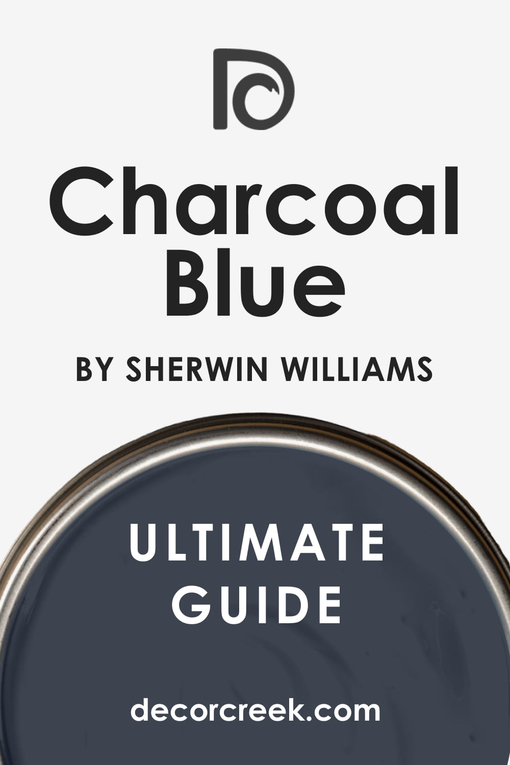
Charcoal Blue SW 2739
Charcoal Blue is a wonderfully deep, moody color that combines the sophisticated drama of charcoal with the dependable strength of a deep navy. Charcoal Blue is a perfect choice if you want the high-contrast appeal of a dark door but desire the subtle richness of a true color instead of a simple black.
This shade has a muted, almost dusty quality that makes it feel grounded and soft, rather than a harsh, bright blue. It pairs fantastically with brick, light stone, and a clean, crisp white trim, creating an exceptionally sharp and polished look.
Choosing Charcoal Blue gives your home a feeling of classic style, reliability, and quiet, assured elegance that is universally appealing. This color is also a reliable choice for staging a home, as it feels both on-trend and deeply classic, appealing to a wide range of potential buyers. Charcoal Blue is a sophisticated, highly appealing color that offers a beautiful depth and a refined welcome to your lovely home.
🎨 Check out the complete guide to this color right HERE 👈
Hale Navy HC-154
Hale Navy is arguably one of the most famous and reliable deep navy blue paint colors, known for its incredible depth and classic, enduring appeal. Hale Navy is a foundational color that instantly gives a front door a stately, heritage feel that is both dramatic and seriously welcoming.
This particular shade has a wonderful amount of gray mixed into the blue, which prevents it from looking overly bright and ensures it reads as a true navy, even in low light. It pairs flawlessly with white trim for a crisp, iconic contrast that feels very New England traditional and always looks fresh and tailored.
Using Hale Navy suggests a home of classic style and thoughtful design, providing a sense of stability and enduring quality to the entrance. This color is so beloved because it works on virtually every style of house, from a cozy Cape Cod to a modern city dwelling. Hale Navy is a truly exceptional, sophisticated color that is a guaranteed win for an instantly classic and highly appealing front door.
🎨 Check out the complete guide to this color right HERE 👈

Wrought Iron 2124-10
Wrought Iron is a sophisticated, warm charcoal gray that has lovely blue-green undertones, giving it a complex, slightly aged appearance. Wrought Iron is an ideal choice for a front door when you want a color that is dark and grounding but still offers a subtle color shift and warmth.
This shade is one of Benjamin Moore’s most popular dark colors because it avoids looking flat, instead offering a soft depth that feels very high-end. It pairs wonderfully with light, neutral exterior colors, such as cream, light gray, or white, providing a striking, beautiful contrast that draws the eye.
Choosing Wrought Iron instantly gives your home a feeling of polished elegance and quiet strength, suggesting a well-maintained and stylish interior. This color works perfectly on many styles of homes, from modern farmhouses to more traditional residences, emphasizing the door’s hardware and details beautifully. Wrought Iron is a versatile and beautiful color that provides an excellent, dependable backdrop for a truly inviting entryway.
🎨 Check out the complete guide to this color right HERE 👈

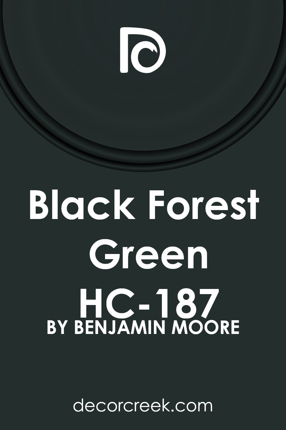
Black Forest Green HC-187
Black Forest Green is a deeply saturated, moody color that sits right at the edge of green and black, offering a powerful, natural drama. Black Forest Green is a phenomenal color choice for a front door that wants to make a serious, sophisticated statement without resorting to pure black.
This shade is complex, offering a visible rich green hue in the sunlight, while looking almost black in shadow, giving it a changing, engaging quality. It pairs beautifully with warm materials like brick and natural stone, or it can be used with a crisp white trim for a sharp, sophisticated contrast.
Choosing Black Forest Green gives your home an immediate sense of heritage, depth, and a connection to the landscape, feeling stately and enduring. This color is particularly effective on homes with traditional architecture, adding a distinguished and classic feel that is both strong and incredibly beautiful. Black Forest Green is a rich, powerful color that provides a deep, luxurious welcome to any visitor.
🎨 Check out the complete guide to this color right HERE 👈
Essex Green HC-188
Essex Green is a truly beautiful, deep color that is essentially a black with a noticeable, very dark green undertone, giving it a soft, earthy complexity. Essex Green is an excellent, sophisticated choice for a front door, offering the drama of a dark color but with a slight, natural warmth that feels less stark than pure black.
This shade is part of Benjamin Moore’s Historical Collection, making it a reliable choice for adding a sense of age, permanence, and classic elegance to your home. It pairs wonderfully with traditional trim colors like creamy whites, or you can use it to beautifully complement a warm stone or brick exterior.
Choosing Essex Green gives your entrance a feeling of quiet authority, tradition, and a deep connection to the natural environment surrounding your home. This color is so dark that it feels nearly black, but that hint of green keeps it feeling soft, inviting, and highly professional. Essex Green is a powerful, elegant color that is a superb option for a refined, inviting front entrance.
🎨 Check out the complete guide to this color right HERE 👈

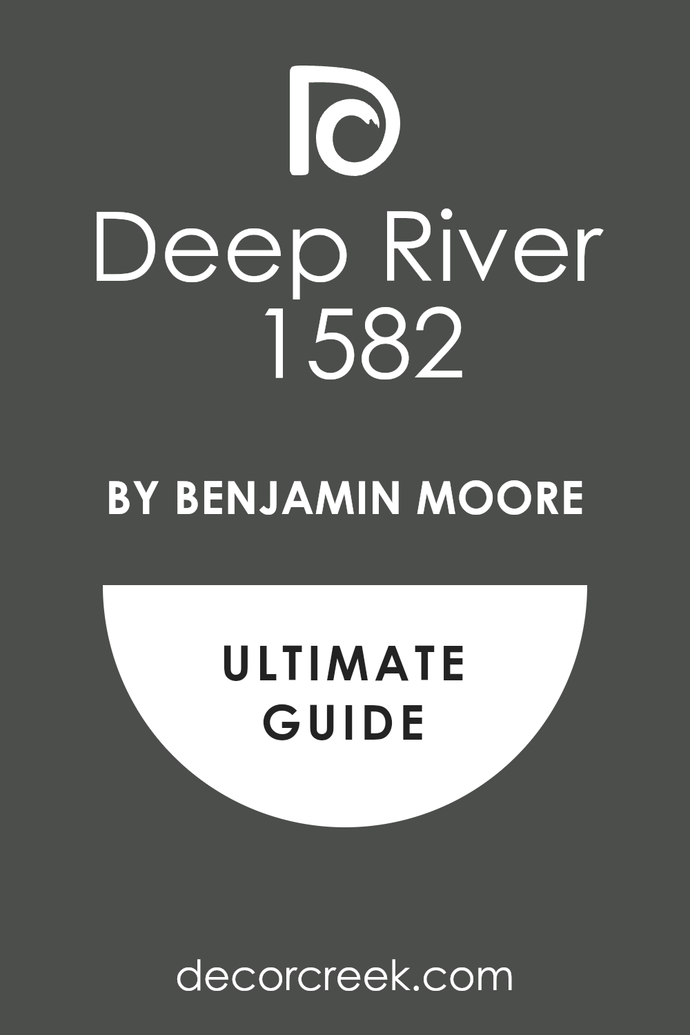
Deep River 1582
Deep River is a wonderfully saturated, moody blue that beautifully balances the depth of a dark neutral with the richness of a true color. Deep River is a fantastic option for a front door if you are looking for a powerful statement blue that has a significant amount of gray to keep it grounded and sophisticated.
This shade is perfect for giving your home a stately, yet slightly contemporary look that feels both classic and perfectly on-trend for today’s styles. It pairs beautifully with white or cream trim, creating a strong, clean contrast that draws the eye directly to the entrance of your home.
Using Deep River on your front door suggests a home of thoughtful design, providing a welcome that is both formal and incredibly inviting to all who approach. This color is versatile, working well on many different home styles, from traditional shingle style homes to more modern, clean-lined residences. Deep River is a highly recommended color for achieving a deep, enduring, and very attractive blue door.
🎨 Check out the complete guide to this color right HERE 👈
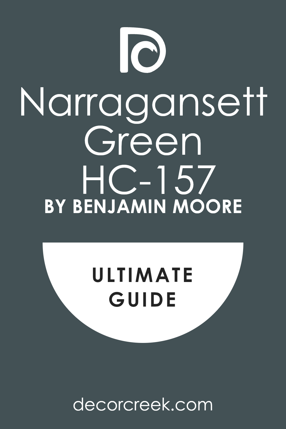
Narragansett Green HC-157
Narragansett Green is a truly beautiful color that is a rich blend of deep, muted blue and forest green, resulting in a moody, complex shade. Narragansett Green is a sophisticated choice that offers the depth of a dark neutral but with a noticeable and grounding natural color that feels very welcoming.
This particular shade is part of Benjamin Moore’s Historical Collection, giving it an immediate sense of heritage and enduring, classic appeal. It pairs wonderfully with traditional white or creamy trim, creating a stunning and slightly unexpected contrast that is both fresh and elegant.
Choosing Narragansett Green gives your home a feeling of quiet confidence and a strong connection to natural surroundings, perfect for a cozy, well-loved home. This color works particularly well on traditional architectural styles where its complexity can be appreciated and its depth can enhance detailing. Narragansett Green is a gorgeous, multi-faceted color that provides a unique and deeply satisfying welcome to your cherished property.
🎨 Check out the complete guide to this color right HERE 👈
Regent Green 2136-20
Regent Green is a highly saturated, rich jewel-toned green that has a strong, powerful presence without feeling overly bright or artificial. Regent Green is an exceptional choice for a front door, providing a luxurious, eye-catching focal point that feels deeply traditional and high-end.
This shade is a deep forest green with lovely blue undertones that give it an engaging complexity and prevent it from feeling too stark or flat. It pairs beautifully with dark wood accents, or you can use it to create a striking contrast against a lighter exterior like beige or white.
Choosing Regent Green gives your home a sense of heritage, deep comfort, and a bold, welcoming confidence that makes a powerful first impression. This color is particularly effective on homes where you want to emphasize the architectural details of the door and make it feel like an important entryway. Regent Green is a gorgeous, vibrant, and powerful color that is a fantastic way to introduce depth and style to your home’s facade.
🎨 Check out the complete guide to this color right HERE 👈
Salamander 2050-10
Salamander is a truly magnificent, complex color that sits at the intersection of a deep forest green and a moody, near-black, giving it incredible depth. Salamander is an absolutely brilliant choice for a front door if you want a color that is dramatically dark but still offers the quiet richness of a true hue.
This shade is a highly sophisticated color that reads as almost black in shadow but reveals a deep, earthy green when hit with direct sunlight, giving it constant engagement. It pairs beautifully with both modern and traditional home styles, offering an instant sense of chic sophistication and quiet confidence.
Using Salamander gives your home an air of distinction and artistry, suggesting a thoughtfully designed interior that is both stylish and comfortable. This deep green is a favorite among designers for its ability to provide a powerful contrast without feeling harsh, making it universally appealing. Salamander is a phenomenal, luxurious color that ensures your front door makes a deep, lasting, and elegant impression.
🎨 Check out the complete guide to this color right HERE 👈

Knoxville Gray HC-160
Knoxville Gray is a wonderful, muted medium-tone color that is best described as a sophisticated blue-gray-green, giving it fantastic versatility and depth. Knoxville Gray is an incredibly popular color because it acts as a highly refined neutral that offers a subtle, nature-inspired color statement without being too demanding.
This shade has strong gray undertones that allow it to harmonize effortlessly with almost any exterior color, from warm brick to cool white siding. It pairs beautifully with classic white trim, creating a fresh, clean contrast that feels both traditional and perfectly current for today’s styles.
Choosing Knoxville Gray gives your home a welcoming, balanced feeling, suggesting a comfortable interior that is both stylish and highly organized. This color is a fantastic choice for giving your front door a noticeable color update that still feels grounded, quiet, and incredibly easy to live with. Knoxville Gray is a lovely, multi-faceted color that provides a refined and gentle welcome to your home.
🎨 Check out the complete guide to this color right HERE 👈
Newburyport Blue HC-155
Newburyport Blue is a classic, deep navy blue that is slightly brighter and less gray than Hale Navy, offering a more immediate, distinct blue presence. Newburyport Blue is a traditional and highly dependable color choice that instantly gives your front door a stately, heritage look with a nautical connection.
This shade has a lovely richness that makes it a perfect, deep counterpoint to lighter exterior colors like classic white, cream, or light gray siding. It pairs exceptionally well with traditional architectural styles, where its deep, enduring color adds a significant element of quality and permanence.
Choosing Newburyport Blue gives your home a feeling of stability, deep-rooted charm, and classic style that is always in fashion and highly appealing. This color is a fantastic choice for homeowners who want a true, distinct blue that maintains a serious, sophisticated feeling while welcoming visitors. Newburyport Blue is a reliable, rich color that ensures your front door is a truly attractive, enduring, and polished focal point.
🎨 Check out the complete guide to this color right HERE 👈

Cefalú Beach 2061-20
Cefalú Beach is a bold, intensely saturated blue that truly earns its name, offering a vibrant, electric pop of pure, engaging color. Cefalú Beach is a choice for the brave homeowner who wants their front door to be a beacon of energetic style and immediate, confident personality.
This shade is a pure, bright blue that has minimal gray or black, making it wonderfully clear and cheerful, instantly drawing the eye toward your entrance. It pairs fantastically with neutral exteriors like stark white, light gray, or black, creating a high-energy, memorable contrast.
Using Cefalú Beach gives your home an immediate sense of fun, artistry, and confident individuality, suggesting a bright and spirited atmosphere inside. This color is perfect for adding a touch of contemporary flair or a lively coastal vibe to your property, standing out beautifully against a green lawn. Cefalú Beach is a distinct, vibrant color that ensures your front door is a powerful, optimistic, and highly attractive focal point.
French Beret 1610
French Beret is a gorgeous, sophisticated color that is a deeply saturated, muted blue-gray, offering a beautiful blend of coolness and depth. French Beret is an excellent choice for a front door that seeks the dramatic appeal of a dark color but with the added complexity and softness of a beautiful hue.
This shade has a significant amount of gray, which keeps the blue from feeling too bright, giving it an urban, refined, and highly polished appearance. It pairs beautifully with both modern and traditional home styles, offering a lovely contrast against light siding or harmonizing well with darker trim.
Choosing French Beret gives your home an immediate sense of quiet style, thoughtful design, and a modern, appealing elegance that is very welcoming. This color works perfectly for giving your entryway a subtle touch of color that feels much more nuanced and interesting than a simple charcoal or black. French Beret is a fantastic, versatile color that provides a deep, alluring, and enduring welcome to your comfortable home.
🎨 Check out the complete guide to this color right HERE 👈
Graphite 1603
Graphite is a complex, deep charcoal gray that features subtle but noticeable blue-green undertones, giving it a wonderfully soft, almost velvet-like quality. Graphite is an excellent choice for a front door if you want a sophisticated, dark color that avoids the sometimes-harsh look of a pure black paint.
This shade is perfect for providing a strong, grounding focal point to your home’s façade that pairs beautifully with a wide variety of exterior materials. It looks stunning against crisp white trim, creating a polished, highly tailored contrast that instantly upgrades the perceived quality of your home.
Using Graphite suggests a home of modern sophistication and quiet confidence, providing a powerful statement that is still incredibly versatile and easy to decorate around. This color is a strong contender for homeowners who want a dark door that feels current, refined, and maintains a sense of welcoming warmth. Graphite is a beautiful, highly dependable dark gray that provides a luxurious and enduring welcome to your treasured home.
Ashwood Moss 1484
Ashwood Moss is a beautifully muted, mid-tone green with a strong dose of gray and a touch of brown, giving it a deep, earthy, and organic feel. Ashwood Moss is an excellent choice for a front door when you are seeking a nature-inspired color that is incredibly sophisticated and far from bright or primary.
This shade works wonderfully on homes that have a strong connection to their landscaping, or those with rustic architectural elements like wood siding or stone accents. It pairs beautifully with both warm and cool exterior color palettes, acting as a highly flexible and appealing neutral anchor for the entryway.
Choosing Ashwood Moss gives your home a feeling of comfortable heritage, unpretentious style, and a calming, grounded presence that is immediately welcoming. This color is perfect for adding a subtle pop of color that feels very intentional and well-chosen, suggesting a thoughtful approach to design. Ashwood Moss is a refined, earthy color that offers a beautiful, enduring welcome to your cozy home.
🎨 Check out the complete guide to this color right HERE 👈
Van Courtland Blue HC-145
Van Courtland Blue is a gorgeous, historic blue that is a mid-tone color featuring a significant amount of soft gray, making it feel highly traditional and composed. Van Courtland Blue is a reliable and lovely choice for a front door, offering a noticeable but still very gentle blue color that is universally appealing.
This shade is part of Benjamin Moore’s Historical Collection, giving it an immediate sense of classic elegance and enduring style that works on many home types. It pairs beautifully with both crisp white and traditional cream trim, creating a clean, classic contrast that feels consistently fresh and welcoming.
Choosing Van Courtland Blue gives your home a feeling of quiet style, stability, and a gentle formality that is very attractive to all who visit. This color is a wonderful alternative to a darker navy, providing a softer, more approachable blue that still adds plenty of beautiful contrast and depth. Van Courtland Blue is a versatile, lovely color that provides a balanced, refined, and enduring welcome to your property.
🎨 Check out the complete guide to this color right HERE 👈
Dinner Party AF-300
Dinner Party is a stunningly rich, deep, and complex red that has a sophisticated, muted undertone, giving it the feel of a luxurious velvet or wine. Dinner Party is an excellent choice for a front door if you want a powerful red statement that feels entirely grown-up, elegant, and perfectly dramatic.
This shade avoids the harshness of a bright, primary red, instead offering a deep, earthy warmth that makes it feel grounded and inviting. It pairs beautifully with traditional neutral exteriors like light gray, cream, or warm beige, creating an immediate, high-contrast focal point.
Using Dinner Party gives your home an immediate sense of bold hospitality, warmth, and classic style, often associated with a formal and well-loved home. This color is perfect for traditional architectural styles where its depth and heritage feel can truly shine and enhance the entry’s detailing. Dinner Party is a luxurious, sophisticated red that provides an incredibly strong, welcoming, and memorable first impression.
Caliente AF-290
Caliente is a vibrant, deeply energetic red that is a fantastic true red with just enough depth to keep it from looking fluorescent or overly childish. Caliente was Benjamin Moore’s 2018 Color of the Year, and it remains a popular choice for homeowners who want an immediate, powerful, and very clear red statement.
This shade is a true, saturated red that is perfect for adding a bold, optimistic, and highly confident pop of color to your home’s facade. It pairs wonderfully with crisp white trim or darker neutral siding like charcoal or black, creating a very sharp, stunning contrast that demands attention.
Choosing Caliente gives your home a feeling of high energy, warmth, and classic hospitality, making the front door an unmistakable focal point. This color is perfect for adding drama to both traditional and more modern home styles, providing a timeless sense of passion and welcome. Caliente is a brilliant, powerful red that is a guaranteed way to make your front door stand out and feel instantly inviting.
🎨 Check out the complete guide to this color right HERE 👈
Cottage Red HC-184
Cottage Red is a delightful, classic red that perfectly blends a bright hue with an underlying brown tone, giving it a soft, earthy, and historic feel. Cottage Red is an excellent choice for a front door where you want a true, distinct red that feels grounded, warm, and highly traditional, avoiding a jarring look.
This shade is perfect for homes with a strong sense of heritage, such as farmhouses, traditional Colonials, or cozy, rustic cottages. It pairs beautifully with warm neutrals like cream, beige, and natural wood siding, offering a comforting, traditional contrast.
Choosing Cottage Red gives your home an immediate sense of warmth, coziness, and classic, timeless appeal, suggesting a well-loved and welcoming interior. This color is a wonderful alternative to a fiery red, providing a softer, more approachable brightness that still makes a strong, memorable statement. Cottage Red is a highly dependable, beautiful red that provides a warm, historic, and enduring welcome to your property.
🎨 Check out the complete guide to this color right HERE 👈
Fairview Taupe HC-85
Fairview Taupe is a gorgeously rich, deeply saturated color that is a complex blend of brown, gray, and a hint of warm green, creating a moody, earthy neutral. Fairview Taupe is an excellent choice for a front door when you are seeking a dark, grounding color that offers more warmth and nuance than a simple charcoal or black.
This shade is part of Benjamin Moore’s Historical Collection, giving it an immediate sense of heritage, weight, and sophisticated, enduring quality. It pairs beautifully with light, neutral siding like cream or off-white, providing a deep, elegant contrast that looks incredibly high-end.
Using Fairview Taupe gives your home a feeling of quiet strength, traditional style, and a connection to the natural, surrounding landscape. This color is perfect for homeowners who want a door color that is deep and sophisticated but still feels welcoming and avoids any cool, stark undertones.
Fairview Taupe is a stunning, warm neutral that provides a luxurious, grounded, and deeply satisfying welcome to your cherished home.
🎨 Check out the complete guide to this color right HERE 👈
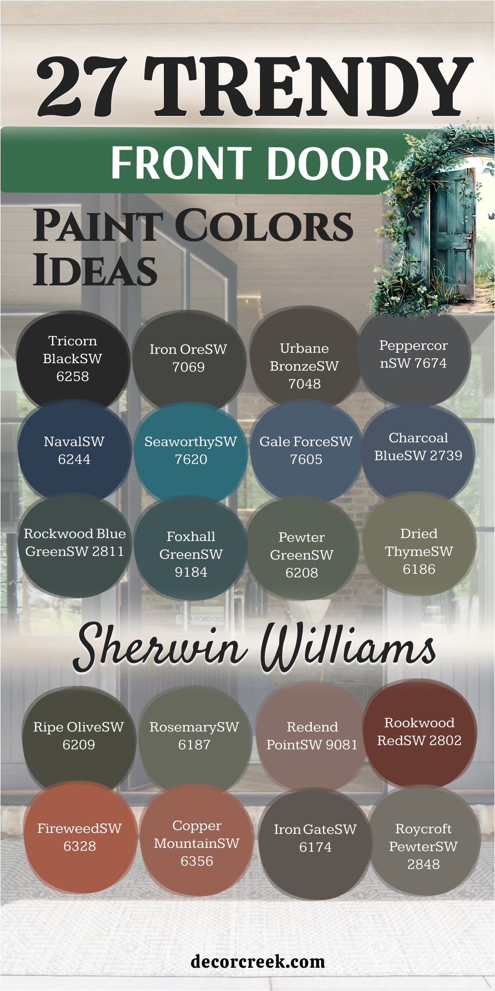
27 Front Door Paint Color Ideas By Sherwin Williams
Tricorn Black SW 6258
Tricorn Black is a foundational, pure black that is a perfect choice for creating high drama and sophisticated contrast on your front door. Tricorn Black ensures your entry feels modern and grounded, pairing beautifully with bright white or creamy off-white exterior trim.
This classic shade offers unmatched versatility, looking equally fantastic on sleek modern homes and intricate traditional architecture. It provides a striking focal point, immediately commanding attention and boosting your home’s overall curb appeal dramatically.
Tricorn Black reads as a true, unwavering black under all light conditions, giving a professional and polished finish that never looks faded. I recommend this color frequently because it’s a confident, powerful statement that never goes out of style for an entryway.
Using Tricorn Black suggests a classic style, especially on traditional homes like Colonials or Tudors, but it can also look sleek on modern architecture. It provides a welcoming sense of formality and works well in both bright sunlight and deep shade, looking rich and deep under all conditions.
Tricorn Black is a paint that homeowners often select when they want a reliable and bold statement without introducing any distracting color. This bold color is perfect if your goal is to make your front door a powerful focal point on a lighter-colored house.
🎨 Check out the complete guide to this color right HERE 👈
Iron Ore SW 7069
Iron Ore is a deeply rich charcoal that expertly balances the moodiness of black with the soft sophistication of a warm, true gray tone. Iron Ore is a popular choice for achieving a dark, powerful door without the stark, sometimes harsh feeling of pure black paint.
This shade has subtle brown and green undertones that give it an earthy, velvety finish that changes beautifully with the daylight. It works exceptionally well against light, neutral siding like white, cream, or pale gray, adding depth and a feeling of solidity to the entry.
Iron Ore is a highly versatile color that complements natural elements like stone and wood, making it a favorite for farmhouse or Craftsman styles. Choosing Iron Ore instantly gives your home an updated, tailored, and very high-end appearance that feels subtly luxurious and welcoming.
It is an extremely versatile color that has been trending for a few years and shows no sign of losing its appeal for a reason.
This color is highly adaptable to both traditional and modern door styles, emphasizing the details and hardware well. Iron Ore is an excellent choice for creating a striking, sophisticated, and memorable entrance to your cherished home.
🎨 Check out the complete guide to this color right HERE 👈
Urbane Bronze SW 7048
Urbane Bronze is a complex, grounding neutral, perfectly situated between a deep gray, a rich brown, and a hint of metallic warmth. Urbane Bronze offers a unique, sophisticated door color that gives the entrance an immediate sense of quiet strength and enduring quality.
This rich, earthy shade beautifully complements homes with stone or brick, where it harmonizes with the natural textures of the exterior. It’s an ideal color for those who want a dark door that feels warmer and more connected to nature than a simple black or charcoal.
Urbane Bronze pairs wonderfully with off-white and cream trims, creating a refined and highly current contrast that feels comfortable and inviting. Choosing this color provides your home with a trendy but grounded look, appealing to both contemporary and traditional design preferences with its deep color.
The bronze quality is subtle but adds a luxurious, velvety finish that changes slightly depending on the light throughout the day. Urbane Bronze pairs wonderfully with off-whites and creams, or you can use it to create a striking monochromatic look with darker trim.
Choosing this color gives your home a feeling of quiet confidence and contemporary elegance, appealing to many different aesthetic tastes. Urbane Bronze is a fantastic, modern neutral that offers a welcome sense of depth and stability to your home’s facade.
🎨 Check out the complete guide to this color right HERE 👈
Peppercorn SW 7674
Peppercorn is a deeply saturated, cool charcoal gray that provides a rich, strong foundation without reading as pure black on the door. Peppercorn is one of my go-to dark grays for a powerful and sophisticated statement that feels very grounded and current.
This particular shade has soft blue-violet undertones, which become more apparent in bright light, giving it a subtle depth and complexity. It’s an ideal choice if you want the drama of a dark color but prefer a cool-toned finish that balances warm siding or brick.
Peppercorn pairs beautifully with a clean, crisp white trim, creating a tailored, classic look that is both smart and inviting. Because it’s so dark, it also works well as a grounding element on lighter stucco or light gray siding, offering fantastic contrast. Choosing Peppercorn signals a sophisticated and slightly modern sensibility in a homeowner, providing a durable and stylish look that always feels well-chosen.
🎨 Check out the complete guide to this color right HERE 👈
Naval SW 6244
Naval is a classic, deeply saturated navy blue that provides an instant sense of heritage and sophisticated elegance to any front entrance. Naval is an incredibly versatile color that looks stunning on every style of home, from traditional coastal cottages to formal, inland residences.
This shade is highly dependable as a dark blue, maintaining its true color and avoiding the common issue of looking black in shadowed areas. It pairs flawlessly with bright white trim, creating an iconic, high-contrast look that feels tailored, fresh, and consistently attractive.
Using Naval on your front door gives your house an instant feeling of stability, quality, and quiet authority, extending a warm and reliable invitation. This color is a design favorite because it is universally loved and projects a feeling of enduring, classic style that performs beautifully in a resale situation. Naval is a brilliant choice for making a powerful, enduring statement that perfectly blends classic style with modern appeal.
🎨 Check out the complete guide to this color right HERE 👈
Seaworthy SW 7620
Seaworthy is a vibrant, mid-tone blue that manages to feel bright and happy without being overly loud or childish. Seaworthy has a gorgeous, nautical feel, perfect for homes that seek a slightly more spirited and energetic entrance than a traditional dark navy.
This cheerful shade has subtle green undertones, which give it a unique teal quality that adds character and feels refreshing on a sunny day. It’s an especially wonderful color for coastal homes, lake houses, or any property where you want to evoke a feeling of water and clear skies.
Seaworthy contrasts beautifully with neutral siding like warm beiges, soft grays, or classic white, making the front door truly stand out. This paint choice instantly gives your home a more casual, welcoming, and optimistic vibe, suggesting a relaxed and happy atmosphere within. Seaworthy is a refreshing alternative to standard blues, offering a lovely pop of saturated color that draws people toward your door.
Gale Force SW 7605
Gale Force is a stunning, deeply saturated blue-green that is moody, rich, and truly captivating, evoking the power of a deep sea storm. Gale Force is an excellent choice for a front door if you are looking for a highly distinct and complex color that shifts beautifully with the light.
This shade has strong gray undertones that prevent it from appearing too bright, giving it an old-world, sophisticated, and slightly weathered charm. It pairs wonderfully with light, neutral siding like soft gray, cream, or even a stark white, where the depth of the color can truly shine.
Choosing Gale Force gives your home a feeling of mystery, artistry, and quiet confidence, setting it apart from more conventional dark door choices. This blue-green is perfect for adding a sense of drama and individuality to your home’s façade while maintaining a classic, well-designed feeling. Gale Force is a striking color that I often recommend when a homeowner wants a unique, powerful, and deeply beautiful welcome.
🎨 Check out the complete guide to this color right HERE 👈
Charcoal Blue SW 2739
Charcoal Blue is a wonderfully deep, moody color that combines the sophisticated drama of charcoal with the dependable strength of a deep navy. Charcoal Blue is a perfect choice if you want the high-contrast appeal of a dark door but desire the subtle richness of a true color instead of a simple black.
This shade has a muted, almost dusty quality that makes it feel grounded and soft, rather than a harsh, bright blue. It pairs fantastically with brick, light stone, and a clean, crisp white trim, creating an exceptionally sharp and polished look.
Choosing Charcoal Blue gives your home a feeling of classic style, reliability, and quiet, assured elegance that is universally appealing. This color is also a reliable choice for staging a home, as it feels both on-trend and deeply classic, appealing to a wide range of potential buyers. Charcoal Blue is a sophisticated, highly appealing color that offers a beautiful depth and a refined welcome to your lovely home.
🎨 Check out the complete guide to this color right HERE 👈
Rockwood Blue Green SW 2811
Rockwood Blue Green is a deep, heritage color that beautifully blends a rich navy with a significant amount of classic forest green, giving it fantastic depth. Rockwood Blue Green is a wonderful color choice for a front door, offering a serious, traditional look that carries a subtle, engaging color complexity.
This shade leans heavily into the dark, muted end of the spectrum, which allows it to pair beautifully with historically accurate trim colors like creams or deep mustards. It’s particularly effective on older, traditional homes like Victorians or Craftsman styles, where its depth complements the intricate architectural details.
Using Rockwood Blue Green gives your home an immediate sense of history, thoughtfulness, and quiet elegance, hinting at a truly cared-for interior. This blue-green is dark enough to read almost black in certain light conditions but shows a lovely mossy blue when the sun hits it. Rockwood Blue Green is a gorgeous, complex color for creating a distinguished and inviting entry that feels both old-world and well-designed.
Foxhall Green SW 9184
Foxhall Green is a deep, complex, dark green that sits between forest green and a moody teal, offering a rich and sophisticated color statement. Foxhall Green is a fantastic choice for anyone who wants a dark, grounding door color that is decidedly not black, offering a welcome hint of natural color.
This shade has a beautiful depth that pairs exceptionally well with brick exteriors, both red and brown, creating a stunning, high-contrast look. It also looks absolutely stunning against clean, crisp white siding, where the color’s richness really stands out and emphasizes the door’s design.
Using Foxhall Green gives your front entrance a sense of quiet authority, tradition, and an easy connection to the natural landscape surrounding your home. This color is dark enough to feel extremely polished and modern but has the softness of green to keep it from feeling too stark or severe. Foxhall Green is a rich, highly appealing color that offers a beautiful, enduring welcome to your treasured home.
🎨 Check out the complete guide to this color right HERE 👈
Pewter Green SW 6208
Pewter Green is a mid-to-dark muted green with a gray base that gives it a wonderfully sophisticated and adaptable quality. Pewter Green is a highly versatile and popular color because it strikes a perfect balance: it’s a distinct color without being overly bright or demanding attention.
This lovely shade has an earthy quality that makes it pair beautifully with natural exterior elements like stone, wood shutters, and landscapes full of greenery. It works particularly well on homes with white, cream, or light gray siding, where it offers a refreshing but very balanced pop of color.
Using Pewter Green creates a welcoming entrance that feels calm, connected to nature, and immediately suggests a comfortable, well-cared-for home. This color is a fantastic choice for giving your home’s exterior a contemporary update while maintaining a classic, approachable feeling. Pewter Green is a reliable color that I recommend often for a polished, gentle statement that is universally appealing and easy to live with.
🎨 Check out the complete guide to this color right HERE 👈
Dried Thyme SW 6186
Dried Thyme is a comforting, medium-toned sage green that leans toward an earthy, slightly dusty olive, giving it a soft, natural quality. Dried Thyme is an incredibly appealing and relaxed color choice that evokes feelings of the countryside, making it great for cottage-style or rustic homes.
This shade has a wonderful, organic feel that makes it look fantastic when surrounded by landscaping and natural materials like cedar or stone. It pairs beautifully with a range of exterior colors, from warm beige and taupe to a bright, clean white, adding a gentle contrast.
Choosing Dried Thyme gives your front door a welcoming and slightly weathered appearance, suggesting a home that is effortlessly comfortable and unpretentious. This color offers a much-needed warmth compared to cooler grays and blacks, providing a more approachable and grounded entryway. Dried Thyme is a perfect option if you desire a green door that feels muted, natural, and incredibly harmonious with its outdoor surroundings.
🎨 Check out the complete guide to this color right HERE 👈
Ripe Olive SW 6209
Ripe Olive is a gorgeously deep, moody olive green that is heavily saturated with brown, giving it a rich, old-world, and distinctly natural feel. Ripe Olive is an excellent choice for a front door that seeks a dark, grounding color that is decidedly earthy and avoids any primary brightness.
This shade is highly sophisticated, working beautifully to complement homes with warm-toned brick, natural wood siding, or rustic stone facades. It pairs wonderfully with creamy off-white or deep, darker trim colors, allowing the olive’s richness to fully shine in the sunlight.
Choosing Ripe Olive gives your home an immediate feeling of heritage, quiet strength, and a deep connection to the surrounding landscape. This color is a fantastic way to introduce a deep, highly fashionable color that still feels timeless and perfectly appropriate for many styles of homes. Ripe Olive is a beautiful, complex color that provides a rich, grounded, and enduring welcome to your treasured home.
🎨 Check out the complete guide to this color right HERE 👈

Rosemary SW 6187
Rosemary is a vibrant, medium-to-deep sage green that is significantly brighter than Dried Thyme, offering a more immediate, fresh, and spirited natural color. Rosemary is a lovely choice for a front door if you want a distinctly green color that feels bright and welcoming but still grounded in an earthy, natural tone.
This shade has a wonderful, fresh quality that looks absolutely stunning when surrounded by lush green landscaping and vibrant garden flowers. It pairs beautifully with light, neutral siding like white, cream, or light gray, providing a lively, yet comforting contrast that is universally appealing.
Choosing Rosemary gives your home an immediate sense of cheer, natural beauty, and a cozy, inviting atmosphere that suggests a happy home within. This color is a fantastic way to introduce a bright, nature-inspired pop of color that feels perfectly well-chosen and sophisticated rather than loud. Rosemary is a fresh, highly appealing green that offers a warm, spirited, and very natural welcome to your property.
🎨 Check out the complete guide to this color right HERE 👈

Redend Point SW 9081
Redend Point is a deep, soulful blush that perfectly captures a terracotta warmth, sitting between a rich earth red and a grounded brown-pink. Redend Point was Sherwin-Williams’ 2023 Color of the Year and remains a fantastic choice for those seeking a warm, unique, and deeply personal door color.
This stunning, sophisticated color offers a welcoming and rich texture to the front of your home that is unlike many traditional door colors. It pairs beautifully with neutral exteriors like soft whites, light grays, or even natural wood siding, where its warmth truly shines.
Using Redend Point gives your home a feeling of heritage and quiet confidence, suggesting a comfortable, lived-in, and artfully designed interior. This color is an unexpected choice that feels both historic and thoroughly modern, setting your home apart from the common dark door trend. Redend Point is a brilliant choice for adding a cozy, deeply satisfying hue to your entryway that is sure to draw positive attention.
🎨 Check out the complete guide to this color right HERE 👈
Rookwood Red SW 2802
Rookwood Red is a classic, deep red that manages to be rich and powerful without being overly bright or fire-engine aggressive. Rookwood Red is a gorgeous, heritage color that provides a deep, traditional warmth that feels incredibly welcoming and stately on an entryway.
This shade is complex, offering a lovely balance of red and brown that ties it beautifully to natural elements like wood, brick, and stone. It’s an ideal choice for homes with traditional architectural details where you want a striking color that still feels historically appropriate.
Rookwood Red pairs wonderfully with cream or off-white trim, providing a classic, highly elegant contrast that suggests quality and permanence. Choosing this red gives your home an immediate sense of boldness, warmth, and classic style, often associated with good luck and hospitality. Rookwood Red is a deeply satisfying color that is perfect for making a strong, welcoming statement that remains sophisticated and well-grounded.
🎨 Check out the complete guide to this color right HERE 👈
Fireweed SW 6328
Fireweed is a vibrant, fiery orange-red that is incredibly energetic, sunny, and distinct, offering an immediate, powerful pop of color. Fireweed is an ideal choice for a front door when you want to make a bold, optimistic statement and inject a lot of personality into your home’s façade.
This shade is a true, saturated red-orange that feels warm and bright, making it an excellent focal point against neutral or dark exteriors. It pairs fantastically with dark siding like black, charcoal, or deep navy, creating a sharp, high-contrast look that is modern and engaging.
Using Fireweed gives your home a feeling of high energy, warmth, and creative confidence, suggesting a spirited and well-loved interior. This color is perfect for contemporary architectural styles or for adding a lively, unexpected touch to a more traditional home. Fireweed is a brilliant, powerful color that ensures your front door is a vibrant, unforgettable, and highly attractive welcome.
🎨 Check out the complete guide to this color right HERE 👈
Copper Mountain SW 6356
Copper Mountain is a vibrant, earthy color that lives up to its name, resembling the rich, sun-baked tones of natural copper and burnt orange. Copper Mountain is an incredibly warm and energetic color choice that immediately makes a home feel welcoming, lively, and incredibly distinctive.
This particular shade has a strong red-orange base that is softened by a grounded, earthy undertone, preventing it from appearing too bright or aggressive. It pairs beautifully with neutral siding like deep grays, charcoal, or classic white, offering a brilliant, fiery contrast.
Choosing Copper Mountain gives your home a distinctive Southwestern or rustic appeal, hinting at an adventurous and cozy interior. This color is perfect for those who want a front door that acts as a beacon of warmth and optimism, standing out beautifully against a lush green landscape. Copper Mountain is a fantastic option for adding a unique, fiery personality and a deep sense of tradition to your front entrance.
🎨 Check out the complete guide to this color right HERE 👈
Andiron SW 6174
Andiron is a rich, grounding shade that falls between a deep charcoal and a moody, earthy brown, offering great weight and stability to a front door. Andiron is a very sophisticated neutral that provides the necessary contrast of a dark door without the severity of pure black, thanks to its warm brown base.
This versatile shade works beautifully to complement homes with a wide variety of exterior colors, especially those with natural stone or warm-toned brick. It’s an excellent color for achieving a high-end, polished look that feels both contemporary and firmly traditional at the same time.
Using Andiron gives the entrance a feeling of permanence, quality, and welcoming stability, which is highly appealing to all visitors. This color is also a fantastic alternative to classic gray or black, providing a softer, warmer, and more inviting touch to your home’s welcoming area. Andiron is a dependable and stylish choice for a strong, neutral statement that enhances your home’s existing color palette.
Roycroft Pewter SW 2848
Roycroft Pewter is a complex, muted green-gray that has a distinct, grounded, and slightly earthy quality reminiscent of old metalwork. Roycroft Pewter is a beautiful choice for a front door that offers a soft, nature-inspired color without being a bright or attention-demanding green.
This particular shade has a strong gray base with warm, muddy green undertones, allowing it to harmonize beautifully with both warm and cool exterior color schemes. It’s an ideal option for creating a sophisticated, subtle contrast on homes with white, cream, or light gray siding, enhancing the door’s design.
Using Roycroft Pewter gives the entrance a feeling of quiet style, heritage, and a comfortable, unpretentious atmosphere, which is incredibly welcoming. This color works especially well on Craftsman-style homes or properties with a strong connection to natural, woodsy surroundings. Roycroft Pewter is a refined, gentle color that provides a lovely, organic twist on a traditional gray door.
🎨 Check out the complete guide to this color right HERE 👈
Greenblack SW 6994
Greenblack is a truly sophisticated color that is essentially a black with a noticeable, deep forest green undertone, giving it a rich, subtle complexity. Greenblack is an ideal choice for a front door if you want a color that is dramatically dark but offers a softer, more nuanced feeling than a true, stark black.
This shade is perfect for homeowners who want the high-contrast of a dark door but desire a connection to the surrounding landscape and greenery. It pairs wonderfully with crisp white trim, creating a polished, sharp contrast that looks incredibly smart and well-designed.
Choosing Greenblack gives your home an immediate sense of depth, tradition, and quiet authority, hinting at a truly cared-for and stylish interior. This color is highly versatile, working well on both contemporary and traditional home styles where the slight green hue adds an interesting, engaging quality. Greenblack is a beautiful, dark color that provides a rich, elegant, and enduring welcome to your property.
🎨 Check out the complete guide to this color right HERE 👈
Inkwell SW 6992
Inkwell is a deeply saturated, inky navy blue that is very dark, sitting right at the edge of blue and black, offering serious drama and depth. Inkwell is an excellent choice for a front door when you desire the strength of a dark neutral but with the profound richness of a very moody, sophisticated blue.
This shade is one of Sherwin-Williams’ darkest blues, providing a powerful, grounded focal point that looks incredibly elegant and high-end. It pairs beautifully with light, neutral siding and bright white trim, creating an immediate, clean, and striking contrast that draws the eye.
Using Inkwell on your front door suggests a home of quiet confidence, classic style, and thoughtful design choices, appealing universally to visitors. This color is perfect for giving your home a feeling of heritage and quality, working well on many architectural styles, from traditional to modern. Inkwell is a beautiful, very dark blue that ensures your front door makes a powerful, lasting, and refined impression.
🎨 Check out the complete guide to this color right HERE 👈
Cyberspace SW 7076
Cyberspace is a deeply saturated, cool gray that has a significant blue undertone, giving it a sophisticated, moody, and very modern feeling. Cyberspace is an excellent choice for a front door if you are looking for a dark color that feels less traditional and more connected to contemporary design trends.
This shade has a wonderful depth that prevents it from looking flat, instead offering a rich, dimensional finish that changes slightly with the daylight. It pairs beautifully with cool white trim and light gray siding, creating a very sharp, polished contrast that feels sleek and architectural.
Choosing Cyberspace gives your home an immediate sense of modernity, thoughtful design, and a strong, sophisticated confidence that is very current. This color is perfect for homes with clean lines and a modern aesthetic, but it can also add an updated edge to a traditional home. Cyberspace is a striking, deep color that provides a cool, refined, and enduring welcome to your lovely home.
🎨 Check out the complete guide to this color right HERE 👈

Warm Stone SW 7032
Warm Stone is a gorgeously soft, mid-tone taupe that beautifully blends gray and brown, giving it a comforting, earthy, and highly versatile appeal. Warm Stone is an excellent choice for a front door when you are seeking a light, grounding neutral that offers more interest and depth than a simple off-white.
This shade is perfect for creating a welcoming, cohesive look, especially on homes with natural stone or warm-toned brick where it harmonizes beautifully. It pairs wonderfully with cream or dark brown trim, providing a gentle, balanced contrast that feels sophisticated and unpretentious.
Using Warm Stone gives your home an immediate sense of quiet comfort, stability, and a casual elegance that is highly attractive to many people. This color is a fantastic way to update a home’s exterior with a light neutral that still offers plenty of subtle, sophisticated color. Warm Stone is a lovely, gentle color that provides an inviting, refined, and enduring welcome to your property.
🎨 Check out the complete guide to this color right HERE 👈

Anonymous SW 7046
Anonymous is a rich, muted green-brown that is best described as a deep, sophisticated olive, giving it a wonderfully earthy and highly grounded feel. Anonymous is an excellent choice for a front door that seeks a deep, grounding neutral but with the added warmth and complexity of a natural, organic color.
This shade is perfect for creating a cohesive, warm look, especially on homes with natural wood accents, stone facades, or warm beige siding. It pairs beautifully with both light and dark trim colors, allowing its deep, earthy complexity to fully shine against any backdrop.
Choosing Anonymous gives your home a feeling of quiet strength, heritage, and a deep connection to the surrounding landscape, feeling both strong and welcoming. This color is a fantastic way to introduce a deep, sophisticated neutral that avoids the coolness of a pure gray or the starkness of black. Anonymous is a beautiful, complex color that provides a rich, inviting, and enduring welcome to your treasured home.
🎨 Check out the complete guide to this color right HERE 👈

Rock Bottom SW 7062
Rock Bottom is a deep, complex, dark green that is heavily grounded in brown and gray, giving it a highly sophisticated, organic, and earthy feel. Rock Bottom is an ideal choice for a front door when you want a color that is dramatically dark but offers a warm, nature-inspired richness instead of a stark black.
This shade is perfect for creating a moody, deep contrast against light siding or for harmonizing beautifully with natural stone and brick exteriors. It pairs wonderfully with warm white or cream trim, allowing the deep, mossy green quality of the color to truly stand out.
Using Rock Bottom gives your home an immediate sense of heritage, quiet authority, and a deep connection to the surrounding, natural environment. This color is perfect for homes with a strong traditional or rustic architectural style, where its depth and organic quality can enhance detailing. Rock Bottom is a beautiful, deep color that provides a rich, grounded, and incredibly elegant welcome to your property.
🎨 Check out the complete guide to this color right HERE 👈
Salty Dog SW 9177
Salty Dog is a vibrant, mid-tone blue that is highly saturated and clear, offering a wonderful, cheerful, and unmistakably nautical feeling. Salty Dog is an excellent choice for a front door if you want a distinct, noticeable blue that is full of life and avoids the seriousness of a deep navy.
This shade is perfect for adding an optimistic, bright pop of color to a neutral exterior, particularly against white, light gray, or beige siding. It pairs beautifully with crisp white trim, creating a fresh, clean contrast that evokes feelings of the seaside and sunny skies.
Choosing Salty Dog gives your home an immediate sense of fun, approachability, and a spirited, casual elegance that is highly inviting to all visitors. This color is fantastic for coastal properties, lake houses, or any home where you want to inject a feeling of summer and cheerful outdoor living. Salty Dog is a vibrant, happy blue that ensures your front door is an energetic, attractive, and memorable focal point.
🎨 Check out the complete guide to this color right HERE 👈
12 Red Front Door Paint Color Ideas
Crabby Apple SW 7592
Crabby Apple is a rich, deeply saturated color that perfectly balances the brightness of red with the grounding quality of a subtle brown, evoking a classic autumn apple hue. Crabby Apple is a fantastic choice for a front door that wants to make a strong, beautiful red statement but still feel deeply traditional, warm, and highly inviting.
This shade has a gorgeous depth that prevents it from appearing too bright, instead offering a velvety, heritage quality that looks stunning in all light conditions. It pairs wonderfully with natural materials like stone and wood, or you can use it against a creamy off-white trim for a classic, sophisticated look.
Choosing Crabby Apple gives your home an immediate sense of cozy warmth, traditional quality, and a confident, well-loved atmosphere that is deeply welcoming. This color is perfect for homeowners who want a true red that feels slightly moody and rich, suggesting a comforting, thoughtfully designed interior. Crabby Apple is a gorgeous, complex red that provides a rich, grounded, and incredibly elegant welcome to your property.
🎨 Check out the complete guide to this color right HERE 👈
Heartthrob SW 6866
Heartthrob is a bright, clear, and intensely saturated red that is incredibly lively, offering a powerful and unmistakable pop of cheerful color. Heartthrob is a fantastic choice for a front door if you want to make an immediate, bold, and energetic statement that suggests a very welcoming home.
This shade is a pure, classic red with strong orange undertones that keep it feeling warm and bright, making it a wonderful focal point. It pairs beautifully with crisp white trim or deep, dark neutrals like black or charcoal, creating a stunning, high-contrast look.
Using Heartthrob gives your home an immediate sense of passion, classic hospitality, and an unmissable, vibrant personality that is universally appealing. This color is perfect for adding a traditional, high-energy focal point that is associated with good luck and a lively, spirited atmosphere. Heartthrob is a brilliant, true red that is a guaranteed way to make your front door stand out and feel instantly warm and inviting.
🎨 Check out the complete guide to this color right HERE 👈
Poinsettia SW 6594
Poinsettia is a gorgeous, deeply saturated red that perfectly captures the color of the traditional holiday flower, offering a rich, clean, and classic hue. Poinsettia is an excellent choice for a front door when you are seeking a true, slightly deeper red that feels both celebratory and highly traditional, avoiding any harsh orange.
This shade has lovely blue undertones that give it a sophisticated depth, allowing it to pair beautifully with both cool and warm neutral exteriors. It looks stunning against crisp white trim, creating a powerful, classic contrast that is refined, clean, and immediately eye-catching.
Choosing Poinsettia gives your home an immediate feeling of warmth, classic elegance, and a strong, traditional sense of welcoming hospitality. This color is perfect for homeowners who want a serious, sophisticated red that still offers a bright, undeniable pop of beautiful, engaging color. Poinsettia is a rich, dependable red that provides a classic, enduring, and very attractive welcome to your property.
🎨 Check out the complete guide to this color right HERE 👈
Real Red SW 6868
Real Red is a vibrant, clear, and very direct red that is exactly what its name implies, offering a pure, bright, and classic color presence. Real Red is a classic choice for a front door, making a high-energy, confident statement that is immediately noticeable and traditionally associated with warmth.
This shade is highly saturated and unapologetic, making it a fantastic focal point for homes with neutral exteriors, especially stark white or light gray. It pairs wonderfully with a clean, bright white trim, creating a sharp, striking contrast that looks consistently fresh, bold, and well-maintained.
Using Real Red gives your home an immediate sense of bold personality, traditional luck, and a lively, welcoming atmosphere that instantly draws the eye. This color is perfect for adding a strong, immediate punch of traditional color that works on many architectural styles, from historical homes to more contemporary designs. Real Red is a powerful, straightforward color that ensures your front door is a vibrant, unmistakable, and highly attractive center of attention.
🎨 Check out the complete guide to this color right HERE 👈
Stolen Kiss SW 7586
Stolen Kiss is a beautiful, slightly dusty, medium-toned red that leans toward a sophisticated, muted brick or terracotta color, giving it a grounded warmth. Stolen Kiss is an excellent choice for a front door if you want a red that feels rich, warm, and highly inviting but avoids the intensity of a bright, primary red.
This shade has strong brown and slight orange undertones, making it pair beautifully with earthy exterior colors like warm beige, taupe, or natural stone facades. It looks lovely with a creamy off-white trim, providing a gentle, balanced contrast that feels traditional, cozy, and effortlessly sophisticated.
Choosing Stolen Kiss gives your home an immediate sense of heritage, quiet comfort, and a gentle, welcoming warmth that is very appealing. This color is perfect for giving your entryway a subtle but distinct color statement that feels natural, grounded, and well-integrated into the landscape. Stolen Kiss is a soft, highly sophisticated red that provides a warm, enduring, and incredibly attractive welcome to your cherished home.
🎨 Check out the complete guide to this color right HERE 👈
Heritage Red HC-181
Heritage Red is a wonderfully traditional, deeply saturated color that perfectly balances a true red with an underlying brown tone, giving it an earthy, historic richness. Heritage Red is an excellent choice for a front door that seeks a classic, dependable red that feels warm, welcoming, and firmly rooted in traditional style.
This shade is part of Benjamin Moore’s Historical Collection, making it a reliable option for giving your home a sense of age, permanence, and enduring quality. It pairs beautifully with creamy off-white trim, creating a classic, soft contrast that feels consistently fresh, inviting, and well-maintained.
Choosing Heritage Red gives your home an immediate sense of warmth, stable comfort, and traditional hospitality, suggesting a well-loved and thoughtfully designed interior. This color is perfect for traditional architectural styles like Colonials, Capes, or Farmhouses, where its deep, muted quality can truly shine. Heritage Red is a trustworthy, beautiful red that provides a classic, enduring, and very attractive welcome to your cherished property.
🎨 Check out the complete guide to this color right HERE 👈
Exotic Red 2086-10
Exotic Red is a pure, true, bright red that is highly saturated and completely clear, offering a dramatic, vibrant, and incredibly bold color statement. Exotic Red is a fantastic choice for a front door if you want a color that is unapologetically bright, full of high energy, and guaranteed to be an immediate focal point.
This shade is perfect for creating a sharp, stunning contrast against neutral or dark siding, particularly against black, charcoal, or crisp white. It pairs wonderfully with a clean, stark white trim, creating a dynamic, modern, and highly engaging look that immediately captures attention.
Using Exotic Red gives your home an immediate sense of confident personality, fun, and a lively, spirited atmosphere that suggests a welcoming home within. This color is perfect for adding a bold, traditional pop of color that feels both classic and totally uninhibited by muted trends. Exotic Red is a powerful, cheerful red that ensures your front door is a vibrant, unforgettable, and highly attractive welcome.
🎨 Check out the complete guide to this color right HERE 👈
Dinner Party AF-300
Dinner Party is a stunningly rich, deep, and complex red that has a sophisticated, muted undertone, giving it the feel of a luxurious velvet or wine. Dinner Party is an excellent choice for a front door if you want a powerful red statement that feels entirely grown-up, elegant, and perfectly dramatic.
This shade avoids the harshness of a bright, primary red, instead offering a deep, earthy warmth that makes it feel grounded and inviting. It pairs beautifully with traditional neutral exteriors like light gray, cream, or warm beige, creating an immediate, high-contrast focal point.
Using Dinner Party gives your home an immediate sense of bold hospitality, warmth, and classic style, often associated with a formal and well-loved home. This color is perfect for traditional architectural styles where its depth and heritage feel can truly shine and enhance the entry’s detailing. Dinner Party is a luxurious, sophisticated red that provides an incredibly strong, welcoming, and memorable first impression.
🎨 Check out the complete guide to this color right HERE 👈
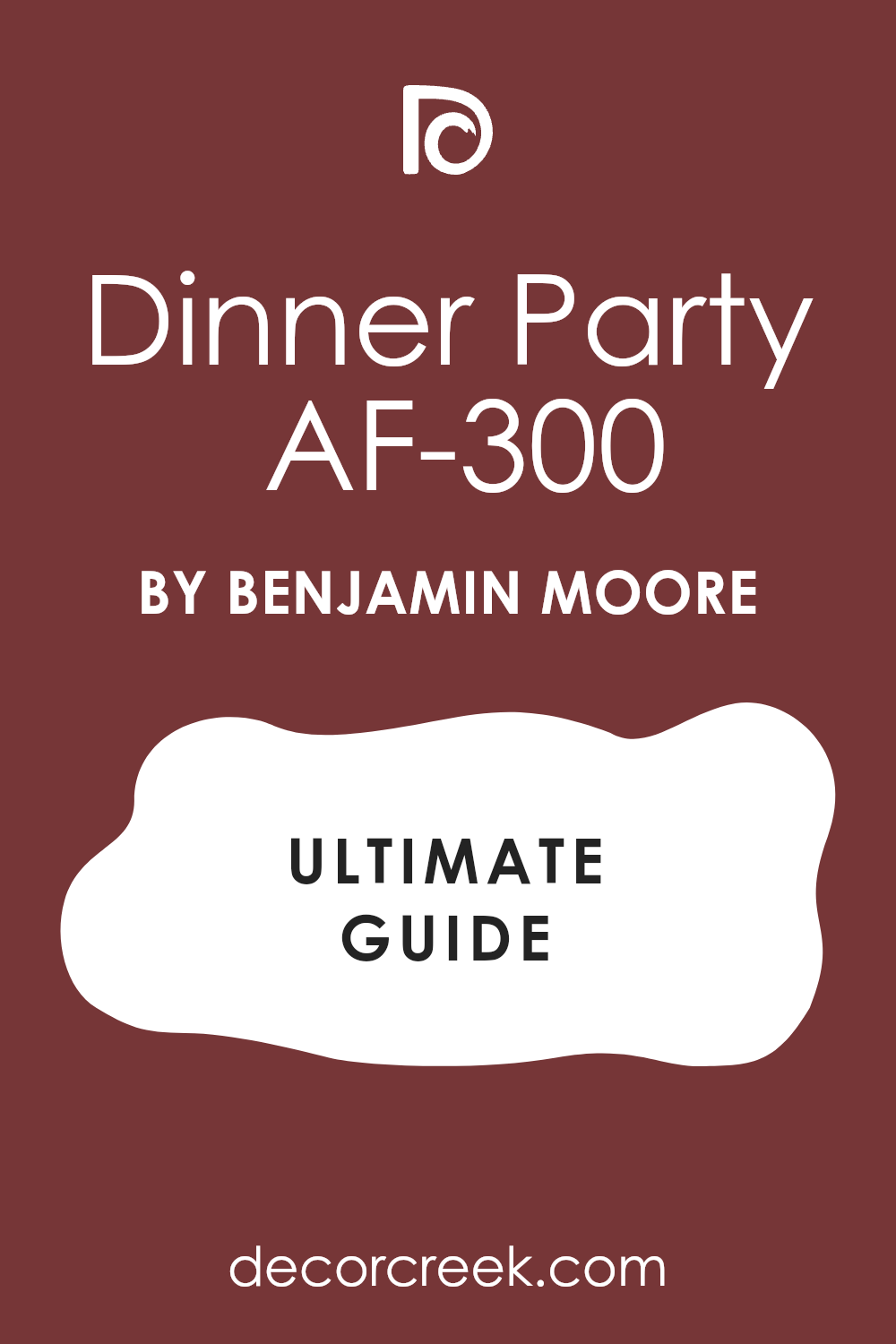
Caliente AF-290
Caliente is a vibrant, deeply energetic red that is a fantastic true red with just enough depth to keep it from looking fluorescent or overly childish. Caliente was Benjamin Moore’s 2018 Color of the Year, and it remains a popular choice for homeowners who want an immediate, powerful, and very clear red statement.
This shade is a true, saturated red that is perfect for adding a bold, optimistic, and highly confident pop of color to your home’s facade. It pairs wonderfully with crisp white trim or darker neutral siding like charcoal or black, creating a very sharp, stunning contrast that demands attention.
Choosing Caliente gives your home a feeling of high energy, warmth, and classic hospitality, making the front door an unmistakable focal point. This color is perfect for adding drama to both traditional and more modern home styles, providing a timeless sense of passion and welcome. Caliente is a brilliant, powerful red that is a guaranteed way to make your front door stand out and feel instantly inviting.
🎨 Check out the complete guide to this color right HERE 👈
Fine Wine SW 6307
Fine Wine is a luxurious, deeply saturated red that is heavily mixed with purple and brown, giving it the rich, moody appearance of a powerful burgundy or dark wine. Fine Wine is an absolutely excellent choice for a front door if you are looking for a highly sophisticated, dramatic red that feels deeply traditional and very high-end.
This shade is perfect for achieving a deep, moody contrast against lighter exteriors, or you can use it to harmonize beautifully with dark trim and stone facades. It pairs beautifully with creamy off-white or even deep charcoal trim, creating a distinguished, elegant, and highly tailored look for the entrance.
Using Fine Wine gives your home an immediate sense of quiet luxury, thoughtful design, and a formal, welcoming warmth that is incredibly appealing to visitors. This color is perfect for traditional architectural styles where its depth and heritage feel can truly enhance the door’s intricate detailing. Fine Wine is a sophisticated, powerful red that provides a rich, elegant, and enduring welcome to your treasured home.
🎨 Check out the complete guide to this color right HERE 👈
Million Dollar Red 2003-10
Million Dollar Red is a richly saturated, warm, and inviting red that has a lovely amount of underlying orange, giving it a bright, high-energy appeal. Million Dollar Red is an excellent choice for a front door that seeks a deep, vibrant red that feels distinctly warm and full of spirited, confident personality.
This shade is perfect for creating a bold, welcoming focal point that is both visually striking and traditionally associated with good fortune. It pairs beautifully with neutral exteriors like cream, light gray, or warm taupe, offering a sharp, bright contrast that draws the eye immediately.
Using Million Dollar Red gives your home an immediate sense of wealth, sophisticated confidence, and a lively, enduring charm that is very appealing to visitors. This color is perfect for adding a touch of sophisticated drama and a traditional sense of warmth to your home’s welcoming area. Million Dollar Red is a brilliant, warm red that ensures your front door is a vibrant, unforgettable, and highly attractive center of attention.
🎨 Check out the complete guide to this color right HERE 👈
Moroccan Red 1309
Moroccan Red is a stunning, complex red that features a strong, earthy blend of red, brown, and a touch of gold, giving it a rich, old-world, and highly artistic feel. Moroccan Red is an excellent choice for a front door when you are seeking a deep, sophisticated red that feels grounded, warm, and incredibly unique among traditional door colors.
This shade is perfect for homes with rustic, Southwestern, or Spanish architectural influences, where its earthy, complex tones can truly harmonize with the materials. It pairs beautifully with natural wood accents, warm beige stucco, or light stone facades, providing a deep, rich, and highly inviting contrast.
Choosing Moroccan Red gives your home an immediate sense of artistry, history, and a bold, sophisticated warmth that hints at a thoughtfully designed interior. This color is perfect for adding a deep, memorable pop of color that feels unique, well-chosen, and perfectly integrated into the overall exterior palette.
Moroccan Red is a gorgeous, complex red that provides a rich, grounded, and incredibly elegant welcome to your property.
🎨 Check out the complete guide to this color right HERE 👈
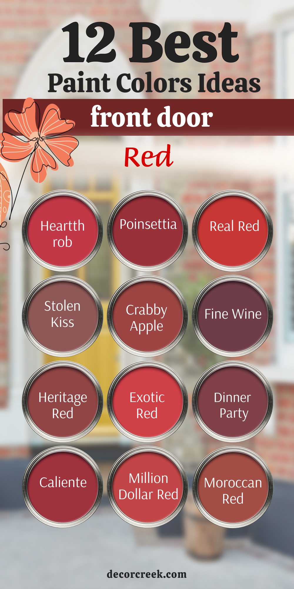
14 Front Door Paint Colors For Tan House
Smoky Blue SW 7604
Smoky Blue is a gorgeous, deep blue that is heavily muted with gray, giving it a sophisticated, cloudy, and wonderfully versatile quality. Smoky Blue is an excellent choice for a front door on a tan house because the cool depth of the blue offers a refreshing, grounded contrast to the tan’s warmth.
This shade is perfect for creating a polished, tailored look that feels both classic and perfectly on-trend, especially when paired with white trim. It pairs beautifully with tan, beige, or warm taupe siding, where the blue prevents the exterior from feeling too monotonous or washed out.
Choosing Smoky Blue gives your home a feeling of quiet style, stability, and a gentle formality that is incredibly appealing and welcoming. This color is a fantastic way to introduce a distinct color that still feels grounded and neutral, avoiding any jarring contrast against the tan. Smoky Blue is a highly dependable, rich blue that provides a balanced, refined, and enduring welcome to your tan home.
🎨 Check out the complete guide to this color right HERE 👈

Riverway SW 6222
Riverway is a stunning, medium-to-deep blue-green that is highly saturated and clear, offering a vibrant, nature-inspired, and very engaging color. Riverway is an excellent choice for a front door on a tan house because its complex blue-green hue creates a lively, fresh contrast to the tan’s warmth and earthiness.
This shade is perfect for injecting a noticeable pop of rich color that feels cheerful and inviting, without being overly bright or demanding attention. It pairs beautifully with a creamy off-white trim, creating a striking contrast that feels both spirited and perfectly grounded against the tan exterior.
Choosing Riverway gives your home an immediate sense of fun, approachability, and a spirited connection to the landscape that is incredibly welcoming. This color is fantastic for adding an unexpected, artistic touch that elevates the common tan exterior to a more sophisticated, well-designed level. Riverway is a vibrant, lovely color that provides a cheerful, distinctive, and very attractive welcome to your tan property.
🎨 Check out the complete guide to this color right HERE 👈

Evergreen Fog SW 9130
Evergreen Fog is a beautiful, mid-tone green that is heavily muted with gray, giving it a sophisticated, dusty, and wonderfully earthy quality. Evergreen Fog is an ideal choice for a front door on a tan house because its earthy tone harmonizes beautifully with the tan while still offering a noticeable, nature-inspired color.
This shade is perfect for creating a subtle, refined contrast that feels grounded, quiet, and incredibly cohesive with the warm, light exterior. It pairs wonderfully with a creamy off-white trim, providing a gentle, balanced contrast that feels effortlessly sophisticated and inviting.
Choosing Evergreen Fog gives your home a feeling of quiet style, stability, and a strong connection to the surrounding, natural landscape. This color is fantastic for giving your entryway an updated, contemporary feel without using a harsh, high-contrast dark color against the tan siding. Evergreen Fog is a soft, highly versatile green that provides a balanced, organic, and enduring welcome to your tan home.
🎨 Check out the complete guide to this color right HERE 👈

Retreat SW 6207
Retreat is a deep, muted green that is heavily saturated with both gray and brown, giving it a highly earthy, moody, and sophisticated olive tone. Retreat is an excellent choice for a front door on a tan house because its deep, grounded quality provides a powerful, warm contrast to the light tan exterior.
This shade is perfect for creating a dramatic, yet welcoming focal point that feels deeply connected to nature and the surrounding landscape. It pairs beautifully with light, creamy trim, allowing the deep richness of the color to fully shine against the lighter tan background.
Choosing Retreat gives your home an immediate sense of quiet strength, heritage, and a deep, thoughtful style that hints at a cozy interior. This color is a wonderful way to introduce a deep, sophisticated neutral that avoids the coolness of a pure gray or the starkness of black against the tan. Retreat is a beautiful, complex color that provides a rich, grounded, and incredibly elegant welcome to your tan home.
🎨 Check out the complete guide to this color right HERE 👈

Black Fox SW 7020
Black Fox is a complex, deeply saturated color that sits between a rich black and a deep, earthy brown, offering a powerful, warm, and sophisticated neutral. Black Fox is an excellent choice for a front door on a tan house because its dramatic depth provides a striking, high-contrast look that grounds the entire facade.
This shade is perfect for creating an immediate, powerful focal point that feels modern and high-end, contrasting beautifully with the light, warm tan siding. It pairs wonderfully with bright white trim, creating a sharp, polished contrast that instantly upgrades the perceived quality and style of the home.
Choosing Black Fox gives your home an immediate sense of sleek sophistication, strength, and quiet confidence that is very appealing and highly fashionable. This color is a fantastic way to introduce the drama of a dark door without the starkness of a true black, thanks to its warm, brown undertones. Black Fox is a reliable, strong color that provides a confident, grounded, and very elegant welcome to your tan property.
🎨 Check out the complete guide to this color right HERE 👈

Warm Stone SW 7032
Warm Stone is a gorgeously soft, mid-tone taupe that beautifully blends gray and brown, giving it a comforting, earthy, and highly versatile appeal. Warm Stone is an excellent choice for a front door on a tan house because its similar undertones create a sophisticated, subtle, and cohesive monochromatic look.
This shade is perfect for creating a quiet, refined entrance that feels naturally integrated into the tan exterior, offering a gentle depth instead of a sharp contrast. It pairs wonderfully with a slightly darker trim color or a creamy off-white, providing a gentle, balanced look that is effortlessly sophisticated.
Choosing Warm Stone gives your home an immediate sense of quiet comfort, stability, and a casual elegance that is highly attractive and welcoming. This color is a fantastic way to update a home’s exterior with a light neutral that still offers plenty of subtle, sophisticated color and seamless harmony with the tan. Warm Stone is a lovely, gentle color that provides an inviting, refined, and enduring welcome to your tan property.
🎨 Check out the complete guide to this color right HERE 👈
Anonymous SW 7046
Anonymous is a rich, muted green-brown that is best described as a deep, sophisticated olive, giving it a wonderfully earthy and highly grounded feel. Anonymous is an excellent choice for a front door on a tan house because its deep, organic color offers a beautiful, warm contrast to the light tan exterior.
This shade is perfect for creating a cohesive, warm look, especially when paired with natural elements like wood or stone, harmonizing with the tan’s earthiness. It pairs beautifully with both light and dark trim colors, allowing its deep, earthy complexity to fully shine against the lighter tan background.
Choosing Anonymous gives your home a feeling of quiet strength, heritage, and a deep connection to the surrounding landscape, feeling both strong and welcoming. This color is a fantastic way to introduce a deep, sophisticated neutral that avoids the coolness of a pure gray or the starkness of black against the tan. Anonymous is a beautiful, complex color that provides a rich, inviting, and enduring welcome to your treasured tan home.
🎨 Check out the complete guide to this color right HERE 👈
Wrought Iron 2124-10
Wrought Iron is a sophisticated, warm charcoal gray that has lovely blue-green undertones, giving it a complex, slightly aged appearance. Wrought Iron is an ideal choice for a front door on a tan house because its dark depth and subtle warmth provide a striking, contemporary contrast to the light tan.
This shade is one of Benjamin Moore’s most popular dark colors, offering a soft depth that feels very high-end and avoids looking too harsh against the warm exterior. It pairs wonderfully with light, neutral trim, creating a striking, beautiful contrast that draws the eye directly to the entrance.
Choosing Wrought Iron instantly gives your home a feeling of polished elegance and quiet strength, suggesting a well-maintained and stylish interior. This color works perfectly for modernizing a tan exterior, providing a fashionable, versatile dark door option that maintains a welcoming warmth. Wrought Iron is a beautiful, highly dependable dark gray that provides an excellent, enduring welcome to your tan property.
🎨 Check out the complete guide to this color right HERE 👈
Hale Navy HC-154
Hale Navy is arguably one of the most famous and reliable deep navy blue paint colors, known for its incredible depth and classic, enduring appeal. Hale Navy is a fantastic choice for a front door on a tan house because its cool, deep blue offers a truly classic, stunning contrast to the tan’s warmth.
This shade is a foundational color that instantly gives your front door a stately, heritage feel that is both dramatic and seriously welcoming. It pairs flawlessly with white or creamy trim for a crisp, iconic contrast that feels very tailored, fresh, and consistently attractive against the tan.
Using Hale Navy suggests a home of classic style and thoughtful design, providing a sense of stability and enduring quality to the entrance. This color is so beloved because it works on virtually every style of house and provides a universal appeal, especially when grounding a lighter exterior. Hale Navy is a truly exceptional, sophisticated color that is a guaranteed win for an instantly classic and highly appealing tan house door.
🎨 Check out the complete guide to this color right HERE 👈
Narragansett Green HC-157
Narragansett Green is a truly beautiful color that is a rich blend of deep, muted blue and forest green, resulting in a moody, complex shade. Narragansett Green is a sophisticated choice for a front door on a tan house because its deep, organic hue offers a unique, compelling contrast to the tan’s warmth.
This shade is part of Benjamin Moore’s Historical Collection, giving it an immediate sense of heritage and enduring, classic appeal that looks wonderful with warm trim. It pairs beautifully with traditional creamy trim, creating a stunning and slightly unexpected contrast that feels both fresh and elegantly grounded against the tan.
Choosing Narragansett Green gives your home a feeling of quiet confidence and a strong connection to natural surroundings, perfect for a cozy, well-loved tan home. This color works particularly well on traditional architectural styles where its complexity can be appreciated and its depth can enhance detailing against the lighter siding. Narragansett Green is a gorgeous, multi-faceted color that provides a unique and deeply satisfying welcome to your cherished tan property.
🎨 Check out the complete guide to this color right HERE 👈
Chelsea Gray HC-168
Chelsea Gray is a warm, mid-to-deep gray that features beautiful brown undertones, giving it a highly versatile, grounding, and sophisticated appeal. Chelsea Gray is an excellent choice for a front door on a tan house because its warmth allows it to harmonize beautifully with the tan while still offering a noticeable, neutral contrast.
This shade is perfect for creating a polished, tailored look that feels contemporary and refined, without the starkness of a cooler charcoal. It pairs wonderfully with creamy white trim, creating a classic, gentle contrast that feels both elegant and incredibly inviting to all who approach.
Choosing Chelsea Gray gives your home a feeling of quiet strength, modern sophistication, and stability, suggesting a well-maintained and thoughtful interior. This color is a fantastic way to introduce a deep neutral that feels current and stylish, offering a lovely, subtle anchor for the light tan exterior. Chelsea Gray is a reliable, warm gray that provides a balanced, refined, and enduring welcome to your tan home.
🎨 Check out the complete guide to this color right HERE 👈

Boothbay Gray HC-165
Boothbay Gray is a gorgeous, light-to-mid-tone color that is a very soft, muted blue-gray, giving it a gentle, sophisticated, and coastal-inspired quality. Boothbay Gray is an excellent choice for a front door on a tan house because its cool, gentle color offers a refreshing, subtle contrast to the tan’s warmth.
This shade is perfect for creating a light, airy entrance that still feels deeply stylish and more interesting than a simple white or cream door. It pairs wonderfully with bright white trim, creating a clean, crisp contrast that feels fresh, welcoming, and perfectly balanced against the light tan siding.
Choosing Boothbay Gray gives your home a feeling of lightness, casual elegance, and a gentle connection to the seaside or a relaxed atmosphere. This color is a fantastic way to introduce a soft, cool color that feels current and sophisticated, avoiding any high-drama contrast on the tan exterior. Boothbay Gray is a lovely, gentle color that provides a refreshing, refined, and enduring welcome to your tan property.
🎨 Check out the complete guide to this color right HERE 👈

Knoxville Gray HC-160
Knoxville Gray is a wonderful, muted medium-tone color that is best described as a sophisticated blue-gray-green, giving it fantastic versatility and depth. Knoxville Gray is a wonderful choice for a front door on a tan house because its complex, earthy color offers a refined contrast to the tan’s warmth.
This shade has strong gray undertones that allow it to harmonize effortlessly with the warm tan exterior, acting as a sophisticated, grounding anchor. It pairs beautifully with classic white trim, creating a fresh, clean contrast that feels both traditional and perfectly current for today’s styles.
Choosing Knoxville Gray gives your home a welcoming, balanced feeling, suggesting a comfortable interior that is both stylish and highly organized. This color is a fantastic choice for giving your front door a noticeable color update that still feels grounded, quiet, and incredibly easy to live with alongside the tan. Knoxville Gray is a lovely, multi-faceted color that provides a refined and gentle welcome to your tan home.
🎨 Check out the complete guide to this color right HERE 👈
Fairview Taupe HC-85
Fairview Taupe is a gorgeously rich, deeply saturated color that is a complex blend of brown, gray, and a hint of warm green, creating a moody, earthy neutral. Fairview Taupe is an excellent choice for a front door on a tan house because its depth and warm undertones create a sophisticated, powerful monochromatic harmony.
This shade is part of Benjamin Moore’s Historical Collection, giving it an immediate sense of heritage, weight, and sophisticated, enduring quality. It pairs beautifully with light, neutral trim, providing a deep, elegant contrast that looks incredibly high-end and grounds the light tan.
Using Fairview Taupe gives your home a feeling of quiet strength, traditional style, and a connection to the natural, surrounding landscape. This color is perfect for homeowners who want a door color that is deep and sophisticated but still feels welcoming and avoids any cool, stark undertones against the warm tan.
Fairview Taupe is a stunning, warm neutral that provides a luxurious, grounded, and deeply satisfying welcome to your cherished tan home.
My Final Thoughts on Choosing Front Door Paint Colors
Selecting the right front door color is one of the most impactful and surprisingly simple ways to personalize your home and significantly boost its curb appeal. I view the door as the signature statement of the entire property, a quick and highly effective way to communicate your personal style before anyone steps inside.
Remember that your door color is a genuine extension of your home’s personality, and it is crucial to choose a shade that truly resonates with you and the feeling you want your entrance to project to the world. A beautiful front door color sets an immediate tone of welcome and care.
I always encourage my clients to begin the process by closely considering the fixed elements of their home—the existing color of the siding, the brick tones, any natural stone, or the color of the roof. These are the constants that your new door color must harmoniously complement.
Choosing a door color in isolation is a mistake; it must work with the existing palette to create a cohesive, polished look.
Furthermore, the power of a quality paint cannot be overstated for such a high-traffic, exposed area. Investing in premium brands like Sherwin-Williams or Benjamin Moore means you are choosing an enduring, rich color that will hold up beautifully against sun, rain, and daily wear over time.
This quality ensures the color remains vibrant and the finish stays crisp for many years.
Most importantly, don’t be afraid to be a little bold! A front door is a relatively small area, making it the perfect spot to experiment with a deep, sophisticated color without making a major commitment to the whole house. Try a deep, grounding navy, a richly sophisticated green, or even a classic, powerful red.
Your final choice should feel like a confidently chosen piece of jewelry for your house, instantly offering a welcoming flash of style and elegance.
The color you choose is the very first thing that greets your guests and the last thing you see when you leave, so ensure it makes you feel genuinely happy and deeply proud to call that beautiful house your home.