Finding the right look for a beach house involves more than just picking a pretty shade of blue. You want your home to stand out against the sand and sky while feeling like it belongs in the neighborhood. I spend my days helping families pick colors that make them feel happy every time they pull into the driveway.
Exterior paint has to work hard because the sun is very bright near the water and can change how a color looks. My goal is to help you find a palette that feels fresh and breezy for your little piece of paradise. We will look at options that make your cottage look amazing from the curb.
The sun out here is both your greatest inspiration and your most demanding critic. When you design for the coast, you quickly learn that a color on a swatch in a shaded studio is a completely different creature than that same color under the relentless glare of the ocean’s noon.
The salt-heavy air and the sheer brilliance of the sky have a way of bleaching out nuance, turning sophisticated mid-tones into something flat and unrecognizable.
I often tell my clients: don’t be afraid of depth. To keep a house from vanishing into the haze of sand and sky, it needs a backbone. If we choose a gray, it needs the weight of a storm cloud so that, under the sun, it softens into a noble pearl.
If we pick a blue, it must be bold enough to hold its own against the shifting turquoise of the water.
Why I Always Trust Sherwin-Williams and Benjamin Moore for the Best Coastal Cottage Exterior Paint Colors
I rely on these two brands because they have spent years making paint that stays bright even in salty air. Their colors are consistent, which means the sample you see in the store will look the same on your walls. I have tried many different brands, but these two never let me down when I need a specific look for a client.
Sherwin-Williams has a great range of greens and blues that look natural and soft. Benjamin Moore offers very crisp whites and deep navies that look high-end and professional. Using quality paint saves you money in the long run because you do not have to repaint as often. I want your cottage to look great for a long time without the color fading away.
How I Choose the Perfect Coastal Paint Color for Any Cottage Exterior
I start by looking at the fixed elements of the house like the roof color and the stone on the porch. You have to make sure the paint color plays nice with the parts of the house you cannot change. I also look at how much sun the front of the house gets during the middle of the day.
Light colors are usually better for smaller cottages because they make the building feel bigger and more open. I always tell my clients to paint a large board and move it around the house to see it in different lights. This helps you avoid picking a color that looks too bright or too muddy. Choosing the right shade is about matching the feeling of the ocean nearby.
It’s about capturing the rhythm of the waves and the quiet shift of the tides. When a palette is right, the architecture doesn’t just sit on the land; it breathes with it.
I often find myself pulling inspiration from the “micro-moments” of the coast—the way a wet pebble looks under a pier, or the pale, chalky violet of a sunset over the marsh. These are the colors that provide a house with a soul.
But beyond the poetry of the landscape, there is the practical reality of living by the water. I remind my families that we aren’t just painting for today; we are painting for the seasons. A soft, sandy beige might look serene in the height of July, but it needs enough warmth to not feel cold and abandoned during a gray winter storm.
We look for those resilient “middle-ground” shades that provide comfort regardless of what the weather is doing outside.
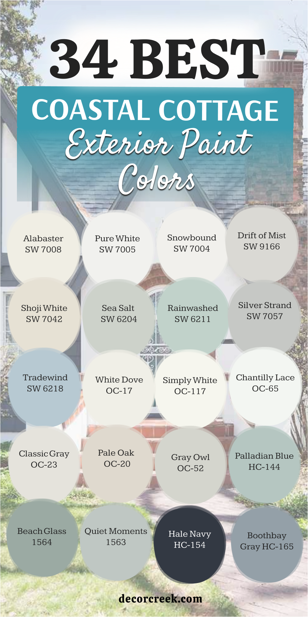
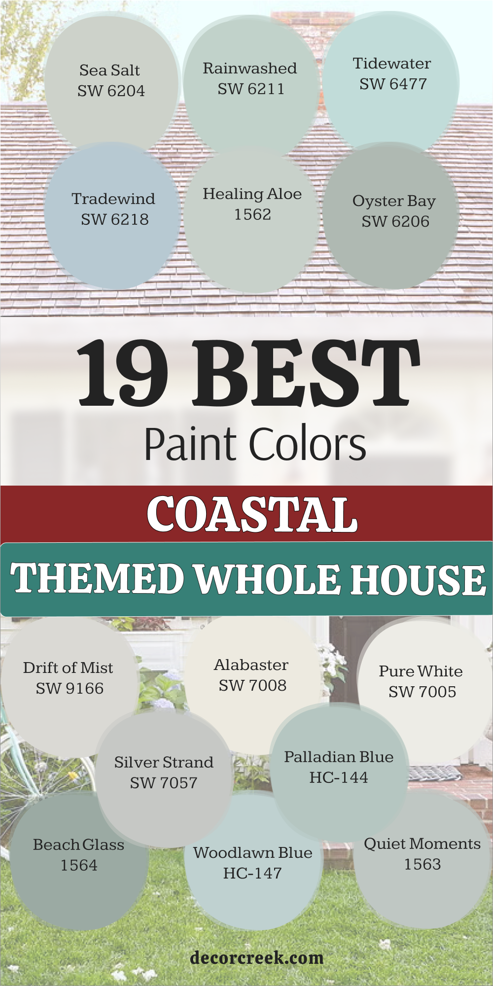
19 Coastal Themed Whole House Paint Colors
Sea Salt SW 6204
Sea Salt SW 6204 looks like a mix of green and gray that changes depending on the clouds. This color is the most popular choice for beach homes because it feels so light. It looks great on cedar shakes or smooth siding. Many people love how it mimics the color of the shallow water near the shore.
The gray tones keep it from looking too much like a bright mint green. It works well with white trim to give a very clean look to the exterior.
You can use it on the whole house without it feeling like too much color. This shade is famous for being a chameleon that adapts to its surroundings. I recommend it to anyone who wants a soft look for their home.
Best used in: cottage exteriors, front doors, shutters, master bedrooms, and sunrooms.
Pairs well with: Alabaster SW 7008, Herron Plume SW 6070, Rainwashed SW 6211, and weathered wood. The key rule of this color for farmhouse style is to use it where you want natural light to feel kind, soft, and inviting throughout the day.
🎨 Check out the complete guide to this color right HERE 👈

Rainwashed SW 6211
Rainwashed SW 6211 provides a bit more blue than other green-gray shades. This color makes a house look very cheerful and friendly to visitors. It stands out beautifully against green grass and white porch railings. I like using this when a house has a lot of architectural detail to show off.
The color feels like a clear spring morning after the clouds go away. It is deep enough to not wash out in the bright afternoon sun. Your neighbors will likely ask you for the name of this paint because it is so pretty.
It creates a very welcoming vibe for a vacation home or a permanent residence. This is a solid choice for a classic beach cottage look.
Best used in: exterior siding, bathrooms, laundry rooms, and kitchen cabinets.
Pairs well with: Pure White SW 7005, First Star SW 7646, and dark bronze hardware. The key rule of this color for farmhouse style is to use it where you want natural light to feel kind, soft, and inviting throughout the day.
🎨 Check out the complete guide to this color right HERE 👈

Tidewater SW 6477
Tidewater SW 6477 is a bright and airy blue that reminds me of tropical water. This color is perfect for a house that wants to feel fun and energetic. It looks very crisp when paired with bright white trim and dark shutters. The blue is clear and does not have a lot of muddy gray in it.
I think this color works best on homes that are close to the water. It catches the light in a way that makes the whole property feel refreshed.
You can use this color to make a small cottage feel much larger than it really is. It is a very happy shade that brings a smile to your face. This is the ultimate choice for a classic coastal vibe.
Best used in: beach house siding, porch ceilings, front doors, and kids’ rooms.
Pairs well with: Extra White SW 7006, Naval SW 6244, and sandy beige tones. The key rule of this color for farmhouse style is to use it where you want natural light to feel kind, soft, and inviting throughout the day.
🎨 Check out the complete guide to this color right HERE 👈

Tradewind SW 6218
Tradewind SW 6218 is a soft blue that has a hint of gray to keep it grounded. This color looks very sophisticated on a large cottage or a two-story home.
It feels more like a traditional paint choice than a bright tropical blue. I often suggest this for clients who want color but want it to look grown-up.
The gray undertones help the color blend in with the natural landscape. It looks stunning when the sun starts to set and the shadows get longer. This color is very easy on the eyes and never feels too loud. It provides a perfect backdrop for colorful flowers in your garden. I find that this shade stays looking clean for a long time.
Best used in: whole house siding, bedrooms, home offices, and shutters.
Pairs well with: Snowbound SW 7004, Shell White SW 8917, and light oak accents. The key rule of this color for farmhouse style is to use it where you want natural light to feel kind, soft, and inviting throughout the day.
🎨 Check out the complete guide to this color right HERE 👈

Naval SW 6244
Naval SW 6244 is a deep and bold navy blue that makes a big statement. This color is excellent for adding contrast to a light-colored coastal home. I love using it on front doors or as an accent on window shutters. It feels very nautical and reminds me of deep ocean water.
When used on the whole house, it looks very expensive and well-planned. You should use a lot of white trim to keep the dark color from feeling too heavy.
It creates a sharp look that defines the lines of your cottage perfectly. This is a power color that looks great in any season. It is a favorite for those who like a classic maritime style.
Best used in: accent walls, front doors, kitchen islands, and exterior siding.
Pairs well with: Alabaster SW 7008, Goldfinch SW 6905, and light gray stone. The key rule of this color for farmhouse style is to use it where you want natural light to feel kind, soft, and inviting throughout the day.
🎨 Check out the complete guide to this color right HERE 👈

Oyster Bay SW 6206
Oyster Bay SW 6206 is a darker version of a green-gray slate color. This color gives a house a very sturdy and established feeling. It works wonders on homes that have a lot of natural wood or stone elements. The green in the paint helps it connect with the trees and shrubs around the yard.
It is a great choice if you want a color that hides dirt and dust well. The shade is deep enough to provide a nice contrast with white windows.
I think it looks very elegant on modern cottage styles. It feels very natural and never looks like a fake or plastic color. This is a top pick for a moody but fresh exterior.
Best used in: exterior siding, master suites, dining rooms, and cabinetry.
Pairs well with: Shoji White SW 7042, Sea Salt SW 6204, and black metal. The key rule of this color for farmhouse style is to use it where you want natural light to feel kind, soft, and inviting throughout the day.
🎨 Check out the complete guide to this color right HERE 👈

Drift of Mist SW 9166
Drift of Mist SW 9166 is a very light gray that almost looks white in the sun. This color is perfect for people who want a neutral home that isn’t just plain white.
It has enough gray to provide a soft contrast against bright white trim. I like how it looks very clean without being too cold or clinical.
The color works well in almost any lighting condition you can imagine. It is a safe choice that will never go out of style for a cottage. You can pair it with almost any color for the front door. It makes the house look neat and very well-maintained. This shade is a workhorse for coastal designers.
Best used in: main exterior walls, open floor plans, hallways, and trim.
Pairs well with: Pewter Cast SW 7673, Pure White SW 7005, and navy accents. The key rule of this color for farmhouse style is to use it where you want natural light to feel kind, soft, and inviting throughout the day.
🎨 Check out the complete guide to this color right HERE 👈

Alabaster SW 7008
Alabaster SW 7008 is a warm white that feels very cozy and inviting. This color is famous for being one of the best whites for any home style. It does not look yellow, but it certainly is not a cold blue-white either. I use this when I want a house to feel bright but also very comfortable.
It reflects the sunlight beautifully without blinding the neighbors. This color makes a cottage look like it belongs in a storybook.
It is a great choice for siding, trim, or even the porch railings. Many people find this color to be the perfect balance for an exterior. It creates a soft glow that looks amazing at sunrise.
Best used in: living rooms, kitchens, hallways, bedrooms, and farmhouse exteriors.
Pairs well with: Iron Ore SW 7069, Agreeable Gray SW 7029, Natural Linen SW 9109, and warm wood tones. The key rule of this color for farmhouse style is to use it where you want natural light to feel kind, soft, and inviting throughout the day.
🎨 Check out the complete guide to this color right HERE 👈

Pure White SW 7005
Pure White SW 7005 is a very clean white that has just a tiny drop of warmth. This color is my go-to when a client wants a very bright and fresh look. It looks stunning when used on the entire exterior of a beach house. It makes the blues and greens of the ocean look even more vibrant.
The color is very crisp and helps the house stand out from the street. It is a very simple choice that allows your landscaping to be the star. You do not have to worry about this white looking too blue or too pink. It is a very reliable color that looks good on every type of siding. This is a staple for a modern coastal cottage.
Best used in: trim, ceilings, exterior siding, and kitchen cabinets.
Pairs well with: Black Magic SW 6991, March Wind SW 7668, and any bright color. The key rule of this color for farmhouse style is to use it where you want natural light to feel kind, soft, and inviting throughout the day.
🎨 Check out the complete guide to this color right HERE 👈

Silver Strand SW 7057
Silver Strand SW 7057 is a light gray with very clear blue and green undertones. This color captures the look of a misty morning on the Atlantic coast. It is light enough to feel airy but has enough color to be interesting. I love how it changes throughout the day as the sun moves across the sky.
It looks very high-end when paired with white trim and a dark roof. This color is a favorite for people who want a beachy feel without using bright blue.
It feels very relaxed and helps the house blend with the sky. I recommend this for anyone who wants a very peaceful exterior look. It is a classic choice for a reason.
Best used in: bedrooms, bathrooms, exterior siding, and laundry rooms.
Pairs well with: Extra White SW 7006, Peppercorn SW 7674, and sea glass accents. The key rule of this color for farmhouse style is to use it where you want natural light to feel kind, soft, and inviting throughout the day.
🎨 Check out the complete guide to this color right HERE 👈
Palladian Blue HC-144
Palladian Blue HC-144 is a soft and airy shade that blends blue, green, and gray perfectly. This color makes a cottage look like it was pulled right from a pretty magazine. It feels very fresh and light when the sun hits the front of the house. I love how it looks against dark green bushes and many colorful flowers.
The green notes in the paint keep it from feeling too cold or icy on a house. It provides a very friendly look that makes people feel happy when they visit you.
You can use it on the whole house or just as a pretty accent on a door. This shade is perfect for anyone who loves the colors of the sea and sky. It stays looking bright and clean even on cloudy days near the coast or ocean.
Best used in: exterior siding, bedrooms, guest bathrooms, and porch ceilings
Pairs well with: Cloud White OC-130, Woodlawn Blue HC-147, and natural wicker The key rule of this color for farmhouse style is to use it where you want natural light to feel kind, soft, and inviting throughout the day.
🎨 Check out the complete guide to this color right HERE 👈

Beach Glass 1564
Beach Glass 1564 is a medium-toned blue-green that has a lot of gray inside it. This color looks very sophisticated on a cottage with a lot of bright white trim. It reminds me of the smooth glass pieces found washed up on the sand at the beach. The depth of the color ensures that it does not disappear in the bright daylight.
It creates a very solid and balanced look for a cottage home of any size. I find that this shade works beautifully with gray roof shingles and stone paths.
It feels very grounded and natural rather than being too bright or flashy for the neighborhood. Your house will feel like a quiet retreat when painted in this lovely and soft tone. This is a top choice for a classic beach house feel that looks amazing.
Best used in: main exterior walls, dining rooms, shutters, and kitchen islands
Pairs well with: White Dove OC-17, Hale Navy HC-154, and weathered wood The key rule of this color for farmhouse style is to use it where you want natural light to feel kind, soft, and inviting throughout the day.
🎨 Check out the complete guide to this color right HERE 👈

Woodlawn Blue HC-147
Woodlawn Blue HC-147 is a clear and bright blue that feels very traditional on a house. This color is part of a historic collection because it looks good on many older homes. It has a very cheerful spirit that brightens up the whole neighborhood for your neighbors. I often use this on cottages that have a lot of character and special detail.
The color is light enough to feel breezy but has enough pigment to stand out clearly. It looks wonderful when paired with a bright white front door and black metal lamps.
You will love how it looks against the blue sky on a hot summer day. It is a very reliable blue that does not turn purple in the shade or shadows. This is a great pick for a very pretty and traditional coastal appearance.
Best used in: cottage siding, master bedrooms, porches, and entryways
Pairs well with: Simply White OC-117, Boothbay Gray HC-165, and silver hardware The key rule of this color for farmhouse style is to use it where you want natural light to feel kind, soft, and inviting throughout the day.
🎨 Check out the complete guide to this color right HERE 👈
Quiet Moments 1563
Quiet Moments 1563 is a very light and gentle mix of blue, green, and gray. This color is famous for making any house look more expensive and well-designed. It feels very light and helps a small cottage look much more open and large. I like how it changes its look as the sun moves from east to west.
The gray tones keep the blue and green from being too loud or bright on the walls. It is a very soft choice that works well with almost any landscape design you pick.
You can use it to create a very light and airy feeling on your front porch. It is a favorite for many designers because it is so easy to live with every day. This shade brings a very soft touch to your home exterior that feels very nice.
Best used in: bedrooms, bathrooms, exterior siding, and sunrooms
Pairs well with: Chantilly Lace OC-65, Shaker Gray 1594, and light oak floors The key rule of this color for farmhouse style is to use it where you want natural light to feel kind, soft, and inviting throughout the day.
🎨 Check out the complete guide to this color right HERE 👈

Healing Aloe 1562
Healing Aloe 1562 is a very pale green that has just a hint of blue and gray. This color looks almost like a neutral because it is so light and soft. It is a great alternative to white if you want just a little bit of color. I love using this on coastal homes that have a lot of white window frames.
The color feels very fresh and clean without being too sharp or cold on a building. It reflects the light in a way that makes the house glow in the quiet evening.
This shade is perfect for creating a very friendly and open look for your new home. It works well with both light and dark accent colors on the trim and doors. I recommend it for anyone who wants a very light green touch for their cottage.
Best used in: exterior walls, laundry rooms, bathrooms, and nurseries
Pairs well with: White Heron OC-57, Gray Owl OC-52, and dark wood doors The key rule of this color for farmhouse style is to use it where you want natural light to feel kind, soft, and inviting throughout the day.
🎨 Check out the complete guide to this color right HERE 👈

White Dove OC-17
White Dove OC-17 is a very popular white that feels soft and creamy on a house. This color is a favorite for many people because it never looks too yellow. It is a perfect choice for trim, siding, or even the entire cottage exterior. I use this when I want a house to feel bright but very warm and cozy.
The color has a tiny bit of gray that keeps it from being too bright in the sun. It looks amazing on traditional siding and modern farmhouses alike in any neighborhood.
You can pair it with any other color in the world and it will look great. It is a very reliable white that makes everything around it look better and cleaner. This is a staple for creating a beautiful and clean home that feels very welcoming.
Best used in: trim, doors, kitchen cabinets, living rooms, and whole house exteriors
Pairs well with: Revere Pewter HC-172, Balboa Mist OC-27, and any bold accent The key rule of this color for farmhouse style is to use it where you want natural light to feel kind, soft, and inviting throughout the day.
🎨 Check out the complete guide to this color right HERE 👈

Simply White OC-117
Simply White OC-117 is a very crisp and clean white with just a hint of warmth. This color was a color of the year because it is so versatile and pretty. It makes a cottage look very fresh and helps it stand out from the green trees. I like how it looks very bright without feeling like a cold hospital room.
The warm undertone makes the house feel very welcoming to anyone who visits your home. It is an excellent choice for a house with a lot of natural light outside.
You can use it on the siding to make your home look brand new again. It works perfectly with black or navy blue shutters for a very sharp and clean look. This is the ultimate white for a clean coastal design that feels very happy.
Best used in: ceilings, trim, kitchens, exterior siding, and art galleries
Pairs well with: Hale Navy HC-154, Black Beauty 2128-10, and warm wood The key rule of this color for farmhouse style is to use it where you want natural light to feel kind, soft, and inviting throughout the day.
🎨 Check out the complete guide to this color right HERE 👈

Classic Gray OC-23
Classic Gray OC-23 is a very light gray that can look like a warm white. This color is perfect for people who find pure white to be too bright for them. It has a very soft feeling that makes a cottage look very expensive and smart. I love how it provides a gentle contrast against bright white window frames or doors.
The color is very neutral and does not have any weird blue or pink tones in it. It is a very safe choice for an exterior because it looks good in any weather.
Your home will look very neat and well-cared for with this shade on the exterior walls. It is an excellent background for a colorful front door or many bright garden flowers. This is a very smart and pretty choice for a coastal home near the beach.
Best used in: main living areas, hallways, exterior siding, and bedrooms
Pairs well with: Stone Harbor 2111-50, Simply White OC-117, and dark slate The key rule of this color for farmhouse style is to use it where you want natural light to feel kind, soft, and inviting throughout the day.
🎨 Check out the complete guide to this color right HERE 👈

Gray Owl OC-52
Gray Owl OC-52 is a light gray that has a very cool and crisp feeling on siding. This color often looks like it has a tiny bit of blue or green in certain lights. It is a very popular choice for modern cottages that want a very clean look. I find that it makes a house look very sturdy and professional from the street.
The color is deep enough to show a real difference against white trim or white doors. It stays looking fresh even when the sun is very bright and intense on the coast.
You can use it on the whole house for a very cohesive and pretty look. It is a great neutral that feels a bit more interesting than a plain tan color. This is a go-to gray for designers who want a cool coastal vibe for a home.
Best used in: kitchens, bathrooms, exterior siding, and home offices
Pairs well with: White Dove OC-17, Kendall Charcoal HC-166, and blue accents The key rule of this color for farmhouse style is to use it where you want natural light to feel kind, soft, and inviting throughout the day.
🎨 Check out the complete guide to this color right HERE 👈

32 Coastal Cottage Exterior Paint Color Combos
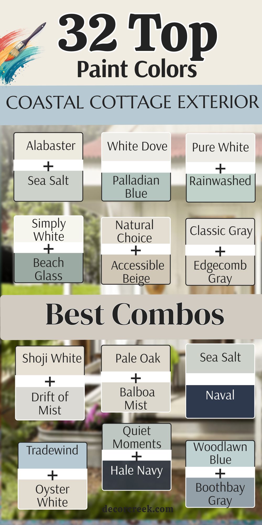
Alabaster SW 7008 + Sea Salt SW 6204
Alabaster SW 7008 + Sea Salt SW 6204 create a very soft and welcoming look for a coastal home. This combination is my favorite for a traditional cottage that needs to feel light and airy.
The warm white on the trim helps the green-gray siding look more colorful and fresh. It reminds me of the foam on the waves hitting a sandy shore on a quiet morning. You can use the white on the railings and the green shade on the main walls. This duo works perfectly because the colors do not fight each other for attention.
Most people feel very relaxed just looking at a house painted in these pretty tones. It is a very safe choice that always looks professional and well-planned. I recommend this for anyone who wants a classic beach house style.
Best used in: cottage exteriors, front doors, shutters, master bedrooms, and sunrooms
Pairs well with: Iron Ore SW 7069, Agreeable Gray SW 7029, Natural Linen SW 9109, warm wood tones The key rule of this color for farmhouse style is to use it where you want natural light to feel kind, soft, and inviting throughout the day.
White Dove OC-17 + Palladian Blue HC-144
White Dove OC-17 + Palladian Blue HC-144 offer a crisp and high-end look that is hard to beat. This pair makes any cottage look like it belongs in a luxury coastal neighborhood. The blue has just enough green to feel like the ocean water under a clear sky.
Using a soft white for the trim prevents the blue from looking too cold or icy. I like how this combo highlights the small details like window boxes or porch columns. It is a very cheerful set of colors that brings a lot of life to the street.
Your home will stand out in a very good way with these shades. It feels very balanced and stays looking beautiful even as the light changes. This is a top-tier choice for a sophisticated beach retreat.
Best used in: trim, doors, kitchen cabinets, living rooms, and whole house exteriors
Pairs well with: Revere Pewter HC-172, Balboa Mist OC-27, and any bold accent The key rule of this color for farmhouse style is to use it where you want natural light to feel kind, soft, and inviting throughout the day.
Pure White SW 7005 + Rainwashed SW 6211
Pure White SW 7005 + Rainwashed SW 6211 provide a very clean and energetic feeling for an exterior. This combination is excellent for smaller cottages that want to feel larger and more open.

The blue-green siding is bright enough to show your personality without being too loud. I love how the bright white makes the main color look very saturated and healthy. It feels like a sunny day at the beach every time you pull into the driveway.
This duo is very popular for vacation rentals because it looks so friendly and inviting. You will find that these colors hide dust quite well while still looking very sharp. It is a very reliable choice for a house with a lot of natural wood accents. Many homeowners love how fresh this looks in the morning sun.
Best used in: trim, ceilings, exterior siding, and kitchen cabinets
Pairs well with: Black Magic SW 6991, March Wind SW 7668, and any bright color The key rule of this color for farmhouse style is to use it where you want natural light to feel kind, soft, and inviting throughout the day.
Simply White OC-117 + Beach Glass 1564
Simply White OC-117 + Beach Glass 1564 create a sophisticated and grounded coastal look. This pairing is perfect for a home that wants to feel established and sturdy near the water.
The medium blue-green shade has a lot of gray that makes it look very expensive. Using a warm white for the trim adds a nice glow that keeps the look from being too dark. I think this combo works wonders on houses with traditional shingles or horizontal siding.
It feels very connected to the natural colors of the dunes and the sea. You can add black hardware to make the whole house look very modern and chic. It is a very peaceful set of colors that never goes out of style. This is a great choice for a year-round home by the coast.
Best used in: ceilings, trim, kitchens, exterior siding, and art galleries
Pairs well with: Hale Navy HC-154, Black Beauty 2128-10, and warm wood The key rule of this color for farmhouse style is to use it where you want natural light to feel kind, soft, and inviting throughout the day.
Natural Choice SW 7011 + Accessible Beige SW 7036
Natural Choice SW 7011 + Accessible Beige SW 7036 are the best choices for a sandy and warm aesthetic. This combination reminds me of tall sea grass and dry sand on a warm summer afternoon.
It is a very neutral look that feels very soft and easy on the eyes. I like using these shades when the house has a lot of stone or brick elements. The two colors are close in tone which makes the house look very large and cohesive.
It is a very safe option if you want to avoid blues and greens entirely. Your cottage will look very tidy and well-maintained with this warm palette. It provides a perfect backdrop for a bright front door in a fun color like coral or navy. This is a very smart look for a relaxed beach lifestyle.
Best used in: exterior siding, hallways, kitchens, and main living areas
Pairs well with: Urbane Bronze SW 7048, Pure White SW 7005, and wood tones The key rule of this color for farmhouse style is to use it where you want natural light to feel kind, soft, and inviting throughout the day.

Classic Gray OC-23 + Edgecomb Gray HC-173
Classic Gray OC-23 + Edgecomb Gray HC-173 offer a very light and airy neutral look for any cottage. This pair is perfect for someone who wants a very clean style that is not just plain white.
The two grays work together to create a very soft shadow effect on the walls. I love how this looks when the sun hits the front of the house and creates a gentle glow. It feels very modern and fresh without being cold or industrial.
You can use the darker gray on the main siding and the lighter gray on the trim. It is a very flexible palette that looks good with any color of roof shingles. This combination makes a small house feel very grand and well-proportioned. It is a very popular choice for a contemporary coastal design.
Best used in: main living areas, hallways, exterior siding, and bedrooms
Pairs well with:Stone Harbor 2111-50, Simply White OC-117, and dark slate The key rule of this color for farmhouse style is to use it where you want natural light to feel kind, soft, and inviting throughout the day.

Shoji White SW 7042 + Drift of Mist SW 9166
Shoji White SW 7042 + Drift of Mist SW 9166 create a very soft and creamy look that feels very high-end. This combination is great for a cottage that needs to look very bright and clean.

Both colors have a hint of warmth that keeps them from looking like a cold gray. I like how they blend together to make the house look very soft and inviting to guests. It is a very subtle look that relies on the quality of the light to show the difference.
You will find that this palette makes your landscaping look very green and vibrant. It is a very relaxing set of colors that works well in any neighborhood. Your home will look like a peaceful sanctuary with these light tones on the exterior. This is a favorite for a minimalist coastal style.
Best used in: exterior siding, bedrooms, living rooms, and large open spaces
Pairs well with: Fawn Brindle SW 7640, Pure White SW 7005, and black accents The key rule of this color for farmhouse style is to use it where you want natural light to feel kind, soft, and inviting throughout the day.
Pale Oak OC-20 + Balboa Mist OC-27
Pale Oak OC-20 + Balboa Mist OC-27 provide a very elegant and soft greige look for a home. This duo is perfect for a coastal cottage that wants to feel very cozy and warm. The colors have a way of changing from gray to beige depending on the clouds in the sky.

I love how they make a house look very sturdy and well-built. It is a very popular choice for those who want a neutral that has a bit of personality. Using these colors together creates a very smooth transition between the walls and the trim.
It looks very beautiful with white flowers and light green plants in the garden. Your house will feel very balanced and ready for guests with this lovely palette. This is a top choice for a sophisticated and soft exterior.
Best used in: living rooms, bedrooms, exterior siding, and kitchens
Pairs well with: Chantilly Lace OC-65, Revere Pewter HC-172, and gold accents The key rule of this color for farmhouse style is to use it where you want natural light to feel kind, soft, and inviting throughout the day.

Sea Salt SW 6204 + Naval SW 6244
Sea Salt SW 6204 + Naval SW 6244 is a very bold and classic maritime combination. This pair uses a light green-gray for the main body and a deep navy for the accents.
I love how the dark blue makes the light siding look even more fresh and airy. It is a very smart look for a house with a big front door or a wide porch. The contrast between the light and dark colors is very striking and beautiful.
It feels very much like a traditional nautical home you would find on the east coast. You can use the navy on the shutters and the front door to ground the whole house. Most people find this look to be very professional and stylish for a beach house. This is a great way to use a dark color without it feeling heavy.
Best used in: cottage exteriors, front doors, shutters, and master bedrooms
Pairs well with: Alabaster SW 7008, Herron Plume SW 6070, Rainwashed SW 6211 The key rule of this color for farmhouse style is to use it where you want natural light to feel kind, soft, and inviting throughout the day.
Tradewind SW 6218 + Oyster White SW 7637
Tradewind SW 6218 + Oyster White SW 7637 create a very soft and breezy look for any exterior. This combination uses a gentle blue and a very warm off-white that feels very relaxed.
I like how the off-white trim keeps the blue from looking too bright in the sun. It feels like a clear day at the shore with a very light wind blowing. This duo is perfect for a house that wants to feel very coastal and traditional.
The colors are very light which helps keep the house cool in the hot summer sun. It is a very pretty look that makes the house feel very open and friendly. You will love how the colors stay looking clean and bright for many years. This is a very reliable choice for a happy and light beach home.
Best used in: whole house siding, bedrooms, home offices, and shutters
Pairs well with: Snowbound SW 7004, Shell White SW 8917, and light oak accents The key rule of this color for farmhouse style is to use it where you want natural light to feel kind, soft, and inviting throughout the day.
Quiet Moments 1563 + Hale Navy HC-154
Quiet Moments 1563 + Hale Navy HC-154 create a beautiful and high-contrast look for a cottage. This combination uses a very light blue-green for the main walls and a dark navy for accents.
I love how the dark blue grounds the house and makes the lighter color feel more vibrant. It feels very coastal and reminds me of deep water meeting a misty sky on the coast. You can use the navy on a front door or window shutters to make the house pop.
This duo is perfect for a homeowner who wants a look that is both soft and very strong. Most people find that this palette makes their house look very expensive and professionally designed. It is a very smart choice for a house with a large porch or many windows. I recommend this for a sophisticated and bold beach house style.
Best used in: bedrooms, bathrooms, exterior siding, and sunrooms
Pairs well with: Chantilly Lace OC-65, Shaker Gray 1594, and light oak floors The key rule of this color for farmhouse style is to use it where you want natural light to feel kind, soft, and inviting throughout the day.

Woodlawn Blue HC-147 + Boothbay Gray HC-165
Woodlawn Blue HC-147 + Boothbay Gray HC-165 offer a very traditional and pretty look for an exterior. This pair uses a clear blue with a medium blue-gray that feels very historical and solid.
I like how the gray tones in the secondary color keep the main blue from looking too bright. It feels like a very sturdy cottage that has been standing by the ocean for many years. This combination works wonders on homes with cedar shingles or classic horizontal lap siding.
You will find that these colors look great even when the weather is very cloudy or gray. It provides a very balanced look that is easy to love and very hard to mess up. Your house will feel very welcoming and cheerful with this blue and gray palette on the walls. This is a top-tier choice for a classic maritime retreat.
Best used in: cottage siding, master bedrooms, porches, and entryways
Pairs well with: Simply White OC-117, White Dove OC-17, and silver hardware The key rule of this color for farmhouse style is to use it where you want natural light to feel kind, soft, and inviting throughout the day.

Gray Owl OC-52 + Kendall Charcoal HC-166
Gray Owl OC-52 + Kendall Charcoal HC-166 provide a very modern and clean look for a coastal home. This combination uses a light cool gray for the body and a very dark charcoal for the trim.
I love how the dark accent color defines the lines of the house and makes it look very sharp. It feels very contemporary and fresh while still fitting in perfectly with a beach setting. This duo is excellent for a house that has a lot of glass or very modern light fixtures.
You can use the dark gray on the window frames to create a very high-end and custom look. It is a very reliable palette that stays looking clean and new for a long time in the sun. Many people love how this look makes their home feel very strong and well-built. This is a great choice for a modern coastal cottage.
Best used in: kitchens, bathrooms, exterior siding, and home offices
Pairs well with: White Dove OC-17, Stonington Gray HC-170, and blue accents The key rule of this color for farmhouse style is to use it where you want natural light to feel kind, soft, and inviting throughout the day.

Silver Strand SW 7057 + Peppercorn SW 7674
Silver Strand SW 7057 + Peppercorn SW 7674 create a very moody and stylish coastal aesthetic for an exterior. This pair uses a light gray with blue-green undertones and a very deep near-black gray.
I like how the dark accents make the main body of the house look very light and airy. It reminds me of a stormy day at the beach when the colors of the sea become very deep. This combination is perfect for a house that wants to stand out as a very designer-led property.
You will love how the light color changes throughout the day as the sun moves around the house. It feels very sophisticated and much more interesting than a basic gray or white house. Your home will look very neat and very well-planned with this striking and pretty palette. This is a smart look for a modern and relaxed lifestyle.
Best used in: bedrooms, bathrooms, exterior siding, and laundry rooms
Pairs well with: Extra White SW 7006, Pure White SW 7005, and sea glass accents The key rule of this color for farmhouse style is to use it where you want natural light to feel kind, soft, and inviting throughout the day.
Repose Gray SW 7015 + Iron Ore SW 7069
Repose Gray SW 7015 + Iron Ore SW 7069 offer a very solid and popular neutral look for any cottage. This combination uses a warm medium gray for the walls and a very dark charcoal for the trim.

I love how this pair works with almost any style of roof or stone on the house. It feels very established and high-end without being too colorful or loud for the neighborhood. This duo is a favorite for many builders because it looks so good on every type of siding.
You can use the dark gray on the front door to create a very welcoming and strong focal point. It is a very safe option that will help your home maintain its value for a very long time. Your cottage will look very tidy and very professional with these colors on the exterior. This is a very popular choice for a new coastal design.
Best used in: main exterior walls, living rooms, and kitchen cabinets
Pairs well with: Eider White SW 7014, Alabaster SW 7008, and light wood The key rule of this color for farmhouse style is to use it where you want natural light to feel kind, soft, and inviting throughout the day.

Stonington Gray HC-170 + Hale Navy HC-154
Stonington Gray HC-170 + Hale Navy HC-154 create a very classic and nautical look that is very pretty. This combination uses a cool medium gray and a deep navy blue that feels very sophisticated and smart.

I like how the blue accents bring out the cool tones in the gray siding for a fresh look. It reminds me of a traditional harbor town where all the houses look very neat and well-kept. This duo is excellent for a house with a lot of white trim and a big wooden front porch.
You will find that these colors work together to make the house look very sturdy and expensive. It is a very flexible palette that looks good in both bright sun and on cloudy afternoons. Most homeowners find this to be the perfect balance of color and neutral for their home. This is a top choice for a classic and elegant beach style.
Best used in: exterior siding, living rooms, and dining areas
Pairs well with: Chantilly Lace OC-65, Revere Pewter HC-172, and navy decor The key rule of this color for farmhouse style is to use it where you want natural light to feel kind, soft, and inviting throughout the day.
Healing Aloe 1562 + Chantilly Lace OC-65
Healing Aloe 1562 + Chantilly Lace OC-65 provide a very light and airy feeling for a small cottage. This combination uses a very pale green and a very bright pure white that feels very clean.
I love how the white trim makes the soft green look much more like a real color on the walls. It feels like a very fresh and healthy home that is full of light and happy energy. This duo is perfect for making a tiny beach house feel much bigger than it really is.
You will love how the colors reflect the light and make the house glow during the sunset. It is a very gentle and soft palette that works well with a lot of flowers and plants. Your house will look like a very pretty and peaceful retreat with these light tones on the siding. This is a favorite for a minimalist and fresh coastal style.
Best used in: exterior walls, laundry rooms, bathrooms, and nurseries
Pairs well with: White Heron OC-57, Gray Owl OC-52, and dark wood doors The key rule of this color for farmhouse style is to use it where you want natural light to feel kind, soft, and inviting throughout the day.

Sea Salt SW 6204 + Intimate White SW 6322
Sea Salt SW 6204 + Intimate White SW 6322 create a very soft and unique look for a coastal home. This combination uses a green-gray main color and a white with a tiny hint of pink for the trim.
I like how the warm trim makes the main color feel very natural and soft like the shoreline. It reminds me of the pink shells you find hidden in the sand on a very quiet beach morning. This duo is very charming and feels very much like a cozy storybook cottage by the sea.
You can use this palette to make your home feel very welcoming and special compared to others. It is a very pretty look that stays looking fresh and clean in the bright coastal sunlight. Most people feel very happy when they see a house painted in these gentle and soft tones. This is a great way to add a bit of personality to your home.
Best used in: cottage exteriors, front doors, shutters, and master bedrooms
Pairs well with: Alabaster SW 7008, Herron Plume SW 6070, and light wood tones The key rule of this color for farmhouse style is to use it where you want natural light to feel kind, soft, and inviting throughout the day.

Opal OC-73 + White Dove OC-17
Opal OC-73 + White Dove OC-17 offer a very sweet and vintage look for a coastal cottage exterior. This combination uses a very soft and dusty pink with a creamy white that feels very nostalgic.
I love how the pink looks like a sunset over the water when it is painted on the siding. It feels very warm and friendly and makes the house look like a very happy place to live. This duo is perfect for a small beach house that has a lot of charm and character.
You will find that the soft white trim keeps the pink from looking too bright or like a toy. It is a very soft and sophisticated way to use a warm color on a coastal property. Your home will look very unique and very pretty with this lovely and warm palette on the walls. This is a top choice for a charming and soft beach retreat.
Best used in: small cottages, front doors, bedrooms, and nursery rooms
Pairs well with: Simply White OC-117, Gray Owl OC-52, and gold accents The key rule of this color for farmhouse style is to use it where you want natural light to feel kind, soft, and inviting throughout the day.
Coral Dust 2173-50+ Drift of Mist SW 9166
Coral Dust 2173-50 + Drift of Mist SW 9166 provide a very fresh and sunny look for any coastal home. This pair uses a soft coral color for the body and a very light gray for the accents.
I like how the light gray trim grounds the coral and keeps it from being too loud for the street. It feels very tropical and fun while still looking very professional and well-designed for a home. This combination is great for a house that wants to feel very energetic and full of life near the sea.
You will love how the colors make the house stand out against the blue sky and green trees. It is a very happy palette that makes people smile when they walk by your house. Your home will feel like a vacation every day with these warm and pretty colors on the walls. This is a smart look for a fun and relaxed lifestyle.
Best used in: front doors, shutters, exterior siding, and sunrooms
Pairs well with: Pure White SW 7005, Naval SW 6244, and sandy beige The key rule of this color for farmhouse style is to use it where you want natural light to feel kind, soft, and inviting throughout the day.
Naval SW 6244 + Alabaster SW 7008
Naval SW 6244 + Alabaster SW 7008 create a very classic and high-contrast maritime look for a home. This combination uses a deep navy blue for the main siding and a warm white for the trim.
I love how the white trim makes the dark blue look even more deep and expensive. It feels very sophisticated and looks amazing on houses with large porches or white railings. This duo is perfect for a home that wants to make a very big statement in the neighborhood.
You can use the navy blue to highlight the height of the house and make it look very tall. It is a very reliable palette that looks good in every season and every type of weather. Most homeowners find this to be a very strong and beautiful choice for a coastal property. This is a favorite for a bold and traditional coastal style.
Best used in: accent walls, front doors, kitchen islands, and exterior siding
Pairs well with: Goldfinch SW 6905, Repose Gray SW 7015, and light stone The key rule of this color for farmhouse style is to use it where you want natural light to feel kind, soft, and inviting throughout the day.
Hale Navy HC-154 + White Dove OC-17
Hale Navy HC-154 + White Dove OC-17 offer a very elegant and traditional look for a beach house. This pair uses a very dark blue and a soft creamy white that feels very nautical and smart.
I like how the creamy white trim adds a bit of warmth to the dark and cool blue walls. It feels like a very well-kept home that belongs on a rocky coast or near a quiet bay. This combination works wonders for making a house look very established and very high-end for the area.
You will find that these colors create a very sharp look that everyone will notice and love. It is a very safe option if you want a dark color but want it to feel very classic. Your house will look very professional and very stylish with this lovely navy and white palette. This is a top-tier choice for a sophisticated maritime home.
Best used in: exterior siding, front doors, dining rooms, and cabinetry
Pairs well with: Classic Gray OC-23, Revere Pewter HC-172, and brass hardware The key rule of this color for farmhouse style is to use it where you want natural light to feel kind, soft, and inviting throughout the day.
Iron Ore SW 7069 + Pure White SW 7005
Iron Ore SW 7069 + Pure White SW 7005 provide a very modern and striking look for any exterior siding. This combination uses a deep charcoal and a very crisp white that feels very contemporary and clean.
I love how the bright white trim cuts through the dark main color to show off the windows. It feels very much like a modern designer home that you would see in a big city near the water. This duo is excellent for a house with a very simple shape and a lot of modern details.
You can use the dark color on the siding to make the house feel very strong and grounded. It is a very reliable palette that makes every other color around it look much more bright. Many people love how this look makes their small cottage feel very high-end and special. This is a great choice for a modern coastal design.
Best used in: modern siding, trim, front doors, and accent walls
Pairs well with: Repose Gray SW 7015, light wood, and black metal The key rule of this color for farmhouse style is to use it where you want natural light to feel kind, soft, and inviting throughout the day.
Kendall Charcoal HC-166 + Simply White OC-117
Kendall Charcoal HC-166 + Simply White OC-117 create a very sharp and designer look for a coastal cottage. This combination uses a medium-dark gray and a warm crisp white that feels very high-quality.
I like how the warm white trim keeps the dark gray siding from looking too cold or like concrete. It feels very sophisticated and looks great with large wooden doors or dark metal light fixtures. This duo is perfect for a house that wants to feel very modern and fresh in a traditional area.
You will find that the charcoal color hides dirt and dust very well near the sandy beach. It is a very pretty palette that looks very expensive and well-planned for any size of house. Most people find this to be a very smart and beautiful choice for a coastal exterior. This is a favorite for a modern and clean coastal style.
Best used in: exterior siding, accent walls, kitchens, and home offices
Pairs well with: Gray Owl OC-52, White Dove OC-17, and silver hardware The key rule of this color for farmhouse style is to use it where you want natural light to feel kind, soft, and inviting throughout the day.
Oyster Bay SW 6206 + Pure White SW 7005
Oyster Bay SW 6206 + Pure White SW 7005 provide a very natural and sturdy look for a cottage home. This pair uses a medium green-gray and a very clean white that feels very connected to nature.
I love how the green tones in the siding help the house blend in with the trees and the grass. It feels very fresh and clean and reminds me of a quiet day spent in a garden by the sea. This combination is great for a house with a lot of natural wood trim or a large wooden porch.
You will love how the white trim makes the green-gray color look very crisp and intentional on the walls. It is a very peaceful palette that makes the house feel like a very safe and warm retreat. Your home will look very neat and very well-cared for with these colors on the exterior. This is a smart look for a relaxed beach lifestyle.
Best used in: exterior siding, master suites, dining rooms, and cabinetry
Pairs well with: Shoji White SW 7042, Sea Salt SW 6204, and black accents The key rule of this color for farmhouse style is to use it where you want natural light to feel kind, soft, and inviting throughout the day.
Tidewater SW 6477 + Alabaster SW 7008
Tidewater SW 6477 + Alabaster SW 7008 create a very happy and airy look for any coastal cottage exterior. This combination uses a bright tropical blue and a warm soft white that feels very friendly.
I like how the warm white trim keeps the blue from looking too much like a bright neon color. It feels like a very fun vacation home that is always ready for a party or a family visit. This duo is perfect for making a small house look very vibrant and full of personality on the street.
You can use the blue on the main siding to create a very cheerful look that people will love. It is a very pretty palette that stays looking bright and clean in the intense coastal sun. Most people feel very energetic and happy when they see a house painted in these pretty tones. This is a great choice for a fun and light beach home.
Best used in: beach house siding, porch ceilings, front doors, and kids’ rooms
Pairs well with: Extra White SW 7006, Naval SW 6244, and light wood The key rule of this color for farmhouse style is to use it where you want natural light to feel kind, soft, and inviting throughout the day.
Rainwashed SW 6211 + Extra White SW 7006
Rainwashed SW 6211 + Extra White SW 7006 offer a very crisp and cool look for a beach house. This pair uses a soft blue-green and a very pure bright white that feels very refreshed and clean.
I like how the cool white trim makes the main color look very icy and light on a hot day. It feels like a very modern and clean home that is always tidy and ready for guests to arrive. This combination works wonders on houses with a lot of architectural detail or special window shapes.
You will find that these colors create a very sharp look that feels very professional and smart. It is a very safe option if you want a colorful house that still looks very high-end and pretty. Your house will look very neat and very stylish with this blue-green and white palette. This is a top-tier choice for a classic beach retreat.
Best used in: exterior siding, bathrooms, laundry rooms, and kitchen cabinets
Pairs well with: Pure White SW 7005, First Star SW 7646, and dark hardware The key rule of this color for farmhouse style is to use it where you want natural light to feel kind, soft, and inviting throughout the day.

Beach Glass 1564 + White Dove OC-17
Beach Glass 1564 + White Dove OC-17 create a very sophisticated and soft look for any coastal cottage. This combination uses a medium blue-gray and a soft creamy white that feels very balanced.
I love how the creamy trim softens the gray tones in the main siding for a very pretty look. It feels very established and high-end and looks great with gray roof shingles or stone paths. This duo is perfect for a home that wants to feel very calm and very well-designed on the coast.
You can use the blue-gray on the main walls to create a very sturdy and beautiful appearance. It is a very reliable palette that stays looking beautiful even as the light changes during the day. Most homeowners find this to be a very peaceful and beautiful choice for their home. This is a favorite for a sophisticated and soft coastal style.
Best used in: main exterior walls, dining rooms, shutters, and kitchen islands
Pairs well with: Hale Navy HC-154, Boothbay Gray HC-165, and weathered wood The key rule of this color for farmhouse style is to use it where you want natural light to feel kind, soft, and inviting throughout the day.
Drift of Mist SW 9166 + Sea Salt SW 6204
Drift of Mist SW 9166 + Sea Salt SW 6204 provide a very subtle and airy look for a coastal exterior. This combination uses a very light gray and a soft green-gray that feels very much like a misty sky.
I like how the two colors are very close in tone which makes the house look very large. It feels very light and breezy and makes the whole property look very fresh and very clean. This duo is excellent for a house that wants a hint of color without being too bold or bright.
You can use the green-gray on the shutters or the front door to add a little bit of interest. It is a very safe palette that works well with any style of garden or landscape design. Your home will look very neat and very well-planned with these soft and pretty colors on the walls. This is a smart look for a relaxed and fresh lifestyle.
Best used in: main exterior walls, open floor plans, hallways, and trim
Pairs well with: Pewter Cast SW 7673, Pure White SW 7005, and navy accents The key rule of this color for farmhouse style is to use it where you want natural light to feel kind, soft, and inviting throughout the day.
Pale Oak OC-20 + Simply White OC-117
Pale Oak OC-20 + Simply White OC-117 create a very warm and elegant look for any coastal home. This pair uses a soft greige and a crisp warm white that feels very high-quality and pretty.
I love how the warm white trim makes the greige siding look very clean and very intentional. It feels very cozy and inviting and reminds me of white oak wood or dry sand at the beach. This combination is perfect for a house that wants to feel very sophisticated and very welcoming to all guests.
You will love how the colors stay looking bright and fresh in the morning sun on the coast. It is a very pretty palette that makes the house feel like a very high-end and special sanctuary. Most people find this to be a very smart and beautiful choice for a coastal cottage exterior. This is a favorite for a clean and warm coastal style.
Best used in: living rooms, bedrooms, exterior siding, and kitchens
Pairs well with: Chantilly Lace OC-65, Revere Pewter HC-172, and gold accents The key rule of this color for farmhouse style is to use it where you want natural light to feel kind, soft, and inviting throughout the day.
Silver Strand SW 7057 + Alabaster SW 7008
Silver Strand SW 7057 + Alabaster SW 7008 offer a very soft and misty look for a beach house exterior. This combination uses a light gray-blue and a warm soft white that feels very balanced and pretty.
I like how the warm white trim keeps the cool blue tones from looking too cold or clinical. It feels like a very fresh and airy home that belongs in a quiet neighborhood by the water. This duo is excellent for making a cottage look very neat and very well-maintained for a long time.
You can use the blue-gray on the siding to create a very peaceful and pretty look for the house. It is a very reliable palette that looks good even when the sun is very bright and intense outside. Your house will look very professional and very stylish with this lovely and soft color palette. This is a top-tier choice for a classic beach retreat.
Best used in: bedrooms, bathrooms, exterior siding, and laundry rooms
Pairs well with: Extra White SW 7006, Peppercorn SW 7674, and sea glass accents The key rule of this color for farmhouse style is to use it where you want natural light to feel kind, soft, and inviting throughout the day.
Classic Gray OC-23 + White Dove OC-17
Classic Gray OC-23 + White Dove OC-17 create a very subtle and high-end look for any coastal cottage. This combination uses a very light gray and a soft creamy white that feels very fresh.
I love how the two colors work together to create a very soft contrast that is easy on the eyes. It feels very modern and clean and makes the house look very expensive and well-designed for a home. This duo is perfect for someone who wants a very neutral look that still has a lot of style.
You will find that these colors make your home look very large and very open to the surroundings. It is a very safe option that will look beautiful for many years without ever going out of style. Most people feel very relaxed and happy when they see a house painted in these soft tones. This is a favorite for a minimalist and elegant coastal style.
Best used in: main living areas, hallways, exterior siding, and bedrooms
Pairs well with: Stone Harbor 2111-50, Simply White OC-117, and dark slate The key rule of this color for farmhouse style is to use it where you want natural light to feel kind, soft, and inviting throughout the day.
31 Coastal Cottage Beach House Exterior Paint Colors
Sea Salt SW 6204
Sea Salt SW 6204 is a wonderful mix of green and gray that reminds me of the ocean on a misty morning. This color is a top choice for beach houses because it looks very natural against the sand. I like how it changes its look depending on how many clouds are in the sky above.
It feels very fresh and light when you use it on large exterior walls or siding. The gray tones keep the green from looking too bright or like a piece of candy. You will find that it looks very smart when paired with a crisp white trim.
It is a very friendly color that makes your cottage feel very welcoming to everyone. Many people love how it brings a bit of nature right to their front door. This is a very reliable shade for any coastal home that wants to look pretty.
Best used in: cottage exteriors, front doors, shutters, master bedrooms, and sunrooms
Pairs well with: Alabaster SW 7008, Herron Plume SW 6070, Rainwashed SW 6211, and weathered wood The key rule of this color for farmhouse style is to use it where you want natural light to feel kind, soft, and inviting throughout the day.
🎨 Check out the complete guide to this color right HERE 👈
Rainwashed SW 6211
Rainwashed SW 6211 is a beautiful blue-green that feels very clean and very cheerful on a house. This color is a bit more colorful than gray but still feels very soft and easy to look at.
I love how it makes a cottage look very bright and happy even on a rainy day. It looks stunning when the sun hits the front of the house and brings out the blue tones. Using this color helps your home stand out in a very nice and professional way.
It provides a perfect backdrop for white porch furniture or colorful flowers in your garden. You will love how it makes the whole property feel like a fresh summer retreat. It is a very popular choice for people who want a real coastal feel for their home. This shade stays looking fresh and clean for a very long time in the sun.
Best used in: exterior siding, bathrooms, laundry rooms, and kitchen cabinets
Pairs well with: Pure White SW 7005, First Star SW 7646, and dark bronze hardware The key rule of this color for farmhouse style is to use it where you want natural light to feel kind, soft, and inviting throughout the day.
🎨 Check out the complete guide to this color right HERE 👈
Tidewater SW 6477
Tidewater SW 6477 is a bright and airy blue that feels like a clear day at the beach. This color is perfect for someone who wants their cottage to feel very fun and full of life. I like how it makes a small building look very large and very open to the sky.
It looks very crisp when you pair it with a very bright white on the trim and railings. The blue is very clear and reminds me of the water in a tropical swimming pool. It is a very happy shade that brings a big smile to your face every time you see it.
You can use it on the main walls to create a very vibrant and pretty look for the house. It works wonders for making a vacation home feel very special and unique. This is a great choice for a very bright and light coastal appearance.
Best used in: beach house siding, porch ceilings, front doors, and kids’ rooms
Pairs well with: Extra White SW 7006, Naval SW 6244, and sandy beige tones The key rule of this color for farmhouse style is to use it where you want natural light to feel kind, soft, and inviting throughout the day.
🎨 Check out the complete guide to this color right HERE 👈
Tradewind SW 6218
Tradewind SW 6218 is a soft blue that has a hint of gray to keep it looking very sophisticated. This color is perfect for a larger cottage that needs a color that is not too loud or bright. I often suggest this for homes that want a very traditional and grown-up coastal style.
The gray undertones help the house blend in with the natural landscape and the water nearby. It looks very beautiful when the sun sets and the colors of the sky start to change. This color is very easy on the eyes and feels very balanced on a large exterior.
You will find that it makes your home look very sturdy and very well-designed for the coast. It is a very pretty shade that stays looking clean and professional for many years. This is a very reliable choice for a high-end beach house look.
Best used in: whole house siding, bedrooms, home offices, and shutters
Pairs well with: Snowbound SW 7004, Shell White SW 8917, and light oak accents The key rule of this color for farmhouse style is to use it where you want natural light to feel kind, soft, and inviting throughout the day.
🎨 Check out the complete guide to this color right HERE 👈
Oyster Bay SW 6206
Oyster Bay SW 6206 is a medium-toned green-gray that feels very solid and natural on a house. This color is a great choice if you want your cottage to look very sturdy and established. I like how the green in the paint helps the building connect with the trees and grass.
It is deep enough to provide a very nice contrast against white windows and white doors. The shade is very sophisticated and makes any home look very expensive and well-planned. You will find that it hides dust and dirt very well if you live near a sandy road.
It feels very peaceful and never looks like a fake or too-bright color on the walls. Most people love how it makes their home feel like a very safe and warm sanctuary. This is a top pick for a moody but very fresh exterior look.
Best used in: exterior siding, master suites, dining rooms, and cabinetry
Pairs well with: Shoji White SW 7042, Sea Salt SW 6204, and black metal The key rule of this color for farmhouse style is to use it where you want natural light to feel kind, soft, and inviting throughout the day.
🎨 Check out the complete guide to this color right HERE 👈
Drift of Mist SW 9166
Drift of Mist SW 9166 is a very light gray that almost looks like a soft white in the sun. This color is perfect for people who want a neutral home that feels very fresh and clean. It has just enough gray to show a soft difference against bright white trim and railings.
I love how it looks very tidy without being too cold or like a hospital room. The color works beautifully in almost any lighting condition you can imagine for your house. It is a very safe choice that will look good for a very long time without going out of style.
You can pair it with a fun front door color to show off your personal style. It makes the whole property look very neat and very well-maintained from the street. This shade is a favorite for designers who want a very light touch.
Best used in: main exterior walls, open floor plans, hallways, and trim
Pairs well with: Pewter Cast SW 7673, Pure White SW 7005, and navy accents The key rule of this color for farmhouse style is to use it where you want natural light to feel kind, soft, and inviting throughout the day.
🎨 Check out the complete guide to this color right HERE 👈
Alabaster SW 7008
Alabaster SW 7008 is a warm and creamy white that makes any cottage feel very cozy and friendly. This color is famous for being one of the best whites for an exterior because it is so soft. It does not look yellow, but it certainly is not a cold or blue-white either.
I use this when I want a house to feel very bright and also very comfortable for guests. It reflects the sunlight in a way that is very kind to the eyes and the neighborhood. This color makes your home look like it belongs in a beautiful storybook by the sea.
It is a great choice for siding or for making a porch look very large and open. Many people find this to be the perfect balance for a beautiful and warm home. It creates a very soft look that is easy to love every single day.
Best used in: living rooms, kitchens, hallways, bedrooms, and farmhouse exteriors
Pairs well with: Iron Ore SW 7069, Agreeable Gray SW 7029, Natural Linen SW 9109, warm wood tones The key rule of this color for farmhouse style is to use it where you want natural light to feel kind, soft, and inviting throughout the day.
🎨 Check out the complete guide to this color right HERE 👈
Pure White SW 7005
Pure White SW 7005 is a very clean and crisp white that makes a house look very new and fresh. This color is my favorite for someone who wants a very bright and modern coastal style. It looks amazing when you use it on the whole exterior of a cottage near the blue water.
The color is very simple and allows your green plants and blue sky to be the stars. You do not have to worry about this white looking too blue or too pink in the afternoon sun. It is a very reliable choice that helps the house stand out from the street in a good way.
Using it on the siding makes the building look very neat and very well-cared for. It is a staple for a modern beach house that needs to look very sharp and clean. Most people find it to be a very refreshing choice.
Best used in: trim, ceilings, exterior siding, and kitchen cabinets
Pairs well with: Black Magic SW 6991, March Wind SW 7668, and any bright color The key rule of this color for farmhouse style is to use it where you want natural light to feel kind, soft, and inviting throughout the day.
🎨 Check out the complete guide to this color right HERE 👈
Extra White SW 7006
Extra White SW 7006 is a very bright and cool white that feels very crisp on an exterior. This color is perfect for trim because it makes any other color next to it look more vibrant.
I like how it feels very clean and helps the house look very professional and sharp. It reflects a lot of light which can make a small cottage feel much bigger than it really is. Using this white on window frames and doors creates a very high-end and custom look.
It stays looking very bright even when the sun is not out or the sky is gray. You will love how it makes the lines of your house look very straight and very neat. It is a great choice for a modern coastal home that needs a very clean finish. This is a very popular white for designers who want a cool look.
Best used in: trim, doors, ceilings, and modern exterior siding
Pairs well with: Rainwashed SW 6211, Naval SW 6244, and cool gray tones The key rule of this color for farmhouse style is to use it where you want natural light to feel kind, soft, and inviting throughout the day.
🎨 Check out the complete guide to this color right HERE 👈
Snowbound SW 7004
Snowbound SW 7004 is a soft white that has a tiny hint of gray to keep it from being too bright. This color is very popular for coastal homes because it feels very cool and very relaxed. I love how it looks very clean without being too sharp or blinding in the summer sun.
It works beautifully on siding or on the trim to create a very cohesive and pretty look. The soft gray undertone helps it blend in with other cool colors like blue or green. It is a very safe choice if you want a white house that feels very calm and quiet.
You will find that it makes your home look very sturdy and very well-proportioned from the curb. It is a very pretty shade that many homeowners pick for a fresh coastal vibe. This is a great choice for a peaceful and light home exterior.
Best used in: exterior siding, trim, kitchens, and master bedrooms
Pairs well with: Silver Strand SW 7057, Iron Ore SW 7069, and light gray stone The key rule of this color for farmhouse style is to use it where you want natural light to feel kind, soft, and inviting throughout the day.
🎨 Check out the complete guide to this color right HERE 👈

Shoji White SW 7042
Shoji White SW 7042 is a very warm and creamy white that almost feels like a very light beige. This color is perfect for a cottage that needs to feel very cozy and very traditional. I like how it looks very soft and never feels too bright or too harsh in the sunlight.
It provides a very pretty look that makes people feel very welcome when they visit your home. The warmth in the paint helps the house look very sturdy and very established in the neighborhood. You will love how it looks when paired with natural wood accents or dark metal lamps.
It is a very flexible color that works well with a lot of different roof colors. Your home will look like a very warm and inviting sanctuary with this soft tone on the walls. This is a favorite for a classic and soft coastal style.
Best used in: exterior siding, bedrooms, living rooms, and large open spaces
Pairs well with: Fawn Brindle SW 7640, Pure White SW 7005, and black accents The key rule of this color for farmhouse style is to use it where you want natural light to feel kind, soft, and inviting throughout the day.
🎨 Check out the complete guide to this color right HERE 👈
Natural Choice SW 7011
Natural Choice SW 7011 is a soft and sandy white that feels very connected to the beach. This color is a great choice for someone who wants a warm home that looks very natural. I love how it reminds me of dry sand and tall sea grass under a warm summer sun.
It is a very neutral look that feels very soft and very easy on the eyes every day. You can use it on the whole house to create a very cohesive and pretty appearance. The warmth of the color makes the building feel very friendly and very inviting to guests.
It looks wonderful when paired with white trim or a dark navy blue front door. You will find that it stays looking clean and fresh for a long time on the coast. This is a smart choice for a relaxed and warm beach lifestyle.
Best used in: exterior siding, hallways, kitchens, and main living areas
Pairs well with: Urbane Bronze SW 7048, Pure White SW 7005, and wood tones The key rule of this color for farmhouse style is to use it where you want natural light to feel kind, soft, and inviting throughout the day.
🎨 Check out the complete guide to this color right HERE 👈
Silver Strand SW 7057
Silver Strand SW 7057 is a light gray that has very pretty blue and green undertones. This color looks like a misty morning on the water and feels very fresh and light. I love how it changes its look as the sun moves across the sky during the day.
It is deep enough to show a difference against white trim but light enough to feel breezy. Many people choose this for their cottage because it feels very coastal without being a bright blue. It is a very sophisticated shade that makes any house look very expensive and well-planned.
You will love how it looks when the sun hits the siding and brings out the soft colors. It provides a very peaceful and pretty look for a home of any size. This is a classic choice for a reason and always looks great.
Best used in: bedrooms, bathrooms, exterior siding, and laundry rooms
Pairs well with: Extra White SW 7006, Peppercorn SW 7674, and sea glass accents The key rule of this color for farmhouse style is to use it where you want natural light to feel kind, soft, and inviting throughout the day.
🎨 Check out the complete guide to this color right HERE 👈
Repose Gray SW 7015
Repose Gray SW 7015 is a very popular medium gray that feels very warm and very steady. This color is a favorite for many builders because it looks good on almost every house style. I like how it provides a very solid and professional look for a coastal cottage exterior.
It is not too light or too dark, which makes it very easy to live with for a long time. The warm undertones keep the gray from looking too cold or like a piece of metal. You can use it on the main walls and pair it with a bright white trim for a sharp look.
It is a very safe option that will help your home look very neat and very well-maintained. Most homeowners find this to be a very smart and beautiful choice for their property. This is a go-to gray for a sturdy and fresh coastal appearance.
Best used in: main exterior walls, living rooms, and kitchen cabinets
Pairs well with: Eider White SW 7014, Alabaster SW 7008, and light wood The key rule of this color for farmhouse style is to use it where you want natural light to feel kind, soft, and inviting throughout the day.
🎨 Check out the complete guide to this color right HERE 👈
Naval SW 6244
Naval SW 6244 is a deep and bold navy blue that makes a very big statement on a house. This color is excellent for a front door or as a main color for a very brave homeowner. I love how it feels very nautical and reminds me of the deep ocean water far from shore.
It looks very sophisticated when you pair it with a lot of bright white trim and railings. The color is very strong and helps define the lines and shapes of your cottage perfectly. Using this dark shade makes the whole property look very high-end and professionally designed.
You will find that it creates a very sharp and pretty look that your neighbors will notice. It is a power color that looks great in any season and in any type of lighting. This is a favorite for those who like a classic maritime style for their home.
Best used in: accent walls, front doors, kitchen islands, and exterior siding
Pairs well with: Alabaster SW 7008, Goldfinch SW 6905, and light gray stone The key rule of this color for farmhouse style is to use it where you want natural light to feel kind, soft, and inviting throughout the day.
🎨 Check out the complete guide to this color right HERE 👈
Smoky Blue SW 7604
Smoky Blue SW 7604 is a medium-dark blue that has a lot of gray and depth inside it. This color looks very sturdy and very professional on a coastal cottage exterior walls. I like how it feels very established and looks great on homes with a lot of character.
The gray tones keep the blue from being too loud or too bright for the neighborhood. It is a very smart choice for a house that wants a real color that still feels very grounded. You will find that this shade looks stunning when paired with a light gray roof or stone path.
It feels very sophisticated and much more interesting than a basic blue or a simple gray. Your house will look very neat and very well-planned with this striking and pretty color. This is a great pick for a moody but fresh maritime look for a home.
Best used in: exterior siding, front doors, shutters, and dining rooms
Pairs well with: Extra White SW 7006, Silver Strand SW 7057, and dark wood The key rule of this color for farmhouse style is to use it where you want natural light to feel kind, soft, and inviting throughout the day.
🎨 Check out the complete guide to this color right HERE 👈

White Dove OC-17
White Dove OC-17 is a very popular white that feels soft and creamy on a house siding. This color is a favorite for many people because it never looks too yellow or too sharp. It is a perfect choice for trim, siding, or even the entire cottage exterior look.
I use this when I want a house to feel bright but also very warm and very cozy. The color has a tiny bit of gray that keeps it from being too bright in the summer sun. It looks amazing on traditional siding and modern cottages alike in any beach neighborhood.
You can pair it with any other color in the world and it will always look great. It is a very reliable white that makes everything around it look better and cleaner. This is a staple for creating a beautiful and clean home that feels very welcoming.
Best used in: trim, doors, kitchen cabinets, living rooms, and whole house exteriors
Pairs well with: Revere Pewter HC-172, Balboa Mist OC-27, and any bold accent The key rule of this color for farmhouse style is to use it where you want natural light to feel kind, soft, and inviting throughout the day.
🎨 Check out the complete guide to this color right HERE 👈
Simply White OC-117
Simply White OC-117 is a very crisp and clean white with just a tiny hint of warmth. This color was a color of the year because it is so versatile and pretty for a house. It makes a cottage look very fresh and helps it stand out from the green trees and grass.
I like how it looks very bright without feeling like a cold or clinical hospital room. The warm undertone makes the house feel very welcoming to anyone who visits your new home. It is an excellent choice for a house with a lot of natural light outside on the coast.
You can use it on the siding to make your home look brand new and very clean again. It works perfectly with black or navy blue shutters for a very sharp and professional look. This is the ultimate white for a clean coastal design that feels very happy.
Best used in: ceilings, trim, kitchens, exterior siding, and art galleries
Pairs well with: Hale Navy HC-154, Black Beauty 2128-10, and warm wood The key rule of this color for farmhouse style is to use it where you want natural light to feel kind, soft, and inviting throughout the day.
🎨 Check out the complete guide to this color right HERE 👈
Chantilly Lace OC-65
Chantilly Lace OC-65 is known for being one of the brightest and purest whites you can pick. This color has almost no visible undertones which makes it look very clean and very simple. It is the perfect choice for someone who wants a very crisp and modern coastal look.
I love how it makes a cottage pop against a blue sky or the blue water of the sea. The brightness of this shade makes every special detail on your house stand out very clearly. It is often used on trim to provide a sharp contrast against darker siding colors like navy.
Your home will look extremely tidy and very well-maintained with this fresh paint on the walls. It creates a very high-end feel that looks great on a small beach cottage near the shore. This is a very popular choice for designers who want a true white.
Best used in: trim, doors, modern siding, kitchens, and bathrooms
Pairs well with: Gray Owl OC-52, Hale Navy HC-154, and black hardware The key rule of this color for farmhouse style is to use it where you want natural light to feel kind, soft, and inviting throughout the day.
🎨 Check out the complete guide to this color right HERE 👈
Classic Gray OC-23
Classic Gray OC-23 is a very light gray that can look like a warm white in the sun. This color is perfect for people who find pure white to be too bright for their home. It has a very soft feeling that makes a cottage look very expensive and very smart.
I love how it provides a gentle contrast against bright white window frames or white doors. The color is very neutral and does not have any weird blue or pink tones in it. It is a very safe choice for an exterior because it looks good in any weather or light.
Your home will look very neat and very well-cared for with this shade on the exterior walls. It is an excellent background for a colorful front door or many bright garden flowers. This is a very smart and pretty choice for a coastal home near the beach.
Best used in: main living areas, hallways, exterior siding, and bedrooms
Pairs well with: Stone Harbor 2111-50, Simply White OC-117, and dark slate The key rule of this color for farmhouse style is to use it where you want natural light to feel kind, soft, and inviting throughout the day.
🎨 Check out the complete guide to this color right HERE 👈
Gray Owl OC-52
Gray Owl OC-52 is a light gray that has a very cool and crisp feeling on siding walls. This color often looks like it has a tiny bit of blue or green in certain lights. It is a very popular choice for modern cottages that want a very clean and fresh look.
I find that it makes a house look very sturdy and professional from the street view. The color is deep enough to show a real difference against white trim or white porch railings. It stays looking fresh even when the sun is very bright and intense on the coast.
You can use it on the whole house for a very cohesive and pretty look for your family. It is a great neutral that feels a bit more interesting than a plain tan or beige color. This is a go-to gray for designers who want a cool coastal vibe for a home.
Best used in: kitchens, bathrooms, exterior siding, and home offices
Pairs well with: White Dove OC-17, Kendall Charcoal HC-166, and blue accents The key rule of this color for farmhouse style is to use it where you want natural light to feel kind, soft, and inviting throughout the day.
🎨 Check out the complete guide to this color right HERE 👈
Pale Oak OC-20
Pale Oak OC-20 is a beautiful greige color that feels very elegant and warm on a cottage. This color reminds me of white oak wood or soft sand on a very quiet beach. It is a great choice if you want a neutral that feels a bit more cozy than a cold gray.
I like how it looks very balanced and does not feel too dark or too light for a house. The warmth in the paint makes a cottage feel very lived-in and very friendly to all your guests. It looks wonderful when paired with natural stone or dark wood accents on a front porch.
You can use it on the whole house for a very smooth and pretty look for the exterior. It is a very popular choice for people who want a sophisticated and soft coastal style. This shade helps your home blend in with the natural colors of the shoreline.
Best used in: living rooms, bedrooms, exterior siding, and kitchens
Pairs well with: Chantilly Lace OC-65, Revere Pewter HC-172, and gold accents The key rule of this color for farmhouse style is to use it where you want natural light to feel kind, soft, and inviting throughout the day.
🎨 Check out the complete guide to this color right HERE 👈
Balboa Mist OC-27
Balboa Mist OC-27 is a very soft and light gray that has a warm and pretty feeling. This color is perfect for someone who wants a very light home that feels very airy and open. I love how it looks very clean and sophisticated on a cottage near the blue water.
It provides a very gentle look that makes people feel very relaxed when they visit your home. The color is very neutral and works well with almost any other color you pick for the door. It looks very beautiful when the sun hits the walls and creates a soft glow in the evening.
You will find that it makes your whole property look very neat and very well-planned from the curb. It is a very popular choice for a contemporary coastal style that feels very fresh. This is a great pick for a light and very pretty beach house exterior.
Best used in: living rooms, bedrooms, exterior siding, and hallways
Pairs well with: White Dove OC-17, Gray Owl OC-52, and dark wood floors The key rule of this color for farmhouse style is to use it where you want natural light to feel kind, soft, and inviting throughout the day.
🎨 Check out the complete guide to this color right HERE 👈
Edgecomb Gray HC-173
Edgecomb Gray HC-173 is a medium-light greige that feels very sturdy and traditional on a house. This color is a favorite for many people because it is so balanced and easy to use. I like how it looks very professional and makes a cottage feel very established and safe.
It is deep enough to provide a nice contrast against bright white trim and window frames. The warm tones keep the color from looking too cold or like a piece of gray stone. You will find that it looks great in both the bright morning sun and the soft afternoon light.
It is a very reliable choice that helps the house maintain its value for a long time. Your home will look very tidy and very well-maintained with this lovely shade on the walls. This is a top choice for a classic and very sturdy coastal look.
Best used in: main living areas, exterior siding, bedrooms, and kitchens
Pairs well with: Simply White OC-117, Revere Pewter HC-172, and dark accents The key rule of this color for farmhouse style is to use it where you want natural light to feel kind, soft, and inviting throughout the day.
🎨 Check out the complete guide to this color right HERE 👈

Palladian Blue HC-144
Palladian Blue HC-144 is a soft and airy shade that blends blue, green, and gray perfectly together. This color makes a cottage look like it was pulled right from a very pretty magazine. It feels very fresh and light when the sun hits the front of the house and the porch.
I love how it looks against dark green bushes and many colorful flowers in your garden. The green notes in the paint keep it from feeling too cold or icy on an exterior wall. It provides a very friendly look that makes people feel happy when they come to visit you.
You can use it on the whole house or just as a pretty accent on a front door. This shade is perfect for anyone who loves the colors of the sea and the summer sky. It stays looking bright and clean even on cloudy days near the coast.
Best used in: exterior siding, bedrooms, guest bathrooms, and porch ceilings
Pairs well with: Cloud White OC-130, Woodlawn Blue HC-147, and natural wicker The key rule of this color for farmhouse style is to use it where you want natural light to feel kind, soft, and inviting throughout the day.
🎨 Check out the complete guide to this color right HERE 👈
Beach Glass 1564
Beach Glass 1564 is a medium-toned blue-green that has a lot of gray inside the color. This shade looks very sophisticated on a cottage with a lot of bright white trim and railings. It reminds me of the smooth glass pieces found washed up on the sand at the beach.
The depth of the color ensures that it does not disappear in the very bright coastal daylight. It creates a very solid and balanced look for a cottage home of any size or shape. I find that this shade works beautifully with gray roof shingles and stone paths around the yard.
It feels very grounded and natural rather than being too bright or flashy for the street. Your house will feel like a quiet retreat when painted in this lovely and soft tone. This is a top choice for a classic beach house feel that looks amazing.
Best used in: main exterior walls, dining rooms, shutters, and kitchen islands
Pairs well with: White Dove OC-17, Hale Navy HC-154, and weathered wood The key rule of this color for farmhouse style is to use it where you want natural light to feel kind, soft, and inviting throughout the day.
🎨 Check out the complete guide to this color right HERE 👈
Quiet Moments 1563
Quiet Moments 1563 is a very light and gentle mix of blue, green, and gray for a house. This color is famous for making any home look more expensive and very well-designed from the curb. It feels very light and helps a small cottage look much more open and large to the eye.
I like how it changes its look as the sun moves from one side of the house to the other. The gray tones keep the blue and green from being too loud or too bright on the siding. It is a very soft choice that works well with almost any landscape design you pick for the yard.
You can use it to create a very light and airy feeling on your front porch or balcony. It is a favorite for many designers because it is so easy to live with every day. This shade brings a very soft touch to your home exterior that feels very nice.
Best used in: bedrooms, bathrooms, exterior siding, and sunrooms
Pairs well with: Chantilly Lace OC-65, Shaker Gray 1594, and light oak floors The key rule of this color for farmhouse style is to use it where you want natural light to feel kind, soft, and inviting throughout the day.
🎨 Check out the complete guide to this color right HERE 👈
Healing Aloe 1562
Healing Aloe 1562 is a very pale green that has just a hint of blue and gray inside it. This color looks almost like a neutral because it is so light and very soft on a house. It is a great alternative to white if you want just a little bit of color for the walls.
I love using this on coastal homes that have a lot of white window frames and white doors. The color feels very fresh and clean without being too sharp or cold on a building exterior. It reflects the light in a way that makes the house glow in the quiet evening after the sun sets.
This shade is perfect for creating a very friendly and open look for your new coastal home. It works well with both light and dark accent colors on the trim and the roof. I recommend it for anyone who wants a very light green touch for their cottage.
Best used in: exterior walls, laundry rooms, bathrooms, and nurseries
Pairs well with: White Heron OC-57, Gray Owl OC-52, and dark wood doors The key rule of this color for farmhouse style is to use it where you want natural light to feel kind, soft, and inviting throughout the day.
🎨 Check out the complete guide to this color right HERE 👈
Woodlawn Blue HC-147
Woodlawn Blue HC-147 is a clear and bright blue that feels very traditional on a coastal house. This color is part of a historic collection because it looks good on many different older homes. It has a very cheerful spirit that brightens up the whole neighborhood for all your neighbors.
I often use this on cottages that have a lot of character and special architectural detail. The color is light enough to feel breezy but has enough pigment to stand out clearly from the street. It looks wonderful when paired with a bright white front door and black metal lamps on the porch.
You will love how it looks against the blue sky on a hot summer day near the water. It is a very reliable blue that does not turn purple in the shade or in the afternoon shadows. This is a great pick for a very pretty and traditional coastal appearance.
Best used in: cottage siding, master bedrooms, porches, and entryways
Pairs well with: Simply White OC-117, Boothbay Gray HC-165, and silver hardware The key rule of this color for farmhouse style is to use it where you want natural light to feel kind, soft, and inviting throughout the day.
🎨 Check out the complete guide to this color right HERE 👈
Boothbay Gray HC-165
Boothbay Gray HC-165 is a medium blue-gray that feels very sturdy and very nautical on a house. This color reminds me of a rocky coast and deep ocean water on a very clear afternoon. I like how it looks very sophisticated and makes a cottage feel very well-built and established.
It is deep enough to provide a very strong contrast against bright white trim and porch railings. The blue in the paint keeps it from looking like a plain or boring gray color on the siding. You will find that it looks very smart when paired with a red or yellow front door for a pop of color.
It is a very reliable choice that helps the house look very professional and very neat from the curb. Your home will look like a very high-end and special maritime retreat with this lovely shade. This is a top choice for a classic and elegant beach style.
Best used in: exterior siding, front doors, shutters, and kitchen islands
Pairs well with: Simply White OC-117, Gray Owl OC-52, and natural wood The key rule of this color for farmhouse style is to use it where you want natural light to feel kind, soft, and inviting throughout the day.
🎨 Check out the complete guide to this color right HERE 👈
Hale Navy HC-154
Hale Navy HC-154 is a very dark and elegant blue that feels very nautical and smart on a house. This color is one of the most popular choices for someone who wants a very strong maritime look. I love how it looks very expensive and makes any cottage look like a high-end coastal home.
Using this deep blue on the siding creates a very sharp and professional look for the whole property. It looks stunning when paired with a lot of crisp white trim and a bright wooden front door. The color is very stable and looks good in almost any lighting condition you can imagine outside.
You will find that it makes your home stand out in a very good way among other houses. It is a power color that brings a lot of style and a lot of tradition to your exterior design. This is a favorite for a bold and traditional coastal style.
Best used in: exterior siding, front doors, dining rooms, and cabinetry
Pairs well with: White Dove OC-17, Classic Gray OC-23, and brass hardware The key rule of this color for farmhouse style is to use it where you want natural light to feel kind, soft, and inviting throughout the day.
🎨 Check out the complete guide to this color right HERE 👈
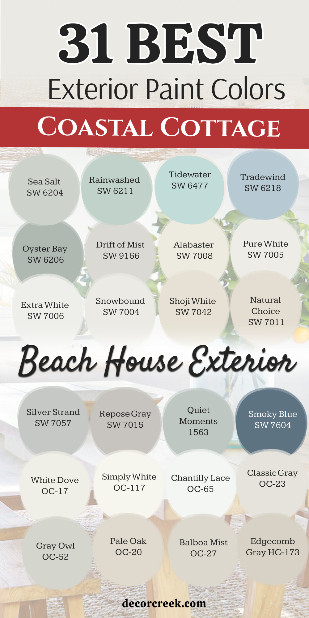
18 Best Paint Colors For Small Coastal Cottages
Alabaster SW 7008
Alabaster SW 7008 is a warm and creamy white that makes a small cottage feel incredibly cozy and inviting. This color is a top choice for smaller homes because it provides brightness without feeling stark or cold. I love how it makes a tiny porch look much larger and more open to guests.
The soft warmth in the paint helps the house glow beautifully during the golden hour by the sea. It creates a very soft look that is easy to love and looks professional on any type of siding. You will find that it pairs perfectly with natural wood accents and green coastal plants.
Most people find this to be the perfect balance for a beautiful and warm small home. It is a very reliable shade for a timeless and friendly beach house appearance.
Best used in: living rooms, kitchens, hallways, bedrooms, and farmhouse exteriors.
Pairs well with: Iron Ore SW 7069, Agreeable Gray SW 7029, and warm wood tones. The key rule of this color for farmhouse style is to use it where you want natural light to feel kind, soft, and inviting throughout the day.
🎨 Check out the complete guide to this color right HERE 👈
Pure White SW 7005
Pure White SW 7005 is a very clean and crisp white that helps a small cottage look brand new and very fresh. This color is excellent for making a compact exterior feel much more spacious and airy than it really is. I like how it acts as a blank canvas that lets your blue shutters or colorful garden flowers truly shine.
It is a very simple and honest white that does not shift into yellow or blue in the afternoon sun. Using this on the siding makes the building look very neat and very well-maintained from the street.
It is a staple for a modern beach house look that needs to stay sharp and bright. You will love how refreshing and clean your home feels with this crisp palette. It is a very smart choice for a minimalist coastal design.
Best used in: trim, ceilings, exterior siding, and kitchen cabinets.
Pairs well with: Black Magic SW 6991, March Wind SW 7668, and any bright color. The key rule of this color for farmhouse style is to use it where you want natural light to feel kind, soft, and inviting throughout the day.
🎨 Check out the complete guide to this color right HERE 👈
Snowbound SW 7004
Snowbound SW 7004 is a soft white with a cool undertone that feels very relaxed and breezy on a small home. This color is perfect for coastal areas because it mimics the cool light of a cloudy day over the water.
I love how it provides a clean look while staying soft enough to be easy on the eyes in the bright sun. It works beautifully on siding to create a very cohesive and pretty look for a small property. The hint of gray in the paint helps it blend in with other cool coastal colors like navy or teal.
You will find that it makes your home look very sturdy and well-proportioned even if it has a small footprint. It is a very pretty shade that many homeowners pick for a fresh and quiet coastal vibe. This is a great choice for a peaceful and light home exterior.
Best used in: exterior siding, trim, kitchens, and master bedrooms.
Pairs well with: Silver Strand SW 7057, Iron Ore SW 7069, and light gray stone. The key rule of this color for farmhouse style is to use it where you want natural light to feel kind, soft, and inviting throughout the day.
🎨 Check out the complete guide to this color right HERE 👈
Drift of Mist SW 9166
Drift of Mist SW 9166 is a very light gray that brings a sophisticated and airy feel to a small coastal cottage. This color is perfect for those who want a neutral that is just a step away from being plain white.
I like how it adds a subtle depth to the exterior walls without making the house feel smaller or darker. It looks very tidy and professional when paired with bright white trim and railings. The color changes gently throughout the day, reflecting the soft colors of the misty morning air.
It is a very safe and smart choice that will look good for many years without going out of style. You can add a colorful front door to this palette to show off your personal style. It makes the whole property look very neat and well-cared for from the curb.
Best used in: main exterior walls, open floor plans, hallways, and trim.
Pairs well with: Pewter Cast SW 7673, Pure White SW 7005, and navy accents. The key rule of this color for farmhouse style is to use it where you want natural light to feel kind, soft, and inviting throughout the day.
🎨 Check out the complete guide to this color right HERE 👈
Shoji White SW 7042
Shoji White SW 7042 is a creamy, warm white that leans towards a very light beige, making a small cottage feel grounded. This color is ideal for a home that needs to feel cozy and traditional rather than modern and sharp.
I love how it provides a soft background that makes a small house look very established in its environment. The warmth in the paint helps the building feel very friendly and inviting to everyone who walks by. It looks wonderful when paired with natural stone paths or dark metal light fixtures on the porch.
You will find that it is a very flexible color that works well with a wide variety of roof colors. Your home will feel like a warm and peaceful sanctuary with this soft tone on the exterior walls. This is a favorite for a classic and soft coastal style.
Best used in: exterior siding, bedrooms, living rooms, and large open spaces.
Pairs well with: Fawn Brindle SW 7640, Pure White SW 7005, and black accents. The key rule of this color for farmhouse style is to use it where you want natural light to feel kind, soft, and inviting throughout the day.
🎨 Check out the complete guide to this color right HERE 👈
Sea Salt SW 6204
Sea Salt SW 6204 is a famous mix of green and gray that is practically made for small beach cottages. This color is a miracle worker for small spaces because it feels very light while still offering a clear, beautiful color.
I like how it makes a tiny house feel like a natural part of the shoreline and the sea grass. It changes beautifully from a soft green to a quiet gray depending on the time of day and the clouds. You will find that it looks very smart and expensive when paired with a crisp white trim.
It is a very friendly color that makes even the smallest home feel very welcoming and fresh. Many people love how it brings the calming colors of nature right to their front door. This is a very reliable shade for any coastal home that wants to look pretty.
Best used in: cottage exteriors, front doors, shutters, and sunrooms.
Pairs well with: Alabaster SW 7008, Herron Plume SW 6070, and weathered wood. The key rule of this color for farmhouse style is to use it where you want natural light to feel kind, soft, and inviting throughout the day.
🎨 Check out the complete guide to this color right HERE 👈
Rainwashed SW 6211
Rainwashed SW 6211 is a cheerful blue-green that brings a lot of personality to a small cottage exterior. This color is perfect for a small home that wants to stand out and feel full of life and energy. I love how it makes a compact building look very bright and happy even on a cloudy or rainy day.
It looks stunning when the sun hits the siding and brings out the fresh blue tones in the paint. Using this color helps a small property feel special and very well-designed compared to its neighbors. It provides a perfect backdrop for white porch furniture and vibrant garden flowers.
You will love how it makes the whole house feel like a refreshing summer retreat. This shade stays looking fresh and clean for a long time, making it a popular choice for coastal living.
Best used in: exterior siding, bathrooms, laundry rooms, and kitchen cabinets.
Pairs well with: Pure White SW 7005, First Star SW 7646, and dark hardware. The key rule of this color for farmhouse style is to use it where you want natural light to feel kind, soft, and inviting throughout the day.
🎨 Check out the complete guide to this color right HERE 👈
Silver Strand SW 7057
Silver Strand SW 7057 is a sophisticated light gray with pretty blue and green undertones that look like mist on the water. This color is excellent for a small cottage because it feels very airy and doesn’t overwhelm the architecture.
I love how it shifts throughout the day, looking more blue in the morning and more gray in the afternoon. It is deep enough to contrast beautifully with white windows but light enough to keep the house looking breezy.
Many people choose this for their small home because it offers a coastal feel without being a loud or bright color. You will love how the sun hits the siding and brings out the soft, complicated layers of the paint. It provides a very peaceful and pretty look for a home of any size.
Best used in: bedrooms, bathrooms, exterior siding, and laundry rooms.
Pairs well with: Extra White SW 7006, Peppercorn SW 7674, and sea glass accents. The key rule of this color for farmhouse style is to use it where you want natural light to feel kind, soft, and inviting throughout the day.
🎨 Check out the complete guide to this color right HERE 👈
Tradewind SW 6218
Tradewind SW 6218 is a soft, traditional blue that has a hint of gray to keep it looking grounded and mature. This color is perfect for a small cottage that wants to feel very classic and high-end. I often suggest this for homes where the owner wants color but wants it to look professional and calm.
The gray undertones help the small house blend in with the sky and the water in a very graceful way. It looks very beautiful during the evening when the light softens and the blue becomes more prominent.
This color is very easy on the eyes and creates a very balanced look for a compact exterior. You will find that it makes your home look very sturdy and well-designed for a life by the sea. It is a very pretty shade that stays looking clean for years.
Best used in: whole house siding, bedrooms, home offices, and shutters.
Pairs well with: Snowbound SW 7004, Shell White SW 8917, and light oak. The key rule of this color for farmhouse style is to use it where you want natural light to feel kind, soft, and inviting throughout the day.
🎨 Check out the complete guide to this color right HERE 👈
White Dove OC-17
White Dove OC-17 is a legendary white that feels soft and creamy on a small cottage exterior. This color is a favorite because it never looks too yellow or too cold, making it very easy to work with. It is a perfect choice for trim or the entire siding if you want a warm and cozy feeling.
I use this when I want a small house to feel very bright and also very welcoming to the neighborhood. The tiny bit of gray in the paint keeps it from being blindingly bright in the direct summer sun. It looks amazing on traditional siding and helps a small house look very clean and well-cared for.
You can pair it with almost any accent color and it will look like a professional designed it. This is a staple for a beautiful, classic, and friendly home.
Best used in: trim, doors, kitchen cabinets, and whole house exteriors.
Pairs well with: Revere Pewter HC-172, Balboa Mist OC-27, and bold accents. The key rule of this color for farmhouse style is to use it where you want natural light to feel kind, soft, and inviting throughout the day.
🎨 Check out the complete guide to this color right HERE 👈
Simply White OC-117
Simply White OC-117 is a crisp and clean white with just a hint of warmth that makes a small cottage feel very fresh. This color is a great choice for making a tiny home stand out and look very modern and neat. I like how it looks very bright without feeling like a clinical or cold space.
The warm undertone makes the small house feel very inviting to anyone who comes to visit you. it is an excellent choice for a house that gets a lot of natural light near the water. You can use it on the siding to make your cottage look brand new and very tidy again
. It works perfectly with black or navy blue shutters for a very sharp and professional look. This is the ultimate white for a clean coastal design that feels very happy and light.
Best used in: ceilings, trim, kitchens, and exterior siding.
Pairs well with: Hale Navy HC-154, Black Beauty 2128-10, and warm wood. The key rule of this color for farmhouse style is to use it where you want natural light to feel kind, soft, and inviting throughout the day.
🎨 Check out the complete guide to this color right HERE 👈
Chantilly Lace OC-65
Chantilly Lace OC-65 is one of the brightest and purest whites you can find for a small cottage. This color has almost no visible undertones, which makes a small house look incredibly clean and simple. It is the perfect choice for a very modern coastal look where you want a crisp contrast against the blue sky.
I love how it makes a small building pop and highlights every architectural detail very clearly. It is often used on trim to provide a sharp frame for other colors, but looks great on the whole house too. Your home will look extremely tidy and very well-maintained with this fresh paint on the siding.
it creates a very high-end and designer feel that works wonders for small properties. This is a very popular white for those who love a true, bright finish.
Best used in: trim, doors, modern siding, and bathrooms.
Pairs well with: Gray Owl OC-52, Hale Navy HC-154, and black hardware. The key rule of this color for farmhouse style is to use it where you want natural light to feel kind, soft, and inviting throughout the day.
🎨 Check out the complete guide to this color right HERE 👈
Classic Gray OC-23
Classic Gray OC-23 is a very light gray that can look like a warm off-white in the bright coastal sun. This color is perfect for a small cottage if you want a look that is soft and very sophisticated. I love how it provides a gentle contrast against bright white window frames or front doors.
The color is very neutral and doesn’t have any distracting blue or pink tones in the paint. It is a very safe choice for an exterior because it looks good in any weather or lighting condition. Your small home will look very neat and well-cared for with this shade on the walls.
It is an excellent background for colorful garden flowers or a bright, fun front door. This is a very smart and pretty choice for a relaxed beach home that feels very expensive.
Best used in: main living areas, hallways, exterior siding, and bedrooms.
Pairs well with: Stone Harbor 2111-50, Simply White OC-117, and dark slate. The key rule of this color for farmhouse style is to use it where you want natural light to feel kind, soft, and inviting throughout the day.
🎨 Check out the complete guide to this color right HERE 👈
Pale Oak OC-20
Pale Oak OC-20 is a beautiful greige that brings a sense of elegance and warmth to a small cottage exterior. This color reminds me of soft sand or white oak wood, making it perfect for a coastal setting.
It is a great choice if you want a neutral that feels a bit more cozy and lived-in than a cool gray. I like how it looks very balanced and keeps a small house from looking too small or too dark. The warmth in the paint makes the cottage feel very friendly and welcoming to all your guests.
It looks wonderful when paired with natural stone or dark wood accents on a porch. You can use it on the whole house for a very smooth and pretty appearance that feels very high-end. This shade helps your small home blend in with the natural colors of the shoreline.
Best used in: living rooms, bedrooms, exterior siding, and kitchens.
Pairs well with: Chantilly Lace OC-65, Revere Pewter HC-172, and gold accents. The key rule of this color for farmhouse style is to use it where you want natural light to feel kind, soft, and inviting throughout the day.
🎨 Check out the complete guide to this color right HERE 👈
Gray Owl OC-52
Gray Owl OC-52 is a light gray with a cool and crisp feeling that works very well on small cottage siding. This color often shows a tiny bit of blue or green in the light, which makes it feel very much at home near the water.
I find that it makes a small house look very sturdy and professional from the street view. The color is deep enough to show a real difference against white trim without being too heavy. It stays looking fresh even when the sun is very bright and intense on the coast.
You can use it on the whole house for a very cohesive and pretty look that feels very modern. It is a great neutral that feels a bit more interesting than a plain tan or beige. This is a go-to gray for designers who want a cool coastal vibe.
Best used in: kitchens, bathrooms, exterior siding, and home offices.
Pairs well with: White Dove OC-17, Kendall Charcoal HC-166, and blue accents. The key rule of this color for farmhouse style is to use it where you want natural light to feel kind, soft, and inviting throughout the day.
🎨 Check out the complete guide to this color right HERE 👈
Palladian Blue HC-144
Palladian Blue HC-144 is a soft and airy mix of blue, green, and gray that makes a small cottage look like a dream. This color can make a tiny home look like it was pulled right from a beautiful design magazine.
It feels very fresh and light when the sun hits the front of the house and the porch. I love how it looks against dark green bushes and colorful garden flowers. The green notes in the paint keep it from feeling too cold or icy on a small building.
It provides a very friendly look that makes people feel happy when they come to visit you. You can use it on the whole house to make it feel more open or as a pretty accent on the door. This shade is perfect for anyone who loves the soft colors of the sea and the sky.
Best used in: exterior siding, bedrooms, guest bathrooms, and porch ceilings.
Pairs well with: Cloud White OC-130, Woodlawn Blue HC-147, and natural wicker. The key rule of this color for farmhouse style is to use it where you want natural light to feel kind, soft, and inviting throughout the day.
🎨 Check out the complete guide to this color right HERE 👈
Beach Glass 1564
Beach Glass 1564 is a medium-toned blue-green with a lot of gray that adds sophistication to a small cottage. This color is perfect for someone who wants their small home to feel grounded and very well-designed.
I like how it reminds me of the smooth glass pieces found washed up on the sand at the beach. The depth of the color ensures that it does not disappear in the very bright coastal sun. It creates a very solid and balanced look that makes a small home look more important and established.
I find that this shade works beautifully with gray roof shingles and stone paths in the yard. It feels very natural and sophisticated rather than being too flashy for the street. Your small house will feel like a quiet and high-end retreat with this lovely tone.
Best used in: main exterior walls, dining rooms, shutters, and kitchen islands.
Pairs well with: White Dove OC-17, Hale Navy HC-154, and weathered wood. The key rule of this color for farmhouse style is to use it where you want natural light to feel kind, soft, and inviting throughout the day.
🎨 Check out the complete guide to this color right HERE 👈
Quiet Moments 1563
Quiet Moments 1563 is a gentle mix of blue, green, and gray that makes a small home look expensive and peaceful. This color is famous for creating a very well-designed and high-end look for any exterior. It feels very light and helps a small cottage look much more open and spacious to the eye.
I like how the color changes as the sun moves across the sky, showing off its different layers. The gray tones in the paint keep the blue and green from being too loud or bright on the siding. It is a very soft choice that works well with almost any landscape design you have.
You can use it to create a very light and airy feeling on a small porch or entryway. This shade brings a very soft and professional touch to your home that feels very nice every day.
Best used in: bedrooms, bathrooms, exterior siding, and sunrooms.
Pairs well with: Chantilly Lace OC-65, Shaker Gray 1594, and light oak floors. The key rule of this color for farmhouse style is to use it where you want natural light to feel kind, soft, and inviting throughout the day.
🎨 Check out the complete guide to this color right HERE 👈
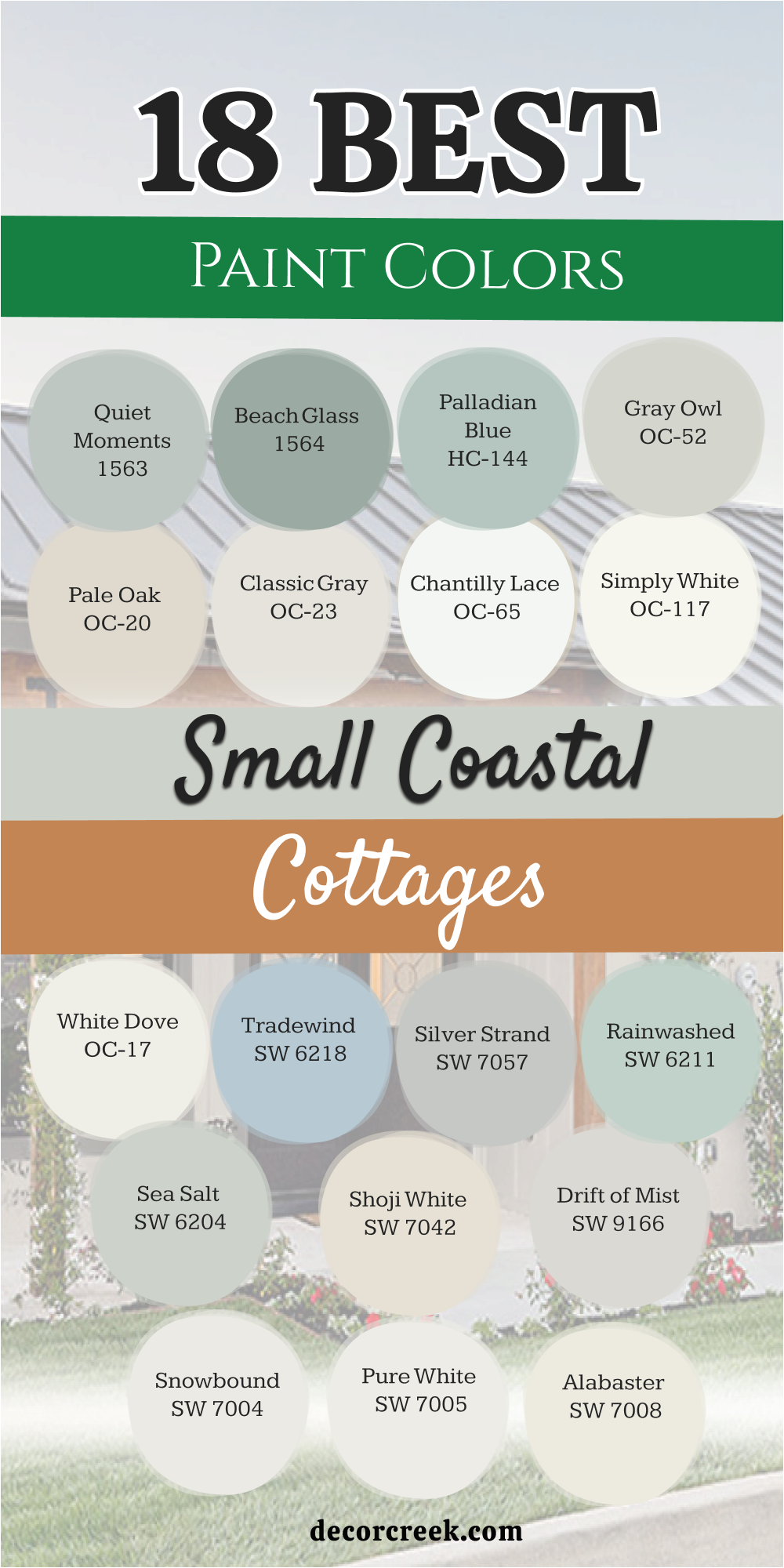
Choosing the right paint for your coastal cottage is all about capturing the light and the spirit of the sea. Whether you live in a tiny beach bungalow or a larger seaside home, these 34 colors offer a range of moods from crisp and energetic to soft and serene. I always tell my clients that the best coastal palette is one that feels like an extension of the natural world outside your front door. The right shade can make your home feel like a sanctuary and a place of true rest.
When you are looking at these blues, greens, and whites, remember that the coastal sun is very bright and can make colors look much lighter than they do on a small swatch. I recommend testing your favorite shades on a large piece of board and moving it around the house at different times of the day. A color that looks perfectly gray in the morning might show a beautiful hint of blue or green as the sun begins to set.
Paying attention to these small shifts is what makes a professional paint job look truly high-end and special.
Ultimately, your home should reflect your personality and the way you want to feel when you return from a walk by the shore.
Whether you pick a bold navy like Hale Navy or a misty neutral like Sea Salt, these colors are designed to stay looking fresh and beautiful for many years. A well-chosen coastal palette not only protects your house but also brings a sense of joy to the whole neighborhood.
I hope this guide helps you find the perfect shade to make your coastal cottage dream a reality.