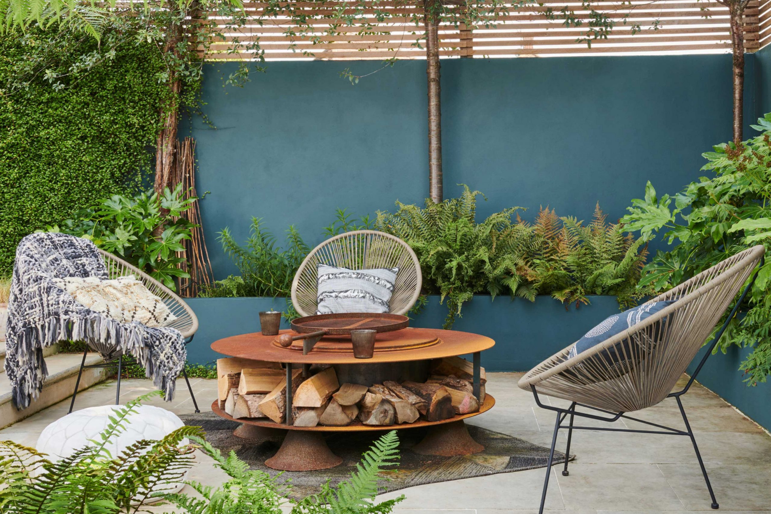
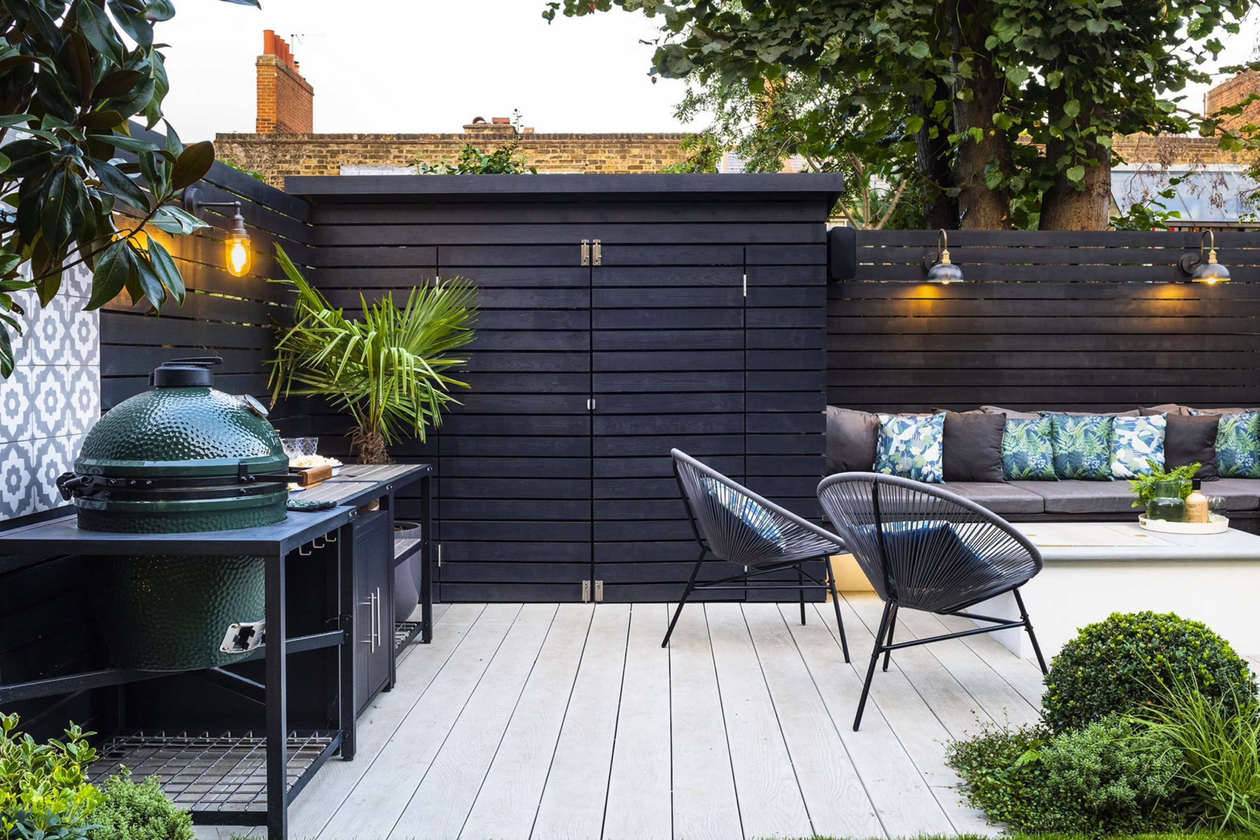
When I think about a garden, I don’t just see flowers and trees—I see color on every surface that frames them. The paint on fences, sheds, and benches becomes part of the view, just like roses or ivy. A soft green wall can make blooms glow brighter, while a deep brown bench can ground the whole yard.
Paint is not just decoration for me; it is a tool that makes outdoor areas feel loved, cared for, and connected.
I’ve learned that the right color makes morning coffee outside taste better, makes family moments linger longer, and even makes rainy days easier to enjoy. That is why I never leave garden surfaces bare.
Why I Trust Sherwin-Williams and Benjamin Moore for Garden Paint Colors
I trust these two brands because I need shades that feel steady under sunlight, rain, or cold nights. Garden paint must stand up to changing weather without losing its charm. I’ve worked with many paints, but Sherwin-Williams and Benjamin Moore give me the truest tones that stay strong season after season.
Their greens feel like real leaves, their whites look fresh without turning harsh, and their earthy colors blend with soil and stone.
For me, that trust is personal—I want homeowners to look out at their yard and still smile years later. That’s why I return to these collections every time.
How I Choose the Right Paint Color for Fences, Furniture, and Garden Walls
When I pick a paint for the garden, I always think first about how the color will sit beside plants. A fence should never fight with flowers, but instead frame them like a picture. A shed should feel like part of the landscape, not a block that stands out. Benches, on the other hand, can be playful or bold—they invite people to sit, so they deserve personality. I hold paint boards outside in real light because sunshine changes everything.
I wait to see how morning, noon, and evening light shift the feeling. That way, I know the choice will bring joy all day.
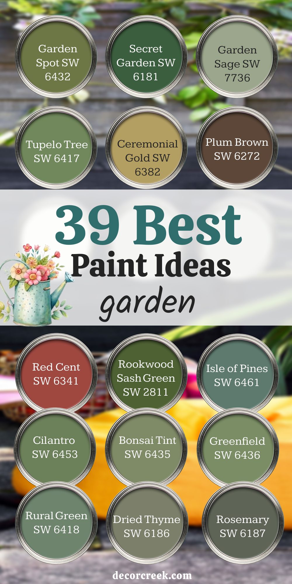
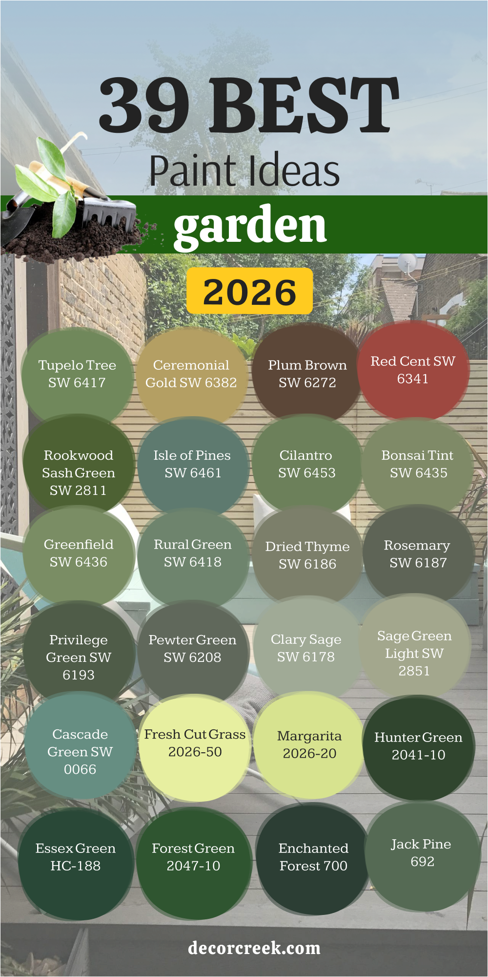
39 Garden Paint Ideas in 2026
Garden Spot SW 6432
Garden Spot SW 6432 feels like fresh leaves after spring rain, alive with a brightness that refreshes the whole yard. I love how this shade brings out the sparkle of nearby flowers, especially pinks, purples, and whites, making them look as if they were just cut for a bouquet. On a garden wall, it adds an uplifting energy without ever feeling too sharp, and on a bench, it makes the seat look lively, as though it’s waiting for someone to rest there.
I’ve seen Garden Spot turn an ordinary fence into something cheerful that makes a garden feel cared for and full of joy. It works beautifully beside light trim or pale stone paths, keeping the look balanced
The key rule of this color for the garden is to let it play with softer tones so it shines with life instead of blending away. When used well, it feels like spring stays all year long.
Plum Brown SW 6272
Plum Brown SW 6272 is rich and earthy, holding both purple and brown in its depth. This makes it perfect for grounding a garden, especially when used on benches or wooden sheds. I like how it feels strong yet cozy, like soil after rain. Flowers in whites or yellows seem brighter against it, making it a clever backdrop. It’s also a color that hides dirt well, which is always helpful outdoors. The key rule of this color for the garden is to pair it with lighter details so its richness feels balanced.
🎨 Check out the complete guide to this color right HERE 👈

Secret Garden SW 6181
Secret Garden SW 6181 carries the deep mood of shaded pathways where vines climb high and the air feels cool. This strong green works beautifully on fences that need to step back, allowing plants and flowers to take center stage. On sheds, it feels rich and protective, almost like a private retreat tucked into the garden.
I’ve used this shade to create gardens that feel like hidden escapes, because the color invites you closer rather than pushing you away.
Secret Garden pairs well with raw wood details, muted stones, or even warm bronze fixtures, giving the garden a natural but solid frame.
It feels at home in both large and small yards, blending quietly with trees. The key rule of this color for the garden is to use it where depth and strength matter most, giving the yard a sense of privacy and shelter.
Red Cent SW 6341
Red Cent SW 6341 carries the energy of clay pots and warm brick paths. It feels earthy and strong, with a cheerful glow in sunlight. I like to use it on smaller garden features like planters, gates, or accents on a shed door. It pairs beautifully with greens, making plants look richer against it. Red Cent gives a garden life and a sense of tradition, reminding me of patios and courtyards in warm climates. The key rule of this color for the garden is to let it be a highlight, not the whole backdrop.
🎨 Check out the complete guide to this color right HERE 👈

Rookwood Sash Green SW 2811
Rookwood Sash Green SW 2811 feels historic and classic, a deep green with a touch of gray that gives it weight. I’ve painted it on fences around older homes, and it instantly felt like it had always been there. It’s a shade that looks dignified yet natural, especially near stone walls or tall trees. On a shed, it blends quietly but still feels carefully chosen. Rookwood Sash Green works best when you want your garden to have a sense of tradition and steadiness.
The key rule of this color for the garden is to use it where timeless character matters.
Isle of Pines SW 6461
Isle of Pines SW 6461 is a bold, almost teal-green shade that feels alive. I like it on benches where a pop of color is welcome, or on sheds that need to stand proudly in the yard. Against flowers, it gives a strong background that makes every petal stand out. Isle of Pines feels adventurous without being too loud, making it perfect for those who like their garden to carry personality. The key rule of this color for the garden is to use it when you want a bold, confident statement.
🎨 Check out the complete guide to this color right HERE 👈

Garden Sage SW 7736
Garden Sage SW 7736 is soft and steady, like herbs drying on a kitchen wall. This muted green has a gentle warmth that makes it one of the easiest shades to live with outdoors. On a shed, it blends softly with leaves and grass, never feeling heavy. On furniture, it carries a calm character that soothes the eye.
I often suggest Garden Sage for people who want a color that feels like green but whispers instead of shouts. It looks beautiful beside terracotta pots, warm woods, or cheerful blooms like tulips and daisies.
It also holds its charm through all seasons, whether the yard is bursting with flowers or resting under winter frost. The key rule of this color for the garden is to let it serve as a backdrop, supporting brighter accents without stealing attention.
It’s a shade that quietly makes everything else look better.
Cilantro SW 6453
Cilantro SW 6453 reminds me of herbs cut fresh for dinner. This lively green is sharp but friendly, perfect for garden boxes, fences, or even furniture. I like how it brings freshness to wood surfaces that might otherwise look worn. Beside reds, oranges, and purples in flowers, it feels playful and bright. Cilantro gives life to corners of the garden that need lifting, especially spots that feel dull. The key rule of this color for the garden is to use it where freshness and cheer are needed.
🎨 Check out the complete guide to this color right HERE 👈

Tupelo Tree SW 6417
Tupelo Tree SW 6417 reminds me of late summer leaves kissed by sunlight, carrying both golden and green notes. This lively shade has an energy that feels playful without crossing into loudness. I’ve used it on fences where homeowners wanted a look that felt cheerful but still natural. It works beautifully on garden boxes, lifting herbs and vegetables so they look even fresher and full of life.
Tupelo Tree also holds warmth through the colder months, keeping the yard from looking dull when plants fade back. Paired with creamy trims or natural stone, it glows without overwhelming.
The key rule of this color for the garden is to use it in spots where brightness and energy are welcome. It’s a color that makes every season feel like it carries a touch of summer.
Bonsai Tint SW 6436
Bonsai Tint SW 6436 feels light and airy, like the soft green of new leaves in early spring. I love how it brings a gentle freshness without being too bright. On garden furniture, it creates a welcoming look, while on walls or fences it acts like a soft frame for flowers. This shade pairs beautifully with whites and light woods, giving a natural and easy balance. I often suggest Bonsai Tint when someone wants their garden to feel bright but not loud. The key rule of this color for the garden is to use it as a soft background that supports brighter details.
🎨 Check out the complete guide to this color right HERE 👈

Greenfield SW 6439
Greenfield SW 6439 carries strength and balance, like the color of healthy summer leaves. On a fence, it makes a garden feel complete, and on a shed it blends well with trees and shrubs. I find it especially beautiful beside stone paths or brick accents because it connects natural and built elements together. Greenfield has the power to make flowers stand out without stealing attention.
The key rule of this color for the garden is to use it when you want a strong, steady green.
Rural Green SW 6418
Rural Green SW 6418 reminds me of open fields and long grass swaying in the wind. It feels natural and free, making it perfect for sheds or large fences that need to blend with the landscape. I like how it works in both bright sun and soft shade, always keeping its friendly charm. This color also looks lovely on wooden benches, giving them a rustic touch. The key rule of this color for the garden is to let it connect the yard with the wider outdoors.
🎨 Check out the complete guide to this color right HERE 👈
Ceremonial Gold SW 6382
Ceremonial Gold SW 6382 brings sunlight to any part of the garden, even shaded corners that need lifting. This shade isn’t a sharp yellow, but a warm golden tone that feels rich, friendly, and steady. I love it on sheds because it keeps them from fading into dullness, and on fences, it casts a welcoming glow that works perfectly with climbing plants and green leaves
. I’ve even used it on gates, where it feels like the entrance itself is smiling at you. Ceremonial Gold has a depth that feels steady but not harsh, so it never clashes with nature’s colors.
It pairs beautifully with whites, earthy browns, or leafy greens, making the whole garden brighter. The key rule of this color for the garden is to use it where you want a warm welcome and a lasting sense of cheer. It’s like having a little piece of sunshine painted right onto your yard.
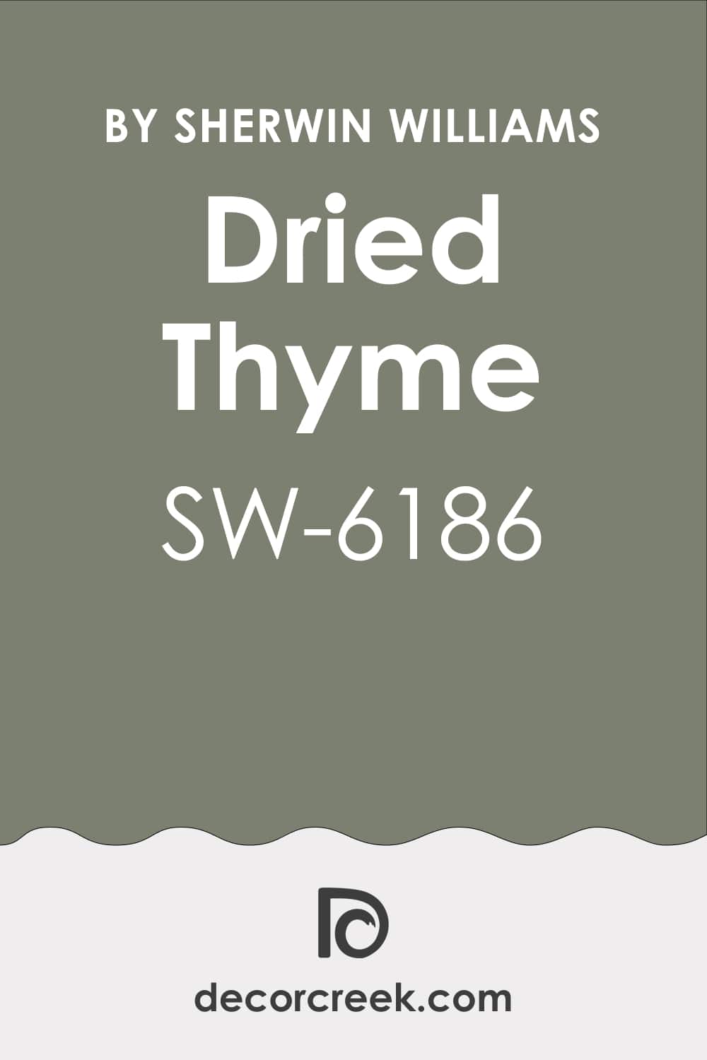
Dried Thyme SW 6186
Dried Thyme SW 6186 is earthy and muted, like herbs left to dry at the end of summer. It has a calming strength that makes it perfect for fences or walls that should feel steady and grounded. I’ve used it on sheds too, where it blends easily into greenery without demanding attention. Flowers of any color shine in front of it, making it a wonderful backdrop. The key rule of this color for the garden is to let it create a sense of natural stability.
🎨 Check out the complete guide to this color right HERE 👈
Rosemary SW 6187
Rosemary SW 6187 feels like the herb itself—fresh yet deep, a green that holds both life and quiet strength. I love using it on benches or furniture because it makes wood feel richer. On sheds, it gives a soft depth that doesn’t overpower the garden. This shade pairs beautifully with cream trim or terracotta pots, creating a balanced look. The key rule of this color for the garden is to use it where you want a balance of freshness and depth.
🎨 Check out the complete guide to this color right HERE 👈

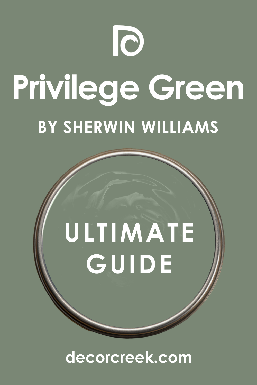
Privilege Green SW 6193
Privilege Green SW 6193 is bold and full, with a richness that feels protective. On a tall fence, it creates a strong frame for a garden, while on a shed it adds weight and style. I like how it works with natural stone and brick, pulling the whole yard together. Flowers and lighter accents pop against its depth, making the garden feel alive. The key rule of this color for the garden is to use it when you want a bold anchor tone.
🎨 Check out the complete guide to this color right HERE 👈
Pewter Green SW 6208
Pewter Green SW 6208 carries a smoky depth that makes it perfect for larger surfaces. On sheds, it looks confident, while on fences it creates a steady, classic backdrop. I enjoy pairing it with whites, soft grays, or muted woods, as it keeps the garden feeling elegant and cared for. This shade also works well with bright flowers, letting them shine against its depth. The key rule of this color for the garden is to use it where strength and elegance matter.
🎨 Check out the complete guide to this color right HERE 👈

Clary Sage SW 6178
Clary Sage SW 6178 is soft and earthy, with a warmth that makes it friendly outdoors. I love it on benches or doors where it feels welcoming without being too strong. On sheds, it blends easily with plants and makes the whole garden look thoughtful. Clary Sage has a way of making everything around it feel balanced, especially when paired with creams or soft browns. The key rule of this color for the garden is to let it bring a gentle, friendly note.
🎨 Check out the complete guide to this color right HERE 👈

Sage Green Light SW 2851
Sage Green Light SW 2851 feels historical and comforting, a gentle green with a classic touch. I like using it on wooden sheds or fences where a softer look is needed. It sits well with stone paths, old bricks, and natural wood, giving the garden a traditional charm. This color makes flowers look brighter without shouting for attention itself. The key rule of this color for the garden is to use it when you want a quiet, classic backdrop.
🎨 Check out the complete guide to this color right HERE 👈

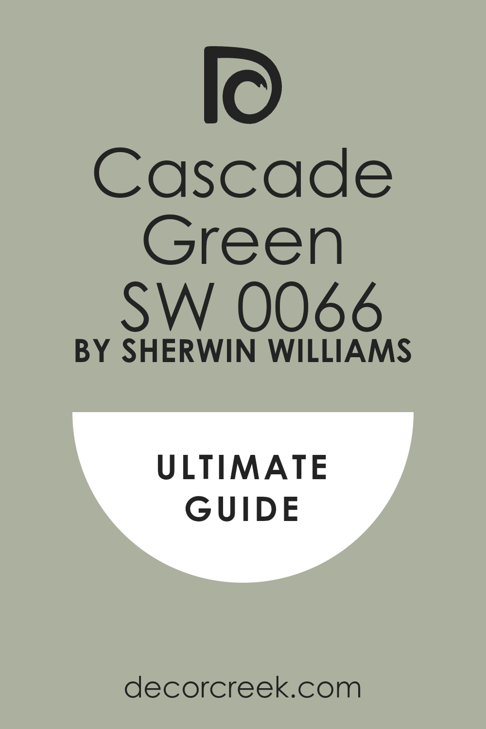
Cascade Green SW 0066
Cascade Green SW 0066 feels fresh and lively, like cool water flowing in summer. I enjoy seeing it on benches and garden furniture because it carries energy and brightness. On sheds, it looks friendly and inviting, adding a playful mood to the yard. This shade works best with whites and light woods, which let its freshness shine. The key rule of this color for the garden is to use it where you want energy and lightness.
🎨 Check out the complete guide to this color right HERE 👈
Fresh Cut Grass 2026-50
Fresh Cut Grass 2026-50 feels alive and joyful, just like the smell of a freshly mowed lawn. I love how this bright green brings energy to fences or small sheds, turning them into happy accents in the yard. On benches, it feels playful and fun, perfect for family gardens. This shade pairs well with crisp whites and deep wood tones, giving balance to its brightness.
Fresh Cut Grass makes every flower seem more colorful against its lively tone. The key rule of this color for the garden is to use it where cheer and fun are wanted.
Margarita 2026-20
Margarita 2026-20 is a zesty lime green that feels lighthearted and modern. I like using it on garden furniture or planters because it adds a spark of freshness without feeling heavy. On fences, it creates a bright frame that wakes up the entire garden. This shade is especially striking with purple or red flowers, which stand out against its brightness.
Margarita feels young, playful, and full of life. The key rule of this color for the garden is to use it as a lively accent that lifts the mood.
Hunter Green 2041-10
Hunter Green 2041-10 is deep and powerful, like the thick leaves of an old forest. I love using it on tall fences where strength and privacy are needed. On sheds, it feels classic and lasting, giving a garden a grounded presence. This shade pairs well with stone paths, brick details, and lighter trims. Flowers look stunning in front of it, especially soft pastels that glow against its depth. The key rule of this color for the garden is to use it when you want strong character.
🎨 Check out the complete guide to this color right HERE 👈

Essex Green HC-188
Essex Green HC-188 is one of those shades that feels both elegant and natural. Its dark richness makes fences and sheds look solid and cared for. I often use it when I want a garden to feel private, almost hidden from the outside world. Paired with white trim, it creates a sharp, classic contrast. It also makes flowering plants look brighter, giving a dramatic frame to blooms. The key rule of this color for the garden is to let it provide strength and elegance.
🎨 Check out the complete guide to this color right HERE 👈

Forest Green 2047-10
Forest Green 2047-10 feels like standing under tall trees on a summer day. It’s bold, full, and filled with nature’s strength. I like it on large sheds or fences where the garden needs a commanding background. Against it, roses, hydrangeas, or even wildflowers look more vivid. This shade works beautifully with natural stone, wood, and warm terracotta details. The key rule of this color for the garden is to use it when you want a garden to feel strong and rich.
🎨 Check out the complete guide to this color right HERE 👈

Enchanted Forest 700
Enchanted Forest 700 carries mystery and beauty, like walking down a shaded woodland path. I love using it when the garden needs a touch of depth without going too dark. On fences, it feels protective, while on sheds it makes the building blend smoothly with trees. It pairs best with light accents like cream or gray stone. This shade has a way of making every plant feel part of a story. The key rule of this color for the garden is to let it add quiet depth.
🎨 Check out the complete guide to this color right HERE 👈

Jack Pine 692
Jack Pine 692 is a smoky, pine-inspired green that feels steady and natural. I’ve seen it make garden benches look classic and strong, while fences painted in this shade carry dignity. It pairs well with warm wood and muted stone, creating a rustic balance. Flowers with bright colors stand out clearly in front of it. Jack Pine has a way of making the garden feel cared for and connected to nature. The key rule of this color for the garden is to use it for rustic balance.
🎨 Check out the complete guide to this color right HERE 👈

Rosepine 461
Rosepine 461 feels soft yet deep, like evergreen branches in shade. It’s a versatile green that works beautifully on sheds, blending into the landscape without feeling heavy. On benches, it adds a calm, welcoming note that pairs well with natural fabrics like linen cushions. I like how Rosepine supports the garden instead of competing with it. The key rule of this color for the garden is to let it serve as a steady companion to plants.
🎨 Check out the complete guide to this color right HERE 👈

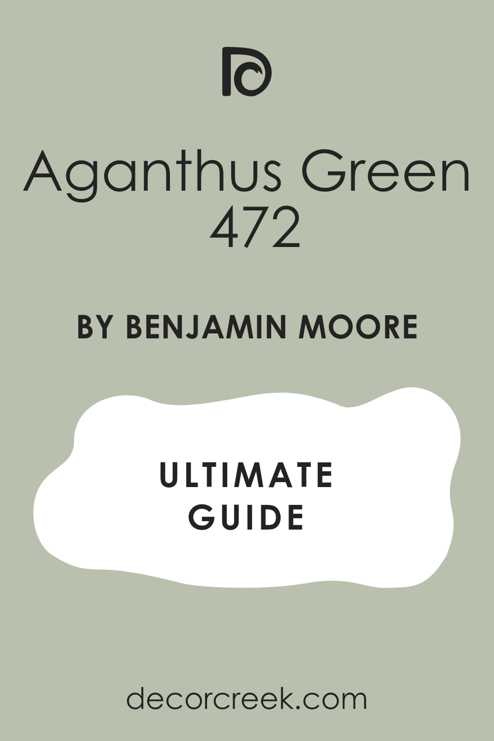
Aganthus Green 472
Aganthus Green 472 reminds me of gentle leaves touched by sunlight. This shade feels uplifting and natural, perfect for smaller fences or garden walls. On planters and boxes, it gives a soft green glow that complements flowers without overpowering them. I like pairing it with whites and soft pinks, which make it feel even fresher. Aganthus Green is a friendly, easy choice for those who want harmony. The key rule of this color for the garden is to use it where light freshness is needed.
🎨 Check out the complete guide to this color right HERE 👈
Tree Moss 508
Tree Moss 508 feels earthy and full, like the surface of old stone covered in moss. I enjoy it on sheds because it adds natural charm and looks like it belongs to the yard. On fences, it creates a grounded backdrop for climbing plants. This shade pairs especially well with wood details, giving warmth to its cool depth. Tree Moss makes a garden feel established, as if it has been cared for over many years. The key rule of this color for the garden is to use it to add a sense of history.
🎨 Check out the complete guide to this color right HERE 👈

Kennebunkport Green HC-123
Kennebunkport Green HC-123 feels coastal and natural, like weathered wood near the sea. I love it on fences and sheds because it gives an easy, outdoor charm. It blends well with sandy stone, gravel paths, and wooden decks. Flowers look brighter in front of it, especially yellows and purples.
The key rule of this color for the garden is to use it where you want a relaxed, welcoming feel.
Prescott Green HC-140
Prescott Green HC-140 feels soft and airy, like early morning light touching new leaves. I love this shade on garden sheds where it brings freshness without being too bold. On fences, it adds a gentle frame that lets flowers stand in focus. Prescott Green works beautifully with whites and creams, making the whole garden glow. The key rule of this color for the garden is to use it where you want lightness and quiet beauty.
🎨 Check out the complete guide to this color right HERE 👈
Louisburg Green HC-113
Louisburg Green HC-113 carries a slightly deeper tone, reminding me of shaded leaves in midsummer. I often use it on sheds to give them a quiet strength that still blends with plants. It pairs well with white trim or warm woods, adding depth to outdoor structures. On benches, it feels sturdy and classic.
The key rule of this color for the garden is to use it where depth and balance matter.
Georgian Green HC-115
Georgian Green HC-115 is a classic soft green with a historic mood. I like it for fences and benches because it feels steady but still friendly. It has a natural grace that pairs with both stone and brick, helping the garden look tied together. Flowers bloom brighter when set against this shade. The key rule of this color for the garden is to use it where a touch of tradition is wanted.
🎨 Check out the complete guide to this color right HERE 👈
Webster Green HC-130
Webster Green HC-130 has richness and weight, a deep green that carries strength. I’ve painted it on tall fences and seen how it makes the garden feel private and enclosed, almost like a secret retreat. On sheds, it looks strong but never harsh. Paired with white trim or stone, it feels classic and lasting.
The key rule of this color for the garden is to use it where strength and privacy are needed.
Urban Nature AF-440
Urban Nature AF-440 is soft and earthy with hints of gray, making it a smart choice for blending with stone or concrete in modern gardens. I like how it softens hard lines and connects the yard with nature. On benches or walls, it feels fresh without being sharp. It pairs beautifully with metal details, giving balance to the garden. The key rule of this color for the garden is to use it in modern yards for a natural link.
🎨 Check out the complete guide to this color right HERE 👈

Croquet AF-455
Croquet AF-455 feels playful and cheerful, a green that reminds me of sunny lawns. I enjoy it on benches where it invites people to sit, and on garden boxes where it highlights herbs and flowers. It pairs well with bright whites, adding charm and life to the yard. Croquet brings out the joy of summer afternoons. The key rule of this color for the garden is to use it where you want energy and fun.
🎨 Check out the complete guide to this color right HERE 👈

Grasslands 502
Grasslands 502 feels wide and open, like rolling hills under the sun. On fences, it gives a soft natural tone that blends with the landscape. On sheds, it makes buildings feel part of the land, not separate. This shade works well with wood decks, stone paths, and brick details. It gives the garden a steady, natural mood. The key rule of this color for the garden is to let it connect the yard to the wider outdoors.
🎨 Check out the complete guide to this color right HERE 👈
Texas Sage 1503
Texas Sage 1503 is earthy and muted, like dry leaves under summer heat. I love it on sheds and fences because it feels natural yet strong. It pairs well with dusty stone paths and warm terracotta pots, making the garden look settled and balanced. On benches, it creates a rustic, weathered charm.
The key rule of this color for the garden is to use it for a grounded, natural feeling.
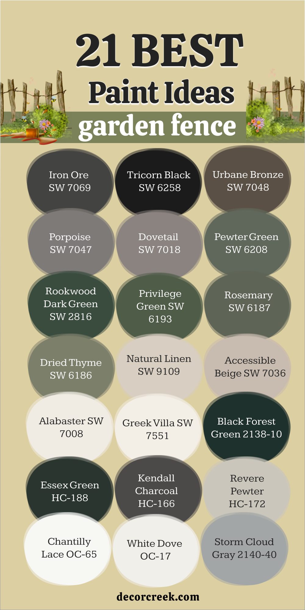
21 Garden Fence Paint Ideas
Iron Ore SW 7069
Iron Ore SW 7069 is a deep charcoal that feels bold and protective. I love using it on fences when I want the garden to feel framed like a picture. Flowers and greenery shine against its dark base, creating strong contrast. Iron Ore also hides dirt and wear, which makes it practical for outdoor use. Paired with warm lights or stone paths, it feels rich and welcoming. The key rule of this color for the garden is to use it when you want a strong, modern frame.
🎨 Check out the complete guide to this color right HERE 👈

Tricorn Black SW 6258
Tricorn Black SW 6258 is a pure black with sharp elegance. On fences, it makes plants and flowers glow, almost like they are staged in front of a backdrop. I’ve used it for clients who wanted their garden to feel crisp and stylish. Tricorn Black works especially well with white trim or bright flowers, adding drama without fuss. The key rule of this color for the garden is to let it act as a bold, classic background.
🎨 Check out the complete guide to this color right HERE 👈

Urbane Bronze SW 7048
Urbane Bronze SW 7048 is earthy and grounded, with a hint of bronze that gives warmth. I love it on wooden fences because it adds richness without feeling too heavy. It pairs beautifully with cream accents and green foliage. Urbane Bronze makes the garden feel cared for, as if every detail has been chosen with thought. The key rule of this color for the garden is to use it where warmth and strength are both wanted.
🎨 Check out the complete guide to this color right HERE 👈

Porpoise SW 7047
Porpoise SW 7047 is a soft gray-brown that feels calm and steady. On fences, it creates a background that doesn’t fight with plants but still looks polished. I like how it blends with stone or brick in the garden, keeping everything tied together. Porpoise has a relaxed charm that works well in both sunny and shaded yards. The key rule of this color for the garden is to use it when you want balance and softness.
🎨 Check out the complete guide to this color right HERE 👈

Dovetail SW 7018
Dovetail SW 7018 carries a medium gray tone that feels refined. I’ve painted fences with this shade, and it instantly made the yard look more finished. It doesn’t demand attention but still gives a sense of style. Dovetail pairs beautifully with light woods, whites, and greenery. The key rule of this color for the garden is to let it add quiet elegance to the background.
🎨 Check out the complete guide to this color right HERE 👈

Pewter Green SW 6208
Pewter Green SW 6208 is smoky and deep, giving fences a confident presence. I love how it grounds the garden while still keeping a natural look. Flowers look brighter against its cool tone, especially warm colors like pink and yellow. On large fences, it feels steady and protective. The key rule of this color for the garden is to use it for strength and harmony with plants.
🎨 Check out the complete guide to this color right HERE 👈
Rookwood Dark Green SW 2816
Rookwood Dark Green SW 2816 has a rich, historic look that feels timeless. On fences, it makes the garden feel enclosed in a natural frame, as if trees have stretched their shade around it. It pairs beautifully with stone details and brick paths. This color feels classic yet welcoming.
The key rule of this color for the garden is to use it when tradition and depth are wanted.
Privilege Green SW 6193
Privilege Green SW 6193 feels bold and lush, giving fences a proud and full appearance. I like using it in yards with wide lawns because it blends beautifully with the grass. Against flowers, it feels strong but never harsh. Privilege Green works best with simple trims in cream or white. The key rule of this color for the garden is to let it act as a powerful anchor.
🎨 Check out the complete guide to this color right HERE 👈
Rosemary SW 6187
Rosemary SW 6187 feels fresh and natural, just like the herb it is named after. On fences, it adds quiet life that blends with plants instead of standing apart. I love it for gardens with herbs and vegetables because it feels connected to the greenery. Rosemary looks best with terracotta pots and wooden accents. The key rule of this color for the garden is to use it for a soft, natural mood.
🎨 Check out the complete guide to this color right HERE 👈
Dried Thyme SW 6186
Dried Thyme SW 6186 is muted and earthy, a perfect shade for a steady fence. It doesn’t shout but quietly supports everything around it. Flowers glow against it, and stone paths look grounded beside it. I’ve used this shade in many gardens where the goal was harmony. The key rule of this color for the garden is to let it provide balance and quiet charm.
🎨 Check out the complete guide to this color right HERE 👈

Natural Linen SW 9109
Natural Linen SW 9109 is a warm beige that makes fences feel inviting. It carries the comfort of natural fabric, giving the yard a relaxed tone. I like it in gardens with bright flowers because it lets their colors shine without competition. Paired with white trim or soft green plants, it feels classic and light. The key rule of this color for the garden is to use it where warmth and comfort matter.
🎨 Check out the complete guide to this color right HERE 👈

Accessible Beige SW 7036
Accessible Beige SW 7036 is soft and steady, a beige with just enough depth to feel grounded. On fences, it creates a neutral frame that works with any garden style. I love how flexible it is—it pairs well with greens, blues, and reds in flowers. It’s a color that always feels dependable. The key rule of this color for the garden is to use it for balance across all seasons.
🎨 Check out the complete guide to this color right HERE 👈

Alabaster SW 7008
Alabaster SW 7008 is a creamy white that feels fresh and welcoming. On fences, it makes the garden glow brighter, especially in the evening when lights shine. I’ve used it to create crisp, clean borders that let plants take center stage. Alabaster works beautifully with dark green foliage and colorful blooms. The key rule of this color for the garden is to use it when you want freshness and clarity.
🎨 Check out the complete guide to this color right HERE 👈

Greek Villa SW 7551
Greek Villa SW 7551 is a warm white with softness that feels graceful. On fences, it brightens the yard without looking stark. I like how it pairs with terracotta pots, natural wood, and all shades of greenery. It feels cheerful in sun and gentle in shade. The key rule of this color for the garden is to let it add light and welcome.
🎨 Check out the complete guide to this color right HERE 👈

Black Forest Green HC-187
Black Forest Green HC-187 is deep and dark, almost black with a green heart. On fences, it gives mystery and depth, letting flowers stand boldly in front. It blends beautifully with tall trees and wooded areas, making the yard feel private. I recommend it when a dramatic, natural look is wanted. The key rule of this color for the garden is to use it for strong privacy.
🎨 Check out the complete guide to this color right HERE 👈

Essex Green HC-188
Essex Green HC-188 feels traditional and powerful, a deep shade that makes fences feel protective. I love it near stonework, where it adds a classic touch. Flowers of all colors stand out against it, especially pale ones. This shade makes gardens look established and cared for. The key rule of this color for the garden is to use it for a lasting, classic mood.
🎨 Check out the complete guide to this color right HERE 👈
Kendall Charcoal HC-166
Kendall Charcoal HC-166 is a dark gray that feels solid and refined. On fences, it creates a modern look without feeling harsh. I like it near clean lines of stone patios or metal accents. It pairs well with both soft pastels and bold flowers. The key rule of this color for the garden is to use it when you want elegance with strength.
🎨 Check out the complete guide to this color right HERE 👈

Revere Pewter HC-172
Revere Pewter HC-172 is a soft greige that carries warmth and flexibility. I’ve painted fences with it to create a gentle, welcoming mood. It works with nearly every garden style, from rustic to modern. This shade blends with stone, wood, and flowers without fuss. The key rule of this color for the garden is to use it for steady harmony.
🎨 Check out the complete guide to this color right HERE 👈

Chantilly Lace OC-65
Chantilly Lace OC-65 is a crisp, clear white that feels bright and clean. On fences, it creates a sharp frame for flowers, making every color look vivid. It’s perfect for gardens that want a fresh and classic feel. I like pairing it with deep greens for contrast. The key rule of this color for the garden is to use it for clarity and brightness.
🎨 Check out the complete guide to this color right HERE 👈

White Dove OC-17
White Dove OC-17 is a soft white that feels gentle and inviting. On fences, it avoids the harshness some whites can bring. It pairs beautifully with greenery, letting flowers look rich and glowing. This shade feels timeless and caring. The key rule of this color for the garden is to use it for softness and warmth.
🎨 Check out the complete guide to this color right HERE 👈

Storm Cloud Gray 2140-40
Storm Cloud Gray 2140-40 carries a blue-gray tone that feels calm and steady. I love it on fences because it echoes the color of the sky, tying the yard to its natural setting. It works well with both bright flowers and muted plants. Storm Cloud Gray creates a thoughtful frame without overpowering the scene.
The key rule of this color for the garden is to use it for a quiet, sky-like backdrop.
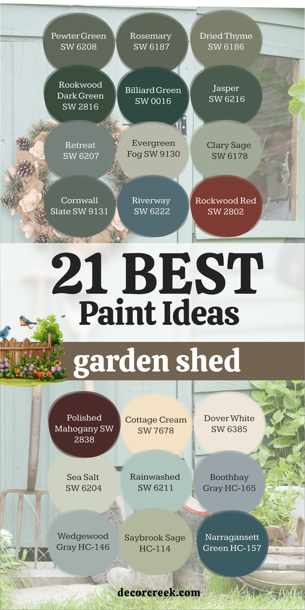
21 Garden Shed Paint Ideas
Pewter Green SW 6208
Pewter Green SW 6208 feels grounded and strong, making a shed look like it has always been part of the garden. I love how this smoky green pairs with stone paths and wooden decks. It’s a color that doesn’t fade into the background but instead holds its place with quiet confidence. Flowers of any color glow against it, giving the shed an elegant weight. The key rule of this color for the garden is to use it for steadiness and depth.
🎨 Check out the complete guide to this color right HERE 👈
Rosemary SW 6187
Rosemary SW 6187 feels fresh yet cozy, like herbs hanging in a sunny kitchen. On a shed, it brings a soft green depth that connects the building to the plants around it. I often pair it with cream trim or natural wood, which makes it even more welcoming. Rosemary makes the shed look cared for and part of the garden’s story. The key rule of this color for the garden is to use it where warmth and nature meet.
🎨 Check out the complete guide to this color right HERE 👈
Dried Thyme SW 6186
Dried Thyme SW 6186 is earthy and muted, perfect for sheds that need to blend with trees and shrubs. I like how it looks steady without being heavy. In sunlight, it feels warm, while in shade it holds a restful tone. This shade makes sheds look solid but never overpowering. The key rule of this color for the garden is to let it provide gentle balance.
🎨 Check out the complete guide to this color right HERE 👈
Rookwood Dark Green SW 2816
Rookwood Dark Green SW 2816 carries an old-world richness that feels classic. On sheds, it creates a strong connection to tradition, almost like a garden house from another time. It looks wonderful next to brick walls, stone borders, and deep foliage. I love how it gives the shed presence without needing bright color.
The key rule of this color for the garden is to use it when history and strength are wanted.
Billiard Green SW 0016
Billiard Green SW 0016 is bold and lively, a true deep green that feels playful yet sturdy. On sheds, it adds personality while still blending with the garden. I like how it shines in sunlight, bringing a cheerful energy to the yard. Paired with cream or soft gray trim, it looks timeless. The key rule of this color for the garden is to use it where a rich, cheerful tone is welcome.
🎨 Check out the complete guide to this color right HERE 👈

Jasper SW 6216
Jasper SW 6216 feels dark and full, like the forest floor in shade. On sheds, it gives a dramatic look that pairs beautifully with lighter trim or stone accents. I love it in yards where privacy and depth are needed. Jasper makes plants stand taller against its strength. The key rule of this color for the garden is to use it where bold depth is needed.
🎨 Check out the complete guide to this color right HERE 👈

Retreat SW 6207
Retreat SW 6207 feels quiet and soothing, with a touch of gray that softens its green heart. On sheds, it blends easily with both grass and stone, creating a balanced look. I love pairing it with pale trims to give contrast. Retreat feels steady, like a gentle pause in the middle of a busy garden. The key rule of this color for the garden is to use it where soft calmness is wanted.
🎨 Check out the complete guide to this color right HERE 👈

Cottage Cream SW 7678
Cottage Cream SW 7678 is soft and sunny, like butter in morning light. On sheds, it brings warmth and cheer, making the yard feel brighter. I love it for smaller buildings that need a welcoming face. Cottage Cream pairs nicely with green shutters or gray roofs.
The key rule of this color for the garden is to use it where cheer and comfort are wanted.
Evergreen Fog SW 9130
Evergreen Fog SW 9130 is modern and soft, with hints of gray that make it versatile. On sheds, it feels stylish without being showy. I’ve used it when clients wanted a fresh but subtle shade that still carried life. Evergreen Fog pairs beautifully with black metal accents or white trims. The key rule of this color for the garden is to use it for a modern yet natural mood.
🎨 Check out the complete guide to this color right HERE 👈

Clary Sage SW 6178
Clary Sage SW 6178 has warmth and charm, a green that feels inviting without being loud. On sheds, it brings friendliness and balance, blending with plants and flowers. I love how it softens the look of wood while adding character. This shade works especially well near terracotta and stone. The key rule of this color for the garden is to use it where friendliness is key.
🎨 Check out the complete guide to this color right HERE 👈

Cornwall Slate SW 9131
Cornwall Slate SW 9131 carries a strong gray-green tone that feels both modern and natural. On sheds, it creates a steady, structured look. I like it in contemporary gardens where clean lines matter, but it also works in rustic yards. It pairs well with darker trim or metal fixtures. The key rule of this color for the garden is to use it for strength with style.
🎨 Check out the complete guide to this color right HERE 👈

Riverway SW 6222
Riverway SW 6222 feels deep and cool, a mix of blue and green that reminds me of shaded water. On sheds, it brings freshness and character. I love pairing it with white or cream trims to brighten it up. Riverway makes a garden shed stand proudly while still feeling natural. The key rule of this color for the garden is to use it where cool depth is wanted.
🎨 Check out the complete guide to this color right HERE 👈

Rockwood Red SW 2802
Rockwood Red SW 2802 is warm and bold, like old barns in the countryside. On sheds, it adds cheer and tradition, making the garden feel rooted. I love how it looks against green plants—it’s a strong contrast that feels natural. Rockwood Red makes a shed feel like a centerpiece.
The key rule of this color for the garden is to use it for bold, classic charm.
Dover White SW 6385
Dover White SW 6385 is a creamy white that feels classic and fresh. On sheds, it makes everything around look brighter. I like using it in gardens filled with colorful flowers because it creates a clear background. Dover White looks timeless, especially with dark green or black trim. The key rule of this color for the garden is to use it for clarity and charm.
🎨 Check out the complete guide to this color right HERE 👈

Polished Mahogany SW 2838
Polished Mahogany SW 2838 is dark and rich, carrying the elegance of deep wood. On sheds, it looks refined and steady, pairing beautifully with lighter trims. I like it for gardens with stone paths and formal layouts. It gives weight to the shed without overwhelming the yard.
The key rule of this color for the garden is to use it for elegance and richness.
Sea Salt SW 6204
Sea Salt SW 6204 feels airy and cool, with a hint of gray-blue under its green base. On sheds, it creates a light, fresh mood. I love pairing it with natural wood accents, which make it feel balanced. Sea Salt is a shade that makes a shed look easy and approachable. The key rule of this color for the garden is to use it for a breezy, friendly mood.
🎨 Check out the complete guide to this color right HERE 👈

Rainwashed SW 6211
Rainwashed SW 6211 feels like morning after rain, fresh and gentle. On sheds, it adds brightness without being loud. I enjoy it for gardens that already have strong greenery, because it gives contrast without clashing. Rainwashed looks best with white trim or light wood. The key rule of this color for the garden is to use it where freshness is wanted.
🎨 Check out the complete guide to this color right HERE 👈

Boothbay Gray HC-165
Boothbay Gray HC-165 is a cool gray-blue that feels nautical and steady. On sheds, it adds character without overpowering the yard. I like how it pairs with both modern and rustic gardens, giving balance in either setting. Flowers look crisp in front of it, especially whites and yellows. The key rule of this color for the garden is to use it for cool balance.
🎨 Check out the complete guide to this color right HERE 👈

Wedgewood Gray HC-146
Wedgewood Gray HC-146 feels light and calming, a soft mix of gray and blue. On sheds, it brings a gentle charm that works with many garden styles. I love it with white trim and bright flowers, which make it shine. Wedgewood Gray is a friendly shade that never feels too much. The key rule of this color for the garden is to use it for gentle character.
🎨 Check out the complete guide to this color right HERE 👈

Saybrook Sage HC-114
Saybrook Sage HC-114 carries a soft sage tone that feels natural and classic. On sheds, it creates an easy link with greenery. I like it paired with warm woods or terracotta pots. This color makes a shed look like part of the garden instead of something separate. The key rule of this color for the garden is to use it for natural connection.
🎨 Check out the complete guide to this color right HERE 👈

Narragansett Green HC-157
Narragansett Green HC-157 is bold and deep, with a mix of green and blue that feels dramatic. On sheds, it creates a strong statement while still blending with nature. I love how it pairs with white trim, which makes it pop. This shade is perfect for those who want their shed to feel important in the yard. The key rule of this color for the garden is to use it for bold presence.
🎨 Check out the complete guide to this color right HERE 👈

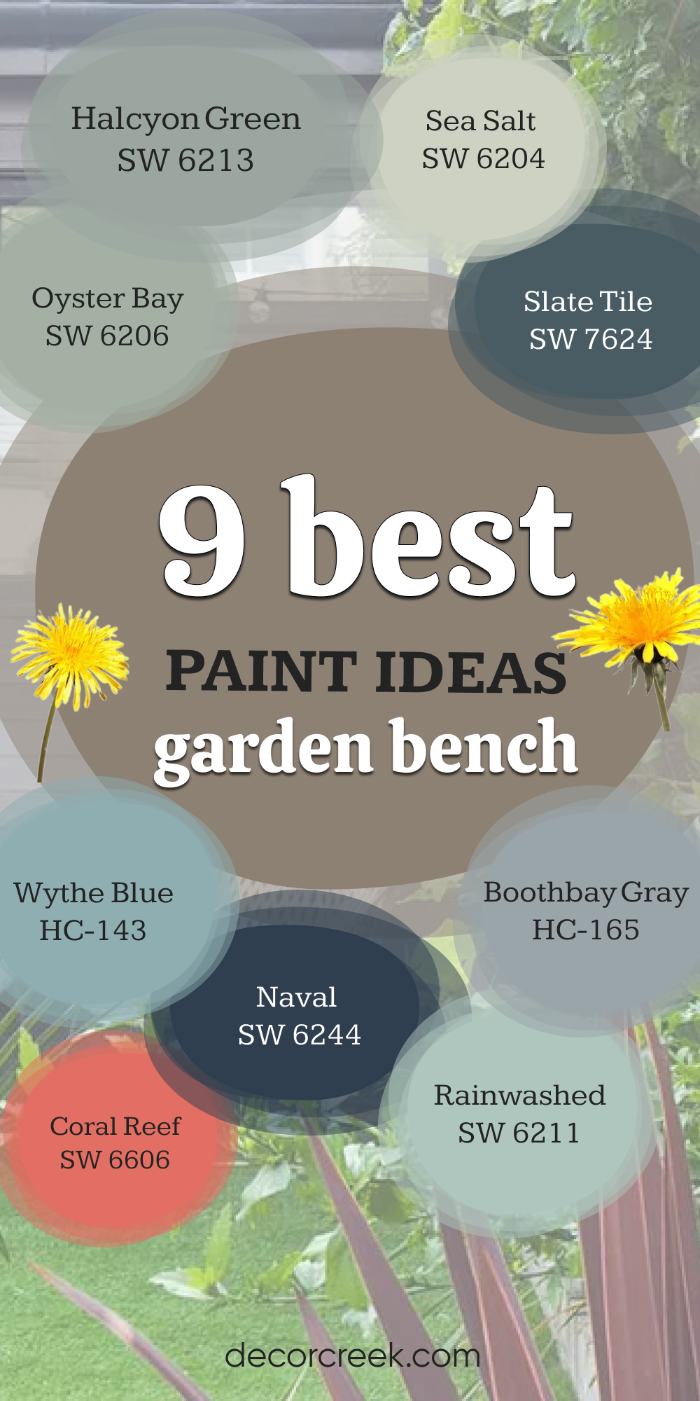
9 Garden Bench Paint Ideas
Oyster Bay SW 6206
Oyster Bay SW 6206 feels gentle and cool, with a mix of green and gray that suits wooden benches perfectly. I love it for benches tucked under trees, where the shade makes the color soft and welcoming. This shade pairs well with cushions in creams or muted blues. Oyster Bay makes a bench look cared for and ready for quiet moments. The key rule of this color for the garden is to use it where you want a gentle resting spot.
🎨 Check out the complete guide to this color right HERE 👈

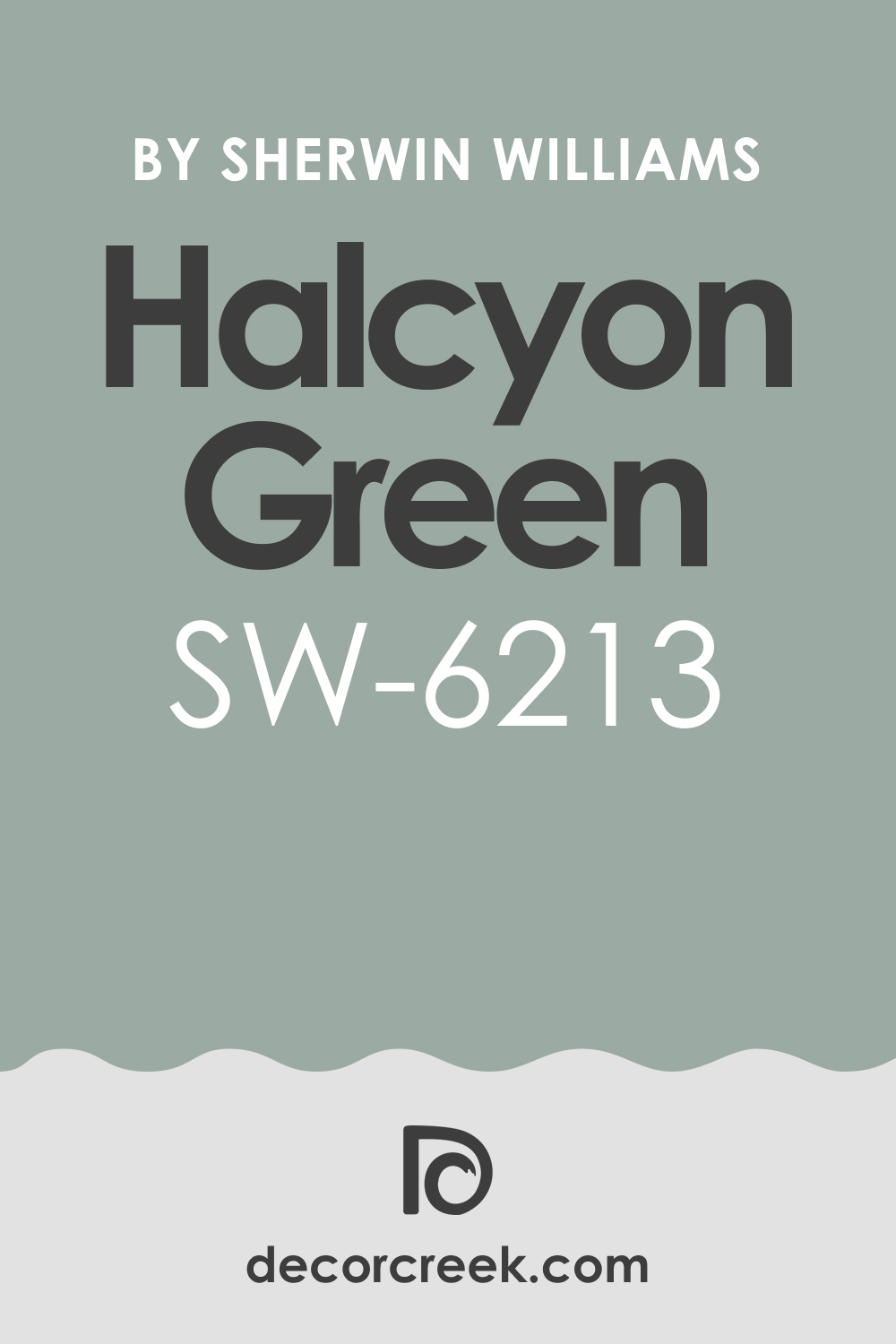
Halcyon Green SW 6213
Halcyon Green SW 6213 carries a calm green-blue tone that feels friendly outdoors. On benches, it adds personality without being too bold. I like it in gardens where flowers are colorful, because this shade supports rather than competes. Halcyon Green looks best with natural wood decks and stone paths. The key rule of this color for the garden is to use it where softness and charm are wanted.
🎨 Check out the complete guide to this color right HERE 👈
Sea Salt SW 6204
Sea Salt SW 6204 feels airy and refreshing, like a soft breeze. On benches, it makes the seat look inviting and light. I enjoy how it pairs with potted plants and simple white pillows. Sea Salt has a way of making even small corners feel special. The key rule of this color for the garden is to use it for a fresh, bright sitting place.
🎨 Check out the complete guide to this color right HERE 👈
Slate Tile SW 7624
Slate Tile SW 7624 is deep and cool, a blue-gray that feels strong yet stylish. On benches, it creates a bold spot that anchors the garden. I like pairing it with lighter accents like pale cushions or cream trim nearby. Slate Tile works well in both modern and classic yards. The key rule of this color for the garden is to use it when you want structure and strength.
🎨 Check out the complete guide to this color right HERE 👈

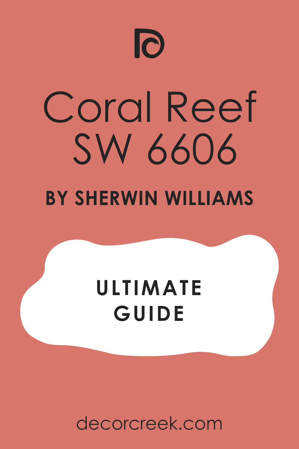
Coral Reef SW 6606
Coral Reef SW 6606 feels playful and bright, a coral-pink tone that turns a garden bench into a statement piece. I love using it in yards that need energy and joy. Against green plants, it shines with cheer. Coral Reef pairs beautifully with white or gray accents. The key rule of this color for the garden is to use it as a fun highlight.
🎨 Check out the complete guide to this color right HERE 👈
Naval SW 6244
Naval SW 6244 is a deep navy blue that feels classic and steady. On benches, it adds elegance without being too formal. I love pairing it with white pillows or striped fabrics for a coastal touch. Naval blends with both stone and greenery, making it versatile. The key rule of this color for the garden is to use it for timeless depth.
🎨 Check out the complete guide to this color right HERE 👈

Rainwashed SW 6211
Rainwashed SW 6211 feels gentle and light, like fresh air after rain. On benches, it creates an easy, welcoming seat. I often suggest it for smaller yards because it adds charm without taking over. Paired with white or light gray accents, it feels clean and bright. The key rule of this color for the garden is to use it for freshness and ease.
🎨 Check out the complete guide to this color right HERE 👈
Boothbay Gray HC-165
Boothbay Gray HC-165 carries a blue-gray mix that feels crisp and cool. On benches, it looks stylish and fits both traditional and modern gardens. I love how it pairs with navy cushions or white accents. Boothbay Gray makes a bench stand out just enough to feel special. The key rule of this color for the garden is to use it for neat, stylish seating.
🎨 Check out the complete guide to this color right HERE 👈
Wythe Blue HC-143
Wythe Blue HC-143 feels cheerful and airy, with just the right mix of blue and green. On benches, it adds charm and friendliness, perfect for a welcoming corner. I like pairing it with neutral fabrics so the color stays the focus. Wythe Blue makes every garden bench look like an invitation to sit and stay awhile. The key rule of this color for the garden is to use it where cheer and comfort are wanted.
🎨 Check out the complete guide to this color right HERE 👈

My Last Word on 39 Garden Paint Ideas
When I walk into a garden, I don’t just see the plants—I see how every fence, shed, and bench helps tell the story of that yard. Paint colors are not small choices; they shape how the garden feels in every season. A deep green fence can make flowers brighter, while a warm cream shed can feel like a welcome. A bold bench can invite people to sit longer and enjoy the view.
I’ve seen how the right paint turns a plain yard into a place where people want to spend time. It’s not about following rules but about listening to what makes you feel good when you step outside.
Pick colors that remind you of comfort, energy, or tradition, and let them frame your plants with care.
My last word is simple: don’t be afraid to let paint work as part of your garden. The shades you choose will protect wood and walls, but more than that, they will hold memories of meals, laughter, and quiet moments outdoors.
That’s what makes color so powerful.