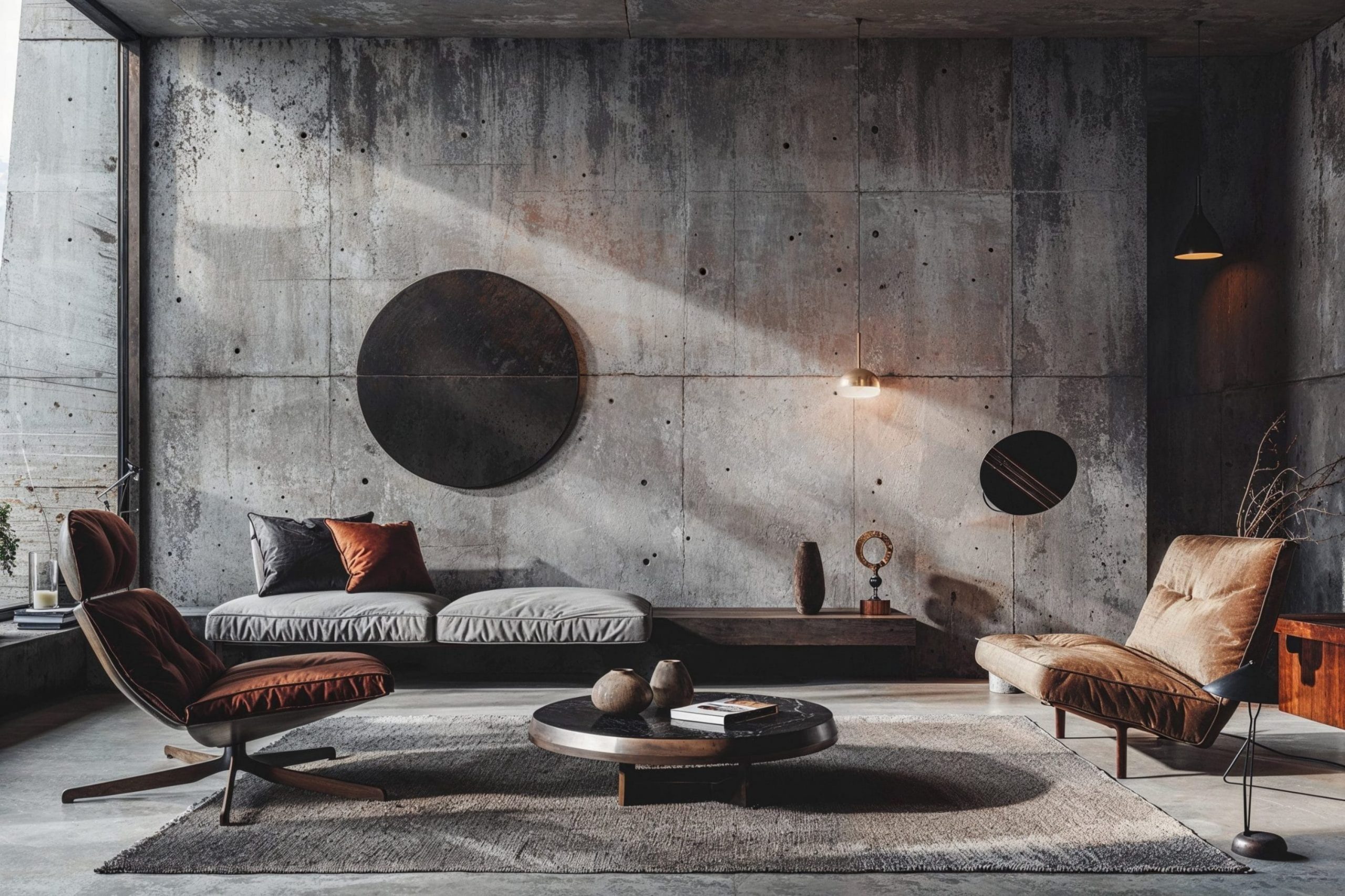
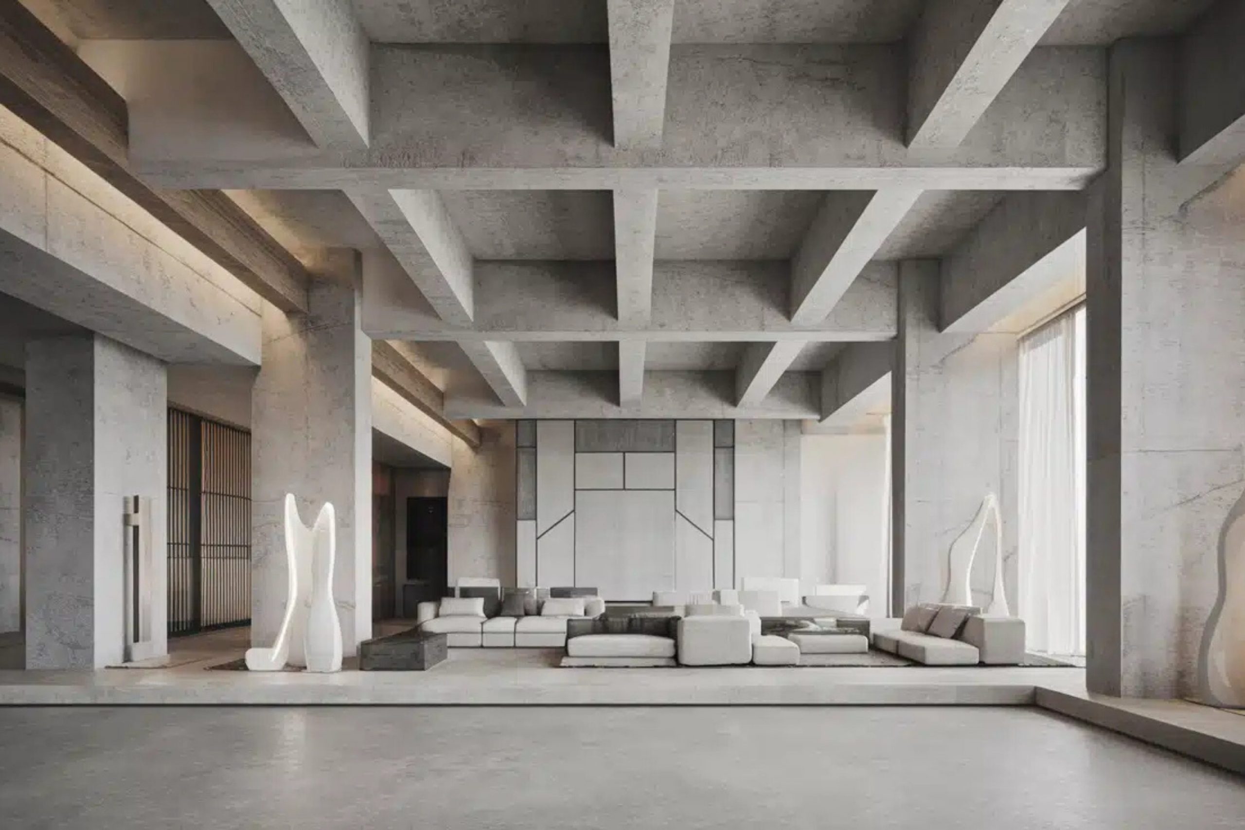
Brutalism is all about raw honesty and strength in your home. I see so many people get scared of this style because they think it has to feel cold or mean. That is not true at all when you pick the right paint. As a designer, I look for colors that show off the texture of concrete, wood, and metal without making the room feel like a cave.
You want colors that stand up for themselves and make a statement. I have put together this guide to help you find the exact shades that make this bold look work. It is about being brave with your walls and showing people that you know exactly what you want. I want you to see that a house can be tough and beautiful at the same time. You should not have to hide the bones of your building behind thin colors.
This style tells a story about who you are and what you believe in. It is for people who do not want to follow the crowd and want something real. I think of these colors as the soul of the building that everyone can see. Using these colors makes your home feel like a solid fortress where you are the boss.
You are building a place that feels like it will last a thousand years. This choice shows that you are not afraid to be different and strong in your own life.
Why I Always Trust Sherwin-Williams and Benjamin Moore for Brutalist Paint Colors
I always go back to Sherwin-Williams and Benjamin Moore because their paint has the weight I need for this look. Brutalism needs thick, rich pigment that does not look like cheap plastic on the wall. Benjamin Moore has these amazing undertones that change beautifully when the sun moves across the room. Sherwin-Williams makes colors that feel solid and grounded which is perfect for heavy furniture and big windows. I need to know that the gray I pick today will still look strong and real five years from now.
These two brands give me the confidence to tell my clients that their home will look high-end and powerful. I have tried many other brands but they often look thin and watery on the walls. When you want your home to look like it is made of stone, you need paint that has real body to it. These paints dry in a way that feels very smooth but also very hard. You can feel the quality when you run your hand across the surface. I trust these companies because they have been making great paint for a very long time.
They know how to make a color stay the same even when the sun hits it all day long. My reputation depends on how good the walls look when I am finished with a job. I want my clients to feel proud of their home and know they spent their money on the best stuff available.
These colors do not fade away or start to look weak after a few months of living there.
How I Choose the Perfect Paint Shades for a Brutalist Interior
Picking colors for this style is different than picking colors for a regular house. I start by looking at the natural materials in the room like the floor and any exposed brick. I want a paint that acts like a background for these heavy elements rather than fighting them. I look at the light because a dark gray can look blue or green depending on which way your windows face.
I also think about how the paint feels against your skin and eyes when you walk in. A good brutalist color should feel like a solid rock wall or a piece of smooth metal. I always test big patches on the wall to make sure the mood feels right before I commit. I watch how the color looks in the morning and then again at night with the lights on.
You have to be sure that the paint does not make the furniture look out of place. I look at the wood in your tables and the metal in your lamps to find the perfect match. Every choice I make is about making the room feel like one big piece of art. I think about the story the room tells when a guest walks through the front door. You want the colors to speak to your brain and make you feel strong.
I take my time because picking the wrong shade can make the whole house feel wrong. I want you to love your walls as much as you love your favorite piece of furniture. It is about finding the right balance between the heavy materials and the light on the walls. This process helps you create a home that is honest and full of character.
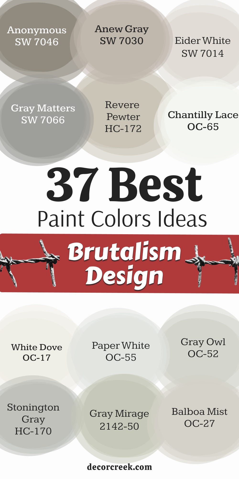
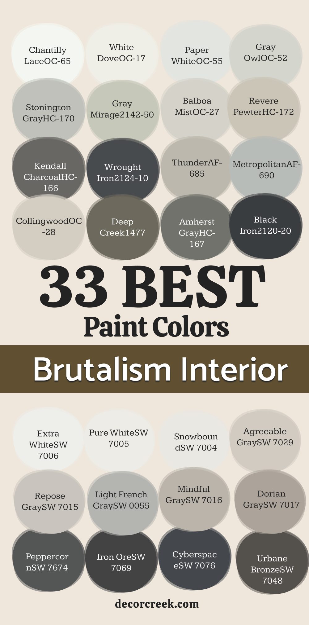
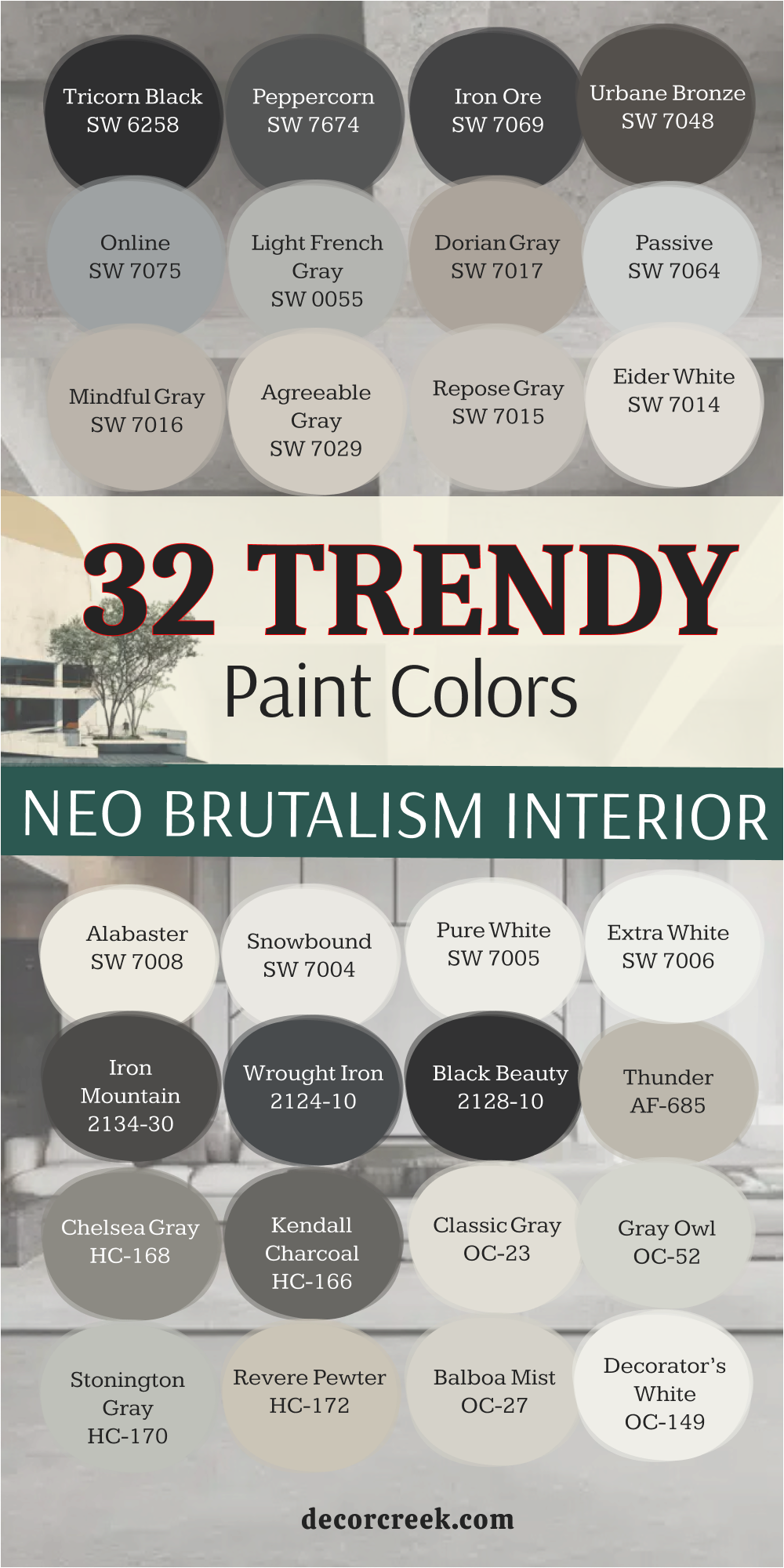
33 Paint Colors For The Brutalism Interior
Chantilly Lace OC-65
Chantilly Lace is the cleanest white you can find to contrast with heavy concrete blocks. Chantilly Lace makes the rough edges of brutalist furniture look sharp and intentional. Chantilly Lace does not have any yellow or blue hiding inside it to mess up your design.
Chantilly Lace acts like a bright spotlight on your raw wood or metal decorations. Chantilly Lace gives your eyes a place to rest when the rest of the room is very busy and heavy. Chantilly Lace works perfectly on ceilings to make the room feel much taller than it actually is.
Chantilly Lace provides a crisp line against dark floorboards or stone tiles. Chantilly Lace feels like a fresh start in a room filled with old-school building materials. Chantilly Lace is the choice for anyone who wants their home to look expensive and neat. Chantilly Lace stays bright even when the sun goes down and you turn on your lamps.
🎨 Check out the complete guide to this color right HERE 👈

White Dove OC-17
White Dove has a tiny bit of warmth that keeps a big room from feeling like a cold hospital. White Dove softens the hard angles of a concrete wall without losing that tough feeling. White Dove looks amazing next to black metal pipes or dark steel beams.
White Dove is a favorite of mine because it feels very high-quality and smooth on the wall. White Dove makes your furniture stand out instead of blending into the background. White Dove works well in big open areas where you have lots of different materials mixed together.
White Dove helps the shadows in the room look soft instead of looking like dirty spots. White Dove gives a sense of history to a new building that needs some personality. White Dove is a very safe pick if you are worried about the room feeling too dark. White Dove connects the floor to the ceiling in a way that feels very natural and easy.
🎨 Check out the complete guide to this color right HERE 👈

Paper White OC-55
Paper White has a touch of gray that makes it look like fresh plaster on a construction site. Paper White is perfect for walls that are next to big glass windows and metal frames. Paper White keeps the room looking light while still matching the brutalist theme.
Paper White does not look like a boring office color because it has real depth to it. Paper White makes any colorful art on your walls pop out and grab your attention. Paper White feels very modern and fits the needs of a person who likes clean lines.
Paper White handles the bright afternoon sun without turning into a glowing mess. Paper White is the best middle ground between a bright white and a dark gray. Paper White looks very professional and gives your home a very organized feeling. Paper White is a great way to start your journey into this bold design style.
Gray Owl OC-52
Gray Owl is a light gray that can look slightly cool depending on your light bulbs. Gray Owl reminds me of a misty morning in a city made of tall stone buildings. Gray Owl provides enough color to see a difference from the white ceiling.
Gray Owl looks very smart when paired with light wood floors and black accents. Gray Owl is a color that people love because it feels very fresh and clean. Gray Owl hides small marks on the wall better than a very bright white color.
Gray Owl works in small rooms to make them feel larger while staying within the theme. Gray Owl is a classic choice for designers who want a reliable and strong backdrop. Gray Owl makes metal furniture look like it belongs in the center of the room. Gray Owl is a color that brings a sense of logic and order to your home.
🎨 Check out the complete guide to this color right HERE 👈

Stonington Gray HC-170
Stonington Gray is a very honest gray that does not try to be anything else. Stonington Gray looks like the side of a grand stone monument in the middle of a park. Stonington Gray creates a very solid feeling on the walls that matches heavy furniture.
Stonington Gray works well with silver and chrome finishes found in brutalist designs. Stonington Gray is dark enough to show off white trim but light enough to keep the room open. Stonington Gray feels very sturdy and reliable for a living room or a big kitchen.
Stonington Gray is a color that I use when I want the walls to feel like they are made of rock. Stonington Gray gives a very serious and professional vibe to any room it is in. Stonington Gray handles shadows very well and adds a lot of interest to the walls. Stonington Gray is a color that will never go out of style for this specific look.
🎨 Check out the complete guide to this color right HERE 👈

Gray Mirage 2142-50
Gray Mirage has a very slight green hint that looks like aged concrete or stone. Gray Mirage brings a bit of the outside world into your brutalist home design. Gray Mirage works wonderfully with natural plants and wooden tables or chairs.
Gray Mirage is a unique choice that makes your home stand out from everyone else. Gray Mirage feels very grounded and makes the room feel like it has been there forever. Gray Mirage changes its look throughout the day as the sun moves across your walls.
Gray Mirage is a smart way to add some variety without breaking the rules of the style. Gray Mirage looks great with leather furniture and heavy wool rugs on the floor. Gray Mirage gives a very organic feeling to a style that can sometimes feel too robotic.
Gray Mirage is the perfect choice for someone who wants a tiny bit of hidden color.
Balboa Mist OC-27
Balboa Mist is a very light and airy color that bridges the gap between beige and gray. Balboa Mist makes a heavy room feel a bit lighter so it is easier to live in every day. Balboa Mist looks like the color of dried clay or very light stone pavers.
Balboa Mist is a great choice for bedrooms where you want a bit more comfort. Balboa Mist works with both warm and cool metals like brass or stainless steel. Balboa Mist keeps the brutalist look from feeling too aggressive or scary for guests.
Balboa Mist is a color that I recommend for people who are just starting with this style. Balboa Mist provides a very smooth look that hides imperfections in your wall texture. Balboa Mist looks very expensive and gives a high-end finish to any flat surface. Balboa Mist is a reliable color that looks good in almost any lighting situation.
🎨 Check out the complete guide to this color right HERE 👈

Revere Pewter HC-172
Revere Pewter is a very famous color because it looks good in every single house. Revere Pewter has a warmth that reminds me of old metal tools and weathered stone. Revere Pewter works perfectly with the raw and honest materials used in brutalist design.
Revere Pewter makes a large room feel more connected and put together. Revere Pewter is a great choice for open floor plans where rooms flow into each other. Revere Pewter looks very solid and gives the walls a sense of real strength.
Revere Pewter handles bright light and dark corners with the same level of beauty. Revere Pewter is a color that people find very easy to live with for many years. Revere Pewter matches with dark wood and black iron in a very natural way. Revere Pewter is a staple in my design kit because it always works exactly how I want.
🎨 Check out the complete guide to this color right HERE 👈

Kendall Charcoal HC-166
Kendall Charcoal is a deep and moody gray that brings a lot of drama to the room. Kendall Charcoal looks like the color of wet slate or a dark paved road. Kendall Charcoal is perfect for an accent wall or a small room that needs a big personality.
Kendall Charcoal makes light-colored furniture look like it is floating in the room. Kendall Charcoal feels very heavy and serious which is the heart of the brutalist look. Kendall Charcoal hides all the flaws on a wall and creates a very smooth surface.
Kendall Charcoal works best in rooms with big windows that let in plenty of natural light. Kendall Charcoal gives a very bold and confident feeling to your interior design. Kendall Charcoal is a color that tells people you are not afraid to be different. Kendall Charcoal looks amazing when you use it on doors or window frames as well.
🎨 Check out the complete guide to this color right HERE 👈

Wrought Iron 2124-10
Wrought Iron is almost black but it has enough gray to keep it looking soft on the eyes. Wrought Iron looks like the heavy metal beams used in giant city bridges. Wrought Iron creates a very strong frame for any room when used on the walls.
Wrought Iron makes bright colors or white furniture look incredibly sharp. Wrought Iron feels very powerful and gives the room a sense of mystery. Wrought Iron is a great choice for a home theater or a very modern office.
Wrought Iron works well with industrial lights and big Edison bulbs. Wrought Iron makes the edges of the room disappear in a way that feels very cool. Wrought Iron is a color for people who want to make a very big statement. Wrought Iron is a classic part of the brutalist palette because it is so raw.
🎨 Check out the complete guide to this color right HERE 👈

Thunder AF-685
Thunder is a mid-tone gray that has a lot of movement and life inside of it. Thunder looks like a storm cloud passing over a city of concrete towers. Thunder is a great color for hallways or living rooms that need a steady look.
Thunder works well with light-colored floors to create a nice balance of tones. Thunder feels very sophisticated and modern without being too flashy or bright. Thunder provides a great backdrop for large pieces of metal art or sculptures.
Thunder is a color that looks very different in the morning than it does at night. Thunder gives a sense of weight to the walls that makes the room feel very safe. Thunder is a reliable choice for any brutalist project because it is so versatile. Thunder makes a room feel finished and planned out by a professional.
🎨 Check out the complete guide to this color right HERE 👈

Metropolitan AF-690
Metropolitan is a cool gray that feels very sleek and high-tech in a home. Metropolitan looks like the polished steel of a modern skyscraper. Metropolitan works perfectly with glass and mirrors to create a very clean look.
Metropolitan is a great choice for a kitchen or a bathroom with metal fixtures. Metropolitan feels very organized and helps you think clearly in your home office. Metropolitan provides a neutral background that lets your furniture be the star.
Metropolitan looks very smooth and gives the walls a very even appearance. Metropolitan is a color that I use when I want a room to feel very tidy. Metropolitan handles natural light very well and does not change colors easily.
Metropolitan is a very trendy choice that still fits the rules of brutalism.
Collingwood OC-28
Collingwood is a very light gray that has a bit of warmth to keep things friendly. Collingwood looks like the color of a sandy beach or light-colored stone. Collingwood is perfect for small apartments that want to look brutalist but need to stay bright.
Collingwood works well with natural wood accents and soft gray rugs. Collingwood feels very open and gives your home a lot of breathing room. Collingwood is a color that I pick when the client wants a very light look.
Collingwood provides a very soft contrast to black metal or dark furniture. Collingwood looks very elegant and makes the walls feel like they are high-quality. Collingwood is easy to match with many different types of fabrics and materials. Collingwood is a great starting point for building a beautiful and strong interior.
🎨 Check out the complete guide to this color right HERE 👈

Deep Creek 1477
Deep Creek is a dark gray with a green and brown undertone that feels very earthy. Deep Creek looks like the mud and stone found at the bottom of a fast river. Deep Creek adds a lot of depth to a room that has lots of concrete and metal.
Deep Creek works well with leather chairs and heavy wooden tables. Deep Creek feels very grounded and makes the room feel very cozy and warm. Deep Creek is a bold choice that brings a bit of nature into a hard design.
Deep Creek looks best when you have some warm lights to bring out the colors. Deep Creek gives a very unique look that you do not see in every house. Deep Creek is perfect for a den or a room where you want to relax.
Deep Creek provides a very strong and heavy feeling that fits brutalism perfectly.
Amherst Gray HC-167
Amherst Gray is a strong and dark gray that feels very traditional and solid. Amherst Gray looks like the weathered stone of an old city building. Amherst Gray works perfectly for the lower half of walls or for a big accent wall.
Amherst Gray makes white furniture or art look very bright and clean. Amherst Gray feels very masculine and powerful in a large open room. Amherst Gray is a color that I use to add weight to a room that feels too light.
Amherst Gray looks great with gold or brass accents to add some shine. Amherst Gray provides a very consistent look that does not change much with the light. Amherst Gray is a very popular choice for modern brutalist homes. Amherst Gray makes the architecture of the room stand out more than the paint.
🎨 Check out the complete guide to this color right HERE 👈

Black Iron 2120-20
Black Iron is a very dark gray that is just one step away from being pure black. Black Iron looks like the heavy plates used in industrial factories. Black Iron creates a very dramatic and moody vibe in any room you choose.
Black Iron is perfect for painting built-in shelves or a fireplace wall. Black Iron makes the textures of your furniture look much more interesting. Black Iron feels very firm and gives the room a sense of great importance.
Black Iron works best when you have light-colored floors to provide a contrast. Black Iron is a color that requires bravery but pays off with a cool look. Black Iron looks very sleek and modern in a house with big windows.
Black Iron is the ultimate color for a raw and honest brutalist interior.
Extra White SW 7006
Extra White is a very bright and cool white that feels extremely fresh. Extra White looks like the light reflecting off a piece of polished silver. Extra White works well to highlight the rough textures of a concrete wall.
Extra White is perfect for trim and ceilings in a brutalist home. Extra White feels very clean and helps the room feel very organized and neat. Extra White makes any other color you use look much more intense.
Extra White provides a high-contrast look when paired with dark grays. Extra White is a color that I use to bring life into a dark basement. Extra White looks very sharp and helps define the lines of the room. Extra White is a great choice for a modern and fast-paced lifestyle.
🎨 Check out the complete guide to this color right HERE 👈
Pure White SW 7005
Pure White is a very balanced white that is neither too warm nor too cool. Pure White looks like a clean sheet of paper before you start a drawing. Pure White works with any material you put next to it in the room.
Pure White is my favorite white for walls that need to look simple and strong. Pure White feels very natural and does not distract from the rest of the room. Pure White makes your brutalist furniture look like a piece of art.
Pure White provides a very smooth and even look on every wall. Pure White is a color that people always feel comfortable around. Pure White looks very high-end and gives the home a professional finish. Pure White is a staple for any designer working on a brutalist project.
🎨 Check out the complete guide to this color right HERE 👈
Snowbound SW 7004
Snowbound has a tiny hint of gray that keeps it from being too bright for the eyes. Snowbound looks like the ground after a light dusting of winter snow. Snowbound works well in rooms that have a lot of different gray tones.
Snowbound feels very soft but still fits the hard look of brutalism. Snowbound is a great choice for kitchens and bathrooms with stone counters. Snowbound makes the room feel very open and full of light.
Snowbound provides a gentle background for heavy metal and wood pieces. Snowbound looks very clean and helps hide some of the dust in the air. Snowbound is a color that I use when I want a room to feel very light. Snowbound connects all the parts of the room together in a very nice way.
🎨 Check out the complete guide to this color right HERE 👈

Agreeable Gray SW 7029
Agreeable Gray is a perfect mix of gray and beige that fits almost anywhere. Agreeable Gray looks like the color of light stone dust on a construction site. Agreeable Gray works with both warm woods and cool metals very easily.
Agreeable Gray is a color that makes everyone feel at home in your house. Agreeable Gray feels very solid and gives the walls a lot of personality. Agreeable Gray provides a neutral look that does not fight with your furniture.
Agreeable Gray looks very good in both big and small rooms. Agreeable Gray is a color that I suggest when you are not sure what to pick. Agreeable Gray handles all types of light and looks great all day long. Agreeable Gray is a very smart choice for a brutalist home that needs to be livable.
🎨 Check out the complete guide to this color right HERE 👈
Repose Gray SW 7015
Repose Gray is a slightly cooler gray that feels very modern and fresh. Repose Gray looks like the color of a concrete sidewalk on a cloudy day. Repose Gray works perfectly with blue or green accents in the room.
Repose Gray feels very light and helps keep the room from feeling heavy. Repose Gray is a great choice for main living areas and hallways. Repose Gray makes the architecture of the house look very clean and sharp.
Repose Gray provides a very even color that looks good on large walls. Repose Gray is a favorite for designers who want a cool and calm vibe. Repose Gray looks very professional and gives the home a finished look. Repose Gray is a reliable color that always meets my expectations.
🎨 Check out the complete guide to this color right HERE 👈

Light French Gray SW 0055
Light French Gray is a classic color that has a very sophisticated feeling. Light French Gray looks like the stone used in old European city buildings. Light French Gray works well with silver hardware and black metal frames.
Light French Gray feels very sturdy and gives the room a sense of history. Light French Gray is a great choice for a study or a formal dining room. Light French Gray makes the room look very expensive without being too loud.
Light French Gray provides a perfect middle tone for a brutalist design. Light French Gray looks very smooth and hides small dents in the wall. Light French Gray is a color that adds a lot of character to a room. Light French Gray is a smart pick for a strong and beautiful home.
🎨 Check out the complete guide to this color right HERE 👈
Mindful Gray SW 7016
Mindful Gray is a bit darker and warmer than many other light grays. Mindful Gray looks like the color of a heavy stone wall in a garden. Mindful Gray works well with dark wood floors and leather furniture.
Mindful Gray feels very grounded and makes the room feel very safe. Mindful Gray is a great choice for a cozy living room or a bedroom. Mindful Gray provides enough contrast to make white trim look very bright.
Mindful Gray looks very solid and gives the walls a lot of weight. Mindful Gray is a color that I use to create a very stable environment. Mindful Gray handles shadows very well and adds a lot of depth. Mindful Gray is a very popular choice for people who love the brutalist style.
🎨 Check out the complete guide to this color right HERE 👈

Dorian Gray SW 7017
Dorian Gray is a medium gray that feels very serious and professional. Dorian Gray looks like the color of a lead pipe or a heavy metal sheet. Dorian Gray works perfectly for walls that need to show a lot of strength.
Dorian Gray feels very modern and fits the needs of a city apartment. Dorian Gray provides a great backdrop for industrial lights and metal art. Dorian Gray looks very consistent and does not change much in the light.
Dorian Gray is a color that I use when I want a room to look very bold. Dorian Gray makes the furniture in the room stand out very clearly. Dorian Gray gives a sense of order and logic to your interior design. Dorian Gray is a classic part of any brutalist color palette.
🎨 Check out the complete guide to this color right HERE 👈

Peppercorn SW 7674
Peppercorn is a very dark gray that can look almost black in some rooms. Peppercorn looks like the color of a burnt piece of wood or old coal. Peppercorn creates a very dramatic and moody atmosphere in your home.
Peppercorn is perfect for a small room where you want a big impact. Peppercorn makes light-colored accents look like they are glowing. Peppercorn feels very heavy and gives the room a lot of importance.
Peppercorn works best with lots of natural light and big open windows. Peppercorn is a color that shows you have a very strong style. Peppercorn looks very sleek and modern on a flat accent wall. Peppercorn is a favorite for creating a very cool and dark look.
🎨 Check out the complete guide to this color right HERE 👈

Iron Ore SW 7069
Iron Ore is a deep charcoal that feels very rich and heavy on the walls. Iron Ore looks like the raw metal found deep inside a mountain. Iron Ore works perfectly with concrete floors and steel furniture.
Iron Ore creates a very strong frame for the rest of your home design. Iron Ore feels very bold and gives the room a sense of power. Iron Ore is a great choice for a fireplace wall or a bedroom. Iron Ore makes any art you hang on it look very special and bright.
Iron Ore provides a very smooth finish that looks like a metal plate. Iron Ore is a color that I use to ground a very large room. Iron Ore is the ultimate choice for a truly brutalist aesthetic.
🎨 Check out the complete guide to this color right HERE 👈

Cyberspace SW 7076
Cyberspace is a very dark gray with a deep blue undertone hiding inside. Cyberspace looks like the sky at night just before it turns completely black. Cyberspace adds a layer of mystery and depth to a brutalist room.
Cyberspace works well with cool metals like stainless steel and chrome. Cyberspace feels very high-tech and modern in an office or a kitchen. Cyberspace provides a very dark background that makes everything else pop.
Cyberspace looks very smooth and gives the walls a very clean appearance. Cyberspace is a color for people who want a very unique and dark look. Cyberspace handles shadows beautifully and creates a lot of interest. Cyberspace is a great way to add a hint of color to a gray room.
🎨 Check out the complete guide to this color right HERE 👈

Urbane Bronze SW 7048
Urbane Bronze is a dark gray with a lot of brown and bronze tones. Urbane Bronze looks like a piece of aged metal that has been outside for years. Urbane Bronze works perfectly with natural wood and leather materials.
Urbane Bronze feels very warm and grounded despite being a very dark color. Urbane Bronze is a great choice for an accent wall or a front door. Urbane Bronze makes the room feel very cozy and rich at the same time.
Urbane Bronze provides a very solid look that fits the brutalist style perfectly. Urbane Bronze looks very high-end and gives the home a lot of class. Urbane Bronze is a color that I use to add a bit of earthiness. Urbane Bronze is a very trendy and popular color for modern homes.
🎨 Check out the complete guide to this color right HERE 👈

Anonymous SW 7046
Anonymous is a medium gray that has a very mysterious and neutral feeling. Anonymous looks like the color of an old concrete bridge in a city. Anonymous works well in any room because it does not draw too much attention.
Anonymous feels very steady and gives the walls a lot of character. Anonymous provides a great backdrop for colorful furniture or large art. Anonymous looks very professional and gives the home an organized vibe.
Anonymous is a color that I use when I want a very balanced look. Anonymous handles light very well and stays looking the same all day. Anonymous is a smart pick for a room that has many different materials. Anonymous is a reliable color that fits the brutalist theme perfectly.
🎨 Check out the complete guide to this color right HERE 👈

Anew Gray SW 7030
Anew Gray is a warmer gray that feels very comfortable and easy to use. Anew Gray looks like the color of light-colored mud or wet sand. Anew Gray works well with warm wood floors and brass light fixtures.
Anew Gray feels very solid and gives the room a lot of strength. Anew Gray is a great choice for a bedroom or a family living room. Anew Gray provides a neutral background that makes everything look neat.
Anew Gray looks very smooth and hides any marks on your walls. Anew Gray is a color that I suggest for people who want a soft look. Anew Gray handles natural light and lamps equally well in any room. Anew Gray is a very versatile color that fits many different styles.
🎨 Check out the complete guide to this color right HERE 👈
Eider White SW 7014
Eider White is a very light gray that almost looks white in bright rooms. Eider White looks like the color of a thin layer of dust on a stone floor. Eider White works well to keep a brutalist room from feeling too dark.
Eider White feels very fresh and clean without being too bright for the eyes. Eider White is a great choice for large walls and open ceilings. Eider White provides a soft contrast to dark metal beams or furniture.
Eider White looks very professional and gives the home a finished look. Eider White is a color that I use to bring more light into a space. Eider White hides imperfections on the wall better than a pure white. Eider White is a smart choice for a modern and strong interior.
🎨 Check out the complete guide to this color right HERE 👈

Gray Matters SW 7066
Gray Matters is a solid middle gray that feels very logical and clear. Gray Matters looks like the color of a new concrete wall in a gallery. Gray Matters works perfectly with industrial furniture and metal decorations.
Gray Matters feels very firm and gives the room a sense of real weight. Gray Matters provides a great backdrop for black and white photography. Gray Matters looks very consistent and does not change much in the sun.
Gray Matters is a color that I use for a very modern and clean look. Gray Matters makes the architecture of the room stand out very well. Gray Matters gives a sense of order to a room that has a lot of items. Gray Matters is a classic choice for any brutalist design project.
🎨 Check out the complete guide to this color right HERE 👈
Tricorn Black SW 6258
Tricorn Black is the truest black you can get for your brutalist home. Tricorn Black looks like the color of a heavy iron anvil or a piece of coal. Tricorn Black creates the ultimate drama and focus in any room you use it.
Tricorn Black is perfect for doors, window frames, or a whole accent wall. Tricorn Black makes every other color in the room look much more bright. Tricorn Black feels very powerful and gives the room a lot of authority.
Tricorn Black works best when you have a lot of glass and natural light. Tricorn Black is a color for someone who is very brave with their style. Tricorn Black looks very sleek and gives the home a high-end finish. Tricorn Black is a staple for creating a strong and honest brutalist look.
🎨 Check out the complete guide to this color right HERE 👈

32 Paint Colors for The Neo Brutalism Interior
Chantilly Lace OC-65
Chantilly Lace brings a modern edge to the neo brutalist style by being very bright. Chantilly Lace looks like the clean surfaces of a brand new office building. Chantilly Lace works well with colorful furniture and bold graphic art on the walls.
Chantilly Lace feels very sharp and helps define the geometric shapes in the room. Chantilly Lace is a great choice for making a small room feel much bigger. Chantilly Lace provides a crisp look that makes your home feel very expensive.
Chantilly Lace looks very neat and helps keep the room looking organized. Chantilly Lace is a color that I use for ceilings to keep things light. Chantilly Lace handles bright lights without looking yellow or blue at all. Chantilly Lace is the perfect choice for a fresh take on brutalism.
🎨 Check out the complete guide to this color right HERE 👈
White Dove OC-17
White Dove adds a layer of comfort to the sharp lines of neo brutalist homes. White Dove looks like the soft light hitting a stone wall in the morning. White Dove works perfectly with light wood and soft fabrics in the room.
White Dove feels very natural and keeps the room from feeling too stiff. White Dove is a color that I love for kitchens and living areas. White Dove provides a smooth background for any colorful decorations you have.
White Dove looks very high-quality and gives the walls a nice finish. White Dove handles shadows in a way that makes the room feel deep. White Dove is a safe pick that always makes a home feel more welcoming. White Dove is a very popular choice for modern and strong interiors.
🎨 Check out the complete guide to this color right HERE 👈
Cloud White OC-130
Cloud White has a very soft and creamy feeling that looks very rich. Cloud White looks like the color of a thick cloud on a bright day. Cloud White works well with natural materials like wool and light wood.
Cloud White feels very open and gives your home a lot of light. Cloud White is a great choice for bedrooms where you want a soft look. Cloud White provides a neutral background that does not fight with anything.
Cloud White looks very clean and helps hide any dust on the walls. Cloud White is a color that I use to make a room feel friendly. Cloud White handles natural light very well and stays bright all day. Cloud White is a smart choice for a neo brutalist style home.
🎨 Check out the complete guide to this color right HERE 👈

Super White OC-152
Super White is an extremely bright color that feels very high-tech and modern. Super White looks like the lights inside a very clean laboratory or gallery. Super White works perfectly for highlighting the shapes of your furniture.
Super White feels very energetic and keeps the room from feeling slow. Super White is a great choice for walls that have big pieces of art. Super White provides a high-contrast look when you use it with black.
Super White looks very sharp and helps define every corner of the room. Super White is a color that I use for a very minimal look. Super White handles bright sun very well and stays looking very pure. Super White is a great choice for a fast-paced and modern lifestyle.
🎨 Check out the complete guide to this color right HERE 👈
Decorator’s White OC-149
Decorator’s White has a tiny bit of cool gray that looks very professional. Decorator’s White looks like the color of a clean piece of modern art. Decorator’s White works well with metal and glass surfaces in the room.
Decorator’s White feels very organized and helps you focus in your home. Decorator’s White is a great choice for a home office or a kitchen. Decorator’s White provides a very even look that is easy on the eyes.
Decorator’s White looks very expensive and gives the home a gallery vibe. Decorator’s White is a color that I use when I want a sleek look. Decorator’s White handles all types of light and stays looking very fresh. Decorator’s White is a favorite for designers who like a modern style.
🎨 Check out the complete guide to this color right HERE 👈
Balboa Mist OC-27
Balboa Mist is a light and warm gray that brings a soft touch to neo brutalism. Balboa Mist looks like the color of light-colored stone used in modern houses. Balboa Mist works well with both warm and cool materials in the room.
Balboa Mist feels very balanced and keeps the room from feeling too cold. Balboa Mist is a great choice for main living rooms and bedrooms alike. Balboa Mist provides a smooth look that hides small marks on the wall.
Balboa Mist looks very high-end and gives the home a nice finish. Balboa Mist is a color that I suggest for a friendly brutalist look. Balboa Mist handles natural light very well and looks good all day. Balboa Mist is a very reliable color that always works as I expect.
🎨 Check out the complete guide to this color right HERE 👈
Revere Pewter HC-172
Revere Pewter brings a sense of history and strength to a modern neo brutalist home. Revere Pewter looks like the color of weathered metal or old stone walls. Revere Pewter works perfectly with heavy furniture and big pieces of wood.
Revere Pewter feels very solid and gives the walls a lot of real weight. Revere Pewter is a great choice for an open living area or a hallway. Revere Pewter provides a neutral look that makes your home feel connected.
Revere Pewter looks very professional and gives the home a serious vibe. Revere Pewter is a color that I use to ground a room with high ceilings. Revere Pewter handles shadows and bright light with the same beauty. Revere Pewter is a classic color that fits the neo brutalist style perfectly.
🎨 Check out the complete guide to this color right HERE 👈
Stonington Gray HC-170
Stonington Gray is a very pure gray that looks very modern and strong. Stonington Gray looks like the color of a polished concrete floor or wall. Stonington Gray works well with black metal and silver hardware in the room.
Stonington Gray feels very sturdy and gives the room a sense of power. Stonington Gray is a great choice for an accent wall or a whole room. Stonington Gray provides a perfect background for industrial style lights.
Stonington Gray looks very smooth and gives the walls an even finish. Stonington Gray is a color that I use for a very clean and bold look. Stonington Gray handles natural light well and stays looking very gray. Stonington Gray is a smart pick for a modern and beautiful interior.
🎨 Check out the complete guide to this color right HERE 👈
Gray Owl OC-52
Gray Owl is a light and cool gray that feels very fresh in a modern home. Gray Owl looks like the color of a misty morning in a big city. Gray Owl works well with blue and green accents in your decorations.
Gray Owl feels very light and helps the room stay open and bright. Gray Owl is a great choice for kitchens and bathrooms with metal. Gray Owl provides a neutral background that lets your furniture stand out.
Gray Owl looks very professional and gives the home a finished look. Gray Owl is a color that I use to create a very modern vibe. Gray Owl handles all types of light and looks great in any room. Gray Owl is a favorite for people who love the neo brutalist look.
🎨 Check out the complete guide to this color right HERE 👈
Classic Gray OC-23
Classic Gray is a very light and warm gray that feels very sophisticated. Classic Gray looks like the color of light-colored stone or very old paper. Classic Gray works well with natural wood and soft fabrics in the room.
Classic Gray feels very elegant and gives the room a sense of class. Classic Gray is a great choice for a bedroom or a fancy living room. Classic Gray provides a very soft look that is very easy to live with.
Classic Gray looks very high-end and gives the walls a smooth finish. Classic Gray is a color that I use when I want a light but warm look. Classic Gray handles natural light very well and stays looking beautiful. Classic Gray is a smart choice for a neo brutalist design project.
🎨 Check out the complete guide to this color right HERE 👈

Kendall Charcoal HC-166
Kendall Charcoal adds a lot of weight and drama to a neo brutalist room. Kendall Charcoal looks like the color of dark wet slate or heavy iron. Kendall Charcoal works perfectly with white furniture and bright metal pieces.
Kendall Charcoal feels very powerful and gives the room a lot of importance. Kendall Charcoal is a great choice for a small room or an accent wall. Kendall Charcoal provides a dark background that makes everything else pop out.
Kendall Charcoal looks very sleek and modern on any flat surface you paint. Kendall Charcoal is a color that shows you have a very bold style. Kendall Charcoal handles shadows well and adds a lot of depth to the room. Kendall Charcoal is a favorite for creating a very cool and dark vibe.
🎨 Check out the complete guide to this color right HERE 👈
Chelsea Gray HC-168
Chelsea Gray is a strong middle gray that feels very balanced and modern. Chelsea Gray looks like the color of a heavy stone wall in a city park. Chelsea Gray works well with both light and dark colors in the room.
Chelsea Gray feels very solid and gives the walls a lot of character. Chelsea Gray is a great choice for a study or a formal living room. Chelsea Gray provides a neutral look that does not fight with your art.
Chelsea Gray looks very professional and gives the home an organized feel. Chelsea Gray is a color that I use to add weight to a light room. Chelsea Gray handles light very well and stays looking the same all day. Chelsea Gray is a very popular choice for people who love brutalist style.
🎨 Check out the complete guide to this color right HERE 👈

Thunder AF-685
Thunder is a mid-tone gray that brings a lot of life to a neo brutalist home. Thunder looks like a heavy rain cloud passing over a concrete building. Thunder works well with light-colored floors to create a nice balance.
Thunder feels very sophisticated and modern without being too bright. Thunder is a great choice for hallways and main living areas in your house. Thunder provides a great backdrop for metal art and wooden furniture.
Thunder looks very smooth and gives the walls a very even appearance. Thunder is a color that I use when I want a very finished look. Thunder handles natural light well and adds a lot of interest to the room. Thunder is a reliable choice for any modern interior design project.
🎨 Check out the complete guide to this color right HERE 👈
Black Beauty 2128-10
Black Beauty is a very rich and deep black that feels extremely high-end. Black Beauty looks like the color of polished black stone or dark ink. Black Beauty works perfectly with white accents and silver metal frames.
Black Beauty feels very dramatic and gives the room a sense of power. Black Beauty is a great choice for doors, trim, or an accent wall. Black Beauty provides a dark background that makes everything look sharp.
Black Beauty looks very sleek and modern in a large open room. Black Beauty is a color for people who want to make a big statement. Black Beauty handles shadows in a way that makes the room feel deep. Black Beauty is the ultimate choice for a bold and modern brutalist look.
🎨 Check out the complete guide to this color right HERE 👈
Wrought Iron 2124-10
Wrought Iron is a deep charcoal that looks very strong and honest on the walls. Wrought Iron looks like the heavy metal beams used in old factories. Wrought Iron works well with raw wood and concrete floors in the room.
Wrought Iron feels very powerful and gives the room a sense of weight. Wrought Iron is a great choice for a fireplace or a modern office. Wrought Iron provides a dark background that makes colors look very bright.
Wrought Iron looks very professional and gives the home a finished look. Wrought Iron is a color that I use to create a very bold vibe. Wrought Iron handles light well and looks very solid on every wall. Wrought Iron is a classic part of the brutalist color palette.
🎨 Check out the complete guide to this color right HERE 👈
Iron Mountain 2134-30
Iron Mountain is a dark gray that feels very grounded and earthy in a home. Iron Mountain looks like the color of heavy rock found deep in the ground. Iron Mountain works perfectly with leather and natural wood materials.
Iron Mountain feels very solid and gives the walls a sense of real strength. Iron Mountain is a great choice for a bedroom or a cozy living room. Iron Mountain provides a dark background that adds a lot of depth to the room.
Iron Mountain looks very high-end and gives the home a lot of character. Iron Mountain is a color that I use to ground a very light room. Iron Mountain handles shadows beautifully and adds a lot of visual interest. Iron Mountain is a very smart choice for a neo brutalist interior.
🎨 Check out the complete guide to this color right HERE 👈

Extra White SW 7006
Extra White brings a very clean and fast feeling to a neo brutalist room. Extra White looks like the light reflecting off a piece of modern glass. Extra White works well to highlight the sharp lines of your furniture.
Extra White is a great choice for ceilings and trim in your home. Extra White feels very fresh and keeps the room from looking old. Extra White provides a high-contrast look when paired with dark grays.
Extra White looks very sharp and helps define every corner of the room. Extra White is a color that I use to bring life into dark areas. Extra White handles bright sun well and stays looking very pure white. Extra White is a smart choice for a modern and clean interior design.
🎨 Check out the complete guide to this color right HERE 👈
Pure White SW 7005
Pure White is a very steady white that fits perfectly in any neo brutalist home. Pure White looks like a fresh start on a clean piece of modern art. Pure White works with any material or color you put in the room.
Pure White feels very natural and does not take away from the design. Pure White is a great choice for main walls in any room of the house. Pure White provides a smooth background that makes furniture stand out.
Pure White looks very high-quality and gives the home a professional finish. Pure White is a color that everyone feels very comfortable around. Pure White handles light well and looks good throughout the entire day. Pure White is a staple for any designer working on a brutalist project.
🎨 Check out the complete guide to this color right HERE 👈
Snowbound SW 7004
Snowbound has a very light hint of gray that makes it feel very modern. Snowbound looks like the color of a stone wall on a bright winter day. Snowbound works well in rooms that have lots of different gray tones.
Snowbound feels very light and keeps the room from feeling too heavy. Snowbound is a great choice for kitchens and bathrooms with light stone. Snowbound provides a soft background for metal and wood furniture pieces.
Snowbound looks very clean and helps hide some of the dust in the room. Snowbound is a color that I use to make a room feel very open. Snowbound handles natural light well and adds a bit of warmth to the room. Snowbound is a smart choice for a neo brutalist style home.
🎨 Check out the complete guide to this color right HERE 👈
Alabaster SW 7008
Alabaster is a very warm and rich white that feels very high-end and smooth. Alabaster looks like the color of expensive stone used in old monuments. Alabaster works perfectly with warm wood and soft fabrics in the room.
Alabaster feels very natural and keeps the brutalist look from being mean. Alabaster is a great choice for living rooms and bedrooms in your home. Alabaster provides a soft background that makes everything look very neat.
Alabaster looks very elegant and gives the walls a professional finish. Alabaster is a color that I use when I want a very cozy feeling. Alabaster handles all types of light and looks beautiful all day long. Alabaster is a very popular choice for modern and strong interiors.
🎨 Check out the complete guide to this color right HERE 👈

Eider White SW 7014
Eider White is a very light gray that feels very fresh and airy in a home. Eider White looks like the color of a thin layer of dust on a stone. Eider White works well to keep a neo brutalist room from feeling dark.
Eider White feels very clean and helps the room stay open and bright. Eider White is a great choice for large walls and high ceilings. Eider White provides a soft contrast to dark metal beams or furniture pieces.
Eider White looks very professional and gives the home a finished look. Eider White is a color that I use to bring more light into a room. Eider White hides small marks on the wall better than a pure white. Eider White is a smart choice for a modern and strong interior.
🎨 Check out the complete guide to this color right HERE 👈
Repose Gray SW 7015
Repose Gray is a cool gray that looks very sleek and modern in a house. Repose Gray looks like the color of a concrete sidewalk on a cloudy day. Repose Gray works perfectly with blue or green accents in your decorations.
Repose Gray feels very light and helps the room stay open and bright. Repose Gray is a great choice for main living rooms and hallways. Repose Gray provides a neutral background that lets your furniture stand out.
Repose Gray looks very professional and gives the home a finished look. Repose Gray is a color that I use to create a modern vibe. Repose Gray handles all types of light and looks great in any room. Repose Gray is a favorite for people who love the neo brutalist look.
🎨 Check out the complete guide to this color right HERE 👈
Agreeable Gray SW 7029
Agreeable Gray is a perfect mix of gray and beige that fits in any room. Agreeable Gray looks like the color of light stone dust on a modern site. Agreeable Gray works with both warm wood and cool metal very easily.
Agreeable Gray feels very solid and gives the walls a lot of personality. Agreeable Gray is a great choice for people who are just starting out. Agreeable Gray provides a neutral look that does not fight with anything else.
Agreeable Gray looks very good in both big and small rooms in your home. Agreeable Gray is a color that I suggest when you are not sure what to pick. Agreeable Gray handles all types of light and looks great all day. Agreeable Gray is a smart choice for a neo brutalist home.
🎨 Check out the complete guide to this color right HERE 👈

Mindful Gray SW 7016
Mindful Gray is a bit warmer and darker than many other light grays. Mindful Gray looks like the color of a heavy stone wall in a garden. Mindful Gray works well with dark wood floors and leather furniture pieces.
Mindful Gray feels very grounded and makes the room feel very safe. Mindful Gray is a great choice for a cozy living room or a bedroom. Mindful Gray provides enough contrast to make white trim look very bright.
Mindful Gray looks very solid and gives the walls a lot of weight. Mindful Gray is a color that I use to create a stable look. Mindful Gray handles shadows well and adds a lot of depth to the room. Mindful Gray is a very popular choice for modern brutalist homes.
🎨 Check out the complete guide to this color right HERE 👈

Passive SW 7064
Passive is a very light and cool gray that feels extremely modern and clean. Passive looks like the color of a metal plate in a high-tech lab. Passive works well with bright colors and bold shapes in the room.
Passive feels very light and keeps the room from looking too heavy. Passive is a great choice for hallways and kitchens in your home. Passive provides a neutral background that makes your furniture look sharp.
Passive looks very professional and gives the home an organized feeling. Passive is a color that I use for a very minimal and sleek look. Passive handles natural light well and stays looking very cool and gray. Passive is a smart choice for a neo brutalist style design.
🎨 Check out the complete guide to this color right HERE 👈
Dorian Gray SW 7017
Dorian Gray is a solid middle gray that feels very serious and professional. Dorian Gray looks like the color of a lead pipe or heavy metal. Dorian Gray works perfectly for walls that need to show a lot of strength.
Dorian Gray feels very modern and fits the needs of a city apartment. Dorian Gray is a great choice for a study or a formal living room. Dorian Gray provides a great backdrop for industrial lights and metal art.
Dorian Gray looks very consistent and does not change much in the sun. Dorian Gray is a color that I use when I want a bold look. Dorian Gray makes the furniture in the room stand out very clearly. Dorian Gray is a classic part of any brutalist color palette.
🎨 Check out the complete guide to this color right HERE 👈
Light French Gray SW 0055
Light French Gray is a classic color that feels very sophisticated and modern. Light French Gray looks like the stone used in old European city buildings. Light French Gray works well with silver hardware and black metal frames.
Light French Gray feels very sturdy and gives the room a sense of history. Light French Gray is a great choice for a study or a dining room. Light French Gray makes the room look expensive without being too loud at all.
Light French Gray provides a perfect middle tone for a brutalist design. Light French Gray looks very smooth and hides small dents in the wall. Light French Gray is a color that adds a lot of character to a room. Light French Gray is a smart pick for a strong and beautiful home.
🎨 Check out the complete guide to this color right HERE 👈
Online SW 7072
Online is a cool gray with a blue undertone that feels very modern. Online looks like the color of a metal computer case or a new car. Online works well with glass and polished metal surfaces in the room.
Online feels very high-tech and fits the neo brutalist style very well. Online is a great choice for a kitchen or a home office area. Online provides a very clean background that makes everything look neat.
Online looks very professional and gives the home an organized vibe. Online is a color that I use for a very sleek and clean look. Online handles all types of light and stays looking very cool on the walls. Online is a smart choice for a modern and strong interior.
🎨 Check out the complete guide to this color right HERE 👈
Urbane Bronze SW 7048
Urbane Bronze is a dark and rich color that brings a lot of class. Urbane Bronze looks like a piece of aged metal that has been outside for years. Urbane Bronze works perfectly with natural wood and leather materials in the room.
Urbane Bronze feels very warm and grounded for such a dark color choice. Urbane Bronze is a great choice for an accent wall or a front door. Urbane Bronze makes the room feel very cozy and high-end at the same time.
Urbane Bronze provides a solid look that fits the neo brutalist style perfectly. Urbane Bronze looks very high-end and gives the home a lot of personality. Urbane Bronze is a color that I use to add an earthy feeling. Urbane Bronze is a very trendy and popular color for modern homes.
🎨 Check out the complete guide to this color right HERE 👈
Iron Ore SW 7069
Iron Ore is a deep charcoal that looks very strong and heavy on the walls. Iron Ore looks like the raw metal found deep inside a mountain rock. Iron Ore works perfectly with concrete floors and steel furniture in the room.
Iron Ore creates a very strong frame for the rest of your home design. Iron Ore feels very bold and gives the room a sense of power. Iron Ore is a great choice for a fireplace wall or a bedroom. Iron Ore makes any art you hang on it look very special and bright.
Iron Ore provides a smooth finish that looks like a heavy metal plate. Iron Ore is a color that I use to ground a very large room. Iron Ore is a top choice for a truly brutalist aesthetic.
🎨 Check out the complete guide to this color right HERE 👈
Peppercorn SW 7674
Peppercorn is a very dark gray that can look almost black in your house. Peppercorn looks like the color of a burnt piece of wood or old coal. Peppercorn creates a very dramatic and moody atmosphere in the whole room.
Peppercorn is perfect for a small room where you want a big impact. Peppercorn makes light-colored accents look like they are glowing in the dark. Peppercorn feels very heavy and gives the room a sense of great importance.
Peppercorn works best with lots of natural light and big open windows. Peppercorn is a color that shows you have a very strong and bold style. Peppercorn looks very sleek and modern on a flat and smooth accent wall. Peppercorn is a favorite for creating a very cool and dark vibe.
🎨 Check out the complete guide to this color right HERE 👈
Tricorn Black SW 6258
Tricorn Black is the strongest black you can use for a neo brutalist home. Tricorn Black looks like the color of a heavy iron anvil or dark coal. Tricorn Black creates a massive amount of drama and focus in any room.
Tricorn Black is perfect for doors, window frames, or a whole accent wall. Tricorn Black makes every other color in the room look much more bright. Tricorn Black feels very powerful and gives the room a lot of authority.
Tricorn Black works best when you have a lot of glass and natural light. Tricorn Black is a color for someone who is very brave with their style. Tricorn Black looks very sleek and gives the home a high-end finish. Tricorn Black is a staple for creating a strong and honest look.
🎨 Check out the complete guide to this color right HERE 👈
18 Best Paint Colors For The Brutalism Aesthetic Vibe
Classic Gray OC-23
Classic Gray is a soft and light gray that sets a high-end mood. Classic Gray looks like the color of fine stone dust in a sunlit room. Classic Gray works well with metal furniture and natural wood accents on the floor.
Classic Gray feels very elegant and gives the room a sense of real class. Classic Gray is a great choice for a bedroom where you want a light look. Classic Gray provides a very soft background that is easy on your eyes.
Classic Gray looks very high-quality and gives the walls a professional and smooth finish. Classic Gray is a color that I use when I want a light but warm look. Classic Gray handles natural light well and stays looking beautiful all day long. Classic Gray is a smart choice for a strong and beautiful interior design.
🎨 Check out the complete guide to this color right HERE 👈
Pale Oak OC-20
Pale Oak is a light and warm color that brings a natural feeling. Pale Oak looks like the color of a piece of unfinished wood or light stone. Pale Oak works perfectly with natural fabrics and heavy metal pieces in the room.
Pale Oak feels very grounded and keeps the room from feeling too cold. Pale Oak is a great choice for main living rooms and open hallways. Pale Oak provides a neutral background that makes your furniture stand out very well.
Pale Oak looks very clean and helps hide some of the dust in the air. Pale Oak is a color that I use to create a very inviting vibe. Pale Oak handles all types of light and looks good in any situation. Pale Oak is a very popular choice for people who love the brutalist look.
🎨 Check out the complete guide to this color right HERE 👈

Edgecomb Gray HC-173
Edgecomb Gray is a warm and steady gray that feels very solid and real. Edgecomb Gray looks like the color of a stone wall in the late afternoon sun. Edgecomb Gray works well with both warm wood and cool metal materials.
Edgecomb Gray feels very balanced and gives the room a lot of real character. Edgecomb Gray is a great choice for a living room or a formal dining area. Edgecomb Gray provides a neutral look that makes your home feel very connected.
Edgecomb Gray looks very professional and gives the home an organized and neat vibe. Edgecomb Gray is a color that I suggest when you want a warm look. Edgecomb Gray handles shadows well and adds a lot of depth to the walls. Edgecomb Gray is a reliable color that always meets my design goals.
🎨 Check out the complete guide to this color right HERE 👈

Collingwood OC-28
Collingwood is a light gray that has a bit of warmth to stay friendly. Collingwood looks like the color of a sandy beach or light-colored city stone. Collingwood is perfect for small rooms that need to stay bright and open.
Collingwood works well with natural wood accents and soft gray rugs on the floor. Collingwood feels very open and gives your home a lot of breathing room. Collingwood is a color that I pick when the client wants a light look.
Collingwood provides a soft contrast to black metal or dark furniture pieces. Collingwood looks very elegant and makes the walls feel like they are high-quality. Collingwood is easy to match with many different types of fabrics and materials. Collingwood is a great starting point for building a beautiful and strong interior.
🎨 Check out the complete guide to this color right HERE 👈
Metropolitan AF-690
Metropolitan is a cool gray that feels very sleek and high-tech in a home. Metropolitan looks like the polished steel of a modern and tall skyscraper. Metropolitan works perfectly with glass and mirrors to create a very clean look.
Metropolitan is a great choice for a kitchen or a bathroom with metal. Metropolitan feels very organized and helps you think clearly in your home office. Metropolitan provides a neutral background that lets your furniture be the star.
Metropolitan looks very smooth and gives the walls a very even appearance. Metropolitan is a color that I use when I want a room to feel tidy. Metropolitan handles natural light well and does not change colors very easily.
Metropolitan is a trendy choice that fits the rules of the brutalist style.
Thunder AF-685
Thunder is a mid-tone gray that brings a lot of life to the walls. Thunder looks like a heavy storm cloud passing over a city of concrete. Thunder works well with light-colored floors to create a nice balance of tones.
Thunder feels very sophisticated and modern without being too bright or loud. Thunder is a great choice for hallways or living rooms that need a steady look. Thunder provides a great backdrop for large pieces of metal art or sculptures.
Thunder is a color that looks very different in the morning than at night. Thunder gives a sense of weight to the walls that makes the room feel safe. Thunder is a reliable choice for any brutalist project because it is so versatile. Thunder makes a room feel finished and planned out by a real professional.
🎨 Check out the complete guide to this color right HERE 👈
Iron Mountain 2134-30
Iron Mountain is a dark gray that feels very grounded and earthy in a room. Iron Mountain looks like the color of heavy rock found deep in the ground. Iron Mountain works perfectly with leather and natural wood materials in the room.
Iron Mountain feels very solid and gives the walls a sense of real strength. Iron Mountain is a great choice for a bedroom or a cozy living room. Iron Mountain provides a dark background that adds a lot of depth to the room.
Iron Mountain looks very high-end and gives the home a lot of character. Iron Mountain is a color that I use to ground a very light room. Iron Mountain handles shadows beautifully and adds a lot of visual interest. Iron Mountain is a very smart choice for a neo brutalist interior.
🎨 Check out the complete guide to this color right HERE 👈
Black Beauty 2128-10
Black Beauty is a very rich and deep black that feels extremely high-end. Black Beauty looks like the color of polished black stone or dark ink. Black Beauty works perfectly with white accents and silver metal frames.
Black Beauty feels very dramatic and gives the room a sense of power. Black Beauty is a great choice for doors, trim, or an accent wall. Black Beauty provides a dark background that makes everything look sharp.
Black Beauty looks very sleek and modern in a large open room. Black Beauty is a color for people who want to make a big statement. Black Beauty handles shadows in a way that makes the room feel deep. Black Beauty is the ultimate choice for a bold and modern brutalist look.
🎨 Check out the complete guide to this color right HERE 👈
Oxford White CC-30
Oxford White is a very clean white that has a tiny bit of warmth. Oxford White looks like the pages of a new book or a fresh plaster wall. Oxford White works well with any color or material you put in the room.
Oxford White feels very fresh and keeps the room from looking old or dirty. Oxford White is a great choice for main walls and ceilings in your home. Oxford White provides a smooth background that makes your furniture stand out well.
Oxford White looks very professional and gives the home a finished and neat look. Oxford White is a color that everyone feels very comfortable being around. Oxford White handles natural light well and stays looking very white all day long.
Oxford White is a staple for any designer working on a brutalist project.
Passive SW 7064
Passive is a very light and cool gray that feels extremely modern and clean. Passive looks like the color of a metal plate in a high-tech lab. Passive works well with bright colors and bold shapes in the room.
Passive feels very light and keeps the room from looking too heavy. Passive is a great choice for hallways and kitchens in your home. Passive provides a neutral background that makes your furniture look sharp.
Passive looks very professional and gives the home an organized feeling. Passive is a color that I use for a very minimal and sleek look. Passive handles natural light well and stays looking very cool and gray. Passive is a smart choice for a neo brutalist style design.
🎨 Check out the complete guide to this color right HERE 👈
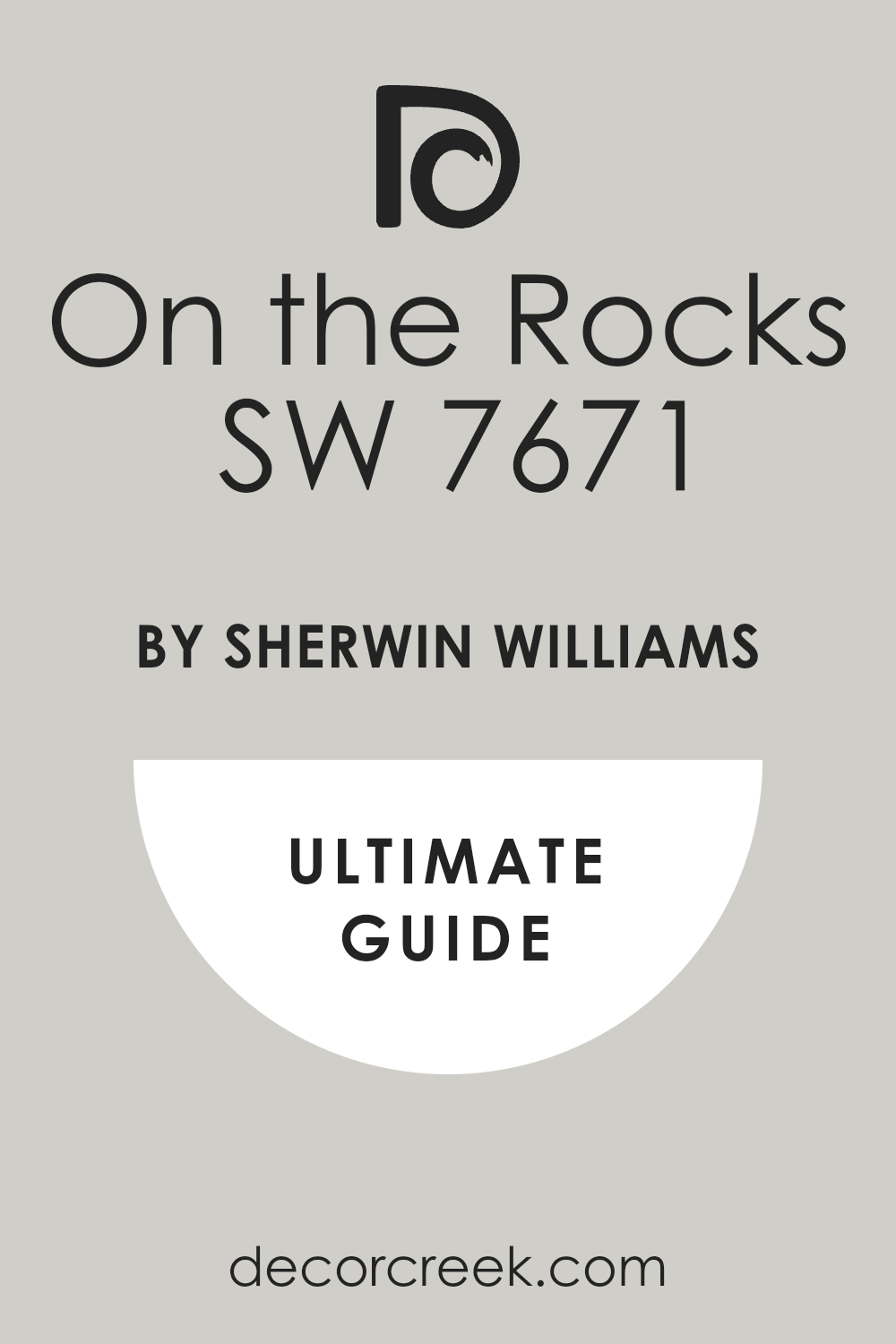
On the Rocks SW 7671
On the Rocks is a very light gray that feels very modern and crisp. On the Rocks looks like the color of light stone or a piece of slate. On the Rocks works well with both warm and cool materials in the room.
On the Rocks feels very fresh and helps keep the room looking open. On the Rocks is a great choice for living rooms and bedrooms in your home. On the Rocks provides a smooth background that makes your furniture look very good.
On the Rocks looks very professional and gives the home an organized vibe. On the Rocks is a color that I use for a very clean and sleek look. On the Rocks handles all types of light and looks great in any situation. On the Rocks is a smart pick for a modern and strong interior.
🎨 Check out the complete guide to this color right HERE 👈
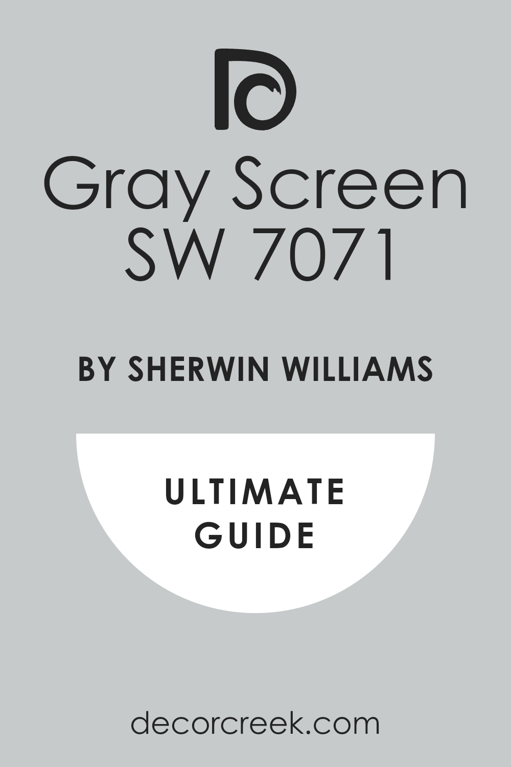
Gray Screen SW 7071
Gray Screen is a cool and light gray that looks very high-tech and sleek. Gray Screen looks like the color of a metal frame or a computer screen. Gray Screen works well with blue accents and silver hardware in the room.
Gray Screen feels very modern and fits the needs of a city apartment style. Gray Screen is a great choice for a kitchen or a modern home office. Gray Screen provides a very clean background that makes everything look very neat.
Gray Screen looks very smooth and gives the walls an even and professional finish. Gray Screen is a color that I use when I want a very fresh vibe. Gray Screen handles natural light well and stays looking very cool and gray. Gray Screen is a favorite for people who love the modern brutalist look.
🎨 Check out the complete guide to this color right HERE 👈
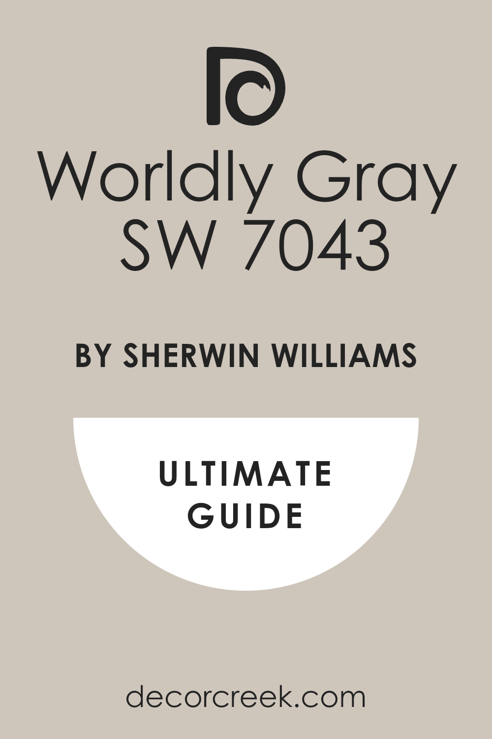
Worldly Gray SW 7043
Worldly Gray is a warm and middle-tone gray that feels very grounded and real. Worldly Gray looks like the color of stone dust on a busy construction site. Worldly Gray works well with both warm wood and cool metal furniture pieces.
Worldly Gray feels very solid and gives the walls a lot of real character. Worldly Gray is a great choice for a main living area or a hallway. Worldly Gray provides a neutral look that makes your home feel very put together.
Worldly Gray looks very professional and gives the home an organized and neat vibe. Worldly Gray is a color that I suggest for people who want a warm look. Worldly Gray handles shadows well and adds a lot of depth to the walls. Worldly Gray is a reliable color that always meets my design expectations.
🎨 Check out the complete guide to this color right HERE 👈
Anonymous SW 7046
Anonymous is a medium gray that has a very mysterious and neutral feeling. Anonymous looks like the color of an old concrete bridge in a city. Anonymous works well in any room because it does not draw too much attention.
Anonymous feels very steady and gives the walls a lot of character. Anonymous provides a great backdrop for colorful furniture or large art. Anonymous looks very professional and gives the home an organized vibe.
Anonymous is a color that I use when I want a very balanced look. Anonymous handles light very well and stays looking the same all day. Anonymous is a smart pick for a room that has many different materials. Anonymous is a reliable color that fits the brutalist theme perfectly.
🎨 Check out the complete guide to this color right HERE 👈
Urbane Bronze SW 7048
Urbane Bronze is a dark and rich color that brings a lot of class. Urbane Bronze looks like a piece of aged metal that has been outside for years. Urbane Bronze works perfectly with natural wood and leather materials in the room.
Urbane Bronze feels very warm and grounded for such a dark color choice. Urbane Bronze is a great choice for an accent wall or a front door. Urbane Bronze makes the room feel very cozy and high-end at the same time.
Urbane Bronze provides a solid look that fits the neo brutalist style perfectly. Urbane Bronze looks very high-end and gives the home a lot of personality. Urbane Bronze is a color that I use to add an earthy feeling. Urbane Bronze is a very trendy and popular color for modern homes.
🎨 Check out the complete guide to this color right HERE 👈
Web Gray SW 7075
Web Gray is a cool and dark gray that feels very sophisticated and modern. Web Gray looks like the color of a heavy metal sheet or a dark stone. Web Gray works perfectly with blue accents and silver hardware in the room.
Web Gray feels very powerful and gives the room a sense of real strength. Web Gray is a great choice for an accent wall or a modern office space. Web Gray provides a dark background that makes everything else look very sharp.
Web Gray looks very professional and gives the home an organized and neat vibe. Web Gray is a color that I use for a very sleek and bold look. Web Gray handles all types of light and looks good in any room. Web Gray is a smart pick for a modern and beautiful interior design.
🎨 Check out the complete guide to this color right HERE 👈
Grizzle Gray SW 7068
Grizzle Gray is a dark and heavy gray that feels very solid and grounded. Grizzle Gray looks like the color of a stormy sky or a piece of lead. Grizzle Gray works well with both light and dark materials in the room.
Grizzle Gray feels very powerful and gives the walls a lot of real weight. Grizzle Gray is a great choice for a fireplace or a formal living room. Grizzle Gray provides a dark background that adds a lot of depth to the room.
Grizzle Gray looks very professional and gives the home a finished and bold look. Grizzle Gray is a color that I use to create a very serious vibe. Grizzle Gray handles shadows well and looks very solid on every single wall. Grizzle Gray is a classic part of any brutalist color palette I create.
🎨 Check out the complete guide to this color right HERE 👈

Black Magic SW 6991
Black Magic is a very deep and dark black that feels extremely bold and strong. Black Magic looks like the color of a heavy iron gate or a piece of coal. Black Magic works perfectly with white accents and silver metal in the room.
Black Magic feels very dramatic and gives the room a sense of great importance. Black Magic is a great choice for doors, trim, or an accent wall area. Black Magic provides a dark background that makes everything look sharp and clean.
Black Magic looks very sleek and modern in a large and open room. Black Magic is a color for people who want to make a big statement. Black Magic handles shadows in a way that makes the room feel very deep. Black Magic is the ultimate choice for a bold and modern brutalist look.
🎨 Check out the complete guide to this color right HERE 👈

21 Best Paint Colors For The Soft Brutalism Interior Style
White Dove OC-17
White Dove adds a layer of comfort to the sharp lines of neo brutalist homes. White Dove looks like the soft light hitting a stone wall in the morning. White Dove works perfectly with light wood and soft fabrics in the room.
White Dove feels very natural and keeps the room from feeling too stiff. White Dove is a color that I love for kitchens and living areas. White Dove provides a smooth background for any colorful decorations you have.
White Dove looks very high-quality and gives the walls a nice finish. White Dove handles shadows in a way that makes the room feel deep. White Dove is a safe pick that always makes a home feel more welcoming. White Dove is a very popular choice for modern and strong interiors.
🎨 Check out the complete guide to this color right HERE 👈
Chantilly Lace OC-65
Chantilly Lace brings a modern edge to the neo brutalist style by being very bright. Chantilly Lace looks like the clean surfaces of a brand new office building. Chantilly Lace works well with colorful furniture and bold graphic art on the walls.
Chantilly Lace feels very sharp and helps define the geometric shapes in the room. Chantilly Lace is a great choice for making a small room feel much bigger. Chantilly Lace provides a crisp look that makes your home feel very expensive.
Chantilly Lace looks very neat and helps keep the room looking organized. Chantilly Lace is a color that I use for ceilings to keep things light. Chantilly Lace handles bright lights without looking yellow or blue at all. Chantilly Lace is the perfect choice for a fresh take on brutalism.
🎨 Check out the complete guide to this color right HERE 👈
Cloud White OC-130
Cloud White has a very soft and creamy feeling that looks very rich. Cloud White looks like the color of a thick cloud on a bright day. Cloud White works well with natural materials like wool and light wood.
Cloud White feels very open and gives your home a lot of light. Cloud White is a great choice for bedrooms where you want a soft look. Cloud White provides a neutral background that does not fight with anything.
Cloud White looks very clean and helps hide any dust on the walls. Cloud White is a color that I use to make a room feel friendly. Cloud White handles natural light very well and stays bright all day. Cloud White is a smart choice for a neo brutalist style home.
🎨 Check out the complete guide to this color right HERE 👈
Classic Gray OC-23
Classic Gray is a soft and light gray that sets a high-end mood. Classic Gray looks like the color of fine stone dust in a sunlit room. Classic Gray works well with metal furniture and natural wood accents on the floor.
Classic Gray feels very elegant and gives the room a sense of real class. Classic Gray is a great choice for a bedroom where you want a light look. Classic Gray provides a very soft background that is easy on your eyes.
Classic Gray looks very high-quality and gives the walls a professional and smooth finish. Classic Gray is a color that I use when I want a light but warm look. Classic Gray handles natural light well and stays looking beautiful all day long. Classic Gray is a smart choice for a strong and beautiful interior design.
🎨 Check out the complete guide to this color right HERE 👈
Pale Oak OC-20
Pale Oak is a light and warm color that brings a natural feeling. Pale Oak looks like the color of a piece of unfinished wood or light stone. Pale Oak works perfectly with natural fabrics and heavy metal pieces in the room.
Pale Oak feels very grounded and keeps the room from feeling too cold. Pale Oak is a great choice for main living rooms and open hallways. Pale Oak provides a neutral background that makes your furniture stand out very well.
Pale Oak looks very clean and helps hide some of the dust in the air. Pale Oak is a color that I use to create a very inviting vibe. Pale Oak handles all types of light and looks good in any situation. Pale Oak is a very popular choice for people who love the brutalist look.
🎨 Check out the complete guide to this color right HERE 👈
Edgecomb Gray HC-173
Edgecomb Gray is a warm and steady gray that feels very solid and real. Edgecomb Gray looks like the color of a stone wall in the late afternoon sun. Edgecomb Gray works well with both warm wood and cool metal materials.
Edgecomb Gray feels very balanced and gives the room a lot of real character. Edgecomb Gray is a great choice for a living room or a formal dining area. Edgecomb Gray provides a neutral look that makes your home feel very connected.
Edgecomb Gray looks very professional and gives the home an organized and neat vibe. Edgecomb Gray is a color that I suggest when you want a warm look. Edgecomb Gray handles shadows well and adds a lot of depth to the walls. Edgecomb Gray is a reliable color that always meets my design goals.
🎨 Check out the complete guide to this color right HERE 👈
Revere Pewter HC-172
Revere Pewter brings a sense of history and strength to a modern neo brutalist home. Revere Pewter looks like the color of weathered metal or old stone walls. Revere Pewter works perfectly with heavy furniture and big pieces of wood.
Revere Pewter feels very solid and gives the walls a lot of real weight. Revere Pewter is a great choice for an open living area or a hallway. Revere Pewter provides a neutral look that makes your home feel very connected.
Revere Pewter looks very professional and gives the home a serious vibe. Revere Pewter is a color that I use to ground a room with high ceilings. Revere Pewter handles shadows and bright light with the same beauty. Revere Pewter is a classic color that fits the neo brutalist style perfectly.
🎨 Check out the complete guide to this color right HERE 👈
Balboa Mist OC-27
Balboa Mist is a light and warm gray that brings a soft touch to neo brutalism. Balboa Mist looks like the color of light-colored stone used in modern houses. Balboa Mist works well with both warm and cool materials in the room.
Balboa Mist feels very balanced and keeps the room from feeling too cold. Balboa Mist is a great choice for main living rooms and bedrooms alike. Balboa Mist provides a smooth look that hides small marks on the wall.
Balboa Mist looks very high-end and gives the home a nice finish. Balboa Mist is a color that I suggest for a friendly brutalist look. Balboa Mist handles natural light very well and looks good all day. Balboa Mist is a very reliable color that always works as I expect.
🎨 Check out the complete guide to this color right HERE 👈
Weimaraner AF-155
Weimaraner is a warm and sophisticated gray with a brown hint. Weimaraner looks like the color of a smooth velvet fabric or light clay. Weimaraner works well with leather furniture and dark wood floors.
Weimaraner feels very rich and gives the room a sense of deep comfort. Weimaraner is a great choice for a bedroom or a cozy sitting room. Weimaraner provides a neutral background that feels very high-end and special.
Weimaraner looks very professional and gives the home a finished look. Weimaraner is a color that I use when I want to add some warmth. Weimaraner handles all types of light and looks beautiful in every room. Weimaraner is a smart pick for a soft and strong interior design.
🎨 Check out the complete guide to this color right HERE 👈
Annapolis Gray HC-176
Annapolis Gray is a warm and medium gray that feels very grounded. Annapolis Gray looks like the color of a stone building on a sunny day. Annapolis Gray works well with natural materials and warm metal accents.
Annapolis Gray feels very solid and gives the walls a lot of personality. Annapolis Gray is a great choice for a dining room or a main hallway. Annapolis Gray provides a neutral look that makes the room feel very put together.
Annapolis Gray looks very high-quality and gives the home a professional vibe. Annapolis Gray is a color that I use for a very steady and real look. Annapolis Gray handles shadows well and adds a lot of depth to the walls. Annapolis Gray is a reliable color that fits the brutalist style perfectly.
Silhouette AF-655
Silhouette is a very dark and moody gray that brings a lot of drama. Silhouette looks like the color of a heavy shadow on a concrete wall. Silhouette works perfectly with light-colored accents and bright metal pieces.
Silhouette feels very powerful and gives the room a sense of importance. Silhouette is a great choice for a small room or a bold accent wall. Silhouette provides a dark background that makes everything else look very sharp.
Silhouette looks very sleek and modern in a house with big windows. Silhouette is a color for people who want to show their strong style. Silhouette handles light in a way that makes the room feel very deep. Silhouette is a favorite for creating a very cool and dark look.
🎨 Check out the complete guide to this color right HERE 👈
Pure White SW 7005
Pure White is a very steady white that fits perfectly in any neo brutalist home. Pure White looks like a fresh start on a clean piece of modern art. Pure White works with any material or color you put in the room.
Pure White feels very natural and does not take away from the design. Pure White is a great choice for main walls in any room of the house. Pure White provides a smooth background that makes furniture stand out.
Pure White looks very high-quality and gives the home a professional finish. Pure White is a color that everyone feels very comfortable around. Pure White handles light well and looks good throughout the entire day. Pure White is a staple for any designer working on a brutalist project.
🎨 Check out the complete guide to this color right HERE 👈

Snowbound SW 7004
Snowbound has a very light hint of gray that makes it feel very modern. Snowbound looks like the color of a stone wall on a bright winter day. Snowbound works well in rooms that have lots of different gray tones.
Snowbound feels very light and keeps the room from feeling too heavy. Snowbound is a great choice for kitchens and bathrooms with light stone. Snowbound provides a soft background for metal and wood furniture pieces.
Snowbound looks very clean and helps hide some of the dust in the room. Snowbound is a color that I use to make a room feel very open. Snowbound handles natural light well and adds a bit of warmth to the room. Snowbound is a smart choice for a neo brutalist style home.
🎨 Check out the complete guide to this color right HERE 👈

Alabaster SW 7008
Alabaster is a very warm and rich white that feels very high-end and smooth. Alabaster looks like the color of expensive stone used in old monuments. Alabaster works perfectly with warm wood and soft fabrics in the room.
Alabaster feels very natural and keeps the brutalist look from being mean. Alabaster is a great choice for living rooms and bedrooms in your home. Alabaster provides a soft background that makes everything look very neat.
Alabaster looks very elegant and gives the walls a professional finish. Alabaster is a color that I use when I want a very cozy feeling. Alabaster handles all types of light and looks beautiful all day long. Alabaster is a very popular choice for modern and strong interiors.
🎨 Check out the complete guide to this color right HERE 👈
Repose Gray SW 7015
Repose Gray is a cool gray that looks very sleek and modern in a house. Repose Gray looks like the color of a concrete sidewalk on a cloudy day. Repose Gray works perfectly with blue or green accents in your decorations.
Repose Gray feels very light and helps the room stay open and bright. Repose Gray is a great choice for main living rooms and hallways. Repose Gray provides a neutral background that lets your furniture stand out.
Repose Gray looks very professional and gives the home a finished look. Repose Gray is a color that I use to create a modern vibe. Repose Gray handles all types of light and looks great in any room. Repose Gray is a favorite for people who love the neo brutalist look.
🎨 Check out the complete guide to this color right HERE 👈
Agreeable Gray SW 7029
Agreeable Gray is a perfect mix of gray and beige that fits in any room. Agreeable Gray looks like the color of light stone dust on a modern site. Agreeable Gray works with both warm wood and cool metal very easily.
Agreeable Gray feels very solid and gives the walls a lot of personality. Agreeable Gray is a great choice for people who are just starting out. Agreeable Gray provides a neutral look that does not fight with anything else.
Agreeable Gray looks very good in both big and small rooms in your home. Agreeable Gray is a color that I suggest when you are not sure what to pick. Agreeable Gray handles all types of light and looks great all day. Agreeable Gray is a smart choice for a neo brutalist home.
🎨 Check out the complete guide to this color right HERE 👈
Mindful Gray SW 7016
Mindful Gray is a bit warmer and darker than many other light grays. Mindful Gray looks like the color of a heavy stone wall in a garden. Mindful Gray works well with dark wood floors and leather furniture pieces.
Mindful Gray feels very grounded and makes the room feel very safe. Mindful Gray is a great choice for a cozy living room or a bedroom. Mindful Gray provides enough contrast to make white trim look very bright.
Mindful Gray looks very solid and gives the walls a lot of weight. Mindful Gray is a color that I use to create a stable look. Mindful Gray handles shadows well and adds a lot of depth to the room. Mindful Gray is a very popular choice for modern brutalist homes.
🎨 Check out the complete guide to this color right HERE 👈
On the Rocks SW 7671
On the Rocks is a very light gray that feels very modern and crisp. On the Rocks looks like the color of light stone or a piece of slate. On the Rocks works well with both warm and cool materials in the room.
On the Rocks feels very fresh and helps keep the room looking open. On the Rocks is a great choice for living rooms and bedrooms in your home. On the Rocks provides a smooth background that makes your furniture look very good.
On the Rocks looks very professional and gives the home an organized vibe. On the Rocks is a color that I use for a very clean and sleek look. On the Rocks handles all types of light and looks great in any situation. On the Rocks is a smart pick for a modern and strong interior.
🎨 Check out the complete guide to this color right HERE 👈
City Loft SW 7631
City Loft is a very light and warm gray that feels very soft on the walls. City Loft looks like the color of light reflecting off a clean city street. City Loft works well with modern furniture and soft light-colored fabrics.
City Loft feels very open and gives your home a lot of extra light. City Loft is a great choice for a bedroom or a small apartment space. City Loft provides a neutral background that makes everything look very neat.
City Loft looks very professional and gives the home a finished and clean look. City Loft is a color that I use when I want a soft vibe. City Loft handles natural light well and stays looking beautiful all day. City Loft is a smart choice for a soft brutalist style home.
🎨 Check out the complete guide to this color right HERE 👈

Drift of Mist SW 9166
Drift of Mist is a very light and airy gray that feels very modern and fresh. Drift of Mist looks like the color of a light fog over a stone building. Drift of Mist works well with both metal and wood materials in the room.
Drift of Mist feels very light and helps keep the room from looking heavy. Drift of Mist is a great choice for main walls and open ceiling areas. Drift of Mist provides a soft background that makes your furniture look sharp.
Drift of Mist looks very clean and helps hide any small marks on the wall. Drift of Mist is a color that I use for a very minimal and sleek look. Drift of Mist handles all types of light and looks good in any situation. Drift of Mist is a smart choice for a modern and strong interior.
🎨 Check out the complete guide to this color right HERE 👈

Accessible Beige SW 7036
Accessible Beige is a warm and steady color that brings a natural feeling. Accessible Beige looks like the color of light-colored clay or sand on a site. Accessible Beige works perfectly with warm wood floors and leather materials.
Accessible Beige feels very grounded and makes the room feel very safe and real. Accessible Beige is a great choice for living rooms and kitchens in your home. Accessible Beige provides a neutral background that makes everything look very put together.
Accessible Beige looks very high-quality and gives the walls a professional finish. Accessible Beige is a color that I suggest for a cozy brutalist look. Accessible Beige handles natural light well and adds a lot of warmth to the room. Accessible Beige is a reliable color that always works exactly as I expect.
🎨 Check out the complete guide to this color right HERE 👈

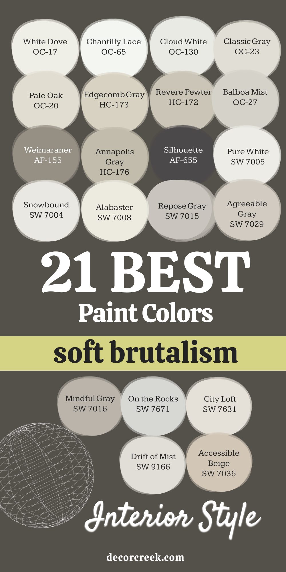
My Final Thoughts
Designing a home with brutalist paint colors is about being honest with your materials and showing the world you value real strength. I want you to feel the heavy weight and the raw power of your walls every time you walk into a room. You do not need a million different colors to make a home look amazing because a simple palette often tells a much bigger story.
Just a few well-picked shades from this list will give your home the power and the specific look you want without any extra fluff. Remember to always look at your paint samples next to your furniture and under your own lights so you see the real truth of the color. Your home should be a place that feels like it belongs to you and no one else in the world. I hope this list helps you find the perfect shade to start your design and gives you the courage to be bold.
Creating a look that feels both heavy and right requires a lot of thinking about how light hits a flat surface. You have to be sure that the gray you pick does not turn into something else when the sun goes down and you turn on your lamps. I believe that a wall should look like it was built to last for a hundred years without needing any changes at all.
When you choose these paints, you are making a promise to yourself to keep things simple and high-quality. Every brush stroke should add to the sense of order and logic that makes this style so special to me. Do not be afraid of the dark shades because they often bring the most character to a big open room. You are building a background for your life that is as solid as a rock and as real as metal.
The beauty of this design style is that it does not try to hide what it is made of or pretend to be fancy. I love helping people see that a gray wall can have just as much life and energy as a bright red or blue one. You are choosing a path that values the structure of the house and the honesty of the materials used in the building.
Make sure you take your time to look at how the paint feels against the wood of your chairs or the metal of your tables. This process is about finding a balance between the hard edges of the world and the comfort you need in your own house. I am confident that these thirty-seven ideas will give you exactly what you need to make your home feel solid. Your journey into this style is a chance to show your own strength through the colors you choose to live with.