Finding the right paint for every room is a substantial undertaking that makes a monumental difference in how you experience your daily life at home. Your walls are more than just a backdrop; they are the emotional foundation of your living space.
I have spent years meticulously guiding homeowners through the process of selecting colors that transform ordinary houses into sophisticated spaces that look as though they belong on the pages of a high-end design magazine.
It is completely natural for families to worry about making a costly mistake or choosing a shade that feels overwhelming once it’s on the wall. However, I am here to demystify the process and turn what can be a stressful chore into an easy, creative, and rewarding journey for you.
You and your family deserve a home that feels intentionally put together—a sanctuary that balances professional aesthetics with a style that matches your unique personality perfectly.
Why I Trust Benjamin Moore for Creating Beautiful Whole House Color Schemes
Benjamin Moore produces world-class paint that offers incredible longevity and performs exactly like the professional swatches you see in the store. One of the primary reasons I rely on this brand is its remarkable color accuracy; the deep, rich pigments ensure that the finished result has a professional, high-end luster.
Their collections are designed with a sophisticated depth of color that brings a sense of luxury to any architectural style, from historic farmhouses to modern lofts.
Beyond the beauty of the colors, their paint features exceptional coverage and hide. This means you won’t have to spend an entire week applying endless extra layers to achieve a smooth, even finish, saving you both time and effort.
It gives me immense peace of mind to know that the superior quality of these finishes will keep your walls looking vibrant and fresh for years to come.
Families especially love how these durable formulas handle the rigors of real life—resisting fading while easily standing up to sticky handprints and the inevitable scuffs of a busy household.
How I Design the Ideal Whole House Color Scheme for a Cohesive Interior
My design process always begins by observing the “light story” of your home—how the sun moves through each room from the first light of morning until the sun sets in the evening. A truly successful color plan relies on a primary “anchor” color that flows seamlessly from the front entryway all the way through the hallways to the back of the house. This foundational shade creates a visual thread that ties the entire architectural layout together into one harmonious experience.
Once we establish that flow, I then curate a selection of deeper, moodier, or more vibrant “destination” colors for specific rooms to add character and visual interest. This strategic method ensures that walking from the bright energy of a kitchen into the calm of a master bedroom feels natural, intentional, and smooth.
My ultimate goal is to help you create a home environment that makes sense logically, feels organized visually, and provides a sense of peace every time you walk through the door.
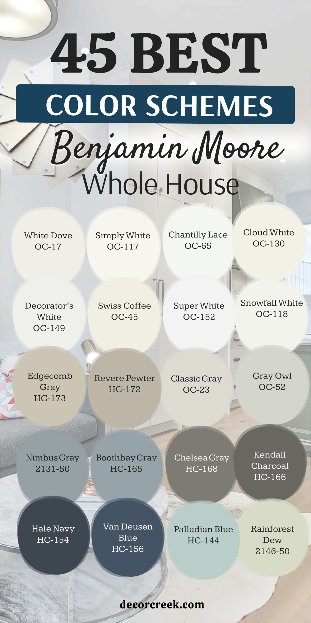
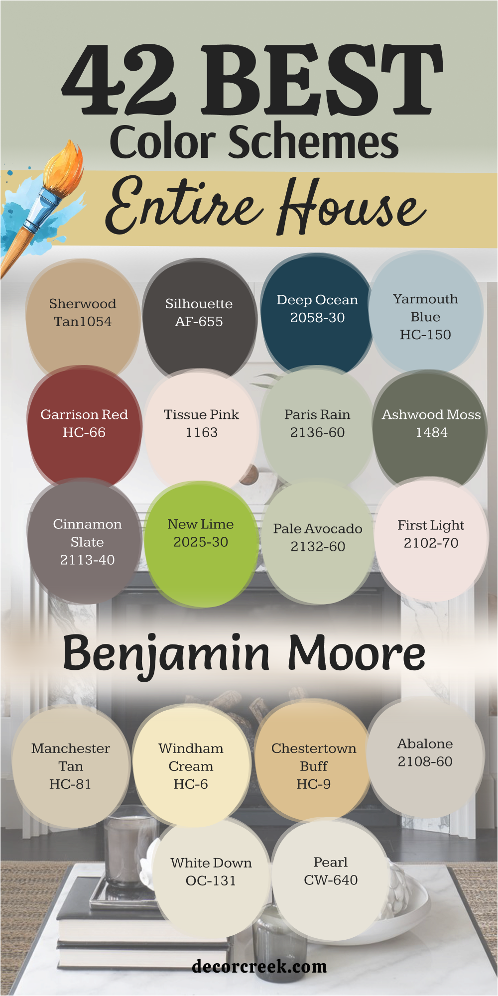
42 Benjamin Moore Entire House Color Schemes
White Dove OC-17
White Dove OC-17 is a soft choice that avoids looking too sharp or clinical on your walls. This shade has just enough warmth to make a large room feel friendly instead of cold. Many homeowners pick it for trim and doors because it works with almost any other wall color. It reflects light in a way that makes small hallways seem much bigger than they really are.
I suggest using it on ceilings to keep the top of the room looking light and airy. The color stays true even when the sun goes down and you turn on your indoor lamps. It hides a little bit of dust better than a very bright, stark white would. You will find that this paint makes your wooden furniture stand out in a very pretty way.
It is a reliable pick for people who want a clean look without the harshness of a hospital room.
Best used in: kitchens, living rooms, trim, and ceilings
Pairs well with: Revere Pewter HC-172, Hale Navy HC-154, and dark wood floors The key rule of this color for farmhouse style is to use it where you want natural light to feel kind, soft, and inviting throughout the day.
🎨 Check out the complete guide to this color right HERE 👈

Simply White OC-117
Simply White OC-117 brings a crisp energy to your home that feels like a fresh start every morning. This color has a tiny hint of yellow that keeps it from looking blue or grey in the shadows. I love putting this in kitchens because it makes everything from the cabinets to the counters look brand new. It is bright enough to make a dark basement feel like a regular part of the house.
The paint works wonders on window frames where it catches the afternoon sun beautifully. You can use it on every wall if you want a house that feels open and very modern. It is a favorite for designers who want a backdrop that does not fight with colorful rugs or art.
This shade helps your home feel tidy even on days when you have a little bit of a mess. It creates a cheerful mood that helps you start your day with a smile on your face.
Best used in: modern kitchens, bathrooms, and sunny bedrooms
Pairs well with: Kendall Charcoal HC-166, Black Beauty 2128-10, and light oak The key rule of this color for farmhouse style is to use it where you want natural light to feel kind, soft, and inviting throughout the day.
🎨 Check out the complete guide to this color right HERE 👈

Chantilly Lace OC-65
Chantilly Lace OC-65 is known for being one of the cleanest whites you can buy for your home. This color does not have strong hidden tones, so it stays looking very pure in any lighting. I often recommend it for modern homes where the lines are very straight and the style is simple. It makes your colorful decorations pop and become the stars of the room.
The paint looks great on crown molding because it creates a sharp contrast against darker wall colors. You will notice that it makes your home feel very high-end and expensive without a lot of effort. It is the best choice if you are worried about your white paint looking too yellow or too blue. This shade gives a crisp finish to cabinets and makes them look like they were painted by a pro.
Using it throughout the house creates a sense of order that helps everyone feel more relaxed.
Best used in: trim, doors, cabinets, and art galleries
Pairs well with: Gray Owl OC-52, Edgecomb Gray HC-173, and navy blue The key rule of this color for farmhouse style is to use it where you want natural light to feel kind, soft, and inviting throughout the day.
🎨 Check out the complete guide to this color right HERE 👈

Cloud White OC-130
Cloud White OC-130 feels like a soft marshmallow that makes any room feel cozy and safe. This paint has a creamy base that works perfectly in older homes with lots of character. I like to use it in bedrooms where you want to feel tucked in and comfortable at night. It is not as bright as other whites, which means it does not hurt your eyes in the sun.
The color works well with antique furniture and helps old wood look its absolute best. You can paint your whole living room in this shade to create a background that feels very classic. It bridges the gap between traditional styles and modern looks in a very smart way.
Many people choose it because it feels more like a “real” home color than a trendy one. It is a steady choice that you will likely still love many years from now.
Best used in: traditional living rooms, nurseries, and cozy dens
Pairs well with: Manchester Tan HC-81, Van Deusen Blue HC-156, and brass hardware The key rule of this color for farmhouse style is to use it where you want natural light to feel kind, soft, and inviting throughout the day.
🎨 Check out the complete guide to this color right HERE 👈

Decorator’s White OC-149
Decorator’s White OC-149 has a tiny bit of gray in it that makes it look very cool and sophisticated. This color is a top pick for people who like a style that is clean and a bit more formal. I find that it works best in rooms with lots of big windows and natural outdoor light. It makes a room feel cool on a hot day, which is a great trick for sunny climates.
The paint is excellent for making a small bathroom feel like a fancy spa at a hotel. It provides a sharp look when paired with black accents or dark metal light fixtures. You should use this if you want your home to feel very current and up to date. It stays looking very professional and sharp even in the busiest areas of your house.
This color helps a room feel organized and provides a great logic to your decorating plan.
Best used in: bathrooms, laundry rooms, and modern offices
Pairs well with: Chelsea Gray HC-168, Wrought Iron 2124-10, and silver accents The key rule of this color for farmhouse style is to use it where you want natural light to feel kind, soft, and inviting throughout the day.
🎨 Check out the complete guide to this color right HERE 👈
Swiss Coffee OC-45
Swiss Coffee OC-45 is a warm and creamy color that makes guests feel welcome as soon as they walk in. This shade is famous for being used by famous designers who want a home to feel expensive but lived-in. I love how it looks in an entry hall because it sets a friendly tone for the whole house. It is a bit darker than a pure white, which adds a nice depth to your walls.
The paint is perfect for a dining room where you want the light to feel soft during family dinners. It pairs beautifully with warm wood tones and gold decorations that many people have. You will see that it softens the corners of a room and makes the architecture look more gentle.
This is a great choice for families who want a house that feels like a big, warm hug. It is a classic color that never goes out of style and always looks very high-quality.
Best used in: entryways, dining rooms, and whole-house walls
Pairs well with: Edgecomb Gray HC-173, Boothbay Gray HC-165, and gold leaf The key rule of this color for farmhouse style is to use it where you want natural light to feel kind, soft, and inviting throughout the day.
🎨 Check out the complete guide to this color right HERE 👈

Super White OC-152
Super White OC-152 is the boldest and brightest white you can choose for your home project. This color is very powerful and makes a room feel like it is glowing with energy. I use this when a homeowner wants a very striking and clean look that stands out. It works best in a house with a lot of modern art and very simple, clean furniture.
The paint reflects almost all the light that hits it, making it the king of brightening up dark spots. You can use it to make a small kitchen feel like a professional cooking studio. It is a very honest color because it does not change much when the sun goes behind a cloud. This shade tells everyone that you like things to be very neat and very orderly.
It is a brave choice that makes a big statement about your love for modern design.
Best used in: art studios, modern kitchens, and dark hallways
Pairs well with: Black 2132-10, Hale Navy HC-154, and bright primary colors The key rule of this color for farmhouse style is to use it where you want natural light to feel kind, soft, and inviting throughout the day.
🎨 Check out the complete guide to this color right HERE 👈
Snowfall White OC-118
Snowfall White OC-118 is a crisp color that reminds me of a fresh blanket of snow on a winter day. This paint is very clean but has just a tiny touch of warmth to keep it from feeling icy. I think it looks wonderful in a sunroom where the light can bounce around all day long. It helps a room feel very open and gives you lots of room to breathe and think.
The color is a smart choice for trim if you want something that looks slightly softer than a pure white. It works well in a bedroom because it feels very light and helps you wake up feeling refreshed. You can use it on the ceiling to help the walls look taller and the room feel more grand. This shade is a great middle-ground for people who cannot decide between a warm and a cool white.
It makes your home feel like a peaceful place to hide away from the busy world outside.
Best used in: sunrooms, bedrooms, and tall ceilings
Pairs well with: Sea Haze 2137-50, Revere Pewter HC-172, and light blue The key rule of this color for farmhouse style is to use it where you want natural light to feel kind, soft, and inviting throughout the day.
Edgecomb Gray HC-173
Edgecomb Gray HC-173 is a beautiful mix of gray and beige that many people call a “greige.” This color is a superstar because it changes slightly depending on the light in your room. I recommend this to almost everyone because it is so easy to live with every day. It makes a room feel cozy like a beige but looks modern like a gray paint.
The paint is light enough to use in every single room of your house without it feeling dark. It creates a very smooth flow from the living room to the bedrooms and the kitchen. You will like how it hides small scuffs and marks that happen in a busy family home. It looks great with both white trim and dark wood floors, giving you many options for furniture.
This is the ultimate “safe” color that always ends up looking very stylish and thoughtful.
Best used in: hallways, living rooms, and open floor plans
Pairs well with: White Dove OC-17, Hale Navy HC-154, and mid-tone woods The key rule of this color for farmhouse style is to use it where you want natural light to feel kind, soft, and inviting throughout the day.
🎨 Check out the complete guide to this color right HERE 👈

Revere Pewter HC-172
Revere Pewter HC-172 is perhaps the most famous paint color for people who want a cohesive home. This shade is a bit darker than other neutrals, which gives your walls a very solid and sturdy feel. I love using it in open-concept houses because it ties all the different areas together perfectly. It has a way of making even a brand-new house feel like it has some history and soul.
The color works in any light, though it looks its best in rooms with big windows facing the sun. It is a very grounding color that helps you feel centered and focused when you are at home. You can pair it with colorful pillows and rugs, and it will never clash with your favorite things. This paint is a workhorse that handles the wear and tear of a happy home very well.
It is a smart investment because it makes your house look more valuable to anyone who visits.
Best used in: family rooms, kitchens, and large master bedrooms
Pairs well with: Simply White OC-117, Chelsea Gray HC-168, and navy accents The key rule of this color for farmhouse style is to use it where you want natural light to feel kind, soft, and inviting throughout the day.
🎨 Check out the complete guide to this color right HERE 👈

Classic Gray OC-23
Classic Gray OC-23 is a very light and airy shade that acts like a soft whisper on your walls. This paint color is much more interesting than a plain white because it has a tiny drop of warmth hidden inside. I love using this in hallways because it makes narrow paths feel much wider and more welcoming for guests. It reflects the sun in a way that feels bright but never makes you want to squint your eyes.
The color changes throughout the day, looking a bit warmer in the morning and cooler in the afternoon. You can use it in every room to create a house that feels very light and tied together. It looks particularly high-end when you pair it with bright white trim and dark metal door handles. This shade is a great choice for a bedroom where you want to wake up feeling refreshed and ready for the day.
Families like it because it makes a home feel clean and organized without being too cold or stiff.
Best used in: living rooms, hallways, bedrooms, and open floor plans
Pairs well with: Simply White OC-117, Hale Navy HC-154, and charcoal accents The key rule of this color for farmhouse style is to use it where you want natural light to feel kind, soft, and inviting throughout the day.

Gray Owl OC-52
Gray Owl OC-52 is a very popular choice for people who want a cool and crisp look in their home. This paint has a tiny bit of blue and green tucked into the gray, which makes it feel very fresh. I find that it looks its best in rooms that get a lot of natural light from big windows. It helps a kitchen feel very modern and works perfectly with stainless steel appliances and white cabinets.
The color is a smart pick for a bathroom because it makes the whole area look like a clean spa. You will see that it provides a great background for colorful towels or bright art on the walls. It is light enough to use on large walls without making the house feel dark or heavy at all. This shade helps a room feel very balanced and provides a logic that makes sense for a busy family.
Using it makes your home feel very current and like it belongs in a new building.
Best used in: kitchens, bathrooms, and sunny living rooms
Pairs well with: White Dove OC-17, Chelsea Gray HC-168, and navy blue The key rule of this color for farmhouse style is to use it where you want natural light to feel kind, soft, and inviting throughout the day.
🎨 Check out the complete guide to this color right HERE 👈

Beneath the Clouds 2131-50
Beneath the Clouds 2131-50 is a medium gray that has a very strong and beautiful blue tone to it. This color reminds me of the sky right before a rainstorm, which feels very steady and grounded. I suggest using it in a home office where you need to stay focused and get your work done. It has enough depth to make a room feel very special and different from the rest of the house.
The paint looks wonderful when you have white furniture or light wood floors to balance out the color. You can use it as an accent wall if you are afraid of painting a whole room a darker shade. It brings a lot of personality to a laundry room or a mudroom where people drop their shoes. This color helps a house feel like it has a plan and that every room was chosen with care.
It is a very sophisticated choice that makes your home look like a professional designer visited you.
Best used in: offices, laundry rooms, and bedroom accent walls
Pairs well with: Chantilly Lace OC-65, Revere Pewter HC-172, and silver hardware The key rule of this color for farmhouse style is to use it where you want natural light to feel kind, soft, and inviting throughout the day.
Boothbay Gray HC-165
Boothbay Gray HC-165 is a soft and pretty blue-gray that looks like the ocean on a cloudy morning. This paint is a favorite for people who want a little bit of color but still want to stay neutral. I like to put this on kitchen islands because it makes them stand out as the heart of the home. It feels very cozy in a bedroom and helps you feel ready to tuck in for a long night.
The color works well with many different styles, from a beach house to a very traditional family home. You will notice that it looks very different depending on if the sun is out or if it is nighttime. It pairs beautifully with sandy colors and light wood to create a very natural look for your family. This shade is a great way to add a bit of fun to your house without being too loud or bright.
It makes your home feel like a special place where everyone can relax and be themselves.
Best used in: kitchen islands, bedrooms, and bathroom vanities
Pairs well with: Cloud White OC-130, Simply White OC-117, and gold accents The key rule of this color for farmhouse style is to use it where you want natural light to feel kind, soft, and inviting throughout the day.
🎨 Check out the complete guide to this color right HERE 👈

Chelsea Gray HC-168
Chelsea Gray HC-168 is a rich and dark gray that brings a lot of drama and style to any wall. This color is very strong, so I often use it for cabinets or for a very cozy media room. It makes a room feel very safe and sturdy, which is a great feeling for a family home. You should use this paint if you want to make a big statement that looks very expensive and high-end.
The paint provides a perfect contrast when you use it against very bright white trim and light-colored rugs. It hides fingerprints and scuffs very well, making it a smart choice for lower cabinets in a kitchen. You will find that it makes gold or brass light fixtures look very shiny and beautiful on the wall. This shade gives a room a very clear purpose and makes the architecture look very sharp and defined.
It is a bold choice that shows you have great taste and a lot of confidence in your home.
Best used in: kitchen cabinets, media rooms, and dining rooms
Pairs well with: Classic Gray OC-23, White Dove OC-17, and warm brass The key rule of this color for farmhouse style is to use it where you want natural light to feel kind, soft, and inviting throughout the day.
🎨 Check out the complete guide to this color right HERE 👈
Kendall Charcoal HC-166
Kendall Charcoal HC-166 is a very deep and moody gray that almost looks like a dark stone or slate. This paint is excellent for creating a room that feels very private and tucked away from the rest of the world. I love using it on the outside of a house or on a front door to make a great first impression. It has a lot of warmth for such a dark color, which keeps it from feeling like a black hole.
The color works wonders in a small powder room where you want to surprise your guests with something bold. You can use it behind a TV to help the screen blend in so it does not stand out so much. It feels very solid and helps a house feel like it was built to last for a long time. This shade is a favorite for people who want a modern look that still feels very natural and earthy.
It brings a lot of weight to a room in a way that feels very balanced and smart.
Best used in: front doors, powder rooms, and exterior trim
Pairs well with: Simply White OC-117, Revere Pewter HC-172, and light wood The key rule of this color for farmhouse style is to use it where you want natural light to feel kind, soft, and inviting throughout the day.
🎨 Check out the complete guide to this color right HERE 👈

Hale Navy HC-154
Hale Navy HC-154 is a classic navy blue that many designers think of as a neutral because it goes with everything. This paint is very dark and rich, making it look like a very expensive suit for your walls. I often use it in dining rooms to create a place that feels very special for holiday meals and parties. It has a tiny bit of gray in it, which keeps the blue from looking too much like a child’s room.
The color makes white trim look incredibly bright and clean by comparison, which is a very sharp look. You can paint a whole bedroom in this shade if you want a place that feels very dark and easy to sleep in. It is a very popular choice for kitchen islands because it adds a lot of personality to the middle of the room. This shade helps a home feel very traditional and strong, giving everyone a sense of pride in their house.
It is a color that people will always notice and talk about because it looks so professional.
Best used in: dining rooms, kitchen islands, and master bedrooms
Pairs well with: White Dove OC-17, Edgecomb Gray HC-173, and gold hardware The key rule of this color for farmhouse style is to use it where you want natural light to feel kind, soft, and inviting throughout the day.
🎨 Check out the complete guide to this color right HERE 👈

Van Deusen Blue HC-156
Van Deusen Blue HC-156 is a medium-to-dark blue that feels very historical and very important on your walls. This paint is a bit brighter than a navy, so you can really see the blue color even in a darker room. I think it looks fantastic on the exterior of a house with white windows and a bright red door. It brings a lot of life to a home office and helps you feel creative and ready to work.
The color is a great choice for a mudroom where kids drop their coats and bags every day after school. You will find that it makes wood furniture look very warm and very pretty when placed against it. It is a very friendly blue that feels happy and serious at the exact same time for your family. This shade is a smart way to add a lot of color to your life without it being too bright or loud.
It makes a house feel very put together and shows that you have a very good plan for your home.
Best used in: exteriors, home offices, and mudrooms
Pairs well with: Chantilly Lace OC-65, Manchester Tan HC-81, and warm oak The key rule of this color for farmhouse style is to use it where you want natural light to feel kind, soft, and inviting throughout the day.

Palladian Blue HC-144
Palladian Blue HC-144 is a soft mix of blue and green that looks like the color of a clear tropical ocean. This paint is very light and helps a room feel very airy and easy to be in for a long time. I love putting this in guest bedrooms so that friends feel like they are staying at a fancy vacation house. It has a way of making even a messy room feel a bit more organized and intentional for you.
The color works beautifully in bathrooms because it looks very clean and matches well with white tiles and silver faucets. You can use it in a laundry room to make the chore of washing clothes feel a bit more pleasant and light. It is a very cheerful shade that helps everyone in the family start their day with a good mood.
This shade is a favorite for people who love nature and want to bring a bit of the outside into their home.
It creates a very soft look that helps a house feel like a very happy and bright place to live.
Best used in: guest bedrooms, bathrooms, and laundry rooms
Pairs well with: Cloud White OC-130, Woodlawn Blue HC-147, and dark wood The key rule of this color for farmhouse style is to use it where you want natural light to feel kind, soft, and inviting throughout the day.
🎨 Check out the complete guide to this color right HERE 👈

Rainforest Dew 2146-50
Rainforest Dew 2146-50 is a very light green that feels fresh and full of energy like a garden in the spring. This paint is a great way to add a soft touch of color to a house that has a lot of white or gray. I recommend it for nurseries or playrooms because it feels very young and very happy for little children. It is bright enough to help a room feel sunny even on a day when it is raining outside your window.
The color looks very pretty with light wood floors and simple white furniture that many families already own. You will find that it makes a small breakfast nook feel like a very special place to drink your morning milk or tea. It is a very gentle shade of green that does not feel too bold or too much like a forest for your walls. This shade helps a home feel very natural and reminds you of being outside in the grass and the sun.
It is a fun choice for people who want their house to feel very unique and full of life for everyone.
Best used in: nurseries, playrooms, and breakfast nooks
Pairs well with: Simply White OC-117, Edgecomb Gray HC-173, and light pine The key rule of this color for farmhouse style is to use it where you want natural light to feel kind, soft, and inviting throughout the day.
Aegean Teal 2136-40
Aegean Teal 2136-40 is a mid-tone blue-green color that brings a lot of life and depth to any room. This paint has a bit of gray in it, which helps it look very balanced and grounded on your walls. I love using this color in a dining room because it makes the area feel very special for family meals. It stands out in a home where most of the other walls are white or very light.
The color looks very rich when you have wooden tables or gold picture frames against it. You will see that it changes from a deep blue to a soft green depending on how the sun hits it. It is a great choice for a front door if you want your house to look very welcoming from the street. This shade helps a house feel very creative and shows that you have a very good sense of style.
It makes a room feel like a cozy corner where you can sit and read a book for a long time.
Best used in: dining rooms, kitchen islands, front doors, and accent walls
Pairs well with: Cloud White OC-130, Gray Owl OC-52, and dark walnut The key rule of this color for farmhouse style is to use it where you want natural light to feel kind, soft, and inviting throughout the day.
🎨 Check out the complete guide to this color right HERE 👈
Deep River 1582
Deep River 1582 is a very dark green that has a lot of gray and black mixed into the paint. This color reminds me of a deep forest late in the evening when the shadows are very long. I suggest using it in a small office or a library where you want to feel very focused and serious. It makes a big statement and gives a room a very sturdy and strong feeling for your family.
The paint provides a perfect background for bright white lamps or colorful books on a shelf. You can use it on a single wall to create a lot of drama without painting the whole house dark. It hides marks and scuffs very well, which is great for rooms where people walk around a lot. This shade helps a home feel very high-end and like it has a lot of history behind it.
It is a bold choice that makes your house feel very solid and very well-built for everyone.
Best used in: home offices, libraries, and exterior accents
Pairs well with: Swiss Coffee OC-45, Revere Pewter HC-172, and brass The key rule of this color for farmhouse style is to use it where you want natural light to feel kind, soft, and inviting throughout the day.
🎨 Check out the complete guide to this color right HERE 👈

Rainy Afternoon 1575
Rainy Afternoon 1575 is a moody green that feels very lush and very natural on your interior walls. This paint is darker than most greens, which gives it a very sophisticated and expensive look. I find that it works wonders in a bedroom where you want the walls to feel very close and cozy. It helps a room feel very quiet and like a secret hiding place from the rest of the world.
The color looks beautiful when paired with light gray rugs and silver metal decorations in your home. You will notice that it brings out the green in your indoor plants and makes them look very healthy. It is a smart pick for a media room where you want the walls to be dark for watching movies. This shade gives a house a very intentional look that feels like it was planned by a pro.
It makes your home feel very peaceful and like a great place to rest after a busy day.
Best used in: bedrooms, media rooms, and cozy dens
Pairs well with: Classic Gray OC-23, White Dove OC-17, and light oak The key rule of this color for farmhouse style is to use it where you want natural light to feel kind, soft, and inviting throughout the day.
🎨 Check out the complete guide to this color right HERE 👈
White Heron OC-57
White Heron OC-57 is a very crisp white that has a tiny touch of cool gray hidden in the paint. This color is perfect for people who want their home to look very sharp and very modern. I love using it in a bathroom because it makes the whole area feel very clean and very bright. It reflects light very well, which helps a small room with no windows feel much larger.
The paint is a great choice for ceilings because it makes them look very high and very open. You can use it on all your trim and doors to create a very consistent look throughout the house. It does not turn yellow over time, so it stays looking very fresh for many years for you. This shade helps a room feel very organized and provides a clear logic for your furniture.
It is a very reliable white that makes everything else in your home look more colorful.
Best used in: bathrooms, kitchens, trim, and modern living rooms
Pairs well with: Hale Navy HC-154, Gray Owl OC-52, and black accents The key rule of this color for farmhouse style is to use it where you want natural light to feel kind, soft, and inviting throughout the day.
🎨 Check out the complete guide to this color right HERE 👈
Pearl CW-640
Pearl CW-640 is a classic off-white that feels very soft and very elegant on your living room walls. This paint has a bit of cream in it, which makes it feel very traditional and very friendly. I recommend it for older homes where you want to keep the style feeling very authentic and very sweet. It is a very polite color that does not demand too much attention from your guests.
The color works beautifully with antique furniture and patterned rugs that have a lot of different colors. You will see that it makes a room feel very warm and very inviting for family gatherings. It is a great choice for a hallway because it makes the path feel very soft and very easy. This shade helps a house feel like a real home where people have lived for a long time.
It provides a very steady background that makes everyone feel very comfortable and very relaxed.
Best used in: traditional living rooms, hallways, and entryways
Pairs well with: Manchester Tan HC-81, Van Deusen Blue HC-156, and cherry wood The key rule of this color for farmhouse style is to use it where you want natural light to feel kind, soft, and inviting throughout the day.
White Down OC-131
White Down OC-131 is a warm white that feels very cozy and very much like a soft wool blanket. This paint is a bit darker than a pure white, which adds a nice layer of depth to your walls. I love putting this in a bedroom because it makes the light feel very gentle when you wake up. It has enough warmth to stop a room from ever feeling cold or lonely for your family.
The color looks very nice with white trim because it creates a very soft and pretty contrast. You can use it in a nursery to create a place that feels very safe and very quiet for a baby. It hides dust and small marks better than a very bright white would in a busy house. This shade helps a home feel very traditional and like it has a very warm heart.
It is a very comfortable choice that you will find easy to love for a long time.
Best used in: nurseries, bedrooms, and traditional kitchens
Pairs well with: Revere Pewter HC-172, Chelsea Gray HC-168, and warm textiles The key rule of this color for farmhouse style is to use it where you want natural light to feel kind, soft, and inviting throughout the day.
🎨 Check out the complete guide to this color right HERE 👈
Abalone 2108-60
Abalone 2108-60 is a very light gray that has a tiny hint of purple or pink hidden inside the paint. This color is very interesting because it changes a lot depending on the rugs and pillows you use. I find that it looks very sophisticated in a dining room or a formal sitting area for your guests. It makes a room feel very soft and very pretty without being too bright or too loud.
The paint works very well in rooms that do not get a lot of direct sunlight during the day. You will notice that it adds a bit of a glow to the walls when you turn on your lamps. It is a great choice for someone who wants a gray that feels a bit more special than usual. This shade helps a house feel very unique and shows that you put a lot of thought into it.
It creates a very gentle mood that helps everyone in the family feel very much at home.
Best used in: dining rooms, guest rooms, and master suites
Pairs well with: Chantilly Lace OC-65, Hale Navy HC-154, and silver decor The key rule of this color for farmhouse style is to use it where you want natural light to feel kind, soft, and inviting throughout the day.
🎨 Check out the complete guide to this color right HERE 👈
Chestertown Buff HC-9
Chestertown Buff HC-9 is a warm and sunny gold color that makes a room feel very bright and happy. This paint reminds me of a field of wheat or a sunny morning in a big country kitchen. I love using it in dark rooms because it brings its own light and energy to the walls. It makes a house feel very traditional and very much like a classic family home.
The color pairs beautifully with dark wood furniture and green plants that you might have in your home. You will see that it creates a very cheerful mood for kids and adults who spend time there. It is a bold choice for a kitchen, but it makes the room feel like the heart of the house. This shade helps a home feel very welcoming and very full of life for everyone who visits.
It is a very friendly color that makes people want to sit down and stay for a while.
Best used in: kitchens, breakfast nooks, and traditional entryways
Pairs well with: White Dove OC-17, Van Deusen Blue HC-156, and dark wood The key rule of this color for farmhouse style is to use it where you want natural light to feel kind, soft, and inviting throughout the day.
🎨 Check out the complete guide to this color right HERE 👈
Windham Cream HC-6
Windham Cream HC-6 is a soft and buttery yellow that feels very light and very airy on your walls. This paint is a great way to add color to a house without making it feel too heavy or dark. I recommend it for a laundry room or a bathroom to make the space feel very sunny and fresh. It has a very classic feel that works well in homes with a lot of white trim and doors.
The color makes a room feel very open and helps the ceiling look a bit higher than it really is. You can use it in a guest room to make friends feel like they are staying in a sunny cottage. It is a very happy shade that helps you feel positive when you are doing your daily chores. This shade helps a home feel very lighthearted and very easy to live in for your family.
It provides a very soft look that is very easy on the eyes throughout the day.
Best used in: bathrooms, laundry rooms, and guest bedrooms
Pairs well with: Simply White OC-117, Palladian Blue HC-144, and white linens The key rule of this color for farmhouse style is to use it where you want natural light to feel kind, soft, and inviting throughout the day.
Manchester Tan HC-81
Manchester Tan HC-81 is a very steady beige that looks like the color of clean sand at the beach. This paint is a favorite for whole-house color schemes because it goes with every single other color. I often use it in large living areas to provide a background that feels very solid and very safe. It does not have any strange green or pink tones, which makes it very easy to use.
The color works well with both modern furniture and very old pieces that you have in your home. You will find that it makes your white trim look very crisp and very sharp on every wall. It is a very reliable choice for people who want a house that feels very put together and neat. This shade helps a home feel very organized and provides a great flow from one room to the next.
It is a very smart investment because it makes your house look very professional and very well-kept.
Best used in: open floor plans, living rooms, and hallways
Pairs well with: White Dove OC-17, Hale Navy HC-154, and black accents The key rule of this color for farmhouse style is to use it where you want natural light to feel kind, soft, and inviting throughout the day.
🎨 Check out the complete guide to this color right HERE 👈

First Light 2102-70
First Light 2102-70 is a very soft and refreshing pink that feels like a new beginning for your home. This paint has a tiny bit of cool blue inside it, so it never looks too sugary or bright. I love putting this in a bedroom because it makes the morning sun look very sweet on your walls. It is a modern choice that brings a lot of life to a house that has too much gray.
The color works beautifully in a small bathroom to make the whole room feel like a fancy hotel. You will see that it makes your skin look very healthy and glowing when you look in the mirror. It is a great choice for a laundry room where you want to feel a bit more cheerful. This shade helps a house feel very creative and shows that you have a very fun personality.
It makes a room feel very light and airy, which is perfect for a happy family home.
Best used in: bedrooms, bathrooms, laundry rooms, and nurseries
Pairs well with: Cloud White OC-130, Gray Owl OC-52, and light wood The key rule of this color for farmhouse style is to use it where you want natural light to feel kind, soft, and inviting throughout the day.
🎨 Check out the complete guide to this color right HERE 👈

Pale Avocado 2146-40
Pale Avocado 2146-40 is a gentle green that looks like the inside of a fresh piece of fruit. This paint is very natural and helps a room feel like it is connected to the garden outside. I recommend it for a sunroom or a kitchen where you want to feel very awake and very healthy. It has enough gray in it to keep the green from looking too loud or too bright.
The color looks very smart when you have white cabinets and dark metal handles in your home. You can use it in a mudroom to make the entry to your house feel very earthy and very clean. It is a favorite for people who want a color that feels very grounded and very steady for their kids. This shade helps a home feel very unique and shows that you love nature and the outdoors.
It provides a very soft look that stays looking very professional in any kind of light.
Best used in: kitchens, sunrooms, mudrooms, and guest bedrooms
Pairs well with: Simply White OC-117, Revere Pewter HC-172, and dark wood The key rule of this color for farmhouse style is to use it where you want natural light to feel kind, soft, and inviting throughout the day.
New Lime 2025-30
New Lime 2025-30 is a very bright and bold green that brings a huge amount of energy to your house. This paint is a very brave choice for people who want a home that feels very exciting and very fun. I often use it as an accent in a playroom or a basement where kids spend a lot of time. It makes a big statement and tells everyone that your house is a place for joy and play.
The color works wonders in a small closet or a pantry to make a hidden room feel very special. You will notice that it makes everything around it look very vivid and very full of life for your family. It is a very honest green that stays looking very strong even when the sun goes down at night. This shade helps a house feel very bold and provides a logic that is all about being happy.
It is a fun choice that makes your home stand out from every other house on your street.
Best used in: playrooms, basements, pantries, and accent walls
Pairs well with: Super White OC-152, Black Beauty 2128-10, and bright accents The key rule of this color for farmhouse style is to use it where you want natural light to feel kind, soft, and inviting throughout the day.
Cinnamon Slate 2113-40
Cinnamon Slate 2113-40 is a deep mix of purple, brown, and gray that feels very rich and very warm. This paint is a very sophisticated choice for a dining room where you want to feel very tucked in. I find that it looks very expensive and makes a house feel like it has a very high value. It has a lot of depth that makes the walls look very solid and very sturdy for you.
The paint provides a perfect background for gold frames and warm wooden floors in your living room. You can use it in a study or a library to create a place that feels very private and very quiet. It hides scuffs and marks incredibly well, which is great for high-traffic areas in a busy home. This shade gives a house a very intentional look that feels like it was designed by a very smart expert.
It makes a room feel very cozy and like a very safe place for your family to rest.
Best used in: dining rooms, home offices, libraries, and master bedrooms
Pairs well with: White Dove OC-17, Edgecomb Gray HC-173, and brass decor The key rule of this color for farmhouse style is to use it where you want natural light to feel kind, soft, and inviting throughout the day.
🎨 Check out the complete guide to this color right HERE 👈
Ashwood Moss 1484
Ashwood Moss 1484 is a dark and leafy green that feels very lush and very much like a deep forest. This paint is a great way to bring a lot of drama to a room without using a dark gray or black. I love using it in a guest bathroom to create a look that feels very high-end and very special. It has a very natural feel that helps a house feel very connected to the earth and the trees.
The color looks beautiful with white trim and light oak furniture that helps the green stand out. You will see that it makes a room feel very calm and very much like a quiet place to think. It is a very sturdy color that handles the daily life of a busy family without any trouble at all. This shade helps a home feel very established and shows that you have a very good plan for your style.
It provides a very deep look that makes your house feel very unique and very well-planned.
Best used in: bathrooms, accent walls, bedrooms, and dining rooms
Pairs well with: Cloud White OC-130, Manchester Tan HC-81, and gold accents The key rule of this color for farmhouse style is to use it where you want natural light to feel kind, soft, and inviting throughout the day.
🎨 Check out the complete guide to this color right HERE 👈
Paris Rain 1501
Paris Rain 1501 is a light and airy green-gray that feels very fresh and very much like a misty morning. This paint is a very polite color that works well in every single room of your house. I recommend it for an entry hall because it feels very welcoming and very soft for your guests. It has a bit of a glow that helps a dark hallway feel much more open and bright.
The color works beautifully with white linens and light gray rugs that many people like to use. You can use it in a kitchen to create a background that feels very clean and very modern for your family. It is a very steady choice that looks good in both the morning sun and the evening lamplight. This shade helps a house feel very organized and provides a great flow from the front to the back.
It is a very gentle choice that makes your home feel like a very light and happy place.
Best used in: entryways, kitchens, hallways, and living rooms
Pairs well with: White Heron OC-57, Hale Navy HC-154, and silver hardware The key rule of this color for farmhouse style is to use it where you want natural light to feel kind, soft, and inviting throughout the day.
🎨 Check out the complete guide to this color right HERE 👈

Tissue Pink 1163
Tissue Pink 1163 is a very soft and delicate pink that looks like the petals of a very pretty flower. This paint is a great way to make a room feel very warm and very sweet without being too loud. I love using it in a nursery because it creates a place that feels very safe and very quiet for a baby. It has a tiny bit of peach inside it, which keeps the color from looking too cool or too blue.
The color looks very nice with white furniture and light wood floors that many families already have. You will notice that it adds a very gentle light to the room that makes everyone feel very relaxed. It is a smart pick for a small bathroom where you want to add a bit of a soft glow to the walls. This shade helps a home feel very friendly and shows that you have a very kind and caring personality.
It makes a room feel very cozy and like a very special part of your house for everyone.
Best used in: nurseries, bathrooms, bedrooms, and guest rooms
Pairs well with: Chantilly Lace OC-65, Revere Pewter HC-172, and gold accents The key rule of this color for farmhouse style is to use it where you want natural light to feel kind, soft, and inviting throughout the day.
Garrison Red HC-66
Garrison Red HC-66 is a deep and traditional red that brings a lot of strength and power to your walls. This paint is a very classic choice for an office or a dining room where you want a very bold look. I find that it makes a house feel very important and like it has a lot of history and character. It has a bit of brown in it, which keeps the red from looking like a bright fire engine.
The paint provides a very strong contrast when you use it with bright white trim and dark wood doors. You can use it on a front door to make your house look very sturdy and very welcoming to your neighbors. It is a very solid color that does not change much even when the light in the room shifts during the day.
This shade helps a home feel very grounded and shows that you have a very confident sense of style. It makes a room feel very warm and like a very important place for family gatherings and meals.
Best used in: dining rooms, home offices, front doors, and libraries
Pairs well with: White Dove OC-17, Manchester Tan HC-81, and dark mahogany The key rule of this color for farmhouse style is to use it where you want natural light to feel kind, soft, and inviting throughout the day.
Yarmouth Blue HC-150
Yarmouth Blue HC-150 is a soft and pretty blue that has a lot of gray mixed into the paint to keep it steady. This color feels like a clear lake on a quiet morning, which is very pleasant for a busy family home. I suggest using it in a bedroom where you want to feel very peaceful and ready for a good sleep. It is light enough to use on all four walls without making the room feel too small or too dark.
The color looks wonderful with white furniture and light gray accents that help the blue feel very fresh. You will see that it adds a bit of a cool feeling to a room that gets a lot of hot afternoon sun. It is a great choice for a bathroom because it makes the whole area look very clean and very professional. This shade helps a house feel very organized and shows that you have a very good eye for color.
It makes a room feel very light and airy, which is perfect for a home where people love to relax.
Best used in: bedrooms, bathrooms, laundry rooms, and guest rooms
Pairs well with: Simply White OC-117, Gray Owl OC-52, and light wood The key rule of this color for farmhouse style is to use it where you want natural light to feel kind, soft, and inviting throughout the day.
🎨 Check out the complete guide to this color right HERE 👈
Deep Ocean 2058-30
Deep Ocean 2058-30 is a very dark and powerful blue that brings a lot of drama to your interior walls. This paint is a very modern choice for people who want a home that feels very bold and very stylish. I love using it in a media room or as an accent wall behind a bed to create a very cozy feeling. It has a lot of depth that makes the wall look like it goes on forever for your family.
The color works beautifully with bright white lamps and silver decorations that stand out against the dark blue. You can use it in a powder room to create a very big surprise for your guests in a small space. It hides marks very well, which is great for a house where kids and pets are always running around. This shade helps a home feel very high-end and provides a logic that is all about being brave with color.
It makes a room feel very private and like a very special corner of your house for everyone.
Best used in: media rooms, powder rooms, bedrooms, and accent walls
Pairs well with: Chantilly Lace OC-65, Classic Gray OC-23, and silver metal The key rule of this color for farmhouse style is to use it where you want natural light to feel kind, soft, and inviting throughout the day.
Silhouette AF-655
Silhouette AF-655 is a very dark gray that has a tiny bit of red or brown hidden inside the deep paint. This color is very rich and makes a room feel very warm and very sturdy at the same time for you. I recommend it for an office or a basement where you want to create a very focused and quiet mood. It makes white trim look incredibly bright and helps your furniture look like the star of the show.
The paint is a great choice for cabinets because it gives them a very professional and very expensive look for your home. You will notice that it adds a lot of weight to the room, which helps it feel very balanced and very steady. It is a very reliable dark shade that stays looking very good even in a room with very little light. This shade helps a house feel very intentional and shows that you have a very good plan for your design.
It makes a room feel very cozy and like a very safe place to spend time with your family.
Best used in: home offices, kitchen cabinets, basements, and dining rooms
Pairs well with: White Dove OC-17, Revere Pewter HC-172, and warm wood The key rule of this color for farmhouse style is to use it where you want natural light to feel kind, soft, and inviting throughout the day.
🎨 Check out the complete guide to this color right HERE 👈
Sherwood Tan 1054
Sherwood Tan 1054 is a warm and earthy beige that feels very natural and very much like a sun-dried clay. This paint is a very steady choice for a family living room where you want to feel very comfortable. I find that it brings a lot of warmth to a house and makes the walls look very soft and very friendly. It has a very classic look that works well with traditional furniture and large, cozy rugs for everyone.
The color works beautifully with dark wood floors and green plants that add a bit of life to your home. You will see that it hides dust and dirt very well, which makes it a very smart choice for a busy hallway. It is a very reliable shade that makes a room feel very grounded and very much like a real home.
This shade helps a house feel very welcoming and provides a great flow between the kitchen and the dining area. It is a very friendly choice that helps everyone in the family feel very much at ease and relaxed.
Best used in: living rooms, hallways, dining rooms, and entryways
Pairs well with: Simply White OC-117, Hale Navy HC-154, and warm textiles The key rule of this color for farmhouse style is to use it where you want natural light to feel kind, soft, and inviting throughout the day.
28 Warm Neutrals For The Whole House by Benjamin Moore
White Dove OC-17
White Dove OC-17 is a soft choice that avoids looking too sharp or clinical on your walls. This shade has just enough warmth to make a large room feel friendly instead of cold. I find that it works perfectly for trim and doors because it matches almost any other wall color. It reflects light in a way that makes small hallways seem much bigger than they really are.
I suggest using it on ceilings to keep the top of the room looking light and airy. The color stays true even when the sun goes down and you turn on your indoor lamps. It hides a little bit of dust better than a very bright and stark white would. You will find that this paint makes your wooden furniture stand out in a very pretty way.
It is a reliable pick for people who want a clean look without the harshness of a hospital room.
Best used in: kitchens, living rooms, trim, and ceilings
Pairs well with: Revere Pewter HC-172, Hale Navy HC-154, and dark wood floors The key rule of this color for farmhouse style is to use it where you want natural light to feel kind, soft, and inviting throughout the day.
🎨 Check out the complete guide to this color right HERE 👈
Simply White OC-117
Simply White OC-117 brings a crisp energy to your home that feels like a fresh start every morning. This color has a tiny hint of yellow that keeps it from looking blue or grey in the shadows. I love putting this in kitchens because it makes everything from the cabinets to the counters look brand new. It is bright enough to make a dark basement feel like a regular part of the house.
The paint works wonders on window frames where it catches the afternoon sun beautifully. You can use it on every wall if you want a house that feels open and very modern. It is a favorite for designers who want a backdrop that does not fight with colorful rugs or art. This shade helps your home feel tidy even on days when you have a little bit of a mess.
It creates a cheerful mood that helps you start your day with a smile on your face.
Best used in: modern kitchens, bathrooms, and sunny bedrooms
Pairs well with: Kendall Charcoal HC-166, Black Beauty 2128-10, and light oak The key rule of this color for farmhouse style is to use it where you want natural light to feel kind, soft, and inviting throughout the day.
🎨 Check out the complete guide to this color right HERE 👈
Swiss Coffee OC-45
Swiss Coffee OC-45 is a warm and creamy color that makes guests feel welcome as soon as they walk in. This shade is famous for being used by experts who want a home to feel expensive but lived-in. I love how it looks in an entry hall because it sets a friendly tone for the whole house. It is a bit darker than a pure white, which adds a nice depth to your walls.
The paint is perfect for a dining room where you want the light to feel soft during family dinners. It pairs beautifully with warm wood tones and gold decorations that many people have. You will see that it softens the corners of a room and makes the architecture look more gentle. This is a great choice for families who want a house that feels like a big and warm hug.
It is a classic color that never goes out of style and always looks very high-quality.
Best used in: entryways, dining rooms, and whole-house walls
Pairs well with: Edgecomb Gray HC-173, Boothbay Gray HC-165, and gold leaf The key rule of this color for farmhouse style is to use it where you want natural light to feel kind, soft, and inviting throughout the day.
🎨 Check out the complete guide to this color right HERE 👈
Pale Oak OC-20
Pale Oak OC-20 is a very light and elegant neutral that sits right between a gray and a beige. This paint makes a room feel very bright while still adding a sense of warmth to the air. I often suggest this for master bedrooms because it feels very quiet and very easy to look at. It has a way of making a house feel much more expensive than it actually cost to build.
The color works well with both silver and gold metals, which gives you many choices for your lamps. You will notice that it looks like a soft cream when the sun is out in the morning. It hides fingerprints on the walls quite well, which is a big help for families with small kids. This shade helps a house feel very organized and provides a logic that ties every room together.
It is a very polite color that lets your beautiful furniture be the star of the home.
Best used in: master bedrooms, living rooms, and open floor plans
Pairs well with: White Dove OC-17, Chelsea Gray HC-168, and walnut wood The key rule of this color for farmhouse style is to use it where you want natural light to feel kind, soft, and inviting throughout the day.
🎨 Check out the complete guide to this color right HERE 👈

Balboa Mist OC-27
Balboa Mist OC-27 is a very popular light gray that feels very warm and very cozy on your walls. This paint color is a great choice for people who are afraid of a room looking too cold. I love using it in a nursery because it creates a very gentle and safe feeling for a baby. It has a tiny bit of a purple tone that only shows up in certain types of light.
The color changes throughout the day, which makes your house feel very alive and very interesting to see. You can use it in a laundry room to make the task of washing clothes feel a bit more nice. It looks very sharp against bright white trim and helps your baseboards look very clean and new. This shade helps a home feel very modern but still keeps a very friendly and welcoming vibe.
It is a smart pick for anyone who wants a neutral that has a bit of personality.
Best used in: nurseries, laundry rooms, and small living areas
Pairs well with: Simply White OC-117, Hale Navy HC-154, and light gray rugs The key rule of this color for farmhouse style is to use it where you want natural light to feel kind, soft, and inviting throughout the day.
🎨 Check out the complete guide to this color right HERE 👈

Edgecomb Gray HC-173
Edgecomb Gray HC-173 is a beautiful mix of gray and beige that many people call a perfect greige. This color is a superstar because it changes slightly depending on the light in your room. I recommend this to almost everyone because it is so easy to live with every single day. It makes a room feel cozy like a beige but looks modern like a gray paint.
The paint is light enough to use in every room of your house without it feeling dark. It creates a very smooth flow from the living room to the bedrooms and the kitchen. You will like how it hides small scuffs and marks that happen in a busy family home. It looks great with both white trim and dark wood floors, giving you many options for furniture.
This is the ultimate safe color that always ends up looking very stylish and very thoughtful.
Best used in: hallways, living rooms, and open floor plans
Pairs well with: White Dove OC-17, Hale Navy HC-154, and mid-tone woods The key rule of this color for farmhouse style is to use it where you want natural light to feel kind, soft, and inviting throughout the day.
🎨 Check out the complete guide to this color right HERE 👈
Manchester Tan HC-81
Manchester Tan HC-81 is a very steady beige that looks like the color of clean sand at the beach. This paint is a favorite for whole-house color schemes because it goes with every single other color. I often use it in large living areas to provide a background that feels very solid. It does not have any strange green or pink tones, which makes it very easy to use.
The color works well with both modern furniture and very old pieces that you have in your home. You will find that it makes your white trim look very crisp and very sharp on every wall. It is a very reliable choice for people who want a house that feels very put together. This shade helps a home feel very organized and provides a great flow from one room to the next.
It is a very smart investment because it makes your house look very professional and well-kept.
Best used in: open floor plans, living rooms, and hallways
Pairs well with: White Dove OC-17, Hale Navy HC-154, and black accents The key rule of this color for farmhouse style is to use it where you want natural light to feel kind, soft, and inviting throughout the day.
🎨 Check out the complete guide to this color right HERE 👈
Grant Beige HC-83
Grant Beige HC-83 is a medium-toned neutral that feels very sturdy and very grounded on your interior walls. This paint has a bit more depth than a light tan, which makes a room feel very cozy. I recommend it for a home office where you want to feel very focused and very productive. It looks very natural and reminds me of the colors you see on a walk in the woods.
The color pairs beautifully with dark wood furniture and green plants that add life to your home. You will see that it makes a room feel very warm and very inviting for family gatherings. It is a great choice for a basement because it adds a sense of comfort to a colder area. This shade helps a house feel very traditional and like it has a very strong and stable heart.
It provides a very steady look that makes everyone in the family feel very much at home.
Best used in: home offices, basements, and traditional living rooms
Pairs well with: Simply White OC-117, Van Deusen Blue HC-156, and oak floors The key rule of this color for farmhouse style is to use it where you want natural light to feel kind, soft, and inviting throughout the day.
🎨 Check out the complete guide to this color right HERE 👈

Collingwood OC-28
Collingwood OC-28 is a very pretty gray that has a lot of warmth and a tiny bit of a stone look. This paint is an excellent choice for a kitchen where you have white cabinets and dark stone counters. I find that it looks very high-end and makes a house feel very modern and very fresh. It is not too dark, so it keeps the house feeling very light and very open for everyone.
The color works wonders in a bathroom to make the whole area look like a very clean and nice spa. You will find that it provides a great background for colorful towels or bright art on the walls. It is light enough to use on large walls without making the house feel heavy or small. This shade helps a room feel very balanced and provides a logic that makes sense for a busy family.
Using it makes your home feel very current and like it belongs in a brand new building.
Best used in: kitchens, bathrooms, and open living areas
Pairs well with: White Dove OC-17, Chelsea Gray HC-168, and navy blue The key rule of this color for farmhouse style is to use it where you want natural light to feel kind, soft, and inviting throughout the day.
🎨 Check out the complete guide to this color right HERE 👈

Lenox Tan HC-44
Lenox Tan HC-44 is a rich and warm tan that feels very much like a golden harvest under the sun. This paint is very deep, which makes a large room feel much more cozy and much more private. I love using this in a dining room because it makes the walls look very soft and very inviting. It has a very traditional feel that works well in homes with a lot of wood and history.
The color looks very nice when you have bright white trim to create a sharp and clean contrast. You will notice that it adds a lot of warmth to a house that gets a lot of cold light. It is a very sturdy color that handles the daily life of a busy family without showing marks. This shade helps a home feel very established and shows that you have a very good sense of style.
It makes a room feel very cozy and like a very safe place for your family to rest.
Best used in: dining rooms, living rooms, and traditional master bedrooms
Pairs well with: Simply White OC-117, Wrought Iron 2124-10, and dark wood The key rule of this color for farmhouse style is to use it where you want natural light to feel kind, soft, and inviting throughout the day.
🎨 Check out the complete guide to this color right HERE 👈
Bleeker Beige HC-80
Bleeker Beige HC-80 is a very reliable neutral that feels like a warm hug for your entire house. This paint color has a tiny bit of a green undertone that makes it look very natural and earthy. I love using it in living rooms where you want a background that feels very solid and very safe. It works wonders in spaces that get a lot of bright sun because the color stays very steady.
The paint looks very high-end when you pair it with crisp white trim and dark wooden floors. You will find that it hides small scuffs and dust much better than a very light white or gray. It is a great choice for a kitchen where you want a look that feels very traditional and very clean. This shade helps a house feel very organized and provides a logic that ties every room together.
It makes a room feel very cozy and like a very special place for your family to gather.
Best used in: kitchens, living rooms, hallways, and traditional exteriors
Pairs well with: Cloud White OC-130, Hale Navy HC-154, and warm oak The key rule of this color for farmhouse style is to use it where you want natural light to feel kind, soft, and inviting throughout the day.
🎨 Check out the complete guide to this color right HERE 👈
Pashmina AF-100
Pashmina AF-100 is a sophisticated muddy neutral that feels very rich and very deep on your walls. This paint is part of the Affinity collection which means it looks good in almost any kind of lighting. I often recommend it for a master bedroom because it feels very quiet and very expensive for your home. It has a way of making a new house feel like it has a lot of history and soul.
The color works beautifully with stone fireplaces and soft rugs that have a lot of different textures. You will notice that it creates a very strong and sturdy look that makes the house feel very well-built. It is a smart pick for a dining room where you want to create a very elegant and formal mood. This shade gives a house a very intentional look that feels like it was designed by a pro.
It makes a room feel very private and like a very safe corner of your house for everyone.
Best used in: master bedrooms, dining rooms, and cozy sitting areas
Pairs well with: Chantilly Lace OC-65, Chelsea Gray HC-168, and gold accents The key rule of this color for farmhouse style is to use it where you want natural light to feel kind, soft, and inviting throughout the day.
🎨 Check out the complete guide to this color right HERE 👈

Muslin OC-12
Muslin OC-12 is a very soft and pretty beige that reminds me of a piece of clean linen cloth. This paint is very light but still has enough warmth to keep your home from feeling cold or empty. I love putting this in an entry hall because it feels very welcoming and very soft for your guests. It has a very classic feel that works well in homes with a lot of traditional furniture.
The color makes a room feel very open and helps the ceiling look a bit higher than it really is. You can use it in a guest room to make friends feel like they are staying in a sunny cottage. It is a very happy shade that helps you feel positive when you are doing your daily chores. This shade helps a home feel very lighthearted and very easy to live in for your family.
It provides a very soft look that is very easy on the eyes throughout the entire day.
Best used in: entryways, guest bedrooms, and traditional living rooms
Pairs well with: Simply White OC-117, Hale Navy HC-154, and dark wood The key rule of this color for farmhouse style is to use it where you want natural light to feel kind, soft, and inviting throughout the day.
🎨 Check out the complete guide to this color right HERE 👈

Cedar Key OC-16
Cedar Key OC-16 is a very gentle tan that has a tiny bit of a gray stone look hidden inside. This paint is an excellent choice for a kitchen where you have white cabinets and dark stone counters. I find that it looks very high-end and makes a house feel very modern and very fresh. It is not too dark, so it keeps the house feeling very light and very open for everyone.
The color works wonders in a bathroom to make the whole area look like a very clean and nice spa. You will find that it provides a great background for colorful towels or bright art on the walls. It is light enough to use on large walls without making the house feel heavy or small. This shade helps a room feel very balanced and provides a logic that makes sense for a busy family.
Using it makes your home feel very current and like it belongs in a brand new building.
Best used in: kitchens, bathrooms, and open floor plans
Pairs well with: White Dove OC-17, Boothbay Gray HC-165, and silver hardware The key rule of this color for farmhouse style is to use it where you want natural light to feel kind, soft, and inviting throughout the day.
🎨 Check out the complete guide to this color right HERE 👈

Wind’s Breath OC-24
Wind’s Breath OC-24 is a very light and airy neutral that feels like a soft breeze through your home. This paint is much more interesting than a plain white because it has a tiny drop of warmth inside. I love using this in hallways because it makes narrow paths feel much wider and more welcoming. It reflects the sun in a way that feels bright but never makes you want to squint.
The color changes throughout the day, looking a bit warmer in the morning and cooler in the afternoon. You can use it in every room to create a house that feels very light and tied together. It looks particularly high-end when you pair it with bright white trim and dark metal door handles. This shade is a great choice for a bedroom where you want to wake up feeling refreshed.
Families like it because it makes a home feel clean and organized without being too cold or stiff.
Best used in: hallways, living rooms, and whole-house walls
Pairs well with: Simply White OC-117, Kendall Charcoal HC-166, and black accents The key rule of this color for farmhouse style is to use it where you want natural light to feel kind, soft, and inviting throughout the day.
🎨 Check out the complete guide to this color right HERE 👈
Ballet White OC-9
Ballet White OC-9 is a creamy and soft white that feels very elegant and very much like a silk ribbon. This paint has a bit of a glow that helps a dark room feel much more open and bright. I recommend it for older homes where you want to keep the style feeling very authentic and sweet. It is a very polite color that does not demand too much attention from your guests.
The color works beautifully with antique furniture and patterned rugs that have a lot of different colors. You will see that it makes a room feel very warm and very inviting for family gatherings. It is a great choice for a hallway because it makes the path feel very soft and easy. This shade helps a house feel like a real home where people have lived for a long time.
It provides a very steady background that makes everyone feel very comfortable and very relaxed.
Best used in: living rooms, dining rooms, and traditional entries
Pairs well with: White Dove OC-17, Revere Pewter HC-172, and warm wood The key rule of this color for farmhouse style is to use it where you want natural light to feel kind, soft, and inviting throughout the day.
🎨 Check out the complete guide to this color right HERE 👈
Linen White 912
Linen White 912 is a very classic warm white that has been a favorite for homes for many years. This paint is very creamy and makes a room feel like it is filled with soft sunshine. I like to use it in bedrooms where you want to feel tucked in and very comfortable at night. It is not as bright as other whites, which means it does not hurt your eyes in the sun.
The color works well with antique furniture and helps old wood look its absolute best in your home. You can paint your whole living room in this shade to create a background that feels very classic. It bridges the gap between traditional styles and modern looks in a very smart and simple way. Many people choose it because it feels more like a real home color than a trendy one.
It is a steady choice that you will likely still love many years from now.
Best used in: bedrooms, living rooms, and traditional kitchens
Pairs well with: Simply White OC-117, Van Deusen Blue HC-156, and dark wood The key rule of this color for farmhouse style is to use it where you want natural light to feel kind, soft, and inviting throughout the day.
Maritime White OC-5
Maritime White OC-5 is a very clean and warm neutral that feels like a beach house on a sunny day. This paint is perfect for people who want their home to look very sharp and very organized. I love using it in a bathroom because it makes the whole area feel very clean and very bright. It reflects light very well, which helps a small room with no windows feel much larger.
The paint is a great choice for ceilings because it makes them look very high and very open. You can use it on all your trim and doors to create a very consistent look throughout the house. It does not turn yellow over time, so it stays looking very fresh for many years for you. This shade helps a room feel very organized and provides a clear logic for your furniture.
It is a very reliable neutral that makes everything else in your home look more colorful.
Best used in: bathrooms, kitchens, and seaside cottages
Pairs well with: Hale Navy HC-154, Gray Owl OC-52, and black accents The key rule of this color for farmhouse style is to use it where you want natural light to feel kind, soft, and inviting throughout the day.
Revere Pewter HC-172
Revere Pewter HC-172 is perhaps the most famous paint color for people who want a cohesive home. This shade is a bit darker than other neutrals, which gives your walls a very solid and sturdy feel. I love using it in open-concept houses because it ties all the different areas together perfectly. It has a way of making even a brand-new house feel like it has some history and soul.
The color works in any light, though it looks its best in rooms with big windows facing the sun. It is a very grounding color that helps you feel centered and focused when you are at home. You can pair it with colorful pillows and rugs, and it will never clash with your favorite things. This paint is a workhorse that handles the wear and tear of a happy home very well.
It is a smart investment because it makes your house look more valuable to anyone who visits.
Best used in: family rooms, kitchens, and large master bedrooms
Pairs well with: Simply White OC-117, Chelsea Gray HC-168, and navy accents The key rule of this color for farmhouse style is to use it where you want natural light to feel kind, soft, and inviting throughout the day.
🎨 Check out the complete guide to this color right HERE 👈
Classic Gray OC-23
Classic Gray OC-23 is a very light and airy shade that acts like a soft whisper on your walls. This paint color is much more interesting than a plain white because it has a tiny drop of warmth inside. I love using this in hallways because it makes narrow paths feel much wider and more welcoming for guests. It reflects the sun in a way that feels bright but never makes you want to squint your eyes.
The color changes throughout the day, looking a bit warmer in the morning and cooler in the afternoon. You can use it in every room to create a house that feels very light and tied together. It looks particularly high-end when you pair it with bright white trim and dark metal door handles. This shade is a great choice for a bedroom where you want to wake up feeling refreshed and ready for the day.
Families like it because it makes a home feel clean and organized without being too cold or stiff.
Best used in: living rooms, hallways, bedrooms, and open floor plans
Pairs well with: Simply White OC-117, Hale Navy HC-154, and charcoal accents The key rule of this color for farmhouse style is to use it where you want natural light to feel kind, soft, and inviting throughout the day.
🎨 Check out the complete guide to this color right HERE 👈
Chelsea Gray HC-168
Chelsea Gray HC-168 is a rich and dark gray that brings a lot of drama and style to any wall. This color is very strong, so I often use it for cabinets or for a very cozy media room. It makes a room feel very safe and sturdy, which is a great feeling for a family home. You should use this paint if you want to make a big statement that looks very expensive and high-end.
The paint provides a perfect contrast when you use it against very bright white trim and light-colored rugs. It hides fingerprints and scuffs very well, making it a smart choice for lower cabinets in a kitchen. You will find that it makes gold or brass light fixtures look very shiny and beautiful on the wall. This shade gives a room a very clear purpose and makes the architecture look very sharp and defined.
It is a bold choice that shows you have great taste and a lot of confidence in your home.
Best used in: kitchen cabinets, media rooms, dining rooms, and focal walls
Pairs well with: Classic Gray OC-23, White Dove OC-17, and warm brass The key rule of this color for farmhouse style is to use it where you want natural light to feel kind, soft, and inviting throughout the day.
🎨 Check out the complete guide to this color right HERE 👈

Driftwood 2107-40
Driftwood 2107-40 is a medium-toned gray that has a lot of warmth and a bit of a brown tone. This paint color reminds me of wood that has been smoothed by the ocean waves and the sun. I love using this in a home office because it feels very sturdy and very professional for your work. It has enough depth to make a room feel very special without being too dark or heavy.
The paint works very well with light gray rugs and silver metal decorations in your home. You will notice that it creates a very strong look that makes the house feel very well-built. It is a smart pick for a dining room where you want to create a very elegant and formal mood. This shade gives a house a very intentional look that feels like it was planned by a very smart expert.
It makes a room feel very private and like a very safe corner of your house for everyone.
Best used in: home offices, dining rooms, and exterior siding
Pairs well with: Chantilly Lace OC-65, Revere Pewter HC-172, and black metal The key rule of this color for farmhouse style is to use it where you want natural light to feel kind, soft, and inviting throughout the day.
Natural Cream OC-14
Natural Cream OC-14 is a very light and pretty neutral that feels like a soft mix of gray and beige. This paint is much more interesting than a plain white because it has a tiny drop of warmth inside. I love using this in hallways because it makes narrow paths feel much wider and more welcoming. It reflects the sun in a way that feels bright but never makes you want to squint your eyes.
The color changes throughout the day, looking a bit warmer in the morning and cooler in the afternoon. You can use it in every room to create a house that feels very light and tied together. It looks particularly high-end when you pair it with bright white trim and dark metal door handles. This shade is a great choice for a bedroom where you want to wake up feeling refreshed.
Families like it because it makes a home feel clean and organized without being too cold or stiff.
Best used in: living rooms, hallways, bedrooms, and open floor plans
Pairs well with: Simply White OC-117, Hale Navy HC-154, and charcoal accents The key rule of this color for farmhouse style is to use it where you want natural light to feel kind, soft, and inviting throughout the day.
🎨 Check out the complete guide to this color right HERE 👈

Kingsport Gray HC-86
Kingsport Gray HC-86 is a deep and earthy neutral that has a lot of brown and gray mixed together. This paint is very strong, so I often use it for an office or for a very cozy media room. It makes a room feel very safe and sturdy, which is a great feeling for a family home. You should use this paint if you want to make a big statement that looks very expensive and high-end.
The paint provides a perfect contrast when you use it against very bright white trim and light-colored rugs. It hides fingerprints and scuffs very well, making it a smart choice for lower cabinets in a kitchen. You will find that it makes gold or brass light fixtures look very shiny and beautiful on the wall. This shade gives a room a very clear purpose and makes the architecture look very sharp and defined.
It is a bold choice that shows you have great taste and a lot of confidence in your home.
Best used in: home offices, exteriors, and accent walls
Pairs well with: White Dove OC-17, Manchester Tan HC-81, and warm brass The key rule of this color for farmhouse style is to use it where you want natural light to feel kind, soft, and inviting throughout the day.
🎨 Check out the complete guide to this color right HERE 👈
Shaker Beige HC-45
Shaker Beige HC-45 is a very classic and warm tan that has been a favorite for many years. This paint is very creamy and makes a room feel like it is filled with soft sunshine. I like to use it in living rooms where you want to feel tucked in and very comfortable. It is not as bright as other neutrals, which means it does not hurt your eyes in the sun.
The color works well with antique furniture and helps old wood look its absolute best in your home. You can paint your whole living room in this shade to create a background that feels very classic. It bridges the gap between traditional styles and modern looks in a very smart and simple way. Many people choose it because it feels more like a real home color than a trendy one.
It is a steady choice that you will likely still love many years from now.
Best used in: living rooms, kitchens, and traditional bedrooms
Pairs well with: Simply White OC-117, Van Deusen Blue HC-156, and dark wood The key rule of this color for farmhouse style is to use it where you want natural light to feel kind, soft, and inviting throughout the day.
🎨 Check out the complete guide to this color right HERE 👈

Sandy Hook Gray HC-108
Sandy Hook Gray HC-108 is a medium-toned neutral that feels very sturdy and very much like a light stone. This paint has a lot of green and brown inside it, which makes it look very natural and earthy. I recommend it for an entry hall because it feels very welcoming and very soft for your guests. It has a very classic feel that works well in homes with a lot of traditional furniture.
The color makes a room feel very solid and helps the house feel very well-built for your family. You can use it in a guest room to make friends feel like they are staying in a cozy cottage. It is a very steady shade that helps you feel grounded when you are at home after a long day. This shade helps a home feel very intentional and shows that you have a very good plan for your style.
It provides a very deep look that makes your house feel very unique and very well-planned.
Best used in: entryways, exteriors, and home offices
Pairs well with: White Dove OC-17, Kendall Charcoal HC-166, and warm oak The key rule of this color for farmhouse style is to use it where you want natural light to feel kind, soft, and inviting throughout the day.
Elmira White HC-84
Elmira White HC-84 is a very soft and warm off-white that feels very elegant on your living room walls. This paint has a bit of a beige tone, which makes it feel very traditional and very friendly. I recommend it for older homes where you want to keep the style feeling very authentic and sweet. It is a very polite color that does not demand too much attention from your guests.
The color works beautifully with antique furniture and patterned rugs that have a lot of different colors. You will see that it makes a room feel very warm and very inviting for family gatherings. It is a great choice for a hallway because it makes the path feel very soft and easy. This shade helps a house feel like a real home where people have lived for a long time.
It provides a very steady background that makes everyone feel very comfortable and very relaxed.
Best used in: living rooms, bedrooms, and traditional kitchens
Pairs well with: Simply White OC-117, Revere Pewter HC-172, and dark wood The key rule of this color for farmhouse style is to use it where you want natural light to feel kind, soft, and inviting throughout the day.
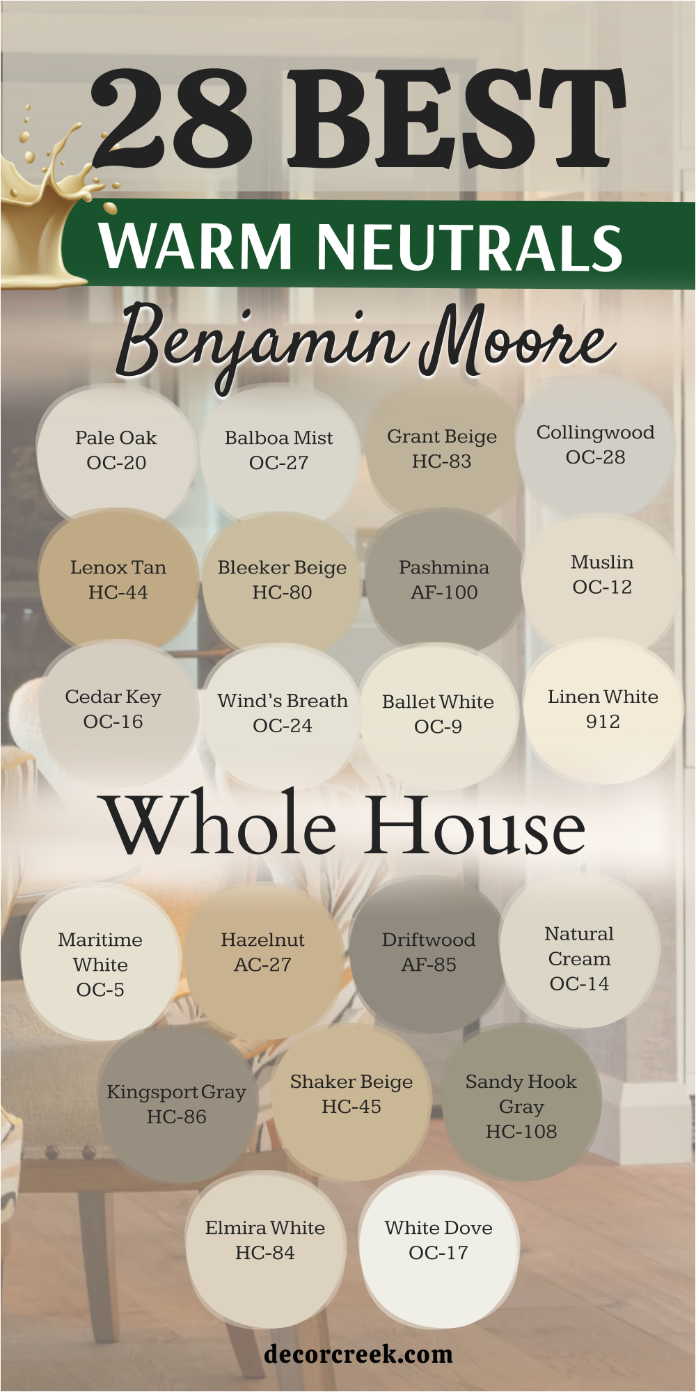
41 Paint Color Combos From Benjamin Moore for the Whole House
White Dove OC-17 / Hale Navy HC-154
White Dove OC-17 / Hale Navy HC-154 creates a classic look that feels very balanced and very strong in any home. This combination uses a soft white for the main walls and a deep blue for a kitchen island or a study. I love how the dark blue makes the white trim look even cleaner and brighter for your family. It is a very safe choice if you want your house to look very expensive and very well-planned.
The paint colors work together to help a room feel both light and grounded at the same time. You will see that the navy blue adds a lot of personality to a room without making it feel too small. It is a favorite for bathrooms where you want a very clean and very nautical style. This pair helps a house feel very organized and provides a clear logic for your decorating choices.
Using these two colors together makes your home feel very traditional and very much like a high-end hotel.
Best used in: kitchens with islands, master suites, and formal dining rooms
Pairs well with: Revere Pewter HC-172, warm wood tones, and gold light fixtures The key rule of this color for farmhouse style is to use it where you want natural light to feel kind, soft, and inviting throughout the day.
Simply White OC-117 / Kendall Charcoal HC-166
Simply White OC-117 / Kendall Charcoal HC-166 offers a very modern and sharp contrast that brings a lot of energy. This duo uses a very bright white for the walls and a dark stony gray for the doors or a fireplace. I find that it makes a living room look very current and helps your colorful art pop off the wall. It is a brave choice for people who love a clean look that has a lot of excitement.
The paint colors help a small room feel very tall and very wide when used in the right way. You will notice that the charcoal gray hides marks on the doors very well, which is great for busy kids. It looks very professional when you have silver or black metal hardware on your cabinets. This pair helps a home feel very neat and shows that you have a very bold and fun personality.
It makes a room feel very fresh and like a very cool place to hang out with your friends.
Best used in: modern living rooms, laundry rooms, and entryways
Pairs well with: Gray Owl OC-52, light oak floors, and black metal accents The key rule of this color for farmhouse style is to use it where you want natural light to feel kind, soft, and inviting throughout the day.
Pale Oak OC-20 / Wrought Iron 2124-10
Pale Oak OC-20 / Wrought Iron 2124-10 is an elegant choice that feels very soft and very sturdy on your walls. This mix uses a light warm gray for the main areas and a near-black shade for a focal point. I recommend this for a master bedroom where you want the bed to sit against a very dark and cozy wall. It has a way of making a large house feel very connected and very much like a single plan.
The paint colors work in any light and help your white furniture look very bright and very pretty. You will find that the dark accent color makes your windows look like frames for the garden outside. It is a smart pick for a home office where you want to feel very focused and very serious. This pair helps a house feel very high-end and shows that you put a lot of thought into your style.
It makes a room feel very private and like a very safe corner of your house for everyone.
Best used in: master bedrooms, home offices, and modern dining areas
Pairs well with: White Dove OC-17, marble textures, and silver decor The key rule of this color for farmhouse style is to use it where you want natural light to feel kind, soft, and inviting throughout the day.

Edgecomb Gray HC-173 / Van Deusen Blue HC-156
Edgecomb Gray HC-173 / Van Deusen Blue HC-156 brings a very natural and earthy feeling to your interior design. This combination uses a perfect greige for the hallways and a medium blue for a cozy den or mudroom. I love how the blue color feels very historical and matches perfectly with the warm gray walls. It is a very friendly choice that helps guests feel very welcome as soon as they walk inside.
The paint colors hide dust and small marks very well, which is a big help for a busy family home. You will see that it makes wood furniture look very rich and very deep in the afternoon sun. It is a great choice for a nursery where you want a look that is soft but still has some color. This pair helps a home feel very traditional and provides a great flow from one room to the next.
It makes a room feel very cozy and like a very special place for your family to grow.
Best used in: mudrooms, family rooms, and children’s bedrooms
Pairs well with: Simply White OC-117, warm pine wood, and brass accents The key rule of this color for farmhouse style is to use it where you want natural light to feel kind, soft, and inviting throughout the day.
Revere Pewter HC-172 / Hale Navy HC-154
Revere Pewter HC-172 / Hale Navy HC-154 is one of the most popular pairs for a whole house color scheme today. This duo uses a solid medium gray for the living spaces and a dark navy for a kitchen island or vanity. I find that it makes a house feel very sturdy and very well-built for a happy family life. It has a very classic look that works with many different types of rugs and furniture.
The paint colors look very professional and help your white trim stand out in a very sharp way. You will notice that it adds a lot of value to the look of your home without being too loud. It is a favorite for open floor plans because the two colors look great when you see them together. This pair helps a house feel very organized and shows that you have a very steady and good taste.
It makes a room feel very warm and like a very important place for family gatherings and meals.
Best used in: open-concept kitchens, basements, and dining rooms
Pairs well with: Cloud White OC-130, leather furniture, and gold hardware The key rule of this color for farmhouse style is to use it where you want natural light to feel kind, soft, and inviting throughout the day.
Balboa Mist OC-27 / Chelsea Gray HC-168
Balboa Mist OC-27 / Chelsea Gray HC-168 creates a soft and layered look that feels very current and very clean. This combination uses a light warm gray for the walls and a deeper gray for the kitchen cabinets. I love how the two colors share the same warm feeling so they never clash with each other. It is a very smart choice for a small house because it keeps things light but adds a bit of depth.
The paint colors make a bathroom look like a very nice spa where you can relax after a long day. You will see that it provides a very gentle background for your favorite colorful pillows and soft blankets. It is a great choice for a laundry room where you want the space to feel very neat and tidy. This pair helps a home feel very balanced and shows that you have a very calm and caring personality.
It makes a room feel very light and airy, which is perfect for a happy family home.
Best used in: kitchens with painted cabinets, bathrooms, and nurseries
Pairs well with: Simply White OC-117, light oak, and silver metal accents The key rule of this color for farmhouse style is to use it where you want natural light to feel kind, soft, and inviting throughout the day.
Classic Gray OC-23 / Newburyport Blue HC-155
Classic Gray OC-23 / Newburyport Blue HC-155 is a very elegant mix that feels like a house by the ocean. This pair uses a very light whisper of gray for the walls and a strong blue for the doors or trim. I recommend this for a guest room where you want your friends to feel like they are on a nice vacation. It has a way of making a simple room look very fancy and very expensive for your family.
The paint colors reflect the sun beautifully and help a dark room feel much more open and bright. You will find that the blue accent color brings a lot of life to the house without being too bright. It is a smart pick for a hallway where you want to add a bit of a surprise with a colorful door. This pair helps a house feel very unique and shows that you have a very good eye for color.
It makes a room feel very cozy and like a very special part of your house for everyone.
Best used in: guest bedrooms, hallways, and coastal-style living rooms
Pairs well with: White Dove OC-17, sandy neutrals, and navy textiles The key rule of this color for farmhouse style is to use it where you want natural light to feel kind, soft, and inviting throughout the day.

Manchester Tan HC-81 / Iron Mountain 2134-30
Manchester Tan HC-81 / Iron Mountain 2134-30 offers a very grounded and earthy look for a traditional home. This combination uses a sandy beige for the main walls and a dark charcoal for a library or a study. I love how the dark color makes the warm beige feel even more cozy and more friendly for you. It is a very reliable choice that handles the daily life of a busy house with no trouble
The paint colors work well with old wooden furniture and green plants that you might have inside. You will see that it creates a very solid mood that helps everyone in the family feel very safe. It is a great choice for an entryway where you want to make a very strong and very warm first impression. This pair helps a home feel very established and shows that you love a look that is very classic.
It provides a very steady background that makes everyone feel very comfortable and very relaxed.
Best used in: traditional entryways, home offices, and exterior accents
Pairs well with: White Heron OC-57, dark walnut wood, and bronze hardware The key rule of this color for farmhouse style is to use it where you want natural light to feel kind, soft, and inviting throughout the day.

Collingwood OC-28 / Boothbay Gray HC-165
Collingwood OC-28 / Boothbay Gray HC-165 is a very soft and pretty mix that feels like a morning in the garden. This duo uses a warm stone gray for the walls and a soft blue-gray for the bathroom vanity or a dresser. I find that it makes a house feel very light and very airy while still having some lovely color. It is a favorite for people who want a house that looks very neat and very put together.
The paint colors look very nice with white linens and light wood floors that many families already have. You will notice that it adds a very gentle glow to the room that makes everyone feel very happy. It is a smart pick for a bedroom where you want to wake up feeling refreshed and ready for the day. This pair helps a home feel very organized and provides a great flow from the kitchen to the dining area.
It makes a room feel very fresh and like a very nice place for your family to hang out.
Best used in: bathrooms, bedrooms, and kitchens with light accents
Pairs well with: Chantilly Lace OC-65, light gray rugs, and silver accents The key rule of this color for farmhouse style is to use it where you want natural light to feel kind, soft, and inviting throughout the day.
Swiss Coffee OC-45 / Essex Green HC-188
Swiss Coffee OC-45 / Essex Green HC-188 is a very rich and traditional pair that brings a lot of history to a house. This combination uses a creamy white for the main areas and a very deep forest green for a cozy den. I love how the dark green makes the cream walls look very soft and very inviting for your guests. It is a very high-end choice that makes your home look like a classic estate or a big manor.
The paint colors provide a perfect background for gold frames and warm wooden floors in your living room. You will see that it creates a very formal mood that is perfect for holiday dinners and family parties. It is a great choice for a front door if you want your house to look very sturdy and very welcoming. This pair helps a house feel very intentional and shows that you have a very good and steady taste.
It makes a room feel very cozy and like a very safe place for your family to rest.
Best used in: formal dining rooms, libraries, and front doors
Pairs well with: White Down OC-131, mahogany wood, and brass decor The key rule of this color for farmhouse style is to use it where you want natural light to feel kind, soft, and inviting throughout the day.

Wind’s Breath OC-24 / Kendall Charcoal HC-166
Wind’s Breath OC-24 / Kendall Charcoal HC-166 offers a soft and strong contrast that works perfectly for a modern family home. This combination uses a very light and airy off-white for the main walls and a dark stony gray for the doors or a fireplace. I find that it makes a living room look very current and helps your colorful art stand out against the pale background. It is a brave choice for people who love a clean look that still has a lot of visual excitement.
The paint colors help a small room feel very tall and very wide when used together in the right way. You will notice that the charcoal gray hides marks on the doors very well which is great for busy kids. It looks very professional when you have silver or black metal hardware on your cabinets or your front door. This pair helps a home feel very neat and shows that you have a very bold and fun personality.
It makes a room feel very fresh and like a very cool place to hang out with your friends.
Best used in: modern living rooms, laundry rooms, and entryways
Pairs well with: Gray Owl OC-52, light oak floors, and black metal accents The key rule of this color for farmhouse style is to use it where you want natural light to feel kind, soft, and inviting throughout the day.
Pashmina AF-100 / Hale Navy HC-154
Pashmina AF-100 / Hale Navy HC-154 creates a very rich and sophisticated look that feels very deep on your interior walls. This duo uses a muddy neutral for the hallways and a classic dark blue for a kitchen island or a study. I love how the dark blue makes the warm beige walls look even more cozy and more friendly for you. It is a very high-end choice that makes your home look like a professional designer visited every single room.
The paint colors work in any light and help your white furniture look very bright and very pretty against the dark navy. You will find that the blue accent color brings a lot of life to the house without being too bright. It is a smart pick for a dining room where you want to create a very elegant and formal mood. This pair helps a house feel very unique and shows that you have a very good eye for color.
It makes a room feel very private and like a very safe corner of your house for everyone.
Best used in: master suites, formal dining rooms, and kitchen islands
Pairs well with: Chantilly Lace OC-65, stone textures, and gold light fixtures The key rule of this color for farmhouse style is to use it where you want natural light to feel kind, soft, and inviting throughout the day.
Grant Beige HC-83 / Knoxville Gray HC-160
Grant Beige HC-83 / Knoxville Gray HC-160 brings a very natural and earthy feeling to your interior design plan this year. This combination uses a sturdy beige for the main areas and a deep blue-green gray for the cabinets or a den. I love how the cool gray-green feels very historical and matches perfectly with the warm tan walls in your home. It is a very friendly choice that helps guests feel very welcome as soon as they walk inside the door.
The paint colors hide dust and small marks very well which is a big help for a busy family home. You will see that it makes wood furniture look very rich and very deep in the warm afternoon sun. It is a great choice for a mudroom where you want a look that is soft but still has some color. This pair helps a home feel very traditional and provides a great flow from one room to the next room.
It makes a room feel very cozy and like a very special place for your family to grow.
Best used in: mudrooms, home offices, and traditional living areas
Pairs well with: Simply White OC-117, warm oak floors, and bronze hardware The key rule of this color for farmhouse style is to use it where you want natural light to feel kind, soft, and inviting throughout the day.
Lenox Tan HC-44 / Wrought Iron 2124-10
Lenox Tan HC-44 / Wrought Iron 2124-10 is a very warm and strong pair that feels very much like a cozy lodge. This mix uses a golden tan for the main living spaces and a near-black shade for a focal point wall. I recommend this for a large family room where you want the walls to feel very close and very sturdy. It has a way of making a house feel very solid and very much like a single big plan.
The paint colors look very nice when you have bright white trim to create a sharp and clean contrast for you. You will notice that the dark accent color makes your windows look like frames for the green trees outside. It is a smart pick for a basement or a media room where you want to feel very tucked in. This pair helps a house feel very established and shows that you have a very good sense of style.
It makes a room feel very cozy and like a very safe place for your family to rest.
Best used in: family rooms, basements, and traditional master bedrooms
Pairs well with: Simply White OC-117, leather furniture, and dark wood The key rule of this color for farmhouse style is to use it where you want natural light to feel kind, soft, and inviting throughout the day.
Shaker Beige HC-45 / Van Deusen Blue HC-156
Shaker Beige HC-45 / Van Deusen Blue HC-156 offers a classic look that feels very balanced and very friendly for families. This combination uses a creamy tan for the walls and a medium-to-dark blue for the doors or a kitchen island. I love how the blue color feels very happy and matches perfectly with the warm beige walls in your house. It is a very safe choice if you want your house to look very expensive and very well-planned.
The paint colors work together to help a room feel both light and grounded at the exact same time for you. You will see that the blue adds a lot of personality to a room without making it feel too small. It is a favorite for entryways where you want a very clean and very traditional style for your guests. This pair helps a house feel very organized and provides a clear logic for your decorating choices in the home.
Using these two colors together makes your home feel very traditional and very much like a high-end estate.
Best used in: entryways, kitchens with islands, and children’s rooms
Pairs well with: White Dove OC-17, warm pine, and brass accents The key rule of this color for farmhouse style is to use it where you want natural light to feel kind, soft, and inviting throughout the day.
Natural Cream OC-14 / Iron Mountain 2134-30
Natural Cream OC-14 / Iron Mountain 2134-30 is an elegant choice that feels very soft and very sturdy on your walls. This mix uses a light off-white for the main areas and a dark charcoal for a library or a study. I recommend this for a living room where you want a background that feels very clean and very modern. It has a way of making a large house feel very connected and very much like a single plan.
The paint colors work in any light and help your white furniture look very bright and very pretty against the dark gray. You will find that the charcoal accent color makes your white trim stand out in a very sharp way. It is a smart pick for a home office where you want to feel very focused and very serious. This pair helps a house feel very high-end and shows that you put a lot of thought into your style.
It makes a room feel very private and like a very safe corner of your house for everyone.
Best used in: living rooms, home offices, and modern dining areas
Pairs well with: Simply White OC-117, marble textures, and silver decor The key rule of this color for farmhouse style is to use it where you want natural light to feel kind, soft, and inviting throughout the day.
Cedar Key OC-16 / Boothbay Gray HC-165
Cedar Key OC-16 / Boothbay Gray HC-165 creates a soft and pretty mix that feels like a morning in a garden. This duo uses a light stone beige for the walls and a soft blue-gray for the bathroom vanity or a dresser. I find that it makes a house feel very light and very airy while still having some lovely color. It is a favorite for people who want a house that looks very neat and very put together.
The paint colors look very nice with white linens and light wood floors that many families already have in homes. You will notice that it adds a very gentle glow to the room that makes everyone feel very happy. It is a smart pick for a bedroom where you want to wake up feeling refreshed and ready for the day. This pair helps a home feel very organized and provides a great flow from the kitchen to the dining area.
It makes a room feel very fresh and like a very nice place for your family to hang out.
Best used in: bathrooms, bedrooms, and kitchens with light accents
Pairs well with: White Dove OC-17, light gray rugs, and silver accents The key rule of this color for farmhouse style is to use it where you want natural light to feel kind, soft, and inviting throughout the day.
Muslin OC-12 / Hale Navy HC-154
Muslin OC-12 / Hale Navy HC-154 is a very traditional and rich pair that brings a lot of strength to your walls. This combination uses a creamy linen beige for the main areas and a dark navy for a dining room wall. I love how the dark blue makes the light beige walls look very soft and very inviting for your guests. It is a very high-end choice that makes your home look like a classic estate or a big manor.
The paint colors provide a perfect background for gold frames and warm wooden floors in your living room for you. You will see that it creates a very formal mood that is perfect for holiday dinners and family parties. It is a great choice for a powder room where you want to make a very bold and strong statement. This pair helps a house feel very intentional and shows that you have a very good and steady taste.
It makes a room feel very cozy and like a very safe place for your family to gather.
Best used in: dining rooms, powder rooms, and traditional entryways
Pairs well with: Simply White OC-117, mahogany wood, and gold hardware The key rule of this color for farmhouse style is to use it where you want natural light to feel kind, soft, and inviting throughout the day.
Sandy Hook Gray HC-108 / Kendall Charcoal HC-166
Sandy Hook Gray HC-108 / Kendall Charcoal HC-166 offers a very grounded and earthy look for a modern or traditional home. This combination uses a medium stone gray for the main walls and a dark charcoal for the doors or trim. I love how the dark color makes the warm gray walls feel even more cozy and more friendly for you. It is a very reliable choice that handles the daily life of a busy house with no trouble.
The paint colors work well with dark wood furniture and green plants that you might have inside the house. You will see that it creates a very solid mood that helps everyone in the family feel very safe. It is a great choice for an entryway where you want to make a very strong and very warm first impression. This pair helps a home feel very established and shows that you love a look that is very classic.
It provides a very steady background that makes everyone feel very comfortable and very relaxed at home.
Best used in: entryways, home offices, and exterior siding
Pairs well with: White Dove OC-17, warm oak floors, and black metal accents The key rule of this color for farmhouse style is to use it where you want natural light to feel kind, soft, and inviting throughout the day.
Kingsport Gray HC-86 / Wrought Iron 2124-10
Kingsport Gray HC-86 / Wrought Iron 2124-10 is a very rich and moody pair that brings a lot of drama to your home. This combination uses a deep earthy tan for the main walls and a near-black shade for the kitchen cabinets. I love how the dark color makes the walls look very soft and very inviting for your guests in the evening. It is a very high-end choice that makes your home look like a very expensive and very well-designed house.
The paint colors provide a perfect background for gold frames and warm wooden floors in your office or study area. You will see that it creates a very serious mood that is perfect for getting a lot of work done. It is a great choice for a media room where you want the walls to feel very dark and very cozy. This pair helps a house feel very intentional and shows that you have a very good and steady taste.
It makes a room feel very private and like a very safe place for your family to rest.
Best used in: home offices, kitchen cabinets, and media rooms
Pairs well with: White Dove OC-17, brass decor, and dark wood floors The key rule of this color for farmhouse style is to use it where you want natural light to feel kind, soft, and inviting throughout the day.
Gray Owl OC-52 / Hale Navy HC-154
Gray Owl OC-52 / Hale Navy HC-154 creates a crisp and cool look that feels very fresh in any modern home. This combination uses a light gray with a hint of blue for the main walls and a deep navy for a kitchen island or a study. I love how the dark blue makes the cool gray walls look even cleaner and brighter for your family. It is a very safe choice if you want your house to look very expensive and very well-planned.
The paint colors work together to help a room feel both light and grounded at the same time. You will see that the navy blue adds a lot of personality to a room without making it feel too small. It is a favorite for bathrooms where you want a very clean and very nautical style. This pair helps a house feel very organized and provides a clear logic for your decorating choices.
Using these two colors together makes your home feel very current and very much like a high-end hotel.
Best used in: kitchens with islands, bathrooms, and sunny living rooms
Pairs well with: White Dove OC-17, silver hardware, and light oak floors The key rule of this color for farmhouse style is to use it where you want natural light to feel kind, soft, and inviting throughout the day.
Nimbus Gray 2131-50 / Chelsea Gray HC-168
Beneath the Clouds 2131-50 / Chelsea Gray HC-168 brings a very strong and beautiful blue-gray feeling to your interior design. This combination uses a medium blue-toned gray for the walls and a deep rich gray for the trim or cabinets. I love how the darker gray feels very historical and matches perfectly with the blue walls in your home. It is a very friendly choice that helps guests feel very welcome as soon as they walk inside.
The paint colors hide dust and small marks very well which is a big help for a busy family home. You will see that it makes silver metal look very bright and very pretty in the afternoon sun. It is a great choice for a laundry room or a mudroom where you want a look that is soft but still has some weight. This pair helps a home feel very traditional and provides a great flow from one room to the next.
It makes a room feel very cozy and like a very special place for your family to grow.
Best used in: laundry rooms, mudrooms, and home offices
Pairs well with: Chantilly Lace OC-65, silver hardware, and white tile The key rule of this color for farmhouse style is to use it where you want natural light to feel kind, soft, and inviting throughout the day.
Smoke 2122-40 / Kendall Charcoal HC-166
Smoke 2122-40 / Kendall Charcoal HC-166 offers a very soft and moody look that feels like a quiet morning at the lake. This duo uses a light blue-green for the main walls and a dark stony gray for the doors or a fireplace. I find that it makes a bedroom look very current and helps your white linens look very bright. It is a brave choice for people who love a look that has a lot of color but still feels very steady.

The paint colors help a small room feel very tall and very wide when used in the right way. You will notice that the charcoal gray hides marks on the doors very well which is great for busy kids. It looks very professional when you have silver or black metal hardware on your cabinets or doors. This pair helps a home feel very neat and shows that you have a very bold and fun personality.
It makes a room feel very fresh and like a very cool place to hang out with your friends.
Best used in: bedrooms, bathrooms, and cozy sitting areas
Pairs well with: Simply White OC-117, light gray rugs, and dark wood The key rule of this color for farmhouse style is to use it where you want natural light to feel kind, soft, and inviting throughout the day.
Palladian Blue HC-144 / Iron Mountain 2134-30
Palladian Blue HC-144 / Iron Mountain 2134-30 is an elegant choice that feels very light and very sturdy on your walls. This mix uses a soft tropical blue-green for the main areas and a dark charcoal for a focal point. I recommend this for a guest room where you want a background that feels very clean and very happy. It has a way of making a large house feel very connected and very much like a single plan.
The paint colors work in any light and help your white furniture look very bright and very pretty against the dark gray. You will find that the charcoal accent color makes your white trim stand out in a very sharp way. It is a smart pick for a laundry room where you want to feel very organized and very ready to work. This pair helps a house feel very high-end and shows that you put a lot of thought into your style.
It makes a room feel very private and like a very safe corner of your house for everyone.
Best used in: laundry rooms, guest bedrooms, and bathrooms
Pairs well with: Cloud White OC-130, dark wood floors, and silver accents The key rule of this color for farmhouse style is to use it where you want natural light to feel kind, soft, and inviting throughout the day.
Quiet Moments 1563 / Hale Navy HC-154
Quiet Moments 1563 / Hale Navy HC-154 creates a very soft and rich pair that brings a lot of peace to your home. This combination uses a light blue-gray for the walls and a dark navy for a kitchen island or vanity. I love how the dark blue makes the light walls look very soft and very inviting for your guests. It is a very high-end choice that makes your home look like a classic estate or a big manor.

The paint colors provide a perfect background for gold frames and warm wooden floors in your living room for you. You will see that it creates a very formal mood that is perfect for holiday dinners and family parties. It is a great choice for a bedroom where you want to make a very bold and strong statement. This pair helps a house feel very intentional and shows that you have a very good and steady taste.
It makes a room feel very cozy and like a very safe place for your family to gather.
Best used in: bedrooms, bathrooms, and kitchen islands
Pairs well with: White Dove OC-17, gold accents, and light wood floors The key rule of this color for farmhouse style is to use it where you want natural light to feel kind, soft, and inviting throughout the day.
Beach Glass 1564 / Wrought Iron 2124-10
Beach Glass 1564 / Wrought Iron 2124-10 offers a very grounded and earthy look for a modern or traditional home. This combination uses a medium sea-green for the main walls and a near-black shade for the doors or trim. I love how the dark color makes the green walls feel even more cozy and more friendly for you. It is a very reliable choice that handles the daily life of a busy house with no trouble.

The paint colors work well with dark wood furniture and green plants that you might have inside the house. You will see that it creates a very solid mood that helps everyone in the family feel very safe. It is a great choice for an entryway where you want to make a very strong and very warm first impression. This pair helps a home feel very established and shows that you love a look that is very classic.
It provides a very steady background that makes everyone feel very comfortable and very relaxed at home.
Best used in: entryways, bedrooms, and dining rooms
Pairs well with: Simply White OC-117, dark wood, and silver metal The key rule of this color for farmhouse style is to use it where you want natural light to feel kind, soft, and inviting throughout the day.
Healing Aloe 1562 / Kendall Charcoal HC-166
Healing Aloe 1562 / Kendall Charcoal HC-166 creates a soft and layered look that feels very current and very clean. This combination uses a very light green for the walls and a deeper gray for the kitchen cabinets or doors. I love how the two colors look so natural together like trees and stones in the forest. It is a very smart choice for a small house because it keeps things light but adds a bit of depth.

The paint colors make a bathroom look like a very nice spa where you can relax after a long day. You will see that it provides a very gentle background for your favorite colorful pillows and soft blankets. It is a great choice for a laundry room where you want the space to feel very neat and tidy. This pair helps a home feel very balanced and shows that you have a very calm and caring personality.
It makes a room feel very light and airy, which is perfect for a happy family home.
Best used in: bathrooms, bedrooms, and nurseries
Pairs well with: White Dove OC-17, light oak, and black metal accents The key rule of this color for farmhouse style is to use it where you want natural light to feel kind, soft, and inviting throughout the day.
Saybrook Sage HC-114 / Hale Navy HC-154
Saybrook Sage HC-114 / Hale Navy HC-154 is a very rich and traditional pair that brings a lot of history to a house. This combination uses a soft green for the main areas and a dark navy for a dining room wall or study. I love how the dark blue makes the green walls look very soft and very inviting for your guests. It is a very high-end choice that makes your home look like a classic estate or a big manor.

The paint colors provide a perfect background for gold frames and warm wooden floors in your living room. You will see that it creates a very formal mood that is perfect for holiday dinners and family parties. It is a great choice for a front door if you want your house to look very sturdy and very welcoming. This pair helps a house feel very intentional and shows that you have a very good and steady taste.
It makes a room feel very cozy and like a very safe place for your family to rest.
Best used in: dining rooms, living rooms, and exteriors
Pairs well with: Cloud White OC-130, warm wood tones, and brass decor The key rule of this color for farmhouse style is to use it where you want natural light to feel kind, soft, and inviting throughout the day.
October Mist 1495 / Iron Mountain 2134-30
October Mist 1495 / Iron Mountain 2134-30 offers a very soft and strong contrast that works perfectly for a modern family home. This combination uses a silver-green for the main walls and a dark charcoal for the kitchen cabinets or doors. I find that it makes a kitchen look very current and helps your wooden counters stand out against the background. It is a brave choice for people who love a clean look that still has a lot of visual excitement.

The paint colors help a small room feel very tall and very wide when used together in the right way. You will notice that the charcoal gray hides marks on the doors very well which is great for busy kids. It looks very professional when you have silver or black metal hardware on your cabinets or your front door. This pair helps a home feel very neat and shows that you have a very bold and fun personality.
It makes a room feel very fresh and like a very cool place to hang out with your friends.
Best used in: kitchens, living rooms, and mudrooms
Pairs well with: Simply White OC-117, light wood, and black metal accents The key rule of this color for farmhouse style is to use it where you want natural light to feel kind, soft, and inviting throughout the day.
Gloucester Sage HC-100 / Wrought Iron 2124-10
Gloucester Sage HC-100 / Wrought Iron 2124-10 is a very warm and strong pair that feels very much like a cozy forest cabin. This mix uses a dark green for the main living spaces and a near-black shade for a focal point wall. I recommend this for a large family room where you want the walls to feel very close and very sturdy. It has a way of making a house feel very solid and very much like a single big plan.
The paint colors look very nice when you have bright white trim to create a sharp and clean contrast for you. You will notice that the dark accent color makes your windows look like frames for the green trees outside. It is a smart pick for a basement or a media room where you want to feel very tucked in. This pair helps a house feel very established and shows that you have a very good sense of style.
It makes a room feel very cozy and like a very safe place for your family to rest.
Best used in: family rooms, dens, and home offices
Pairs well with: White Dove OC-17, leather furniture, and dark wood The key rule of this color for farmhouse style is to use it where you want natural light to feel kind, soft, and inviting throughout the day.
Ashley Gray HC-87 / Hale Navy HC-154
Ashley Gray HC-87 / Hale Navy HC-154 creates a very rich and sophisticated look that feels very deep on your interior walls. This duo uses a warm taupe for the walls and a classic dark blue for a kitchen island or a vanity. I love how the dark blue makes the warm gray walls look even more cozy and more friendly for you. It is a very high-end choice that makes your home look like a professional designer visited every single room.
The paint colors work in any light and help your white furniture look very bright and very pretty against the dark navy. You will find that the blue accent color brings a lot of life to the house without being too bright. It is a smart pick for a master bedroom where you want to create a very elegant and formal mood. This pair helps a house feel very unique and shows that you have a very good eye for color.
It makes a room feel very private and like a very safe corner of your house for everyone.
Best used in: master bedrooms, dining rooms, and home offices
Pairs well with: Simply White OC-117, gold accents, and warm wood floors The key rule of this color for farmhouse style is to use it where you want natural light to feel kind, soft, and inviting throughout the day.
Stone Hearth CC-490 / Kendall Charcoal HC-166
Stone Hearth CC-490 / Kendall Charcoal HC-166 offers a very grounded and earthy look for a modern or traditional home. This combination uses a warm stone-colored tan for the main walls and a dark charcoal for the doors or trim. I love how the dark color makes the warm walls feel even more cozy and more friendly for you. It is a very reliable choice that handles the daily life of a busy house with no trouble.
The paint colors work well with dark wood furniture and green plants that you might have inside the house. You will see that it creates a very solid mood that helps everyone in the family feel very safe. It is a great choice for an entryway where you want to make a very strong and very warm first impression. This pair helps a home feel very established and shows that you love a look that is very classic.
It provides a very steady background that makes everyone feel very comfortable and very relaxed at home.
Best used in: entryways, living rooms, and kitchens
Pairs well with: White Dove OC-17, dark wood, and silver metal accents The key rule of this color for farmhouse style is to use it where you want natural light to feel kind, soft, and inviting throughout the day.
Thunder AF-685 / Hale Navy HC-154
Thunder AF-685 / Hale Navy HC-154 is one of the most popular pairs for a whole house color scheme today. This duo uses a solid medium gray for the living spaces and a dark navy for a kitchen island or a dresser. I find that it makes a house feel very sturdy and very well-built for a happy family life. It has a very classic look that works with many different types of rugs and furniture.

The paint colors look very professional and help your white trim stand out in a very sharp way. You will notice that it adds a lot of value to the look of your home without being too loud. It is a favorite for open floor plans because the two colors look great when you see them together. This pair helps a house feel very organized and shows that you have a very steady and good taste.
It makes a room feel very warm and like a very important place for family gatherings and meals.
Best used in: living rooms, kitchens, and master bedrooms
Pairs well with: Chantilly Lace OC-65, leather, and gold hardware The key rule of this color for farmhouse style is to use it where you want natural light to feel kind, soft, and inviting throughout the day.
Sparrow AF-720 / Iron Mountain 2134-30
Sparrow AF-720 / Iron Mountain 2134-30 is a very rich and moody pair that brings a lot of drama to your home. This combination uses a deep earthy gray for the main walls and a near-black shade for the kitchen cabinets. I love how the dark color makes the walls look very soft and very inviting for your guests in the evening. It is a very high-end choice that makes your home look like a very expensive and very well-designed house.
The paint colors provide a perfect background for gold frames and warm wooden floors in your office or study area. You will see that it creates a very serious mood that is perfect for getting a lot of work done. It is a great choice for a media room where you want the walls to feel very dark and very cozy. This pair helps a house feel very intentional and shows that you have a very good and steady taste.
It makes a room feel very private and like a very safe place for your family to rest.
Best used in: home offices, media rooms, and dining rooms
Pairs well with: Simply White OC-117, brass decor, and dark wood floors The key rule of this color for farmhouse style is to use it where you want natural light to feel kind, soft, and inviting throughout the day.
Iron Mountain 2134-30 / Chantilly Lace OC-65
Iron Mountain 2134-30 / Chantilly Lace OC-65 offers a very modern and sharp contrast that brings a lot of energy. This duo uses a dark charcoal gray for the main walls and a very pure white for the trim or cabinets. I find that it makes a living room look very current and helps your colorful art pop off the wall. It is a brave choice for people who love a clean look that has a lot of excitement.
The paint colors help a small room feel very tall and very wide when used in the right way. You will notice that the white trim makes the dark walls look very professional and very expensive. It looks very professional when you have silver or black metal hardware on your cabinets or doors. This pair helps a home feel very neat and shows that you have a very bold and fun personality.
It makes a room feel very fresh and like a very cool place to hang out with your friends.
Best used in: modern living rooms, dining rooms, and focal walls
Pairs well with: Classic Gray OC-23, silver hardware, and black metal The key rule of this color for farmhouse style is to use it where you want natural light to feel kind, soft, and inviting throughout the day.
Kendall Charcoal HC-166 / White Dove OC-17
Kendall Charcoal HC-166 / White Dove OC-17 is an elegant choice that feels very soft and very sturdy on your walls. This mix uses a dark stony gray for the walls and a soft warm white for the trim and cabinets. I recommend this for a kitchen where you want the lower cabinets to be dark and the walls to be light. It has a way of making a large house feel very connected and very much like a single plan.
The paint colors work in any light and help your white furniture look very bright and very pretty against the dark gray. You will find that the white accent color makes your dark walls feel much softer and more welcoming. It is a smart pick for a home office where you want to feel very focused and very serious. This pair helps a house feel very high-end and shows that you put a lot of thought into your style.
It makes a room feel very private and like a very safe corner of your house for everyone.
Best used in: kitchens, home offices, and master bedrooms
Pairs well with: Edgecomb Gray HC-173, light wood, and silver accents The key rule of this color for farmhouse style is to use it where you want natural light to feel kind, soft, and inviting throughout the day.
Hale Navy HC-154 / Simply White OC-117
Hale Navy HC-154 / Simply White OC-117 is one of the most classic pairs for a whole house color scheme today. This duo uses a dark navy for the main walls and a very crisp white for the trim and ceilings. I find that it makes a house feel very sturdy and very well-built for a happy family life. It has a very classic look that works with many different types of rugs and furniture.
The paint colors look very professional and help your white trim stand out in a very sharp way. You will notice that it adds a lot of value to the look of your home without being too loud. It is a favorite for entryways because it makes a very strong and very clean first impression. This pair helps a house feel very organized and shows that you have a very steady and good taste.
It makes a room feel very warm and like a very important place for family gatherings and meals.
Best used in: entryways, dining rooms, and kitchen cabinets
Pairs well with: Revere Pewter HC-172, gold hardware, and dark wood The key rule of this color for farmhouse style is to use it where you want natural light to feel kind, soft, and inviting throughout
Newburyport Blue HC-155 / White Dove OC-17
Newburyport Blue HC-155 / White Dove OC-17 creates a soft and pretty mix that feels like a morning at the beach. This duo uses a strong blue for the walls and a soft warm white for the trim and doors. I find that it makes a house feel very light and very airy while still having some lovely color. It is a favorite for people who want a house that looks very neat and very put together.
The paint colors look very nice with white linens and light wood floors that many families already have. You will notice that it adds a very gentle glow to the room that makes everyone feel very happy. It is a smart pick for a bedroom where you want to wake up feeling refreshed and ready for the day. This pair helps a home feel very organized and provides a great flow from the kitchen to the dining area.
It makes a room feel very fresh and like a very nice place for your family to hang out.
Best used in: bedrooms, bathrooms, and living rooms
Pairs well with: Classic Gray OC-23, light wood, and navy textiles The key rule of this color for farmhouse style is to use it where you want natural light to feel kind, soft, and inviting throughout the day.
Van Deusen Blue HC-156 / Chantilly Lace OC-65
Van Deusen Blue HC-156 / Chantilly Lace OC-65 is a very rich and traditional pair that brings a lot of history to a house. This combination uses a historical blue for the walls and a very pure white for the trim and ceilings. I love how the dark blue makes the white walls look very soft and very inviting for your guests. It is a very high-end choice that makes your home look like a classic estate or a big manor.
The paint colors provide a perfect background for gold frames and warm wooden floors in your living room. You will see that it creates a very formal mood that is perfect for holiday dinners and family parties. It is a great choice for a front door if you want your house to look very sturdy and very welcoming. This pair helps a house feel very intentional and shows that you have a very good and steady taste.
It makes a room feel very cozy and like a very safe place for your family to rest.
Best used in: formal dining rooms, home offices, and exteriors
Pairs well with: Manchester Tan HC-81, brass decor, and dark wood The key rule of this color for farmhouse style is to use it where you want natural light to feel kind, soft, and inviting throughout the day.
Boothbay Gray HC-165 / White Dove OC-17
Boothbay Gray HC-165 / White Dove OC-17 offers a very soft and moody look that feels like a quiet morning at the ocean. This duo uses a light blue-gray for the main walls and a soft warm white for the trim or cabinets. I find that it makes a kitchen look very current and helps your white counters look very bright. It is a brave choice for people who love a look that has a lot of color but still feels very steady.
The paint colors help a small room feel very tall and very wide when used in the right way. You will notice that the white trim makes the soft gray walls look very professional and very expensive. It looks very professional when you have silver or gold hardware on your cabinets or your front door. This pair helps a home feel very neat and shows that you have a very bold and fun personality.
It makes a room feel very fresh and like a very cool place to hang out with your friends.
Best used in: kitchens, bathrooms, and bedrooms
Pairs well with: Simply White OC-117, light wood, and gold accents The key rule of this color for farmhouse style is to use it where you want natural light to feel kind, soft, and inviting throughout the day.
Edgecomb Gray HC-173 / Chantilly Lace OC-65
Edgecomb Gray HC-173 / Chantilly Lace OC-65 creates a very soft and clean look that feels very balanced and very fresh. This combination uses a perfect greige for the walls and a very pure white for the trim and doors. I love how the white trim makes the warm gray walls look even cleaner and brighter for your family. It is a very safe choice if you want your house to look very expensive and very well-planned.
The paint colors work together to help a room feel both light and grounded at the same time. You will see that it hides small scuffs and marks very well which is a big help for a busy family home. It is a favorite for open floor plans where you want a very clean and very modern style for your guests. This pair helps a house feel very organized and provides a clear logic for your decorating choices in the home.
Using these two colors together makes your home feel very traditional and very much like a high-end estate.
Best used in: open floor plans, hallways, and living rooms
Pairs well with: Hale Navy HC-154, warm wood floors, and silver accents The key rule of this color for farmhouse style is to use it where you want natural light to feel kind, soft, and inviting throughout the day.
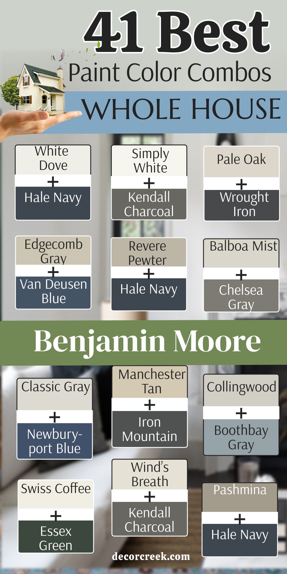
My Final Thoughts about 45 Benjamin Moore Whole House Color Schemes
Choosing a cohesive color palette for your entire home is a significant and deeply personal decision that ultimately tells the unique story of who you are and what you value. It is far more than just a home improvement project; it is about curating the atmosphere where your life unfolds.
I truly hope this comprehensive list of Benjamin Moore favorites helps you visualize the incredible power of color and see how much a simple gallon of high-quality paint can fundamentally shift the energy and mood of your daily life.
When you choose the right tones, you aren’t just changing a wall; you are enhancing every morning cup of coffee and every evening spent relaxing with your loved ones.
You and your family deserve a sanctuary that feels like a truly special place—a curated backdrop designed specifically for you to grow, thrive, and create lifelong memories together. Taking the time to thoughtfully research and select the perfect shades is a beautiful reflection of how much you deeply care about the well-being and comfort of the people living inside those walls. A well-chosen palette provides a sense of calm and order that supports a busy family lifestyle.
Always remember that high-quality paint is the most effective and accessible tool available to make your home look exactly how you have always envisioned it in your dreams. It has the unique ability to hide architectural flaws, highlight beautiful trim, and bring a sense of professional design to even the simplest of spaces.
By investing this effort now, you are turning a house into a soulful home that will continue to inspire you and welcome your guests for many years to come.