Creating a work area at home is more than just buying a desk and a chair; it is about building a complete environment that feeds your productivity and energy. I see so many people struggle with their daily tasks because they pick a paint color that accidentally makes them feel tired, sluggish, or easily distracted by their surroundings.
My goal is to help you find a specific shade that makes your brain feel sharp and alert while keeping your body feel relaxed and comfortable during long hours. In 2026, we are looking for colors that feel real and grounded, moving away from fake-looking tones toward shades that remind us of nature and stability.
Whether you are reading heavy books for school or working a full-time job from your laptop, the walls around you change how you think and how you handle stress.
I want to help you build a room where you actually want to spend time, turning your office into a place you love rather than a place you avoid.
Why I Trust Sherwin-Williams and Benjamin Moore for Home Study Room Paint Colors
I always use these two brands for my professional projects because their pigments are thick, rich, and designed to look beautiful under any kind of light. When you paint a wall in your home, you want the final color to look exactly like the little paper sample you held in the store, and these brands deliver that consistency every time.
These companies make high-quality paint that lasts a very long time and handles both natural sunlight and artificial light bulbs very well without fading. I know from years of experience that if I pick a dark blue or a soft white from their collections, the finish will be smooth and will not look patchy, streaky, or cheap on the wall.
Their paint covers the walls easily in fewer coats and stays looking fresh and clean for years, even if you have to wipe away a stray pen mark now and then. This reliability and professional grade quality is why experts like me keep coming back to them for every important home study project.
How I Choose Paint Colors That Support Focus, Comfort, and Daily Study
I look at how much natural light comes through the windows at different times of the day before I ever pick up a bucket of paint or a brush. If a room is naturally dark or faces north, I might choose something with a bit of warmth to make the area feel less cold and more inviting for a long morning of work.
If the room is very bright with big south-facing windows, I look for shades with gray or cool undertones that stop the sun from bouncing off the walls too hard and causing a glare. I also think deeply about the science of how a color makes you feel emotionally and physically when you are trying to concentrate on a hard task.
Blue helps most people stay steady, quiet, and mentally balanced, while green is great for long hours of study because it does not strain your eyes or cause mental fatigue. I strictly avoid colors that are too loud, neon, or overly bright because they overstimulate the brain and make it very hard to sit still and focus on a single project for a long time.
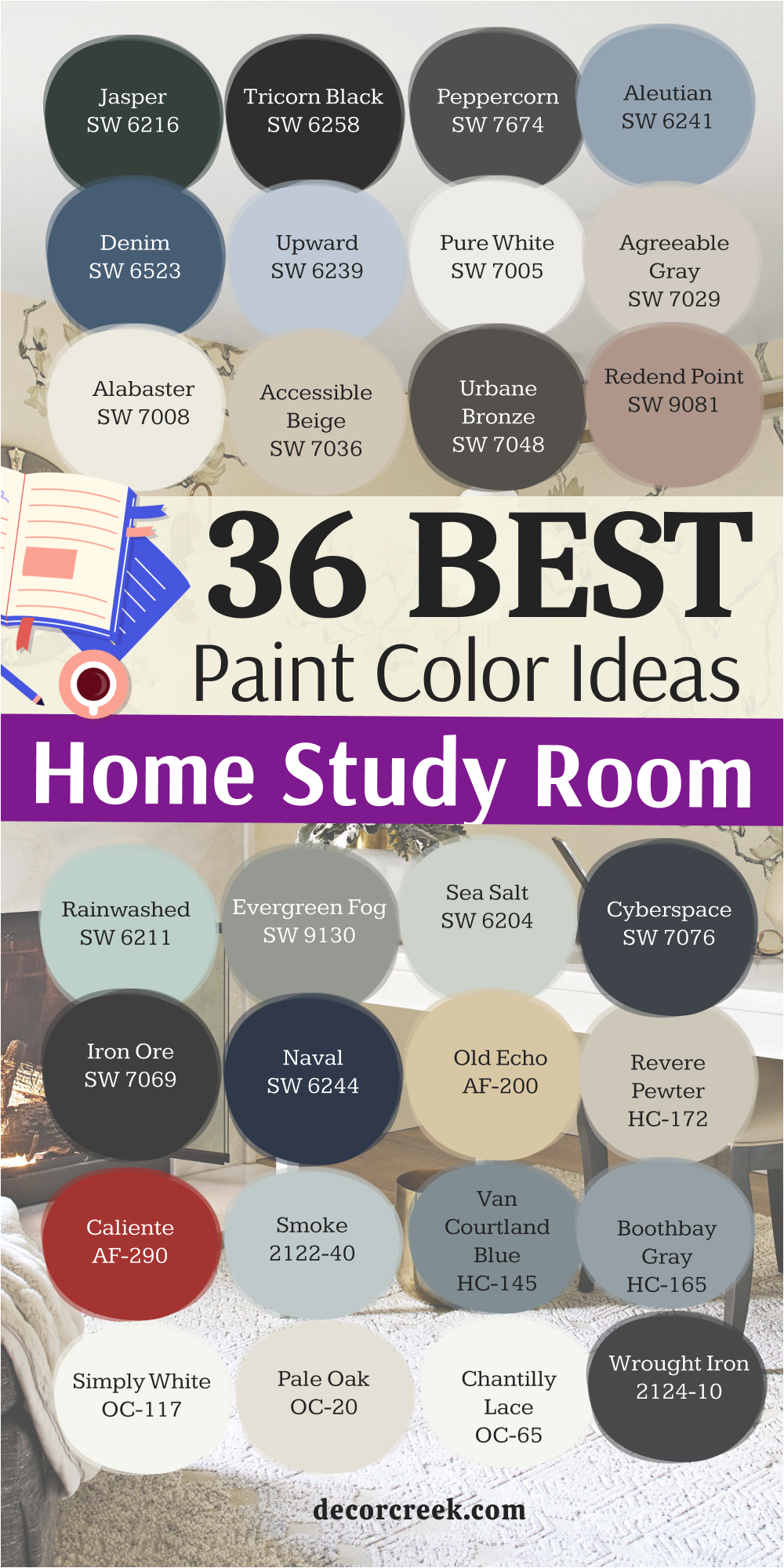
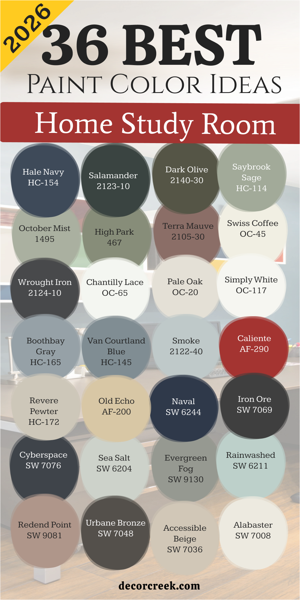
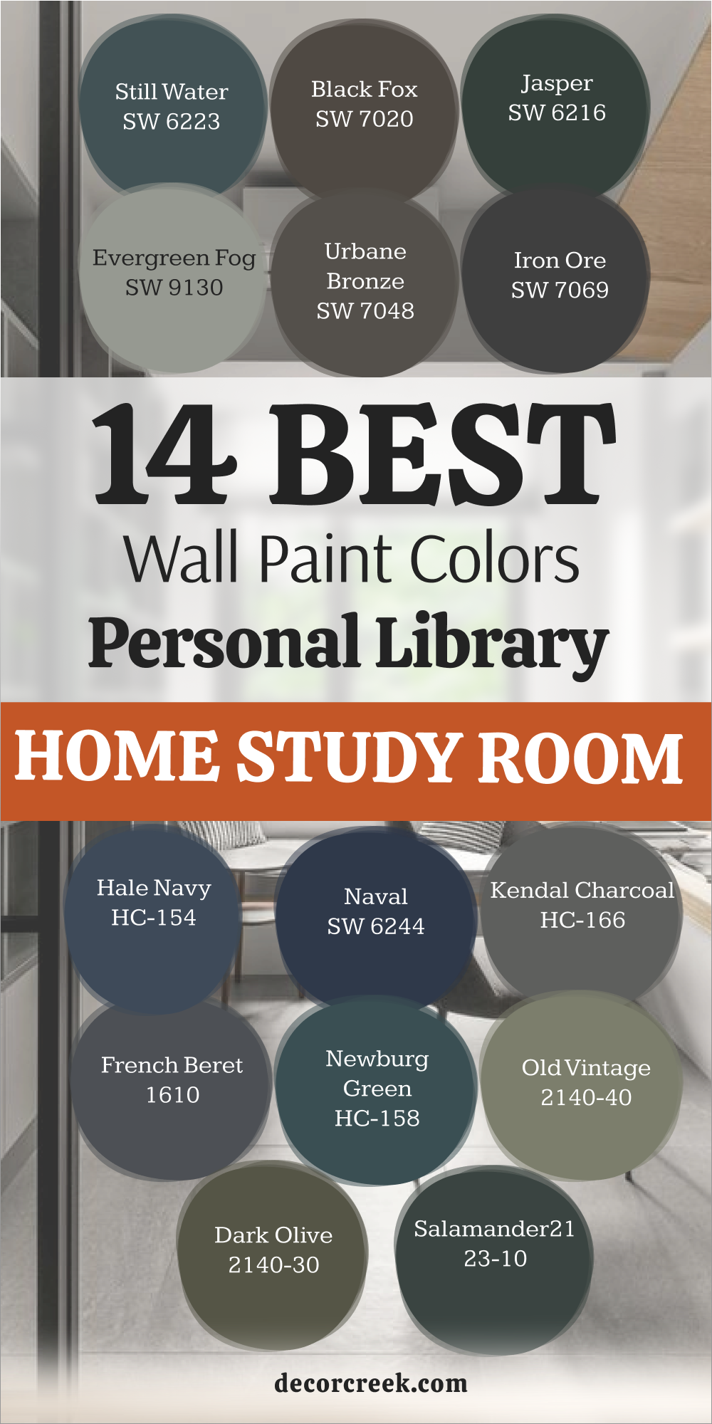
36 Best Home Study Room Paint Color Ideas In 2026
Hale Navy HC-154
Hale Navy HC-154 brings a heavy and serious feeling to any wall it touches. This navy shade acts like a neutral because it works with almost any kind of wood furniture you own. Many people choose this color when they want to feel like a professional boss in their own house.
It hides shadows well and makes gold or brass lamps look very expensive. You will notice that the dark tone helps you look at your computer screen without seeing glare from the walls.
This deep blue stays popular because it feels strong and stable. It is a great choice for a room where you need to make big decisions. The finish looks best when you use a matte or eggshell texture to keep it looking soft. Large windows make this blue pop during the daytime.
Best used in: study rooms, home offices, accent walls, and cabinetry
Pairs well with: Simply White OC-117, Revere Pewter HC-172, Wood tones, Gold accents The key rule of this color for a professional style is to use it where you want to feel a sense of authority and deep concentration while working.
🎨 Check out the complete guide to this color right HERE 👈

Salamander 2050-10
Salamander 2050-10 is a mix of dark green and black that looks different as the sun moves across the sky. This color feels like a thick forest at night and keeps the room feeling very private. You can use this on all four walls if you want a cozy spot for reading.
It makes white trim look very crisp and clean. Many designers love how this shade adds drama without being too bright or annoying. It is a sophisticated pick for someone who wants a moody environment for creative writing.
The green undertone keeps it from feeling as cold as a plain black would. It creates a backdrop that makes your books and art stand out. This paint is thick and covers old colors very well.
Best used in: libraries, dens, media rooms, and small offices
Pairs well with: Pale Oak OC-20, Chantilly Lace OC-65, Leather furniture, Walnut wood The key rule of this color for a moody style is to use it in smaller rooms to create a feeling of being tucked away from the rest of the world.
🎨 Check out the complete guide to this color right HERE 👈

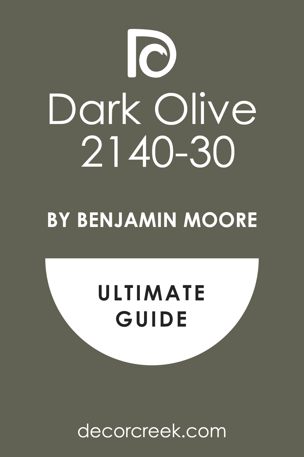
Dark Olive 2140-30
Dark Olive 2140-30 offers a natural look that reminds me of old trees and mossy paths. This olive tone is excellent for people who spend eight hours a day at a desk. It is very easy on the eyes and does not cause fatigue like bright yellows or reds.
You will find that it matches well with warm leather chairs and soft rugs. This color brings the feeling of the outdoors inside your house. It works well in both modern homes and older houses with lots of character.
The yellow in the base keeps the green from looking too gray or dull. It feels grounded and honest as a choice for a serious student. This shade looks amazing when paired with black metal desk frames.
Best used in: home offices, mudrooms, libraries, and bedroom nooks
Pairs well with: Swiss Coffee OC-45, Wood tones, Black accents, Creamy whites The key rule of this color for a natural style is to use it with plenty of indoor plants to make your work area feel like a garden retreat.
🎨 Check out the complete guide to this color right HERE 👈
Saybrook Sage HC-114
Saybrook Sage HC-114 is a soft green that feels like a breath of fresh air. This color is light enough to use in a small closet that you turned into a tiny office. It has a bit of silver in it which makes it look very high-end and clean.
You can pair this with light oak floors for a very modern and bright look. Many people find that this green helps them stay patient when they are doing math or hard tasks.
It is not a loud color, so it stays in the background where it belongs. This sage works beautifully with white curtains and simple furniture. It reflects light in a way that makes the room feel larger than it actually is.
Best used in: small offices, bedrooms, sunrooms, and craft areas
Pairs well with: Simply White OC-117, Shaker Gray 2136-40, Light wood, White linen The key rule of this color for a light style is to use it in rooms that get a lot of morning sun to keep the energy feeling positive.
🎨 Check out the complete guide to this color right HERE 👈

October Mist 1495
October Mist 1495 has a silver-green tint that looks very soft and gentle on the eyes. This color was a big hit because it fits into almost any decorating plan. It feels like a neutral but has enough personality to not be boring like plain beige.
You will like how it changes from green to gray depending on your light bulbs. It is a smart choice for a room that serves as both an office and a guest room.
The color stays quiet and helps you think clearly without any distractions. It matches well with stone textures and woven baskets. This shade is perfect for a teacher or a writer who needs a soft place to work.
Best used in: shared offices, guest rooms, hallways, and kitchens
Pairs well with: Steam AF-15, Gloucester Sage HC-100, Natural textures, Black metal The key rule of this color for an organic style is to use it as a base for a room filled with natural wood and soft fabrics.
🎨 Check out the complete guide to this color right HERE 👈

High Park 467
High Park 467 is a medium green that feels like a classic park bench or a well-kept lawn. This color has enough depth to feel rich but is not so dark that it feels heavy. It provides a great contrast for light-colored bookshelves or white desks.
You will notice that it brings a lot of life to a room that has no view of the outside. This green is very traditional and feels like it belongs in a house with a lot of history.
It works best with warm lighting that brings out the yellow hidden in the paint. Many people use this to create a focal point behind their computer. It feels reliable and steady for a daily routine.
Best used in: traditional offices, dining rooms, library walls, and cabinets
Pairs well with: Wickham Gray HC-171, White Dove OC-17, Brass hardware, Oak furniture The key rule of this color for a traditional style is to use it where you want a classic look that reminds you of old-fashioned school rooms.
Terra Mauve 105
Terra Mauve 105 is a unique color that sits between brown, purple, and pink. This earthy tone feels very warm and makes a room feel like it is giving you a hug.
It is a fantastic choice for people who work in creative fields like fashion or art. The color is bold but still feels grown-up and professional. It works well with dark wood and gold frames on the wall.
You will find that this shade makes the room feel very cozy in the evening. It is a great way to add color without using a basic blue or green. The warmth of the paint helps you stay energized during a long afternoon.
Best used in: creative studios, bedrooms, accent walls, and powder rooms
Pairs well with: Cloud White OC-130, Charcoal grays, Gold accents, Warm lighting The key rule of this color for a creative style is to use it in rooms where you want to feel inspired and original every single day.
Swiss Coffee OC-45
Swiss Coffee OC-45 is one of the most famous white paints because it is so warm and inviting. It never looks like a cold hospital room because it has a tiny bit of yellow and gray in it.
This is my favorite color for a simple and clean office. It makes the whole room feel bright and happy without being blinding. You can use this on the walls, the trim, and even the ceiling for a seamless look.
It is a very safe choice if you are not sure what color to pick. It works with every single furniture color in the world. This white feels soft like a wool blanket.
Best used in: whole houses, kitchens, offices, and dark hallways
Pairs well with: White Dove OC-17, Hale Navy HC-154, Wood tones, Black accents The key rule of this color for a clean style is to use it when you want a room to feel bright but still very soft and welcoming.
🎨 Check out the complete guide to this color right HERE 👈

Wrought Iron 2124-10
Wrought Iron 2124-10 is a very dark gray that often looks like a soft black. This color is great for a modern office where you want to look very professional on video calls.
It creates a sharp background that makes you stand out. While it is dark, it has a blue-gray tint that keeps it from looking flat. You should use this if you have big windows or very good lighting.
It makes colorful art look amazing because the colors jump off the wall. This is a power color for a home office. It feels expensive and very well-designed.
Best used in: modern offices, accent walls, doors, and exteriors
Pairs well with: Chantilly Lace OC-65, Revere Pewter HC-172, Wood floors, Metal desks The key rule of this color for a modern style is to use it when you want a high-contrast look that feels very bold and organized.
🎨 Check out the complete guide to this color right HERE 👈

Chantilly Lace OC-65
Chantilly Lace OC-65 is the cleanest white paint you can buy. It has no blue, yellow, or green hiding inside of it. This makes it perfect for a room where you want everything to look crisp and sharp.
It is the best choice for trim and doors in any study room. If you have a very modern style, you can paint the whole room in this color. It makes the sun look very bright when it hits the walls.
You will never feel like the walls are closing in on you with this white. It is like a blank piece of paper ready for your ideas.
Best used in: trim, ceilings, modern offices, and kitchens
Pairs well with: Any color, Black accents, Wood tones, Colorful art The key rule of this color for a crisp style is to use it when you want the truest white possible without any weird shadows.
🎨 Check out the complete guide to this color right HERE 👈

Pale Oak OC-20
Pale Oak OC-20 acts as a very light and graceful bridge between gray and beige. This color reminds me of the soft bark on a white oak tree in the early morning light.
You will find that it makes a room feel open and airy without the starkness of a plain white. Many people love how it stays quiet in the background so you can focus on your reading. It is a smart choice for a small office that needs to feel larger than it really is.
The warmth in the paint prevents the room from feeling chilly on rainy days. It looks beautiful with light wood floors and white linen curtains. This shade is famous for being very easy to live with for many years. It provides a clean look that still feels very much like a home.
Best used in: small offices, bedrooms, open floor plans, and entryways
Pairs well with: Chantilly Lace OC-65, Wrought Iron 2124-10, Natural wood, Brass hardware The key rule of this color for a light style is to use it when you want a room to feel bright but still very soft and welcoming.
🎨 Check out the complete guide to this color right HERE 👈

Simply White OC-117
Simply White OC-117 is a favorite for many because it has just enough warmth to feel like a sunny day. This white is not cold or blue, which makes it perfect for a happy and productive work area.
You can use it on the walls and the trim to make the room feel seamless and tall. It creates a very fresh feeling that helps you wake up when you start your morning tasks. Many artists choose this shade because it does not change the way colors look on their desk.
It reflects a lot of light, which is great if your office is in a basement or a dark corner. You will notice that it makes every other color in the room look more vibrant. This is a very reliable paint that always looks high-end.
Best used in: kitchens, trim, ceilings, and modern home offices
Pairs well with: Hale Navy HC-154, Silver Gray, Dark wood tones, Black metal The key rule of this color for a bright style is to use it in rooms where you want to maximize natural light and feel high energy.
🎨 Check out the complete guide to this color right HERE 👈

Boothbay Gray HC-165
Boothbay Gray HC-165 is a medium-toned gray that has a very strong blue and green heart. This color looks like the ocean on a cloudy day and brings a lot of peace to a busy desk.
You will find that it is dark enough to have real character but light enough to stay friendly. It looks stunning when paired with crisp white trim and dark mahogany furniture. Many professionals like this color because it feels traditional and very well-organized.
It hides small marks on the wall better than very light colors do. The blue in the paint helps keep your mind steady during long study sessions. It is a very sophisticated choice for a formal home library.
Best used in: formal studies, cabinetry, bedrooms, and bathroom vanities
Pairs well with: Simply White OC-117, Revere Pewter HC-172, Dark wood, Navy accents The key rule of this color for a classic style is to use it where you want a sense of order and professional calm while you work.
🎨 Check out the complete guide to this color right HERE 👈

Van Courtland Blue HC-145
Van Courtland Blue HC-145 is a timeless blue that feels like it belongs in a historic mansion. This shade has a bit of gray in it, so it never looks like a bright baby blue. You will feel very centered and ready to work when you sit inside walls painted this color.
It provides a perfect background for black-and-white photography or sketches. This blue is strong enough to make a statement but stays polite enough for a professional office.
It works very well with medium-toned woods like cherry or walnut. Many people find that blue walls help them stay in their chairs longer to finish their work. It is a solid, dependable color that never goes out of fashion.
Best used in: home offices, dining rooms, front doors, and accent walls
Pairs well with: White Dove OC-17, Hale Navy HC-154, Wood tones, Silver hardware The key rule of this color for a historic style is to use it to create a room that feels both established and very peaceful.
🎨 Check out the complete guide to this color right HERE 👈
Smoke 2122-40
Smoke 2122-40 is a very light and misty blue that feels almost like a neutral gray. This color is perfect for someone who wants a bit of color but is afraid of anything too bold.
It creates a very soft environment that helps lower your heart rate while you study. You will notice that it makes the room feel very clean and very quiet. It is a great choice for a room with a lot of white furniture or light gray rugs.
The color stays fresh and does not turn yellow over time. It is especially beautiful in rooms that get a lot of soft afternoon light. Many people use this in their office to create a space that feels like a spa.
Best used in: bedrooms, home offices, bathrooms, and nurseries
Pairs well with: Chantilly Lace OC-65, Gray Owl OC-52, White furniture, Soft textures The key rule of this color for a light style is to use it when you want the room to feel as light as air and very easy to think in.
🎨 Check out the complete guide to this color right HERE 👈

Caliente AF-290
Caliente AF-290 is a bold and spicy red that brings a huge amount of energy to a room. This color is for the person who needs to feel excited and motivated to get their work done.
It is a very warm shade that makes a large office feel more intimate and filled with life. You should use this color if you do a lot of creative brainstorming or fast-paced work. It looks incredible with dark wood bookshelves and heavy leather chairs.
The color is very confident and tells people that you are a person of action. It works best as an accent wall if you are worried about the room being too bright. This red is deep and rich, not thin or cheap looking.
Best used in: accent walls, dining rooms, library nooks, and front doors
Pairs well with: Black, White, Gold accents, Dark wood furniture The key rule of this color for an energetic style is to use it to spark your brain and keep you moving through hard projects.
🎨 Check out the complete guide to this color right HERE 👈
Revere Pewter HC-172
Revere Pewter HC-172 is perhaps the most famous “greige” color ever made for a home. This mix of gray and beige is the perfect neutral because it works in any light.
You will find that it makes your office feel very updated and very professional. It has a tiny bit of green in the base which makes it feel very earthy and real. This color is a great choice if you have a lot of different wood colors in your furniture.
It brings everything together and makes the room look like a designer planned it. It is light enough to be used on every wall without feeling heavy. Most people find this color to be the easiest choice for a focused work area.
Best used in: whole houses, offices, kitchens, and hallways
Pairs well with: White Dove OC-17, Chelsea Gray HC-168, Wood floors, Black accents The key rule of this color for a balanced style is to use it as a safe and beautiful backdrop for a very busy work life.
🎨 Check out the complete guide to this color right HERE 👈

Lingerie AF-200
Lingerie AF-200is a warm and golden beige that feels like a sunny afternoon in a library. This color is much more interesting than a basic tan because it has a lot of glow to it.
You will like how it makes your skin look good on video calls because of the warm reflection. It is a great pick for a room that feels a little bit cold or dark. This shade reminds me of old parchment paper and classic books.
It makes the room feel very cozy and helps you settle in for a long night of study. It works beautifully with dark green accents or navy blue chairs. This is a very comforting color that never feels boring.
Best used in: traditional offices, living rooms, bedrooms, and dark spaces
Pairs well with: Steam AF-15, Flint AF-560, Dark wood, Green accents The key rule of this color for a cozy style is to use it where you want to feel a sense of warmth and history around you.
🎨 Check out the complete guide to this color right HERE 👈
Naval SW 6244
Naval SW 6244 is a deep and powerful navy blue that feels very grounded and strong. This color is a top choice for a modern study because it looks so clean and sharp.
You will find that it makes your white desk or gold lamps look like they belong in a magazine. It is a very dark color, but it does not feel gloomy because the blue is so rich. Many people use this to create a “power wall” behind their computer screen.
It helps you stay focused because the walls do not distract you with bright light. This blue is very classic and will still look good ten years from now. It is a great way to make a room feel very expensive for a small price.
Best used in: home offices, accent walls, bedrooms, and cabinetry
Pairs well with: Alabaster SW 7008, Agreeable Gray SW 7029, Gold hardware, Cognac leather The key rule of this color for a professional style is to use it to create a strong and serious mood for high-level work.
🎨 Check out the complete guide to this color right HERE 👈

Iron Ore SW 7069
Iron Ore SW 7069 is a very dark, soft charcoal that is almost black but much friendlier. This color is perfect for a home office where you want to feel tucked away and safe.
You will notice that it makes the edges of the room disappear, which makes the space feel very deep. It is a great choice for a modern or industrial style room with metal and wood.
The color is very moody and helps you stay in a deep state of concentration. It looks amazing when you have large windows to let the light hit the dark paint. You can use this on the ceiling too if you want a very dramatic and cozy look. This is a very trendy color for 2026 because it feels so solid.
Best used in: accent walls, exteriors, doors, and modern studies
Pairs well with: Alabaster SW 7008, Extra White SW 7006, Light wood, Brass The key rule of this color for a moody style is to use it when you want a high-fashion look that feels very private and cool.
🎨 Check out the complete guide to this color right HERE 👈

Cyberspace SW 7076
Cyberspace SW 7076 is a very dark blue-gray that feels like the deep sky at midnight. This color is even deeper than most navies and has a very cool, modern edge.
You will love how it makes colorful books on a shelf look like pieces of art. It is a very “smart” color that helps you feel like you are in a high-tech workspace. This shade works well if you have a lot of gray or silver in your furniture.
It is dark enough to hide any imperfections on your walls very well. Many people use this for a library room because it feels so quiet and still. It is a bold choice that shows you have a lot of style.
Best used in: libraries, media rooms, home offices, and accent walls
Pairs well with: High Reflective White SW 7757, Gray Cloud, Silver accents, Modern furniture The key rule of this color for a modern style is to use it to create a sleek and quiet environment for deep digital work.
🎨 Check out the complete guide to this color right HERE 👈

Sea Salt SW 6204
Sea Salt SW 6204 is a very famous color that changes between green, blue, and gray. This color is very light and makes any study room feel like a quiet beach house.
You will find that it is very relaxing for your brain when you are stressed out by work. It works best in rooms that have a lot of natural light coming through the windows.
This shade is very popular because it is more interesting than white but still feels very clean. It looks beautiful with white trim and light-colored rugs. Many people find that this color helps them breathe a little easier during a long day. It is a very gentle choice for a home office.
Best used in: bathrooms, bedrooms, small offices, and laundry rooms
Pairs well with: Alabaster SW 7008, Heron Plume SW 6070, Light wood, Glass accents The key rule of this color for a light style is to use it when you want a room to feel fresh, clean, and very peaceful.
🎨 Check out the complete guide to this color right HERE 👈

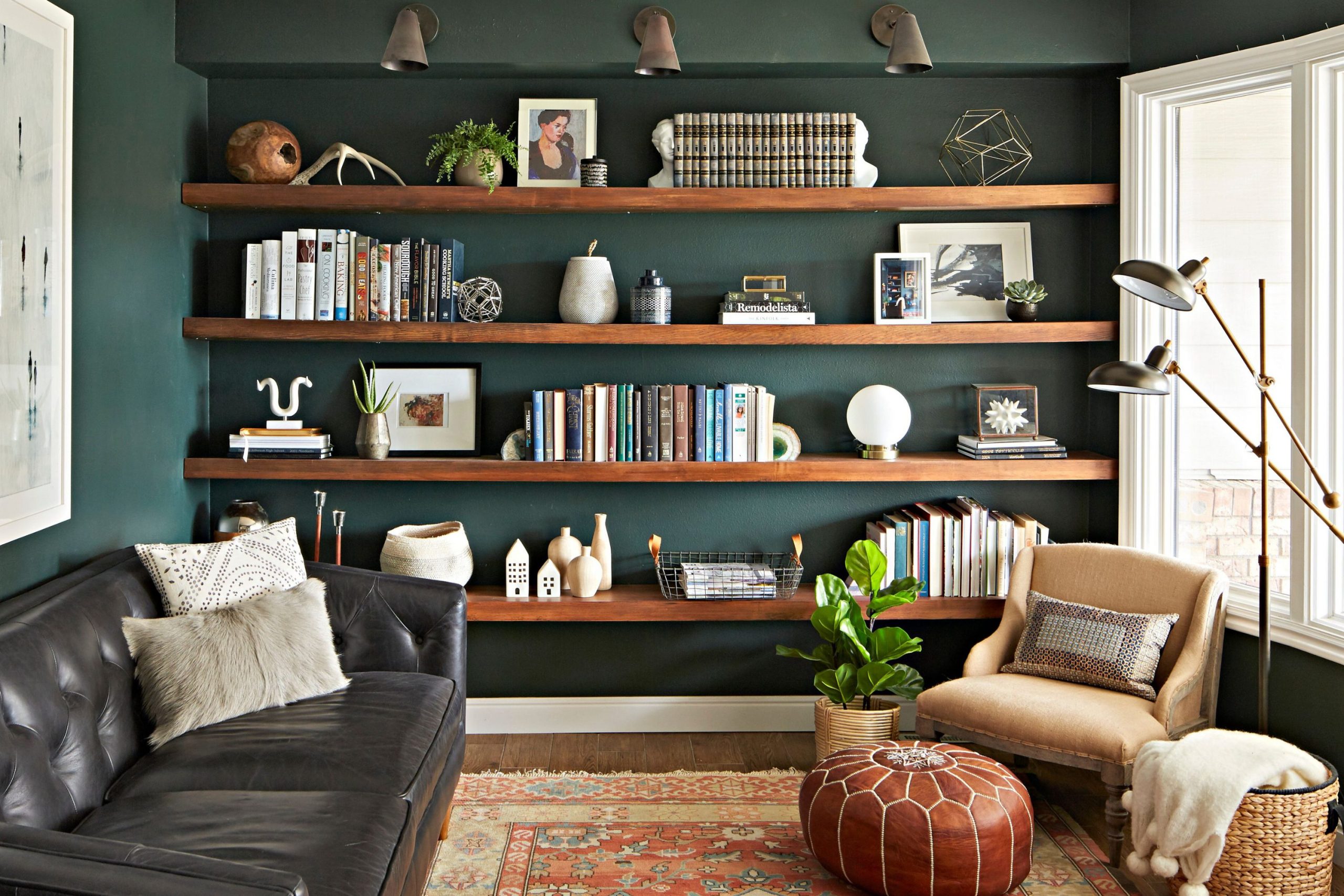
Evergreen Fog SW 9130
Evergreen Fog SW 9130 is a gorgeous mix of green and gray that feels very organic and real. This color was a color of the year because it fits so well with the modern desire for nature.
You will notice that it feels very sophisticated but also very down-to-earth and simple. It is a medium-toned paint that adds a lot of personality to a room without being too loud.
This shade looks incredible with dark wood and black metal accents. It is a great choice for a room where you do a lot of thinking and planning. The color is very steady and helps you stay focused on your goals. It feels very fresh and updated for 2026.
Best used in: home offices, bedrooms, cabinetry, and dining rooms
Pairs well with: Urbane Bronze SW 7048, Accessible Beige SW 7036, Natural wood, Black metal The key rule of this color for an organic style is to use it to bring the feeling of a quiet forest into your daily workspace.
🎨 Check out the complete guide to this color right HERE 👈

Rainwashed SW 6211
Rainwashed SW 6211 is a light green-blue that feels like the air right after a rainstorm. This color is very clear and bright, which helps keep your energy up during the day.
You will like how it makes a small room feel much more open and less crowded. It is a very “happy” color that can help you stay in a good mood while you study.
This shade works well with white furniture and light-colored accessories. It is light enough that you can paint the whole room and even the ceiling in this color. Many people choose this for a craft room or a creative office. It feels very fresh and very clean at all times.
Best used in: craft rooms, small offices, bathrooms, and sunrooms
Pairs well with: Pure White SW 7005, Sea Salt SW 6204, Light wood, White linen The key rule of this color for a bright style is to use it when you want a cheerful and light environment for your daily tasks.
🎨 Check out the complete guide to this color right HERE 👈

Redend Point SW 9081
Redend Point SW 9081 is a warm and earthy color that looks like soft clay or sand. This color is very popular right now because it feels very natural and very human.
You will find that it makes a room feel very grounding and very supportive. It is a great choice for someone who wants a cozy office that doesn’t use blue or green. This shade works beautifully with terracotta pots and woven textures.
It feels very artisanal and hand-crafted, which is great for a creative person. The warmth of the paint makes the room feel very inviting in the evening light. It is a very trendy but very livable choice for 2026.
Best used in: bedrooms, home offices, accent walls, and living rooms
Pairs well with: Foothills SW 7514, Kestrel White SW 7516, Earthy textures, Wood furniture The key rule of this color for a natural style is to use it to create a workspace that feels very warm, grounded, and personal.
🎨 Check out the complete guide to this color right HERE 👈

Urbane Bronze SW 7048
Urbane Bronze SW 7048 is a rich and dark color that sits between brown and gray. This color is very sophisticated and makes any room look like it was designed by a pro.
You will love how it creates a very quiet and serious mood for your home office. It looks especially good with light wood floors or a cream-colored rug for contrast.
This shade is very grounding and helps you feel settled when you have a lot of work to do. It feels like a very “expensive” color that adds a lot of value to your home’s look. Many people use this on built-in bookshelves for a very high-end library feel. It is a bold choice that feels very warm and safe.
Best used in: accent walls, exteriors, home offices, and cabinetry
Pairs well with: Modern Gray SW 7632, Messenger Bag SW 7740, Light wood, Black metal The key rule of this color for a high-end style is to use it where you want a sense of luxury and deep focus in your work area.
🎨 Check out the complete guide to this color right HERE 👈

Accessible Beige SW 7036
Accessible Beige SW 7036 is the perfect neutral because it has a bit of gray to keep it from looking too yellow. This color is very easy on the eyes and works in almost any room in the house.
You will find that it provides a very calm and steady background for your daily study. It is light enough to keep the room feeling bright but has enough color to show off white trim.
This shade is a very safe choice if you want a professional look that is not too bold. It matches perfectly with almost any furniture you already own. Many people use this for their whole house because it is so versatile. It feels very clean and very updated.
Best used in: whole houses, hallways, offices, and living rooms
Pairs well with: Alabaster SW 7008, Urban Bronze SW 7048, Wood tones, Navy blue The key rule of this color for a balanced style is to use it when you want a room that feels neutral, clean, and very easy to work in.
🎨 Check out the complete guide to this color right HERE 👈

Alabaster SW 7008
Alabaster SW 7008 is a creamy and soft white that is famous for being very kind to the eyes. This color is not too bright and not too yellow, which makes it perfect for a cozy office.
You will notice that it makes the light in your room feel very soft and inviting. It is a great choice for a farmhouse style or a traditional study. You can use this on the walls and the trim for a very classic and clean look.
It works beautifully with warm wood tones and black metal accents. Many people find that this white makes them feel very relaxed and ready to learn. It is a very popular choice that never feels out of date.
Best used in: living rooms, kitchens, hallways, bedrooms, and farmhouse exteriors
Pairs well with: Iron Ore SW 7069, Agreeable Gray SW 7029, Natural Linen SW 9109, warm wood tones The key rule of this color for farmhouse style is to use it where you want natural light to feel kind, soft, and inviting throughout the day.
🎨 Check out the complete guide to this color right HERE 👈

Agreeable Gray SW 7029
Agreeable Gray SW 7029 is a very popular light gray that has a warm heart. This color is perfect for a modern office because it looks very clean but never feels cold.
You will find that it changes slightly with the light, which keeps the room interesting. It is a great background for colorful art or a big green plant. This shade is very easy to pair with other colors like navy blue or dark green.
It is light enough to make a small room feel much bigger than it is. Many people choose this because it makes their home look very new and very fresh. It is a reliable choice for a focused and professional workspace.
Best used in: whole houses, offices, bedrooms, and kitchens
Pairs well with: Alabaster SW 7008, Extra White SW 7006, Wood floors, Black accents The key rule of this color for a modern style is to use it as a versatile and clean backdrop for a very busy and productive life.
🎨 Check out the complete guide to this color right HERE 👈

Pure White SW 7005
Pure White SW 7005 is a very clean and simple white that has just a tiny drop of warmth. This color is perfect if you want a room that looks very bright and very sharp.
You will love how it makes your furniture and your books stand out on the shelves. It is a great choice for the trim and the ceiling in any study room. This white does not have any weird blue or yellow undertones, so it stays very true.
It makes the sun look very bright when it hits the walls in the morning. Many people find that a white office helps them feel very organized and very clear-headed. It is a very simple and very beautiful choice.
Best used in: trim, ceilings, modern offices, and kitchens
Pairs well with: Any color, Wood tones, Black accents, Colorful accessories The key rule of this color for a crisp style is to use it when you want the room to feel as bright and organized as possible.
🎨 Check out the complete guide to this color right HERE 👈

Upward SW 6239
Upward SW 6239 is a very light and airy blue that feels like looking at the sky on a clear day. This color is very peaceful and helps you stay calm when you have a lot of homework.
You will notice that it makes the room feel very open and very fresh. It is a great choice for a small office that needs more “air” in it. This blue looks beautiful with white furniture and silver lamps.
It is a very “light” color that doesn’t demand too much of your attention. Many people find that this shade helps them feel more creative and more positive. It is a very gentle and very pretty choice for a home workspace.
Best used in: bedrooms, nurseries, small offices, and bathrooms
Pairs well with: Pure White SW 7005, Naval SW 6244, Light wood, Silver accents The key rule of this color for a light style is to use it to create a room that feels very peaceful, positive, and very easy to breathe in.
🎨 Check out the complete guide to this color right HERE 👈

Denim SW 6523
Denim SW 6523 is a medium-toned blue that feels very comfortable and very familiar. This color is like your favorite pair of jeans, making it a very easy choice for a home office.
You will feel very relaxed and ready to work inside walls painted this shade. It is dark enough to feel serious but bright enough to stay friendly and happy. This blue works very well with light wood desks and white bookshelves.
It provides a great background for a lot of different styles of art. Many people find that this color helps them stay in their seat and get their work done. It is a very classic and very dependable blue.
Best used in: bedrooms, home offices, laundry rooms, and accent walls
Pairs well with: Extra White SW 7006, Accessible Beige SW 7036, Light wood, Navy blue The key rule of this color for a classic style is to use it to create a workspace that feels very comfortable, familiar, and very productive.
🎨 Check out the complete guide to this color right HERE 👈

Aleutian SW 6241
Aleutian SW 6241 is a soft and smoky blue that has a lot of gray in it. This color feels very sophisticated and very quiet, which is great for a study. You will love how it makes the room feel very still and very professional.
It is a great choice if you want a blue that is not too “childish” or too bright. This shade looks amazing with dark wood furniture and silver hardware.
It is a very “smart” color that helps you focus on your reading and your writing. Many people choose this for a more formal home office. It feels very updated and very high-end for 2026.
Best used in: bedrooms, home offices, dining rooms, and cabinetry
Pairs well with: Pure White SW 7005, Slate Tile SW 7624, Dark wood, Silver accents The key rule of this color for a professional style is to use it to create a room that feels very quiet, serious, and very well-organized.
🎨 Check out the complete guide to this color right HERE 👈
Peppercorn SW 7674
Peppercorn SW 7674 is a very dark and moody gray that can look almost black in some lights. This color is perfect for an accent wall or a very dramatic home library.
You will love how it makes your white trim and your colorful books pop. It is a very “power” color that makes you feel very focused and very important. This shade works best in rooms that have a lot of natural light or very good lamps.
It creates a very quiet and still environment for deep thinking. Many people use this on all four walls to create a very cozy and private “cave” for work. It is a very bold and very stylish choice.
Best used in: accent walls, media rooms, libraries, and home offices
Pairs well with: Alabaster SW 7008, Repose Gray SW 7015, Wood floors, Brass hardware The key rule of this color for a moody style is to use it when you want a very high-contrast and dramatic look that feels very private.
🎨 Check out the complete guide to this color right HERE 👈
Tricorn Black SW 6258
Tricorn Black SW 6258 is the truest black paint you can find without any weird undertones. This color is very bold and very modern for a home study.
You will love using it as an accent wall or on a set of built-in bookshelves. it creates a very sharp and very professional look that makes everything else in the room stand out.
This black is very confident and tells people that you take your work very seriously. It looks incredible with bright white trim and gold or brass accessories. Many people use this to create a very sleek and very high-tech workspace. It is a very powerful choice that looks very expensive.
Best used in: accent walls, doors, cabinetry, and exteriors
Pairs well with: Extra White SW 7006, Gray Owl OC-52, Gold accents, Modern furniture The key rule of this color for a modern style is to use it when you want a very bold, high-contrast look that feels very organized and strong.
🎨 Check out the complete guide to this color right HERE 👈

Jasper SW 6216
Jasper SW 6216 is a very deep and rich forest green that feels very traditional and very luxurious. This color is perfect for a home office where you want to feel like you are in a classic library.
You will love how it makes the room feel very grounded and very quiet. It looks stunning with dark wood furniture and heavy rugs. This green is very “smart” and helps you feel like you are in a place of learning.
It is a great choice if you want a dark color that is not gray or blue. Many people find that this shade helps them stay focused for a long time. It is a very beautiful and very sophisticated choice for 2026.
Best used in: libraries, dens, accent walls, and home offices
Pairs well with: Alabaster SW 7008, Wood tones, Leather furniture, Gold accents The key rule of this color for a traditional style is to use it to create a room that feels very established, serious, and very rich in color.
🎨 Check out the complete guide to this color right HERE 👈
14 Best Home Study Room Personal Library Wall Paint Colors
Hale Navy HC-154
Hale Navy HC-154 stands as a top pick for anyone building a serious collection of books. This deep blue provides a heavy and grand background that makes every book spine look bright and important.
You will find that this shade feels very solid and helps you stay in your chair for hours of reading. It acts like a neutral because it works so well with mahogany, oak, or walnut shelving.
Many people love how it creates a room that looks like a classic university library. The color is dark enough to hide shadows but has enough blue to feel alive and rich. It makes gold lettering on old books really shine when the lamps are turned on. This is a very dependable choice for a quiet reading room.
Best used in: personal libraries, study rooms, accent walls, and cabinetry
Pairs well with: Simply White OC-117, Revere Pewter HC-172, Wood tones, Gold accents The key rule of this color for a professional style is to use it where you want to feel a sense of authority and deep concentration while working.
🎨 Check out the complete guide to this color right HERE 👈
Salamander 2055-10
Salamander 2055-10 is a dark and moody mix of green and black that feels very private and safe. This color is perfect for a library because it makes the walls feel like they are wrapping you in a warm blanket.
You will notice that it creates a very quiet mood that is perfect for studying hard subjects. It looks very expensive when paired with brass floor lamps and leather armchairs.
The green tint keeps the room from feeling too cold or like a basement. Many designers use this to create a high-end look in a small room. It provides a stunning backdrop for art and photography collections. This paint is very thick and gives the walls a very smooth and finished look.
Best used in: libraries, dens, media rooms, and small offices
Pairs well with: Pale Oak OC-20, Chantilly Lace OC-65, Leather furniture, Walnut wood The key rule of this color for a moody style is to use it in smaller rooms to create a feeling of being tucked away from the rest of the world.
🎨 Check out the complete guide to this color right HERE 👈
Dark Olive 2140-30
Dark Olive 2140-30 brings a grounded and earthy feeling to your personal library walls. This color reminds me of old forests and helps your eyes relax after looking at a screen or a page for a long time.
You will find that it makes the room feel very natural and very honest. It works beautifully with warm wood tones and woven rugs. This shade of green is very traditional but still feels fresh for a modern home.
It does not distract you from your work because it stays very steady in the background. Many people find that this color helps them feel more connected to their thoughts. It is a very smart choice for a focused study environment.
Best used in: home offices, mudrooms, libraries, and bedroom nooks
Pairs well with: Swiss Coffee OC-45, Wood tones, Black accents, Creamy whites The key rule of this color for a natural style is to use it with plenty of indoor plants to make your work area feel like a garden retreat.
🎨 Check out the complete guide to this color right HERE 👈
Storm Cloud Gray 2140-40
Storm Cloud Gray 2140-40 is a softer green that feels like it has a lot of history behind it. This color has a dusty quality that makes it look very soft on the walls.
You will like how it makes your library feel like an old-fashioned study from a movie. It is light enough to keep the room from feeling too dark but has enough color to be interesting. This shade works very well with antique furniture and old maps.
It reflects light in a very gentle way that is kind to your eyes. Many people choose this color because it feels very peaceful and very quiet. It is a great way to add a bit of character to a new house.
Best used in: libraries, bedrooms, living rooms, and traditional studies
Pairs well with: Cloud White OC-130, Dark wood, Brass hardware, Soft grays The key rule of this color for a vintage style is to use it when you want a room to feel established and filled with stories.
Newburg Green HC-158
Newburg Green HC-158 is a very rich and deep teal that looks very sophisticated on a library wall. This color has a lot of blue in it which makes it feel very cool and very calm.
You will find that it adds a lot of drama to the room without being too loud. It looks amazing when used on built-in bookshelves and the walls at the same time.
This shade makes white trim look very sharp and very clean. Many people love how this color changes from blue to green as the sun goes down. It is a very “smart” color that makes you feel ready to learn something new. This is a very high-end choice for a modern library.
Best used in: cabinetry, accent walls, libraries, and front doors
Pairs well with: White Dove OC-17, Revere Pewter HC-172, Wood floors, Gold accents The key rule of this color for a sophisticated style is to use it where you want a bold look that still feels very professional.
🎨 Check out the complete guide to this color right HERE 👈
French Beret 1610
French Beret 1610 is a very dark gray that has a strong blue soul hidden inside. This color is perfect for a library because it makes the room feel very still and very serious.
You will notice that it makes your books look like the most important thing in the room. It is a very modern choice that looks great with silver or chrome lamps.
This shade of gray is very deep and helps you feel very focused on your work. It creates a very quiet environment that is perfect for late-night reading sessions. Many people use this color to create a very chic and very stylish office. It is a powerful color that stays very quiet.
Best used in: modern libraries, accent walls, doors, and bedrooms
Pairs well with: Chantilly Lace OC-65, Gray Owl OC-52, Silver hardware, Modern furniture The key rule of this color for a modern style is to use it when you want a very sleek and very quiet environment for deep thinking.
🎨 Check out the complete guide to this color right HERE 👈
Kendal Charcoal HC-166
Kendal Charcoal HC-166 is a medium-to-dark gray that feels very warm and very solid. This color is like a well-tailored suit for your library walls. You will find that it makes every other color in the room look better.
It has a tiny bit of brown in the base which keeps it from feeling cold or like concrete. This shade is very reliable and stays the same color in almost any light.
It works beautifully with light wood floors and white ceilings for a balanced look. Many people choose this because it feels very professional and very organized. It is a great choice for a room where you need to get a lot of work done.
Best used in: home offices, living rooms, exteriors, and libraries
Pairs well with: Simply White OC-117, Revere Pewter HC-172, Wood tones, Black accents The key rule of this color for a balanced style is to use it as a strong and beautiful backdrop for a very productive workspace.
🎨 Check out the complete guide to this color right HERE 👈

Naval SW 6244
Naval SW 6244 is a classic navy that brings a sense of order to your personal library. This color is very dark and very confident, which helps you feel ready to tackle big projects.
You will like how it makes your white bookshelves look very crisp and very modern. It is a very “power” color that makes the room feel very important.
This shade of blue is very popular because it never goes out of style. It helps keep the room feeling quiet and focused because it does not reflect too much light. Many people use this color to create a room that feels very professional and very high-end. It is a very safe and very beautiful choice.
Best used in: home offices, accent walls, bedrooms, and cabinetry
Pairs well with: Alabaster SW 7008, Agreeable Gray SW 7029, Gold hardware, Cognac leather The key rule of this color for a professional style is to use it to create a strong and serious mood for high-level work.
🎨 Check out the complete guide to this color right HERE 👈
Iron Ore SW 7069
Iron Ore SW 7069 is a soft black that feels very cozy and very modern at the same time. This color is great for a library because it makes the walls disappear and lets your books take center stage.
You will notice that the room feels very private and very still when you use this shade. it is a great choice for a room with big windows because the light looks amazing against the dark paint.
This color is very trendy for 2026 because it feels so grounded and real. It makes the room feel like a safe “cave” where you can hide and read for hours. Many people use this color to create a very dramatic and very stylish workspace.
Best used in: accent walls, exteriors, doors, and modern studies
Pairs well with: Alabaster SW 7008, Extra White SW 7006, Light wood, Brass The key rule of this color for a moody style is to use it when you want a high-fashion look that feels very private and cool.
🎨 Check out the complete guide to this color right HERE 👈
Urbane Bronze SW 7048
Urbane Bronze SW 7048 is a warm and dark color that feels very organic and very sophisticated. This color has a lot of brown in it which makes it feel like the earth or old stone.
You will love how it makes your library feel very warm and very inviting. It looks incredible with light wood furniture and cream-colored accents. This shade is very grounding and helps you feel very settled in your chair.
It is a great choice for a room where you want to feel a connection to nature. Many people use this color to create a very high-end and very professional look. It is a bold choice that feels very safe and very comfortable.
Best used in: accent walls, exteriors, home offices, and cabinetry
Pairs well with: Modern Gray SW 7632, Messenger Bag SW 7740, Light wood, Black metal The key rule of this color for a high-end style is to use it where you want a sense of luxury and deep focus in your work area.
🎨 Check out the complete guide to this color right HERE 👈
Evergreen Fog SW 9130
Evergreen Fog SW 9130 is a beautiful green-gray that brings a natural feeling to your book collection. This color is very soft and very easy on the eyes, making it perfect for long reading sessions.
You will find that it feels very sophisticated but also very simple and down-to-earth. It works well with both modern and traditional furniture. This shade is very popular right now because it makes people feel very calm and very peaceful.
It helps the room feel fresh and updated for the year 2026. Many people choose this color because it makes them feel like they are working in a quiet park. It is a very steady and very reliable color.
Best used in: home offices, bedrooms, cabinetry, and dining rooms
Pairs well with: Urbane Bronze SW 7048, Accessible Beige SW 7036, Natural wood, Black metal The key rule of this color for an organic style is to use it to bring the feeling of a quiet forest into your daily workspace.
🎨 Check out the complete guide to this color right HERE 👈
Jasper SW 6216
Jasper SW 6216 is a very dark and rich forest green that makes a library feel very grand. This color is for someone who wants a room that feels very serious and very established.
You will like how it makes the room feel very quiet and very focused. It looks stunning with dark wood bookshelves and gold or brass accents. This shade of green is very “smart” and makes you feel like you are in a place of great learning.
It is a great alternative to blue or gray if you want something with more life in it. Many people use this color to create a very dramatic and very beautiful study. It is a very high-end choice that looks very expensive.
Best used in: libraries, dens, accent walls, and home offices
Pairs well with: Alabaster SW 7008, Wood tones, Leather furniture, Gold accents The key rule of this color for a traditional style is to use it to create a room that feels very established, serious, and very rich in color.
🎨 Check out the complete guide to this color right HERE 👈
Black Fox SW 7020
Black Fox SW 7020 is a very dark brown-gray that feels very warm and very cozy. This color is like a cup of hot coffee for your library walls. You will notice that it makes the room feel very intimate and very small in a good way.
It is a great choice for a room where you want to hide away from the world and read. This shade works beautifully with light-colored rugs and soft fabrics. It feels very grounded and very real, which helps you focus on your thoughts.
Many people choose this color because it is more interesting than a plain gray or black. It is a very comforting and very stylish choice for a home office.
Best used in: accent walls, bedrooms, exteriors, and libraries
Pairs well with: Accessible Beige SW 7036, Alabaster SW 7008, Light wood, Warm lighting The key rule of this color for a cozy style is to use it when you want the room to feel very warm, private, and very safe.
🎨 Check out the complete guide to this color right HERE 👈

Still Water SW 6223
Still Water SW 6223 is a deep and mysterious teal that brings a lot of color to your library. This shade of blue-green is very moody and helps you feel very creative and very deep.
You will find that it looks amazing when the light hits the walls and shows off the green tones. it is a great choice for an accent wall or for painting a set of built-in cabinets. This color is very sophisticated and makes the room look like it was designed by a pro.
Many people love how this color feels very quiet and very still, just like its name. It is a very beautiful and very modern choice for a home study.
Best used in: accent walls, cabinetry, bathrooms, and libraries
Pairs well with: Pure White SW 7005, Revere Pewter HC-172, Wood tones, Brass hardware The key rule of this color for a moody style is to use it when you want a rich, deep color that helps you feel very focused and inspired.
🎨 Check out the complete guide to this color right HERE 👈
15 Ideas For The Study Room Home Office Wall Paint Colors
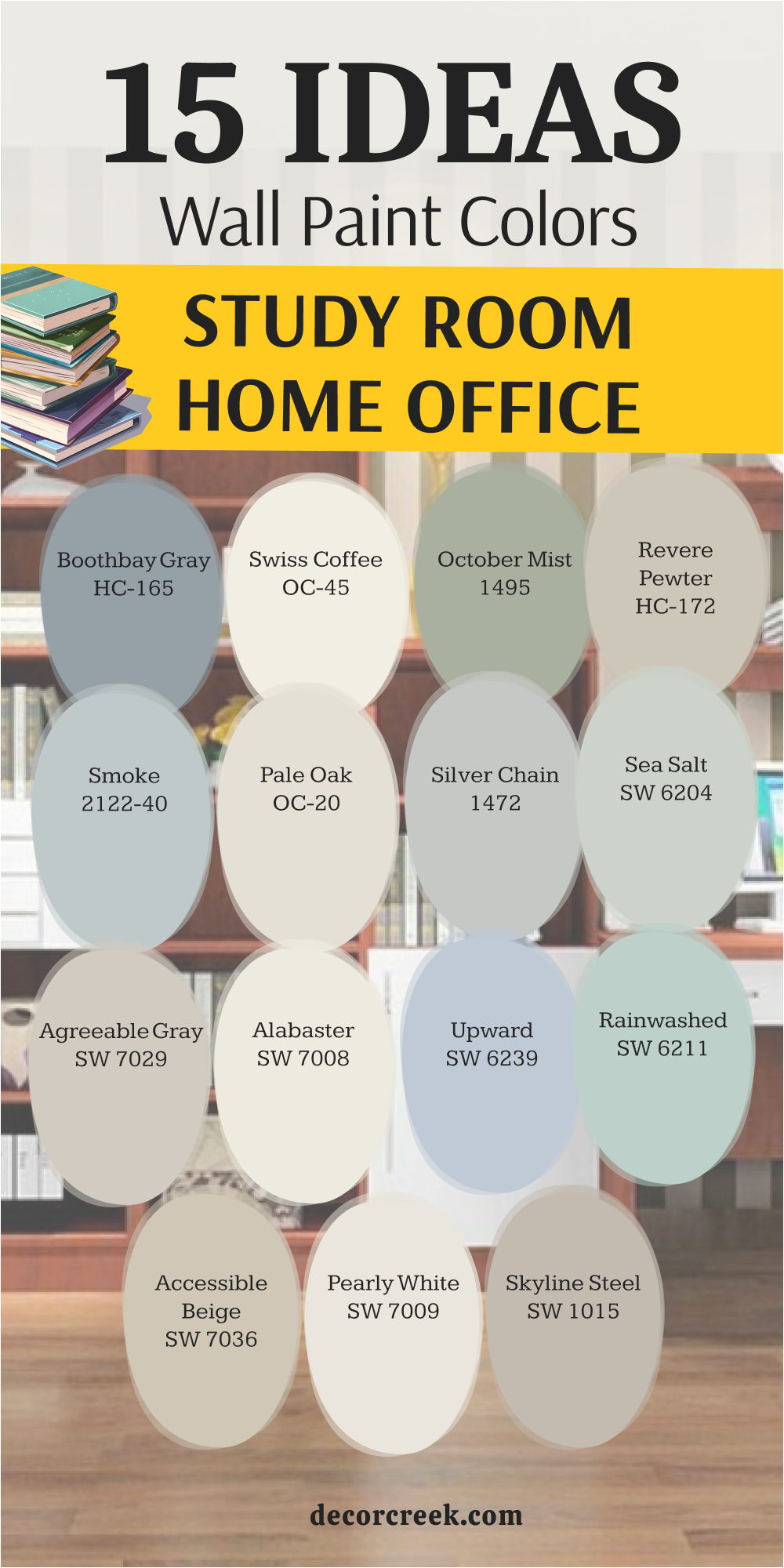
Boothbay Gray HC-165
Boothbay Gray HC-165 feels like a soft mist sitting over a quiet lake in the morning. This color is a wonderful mix of blue and gray that keeps your home office feeling very professional but not cold.
You will find that it helps you stay focused during long meetings because it is so easy on the eyes. It looks very expensive when you pair it with white trim and dark wood desks. Many people love how it changes slightly when the sun moves across the sky during the day.
This shade is dark enough to have real personality but light enough to stay friendly. It creates a very steady environment where your brain can settle down and work. This is a very smart choice for a formal workspace.
Best used in: formal studies, cabinetry, bedrooms, and bathroom vanities
Pairs well with: Simply White OC-117, Revere Pewter HC-172, Dark wood, Navy accents The key rule of this color for a classic style is to use it where you want a sense of order and professional calm while you work.
🎨 Check out the complete guide to this color right HERE 👈
Swiss Coffee OC-45
Swiss Coffee OC-45 is the warmest white you can find that still looks clean and fresh. This color makes your home office feel very bright and happy even on a cloudy winter day. You will notice that it has a tiny bit of yellow and gray that keeps it from looking like a hospital room.
It is a very safe choice if you have a lot of colorful books or art on your walls. Many people paint their whole office in this shade to make the walls feel like they are glowing.
It works perfectly with every single wood color and every metal finish you can think of. This white feels very soft and very welcoming for a daily routine. It is a top choice for a simple and organized life.
Best used in: whole houses, kitchens, offices, and dark hallways
Pairs well with: White Dove OC-17, Hale Navy HC-154, Wood tones, Black accents The key rule of this color for a clean style is to use it when you want a room to feel bright but still very soft and welcoming.
🎨 Check out the complete guide to this color right HERE 👈
October Mist 1495
October Mist 1495 brings a gentle silver-green tone to your walls that feels very organic and real. This color acts as a neutral that is much more interesting than a plain tan or beige.
You will find that it helps you feel more creative and relaxed while you are typing away at your desk. It looks very beautiful with natural textures like wicker baskets and wooden shelves.
This shade is light enough to make a small office feel like it has more room to breathe. Many people choose this green because it reminds them of a quiet garden in the autumn. It stays in the background and does not demand too much of your energy. This is a very reliable color for a peaceful study area.
Best used in: shared offices, guest rooms, hallways, and kitchens
Pairs well with: Steam AF-15, Gloucester Sage HC-100, Natural textures, Black metal The key rule of this color for an organic style is to use it as a base for a room filled with natural wood and soft fabrics.
🎨 Check out the complete guide to this color right HERE 👈
Revere Pewter HC-172
Revere Pewter HC-172 is a very famous color because it looks perfect in almost every home in the world. This color is a mix of gray and beige that feels very updated and very professional for an office.
You will love how it provides a very steady and quiet background for your computer monitor. It has a tiny bit of green hidden inside that makes it feel very earthy and very solid.
This shade works well with light oak floors or dark cherry furniture alike. Many people find that this color helps the room feel very balanced and very organized. It is a very safe choice if you are not sure what color to pick for your study. It feels very clean and very high-end.
Best used in: whole houses, offices, kitchens, and hallways
Pairs well with: White Dove OC-17, Chelsea Gray HC-168, Wood floors, Black accents The key rule of this color for a balanced style is to use it as a safe and beautiful backdrop for a very busy work life.
🎨 Check out the complete guide to this color right HERE 👈
Smoke 2122-40
Smoke 2122-40 is a very light blue that feels like a breath of fresh air for your home office. This color is so soft that it almost feels like a neutral gray but with much more life in it. You will notice that it makes your office feel very quiet and very still throughout the day.
It is a great choice if you have a small space because it reflects light so beautifully. This shade works very well with white furniture and silver desk accessories for a modern look.
Many people find that this blue helps them stay patient when they have a lot of difficult work. It is a very gentle and very pretty color that never feels heavy. This is a perfect pick for a spa-like study room.
Best used in: bedrooms, home offices, bathrooms, and nurseries
Pairs well with: Chantilly Lace OC-65, Gray Owl OC-52, White furniture, Soft textures The key rule of this color for a light style is to use it when you want the room to feel as light as air and very easy to think in.
🎨 Check out the complete guide to this color right HERE 👈
Pale Oak OC-20
Pale Oak OC-20 offers a very light and graceful look that feels like the inside of a quiet gallery. This color is a very pale “greige” that keeps your office feeling open and very airy.
You will like how it provides a very soft contrast against white trim and dark frames on the wall. It is a smart choice for a room that does not get a lot of natural sunlight from the windows.
This shade stays very quiet and helps you focus on your reading without any visual noise. Many people love how it makes the whole room feel very clean and very high-end. It works beautifully with natural wood floors and light-colored rugs. This is a very easy color to live with for many years.
Best used in: small offices, bedrooms, open floor plans, and entryways
Pairs well with: Chantilly Lace OC-65, Wrought Iron 2124-10, Natural wood, Brass hardware The key rule of this color for a light style is to use it when you want a room to feel bright but still very soft and welcoming.
🎨 Check out the complete guide to this color right HERE 👈
Silver Chain 1472
Silver Chain 1472 is a very classic gray that feels very sharp and very professional on an office wall. This color does not have any hidden blue or purple tones, so it stays looking very true.
You will find that it makes your white desk and black chair look very modern and very sleek. It is a great choice for someone who wants a very clean and very organized workspace. This shade of gray is medium-toned so it has enough weight to feel serious.
Many people choose this color because it makes their home office look like a real professional business. It looks amazing with colorful art and bright office supplies for a pop of energy. This is a very dependable and very stylish gray.
Best used in: modern offices, living rooms, hallways, and kitchens
Pairs well with: Simply White OC-117, Charcoal grays, Silver accents, Modern furniture The key rule of this color for a professional style is to use it to create a sharp, clean, and very focused environment for your daily work.
🎨 Check out the complete guide to this color right HERE 👈

Sea Salt SW 6204
Sea Salt SW 6204 is a very light green-blue that brings a sense of peace to any study room. This color is very famous because it makes people feel very relaxed and very calm instantly.
You will notice that it looks like the ocean on a very soft and quiet morning. It works best in rooms with lots of natural light where you can see the color change. This shade is very light and helps keep your energy feeling positive during a long work day.
Many people choose this color because it is much more interesting than a basic white or tan. It looks beautiful with light wood and white linen curtains. This is a very gentle and very fresh choice.
Best used in: bathrooms, bedrooms, small offices, and laundry rooms
Pairs well with: Alabaster SW 7008, Heron Plume SW 6070, Light wood, Glass accents The key rule of this color for a light style is to use it when you want a room to feel fresh, clean, and very peaceful.
🎨 Check out the complete guide to this color right HERE 👈
Agreeable Gray SW 7029
Agreeable Gray SW 7029 is the most popular gray for a reason—it just works everywhere. This color is very light and has a warm heart that keeps your office from feeling like a cold office. You will find that it makes your workspace look very updated and very clean.
It is a great background for a big green plant or a wall filled with your favorite books. This shade is very easy to pair with any other color you want to add to the room.
Many people use this for their whole house because it makes every room feel connected and simple. It stays quiet and helps you focus on your tasks without any distractions. This is a very reliable and very beautiful neutral.
Best used in: whole houses, offices, bedrooms, and kitchens
Pairs well with: Alabaster SW 7008, Extra White SW 7006, Wood floors, Black accents The key rule of this color for a modern style is to use it as a versatile and clean backdrop for a very busy and productive life.
🎨 Check out the complete guide to this color right HERE 👈
Alabaster SW 7008
Alabaster SW 7008 is a creamy white that feels very soft and very kind to your eyes. This color is a top pick for a farmhouse style office or a cozy study at home.
You will like how it makes the room feel very inviting and very warm in the evening light. It is not as bright as a pure white, so it does not cause any glare on your computer screen.
Many people use this on the walls and the trim for a very classic and very soft look. It works beautifully with warm wood tones and black metal desk lamps. This shade helps you feel very relaxed and ready to study for a long time. It is a very famous and very beautiful choice.
Best used in: living rooms, kitchens, hallways, bedrooms, and farmhouse exteriors
Pairs well with: Iron Ore SW 7069, Agreeable Gray SW 7029, Natural Linen SW 9109, warm wood tones The key rule of this color for farmhouse style is to use it where you want natural light to feel kind, soft, and inviting throughout the day.
🎨 Check out the complete guide to this color right HERE 👈
Upward SW 6239
Upward SW 6239 is a very light and airy blue that feels like looking at the sky. This color is very peaceful and helps keep your heart rate low when you have a lot of work.
You will find that it makes a small office feel much more open and very fresh. It is a great choice for a room where you want to feel very creative and very positive.
This shade of blue works beautifully with white furniture and silver accents. Many people choose this color because it helps them feel like they have more room to think. It is a very gentle and very pretty color that stays very quiet. This is a perfect pick for a light and happy workspace.
Best used in: bedrooms, nurseries, small offices, and bathrooms
Pairs well with: Pure White SW 7005, Naval SW 6244, Light wood, Silver accents The key rule of this color for a light style is to use it to create a room that feels very peaceful, positive, and very easy to breathe in.
🎨 Check out the complete guide to this color right HERE 👈
Rainwashed SW 6211
Rainwashed SW 6211 is a light green-blue that feels very clear and very refreshing. This color brings a lot of life to your office walls and helps you feel energized during the day.
You will notice that it makes the whole room feel very clean and very updated. It works beautifully with light wood desks and white shelves for a very modern look.
This shade is very “happy” and can help you stay in a good mood while you study hard. Many people use this color in a craft room or a home office to feel inspired. It reflects light in a way that makes the room feel very bright and very airy. This is a very fresh and very beautiful choice.
Best used in: craft rooms, small offices, bathrooms, and sunrooms
Pairs well with: Pure White SW 7005, Sea Salt SW 6204, Light wood, White linen The key rule of this color for a bright style is to use it when you want a cheerful and light environment for your daily tasks.
🎨 Check out the complete guide to this color right HERE 👈
Accessible Beige SW 7036
Accessible Beige SW 7036 is a perfect neutral because it is not too yellow and not too gray. This color is very easy on the eyes and provides a very steady background for your study.
You will find that it makes your office feel very professional and very organized. It is light enough to keep the room feeling bright but has enough color to feel cozy.
This shade matches almost any furniture you already have in your house. Many people choose this color because it looks very high-end and very clean. It stays quiet and lets you focus on your work without any trouble. This is a very reliable and very beautiful color for a home office.
Best used in: whole houses, hallways, offices, and living rooms
Pairs well with: Alabaster SW 7008, Urban Bronze SW 7048, Wood tones, Navy blue The key rule of this color for a balanced style is to use it when you want a room that feels neutral, clean, and very easy to work in.
🎨 Check out the complete guide to this color right HERE 👈
Pearly White SW 7009
Pearly White SW 7009 is a very soft white that has a tiny bit of gray and green in it. This color feels very cool and very sophisticated on your office walls. You will love how it makes the room feel very quiet and very professional.
It is a great choice if you want a white that is not too warm or too yellow. This shade works beautifully with dark wood furniture and silver hardware for a modern look.
Many people find that this color helps the room feel very clean and very organized. It stays very true and does not change much in different lighting. This is a very high-end and very beautiful choice for a study.
Best used in: trim, cabinetry, offices, and bedrooms
Pairs well with: Grizzle Gray SW 7068, Pure White SW 7005, Dark wood, Silver accents The key rule of this color for a clean style is to use it when you want a room to feel very sophisticated, cool, and very well-organized.
🎨 Check out the complete guide to this color right HERE 👈
Skyline Steel SW 1015
Skyline Steel SW 1015 is a medium-toned gray that feels very solid and very modern. This color is like the steel in a skyscraper—it is very strong and very steady for your walls.
You will find that it makes your office feel very professional and very up-to-date. It has a bit of warmth in it that keeps it from feeling like cold metal. This shade works beautifully with black desk chairs and metal frames for a cool look.
Many people choose this color because it makes their workspace feel very serious and very focused. It is a great choice for a room where you need to get a lot of important work done. This is a very dependable and very stylish gray.
Best used in: modern offices, accent walls, hallways, and living rooms
Pairs well with: Extra White SW 7006, Black accents, Metal furniture, Gray tones The key rule of this color for a professional style is to use it to create a strong, clean, and very serious environment for your study.
🎨 Check out the complete guide to this color right HERE 👈
21 Ideas For The Modern Study Room Paint Colors
Wrought Iron 2124-10
Wrought Iron 2124-10 is a very dark gray that often looks like a soft black on the wall. This color is great for a modern office where you want to look very professional on video calls.
It creates a sharp background that makes you stand out while you are speaking to your team. While it is dark, it has a blue-gray tint that keeps it from looking flat or boring.
You should use this if you have big windows or very good lamps in your room. It makes colorful art look amazing because the colors jump off the wall. This is a power color for a home office that needs to feel very cool. It feels expensive and very well-designed for a modern lifestyle.
Best used in: modern offices, accent walls, doors, and exteriors
Pairs well with: Chantilly Lace OC-65, Revere Pewter HC-172, Wood floors, Metal desks The key rule of this color for a modern style is to use it when you want a high-contrast look that feels very bold and organized.
🎨 Check out the complete guide to this color right HERE 👈
Chelsea Gray HC-168
Chelsea Gray HC-168 is a sophisticated gray that has a lot of depth and a very rich feeling. This color is medium-toned, so it makes a statement without making the room feel like a dark cave.
You will find that it works perfectly with both warm wood and cool metal furniture in your study. It feels very established and very serious, which helps you get into a deep work mode.
Many people love how this color hides small marks and looks fresh for many years. It looks beautiful with crisp white trim to keep the edges of the room looking sharp. This is a very popular choice for a designer look in a home office. It stays very steady under different types of light bulbs.
Best used in: cabinetry, home offices, living rooms, and exterior trim
Pairs well with: Simply White OC-117, Revere Pewter HC-172, Brass hardware, Oak furniture The key rule of this color for a balanced style is to use it to create a room that feels both high-fashion and very comfortable for daily tasks.
🎨 Check out the complete guide to this color right HERE 👈

Metropolitan AF-690
Metropolitan AF-690 is a cool and stylish gray that feels very modern and very clean. This color has a slight blue undertone that makes the room feel very quiet and very peaceful.
You will like how it makes your workspace feel like a professional gallery or a high-end studio. It is light enough to use on all four walls without making the room feel small or tight.
This shade is a great pick if you want a neutral that feels a bit more interesting than a plain gray. It reflects light in a very soft way that does not strain your eyes during long reading hours. Many people find that this color helps them stay calm and organized during a busy day. It feels very fresh for the year 2026.
Best used in: modern offices, bedrooms, kitchens, and open floor plans
Pairs well with: Chantilly Lace OC-65, Hale Navy HC-154, Silver accents, Glass furniture The key rule of this color for a sleek style is to use it where you want a very clean and very quiet environment for digital work.
Gray Owl OC-52
Gray Owl OC-52 is one of the most famous light grays because it is so bright and so clean. This color has a tiny bit of green and blue in it, which keeps it from looking like cold concrete.
You will notice that it makes your home office feel very airy and very open even if the room is small. It is a perfect choice if you want a modern look that still feels very friendly and light.
This shade works beautifully with white furniture and light wood floors for a very fresh feeling. Many artists and writers choose this color because it provides a very clear background for their work. It stays very quiet and helps you think about your projects instead of the walls. This is a very reliable and very beautiful paint.
Best used in: whole houses, small offices, bathrooms, and kitchens
Pairs well with: White Dove OC-17, Hale Navy HC-154, Wood tones, Black accents The key rule of this color for a light style is to use it when you want a room to feel bright, clean, and very easy to breathe in.
🎨 Check out the complete guide to this color right HERE 👈

Stonington Gray HC-170
Stonington Gray HC-170 is a true, classic gray that looks very professional and very sharp. This color does not have a lot of hidden warmth, so it stays looking like a real cool gray in any light.
You will find that it makes your office look very modern and very well-ordered. It is a great background for black-and-white photos or sleek metal desk organizers. This shade is medium-light, so it gives the room a nice amount of color without being too heavy.
Many people choose this because it makes their home office feel like a high-end corporate workspace. It looks amazing with bright white trim and dark gray accents. This is a very dependable choice for a focused study.
Best used in: modern studies, hallways, living rooms, and kitchens
Pairs well with: Chantilly Lace OC-65, Coventry Gray HC-169, Metal furniture, Black accents The key rule of this color for a professional style is to use it to create a sharp, clean, and very focused environment for your daily work.
🎨 Check out the complete guide to this color right HERE 👈

Coventry Gray HC-169
Coventry Gray HC-169 is a medium-toned gray that feels very solid and very reliable on the wall. This color is a bit darker than some of the other grays, which gives it a more serious and professional feel.
You will like how it provides a strong contrast against white desks and light-colored chairs. It is a very “smart” color that helps you feel like you are in a place of serious learning and work.
This shade works well with both silver and gold accents, making it very versatile for your decor. Many people find that this gray helps them feel more disciplined and ready to finish their tasks. It is a very classic modern color that always looks expensive and well-done.
Best used in: home offices, dining rooms, cabinetry, and hallways
Pairs well with: Simply White OC-117, Stonington Gray HC-170, Wood floors, Navy accents The key rule of this color for a structured style is to use it where you want a sense of order and professional focus in your work life.
🎨 Check out the complete guide to this color right HERE 👈

Black Pepper 2130-40
Black Pepper 2130-40 is a deep, smoky gray that has a very strong blue heart inside it. This color feels very moody and very modern, perfect for a study room that needs some drama.
You will find that it makes the room feel very quiet and very still, which is great for deep concentration. It looks amazing when paired with light wood floors or a very bright white rug for contrast.
This shade is dark enough to be bold but has enough color to not feel like a plain dark wall. Many people choose this for an accent wall behind their computer to reduce eye strain from bright light. It is a very sophisticated choice for someone who likes a cooler color palette.
Best used in: accent walls, bedrooms, home offices, and media rooms
Pairs well with: White Heron OC-57, Silver Chain 1472, Wood tones, Silver hardware The key rule of this color for a moody style is to use it when you want a rich, cool color that helps you feel very focused and calm.
Paper White OC-55
Paper White OC-55 is a very light and crisp gray that feels almost like a cool white. This color is perfect if you want a very modern and very minimalist look for your home office.
You will notice that it makes the room feel very bright and very sharp without being a plain hospital white. It has a tiny bit of blue in it which makes it feel very fresh and very new for 2026.
This shade works beautifully with black metal furniture and simple glass desks. Many people love how it provides a very clean background for a lot of digital equipment and monitors. It reflects light very well and makes even a tiny closet office feel like a real room.
Best used in: modern offices, galleries, hallways, and kitchens
Pairs well with: Chantilly Lace OC-65, Wrought Iron 2124-10, Black accents, Modern furniture The key rule of this color for a crisp style is to use it when you want the room to feel as bright, organized, and modern as possible.
Nightingale AF-670
Nightingale AF-670 is a soft and glowing neutral that brings a bit of warmth to a modern study. This color is very easy to live with because it is not too yellow and not too gray.
You will find that it makes your office feel very inviting and very comfortable for a long day of work. It is a smart choice for a room that serves as both a study and a place to relax with a book.
This shade works very well with medium wood tones and soft fabric chairs. Many people choose this color because it makes the room feel very steady and very calm. It stays in the background and lets you focus on your thoughts and your projects. This is a very gentle and very beautiful choice.
Best used in: whole houses, bedrooms, home offices, and living rooms
Pairs well with: Steam AF-15, Cinder AF-705, Wood tones, Soft textures The key rule of this color for a balanced style is to use it as a safe and beautiful backdrop for a very productive and happy life.
Mount Saint Anne 1565
Mount Saint Anne 1565 is a beautiful mid-tone blue-green that feels very sophisticated and very modern. This color has a lot of gray in it, which keeps it from looking too bright or like a child’s room.
You will notice that it brings a very calm and professional feeling to your home office walls. It looks incredible with dark wood furniture and brass or gold lamps for a high-end look.
This shade is a great pick if you want a color that has some personality but still feels very grown-up. Many people find that this color helps them stay creative and patient during hard tasks. It is a very pretty and very stylish choice that feels very updated for 2026.
Best used in: bedrooms, home offices, cabinetry, and dining rooms
Pairs well with: Simply White OC-117, Boothbay Gray HC-165, Gold accents, Wood floors The key rule of this color for a sophisticated style is to use it to create a room that feels very quiet, serious, and very well-designed.
🎨 Check out the complete guide to this color right HERE 👈
Cyberspace SW 7076
Cyberspace SW 7076 is a very dark blue-gray that looks like the deep sky at midnight. This color is even deeper than most navies and has a very cool, modern edge for an office.
You will love how it makes colorful books on a shelf look like pieces of art against the dark paint. It is a very “smart” color that helps you feel like you are in a high-tech and high-focus workspace.
This shade works well if you have a lot of gray or silver in your furniture and accessories. It is dark enough to hide any imperfections on your walls very well and makes the room feel still. Many people use this for a library room because it feels so private and quiet. It is a bold choice that shows you have a lot of style.
Best used in: libraries, media rooms, home offices, and accent walls
Pairs well with: High Reflective White SW 7757, Gray Cloud, Silver accents, Modern furniture The key rule of this color for a modern style is to use it to create a sleek and quiet environment for deep digital work.
🎨 Check out the complete guide to this color right HERE 👈
Passive SW 7064
Passive SW 7064 is a very light and cool gray that feels very modern and very fresh. This color does not have any warmth in it, which makes it look very crisp and very sharp on your study walls.
You will find that it makes your white trim look very bright and your black furniture look very sleek. It is a great choice for someone who wants a very clean and very organized home office.
This shade of gray is light enough to keep the room feeling very open and very airy throughout the day. Many people choose this color because it makes their workspace look very updated and very professional. It stays very true and does not change much in different lighting conditions.
Best used in: modern offices, hallways, bedrooms, and kitchens
Pairs well with: Pure White SW 7005, Iron Ore SW 7069, Silver accents, Blue tones The key rule of this color for a clean style is to use it when you want a room to feel very sophisticated, cool, and very well-organized.
🎨 Check out the complete guide to this color right HERE 👈
Repose Gray SW 7015
Repose Gray SW 7015 is a favorite for many because it is the perfect “greige” that leans a little more toward gray. This color has just enough warmth to keep your office from feeling cold, but it still looks very modern.
You will notice that it makes your workspace feel very calm and very steady for your daily routine. It is a great background for any kind of art or furniture you want to put in the room.
This shade is light enough to be used on every wall and even the ceiling for a seamless look. Many people find that this color helps the room feel very balanced and very organized. It is a very safe and very beautiful choice for a focused study room.
Best used in: whole houses, offices, living rooms, and bedrooms
Pairs well with: Eider White SW 7014, Pavestone SW 7642, Wood tones, Black accents The key rule of this color for a balanced style is to use it as a safe and beautiful backdrop for a very productive and happy life.
🎨 Check out the complete guide to this color right HERE 👈

City Loft SW 7631
City Loft SW 7631 is a very light and soft neutral that feels like a mix of cream and gray. This color is perfect for a modern office that needs to feel very bright and very inviting.
You will like how it makes the room feel very open and very clean without the starkness of a pure white. It has a tiny bit of warmth that makes the light in the room feel very soft and very kind.
This shade works beautifully with light wood and soft textures like wool or linen. Many people choose this color because it makes their home office feel like a high-end hotel suite. It stays very quiet in the background and helps you focus on your work easily.
Best used in: bedrooms, home offices, living rooms, and open floor plans
Pairs well with: Alabaster SW 7008, Urban Bronze SW 7048, Natural wood, Soft grays The key rule of this color for a soft style is to use it when you want a room to feel bright but still very cozy and welcoming.
🎨 Check out the complete guide to this color right HERE 👈

Crushed Ice SW 7647
Crushed Ice SW 7647 is a very light and cool gray that looks very fresh and very crisp on the wall. This color is a great choice if you want a modern office that feels very high-energy and very clean.
You will find that it makes your furniture and your books look very sharp and very well-defined. It is light enough to make even a very small room feel much bigger and more airy.
This shade has a tiny bit of blue in it which keeps it feeling very new and very updated for 2026. Many people love how it provides a very clean background for a lot of computer gear and monitors. It is a very reliable and very beautiful choice for a modern study.
Best used in: modern offices, kitchens, hallways, and bathrooms
Pairs well with: Pure White SW 7005, Charcoal grays, Silver accents, Modern furniture The key rule of this color for a crisp style is to use it when you want the room to feel as bright, organized, and modern as possible.
🎨 Check out the complete guide to this color right HERE 👈
Modern Gray SW 7632
Modern Gray SW 7632 is a medium-light neutral that feels very sophisticated and very warm. This color is not too yellow and not too gray, which makes it perfect for a professional home study.
You will notice that it makes the room feel very steady and very well-grounded for your work. It looks amazing when paired with dark wood furniture and black metal accents for a high-end look.
This shade is a great choice if you want a neutral that has a bit more depth than a very light white. Many people find that this color helps them feel more settled and ready to tackle long projects. It feels very updated and very stylish for a modern house.
Best used in: whole houses, offices, dining rooms, and bedrooms
Pairs well with: Snowbound SW 7004, Urbane Bronze SW 7048, Wood tones, Black accents The key rule of this color for a sophisticated style is to use it to create a room that feels very quiet, serious, and very well-designed.
🎨 Check out the complete guide to this color right HERE 👈

Grizzle Gray SW 7068
Grizzle Gray SW 7068 is a deep and powerful charcoal gray that feels very serious and very modern. This color is perfect for an office where you want to feel very focused and very important.
You will love how it creates a very quiet and still environment for your deep thinking and writing. It looks incredible with light wood floors and bright white trim for a very high-contrast look.
This shade is dark enough to be bold but has a soft quality that keeps it from feeling cold. Many people use this on all four walls to create a very private and very cozy workspace. It is a very “power” color that shows you take your work very seriously.
Best used in: accent walls, home offices, media rooms, and exteriors
Pairs well with: Alabaster SW 7008, Repose Gray SW 7015, Wood floors, Metal hardware The key rule of this color for a moody style is to use it when you want a very high-contrast and dramatic look that feels very private.
🎨 Check out the complete guide to this color right HERE 👈

Software SW 7074
Software SW 7074 is a medium-to-dark gray that has a very cool and technical feeling. This color is like the metal on a high-end laptop—it is very sleek and very modern.
You will find that it makes your office feel very professional and very up-to-date. It has a bit of blue in the base which keeps it looking very fresh and very sharp on the walls.
This shade works beautifully with silver desk accessories and black office chairs. Many people choose this color because it makes their workspace feel very focused and very efficient. It is a great choice for a room where you do a lot of digital work or engineering. This is a very dependable and very stylish gray.
Best used in: modern offices, accent walls, cabinetry, and hallways
Pairs well with: Extra White SW 7006, Cyberspace SW 7076, Silver hardware, Modern furniture The key rule of this color for a technical style is to use it to create a strong, clean, and very serious environment for your study.
🎨 Check out the complete guide to this color right HERE 👈
Origami White SW 7636
Origami White SW 7636 is a very light and soft white that has a bit of gray in it to keep it modern. This color is perfect for a study that needs to feel very calm and very peaceful for your thoughts.
You will notice that it makes the room feel very bright but not at all overwhelming or loud. It is a great choice for a minimalist style office with simple furniture and lots of space.
This shade reflects light in a very gentle way that is very kind to your eyes during a long day. Many people love how it makes the whole room feel very clean and very well-organized. It works beautifully with natural wood and light gray rugs for a soft look.
Best used in: modern offices, bedrooms, living rooms, and open floor plans
Pairs well with: Pure White SW 7005, Urban Bronze SW 7048, Natural wood, Soft grays The key rule of this color for a soft style is to use it when you want a room to feel bright but still very cozy and welcoming.
Big Chill SW 7648
Big Chill SW 7648 is a light and airy gray that feels very cool and very refreshing. This color is like a breath of cold air for your study walls—it keeps everything feeling very fresh and very new.
You will find that it makes your white furniture and your silver lamps look very modern and very sleek. It is a great choice if you want a gray that is very light but still has a real color to it.
This shade works beautifully in rooms that get a lot of bright sunlight because it stays looking very cool. Many people find that this color helps them stay alert and focused on their tasks. It is a very reliable and very beautiful choice for a modern workspace.
Best used in: modern offices, kitchens, bedrooms, and bathrooms
Pairs well with: Pure White SW 7005, Iron Ore SW 7069, Silver accents, Blue tones The key rule of this color for a crisp style is to use it when you want the room to feel as bright, organized, and modern as possible.
🎨 Check out the complete guide to this color right HERE 👈
Lazy Gray SW 6254
Lazy Gray SW 6254 is a light and soft blue-gray that feels very peaceful and very quiet. This color is perfect for a study room where you want to feel very relaxed and very steady.
You will love how it makes the room feel very open and very fresh without being a bright blue. It has a very sophisticated feeling that works well for a professional home office.
This shade works beautifully with white trim and dark gray accents for a very clean look. Many people choose this color because it helps them stay patient and creative during their work day. It is a very gentle and very pretty color that feels very updated for 2026.
Best used in: bedrooms, home offices, bathrooms, and laundry rooms
Pairs well with: Pure White SW 7005, Naval SW 6244, Silver accents, White furniture The key rule of this color for a light style is to use it to create a room that feels very peaceful, positive, and very easy to breathe in.
🎨 Check out the complete guide to this color right HERE 👈
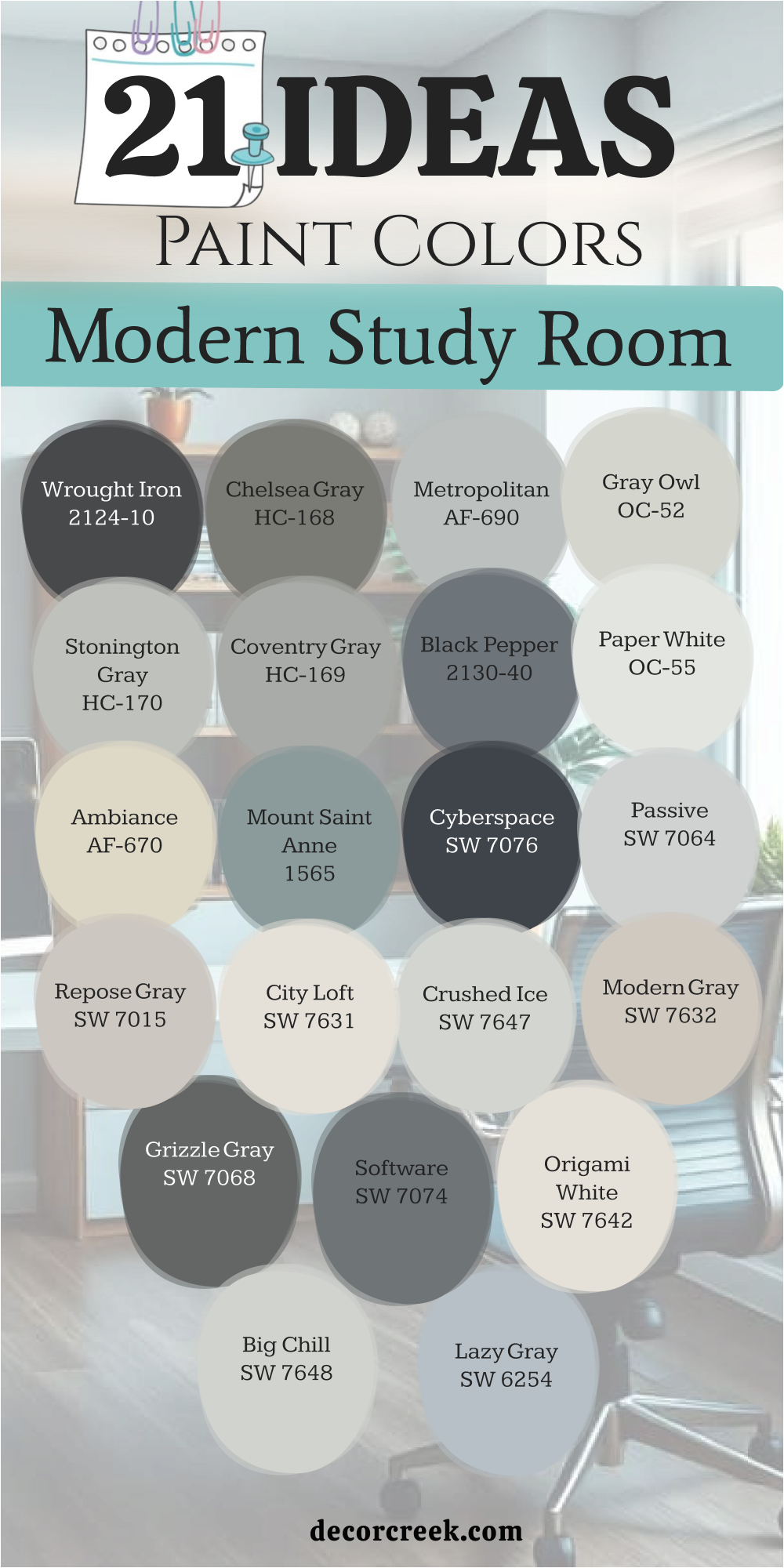
My Final Thoughts About 36 best Home Study Room Paint Color Ideas
Picking a color for your study room is a personal choice that affects your work every day and shapes your productivity in ways you might not even notice at first. I hope this list helps you see how different tones can change your mood and your focus, allowing you to build an environment that matches your specific mental needs.
Whether you like the dark and serious feel of a library for deep research or the bright and airy look of a modern office for creative brainstorming, there is a perfect bucket of paint for you in this collection. It is so important to remember to check your samples at different times of the day to see how the light changes them, as a color that looks warm in the morning might look quite different under your desk lamp at night.
Your home office should be a place that makes you feel proud and ready to learn, acting as a personal sanctuary where you can do your very best thinking without any outside noise. I believe that when you love the walls around you, you find it much easier to sit down and tackle even the most difficult projects on your to-do list.
Taking the time to choose the right shade is an investment in your own success and your daily happiness while you work from home.
Good luck with your project as you begin this journey of color, and I truly hope you enjoy every minute you spend in your new beautiful room.