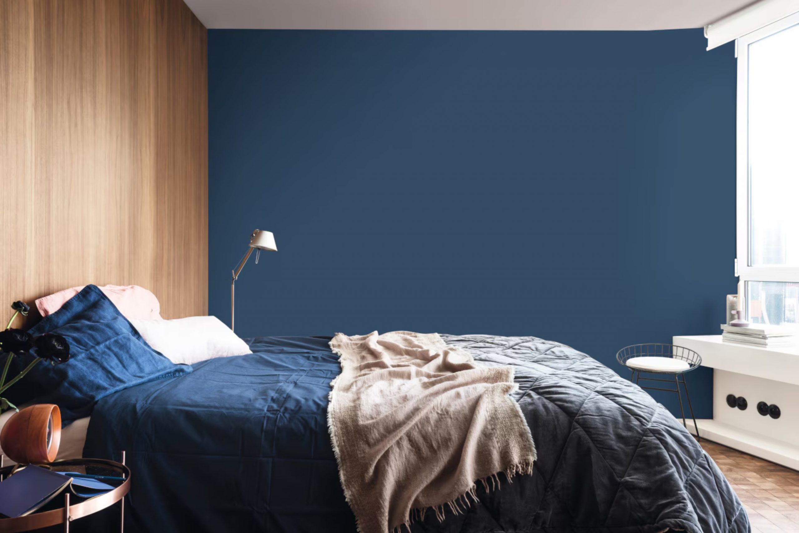
When clients come to me asking for a bedroom refresh, navy blue is often the first color I suggest because of its extraordinary ability to create a mood of deep comfort and sophisticated style. I’ve seen firsthand how this rich hue can completely change a room’s feeling, moving it from ordinary to truly memorable.
I’ve personally used navy paint in dozens upon dozens of homes and staging projects throughout my career, and every single time, the results are simply wonderful and exceed expectations.
It’s a color that feels inherently safe and grounding, yet profoundly dramatic, offering a rich, enveloping backdrop that can make everything else—from crisp white linens to colorful textiles and bright artwork—really stand out and sparkle.
Choosing navy for your most personal retreat, your bedroom, is an exciting and impactful design decision. It immediately adds a layer of maturity, thoughtful design, and undeniable depth to the architecture of the room.
This guide is more than just a list; it is my personal, curated collection of the very best navy shades, pulled from my many years of experience helping people make their homes feel truly special and refined. By following my lead, you are tapping into expert knowledge.
Get ready to find the navy blue that speaks directly to your heart for a bedroom you will utterly adore and feel deeply connected to well into 2026.

Why I Always Trust Sherwin-Williams and Benjamin Moore for Navy Blue Bedroom Paints
I rely heavily on Sherwin-Williams and Benjamin Moore for a single, simple, and utterly practical reason: unbeatable quality and color consistency. As a home interior and staging expert, my reputation rests on the final finish, and I need paint that applies beautifully, covers perfectly, and looks exactly as expected, every single time I open a can.
These two iconic brands have meticulously perfected their paint formulas over years, ensuring that the rich pigment of a deep navy blue holds up on your walls without the common issues of fading, looking patchy, or appearing muddy after drying.
The pure, luxurious depth of color you consistently get from their navy shades is frankly unmatched in the industry—it’s the clear difference between a flat, uninteresting blue and a blue that has a luxurious, velvety richness that changes beautifully with the light.
I know that when I specify a color like Benjamin Moore’s ‘Hale Navy’ or Sherwin-Williams’ ‘Naval,’ the client will get a lasting, durable, high-end finish that instantly makes the entire room feel custom, polished, and significantly more expensive than the cost of the paint itself.
For a color as impactful and important as navy in a bedroom, you simply deserve the very best quality and reliability, and these two leading brands consistently deliver just that, allowing me to trust the final look completely.
How I Choose the Perfect Navy Blue Shade for a Bedroom
Selecting the perfect navy blue isn’t about guessing; it’s about understanding light and feeling. My process starts by asking clients how the bedroom is used and when. Does it get morning sun, or is it a dim, cozy corner?
- Look for Undertones: Navy blue is never just blue. It hides secret colors called undertones, usually gray, green, or purple. A navy with a gray or green undertone, like Hale Navy, feels more grounded and natural. A purple undertone, like in Evening Sky, adds a richness that feels almost royal.
- Test in the Light: I always tell people to test a large paint sample (a true swatch, not just a tiny chip) on the wall and look at it at different times of day. Natural morning light will make the blue appear truer and brighter, while nighttime artificial light will make it look deeper, sometimes almost black.
- Consider the Pairing: Think about your bedding and furniture. Crisp white trim makes any navy look nautical and fresh, but if you have creamy off-white linens, you might want a slightly warmer navy to avoid a stark contrast. The right navy will feel like a perfect hug for the room’s existing pieces.
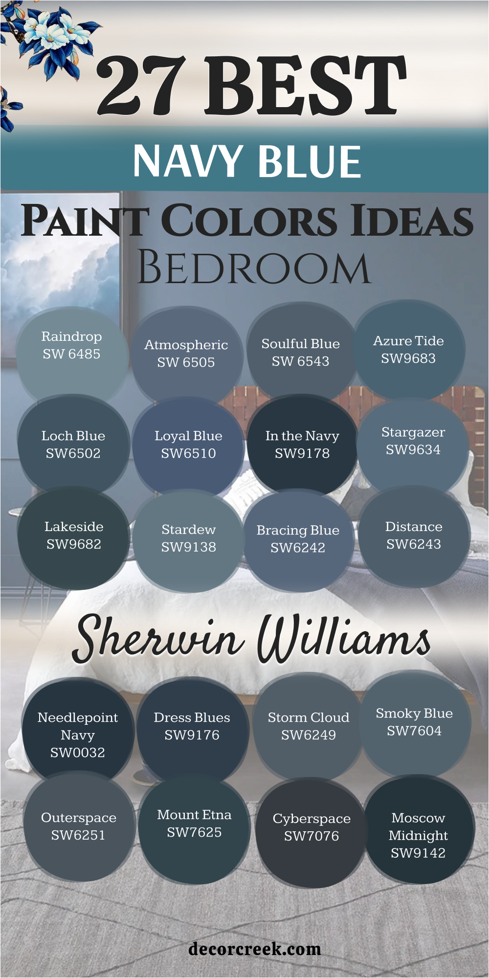
38 Best Navy Blue Bedroom Paint Color Ideas In 2026
Naval SW 6244
Naval SW 6244 is a top-tier navy that always provides a true, balanced blue without leaning too heavily into gray or green undertones. It’s my go-to when a client asks for a classic navy because it has a dependable, rich quality that works in almost any light. Naval pairs excellently with crisp white bedding and warm metallic accents for a sophisticated, tailored look that is easy to build upon.
I suggest using it on an accent wall behind your headboard to add instant depth and a strong, beautiful focal point to the room. This deep shade creates a wonderfully cozy and intimate feel in a bedroom, helping the room feel like a protected, restful haven.
The color holds its rich pigment beautifully, which is a testament to its high quality and lasting appeal for a main bedroom. Naval is truly a versatile anchor for any decor style, from nautical to highly contemporary. It truly makes a bedroom feel like it was designed by an expert for thoughtful rest and personal style.
🎨 Check out the complete guide to this color right HERE 👈

Gale Force SW 7605
Gale Force SW 7605 is the perfect choice for someone wanting a navy that has a complex and moody edge, featuring strong green undertones. It often reads as a deep teal, offering a rich blue that is not quite traditional but equally beautiful and grounding. The color creates a sophisticated drama that is perfect for a bedroom, giving the room a designer-finished, custom look.
I like to pair Gale Force with a light greige or warm white to allow its velvety depth to truly shine on the walls. This shade is particularly stunning when used on built-in shelving or a dresser, where it anchors the furniture with its earthy, rich hue. Gale Force works well with natural wood tones, enhancing the organic, restful feel you want in a sleeping area.
It’s a dynamic color that shifts depending on the light, ensuring your bedroom walls always look interesting and dimensional. This blue-green offers a unique twist on navy that still delivers the dark, comforting quality people desire.
🎨 Check out the complete guide to this color right HERE 👈
Indigo Batik SW 7602
Indigo Batik SW 7602 is a deep, luxurious blue that carries a hint of purple undertone, giving it a rich, regal quality that feels perfectly suited for a main bedroom. This subtle complexity prevents it from looking flat and instead gives the wall a velvety depth and dimension.
I often use Indigo Batik with soft, warm grays and creamy whites to keep the overall look soft yet sophisticated. This shade is incredible for creating a grounded, restful atmosphere that helps the mind unwind at the end of a long day. It’s a beautifully saturated color that holds its blue character, even in lower light, ensuring it doesn’t look completely black on your walls.
Indigo Batik looks gorgeous with layered textures like velvet pillows or woven rugs, enhancing the feeling of depth. This blue is a fantastic option for someone who wants a distinctive, elegant navy that feels both classic and wonderfully current. It’s a color that speaks to thoughtful design and a love for deep, sophisticated hues in personal retreats.
🎨 Check out the complete guide to this color right HERE 👈

Seaworthy SW 7620
Seaworthy SW 7620 is a striking, deep blue that immediately brings to mind the elegance of the open sea with its nautical, stormy quality. It features pronounced cool, gray undertones that mute its intensity, making it a sophisticated backdrop that won’t feel overly dark or heavy.
I often suggest Seaworthy when a client wants a navy that leans toward the historic and grounded, offering a classic maritime vibe. This color pairs beautifully with crisp white trim like Pure White to create a fresh, high-contrast aesthetic that is instantly appealing. For a touch of warmth, introduce copper or warm wood accents, which look stunning against its cool blue depth.
Seaworthy is an ideal choice for a bedroom because its calming undertones promote a restful, peaceful environment. Its richness adds character, perfect for a feature wall that demands attention without shouting. This shade can make your bedroom feel like a chic coastal retreat, regardless of where you live.
Salty Dog SW 9177
Salty Dog SW 9177 is a bold and versatile deep navy blue that exudes a sense of polished drama and sophistication in a bedroom. It has gray undertones that are just enough to keep it balanced, preventing it from feeling too intense or vibrant. This shade is perfect for creating a moody, modern vibe that still feels utterly classic and expertly designed.
I often pair Salty Dog with clean, crisp whites and soft, sandy beiges to emphasize its depth and provide a welcome contrast. Use it on all four walls for an immersive effect that makes the room feel wrapped in rich color. Salty Dog is a wonderful canvas for metallic hardware in brass or gold, which creates a luxurious glint against the deep blue.
This navy is a showstopper, excellent for a primary bedroom where you want a striking statement without sacrificing a sense of peacefulness. It has a beautiful depth that adapts well, feeling true blue in bright light and more charcoal at night. Salty Dog is truly a color that brings personality and flair to any room I use it in.
🎨 Check out the complete guide to this color right HERE 👈
Charcoal Blue SW 2739
Charcoal Blue SW 2739 is a sophisticated, deep blue-gray that sits right on the border between a dark navy and a rich charcoal, giving it a wonderful ambiguity and versatility. It has subtle green undertones, which can sometimes appear in certain lighting, making it a dynamic and complex shade that keeps the eye interested.
This color is fantastic for creating a cozy, tailored sanctuary that feels both modern and utterly enduring. I often use a very light, crisp white like Snowbound with Charcoal Blue to ensure the trim pops and the depth of the blue is fully appreciated. It’s a gorgeous choice for a primary bedroom, where its grounding color can foster a sense of deep rest and quiet focus.
In a well-lit room, you’ll see more of the navy blue, while in dimmer settings, it will lean toward a darker, moodier gray. Charcoal Blue works beautifully with warm wood furniture and leather accents, creating a rich, designer-approved palette. This paint color is a testament to how a deep shade can add refinement and polished charm to your sleeping quarters.
🎨 Check out the complete guide to this color right HERE 👈
Anchors Aweigh SW 9179
Anchors Aweigh SW 9179 is a deep, strong navy that exudes a sense of sophistication and dependable strength, living up to its nautical name. It is a very rich color, and its cool undertones lean toward gray, which slightly mutes the blue, making it feel more grounded and adaptable. This is a perfect navy if you want a very dark color that still clearly reads as true blue and not black.
I recommend pairing Anchors Aweigh with bright whites like Pure White to create a striking, classic contrast that is instantly fresh and tailored. Use it on built-in shelving or an accent wall to add immediate architectural interest and depth to your bedroom.
This shade fosters a cocoon-like coziness, making it an excellent choice for a restful and intimate bedroom environment. In bright natural light, the color is vibrant, while in the evening, it deepens into a velvety, dramatic hue. Anchors Aweigh looks stunning with metallic accents in gold or brass, elevating the whole look to one of tailored luxury. It truly is a versatile, statement-making navy that brings an undeniable polish to your home design.
🎨 Check out the complete guide to this color right HERE 👈

Moscow Midnight SW 9142
Moscow Midnight SW 9142 is a very deep, dramatic color that is essentially a dark teal because of its strong green undertones mixed into the rich blue. With a very low Light Reflectance Value, this shade is for those who are ready to make a bold, truly dramatic statement in their bedroom.
This color creates a luxurious, intimate atmosphere that feels wonderfully rich and classy, like a plush jewel box. Because it is so dark, I always suggest balancing Moscow Midnight with plenty of light contrast, such as pure white bedding, light wood furniture, or a bright rug.
Use this color in a room with some natural light so its beautiful teal character can shine through and not look completely black. It’s an ideal choice for a powder room or a main bedroom accent wall where you want an unforgettable focal point. The richness of Moscow Midnight is stunning when paired with gold or brass hardware, adding a flash of warmth and high-end elegance.
🎨 Check out the complete guide to this color right HERE 👈
Cyberspace SW 7076
Cyberspace SW 7076 is a deep charcoal that has a distinct blue undertone, making it a fantastic near-black navy option that is softer than true black. This color brings an immediate sense of modern sophistication and drama to any bedroom wall. Its slightly cool, refined nature makes it a superb choice for a sleek, contemporary aesthetic when paired with cool-toned neutrals.
I like to use Cyberspace with a crisp gray like Dorian Gray to create a layered, moody palette that feels effortlessly current. It’s a wonderful color for painting a bed frame or nightstands to anchor the furniture in the room with rich depth.
This shade is perfect for a bedroom where you want a grounding, yet interesting, wall color that acts as a strong, non-distracting background. In brighter rooms, the blue becomes more apparent, while in lower light, it deepens into a velvety charcoal. Cyberspace is a smart and powerful choice for a design that feels polished, current, and richly intentional.
🎨 Check out the complete guide to this color right HERE 👈

Mount Etna SW 7625
Mount Etna SW 7625 is a rich, moody color that is best described as a deep green that carries strong blue and gray undertones, making it a beautiful off-navy contender. Its complexity and depth offer a sophisticated feel that is both earthy and refined, appealing to those who want a nature-inspired but still dark palette.
This color is wonderful for creating a tranquil, natural retreat in a bedroom, especially when paired with natural wood and woven textures. I suggest contrasting Mount Etna with a clean white like Pure White on the trim to make the rich green-blue depth truly stand out. In bright light, the green comes alive, while in dimmer settings, it takes on a deeper, more atmospheric blue-gray quality.
It works beautifully on all four walls to create a cozy, enveloping effect that is perfect for a restful sleep environment. The shade delivers a feeling of grounded elegance that makes the room feel expensive and thoughtfully put together. This is a special, less common deep shade that offers a luxurious twist on a traditional navy blue.
🎨 Check out the complete guide to this color right HERE 👈
Outerspace SW 6251
Outerspace SW 6251 is a deep blue-gray that feels cool and incredibly modern, an ideal choice when you want a navy that leans toward a rich, smoky gray. This shade works beautifully to create a thoughtful, quiet atmosphere in a bedroom that feels deeply private and tucked away.
I love pairing Outerspace with whites that have a slight gray undertone to keep the overall palette soft and sophisticated without harsh contrasts. It is dark enough to be dramatic, but its gray character keeps it from looking too black or heavy on the walls. Outerspace is an elegant background color that is perfect for a gallery wall or photo display, letting the art become the star.
This shade adds a sense of depth and architecture to a room, making it a great choice for a main bedroom. It creates a refined, understated look that is ideal for a contemporary or minimalist style of decorating.
🎨 Check out the complete guide to this color right HERE 👈

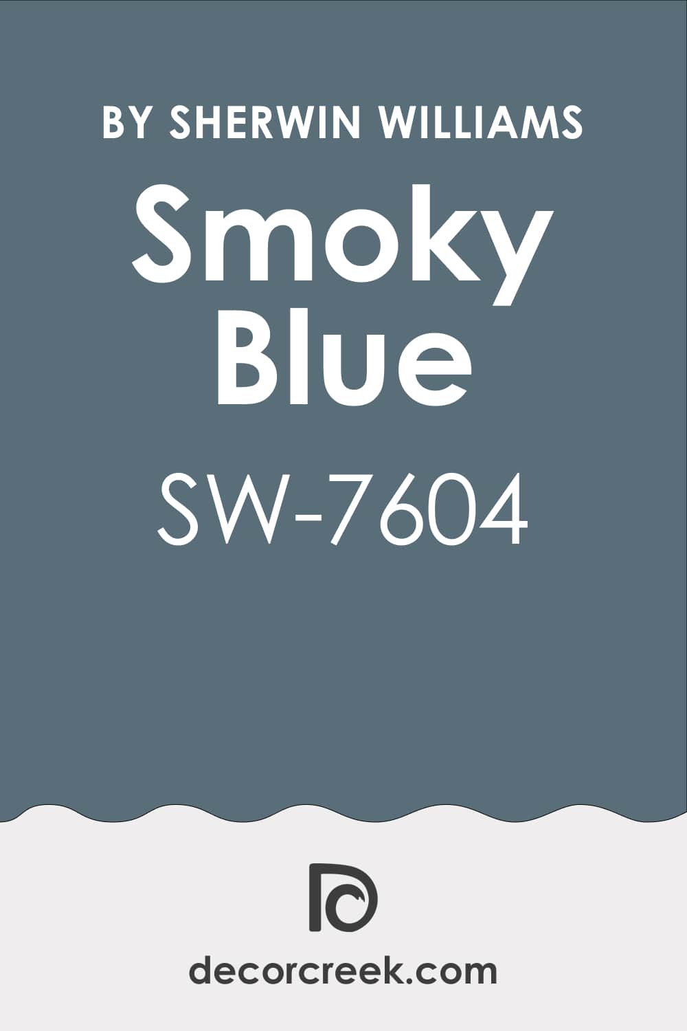
Smoky Blue SW 7604
Smoky Blue SW 7604 is a muted, slightly hazy blue that offers a softer, airier take on navy for a bedroom where you want to maintain some brightness. It contains very clear gray undertones that make it incredibly peaceful and relaxing, perfect for a resting room.
I often use Smoky Blue in bedrooms that lack natural light because it won’t appear too black and will retain its blue charm. This color pairs wonderfully with creamy whites and natural linen fabrics for a feel of coastal, light elegance. It provides a gentle yet present color that adds character without the sharpness or heaviness of a highly saturated navy.
Smoky Blue feels fresh and clean, making it a great option for a guest room or child’s room where a lighter tone is desired. This shade is the perfect way to get a deep but not heavy blue that contributes to a feeling of calm and quiet.
🎨 Check out the complete guide to this color right HERE 👈
Storm Cloud SW 6249
Storm Cloud SW 6249 is a dynamic blue-gray with a slight hint of green, living on the line between navy and a rich gray, offering a complex, refined look. True to its name, it has a moody, atmospheric character that is very grounding and ideal for creating an evocative bedroom.
I recommend pairing Storm Cloud with dark wood furniture and rich textures to emphasize its depth and cozy saturation. This color creates a feeling of deep rest, making it a great choice for a full-room application, turning the room into a chic cocoon. Its multifaceted nature means it will look different throughout the day, always staying interesting and visually engaging.
Storm Cloud adds an adult, sophisticated appearance to a bedroom, making it a great choice for a couple. This shade provides refined drama without being overly bright, perfect for a quiet, secluded area.
🎨 Check out the complete guide to this color right HERE 👈
Needlepoint Navy SW 0032
Needlepoint Navy SW 0032 is a saturated, pure navy that has very few gray or green undertones, making it a true, reliable navy blue shade. This color is perfect when you want a crisp, classic navy look that feels traditional and strong on your bedroom walls. I love using Needlepoint Navy with a very clean white trim to create a high contrast that looks neat, fresh, and nautical.
It is dark enough to be dramatic, but its purity keeps it from falling into black, preserving the blue color. This shade is wonderful for an accent wall in a room with white walls, instantly adding a focal point and depth to the room.
Needlepoint Navy is a stylish, enduring color that makes a great background for bright art pieces or metallic accents. It is a bold yet safe choice that gives a bedroom determination and polish.
Commodore SW 6524
Commodore SW 6524 is a very vibrant, deep blue that sits on the brighter side of the navy spectrum, carrying a noticeable blue pigment and less gray. This color is ideal if you want a navy that looks richer and less somber, bringing energy to the bedroom while remaining deep.
I recommend using Commodore in well-lit rooms where its saturation can shine without making corners too dark. It pairs beautifully with silver and nickel accents for a modern, fresh look that feels athletic and sleek. Commodore is great for a guest bedroom or a teenager’s room where you want a little more brightness and fun in a deep color.
It provides a distinct, stylish feeling that is more dynamic than the traditional, grayer navy shades. This color is a way to get deep blueness with a feeling of cheerful saturation.
🎨 Check out the complete guide to this color right HERE👈
Blue Iris SW 9687
Blue Iris SW 9687 is a very dark, deep, near-black navy that is an excellent choice for creating maximum drama and coziness in a bedroom. This color is perfect when you want the walls to recede into soft darkness, creating a cocoon feeling that is perfect for rest and sleep.
I suggest pairing Naval Night with abundant light fabrics and accents to ensure the room remains balanced and not heavy. It looks incredibly rich and expensive when combined with textural elements like velvet or silk, adding a luxurious appearance. Naval Night is a bold statement that turns a bedroom into a refined, private refuge.
It provides incredible depth that makes everything in front of it pop and look crisp, especially white moldings. This shade is for those seeking the ultimate, breathtaking navy to create an elegant and intimate area.
🎨 Check out the complete guide to this color right HERE 👈
Stargazer SW 9635
Stargazer SW 9635 is a soft, slightly dusty blue that represents a lighter, more muted take on navy for a bedroom where you want to keep things gentler. It has enough gray to give it a sophisticated, historic feel, but enough blue to make it feel like a deep color.
I recommend using Stargazer with off-white trim and warm-toned wood to create a cozy, farmhouse-inspired elegance in the bedroom. This color is wonderfully calming and approachable, making it a great choice for an entire room application that feels enveloping and soft.
Stargazer provides a serene backdrop that is perfect for layering textures and patterns for a personalized, unique look. It’s a navy that doesn’t demand attention but instead provides a gentle foundation for a truly restful environment.
🎨 Check out the complete guide to this color right HERE 👈
Silent Ripple SW 9682
Silent Ripple SW 9682 is a deep, rich blue that is heavily influenced by green undertones, placing it firmly in the deep teal family, a beautiful alternative to traditional navy. This color is fantastic for creating a grounded, natural mood in a bedroom, evoking the feeling of a deep, wooded lake at dusk.
I love pairing Lakeside with natural materials like woven baskets and wooden furniture, along with light, creamy whites for contrast. Its intense depth provides a luxurious, sophisticated feel that works beautifully as a full wall color for a cozy, dark retreat.
Lakeside is a color that adds immediate personality and custom style, perfect for a homeowner who desires a rich, unique blue-green statement. This shade provides an earthy drama that is both restful and visually stunning.
🎨 Check out the complete guide to this color right HERE 👈
Dress Blues SW 9176
Dress Blues SW 9176 is a deep, serious navy that truly looks like the color of a formal uniform, offering a sense of classic structure and refinement to a bedroom. This shade has very little gray, making it a pure, strong blue that holds its color well, even in lower light, which is ideal for a sleeping room.
I recommend pairing Dress Blues with crisp, white linens and silver accents for a tailored, elegant aesthetic that feels upscale and polished. It is a fantastic choice for a feature wall to frame a beautiful bed, instantly giving the room a strong focal point with its rich depth.
Dress Blues provides a sophisticated, formal backdrop that makes the room feel wonderfully organized and thoughtfully designed. This is a dependable navy that delivers unmistakable class and quiet authority to your home.
🎨 Check out the complete guide to this color right HERE 👈
Hale Navy HC-154
Hale Navy HC-154 is arguably Benjamin Moore’s most celebrated navy, famous for its perfectly balanced gray-green undertones that make it feel exceptionally grounded and soft. This navy is incredibly versatile, reading as a deep, rich blue in bright light and a more moody blue-gray at night, adapting beautifully to any setting.
I love using Hale Navy on built-ins or a fireplace mantel in the bedroom to anchor the architecture with its sophisticated depth. It pairs wonderfully with nearly any other color, from bright coral to creamy white, making it a design favorite for its flexibility.
Hale Navy creates a bedroom that feels deeply restful and classic, avoiding any harshness with its velvety, soft quality. This color provides a high-end, established look that will truly stand the test of time in your home.
🎨 Check out the complete guide to this color right HERE 👈

Van Deusen Blue HC-156
Van Deusen Blue HC-156 is a vibrant, slightly brighter navy that has a clear, crisp blue base and a subtle gray undertone to keep it grounded. This shade is ideal when you want a navy that clearly retains its blue identity and feels a bit more energetic and less somber than the darkest navies.
I recommend using Van Deusen Blue in a bedroom with ample natural light where its beautiful blue pigment can truly shine and feel fresh. It looks stunning when trimmed with a clean white like Simply White for a fresh, historic feel that is utterly charming and tailored.
Van Deusen Blue is a fantastic choice for a traditional or coastal-style bedroom, bringing a sense of classic, cheerful depth. This color provides a wonderful depth and richness without sacrificing the feeling of lightness and vitality.
🎨 Check out the complete guide to this color right HERE 👈

Newburyport Blue HC-155
Newburyport Blue HC-155 is a rich, refined navy with subtle gray undertones that softens its boldness, giving it a more sophisticated and approachable edge than a pure navy. This color is part of the Historical Collection for a reason; it provides an enduring, classic elegance that makes a bedroom feel established and polished.
I often pair Newburyport Blue with creamy off-whites and natural wood furniture to create a cozy, warm contrast that feels wonderfully inviting. It’s an excellent choice for a whole-room application, as its gray influence ensures it creates an enveloping, tranquil atmosphere that is ideal for rest.
Newburyport Blue is a balanced and dependable shade that gives a bedroom a sense of heritage and quiet luxury. This navy offers the perfect middle ground between dramatic depth and sophisticated softness.
🎨 Check out the complete guide to this color right HERE 👈

Kensington Blue CC-780
Kensington Blue CC-780 is a classic, true navy that is highly pigmented and creates a strong, deep statement in a bedroom. This shade is perfect for those who want a straightforward, confident navy without the fuss of complex green or gray undertones.
I suggest using Kensington Blue with bright, high-contrast white trim for a clean, nautical-inspired look that feels fresh and utterly timeless. It’s a wonderful color for adding a sense of formality and structure to a bedroom, making it feel purposeful and adult.
Kensington Blue is dark enough to be dramatic and cozy, yet pure enough to maintain its blue color even in lower light settings. This navy is a dependable, stylish choice that provides a rich, grounding base for any decorating style you desire.
Gentleman’s Gray 2062-20
Gentleman’s Gray 2062-20 is a deep, dramatic color that is better described as a blackened teal-blue, boasting strong green undertones that give it incredible depth and complexity. This shade is fantastic for creating a moody, luxurious feel, perfect for a bedroom where you want a truly high-end, custom look.
I love using Gentleman’s Gray with warm sandy neutrals and rich jewel tones like emerald or ruby in the accents for a sophisticated palette. Its complexity ensures the wall never looks flat, providing a velvety, textured appearance that is visually captivating.
Gentleman’s Gray is a bold alternative to traditional navy, offering a unique, artistic backdrop that feels both grounded and intensely personal. This color is a way to make a strong, refined statement without being overly aggressive.
🎨 Check out the complete guide to this color right HERE 👈

Deep Royal 2061-10
Deep Royal 2061-10 is an intensely deep, distinguished navy that comes very close to looking black, providing an incredible level of drama and sophistication in a bedroom. This color is ideal for creating an intimate, enveloping atmosphere, perfect for a sleeping room that feels completely secluded and cozy.
I recommend balancing Deep Royal with light, silvery-gray accents and plenty of white to prevent the room from feeling too heavy or closed in. It has a high pigment load that makes it feel velvety and luxurious on the walls, especially in a matte finish.
Deep Royal is a commanding color that makes a fantastic accent wall, instantly drawing the eye and anchoring the furniture with its intense depth. This shade is for the client who desires a bold, near-black navy that still carries the rich blue soul.
🎨 Check out the complete guide to this color right HERE 👈

Polo Blue 2062-10
Polo Blue 2062-10 is a classic, true navy that sits in the middle of the spectrum, providing an excellent balance of depth and clear blue color for a bedroom. This shade is a reliable choice for achieving a traditional, refined look that is always in style and works well with many wood tones.
I suggest using Polo Blue for a tailored, academic feel, pairing it with white trim and dark, classic furniture pieces. It is a fantastic option for a guest room or study-bedroom, where you want a strong color that is also serene and non-distracting.
Polo Blue provides a solid, dependable foundation that feels both sophisticated and inherently comforting in its straightforward depth. This navy is about uncomplicated elegance and a pure, powerful blue statement.
🎨 Check out the complete guide to this color right HERE 👈

Old Navy 2063-10
Old Navy 2063-10 is a classic, deep navy blue that is celebrated for being one of Benjamin Moore’s most reliable blue shades, with only a slight hint of an indigo-purple undertone. This color is perfect when you want a pure, dark navy that won’t turn green or gray in warm light, ensuring a true blue experience on your walls.
I love using Old Navy on all four walls of a bedroom for a cozy, ship-cabin feel that feels intimate and completely sheltered. It creates a crisp contrast with white trim, which is essential for making the room feel fresh and intentional despite the dark color.
Old Navy is a versatile and enduring choice that gives a bedroom a sense of timeless luxury and strong, classic character. This shade provides a deep-sea blue that is both visually stunning and wonderfully restful.
🎨 Check out the complete guide to this color right HERE 👈

Evening Sky 833
Evening Sky 833 is an intriguing, deep hue that blends black and midnight blue, carrying a distinct purple undertone that gives it a velvety, almost royal richness. This color is a fantastic way to introduce a dramatic, moody depth to a bedroom that feels more complex and warmer than a standard gray-navy.
I recommend pairing Evening Sky with warm, creamy whites and antique brass accents to highlight its opulent, dark character. The purple hint adds a layer of unexpected sophistication, making the room feel intimate and truly unique in its coloring.
Evening Sky is wonderful for a primary bedroom where you want a strong personality and a color that feels like a soft, dark backdrop for sleeping. This shade provides a rich, romantic feel that is both dramatic and profoundly comforting.
Hudson Bay 1680
Hudson Bay 1680 is a classic navy blue loved for its balance of bold color and a slightly lived-in, warm feeling with its subtle gray undertones. This color is ideal for creating a grounded, traditional bedroom that feels dependable and utterly inviting with its recognizable depth.
I suggest using Hudson Bay on a wainscoting or paneling in the bedroom and painting the upper walls a soft white for a historic, tailored look.
Its slight warmth makes it pair beautifully with darker wood furniture and soft neutral linens, creating a cozy, established atmosphere. Hudson Bay is a versatile workhorse that brings a sense of classic structure and enduring style to any sleeping room. This shade is a safe yet stylish choice that delivers the powerful aesthetic of a deep navy.
🎨 Check out the complete guide to this color right HERE 👈
Blue Danube 2062-30
Blue Danube 2062-30 is a bright, vibrant medium-to-deep blue that offers a more energetic take on the navy spectrum, ideal for a bedroom that receives plenty of light.
This color is perfect when you want a blue that is richly saturated and full of life, bringing a cheerful, dynamic mood to the walls. I love using Blue Danube in a guest bedroom or children’s room for its uplifting, lively quality, keeping the space from feeling too serious.
It looks fantastic with crisp white and primary color accents for a fresh, bold aesthetic that is full of fun and personality. Blue Danube is a way to get a deep blue impact while maintaining a feeling of brightness and clear color on your walls. This shade provides an invigorating contrast that is wonderfully appealing and visually arresting.
🎨 Check out the complete guide to this color right HERE 👈

Mysterious AF-565
Mysterious AF-565 is a deep, chameleon-like blue-black hybrid that features subtle charcoal and navy undertones, making it a highly sophisticated and moody color.
This shade is perfect for creating a velvety, dramatic feel in a bedroom, often appearing as a soft black in low light and a steely navy in brighter conditions.
I recommend pairing Mysterious with high-contrast whites like Chantilly Lace to emphasize its depth and create a sleek, contemporary look. It is an excellent choice for a bedroom that seeks a strong architectural element and a color that feels truly one-of-a-kind in its ambiguity. Mysterious provides a rich, grounding backdrop that makes textures and metallic accents truly pop with luxury. This color is a way to make a dramatic, custom statement that is both dark and undeniably elegant.
🎨 Check out the complete guide to this color right HERE 👈
Hidden Sapphire CSP-690
Hidden Sapphire CSP-690 is an intensely deep, vibrant blue that leans toward the jewel-tone sapphire, offering a rich, almost electric depth to a bedroom.
This color is for those who desire a navy that is purely blue and deeply saturated, bringing a luxurious, sophisticated sparkle to the walls. I suggest using Hidden Sapphire as an accent wall color to frame a bed or a piece of important artwork, making it the instant centerpiece of the room.
It looks incredible with silver or chrome accents for a sleek, glamorous aesthetic that feels high-end and modern. Hidden Sapphire provides a dramatic visual impact that is both bold and wonderfully intimate for a sleeping room. This shade is a true jewel-toned experience, full of personality and powerful color.
🎨 Check out the complete guide to this color right HERE 👈
Water’s Edge 1635
Water’s Edge 1635 is an elegant, muted blue-gray that carries a strong sense of the Old World while still working beautifully in a contemporary bedroom setting.
This shade is perfect when you want a navy that is soft, misty, and incredibly soothing, providing a gentle depth rather than a stark, bold one. I love using Water’s Edge for a full-room application to create a feeling of subtle retreat and quiet sophistication in the bedroom.
It pairs wonderfully with warm wood tones and creamy whites, giving the room an organic, peaceful feel that encourages relaxation. Water’s Edge provides a calm, grounded backdrop that is ideal for a restful environment and feels expertly coordinated with neutral decor. This color is a softer way to introduce a deep blue depth into your private room.
🎨 Check out the complete guide to this color right HERE 👈
Amsterdam AF-550
Amsterdam AF-550 is an appealing blue-gray that elegantly merges a deep blue with a soft gray, providing a sophisticated, nuanced depth for a bedroom.
This shade is perfect for creating a thoughtful, contemporary backdrop that feels both structured and inherently calming due to its gray influence. I recommend pairing Amsterdam with clean, crisp white trim to emphasize its deep blue-gray character and provide a polished contrast.
It is a fantastic choice for a bedroom because its muted quality ensures it creates an enveloping, restful atmosphere without being overly dramatic. Amsterdam provides a refined, adult color that works seamlessly with modern furnishings and textures. This color offers a gentle depth that is both stylish and wonderfully comfortable.
🎨 Check out the complete guide to this color right HERE 👈
Starry Night Blue 2067-20
Starry Night Blue 2067-20 is a deep, rich navy blue that is full of classic character and feels immediately tailored and academic on the walls of a bedroom.
This shade is a pure, strong navy that is perfect for achieving a traditional, stately look that is both powerful and inherently serious in its elegance. I suggest using Starry Night Blue for a primary bedroom or library-style room, pairing it with rich wood and leather accents for a cozy, sophisticated feel.
It provides an excellent, strong contrast to crisp white trim, making the architectural details of the room truly stand out.Starry Night Blue is a dependable, commanding color that brings a sense of order and timeless refinement to your sleeping quarters. This navy is a bold choice that creates a rich, beautifully structured backdrop.
🎨 Check out the complete guide to this color right HERE👈
Blue Note 2129-30
Blue Note 2129-30 is a deep navy that features dark gray undertones, giving it a versatile and sophisticated quality that is perfect for a mature bedroom design.
This shade is ideal when you want a navy that is dark and moody but remains clearly distinguishable from black, offering a soft, charcoal-like depth. I love using Blue Note with light, silvery-gray wall colors on adjacent walls for a harmonious, layered palette that feels very contemporary.
It creates a grounded, restful backdrop that works beautifully with modern, clean-lined furniture and neutral textiles. Blue Note is a dependable, elegant navy that provides a quiet sophistication and a feeling of comfortable, intentional design. This color is all about understated power and a beautifully balanced depth.
🎨 Check out the complete guide to this color right HERE 👈

Stunning 826
Stunning 826 is a dark sapphire blue that truly sparkles with a noticeable violet undertone, giving it an opulent, jewel-toned richness for a bedroom. This color is for those who want a navy that is vibrant and deeply saturated, bringing a sense of regal drama and warmth to the walls.
I suggest using Stunning 826 with creamy white trim and gold accents to emphasize its luxurious, deep blue and purple character. It creates an intimate, high-impact feel, perfect for a primary bedroom where you want the color to be the main sophisticated statement.
Stunning 826 is a bold, warm-leaning navy that is wonderfully evocative and unique in its intense, complex coloring. This shade provides a rich, almost glowing depth that is undeniably beautiful.
🎨 Check out the complete guide to this color right HERE 👈
27 Best Navy Blue Paint Color Ideas for the Bedroom by Sherwin-Williams
Naval SW 6244
Naval SW 6244 is a top-tier navy that always provides a true, balanced blue without leaning too heavily into gray or green undertones. It’s my go-to when a client asks for a classic navy because it has a dependable, rich quality that works in almost any light.
Naval pairs excellently with crisp white bedding and warm metallic accents for a sophisticated, tailored look that is easy to build upon. I suggest using it on an accent wall behind your headboard to add instant depth and a strong, beautiful focal point to the room.
This deep shade creates a wonderfully cozy and intimate feel in a bedroom, helping the room feel like a protected, restful haven. The color holds its rich pigment beautifully, which is a testament to its high quality and lasting appeal for a main bedroom. Naval is truly a versatile anchor for any decor style, from nautical to highly contemporary. It truly makes a bedroom feel like it was designed by an expert for thoughtful rest and personal style.
🎨 Check out the complete guide to this color right HERE 👈
Gale Force SW 7605
Gale Force SW 7605 is the perfect choice for someone wanting a navy that has a complex and moody edge, featuring strong green undertones. It often reads as a deep teal, offering a rich blue that is not quite traditional but equally beautiful and grounding.
The color creates a sophisticated drama that is perfect for a bedroom, giving the room a designer-finished, custom look. I like to pair Gale Force with a light greige or warm white to allow its velvety depth to truly shine on the walls.
This shade is particularly stunning when used on built-in shelving or a dresser, where it anchors the furniture with its earthy, rich hue. Gale Force works well with natural wood tones, enhancing the organic, restful feel you want in a sleeping area. It’s a dynamic color that shifts depending on the light, ensuring your bedroom walls always look interesting and dimensional. This blue-green offers a unique twist on navy that still delivers the dark, comforting quality people desire.
🎨 Check out the complete guide to this color right HERE 👈
Indigo Batik SW 7602
Indigo Batik SW 7602 is a deep, luxurious blue that carries a hint of purple undertone, giving it a rich, regal quality that feels perfectly suited for a main bedroom. This subtle complexity prevents it from looking flat and instead gives the wall a velvety depth and dimension. I often use Indigo Batik with soft, warm grays and creamy whites to keep the overall look soft yet sophisticated.
This shade is incredible for creating a grounded, restful atmosphere that helps the mind unwind at the end of a long day. It’s a beautifully saturated color that holds its blue character, even in lower light, ensuring it doesn’t look completely black on your walls.
Indigo Batik looks gorgeous with layered textures like velvet pillows or woven rugs, enhancing the feeling of depth. This blue is a fantastic option for someone who wants a distinctive, elegant navy that feels both classic and wonderfully current. It’s a color that speaks to thoughtful design and a love for deep, sophisticated hues in personal retreats.
🎨 Check out the complete guide to this color right HERE 👈
Seaworthy SW 7620
Seaworthy SW 7620 is a deep, nautical blue that has a beautiful, slightly stormy quality due to its pronounced gray undertones, making it very sophisticated. It’s a gorgeous choice for a bedroom because it feels incredibly grounded and restful, like looking out over the open, dark ocean.
I recommend pairing Seaworthy with crisp, clean white trim and light-colored furniture to balance its deep richness on the walls. This color works wonderfully as a full-room color because its gray influence ensures it never feels too vibrant or overwhelming for a sleeping area.
Seaworthy has a classic appeal that lends itself well to many decor styles, providing an enduring, chic background. Using this shade can make your room feel instantly more architectural and tailored, highlighting existing moldings or trim work. It is an excellent example of how a navy can be bold yet reserved, delivering drama with a quiet, soothing intensity.
Salty Dog SW 9177
Salty Dog SW 9177 is a rich, bold navy with noticeable gray undertones that provide a sense of drama while keeping the color beautifully balanced and easy to live with. It’s a very deep blue that holds its true color well, making it a reliable choice for a bedroom where you want a strong visual statement.
I love the pairing of Salty Dog with warm copper or brass accents, as the metallic sheen looks stunning against the deep blue backdrop. This shade is ideal for a feature wall to anchor a light-colored bed and create a striking focal point with its depth and character.
Salty Dog is an undeniably high-impact color that can instantly make a room feel more custom and thoughtfully decorated. It gives off a classic, almost preppy sophistication when trimmed with bright white, which I find very appealing in a main bedroom. This navy has a polished, bold presence that is simply captivating and encourages a feeling of cozy intimacy.
🎨 Check out the complete guide to this color right HERE 👈
Charcoal Blue SW 2739
Charcoal Blue SW 2739 is a deep, versatile color that is perfectly positioned between a true navy and a rich gray, offering a sophisticated hybrid. Its subtle green undertones give it a unique complex character that prevents it from feeling like a standard, everyday blue.
I recommend using Charcoal Blue with soft, muted neutrals like Repose Gray to create a layered, contemporary palette that feels very refined. This shade is fantastic for creating a moody, quiet bedroom that fosters deep rest and feels wonderfully private and tucked away.
It’s an ideal choice for painting built-ins or a vanity, where its rich depth adds an architectural and custom feel to the furniture piece. Charcoal Blue works with both warm and cool wood tones, making it a very adaptable anchor for different furniture styles in the room. This color is all about understated drama, giving your walls a profound depth without being stark or overly bold.
🎨 Check out the complete guide to this color right HERE 👈
Anchors Aweigh SW 9179
Anchors Aweigh SW 9179 is a very deep, almost black navy blue that is fantastic for creating a high-contrast, dramatic look in a bedroom. It has cool undertones that ensure the color reads as a rich, dark blue rather than simply a muted black, which is important for that navy effect.
I often suggest pairing Anchors Aweigh with crisp, clean white trim and bright white bedding to make the contrast pop and look incredibly fresh. This shade is perfect for an accent wall, where it can be used to frame a beautiful headboard or piece of artwork with its dense color.
It creates a cocooning effect that is wonderful for promoting a cozy, intimate feeling in a sleeping area, encouraging peaceful sleep. Anchors Aweigh is a sophisticated choice for anyone who desires a navy that is rich, commanding, and undeniably stylish on their walls. It provides a solid, grounded foundation for layering different textures and lighter accent colors in the decor.
🎨 Check out the complete guide to this color right HERE 👈
Moscow Midnight SW 9142
Moscow Midnight SW 9142 is a sultry, dark blue-green that gives a deep teal appearance, a perfect option for a bedroom where you want a truly dramatic and luxurious feel. It has an extremely low Light Reflectance Value, making it one of the darkest shades in the navy family, best used in rooms with contrast.
I love using Moscow Midnight in a powder room or on a single bedroom wall to create a jewel-box moment that feels wonderfully unique and special. Pair this sophisticated color with warm gold or rich bronze metallic accents to enhance its luxurious depth and add a beautiful sparkle.
It’s a bold choice that immediately signals a high-end, custom design sensibility, perfect for an adventurous homeowner. In the evenings, this shade becomes incredibly dark and atmospheric, creating a deeply restful and private environment. This is a navy option for those who want their bedroom to feel unforgettable and richly enveloping in its deep, complex color.
🎨 Check out the complete guide to this color right HERE 👈
Cyberspace SW 7076
Cyberspace SW 7076 is a deep charcoal with a clear blue undertone, a superb choice for a bedroom seeking a modern, architectural feel that is softer than pure black. It provides a sophisticated balance between navy and gray, giving the wall a beautiful, grounded depth.
I suggest using Cyberspace on a wall with wainscoting or paneling, where the texture can truly show off the color’s rich depth and complexity. This shade is excellent for creating a backdrop that is both calming and highly polished, making light-colored furnishings look crisp and intentional.
It’s a contemporary navy that pairs wonderfully with minimalist decor, acting as the strong anchor in a clean-lined design. Cyberspace works beautifully to make a bedroom feel tucked away and private, providing a mature and restful environment. This color is a sleek, refined statement that brings depth and an unmistakable feeling of thoughtful style to your sleeping quarters.
🎨 Check out the complete guide to this color right HERE 👈
Mount Etna SW 7625
Mount Etna SW 7625 is a beautiful, deep green that carries strong blue undertones, making it a fantastic alternative to traditional navy that still offers the same rich depth and grounding effect. This color feels very organic and restful, perfect for bringing a subtle, natural mood into a bedroom setting.
I love pairing Mount Etna with natural, lighter wood tones and soft, white linens to emphasize its earthy beauty and keep the room feeling fresh. The blue undertone is what links it to the navy family, providing that deep, sophisticated mood but with a unique, interesting twist.
It’s an ideal choice for a whole room application to create an enveloping, cozy environment that feels protected and intimately designed. Mount Etna offers a calming visual depth that is wonderful for promoting relaxation and an escape from the outside world. This shade delivers a unique character that feels custom and adds a layer of quiet, sophisticated personality to the room.
🎨 Check out the complete guide to this color right HERE 👈
Needlepoint Navy SW 0032
Needlepoint Navy SW 0032 is a saturated, pure navy that has very few gray or green undertones, making it a true, reliable navy blue shade. This color is perfect when you want a crisp, classic look of navy, that feels traditional and strong on your bedroom walls.
I love using Needlepoint Navy with a very clean white trim to create a high contrast that looks neat, fresh, and nautical. It is dark enough to be dramatic, but its purity keeps it from falling into black, preserving the blue color.
This shade is wonderful for an accent wall in a room with white walls, instantly adding a focal point and depth to the room. Needlepoint Navy is a stylish, enduring color that makes a great background for bright art pieces or metallic accents. It is a bold yet safe choice that gives a bedroom determination and polish.
Outerspace SW 6251
Outerspace SW 6251 is a deep blue-gray that feels cool and incredibly modern, an ideal choice when you want a navy that leans toward a rich, smoky gray. Outerspace works beautifully to create a thoughtful, quiet atmosphere in a bedroom that feels deeply private and tucked away.
I love pairing this color with whites that have a slight gray undertone to keep the overall palette soft and sophisticated without harsh contrasts. It is dark enough to be dramatic, but its gray character keeps it from looking too black or heavy on the walls.
Outerspace is an elegant background color that is perfect for a gallery wall or photo display, letting the art become the star. This shade adds a sense of depth and architecture to a room, making it a great choice for a main bedroom. It creates a refined, understated look that is ideal for a contemporary or minimalist style of decorating.
🎨 Check out the complete guide to this color right HERE 👈
Dress Blues SW 9176
Dress Blues SW 9176 is a deep, serious navy that truly looks like the color of a formal uniform, offering a sense of classic structure and refinement to a bedroom. This shade has very little gray, making it a pure, strong blue that holds its color well, even in lower light, which is ideal for a sleeping room.
I recommend pairing Dress Blues with crisp, white linens and silver accents for a tailored, elegant aesthetic that feels upscale and polished. It is a fantastic choice for a feature wall to frame a beautiful bed, instantly giving the room a strong focal point with its rich depth.
Dress Blues provides a sophisticated, formal backdrop that makes the room feel wonderfully organized and thoughtfully designed. This is a dependable navy that delivers unmistakable class and quiet authority to your home.
Smoky Blue SW 7604
Smoky Blue SW 7604 is a muted, slightly hazy blue that offers a softer, airier take on navy for a bedroom where you want to maintain some brightness. This color contains very clear gray undertones that make it incredibly peaceful and relaxing, perfect for a resting room.
I often use Smoky Blue in bedrooms that lack natural light because it won’t appear too black and will retain its blue charm. This color pairs wonderfully with creamy whites and natural linen fabrics for a feel of coastal, light elegance.
It provides a gentle yet present color that adds character without the sharpness or heaviness of a highly saturated navy. Smoky Blue feels fresh and clean, making it a great option for a guest room or child’s room where a lighter tone is desired. This shade is the perfect way to get a deep but not heavy blue that contributes to a feeling of calm and quiet.
🎨 Check out the complete guide to this color right HERE 👈

Storm Cloud SW 6249
Storm Cloud SW 6249 is a dynamic blue-gray with a slight hint of green, living on the line between navy and a rich gray, offering a complex, refined look. True to its name, it has a moody, atmospheric character that is very grounding and ideal for creating an evocative bedroom.
I recommend pairing Storm Cloud with dark wood furniture and rich textures to emphasize its depth and cozy saturation. This color creates a feeling of deep rest, making it a great choice for a full-room application, turning the room into a chic cocoon.
Its multifaceted nature means it will look different throughout the day, always staying interesting and visually engaging. Storm Cloud adds an adult, sophisticated appearance to a bedroom, making it a great choice for a couple. This shade provides refined drama without being overly bright, perfect for a quiet, secluded area.
Check out the complete guide to this color right HERE 👈
Distance SW 6243
Distance SW 6243 is a rich, medium-deep blue that has a distinct gray undertone, giving it a dusty, muted quality that feels soft and restful in a bedroom.
This shade is ideal when you want a blue that is noticeably deep but still maintains a sense of lightness and avoids feeling heavy on the walls. I often use Distance with creamy off-whites and natural wood to emphasize its soothing, approachable character and create a cozy atmosphere.
It provides a soft, grounded background that works well with a variety of decor styles, from modern farmhouse to transitional. Distance is a dependable, mid-tone navy that brings a gentle sophistication and a feeling of peaceful retreat to your sleeping room. This color offers a beautifully wearable blue depth that is easy to live with every day.
🎨 Check out the complete guide to this color right HERE 👈

Bracing Blue SW 6242
Bracing Blue SW 6242 is a vibrant, deep blue that is full of life and has a clear, clean pigment, offering a more energetic take on the navy color.
This shade is perfect for a bedroom where you want the blue to be richly saturated and feel slightly more bright and inviting than a black-based navy. I recommend using Bracing Blue in a room with plenty of natural light to let its vibrancy shine, pairing it with white trim for a crisp, fresh contrast.
It’s a great choice for a guest room or a secondary bedroom where you want a pop of cheerful color while still keeping the depth. Bracing Blue provides a dynamic, stylish feeling that is both sophisticated and joyful in its intense blue hue. This color is a way to get a powerful blue statement with a lively, energetic soul.
🎨 Check out the complete guide to this color right HERE 👈
Stardew SW 9138
Stardew SW 9138 is a dusty blue-gray that is on the lighter end of the navy spectrum, leaning more toward a deep muted gray with a pronounced blue influence.
This shade is ideal for a bedroom where you want a light, airy feeling but still crave the sophistication of a deep color without the intensity. I love pairing Stardew with clean white and light wood tones for a modern, Scandinavian-inspired aesthetic that feels incredibly peaceful.
It works beautifully on all four walls, creating a soft, enveloping atmosphere that is perfect for resting and unwinding. Stardew provides a quiet, refined backdrop that is versatile and feels effortlessly cohesive with layered textures and subtle patterns. This color offers a gentle depth that is wonderfully approachable and soothing.
🎨 Check out the complete guide to this color right HERE 👈

Lakeside SW 9683
Lakeside SW 9683 is a deep, rich blue that is heavily influenced by green undertones, placing it firmly in the deep teal family, a beautiful alternative to traditional navy.
This color is fantastic for creating a grounded, natural mood in a bedroom, evoking the feeling of a deep, wooded lake at dusk. I love pairing Lakeside with natural materials like woven baskets and wooden furniture, along with light, creamy whites for contrast.
Its intense depth provides a luxurious, sophisticated feel that works beautifully as a full wall color for a cozy, dark retreat. Lakeside is a color that adds immediate personality and custom style, perfect for a homeowner who desires a rich, unique blue-green statement. This shade provides an earthy drama that is both restful and visually stunning.
🎨 Check out the complete guide to this color right HERE 👈
Stargazer SW 9635
Stargazer SW 9635 is a soft, slightly dusty blue that represents a lighter, more muted take on navy for a bedroom where you want to keep things gentler. It has enough gray to give it a sophisticated, historic feel, but enough blue to make it feel like a deep color.
I recommend using Stargazer with off-white trim and warm-toned wood to create a cozy, farmhouse-inspired elegance in the bedroom. This color is wonderfully calming and approachable, making it a great choice for an entire room application that feels enveloping and soft.
Stargazer provides a serene backdrop that is perfect for layering textures and patterns for a personalized, unique look. It’s a navy that doesn’t demand attention but instead provides a gentle foundation for a truly restful environment.
🎨 Check out the complete guide to this color right HERE 👈
In the Navy SW 9178
In the Navy SW 9178 is a very rich, deep blue that has minimal gray, giving it a clean, strong presence that feels crisp and classic in a bedroom.
This shade is perfect for a traditional, tailored aesthetic, providing the reliable depth of navy without leaning too far into charcoal or teal. I suggest pairing In the Navy with bright white trim and silver accents for a fresh, high-contrast look that is instantly polished and elegant.
It’s an excellent choice for a feature wall or built-in cabinetry, where its dense color can truly anchor the furniture and architectural details. In the Navy provides a sophisticated, strong backdrop that is both cozy and wonderfully structured. This color is a way to get a powerful, pure navy statement that feels both enduring and stylish.
🎨 Check out the complete guide to this color right HERE 👈

Loyal Blue SW 6510
Loyal Blue SW 6510 is a medium-deep blue that is vibrant and clear, sitting on the more colorful side of the navy family, perfect for a lively bedroom.
This shade is ideal when you want a deep blue that is noticeably bright and full of energy, providing a cheerful, uplifting mood to the walls. I love using Loyal Blue in a room with lots of natural light to fully showcase its beautiful, clean pigment and rich saturation.
It pairs wonderfully with yellows or greens for a bold, complementary palette that feels customized and unique. Loyal Blue is a bold and dynamic choice that brings a sense of joyful depth to the sleeping room while maintaining a sophisticated feel. This color is a way to get a deep color impact without any of the gloominess.
🎨 Check out the complete guide to this color right HERE 👈
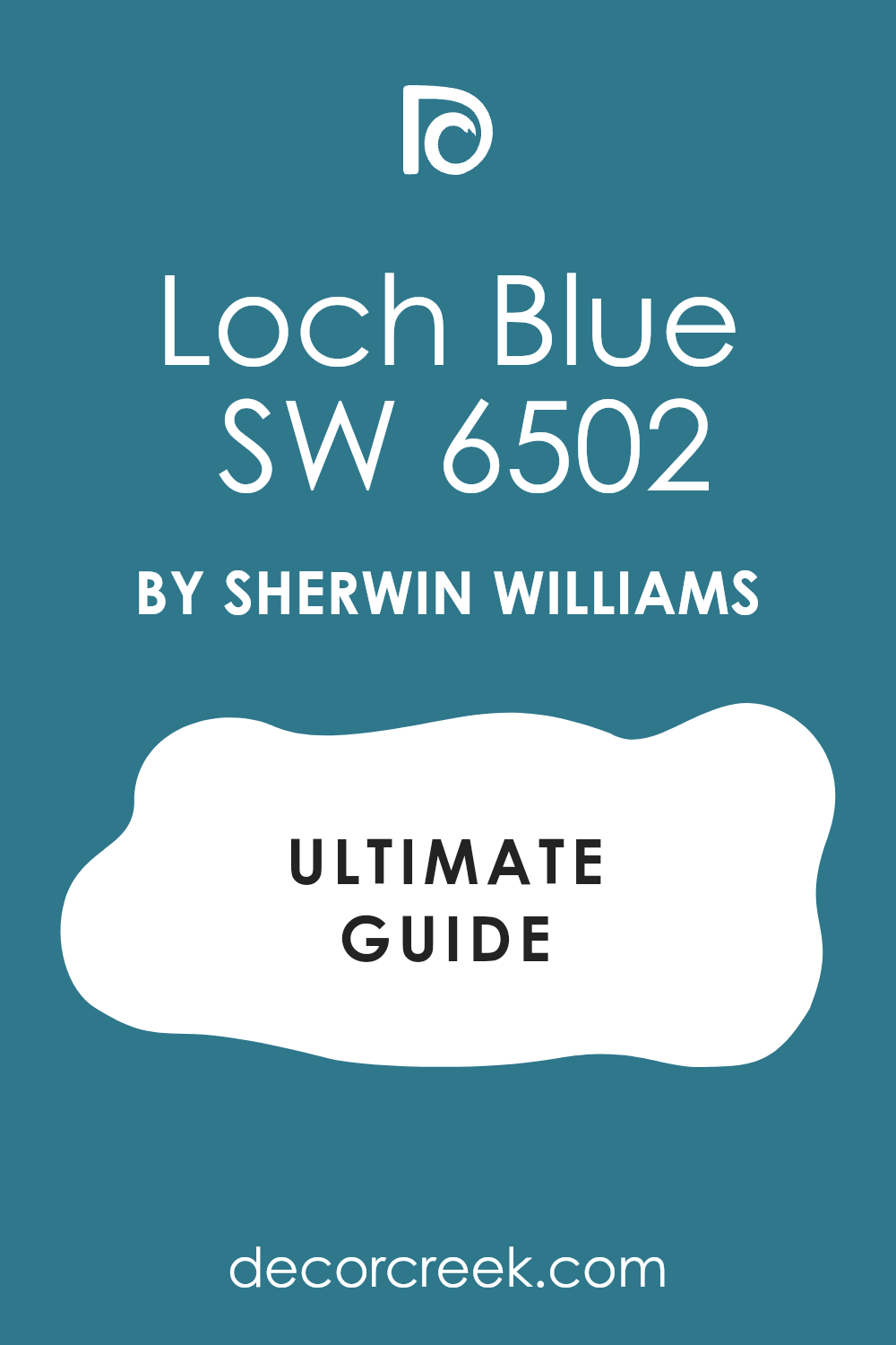
Loch Blue SW 6502
Loch Blue SW 6502 is a deep, atmospheric blue that carries a noticeable green undertone, placing it in the blue-green or teal family, similar to the color of a moody lake.
This shade is perfect for a bedroom where you want a rich, organic feel that connects the interior to a natural, peaceful vibe. I recommend pairing Loch Blue with natural wood tones and creamy neutrals to emphasize its earthy, deep character and create a cozy atmosphere.
Its depth is wonderful for a full-room application, creating a serene, enveloping effect that is ideal for rest and quiet time. Loch Blue provides a unique, sophisticated twist on navy, offering a complex depth that is visually intriguing and beautifully restful. This color is a rich, moody blue that brings a beautiful character to your walls.
🎨 Check out the complete guide to this color right HERE 👈
Azure Tide SW 9684
Azure Tide SW 9684 is a medium-deep blue that is vibrant and clean, possessing a crisp, almost tropical clarity that is rare in the navy category. This shade is perfect for a bedroom that aims for a fresh, coastal-inspired look with a color that feels deep yet brightly saturated.
I suggest using Azure Tide with pure white trim and light, sandy beige accents for a clean, resort-like feel that is utterly refreshing. It’s a great choice for an accent wall or a full room where you want the blue to feel energizing and clear, rather than dark and charcoal-like.
Azure Tide provides a lively, sophisticated depth that is wonderfully uplifting and visually appealing for a sleeping room. This color is a way to get a rich blue statement with a noticeable, beautiful vibrance.
🎨 Check out the complete guide to this color right HERE 👈

Soulful Blue SW 6543
Soulful Blue SW 6543 is a deep, sophisticated blue that is slightly softened by gray to give it a wonderful muted quality that feels perfectly suited for a bedroom.
This shade is ideal when you want a navy that has a subtle, elegant presence and creates a quiet, reflective mood without being harsh or overly bright. I love pairing Soulful Blue with creamy, warm whites and rich, textured fabrics to enhance its cozy, welcoming character.
It provides a grounded, restful background that allows other decor elements to shine while keeping the walls feeling deeply colored and refined. Soulful Blue is a balanced and approachable navy that brings a gentle, mature sophistication to your private retreat. This color offers a calming, deep presence that is easy to live with every day.
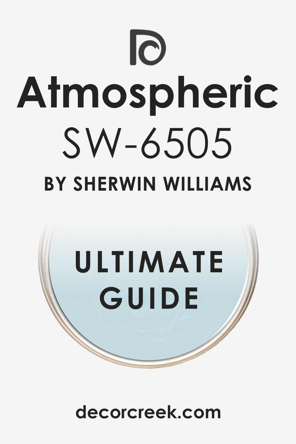
Atmospheric SW 6505
Atmospheric SW 6505 is a vibrant, medium-deep blue that is full of clean pigment and possesses a lively, energetic character, perfect for an active bedroom.
This shade is ideal for a guest room or secondary bedroom where you want a blue that feels fresh, inviting, and clearly colored, not too dark or moody. I recommend using Atmospheric with bright white trim and bold, simple accessories for a clean, modern look that feels effortless and tailored.
It provides a cheerful depth that is wonderfully appealing and prevents the room from feeling too bland or washed out. Atmospheric is a bold yet balanced choice that brings a sense of uplifting color while still providing a rich background. This color is a way to get a deep blue statement that feels vibrant and refreshing.
🎨 Check out the complete guide to this color right HERE 👈
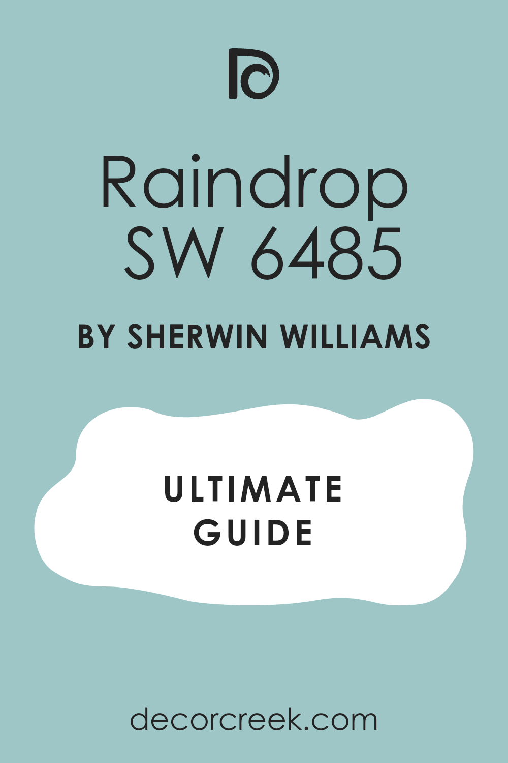
Raindrop SW 6485
Raindrop SW 6485 is a light, dusty blue-gray that is the softest shade in this list, offering the subtle sophistication of navy without the deep pigment intensity.
This shade is perfect for a bedroom where you want a very gentle wash of deep color that keeps the room feeling airy and bright. I love using Raindrop on all four walls to create a subtle, misty effect that is incredibly soothing and relaxing for a sleeping room.
It pairs beautifully with pure white trim to highlight its beautiful light blue-gray tone and give the room a fresh, clean finish. Raindrop provides a soft, understated backdrop that is ideal for a peaceful retreat and feels wonderfully cozy and intimate. This color is a way to get a hint of deep blue with a light, ethereal quality.
🎨 Check out the complete guide to this color right HERE 👈
16 Navy Blue And Pink Bedroom Paint Color Ideas
Naval SW 6244
Naval SW 6244 is a classic, balanced navy that acts as the perfect sophisticated anchor for a playful pink pairing in a bedroom. The true blue tone of Naval provides a crisp, clean contrast that prevents soft pinks from feeling overly sweet or juvenile.
I recommend using Naval on the main walls and introducing a soft, dusty pink in the bedding, curtains, or a statement chair. The contrast between this deep navy and a gentle pink like Intimate White creates a striking, yet balanced, visual harmony.
This combination is wonderfully modern and stylish, offering a grown-up take on a classically feminine and bold pairing. Naval’s depth grounds the lightness of the pink, resulting in a bedroom that feels both vibrant and deeply restful. It’s a design choice that is unexpectedly chic and full of personality.
🎨 Check out the complete guide to this color right HERE 👈
Gale Force SW 7605
Gale Force SW 7605, with its intriguing deep teal undertones, provides a unique and rich counterpoint when paired with soft pink hues in a bedroom.
The subtle green in the blue creates a more organic, complex backdrop that makes the pink accents feel wonderfully intentional and rich. I suggest using Gale Force on an accent wall and contrasting it with a peachy, warm pink like Rosé for a truly custom and layered look.
This pairing is less traditional, lending itself to a more bohemian or contemporary bedroom design that values unique color combinations. The complexity of Gale Force ensures the bedroom feels deeply cozy and artistic, while the pink adds a necessary element of softness and light. It’s a sophisticated pairing that results in a high-impact, memorable bedroom aesthetic.
🎨 Check out the complete guide to this color right HERE 👈
Indigo Batik SW 7602
Indigo Batik SW 7602’s rich blue with a hint of purple is stunning when paired with certain shades of pink, creating a bedroom that feels distinctly luxurious and jewel-toned.
The purplish flash in the navy complements the red tones in a pink, making them feel naturally harmonious rather than clashing. I love using Indigo Batik with a blush pink like Pink Bliss, applying the deep blue on the walls and reserving the pink for plush velvet textiles.
This combination results in a room that feels incredibly romantic and richly layered, perfect for a main bedroom retreat. The depth of the blue ensures the room feels grounded and sophisticated, while the pink adds a touch of desirable warmth and softness. It’s a pairing that truly makes a statement of bold elegance and thoughtful color coordination.
🎨 Check out the complete guide to this color right HERE 👈
Anchors Aweigh SW 9179
Anchors Aweigh SW 9179 is a very dark, near-black navy that provides a dramatic, strong backdrop perfect for making pink accessories truly pop with vibrant contrast in a bedroom.
The intensity of this deep shade makes a soft pink, like First Light, appear even more luminous and airy by comparison on a wall or in bedding. I recommend using Anchors Aweigh on the walls and pairing it with large pops of pink in the artwork, pillows, and decorative items for a crisp, graphic look.
This combination feels incredibly modern and energetic, ideal for a bedroom that aims for a bold, contemporary design aesthetic. The deep blue ensures the room is anchored with sophisticated depth, allowing the pink to provide a joyful, light element. It’s a striking, high-contrast pairing that is guaranteed to draw attention and feel wonderfully custom.
🎨 Check out the complete guide to this color right HERE 👈
Charcoal Blue SW 2739
Charcoal Blue SW 2739 is a sophisticated blue-gray with subtle green undertones, offering a more muted, refined anchor for a pink pairing in a bedroom.
The slight graying of this navy shade allows it to beautifully harmonize with both cool and warm pinks, resulting in a more effortlessly balanced palette. I often use Charcoal Blue on the lower wall paneling and a soft, pale pink on the upper walls, like Intimate White, for a chic, two-toned look.
This combination feels incredibly polished and mature, avoiding the stark contrast of a pure navy and a bright pink. The depth of the blue-gray grounds the room and allows the soft pink to feel gently illuminated and inviting. It’s a sophisticated, understated pairing that delivers a beautiful, restful, and thoughtfully designed bedroom.
🎨 Check out the complete guide to this color right HERE 👈
Hale Navy HC-154
Hale Navy HC-154 is a famously popular navy that has subtle green undertones, making it a superb, warm-leaning anchor for various pink shades in a bedroom.
The slight green flash in the blue provides a natural, grounded contrast to the warmth of a pink hue, creating a harmonious and balanced visual. I suggest pairing Hale Navy with a soft, dusty rose or a muted pink like Proposal for a bedroom that feels incredibly rich and velvety.
This combination is a fantastic way to introduce color and drama while maintaining a classic, enduring elegance in your design. Hale Navy on the walls makes the pink accents, especially those in heavier fabrics like velvet, look luxuriously rich and deep. It’s a high-end, sophisticated pairing that has become a favorite in interior design for its ability to feel both dramatic and incredibly cozy.
🎨 Check out the complete guide to this color right HERE 👈
Gentleman’s Gray 2062-20
Gentleman’s Gray 2062-20 is a deep, dramatic blue-green that is an excellent, complex alternative to a traditional navy when pairing with pink in a bedroom.
Its noticeable green undertone positions it closer to a teal, giving it a more organic, interesting depth that contrasts wonderfully with pink. I recommend using Gentleman’s Gray with a coral or soft salmon pink for a truly striking and unique color combination that feels bold and fresh.
This deep shade on an accent wall provides an artistic, moody background that makes the light, playful pink element feel delightfully vibrant. It’s a pairing that is both visually dynamic and incredibly rich, resulting in a bedroom that feels custom and exceptionally stylish. This color combination is perfect for a room aiming for a boutique-hotel aesthetic that is both restful and visually captivating.
🎨 Check out the complete guide to this color right HERE 👈
Kensington Blue CC-780
Kensington Blue CC-780 is a classic, true navy blue that offers a clean, refined base that is highly versatile for pairing with a variety of pinks in a bedroom.
This shade has a clear blue character without strong distracting undertones, making it a reliable partner for soft and bright pinks alike. I often use Kensington Blue on cabinetry or a built-in window seat and pair it with a soft, pale pink wall color for a sophisticated, two-toned approach.
The crispness of this navy ensures that the pink element, whether on the walls or in textiles, feels fresh, clean, and beautifully intentional. It’s a combination that feels instantly polished and classic, delivering a traditional, yet updated, bedroom look that has enduring appeal. This navy and pink pairing is about enduring beauty and a comfortable, gentle sophistication that is perfect for a peaceful bedroom.
Romance SW 6323
Romance SW 6323 is a delicate, blush pink that serves as a beautiful accent or complementary color when a deep navy is the primary wall color in a bedroom.
This soft, pale pink offers a gentle warmth and lightness that prevents the deep navy, like Naval, from feeling too heavy or closed in. I suggest using Romance for all your bedding and accent pillows against a navy wall to create a soft, inviting, and wonderfully feminine contrast.
The subtle hue of Romance allows the navy to be the main sophisticated anchor, while the pink provides the necessary element of inviting coziness. This combination is all about balance and softness, creating a bedroom that feels richly appointed and utterly tranquil. It’s a key color for achieving a sophisticated, grown-up pink and navy palette.
🎨 Check out the complete guide to this color right HERE 👈
Intimate White SW 6322
Intimate White SW 6322 is a white shade that has a distinct, creamy pink undertone, making it a perfect, subtle partner for a deep navy blue in a bedroom.
This shade is ideal for trim or ceiling color against a navy wall, as it provides a softer contrast than a pure white and ties into the pink accents in the room. The warmth of this pink-white helps to balance the cool depth of a navy like Anchors Aweigh, resulting in a bedroom that feels incredibly balanced and inviting.
I recommend using Intimate White for a cozy, slightly vintage feel when paired with navy, rather than a stark, modern aesthetic. The pairing creates a bedroom that is soft, richly textured, and wonderfully restful due to the gentle interplay of colors. It’s the perfect way to gently introduce pink into the room without making a loud or overly obvious statement.
🎨 Check out the complete guide to this color right HERE 👈
Malted Milk SW 6057
Malted Milk SW 6057 is a warm, muted pink-beige that offers a grounded, grown-up version of pink, pairing beautifully with deep navy shades in a bedroom.
This shade is perfect for achieving a sophisticated, dusty palette where the pink acts as a creamy neutral to balance the navy’s depth. I recommend using Malted Milk for the general wall color or major upholstery pieces, letting a true navy like Hale Navy provide the strong, dark accent.
The softness of this pink-beige ensures the room feels warm and incredibly cozy, avoiding any starkness often associated with navy and bright white. Malted Milk is a versatile, comforting color that softens the impact of navy, resulting in a mature, peaceful bedroom. This color provides a creamy, sophisticated warmth that grounds the entire design.
🎨 Check out the complete guide to this color right HERE 👈
Rosé SW 6290
Rosé SW 6290 is a soft, dusty rose pink with a hint of gray, making it a sophisticated, muted option for pairing with navy blue in a bedroom.
This shade is excellent because its gray undertone ensures it doesn’t feel juvenile or overly bright, harmonizing beautifully with deep, moody navies. I suggest using Rosé for accent pillows, throws, or a piece of painted furniture against a deep navy wall like Gale Force for a rich, layered look.
The interplay of the moody blue-green and the dusty pink creates a complex, contemporary palette that is both visually exciting and restful. Rosé is a chic, mature pink that brings a desired softness and warmth to the powerful structure of a navy-painted room. This pairing is about sophisticated contrast and quiet elegance.
🎨 Check out the complete guide to this color right HERE 👈
Rachel Pink SW 0026
Rachel Pink SW 0026 is a light, gentle pink that is clean and pure, providing a fresh, bright contrast to deep navy blue in a bedroom setting. This shade is perfect when you want the pink element to feel airy and illuminating, acting as a cheerful foil to the intensity of the navy.
I love using Rachel Pink on the upper walls with navy wainscoting, or for all the trim to create a sweet, crisp definition in the room. The brightness of this pink makes the navy, like Anchors Aweigh, feel even richer and more grounded by comparison.
Rachel Pink is a great way to introduce a clean, clear pink that still feels sophisticated and playful against a classic navy backdrop. This combination is all about fresh contrast and a lighthearted elegance.
🎨 Check out the complete guide to this color right HERE 👈
Pink Bliss 2093-70
Pink Bliss 2093-70 is a pale, ethereal blush pink that is very soft and quiet, providing a gentle, delicate contrast to the powerful depth of a navy blue in a bedroom.
This shade is ideal for creating a whisper of warmth and femininity, ensuring the navy remains the primary, sophisticated color in the design. I recommend using Pink Bliss for the majority of the wall room and introducing navy in smaller, impactful doses like a painted door or bedding accents.
The extreme softness of this pink prevents the deep navy from feeling too stark, resulting in a dreamy, cloud-like atmosphere. Pink Bliss is a subtle, sophisticated pink that adds a layer of delicate beauty and lightness to a navy palette. This pairing creates a bedroom that feels serenely beautiful and richly layered.
🎨 Check out the complete guide to this color right HERE 👈
First Light 2102-70
First Light 2102-70 is a light, rosy pink that is very current and feels bright, clean, and optimistic, making it a lovely partner for deep navy blue in a bedroom.
This shade is perfect when you want a pink that is noticeable but still pale, bringing a fresh, contemporary warmth to the walls. I suggest pairing First Light with a crisp navy like Naval, using the pink on all the walls and letting the navy define the accents and furniture.
The combination creates a modern, inviting palette that feels balanced between the depth of the blue and the lightness of the pink. First Light is a versatile, cheerful pink that ensures the navy accents feel sharp and intentional while the overall room feels bright and airy. This pairing is about current style and gentle contrast.
🎨 Check out the complete guide to this color right HERE 👈

Proposal AF-260
Proposal AF-260 is a muted, sophisticated pink-beige that leans heavily towards a warm, dusty blush, making it an excellent neutral counterpoint to navy blue in a bedroom.
This shade is perfect for creating an adult, subdued palette where the pink provides warmth and softness without being obviously colorful. I recommend using Proposal for the bedding and major textile room against a deep navy wall like Hale Navy for a velvety, custom-designed feel.
The gray undertone in this pink-beige allows it to beautifully ground the depth of the navy, resulting in a refined, quiet sophistication. Proposal is a luxurious, muted color that ensures the navy takes on an elegant, polished character in the bedroom. This pairing creates a cozy, highly sophisticated and restful room.
🎨 Check out the complete guide to this color right HERE 👈

19 Navy Blue Accent Wall Bedroom Paint Color Ideas
Naval SW 6244
Naval SW 6244 is a perfect, reliable navy for a bedroom accent wall, offering a clean, deep blue that instantly anchors the space behind the bed or along a feature wall.
This shade creates an immediate focal point with its saturated color, making light-colored furniture and crisp white trim truly stand out with a beautiful contrast. I recommend pairing the Naval accent wall with a light, soft gray on the other walls to allow the deep blue to be the star without overwhelming the room.
The true blue tone ensures the accent wall feels classic and endlessly stylish, providing a sophisticated, enduring look for the bedroom. Naval is dark enough to feel dramatic and moody, which is ideal for a sleeping area, yet bright enough to maintain its blue identity.
🎨 Check out the complete guide to this color right HERE 👈
Gale Force SW 7605
Gale Force SW 7605 is an excellent choice for a bedroom accent wall because its deep teal, complex undertones offer a dynamic visual interest that is more unique than a standard navy.
This blue-green shade is perfect for adding a velvety richness and sophistication that feels custom and thoughtfully designed for a sleeping room. I suggest using Gale Force on the wall with built-in shelving to truly emphasize the architectural detail and add depth to the feature.
The color has a wonderful way of shifting in the light, offering a fresh, intriguing view throughout the day, which keeps the room engaging. This bold accent wall provides a stylish backdrop that makes gold or copper metallic accessories shine with a luxurious gleam.
🎨 Check out the complete guide to this color right HERE 👈
Indigo Batik SW 7602
Indigo Batik SW 7602 makes a stunning bedroom accent wall due to its rich depth and subtle purple undertone, giving the wall a luxurious, dimensional quality.
This shade is perfect for creating a sophisticated, jewel-toned backdrop that beautifully frames light-colored headboards and white linens in the room. I recommend using Indigo Batik on the wall opposite a window so the natural light hits it, revealing its complex character and preventing it from feeling too heavy.
The color’s richness creates an immediate sense of intimacy and coziness, which is exactly what you want for a restful bedroom environment. This navy accent wall is about understated drama and elegance, providing a beautiful focal point that feels both classic and highly refined in the design.
🎨 Check out the complete guide to this color right HERE 👈
Seaworthy SW 7620
Seaworthy SW 7620 is a deep blue with gray undertones that is ideal for a bedroom accent wall, giving the room a grounded, sophisticated, and slightly stormy nautical vibe.
This color is perfect for adding a serene, restful depth that feels comforting and encourages a peaceful atmosphere for sleeping. I suggest pairing a Seaworthy accent wall with a warm greige or off-white on the surrounding walls to soften the transition and keep the room feeling balanced.
The muted quality of this navy ensures the accent wall is dramatic without being jarring, blending beautifully with natural wood furniture pieces in the room. This shade delivers a rich, enduring character that makes the feature wall feel like a high-quality, permanent part of the bedroom design.
Charcoal Blue SW 2739
Charcoal Blue SW 2739 is an elegant blue-gray that is wonderful for a bedroom accent wall, offering a softer, more nuanced depth than a pure, bright navy.
This shade provides an architectural strength that is perfect for highlighting a wall with a unique shape or a striking piece of artwork above the bed. I recommend using Charcoal Blue with crisp white crown molding on the accent wall to emphasize its refined, tailored look and the contrast in the room.
Its complex, smoky quality makes it a versatile background that complements a wide range of secondary colors and metallic finishes in the decor. This accent wall is all about sophisticated grounding, creating a mature and beautifully balanced focal point that encourages a feeling of quiet restfulness.
🎨 Check out the complete guide to this color right HERE 👈
Anchors Aweigh SW 9179
Anchors Aweigh SW 9179 is a powerful, near-black navy that makes a bold, dramatic bedroom accent wall for those seeking the maximum visual impact.
This shade is perfect for immediately anchoring the entire room, drawing the eye to the feature wall and framing the bed with commanding depth. I suggest using this deep navy on the accent wall with minimal, light-colored furniture and accessories to ensure the contrast is clean and striking.
The color creates a velvety, immersive effect that is wonderfully intimate and cozy, transforming the bedroom into a private, tucked-away retreat. Anchors Aweigh provides a solid, grounded foundation that allows every other element in the room, from pillows to lamps, to truly stand out.
🎨 Check out the complete guide to this color right HERE 👈
Moscow Midnight SW 9142
Moscow Midnight SW 9142 is a very dark, sultry blue-green that creates an unforgettable, jewel-box accent wall in a bedroom with its intense depth.
This highly pigmented shade is ideal for introducing an element of luxurious drama and high style, perfect for a feature wall behind a simple, tailored headboard. I recommend pairing the Moscow Midnight accent wall with plenty of warm gold or brass accents to enhance its richness and add a dazzling, chic sparkle.
Its exceptionally dark nature makes it the perfect color for a wall that you want to recede and add texture in a well-lit room. This accent wall is a bold, non-traditional choice that delivers a sophisticated, custom-designed aesthetic that is both moody and deeply appealing for a sleeping area.
🎨 Check out the complete guide to this color right HERE 👈
Mount Etna SW 7625
Mount Etna SW 7625 is a deep, moody green-blue that makes a fantastic accent wall for a bedroom, offering an organic, complex depth that feels incredibly restful and connected to nature.
This shade provides a beautiful way to introduce a dark color that is not a traditional navy, giving the room a unique, custom feel that is both sophisticated and earthy. I suggest pairing the Mount Etna accent wall with natural wood tones and linen textures to emphasize its organic quality and create a peaceful atmosphere.
The color’s deepness creates an enveloping effect, perfect for a wall that frames a reading nook or a comfortable armchair in the corner of the bedroom. This accent wall is an expression of quiet, sophisticated drama, bringing a lovely, rich character to the sleeping room.
🎨 Check out the complete guide to this color right HERE 👈
Salty Dog SW 9177
Salty Dog SW 9177 is a rich navy with gray undertones that is an excellent, dependable choice for a bedroom accent wall, offering a balance of boldness and lasting style.
This shade is perfect for adding a strong visual statement without the intensity of a near-black navy, allowing it to feel more approachable on a feature wall. I recommend using Salty Dog with clean, crisp white trim and baseboards on the accent wall to make the rich blue color truly pop with freshness and definition.
The color has a wonderful polished quality that works beautifully with all types of artwork, providing a grounded, rich background for your personal pieces. This navy accent wall is a classic move that delivers immediate depth and sophisticated structure to the entire bedroom layout.
🎨 Check out the complete guide to this color right HERE 👈
Dress Blues SW 9176
Dress Blues SW 9176 is a deep, sophisticated navy that creates an exceptional bedroom accent wall, living up to its name with its tailored, refined presence.
This shade is slightly brighter than a near-black navy, allowing the rich blue color to remain visible even in dimmer lighting conditions, which is key for an accent wall. I suggest pairing Dress Blues with a lighter, warm gray on the other walls to ensure the deep navy acts as the strong, beautiful anchor without the room feeling cold.
The color adds a wonderful sense of order and tradition, making the bedroom feel established, custom, and thoughtfully put together. This accent wall provides a rich, enveloping background that makes sleeping room feel both elegant and wonderfully cozy for a peaceful retreat.
Hale Navy HC-154
Hale Navy HC-154 is Benjamin Moore’s most popular navy and creates a beautiful, grounded accent wall due to its soft, gray-green undertones.
This shade is famous for its incredible versatility, providing a rich, dark focal point that avoids feeling harsh or stark in a bedroom. I love using Hale Navy on a shiplap or board-and-batten accent wall to truly showcase its velvety depth and texture.
The color works beautifully with almost any accent color, from warm beiges to cool whites, making it a designer favorite for its sophisticated flexibility. Hale Navy is dark enough to be dramatic and cozy, yet soft enough to contribute to a genuinely restful atmosphere. This accent wall choice delivers a high-end, established look that will always be in style.
🎨 Check out the complete guide to this color right HERE 👈
Van Deusen Blue HC-156
Van Deusen Blue HC-156 is a vibrant, slightly brighter navy that makes a wonderful, energetic accent wall without losing its deep, sophisticated character.
This shade is ideal when you want the accent wall to have a clear, clean blue color that stands out as rich, but is not trying to look black. I recommend pairing Van Deusen Blue with a crisp white trim and light gray walls to create a fresh, classic contrast that is instantly appealing.
It’s a fantastic choice for a bedroom that is well-lit, where its beautiful blue pigment can truly shine and feel fresh. This accent wall provides a sophisticated depth with a lively spirit, perfect for a space that feels both traditional and current.
🎨 Check out the complete guide to this color right HERE 👈
Newburyport Blue HC-155
Newburyport Blue HC-155 is a rich, refined navy with subtle gray undertones that makes a beautiful, softly dramatic accent wall for a bedroom.
This shade is perfect for creating a grounded, classic focal point that feels incredibly sophisticated and enduring in its depth. I suggest using Newburyport Blue with creamy off-whites on the adjacent walls to create a warm, inviting contrast that softens the overall aesthetic.
Its muted quality ensures the accent wall is deep and rich but still contributes to a tranquil, restful atmosphere for sleeping. This navy accent wall provides a sense of heritage and quiet luxury, delivering a perfect balance between drama and approachability.
🎨 Check out the complete guide to this color right HERE 👈
Gentleman’s Gray 2062-20
Gentleman’s Gray 2062-20 is a deep, dramatic blackened teal-blue that creates a unique, moody accent wall, perfect for adding a rich, complex layer to a bedroom.
Its strong green undertone provides an artistic, sophisticated background that is far more interesting than a standard navy. I love using Gentleman’s Gray with warm brass accents and deep, textured fabrics to emphasize its luxurious, velvety depth.
This shade is excellent for an accent wall that aims for a boutique-hotel aesthetic, feeling bold, custom, and highly refined. This accent wall provides a commanding, memorable focal point that is both deeply cozy and visually captivating.
🎨 Check out the complete guide to this color right HERE 👈
Polo Blue 2062-10
Polo Blue 2062-10 is a classic, true navy that makes a fantastic, dependable accent wall, offering a straightforward, strong blue presence in a bedroom.
This shade is perfect for achieving a traditional, tailored focal point that is reliably deep and works well with many wood tones. I suggest pairing Polo Blue with a clean white wall color to create a crisp, high-contrast look that is sharp and timelessly elegant.
It is dark enough to be dramatic and anchor the bed, yet its purity keeps it from looking muddy or too black. This navy accent wall provides a solid, sophisticated foundation that brings a sense of order and structure to the sleeping room.
🎨 Check out the complete guide to this color right HERE 👈
Deep Royal 2061-10
Deep Royal 2061-10 is an intensely deep, near-black navy that creates a powerfully dramatic accent wall, ideal for achieving a maximum impact in a bedroom.
This color is perfect for creating a velvety, immersive backdrop that makes the bed and light-colored linens appear to float in luxurious darkness.
I recommend balancing the Deep Royal accent wall with lots of white and metallic accents to prevent the room from feeling too dark and to enhance the contrast. It is a commanding, sophisticated color that provides incredible depth, making the room feel instantly intimate and high-end. This accent wall is a bold choice that truly transforms the feeling of the bedroom.
🎨 Check out the complete guide to this color right HERE 👈
Blue Note 2129-30
Blue Note 2129-30 is a deep navy with dark gray undertones that makes an excellent, sophisticated accent wall, providing a balanced, moody depth.
This shade is perfect when you want a navy that is dark and grounded but avoids the vibrant feel of a pure blue, leaning towards a charcoal elegance. I love using Blue Note with light, warm gray walls to create a harmonious, contemporary palette that feels effortlessly refined.
It creates a restful, quiet focal point that works seamlessly with modern furniture and neutral decor. This navy accent wall provides a subtle, mature drama that is both cozy and wonderfully structured.
🎨 Check out the complete guide to this color right HERE 👈
Kensington Blue CC-780
Kensington Blue CC-780 is a classic, true navy that creates an exceptionally clean, strong accent wall, perfect for a traditional or coastal bedroom.
This shade is highly pigmented and reliably blue, making it an ideal choice for a straightforward, elegant focal point without complex undertones.
I suggest pairing Kensington Blue with crisp white trim for a sharp, classic contrast that makes the feature wall feel instantly tailored and sophisticated. It is dark enough to anchor the room and provide depth, yet its purity is wonderfully refreshing and non-somber. This navy accent wall is a dependable, stylish choice that brings a sense of strong, enduring character to the room.
Mysterious AF-565
Mysterious AF-565 is a deep, ambiguous blue-black hybrid that makes a stunning, moody accent wall, offering a subtle blend of charcoal and navy.
This shade is perfect for a bedroom seeking a velvety, sophisticated drama that appears as a soft black or a deep, steely navy depending on the light.
I recommend using Mysterious with high-contrast whites and metallic accessories to highlight its depth and create a sleek, modern look. It provides an intense, grounding backdrop that makes textures and art truly pop with richness. This accent wall is a way to make a custom, refined statement that is dark, unique, and undeniably elegant.
🎨 Check out the complete guide to this color right HERE 👈
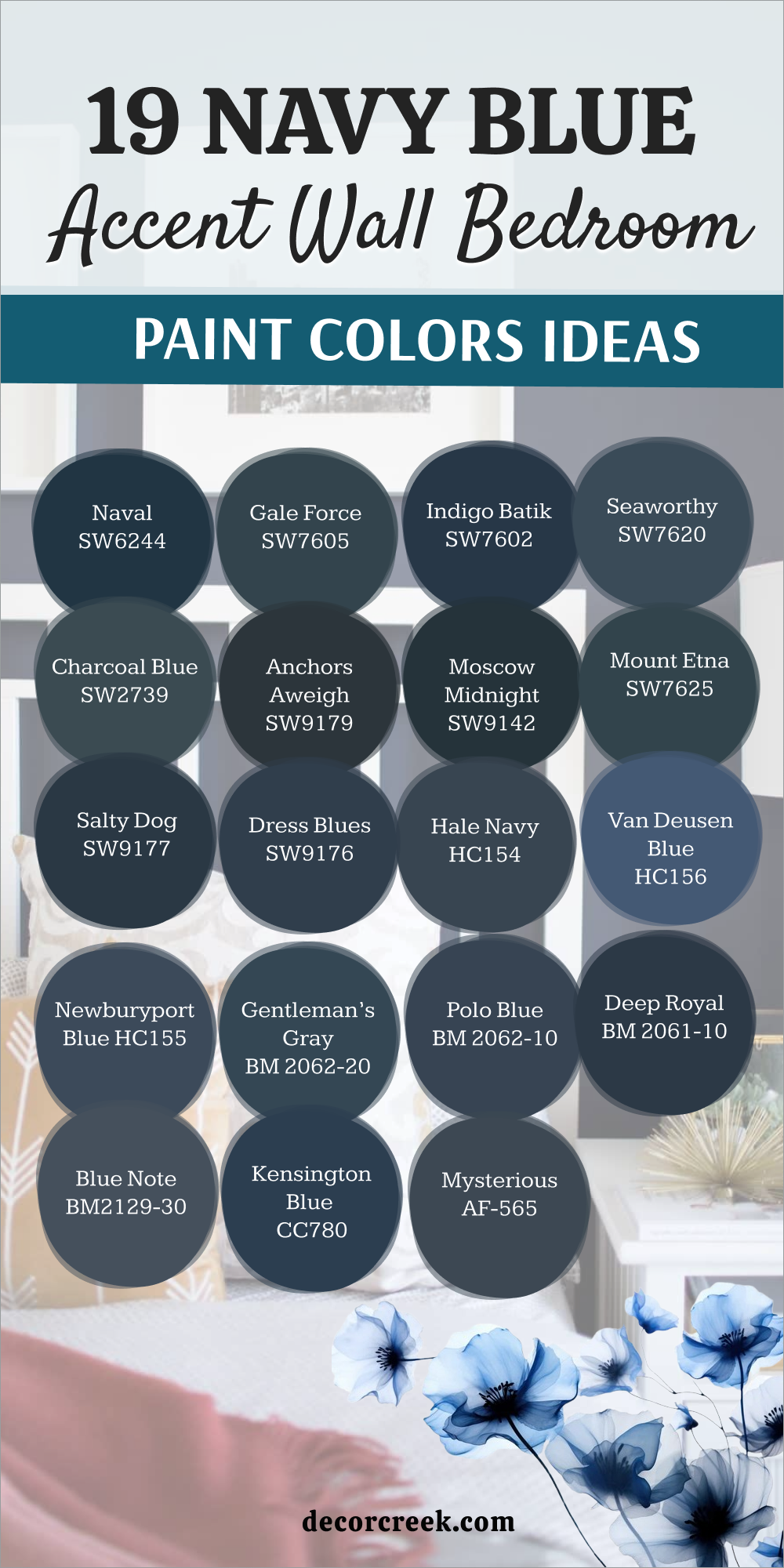
My Final Thoughts on Choosing Navy Blue Bedroom Paint Colors
Selecting the right navy blue for your bedroom is a decision that deeply impacts how you feel in your personal retreat. I always remind my clients that paint is much more than just color; it’s an emotional investment in your home and your well-being.
Remember to consider the light—a navy that looks stunning on a small chip or in a bright showroom will appear much deeper on your actual wall, so always use a large sample board and check it morning, noon, and night.
If you are aiming for a classic, crisp feel, lean into a true navy with minimal undertones, like Naval or Kensington Blue. If you prefer a richer, more complex mood, consider the intriguing undertones of shades like Gale Force (green) or Indigo Batik (purple).
Don’t forget the power of pairing; white trim, metallic hardware, and colorful bedding are the essential elements that truly bring the deep blue to life and make the whole room feel complete.
Your bedroom should be your favorite room, a gorgeous, restorative retreat, and the right navy blue is the perfect choice to make that dream a reality.

