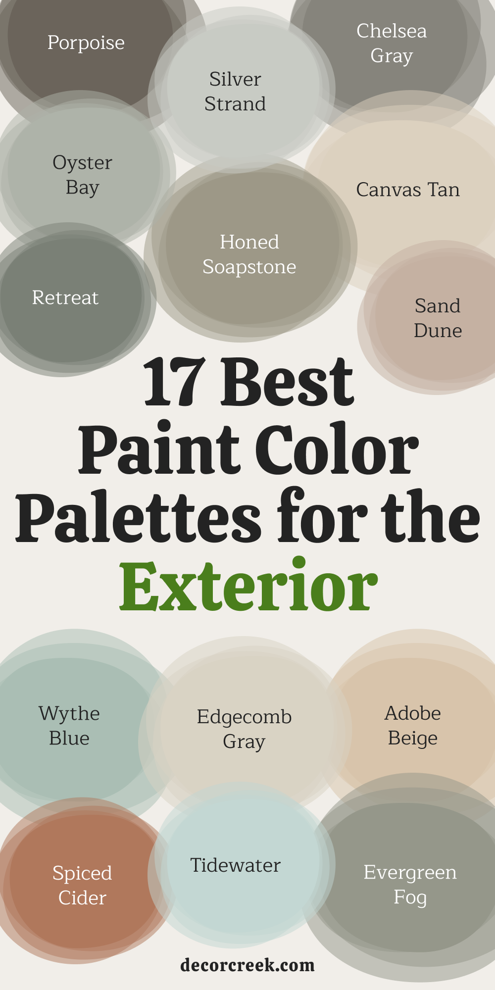
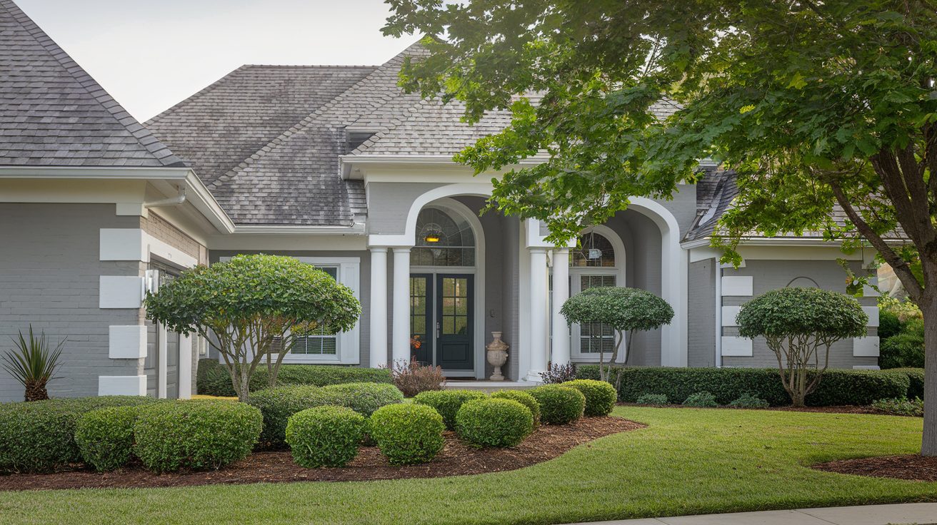
Choosing the right exterior paint palette can feel daunting, but it doesn’t have to be! These 17 curated color combinations are designed to help you confidently transform your home’s exterior.
Each palette includes a thoughtful mix of seven harmonious shades from Sherwin-Williams and Benjamin Moore, tailored to a variety of styles—from classic colonial homes to modern farmhouses.
How to Use These Palettes
Each palette features a suggested theme and a mix of colors for specific parts of your home:
- Main color: Ideal for siding or large surfaces.
- Trim: Light or dark neutrals that frame the home and provide contrast.
- Accent colors: Bold or muted shades for doors, shutters, or other standout features.
Tip: Start by identifying your home’s architectural style and surroundings (landscape, neighborhood vibe, etc.). Once you’ve found a palette that speaks to you, test the colors in small swatches on your home’s exterior. Observe how they look in different lighting throughout the day—it can make a huge difference!
These palettes aren’t just paint combinations; they’re tools to help you create a home that reflects your style and personality while boosting curb appeal. Ready to find your perfect match? Let’s begin!
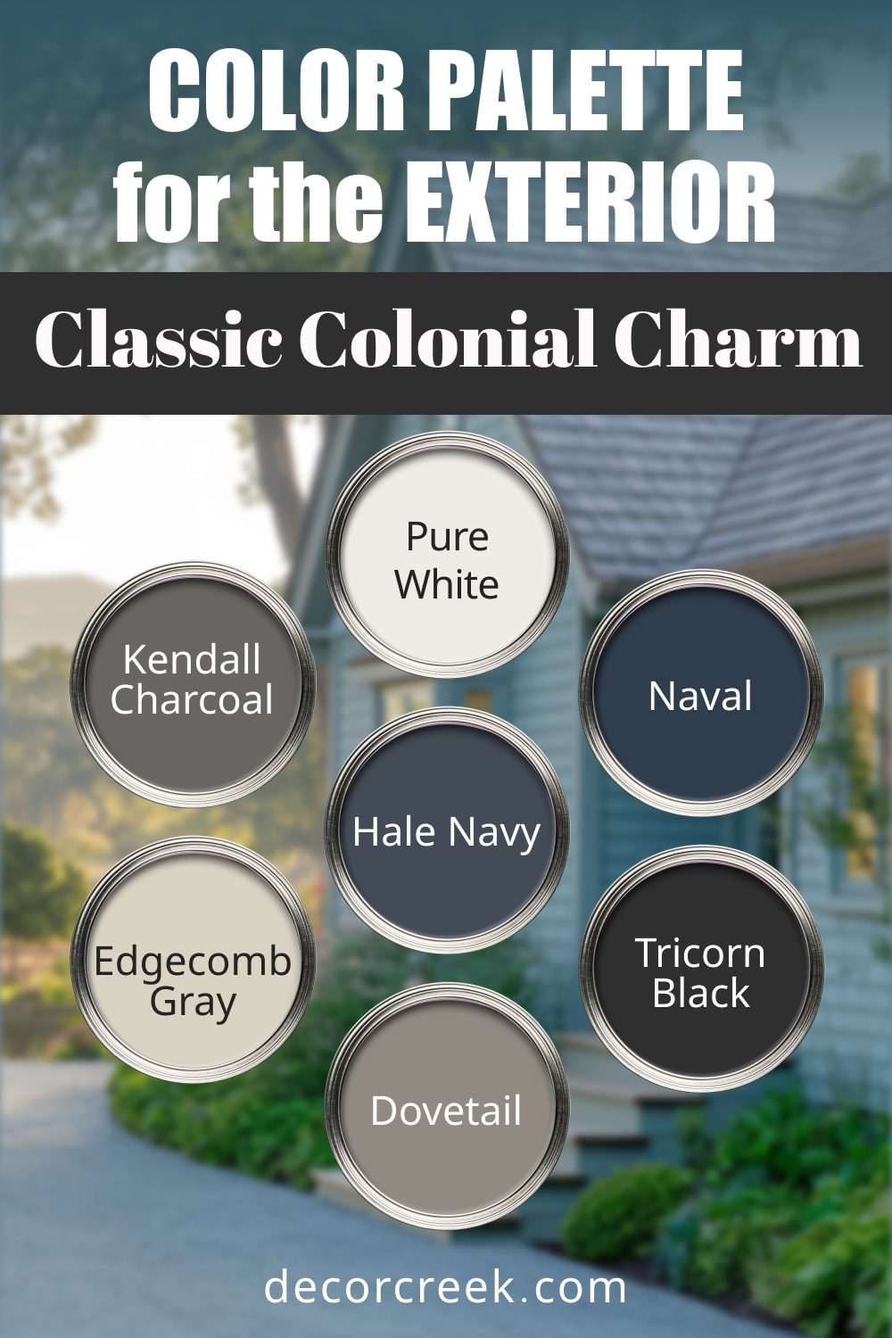
1. Classic Colonial Charm
This palette is all about timeless elegance, perfect for traditional homes with colonial or Georgian architecture.
- Sherwin-Williams Pure White (SW 7005): A crisp, clean white that brings out architectural details.
- Benjamin Moore Kendall Charcoal (HC-166): A rich, deep gray that feels grounding and sophisticated.
- Sherwin-Williams Naval (SW 6244): A striking navy blue for bold accents.
- Benjamin Moore Edgecomb Gray (HC-173): A warm neutral to soften the overall look.
- Sherwin-Williams Tricorn Black (SW 6258): A dramatic black for doors or shutters.
- Benjamin Moore Hale Navy (HC-154): Slightly lighter than Naval, great for contrast.
- Sherwin-Williams Dovetail (SW 7018): A soft gray with earthy undertones to balance the palette.
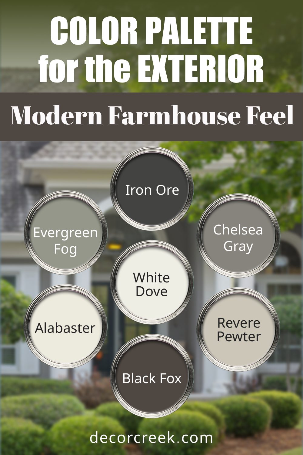
2. Modern Farmhouse Feel
This palette combines light, airy colors with grounding neutrals, ideal for farmhouse-style homes or cozy cottages.
- Sherwin-Williams Alabaster (SW 7008): A warm white that exudes simplicity and comfort.
- Benjamin Moore White Dove (OC-17): A creamy white for trim or siding.
- Sherwin-Williams Iron Ore (SW 7069): A moody, dark gray for bold contrast.
- Benjamin Moore Chelsea Gray (HC-168): A soft gray that works beautifully with whites.
- Sherwin-Williams Evergreen Fog (SW 9130): A gentle green-gray that adds a hint of nature.
- Benjamin Moore Revere Pewter (HC-172): A classic greige to tie everything together.
- Sherwin-Williams Black Fox (SW 7020): A deep, earthy brown for an unexpected edge.
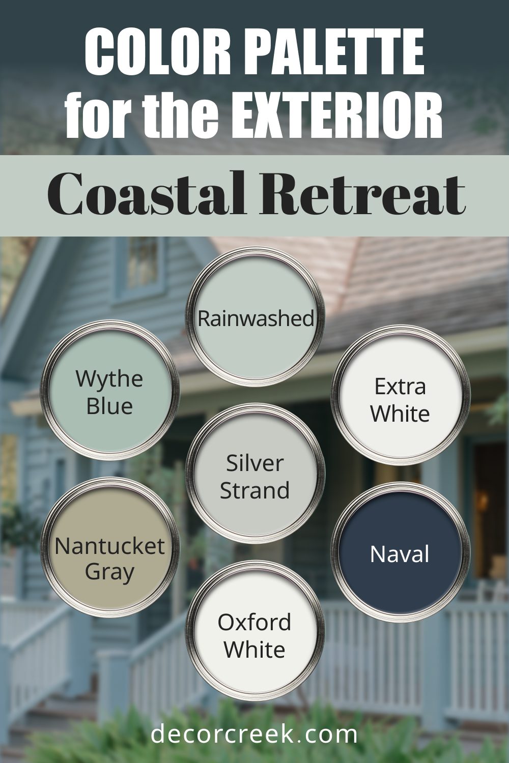
3. Coastal Retreat
Inspired by the sea and sky, this palette brings a breezy, relaxed vibe to coastal homes.
- Sherwin-Williams Rainwashed (SW 6211): A soft blue-green reminiscent of calm waters.
- Benjamin Moore Nantucket Gray (HC-111): A muted gray-green, perfect for natural accents.
- Sherwin-Williams Extra White (SW 7006): A bright, fresh white for siding or trim.
- Benjamin Moore Wythe Blue (HC-143): A blue-green that feels both bold and serene.
- Sherwin-Williams Silver Strand (SW 7057): A light, silvery gray for a modern touch.
- Benjamin Moore Oxford White (CC-30): A crisp white that pairs effortlessly with coastal colors.
- Sherwin-Williams Naval (SW 6244): A rich navy to anchor the breezy tones.
4. Craftsman Revival
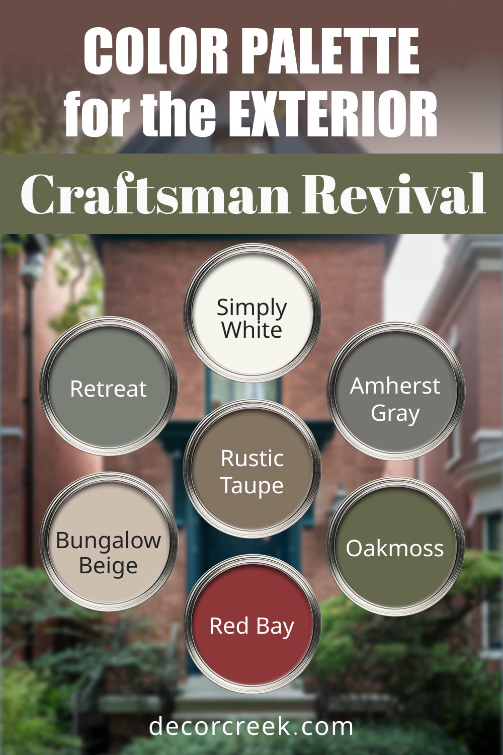
Designed for Craftsman-style homes, this palette emphasizes warm earth tones and natural shades that highlight handcrafted details.
- Sherwin-Williams Bungalow Beige (SW 7511): A soft beige with warm undertones, great for siding.
- Benjamin Moore Amherst Gray (HC-167): A moody gray that adds depth to architectural details.
- Sherwin-Williams Retreat (SW 6207): A muted sage green that blends beautifully with nature.
- Benjamin Moore Rustic Taupe (AC-7): A warm taupe for subtle contrast.
- Sherwin-Williams Red Bay (SW 6321): A deep, earthy red perfect for doors or accents.
- Benjamin Moore Simply White (OC-117): A crisp white for clean, complementary trim.
- Sherwin-Williams Oakmoss (SW 6180): A rich olive green that adds warmth and character.
5. Urban Sophistication
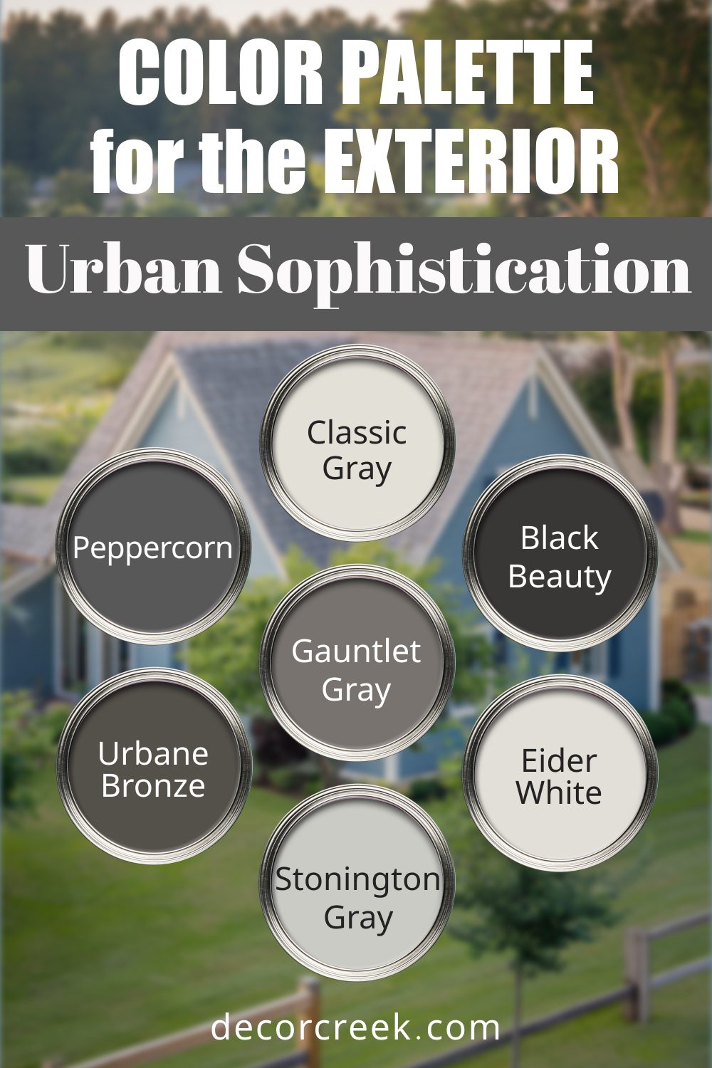
Perfect for city homes, this palette uses modern neutrals with bold contrasts to create a striking yet refined look.
- Sherwin-Williams Eider White (SW 7014): A cool off-white that feels sleek and modern.
- Benjamin Moore Black Beauty (2128-10): A true black with a luxurious depth, great for accents.
- Sherwin-Williams Gauntlet Gray (SW 7019): A strong mid-gray for contemporary siding.
- Benjamin Moore Stonington Gray (HC-170): A light gray with blue undertones, perfect for balance.
- Sherwin-Williams Urbane Bronze (SW 7048): A warm bronze-gray with modern appeal.
- Benjamin Moore Classic Gray (OC-23): A soft, versatile gray that works in almost any combination.
- Sherwin-Williams Peppercorn (SW 7674): A deep, moody charcoal for dramatic effects.
6. Desert Warmth
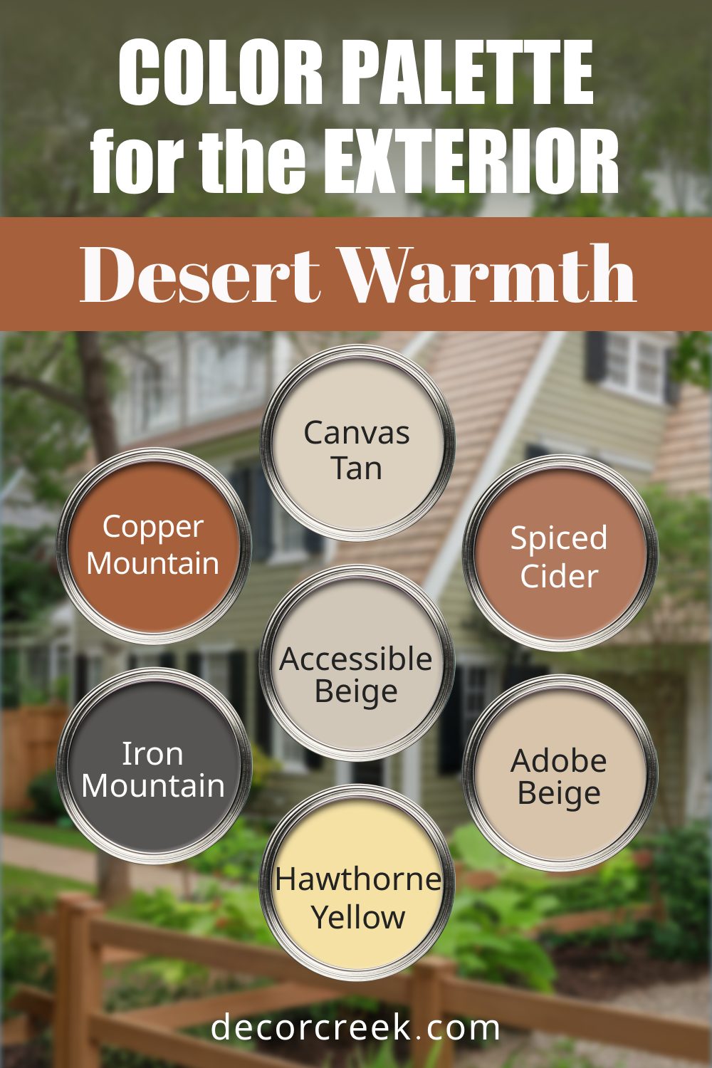
This palette reflects the beauty of desert landscapes with warm, earthy tones and sun-kissed neutrals, perfect for homes in arid climates.
- Sherwin-Williams Canvas Tan (SW 7531): A soft tan that feels warm and welcoming.
- Benjamin Moore Adobe Beige (1128): A muted peachy beige, perfect for siding or trim.
- Sherwin-Williams Spiced Cider (SW 7702): A rich, reddish-brown reminiscent of desert clay.
- Benjamin Moore Hawthorne Yellow (HC-4): A warm, sunlit yellow for cheerful accents.
- Sherwin-Williams Accessible Beige (SW 7036): A versatile beige with subtle gray undertones.
- Benjamin Moore Iron Mountain (2134-30): A dark brown-gray for bold details or accents.
- Sherwin-Williams Copper Mountain (SW 6356): A deep, coppery orange that adds a rustic touch.
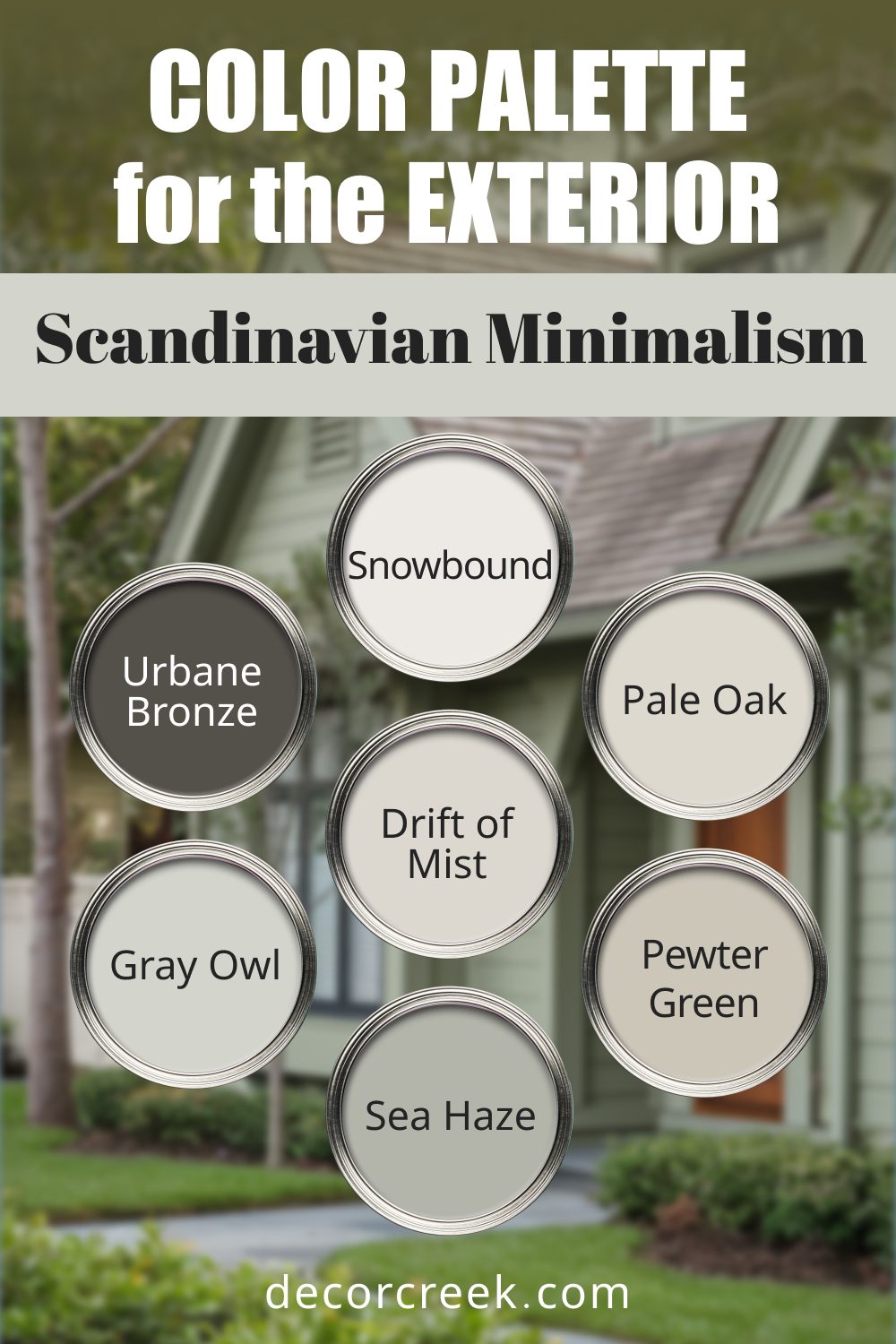
7. Scandinavian Minimalism
This simple yet striking palette is inspired by Scandinavian design, with light neutrals and soft, muted colors.
- Sherwin-Williams Snowbound (SW 7004): A bright, clean white with a cool undertone.
- Benjamin Moore Pale Oak (OC-20): A light greige with a subtle warmth.
- Sherwin-Williams Drift of Mist (SW 9166): A pale gray with a delicate green undertone.
- Benjamin Moore Gray Owl (OC-52): A light gray with the slightest hint of blue.
- Sherwin-Williams Urbane Bronze (SW 7048): A rich, warm bronze for contrast.
- Benjamin Moore Sea Haze (2137-50): A soft green-gray that evokes calm and simplicity.
- Sherwin-Williams Pewter Green (SW 6208): A medium green-gray with a contemporary feel.
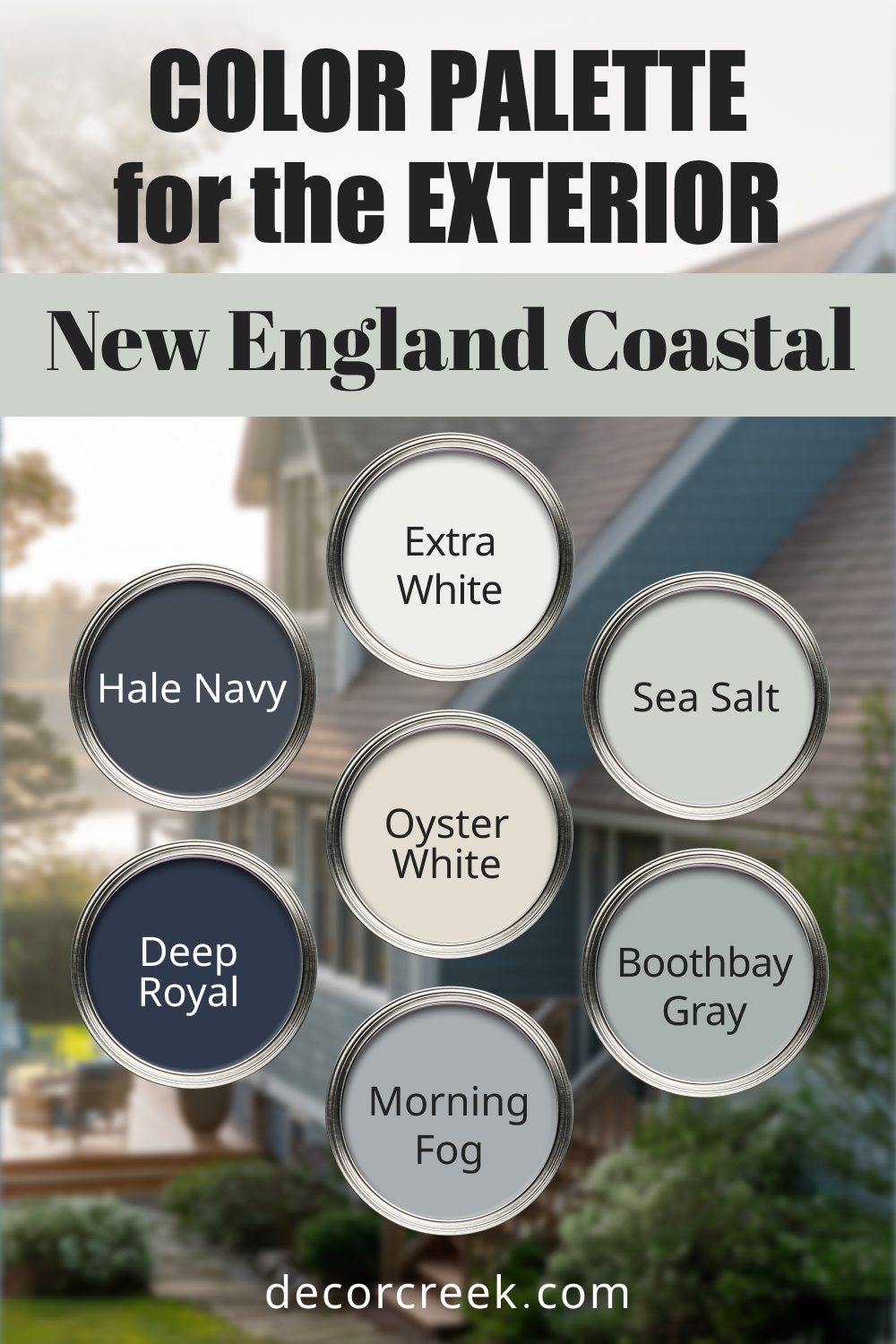
8. New England Coastal
This palette evokes the charm of historic coastal towns with weathered grays, classic blues, and crisp whites.
- Sherwin-Williams Oyster White (SW 7637): A warm white that resembles aged seaside cottages.
- Benjamin Moore Boothbay Gray (HC-165): A soft blue-gray for a coastal vibe.
- Sherwin-Williams Sea Salt (SW 6204): A delicate greenish-gray that feels fresh and airy.
- Benjamin Moore Deep Royal (2061-10): A bold, deep blue for accents.
- Sherwin-Williams Morning Fog (SW 6255): A gentle gray with soft blue undertones.
- Benjamin Moore Hale Navy (HC-154): A timeless navy blue that ties the palette together.
- Sherwin-Williams Extra White (SW 7006): A bright white for trim and details.
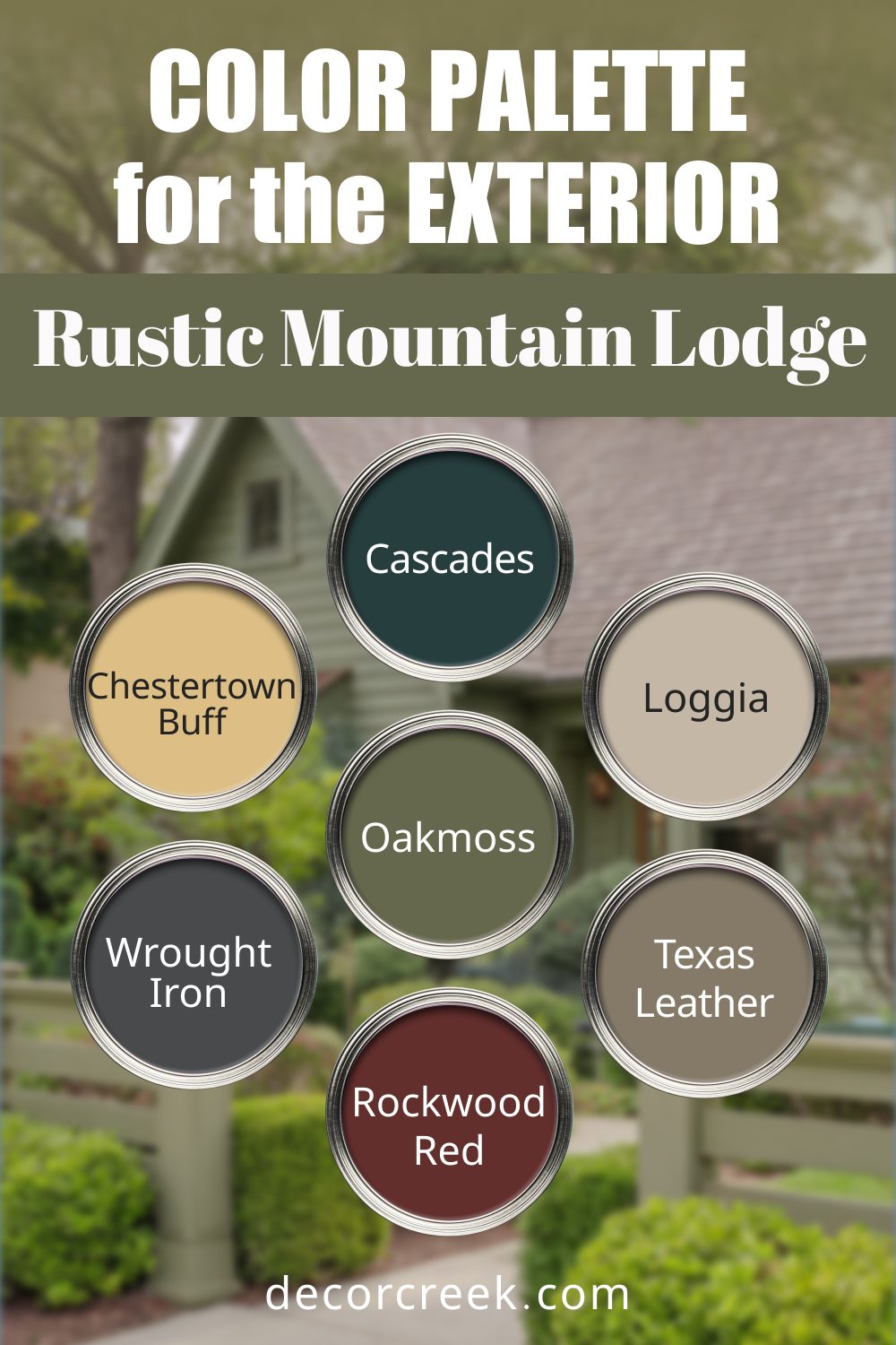
9. Rustic Mountain Lodge
Inspired by forest cabins, this palette features deep, natural colors that blend seamlessly with wooded surroundings.
- Sherwin-Williams Loggia (SW 7506): A warm beige that works well on large exterior surfaces.
- Benjamin Moore Wrought Iron (2124-10): A dark, muted black with a touch of gray.
- Sherwin-Williams Oakmoss (SW 6180): A rich olive green perfect for siding or accents.
- Benjamin Moore Texas Leather (AC-3): A deep brown with warm, earthy undertones.
- Sherwin-Williams Rockwood Red (SW 2802): A rustic red that adds a bold pop of color.
- Benjamin Moore Chestertown Buff (HC-9): A warm golden beige that complements natural tones.
- Sherwin-Williams Cascades (SW 7623): A deep forest green that feels lush and inviting.
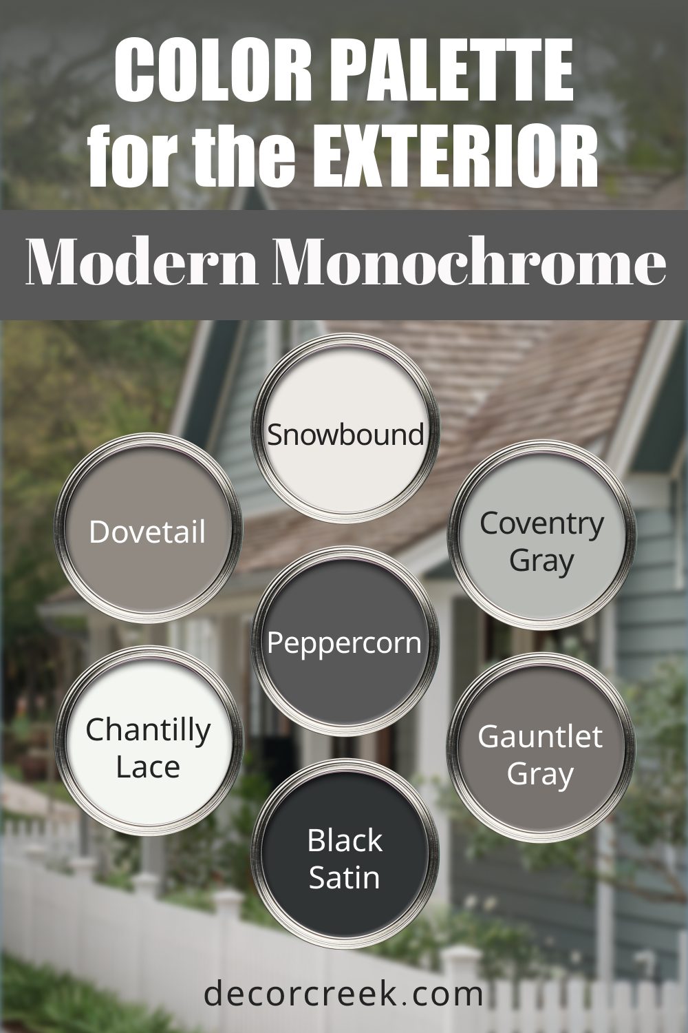
10. Modern Monochrome
This sleek and sophisticated palette is perfect for modern homes with clean lines and bold contrasts.
- Sherwin-Williams Snowbound (SW 7004): A bright white that feels crisp and modern.
- Benjamin Moore Black Satin (2131-10): A deep, velvety black for dramatic accents.
- Sherwin-Williams Dovetail (SW 7018): A mid-tone gray with a soft warmth.
- Benjamin Moore Coventry Gray (HC-169): A cool, neutral gray with subtle blue undertones.
- Sherwin-Williams Gauntlet Gray (SW 7019): A darker gray that adds depth.
- Benjamin Moore Chantilly Lace (OC-65): A pure white that’s perfect for trim and details.
- Sherwin-Williams Peppercorn (SW 7674): A deep, moody charcoal for a striking finish.
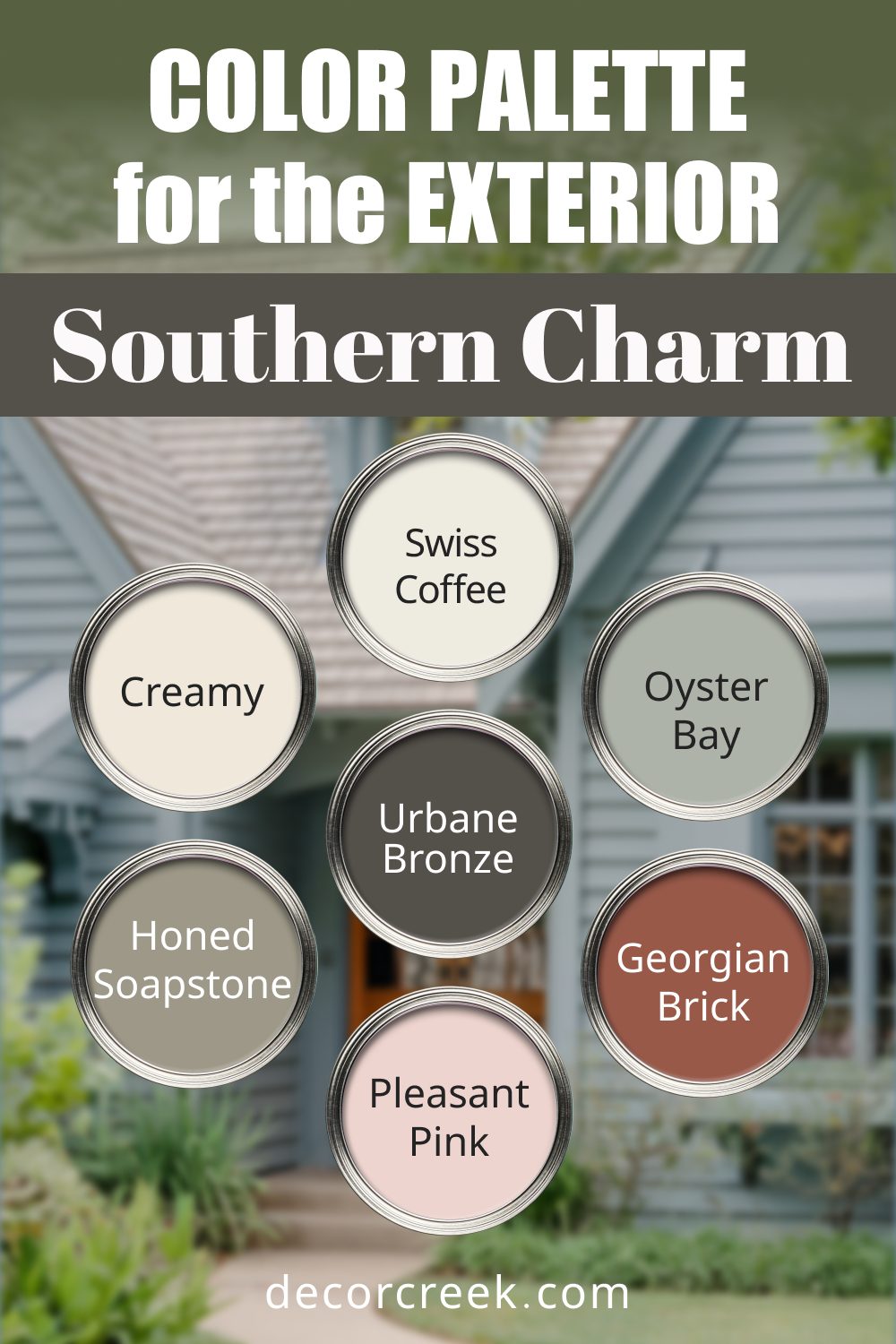
11. Southern Charm
With soft pastels and warm neutrals, this palette is ideal for traditional homes with wrap-around porches and plenty of charm.
- Sherwin-Williams Creamy (SW 7012): A soft, buttery white that feels warm and inviting.
- Benjamin Moore Georgian Brick (HC-50): A rich, terracotta red for accents.
- Sherwin-Williams Oyster Bay (SW 6206): A muted green-gray for siding or trim.
- Benjamin Moore Pleasant Pink (2094-60): A delicate blush tone for a subtle pop of color.
- Sherwin-Williams Honed Soapstone (SW 9126): A deep gray-green with a sophisticated touch.
- Benjamin Moore Swiss Coffee (OC-45): A creamy white that’s soft and timeless.
- Sherwin-Williams Urbane Bronze (SW 7048): A rich, warm bronze for grounding accents.
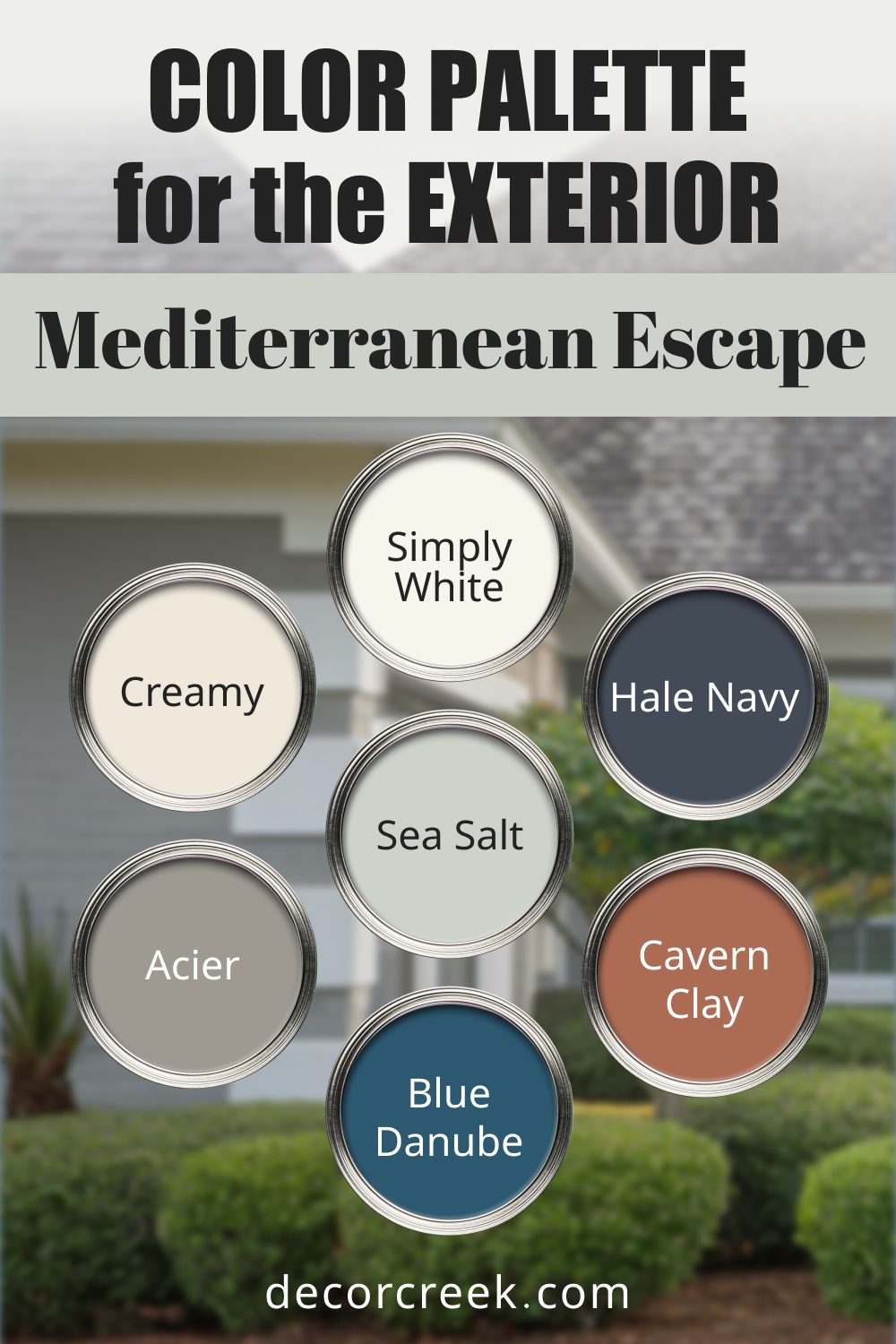
12. Mediterranean Escape
Inspired by sun-soaked villas, this palette features warm terracottas, cool blues, and creamy neutrals for a vibrant, welcoming look.
- Sherwin-Williams Creamy (SW 7012): A soft, warm white perfect for walls or trim.
- Benjamin Moore Blue Danube (2062-30): A bright, Mediterranean blue for bold accents.
- Sherwin-Williams Cavern Clay (SW 7701): A rich terracotta that captures warmth and charm.
- Benjamin Moore Simply White (OC-117): A crisp white to balance the stronger colors.
- Sherwin-Williams Sea Salt (SW 6204): A delicate greenish-gray for a refreshing touch.
- Benjamin Moore Hale Navy (HC-154): A deep navy to ground the palette.
- Sherwin-Williams Acier (SW 9170): A warm, light gray for a modern touch.
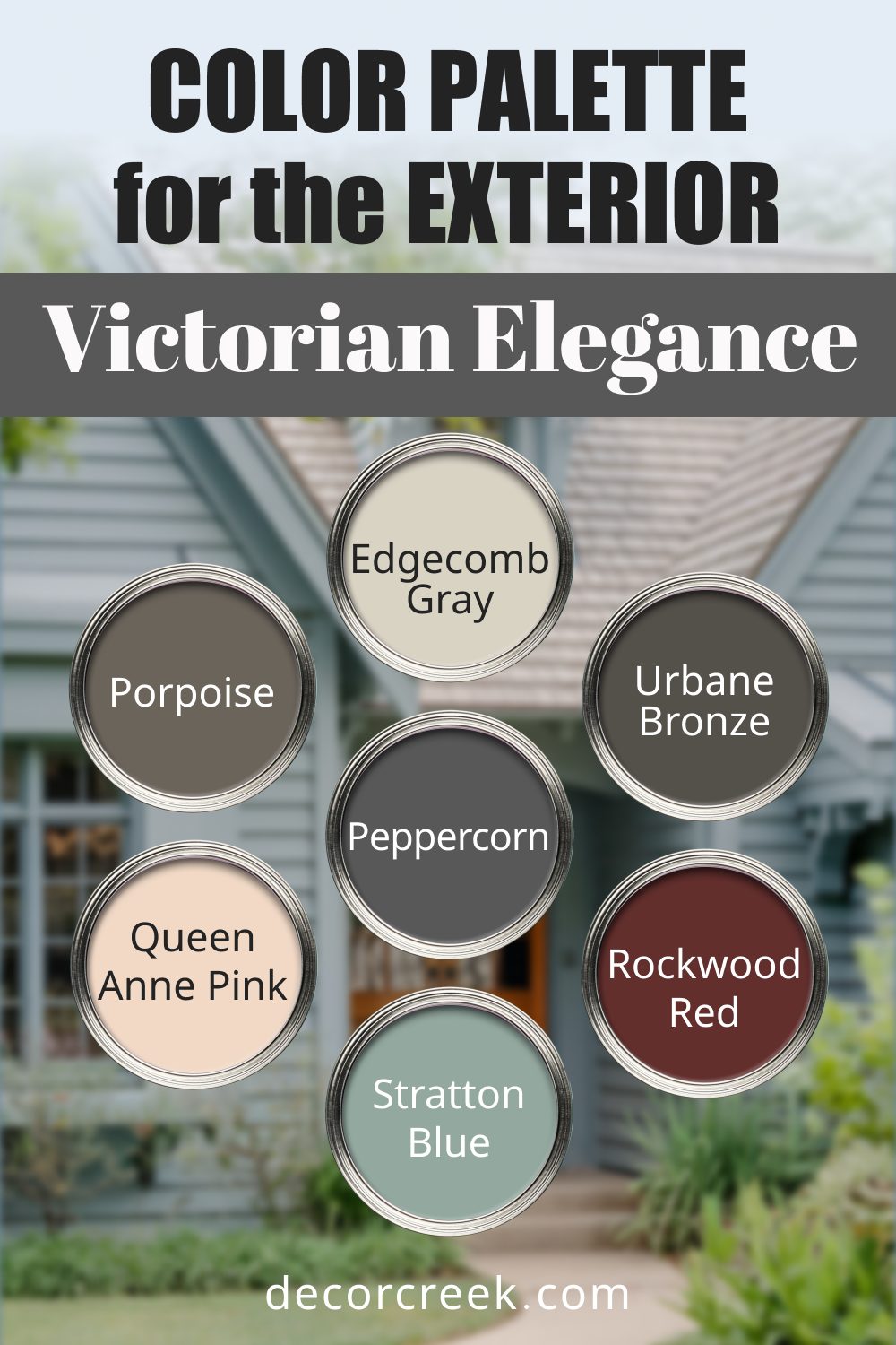
13. Victorian Elegance
Perfect for ornate Victorian homes, this palette mixes bold jewel tones with muted neutrals for a luxurious feel.
- Sherwin-Williams Rookwood Red (SW 2802): A rich, vintage red that stands out.
- Benjamin Moore Stratton Blue (HC-142): A muted teal that complements intricate details.
- Sherwin-Williams Porpoise (SW 7047): A deep gray-brown for elegant accents.
- Benjamin Moore Queen Anne Pink (HC-60): A soft, romantic pink that adds character.
- Sherwin-Williams Urbane Bronze (SW 7048): A deep, warm bronze for dramatic contrasts.
- Benjamin Moore Edgecomb Gray (HC-173): A classic greige that balances bold colors.
- Sherwin-Williams Peppercorn (SW 7674): A moody charcoal to ground the palette.
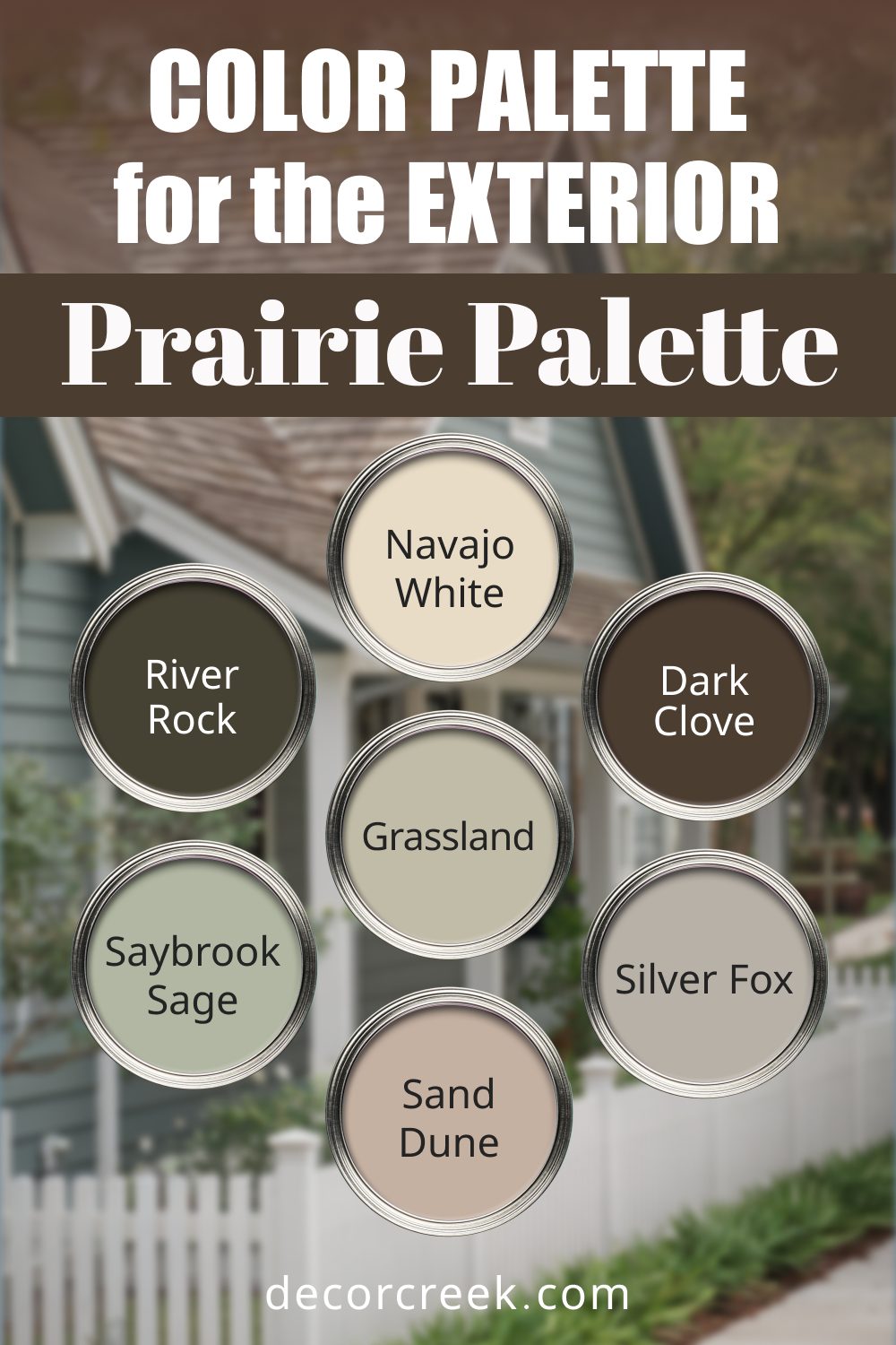
14. Prairie Palette
Inspired by the open plains, this palette features soft, earthy tones and muted greens for a harmonious look.
- Sherwin-Williams Navajo White (SW 6126): A warm cream for large surfaces.
- Benjamin Moore Saybrook Sage (HC-114): A gentle sage green for trim or accents.
- Sherwin-Williams Sand Dune (SW 6086): A beige with subtle orange undertones for warmth.
- Benjamin Moore Rock River (2139-10): A deep, earthy brown for a rustic feel.
- Sherwin-Williams Grassland (SW 6163): A muted green-gray that ties in natural elements.
- Benjamin Moore Silver Fox (2108-50): A soft gray with a warm undertone.
- Sherwin-Williams Dark Clove (SW 9183): A deep brown for doors and accents
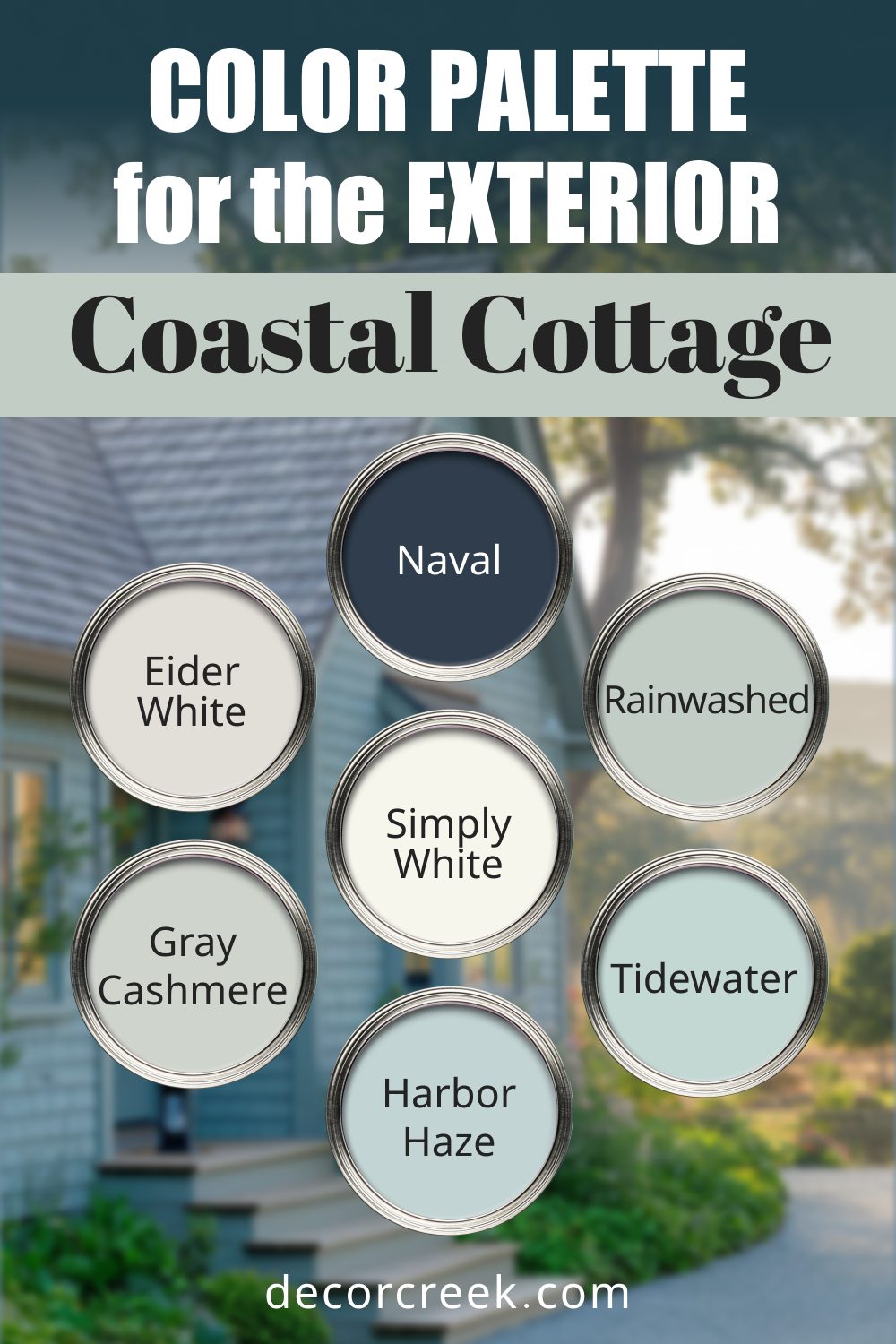
15. Coastal Cottage
This palette is designed for charming, relaxed homes near the sea, with soft blues, greens, and crisp whites.
- Sherwin-Williams Eider White (SW 7014): A cool white that feels fresh and modern.
- Benjamin Moore Harbor Haze (2136-60): A soft blue with a misty quality.
- Sherwin-Williams Rainwashed (SW 6211): A green-blue reminiscent of sea glass.
- Benjamin Moore Gray Cashmere (2138-60): A pale green-gray that evokes calm.
- Sherwin-Williams Tidewater (SW 6477): A soft, aqua blue for accents.
- Benjamin Moore Simply White (OC-117): A versatile white for trim and siding.
- Sherwin-Williams Naval (SW 6244): A bold navy for shutters or doors.
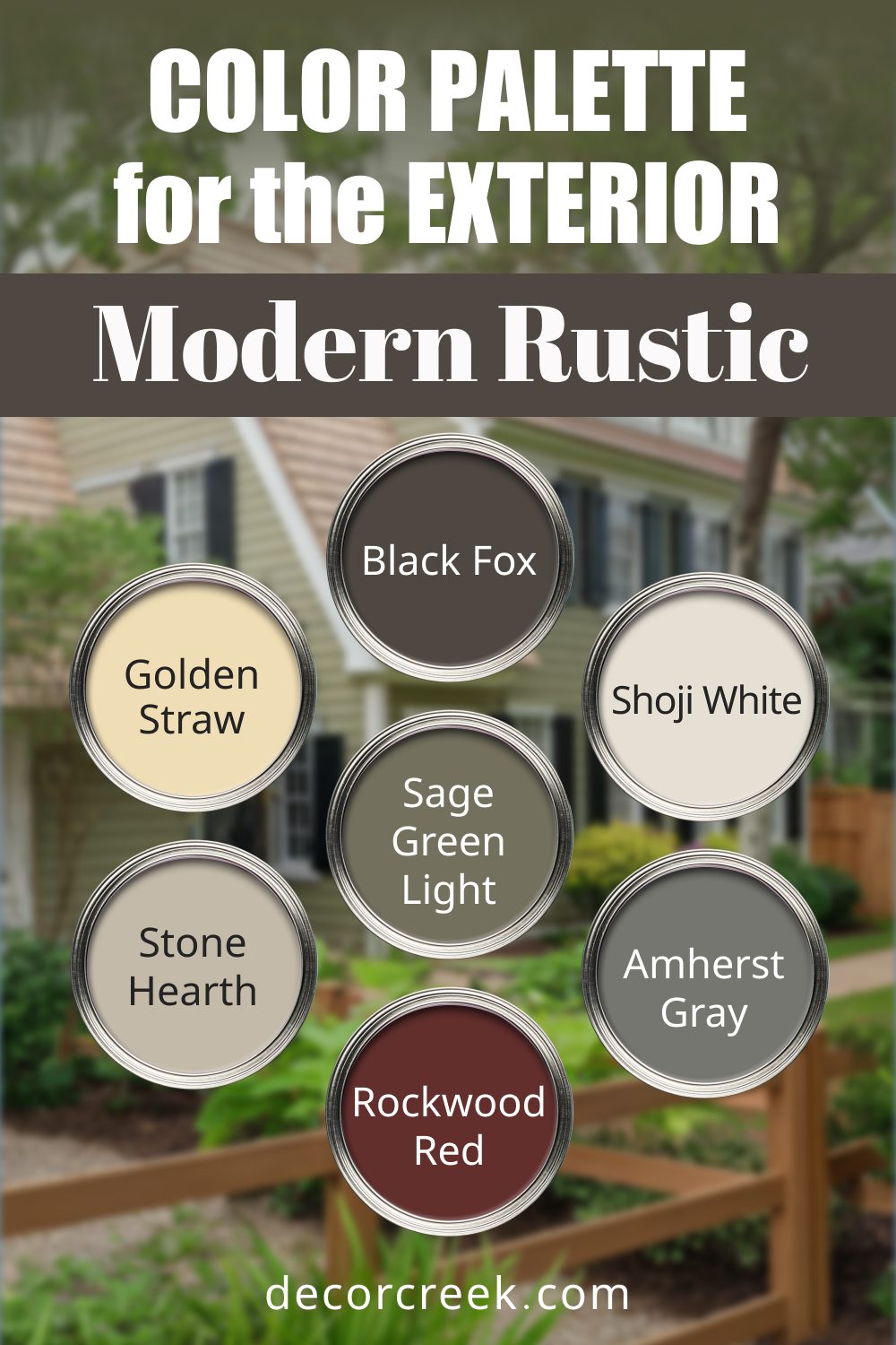
16. Modern Rustic
This palette balances modern simplicity with natural, earthy tones, ideal for homes blending into natural landscapes.
- Sherwin-Williams Shoji White (SW 7042): A warm, creamy white for siding.
- Benjamin Moore Amherst Gray (HC-167): A dark gray that adds depth.
- Sherwin-Williams Sage Green Light (SW 2851): A muted green for a rustic touch.
- Benjamin Moore Golden Straw (2152-50): A warm yellow-beige that feels organic.
- Sherwin-Williams Black Fox (SW 7020): A deep brown-gray for striking accents.
- Benjamin Moore Stone Hearth (984): A taupe-gray that complements earthy tones.
- Sherwin-Williams Rockwood Red (SW 2802): A deep red for bold highlights.
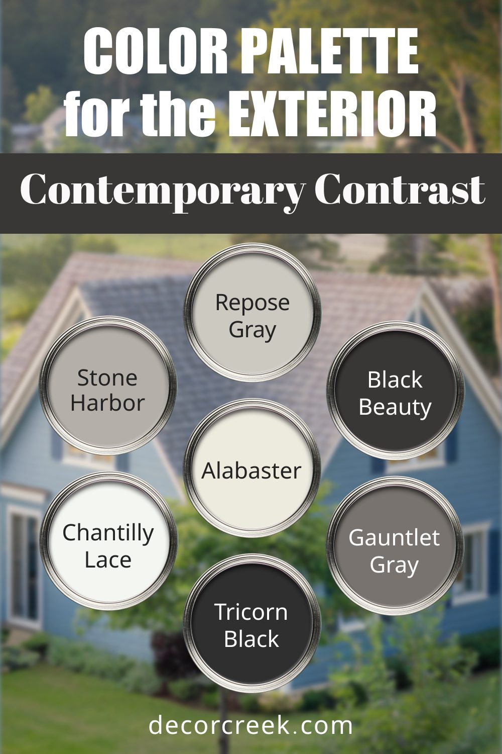
17. Contemporary Contrast
This high-impact palette is perfect for modern homes, using stark contrasts and sleek neutrals.
- Sherwin-Williams Alabaster (SW 7008): A soft white with warm undertones.
- Benjamin Moore Black Beauty (2128-10): A deep black for striking accents.
- Sherwin-Williams Repose Gray (SW 7015): A cool gray with a clean, modern feel.
- Benjamin Moore Chantilly Lace (OC-65): A bright white that works as a trim or base.
- Sherwin-Williams Gauntlet Gray (SW 7019): A deep gray for added depth.
- Benjamin Moore Stone Harbor (2111-50): A light, warm gray for balance.
- Sherwin-Williams Tricorn Black (SW 6258): A pure, dramatic black to finish the look.
Tips for Choosing the Right Palette
Finding the right exterior palette isn’t just about picking colors you like—it’s about creating a cohesive look that complements your home’s style, surroundings, and even your neighborhood. Here are some practical tips to help you make the best choice:
1. Start with Your Home’s Architecture
Your home’s design can guide your color choices. For example:
- Colonial or Georgian homes look stunning with crisp whites, deep blues, and bold blacks for accents.
- Farmhouses shine with light neutrals, soft greens, and warm grays.
- Contemporary homes often suit monochromatic palettes with bold, contrasting accents.
Respecting your home’s architecture ensures the colors enhance its character rather than clash with it.
2. Factor in the Landscape
Consider the natural surroundings. Homes in wooded areas pair beautifully with earthy greens, browns, and muted grays. In coastal areas, whites, blues, and soft greens evoke the breezy charm of the ocean.
Your landscape should feel like an extension of your home’s palette.
3. Work With Your Neighborhood
While your home should reflect your personality, it’s also important to keep the neighborhood in mind. Some areas have Homeowners’ Association (HOA) guidelines, but even if they don’t, choosing colors that harmonize with nearby homes can maintain a cohesive, polished look.
4. Think About Climate and Light
Climate and sunlight can significantly affect how colors appear:
- Bright sunlight can wash out lighter colors and make dark hues look sharper.
- Overcast or shaded areas can make cool colors feel muted.
- Warmer climates benefit from lighter tones that reflect heat, while darker hues can add cozy warmth to homes in cooler regions.
5. Don’t Skip Testing
Even if you love how a color looks online or in the store, test it on your home. Paint small swatches of all the colors in your palette on different sides of the house. Observe them in various lighting conditions—morning, midday, and evening—to see how they change throughout the day.
6. Balance the Palette
A great exterior palette includes a mix of:
- Main color for siding.
- Trim color for windows, gutters, and other structural details.
- Accent color for doors, shutters, or unique architectural elements.
For balance, stick to one or two bold colors paired with neutrals to avoid a chaotic look.
7. Consider Resale Value
If you’re thinking about selling your home in the future, neutral tones or classic combinations are usually the safest bet. According to Zillow, homes with light gray or beige exteriors sell for $6,500 more on average.
Final Thoughts on Choosing the Perfect Exterior Palette
Your home’s exterior is its first impression, so make it count. By using these curated palettes, you can transform your home into a space that reflects your style while fitting beautifully with its surroundings.
Remember, finding the right colors takes time—don’t rush the process. Experiment with swatches, think about how the shades work together, and imagine how they’ll look season after season. A well-chosen palette doesn’t just enhance your home’s curb appeal; it makes coming home every day a joy.
Your perfect exterior palette is out there—now it’s time to find it!
