When I think back on the homes I’ve walked through, painted, and staged this past year, one thing is clear: color still holds everything together. It can make you feel lighter after a long day. It can make your guests want to stay just a little longer.
A good paint color is more than just a trend—it’s part of your life. And when it’s wrong?
You feel it every time you walk by.
This list isn’t about chasing every fad. These are the shades I keep coming back to because they work. They work in small hallways and big kitchens, in old cottages and new builds.
These are the 51 best paint colors I’ve trusted over and over again this year.
Why Paint Color Still Matters in 2025
In 2025, people are still spending more time at home than they used to. Even if they’re back at the office, home is where they want to feel steady. So color still matters—a lot. It helps set the mood, it makes each room feel different, and honestly, it makes things feel more put-together, even if nothing else is new.
Color is also one of the most affordable ways to shift how your home feels. A can of paint costs less than new furniture, and the right shade can do more than any throw pillow or light fixture ever could.
It’s quick, it’s doable, and it makes a real difference.
What People Are Really Looking for in Color Right Now
Right now, I hear people say things like, “I want it to feel fresh but not cold,” or “I don’t want it to feel boring.” They’re craving colors that look lived-in without feeling dull. Nothing too sharp, nothing too flat.
The most popular shades this year are grounded. They feel natural, but still have style. Warm whites, dusty blues, faded greens, and cozy taupes—these are the ones people keep asking for.
They make a room feel easy to be in, even if the rest of life is messy.
A Quick Note on How I Picked These 51 Shades
Every color on this list has been used in a real home. Not just in a catalog or a show house. I’ve seen these shades in action—on walls, trim, cabinets, even ceilings.
Some came straight from clients who knew what they wanted. Others were picked during long paint-deck sessions, where we narrowed down swatches to the one that finally felt right.
I also leaned on the forecasts from Sherwin-Williams and Benjamin Moore, and matched them with what people actually seem to love.
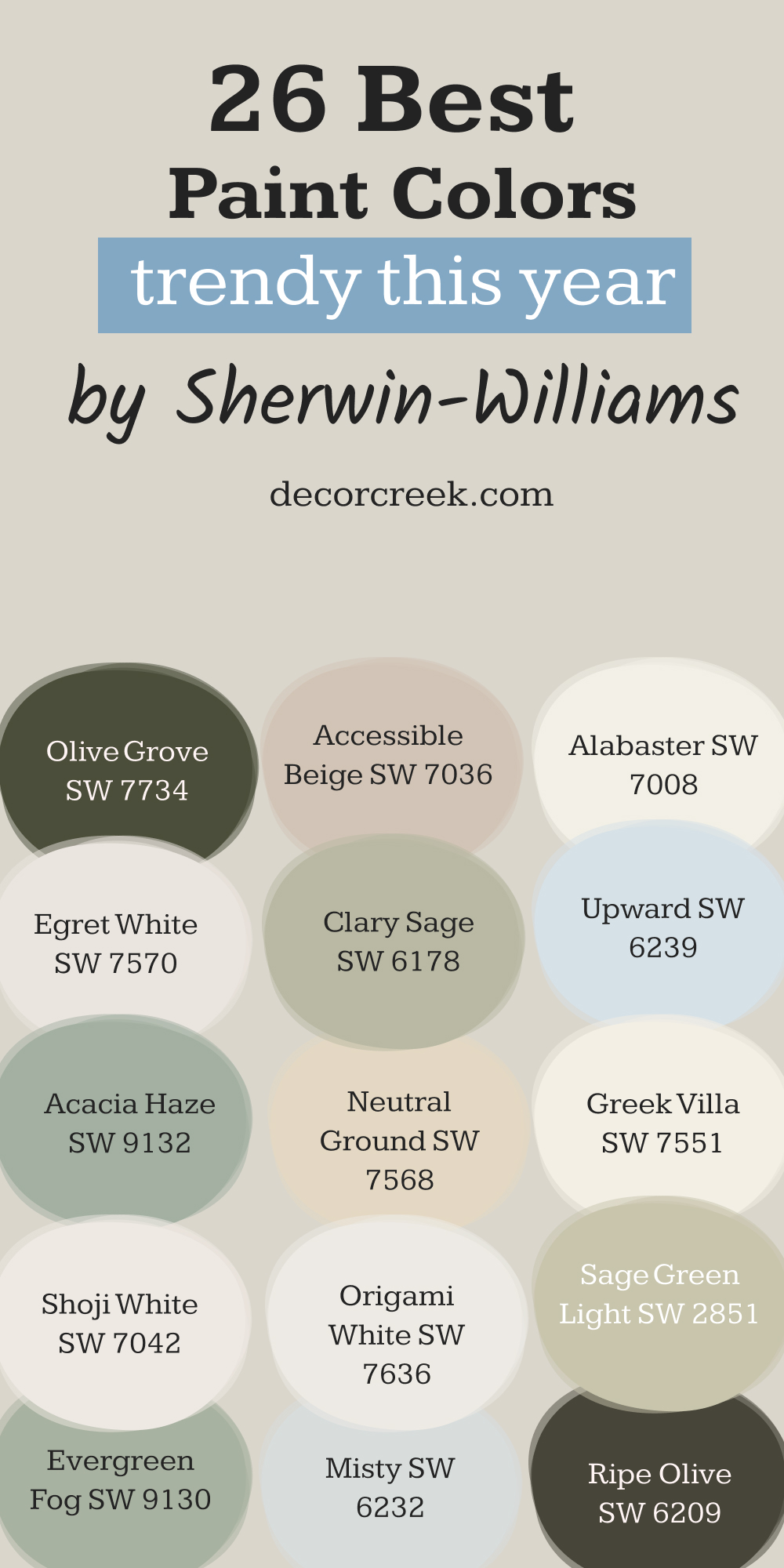
Top 26 Sherwin-Williams Shades Making Homes Feel Right in 2025
Shoji White SW 7042
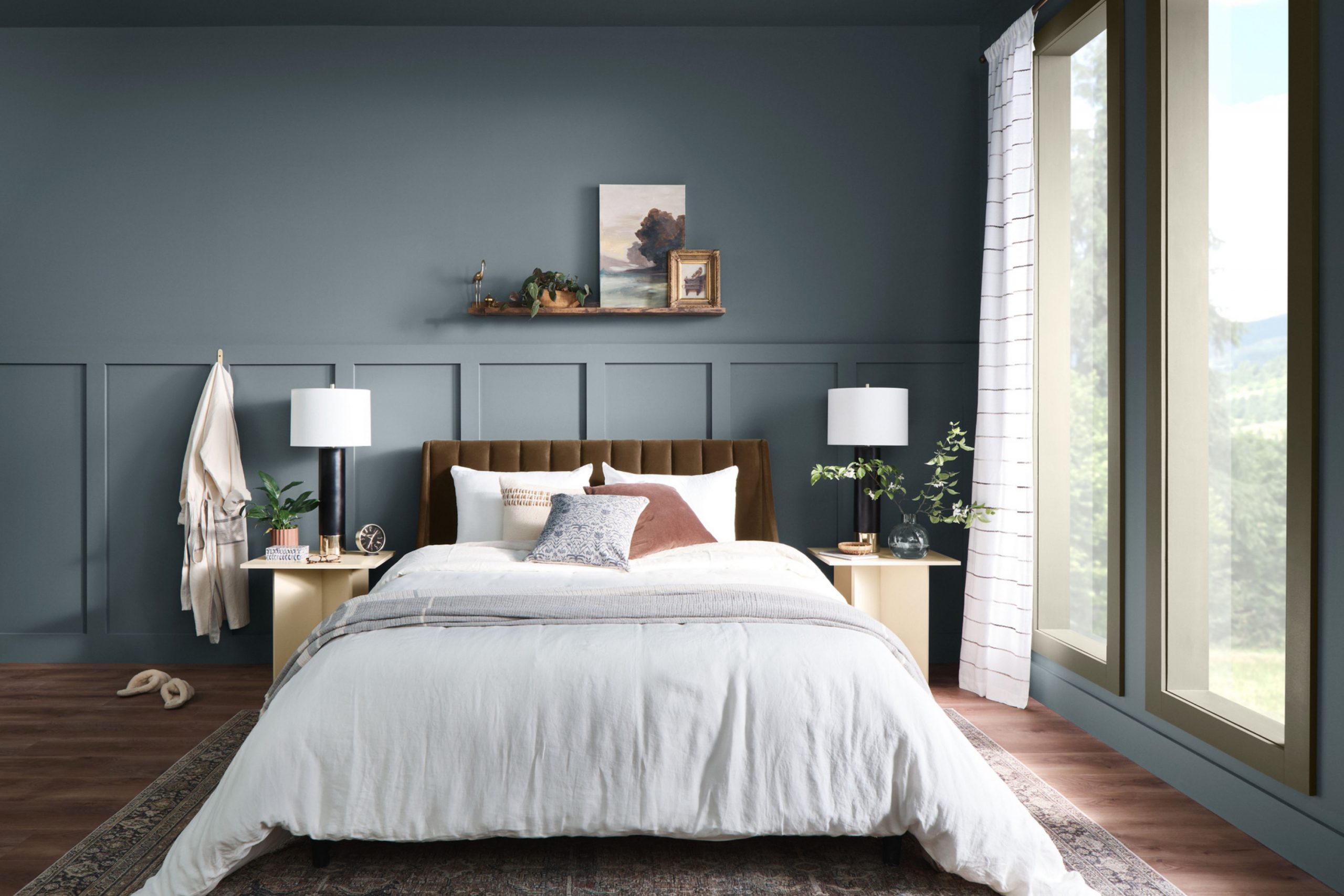
Shoji White SW 7042 has just enough warmth to make a room feel relaxed, but it’s still clean. I like it for bedrooms and dining rooms, especially in homes with soft light. It doesn’t look too yellow or too gray—it just feels comfortable. It pairs well with black window frames or natural woods.
When someone says, “I want white, but not too white,” I pull out Shoji.
👉See the full guide to this color HERE👈

Accessible Beige SW 7036
Accessible Beige SW 7036 is one of those colors that always surprises people. It’s not the beige you remember from the ’90s. It’s softer, a little grayer, and it feels modern without trying hard. I’ve used it in entryways, offices, and even bathrooms.
It plays well with cool tones or warm accents. This one never feels flat.
👉See the full guide to this color HERE👈

Alabaster SW 7008
Alabaster SW 7008 is creamy and soft without feeling yellow. It’s one of Sherwin-Williams’ most popular whites, and for good reason. I’ve seen it make kitchens feel bigger and living rooms feel brighter.
Joanna Gaines picked it for a reason—it just works. If you’re stuck between too many whites, start here.
👉See the full guide to this color HERE👈

Egret White SW 7570
Egret White SW 7570 walks the line between beige and gray. I like it in rooms where you want something quiet but not boring. It works great with leather furniture or raw wood.
I’ve also used it in nurseries when the parents didn’t want a “baby” color. It’s grown-up but gentle.
👉See the full guide to this color HERE👈
Neutral Ground SW 7568
Neutral Ground SW 7568 has a soft beige feel, but it leans fresh instead of heavy. I’ve seen it pull together rooms with tricky finishes—like honey oak trim or tile that’s hard to match.
It gives everything a clean backdrop, and it always feels warm without being stuffy.
👉See the full guide to this color HERE👈

Greek Villa SW 7551
Greek Villa SW 7551 is one of my go-to warm whites. It has a soft touch that makes it great for walls, ceilings, and even trim. I’ve used it in homes that needed a lift but didn’t want anything too harsh.
It works especially well in natural light. If you want something classic but cozy, this is it.
👉See the full guide to this color HERE👈

Origami White SW 7636
Origami White SW 7636 is a very soft white with a hint of gray. It doesn’t feel cold—it just tones things down in the right way.
I used it recently in a hallway where pure white felt too sharp, and it made everything feel smoother. It also looks great next to brass hardware or black accents.
👉See the full guide to this color HERE👈
Evergreen Fog SW 9130
Evergreen Fog SW 9130 was the color of the year not long ago, and people still ask for it. It’s a soft green with a gray base, and it works in almost any room.
I’ve used it in bathrooms, mudrooms, and even on kitchen cabinets. It’s cozy, without being dark. People are drawn to it without always knowing why.
👉See the full guide to this color HERE👈

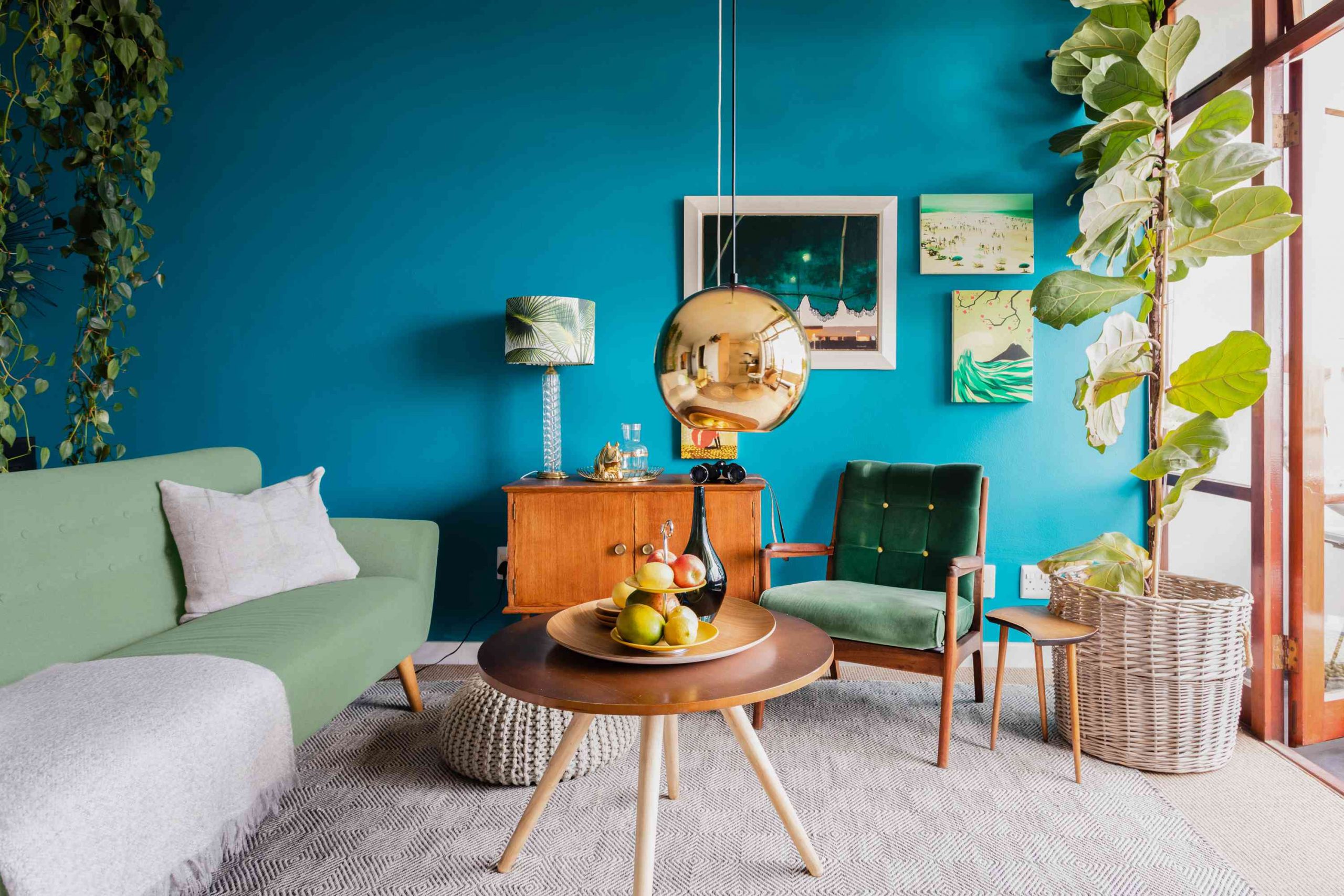
Clary Sage SW 6178
Clary Sage SW 6178 has a fresh garden feel. It’s a true green, but not too bright. I’ve used it in laundry rooms and guest baths—it gives a quiet lift to small areas.
It pairs nicely with white or cream, and it makes natural wood look even richer. This one always gets compliments.
👉See the full guide to this color HERE👈

Ripe Olive SW 6209
Ripe Olive SW 6209 is bold and deep, but in the right light, it’s just stunning. I’ve used it on a fireplace wall and in a small powder room—it made both feel like something out of a magazine.
It’s not for the shy, but it’s so rewarding when used right.
👉See the full guide to this color HERE👈

Acacia Haze SW 9132
Acacia Haze SW 9132 is another muted green that feels balanced. It has a whisper of blue in it, which makes it calming. I like it in bedrooms or bathrooms with gold fixtures.
It also looks amazing with terracotta tile. If Evergreen Fog feels too gray for you, try this.
👉See the full guide to this color HERE👈

Sage Green Light SW 2851
Sage Green Light SW 2851 feels like a soft leaf on a sunny day. I’ve used it in kitchens where people wanted something cheerful but still relaxed.
It makes white cabinets look cleaner and adds just enough personality. It’s also great in rooms with lots of morning light.
👉See the full guide to this color HERE👈
Olive Grove SW 7734
Olive Grove SW 7734 is rich and earthy. It’s deeper than the usual greens but doesn’t feel heavy. I’ve used it on lower cabinets and even a front door.
It gives that strong, rooted feeling without being harsh. It also looks great next to aged brass.
👉See the full guide to this color HERE👈
Misty SW 6232
Misty SW 6232 is soft, airy, and peaceful. It’s a pale blue with gray undertones that feels very light. I often suggest it for bedrooms or bathrooms. It makes a room feel open without being boring. It pairs nicely with white trim and even light wood tones.
👉See the full guide to this color HERE👈

Upward SW 6239
Upward SW 6239 is Sherwin-Williams’ 2024 color of the year, and I’ve already used it in three homes this year. It’s a true blue, but not icy. It feels like the sky right after sunrise.
It works in living rooms, offices, or even bedrooms. People respond to it with a kind of instant ease.
👉See the full guide to this color HERE👈

Smoky Blue SW 7604
Smoky Blue SW 7604 has a strong presence without being too dark. I love it for dining rooms or moody bedrooms. It looks beautiful with antique wood or brass. It’s also a great choice for a front door.
This color feels solid, like it’s been there forever.
👉See the full guide to this color HERE👈

Silvermist SW 7621
Silvermist SW 7621 leans blue, but has a green-gray base that makes it unique. I’ve used it in bathrooms and entryways—it always adds just the right amount of color.
It pairs well with stone, concrete, or even warm metal fixtures.
Bracing Blue SW 6242
Bracing Blue SW 6242 is a confident blue that feels refreshing. It’s not too dark or light, which makes it easy to use in living rooms or offices. It also looks great with white trim or natural woven textures.
This color has energy but still feels grounded.
👉See the full guide to this color HERE👈

Indigo Batik SW 7602
Indigo Batik SW 7602 is one of my favorite deep blues. It’s bold without shouting, and it adds just the right amount of drama. I’ve used it on a kitchen island and in a guest bedroom.
It makes white linens pop and adds depth to any setup.
👉See the full guide to this color HERE👈

Urbane Bronze SW 7048
Urbane Bronze SW 7048 is deep, earthy, and dramatic. It was once color of the year, and I still find myself reaching for it. I like it for accent walls, fireplaces, and even bathroom vanities.
It’s a strong choice that doesn’t overwhelm.
👉See the full guide to this color HERE👈

Naval SW 6244
Naval SW 6244 is a true navy with staying power. I’ve used it in bedrooms, libraries, and even on front doors. It feels classic but not stiff. It works well with both gold and silver tones.
If you need something dark that still feels rich, this is it.
👉See the full guide to this color HERE👈

Tricorn Black SW 6258
Tricorn Black SW 6258 is a sharp, deep black. It’s great for doors, windows, and even furniture. I’ve used it in ultra-modern homes and older ones—it fits both.
It adds instant polish without stealing the whole show.
👉See the full guide to this color HERE👈

Iron Ore SW 7069
Iron Ore SW 7069 is softer than black, but just as strong. It’s deep and smooth, and I love it on exteriors and cabinets. It gives a sense of structure without being too bold.
This one pairs beautifully with creamy whites.
👉See the full guide to this color HERE👈

Carnelian SW 7580
Carnelian SW 7580 is a deep, reddish-brown with richness. I’ve used it in dining rooms and on accent furniture. It brings warmth and history to a room. It’s not flashy, but it has presence.
Perfect if you want a color with soul.
👉See the full guide to this color HERE👈
Cavern Clay SW 7701
Cavern Clay SW 7701 is earthy, warm, and very inviting. I’ve used it in desert-inspired rooms and areas with a lot of natural light. It pairs well with cream, navy, and dark green.
It adds that sunbaked feeling that people love.
👉See the full guide to this color HERE👈

Black Fox SW 7020
Black Fox SW 7020 is a deep brown-black that’s softer than pure black. I like it for exteriors and built-ins. It gives depth without sucking the light out of a room.
Pair it with warm white for a high-contrast look that still feels balanced.
👉See the full guide to this color HERE👈

My Favorite 25 Benjamin Moore Paint Colors for 2025 Homes
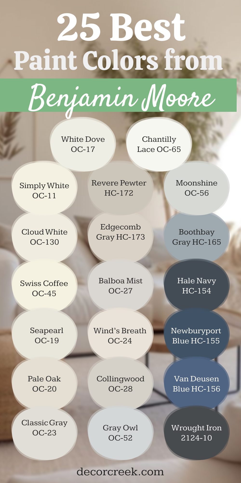
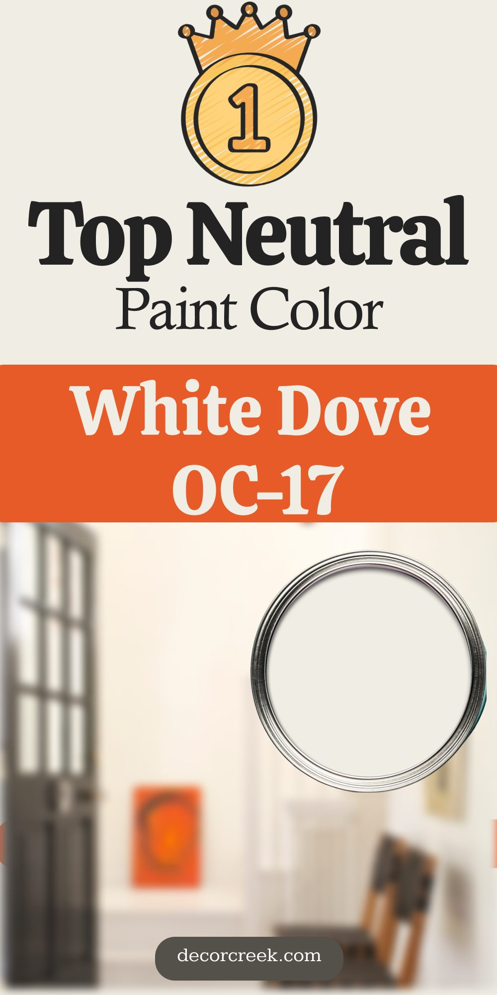
White Dove OC-17
White Dove OC-17 is the one I go to when someone says, “I want it soft, but not yellow.” It’s warm but still feels clean, and it works in every kind of light. I’ve used it in living rooms, hallways, even on kitchen cabinets. It pairs beautifully with black accents or natural wood.
Designers love it because it always looks good in photos—and it never feels cold. If I could only pick one white, this might be it.
👉See the full guide to this color HERE👈

Chantilly Lace OC-65
Chantilly Lace OC-65 is what I call a bright, sharp white. It has no strong undertones, which makes it crisp and modern. I use it when a room needs light, or when trim needs to stand out. It works great with cool grays, deep blues, or even pops of green.
In homes with lots of sunlight, this color really shines. It’s simple, clean, and always stylish.
👉See the full guide to this color HERE👈

Simply White OC-117
Simply White OC-117 has a gentle warmth that makes it friendly. I use it in family homes and open layouts where everything needs to feel connected. It doesn’t feel stark, but it’s not buttery either. It looks good next to wood floors, warm metals, and soft fabrics.
It’s one of those colors that looks like you didn’t try too hard—but it pulls the whole place together.
👉See the full guide to this color HERE👈

Cloud White OC-130
Cloud White OC-130 is a creamy white that feels welcoming. I’ve used it in older homes with lots of charm, especially when the goal was to keep things soft. It looks great on ceilings and trim if you want a more traditional look. It’s warm, but never too much.
When a house has natural textures—linen, jute, light oak—Cloud White blends in perfectly.
👉See the full guide to this color HERE👈

Swiss Coffee OC-45
Swiss Coffee OC-45 feels like morning light. It’s creamy, not yellow, and gives rooms a lived-in feeling. I love using it in bedrooms or libraries where the goal is comfort. It also looks beautiful in kitchens when paired with marble or butcher block.
This color makes a house feel like home, without trying too hard.
👉See the full guide to this color HERE👈

Seapearl OC-19
Seapearl OC-19 is what I reach for when someone wants something soft but not beige. It has the quiet tone of a foggy morning. I’ve used it in dining rooms and living rooms—it lets your furniture stand out without fading into the background.
It pairs well with brushed nickel, white oak, or aged brass. This shade has elegance, but it doesn’t ask for attention.
👉See the full guide to this color HERE👈

Pale Oak OC-20
Pale Oak OC-20 is like a whisper of taupe. It works beautifully in homes with a lot of natural light. I’ve used it on walls where clients wanted warmth but didn’t want color. It’s subtle, but not boring. It shifts depending on the time of day, which makes it interesting without being fussy. If you want calm and cozy, this one does the trick.
👉See the full guide to this color HERE👈

Classic Gray OC-23
Classic Gray OC-23 is soft and adaptable. It’s technically a gray, but it carries a touch of warmth that keeps it from feeling flat. I use it in homes where we need one color to flow through multiple rooms.
It doesn’t clash with flooring or trim, and it helps light bounce around just enough. It’s safe—but in a good way.
👉See the full guide to this color HERE👈
Revere Pewter HC-172
Revere Pewter HC-172 is that classic greige that refuses to go out of style. I’ve used it for years, and it still holds up. It works with traditional or modern styles. It makes rooms feel put together, especially if the flooring has any red or gold tones.
This color has helped many of my clients feel sure about their choice—and that’s worth a lot.
👉See the full guide to this color HERE👈

Edgecomb Gray HC-173
Edgecomb Gray HC-173 is lighter than Revere Pewter but just as flexible. It’s a great choice when someone wants a soft, neutral backdrop without going beige. I’ve used it in kitchens, hallways, and living rooms.
It pairs well with crisp white trim and even stronger colors like navy or hunter green. It’s gentle but still present.
👉See the full guide to this color HERE👈

Balboa Mist OC-27
Balboa Mist OC-27 feels like a soft morning. It’s gray, but with just enough warmth to make it feel smooth. I’ve used it in homes where people wanted gray walls that didn’t feel icy. It looks great with warm wood tones or brushed brass.
This color gives a sense of ease without being too pale.
👉See the full guide to this color HERE👈

Wind’s Breath OC-24
Wind’s Breath OC-24 has a unique softness to it. Somewhere between beige and off-white, it looks like linen in paint form. I like it for open floor plans and areas with lots of natural light. It’s not flashy, but it always looks finished.
Perfect for homes that lean rustic or minimal.
👉See the full guide to this color HERE👈
Collingwood OC-28
Collingwood OC-28 is a true neutral that feels modern. It doesn’t shift too much with the light, which makes it a safe choice for large areas. I’ve used it in homes where clients were nervous about committing to gray. It feels stable and fresh.
It also looks great against white baseboards and matte black accents.
👉See the full guide to this color HERE👈

Gray Owl OC-52
Gray Owl OC-52 is cool-toned but not too chilly. I use it in bathrooms, offices, and sometimes nurseries. It shifts a bit with the light—it can feel more blue or green depending on the room. That makes it playful, without being distracting.
If you like a crisp, airy feeling, this color does the job.
👉See the full guide to this color HERE👈

Moonshine OC-56
Moonshine OC-56 is soft and silvery. It’s almost like fog in color form. I love it for coastal homes or areas with a lot of greenery outside.
It balances out wood tones really well. This one always feels light, even when the weather’s not.
Boothbay Gray HC-165
Boothbay Gray HC-165 is a blue-gray that leans just warm enough. It gives a room character without going bold. I’ve used it on kitchen islands, bathroom walls, even front doors.
It makes white trim look sharp and pairs beautifully with chrome or pewter finishes.
👉See the full guide to this color HERE👈

Hale Navy HC-154
Hale Navy HC-154 is deep, strong, and always on point. I’ve used it in bedrooms, dining rooms, and entryways. It gives that classic New England look, but works in modern homes too.
It’s confident without being showy. Gold, white, leather—it all plays well with Hale Navy.
👉See the full guide to this color HERE👈

Newburyport Blue HC-155
Newburyport Blue HC-155 is like a navy with a story. It’s rich and a little softer than Hale Navy. I’ve used it in more traditional homes, especially paired with cream or ivory trim.
It has a classic look that makes rooms feel important.
👉See the full guide to this color HERE👈

Van Deusen Blue HC-156
Van Deusen Blue HC-156 is bold but still elegant. It has a slightly gray base that makes it feel grounded. I like it for offices or dens where you want a bit of mood.
It looks great with walnut, brass, or even rattan. This is one of those shades people ask about when they walk in.
👉See the full guide to this color HERE👈

Wrought Iron 2124-10
Wrought Iron 2124-10 is almost black—but not quite. I’ve used it on doors, cabinets, even walls. It has a softness that pure black doesn’t offer. It’s dramatic but still livable.
If you want something dark but not cold, this is one to try.
👉See the full guide to this color HERE👈

Kendall Charcoal HC-166
Kendall Charcoal HC-166 is a dark gray with a good bit of brown in it. It feels earthy and rich. I’ve used it in dining rooms, home libraries, and on exteriors.
It adds weight to a room without making it gloomy. This color feels like a wool coat—tailored and cozy.
👉See the full guide to this color HERE👈

Essex Green HC-188
Essex Green HC-188 is a very dark green that borders on black. I love it for front doors and moody powder rooms. It makes brass hardware pop and gives instant charm. It’s strong but has a quiet side too.
👉See the full guide to this color HERE👈

Saybrook Sage HC-114
Saybrook Sage HC-114 is soft, welcoming, and feels like spring. I use it in kitchens, sunrooms, or anywhere that needs life without being loud.
It works well with wicker, white trim, or even floral fabrics. This is the green that makes people smile.
👉See the full guide to this color HERE👈

October Mist 1495
October Mist 1495 was Benjamin Moore’s color of the year—and it deserves it. It’s a dusty green that feels very current. I’ve used it in bedrooms and offices. It brings just enough color without overpowering.
Pair it with creams and light wood for a fresh feel.
👉See the full guide to this color HERE👈

Normandy 2129-40
Normandy 2129-40 is a slate blue with a steady feel. I love it in quiet bedrooms or home offices. It gives color without being busy. It’s calming, but with depth.
I often use it when clients are tired of grays but don’t want something bright.
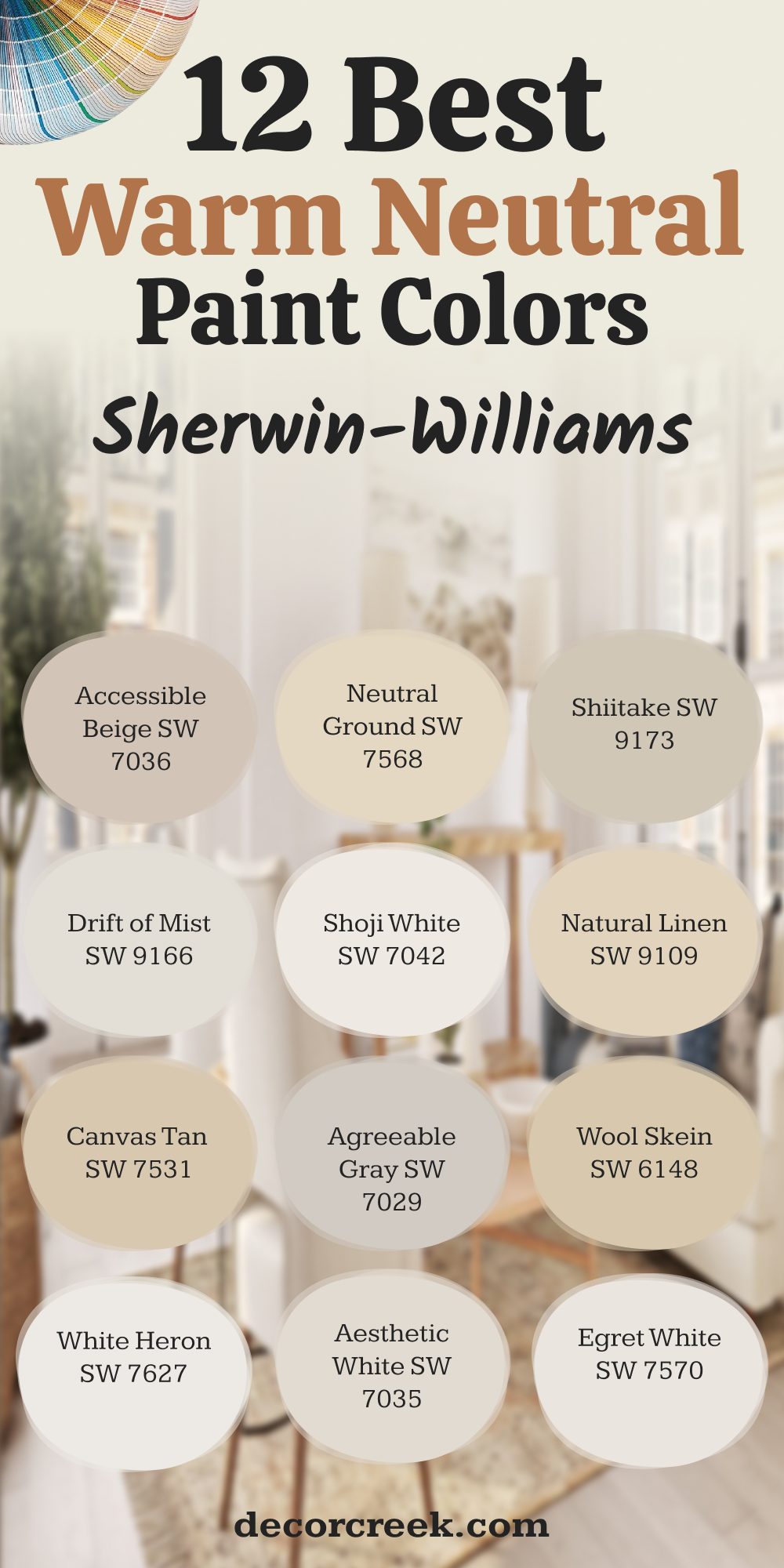
12 Go-To Sherwin-Williams Warm Shades That Never Miss
Accessible Beige SW 7036
Accessible Beige SW 7036 has a soft warmth that makes rooms feel welcoming. I use it often when someone wants beige, but not the old-school kind. It pairs beautifully with both cool and warm tones. I’ve used it in offices, hallways, and living rooms.
It works in sunlight and low light just the same. This is one of those rare shades that makes everything around it look better.
👉See the full guide to this color HERE👈
Neutral Ground SW 7568
Neutral Ground SW 7568 is my go-to for clients who want warmth without yellow. It has a smooth, gentle quality that calms everything down. I love using it in bedrooms or shared areas. It pairs really well with off-whites and soft browns.
It feels stable, lived-in, and friendly—without being plain.
👉See the full guide to this color HERE👈
Shiitake SW 9173
Shiitake SW 9173 gives a soft, earthy tone to any room. It’s a warm neutral with just a whisper of gray. I’ve used it in kitchens and mudrooms where you need a color that hides a little mess. It plays nicely with natural stone and wood.
It’s great when you want something reliable but still interesting.
👉See the full guide to this color HERE👈

Drift of Mist SW 9166
Drift of Mist SW 9166 is a pale gray-beige that almost acts like a white. I like it for open-concept rooms that need flow. It doesn’t steal the show, but it brings a polished feeling to everything around it.
I’ve used it on ceilings and cabinets too. This one’s a quiet favorite.
👉See the full guide to this color HERE👈

Shoji White SW 7042
Shoji White SW 7042 shows up again because it really works. Its soft, warm base gives off that creamy-but-clean feeling. I’ve used it in living rooms and hallways where you want brightness without coolness. It blends easily with woods, metals, and fabrics of all kinds.
👉See the full guide to this color HERE👈
Natural Linen SW 9109
Natural Linen SW 9109 is what I reach for when someone says, “I want it to feel soft and easy.” It’s warm without being too brown. It looks especially good with tan or wicker furniture.
I’ve used it in homes with lots of texture—like stone or plaster—and it holds its own.
👉See the full guide to this color HERE👈

Canvas Tan SW 7531
Canvas Tan SW 7531 is a warm neutral that doesn’t lean too pink or gold. I like it in sunlit rooms where it softens the glare just enough. I’ve used it in guest rooms and entryways where we needed a neutral that still had charm. It also pairs beautifully with darker trim.
👉See the full guide to this color HERE👈

Agreeable Gray SW 7029
Agreeable Gray SW 7029 is one of those famous shades—and it deserves its reputation. It balances gray and beige so well. I’ve used it in nearly every room type.
It’s especially great for resale homes because it appeals to almost everyone. It’s not boring—it’s easy.
👉See the full guide to this color HERE👈

Wool Skein SW 6148
Wool Skein SW 6148 is a warm, cozy tone that reminds me of natural fabrics. I’ve used it in dens, basements, and places where you want things to feel grounded. It also works well next to brick or reclaimed wood.
It’s a little deeper than your average neutral, and that’s why I like it.
👉See the full guide to this color HERE👈

White Heron SW 7627
White Heron SW 7627 is a creamy white that feels elegant. I’ve used it in formal dining rooms and master suites. It reads soft without being yellow.
It works best in rooms with warm artificial light or early morning sun. This is a “grown-up” white that still feels fresh.
👉See the full guide to this color HERE👈
Aesthetic White SW 7035
Aesthetic White SW 7035 is the kind of off-white that just works with everything. It has a touch of beige that makes it feel grounded. I’ve used it on cabinets, trim, and walls—and it always feels pulled together.
It’s great for older homes that need a clean but gentle look.
👉See the full guide to this color HERE👈
Egret White SW 7570
Egret White SW 7570 is back on this list too, because it bridges the gap between beige and gray like few others. It looks beautiful with soft blue or green accents.
I’ve used it in nurseries, bedrooms, and sitting rooms. It never competes, but it always contributes.
👉See the full guide to this color HERE👈
N Best Neutral Paint Colors from Benjamin Moore
You’ve probably seen it but didn’t know the name. It’s that color that somehow makes a room feel finished, even when the furniture’s mismatched and the curtains are still temporary. It doesn’t scream for attention—but it makes everything else look better. This shade works whether you’re after cozy or clean, modern or traditional.
White Dove OC-17 is that perfect warm white I always recommend when a room needs something soft but still clean. It gently supports everything around it—furniture, flooring, art—without pulling attention. It performs well on walls, trim, and even cabinets. It holds up beautifully in daylight and stays welcoming under warm artificial light.
When someone asks for a white that doesn’t feel cold, this is my go-to suggestion. It works in homes that lean modern, traditional, or anywhere in between. It softens everything around it and always feels right.
It looks great in daylight and just as nice under warm lights at night. This is the white I choose when someone wants calm but not cold. It goes with everything from natural wood to deep navy.
It softens everything around it and always feels right. I use it on walls, trim, and cabinets—and it never disappoints.
It looks great in daylight and just as nice under warm lights at night. This is the white I choose when someone wants calm but not cold. It goes with everything from natural wood to deep navy.
Final Take From My Projects
After all the samples, all the taped-up swatches, and all the moments standing in rooms with two dozen little rectangles painted on the wall—these are the colors that kept showing up. Not because they were trendy, but because they felt right.
What I’ve seen is that people want color that doesn’t tire them out. Something that lives quietly in the background but also helps the room feel finished.
They want homes that feel warm in winter, light in summer, and steady all year. And the right paint color helps make that happen.
It’s not always about what’s popular. It’s about what works with your floors, your light, and the way you live. Every shade in this list has made someone feel more at home. And that’s the real reason I keep recommending them.
So if you’re standing in the paint aisle, second-guessing yet another swatch, let this list be a place to start. Not because I said so—but because these colors have already done the job, many times over.
