Victorian houses are special because they have so many beautiful details and shapes. I love working on these homes because they tell a story about the past through their wood trim and tall windows. Picking the right paint is the most important job for any homeowner who wants to show off that history. I want to help you make your house look its best while keeping its classic soul alive.
Choosing colors might feel hard, but I have a plan to make it easy for you. We will look at shades that make your neighbors stop and stare for all the right reasons. My goal is to give you a house that feels proud and looks exactly like it belongs in a history book. I believe every old home deserves to shine with the right coat of paint. You can make your house the star of the street by following my expert tips.
Every single corner of an old home has a bit of magic that needs the right light and color to be seen. I see a lot of people who feel worried about picking a color that might be too dark or too loud for their neighborhood. I am here to tell you that these houses were made to be noticed and to show off their fine lines.
You are not just painting a wall; you are taking care of a piece of art that has stood for a long time.
I spend my days thinking about how to make these tall towers and wrap-around porches look their absolute best for families like yours.
Why I Trust Sherwin-Williams and Benjamin Moore for Authentic Victorian Paint Colors
I always use Sherwin-Williams and Benjamin Moore when I work on old houses. These companies spend a lot of time looking at real colors from the 1800s to get them just right. They have special collections made just for historic homes so you do not have to guess. I know the paint will stay bright and last a long time even in the rain and sun. Their color experts understand that Victorian homes need deep, rich tones that other brands often miss.
I trust their quality because the paint goes on thick and covers old wood perfectly. Using these brands makes my job easier and keeps my clients very happy with their homes. You can find these stores almost anywhere, which makes getting more paint a simple task. I rely on their history of excellence to make sure your project is a total success. These brands have the most accurate palettes to match the true spirit of the Victorian age.
I have seen many different types of paint over the years, and nothing else quite matches the depth of these two brands. They use high-quality pigments that do not fade into a dull grey after just one or two hot summers. When you are painting a house with so much detail, you need a paint that stays exactly where you put it without dripping. I love that they offer samples so we can see how the dark greens and deep reds look against your actual siding. These companies also provide great advice on which finishes to use so your porch looks as good as your window sashes.
I feel confident recommending them because I know the finish will be smooth and very professional for your family.
How I Choose Paint Shades That Respect Victorian Architecture and Details
I start by looking at the small parts of the house like the spindles and the window frames. Victorian homes usually need three or four different colors to show off all their fancy woodwork. I pick a main color for the big walls and then find darker or lighter shades for the trim. I always think about how the sun hits the house at different times of the day. A dark color might look black in the shade but deep green in the bright morning light.
I try to stay true to the era by picking tones that people actually used a long time ago. It is important to make sure the colors do not clash with the stone or brick on your foundation. I want the house to stand out but also fit in with the other beautiful homes on your street. My method ensures that every tiny detail of your architecture gets the attention it deserves. Your home will look balanced and beautiful once we find the perfect combination of shades.
I also look at the houses next door to make sure your new look is friendly and looks good on the block. A great Victorian house should look like it has many layers, almost like a beautiful wedding cake made of wood. I use the darkest colors on the parts of the house that are furthest back to create a sense of depth. The lightest colors go on the parts that I want to pop out toward the street, like the pretty gingerbread trim.
I pay close attention to the porch ceiling because a soft light color there can make the whole entryway feel more open. It is a smart move to test your colors on a large board and move it around the house to see the changes. I want to make sure the red tones do not look too pink and the blues do not look too bright like a toy.
We will work on finding a balance that feels solid and grounded so the house feels like it is part of the earth. Choosing the right trim color is the secret to making the windows look like sparkling jewels on your home. I take my time with this part of the job because the right choices will make the whole building sing with style. Your home is a large canvas, and I want every part of it to tell a story of beauty and care.
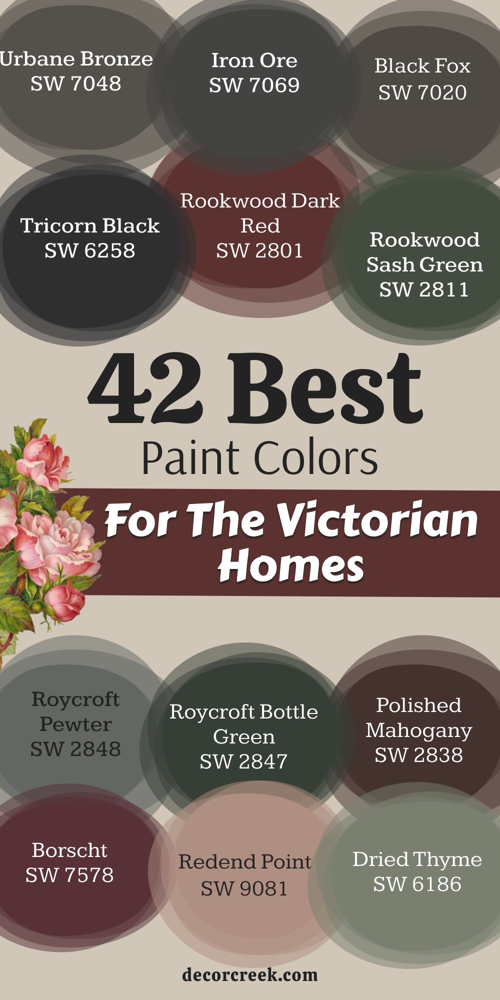
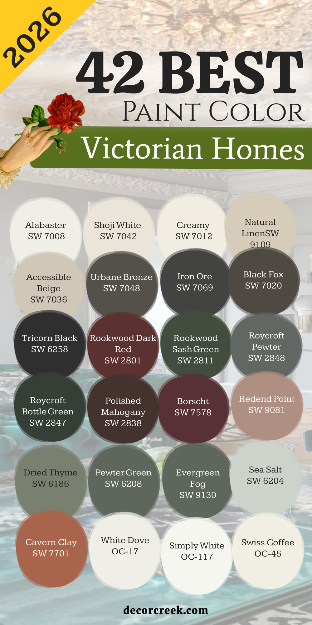
42 Best Paint Colors For The Victorian Homes In 2026
Alabaster SW 7008
Alabaster SW 7008 is a soft white that looks great on big porch columns and wide window trim. This paint works well because it is not too bright or blinding when the sun hits it. This shade provides a clean look that makes the other darker colors on your house pop.
It stays looking fresh even after a long winter because it has a bit of warmth. This is a top choice for people who want a classic white that feels very cozy. It matches perfectly with dark greens or deep reds used on Victorian front doors.
This choice helps show off the shadows in carved wood details without making them look flat. It is a paint I use often when I want the house to feel bright and welcoming. This pick acts as a great bridge between the old style and a more modern feeling. It makes the whole exterior feel organized and very well planned for any family.
🎨 Check out the complete guide to this color right HERE 👈

Creamy SW 7012
Creamy SW 7012 is a rich yellowish white that reminds me of thick vanilla ice cream. This paint looks beautiful on the clapboard siding of a tall Queen Anne style home. It gives a soft glow to the house when the sun starts to set in the evening.
This color is much better than a plain stark white for houses built over a hundred years ago. This tone pairs nicely with brown or tan accents on the porch floor and the steps. It hides dust and dirt better than many other light colors you might try to use.
This selection makes the house feel like a warm hug for anyone who walks up to the door. It is a very safe choice if you are worried about your house looking too cold. This paint highlights the texture of old shingles in a way that makes them look brand new. It is a staple in my design kit for creating a friendly and bright Victorian look.
🎨 Check out the complete guide to this color right HERE 👈

Shoji White SW 7042
Shoji White SW 7042 is a mix between grey and beige that looks different in every light. This paint works as a fantastic main body color for a large three-story Victorian home. It looks very sophisticated when you put it next to dark bronze or black hardware.
This shade is soft enough to use on large surfaces without making the house look too big. This color has a natural feel that reminds me of smooth stones found at a beach. It helps the green plants and colorful flowers in your garden look much brighter.
This selection is a smart pick for homeowners who want a neutral look that is not boring. It stays looking expensive and high-quality for many years after you finish painting. This pick provides a perfect background for showing off fancy gold or brass house numbers. It makes the architectural lines of an old building look very sharp and quite clean.
🎨 Check out the complete guide to this color right HERE 👈

Natural Linen SW 9109
Natural Linen SW 9109 is a tan shade that looks like the fabric of an old sun hat. This paint brings a grounded feeling to a house that has a lot of tall towers. It is a great color if you want your home to blend in with nature.
This tone looks very striking when used with dark wood doors and copper rain gutters. This color feels very traditional and fits the history of the Victorian era very well. It is easy on the eyes and does not show much wear from the weather.
This selection works for both the main siding and the smaller trim pieces on the porch. It makes a house look solid and strong like it has been there forever. This paint is a color that neighbors will surely ask you about because it is so nice. It keeps the focus on the shape of your home rather than just the paint itself.
🎨 Check out the complete guide to this color right HERE 👈

Accessible Beige SW 7036
Accessible Beige SW 7036 is one of the most popular colors because it goes with everything. This paint has a tiny bit of grey in it that keeps the beige from looking too yellow. This shade looks wonderful on the flat parts of the house behind the fancy trim.
It is a light color that still has enough body to stand up to bright sunlight. This selection makes a Victorian house look updated without losing its important historic charm. It works perfectly with navy blue or forest green shutters on the second floor.
This choice is my go-to when a homeowner cannot decide on a specific color. It looks clean and professional and makes the house look very well maintained. This pick helps the different layers of a Victorian roof look more interesting and layered. It is a reliable color that I have used on many successful staging projects.
🎨 Check out the complete guide to this color right HERE 👈

Urbane Bronze SW 7048
Urbane Bronze SW 7048 is a very dark grey that has a lot of brown hidden inside it. This paint looks like old metal and gives a house a very sturdy and heavy feeling. It is perfect for the window sashes or the very bottom of a Victorian home.
This shade makes a bold statement that says the owner cares about style and history. This color looks amazing when you put it next to light cream or soft tan colors. It hides imperfections in old wood that might show up with a lighter paint.
This selection is a color that feels very grounded and serious for a large historic property. It creates a beautiful contrast that makes the architecture of the house stand out. This choice is often used on the front door to create a very grand entrance for guests. It is a favorite for people who like colors that feel deep and full of mystery.
🎨 Check out the complete guide to this color right HERE 👈

Iron Ore SW 7069
Iron Ore SW 7069 is a charcoal color that is almost black but feels much softer and warmer. This paint is great for highlighting the detailed metal work on Victorian roof peaks and fences. It makes a home look very modern and stylish while still being respectful of the past.
This shade provides a very strong look that works well for houses in big busy cities. This color looks stunning when paired with bright white trim for a very high-contrast appearance. It is a heavy color that gives a sense of protection and strength to the building.
This selection works well on the foundation of the house to hide any dirt from the ground. It is a choice that shows you are not afraid to be a little different. This pick makes all the green leaves on nearby trees look extra vibrant and very healthy. It is a classic shade that will never go out of fashion for a grand Victorian.
🎨 Check out the complete guide to this color right HERE 👈

Black Fox SW 7020
Black Fox SW 7020 is a dark chocolate brown that looks almost black in the shade of the trees. This paint is a very rich color that makes a house look expensive and very well cared for. It works beautifully on the handrails of a porch or the decorative brackets in the eaves.
This shade pairs well with warm stone and brick foundations that many old homes have. This color feels like a color that has been around for hundreds of years on old estates. It is a great way to add drama to your house without using a cold black paint.
This selection looks fantastic against a backdrop of autumn leaves in the late part of the year. It gives the house a cozy and earthy feeling that is very pleasant to look at. This pick is a top pick for accenting the gingerbread trim on a classic Victorian cottage. It stands out because it is unique and has so much depth to its appearance.
🎨 Check out the complete guide to this color right HERE 👈

Tricorn Black SW 6258
Tricorn Black SW 6258 is a true black that does not have any hidden blue or brown tones. This paint is the best choice for a front door that needs to look very sharp and clear. It creates a very big impact when used on the window frames of a white house.
This shade makes all other colors look much brighter and more intense when they are near it. This color is a very formal color that gives a Victorian house a lot of dignity and grace. It works well for the small details that you want everyone to notice from the street.
This selection stays looking very dark and does not fade easily in the bright afternoon sun. It is a classic choice for the metal railings on a front porch or a balcony. This pick gives a house a finished look that feels very complete and well thought out. It is the ultimate color for adding a touch of elegance to any old building.
🎨 Check out the complete guide to this color right HERE 👈

Rookwood Dark Red SW 2801
Rookwood Dark Red SW 2801 is a deep burgundy that looks like the color of a very old wine. This paint was a very popular color during the late 1800s for grand Victorian mansions. It makes a house look very regal and important in a neighborhood of lighter homes.
This shade is a perfect accent for the gables and the highest points of the roof line. This color pairs excellently with dark green and gold for a very traditional look. It feels very historic and shows that you know a lot about old house styles.
This selection brings a lot of energy to the house without being too loud or too bright. It is a color that feels very permanent and stable on a big wooden structure. This pick looks beautiful in the winter when there is white snow all over the yard. It is a color that adds a lot of personality and heart to your home.
🎨 Check out the complete guide to this color right HERE 👈
Rookwood Sash Green SW 2810
Rookwood Sash Green SW 2810 is a dark forest green that was made specifically for window parts. This paint looks amazing when used on the narrow parts of the window called the sashes. It is a traditional Victorian color that makes a house look very authentic and real.
This shade works well with red brick and light stone because it is a natural tone. This color gives a house a very classic look that reminds people of old parks and gardens. It is a deep color that adds a lot of weight to the bottom of the house.
This selection looks very professional and shows that you care about the tiny details of your home. It is a color that stays looking good even when it gets a little bit dirty. This pick makes the glass in your windows look very clear and very shiny by contrast. It is a staple for anyone who wants a truly historic paint job for their home.
🎨 Check out the complete guide to this color right HERE 👈
Roycroft Pewter SW 2848
Roycroft Pewter SW 2848 is a medium grey that has a very cool and steady feeling to it. This paint is part of the Arts and Crafts collection but it works for Victorian homes too. It looks very handsome on the main body of a house with a lot of trim.
This shade is a color that feels very balanced and does not take over the whole look. This color works well with both black and white accents for a very clean appearance. It has a bit of blue in it that makes it look very pretty on cloudy days.
This selection is a smart choice for a house that is close to the sidewalk and needs to look neat. It hides the age of old wood by making everything look uniform and very smooth. This pick is a color that I recommend for people who want a house that looks very smart. It helps the house look very tidy and gives it a lot of curb appeal for buyers.
🎨 Check out the complete guide to this color right HERE 👈
Roycroft Bottle Green SW 2847
Roycroft Bottle Green SW 2847 is a very dark green that looks like the glass of an old bottle. This paint is one of the richest colors you can put on a Victorian home exterior. It makes the house look like it is part of a deep and old forest.
This shade is an excellent choice for shutters and the front door of a white house. This color feels very traditional and very fancy at the same time for many owners. It has a lot of depth that makes people want to walk up and touch it.
This selection looks great with brass knockers and handles that shine against the dark paint. It is a color that stays looking rich even after many years of harsh weather. This pick gives a house a lot of character and makes it stand out on the block. It is a color that feels very safe and very strong for a family home.
🎨 Check out the complete guide to this color right HERE 👈
Polished Mahogany SW 2838
Polished Mahogany SW 2838 is a reddish brown that looks exactly like expensive old furniture. This paint brings a sense of wealth and luxury to a Victorian home without being flashy. It works perfectly for the front porch floor and the decorative wood railings.
This shade looks very natural and earthy and matches with almost any other paint color. This color gives the wood a deep look that makes it seem much newer and healthier. It is a great choice for accents on a house that uses a lot of tan and beige.
This selection reminds me of the dark wood libraries found inside these beautiful old houses. It is a color that feels very warm and very welcoming for your family and friends. This pick makes the house feel like it has a very solid and very long history.
It is a top choice for anyone who loves the look of natural wood but wants paint.
Borscht SW 7578
Borscht SW 7578 is a dark beet red that is very bold and full of lots of energy for a house. This paint is a color that people will definitely notice when they drive past your front yard. It works well as an accent color for the small details that make a Victorian special.
This shade gives a home a very creative and artistic feeling that many people really enjoy. This color looks very pretty when paired with light grey or cream colored siding on the house. It is a deep shade that does not look like a bright fire truck red at all.
This selection feels very Victorian because it is a moody and very rich color for the exterior. It makes the house look very lively and happy even on a grey and rainy day. This pick is a color that I use when a client wants to show off their big personality. It brings a lot of heat and warmth to the overall look of a grand old building.
Redend Point SW 9081
Redend Point SW 9081 is a sandy pinkish brown that feels very soft and very natural for a home. This paint is a newer color that still works perfectly for a vintage Victorian house style. It looks like the color of the earth and makes the house feel very grounded indeed.
This shade is a great choice for the main body of a house in a sunny and warm place. This color pairs nicely with dark browns and greens to create a very organic look for you. It has a bit of a blush tone that makes it feel very kind and very friendly.
This selection is a color that looks very different depending on the time of the day and year. It makes the house feel unique because not many people use this specific shade yet. This pick is a smart pick for someone who wants a house that feels light and very breezy. It brings a touch of modern style to a very old and very classic architecture.
🎨 Check out the complete guide to this color right HERE 👈

Dried Thyme SW 6186
Dried Thyme SW 6186 is a dusty green that looks like the leaves of a plant in your garden. This paint is a very popular color right now for people who love the look of nature. It works well on the siding of a Victorian cottage or a smaller historic home.
This shade feels very peaceful and very quiet which is nice for a busy street corner. This color looks wonderful with white trim and a dark black roof on the house exterior. It is a color that does not demand too much attention but still looks very good.
This selection makes a house look very comfortable and like a great place to live for years. It stays looking clean and does not show much wear from the wind or the rain. This pick is a color that I recommend for a house with a lot of trees in the yard. It helps the house blend into the landscape in a very pretty and smart way.
🎨 Check out the complete guide to this color right HERE 👈

Pewter Green SW 6208
Pewter Green SW 6208 is a dark and moody green that has a lot of grey mixed into the paint. This paint looks very elegant on the front of a house with a lot of big windows. It is a very strong color that makes a Victorian home look very expensive and grand.
This shade pairs well with light grey and black for a very modern take on old style. This color has a deep and rich feeling that shows off the quality of the wooden siding. It is a great choice for the accents on a house that is mostly a light color.
This selection looks very professional and gives the house a lot of extra curb appeal for sure. It is a color that neighbors will admire because it looks so well put together now. This pick makes the green of your lawn look even better than it did before you painted. It is a reliable shade for making a house look very sturdy and very well built.
🎨 Check out the complete guide to this color right HERE 👈

Evergreen Fog SW 9130
Evergreen Fog SW 9130 is a light green that feels very soft and a little bit like a grey sky. This paint is a very relaxing color that looks great on a house with a big front porch. It works well for both the siding and the trim if you want a simple look.
This shade is a very popular choice for people who want a house that looks very current. This color pairs nicely with dark wood and stone to create a very natural appearance for all. It has a bit of a vintage feel that fits a Victorian house perfectly in my mind.
This selection looks very clean and very fresh and makes the house feel much more modern. It is a color that is easy to live with for many years without getting tired of it. This pick helps the architectural details of the house stand out in a very nice way. It is a top pick for a house that needs a bit of a new and fresh start.
🎨 Check out the complete guide to this color right HERE 👈

Sea Salt SW 6204
Sea Salt SW 6204 is a very light green that can look grey or blue depending on the weather. This paint is a great choice for a Victorian house near the ocean or a big lake nearby. It makes a home feel very light and very airy even if it is a large building.
This shade pairs beautifully with bright white trim and dark blue shutters on the second floor. This color is a very friendly color that makes people feel happy when they see your house. It looks very clean and very neat and shows that you take good care of things.
This selection is a smart pick for a house that gets a lot of direct sunlight during the day. It hides salt and sand very well if you live in a place with a lot of both. This pick gives a house a very gentle and very kind look that is very attractive to all. It is a favorite for people who want a house that feels like a summer vacation.
🎨 Check out the complete guide to this color right HERE 👈

Cavern Clay SW 7701
Cavern Clay SW 7701 is a warm orange brown that looks like the red rocks in the big desert. This paint brings a lot of warmth and a lot of life to a Victorian house exterior today. It is a very bold choice that shows you have a lot of personal style and flair.
This shade works well as an accent color for the front door or the porch ceiling above. This color pairs perfectly with dark greens and browns for a very earthy and rich look now. It feels very historic because people used many clay-like colors in the old days too.
This selection makes a house look very inviting and very cozy for everyone who comes to visit. It stands out against a blue sky and makes the house look very bright and very sharp. This pick is a color that I use when I want to add a lot of heat to a design. It gives a house a lot of heart and makes it feel very special and very unique.
🎨 Check out the complete guide to this color right HERE 👈

White Dove OC-17
White Dove OC-17 is a very soft white that does not have any harsh or cold blue in it. This paint is the perfect choice for painting big Victorian porch railings and fancy window trim. It makes the house look very clean and very bright without making your eyes hurt in the sun.
This shade is a favorite for designers because it looks good with every single other color choice. This color provides a classic look that will never look old or out of style for your home. It helps the shadows of the wood carvings look very deep and very interesting to look at.
This selection is very easy to find and looks the same every time you buy a new can. It covers old wood very well and gives the house a very finished and professional look. This pick makes your home feel very welcoming and very friendly to everyone who passes by. It is a reliable white that I use on almost every project I work on in this city.
🎨 Check out the complete guide to this color right HERE 👈

Simply White OC-117
Simply White OC-117 is a very bright and happy white that has just a tiny hint of yellow. This paint makes a house look like it is glowing with light even on a very cloudy day. It is perfect for the main body of a house if you want a very fresh look.
This shade makes all the colorful flowers in your front yard look extra bright and very pretty. This color is a very clean choice that makes your Victorian home look very well cared for. It works beautifully with black shutters and a red front door for a classic appearance.
This selection helps the house look big and tall and very proud on its lot in the neighborhood. It is a very crisp color that shows off every single straight line in your architecture. This pick stays looking white even when it gets a little bit of dust from the street. It is a color that makes the whole house feel very energetic and very alive for the owners.
🎨 Check out the complete guide to this color right HERE 👈

Swiss Coffee OC-45
Swiss Coffee OC-45 is a creamy white that feels very soft and very rich like a cup of warm milk. This paint is a great choice for an old house because it feels very traditional and very historic. It looks wonderful on the large siding boards and the small decorative parts of the porch.
This shade has a lot of warmth that makes the house feel very cozy and very comfortable. This color pairs nicely with dark wood doors and copper lights on the front of the home. It is a very popular color because it never looks too yellow or too grey in the sun.
This selection hides small cracks in old wood much better than a very bright white paint would. It gives the house a very soft and very gentle look that is very pleasing to everyone. This pick is a smart choice for a family home that wants to look very elegant and smart. It makes the Victorian details look very smooth and very high-quality for many years.
🎨 Check out the complete guide to this color right HERE 👈

Shaker Beige HC-45
Shaker Beige HC-45 is a medium tan color that has been a favorite for many decades now. This paint looks very solid and very strong on the exterior of a large Victorian home today. It provides a neutral background that lets the colorful trim pieces be the stars of the show.
This shade feels very grounded and very natural like the color of sand or dried tall grass. This color works perfectly with dark green or dark red accents on the window frames and doors. It is a very safe choice if you want your house to look professional and very well done.
This selection stays looking good in all kinds of weather and does not fade away in the sun. It makes the house look very traditional and very much like a classic home from the past. This pick is a great way to add color to your house without it being too loud or bright. It gives the architecture a very balanced and very even look that is very attractive to buyers.
🎨 Check out the complete guide to this color right HERE 👈

Grant Beige HC-83
Grant Beige HC-83 is a light beige that has a little bit of grey hidden deep inside the paint. This paint looks very sophisticated and very modern on a classic Victorian house with many layers. It works well as a main color for the siding because it is very easy to look at.
This shade changes slightly during the day as the sun moves across the front of the house. This color pairs beautifully with white trim and dark grey shutters for a very neat look. It feels very high-end and expensive which makes your home look very valuable on the block.
This selection is a smart pick for a house that is surrounded by a lot of green trees. It does not show dirt or dust easily which keeps the house looking clean for a long time. This pick makes the details of the house stand out without being the center of attention herself. It is a reliable and very pretty color that fits the Victorian style in a very nice way.
🎨 Check out the complete guide to this color right HERE 👈

Manchester Tan HC-81
Manchester Tan HC-81 is a very light and soft tan that reminds me of a sandy beach in summer. This paint is a great choice for the main body of a house that has a lot of dark trim. It looks very clean and very fresh and makes the house feel much more modern and new.
This shade is a very neutral color that does not clash with any other colors in the neighborhood. This color helps the house look very bright and very open and very welcoming for guests to visit. It works perfectly with a black front door and white window frames for a very sharp look.
This selection is a favorite for people who want a house that looks very tidy and organized. It provides a soft background for all the beautiful wood carvings on your Victorian home today. This pick stays looking nice for a long time and is very easy to match with new plants. It is a color that I recommend for anyone who wants a classic and very light look.
🎨 Check out the complete guide to this color right HERE 👈

Pashmina AF-100
Pashmina AF-100 is a rich grey-beige that feels very thick and very luxurious on the walls. This paint brings a lot of style and a lot of class to any Victorian home that uses it. It looks very elegant when paired with dark bronze lights and a very heavy front door.
This shade has enough color to stand out but it is still very soft on the eyes. This color works well in both bright sun and the deep shade of a large front porch. It feels very current and very modern while still being very respectful of the old house.
This selection hides the age of the wood by making everything look very smooth and very even. It is a color that makes the house feel very solid and very well built for the long haul. This pick is a great choice for a house that wants to look very smart and very professional. It adds a touch of fashion to the historic architecture in a very careful and nice way.
🎨 Check out the complete guide to this color right HERE 👈

Revere Pewter HC-172
Revere Pewter HC-172 is a light grey that is famous for being one of the best colors ever made. This paint looks amazing on a Victorian house because it has just the right amount of warmth. It acts like a chameleon and looks slightly different depending on what other colors are nearby.
This shade works perfectly for the siding and makes the white trim look very crisp and very sharp. This color is a very popular choice for people who want a house that looks very high-quality. It feels very traditional but also has a bit of a modern edge that many people love.
This selection stays looking great for years and years without ever going out of style for you. It is a smart pick for a house that has a lot of stone or brick around the bottom. This pick helps the house look very clean and very well maintained for anyone who passes by. It is a color that I trust to make any old home look its absolute best in the sun.
🎨 Check out the complete guide to this color right HERE 👈

Kendall Charcoal HC-166
Kendall Charcoal HC-166 is a deep and dark grey that feels very heavy and very strong on a home. This paint is a great choice for adding a lot of drama to a Victorian house exterior today. It looks very sophisticated when used on the trim or the very bottom part of the house.
This shade makes the white parts of the house look like they are popping out toward you. This color is a very bold choice that shows you have a lot of taste and a lot of confidence. It feels very grounded and very sturdy like a rock that has been there for a long time.
This selection works well for the window frames to make them look very sharp and very clear. It stays looking very dark even in the brightest light which is exactly what some people want. This pick is a favorite for creating a look that feels very expensive and very well done now. It gives the house a lot of character and a very strong personality for everyone to see.
🎨 Check out the complete guide to this color right HERE 👈

Wrought Iron 2124-10
Wrought Iron 2124-10 is a very dark grey that is almost black but has a bit of blue in it. This paint looks like the old iron fences that you often see around very grand Victorian estates. It provides a very strong and very clear look for the accents on your historic home exterior.
This shade is perfect for the front door or the shutters on a very light colored house. This color feels very formal and very serious and gives the house a lot of extra dignity. It works well to hide any small marks or dents in old wood that you want to cover up.
This selection makes the architecture look very sharp and very well defined from far away in the street. It is a color that stays looking very rich and very deep for a very long period of time. This pick is a smart choice for adding a touch of old-world class to a newer renovation project. It gives the whole house a finished look that feels very complete and very well thought out.
🎨 Check out the complete guide to this color right HERE 👈

Iron Mountain 2134-30
Iron Mountain 2134-30 is a dark grey that feels a little bit softer than a true black paint would. This paint looks very handsome on the trim of a house that uses light grey or tan siding colors. It provides a lot of contrast that makes the house look very interesting and very well layered.
This shade has a bit of warmth to it that keeps it from looking too cold or too blue. This color is a great choice for the porch floor or the steps leading up to the front door. It feels very solid and very durable and can handle a lot of people walking on it every day.
This selection makes the house look very modern while still staying true to the Victorian style of building. It is a color that I use when I want a house to look very strong and very impressive. This pick helps the small details like the brackets and the spindles stand out in a nice way. It gives the exterior a very polished and very clean look that everyone will surely admire today.
🎨 Check out the complete guide to this color right HERE 👈

Amherst Gray HC-167
Amherst Gray HC-167 is a medium dark grey that has a very classic and very steady feeling to it. This paint works well for the main siding of a house if you want a look that is very serious. It looks very good with bright white trim and a black roof for a very traditional appearance.
This shade is a very neutral color that fits in well with any street or any neighborhood. This color feels very high-end and shows that you care a lot about the quality of your home. It stays looking clean and does not show much wear from the wind or the rain in the winter.
This selection is a smart pick for a house that has a lot of wood and stone details. It helps the house look very balanced and very even from the top all the way to the bottom. This pick is a color that many people find very attractive because it is so easy to love. It makes the Victorian architecture look very strong and very well built for the long future.
🎨 Check out the complete guide to this color right HERE 👈

Chelsea Gray HC-168
Chelsea Gray HC-168 is a warm grey that looks very rich and very full of life on an old house. This paint is a favorite for designers because it makes every house look more expensive than it is. It looks wonderful with gold or brass hardware on the front door and the window frames too.
This shade has a bit of brown in it that makes it feel very earthy and very grounded. This color works well as both a main color and a trim color for a Victorian home today. It feels very sophisticated and very smart and gives the house a lot of curb appeal for sure.
This selection is a great choice for a home that wants to stand out in a very quiet way. It hides imperfections in the wood siding very well and makes everything look very smooth and clean. This pick is a color that stays looking good in every kind of light during the whole year. It gives the house a very finished and very professional look that makes neighbors very jealous indeed.
🎨 Check out the complete guide to this color right HERE 👈

Salamander 2050-10
Salamander 2050-10 is a very deep green that is almost black but has a lot of hidden color inside. This paint looks like the dark leaves in a forest and brings a lot of life to the house. It is a very rich and very bold choice for the shutters or the front door of a Victorian.
This shade adds a lot of mystery and a lot of depth to the overall look of the building. This color pairs beautifully with warm tan or cream colors for a very traditional and historic look. It feels very expensive and very high-quality and shows off the owner’s great taste in paint colors.
This selection makes the house look very unique because it is such a special and deep shade of green. It stays looking very dark and very rich even after many years of sun and rain on the wood. This pick is a favorite for people who want a house that looks very grand and very important. It gives the architecture a lot of weight and a very strong presence in the neighborhood today.
🎨 Check out the complete guide to this color right HERE 👈

Essex Green HC-188
Essex Green HC-188 is a classic dark green that has been used on Victorian homes for a long time. This paint looks very traditional and very historic and fits the era of the house perfectly for all. It provides a very deep and very rich look for the window sashes and the decorative trim pieces.
This shade is a very strong color that makes the house look very sturdy and very well built. This color pairs perfectly with red brick foundations and light stone steps for a very natural look. It feels very formal and very dignified and gives the house a lot of character and history. This selection is a smart pick for a house that is surrounded by a lot of old and tall trees.
It hides dirt and dust very well and stays looking clean for a very long period of time now. This pick is a color that many people recognize as a sign of a very well-kept home. It makes the Victorian details look very sharp and very clear for everyone who passes by the house.
🎨 Check out the complete guide to this color right HERE 👈

Nightfall 1596
Nightfall 1596 is a dark grey with a touch of blue that looks like the sky just after the sun sets. This paint brings a lot of mood and a lot of drama to the exterior of a Victorian home. It looks very sophisticated and very modern when paired with light grey or white trim on the house.
This shade is a bold choice that makes the house look very stylish and very well designed for you. This color has a deep and rich feeling that shows off the beautiful texture of the old wood. It works well for the front door to create a very grand and very inviting entrance for guests. This selection is a favorite for people who want a look that is very current and very trendy now.
It stays looking very dark and very intense even in the brightest light of the afternoon sun. This pick gives the house a lot of personality and a very strong look that people will remember. It is a color that I trust to make any home look very impressive and very high-end today.
🎨 Check out the complete guide to this color right HERE 👈
Deep River 1582
Deep River 1582 is a dark green-grey that feels very natural and very grounded on a large old house. This paint looks like the water in a deep forest lake and brings a sense of life to the home. It is a very rich and very elegant color for the siding or the trim of a Victorian home.
This shade pairs nicely with warm wood and stone to create a very organic and earthy appearance. This color feels very traditional but also has a bit of a unique twist that makes it special. It works well to show off the different layers and shapes of a house with a lot of detail.
This selection hides the age of the house by making everything look very uniform and very smooth now. It is a color that stays looking good in all kinds of weather during the whole long year. This pick is a smart choice for a house that wants to look very solid and very well built. It gives the architecture a very finished and very professional look that is very attractive to all.
🎨 Check out the complete guide to this color right HERE 👈
Hale Navy HC-154
Hale Navy HC-154 is a classic navy blue that is famous for being the perfect shade for any home. This paint looks amazing on a Victorian house because it is so rich and so very deep in color. It provides a very strong and very clear look that makes the white trim look very bright.
This shade feels very traditional and very historic and gives the house a lot of extra dignity. This color pairs beautifully with gold hardware and a red front door for a very patriotic look. It is a very popular choice for people who want a house that looks very smart and professional.
This selection stays looking very blue and does not turn grey or purple in the bright sunlight. It is a color that many people find very attractive because it is so easy to love and use. This pick helps the house look very clean and very well maintained for anyone who passes by today. It is a reliable color that I use on many projects when I want a high-quality finish for sure.
🎨 Check out the complete guide to this color right HERE 👈

Gentleman’s Gray 2062-20
Gentleman’s Gray 2062-20 is a dark teal-blue that brings a lot of color and a lot of life to a house. This paint is a very bold and very stylish choice for a Victorian home with a lot of personality. It looks very sophisticated and very high-end when paired with light grey or white trim on the siding.
This shade has a bit of a vintage feel that fits the history of the era perfectly in my mind. This color works well for the front door or the shutters to add a pop of unique color. It feels very expensive and very well done and shows that you have a lot of taste in paint.
This selection is a favorite for people who want a house that looks very creative and very artistic. It stays looking very rich and very deep even after many years of sun and rain on the wood. This pick gives the house a lot of character and a very strong look that people will surely admire. It is a color that I trust to make any home look very impressive and very special today.
🎨 Check out the complete guide to this color right HERE 👈

Victorian Mauve 2114-50
Victorian Mauve 2114-50 is a soft purple-grey that was very popular in the late 1800s for many homes. This paint brings a touch of history and a touch of romance to the exterior of a Victorian house. It looks very pretty when paired with dark grey or white trim for a very traditional look for all.
This shade is a very gentle and very kind color that makes the house feel very welcoming and soft. This color helps the architectural details stand out in a way that is very nice and very pleasing. It feels very unique and very special because not many people use this specific shade of mauve today.
This selection works well for the siding of a smaller cottage or a house with a lot of flowers. It stays looking very nice for a long time and is very easy to match with new garden plants. This pick gives the house a lot of heart and makes it feel like a very special place to live. It is a color that I recommend for anyone who wants a classic and very pretty look for home.
🎨 Check out the complete guide to this color right HERE 👈
Dark Burgundy 2075-10
Dark Burgundy 2075-10 is a very deep and rich red that looks like the color of a dark cherry. This paint provides a lot of drama and a lot of energy for the exterior of a Victorian home. It looks very regal and very important and gives the house a lot of extra dignity and grace.
This shade is a perfect accent for the gables and the highest points of the roof line on top. This color pairs excellently with dark green and gold for a very traditional and historic look today. It feels very formal and very serious and shows that you care a lot about the quality of home.
This selection brings a lot of life to the house without being too loud or too bright in the sun. It is a color that stays looking very rich and very deep for a very long period of time now. This pick is a favorite for creating a look that feels very expensive and very well done for all. It gives the house a lot of character and a very strong look that neighbors will admire.
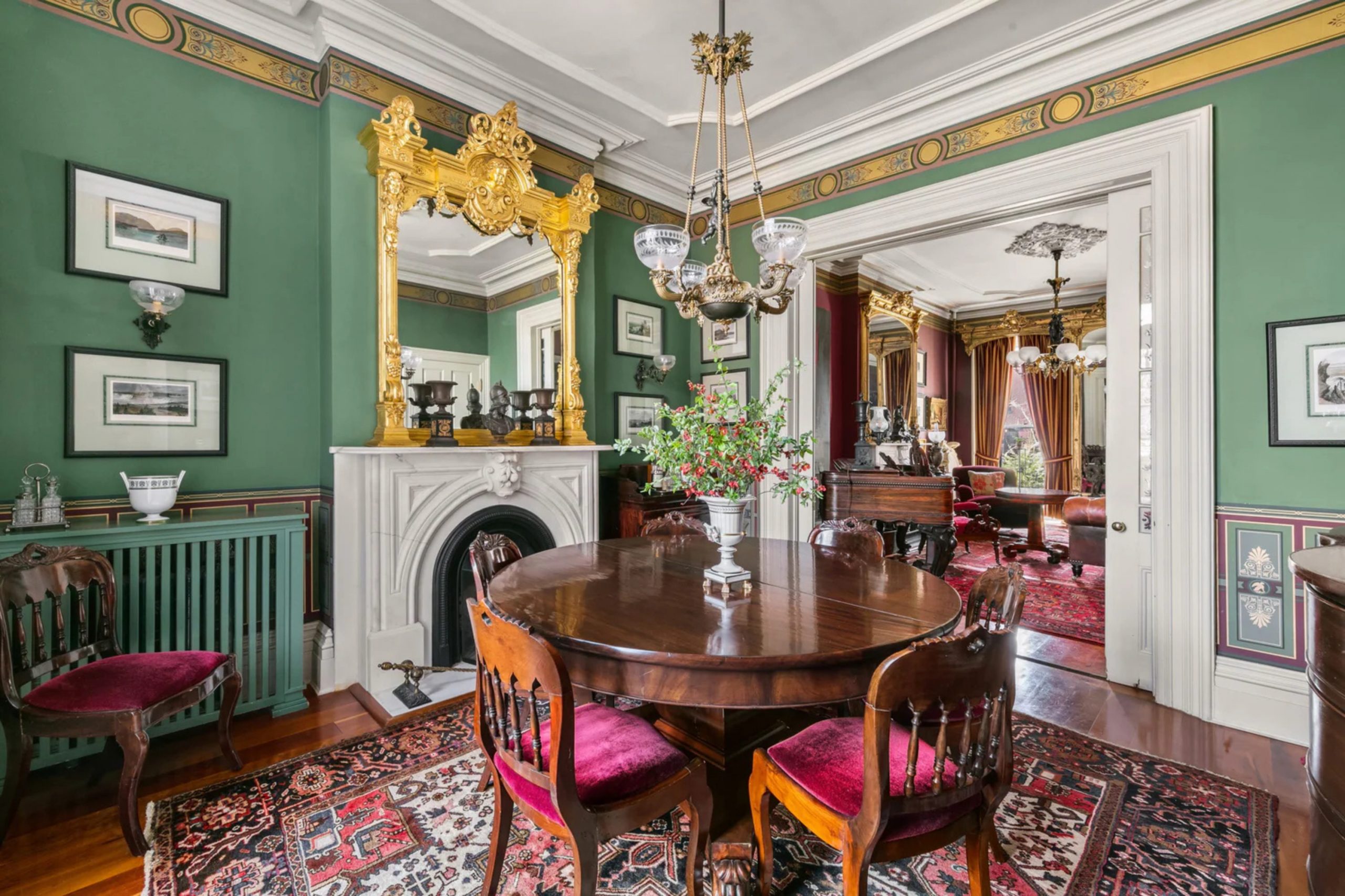
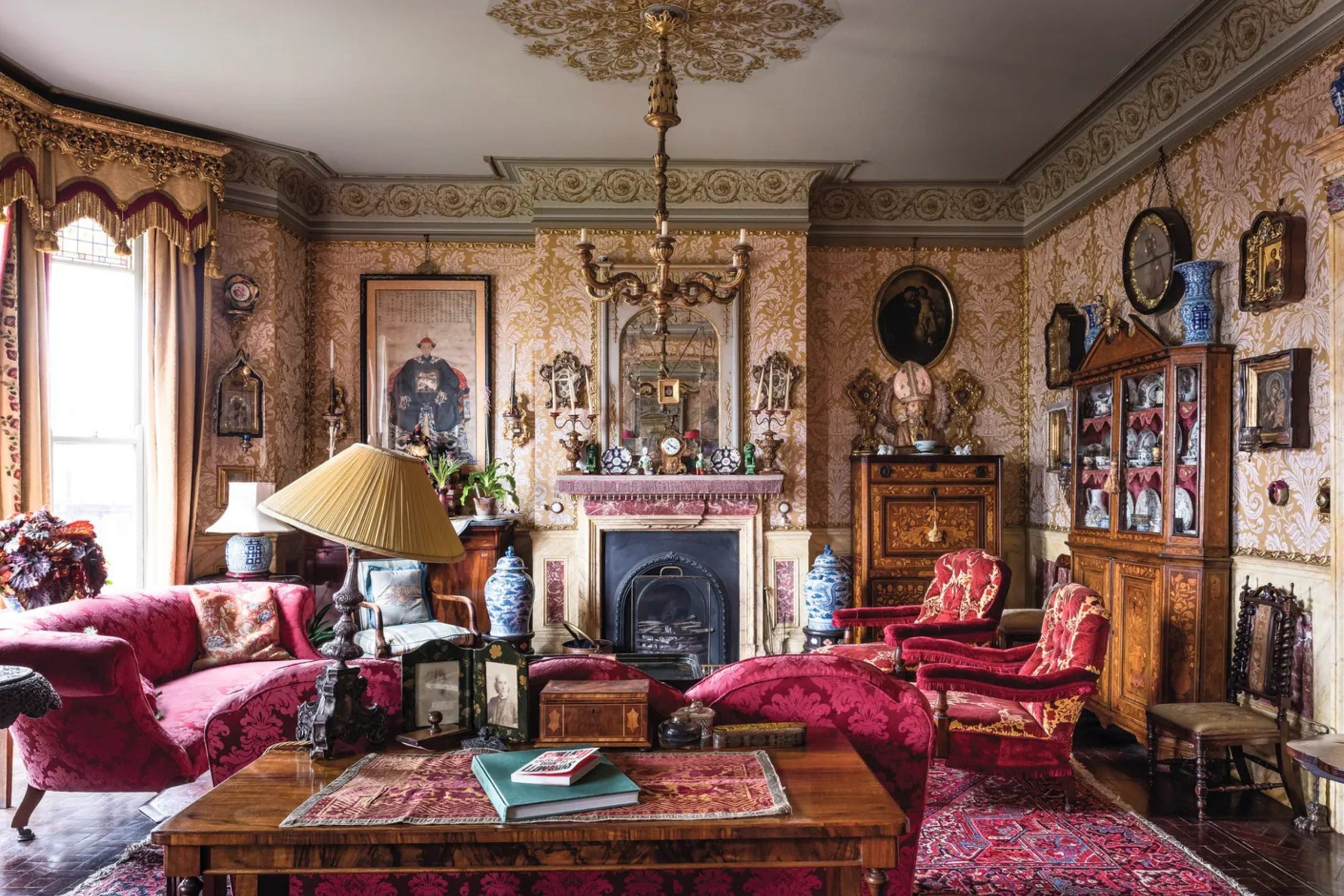
32 Paint Colors For The Victorian Homes Interior
Alabaster SW 7008
Alabaster SW 7008 is a creamy white that makes the high ceilings of a Victorian room look even taller. This paint provides a soft light that fills the room and makes it feel very open and very bright. It works perfectly on the tall baseboards and the fancy crown molding that these houses often have inside.
This shade is a favorite for the living room because it is very easy to live with every day. This color pairs nicely with dark wood floors and colorful rugs for a very balanced and neat look. It feels very warm and very cozy and makes the house feel like a very friendly place to be.
This selection is a smart pick for a dark hallway that needs a bit more light from the paint. It stays looking clean and fresh and is very easy to wipe down if it gets a dirty mark. This pick helps the whole room feel very organized and very well planned for a busy family today. It is a reliable white that I use to make every interior look its absolute best for my clients.
🎨 Check out the complete guide to this color right HERE 👈
Creamy SW 7012
Creamy SW 7012 is a warm white that feels like a bowl of hot oatmeal on a cold winter morning. This paint looks beautiful in a bedroom where you want a very soft and very gentle feeling for sleep. It gives the walls a subtle glow that makes the whole room feel very welcoming and very kind to all.
This shade is much better than a plain white because it has a lot of heart and a lot of warmth. This color works well with vintage furniture and old lace curtains for a very traditional Victorian look inside. It hides small marks on the walls better than many other light colors you might try to use for walls.
This selection makes the room feel like a safe and happy place for everyone in the family to relax. It is a very safe choice if you are worried about your home looking too cold or too empty. This pick highlights the texture of old plaster walls in a way that makes them look very smooth. It is a staple in my design kit for creating a friendly and very bright look for any room.
🎨 Check out the complete guide to this color right HERE 👈
Shoji White SW 7042
Shoji White SW 7042 is a mix of grey and beige that looks very smart in a formal dining room. This paint changes color as the light from the windows moves around the room during the whole day today. It looks very sophisticated when paired with dark wood tables and chairs for a very high-end appearance for guests.
This shade is soft enough to use on every wall in the house without making it look boring. This color has a natural feel that makes the room feel very grounded and very solid for the family. It helps the art on your walls and the photos on your desk look much brighter and better. This selection is a smart pick for people who want a modern look inside their very old house today.
It stays looking expensive and high-quality for many years after you finish the painting job in the room. This pick provides a perfect background for showing off your favorite things and your favorite furniture for everyone. It makes the lines of the room look very sharp and very clean for a very professional and nice finish.
🎨 Check out the complete guide to this color right HERE 👈
Natural Linen SW 9109
Natural Linen SW 9109 is a tan shade that reminds me of the pages of a very old and dear book. This paint brings a sense of history and a sense of comfort to a library or a home office. It is a great color if you want a room to feel very quiet and very focused for work.
This shade looks very striking when used with dark wood bookshelves and big leather chairs for the family. This color feels very traditional and fits the style of a Victorian home perfectly in my expert opinion. It is easy on the eyes and makes the room feel very steady and very calm for everyone inside.
This selection works well for the walls because it does not take over the whole feeling of the room. It makes the furniture look solid and strong and very much like it belongs in that specific place. This pick is a color that friends will surely admire because it looks so classic and so very nice. It keeps the focus on your life and your things rather than just the paint on the walls.
🎨 Check out the complete guide to this color right HERE 👈
Redend Point SW 9081
Redend Point SW 9081 is a soft pink-brown that feels like a warm sunset inside your favorite room today. This paint brings a lot of unique style to a bedroom or a cozy sitting area for the family. It looks very natural and very earthy and makes the room feel very grounded and very comfortable for all.
This shade is a newer color that still works perfectly with the vintage feeling of a Victorian house. This color pairs nicely with dark wood and green plants to create a very organic look for your home. It has a bit of a blush tone that makes the room feel very kind and very friendly for guests.
This selection is a color that looks very different depending on the lamps you use in the room at night. It makes the room feel unique because it is a very special and very modern shade of paint for walls. This pick is a smart choice for someone who wants a room that feels light and very breezy and nice. It brings a touch of modern fashion to a very old and very classic architecture in a great way.
🎨 Check out the complete guide to this color right HERE 👈
Rookwood Dark Red SW 2801
Rookwood Dark Red SW 2801 is a deep red that makes a dining room look very grand and very formal. This paint was used a long time ago in the most expensive homes for a very regal look for guests. It makes the room feel very important and shows that you care a lot about the history of house.
This shade is perfect for a room where you want to have big holiday dinners with all the family. This color pairs excellently with dark wood and gold frames for a very traditional and historic appearance today. It feels very rich and very deep and adds a lot of energy to the room without being loud. This selection brings a lot of heart to the house and makes the room feel very warm and very cozy.
It is a color that stays looking very expensive and very high-quality for a very long period of time. This pick looks beautiful at night when the lights are low and the candles are burning on the table. It is a color that adds a lot of personality and a lot of power to your favorite room.
🎨 Check out the complete guide to this color right HERE 👈
Rookwood Sash Green SW 2810
Rookwood Sash Green SW 2810 is a dark green that brings the feeling of an old garden inside your house. This paint looks amazing in a sunroom or a mudroom where you have a lot of green plants for all. It is a traditional color that makes the room feel very authentic and very much like the old days.
This shade works well with wood floors and natural stone because it is a very earthy and solid tone. This color gives the room a very classic look that reminds people of old parks and quiet places to sit. It is a deep color that adds a lot of weight and a lot of strength to the walls.
This selection looks very professional and shows that you know a lot about the history of Victorian design today. It is a color that stays looking good even if the room gets a lot of use from the family. This pick makes the view out of your windows look even better by framing it with a natural green. It is a staple for anyone who wants a truly historic and very beautiful interior for their old home.
🎨 Check out the complete guide to this color right HERE 👈
Roycroft Pewter SW 2848
Roycroft Pewter SW 2848 is a medium grey that feels very cool and very steady in a busy kitchen today. This paint is a smart choice because it looks very clean and very organized for a place where you cook. It works well with white cabinets and black counters for a very sharp and very modern look for home.
This shade is a color that feels very balanced and does not make the room feel too small or dark. This color has a bit of blue in it that makes it look very pretty in the morning light. It feels very high-end and shows that you have a lot of taste in the colors you pick for walls.
This selection is a great choice for a room that gets a lot of use every single day of the week. It hides small marks and fingerprints very well which is great for families with small children in the house. This pick is a color that I recommend for anyone who wants a room that looks very smart and clean. It helps the whole house feel very tidy and gives it a lot of style for everyone to see.
🎨 Check out the complete guide to this color right HERE 👈
Borscht SW 7578
Borscht SW 7578 is a dark red that brings a lot of excitement and a lot of energy to a room. This paint is a color that will definitely make your guests say wow when they walk into your front hall. It works well in a space where you want to feel happy and full of life every single day now.
This shade gives the home a very creative and very artistic feeling that many people really enjoy having inside. This color looks very pretty when paired with white trim and light grey floors for a very modern look. It is a deep shade that does not look like a bright fire truck at all because it is rich.
This selection feels very Victorian because it is a moody and very deep color for the walls of the home. It makes the room look very lively and happy even on a grey and rainy day during the winter. This pick is a color that I use when a client wants to show off their big personality. It brings a lot of heat and warmth to the overall look of a grand and very old building.
Roycroft Bottle Green SW 2847
Roycroft Bottle Green SW 2847 is a very dark green that makes a room feel like a cozy secret place. This paint is one of the richest colors you can put on the walls of a Victorian study or den. It looks very elegant and very fancy and makes the room feel very expensive and very well done today.
This shade has a lot of depth that makes people want to stay in the room for a long time. This color feels very traditional and very historic and fits the old house style perfectly in my expert mind. It pairs beautifully with leather books and brass lamps for a very classic and very smart look for home.
This selection is a favorite for people who want a room that feels very private and very quiet for all. It stays looking very rich and very deep even when the lights are turned down low in the evening. This pick gives the room a lot of character and makes it stand out from the other rooms in house. It is a color that feels very safe and very strong for a room where you want to relax.
🎨 Check out the complete guide to this color right HERE 👈
Polished Mahogany SW 2838
Polished Mahogany SW 2838 is a reddish brown that looks like the wood of a very expensive piano in the parlor. This paint brings a sense of wealth and luxury to the interior of a Victorian home without being too flashy. It works perfectly for a room where you want to show off your best furniture and your best art today.
This shade looks very natural and very earthy and matches with almost any other color you have in room. This color gives the walls a deep look that makes the whole room feel much newer and very healthy. It is a great choice for a room that has a lot of windows and a lot of bright light.
This selection reminds me of the beautiful wood carvings that you find in the most famous old mansions now. It is a color that feels very warm and very welcoming for your family and for all your guests. This pick makes the house feel like it has a very solid and a very long history of being loved. It is a top choice for anyone who loves the look of natural wood but wants to use paint.
Cavern Clay SW 7701
Cavern Clay SW 7701 is a warm orange brown that feels like a cozy fire in a big stone fireplace. This paint brings a lot of life and a lot of heart to a kitchen or a family room today. It is a very bold choice that shows you have a lot of personal style and a lot of flair. This shade works well to make a large room feel more comfortable and more intimate for the whole family.
This color pairs perfectly with dark wood and green plants for a very natural and very earthy look for all. It feels very historic because people used many colors like this in the old days for their own homes. This selection makes the room look very inviting and very friendly for everyone who comes to visit you at home.
It stands out against white trim and makes the whole room look very bright and very sharp in the sun. This pick is a color that I use when I want to add a lot of heat to a design. It gives the room a lot of personality and makes it feel very special and very unique for the owner.
🎨 Check out the complete guide to this color right HERE 👈
Dried Thyme SW 6186
Dried Thyme SW 6186 is a soft green that makes a bedroom feel like a quiet garden in the morning. This paint is a very popular color right now because it brings the beauty of nature inside your house today. It works well in a room where you want to feel relaxed and ready to have a good night sleep.
This shade feels very peaceful and very quiet and is very easy on the eyes during the whole day. This color looks wonderful with white furniture and light wood floors for a very fresh and very clean look. It is a color that does not demand too much attention but still looks very good to everyone who sees. This selection makes a room look very comfortable and like a great place to spend a lot of time with family.
It stays looking clean and does not show much wear or marks from the people living in the house now. This pick is a color that I recommend for a room that gets a lot of natural light from windows. It helps the room feel connected to the trees and the grass outside in a very pretty and smart way.
🎨 Check out the complete guide to this color right HERE 👈
Pewter Green SW 6208
Pewter Green SW 6208 is a dark green with a lot of grey that looks very expensive in a parlor. This paint brings a sense of style and a sense of history to any room that uses it for the walls. It is a very strong color that makes a Victorian interior look very grand and very well put together now.
This shade pairs well with light grey and black for a very modern take on a very old house style. This color has a deep and rich feeling that shows off the high quality of the paint and the work. It is a great choice for a room where you want to feel very smart and very professional every day. This selection looks very professional and gives the room a lot of extra style and a lot of extra class.
It is a color that guests will admire because it looks so well chosen and so very well done for you. This pick makes the furniture in the room look even better than it did before you started the painting. It is a reliable shade for making a room look very sturdy and very well built for the long future.
🎨 Check out the complete guide to this color right HERE 👈
Black Fox SW 7020
Black Fox SW 7020 is a dark brown that feels very warm and very rich like a cup of dark coffee. This paint is a great choice for a room where you want to feel very cozy and very tucked away. It looks very elegant when used on the walls of a small library or a quiet sitting room for two.
This shade makes the light from a lamp look very soft and very pretty in the evening at home today. This color pairs well with warm wood and gold frames for a very traditional and very historic appearance for all. It is a great way to add drama to your room without using a cold black paint on the walls. This selection looks fantastic in a room with a lot of old books and a lot of family photos.
It gives the room an earthy feeling that is very pleasant to be in for a long time during the day. This pick is a top pick for creating a look that feels very private and very special for the owner. It stands out because it is unique and has so much depth to its appearance for everyone to see.
🎨 Check out the complete guide to this color right HERE 👈
Urbane Bronze SW 7048
Urbane Bronze SW 7048 is a dark grey that makes a room feel very modern and very sophisticated for the family. This paint looks like old stone and gives the walls a very solid and very strong feeling for the long term. It is perfect for a room where you want to show off your very best modern art and furniture today.
This shade makes a bold statement that says the owner knows exactly what looks good in a historic home. This color looks amazing when you put it next to light cream or soft white trim in the same room. It hides any small bumps in the walls very well and makes everything look very smooth and very clean now. This selection is a color that feels very grounded and very serious for a room that gets used for work.
It creates a beautiful contrast that makes the architecture of the room stand out for everyone who enters the house. This pick is often used to create a look that feels very expensive and very well designed by an expert. It is a favorite for people who like colors that feel deep and full of a lot of mystery.
🎨 Check out the complete guide to this color right HERE 👈
White Dove OC-17
White Dove OC-17 is a soft white that makes a small room feel much bigger and much brighter for everyone. This paint is the best choice for the walls of a hallway or a bathroom that does not have windows. It provides a clean and fresh look that never feels too cold or too sterile for the people living there.
This shade is a favorite for designers because it makes every other color in the room look much better today. This color helps the wood trim stand out and look very sharp and very well defined for the whole family. It is a very popular color because it matches every kind of furniture and every kind of rug you own. This selection is very easy to find and stays looking the same for many years after you paint the room.
It covers old paint very well and gives the room a very finished and very professional appearance for all. This pick makes your home feel very welcoming and very friendly to everyone who comes inside to visit with you. It is a reliable white that I use to make every room look its absolute best for the long future.
🎨 Check out the complete guide to this color right HERE 👈
Simply White OC-117
Simply White OC-117 is a bright white that brings a lot of joy and a lot of light to a room. This paint makes the whole room feel like it is full of sunshine even when it is raining outside today. It is perfect for a kitchen where you want everything to look very clean and very fresh for the family. This shade makes the colors of your food and your dishes look extra bright and very tasty for everyone.
This color is a very crisp choice that makes your Victorian home look very modern and very well cared for. It works beautifully with black accents and wood floors for a very sharp and very clean appearance for guests. This selection helps the room look big and open and very welcoming for everyone who comes to visit you.
It is a very bright color that shows off every single detail of your beautiful room and your things. This pick stays looking white even when the room gets a lot of use every single day of the week. It is a color that makes the whole house feel very energetic and very alive for the people inside.
🎨 Check out the complete guide to this color right HERE 👈
Swiss Coffee OC-45
Swiss Coffee OC-45 is a creamy white that feels very rich and very soft like a warm wool blanket. This paint is a great choice for a bedroom because it makes the room feel very cozy and very quiet. It looks wonderful on the walls and the ceiling and makes the whole room feel very well put together.
This shade has a lot of warmth that makes you want to stay in bed for just a little bit longer. This color pairs nicely with light wood and soft colors for a very traditional and very pretty look today. It is a very popular color because it never looks too yellow or too grey in the light of the lamp. This selection hides small marks on the walls much better than a very bright white paint would ever do.
It gives the room a very soft and very gentle look that is very pleasing to everyone who enters. This pick is a smart choice for a family home that wants to look very elegant and very smart now. It makes the Victorian details look very smooth and very high-quality for many years of happy living.
🎨 Check out the complete guide to this color right HERE 👈
Shaker Beige HC-45
Shaker Beige HC-45 is a tan color that brings a sense of strength and a sense of history to a room. This paint looks very solid and very reliable on the walls of a family room or a den today. It provides a neutral background that lets your colorful pillows and blankets be the stars of the show for all.
This shade feels very grounded and very natural like the color of warm earth or a sandy path outside. This color works perfectly with dark wood furniture and green plants for a very traditional and very nice look. It is a very safe choice if you want your room to look professional and very well done for guests. This selection stays looking good in all kinds of light and does not fade away over the long years.
It makes the room look very traditional and very much like a classic home from a long time ago. This pick is a great way to add color to your room without it being too loud or too bright. It gives the whole house a very balanced and very even look that is very attractive to everyone.
🎨 Check out the complete guide to this color right HERE 👈
Manchester Tan HC-81
Manchester Tan HC-81 is a light tan that makes a room feel very open and very airy for the family. This paint is a great choice for the walls of a living room that gets a lot of use today. It looks very clean and very fresh and makes the room feel much more modern and new for everyone.
This shade is a very neutral color that does not clash with any of your furniture or your art. This color helps the room look very bright and very welcoming for guests who come to visit you at home. It works perfectly with white trim and dark wood floors for a very sharp and very professional appearance now. This selection is a favorite for people who want a house that looks very tidy and very organized for all.
It provides a soft background for all the beautiful things you have collected over the long years of life. This pick stays looking nice for a long time and is very easy to match with new things you buy. It is a color that I recommend for anyone who wants a classic and very light look for home.
🎨 Check out the complete guide to this color right HERE 👈
Pashmina AF-100
Pashmina AF-100 is a rich grey-beige that feels very thick and very luxurious on the walls of a bedroom. This paint brings a lot of style and a lot of class to any room that uses it for the interior. It looks very elegant when paired with soft white curtains and a very comfortable bed for the family today.
This shade has enough color to stand out but it is still very soft on the eyes in the morning. This color works well in both bright light and the soft light of a lamp in the evening for all. It feels very current and very modern while still being very respectful of the old Victorian house style now. This selection hides the age of the walls by making everything look very smooth and very even for everyone.
It is a color that makes the room feel very solid and very well built for a very long future. This pick is a great choice for a room that wants to look very smart and very professional for guests. It adds a touch of fashion to the historic architecture in a very careful and very nice way.
🎨 Check out the complete guide to this color right HERE 👈
Revere Pewter HC-172
Revere Pewter HC-172 is a light grey that is famous for making every room look its absolute best today. This paint looks amazing in a Victorian living room because it has just the right amount of warmth for all. It acts like a chameleon and changes slightly depending on the furniture and the rugs you have in the room.
This shade works perfectly for the walls and makes the white wood trim look very crisp and very sharp now. This color is a very popular choice for people who want a house that looks very high-quality for everyone. It feels very traditional but also has a bit of a modern edge that many people love to have inside. This selection stays looking great for years and years without ever going out of style for you or your family.
It is a smart pick for a room that has a lot of different colors and a lot of different patterns. This pick helps the room look very clean and very well maintained for anyone who comes to visit you today. It is a reliable color that I trust to make any room look beautiful and very special for the owners.
🎨 Check out the complete guide to this color right HERE 👈
Kendall Charcoal HC-166
Kendall Charcoal HC-166 is a deep grey that brings a lot of drama and a lot of style to a room. This paint is a great choice for a formal dining room where you want to have fancy dinners with friends. It looks very sophisticated and very expensive and makes the room feel very grand and very important for all today.
This shade makes the light from a chandelier look very bright and very sparkly against the dark walls of the room. This color is a very bold choice that shows you have a lot of taste and a lot of confidence now. It feels very grounded and very sturdy like the walls of a castle that has been there forever for all. This selection works well for an accent wall to make one part of the room stand out for everyone to see.
It stays looking very dark even in the brightest light which is exactly what some people want for a room. This pick is a favorite for creating a look that feels very private and very high-end for the family. It gives the room a lot of character and a very strong personality that people will surely remember later.
🎨 Check out the complete guide to this color right HERE 👈
Wrought Iron 2124-10
Wrought Iron 2124-10 is a very dark grey that makes a room feel very strong and very impressive for all. This paint looks like old metal and provides a very clear and very sharp look for the walls today. It is perfect for a room where you want to show off your very best modern furniture and art for guests. This shade feels very formal and very serious and gives the house a lot of extra dignity and grace now.
This color works well to hide any small marks or bumps on old plaster walls that you want to cover up. It makes the lines of the room look very sharp and very well defined for everyone who enters the house today. This selection is a color that stays looking very rich and very deep for a very long period of time.
It is a smart choice for adding a touch of old-world class to a newer room in your Victorian home. This pick gives the whole room a finished look that feels very complete and very well thought out for all. It is a favorite for people who want a look that is very unique and very powerful for their home.
🎨 Check out the complete guide to this color right HERE 👈
Iron Mountain 2134-30
Iron Mountain 2134-30 is a dark grey that feels a bit softer and a bit warmer than a true black paint. This paint looks very handsome in a room that has a lot of light colored furniture and a lot of rugs. It provides a lot of contrast that makes the room look very interesting and very well layered for the family.
This shade has a bit of warmth to it that keeps the room from looking too cold or too blue. This color is a great choice for a home office or a room where you want to feel focused. It feels very solid and very durable and makes the walls look very strong and very healthy for everyone today. This selection makes the room look very modern while still staying true to the Victorian style of building the home.
It is a color that I use when I want a room to look very impressive and very well designed. This pick helps the small details like the window frames and the doors stand out in a very nice way. It gives the interior a very polished and very clean look that everyone will admire for a long time.
🎨 Check out the complete guide to this color right HERE 👈
Amherst Gray HC-167
Amherst Gray HC-167 is a medium dark grey that has a very classic and very steady feeling for a room. This paint works well for the walls of a room where you want a look that is very serious. It looks very good with white trim and dark floors for a very traditional and very historic appearance today. This shade is a very neutral color that fits in well with any kind of furniture you might own now.
This color feels very high-end and shows that you care a lot about the quality of your home for all. It stays looking clean and fresh and is very easy to live with for many years of happy living inside. This selection is a smart pick for a room that has a lot of wood and stone details for everyone.
It helps the room look very balanced and very even and makes you feel very safe and very comfortable. This pick is a color that many people find very attractive because it is so easy to love and enjoy. It makes the Victorian interior look very strong and very well built for the long future of the family.
🎨 Check out the complete guide to this color right HERE 👈
Chelsea Gray HC-168
Chelsea Gray HC-168 is a warm grey that makes a room feel very rich and very full of life today. This paint is a favorite for designers because it makes every room look more expensive and more stylish for all. It looks wonderful with gold or brass lamps and a lot of colorful pillows and blankets on the couch now.
This shade has a bit of brown in it that makes the room feel very earthy and very grounded. This color works well as a main color for the walls of a large living room or a dining room. It feels very sophisticated and very smart and gives the house a lot of style and class for guests.
This selection is a great choice for a room that wants to stand out in a very quiet way. It hides imperfections in the walls very well and makes everything look very smooth and very clean for everyone. This pick is a color that stays looking good in every kind of light during the whole long year. It gives the room a very finished and very professional look that makes your family very happy indeed.
🎨 Check out the complete guide to this color right HERE 👈
Salamander 2050-10
Salamander 2050-10 is a very deep green that makes a room feel like a lush forest hideaway for the family. This paint brings a lot of life and a lot of color to a room that has been very boring. It is a very rich and very bold choice for a library or a small den in a Victorian.
This shade adds a lot of mystery and a lot of depth to the walls and the whole room today. This color pairs beautifully with warm wood and tan colors for a very traditional and historic look for all. It feels very expensive and very high-quality and shows off your great taste in paint colors for everyone to see.
This selection makes the room look very unique because it is such a special and deep shade of green paint. It stays looking very dark and very rich even in the soft light of a lamp in the evening. This pick is a favorite for people who want a room that feels very grand and very important now. It gives the interior a lot of weight and a very strong presence that people will surely love to see.
🎨 Check out the complete guide to this color right HERE 👈
Essex Green HC-188
Essex Green HC-188 is a dark green that has been a favorite for old houses for a very long time. This paint looks very traditional and very historic and fits the style of the house perfectly for everyone today. It provides a very deep and very rich look for the walls of a formal room or a study.
This shade is a very strong color that makes the room feel very sturdy and very well built for all. This color pairs perfectly with dark wood and red accents for a very classic and very nice look now. It feels very formal and very dignified and gives the house a lot of character and a lot of history. This selection is a smart pick for a room that gets a lot of natural light from big windows.
It hides dirt and marks very well and stays looking clean for a very long period of time for you. This pick is a color that many people recognize as a sign of a very well-kept and happy home. It makes the Victorian details look very sharp and very clear for everyone who enters the room today.
🎨 Check out the complete guide to this color right HERE 👈
Hale Navy HC-154
Hale Navy HC-154 is a deep blue that brings a lot of style and a lot of class to a room. This paint is a favorite for a reason because it looks amazing on the walls of any Victorian room. It provides a very strong and very clear look that makes your white trim look very bright and clean. This shade feels very traditional and very historic and gives the room a lot of extra dignity for everyone today.
This color pairs beautifully with gold frames and wood floors for a very high-end and very smart look now. It is a very popular choice for people who want a room that looks very professional and very well done. This selection stays looking very blue and does not turn grey even in the bright light of the sun.
It is a color that many people find very attractive because it is so easy to love and use for all. This pick helps the room look very clean and very well maintained for anyone who comes to visit you. It is a reliable color that I trust to make any room look beautiful and very special for the owners.
🎨 Check out the complete guide to this color right HERE 👈
Victorian Mauve 2114-50
Victorian Mauve 2114-50 is a soft purple-grey that reminds me of the history of the 1800s for these homes. This paint brings a touch of romance and a touch of class to a bedroom or a small sitting room. It looks very pretty when paired with dark grey or white trim for a very traditional and nice look.
This shade is a very gentle and very kind color that makes the room feel very welcoming for the family. This color helps the architectural details of the room stand out in a way that is very soft and nice. It feels very unique and very special because not many people use this specific shade for their walls today. This selection works well for a room where you want to feel relaxed and ready to have a good rest.
It stays looking very nice for a long time and is very easy to match with your favorite things. This pick gives the room a lot of heart and makes it feel like a very special place to be. It is a color that I recommend for anyone who wants a classic and very pretty look for home.
🎨 Check out the complete guide to this color right HERE 👈
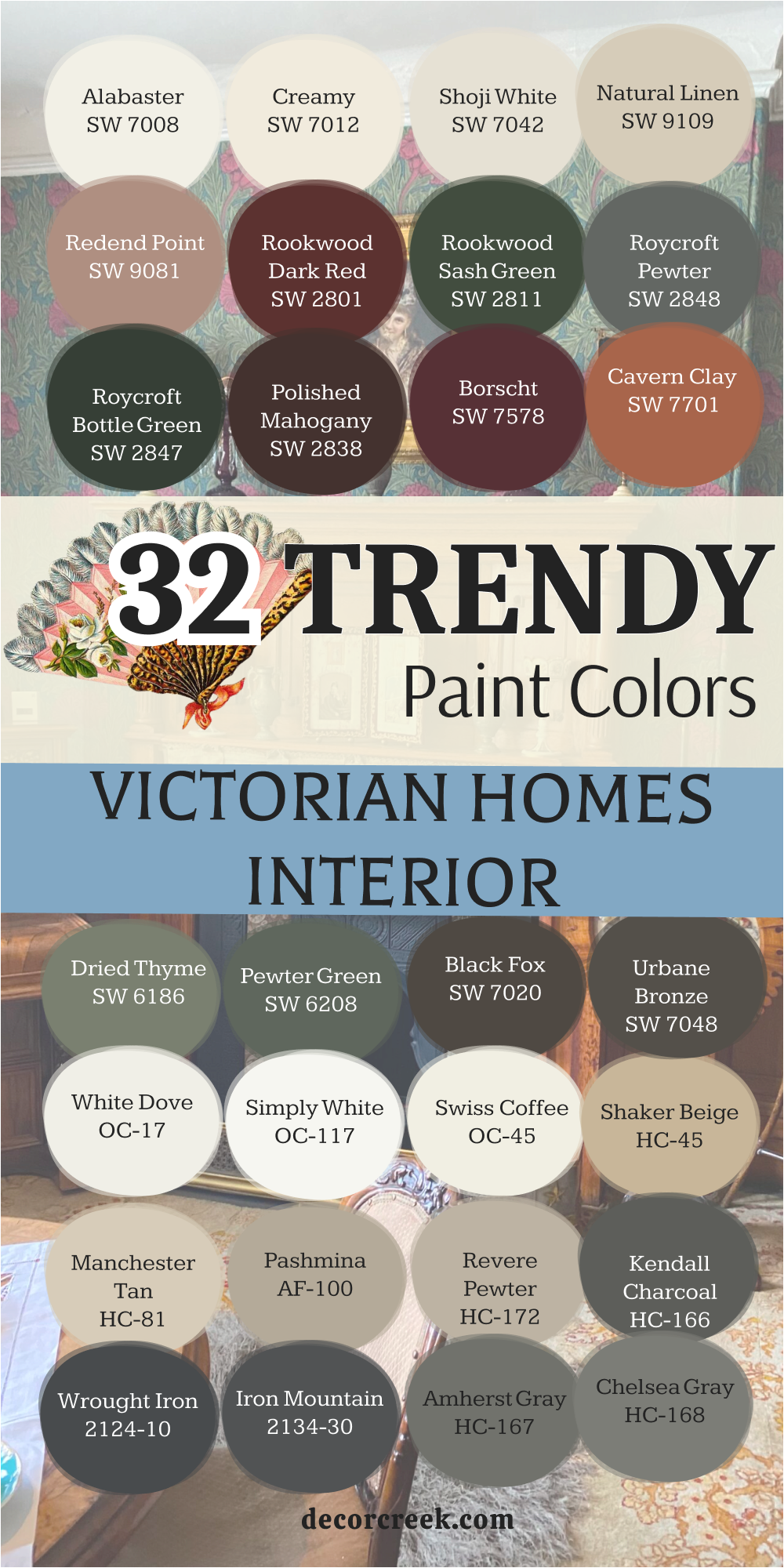
21 Paint Colors For The Modern Victorian Homes
Anonymous SW 7046
Anonymous SW 7046 is a medium grey that looks very fresh and very modern on a historic Victorian home. This paint brings a lot of style to the exterior without making the house look too bright or too loud. It works well for the main body of the house because it is very easy to look at for all. This shade has a bit of warmth that keeps it from looking like a cold or a blue grey.
This color pairs nicely with white trim and a black front door for a very sharp and clean look. It feels very current and shows that you have a lot of taste in the modern style of today. This selection hides the age of the wood siding very well and makes the house look very new and healthy.
It is a smart pick for a house in a neighborhood that has a lot of newer homes and buildings. This pick helps the house fit in while still keeping its special and historic character for everyone to see. It is a reliable color for creating a look that is very smart and very professional for the owners.
🎨 Check out the complete guide to this color right HERE 👈

Iron Ore SW 7069
Iron Ore SW 7069 is a charcoal grey that makes a Victorian home look very strong and very impressive for everyone. This paint provides a lot of drama and a lot of contrast for the exterior of a very large building. It is perfect for the trim or the foundation to give the house a very solid and sturdy look today.
This shade is a bold choice that shows you are not afraid to use a very dark and rich color. This color looks amazing when paired with light grey siding for a very modern and very stylish appearance for all. It feels very high-end and expensive and makes your home look very valuable on the block for the neighbors.
This selection stays looking very dark even in the brightest light which is exactly what some people want for home. It hides imperfections in old wood very well and makes the lines of the house look very sharp and clear. This pick gives the house a lot of character and a very strong look that people will surely remember later. It is a color that I trust to make any home look very impressive and very well designed.
🎨 Check out the complete guide to this color right HERE 👈
Peppercorn SW 7674
Peppercorn SW 7674 is a dark grey that feels very balanced and very even on the walls of a home. This paint is a great choice for the main body of a house if you want a very modern look. It looks very sophisticated and very smart when paired with white trim and a colorful front door for all.
This shade has a bit of a blue tone that makes it look very pretty on a clear day today. This color is a very popular choice for people who want a house that looks very current and trendy. It feels very high-quality and shows that you care a lot about the way your home looks for guests. This selection stays looking clean and does not show much wear from the wind or the rain in the winter.
It is a smart pick for a house that has a lot of straight lines and a lot of windows. This pick helps the house look very tidy and very organized for anyone who passes by the front yard. It is a reliable color for making a Victorian home look very modern and very well maintained for all.
🎨 Check out the complete guide to this color right HERE 👈

Gauntlet Gray SW 7019
Gauntlet Gray SW 7019 is a warm grey that brings a lot of life and a lot of heart to a house. This paint looks very rich and very full on the siding of a Victorian home with a lot of detail. It provides a neutral background that lets the white trim and the black roof be the stars of the show. This shade feels very grounded and very natural like the color of a mountain or a big stone for all.
This color works perfectly with dark wood and green plants for a very organic and very earthy look for home. It is a very safe choice if you want your house to look professional and very well done today. This selection stays looking good in all kinds of weather and does not fade away over the long years.
It makes the house look very modern while still being very respectful of the old Victorian house style now. This pick is a great way to add color to your house without it being too loud or too bright. It gives the architecture a very balanced and very even look that is very attractive to everyone.
🎨 Check out the complete guide to this color right HERE 👈
Grizzle Gray SW 7068
Grizzle Gray SW 7068 is a dark grey with a bit of green that looks very interesting on an old house. This paint brings a lot of personality and a lot of style to the exterior of a Victorian home today. It looks very sophisticated and very high-end when paired with light tan or cream colors for the trim for all.
This shade has a deep and rich feeling that shows off the beautiful texture of the wood siding for everyone. This color is a very bold choice that makes your house look very unique and very special on the block. It feels very grounded and very sturdy and gives the house a lot of extra dignity and grace for you. This selection works well for the window frames to make them look very sharp and very clear for the guests.
It stays looking very rich and very deep even after many years of sun and rain on the wood now. This pick is a favorite for creating a look that feels very expensive and very well done for the owner. It gives the house a lot of character and a very strong look that people will surely admire later.
🎨 Check out the complete guide to this color right HERE 👈

Sealskin SW 7675
Sealskin SW 7675 is a very dark brown-grey that feels very thick and very luxurious on the walls of a house. This paint brings a sense of wealth and a sense of luxury to any Victorian home that uses it today. It looks very elegant when paired with copper lights and a very heavy wood front door for everyone to see.
This shade has enough color to stand out but it is still very soft and very easy on the eyes. This color works well in both bright light and the shade of a large porch during the long day. It feels very current and very modern while still being very respectful of the old historic style for all. This selection hides the age of the wood siding very well and makes everything look very smooth and clean.
It is a color that makes the house feel very solid and very well built for the long future for you. This pick is a great choice for a house that wants to look very smart and very professional for guests. It adds a touch of fashion to the historic architecture in a very careful and a very nice way.
🎨 Check out the complete guide to this color right HERE 👈
Jasper SW 6216
Jasper SW 6216 is a very dark green that looks like the color of a deep forest in the evening. This paint brings a lot of mood and a lot of drama to the exterior of a modern Victorian home. It looks very sophisticated and very stylish when paired with light grey or white trim for the house today.
This shade is a bold choice that makes the house look very high-end and very well designed for everyone. This color has a deep and rich feeling that shows off the high quality of the paint and the work. It works well for the shutters or the front door to create a very grand and very inviting entrance. This selection is a favorite for people who want a look that is very current and very trendy for home.
It stays looking very dark and very intense even in the brightest light of the afternoon sun for you. This pick gives the house a lot of character and a very strong look that people will surely remember. It is a color that I trust to make any home look very impressive and very special today.
🎨 Check out the complete guide to this color right HERE 👈
Darkroom SW 7083
Darkroom SW 7083 is a deep black with a bit of red that looks like the color of an old photo room. This paint brings a lot of mystery and a lot of style to the exterior of a Victorian home today. It is a very rich and very bold choice for the front door or the window trim of the house.
This shade adds a lot of personality and a lot of depth to the overall look of the building for all. This color pairs beautifully with light grey or tan siding for a very modern and very sharp look now. It feels very expensive and very high-quality and shows off your great taste in the colors you pick for home.
This selection makes the house look very unique because it is such a special and deep shade of black paint. It stays looking very dark and very rich even after many years of sun and rain on the wood for you. This pick is a favorite for people who want a house that looks very grand and very important for everyone. It gives the architecture a lot of weight and a very strong presence in the neighborhood today.
🎨 Check out the complete guide to this color right HERE 👈
Charcoal Blue SW 2739
Charcoal Blue SW 2739 is a dark blue with a lot of grey that looks very smart on an old house. This paint brings a sense of history and a sense of style to any Victorian home that uses it today. It looks very sophisticated and very high-end when paired with white trim and a black roof for everyone. This shade has a deep and rich feeling that makes the house look very well cared for and healthy.
This color is a very popular choice for people who want a house that looks very current and very trendy. It feels very solid and very sturdy and gives the house a lot of extra dignity and grace for you. This selection works well for the siding because it is very easy on the eyes during the whole day now.
It stays looking very rich and very deep even in the brightest light of the afternoon sun for everyone. This pick is a favorite for creating a look that feels very expensive and very well done for the owner. It gives the house a lot of character and a very strong look that people will surely admire later.
🎨 Check out the complete guide to this color right HERE 👈
Mount Etna SW 7625
Mount Etna SW 7625 is a dark teal-grey that looks like the color of a mountain in the fog today. This paint brings a lot of unique style and a lot of life to the exterior of a Victorian home. It looks very sophisticated and very modern when paired with light grey or white trim on the house for all. This shade is a bold choice that shows you have a lot of taste and a lot of confidence in style.
This color has a deep and rich feeling that shows off the beautiful texture of the wood siding for everyone. It works well for the front door to create a very grand and very inviting entrance for all your guests. This selection is a favorite for people who want a look that is very creative and very artistic for home.
It stays looking very dark and very intense even in the brightest light of the afternoon sun for you. This pick gives the house a lot of character and a very strong look that people will surely remember later. It is a color that I trust to make any home look very impressive and very high-end today.
🎨 Check out the complete guide to this color right HERE 👈
Van Deusen Blue HC-156
Van Deusen Blue HC-156 is a medium dark blue that looks very classic and very steady on an old house. This paint works well for the siding of a Victorian home if you want a look that is very smart. It looks very good with white trim and a black front door for a very traditional and historic look today.
This shade is a very neutral color that fits in well with any street or any neighborhood for everyone. This color feels very high-end and shows that you care a lot about the quality of your home for all. It stays looking clean and fresh and does not show much wear from the wind or the rain now. This selection is a smart pick for a house that has a lot of wood and stone details for everyone.
It helps the house look very balanced and very even and makes you feel very safe and comfortable for all. This pick is a color that many people find very attractive because it is so easy to love and use. It makes the Victorian architecture look very strong and very well built for the long future of family.
🎨 Check out the complete guide to this color right HERE 👈

Newburyport Blue HC-155
Newburyport Blue HC-155 is a rich blue that brings a lot of joy and a lot of style to a house. This paint looks amazing on a Victorian home because it is so deep and so very full of color for all. It provides a very strong and very clear look that makes the white trim look very bright and clean today.
This shade feels very traditional and very historic and gives the house a lot of extra dignity and grace for you. This color pairs beautifully with gold hardware and a red front door for a very high-end appearance for guests. It is a very popular choice for people who want a house that looks very smart and professional now.
This selection stays looking very blue and does not turn grey even in the bright light of the sun for everyone. It is a color that many people find very attractive because it is so easy to love and use for home. This pick helps the house look very clean and very well maintained for anyone who passes by today. It is a reliable color that I trust to make any home look beautiful and very special for the owners.
🎨 Check out the complete guide to this color right HERE 👈

Gentleman’s Gray 2062-20
Gentleman’s Gray 2062-20 is a dark blue with a bit of green that looks very sharp on an old house. This paint brings a sense of style and a sense of history to any Victorian home that uses it today. It looks very sophisticated and very high-end when paired with light grey or white trim on the house for all.
This shade has a deep and rich feeling that shows off the beautiful texture of the wood siding for everyone. This color is a very bold choice that makes your house look very unique and very special on the block. It feels very grounded and very sturdy and gives the house a lot of extra dignity and grace for you. This selection works well for the front door to create a very grand and very inviting entrance for all.
It stays looking very rich and very deep even after many years of sun and rain on the wood now. This pick is a favorite for creating a look that feels very expensive and very well done for the owner. It gives the house a lot of character and a very strong look that people will surely admire later.
🎨 Check out the complete guide to this color right HERE 👈
Dark Olive 2140-30
Dark Olive 2140-30 is a deep green-brown that looks like the color of an old forest in the sun today. This paint brings a lot of natural style and a lot of heart to the exterior of a Victorian home. It looks very sophisticated and very modern when paired with light tan or cream colors for the trim for all.
This shade has a bit of an earthy tone that makes the house feel very grounded and very solid now. This color works perfectly for the siding because it is very easy on the eyes during the whole long day. It feels very current and shows that you have a lot of taste in the modern style of today for all.
This selection hides the age of the wood siding very well and makes everything look very smooth and very clean. It is a smart pick for a house in a neighborhood that has a lot of trees and big yards now. This pick helps the house fit in while still keeping its special and historic character for everyone to see. It is a reliable color for creating a look that is very smart and very professional for the owners.
🎨 Check out the complete guide to this color right HERE 👈
Vintage Wine 2116-20
Vintage Wine 2116-20 is a deep purple-red that brings a lot of unique style and life to a house. This paint is a very bold and very artistic choice for a Victorian home with a lot of personality today. It looks very sophisticated and very high-end when paired with light grey or white trim for the siding for all.
This shade has a bit of a vintage feel that fits the history of the era perfectly for everyone. This color works well for the front door or the shutters to add a pop of very special color now. It feels very expensive and very well done and shows that you have a lot of taste in paint colors. This selection is a favorite for people who want a house that looks very creative and very stylish for all.
It stays looking very rich and very deep even after many years of sun and rain on the wood for you. This pick gives the house a lot of character and a very strong look that people will surely admire later. It is a color that I trust to make any home look very impressive and very special today.
🎨 Check out the complete guide to this color right HERE 👈
Black Forest Green HC-187
Black Forest Green HC-187 is a very dark green that looks like the color of a thick woods at night. This paint brings a lot of mood and a lot of drama to the exterior of a Victorian home today. It is a very rich and very bold choice for the shutters or the front door of the house for all. This shade adds a lot of personality and a lot of depth to the overall look of the building now.
This color pairs beautifully with warm tan or cream colors for a very traditional and historic appearance for all. It feels very expensive and very high-quality and shows off your great taste in the colors you pick for home. This selection makes the house look very unique because it is such a special and deep shade of green paint.
It stays looking very dark and very rich even after many years of sun and rain on the wood for you. This pick is a favorite for people who want a house that looks very grand and very important for everyone.
It gives the architecture a lot of weight and a very strong presence in the neighborhood today.
🎨 Check out the complete guide to this color right HERE 👈
Nightfall 1596
Nightfall 1596 is a dark grey-blue that brings a lot of mystery and a lot of style to an old house. This paint looks very sophisticated and very modern when paired with light grey or white trim on the house today. It provides a lot of drama and a lot of contrast for the exterior of a very large building for all. This shade is a bold choice that shows you have a lot of taste and a lot of confidence in style.
This color has a deep and rich feeling that shows off the beautiful texture of the wood siding for everyone. It works well for the front door to create a very grand and very inviting entrance for all your guests. This selection is a favorite for people who want a look that is very current and very trendy for home.
It stays looking very dark and very intense even in the brightest light of the afternoon sun for you. This pick gives the house a lot of character and a very strong look that people will surely remember later. It is a color that I trust to make any home look very impressive and very high-end today.
🎨 Check out the complete guide to this color right HERE 👈
Dragon’s Breath 1547
Dragon’s Breath 1547 is a very dark brown-grey that looks like the color of old smoke and stone today. This paint brings a lot of mood and a lot of strength to the exterior of a Victorian home. It looks very sophisticated and very modern when paired with light tan or cream colors for the trim for all.
This shade has a bit of an earthy tone that makes the house feel very grounded and very solid now. This color is a bold choice that shows you are not afraid to use a very dark and rich color for all. It feels very high-end and expensive and makes your home look very valuable on the block for the neighbors. This selection stays looking very dark even in the brightest light which is exactly what some people want for home.
It hides imperfections in old wood very well and makes the lines of the house look very sharp and clean. This pick gives the house a lot of character and a very strong look that people will surely remember later. It is a color that I trust to make any home look very impressive and very well designed.
🎨 Check out the complete guide to this color right HERE 👈
Gargoyle 1546
Gargoyle 1546 is a medium dark grey-brown that looks very steady and very solid on an old house today. This paint brings a sense of history and a sense of style to any Victorian home that uses it for all. It looks very sophisticated and very high-end when paired with white trim and a black front door for everyone.
This shade has a bit of an earthy tone that makes the house feel very grounded and very solid now. This color works perfectly for the siding because it is very easy on the eyes during the whole long day.
It feels very current and shows that you have a lot of taste in the modern style of today for all. This selection hides the age of the wood siding very well and makes everything look very smooth and very clean.
It is a smart pick for a house in a neighborhood that has a lot of newer homes and buildings.
This pick helps the house fit in while still keeping its special and historic character for everyone to see. It is a reliable color for creating a look that is very smart and very professional for the owners.
Thunder AF-685
Thunder AF-685 is a light grey-beige that makes a room feel very open and very modern for the family today. This paint brings a lot of style and a lot of class to any Victorian room that uses it inside. It looks very elegant when paired with white trim and dark wood floors for a very sharp appearance for all.
This shade is a very neutral color that does not clash with any of your furniture or your art now. This color helps the room look very bright and very welcoming for guests who come to visit you at home. It works perfectly with modern lights and a colorful rug for a very current and trendy look for everyone. This selection is a favorite for people who want a house that looks very tidy and very organized for all.
It provides a soft background for all the beautiful things you have collected over the long years of life. This pick stays looking nice for a long time and is very easy to match with new things you buy. It is a color that I recommend for anyone who wants a modern and very light look for home.
🎨 Check out the complete guide to this color right HERE 👈

Deep Creek 1477
Deep Creek 1477 is a dark grey-green that looks very rich and very full of life on an old house today. This paint brings a lot of natural style and a lot of heart to the exterior of a Victorian home. It looks very sophisticated and very modern when paired with light tan or cream colors for the trim for all.
This shade has a bit of an earthy tone that makes the house feel very grounded and very solid now. This color is a bold choice that shows you are not afraid to use a very dark and rich color for all. It feels very high-end and expensive and makes your home look very valuable on the block for the neighbors.
This selection stays looking very dark even in the brightest light which is exactly what some people want for home. It hides imperfections in old wood very well and makes the lines of the house look very sharp and clean. This pick gives the house a lot of character and a very strong look that people will surely remember later. It is a color that I trust to make any home look very impressive and very well designed.
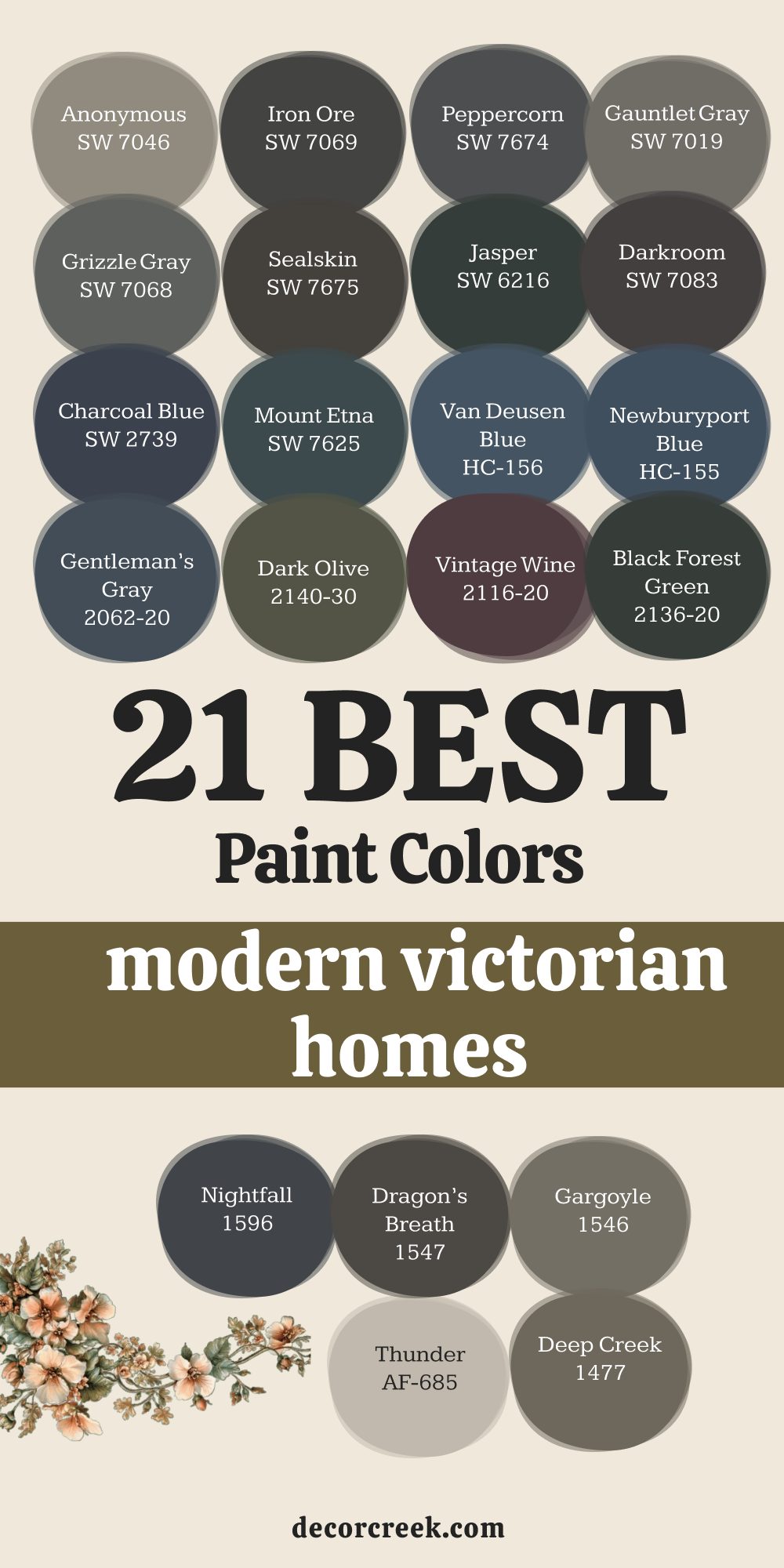
19 Evergreen Paint Colors For The Old Victorian Homes
Rookwood Dark Red SW 2801
Rookwood Dark Red SW 2801 is a classic deep red that has been used for over a hundred years on houses. This paint brings a sense of history and a sense of dignity to any Victorian home that uses it today. It looks very regal and very important and gives the house a lot of extra grace and power for all. This shade is a perfect accent for the gables and the highest points of the roof line on the top.
This color pairs excellently with dark green and gold for a very traditional and historic look for the home. It feels very formal and very serious and shows that you care a lot about the quality of your house. This selection brings a lot of life to the house without being too loud or too bright in the sun.
It is a color that stays looking very rich and very deep for a very long period of time for you. This pick is a favorite for creating a look that feels very expensive and very well done for all. It gives the house a lot of character and a very strong look that neighbors will surely admire.
🎨 Check out the complete guide to this color right HERE 👈
Rookwood Sash Green SW 2810
Rookwood Sash Green SW 2801 is a dark green that was made to last for a long time on windows. This paint looks very traditional and very historic and fits the style of an old house perfectly for everyone. It provides a very deep and very rich look for the window sashes and the decorative trim pieces today.
This shade is a very strong color that makes the house look very sturdy and very well built for all. This color pairs perfectly with red brick foundations and light stone steps for a very natural appearance for all. It feels very formal and very dignified and gives the house a lot of character and a lot of history. This selection is a smart pick for a house that is surrounded by a lot of old and tall trees.
It hides dirt and dust very well and stays looking clean for a very long period of time now. This pick is a color that many people recognize as a sign of a very well-kept and happy home. It makes the Victorian details look very sharp and very clear for everyone who passes by today.
🎨 Check out the complete guide to this color right HERE 👈
Roycroft Bottle Green SW 2847
Roycroft Bottle Green SW 2847 is a deep green that looks like the color of an old glass bottle today. This paint brings a lot of style and a lot of class to the exterior of a Victorian home for all. It looks very sophisticated and very high-end when paired with white trim and a black front door for everyone.
This shade has a deep and rich feeling that shows off the beautiful texture of the wood siding for you. This color is a very popular choice for people who want a house that looks very traditional and very historic. It feels very solid and very sturdy and gives the house a lot of extra dignity and grace for all. This selection works well for the shutters or the front door to add a pop of very special color now.
It stays looking very rich and very deep even after many years of sun and rain on the wood. This pick is a favorite for creating a look that feels very expensive and very well done for the owner. It gives the house a lot of character and a very strong look that people will surely admire later.
🎨 Check out the complete guide to this color right HERE 👈
Roycroft Bronze Green SW 2846
Roycroft Bronze Green SW 2846 is a dark brown-green that looks very rich and very full on an old house today. This paint brings a sense of history and a sense of strength to any Victorian home that uses it for all. It looks very sophisticated and very high-end when paired with light tan or cream colors for the trim for everyone.
This shade has a bit of an earthy tone that makes the house feel very grounded and very solid now. This color works perfectly for the siding because it is very easy on the eyes during the whole long day. It feels very traditional and shows that you have a lot of taste in the classic style of house. This selection hides the age of the wood siding very well and makes everything look very smooth and clean.
It is a smart pick for a house that is surrounded by a lot of green trees and yards for all. This pick helps the house fit in while still keeping its special and historic character for everyone to see. It is a reliable color for creating a look that is very smart and very professional.
🎨 Check out the complete guide to this color right HERE 👈
Polished Mahogany SW 2838
Polished Mahogany SW 2838 is a reddish brown that looks like the color of very old and dear wood today. This paint brings a sense of wealth and a sense of luxury to any Victorian home that uses it for all. It looks very elegant when paired with dark green or black accents for a very traditional look for everyone.
This shade has a bit of a warm tone that makes the house feel very welcoming and very friendly for all. This color works perfectly for the porch floor or the front door to add a pop of special color now. It feels very expensive and very well done and shows that you have a lot of taste in paint colors.
This selection is a favorite for people who want a house that looks very classic and very stylish for all. It stays looking very rich and very deep even after many years of sun and rain on the wood. This pick gives the house a lot of character and a very strong look that people will surely admire later. It is a color that I trust to make any home look very impressive and very special today.
Black Fox SW 7020
Black Fox SW 7020 is a dark brown that has been used on old houses for a long time with great success. This paint brings a lot of style and a lot of class to the exterior of a Victorian home today. It looks very sophisticated and very high-end when paired with light tan or white trim for everyone to see.
This shade has a deep and rich feeling that shows off the beautiful texture of the wood siding for you. This color is a very popular choice for people who want a house that looks very traditional and historic. It feels very solid and very sturdy and gives the house a lot of extra dignity and grace for all. This selection works well for the window frames to make them look very sharp and very clear for everyone.
It stays looking very rich and very deep even after many years of sun and rain on the wood. This pick is a favorite for creating a look that feels very expensive and very well done for the owner. It gives the house a lot of character and a very strong look that people will surely admire later.
🎨 Check out the complete guide to this color right HERE 👈
Iron Ore SW 7069
Iron Ore SW 7069 is a charcoal grey that has been a favorite for historic homes for many decades today. This paint brings a sense of strength and a sense of style to any Victorian home that uses it for all. It looks very sophisticated and very high-end when paired with light grey or white trim for everyone to see.
This shade has a deep and rich feeling that makes the house look very well cared for and healthy. This color is a very bold choice that shows you have a lot of taste and a lot of confidence. It feels very grounded and very sturdy and gives the house a lot of extra dignity and grace now. This selection works well for the trim or the foundation to give the house a very solid look.
It stays looking very dark and very rich even after many years of sun and rain on the wood for you. This pick is a favorite for creating a look that feels very expensive and very well done for the owner. It gives the house a lot of character and a very strong look that people will surely admire later.
🎨 Check out the complete guide to this color right HERE 👈
Urbane Bronze SW 7048
Urbane Bronze SW 7048 is a dark brown-grey that has been used for a long time on grand old houses today. This paint brings a sense of wealth and a sense of luxury to any Victorian home that uses it for all. It looks very elegant when paired with light tan or white trim for a very traditional look for everyone.
This shade has a deep and rich feeling that shows off the beautiful texture of the wood siding now. This color is a very popular choice for people who want a house that looks very classic and historic. It feels very solid and very sturdy and gives the house a lot of extra dignity and grace for all. This selection works well for the front door or the shutters to add a pop of special color now.
It stays looking very rich and very deep even after many years of sun and rain on the wood. This pick is a favorite for creating a look that feels very expensive and very well done for the owner. It gives the house a lot of character and a very strong look that people will surely admire later.
🎨 Check out the complete guide to this color right HERE 👈
Kendall Charcoal HC-166
Kendall Charcoal HC-166 is a deep grey that has been a top choice for old houses for many years today. This paint brings a sense of style and a sense of history to any Victorian home that uses it for all. It looks very sophisticated and very high-end when paired with white trim and a black front door for everyone.
This shade has a deep and rich feeling that makes the house look very well cared for and healthy now. This color is a very popular choice for people who want a house that looks very smart and professional. It feels very solid and very sturdy and gives the house a lot of extra dignity and grace for all. This selection works well for the siding because it is very easy on the eyes during the whole day.
It stays looking very rich and very deep even in the brightest light of the afternoon sun for you. This pick is a favorite for creating a look that feels very expensive and very well done for the owner. It gives the house a lot of character and a very strong look that people will surely admire later.
🎨 Check out the complete guide to this color right HERE 👈
Wrought Iron 2124-10
Wrought Iron 2124-10 is a dark grey that looks like the color of old metal fences around historic homes. This paint brings a sense of history and a sense of strength to any Victorian home that uses it today. It looks very sophisticated and very high-end when paired with white trim and a black front door for everyone.
This shade has a deep and rich feeling that makes the house look very well cared for and healthy now. This color is a very popular choice for people who want a house that looks very traditional and classic. It feels very solid and very sturdy and gives the house a lot of extra dignity and grace for all. This selection works well for the trim or the shutters to add a pop of very special color now.
It stays looking very rich and very deep even after many years of sun and rain on the wood. This pick is a favorite for creating a look that feels very expensive and very well done for the owner. It gives the house a lot of character and a very strong look that people will surely admire later.
🎨 Check out the complete guide to this color right HERE 👈
Salamander 2050-10
Salamander 2050-10 is a very dark green that has been used for a long time on historic Victorian homes today. This paint brings a sense of history and a sense of mystery to any house that uses it for all. It looks very sophisticated and very high-end when paired with light tan or cream colors for the trim for everyone.
This shade has a deep and rich feeling that shows off the beautiful texture of the wood siding now. This color is a very bold choice that makes your house look very unique and very special for all. It feels very grounded and very sturdy and gives the house a lot of extra dignity and grace now. This selection works well for the shutters or the front door to add a pop of special color.
It stays looking very rich and very deep even after many years of sun and rain on the wood. This pick is a favorite for creating a look that feels very expensive and very well done for the owner. It gives the house a lot of character and a very strong look that people will surely admire later.
🎨 Check out the complete guide to this color right HERE 👈
Essex Green HC-188
Essex Green HC-188 is a dark green that has been a classic choice for old houses for many decades today. This paint brings a sense of history and a sense of tradition to any Victorian home that uses it for all. It looks very sophisticated and very high-end when paired with white trim and a black front door for everyone.
This shade has a deep and rich feeling that makes the house look very well cared for and healthy now. This color is a very popular choice for people who want a house that looks very traditional and classic. It feels very solid and very sturdy and gives the house a lot of extra dignity and grace for all.
This selection works well for the window sashes and the decorative trim pieces on the house today. It stays looking very rich and very deep even after many years of sun and rain on the wood. This pick is a favorite for creating a look that feels very expensive and very well done for the owner. It gives the house a lot of character and a very strong look that people will surely admire later.
🎨 Check out the complete guide to this color right HERE 👈
Dark Olive 2140-30
Dark Olive 2140-30 is a deep green-brown that has been used for a long time on historic Victorian homes today. This paint brings a sense of history and a sense of heart to any house that uses it for all. It looks very sophisticated and very modern when paired with light tan or cream colors for the trim for everyone.
This shade has a bit of an earthy tone that makes the house feel very grounded and very solid now. This color works perfectly for the siding because it is very easy on the eyes during the whole day. It feels very traditional and shows that you have a lot of taste in the classic style of house. This selection hides the age of the wood siding very well and makes everything look very smooth and clean.
It is a smart pick for a house that is surrounded by a lot of old and tall trees for all. This pick helps the house fit in while still keeping its special and historic character for everyone to see. It is a reliable color for creating a look that is very smart and very professional for the owners.
🎨 Check out the complete guide to this color right HERE 👈
Dragon’s Breath 1547
Dragon’s Breath 1547 is a dark brown-grey that has been a top choice for old houses for many years today. This paint brings a sense of style and a sense of history to any Victorian home that uses it for all. It looks very sophisticated and very high-end when paired with light tan or white trim for everyone to see.
This shade has a deep and rich feeling that makes the house look very well cared for and healthy now. This color is a very bold choice that shows you have a lot of taste and a lot of confidence. It feels very grounded and very sturdy and gives the house a lot of extra dignity and grace now. This selection works well for the siding or the trim to give the house a very solid look.
It stays looking very dark and very rich even after many years of sun and rain on the wood for you. This pick is a favorite for creating a look that feels very expensive and very well done for the owner. It gives the house a lot of character and a very strong look that people will surely admire later.
🎨 Check out the complete guide to this color right HERE 👈
Newburyport Blue HC-155
Newburyport Blue HC-155 is a rich blue that has been a favorite for historic homes for many decades today. This paint brings a sense of history and a sense of style to any Victorian home that uses it for all. It looks very sophisticated and very high-end when paired with white trim and a black front door for everyone.
This shade has a deep and rich feeling that makes the house look very well cared for and healthy now. This color is a very popular choice for people who want a house that looks very traditional and classic. It feels very solid and very sturdy and gives the house a lot of extra dignity and grace for all. This selection works well for the siding because it is very easy on the eyes during the whole day.
It stays looking very blue and does not turn grey even in the bright light of the sun for you. This pick is a favorite for creating a look that feels very expensive and very well done for the owner. It gives the house a lot of character and a very strong look that people will surely admire later.
🎨 Check out the complete guide to this color right HERE 👈
Van Deusen Blue HC-156
Van Deusen Blue HC-156 is a medium blue that has been a top choice for old houses for many years today. This paint brings a sense of style and a sense of history to any Victorian home that uses it for all. It looks very sophisticated and very high-end when paired with white trim and a black front door for everyone.
This shade has a deep and rich feeling that makes the house look very well cared for and healthy now. This color is a very popular choice for people who want a house that looks very traditional and classic. It feels very solid and very sturdy and gives the house a lot of extra dignity and grace for all. This selection works well for the siding because it is very easy on the eyes during the whole day.
It stays looking very blue and does not turn grey even in the bright light of the sun for you. This pick is a favorite for creating a look that feels very expensive and very well done for the owner. It gives the house a lot of character and a very strong look that people will surely admire later.
🎨 Check out the complete guide to this color right HERE 👈
Hale Navy HC-154
Hale Navy HC-154 is a deep blue that has been a classic choice for old houses for many decades today. This paint brings a sense of history and a sense of style to any Victorian home that uses it for all. It looks very sophisticated and very high-end when paired with white trim and a black front door for everyone.
This shade has a deep and rich feeling that makes the house look very well cared for and healthy now. This color is a very popular choice for people who want a house that looks very traditional and classic. It feels very solid and very sturdy and gives the house a lot of extra dignity and grace for all. This selection works well for the siding because it is very easy on the eyes during the whole day.
It stays looking very blue and does not turn grey even in the bright light of the sun for you. This pick is a favorite for creating a look that feels very expensive and very well done for the owner. It gives the house a lot of character and a very strong look that people will surely admire later.
🎨 Check out the complete guide to this color right HERE 👈
French Beret 1610
French Beret 1610 is a dark grey-blue that has been used for a long time on historic Victorian homes today. This paint brings a sense of history and a sense of style to any house that uses it for all. It looks very sophisticated and very high-end when paired with white trim and a black front door for everyone.
This shade has a deep and rich feeling that makes the house look very well cared for and healthy now. This color is a very popular choice for people who want a house that looks very traditional and classic. It feels very solid and very sturdy and gives the house a lot of extra dignity and grace for all. This selection works well for the siding or the trim to give the house a very solid look.
It stays looking very dark and very rich even after many years of sun and rain on the wood for you. This pick is a favorite for creating a look that feels very expensive and very well done for the owner. It gives the house a lot of character and a very strong look that people will surely admire later.
🎨 Check out the complete guide to this color right HERE 👈
Black Beauty 2128-10
Black Beauty 2128-10 is a true black that has been used for a long time on grand old houses today. This paint brings a sense of history and a sense of strength to any Victorian home that uses it for all. It looks very sophisticated and very high-end when paired with white trim and a black front door for everyone.
This shade has a deep and rich feeling that makes the house look very well cared for and healthy now. This color is a very popular choice for people who want a house that looks very traditional and classic. It feels very solid and very sturdy and gives the house a lot of extra dignity and grace for all. This selection works well for the front door or the window frames to add a pop of special color.
It stays looking very black and does not fade away even in the brightest light of the sun for you. This pick is a favorite for creating a look that feels very expensive and very well done for the owner. It gives the house a lot of character and a very strong look that people will surely admire later.
🎨 Check out the complete guide to this color right HERE 👈
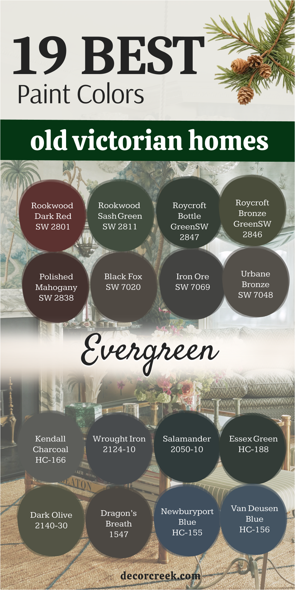
My Final Thoughts
Choosing the right paint for your Victorian home is a journey that I want to help you enjoy every single day of the week. I have shared my favorite colors because I know they will make your house look like a masterpiece of history. These shades have the power to show off every detail and every shape of your beautiful and old architecture. You should pick the ones that make you feel happy when you drive up to your driveway after a long day.
I trust these brands because they care about quality just as much as I care about your home looking perfect for all. Remember to take your time and look at the samples in the morning and in the evening sun. Your home is a story from the past and you are the one who gets to write the next chapter with paint. I hope these choices bring a lot of joy and a lot of pride to your family for many years to come. Your Victorian house is lucky to have someone who cares about its beauty as much as you do.
I want you to feel a deep sense of excitement as you look at these amazing options for your siding and trim. Making a choice for such a grand building is a big deal and it shows how much you love your property. You have the chance to be the person who brings a bit of magic back to your neighborhood with a fresh and smart look.
My experience has taught me that a house with the right colors feels more solid and more loved by everyone who lives inside its walls. You can mix and match these tones to create a look that is all your own while still being very respectful of the era. These paint picks are the best tools you have to protect the wood and make the carvings look sharp and clear.
I believe that your home will be the talk of the town once you apply these rich and beautiful finishes to its exterior. Every brush stroke is a way to honor the hard work of the people who built your house so many years ago. Please trust your heart and your eyes as you find the combination that feels just right for your unique style. I am so glad I could share my expert knowledge to help you make your house the most beautiful one on the street today.