Updated on Jul 13, 2025
29 Minute Read

54 Best Paint Colors From Sherwin WIlliams For This Year

Paint colors that bring comfort, warmth, and easy style to any room.

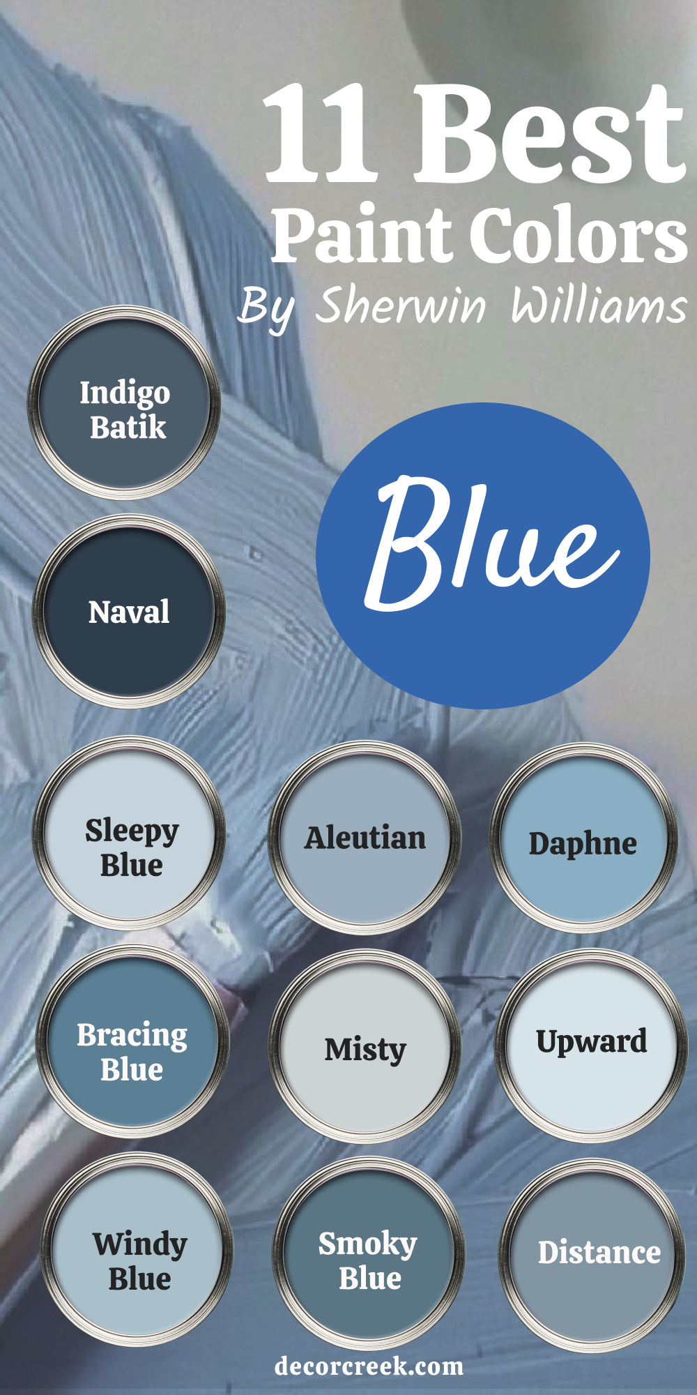
Color is one of the first things people notice when they walk into a room. It can make a home feel warm, friendly, fresh, or even a little moody in the best way. I’ve worked with all kinds of clients this year, and almost every project included a Sherwin-Williams shade.

These paints hold up, look good in natural and artificial light, and make decorating easier.

Whether you’re painting a living room, a kitchen, or just a hallway, there’s a shade here that will help bring it all together. This list includes my top choices—real colors that worked in real homes.

54 Best Paint Colors From Sherwin WIlliams for this Year
via elledecor.com

Why Sherwin-Williams Is Still My Favorite

There’s a reason I keep coming back to Sherwin-Williams. The colors aren’t just trendy—they feel like they belong in real homes. Their paint covers well, lasts, and most shades work with a range of lighting and furnishings. They also have a huge variety, from clean whites to deep blues and soft greens.

One of my clients even said, “Your color made my tiny apartment feel like a real home.” And honestly, I believe them.

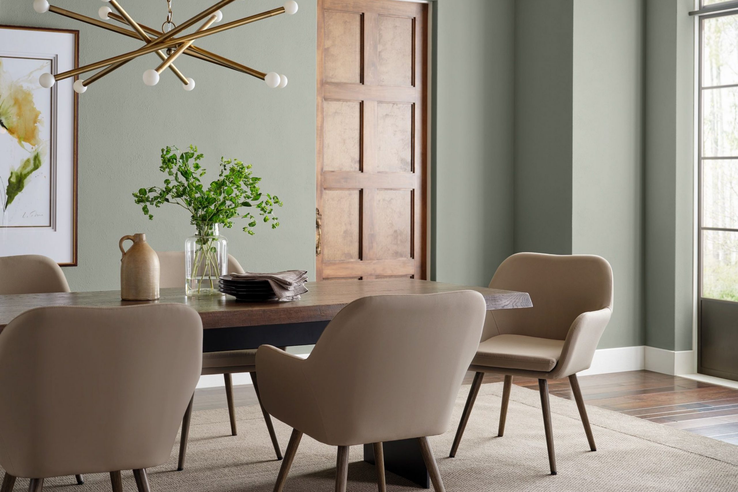
How I Pick the Best Colors for Real Homes

Choosing a good paint color is about more than just liking how it looks on a swatch.

I always ask: How does the light hit this wall? What mood are we trying to create? Are we working with warm wood floors or cool tile?

There’s also real science behind this—studies show that colors can affect our emotions and energy levels (source). I always look at paint in daylight and at night.

And I trust the colors that have worked again and again in other projects.

My Go-To Checklist for Good Paint Colors by Sherwin-Williams

Over the years, I’ve learned that picking a paint color isn’t just about what looks nice on a swatch. It’s about how it feels, how it works in the room, and how it fits real everyday life.

Here’s what I always keep in mind when choosing colors for my clients’ homes:

  • The color works in both natural and artificial light. It looks good morning to night without surprises.
  • It pairs well with most wood tones, metals, and fabrics. That makes it easier to decorate around.
  • The shade feels good to live with every day—not just in photos. I always think about how people feel in the room.
  • It doesn’t go too cold or too yellow. Balanced tones are easier on the eyes and more flexible in real homes.
  • It holds up well over time. I want colors that still feel right years later.
  • It plays nice with both warm and cool accents. That gives clients more freedom with furniture and finishes.
  • It hides wear, fingerprints, and little messes. Real life isn’t always spotless, and the color shouldn’t demand perfection.
  • It brings the right mood—soft for resting, bold for gathering, light for working. Color sets the tone for how a room feels.
  • It adapts to many styles—from modern to farmhouse. A good color doesn’t box you in.
  • My clients love it. If people feel happier in the room, I know we picked the right shade.
My Go-To Checklist for Good Paint Colors by Sherwin-Williams
via sherwin-williams.com

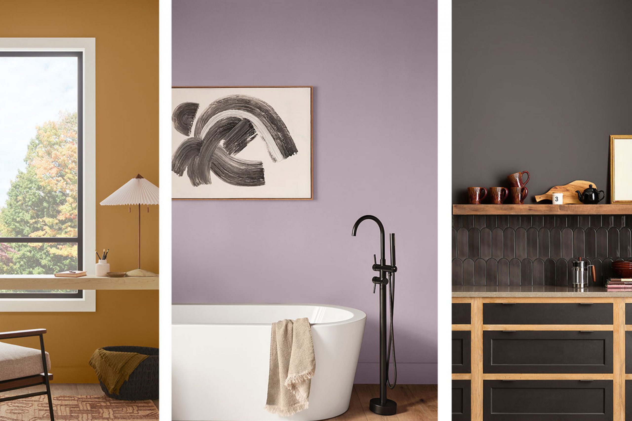
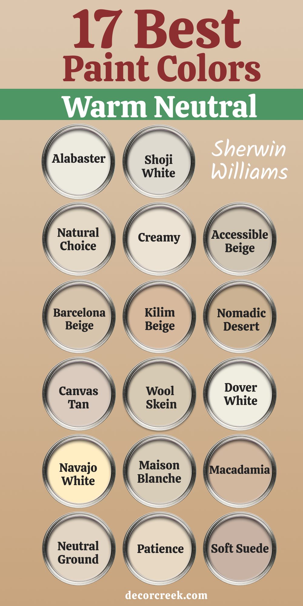
17 Best Warm Neutrals from Sherwin-Williams This Year

Alabaster SW 7008

Alabaster SW 7008 is a soft, creamy white that feels warm without being too yellow. I’ve used it in living rooms and bedrooms where we wanted a peaceful backdrop that still felt alive. It plays well with wood tones, leather, and soft textiles. What I like most is how it changes just a little depending on the light, always staying easy on the eyes.

It’s also one of Sherwin-Williams’ most loved shades—and for good reason. This one never fails me.

👉 Read the full guide for this color HERE 👈

alabaster_sw_7008_paint_color_by_sherwin_williams_ultimate_guide
via decorcreek.com

Shoji White SW 7042

Shoji White SW 7042 is perfect for clients who want something brighter than beige but softer than white. It has a cozy undertone that makes big rooms feel more inviting.

I’ve used it in open-plan kitchens and hallways that needed warmth without going too dark.

It’s great next to natural stone, warm metals, and even black trim. It has just enough depth to feel styled, not flat. It’s become one of my go-to colors for a fresh update.

👉 Read the full guide for this color HERE 👈

shoji_white_sw_7042_paint_color_by_sherwin_williams_ultimate_guide
via decorcreek.com

Natural Choice SW 7011

Natural Choice SW 7011 is a beautiful off-white with a hint of beige. It’s one of those shades that looks different in every room, but always right.

I’ve used it in nurseries and reading corners—it feels light but never cold. It works especially well with soft greens and blues.

This color is easy to live with, which is something many clients ask for. If you want something classic but warm, this is it.

👉 Read the full guide for this color HERE 👈

natural_choice_sw_7011_paint_color_by_sherwin_williams_ultimate_guide
via decorcreek.com

Creamy SW 7012

Creamy SW 7012 lives up to its name. It’s buttery, soft, and inviting, like fresh whipped cream. I use this in kitchens with white cabinets where pure white might feel too harsh.

Creamy makes everything feel more relaxed. It works nicely with brass hardware, light woods, and linen textures.

I like it because it doesn’t shout, but it definitely adds comfort.

👉 Read the full guide for this color HERE 👈

creamy_sw_7012_paint_color_by_sherwin_williams_ultimate_guide
via decorcreek.com

Accessible Beige SW 7036

Accessible Beige SW 7036 is one of the best-balanced beiges I’ve ever worked with. It’s not too pink, not too gray, not too yellow—it just works. I’ve painted bedrooms, entryways, even ceilings with this shade. It feels clean but never sterile.

If you don’t know where to start, start here. It’s named “accessible” for a reason—it goes with nearly everything.

👉 Read the full guide for this color HERE 👈

SW 7036 Accessible Beige by Sherwin Williams Ultimate Guide
via decorcreek.com

Barcelona Beige SW 7530

Barcelona Beige SW 7530 brings in a classic tan look without making a room feel dated. It’s warm, smooth, and feels grounded. I love pairing it with darker wood or terracotta. In family rooms or basements, it keeps things calm but not boring.

It also looks beautiful under warm lighting. This one is a solid neutral that has weight but not heaviness.

👉 Read the full guide for this color HERE 👈

barcelona_beige_sw_7530_paint_color_by_sherwin_williams_ultimate_guide
via decorcreek.com

Kilim Beige SW 6106

Kilim Beige SW 6106 reminds me of sun-baked clay. It has a hint of orange warmth, but it’s soft and easygoing. I’ve used it in homes with Southwest or rustic touches, but also in modern areas to balance cool elements.

It’s a favorite for anyone who wants a touch of earthy warmth. Pair it with ivory, brown, or green accents. It’s got personality, but it still plays nice.

👉 Read the full guide for this color HERE 👈

kilim_beige_sw_6106_paint_color_by_sherwin_williams_ultimate_guide
via decorcreek.com

Nomadic Desert SW 6107

Nomadic Desert SW 6107 feels grounded and natural. It’s a deeper beige that brings a room to life without being dramatic.

I often use this in dining rooms or entryways where we want warmth and structure. It works beautifully with iron accents and dark wood.

Some clients are afraid of too much color—this one helps bridge that gap. It’s strong but not pushy.

👉 Read the full guide for this color HERE 👈

nomadic_desert_sw_6107_paint_color_by_sherwin_williams_ultimate_guide-1
via decorcreek.com

Canvas Tan SW 7531

Canvas Tan SW 7531 is smooth and easy to live with. It’s lighter than some warm neutrals, but still adds enough contrast on white trim.

I’ve used it in bedrooms and even sunrooms, where the goal was a calm and grounded look. It works best with warm whites and muted blues.

This one doesn’t fight for attention, and that’s what makes it so good. It’s peaceful in the best way.

👉 Read the full guide for this color HERE 👈

canvas_tan_sw_7531_paint_color_by_sherwin_williams_ultimate_guide
via decorcreek.com

Wool Skein SW 6148

Wool Skein SW 6148 feels like a soft blanket. It’s a light tan with a bit of warmth and a touch of gray. In offices or guest rooms, it brings a clean look without being boring.

It pairs well with natural wood, black metal, and aged brass. I like that it doesn’t steal the spotlight but supports everything else in the room.

It’s gentle and dependable.

👉 Read the full guide for this color HERE 👈

wool_skein_sw_6148_paint_color_by_sherwin_williams_ultimate_guide
via decorcreek.com

Dover White SW 6385

Dover White SW 6385 is a creamy white that’s a little warmer than most. I’ve used it on kitchen cabinets, walls, and even trim when I wanted a softer finish.

It looks amazing with aged brass and butcher block counters. Some whites can feel stark—this one never does. It’s friendly, lived-in, and inviting.

It’s especially good in homes with pets and kids.

👉 Read the full guide for this color HERE 👈

dover_white_sw_6385_paint_color_by_sherwin_williams_ultimate_guide
via decorcreek.com

Navajo White SW 6126

Navajo White SW 6126 brings warmth without going too deep. It has just enough yellow to feel sunny, but it doesn’t go too golden.

I’ve used it in small dining areas and cozy bedrooms. It makes a room feel cheerful without being loud.

This shade pairs well with terracotta, navy, or even light greens. It’s cheerful but still grown-up.

👉 Read the full guide for this color HERE 👈

navajo_white_sw_6126_paint_color_by_sherwin_williams_ultimate_guide
via decorcreek.com

Maison Blanche SW 7526

Maison Blanche SW 7526 is a creamy neutral that feels a little bit French. It has a quiet old-world charm and looks beautiful with soft blues and antique brass.

I’ve used it in entryways and powder rooms where I wanted character without a strong color. It’s especially pretty in natural daylight.

It feels warm but never heavy. One of my favorite hidden gems.

👉 Read the full guide for this color HERE 👈

maison_blanche_sw_7526_paint_color_by_sherwin_williams_ultimate_guide
via decorcreek.com

Macadamia SW 6142

Macadamia SW 6142 is a warm tan that works great in family rooms and dens. It’s rich enough to stand on its own but doesn’t make a room feel dark.

I love how it looks with rattan, dark green, or even denim blue. It’s strong but welcoming. This shade is great for cozy homes with a bit of texture and heart.

It makes everything feel just a little more finished.

Neutral Ground SW 7568

Neutral Ground SW 7568 is light, smooth, and very livable. I’ve used this in rental homes and model units because it always looks clean.

It has soft beige notes that keep it warm, but it doesn’t lean yellow. It goes with both warm and cool furnishings. It’s the kind of color that doesn’t date quickly.

If you want something safe but still pretty, this is it.

👉 Read the full guide for this color HERE 👈

neutral_ground_sw_7568_paint_color_by_sherwin_williams_ultimate_guide
via decorcreek.com

Patience SW 7555

Patience SW 7555 is like a soft glow on the wall. It’s light and airy but has a nice warm touch.

I’ve used it in small homes where we needed to keep things light but not cold. It works great with soft pinks, clay tones, and off-whites.

It feels easy, cozy, and clean. It’s one of those “can’t-go-wrong” shades.

👉 Read the full guide for this color HERE 👈

patience_sw_7555_paint_color_by_sherwin_williams_ultimate_guide
via decorcreek.com

Soft Suede SW 9577

Soft Suede SW 9577 is a newer shade I’ve started using this year, and I love it. It has a rich taupe look that feels modern and grounding.

In bedrooms, it makes the walls feel like a soft hug. I’ve also seen it work great in living rooms with dark green accents.

It’s not too dark, not too light—just solid. It’s the warm neutral for someone ready to try something new.

👉 Read the full guide for this color HERE 👈

soft_suede_sw_9577_paint_color_by_sherwin_williams_ultimate_guide
via decorcreek.com
17 best warm Neutrals from Sherwin Williams this year
via decorcreek.com

My Top 12 Sherwin-Williams Warm Neutrals of the Year

Drift of Mist SW 9166

Drift of Mist SW 9166 is one of those light, airy neutrals that somehow feels both modern and classic. It leans gray but with a warm softness that keeps rooms from feeling chilly. I’ve used it in open concept homes where we needed flow without flatness. It pairs beautifully with wood tones, brushed metals, and almost any trim color.

It’s easy to live with and hard to get tired of. This is the shade I turn to when clients want light without going white.

👉 Read the full guide for this color HERE 👈

SW 9166 Drift of Mist by Sherwin Williams Ultimate Guide
decorcreek.com

Agreeable Gray SW 7029

Agreeable Gray SW 7029 lives up to its name—it works with nearly everything. It’s a true greige, with a nice mix of gray and beige that feels soft and lived-in. I’ve used this in entryways, bedrooms, and even kitchens, and it always looks pulled together. It’s especially good in homes with mixed finishes and changing light.

No matter where I put it, the result feels calm and complete. It’s one of the most requested colors I’ve seen.

👉 Read the full guide for this color HERE 👈

agreeable_gray_sw_7029_paint_color_by_sherwin_williams_ultimate_guide
via decorcreek.com

Repose Gray SW 7015

Repose Gray SW 7015 is a cool gray with a little warmth hiding underneath. It doesn’t go purple, which is why I like using it in bedrooms or hallways where colors shift during the day. It pairs well with deep blues, blacks, and natural linen. In homes with lots of light, it stays crisp and easy.

In shadowed rooms, it brings a soft sense of order. I think of it as a safe choice that still feels stylish.

👉 Read the full guide for this color HERE 👈

SW 7015 Repose by Sherwin Williams Ultimate Guide
via decorcreek.com

Requisite Gray SW 7023

Requisite Gray SW 7023 is a deeper, stronger neutral that adds presence to a room. I’ve used it in offices and dining rooms where we wanted something grounded but still neutral. It leans a bit warm but never looks muddy.

It looks great with medium wood and black metal. I also like using it with creamy trim for contrast. It’s quiet, but confident.

👉 Read the full guide for this color HERE 👈

requisite_gray_sw_7023_paint_color_by_sherwin_williams_ultimate_guide
via decorcreek.com

City Loft SW 7631

City Loft SW 7631 is a fresh neutral with a light, breezy look. It’s a soft mix of beige and gray, almost like oatmeal with cream. I like it in loft-style homes and small rooms that need to feel open. It plays nicely with light wood, off-white trim, and greenery.

It’s subtle without being bland. A good pick when white feels too cold.

👉 Read the full guide for this color HERE 👈

city_loft_sw_7631_paint_color_by_sherwin_williams_ultimate_guide
via decorcreek.com

Modern Gray SW 7632

Modern Gray SW 7632 has just enough depth to make walls feel complete. It leans warm but not yellow, and it brings a polished look to bedrooms and living rooms. I’ve paired it with soft blues and even blush accents, and it always looks good. It’s smooth, grounded, and easy to coordinate with.

This is one of those shades that helps a room feel like “home.” I’ve even used it on ceilings for a cozy wraparound feel.

👉 Read the full guide for this color HERE 👈

modern_gray_sw_7632_paint_color_by_sherwin_williams_ultimate_guide
via decorcreek.com

Big Chill SW 7648

Big Chill SW 7648 is a cool gray that feels crisp and clean. I use it in homes with a lot of modern finishes—glass, black fixtures, pale oak. It doesn’t add warmth, but it also doesn’t feel cold or sterile. It brings a touch of elegance to laundry rooms, bathrooms, and guest rooms.

If you’re looking for a light gray that won’t go blue or purple, this one is solid. It’s dependable and neat.

👉 Read the full guide for this color HERE 👈

big_chill_sw_7648_paint_color_by_sherwin_williams_ultimate_guide
via decorcreek.com

Egret White SW 7570

Egret White SW 7570 has a soft taupe quality that feels light but grounded. I’ve used it in hallways and large family rooms where we wanted a subtle neutral with character. It pairs well with warm lighting and earthy accents.

In some lights, it feels creamy; in others, more beige. That little shift makes it interesting. It’s gentle and has just enough color to stand out.

👉 Read the full guide for this color HERE 👈

egret_white_sw_7570_paint_color_by_sherwin_williams_ultimate_guide-1
via decorcreek.com

On the Rocks SW 7671

On the Rocks SW 7671 is a true neutral gray that doesn’t lean warm or cool. It’s what I call a “clean-slate color”—perfect for rooms where you want the furniture and textures to lead.

I’ve used it in offices and bedrooms with black, brass, or navy. It always feels neat and tidy. If you’re trying to simplify your color palette, this is a great choice. It holds everything together.

👉 Read the full guide for this color HERE 👈

on_the_rocks_sw_7671_paint_color_by_sherwin_williams_ultimate_guide
via decorcreek.com

Pediment SW 7634

Pediment SW 7634 has a slight pink-beige undertone that makes it feel soft without being too warm. It’s one of those colors that flatters skin tones, so I love it in bedrooms and bathrooms. It works beautifully with white trim and layered fabrics.

I like it with creams, blush, and aged gold. It’s quiet, but not plain. This color has heart.

👉 Read the full guide for this color HERE 👈

pediment_sw_7634_paint_color_by_sherwin_williams_ultimate_guide
via decorcreek.com

Crushed Ice SW 7647

Crushed Ice SW 7647 is pale and barely-there, but not boring. It gives walls a clean look while still adding a touch of tone. I like it in kitchens, bathrooms, and any room where light bounces around. It doesn’t feel sterile or icy—just soft and clean.

Pair it with deeper grays or warm whites for contrast. A perfect pick for a fresh feel.

👉 Read the full guide for this color HERE 👈

crushed_ice_sw_7647_paint_color_by_sherwin_williams_ultimate_guide
via decorcreek.com

Incredible White SW 7028

Incredible White SW 7028 is a very light neutral with a touch of gray and beige. It’s almost off-white, but with enough color to hold its own. I use this in homes where clients want a whisper of color without commitment.

It works great on ceilings, trim, or whole rooms.

It keeps everything feeling open but not too bright. It’s one of my secret weapons for calm interiors.

👉 Read the full guide for this color HERE 👈

incredible_white_sw_7028_paint_color_by_sherwin_williams_ultimate_guide
via decorcreek.com
12 best neutral paint colors from Sherwin WIlliams
via decorcreek.com

Top 14 Sherwin-Williams Greens I Used All Year

Evergreen Fog SW 9130

Evergreen Fog SW 9130 has become one of my most-used greens. It has a mix of green, gray, and just a little bit of warmth that makes it feel cozy and fresh at the same time. I’ve used it in bedrooms, bathrooms, and even laundry rooms—it always looks thoughtful. It works well with warm whites, natural woods, and leather.

It was also named Sherwin-Williams Color of the Year for 2022, and people still ask for it. If you want something that feels current but not trendy, this is a safe bet.

👉 Read the full guide for this color HERE 👈

evergreen_fog_sw_9130_paint_color_by_sherwin_williams_ultimate_guide
via decorcreek.com

Pewter Green SW 6208

Pewter Green SW 6208 is a deep, rich green that makes a bold but calm statement. I’ve used it on kitchen cabinets and built-ins where we wanted to anchor the room without going black. It looks great next to brass, marble, and warm wood floors.

The depth of this green brings character without making the room feel closed in.

It’s also stunning with off-white walls. This is the green for people who like strong color done tastefully.

👉 Read the full guide for this color HERE 👈

Pewter Green SW-6208 by Sherwin Williams Ultimate Guide
decorcreek.com

Retreat SW 6207

Retreat SW 6207 is a muted sage-green with gray undertones that feels restful. I love using it in bedrooms and home offices. It doesn’t feel loud or distracting, and that makes it ideal for areas where focus matters. It pairs well with whites, creams, and soft browns.

It’s also beautiful next to woven textures like cane or jute. This green feels grounded, like something you’d find in nature.

👉 Read the full guide for this color HERE 👈

Retreat SW-6207 by Sherwin Williams Ultimate Guide
decorcreek.com

Sea Salt SW 6204

Sea Salt SW 6204 is light, gentle, and perfect for places you want to feel fresh. I’ve used this one in bathrooms, coastal homes, and small entryways that need brightness with a bit of personality. Depending on the light, it leans green or blue, but always soft.

It works well with crisp white trim and light wood furniture. Sherwin-Williams lists it as one of their most popular shades, and I understand why. It’s easy to love.

👉 Read the full guide for this color HERE 👈

SW 6204 Sea Salt by Sherwin Williams Ultimate Guide
via decorcreek.com

Clary Sage SW 6178

Clary Sage SW 6178 is a warm herbal green that reminds me of dried leaves and old gardens. It brings warmth to kitchens, especially when paired with butcher block or brick. It also looks charming in farmhouse-style homes. This shade feels comforting and a little nostalgic.

It’s not too bright and holds up beautifully in natural light. It brings a gentle, homey vibe to any room.

👉 Read the full guide for this color HERE 👈

Clary Sage SW-6178 by Benjamin Moore Ultimate Guide
decorcreek.com

Softened Green SW 6177

Softened Green SW 6177 is a gentle sage tone that leans a little warm. I like using it in guest rooms and quiet corners that need some life but not too much drama. It works with soft grays, whites, and even faded blues. It gives just enough color to make a room feel cared for.

This one feels very “put-together” without trying too hard. Clients love how peaceful it feels without being boring.

👉 Read the full guide for this color HERE 👈

Softened Green SW-6177 by Sherwin-Williams Ultimate Guide
decorcreek.com

Acacia Haze SW 9132

Acacia Haze SW 9132 is a dusty green-gray with a strong presence. I use it when I want a green that feels slightly moody but not heavy. It’s beautiful in bedrooms and home libraries. Pair it with bronze hardware or tan leather for a rich, layered look.

It’s deep without being dark. If you want a more grounded, mature feel, this is a winner.

👉 Read the full guide for this color HERE 👈

acacia_haze_sw_9132_paint_color_by_sherwin_williams_ultimate_guide
via decorcreek.com

Ripe Olive SW 6209

Ripe Olive SW 6209 is a bold olive green that brings earthiness and character. I’ve used it on feature walls and lower kitchen cabinets for that old-world charm. It feels strong and grounded but still inviting. I often pair it with off-white and rustic textures.

It’s not for everyone, but the people who love it really love it. It’s deep, rich, and enduring in the best way.

👉 Read the full guide for this color HERE 👈

decorcreek.com

Green Onyx SW 9128

Green Onyx SW 9128 is a soft, dusty green with a gray undertone. It reminds me of heirloom herbs or faded linen. I’ve used it in bathrooms and quiet hallways where we needed just a little lift. It pairs nicely with matte black fixtures or antique brass.

It’s subtle but adds warmth and color in the background. A gentle, lived-in kind of green.

👉 Read the full guide for this color HERE 👈

Green Onyx SW 9128 by Sherwin Williams Ultimate Guide
decorcreek.com

Sage Light SW 2851

Sage Light SW 2851 is from the historic collection, and it has that classic, aged charm. I like using it in older homes or new builds that want character. It has a soft, garden-like quality that works well with creamy whites and terra cotta. This shade looks beautiful with vintage wood furniture.

It makes a room feel thoughtful and full of memory. A very special green with a gentle soul.

Rosemary SW 6187

Rosemary SW 6187 is strong, dark, and stylish. I love using it in kitchens, especially on islands or pantry doors. It pairs beautifully with brushed brass or copper. It’s a great green for anyone who wants something bold but not loud.

It also looks incredible next to warm wood and cream. This color always brings depth.

👉 Read the full guide for this color HERE 👈

SW 6187 Rosemary by Sherwin Williams Ultimate Guide
decorcreek.com

Olive Grove SW 7734

Olive Grove SW 7734 is a deep green that feels both classic and rich. I’ve used it in moody dining rooms and traditional offices. It brings elegance without being stuffy. Pair it with soft whites and dark walnut for a polished look.

It holds up beautifully over time. A good green for rooms that need presence.

👉 Read the full guide for this color HERE 👈

olive_grove_sw_7734_paint_color_by_sherwin_williams_ultimate_guide
via decorcreek.com

Privilege Green SW 6193

Privilege Green SW 6193 is a clean, bold green with strong yellow undertones. I’ve used this in creative areas like craft rooms or sunrooms where we wanted energy and freshness. It’s fun, vibrant, and lively without feeling neon. It pairs well with white trim and lots of natural light.

For playful or creative homes, this one works like a charm. A happy green.

👉 Read the full guide for this color HERE 👈

Privilege Green SW 6193 by Sherwin Williams Ultimate Guide
decorcreek.com

Cascades SW 7623

Cascades SW 7623 is a deep, blue-green shade that feels luxurious. I’ve used it in bathrooms, dens, and dining rooms where we wanted bold color with elegance. It pairs beautifully with gold fixtures, dark wood, and velvet textures. It’s dramatic but controlled.

This is a show-stopping color that people remember. Perfect when you want a little wow without going overboard.

👉 Read the full guide for this color HERE 👈

cascades_sw_7623_paint_color_by_sherwin_williams_ultimate_guide
via decorcreek.com
14 Best green paint colors from SHerwin WIlliams
via decorcreek.com

11 Soft and Bold Blues That Worked in Every Room

Naval SW 6244

Naval SW 6244 is a deep navy that always looks sharp and classic. I’ve used it in dining rooms, libraries, and even bathrooms for that bold, clean look. It pairs beautifully with brass, cream, or crisp white trim. It doesn’t feel cold—it feels steady and grounded.

This shade was Color of the Year in 2020, and it’s still a favorite today. If you want something strong but classic, Naval does the job.

👉 Read the full guide for this color HERE 👈

SW 6244 Naval by Sherwin Williams Ultimate Guide
decorcreek.com

Smoky Blue SW 7604

Smoky Blue SW 7604 is bold, rich, and just a little moody in the best way. I’ve used it on lower kitchen cabinets and bedroom walls, and it always feels cozy. It leans just slightly teal, which makes it a bit more fun than a standard navy.

This color works especially well with warm wood, brushed gold, and creamy whites. It adds weight to a room without making it feel heavy. A confident choice with personality.

👉 Read the full guide for this color HERE 👈

Smoky Blue SW-7604 by Sherwin Williams Ultimate Guide
via decorcreek.com

Indigo Batik SW 7602

Indigo Batik SW 7602 is a strong medium blue that feels artistic and deep. It works in both modern and traditional homes, depending on what you pair it with. I’ve used it in kids’ rooms, offices, and powder rooms to give a sense of structure.

It blends well with darker wood and natural textures. The color makes a room feel more finished without needing a lot of décor. It’s bold, but never overbearing.

👉 Read the full guide for this color HERE 👈

SW-7602 Indigo Batik by Sherwin Williams Ultimate Guide
decorcreek.com

Sleepy Blue SW 6225

Sleepy Blue SW 6225 is soft, peaceful, and lovely in bedrooms. It leans just a little gray, so it doesn’t feel too bright or chilly. I like using it with warm whites, rattan, and soft fabrics. It helps rooms feel open without feeling empty.

Clients always describe it as “relaxing.” It’s one of those shades that makes you take a deep breath.

👉 Read the full guide for this color HERE 👈

sleepy_blue_sw_6225_paint_color_by_sherwin_williams_ultimate_guide
via decorcreek.com

Aleutian SW 6241

Aleutian SW 6241 is a dusty blue with a touch of violet. It feels soft but not pastel, which makes it very usable. I’ve used it in guest rooms and small bathrooms for something gentle but memorable. It looks lovely with matte black or antique silver accents.

This shade brings calm without going flat. It’s a great choice when you want color but don’t want loud.

👉 Read the full guide for this color HERE 👈

Aleutian SW-6241 by Sherwin Williams Ultimate Guide
decorcreek.com

Daphne SW 9151

Daphne SW 9151 is a lively blue with just a hint of gray that keeps it from feeling too bright. I’ve used it in entryways and kitchens when clients wanted a little energy. It pairs well with clean whites and warm metals. It’s cheerful without being childish. 

I think of it as a great mood-lifter. This is a blue that brings joy.

👉 Read the full guide for this color HERE 👈

Daphne SW-9151 by Sherwin Williams Ultimate Guide
via decorcreek.com

Bracing Blue SW 6242

Bracing Blue SW 6242 is cool, clear, and modern. It works beautifully in homes with minimalist style or crisp finishes. I’ve used it in bathrooms and laundry rooms for a bright, refreshing feel. It pairs nicely with white tile and silver hardware.

The color feels like a clean slate. It gives a room just enough personality without taking over.

👉 Read the full guide for this color HERE 👈

SW 6242 Bracing Blue by Sherwin Williams Ultimate Guide
via decorcreek.com

Misty SW 6232

Misty SW 6232 is a soft blue-gray that always feels light and airy. I’ve used it in nurseries and living rooms where we needed gentle color that wouldn’t darken the room. It plays well with beige, cream, and even soft yellows.

The tone shifts slightly during the day, which keeps it interesting. It’s one of the easiest blues to live with. People always say their room feels brighter with Misty on the walls.

👉 Read the full guide for this color HERE 👈

Misty SW 6232 by Sherwin Williams Ultimate Guide
via decorcreek.com

Upward SW 6239

Upward SW 6239 is clean and fresh, like a pale morning sky. I love using it in coastal homes or small bedrooms that need a breath of lightness. It goes especially well with white trim and driftwood accents. Even though it’s light, it has enough color to feel styled.

It doesn’t lean gray, which makes it nice for cheerful, calm rooms. One of my favorites for soft, airy looks.

👉 Read the full guide for this color HERE 👈

Upward SW-6239 by Sherwin Williams Ultimate Guide
decorcreek.com

Windy Blue SW 6240

Windy Blue SW 6240 is a true mid-tone blue that feels casual and comfortable. I’ve used it in family rooms, laundry areas, and even mudrooms. It adds a bit of playfulness but still feels clean. I love pairing it with white, wicker, or anything natural.

It gives just enough color without being bold. This is the kind of blue that makes a home feel lived in.

👉 Read the full guide for this color HERE 👈

Windy Blue SW-6240 by Sherwin Williams Ultimate Guide
decorcreek.com

Distance SW 6243

Distance SW 6243 is a slate-like blue that leans cool and a little dramatic. It works well in dining rooms and home offices where you want a bit of depth. It pairs beautifully with dark wood, leather, and soft golds. I love how it changes in different lighting—sometimes more blue, sometimes more gray.

It feels thoughtful and confident. This shade makes a quiet statement.

👉 Read the full guide for this color HERE 👈

SW 6243 Distance by Sherwin Williams Ultimate Guide
via decorcreek.com
11 Best Blue paint colors From SHerwin WIlliams
via decorcreek.com

My Final Thoughts From My Projects

Looking back on the homes I worked in this year, these Sherwin-Williams colors stood out again and again. They weren’t just trendy—they made people feel something. Some brought comfort after long days, some made rooms feel brighter in the mornings, and some helped small places feel just a little bigger.

I watched families settle in, couples feel more at home, and quiet corners turn into favorite spots, all because the right color was on the wall.

Every home has its own rhythm, and paint can support that more than we often realize. That’s why I keep turning to Sherwin-Williams. These shades aren’t picked just to match a couch or follow a trend. They work in real homes, with real light, and with the way people live every day.

If you’re still unsure what to choose, start with one color that speaks to how you want to feel—and build from there.

Leave a Reply

Your email address will not be published. Required fields are marked *

    Make Your
    Best Home