Creating a home that looks like it has belonged to a wealthy family for generations is about picking the right shades. You want your rooms to feel established and rich without trying too hard. This look is all about history and quality. I have spent years helping people make their houses look expensive and sturdy.
The right paint on the walls can change how people feel when they walk through your front door. It makes the house feel like it has many stories to tell. You do not need a huge bank account to get this look in your own home. Picking colors that feel heavy and real is the first step to a beautiful life. Let us look at the best choices for your walls this year.
A house with the right palette feels much more permanent and very well-built for the family. You are creating a legacy for your children by choosing tones that never go out of style.
My goal is to help you find that perfect feeling of wealth and comfort in every corner of your building.

Why I Always Trust Sherwin-Williams and Benjamin Moore for Old Money Paint Colors
I only use the best brands because they have the most pigment in every can. Sherwin-Williams and Benjamin Moore are the two names I always pick for high-end projects. Their colors look deep and rich on the wall instead of looking thin or cheap. Cheap paint can ruin the look of a nice room very quickly.
These brands offer shades that look like they have been around for a hundred years. The way light hits these paints makes a big difference in how your home feels at night. I know that these paints will last a long time without fading or peeling away. Using good paint is a smart investment for any homeowner who cares about quality.
It saves you money later because you do not have to repaint as often. These companies have the best history of making colors that look truly expensive. When you use professional paint, the finish looks much smoother and much more luxurious to the touch. It provides a level of detail that makes even a plain wall look like a piece of art.
I find that these brands have the most reliable fans who want a house that looks very prestigious.
How I Choose the Perfect Paint Color for an Old Money Home
I look at the light in the room before I ever open a paint can. Natural light from the windows changes how a color looks throughout the day. I also think about the dark wood furniture and heavy rugs that go with this style. A good color should act like a background for your beautiful things. I avoid bright colors that look too trendy or loud for a serious home.
I want the house to feel grounded and steady for the people living inside. It is important to test a small patch on the wall to see how it looks at noon and at dinner time. I always pick shades that remind me of old libraries and stone estates. Balance is the most important thing when you are choosing a palette for the whole house.
I want every room to flow into the next one without a big surprise. A house that feels connected is a house that feels very expensive and well-planned. I take the time to look at how the floors meet the walls to ensure the contrast is exactly right for a grand estate.
Thinking about the future of the house helps me pick colors that stay beautiful for a lifetime.
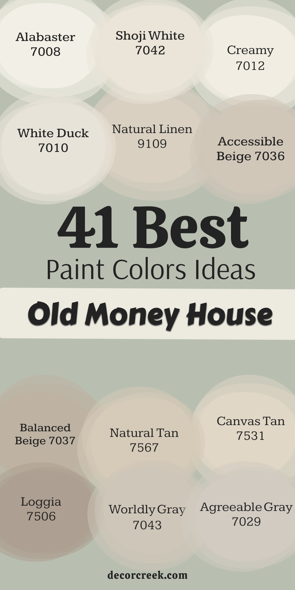
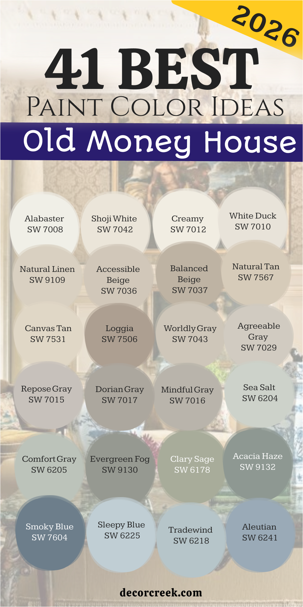
41 Paint Color Ideas For The Old Money House in 2026
Alabaster SW 7008
Alabaster SW 7008 provides a soft white look that never feels too cold or clinical. This color looks like the pages of a very old book sitting in a sunroom. It works well on trim and walls because it stays very quiet and soft. You will notice how it brings out the dark tones in your wooden floors.
Many people use this shade to make a hallway feel much wider and brighter. It catches the morning sun in a way that feels very warm and welcoming. Every piece of art you hang on this wall will look like it belongs in a museum.
This white has just enough yellow to keep it from looking like a hospital room. I love how it makes a ceiling feel high and airy during the day. It is the perfect starting point for any house that needs a fresh start.
🎨 Check out the complete guide to this color right HERE 👈

Shoji White SW 7042
Shoji White SW 7042 is a creamy choice that feels a bit more solid than a standard white. This shade has a tiny bit of gray and beige mixed inside the paint. It reminds me of expensive linen fabric used for curtains in a manor. You can put this in a bedroom to make the bed look very cozy.
It helps the light bounce around the room without making your eyes hurt. This color looks great next to gold picture frames and dark oil paintings. I often use it in large living areas where the walls are very tall.
It gives the house a sense of peace that is hard to find with other paints. The color stays looking clean even if you have pets or children running around. It is a very reliable pick for anyone who wants a soft background.
🎨 Check out the complete guide to this color right HERE 👈

Creamy SW 7012
Creamy SW 7012 is exactly what the name says because it looks like rich vanilla butter. This color adds a lot of warmth to a kitchen with white cabinets and stone counters. It feels very traditional and reminds me of homes built in the early 1900s.
You will find that it makes even a small room feel much more expensive. The yellow undertones are very soft so the room never looks too bright. It is a wonderful choice for a dining room where you host holiday meals.
Your guests will feel comfortable because the walls look so soft and inviting. I like to use this on the walls when the trim is a very bright white. It creates a small contrast that looks very professional and polished. This shade is a classic staple for designers who want a rich look.
🎨 Check out the complete guide to this color right HERE 👈

White Duck SW 7010
White Duck SW 7010 sits right between a white and a light gray on the wall. This color is very popular because it hides small bits of dust very well. It looks like the stone on a cottage in the countryside of England.
You can use it in a mudroom or a laundry area to keep things looking neat. The shade feels very heavy and substantial which is perfect for this style. It works well with blue or green accents in your furniture and pillows. I think it looks best when the sun is shining through a large window.
It does not change its look too much when you turn on the lamps at night. This is a very safe choice if you are worried about picking the wrong white. It has a strength to it that makes the house feel very well built.
🎨 Check out the complete guide to this color right HERE 👈
Natural Linen SW 9109
Natural Linen SW 9109 brings the look of raw fabric right onto your interior walls. This color feels very organic and earthy like a field of tall dried grass. It is a darker beige that makes a large room feel much more intimate.
You should use this in a library or a study with many rows of books. It makes the wood grain in your furniture pop out and look very shiny. Many people love how this color feels like a warm hug when they enter.
It does not feel old or dusty but it does feel very established. The paint has a depth that makes the walls look like they have many layers. I suggest this for people who want a home that feels lived in and loved. It is a sturdy color that stays beautiful for many years.
🎨 Check out the complete guide to this color right HERE 👈

Accessible Beige SW 7036
Accessible Beige SW 7036 is the most famous beige for a very good reason. This color is perfect because it does not look too pink or too yellow. It acts like a neutral backdrop for any kind of furniture you might own.
You can put it in a nursery or a master bedroom for a soft look. It makes the whole house feel connected if you use it in every room. The shade is very light but it still has enough color to see a difference.
It looks very high end when paired with dark wood or black metal. I find that it makes people feel very relaxed when they sit in the room. This color is a workhorse that never lets you down during a big project. It is the ultimate choice for a home that needs to look clean and rich.
🎨 Check out the complete guide to this color right HERE 👈

Balanced Beige SW 7037
Balanced Beige SW 7037 has a bit more depth than the lighter shades of tan. This color feels very grounded and looks like the sand on a private beach. It is a great choice for a basement or a room with less natural light.
The paint makes the walls feel solid like they are made of thick stone. I like to use this in a foyer to greet people with a warm tone. It coordinates perfectly with dark leather chairs and heavy wool rugs.
You will see that it provides a nice contrast against white baseboards and doors. It is a very sophisticated color that does not demand too much attention. The room will feel very steady and permanent once the paint is dry. This is a color for someone who wants their home to feel like a fortress.
🎨 Check out the complete guide to this color right HERE 👈

Natural Tan SW 7567
Natural Tan SW 7567 is a light and airy version of a classic khaki color. This paint looks very fresh and reminds me of a summer house by the ocean. It is very easy to look at and does not distract from your view outside.
You can use it in a breakfast nook to start your day with a light mood. It pairs beautifully with light blue accents or green plants in the corners. The color stays very consistent even when the weather outside is cloudy or dark.
I love how it makes small rooms feel like they have a lot more air. It is a very polite color that works well in any part of the house. You will find that it makes your home look very well cared for and tidy. This shade is a great way to get that expensive look without using white.
🎨 Check out the complete guide to this color right HERE 👈
Canvas Tan SW 7531
Canvas Tan SW 7531 is a very pale beige that looks like a clean painter’s sheet. This color is very helpful if you want a room to look bright but not cold. It has a tiny bit of warmth that makes the walls feel very soft to the touch.
You should use this in a guest room to make your friends feel very welcome. It looks excellent with dark navy blue or deep forest green decorations. The paint has a smooth finish that makes the walls look very expensive and flat.
I often recommend this for hallways that do not get a lot of direct sunlight. It keeps the house feeling open and large without being boring or plain. This is a very smart choice for a modern take on an old style. It feels very current but still respects the history of the house.
🎨 Check out the complete guide to this color right HERE 👈

Loggia SW 7506
Loggia SW 7506 is a rich tan that has a little bit of gray hidden inside it. This color looks like the stone pillars on a porch in a wealthy neighborhood. It is a very strong color that can handle a room with a lot of furniture.
You will find that it makes a living room feel very grand and professional. It works well with dark brown wood and brass light fixtures on the walls. The shade is dark enough to create a cozy feeling during the cold winter.
I like how it looks when you have a fireplace made of natural grey stone. It ties the whole room together and makes it feel very finished and complete. This is a great color for a person who wants a house with a lot of character. It feels like a color that has been used for centuries in grand estates.
🎨 Check out the complete guide to this color right HERE 👈

Worldly Gray SW 7043
Worldly Gray SW 7043 is a gray that feels very warm and never looks like concrete. This color is very soft and looks like a misty morning in a big park. It is a perfect middle ground for someone who cannot decide between gray and beige.
You can use it in a bathroom to make the space feel very clean and expensive. It works very well with silver or chrome faucets and towel racks. The color changes slightly depending on what other colors are in the room.
I find that it makes a house feel very updated and fresh for a new family. It provides a beautiful background for modern furniture and old antiques alike. This is a very flexible color that works in almost any lighting situation. You will love how it makes your home feel very smart and well planned.
🎨 Check out the complete guide to this color right HERE 👈
Agreeable Gray SW 7029
Agreeable Gray SW 7029 is the most popular gray because it goes with everything. This color is very light and keeps a room feeling very happy and bright. It looks like a soft cloud on a day when the sun is trying to peek through.
You can use this in a kitchen to make the cabinets really stand out and shine. It is a great choice for an open floor plan where the rooms all connect. The color is very soft and does not hurt your eyes even in bright light.
I think it looks best with white trim and dark wood furniture in the room. It makes the whole house feel very cohesive and put together for guests. Many people pick this color because they know it will look good for a long time. It is a very safe and beautiful way to update an old house.
🎨 Check out the complete guide to this color right HERE 👈

Repose Gray SW 7015
Repose Gray SW 7015 is a cool gray that feels very sophisticated and modern. This color looks like the metal on a high-end watch or a silver tray. It is very crisp and makes a room feel very orderly and very neat.
You should use this in a home office to help you focus on your work. It looks wonderful with black accents and white marble tops on the desks. The paint has a tiny bit of blue that comes out when the sun goes down.
I like how it makes a room feel very cool during a hot summer afternoon. It is a great choice for a bedroom if you want to sleep in a dark room. This color makes your home look like it belongs to a very important person. It is a very sharp look that stays stylish through every changing season.
🎨 Check out the complete guide to this color right HERE 👈

Dorian Gray SW 7017
Dorian Gray SW 7017 is a medium gray that has a very rich and moody feel. This color looks like the sky right before a big rainstorm in the city. It is a very solid choice for a dining room or a cozy den for movies.
You will notice that it makes white trim look very bright and very clean. The color is dark enough to hide small marks or scratches on the lower walls. I love how it looks when you have large windows with a lot of green trees outside.
It brings a sense of drama to the house without being too dark or scary. This shade feels very old-fashioned in a way that shows a lot of wealth. It is a perfect color for a room where you want to sit and talk. Your home will feel very sturdy and well-built with this gray on the walls.
🎨 Check out the complete guide to this color right HERE 👈

Mindful Gray SW 7016
Mindful Gray SW 7016 is a gray that feels very deep and has a lot of soul. This color looks like the weathered stone on a very old church or castle. It is a bit darker than the most common grays which gives it more power.
You can use it in a master bathroom to create a look of luxury. It pairs perfectly with white tile and dark gray rugs on the floor. The paint has a way of making the room feel very quiet and very still. I find that it works best in rooms that have a lot of different textures.
It looks great with velvet pillows and silk curtains in a formal living room. This is a color that tells people you have very good taste in design. It feels very expensive and makes the house feel like a safe retreat.
🎨 Check out the complete guide to this color right HERE 👈

Sea Salt SW 6204
Sea Salt SW 6204 is a very light green that has a lot of gray and blue inside. This color looks like the ocean on a day when the water is very shallow. It is a very refreshing choice for a sunroom or a small guest bathroom.
You will find that it makes the room feel very light and very breezy. It works beautifully with white furniture and light wood floors in the house. The color changes from green to gray depending on the time of the day.
I like how it makes a house feel like it is located near the beach. It is a very soft color that makes people feel very happy and light. Many designers use this to add a tiny bit of color without being too bold. This is a very charming choice for a house that needs a bit of life.
🎨 Check out the complete guide to this color right HERE 👈

Comfort Gray SW 6205
Comfort Gray SW 6205 is a bit darker and more green than the sea salt color. This paint looks like the leaves on a sage plant in a herb garden. It is a very relaxing color that works well in a bedroom or a nursery.
You will see that it makes the room feel very grounded and very natural. It looks excellent with dark walnut wood or black metal bed frames. The shade is very sophisticated and does not look like a typical child’s room.
I love how it brings the feeling of nature inside your house walls. It is a very smart color for a room where you want to relax and read. Your home will feel very stable and high-end with this beautiful green shade. It is a very popular pick for houses that want to feel more traditional.
🎨 Check out the complete guide to this color right HERE 👈

Evergreen Fog SW 9130
Evergreen Fog SW 9130 is a deep green that feels very organic and very rich. This color looks like the forest on a day when there is a lot of mist. It is a very trendy color that still feels like it has a long history.
You can use it in a mudroom or a pantry to add a lot of style. It pairs very well with gold hardware and light wood shelving on the walls. The paint has a gray undertone that keeps it from looking too bright green.
I think it looks best in a room that has a lot of natural wood accents. It makes the house feel like it is part of the landscape around it. This is a very bold choice that still feels very safe and very classic. You will love how it adds a lot of personality to your home’s interior.
🎨 Check out the complete guide to this color right HERE 👈

Clary Sage SW 6178
Clary Sage SW 6178 is a soft herbal green that feels very traditional and very old. This color looks like the velvet on an old chair in a grand library. It is a very warm green that makes a room feel very cozy and very lived-in.
You should use this in a kitchen with cream cabinets for a vintage look. It works beautifully with copper pots and pans hanging on the walls. The color stays very soft even when the sun is shining directly on it.
I find that it makes people feel very comfortable and very much at home. It is a great choice for a house that has a lot of history and character. Your guests will feel like they have stepped back in time to a simpler era. This color is a very elegant way to use green in your big house.
🎨 Check out the complete guide to this color right HERE 👈

Acacia Haze SW 9132
Acacia Haze SW 9132 is a blue-green color that has a very dusty and soft feel. This color looks like the leaves on an exotic tree in a faraway land. It is a very unique shade that you do not see in every single house.
You can use it in a formal dining room to create a very special look. It looks wonderful with dark wood furniture and white lace tablecloths on the table. The paint has a gray quality that makes it look very expensive and very rare.
I like how it creates a soft mood in the room during the evening hours. It is a very smart color for someone who wants something different but classy. This shade makes your home feel very curated and very well designed by a pro. It is a beautiful way to show off your personal style in a big way.
🎨 Check out the complete guide to this color right HERE 👈

Smoky Blue SW 7604
Smoky Blue SW 7604 is a medium blue that feels very dusty and very historic. This color looks like the denim on a pair of very expensive work pants. It is a very strong color that adds a lot of weight to a room’s walls.
You can use it in a boy’s bedroom or a home office for a classic look. It works very well with orange or red accents in the decorations and rugs. The paint has a gray tone that keeps it from looking like a bright toy color.
I find that it makes a room feel very serious and very well organized. It looks great when you have white trim to make the blue look even deeper. This is a very reliable color for a house that needs a bit of navy feel. Your home will look very established and very grand with this blue choice.
🎨 Check out the complete guide to this color right HERE 👈

Sleepy Blue SW 6225
Sleepy Blue SW 6225 is a very light and airy blue that feels like a clear sky. This color looks like the silk inside a very expensive jewelry box on a vanity. It is a very soft choice for a guest room or a master bathroom walls.
You will find that it makes the room feel very peaceful and very quiet. It works beautifully with white linens and silver mirrors on the walls. The color stays very bright and happy even on a day when it is raining.
I like how it makes a small space feel much larger than it actually is. It is a very polite color that does not demand you look at it constantly. Many people love how it reminds them of a holiday at a lake house. This is a very sweet and rich color for a relaxing part of your home.
🎨 Check out the complete guide to this color right HERE 👈
Tradewind SW 6218
Tradewind SW 6218 is a blue that has a lot of gray and a tiny bit of green. This color looks like the water in a harbor on a very breezy morning. It is a very sophisticated blue that feels more like a neutral on the wall.
You should use this in a laundry room to make the chore feel more fancy. It looks excellent with light gray floors and white machines in the room. The paint has a very clean finish that makes the house feel very fresh.
I often recommend this for people who want a blue that is not too bold. It creates a very steady and professional look in any room you choose. This color is a great way to add a bit of color to a hallway or stairs. Your home will feel very polished and very high-end with this soft shade.
🎨 Check out the complete guide to this color right HERE 👈

Aleutian SW 6241
Aleutian SW 6241 is a denim blue that feels very cool and very sturdy on walls. This color looks like the paint on an old ship that has seen many storms. It is a very classic color that works well in a traditional living room set.
You will see that it makes leather furniture look very rich and very dark. It pairs perfectly with cream-colored rugs and dark wood coffee tables in the room. The shade is dark enough to feel important but light enough to stay friendly.
I love how it looks when you have black and white photos on the wall. It creates a very timeless look that never goes out of style for a house. This is a very smart color for a family that wants a house with a story. It feels very expensive and very well-made once it is dry on your walls.
🎨 Check out the complete guide to this color right HERE 👈
Misty SW 6232
Misty SW 6232 is the lightest blue you can find that still has a lot of gray. This color looks like the fog rolling over a field in the early morning hours. It is a very soft and quiet color that works well in a large open room.
You can use it as a background for very colorful paintings and bright rugs. It keeps the house feeling very light and very open for all your guests. The paint has a very smooth look that makes the walls look perfectly flat.
I like how it makes a ceiling look like it is floating high above your head. It is a very elegant choice for a house that has a lot of crown molding. This color shows off the architecture of the house without taking over the room. It is a very sophisticated and light way to finish a beautiful interior space.
🎨 Check out the complete guide to this color right HERE 👈

Urbane Bronze SW 7048
Urbane Bronze SW 7048 is a very dark brown that has a lot of gray and green. This color looks like the metal on a very old gate at a big estate. It is a very powerful color that adds a lot of drama to any small room.
You should use this on an accent wall or in a cozy library for reading. It looks incredible with gold lamps and warm yellow light bulbs in the room. The paint makes the walls feel very thick and very protective around you.
I find that it makes a house feel very modern and very expensive at once. It is a great choice for a front door to make a very big statement. This color tells everyone that your home is a place of great importance and style. Your home will feel very grounded and very rich with this dark and moody shade.
🎨 Check out the complete guide to this color right HERE 👈

Porpoise SW 7047
Porpoise SW 7047 is a deep gray that feels very warm and very solid like stone. This color looks like the skin of a dolphin or a wet rock by the sea. It is a very high-end color that works well in a modern dining room setting.
You will notice that it makes white dishes and silver forks look very shiny. It works beautifully with light wood floors to keep the room from being too dark. The paint has a very rich depth that makes the walls look very expensive.
I love how it looks when the sun hits it and shows the hidden brown tones. It is a very smart color for a house that wants to feel very established. Your guests will be impressed by how bold and confident this color looks on walls. This is a very classic choice for a house with a lot of light.
🎨 Check out the complete guide to this color right HERE 👈

Iron Ore SW 7069
Iron Ore SW 7069 is a very dark charcoal that is almost black but much softer. This color looks like the iron railings on a balcony in a big city house. It is a very dramatic choice for a powder room or a small dark hallway.
You can use it to make a large room feel much more cozy and very private. It looks amazing with bright white trim and dark gold mirrors on the wall. The paint has a very matte look that hides any bumps or holes in the wall.
I like how it makes a house feel very secure and very well protected from outside. It is a very brave color that shows you are not afraid of a bold look. This shade is a favorite for designers who want a very rich and moody vibe. Your home will look like a million dollars with this dark and heavy gray.
🎨 Check out the complete guide to this color right HERE 👈

Black Fox SW 7020
Black Fox SW 7020 is a dark chocolate brown that has a lot of black mixed in. This color looks like the fur of a dark animal in the woods at night. It is a very warm and rich choice for a den or a very cozy bedroom.
You will see that it makes colorful pillows and blankets really pop out and shine. It works perfectly with warm wood furniture and brass handles on the doors. The shade is very deep and makes the room feel like a secret hideout.
I find that it creates a very luxurious feeling that is hard to get with light colors. It is a very traditional color that has been used in grand homes for a long time. This color makes your home feel very expensive and very full of history and life. You will love how cozy your house feels with this dark and rich brown paint.
🎨 Check out the complete guide to this color right HERE 👈

Seal Skin SW 7675
Seal Skin SW 7675 is a very dark and cool black that feels like expensive leather. This color looks like the ink in a very old fountain pen on a desk. It is a very sharp and professional color that works well in a home office.
You can use it on the trim of a house to create a very bold outline. It looks wonderful with light gray walls and very bright white ceilings in a room. The paint has a very thick look that makes the walls look very sturdy and strong.
I like how it creates a lot of contrast in a house that has many light colors. It is a very sophisticated choice for someone who loves a clean and modern look. This color makes your home feel very important and very well taken care of by you. It is a beautiful way to add a bit of weight to your interior.
🎨 Check out the complete guide to this color right HERE 👈
Cavern Clay SW 7701
Cavern Clay SW 7701 is a warm terracotta color that feels very earthy and very old. This color looks like the clay pots in a garden in a sunny Mediterranean country. It is a very bold choice that adds a lot of warmth to a kitchen or dining room.
You will find that it makes people feel very hungry and very happy to be there. It works beautifully with natural wood and green plants sitting on the window sills. The color stays very vibrant even when the sun is not shining directly on the wall.
I love how it brings a sense of the outdoors into your home in a rich way. It is a very traditional color that has been used for thousands of years in houses. This shade makes your home feel very warm and very full of life and energy. It is a great way to add a bit of spice to your house walls.
🎨 Check out the complete guide to this color right HERE 👈

Redend Point SW 9081
Redend Point SW 9081 is a soft pink-beige that feels very natural and very calming. This color looks like the stones in a canyon during a very soft sunset hour. It is a very gentle choice for a bedroom or a quiet sitting room in the house.
You will see that it makes the room feel very soft and very easy to rest in. It looks excellent with light wood furniture and cream-colored fabrics on the chairs. The paint has a very subtle glow that makes the walls look very healthy and bright.
I find that it makes people feel very relaxed and very much at peace when inside. It is a very modern take on a classic neutral color for a wealthy home look. This color shows that you have a very soft and very sophisticated style in your home. Your house will feel very welcoming and very kind with this beautiful and light shade.
🎨 Check out the complete guide to this color right HERE 👈

Chinese Red SW 0057
Chinese Red SW 0057 is a very bright and bold red that feels like a big celebration. This color looks like the lacquer on a very expensive cabinet from a far away land. It is a very traditional choice for a formal dining room or a front door.
You can use it to make a very big statement that everyone will remember for years. It works perfectly with gold frames and dark black furniture in a very grand room. The paint has a very high energy that makes the house feel very alive and fun.
I like how it adds a pop of color to a house that is mostly white and gray. It is a very brave color that shows you have a lot of confidence in your taste. This shade has been a sign of wealth and power in many cultures for a long time. Your home will feel very grand and very special with this bright red paint.
Bitter Chocolate SW 6013
Bitter Chocolate SW 6013 is a deep and dark brown that looks like a bar of candy. This color looks like the dark wood on a very old piano in a music room. It is a very rich and heavy color that makes a room feel very established.
You should use this in a library or a room with a large stone fireplace. It looks incredible with cream rugs and light blue pillows on the sofa in the room. The paint has a very solid look that makes the walls look like they are made of wood.
I find that it creates a very cozy and very private feeling for the people inside. It is a very classic color for a house that wants to feel very old and very rich. This shade makes your home feel very grounded and very full of deep and long history.
You will love how much character this dark brown adds to your favorite room.
Turkish Coffee SW 6076
Turkish Coffee SW 6076 is an even darker brown that feels like a very strong drink. This color looks like the earth in a very healthy garden after a big rain. It is a very sophisticated choice for a small office or a very moody bedroom.
You will notice that it makes white lamps and light curtains look very bright. It works beautifully with brass light fixtures and old gold frames on the walls. The paint has a very smooth finish that makes the walls look very high-end and flat.
I love how it creates a lot of drama in a house that needs a bit of power. It is a very traditional color that reminds me of old men’s clubs and libraries. This color makes your home feel very serious and very well-to-do for all who enter. Your house will have a lot of depth and a lot of soul with this paint.
🎨 Check out the complete guide to this color right HERE 👈
Dress Blues SW 9176
Dress Blues SW 9176 is a very formal navy blue that feels like a sharp uniform. This color looks like the deep ocean water far away from the sandy beach shore. It is a very classic choice for a dining room or a very grand front entrance.
You can use it to create a look of authority and high style in your home. It looks amazing with bright white trim and very shiny silver handles on the doors. The paint has a very rich tone that stays blue even in a very dark room.
I like how it makes a house feel very clean and very well-organized for a family. It is a very popular color for houses that want to look very traditional and very rich. This shade tells people that you value order and beauty in your daily life at home. Your home will look very polished and very expensive with this deep and dark blue.
🎨 Check out the complete guide to this color right HERE 👈
Naval SW 6244
Naval SW 6244 is the most famous navy blue because it is so perfectly balanced. This color looks like the sky in the middle of a very clear and dark night. It is a very strong and confident color that works well in any room of the house.
You will see that it makes gold and brass accents look like they are glowing. It pairs perfectly with white marble and light gray floors in a very modern kitchen. The shade is very deep but it never looks like it is just a black color.
I find that it adds a lot of value to a house because it looks so professional. It is a very timeless choice that will still look good twenty years from now in your home. This color makes your house feel very sturdy and very much like a grand estate. You will be very happy with how rich and deep this blue looks on your walls.
🎨 Check out the complete guide to this color right HERE 👈

Thunderous SW 6201
Thunderous SW 6201 is a blue that has a lot of green and gray mixed into it. This color looks like the dark paint on an old house in a very wealthy city. It is a very unique and moody choice for a living room or a study area.
You can use it to create a look that is both very old and very modern at once. It looks wonderful with warm wood tones and bright orange or yellow decorations in the room. The paint has a very deep and mysterious quality that makes people want to look closer.
I like how it changes its look depending on how much light is coming in the window. It is a very sophisticated color for someone who wants a house with a lot of secrets. This shade makes your home feel very curated and very much like a piece of art. Your house will have a very special and very rich feeling with this green-blue paint.
Indigo Batik SW 7602
Indigo Batik SW 7602 is a blue that feels very artistic and very full of deep culture. This color looks like the dye on a piece of very expensive fabric from a far land. It is a very vibrant but dark choice for a bedroom or a very cozy media room.
You will notice that it makes white furniture look very crisp and very clean in the room. It works beautifully with light wood accents and woven baskets on the floor of the house. The paint has a very rich finish that makes the walls look very soft and very deep.
I find that it adds a lot of personality to a room without being too loud or bright. It is a very smart color for a house that wants to feel very lived-in and very rich. This color shows that you have a very global and very sophisticated taste in your home design. Your home will feel very unique and very grand with this beautiful indigo shade on walls.
🎨 Check out the complete guide to this color right HERE 👈

Dark Night SW 6237
Dark Night SW 6237 is a very deep blue-green that feels like a forest after the sun goes down. This color looks like the velvet on a very old and expensive theater curtain in the city. It is a very dramatic and moody choice for a small room that you want to feel big.
You should use this in a bathroom or a library to create a very high-end look. It looks incredible with gold mirrors and white marble counters on the sinks and tables. The paint has a very dark tone that makes the room feel very private and very quiet.
I love how it creates a sense of luxury that you can only find in big mansions. It is a very brave color that pays off with a lot of style and a lot of beauty. This shade makes your home feel very secure and very much like a rich person’s retreat. You will love the depth and the power that this dark color brings to your house.
🎨 Check out the complete guide to this color right HERE 👈
Charcoal Blue SW 2739
Charcoal Blue SW 2739 is a very dark gray that has a very strong blue undertone inside it. This color looks like the slate on the roof of a very old and very large house. It is a very solid and heavy color that works well in a traditional dining room.
You will see that it makes white candles and silver plates look very bright and very shiny. It pairs perfectly with dark wood floors and very light gray rugs in the middle of the room. The shade is very serious and makes the house feel like a place of great importance.
I find that it creates a very professional look that is great for a home office or study. It is a very classic color that shows you have a lot of respect for old style. This color makes your home feel very sturdy and very much like it will last forever. Your house will look very expensive and very well-built with this dark and moody blue-gray.
🎨 Check out the complete guide to this color right HERE 👈
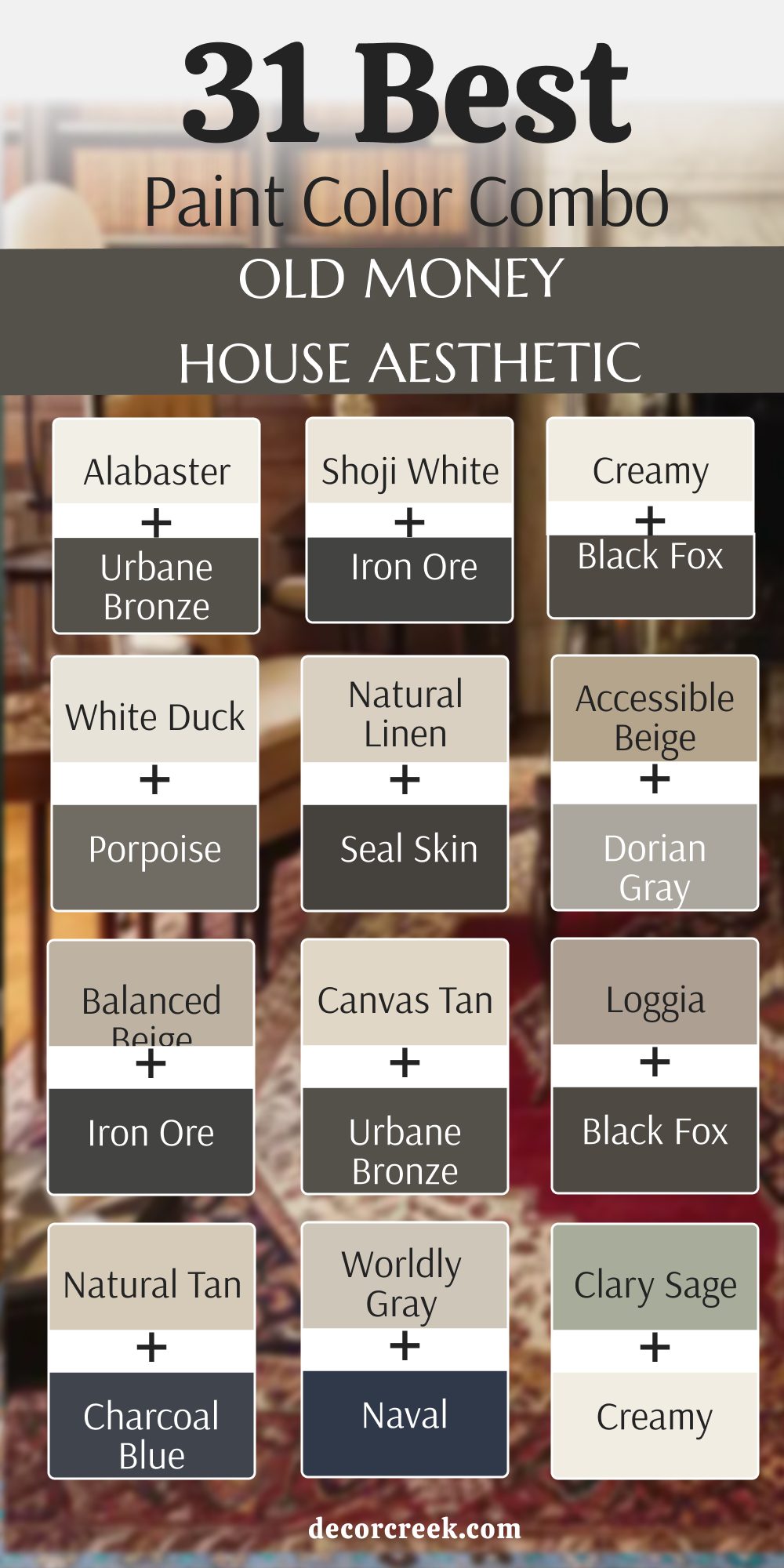
31 Paint Color Combo For The Old Money House Aesthetic
Alabaster SW 7008 + Urbane Bronze SW 7048
Alabaster SW 7008 plus Urbane Bronze SW 7048 creates a look that is very sharp and very clean. This pair works well because the white is very soft and the dark brown is very heavy. You should use the white on the walls and the dark color on the doors or trim.
It reminds me of a very expensive hotel in a big city with lots of history. The contrast makes every line in your house look very straight and very well-planned by a pro. I like how the dark bronze makes the soft white look even brighter and more fresh for guests.
This is a very popular choice for a front hallway or a very grand living room. It tells people that you care about the small details in your beautiful and large home. Your house will feel very modern but also very traditional at the same time with this pair. This combo is a very safe way to get a high-end look without much effort at all.
Shoji White SW 7042 + Iron Ore SW 7069
Shoji White SW 7042 plus Iron Ore SW 7069 is a very sophisticated mix for a newer house. This combination uses a creamy white and a very dark gray to create a lot of deep drama. You can use the dark color on a fireplace or a large bookshelf to make it stand out.
The white keeps the room from feeling too dark or too small for your family to enjoy. It looks very professional and shows that you have a lot of confidence in your style. I find that this pair works best in a room with a lot of natural light coming in.
It makes the architecture of the house look very expensive and very sturdy for many years. This is a great way to make a plain room look like it has a lot of history. Your guests will think you hired a designer to pick these two beautiful and strong colors. It is a very classic look that stays in style for a very long time in any house.
Creamy SW 7012 + Black Fox SW 7020
Creamy SW 7012 plus Black Fox SW 7020 feels very warm and very inviting for a family home. This mix uses a yellow-white and a dark brown to make a room feel very cozy and rich. You should use this in a kitchen with dark cabinets and very light-colored walls for a big look.
It reminds me of a country estate where people spend a lot of time by the fire. The warm tones make everyone feel very comfortable and very much at home when they visit you. I love how the dark brown makes the creamy white look like rich vanilla ice cream on walls.
This is a very traditional choice that works well with old wood furniture and heavy rugs. It creates a sense of peace and steady comfort that is very hard to find elsewhere. Your home will feel very established and very well-loved with this beautiful and warm color pair. This is a perfect choice for a room where you want to relax and talk.
White Duck SW 7010 + Porpoise SW 7047
White Duck SW 7010 plus Porpoise SW 7047 is a very balanced and very neutral color combination for walls. This pair uses a light gray-white and a medium gray to create a very steady and calm look. You can use these colors in a bathroom to make it feel like a very expensive spa or hotel.
The light color keeps things feeling clean while the dark color adds a bit of weight and power. It looks very high-end when you have silver or chrome fixtures in the room with the paint. I find that this mix works well in almost any light because both colors are very quiet.
They do not fight for attention but they work together to make the house look very tidy. This is a very smart choice for a house that has a lot of different styles of furniture. It provides a very smooth background for all your things and makes the house feel very whole. Your home will look very polished and very well-organized with this gray and white color pair.
Natural Linen SW 9109 + Seal Skin SW 7675
Natural Linen SW 9109 plus Seal Skin SW 7675 is a very rich and very organic mix for a study. This combination uses a tan color and a dark black to make a room feel very serious. You should use the tan on the walls and the black on the window frames or trim pieces.
It looks like the library of a very wealthy person who travels a lot around the world. The warm tan makes the black look very sharp and very professional in the bright daylight. I like how this pair makes a room feel very grounded and very much like a safe retreat.
It works beautifully with leather chairs and old books on the shelves in a very large room. This is a very sophisticated choice for someone who wants a house that feels very important. Your home will feel very sturdy and very full of deep character with these two paint colors. This is a very classic and high-end way to decorate your favorite room in the house.
Accessible Beige SW 7036 + Dorian Gray SW 7017
Accessible Beige SW 7036 plus Dorian Gray SW 7017 is a very soft and very pretty gray-beige mix. This pair uses two of the most popular colors to create a house that feels very updated and light. You can use the light beige on most walls and the gray on a kitchen island or a door.
It makes the house feel very cohesive and very well-planned from the front to the back door. The colors are very close in tone so they do not create a big shock when you see them. I find that this mix makes people feel very relaxed and very happy when they are in the house.
It works well with any kind of wood or metal you have in your furniture and decorations. This is a very safe and beautiful choice for a family that wants a very clean look. Your home will feel very fresh and very much like a new estate with this color pair. It is a very reliable way to make your house look very expensive and very neat.
Balanced Beige SW 7037 + Iron Ore SW 7069
Balanced Beige SW 7037 plus Iron Ore SW 7069 is a very strong and very dramatic color combination for a house. This mix uses a solid tan and a very dark charcoal to make a big statement in any room. You should use the tan on the main walls and the dark gray on the baseboards or a fireplace.
It creates a look that is very masculine and very powerful for a home office or a den. The dark gray makes the tan look very warm and very rich in the afternoon sun. I love how this pair makes a house feel like it is built from thick stone and heavy wood.
It looks very high-end and shows that you have a very bold and very classic taste in design. This is a great choice for a house with tall ceilings and a lot of large windows. Your home will feel very secure and very much like a grand mansion with these two colors. It is a very impressive look that will make your guests say wow when they enter.
Canvas Tan SW 7531 + Urbane Bronze SW 7048
Canvas Tan SW 7531 plus Urbane Bronze SW 7048 is a very elegant and very soft neutral color pair. This combination uses a very light tan and a dark brown-gray to create a very polished look for walls. You can use the light color in a bedroom and the dark color for the bed frame or a dresser.
It reminds me of a very expensive beach house where everything is very clean and very tidy. The light tan keeps the room feeling airy while the dark color adds a sense of history and age. I find that this mix works very well with green plants and natural wood accents in the room.
It makes the house feel very organic and very much like a part of the nature outside. This is a very smart choice for a house that wants to feel very light and very expensive. Your home will feel very relaxed and very well-designed with these two soft and rich colors together. It is a very charming way to get an old money look in your own modern home.
Loggia SW 7506 + Black Fox SW 7020
Loggia SW 7506 plus Black Fox SW 7020 is a very deep and very warm color combination for a cozy room. This mix uses a rich tan and a dark chocolate brown to make a space feel very intimate. You should use this in a room where you like to watch movies or sit by a warm fire.
The two colors blend together very well because they both have a lot of warm brown inside them. It makes the walls look very thick and very protective for the people living in the house. I love how this pair makes a room feel very established and very much like a family heirloom.
It works perfectly with leather sofas and warm yellow lamps in the corners of the room. This is a very traditional choice that has been used in wealthy homes for many generations. Your home will feel very cozy and very full of rich history with these two beautiful paint shades. This is a perfect way to make a big house feel very much like a home.
Natural Tan SW 7567 + Charcoal Blue SW 2739
Natural Tan SW 7567 plus Charcoal Blue SW 2739 is a very fresh and very classic color pair for a house. This combination uses a light sandy tan and a very dark blue-gray to create a lot of contrast. You can use the tan on the walls and the dark blue on the kitchen cabinets or a vanity.
It looks very clean and very nautical like a house by the sea in a wealthy town. The light tan makes the blue look very deep and very professional in the bright morning light. I find that this mix makes a house feel very organized and very much like it is in a big city.
It works beautifully with white marble and silver hardware on the doors and drawers of the house. This is a very sophisticated choice for someone who wants a house that feels very updated and rich. Your home will look very sharp and very well-cared for with these two strong and pretty colors. It is a very impressive look for any guest who comes to visit your home.
Worldly Gray SW 7043 + Naval SW 6244
Worldly Gray SW 7043 plus Naval SW 6244 is a very smart and very professional color mix for a study. This pair uses a warm gray and a deep navy blue to create a high-end feel. You should use the gray on most walls and the blue for a special accent wall.
It reminds me of a grand library where people make very important decisions for the family. The gray keeps the room from feeling too heavy while the blue adds a lot of deep soul. I find that this combination looks best with brass lamps and dark wood desks.
It is a very classic choice that shows you have a very refined and sharp taste. Your home will look very polished and very much like a mansion with these colors. This is a great way to make an office feel very rich and very sturdy.
Agreeable Gray SW 7029 + Dress Blues SW 9176
Agreeable Gray SW 7029 plus Dress Blues SW 9176 is a very clean and very crisp color duo. This mix uses the most popular gray and a sharp military blue to create order. You can use the gray in the hallways and the blue in a formal dining room.
It makes the house feel very fresh and very well-organized for all your special guests. The light gray provides a soft background while the blue makes a very bold statement. I like how this pair makes every room feel very connected and very well-planned.
It works perfectly with white trim and silver mirrors on the interior walls of the building. This is a very safe and very beautiful choice for a large family home today. Your house will feel very modern but also very traditional with this pretty color match.
Repose Gray SW 7015 + Thunderous SW 6201
Repose Gray SW 7015 plus Thunderous SW 6201 is a very moody and very artistic color pairing. This combination uses a cool gray and a green-blue to create a deep sense of mystery. You should use this in a bedroom where you want to feel very private and very safe.
The gray keeps things looking neat while the blue adds a lot of rich character. It looks wonderful with dark velvet curtains and light-colored rugs on the wood floors. I find that this mix makes people feel very relaxed and very much at peace inside.
It shows that you are not afraid to use bold colors in a very tasteful way. This is a very sophisticated choice for someone who loves a custom and unique look. Your home will feel very special and very much like a luxury retreat with this.
Mindful Gray SW 7016 + Dark Night SW 6237
Mindful Gray SW 7016 plus Dark Night SW 6237 is a very powerful and very deep color mix. This pair uses a stone gray and a dark teal blue to create a lot of drama. You can use the gray on the main walls and the blue for a kitchen island.
It makes the space feel very established and very much like a grand old manor. The gray is very solid and the blue is very rich and very full of life. I love how this pair looks when the sun goes down and the lamps are turned on.
It creates a very cozy and very expensive feeling that is hard to find anywhere else. This is a great choice for a house that has a lot of architectural details. Your home will feel very sturdy and very well-built with these two beautiful paint shades.
Dorian Gray SW 7017 + Indigo Batik SW 7602
Dorian Gray SW 7017 plus Indigo Batik SW 7602 is a very classic and very rich color duo. This mix uses a medium gray and a deep purple-blue to create a royal feeling. You should use this in a guest room to make your visitors feel very welcome and rich.
The gray provides a very steady look while the indigo adds a pop of artistic style. It works beautifully with white linens and dark mahogany wood furniture in the large room. I find that this combination makes the house feel very curated and very well-managed for life.
It is a very traditional choice that has been a favorite for many wealthy designers. Your house will look very polished and very much like an estate with these colors. This is a very smart way to add color while keeping things very professional.
Sea Salt SW 6204 + Urbane Bronze SW 7048
Sea Salt SW 6204 plus Urbane Bronze SW 7048 is a very fresh and very earthy color combination. This pair uses a light green-gray and a dark bronze to create a natural look today. You can use the light green in a sunroom and the dark bronze for the window frames.
It reminds me of a garden estate where the outside comes right into the house walls. The light color is very airy and the dark color is very grounded and very strong. I like how this mix makes the house feel very peaceful and very much like a spa.
It works well with light wood floors and many green plants in every single room. This is a very elegant choice for a house that wants to feel very light. Your home will feel very relaxed and very well-designed with these two natural paint shades.
Comfort Gray SW 6205 + Iron Ore SW 7069
Comfort Gray SW 6205 plus Iron Ore SW 7069 is a very solid and very calming color pair. This combination uses a herbal green and a soft black to create a very sturdy feeling. You should use the green in a bedroom and the dark gray for the closet doors.
It makes the room feel very protective and very much like a safe place to rest. The green has a lot of gray inside so it never looks too bright or too loud. I find that this mix makes a house feel very established and very full of history.
It looks excellent with silver hardware and white marble tops on the tables and dressers. This is a very sophisticated choice for someone who wants a very quiet and rich home. Your home will look very grand and very well-cared for with these two colors.
Evergreen Fog SW 9130 + Shoji White SW 7042
Evergreen Fog SW 9130 plus Shoji White SW 7042 is a very trendy and very rich color duo. This mix uses a misty green and a creamy white to create a soft and natural look. You can use the green for the cabinets and the white for the walls in a kitchen.
It makes the room feel very updated and very much like it belongs in a magazine. The green is very deep and the white is very warm and very inviting for the family. I love how this pair makes a house feel like it is part of the forest outside.
It works beautifully with brass handles and light oak wood floors in the center of the house. This is a very popular choice for people who want an old money look for today. Your home will feel very fresh and very full of life with these two colors.
Clary Sage SW 6178 + Creamy SW 7012
Clary Sage SW 6178 plus Creamy SW 7012 is a very traditional and very warm color pairing. This combination uses a sage green and a butter white to create a vintage feeling for all. You should use this in a kitchen or a breakfast nook for a very cozy morning.
The green is very herbal and the white is very soft and very much like a warm hug. It reminds me of a country house where people spend a lot of time baking and talking. I find that this mix makes everyone feel very comfortable and very much at home when visiting.
It works perfectly with copper pots and old wooden tables in the middle of the room. This is a very classic choice for a family that values history and simple beauty. Your home will feel very established and very well-loved with these two paint shades.
Acacia Haze SW 9132 + Alabaster SW 7008
Acacia Haze SW 9132 plus Alabaster SW 7008 is a very soft and very unique color combination. This pair uses a dusty blue-green and a clean white to create a very light look. You can use the green-blue for the laundry room and the white for the main hallway.
It makes the house feel very clean and very much like a breath of fresh air today. The blue-green has a gray tone that keeps it looking very expensive and very rare on walls. I like how this pair creates a calm mood in the room even during a very busy day.
It works well with white furniture and silver accents in the decorations and the lamps. This is a very smart choice for a house that wants to feel very airy and rich. Your home will feel very curated and very well-designed with these two soft colors together.
Smoky Blue SW 7604 + White Duck SW 7010
Smoky Blue SW 7604 plus White Duck SW 7010 is a very sturdy and very classic color mix. This combination uses a medium blue and a stone white to create a lot of deep strength. You should use the blue in a home office and the white in the connected hallway area.
It makes the office feel very serious and very much like a place for grand thoughts. The blue is very dusty and the white is very neutral and very easy on the eyes. I find that this mix makes a house feel very organized and very much like a manor.
It looks wonderful with leather chairs and dark walnut wood furniture in the large room. This is a very reliable choice for a house that needs a bit of a navy blue feel. Your home will look very established and very grand with these two beautiful paint choices.
Tradewind SW 6218 + Dorian Gray SW 7017
Tradewind SW 6218 plus Dorian Gray SW 7017 is a very elegant and very cool color pairing. This pair uses a breezy blue and a rich gray to create a very polished and neat look. You can use the blue in a bathroom and the gray for the cabinets under the sink.
It makes the space feel very high-end and very much like an expensive city apartment. The blue is very light and the gray is very solid and very much like a stone wall. I like how this mix makes a house feel very updated and very fresh for guests today.
It works beautifully with chrome fixtures and white tile on the floor and the walls. This is a very sophisticated choice for someone who wants a house that feels very smart. Your home will feel very professional and very well-managed with these two cool paint colors.
Aleutian SW 6241 + Iron Ore SW 7069
Aleutian SW 6241 plus Iron Ore SW 7069 is a very deep and very dramatic color duo for a house. This mix uses a denim blue and a charcoal gray to create a lot of weight on walls. You should use this in a den or a media room where you want to feel cozy.
The blue is very cool and the gray is very dark and very much like a solid rock. It reminds me of a study in an old castle where the walls are very thick and strong. I love how this pair makes a house feel very secure and very well-protected for the family.
It works perfectly with warm yellow lights and heavy wool blankets on the sofas. This is a very bold choice that shows you have a lot of confidence in your style. Your home will look very expensive and very full of deep history with these colors.
Misty SW 6232 + Charcoal Blue SW 2739
Misty SW 6232 plus Charcoal Blue SW 2739 is a very soft and very high-contrast color mix. This combination uses a light gray-blue and a dark blue-gray to create a sharp look. You can use the light color on the walls and the dark color on the built-in shelves.
It makes the room feel very orderly and very much like a professional gallery for your art. The light blue is very airy and the dark blue is very serious and very powerful. I find that this mix makes a house feel very updated and very rich at the same time.
It looks great with silver picture frames and white marble tops on the small tables. This is a very smart choice for a house that has a lot of architectural details today. Your home will look very polished and very well-cared for with these two strong paint shades.
Sleepy Blue SW 6225 + Natural Linen SW 9109
Sleepy Blue SW 6225 plus Natural Linen SW 9109 is a very soft and very warm color pairing. This pair uses a light sky blue and a tan fabric color to create a cozy feeling. You should use the blue in a bedroom and the tan for the curtains and the rug.
It makes the room feel very peaceful and very much like a soft and warm hug today. The blue is very gentle and the tan is very earthy and very full of deep character. I like how this mix makes a house feel very lived-in and very well-loved by the family.
It works well with light wood furniture and cream-colored fabrics on the chairs and bed. This is a very charming choice for a house that wants to feel very light and rich. Your home will feel very welcoming and very kind with these two beautiful and soft colors.
Urbane Bronze SW 7048 + Alabaster SW 7008
Urbane Bronze SW 7048 plus Alabaster SW 7008 is the reverse of my favorite high-contrast mix. This combination uses a dark brown-gray for the walls and a soft white for the ceiling. You should use this in a dining room to create a very grand and very formal feeling.
The dark walls make the room feel very intimate while the white ceiling keeps it open. It looks like a very expensive restaurant in a big city with a lot of old history. I find that this mix makes the white dishes and silver forks look very bright and shiny.
This is a very bold choice for someone who wants to make a big statement with paint. Your home will feel very important and very much like a mansion with these two colors. It is a very impressive and rich way to finish a formal room today.
Black Fox SW 7020 + Creamy SW 7012
Black Fox SW 7020 plus Creamy SW 7012 is a very warm and very deep color combination for a room. This mix uses a chocolate black and a butter white to create a very cozy space. You can use the dark color on the lower walls and the light color on the top walls.
It reminds me of a traditional library where the wood is very dark and very expensive. The dark brown is very rich and the white is very soft and very much like vanilla. I love how this pair makes a house feel very established and very full of history today.
It works perfectly with leather chairs and warm yellow lamps in the corners of the room. This is a very classic choice for a house that wants to feel very old and rich. Your home will feel very sturdy and very well-built with these two beautiful paint shades.
Seal Skin SW 7675 + Shoji White SW 7042
Seal Skin SW 7675 plus Shoji White SW 7042 is a very sharp and very professional color duo. This pair uses a cool black and a creamy white to create a lot of clean contrast. You should use the black on the trim and the white on the main walls of the room.
It makes the house feel very orderly and very much like a high-end office in the city. The black is very smooth and the white is very solid and very much like a stone wall. I find that this mix makes a house feel very updated and very fresh for all guests.
It looks wonderful with silver hardware and black metal lamps on the tables and desks. This is a very sophisticated choice for someone who loves a clean and modern look. Your home will feel very important and very well-managed with these two strong paint colors.
Bitter Chocolate SW 6063 + Alabaster SW 7008
Bitter Chocolate SW 6013 plus Alabaster SW 7008 is a very rich and very sweet color pairing. This combination uses a deep candy brown and a soft white to create a lot of warmth. You can use the brown in a den and the white for the ceiling and the window trim.
It makes the room feel very cozy and very much like a secret hideout for the family. The brown is very heavy and the white is very light and very much like a cloud. I like how this mix makes the house feel very established and very full of soul today.
It works well with light gray rugs and cream-colored sofas in the middle of the room. This is a very traditional choice for a house that wants to feel very old and rich. Your home will feel very grounded and very well-loved with these two beautiful paint shades.
Turkish Coffee SW 6076 + Creamy SW 7012
Turkish Coffee SW 6076 plus Creamy SW 7012 is a very dark and very warm color mix for a room. This pair uses a strong coffee brown and a butter white to create a very deep feeling. You should use this in a small study where you want to focus and feel very private.
The brown is very rich and the white is very soft and very much like a warm hug today. It reminds me of an old men’s club where everything is very quiet and very expensive. I find that this mix makes a house feel very important and very much like a manor.
It looks amazing with brass light fixtures and old gold frames on the pictures on the walls. This is a very classic choice for a family that values history and deep beauty today. Your home will feel very sturdy and very well-built with these two beautiful paint shades.
Naval SW 6244 + Alabaster SW 7008
Naval SW 6244 plus Alabaster SW 7008 is the ultimate classic color combination for an estate house. This mix uses the most famous navy blue and a soft white to create a lot of style. You can use the blue in the dining room and the white in the foyer and the hallway.
It makes the house feel very clean and very much like a grand estate by the ocean. The blue is very powerful and the white is very light and very much like a fresh sheet. I love how this pair makes a house feel very organized and very much like a million dollars.
It works perfectly with gold mirrors and white marble floors in the front of the house today. This is a very timeless choice that shows you have a lot of respect for old ways. Your home will feel very polished and very expensive with these two beautiful paint shades.
17 Paint Color Ideas For The Old Money House Interior
Alabaster SW 7008
Alabaster SW 7008 is my favorite white for a main living room because it is so soft. This color makes the whole house feel very light and very happy during the day. It looks like the walls of a very expensive art gallery in a big city center.
You will see that it makes all your furniture look very clean and very new for guests. It is a very safe choice for a ceiling because it makes the room feel very tall. I like how it stays looking white even when the sun is not shining directly on the wall.
This color is a classic part of a high-end home that wants to feel very traditional. It provides a beautiful and quiet background for your whole life inside the house. You will love how much air and light this color adds to every single room you paint. This is a very rich and very simple way to finish your interior walls this year.
🎨 Check out the complete guide to this color right HERE 👈
Shoji White SW 7042
Shoji White SW 7042 is a very creamy and very solid choice for an interior bedroom wall. This color makes the bed and the linens look very soft and very inviting for a nap. It has a bit of beige and gray that keeps it from looking like a plain white wall.
You will find that it makes the room feel very warm and very cozy at night time. It looks great with dark wood furniture and old gold frames on the pictures you hang. I often use this in hallways to make them feel much wider and much more expensive than they are.
This is a very popular color for houses that want to feel very established and very old. It gives the house a sense of history that is very hard to find with other white paints. Your home will feel very steady and very much like a mansion with this beautiful shade. This is a very smart way to update your house without using a bold color.
🎨 Check out the complete guide to this color right HERE 👈
Creamy SW 7012
Creamy SW 7012 is the best color for a traditional kitchen with lots of wood and stone. This paint looks like rich butter and makes the whole room feel very warm and very friendly. It is a very classic color that has been used in wealthy homes for a long time.
You will see that it makes your white dishes and silver pans look very bright and shiny. It works beautifully with dark granite counters and warm wood floors in the center of the house. I find that this color makes people feel very hungry and very happy to be in the kitchen.
It is a very soft and very polite color that does not demand you look at it. This shade makes your home feel very welcoming and very much like a family estate for all. You will love how much warmth and light this color adds to your favorite room to cook. This is a very rich and very simple choice for a beautiful home interior.
🎨 Check out the complete guide to this color right HERE 👈
White Duck SW 7010
White Duck SW 7010 is a very sturdy and very neutral color for a laundry room or mudroom. This paint looks like the stone on an old cottage and stays looking clean for a long time. It has a bit of gray that makes it feel very solid and very much like a real wall.
You can use it in a small space to make it feel much larger and much more airy. It looks excellent with black metal hooks and light wood shelves in a very busy room. I like how it provides a very steady background for all the things you do every day.
This is a very smart choice for a house that has a lot of people and pets running around. It keeps the house looking very neat and very well-organized for all your friends who visit. Your home will feel very professional and very high-end with this beautiful and light gray-white. This is a very reliable color that never goes out of style for a big house.
🎨 Check out the complete guide to this color right HERE 👈
Natural Linen SW 9109
Natural Linen SW 9109 brings the look of raw and expensive fabric to your living room walls. This color feels very organic and reminds me of a field of wheat in the late summer. It is a very warm and rich tan that makes a large room feel much more cozy.
You should use this in a room with a lot of books and a big leather chair. It makes the wood grain in your floor look very deep and very shiny in the light. Many people love how this color feels like a warm hug when they come home from work.
It does not feel old or dusty but it does feel very established and very full of history. The paint has a way of making the walls look like they have many layers of beauty. I suggest this for someone who wants a home that feels lived in and very well-loved. This is a very sturdy and very rich color for your favorite interior space.
🎨 Check out the complete guide to this color right HERE 👈
Accessible Beige SW 7036
Accessible Beige SW 7036 is the most famous neutral for an interior because it is so easy. This color is perfect because it does not look too pink or too yellow on the walls. It acts like a soft backdrop for any kind of furniture or art you want to show.
You can put it in a nursery or a master bedroom for a very soft and light look. It makes the whole house feel connected if you use it in every single room you have. The shade is very light but it still has enough color to see a real difference.
It looks very high-end when you have dark wood trim or black metal lamps in the room. I find that it makes people feel very relaxed and very much at peace in the house. This color is a workhorse that never lets you down when you are doing a big project. Your home will look very clean and very rich with this beautiful and light beige paint.
🎨 Check out the complete guide to this color right HERE 👈
Loggia SW 7506
Loggia SW 7506 is a rich tan that adds a lot of character to a formal dining room wall. This color looks like the stone on a grand estate and feels very solid and very permanent. It is a very strong color that can handle a room with a lot of large furniture pieces.
You will find that it makes a dining room feel very professional and very ready for a party. It works well with dark brown wood and brass light fixtures on the walls of the house. The shade is dark enough to create a very cozy feeling during the cold winter months.
I like how it looks when you have a large rug with many different colors on the floor. It ties the whole room together and makes it feel very finished and very high-end for guests. This is a great color for a person who wants a house with a lot of deep history. Your house will feel very grand and very special with this beautiful and warm tan shade.
🎨 Check out the complete guide to this color right HERE 👈
Worldly Gray SW 7043
Worldly Gray SW 7043 is a gray that feels very warm and never looks like a cold city street. This color is very soft and looks like a misty morning in a very big and old park. It is a perfect middle ground for someone who wants a house that looks both old and new.
You can use it in a bathroom to make the space feel very clean and very expensive. It works very well with silver or chrome faucets and white tile on the floor and walls. The color changes slightly depending on what other colors you have in your furniture and rugs.
I find that it makes a house feel very updated and very fresh for a new family moving in. It provides a beautiful background for modern chairs and old antique tables alike in the room. This is a very flexible color that works in almost any lighting situation you have in your home. You will love how it makes your home feel very smart and very well-planned by a professional.
🎨 Check out the complete guide to this color right HERE 👈
Mindful Gray SW 7016
Mindful Gray SW 7016 is a gray that feels very deep and has a lot of soul on the walls. This color looks like the weathered stone on a very old church or a large stone castle. It is a bit darker than the most common grays which gives it more power and more weight.
You can use it in a master bathroom to create a look of total luxury and high style. It pairs perfectly with white tile and dark gray rugs on the floor of the beautiful room. The paint has a way of making the room feel very quiet and very still for a long time.
I find that it works best in rooms that have a lot of different textures like silk and wool. It looks great with velvet pillows and silk curtains in a very formal living room area. This is a color that tells people you have very good taste in your home design choices. It feels very expensive and makes the house feel like a very safe and rich retreat.
🎨 Check out the complete guide to this color right HERE 👈
Dorian Gray SW 7017
Dorian Gray SW 7017 is a medium gray that has a very rich and very moody feel inside. This color looks like the sky right before a big rainstorm hits a very large city center. It is a very solid choice for a dining room or a cozy den for watching your favorite movies.
You will notice that it makes white trim look very bright and very clean on the walls. The color is dark enough to hide small marks or scratches that might happen over many years. I love how it looks when you have large windows with a lot of green trees outside in the garden.
It brings a sense of drama to the house without being too dark or too scary for children. This shade feels very old-fashioned in a way that shows a lot of wealth and history. It is a perfect color for a room where you want to sit and talk with your friends. Your home will feel very sturdy and very well-built with this beautiful and strong gray paint.
🎨 Check out the complete guide to this color right HERE 👈
Evergreen Fog SW 9130
Evergreen Fog SW 9130 is a deep green that feels very organic and very rich on your walls. This color looks like the forest on a day when there is a lot of mist in the air. It is a very trendy color that still feels like it has a long and very rich history.
You can use it in a mudroom or a pantry to add a lot of style and a lot of life. It pairs very well with gold hardware and light wood shelving on the walls of the kitchen. The paint has a gray undertone that keeps it from looking like a bright toy color in the room.
I think it looks best in a room that has a lot of natural wood accents and floors. It makes the house feel like it is part of the landscape around it in a very big way. This is a very bold choice that still feels very safe and very classic for a wealthy home. You will love how it adds a lot of personality and beauty to your home’s interior rooms.
🎨 Check out the complete guide to this color right HERE 👈
Clary Sage SW 6178
Clary Sage SW 6178 is a soft herbal green that feels very traditional and very old for a house. This color looks like the velvet on an old chair in a grand library full of books. It is a very warm green that makes a room feel very cozy and very lived-in by a family.
You should use this in a kitchen with cream cabinets for a very beautiful and vintage look. It works beautifully with copper pots and pans hanging on the walls near the stove or sink. The color stays very soft even when the sun is shining directly on it through a window.
I find that it makes people feel very comfortable and very much at home when they visit. It is a great choice for a house that has a lot of history and a lot of character. Your guests will feel like they have stepped back in time to a simpler and richer era. This color is a very elegant way to use green in your big and beautiful house interior.
🎨 Check out the complete guide to this color right HERE 👈
Smoky Blue SW 7604
Smoky Blue SW 7604 is a medium blue that feels very dusty and very historic on the walls. This color looks like the denim on a pair of very expensive work pants from a factory. It is a very strong color that adds a lot of weight and power to a room’s interior.
You can use it in a boy’s bedroom or a home office for a very classic look. It works very well with orange or red accents in the decorations and the rugs. The paint has a gray tone that keeps it from looking like a bright toy color in the room.
I find that it makes a room feel very serious and very well organized for your work. It looks great when you have white trim to make the blue look even deeper and richer. This is a very reliable color for a house that needs a bit of a navy blue feel. Your home will look very established and very grand with this beautiful and strong blue choice.
🎨 Check out the complete guide to this color right HERE 👈
Tradewind SW 6218
Tradewind SW 6218 is a blue that has a lot of gray and a tiny bit of green inside. This color looks like the water in a harbor on a very breezy and clear morning. It is a very sophisticated blue that feels more like a neutral on the wall of the house.
You should use this in a laundry room to make the chore feel more fancy and fun. It looks excellent with light gray floors and white machines in the room for a clean look. The paint has a very clean finish that makes the house feel very fresh and very new.
I often recommend this for people who want a blue that is not too bold or too bright. It creates a very steady and professional look in any room you choose to paint it in. This color is a great way to add a bit of color to a hallway or a stairs area. Your home will feel very polished and very high-end with this soft and beautiful blue shade.
🎨 Check out the complete guide to this color right HERE 👈
Urbane Bronze SW 7048
Urbane Bronze SW 7048 is a very dark brown that has a lot of gray and green inside it. This color looks like the metal on a very old gate at a big and wealthy estate. It is a very powerful color that adds a lot of drama and style to any small room.
You should use this on an accent wall or in a cozy library for your reading time. It looks incredible with gold lamps and warm yellow light bulbs in the room for a glow. The paint makes the walls feel very thick and very protective for the people in the house.
I find that it makes a house feel very modern and very expensive at the same time. It is a great choice for a front door to make a very big statement to the neighbors. This color tells everyone that your home is a place of great importance and very high style. Your home will feel very grounded and very rich with this dark and moody paint shade.
🎨 Check out the complete guide to this color right HERE 👈
Black Fox SW 7020
Black Fox SW 7020 is a dark chocolate brown that has a lot of black mixed in the can. This color looks like the fur of a dark animal in the woods at night time. It is a very warm and rich choice for a den or a very cozy bedroom for sleeping.
You will see that it makes colorful pillows and blankets really stand out and look very pretty. It works perfectly with warm wood furniture and brass handles on the doors of the room. The shade is very deep and makes the room feel like a secret and private hideout for you.
I find that it creates a very luxurious feeling that is hard to get with light colors on walls. It is a very traditional color that has been used in grand homes for a very long time. This color makes your home feel very expensive and very full of history and life for your family. You will love how cozy your house feels with this dark and rich brown paint in your favorite room.
🎨 Check out the complete guide to this color right HERE 👈
Naval SW 6244
Naval SW 6244 is the most famous navy blue because it is so perfectly balanced for an interior. This color looks like the sky in the middle of a very clear and dark night in the city. It is a very strong and confident color that works well in any room of the house.
You will see that it makes gold and brass accents look like they are glowing on the wall. It pairs perfectly with white marble and light gray floors in a very modern and rich kitchen. The shade is very deep but it never looks like it is just a black color on the wall.
I find that it adds a lot of value to a house because it looks so professional and clean. It is a very timeless choice that will still look good twenty years from now in your house. This color makes your house feel very sturdy and very much like a grand estate for all. You will be very happy with how rich and deep this blue looks on your interior walls today.
🎨 Check out the complete guide to this color right HERE 👈
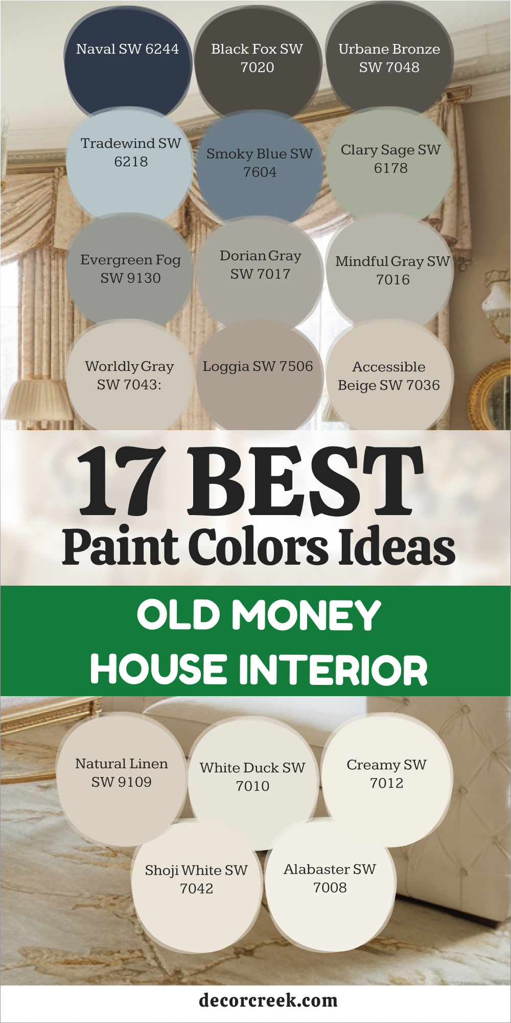
19 Paint Color Ideas For The Old Money House Exterior
Pure White SW 7005
Pure White SW 7005 is a very bright and very clean choice for a large house exterior. This color makes the house look like it is brand new even if it is very old. It catches the sunlight in a way that makes the house glow from the street for neighbors.
You will find that it makes the green grass and trees look very bright and very healthy. It works beautifully with black shutters and a dark front door for a classic and rich look. I like how it stays looking very crisp and very neat throughout the whole year in the sun.
This is a very popular choice for big houses in the south because it stays very cool. It provides a very professional and very high-end look that never goes out of style for anyone. Your home will feel very grand and very well-cared for with this beautiful and light white paint. This is a very smart way to make your house the best one on the whole block.
🎨 Check out the complete guide to this color right HERE 👈

Greek Villa SW 7551
Greek Villa SW 7551 is a soft and creamy white that feels very warm on a house exterior. This color looks like the stone on an old villa by the sea in a sunny country. It is a very welcoming color that makes people feel happy when they drive up the driveway.
You should use this if you want a white that is not too bright or too harsh for eyes. It looks wonderful with dark wood beams and stone accents on the front of the house. The paint has a tiny bit of yellow that makes it feel very sun-kissed and very friendly for all.
I find that it makes a large house feel very cozy and very much like a real family home. It is a very traditional choice that has been used on wealthy estates for many hundreds of years. This shade makes your home feel very established and very rich in a soft and quiet way. Your house will look very elegant and very beautiful with this creamy and warm white paint today.
🎨 Check out the complete guide to this color right HERE 👈

Dover White SW 6385
Dover White SW 6385 is a classic white that has a lot of warmth and a lot of history. This color looks like the white paint on a very old and very grand colonial house in the north. It is a very soft color that makes the house feel very solid and very well-built for many years.
You will see that it makes the dark roof and gutters look very sharp and very clean. It works perfectly with red brick or gray stone on the foundation of the large house. The shade is very traditional and tells people that you value the history of your home and life.
I love how it looks when you have a lot of white flowers in the garden around the house. It creates a very peaceful and very high-end look that is very hard to beat with other colors. This is a very reliable choice for a house that wants to look very expensive and very old. Your home will feel very sturdy and very much like a mansion with this beautiful white shade.
🎨 Check out the complete guide to this color right HERE 👈

Natural Choice SW 7011
Natural Choice SW 7011 is a very soft beige that looks almost white in the bright afternoon sun. This color is a great way to add a bit of warmth to your house without using a dark paint. It looks like the sand on a private beach and feels very light and very airy for a home.
You can use it on the main walls of the house with bright white trim for a nice look. It makes the windows and doors stand out and look very clean and very well-organized for guests. I find that this color stays looking good even when there is a lot of dust or dirt nearby.
It is a very polite color that blends in well with the other houses on the rich street. This is a very smart choice for a house that wants to feel very updated and very rich. Your home will look very fresh and very well-maintained with this beautiful and light beige paint today. It is a very charming way to finish your exterior walls and look very high-end.
🎨 Check out the complete guide to this color right HERE 👈

Oyster White SW 7637
Oyster White SW 7637 is a very light gray that has a bit of beige and green inside it. This color looks like the inside of a shell and feels very sophisticated for a large house exterior. It is a very unique choice that makes your house stand out in a very quiet and rich way.
You will find that it changes its look depending on if the sky is cloudy or very blue. It works beautifully with dark gray shutters and a black front door for a very sharp look. I like how it makes the house feel very modern and very expensive at the same time for neighbors.
This is a very popular color for houses that have a lot of natural stone on the front side. It ties the whole house together and makes it feel very finished and very well-planned by a pro. Your home will feel very grand and very special with this beautiful and light gray-white paint today. It is a very elegant way to show off your style and your wealth to the world.
🎨 Check out the complete guide to this color right HERE 👈

Kilim Beige SW 6106
Kilim Beige SW 6106 is a very warm and very solid tan that looks great on a large home. This color looks like the earth in a very dry and sunny place and feels very grounded. It is a very traditional choice that works well with brown or red roofs on the house.
You will see that it makes the house feel very sturdy and very much like a safe fortress. It pairs perfectly with dark brown trim and a very heavy wood front door for a rich look. The shade is dark enough to hide small marks or dirt that might get on the walls of the house.
I find that it makes people feel very welcome and very comfortable when they visit your big home. It is a very classic color that has been a favorite for many years in wealthy neighborhoods. This color makes your home feel very established and very full of deep and long history. Your house will look very warm and very expensive with this beautiful and strong tan paint.
🎨 Check out the complete guide to this color right HERE 👈

Nomadic Desert SW 6107
Nomadic Desert SW 6107 is a bit darker than the other tans and has a lot of rich depth. This color looks like the sand in a very far away place and feels very exotic and very rich. It is a very strong color that adds a lot of weight to the look of a large house. You should use this if you want a house that feels very permanent and very well-built for life.
It works wonderfully with dark wood accents and large stone pillars on the front of the house. The paint has a very warm tone that makes the house glow during the sunset hours of the day. I love how it makes the green trees and bushes look very vibrant and very healthy in the garden.
This is a very sophisticated choice for someone who wants a house with a lot of character and style. Your home will feel very grand and very much like a big estate with this beautiful tan. It is a very smart and rich way to update your house exterior today for your family.
🎨 Check out the complete guide to this color right HERE 👈

Barcelona Beige SW 7530
Barcelona Beige SW 7530 is a very light and very airy tan that feels like a summer holiday. This color looks like the walls of a very expensive house in a warm and sunny city. It is a very fresh and very clean choice for a house that wants to look very updated.
You will find that it makes the house look very large and very open to the world around it. It looks excellent with bright white trim and a light blue front door for a very pretty look. I like how it stays looking very bright even on a day when the sky is very gray and dark.
This is a very polite color that does not demand too much attention from the people passing by. It shows that you have a very soft and very sophisticated taste in your home design choices. Your home will feel very welcoming and very kind with this beautiful and light beige paint today. It is a very charming way to make your house look very expensive and very neat.
🎨 Check out the complete guide to this color right HERE 👈
Anew Gray SW 7030
Anew Gray SW 7030 is a gray that has a lot of warmth and does not feel cold at all. This color looks like the stone on a very old and very grand manor house in the woods. It is a perfect middle ground for a house that wants to look both old and very modern today.
You can use it on the main walls of the house with dark gray trim for a sharp look. It makes the architecture of the house stand out and look very professional for all who see it. I find that this color works well in any kind of weather and stays looking very high-end.
It provides a beautiful and quiet background for your garden and your driveway in the front yard. This is a very smart choice for a house that wants to feel very sturdy and very rich for all. Your home will look very polished and very well-cared for with this beautiful and warm gray paint. It is a very reliable way to make your house look like a million dollars today.
🎨 Check out the complete guide to this color right HERE 👈
Ellie Gray SW 7650
Ellie Gray SW 7650 is a medium gray that feels very sophisticated and very cool on a house. This color looks like the metal on a very expensive car or a silver tray in the house. It is a very crisp and very neat choice for a house that wants to look very orderly and sharp.
You will notice that it makes white trim and black shutters look very bright and very clean today. It works beautifully with silver or chrome light fixtures on the front of the large house for a look. The paint has a very smooth finish that makes the walls look perfectly flat and very well-built for life. I like how it makes a house feel very modern and very much like it is in a big city.
This is a very high-end color that tells people you have a very sharp and professional style. Your home will feel very important and very well-managed with this beautiful and cool gray paint today. It is a very impressive look that will last for many years on your house.
🎨 Check out the complete guide to this color right HERE 👈
Retreat SW 6207
Retreat SW 6207 is a deep green-gray that feels very organic and very much like the nature outside. This color looks like the leaves on a very old and very large tree in a forest for a look. It is a very moody and very rich choice for a house that is tucked away in the woods.
You can use it to make a big house blend in with the garden and the trees around it. It looks wonderful with natural wood trim and stone accents on the porch and the stairs today. The paint has a very quiet and very still quality that makes the house feel like a secret place.
I find that it adds a lot of personality to a house that is mostly made of wood and stone. It is a very sophisticated color for someone who loves the outdoors and the peace of nature. This shade makes your home feel very secure and very much like a private estate for your family. Your house will have a lot of depth and a lot of soul with this beautiful and dark green paint.
🎨 Check out the complete guide to this color right HERE 👈

Pewter Green SW 6208
Pewter Green SW 6208 is a very dark and very rich green that feels like an old family library. This color looks like the moss on a very old stone wall in a garden for a classic look. It is a very strong and very powerful color that adds a lot of weight to a house exterior.
You should use this if you want a house that looks very established and very full of deep history. It works perfectly with gold or brass light fixtures and a very dark wood front door today. The shade is very deep and makes the house feel like it has been there for a hundred years.
I love how it makes the white snow in the winter look very bright and very clean for all neighbors. This is a very traditional choice that shows you have a lot of respect for the old ways of life. Your home will feel very sturdy and very much like a grand mansion with this beautiful green shade. It is a very impressive and rich way to update your house exterior this year.
🎨 Check out the complete guide to this color right HERE 👈

Rock Bottom SW 7062
Rock Bottom SW 7062 is an extremely dark green-gray that is almost black but much softer on eyes. This color looks like the rocks at the bottom of a very deep and cold river in the mountains. It is a very dramatic and very bold choice for a modern house that wants to look rich today. You can use it on the whole house or just on the trim to create a very big statement.
It looks amazing with bright white windows and a light wood front door for a lot of contrast. The paint has a very matte look that hides any bumps or holes in the walls of the house. I like how it makes a house feel very secure and very well-protected from the outside world for all.
It is a very brave color that shows you have a lot of confidence in your personal style. This shade is a favorite for people who want a very rich and very moody vibe for their home. Your house will look very expensive and very powerful with this dark and heavy green-gray paint.
🎨 Check out the complete guide to this color right HERE 👈
Peppercorn SW 7674
Peppercorn SW 7674 is a very dark charcoal gray that feels very sophisticated and very sharp on a house. This color looks like the black pepper on a plate in a very expensive restaurant in the big city. It is a very neutral dark color that works well with any other color you have on your house. You will find that it makes white trim look like it is glowing in the bright morning sunlight today.
It works beautifully with black metal railings and silver light fixtures on the front of the house for look. The paint has a very rich depth that makes the walls look very thick and very sturdy for many years.
I find that it adds a lot of value to a house because it looks so professional and well-planned by a pro. It is a very modern choice that still feels very much like an old money house in the city. Your home will look very important and very high-end with this beautiful and dark charcoal gray paint today.
🎨 Check out the complete guide to this color right HERE 👈

Gauntlet Gray SW 7019
Gauntlet Gray SW 7019 is a medium-dark gray that feels very solid and very much like a heavy stone. This color looks like the armor on a knight or the stone on a very large and grand castle wall. It is a very strong and very reliable color that works well on any kind of house exterior today.
You can use it on the main walls with a very light gray trim for a very professional look. It makes the house feel very permanent and very well-built for the family living inside it now. I like how it stays looking very clean and very tidy even after a big rainstorm in the summer.
This is a very popular color for houses that want to look very established and very rich for neighbors. It provides a very steady and very professional background for all your outdoor activities and garden work. Your home will feel very sturdy and very much like a mansion with this beautiful and strong gray shade.
🎨 Check out the complete guide to this color right HERE 👈
North Star SW 6246
North Star SW 6246 is a very formal and very deep blue that feels like a sharp suit for your house. This color looks like the deep ocean water at night when there is no moon in the sky above. It is a very classic choice for a front door or for the whole house if you want drama.
You can use it to create a look of authority and high style for all your friends who visit today. It looks amazing with bright white trim and very shiny gold handles on the front door of the house. The paint has a very rich tone that stays looking blue even in the darkest shadows of the porch.
I like how it makes a house feel very clean and very well-organized for a busy family with kids. It is a very popular color for houses that want to look very traditional and very rich for all. This shade tells people that you value order and beauty in your daily life at your home. Your home will look very polished and very expensive with this deep and dark blue paint today.
🎨 Check out the complete guide to this color right HERE 👈
Cyberspace SW 7076
Cyberspace SW 7076 is a very dark blue-gray that is almost black but has a lot of deep blue soul. This color looks like the sky in a far away place where the stars are very bright and very white. It is a very modern and very moody choice for a house that wants to make a big statement today.
You will notice that it makes wood accents and stone pillars look very rich and very warm in sun. It works perfectly with white windows and silver light fixtures for a very sharp and professional look for all. The paint has a very thick look that makes the walls look very sturdy and very well-protected for years.
I find that it creates a very luxurious feeling that is hard to find with any other dark paint color. It is a very sophisticated choice for someone who loves a clean and modern and rich look for a house. Your home will feel very important and very well-cared for with this beautiful and dark blue-gray paint today.
🎨 Check out the complete guide to this color right HERE 👈

Anonymous SW 7046
Anonymous SW 7046 is a warm gray that has a bit of brown and green inside the paint can. This color looks like the stone on a very old and very grand estate in a rainy country side. It is a very quiet and very sophisticated color that does not shout for attention from the neighbors.
You can use it on a house with a lot of trees to create a very peaceful and rich look today. It works beautifully with dark brown trim and a stone foundation on the front of the large house. The paint has a very earthy quality that makes the house feel like it is part of the ground. I like how it makes people feel very relaxed and very much at home when they visit your big estate.
It is a very traditional color that has been used by wealthy families for a very long time in history. This color makes your home feel very established and very full of deep and long character for your family. Your house will look very warm and very expensive with this beautiful and rich warm gray paint today.
🎨 Check out the complete guide to this color right HERE 👈

Thunder Gray SW 7645
Thunder Gray SW 7645 is a very dark and very heavy gray that feels like a big storm cloud. This color looks like the slate on the roof of a very old and very large mansion in the city. It is a very solid and very powerful color that adds a lot of weight to any house exterior.
You should use this if you want a house that looks very serious and very well-protected from everything. It looks incredible with white trim and a very bright red or blue front door for a lot of pop. The paint has a very rich finish that makes the walls look very high-end and very flat for all to see. I love how it creates a sense of luxury that is only found in the most expensive neighborhoods today.
It is a very brave color that shows you have a lot of confidence in your personal taste and style. This shade makes your home feel very secure and very much like a rich person’s private retreat for life. Your house will have a lot of power and a lot of beauty with this dark and moody gray paint.
🎨 Check out the complete guide to this color right HERE 👈

My Final Thoughts
Picking the right paint is the fastest way to make your home look like a grand estate. I have shared these colors because they have a depth and a history that is hard to match. When you use these shades, your house starts to tell a story of quality and good taste. It is about making choices that feel heavy and real instead of light and cheap. You want your family to feel safe and surrounded by beauty every single day they are home.
These colors from Sherwin-Williams and Benjamin Moore are the tools you need to do that well. Remember to look at the light and the furniture you already have before you make a final pick. A beautiful home is a place where every color works together to create a feeling of rich comfort. I am so happy to help you start this journey of making your house look its very best. Your home is your legacy, and these colors will help you protect it for a long time.
Creating a home that looks expensive means you must pay attention to how every wall feels under different lamps. I believe that a house should feel like it has been in the family for many decades even if you just moved in last week. The shades I picked for this list are meant to provide a sense of strength and high status for your building.
You can mix and match these tones to create a flow that feels very natural and very expensive from the front door to the back porch.
Using quality paint brands is a smart way to ensure that the rich look stays fresh for many years without fading away. Every brush stroke is an investment in the value and the feeling of your private property.
Your neighbors will surely notice how your house looks much more professional and more polished than the others on the block. I take great pride in helping you find the perfect match for your floors and your heavy wooden furniture. This process is about more than just a new coat of paint because it is about building a beautiful life. Trusting your instincts and using these classic colors will give you a result that feels both grand and very personal.