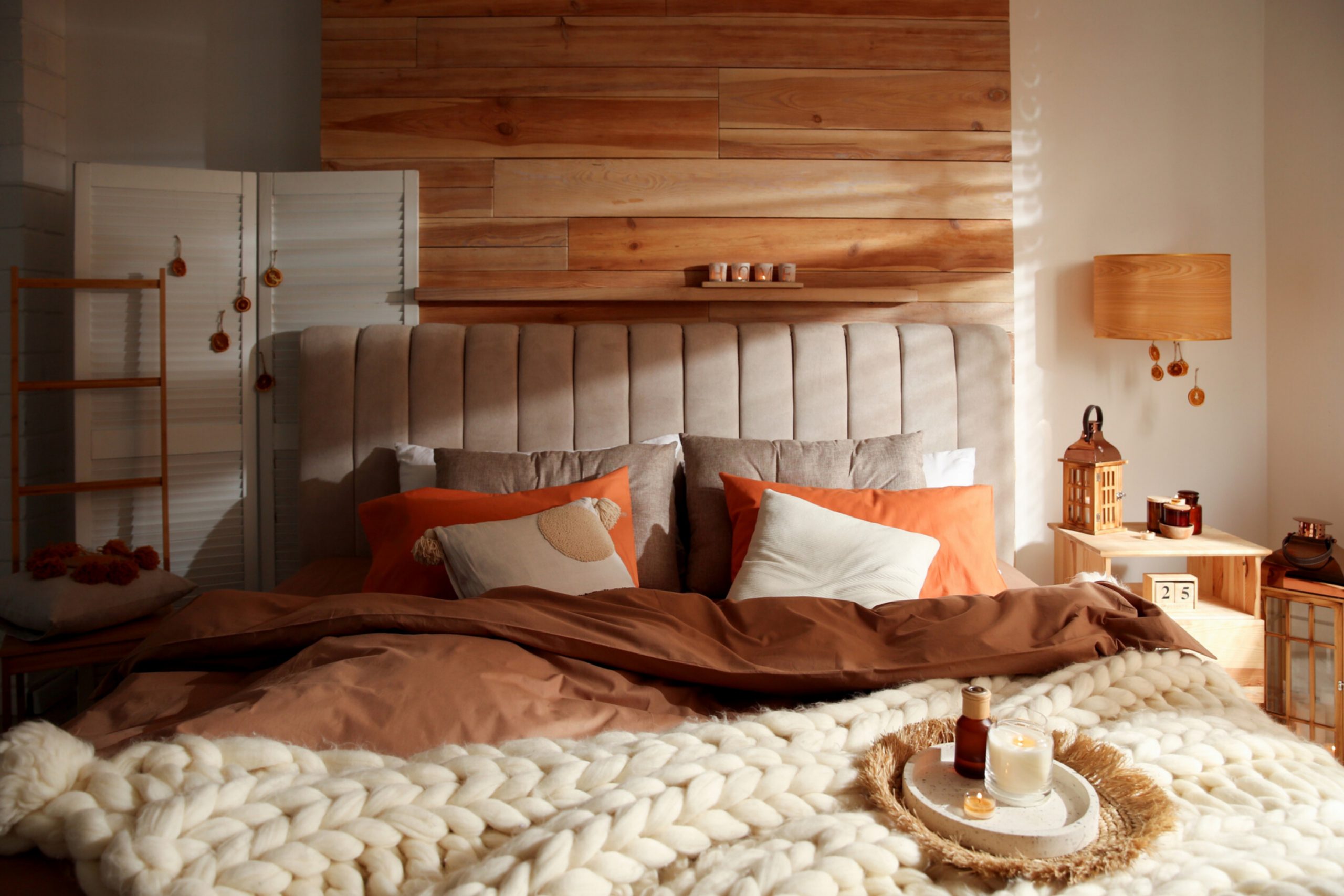
Warm bedroom paint colors bring comfort and a cozy glow. When I design a bedroom, I often reach for shades that make the room feel welcoming. These tones can soften the walls, highlight fabrics, and set the mood for rest. Some warm colors remind me of sandy beaches, while others feel like creamy milk or golden light.
Each one has its own way of creating comfort. With the right choice, a bedroom feels safe and personal.
Why I Trust Sherwin-Williams for Cozy and Relaxing Bedroom Tones
I often choose Sherwin-Williams because their colors always feel steady. Their warm tones never look too bold, and they test beautifully in different lights. I know I can find creamy whites, sandy beiges, or golden notes all in one palette. These shades help me make bedrooms that feel cozy but not heavy.
What I love most is the balance between brightness and comfort. With their range, I can match any mood my client wants.
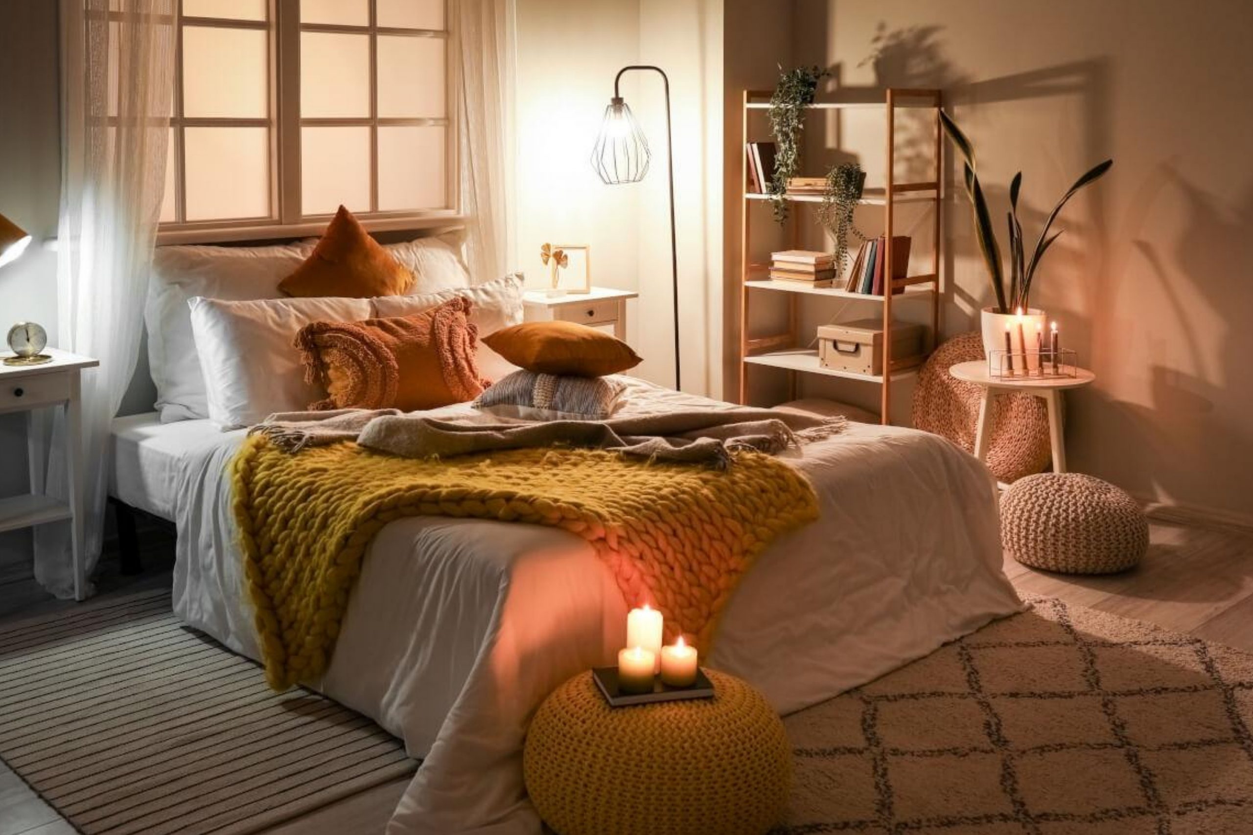
How I Choose the Right Warm Color for a Calm and Inviting Bedroom
My way of picking warm bedroom colors always starts with light. I check how the room looks in morning and evening because colors change with light. Then I listen to what mood the person wants, soft beige or golden richness. I try samples on the wall, because paint in a can never looks the same on the surface.
Warm colors are about feelings, and the right one makes a bedroom truly inviting. When the match is right, the room feels like home.
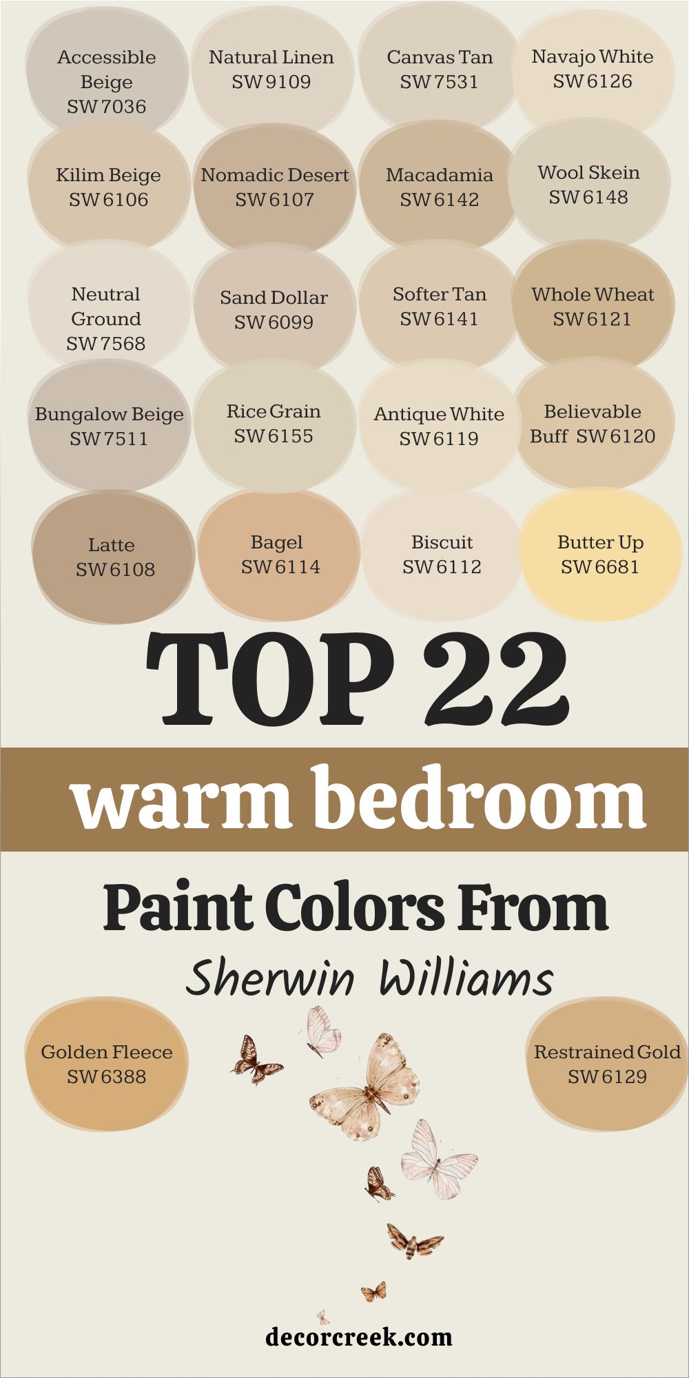
22 Top Warm Bedroom Paint Colors from Sherwin Williams
Accessible Beige – SW 7036
Accessible Beige feels warm without being heavy. It has a soft gray touch that keeps it balanced. Bedrooms painted in this shade feel cozy and open at the same time. I often use it when clients want comfort without too much color. This shade pairs beautifully with natural wood or creamy trim.
The key rule of this color for bedroom is that it works in both modern and classic styles.

Natural Linen – SW 9109
Natural Linen feels gentle, like soft fabric. It works especially well with neutral bedding and natural textures. Bedrooms in this shade glow with warmth but never feel too dark. I like it because it blends smoothly with other tones. It looks wonderful in rooms with warm light.
The key rule of this color for bedroom is that it creates a background that feels relaxed.

Canvas Tan – SW 7531
Canvas Tan has a sandy warmth that reminds me of beaches. Bedrooms with this color look both cozy and airy. It adds just enough warmth without feeling too bold. I often suggest it for rooms that need comfort but still want brightness. It blends well with creamy trim or soft wood tones.
The key rule of this color for bedroom is that it brings softness with ease.

Navajo White – SW 6126
Navajo White shines with a creamy glow. It is warm but still bright enough for small bedrooms. I like how it makes fabrics look richer and softer. The yellow undertone gives it a cheerful touch. It pairs nicely with golden lamps and warm wood.
The key rule of this color for bedroom is that it works best with cozy lighting.

Kilim Beige – SW 6106
Kilim Beige feels classic and dependable. It has a balance of beige and warmth that feels comforting. Bedrooms painted in this shade have a grounded glow. I use it often because it works for many different styles. It pairs best with whites and warm fabrics.
The key rule of this color for bedroom is that it always feels rich but soft.

Nomadic Desert – SW 6107
Nomadic Desert has depth with an earthy warmth. Bedrooms in this shade feel cozy and safe, like a soft blanket. It is stronger than lighter beiges but not too bold. I use it in larger rooms where warmth is needed. It pairs well with darker wood and rich fabrics.
The key rule of this color for bedroom is that it feels grounded and warm.

Macadamia – SW 6142
Macadamia feels creamy and nutty. Bedrooms in this color glow with golden warmth. It works best with neutral bedding that lets the color stand out. I often use it for rooms that need comfort but also richness. It is warm without being too bright.
The key rule of this color for bedroom is that it feels natural and soft.
Wool Skein – SW 6148
Wool Skein feels soft with a touch of gray. It makes bedrooms warm without looking dark. I like it as a quiet background that allows fabrics to shine. It works with both light wood and deep tones. It feels gentle in the morning and cozy at night.
The key rule of this color for bedroom is that it adds warmth quietly.

Neutral Ground – SW 7568
Neutral Ground looks sandy and light. Bedrooms in this shade feel open but cozy. I use it when clients want warmth but not too much color. It pairs well with bedding in whites and beiges. This shade works well in both small and large rooms.
The key rule of this color for bedroom is that it feels easy and inviting.

Sand Dollar – SW 6099
Sand Dollar feels like soft morning light. It brings cheer without being too bright. Bedrooms with this shade feel warm and welcoming. I like pairing it with creamy trim. It adds a glow that feels soft and golden.
The key rule of this color for bedroom is that it makes the room lively but still cozy.
Softer Tan – SW 6141
Softer Tan feels warm and safe. Bedrooms in this shade glow with gentle warmth. It is not too deep, so it works well in many settings. I like it as a backdrop for natural fabrics. It keeps the room soft without stealing attention.
The key rule of this color for bedroom is that it brings comfort in a quiet way.

Whole Wheat – SW 6121
Whole Wheat feels golden and full. Bedrooms painted in this color feel rich and inviting. It pairs beautifully with dark woods and warm lights. I like how it adds depth without being too heavy. It creates a glow that feels natural.
The key rule of this color for bedroom is that it feels full of warmth.
Bungalow Beige – SW 7511
Bungalow Beige feels grounded and steady. Bedrooms in this shade look warm and safe. I like pairing it with creamy bedding or wood furniture. It has enough depth to stand out. It feels warm without being too bold.
The key rule of this color for bedroom is that it feels stable and welcoming.

Rice Grain – SW 6155
Rice Grain feels creamy and light. Bedrooms in this shade look brighter and softer. It works well in rooms with less natural light. I like how it pairs with warm whites. It adds warmth without being strong.
The key rule of this color for bedroom is that it brings light with comfort.
Antique White – SW 6119
Antique White feels creamy and soft. Bedrooms painted in this shade glow with warmth. It is gentle and easy on the eyes. I often use it for a simple but cozy look. It works with both modern and classic furniture.
The key rule of this color for bedroom is that it adds comfort with ease.

Believable Buff – SW 6120
Believable Buff feels golden but soft. Bedrooms in this shade feel safe and warm. I like it because it pairs well with light bedding. It is strong enough to stand out but not too dark. It adds depth without heaviness.
The key rule of this color for bedroom is that it feels cozy and balanced.

Latte – SW 6108
Latte feels like warm coffee. Bedrooms in this shade glow with richness. It works well with natural wood and cozy fabrics. I often use it when clients want a deeper warmth. It feels inviting in both day and night light.
The key rule of this color for bedroom is that it adds richness with comfort.

Bagel – SW 6114
Bagel feels golden and cheerful. Bedrooms painted in this shade glow warmly. It pairs nicely with creamy trim and soft fabrics. I like it for rooms that need a sunny touch. It feels warm but not too strong.
The key rule of this color for bedroom is that it adds gentle brightness.
Biscuit – SW 6112
Biscuit feels creamy and soft. Bedrooms painted in this shade feel safe and cozy. It works well with wood and natural bedding. I like it because it keeps the room light. It gives warmth without standing out.
The key rule of this color for bedroom is that it makes the room inviting.

Butter Up – SW 6681
Butter Up feels sunny and light. Bedrooms in this shade glow with cheer. It adds a touch of brightness but still feels soft. I often pair it with white bedding. It feels happy without being too bold.
The key rule of this color for bedroom is that it adds a cheerful glow.

Golden Fleece – SW 6388
Golden Fleece feels warm with a golden glow. Bedrooms painted in this shade look cozy and rich. It works best with warm woods and soft fabrics. I like how it feels inviting both day and night. It brings in brightness without harshness.
The key rule of this color for bedroom is that it adds gentle richness.
Restrained Gold – SW 6129
Restrained Gold feels golden with depth. Bedrooms painted in this shade look grounded and safe. It pairs beautifully with warm bedding and natural fabrics. I like how it adds richness without being dark. It has a classic warmth that feels strong.
The key rule of this color for bedroom is that it makes the room feel rich and warm.
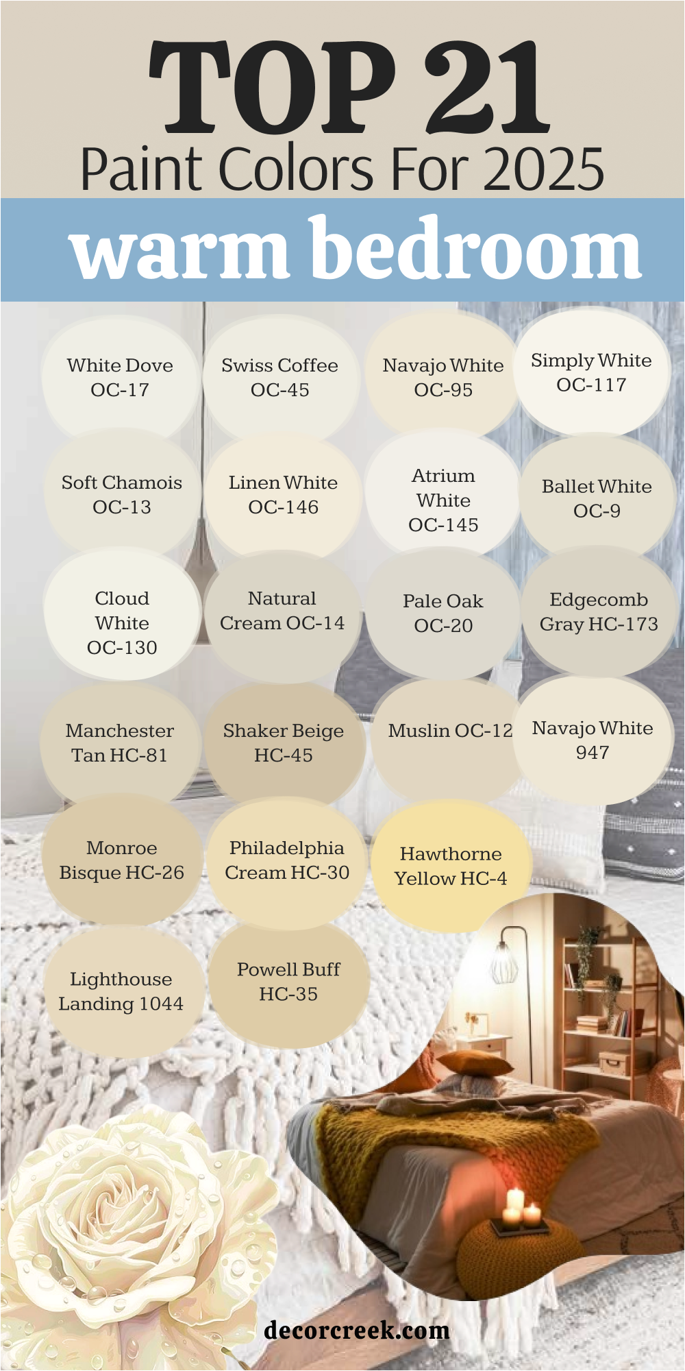
21 Top Warm Bedroom Paint Colors from Benjamin Moore
White Dove – OC-17
White Dove feels creamy and soft, making the bedroom glow with warmth. It pairs beautifully with both dark wood and lighter fabrics. I like how it keeps the room bright without looking too sharp. This shade feels welcoming in both daylight and lamplight. It is a color that many clients choose when they want brightness and comfort together.
The key rule of this color for bedroom is that it makes the walls glow gently.

Swiss Coffee – OC-45
Swiss Coffee feels smooth and creamy, like warm milk. Bedrooms painted in this shade feel gentle and safe. It pairs well with warm bedding or light wood furniture. I often suggest it for people who want comfort but still enjoy brightness. It makes a bedroom feel balanced and soft.
The key rule of this color for bedroom is that it gives warmth without heaviness.

Navajo White – OC-95
Navajo White has a golden undertone that shines softly. Bedrooms in this shade feel cheerful and cozy at the same time. I love how it pairs with creamy bedding and golden lights. It brings out warmth in fabrics and wood furniture. It works beautifully in both small and large rooms.
The key rule of this color for bedroom is that it adds sunny glow without being strong.

Simply White – OC-117
Simply White feels warm and fresh, never cold. Bedrooms painted in this shade look bright but still cozy. It pairs well with natural bedding and soft fabrics. I like how it adapts to both modern and classic bedrooms. This shade shines softly in daylight but feels warm at night.
The key rule of this color for bedroom is that it brings warmth while keeping brightness.

Soft Chamois – OC-13
Soft Chamois feels creamy with a soft beige note. Bedrooms painted in this shade look calm and gentle. It works beautifully with natural linens and warm lighting. I often use it for bedrooms that need softness without depth. It makes the room glow with comfort.
The key rule of this color for bedroom is that it creates gentle warmth.

Linen White – OC-146
Linen White feels like natural fabric, soft and cozy. Bedrooms painted with this shade glow warmly. It is not too strong, so it works in any size of room. I like pairing it with simple bedding for a soft effect. It shines warmly under lamplight.
The key rule of this color for bedroom is that it blends comfort with brightness.

Atrium White – OC-145
Atrium White has a warm blush undertone. Bedrooms painted in this shade look soft and inviting. It works nicely with golden lamps and creamy fabrics. I like it for bedrooms where a gentle warmth is needed. It feels both fresh and cozy.
The key rule of this color for bedroom is that it adds warmth in a soft way.

Ballet White – OC-9
Ballet White feels creamy with a quiet touch of gray. Bedrooms painted with this shade look light and warm at the same time. I often pair it with light bedding for a gentle style. It adds a glow without being bold. This shade is soft enough to work in many styles.
The key rule of this color for bedroom is that it balances warmth with brightness.

Cloud White – OC-130
Cloud White feels creamy and glowing. Bedrooms in this shade look cozy but never heavy. I like using it in rooms that need warmth but also brightness. It pairs well with wood tones and soft fabrics. It feels bright during the day and warm in the evening.
The key rule of this color for bedroom is that it adds light with comfort.

Natural Cream – OC-14
Natural Cream feels smooth and warm, like soft beige with cream. Bedrooms in this shade look gentle and cozy. I often pair it with natural bedding for a grounded feel. It works well in medium-sized rooms. It has a warmth that feels welcoming but not too bold.
The key rule of this color for bedroom is that it adds a soft natural glow.

Pale Oak – OC-20
Pale Oak feels like a warm greige with comfort. Bedrooms in this shade look both modern and cozy. I love how it pairs with whites and wood accents. It adds depth while still staying soft. This shade works beautifully with natural fabrics.
The key rule of this color for bedroom is that it feels warm but modern.

Edgecomb Gray – HC-173
Edgecomb Gray feels soft with a warm touch. Bedrooms painted in this shade look gentle and grounded. It blends well with both warm bedding and white trim. I often use it in bedrooms that need warmth without much depth. It adapts well to natural light.
The key rule of this color for bedroom is that it adds quiet warmth.

Manchester Tan – HC-81
Manchester Tan feels sandy and cheerful. Bedrooms painted in this shade glow warmly. It pairs well with natural wood and white trim. I like how it adds comfort without being too heavy. It feels warm but never strong.
The key rule of this color for bedroom is that it gives a golden warmth.

Shaker Beige – HC-45
Shaker Beige feels classic and cozy. Bedrooms painted in this shade feel grounded and rich. I pair it often with warm bedding and soft lighting. It has enough depth to make the room feel warm. This shade feels natural and soft in both small and large rooms.
The key rule of this color for bedroom is that it adds warmth with depth.

Muslin – OC-12
Muslin feels creamy with a soft beige touch. Bedrooms in this shade look gentle and cozy. I love using it in rooms that need warmth but still feel bright. It works well with soft fabrics and neutral bedding. It shines warmly with lamp light.
The key rule of this color for bedroom is that it makes the bedroom glow softly.
Navajo Beige – 947
Navajo Beige feels sandy and warm, like natural earth. Bedrooms painted in this shade feel safe and inviting. I often use it with wooden furniture for a cozy look. It pairs beautifully with creamy bedding. It feels gentle but not plain.
The key rule of this color for bedroom is that it adds warmth in a natural way.
Monroe Bisque – HC-26
Monroe Bisque feels creamy with a golden touch. Bedrooms in this shade glow warmly. It pairs nicely with earthy fabrics and soft lighting. I like it for rooms that need more comfort. It feels grounded but still bright.
The key rule of this color for bedroom is that it adds cozy richness.
Philadelphia Cream – HC-30
Philadelphia Cream feels golden and soft. Bedrooms painted in this shade feel cheerful and inviting. It pairs well with white trim and warm bedding. I use it when clients want a cozy but bright look. It works well in both modern and classic rooms.
The key rule of this color for bedroom is that it adds a golden glow.
Hawthorne Yellow – HC-4
Hawthorne Yellow feels sunny and happy. Bedrooms painted in this shade look cheerful and warm. It pairs well with natural bedding and soft fabrics. I like how it brings joy without being too strong. It feels bright in the morning and cozy at night.
The key rule of this color for bedroom is that it adds warmth with cheer.

Lighthouse Landing – 1044
Lighthouse Landing feels creamy with golden warmth. Bedrooms in this shade feel inviting and safe. It pairs beautifully with soft bedding and natural woods. I use it often for rooms that need gentle glow. It feels balanced and cozy at any time of day.
The key rule of this color for bedroom is that it adds light warmth.
Powell Buff – HC-35
Powell Buff feels golden and rich. Bedrooms painted with this shade glow warmly. I pair it with creamy trim and warm fabrics. It works well for clients who want a cozy yet classic look. It feels warm without being dark.
The key rule of this color for bedroom is that it adds richness with comfort.

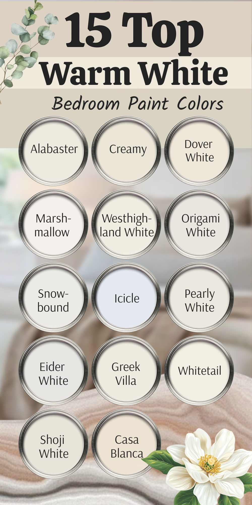
15 Top Warm White Bedroom Paint Colors
Alabaster – SW 7008
Alabaster feels creamy and soft, almost like warm light on the walls. Bedrooms painted in this shade glow with comfort and brightness. I like how it works with both natural wood and light bedding. It feels simple but rich enough to stand out gently. Many of my clients choose it because it never feels cold.
The key rule of this color for bedroom is that it gives light while keeping a cozy warmth.

Creamy – SW 7012
Creamy feels like warm milk poured over the walls. Bedrooms painted in this shade look soft and inviting. I like how it pairs with golden lamps and wooden furniture. It makes a room glow without being too strong. This shade is perfect for bedrooms that need gentle brightness.
The key rule of this color for bedroom is that it makes everything feel safe and cozy.

Dover White – SW 6385
Dover White carries a golden undertone that shines softly. Bedrooms painted in this color feel cheerful and welcoming. I often pair it with warm fabrics and natural textures. It brings a sunny glow that feels comforting. It has just enough depth to keep the walls from looking flat.
The key rule of this color for bedroom is that it adds brightness with warmth.

Marshmallow – SW 7001
Marshmallow feels soft and sweet, like its name suggests. Bedrooms painted in this shade look light but still warm. I like how it blends with pastel bedding or creamy accents. It feels gentle in both small and large rooms. It never looks sharp, always soft and welcoming.
The key rule of this color for bedroom is that it creates a tender glow.

Westhighland White – SW 7566
Westhighland White feels creamy and fresh at the same time. Bedrooms in this shade glow with a cozy warmth. I like how it pairs with neutral bedding and wood furniture. It looks bright in daylight but never feels cold. This shade is easy to use in both classic and modern rooms.
The key rule of this color for bedroom is that it adds warmth while staying light.

Origami White – SW 7636
Origami White feels soft with a slight warm touch. Bedrooms painted in this shade look gentle and inviting. I often use it in homes where a quiet background is needed. It pairs well with creamy trim and natural fabrics. It feels calm during the day and warm at night.
The key rule of this color for bedroom is that it creates a soft, welcoming glow.

Snowbound – SW 7004
Snowbound feels fresh with just a hint of warmth. Bedrooms painted in this shade stay bright without being harsh. I like how it pairs with warm lamps and cozy fabrics. It feels cheerful during the day but comforting at night. Many clients love it because it feels clean but not cold.
The key rule of this color for bedroom is that it adds light with softness.

Icicle – SW 6238
Icicle feels airy with a soft creamy undertone. Bedrooms painted in this shade look bright but still inviting. It works well when paired with natural bedding and light wood. I like using it in smaller rooms because it makes them glow. It feels soft even in stronger daylight.
The key rule of this color for bedroom is that it keeps things warm while looking light.

Pearly White – SW 7009
Pearly White feels creamy with a soft glow, like pearls shining. Bedrooms painted in this shade feel elegant and cozy. I like how it pairs with warm bedding and neutral fabrics. It makes the room glow softly under lamplight. This color keeps the bedroom warm but still gentle.
The key rule of this color for bedroom is that it adds a smooth and cozy brightness.

Eider White – SW 7014
Eider White feels soft with a touch of gray warmth. Bedrooms painted in this shade look cozy and stylish. I often pair it with wooden furniture for balance. It feels warm but still light enough for small rooms. This shade works beautifully with neutral fabrics.
The key rule of this color for bedroom is that it adds warmth with a gentle touch.

Greek Villa – SW 7551
Greek Villa feels creamy and glowing, perfect for bedrooms that need warmth. It has a brightness that never feels sharp. I like using it with natural linens and warm lights. Bedrooms painted in this shade look inviting day and night. It feels cozy but still light.
The key rule of this color for bedroom is that it blends brightness with comfort.

Whitetail – SW 7103
Whitetail feels bright but warm at the same time. Bedrooms painted with this shade glow softly. I often suggest it for clients who want brightness but not a sharp look. It pairs well with warm bedding and wood furniture. It feels cheerful in daylight and cozy in the evening.
The key rule of this color for bedroom is that it adds glow while keeping warmth.

Shoji White – SW 7042
Shoji White feels soft with a beige undertone. Bedrooms painted in this shade look cozy and grounded. I like how it pairs with warm fabrics and natural textures. It feels rich but not too strong. This shade is perfect for rooms that need depth without bold color.
The key rule of this color for bedroom is that it adds quiet warmth.

Casa Blanca – SW 7571
Casa Blanca feels creamy and classic. Bedrooms painted in this shade glow with soft warmth. I often use it in homes that need a gentle but cozy background. It works well with neutral bedding and golden lamps. This color never feels flat, always inviting.
The key rule of this color for bedroom is that it gives warmth in a soft way.

Oyster White – SW 7637
Oyster White feels creamy with a sandy note. Bedrooms in this shade feel warm but not heavy. I like how it pairs with both modern and traditional furniture. It glows softly in warm lighting. It feels inviting during the day and rich at night.
The key rule of this color for bedroom is that it creates a grounded and cozy look.

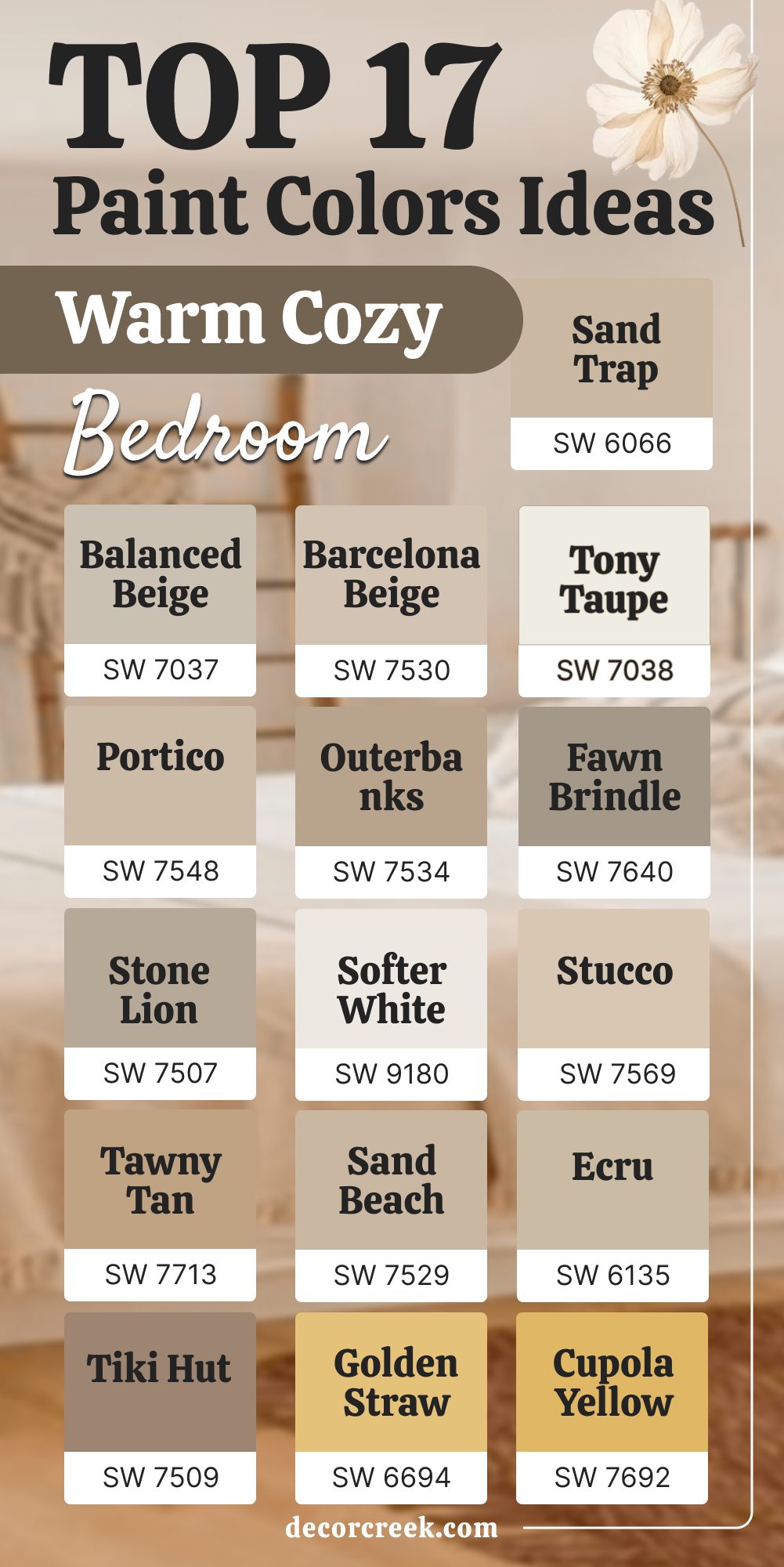
17 Top Warm Cozy Bedroom Paint Color Ideas
Balanced Beige – SW 7037
Balanced Beige feels warm and steady, like soft sand under your feet. Bedrooms painted in this shade look grounded but still light. I like how it pairs with wood accents and cozy fabrics. It works well in both small rooms and large ones. The warmth is soft enough to stay inviting without being bold.
The key rule of this color for bedroom is that it brings comfort with balance.

Barcelona Beige – SW 7530
Barcelona Beige feels soft and golden, making bedrooms glow gently. I often use it when a room needs more warmth but still has to stay bright. It pairs well with creamy whites and light bedding. I like how it makes the furniture stand out without being loud. This shade is safe but still has charm.
The key rule of this color for bedroom is that it adds a warm glow that feels welcoming.

Tony Taupe – SW 7038
Tony Taupe feels rich and cozy, with a warm undertone that adds depth. Bedrooms in this shade feel safe and inviting. I often pair it with creamy trim or warm wood pieces. It works well for clients who want a color that feels a little stronger but not heavy. It keeps its warmth in both daylight and lamplight.
The key rule of this color for bedroom is that it adds richness while staying soft.

Portico – SW 7548
Portico feels sandy and light, almost like stone warmed by the sun. Bedrooms painted in this shade look soft and cozy. I like how it matches with simple fabrics and golden lights. It is not too bold but has enough warmth to make a room inviting. I often use it when I want to create a calm but cozy background.
The key rule of this color for bedroom is that it brings warmth with a natural feel.
Outerbanks – SW 7534
Outerbanks feels grounded and warm, like the earth on a sunny day. Bedrooms painted in this shade feel safe and cozy. I like how it pairs with strong wood furniture. It works best when the room needs depth and character. The shade feels steady, never too bright or flat.
The key rule of this color for bedroom is that it makes the room feel rich and welcoming.
Fawn Brindle – SW 7640
Fawn Brindle feels soft with a touch of gray warmth. Bedrooms painted in this shade look stylish and inviting. I often pair it with creamy whites and natural linens. It has enough depth to add character without feeling too dark. The color feels balanced both in daylight and at night.
The key rule of this color for bedroom is that it brings a cozy mood with elegance.

Stone Lion – SW 7507
Stone Lion feels earthy and rich, like warm stone. Bedrooms painted in this shade glow with a deep comfort. I like how it works with warm bedding and golden lighting. It feels steady and strong, yet still cozy. This shade pairs well with wood accents and layered fabrics.
The key rule of this color for bedroom is that it adds grounded warmth.

Softer White – SW 9180
Softer White feels creamy with just a touch of warmth. Bedrooms in this shade look bright but never sharp. I like how it works with natural fabrics and warm lights. It gives the room an inviting glow during the evening. Many clients love it because it looks clean but still cozy.
The key rule of this color for bedroom is that it keeps the room light while adding comfort.
Stucco – SW 7569
Stucco feels sandy and sun-warmed, perfect for bedrooms that need cozy charm. It works well with rustic furniture or natural textures. I like how it adds warmth without feeling too strong. It feels cheerful during the day and cozy at night. This shade is versatile for many home styles.
The key rule of this color for bedroom is that it adds soft golden comfort.
Tawny Tan – SW 7713
Tawny Tan feels golden and full of warmth. Bedrooms painted in this shade feel cheerful and cozy. I like how it pairs with warm bedding and dark wood furniture. It shines under both daylight and lamplight. This shade gives depth without being too bold.
The key rule of this color for bedroom is that it adds a glowing warmth.
Sand Beach – SW 7529
Sand Beach feels soft and natural, like walking barefoot on warm sand. Bedrooms in this shade glow gently with warmth. I often pair it with simple white bedding to let the color shine. It feels cheerful without being loud. The color blends well with natural fabrics and textures.
The key rule of this color for bedroom is that it adds gentle comfort.
Ecru – SW 6135
Ecru feels creamy with a soft golden undertone. Bedrooms painted in this shade feel safe and inviting. I like how it pairs with wooden accents and neutral fabrics. It has just enough depth to feel warm without being bold. The glow works beautifully in both day and night light.
The key rule of this color for bedroom is that it gives a cozy golden touch.
Tiki Hut – SW 7509
Tiki Hut feels strong and earthy, with a cozy richness. Bedrooms in this shade feel grounded and safe. I like how it pairs with creamy trim or golden lamps. It works well for larger rooms where warmth is needed. The shade adds character without being harsh.
The key rule of this color for bedroom is that it creates a warm and bold comfort.

Golden Straw – SW 6694
Golden Straw feels cheerful and sunny, like morning light. Bedrooms painted in this shade glow with joy. I like how it pairs with creamy whites and soft fabrics. It adds energy while still staying cozy. This color feels bright in the morning and gentle in the evening.
The key rule of this color for bedroom is that it brings a happy warmth.
Cupola Yellow – SW 7692
Cupola Yellow feels soft but glowing, like sunlight on warm walls. Bedrooms in this shade feel bright and cheerful. I often pair it with natural wood and neutral fabrics. It is bold enough to add character but never too sharp. This color works beautifully in cozy homes.
The key rule of this color for bedroom is that it adds glowing cheer.
Sand Trap – SW 6066
Sand Trap feels creamy with a beige touch. Bedrooms painted in this shade feel calm and cozy. I like how it blends with natural bedding and simple furniture. It never feels heavy, always soft and warm. This shade adds a gentle warmth without being too bold.
The key rule of this color for bedroom is that it creates a soft comfort.

Ivoire – SW 6127
Ivoire feels creamy with a golden undertone. Bedrooms in this shade glow warmly and feel inviting. I often pair it with white trim or neutral bedding. It shines softly under warm lamps. This color makes the bedroom feel cheerful without being strong.
The key rule of this color for bedroom is that it adds golden light with comfort.
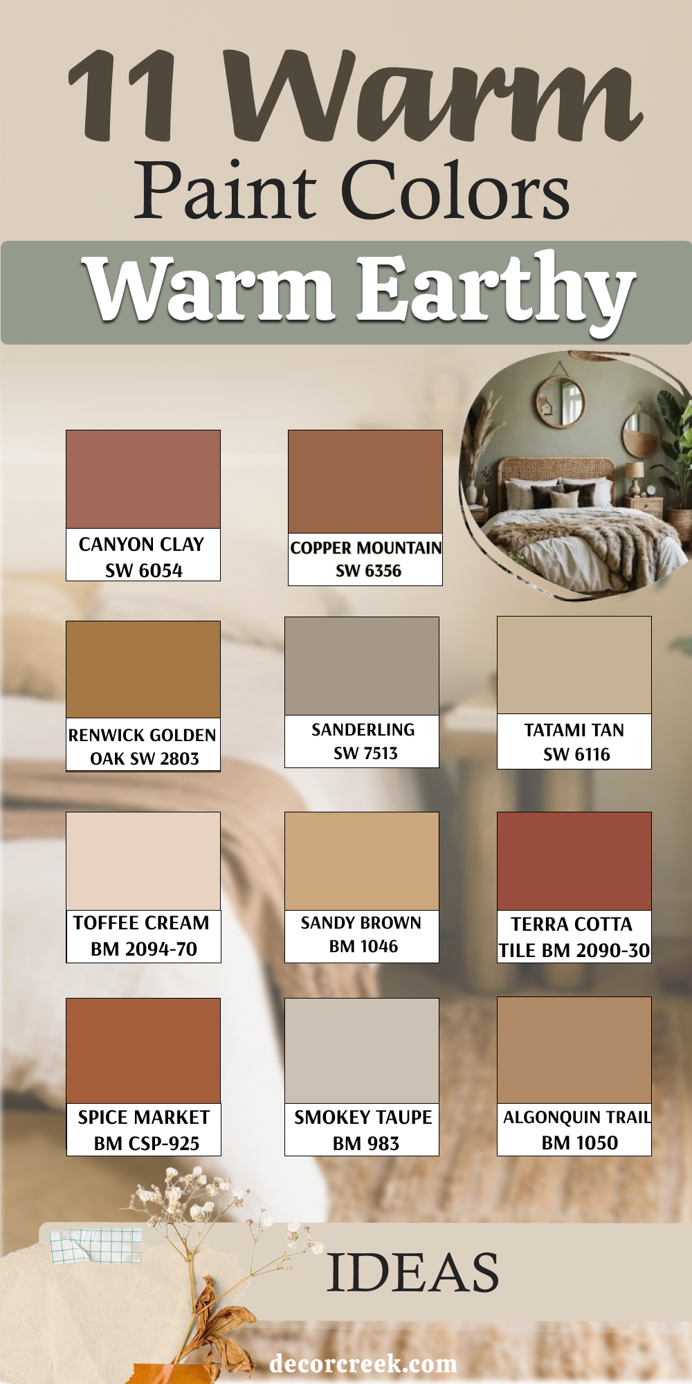
11 Warm Earthy Bedroom Paint Color Ideas
Canyon Clay – SW 6054
Canyon Clay feels rich and warm, like baked earth in the sun. Bedrooms painted in this shade feel grounded and cozy. I like pairing it with neutral bedding to balance the depth. It works well in rooms that need a touch of natural richness. The shade carries strength but still feels inviting.
The key rule of this color for bedroom is that it brings in earthy comfort.
Copper Mountain – SW 6356
Copper Mountain feels glowing, with a golden clay undertone. Bedrooms in this shade feel warm and unique. I often use it with rustic furniture or soft cream bedding. It creates a cozy mood while adding depth to the room. This color feels bold yet soft under warm light.
The key rule of this color for bedroom is that it adds an earthy glow.

Renwick Golden Oak – SW 2803
Renwick Golden Oak feels like polished wood with warmth. Bedrooms painted in this shade feel safe and classic. I like how it pairs with traditional furniture. It has a richness that works best in larger rooms. The golden undertone keeps it from looking too dark.
The key rule of this color for bedroom is that it adds wood-like comfort.
Sanderling – SW 7513
Sanderling feels sandy and soft, with a natural glow. Bedrooms painted in this shade look calm and cozy. I often pair it with simple fabrics and wooden accents. It works beautifully in smaller rooms where warmth is needed. The color feels inviting without being too strong.
The key rule of this color for bedroom is that it adds soft earthy balance.

Tatami Tan – SW 6116
Tatami Tan feels warm with a sandy beige note. Bedrooms in this shade glow gently and feel inviting. I like using it with light bedding and natural fabrics. It never feels sharp, always soft and cozy. The shade works well for people who want warmth without boldness.
The key rule of this color for bedroom is that it gives a natural warmth.

Toffee Cream – BM 2094-70
Toffee Cream feels creamy with a touch of golden sweetness. Bedrooms painted in this shade look warm and inviting. I like how it blends with wood accents and soft linens. It glows gently under warm lamps. This color feels cozy without being heavy.
The key rule of this color for bedroom is that it adds a sweet golden comfort.
Sandy Brown – BM 1046
Sandy Brown feels earthy and strong, like warm desert sand. Bedrooms painted in this shade feel rich and grounded. I often pair it with creamy bedding to soften the depth. It works well in homes with rustic or natural style. The color feels bold but still cozy.
The key rule of this color for bedroom is that it adds strength with warmth.
Terra Cotta Tile – BM 2090-30
Terra Cotta Tile feels bold and earthy, with the warmth of clay. Bedrooms in this shade feel cozy and full of character. I like how it pairs with creamy whites and soft lights. It adds depth while still staying inviting. This shade works best in rooms that need richness.
The key rule of this color for bedroom is that it brings clay-like charm.
Spice Market – BM CSP-925
Spice Market feels rich with golden brown notes. Bedrooms painted in this shade look cozy and warm. I like pairing it with natural fabrics and golden lamps. It feels grounded, almost like warm spices. The glow works beautifully in evening light.
The key rule of this color for bedroom is that it adds depth with warmth.
Smokey Taupe – BM 983
Smokey Taupe feels soft with an earthy undertone. Bedrooms in this shade feel safe and inviting. I often use it with creamy trim to keep the look light. It blends well with both modern and traditional designs. This shade carries warmth without being too bold.
The key rule of this color for bedroom is that it adds soft earthy comfort.

Algonquin Trail – BM 1050
Algonquin Trail feels golden and earthy, like sunlit soil. Bedrooms painted in this shade glow warmly. I like how it pairs with natural bedding and wooden accents. It gives a sense of richness without heaviness. This color feels cozy both day and night.
The key rule of this color for bedroom is that it adds a natural golden warmth.
Final Thoughts on Warm Bedroom Colors
Warm bedroom colors create a feeling of comfort, safety, and personal touch. From creamy whites to sandy beiges and earthy clays, each shade tells its own story. I always remind my clients that light, fabrics, and furniture play a big role in how a color feels.
A warm shade can make mornings brighter and nights softer.
With so many beautiful options, there is always a color that will make a bedroom feel like home.
The right warm tone turns the room into a place where rest feels easy and natural.
