The hallway is the first and most important impression of your home, and unfortunately, for too long, many of us have settled for boring, standard light colors. But I firmly believe that your entryway deserves to be dramatic, impactful, and memorable. In 2026, I see a huge and confident trend toward deep, moody, and incredibly sophisticated paint shades in these transitional zones, setting a powerful tone.
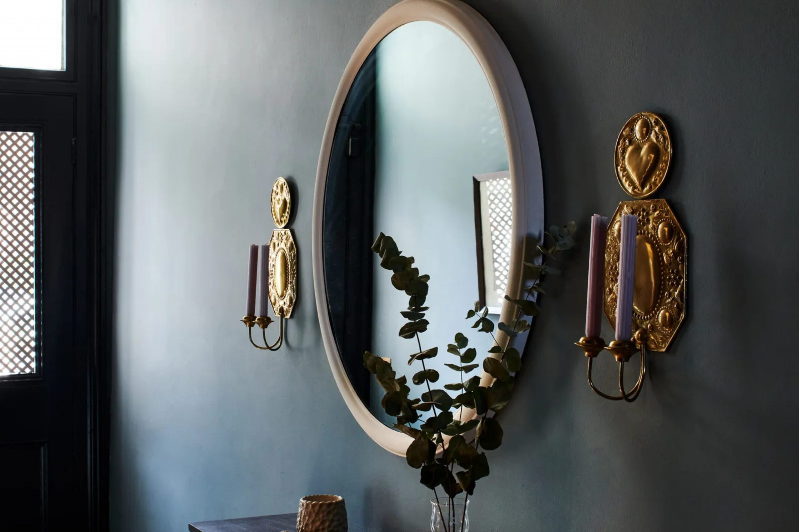
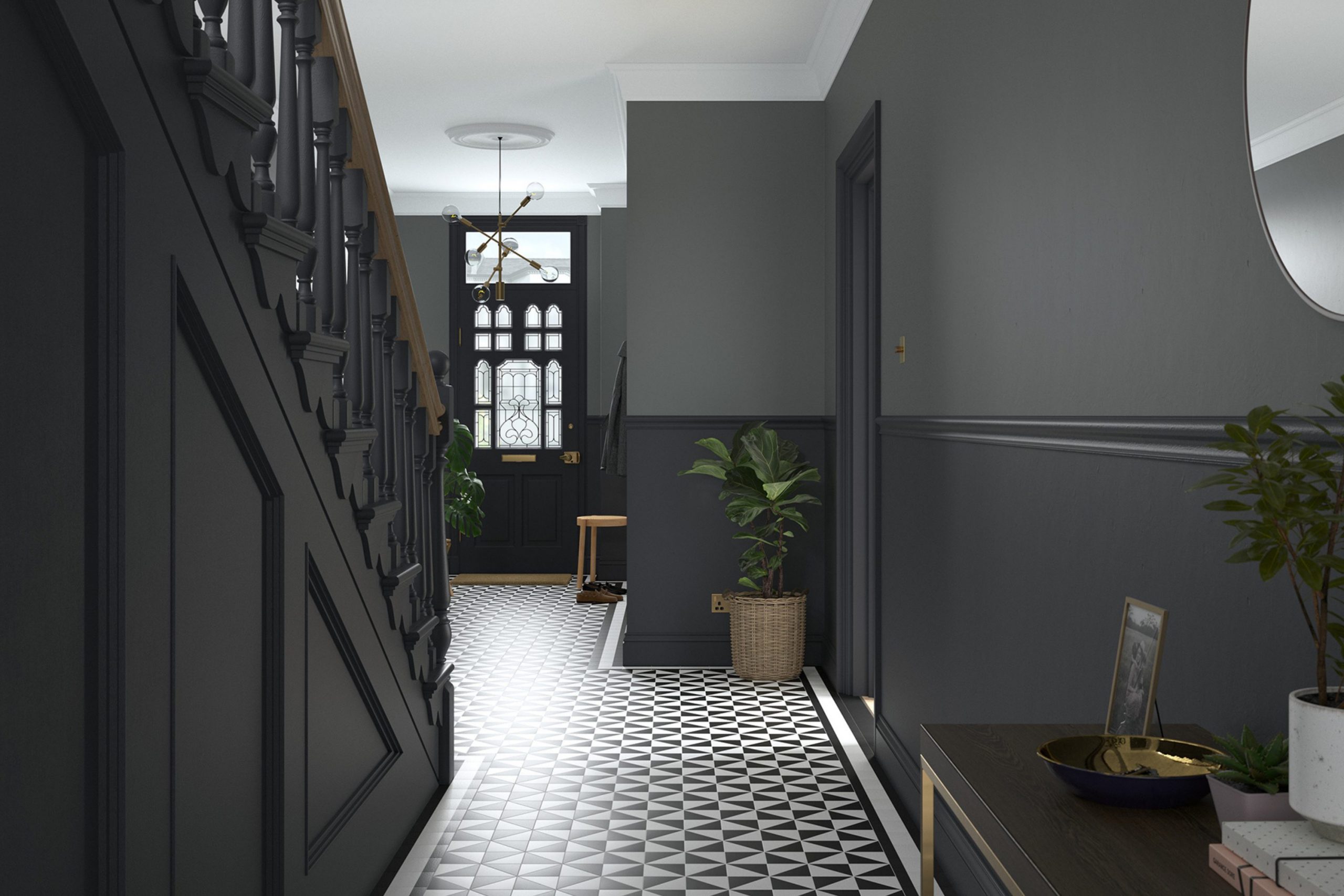
Using a dark color in a small or dimly lit hallway might seem risky, but it is actually a design secret that makes the adjoining bright rooms feel even bigger and brighter due to the strong contrast. A deep, rich color instantly introduces character and sophistication that simple white or beige just cannot provide.
This is your chance to be bold and create a powerful, welcoming, and luxurious tone right at your front door.
I am going to share my top 33 dark color options for hallways for the coming year and walk you through my exact process for choosing the perfect shade that will give your home that high-end feel.
Why I Always Trust Sherwin-Williams and Benjamin Moore for Dark Shades
When I’m specifying a dark, saturated color—especially one that needs to look flawless under artificial light, which is very common in hallways—I stick almost exclusively to Sherwin-Williams (SW) and Benjamin Moore (BM) paints. My many years of knowledge and experience as a designer and stager have shown that these two brands offer superior pigmentation quality and unmatched color depth. When using a very dark color, the quality of the paint becomes even more critical because any weak spots, fading, or poor coverage are immediately obvious.
Sherwin-Williams is fantastic for their deep, saturated colors that often have a wonderful subtlety to their undertones, preventing them from looking flat. Their formulas are incredibly reliable, and I know I will get the exact color I see on the swatch without much fuss. Benjamin Moore, on the other hand, is known for its beautiful, rich, and often more complex shades.
Their historical collection colors are particularly useful for creating that classic, anchored feeling in a hallway. Both companies offer premium lines that ensure a smooth, durable finish—something crucial for high-traffic areas like a hallway where scuffs happen easily.
Ultimately, their consistently high-quality ingredients and color accuracy save me time and guarantee a stunning, lasting result for my clients
How I Choose the Right Deep and Moody Shade for a Hallway
Choosing a deep, moody shade for a hallway is more than just picking a pretty color; it’s about making a careful, reasoned decision based on the space’s specific features. My number one consideration is the natural and artificial light in the hallway. I know a color will look completely different in a sunlit hallway versus a windowless one, so I always observe the color at different times of day using large paint samples.
Next, I look closely at the undertones of the color. A seemingly dark gray might have a hidden green, blue, or violet undertone that will clash with the flooring, trim, or nearby furnishings. The finish of the paint is also vital; a matte or flat finish soaks up light and makes the color feel richer and more velvety, while an eggshell or satin finish offers better durability and a slight reflective quality.
I always consider the adjoining rooms; the dark hallway should provide a beautiful contrast to, but still harmonize with, the colors in the main living areas it connects.
Finally, I think about the mood I want to create—do I want a dramatic, grounding navy, or a warm, cocooning charcoal?
This process ensures the chosen dark color feels intentional, not accidental.
33 Dark Hallway Paint Color Ideas
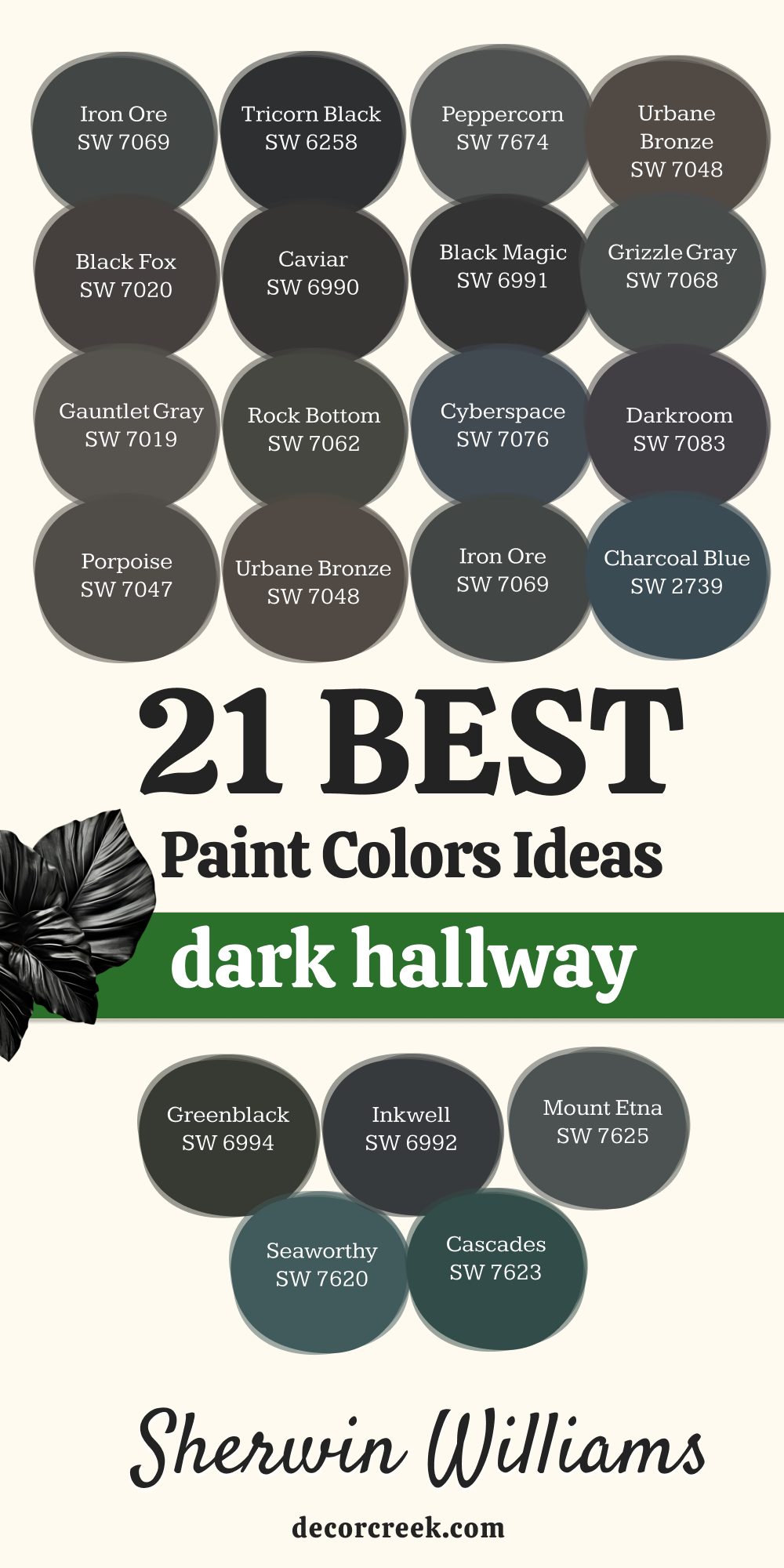
Iron Ore SW 7069
Iron Ore is a sophisticated, soft charcoal that is one of my all-time favorite dark colors. Iron Ore reads as a dark, grounding gray with just a hint of a warm brown or deep green undertone, making it incredibly versatile. Iron Ore works beautifully with both warm woods and cool metals, easily bridging different design styles.
Iron Ore is dark enough to offer dramatic contrast against white trim but is never quite a stark black. Iron Ore performs exceptionally well in hallways because its slight softness prevents it from feeling harsh, even under direct light. Iron Ore is a go-to choice when a client wants a color that feels both contemporary and classic at the same time.
Iron Ore looks fantastic paired with light oak flooring or crisp, bright white marble nearby. Iron Ore is a color that adds instant architectural presence to any long, narrow passageway. Iron Ore feels rich and deep without swallowing all the light in the hallway. Iron Ore is the perfect solution for creating that high-contrast, gallery-like effect for displaying art.
👉 Read the full guide for this color HERE 👈

Peppercorn SW 7674
Peppercorn is a deeply saturated, complex gray that sits perfectly between a true charcoal and a soft black. Peppercorn has a beautiful smoky, almost stone-like quality that gives it an authentic, aged feel. Peppercorn offers a sophisticated alternative to pure black, providing drama while still reading as a rich dark gray.
Peppercorn’s very subtle cool undertone makes it a brilliant partner for bright white crown molding and trim. Peppercorn is a favorite for creating a grounding and restful atmosphere in high-traffic connector spaces. Peppercorn is a highly requested color because it looks elegant and expensive without being overly trendy.
Peppercorn provides the perfect backdrop to let metal fixtures, mirrors, and vibrant accessories truly pop. Peppercorn is durable and forgiving in busy areas, making it a highly practical choice for a family home. Peppercorn is a powerful color that immediately gives a hallway a sense of depth and purpose. Peppercorn is a rich color that works well under both warm and cool artificial lighting conditions.
👉 Read the full guide for this color HERE 👈

Tricorn Black SW 6258
Tricorn Black is a stunning, true black that contains virtually no noticeable undertones of blue, brown, or green. Tricorn Black is the perfect color when you want to make an utterly uncompromising statement in your home’s entry. Tricorn Black creates an incredibly chic and sophisticated look, especially when applied with a flat or matte finish.
Tricorn Black is often used by designers to make a small hallway feel intentional, like a beautiful, dramatic connector between bright rooms. Tricorn Black provides the maximum amount of contrast against neighboring light walls, making them feel even airier. Tricorn Black is the ultimate backdrop for showcasing brass, gold, or silver light fixtures, which truly shine against it.
Tricorn Black is a bold choice that immediately signals a high degree of design confidence to guests. Tricorn Black can be softened by layering in artwork and a textured runner rug down the hallway. Tricorn Black is a classic color that will never fall out of style, making it a wise, long-term choice. Tricorn Black is excellent for hiding any imperfections on older hallway walls due to its deep saturation.
👉 Read the full guide for this color HERE 👈

Urbane Bronze SW 7048
Urbane Bronze is a rich, warm, and deeply saturated color that leans into the brown and gray families for a comforting feel. Urbane Bronze has a distinct, grounding presence and was even named a color of the year for its complex, organic warmth. Urbane Bronze provides a beautiful contrast against creams and warm whites, making those lighter colors feel cozier and richer.
Urbane Bronze has strong bronze and earthy undertones that prevent it from feeling too cold or stark in a dark hallway. Urbane Bronze is a phenomenal choice for creating a feeling of being cocooned and protected as you pass through the home. Urbane Bronze pairs wonderfully with natural materials like stone, leather, and rough-hewn wood textures.
Urbane Bronze is a brilliant option for a hallway that receives little to no natural light, as its warmth keeps it from feeling drab. Urbane Bronze is excellent for giving a home an instant feeling of well-established, quiet luxury. Urbane Bronze is a versatile shade that works in both modern minimalist and traditional style homes. Urbane Bronze is a color that makes a big impact while still feeling very much rooted in nature.
👉 Read the full guide for this color HERE 👈

Iron Mountain 2134-30
Iron Mountain is a deep, strong charcoal gray with a definite warm brown undertone that gives it a velvety, comforting look. Iron Mountain is much richer and warmer than a standard cool gray, avoiding the institutional feeling some darker shades can possess. Iron Mountain is a highly popular choice for those who want a dramatic color that still feels inviting and natural.
Iron Mountain’s deep saturation makes it a wonderful color for hallways where you want to highlight wood trim or archways. Iron Mountain creates a substantial and grounded feeling that is perfect for a main entry or a long connecting hall. Iron Mountain is dark enough to look nearly black in low light but reveals its warm gray complexity when lights are on.
Iron Mountain offers a handsome and sophisticated look that is the foundation of many high-end, tailored designs. Iron Mountain is an excellent backdrop for artwork, as the subtle warmth of the paint complements many different color palettes. Iron Mountain works well to unify a home with open sight lines by providing a bold anchor in the middle. Iron Mountain is a shade that provides a sense of stability and quiet confidence to the home’s transition zones.
👉 Read the full guide for this color HERE 👈

Kendall Charcoal HC-166
Kendall Charcoal is an incredibly popular, classic deep gray that features a green-brown undertone that makes it rich and grounding. Kendall Charcoal is one of those highly dependable colors that works well in almost any light, which is a major benefit for a hallway. Kendall Charcoal is dark and dramatic without ever feeling black, providing a softer contrast to light trim.
Kendall Charcoal is a sophisticated color that creates a sense of history and permanence within the home’s architecture. Kendall Charcoal’s complex undertones allow it to pair beautifully with both cool blues and warm reds in adjacent rooms. Kendall Charcoal is a truly versatile color that is perfect for traditional, transitional, and even more contemporary settings.
Kendall Charcoal is a good choice for a hallway that is wide, as it can make the dimensions feel more intimate and inviting. Kendall Charcoal is the kind of color that makes you feel instantly settled and comfortable when you walk in the door. Kendall Charcoal is an iconic shade that designers often rely on for its tested depth and richness. Kendall Charcoal is a superb background for showcasing family photos or a well-curated gallery wall.
👉 Read the full guide for this color HERE 👈

Wrought Iron 2124-10
Wrought Iron is a beautiful, very dark gray that leans heavily toward soft, smoky black with a definite cool blue or sometimes green undertone. Wrought Iron is a high-drama choice that is still more forgiving than a true, stark black like Tricorn Black. Wrought Iron provides a sophisticated, moody atmosphere that is perfect for a more formal or tailored home.
Wrought Iron’s slight cool cast makes it a beautiful pairing for silver hardware or chrome fixtures down the hall. Wrought Iron is an excellent shade for providing a strong, grounding connection between light, airy rooms. Wrought Iron gives a hallway that chic, tailored look, making it feel like a purposeful part of the design.
Wrought Iron’s depth works wonderfully to obscure shadows, making the surface of the walls look perfectly smooth. Wrought Iron is a good option when you want a color that is almost black but with a softer, more historic appearance. Wrought Iron is fantastic for making any decorative architectural details, like molding, really stand out in sharp relief. Wrought Iron is a paint color that feels very intentional and custom-designed for the space it occupies.
👉 Read the full guide for this color HERE 👈

Charcoal Blue SW 2739
Charcoal Blue is a deeply saturated color that is a stunning blend of dark gray and deep navy blue, creating a sophisticated moody hue. Charcoal Blue provides a striking, jewel-toned depth that is unexpected and highly memorable in a transitional space. Charcoal Blue is a perfect way to introduce a rich color without going for a simple black or gray.
Charcoal Blue works brilliantly to set a calm yet dramatic tone right at the entrance of a home. Charcoal Blue has a noticeable blue undertone that is revealed more clearly in natural light but still holds its depth under lamps. Charcoal Blue is a good choice for connecting a home where the main living areas are done in shades of light blue or white.
Charcoal Blue is the kind of color that makes white trim and doors feel exceptionally crisp and clean by comparison. Charcoal Blue is a phenomenal backdrop for gold, brass, or copper accents, which provide a beautiful, warm contrast. Charcoal Blue is a powerful way to inject personality and deep character into an otherwise simple hallway structure. Charcoal Blue is an instant classic that feels both heritage and completely modern all at once.
👉 Read the full guide for this color HERE 👈
Cyberspace SW 7076
Cyberspace is a deep, commanding color that is a blend of dark navy and charcoal gray, giving it a modern, slightly futuristic feel. Cyberspace is a sophisticated choice for a hallway, offering the depth of a dark neutral with the richness of blue. Cyberspace works particularly well in homes with a more contemporary or streamlined aesthetic.
Cyberspace’s subtle blue undertone ensures that the color never reads as just a flat gray or a simple black. Cyberspace is a fantastic color for creating a hallway that feels like a purposeful, luxurious passage through the home. Cyberspace looks stunning when paired with industrial-style lighting or minimalist artwork with bold, graphic lines.
Cyberspace is a rich color that provides a gorgeous contrast to light wood floors or a very pale, textured runner rug. Cyberspace is a dependable, deep shade that can handle a lot of artificial light without looking washed out. Cyberspace is a good option for people who want a dark wall color that is both dramatic and highly usable in a busy area. Cyberspace is a color that grounds the home and makes the adjacent rooms feel brighter and more vibrant.
👉 Read the full guide for this color HERE 👈

Deep Space 2125-20
Deep Space is a mysterious and complex color that is a blend of very dark blue, charcoal, and a hint of purple, living up to its cosmic name. Deep Space is a truly unique dark color that offers a beautiful, moody depth far beyond a basic gray or navy. Deep Space works exceptionally well in transitional spaces where you want to create a feeling of richness and intriguing mystery.
Deep Space has a very distinct blue-purple cast that makes it feel expensive and custom when the right light hits it. Deep Space is a fantastic color to pair with polished nickel or brushed steel accents for a sophisticated, cool-toned design. Deep Space is a powerful backdrop that makes lighter furniture or sculptural pieces in the hallway appear much more prominent.
Deep Space is a perfect choice for giving an ordinary hallway an immediate sense of grandeur and tailored design. Deep Space is a saturated color that works to conceal any distracting shadows or architectural inconsistencies in the hall. Deep Space is an excellent option for creating a deeply atmospheric entry that makes a strong, personalized design statement. Deep Space is a shade that rewards closer viewing, revealing its beautiful complexity as you walk through the hallway.
👉 Read the full guide for this color HERE 👈
French Beret 1610
French Beret is a distinguished, very deep shade of navy blue that is almost black but retains a hint of true, rich blue for character. French Beret is an elegant and classic dark color that lends a formal and refined air to any hallway setting. French Beret provides a beautiful, dark canvas that feels traditional but can easily adapt to modern furnishings.
French Beret’s noticeable blue undertone makes it a perfect complement to warm white trims and brass hardware. French Beret is a great choice for connecting rooms that feature other shades of blue or crisp coastal-inspired colors. French Beret is a highly reliable deep navy that avoids the murky or washed-out look under most artificial lighting.
French Beret is a powerful way to introduce a strong, non-neutral color without making the space feel busy or loud. French Beret’s depth is exceptional for grounding the hallway and making it feel substantial and well-defined. French Beret is an instantly classic color that suggests a certain level of sophistication and high taste in the home. French Beret is a dependable shade that can make a long hallway feel more intimate and intentionally designed.
👉 Read the full guide for this color HERE 👈
Nightfall 1596
Nightfall is an intensely deep, inky navy that is nearly black, offering a dramatic and brooding intensity that is highly impactful in a hallway. Nightfall is a superb color choice when you want the impact of black but with the slight richness and warmth that a deep blue provides. Nightfall is fantastic for creating a high-contrast hallway that makes a strong, sophisticated statement right at the front door.
Nightfall’s deep blue tone prevents it from feeling cold or stark, giving it a luxurious and velvety appearance. Nightfall is an excellent color for highlighting light, framed artwork or mirrors that feature decorative gold or silver frames. Nightfall is a good option for connecting to rooms that have a lot of natural light, as it acts as a wonderful, dark anchor.
Nightfall is a highly dramatic shade that makes the transition from the exterior world into the home feel purposeful and stylish. Nightfall’s depth is very effective for giving a narrow hallway a feeling of cohesion and focus. Nightfall is a paint color that feels both powerful and quietly restrained at the same time, a perfect balance for a high-end look. Nightfall is a rich hue that instantly gives the architecture of the home a more tailored and established presence.
👉 Read the full guide for this color HERE 👈
Black Magic SW 6991
Black Magic is a highly saturated, soft black that has a touch more warmth than Tricorn Black, offering a rich, velvety texture. Black Magic is a strong, powerful color that is perfect for creating a dramatic and high-style hallway that grabs attention. Black Magic has a slight brown or deep purple undertone that keeps it from looking severe, making it more livable than a pure black.
Black Magic is a favorite for designers when they want a color that is deeply grounding and highly effective for contrast. Black Magic is an excellent choice for a hallway that features unique architectural details you want to subtly highlight by painting them dark. Black Magic looks stunning with a simple, light-colored runner rug and very minimal, sculptural lighting fixtures.
Black Magic is a dependable, deep shade that works wonderfully in a range of lighting conditions without losing its intensity. Black Magic is a great option for creating a sophisticated gallery wall effect where the dark background allows the art to be the focus. Black Magic is a strong color that adds an element of unexpected luxury to a space often overlooked in design. Black Magic is a gorgeous color for unifying various elements in a busy hallway into a cohesive, dramatic whole.
👉 Read the full guide for this color HERE 👈
Caviar SW 6990
Caviar is a very dark, off-black color that has a beautiful, almost graphite-like appearance with a very slight, soft brown-gray undertone. Caviar is a luxurious and sophisticated dark neutral that gives a hallway instant depth and tailored elegance. Caviar is the perfect choice when you want a color that is almost black but has a subtle softness and a less stark feel.
Caviar works beautifully to enhance warm wood trims or natural stone flooring in an entryway. Caviar is a popular color for creating a hallway that feels purposeful, refined, and beautifully moody. Caviar’s depth is fantastic for making any white trim, baseboards, or interior doors pop with a clean, crisp contrast.
Caviar is an excellent backdrop for lighter accessories and mirrors that you want to be the focal point as you walk through. Caviar is a versatile dark color that can handle both traditional and modern styling with ease and confidence. Caviar is a shade that feels very expensive and custom-designed without the associated high price tag. Caviar is a reliable, rich color that makes any simple hallway feel instantly more established and architecturally interesting.
👉 Read the full guide for this color HERE 👈
Black Fox SW 7020
Black Fox is a highly complex, deep shade that sits perfectly between dark brown, black, and deep bronze, giving it exceptional warmth. Black Fox is a fantastic, comforting dark color that provides drama without the coolness often associated with true blacks or grays. Black Fox is an ideal choice for a hallway where you want to create a warm, earthy, and inviting first impression.
Black Fox has strong brown and bronze undertones that become more visible in natural light, giving it a rich, organic feel. Black Fox pairs exceptionally well with warm, aged metals like bronze or copper light fixtures and hardware. Black Fox is an excellent color for homes that feature a lot of wood paneling or natural materials in the nearby living areas.
Black Fox’s depth is stunning for making a long hallway feel more intimate and beautifully grounded. Black Fox is a deep color that works well in homes that favor a rustic, craftsman, or modern farmhouse aesthetic. Black Fox is a sophisticated way to introduce a non-standard dark neutral that feels both fresh and classic at once. Black Fox is a highly dependable and popular shade that creates a distinct and memorable sense of arrival in the home.
👉 Read the full guide for this color HERE 👈

Deep Mulberry 2069-10
Deep Mulberry is a rich, evocative color that is a very dark, muted blend of purple, brown, and gray, creating a unique, sophisticated mood. Deep Mulberry is a highly unconventional and luxurious choice for a hallway, offering a distinct departure from basic neutrals. Deep Mulberry is perfect for creating a passage that feels sumptuous, mysterious, and beautifully unexpected.
Deep Mulberry’s strong purple undertone reveals itself more fully under warm artificial light, adding to its richness. Deep Mulberry is a fantastic color to pair with brass or gold accents, which emphasize its warm, jewel-toned depth. Deep Mulberry is a great option for introducing a bold, almost historical color into a home with transitional or traditional architecture.
Deep Mulberry is a powerful shade that gives a hallway immediate character and a strong, memorable identity. Deep Mulberry is a sophisticated color that creates a beautiful contrast to very pale or pink-toned light walls in adjoining rooms. Deep Mulberry is a bold choice that signals a homeowner with a strong sense of personal style and design flair. Deep Mulberry is a deep hue that makes the journey through the hallway feel like a purposeful, refined design event.
👉 Read the full guide for this color HERE 👈
Rock Bottom SW 7062
Rock Bottom is an incredibly rich, deep color that is a complex blend of dark gray, deep green, and a hint of brown, creating an earthy, grounding shade. Rock Bottom is a beautifully organic dark color that is perfect for bringing a subtle, natural depth into the transitional spaces of a home. Rock Bottom is a sophisticated alternative to basic black or gray, offering a much more rooted and natural feel.
Rock Bottom’s strong green undertone makes it a fantastic partner for natural wood finishes and creamy, light off-whites. Rock Bottom is an excellent choice for creating a hallway that feels anchored, sturdy, and wonderfully established. Rock Bottom is a good option for homes that favor a more nature-inspired palette, like those near the coast or with lush landscaping.
Rock Bottom’s deep saturation is wonderful for making any light accessories or potted plants in the hallway truly stand out. Rock Bottom is a rich color that works well to conceal any minor wall imperfections due to its dark, earthy pigment. Rock Bottom is a dependable shade that gives a hallway a sense of quiet luxury and understated drama. Rock Bottom is a deep hue that connects the home to the natural world, feeling both current and inherently classic.
👉 Read the full guide for this color HERE 👈
Porpoise SW 7047
Porpoise is a sophisticated, warm color that is a perfect blend of deep gray and brown, giving it a rich, comforting, and organic feel. Porpoise is an excellent dark neutral that provides a dramatic backdrop without ever feeling cold or overly stark in a hallway. Porpoise has a lovely, subtle brown undertone that makes it work beautifully with almost any wood tone, from light oak to deep mahogany.
Porpoise is a great choice for creating a hallway that feels cocooning, welcoming, and beautifully grounded. Porpoise is a dependable, deep shade that performs consistently well under a variety of different lighting conditions. Porpoise is a fantastic backdrop for displaying artwork that features warm, rich colors or a variety of natural materials.
Porpoise is a rich color that gives a hallway an immediate sense of established elegance and thoughtful design. Porpoise’s depth is wonderful for making the transition from the bright exterior into the home feel purposeful and substantial. Porpoise is a very popular, high-end neutral that is a staple for creating a sophisticated, tailored look. Porpoise is a versatile color that can be successfully used in both highly traditional and sleekly modern home styles.
👉 Read the full guide for this color HERE 👈

Darkroom SW 7083
Darkroom is an intensely deep color that is a near-black with a complex, deep purple-brown undertone, giving it a warm, intriguing mystery. Darkroom is a highly dramatic and sophisticated choice for a hallway, offering a richness that goes beyond simple black. Darkroom is perfect for creating a passage that feels sumptuous, velvety, and beautifully unconventional.
Darkroom’s unique purple-brown cast ensures that the color never feels flat or one-dimensional, even in low light. Darkroom is a fantastic color to pair with polished metals and rich textures for an immediate sense of luxury and high style. Darkroom is a great option for giving an ordinary hallway an immediate feeling of depth and refined architectural presence.
Darkroom’s deep saturation is wonderful for making white trim or ceiling details pop with striking, clean contrast. Darkroom is a bold choice that signals a homeowner who is not afraid to use color to create a highly personalized and memorable space. Darkroom is a superb background for showcasing dramatic, modern lighting fixtures or a collection of sculptural pieces. Darkroom is a rich hue that makes walking through the hallway feel like a focused, deliberate, and designed experience.
👉 Read the full guide for this color HERE 👈
Gauntlet Gray SW 7019
Gauntlet Gray is a rich, medium-to-dark gray that has a noticeable warm brown undertone, making it feel very cozy and inviting. Gauntlet Gray is a versatile, sophisticated color that provides drama without the intensity of a near-black shade. Gauntlet Gray is an excellent choice for creating a hallway that feels grounded, welcoming, and beautifully balanced.
Gauntlet Gray’s warmth ensures that the color never reads as cold or sterile, even in areas with minimal natural light. Gauntlet Gray is a fantastic color for contrasting against light, airy rooms, providing a subtle but effective transition and anchor. Gauntlet Gray is a dependable shade that pairs well with almost any wood tone, from light, cool grays to deep, rich browns.
Gauntlet Gray is a good option for hallways where you want a dark wall color that still feels bright enough to show detail. Gauntlet Gray’s depth is perfect for making white trim and architectural molding look exceptionally crisp and clean. Gauntlet Gray is a popular, highly livable dark neutral that offers a high-end look without being overly trendy. Gauntlet Gray is a beautiful shade that gives the hallway a sense of substance and quiet authority.
👉 Read the full guide for this color HERE 👈
Grizzle Gray SW 7068
Grizzle Gray is a sophisticated, deep color that is a lovely mix of charcoal gray and a muted, dark green, giving it a subtly complex, organic feel. Grizzle Gray is a great choice for a hallway when you want a dark neutral but prefer a shade with a more natural and layered undertone. Grizzle Gray provides a deep, moody backdrop that feels incredibly grounded and connected to earthier tones.
Grizzle Gray’s subtle green cast prevents it from ever feeling stark, adding a sophisticated, almost historic quality to the walls. Grizzle Gray is an excellent color for contrasting against gold or brass lighting and light-colored natural fiber runner rugs. Grizzle Gray is a good option for connecting rooms that feature a variety of colors, as its gray base makes it a wonderful coordinating neutral.
Grizzle Gray is a rich color that makes any simple hallway feel immediately more architecturally significant and customized. Grizzle Gray’s depth works beautifully to make the transition from a bright room feel purposeful and refined. Grizzle Gray is a highly versatile dark shade that works across styles, from traditional to rustic contemporary. Grizzle Gray is a dependable shade that lends a sense of stability and quiet confidence to the home’s passages.
👉 Read the full guide for this color HERE 👈

Pavestone SW 7642
Pavestone is a deep, complex gray that leans heavily into a warm brown-taupe undertone, giving it a rich, almost stone-like appearance. Pavestone is a sophisticated and very grounding color that is perfect for creating a dramatic yet comforting atmosphere in a hallway. Pavestone is an excellent alternative to cooler charcoals, offering a darker shade that still feels inherently warm and inviting.
Pavestone’s warm cast makes it pair beautifully with light oak floors and natural wood furniture in the entryway. Pavestone is a great choice for a hallway that receives little natural light, as its warmth keeps the dark color from feeling heavy. Pavestone is a popular color for creating a hallway that feels expensive, custom-designed, and elegantly settled.
Pavestone’s depth provides a subtle contrast to bright white trim, creating a tailored, high-end look. Pavestone is a rich color that works well to conceal any subtle wall imperfections due to its complex pigmentation. Pavestone is a dependable dark neutral that adds a sense of permanence and quiet luxury to the home’s transitional areas. Pavestone is a beautiful shade that makes the journey through the home feel cohesive and intentionally well-designed.
👉 Read the full guide for this color HERE 👈
Thunder AF-685
Thunder is a highly sophisticated, mid-to-dark gray that carries a distinct, soft blue or sometimes violet undertone, giving it a beautiful, moody complexity. Thunder is a phenomenal color choice when you want a dark gray that is noticeably richer and more layered than a simple charcoal. Thunder provides a deep, dramatic backdrop that feels refined, tailored, and beautifully atmospheric in a hallway.
Thunder’s complex undertones allow it to work equally well with warm brass and cool chrome or nickel fixtures. Thunder is a great option for creating a subtle contrast to bright white trim, ensuring the look remains clean but also dimensional. Thunder is a popular color for giving a home an instant sense of modern, subdued luxury and architectural weight.
Thunder’s depth is stunning for making a long, narrow hallway feel more intimate and intentionally designed. Thunder is a dependable shade that holds its complex color well under different lighting conditions throughout the day. Thunder is a gorgeous color for unifying various design elements into a cohesive, sophisticated, and grounded whole. Thunder is a rich hue that makes the passage through the hallway feel like a deliberate and elegant part of the home’s design.
👉 Read the full guide for this color HERE 👈

Amherst Gray HC-167
Amherst Gray is a classic, deep, saturated gray that has a strong, rich green-blue undertone, giving it a slightly historic and complex feel. Amherst Gray is a powerful and sophisticated choice for a hallway, offering the depth of a dark neutral with an intriguing color cast. Amherst Gray is a beautiful color that gives a hallway an immediate sense of anchored elegance and established taste.
Amherst Gray’s cool undertone makes it pair exceptionally well with crisp white trim and polished silver or nickel hardware. Amherst Gray is a great option for creating a dramatic contrast to light, airy rooms, defining the transition perfectly. Amherst Gray is a popular shade for homes that favor a more traditional or classic transitional style for its proven depth.
Amherst Gray’s depth is wonderful for making any architectural details, like crown molding, truly stand out in sharp relief. Amherst Gray is a highly versatile dark color that can feel both deeply traditional and quite modern depending on the furnishings. Amherst Gray is a dependable, rich shade that contributes a feeling of stability and quiet confidence to the home’s passages. Amherst Gray is a rich hue that makes the hallway feel purposeful and beautifully integrated into the overall home design.
👉 Read the full guide for this color HERE 👈

Chelsea Gray HC-168
Chelsea Gray is an exceptionally popular and versatile deep gray that carries a warm, earthy brown undertone, making it one of the coziest dark grays available. Chelsea Gray is a fantastic choice for a hallway, offering drama and depth while still maintaining a very welcoming and approachable feel. Chelsea Gray is a reliable dark neutral that works beautifully with both light and dark wood tones throughout a home. Chelsea Gray’s warmth ensures that the color never reads as cold or sterile, even in areas with limited natural light.
Chelsea Gray is a great option for creating a subtle contrast to bright white trim, ensuring a clean, high-end look. Chelsea Gray is a highly livable dark color that works well in a variety of styles, from traditional to transitional to modern. Chelsea Gray’s depth is excellent for making a long or wide hallway feel more intimate and beautifully grounded.
Chelsea Gray is a dependable shade that holds its rich color consistently under different types of artificial lighting. Chelsea Gray is a sophisticated color that instantly gives a hallway an air of established quality and thoughtful design. Chelsea Gray is a rich hue that makes the walk through the home feel cohesive, comfortable, and aesthetically pleasing.
👉 Read the full guide for this color HERE 👈

Soot 2129-20
Soot is a very deep, rich color that is a highly saturated blend of charcoal black and a strong blue undertone, giving it an inky, mysterious quality. Soot is an incredibly dramatic choice for a hallway, offering the boldness of black but with a cooler, more atmospheric depth. Soot is the perfect color when you want to make an utterly sophisticated and powerful statement right at the home’s entrance.
Soot’s subtle blue cast ensures that the color avoids looking flat, giving it a beautiful, velvety complexity on the walls. Soot is a fantastic color to pair with polished nickel or chrome fixtures for a sleek, cool-toned, and modern aesthetic. Soot is a great option for providing an intense, grounding contrast to light, bright, or primarily white living areas.
Soot’s depth is wonderful for making any light artwork or architectural details in the hallway truly stand out. Soot is a high-impact color that immediately signals a high degree of design confidence and tailored sophistication. Soot is a dependable shade that works well for hiding any shadows or wall imperfections in a challenging hallway. Soot is a rich hue that makes the transition through the hallway feel purposeful, deliberate, and stylishly dramatic.
Graphite 1603
Graphite is a beautiful, deep gray that leans heavily toward cool charcoal with a definite, often strong blue-green undertone, making it rich and layered. Graphite is a sophisticated and complex dark color that offers a departure from a basic black or simple charcoal gray. Graphite provides a dramatic, grounding backdrop that feels both tailored and slightly organic in a transitional space.
Graphite’s noticeable cool undertone makes it a brilliant partner for silver, chrome, or polished nickel light fixtures and hardware. Graphite is a great choice for connecting rooms that feature cooler color palettes, such as pale blues, grays, or greens. Graphite is a popular shade for giving a home an immediate sense of modern, architectural substance and depth.
Graphite’s depth is stunning for making a long hallway feel more cohesive and beautifully anchored. Graphite is a reliable dark color that maintains its depth well, even in hallways with limited or challenging artificial light. Graphite is a rich hue that instantly gives the hallway a feeling of quiet luxury and understated drama. Graphite is a versatile shade that complements both contemporary minimalist designs and more classic, traditional furnishings.
👉 Read the full guide for this color HERE 👈
Deep Silver 2124-30
Deep Silver is an intensely dark gray that is nearly black, possessing a very subtle, yet noticeable cool blue or blue-green undertone, giving it a polished look. Deep Silver is a sophisticated and dramatic choice for a hallway, offering a richness that feels almost metallic and highly refined. Deep Silver is the perfect color when you want the impact of black but with a cooler, more architectural complexity.
Deep Silver’s slight blue cast makes it an excellent pairing for polished chrome or sleek stainless steel hardware and accents. Deep Silver is a great option for creating a striking contrast to bright white trim, ensuring a clean, crisp, and high-end look. Deep Silver is a popular color for giving a home an instant feeling of modern elegance and tailored sophistication.
Deep Silver’s depth is wonderful for making a long, narrow hallway feel more substantial and intentionally designed. Deep Silver is a dependable shade that works well to conceal shadows and make the wall surface look consistently smooth. Deep Silver is a rich hue that makes the transition through the hallway feel purposeful, deliberate, and beautifully refined.
Deep Silver is a bold color that immediately signals a homeowner with a strong sense of modern, high-style design.
Hale Navy HC-154
Hale Navy is a true classic, an iconic, deeply saturated, and highly usable rich navy blue that is a designer favorite. Hale Navy is a stunning, sophisticated color that provides instant depth and tailored elegance to any hallway setting. Hale Navy is the perfect choice for introducing a dark, powerful color that still feels distinctly warm and inviting.
Hale Navy’s slight gray undertone keeps it from feeling childish or overly bright, giving it a mature and grounded appearance. Hale Navy is a fantastic color for contrasting against warm white trim and classic brass or gold hardware and light fixtures. Hale Navy is a great option for connecting light, airy rooms, acting as a beautiful, grounding anchor between them.
Hale Navy is a popular shade for giving a home a sense of history, established quality, and timeless appeal. Hale Navy’s depth is excellent for making a long hallway feel more intimate and architecturally significant. Hale Navy is a highly versatile shade that works beautifully in traditional, transitional, and even modern home styles. Hale Navy is a dependable, rich hue that makes the passage through the home feel cohesive and purposefully well-designed.
👉 Read the full guide for this color HERE 👈

Naval SW 6244
Naval is an intensely deep, inky navy that is very dark but retains a clear, rich blue undertone, offering a commanding and dramatic presence. Naval is a sophisticated and highly popular color, known for its beautiful depth that is almost black but with more character. Naval is a perfect choice when you want a dark wall that is deeply grounding and exceptionally refined in a hallway.
Naval’s blue cast ensures that the color avoids looking flat, giving it a luxurious, almost velvety finish on the walls. Naval is a fantastic color to pair with polished metals and rich textures for an immediate sense of high style and tailored luxury. Naval is a great option for giving a standard hallway an immediate feeling of depth and architectural weight.
Naval’s deep saturation is wonderful for making white trim or ceiling details pop with a striking, clean contrast. Naval is a bold choice that signals a homeowner who is not afraid to use color to create a highly memorable and sophisticated space. Naval is a superb background for showcasing modern lighting fixtures or a collection of beautifully framed prints. Naval is a rich hue that makes the journey through the hallway feel like a deliberate and elegant design event.
👉 Read the full guide for this color HERE 👈

Cascades SW 7623
Cascades is a unique and deeply saturated color that is a beautiful blend of dark teal, deep green, and a cool gray, creating a rich, moody hue. Cascades is a highly unconventional and luxurious choice for a hallway, offering a sophisticated departure from basic dark neutrals. Cascades is perfect for creating a passage that feels sumptuous, mysterious, and beautifully unexpected and dramatic.
Cascades’ strong teal-green undertone makes it feel organic and very rich, revealing its complexity under light. Cascades is a fantastic color to pair with copper or bronze accents, which emphasize its warm, jewel-toned depth. Cascades is a great option for introducing a bold, yet grounding, color into a home with transitional or craftsman-style architecture.
Cascades is a powerful shade that gives a hallway immediate character and a strong, memorable identity. Cascades is a sophisticated color that creates a beautiful contrast to very pale or warm beige walls in adjoining rooms. Cascades is a bold choice that signals a homeowner with a strong sense of personal style and design flair. Cascades is a deep hue that makes the journey through the hallway feel like a purposeful, refined design event.
👉 Read the full guide for this color HERE 👈
Black Horizon 2132-30
Black Horizon is an extremely dark gray that is virtually black, with a very subtle, complex green-brown undertone, giving it an earthy, nuanced depth. Black Horizon is a sophisticated color that provides the drama of black but with a softer, more organic quality that is highly livable in a hallway.
Black Horizon is an ideal choice for a home where you want a dramatic backdrop that still feels connected to natural materials. Black Horizon’s subtle undertone prevents it from looking harsh, making it a wonderful color for a refined, tailored look. Black Horizon is a great option for highlighting natural wood trim or light, textured runner rugs in the entryway.
Black Horizon is a popular shade for giving a home an instant feeling of well-established, quiet luxury and architectural weight. Black Horizon’s depth is exceptional for making light, framed artwork truly stand out in a high-contrast display. Black Horizon is a dependable shade that works well to conceal shadows and make the wall surface look consistently smooth. Black Horizon is a rich hue that makes the transition through the hallway feel purposeful, deliberate, and beautifully refined.
Black Horizon is a bold color that immediately signals a homeowner with a strong sense of understated, high-style design.
Carbon Copy 2117-10
Carbon Copy is a stunning, deeply saturated gray that is a perfect blend of charcoal and a strong, cool blue undertone, giving it a crisp, contemporary feel. Carbon Copy is a sophisticated and complex dark color that is perfect for creating a dramatic and modern aesthetic in a hallway. Carbon Copy provides a deep, moody backdrop that feels incredibly tailored and architecturally significant in a transitional space.
Carbon Copy’s clear cool cast makes it a beautiful pairing for polished chrome, silver, or sleek black metal fixtures. Carbon Copy is a great option for creating a sharp contrast to bright white trim, ensuring a clean, crisp, and high-end look. Carbon Copy is a popular shade for giving a home an instant feeling of modern elegance and structured sophistication.
Carbon Copy’s depth is wonderful for making a long hallway feel more cohesive and beautifully anchored into the home’s design. Carbon Copy is a reliable dark color that maintains its depth well under different types of artificial lighting throughout the day. Carbon Copy is a rich hue that instantly gives the hallway a feeling of quiet luxury and understated drama
. Carbon Copy is a versatile shade that complements both contemporary minimalist designs and sleek transitional furnishings.

21 dark hallway paint color ideas by sherwin williams
Iron Ore SW 7069
Iron Ore is a beautifully soft, sophisticated charcoal that is one of my most requested dark neutrals. Iron Ore has a grounding, rich gray base with a very subtle warm undertone that prevents it from feeling cold or stark. Iron Ore is dark enough to be dramatic but light enough to retain its gray identity, offering perfect high contrast against white trim.
Iron Ore performs exceptionally well in hallways because its slight softness prevents it from feeling harsh, even under direct light. Iron Ore is a go-to choice when a client wants a color that feels both contemporary and classic in the transitional space. Iron Ore looks fantastic paired with light oak or creamy marble flooring in a well-styled entryway.
Iron Ore is a color that adds instant architectural substance to any long, narrow passageway and elevates the mood. Iron Ore feels rich and deep without completely absorbing all available light in the hallway’s often-dim setting. Iron Ore is the perfect solution for creating that gallery-like effect to showcase a curated collection of art or photos. Iron Ore is a highly versatile and dependable shade that grounds the home’s center beautifully.
👉 Read the full guide for this color HERE 👈
Tricorn Black SW 6258
Tricorn Black is a stunning, true black that is my favorite unadulterated shade, completely free of any noticeable blue, brown, or green undertones. Tricorn Black is the perfect color when you want to make an utterly bold and unapologetic statement in your home’s main corridor. Tricorn Black creates an incredibly chic and high-contrast look, especially when used in a luxurious matte finish.
Tricorn Black is often used by designers to make a smaller hallway feel intentional, like a powerful, dark jewel box connector. Tricorn Black provides the maximum amount of contrast against neighboring light walls, visually amplifying the brightness of those adjoining rooms. Tricorn Black is the ultimate backdrop for showcasing dramatic brass, gold, or silver light fixtures, which appear suspended in space against it.
Tricorn Black is a bold choice that immediately signals a high degree of design confidence and flair to anyone who enters the home. Tricorn Black can be softened by layering in an antique mirror and a highly textured natural fiber runner rug down the center. Tricorn Black is a classic color that will forever remain in style, making it a wise and sophisticated long-term investment. Tricorn Black is excellent for hiding any subtle wall imperfections due to its intense, deep saturation.
👉 Read the full guide for this color HERE 👈
Peppercorn SW 7674
Peppercorn is a deeply saturated, complex gray that sits perfectly between a true charcoal and a soft black for a smoky, nuanced look. Peppercorn has a beautiful stone-like quality that gives it an authentic, aged, and highly sophisticated feel. Peppercorn offers a superb alternative to pure black, providing drama while still reading recognizably as a rich, layered dark gray.
Peppercorn’s very subtle cool undertone makes it an elegant partner for crisp, bright white crown molding and door trim. Peppercorn is a consistent favorite for creating a grounding and restful atmosphere in high-traffic connector spaces in the home. Peppercorn is a highly requested color because it looks incredibly elegant and expensive without being susceptible to quick trends.
Peppercorn provides the perfect dark canvas to let metal fixtures, reflective mirrors, and any vibrant hallway accessories truly pop. Peppercorn is durable and forgiving in busy areas, making it a highly practical and high-style choice for a family home. Peppercorn is a powerful color that immediately gives a hallway a strong sense of depth, purpose, and architectural weight. Peppercorn is a rich color that works reliably well under both warm and cool artificial lighting environments.
👉 Read the full guide for this color HERE 👈
Urbane Bronze SW 7048
Urbane Bronze is a rich, warm, and deeply saturated color that leans strongly into the brown and deep gray families for a comforting, earthy feel. Urbane Bronze has a distinct, grounding presence and was recognized as a color of the year for its complex, organic warmth and high usability. Urbane Bronze provides a beautiful, soft contrast against creamy off-whites, making those lighter colors feel cozier and much richer.
Urbane Bronze has strong bronze and muted earthy undertones that prevent it from ever feeling too cold or stark in a dark corridor. Urbane Bronze is a phenomenal choice for creating a feeling of being cocooned, safe, and protected as you move through the home’s passages. Urbane Bronze pairs wonderfully with tactile natural materials like light stone, subtle leather accents, and organic wood textures.
Urbane Bronze is a brilliant option for a hallway that receives little to no natural light, as its warmth keeps it from ever looking drab or dull. Urbane Bronze is excellent for giving a home an immediate sense of well-established, quiet, and contemporary luxury. Urbane Bronze is a versatile and complex shade that works equally well in modern minimalist and classic transitional style interiors. Urbane Bronze is a color that makes a big, sophisticated impact while still feeling very much rooted and connected to nature.
👉 Read the full guide for this color HERE 👈
Black Fox SW 7020
Black Fox is a highly complex, deep shade that sits perfectly between dark brown, soft black, and deep bronze, resulting in a beautifully organic warmth. Black Fox is a fantastic, comforting dark color that provides high drama without the immediate coolness associated with pure blacks or deep charcoals. Black Fox is an ideal choice for a hallway where you want to create a warm, earthy, and highly inviting first impression for guests.
Black Fox has strong brown and muted bronze undertones that become more visible under natural light, giving it a rich, organic depth. Black Fox pairs exceptionally well with warm, aged metals like dark bronze or copper light fixtures and decorative hardware. Black Fox is an excellent color for homes that feature a lot of natural wood trim, paneling, or organic materials in the nearby living spaces.
Black Fox’s depth is stunning for making a long hallway feel more intimate, purposeful, and beautifully grounded. Black Fox is a reliable color that works well in homes that favor a rustic, craftsman, or refined modern farmhouse interior design aesthetic. Black Fox is a sophisticated way to introduce a non-standard dark neutral that feels both incredibly fresh and inherently classic at once. Black Fox is a highly dependable and popular shade that creates a distinct and memorable sense of anchored arrival in the home.
👉 Read the full guide for this color HERE 👈
Caviar SW 6990
Caviar is a very dark, off-black color that has a beautiful, highly saturated, almost graphite-like appearance with a very slight, soft brown-gray undertone. Caviar is a luxurious and sophisticated dark neutral that gives a hallway instant depth, rich texture, and tailored elegance. Caviar is the perfect choice when you want a color that is almost black but has a subtle, highly desired softness and a much less stark feel.
Caviar works beautifully to enhance existing warm wood trims or natural stone flooring in a grand entryway. Caviar is a popular color for creating a hallway that feels purposeful, refined, and beautifully moody and high-end. Caviar’s depth is fantastic for making any white trim, baseboards, or interior doors pop with a clean, crisp, and striking contrast.
Caviar is an excellent backdrop for lighter-toned accessories and reflective mirrors that you want to be the primary focal point as you walk through. Caviar is a versatile dark color that can handle both traditional and sleekly modern styling with equal ease and confidence. Caviar is a shade that feels very expensive, custom-designed, and deliberately chosen without an overly custom price tag. Caviar is a reliable, rich color that makes any simple hallway feel instantly more established and architecturally interesting and complex.
👉 Read the full guide for this color HERE 👈
Black Magic SW 6991
Black Magic is a highly saturated, soft black that possesses a touch more warmth than the stark Tricorn Black, offering a rich, velvety and comforting texture. Black Magic is a strong, powerful color that is perfect for creating a dramatic and high-style hallway that immediately demands attention and focus. Black Magic has a subtle deep purple or muted brown undertone that keeps it from looking severe, making it a more inviting and livable dark shade.
Black Magic is a favorite for designers when they require a color that is deeply grounding and highly effective for providing sharp contrast. Black Magic is an excellent choice for a hallway that features unique architectural details you wish to subtly highlight by painting the main walls dark. Black Magic looks stunning with a minimalist, light-colored runner rug and very sculptural, modern lighting fixtures in polished chrome.
Black Magic is a dependable, deep shade that works wonderfully in a range of challenging lighting conditions without losing its intense saturation. Black Magic is a great option for creating a sophisticated gallery wall effect where the intensely dark background allows the art to be the single point of focus. Black Magic is a strong color that adds an element of unexpected luxury and architectural weight to a transitional space often overlooked in design. Black Magic is a gorgeous color for unifying various elements and finishes in a busy hallway into a cohesive, highly dramatic whole.
👉 Read the full guide for this color HERE 👈
Grizzle Gray SW 7068
Grizzle Gray is a sophisticated, deep color that is a lovely mix of charcoal gray and a muted, dark green, resulting in a subtly complex, highly organic feel. Grizzle Gray is a great choice for a hallway when you want a dark neutral but prefer a shade with a more natural, earthy, and layered undertone. Grizzle Gray provides a deep, moody backdrop that feels incredibly grounded and connected to natural, earthier tones and materials.
Grizzle Gray’s subtle green cast prevents it from ever feeling stark or cold, adding a sophisticated, almost historic quality to the walls. Grizzle Gray is an excellent color for contrasting against gold or brass lighting fixtures and light-colored natural fiber runner rugs. Grizzle Gray is a good option for connecting rooms that feature a variety of color schemes, as its gray base makes it a wonderful coordinating neutral.
Grizzle Gray is a rich color that makes any simple hallway feel immediately more architecturally significant and intentionally customized. Grizzle Gray’s depth works beautifully to make the transition from a bright, adjacent room feel purposeful and highly refined. Grizzle Gray is a highly versatile dark shade that works successfully across interior styles, from classic traditional to modern contemporary. Grizzle Gray is a dependable shade that lends a sense of stability and quiet confidence to the high-traffic passages of the home.
👉 Read the full guide for this color HERE 👈
Gauntlet Gray SW 7019
Gauntlet Gray is a rich, medium-to-dark gray that has a noticeable warm brown undertone, making it feel exceptionally cozy and naturally inviting. Gauntlet Gray is a versatile, sophisticated color that provides drama and depth without the severe intensity of a near-black shade. Gauntlet Gray is an excellent choice for creating a hallway that feels grounded, welcoming, and beautifully balanced for daily use.
Gauntlet Gray’s warmth ensures that the color never reads as cold or sterile, even in areas with limited or difficult natural light. Gauntlet Gray is a fantastic color for contrasting against light, airy rooms, providing a subtle but highly effective transition and architectural anchor. Gauntlet Gray is a dependable shade that pairs well with almost any wood tone, from light, cool grays to deep, rich browns.
Gauntlet Gray is a good option for hallways where you want a dark wall color that still feels bright enough to effectively show off detail. Gauntlet Gray’s depth is perfect for making white trim and architectural molding look exceptionally crisp, clean, and well-defined. Gauntlet Gray is a popular, highly livable dark neutral that offers a very high-end look without being overly reliant on passing trends. Gauntlet Gray is a beautiful shade that gives the hallway a palpable sense of substance and quiet, tailored authority.
👉 Read the full guide for this color HERE 👈
Rock Bottom SW 7062
Rock Bottom is an incredibly rich, deep color that is a complex blend of dark gray, deep green, and a hint of brown, resulting in an earthy, strongly grounding shade. Rock Bottom is a beautifully organic dark color that is perfect for bringing a subtle, highly natural depth into the transitional spaces of a home. Rock Bottom is a sophisticated alternative to basic black or gray, offering a much more rooted, layered, and organic feel and presence.
Rock Bottom’s strong green undertone makes it a fantastic partner for natural wood finishes and soft, creamy, light off-whites in the adjacent rooms. Rock Bottom is an excellent choice for creating a hallway that feels anchored, sturdy, and wonderfully established and permanent. Rock Bottom is a good option for homes that favor a more nature-inspired palette, like those near a forest, garden, or with lush, green landscaping.
Rock Bottom’s deep saturation is wonderful for making any light accessories or potted plants in the hallway truly stand out and pop visually. Rock Bottom is a rich color that works well to conceal any minor wall imperfections due to its dark, earthy, and complex pigment. Rock Bottom is a dependable shade that gives a hallway a sense of quiet luxury, subtle drama, and organic sophistication. Rock Bottom is a deep hue that connects the home to the natural world, feeling both completely current and inherently classic at once.
👉 Read the full guide for this color HERE 👈
Cyberspace SW 7076
Cyberspace is a deep, commanding color that is a precise blend of dark navy and charcoal gray, giving it a modern, slightly mysterious and highly tailored feel. Cyberspace is a sophisticated choice for a hallway, offering the grounding depth of a dark neutral with the subtle richness of a deep blue. Cyberspace works particularly well in homes with a more contemporary, streamlined, or highly architectural aesthetic. Cyberspace’s subtle, yet noticeable, blue undertone ensures that the color never reads as just a flat, simple gray or a plain black.
Cyberspace is a fantastic color for creating a hallway that feels like a purposeful, luxurious, and highly refined passage through the home. Cyberspace looks stunning when paired with industrial-style or minimalist lighting fixtures and bold, graphic, framed artwork. Cyberspace is a rich color that provides a gorgeous contrast to light wood floors or a very pale, textured runner rug down the center.
Cyberspace is a dependable, deep shade that can handle a lot of artificial light without ever looking washed out or losing its intensity. Cyberspace is a good option for people who want a dark wall color that is both dramatically impactful and highly usable in a busy, high-traffic area. Cyberspace is a color that strongly grounds the home and makes the adjacent, lighter rooms feel much brighter and more vibrant by comparison.
👉 Read the full guide for this color HERE 👈
Darkroom SW 7083
Darkroom is an intensely deep color that is a near-black with a complex, deep purple-brown undertone, giving it a warm, velvety, and intriguing mystery. Darkroom is a highly dramatic and incredibly sophisticated choice for a hallway, offering a richness that moves far beyond simple black. Darkroom is perfect for creating a passage that feels sumptuous, velvety, and beautifully unconventional and custom.
Darkroom’s unique purple-brown cast ensures that the color never feels flat or one-dimensional, even in areas with low or challenging light. Darkroom is a fantastic color to pair with polished metals and rich textures for an immediate sense of luxury and high-style design impact. Darkroom is a great option for giving an ordinary hallway an immediate feeling of depth and refined architectural presence.
Darkroom’s deep saturation is wonderful for making white trim or ceiling details pop with striking, clean, and strong contrast. Darkroom is a bold choice that signals a homeowner who is not afraid to use powerful color to create a highly personalized and memorable space. Darkroom is a superb background for showcasing dramatic, modern lighting fixtures or a collection of sculptural, reflective pieces. Darkroom is a rich hue that makes the journey through the hallway feel like a purposeful, deliberate, and designed, refined experience.
👉 Read the full guide for this color HERE 👈
Porpoise SW 7047
Porpoise is a sophisticated, warm color that is a perfect blend of deep gray and muted brown, giving it a rich, comforting, and organic feel. Porpoise is an excellent dark neutral that provides a dramatic backdrop without ever feeling cold or overly stark in a hallway setting. Porpoise has a lovely, subtle brown undertone that makes it work beautifully with almost any wood tone, from light oak to deep mahogany.
Porpoise is a great choice for creating a hallway that feels cocooning, welcoming, and beautifully grounded and established. Porpoise is a dependable, deep shade that performs consistently well under a variety of different lighting conditions throughout the day. Porpoise is a fantastic backdrop for displaying artwork that features warm, rich colors or a variety of natural materials and textures.
Porpoise is a rich color that gives a hallway an immediate sense of established elegance and thoughtfully tailored design. Porpoise’s depth is wonderful for making the transition from the bright exterior into the home feel purposeful and substantial. Porpoise is a very popular, high-end neutral that is a staple for creating a sophisticated, refined, and custom look. Porpoise is a versatile color that can be successfully used in both highly traditional and sleekly modern home design styles.
👉 Read the full guide for this color HERE 👈
Urbane Bronze SW 7048
Urbane Bronze is a rich, warm, and deeply saturated color that leans strongly into the brown and deep gray families for a comforting, earthy feel. Urbane Bronze has a distinct, grounding presence and was recognized as a color of the year for its complex, organic warmth and high usability. Urbane Bronze provides a beautiful, soft contrast against creamy off-whites, making those lighter colors feel cozier and much richer.
Urbane Bronze has strong bronze and muted earthy undertones that prevent it from ever feeling too cold or stark in a dark corridor. Urbane Bronze is a phenomenal choice for creating a feeling of being cocooned, safe, and protected as you move through the home’s passages. Urbane Bronze pairs wonderfully with tactile natural materials like light stone, subtle leather accents, and organic wood textures.
Urbane Bronze is a brilliant option for a hallway that receives little to no natural light, as its warmth keeps it from ever looking drab or dull. Urbane Bronze is excellent for giving a home an immediate sense of well-established, quiet, and contemporary luxury. Urbane Bronze is a versatile and complex shade that works equally well in modern minimalist and classic transitional style interiors. Urbane Bronze is a color that makes a big, sophisticated impact while still feeling very much rooted and connected to nature.
👉 Read the full guide for this color HERE 👈
Iron Ore SW 7069
Iron Ore is a beautifully soft, sophisticated charcoal that is one of my most requested dark neutrals. Iron Ore has a grounding, rich gray base with a very subtle warm undertone that prevents it from feeling cold or stark. Iron Ore is dark enough to be dramatic but light enough to retain its gray identity, offering perfect high contrast against white trim.
Iron Ore performs exceptionally well in hallways because its slight softness prevents it from feeling harsh, even under direct light. Iron Ore is a go-to choice when a client wants a color that feels both contemporary and classic in the transitional space. Iron Ore looks fantastic paired with light oak or creamy marble flooring in a well-styled entryway.
Iron Ore is a color that adds instant architectural substance to any long, narrow passageway and elevates the mood. Iron Ore feels rich and deep without completely absorbing all available light in the hallway’s often-dim setting. Iron Ore is the perfect solution for creating that gallery-like effect to showcase a curated collection of art or photos. Iron Ore is a highly versatile and dependable shade that grounds the home’s center beautifully.
👉 Read the full guide for this color HERE 👈
Charcoal Blue SW 2739
Charcoal Blue is a deeply saturated color that is a stunning blend of dark gray and deep navy blue, creating a sophisticated moody hue. Charcoal Blue provides a striking, jewel-toned depth that is unexpected and highly memorable in a transitional space. Charcoal Blue is a perfect way to introduce a rich color without going for a simple black or gray.
Charcoal Blue works brilliantly to set a calm yet dramatic tone right at the entrance of a home. Charcoal Blue has a noticeable blue undertone that is revealed more clearly in natural light but still holds its depth under lamps. Charcoal Blue is a good choice for connecting a home where the main living areas are done in shades of light blue or white.
Charcoal Blue is the kind of color that makes white trim and doors feel exceptionally crisp and clean by comparison. Charcoal Blue is a phenomenal backdrop for gold, brass, or copper accents, which provide a beautiful, warm contrast. Charcoal Blue is a powerful way to inject personality and deep character into an otherwise simple hallway structure. Charcoal Blue is an instant classic that feels both heritage and completely modern all at once.
👉 Read the full guide for this color HERE 👈
Greenblack SW 6994
Greenblack is an intensely deep, near-black color that has a beautiful, highly complex deep green undertone, giving it a rich, organic, and highly intriguing quality. Greenblack is a sophisticated and highly unusual choice for a hallway, offering the drama of black with an unexpected, earthy twist. Greenblack is perfect for creating a passage that feels sumptuous, mysterious, and beautifully rooted in nature. Greenblack’s strong green cast ensures that the color never looks flat, giving it a rich, velvety depth on the walls.
Greenblack is a fantastic color to pair with polished bronze or natural wood accents for an immediate sense of high style and organic luxury. Greenblack is a great option for giving an ordinary hallway an immediate feeling of depth and refined architectural presence. Greenblack’s deep saturation is wonderful for making white trim or ceiling details pop with striking, clean, and strong contrast.
Greenblack is a bold choice that signals a homeowner who is not afraid to use subtle color to create a highly personalized and memorable space. Greenblack is a superb background for showcasing natural fiber rugs or artwork with rich, earthy color palettes. Greenblack is a rich hue that makes the journey through the hallway feel like a deliberate, designed, and naturally elegant experience.
👉 Read the full guide for this color HERE 👈
Inkwell SW 6992
Inkwell is an intensely dark, deeply saturated color that is a beautiful blend of near-black and a strong, deep blue-navy, giving it an inky, rich, and mysterious quality. Inkwell is an incredibly dramatic choice for a hallway, offering the boldness of black but with a richer, more atmospheric, and historic depth. Inkwell is the perfect color when you want to make an utterly sophisticated and powerful statement right at the home’s main entry.
Inkwell’s subtle blue cast ensures that the color avoids looking flat, giving it a beautiful, velvety complexity on the walls. Inkwell is a fantastic color to pair with polished nickel or chrome fixtures for a sleek, cool-toned, and modern, tailored aesthetic. Inkwell is a great option for providing an intense, grounding contrast to light, bright, or primarily white living areas it connects.
Inkwell’s depth is wonderful for making any light artwork or architectural details in the hallway truly stand out in sharp relief. Inkwell is a high-impact color that immediately signals a high degree of design confidence and sophisticated taste. Inkwell is a dependable shade that works well for hiding any shadows or minor wall imperfections in a challenging hallway. Inkwell is a rich hue that makes the transition through the hallway feel purposeful, deliberate, and stylishly dramatic and refined.
👉 Read the full guide for this color HERE 👈
Mount Etna SW 7625
Mount Etna is a deeply saturated color that is a sophisticated blend of dark gray, deep green, and a hint of blue, creating a highly complex, moody hue. Mount Etna is a highly unconventional and luxurious choice for a hallway, offering a rich departure from basic dark neutrals. Mount Etna is perfect for creating a passage that feels sumptuous, mysterious, and beautifully rooted in a sophisticated, earthy drama. Mount Etna’s strong green-blue undertone makes it feel organic and very rich, revealing its complexity under light.
Mount Etna is a fantastic color to pair with copper or brass accents, which emphasize its warm, jewel-toned, and dark depth. Mount Etna is a great option for introducing a bold, yet highly grounding, color into a home with transitional or craftsman-style architecture. Mount Etna is a powerful shade that gives a hallway immediate character and a strong, memorable, custom identity.
Mount Etna is a sophisticated color that creates a beautiful contrast to very pale or warm beige walls in adjoining rooms. Mount Etna is a bold choice that signals a homeowner with a strong sense of personal style and unique design flair. Mount Etna is a deep hue that makes the journey through the hallway feel like a purposeful, refined, and highly designed experience.
👉 Read the full guide for this color HERE 👈
Cascades SW 7623
Cascades is a unique and deeply saturated color that is a beautiful blend of dark teal, deep green, and a cool gray, creating a rich, moody hue. Cascades is a highly unconventional and luxurious choice for a hallway, offering a sophisticated departure from basic dark neutrals. Cascades is perfect for creating a passage that feels sumptuous, mysterious, and beautifully unexpected and dramatic. Cascades’ strong teal-green undertone makes it feel organic and very rich, revealing its complexity under light.
Cascades is a fantastic color to pair with copper or bronze accents, which emphasize its warm, jewel-toned, and dark depth. Cascades is a great option for introducing a bold, yet grounding, color into a home with transitional or craftsman-style architecture. Cascades is a powerful shade that gives a hallway immediate character and a strong, memorable, custom identity.
Cascades is a sophisticated color that creates a beautiful contrast to very pale or warm beige walls in adjoining rooms. Cascades is a bold choice that signals a homeowner with a strong sense of personal style and unique design flair. Cascades is a deep hue that makes the journey through the hallway feel like a purposeful, refined, and highly designed experience.
👉 Read the full guide for this color HERE 👈
Seaworthy SW 7620
Seaworthy is a deeply saturated color that is a beautiful and bold blend of deep navy, dark teal, and a slight hint of gray, creating a rich, watery hue. Seaworthy is a highly sophisticated and memorable choice for a hallway, offering the depth of navy with an unexpected, vibrant color cast. Seaworthy is perfect for creating a passage that feels sumptuous, dramatic, and beautifully unconventional and deeply rich.
Seaworthy’s strong teal-blue undertone makes it feel oceanic and very saturated, revealing its complexity under various lighting. Seaworthy is a fantastic color to pair with brass or gold accents, which provide a beautiful, warm contrast to its cool depth. Seaworthy is a great option for introducing a bold, non-neutral color into a home with transitional or subtly coastal-inspired design.
Seaworthy is a powerful shade that gives a hallway immediate character and a strong, memorable, custom identity. Seaworthy is a sophisticated color that creates a beautiful contrast to very pale or crisp white walls in adjoining rooms. Seaworthy is a bold choice that signals a homeowner with a strong sense of personal style and unique design flair.
Seaworthy is a deep hue that makes the journey through the hallway feel like a purposeful, refined, and highly designed experience.
33 Dark Hallway PaintColor Ideas Trendy This Year
Anonymous SW 7046
Anonymous is a rich, medium-to-dark color that is a complex blend of deep gray, earthy brown, and a strong, muted green, giving it a highly organic feel. Anonymous is a sophisticated and very grounding color that is perfect for creating a dramatic yet comforting and rooted atmosphere in a hallway. Anonymous is an excellent alternative to cooler charcoals, offering a darker shade that still feels inherently warm and connected to nature.
Anonymous’s strong green-brown cast makes it pair beautifully with natural wood finishes and creamy, light off-whites in the adjacent rooms. Anonymous is a great choice for a hallway that receives little natural light, as its warmth keeps the dark color from feeling heavy or drab. Anonymous is a popular color for creating a hallway that feels expensive, custom-designed, and elegantly settled into the home’s architecture.
Anonymous’s depth provides a subtle contrast to bright white trim, creating a tailored, high-end, and finished look. Anonymous is a rich color that works well to conceal any subtle wall imperfections due to its complex, highly layered pigmentation. Anonymous is a dependable dark neutral that adds a sense of permanence and quiet luxury to the home’s transitional areas. Anonymous is a beautiful shade that makes the journey through the home feel cohesive, natural, and intentionally well-designed.
👉 Read the full guide for this color HERE 👈

Mink SW 6004
Mink is a sophisticated, deeply saturated color that is a highly complex blend of dark gray, rich brown, and a hint of muted purple, giving it a warm, intriguing mystery. Mink is a luxurious and unconventional dark neutral choice for a hallway, offering a sophisticated departure from basic dark gray. Mink is perfect for creating a passage that feels sumptuous, velvety, and beautifully unexpected and dramatic in its subtlety.
Mink’s strong brown-purple undertone ensures that the color never looks flat, giving it a beautiful, rich depth on the walls. Mink is a fantastic color to pair with polished brass or soft gold accents, which emphasize its warm, jewel-toned, and dark depth. Mink is a great option for giving an ordinary hallway an immediate feeling of depth and refined architectural presence.
Mink’s deep saturation is wonderful for making white trim or ceiling details pop with striking, clean, and strong contrast. Mink is a bold choice that signals a homeowner who is not afraid to use subtle color to create a highly personalized and memorable space. Mink is a superb background for showcasing modern lighting fixtures or a collection of sculptural, reflective pieces. Mink is a rich hue that makes the journey through the hallway feel like a deliberate, designed, and elegantly luxurious experience.
👉 Read the full guide for this color HERE 👈
Urbane Bronze SW 7048
Urbane Bronze is a rich, warm, and deeply saturated color that leans strongly into the brown and deep gray families for a comforting, earthy feel. Urbane Bronze has a distinct, grounding presence and was recognized as a color of the year for its complex, organic warmth and high usability. Urbane Bronze provides a beautiful, soft contrast against creamy off-whites, making those lighter colors feel cozier and much richer.
Urbane Bronze has strong bronze and muted earthy undertones that prevent it from ever feeling too cold or stark in a dark corridor. Urbane Bronze is a phenomenal choice for creating a feeling of being cocooned, safe, and protected as you move through the home’s passages. Urbane Bronze pairs wonderfully with tactile natural materials like light stone, subtle leather accents, and organic wood textures.
Urbane Bronze is a brilliant option for a hallway that receives little to no natural light, as its warmth keeps it from ever looking drab or dull. Urbane Bronze is excellent for giving a home an immediate sense of well-established, quiet, and contemporary luxury. Urbane Bronze is a versatile and complex shade that works equally well in modern minimalist and classic transitional style interiors. Urbane Bronze is a color that makes a big, sophisticated impact while still feeling very much rooted and connected to nature.
👉 Read the full guide for this color HERE 👈
Seaworthy SW 7620
Seaworthy is a deeply saturated color that is a beautiful and bold blend of deep navy, dark teal, and a slight hint of gray, creating a rich, watery hue. Seaworthy is a highly sophisticated and memorable choice for a hallway, offering the depth of navy with an unexpected, vibrant color cast. Seaworthy is perfect for creating a passage that feels sumptuous, dramatic, and beautifully unconventional and deeply rich.
Seaworthy’s strong teal-blue undertone makes it feel oceanic and very saturated, revealing its complexity under various lighting. Seaworthy is a fantastic color to pair with brass or gold accents, which provide a beautiful, warm contrast to its cool depth. Seaworthy is a great option for introducing a bold, non-neutral color into a home with transitional or subtly coastal-inspired design.
Seaworthy is a powerful shade that gives a hallway immediate character and a strong, memorable, custom identity. Seaworthy is a sophisticated color that creates a beautiful contrast to very pale or crisp white walls in adjoining rooms. Seaworthy is a bold choice that signals a homeowner with a strong sense of personal style and unique design flair.
Seaworthy is a deep hue that makes the journey through the hallway feel like a purposeful, refined, and highly designed experience.
Web Gray SW 7075
Web Gray is a highly versatile and deep color that is a true dark charcoal gray with a very subtle, almost indiscernible cool undertone, giving it a classic, tailored look. Web Gray is a sophisticated choice for a hallway, offering the grounding depth of a dark neutral without any strong competing color casts. Web Gray works particularly well in homes with a contemporary, clean, or highly architectural aesthetic where purity of tone is key.
Web Gray’s neutrality ensures that the color reads as a perfect deep gray, making it highly flexible for coordinating with other colors. Web Gray is a fantastic color for creating a hallway that feels like a purposeful, luxurious, and highly refined passage through the home. Web Gray looks stunning when paired with sleek industrial or modern minimalist lighting fixtures and bold, graphic, black-and-white art.
Web Gray is a rich color that provides a gorgeous contrast to light wood floors or a very pale, crisp runner rug down the center. Web Gray is a dependable, deep shade that can handle a lot of artificial light without ever looking washed out or flat. Web Gray is a good option for people who want a dark wall color that is both dramatically impactful and truly neutral in a busy, high-traffic area. Web Gray is a color that strongly grounds the home and makes the adjacent, lighter rooms feel much brighter and more vibrant by comparison.
👉 Read the full guide for this color HERE 👈
Peppercorn SW 7674
Peppercorn is a deeply saturated, complex gray that sits perfectly between a true charcoal and a soft black for a smoky, nuanced look. Peppercorn has a beautiful stone-like quality that gives it an authentic, aged, and highly sophisticated feel. Peppercorn offers a superb alternative to pure black, providing drama while still reading recognizably as a rich, layered dark gray.
Peppercorn’s very subtle cool undertone makes it an elegant partner for crisp, bright white crown molding and door trim. Peppercorn is a consistent favorite for creating a grounding and restful atmosphere in high-traffic connector spaces in the home. Peppercorn is a highly requested color because it looks incredibly elegant and expensive without being susceptible to quick trends.
Peppercorn provides the perfect dark canvas to let metal fixtures, reflective mirrors, and any vibrant hallway accessories truly pop. Peppercorn is durable and forgiving in busy areas, making it a highly practical and high-style choice for a family home. Peppercorn is a powerful color that immediately gives a hallway a strong sense of depth, purpose, and architectural weight. Peppercorn is a rich color that works reliably well under both warm and cool artificial lighting environments.
👉 Read the full guide for this color HERE 👈
Roycroft Pewter SW 2848
Roycroft Pewter is a sophisticated, deeply saturated color that is a complex blend of dark gray, deep green, and a muted blue, creating a historic, highly-layered hue. Roycroft Pewter is an unconventional and distinguished dark color choice for a hallway, offering a sophisticated departure from basic dark neutrals. Roycroft Pewter is perfect for creating a passage that feels sumptuous, historic, and beautifully rooted in a refined, earthy drama.
Roycroft Pewter’s strong green-blue undertone makes it feel organic and very rich, revealing its complexity under light. Roycroft Pewter is a fantastic color to pair with aged bronze or copper accents, which emphasize its warm, jewel-toned, and dark depth. Roycroft Pewter is a great option for introducing a bold, yet highly grounding, color into a home with transitional or craftsman-style architecture.
Roycroft Pewter is a powerful shade that gives a hallway immediate character and a strong, memorable, custom identity. Roycroft Pewter is a sophisticated color that creates a beautiful contrast to very pale or warm beige walls in adjoining rooms. Roycroft Pewter is a bold choice that signals a homeowner with a strong sense of personal style and unique design flair. Roycroft Pewter is a deep hue that makes the journey through the hallway feel like a purposeful, refined, and highly designed experience.
👉 Read the full guide for this color HERE 👈
Salty Dog SW 9177
Salty Dog is a deeply saturated color that is a beautiful and bold blend of dark navy and a strong, deep red undertone, creating a rich, almost purple-blue hue. Salty Dog is a highly sophisticated and memorable choice for a hallway, offering the depth of navy with an unexpected, complex color cast. Salty Dog is perfect for creating a passage that feels sumptuous, dramatic, and beautifully unconventional and deeply rich.
Salty Dog’s strong red-blue undertone makes it feel highly saturated and moody, revealing its complexity under various lighting. Salty Dog is a fantastic color to pair with brass or gold accents, which provide a beautiful, warm contrast to its cool depth. Salty Dog is a great option for introducing a bold, non-neutral color into a home with transitional or subtly coastal-inspired design.
Salty Dog is a powerful shade that gives a hallway immediate character and a strong, memorable, custom identity. Salty Dog is a sophisticated color that creates a beautiful contrast to very pale or crisp white walls in adjoining rooms. Salty Dog is a bold choice that signals a homeowner with a strong sense of personal style and unique design flair. Salty Dog is a deep hue that makes the journey through the hallway feel like a purposeful, refined, and highly designed experience.
👉 Read the full guide for this color HERE 👈
Granite Peak SW 6250
Granite Peak is a sophisticated, deep color that is a lovely mix of charcoal gray and a strong, cool blue undertone, giving it a crisp, highly architectural feel. Granite Peak is a great choice for a hallway when you want a dark neutral but prefer a shade with a more architectural, layered, and cool undertone. Granite Peak provides a deep, moody backdrop that feels incredibly grounded and connected to tailored, classic design. Granite Peak’s subtle blue cast prevents it from ever feeling stark or cold, adding a sophisticated, modern quality to the walls.
Granite Peak is an excellent color for contrasting against polished chrome or silver light fixtures and cool-toned art. Granite Peak is a good option for connecting rooms that feature a variety of color schemes, as its gray base makes it a wonderful coordinating neutral. Granite Peak is a rich color that makes any simple hallway feel immediately more architecturally significant and intentionally customized.
Granite Peak’s depth works beautifully to make the transition from a bright, adjacent room feel purposeful and highly refined. Granite Peak is a highly versatile dark shade that works successfully across interior styles, from classic traditional to modern contemporary. Granite Peak is a dependable shade that lends a sense of stability and quiet confidence to the high-traffic passages of the home.
👉 Read the full guide for this color HERE 👈

Serious Gray SW 6256
Serious Gray is a deep, saturated color that is a true dark charcoal gray with a very subtle, cool blue-green undertone, giving it a classic, highly tailored look. Serious Gray is a sophisticated choice for a hallway, offering the grounding depth of a dark neutral without any strong competing color casts. Serious Gray works particularly well in homes with a contemporary, clean, or highly architectural aesthetic where purity of tone is key.
Serious Gray’s subtle undertone ensures that the color reads as a perfect deep gray, making it highly flexible for coordinating with other colors. Serious Gray is a fantastic color for creating a hallway that feels like a purposeful, luxurious, and highly refined passage through the home. Serious Gray looks stunning when paired with sleek industrial or modern minimalist lighting fixtures and bold, graphic, black-and-white art.
Serious Gray is a rich color that provides a gorgeous contrast to light wood floors or a very pale, crisp runner rug down the center. Serious Gray is a dependable, deep shade that can handle a lot of artificial light without ever looking washed out or flat. Serious Gray is a good option for people who want a dark wall color that is both dramatically impactful and truly neutral in a busy, high-traffic area. Serious Gray is a color that strongly grounds the home and makes the adjacent, lighter rooms feel much brighter and more vibrant by comparison.
👉 Read the full guide for this color HERE 👈
Grays Harbor SW 6236
Grays Harbor is a sophisticated, deep color that is a lovely mix of charcoal gray and a muted, dark blue-green, resulting in a subtly complex, highly organic feel. Grays Harbor is a great choice for a hallway when you want a dark neutral but prefer a shade with a more natural, layered, and cool undertone. Grays Harbor provides a deep, moody backdrop that feels incredibly grounded and connected to tailored, yet natural design.
Grays Harbor’s subtle blue-green cast prevents it from ever feeling stark or cold, adding a sophisticated, almost historic quality to the walls. Grays Harbor is an excellent color for contrasting against polished silver or aged bronze light fixtures and cool-toned art. Grays Harbor is a good option for connecting rooms that feature a variety of color schemes, as its gray base makes it a wonderful coordinating neutral.
Grays Harbor is a rich color that makes any simple hallway feel immediately more architecturally significant and intentionally customized. Grays Harbor’s depth works beautifully to make the transition from a bright, adjacent room feel purposeful and highly refined. Grays Harbor is a highly versatile dark shade that works successfully across interior styles, from classic traditional to modern contemporary. Grays Harbor is a dependable shade that lends a sense of stability and quiet confidence to the high-traffic passages of the home.
👉 Read the full guide for this color HERE 👈
Wall Street SW 7665
Wall Street is a deep, highly saturated color that is a classic dark charcoal gray with a very subtle, cool blue undertone, giving it a crisp, architectural look. Wall Street is a sophisticated choice for a hallway, offering the grounding depth of a dark neutral that is highly refined and tailored. Wall Street works particularly well in homes with a contemporary, clean, or highly architectural aesthetic where purity of tone is key. Wall Street’s subtle cool undertone ensures that the color reads as a perfect deep gray, making it highly flexible for coordinating with other colors.
Wall Street is a fantastic color for creating a hallway that feels like a purposeful, luxurious, and highly refined passage through the home. Wall Street looks stunning when paired with sleek industrial or modern minimalist lighting fixtures and bold, graphic, black-and-white art. Wall Street is a rich color that provides a gorgeous contrast to light wood floors or a very pale, crisp runner rug down the center.
Wall Street is a dependable, deep shade that can handle a lot of artificial light without ever looking washed out or flat. Wall Street is a good option for people who want a dark wall color that is both dramatically impactful and truly neutral in a busy, high-traffic area. Wall Street is a color that strongly grounds the home and makes the adjacent, lighter rooms feel much brighter and more vibrant by comparison.
👉 Read the full guide for this color HERE 👈
Mount Etna SW 7625
Mount Etna is a deeply saturated color that is a sophisticated blend of dark navy, deep teal, and a cool gray, creating a highly complex, moody hue. Mount Etna is a highly unconventional and luxurious choice for a hallway, offering a rich departure from basic dark neutrals. Mount Etna is perfect for creating a passage that feels sumptuous, mysterious, and beautifully rooted in a sophisticated, earthy drama.
Mount Etna is a fantastic color to pair with copper or brass accents, which emphasize its warm, jewel-toned, and dark depth. Mount Etna is a great option for introducing a bold, yet highly grounding, color into a home with transitional or craftsman-style architecture.
Mount Etna is a powerful shade that gives a hallway immediate character and a strong, memorable, custom identity. Mount Etna is a sophisticated color that creates a beautiful contrast to very pale or warm beige walls in adjoining rooms. Mount Etna is a bold choice that signals a homeowner with a strong sense of personal style and unique design flair. Mount Etna is a deep hue that makes the journey through the hallway feel like a purposeful, refined, and highly designed experience.
👉 Read the full guide for this color HERE 👈
Night Owl SW 7061
Night Owl is a very dark, near-black color that has a beautiful, highly complex deep brown undertone, giving it a warm, earthy, and highly intriguing quality. Night Owl is a sophisticated and highly unusual choice for a hallway, offering the drama of black with an unexpected, organic twist. Night Owl is perfect for creating a passage that feels sumptuous, mysterious, and beautifully rooted in nature. Night Owl’s strong brown cast ensures that the color never looks flat, giving it a rich, velvety depth on the walls.
Night Owl is a fantastic color to pair with polished bronze or natural wood accents for an immediate sense of high style and organic luxury. Night Owl is a great option for giving an ordinary hallway an immediate feeling of depth and refined architectural presence. Night Owl’s deep saturation is wonderful for making white trim or ceiling details pop with striking, clean, and strong contrast.
Night Owl is a bold choice that signals a homeowner who is not afraid to use subtle color to create a highly personalized and memorable space. Night Owl is a superb background for showcasing natural fiber rugs or artwork with rich, earthy color palettes. Night Owl is a rich hue that makes the journey through the hallway feel like a deliberate, designed, and naturally elegant experience.
👉 Read the full guide for this color HERE 👈
Dovetail SW 7018
Dovetail is a deep, highly saturated color that is a classic dark charcoal gray with a very subtle, warm brown undertone, giving it a comforting, tailored look. Dovetail is a sophisticated choice for a hallway, offering the grounding depth of a dark neutral that is highly refined and highly versatile. Dovetail works particularly well in homes with a contemporary, transitional, or highly architectural aesthetic where purity of tone is key.
Dovetail’s subtle warm undertone ensures that the color reads as a perfect deep gray, making it highly flexible for coordinating with other colors. Dovetail is a fantastic color for creating a hallway that feels like a purposeful, luxurious, and highly refined passage through the home. Dovetail looks stunning when paired with sleek industrial or modern minimalist lighting fixtures and bold, graphic, black-and-white art.
Dovetail is a rich color that provides a gorgeous contrast to light wood floors or a very pale, crisp runner rug down the center. Dovetail is a dependable, deep shade that can handle a lot of artificial light without ever looking washed out or flat. Dovetail is a good option for people who want a dark wall color that is both dramatically impactful and truly neutral in a busy, high-traffic area. Dovetail is a color that strongly grounds the home and makes the adjacent, lighter rooms feel much brighter and more vibrant by comparison.
👉 Read the full guide for this color HERE 👈

Smokehouse SW 7040
Smokehouse is a deep, complex gray that leans heavily into a warm brown-taupe undertone, giving it a rich, almost stone-like appearance. Smokehouse is a sophisticated and very grounding color that is perfect for creating a dramatic yet comforting atmosphere in a hallway. Smokehouse is an excellent alternative to cooler charcoals, offering a darker shade that still feels inherently warm and inviting. Smokehouse’s warm cast makes it pair beautifully with light oak floors and natural wood furniture in the entryway.
Smokehouse is a great choice for a hallway that receives little natural light, as its warmth keeps the dark color from feeling heavy. Smokehouse is a popular color for creating a hallway that feels expensive, custom-designed, and elegantly settled into the home’s architecture. Smokehouse’s depth provides a subtle contrast to bright white trim, creating a tailored, high-end, and finished look.
Smokehouse is a rich color that works well to conceal any subtle wall imperfections due to its complex, highly layered pigmentation. Smokehouse is a dependable dark neutral that adds a sense of permanence and quiet luxury to the home’s transitional areas. Smokehouse is a beautiful shade that makes the journey through the home feel cohesive, natural, and intentionally well-designed.
👉 Read the full guide for this color HERE 👈
Thunder Gray SW 7645
Thunder Gray is a highly sophisticated, mid-to-dark gray that carries a distinct, soft blue or sometimes violet undertone, giving it a beautiful, moody complexity. Thunder Gray is a phenomenal color choice when you want a dark gray that is noticeably richer and more layered than a simple charcoal. Thunder Gray provides a deep, dramatic backdrop that feels refined, tailored, and beautifully atmospheric in a hallway. Thunder Gray’s complex undertones allow it to work equally well with warm brass and cool chrome or nickel fixtures.
Thunder Gray is a great option for creating a subtle contrast to bright white trim, ensuring the look remains clean but also dimensional. Thunder Gray is a popular color for giving a home an instant sense of modern, subdued luxury and architectural weight. Thunder Gray’s depth is stunning for making a long hallway feel more intimate and intentionally designed.
Thunder Gray is a dependable shade that holds its complex color well under different lighting conditions throughout the day. Thunder Gray is a gorgeous color for unifying various elements into a cohesive, sophisticated, and grounded whole. Thunder Gray is a rich hue that makes the passage through the hallway feel like a deliberate and elegant part of the home’s design.
👉 Read the full guide for this color HERE 👈
Peppercorn SW 7674
Peppercorn is an intensely deep, near-black color that has a beautiful, highly complex deep green undertone, giving it a rich, organic, and highly intriguing quality. Peppercorn is a sophisticated and highly unusual choice for a hallway, offering the drama of black with an unexpected, earthy twist. Peppercorn is perfect for creating a passage that feels sumptuous, mysterious, and beautifully rooted in nature.
Peppercorn is a fantastic color to pair with polished bronze or natural wood accents for an immediate sense of high style and organic luxury. Peppercorn is a great option for giving an ordinary hallway an immediate feeling of depth and refined architectural presence.
Peppercorn is a bold choice that signals a homeowner who is not afraid to use subtle color to create a highly personalized and memorable space. Peppercorn is a superb background for showcasing natural fiber rugs or artwork with rich, earthy color palettes. Peppercorn is a rich hue that makes the journey through the hallway feel like a deliberate, designed, and naturally elegant experience.
👉 Read the full guide for this color HERE 👈
Garret Gray SW 6075
Garret Gray is a sophisticated, deep color that is a lovely mix of charcoal gray and a muted, dark green-blue, resulting in a subtly complex, highly organic feel. Garret Gray is a great choice for a hallway when you want a dark neutral but prefer a shade with a more natural, layered, and cool undertone. Garret Gray provides a deep, moody backdrop that feels incredibly grounded and connected to tailored, yet natural design.
Garret Gray’s subtle blue-green cast prevents it from ever feeling stark or cold, adding a sophisticated, almost historic quality to the walls. Garret Gray is an excellent color for contrasting against polished silver or aged bronze light fixtures and cool-toned art. Garret Gray is a good option for connecting rooms that feature a variety of color schemes, as its gray base makes it a wonderful coordinating neutral.
Garret Gray is a rich color that makes any simple hallway feel immediately more architecturally significant and intentionally customized. Garret Gray’s depth works beautifully to make the transition from a bright, adjacent room feel purposeful and highly refined. Garret Gray is a highly versatile dark shade that works successfully across interior styles, from classic traditional to modern contemporary. Garret Gray is a dependable shade that lends a sense of stability and quiet confidence to the high-traffic passages of the home.
👉 Read the full guide for this color HERE 👈
Jasper SW 6216
Jasper is an intensely deep, near-black color that has a beautiful, highly complex strong, deep green undertone, giving it a rich, organic, and highly intriguing quality. Jasper is a sophisticated and highly unusual choice for a hallway, offering the drama of black with an unexpected, earthy twist. Jasper is perfect for creating a passage that feels sumptuous, mysterious, and beautifully rooted in nature.
Jasper’s strong green cast ensures that the color never looks flat, giving it a rich, velvety depth on the walls. Jasper is a fantastic color to pair with polished bronze or natural wood accents for an immediate sense of high style and organic luxury. Jasper is a great option for giving an ordinary hallway an immediate feeling of depth and refined architectural presence.
Jasper’s deep saturation is wonderful for making white trim or ceiling details pop with striking, clean, and strong contrast. Jasper is a bold choice that signals a homeowner who is not afraid to use subtle color to create a highly personalized and memorable space. Jasper is a superb background for showcasing natural fiber rugs or artwork with rich, earthy color palettes. Jasper is a rich hue that makes the journey through the hallway feel like a deliberate, designed, and naturally elegant experience.
👉 Read the full guide for this color HERE 👈
Pewter Green SW 6208
Pewter Green is a sophisticated, deep color that is a lovely mix of charcoal gray and a strong, muted, earthy green, resulting in a subtly complex, highly organic feel. Pewter Green is a great choice for a hallway when you want a dark neutral but prefer a shade with a more natural, layered, and comforting undertone. Pewter Green provides a deep, moody backdrop that feels incredibly grounded and connected to tailored, yet natural design.
Pewter Green’s subtle green cast prevents it from ever feeling stark or cold, adding a sophisticated, almost historic quality to the walls. Pewter Green is an excellent color for contrasting against polished silver or aged bronze light fixtures and cool-toned art. Pewter Green is a good option for connecting rooms that feature a variety of color schemes, as its gray base makes it a wonderful coordinating neutral.
Pewter Green is a rich color that makes any simple hallway feel immediately more architecturally significant and intentionally customized. Pewter Green’s depth works beautifully to make the transition from a bright, adjacent room feel purposeful and highly refined. Pewter Green is a highly versatile dark shade that works successfully across interior styles, from classic traditional to modern contemporary. Pewter Green is a dependable shade that lends a sense of stability and quiet confidence to the high-traffic passages of the home.
👉 Read the full guide for this color HERE 👈
Rosemary SW 6187
Rosemary is an intensely deep, near-black color that has a beautiful, highly complex strong, deep green undertone, giving it a rich, organic, and highly intriguing quality. Rosemary is a sophisticated and highly unusual choice for a hallway, offering the drama of black with an unexpected, earthy twist. Rosemary is perfect for creating a passage that feels sumptuous, mysterious, and beautifully rooted in nature.
Rosemary’s strong green cast ensures that the color never looks flat, giving it a rich, velvety depth on the walls. Rosemary is a fantastic color to pair with polished bronze or natural wood accents for an immediate sense of high style and organic luxury. Rosemary is a great option for giving an ordinary hallway an immediate feeling of depth and refined architectural presence.
Rosemary’s deep saturation is wonderful for making white trim or ceiling details pop with striking, clean, and strong contrast. Rosemary is a bold choice that signals a homeowner who is not afraid to use subtle color to create a highly personalized and memorable space. Rosemary is a superb background for showcasing natural fiber rugs or artwork with rich, earthy color palettes. Rosemary is a rich hue that makes the journey through the hallway feel like a deliberate, designed, and naturally elegant experience.
👉 Read the full guide for this color HERE 👈

Andiron SW 6174
Andiron is a deep, complex color that leans heavily into a warm brown-charcoal undertone, giving it a rich, comforting, and highly sophisticated appearance. Andiron is a luxurious and very grounding color that is perfect for creating a dramatic yet comforting and rooted atmosphere in a hallway. Andiron is an excellent alternative to cooler charcoals, offering a darker shade that still feels inherently warm and highly inviting. Andiron’s strong brown cast makes it pair beautifully with light oak floors and natural wood furniture in the entryway.
Andiron is a great choice for a hallway that receives little natural light, as its warmth keeps the dark color from feeling heavy or drab. Andiron is a popular color for creating a hallway that feels expensive, custom-designed, and elegantly settled into the home’s architecture. Andiron’s depth provides a subtle contrast to warm cream trim, creating a tailored, high-end, and finished look.
Andiron is a rich color that works well to conceal any subtle wall imperfections due to its complex, highly layered pigmentation. Andiron is a dependable dark neutral that adds a sense of permanence and quiet luxury to the home’s transitional areas. Andiron is a beautiful shade that makes the journey through the home feel cohesive, natural, and intentionally well-designed.
👉 Read the full guide for this color HERE 👈
Enduring Bronze SW 7055
Enduring Bronze is a rich, warm, and deeply saturated color that leans strongly into the brown and deep gray families for a comforting, earthy feel. Enduring Bronze has a distinct, grounding presence and was recognized as a color of the year for its complex, organic warmth and high usability. Enduring Bronze provides a beautiful, soft contrast against creamy off-whites, making those lighter colors feel cozier and much richer.
Enduring Bronze has strong bronze and muted earthy undertones that prevent it from ever feeling too cold or stark in a dark corridor. Enduring Bronze is a phenomenal choice for creating a feeling of being cocooned, safe, and protected as you move through the home’s passages. Enduring Bronze pairs wonderfully with tactile natural materials like light stone, subtle leather accents, and organic wood textures.
Enduring Bronze is a brilliant option for a hallway that receives little to no natural light, as its warmth keeps it from ever looking drab or dull. Enduring Bronze is excellent for giving a home an immediate sense of well-established, quiet, and contemporary luxury. Enduring Bronze is a versatile and complex shade that works equally well in modern minimalist and classic transitional style interiors. Enduring Bronze is a color that makes a big, sophisticated impact while still feeling very much rooted and connected to nature.
👉 Read the full guide for this color HERE 👈
Eclipse SW 6166
Eclipse is an intensely deep, near-black color that has a beautiful, highly complex strong, deep purple-brown undertone, giving it a warm, velvety, and intriguing mystery. Eclipse is a highly dramatic and sophisticated choice for a hallway, offering a richness that moves far beyond simple black. Eclipse is perfect for creating a passage that feels sumptuous, velvety, and beautifully unconventional and custom.
Eclipse’s unique purple-brown cast ensures that the color never feels flat or one-dimensional, even in areas with low or challenging light. Eclipse is a fantastic color to pair with polished metals and rich textures for an immediate sense of luxury and high-style design impact. Eclipse is a great option for giving an ordinary hallway an immediate feeling of depth and refined architectural presence.
Eclipse’s deep saturation is wonderful for making white trim or ceiling details pop with striking, clean, and strong contrast. Eclipse is a bold choice that signals a homeowner who is not afraid to use powerful color to create a highly personalized and memorable space. Eclipse is a superb background for showcasing dramatic, modern lighting fixtures or a collection of sculptural, reflective pieces. Eclipse is a rich hue that makes the journey through the hallway feel like a deliberate, designed, and elegantly luxurious experience.
👉 Read the full guide for this color HERE 👈
Porpoise SW 7047
Porpoise is a sophisticated, warm color that is a perfect blend of deep gray and muted brown, giving it a rich, comforting, and organic feel. Porpoise is an excellent dark neutral that provides a dramatic backdrop without ever feeling cold or overly stark in a hallway setting. Porpoise has a lovely, subtle brown undertone that makes it work beautifully with almost any wood tone, from light oak to deep mahogany.
Porpoise is a great choice for creating a hallway that feels cocooning, welcoming, and beautifully grounded and established. Porpoise is a dependable, deep shade that performs consistently well under a variety of different lighting conditions throughout the day. Porpoise is a fantastic backdrop for displaying artwork that features warm, rich colors or a variety of natural materials and textures.
Porpoise is a rich color that gives a hallway an immediate sense of established elegance and thoughtfully tailored design. Porpoise’s depth is wonderful for making the transition from the bright exterior into the home feel purposeful and substantial. Porpoise is a very popular, high-end neutral that is a staple for creating a sophisticated, refined, and custom look. Porpoise is a versatile color that can be successfully used in both highly traditional and sleekly modern home design styles.
👉 Read the full guide for this color HERE 👈
Sable SW 6083
Sable is a deep, complex color that leans heavily into a rich brown-charcoal undertone, giving it a warm, decadent, and highly sophisticated appearance. Sable is a luxurious and very grounding color that is perfect for creating a dramatic yet comforting and rooted atmosphere in a hallway. Sable is an excellent alternative to cooler charcoals, offering a darker shade that still feels inherently warm and highly inviting. Sable’s strong brown cast makes it pair beautifully with light oak floors and natural wood furniture in the entryway.
Sable is a great choice for a hallway that receives little natural light, as its warmth keeps the dark color from feeling heavy or drab. Sable is a popular color for creating a hallway that feels expensive, custom-designed, and elegantly settled into the home’s architecture. Sable’s depth provides a subtle contrast to warm cream trim, creating a tailored, high-end, and finished look.
Sable is a rich color that works well to conceal any subtle wall imperfections due to its complex, highly layered pigmentation. Sable is a dependable dark neutral that adds a sense of permanence and quiet luxury to the home’s transitional areas. Sable is a beautiful shade that makes the journey through the home feel cohesive, natural, and intentionally well-designed.
Urbane Bronze SW 7048
Urbane Bronze is a rich, warm, and deeply saturated color that leans strongly into the brown and deep gray families for a comforting, earthy feel. Urbane Bronze has a distinct, grounding presence and was recognized as a color of the year for its complex, organic warmth and high usability. Urbane Bronze provides a beautiful, soft contrast against creamy off-whites, making those lighter colors feel cozier and much richer.
Urbane Bronze has strong bronze and muted earthy undertones that prevent it from ever feeling too cold or stark in a dark corridor. Urbane Bronze is a phenomenal choice for creating a feeling of being cocooned, safe, and protected as you move through the home’s passages. Urbane Bronze pairs wonderfully with tactile natural materials like light stone, subtle leather accents, and organic wood textures.
Urbane Bronze is a brilliant option for a hallway that receives little to no natural light, as its warmth keeps it from ever looking drab or dull. Urbane Bronze is excellent for giving a home an immediate sense of well-established, quiet, and contemporary luxury. Urbane Bronze is a versatile and complex shade that works equally well in modern minimalist and classic transitional style interiors. Urbane Bronze is a color that makes a big, sophisticated impact while still feeling very much rooted and connected to nature.
👉 Read the full guide for this color HERE 👈
Black Pepper 2130-40
Black Pepper is a sophisticated, deep color that is a lovely mix of charcoal gray and a strong, muted, earthy green-brown, resulting in a subtly complex, highly organic feel. Black Pepper is a great choice for a hallway when you want a dark neutral but prefer a shade with a more natural, layered, and comforting undertone. Black Pepper provides a deep, moody backdrop that feels incredibly grounded and connected to tailored, yet natural design.
Black Pepper is an excellent color for contrasting against polished silver or aged bronze light fixtures and cool-toned art. Black Pepper is a good option for connecting rooms that feature a variety of color schemes, as its gray base makes it a wonderful coordinating neutral.
Black Pepper is a rich color that makes any simple hallway feel immediately more architecturally significant and intentionally customized. Black Pepper is a highly versatile dark shade that works successfully across interior styles, from classic traditional to modern contemporary.
Black Pepper is a dependable shade that lends a sense of stability and quiet confidence to the high-traffic passages of the home.
Abyss 2128-20
Abyss is an intensely deep, near-black color that has a beautiful, highly complex strong, deep blue-green undertone, giving it a rich, oceanic, and highly intriguing quality. Abyss is a sophisticated and highly unusual choice for a hallway, offering the drama of black with an unexpected, deep color twist. Abyss is perfect for creating a passage that feels sumptuous, mysterious, and beautifully rooted in the depths of the sea.
Abyss’s strong blue-green cast ensures that the color never looks flat, giving it a rich, velvety depth on the walls. Abyss is a fantastic color to pair with polished brass or natural wood accents for an immediate sense of high style and organic luxury. Abyss is a great option for giving an ordinary hallway an immediate feeling of depth and refined architectural presence.
Abyss’s deep saturation is wonderful for making white trim or ceiling details pop with striking, clean, and strong contrast. Abyss is a bold choice that signals a homeowner who is not afraid to use subtle color to create a highly personalized and memorable space. Abyss is a superb background for showcasing natural fiber rugs or artwork with rich, earthy color palettes. Abyss is a rich hue that makes the journey through the hallway feel like a deliberate, designed, and naturally elegant experience.
👉 Read the full guide for this color HERE 👈
Deep River 1582
Deep River is an intensely dark, deeply saturated color that is a beautiful blend of near-black and a strong, deep blue-navy, giving it an inky, rich, and mysterious quality. Deep River is an incredibly dramatic choice for a hallway, offering the boldness of black but with a richer, more atmospheric, and historic depth. Deep River is the perfect color when you want to make an utterly sophisticated and powerful statement right at the home’s main entry.
Deep River’s subtle blue cast ensures that the color avoids looking flat, giving it a beautiful, velvety complexity on the walls. Deep River is a fantastic color to pair with polished nickel or chrome fixtures for a sleek, cool-toned, and modern, tailored aesthetic. Deep River is a great option for providing an intense, grounding contrast to light, bright, or primarily white living areas it connects.
Deep River’s depth is wonderful for making any light artwork or architectural details in the hallway truly stand out in sharp relief. Deep River is a high-impact color that immediately signals a high degree of design confidence and sophisticated taste. Deep River is a dependable shade that works well for hiding any shadows or minor wall imperfections in a challenging hallway. Deep River is a rich hue that makes the transition through the hallway feel purposeful, deliberate, and stylishly dramatic and refined.
👉 Read the full guide for this color HERE 👈
Gentleman’s Gray 2062-20
Gentleman’s Gray is a classic, deeply saturated, and highly usable rich navy blue that is a designer favorite for its historic appeal. Gentleman’s Gray is a stunning, sophisticated color that provides instant depth and tailored elegance to any hallway setting. Gentleman’s Gray is the perfect choice for introducing a dark, powerful color that still feels distinctly warm and inviting.
Gentleman’s Gray’s slight gray undertone keeps it from feeling childish or overly bright, giving it a mature and grounded appearance. Gentleman’s Gray is a fantastic color for contrasting against warm white trim and classic brass or gold hardware and light fixtures. Gentleman’s Gray is a great option for connecting light, airy rooms, acting as a beautiful, grounding anchor between them.
Gentleman’s Gray is a popular shade for giving a home a sense of history, established quality, and timeless appeal. Gentleman’s Gray’s depth is excellent for making a long hallway feel more intimate and architecturally significant. Gentleman’s Gray is a highly versatile shade that works beautifully in traditional, transitional, and even modern home styles. Gentleman’s Gray is a dependable, rich hue that makes the passage through the home feel cohesive and purposefully well-designed.
👉 Read the full guide for this color HERE 👈


My Final Thoughts on Choosing Dark Hallway Paint Colors for 2026
The hallway is arguably the most important transitional space in your entire home, serving as the critical first impression and the main artery connecting all other rooms. For far too long, interior design conventions have dictated settling for merely functional, often boring, light, or neutral colors in these areas. However, I firmly believe your hallway deserves to be a truly dramatic, impactful, and memorable statement piece that sets the tone for your home’s entire aesthetic narrative.
In 2026, I’m observing a monumental shift toward embracing deep, moody, and intensely sophisticated paint colors specifically within these transitional corridors. This movement is not just about choosing dark shades; it’s about leveraging them strategically.
While the idea of painting a small or dimly lit hallway a dark color might initially feel counterintuitive or even slightly scary, it’s actually a well-known designer’s secret to enhance your space. By creating a dark, saturated entryway, you establish a powerful visual contrast that makes the adjoining, brighter living areas feel exponentially bigger, airier, and more vibrant when you step into them.
A deep, rich, and deliberately chosen color instantly infuses a hallway with unparalleled character, architectural sophistication, and grounding depth that simple, ubiquitous white or beige simply cannot rival.
This is your chance to be truly bold, inject high-end style, and set a powerful, luxurious, and welcoming tone right at your front door, dramatically improving your home’s perceived value. I’ve meticulously curated my definitive list of the top 33 dark hallway paint color picks for the coming year and am excited to share my precise, step-by-step process for selecting the perfect shade to imbue your home with that sought-after, tailored, high-end feel.