Green is one of the most versatile colors I work with as a designer, and I use it in many homes because it feels so natural and easy to live with. It brings the outdoors inside and makes any room feel grounded, fresh, and welcoming from the moment you walk in.
I often see how green can change the mood of a room, making it feel more relaxed and comfortable without much effort. Finding the right colors to sit next to it is the secret to a clean and polished look that feels just right.
I have spent years testing how different paints react to green walls, cabinets, and furniture in real homes. I pay close attention to how light changes the color during the day and how it looks at night.
This guide will show you exactly which shades work best together so you can create a home that feels warm, balanced, and truly yours.
Why I Always Trust Sherwin-Williams and Benjamin Moore for the Best Colors That Go with Green
I rely on Sherwin-Williams and Benjamin Moore because their pigments are consistent and high quality, and I know I can trust the result every time. When I pick a shade from their decks, I have a clear idea of how it will look under your lights and next to your green tones.
These brands offer a wide range of undertones, which makes pairing colors with green much easier and less stressful. I can find the perfect white, gray, or deeper shade without guessing. Their paints also last a long time, which is very important in busy homes with daily use.
I have seen how well these finishes hold up on walls, cabinets, and trim over the years. I never have to worry about the color looking flat, dull, or muddy after it dries. Using these brands gives me total confidence in every project I finish and helps me create results my clients truly love.
How I Choose the Perfect Paint Color to Pair with Green Walls, Cabinets, and Decor
I start by looking at the undertone of the green you already have in your house, because this step makes all the difference. Some greens are warm with soft yellow hints, while others are cool with gentle blue hints, and each type needs a different partner.
I match warm greens with creamy whites, soft beiges, or warm grays to keep the look soft and cozy. For cool greens, I often choose crisp whites, light grays, or even deep blues to create a fresh and clean feel. I also think about how much sunlight the room gets during the day, since light can change how the color looks.
Darker colors can feel rich and strong in larger rooms, while lighter shades help smaller areas feel open and bright. I always test a large sample on the wall before making a final choice, and I suggest you do the same. This step helps me see how the two colors work together from morning to evening.
It also shows how they look with your furniture, floors, and decor. Taking this extra time makes sure the final result feels balanced, natural, and easy to enjoy every day.
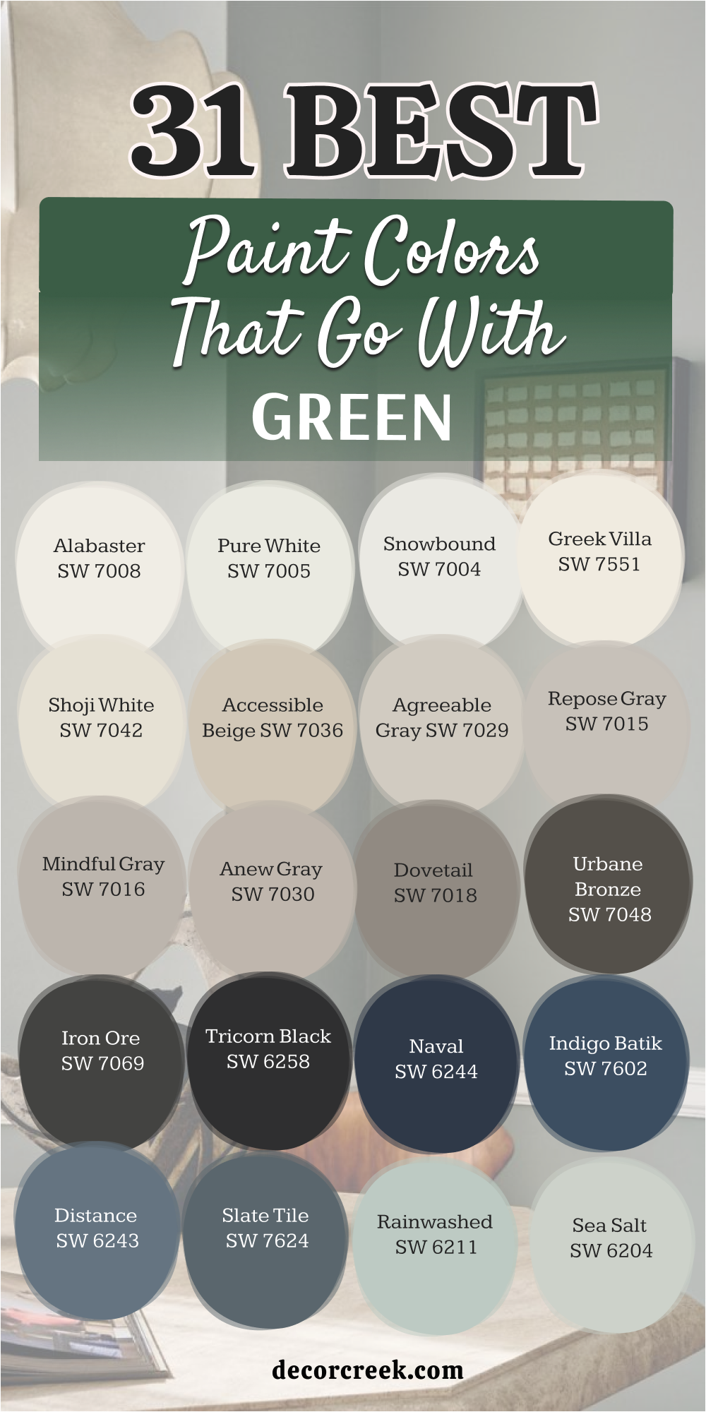
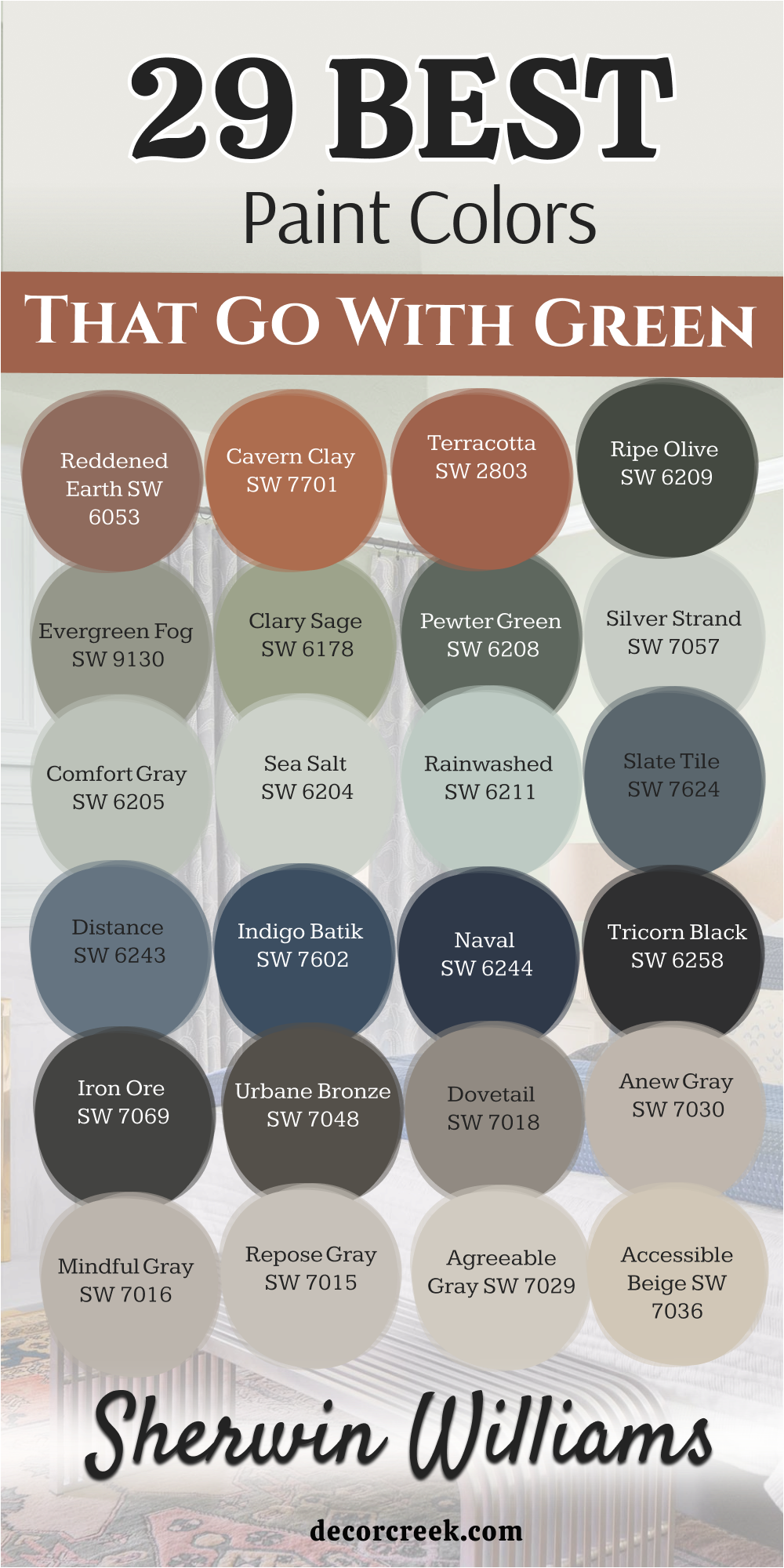
29 Paint Colors that go Wwith Green from Sherwin Williams
Alabaster SW 7008
Alabaster SW 7008 is a creamy white that feels very soft and cozy in any room. This color looks beautiful next to deep forest greens because it is not too bright. It helps balance out the darkness of the green so the room stays friendly.
I use this paint often when I want a look that feels lived-in and comfortable. It has just enough yellow to keep it from looking like a cold hospital room. This shade makes your green accents stand out without being loud.
Many of my clients love how it makes their kitchen feel bright but still warm. It is a very safe choice if you are worried about picking the wrong white. You will notice how it catches the sunlight in a very gentle way. It creates a very inviting feel for your family and guests to enjoy.
Best used in: living rooms, kitchens, hallways, bedrooms, and farmhouse exteriors
Pairs well with: Iron Ore SW 7069, Agreeable Gray SW 7029, Natural Linen SW 9109, warm wood tones The key rule of this color for farmhouse style is to use it where you want natural light to feel kind, soft, and inviting throughout the day.
🎨 Check out the complete guide to this color right HERE 👈

Pure White SW 7005
Pure White SW 7005 provides a very clean look that works with every single green paint. This shade has a tiny bit of black in it to keep it from looking too blue or harsh. It makes dark green cabinets look sharp and very modern.
I pick this when I want the green to be the main star of the show. It acts like a clean sheet of paper for the rest of your decor items. You can use it on trim or doors to create a nice border for your walls.
This paint is great because it does not change color much when the sun goes down. It stays looking like a true white even in rooms with small windows. You will appreciate how crisp your home looks once this is on the walls. It gives a very fresh finish to a bathroom or kitchen.
Best used in: trim, ceilings, modern kitchens, and bright bathrooms
Pairs well with: Pewter Green SW 6208, Black Magic SW 6991, March Wind SW 7668 The key rule of this color for a modern style is to use it as a crisp border that makes your green walls pop with high energy.
🎨 Check out the complete guide to this color right HERE 👈

Snowbound SW 7004
Snowbound SW 7004 has a slight gray undertone that makes it very cool and crisp. This color is perfect if your green paint has a bit of blue or teal in it. It prevents the room from feeling too yellow or dingy in the afternoon light.
I like to use it in bathrooms where everything needs to look very fresh. It works well with silver or chrome faucets and green tile work. This paint makes a room feel very open and airy for your family.
It is a bright choice but it still feels very heavy and high quality. You will see how it brightens up dark corners of your house instantly. It is a favorite for people who want a very neat and tidy look. This shade makes the green feel very cool and steady.
Best used in: bathrooms, laundry rooms, and cool-toned bedrooms
Pairs well with: Ripe Olive SW 6209, Storm Cloud SW 6249, Tricorn Black SW 6258 The key rule of this color for a fresh look is to pair it with cool greens to keep the room feeling crisp and clean.
🎨 Check out the complete guide to this color right HERE 👈

Greek Villa SW 7551
Greek Villa SW 7551 is a rich white that feels like a warm hug for your walls. This shade has a nice glow that looks amazing next to olive green furniture. It is not as yellow as ivory but it is much warmer than a basic white.
I suggest this for living rooms where you want people to sit and stay a while. It makes a green accent wall feel very expensive and high-end. This paint handles shadows very well without turning into a muddy gray color.
It is a great way to make a room feel sunny even on a cloudy day. You can use it on the ceiling to make the whole room feel more connected. It is a classic choice that never goes out of style for home owners. It brings a very soft light to dark green corners.
Best used in: living rooms, entryways, and large open floor plans
Pairs well with: Clary Sage SW 6178, Urban Bronze SW 7048, Wood Finishings The key rule of this color for a cozy feel is to use it in rooms with lots of fabric and soft green textures.
🎨 Check out the complete guide to this color right HERE 👈

Shoji White SW 7042
Shoji White SW 7042 is a mix between white and beige that is very popular right now. This color is quite soft and looks great with muted or dusty green tones. It creates a very soft look that is easy on the eyes when you wake up.
I love using this in bedrooms where you want to feel relaxed and happy. It is dark enough to show a contrast against white trim but still feels very light. This paint makes green plants look very vibrant and healthy against the wall.
It is a very flexible shade that adapts to the furniture you already own. You will find that it hides small marks or dust better than a very bright white. It gives your walls a creamy finish that feels very professional. This color makes a room feel very solid and safe.
Best used in: bedrooms, dining rooms, and cozy reading nooks
Pairs well with: Evergreen Fog SW 9130, Felted Wool SW 9171, Black Fox SW 7020 The key rule of this color for a soft look is to use it as a neutral base that lets your green decor take center stage.
🎨 Check out the complete guide to this color right HERE 👈

Accessible Beige SW 7036
Accessible Beige SW 7036 is a very famous color because it goes with almost everything. This paint has a bit of gray in it which makes it look very updated and fresh. It is the perfect partner for sage green or dark forest green walls.
I use it when I want a room to feel warm but not too yellow. It acts as a bridge between your green paint and your wooden floors. This shade is very helpful for making a large room feel more connected and finished.
It is a very sturdy color that looks great in any lighting situation you have. You will love how it makes your green throw pillows look very rich and deep. It is one of my top picks for a whole-house neutral color. This paint makes green feel very natural and grounded.
Best used in: hallways, family rooms, and open concept kitchens
Pairs well with: Privilege Green SW 6193, Urbane Bronze SW 7048, Alabaster SW 7008 The key rule of this color for a balanced look is to use it in areas where you want a natural flow between green rooms.
🎨 Check out the complete guide to this color right HERE 👈

Agreeable Gray SW 7029
Agreeable Gray SW 7029 is the most popular gray for a very good reason. This color is what we call a greige because it is part gray and part beige. It works wonderfully with green because it does not feel too cold or like concrete.
I use it to make green kitchen islands stand out as a beautiful focal point. This paint makes every room look very clean and well put together for guests. It changes slightly depending on the light but it always looks very high quality.
You can trust this color to make your green decorations look modern and smart. It is a great choice if you want a neutral that is not white or tan. This shade helps your home feel very current and stylish. It works with almost every green tone you can find.
Best used in: kitchens, living areas, and home offices
Pairs well with: Retreat SW 6207, Sea Salt SW 6204, Mega Greige SW 7031 The key rule of this color for a modern feel is to use it as a backdrop that lets deep green furniture look bold.
🎨 Check out the complete guide to this color right HERE 👈

Repose Gray SW 7015
Repose Gray SW 7015 is a slightly cooler gray that feels very sophisticated and chic. This paint has a tiny bit of blue and green hidden inside of it already. Because of that, it matches perfectly with green walls or green velvet sofas.
I like to use it in rooms that get a lot of bright natural sunlight. It helps to keep the room looking cool and fresh when it is hot outside. This shade is very popular for modern homes with a lot of metal or glass.
It provides a smooth look that makes your green accents feel very intentional. You will notice that it makes the room feel very quiet and peaceful for your family. It is a great way to update a room that feels old or dark. This color makes light green feel very crisp.
Best used in: master bedrooms, modern living rooms, and sunrooms
Pairs well with: Basil SW 6194, Eider White SW 7014, Pavestone SW 7642 The key rule of this color for a chic look is to pair it with dark, moody greens for a high-end feel.
🎨 Check out the complete guide to this color right HERE 👈

Mindful Gray SW 7016
Mindful Gray SW 7016 is a mid-tone gray that has a lot of depth and character. This color is a bit darker than the other grays, which makes it feel very grounded. I find it looks best when paired with a very bright emerald green.
It keeps the bright green from being too loud or making your eyes tired. This paint is great for making a room feel more formal and elegant for dinner parties. It covers walls very well and creates a very smooth and even finish.
You can use it in a home office to create a professional and focused environment. It works well with dark wood furniture and green rugs or curtains. This shade is a great way to add weight to a room that feels too light. It makes green feel very serious and grown up.
Best used in: dining rooms, offices, and accent walls
Pairs well with: Emerald Green, Pure White SW 7005, Dovetail SW 7018 The key rule of this color for a formal look is to use it in rooms where you want a strong contrast with your green items.
🎨 Check out the complete guide to this color right HERE 👈

Anew Gray SW 7030
Anew Gray SW 7030 is a warm gray that feels very stony and natural like a pebble. This color has more brown in it than many other grays on this list. It is a fantastic partner for olive greens or mossy green shades.
I pick this color when I want a home to feel very natural and organic. It reminds me of the colors you see while walking through a quiet forest. This paint makes green cabinets feel very earthy and connected to the ground.
It is a great choice for a basement or a room that needs a bit of warmth. You will like how it makes your home feel very solid and very well built. It is a very forgiving color that hides a lot of wear and tear. This shade makes your green accents look very rich.
Best used in: basements, entryways, and family rooms
Pairs well with: Moss Green, Accessible Beige SW 7036, Urbane Bronze SW 7048 The key rule of this color for a natural look is to use it alongside greens that have a heavy yellow or brown base.
🎨 Check out the complete guide to this color right HERE 👈
Dovetail SW 7018
Dovetail SW 7018 is a dark gray that feels very cozy and like a warm blanket. This color is strong enough to stand up to very bold and bright greens. I use it when I want to create a room that feels very private and snug.
It looks amazing on built-in bookshelves next to a green reading chair. This paint gives the room a lot of personality without needing a lot of art. It is a very rich shade that makes any space feel more expensive than it is.
You can use it in a bedroom to help you sleep better in a dark environment. It works well with gold or brass handles and green decor pieces. This color is a bold choice that pays off with a very stylish look. It makes light green pops look very bright.
Best used in: media rooms, libraries, and master bedrooms
Pairs well with: Hunter Green, Alabaster SW 7008, Mindful Gray SW 7016 The key rule of this color for a cozy look is to use it in smaller rooms to create a very snug and private feeling.
🎨 Check out the complete guide to this color right HERE 👈

Urbane Bronze SW 7048
Urbane Bronze SW 7048 is a very dark and moody color that is almost brown. This paint has a lot of green in its base, which makes it a natural match. I love using this color for doors or window frames against a green wall.
It makes the house look very modern and very grounded to the earth. This shade is great for creating a lot of drama in a small powder room. It feels very heavy and high quality when you see it on the walls.
You can use it to highlight the architecture of your home very effectively. It works perfectly with light green accents to create a big contrast. This is a very trendy color that designers use for a very high-end look. It makes mint green look very cool and smart.
Best used in: accent walls, exteriors, and powder rooms
Pairs well with: Sea Salt SW 6204, Shoji White SW 7042, Silver Strand SW 7057 The key rule of this color for a dramatic look is to use it in small doses or on a single wall to create a big impact.
🎨 Check out the complete guide to this color right HERE 👈

Iron Ore SW 7069
Iron Ore SW 7069 is a soft black that is much friendlier than a true jet black. This color looks very sophisticated when it is paired with a light mint green. It provides a sharp look that keeps the mint from looking too much like a nursery.
I use this paint for kitchen islands or fireplace mantels to ground the room. It feels very smooth and looks like natural stone or dark metal. This shade is perfect for people who want a bold look but are afraid of black.
It has a tiny bit of warmth that keeps it from feeling cold or scary. You will find that it makes your green plants look very bright and alive. It is a very smart color that makes your whole house look more modern. This paint makes any green look very vibrant.
Best used in: kitchen islands, fireplaces, and front doors
Pairs well with: Rainwashed SW 6211, Alabaster SW 7008, Repose Gray SW 7015 The key rule of this color for a bold look is to use it on architectural features like beams or trim to frame your green walls.
🎨 Check out the complete guide to this color right HERE 👈

Tricorn Black SW 6258
Tricorn Black SW 6258 is a very true black that has no obvious undertones at all. This paint is very powerful and makes a huge statement next to any green. I use it when I want a very high-contrast look that feels very clean.
It works best with sharp emerald greens or very light sage greens. This shade makes the green in your room look much more intense and bright. It is a very classic choice for front doors or modern furniture pieces.
You should use it in rooms with plenty of light so it does not feel too dark. It is a very impressive color that shows you are confident in your style. This paint gives a finished and polished look to every project I do. It makes green walls feel very fancy and expensive.
Best used in: front doors, shutters, and modern furniture
Pairs well with: Emerald Green, Snowbound SW 7004, Agreeable Gray SW 7029 The key rule of this color for a classic look is to use it sparingly to ground the room and make your greens pop.
🎨 Check out the complete guide to this color right HERE 👈

Naval SW 6244
Naval SW 6244 is a deep navy blue that feels very royal and very strong. This color is a surprising but beautiful partner for light or medium greens. I love the way blue and green look together because they are next to each other in nature.
It reminds me of the ocean meeting the forest on a sunny day. This paint makes a room feel very tall and very wide if used correctly. It is a very traditional color that still feels very fresh and new today.
You can use it in a bedroom to create a very dark and restful place. It works well with white trim and green pillows or rugs for a preppy look. This shade is a favorite for many of my clients who want a rich color. It makes sage green look very bright and happy.
Best used in: dining rooms, bedrooms, and office cabinets
Pairs well with: Sea Salt SW 6204, Pure White SW 7005, Gold Accents The key rule of this color for a royal feel is to pair it with light greens to keep the room from feeling too heavy.
🎨 Check out the complete guide to this color right HERE 👈

Indigo Batik SW 7602
Indigo Batik SW 7602 is a blue that has a little bit of a denim or fabric feel. This color is slightly more casual than a dark navy, making it very friendly. I find it looks wonderful with muted greens like sage or olive.
It creates a very comfortable look that is perfect for a family room. This paint feels very classic and reminds me of old-fashioned home designs. It is a great way to add color to your home without it being too bright.
You can use it on a single wall to create a very nice focal point. It works well with wooden furniture and green curtains or plants. This shade is very easy to live with for many years to come. It makes dusty greens feel very warm and very natural.
Best used in: family rooms, boys’ bedrooms, and laundry rooms
Pairs well with: Sage Green, Alabaster SW 7008, Accessible Beige SW 7036 The key rule of this color for a casual look is to use it with greens that have a soft or dusty appearance.
🎨 Check out the complete guide to this color right HERE 👈

Distance SW 6243
Distance SW 6243 is a medium blue that has a dusty and soft quality to it. This color is very pretty and looks great with light, airy greens. I use it to create a room that feels very open and very light. It is a great choice for a guest room where you want people to feel welcome.
This paint is not too dark and not too light, so it fits in many places. It makes green decor look very fresh and very modern in your home. You will like how it changes slightly as the sun moves across the sky.
It is a very soft color that does not demand too much attention. This shade helps to create a very balanced and happy environment for everyone. It makes light green walls feel very sunny and cheerful.
Best used in: guest bedrooms, bathrooms, and sunrooms
Pairs well with: Mint Green, Snowbound SW 7004, Repose Gray SW 7015 The key rule of this color for a balanced look is to pair it with greens of a similar light intensity.
🎨 Check out the complete guide to this color right HERE 👈

Slate Tile SW 7624
Slate Tile SW 7624 is a dark blue-gray that feels very solid and very deep. This color is excellent for adding a lot of mood to a room with green accents. I love how it looks with dark hunter green for a very masculine feel.
It is a very strong color that makes a room feel very safe and sturdy. This paint is perfect for a library or a dark office where you work. It hides shadows very well and looks very consistent on the whole wall.
You can use it to make light green furniture look very bright and very clear. It is a very sophisticated shade that designers love to use for drama. This color will make your home feel very expensive and well planned. It gives a very heavy and rich feel to green.
Best used in: libraries, offices, and moody living rooms
Pairs well with: Hunter Green, Pure White SW 7005, Mindful Gray SW 7016 The key rule of this color for a moody feel is to use it in rooms with dark wood and green velvet textures.
🎨 Check out the complete guide to this color right HERE 👈

Rainwashed SW 6211
Rainwashed SW 6211 is a light green-blue that feels very watery and light. This color is very close to green already, so it matches perfectly with other greens. I use it to create a room that feels very clean and very fresh.
It is a wonderful choice for a bathroom or a kitchen where you want light. This paint makes the room feel very big and very open to the sun. It works well with white cabinets and dark metal hardware for contrast.
You will find that it makes you feel very happy and refreshed when you enter. It is a very soft shade that is easy for anyone to look at all day. This color is a classic choice for a bright and happy home environment. It makes dark green accents look very deep.
Best used in: bathrooms, kitchens, and nurseries
Pairs well with: Iron Ore SW 7069, Pure White SW 7005, Slate Tile SW 7624 The key rule of this color for a fresh look is to use it in rooms that get a lot of natural morning light.
🎨 Check out the complete guide to this color right HERE 👈

Sea Salt SW 6204
Sea Salt SW 6204 is one of the most famous light greens in the entire world. This color is very soft and can look gray, blue, or green depending on the time. I find it works best with dark grays and crisp whites to ground it.
t is a very light shade that makes any room feel much bigger than it is. This paint is perfect for people who want just a little bit of color. It looks very natural and reminds me of the beach or a quiet garden.
You can use it in every room of the house and it will always look great. It is a very safe and popular choice for home staging and selling. This shade will make your home feel very light and very airy for guests. It works beautifully with natural wood.
Best used in: whole house color, bathrooms, and bedrooms
Pairs well with: Urbane Bronze SW 7048, Naval SW 6244, Alabaster SW 7008 The key rule of this color for an airy feel is to use it as a neutral that offers a tiny hint of green personality.
🎨 Check out the complete guide to this color right HERE 👈

Comfort Gray SW 6205
Comfort Gray SW 6205 is a medium green-gray that feels very solid and stable. This color is slightly darker than Sea Salt and has more gray in its heart. I use it when I want a room to feel very cozy but still look very clean.
It works great with white trim and dark green rugs for a layered look. This paint is very good at hiding marks and looks very high-end on walls. It is a very popular choice for bedrooms because it feels very quiet.
You can use it with warm wood furniture to create a very natural feel. This shade makes the light in your room feel very soft and very kind. It is a very reliable color that looks good in every single house. This paint makes green plants look very lush.
Best used in: bedrooms, living rooms, and laundry rooms
Pairs well with: Alabaster SW 7008, Sea Salt SW 6204, Urbane Bronze SW 7048 The key rule of this color for a cozy look is to use it in rooms where you want a soft and steady feeling all day.
🎨 Check out the complete guide to this color right HERE 👈

Silver Strand SW 7057
Silver Strand SW 7057 is a very light gray that has a shimmer of green and blue. This color is very bright and makes a room feel like it is glowing. I find it looks wonderful in small bathrooms or narrow hallways with green accents.
It provides a very clean and very polished look for your family home. This paint changes throughout the day and looks different in every room. It is a very sophisticated choice that feels very modern and very fresh.
You will like how it makes your green towels or pillows stand out nicely. It works well with silver hardware and white marble for a luxury feel. This shade helps your home feel very open and very light for everyone. It makes dark green trim look very sharp.
Best used in: bathrooms, hallways, and small bedrooms
Pairs well with: Pewter Green SW 6208, Pure White SW 7005, Iron Ore SW 7069 The key rule of this color for a polished look is to use it with cool-toned greens to keep the room looking bright.
🎨 Check out the complete guide to this color right HERE 👈
Pewter Green SW 6208
Pewter Green SW 6208 is a dark and earthy green that feels very rich and very deep. This color has a lot of gray in it, which makes it look very modern. I love using this for kitchen cabinets or a moody accent wall in a study.
It makes the room feel very expensive and very well designed from the start. This paint works best with bright white trim to create a strong contrast. It feels very grounded and reminds me of the forest on a cloudy day.
You can use it to make a small room feel very cozy and very private. It looks great with gold handles and warm wood floors in your house. This shade is a favorite for designers who want a bold and trendy look. It makes light gray walls pop.
Best used in: kitchen cabinets, accent walls, and home offices
Pairs well with: Pure White SW 7005, Silver Strand SW 7057, Gold accents The key rule of this color for a bold look is to use it on surfaces you want to highlight as a focal point.
🎨 Check out the complete guide to this color right HERE 👈

Clary Sage SW 6178
Clary Sage SW 6178 is a soft and herbal green that feels very natural and light. This color has a bit of yellow in it, making it feel very warm and sunny. I suggest this for kitchens or sunrooms where you want to feel happy.
It looks beautiful next to creamy whites and natural wood furniture. This paint makes a room feel like a quiet garden in the middle of spring. It is a very easy color to look at and never feels too dark.
You will find that it makes your home feel very welcoming and very kind. It works well with terracotta tiles and woven baskets for a natural look. This shade is a classic choice for a soft and pretty green room. It brings a very happy light into your space.
Best used in: kitchens, sunrooms, and guest bedrooms
Pairs well with: Greek Villa SW 7551, Cavern Clay SW 7701, Natural Wood The key rule of this color for a natural look is to pair it with warm neutrals to keep the room feeling sunny.
🎨 Check out the complete guide to this color right HERE 👈

Evergreen Fog SW 9130
Evergreen Fog SW 9130 is a beautiful mid-tone green that feels very soft and dusty. This color is a mix of green, gray, and a little bit of blue. I use it when I want a room to look very modern but still feel very cozy.
It is a very popular choice for bedrooms and living room walls today. This paint makes the room feel very grounded and very sophisticated for guests. It works well with black hardware and light oak wood floors.
You will see how it changes from green to gray as the sun moves. It is a very flexible shade that looks great with many different decor styles. This color makes your home feel very current and very well planned out. It makes white trim look very bright and clean.
Best used in: bedrooms, living rooms, and kitchen islands
Pairs well with: Alabaster SW 7008, Shoji White SW 7042, Black accents The key rule of this color for a modern look is to use it as a bridge between gray and green tones.
🎨 Check out the complete guide to this color right HERE 👈

Ripe Olive SW 6209
Ripe Olive SW 6209 is a very dark and deep green that feels very serious and moody. This color is almost black in some lights, which makes it very dramatic. I love to use it in dining rooms to create a very elegant feel for dinner.
It makes white art or gold mirrors look very bright and very expensive. This paint is very rich and gives a lot of personality to a room. It feels very solid and reminds me of old-growth forests and nature.
You can use it on a single wall to create a very strong focal point. It works best in rooms with a lot of light so it does not feel too small. This shade is a bold choice that looks very high-end and smart. It makes light wood furniture stand out beautifully.
Best used in: dining rooms, libraries, and accent walls
Pairs well with: Snowbound SW 7004, Agreeable Gray SW 7029, Gold accents The key rule of this color for a dramatic look is to use it in rooms where you want a very high contrast.
🎨 Check out the complete guide to this color right HERE 👈

Rookwood Terra Cotta SW 2803
Rookwood Terra Cotta SW 2803 is a warm and earthy orange-brown that feels very natural. This color is a fantastic partner for green because they are found together in nature. I use it to add a lot of warmth to a room with green plants.
It makes the room feel very sunny and very full of life for your family. This paint reminds me of clay pots and warm desert sands in the sun. It works well with sage green or olive green for a very organic look.
You will find that it makes your home feel very cozy and very welcoming. It is a great choice for a kitchen or a breakfast nook area. This shade helps to balance out the coolness of some green paint colors. It makes sage green look very fresh and bright.
Best used in: kitchens, breakfast nooks, and entryways
Pairs well with: Clary Sage SW 6178, Alabaster SW 7008, Natural wood The key rule of this color for a warm look is to use it as an accent with soft green walls.
Cavern Clay SW 7701
Cavern Clay SW 7701 is a bright and energetic earthy tone that feels very ancient. This color has a lot of soul and looks wonderful with deep green accents. I pick this when I want a room to feel very bold and very unique.
It creates a very warm look that feels like a sunset in your own house. This paint works well with dark green furniture or green patterned rugs. It is a very strong color that makes a big statement to everyone who visits.
You can use it in a small office to feel more creative and focused. It looks great with natural textures like wool and wood and stone. This shade is a fun way to add personality to a green-heavy room. It makes dark green feel very rich and deep.
Best used in: home offices, accent walls, and dining areas
Pairs well with: Pewter Green SW 6208, Greek Villa SW 7551, Black accents The key rule of this color for a unique look is to use it in rooms with lots of natural light and green plants.
🎨 Check out the complete guide to this color right HERE 👈

Reddened Earth SW 6053
Reddened Earth SW 6053 is a soft and dusty red-brown that feels very grounded. This color is very quiet and looks beautiful with muted green tones like sage. I use it to create a room that feels very steady and very peaceful.
It reminds me of the earth and the soil in a healthy garden. This paint makes green walls feel very natural and very connected to the world. It is a great choice for a bedroom where you want a very soft feel.
You will like how it makes your home feel very solid and very well built. It works well with creamy whites and dark green curtains for a full look. This shade is a very sophisticated choice for a natural home design. It makes soft green look very kind and warm.
Best used in: bedrooms, living rooms, and cozy nooks
Pairs well with: Sage Green, Alabaster SW 7008, Dark wood The key rule of this color for a natural look is to pair it with soft greens to create a forest-like feel.
🎨 Check out the complete guide to this color right HERE 👈

21 Best Combo of Paint Colors that go With Green
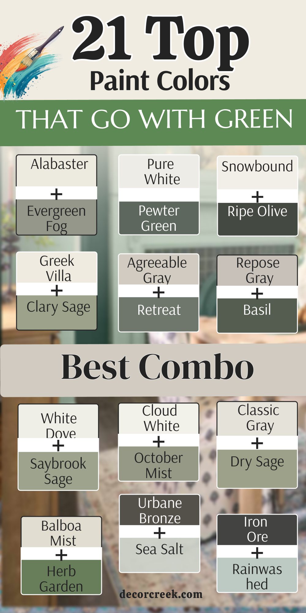
Alabaster SW 7008 & Evergreen Fog SW 9130
Alabaster SW 7008 and Evergreen Fog SW 9130 make a pair that feels very natural and steady in your home. The creamy white of the Alabaster softens the dusty green of the Evergreen Fog perfectly.
I use this mix when I want a room to feel very cozy and grounded for a family. It is a great choice for a bedroom where you want to feel very relaxed and happy. The green acts as a beautiful focal point on one wall or on the cabinets.
The white keeps the rest of the room feeling light and very open to the sun. You will see how these colors work together to create a very soft look for everyone. This is a very popular choice for modern farmhouse homes right now. It is a combo that is very easy to live with for many years to come. This pair makes your home feel very balanced and kind.
Best used in: bedrooms, kitchens, and living rooms
Pairs well with: light oak wood, black hardware, linen fabrics The key rule of this color for a cozy look is to use Alabaster on most walls and Evergreen Fog as an accent.
Pure White SW 7005 & Pewter Green SW 6208
Pure White SW 7005 and Pewter Green SW 6208 create a very sharp and clean look for any modern house. The dark, earthy green of Pewter Green looks very smart next to a crisp and bright white.
I love using this combination for kitchen cabinets and bright white walls to show off your style. It makes the kitchen look very expensive and very well designed for a professional chef. The white helps to make the dark green feel very bold and very intentional in the room.
You can add gold handles to make this look even more high-end and fancy for guests. This pair is great for people who want a lot of contrast in their home environment. It feels very fresh and stays looking clean for a very long time. You will love how the green looks deep and rich in the evening light. This combo gives a very polished finish to your workspace.
Best used in: kitchens, home offices, and modern dining rooms
Pairs well with: gold hardware, marble countertops, dark wood floors The key rule of this color for a sharp look is to keep the white very clean and the green very dark.
Snowbound SW 7004 & Ripe Olive SW 6209
Snowbound SW 7004 and Ripe Olive SW 6209 offer a very dramatic and cool look for your favorite rooms. Ripe Olive is a very deep, dark green that feels very moody and very serious on a wall. Snowbound has a gray base that keeps the room from feeling too warm or yellow in the sun.
I suggest this for a media room or a study where you want a big visual impact. The dark green makes the walls feel very far away and very deep like a forest. The white trim provides a nice frame that keeps the room looking neat and tidy for guests.
This is a very bold choice that shows a lot of personal style and confidence in design. You will enjoy how the green changes from day to night in a cool and steady way. It is a very sophisticated pair for any modern home that wants to stand out. This mix makes a room feel very private and snug.
Best used in: studies, media rooms, and accent walls
Pairs well with: silver accents, leather furniture, gray rugs The key rule of this color for a dramatic look is to use Ripe Olive on all four walls for a total look.
Greek Villa SW 7551 & Clary Sage SW 6178
Greek Villa SW 7551 and Clary Sage SW 6178 create a very sunny and welcoming feel in your living areas. The rich white of Greek Villa has a warm glow that matches the herbal green of Clary Sage.
I find this mix works best in kitchens or breakfast rooms that get lots of morning light. It makes the room feel very friendly and very kind for your family to gather in. This pair reminds me of a quiet cottage garden filled with fresh herbs and sunshine.
The warm white keeps the soft green from looking too cold or too gray on cloudy days. You will notice how the room feels very light and very airy when you walk inside. It is a classic choice that makes any home feel more inviting and very comfortable. This combination is great for making a small room feel much bigger. It brings a very happy energy to your daily life.
Best used in: kitchens, breakfast nooks, and sunrooms
Pairs well with: terracotta, warm wood, woven baskets The key rule of this color for a sunny feel is to use Greek Villa as the main color to keep things bright.
Agreeable Gray SW 7029 & Retreat SW 6207
Agreeable Gray SW 7029 and Retreat SW 6207 are a very smart and updated pair for a modern home. Agreeable Gray is a perfect neutral that sits quietly next to the misty green of Retreat. I use this when I want a master bedroom to feel very professional and very calm for sleep.
The green has a dusty quality that makes it look very expensive and very well chosen. This pair works well with almost any furniture you already have in your house. The gray keeps the room looking very clean while the green adds a nice bit of personality.
You will find that this combination is very easy on the eyes and feels very balanced. It is a great way to use color without making the room feel too loud or busy. This mix helps your home feel very current and very stylish for years. Your guests will think a designer picked these just for you.
Best used in: master bedrooms, living rooms, and guest suites
Pairs well with: navy blue, white trim, dark metal The key rule of this color for a balanced look is to use Retreat on a single wall to ground the room.

Repose Gray SW 7015 & Basil SW 6194
Repose Gray SW 7015 and Basil SW 6194 provide a very cool and sophisticated look for your main rooms. Repose Gray is a crisp neutral that lets the deep and rich tone of Basil truly shine bright. I love using this pair in a dining room where you want a very elegant feel for parties.
The green is dark enough to be bold but the gray keeps it from being too heavy. This combination looks very high-end with silver accents and clean white doors or trim. It creates a very smooth and even look that feels very professional and very sharp.
You will like how the gray wall makes the green furniture or art look very vibrant. It is a great choice for someone who wants a home that feels very neat and tidy. This shade mix helps a room feel very quiet and very focused for your family. It is a very modern way to bring green into your house.
Best used in: dining rooms, offices, and formal living areas
Pairs well with: silver hardware, white marble, gray fabrics The key rule of this color for a chic look is to use Basil as a strong accent against the light gray.
Accessible Beige SW 7036 & Privilege Green SW 6193
Accessible Beige SW 7036 and Privilege Green SW 6193 make a very warm and earthy pair for any room. Accessible Beige is a sturdy neutral that has enough warmth to match the depth of Privilege Green.
I pick this combination when I want a family room to feel very solid and very cozy. The green is a medium shade that looks very natural like the leaves on a tree in summer. This pair works wonderfully with wooden floors and leather chairs to create a full look.
It makes the house feel very well built and very connected to the ground outside. You will love how the beige keeps the room feeling sunny even when the green is very present. It is a very safe and popular choice for making a house feel like a real home. This mix is very forgiving and hides a lot of daily wear and tear. It creates a very friendly and happy environment for everyone.
Best used in: family rooms, entryways, and mudrooms
Pairs well with: leather, dark wood, bronze fixtures The key rule of this color for a grounded look is to pair them with natural materials like wood and stone.
White Dove OC-17 & Saybrook Sage HC-114
White Dove OC-17 and Saybrook Sage HC-114 create a very soft and pretty look that is very classic. White Dove is a famous white that is very creamy and feels very soft on the eyes. Saybrook Sage is a gentle green that looks like it belongs in a very old and beautiful house.

I use this pair in nurseries or guest rooms to create a very sweet and kind feeling. The white is not too bright, so it matches the quiet nature of the sage green perfectly. This combination makes the room feel very light and very airy for your favorite people.
It is a very traditional look that never goes out of style for home owners today. You will find that it makes the room feel very peaceful and very happy all day long. This pair is a great way to add a little bit of color that feels very natural. It makes your home feel very light and very fresh.
Best used in: nurseries, guest rooms, and cottages
Pairs well with: brass, light fabrics, floral patterns The key rule of this color for a soft look is to use White Dove on the trim to frame the sage walls.

Simply White OC-117 & Gloucester Sage HC-100
Simply White OC-117 and Gloucester Sage HC-100 offer a very strong and high-contrast look for your home. Simply White is a very bright and crisp color that makes the dark green feel very powerful.

Gloucester Sage is a heavy and deep green that feels very historic and very rich on a wall. I suggest this for an entryway where you want to make a big first impression on guests. The bright white keeps the dark green from making the hall feel too small or too dark.
This pair works well with dark wood and gold accents for a very luxury and fancy look. You will notice how the white makes the green look very deep and very intentional in the space. It is a very confident choice that makes your home look very well designed and very smart. This mix helps the architecture of your house stand out very clearly for everyone. It is a very bold and beautiful combination.
Best used in: entryways, exteriors, and formal studies
Pairs well with: gold, dark oak, black metal The key rule of this color for a bold look is to use Simply White to highlight beautiful architectural details.

Cloud White OC-130 & October Mist 1495
Cloud White OC-130 and October Mist 1495 create a very misty and soft look that feels like a dream. Cloud White is a very soft neutral that has a tiny bit of warmth for your walls. October Mist is a very light and silvery green that is very popular for modern homes.

I use this pair in bathrooms or bedrooms where you want to feel very light and free. The green is so soft that it almost looks like a neutral color in some lights. This combination makes the room feel very big and very open to the sky outside.
It is a very pretty look that feels very current and very fresh for a young family. You will love how the colors change as the sun moves across your room during the day. It is a very safe choice if you want a green that is not too loud or bright. This mix makes your home feel very organized and very clean.
Best used in: bathrooms, bedrooms, and small spaces
Pairs well with: silver, light gray, white linens The key rule of this color for a misty look is to use them in rooms with plenty of soft, natural light.

Classic Gray OC-23 & Dry Sage 2142-40
Classic Gray OC-23 and Dry Sage 2142-40 make a very sophisticated and quiet pair for a home office. Classic Gray is a very light neutral that looks like a soft shadow on the wall. Dry Sage is a dusty green that feels very professional and very focused for work.

I pick this when I want a room to feel very smart and very well put together for a busy day. The green adds a nice bit of color without being a distraction to your eyes. This pair works well with modern furniture and black accents for a very sharp look.
You will find that it makes the room feel very cool and very steady for your family. It is a great way to make a small office feel much more important and very expensive. This mix helps your home feel very updated and very stylish for many years. It is a very clever and beautiful combination of colors.
Best used in: home offices, laundry rooms, and modern halls
Pairs well with: black, walnut wood, glass The key rule of this color for a focused look is to use Dry Sage on the walls and Classic Gray on the ceiling.
Edgecomb Gray HC-173 & Carolina Gull 2138-40
Edgecomb Gray HC-173 and Carolina Gull 2138-40 create a very stony and natural look for a living room. Edgecomb Gray is a warm greige that feels very solid and very high quality on any wall. Carolina Gull is a medium green with a gray heart that looks like a stone in a forest.

I use this pair when I want a house to feel very natural and very connected to the earth. The warm gray keeps the cool green from feeling too cold or too dark in the room. This combination works wonderfully with stone fireplaces and heavy wooden beams for a full look.
It makes the room feel very safe and very sturdy for your kids and pets. You will love how the colors feel very rich and very deep in the afternoon sun. It is a very popular choice for people who like a very organic and simple home. This mix helps your home feel very grounded and very peaceful.
Best used in: living rooms, family rooms, and stone houses
Pairs well with: stone, oak, warm fabrics The key rule of this color for a natural look is to pair them with heavy textures like wool and wood.
Balboa Mist OC-27 & Herb Garden 434
Balboa Mist OC-27 and Herb Garden 434 offer a very fresh and vibrant look for a sunny kitchen. Balboa Mist is a light gray that feels very clean and very updated for a modern family. Herb Garden is a bright and happy green that looks like fresh grass in the summer time.

I suggest this for a kitchen island or a small pantry to add a pop of color. The light gray helps to ground the bright green so it does not feel too loud in the room. This pair works well with white cabinets and silver handles for a very neat and tidy look.
You will notice how the green makes the whole room feel more alive and very energetic for your morning. It is a very fun choice that shows a lot of personality and a love for nature. This mix helps your home feel very bright and very happy for everyone who visits. It is a very cheerful and pretty combination.
Best used in: kitchens, pantries, and mudrooms
Pairs well with: white, silver, light wood The key rule of this color for a happy look is to use Herb Garden as a fun splash of color in a light room.
Urbane Bronze SW 7048 & Sea Salt SW 6204
Urbane Bronze SW 7048 and Sea Salt SW 6204 make a very dramatic and beautiful pair for a bathroom. Urbane Bronze is a very dark and moody color that feels very heavy and very rich. Sea Salt is a very light and watery green that feels very airy and very fresh on the wall.
I love this combination because the dark bronze makes the light green look very bright and clear. It creates a very high-end look that feels like a fancy hotel or a luxury spa. The dark color grounds the room while the light color keeps it from feeling too small for you.
This pair works well with gold fixtures and white towels for a very polished and smart finish. You will find that it makes the room feel very private and very special for your family. It is a very trendy choice that designers use to create a big impact in a small space. This mix is very sophisticated and bold.
Best used in: bathrooms, powder rooms, and master suites
Pairs well with: gold, white, dark metal The key rule of this color for a luxury look is to use Urbane Bronze on the vanity or a single wall.
Iron Ore SW 7069 & Rainwashed SW 6211
Iron Ore SW 7069 and Rainwashed SW 6211 provide a very sharp and modern look for a front entryway. Iron Ore is a soft black that looks very solid and very sturdy on a door or a wall. Rainwashed is a light green-blue that feels very watery and very fresh for your guests.
I use this pair to create a very high contrast that looks very clean and very updated. The dark gray makes the light green-blue pop and look very vibrant and full of life. This combination works well with silver hardware and modern glass for a very neat finish.
You will like how the room feels very structured and very well planned out from the start. It is a great way to make a small space feel very important and very expensive for your home. This mix helps your home look very current and very stylish for many years to come. It is a very smart and beautiful way to use dark colors.
Best used in: entryways, mudrooms, and modern baths
Pairs well with: silver, glass, white trim The key rule of this color for a sharp look is to use Iron Ore as a frame for the light green walls.
Naval SW 6244 & Sea Salt SW 6204
Naval SW 6244 and Sea Salt SW 6204 create a very royal and fresh look that feels like the ocean. Naval is a deep navy blue that is very strong and very traditional for a family home. Sea Salt is a light and airy green that keeps the dark blue from feeling too heavy or too dark.
I pick this combination when I want a living room to feel very rich and very full of color. The blue and green work together because they are neighbors in nature and look great together. This pair works well with white trim and gold accents for a very preppy and polished look.
You will love how the light green makes the dark blue look very deep and very intentional in the room. It is a very popular choice for people who want a home that feels very classic and very smart. This mix helps your home feel very balanced and very happy for everyone who enters.
Best used in: living rooms, dining rooms, and bedrooms
Pairs well with: gold, white, navy fabrics The key rule of this color for a royal feel is to use Naval on the lower part of the wall and Sea Salt on top.
Hale Navy HC-154 & Soft Fern 2144-40
Hale Navy HC-154 and Soft Fern 2144-40 offer a very traditional and rich look for a formal dining room. Hale Navy is a classic dark blue that feels very sturdy and very high quality on any wall. Soft Fern is a light and herbal green that brings a nice bit of nature into the house.

I suggest this pair for a room with lots of white woodwork and dark wood furniture for a full look. The blue provides a very solid background while the green keeps things feeling fresh and alive. This combination makes the room feel very elegant and very well established for dinner parties.
You will notice how the colors feel very expensive and very well chosen for your family. It is a very safe choice that stays looking good for many years without going out of style. This mix helps your home feel very formal and very sophisticated for your guests.
Best used in: dining rooms, libraries, and formal entries
Pairs well with: white, dark wood, brass The key rule of this color for a formal look is to use Hale Navy as a bold backdrop for green decor.
Kendall Charcoal HC-166 & Oil Cloth CSP-760
Kendall Charcoal HC-166 and Oil Cloth CSP-760 make a very moody and modern pair for a home library. Kendall Charcoal is a deep and rich gray that feels very solid and very quiet for a room. Oil Cloth is a muted and dusty green that looks very professional and very smart on a wall.

I use this when I want a space to feel very private and very focused for reading or work. The dark gray makes the dusty green look very rich and very deep like a forest shadow. This pair works well with leather books and gold lamps for a very high-end and fancy finish.
You will find that it makes the room feel very snug and very safe for your family to enjoy. It is a very bold choice that shows you have a lot of personal style and confidence. This mix helps your home feel very current and very well designed for a professional look.
Best used in: libraries, offices, and dark bedrooms
Pairs well with: gold, leather, dark wood The key rule of this color for a moody look is to keep the lighting soft to highlight the deep colors.
Chelsea Gray HC-168 & Pale Avocado 2146-40
Chelsea Gray HC-168 and Pale Avocado 2146-40 provide a very stony and earthy look for a cozy kitchen. Chelsea Gray is a mid-tone gray that feels very sturdy and very high quality for your walls. Pale Avocado is a warm and soft green that adds a nice bit of sunshine to the room.

I pick this combination when I want a kitchen to feel very natural and very welcoming for a family. The gray grounds the room while the green makes the space feel more happy and full of energy. This pair works well with wooden cutting boards and black metal handles for a very neat look.
You will like how the warm green keeps the gray from feeling too cold or like concrete in the morning. It is a great choice for a house that wants to feel very organic and very simple for everyone. This mix helps your home feel very grounded and very peaceful for your daily life.
Best used in: kitchens, laundry rooms, and mudrooms
Pairs well with: black, oak wood, white trim The key rule of this color for an earthy look is to use Pale Avocado on the cabinets and Chelsea Gray on the walls.
Cavern Clay SW 7701 & Clary Sage SW 6178
Cavern Clay SW 7701 and Clary Sage SW 6178 create a very warm and energetic pair for a creative room. Cavern Clay is a bright and earthy orange-brown that feels very ancient and very full of soul. Clary Sage is a soft and herbal green that balances the high energy of the clay color.
I use this mix when I want a sunroom or an office to feel very vibrant and very unique. The two colors are found together in nature and always look very happy and full of life together. This combination works well with terracotta pots and green plants for a very organic and full look.
You will notice how the warm clay makes the soft green look very fresh and very clear in the sunlight. It is a fun choice that adds a lot of personality and kindness to your home. This mix helps your home feel very sunny and very welcoming for your guests and family.
Best used in: sunrooms, offices, and creative spaces
Pairs well with: terracotta, natural wood, green plants The key rule of this color for a unique look is to use Cavern Clay on a single wall and Clary Sage on the others.
Terracotta Tile 2090-30 & Saybrook Sage HC-114
Terracotta Tile 2090-30 and Saybrook Sage HC-114 offer a very traditional and warm look for an old house. Terracotta Tile is a rich and deep orange-brown that feels very solid and very historic on a wall. Saybrook Sage is a gentle and quiet green that brings a nice bit of balance to the warmth.
I suggest this for a dining area or a kitchen where you want a very cozy and lived-in feel. The orange-brown reminds me of warm earth while the green reminds me of soft leaves in a garden. This pair works well with dark wood and white trim for a very classic and pretty finish.
You will like how the room feels very sturdy and very well established for your daily family meals. It is a great choice for making a large room feel much more snug and very private for everyone. This mix helps your home feel very warm and very grounded for many years.
Best used in: kitchens, dining rooms, and entryways
Pairs well with: dark wood, white, brass The key rule of this color for a warm look is to pair them with vintage furniture and natural textures.
19 Paint Colors that go With Sage Green
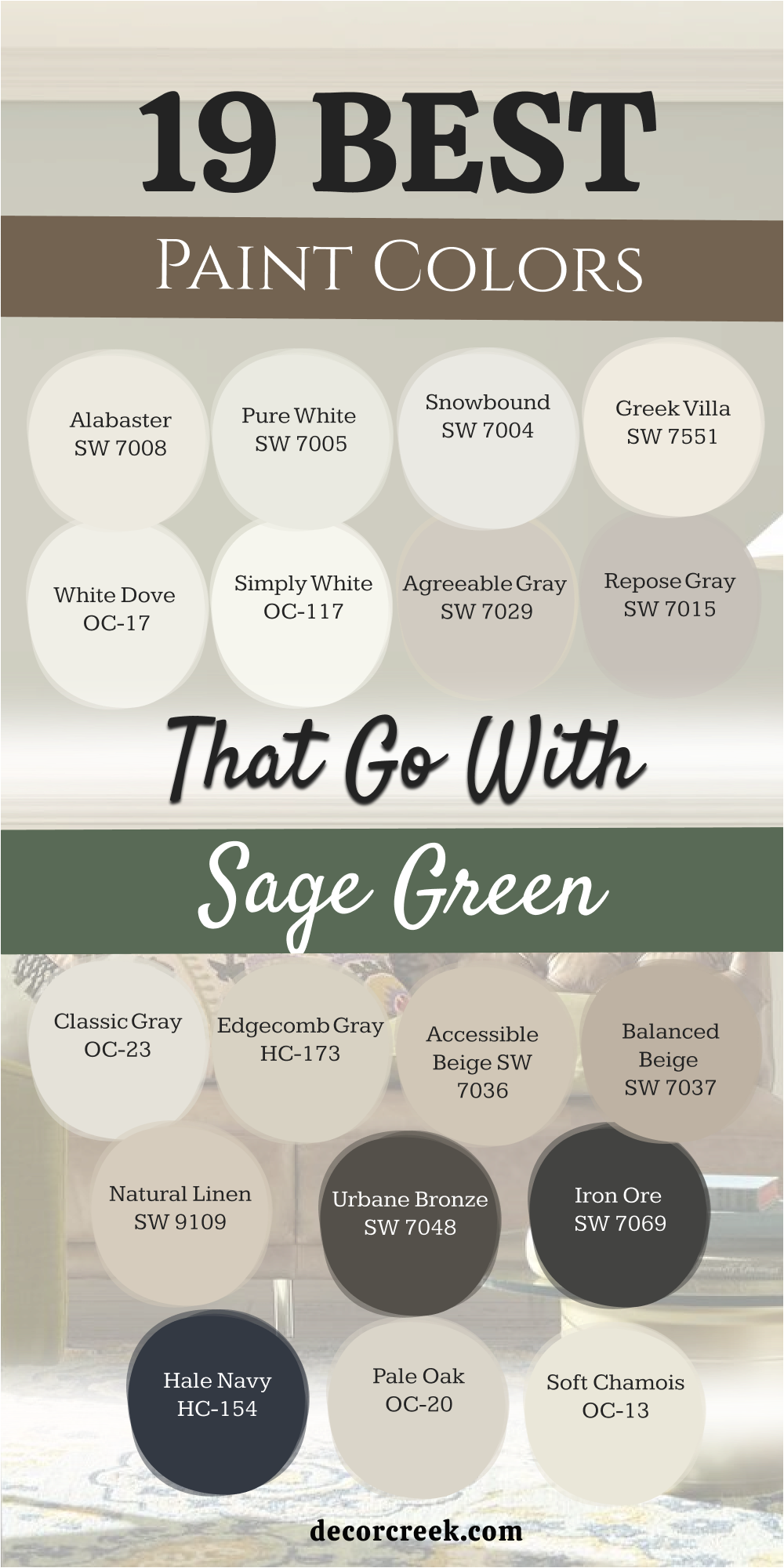
Alabaster SW 7008
Alabaster SW 7008 is the best creamy white to use with a soft sage green. This color has a warm heart that matches the soft nature of sage perfectly. I find that it makes sage green look more like a color from a garden.
It is a very friendly choice that makes a room feel very light and very open. This paint does not fight with the sage, it just sits quietly in the back. You can use it on the ceiling to make the sage walls feel more grounded.
It is a very safe pick for anyone who wants a soft and pretty room. This shade makes your home feel very clean but still very warm for your kids. You will love how it glows when the sun hits it in the afternoon. It creates a very inviting feel for your family and guests to enjoy.
Best used in: living rooms, kitchens, and nurseries
Pairs well with: Sage Green, Iron Ore SW 7069, Light Wood The key rule of this color for a soft look is to use it on trim to make the sage walls feel extra gentle.
🎨 Check out the complete guide to this color right HERE 👈
Pure White SW 7005
Pure White SW 7005 makes sage green look very modern and very updated today. This white is very clean and helps the dusty look of sage feel more energetic. I use this when I want a sage green bathroom to feel very fresh and very new.
It provides a great contrast that makes the green look more like a real color. This paint is very easy to clean and stays looking bright for a long time. It works well with black or silver fixtures for a very contemporary look in your home.
You will notice how it makes the sage green look very sharp and very clear. It is a great way to make an old-fashioned color look very current and stylish. This shade is a top choice for a crisp and neat finish. It gives a very fresh finish to a bathroom or kitchen.
Best used in: bathrooms, modern kitchens, and laundry rooms
Pairs well with: Sage Green, Pewter Green SW 6208, Black accents The key rule of this color for a modern look is to use it on cabinets to make sage walls really stand out.
🎨 Check out the complete guide to this color right HERE 👈
Snowbound SW 7004
Snowbound SW 7004 is a cool white that brings out the blue side of sage green. This color is very crisp and helps to keep the sage from looking too muddy. I like to use it in rooms that have a lot of blue decorations or rugs.
It creates a very fresh look that feels very light and very airy for everyone. This paint makes the room feel very cold and fresh, which is great for hot climates. It is a very smart choice for a bedroom where you want a very clean feel.
You can use it to highlight the soft tones in your sage green furniture very well. It is a very high-quality paint that gives a very smooth and even look. This shade helps your home feel very organized and very well kept. It makes the green feel very cool and steady.
Best used in: bedrooms, sunrooms, and cool-toned living areas
Pairs well with: Blue-Sage, Ripe Olive SW 6209, Gray accents The key rule of this color for a crisp look is to use it in bright rooms to highlight the cool side of sage.
🎨 Check out the complete guide to this color right HERE 👈
Greek Villa SW 7551
Greek Villa SW 7551 is a rich white that feels like a warm hug for your walls. This shade has a nice glow that looks amazing next to sage green furniture or walls. It is not as yellow as ivory but it is much warmer than a basic white.
I suggest this for living rooms where you want people to sit and stay a while. It makes a sage green accent wall feel very expensive and high-end. This paint handles shadows very well without turning into a muddy gray color.
It is a great way to make a room feel sunny even on a cloudy day. You can use it on the ceiling to make the whole room feel more connected. It is a classic choice that never goes out of style for home owners. It brings a very soft light to dark sage corners.
Best used in: living rooms, entryways, and large open floor plans
Pairs well with: Sage Green, Urban Bronze SW 7048, Wood Finishings The key rule of this color for a cozy feel is to use it in rooms with lots of fabric and soft green textures.
🎨 Check out the complete guide to this color right HERE 👈
White Dove OC-17
White Dove OC-17 is a legendary white that is very soft and very creamy for your home. This color has just a tiny hint of gray that keeps it looking very expensive. I use it with sage green when I want a room to look very classic and very traditional.
It is a very popular choice for trim and doors because it looks very soft against the green. This paint makes sage green feel very elegant and very well chosen for a fancy house. It works well in dining rooms where you have big green curtains or rugs.
You will like how it makes your home feel very steady and very solid for years. It is a very light color but it still feels very rich and full of quality. This shade helps a room feel very quiet and very peaceful for your family. It is a favorite for many professional designers.
Best used in: trim, doors, dining rooms, and traditional kitchens
Pairs well with: Saybrook Sage HC-114, Revere Pewter HC-172, Wood tones The key rule of this color for a classic look is to use it on moldings to give your sage walls a rich frame.
🎨 Check out the complete guide to this color right HERE 👈
Simply White OC-117
Simply White OC-117 is a very bright and happy white that feels very fresh. This color is a great choice if you want your sage green to look very crisp. I use it in small kitchens to make the sage green cabinets look very clean.
It has a little bit of warmth that keeps it from feeling like cold ice. This paint makes the whole room feel very sunny and very open to the world outside. It is a very high-quality color that gives a very smooth finish to your walls.
You will notice how it makes the green in your room feel very modern and new. It works well with light wood floors and silver handles for a neat look. This shade is perfect for making a dark house feel much more bright and cheerful. It creates a very light and airy environment for everyone.
Best used in: kitchens, ceilings, and small dark rooms
Pairs well with: Sage Green, Black metal, Light oak The key rule of this color for a happy look is to use it in rooms with big windows to catch the light.
🎨 Check out the complete guide to this color right HERE 👈
Agreeable Gray SW 7029
Agreeable Gray SW 7029 is a perfect neutral that works wonderfully with sage green. This color is a mix of gray and beige, which makes it feel very warm and friendly. I use it as a bridge between sage green walls and your other furniture items.
It keeps the room looking very clean without feeling cold or like concrete. This paint is very flexible and looks good in any lighting situation you have. It makes sage green accents stand out in a very smart and modern way.
You will find that it is very easy to live with for many years in your house. It is a great choice for a whole-house color that flows into a green room. This shade helps your home feel very current and very stylish for your guests. It makes green decor look very professional and sharp.
Best used in: living rooms, hallways, and open floor plans
Pairs well with: Sage Green, Sea Salt SW 6204, Pure White SW 7005 The key rule of this color for a balanced look is to use it on the main walls to let sage green furniture pop.
🎨 Check out the complete guide to this color right HERE 👈
Repose Gray SW 7015
Repose Gray SW 7015 is a cool and sophisticated gray that looks very chic. This color has a tiny bit of blue and green hidden in its base already. Because of that, it matches sage green perfectly and feels very connected to it.
I like to use it in master bedrooms where you want a very quiet and focused look. This paint makes the sage green look very fresh and very updated for today. It handles bright sunlight very well and keeps the room feeling cool and fresh.
You will notice that it makes your home feel very neat and very well put together. It is a great way to update an old room that feels dark or heavy. This shade gives a very polished finish to any green-themed project you have. It makes light sage green look very crisp.
Best used in: bedrooms, modern living rooms, and offices
Pairs well with: Sage Green, Eider White SW 7014, Iron Ore SW 7069 The key rule of this color for a chic look is to pair it with soft sage for a high-end and calm feel.
🎨 Check out the complete guide to this color right HERE 👈
Classic Gray OC-23
Classic Gray OC-23 is a very light and airy neutral that feels like a soft shadow. This color is almost white but has just enough gray to show a nice contrast. I use it with sage green to create a room that feels very light and very open.
It is a wonderful choice for a guest room or a small nursery for your family. This paint makes sage green look very soft and very pretty in the morning light. It is a very high-end color that designers love for a very simple look.
You will find that it makes your home feel very clean and very well organized for guests. It works well with silver hardware and white linens for a fresh finish. This shade helps to create a very balanced and happy environment for everyone. It makes sage green walls feel very sunny.
Best used in: nurseries, guest rooms, and small bathrooms
Pairs well with: Dry Sage 2142-40, Simply White OC-117, Gray fabrics The key rule of this color for a soft look is to use it as a neutral base that stays in the background.
🎨 Check out the complete guide to this color right HERE 👈
Edgecomb Gray HC-173
Edgecomb Gray HC-173 is a warm and stony neutral that feels very natural. This color is a very popular choice for people who want a home that feels very earthy. I use it with sage green to create a look that reminds me of a quiet forest.
It is a very sturdy color that makes any room feel very safe and very solid. This paint works well with wooden floors and stone fireplaces in your house. It keeps the sage green from looking too cold on cloudy or rainy days.
You will love how it makes your green throw pillows or rugs look very rich. It is a very forgiving color that hides a lot of wear and tear from kids. This shade helps your home feel very grounded and very peaceful for your daily life. It makes sage green feel very organic.
Best used in: family rooms, kitchens, and entryways
Pairs well with: Sage Green, White Dove OC-17, Dark wood The key rule of this color for a natural look is to pair it with greens that have a warm or yellow base.
🎨 Check out the complete guide to this color right HERE 👈
Accessible Beige SW 7036
Accessible Beige SW 7036 is a very famous color because it is so easy to use. This paint has a bit of gray in it which makes it look very updated and smart. It is a fantastic partner for sage green because it feels very warm and very kind.
I use it when I want a large room to feel more connected and finished for a family. It acts as a bridge between your green walls and your natural wood furniture. This shade is very helpful for making a home feel very welcoming and very comfortable.
It is a very reliable color that looks good in any room of the house. You will love how it makes your sage green accents look very deep and very rich. It is one of my top picks for a cozy and natural home environment. This paint makes green feel very grounded.
Best used in: hallways, family rooms, and kitchens
Pairs well with: Sage Green, Alabaster SW 7008, Urbane Bronze SW 7048 The key rule of this color for a grounded look is to use it in areas where you want a natural flow.
🎨 Check out the complete guide to this color right HERE 👈
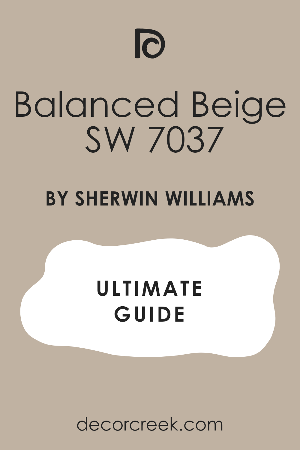
Balanced Beige SW 7037
Balanced Beige SW 7037 is a deeper tan color that feels very rich and very solid. This color has more weight than other neutrals, which makes it feel very grounded. I find it looks wonderful with a dark sage or a mossy green shade.
It creates a very cozy look that is perfect for a study or a den area. This paint makes the room feel very private and very warm for your family. It works well with leather furniture and dark wood accents in your home.
You will like how it makes your home feel very well built and very sturdy. It is a great choice for a basement or a room that needs a bit of strength. This shade is very easy to live with and stays looking good for a long time. It makes sage green look very earthy and full of life.
Best used in: dens, studies, and warm living rooms
Pairs well with: Sage Green, Shoji White SW 7042, Bronze accents The key rule of this color for a cozy look is to use it in rooms with lots of natural wood textures.
🎨 Check out the complete guide to this color right HERE 👈
Natural Linen SW 9109
Natural Linen SW 9109 is a soft and sandy color that feels very organic and light. This color looks like raw fabric or a beach on a sunny afternoon. I use it with sage green to create a very light and natural look for a home.
It is a very pretty shade that makes any room feel more like a garden. This paint makes sage green feel very fresh and very clean in your space. It is a great choice for a bedroom where you want to feel very relaxed.
You will find that it makes your home feel very airy and very open to the sun. It works well with woven baskets and light wooden furniture for a soft look. This shade helps to create a very balanced and happy environment for everyone. It makes sage green look very sunny.
Best used in: bedrooms, sunrooms, and laundry rooms
Pairs well with: Sage Green, Pure White SW 7005, Wood tones The key rule of this color for a soft look is to use it with greens that have a light and dusty appearance.
🎨 Check out the complete guide to this color right HERE 👈

Urbane Bronze SW 7048
Urbane Bronze SW 7048 is a very dark and moody color that is almost brown. This paint has a lot of green in its base, which makes it a natural match for sage. I love using this color for doors or window frames against a sage green wall.
It makes the house look very modern and very grounded to the earth. This shade is great for creating a lot of drama in a small powder room. It feels very heavy and high quality when you see it on the walls.
You can use it to highlight the architecture of your home very effectively. It works perfectly with sage green accents to create a big contrast. This is a very trendy color that designers use for a very high-end look. It makes sage green look very cool and smart.
Best used in: accent walls, exteriors, and doors
Pairs well with: Sage Green, Shoji White SW 7042, Silver Strand SW 7057 The key rule of this color for a dramatic look is to use it in small doses to ground the room.
🎨 Check out the complete guide to this color right HERE 👈
Iron Ore SW 7069
Iron Ore SW 7069 is a soft black that is much friendlier than a true jet black. This color looks very sophisticated when it is paired with a light sage green. It provides a sharp look that keeps the sage from looking too much like a nursery.
I use this paint for kitchen islands or fireplace mantels to ground the room. It feels very smooth and looks like natural stone or dark metal. This shade is perfect for people who want a bold look but are afraid of black.
It has a tiny bit of warmth that keeps it from feeling cold or scary. You will find that it makes your sage green items look very bright and alive. It is a very smart color that makes your whole house look more modern. This paint makes any green look very vibrant.
Best used in: kitchen islands, fireplaces, and front doors
Pairs well with: Sage Green, Alabaster SW 7008, Repose Gray SW 7015 The key rule of this color for a bold look is to use it on furniture to frame your sage green walls.
🎨 Check out the complete guide to this color right HERE 👈
Hale Navy HC-154
Hale Navy HC-154 is a deep and royal blue that feels very strong and classic. This color is a beautiful partner for sage green because they are neighbors in nature. I love the way they look together because it feels like the sea meeting the field.
This paint makes a room feel very tall and very wide if used correctly. It is a very traditional color that still feels very fresh and new today. You can use it in a study to create a very dark and restful place for work.
It works well with white trim and sage green pillows or rugs for a preppy look. This shade is a favorite for many of my clients who want a rich color. It makes sage green look very bright and happy.
Best used in: studies, dining rooms, and accent walls
Pairs well with: Sage Green, White Dove OC-17, Gold accents The key rule of this color for a royal feel is to pair it with light sage to keep the room bright.
🎨 Check out the complete guide to this color right HERE 👈
Romantic Pink 2004-70
Romantic Pink 2004-70 is a very soft and pretty color that feels very kind. This color is a fantastic partner for sage green because they are opposite on the wheel. I use it to add a little bit of sweetness to a sage green room.
It makes the room feel very happy and very full of life for a family. This paint reminds me of flowers in a garden during the early morning. It works well with sage green in a nursery or a very soft living area.
You will find that it makes your home feel very cozy and very welcoming for guests. It is a great choice for a bedroom where you want to feel very light. This shade helps to balance out the cool feel of the sage green paint. It makes sage green look very fresh.
Best used in: nurseries, bedrooms, and soft living rooms
Pairs well with: Sage Green, Simply White OC-117, Gold The key rule of this color for a sweet look is to use it in small accents like pillows or a single wall.
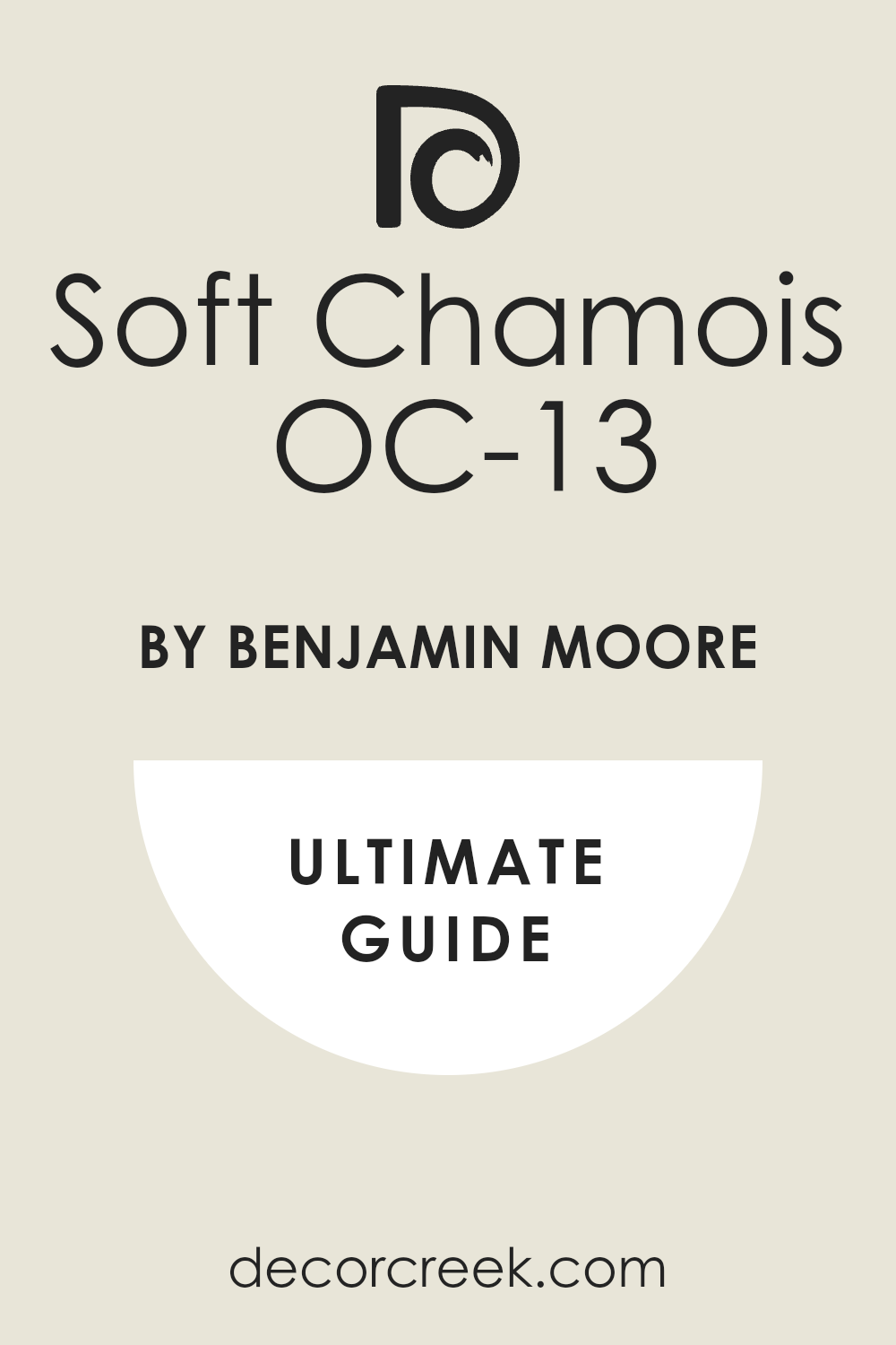
Soft Chamois OC-13
Soft Chamois OC-13 is a very light and creamy neutral that feels like velvet. This color is very soft and looks wonderful with a dusty sage green wall. I use it to create a room that feels very elegant and very expensive.
It is a very quiet color that does not demand too much attention from your eyes. This paint makes sage green look very rich and very deep in your space. It is a great choice for a living room where you want people to feel relaxed.
You will notice how it helps to make the room feel very sunny and open. It works well with brass hardware and white linens for a polished finish. This shade is a favorite for a very high-end and simple home design. It makes sage green look very sophisticated.
Best used in: living rooms, bedrooms, and master suites
Pairs well with: Sage Green, White Dove OC-17, Brass The key rule of this color for a luxury look is to use it on the walls to let your green furniture shine.
🎨 Check out the complete guide to this color right HERE 👈
Pale Oak OC-20
Pale Oak OC-20 is a light greige that feels very stony and very natural for a house. This color is a very popular neutral because it changes with the light so well. I use it with sage green to create a look that is very updated and fresh.
It is a very sturdy color that makes any room feel more solid and safe. This paint makes sage green feel very clean and very modern in your home. It is a great choice for an entryway or a large open floor plan.
You will like how it makes your home feel very airy and very open to the sunlight. It works well with black accents and light wood floors for a neat look. This shade helps to create a very balanced and happy environment for everyone. It makes sage green look very bright.
Best used in: entryways, living rooms, and open floor plans
Pairs well with: Sage Green, Chantilly Lace OC-65, Black metal The key rule of this color for a modern look is to use it as a neutral base for a green-focused room.
🎨 Check out the complete guide to this color right HERE 👈

14 Paint Colors that go With Emerald Green
Shoji White SW 7042
Shoji White SW 7042 is a soft, warm neutral that looks great with bright emerald green. This color helps to tone down the high energy of emerald green so it is easier to see. I use it when I want an emerald green room to feel more like a home.
It is a very creamy shade that feels very expensive and very high quality on walls. This paint makes the emerald look very rich and very deep like a real jewel. It is a great choice for a living room where you have an emerald green sofa.
You will find that it makes the room feel very warm and very inviting for your guests. It is a very flexible color that works with many different types of lighting. This shade is a favorite for creating a luxury look in any home. Using this white helps the green feel very grounded and very solid for your family. Emerald green can sometimes feel a bit cold, but this shade brings the perfect amount of kindness. You will enjoy how it makes the green pop without being too loud for your eyes.
Best used in: living rooms, dining rooms, and master suites
Pairs well with: Emerald Green, Evergreen Fog SW 9130, Gold The key rule of this color for a luxury look is to use it as a soft background for bold emerald furniture.
🎨 Check out the complete guide to this color right HERE 👈
Creamy SW 7012
Creamy SW 7012 is a very warm and yellow-based white that feels very traditional and rich. This color looks beautiful with emerald green because it creates a very classic feel. I use it in older homes where I want the emerald green to look very historic.
It is a very soft paint that makes the room feel very cozy and very full. This shade prevents the emerald green from looking too cold or too modern for the space. It works well with dark wood floors and big green curtains for a full look.
You will like how it makes your home feel very sturdy and very well established. It is a great choice for a formal dining room where you want to impress. This color adds a lot of warmth and kindness to a very bold green room. Many people love how it glows when you turn the lamps on in the evening. It makes a room feel like a safe hug from an old friend. This white has enough heart to balance out the strong strength of emerald walls.
Best used in: dining rooms, libraries, and historic homes
Pairs well with: Emerald Green, Dark Wood, Brass The key rule of this color for a historic look is to use it on all the trim and doors to frame the green.
🎨 Check out the complete guide to this color right HERE 👈

Eider White SW 7014
Eider White SW 7014 is a light gray-white that feels very soft and a little bit misty. This color is a great partner for emerald green because it is very quiet and calm. I use it when I want the emerald green to be the only thing people notice.
It provides a very smooth look that does not have any yellow or blue in it. This paint makes the emerald green look very clean and very modern in your room. It is a great choice for a bedroom or a small office where you want focus.
You will notice how it helps to balance the strength of the green very effectively. It is a very popular shade for people who like a very neat and tidy home. This color gives a very polished finish to any emerald green project. It helps a room feel very light even if the green is very dark. This shade is perfect if you want a modern look that still feels very soft. You will appreciate how it makes your green accents look very sharp and very clear.
Best used in: offices, bedrooms, and modern entryways
Pairs well with: Emerald Green, Repose Gray SW 7015, Black The key rule of this color for a polished look is to use it on the walls to let emerald accents shine bright.
🎨 Check out the complete guide to this color right HERE 👈
Cloud White OC-130
Cloud White OC-130 is a very soft and light neutral that feels like a big fluffy cloud. This color has just a tiny bit of warmth to keep it from looking like ice. I pick this when I want a room with emerald green to feel very airy and open.
It is a very pretty white that makes the green look very vibrant and very fresh. This paint is wonderful for ceilings and trim because it looks very clean next to green. It helps to make a small room feel much bigger and much more sunny for you.
You will love how it makes the green in your home feel very expensive and high-end. It is a very reliable color that looks good in every single room you have. This shade is a top pick for making a dark house feel much more cheerful. It brings a very happy light into your living space and makes green feel alive.
Best used in: ceilings, trim, and small dark rooms
Pairs well with: Emerald Green, Wood floors, Silver hardware The key rule of this color for an airy feel is to use it on the ceiling to lift the green walls up.
🎨 Check out the complete guide to this color right HERE 👈
Chantilly Lace OC-65
Chantilly Lace OC-65 is the cleanest and brightest white that I ever use in my work. This color has no obvious undertones, so it is a very true and pure white. I love using this with emerald green to create a very high contrast and sharp look.
It makes the green look very deep and very intense, like a high-fashion magazine. This paint is perfect for modern homes with lots of glass and metal furniture. It provides a very neat and tidy finish that looks very professional for everyone.
You will notice how it makes the emerald green look very modern and very updated today. It is a great choice for a kitchen with green cabinets and bright white walls. This shade makes your home feel very organized and very well put together for guests. It is a very impressive color that shows you are confident in your style.
Best used in: modern kitchens, bathrooms, and bright galleries
Pairs well with: Emerald Green, Black accents, Chrome The key rule of this color for a sharp look is to use it where you want a very high contrast.
🎨 Check out the complete guide to this color right HERE 👈

Mindful Gray SW 7016
Mindful Gray SW 7016 is a mid-tone gray that has a lot of depth and character. This color is a bit darker than other grays, which makes it feel very grounded. I find it looks best when paired with a very bright emerald green in a room.
It keeps the bright green from being too loud or making your eyes tired after a while. This paint is great for making a room feel more formal and elegant for dinner parties. It covers walls very well and creates a very smooth and even finish for you.
You can use it in a home office to create a professional and focused environment. It works well with dark wood furniture and green rugs or curtains in your house. This shade is a great way to add weight to a room that feels too light. It makes emerald green feel very serious and very grown up for your family. You will like how it makes the green look very rich and very sophisticated.
Best used in: dining rooms, offices, and accent walls
Pairs well with: Emerald Green, Pure White SW 7005, Dovetail SW 7018 The key rule of this color for a formal look is to use it in rooms where you want a strong contrast.
🎨 Check out the complete guide to this color right HERE 👈
Anew Gray SW 7030
Anew Gray SW 7030 is a warm gray that feels very stony and natural like a pebble. This color has more brown in it than many other grays on this list here. It is a fantastic partner for emerald green because it brings an earthy feel to the room.
I pick this color when I want a home to feel very natural and organic for guests. It reminds me of the colors you see while walking through a quiet forest path. This paint makes green accents feel very earthy and connected to the ground below.
It is a great choice for a basement or a room that needs a bit of warmth. You will like how it makes your home feel very solid and very well built. It is a very forgiving color that hides a lot of wear and tear from kids. This shade makes your emerald green decor look very rich and very full of life. It creates a very steady and peaceful environment for everyone to enjoy.
Best used in: basements, entryways, and family rooms
Pairs well with: Emerald Green, Accessible Beige SW 7036, Urbane Bronze SW 7048 The key rule of this color for a natural look is to use it alongside greens that have a heavy base.
🎨 Check out the complete guide to this color right HERE 👈
Balboa Mist OC-27
Balboa Mist OC-27 is a very light and airy neutral that feels like a soft mist. This color is a very popular choice for modern homes because it looks so fresh. I use it with emerald green to create a look that is very updated and new.
It is a very pretty shade that makes any room feel much more open to the sun. This paint makes emerald green feel very clean and very modern in your own home. It is a great choice for an entryway or a large open floor plan for families.
You will find that it makes your home feel very light and very airy for everyone. It works well with black accents and light wood floors for a very neat look. This shade helps to create a very balanced and happy environment for your guests. It makes emerald green walls look very sunny and very bright during the day.
Best used in: entryways, living rooms, and open floor plans
Pairs well with: Emerald Green, Chantilly Lace OC-65, Black metal The key rule of this color for a modern look is to use it as a neutral base for green accents.
🎨 Check out the complete guide to this color right HERE 👈
Natural Tan SW 7567
Natural Tan SW 7567 is a warm and sandy color that feels very organic and soft. This color looks like the earth on a sunny afternoon in a quiet place. I use it with emerald green to create a very light and natural look for a house.
It is a very pretty shade that makes any room feel more like a garden. This paint makes emerald green feel very fresh and very clean in your living space. It is a great choice for a bedroom where you want to feel very relaxed.
You will find that it makes your home feel very airy and very open to the sun. It works well with woven baskets and light wooden furniture for a soft look. This shade helps to create a very balanced and happy environment for everyone. It makes emerald green look very sunny and very full of energy. You will love how it warms up the deep tones of the green.
Best used in: bedrooms, sunrooms, and laundry rooms
Pairs well with: Emerald Green, Pure White SW 7005, Wood tones The key rule of this color for a soft look is to use it with greens that have a light appearance.
🎨 Check out the complete guide to this color right HERE 👈
Manchester Tan HC-81
Manchester Tan HC-81 is a sophisticated and traditional tan that feels very steady. This color is a classic choice for people who want a home that feels very sturdy. I use it with emerald green to create a look that is very high-end and rich.
It is a very solid color that makes any room feel very safe and very professional. This paint works well with wooden floors and dark fireplaces in your family house. It keeps the emerald green from looking too cold on cloudy or rainy days outside.
You will love how it makes your green throw pillows or rugs look very expensive. It is a very forgiving color that hides a lot of daily wear and tear. This shade helps your home feel very grounded and very peaceful for your life. It makes emerald green feel very organic and very well put together.
Best used in: family rooms, kitchens, and entryways
Pairs well with: Emerald Green, White Dove OC-17, Dark wood The key rule of this color for a natural look is to pair it with greens that have a warm base.
🎨 Check out the complete guide to this color right HERE 👈

Dovetail SW 7018
Dovetail SW 7018 is a dark gray that feels very cozy and like a warm blanket. This color is strong enough to stand up to very bold and bright emerald greens. I use it when I want to create a room that feels very private and snug.
It looks amazing on built-in bookshelves next to a green reading chair in a corner. This paint gives the room a lot of personality without needing a lot of art. It is a very rich shade that makes any space feel more expensive than it is.
You can use it in a bedroom to help you sleep better in a dark place. It works well with gold or brass handles and green decor pieces in the room. This color is a bold choice that pays off with a very stylish look. It makes emerald green look very bright and very clear against the gray. You will like how it makes your home feel very solid and very quiet.
Best used in: media rooms, libraries, and master bedrooms
Pairs well with: Emerald Green, Alabaster SW 7008, Mindful Gray SW 7016 The key rule of this color for a cozy look is to use it in smaller rooms for a private feeling.
🎨 Check out the complete guide to this color right HERE 👈
Kendall Charcoal HC-166
Kendall Charcoal HC-166 is a deep and rich gray that feels very solid and quiet. This color is very moody and looks wonderful with a bright emerald green wall. I use it to create a room that feels very elegant and very expensive for you.
It is a very strong color that does not demand too much attention from your eyes. This paint makes emerald green look very rich and very deep in your space. It is a great choice for a living room where you want people to feel very relaxed.
You will notice how it helps to make the room feel very private and very snug. It works well with brass hardware and white linens for a polished finish. This shade is a favorite for a very high-end and simple home design for guests. It makes emerald green look very sophisticated and very modern today.
Best used in: living rooms, bedrooms, and master suites
Pairs well with: Emerald Green, White Dove OC-17, Brass The key rule of this color for a luxury look is to use it on the walls for your green furniture.
🎨 Check out the complete guide to this color right HERE 👈
Newburyport Blue HC-155
Newburyport Blue HC-155 is a deep and royal blue that feels very strong and classic. This color is a beautiful partner for emerald green because they are neighbors. I love the way they look together because it feels like the deep sea and nature.
This paint makes a room feel very tall and very wide if you use it correctly. It is a very traditional color that still feels very fresh and new today for families. You can use it in a study to create a very dark and restful place for work.
It works well with white trim and emerald green pillows or rugs for a preppy look. This shade is a favorite for many of my clients who want a rich color. It makes emerald green look very bright and happy in the sunlight. You will appreciate how the two colors talk to each other to create a bold look.
Best used in: studies, dining rooms, and accent walls
Pairs well with: Emerald Green, White Dove OC-17, Gold accents The key rule of this color for a royal feel is to pair it with emerald to keep the room bright.
🎨 Check out the complete guide to this color right HERE 👈

Gentleman’s Gray 2062-20
Gentleman’s Gray 2062-20 is a very dark blue-gray that feels very sophisticated and smart. This color is almost like a suit for your walls and looks great with emerald green. I use it when I want a room to feel very formal and very well designed for guests.
It provides a very smooth look that makes the green look very vibrant and clear. This paint makes the emerald green feel very clean and very modern in your home. It is a great choice for a bedroom or a large office where you want to focus.
You will notice how it helps to balance the strength of the green very effectively for you. It is a very popular shade for people who like a very neat and tidy house. This color gives a very polished finish to any emerald green project you have. It makes emerald green look very rich and very full of deep character.
Best used in: offices, bedrooms, and modern entryways
Pairs well with: Emerald Green, Repose Gray SW 7015, Black The key rule of this color for a polished look is to use it on the walls for emerald accents.
🎨 Check out the complete guide to this color right HERE 👈

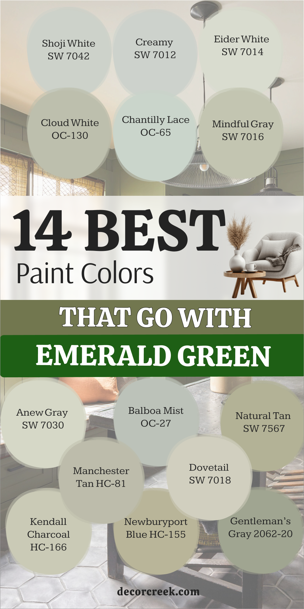
Green is a color that connects us to nature and makes our homes feel alive and full of warmth. When I work with green, I always notice how it brings a fresh and cozy feeling into any room, no matter the style. Picking the right partner for your green paint is about finding a balance that feels right to you and your home.
Sometimes I go for a bold contrast with deep black, and other times I choose a soft creamy white for a gentle and easy look.
I always suggest buying a small can and painting a test spot on your wall first before making a final choice. This simple step helps you see how the color looks in your own light during the day and in the evening.
It also lets you check how it works with your furniture, fabrics, and decor pieces. Trust your feelings when you look at the wall, because your first reaction often tells you everything you need to know.Your home should be a place where you feel happy, safe, and comfortable every single day.
The right color pairing can make a room feel more put together and welcoming without much effort.
Using these tried combinations makes the whole process easier and helps you avoid second guessing.
I always remind my clients to enjoy each step, because creating a home you love should feel exciting.
In the end, green can help you build a home that feels fresh, cozy, and truly yours.