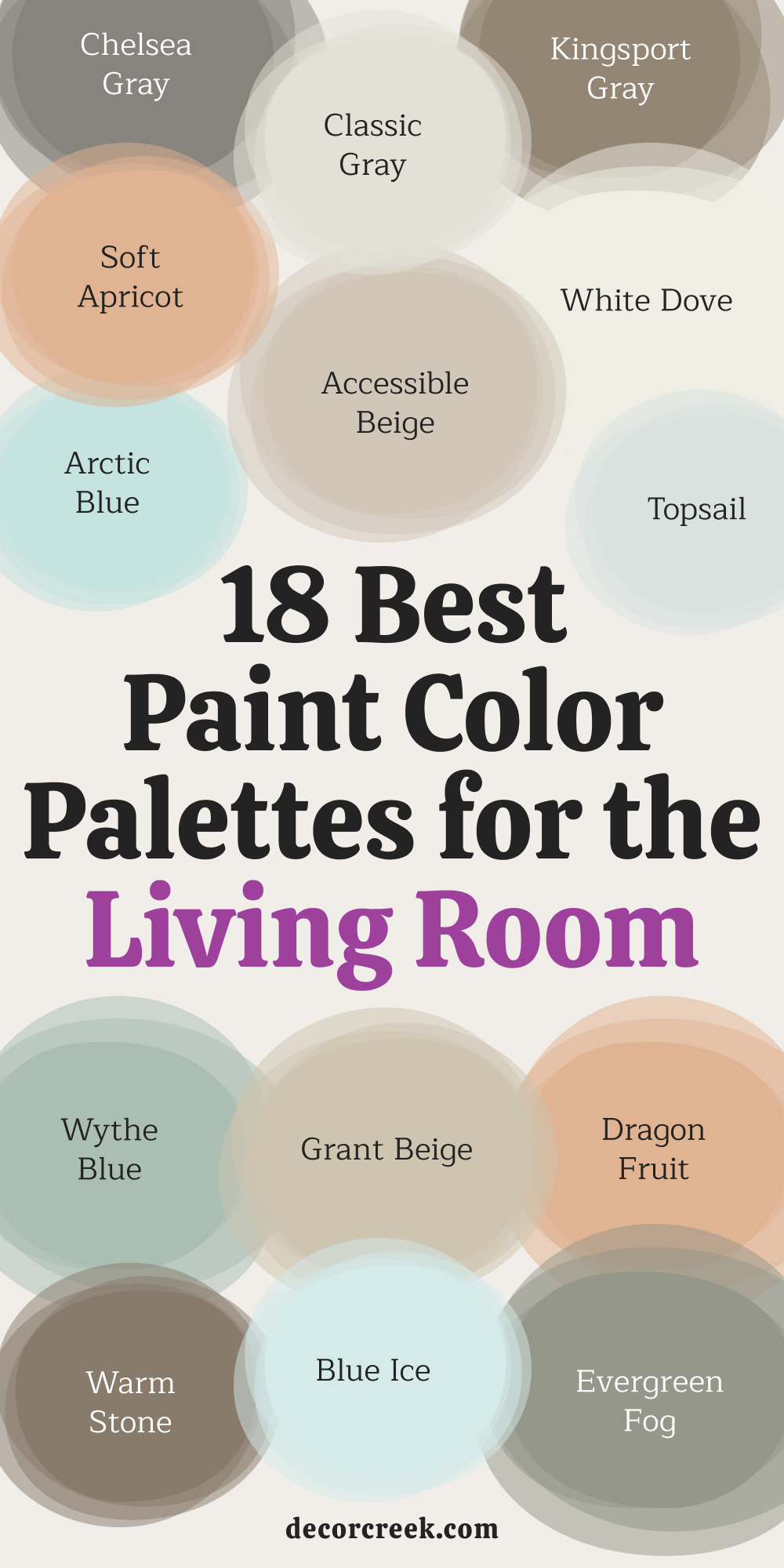
Choosing the right paint palette for your living room can feel like a big decision, but it’s one of the most rewarding steps in designing a space where your family and friends will gather. Colors do more than just decorate walls—they set the mood, bring harmony, and help express your style.
I’ve crafted 18 paint palettes blending Sherwin Williams and Benjamin Moore colors, each designed to create a unique ambiance. Whether you love cozy neutrals or vibrant hues, there’s a palette for you. Let’s get started!
How to Use These Palettes?
Each palette below includes seven colors:
- Use the first two shades for the walls.
- The third and fourth for accents like trim or furniture.
- The fifth for ceilings or subtle details.
- The last two for bold accents or pops of color.
Remember, test paint samples in your space before committing. Lighting can change how a color looks, so swatch them on your walls first.
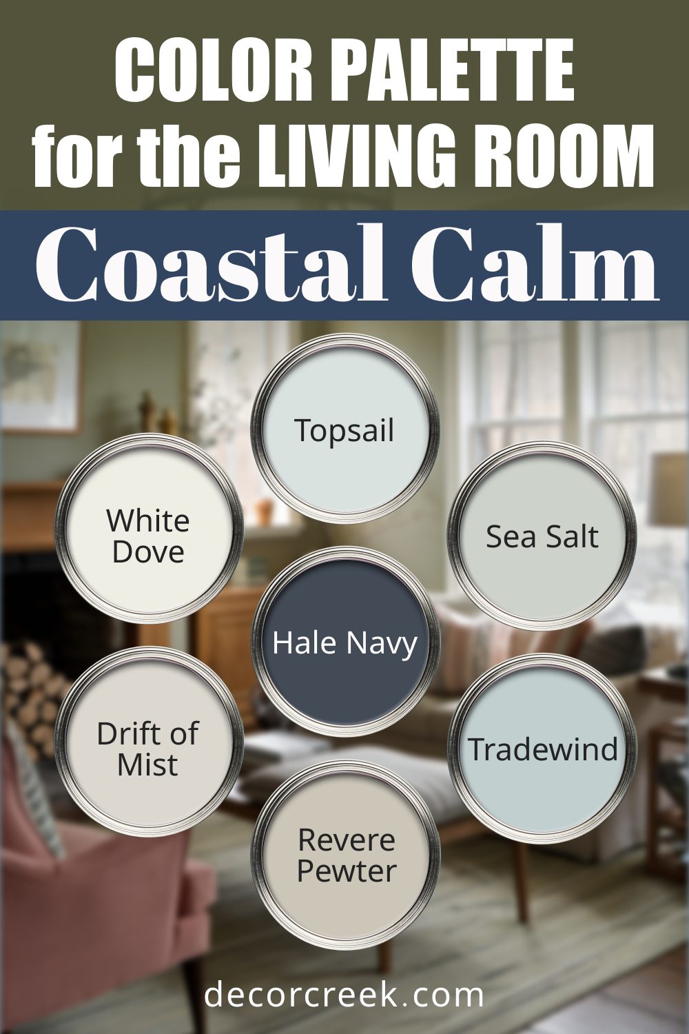
Coastal Calm
For breezy, light-filled living rooms inspired by the beach. This palette combines soft, airy tones with grounding neutrals.
Feel: Breezy and light, inspired by the sea.
Use: Combine soft blues and greens on walls with white and gray accents for a tranquil, airy space.
- Sherwin Williams Topsail: A soft blue-gray that feels like a calm ocean breeze.
- Benjamin Moore White Dove: A warm white that adds a cozy, inviting touch.
- Sherwin Williams Sea Salt: A muted green reminiscent of seafoam.
- Benjamin Moore Hale Navy: A deep navy blue for dramatic contrast.
- Sherwin Williams Drift of Mist: A subtle gray that works well as a backdrop.
- Benjamin Moore Revere Pewter: A versatile neutral gray with warmth.
- Sherwin Williams Tradewind: A light aqua that evokes the sea’s tranquility.
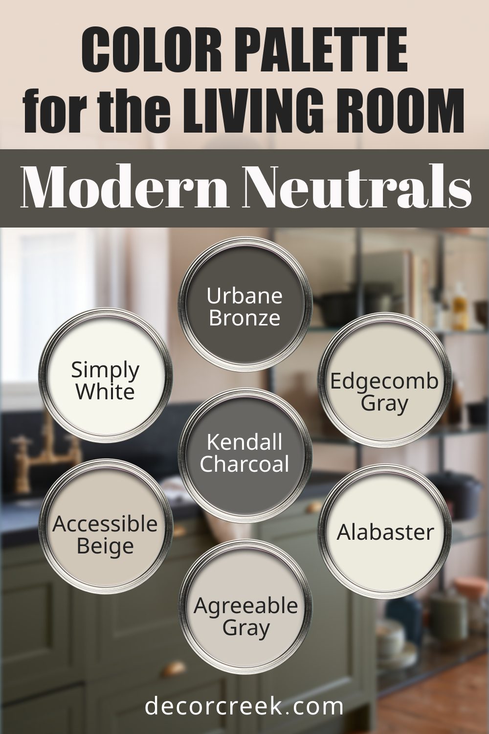
Modern Neutrals
Sleek, timeless colors for a contemporary vibe. Perfect for creating a clean, understated living space.
Feel: Sleek and timeless, perfect for contemporary homes.
Use: Layer gray and beige tones on walls and trim, with dark accents for depth and elegance.
- Sherwin Williams Agreeable Gray: A soft gray-beige that’s universally loved.
- Benjamin Moore Simply White: A bright white that reflects natural light beautifully.
- Sherwin Williams Accessible Beige: A beige with gray undertones for balance.
- Benjamin Moore Kendall Charcoal: A bold charcoal for depth and sophistication.
- Sherwin Williams Urbane Bronze: A moody bronze for an edgy touch.
- Benjamin Moore Edgecomb Gray: A light gray-beige that adds warmth.
- Sherwin Williams Alabaster: A creamy white with a hint of softness.
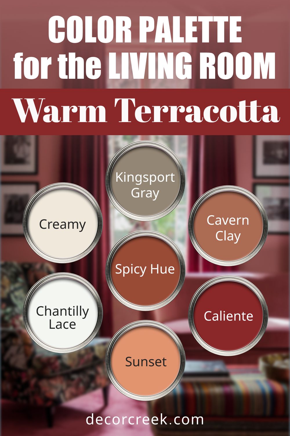
Warm Terracotta
Cozy earth tones for a relaxed, inviting space. These shades bring warmth and personality to a room.
Feel: Cozy and earthy, with a rustic charm.
Use: Use terracotta and muted oranges for walls, paired with warm neutrals and pops of golden yellow.
- Benjamin Moore Caliente: A bold, rich red that adds energy.
- Sherwin Williams Cavern Clay: A warm terracotta for a rustic feel.
- Benjamin Moore Chantilly Lace: A crisp white that balances warm tones.
- Sherwin Williams Creamy: A soft beige for a classic touch.
- Sherwin Williams Spicy Hue: A burnt orange that’s lively and fun.
- Benjamin Moore Kingsport Gray: A neutral brown for grounding the palette.
- Sherwin Williams Sunset: A golden yellow for a cheerful accent.
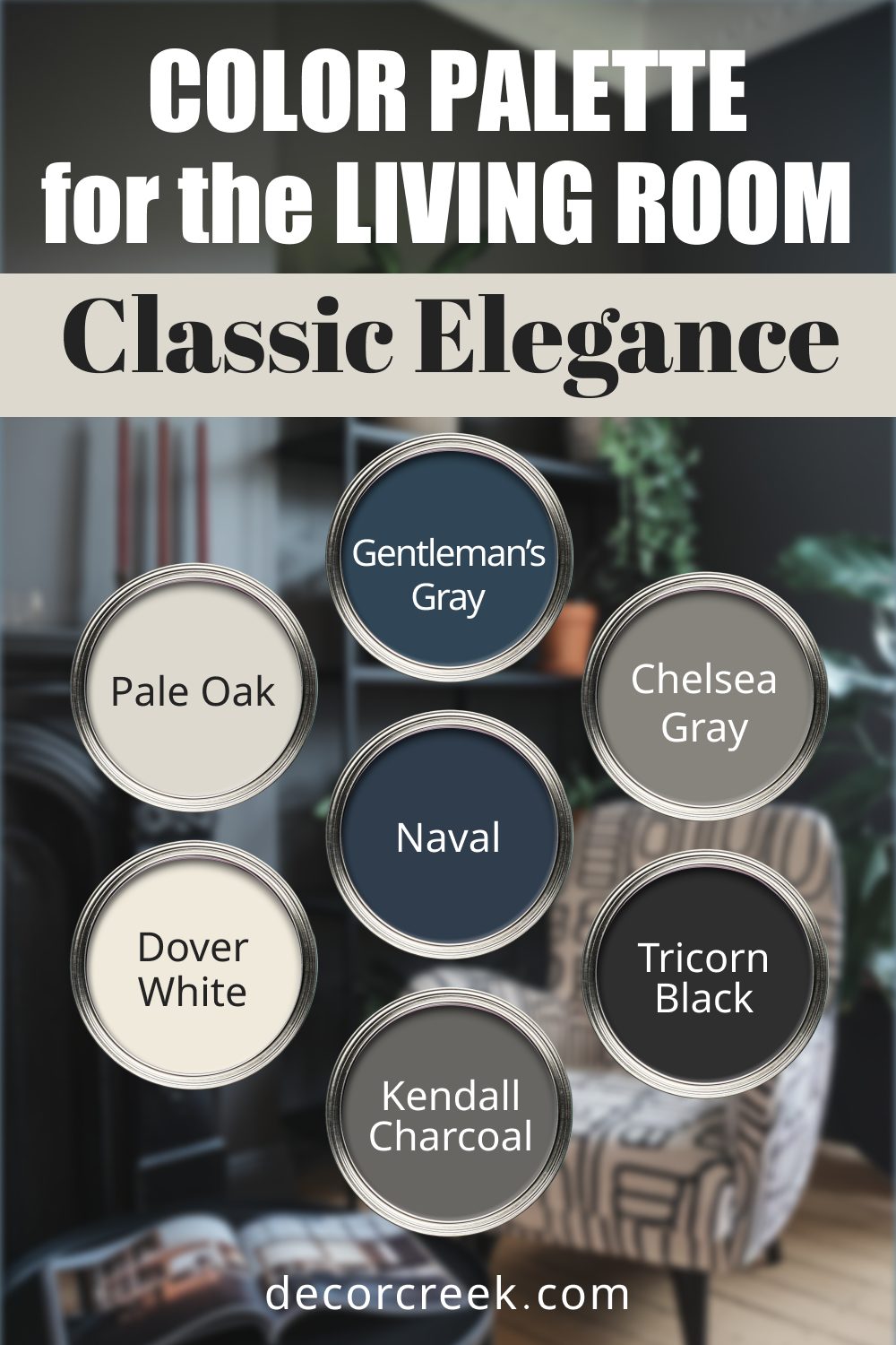
Classic Elegance
Perfect for traditional living rooms with a touch of sophistication. This palette blends timeless neutrals with rich accents.
Feel: Sophisticated and traditional.
Use: Deep navy or charcoal accents with soft grays and whites create a refined, balanced look.
- Benjamin Moore Gentleman’s Gray: A dark blue-gray for a dramatic impact.
- Sherwin Williams Naval: A classic navy that pairs beautifully with light tones.
- Benjamin Moore Pale Oak: A soft beige-gray that’s understated.
- Sherwin Williams Dover White: A warm white that feels welcoming.
- Benjamin Moore Chelsea Gray: A medium gray for added depth.
- Sherwin Williams Tricorn Black: A rich black for striking accents.
- Benjamin Moore Kendall Charcoal: A bold charcoal gray for grounding elegance.
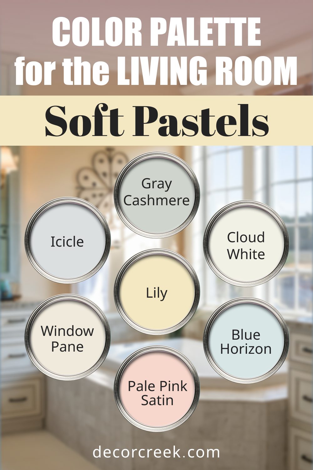
Soft Pastels
For a delicate, calming living room. These gentle hues create a peaceful atmosphere.
Feel: Gentle and calming, with a delicate charm.
Use: Apply pale greens and blues on walls, complemented by soft pinks or whites in furniture and décor.
- Sherwin Williams Window Pane: A pale green that’s refreshing and light.
- Benjamin Moore Cloud White: A soft white for an airy feel.
- Sherwin Williams Icicle: A cool gray that blends seamlessly.
- Benjamin Moore Gray Cashmere: A green-gray with a soothing effect.
- Sherwin Williams Blue Horizon: A muted blue that’s serene and timeless.
- Benjamin Moore Pale Pink Satin: A soft pink for a subtle feminine touch.
- Sherwin Williams Lily: A delicate lavender that adds charm.
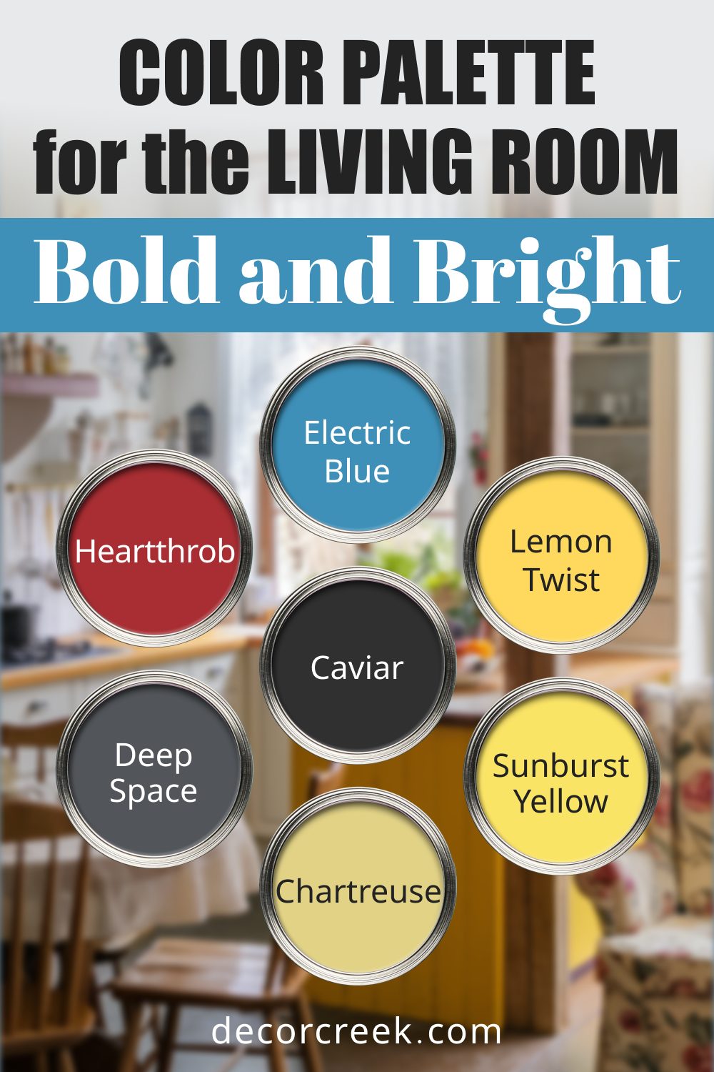
Bold and Bright
For vibrant, playful living spaces. This palette brings energy and personality.
Feel: Vibrant and playful, full of energy.
Use: Pair bold reds, yellows, and greens with clean white trim for a lively, high-energy space.
- Sherwin Williams Heartthrob: A bold red for striking statements.
- Benjamin Moore Electric Blue: A vibrant blue that energizes a space.
- Sherwin Williams Lemon Twist: A cheerful yellow that brightens the room.
- Benjamin Moore Deep Space: A deep gray for balancing bold tones.
- Sherwin Williams Caviar: A luxurious black for contrast.
- Benjamin Moore Sunburst Yellow: A sunny yellow that sparks joy.
- Sherwin Williams Chartreuse: A vivid green for a lively accent.
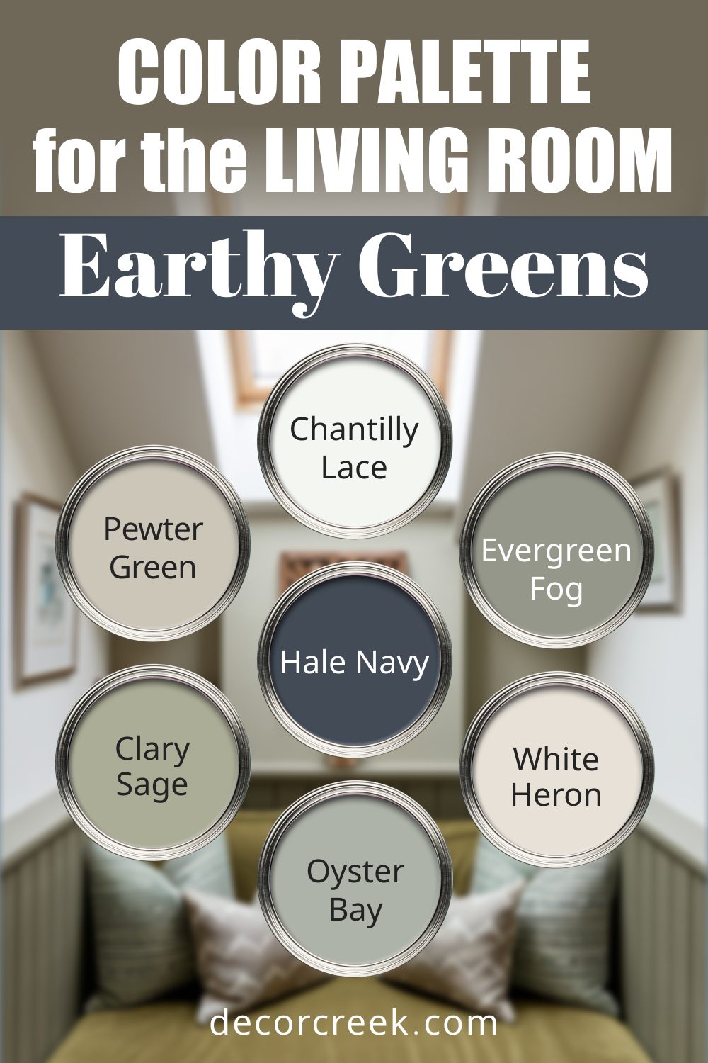
Earthy Greens
For a natural, grounded feel inspired by the outdoors. These greens and neutrals create a soothing environment.
Feel: Grounded and natural, with an organic touch.
Use: Green walls with crisp white trim and darker accents create a soothing, nature-inspired look.
- Sherwin Williams Clary Sage: A muted green that feels organic and calming.
- Benjamin Moore White Heron: A clean white that complements natural tones.
- Sherwin Williams Evergreen Fog: A soft gray-green for a tranquil backdrop.
- Benjamin Moore Hale Navy: A deep blue for a grounding accent.
- Sherwin Williams Oyster Bay: A warm gray-green for balance.
- Benjamin Moore Chantilly Lace: A crisp white to lighten the palette.
- Sherwin Williams Pewter Green: A bold, rich green for statement pieces.
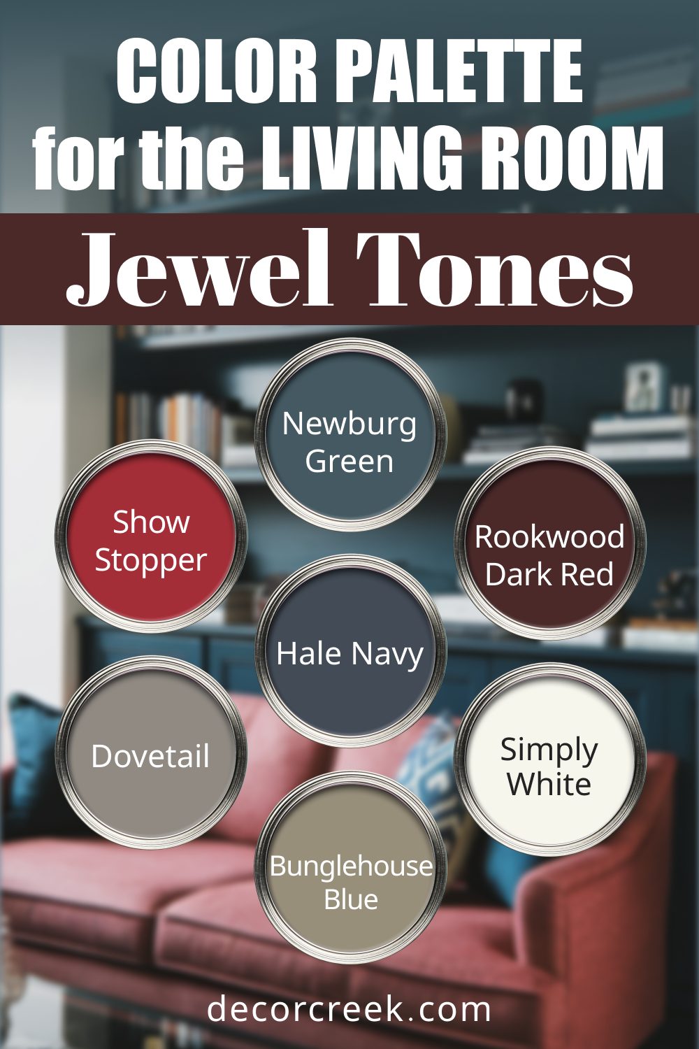
Jewel Tones
Rich, luxurious colors for a dramatic living room. These shades add depth and opulence.
Feel: Luxurious and dramatic, with rich depth.
Use: Use deep reds, blues, and greens for accents or feature walls, balanced with whites or grays.
- Sherwin Williams Rookwood Dark Red: A deep red for elegance.
- Benjamin Moore Newburg Green: A teal green that feels luxurious.
- Sherwin Williams Dovetail: A dark gray that anchors the palette.
- Benjamin Moore Hale Navy: A classic navy that exudes sophistication.
- Sherwin Williams Show Stopper: A bright red for a bold accent.
- Benjamin Moore Simply White: A neutral white to balance richness.
- Sherwin Williams Bunglehouse Blue: A bold blue for a striking finish.
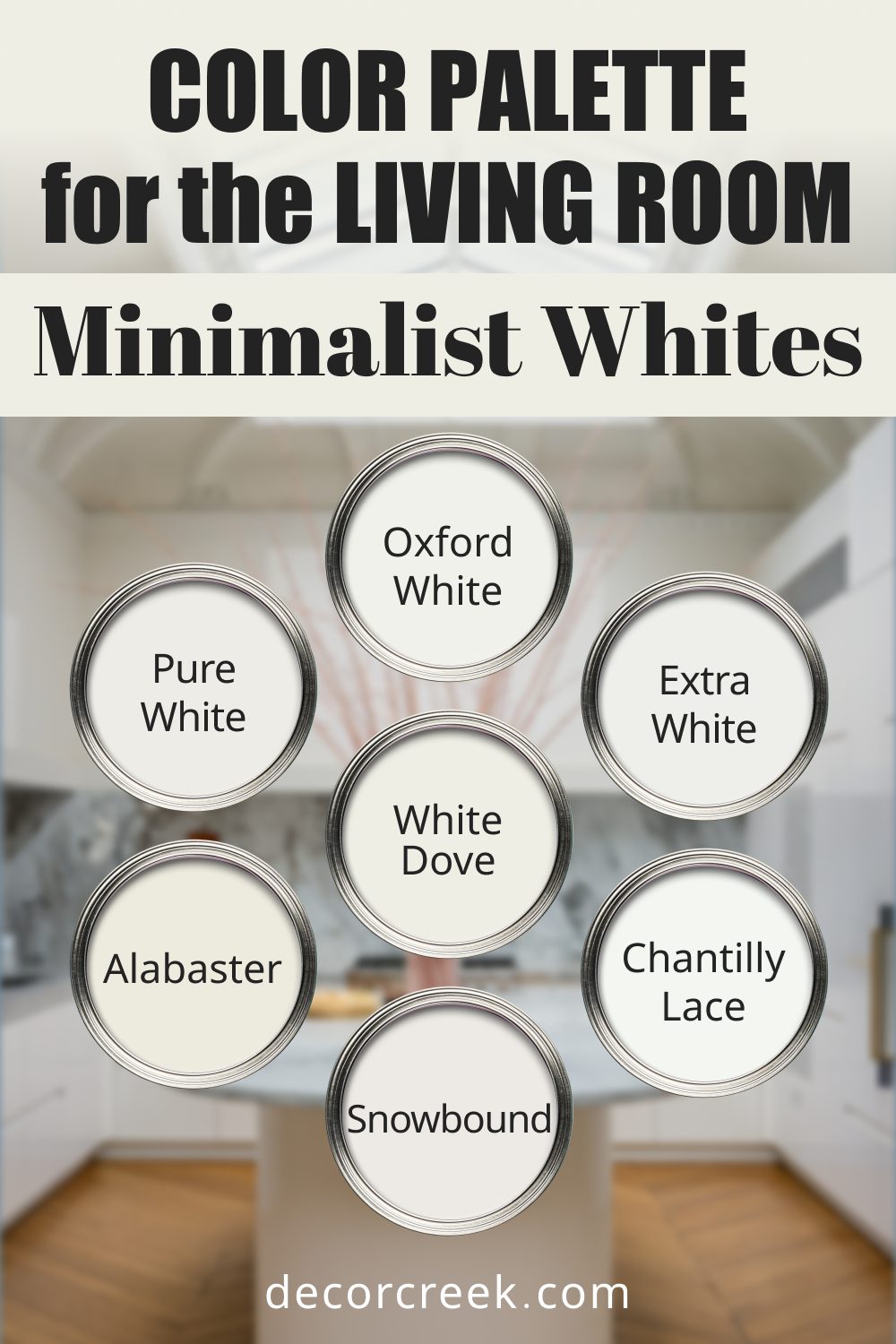
Minimalist Whites
Clean and simple for a bright, airy space.
Feel: Bright and clean, perfect for a simple aesthetic.
Use: Layer whites of varying warmth on walls, trim, and ceilings to keep the space fresh and cohesive.
-
- Sherwin Williams Alabaster (warm white)
- Benjamin Moore Chantilly Lace (neutral white)
- Sherwin Williams Pure White
- Benjamin Moore Oxford White
- Sherwin Williams Snowbound
- Benjamin Moore White Dove
- Sherwin Williams Extra White
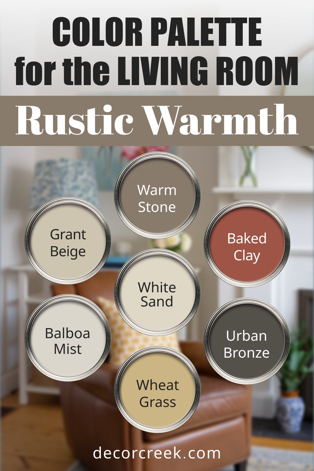
Rustic Warmth
Warm tones perfect for a cozy, cabin-inspired room. This palette blends earthy hues with comforting neutrals.
Feel: Warm and inviting, with a cozy cabin vibe.
Use: Earthy browns and muted greens on walls and accents create a snug, grounded atmosphere.
- Sherwin Williams Warm Stone: An earthy brown that feels grounded and inviting.
- Benjamin Moore Grant Beige: A warm beige that creates a soothing backdrop.
- Sherwin Williams Baked Clay: A terracotta shade full of rustic charm.
- Benjamin Moore White Sand: A soft, off-white with a natural feel.
- Sherwin Williams Urban Bronze: A dark bronze for an elegant accent.
- Benjamin Moore Balboa Mist: A light gray-beige for balance.
- Sherwin Williams Wheat Grass: A warm, muted green with organic tones.
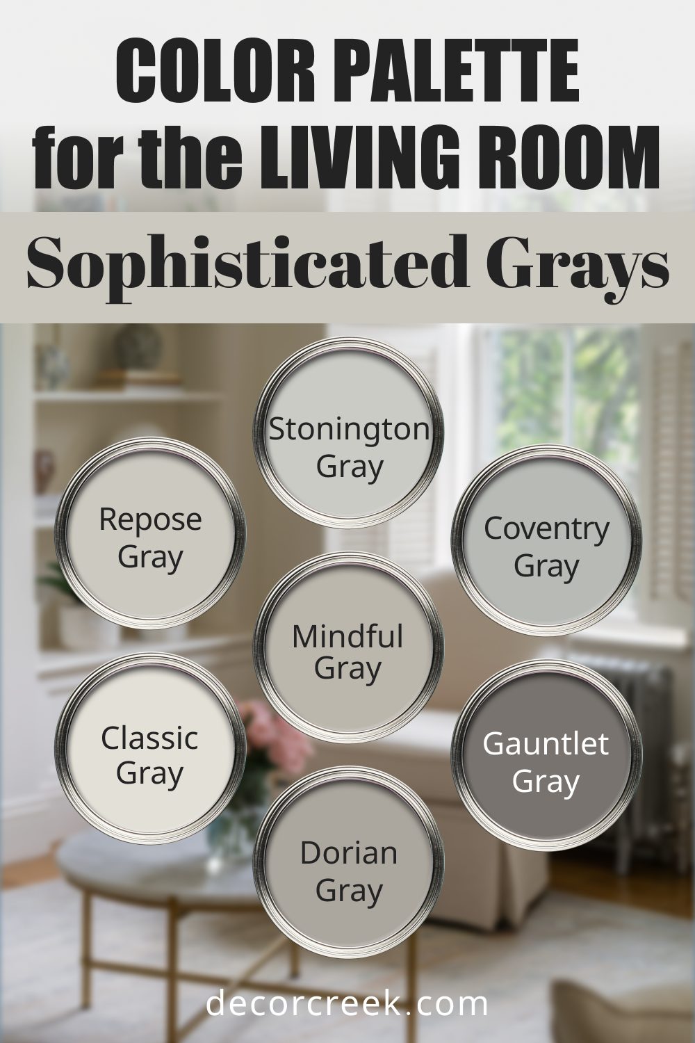
Sophisticated Grays
For a sleek and versatile space. These grays range from light to dark, making it easy to create depth and dimension.
Feel: Polished and versatile, suited for any style.
Use: Combine light and dark grays on walls, trim, and furniture for a modern, layered effect.
- Sherwin Williams Repose Gray: A light gray with warm undertones for versatility.
- Benjamin Moore Stonington Gray: A cool gray that feels modern and clean.
- Sherwin Williams Gauntlet Gray: A deep gray for dramatic accents.
- Benjamin Moore Coventry Gray: A classic gray with timeless appeal.
- Sherwin Williams Mindful Gray: A mid-tone gray that pairs well with neutrals.
- Benjamin Moore Classic Gray: A soft, understated gray for subtle elegance.
- Sherwin Williams Dorian Gray: A darker gray that adds sophistication.
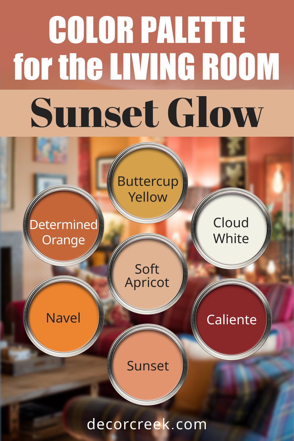
Sunset Glow
Warm hues inspired by the colors of a setting sun. These shades bring energy and a sense of warmth to your living room.
Feel: Warm and energizing, inspired by golden hours.
Use: Use soft yellows or oranges on walls with white trim and deeper reds or oranges as accents.
- Sherwin Williams Sunset: A soft, golden orange reminiscent of dusk.
- Benjamin Moore Caliente: A bold, vibrant red for energy.
- Sherwin Williams Soft Apricot: A delicate peachy tone with warmth.
- Benjamin Moore Buttercup Yellow: A sunny yellow that adds cheer.
- Sherwin Williams Determined Orange: A rich, intense orange for bold accents.
- Benjamin Moore Cloud White: A neutral white for a soft touch.
- Sherwin Williams Navel: A golden yellow-orange for a bold statement.
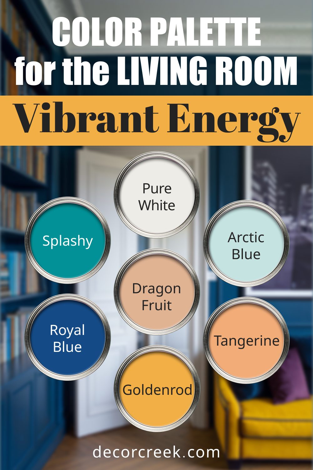
Vibrant Energy
For those who love bold, lively spaces. This palette is all about bright, attention-grabbing colors balanced with fresh whites.
Feel: Bold and lively, with personality.
Use: Bright greens, yellows, and blues on accent walls or furniture with whites to ground the space.
- Sherwin Williams Dragon Fruit: A bright pink that commands attention.
- Benjamin Moore Royal Blue: A bold, regal blue that energizes.
- Sherwin Williams Goldenrod: A vibrant yellow for sunny accents.
- Benjamin Moore Arctic Blue: A crisp, icy blue for cool balance.
- Sherwin Williams Tangerine: A juicy orange that feels playful.
- Benjamin Moore Pure White: A clean white to ground the palette.
- Sherwin Williams Splashy: A vivid green that adds a lively pop.
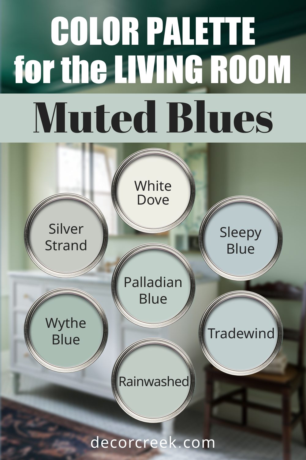
Muted Blues
Calm and understated shades for a relaxing vibe. Perfect for spaces where tranquility is the goal.
Feel: Calm and understated, perfect for relaxation.
Use: Apply soft blue tones on walls and balance with whites and silvers for a serene look.
- Sherwin Williams Rainwashed: A soft blue-green that feels serene.
- Benjamin Moore Wythe Blue: A muted blue with a timeless quality.
- Sherwin Williams Sleepy Blue: A soft, dreamy blue for soothing spaces.
- Benjamin Moore Palladian Blue: A blue-green with gentle warmth.
- Sherwin Williams Silver Strand: A silvery blue-gray that’s versatile.
- Benjamin Moore White Dove: A neutral white to highlight the muted blues.
- Sherwin Williams Tradewind: A light aqua with a coastal feel.
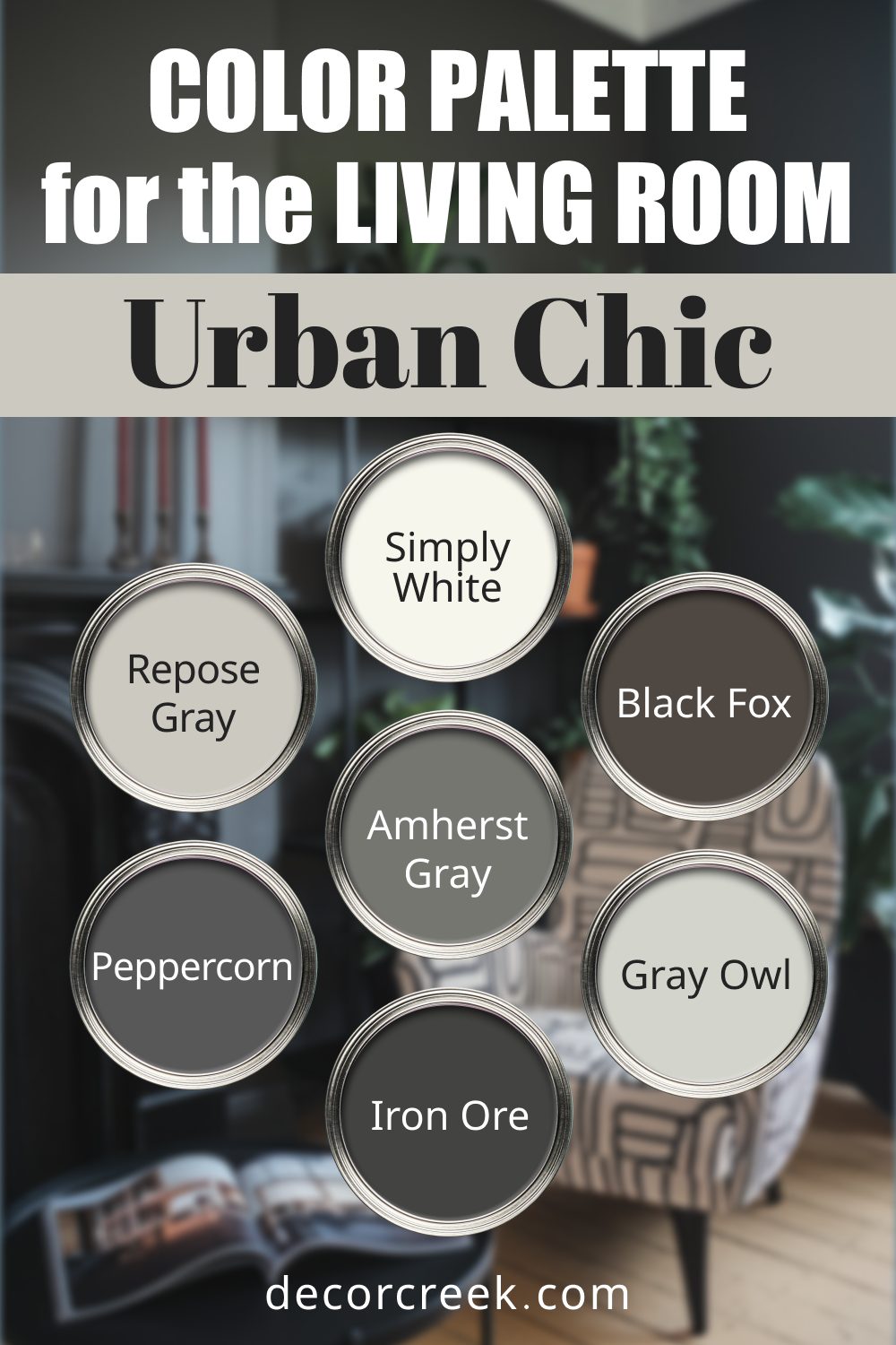
Urban Chic
For a modern, industrial-inspired space. These dark tones and cool neutrals create a sleek, edgy aesthetic.
Feel: Edgy and modern, with industrial vibes.
Use: Pair dark tones like charcoal and black with cool grays and whites for a sleek, urban feel.
- Sherwin Williams Black Fox: A moody brown-black that’s dramatic.
- Benjamin Moore Gray Owl: A cool gray for a clean, contemporary backdrop.
- Sherwin Williams Iron Ore: A deep charcoal gray for striking accents.
- Benjamin Moore Simply White: A bright white that softens darker tones.
- Sherwin Williams Peppercorn: A rich gray with a sophisticated edge.
- Benjamin Moore Amherst Gray: A dark, neutral gray for depth.
- Sherwin Williams Repose Gray: A soft gray with warm undertones for balance.
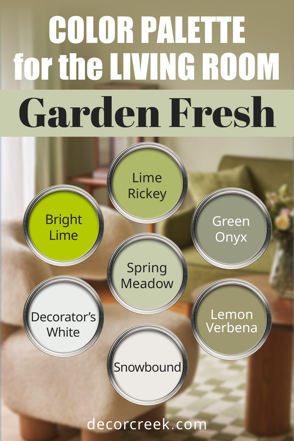
Garden Fresh
Bright and cheerful, perfect for plant-filled rooms. This palette complements greenery beautifully.
Feel: Bright and cheerful, full of life.
Use: Greens and yellows as wall accents, paired with whites to highlight plants and natural décor.
- Sherwin Williams Lime Rickey: A vivid green that’s playful and lively.
- Benjamin Moore Bright Lime: A bold lime green for dramatic accents.
- Sherwin Williams Green Onyx: A soft, organic green with natural charm.
- Benjamin Moore Spring Meadow: A fresh green that feels rejuvenating.
- Sherwin Williams Lemon Verbena: A soft yellow-green with cheerful energy.
- Benjamin Moore Decorator’s White: A clean, bright white for a crisp finish.
- Sherwin Williams Snowbound: A slightly warm white to soften the palette.
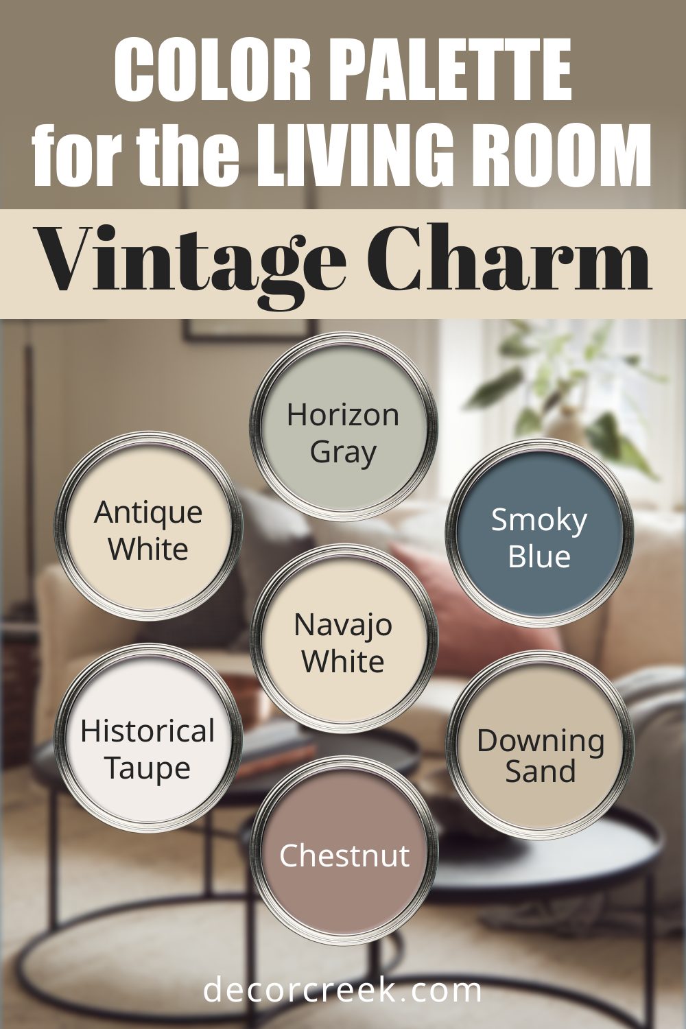
Vintage Charm
Classic shades with a nostalgic twist. These hues create a sense of warmth and timelessness.
Feel: Warm and nostalgic, with timeless appeal.
Use: Combine creamy whites and soft grays with deeper blues or browns for a cozy, classic look.
- Sherwin Williams Antique White: A creamy white with a vintage feel.
- Benjamin Moore Horizon Gray: A soft gray with subtle green undertones.
- Sherwin Williams Smoky Blue: A deep blue with a hint of gray for a nostalgic vibe.
- Benjamin Moore Navajo White: A warm, off-white with timeless appeal.
- Sherwin Williams Downing Sand: A muted beige that feels historic.
- Benjamin Moore Vintage Taupe: A soft brown-taupe with warmth.
- Sherwin Williams Velvety Chestnut: A rich brown that adds depth.
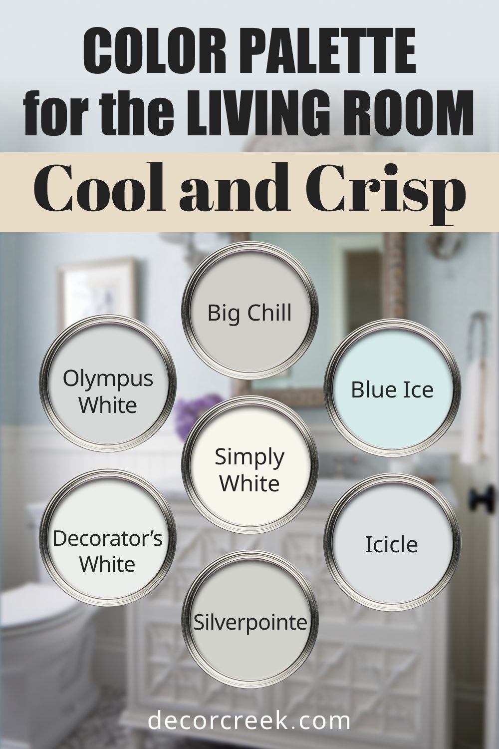
Cool and Crisp
Perfect for a refreshing, modern space. These cool tones create a clean, revitalizing atmosphere.
Feel: Refreshing and modern, with a clean finish.
Use: Icy blues and silvers on walls with bright white trim create a crisp, revitalizing space.
- Sherwin Williams Silverpointe: A light silver-gray with a crisp edge.
- Benjamin Moore Decorator’s White: A bright white with a modern touch.
- Sherwin Williams Icicle: A pale blue-gray for a cool vibe.
- Benjamin Moore Blue Ice: A frosty blue that feels refreshing.
- Sherwin Williams Olympus White: A soft gray with blue undertones.
- Benjamin Moore Simply White: A clean white that’s effortlessly modern.
- Sherwin Williams Big Chill: A light, icy gray for a cooling effect.
Tips for Picking the Right Palette
- Assess Lighting: North-facing rooms may feel cooler, so opt for warmer shades. South-facing rooms can handle cooler tones.
- Room Size: Lighter colors make small spaces feel larger, while darker colors can add depth.
- Existing Furniture: Coordinate with your sofa, rugs, and curtains for a unified look.
I once worked with a family who loved bold colors but felt unsure how to use them.
We went with Palette 6 (Bold and Bright) for their living room: Sherwin Williams Heartthrob on an accent wall and Benjamin Moore Cloud White on the rest. They were amazed at how it transformed their room into a lively, joyful space while still feeling balanced.
A Final Word on Choosing Colors
Your living room is the heart of your home—a place to gather, relax, and create lasting memories. The right paint palette can set the tone, whether you want a calm retreat, a lively space for entertaining, or something entirely unique to you. These 18 curated palettes are a starting point to help you envision your perfect living room.
Remember, no matter the palette, balance is key. Pair bold tones with neutrals, test samples in your space, and don’t be afraid to make it personal. The colors you choose should make your living room feel like home.
